We’re nearly through another year, which means another holiday season is upon us. For some, this started once Halloween was over while for others it seemingly never ended. And like years past, we’re going all-in at The Nostalgia Spot. Every day in December through Christmas Day, join us as we take a look at a celebrated, or not so celebrated, holiday classic. Each year this happens it becomes harder and harder to find Christmas specials worth talking about. My solution last year was to revisit my years old list of the top 25 and give them more due so it’s something I’m going to continue this year. Basically every fifth day I’ll pluck a special from my list of 25 that hasn’t had a full write-up here already and give it another look. It’s not to reexamine them, necessarily, but more to celebrate them as I still feel just fine about that list. It also should help lengthen how long I can keep this up, because for the first time, when I got settled in to work on this year’s slate I was feeling it a bit more difficult than before.
2022 feels like another year many are looking forward to leaving behind. I feel like every year of recent memory has had that sort of feeling, so it’s one reason why I welcome the holiday season. Work is lighter, the house is fully decorated, and I have plenty of Christmas specials at my fingertips to watch with my kids day in and day out. There are some new additions I am looking forward to getting a look at this year, while it also looks like some I was anticipating a year ago won’t be happening (thanks Warner/Discovery). And with this blog increasingly becoming more and more toy-focused, it’s nice to have something else to blog about for a month.
As per usual, while the Christmas content is in full swing, the regular content stops. I might have a couple of bonus posts in-store for you this year, but in general, if you’re coming here for said toy reviews you’ll have to wait until Boxing Day or later for our regularly scheduled programming to resume. And this year for December 1st, I have a rather fun post going up. At least it was fun for me, I’m not sure how it will work for others, but hopefully people like it. I feel really good about this year’s batch of specials as there’s some pretty good ones in here and some awesomely bad ones plus at least one that’s pretty topical. So while you’re stuffing down your turkey tomorrow, know you got something awesome coming your way next week. It’s the Christmas Spot, and for at least one more year, it’s bringing the Christmas goods!
Want to check out the archives to put you in the Christmas mood? Here are some suggestions from Christmas Spots of the past:
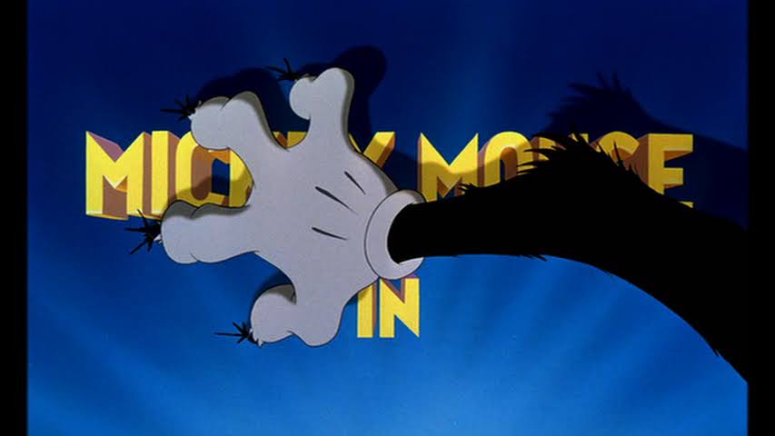
Welcome back to The Christmas Spot! It’s that time of year once again when this blog takes a break from the usual and turns into your very own Christmas advent calendar of holiday goodness, and some badness. Starting today, it’s nothing but Christmas specials until the big day, and to kick off this year’s installment…
In the mid 90s comedian Louie Anderson got his own animated show. I have no idea how or why. It was apparently a Fox thing to find stand-up comedians and give them their own show, they just usually took the form of a late night show or sitcom. Life with Louie was a cartoon about…
Before there was an entire broadcast television network owned by Time Warner, there was the relationship that existed between Fox and WB. Fox, needing a lot of content to launch its kid programming block The Fox Kids Network, partnered with WB and Steven Spielberg to bring the world Tiny Toon Adventures. It was a success,…
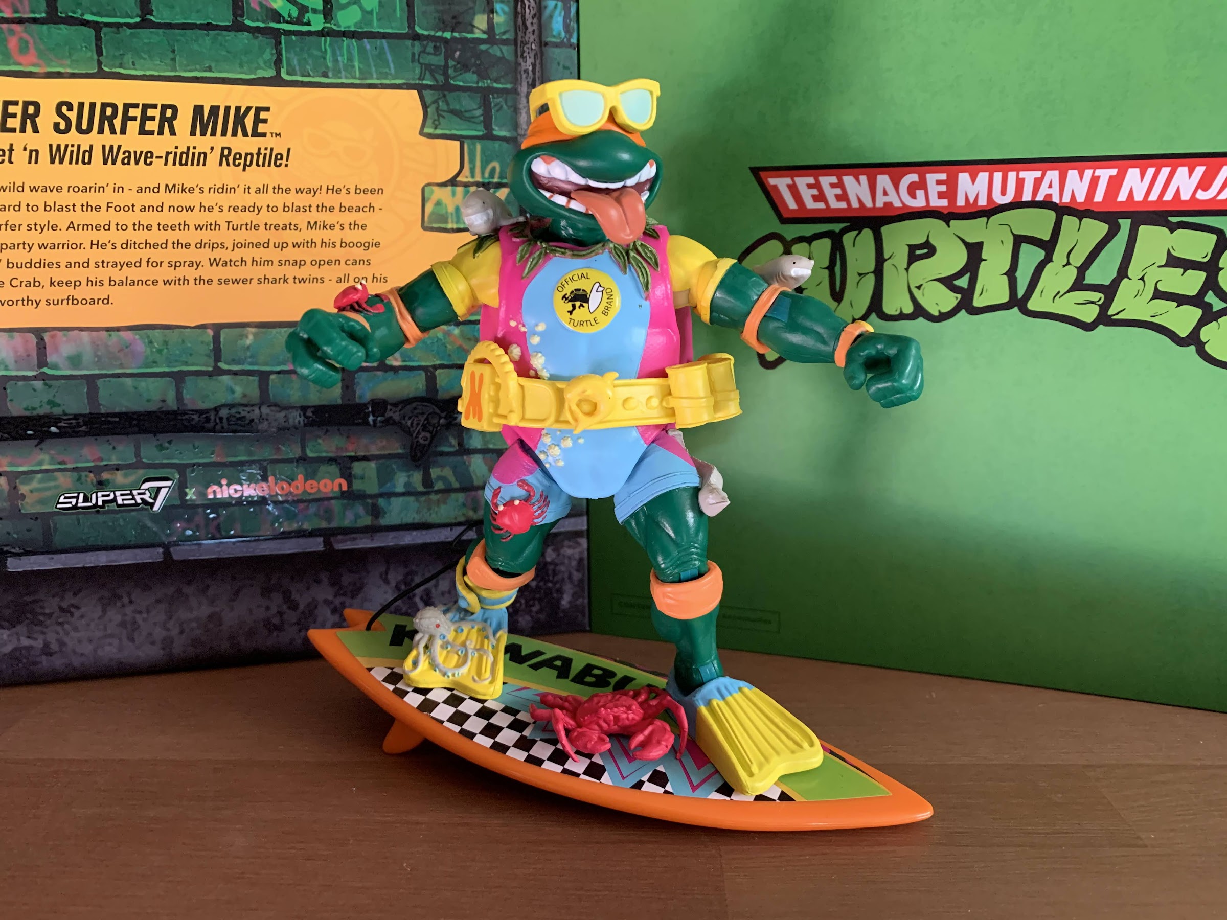
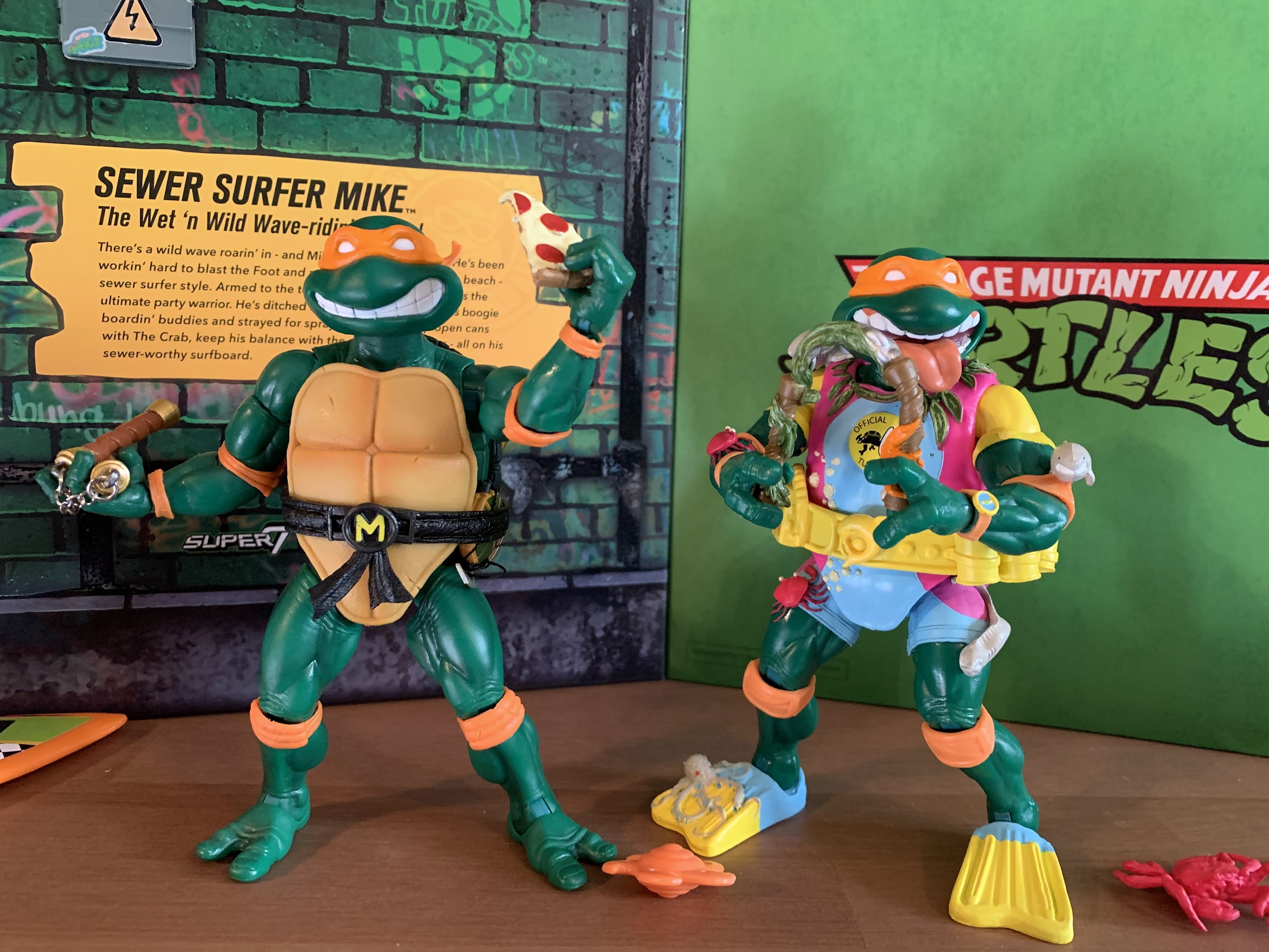
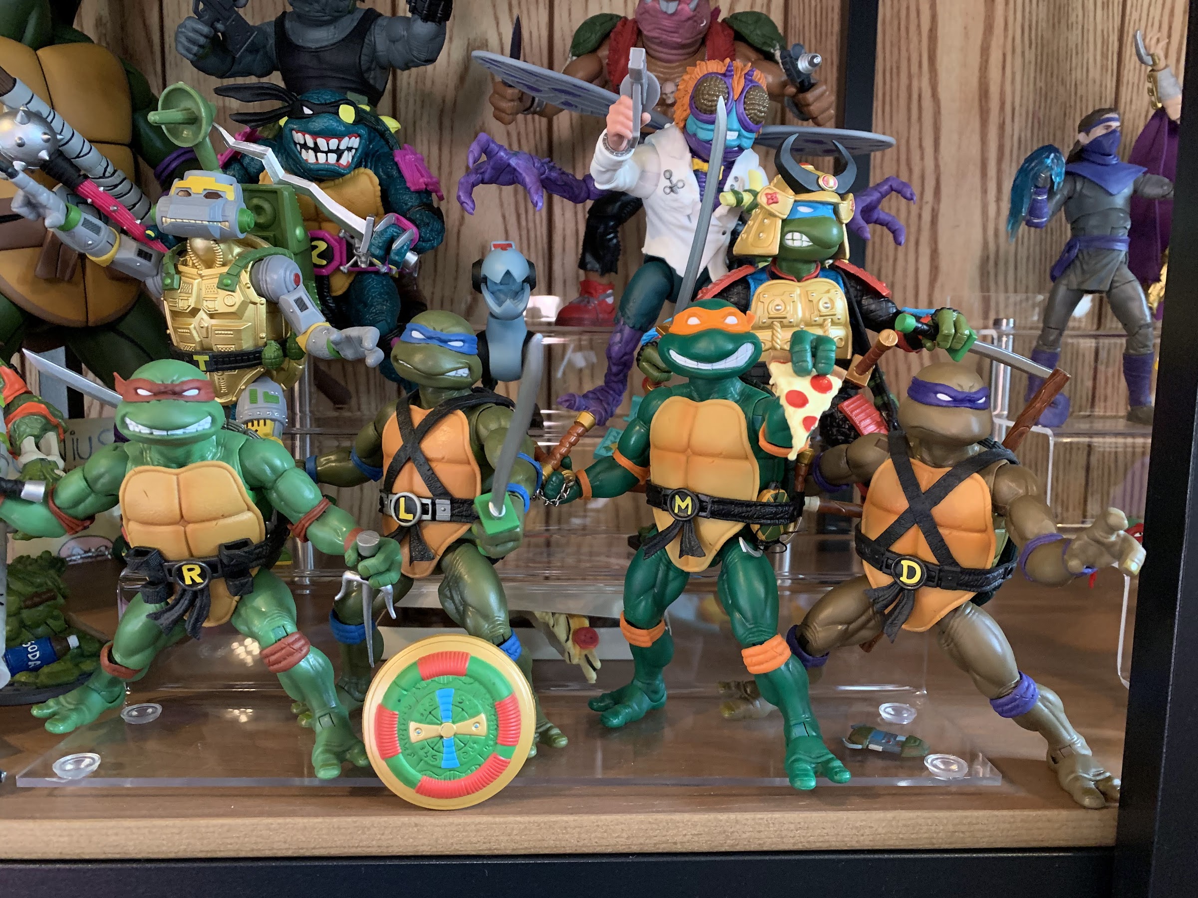
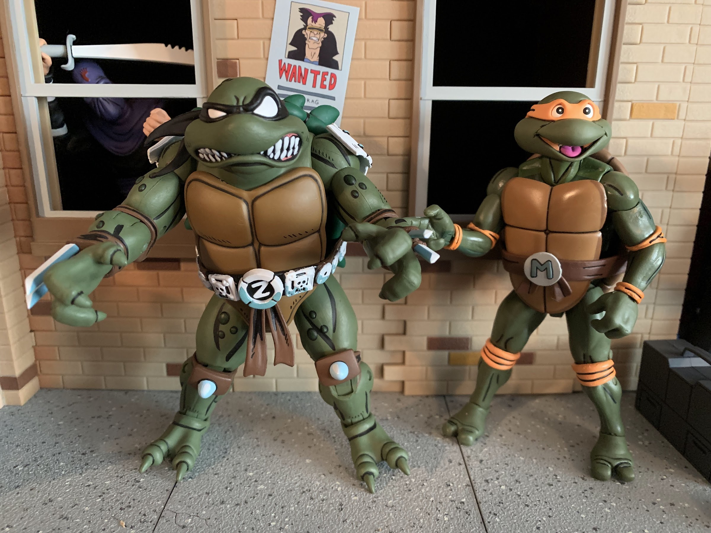
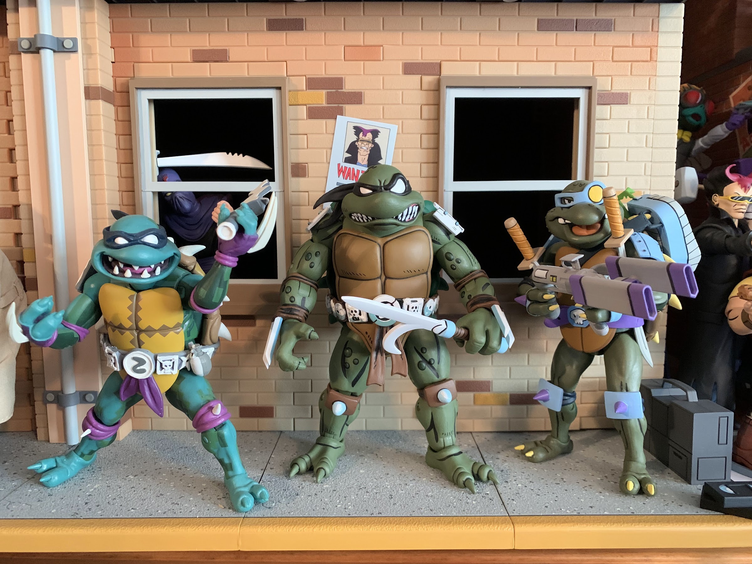
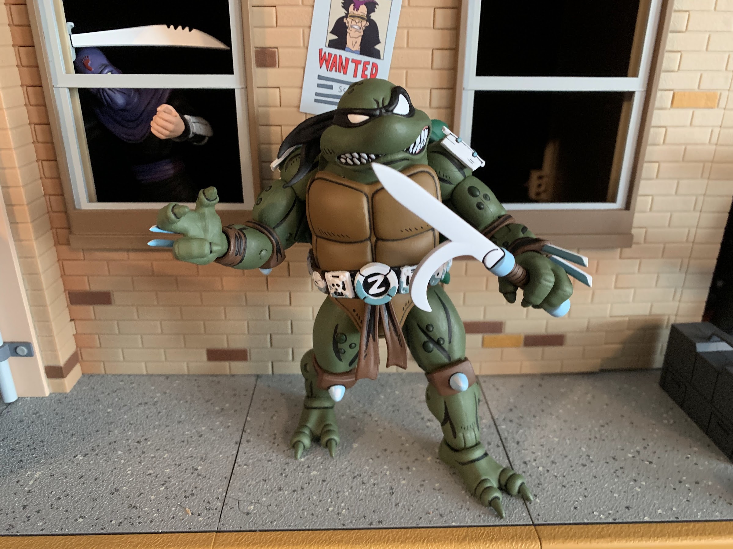
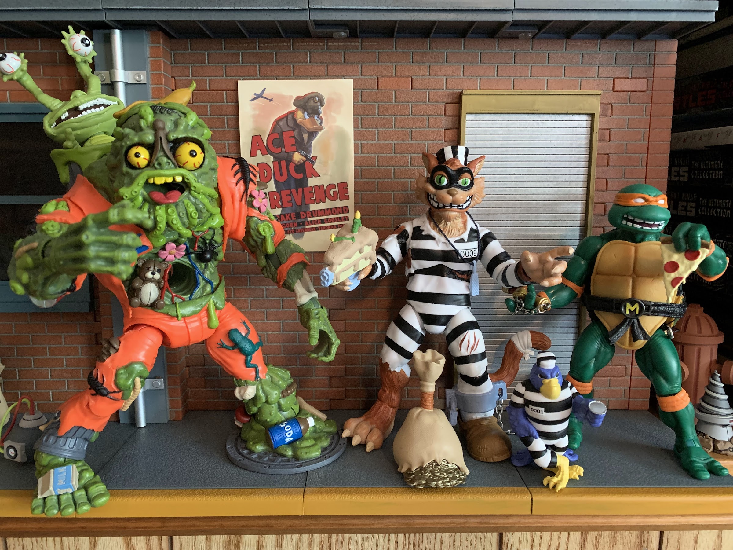
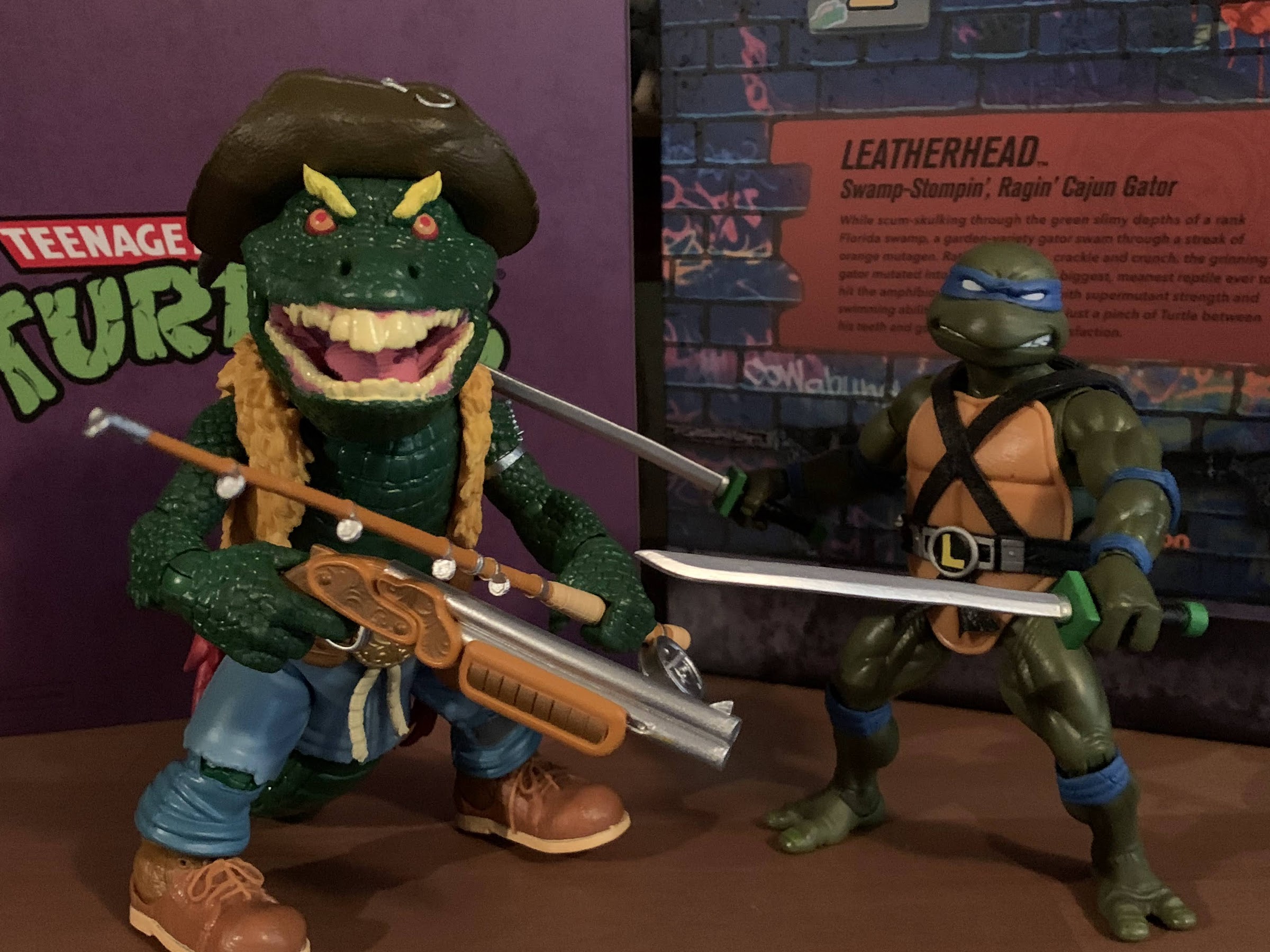
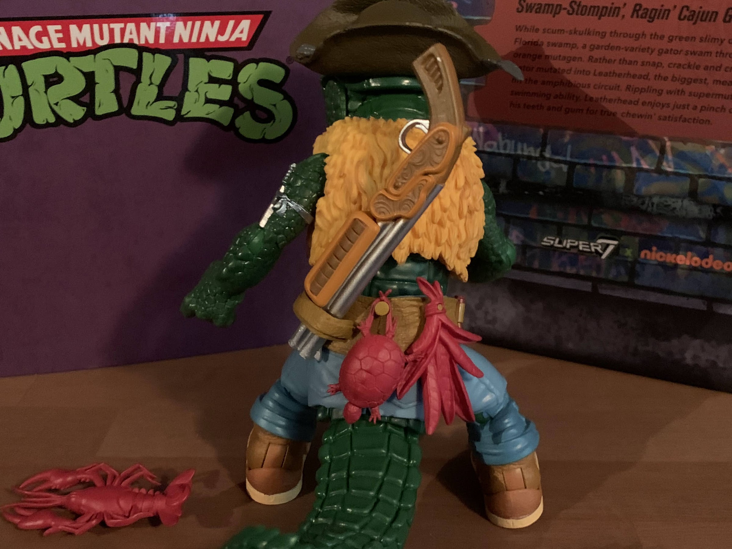
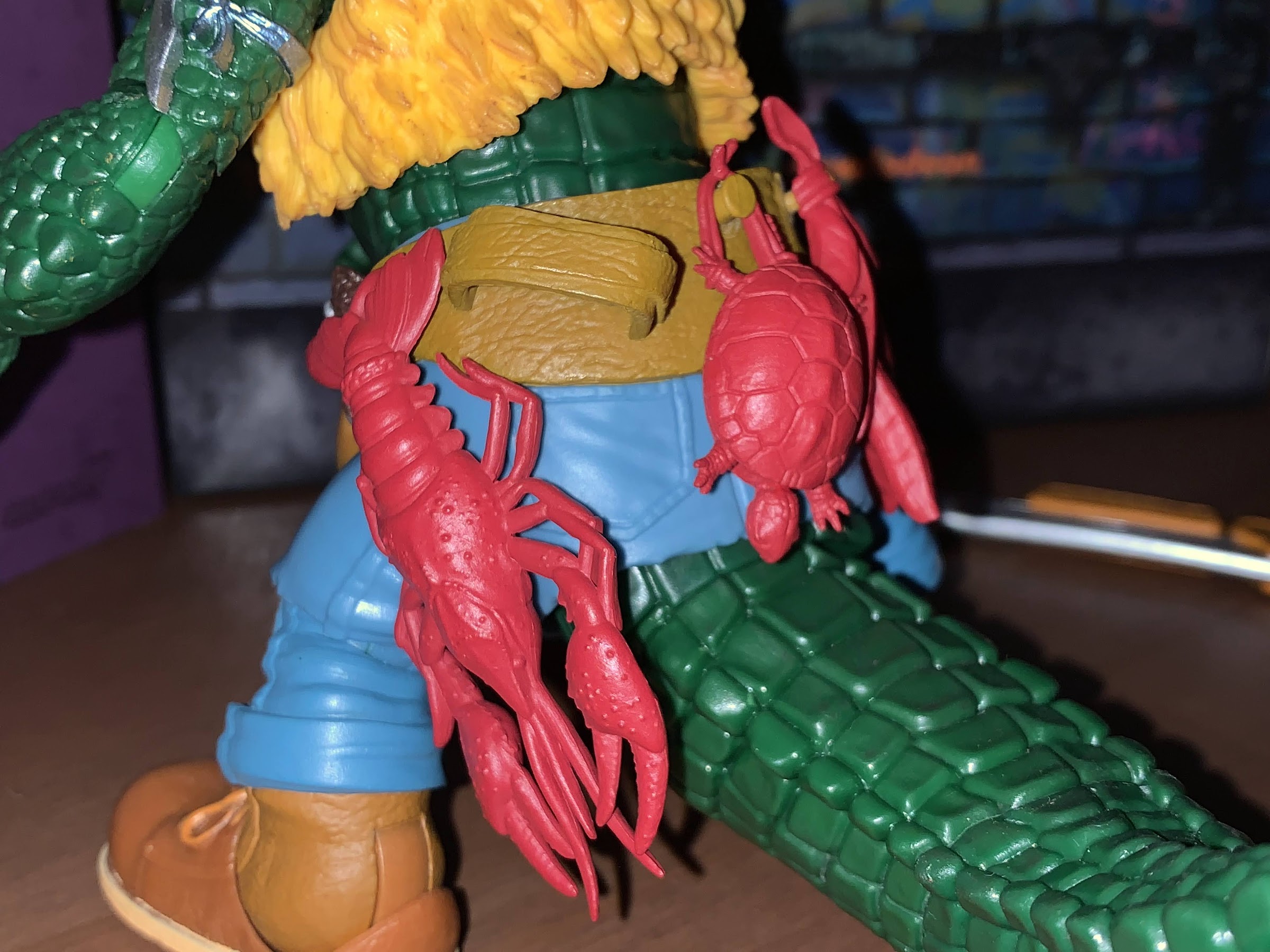
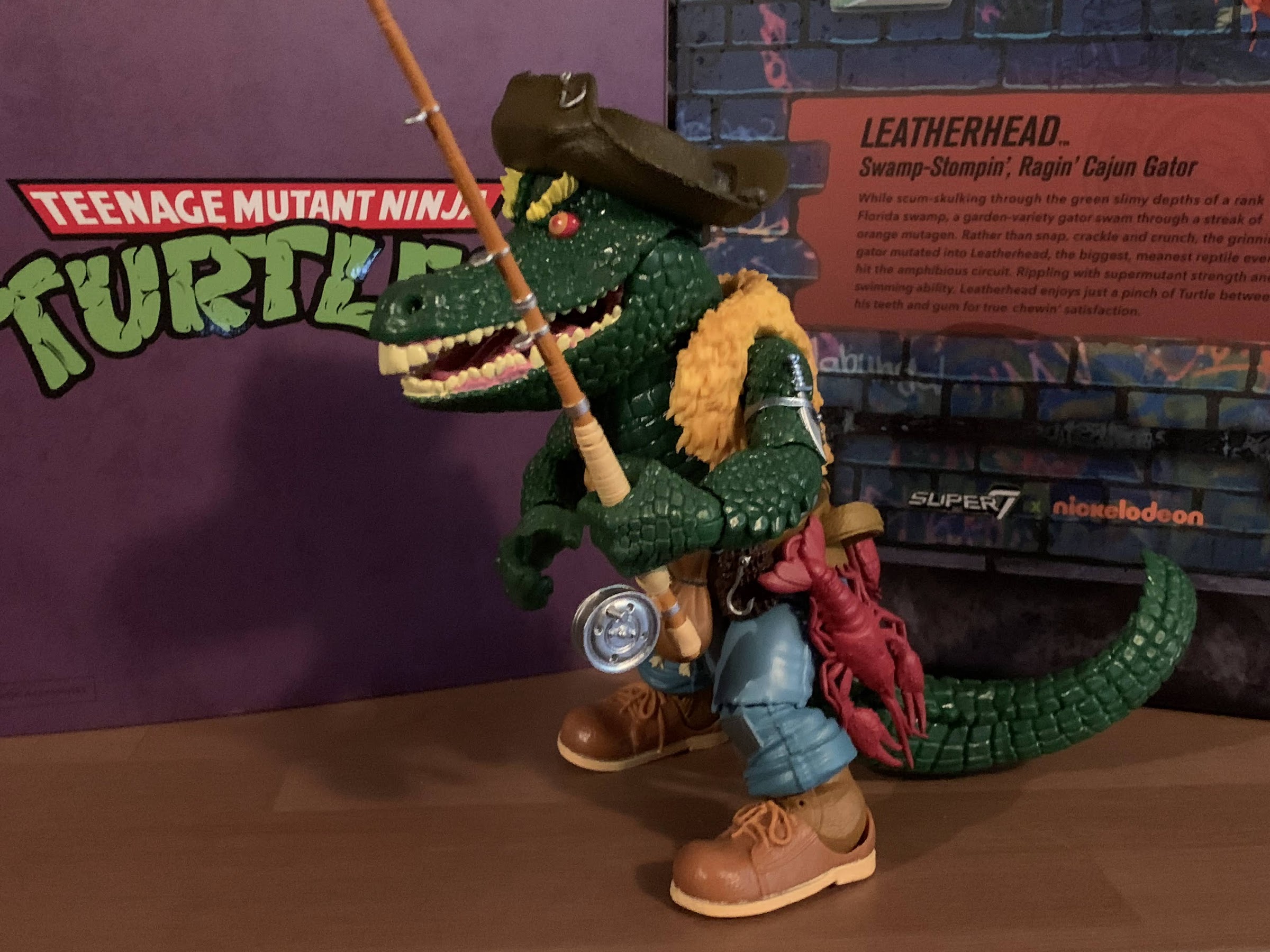
We are back with one more look at Wave 6 of Super7’s Teenage Mutant Ninja Turtles line of Ultimates! action figures: Sewer Surfer Mike. This, like every figure in the line so far, is a recreation of a Playmates Toys figure from the vintage line of TMNT action figures, and in this case it’s of Mike the Sewer Surfer. That was the Michelangelo included in the inaugural disguise series which was basically the first of the “wacky” variants that Playmates would do. Many more followed, but for me, that first wave was the most memorable and Michelangelo as a surfer dude made plenty of sense. And it was a toy I really enjoyed as a kid. Something about that pink and blue wet suit was just a pleasing aesthetic for me. I loved the sculpted details like the octopus on one of Mikey’s legs or that metallic paint on his sunglasses. He also had a little, crab, buddy that affixed to his surfboard and it was just a fun, silly, figure. And because of that affection I had for it as a kid I had to get the Super7 version. There was at least one other compelling reason to get this, which we’ll get to, but it was largely a no-brainer. I really liked all of those disguised turtles, it’s one of the few waves I had every figure from, and the nostalgia is strong here.
He certainly looks the part.
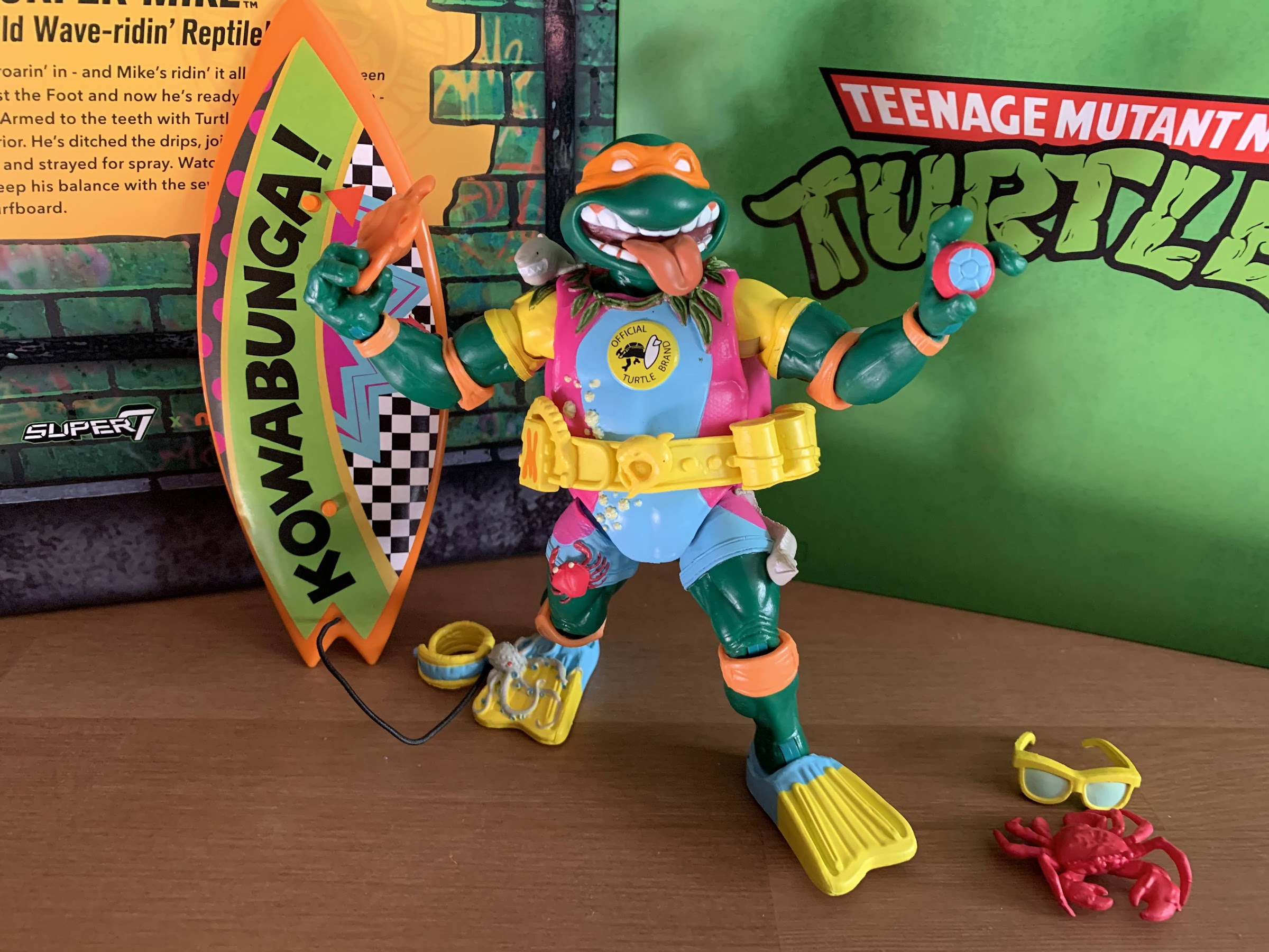
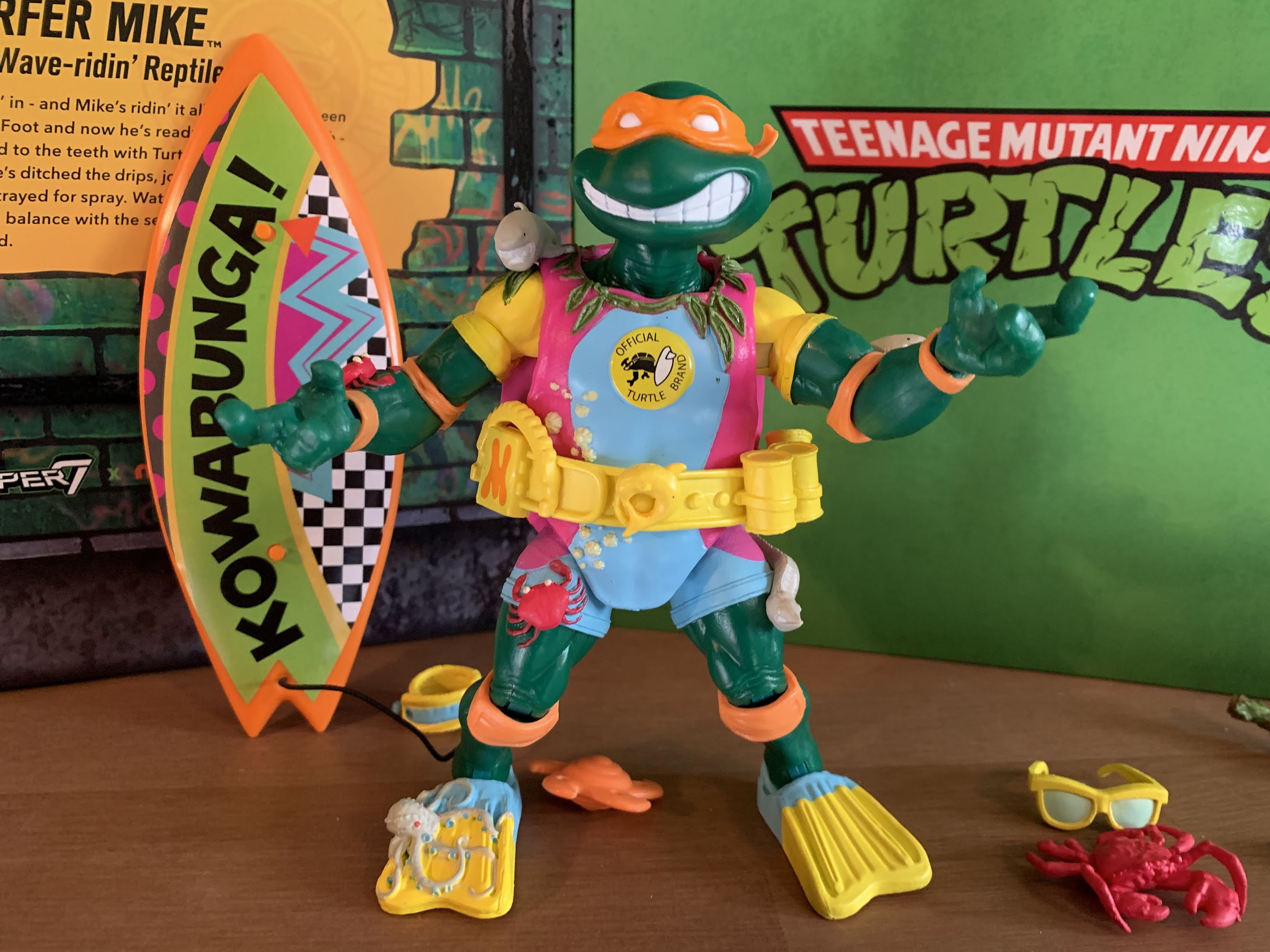
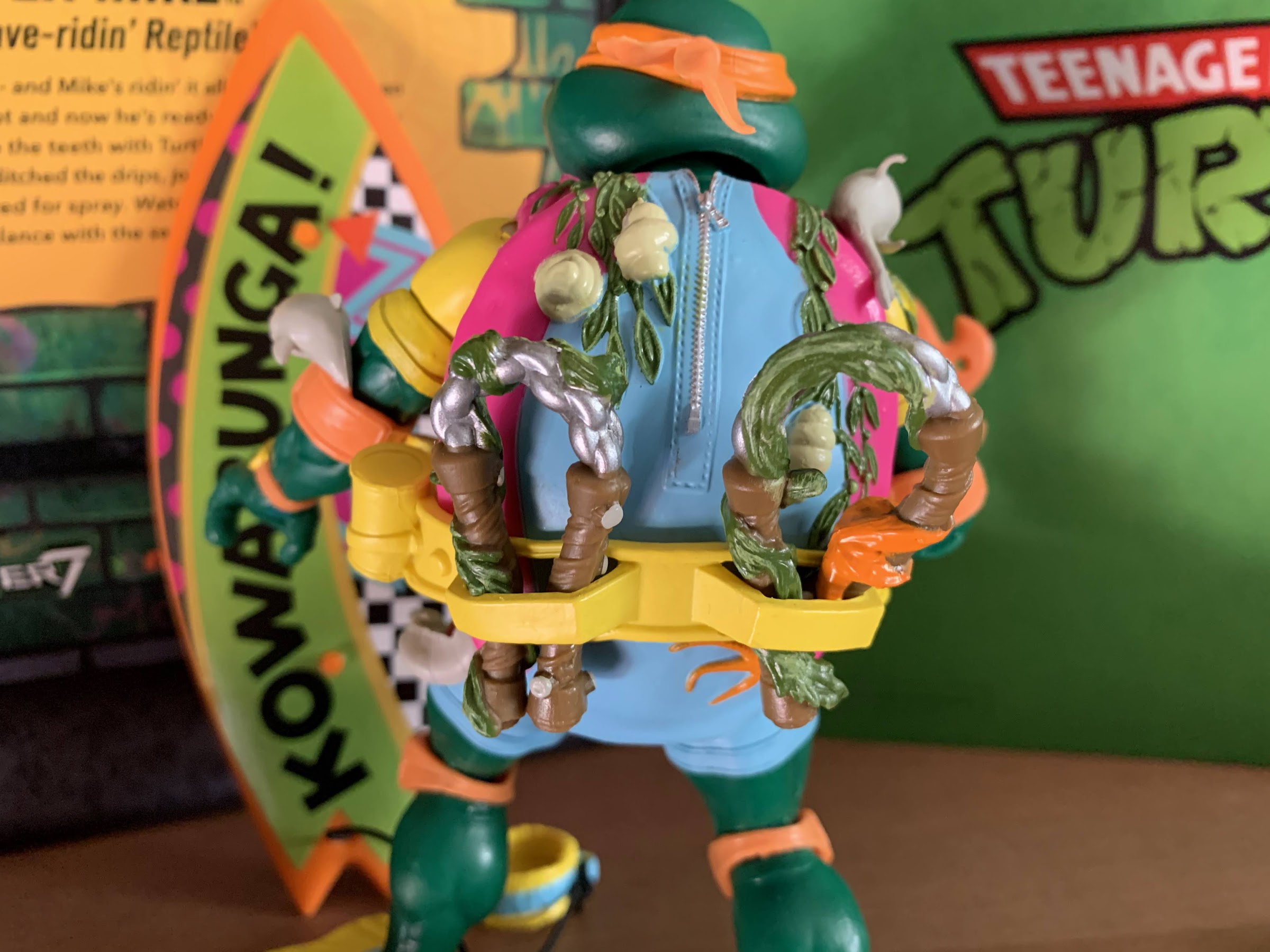
Mikey comes in the standard Super7 Ultimates! box with slipcover on the outside and window box within. Mikey stands around 6″ and is basically in-line with the other turtles, as expected. Since he features a new outfit that’s all done as part of the sculpt, everything about this guy is new. The only parts Super7 could reuse were the hands and maybe the shins. He’s done in as much colored plastic as possible, which for Mikey is that deep, forest, green that distinguishes him from his brothers. The wet suit feature some painted details and it’s done in an acceptable fashion. There’s a lot of additional, fun, sculpted bits on this guy in the form of various sea creatures. Mikey looks like he was vomited up by a whale or something as he’s got crabs (the good kind), sharks, and seawood all over the place and it’s something I remember fondly of the original figure. I’m a little surprised some of these aren’t removable, but they weren’t on the old figure so I don’t hate it. I’d have kept them on, but I understand if some are disappointed just like how some out there wanted Scratch’s shackle to be removable. It is interesting that the default portrait for this figure has Mikey with his tongue hanging out. That is not how the original figure depicted him as he instead had a sly smile and shades. The shades, by the way, are removable this time. The second portrait is more in-line with the original. It doesn’t matter since both heads are in the box, but I found it a bit curious. He still features a big, yellow, belt and I am a bit disappointed there isn’t more paint here. I thought Super7 did a good job making Slash’s belt pop more, but with this one it’s like they didn’t even try. Despite that, I think he looks good and I’m as charmed with this version as I was the original when I was a kid.
He’s got some board wax and these oversized throwing stars, but the board is the main attraction.
What certainly adds to the fun factor here rests with the accessories. Mikey’s got a decent spread, and it starts with the optional hands. Mikey comes with two sets of gripping hands (vertical hinge and horizontal), fists, and style posed hands. For those gripping hands he has his trusty nunchaku. These are of the molded plastic variety and Super7 added some seaweed to them in keeping with the theme. The original figure did not come with these so I like that Super7 gave us some. The only issue is they’re very gummy to the point where I find the texture unpleasent. It’s a shame, because the sculpt and paint are nice, but they’re so soft that I couldn’t even get them into his gripping hands. He also has three cans of wax, I guess to maintain his board, and I initially wasn’t sure what they were. They’re painted okay, my blue and yellow one isn’t lined up properly, but don’t do much for me otherwise. He also has his starfish shurikens which is something that did come with the old toy, and most important he comes with his surfboard. It looks like the vintage one as it’s cast in orange plastic and has a decal on it. It’s disappointing to see a decal in place of paint or a printing, but that’s what we got. The little crab guy is included, but he no longer clips into the board and instead is intended to just be placed on it which doesn’t work as well since the board needs to lean forward. There’s also a foot strap for the board in case Mikey wipes out. It looks pretty cool, but it’s really crying out for a display stand of some kind. Similar to the Optimus Prime figure Super7 did, the fins on the underside of the board make it a challenge to actually pose Mikey in a surfing position. He’s a bit annoying to pose because while he can peg onto the board, nothing else does and his sunglasses just rest on his head unconvincingly so there’s a lot of balancing going on. Lastly, he has a weapon sprue which contains the shuriken, nunchaku, crab, and wax cans surrounded by a block and tackle. It would have been cool to get the block and tackle as an accessory, though admittedly I don’t know what I would have done with it. Just like I don’t know what to do with the sprue. These are being phased out from future waves and I consider that no great loss.
As is often the case, two heads are indeed better than one.
Of course, we also have that other head which is more vintage inspired. Put that on your figure with the shades and the look is mostly complete (the fit of the shades is rather poor) which frees up that other head for another figure. It’s no secret that a lot of folks weren’t crazy about Michelangelo’s alternate head from the Wave 3 release of Ultimates! I’ve been using that head, because I overall liked the alt heads more, but it is my least favorite of the four. It’s just an odd expression. They were going for a smile or a laugh, but it’s very blocky and he has huge gaps between his teeth. This one kind of carries that weakness forward, but overall both heads do a much better job of getting Mikey’s termperment across. And the good news is that Super7 was able to match the colored plastic very well between this release and that past one so, if you want to, you can swap out the old head with one of these. I’m definitely going to do that with my display, though I haven’t yet decided which head I want for which figure. And I suppose the inverse is true if you really want your Sewer Surfer Mike to have one of the old heads. The classic, vintage, head doesn’t look terrible, though I can’t see myself going in that direction, but it’s always nice to have options.
One clear and obvious negative with this figure are these gummy, awful, nunchuks. I love the seaweed and such, but he can’t even grip them easily because they’re so gummy.
Now, the big deal with this line of late has been articulation. Wave 5, which arrived at the same time as Wave 6, was pretty much a disaster as far as loose joints are concerned. The Wave 6 figures I’ve looked at have been much better. Slash was pretty great, and while Scratch had some odd engineering choices, he was at least plenty sturdy. Mikey, being a Wave 6 release as well, is more of the same which is a good thing. He articulates just like the other turtles so we have a double ball peg at the head that has subpar range because of how low it sits on the unarticulated neck. The shoulders are ball-hinged and he can just about get his arms out to the side. He has a biceps swivel and the elbows are single hinges with rotation and it’s fine. The wrists swivel and hinge and the hands swap fairly easily. In the torso, is a waist twist that does little and at the hips Mikey can almost do full splits (it’s the sculpted eel on his left thigh that keeps him from achieving a true split), kick forward, and can’t really kick back due to the shell. There is a thigh twist and the knees are single hinges with a swivel. At the ankle, we get hinges and rockers which continue to be the strong point of the line. The rest is just basic. The range is mediocre as he can’t quite hit a 90 degree bend at either the elbow or knee, but there are at least no surprises. We know what to expect and that the articulation is going to be a weak spot for this line, at least what is here seems fine as far as quality control is concerned. I’d love to see Super7 do better, but we’re at a point that we should expect this level of articulation and either accept ir or pass because it’s unlikely to change.
Whether you go with the tongue head or the closed mouth, I think it’s an improvement for the wave 3 Mikey.
This is a figure that is not likely to excite many, but it’s probably not going to let many down either. It feels like it should be regarded as a new baseline for the entire series. There’s a good amount of paint on the figure proper and it’s applied reasonably well. Yes, it’s not pristine upon close inspection, but it’s good enough. The articulation is not impressive, but is up to the line’s own standard and at 6 waves deep it’s mostly on the consumer at this point if they’re letdown in that department. And the figure also comes with enough, though I definitely would have appreciated some new hands like open palms for a more traditoonal surfing pose or maybe a “Hang 10” gesture. At least there is already plenty of new tooling with this guy so it doesn’t feel like Super7 cheaped out on us. My only true criticisms rest with the belt and nunchuks. The belt just needs more paint as it shouldn’t be all yellow like that. At least hit the cans with something. And that gummy plastic utilized for the chuks needs to take a hike. I get that they were looking for a flexible alternative for the weapons, but this isn’t the right solution. Mostly though, if you’re into this line and have been generally pleased then you’ll like this figure and if you liked the vintage one well then it’s a no brainer. The fact that his second head works well with the older Mikey might be reason enough for some to drop the $55 it costs to get this guy.
The new heads for Mikey are a bit “toony” compared with the other brothers, but it works well enough as far as I’m concerned.
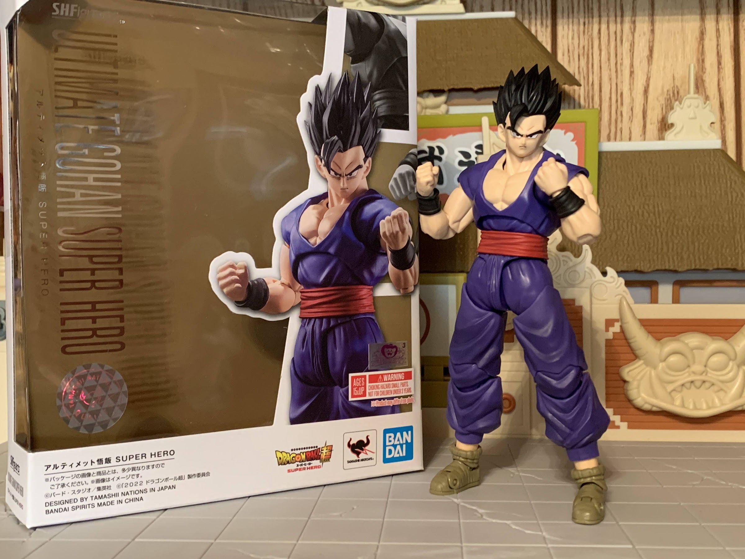
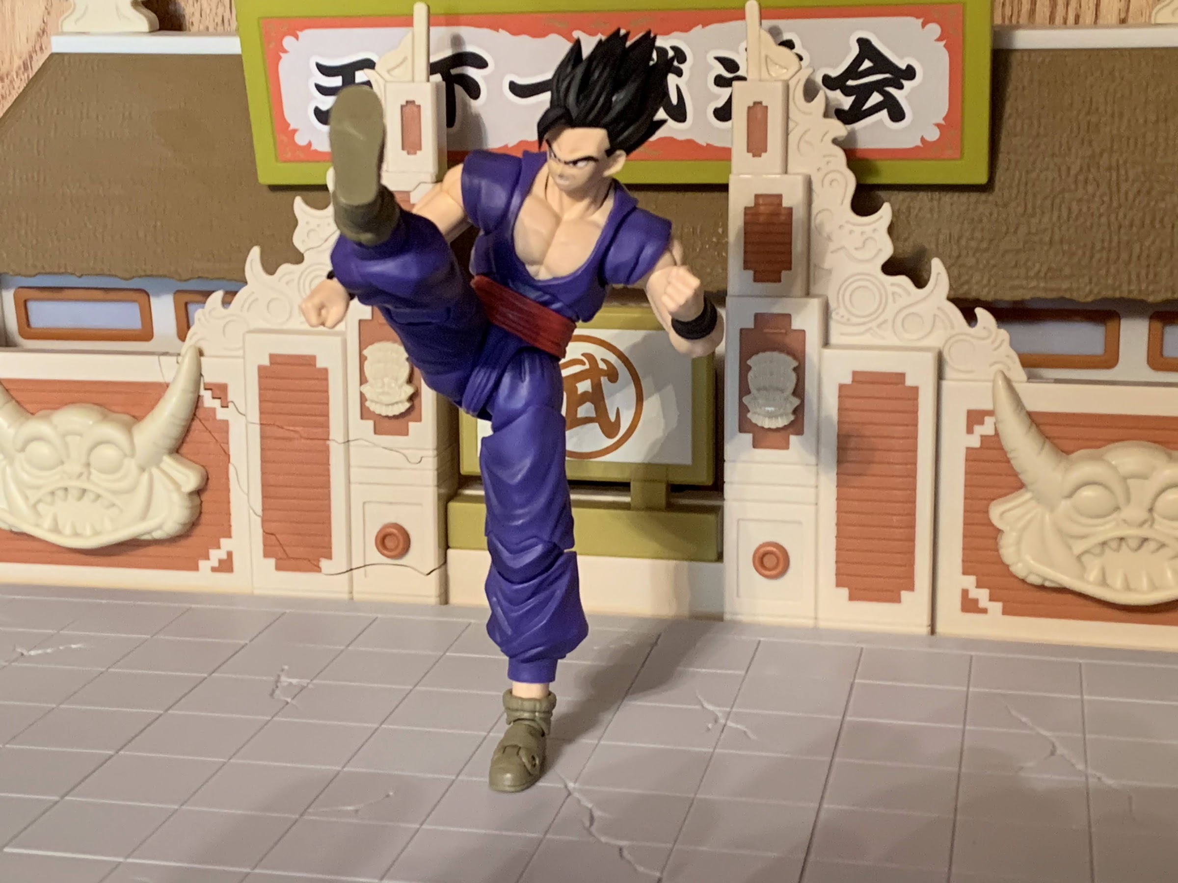
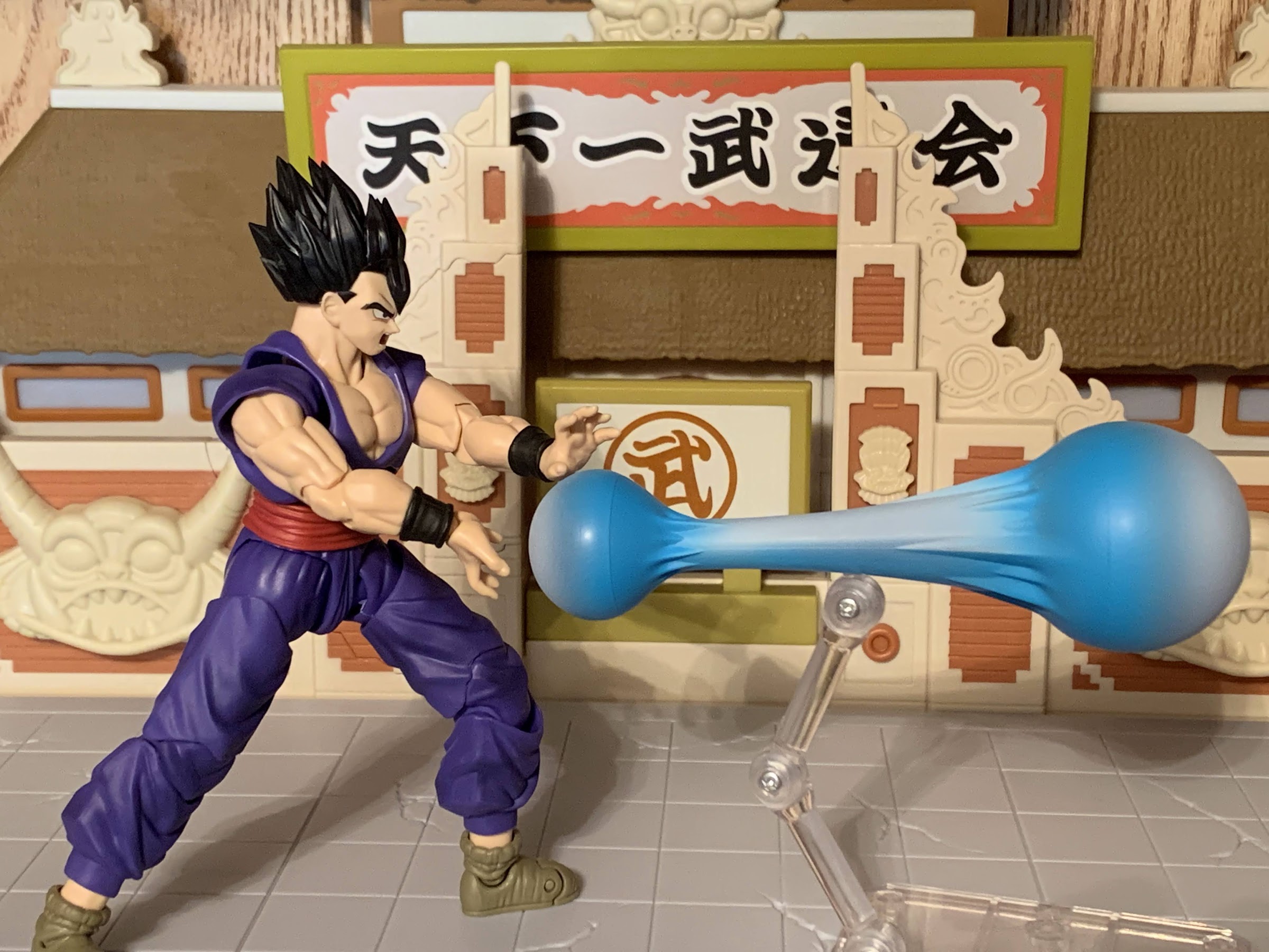
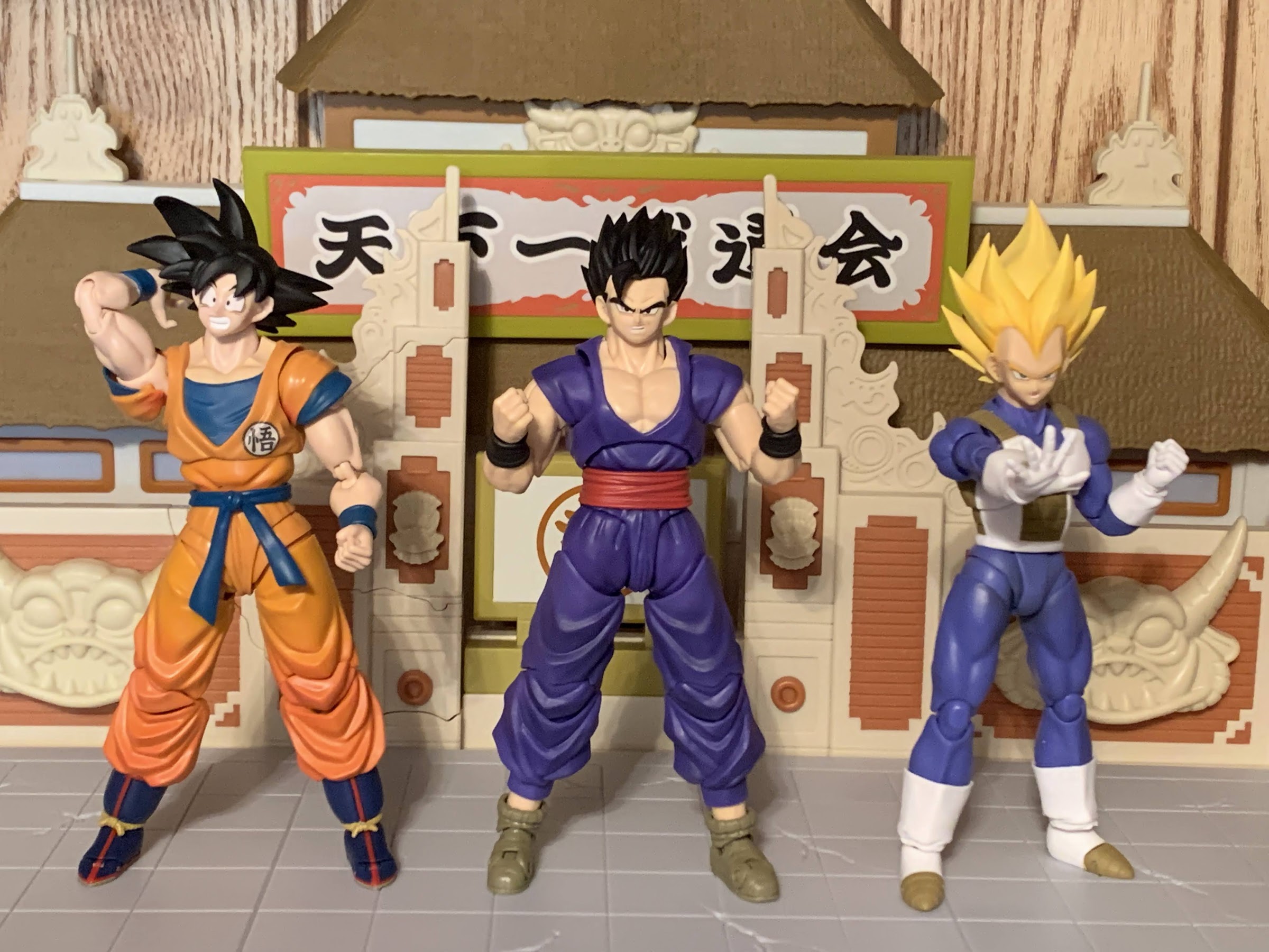
As part of the promotion for the film Dragon Ball Super – Super Hero, Bandai released a wave of action figures from its S.H. Figuarts brand of characters from the film. The neat thing was, these releases were actually really cheap relative to other SHF releases with a MSRP of just $35. Of the four, the only one I grabbed initially was Goku as I was looking for a base version of Goku and that figure really stood out as better than the alternative to me. I was tempted by Piccolo as well because the headsculpts looked like an improvement over the figure I have, but ultimately I didn’t want to spend money for some new heads. Another temptation for me was the new Gohan. Depicted in his “Ultimate” form, the adult Gohan from the film looked really interesting because it would appear he’s on a newer body that could see some reuse down the road. At the end of the day though, I’m not a huge Gohan fan so I decided to pass. The question was rendered moot too when he sold out really quickly as there’s a legion of Dragon Ball collectors out there who have been waiting for a good interpretation of Ultimate Gohan.
Then Bandai put up for sale on its Premium Bandai webstore two characters from the film: Gamma 1 and Gamma 2. They’re the “sort of” villains from the film and I liked their look. I wasn’t sure if I liked it enough to pay the Premium Bandai upcharge to get them though, but once I finally saw the film, I ended up taking the plunge. The thing with those figures is they both come with optional parts for the Ultimate Gohan figure. I suppose I could have sold those parts to recoup some of the expense of those two figures, but instead I just went in for more and purchased the Gohan figure. Retailers opened up some additional preorders for him, at the slightly inflated price of $40 (he may have started off there too and I just forgot), and I grabbed one of them. I’ve had the figure for about a month now, and let me tell you something: I love it!
My Gohan, you’re looking unusually focused this morning.
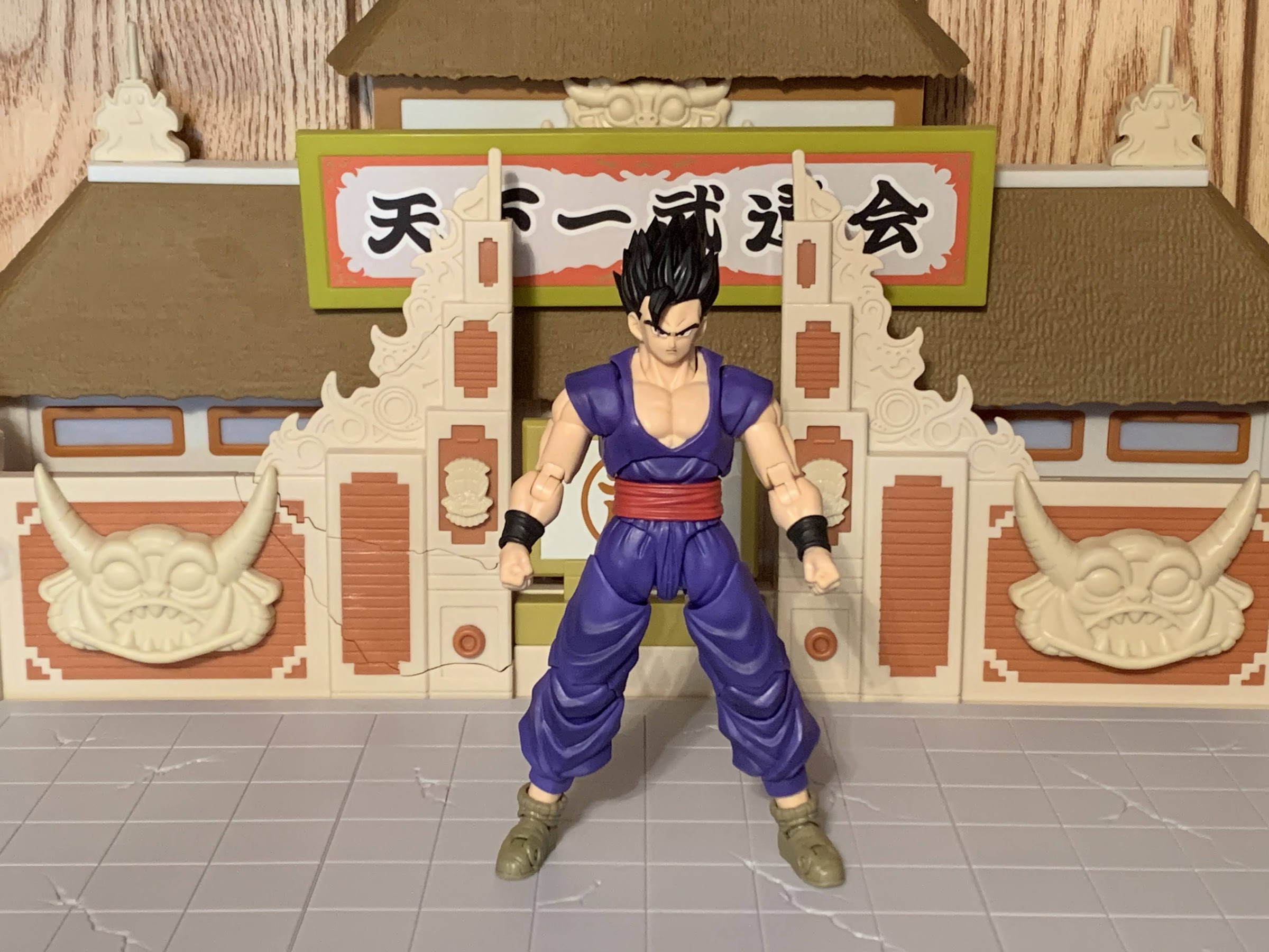
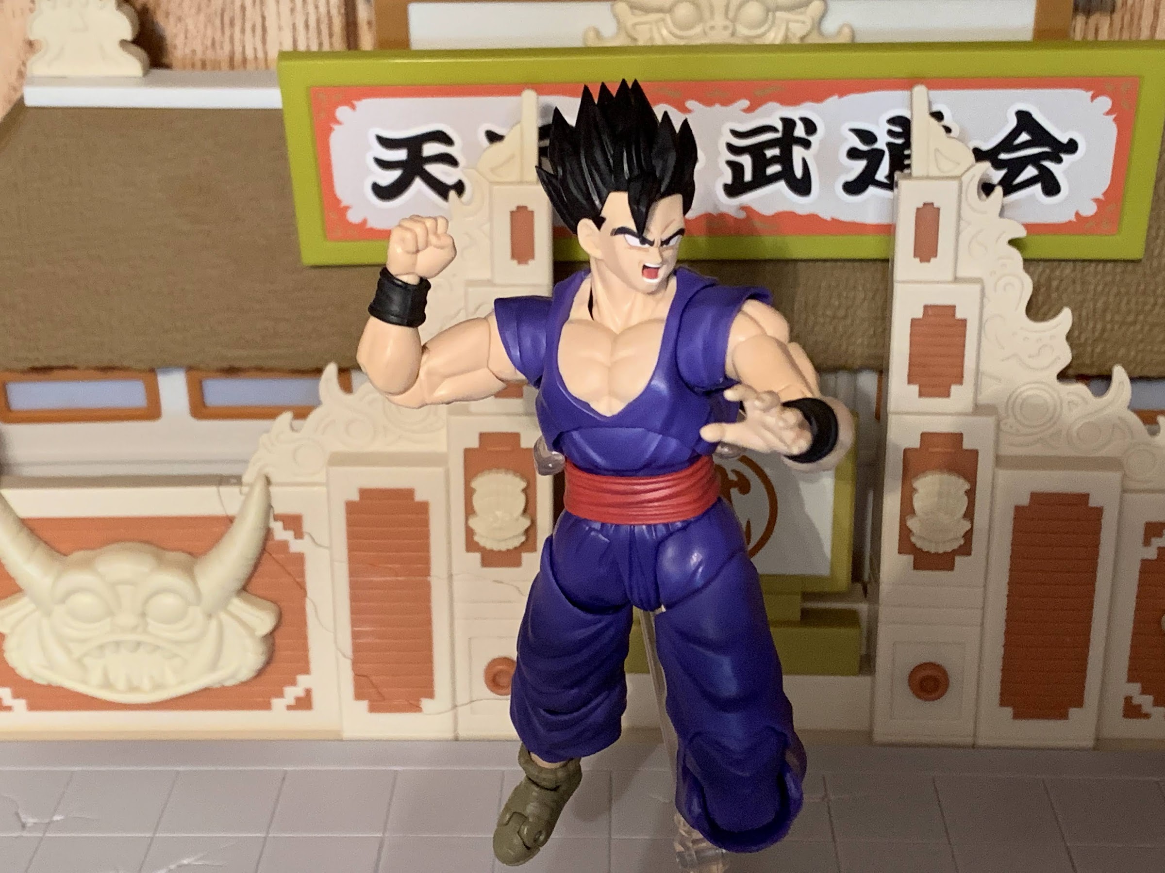
Gohan comes in the usual window box and should look fairly routine from outside the box. Once removed, he stands just shy of 5.5″ to the top of his face, closer to 6.5″ if you want to go to the top of the hair. Gohan from the movie is depicted in his classic Piccolo training uniform. It’s a purple gi with red sash and he has the big, chunky, shoes he and Piccolo both feature in the movie. He basically only distinguishes himself from Piccolo via his black wriststraps. He’s in his “Ultimate” form which was his ascended form he learned from the Elder Kai during the Buu Saga. It’s basically Gohan’s ultimate form, hence the name, though it doesn’t come with a flashy transformation. If anything, he just has slightly bigger, spikier, hair. He’s also jacked and that comes through in the sculpt. It’s an interesting juxtaposition to Goku who keeps going through all of these different forms and hair colors to get more powerful, but his kid just bulks up a bit. I kind of like that about Gohan, though he has his own wild transformations too.
The new style for the shoulder joints can be a bit finicky to work with, but the reward is that they look so much better than the old style with the sleeve cuff pegged into the shoulder itself.
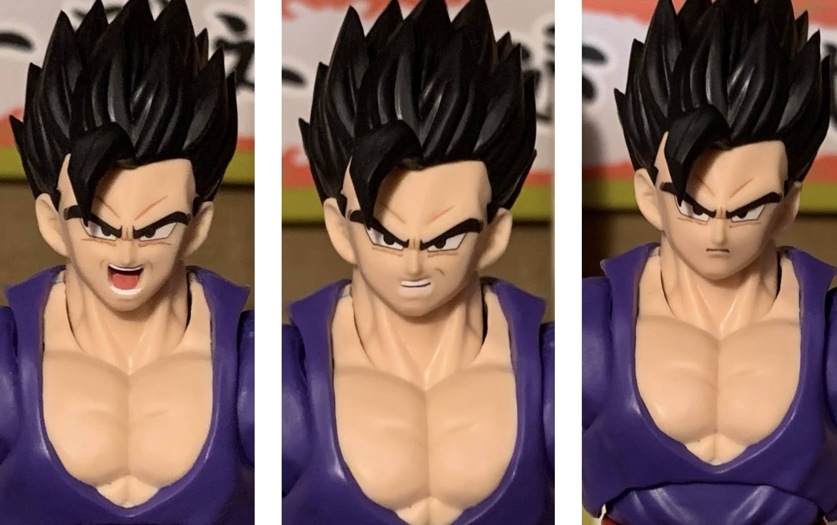
Like most figures in this line, Gohan is largely composed of molded, colored, plastic which minimizes the need for paint. I suppose “need” is a strong word and certainly a subjective one as many (myself included) would like to see more paint on these releases. It’s much harder to criticize them for that though at this lower price point. With Gohan, there appears to be a hint of shading on the legs, which they like to do for some reason. It’s not as visible with Gohan as it is with Goku and his orange gi, which almost works out better for Gohan. It adds just a touch of depth and comes across well. It’s also helped by the fact that the purple is quite matte on this figure giving him a nice finish. The chest is painted and it’s not a perfect match to the neck and arms. The chest has a matte appearance, while there is a touch of shine on the neck, but it’s not awful. The red sash is a separate, floating, piece though it is rather snug on the figure. It may cause some paint transfer if you’re not careful. Lastly though, the faces for this figure look terrific. I don’t know what Bandai did to improve their facial printing, but keep it up. The previous Goku figure looked nice, but Gohan is even better. These faces all look fantastic and it really brings the figure to life. The hair also looks nice and it’s even tricky to figure out where the seem is to remove the bangs because the fit is so good. The only blemish is a bit of mold release, roughness, on the side of the hair. It’s not very noticeable from a shelf, but it does kind of suck and I considered trying to exchange it, but opted not to. Aside from that though, I think this figure looks wonderful.
On one foot with not assistance, and on the flimsy plastic of the arena playset at that.
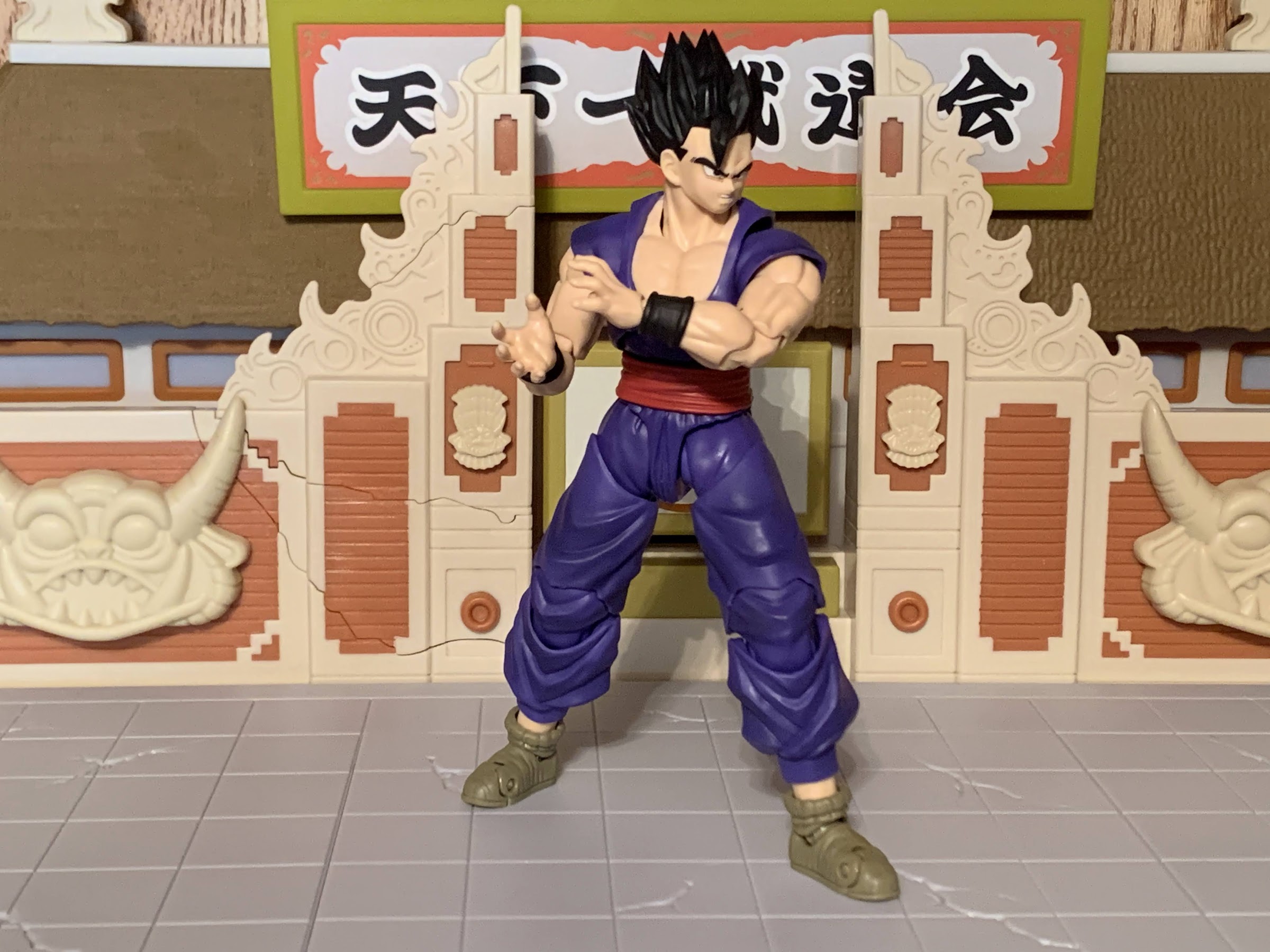
Adding to my enjoyment is the articulation. I’ve been a little critical of the various Goku figures as I acquire more of them because that figure has some limitations and some features that are a bit of an eyesore. This figure doesn’t solve every problem that Goku has, but it comes close. The head is on a double-ball peg with another ball joint at the base of the neck. He can move around nice and smooth and there’s great nuance posing afforded by this setup. It’s only weakness it he can’t look up very well so if you wanted to position him in a flying pose parallel with the ground it would look awkward. The shoulders have a newer style of joint similar to what Krillin has which means theres no pegged in shoulder piece to look stupid. The sleeve is just a floating piece the arms goes through and it pegs into a ball and hinge style of joint inside the torso. The end result is you get some up and down movement at just the shoulder before even engaging the hinge which allows the arms to be raised out. You do have to work with the sleeve to get them horizontal, but it’s do-able. There is still a butterfly joint and that may be the only limitation here as he doesn’t seem to reach across quite as far as Goku. A Kamehameha pose is still possible, but a little less natural looking. The rear of the joint is cleaner, though there will still be angles where it looks unsightly. The joint is all cast in purple though so at least it doesn’t look as ridiculous as Goku’s where the interior is flesh-toned. The rest of the arms are typical stuff with a biceps swivel, double-jointed elbow that goes well past 90 degrees, and ball-peg wrists.
This one needs a stand though.
In the torso, we get a ball-joint at the diaphragm. There is no hinge in there to lift the upper torso higher which seems cleaner, but the figure also doesn’t have much range forward and back. He can pivot a bit on the joint as well. Below that is a waist twist which feels like a ball-peg of some kind. It mostly lets him twist, but you do get some nuance posing out of it as well. At the hips, we have some kind of a ball-joint that works very well. Gohan can achieve full splits and kick forward plenty far, though can’t kick back because he does have sculpted cheeks. There’s a thigh twist below that which is very smooth and the double-jointed knees both look and function well. At the boot, there’s a swivel and the feet are ball pegs. They don’t have much range going forward and back due to the cuffs on the shoes, but the rocker works okay. There’s also a toe hinge if you like those.
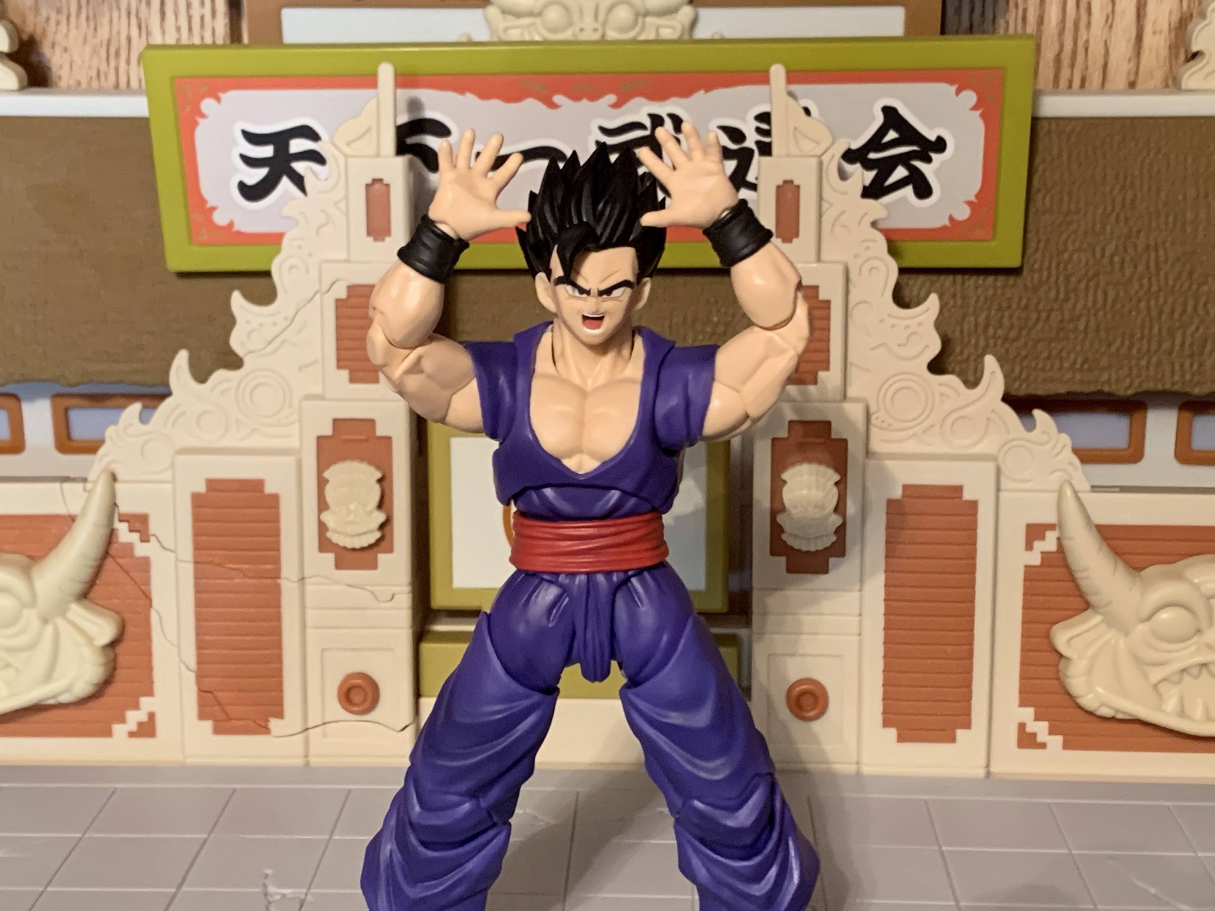
The Masenko pose is a bit tricky. Anything that requires the figure to raise its arms above the shoulder is tough because of the shirt piece.
Most importantly, all of the articulation is really smooth. No stuck joints, no uncomfortable creeking or squeeking noises, and it’s all very visually appealing. That may not sit as well with some other folks as I can see some wishing Bandai sacrificed some of the form to get better range in places. The torso feels like the biggest issue as we could probably get a better ab crunch in there. The ankles also aren’t great, but I think that’s partly due to the character design and the shoes present. The shoulders still aren’t perfect, but I think they look much better this way and I’ll take the reduced range there for this visual. I would definitely be interested in seeing a new Goku on this body, though I don’t know what version (I did order the Super Saiyan 2 Goku, but it’s on the usual buck). Maybe a brand new Super Saiyan 3 or “Awakening Super Saiyan” Goku?
He can do a reasonable Kamehameha pose though.
Fire away, Gohan!
This is a bit of a budget release, but there are still some accessories to talk about. Unfortunately, they’re not particularly exciting. Gohan just comes with some extra hands and face plates. For faces, he has a stern expression, teeth-gritting, and a yelling one. For hands, we get fists out of the box plus Kamehameha hands, martial arts pose hands, and a set of open “Masenko” hands. That’s it. It’s expected given the price point, but still disappointing to only get a conventional spread of hands plus three facial expressions. An effect part would have been welcomed and, honestly, adds mere pennies to the cost. How about the Super Saiyan 4 Goku blast effect, but in yellow or blue? Just something to put in his hands for a Masenko effect, though his shoulders aren’t really made for the charging effect so maybe it’s better not to draw attention to that via an effect?
Bandai is really killing it lately with the faces.
If this is the new, standard, body going forward for Bandai then I think it’s pretty good. It could be better, but I think we’ll get a lot of nice looking figures out of this. And even though there are some short-comings, I still love this releasae. And I don’t even consider myself a fan of Gohan. Nothing against him, I don’t actively dislike the character, he’s just not my favorite. This figure though is one of my favorites in the line and I’ve been having a blast with him just posing and fiddling with him on my desk while he waits for me to write this review. And maybe that’s partly what took me so long as I drew out the process. He’s going to head for the shelf soon and join his buddies, but I am definitely looking forward to getting those extra parts with the Gamma brothers so I have an excuse to mess with this one again. If you thought you didn’t need it for one reason or another, I must encourage you to rethink that. And at 40 bucks, this feels like quite the steal. This figure is way better than the Apocalypse I reviewed recently, a figure I did ultimately like, and it costs the same. While lesser companies are getting more expensive, Bandai is actually getting cheaper and that’s awesome. Keep it up!
I wasn’t sold on him initially, but I’m pretty happy to have added Gohan to the shelf.
In the late 1980s the arcade scene in the US was still going strong. Classic style arcade games like Donkey Kong and Pac-Man were being overtaken by a new genre of quarter-munching pain: the brawler. Or the beat-em-up. If you’ve played one, then you can picture what I’m talking about. It was usually a one to four player experience where each player would take control of an avatar and battle hordes of enemies all while gradually moving to the right with the goal to reach a boss encounter by the end. These games were often very simple, usually requiring just two buttons and a joystick, and most all played the same: you punch, you jump, you unleash a special move that consumes a portion of your health, and you die. A lot. Most games required the player to pump in another quarter upon a final death, usually giving them 10 seconds to do so, which would allow the player to re-spawn immediately. This made completing the game quite manageable, provided one had enough quarters because these games were designed to beat the player down. There was often just too many enemies onscreen for even the most accomplished player to dispatch in a flawless fashion. The character the player controlled just wasn’t equipped with enough maneuvers to avoid hits while simultaneously dishing out punishment. Plus, the games weren’t above getting cheap by having players get attacked by unseen enemies or by having boss characters just shrug off all damage. Actually having a story and an ending made them unique at the time since the goal wasn’t to just play as long as possible and get the highest score, which also made them addicting. Yeah, I want to see the X-Men defeat Mangeto, I need to know if the Simpson family rescues Maggie, and I have enough money to do it!
One of the developers who best exemplefied excellence in the field of the beat-em-up was Konami, and two of their biggest hits belonged to the Teenage Mutant Ninja Turtles. The other part of this genre that appealed to players was they looked lovely. As video game technology advanced rapidly in the 80s, the home consoles could not keep up with the arcade. That’s why it was the arcade where you could find a brawler with beautiful, large, sprites that truly resembled what they were supposed to. It made this genre a magnet for licensed properties and developers could even sneak in some soundbites if the property was from television or a movie. And for a franchise like TMNT, it made creating a game that actually looked like the mega popular cartoon show a feasible thing. The home Teenage Mutant Ninja Turtles for the Nintendo Entertainment System sort of looked like the property. I knew I was looking at the turtles when I played it, even if they didn’t exactly look like the characters from the show. And the enemies were pretty damn confusing as well, and not always for technological reasons. With the arcade game that released the same year, there was none of that. It felt like playing an episode of the show and was a delight to my kid-brain. My strongest memory of that title was playing it at my cousin’s birthday party which was held at a roller skating rink. We were there, confronting Shredder, after spending who knows how many quarters to get there, when a kid who had been watching for most of the time accidentally stepped on the power cord. My cousin, the birthday boy, went ballistic on the poor kid while my aunt tried to calm him down. At the time, I was initially disappointed to not see the end of the game, but I think I felt worse for the kid. My aunt had been trying to corral us anyway for cake and ice cream so she wasn’t disappointed. Maybe she actually did it and blamed the kid!
The heroes in a half-shell are back in a fun, sleek, retro package!
That initial offering from Konami looked great, and the pacing was a lot of fun, but it was very much a basic game design. When the developer came back for the sequel, Turtles in Time, it did more than just put a shine on the experience. Special moves were added, the kind that take away health to execute, and some additional maneuvers were added to freshen up the experience. By far, the biggest new addition, and the flashiest, was the ability for the player to toss enemies at the screen which was highlighted during the attract mode setting and certainly worked to get attention. And when that game was brought to the Super Nintendo, it was a near perfect port. Some animations and sound clips had to be removed, but the game made up for it by adding new boss encounters and levels making it the superior experience. And it was beatable at home, with the ability to adjust the amount of lives players had and toggle the game’s difficulty. It was a terrific experience for kids in the early 90s into the franchise and it’s a shared experience for men my age (and probably a fair amount of women too) and one most remember quite fondly.
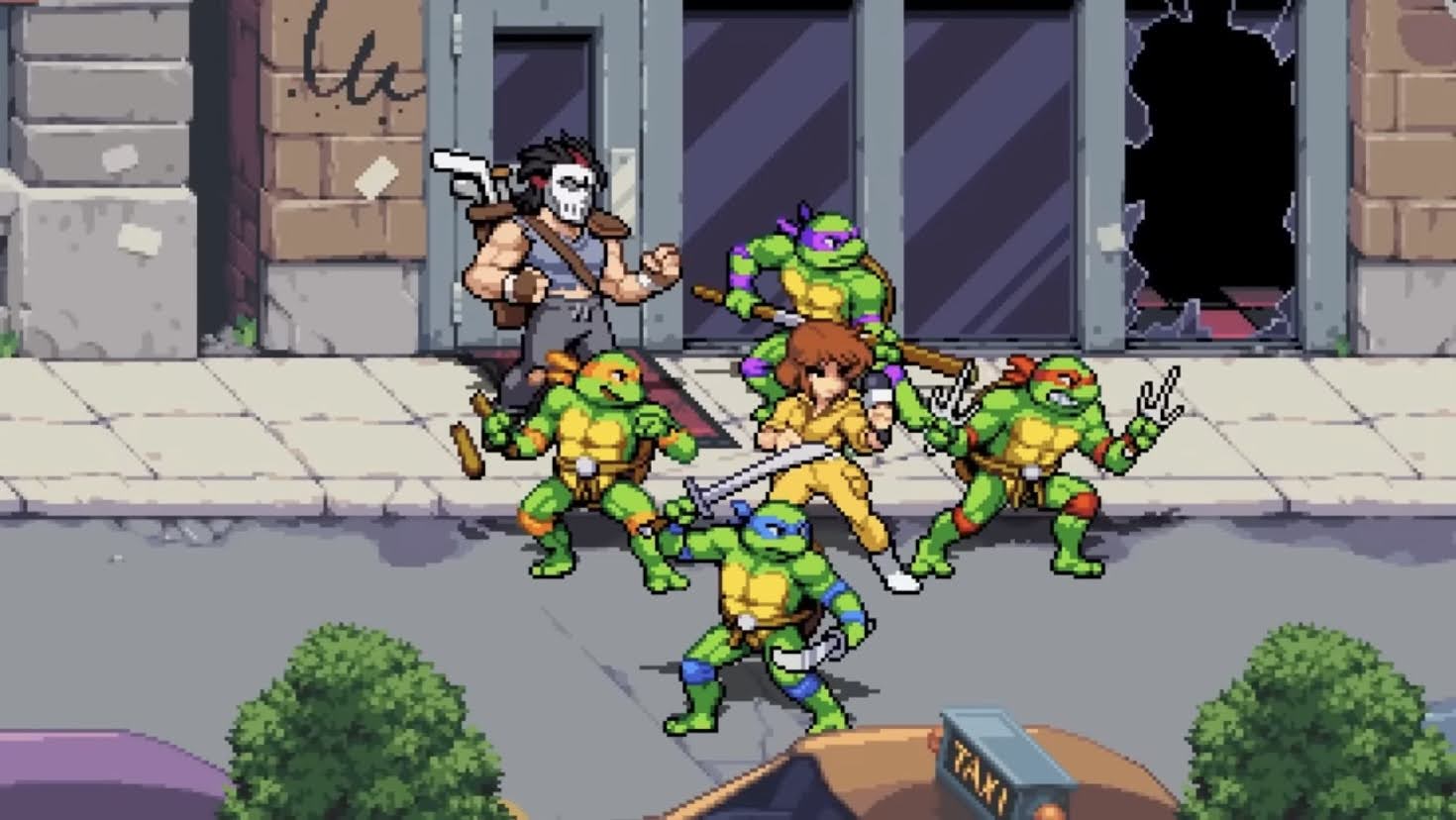
Because of the popularity of those two games, developer Tribute Games returned to it for 2022 with Shredder’s Revenge. The turtles never actually left the brawler genre, more were made into the 2000s including a re-make of Turtles in Time, but none managed to capture the attention of fans like Turtles in Time did. Tribute seemed hell-bent on changing that as Shredder’s Revenge was revealed well ahead of the launch and it was immediately clear that the game was after adults who grew up with those old school games. It’s a 2D, sprite-based, brawler that incorporates a lot of what Turtles in Time did, plus it adds a dash of something new. Yes, it’s still limited by its genre and it’s not out to reinvent the wheel or reexamine what this genre is capable of, but it does provide for some depth. Mostly, it’s designed to take players on a trip through an enhanced episode of the classic cartoon series and returns the original voice cast for the turtles. And because we’re now in the year 2022, the experience has been enhanced to include up to 6 players either via the couch or online and it’s no longer limited to those who own a Super Nintendo.
This time, you and five of your friends can take it to Shredder all at the same time.
Shredder’s Revenge presents two main game modes out of the gate: Story and Arcade. Story mode is self-explanatory, while Arcade is basically just the story mode without the interludes and map and is intended to be more challenging. From the get-go, players have access to six playable characters: the four turtles (Leonardo, Michelangelo, Donatello, and Raphael) plus their master, Splitner, and main ally April O’Neil. All of the characters differentiate themselves via three attributes: Range, Speed, and Power. Leonardo is intended to be the most balanced, while the other characters all lean towards something such as Donatello having the best range and Raph hitting the hardest. The characters also handle slightly differently with Mikey being able to bounce off of foes while Leonardo has a wide-ranging jump attack. As you progress through story mode, characters earn experience and progressively get better via enhancements to their special move so it pays to replay with different characters.
Yes, you can still throw Foot Soldiers at the screen.
The actual gameplay should feel rather familiar to those who played Turtles in Time. The face buttons on the controller all do something different with one being attack, jump, parry, and special. Special moves no longer consume health and instead have their own meter that gradually fills as you dish out damage. Most special moves are designed to clear the screen, or at least a portion of it, and are best used when undier siege by a lot of enemies. As characters accumulate experience, the special move meter expands and a special dive attack can be unlocked as well as a ninja master mode that’s like a temporary buff in place of just one, singular, attack. Jumping and attacking the standard way should feel pretty familiar as well, while the parry button is where the backflip is basically mapped to now. Players can also still grab enemies by simply walking into them which opens up the bash attack where the player slams the enemy to either side in a comical fashion and the screen-toss is still present, and just like the SNES game, plays a role in one boss encounter. There’s also a taunt button which allows the player to earn special move power without fighting and in co-op mode there’s a button dedicated to assisting allies via a high-five which transfers health from one player to the other. Each player has a set amount of lives at the beginning, but beating back enemies can earn extra lives. Pizzas still restore health and are scattered about the levels and new to this game is a massive pie that will restore the health of all active player characters, so no fighting over that one. There’s also still power-up pizzas which make the player momentarily invincible and places them in a spinning attack to smack away all foes. There’s also a new one that just enables the player to spam their special move too. In short, it’s all rather familiar, but there’s enough new wrinkles to please old school fans and nothing added breaks or ruins the experience. It’s all for the better.
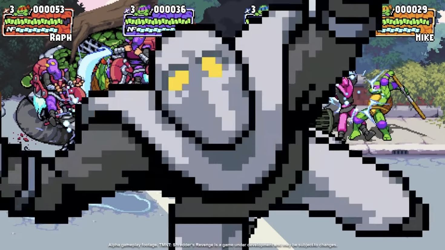
As was the case in past games, boss characters tend to be presented oversized relative to their toon counterpart.
Where the game really shines is in the presentation. There’s a great intro done in a hand-drawn style with a new arrangement of the theme song (sung by Faith No More’s Mike Patton) to accompany it and really set the mood. The sprite work is bright and vibrant, and while the characters seem a little small relative to their environment in this one, it all fits well on the screen. The art style is obviously based on the cartoon, but it also has it’s own thing going for it. Foot Soldiers have more of a squat appearance with oversized heads while the sizing on the boss characters fluctuates quite wildly. Bebop and Rocksteady are huge, while Rat King is fairly petite. All of the enemy deisgns are also based on the show, so you’ll see Triceratons that look removed from their lone experience and Slash has his very toon specific look. All of the bosses from Turtles in Time return for this one, but there’s also some new ones that I won’t spoil. I would consider at least one a true deep cut from the show, but if you’re as into collecting NECA’s action figures as I am then none will appear that deep. You also get the returning cast from the show so you have Cam Clarke (Leonardo, Rocksteady), Rob Paulsen (Raphael), Barry Gordon (Donatello, Bebop) and Townsend Coleman (Michelangelo, Rat King, Rahzar). Unfortunately, they’re the only ones brought back so someone like Pat Fraley is missed, but if you’re only going to bring back four cast members from the show at least it’s the turtles. Most of the characters are one and done battles, but like the original game, you’ll chase Bebop and Rocksteady around a bit. Levels in story mode are laid out on a map of New York that are accessed by driving the Turtle Van around which feels like a nod to the original NES game, though you never get to drive the van in a level which feels like a missed opportunity. There are still surfing and hoverboard levels, and in story mode there are collectibles scattered across levels that can be uncovered for an experience bonus, but they’re not very compelling. The story itself is also mostly non-existant and of little importance. Shredder is still interested in the Statue of Liberty for some reason and most of the game involves the turtles trying to prevent the bad guys from re-assembling Krang’s body.
Story mode will probably only take you a few hours to complete, but there are additional challenges that can keep you coming back for a little while.
Completing all of the levels in story mode will unlock one additional character: Casey Jones. Depending on who you beat the game with will also influence the ending you receive in a small way so there is some encouragement to replay the mode with different characters. Not only will they get stronger, but you’ll get a little bonus postscript for the ending. You can also replay any level at any time throughout story mode and the game will keep track of what you accomplished, or did not, for each one. There are cameos hidden throughout the game in addition to other collectibles. None of them are particularly difficult to find, it just requires the player to bash away at all destructable objects in a given level. There are also additional challenges for each one that range in difficulty. Some will require the player to just avoid a certain obstacle or maneuver an enemy in the level posseses, while others just task you with not taking damage. The difficulty can be toggled as well and playing on the normal setting presents a modest challenge. I haven’t tackled the game on hard yet, and I don’t know when I will since I tend to play with my kids, but I will probably try it at some point.
Shredder’s Revenge is available on all of the major consoles out there. It was first made available digitally, but physical copies have been made availble via Limited Run Games. There’s a standard version available now which is how I purchased the game for the Nintendo Switch, but more robust collector versions were also available. While it was tempting to go for the version that came in a VHS styled box, I ultimately didn’t want to pay the extra money or endure the longer wait to get it. All physical versions come with a Pizza Hut coupon like the NES version of the arcade game back in the day, which is certainly a fun inclusion that I assume most owners would prefer to keep over actually exchanging it for a personal pan pizza. And that inlcudes me. All physical versions also come with a fairly robust manual and some stickers which is pretty cool. As for the Switch version, the performance is great. I didn’t notice any slowdown or frame rate hiccups and it was easy to add players to the mix. I haven’t tried it online, but I hope to whenever my buddy who did go for one of the fancier packages finally gets his.
It’s pretty cool to have these guys back in my game console.
I don’t want to oversell Shredder’s Revenge. It is, at its heart, a humble beat-em-up that doesn’t require numerous amounts of quarters to get through. It is a fun experience though and is especially so for those who grew up on Teenage Mutant Ninja Turtles and the games from Konami. And even if you didn’t, my son is proof that it can appeal to the kids of today as well as he’s had his nose buried deep in this one since I got it despite us beating it in a mere two play sessions. It doesn’t do anything to elevate the genre, but it does do enough that I feel it’s easily the best beat-em-up I’ve ever played. There’s enough variety in the characters to make it worthwhile to experiment with them all and the player has enough control over the characters to make it possible to actually get really good at the game. Turtles in Time had some of that going for it, but mostly getting good at that game just involved managing the amount of enemies on screen in the most economical fashion possible and knowing when it wasn’t worth it to try and damage a boss. Some of the bosses in Shredder’s Revenge can feel a tad cheap at times, but for the most part, it’s also easy to see how to tackle each one and for the most part it’s pretty fun too. I think I only dislike one boss fight, Rat King, as it’s just too long and mostly involves the player dodging swarms of rats. Other than that, the other fights are fine and there’s a fair amount of variety in the encounters as well. I don’t think I’ll sink 60 hours into this game or anything, but it’s a good time and I feel motivated to at least power up all of the playable characters. If you grew up on this stuff, then this game is a no-brainer.
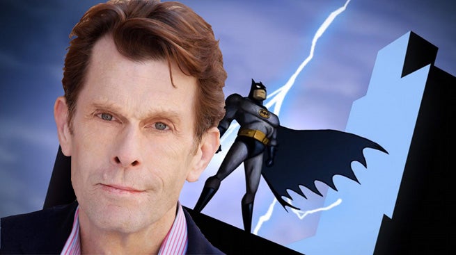
My first Batman growing up was Adam West. He was a wonderful Batman and I enjoyed watching him with my family on television. That version of the character is considered a joke in this day and age, but there was a ton of charm to him and it’s important to remember it was supposed to be a funny, light-hearted, show that didn’t take itself seriously. He was perfect for that. Michael Keaton would be my second Batman and he was a total 180 when compared with the West take. Brooding, menacing, and even lethal, the Batman of the Tim Burton movies was more beast than man at times. It’s a unique take just as much as the West version and there’s room for both interpretations. My third Batman was of the faceless kind because he existed in animation. I would come home from school and settle in for an afternoon of cartoons and the highlight was going to be Batman: The Animated Series. I loved that Batman and he quickly became my favorite version of the character. He had that strong, silent, vibe of the Keaton Batman, but he was also compassionate. He seemed to care about the villains he was forced to do battle with and wanted what was best for them, even if they caused him great pain in the moment. He was simple and direct with his words, but nevertheless captivating. I hung on every word the character spoke and it was delivered with a genuine gravitas that never felt forced. As a kid, I didn’t even know who was responsible for this version of the character. And with any role, the real answer is it’s a combination of people, but the one who set the tone was the man responsible for his voice. That man was Kevin Conroy, whom we tragically lost to cancer just now.
I don’t normally make these types of posts. My blog is not a spur of the moment type. It’s not a diary. It’s mostly reviews of things I find inherently nostalgic, but Kevin Conroy felt like the type of subject that needed to be addressed in the moment. Kevin Conroy was Batman. He will always be the first person I think of when I hear the name Batman. It’s his voice I hear in my head whenever I read a line of dialogue from the character, whether the comic I’m reading from is 2 weeks old or 40 years old. Mask of the Phantasm is my favorite Batman movie and it’s hard to imagine it ever being topped. A lot of people deserve credit for making the show and films so wonderful, but it’s very easy to put a lot of that credit on the shoulders of Kevin Conroy. And to add to it, Conroy was, by all acconts, a wonderful human being. His co-stars speak glowling of him, not just in tributes upon his death, but at seemingly every chance on the convention circuit or in any kind of retrospective on the character. He was a gay man, and his contribution to DC’s Pride series was a beautiful tribute to the character and what it meant for him to play what is essentially a closeted character. And for Bruce Wayne, that secret is quite litereally the costume in his closet.
The character of Batman will have more voices and it’s a character that will outlive us all. There’s no replacing Kevin. He is and will forever be Batman for millions of kids turned adults and millions more who are exposed to the wonderful Batman: The Animated Series. Today feels like the world suffered a terrible loss, and it did, but I’m at least comforted in knowing that Kevin Conroy will live forever as Batman. Rest in peace.
The big, bad, alien, turtle is here to kick some ass!
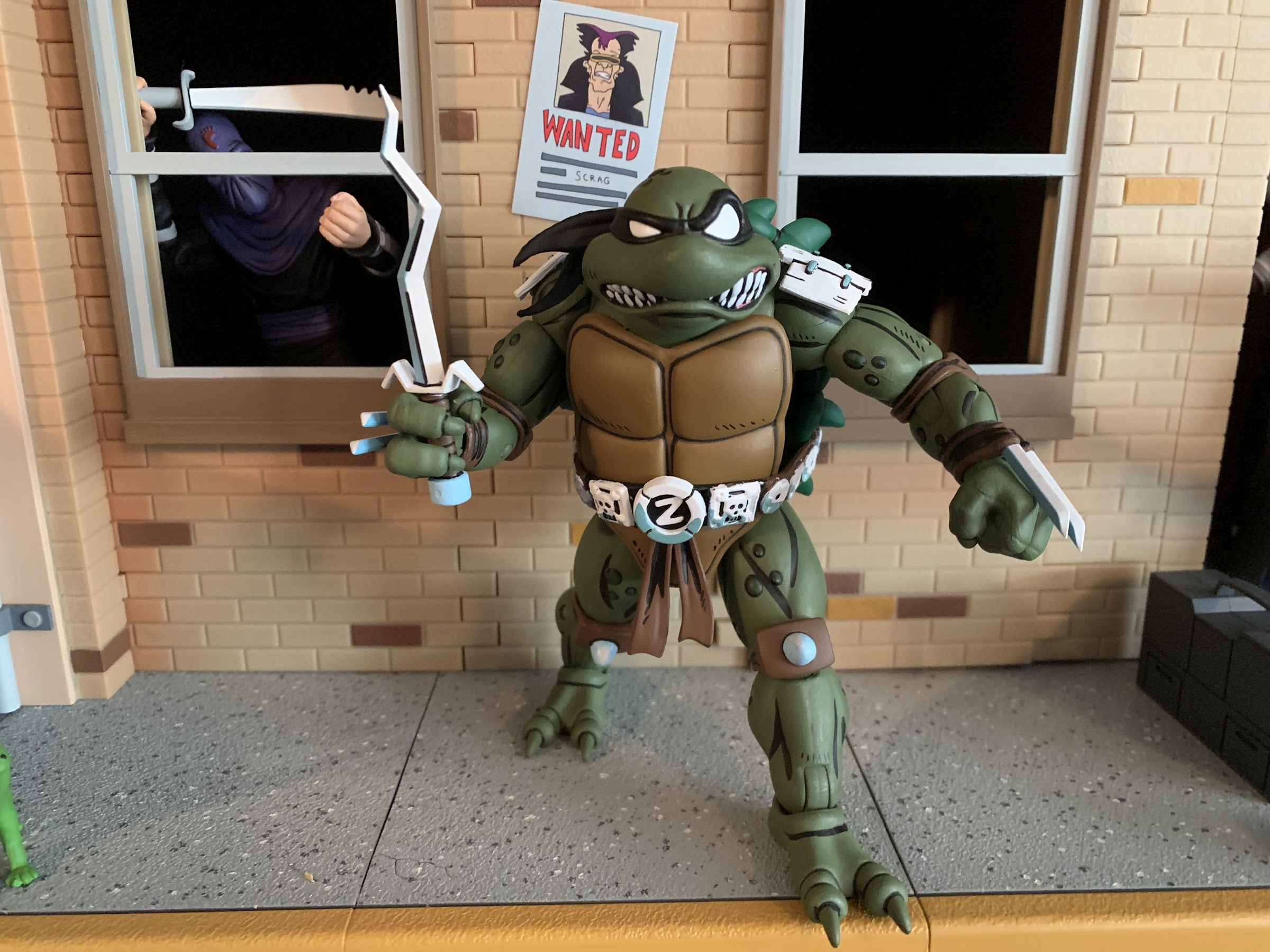
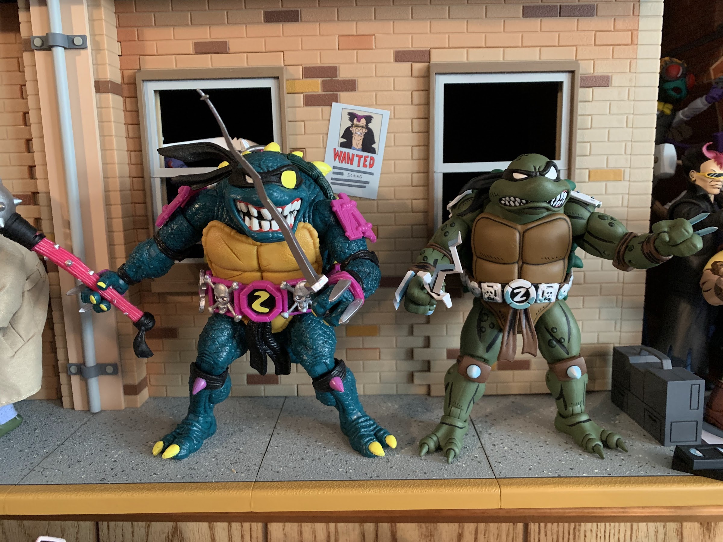
As NECA continues to find success with its Teenage Mutant Ninja Turtles lines of action figures, the company has sought to branch out beyond the usual source material in an effort to give collectors more of what they want and also likely to just keep the hype train rolling. NECA started first with doing figures based on the original comic appearance of the turtles in the Mirage Studios series which has lead to video game, movie, and cartoon adaptations. The cartoon is, by far, the most popular and successful it would seem and a natural complement to that television show is the line of comics released by Archie while the show was in production titled Teenage Mutant Ninja Turtles Adventures. These comics started off as adaptations of the show, but soon went their own way. It’s through this comic that many characters fans would come to enjoy in both the Playmates toyline and the show actually originated. One of the most popular characters to debut in this fashion has been the sometimes evil mutant, sometimes alien, turtle Slash!
Slash is someone we’ve talked about recently as Super7 just sent out their take on the beastly snapping turtle. That figure is based on the Playmates release which really honed in on Slash’s debut where he was more bad guy than good. It likely made sense to someone in marketing to basically have an anti-ninja turtle in the ranks of the bad guys and that toy set the stage for the character’s introduction in the show, even though toon Slash would end up being quite different as far as temperament goes. Slash as he was presented in the comics was a little more nuanced. His home world was destroyed by industrialists which essentially sent him into a frenzy that landed him in an intergalactic prison of sorts where he befriended Krang. Not really knowing how evil Krang was, Slash helped him and was introduced as a villain to the Teenage Mutant Ninja Turtles, but he’d eventually come to realize that Krang was no friend of his and was taken in by the Mighty Mutanimals which basically made him a good guy. A lot of other takes on the character seem to have followed suit where Slash will start off as an adversary before becoming more ambiguous and even heroic. His debut was in an issue of the series written by Stephen Murphy, though I can’t find a credit for who actually created the character, but many on the Archie staff were unhappy with how the Mutanimals characters were treated when brought over to the cartoon and I assume Slash was no exception.
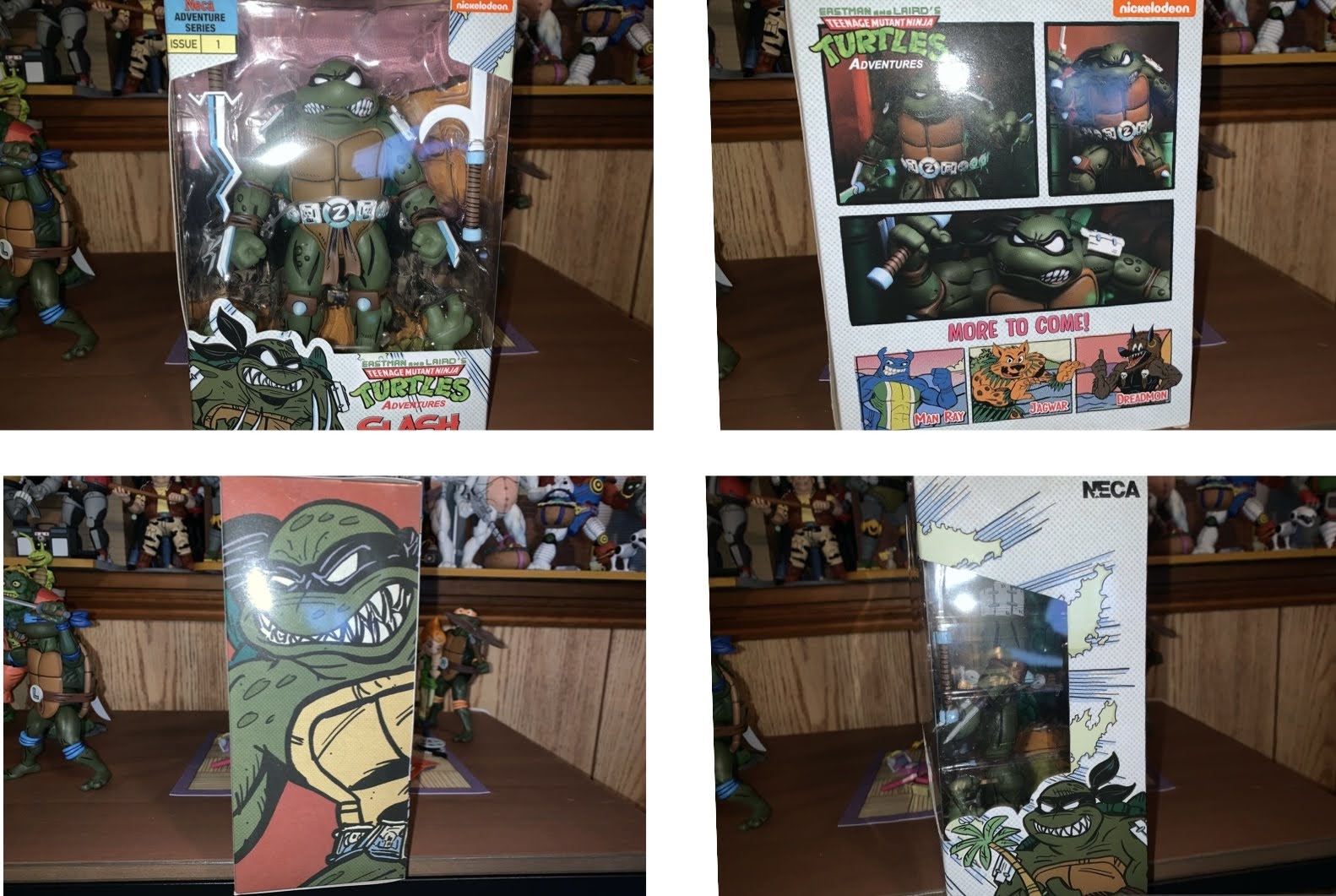
Per usual, NECA went all out with the artwork on the box hiring former TMNT Adventures artist Kevin Mitchroney to handle things.
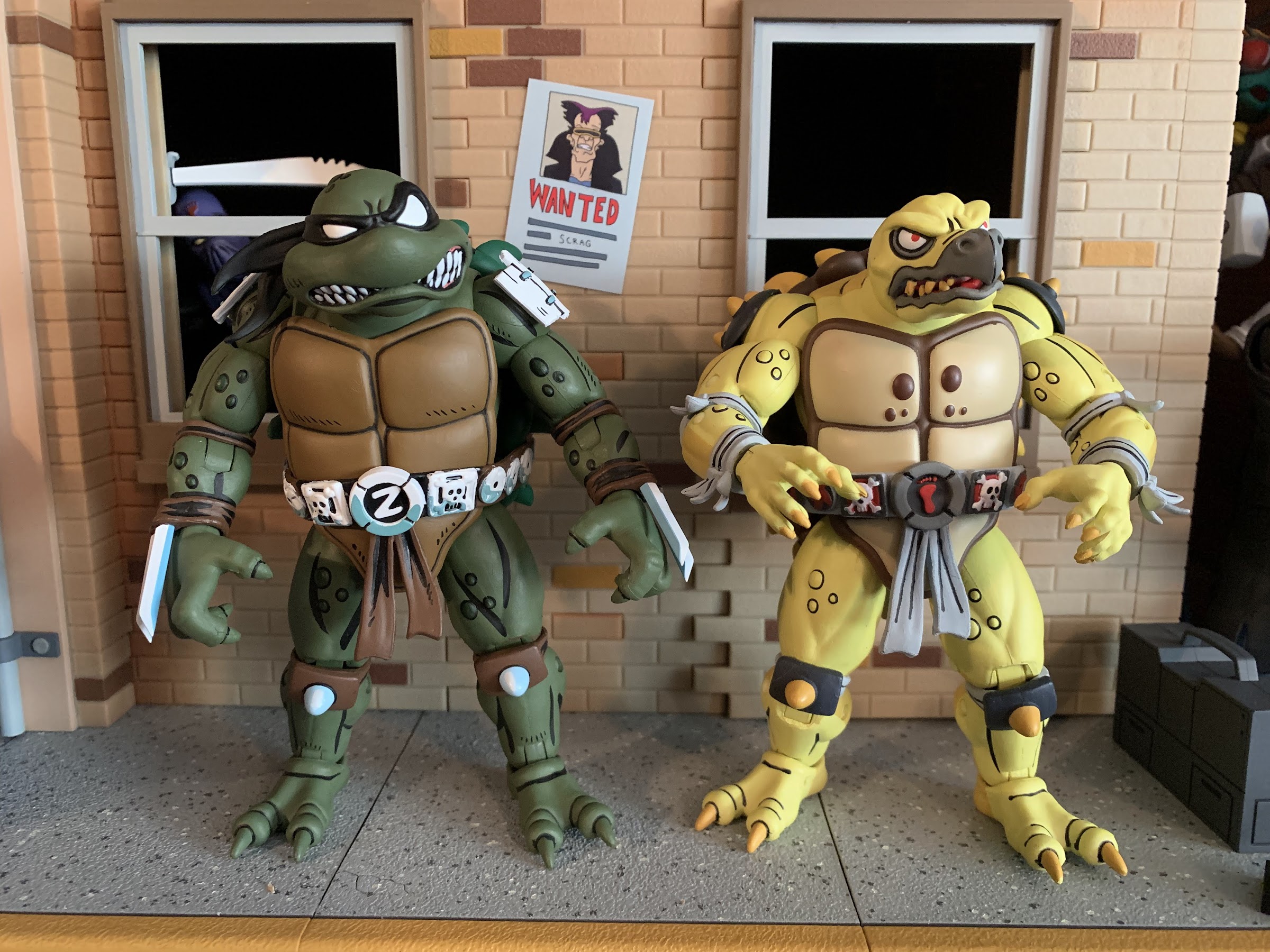
Slash, being a popular character within the fanbase, makes some sense as NECA’s debut in the Archie universe. They have done two versions of the character already, one for the video game and one for the cartoon, but both utilized the standard ninja turtle mold. I like both interpretations of the character, but my main criticism with each release was that Slash was too small. He doesn’t necessarily need to be taller than the turtles, but he should have more mass. NECA seems to have heard that criticism from the fanbase as this version of Slash is on the newer Tokka base body. It’s amusing to me because in the vintage Playmates line, Tokka was basically a repurposed Slash so the cycle is complete! This body though gives Slash that thicker, more physically imposing, appearance that I think fans wanted from the other figures. TMNT brand director for NECA, Trevor Zammit, has even indicated they may redo the cartoon version on this body. They have been saying similar things about April for awhile too so I certainly wouldn’t hold your breath, but as the toon line gets further into deep cut territory it wouldn’t shock me to see a fan favorite like Slash revisited once again.
This figure shares most of its anatomy with the previously released Tokka.
Since this is the first in a new subline from NECA, we should talk a little about the box. It’s in the same shape as the Fugitoid and Loot Crate Claw Shredder packaging which is that of a trapezoid and features a window display on the front with artwork on the sides and product shots on the rear. All of the art is done by former Archie artist Kevin Mitchroney who also previously worked on the San Diego Comic Con exclusive carrying case from a few years back. It’s great to see NECA continue to seek out an authentic artist for these lines as it really does add to the presentation. Of course, ultimately the box is just trash that houses the action figure and mine has been ripped open, but I still think the box is pretty cool. Slash comes on a plastic tray that is easily removed from the box, if you want to preserve it, and the backdrop is that of his home world, if I’m not mistaken. Possibly my biggest pet peeve with this release starts here as every limb and accessory for this guy is held down by an annoying, plastic, tie-down. I hate these things so much because you have to pull on them to stretch them and then snip. You can try to rip past them, and I ended up doing that for the optional hands, but these little things get everywhere and leave your fingers sore. You also can’t do the rip technique for anything painted, which for a NECA figure is almost everything, as that could damage the paint. I find the tie-downs unnecessary as the bubble is plenty strong enough to keep the figure in place, but maybe it’s extra reinforcement to appease mint-in-box collectors, but screw them! NECA, please, ditch these things!
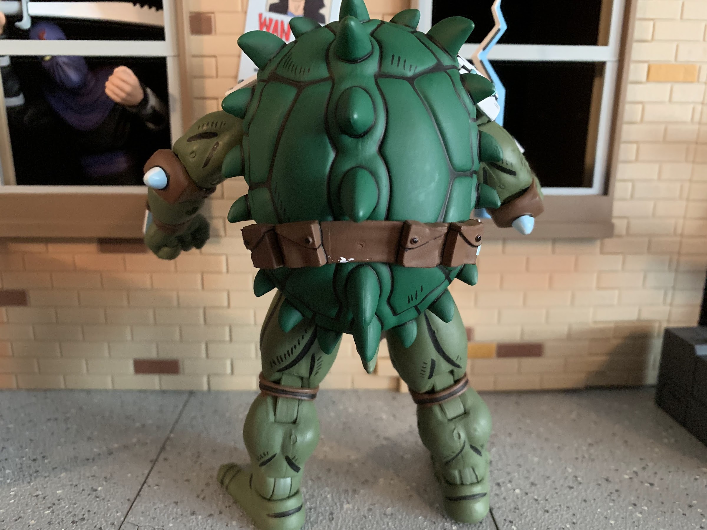
One thing NECA had to re-sculpt for Slash is the shell, which is a bit more vicious looking than Tokka’s. Note the unfortunate white blob of paint on the belt of my figure.
And speaking of unfortunate paint apps, paint rub might be a universal issue with this release.
With that out of the way, lets actually talk about the figure. Slash when standing upright is about 5.875″ tall. He is one of those characters that’s a bit hunched forward so he’s never as tall as he could be. He seems to scale well with the toon turtles, and I’m assuming if they do Archie turtles they’ll be the same height, and that promised mass is certainly on display out of the box. He is just a chunky boy. Most of the figure is cast in a muted green, but then painted over, to give him a matte finish. He has some black linework on his muscle lines and the plastron which helps the figure to pop. The warts on his skin are done in a darker green and the plastron brown. On the back, his shell is cast in a much richer green and features a lot of that linework featured elsewhere. It’s also on his belt, and the metallic portions are painted white with a hit of blue shading which gives him a very comic-like appearance. There’s no panel shading so the approach here is definitely similar to the Mirage line. As for the new sculpt, the new parts are the plastron, hands, shell, and obviously the head. I love this expression Slash is sporting with one eyebrow raised and his sharp teeth all on display. The paint on his head is really clean and: Look! – painted shoulder pauldrons! His trademarked blades are also quite pointy and a little sharp and if I have one critique with the sculpt it’s that I wish they were longer like they are on the box art. In terms of presentation issues, it’s basically just paint imperfections here and there. There’s a small blob of white on the back of the belt that I might try to remove and there’s a couple of rough spots. One is on the edge of the plastron above his right pectoral and the paint is pretty choppy around the thigh joint on the rear of the leg. There’s also a bit of paint transfer around the the knees on mine from the kneepad to the thigh. That joint was also stuck out of the box and I think it’s because of the paint there. When you use as much paint as NECA does, these blemishes are bound to happen and overall I’d say it’s at an acceptable level here. Especially since the alternative would be to use less paint which I am not in favor of.
This chunkier build is much more suitable for Slash than the turtle body, which is what the previous NECA Slash releases utilized.
And here he is with those past releases. I like all three, but I much prefer this body for Slash, though I wish his wrist blades were as long as the video game figure’s.
Slash, being a chunker, is not the most impressive figure when it comes to posing. He has pretty much all of the joints one would want, but his design limits his range. The head is on a ball peg and since it’s positioned forward he doesn’t get as much range as one might hope. He can look up a little, down a little, and to each side a little. Perhaps if he had more of a neck he could get better range, but as it stands it’s a bit lacking. The shoulders are ball-hinged, but he has those white pauldrons to be mindful of. The right one on mine sometimes wants to curl under the shell when positioning the arm which makes me worried about paint transfer. He basically isn’t going to get his arms out all the way to the side, and since he’s a turtle, he can’t rotate all the way around either as the shell gets in the way. We do have a biceps swivel after that and the elbows are double-jointed. Because of the elbow pad, he’s basically only good for a 90 degree bend. If you really work at it, you can possibly get him to go past that. The hands swivel and all feature horizontal hinges, which is a bummer for the accessories. It also kind of stinks that he can’t rotate his blades at all. In the torso, there is a waist twist that’s either single or a double-ball, but because he’s a turtle, it doesn’t allow for much movement. The hips are ball and socket joints with a thigh swivel. He can just about hit a full split, though the built-in thigh swivel doesn’t seem to want to move much on mine. Instead, the hip mostly pivots on the ball and socket, but that might be enough rotation for most. The knees are double-jointed, but like the elbows, you’re probably not getting past 90 here. The ankles are hinged and have a rocker and both work well. In terms of joint tolerance, I would say most of the joints are on the tight side. The right knee is the only one I had to heat up, but the shoulder hinges seem especially tight as well. The hips are a little on the loose side, but he’s holding himself up even at the widest stance possible so it’s not presently an issue. Because of the blades in his wrists, the wrist hinges are pretty tough to make much use of as you definitely don’t want to rub the hands on those mostly white blades. It mostly just highlights the need for vertical hinges as those would be far more preferable than what’s present.
In addition to the kris, Slash also come with one of these things.
Slash does come with a few accessories he can make use of in the form of weapons and spare parts. Out of the box, he’s equipped with fists, but he also has a set of gripping hands and clenchy, style, pose hands. Swapping them is a bit tricky because of the blades, and the fit is also rather snug, but do-able without any heat. In terms of weaponry, he has his kris sword which some refer to as a sai. It’s just a crooked, short, sword and it has the same white and blue paint app that his belt and blades feature which I like a lot. Based on most of his artwork, I think it could have been made a little bigger, but otherwise it gets the job done. Slash also comes with a bladed, hook, weapon and it’s mostly known as that thing that came with all of the vintage turtles. I have no idea if he actually used such a weapon in the comics, but I’m probably not going to make use of it. That’s it though. It’s definitely not a lot, but for most it will probably be enough. I think an extra head is always nice to have, but admittedly, I really like his present expression so I’m not sure another would be any better. I find it curious that he’s depicted with his little, toy, palm tree on the box art, but NECA declined to include one with the figure. It’s made more odd since they’ve already tooled such an accessory for the toon Slash. The only thing I really miss is just vertically hinged gripping hands. It would have also been cool if the bladed wrist weapons were removable just for some different posing opportunities.
He also looks rather menacing without a weapon.
Slash is a pretty cool looking figure. I suppose I didn’t need to write as much as I did up to now when I could have just said that and been done with it, but it’s the truth. He just looks cool. There are some issues with the articulation and paint, but the overall package seems to overcome that just fine. And since he’s the debut of a new line, there’s an added element of excitement at play as well. Slash is just the first, and still come to are Man Ray, Jagwar, and Dreadmon with more certain to follow. It would seem that NECA is prioritizing the Mutanimals first, and I think that’s a sound strategy since some of them have never been in plastic before. This figure is currently being sold at specialty retail for around $38 which is basically what NECA Ultimates are starting to retail for these days. It’s higher than I would like, but I have already seen this one discounted in some places. I do not know if there are any plans to bring any of this line to big box retailers like Target. The fact that Man Ray was unveiled quite a while ago and no preorder has gone up makes me think there’s a chance he’s going to one of the big stores initially, like Fugitoid, before specialty gets a crack at him. Unless the plan is only to do one figure from this line per year. I actually have little affection for the comic this figure is from so I don’t know how deep I’ll go on this line, but I liked this look enough for Slash that I got it anyway. I’ll probably do the same with at least Man Ray since he never had a proper appearance in the cartoon. For fans of those Archie comics though, this is pretty exciting and I hope they’re happy with how this figure turned out.
I’m guessing someone out there will want to see this guy with the Super7 figure, so here you are.
Nothing to see here, folks. Just a couple of fellas in striped pajamas minding their own business.
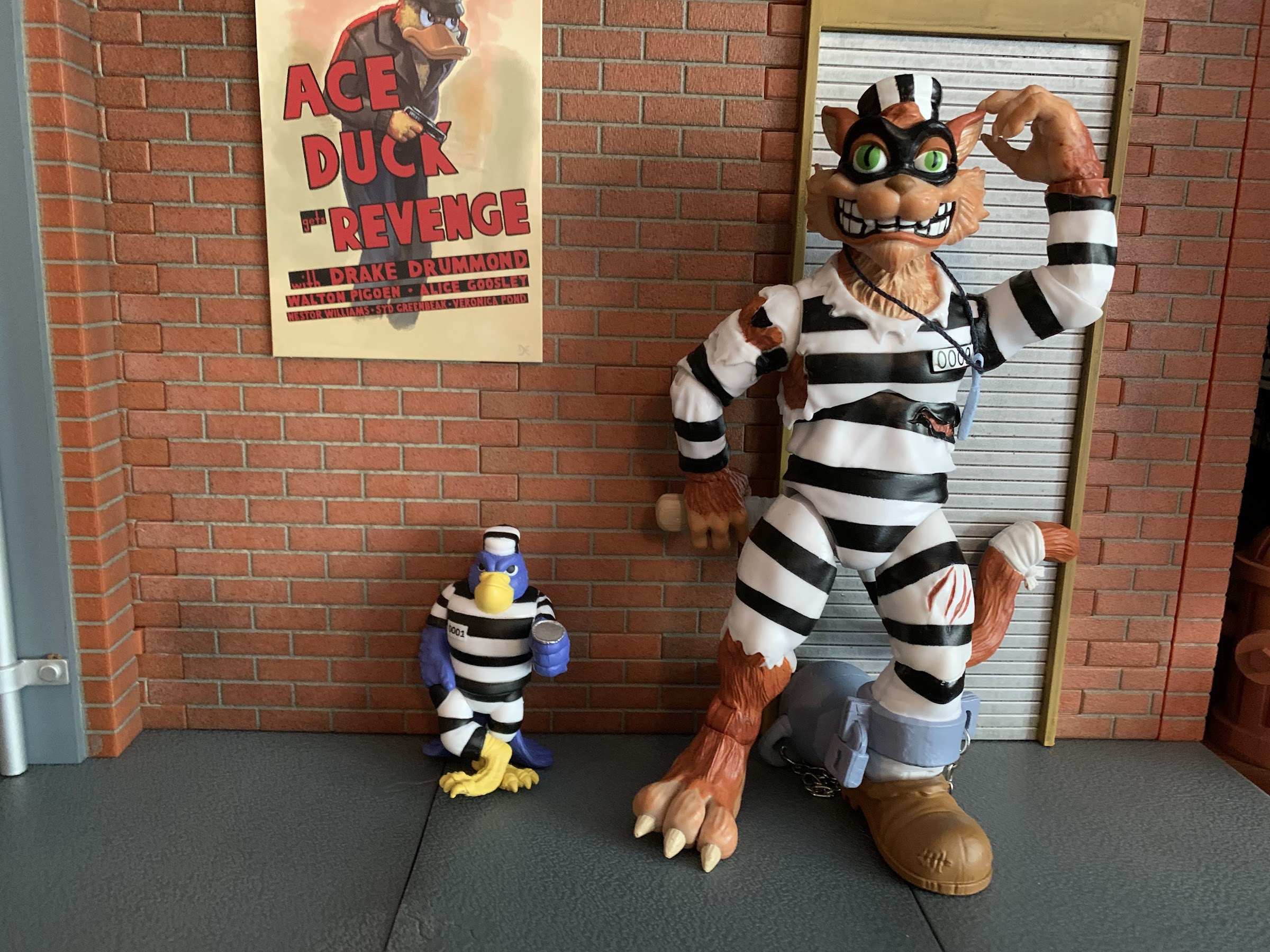
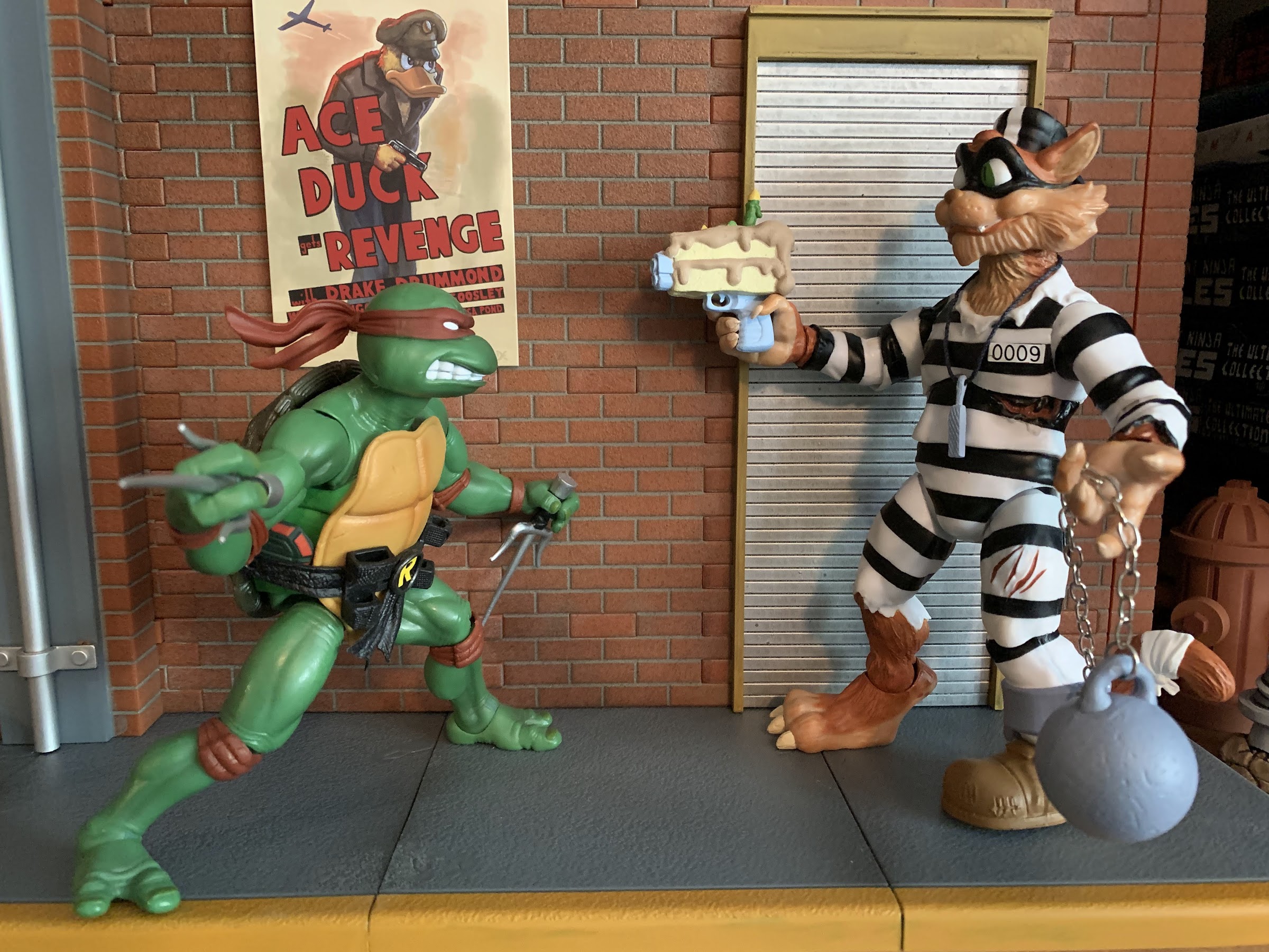
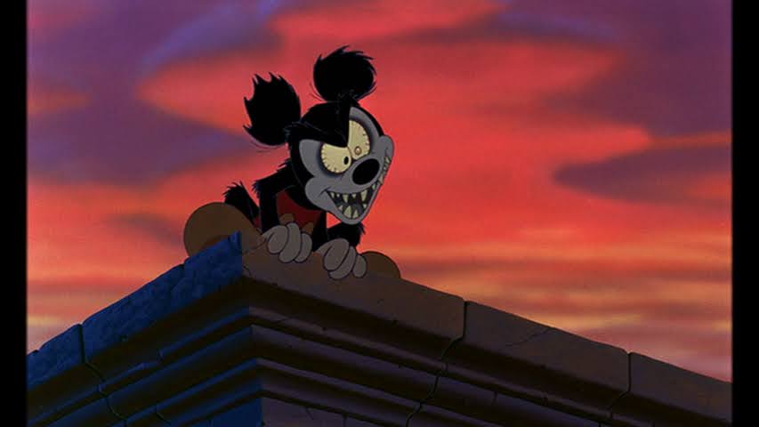
Ask a casual fan of Teenage Mutant Ninja Turtles who Scratch is and it’s possible they’ll have no idea who you’re talking about. Ask a collector of Teenage Mutant Ninja Turtles action figures who Scratch is and their eyes will shift to one of longing. Scratch the cat was a late entrant in the classic line of Playmates action figures. He was originally released in 1993 when the basic assortment of TMNT figures had shrunk to just 7. In their place were figures based on a new movie, the toon subline, cave turtles, mutating turtles, and a bunch of other gimmicks. Kids had basically grown bored with the franchise, so Playmates was throwing a bunch of different tricks at them to try to cling to a demographic that had been obsessed with their product for a few years at this point. And a few years for a children’s toyline can sometimes feel like an eternity.
So it was that Scratch, Halfcourt, Hot Spot, and the other figures from ’93 went somewhat ignored. They were also produced in fewer numbers compared with the basic assortment of the prior years, and the people who were buying them were kids which meant they’d get beat up, broken, donated, etc. As a result, they’re even harder to find today and if you have a mint, carded, Scratch or one of those other guys from ’93 then you have yourself a decent little payday in front of you, should you wish to sell. And for whatever reason, Scratch has become “the one” from that assortment and for collectors of the line he’s become a bit of a grail piece, despite the fact that there are other figures more rare in the line. Because of his infamy, it’s not surprising that Super7 would turn to the character that went unloved nearly 30 years ago, but so many are after today.
In 1993, I was barely clinging to my TMNT fandom. I saw the third film and liked it enough and would get it on VHS later that year. I had Cave Turtle Leonardo from the prior year and was very smitten with that year’s Turtle Trolls. It was also the year I bought my final TMNT figure until 2003, a Ninja-flipping Raphael. Otherwise, I was really into X-Men and the offerings from ToyBiz. Plus, Mighty Morphin’ Power Rangers debuted that summer and set the toy world on fire as well. And I can remember encountering that basic assortment like Hot Spot, Mona Lisa, and yes, Scratch, and my take then was “Wow, these look stupid.” And they kind of were. Mona Lisa is fine, but Hot Spot? He’s a mutant dalmatian that is a fire fighter – how creative? Scratch is a mutant cat burglar who….wait for it…is a cat! They’re two of the laziest designs put out by Playmates and are totally unremarkable as characters and as action figures. If that’s the case, why did I bother with this updated version of a character that I think is kind of lame? The answer is: I don’t know! When the solicitation went up, I didn’t give it much thought. I guess I liked the idea of a figure with a ball and chain and I was intrigued by the presence of a diaphragm joint and what looked like a fairly ambitious paint job, by Super7 standards. I don’t know if that should have been enough to get me to drop $55 on the figure, but it did so here we are.
It’s starting to feel like a rarity to get a non-turtle in this line that isn’t massive.
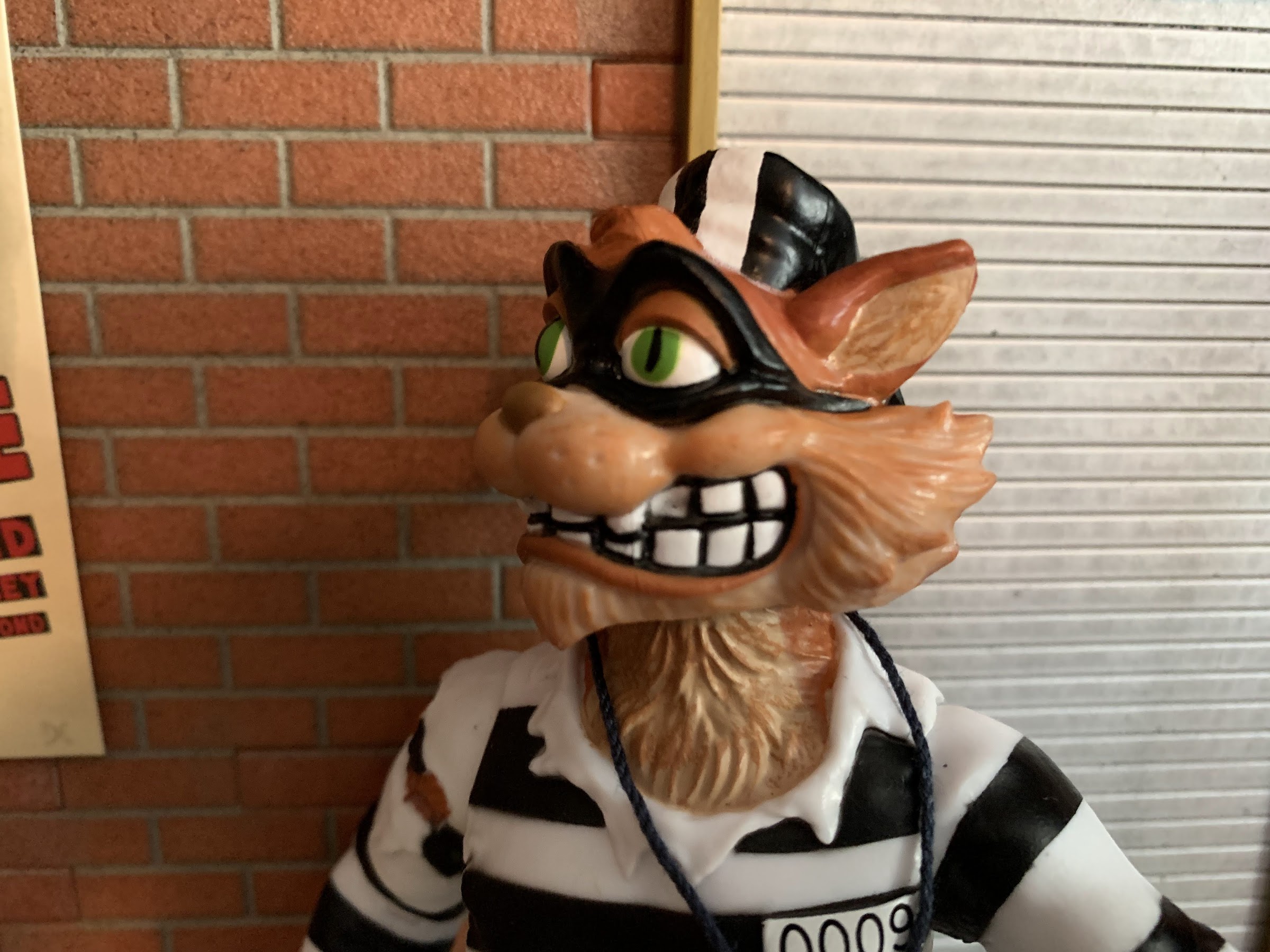
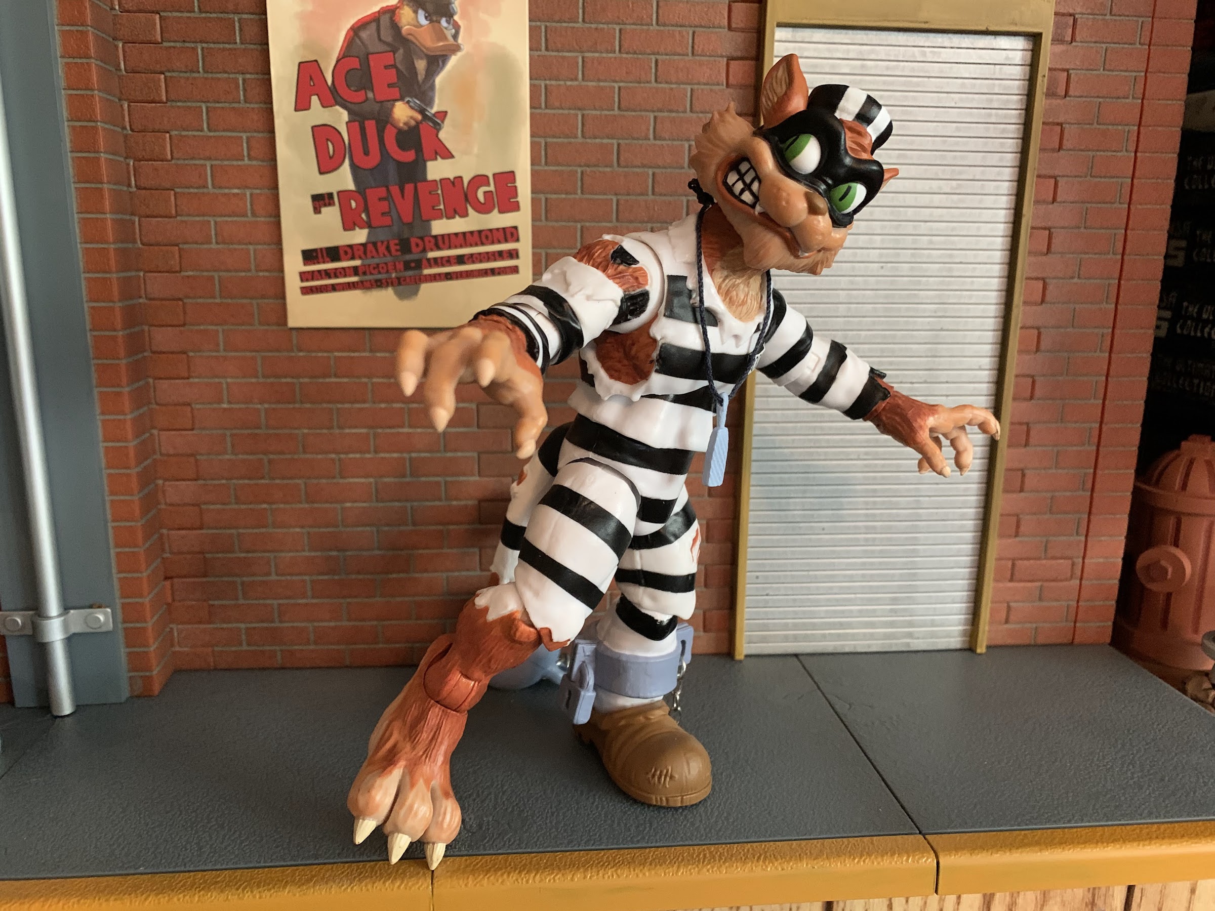
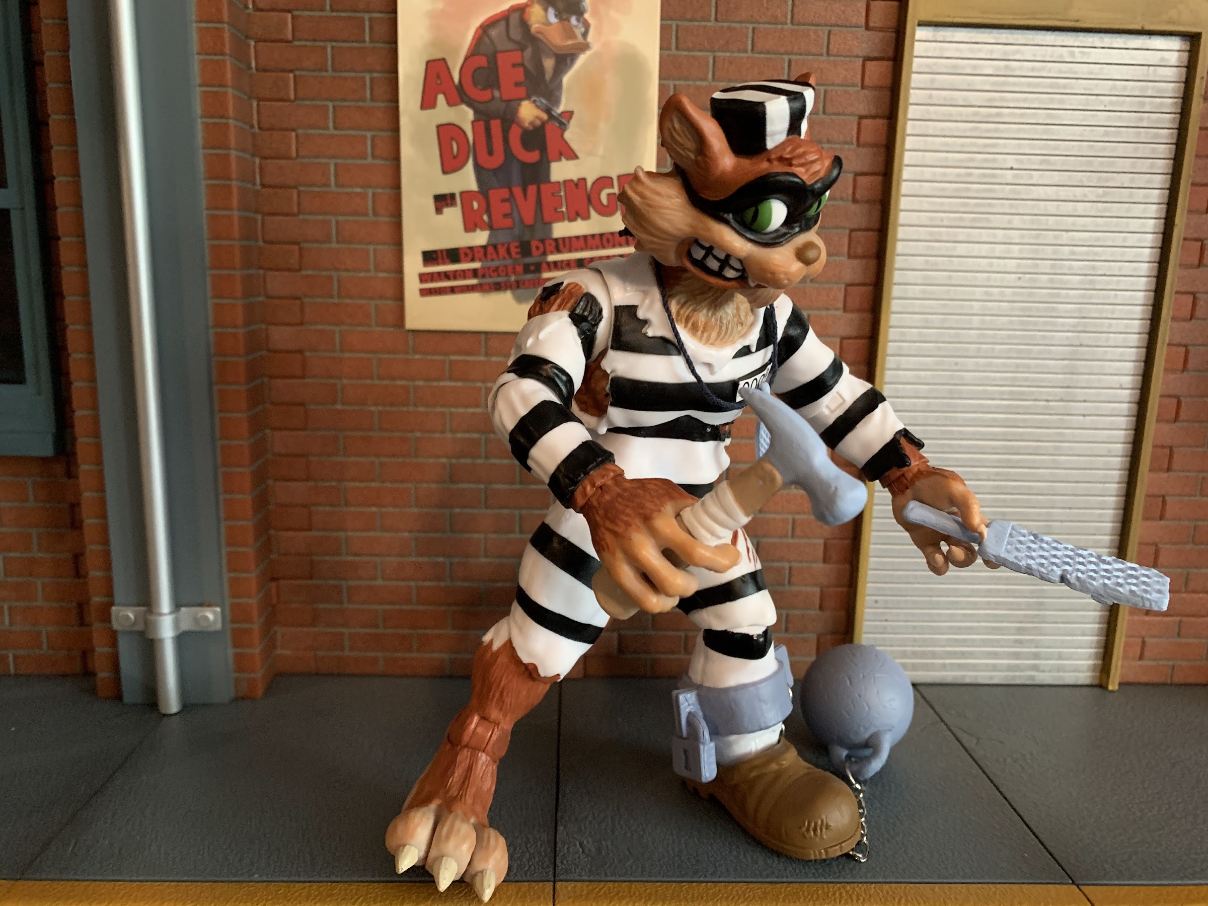
Scratch is one of those figures that can best be described as “what you see, is what you get.” He stands about 6.5″ in height and comes in a standard sized box. He’s sporting an old timey jailbird outfit, so white jumpsuit with black stripes. He’s got a cat burglar mask and a little hat too. Like many, many, figures from Playmates, he has one foot sporting a boot and one that’s bare. The booted foot is also shackled and a bluish-grayish ball is attached to the shackle via an actual chain. Around his neck is a piece of black thread with a small nail file attached for busting out of jail. His clothing is mostly in tatters as he’s either gotten into some scrums in prison or his escape act left him a bit worse for ware. It was a pretty bland design in 1993, and it’s really no better in 2022. I suppose the thinking here is that the large scale of this line can improve the sculpt and the added paint can elevate it. And I suppose it does. Kind of. His face is very expressive and every piece of exposed flesh is nicely textured to simulate fur. There’s no texture to the clothing, but there are numerous rips and the folds of which are sculpted on. I like that his prison uniform was apparently custom made because it continues onto his tail, though it’s pretty torn. The end of his tail is wrapped as well, like many a cartoon cat. The shackle on the left ankle is a bit odd though. It’s part of the sculpt, which was true of the original toy, but it feels like this is something Super7 could have improved upon by making it removable. The area between the curved bar of the lock and the actual lock itself is also filled in with plastic so it doesn’t look as good as it could. The actual ball portion can be removed since it’s just affixed via a small, weak, chain, so if you wish you can simply bend the last link and slide it off, though each time you do you likely risk the link just breaking all together.
Looks like they messed up Scratch’s missing tooth. That white indent is probably supposed to be painted black.
Excepting the shackle, I think the sculpt looks pretty good from a technical standpoint. Whether or not you like the character design is certainly subjective. The paint though is a bit of a mixed bag. The fur is the standout. Scratch is basically a light brown with a red-brown overcoat. The hands, the feet, the face – all look good. The teeth and the mask are especially clean, though the factory screwed up Scratch’s missing tooth by basically painting the gap as if a tooth were there which just looks strange. It also looks like they missed the black outline for his right fang as it’s present on the left side. The jail suit is a little less impressive. Scratch appears to be mostly cast in white plastic so the black lines and the exposed fur are all painted effects. This is a sound strategy, but may have been a little too much for Super7 to handle. There are numerous places where the paint doesn’t go far enough to the edge of the clothing and doesn’t look great. It’s especially noticeable on the wrappings on his tail. The rip around his right shoulder also looks weird because the arm is cast in white, but it looks like the rip should result in an exposed armpit, but doesn’t. There’s also a scuff on one of the black lines on my figure’s left leg. Interestingly enough, some of the spots that look hard to paint turned out very well. There’s a thin rip at the base of his rib cage on his left side that’s nice and clean and the little slashes on his left thigh all look great. “Mixed bag” is probably the best way to describe this one when you’re talking paint.
My best attempt at tip-toes.
Scratch, being one of the more generic character designs in this line, should be one of the best articulated as a result. There’s no shell to work around, he’s not super chunky, or an alligator, he’s basically a humanoid character that just happens to be covered in fur and features a tail. Again, you would think that would bode well for Scratch, but eh, more mixed bag. It starts at the head where Scratch is surprisingly locked down. He basically can’t look up at all and only down a little because his head sits so low on the neck, which is unarticulated. He does get a little tilt to each side and can rotate, but the lack of up and down is disappointing. At the shoulder, he can just hit horizontal and rotates all the way, of course. There is no biceps swivel once again, and instead we get an elbow swivel that can at least go all the way around. The hinge there can’t hit a 90 degree bend which continues to be a disappointment. Yeah, there’s little different between 90 and almost 90, but the goal here is to be able to go past 90 degrees. The wrists swivel and hinge and Scratch does have a vertical hinge for his trigger hand, so that’s a plus. In the torso we have a new joint not featured on other figures in the line which is at the diaphragm. It feels like a ball joint, and it allows Scratch to rotate a little bit and he seems to have more range rotating to his right. He can’t really bend back far, but he does crunch forward a bit. You also get some nuance posing which I like. It’s not amazing, but being able to break-up the torso like this adds more than you think. At the waist we have a twist that is surprisingly tight. He can’t go all the way around, or at least he doesn’t want to and I’m not going to force it. The hips can go out to the side to almost a full split and he kicks forward well and there’s a bit of a thigh swivel. At the knee, we have the standard single hinge and swivel which rotates all the way around on the right leg, but does more of a pivot on the left. The right leg can hit a 90 degree bend, or close to one, while the left knee barely does anything because of it’s shape. It’s a poor design as there’s nothing unique about this guy preventing better range. The ankle hinges and can rock to the side, and just like the knee, the right foot is far more functional than the left though the ankle rocker is more like a swivel on the right foot than a true pivot. Lastly, the tail is on a ball peg and doesn’t do much of anything save for swivel around. Trying to pose it any other way is likely to just result in it popping off.
At least he has the right hinge for his trigger hand!
The articulation continues to be a weak spot for this line and Scratch is, in some ways, more disappointing than most. As I said before, there’s nothing about this character’s design that should make the articulation hard to implement, but it still comes up short. With the knees and elbows, they’re just not allowing for enough room to add in the necessary range. Don’t do double-hinges if you don’t like them, but single-hinged joints should work better than this. A double-ball peg approach to the waist would add a lot of nuance as well, and Super7 needs to allow for more clearance at the head. I should also add, the joints on the knees are painted so you’ll want to be careful there. The right calf is actually cast in clear plastic, so it’s not too unsightly if some of that paint rubs off of the hinge. The left calf is in white and part of the stripe by his knee is painted onto it. The knee barely moves as it is so most should be okay, but it’s something to be mindful of. As far as tolerance goes, Scratch is definitely more in-line with Slash than he is with the Wave 5 releases. Most of the figure moves fine, though that diaphragm joint is a bit loose. It will flop a bit if you shake the figure, but otherwise seems to hold its pose okay. The hips are fine and so are the wrist hinges and waist.
This is definitely intentional. Image on the left is from the excellent Rad Plastic.
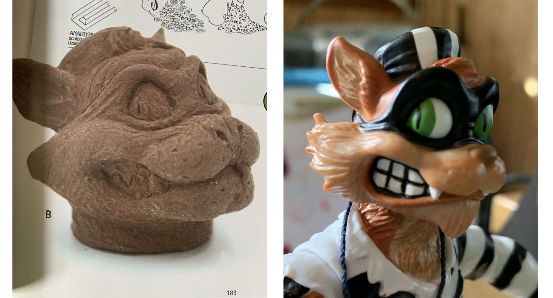
So far I would categorize this review as merely okay, but Scratch has one last chance to impress and that’s with his accessories. Scratch is pretty well loaded with stuff and it starts with an assortment of hands. Scratch has a set of fists, gripping hands, style pose hands, and trigger finger hands. The gripping hands feature a different grip for each so one is tighter than other. His left trigger finger hand has a horizontal hinge, which is useless, but the right has a vertical hinge. I don’t know why they did it that way, but as long as we have one good trigger hand I’m content. Scratch also has an alternate portrait and this one features more of a closed mouth and side-eyed glance. I don’t normally like side-eye expressions, but something about this one works for me. It’s a little more toony in the eyes as there’s no exposed eyelid so I might settle on this one for my display. This expression also dates back to an uncovered clay sculpture for the original figure, which was done by Anaglyph, and was apparently considered for the final figure (image above is from the wonderful TMNT toy resource Rad Plastic). Getting the head and hands off is no problem, though seating the second head is a bit of a pain, but doable without heat.
I’ve seen Sylvester the cat have to settle for worse.
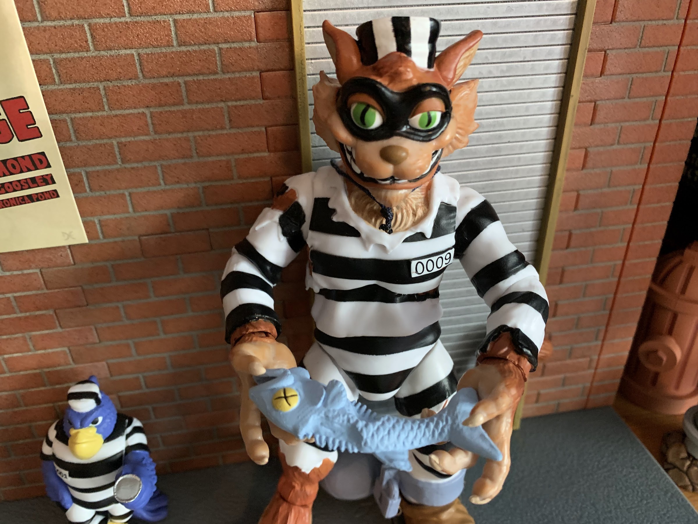
For those hands, Scratch has a few items he can wield. I already mentioned the small file dangling from a rope around his neck, but he also has a large one he can kind of hold in the tighter gripping hand. It’s cast in that same blue-gray as the smaller file and the steel ball and it looks fine. There’s a dead fish for Scratch to apparently snack on that’s also the same blue-gray color, which is weird, but has some yellow, painted-on, eyes. There’s a claw hammer for Scratch to smack stuff with and it’s fully painted and fits well on the other gripping hand. There’s a sack of money and it’s really well painted. It’s flat on the bottom so it’s designed to be placed on a surface and it’s sculpted to look like the gold coins inside are spilling out. You can put it in his hand if you want though, but it will look weird. My favorite accessory though is the cake gun. It’s a handgun with a slice of cake over it implying that Scratch snuck it into prison in an actual cake and pulled this sucker out. It’s goofy, but reflective of the vintage line. I’m left wishing Super7 gave us the rest of the cake. Lastly, Scratch comes with a buddy figure named Jailbird. Again, pretty weak design as he’s just a bird in a prison uniform, but who didn’t like getting a little buddy figure in the vintage line? Jailbird is well painted and in a casual pose where he looks like he’s flipping a coin. I think he’s supposed to be a hawk, though he’s purple. He doesn’t stand totally upright, which bugs me a little, and features zero articulation. At least he’s fully painted. There’s also a weapon sprue for Scratch and it’s cast in yellow like the vintage toy, though it appears to be a paler yellow. The ball and chain accessory makes up the outer part of the sprue, with the file, cake gun, fish, and hammer inside it. The shackle doesn’t open or anything so I don’t see how you could get it on the figure without removing a foot. It’s more for those who want Scratch to wield yellow weapons though, but still feels rather pointless. It’s no surprise then that these look like they’re going to be phased out in the next wave.
He’s going to need those tools if he wants to get that shackle off.
At the end of the day, Scratch was a fairly unremarkable figure in the vintage line, and he’s close to that in the Super7 line. He’s a little better than unremarkable and that’s mostly accomplished with the accessories. I love the cake gun and the money bag is one of the better painted items I’ve received from Super7. The hammer, file, and dead fish are done well, but aren’t particularly exciting. I do like the alternate head, and the ball and chain is basically an accessory too and one that’s pretty fun. The vintage figure did not have the actual ball and chain, but did have the shackle, so I guess it isn’t a terrible thing that the shackle isn’t removable. You can make this display like the vintage toy, though going the extra mile there would have been cool. The articulation is subpar though. He’s better than some of the other figures in the line in that regard, but those figures were poorly articulated so that makes Scratch just underwhelming by comparison. I think Super7 can do better and I’d like to see them try. The paint is at least more ambitious than some of the figures in the line, even if it isn’t exactly a homerun. He’ll look fine on a shelf, but closer scrutiny leaves something to be desired.
All right, who let the cat out?!
Your fondness for Scratch will likely come down to your subjective reaction to the character design, which I don’t hate, I just find boring. There’s enough here in the accessories and overall look to leave me content, but this figure will never enter my mind when I’m trying to pick my favorite from this line. That’s also true of the opposite though as he’s far from the worst and if anything collectors should feel okay about the quality of the product coming out of Wave 6 considering how shaky Wave 5 turned out. And even as I say all of this, I can’t deny that I had more fun than usual snapping pictures of this guy, utilizing my own cat’s carrier, and such. Scratch is a corny design that’s been elevated due to the scarcity of the original figure and for many longtime TMNT collectors this is as close as they’re going to get to that figure. If you have always desired Scratch the action figure, then this should “scratch” that itch. It’s unarguably a better, more enjoyable, figure than the vintage release and should look fine with the rest of your collection. On the other hand, if you see a figure of a literal cat burglar and it does nothing for you then you probably won’t miss this one. I give it a measured recommend for that reason.
“I know more of this world than you could even dream, that is why I must…destroy it!”
It is Halloween and that means it’s time for costumes, candy, and spooky fun. It’s also Halloween 2022, a pretty important date if you grew up loving those mutants who ran around in colorful spandex fighting for a better tomorrow. That’s because 30 years ago on this very night, the animated series X-Men premiered on the Fox network. The decision to debut a cartoon in prime time with characters still on the periphery of mainstream appeal was both a bold choice and one brought about by necessity. Fox had done the same recently with Batman – The Animated Series, but that hardly feels like a gamble considering that was coming hot on the heels of Batman Returns. You see, the show should have premiered in September on Saturday mornings, but the project was fraught with delays and the early animation sent back from studio AKOM was said to be a disaster. And since the show wasn’t going to be able to premiere as planned, the producers involved decided to focus on the first two episodes to get them ready for a Halloween premiere with the rest of the season to follow in early 1993. Marketing dubbed it a sneak peek, and it must have worked because before long the show was a ratings hit and the rest is history.
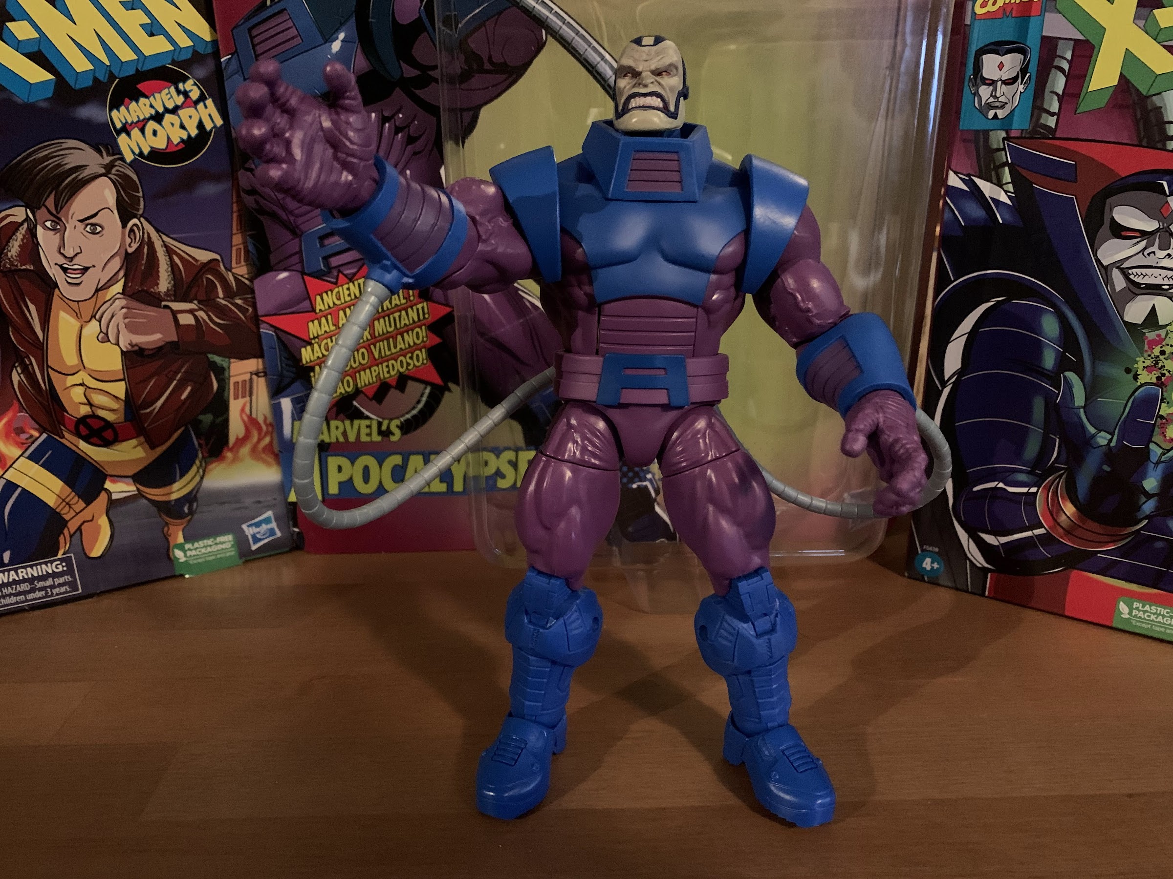
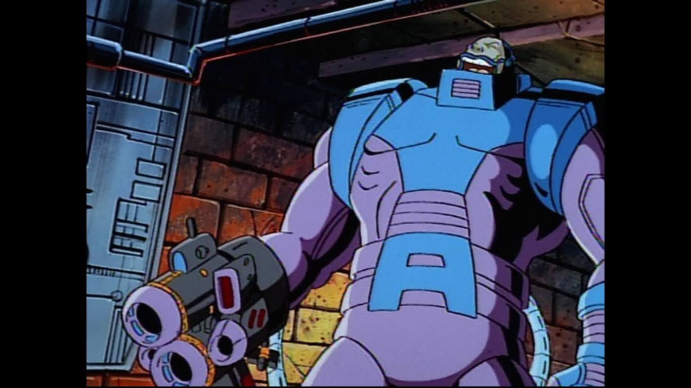
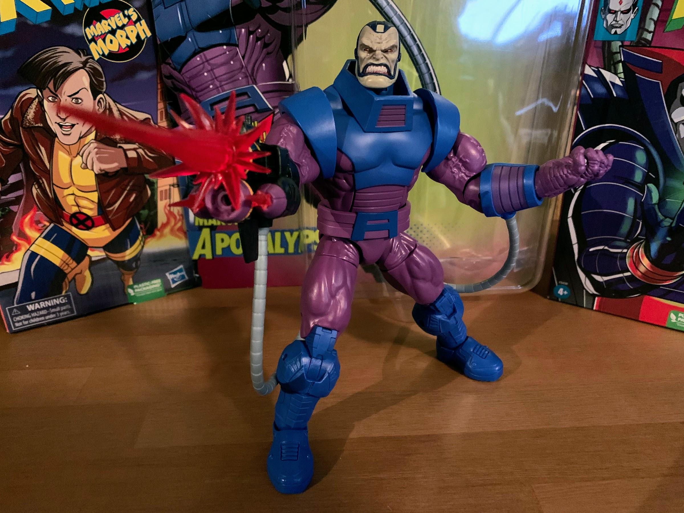
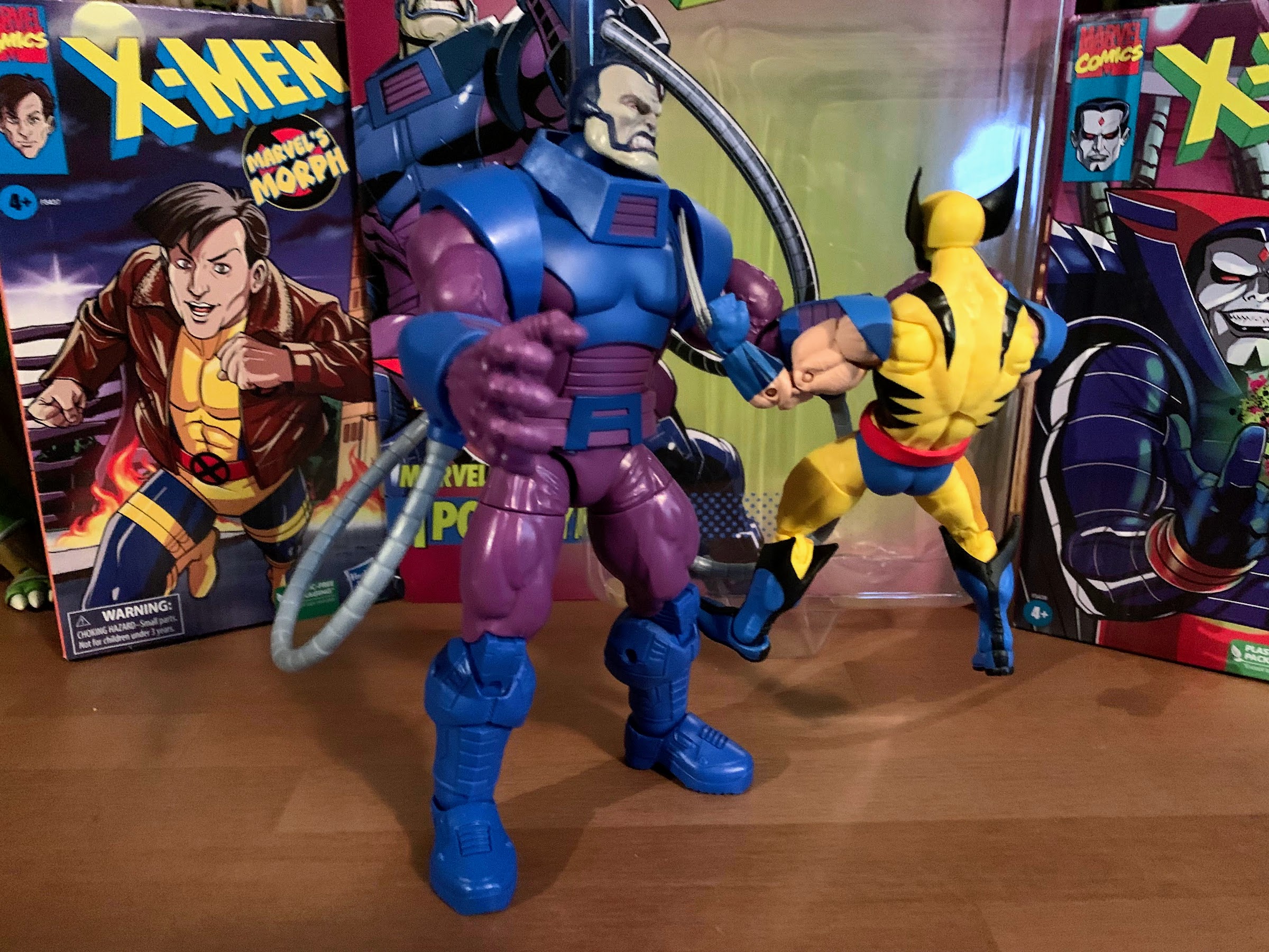
Given that it’s such an important day for an elder X-Men fan like myself, it only felt appropriate to forego something spooky this Halloween in favor of something celebrating that show. Now, I originally intended to debut my review of Hasbro’s Morph, but I received that figure in late September and I was just too eager to talk about Morph. The timing just didn’t make sense, so we’re pivoting to something else. Had Mystique, the next planned figure in Hasbro’s dedicated X-Men animated line, arrived this month she would have been featured here. And she even embodies a bit of that Halloween look with her blank eyes and affection for skulls. Instead though, I think we have the next best thing with one of the major villains from the show: Apocalypse.
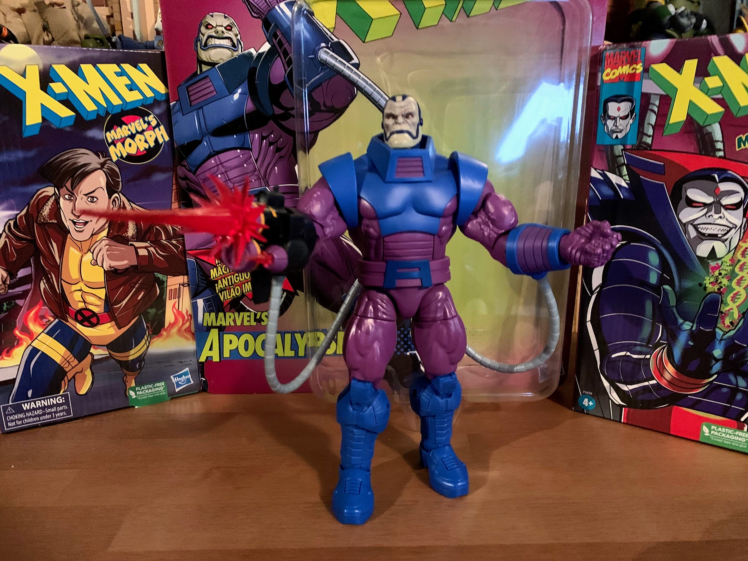
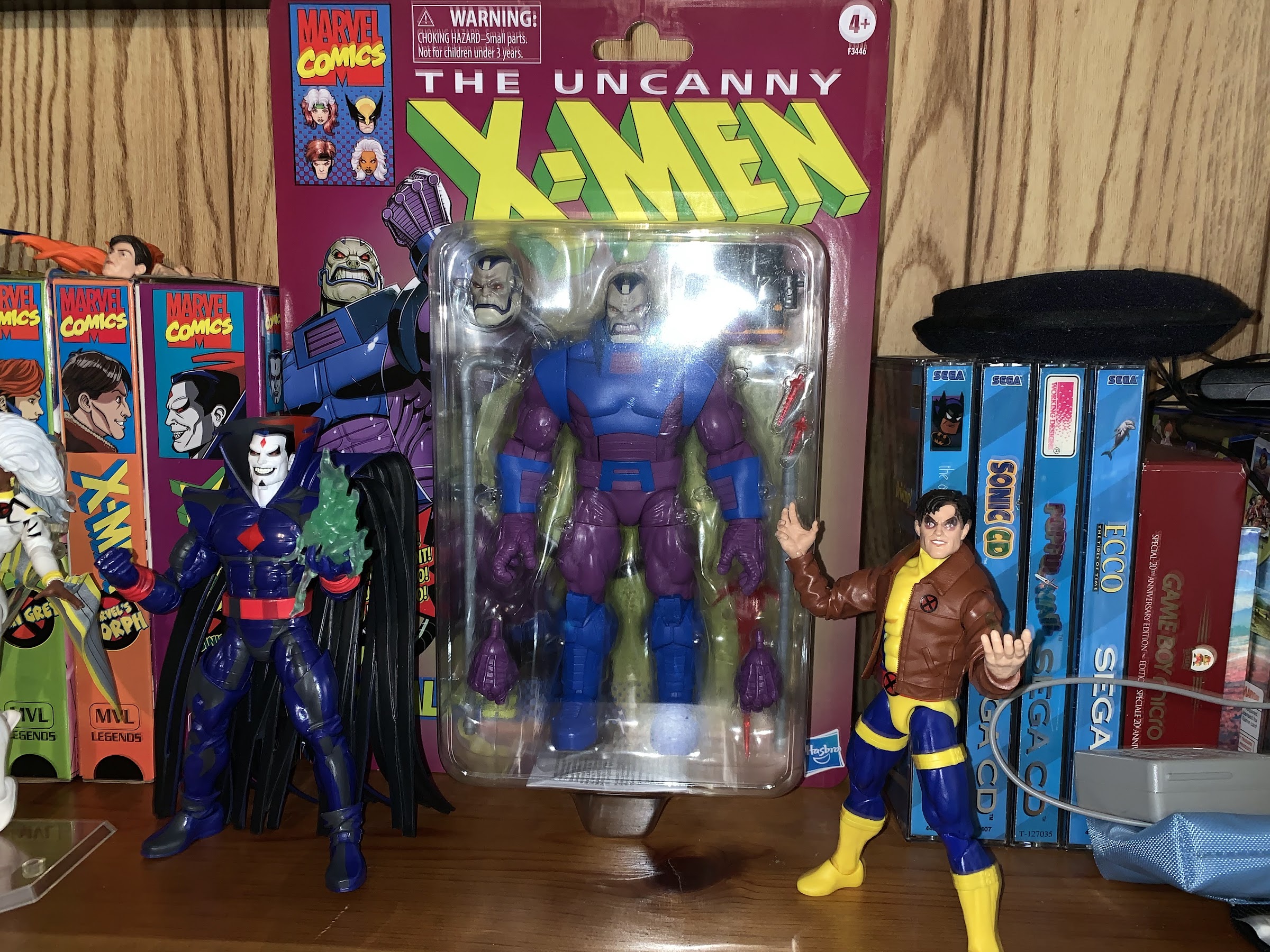
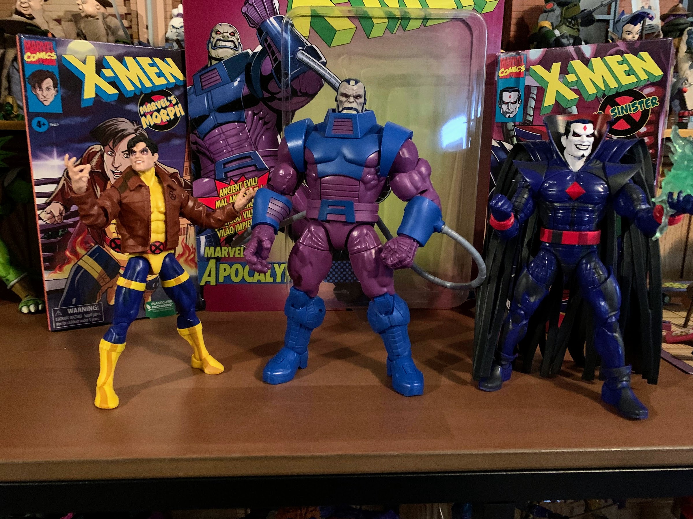
This card is stupid big.
Hasbro’s retro card series of Marvel Legends has caused some confusion in the collector community, and I’m afraid this Apocalypse only adds to that. It started a few years ago as an homage to the classic ToyBiz line of figures from the 90s. Hasbro created updated blister cards based on those styles and packaged Legends in them. They had to be slightly oversized to accommodate the larger Legends figures compared to the classic ToyBiz ones, but who in the collector community doesn’t love a good dose of nostalgia? They’re definitely neat, and since the designs of the figures are largely based on their 90s appearances they hit pretty hard when it comes to nostalgia. It was successful enough that Hasbro then did the same with Spider-Man. Unlike the old X-Men line, the Spider-Man line from ToyBiz was a direct tie-in to the animated series that premiered on Fox (in sneak peek fashion as well since it worked so well with X-Men) in 1994. As a result, collectors weren’t sure if these new Spider-Man retro card releases were based on the animated series as well. I’ve seen many collectors refer to the Hobgoblin, especially, from that line as being animated inspired, but that doesn’t appear to be the case. The only one released that is definitely based on the cartoon is the PulseCon exclusive Venom from last year (which is being followed-up with an animated Spider-Man this fall).
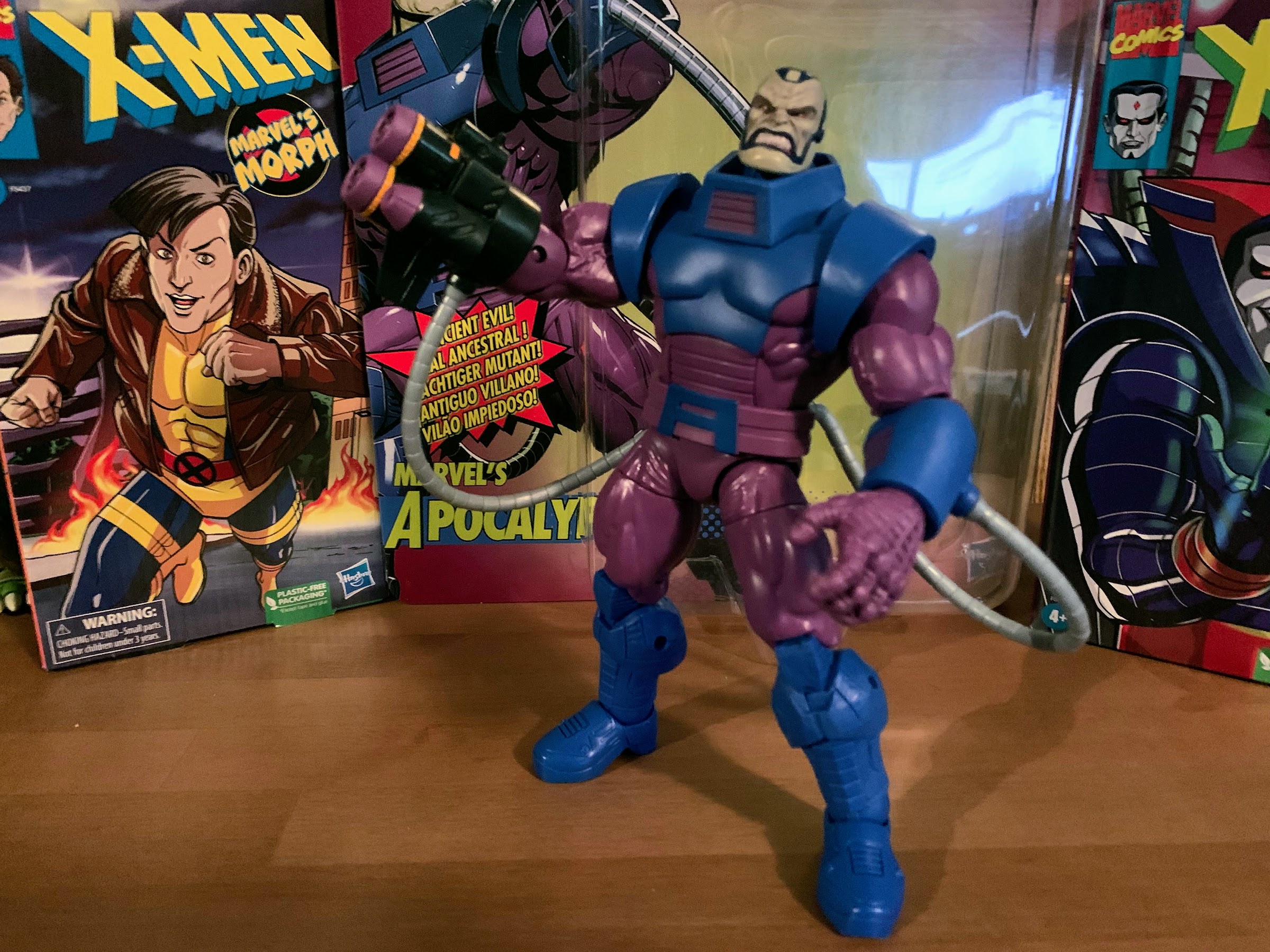
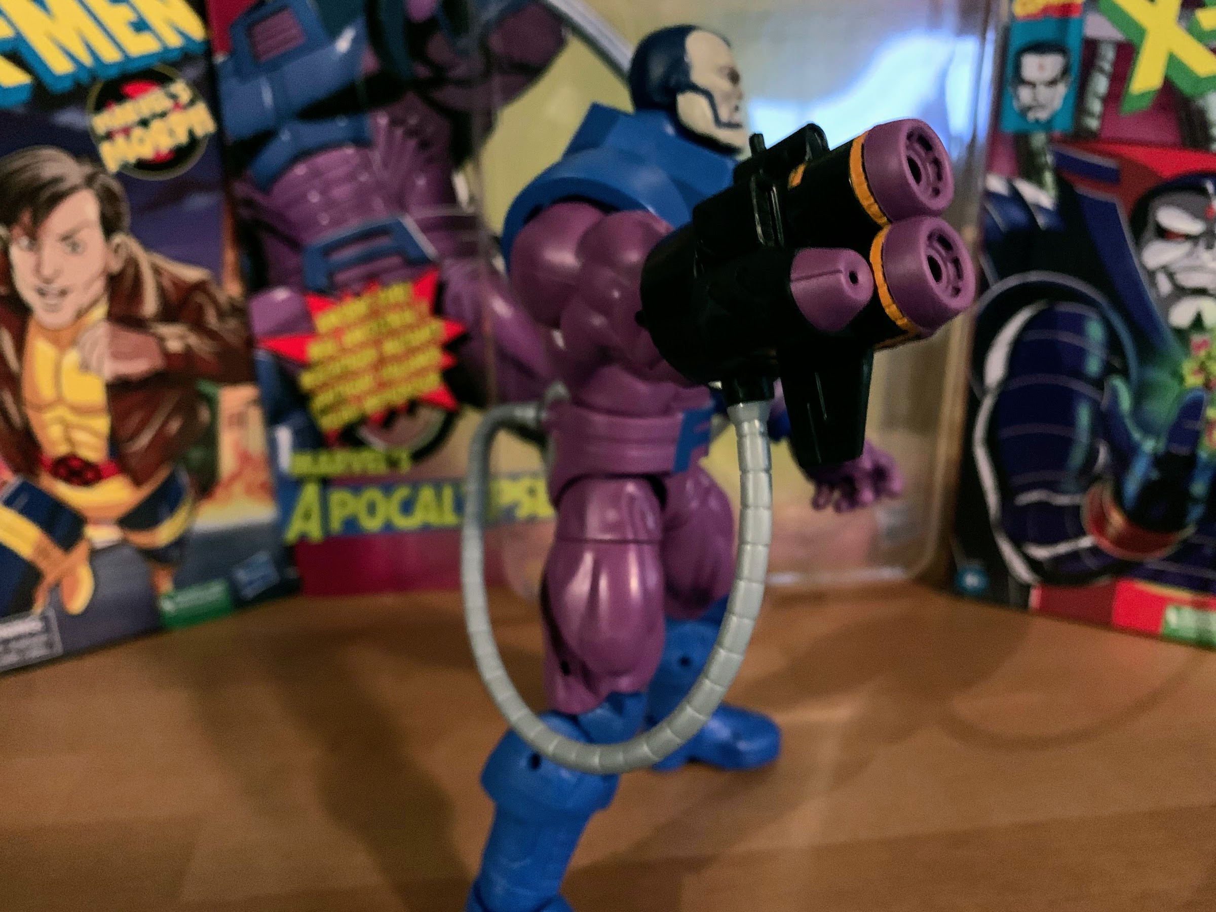
The actual figure though? Not really that big. I would have actually liked a little more height out of this guy.
Now adding to any confusion that still exists out there is this Apocalypse figure. Apocalypse had multiple releases in the ToyBiz days so a retro card release makes sense. However, this particular figure features a purple and blue deco. That is significant because that’s the color scheme Apocalypse had in the animated series. No where else has Apocalypse ever looked like this. And to drive the point home further, he comes with an interchangeable gun attachment for his arm that is pulled right from an episode of the show which has left many to ask “So why is this not a release in the VHS line?” And the answer is, “I don’t know.” I don’t think any of the marketing team for Legends has explained that one. My guess is that someone on the team really wanted to do this character in this look, but the budget for the VHS line couldn’t accommodate it so they did it this way. It’s bizarre, because this figure does not feature the cel-shading paint job of the VHS line so it’s not just a difference in packaging. This figure is also based on the build-a-figure Apocalypse released a few years ago, so disassembling it to fit in a VHS box would not have been problem. Plus, as illustrated with Mr. Sinister’s VHS box, Hasbro is willing to adjust the sizing when necessary on those boxes so there’s really nothing stopping Hasbro from releasing the figure in that line from a design standpoint. I know the cel-shading is a bit of a contentious topic in the community, but this figure is so cartoon specific that I can’t imagine there was a ton of demand from collectors not interested in the animated series. This version of Apocalypse has always been viewed as a little “goofy” because of those colors so comic collectors are most certainly not the target audience, but here we are.
This is unquestionably supposed to be Apocalypse from the cartoon, you can’t fool me Hasbro!
Because of the colors on this guy, I definitely consider him to be part of the animated series line of action figures. It’s bizarre, and if it’s simply a matter of budget then I don’t know why they didn’t just hit this guy with more paint so he would fit in, but here we are. That said, I’m happy to have Apocalypse in this deco as it’s been perhaps the figure I’ve wanted most to come out of the animated line next to Morph. This funky color palette just hits right for me. Like most kids in the early 90s, I was confused why Apocalypse looked like he was painted for Easter in the show and would have preferred him in black and blue, but over time this look has just become a hallmark of the series for me and I appreciate it more as a result. Plus, Apocalypse is so bad ass that he can look like this and still be feared!
The figure does come on the aforementioned blister card and it is pretty massive. It’s almost comical to look at how big this thing is relative to other retro card releases and even more ludicrous compared to the 90s cards. It features some nice artwork, though not in the animated style aside from the suit colors, and definitely has that old school ToyBiz feel. Many like to keep these releases mint-on-card, but I am not one of them. If you want to preserve the card as much as possible, I recommend slicing the bubble from the bottom with a blade which will allow you to slide this big boy out. And once removed, he is indeed rather big standing at around 8.25″.
Even this gun attachment is taken right from the show.
In looking at this figure, what immediately stands out as “animated” aside from the colors is the sculpt of the chest. I mentioned earlier that this figure is based on the build-a-figure from a few years ago, but it’s been re-tooled in several places and the upper torso is one such place. The musculature has a very soft look to it which is in-line with the show. There’s basically just a hint of pectorals and nothing more. The other details of the costume, such as the shoulders and the collar area, look as they should. The only parts not exactly screen accurate are the boots and the gloves. The boots are just all-together busier in their design, something an animated show would strive to eliminate. The hands are similar, but they’re also just not sculpted right as he should have a blue knuckleguard on each hand. Lastly, the cables that connect his arms to his back should plug-in around the elbow and not the forearm. Obviously, these inaccuracies exist because Hasbro is reusing old parts and I would say it’s mostly fine. While I would love to buy action figures that are committed to matching the source material to a more exact specification, I know that’s not Hasbro’s approach. They do things mostly with cost in mind and basically think giving us a new torso is good enough. The issue now is that approach was more acceptable when these figures were a lot cheaper. It’s something that will bother some folks, and for others it won’t. In my experience Hasbro has done a good job of conditioning its fanbase to accept these figures for what they are so my expectation is most will be unbothered.
In typical Hasbro fashion, they give you some of what you want, but not everything. This gun has four barrels, but you get just 3 blast effects.
As a last bit of aesthetics, we should talk about the paint job. Apocalypse is quite purple and quite blue, as he should be. Hasbro prioritizes using as much colored plastic as possible with their figures and this one is no exception. The paint is mostly limited to the head, upper torso and the gauntlets. The head is where the most paint was needed and it’s done well enough. We’ll talk about the appropriateness of the expressions when we get to the accessories, but there’s enough paint to bring out the sculpted details of the face with minimal slop. He’s not the easiest face to paint as the lips basically wrap around the whole head and he has that gap in the blue on top of the head, so Hasbro did a very nice job here. What is unfortunate though is his head is in two pieces glued together and there’s a blue seem as a result between his forehead and the portion of his flesh that runs up his head and it looks stupid. Otherwise, the paint details are fairly simple and done well enough. The chest even has this really nice, matte, finish which looks great, but also makes the shiny, plastic, portions look worse by comparison. Where they had to match colored plastic to painted, the figure also looks fine.
The source material for the gun is clearly the show, though it was simplified a bit for this release.
The elephant in the room when it comes to paint is obviously the exclusion of cel-shading. This is a retro card release, so cel-shading isn’t normally expected, but he’s also animated Apocalypse and the other X-Men animated figures all have it. Personally, I would like characters based on a cartoon to feature a paint job that reflects that medium. On the other hand, I concede that the cel-shading in the VHS line has been applied poorly. Part of me would like to give Hasbro some credit here in thinking that with a bigger figure to work with, the cel-shading would turn out better, but there’s no guarantee of that. They seem to struggle just finding the right colors to use when shading (see the hideous mustard color they use to shade yellow). Ultimately, it is what it is. I would love some shading on the torso, especially, but it’s not here. Maybe that’s a good thing? I don’t know, but that’s just my opinion. I don’t think he clashes in a significant manner amongst the other figures in the VHS line so I guess it doesn’t matter that much. As was the case with the accuracy of the sculpt, the absence of shading is going to matter more to some, and not at all to others.
Would it have been hard to just give us one more teeny, tiny, piece to stich in that bottom barrel? Though the proper thing to do would have been to sculpt a new, double-barrel, blast effect that plugs into both at the same time.
Moving on to accessories, Apocalypse is pretty much par for the course when it comes to Legends these days. He doesn’t have a lot, but at least here what he does have is done well. First of all, he has two sets of hands: fists and open, “clenchy,” hands. That’s fine as it allows him to look menacing, dramatic, and you can even get those clenchy hands to grab onto another figure. He also has two heads: an angry one and a stoic one. The angry one is reused, and the stoic is new. As a comic inspired sculpt, I think the angry head is fine. As an animated Apocalypse? It’s terrible. He basically never looked like this in the show so I probably won’t be using it. The stoic head is more my thing. It’s still done in the Legends style so it’s not a toon-accurate look for the character, but that’s been true of almost every release in the VHS line as well save for Wolverine. I refer to it as stoic, but he is frowning and looks kind of ticked off. I do wish the shape of both was different as Apocalypse tends to have a wide jaw compared with the top of his head, in both the comics and the show, but these heads are pretty uniform. If it were up to me, I’d have gone with this head, but with less detail to remove the frown and paired it with a laughing head. Imagine a laughing Apocalypse on your shelf with his fists on his hips or his arms crossed? Perfection. Lastly, we have the optional gun part. It attaches to the forearm and the cable can even plug into it. It is taken directly from the “Beyond Good and Evil” plotline when Cable confronts Apocalypse at the start so it is pulled right out of the show. It looks nice and Hasbro even included some blast effects for it which I would not have expected. It’s nice to have as it allows you to display Apocalypse as a menacing overlord on your shelf, or as someone willing to get his hands dirty which was rather true of the character in the show. They could have loaded him up with more arm attachments, but this feels like a fine selection of stuff for Apocalypse. It just would have been nice to get a new effect part for the main part of the gun that plugs into both of the center barrels. Since they instead gave us three separate pieces, one barrel will always be empty.
The gripping hands are wide enough that you can make your Apocalypse perform chokeslams on Wolverine.
Time to talk about the articulation. Despite being a big boy, Apocalypse moves okay and is pretty standard for the line. We have the ball-hinged head that lets him look up and down, all around, and even tilt the head a smidge. The collar doesn’t really get in the way until you try to rotate the head, but the range is decent. The shoulders are just ball-hinged and he can raise his arms out the side and rotate them pretty well even with the shoulder pads getting in the way slightly. The elbows are single-jointed and he can’t quite hit a 90 degree bend, so that could be better. The wrists rotate and hinge horizontally. In the torso, we get an ab crunch that lets him bend back a bit, and crunch forward a decent amount. It’s mostly colored plastic here so paint rub shouldn’t be of great concern, but it’s worth being mindful of. The waist is just a twist and the legs are ball-pegs. He can damn near do a full split and is capable of kicking forward just fine, though the cheeks will prevent much rear leg motion. There is a thigh cut which does what thigh cuts do and the knees are double-jointed. There’s no boot cut, but down in the ankles you have the usual hinge and rocker combination which works just fine. More importantly, everything is nice and tight so he shouldn’t be toppling over on your shelf. Apocalypse really only needs to hit a few poses and this figure is capable of doing that.
He is here to crush the mutants, and seems capable enough.
All in all, I am quite pleased with this release for Apocalypse. Yes, I would have preferred this come in the VHS line for both the packaging and the cel-shading, but since it didn’t, at least we got a fairly robust release as far as accessories go. I’ve been pretty disappointed with the majority of the VHS line because of the poorly applied cel-shading, inappropriate reuse of some sculpts, and the dearth of worthwhile accessories. It’s really been a money-grab kind of line and at least this Apocalypse feels more substantial and like a better value. They actually did some re-sculpting to make the figure more cartoon accurate, and while they didn’t go as far as they could with that, I think most will find they went far enough. My preference would have always been to receive figures with sculpts actually designed to mimic the animated look, but Hasbro was never committed to doing that for one reason or another. This figure does suffer a bit as a result because the head isn’t right and the veiny biceps look stupid on Apocalypse (and they would look stupid on any version of Apocalypse so I don’t get the thinking here). The rest of its shortcomings are just par for the course with Marvel Legends, like the dearth of paint apps (the cables look especially plain), so regular Legends collectors will likely be content. Unless someone else can get the license to produce animated X-Men figures (highly unlikely), this is unfortunately the best we’re likely to get. And at least with Apocalypse, this one does indeed feel good enough. Most of the VHS figures are not and the feeling of settling is palpable with each one, but here I don’t feel that way. At least not as much.
Apocalypse does come at an inflated price though of $40 which is obviously a lot for a Marvel Legends release. This one at least feels more worthy of that price compared with the VHS figures at around 28 bucks. A comparable figure would probably be NECA’s Chrome Dome from the Teenage Mutant Ninja Turtles line which was also $40. I would argue that the NECA release is a better value than this as it came with more stuff, more paint, and was 100% new tooling, but it also came out a year ago so maybe in 2022 it would be $45. Value, as always, is rather subjective, but in this case I think the value is there. If you’re interested in picking this one up, you may have to dig around a bit as it is sold out in several places. Hasbro Pulse still has it open for order so that may be the safest bet. Amazon does as well, but they can be hard to trust. Re-stocks may be on the way too so I don’t think it’s one you’ll have to spend a fortune on eBay for, but I also would recommend acting fast since I don’t think this one is ticketed for big box stores which would indicate there will be fewer of these out in the wild than the Age of Apocalypse version, by comparison. More importantly, if you can find some time today (admittedly, difficult given the holiday) or maybe even just this week throw on some classic X-Men and take a trip through time. It’s incredible to think I was watching the show as a kid 30 years ago, and while it may not hit the same as it did for me then, it’s still a worthwhile nostalgia binge and a show I think is worth celebrating. Or if you want to read more about it, I’ve covered both Previously on X-Men and the X-Men art book and recommend both to fans of the show. Here’s hoping the sequel series due next year is able to carry on its legacy.
There is a lot of debate over who the greatest cartoon star of all time is, but there isn’t much debate about who the first real star was. That title belongs to Mickey Mouse who entered into the world of cinema in 1928 and remained a star into the 1950s. Since then, Mickey’s presence on the big screen has been severely reduced. Between 1953 and 1983, there were no Mickey Mouse shorts. That drought was put out with the release of Mickey’s Christmas Carol, but that short subject has always felt like a cheat. Most Mickey Mouse shorts were around 8 minutes or so, that one was 26 and that’s likely because Disney always had plans to put it on television as a holiday special. Following that short, Mickey would come back with a cameo in Who Framed Roger Rabbit? followed by another long-form short in The Prince and the Pauper in 1990. Again, not really a short in the classic sense. The true drought was finally laid to waste in 1995 with a brand new bonafide short that would go on to be nominated for an Academy Award, but Disney would rather you forget about that these days.
Since it is October, the spookiest month of the year, I wanted to recognize the spirit of the month in some fashion which is why we’re to talk about the much unloved Mickey Mouse comeback Runaway Brain. The short was conceived by animator Chris Bailey with backing from executive Jeffrey Katzenberg. In the 90s, Mickey Mouse was a frequent subject in the halls of Disney’s animation wing as the company wanted to restore the character to prominence. The problem was, after decades of being a corporate mascot, Mickey was hard to pin down. As characters like Goofy and Donald Duck gained popularity back in the 30s, Mickey was pushed into more of a straight man role. He really didn’t do much, just played off of others. The 1990 short was attached to The Rescuers Down Under, one of the only animated films of the Disney Renaissance that failed to make a splash. Was that Mickey’s fault? No, probably not, but he apparently didn’t help to elevate that release.
Runaway Brain sees Mickey Mouse firmly as a 90s man.
Bailey wanted to do something different with Mickey and it’s said that Katzenberg was onboard with doing a “90’s Mickey.” The original pitch for a short was a duo picture between Mickey and Donald where a jealous Donald would actually try to kill Mickey. That wasn’t going to fly and it was unsurprisingly nixed by Disney executives Peter Schneider and Thomas Schumacher. Rather than rework that pitch, Bailey did something all-together different coming up with a pseudo-Frankenstein for Mickey that saw the mouse turned into a monster. It was a bold take from a design standpoint as it involved creating a new, monstrous, version of Mickey Mouse which could upset Disney fans young and old. Katzenberg liked it though, and since Disney had a newly acquired team of animators just sitting on their hands in France, the storyboard actually went into production.
Unfortunately, between the start of production and the eventual end, Jeffrey Katzenberg was fired. Or let go, however he chooses to spin it these days. At any rate, one of the supporters high up in the company was gone and in his place were Schumacher and Schneider who seemed to have a much lower opinion of Bailey’s short subject. Despite having a terrific team of animators onboard including Andreas Deja who animated Mickey in Who Framed Roger Rabbit?, the executives demanded the short be chopped up and hacked apart to remove effects and change scenes around entirely, including the ending. Michael Eisner was said to have liked the short when it was screened for he and the other executives, but either Bailey and team were cut off from appealing to him, or he just left it all to Schumacher and Schneider and put all of his trust in their decisions.
The end result is that a severely compromised version of Runaway Brain was sent to theaters in 1995 playing in front of the dud A Kid in King Arthur’s Court. I suppose the optimist might say that the powers that be paired Mickey up with the forgettable picture to help bring in additional patrons, but Bailey saw it as a slight. It would air with A Goofy Movie and The Hunchback of Notre Dame in other territories, two films that make more sense to pair it with (A Goofy Movie especially), but plans to screen it in 1996 with the Glenn Close starring 101 Dalmatians re-make were nixed at the 11th hour. And since then, the film has only been released on physical media once as part of the Mickey Mouse: In Living Color Volume 2 set and digitally with Walt Disney Animation Studios Short Films Collection. And that digital release could be considered a surprise, though it says a lot about the studio’s attitude toward the film that it wasn’t part of the actual, physical, release of the set.
Does Runaway Brain deserve this kind of treatment from the studio? Of course not! While it’s not Mickey’s greatest role or anything, it’s a fun little film and should be on Disney+ at least. Granted, a lot of Mickey shorts are not on the service, but as the only true short from the 1990s, why not that one? Plus it would fit nicely into the Halloween collection. At any rate, lets take a scene-by-scene look at this short so we can see what we’re being deprived of. I am viewing the short via the DVD of the previously mentioned Mickey compilation which is a pretty great set if you like physical media (and it seems to have actually come down in price over the years).
Not the kind of intro we’re accustomed to seeing for a Mickey cartoon.
The film begins with a big Mickey Mouse title card and some rather upbeat, fairly typical, Mickey type music. It’s interrupted with a monstrous version of Mickey’s gloved hand which slaps down on the card and then slashes across it replacing it with the Runaway Brain title. The font looks like its molten lava or something and it’s a solid juxtaposition to what was originally presented.
Maybe Disney just doesn’t want kids to see how Mickey really lives?
We then find Mickey (Wayne Allwine) at his home. It’s dark and rainy and he’s shouting from inside like he’s being attacked. He’s not, and is actually just playing a video game. He’s really into into it though and so is Pluto (Bill Farmer) who’s bouncing around and barking up a storm. We get a look at the game and it’s a fighter pitting Dopey against the Evil Queen from Snow White and the Seven Dwarfs. The gamepad he’s using does slightly resemble a Genesis one, though it’s clearly designed to be something generic.
Geez Minnie, you’re worse than my mom! Can’t you tell by the row of tombstones that Mickey is on his last life?!
Minnie Mouse (Russi Taylor) then enters all excited to see her man. She walks in between Mickey and the TV and you can probably imagine how that goes over with the mouse. Mickey even remarks, “Are you trying to get me killed?” and Minnie responds with a “Maybe,” as she feels Mickey has forgotten about an important day. She has to remind him she’s referring to the anniversary of their first date and Mickey is forced to scramble. He puts down the game and tells Minnie he has big plans. Grabbing a newspaper which features an add for miniature golf, he waves it in her face remarking how they can have some fun in the sun. Unfortunately, Mickey didn’t notice an ad for a Hawaiian cruise just below the mini golf one and that’s what Minnie thinks he’s referring to. She gives him a big hug while Mickey stares at the ad and recoils at the thousand dollar price tag. Minnie plants a kiss on his lips before departing to go swimsuit shopping leaving Mickey to try to figure out a way out of this mess.
You can tell this is 90s Mickey instead of 2000s Mickey by his lack of an ass.
Man’s, or mouse’s, best friend seems to have the answer as he flops the want ads in front of his master. Mickey’s attention is drawn to an ad promising pay for an afternoon of mindless work – what could go wrong? Mickey sets out to investigate and arrives at the home of Dr. Frankenollie, a portmanteau of Frank Thomas and Ollie Johnston, two of the famous 9 old men of Disney animating legend. His home happens to be located at 1313 Lobotomy Lane which doesn’t seem at all like a bad omen. Mickey seems unphased though as he tosses on a blue tie, and there’s a very brief animation flourish of it choking him as he secures it, before knocking on the door.
Mickey can’t help himself – he’s jealous.
When he does so, the ground opens up below Mickey and swallows him whole! He travels down a steel pipe and drops into a crude looking chair that immediately shackles him in place. He cracks, “Talk about your ironclad contracts,” which was one of the many revisions the Disney executives made with this one as he was originally supposed to say, “I think I’m in trouble.” Such a needless revision. We’re then introduced to the doc (Kelsey Grammer), who as an ape, basically climbs all over Mickey. He’s a skinny ape in a white lab coat with a lightbulb in his head. As he examines Mickey he asks him questions such as “Here for the job?” Mickey tries answering his questions in various ways, basically trying to tell him what he doesn’t want to hear and sometimes what he does, just to see if there is a way out. It’s clear his responses mean nothing to the doctor as he has what he wants and Mickey is going no where.
He may be named Julius, but that’s Pete like you’ve never seen him before! He even has his peg leg back in this one!
Dr. Frankenollie then introduces Mickey to his partner: Julius. Julius (Jim Cummings) rises from a contraption in the ground and is basically a massive version of Pete crossed with Frankenstein’s monster. He eagerly confirms for Mickey that he intends to swap their brains, and when he does we get a fun X-Ray shot of Mickey’s head which depicts his brain in 3 parts: his head and each ear. Despite protests from the mouse, the doctor activate his machine. Electricity surges out of a contraption in the ceiling and blasts both Mickey and Julius with electricity. For Mickey, it looks quite painful, but for Julius it looks almost therapeutic.
It doesn’t look like the doctor will be helping you, Mickey.
When the experiment is over and the dust settles, the lab looks absolutely trashed. A closeup of Mickey’s eyes and a part of his nose is accompanied with a voice over of him seemingly thinking all is well. It’s not, and as the camera zooms out we see the experiment worked and Mickey is in the body of the giant monster! Mickey, panicked, runs over to Doctor Frankenollie begging him to undo what happened only the doctor is unresponsive. Mickey picks him up and he’s stiff as board. Then his flesh turns to dust leaving behind only a skeleton, which too turns to dust. It would seem the doctor didn’t get to live to see the culmination of his life’s work – such a shame.
Looks like they didn’t have to edit out all of the drool!
We’re then introduced to the monstrous Mickey! Julius comes jumping out of the debris and he’s basically a feral version of Mickey. He walks mostly on all fours, his hands are curled into claws, his ears are furry and jagged, and his eyes rimmed with dark circles and bloodshot. He was supposed to feature lots of drool too, but that was another element the Disney executives had edited out. Mickey tries to reason with Julius and in doing so mentions Minnie. He tells Julius to look in his wallet and when he does he finds a picture of Minnie and Mickey (and we get a brief shot of Mickey from Steamboat Willie) and seems to salivate over Minnie. Mickey grabs the wallet, but it’s too late. Despite formerly being a cat monster, Julius is pretty infatuated with Minnie Mouse and starts grunting her name as he climbs up and out of the ceiling of the lab forcing Mickey to give chase.
Aww, he’s cute!
Julius emerges on the roof and starts gnawing on the ledge before something catches his eye. It’s Minnie and she’s entering a shop named The Wet Rat (eww). She’s looking at bathing suits, bikinis to be exact, which look quite tiny and a bit risqué, but one look at the size of Minnie’s body and they actually seem reasonably sized. And since a bikini includes a top, it actually covers more than we’re used to seeing with Minnie. Julius comes running in and Minnie tries to hide what she’s looking at since she doesn’t want him to see it until they’re on the boat. She doesn’t notice that her man is looking a bit more feral than usual, and with her back turned toward him, the real Mickey comes bursting in.
I think he likes it, Minnie.
Mickey cries out a warning that she’s in the presence of a monster, but she only hears the warning. When she turns around, she sees Mickey, in the monster’s body, grabbing the Julius-Mickey and assumes the monster is the, er, monster. I realize that sounds confusing, but she throws stuff at Mickey and frees Julius and the two of them run out the door. As they run down the street, Minnie is holding Julius by the hand who basically hops behind her and it’s rather fun looking. Mickey, in the body of the monster, smashes through the store and chases after them.
He can change his ears at will, but apparently not the rest of his body.
Mickey catches up to the pair and is able to snatch Minnie. He’s finally able to get her to notice it’s him speaking to her, and this short does do the cheat where the characters retain their usual voice despite the body swap. As he says “It’s me, Mickey!” his ears morph into traditional Mickey-shaped ears which is rather clever. Minnie doesn’t ask questions and believes him now, but feral Mickey has grabbed onto a car and is speeding towards them. Mickey swings via some construction equipment to the top of a skyscraper where he deposits Minnie for safe keeping. He then swings back down to ground level and is able to grab Julius. As they swing up into the air once more, Julius opens the bucket Mickey is swinging from which dumps some construction waste onto his head (steel girders and such) which causes him to let go. They land on some power lines which shocks their brains back into the proper body, then slingshots them towards the building Minnie is on. They smash through a billboard, coincidentally for the Hawaiian cruise that started all of this, with the character heads comically inserted into the image.
Mickey might miss having all of that extra room for his brain.
Mickey comes to and realizes he’s back in his old body. Unfortunately, he’s also in the grip of Julius and so is Minnie! Julius is still lusting over the mouse and Mickey has to bite his finger in order for the monster to drop him. Julius swats him off of the building and then makes a kissy face in Minnie’s direction who promptly slaps him. He’s pretty ticked off now, but before he can do anything to Minnie, Mickey returns! He’s armed with some rope and what appears to be a window squeegee which he cocks like a shotgun. He gets Julius’ attention and then charges at the monster!
Disney wouldn’t let Mickey wield a toy gun for the video game scene, so they had to make do with this.
Mickey uses his squeegee like a pole-vault and launches himself over Julius and onto a mechanical arm attached to a hula dancer on the billboard they previously smashed through. The arms goes up and and down, but largely is horizontal with the rooftop so Mickey is able to run across it. He lassos Julius who lets go of Minnie, but Mickey is able to lasso her as well. Swinging down and back to the rooftop with his girl in his arms, Mickey and Minnie share an embrace while a wrapped up Julius teeters via his peg leg on the ledge. Minnie takes a step back after her embrace with Mickey ends and she accidentally bumps Julius off of the building. Worry not for the monster, for as he falls the mechanical arm of the billboard pulls him back up like a yo-yo. The camera zooms out for a full look at the gag which provides for our first real look at the contraption in action.
That is one powerful motor in that billboard.
We then cut to Minnie, in her little, green, bikini, and Mickey with their toes in the water. They look like they’re on a float indicating Mickey was able to come up with the money to make their vacation dreams come true. Or not. We zoom out as Minnie plants a nice, wet, one on her man to see they’re on an inner tube being pulled by Julius. He’s swimming them to Hawaii with the picture from Mickey’s wallet dangling in front of his face. This was originally meant to be a crude effigy of Minnie fashioned out of pillows, but for some reason the executives didn’t like that. I don’t think either is necessarily more funny than the other, it just sucks to make people re-animate something for nothing. Plus, in order for this to work now Mickey’s wallet has to be Julius-sized which makes little sense.
Mickey and Minnie may have received a happy ending, but Runaway Brain has not.
That’s it though. Runaway Brain is far more infamous than it rightly deserves to be. The cartoon is fine and I enjoy the look of the characters in it. Mickey and Minnie have a nice flow to their animation and I love how they’re just constantly in motion. Their character models are just ever so slightly redesigned here to make them feel unique to the picture. They both seem a little taller and more narrow than usual, but they still maintain their signature look. I love Dr. Frankenollie, who we really only see briefly. The animators have a lot of fun with the fact that he’s an ape as he doesn’t just stand in front of Mickey, he climbs all over him and all over his own equipment. Julius is positively huge which makes his design a great deal of fun, though he’s still plainly in the realm of a Frankenstein. The feral Mickey is the most memorable part of the short and it’s because it’s just fun to see a monstrous take on a classic character like Mickey Mouse. His arms are usually bent so he has some sharp angles in his posture which is quite different from the rubber-hosed Mickey and his fur is ruff and exaggerated, which again, is very different from traditional Mickey who looks more black-skinned than furry. I’m having a hard time thinking of a scene that makes Mickey look like a fur-covered being and coming up empty.
It is thought that the design of the feral Mickey is the leading reason why this short is so shunned by the company. He’s unsettling and a bit scary and it would seem a lot of people associated with Disney do not like seeing such descriptors attached to Mickey Mouse. Sitting here in 2022 and watching it, it really feels like much ado about nothing. This feral Mickey is not particularly gross, which he certainly could have been given this was made in the 90s, and he’s only vaguely monstrous. We’ve seen Mickey look far worse now on the Paul Rudish shorts, but perhaps those are allowed to get away with more because they have their own style which is very different from classic Mickey? I’m not sure, but in terms of ugly depictions of Mickey, we’ve moved way past feral Mickey in the 27 years since the release of Runaway Brain.
It’s a shame that Disney just leaves this one hanging when it’s a film that deserves to be seen by millions.
At this point, the black sheep status Runaway Brain seems to embody is nothing short of peculiar. It’s such an inoffensive cartoon. There’s an energy to it that is unmistakably 90s, and the animation puts it square in that era too which is a good thing. It’s nice to have a 90s looking Mickey since he had few shorts and wasn’t allowed to grace television sets as part of the Disney Afternoon like Donald and Goofy. He even gets to act heroic in this one and save his beloved Minnie who also is able to stick up for herself and avoid being a total damsel in distress. It brings back Mickey’s troubles with money, a common trait in his classic shorts, and it’s all together perfectly fine. It’s not some remarkable piece of animation and probably not even top 10 for a Mickey Mouse short, but it is fun. According to some within the company, there’s really no conspiracy or grand design to keep Runaway Brain out of the public eye, it’s just not popular and gets overlooked as a result. Others maintain the opposite though and indicate that many at Disney don’t like it and would rather see it buried. It’s rarely merchandized, and as we covered before, has only been made available on two occasions since leaving theaters. Which is silly, because I think the feral Mickey design could be popular if given the chance as a Halloween tie-in. Sell furry Mickey ears at the parks, put him on keychains, or corny motivational posters about having a bad hair day. Make feral Mickey plushes – I’d buy one! A video game where the player controls a Mickey that turns into the feral Mickey at night like a werewolf could even be fun! Or it would be like that terrible Sonic game. Either way, Runaway Brain deserves to be seen and should be a Halloween treat year in and year out and most certainly should be treated a lot better than it currently is.
Time to meet the good old boy, or gator, or whatever.
When we last looked at a wave 5 release in Super7’s line of Teenage Mutant Ninja Turtles Ultimates! it didn’t go that well. Sewer Samurai Leonardo wasn’t an abysmal failure, but it had some problems that really took some of the shine off of the release. It was the type of thing that really shouldn’t occur at this price point when it comes to action figures, so I approached my next Wave 5 release with some trepidation, but I’m happy to say that this one is a better, overall, experience. It’s not without it’s flaws, but they’re more acceptable than what we saw with Leonardo.
Leatherhead is another big boy, but not necessarily when it comes to height.
When Wave 5 went up for sale, I initially only pre-ordered Leonardo. Some time later I put in for Ray Fillet, but as time went on I fell out of love with that decision. The one I was on the fence about from day one though was Leatherhead. When it comes to this line, I’m finding the attraction for me is either a love of the original figure from Playmates, or I’m just blown away by the larger scale. With Leatherhead, I never had that old figure and it wasn’t some giant hole in my collection. I’m pretty sure I wanted it, as when I had a friend over that brought the figure with him I remember being happy he forgot it as he was getting ready to leave, only for his mom to remind him not to forget his toys. Damn! When the Super7 solicitation came out though it was clear Leatherhead was going to be the big boy of Wave 5, but I wanted to see the final product before putting in an order. When they started to trickle out, I decided to take the plunge, though I was a bit afraid I was going to get burned. It was a daily decision, do I keep my preorder or drop it? Then it came in stock and the decision was made, so lets check it out!
This box is stupid big. On the left is the slipcase and on the right is the actual box with a standard sized one in the middle.
Leatherhead comes in a massive version of Super7’s standard Ultimates! packaging. It has an extra 2″ of depth which really makes a difference. By height, it’s basically the same, but they must have found themselves in no man’s land when it came to the figure. I’m surprised they didn’t package him with a profile view instead, but the box is certainly an attention grabber as a result. The figure itself isn’t massive in the same way that Bebop or Muckman is. By height, he’s about 6.25″ to the top of his head and approaches 7″ when you factor in the hat. He doesn’t really stand fully upright, so his height is deceiving. Where the size comes in is from his depth. He’s a gator, so he has a massive snout plus a tail, though that comes disassembled form the figure in the box. In the same stance as I took the heigh measurement, his length is approximately 9.5″ which can actually be made longer if you crouch him down into a pose more resembling the vintage figure.
And this is why the box had to be made so deep. Granted, the tail isn’t on in the box.
Leatherhead is a uniquely sized beast for this line, but he’s still fundamentally a Super7 release. Most of the figure features sculpted plastic done in a base color that negates a need for paint. Or at least, that’s the thinking. The scaled texture of his green flesh looks nice and his belly is less scaled, though still green unlike a real alligator. There is a hint of a wash on his hands and maybe a touch on the neck, chest, and tail. What’s there is extremely subtle and I wish there was more of it since this guy came out of a swamp. He should be grimy and gross. His vest is sculpted in a marigold color and that has a wash applied to add some texture to it. Parts of the pants and boots are painted, but the right leg is a little off. He has a torn knee in his jeans on that side so they sculpted it in green and painted the blue onto it, but it doesn’t match the thigh. A wash to make those jeans look dirty might have helped to conceal that, but oh well. The painted parts of the boots also don’t match the colored portions, and it seems to stand out even more in pictures than it does in reality. On the face, his eyes are painted well and his blonde eyebrows look okay. The teeth are a bit of a mixed bag. They’re painted an off-white color and in some places that ended up covering the gums, namely right on the front of his muzzle, which sucks. The hat is rather well-painted as are the various bits and bobs on his belt. There’s a dagger sculpted onto the arm that is also well-painted, but I wish it had been made an accessory instead. Isn’t that part of the point of this line to make some of those sculpted bits more realistic and functional?
The paint on the gumline could certainly be better. And you can also see a faint scuff, or some kind of residue, on the upper jaw if you look closely.
The paint is acceptable. It’s not exactly praise worthy, but I can forgive some of the sloppiness. There is an odd scuff on the right side of my figure’s face. I can’t tell if it’s just some glue-like residue from the factory or actual damage. I’ll probably hit it with something later, but I don’t know if it shows in pictures. From a presentation perspective, how much you like this figure will largely depend on the overall look and that’s a good thing. It has some of the oddities of that vintage figure like the big, buck, teeth on the front of it. I know a lot of people find that part of the sculpt off-putting and it’s something that stands out more at this scale, but it was on the old figure. There’s no alternate portrait, unfortunately, so if you don’t like the look there’s nothing in the box that’s going to remedy that.
Articulation wise, the joints are better here than they were with Samurai Leo, though functionally there isn’t much for Leatherhead to do since his legs basically need to be in this pose in order to keep him standing.
Let’s just jump right to the articulation since that was a major problem with Leonardo. Leatherhead is definitely better, though not perfect. He is going to suffer because of his form factor. Some of that couldn’t be helped, some of it could have been, but Super7 declined to address it. His head is on a big ball-peg and he can rotate all around and has some room for nuance posing. He can also look up, but he can’t really look down. The jaw is articulated and as long as you don’t have his head all the way down it can open reasonably far. The shoulders are simple ball-hinges and he can raise his arms out to the side past horizontal, so that’s nice. There’s no biceps swivel as he has that at the elbow instead. It’s not ideal, but it works okay. The wrists rotate and hinge and all hinges are of the horizontal variety including his trigger finger hands, which is unfortunate. The waist is a bit of a trouble spot. It just swivels, but it’s very loose. Just flicking him will make him turn. The hips are okay though so he stands up fine. The range at the legs isn’t very good though, and the knee is even worse. They’re practically useless for the hinge, though the swivel is okay. The ankles have a hinge and a rocker and they’re fine. He can be positioned forward into his vintage pose which was low to the ground like a normal alligator. The balance is tough though as he wants to tip forward. I never planned to display him like this so I’m not bothered, but anyone who prefers the vintage look you have been warned. Lastly, the tail is on a big ball peg, but it doesn’t do much since that’s the only joint on it. And do yourself a favor and just heat that sucker up before trying to put it on.
He does have some weapon storage, though I can’t imagine posing him without the shotgun in-hand.
Leatherhead is a figure of limited pose ability, but that was expected just by looking at him. The hips being fine are what makes him for me. If those had been terribly loose then it would have ruined him. Instead, it’s just the waist, which since it just twists, isn’t a huge posing issue. It still sucks that it’s as loose as it is and it really shouldn’t be, but he’s not falling over so I’m not angry about it. The hinges for the hands are a bit loose too, but his accessories are staying put so I guess it’s not a big deal. Swapping his hands is also much easier than it was with Leo. The plastic used for Leo feels a lot more rubbery and the ridges they put on the pegs seem more pronounced. I still don’t know why they put those on them when the hands have been fine up until now, but it is what it is.
He somehow manages to look intimidating and like a doofus all at the same time.
When it comes to accessories, Leatherhead has a mix of old and new. For hands, he comes with gripping hands attached in the box and he also has a set of trigger hands and fists. As mentioned previously, the trigger hands have the wrong hinge. I’d even liked the standard gripping hands to have a vertical hinge as they would work better with his other accessories. His main one is a shotgun and it’s cast in orange plastic with some brown wood grain added and a silver barrel. The pump action on it works, but mine was kind of warped and hard to manipulate out of the box. I heated it up to straighten it out some to get it moving, but be careful as the silver portion of the gun is all paint and it can rub off. It kind of sucks that the weapon came with the pump in the wrong place so most will want to move it at least once. Maybe they should have just cast it in a gun-metal gray like Rocksteady’s machine gun? There’s also almost no indentation at all in at the end of the barrel, or black paint to create the illusion it’s an actual barrel, which looks weird.
The red accessories on his belt are all removable. They look fine, but would have looked better with some paint.
Leatherhead’s other vintage accessories include a giant claw trap. It has a metallic finish, almost bronze, and it too works in that it hinges. It’s pretty menacing looking too. He also has his belt fixtures from the old toy: a crayfish, turtle, and flock of feathers. Unfortunately, they’re unpainted and just case in red plastic. The crayfish looks fine, but the turtle and feathers look pretty stupid all in red. All three key into his belt and they all do so in a different manner so they can’t be put in the wrong place. They stay on okay, but in order for these to work well the factory had to cast the belt in some fairly rigid plastic which doesn’t work as well for the shotgun holster. It has to really be squeezed in there and I worry about paint rub, which is why I’ll probably just keep it in his hand anyway.
Maybe we have this guy figured all wrong and he’s just a fisherman that wants to be left alone?
New for this release is a fly-fishing rod. Like the gun, it was a little warped out of the box so I tried to straighten it as best I could. It’s painted rather well, but the wheel on it doesn’t spin or anything which would have been cool. I like it though and I think it adds to this hillbilly persona the character has. Lastly, he has a weapon sprue which features the shotgun, claw trap, and rod which is used as the frame of the sprue. Apparently it snaps together, but I don’t know if that painted one is supposed to come apart. If you like that look though, it’s here, only they did it in brown and not the red of the vintage toy so it feels kind of pointless, more so than usual.
“Hahahahaha – dumb turtle stepped in the trap!”
Leatherhead is an overall better release than Sewer Samurai Leonardo. He is more in-line with the level of quality and functionality of past releases in this line and the shortcomings are more acceptable as a result. He’s still not perfect, and I feel like the Wave 6 Slash is a higher quality figure so I’m eager to look at some more of that wave. At $55, it’s the type of release that warrants consideration, but isn’t a slam dunk either. It’s expensive for what it is, and I don’t know that it compares too favorably with other figures in that price range. As has been the case with this line, the main selling point is the sculpt and inherent nostalgia involved in remaking a classic figure from a memorable toyline. And for many, Leatherhead was a pretty important release for that vintage line so I suspect this is a figure a lot of folks have been looking forward to. I think if you know what you’re in for, this one can be a winner. As always, value is subjective and it’s hard to overlook how a lot of retailers have gone all-in on this line which has lead to discounts down the road. If you’re unsure about $55, maybe wait for a sale. As for me, I’m content and I think this figure is a fine addition to the collection. I don’t plan on getting the other Wave 5 releases, but I have a couple of Wave 6 figures left to talk about so stick around for that and plan for a few more Turtle Tuesdays in the near future.
I figured I’d give you all a comparison to another big, green, guy from the line.