It’s been said that the 80s were pretty wild, and it’s not much of an exaggeration. At least where children’s media is concerned. After years of the government getting involved in what was okay to broadcast to children, the Reagan administration basically said “Eh, kids deserve to have everything and anything marketed towards them.” There were still some educational mandates placed on broadcast networks, but television producers were basically allowed to make glorified toy commercials that could pass as entertainment on their own. And apparently there just wasn’t enough kid’s content out there because toy producers turned to an unlikely source for inspiration: the R rated movie.
R rated films were suddenly on-brand to market to kids, boys mostly. Rambo got a TV show and the advertising blitz that came out of Terminator 2 at the toy aisle was inescapable. Perhaps the oddest of the bunch though was RoboCop. One look at RoboCop and it’s easy to see how that design could appeal to a kid. He’s a big cyborg with a giant sidearm housed in his leg. Since he’s a cop he can be marketed as a good guy and if one were to just make a cartoon about a robot cop for kids it’s not hard to imagine that working. The reality is that the Paul Verhoeven helmed film was a satirical takedown of the police state, consumerism, and a lot of the vices of the time present in 80s America. A show coming out of that which is just “The cops are your friends now here’s some toys” is about as far from the premise of the film as one could get, but it’s what we got.

RoboCop premiered in the fall of 1988 and failed to make much of an impact. The show is more famous in animation circles for having its lone season cut from 13 episodes to 12 so that Marvel Productions could take that money and apply it to a pilot for an X-Men cartoon that would never get picked up. Interestingly, just a few years later the same executive producer of RoboCop, Margaret Loesch, would find herself overseeing the Fox Kids Network where she finally had enough pull to get an X-Men cartoon to television. Her chosen showrunner for that project was Eric Lewald who developed the show alongside Larry Houston and a host of others. As fate would have it, when Orion was looking to try RoboCop once again on the small screen in the late 90s, it was Eric alongside wife Julia who were tabbed to develop a new show. Larry Houston was once again on-hand, this time as a producer, and the end result would be RoboCop: Alpha Commando.
Alpha Commando is not a direct continuation of the old show or even the films, but it does sort of feel like one. It was a direct to syndication show and received an initial order of 40 episodes, which when paired with the 12 episodes of the first series, gets you to the magic number of 52 syndicated shows like to have. It takes place 10 years after RoboCop was originally created. Set in the far off time of 2030, RoboCop (David Sobolov) has been reawakened to deal with terrorists and save New Detroit City, America, the world? – once again. He has a new partner in Agent Nancy Miner (Akiko Morison) and the only character from the original movie is Sgt. Reed (Blu Mankuma). . I have zero memory of this show and I can only assume it was airing on cable. It definitely has a USA Network or Sci-Fi Channel vibe about it.

Was it wise to once again try and adapt RoboCop for animation? 1998 was certainly an odd time to try. The film franchise was dead following the poorly received RoboCop 3 in 1993. That film tried to bring the character more in-line with what Orion likely felt was a commercial entity as it was a PG-13 rated film instead of R. I certainly can’t speak for all children of 1993, but I know I wasn’t impressed in the rating moving from R to PG-13. That felt condescending and my kid brain rejected the PG-13 RoboCop. Plus, the movie sucked anyway. Come 1998, if you were 8-10 years old in 1993 then you were now 13-15 and likely aging out of cartoons. Just who was this show going to be for? It mostly feels like the last gasp of a fading franchise, one last shot at a big payday for the relatively small studio, and it doesn’t look like it worked out.
That doesn’t mean the show is bad. It very well might be, but I’ve honestly never watched a moment of it before now and I didn’t even know it existed. At the time, I probably came across it and was aware, but I obviously forgot and never sought it out. We’re here though which means it must have a Christmas episode. “Oh Tannenbaum Whoa Tannenbaum!” sounds like a bad Misfits song, but it’s also intriguing. Maybe not deservedly so as I can’t imagine this show is anything like the original film, but RoboCop setting its sights on Christmas has a lot of potential. Heck, lets see if at age 85 we can convince Paul Verhoeven to essentially come out of retirement and direct a real RoboCop Christmas special. I’d buy that for a dollar!

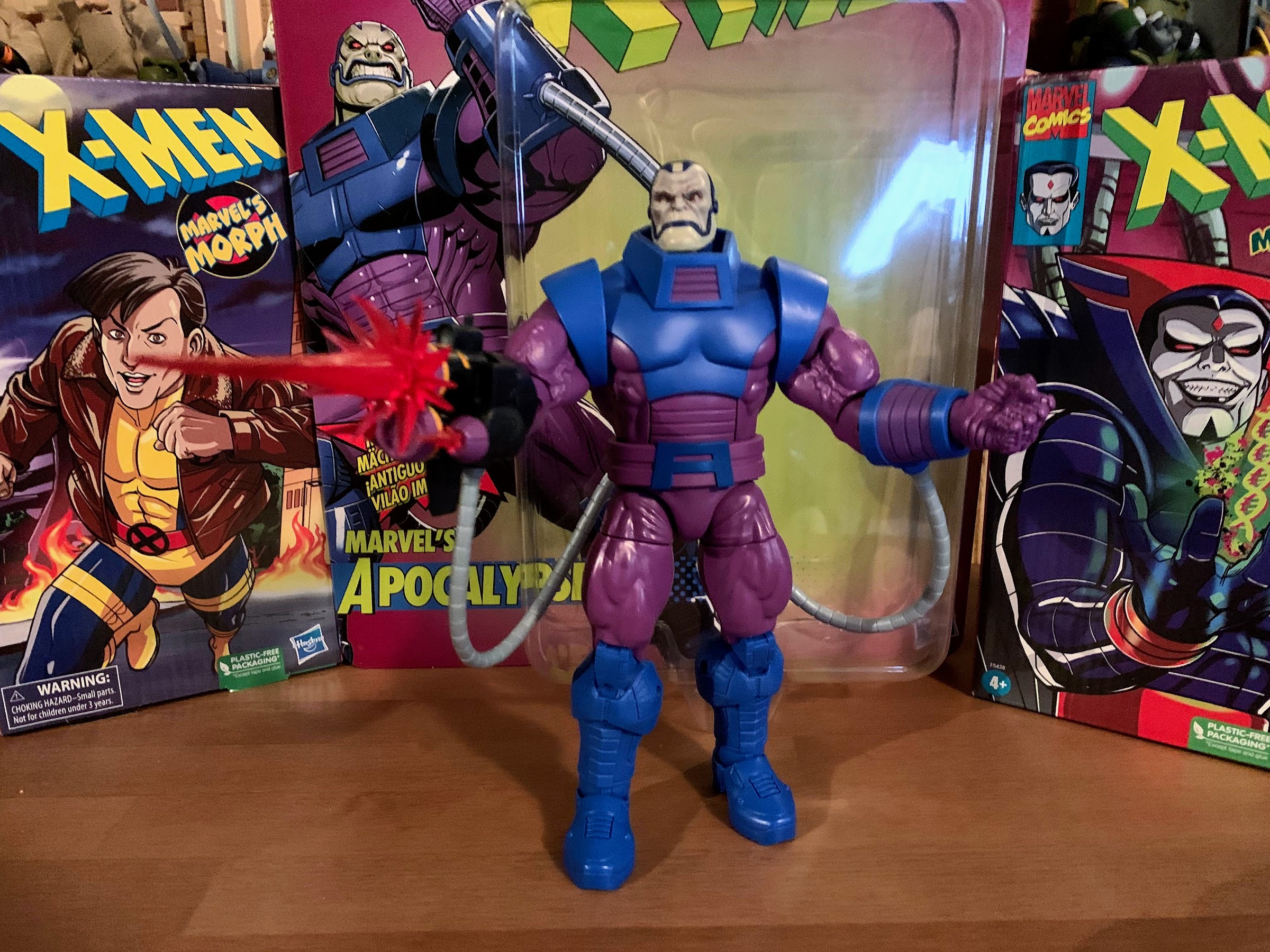
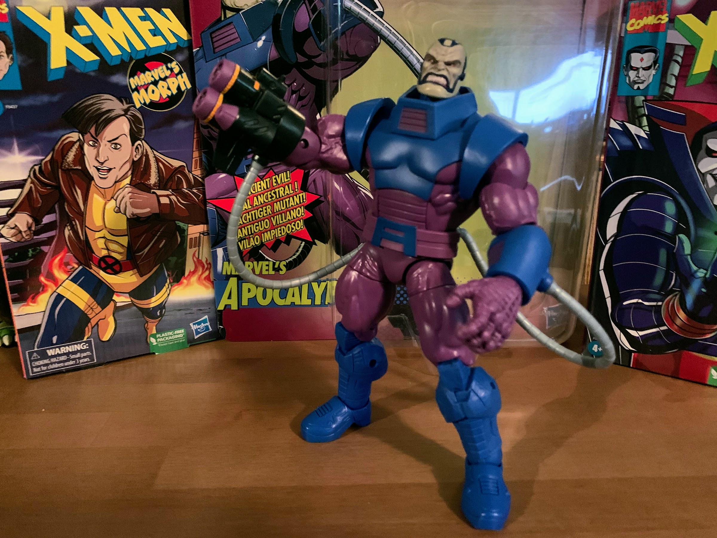
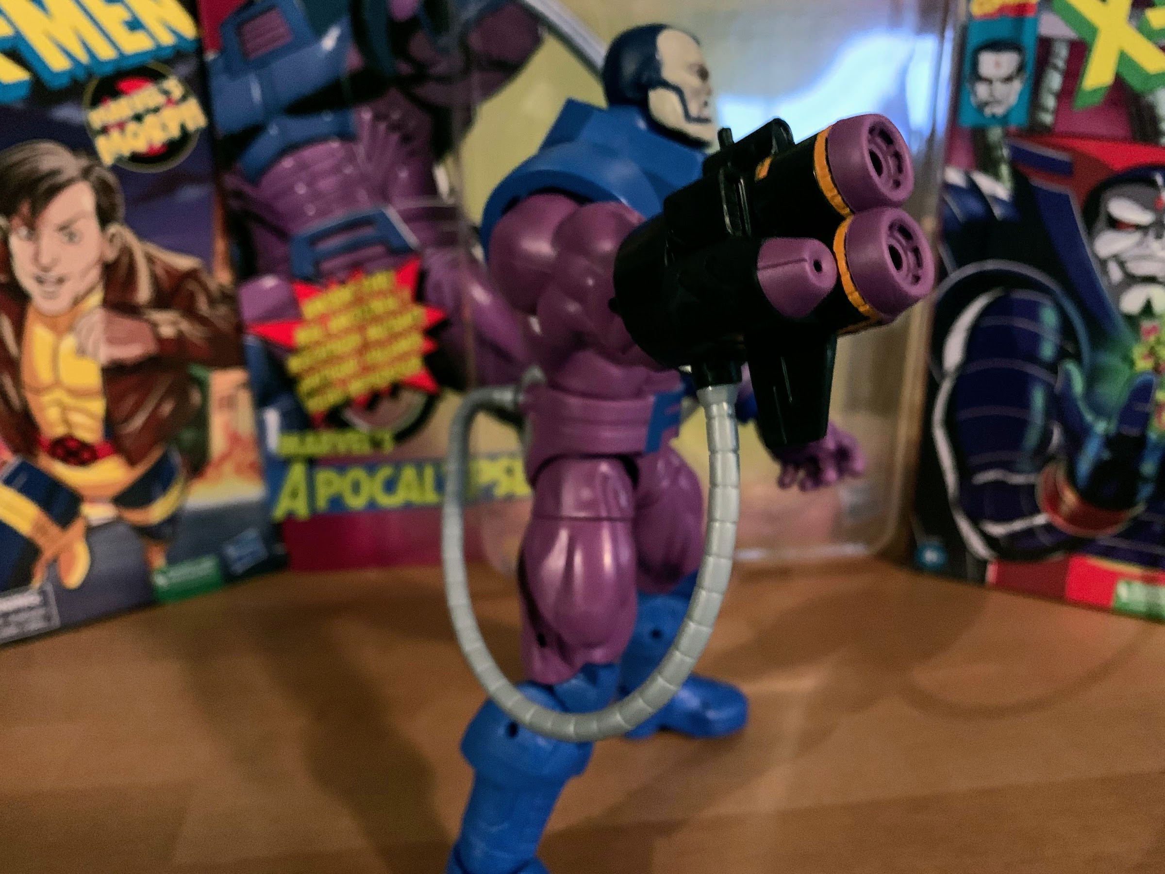
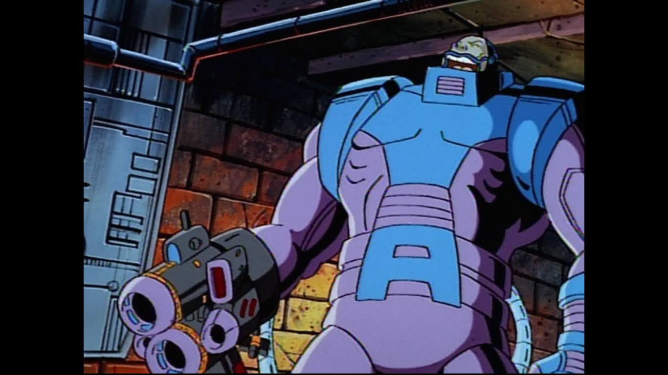
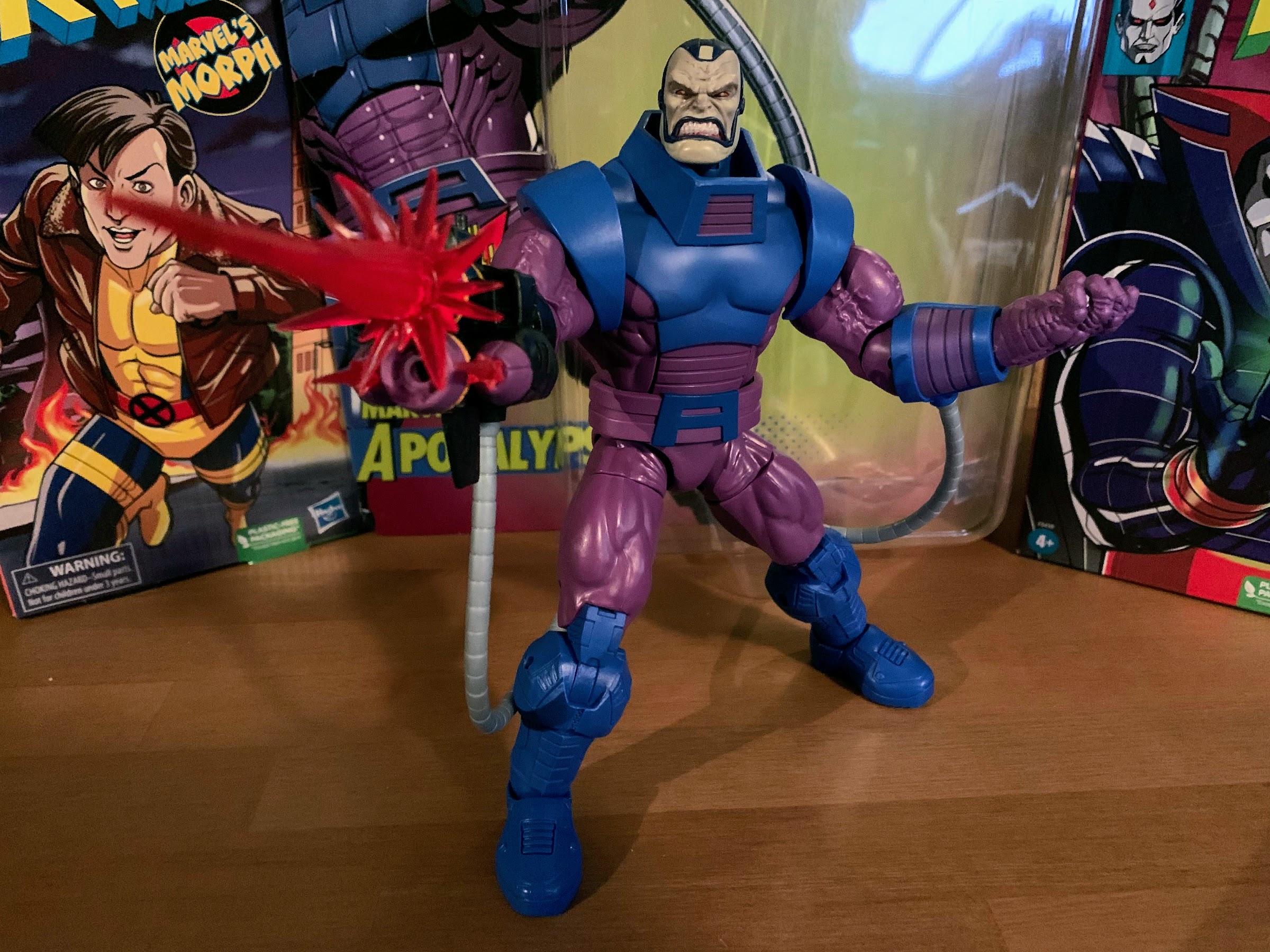
This episode of RoboCop: Alpha Commando resides almost right in the middle of the show’s run which means there’s probably some continuity at this point and the audience is expected to know who these characters are. I do not, but we’re going to do the best we can. The show begins with the caption that this is New Detroit City in the year 2030. We get some quick shots of RoboCop being constructed, or awakened, and some techno music from Carl Johnson starts to build. It’s a pretty rad intro, until the vocals come in. It’s just some layered voices chanting “ROBO-COP!” and it sounds so stupid. The visuals have also changed to show RoboCop in action. Apparently, a big metal dude with a gun isn’t cool enough so now he’s more like a bad ass Inspector Gadget. He has pop-out roller blades in his feet, net launchers in his forearms, and he can shoot out cables that wrap up his foes. We even get to see him stopping a train like Superman might. This is not your father’s RoboCop, folks.

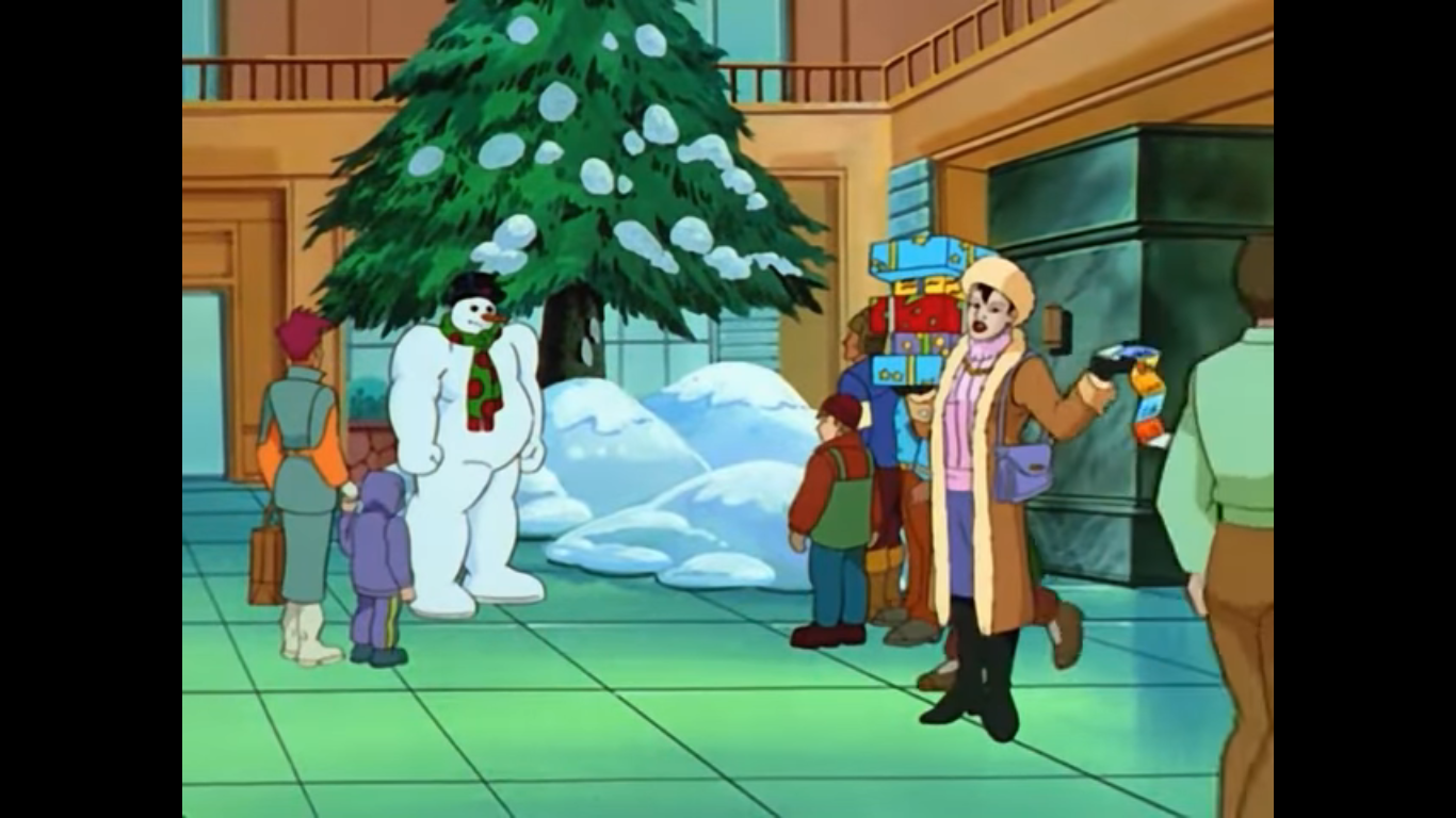
The episode begins high above the city as snow is falling. A robot floats onto the screen that resembles a fancy trashcan. It’s basically advertising itself as a kitchen aid and wants people to go buy one this Christmas. A blimp sails by with a video advertisement for perfume broadcasting from it and a robotic Santa with a lone reindeer crosses paths with the screen that contains a video message from one Giggles the Elf who wants people to buy him at Hunting Dorfs department store. If Hunting Dorfs is a play on an existing store it’s not landing for me (Bloomingdale’s?). It’s also possible this store is from one of the films, it’s been a while since I watched one. At street level, Agent Miner is stuck in traffic and quite angry about it. She’s pissed at all of the late shoppers clogging the streets, but her partner RoboCop is quick to point out that she’s in the same boat. RoboCop in this show is quite a deal larger than he is in the movie and looks rather absurd in a pedestrian vehicle. I don’t think he could be expected to fit in this thing. He’s also more of a dark gray in color than the steel look he had in the film and prior cartoon. I’m surprised they were able to resist calling this show RoboCop: Xtreme!
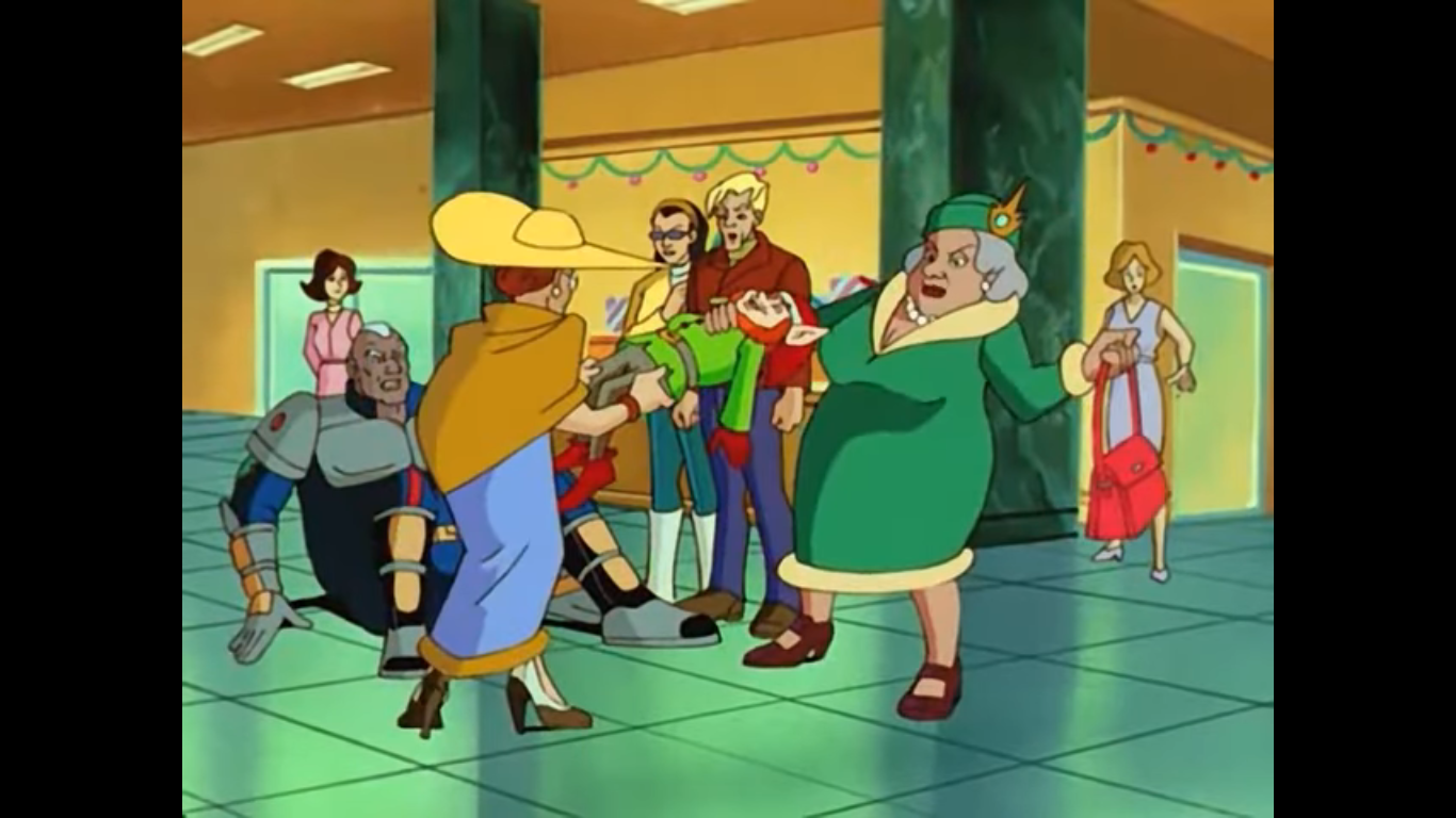
Inside the store, we hard cut to Sgt. Reed taking a purse to the face. A pair of older women are fighting over this Giggles the Elf doll. It’s an amusing sight as the doll is basically life-sized so the two women look like they’re playing tug-of-war with a rather short man in place of a rope. A store manager comes to help Sgt. Reed up off the floor as the purse was apparently swung by one of these women. He apologizes for the behavior of the guests as people are getting really upset and claiming that their items are being stolen. We see a group of people basically just bickering with each other and accusing each other of theft. Reed tries to put out the fire with a plea for Christmas spirit, but a rather large, angry, woman is having none of it. She lifts the rather large man off of his feet and throws him back into the other cops! Then the other patrons start wailing on them with all of their various items! This is nuts! If this were a scene in the original film, the cops would be jumping to their feet and blasting away at this mob, but this is a kid’s show. Before the scene ends, we see a bag laying on its side and a red-gloved hand sneaks into frame to snatch the contents of said bag. The hand clearly belongs to one of those elf dolls.

We switch locations with an exterior shot of the police headquarters. It looks like a giant, domed, stadium so I guess their budget is appropriately large. Sgt. Reed is sitting at his desk and rubbing the back of his head with an ice bag while RoboCop gives him a quick examination. The image is from his point of view and we get to see he’s X-raying the guy without any sort of protective equipment so he’s probably just blasting radiation out into that office. Reed has some superficial injuries to go along with his bruised dignity, as RoboCop puts it, and then the big guy prints out a bill for him. I bet he doesn’t pay it. Officer Miner then sets the plot up for us as she mentions all of the people Reed had arrested at the store were claiming to be victims of a robbery. How like the police to arrest the aggrieved? Reed says the security cameras turned up nothing, and I guess because we need a reminder of what the stakes are here, the giant woman from earlier barges in with cops draped all over her to scream about her rights and that those elf dolls were hers! The police are apparently too busy with crowd control, so Sgt. Reed has no choice but to ask Miner and Murphy to go undercover and catch these thieves. Yeah, you read that right, he wants the giant robot guy to go undercover.
RoboCop’s answer to such a request is to put on a snowman costume. I’ve seen worse ideas, though the proportions on this snowman are unlike any I have ever seen. He’s stationed inside the mall and some onlookers are understandably curious about this beefy looking snowman. Miner is nearby with an arm full of packages as she pretends to be a rich person without her trusty butler. It’s ridiculous, but apparently her plan works as her purse gets snatched. There’s an animation gaffe as the purse is still there when she tells her partner that they took the bait, then it vanishes. Mr. Frosty springs into action by ditching the costume and running after a beacon that was apparently in Miner’s bag. It’s now in the bag belonging to…grandma? Well, a little old lady, and RoboCop is pretty surprised when he picks her up off of her feet. A little elf then pops out of the bag and it’s that Giggles guy. He aims something at RoboCop that fires oil which lands on his trademarked red visor allowing him to make an escape with his elf buddies.

You think a little oil to the eye is going to stop RoboCop? Hah! He just engages his go-go-gadget wipers and clears that stuff out in a flash! He runs after the elves which number five and manages to corner them in a dead end. It’s rather odd for a mall to feature such a thing, but I’ll allow it. RoboCop is a bit confused at what he’s seeing, but the elves (who are all identical) waste no time in attacking. They take to his ankles with torches and saws and start hacking away while RoboCop…just stands there? I’m getting angry as I watch this thinking RoboCop is about to just crumple into a pile of bolts, but he does start kicking them and tossing them away. They repeatedly smash into the wall and we get another animation error as six elves slam into the wall instead of five. Or, one got up, ran back at RoboCop offscreen, and got tossed a second time. RoboCop seems to think he’s got them, but Giggles here seems to think otherwise as he points out the crowd of onlookers. The group (many of which are reused models from the earlier scene of the cop beatdown and should probably be in jail right now) are all disgusted that RoboCop would attack Giggles like this, and I guess they’re trying to turn the public against RoboCop? The other elves then fall apart as they’re all robots and RoboCop is left holding the last, functional, one.

RoboCop was evidently able to extricate himself from that sticky situation as we cut to the laboratory of Dr. Neumeier (Dean Haglund) who is examining the severed head of Giggles the Elf. He’s rather impressed with the tech on display and declares that whoever developed this thing is a genius while Miner thinks they’re a “nutbar.” RoboCop pops out that hand spike of his and connects to the computer system to analyze the head. He finds the security footage from the store there and it’s been edited to scrub out the crimes. Neumeier seems to find this impossible, but then the writer of the episode gets to self-congratulate themselves via Neumeier who sums up the situation with a “Who came up with this?” Sgt. Reed then contacts the group via video chat and he can be seen dodging flying presents as there’s more trouble down at Hunting Dorfs. He needs backup, so RoboCop and Miner depart to assist.

As the pair exit the lab, they find a giant gift placed on the stoop just outside. The two seem confused, but Neumeier is psyched as no one ever gives him presents. He drags the heavy item inside as the other two leave. As he sits down to unwrap it he actually hopes aloud that it contains a massive fruit cake because we just had to get a fruit cake mention in here. It does not though and instead contains…a woman?! If you’re thinking something like the classic stripper in the cake bit, you would be mistaken as this woman is very clothed. She’s decked out in holiday attire and appears to be holding a pie. When she bursts out she cries “Newmy!” as the guy falls out of his chair in surprise. These two clearly have a history, but I can’t even tell what her name is. Charlotta?

After a quick break, we come back to the same scene and Charlotta (I’m reasonably confident that’s her name) is emerging from the remnants of the gift as Neumeier comes to. She asks where RoboCop is as she claims to have something for him, but realizing he’s not there she sets down her pie. Neumeier is apparently so shocked to see her because she’s been in prison for apparently trying to kill Neumeier and the others. They also have some kind of toxic relationship at play because Charlotta seems to like him and she’s also pretty horny after being in jail for what I assume was months. She says she got out for good behavior, but who can be sure? She points out that Neumeier apparently promised to wait for her and vows to make it worth his while. When he mentions the attempted murder, Charlotta responds with an unconvincing, “Oh Newmy! I wouldn’t hurt a fly!” as she strokes his cheek.
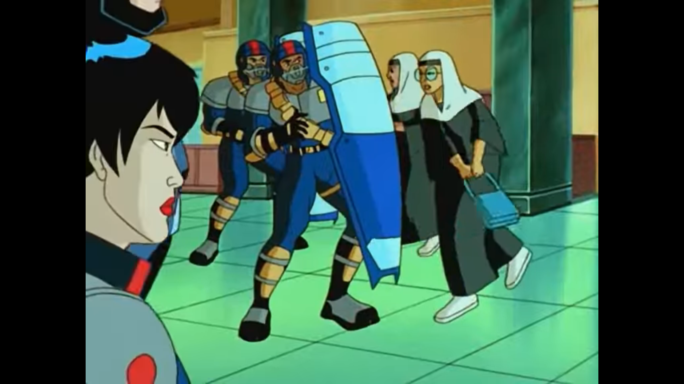
We’re apparently going to leave those two to their reunion and shift scenes at this point. We’re back at a department store and the place is in chaos. People are fighting, nuns are striking cops, and someone swiped a coat off of a mannequin that looks just like Daria’s friend Jane. Sgt. Reed informs RoboCop and Miner that the place is going crazy because the whole system is down and people can’t use their credit cards. I’ve been in stores when that happens and I can’t say I’ve ever seen a melee break out. The store manager is there to confirm the chaos. When the whole world conspires to keep consumers from consuming the whole thing falls apart. You know, I think I am getting a teeny bit of the original RoboCop‘s vibe in this show after all. And even more so when RoboCop asks who supplied those dolls and the manager confirms it was the same company that installed their security system. When Miner points out how bizarre that is, the manager agrees, but since the dolls were practically free and come with massive profit margins it was a risk worth taking. Spoken like a true capitalist!
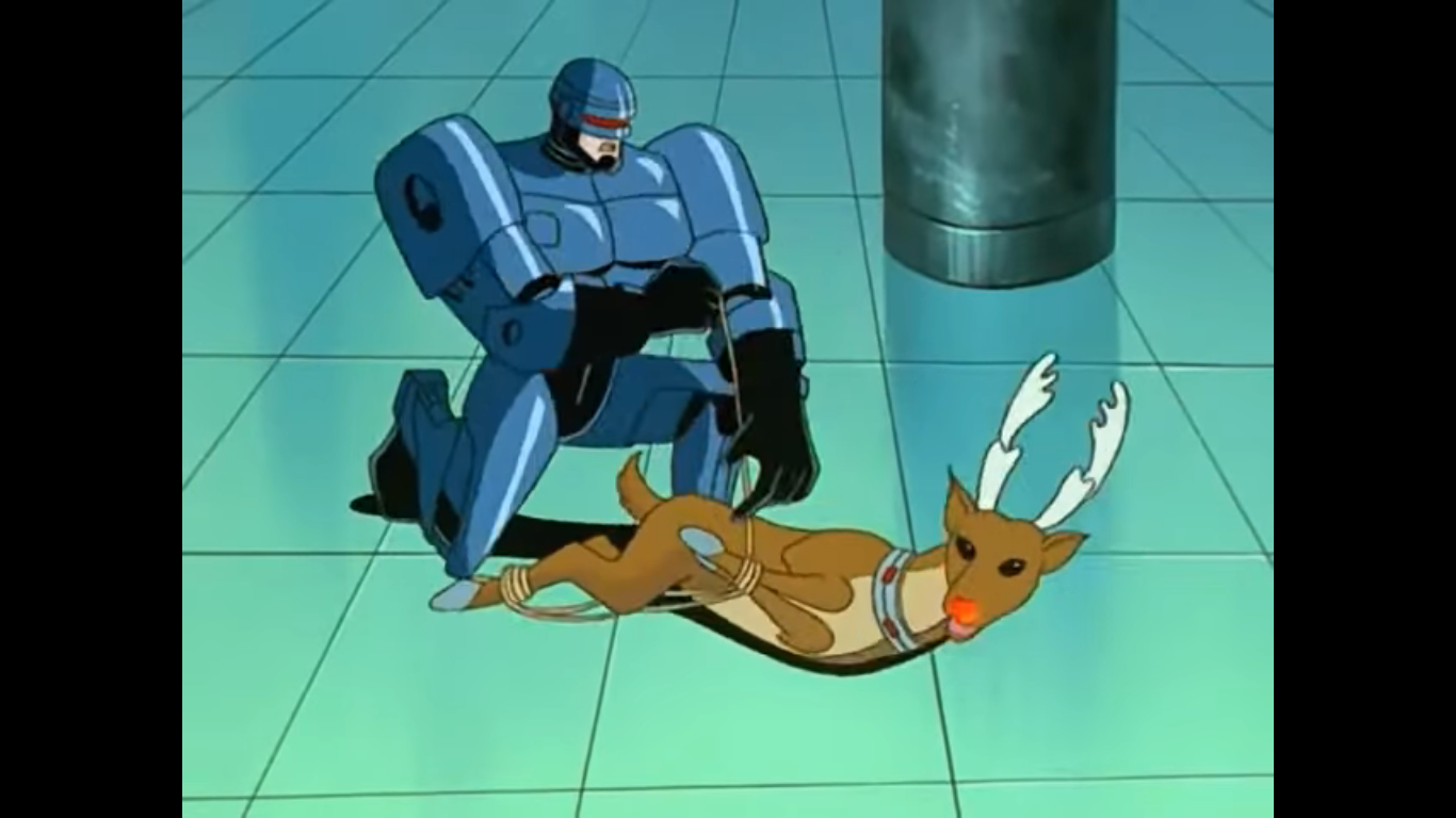
Miner directs RoboCop’s attentiont to a store display Rudolph. The world’s most famous reindeer seems intent on watching the two. RoboCop does some sort of analysis thingy and determines the red, glowing, nose is actually a camera. Upon having that out in the open, Rudolph decides to flee. Miner can’t get off a clean shot, so RoboCop has to pursue declaring unenthusiastically that this is his new role: Destroyer of Christmas. I’m thinking we’re about to see these gnarly roller blades he’s got concealed in his feet, but RoboCop instead deploys his grappling hook from his arm to wrap the reindeer up. With the creature subdued, RoboCop is able to hogtie it (deertie?) and shove his fist-spike into an orifice on the creature’s side. The robo-deer doesn’t appear to like this and I feel like RoboCop has some consent issues, and this probably violates a whole bunch of laws too, but who knows what’s been passed in this new fascist state? RoboCop downloads a whole bunch of stuff and poor Rudolph seems rather worse for ware.

We return to Neumeier’s lab where we find the young scientist backpedaling pleading with Charlotta not to do something. And that something appears to be sex as the woman pursues the clumsy oaf imploring him not to think, but feel. He ends up against a wall and makes a quip about feeling some indigestion brought on by sauerkraut (gross), so his breath must reek. Charlotta tells him not to tease her, then says “You know what I want.” When Neumeier responds with an “I do?” she goes full-blown into fake orgasm mode with a “Yes. Yes! YES!” Before we can have just what she wants confirmed, a light from her box (no, not that one, the box she arrived in you perv) starts blinking and distracts her. She tells Neumeier that what she wants is a snack, maybe some hot cocoa, Lab boy runs off to fetch something for her which allows Charlotta to see what’s going on back in her box. There’s some device that’s basically a big answering machine and when she checks her messages we see a video of RoboCop sharing what he found inside Rudolph with the others. RoboCop has apparently uncovered a signal that will lead them to whoever is behind this prompting Miner to wonder aloud who would be sick enough to do this at Christmas?

Charlotta, that’s who! She’s understandably pissed and says she knew those two would screw things up for her. Neumeier then returns with two cups of cocoa and Charlotta has to turn off the villainous talk and trade it for her cute voice. She’s aghast at the lack of marshmallows in her cocoa, which may be true, or its a ruse to get Neumeier to leave the room again. With him off looking for the gelatinous desert item, Charlotta pulls out a small vile of gray substance and pours it into Neumeier’s cup. He comes back to announce he’s all out and Charlotta indicates she’s fine with that and encourages him to drink up. A genius like Neumeier should probably see this encouragement for what it is, but he doesn’t and soon collapses into a puddle. Charlotta laughs at him calling him “Nerd-meier!” and then pulls out her pie once more revealing it’s actually a bomb.

RoboCop and Miner are shown entering what looks like a warehouse. I assume this is where the Giggles dolls are made. Up on a catwalk is Charlotta and Neumeier who is semi-conscious and bound to a chair. She refers to the pair as a couple of Christmas turkeys in need of stuffing because, remember, she’s still super horny from being in prison. Neumeier sees the two and asks why they’re so tiny which allows RoboCop to tell that he’s been drugged. A bunch of Giggles dolls then surround the two and it’s time for a rumble!

Miner reminds Charlotta that this is where the villain speech goes, and the tactic works! Charlotta claims she’s knew to villainy and starts to inform the two of her plans while RoboCop indicates he’s recording the confession. It would seem that in 2030, online shopping has started to die off and this whole scheme was concocted by Charlotta, who is being paid by Big Internet, to make in-store buying a truly wretched experience thus driving people back to the online retailers. RoboCop gets to be the one to ask “Why?” and Charlotta’s response is probably what you’re expecting: she hates Christmas. She hates it because her last name is Tannenbaum and she’s sick of the jokes. She gets to be the one to say the episode’s title and remarks she hates how people will ask her “Can I play with your ornaments?” Is that a boob joke?

Now that the plan has been been revealed we can get to the violence. Charlotta, I guess, just walks away leaving her minions to attack RoboCop and Miner. They lay waste to the elf robots and these dome-headed robots that look like something out of Lost in Space. If seeing mechanical elf parts thrown around is unsettling, wait until you see RoboCop blast a robot snowman with a flame thrower! And then there’s the reindeer that shoot lasers out of their antlers, which RoboCop destroys with a grenade. It’s Miner who gets to make the remark about being glad her son isn’t here to witness this.

The robots have been dealt with, so now it’s just Charlotta. She apparently does care about Neumeier as she unties him and carries him to the roof. Or, she just needs a hostage. The cops pursue her as Neumeier comes to. Charlotta may like him, or may not, but she’s willing to dangle him over the edge of the roof in order to keep RoboCop and Miner at bay. Neumeier, not wanting to end up like a bowl of cranberry sauce, tries reasoning with Charlotta. He tells her that he understands what it’s like to be a super genius and have people not “get” you. He says he meant it when he told her that he’d wait for her, and even uses the “L” word. Charlotta starts sobbing and seems to be touched, but when Neumeier suggests she let him go she hardens to tell him that isn’t happening. Then, the kitchen robot from the very beginning of the episode emerges and the thing is huge! I did not get a sense for its scale at the time, but it’s like a spaceship. Charlotta tackles Neumeier into it, and the robot flies away.

So that’s it? The bad girl gets away and is probably getting some action right now while RoboCop and Miner are forced to look on. Hah, of course not! RoboCop scans the skies and finds the Santa balloon from earlier and declares that they’re hitching a ride! Inside the kitchen robot, a delighted Charlotta is busy making plans for she and her beloved. They’re going to move to the suburbs, build a dog, and clone some kids. Neumeier doesn’t seem unhappy about this. They’re interrupted by a banging from above, and it’s the giant Santa balloon. This thing is also way bigger than I initially thought as RoboCop and Miner are standing on the sleigh’s bench. RoboCop is probably the size of one of of Santa’s fingers. He’s got his jack-in device inserted and he’s controlling the balloon and making it basically bounce off the top of Charlotta’s. She vows not to go down without a fight, and the hatchet arms of her ride start spinning. RoboCop demonstrates that he has a finger laser and he finger bangs the right arm off of the robot balloon, but isn’t able to do the same to the left before it penetrates the Santa balloon and the two begin to do as Charlotta said: go down.

Back at Hunting Dorfs, the Giggles dolls are being marched away in handcuffs. Apparently robots have rights? How progressive! Sgt. Reed is standing by with the store manager who indicates he can’t take anymore this Christmas, his nerves are shot. Reed gets to say the fateful line of “It’s over,” when it most certainly is not. The two balloons come crashing through the glass ceiling creating an awful mess. Miner is the first to emerge from the wreckage completely unscathed and apologetic for what just happened to the man’s store. Reed asks where’s Murphy, and that’s RoboCop’s cue to emerge “Upholding the loving spirit of the holiday season.” That’s because Neumeier and Charlotta are basically seated on his palm in a passionate embrace. He sets the pair down and Charlotta seeks to confirm if her beloved will wait for her again. Neumeier just says he’ll email her every day and then goes in for a kiss. We’re denied actually seeing it as Miner tells RoboCop she needs to get out of there before she loses her lunch. RoboCop suggests she needs to get into the holiday spirit as the two walk out and she retorts with a “Don’t push it.” As they exit the building, the few items not completely destroyed in their wake fall apart and we roll credits.

That was…not bad? The opening for the episode made the show look rather silly and goofy, but once it got going there was way more RoboCop to be found than I ever expected. Consumers going nuts because they can’t buy stuff is a rather damning indictment of the holiday shopping season. A horned-up villain who wants to destroy Christmas because her name lends itself well to boob jokes? Impressively absurd. And the episode even seemed to make a point that the cops left the world in a worse state after catching the bad guy with that final shot of the crumbling store. The show was rated Y-7, but there was quite a bit of suggestive dialogue between Charlotta and Neumeier that would be way over a sever-year-old’s head and the action scenes make liberal use of the fact that the enemies are mostly mechanical. What other kid’s show is going to have its hero violate Rudolph and incinerate Frosty? That’s Robot Chicken type stuff, not Saturday morning.
The animation was a mixed bag. It was choppy and probably done on the cheap while the characters had fairly intricate designs and a semi-realistic approach to the art style. In that, it’s not unlike Lewald’s other show, X-Men, which was guilty of the same. The voice cast was pretty good, though this is one of those shows that doesn’t list out the roles of who does what. I know who the main cast is, but the secondary characters are a mystery. I think Charlotta was voiced by Elizabeth Carol Savenkoff as she’s the only other female listed, but the rest are unknown to me.

Christmas-wise, we get plenty of background stuff. I’m glad there was no kid character to play to outside of the one girl upset with RoboCop for beating the shit out of Giggles. There was a subtle B plot about RoboCop being unhappy about taking down these Christmas themed bad guys like it was a burden of some kind, but it wasn’t really played up. There were some jokes written into the dialogue, but nothing particularly humorous. Instead the humor is situational and even a touch dark since I think we’re supposed to laugh at some of the violence inflicted upon Christmas. I suppose this was a bit of a tough episode to just jump into as my first one since there was obviously a history with Charlotta, but I didn’t find it to be much of a barrier.

Is this episode of RoboCop: Alpha Commando getting a recommend from me this holiday season? I guess so. There was enough of a satirical element at play that I think it’s worth a look. Plus, it’s easy to find streaming for free so it’s not like it’s going to cost you anything. I am left a bit curious about the show as a whole where as before I was indifferent. I’ve always felt there’s only one good RoboCop anything, the first film, and the rest was trash, but maybe there is at least one exception to be made.
Can’t wait until tomorrow for more Christmas? Check out what we had to say on this day last year and beyond:

Dec. 21 – A Muppet Family Christmas
This year we’re celebrating two things at The Christmas Spot. Well, 3 things if you count Christmas by itself, which I suppose you should. Every fifth day, we’re celebrating the best of the best which is why yesterday was A Charlie Brown Christmas. If you read the feature on December 1st for this year, then…

Dec. 21 – Count Duckula – “A Christmas Quacker”
In the 1980s, Nickelodeon didn’t have a lot of animated content. That’s probably surprising for today’s adolescents, but that’s how the network was in the old days. That was due in large part to the network first prioritizing educational content, and then wanting to make sure whatever it aired couldn’t be found on another channel.…

Dec. 21 – Buzz Lightyear of Star Command – “Holiday Time”
When Pixar set out to create competing, fictional, toys in its debut film Toy Story it settled on cowboys and space rangers. The thought being that once upon a time cowboys were the most popular fantasy toy among boys, but were soon replaced by fantastic space voyagers once real-life space travel became possible. In order…