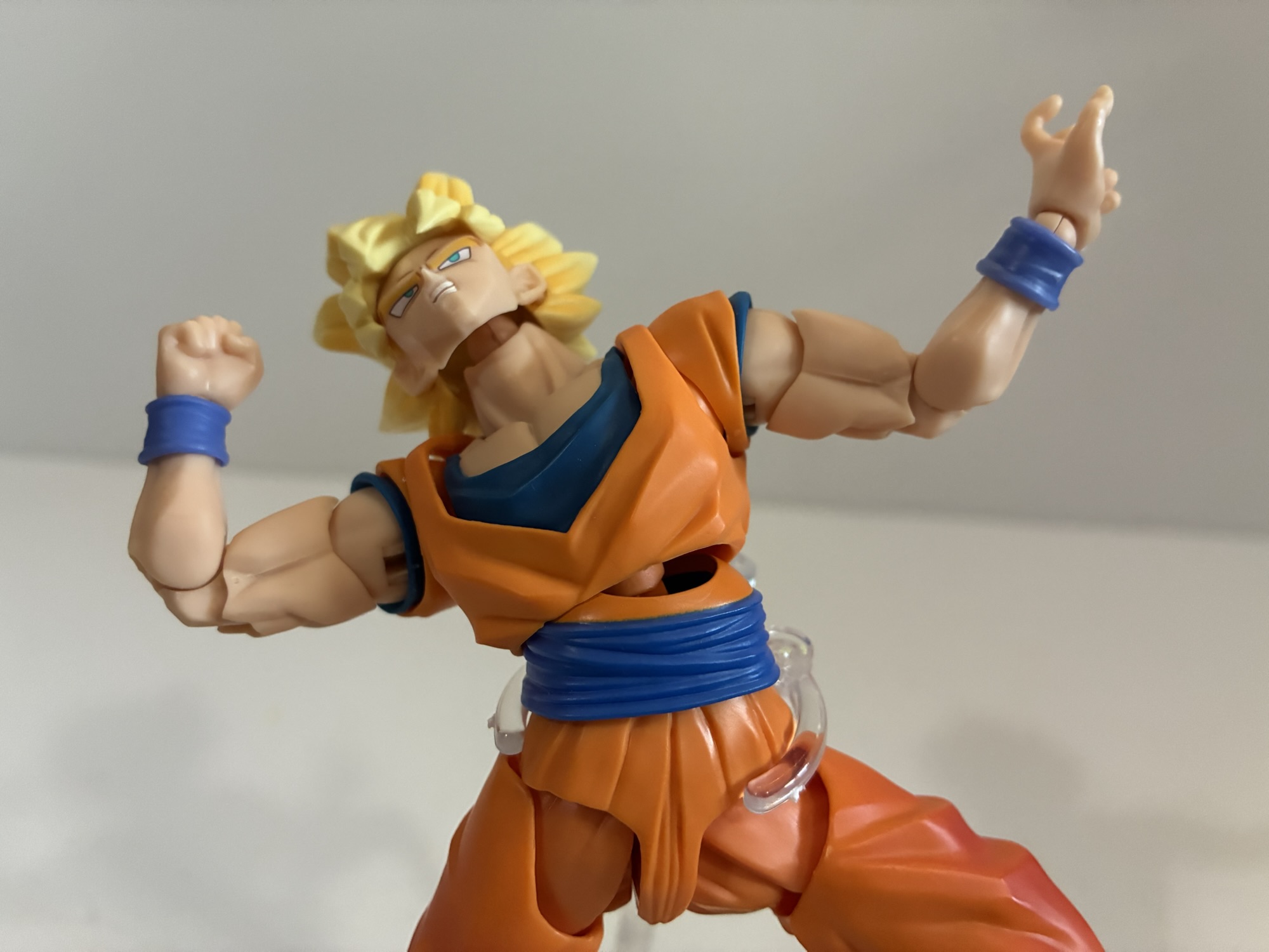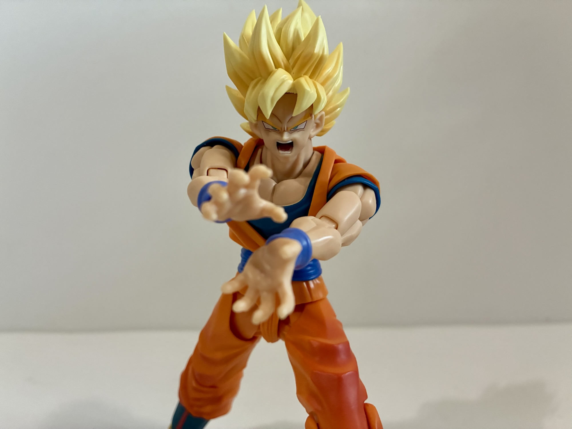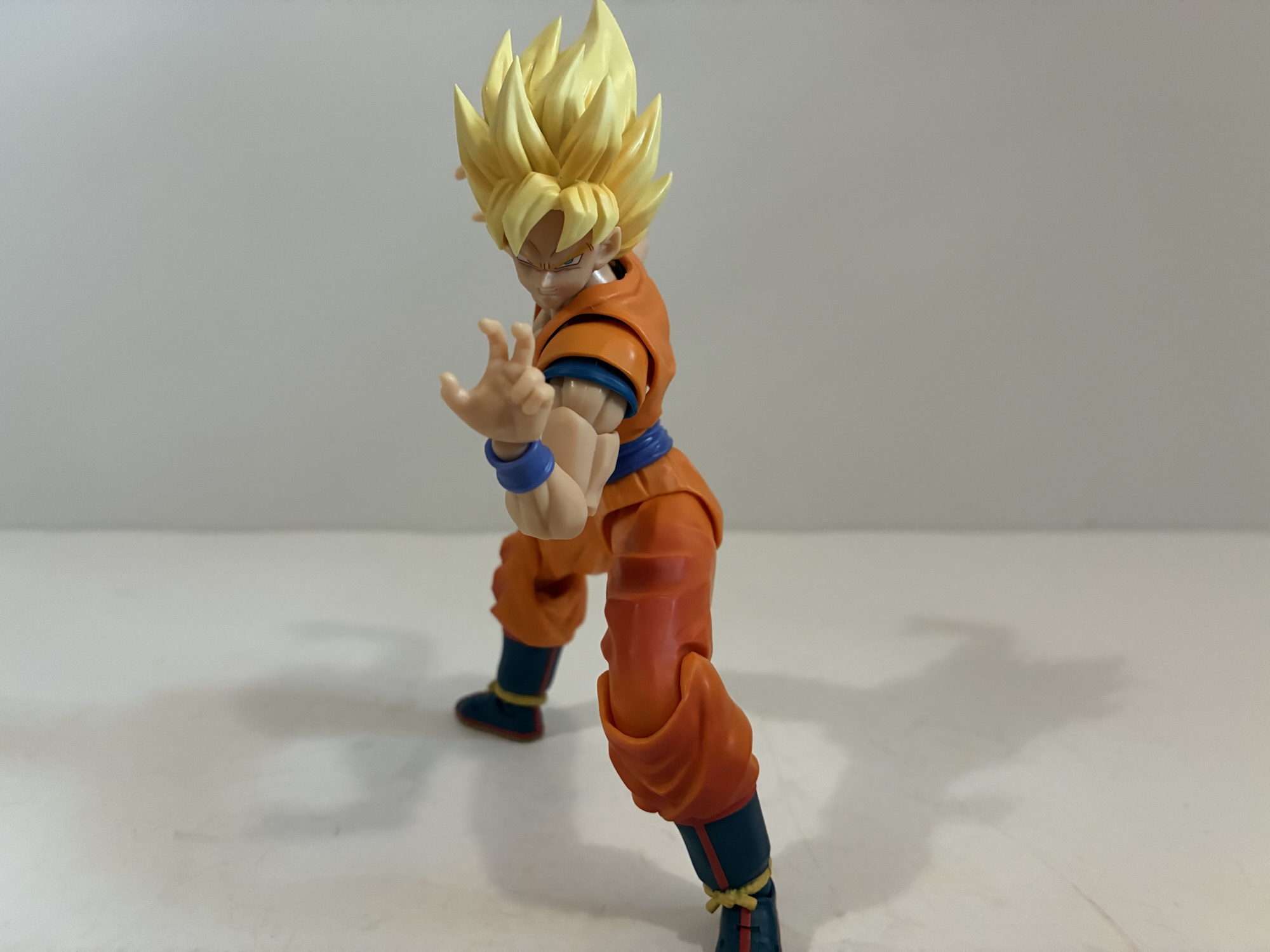
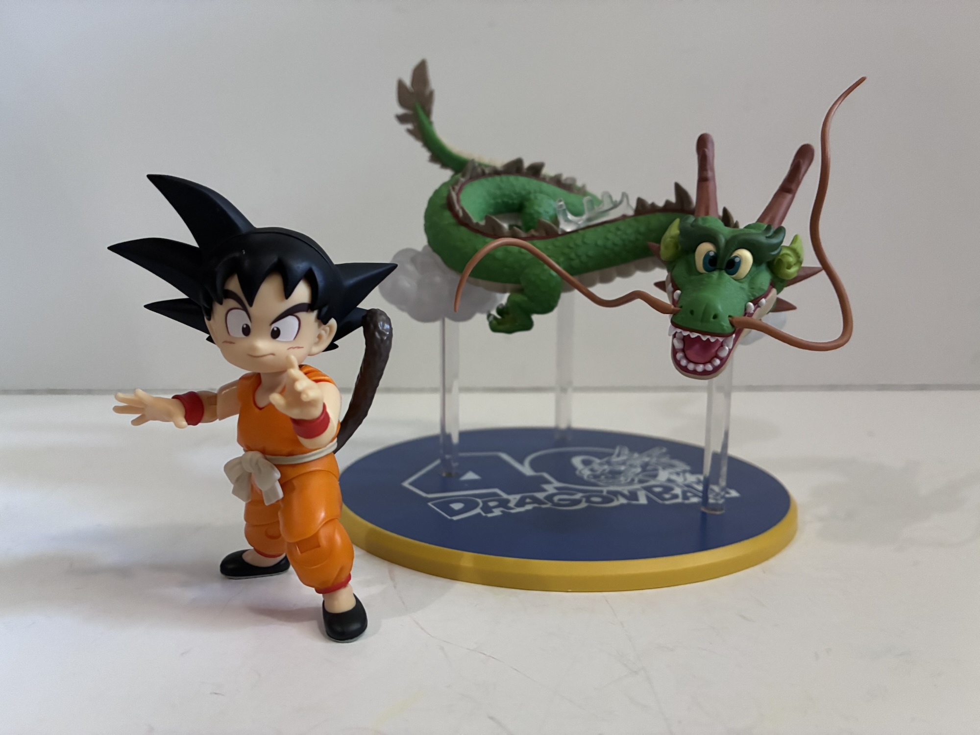
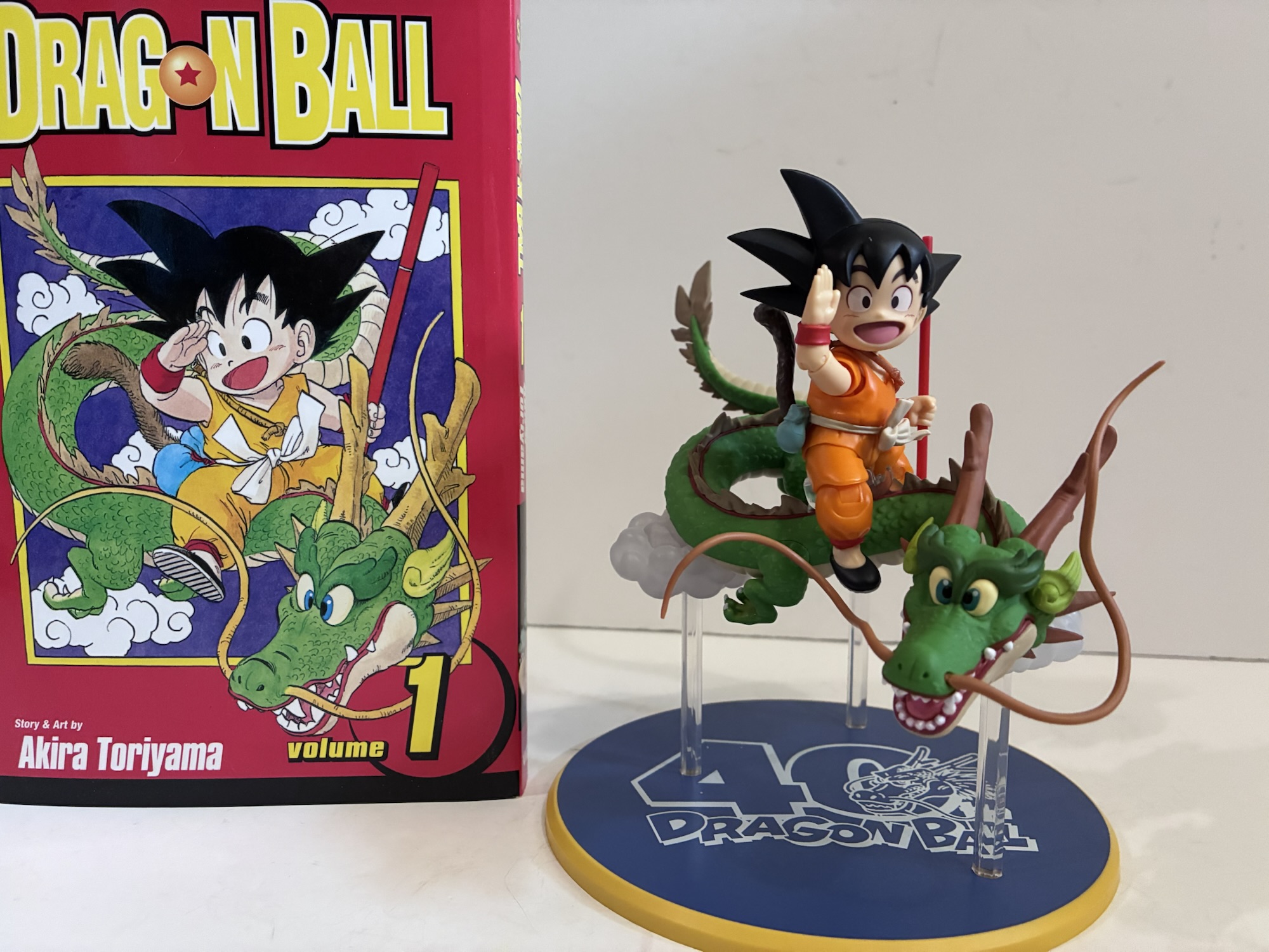
It was last year that Bandai and Tamashii Nations announced a selection of special releases in the S.H.Figuarts line of action figures celebrating the 40th anniversary of Akira Toriyama’s Dragon Ball. Among those announced was a brand new version of kid Goku and Shenron from the cover of the very first volume of manga for Dragon Ball depicting Goku in a pale orange gi riding atop a rather adorable version of the mighty eternal dragon. At the time, it was a Japan-only exclusive and I patiently waited for it to show up on Premium Bandai like other 40th anniversary figures, but it never came. The figure would be added to the pop-up shop circuit, but those never came anywhere near my geographic location and I’m not about to make a five hour drive in order to secure a figure, no matter how much I might want it. Thankfully, this spring Bandai partnered with Big Bad Toy Store to make this exclusive figure available to customers unable to attend one of these events. Ordinarily, when exclusives from this line show up at BBTS it’s because the store purchased them like an actual customer from Bandai making the price for anyone buying it off of them MSRP+. For this release, it looks like BBTS was able to get a bunch of these at wholesale as the price is $100 which is certainly steep for an action figure, but as far as I know it’s the price of the figure at the pop-up shops.
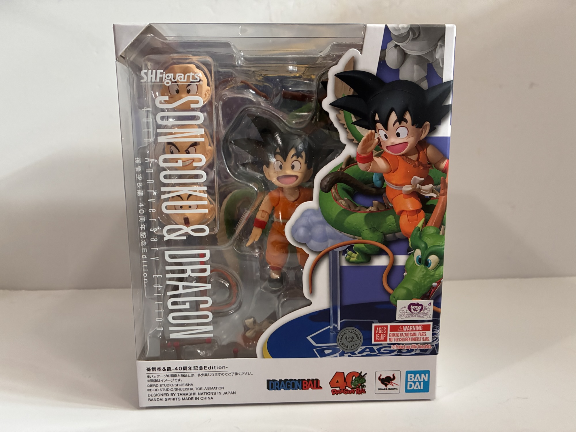
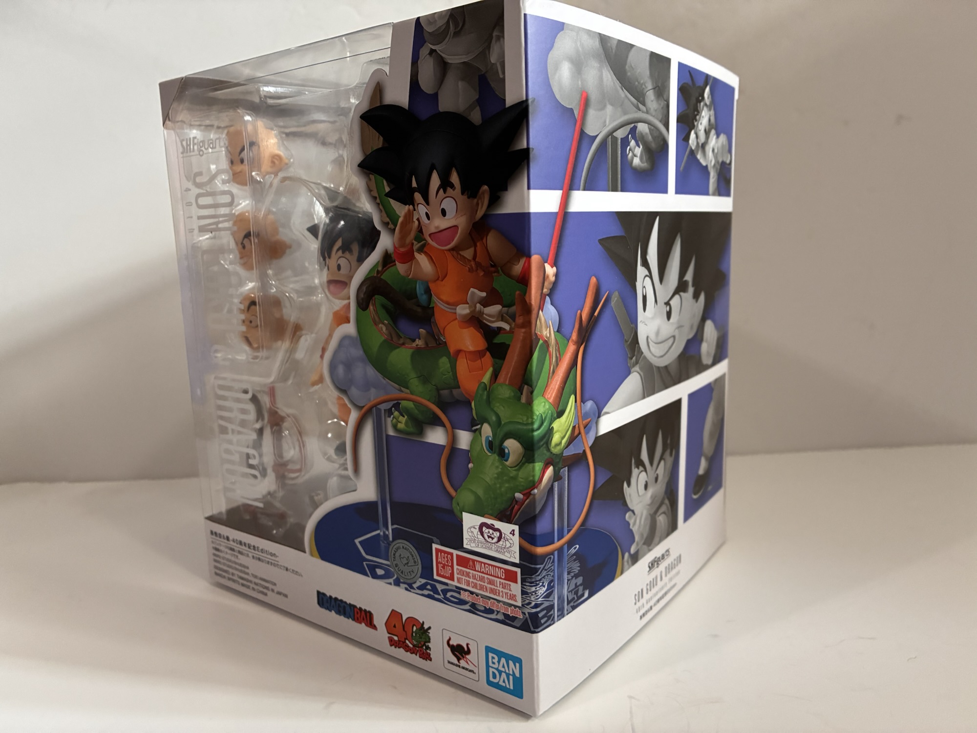
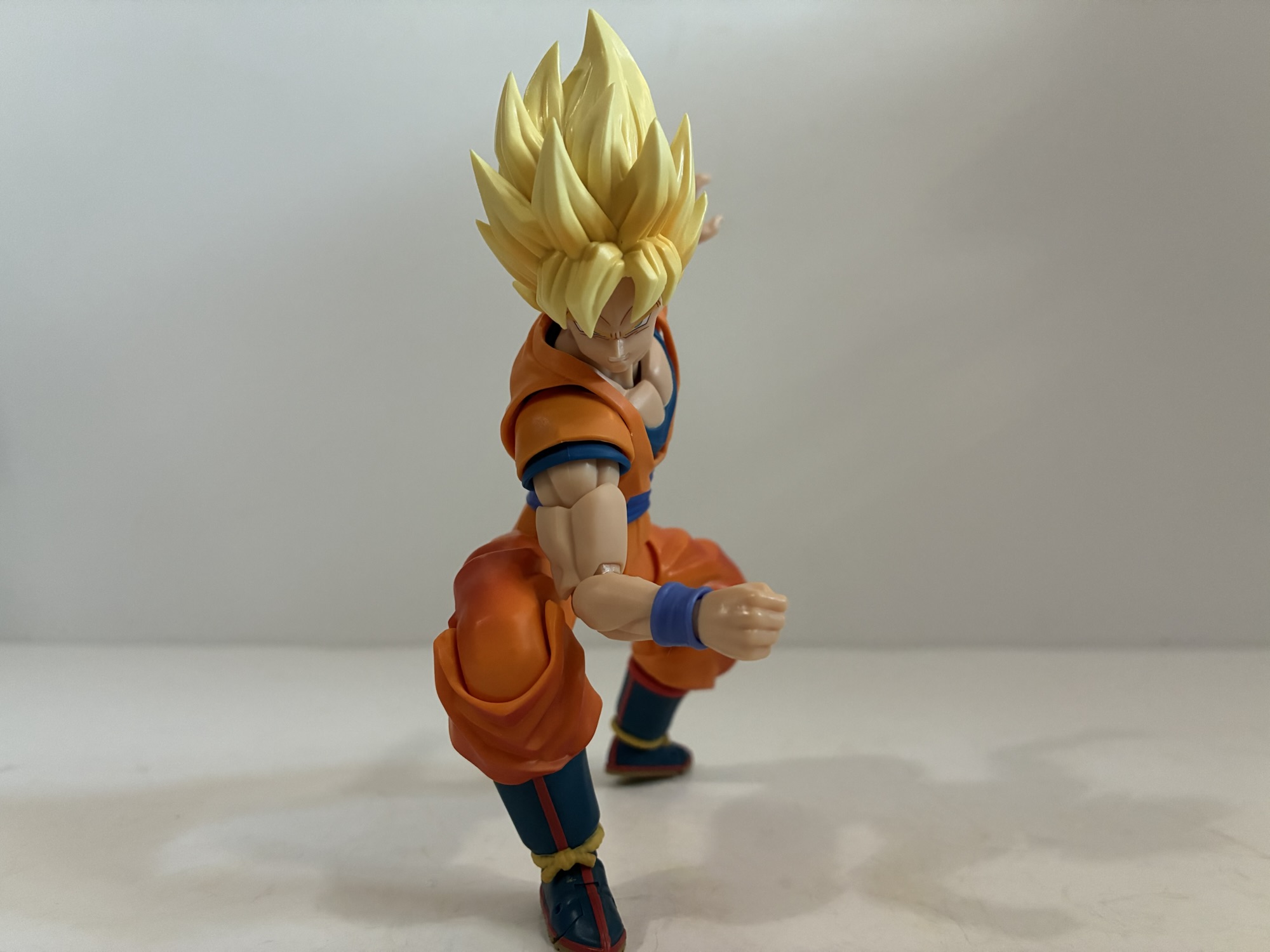
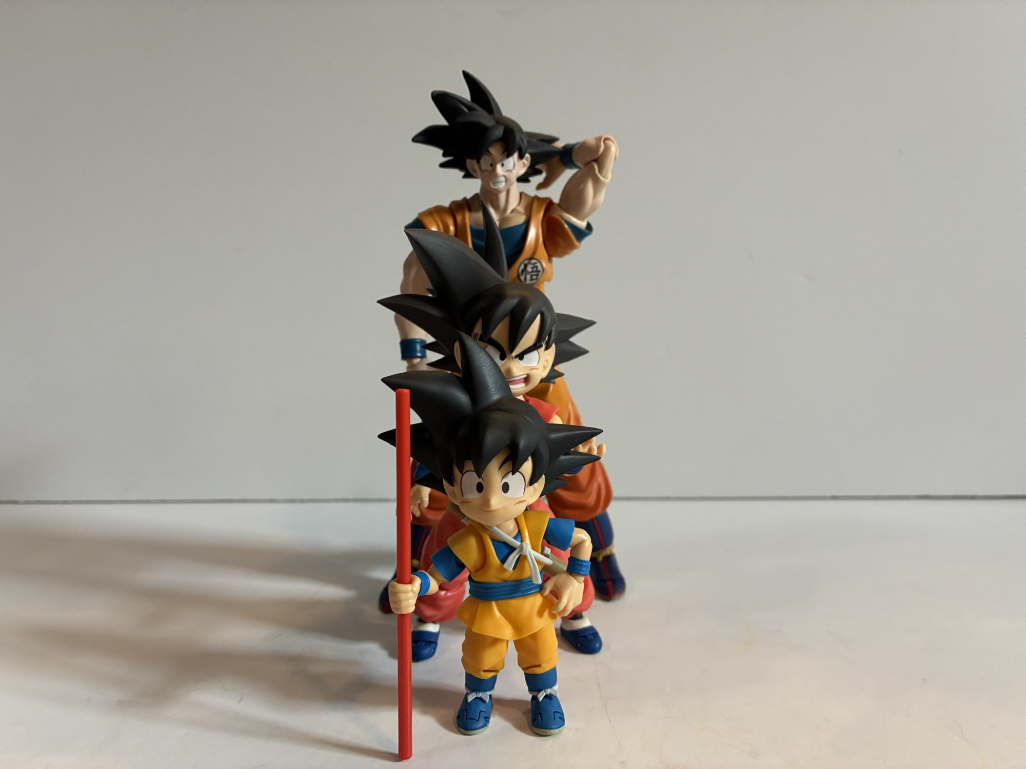
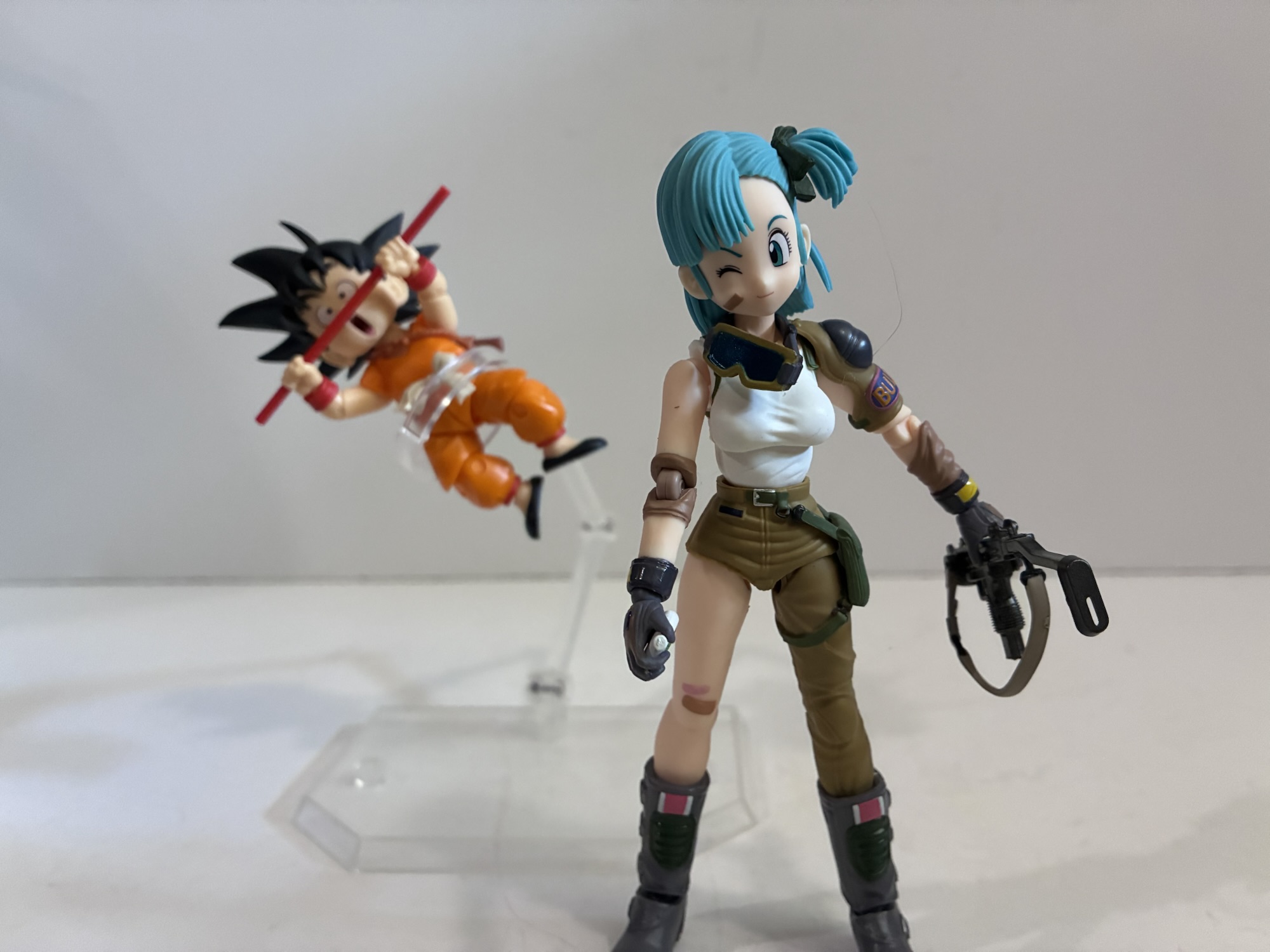
Previously, the only 40th anniversary figure I had purchased was the reissue of Cooler. He’s a bit of an odd one to release for such an occasion since he didn’t even appear in the manga or anime and is instead a movie character. In this case, the occasion just seemed like an excuse for Bandai to reissue one of its more popular and well-received exclusives for those who had previously missed out and to tie him into the event they just stuck a special base in the box. With Goku, the homage to the first cover is a much more worthwhile way to celebrate such an historic occasion and should make for a wonderful display piece whether it’s kept in-box or taken out. The box is oversized and more of a cube shape than typical with a generous window showcasing the figure riding atop the dragon. It’s presented so well that it did almost pain me to remove it, but I really wanted to get my hands on this all new Goku figure so it basically had to happen. I’ve repeated many times that my favorite era of Dragon Ball is the kid Goku era. There’s a charm to it not present in the later iterations and the cast is pretty tight. The original SHF Goku figure was fine at the time i purchased it, but he’s not even remotely in-scale with other figures in the line. He’s much too big plus he doesn’t really embody the proportions of the character from either the manga or anime. In both, Goku is kind of chubby looking with an egg-shaped body with stubby little arms and legs. He’s designed to look cute, not powerful, while the figure was more stream-lined and quite tall. More than the height though, it’s just that the overall proportions don’t look right. Place him beside a Dragon Ball era Bulma and the two don’t even look like they’re from the same toy line. Roshi was a bit on the large side too so the scale there is a bit better, but overall it’s not the best representation.
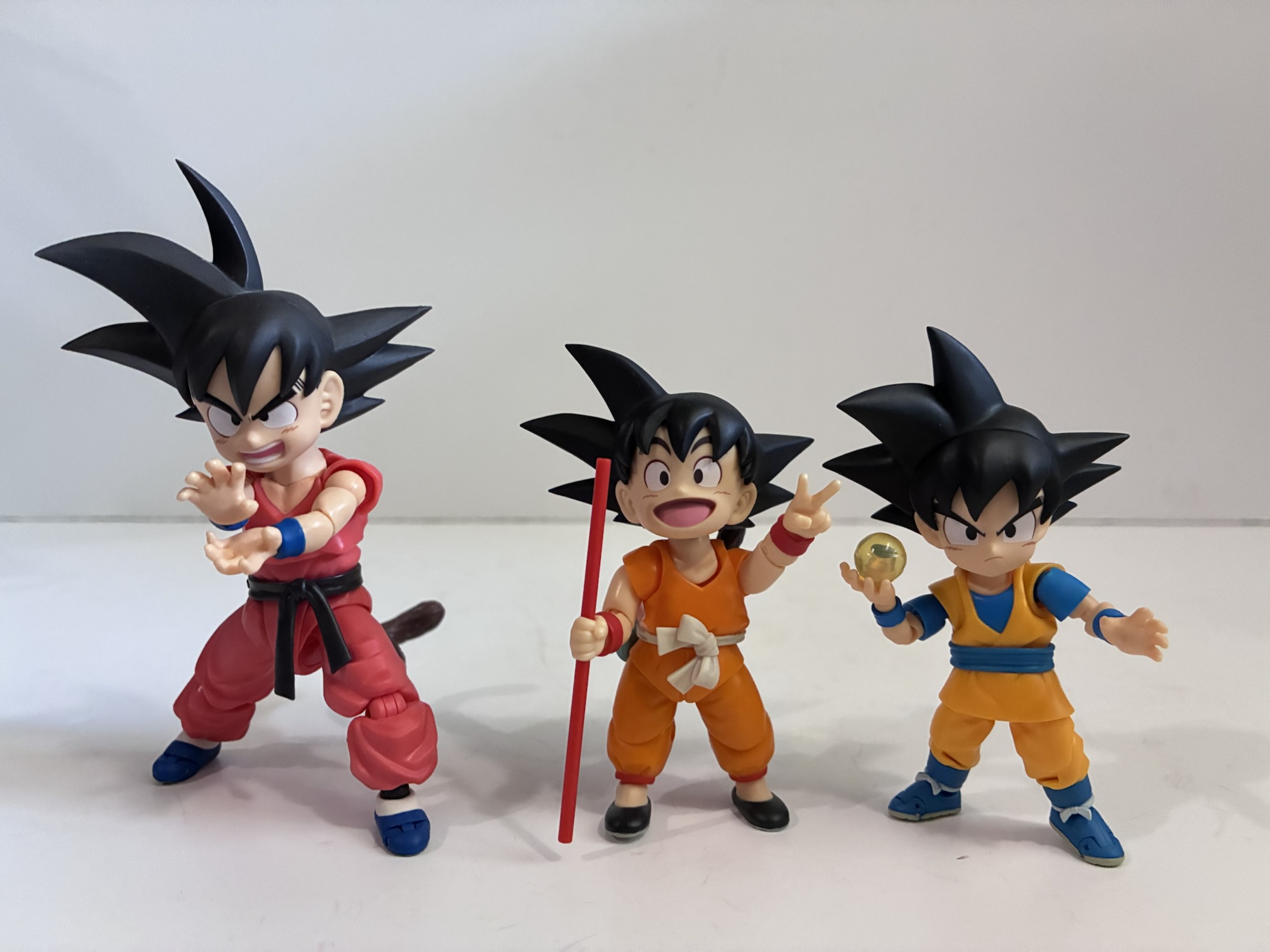
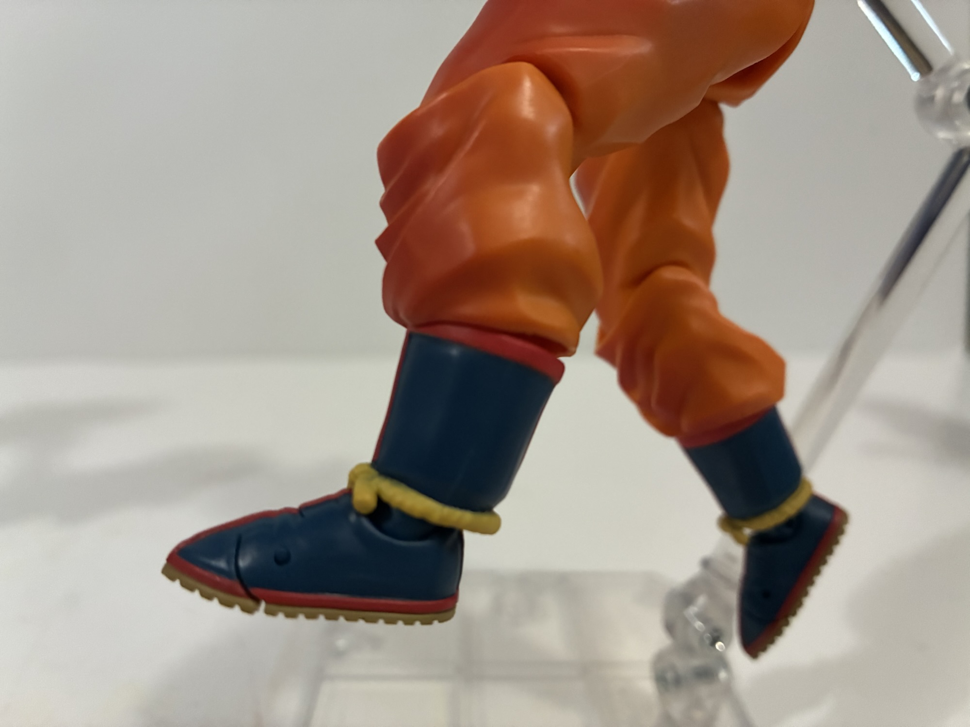
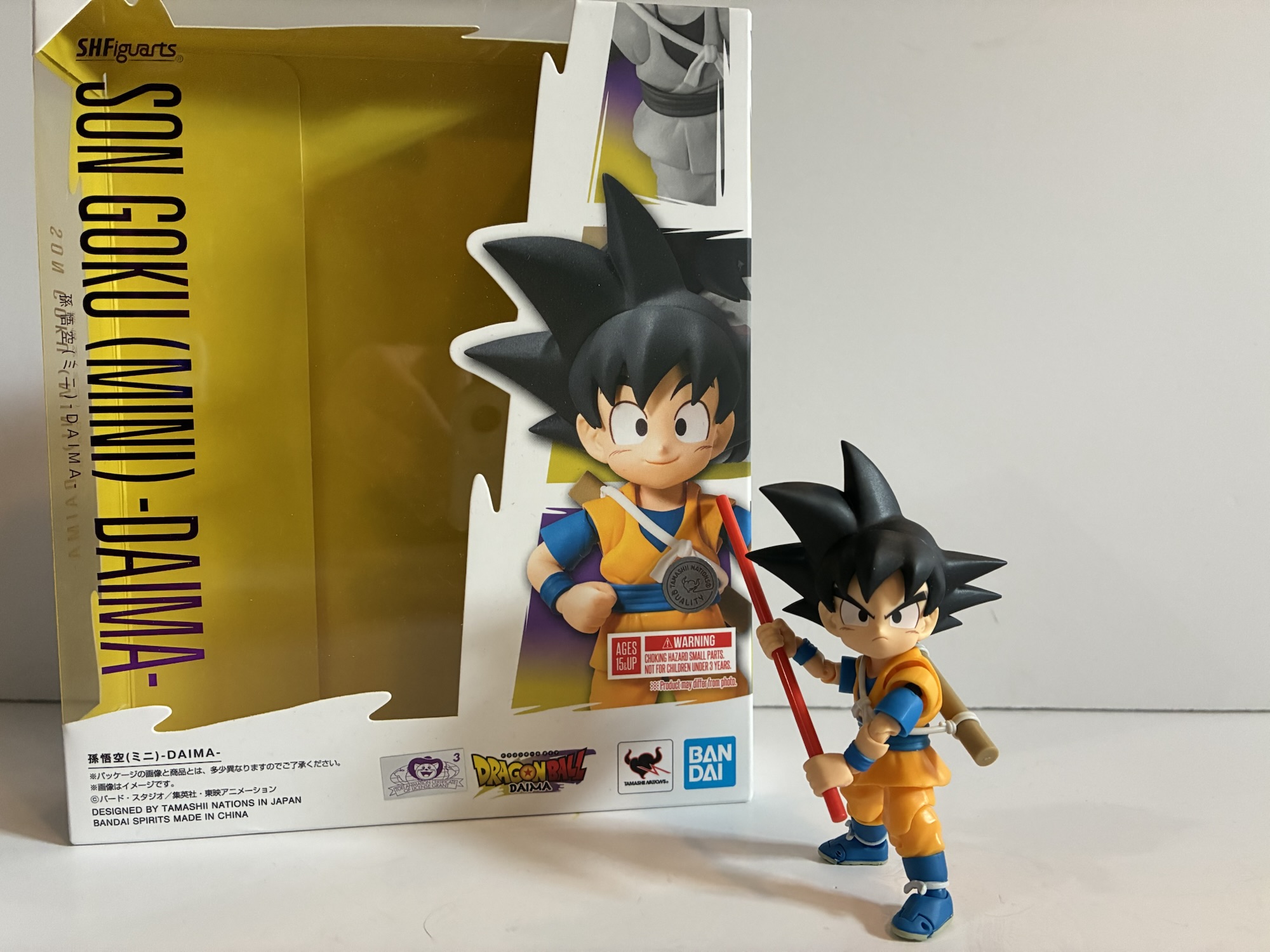
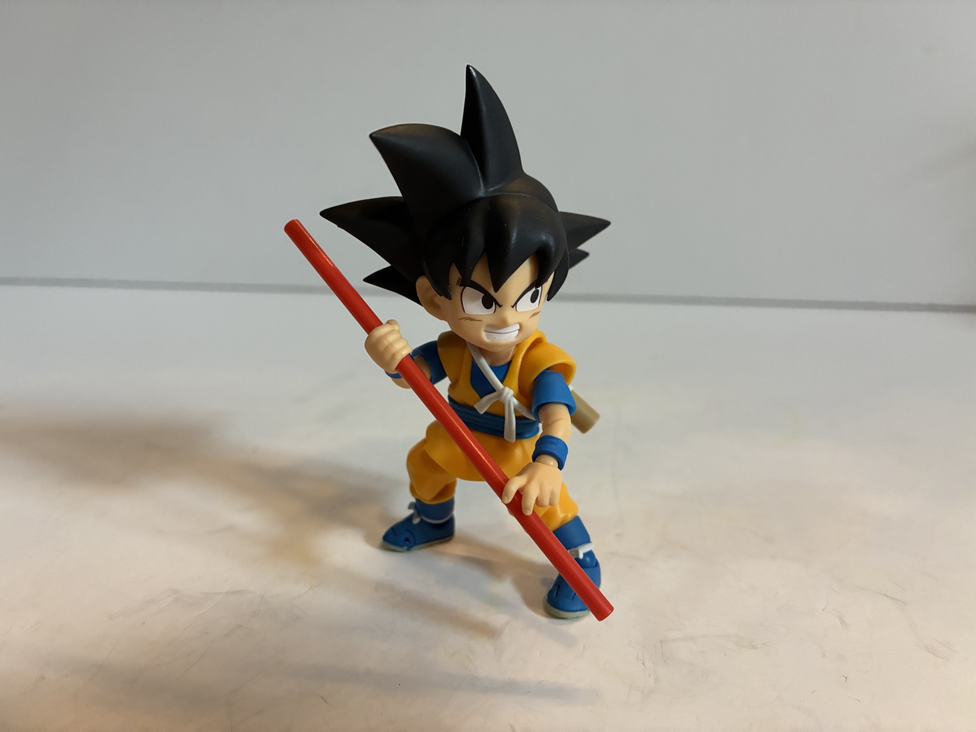
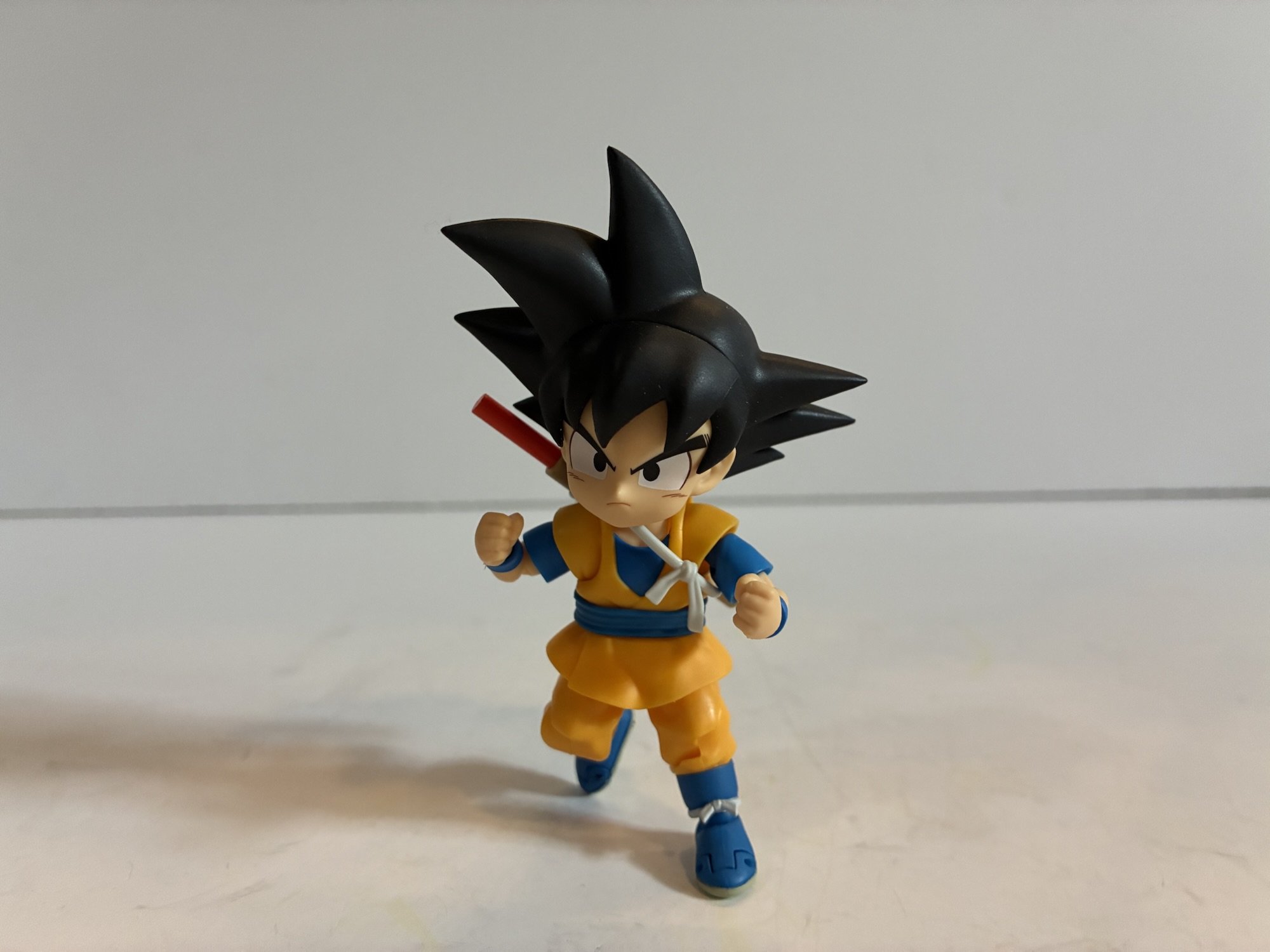
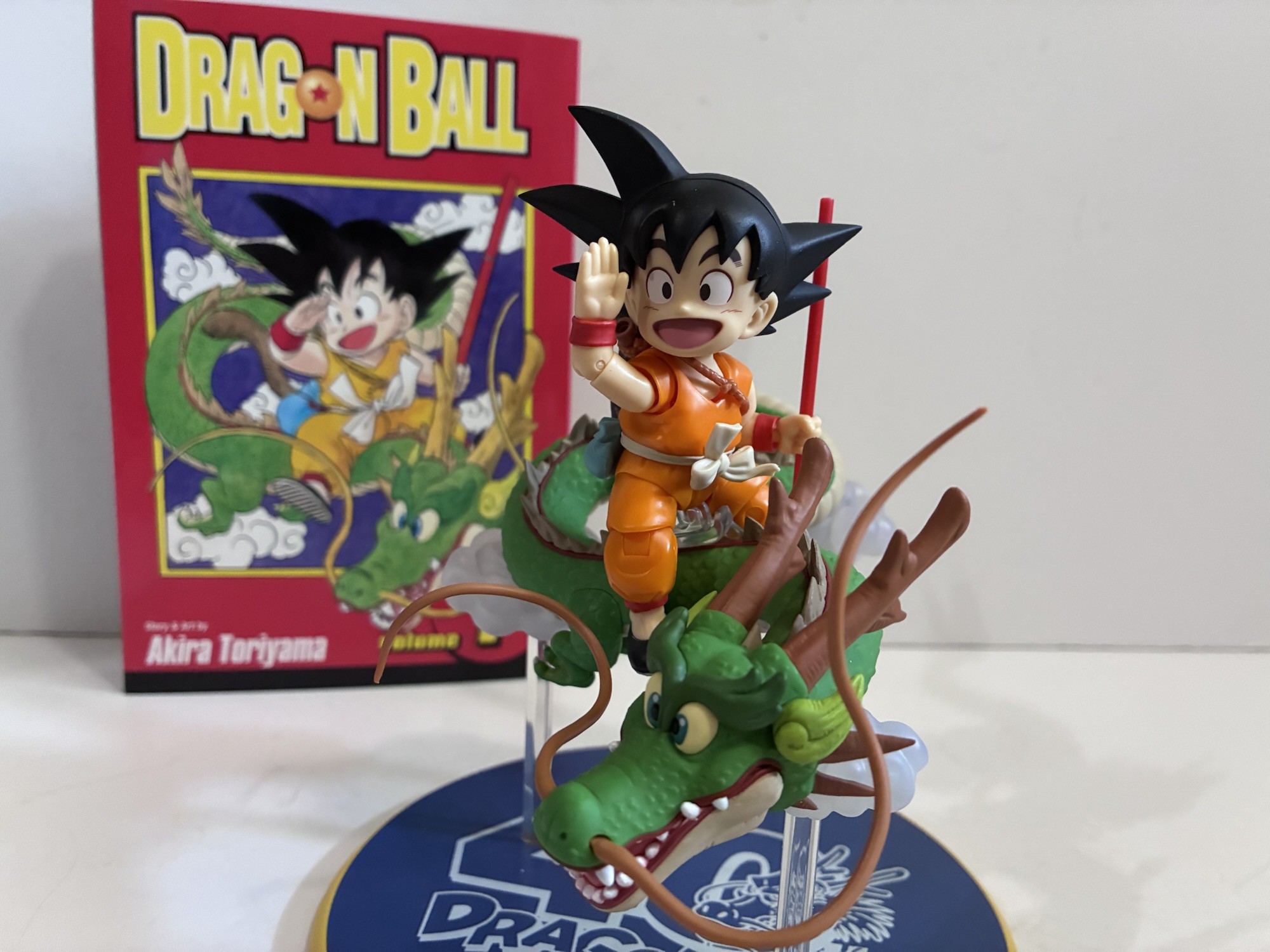
Since then, we’ve received smaller versions of Goku, but none based on his look from Dragon Ball. There’s a Dragon Ball GT Kid Goku release as well as the Daima Mini Goku and both are quite small by comparison. This new version takes after them and likely utilizes some of the same parts. Or at least that was my thinking going in, but in the case of this figure vs the Mini Goku there’s virtually nothing shared. Even the hands and Power Pole accessory are different. I can’t attest to the GT figure since I don’t have it, but if Bandai went to the trouble of making so many new parts for this figure then it bodes well for those hoping to get a blue version or a red one. This little guy stands a tick under 3″ putting him in similar territory to the Daima figure. What’s different though is the approach to the sculpt. Daima Goku is slimmer and more like a shrunken down adult Goku. This new Goku has those rounded proportions of the manga character with tubular arms and a round tummy. His legs are a bit long for the design, but since he had to match the pose from the manga his legs needed to be a bit long. When Goku is just standing still in the manga his legs definitely “shrink” as Toriyama was able to take some liberties with the character, but for a 3D representation some adjustments are needed. The gi is orange and a more saturated shade when compared with the Daima figure, but not as red as what appears in the anime. This is in keeping with the look from that cover which also has small, slipper-like shoes and red wrist bands and trim at the end of the pants. It’s basically just a different color of his traditional blue gi and he has an off-white sash and a turquoise pouch hanging from it where his Dragon Ball is stored, a nice little attention to detail.
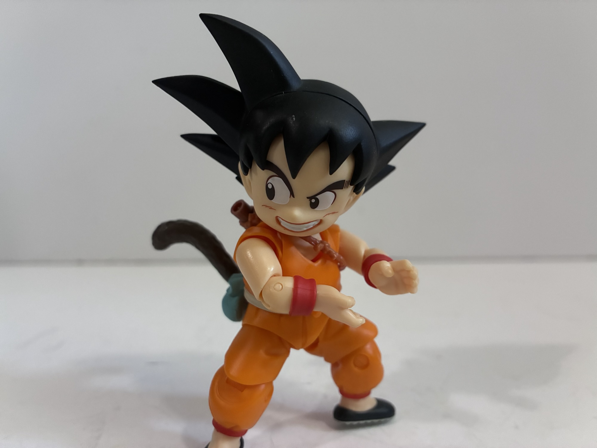
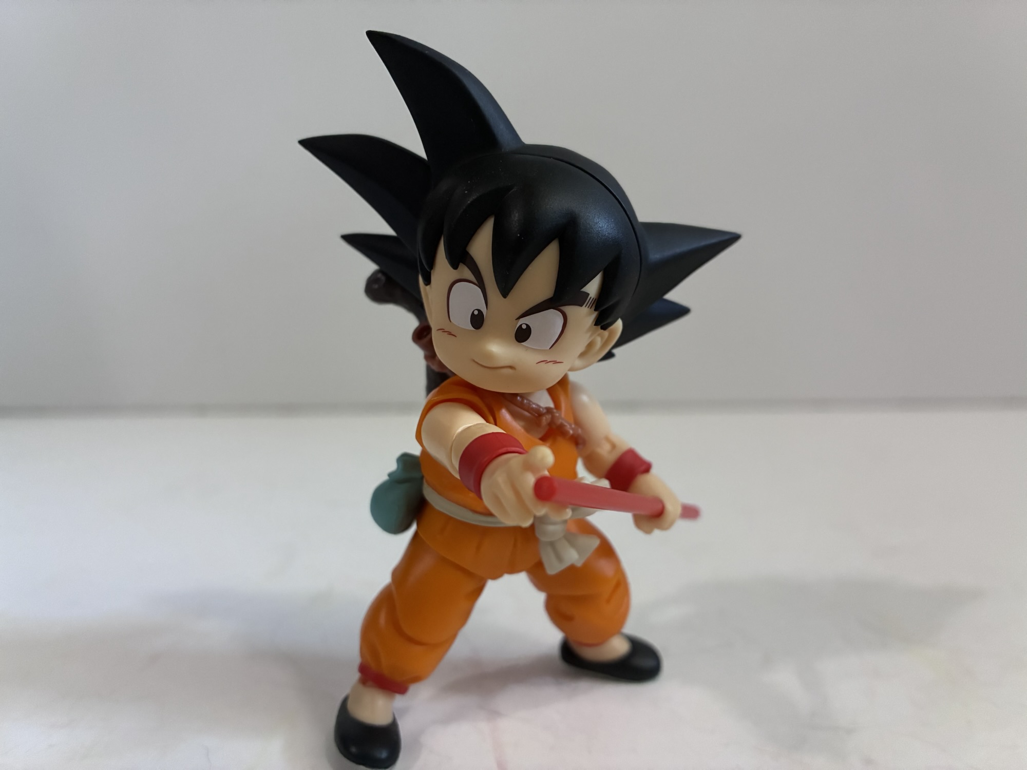
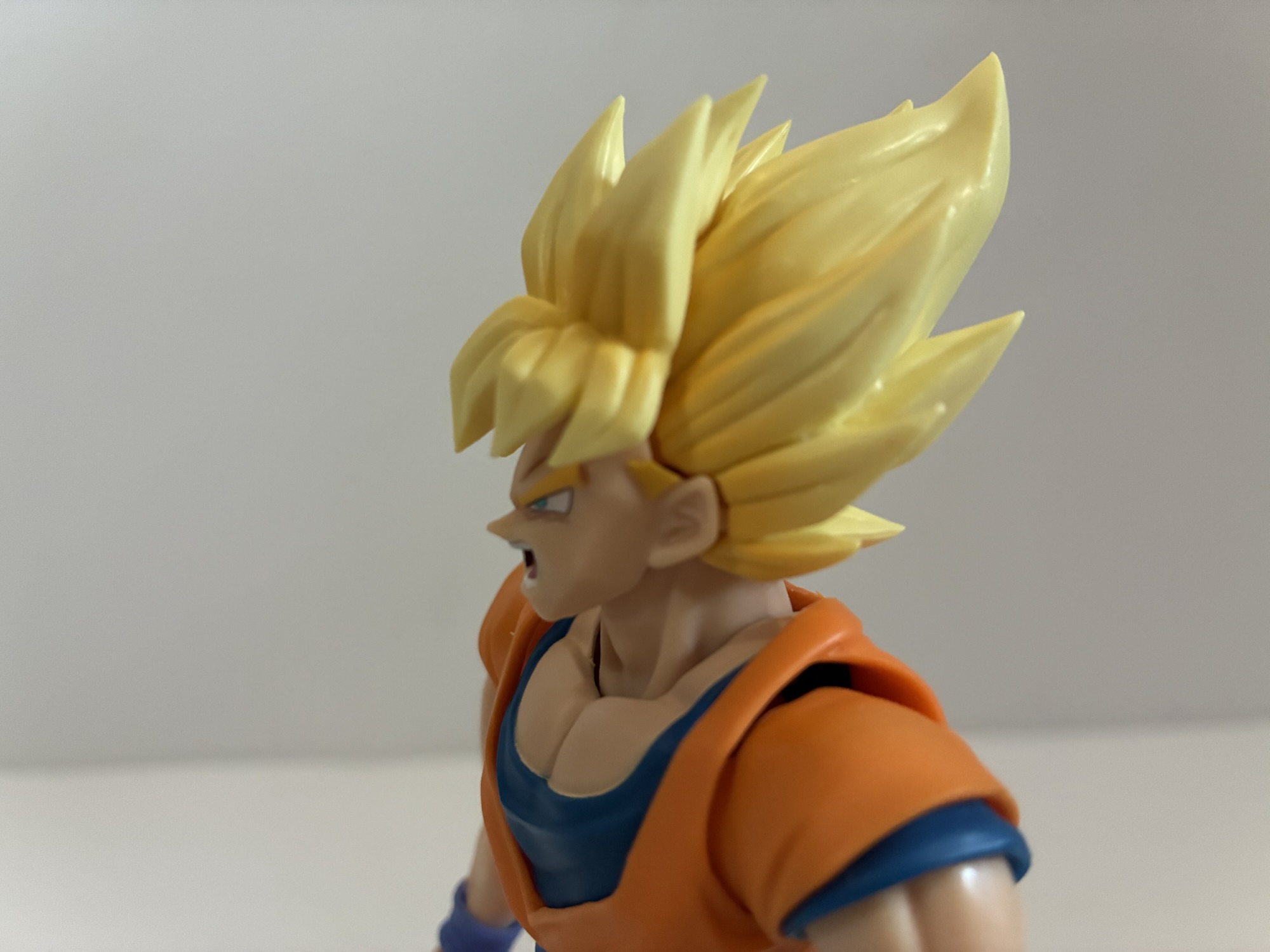
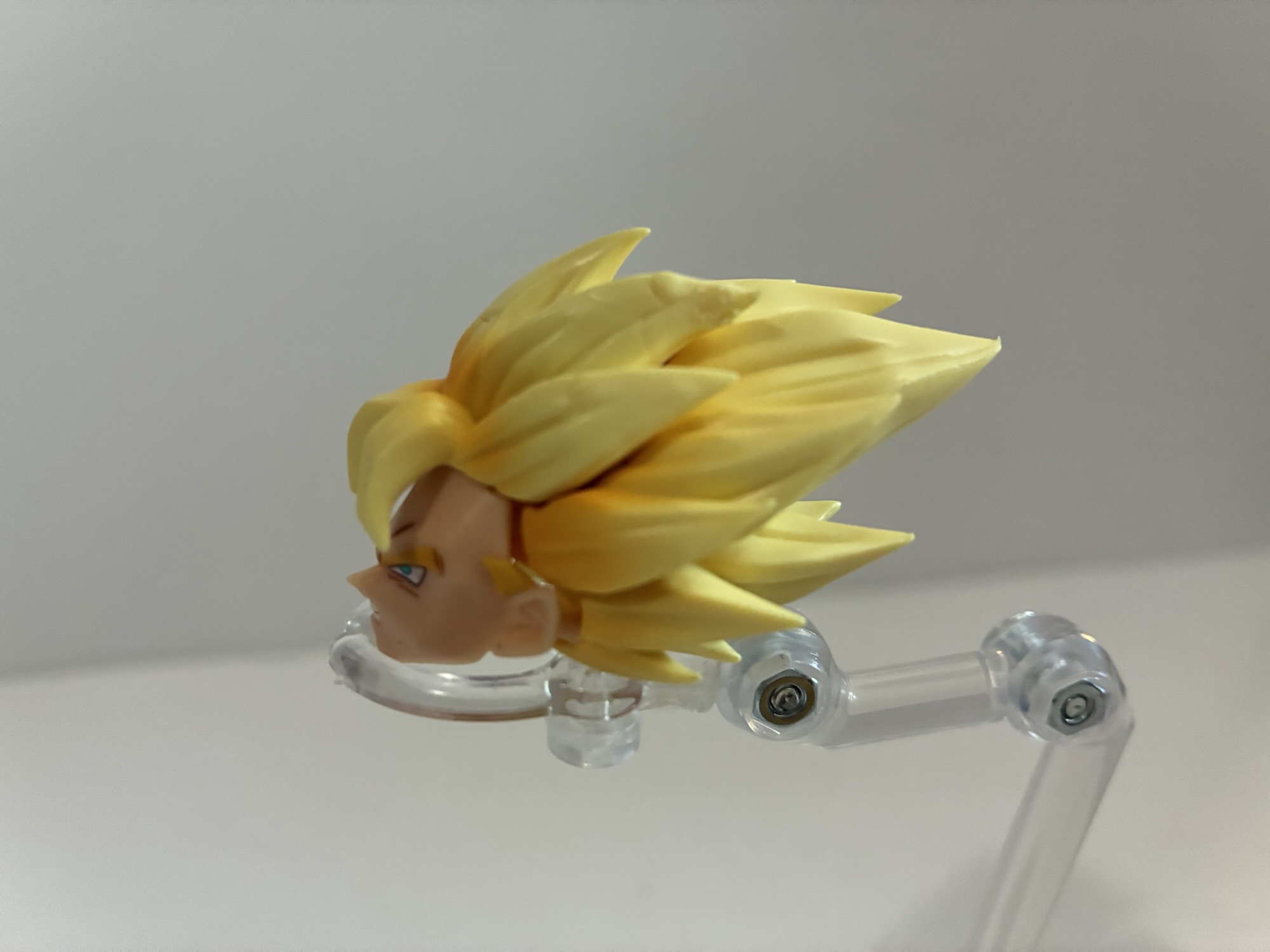
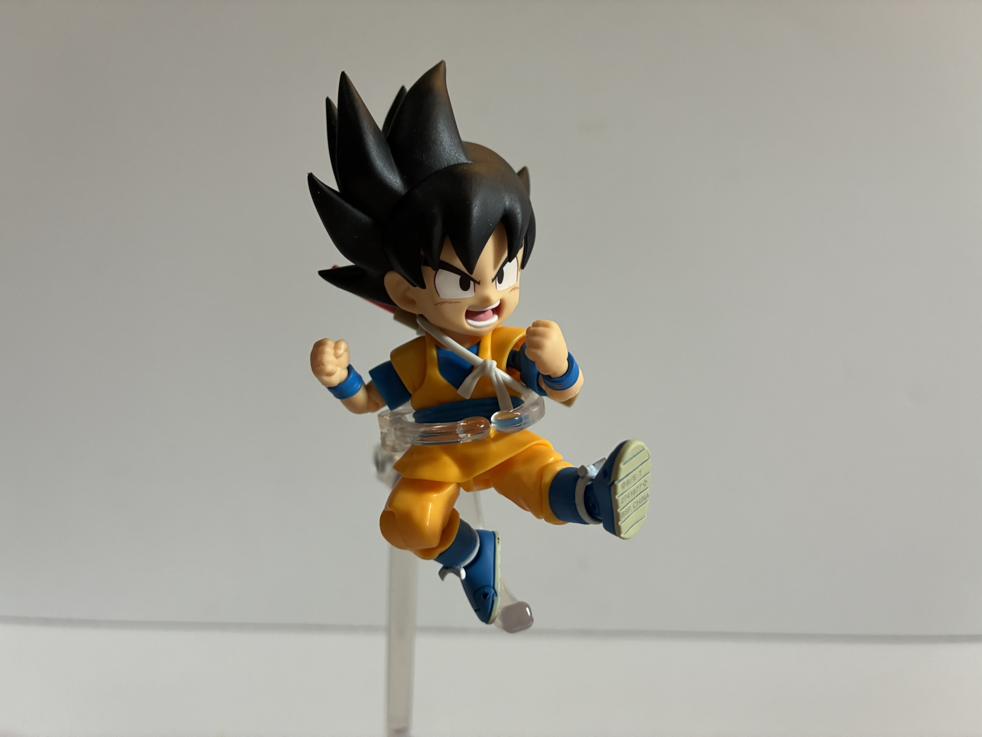
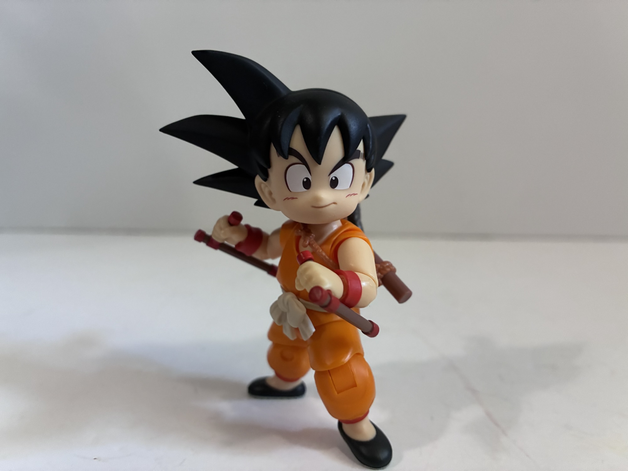
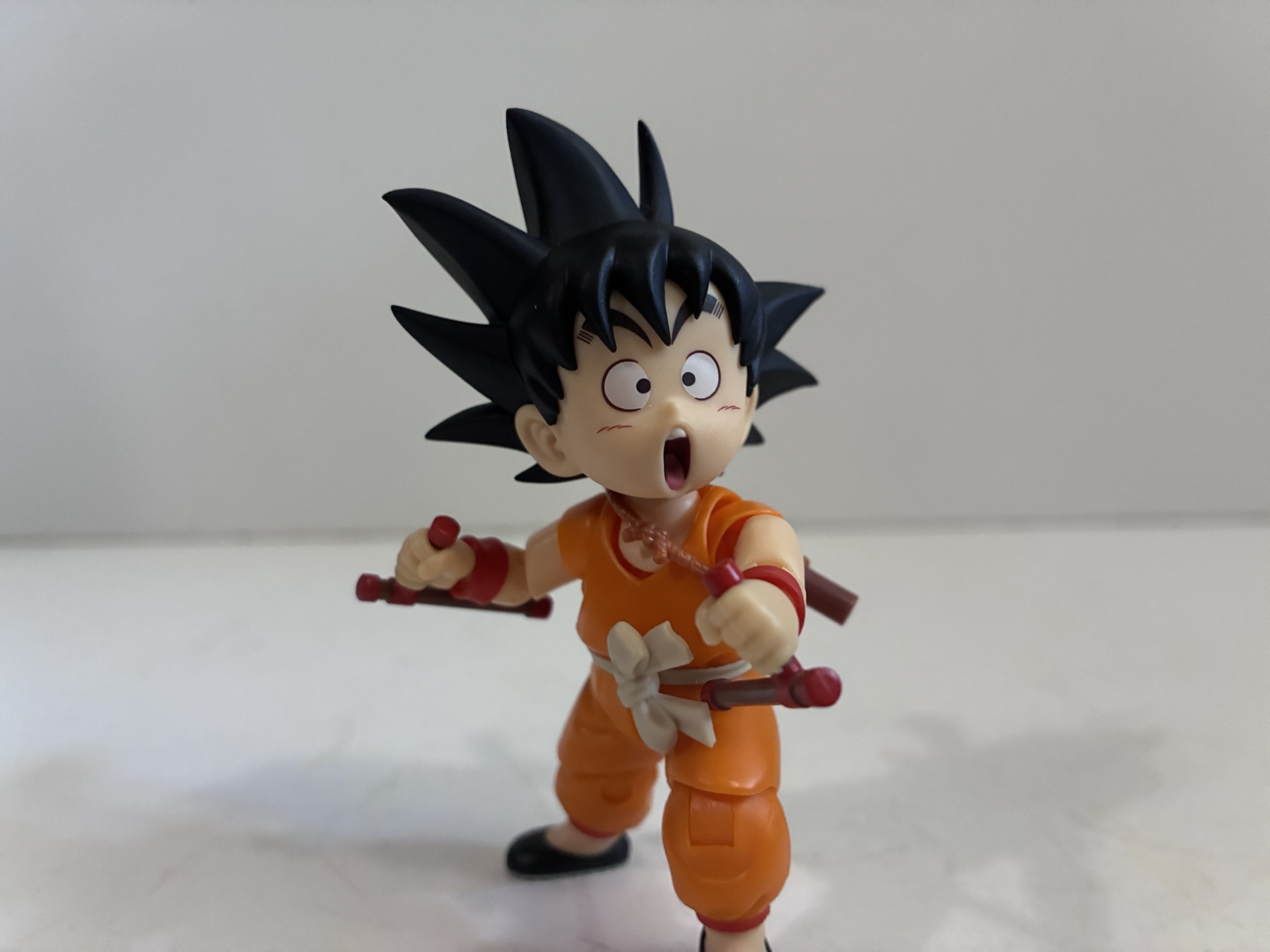
For heads, we get two with four total expressions. The default head features Goku’s trademarked spikey hairdo with a big open mouthed expression to match the cover image. The eyes have a rounded look which is consistent with Dragon Ball and the inner mouth is just painted pink which is very similar to an expression the original Kid Goku figure came with in both appearance and execution. His other expressions feature a cocky little smirk and a mischievous side-eye grin. The side-eye expression is pretty cute, though it looks a bit off-model to me. It could also be the pink outline around the mouth that’s throwing it off for me as that’s not usually present in the art or the figures. The alternate head is an even spikier version of Goku’s hair with an open-mouth expression. It’s pretty goofy looking, but it’s a direct pull from the cover of volume 10 (and the anime’s ending credits) where Goku is just sort of floating in the air with his Power Pole across his forehead while Bulma mugs for the camera. I do enjoy this rougher looking version of Goku’s hair, but it seems the only portrait that works with it is the one that’s on it by default. That makes it very scene specific and I don’t know if I really see myself using it, even though I do like it. In addition to that, there is an assortment of hands in the box: waving, gripping, fists, peace sign, relaxed (a cupping Kamehameha-like pose), open, and a pair of gestured hands that seem specific to how Goku often placed one hand at the top of his Power Pole. There’s an alternate set of bangs for the default head that’s barely different from what’s on him to start with. I guess one is slightly askew and maybe it’s just to match the cover while the other represents how he’s typically drawn? There’s a secondary bow for his sash which is more of an action pose as well as some weapons. For one, we get the Power Pole and included sling. There’s a version for Goku to hold and a little stub to plug into the sling when the weapon is holstered. He also has a pair of tonfa which are tiny and cute. These are taken (along with the mischievous side-eyes grin) from the cover of chapter one of the manga. They’re brown with some red trim and provide for some more display options. To insert them into Goku’s gripping hands, the red banding needs to be removed from the handle first. It’s a tiny piece so don’t drop it or the carpet monster will eat.
That is, if you aren’t planning on displaying this Goku atop the dragon. The little Shenron included is a cuter depiction of the character meant to match the artwork and he’s basically a glorified display stand for Goku. Shenron is well-painted and his whiskers are the only parts that need to be attached out of the box. In addition to the head itself, they’re also the only articulation points and he’s meant to sit atop three, translucent, clouds which are atop transparent, acrylic, posts. They plug into the included base which has a 40th anniversary graphic printed onto it and Shenron affixes to these clouds via magnets, which is a nice touch. Just in front of his forelegs is a section of his spiny fin that can be removed and replaced with an acrylic seat for Goku. It’s meant to allow the small piece between his legs to get a secure enough grip on the back of the dragon for his riding pose and there’s also a slot for his tail. If you don’t want him atop the dragon, then you simply leave the fin in place. The clouds do have to be inserted by the user and in order to do so the little pegs in the base have to be popped out which can be done from the underside. There’s also an included, orange, piece of plastic that’s basically a pry bar. This is used for swapping the bow on Goku’s belt since the instructions flag it as a potential damage point, but you probably won’t need it since both bows are rather pliable. With everything assembled, Goku sits atop the dragon with relative ease. He can be posed to resemble the manga cover, or he can be doing something else. The dragon sits a little over 2″ above the base and its silhouette doesn’t extend much beyond the base so the shelf space needed for this one is surprisingly minimal. It might have been fun to get three additional posts for the clouds to sit the figures even higher above the base, but as is it displays very well.
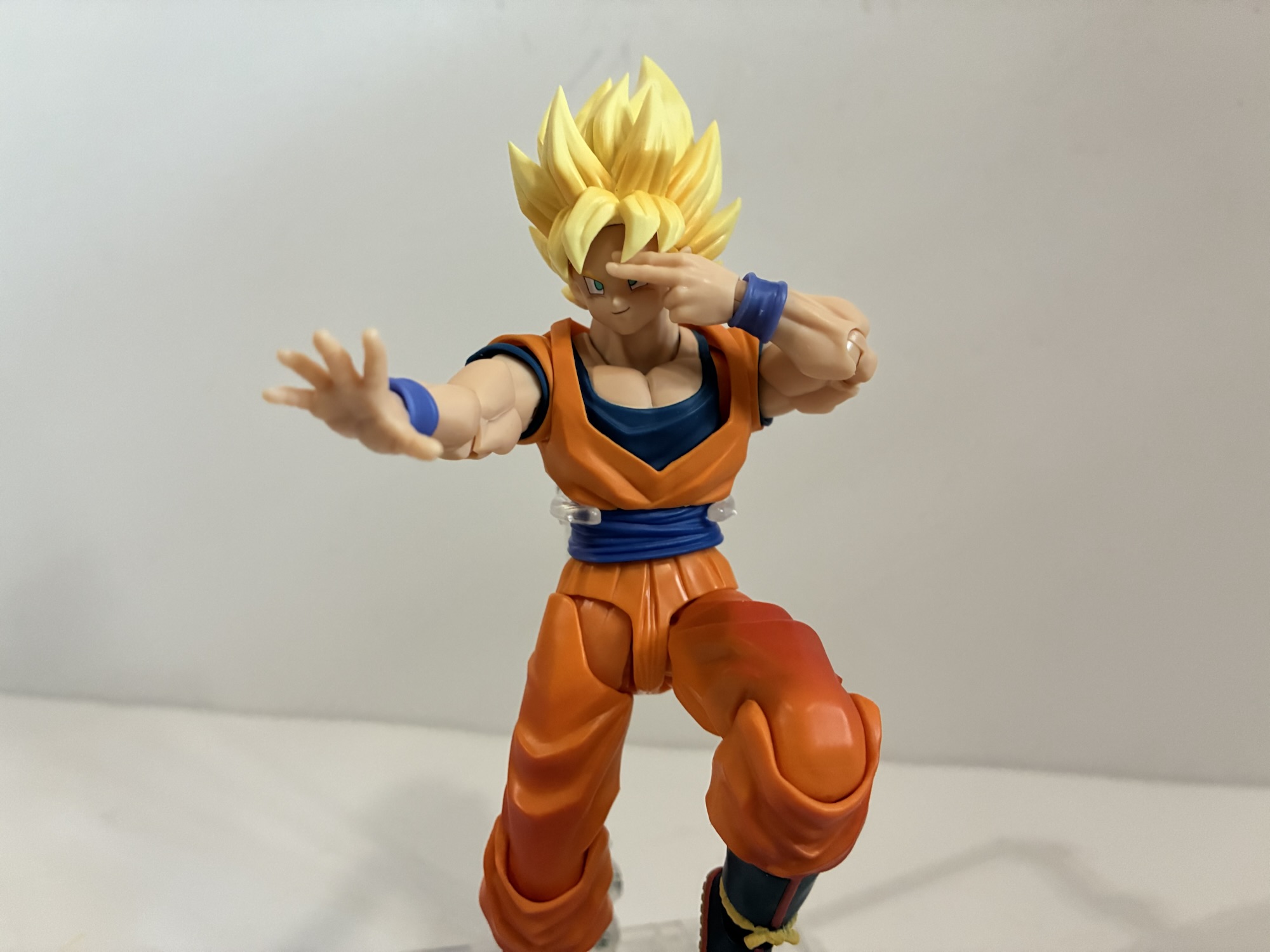
For articulation, Tamashii Nations made some alterations to this one when compared with other smaller Goku figures from the past. I’m guessing some of these are similar to the Pan figure they did, but that isn’t one I actually bought. The neck is a standard double ball peg which has solid range that’s aided by a single ball at the base of the neck. The shoulders are hinged ball pegs with a butterfly joint, but not the kind that gets a whole lot of range. There’s a ball joint in the waist, and the legs affix via straight ball pegs and have suitable range out to the side and forward. The knees and elbows are single hinged and they do swivel. A 90 degree bend is possible, but no further. Interestingly, there is a visible peg on the inner knee and elbow which is something I can’t recall seeing in a Tamashii Nations release prior to this one. It’s not ghastly or anything, just something I noticed. The wrists and ankles are the most unique and the most basic as they are like the hips in that they’re just straight pegs with a ball at the end. On one hand (no pun intended), I don’t mind it since it makes swapping hands easier than having to fiddle with a tiny hinged ball joint like the Goku Mini. At the ankles though, it’s a bit limited and I don’t know why the Daima Goku can have a more traditional hinge and rocker setup and this Goku can’t. I can only assume it was an aesthetic choice more than anything as the slipper look does present better this way, but it does come at a cost. The tail also swivels on a ball peg as does the bow on the sash.
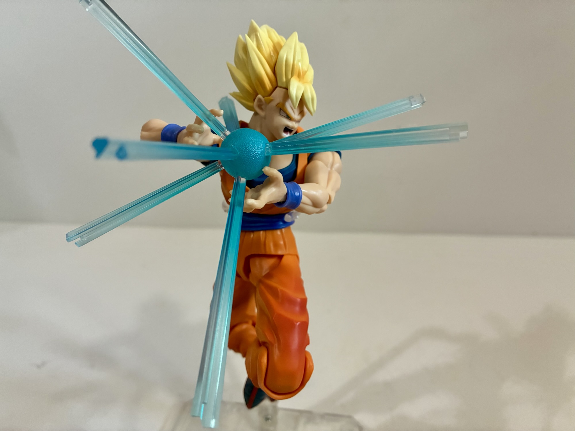
The articulation is certainly functional, but is more limited than other kid versions of Goku. He can do a decent Kamehameha charging pose, but a firing one is a little less convincing. The ball joint at the waist mostly provides rotation and a little pivot without much crunch. That’s pretty much expected though given the size and shape of Goku. The original had that hinged diaphragm joint to extend and bend, but that just doesn’t really work with these rounder dimensions. This is a more scene specific figure and as far as that goes he can do it, but it’s a little less fun to play with in hand. Does that mean I actually wouldn’t want to see this repurposed for other Dragon Ball looks? I certainly would not go that far. The articulation may have limits, but the trade-off is worth it to me so if Bandai wants to come back with this figure in blue I’d probably be all over it. Especially with some more scene specific expressions. That’s where most of the charm lies in this figure for me and it’s a great base for others. Goku has plenty of looks in the series, but Bandai hasn’t done a brand new Dragon Ball figure since Launch back in 2022. It seems like a dead line, but I hope this leads to more. This body could be repurposed for Krillin and we never did get a training uniform version of him. There are numerous looks for Bulma and the main antagonists of early Dragon Ball, the Pilaf gang, have yet to be made and this body could probably work for Shu. Not to mention all of the characters that come later like Tienshinhan, Kami, Chi Chi, and Piccolo Jr. If we could only get one figure though I’d have to go to bat for Yamcha in his first appearance look. That one seemed like a given, but we’re still waiting.
I’m getting ahead of myself. What’s important here is we did get a new Dragon Ball figure of Goku and it’s a special one because it celebrates one of the earliest depictions of the character. As a very specific release, this works pretty well. Sure, it’s a bit tough to perfectly nail the pose, but it definitely can get close enough. A more determined individual may even be able to get something more accurate with persistence. The Goku and dragon turned out well and it’s a pretty attractive piece for anyone’s collection. It does come at a cost, but for what’s in the box I think the value is decent. Not great, but not the worst thing in the world. If you love Dragon Ball and wanted something to celebrate this milestone then you’d be hard-pressed to do better here. There is an adult Goku on the way with his turban and tiger pelt, but I have no attachment to that particular artwork. This, on the other hand, is one I’ve always adored so it’s the best release for me. And if it leads to more Dragon Ball figures then all the better.
For plenty more Dragon Ball, take a look at these:

S.H.Figuarts Dragon Ball Z Cooler: Final Form – 40th Anniversary Reissue Edition
Bandai sure picked an interesting way to celebrate 40 years of Dragon Ball. Well, in the United States they did. In Japan, to mark the occasion the company released a brand new Goku and Shenlong action figure set based on the cover of Dragon Ball issue #1. Makes sense. For the US market, we get…
Keep reading
S.H.Figuarts Dragon Ball Daima Super Saiyan 4 Son Goku (Mini)
It’s no great secret that the black sheep of the Dragon Ball universe is the anime Dragon Ball GT. Created in-house by Toei animation, Dragon Ball GT was a continuation of Dragon Ball Z without creator Akira Toriyama. While Toriyama had to grant approval to many aspects of the series, he wasn’t directly involved with…
Keep reading
S.H.Figuarts Dragon Ball Lunch
It’s no secret my preferred take on the world of Dragon Ball created by author/artist Akira Toriyama is the original one: Dragon Ball. Of course, in the manga it’s just all Dragon Ball up until the more recent Dragon Ball Super, but for anime viewers there’s Dragon Ball, Dragon Ball Z, Dragon Ball GT, and…
Keep reading