Unlike the first three episodes of season two of X-Men ’97, this fourth one is going to spend all of its time in one era. And as you could probably guess, that era is 3,000 BCE since that is where we left off last week. I consider these reviews that I do spoiler free, but even so, I don’t think it’s much of a spoiler to say that Rama-Tut’s (John de Lancie) attack at the end of last week’s episode was not very successful. The show wanted us to believe that our beloved X-Men were in real danger, but that was pretty hard to believe considering it was just the third episode. As expected, Magneto (Matthew Waterson) was able to put up a forcefield just in time to spare our heroes. Also surviving, to no one’s surprise, is En Sabah Nur (Adetokumboh M’Cormack) who is basically some kind of super man and I think he just shrugged it off. As for the rest, they’re all dead and Nur’s fortress is in ruins. Among the dead is Baal, Nur’s adopted father, and it’s unlikely he’ll react well to that.
Much of last week’s episode featured Magneto trying to get En Sabah Nur to buy into Xavier’s (Ross Marquand) dream of human and mutant coexistence. Mercy was a big part of that lesson, but when Nur discovered that Magneto and the X-Men were sneaking around behind his back and working on a time machine, he grew pretty angry. He felt this was a betrayal, which seemed extreme to me at the time, but it’s hard to get a read on just how Magneto sold himself to Nur. Clearly, he doesn’t look like someone born in Egypt so he should have known that he was from somewhere far off (we’ll ignore the whole language thing, everyone speaks English because it’s just easier that way). Then again, Nur doesn’t really look like a typical Egyptian either thanks to his mutation and I suppose he may have assumed the same of Magneto. Either way, that door was shut by episode’s end, but now it’s Xavier’s turn to try to appeal to the would-be mass murderer. Since Xavier and pals survived Tut’s attack, Nur is forced to look upon him with respect since he does buy into that whole survival of the fittest mantra. Xavier is then able to convince Nur to allow him to probe his mind to find out just what it is they are both seeking.
You’re up, Chuck.
Xavier doesn’t really learn anything new, at least not to the audience. The temple they, and Rama-Tut, are seeking is quite literally calling out to En Sabah Nur. It’s clearly not of this world, but it’s a destination they all seek. It’s also made even more important for the X-Men to find this thing because Magneto is very much committed to his idea of reform for Nur so much so that he disables Bishop’s (Isaac Robinson-Smith) time traveling bracelet. He seems to think they’ll be able to repair it with the tech waiting for them at this temple, but that’s one Hell of a gamble. The rest of the episode is fairly straight-forward. We do get some character moments of which the most intriguing is between Rogue (Lenore Zann) and Nur while camping for the night. Xavier also receives a communication from Rama-Tut himself during which viewers not familiar with the character get the Cliff’s Notes version of just who he is. The most interesting aspect of the meeting is finding out that Tut is attempting to prevent the rise of Apocalypse (Marquand), though he seems to view it as inevitable. I mostly find it interesting because we know that he, as Immortus, will assist Bishop in doing just that some 5,000 years in the future during the “Beyond Good and Evil” arc. He had to wait an awful long time for that sort of satisfaction.
Well, that answers some questions.
And inevitable is certainly a theme with this one. What we’re seeing is a fatalistic approach to time travel on display where everything occurs in a loop. We saw that in episode two with Nathan obtaining the power of Apocalypse’s celestial ship, which was referred to simply as Ship in the X-Men episode “Obsession.” That entity manifests itself as Cable’s computer, a device which allows him to travel through time and a power Apocalypse seeks in “Beyond Good and Evil.” It first rested with Apocalypse until Cable essentially stole it before he reacquired it to embark on that particular quest. With the X-Men in the past attempting to prevent his rise, they have inadvertently become a part of it. Apocalypse is inevitable, and like Bishop trying to alter time to improve upon his future, it seems like there is little mere mortals can do about it. Everything has happened for a reason and for longtime viewers of X-Men and now X-Men ’97, it’s rewarding to see how everything intertwines.
Even this one finds time for some interesting character moments.
This episode does feature an action-packed climax and a resolution designed to land with a wallop. It is, unfortunately, undermined by the show up to this point as we have had numerous fake outs and lasting consequences seem to be in short supply when it comes to X-Men ’97. That is not unique to the show as it’s something of a failing for comics as a whole. Perhaps the fallout will land better in a future episode, but for me when this one was over I didn’t feel much of anything other than appreciation for how well everything was animated. To my surprise, the episode also didn’t really toy with the idea of the X-Men taking out En Sabah Nur before he becomes Apocalypse, assuming they could. There is a brief moment where it seems like Bishop is willing to do so, but he’s stopped and no discussion ensues. A pedantic complaint I also have is we see Xavier and Magneto secretly communicating via telepathy, but the whole time Magneto is wearing his helmet. This would not have been an issue in the original series because at that point it had not been established that Magneto’s helmet blocked psychic attacks. Unfortunately for the show, that retcon was adopted for the first season of the show so it should still be in effect now. It further annoys me because we didn’t need Magneto to put his helmet on. He didn’t have it in the previous episode and I don’t even know how he managed to recover it during all that happened on Asteroid M, so why even stick it back on his head now? The design is slightly different so maybe it’s not the exact same helmet and instead one he created during their time in Egypt. Even so, it sure looks to be largely the same so there’s no reason to think it wouldn’t possess the same benefits as his old one.
That helmet is bugging me way too much.
It’s not important, just something a very invested fan like myself needs to call out. “Rise of Apocalypse: Part 2” lives up to its name and it will likely prove to be a necessary step for the greater conflict with Apocalypse this season. Nothing is resolved here as far as that conflict goes, though other aspects of this early season are. For instance, we do learn who was calling out to Xavier in that vision he had in the prior episode, though the individual is never given a name (you’ll have to…search…that information out yourself). I should also point out that there is a stinger scene at the end of this one during the credits so don’t bail on it while the X-Men are spinning on their pedestals. It’s just a tease for next week’s episode and if you looked ahead at the episode titles then you can probably guess where we’re heading. I’m expecting it to be kind of a time out episode before we get back to the Apocalypse plot, but I obviously could be wrong. This is an episode of X-Men ’97 that largely keeps the train rolling and serves to be an exciting half hour of television with some time travel quirks, albeit one with an ending that doesn’t land as forcefully as the writing staff probably intended.
The premiere episode for season two of X-Men ’97 took us to the far off future where Apocalypse reigns supreme. The second followed that one up with a story set in the present time of the series: 1997 (Duh!). Now, for the third episode of this three-part premiere we head to ancient Egypt to meet…
The title of this post says X-Men ’97, but in some respects it should read X-Force ’97 because that’s what the opening title presents. Yes, boys and girls, we have ourselves an X-Force on television. Cable made numerous appearances in the original series, but never as the leader of X-Force. This surprised me as a…
At last, X-Men ’97 has made its return to airwaves with not one, not two, but three episodes for the premiere which means there’s a lot to talk about. Truthfully, too much for one post which is why we need to keep things to one episode per entry as is the style of the time.…
The premiere episode for season two of X-Men ’97 took us to the far off future where Apocalypse reigns supreme. The second followed that one up with a story set in the present time of the series: 1997 (Duh!). Now, for the third episode of this three-part premiere we head to ancient Egypt to meet up with the rest of the X-Men, only they’re not alone for in this time is the mutant En Sabah Nur who the X-Men know will one day become Apocalypse. They have been unknowingly sent here against their will by Mother Askani to prevent the rise of Apocalypse, but just how they’re supposed to go about such is a matter of debate. Beyond that is the debate of if it should happen at all?
The episode opens with the X-Men who were sent to the future now back in the ruins of the X-Mansion. They returned expecting to find the team Bishop (Isaac Robinson-Smith) was sent to retrieve there as well, but when no one appears they become concerned. This is time travel, after all, so the idea that they have to wait for their return doesn’t make sense if they were all set to return to a specific moment in time. All they can do is wait though, because Forge (Gil Birmingham) is unable to get a reading on their time bracelets. In 3,000 BCE, En Sabah Nur (Adetokumboh M’Cormack) is preparing to lead his forces against those of Rama-Tut (John de Lancie) who is a vicious ruler and slaver that once possessed Nur. Alongside Nur is Baal (Michael Dorn), the man he looks up to as a surrogate father for he is the one credited with rescuing Nur from a life of slavery. Nur is, as far as we know, the world’s first mutant with the tell-tale sign being his pale skin and blue lips. He also possesses incredible strength and durability and is something of a super man which is what makes him a natural leader of other former slaves.
The X-Men have been sent to the past to stop En Sabah Nur from becoming Apocalypse.
The X-Men trapped in this past are under no delusions who En Sabah Nur is, or rather, who he will become. Charles (Ross Marquand) feels their presence in the past is an affront to nature and they should do everything in their power to not interfere and instead focus on getting back home. Magneto (Matthew Waterson), on the other hand, sees this as an opportunity to set Nur on a different path. If he can instill in him the values of Charles Xavier then perhaps Xavier’s dream of human and mutant coexistence can come true before he’s even born to dream it himself. He views this as penance for his hand in what happened on Genosha, but Charles is not so certain this is the correct path. What no one seems to suggest is simply destroying En Sabah Nur before he can become Apocalypse. Such is the quagmire of the time traveler – if you can prevent an atrocity by taking out the orchestrator of such before it happens should you? En Sabah Nur as he exists in this moment in time is not the same man who committed countless atrocities as Apocalypse. Can he be sentenced for a crime he has not committed? This question doesn’t come up in this episode, but perhaps it will soon enough.
This isn’t the Egypt you read about in your textbooks.
As for the X-Men stranded here which includes Beast (George Buza), Rogue (Lenore Zann), and Nightcrawler (Adrian Hough) in addition to Magneto and Charles, their journey home is perhaps an impossibility. Beast is no Forge, but he has spent time working with Bishop’s time traveling device and has some knowledge of how it works. The problem is acquiring the power and resources needed to create a time machine and to do that they look to the forces of Rama-Tut. We may be in ancient Egypt, but the tech of Tut is certainly not of this era. He attacks with robotic minions lead by a human general named Logos (Chris Britton) and once the forces of Nur lay waste to them, the X-Men scavenge the battlefield for parts, but they’re not making much headway which is taking its toll on everyone, especially Beast. The plot takes a turn when Magneto is able to convince Nur to abandon his survival of the fittest mantra and take Logos hostage rather than kill him. With him in their clutches, Magneto hopes to convince Xavier to probe his mind and perhaps find a solution to their problems, but instead Xavier just finds more riddles. A disembodied voice that espouses a famous quote from Apocalypse appears before Charles alongside a massive, fiery, eye that looks like a galaxy being born. The presence of a shattered moon in the shape of Magneto’s helm leads me to believe this could be a foreshadowing for Onslaught, though I’ve seen some speculate that this could be a reference to Stryfe. I would have thought it was merely a vision of Apocalypse himself, but Xavier is the one who classifies this individual as a mystery and that would be a pretty lame mystery since we know that Apocalypse is the villain already in focus.
In this era, Rama-Tut rules, but I definitely wasn’t expecting to see the X-Ternal (credited as Candra) from the episode “X-Ternally Yours” to make an appearance.
The episode does end on a cliffhanger, though it’s a bit of a toothless one since these characters have quite a bit of plot armor at this point. Bishop will also make an appearance and, if anything, this cliffhanger may just explain why the X-Men were unable to rendezvous with their comrades in 1997. Perhaps we will find out the events of this episode caused the time bracelets to be damaged and the X-Men will have to seek out another way to return home. Of course, with me catching up and this going live the day part two drops that means these questions have likely already been answered (and maybe the identity of the mystery voice has as well), but I had to make sure I got my thoughts down before that episode dropped. I am guessing the technology of Rama-Tut hides a way for the team to get home and it would be a great example of circular story-telling since it was a future version of Rama-Tut that helped Bishop and the X-Men take down Apocalypse in the “Beyond Good and Evil” arc. There, he took the form of a cosmic janitor named Bender who only revealed himself to the viewer as Immortus at the end, but he’s basically a future version of Rama-Tut who is also an aspect of Kang the Conqueror. Yeah, it’s complicated.
A lot of capes in this picture.
“Rise of Apocalypse: Part 1” is a bit slower paced than the other two episodes in this three episode premiere. Being that it’s co-written by Beau DeMayo (along with JB Ballard), that’s not a surprise as he seems to like these more talky episodes and when you get Magneto and Xavier sharing scenes that tends to happen. It’s a necessary episode, though I do wonder if this is really how I want to see Apocalypse portrayed. I like origin stories and villain ones can be a lot of fun, but Apocalypse as a Spartacus figure is hard to square. Are we supposed to have sympathy for this character? Apocalypse is a genocidal monster, I’m not sure that I want or need to know that he wasn’t always bad. This is an adaptation of Rise of Apocalypse by Terry Kavanagh and Adam Pollina so it’s not a new story, but I never read that one to know if the portrayal of En Sabah Nur was quite the same. At any rate, I’m willing to see how things progress from here and since this is only part one it does feel a little incomplete. We’ve set the table, but the meal has yet to arrive.
The title of this post says X-Men ’97, but in some respects it should read X-Force ’97 because that’s what the opening title presents. Yes, boys and girls, we have ourselves an X-Force on television. Cable made numerous appearances in the original series, but never as the leader of X-Force. This surprised me as a…
At last, X-Men ’97 has made its return to airwaves with not one, not two, but three episodes for the premiere which means there’s a lot to talk about. Truthfully, too much for one post which is why we need to keep things to one episode per entry as is the style of the time.…
Today, X-Men ’97 dropped the curtain on its first season and what a way to bring it to an end. Last week’s episode was a roller coaster of emotions for me. I couldn’t go into much detail of my review of “Tolerance is Extinction – Part 2” without wading into spoiler territory, so allow me…
The title of this post says X-Men ’97, but in some respects it should read X-Force ’97 because that’s what the opening title presents. Yes, boys and girls, we have ourselves an X-Force on television. Cable made numerous appearances in the original series, but never as the leader of X-Force. This surprised me as a kid since if you went to a toy store during that era you would find action figures featuring an X-Men cardback as well as those with an X-Force one. Cable was basically the Wolverine of that line as he received quite a few figures, though never as many as the more famous Canadian. The line lasted for a few years, but it always was less popular than the X-Men one. In my home town we had a big warehouse store that was literally located in an old warehouse that was family owned. Even though the place looked like a dump and was most associated with cheap products, the toy section was often pretty current and sometimes they would get stuff before even Toys ‘R Us. However, they would also get some of the more unwanted figures and when it came to X-Men there was a long drought because they couldn’t get rid of their X-Force figures. G.W. Bridge, Gideon, Shatterstar, and Kaine seemed to linger forever. It’s why I had a Shatterstar because he felt like the coolest of the ones available. Cable was rarely there, same for Deadpool and Fourarm. Maybe the stink of that store is what kept me out of X-Force because I think the only other X-Force figure I would own from that Toy Biz line was a later Cable who had Terminator-like tare-away flesh for some reason. And that one was given to me by my friend.
When the first season of X-Men ’97 ended with the majority of the team flung through time, but Cable remaining in 1997, it seemed like the time was now for X-Force to make its animated debut. The first episode ended with a tease as Cable (Chris Potter) is seen in the present telling two familiar faces in Archangel (Christopher Barger) and Psylocke (Naoko Mori) that they need to focus on recruitment. When the second episode, “A Force to be Reckoned With” opens, it comes as a cold open which is unusual for the show. It depicts a group of young mutants on the run being lead by some kind of energy bird to the remains of the X-Mansion. It’s in ruins, and one of the kids has an “I told you so,” attitude about the discovery because everyone knows the X-Men are gone. These kids are just the start of the cameos as this is going to be a big one for those who like to scan the background. There are more cameos in this one than there were during the segments in Genosha from the original series (and from last year’s episode, for that matter) so I’m not going to bother to list them all. These ones are rather prominent as among them are Kid Omega (Thomas Dekker) (sporting a Phoenix shirt) and Penance (Miatta Ade Lebile).
X-Factor has entered the chat.
Who are these kids running from? That would be X-Factor, the government backed version of the team that briefly showed up in the original series episode “Cold Comfort.” There, they were lead by Forge, but now they’re being directed by Val Cooper (Catherine Disher) to round up mutants in a bid to turn down the current temperature where human-mutant relations are concerned. The actual makeup of the team is still pretty much the same as we have Havok (Teddy Sears), Polaris (Carolina Ravassa), Strong Guy (Adrian Hough), Wolfsbane, and Multiple Man, the latter having no lines and thus no credited voice actor at this time. Following that scene, we catch up with Jubilee (Holly Chou) and Sunspot (Gui Agustini) at an arcade, but they’re soon visited by an old friend: Cable. Here we get the recruitment pitch, and when Jubilee asks if this team he’s putting together has a name, we smash-cut to the opening title only it’s X-Force! Each member of the team gets their own segment which is headlined by Cable and there are a lot of similar shots to the standard intro. There are throwbacks to the first season of the show as well as the original series including the scene of Cable encountering Apocalypse in his temple and one of the creation of Archangel. The ending sequence has X-Force colliding with the forces of Apocalypse with the mutant kids caught in the middle. It’s an awesome sequence that is almost sure to put a smile on the face of every viewer, even those not necessarily familiar with X-Force.
This is pretty awesome.
With the fun intro over, the rest of the episode can focus on X-Force chasing leads, the first of which concerns the horseman War (Lawrence Bayne) from the first season of the original show. He was the green guy with the bowl cut who I don’t think has ever been seen again since that episode, but Cable lets everyone know that this guy has been pretty busy spreading death and genocide wherever he goes. Our team is indeed Cable, Psylocke, Archangel, Jubilee, and Sunspot with the latter two getting a costume change. Jubilee now has her longer hair and red Generation X costume while Sunspot is sporting his X-Force blue and orange. Curiously, Archangel is back in the blue and pink which we knew from the trailers and Hasbro figure, but why he ditched his Angel look is not addressed. Psylocke is in her ninja look from the 90s and now sports a British accent despite not having one in the original series. Since this is more accurate, I can let that inconsistency slide. This is a hodgepodge assortment for X-Force, but in the confines of the animated series, I think it makes sense. The cast is already bloated and introducing the likes of Warpath, Shatterstar, and Kaine would just be like adding to the pile.
This group may not scream “X-Force,” to 90s comic readers, but for this show I think this squad makes sense.
The mission to capture and interrogate War reveals to Jubilee just how Cable envisions this squad working which stands in direct opposition of what Charles Xavier would do. Cable rationalizes them as soldiers, not students or teachers, and Xavier’s pacifist methods are not going to cut it. He’s more ruthless, and yes we do get our answer as to why the Marvel Legends Archangel comes with Cable’s gun, though I still think it was a mostly worthless inclusion. From there, the focus pivots based on what Psylocke is able to extract from War’s mind by force and telepathy to an old foe in Emma Frost (Zehra Fazal). This puts our squad on a collision course with X-Factor that also leads to Jubilee getting separated which is where the episode really kicks it into high gear.
It’s time for Jubilee to truly graduate.
During the original series, Jubilee was featured a fair amount, but often as the kid who got in over her head and needed the other X-Men to bail her out. Her most independent episode might have been “Jubilee’s Fairy Tale Theater” in which she keeps a group of students calm with a story we see acted out in animation while they wait for rescue. It’s not exactly the sort of spotlight someone like Wolverine would get. In this episode, Jubilee gets her moment as she’s captured and tasked with not just breaking out, but also freeing all of the captive mutants being held by X-Factor on what looks like a SHIELD helicarrier. It’s set to a very era appropriate song which has Beau DeMayo written all over it, but I don’t know for sure who is responsible. The sequence shows Jubilee really cut loose with her powers and skills and the nice thing was that during the new opening title we were treated to a sequence of Psylocke training Jubilee. It’s just a nice, tidy, way of saying this is something that’s been going on for a little awhile and we’re seeing the fruits of that labor on display. What I really appreciate though is that before Jubilee can bust out, we get to see Sunspot and Cable argue over what to do about her capture. Sunspot, being the heroic boyfriend, wants to set everything aside to rescue her, but Cable tells him to trust her. He knows she can take care of herself, or at least he wants to see if she can. When Jubilee does eventually cause a commotion, there’s a moment where we see Cable smile, but it’s not some cocky, “I told you so,” smile. It’s the kind of smile a teacher might feature when a student demonstrates that they’ve absorbed the material they’ve been taught. And he said they weren’t students.
I didn’t necessarily need to know where this thing came from, but it was pretty cool.
The episode does end back in the future to wrap-up the events of the first episode. In doing so, the origin of Cable’s computer cube (Rachel Kimsey) is revealed in a rather clever way. I have no idea if this is something born from the comics or if it was created for the show (this episode was written by Anthony Sellitti and Mariah Wilson), but I do like it. It also sets up the events for the third part of this season premiere where we will check in on the squad sent to the distant past. Even though this is deliberately woven into other threads, this episode of X-Men ’97 X-Force ’97works really well as a stand-alone adventure. It ties into the core mission of the X-Men through a different lens and putting this X-Force team up against X-Factor is another great way to put the focus on just what the X-Men (and X-Force) are out to do. Jubilee’s escape is a ton of fun and should be a highlight of season two when all is said and done, assuming it’s not overshadowed in the 8 episodes to follow. There is some foreshadowing contained in this one via Psylocke’s observations in the mind of War that are certainly intriguing. I think anyone who watched how the first season ended can guess what’s coming, but it’s still fun to see the show tease it. I just wonder when it will pay off?
At last, X-Men ’97 has made its return to airwaves with not one, not two, but three episodes for the premiere which means there’s a lot to talk about. Truthfully, too much for one post which is why we need to keep things to one episode per entry as is the style of the time.…
Today, X-Men ’97 dropped the curtain on its first season and what a way to bring it to an end. Last week’s episode was a roller coaster of emotions for me. I couldn’t go into much detail of my review of “Tolerance is Extinction – Part 2” without wading into spoiler territory, so allow me…
Magneto was right. That was the realization many characters seemed to share at the end of last week’s episode of X-Men ’97. As we roll into the penultimate episode of the show’s first season, a lot is on the line and the show is drawing inspiration from several different sources related to the X-Men over…
At last, X-Men ’97 has made its return to airwaves with not one, not two, but three episodes for the premiere which means there’s a lot to talk about. Truthfully, too much for one post which is why we need to keep things to one episode per entry as is the style of the time. It’s been a long two years since the first season ended with the X-Men scattered through time. When that episode ended, it was tough to know just where everyone landed, but with the first episode of season two that is at least resolved along with a whole bunch of other things. And structurally, the three episode premiere makes sense because each episode is going to take place at a different point in time and focus on a different group of mutants with the very first taking place in the far off future of 3960 where we know Cyclops (Ray Chase) and Jean (Jennifer Hale) wound up, but will soon learn it’s also where Storm(Alison Sealy-Smith), Wolverine (Cal Dodd), and Morph(JP Karliak) landed as well.
As we basically knew going into this one based on how season one ended, season two is going to focus on Apocalypse (Ross Marquand) as the big antagonist of the season. At least, that’s the setup and I suppose he could be dispatched before the season ends, but it sure feels like he’s going to have a presence throughout. When the show begins with that fantastic intro, we find Forge (Gil Birmingham) and Bishop (Isaac Robinson-Smith) taking stock of where the X-Men are. Forge has utilized his mutant powers of invention to create a crude version of the time portal seen in the very first season of X-Men and through that they have been able to pinpoint where everyone wound up. Because Forge’s love interest, Storm, resides in 3960 he draws the task of traveling to the future to bring back the X-Men there while Bishop will be tasked to heading to ancient Egypt to retrieve the rest.
Expect Apocalypse to have a presence throughout this season.
In 3960, we’re properly introduced to Nathan Summers (Michael Johnston) and Mother Askani (Gates McFadden). Askani leads a tribe of individuals who are resisting Apocalypse in this future. There, the immortal mutant has pretty much taken over and successfully enslaved much of the world. The Atlantic ocean is dried up and his fortress looms large. Cyclops and Jean have been training Nathan who does not know that they’re his parents for a few months while the other X-Men are just along for the ride. When Forge arrives, he finds a Wolverine sans his adamantium skeleton who is forced to tangle with Apocalypse’s robotic Dark Riders with bone claws that shatter upon impact, but soon regrow thanks to his mutant healing ability. Because the episode is heavy on the Summers family dynamic, we don’t get any insight on how Wolverine has been coping with that very traumatic moment from the penultimate episode of season one and Morph is mostly there for a little window dressing. Forge has the unenviable task of convincing the Summers family to separate and return to the present despite getting this unexpected opportunity at a life with their son.
The main focus of the episode is on the Summers family.
As such, the episode is heavy on the soapy elements X-Men is known for. Cyclops distrusts Mother Askani who declines to reveal her origins, though the episode is not shy at hinting at it. She feels Nathan is destined to take down Apocalypse and that takes precedent over the whims of his long lost parents who are struggling with the idea that their kid needs to go on without them. We also learn just why the X-Men are where they are, and even though there’s a lot of drama there’s also no shortage of action in this opening episode. It also leads directly into the second episode as we briefly touch base with Cable in 1997, one of the few heroes from season one not sent through time, and even see the origin of a second season of X-Men character.
Claws of bone have limited effectiveness against machines.
“Days of Past Future” is written by Brad Ford Sullivan, Anthony Sellitti, and JB Ballard which does call into question if anything former showrunner Beau DeMayo had planned for this one made it in. Since he will be receiving writing credits in future episodes (and is an executive producer on the series still), I suspect that isn’t the case and the larger picture he had for the show is still intact. Whether that’s a good or bad thing is not something I can say, but since he oversaw the excellent first season I can only assume it’s good despite how his time on the show came to an end. The visuals in the show have only improved, if anything, with bright, vibrant, colors even in this dystopian future dominating the palette. I especially love the little touches like how Wolverine can be seen wincing in pain every time his claws snap and the way this show really makes Storm’s powers resemble those of an actual goddess. The soundtrack by The Newton Brothers, which borrows heavily from the original series score, is thumping and there’s a great use of Cable’s old theme as well when Nathan enters a scene. If I have anything to criticize it’s that the episode resolves itself rather quickly. It’s not necessarily unexpected as we can’t have a big showdown with Apocalypse right out of the gate, but it did bring the episode to a bit of a screeching halt. It’s not unsatisfying as the character interactions work especially well, but perhaps felt a bit too neat and tidy.
Young Nathan will be forced to grapple with his own destiny.
As a return to the world of X-Men ’97, “Days of Past Future” works exceptionally well. I love the callbacks and the minor tweaks to the opening title. This is a show that is rich in lore for longtime viewers of the show and readers of the comic books from which the show draws inspiration from. And in this case, we’re talking about The Adventures of Cyclops and Phoenix which was written by Scott Lodbell who probably should have received a credit on the episode. It’s a good setup for the next several episodes and the season to come and if it had arrived all by itself I would have absolutely been frothing for more, but since it didn’t I got to go right into the second episode which might be even better.
Today, X-Men ’97 dropped the curtain on its first season and what a way to bring it to an end. Last week’s episode was a roller coaster of emotions for me. I couldn’t go into much detail of my review of “Tolerance is Extinction – Part 2” without wading into spoiler territory, so allow me…
Magneto was right. That was the realization many characters seemed to share at the end of last week’s episode of X-Men ’97. As we roll into the penultimate episode of the show’s first season, a lot is on the line and the show is drawing inspiration from several different sources related to the X-Men over…
Ever since the episode list was released for X-Men ’97 I’ve been looking forward to what reads like an epic, three-part, season finale. In truth, given that X-Men ’97 is a serialized show you could basically call every episode “X-Men ’97 Season 1 Part 1” and so on, but the titles do add a dramatic…
On July 1st, 2026, our long wait ends. X-Men ’97 returns to Disney+ with its greatly anticipated second season a little over two years after the conclusion of the first. It’s something I have been looking forward to pretty much ever since credits rolled on the finale and the only thing that stinks about it is that it arrives when I’m on vacation. As a result, I likely won’t have any thoughts up on this blog for a little while where that debut episode is concerned, but to tide things over we do have a toy to look at and it’s of a character that figures to be featured somewhat prominently in the second season of X-Men ’97: Warren Worthington the third, also known as Archangel.
Archangel made his debut in the first season of the original series. He’s ambushed by Cable over his funding for a cure for mutation and winds up being the first victim of said cure when Mystique turns him into a slave of Apocalypse. In the process, Worthington’s feathery, angelic, wings were replaced with cold steel and his skin turned blue. He’d break free of Apocalypse’s control by the next episode, but his quest for revenge consumed him in his next appearance, “Obsession,” before a slightly milder version of the character appeared during the “Beyond Good and Evil” arc. That story was intended to be the show’s finale and at the end of it Archangel was to join the X-Men where he belonged, but a surprise order for new episodes extended the show and such plans were scuttled. During that arc, Archangel had returned to his Angel persona of blue and white, but for some reason when we meet him in X-Men ’97 he’s going to be sporting his original blue and pink Archangel look which is what this figure is based on. Will a reason be given in the show for the switch back? I don’t know. It could be whoever was in charge of the character designs just likes this look better, but I guess we’ll have to watch to find out.
Archangel is a pretty standard height for a superhero.
Archangel is considered a deluxe offering so he comes at an inflated sticker price and in a box as opposed to a blister card. The base figure is the same as the previously released Angel of a couple of years ago which is essentially just a modified version of the Vulcan sculpt. The only difference from that mold is that the torso had to be redone to exclude the butterfly joint in the shoulders in order to fit the ports for the wings. The body even still has the grooves in the forearms intended for characters with long gloves because it’s apparently too much to ask for Hasbro to just sculpt some smooth forearms. The costume is very similar to its appearance in the original series which is also quite similar to the look from the comics. It’s still blue with a pink design painted onto it and the application is pretty clean. The opacity of the pink varies as it transfers to different types of plastic which make up the body. It looks pretty damn good on the torso where the paint has a nice matte appearance. It gets a little thin on the thighs, but it’s not as noticeable as it was with the Gamerverse Venom and its white logo. The only difference between this version of the costume and the one from the 90s series that I can see is that the hands are the same color as the rest of the costume. In the older show, the sleeves ended at the wrist and Archangel’s hands were bare and matched the shade of blue of his face. He also tended to have dark, black, lines under his eyes which are not present here, but that’s probably for the best. They also decided to give him clawed hands which is an interesting choice. I would have preferred that they didn’t, but this (and the color of his hands) all appears to be part of the character design in X-Men ’97 so these aren’t critiques of the figure, but of the design.
The two wing setups available.
Archangel’s distinguishing feature is the pair of big, steel, wings on his back. For the show, Archangel’s wings are fairly simple and are represented by two somewhat triangular pieces of metal. In the comics, he could have all kinds of panels and metallic feathers and there are definitely some designs that are quite busy. This is a simplified look and it’s one I prefer. The wings clip into the figure’s back, but there’s also a joiner piece in the center they port into. The center piece basically just exists to match the look of the show, but it does provide some stability as well. There’s a hinge close to the center for flapping, but otherwise this central piece basically holds the wings in place. If you want to shift them up and down you’ll have to remove that piece, though it leaves behind something ugly. The wings are basically a light gray plastic and there’s no metallic paint applied. It would have been nice to see them fully painted to better reflect their look on television, but that’s not really how Hasbro does things. They do look fine, though I’m torn on how much I like the curve sculpted into them. Maybe something a little less severe would have looked better? If you don’t like them, Hasbro did include Archangel’s retracted wings. Resembling a tuning fork, this just plugs into the back like the standard wings and will take up far less shelf space. It’s a nice option to have, though I don’t know if I’ll be able to resist posing him with his wings out in a flying pose.
He comes with an alternate version of Cables’s gun for some reason.
The other accessories are a bit minimal. Archangel has two portraits: neutral and a teeth gritting one. Both are cowled and it’s a shame we didn’t get an un-cowled look. If Ka-Zar wasn’t so expensive I’d consider buying one and painting the face blue as I always preferred Archangel with his blonde locks showing. By default, Archangel has a trigger finger right hand and a left fist. He also comes with a set of open, clawing, hands which are okay, but I already mentioned how I’m not a fan of his new talons. I’m also irritated we don’t get a right fist, despite one appearing on the back of the box. What would that have added to the budget? A penny’s worth of plastic? If that? The trigger finger hand is unusual, but they did decide to include a gun. Cable’s gun, to be exact as it’s the same one that came with the X-Men ’97 figure. It’s the bigger of the two guns and it has a new deco. The colors are more matte where as the original used a shiny plastic Hasbro loves for metallic objects. This new deco makes it a bit more animated looking, but it’s an odd accessory to include with Archangel. I assume he wields the gun at some point in season two, but getting it over a third head option, extra fist, or some feather blade accessories kind of sucks. A flight stand would have also been nice and, honestly, should be standard issue for a deluxe figure that has big wings on its back.
It’s like they gave him two fists on the back of the box just to call attention to the fact that we’re missing one.
Archangel’s articulation is pretty standard for the line. If you have a figure on this Vulcan body (like Cyclops), then you know what to expect for the most part: hinged neck, ball-hinged shoulders, ab crunch, waist twist, bicep swivel, double-jointed elbows, wrist hinge and swivel, ball-socket hips, thigh swivel, double-jointed knees, shin swivel, ankle rocker and hinge. As stated earlier, the only change is the removal of the butterfly joint which does kind of suck for a flying character. Range otherwise is fine at all of the joints though the various swivels break-up the sculpt of the pink linework and musculature in a rather ugly fashion so they have limited utility. If you want Warren to wield the gun, the trigger hand does have a vertical hinge though the open, clawed, left hand is only so-so as as a stabilizing hand for the barrel. The wings have a hinge where they plug into the back and towards the middle so they can “flap,” and they can also wrap around to the front of the figure. As I mentioned earlier, you can take out the central mount to get swivel articulation, if that’s your preference. The joints are the usual tolerance for a Legends release with the exception of the left elbow. Mine is a touch on the loose side, but not so much that it can’t hold a pose or support the weight of the gun. I’ve never seen a loose elbow joint on a Legends release since they moved to the pin-less design so I’m thinking it’s a one-off with mine and likely not something afflicting all copies.
He should mix in fine with other characters from the animated universe.
This X-Men ’97 Archangel is not an unwelcomed addition to the collection. As a reoccurring guest character in the original series, it always made sense to do a figure of Warren. While I don’t think any of the subtle changes to his look are an improvement, it’s not far enough removed from the 90s look for me to care all that much. What I do care about are the lackluster accessories and Hasbro getting cheap on us with the hand assortment while simultaneously upping the price. They’ve been doing that more and more with releases and it’s getting pretty annoying. Most Legends figures pull from the same pool of already sculpted hands so we’re just talking about the cost of plastic in most cases which is pretty damn negligible with something as small as a hand. And at the asking price of $40 it’s not as if this is a basic release. We’re paying an extra charge just because this guy has wings which is honestly kind of ridiculous. Back in the old days, Archangel was the same price as anyone else, but Hasbro likes to take any excuse it can to raise the price which is why they recently solicited a Doc Samson figure for $35 even though he’s really not deluxe sized and only comes with one extra head and one extra set of hands. I shudder to think what the X-Men ’97 Beast is going to cost since he actually has a backpack accessory – they’re practically breaking the bank! As a result, I’m far more excited for the return of X-Men ’97 than I am for this figure of Archangel. It’s not an underwhelming release, nor does it overwhelm the synapses. It merely whelms. He’ll slot into my animated X-Men collection, though I’ll always wish he had an unmasked head or another fist.
For more X-Men ’97 and ’97 adjacent releases from Hasbro, check these out:
Today we finish our look at wave 3 of X-Men ’97 Marvel Legends action figures and I think I saved the best for last. Cable was one of the non-members of the X-Men to play a pretty substantial role in the original animated series. He showed up in multiple episodes in both the first and…
Previously, on X-Men reviews we looked at Magneto from the upcoming series X-Men ’97. The animated series may have been delayed into 2024, but the action figures from Hasbro are already here. And if you were collecting Hasbro’s line of figures based on the animated series from the 90s, this new line offers a chance…
It is Halloween and that means it’s time for costumes, candy, and spooky fun. It’s also Halloween 2022, a pretty important date if you grew up loving those mutants who ran around in colorful spandex fighting for a better tomorrow. That’s because 30 years ago on this very night, the animated series X-Men premiered on…
“I know more of this world than you could even dream, that is why I must…destroy it!”
It is Halloween and that means it’s time for costumes, candy, and spooky fun. It’s also Halloween 2022, a pretty important date if you grew up loving those mutants who ran around in colorful spandex fighting for a better tomorrow. That’s because 30 years ago on this very night, the animated series X-Men premiered on the Fox network. The decision to debut a cartoon in prime time with characters still on the periphery of mainstream appeal was both a bold choice and one brought about by necessity. Fox had done the same recently with Batman – The Animated Series, but that hardly feels like a gamble considering that was coming hot on the heels of Batman Returns. You see, the show should have premiered in September on Saturday mornings, but the project was fraught with delays and the early animation sent back from studio AKOM was said to be a disaster. And since the show wasn’t going to be able to premiere as planned, the producers involved decided to focus on the first two episodes to get them ready for a Halloween premiere with the rest of the season to follow in early 1993. Marketing dubbed it a sneak peek, and it must have worked because before long the show was a ratings hit and the rest is history.
Given that it’s such an important day for an elder X-Men fan like myself, it only felt appropriate to forego something spooky this Halloween in favor of something celebrating that show. Now, I originally intended to debut my review of Hasbro’s Morph, but I received that figure in late September and I was just too eager to talk about Morph. The timing just didn’t make sense, so we’re pivoting to something else. Had Mystique, the next planned figure in Hasbro’s dedicated X-Men animated line, arrived this month she would have been featured here. And she even embodies a bit of that Halloween look with her blank eyes and affection for skulls. Instead though, I think we have the next best thing with one of the major villains from the show: Apocalypse.
This card is stupid big.
Hasbro’s retro card series of Marvel Legends has caused some confusion in the collector community, and I’m afraid this Apocalypse only adds to that. It started a few years ago as an homage to the classic ToyBiz line of figures from the 90s. Hasbro created updated blister cards based on those styles and packaged Legends in them. They had to be slightly oversized to accommodate the larger Legends figures compared to the classic ToyBiz ones, but who in the collector community doesn’t love a good dose of nostalgia? They’re definitely neat, and since the designs of the figures are largely based on their 90s appearances they hit pretty hard when it comes to nostalgia. It was successful enough that Hasbro then did the same with Spider-Man. Unlike the old X-Men line, the Spider-Man line from ToyBiz was a direct tie-in to the animated series that premiered on Fox (in sneak peek fashion as well since it worked so well with X-Men) in 1994. As a result, collectors weren’t sure if these new Spider-Man retro card releases were based on the animated series as well. I’ve seen many collectors refer to the Hobgoblin, especially, from that line as being animated inspired, but that doesn’t appear to be the case. The only one released that is definitely based on the cartoon is the PulseCon exclusive Venom from last year (which is being followed-up with an animated Spider-Man this fall).
The actual figure though? Not really that big. I would have actually liked a little more height out of this guy.
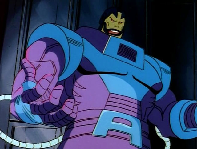
Now adding to any confusion that still exists out there is this Apocalypse figure. Apocalypse had multiple releases in the ToyBiz days so a retro card release makes sense. However, this particular figure features a purple and blue deco. That is significant because that’s the color scheme Apocalypse had in the animated series. No where else has Apocalypse ever looked like this. And to drive the point home further, he comes with an interchangeable gun attachment for his arm that is pulled right from an episode of the show which has left many to ask “So why is this not a release in the VHS line?” And the answer is, “I don’t know.” I don’t think any of the marketing team for Legends has explained that one. My guess is that someone on the team really wanted to do this character in this look, but the budget for the VHS line couldn’t accommodate it so they did it this way. It’s bizarre, because this figure does not feature the cel-shading paint job of the VHS line so it’s not just a difference in packaging. This figure is also based on the build-a-figure Apocalypse released a few years ago, so disassembling it to fit in a VHS box would not have been problem. Plus, as illustrated with Mr. Sinister’s VHS box, Hasbro is willing to adjust the sizing when necessary on those boxes so there’s really nothing stopping Hasbro from releasing the figure in that line from a design standpoint. I know the cel-shading is a bit of a contentious topic in the community, but this figure is so cartoon specific that I can’t imagine there was a ton of demand from collectors not interested in the animated series. This version of Apocalypse has always been viewed as a little “goofy” because of those colors so comic collectors are most certainly not the target audience, but here we are.
This is unquestionably supposed to be Apocalypse from the cartoon, you can’t fool me Hasbro!
Because of the colors on this guy, I definitely consider him to be part of the animated series line of action figures. It’s bizarre, and if it’s simply a matter of budget then I don’t know why they didn’t just hit this guy with more paint so he would fit in, but here we are. That said, I’m happy to have Apocalypse in this deco as it’s been perhaps the figure I’ve wanted most to come out of the animated line next to Morph. This funky color palette just hits right for me. Like most kids in the early 90s, I was confused why Apocalypse looked like he was painted for Easter in the show and would have preferred him in black and blue, but over time this look has just become a hallmark of the series for me and I appreciate it more as a result. Plus, Apocalypse is so bad ass that he can look like this and still be feared!
The figure does come on the aforementioned blister card and it is pretty massive. It’s almost comical to look at how big this thing is relative to other retro card releases and even more ludicrous compared to the 90s cards. It features some nice artwork, though not in the animated style aside from the suit colors, and definitely has that old school ToyBiz feel. Many like to keep these releases mint-on-card, but I am not one of them. If you want to preserve the card as much as possible, I recommend slicing the bubble from the bottom with a blade which will allow you to slide this big boy out. And once removed, he is indeed rather big standing at around 8.25″.
Even this gun attachment is taken right from the show.
In looking at this figure, what immediately stands out as “animated” aside from the colors is the sculpt of the chest. I mentioned earlier that this figure is based on the build-a-figure from a few years ago, but it’s been re-tooled in several places and the upper torso is one such place. The musculature has a very soft look to it which is in-line with the show. There’s basically just a hint of pectorals and nothing more. The other details of the costume, such as the shoulders and the collar area, look as they should. The only parts not exactly screen accurate are the boots and the gloves. The boots are just all-together busier in their design, something an animated show would strive to eliminate. The hands are similar, but they’re also just not sculpted right as he should have a blue knuckleguard on each hand. Lastly, the cables that connect his arms to his back should plug-in around the elbow and not the forearm. Obviously, these inaccuracies exist because Hasbro is reusing old parts and I would say it’s mostly fine. While I would love to buy action figures that are committed to matching the source material to a more exact specification, I know that’s not Hasbro’s approach. They do things mostly with cost in mind and basically think giving us a new torso is good enough. The issue now is that approach was more acceptable when these figures were a lot cheaper. It’s something that will bother some folks, and for others it won’t. In my experience Hasbro has done a good job of conditioning its fanbase to accept these figures for what they are so my expectation is most will be unbothered.
In typical Hasbro fashion, they give you some of what you want, but not everything. This gun has four barrels, but you get just 3 blast effects.
As a last bit of aesthetics, we should talk about the paint job. Apocalypse is quite purple and quite blue, as he should be. Hasbro prioritizes using as much colored plastic as possible with their figures and this one is no exception. The paint is mostly limited to the head, upper torso and the gauntlets. The head is where the most paint was needed and it’s done well enough. We’ll talk about the appropriateness of the expressions when we get to the accessories, but there’s enough paint to bring out the sculpted details of the face with minimal slop. He’s not the easiest face to paint as the lips basically wrap around the whole head and he has that gap in the blue on top of the head, so Hasbro did a very nice job here. What is unfortunate though is his head is in two pieces glued together and there’s a blue seem as a result between his forehead and the portion of his flesh that runs up his head and it looks stupid. Otherwise, the paint details are fairly simple and done well enough. The chest even has this really nice, matte, finish which looks great, but also makes the shiny, plastic, portions look worse by comparison. Where they had to match colored plastic to painted, the figure also looks fine.
The source material for the gun is clearly the show, though it was simplified a bit for this release.
The elephant in the room when it comes to paint is obviously the exclusion of cel-shading. This is a retro card release, so cel-shading isn’t normally expected, but he’s also animated Apocalypse and the other X-Men animated figures all have it. Personally, I would like characters based on a cartoon to feature a paint job that reflects that medium. On the other hand, I concede that the cel-shading in the VHS line has been applied poorly. Part of me would like to give Hasbro some credit here in thinking that with a bigger figure to work with, the cel-shading would turn out better, but there’s no guarantee of that. They seem to struggle just finding the right colors to use when shading (see the hideous mustard color they use to shade yellow). Ultimately, it is what it is. I would love some shading on the torso, especially, but it’s not here. Maybe that’s a good thing? I don’t know, but that’s just my opinion. I don’t think he clashes in a significant manner amongst the other figures in the VHS line so I guess it doesn’t matter that much. As was the case with the accuracy of the sculpt, the absence of shading is going to matter more to some, and not at all to others.
Would it have been hard to just give us one more teeny, tiny, piece to stich in that bottom barrel? Though the proper thing to do would have been to sculpt a new, double-barrel, blast effect that plugs into both at the same time.
Moving on to accessories, Apocalypse is pretty much par for the course when it comes to Legends these days. He doesn’t have a lot, but at least here what he does have is done well. First of all, he has two sets of hands: fists and open, “clenchy,” hands. That’s fine as it allows him to look menacing, dramatic, and you can even get those clenchy hands to grab onto another figure. He also has two heads: an angry one and a stoic one. The angry one is reused, and the stoic is new. As a comic inspired sculpt, I think the angry head is fine. As an animated Apocalypse? It’s terrible. He basically never looked like this in the show so I probably won’t be using it. The stoic head is more my thing. It’s still done in the Legends style so it’s not a toon-accurate look for the character, but that’s been true of almost every release in the VHS line as well save for Wolverine. I refer to it as stoic, but he is frowning and looks kind of ticked off. I do wish the shape of both was different as Apocalypse tends to have a wide jaw compared with the top of his head, in both the comics and the show, but these heads are pretty uniform. If it were up to me, I’d have gone with this head, but with less detail to remove the frown and paired it with a laughing head. Imagine a laughing Apocalypse on your shelf with his fists on his hips or his arms crossed? Perfection. Lastly, we have the optional gun part. It attaches to the forearm and the cable can even plug into it. It is taken directly from the “Beyond Good and Evil” plotline when Cable confronts Apocalypse at the start so it is pulled right out of the show. It looks nice and Hasbro even included some blast effects for it which I would not have expected. It’s nice to have as it allows you to display Apocalypse as a menacing overlord on your shelf, or as someone willing to get his hands dirty which was rather true of the character in the show. They could have loaded him up with more arm attachments, but this feels like a fine selection of stuff for Apocalypse. It just would have been nice to get a new effect part for the main part of the gun that plugs into both of the center barrels. Since they instead gave us three separate pieces, one barrel will always be empty.
The gripping hands are wide enough that you can make your Apocalypse perform chokeslams on Wolverine.
Time to talk about the articulation. Despite being a big boy, Apocalypse moves okay and is pretty standard for the line. We have the ball-hinged head that lets him look up and down, all around, and even tilt the head a smidge. The collar doesn’t really get in the way until you try to rotate the head, but the range is decent. The shoulders are just ball-hinged and he can raise his arms out the side and rotate them pretty well even with the shoulder pads getting in the way slightly. The elbows are single-jointed and he can’t quite hit a 90 degree bend, so that could be better. The wrists rotate and hinge horizontally. In the torso, we get an ab crunch that lets him bend back a bit, and crunch forward a decent amount. It’s mostly colored plastic here so paint rub shouldn’t be of great concern, but it’s worth being mindful of. The waist is just a twist and the legs are ball-pegs. He can damn near do a full split and is capable of kicking forward just fine, though the cheeks will prevent much rear leg motion. There is a thigh cut which does what thigh cuts do and the knees are double-jointed. There’s no boot cut, but down in the ankles you have the usual hinge and rocker combination which works just fine. More importantly, everything is nice and tight so he shouldn’t be toppling over on your shelf. Apocalypse really only needs to hit a few poses and this figure is capable of doing that.
He is here to crush the mutants, and seems capable enough.
All in all, I am quite pleased with this release for Apocalypse. Yes, I would have preferred this come in the VHS line for both the packaging and the cel-shading, but since it didn’t, at least we got a fairly robust release as far as accessories go. I’ve been pretty disappointed with the majority of the VHS line because of the poorly applied cel-shading, inappropriate reuse of some sculpts, and the dearth of worthwhile accessories. It’s really been a money-grab kind of line and at least this Apocalypse feels more substantial and like a better value. They actually did some re-sculpting to make the figure more cartoon accurate, and while they didn’t go as far as they could with that, I think most will find they went far enough. My preference would have always been to receive figures with sculpts actually designed to mimic the animated look, but Hasbro was never committed to doing that for one reason or another. This figure does suffer a bit as a result because the head isn’t right and the veiny biceps look stupid on Apocalypse (and they would look stupid on any version of Apocalypse so I don’t get the thinking here). The rest of its shortcomings are just par for the course with Marvel Legends, like the dearth of paint apps (the cables look especially plain), so regular Legends collectors will likely be content. Unless someone else can get the license to produce animated X-Men figures (highly unlikely), this is unfortunately the best we’re likely to get. And at least with Apocalypse, this one does indeed feel good enough. Most of the VHS figures are not and the feeling of settling is palpable with each one, but here I don’t feel that way. At least not as much.
Apocalypse does come at an inflated price though of $40 which is obviously a lot for a Marvel Legends release. This one at least feels more worthy of that price compared with the VHS figures at around 28 bucks. A comparable figure would probably be NECA’s Chrome Dome from the Teenage Mutant Ninja Turtles line which was also $40. I would argue that the NECA release is a better value than this as it came with more stuff, more paint, and was 100% new tooling, but it also came out a year ago so maybe in 2022 it would be $45. Value, as always, is rather subjective, but in this case I think the value is there. If you’re interested in picking this one up, you may have to dig around a bit as it is sold out in several places. Hasbro Pulse still has it open for order so that may be the safest bet. Amazon does as well, but they can be hard to trust. Re-stocks may be on the way too so I don’t think it’s one you’ll have to spend a fortune on eBay for, but I also would recommend acting fast since I don’t think this one is ticketed for big box stores which would indicate there will be fewer of these out in the wild than the Age of Apocalypse version, by comparison. More importantly, if you can find some time today (admittedly, difficult given the holiday) or maybe even just this week throw on some classic X-Men and take a trip through time. It’s incredible to think I was watching the show as a kid 30 years ago, and while it may not hit the same as it did for me then, it’s still a worthwhile nostalgia binge and a show I think is worth celebrating. Or if you want to read more about it, I’ve covered both Previously on X-Men and the X-Men art book and recommend both to fans of the show. Here’s hoping the sequel series due next year is able to carry on its legacy.
It’s been probably 13 or 14 years since I’ve purchased a Marvel-branded action figure. This is somewhat shocking to me because from the age of 7 to around 25 I spent who knows how much money on Marvel action figures. I was there for the inaugural Toy Biz line of Marvel Superheroes and X-Men action figures and I continued buying Toy Biz figures well past the age of when it was considered “appropriate” by my peers. And even after I stopped actually playing with my toys I still kept them on display in my room. Two pieces of old countertop on milk crates served as my makeshift shelves. Good guys on one side, bad guys on the other. As characters changed allegiance in the comics, so did their placement on my shelf. Aside from that, I didn’t like to mess with them and the dust would grow thicker and thicker and probably contributed to my constant sneezing. I didn’t care though, because I really loved my toys.
When action figures grew up with me I grew extremely excited. There were a few dedicated collector lines, most memorably one based on the Onslaught mini series, but things really changed with Marvel Legends. I was a bit tepid at first with them, mostly due to the absence of X-Men, but eventually I got into it. I started with just a figure here and there, and soon enough I found myself buying entire waves. I also added the occasional Diamond Select figure which at the time prioritized sculpt over articulation making some of the toys little more than glorified statues. I even got into Mini Mates for a period, since they initially focused on the Ultimate X-Men which was a comic I grew attached to pretty quickly.
Eventually, I stopped collecting. Part of that coincided with the dissolving of Toy Biz by Marvel which chose to instead license its properties to Hasbro. Those first few Hasbro waves weren’t very strong, and with the build-a-figure shrinking down to more normal proportions it failed to really motivate me. I think the last wave I bought to completion was whichever one featured The Blob. And even with that, I think I had to buy some figures based on X-Men: The Last Stand which did not sit well with me. That also happened to coincide with me moving out on my own trading the confines of my old bedroom for a small apartment. I didn’t want to have to lug a bunch of toys around with me every time I moved, and once I got settled into my own home that I purchased the itch had passed. I had moved onto other hobbies and comics just didn’t appeal to me like they once did. Sure, there have been a few figures over the years that tempted me, but the rising cost in standard toys makes it pretty easy to just focus on the things that really bring me joy.
That could change though, and if Hasbro wanted me back (and who wouldn’t?) there is one thing the company could do that would guarantee it many of my dollars and it has to do with my favorite show as a child: X-Men.
This recent action figure three-pack is what put my brain into this mode. These almost work as animated versions, but they’re different just enough to not be perfect. And I’m not just referring to Wolverine’s bone claws.
Nostalgia currently has me hooked via NECA’s line of Teenage Mutant Ninja Turtles toys based on the old cartoon series. That show may not be particularly good, but I loved it as a kid and it’s something I can’t let go of. Similarly, I have a huge amount of affection still for X-Men. That show was my life for a few years and unlike TMNT, the show is still watchable today even if it doesn’t hold up as well as Batman or possibly even Gargoyles. And I know I am not alone. There is a lot of love out there for that show and that has been preyed upon via action figures based on the costume designs of the Jim Lee era X-Men from the comics. There was a recently announced three-pack featuring Wolverine, Jean Grey, and Cyclops which is what really got my juices flowing. Those characters bare a strong resemblance to their animated counterparts, but the figures are also clearly aiming to capture the look of the comics and not a cartoon.
What gives me hope that such a line could work is because animated versions of these characters are not far off what is already out there. Take your standard Wolverine action figure, for instance. To make him better resemble the cartoon, Hasbro basically just needs to reduce detail. No stubble on his face, not much hair on the arms, and less muscle definition. DC has done a great job bringing Batman: The Animated Series to plastic form in terms of aesthetics, so why not do the same, Hasbro?
Because I’m such a generous guy, I’m even going to provide a road map for Hasbro. I envision six figures per wave with a build-a-figure bringing the total to seven. Adhering to modern times, the extra buildable figure is not some titanic character, but something closer to a standard sized figure. It would be a good fit for those figures that would need to be 7 or 8 inches as opposed to 5-6, which is what I imagine most figures would fall into. They could be done, and really should be, in scale with Marvel Legends and I would prioritize characters from the first two seasons. If the line’s a success, then sure go for more. If the series happened and worked out as outlined below, then I would definitely buy every figure and really annoy my wife as I hunted for more space to display them.
Series 1
Wolverine
Cyclops
Rogue
Morph
Mystique
Magneto
Build-a-Figure: Sabretooth
This mix would get some fan-favorite good guys out early and also a few villains to pose them against. Wolverine is an obvious must for the first series as he was the most popular character. He should come in his standard uniform and additional hands, some with claws in and some with claws out. A second, unmasked, head would complete the look. Cyclops should also just have his normal look. If a removable flight jacket could be added without harming the sculpt, then all the better, but not necessary. Similar to modern Cyclops figures, he should have a second head with a blast effect and probably an extra set of hands including one with two fingers extended on his right hand to activate his “X” communicator. Morph, on the other hand, should have his flight jacket since he was most often depicted wearing it. He should also have black hair as he did in seasons one and two and an alternate “evil” head. Mystique would need few additional accessories, making her the likely landing spot for a larger piece of the build-a-figure. Magneto would need a helmeted and un-helmeted head to properly capture his long hair. A nice, heavy, fabric cape would also look great, but soft plastic wouldn’t be bad either. Sabretooth, being featured in episode one, makes for a good choice as the first build-a-figure given his size relative to the other characters.
That’s how I want my Wolverine to look, bub.
Series 2
Gambit
Bishop
Storm
Cable
Pyro
Avalanche
BAF: The Blob
Wave Two would be anchored by the next most popular character after Wolverine, Gambit. He’d just need various hands and his bo staff to be authentic. Storm would be the other character from the team, and in the interest of “keeping them wanting,” would be the only other from the main team. Bishop and Cable both played large roles as guest characters and lend themselves well to action figure form. Cable should probably have his season two look which featured a metallic left arm, a more common look than the season one version. Bishop should also feature a removable time bracelet to go along with his really big gun. Pyro and Avalanche would serve as the villains with the BAF being their comrade Blob. A desire to assemble Mystique’s troop would hopefully help drive sales.
Everyone can relax, Gambit is in series two.
Series 3
Beast
Jean Grey
Archangel
Civilian Wolverine
Graydon Creed
Mr. Sinister
BAF: Apocalypse
Series 3 would be the one that nearly completes the main team. Beast, unlike most figures based on the character, should have a cheerful disposition as opposed to an angry one. Jean Grey would need her cartoon-accurate costume, something Toy Biz never delivered on when the show was popular, which was blue and orange as opposed to blue and yellow. She should also probably come with a Cerebro helmet. This would also be a good time for a second Wolverine figure. Since he was so often featured in plain clothes (yellow flannel with a brown jacket), a figure based on that look makes sense. He should have two pairs of clawless hands, ones that look like normal fists and ones that have the steel ports on his hands as he was incorrectly portrayed in season one. Diehard fans of the show, such as myself, really appreciate little details like that. Creed was a big player in season two, and he warrants a figure as a result. Of course, Sinister was the main big, bad, guy of that season and series three feels like a good spot for him. Lastly, Archangel should be included (with a masked head and unmasked head) to pair with the BAF Apocalypse who would be depicted in his animated purple and blue color scheme.
I don’t know why they made him purple, but the toy better follow in the same footsteps!
Series 4
Jubilee
Colossus
Omega Red
Forge
Civilian Cyclops
Professor X
BAF: Juggernaut
Series 4 would finish the main squad by including Jubilee and Professor X. Xavier would be the tough one to include as he would need his hover chair. Recently, Hasbro did a Professor X that I think retails for more than a standard Legend. The company could save money by retooling it and if it has to retail for more then so be it. Colossus guested a couple of times and is deserving of a figure himself. He should be clad in his blue pants and white tank top to match his appearance in the show. If a second, non-transformed, upper torso could be done then that would be really neat. Omega Red is a villain with a great, 90s, design, and even though he’s a bit bigger than other characters, I don’t think he’s so large that he would need to be a BAF. Cyclops had enough non-costumed appearances to be the second main cast member worthy of a civilian look. And Forge had multiple appearances as well. He should come with an alternate head so he could be depicted as main timeline Forge and future Forge. The Juggernaut is the last character that serves as an obvious choice for a BAF and would be a sought after one helping to make sure fans buy the entire wave. That only challenge with him is I think he would need two heads as well, one masked and one unmasked, because it’s hard to make a good-looking Juggernaut figure that features a removable helmet.
Colossus proved you didn’t need a real costume to be a hero.
Series 5 and 6
Phoenix
Gladiator
Nightcrawler
Dazzler
White Queen
Sebastian Shaw
Henry Gyrich
Bolivar Trask
Dark Phoenix
Banshee
Fabian Cortez
Empress Lilandra
BAF: Sentinel
I’m grouping these two together because I have a radical idea for the BAF. It would be a sentinel and the pieces spread between both waves. The piece loadout would be like Giant Man from the Toy Biz days which did an oversized wave of Marvel Legends as a Wal-Mart exclusive. This would allow Hasbro to do a bigger figure to do the sentinel justice, because we need a sentinel for such a series since they were so important in that first season. The desire to have a cartoon sentinel would help move some of the less exciting, but still essential, characters contained in this wave. Trask and Gyrich, specifically, would be unsexy figures, but they had such a large presence over the first season that it feels wrong to exclude them. Much of these waves would also be devoted to the Phoenix and Dark Phoenix Sagas. Doing both regular Phoenix and Dark Phoenix would also save Hasbro money since they’d basically be the same figure, different head. For Lilandra, I’d also go with the Empress version of the character as that would just make for a more striking visual. Cortez is the only character from a later season, but I see more opportunity for villains and I just happen to like him more than someone like Erik the Red or D’Ken.
I don’t see how you could have a toy-line dedicated to the X-Men cartoon and not feature a sentinel somehow.
If the line was a success, it wouldn’t have to end there. I completely ignored Sinister’s Nasty Boys and all of the mutates from the Savage Land. They would really help to bolster the ranks of the villains, but it might be hard to convince people they’re more deserving of plastic than some of the others. An entire Savage Land wave could even be done, though I don’t know if that would be a big seller. Another big bad guy I left out is Mojo who would probably work best as a BAF. If he was done, then he would need to be paired with a Longshot.
As for heroes, there are alternate versions of other characters that could pad things out. Civilian versions of Storm, Rogue, Jean and Jubilee (or her in a flight suit) could be added. Beast and Gambit had other looks as well, but nothing really drastic (though Beast with his Howard the Duck shirt is pretty tempting). Archangel also briefly appeared as Angel in season one and returned in season four sporting his white and blue Angel costume. Wolverine had other looks as well, though my personal favorite would probably be the alternate timeline Wolverine from “One Man’s Worth” which also featured a mohawked Storm. Other guest heroes included Iceman, Psylocke, Alpha Flight and X-Factor so there are certainly more characters to mine from, I’m just not sure any really need a dedicated figure based on their look in the cartoon.
Hasbro missed its chance to honor the cartoon with a line of figures to celebrate the show’s 25th anniversary. There’s still time though to recognize the 30th in 2022 and a toy-line near then would be an appropriate way to do so. If 2022 seems too far away right now it could be timed to end that year. The show is also about to gain new exposure via Disney+ where it and other X-Men cartoons will be available day one. And with Disney acquiring 20th Century Fox it stands to reason that the X-Men will soon join Disney’s Marvel Cinematic Universe bringing even more of a spotlight to the brand. The time is right, Hasbro, make it happen!
No Marvel property has had a more up and down relationship with the silver screen than the X-Men. That’s not necessarily a bad thing, because at least it hasn’t been all down like the Fantastic Four, but it is frustrating for those who love the X-Men property. The first film was one of the early superhero films that launched this new found romance between Hollywood and Marvel, which also helped open the door to DC as well. That first film hit on a lot of what makes the X-Men unique, though it sacrificed action and plot in devoting so much of the film to setup. The second film seemed to better encapsulate what X-Men could be, but made some changes and decisions that felt rushed and short-sighted. Still, it was successful and the best X-Men film for a long time. Following X-Men 2, director Bryan Singer departed the franchise for Superman, and Brett Ratner came on to direct X-Men: The Last Stand, a hot mess that at least had the decency to keep the run time down.
Following The Last Stand, Fox went away from their mutant franchise but did allow Wolverine to get his own terrible solo film. Seeing Marvel have success with other franchises without Fox likely helped bring the X-Men back with the Mathew Vaughn helmed X-Men: First Class. First Class was a new beginning for the franchise, though a confusing one as the continuity between it and the original trilogy seemed non-comittal at best. Was it a prequel? A reboot? Vaughn was one and done, and having not directed much worth discussing since X-Men 2, Singer took over for Days of Future Past, which further muddled the continuity between this new series and the original. Days of Future Past was a fun time travel piece. It also helped that it was adapting one of the most popular plots from the classic X-Men stories. It reunited the new cast with the old, and the conclusion seemed to reset the franchise as the heroes successfully changed the future leading the viewer to assume what happened in the original trilogy was basically undone, or at least severely altered, freeing this new franchise from further continuity scrutiny.
Apocalypse with his two horsewomen Storm and Psylocke.
X-Men: Apocalypse gives us a second completed trilogy, though one that clearly sets up for another X-Men film. It adapts the popular villain, Apocalypse, for the movie-going audience for the first time. Apocalypse is a tough sell in live-action. In the comics, his giant persona complete with big “A” belt buckle and blue lips somehow works, but viewed outside of that context looks ridiculous. His powers in the books began as being a kind of shape-shifter, with the emphasis placed on his ability to increase in size. Since his debut in the pages of X-Factor, Apocalypse has been retconned numerous times and his powers expanded to the point where it’s probably easier to just say that they’re undefined – he can do almost anything. As a plot device, he’s interesting in the sense that he’s a third alternative to the Xavier/Magneto world view. Xavier wants humans and mutants to co-exist, while Magneto wants to establish mutant supremacy. Apocalypse just wants to kill everybody and let the strong survive. He wants to rule over all as a god-like being. It makes sense for one who calls himself Apocalypse, though it’s not always interesting.
Despite that, I’ve mostly enjoyed Apocalypse as a foil as sometimes it’s nice to have one villain in a hero’s rogue’s gallery that’s just plain evil. I never really expected to see him in a film, but if he had been brought over, I expected him to be heavily altered to ground him a bit more. To my surprise, Singer and company did no such thing with Apocalypse.
The film opens with a flashback to a ritual involving Apocalypse in Cairo. He’s being placed in the base of a pyramid, surrounded by his disciples and attendants, as they prepare a second person on a separate slab within the tomb. We learn shortly after that this is a ritual to transfer Apocalypse’s essence to a new host to allow him to continue to live for years upon years.
Apocalypse (Oscar Isaac) is explained later as the first mutant, who likely lived for centuries even before that flashback took place. He was worshipped as a god called En Sabah Nur, and the film actually never directly refers to him as Apocalypse. He’s yet another blue-skinned mutant with weird metal dreadlocks and vaguely Egyptian themed armor. Returning character Moira McTaggert (Rose Byrne) learned through research that he was the suspected first mutant, and each time he transferred to a new, mutant, host he would gain their powers. As a result, Apocalypse possesses numerous abilities that go very much undefined in the film. He’s portrayed similarly to Watchmen’s Dr. Manhattan for much of the film, basically disintegrating people who get in his way without so much as a gesture. Other guys are melded into walls or the ground, and we also see him do some minor mind manipulation. He’s able to somehow sync with satellites to learn about the state of the world after awakening after thousands of years, and perhaps most importantly, is able to draw out the max potential of other mutants. He displays this by assembling his four horsemen: Storm, Psylocke, Archangel, and eventually Magneto.
Jean, Nightcrawler, and Cyclops are expected to shoulder some of the load in this film, but aren’t given adequate character development to really let them sine.
Now, I’m not one for spoilers when reviewing films. It strikes me as lazy, but I’m going to kind of spoil something in this paragraph as it relates to Magneto (Michael Fassbender). We see him with Apocalypse in all of the promotional imagery, so I don’t consider it much of a spoiler to point that out. When we first see Magneto in the film though, he’s married with a daughter and working in a steel mill in Poland. He has a conversation with his daughter before she goes to bed about how his parents were taken from him, and assures her the same won’t befall her. The film could not have telegraphed what’s to follow any more implicitly than that. Again, I don’t mean to spoil anything, but obviously something bad happens which leads Magneto to Apocalypse and I felt irritated by the whole setup. Did we really need Magneto to be, once again, re-motivated to take on humanity? When we left him in Days of Future Past, he really had no reason to change his ways and could have been left as a sulking, angry, and determined adversary for the X-Men without the need for additional motivation.
I suppose I should just cut to the chase and say I did not like this movie. Apocalypse doesn’t work as a villain. He has the personality of a natural disaster. His motivations are vague and uninteresting. They appear to be mostly in-line with his comic book motivations, but I don’t know how much of that is me filling in the blanks with what I know from that medium or the film actually earning that conclusion. His supporting cast is even less interesting as there’s really no character development devoted to his followers. He’s also absurdly over-powered, to the point where it’s not really believable when he (spoiler?) eventually fails to bring death and destruction to the world.
Evan Peters returns as Quicksilver to basically do the same thing he did in Days of Future Past, only with an 80’s soundtrack this time.
None of that is the fault of actor Oscar Isaac, he does about as well as he can with what the script and screenplay give him. And as far as X-Men scripts go, X-Men: Apocalypse hits a new low. When it’s not having its characters spout tired cliches, it’s having them say nothing much at all or clumsily setting up whats to come, as if we need the film to help foreshadow anything. James McAvoy returns as Charles Xavier and he probably comes off the best, as Xavier is pretty easy to write. He’s paired often with Jennifer Lawrence’s Mystique, who’s pushed into a starring role, probably not because her character is suited for such, but most likely because of how her star has risen since First Class. Mystique is poorly suited to be so front and center in the story as she’s clumsily written. Her motivations change so quickly and effortlessly you would think Xavier is mentally controlling her. The same can be said for Magneto.
New additions to the cast include younger versions of mutants featured in the original trilogy: Cyclops (Tye Sheridan), Jean Grey (Sophie Turner), and Nightcrawler (Kodi Smit-McPhee). Cyclops and his relationship with brother Alex/Havok (Lucas Till) is fit into the film by being the younger brother, instead of the older one as he was in the comics. His struggle to control his optic blast mutant power is kind of glossed over and not really dwelled on as Hank/Beast (Nicholas Hoult) presents him with his special glasses pretty quickly. He’s a pretty terrible character who’s primary motivation is apparently skipping out on class to go to the mall – how 80’s! Jean is portrayed rather predictably as the girl scared of her own powers. She has a vision of the coming apocalypse which is what gets the X-Men involved in seeking out more information on En Sabah Nur. Smit-Mcphee’s Nightcrawler is easily my favorite addition to the cast. He’s depicted the same as he was in X-Men 2, visually speaking, and he’s kind of cautious and quirky and is an obvious gentle soul not suited for violence. His religious beliefs are not front and center, but he is shown praying at one point.
The film mostly suffers by just being uninteresting, and it runs over two hours in length. Even at such a length, the plot moves relatively fast as it relates to Apocalypse who just teleports wherever he wants. There’s a pointless detour taken when the X-Men collide with the military and an old foe from the past film, which seems to exist only to setup a soulless cameo. The film builds towards a confrontation with Apocalypse in which we’re supposed to care about the new recruits taking center stage, but we have so little invested in them that it just feels hollow, not to mention expected. The film also wastes the 80’s setting, really not using it for anything other than a few jokes that were probably too obvious for That 80’s Show. Worse, it feels rather forced since none of the characters look like they’ve aged the twenty or so years that have past since First Class.
The resolution is a foregone conclusion from the start, and we’re left with a big, empty, action film that didn’t really need to be an X-Men film. So little of what makes the X-Men special as a property is encapsulated here, and what is feels like retread. I was checking the time an hour into this one, and I couldn’t wait to be done with it and had to struggle through the credits to see the epilogue, which did little to excite me for another film. It feels like Singer is just setting up to tell a story he missed out on with his first go-around with the series, though I have no idea if a next film is a guarantee. Most of the contracts with the heavy hitters likely need to be renegotiated, and what incentive is there for some of them to return? I suppose they could get by without Magneto, since he felt shoe-horned into this film to begin with, but Mystique was positioned as the leader of the X-Men so I don’t know how they get out of that if Lawrence has no interest in reprising her role.
In the end, I’m left to say “who cares?” where a next film is concerned. We already have the reported excellence of Logan to indulge with, and another X-Men film will need to be tackled by people who have the motivation to craft a worthwhile story that begs to be told. Apocalypse did not do that, I don’t think it killed the franchise, but it did bring it back to where it was following The Last Stand. If X-Men Origins: Wolverine is excluded, this is the worst X-Men film yet. I’d rather watch The Last Stand because it at least has an interesting plot, if poorly executed, and it’s a hell of a lot shorter. Like The Last Stand, I find myself not really caring where the franchise goes from here, or if it continues at all, and that’s a pretty poor lasting impression for X-Men: Apocalypse.


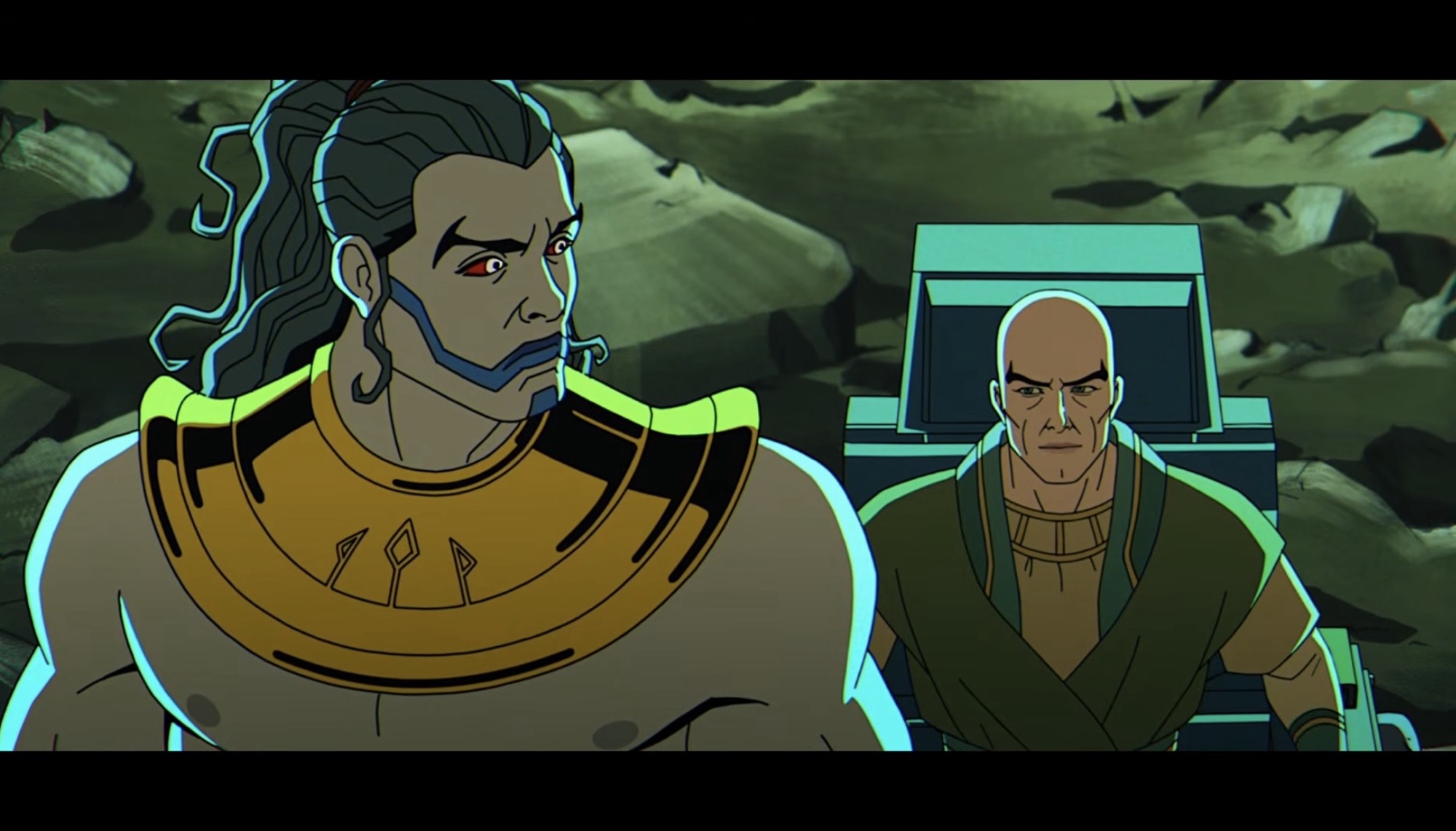
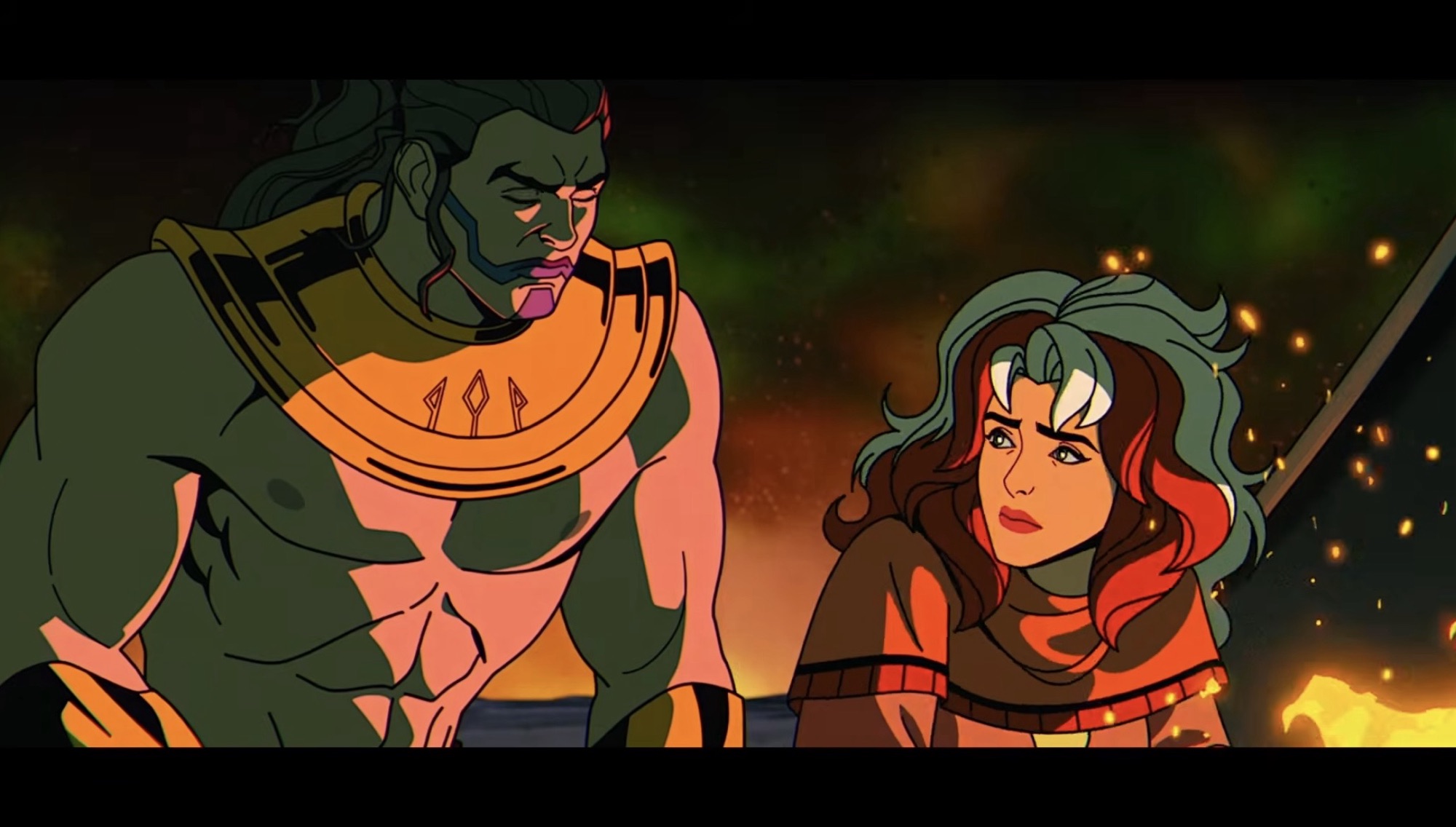
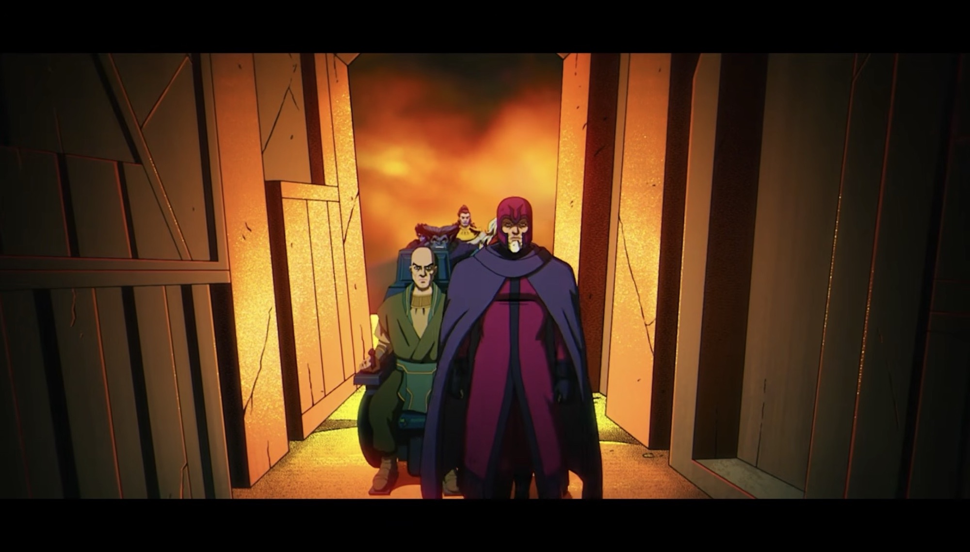


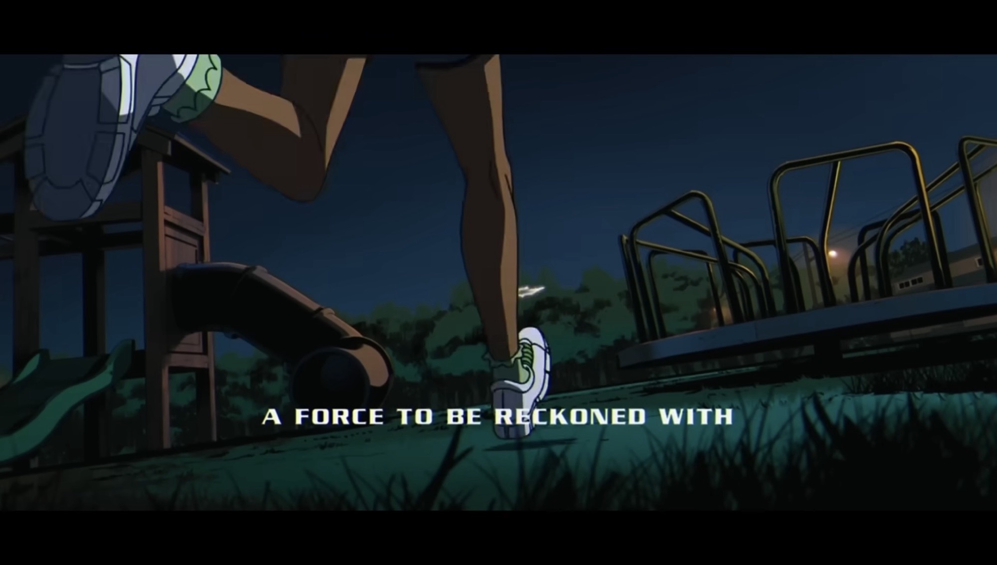
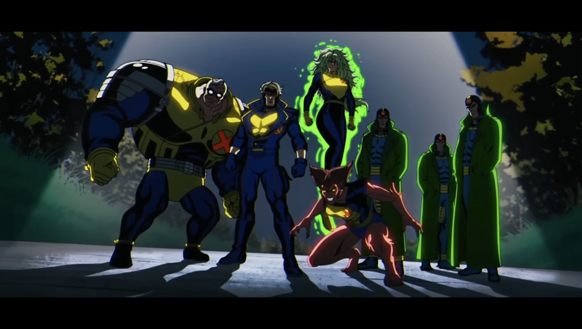
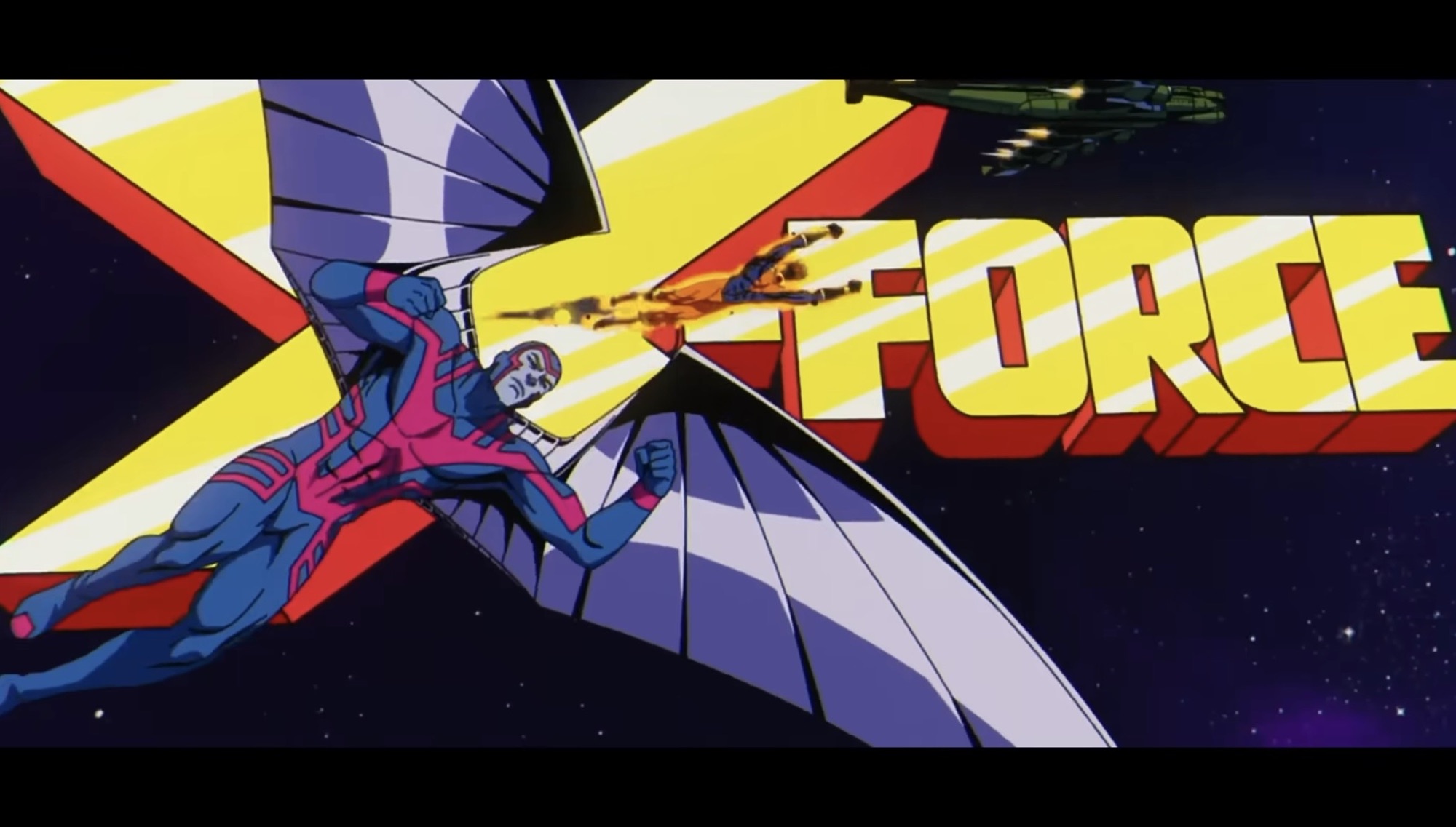
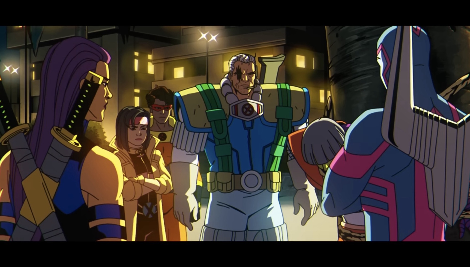
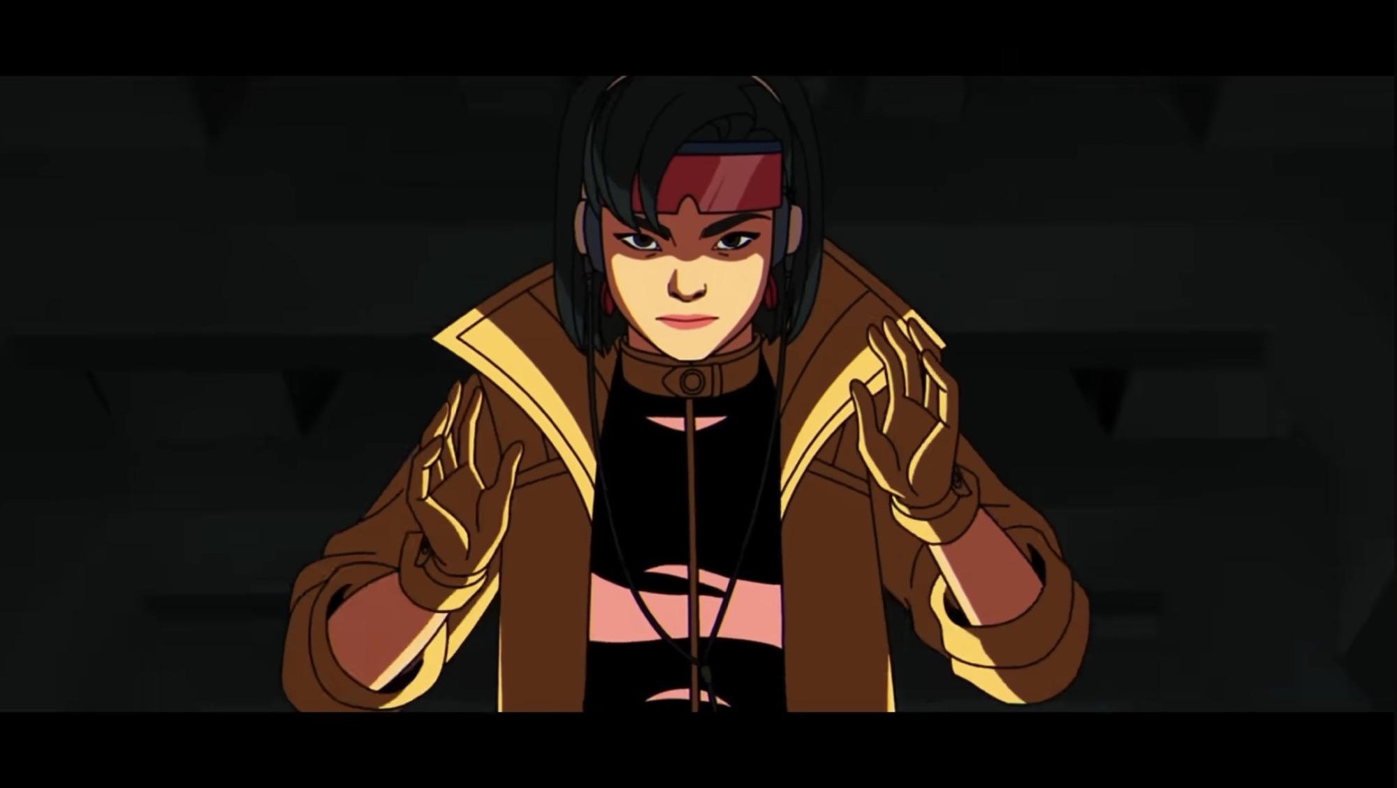
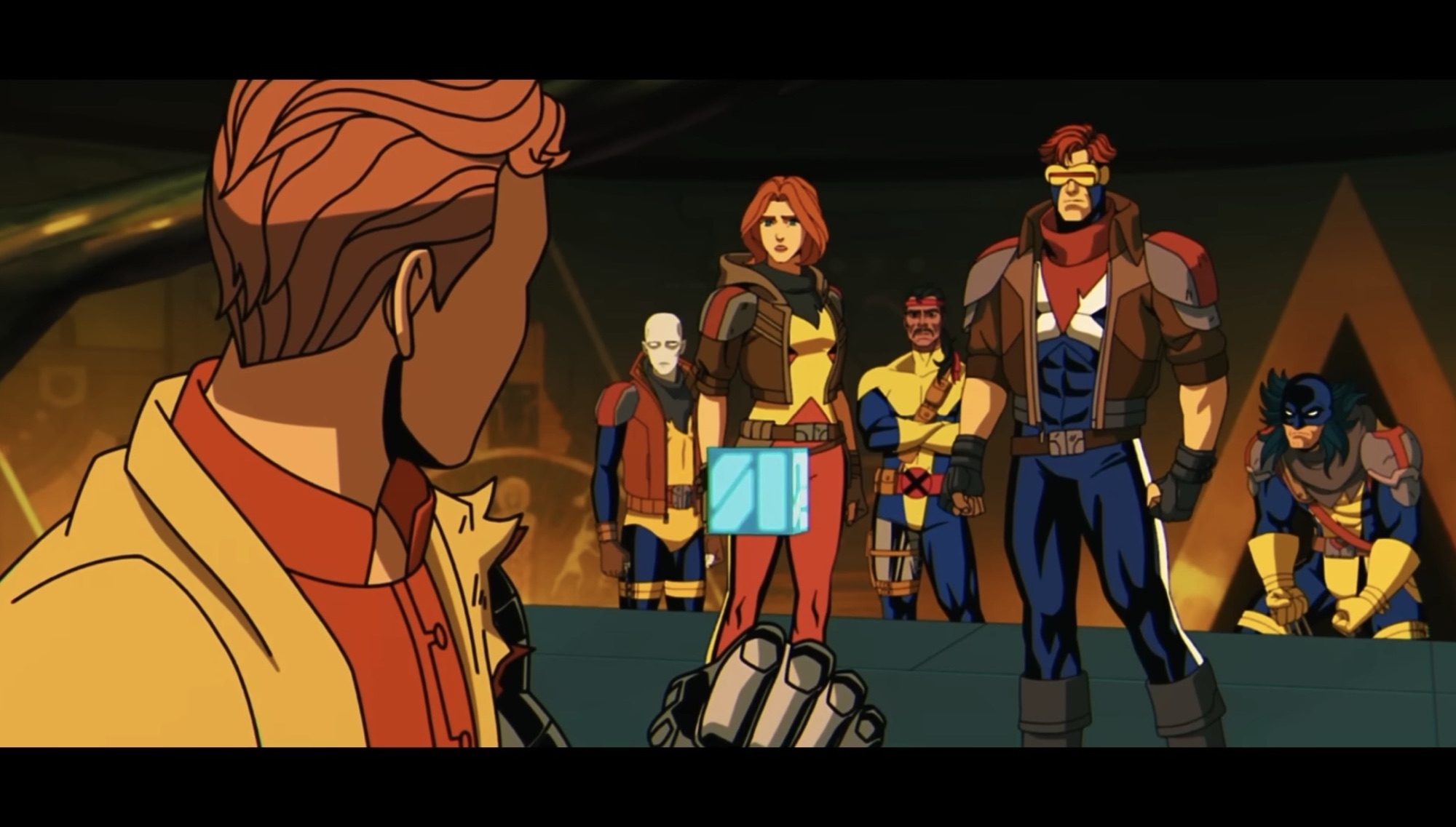


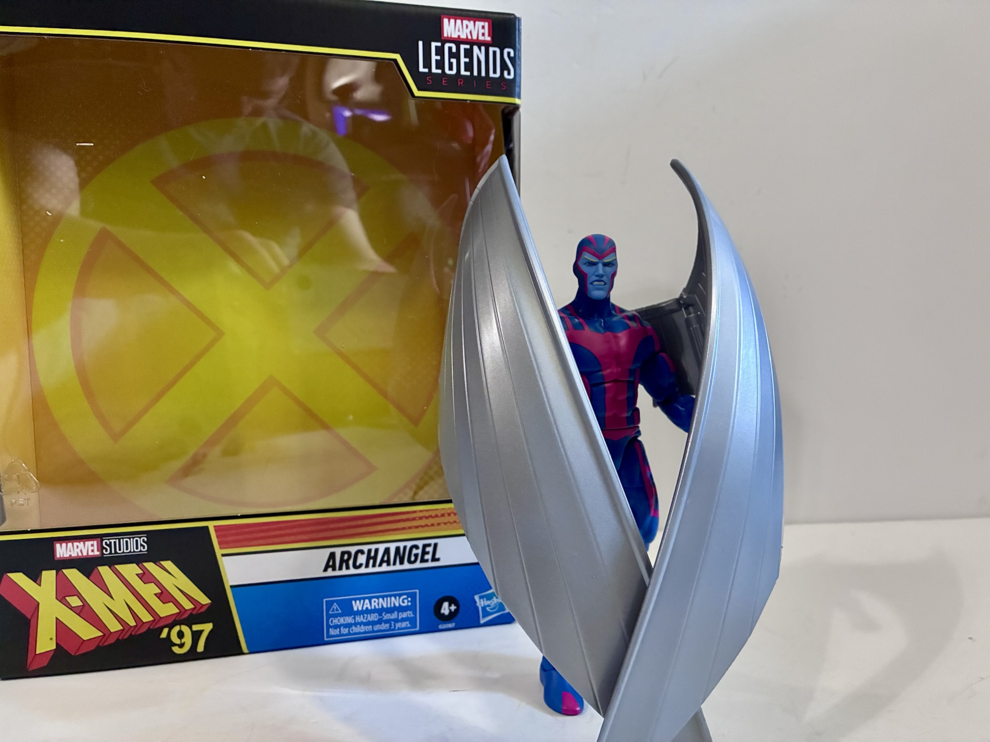
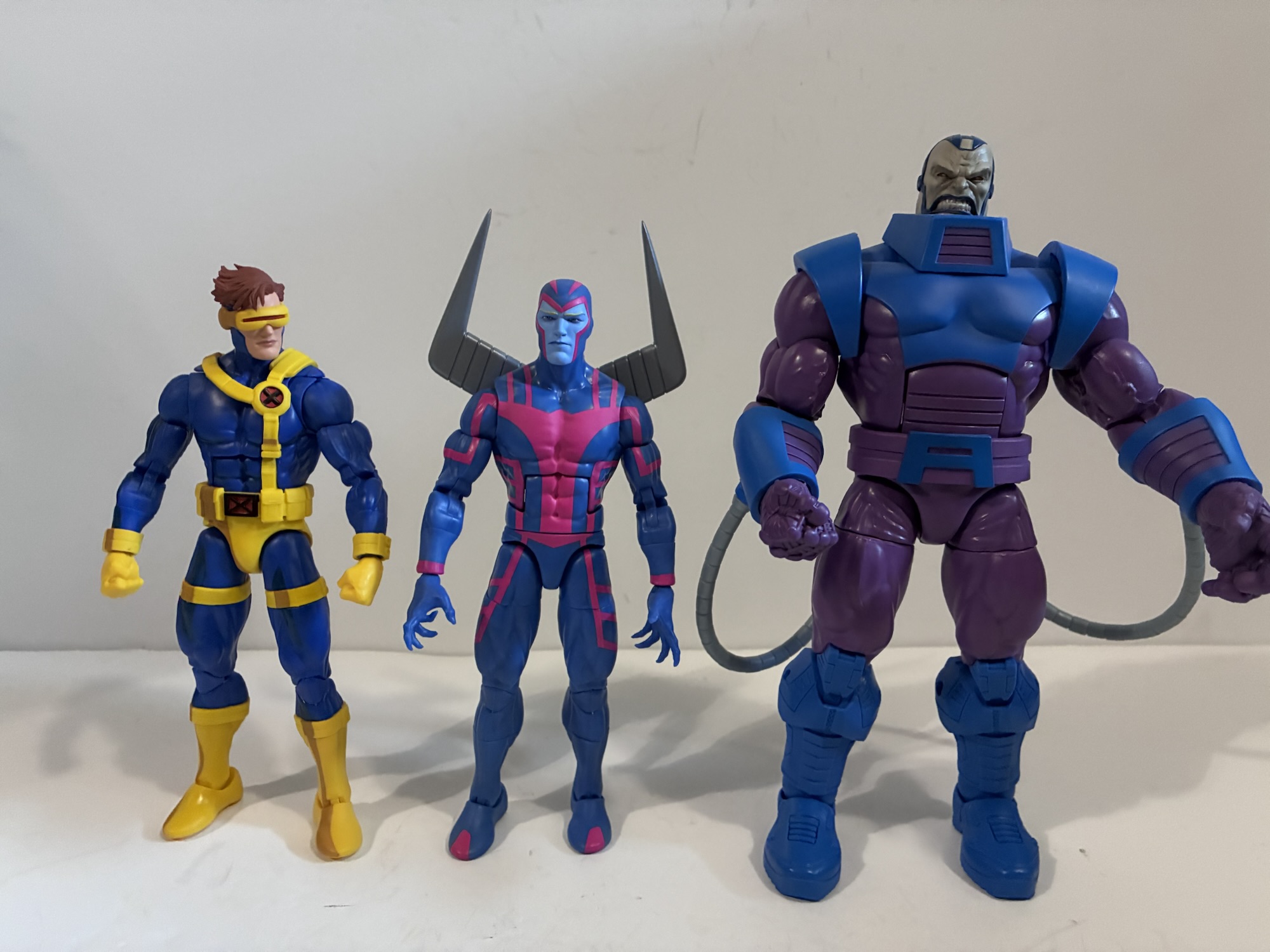
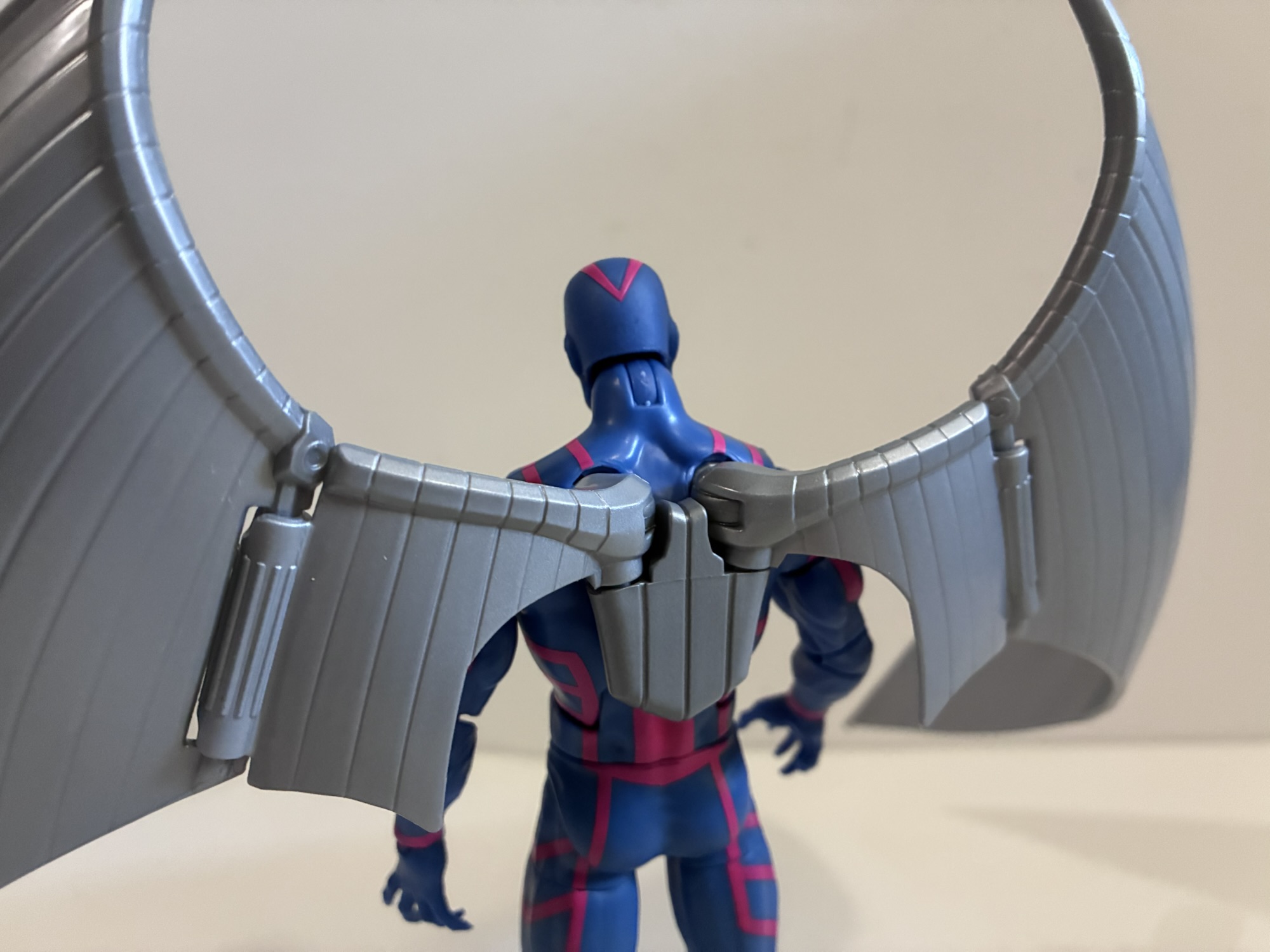
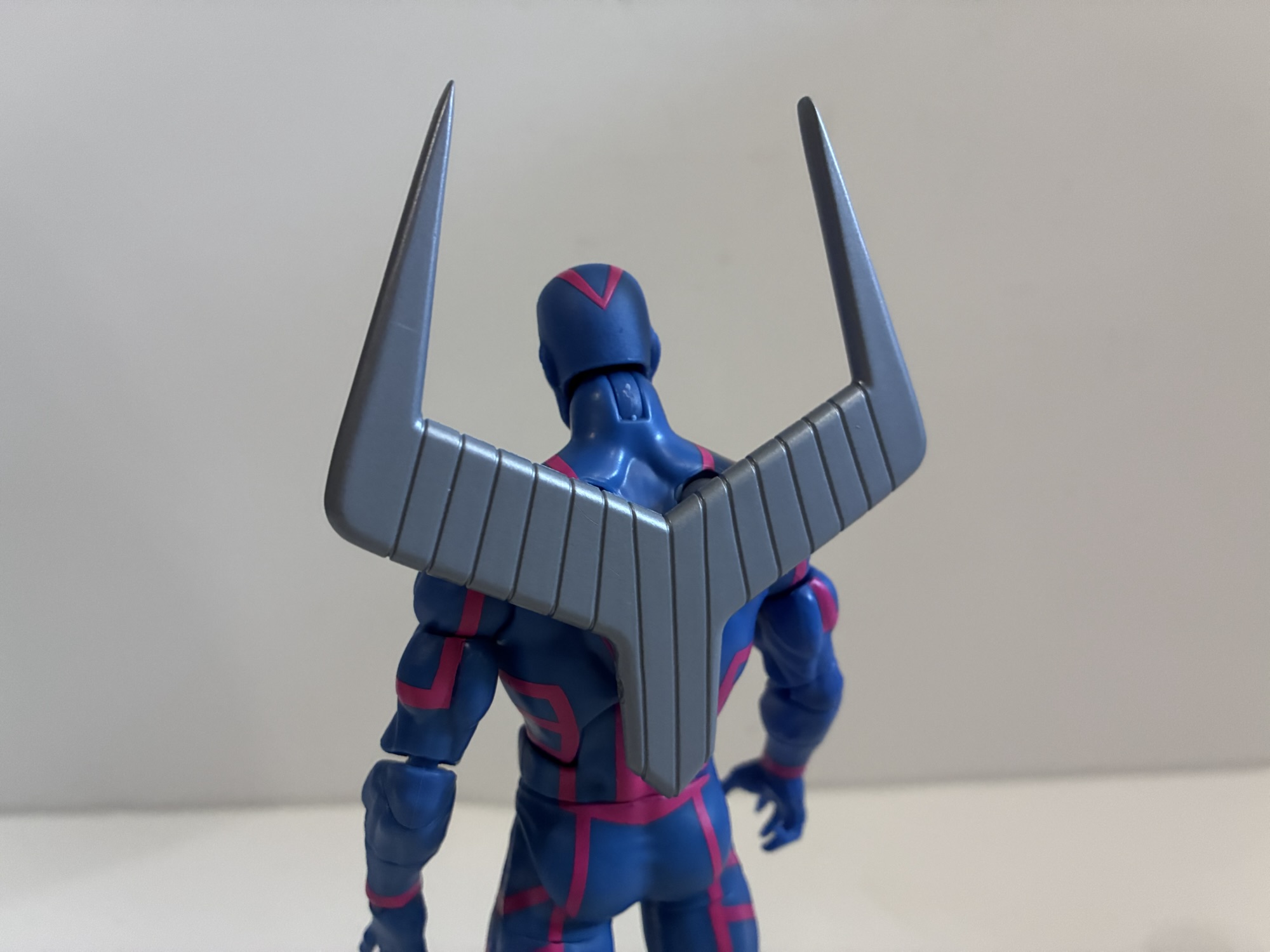
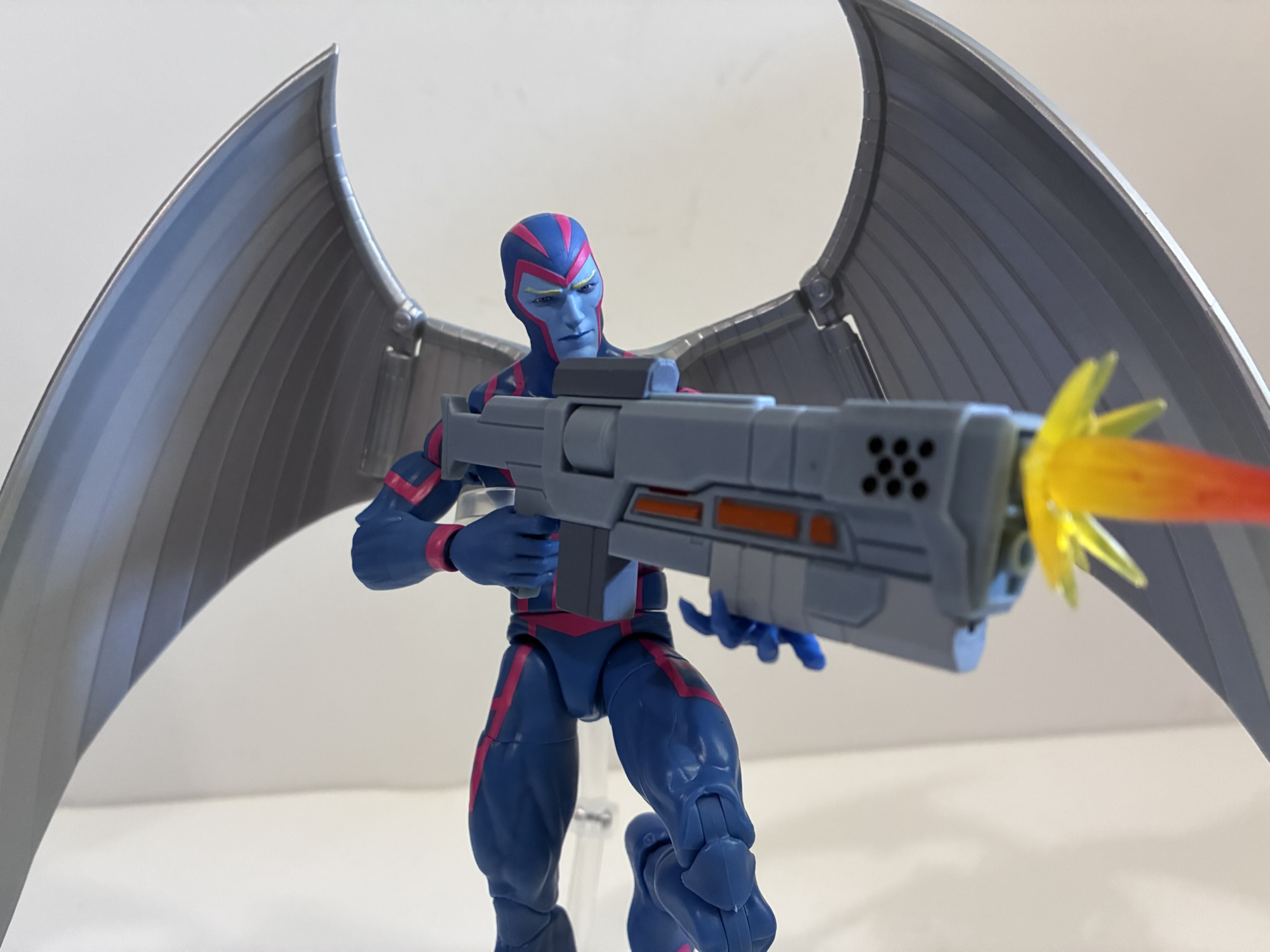
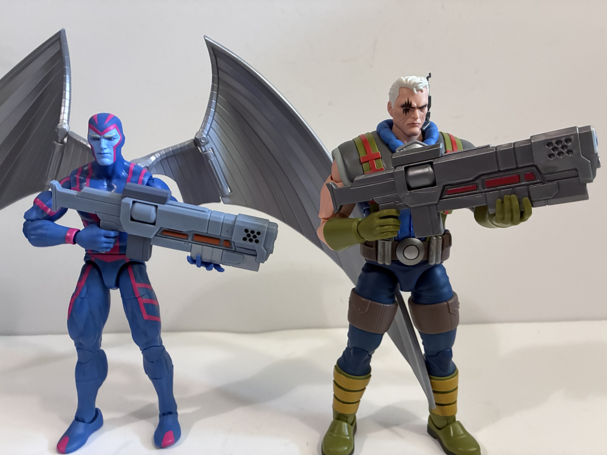
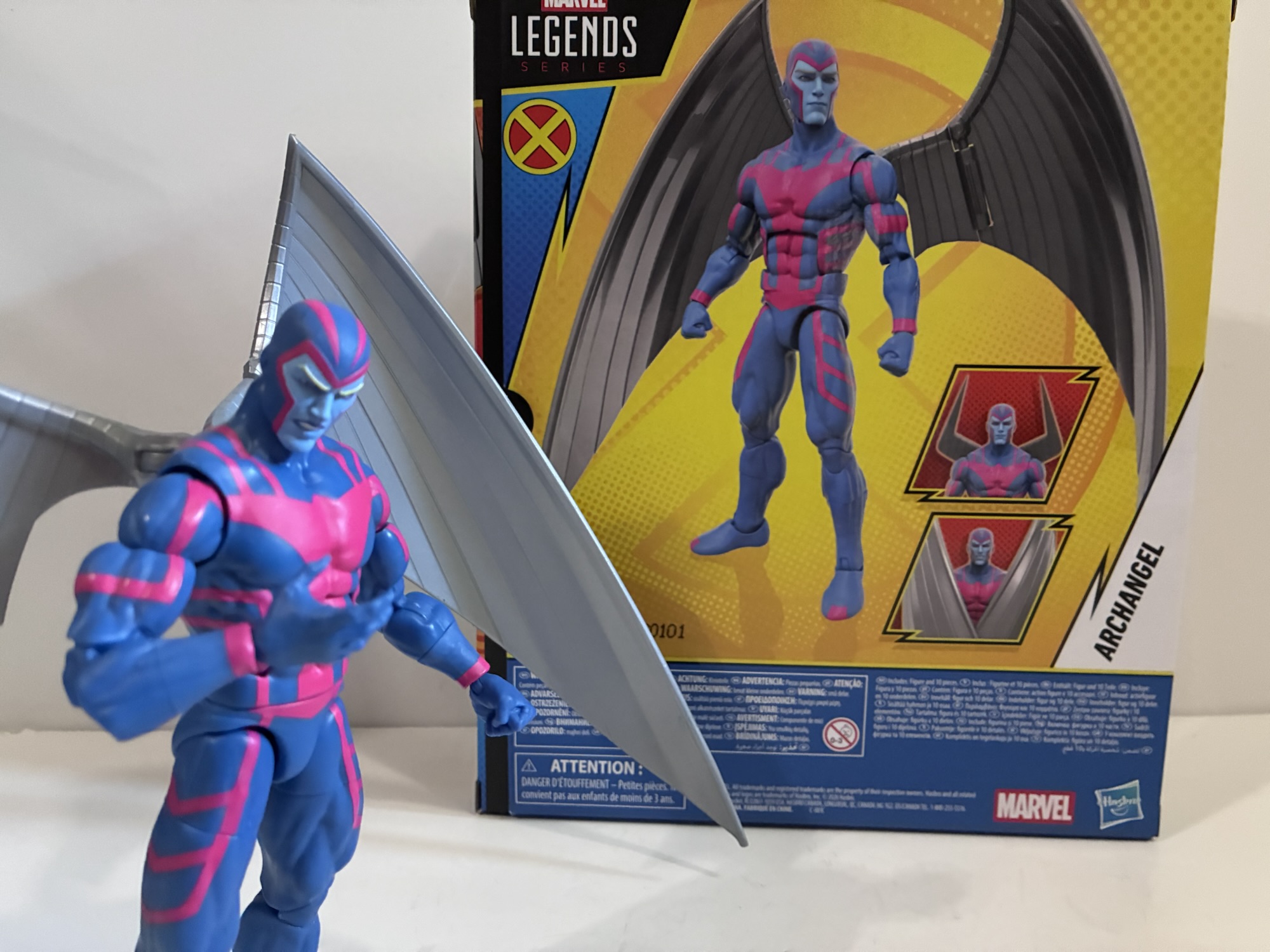
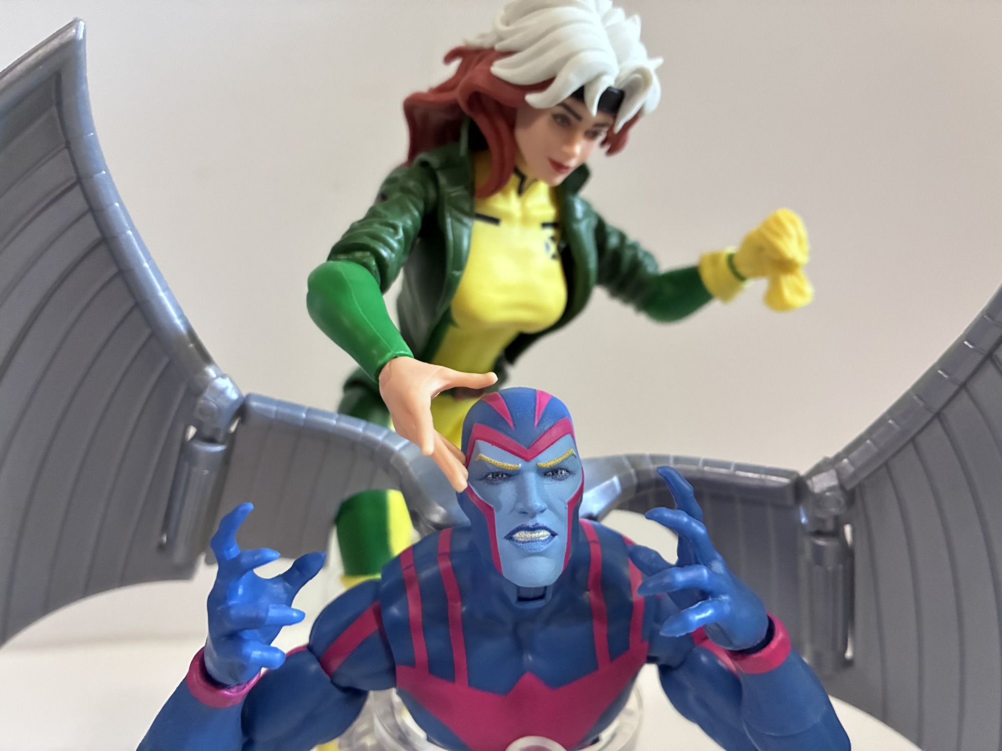
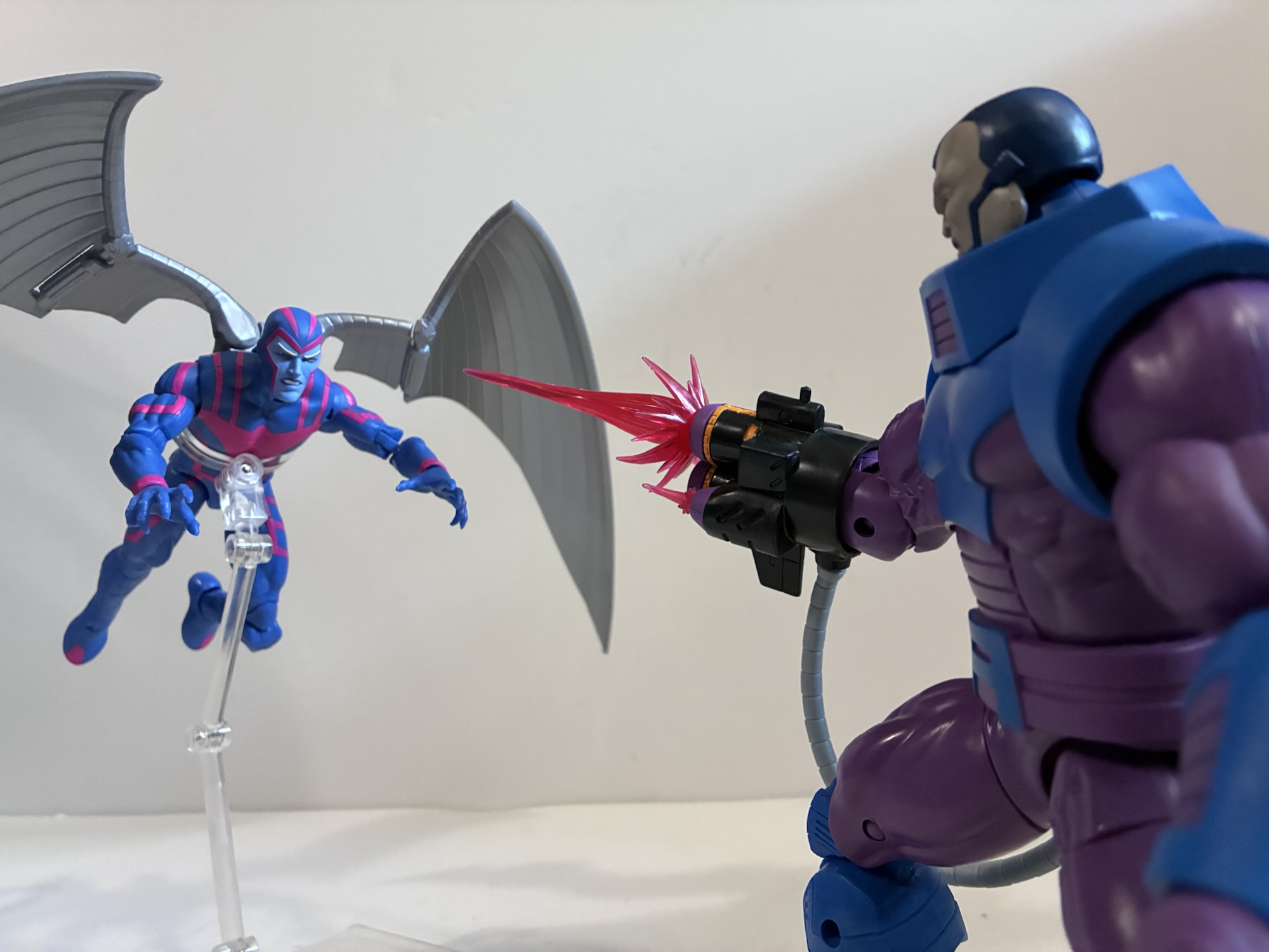


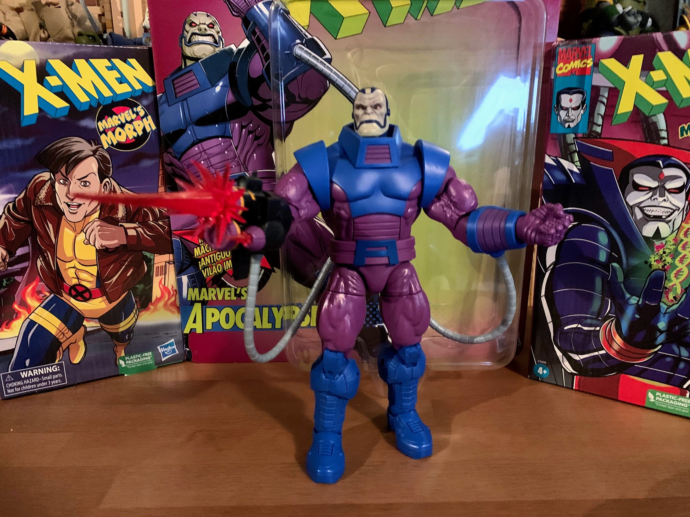
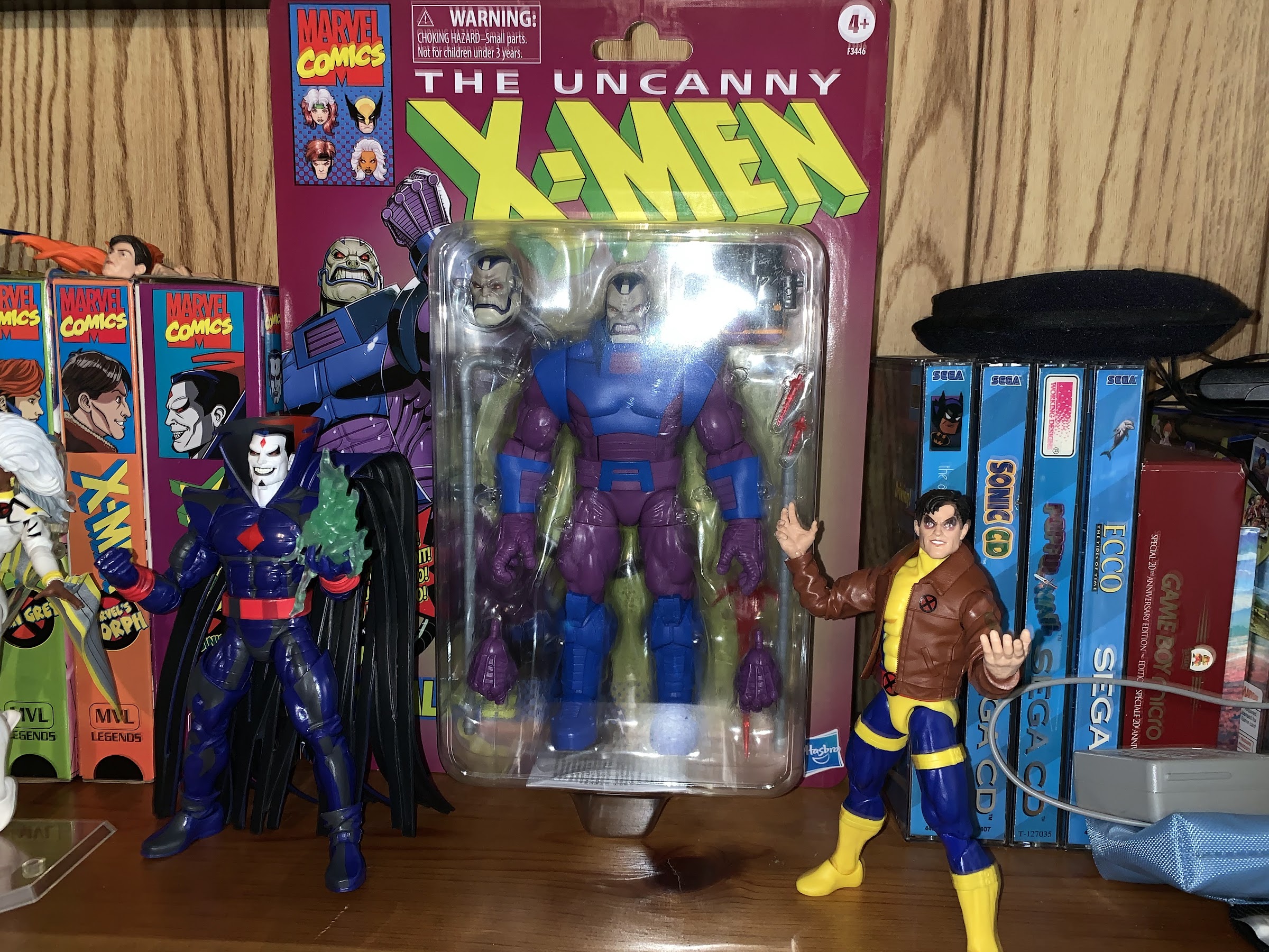
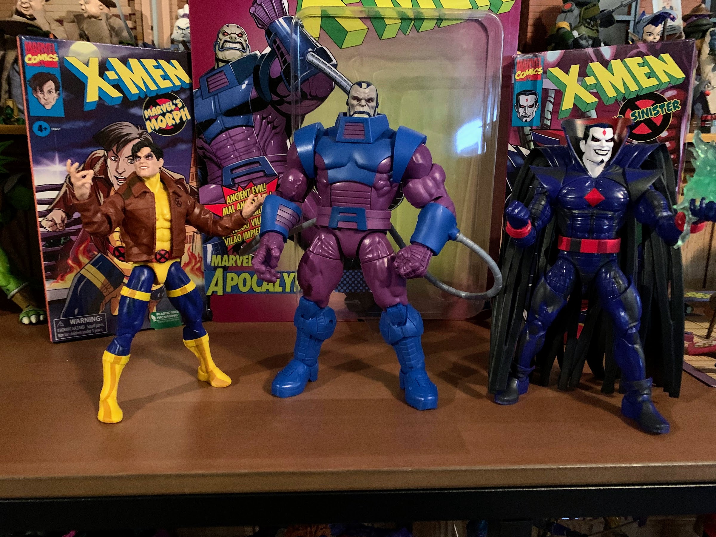
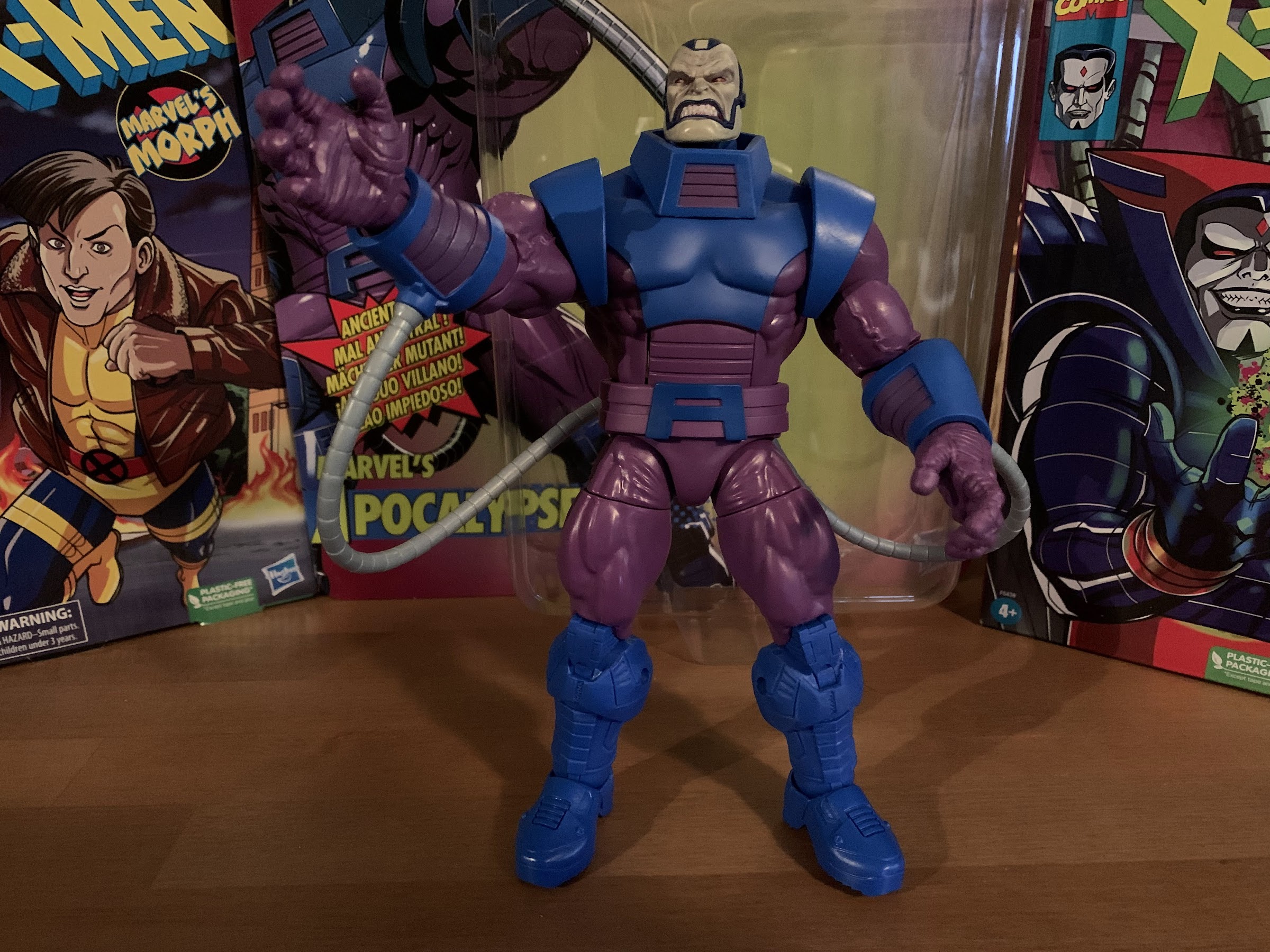
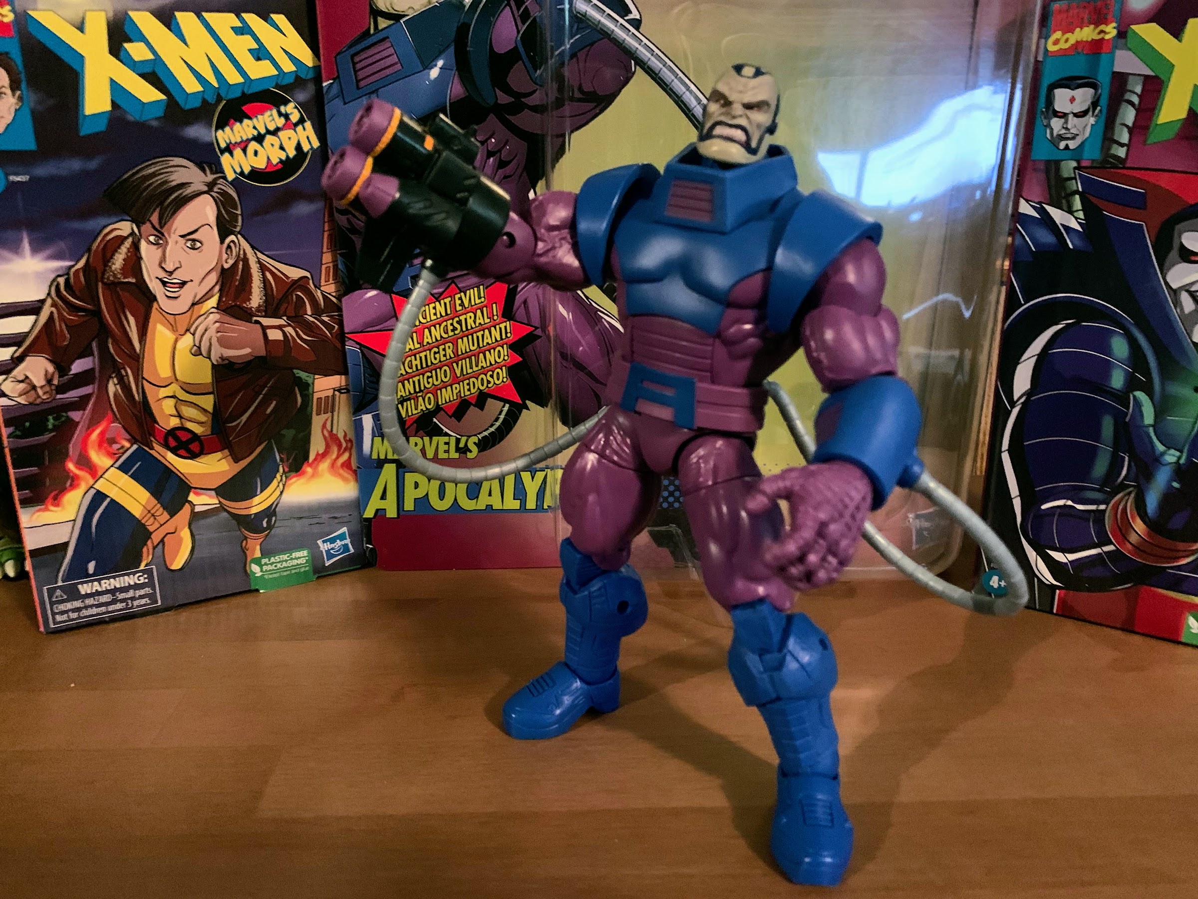
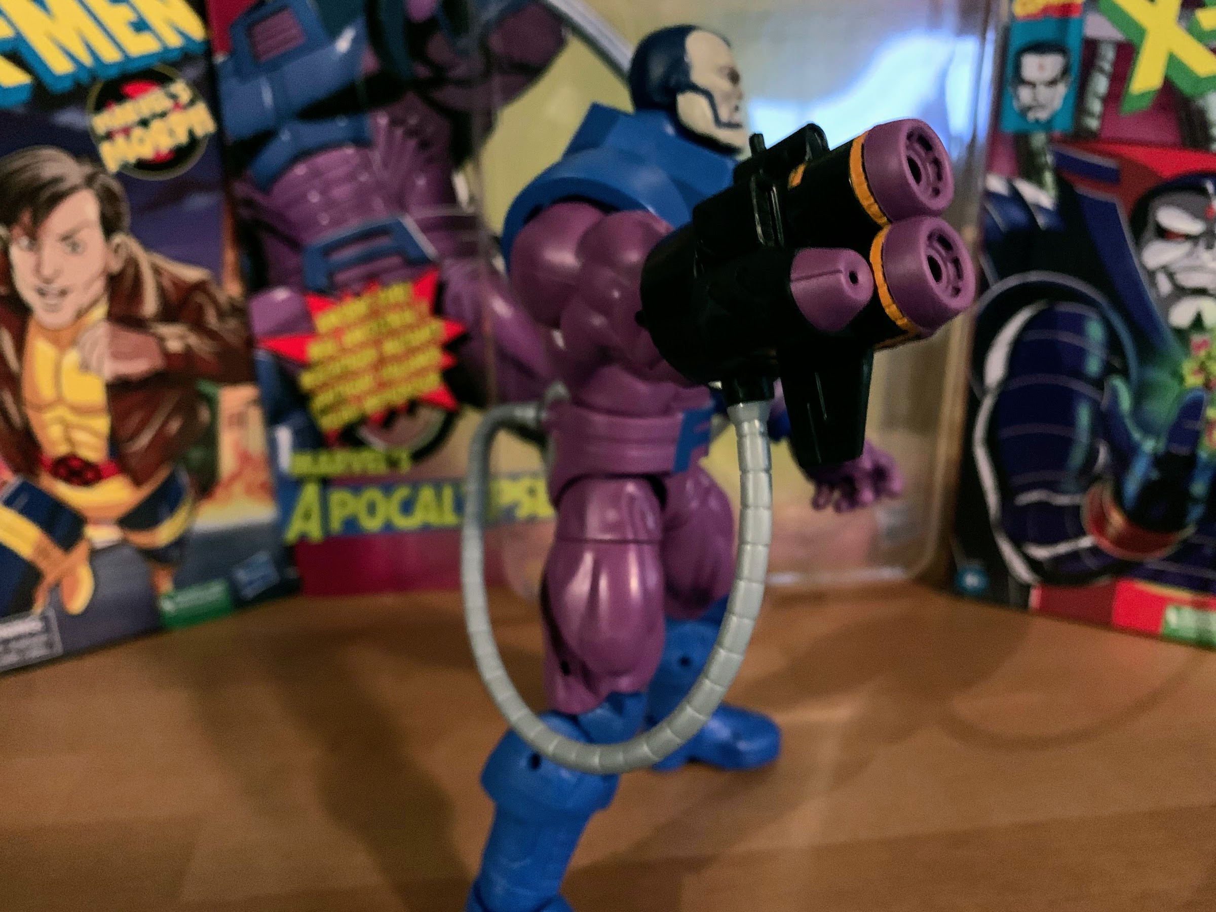
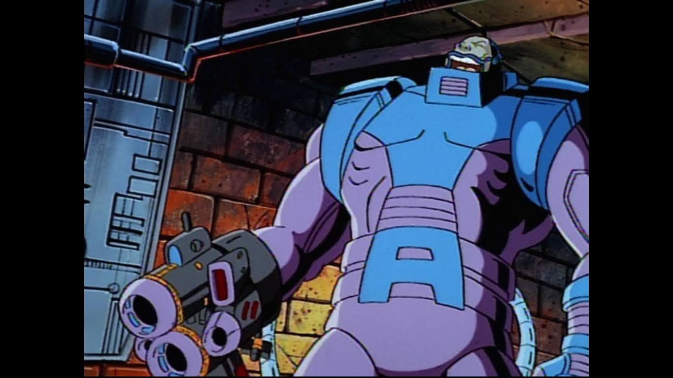
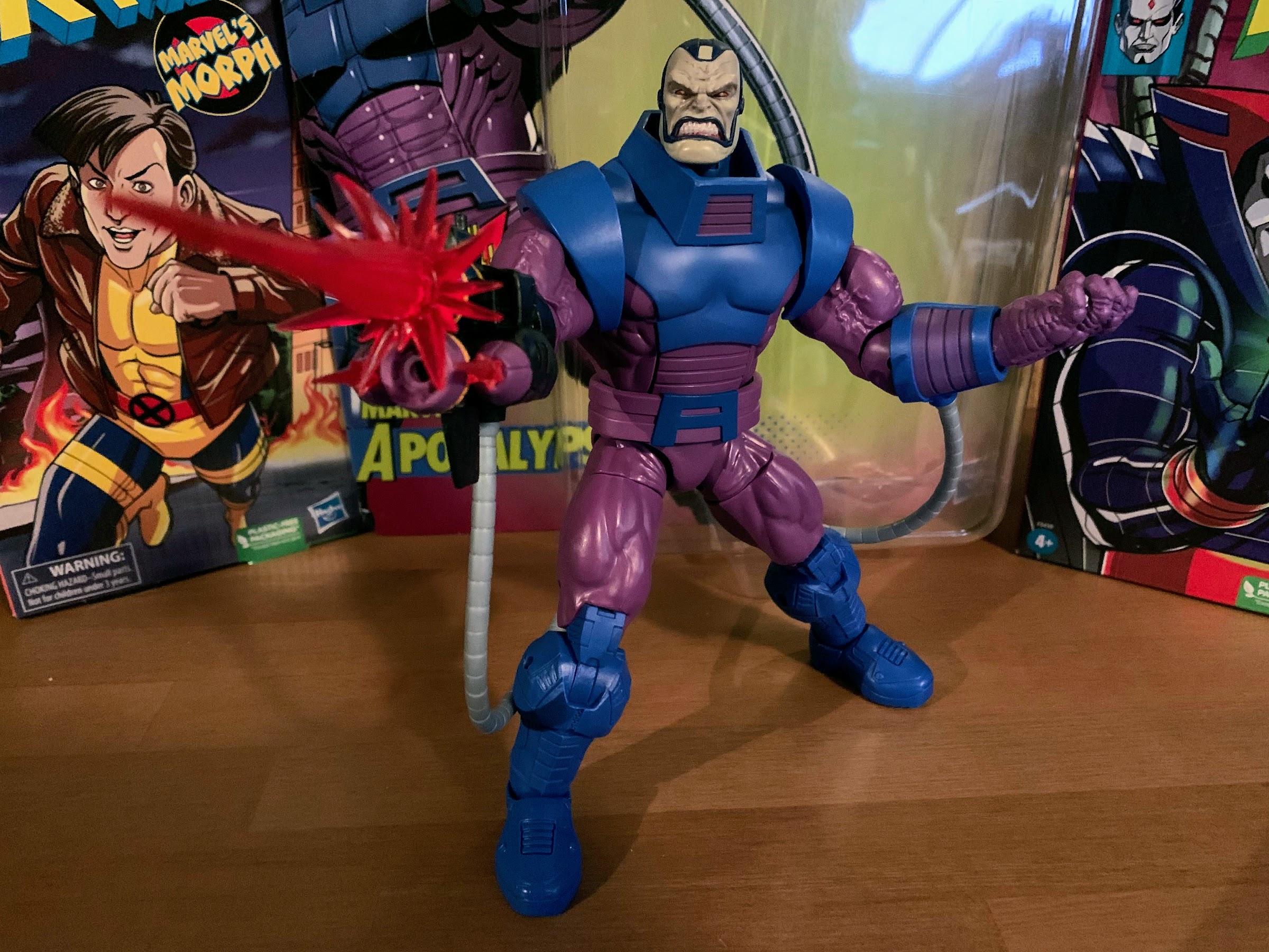
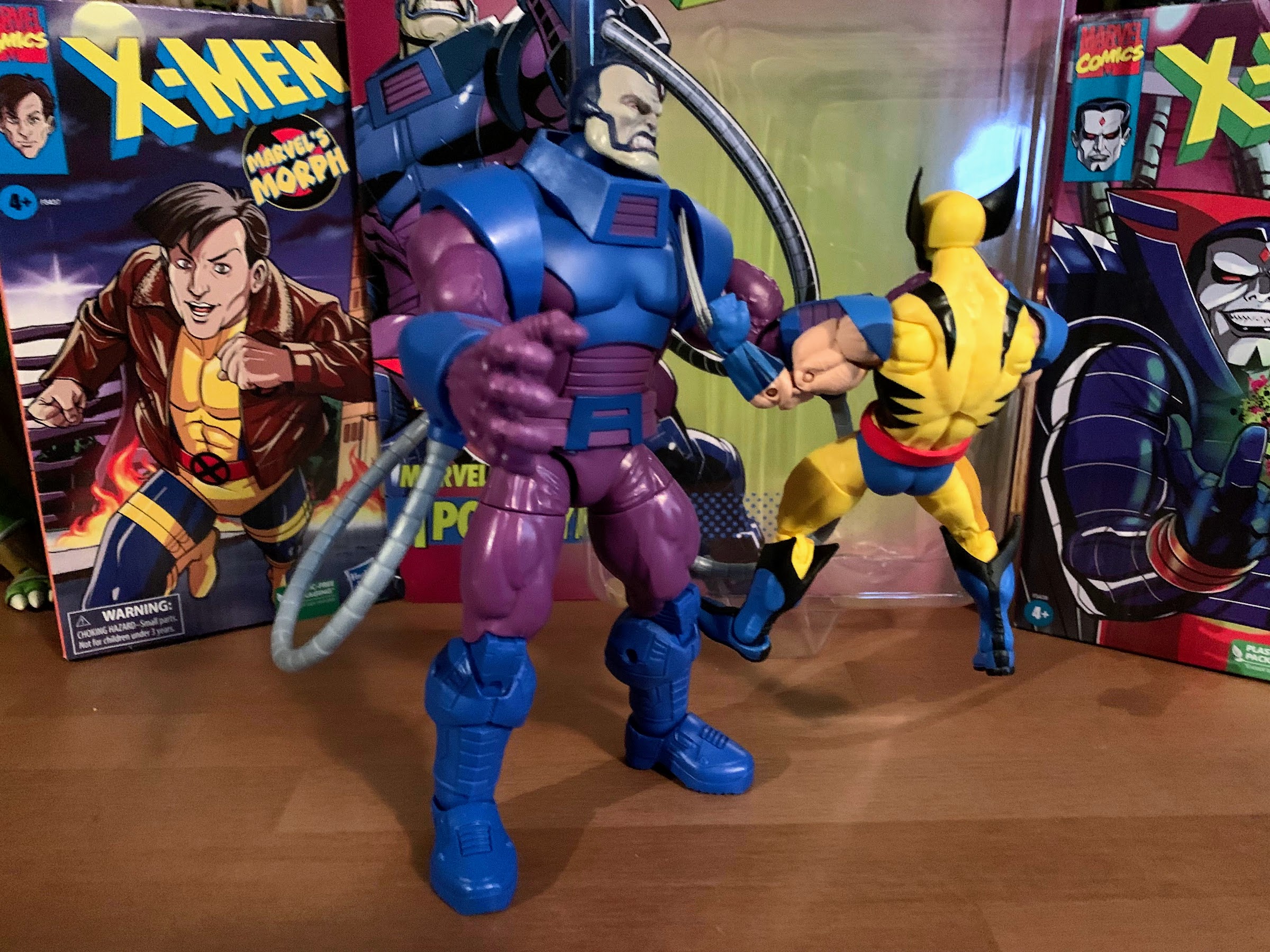

![X-Men (FOX) [1992-1997]Shown from left: Wolverine, Morph, Beast](https://thenostalgiaspot.com/wp-content/uploads/2018/09/xmen_01_-_embed_2017.jpg)