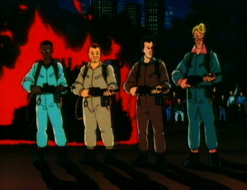
Back in the old Toy Biz line, it felt like we had to wait a long while for an action figure of Beast, or The Beast as the opening title of X-Men: The Animated Series referred to him as. Perhaps that was due to the character spending the bulk of the first season out of sight and out of mind thanks to being incarcerated. And I say it was a long wait, but what is a long wait to a child? It may have been about two years, but Beast eventually arrived with flipping action and an accessory that let him hang off of a smooth surface via a suction cup. I believe I got my figure for Christmas in 1994 and it felt like a big deal as he arrived alongside Morph and nearly filled out the roster from the cartoon. All that was missing was a proper Jean (we’d have to settle for her as Phoenix) and Jubilee (who eventually received a figure in the Generation X subline) while Rogue would arrive shortly after, if memory serves (action figure producers in the 90s were quite reluctant to make women). When Hasbro returned to X-Men for its Marvel Legends line based on the show, they made sure to get to Jubilee and Jean pretty early, but never did release a Beast. For the X-Men ’97 line, once again Jean and Jubilee made it out along with Rogue, but Beast got the shaft yet again. Finally, Hasbro unveiled a ’97 version of Beast on June 8th which is set to go up for preorder in August and will presumably release at some point in 2026. And that very same week I got a shipping notification from Mondo for its take on Beast who will get us ever closer to completing the main roster from the original series.
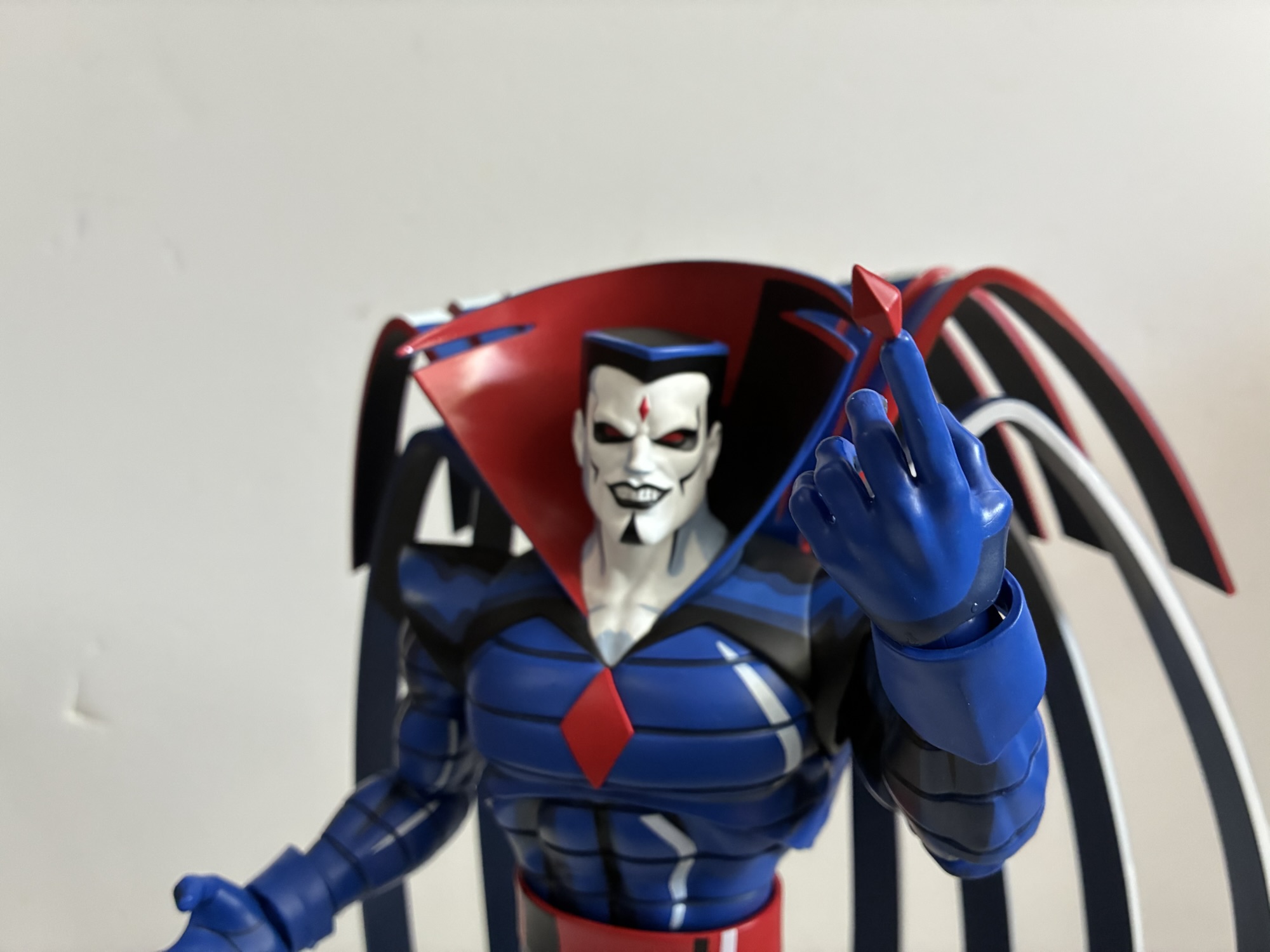
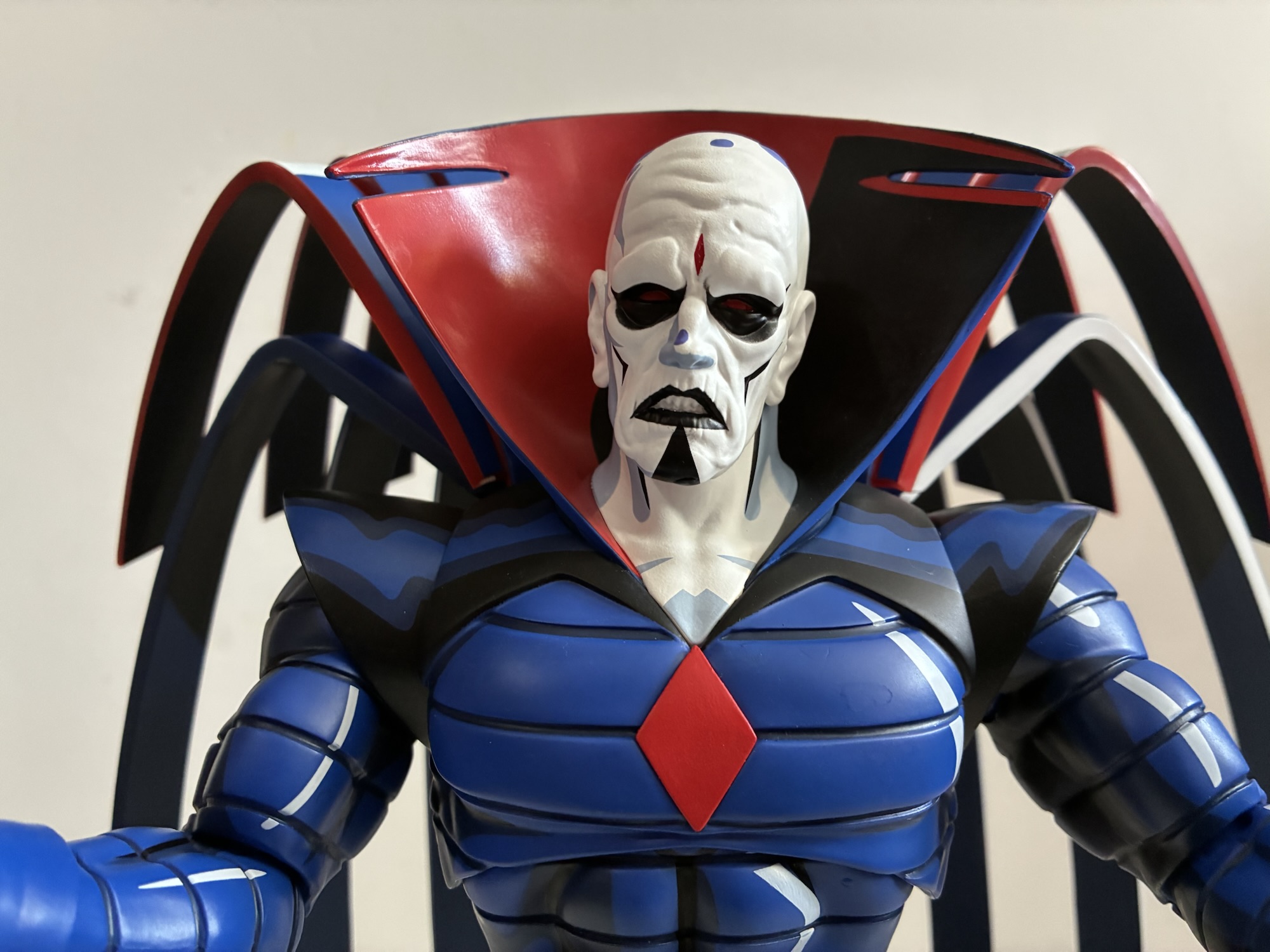
Beast has the distinction of arriving before Storm despite going up for preorder after her. And in this case it was well after as Storm went up around Halloween while Beast went up in February, but for some reason the blue guy beat her out of the factory. Maybe it’s the soft goods needed for Storm’s cape? I’m not sure, but I’d be lying if I said I was disappointed for while I do look forward to getting Storm, Beast was a pretty sizable want for me (literally). He’s just a fun design and we really have never received a proper animated Beast. Even that old Toy Biz figure featured more of a comic look as Beast had his whited-out eyes while the animated version had normal, blue, human eyes. Most of the Legends versions have followed a similar pattern with perhaps the only deviation being the very first Marvel Legends Beast which, apart from the eyes, didn’t bare much resemblance to the cartoon version (not that it was aiming for that). This Beast unquestionably is and like most Mondo releases in this line it arrives first as a limited edition with a bunch of extra goodies thrown in the box. It is yet another wonderful sculpt by Alex Brewer with paint by Mara Ancheta and packaging artwork Dan Veesenmeyer. The packaging does follow the same design as Mr. Sinister with no flap on the front and a write-up by Eric and Julia Lewald on the back detailing their affection for Hank. It would seem this is the standard going forward which is honestly fine as the front flap on the old boxes revealed little since these figures ship wrapped in plastic to protect the paint.

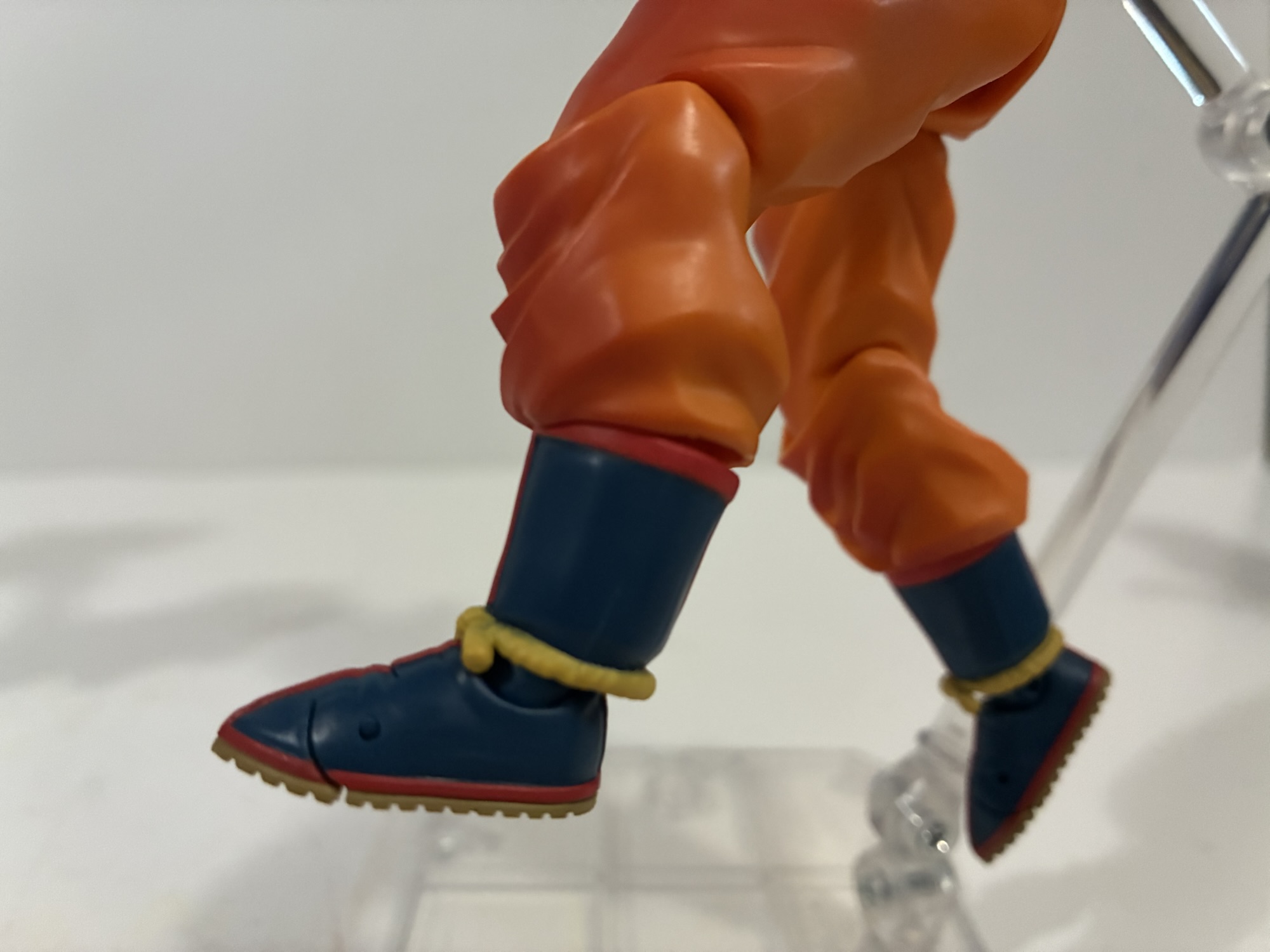
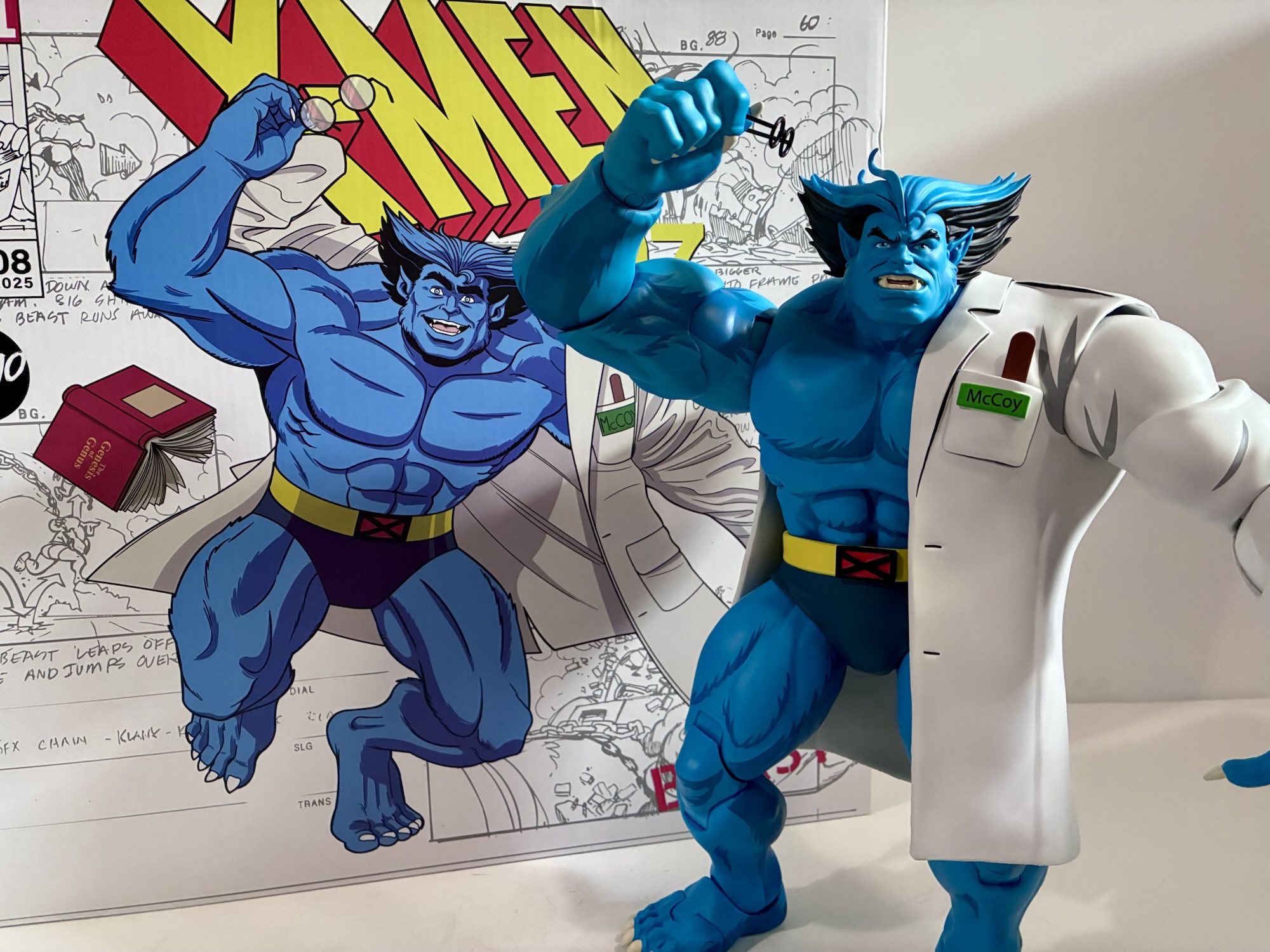
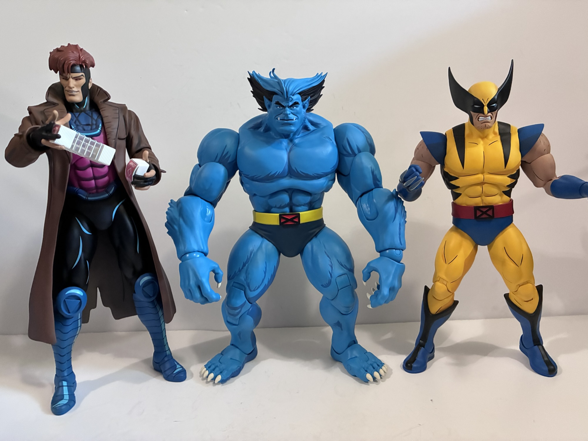
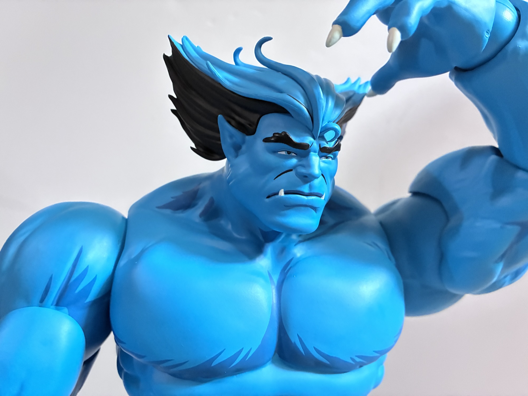
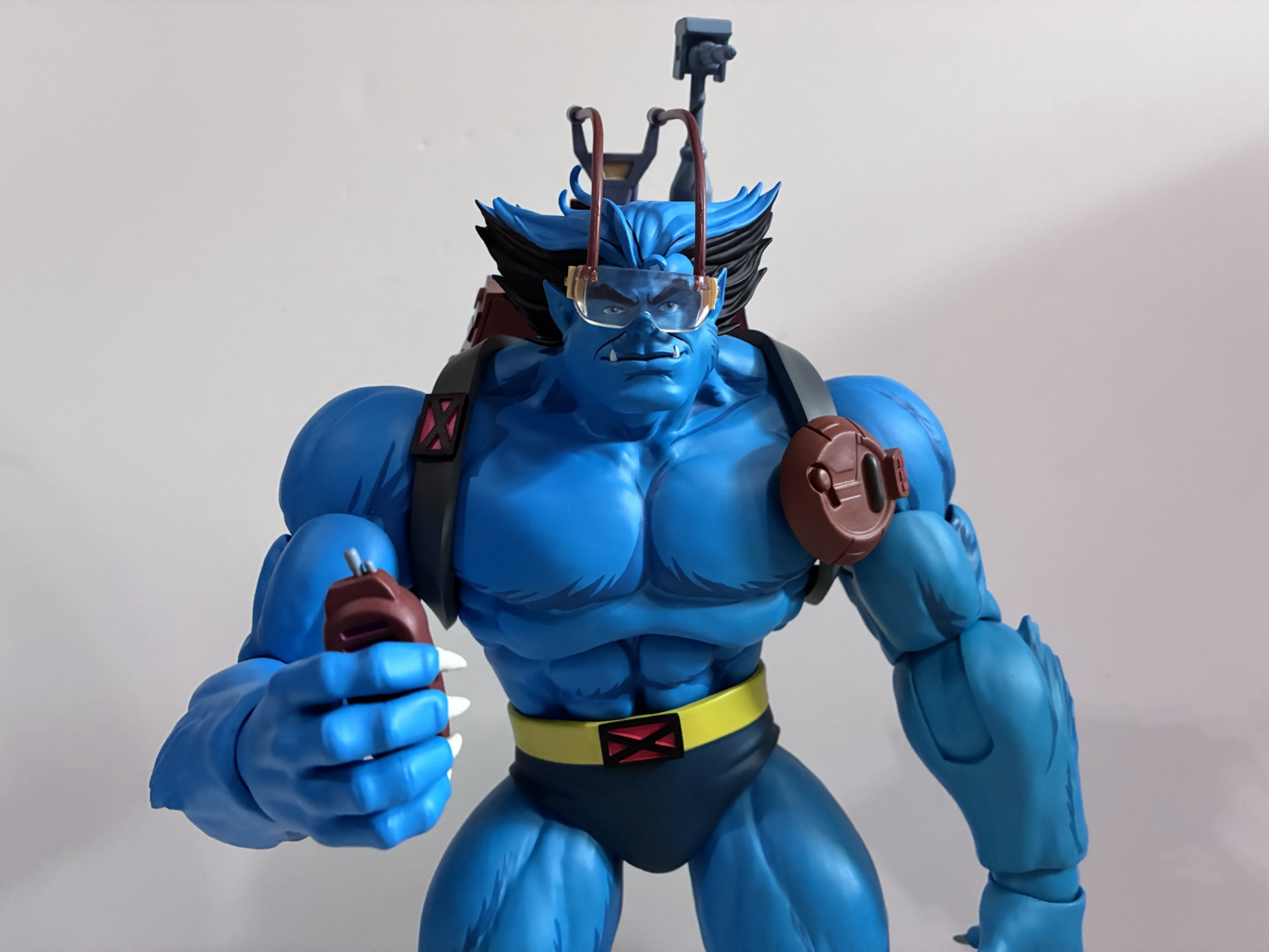
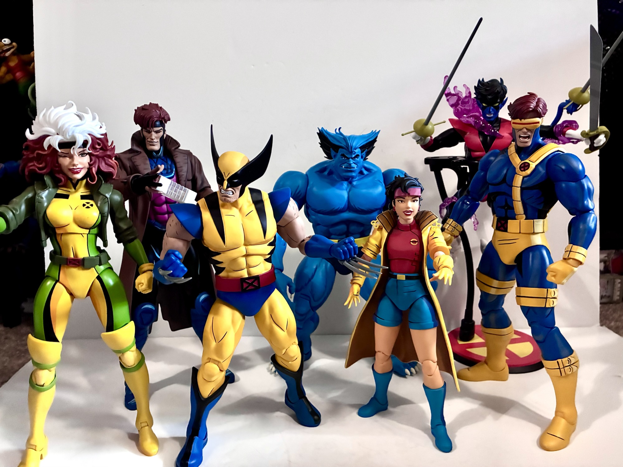
Beast is a big hunk of plastic coming in it at about 11.75″ per Mondo. Since he is a character often depicted standing with a bit of a hunch, exactly how much vertical space he’ll occupy on your shelf is certainly variable. He does pack some heft though as he’s solid. He doesn’t look out of place among the other figures and I do like that Mondo appears to have a mostly no compromises approach to size and scale with these releases. He’s also very much a ’92 design. While there isn’t much separating Beast from the original series and its sequel series, there are some subtle differences most notably in the shape of the face and the linework of the body. This Beast has the wide face of the original series with tufted bits of fur along the jaw line. His stark, black, eyebrows also sit more in-line with the eye as opposed to stretching well beyond them and his hair is a bit more unrestrained. It’s also reflected in the paint job as the original series was more likely to paint the inner lines of Beast’s musculature in a rougher manner. Instead of one, curved, line it was more like several shorter lines arranged in a curve shape to create a subtle illusion of fur. The ’97 art mostly goes with an all blue body with the fur only appearing as a means of breaking the silhouette in key places, something the original series also did. For this figure, Mondo did not sculpt any fur inside the body, but painted it withing the muscles such as in the base of the pectorals and basically along all muscle groupings. It means Beast has a slightly furrier appearance in plastic than he does on celluloid, but given the scale I think it’s a necessary touch to give him a bit more depth and the paint job is subtle enough that it doesn’t detract from the source material. Instead, it feels like this is how Beast is represented in the show on episode’s with the biggest budget or in close-ups as opposed to when he’s just lost in the background.

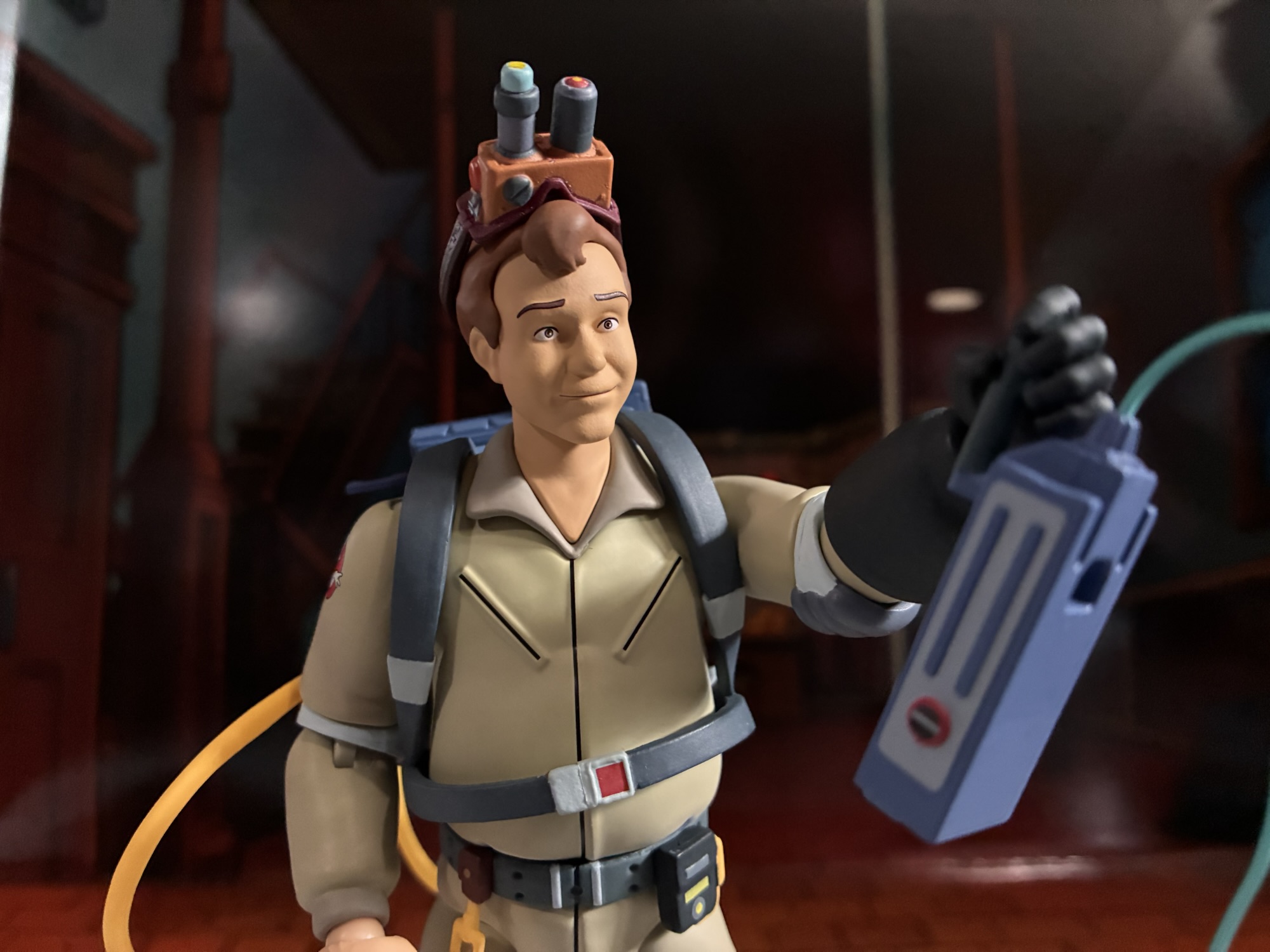
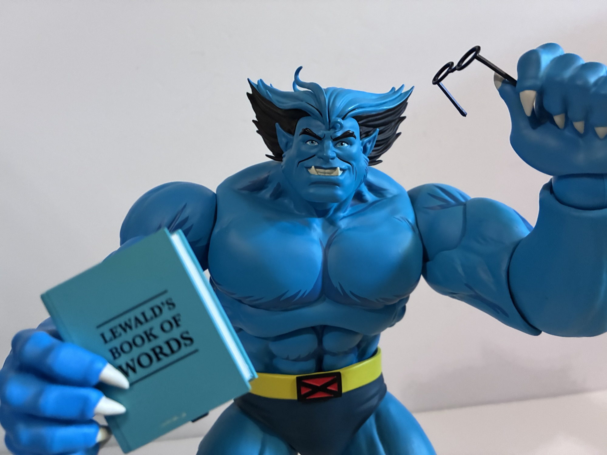
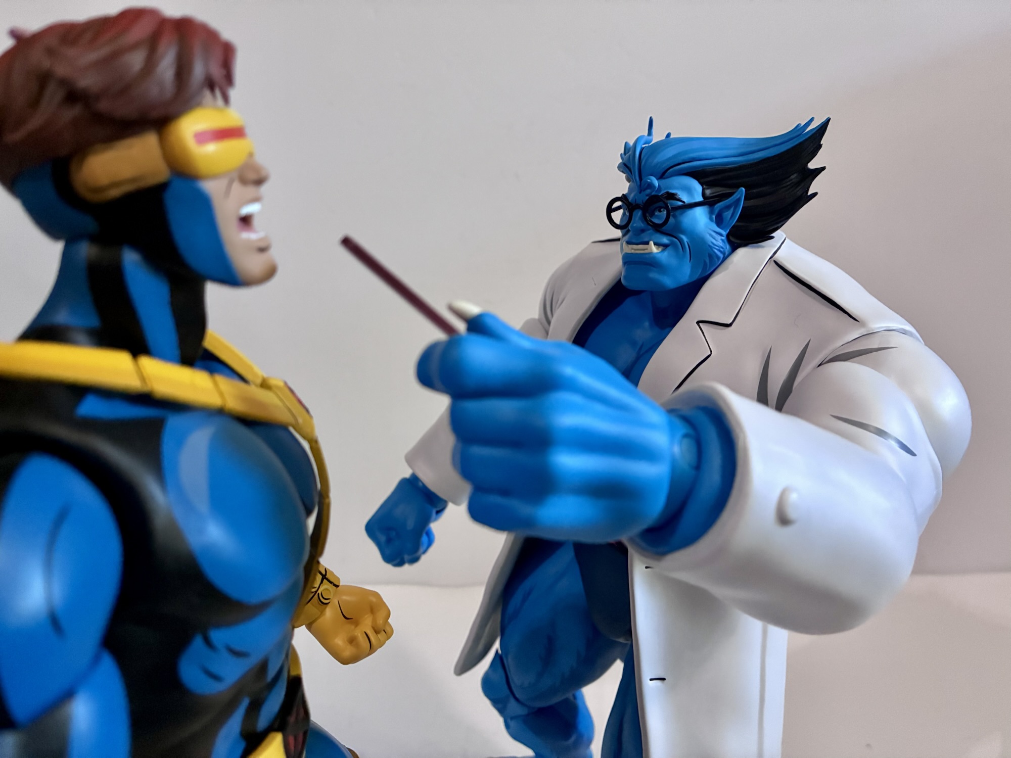
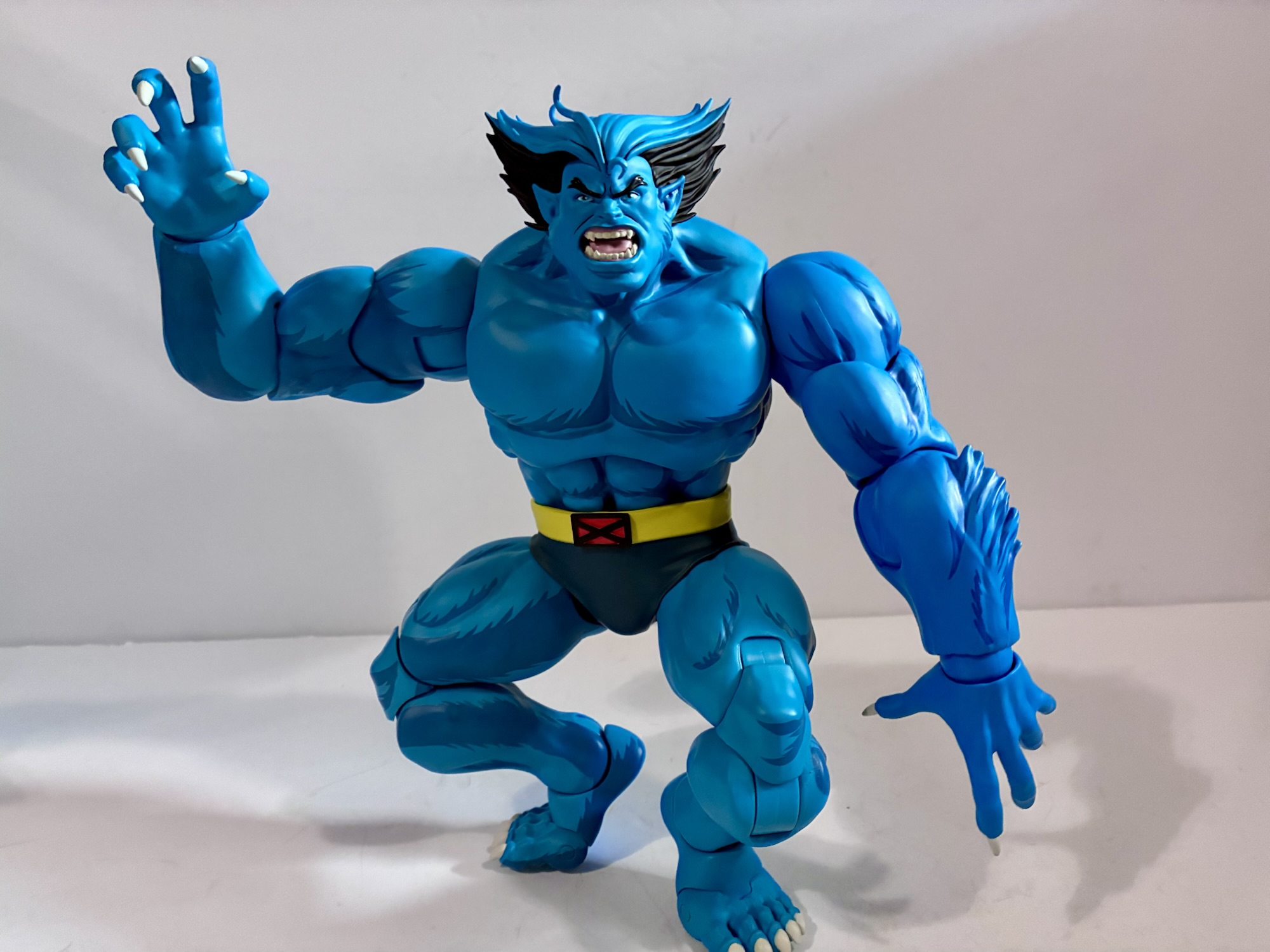
Apart from the paint job, this is just a really great looking take on the character. Initially, I thought the shoulders looked a little bulbous in the promotional shots, but in-hand I don’t see the same. Beast always had quite large shoulders on the show and sculpt reflects that rather accurately. My favorite X-Men character designs are the ones that bely the personality of the individual underneath. A great example is Nightcrawler, the character who looks like a demon but is actually a devout Christian. In the case of Beast, it’s a monstrous individual who is actually a scholar and medical doctor. What makes me prefer the animated design over all others rests with his face. Beast has this very gentle, human-like, visage as opposed to the more primal one he is often given by comic book artists. And for this one, Brewer really nailed the different expressions contained in this set. We get a neutral face by default that has a faint hint of a smile which feels like the perfect default Beast. There’s also an angry one, and a yelling one if you want more of a battle setup. We also get this humorous toothy grin which is the only face that might be from X-Men ’97 though it still reads as a ’92 look to me. Lastly, there’s sad Beast and this is likely pulled from his spotlight episode, “Beauty and the Beast,” though he does have moments of sadness in other episodes that it could work for. I really like that Beast is the chosen character to wear his emotions on his sleeve as he’s basically the first to cry in X-Men ’97 when things get heavy.
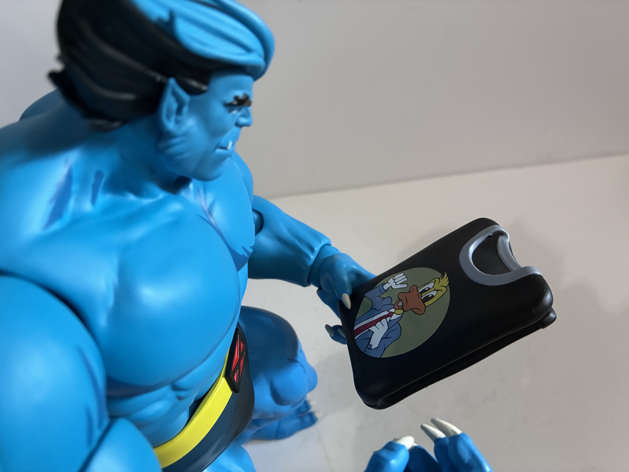
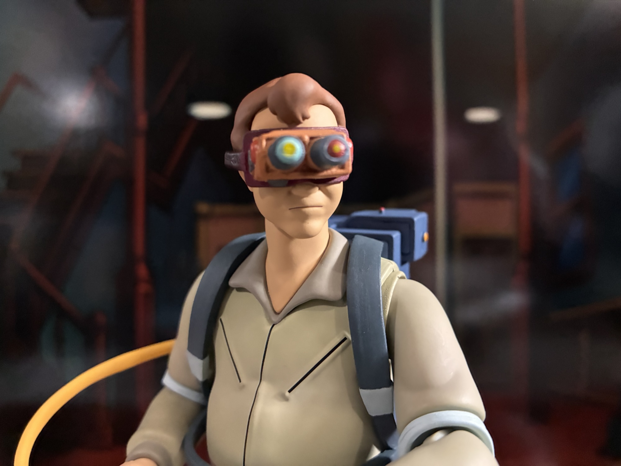
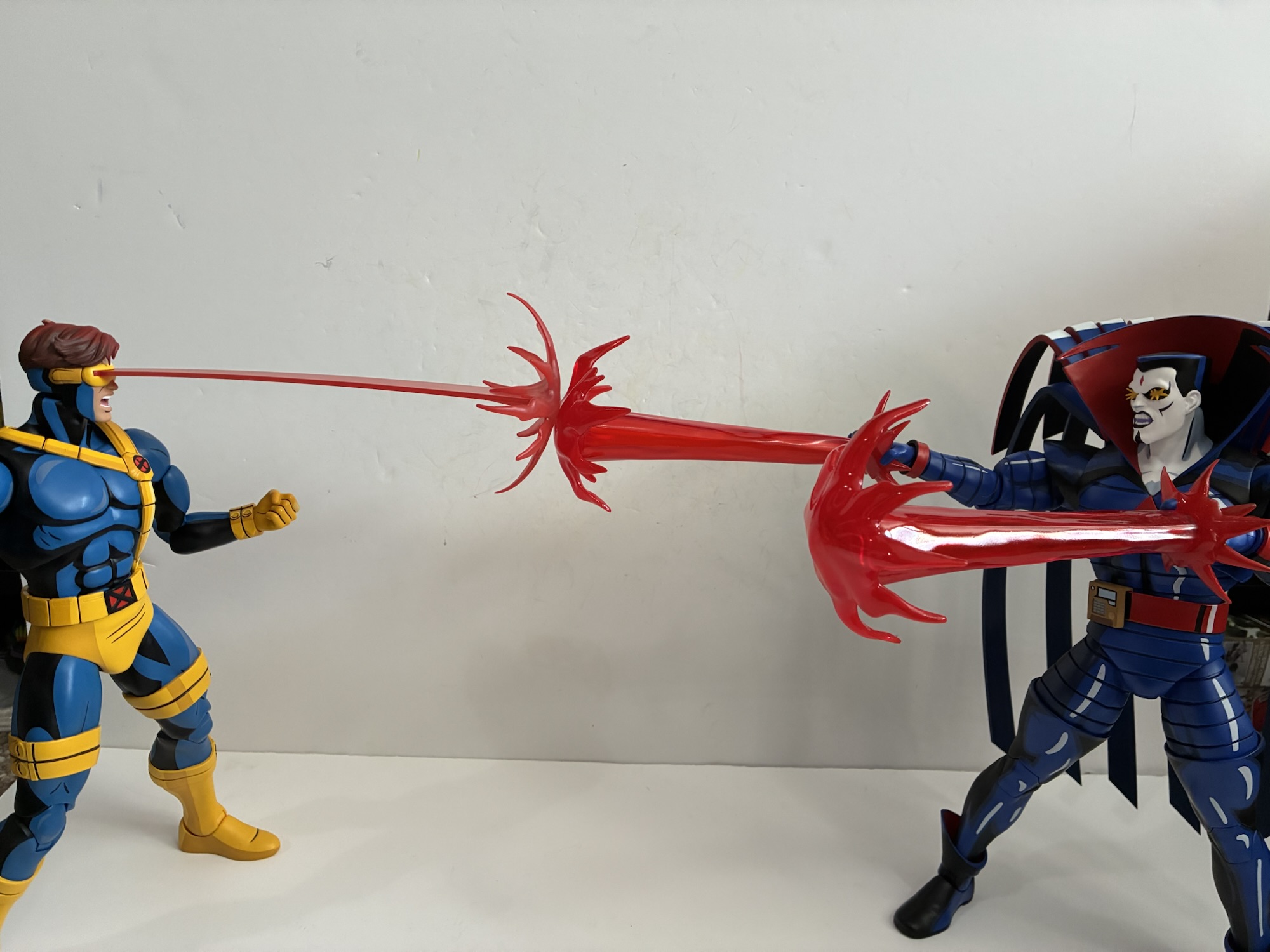
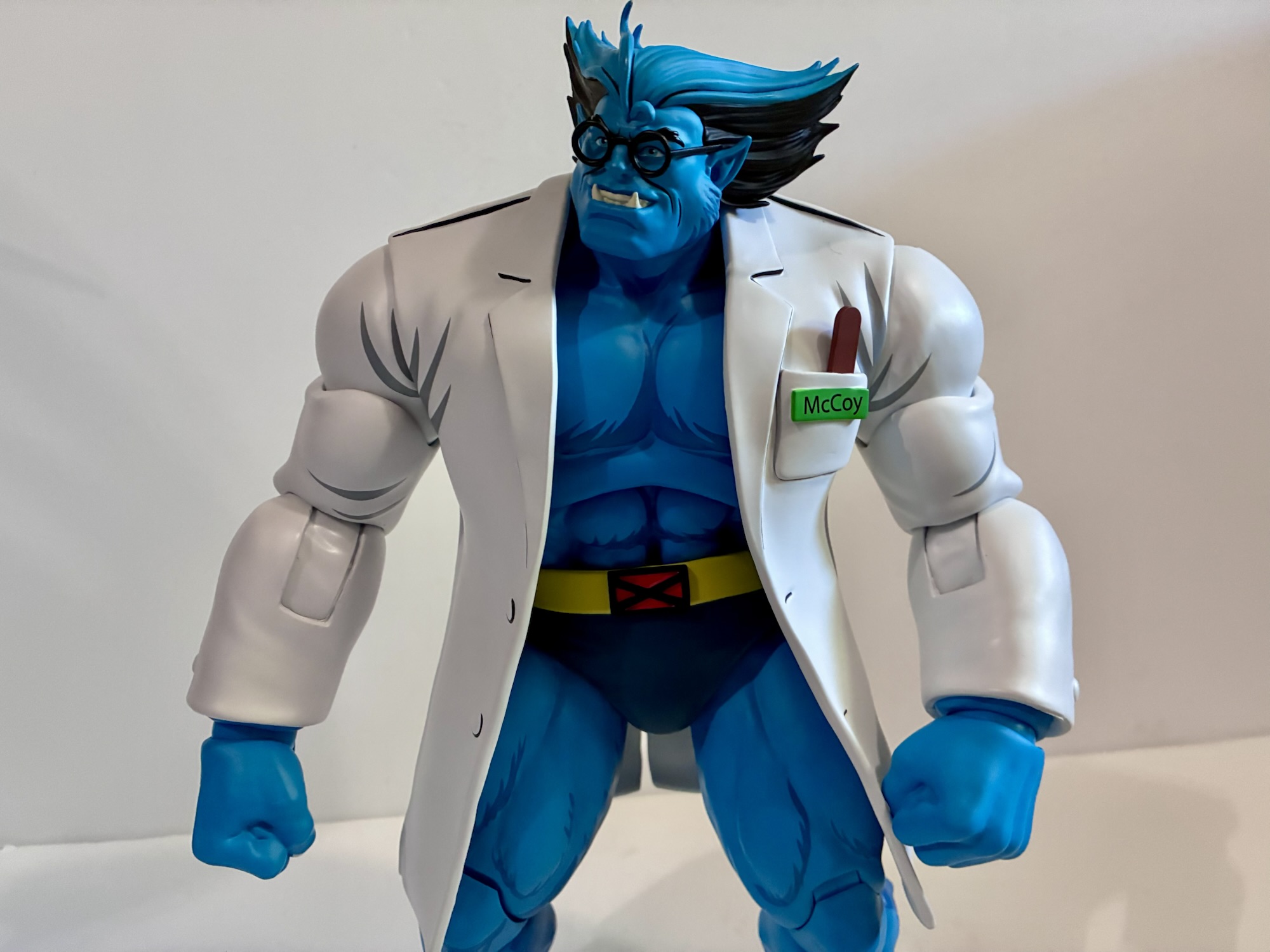
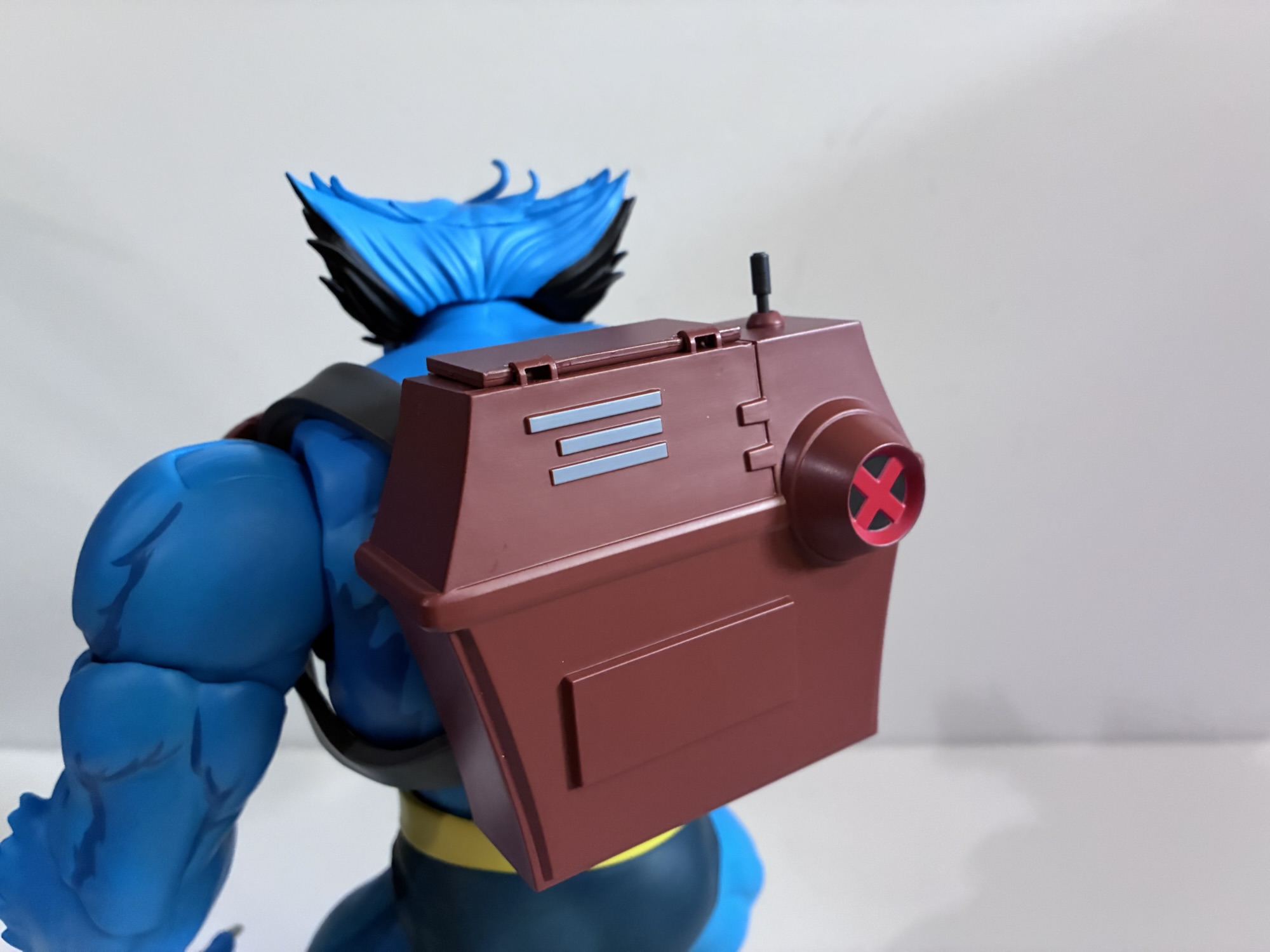
Those are just the expressions available, for hands we get a solid spread that includes sets of fists and gripping hands. There’s also another set of gripping hands that are asymmetrical, a very wide or style posed right hand, a pointing right hand, and an open left hand. He also has two books, one that is open and one that is closed. The closed book contains a shoutout to showrunner Erik Lewald and writer Julia Lewald as it’s titled Lewald’s Book of Words. The open book is The Genus of Genius, a bit smug for someone like Beast. For seeing that small print, Beast has his glasses which slot over his ears well enough without the need for any ugly cut-outs. They’re just black, plastic, frames without a lens and I think it serves the prupose here. He also has his tactical backpack which has a few different accessories all pulled from the original series. There’s a set of goggles that come up and over the head as well as a little blaster that pops out. These just plug into the backpack if you wish to use them or you could have the backpack appear closed. The goggles don’t slot into anything on the face, so you basically have to position his head and the pack itself to get it to sit right. Even so, you’ll probably have a hard time getting him to look in any direction other than straight ahead with these on. Beast also has a little handheld device that served as a communicator in “The Phalanx Covenant – Part One” in conjunction with a radio inside the pack, but that would have been a little too ambitious to include the whole thing. If you don’t want him out in the field though, there’s also an included lab coat accessory which he actually comes packaged wearing. This necessitates the swapping of arms as it’s setup just like the coats that came with Logan and Cyclops. It looks nice when in place and there’s even a little pocket with optional tongue depressor on the left breast, something that showed up in both shows. Because the coat adds a little more bulk to the shoulder area, I’d say it actually casts the slightly better silhouette as a result which was also true of the Cyclops figure. Lastly, Beast also comes with his Howard the Duck shirt as seen during The Phoenix Saga episodes. Unfortunately, it’s just a lump of painted plastic meant to represent the shirt folded up and it’s not something he can actually wear. An actual soft goods one he could wear would have been the icing on the cake. Beast also has the typical Mondo display stand. Unfortunately, they didn’t deem him worthy of the flight stand which is what I’d prefer to see become the standard for the line as these doll stands are pretty poor. If you think it’s a matter of heft my counter to that would be the recently solicited Goliath from Gargoyles comes with a flight stand so if it can support him then it could likely support Beast.
Beast has a pretty standard array of articulation for Mondo, but to my surprise, it’s among the most well-executed. For joints, we get a double ball head, hinged shoulder pegs, bicep, single elbow, ball-jointed wrist, diaphragm, ball-jointed waist, ball socket hips with swivel, double-jointed knees, ankle hinge and rocker, and a toe hinge. The head is perhaps the most limited as his sloped posture and large head means his range is a bit subtle and it’s easy to pop the head off by mistake when posing him. The shoulders have terrific range for what they are and the elbow hinge is pretty deep so Beast has no issues bending his arm 90 degrees, be it sleeved or not. The diaphragm joint actually works and he can arch back and crunch forward a bit and the waist enhances both directions. Both spots swivel and provide for a little rock. Nothing outrageous, but better than other figures in the line. All of the joints are also firm, but smooth, out of the box so I’ve had more fun messing around with Beast than a lot of figures from Mondo. The heads and hands are pliable enough to easily swap and all of the pegs are nice and thick so there’s no durability concerns here. Still, without a neck or butterfly joint, Beast will be confined to mostly simple poses. He can’t quite get down into a three-point stance nor can he look up well enough to emulate his pose on the cover of X-Men #1. He can crouch down and I was able to do so without the aid of a stand. I probably wouldn’t trust him on a shelf without one in such a pose (and I did have him take a dive already), but it is doable.
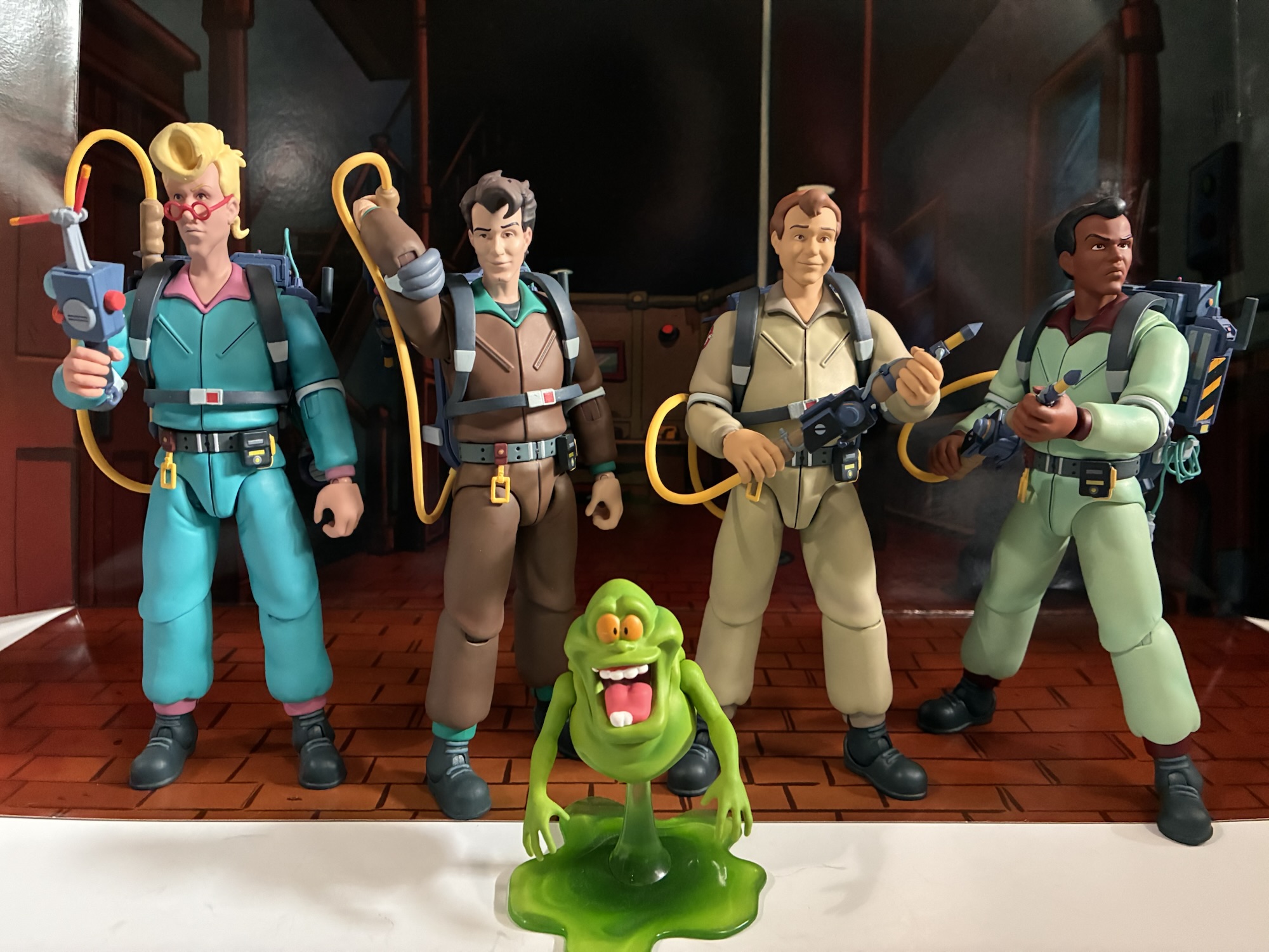
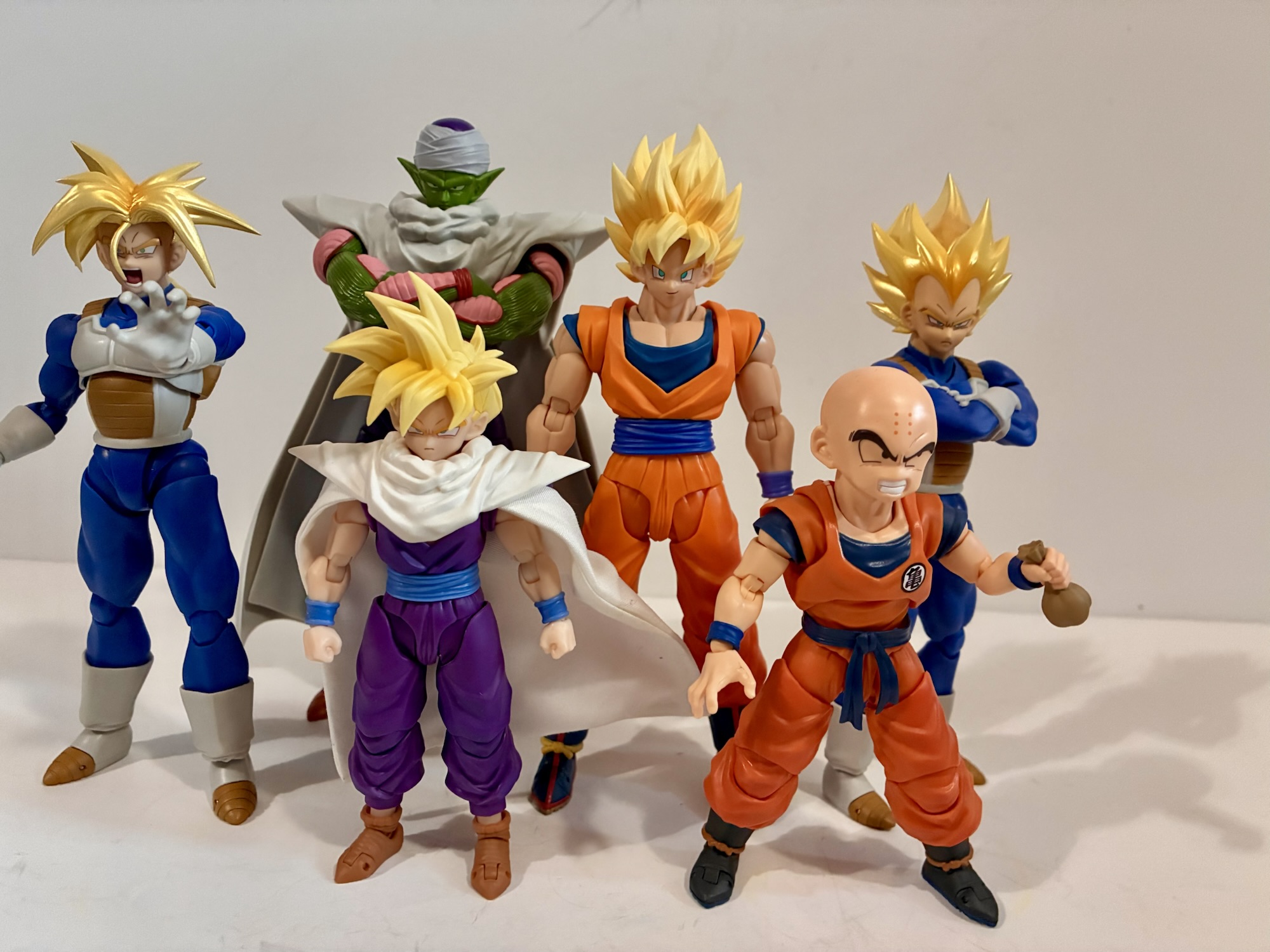
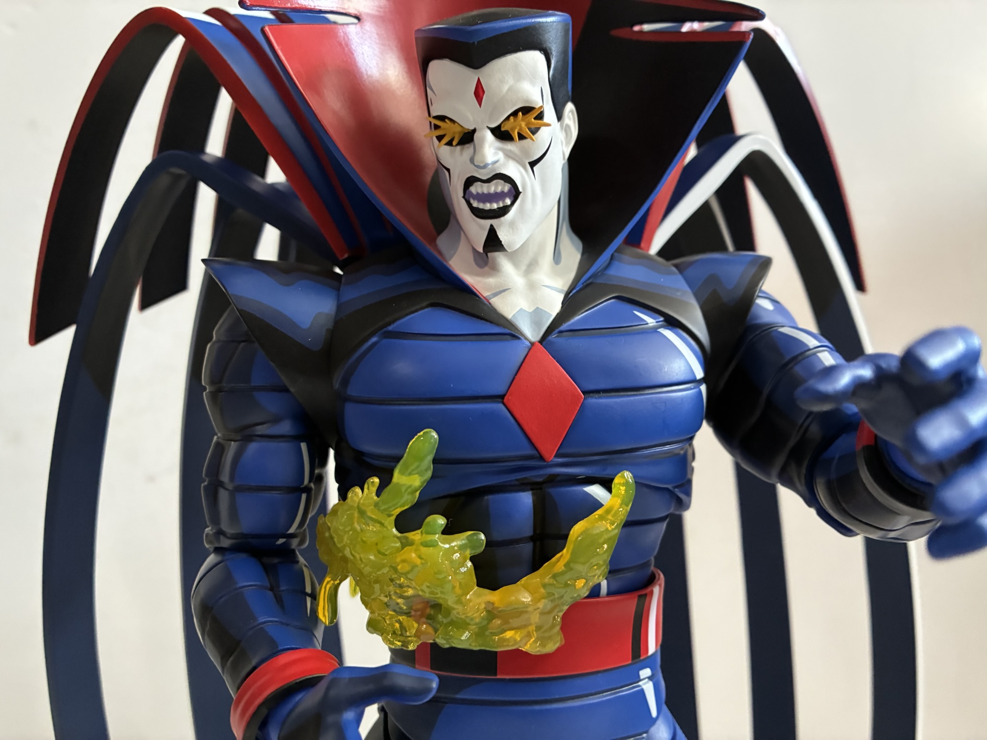
As a result, Beast is probably the most fun character to handle since Nightcrawler, with Nightcrawler being the only one that’s obviously superior to him in the articulation department. He fits in really well among his teammates and I do love the big splash of blue it adds to the shelf. Or rather I will when I find a way to fit him in. The Mondo shelf is getting extremely crowded and it only gets worse when figures are released. I’ll have to find a home for Storm as well at some point this summer and eventually there’s Jean. That’s all that’s been shown so far and with the release of Jean that essentially completes the default team from the ’92 show with the exception of Professor X. And honestly, I don’t know if I want a Professor X for this line given the likely size and cost of such a thing since he has to come with the hoverchair. I do absolutely feel that we need a Morph since he was in the first episode and is a full-time member in X-Men ’97. After that, there’s Bishop, Cable, and Archangel which would all be nice to have, but aren’t necessities for me. If Mondo thinks it can do Apocalypse justice without a massive price hike, then I’d certainly be interested in him as well. He is really the only villain I feel like I need. Juggernaut would be cool as well, but he really didn’t show up much in the original series and has yet to make an appearance in X-Men ’97.
All that is to say there’s a light at the end of the tunnel for this line, but also not. I just listed out probably a couple grand in “maybe” figures not to mention shelf real estate so I guess we may not be as close as I would like to think. With San Diego Comic Con on the horizon, I am sure we’ll see a new figure or two in this line, though it would not shock me if Mondo prioritizes Spider-Man a bit more since that line has only put out three characters so far. Then again, X-Men ’97 returns to Disney+ in just two weeks so they’ll want to strike while the iron is hot with some new reveals. For now, Beast is a clear enhancement to the collection and one of Mondo’s best. I feel like I say that a lot with new releases in the line, but Beast really does vault up to the top or near top of my personal rankings for the line. He’s definitely one to get whether you’re cherry-picking the line or looking to assemble a full squad. And best of all, this limited edition version is still available on Mondo’s website. He is not cheap coming in at $255 and Mondo charges a lot for shipping these days. He is also still listed as coming with a tariff surcharge even though they’ve been reduced dramatically. That’s probably to not enrage the customers who preordered and paid that upfront. With the limited edition of 1,500 units not selling out, it’s possible that a standard version is not inbound either and there’s no indication on the listing what is part of the limited version and what would not be in a hypothetical standard edition. I’m not sure if any of these figures are truly worth what they cost, but if any are then Beast is among them as he’s very well executed. I am certainly happy to have him in my collection.
For more Mondo X-Men figures, check out the below:

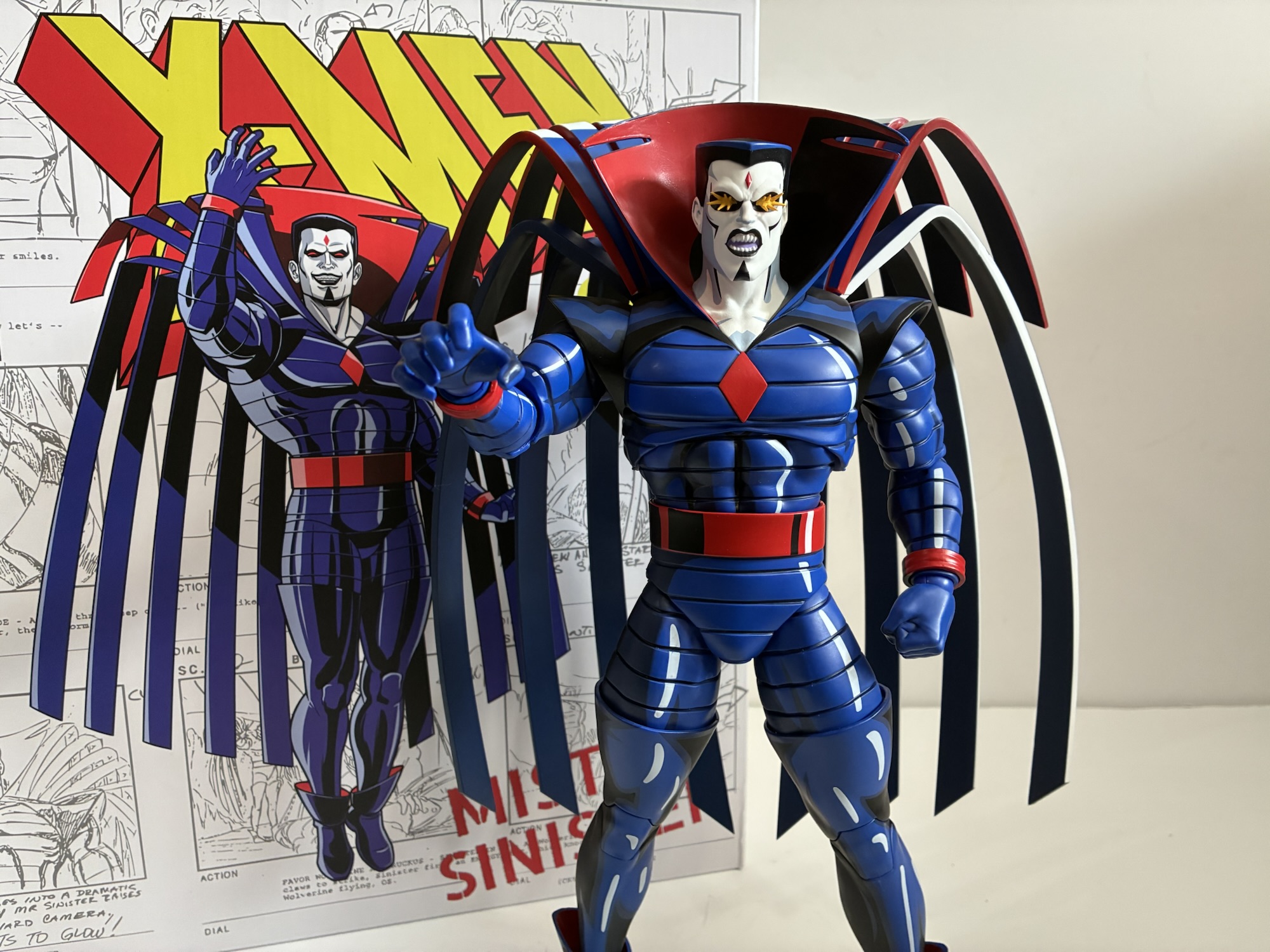
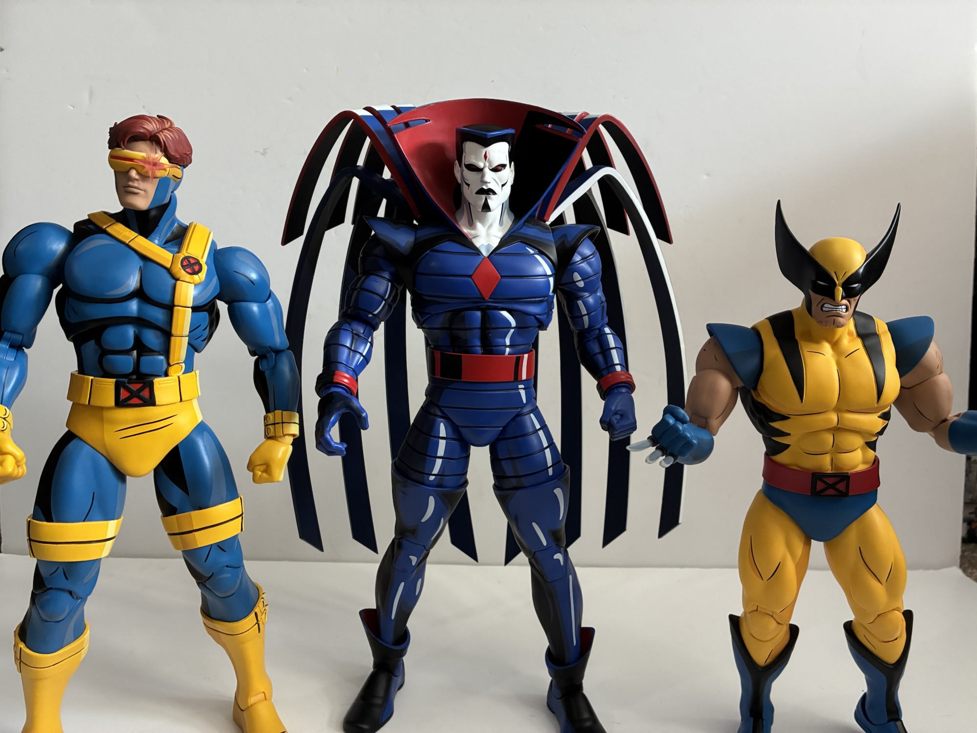
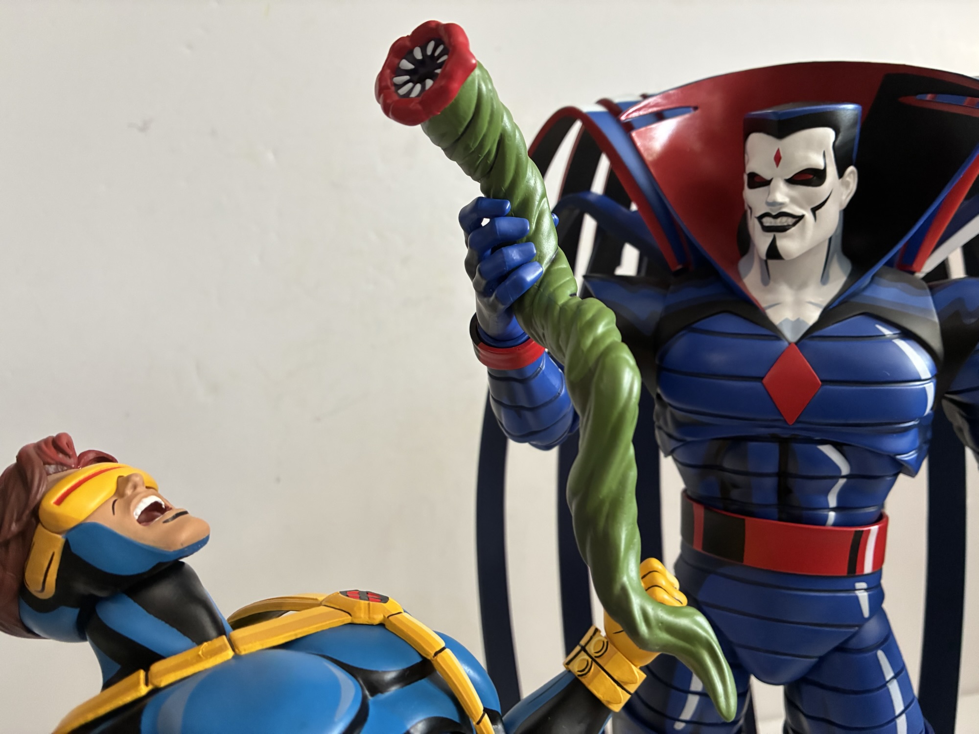
Mondo X-Men ’97 1/6 Scale Mister Sinister – Limited Edition
When the topic of X-Men villains is broached the first name that comes to mind is Magneto. And rightly so, he was on the cover of the very first issue getting pelted by a snowball from Iceman (and Marvel wonders why the kids of the day thought the X-Men looked lame). When the X-Men were…
Keep reading
Mondo X-Men ’97 1/6 Scale Nightcrawler
Yes, I’m afraid this is another toy review that needs to begin with a word about tariffs. It was the talk of 2025 in the toy collecting community because it caused considerable delays, disruptions, and worst of all, increased prices across the board. One line impacted by the introduction of these new costs more than…
Keep reading
Mondo 1/6 X-Men ’97 Wolverine – Limited Edition
Back in 2021, Mondo unveiled for San Diego Comic Con a sixth scale Wolverine action figure based on the X-Men animated series from the 90s. It was a presale to coincide with the 30th anniversary of the show’s premiere and product went out in 2022 closer to that actual anniversary. At the time, Mondo wasn’t…
Keep reading