I have been admiring Jada Toys and their action figure line based on the video game Ultra Street Fighter II from afar. As I mentioned in my reviews of the Storm Arena Street Fighter Alpha 3 figures, I am just a casual Street Fighter fan. I never owned Street Fighter 2, but I still managed to play it a lot because it was ubiquitous. I did own the first Street Fighter Alpha so I have more nostalgia tied into that series, but going back to the original sequel my favorite character was one that didn’t appear in Alpha: Blanka. Blanka was just cool to me. He was this monstrous creature in a roster of characters that looked far more conventional. I also wasn’t that great at the game so when I learned that he had a super move that just required me to hit one button repeatedly (his electric attack) that made me like him even more. Much of my Street Fighter 2 playtime came at the home of my nana and grandpa as my cousin would bring his Super Nintendo and a copy of the game over. Since I was one of the younger cousins, I was almost always player two which meant I would play as a blue Blanka often. That would come to be my preferred colorway for the character over his standard green (never mind that Blanka translates to white in Spanish, though he’s from Brazil where most speak Portuguese. It’s all so confusing,) and that’s true to this day. As a result, I opted to pass on the Jada figures even while they received glowing reviews from fellow collectors, but I promised myself that if Jada ever did a version of its Blanka in blue and yellow then I’d get it. Promise kept.
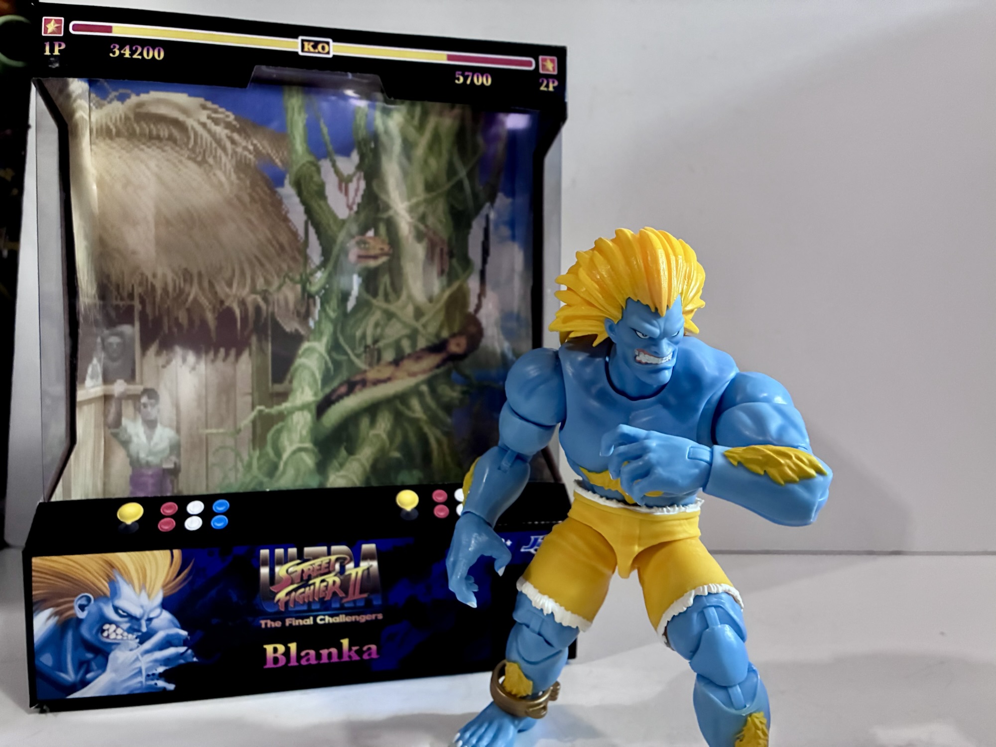
Big Bad Toy Store was given this exclusive player two variant of Blanka to sell on its store for $35. Blanka, classified as a deluxe release by Jada, does run a little more expensive than their other Street Fighter figures, but $35 is still a pretty good price in today’s market (this figure is a lot better than one we’re looking at next week which set me back $40). The packaging is big and flashy as it resembles an arcade cabinet with game artwork on the sides and photography on the back featuring the character. There’s also an expansive cross-sell featuring the character select artwork from the game which really captures how big the line is at this point. As nice as it is, I do have to say that getting into this box is a bit of a pain in the ass. There’s different layers of plastic inside and they’re held in place by those god-awful translucent tie-downs that NECA loves so much. This isn’t the sort of packaging that will easily go back together if you want to re-box the figure, though that really shouldn’t be a concern for Jada. There is a backdrop inside the box that refers to Blanka’s stage in the game, but it’s probably too small to be of much use outside of the box. Still, if you are one of those weirdos that doesn’t like to play with their toys, (I kid, I love you too) this will display nicely and there’s a window on top of the box which helps light to filter in and really show off the figure inside.
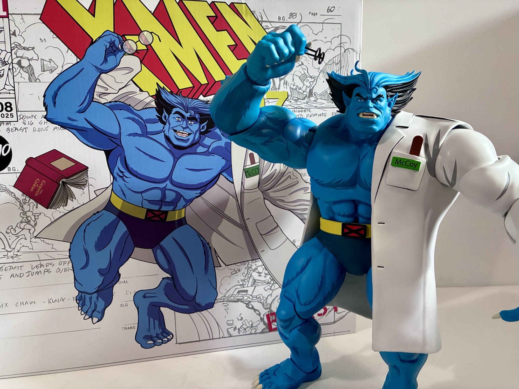
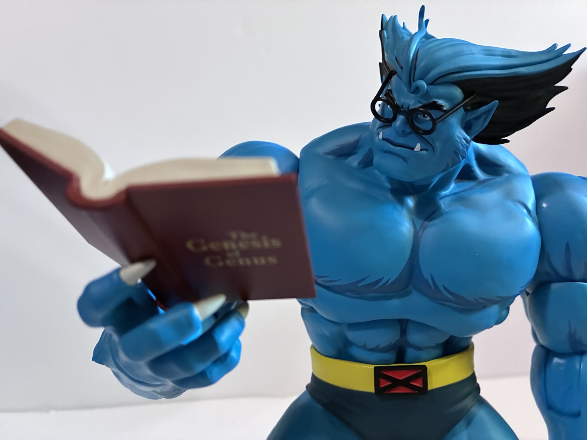
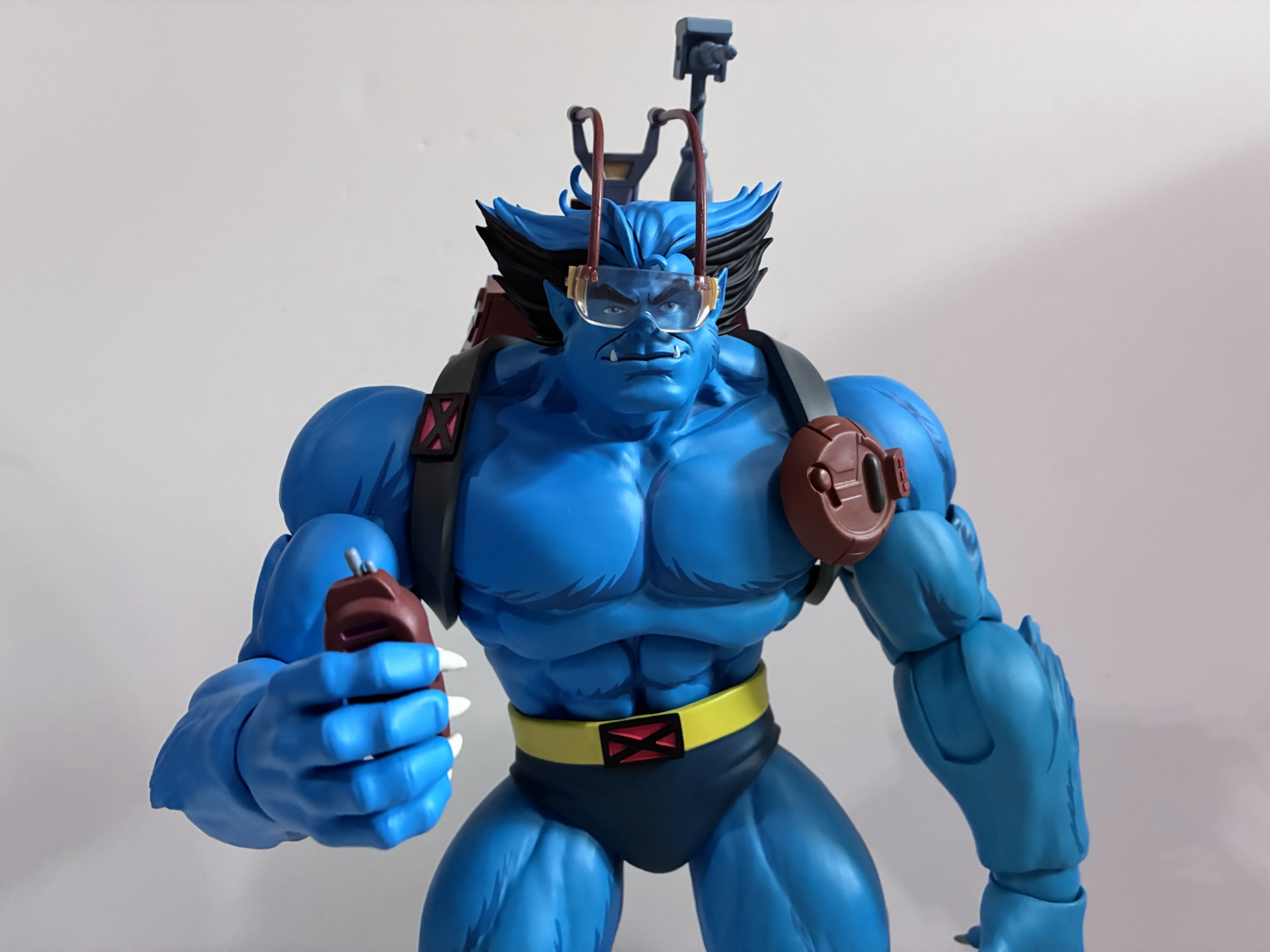
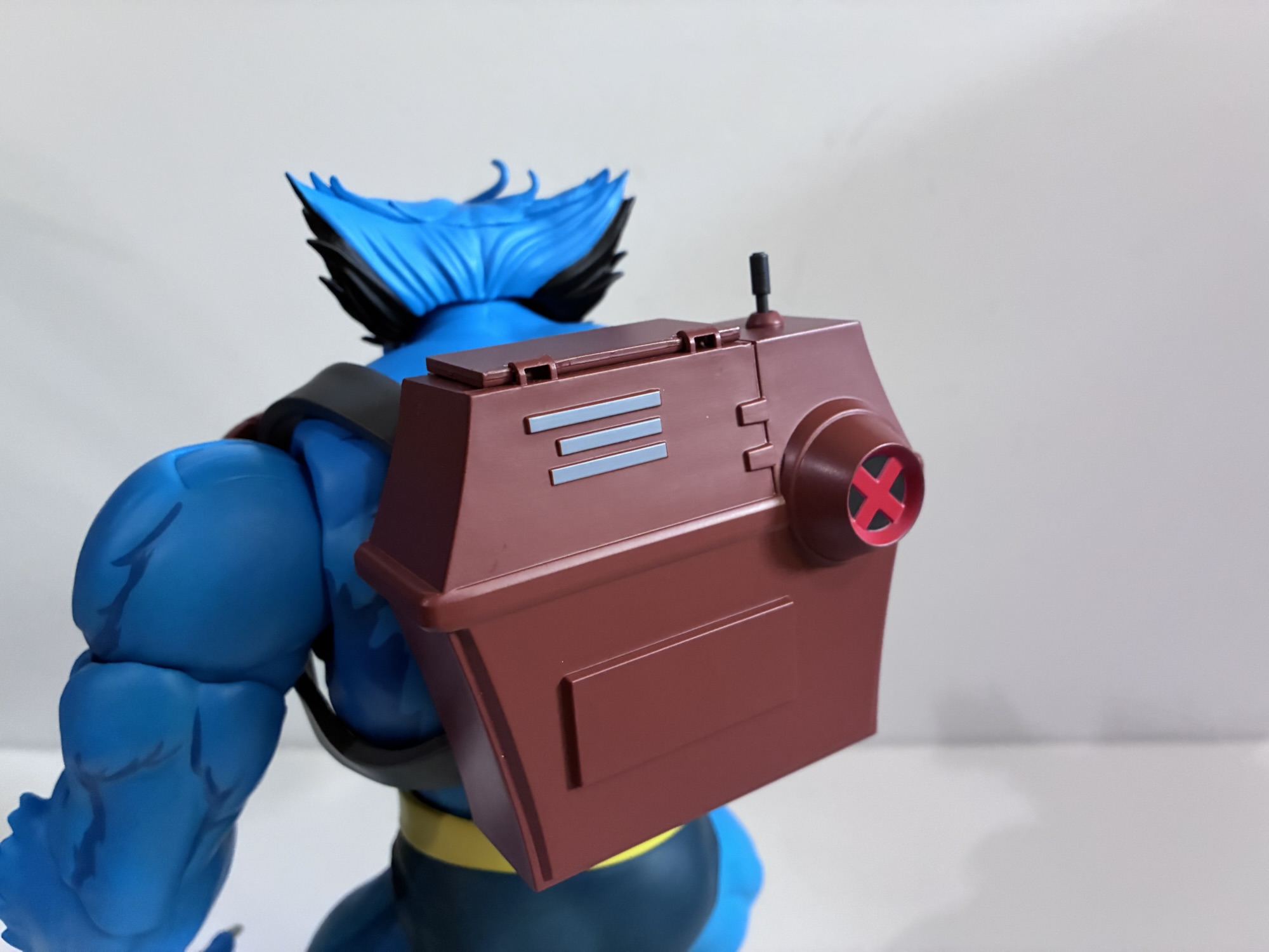
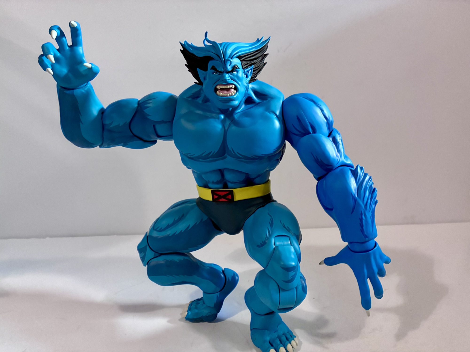
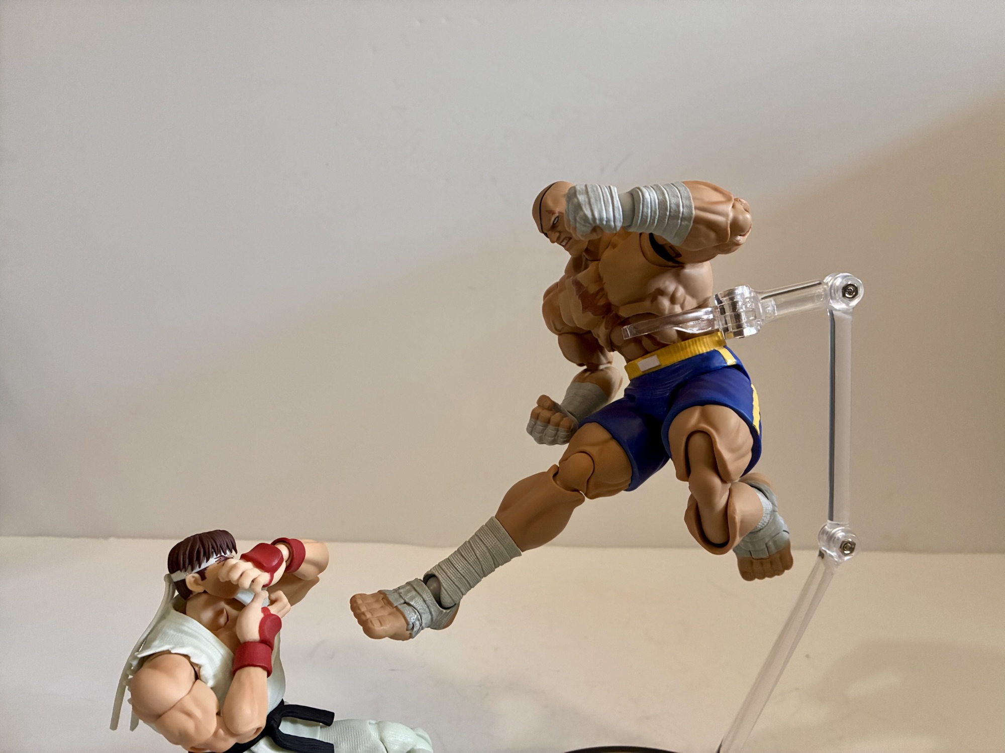
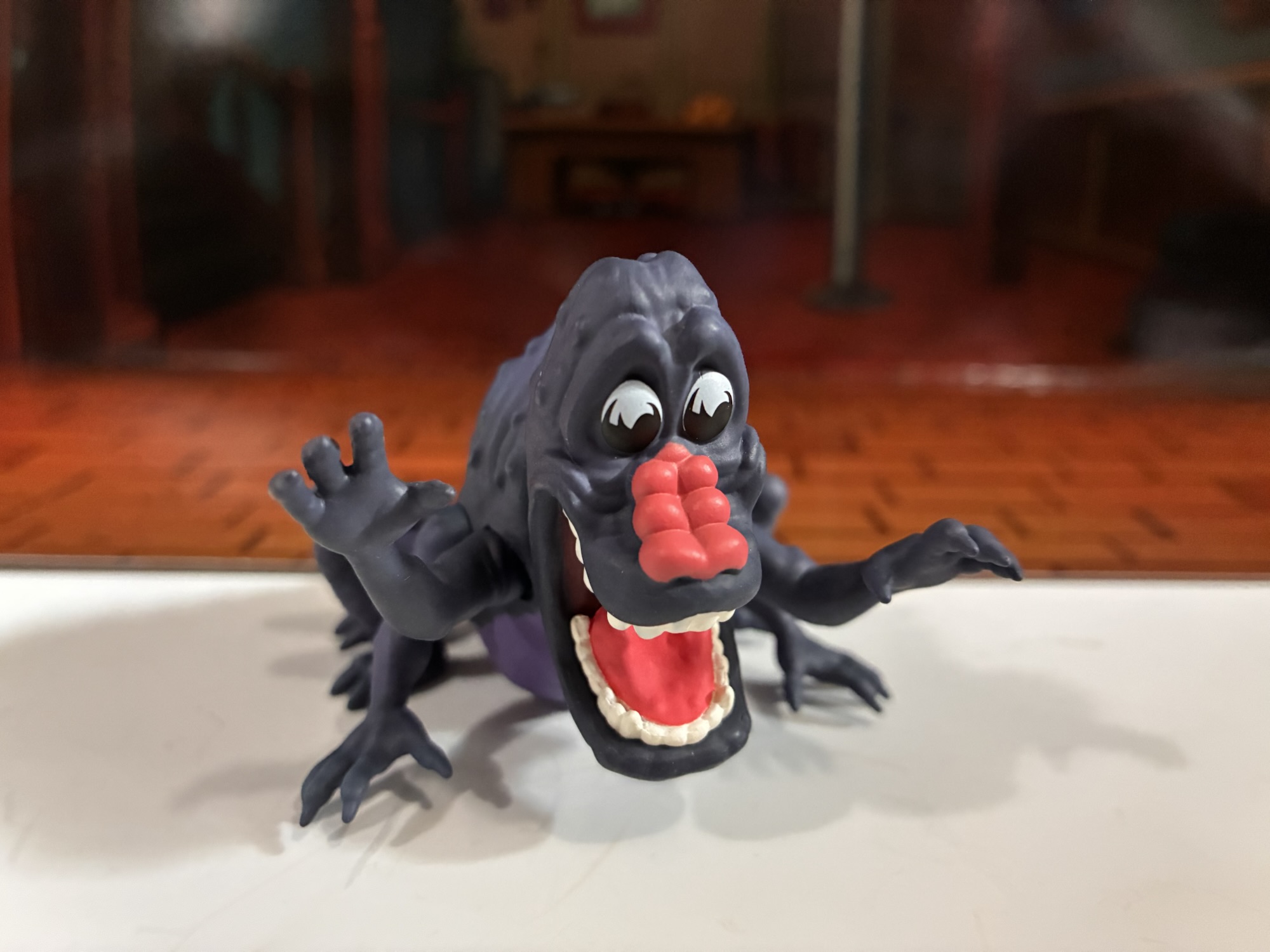
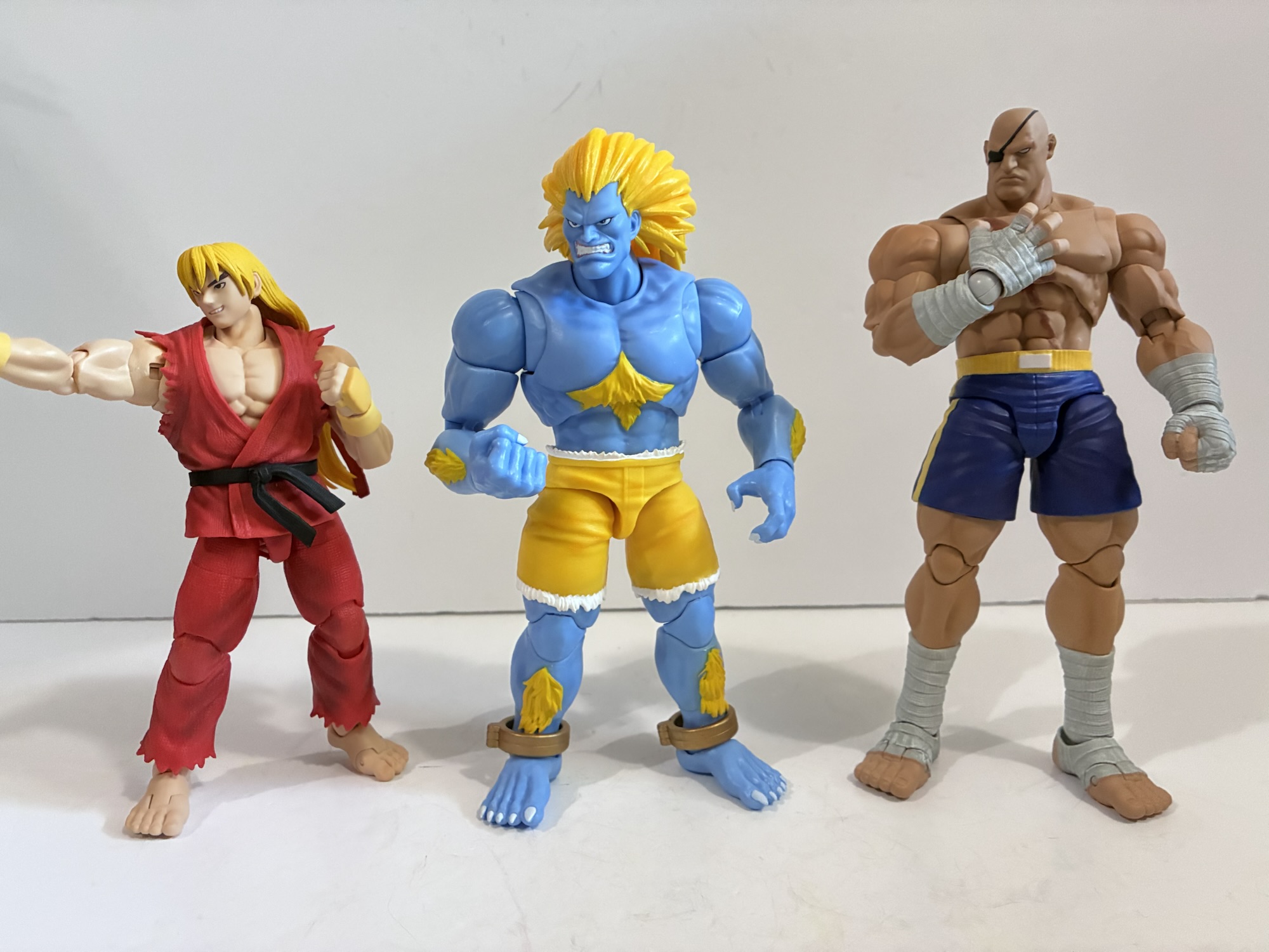
For those who do bust Blanka out of the box, they’ll find a big, blue, boy who stands at about 6.75″ to where I assume his head would end. To the top of his blazing yellow hair he’s about 7.25″. Some of that is irrelevant since Blanka, like last week’s fellow blue boy Beast, is almost always crouched to some degree when moving about in the game and I assume most will pose him as such. I don’t have any other figures from this line, but comparing him to the Storm Arena figures and he looks to be well sized. The sculpts for this line run soft compared with Storm Arena which is partly why I’ve preferred the look of their figures to what Jada was doing, but I do think this does a solid job of capturing the artwork associated with Ultra Street Fighter II. Not the sprites, but the artwork. The default portrait, for example, is definitely modeled on his portrait in the character select screen with the frowny grin that’s wider on his right side. It’s captured well and I like the cleanliness of the edges and the paint. Where the softness comes in is with the musculature. He’s ripped compared to a normal human, but not to the same degree as other figure lines. The biceps show this best as they just wrap around the base of the shoulder without really separating from them. It’s better than the Marvel Legends tiny shoulder syndrome, but I’d have liked to see more definition in that particular area.
What obviously jumps out about this figure is the deco. This powder blue skin with bright yellow hair and trunks just pops. I love the blue and yellow combo, maybe it’s why I’ve always liked a lot of the X-Men costumes from the same era, and this looks great to my eye. The blue body is mostly colored plastic, but it has this tendency to eat light. It’s not shiny and it doesn’t have that “plastic” look some figures possess. There does appear to be some shading on the muscle groups in places which helps give it a nicer texture. The painted portions include the yellow patches of fur on the torso, forearms, and shins. It’s applied cleanly and the yellow is applied heavy enough to overcome the blue underneath. I have a tiny bit of chipping on the shins, but I think that’s from the bronze shackles around his ankles which are floating. I probably need to be more careful when posing his feet. The hair and trunks are molded yellow plastic with the trunks having white trim at the top and bottoms which is nicely applied. We do have some slight color mismatching though as the painted yellow is noticeably darker than the hair and trunks. The upper torso is also a stronger plastic and is a slightly different shade of blue from the arms and abs. It’s not egregious and I’ve seen worse on more expensive figures than this, but it is noticeable under certain lighting conditions. The previously mentioned shackles also appear to be painted which is probably why they have a nice metallic finish.
The figure looks good and my only nitpicks with it really are more stylistic than anything. If you dig the source artwork then you’ll probably dig this interpretation of Blanka. I will say, the in-hand feel of this figure is not as premium as Storm Arena. I don’t know how interested people are in hearing comparisons between the two, but since they are my only reference point for Street Fighter figures (unless you want to count the 90s Hasbro offerings) it’s a comparison that’s begging to be made. Blanka has a very similar feel to the Jada Frosty the Snowman I reviewed back in December of 2025. There’s a heft and a chunk factor, but not really that smoothness I often find with more premium offerings. Of course, he’s $35 so it’s not like we’re talking about MAFEX or Mezco here, but those Storm figures are in the same price range and come with about the same amount of stuff. Blanka feels more like a toy to me which is good in some respects as he definitely feels durable. The plastic is very hard in most places and offers little give. There’s not a smoothness to the joints and even compared to a Marvel Legends it still possesses some of that toy feel. It feels similar to a McFarlane figure, which again is not a bad thing on its own, but it’s just my impression. I’m not sure how I expected the figure to feel in-hand, but it took me a little by surprise.
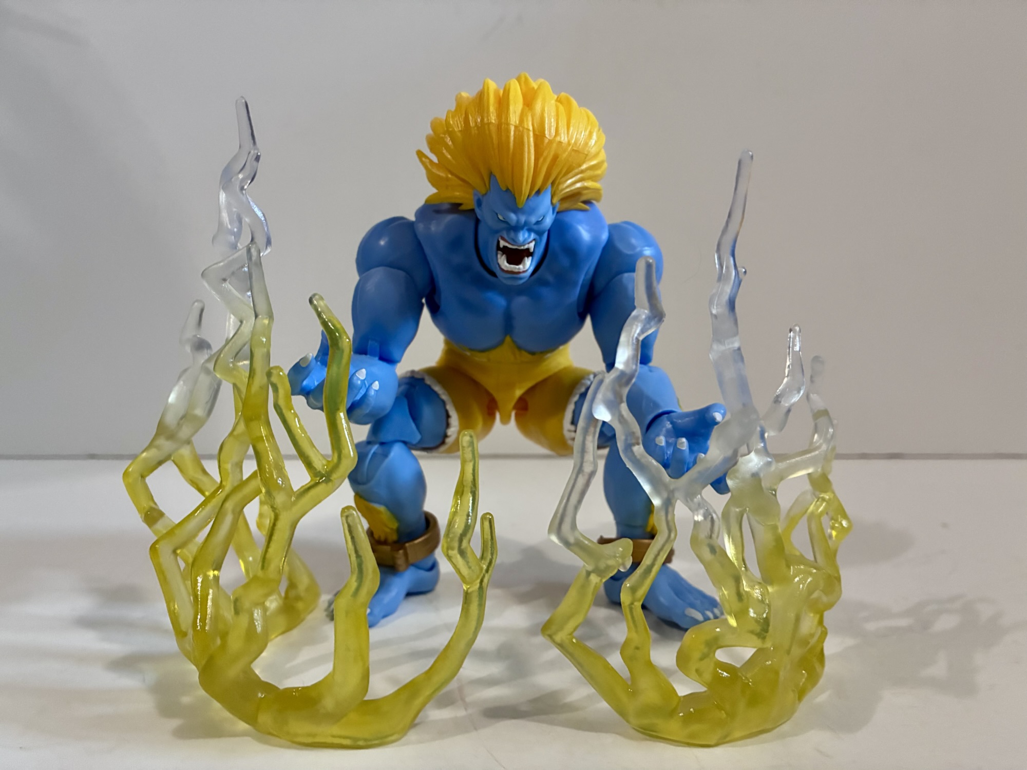
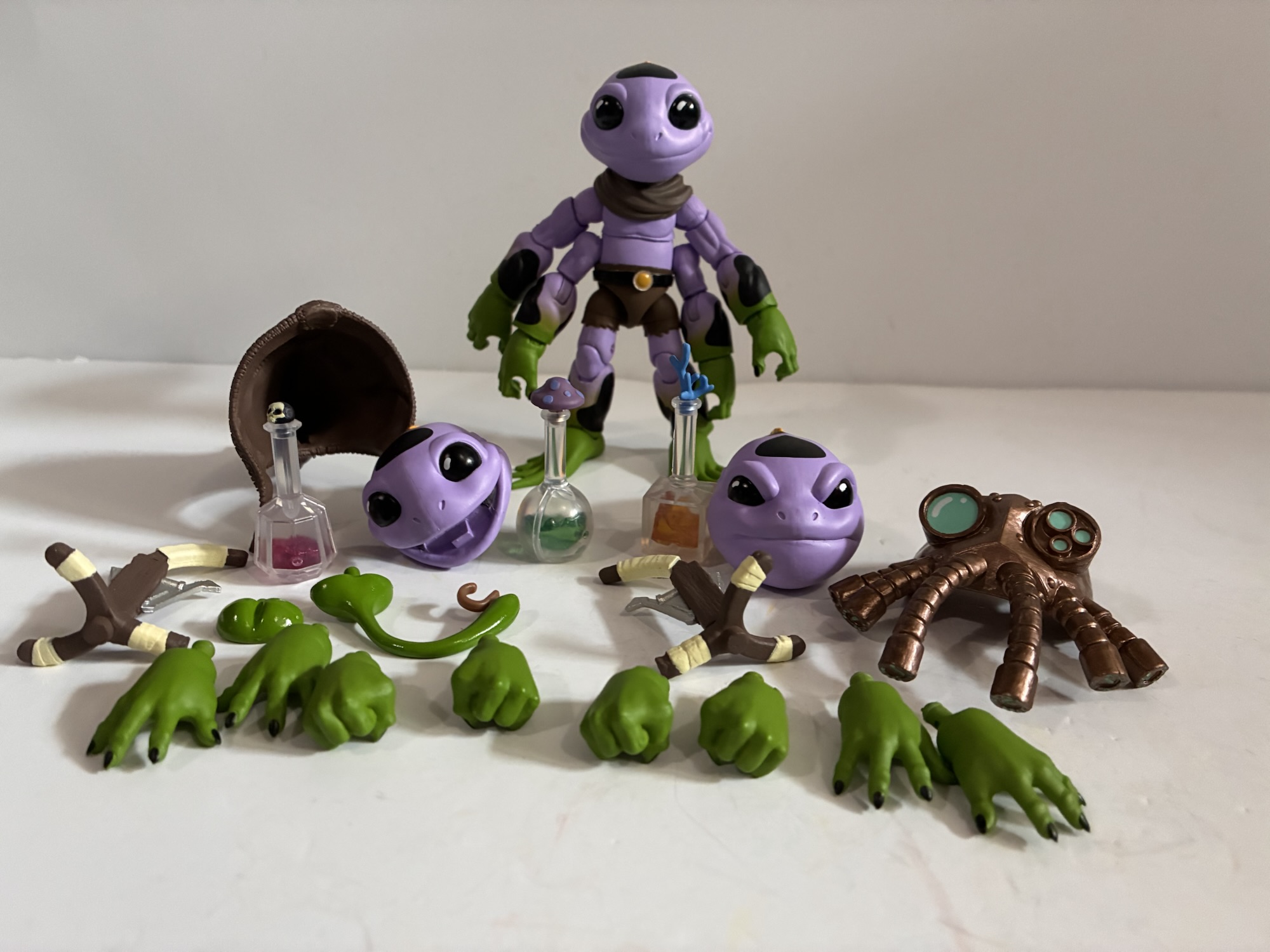
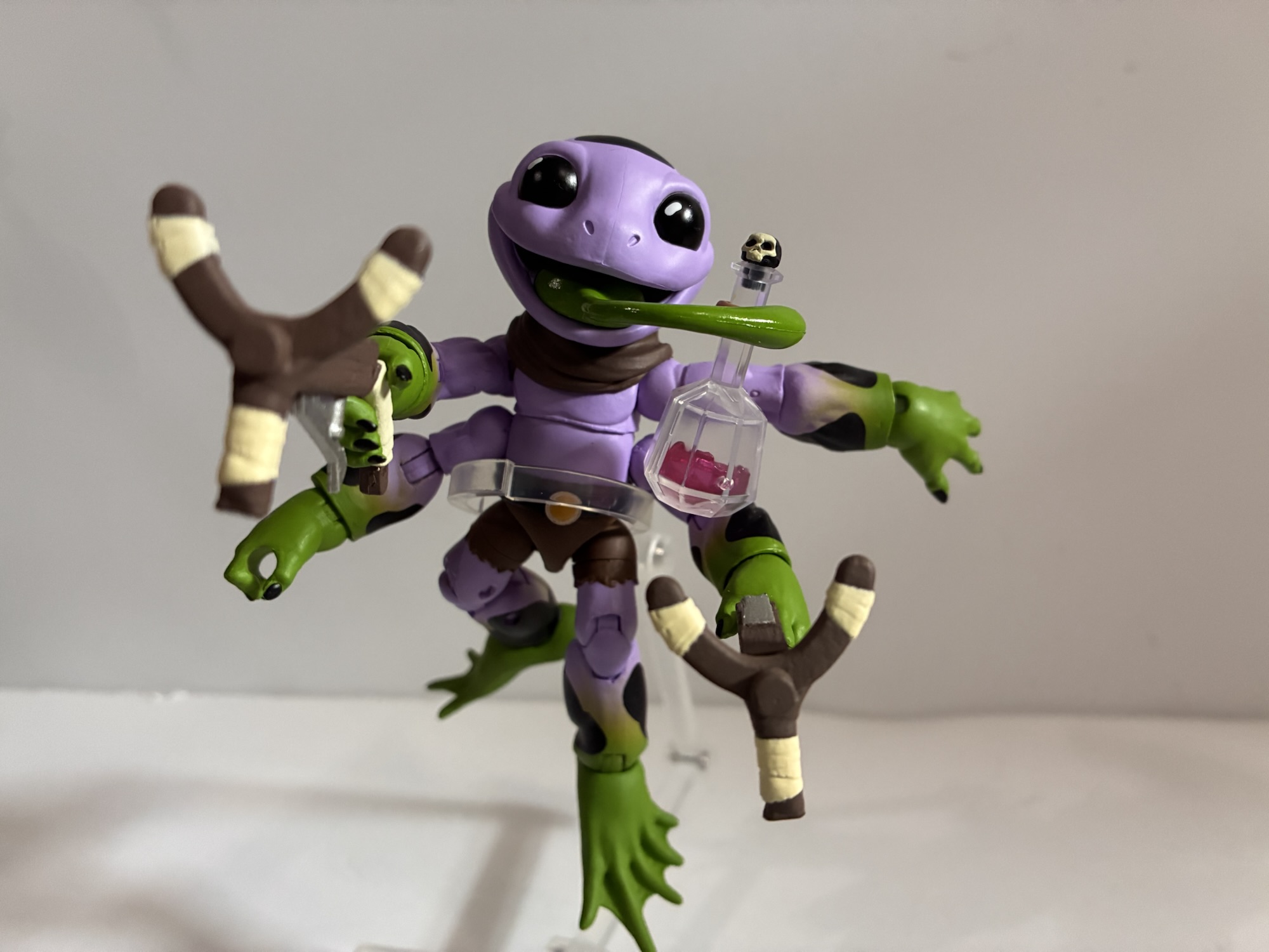
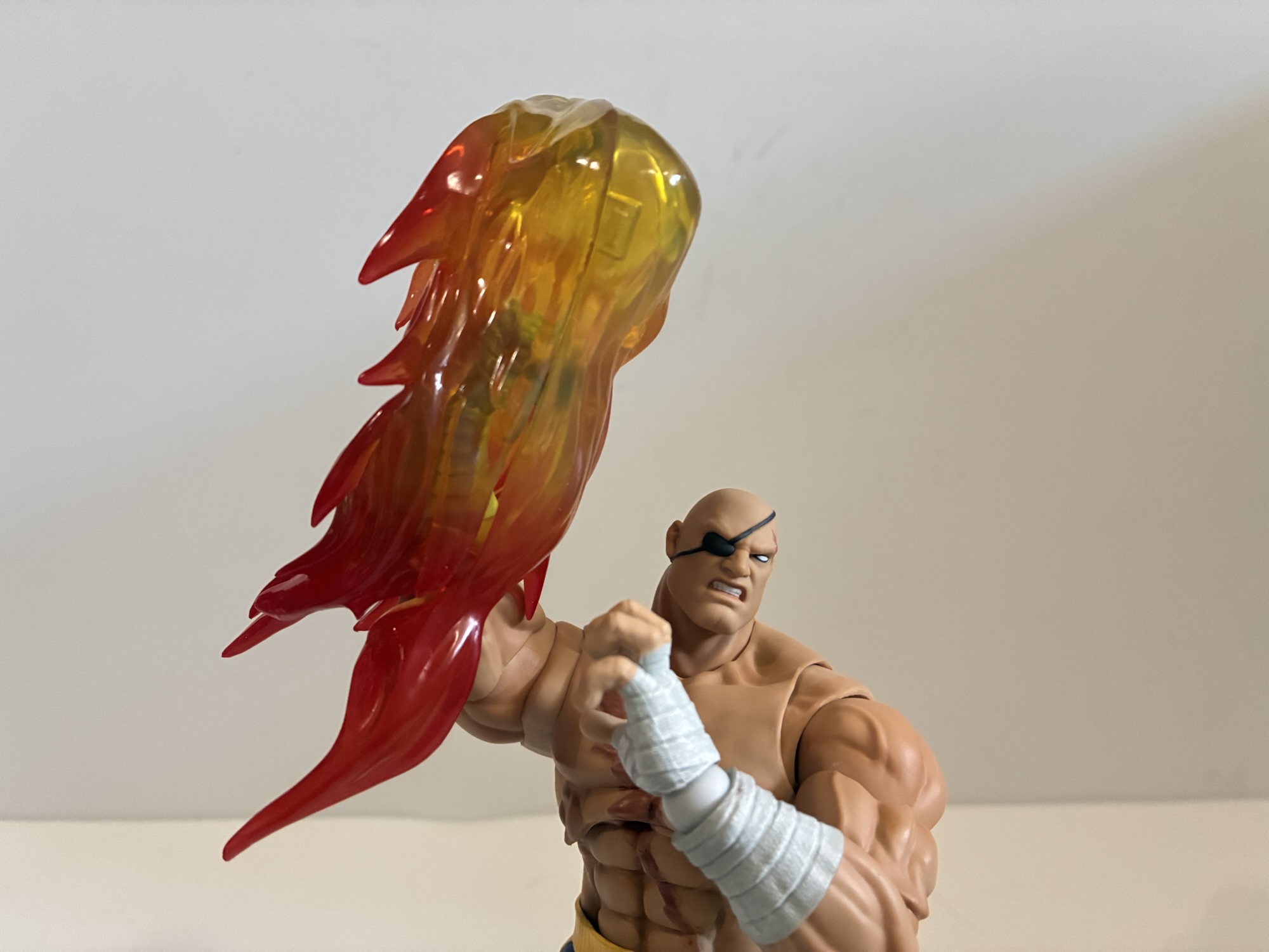
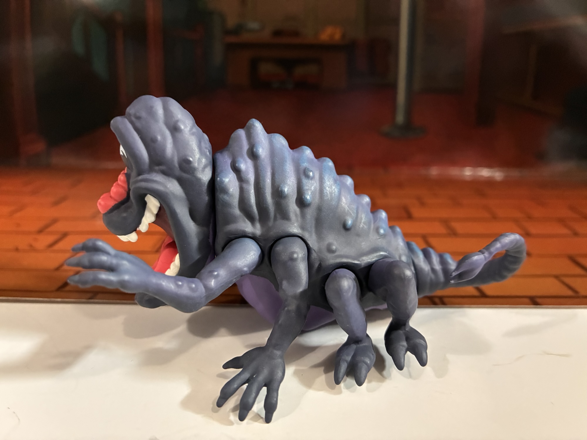
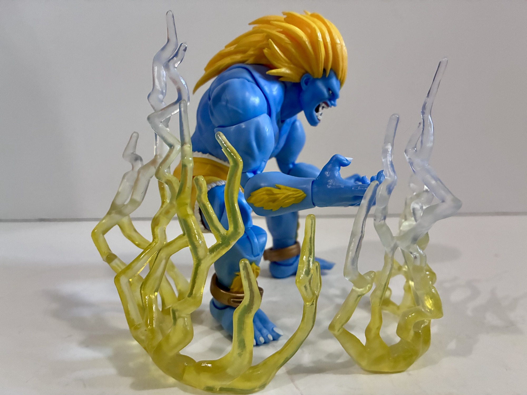
The accessories in the box are pretty typical from what I’ve see of this line. We get an alternate head, an alternate set of hands, and an effect apart from the game. The alternate head features Blanka with a yelling expression. The hair is slightly different and a bit more wild befitting the expression. It’s a good look and I honestly don’t know which I prefer. He comes with a pair of fists by default, but also has a set of clawing hands which is appropriate for the character. For an effect part, we actually get two lightning effects designed to be placed on a surface around a crouching Blanka to mimic his lightning attack from the game. They’re not the same sculpt with one being a little taller than the other, but both are done with soft, translucent, plastic that starts off yellow and finishes clear. It looks great and makes the most sense as an effect part for Blanka though if you wanted a stand in the box I wouldn’t blame you.
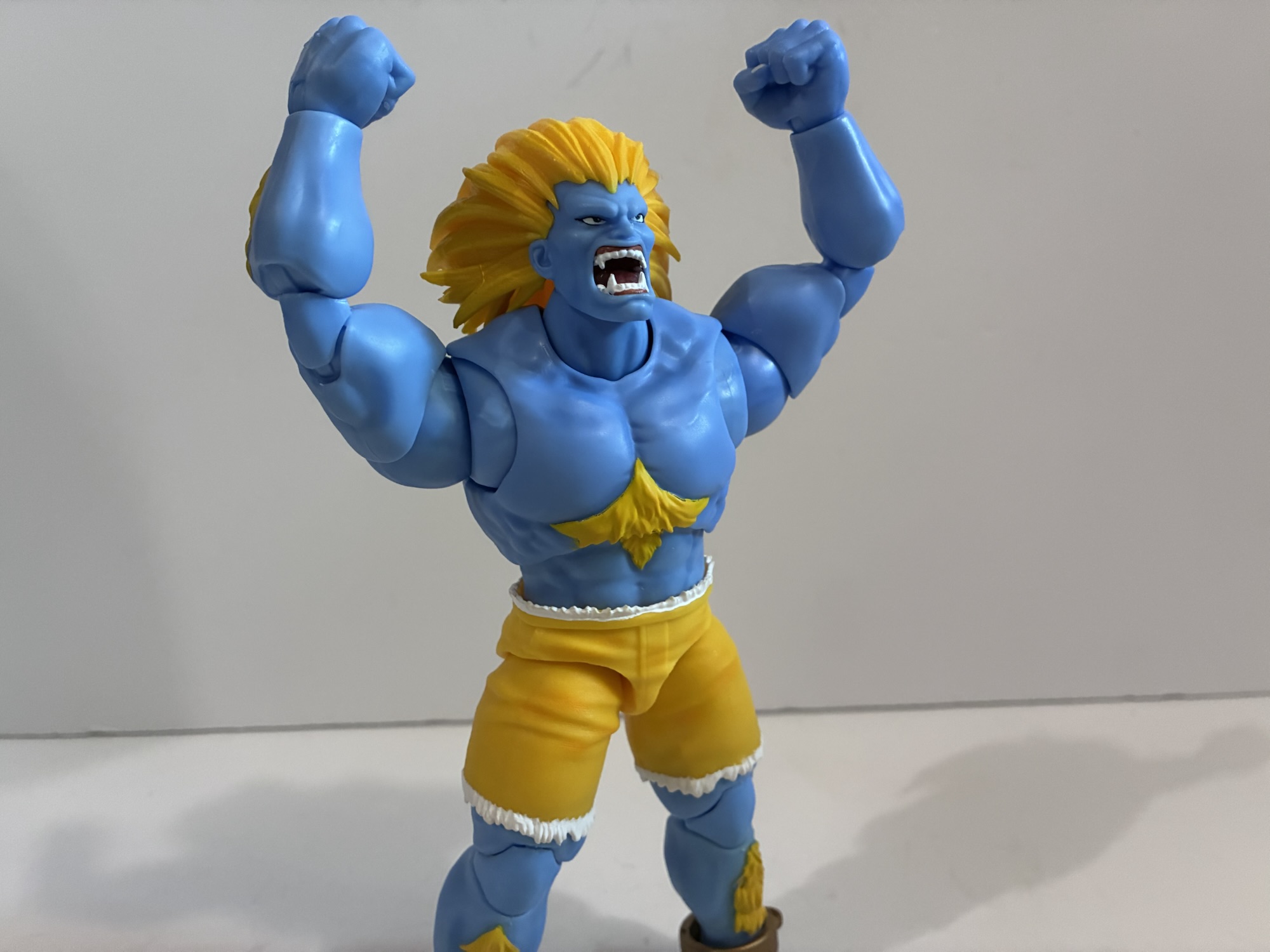
What I was most looking forward to with this figure was just having this colorway in my hands, but not far behind that was checking out the articulation. For a company that has only been in the action figure business a short while, Jada really knows what it’s doing where articulation is concerned. They seem unafraid to take risks and I get the sense that their figures are designed by people who like handling action figures. Take the head, for instance. I haven’t even mentioned it up until now, but the plastic used for Blanka’s hair is very soft and very pliable. It’s basically in two parts: the front which frames the face, and then a center part that’s basically hollow. It looks good, but best of all, it doesn’t impede the figure’s ability to look up nor does it add substantial weight. I don’t know how this would work with something like Dragon Ball Z, but with this figure it works very well. As for joints, just get a load of this roll-out: double ball peg head, neck joint, butterfly, shoulder hinge, bicep, double elbows, wrist hinge and swivel, ball-jointed diaphrahm, ball-jointed waist, ball-socket hips, thigh swivel, double knees, shin swivel, ankle hinge and rocker. And it’s not just what is articulated, but the manner in which Jada does it. The diaphragm has great range weather it’s tilting or rotating. There’s plenty of clearance between it and the abdomen so there’s no paint rub on Blanka’s patch of stomach fur. The waist ball has a little cut-out in the front to help it rock forward that you would only know is there if you popped the figure apart. The thigh swivel is under the shorts so it’s not visible and the shin swivel is hidden by the ankle shackles. The fur on the front of the shin even starts above the cut but hangs over the joint and thus isn’t split when the joint is utilized. It’s a small attention to detail, but how often do we see Hasbro say “Screw it,” and just put a cut through some part of a figure’s sculpt? Doing so renders the joint almost unusable for many because it looks so bad, but Jada took care not to create such issues.
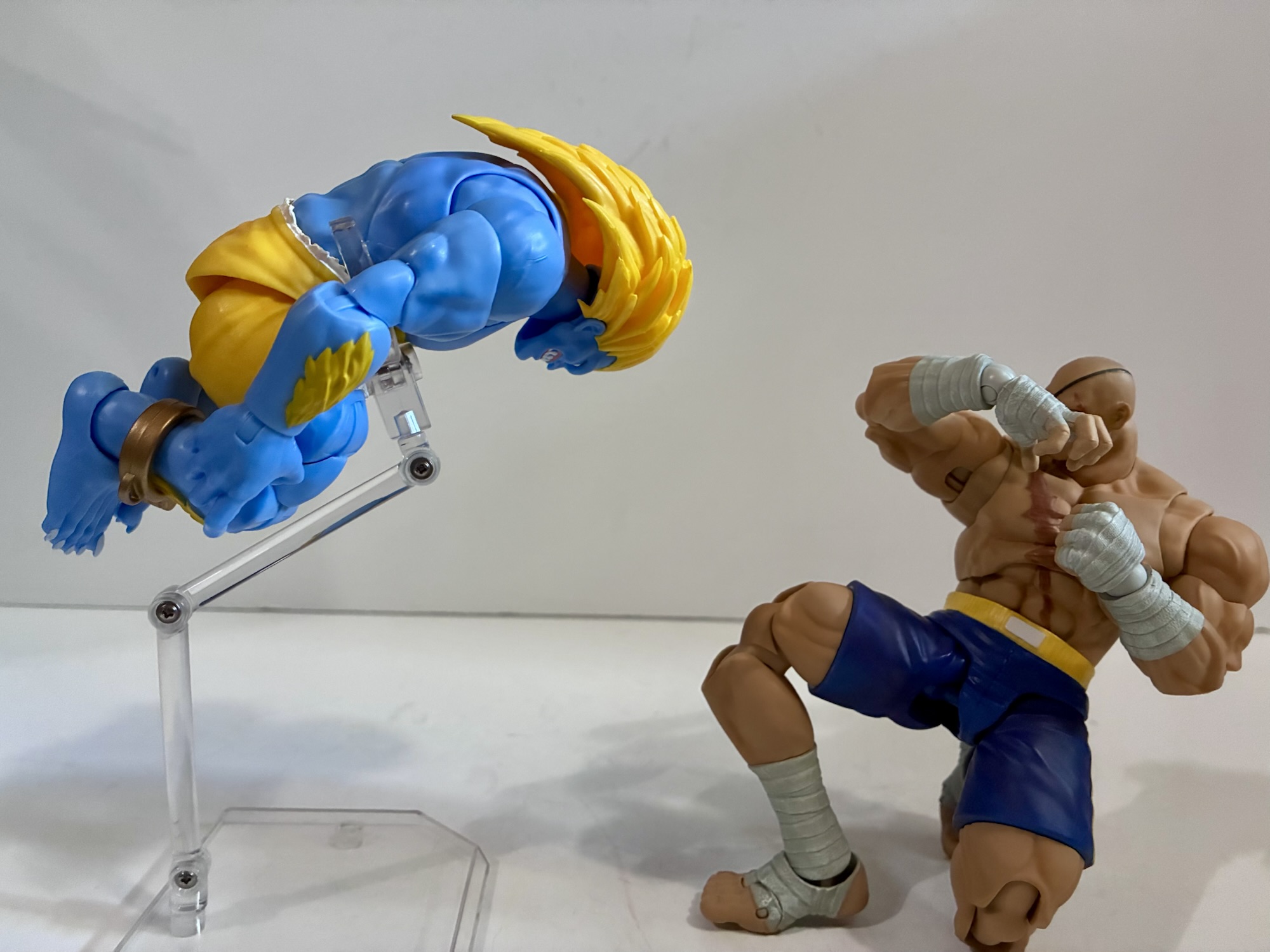
That’s not to say there isn’t any room for improvement. The neck joint on mine doesn’t seem to want to do anything. I checked out some videos to see what it’s supposed to do and it looks like it should click forward and back, but mine is binding. There’s also a lot of plastic cut out of the inside of the elbow joint so it’s not the prettiest double elbow you’re likely to see. The range is great as this big-armed monster can bend past 90 degrees, but some might not like the trade-off. Apart from that though, it largely works really well. The figure, even with a semi-functional neck joint, can look up well enough to get into a crouch and it’s even capable of a decent rolling attack look. The range in the torso and hips is terrific and about the only joint that’s semi-compromised when it comes to range is the butterfly joint. I assume that was an aesthetic choice to not cut more into the pectorals and it’s one I’m personally fine with. It also means his shoulders sit where they should which preserves the silhouette. I hope Jada gave its designers a nice bonus last year and that other companies are buying these things with the intent to copy them because more companies should make figures that articulate like this.
That’s a lot of praise to end the last paragraph on and it’s justified praise. Everything I’ve heard about this line is captured well in this Blanka figure. The figure looks good, the construction is solid, and the articulation is fantastic. And it all comes at a pretty decent price especially considering that this is an exclusive variant. If you’re just interested in picking up a good action figure you’re unlikely to find one that’s appreciably better than this Blanka. While I prefer the aesthetic Storm Arena has settled on for its Street Fighter line, that doesn’t diminish what Jada is doing. If I was a bigger fan of Ultra Street Fighter II then I’d be more than happy to collect this line. As it stands, I may still cave and grab Vega if I ever see him in the wild and I look forward to seeing where Jada goes from here. It may only be June, but I’m pretty sure this Blanka will be part of my own personal top ten when all is said and done this year.
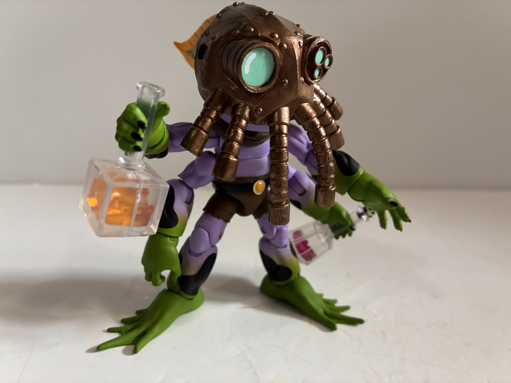
We have a few other Street Fighter figure reviews if you’re interested, and also more blue:

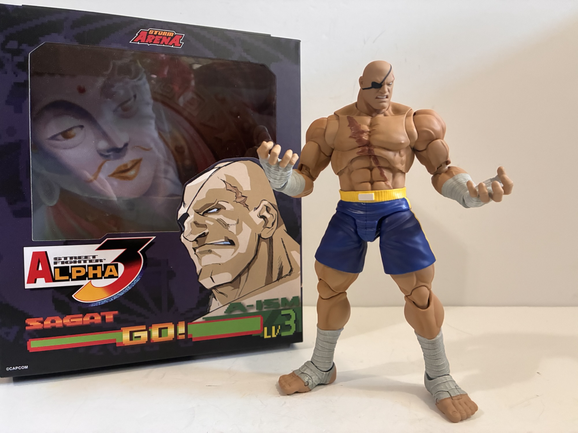
Storm Arena Street Fighter Alpha 3 Sagat
As my collection grows, I try to be more regimented in my purchasing decisions. I have toy lines that I’m more or less all-in on and I rarely question myself with those. They have the most room budgeted in my house and in my actual budget. And then there’s the stuff I’m less invested in.…
Keep reading
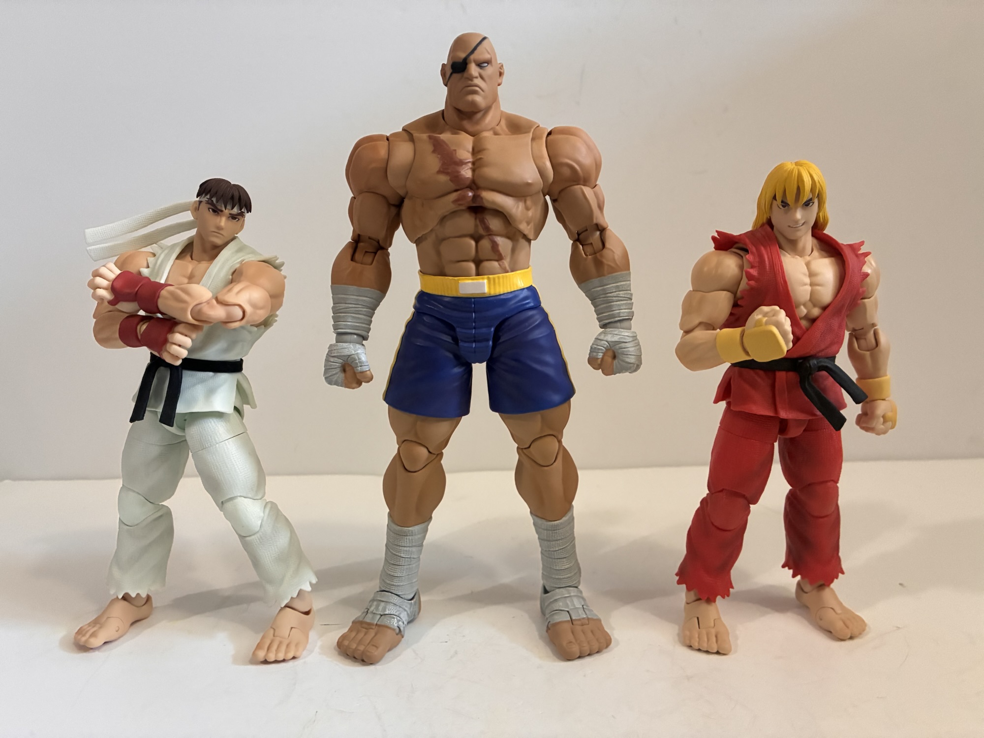
Storm Arena Street Fighter Alpha 3 Ken
One of my most anticipated releases of 2025 came out of no where. I was a kid during the early 90s and into video games so I know a thing or two about Street Fighter. Street Fighter II was everywhere and is pretty much the reason why the one-on-one fighting game became a huge genre…
Keep reading
Marvel Legends Gamerverse Captain America vs Venom
We’re going to be doing a lot of 2025 catch-up here as Christmas always slows things down. Toy producers also like to push product for the holidays so I seem to always end up with a backlog at the end of the year. Especially when stores are doing generous sales and convincing me to buy…
Keep reading