It’s been over two years since the world lost manga artist and writer Akira Toriyama and it’s been about that long since the unofficial end of Dragon Ball Super. The manga and anime series was the official sequel to the hugely successful and mega popular Dragon Ball Z. The final chapter, 103, was released in March of 2024 in Toriyama’s native Japan while English speaking readers have had to wait two years for the collected final volume to be released elsewhere. Sure, the chapters are all made available much sooner via the Shonen Jump app, but I’m still one of those digital deniers clinging to physical media with just about everything I consume. It was a long two years of waiting, but had this volume arrived shortly after Toriyama’s passing I probably would have been a blubbering mess. Having two years to process such a monumental loss may have been a good thing.
After the anime series ended, I went back and picked up all of the volumes of Dragon Ball Super as well as the ones that followed. Super the manga did not end and continued on with two full arcs of Dragon Ball goodness. The manga did bypass the Broly film, but chose to adapt the Super Hero movie and even fleshed it out more with a short arc featuring Goten and Trunks as super heroes in the same style as The Great Saiyaman. The collected volumes are published by Viz Media in the US and the artwork contained within is in black and white. Since Toriyama’s passing, artist Toyotarou has taken up the mantle of an introduction to the volume usually with some nod to Toriyama. For this particular one, he notes that Toriyama often advised him on how to better be a manga creator (a mangaka) and he expresses a desire to keep those lessons in mind for as long as he’s a mangaka himself. Toyotarou is always deferential to Toriyama when speaking on the subject of Dragon Ball and it will be interesting to see if that changes should the manga continue in some way.
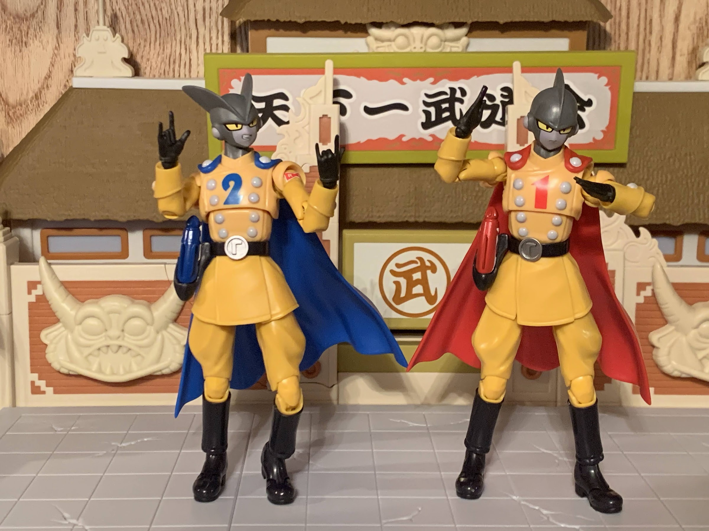
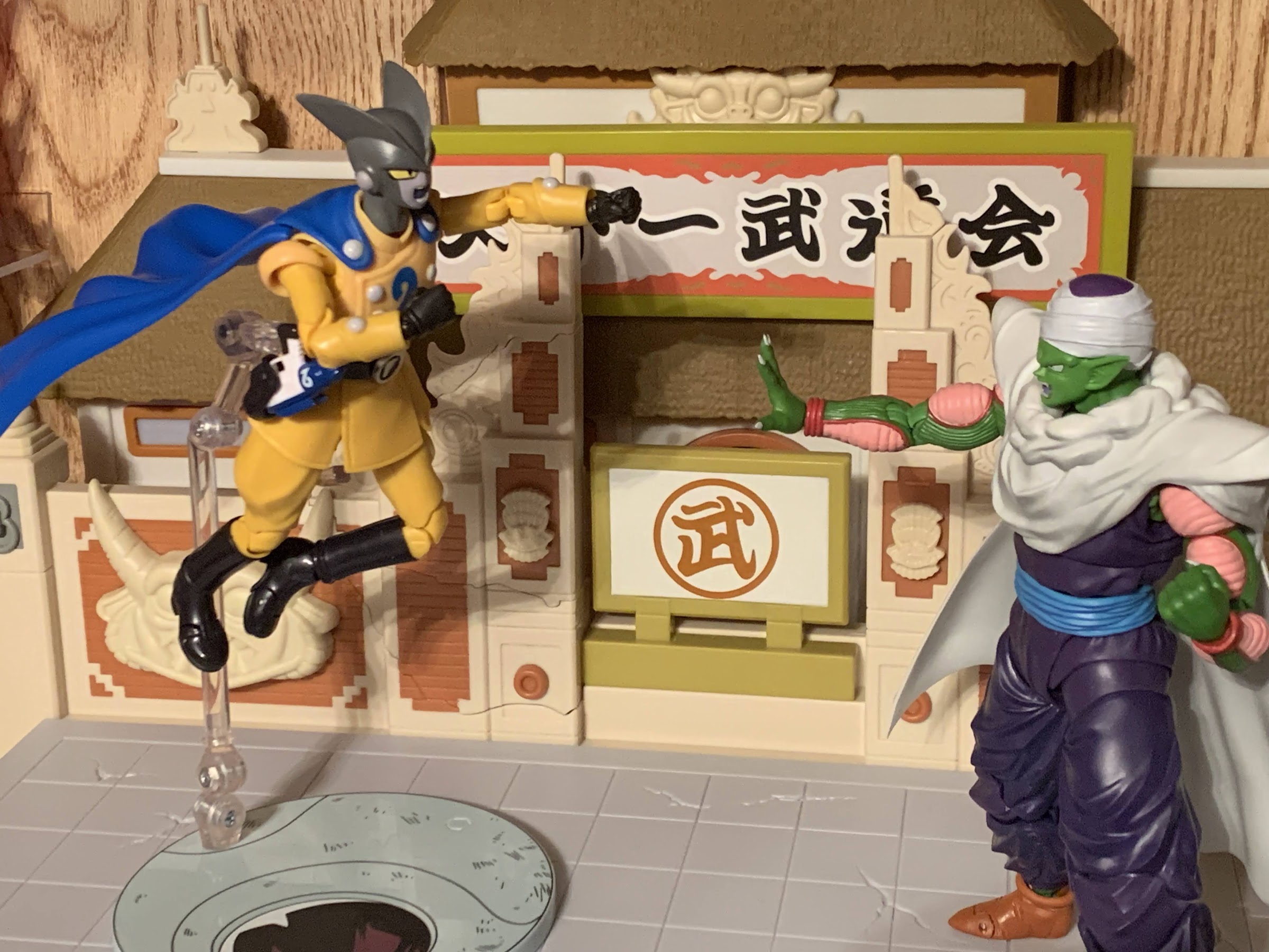
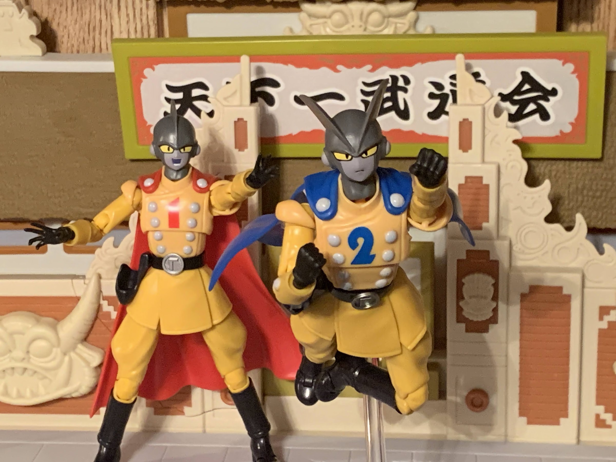
As for the story, it’s a post Super Hero one where we find the remnants of the Red Ribbon Army, lead by Carmine, seeking to exact revenge upon Gohan for thwarting their plans with Cell Max. And to do that they want to recruit the newest super heroes in town: Saiyaman X-1 and Saiyaman X-2. Unfortunately for them, those happen to be the alter egos for Trunks and Goten and they’re not going to help the Red Ribbon Army take down Gohan. Elsewhere, Vegeta, Goku, and Broly are training with Whis on the planet of Lord Beerus. It’s while Vegeta and Broly are dueling that they learn about Gohan’s sudden burst of power and his conquering of Cell Max. It seems they were so engrossed in their training they didn’t notice, but are immediately curious about what the son of Goku is capable of now. Goku decides to pay his son a visit just as Carmine and a soldier are arriving at Gohan’s house with Trunks and Goten along for the ride. Goku can’t be bothered with what’s going on and instead brings everyone to the planet of Lord Beerus. There, Carmine and his lone soldier get to bare witness to what these Saiyans are capable of first with Trunks and Goten taking on Gohan followed by father and son. It’s a simple story and a breezy one as Goku is just out to test the limits of his son with the hope of reaching the conclusion that he doesn’t have to worry about Earth so long as Gohan is there to protect it.
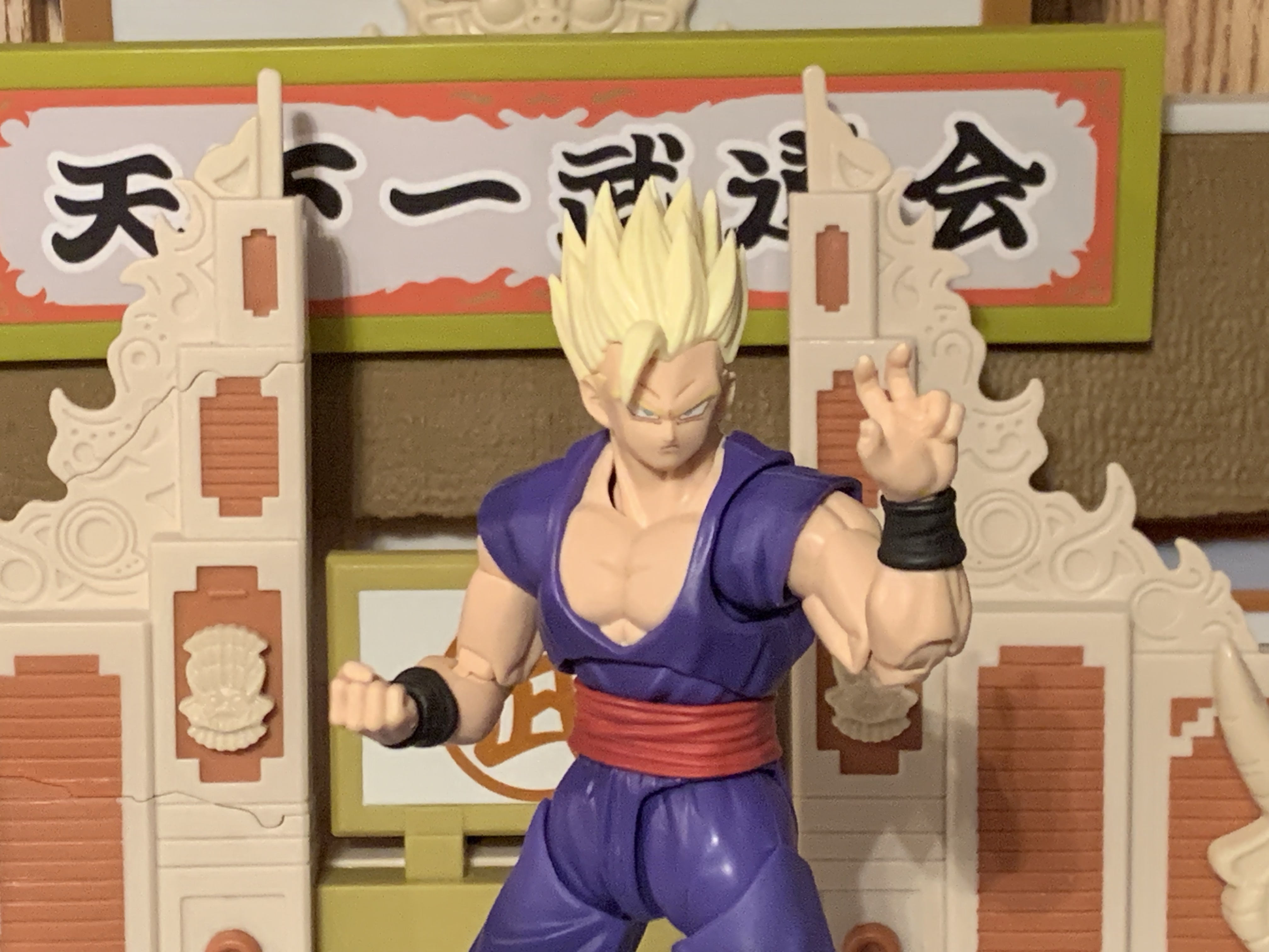
Much of the volume is dedicated to Goku testing out his son’s new abilities.
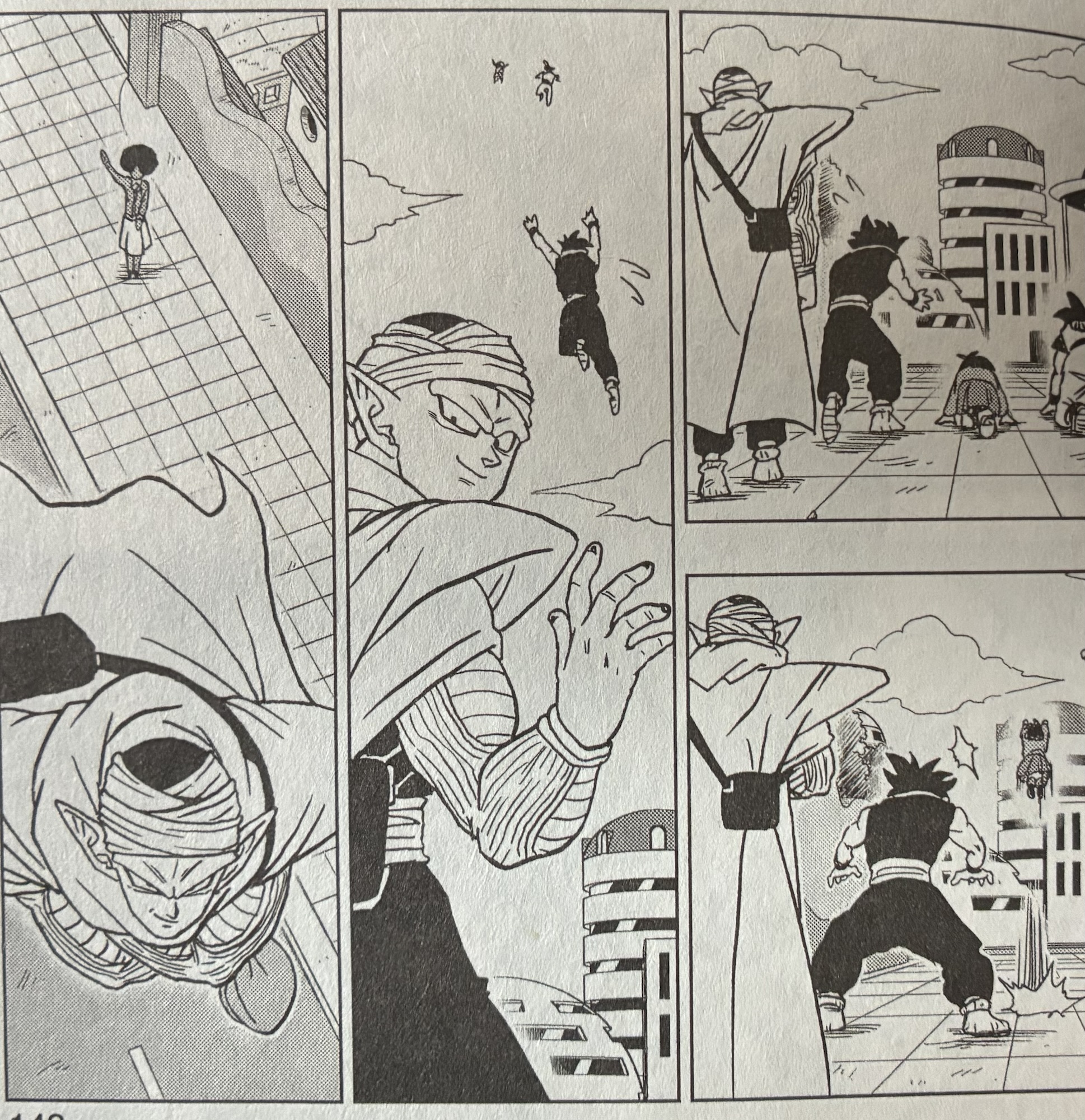
The ending of this story received some additional press because Toriyama apparently requested a change. During the fighting, Goku and company find out about Piccolo’s new power-up as well and naturally Goku wants to see it as well. Vegeta is also curious, but also concedes that he needs to head home or else Bulma might lose interest. When Goku and Gohan return to Earth to find Piccolo he has to decline a sparring session because someone needs to pick Gohan’s daughter, Pan, up from school. Goku tags along at Piccolo’s insistence since he apparently forgot his granddaughter’s name and we get a wordless exchange to close out the story of Pan elated to see her grandpa and Piccolo waving bye to her teacher. The way the scene is illustrated it’s as if Piccolo is waving “bye” to the reader, and since Piccolo was Toriyama’s favorite, it’s been interpreted as his way of saying “good bye.” Right in the feels.
Volume 24 actually doesn’t end there, but with a prequel chapter about how Trunks and Goten decided to become super heroes. Toyotarou explains it was something he wanted to do initially, but just didn’t have the time for it. With the story over (and Shonen probably not minding extra content) he was able to go back and do it and it’s a fun little story, though in this format it’s definitely a tonal shift following the end of chapter 103. I even put my copy down for about a week before I picked it back up to read the prequel chapter.
Farewell.
As the present conclusion to Dragon Ball Super, this is a nice little end. It’s basically a slice of life story just set in the world of Dragon Ball where titanic battles are an everyday thing. The anime is expected to resume in the not too distant future following a remake of the first arc with Beerus. I do wonder, when it finally gets to this final scene, can it possible land with the same impact? Maybe Toriyama can be inserted somehow into it either via a caricature or his little avatar of himself with the mask? Should the manga continue in the hands of Toyotarous, there’s plenty more to explore as Goku still hasn’t seen Piccolo’s new form, Broly is striving to harness his own power, and Frieza is still out there somewhere. If not and it ends here then it’s a sweet ending and one I much prefer to how Dragon Ball Z originally ended with Goku abandoning his family to go train Uub. If you’re a Dragon Ball fan, you have probably read this already so this isn’t exactly a review, per say. This is more of a chance for me to acknowledge the end of the series while it was in the hands of Akira Toriyama and an opportunity to say “Thanks,” and that I’m going to miss that guy.
For more thoughts on Akira Toriyama’s Dragon Ball, check these out:
The first movie under the Dragon Ball Super umbrella is one that sets out to take what was previously non-canon and adapt it into the main series. The most recent two Dragon Ball Z films; Battle of Gods and Resurrection ‘F’, ended up being the start of Dragon Ball Super which is now well over…
I’ve said it before, and I’ll say it again, that Dragon Ball Super has been the thing I’ve loved most that I never knew I wanted. I was done, or at least content, with Dragon Ball Z. Dragon Ball GT wasn’t good, but I didn’t need it so it wasn’t something that bothered me. Then…
I need a break from action figure reviews so why not turn to the world of video games? I don’t get to play many these days, but I did splurge on a PlayStation 5 not that long ago and was looking for something to play. And ideally, that something would be budget friendly. The good…
Whether you’re a Jiren fan or not, it’s hard to deny that this figure looks pretty cool.
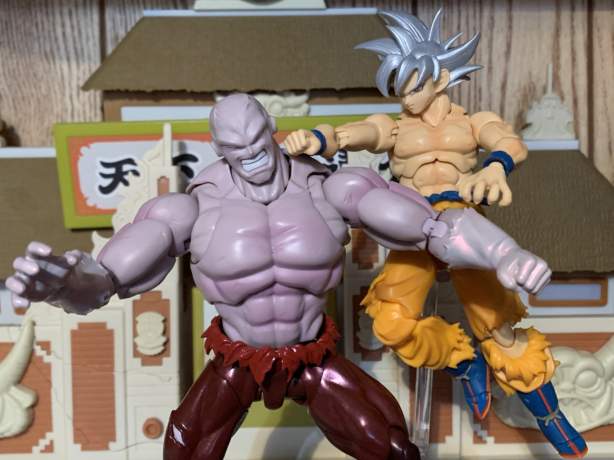
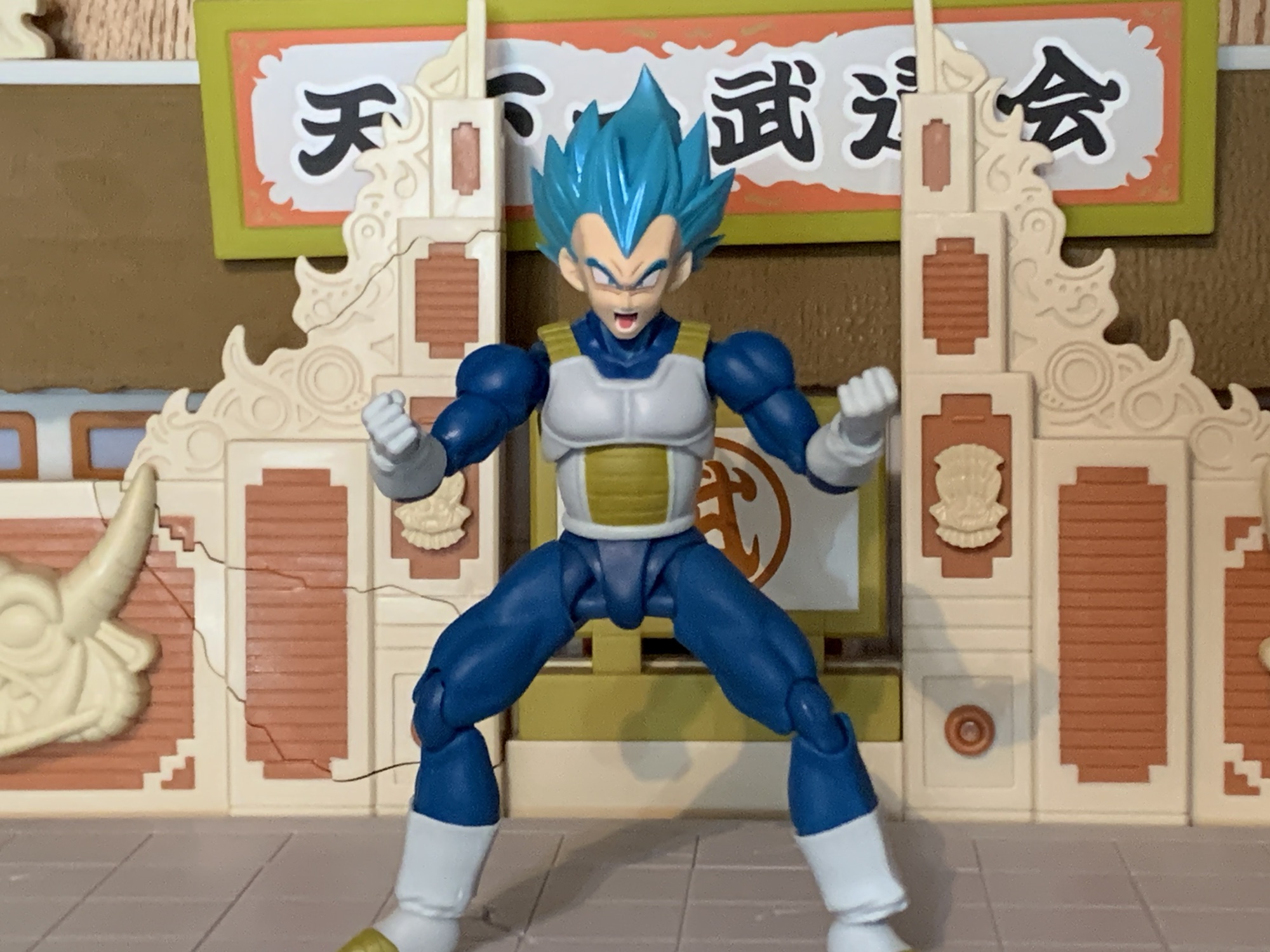
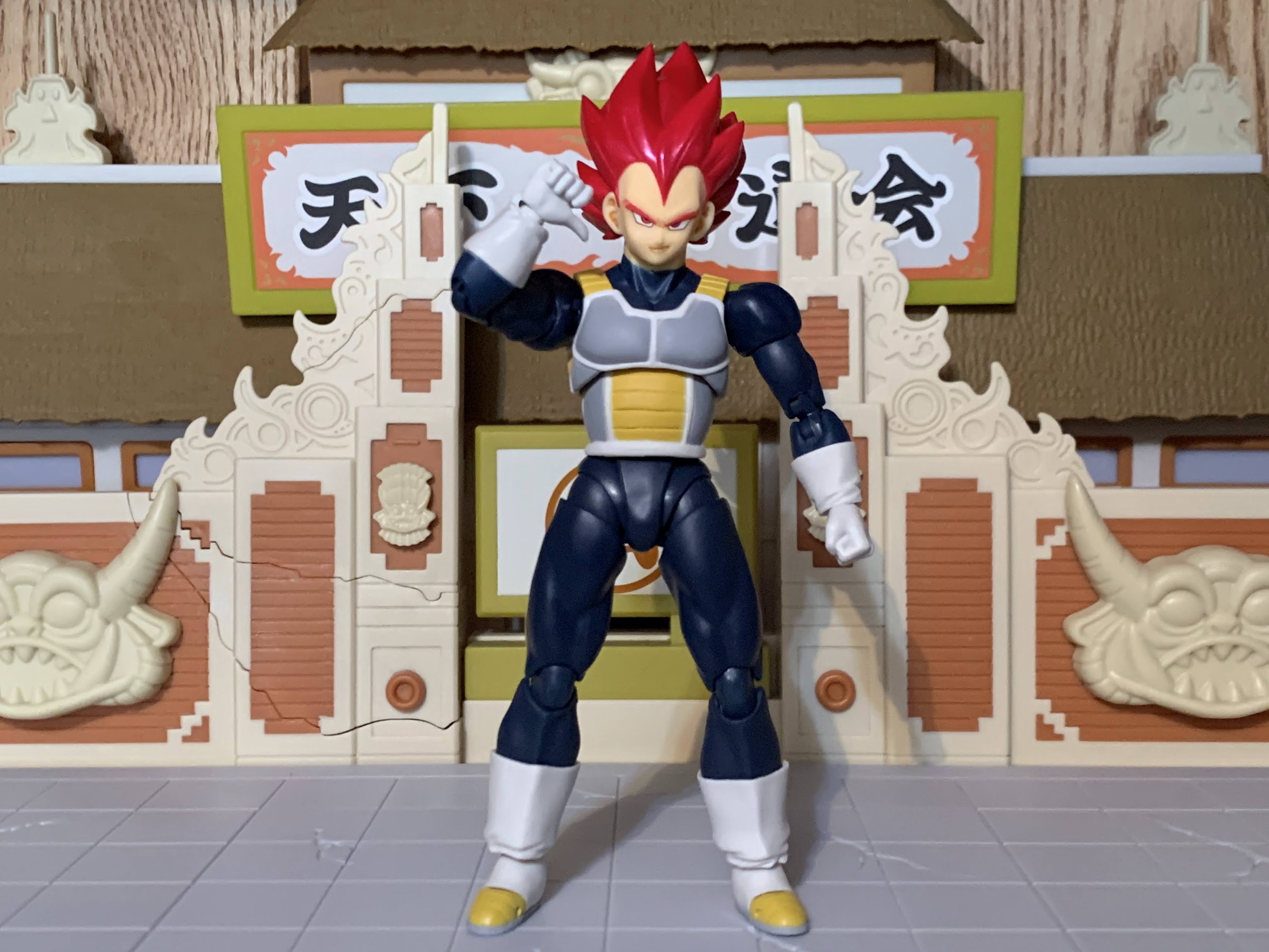
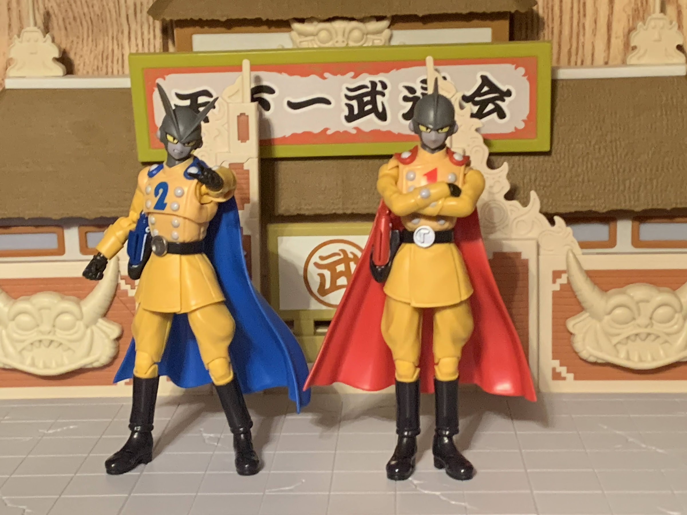
It would seem that FOMO, the fear of missing out, is my primary motivation for purchases in Bandai’s S.H.Figuarts line of Dragon Ball action figures. The last one we looked at was a big one for me in Future Trunks from Dragon Ball Super. That dreaded FOMO was strong enough that it got me to buy a figure I knew was compromised and had no chance of truly satisfying me, but buy it I did. Today’s FOMO purchase was done almost for the opposite reason. Really, it happened only because I initially decided not to get that Trunks figure and put my money towards this one instead. And I am talking about Jiren.
This dude must live in the gym.
Jiren is the big bad guy from the so far final arc of the Dragon Ball Super anime. The series has continued in manga form, but as of right now there’s no real concrete proof the anime will resume. In terms of Dragon Ball bad guys, Jiren isn’t very interesting. The plot of that final arc is that the Gods of the many universes have decided to pit each universe against each other in a battle royale. For the victor, a wish from the Super Dragon Balls which are capable of granting any wish one can think of. For the losers, total annihilation in the form of getting wiped out of existence. It’s not even death, it’s just deletion. As a result, all of the warriors competing against our favorite heroes are just fighting for self preservation. While some are certainly bad guys, most are just like Goku, Gohan, and all the rest in that they just don’t want to be ended.
He’s more bulk than height.
Jiren, for his part, is not a bad guy. He is supremely confident bordering on arrogance, but he’s not the taunting type like Vegeta. Instead, when he determines that no one is worth his time he chooses to sit in a meditative state. It comes off as arrogance from the outside, but whenever he’s challenged he backs it up so it’s not like his arrogance is unearned. Furthermore, as a character design he’s a little boring for an Akira Toriyama character. His defining feature would be that he has a massive upper body and comparatively small legs. His head is almost like that of your garden variety alien just without the massive cranium. He also has those Frieza-like ear holes which show up in many character designs. As a result, he’s really just like a random video game boss from a plot-less arcade brawler. Our hero Goku just needs to get to him and then find a way to overcome him. Jiren isn’t evil, he’s also not exactly heroic, he’s just a guy.
“Don’t make me throw this at you!”
Because of my attitude towards Jiren I’ve never felt much of a pull to add him to my collection. I saw the figures before I ever saw him in the anime and was feeling incredibly underwhelmed by the design. The figures came and went though and they actually seemed to receive high marks from those who bought them. The sculpts, the way the articulation was implemented, and the overall size made them seem like really good action figures. Ordinarily, that’s not enough to get me to buy a figure of a character I’m not attached to, but then I went and got Ultra Instinct Goku and the desire to add a Jiren to pair with the figure manifested. When I felt similarly underwhelmed by Bandai’s 2024 convention exclusives, it was Jiren that I decided to preorder and Jiren alone.
He probably would need a bigger aura than the standard one. Maybe that’s why one wasn’t included?
Jiren comes in the standard event exclusive packaging with a black and red color scheme. This is Jiren as he appeared at the very end of Dragon Ball Super his body hulked up to gargantuan proportions and his uniform in tatters. Like Trunks, this event exclusive version has a new paint job and it’s trying to replicate Jiren’s red aura. His ordinarily pale purple flesh has a blush of pink to it while his black pants also have a shiny, red, hue applied that almost makes him look like he’s candy-coated. His flesh has a matte finish so this high gloss approach is far less distracting on Jiren than it is with Trunks. The only thing I don’t really care for is that his white gloves, once the pearlescent red overcoat is applied, makes them blend in a little too much with his arms. There’s not much contrast there aside from the gloss. The same is true for the boots, but since he’s still wearing pants it doesn’t look as noticeable. All that is to say that I don’t hate this approach and it’s executed well enough, but if I could have the standard paint job I’d probably choose that over it.
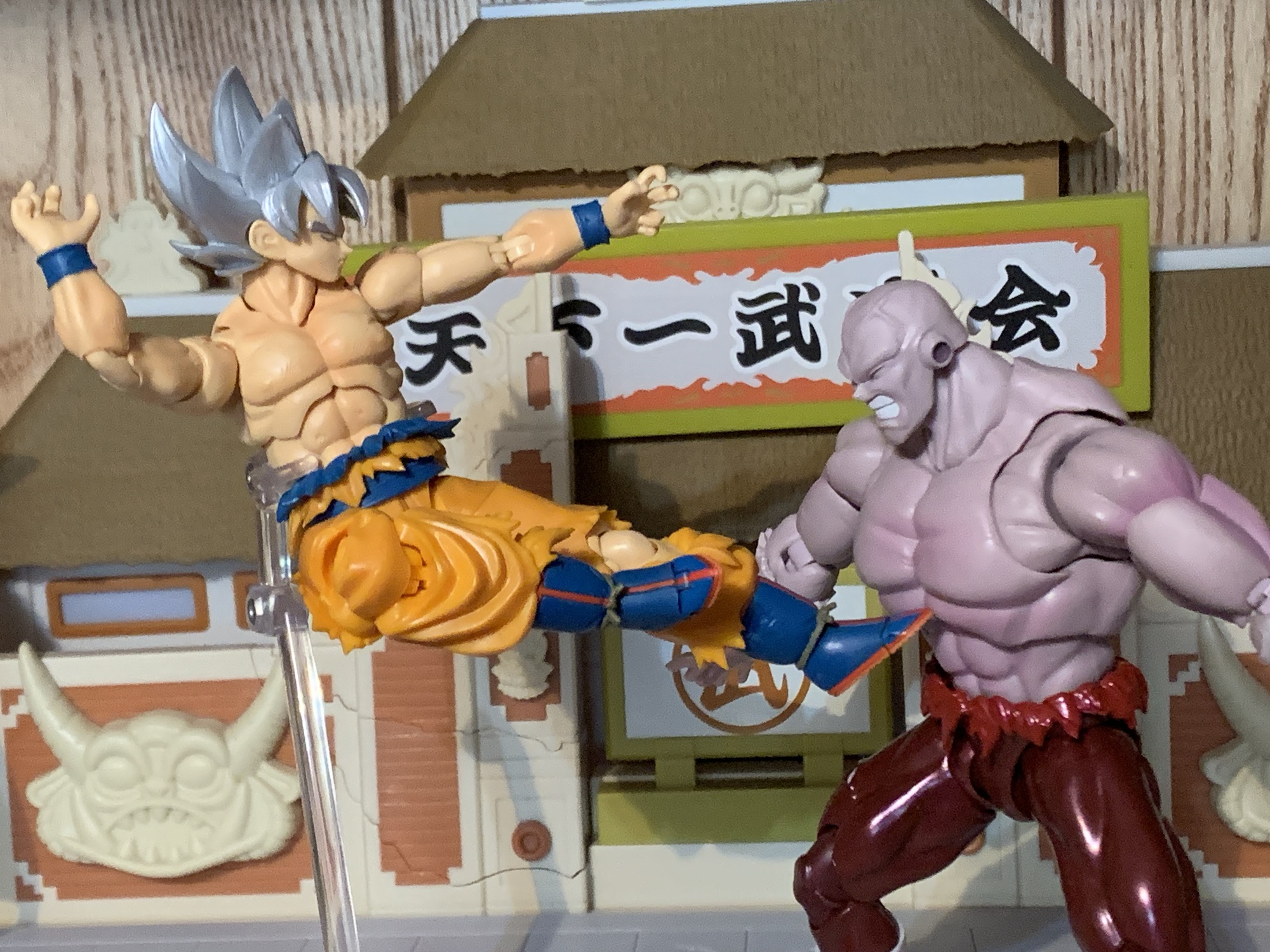
He’s destined to battle Goku for as long as both are on my shelf.
The selling point with Jiren is not the paint, but the sculpt. This is a big, beefy, boy. He’s really not extremely tall by SHF standards. He comes in at roughly 6.75″ making him noticeably taller than Goku, but he’s still shorter than a figure like Nappa or Orange Piccolo. What really stands out is just the bulk. Jiren has this huge, puffed-out, chest that really captures the look of the show’s art. If I have one consistent criticism with this line it’s that the chests on most figures aren’t big enough. They’re usually plenty broad, but view the figure from the side and it’s like their pectorals are nonexistent. It’s almost like they just drew their muscles on with a sharpie. Jiren does not suffer from that which makes him an interesting figure to look at and handle. I love chunky figures, and Jiren certainly fits the bill. His arms are massive as well and while his legs look small by comparison, they’re still thicker than Goku’s. I may not love the character design, but it would be hard to argue that Bandai didn’t nail what was presented to them.
Tag! You’re It!
I was pretty disappointed with how the Trunks figure had a bunch of accessories cut. With Jiren, that’s not a problem. He seems to have retained everything from the standard release including all four portraits: neutral, teeth-gritting, yelling, and a closed eyes with teeth gritting. The closed eyes head captures his frustrations when he finds he’s being overpowered late in the fight and also works as an expression for when he’s taking a blow on your shelf. They look good and the only aspect of them I don’t really care for is the thin, white, outline around the eyes. It makes it look like Jiren just has massive pupils, but when I look at stills from the anime it sure looks to me like he’s supposed to just have big, black, eyes. Any other colors are just shading and trying to create the illusion of a somewhat reflective surface.
I was surprised by the double-ball peg wrist joints.
For hands, Jiren has four sets to choose from: fists, clenching, chops, and splayed open. For his left, clenching hand, he also has an effect part. It’s basically a little handheld fireball and it’s made out of translucent orange plastic. There’s an indent for that specific hand which allows his thumb to slot into it so he gets a good grip on it. You don’t need the indentations if you just want to stand him with his palm pointed up holding it, but if you want to pose him like he’s going to throw it then you’ll want to stick it in his left hand. It’s always good to get an effect part, but it is pretty small and not something likely to stand out on your shelf. As was the case with Trunks, what we’re really missing is just an aura effect to pair with this exclusive paint job. A red aura makes too much sense here, but Bandai didn’t want to throw one in. He already cost $75 so I guess I can’t be too upset about the omission as I doubt I would have been willing to pay much more than that for a character I’m lukewarm on.
Looks like you missed, Jiren!
A bulky body presents challenges for anyone looking to cut it up and apply articulation, but it’s something the folks at Tamashii Nations are pretty adept at. Jiren’s torso is certainly cut-up for articulation, but not distressingly so. There’s no gapping at the base of the neck and he gets decent range there. The heads pop off very easily, but at least they go on just as easil, as they use that drum setup we’ve seen with figures like Krillin and Nappa. His shoulders are on big, butterfly, joints and they get okay range come across the chest, but that chest is so big that it can only do so much. It doesn’t go back really at all which is more disappointing than the range going forward. Range at the shoulder otherwise is fine and you get a bicep swivel, double-jointed elbow, and ball peg wrists. The double-ball peg wrist was a surprise as normally they use a ball hinge. It functions well enough, but if you want to get the most range you’ll have to accept a gap between the wrist and hand.
And now Jiren must pay the price for failing to land a blow.
The torso features what I assume is a double ball peg in the diaphragm. It’s mostly for tilt forward and back as there’s really no rotation. You get a little of that at the ball-jointed waist. Between the two, the crunching forward and back is nice and you get just enough rotation to make it work. This hips go out to the side almost to a full split and kick forward 90 degrees. He does have a sculpted ass so there’s nothing going back unless you kick the leg out to the side. The figure has thigh swivels, but mine won’t budge. I don’t know if that’s a common issue or not. It could be caused by the new paint job since it seems like a thick coat which may have required some tiny adjustments to the tooling that weren’t made. Or I just need to hit it with a hair dryer. Double-jointed knees are fine and the ankles are hinged. They didn’t leave enough space for the ankle rocker though so it’s pretty limited. There’s also the customary toe hinge if you want it.
Oh the agony of defeat – better luck next time, bud!
Jiren’s articulation is probably going to be good enough. He’s meant for strong, powerful, poses and he has the capability of pulling off such feats. I wish the diaphragm joint allowed for some rotation. I think their old hinged-ball joint would have made that possible. More so, I’m disappointed in the ankle rockers as he has some pretty small feet relative to his size and not being able to get them flat on a surface in some stances can make keeping the figure upright a challenge. It’s enough though and the combination of sculpt, paint, and articulation makes this a worthwhile release. It wasn’t the re-release I was hoping for, but it’s not one I regret buying. He fits in nicely on my shelf opposite Goku and now I kind of want a proper Dragon Ball Super Frieza to add to the confrontation. It looks like Bandai has taken this listing off of their website as he was available in February as an in-stock item, but that doesn’t mean he sold out. They may be holding back stock for in-person sales at conventions and pop-ups. For that reason, it may not be terribly expensive on the secondary market. If it’s a figure you feel like you need, then I do recommend tracking it down. If it only retails for a small markup then I’d consider it worth it as I don’t think we’re ever going to get another Jiren. What is out there is likely all that ever will be.
For more Dragon Ball Super action figure reviews look no further:
It’s sort of interesting to me that the first Dragon Ball action figure I review after the passing of creator Akira Toriyama is one based off of the artwork of his protege – Toyotarou. Toyotarou basically lived the dream of fanfic artist and writer turned official. It’s rumored that he worked on the fan-fic manga…
Our last look at an S.H.Figuarts release was the Dragon Ball GT Super Saiyan 4 Goku. Now, we look at a figure from the series that effectively replaced GT: Dragon Ball Super. And perhaps the most popular villain from that new series is Goku Black. Without getting into spoiler territory, Goku Black is basically an…
When Akira Toriyama set out to draft the plot for Dragon Ball Super: Super Hero his original goal for the film was to take a favorite character of his and give him an upgrade. That character was Piccolo who had basically been left behind by the likes of Goku and Vegeta way back at the…
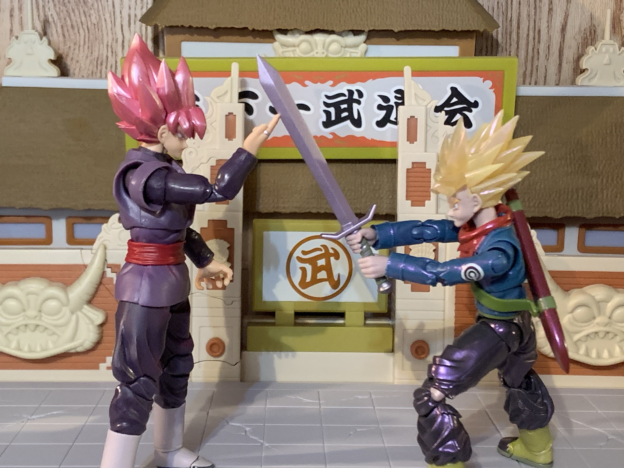
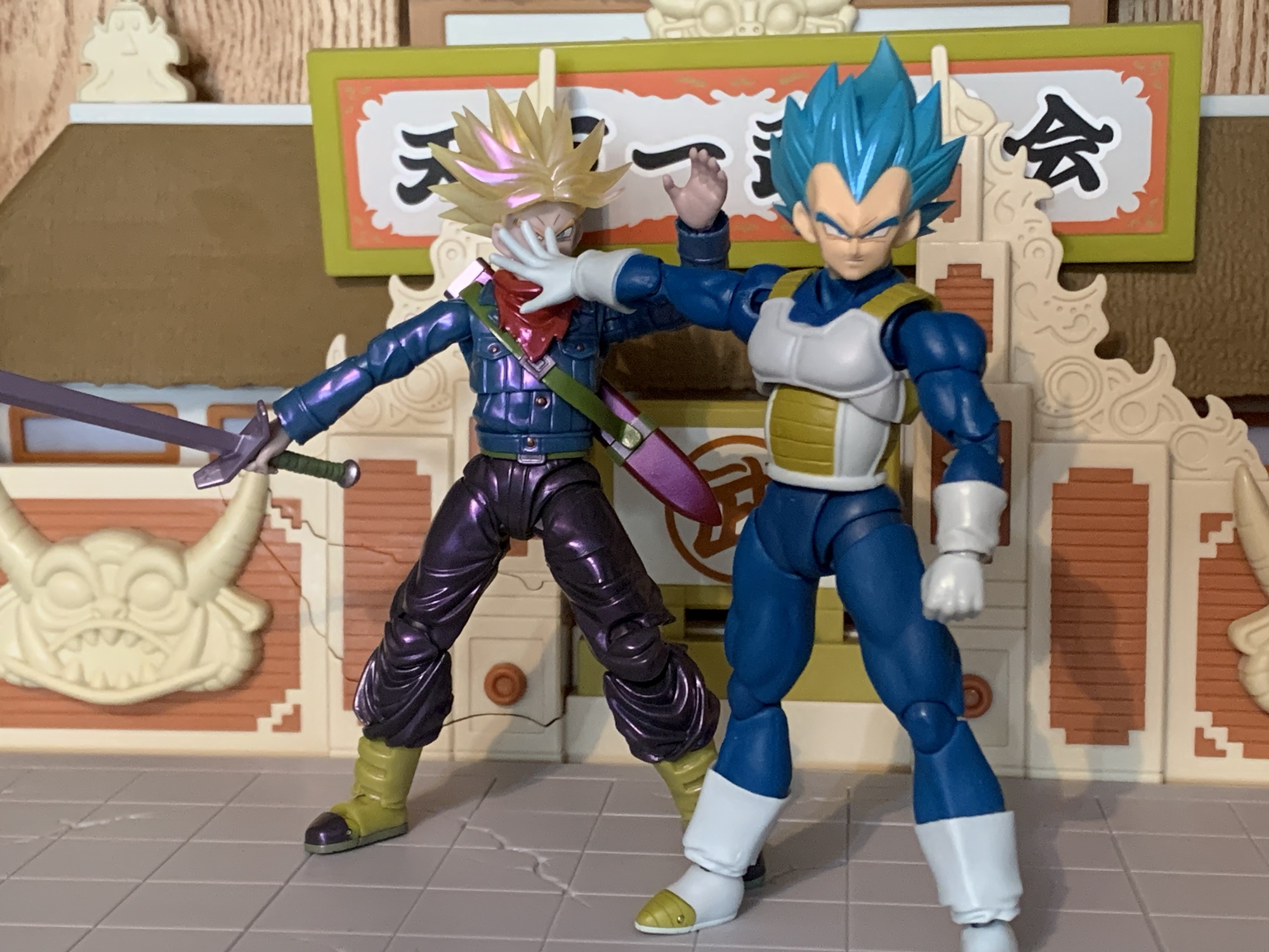
Trunks is back from the future and needs help cleaning up yet another mess.
When looking back on the anime adaptation of Dragon Ball Super, I think my favorite arc is the Future Trunks/Goku Black one. It does get messy at times, and like most things Dragon Ball it goes on longer than it needed to, but it had some real, emotional, stakes which isn’t often found in Dragon Ball. The time travel stuff is always a ton of fun and Dragon Ball has its own spin on how time travel works with new wrinkles introduced in Super. And it marked the return of fan-favorite character Trunks, the boy from the future. The future version of Trunks is much different from the younger one in the main timeline. That Trunks has had a relatively carefree life (though he technically did die once) whereas the future counterpart has only known hardship. And he’s basically just another son seeking his father’s approval, but he just so happens to be the son of Vegeta, not the sort of touchy feely dad. The saga provided some closure there, and unlike the Cell arc from Dragon Ball Z, Trunks got to be the hero of his own story as opposed to sitting on the sidelines waiting for someone else to take down the big, bad, guy. Though he still needed an assist from God.
I liked this version of Trunks so much that I even got the Dragon Stars version. It’s the only Dragon Stars figure in my collection to this day.
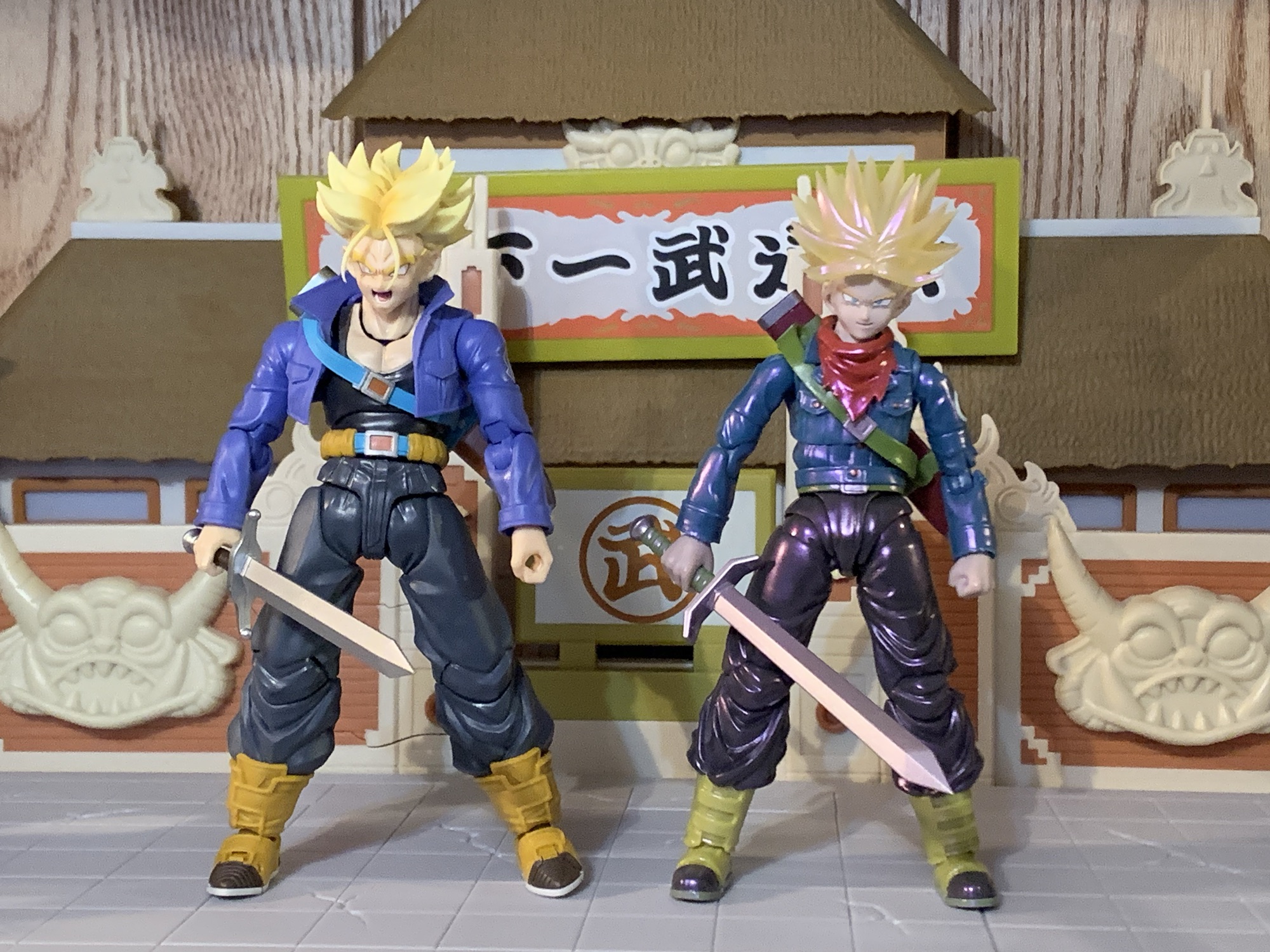
It was years ago that Bandai and Tamashii Nations released the Super version of Future Trunks in the S.H.Figuarts line. 2018, to be exact, and at a time when I wasn’t collecting this line like I am now. Even so, I considered getting it, but it seemed pretty pricey to me at the time. I had not yet been conditioned to the SHF pricing model (some would say that’s a good thing) and I decided not to get it. As you can probably guess based on where this has lead, I ended up regretting that decision. The figure is even more expensive now on the secondary market as it has never been re-released. And perhaps worse, the secondary market can be tricky to navigate when it comes to a figure as old as that one because bootlegs are a real problem. And since it’s an older figure, it’s also a bit dated and spending the extra coin in today’s dollars might just leave me with a serious case of buyer’s remorse. No, instead I’ve opted to bide my time in hopes that Bandai would return to Trunks. He is, after all, a fan-favorite and probably a safe bet to sell well. It’s just a question of whether or not the Super version is as popular as the one from DBZ.
The height is okay, but damn is Trunks tiny next to Goku and Vegeta.
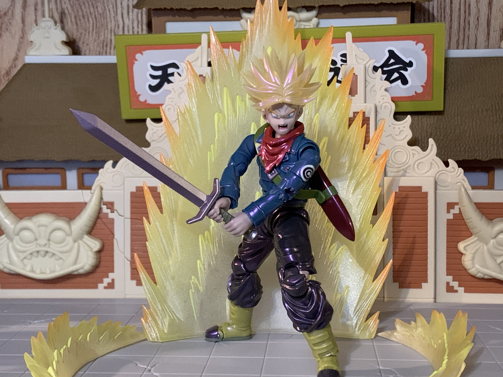
2024 ended up being the year where my patience paid off. Maybe. Future Trunks was announced as a convention exclusive, but like most exclusives, it meant he was going to be a variant of the original release. To be specific, this is considered the Gallick Gun edition. Trunks has adopted one of his father’s signature moves and with it comes a purple aura. To achieve this effect, Bandai gave Trunks a coat of pearlescent paint with a purple hue to it. They also went with the translucent Super Saiyan hair which they’re rather fond of when it comes to convention exclusives. I didn’t love the look, but it wasn’t going to be a deal breaker. What bothered me more than the new deco is the cut in the accessory load-out. Gone is the standard Trunks head even though he can certainly perform the maneuver when not in his Super Saiyan form. Worse though, is the removal of the Hope Sword. In the anime (spoilers if you have yet to watch it), Trunks has his sword break while battling his foe. When all hope seems lost, Trunks basically creates a Spirit Bomb out of his broken sword. The effect part was this big, translucent, blue, sword that I think even necessitated its own stand. It was pretty awesome in the show and seeing it in figure form was a huge draw to that original figure for me. Having that get cut, plus an MSRP of $75 for this new version, really soured me on it.
And he’s even tiny next to…Trunks!
So I didn’t get it. What? But this is a review for that figure, you’re probably saying to yourself as you read this. Yes, obviously, I changed my mind. The regret of passing on that original figure was pretty hard to get over and still is. I didn’t preorder this figure, but unlike in past years Bandai apparently made more than what was ordered. Future Trunks was stocked after the fact on their webstore along with some other exclusives, and to make it even more enticing, Premium Bandai ran a free shipping promotion on its website for a week. And damnit, they got me. They got me for the Vegeta we looked at last week, they got me for the Trunks we’re looking at this week, and damn near got me on the Mini Goku, but I figured I was already giving them enough of my money. Now that I have paid for this figure, it’s time to sort out some feelings.
The paint job here is trying to sell the idea of an aura around him. Problem is, I don’t have the right color or know if they even make one in the proper shade.
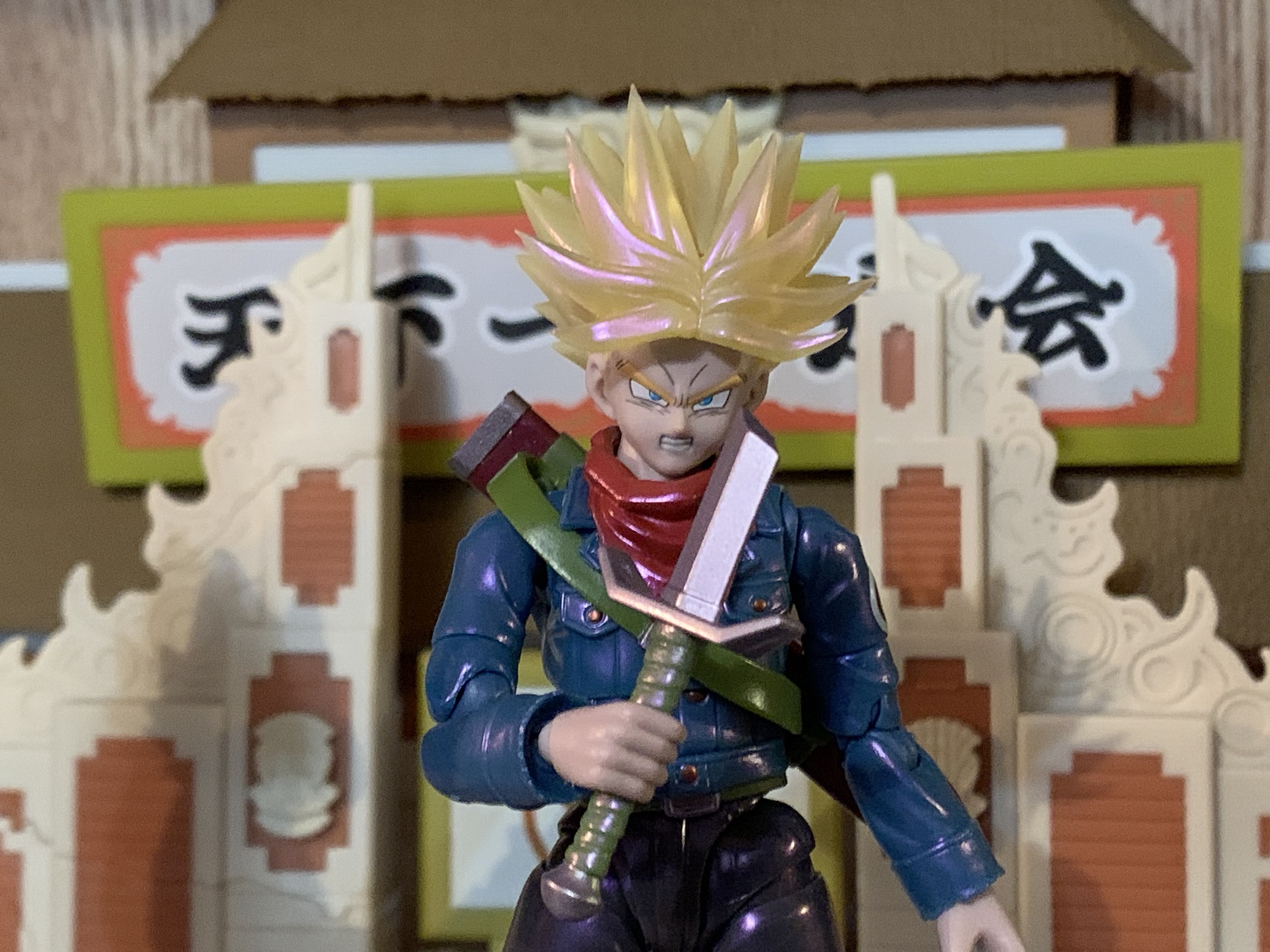
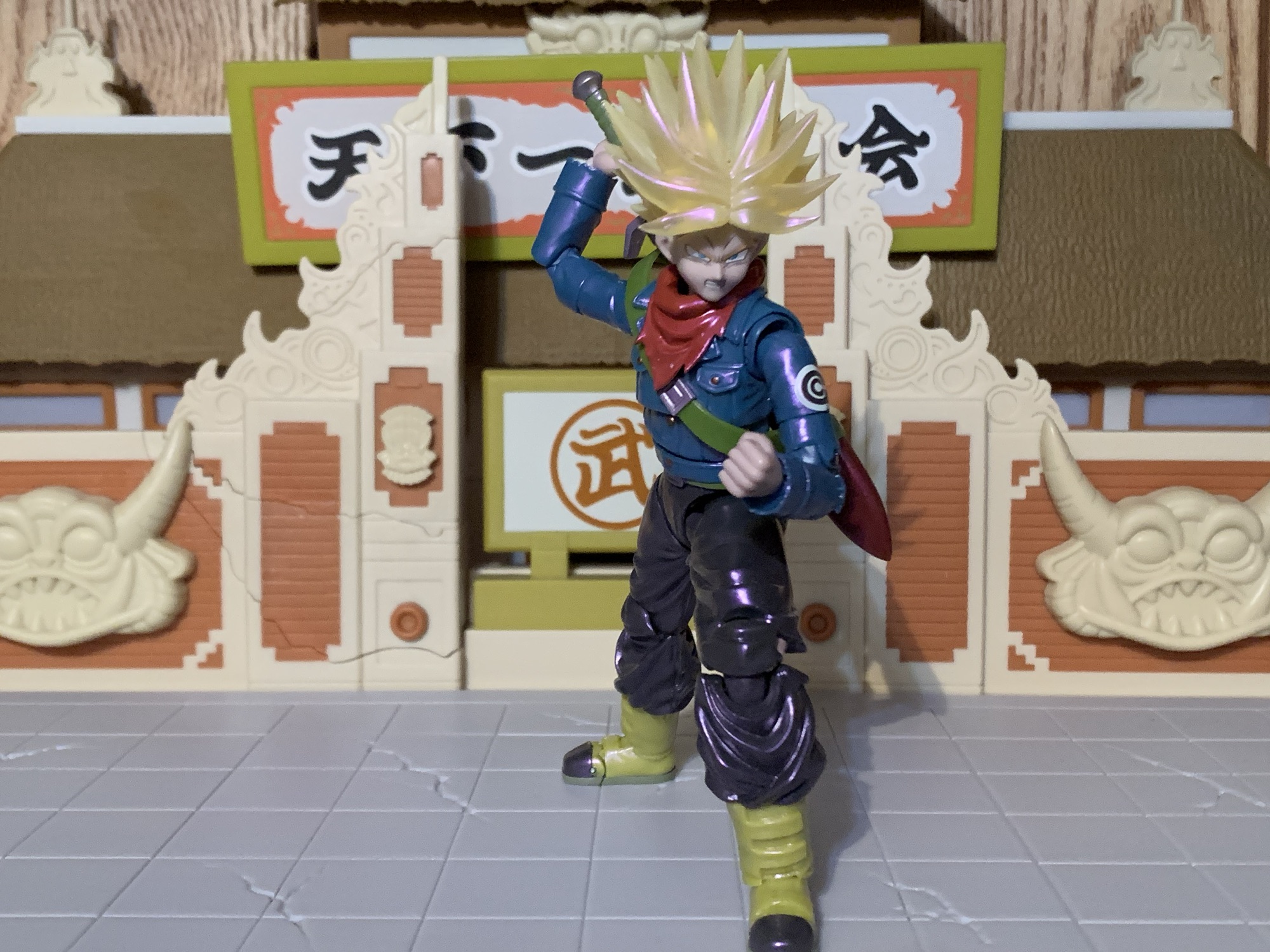
Future Trunks comes in the event exclusive style box which, in this case, goes for a black and pink color combo. I’m surprised they didn’t go with more of a purple considering the theming, but whatever. It’s just trash to protect the figure inside. Trunks is, as advertised, in his Super Saiyan form and stands approximately 5.25″ to where I assume the top of his head would be with his hair extending far beyond that. Out of the box, he won’t have his scabbard across his back and to put that on you will have to remove his head. It’s not really one of those SHF heads that’s designed to come off and go back on easily and the spiky nature of his hair doesn’t help things. I went ahead and dunked him him in some hot water to make it easier. You will also likely need to remove the scarf piece that’s around his neck which tabs into the chest. The scabbard can then slide over an arm easily enough and there’s an extra tab hole behind the right shoulder to secure it in place, though it isn’t really necessary.
The Gallick Gun pose – it’s kind of goofy, but it’s what Bandai chose to hone in on with this edition.
It should be stated that this version of Super Saiyan Trunks is what some fans have dubbed Super Saiyan Rage. Trunks, during his battle with Black, taps into another fountain of power through sheer rage. His hair sticks up higher and becomes even spikier than usual similar to his Ultra Super Saiyan form from Dragon Ball Z, only this time it comes without much added bulk. His eyes do white out and his yellow aura develops a blue core which seemed to signify to the viewer that this was similar to Goku and Vegeta’s Super Saiyan Blue. It’s also seemingly just as powerful as he’s able to go toe-to-toe with Black in this form. It is an anime only thing, so who knows if Toriyama considered it canon, but Gohan’s Beast form sort of follows in its footsteps as a form that’s unique to half-saiyans.
We have a few charging effects in this line, but we’re really lacking in the beam department.
Bandai got the hair right, but not much else when it comes to the look. The outfit is all there and fairly accurate. Trunks has a more traditional jacket than the half one he used to sport and his pants are pretty much the same as they’ve always been. The figure though is just very slight. Put the new Vegeta next to him and they look like they’re two different scales. The height is okay, but the face, the arms, the torso – they’re all narrow and thin which isn’t something I see much in Dragon Ball. Place him beside the somewhat recent Future Trunks from the DBZ line, and it’s even more stark. That figure looks like it’s the more mature fighter, not this one who should be much older. Some of that is likely due to the jacket being all part of the sculpt. There isn’t a body underneath an overlay. It makes for a clean presentation, especially compared with the somewhat janky recent Future Trunks, but it definitely slims the profile. In order for Trunks to exist under this jacket, he’d have to be around 100lbs. He would be a very small man, which is not befitting the character from the show.
He’s still carrying that old blade. Well, actually, it must be a different one since he’s broken them before.
Aside from that issue, and it’s a rather big one, Trunks looks okay. The portraits have been given some enhancements and they’re nice and crisp. The paint on the body is clean and this new finish seems to achieve what it’s going for, whether I subjectively like it or not. The translucent hair is still kind of a sore subject for me. That might be going too far, but I don’t prefer it to painted hair. I think the best would be to go with a pale yellow and then a shiny coat of paint over it. The hair is coated like the rest of the figure so it has a shiny quality to it. I know it’s supposed to be the result of an aura, but it mostly reminds me of soap bubbles and the colors that dance around on their surface. It is what it is and I don’t hate it, it’s just not an improvement over what we had before. And since he doesn’t come with an aura effect to go with it, it does feel incomplete to me.
Silly boy, you can’t stop a god with a knife!
I’ve already mentioned how accessories were cut for this re-release, so just what was maintained? Well, for starters we get four portraits: smirk, teeth-gritting, yelling, and yelling with a side eye. They’re fine, but what’s missing is just a stoic, or grim, expression which is the expression I think of first when it comes to Future Trunks. I don’t think we really need the smirk, to be honest. And it would have been awesome if one of the yelling heads had whited-out eyes. For hands, we get a set of fists, gripping, splayed open, clenching, and one left, relaxed hand. I think the relaxed hand is here for him to hold his scabbard, though I don’t know for sure since it’s not in any of the pictures. The right, clenching, hand also has a hole in it and it’s for the effect part which is a little, translucent, purple, energy ball. It comes on an acrylic post that’s maybe a third of an inch long and it pegs into the hand via a ball socket. This is for his Gallick Gun charging pose which is one awkward pose. I guess Vegeta couldn’t have a Kamehameha stance so he does this thing where his palms are always pointing out as he charges the maneuver with his hands together. It’s achievable, but weird looking. Maybe that’s why he pretty much stopped doing it in favor of other attacks?
I warned you.
Lastly, Trunks has his trusty sword. We get two versions: regular and broken. The broken one serves a narrative purpose, but also it’s easier to slot into the scabbard. The hilt is painted green while the blade and pommel are silver, but like the figure itself, there’s a hit of pink on the blade so it matches the whole aura theme they’re going for. And like the DBZ counterpart, the pommel comes off so the sword can slide into the gripping hands. It only goes on one way, which is a bit annoying when you’re fiddling with such a tiny thing, but the figure gets a very tight grip on the handle. Almost too tight as it takes some elbow grease to get it out of his hands once there.
Everybody talks about the Father-Son Kamehameha, but what about the Father-Son Gallick Gun?
One area with this figure I have little to complain about is the articulation. Since the figure doesn’t utilize an overlay for the coat, all of the articulation is cut right into the figure and since the scabbard is secured via a sling, it doesn’t fall off constantly. The head is on a hinged ball peg, which I hate, but it does function fine. The scarf will limit his range though, and while it is removable, it leaves behind a giant hole in his chest so that’s not really a viable solution. Shoulders, biceps, elbows, and wrists are all standard stuff. The figure does have butterfly joints in the shoulders and they work well enough coming forward, but offer nothing going back. There’s a joint in the mid-torso that pivots a bit side-to-side and allows for some forward and back. A waist joint is where you’ll get most of your rotation and he can crunch forward and back thanks to it and the hips. Since this is an older release, he doesn’t have those annoying, sculpted, butt cheeks. Mai may be disappointed, but it allows for full splits going forward and back. Out to the side, you get about 45 degrees. If you can find a way to get the caps in his hips to slip over or under the thigh swivel then you may get more, but it’s hard plastic and not very forgiving. Beyond the hips, Trunks kicks forward well and the thigh swivel affords some pivot. The knees and ankle hinges are fine while the rocker is limited. There’s also a toe hinge if you want it.
How I imagine it would look to be in the presence of the Father-Son Gallick Gun.
I don’t want to overstate the articulation here. It’s not elite or anything by the standards of the line, but it’s functionally sufficient. Trunks can hit all of the Trunks poses well enough. He can hit his downward swing, jab, or have his hand on the handle while the blade is in the scabbard. It will work, and what holds the figure back is not the articulation, it’s almost everything else. The paint job is executed well enough. It’s something you either like or you don’t. The sculpt is dated and not true to the character. He may look off when posed with the new Vegeta, but that Vegeta sculpt is actually just as old. His proportions were never right and this is a version of the character begging for a redo just like the DBZ version received. The reason to get this figure is if you really like the character and feel better paying $75 for it as opposed to the $120 or so you’re likely to pay for a secondhand version of the old figure. That figure will have more stuff and a more true-to-the anime paint job, but will have all of the same problems as this one plus the older face printing. And if you’re thinking of using the updated face plates with the old figure, it’s probably not going to work. The flesh tone here has a purple hue to it. It may not be apparent when looking at the figure by itself, but place it beside another character and it stands out. He’d basically look like poisoned Trunks if you tried to mix and match.
He’s still Trunks and he’s still cool, but he could be so much better.
Am I content with my purchase? I still don’t know. This is an obvious compromise for my collection. It’s a character I want in my display, but not the version of the character I would like. If I could get the older version for a hundred bucks or less then I would not have bothered. Both are compromised takes on the character, but the original less so. And that Hope Sword is pretty damn cool. If you have that old figure and decide to get this one too then you could probably use the depowered head on the new body. The necks won’t match, but the scarf will hide it if you want. The only reason to do that though is if you really like Future Trunks. This version is okay, but not what I want. I would have much preferred they just give him a blueish hue and make him Hope Sword Future Trunks. At the very least, he should have his own aura to go with the Gallick Gun. A Hope Sword Trunks could have created his unique yellow and blue aura and would have looked way cooler. Plus such a display would lend itself well to being off on its own in a different part of your collection making the size issues less of a concern. Oh well. If you’re like me and really regret passing on the Super version of Future Trunks, I guess you may as well grab this one if you’re okay with the price. Once it’s gone though (and it’s no longer being offered on their website, but it may be making the convention and pop-up store rounds) I wouldn’t entertain paying so much as a dime more than MSRP. Hopefully, something better for Future Trunks is in our future.
If you like Trunks or are just really into Dragon Ball Super then you may like checking out these reviews:
In the waning days of Toys ‘R Us, I found myself at one of the nearby stores in need of something. What that something was, I don’t recall, but since everything was hitting clearance I had a look around the store. TRU had started carrying the Bandai/Tamashii Nations S.H.Figuarts line of action figures which, at…
The most captivating character in all of Dragon Ball Z for me back in the 90s was unquestionably Trunks. The offspring of Bulma and Vegeta who traveled back in time to warn the heroes of the day about impending doom on the horizon was unique for many reasons. For one, he actually looks like a…
My isn’t that title a mouthful? This version of the classic character Goku comes to you from Bandai via New York Comic Con. If I were to simplify that title, I’d call it shiny Super Saiyan Blue Kaio-Ken Goku, which is still pretty wordy. I guess blame Dragon Ball creator Akira Toriyama for the obsession…
I guess we’re making the first week of March Vegeta Week here on The Nostalgia Spot, and why not? He is royalty, after all. This one should be a short one since we’ve looked at this figure before. Multiple times. Bandai has been able to extract a lot of value out of their Super Saiyan Vegeta mold which I believe was an early 2.0 body for the S.H.Figuarts line. It was also the first figure in the line I got way back in 2018. It’s funny to look back on how smitten I was with that figure and now I look at it and seem to only notice the flaws. What has at least held up over the years is the overall look of the sculpt, which is good since Bandai hasn’t really changed it. It’s not perfect, but obviously good enough for me to keep buying it. I now have four versions of this figure, plus two more that also share some parts. For awhile, I had just one Vegeta figure and now there are many, but since he is Saiyan royalty I guess that’s fitting.
Goku could use a similar upgrade.
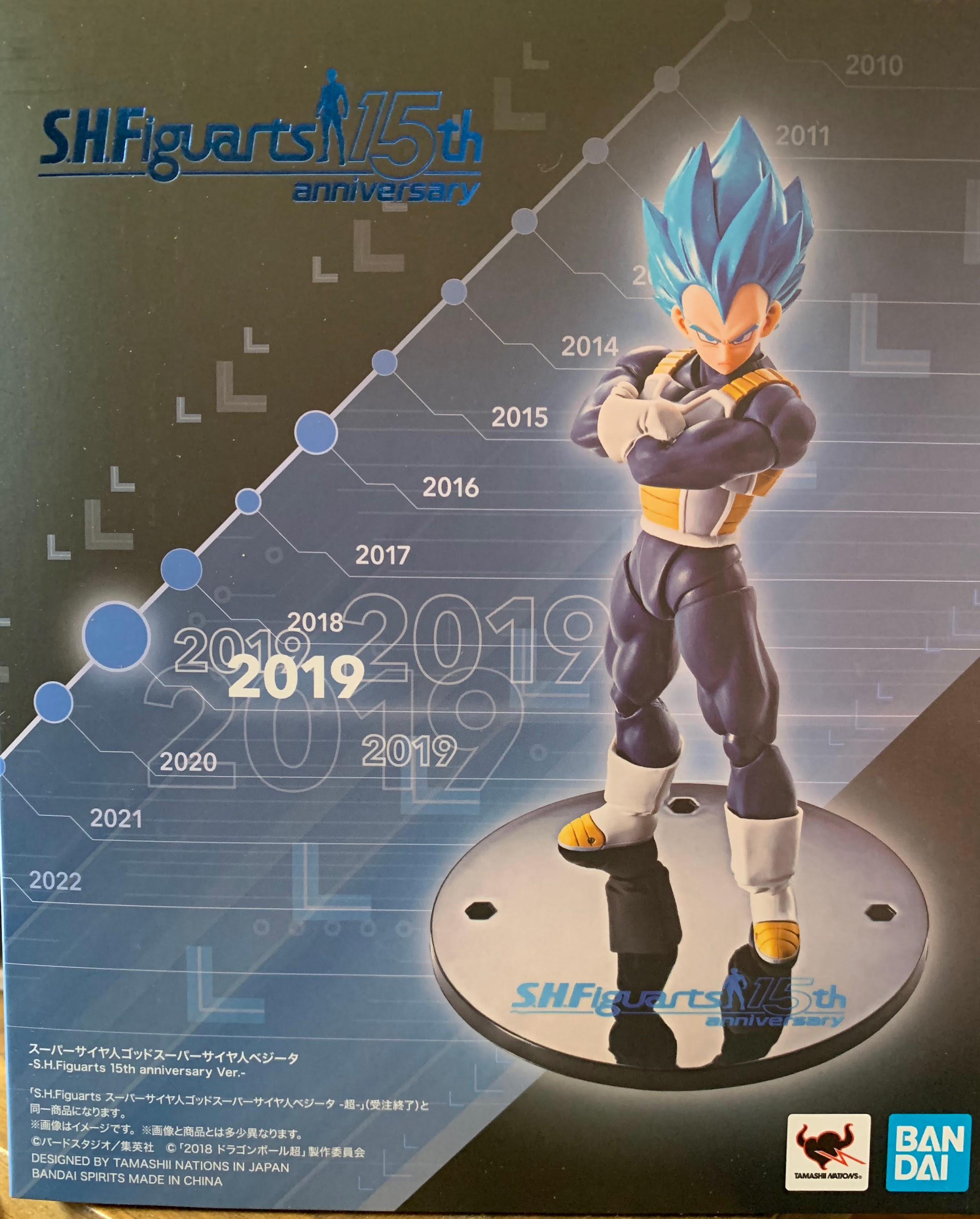
Much more recently, Bandai reissued it’s Super Saiyan God Super Saiyan Vegeta for the line’s 15th anniversary. That figure was one I had been hoping would see a revision because I had missed it back when it first came out and I have come to really enjoy the look of Super Saiyan Blue. I was, however, disappointed with the reissue because there were no updates to the original figure. In more recent times, Bandai has reissued figures aplenty, but always with improved face-printing. They didn’t do that for their special 15th anniversary figure and the result was a figure that looked dated. Fast-forward a few months after release, and we find out that another Super Saiyan Blue Vegeta is on the way and this one was ticketed to be part of the budget-friendly $35 subline. These are the figures shipped to brick and mortar stores that typically are of the most popular characters and are designed as an entry point for newcomers. Even though the price was far better than a lot of new figures in the line, I was still annoyed by the release since I had just spent good money on a lesser version. I got over it though, and when the Premium Bandai website was offering a free shipping promotion in February I decided to just grab this new Vegeta to seemingly right the prior wrong.
I have no shortage of Vegetas.
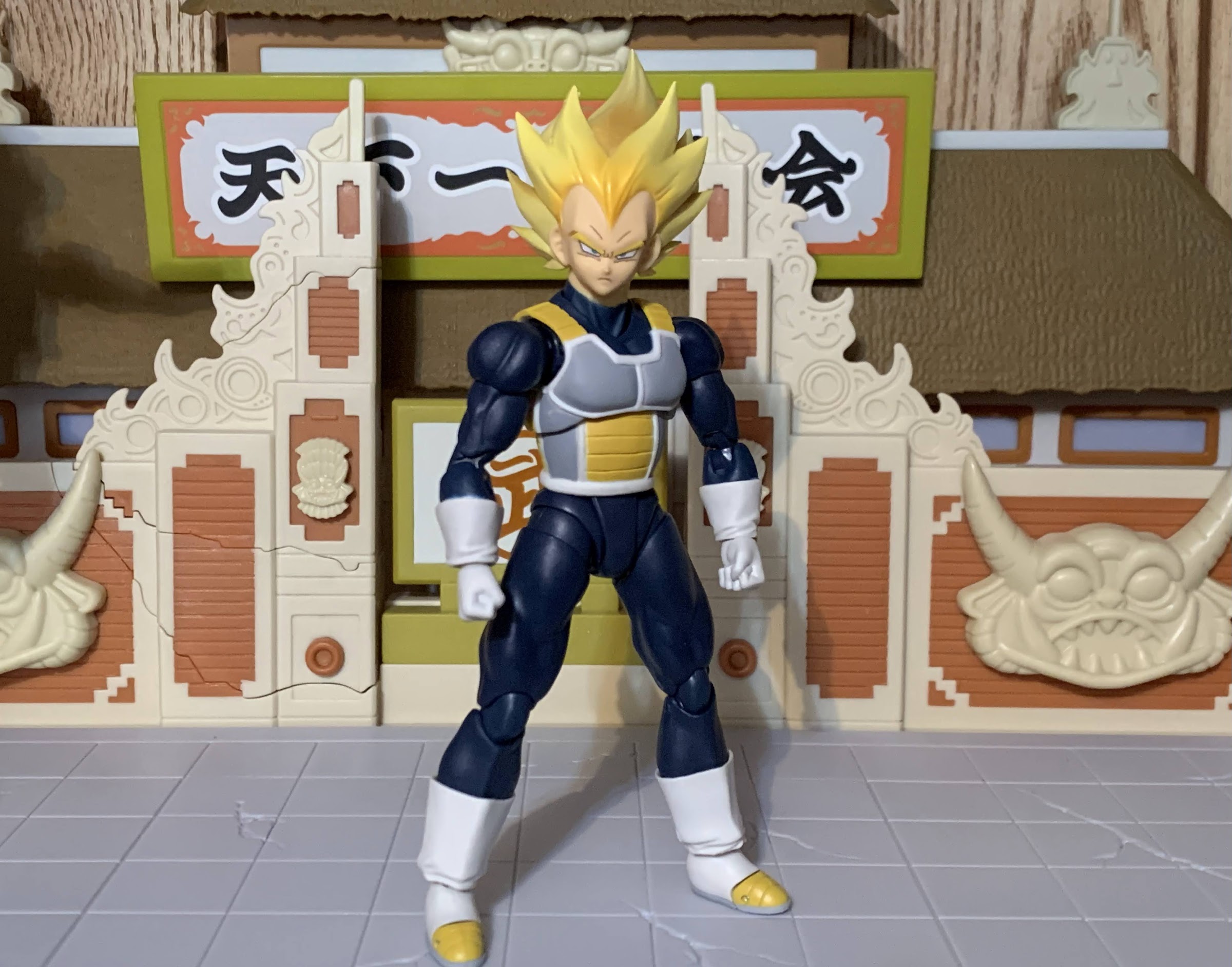
Dubbed Unwavering Saiyan Pride, this Super Saiyan Blue Vegeta is indeed very familiar. The body is exactly the same as the previous release, but the deco has been refined. The original was white and brown on the armor with a shade of blue for the bodysuit that bordered on purple. It’s a similar color to the manga. The re-release from a few years ago (which I didn’t bother to review) saw the blue altered to a more royal blue with the straps and plating on the armor lightened to a shade of tan. The white portions of the suit are a more off-white. This new Vegeta keeps the off-white while pairing it with a dull shade of yellow-brown that basically sits in between the prior two figures. The bodysuit is a new shade of blue with a touch more yellow. It reminds me of the ocean in the Caribbean giving it an almost warm feeling as opposed to the usual coldness blue imparts.
The faces on this one are so good.
This updated shade is likely here to play off of the new head sculpt. As far as I know, this portrait is entirely new. The shape of the hair is different from all of the other Vegeta figures I own. It fans out more which does seem to match his depiction in Dragon Ball Super – maybe we should think of this as a Toyotarou version? The hair is a light blue with a pearl finish. Like the body, there’s a touch more yellow making it lighter than the previous Super Saiyan Blue figure. It does help to give off the illusion of a radiating Vegeta and this figure would pair well with an aura effect.
He’s got the hands for a classic Vegeta stance, but those hips won’t let him go much lower.This pose makes me wish he had an effect part, but for 35 bucks one isn’t expected.
I like the overall approach by Tamashii Nations here, but the execution is a little suspect. I suppose it should be expected at the lower price point, but there’s no reason to skimp on quality either. After all, it’s the same company on the box no matter the price. Paint is a little sloppy in places and most noticeably around the neckline. The blue is fuzzy and my figure has a blob of brown on the back of the neck which I guess is from the armor straps. The edgework around the armor isn’t as clean as it could be, and like the recently reviewed Old Style Battle Clothes Vegeta, some of the steel in the right elbow joint is visible suggesting it was slightly misaligned during assembly. More annoying though is the miscolored parts as the crotch piece is a darker blue from the rest of the legs. I think this is caused by the crotch being a slightly harder plastic and the legs having a little bit of a wash applied to them. I don’t know how well it shows in pictures, but in-hand and under normal lighting conditions it’s pretty noticeable.
Maybe my least favorite expression of the bunch, but it still gets the job done.
What did turn out well though are the portraits. These are Bandai’s best Vegeta expressions yet and they alone are worth the upgrade. We get four expressions this time: stoic, yelling, teeth showing, and a smirk. Maye instead of stoic I should call this Vegeta Resting Bitch Face because he looks kind of pissed. He looks really ticked off with the teeth-gritting expression and the smirk is the perfect, cocky, Vegeta we all know and love. I love all three, while the yelling one is a bit more specific. It’s also longer as a result and looks a touch off to me, but not terribly so. The rest of the accessories are the same old, same old: fists, clenching hands, martial arts pose hands, open hands, and a right thumb gesture. He also has the old style crossed-arms piece that connects at the biceps. I didn’t bother to try it out this time because I already have it on two of my Vegeta figures, three including the Namek Vegeta.
“Step aside, boy, I’ll handle the rest.”
Articulation is exactly the same as the past Vegeta figures. The new head doesn’t function any better or worse and they’re still sticking with that annoying hinged ball peg for the neck. The hips are the most restrictive part of the figure while the hinged joint in the mid-torso feels welcomed after handling the last two Vegeta figures that lacked it. It’s mostly fine, but showing its age here. We could use a Vegeta with better butterfly joints as well as better hips. The ball peg ankles also need to be fired into the sun.
Kick that imposter’s ass, Vegeta!
Is this a figure that’s worth $35? Absolutely. It’s not perfect and some aspects of it are dated, but compared to other brands at this or a similar price and it’s still damn impressive. It gets right what it needs to and that’s the color pallet and the expressions. This is probably the best Vegeta figure yet unless you really like Super Saiyan 4. I prefer a more traditional Vegeta and while Super Saiyan Blue might not be anyone’s idea of traditional, I do think the guy looks good in blue so if I had to get rid of all of my Vegeta figures but one this would be the one to keep. I do think we could do with an update and hopefully Bandai is willing to go beyond the anime and give us Vegeta figures from later in Super. Those would present an opportunity for something new. They also haven’t done his maxed out blue from the end of the anime. Perhaps an ascended Super Saiyan Vegeta on a new body could be in the cards? That would lend itself well to redos. We’re also getting a new base form Vegeta via the Dragon Ball Daima line this year and I’m interested in checking that out. For now though, I’m happy with this Vegeta and glad I didn’t pass on it. Even if I now have a small army of Vegetas.
When a toy line is as long in the tooth as Bandai’s S.H.Figuarts Dragon Ball Z line, producers tend to start looking in all of the various crevices of the property for new material. We recently looked at a figure that did just that in Mecha Frieza, a version of the chief villain of the…
To celebrate the 15th anniversary of the Bandai/Tamashii Nations action figure line, S.H.Figuarts, Bandai turned to the fans. There was a large roster of releases eligible for re-release to mark the occasion, and anyone who wanted to could cast a vote for their five favorites. The winner was, not surprisingly, Vegeta. And in particular, it…
We’re back with another action figure review from everyone’s favorite version of Dragon Ball: Dragon Ball GT! And really, the only thing people remember from Dragon Ball GT is the Super Saiyan 4 transformation. Designed to bring the Saiyans back to their more primal roots, the Super Saiyan 4 transformation is pretty much on an…
It’s sort of interesting to me that the first Dragon Ball action figure I review after the passing of creator Akira Toriyama is one based off of the artwork of his protege – Toyotarou. Toyotarou basically lived the dream of fanfic artist and writer turned official. It’s rumored that he worked on the fan-fic manga Dragon Ball AF, though I don’t know if that’s ever been confirmed or refuted, and he was the artist and writer for Dragon Ball Heroes: Victory Mission. All of this work within the Dragon Ball universe must have put him on Toriyama’s radar for it was he who selected Toyotarou to be the artist for the Dragon Ball Super manga.
This figure comes in a much larger box than usual.
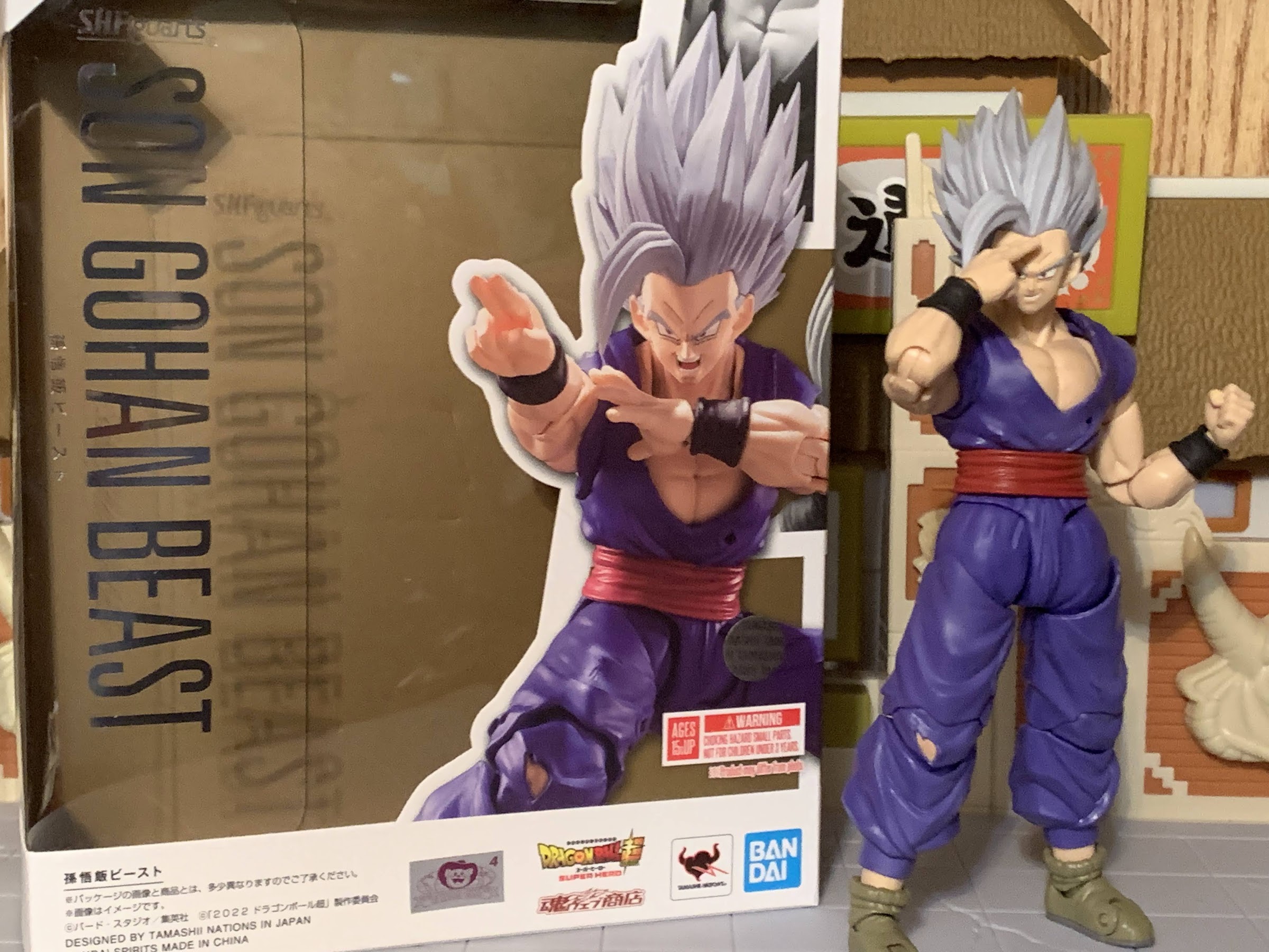
As a celebration of Toyotarou’s contributions to Dragon Ball and to also celebrate 15 years of S.H. Figuarts Dragon Ball releases, Bandai decided to release this special Toyotarou edition of the previously released Ultra Instinct Son Goku figure from Dragon Ball Super. The figure has been outfitted with new face plates to better reflect Toyotarou’s art style, which really isn’t all that different from Toriyama’s. The main feature seems to be narrower eyes which have a different sharpness about them. Toyotarou was also able to influence the expressions we have here and the figure received a slight re-deco to more reflect the colorization of the manga vs the anime. To cap it off, this release comes in an oversized box which also includes a book. Titled the Dragon Ball S.H.Figupedia, it catalogs all of the figures released in the line and also includes some short interviews and quotes from the people who are closest to the line. The only omission of note is Toriyama himself which is a bit of a shame. Maybe Dragon Ball action figures just weren’t his thing?
And the box is much larger than usual because it has this book all about the S.H.Figuarts line.
The figure itself is a reissue so it’s going to be pretty familiar to anyone who has the old figure. It’s also familiar to really anyone who has purchased a Goku from this line. For me, I never got the initial figure and there’s actually a lot more “new” here than I would have expected. He does share a lot of parts with one of the Goku figures I have and that’s the Super Saiyan Blue Kaio-Ken edition. Both figures feature the same legs and arms, though for this figure the hole for the sleeves in the shoulder has been removed. The belt piece is different since it needed to include the tattered remains of Goku’s blue undershirt and the torso is completely different since this Goku is bare-chested. Basically every Goku uses the same hands and feet while the heads are obviously completely different. I believe the main hair piece is the same as before too, though it may have been modified for these new faces as these key-into the sculpt in a unique manner from what I’ve been exposed to.
There’s certainly new stuff here, but from the waist down these two figures are the same
Ultra Instinct lends itself well to simple, calm, posing.
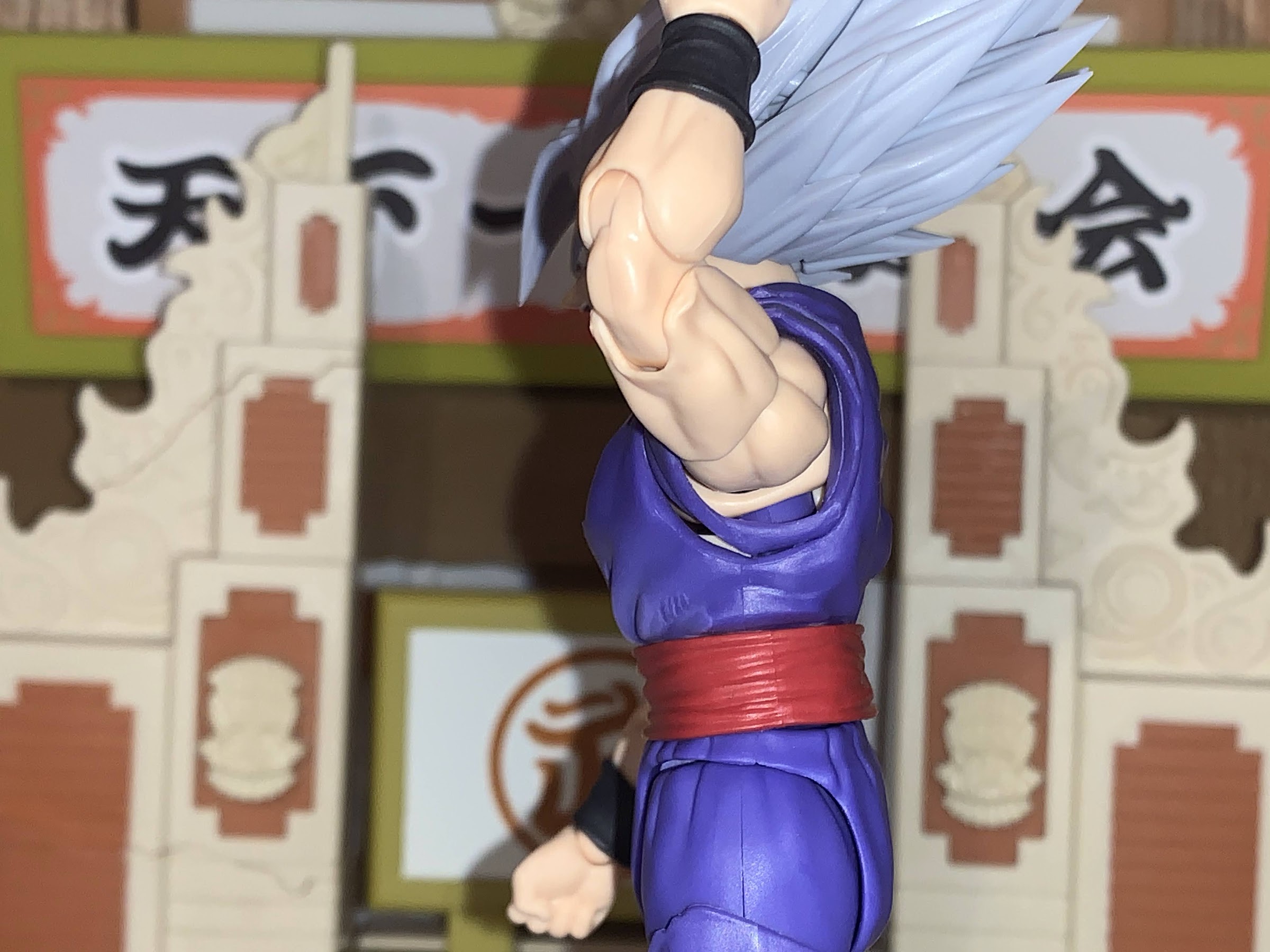
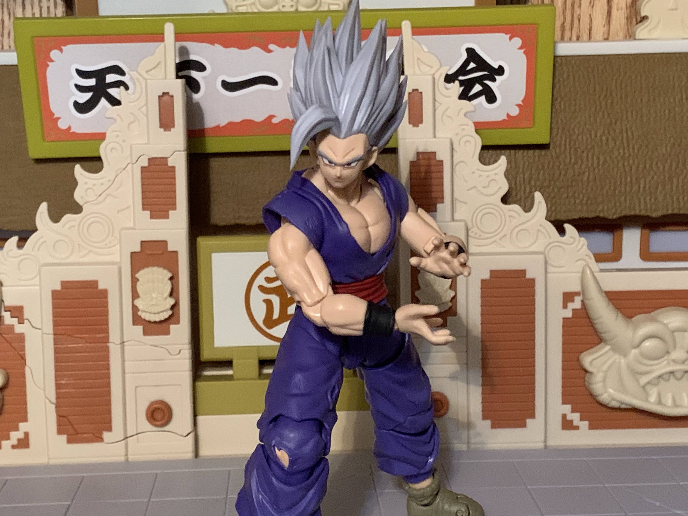
Goku stands at roughly 5.75″ to the top of where his head should be. The hair is a nice, pearl, silver and it’s an opaque piece of plastic, not translucent like some special edition figures we’ve seen. The ears on all of the faces are slightly larger as that is something Toyotarou feels is a part of his take on Goku and I honestly wouldn’t have noticed if he didn’t point it out in the included interview. The facial details are very sharp and crisp as this continues to be a real strength for the line. The torso and arms have sculpted battle damage, but no paint to bring them out. There is a slight wash to the torso and shoulders, a soft pink or orange which does give the figure a nice bit of warmth. It’s not on the rear of the torso which looks cold as a result. There appears to a hint of a dark wash to the pants which I mostly notice in the crotch and at the tips of the frayed parts. Otherwise, paint is mostly reserved for the wrist bands, boots, and some of the exposed flesh of the legs. The colors match well throughout and I am still quite fond of this torn gi sculpt. All in all, a nice looking version of Goku.
I’m really digging this eyes closed portrait.
They never stood a chance.
The different faces and hair help to bring this figure to life. Out of the box, Goku has the silver hair that most resembles the shape of his natural hair, but he also has a windswept version to swap to for action shots. Both look very nice and it will be hard to settle on a display for very long. His default face is a stoic one, but he also has a yelling portrait, side-eye, clenched teeth, and an eyes closed option. The eyes closed option is pretty damn cool and suits this form rather well, though it’s hard to turn-down how expressive the opened eyes are. I’m not normally into the side-eye options, but this one is like a glare. Whoever is getting the side-eye treatment from Goku is really pissing him off. For hands, the usual assortment is at play here: fists, martial arts posed, Kamehameha, and open. Nothing really special there and no effect part was included. That’s the only downgrade from the initial release which had a charging blast effect. It would have been nice to get one of those, though we have received quite a few of late. Really, a new aura would have been awesome as Ultra Instinct has this thick, almost syrupy, silver aura at times in the anime. It would have been fun to see Tamashii Nations attempt that.
The wind swept hair is a nice touch.
Maybe I should have grabbed Jiren after all so this Goku would have someone to battle?
The articulation for this Goku is virtually the same as the many other Goku figures we have received over the years save for the most recent Legendary Super Saiyan version which is on an all new body. I’ll link to some at the end of this entry if you want the full write-up, but suffice to say it all works just as well here, if not better. And it’s only better because there’s no shirt to have to deal with, but that was never a huge hindrance anyway. He actually can’t bring his arms across his chest any better than other figures and maybe a touch less. You just don’t have the sleeve flaps to fiddle with which is nice. I also can’t tell if there is a hinged peg setup in the diaphragm or if there’s just a little play on joint itself. It doesn’t lift as high as the other Goku figures, if so, but the clearance is fine and you get some forward and back articulation. It’s a well articulated Goku and the only things I dislike is the hinged ball peg at the head and the ball peg ankles.
Goku’s determined face.
The included book is basically the flagship accessory for this figure. Is that better than a blast effect? Yeah, kind of. Only because the book is unique and pretty well done. There isn’t anything truly revealing in it, no earth-shattering details about the development of the line or anything like that. It’s mostly just a celebration of the line and the product shots inside are all from the various solicitations we’ve seen in the past. I was hoping for a tease or maybe a reveal at the end of the book, but there’s nothing like that in it. It basically includes up to the Mecha Frieza figure, which is about to be released, and nothing beyond that. In terms of figures that have been revealed, it’s already out of date, but it probably would have been impossible for that to be avoided unless they had prototypes available for photography well in advance of the solicitations. Perhaps they could have done something to future-proof it a little via concept art or renders, but it probably wouldn’t have made much of a difference. It’s fun to flip through and the quality is pretty standard stuff. It’s 143 pages and in full color. There’s a dust cover on it, though it is a soft cover book. I like stuff like this so this was a selling point for me. Some people might not care and want more out of the figure for 80 bucks.
The book should be pretty fun for those who have been into this line for years.
The Ultra Instinct Son Goku – Toyotarou edition is a solid release for Bandai and Tamashii Nations. The figure captures the Toyotarou aesthetic rather well and I think it’s an improvement over the original release. It just stinks for those who missed out on that figure and wanted this one and had no interest in paying for the book. The figure doesn’t come with a whole lot and is basically like a 50 dollar release for the line meaning you’re paying about 30 bucks for the book and fancy packaging. When the first edition of this figure came out I wasn’t really sold on the Ultra Instinct design so I passed on it. I’ve warmed to it a bit since so I was happy about this new version as well as the included book. Yeah, I do wish there was an effect part or something else in the box, but I’m fairly content. I’m curious how many more Goku reissues on this body are to come. It feels like we’re on the verge of Bandai moving to a new body for the star of Dragon Ball and I’ll be curious to see if that does indeed happen. This figure was a Premium Bandai exclusive where the MSRP was $80. It’s sold out so if you want it you will have to track one down elsewhere. Maybe you’ll be able to get it for less if you don’t want the book? More likely, it will cost you more.
My isn’t that title a mouthful? This version of the classic character Goku comes to you from Bandai via New York Comic Con. If I were to simplify that title, I’d call it shiny Super Saiyan Blue Kaio-Ken Goku, which is still pretty wordy. I guess blame Dragon Ball creator Akira Toriyama for the obsession…
I can remember a time in my life when I was just dying to see Goku, the hero of Dragon Ball Z, become that which was prophesized: a Super Saiyan! The seed for such a transformation wasn’t planted very early in the show and really only started being mentioned as the original version of the…
I believe I have touched on it before, and it’s also probably common knowledge among fans of Dragon Ball, that the story was supposed to end with Gohan’s triumph over Perfect Cell. Goku was dead and gone having sacrificed himself to save the world, but his son would carry on his legacy in his own…
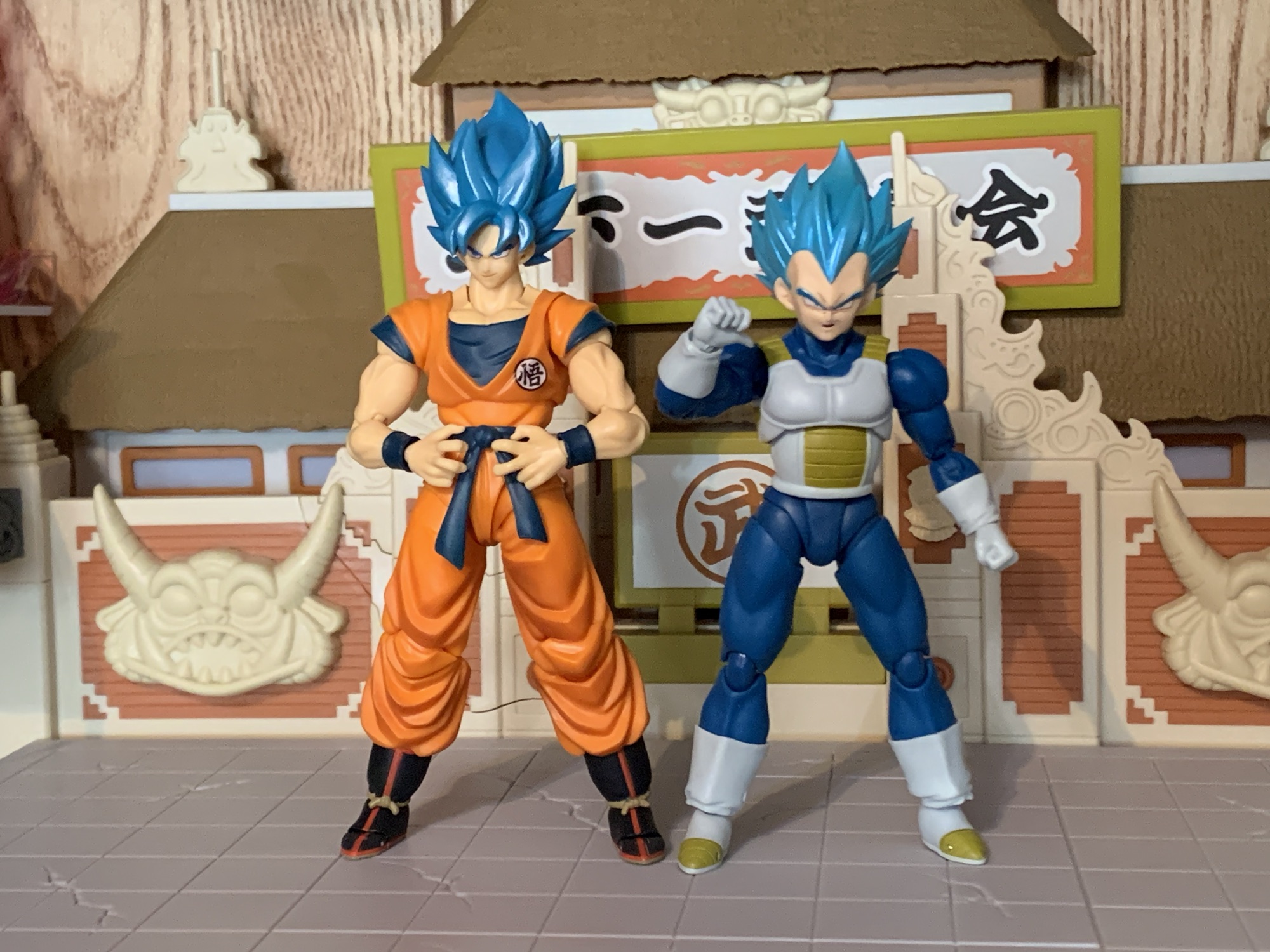
To celebrate the 15th anniversary of the Bandai/Tamashii Nations action figure line, S.H.Figuarts, Bandai turned to the fans. There was a large roster of releases eligible for re-release to mark the occasion, and anyone who wanted to could cast a vote for their five favorites. The winner was, not surprisingly, Vegeta. And in particular, it was the Super Saiyan God/Super Saiyan God Super Saiyan (yeah, I know) version of the character that had been released with the film Dragon Ball Super: Broly. That movie actually marked the first time we saw Vegeta use the Super Saiyan God form in animation (he used it in the manga) so it made sense to finally do a figure of that version. Rather than make it a dedicated Super Saiyan God figure, Bandai included a second head so he could also show off his Super Saiyan Blue look.
He has a snazzy slip cover and a disc stand. Those are the only additions.
When that movie and figure debuted, I was still feeling my way through this line. Did I need such a release? Yeah, I kind of did, but it took me awhile to figure that out. As a result, I never got it so this figure was indeed among the five I selected when I made my voice heard. It wasn’t my number one choice though (that would have been the Dragon Ball Super version of Future Trunks), but at least it was a choice. This was to be a special edition too, but all that meant is we were getting a fancy slipcover and a disc stand. For me, someone who never bought this figure before, it seemed worth it. Was it worth it for those who already had it? That’s a much harder question.
Assemble the blue-haired Saiyans!
Vegeta comes in the standard S.H.Figuarts box with the usual assortment of artwork. I don’t know if the photography is the same or not, but the name printed on the box does acknowledge the anniversary edition. There’s also a slipcover that goes over it with an image of the figure posed on the included “stand” with a timeline in the background and “2019” in a larger font since that was the year this one was originally released. The font and printing on the sides is surprisingly plain though. Like bootleg plain. If you’re an in-box collector you may be underwhelmed. If you’re not then you probably don’t care.
This figure will likely feel pretty familiar, whether you bought the first release or not.
The actual figure is basically the same Super Saiyan Vegeta figure that’s been released multiple times. This is my third version, personally. He has the same Cell Saga style of Saiyan armor only now it’s painted gray with a brighter yellow on the straps, abdomen, and lower back. The body suit is a very dark navy that’s almost black while the gloves and boots are more of an off-white. The only difference with this figure for me are the feet which feature a more rounded toe. I think they’re from the Resurrection F version of Vegeta? I’m not positive though.
I don’t have an all blue aura so this one will have to do.
It all means that this release of Vegeta has the same pros and cons as the other ones, only with more paint means more room for error. The paint on the abdomen, actually not a new spot to be painted, sucks. It doesn’t come all that close to the edges considering we’re dealing with a premium collectible here. At least the brightness of the yellow obscures that to a degree, but in-hand it’s pretty noticeable. The gray parts are okay and I like how it contrasts with the white piping. There is a scuff under my figure’s right arm and there are a few spots where it doesn’t properly fill the area.
The face printing on this release is not on par with the recently reissued Super Saiyan “Awakened Super Saiyan Blood” Vegeta. That one cost $35 at Target, this one cost $70 with a $10 shipping charge.
The Super Saiyan head looks pretty good on this body too.
The two portraits are the defining feature of this Vegeta. You basically get two hair pieces: one metallic magenta and the other a metallic blue. The sculpt is different from Super Saiyan Vegeta. It’s more narrow and less spiky, though still plenty spiky. I literally poked holes in the skin on my fingers swapping all of these heads as I moved them around the different bodies I have to figure out which combination I liked most since I intend to display all three versions. Nevertheless, I prefer the more full version of the Super Saiyan head’s hair, but this is fine. What’s not fine is the lack of options. Yeah, it’s great we get both the red and blue hair, but we only get one faceplate for Super Saiyan God (cocky smirk) while Super Saiyan Blue gets three expressions (stoic, teeth baring, and yelling). This is a re-release with 100% reuse sold at a fairly high price, why not just toss in more expressions? I feel like both looks need the cocky smirk, that’s just a Vegeta necessity, while the God head should at least have an angry look too. And perhaps more disappointing is that the face printing isn’t all that great. It’s not up to the new standards of the line and I don’t know if they’ve been improved at all since I don’t have the original release. Last year’s re-release of Super Saiyan Vegeta looks way better than the original release when it comes to the faces, it’s a shame the same can’t be said of the prestigious Premium Bandai 15th anniversary version.
For the God head you only get the one face. At least it’s the right one.
The stand is pretty lame, and hard to photograph since it’s so glossy.
Other than the heads, you get the usual assortment of Vegeta hands: fists, open, clenching, martial arts posed, and a lone right thumbs up hand. The crossed arms piece is also included and is just as annoying to fiddle with as it’s always been, but it does also look pretty good once you manage to get it into place. That’s it though as there are no effect parts or anything like that. You do get a special stand, but it doesn’t really earn that title of “special.” It’s just a black disc, the same that came with the event excusive stands a few years ago that featured Goku’s insignia as well as Whis and a Saiyan Space pod. Now it’s just all black with a 15th anniversary logo printed on it in metallic blue. It doesn’t say Vegeta or even Dragon Ball. It has slots that can be punched out for an action stand, but one wasn’t included.
This one is going to articulate just like the past iterations, which is pretty good.
I do think I prefer the red hair on the darker body.
The articulation for this guy is the same as the old one, so you can check the link down below if you want the full rundown. This figure is supposed to be a celebration of the line and it should have appeal to longtime collectors of the line because of that, but I don’t know if many would agree. Simply put, if you have the first release of this figure there’s really no reason to get this one. The extra stand sucks. It’s cheap and lazy. There are really no extra bells and whistles that I can see with the figure itself and the paint job is lackluster and not really reflective of the price point. If you’re like me and you wanted a version of Vegeta in these forms then it’s fine. It’s still a good figure despite the flaws, it’s just as a special release it seems phoned in. There’s nothing special about it.
“Yawn! You Saiyans bore me.”
Can’t get enough Vegeta? Here’s some things you may enjoy:
He’s the Prince of all Saiyans. The last survivor to have laid eyes on Planet Vegeta, home world of the mighty warriors and birthplace of the legendary Goku. And he’s also a pretty fine toy. Vegeta, arguably the most popular character to emerge from Dragon Ball Z, has seen his likeness cast in numerous forms…
The first movie under the Dragon Ball Super umbrella is one that sets out to take what was previously non-canon and adapt it into the main series. The most recent two Dragon Ball Z films; Battle of Gods and Resurrection ‘F’, ended up being the start of Dragon Ball Super which is now well over…
We’re back with another action figure review from everyone’s favorite version of Dragon Ball: Dragon Ball GT! And really, the only thing people remember from Dragon Ball GT is the Super Saiyan 4 transformation. Designed to bring the Saiyans back to their more primal roots, the Super Saiyan 4 transformation is pretty much on an…
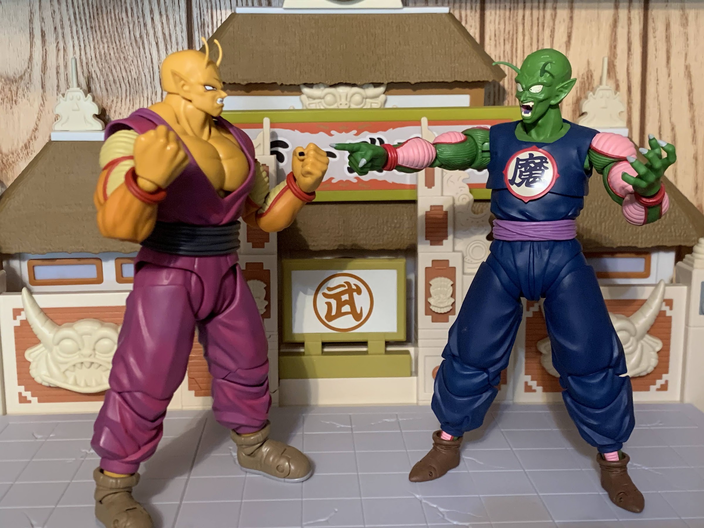
When Akira Toriyama set out to draft the plot for Dragon Ball Super: Super Hero his original goal for the film was to take a favorite character of his and give him an upgrade. That character was Piccolo who had basically been left behind by the likes of Goku and Vegeta way back at the onset of The Cell Saga in Dragon Ball Z. After fusing with Kami, Piccolo was briefly the most powerful fighter on Earth, but he was soon surpassed by Cell, then by Vegeta, Trunks, Goku, and you get the idea. Following that arc, Piccolo was more like a resource for the heroes and sometimes fighter, but even when called upon, he usually just got whipped. And he was oddly okay with no longer being competitive, which I suppose is a reflection in a change in nature from the Evil King Piccolo to the Namekian he had become.
“Son! What happened?!”
That isn’t really fun though when it comes to story telling with Piccolo and it would seem that Toriyama wanted to have him be able to mix it up with the best of them again. Enter Orange Piccolo. Spoiler alert for those still waiting to see Dragon Ball Super: Super Hero, but Piccolo makes a wish to the Eternal Dragon Shenron to have his latent power unlocked to defend the Earth from a new threat. Shenron grants the wish, but also does him one better and bestows a hidden power on the proud Namekian. Shenron is not usually known for his generosity, but since Piccolo (as Kami) created Shenron it would seem the dragon felt he owed it to him to give him a power not seen in ages. The movie doesn’t have time to explain it, but that power is an ancient one wielded by Namekian warriors. When their planet was in danger, the mightiest of the Namekian would turn to their Dragon Balls for a power boost. This is detailed briefly in the manga Dragon Ball Super and not the show or film, which is unfortunate because it sure explains a lot when it comes to Orange Piccolo.
He’s orange, buff, and feeling pretty good about himself.
Orange Piccolo is this buffed out state. We don’t know if this how the form was always represented, but I think we can assume the orange part is since it ties back to the actual Dragon Balls. As for the name, well that’s entirely due to Piccolo not having much imagination or time for fancy titles. The form’s name is basically an afterthought and a little bit of a joke that works with the Piccolo character. The only thing we really need to know is that Orange Piccolo is a really big version of Piccolo that’s orange and really powerful. How powerful? Toriyama suggests that he’s on Goku and Vegeta’s level in this form and likely behind Gohan’s new Beast form. I’m not sure if we’re supposed to assume that this is something Piccolo can now do at will or if he’ll need Shenron’s help in the future, but for now, he’s got a cool new form and it’s plenty powerful. Piccolo fans, rejoice!
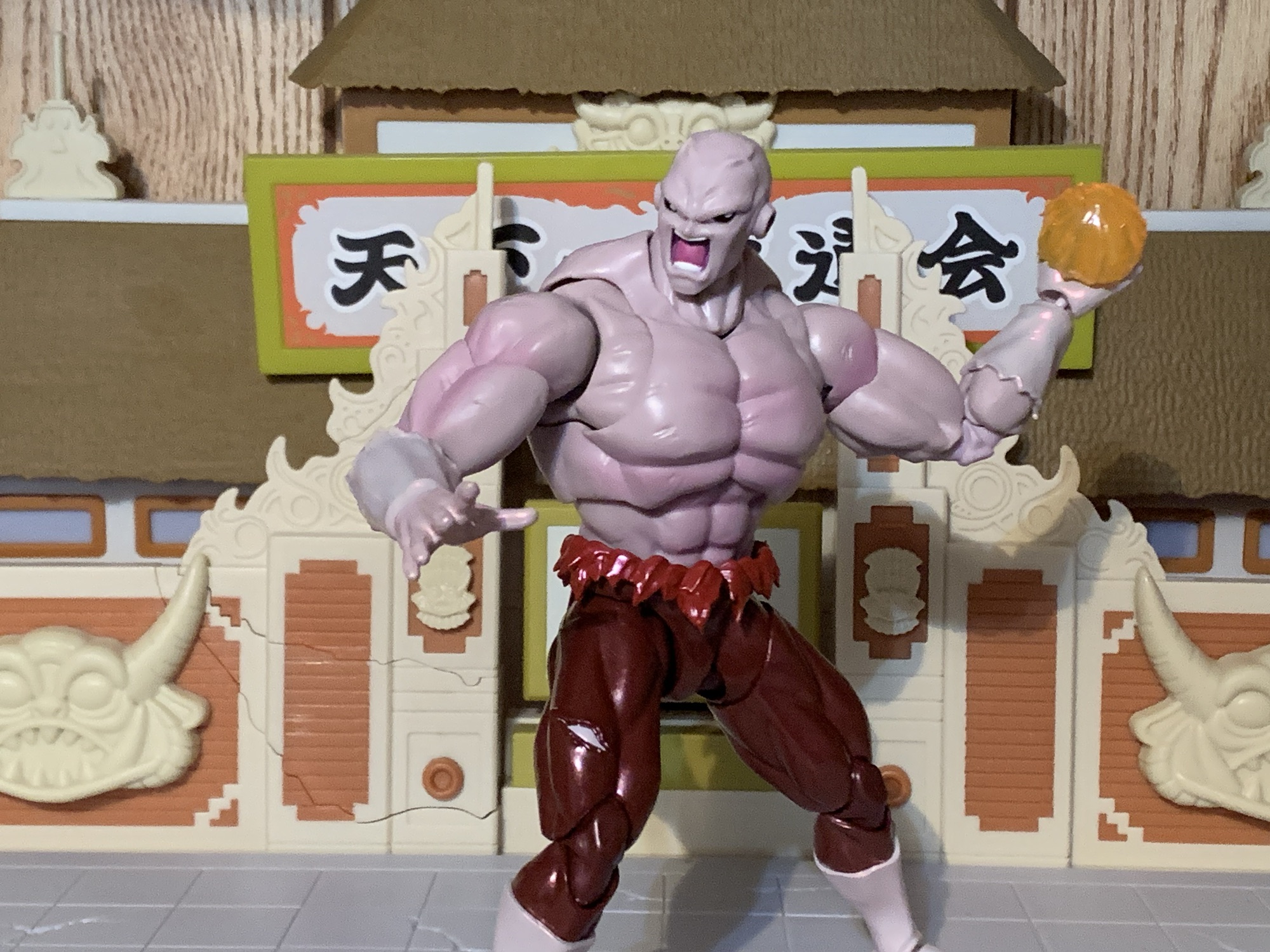
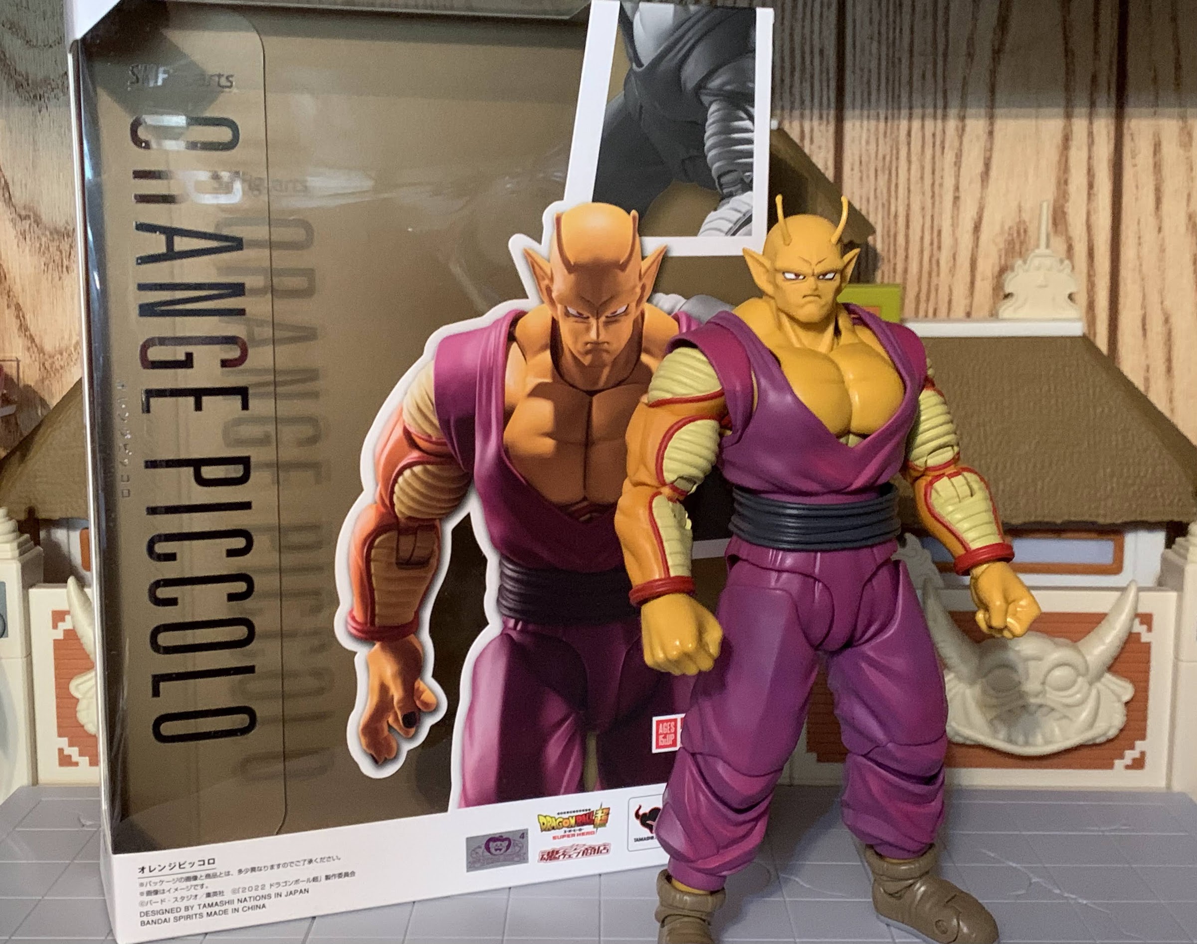
Orange Piccolo probably marks the end of the Super Hero subline which has been a mix of general release and Premium Bandai figures.
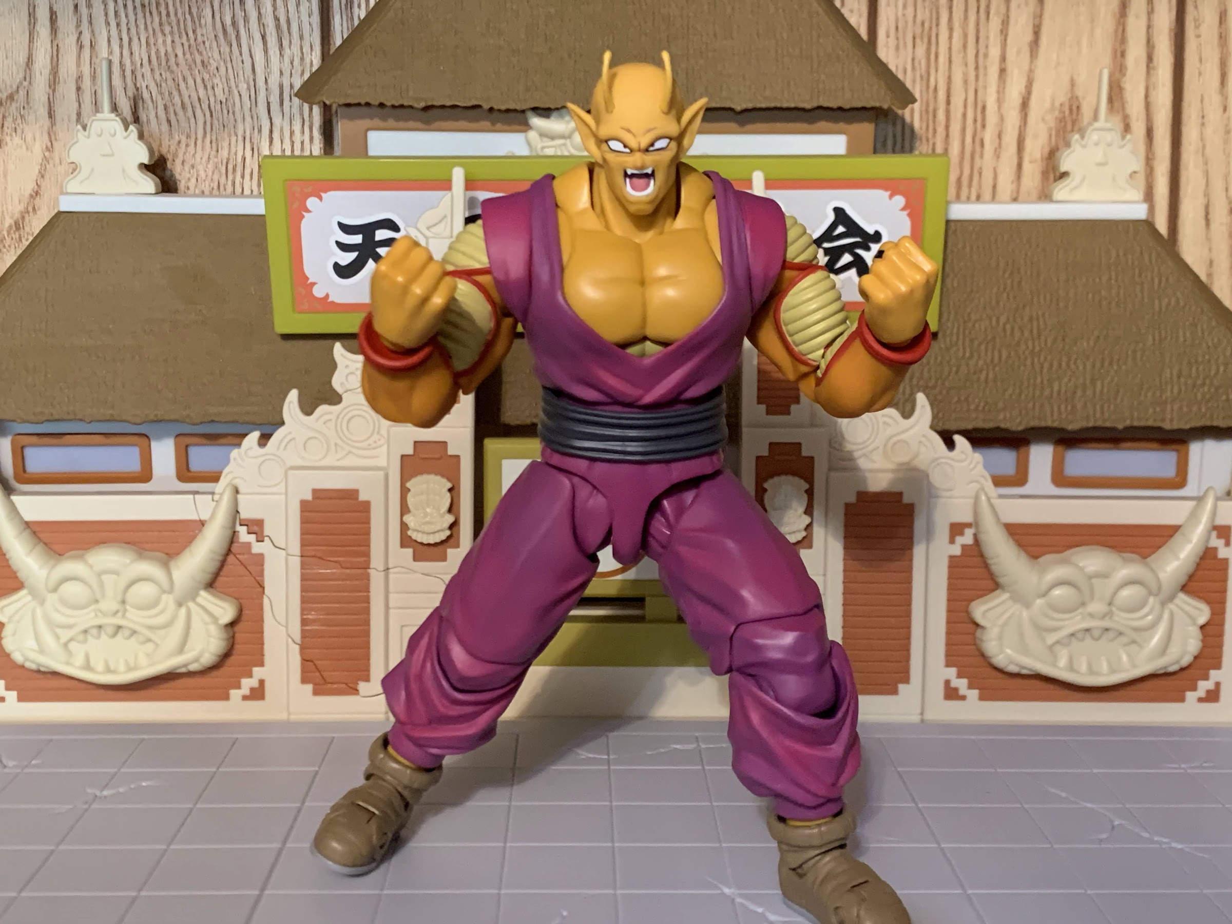
What just might be the final release from Premium Bandai for Super Hero is indeed Orange Piccolo. The figure comes in the same Super Hero packaging as the previous releases only much bigger. And that’s because Orange Piccolo stands at around 7.5″, but beyond his height is his mass. Remember when Trunks got super buff in his fight with Cell? That’s kind of like what Piccolo goes through with this transformation. His head becomes more square-like, his neck is almost as wide as his ears, and his chest is massive. The flesh of his head, neck, and torso is a pale orange while his arms are a more saturated shade. He loses all of the lines on the normally green portion of his arms while the puffy areas remain yellow with a red rim (Super Hero followed the manga coloring so those areas were yellow instead of pink). That’s the basis of the transformation and you either like it or you don’t. I love these big, chunky, action figures so this works for me. At first, I was torn on Piccolo’s color change from green to orange as I think the green is just a part of his identity. Now knowing why he’s orange, I’m less bothered by it. It’s a neat way to call back to what the series is named after and strengthens the lore of the property (though it does raise questions as to why none of the Namekians tried this to stop Frieza, but we’ll just have to ignore that).
The size and the expressions are what sell this figure.
As a figure, Orange Piccolo casts an impressive…figure…on a shelf due to that size. The figure is comprised largely of orange and purple plastic with the purple gi closer to a fuchsia to simulate an aura. There’s some pink shading on the gi as well that’s heavier at the cuffs of the pants and the abdomen. The other paint is reserved for the yellow and red portions and it’s done okay. This figure is a “premium” release and cost $85 so I wouldn’t blame anyone for demanding a little more out of the red piping. The right shoulder on my figure is a little sloppy and there are spots here and there where it could be cleaner. The elbow hinges, which have the pattern continued onto them, are surprisingly clean. I’m a little concerned how these painted hinges will hold up over time, but their movement is smooth so it may be less of an issue than it would be with a cheaper product. The fingernails look like they may just be painted on and they don’t look great. The portraits, on the other hand, are terrific in keeping with Bandai’s output of late. This is a pretty typical release in that it mostly looks fine, but would look improved with a paint wash (especially on the boots) here and there, but that’s something Bandai doesn’t seem to like to do much.
“Oh my, if it isn’t that pathetic Namekian I nearly destroyed all those years ago.”
Like Gohan Beast, Orange Piccolo uses a rubbery overlay for the top of the gi. And like Gohan Beast, this is a mixed bag. On the plus side, you remove any visible joints in the torso. There are new cuts in the cuffs of the shirt though and they need to be accounted for when posing as the figure will look terrible if they’re exposed. The main drawback though is with the articulation. Piccolo has a double-ball peg in his diaphragm, but it’s rendered useless by the overlay. It does nothing aside from annoy as sometimes it will rotate with the waist which can prove irksome since his barely visible abs won’t line-up properly with his pecs. Underneath the overlay, the chest is fully sculpted and painted so if you wanted to you can remove it and have a shirtless, but better articulated, Orange Piccolo, but do you really want to do that to your $85 figure?
“WAIT! WHAT?!? AN ORANGE NAMEKIAN?!”
Like Gohan, the rest of the articulation is mostly fine. The head is on an oddly shaped joint, but it essentially functions as a double-ball peg. The head comes off easy, but it still moves well in tandem with a neck joint and you get up, down, and some nuance. The shoulders are on hinged pegs and that peg slots into a butterfly joint. The arms go out to the side at just about a horizontal position and rotate fine around the cuff of the shirt. The butterfly joint is pretty limited thanks to the overlay. There’s more forward than back, but I question the need to have it at all if it’s going to be this limited. There is a biceps swivel and a double-jointed elbow which does bend past 90 degrees even with the added bulk. The wrists are on hinged ball joints so they rotate and hinge just fine.
“I’ve been looking forward to this, Frieza!”
The waist is on a ball joint so there’s some forward and back to go with the rotation at that joint. The belt is a floating piece that may tab in on the back. The flatter portions of the gi overlay will be exposed if you bend the figure too far in any direction, but the belt can be positioned to remove that. At the hips, the legs go out to the side to almost full splits and Piccolo can kick forward to a horizontal position. They don’t kick back very far and there’s a thigh swivel there that works okay, but isn’t the prettiest joint. Double-jointed knees bend past 90 degrees and the ankles swivel at the top of the boot. Because the boot is such an odd shape, the hinge and ankle rocker offer little range in any direction, but you get a toe hinge!
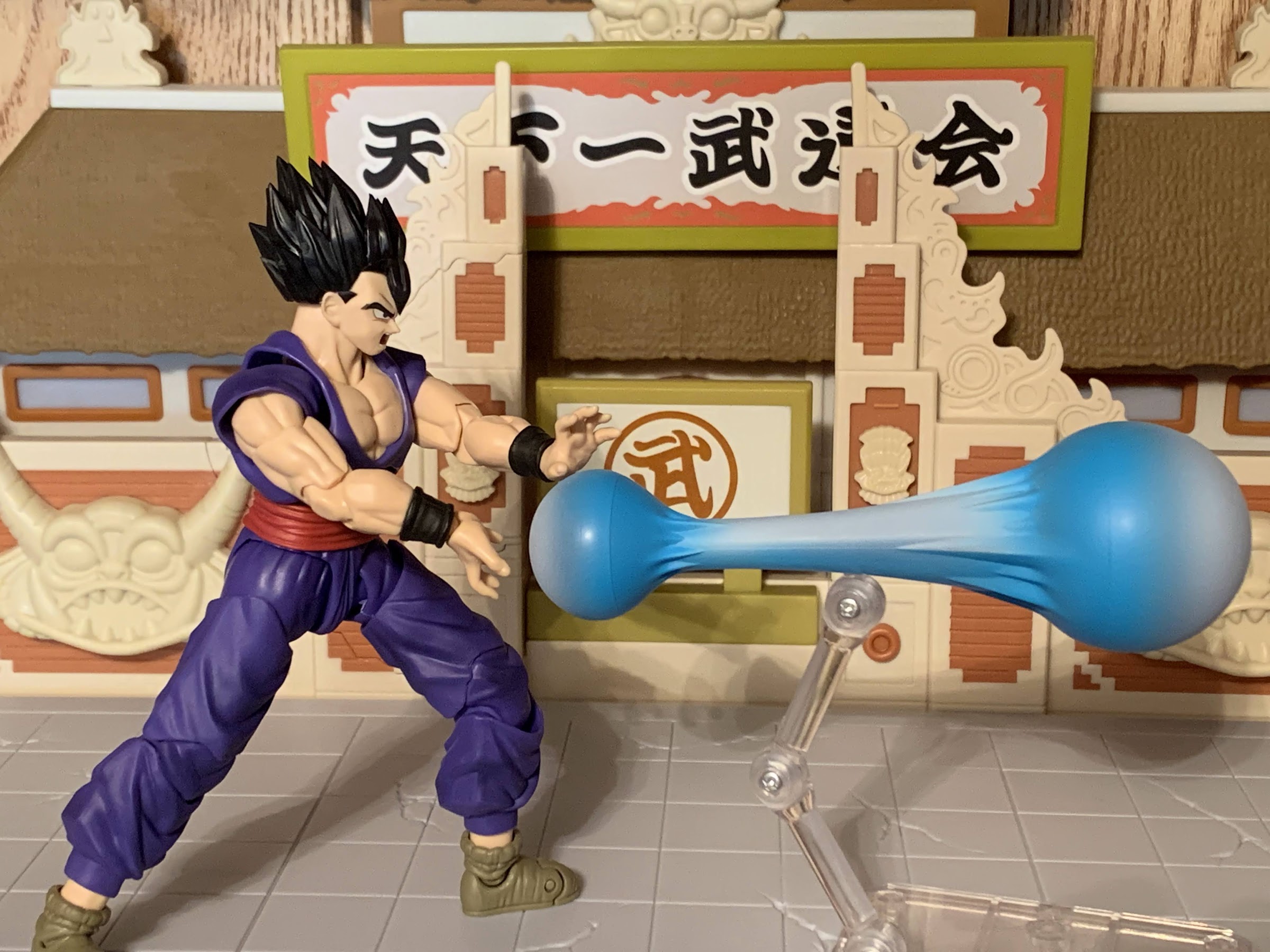
Not to be forgotten, is Gohan’s new Kamehameha effect part. It can be used with Goku, as well, or even Gohan Beast.
Basically, all of the problems Gohan Beast has so does Piccolo, but because of his bulky appearance, it’s even more restrictive. That’s not necessarily a terrible thing though. While I want my figures to have as much range as possible, this version of Piccolo is unquestionably a bruiser and brawler. I think he has just enough and the only real change I’d implement is to dump that overlay. If the overlay was designed to be removed easily because he went shirtless in the film or something then the trade-off would be worth it, but otherwise I’ve been content with the all plastic approach to the torso of past figures. I did see some reports of people getting figures with loose hips. I can say mine are fine. They could probably stand to be a little tighter, but it isn’t an issue. It’s likely something that’s just going to vary from figure to figure. The rest of the joints are all nice and smooth.
As for accessories actually intended for Piccolo, it’s basically four portraits and some clenching hands and slightly less clenchy hands. In other words, not much.
The one area Orange Piccolo does feel light though is with the accessories. He has just three sets of hands: fists, open, and a slightly clenching hand. He does have four heads: stern, smirk, yelling, and teeth gritting. They all look great too and are viable, but that’s where it ends for Piccolo. Because this is the Super Hero subline, he apparently needs to come with parts for the Gohan Super Hero figure like all of the rest. That means he has a set of clenching hands with posts on them and a Kamehameha effect. It’s the same effect that came with Super Saiyan 4 Goku only now it’s the more traditional blue instead of red. And I like the effect and I like that it can actually work with both Gohan and Goku, but where’s Piccolo’s effect part? I’d rather get an effect part for the actual character I’m buying a figure for, not someone else. It’s nice to have, but did that effect part actually help sell more Orange Piccolo figures? I’m skeptical.
This is one tag team you don’t want to mess with.
Orange Piccolo is another A-/B+ release from Premium Bandai. I like the figure, but I do feel like it’s missing that extra ingredient to push it over the top. And that’s how I’ve felt about basically all of these Premium Bandai figures I’ve purchased based on the movie. And since this was a Premium Bandai release, it’s basically made-to-order so if you snoozed several months ago when it went up for sale you’ve already lost. The MSRP was $85 and those who bought Gohan Beast got free shipping. It’s likely more expensive on the secondary market, but if you must have an Orange Piccolo, that may be your only option. Dragon Ball Super is rumored to be coming back to television in the near future, so maybe when the anime gets to Orange Piccolo we’ll see a re-release of some kind, but that is probably a long way off at this point. The $85 is pretty pricey for what’s in the box. I can give it a somewhat tepid recommend at that price, but anything over $100 would be a really hard sell. Good luck!
Interested in other releases from Dragon Ball Super: Super Hero?
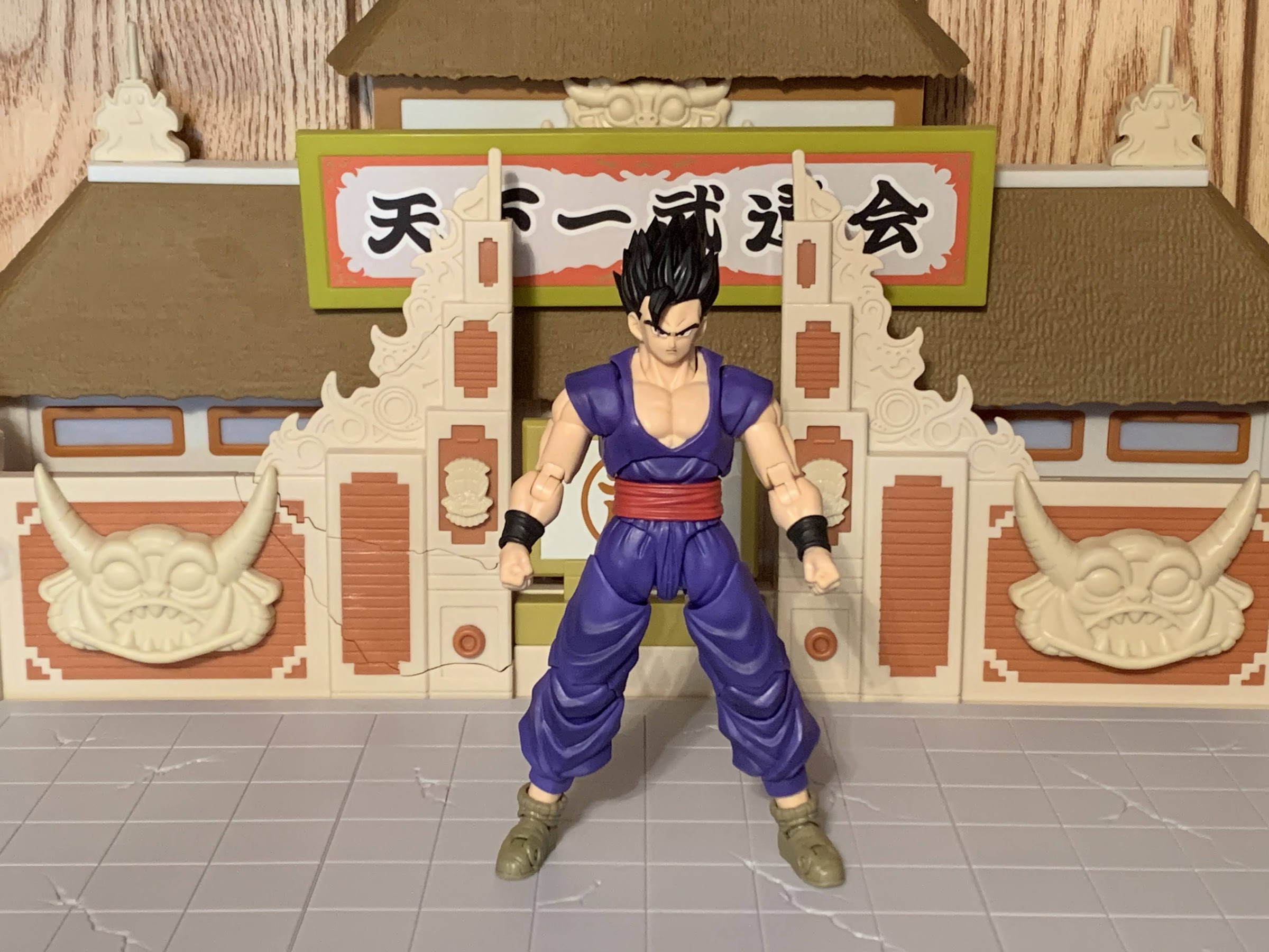
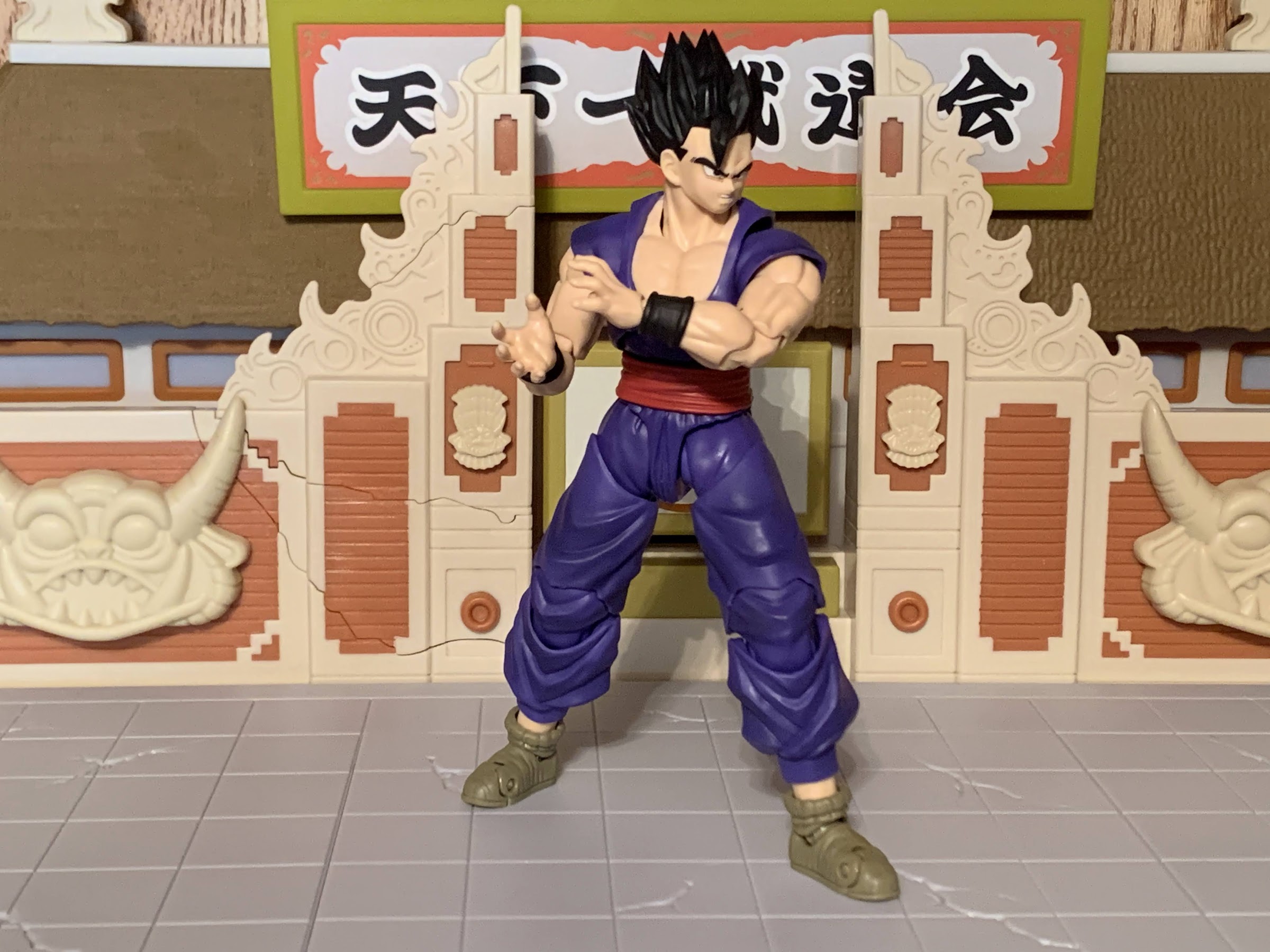
Last summer, fans of Dragon Ball were treated to a new movie: Dragon Ball Super: Super Hero. The intended purpose of the movie seemed to be to take two somewhat forgotten characters in Piccolo and Gohan and give them a makeover. The manga and anime Dragon Ball Super has basically been a story about Goku…
As part of the promotion for the film Dragon Ball Super – Super Hero, Bandai released a wave of action figures from its S.H. Figuarts brand of characters from the film. The neat thing was, these releases were actually really cheap relative to other SHF releases with a MSRP of just $35. Of the four,…
Last year saw the release of a brand new film in the Dragon Ball franchise: Dragon Ball Super: Super Hero. The mouthful of a title was a bit of a throwback affair. It seemed that Toei and series creator Akira Toriyama wanted to use the film to return the spotlight to Gohan and Piccolo, two…
Last summer, fans of Dragon Ball were treated to a new movie: Dragon Ball Super: Super Hero. The intended purpose of the movie seemed to be to take two somewhat forgotten characters in Piccolo and Gohan and give them a makeover. The manga and anime Dragon Ball Super has basically been a story about Goku and Vegeta gaining power and fighting off the bad guys of the universe. Every other prior hero has essentially been knocked down not just a peg, but several. That’s not exactly a surprise as Dragon Ball has pretty much always operated like that with Goku gaining a rival and then leaving said rival in the dust. Really, only Vegeta has managed to hang around and even he’s usually clearly the second best, but after the events of Super Hero there just may be a new strongest in the universe: Gohan.
Looks like Bandai has discovered overlay pieces for their action figures.
Ever since his debut, Gohan has always been the character with the potential to be the strongest fighter in the universe. It’s just his main character trait, and the one that distinguishes him most from his father, is that he doesn’t desire to be the strongest. He doesn’t even like fighting. For him, it’s a means to an end. Originally, Dragon Ball Z was to end with Gohan stepping up and essentially taking over for his dad as the savior of Earth. Economics being what they are, series creator Akira Toriyama was convinced to continue on with his manga and Goku was reestablished as the best of the best. Some fans have always hated what became of Gohan following the Cell saga, but for me, that was always Gohan’s logical progression. With no danger present to force him to keep up, he was going to slip back into his lifestyle and pursue his passion of being a scholar. Ever since the series came back as Dragon Ball Super, Gohan has had to go back and forth between his pursuits as a scholar (and now husband and father) and the universe needing him. After getting smoked by a resurrected Frieza, he’s convinced he needs to at least keep up with his training to some degree and it pays off in the final chapter of the anime, but we don’t really know what he’s up to in the manga as that has (predictably) focused on Goku and Vegeta.
The Kaioken aura seems like the only one that could kind of work with this version of Gohan.
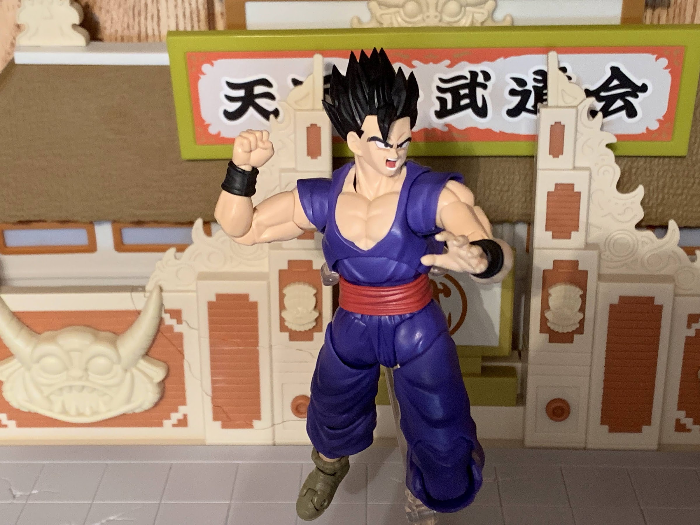
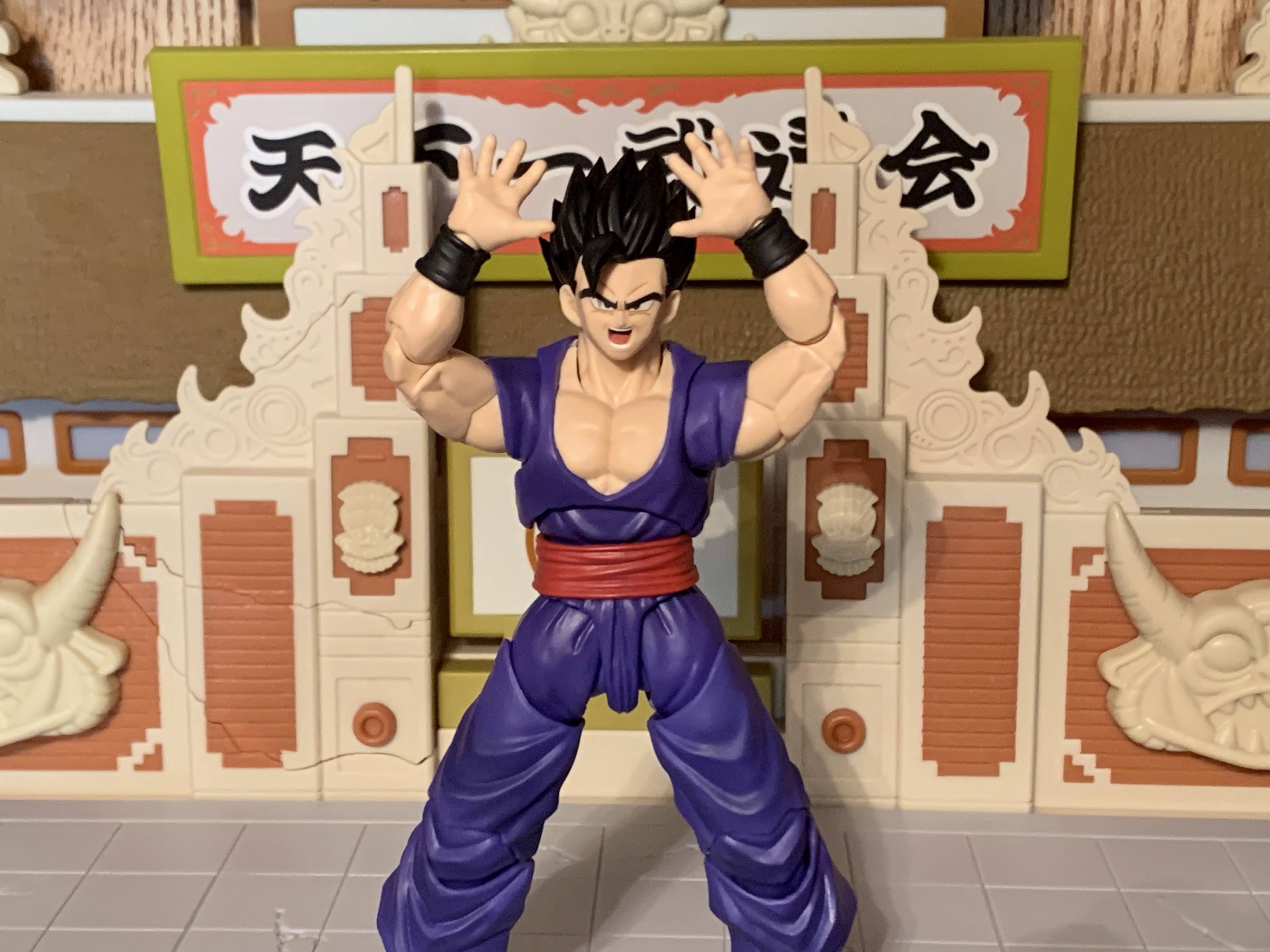
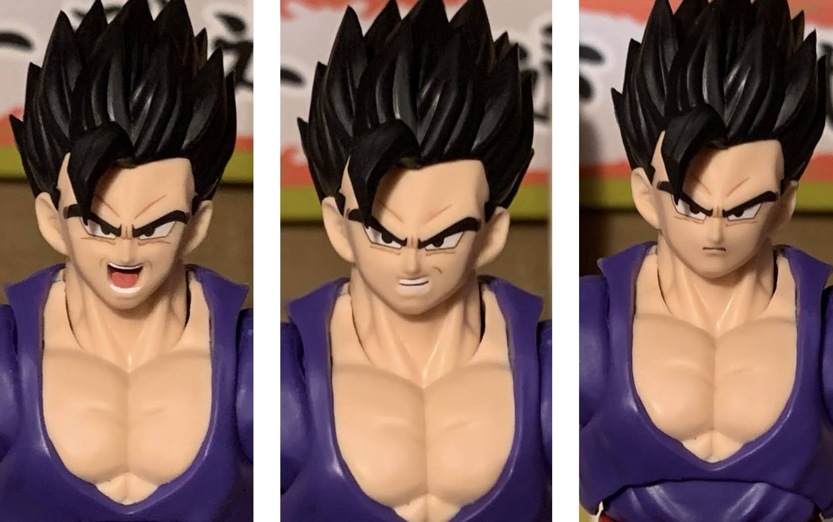
Not to spoil a year old movie, but Goku and Vegeta aren’t around in Super Hero forcing Piccolo and Gohan to defend the Earth against a new threat. And that threat is one that’s possibly even more powerful than our favorite Saiyan duo. We’ll talk about Piccolo’s journey in a month or so, but for Gohan his power-up is what is now called Gohan Beast. In a scene that’s nearly a 1:1 recreation of Gohan’s Super Saiyan 2 transformation, Gohan is able to tap into a new level of power that basically mimics that of Super Saiyan 2, only his hair is even longer, silver, and his cracking energy is red instead of blue. His eyes go red as well making this a more primal take on the Super Saiyan look. It remains to be seen how Toriyama explains this in the manga (if he even does, though I consider that unlikely), but my interpretation is this is the new form Gohan vowed to achieve in Super. A form of his own creation, and perhaps it’s something born from him being mixed race. Either way, it’s more than enough to win the day and Gohan’s new form just may mean he’s the new strongest in the universe.
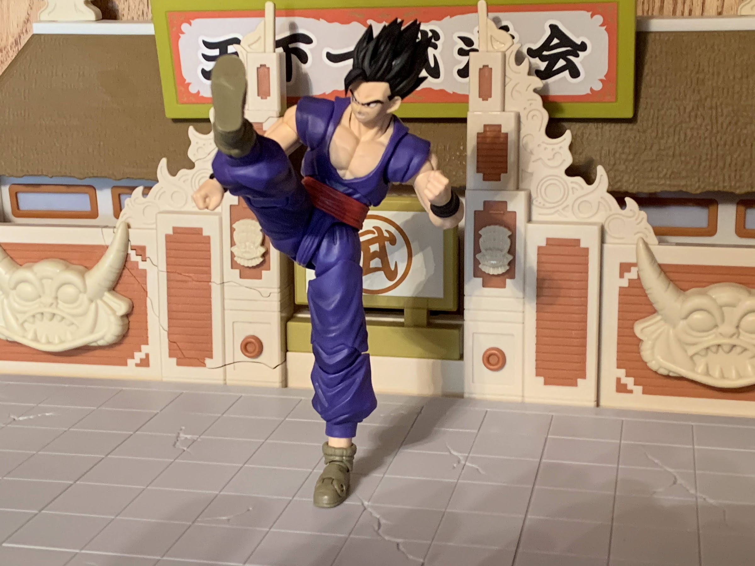
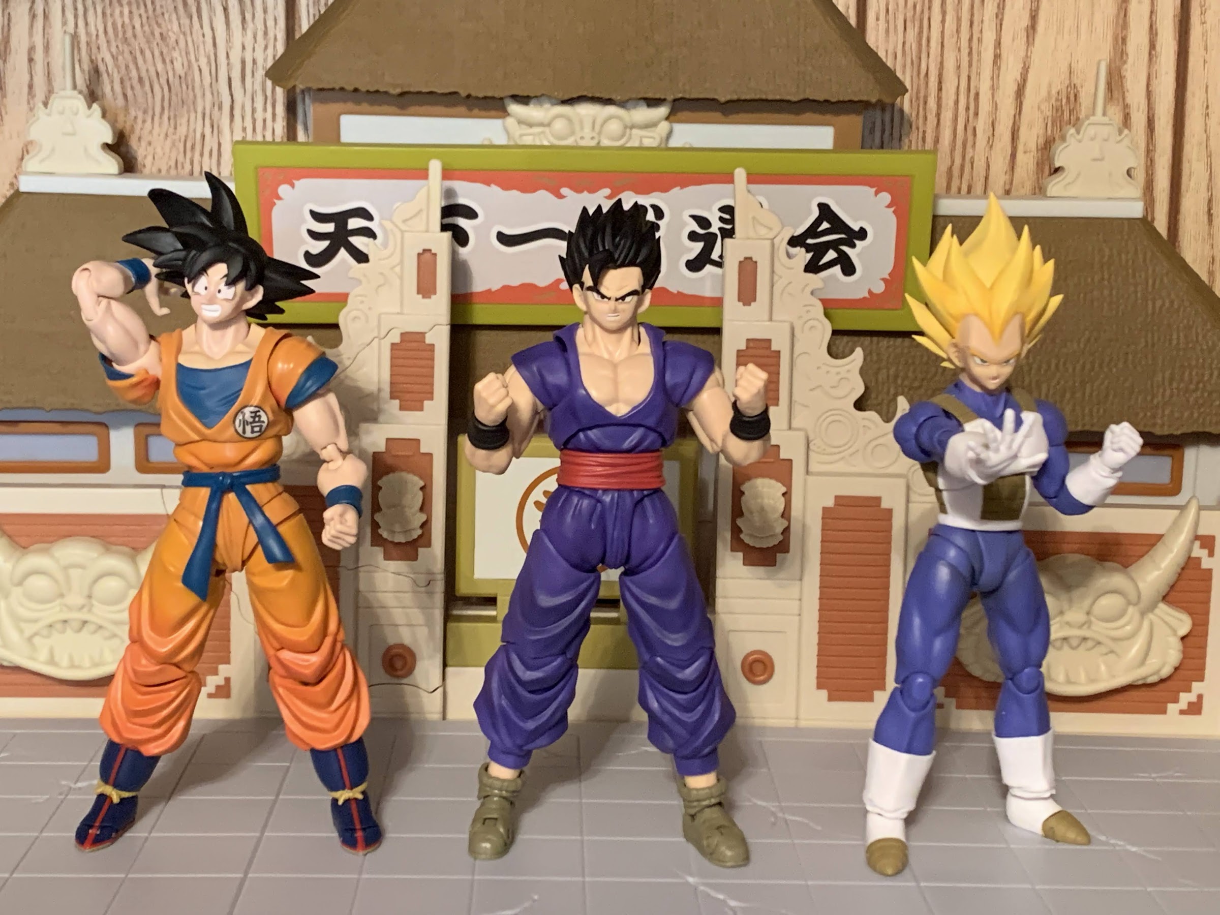
There’s definitely some shared parts with the Ultimate Gohan figure, but that torso is quite different.
Gohan Beast was going to be a major want from fans of Bandai’s action figure line, so it was hardly a surprise to see him go up for sale via the Premium Bandai website. Actually, I suppose I’m a little surprised this wasn’t a general release, but Bandai could always revisit it after the manga debut. Maybe without battle damage or something. The figure itself is very similar to the Ultimate Gohan Super Hero released a year ago, but also more different than I expected. It comes in the standard window box packaging with gold backdrop and was manufactured in China.
“So where’s your ultimate form, Piccolo?!” “Shut up – it’s coming.”
Gohan Beast stands at around 5.5″ to the top of his face making him basically the same as the previous Gohan figure. He’s still in his purple gi with boxy, brown, shoes only now there’s battle damage throughout in the form of hash lines sculpted in and some torn parts in the pants and top. The arms, crotch, and feet are pretty much the only parts repurposed from the older figure as the battle damage necessitated some new sculpting. The main difference is with the torso where Bandai opted to replace the sculpted-on gi with a rubbery overlay. This is true of the torso overlay and the sleeves which appear to peg-in somewhere inside the body. I’ll have more to say about it in the articulation, but from a presentation standpoint it’s an improvement as it allows the chest to be sculpted plastic and removes the challenge of painting it to match the sculpted color of the neck. The faces all look fantastic in keeping with what Bandai has been doing for the past year or so with its face printing and the hair is really well sculpted. It’s super spiky and a bit unpleasant to handle as a result. There isn’t really any shading on it though which is a bummer, especially for a “premium” release. The only thing I don’t care for when it comes to the presentation are the sideburns which are separate from the hair. They’re just a touch darker than the hair and the seam line is a bit annoying. There’s not much that could be done about it though unless they could have made them part of the hair, but maybe that would have looked worse or proven too delicate.
Once again, Lightning Collection effect parts come in handy for Dragon Ball figures.
As for paint, it’s mostly kept to the face. The wristbands are painted and the flesh in the torn pieces on Gohan’s pants had to be painted as well. The color used for those bits is probably just a touch darker than the sculpted flesh tone, but it’s not particularly noticeable since there’s plenty of clothing separating them. The red sash around the waist appears to have a paint wash applied to it and the front of the pants look like they’ve been hit with a matte clear coat. It’s especially noticeable near the cuffs of the pants as the factory didn’t quite hit the whole area leaving the sides of the pants shiny by comparison. The matte finish at least matches the top of the gi and I would say that, overall, this version of Gohan presents rather well. Especially if you like the look of this form.
The way the sleeves are connected to the body really limits the shoulder articulation.
Where things get iffy with this figure is with the articulation. The addition of an overlay for the top is going to cause some issues, and for some, the presentation trade-off Bandai made might not be for everyone. The head is on a double ball peg allowing for rotation and tilt. The hair prevents the figure from looking up, and the head gets some range looking down. There’s a ball joint in the base of the neck which, when used in conjunction with the joint at the head, allows Gohan to look down quite a bit, and you get a little range looking up, but not enough for a straight-ahead flying pose. The shoulders are on a hinged ball peg which is connected via another ball peg inside the shoulder affixed to a butterfly joint. This lets the shoulder move up and down and forward and back, but the range forward and back is quite limited. The hinge in its default, high, position won’t allow Gohan to raise his arms out to the side in a full, horizontal, position, but if you slide the shoulder down first then you should be able to achieve that. The issue preventing a lot of range is the cuff of the gi which is done in a rubbery material and is connected to the body basically in between the shoulder and butterfly joint. At any rate, it’s not a floating piece like it was with Super Hero Gohan. I suppose one could separate it by carefully slicing it with a blade, but it’s unfortunate collectors need to cut up their figure to get the range of motion they’re accustomed to. And I don’t know if this piece would float properly if one were to do that, it might just slide down the arm and require further modification.
Gohan can manage a Kamehameha pose all right…
After the shoulder, there’s the usual biceps swivel and double-jointed elbow. The hands are connected via ball pegs and work fine. In the torso, there may be a ball joint of some kind in the diaphragm, but again, the overly is going to get in the way. If it’s there then it’s basically useless, and I only even suspect it’s there because Bandai basically always includes such a joint and I think I can see one when pulling back on the shirt. There’s a ball joint at the waist and that’s where you’ll get your rotation and tilt, but there’s little in the way of forward or rear “crunch” in the abdominal area. The legs are the exact same as Super Hero Gohan, so the range there is as expected and the only limitations are with the ankles as a result of the more boxy shoe design.
…but the Masenko presents problems.
It’s a bummer to see the shoulders and abdomen so restricted here with Gohan. The prior Gohan released had a fully sculpted gi so there’s an ab joint that works fine. The only eyesore associated with that is the cut across the gi and the fact that Bandai had to match paint to plastic when it painted the bare portion of the figure’s chest. The overlay approach is unquestionably the more aesthetically pleasing way to do it, but is that upgrade enough to warrant a reduction in articulation? In my opinion, the answer is an emphatic “No.” I expect this to be a highly articulated line and I want that extra range. I don’t care about the visual joint, because at the end of the day this is an action figure and action figures have joints on them. It’s fine. I suspect though this was done as much as a cost saving than an improvement. Doing things this way, Bandai doesn’t have to worry about the color of the inner joints for the butterfly mechanism as we so often saw. It may also be easier to assemble and reduce labor costs and it certainly reduces the need for paint hits on characters with this, basic, look. At this stage in the line, I’d like to see the figures getting better at a standard Kamehameha pose, not worse.
Because apparently every figure needs to come with more Ultimate Gohan parts, we get a new face plate with this release.
The articulation may not be up to par, but Bandai is probably hoping that fans will be happy with the accessory load-out, and for the most part, I think they will be. For faces, we get a pretty standard allotment: stoic, smirk, teeth-gritting, yelling. There is a bonus fifth face plate for Gohan Super Hero that features an angry expression with red-rimmed pupils which I assume is intended to be a pre-transformation expression. It’s done well, but I can’t see many actually displaying that figure with it, it’s almost strictly for those who like to photograph their figures. For hands, we also get a pretty standard allotment: fists, open, clenching, martial arts posed, and a two-finger right hand. That’s basically all Gohan calls for as you have hands for the Masenko, Kamehameha, and the two finger posed hand can be used for the Special Beam Canon he apparently taught himself.
Yeah, I can’t make use of this. Even the Ultimate Gohan figure’s arms won’t come apart to give it a shot.
To go with that usual assortment, we get one extra display piece and an effect part. Gohan Beast gets a crossed-arms piece which I suppose could be used with Super Hero Gohan as well. I don’t know how well it works with Gohan Beast though as I can’t get his arms to come apart at the bicep where it’s supposed to. I think this is a byproduct of these arms not really being intended to be utilized in such a manner originally as every other figure I’ve had with one of these pieces has come apart easily. When I try to tug on the arm, the whole butterfly joint tends to slide and I’m afraid the arm will come detached from within the torso before it comes apart at the bicep. The pieces are small, but even when I manage to get a good grip on a shoulder and start working the bicep it shows no sign of loosening. I wasn’t planning on displaying the figure with that piece on so I’m not going to force it, but it sucks when a figure can’t really use an accessory like this.
It’s pretty crazy that Gohan got a part like this before Piccolo.
The last accessory is a Special Beam Canon blast effect. It’s likely an acrylic piece done in translucent blue plastic. There’s a touch of white paint at the tip and it looks pretty good, but there may be some cloudy portions in the sculpt (I have one right in the middle). The spiral effect is a separate piece and it’s glued into the “missile” portion of the blast and back by the fingers. There’s a two finger posed hand sculpted onto it as well which had to be painted to match the figure. It’s not perfect, as painting acrylic to match is certainly not easy, but it’s not so off that it’s likely to discourage folks from using it. There is also a stand included that pegs into the end of the blast because otherwise this would be too heavy for the figure to properly wield. The bigger question with it concerns that hand piece as I’m not convinced they needed to sculpt the hand onto it. It creates problems because acrylic is not as forgiving as PVC so getting the hand on and off the figure is harder than it needs to be. The first time I tried to remove the part, it wouldn’t come off and the peg going into the figure’s forearm came loose before the peg in the hand. It’s also a delicate piece and my spiral part has already separated from the main blast back by the hand. It doesn’t really change the look of the piece, but I can also see people accidentally cracking this thing or snapping it trying to get it on and off. The shoulder range being so limited also prevents the figure from being able to grasp a bicep or forearm with the left hand, as Gohan might do when firing this blast. Even the post on the front of the box is proving really hard to duplicate.
I like this thing, but finding room to display it is going to be a challenge.
For collectors of this line looking for a good representation of Gohan’s new power-up from the movie this figure gets the job done. It just doesn’t earn an A. It’s more like a B- as the frustrations I ran into swapping some of the parts and the limited articulation were real bummers. They give the figure a bit of a “janky” quality which is not a way I would describe most S.H.Figuarts releases. I’m used to smooth articulation, good range of motion, and a painless integration process when it comes to the extra stuff. A lot of the issues I experienced with this figure were self-inflicted as the overlay harmed the function and the extra parts could have been done in a different manner as to minimize any issues. Why not have the blast effect just slot into a hand piece rather than make the hand part of it? Or have the fingers slide into the blast? It doesn’t need to be a tight fit, it just needs some stability at that end.
Do The Mario!
If you are interested in acquiring this version of Gohan then you’re unfortunately going to have to seek it out on the secondary market. This was a Premium Bandai release which is like a made-to-order item and orders closed awhile ago. The figure retailed for $65 and I would guess the aftermarket price is likely close to double that right now. Gohan is a popular character so it’s possible another version sees release at some point, especially as the manga moves into this part of the story. I wouldn’t bank on a re-release though if it’s something you really want.
Did you like Dragon Ball Super: Super Hero and want to check out more figures from the movie?
Last year saw the release of a brand new film in the Dragon Ball franchise: Dragon Ball Super: Super Hero. The mouthful of a title was a bit of a throwback affair. It seemed that Toei and series creator Akira Toriyama wanted to use the film to return the spotlight to Gohan and Piccolo, two…
As part of the promotion for the film Dragon Ball Super – Super Hero, Bandai released a wave of action figures from its S.H. Figuarts brand of characters from the film. The neat thing was, these releases were actually really cheap relative to other SHF releases with a MSRP of just $35. Of the four,…
Back in the early 2000s I was a collector of Irwin Toys’ Dragon Ball Z line of action figures. When I started collecting that line, I just focused on my favorite characters which were primarily Vegeta, Trunks, and Piccolo. Gradually, the collector impulse took over and I started buying entire waves as they came out…
Are you ready to experience the latest in android technology?
Last year saw the release of a brand new film in the Dragon Ball franchise: Dragon Ball Super: Super Hero. The mouthful of a title was a bit of a throwback affair. It seemed that Toei and series creator Akira Toriyama wanted to use the film to return the spotlight to Gohan and Piccolo, two characters who had been sidelined in Dragon Ball Super in favor of the two Saiyan boys, Goku and Vegeta. The film also marked the return of longtime adversary the Red Ribbon Army and with it came two new androids for the good guys to pummel: Gamma 1 and Gamma 2. I’m not sure if there was an embargo on the new characters when it came to action figures or if Bandai just wanted to give fans a chance to see the characters in action first, but two new figures of the pair were introduced via the Premium Bandai route and recently started shipping. These are made-to-order figures sold exclusively by Bandai direct to consumer. Presumably, there’s a bit of a crowd-fund element at play, similar to what we see with Super7, whereby if not enough orders came in then the project would get scrapped, but evidently that didn’t happen. Perhaps Bandai also sees softer sales with either movie characters or new ones which is why this pair went the “premium” route. The inclusion of added parts for Gohan with each figure also adds to the feeling that maybe confidence in the pair wasn’t super high. The two were at least priced in a more reasonable window at $70 a piece. While this is a lot higher than the retail releases for the film of Goku, Gohan, Vegeta, and Piccolo, they also feels like bigger releases as they come with a lot more stuff and they’re not reused molds from past figures. They do basically share all of the same parts save for the heads which is why I’m going to review them together.
There is a bit of a dorky element at play with these two. Think Ginyu Force.
The Gamma boys come in the traditional window box packaging the S.H.Figuarts line is known for. There’s product shots, or renders, combined with a gold backdrop that seems to be part of the Super Hero theming. Out of their respective boxes, Gamma 1 and 2 stand at approximately 5.75″ to the top of their heads not including their stylish fins. And those fins are the main things that distinguish the pair as Gamma 1 has one, center, fin on his head while Gamma 2 has, appropriately enough, two fins set off to the side. The only other thing that separates them is their choice in color for the cape and the number on their chest. Sculpt-wise, the bodies are entirely the same save for the head. Both characters have a dark gray skin tone with a light gray face. They have a bit of a shark thing going on with their heads and the circular ears do give them a distinctive Toriyama feel to their design. Their bodies are clothed in a soft yellow military suit which is all unpainted plastic. The only paint on these guys is reserved for the buttons on the double-breasted jacket and the cuffs of the sleeves along with the painted numeral on the chest. And that paint is not that well done. The buttons look cheap and the edgework is not the sharpest. The actual yellow portions of the suit are okay. It’s mostly matte, but the softer plastic for the bottom of the coat does have a different look to it than the harder plastic bits. The knees and elbows are a touch darker than the rest, but it probably won’t be that noticeable on a shelf. I would also argue the shade is a touch off to the source material. These guys have more of a mustard to the yellow in comparison with the film. There is the customary Red Ribbon logo on the left shoulder and that looks clean, but overall, the paint is not a strong suit here.
Unlike most Dragon Ball villains, these two actually use a gun.
The rest of the aesthetics are generally good. The faces look appropriate and I like the height of the characters for the line. The boots have a very glossy appearance, but that seems intentional given their presentation in the film. The cape is hard plastic with a hinge which I think looks mostly fine. I wasn’t crazy about the segmented cape on the Proud Namekian Piccolo so I don’t mind the simpler approach here. The only thing I’m not crazy about are the shoulders as they do the Goku thing of having part of the material just pinned on. With Goku, I don’t like it, but I always understood it to a degree because he has short sleeves that extend onto his shoulder. Here, it’s a suit that just has shoulder pads and a V shape to it so I wish they just left it alone. I don’t think it would have reduced the articulation in a meaningful way and it would have looked better. I find myself fussing with these shoulder pieces more than I would like as I try to hide gaps and get them into a more natural pose.
I hate these ball-hinged heads because you can’t put the hinge where you want to. The heads are grooved to fit that tab visible on Gamma 2 so for him his hinge will always be on the side while Gamma 1’s is more centered. As far as I can tell, there’s no easy way to rotate just that barrel piece that slots into the head.
With that in mind, lets just jump to the articulation since both figures are the same and then we’ll talk about the accessories. Both figures use a ball-hinge for the head connected with a ball-peg system at the base of the neck. I don’t know why they did it this way, but it sure is annoying. You will have to manipulate the direction the hinge is face if you want more nuance posing, but they can look down and rotate and the lower neck joint helps to add more character. It can get a little gappy though if you tilt it back too far. Doing so with the hinge in the proper orientation and in conjunction with the hinged-ball peg system of the diaphragm can get both figures into a good flying pose. That diaphragm joint also provides rotation and tilt, though you do have to be mindful of the chest buttons when crunching forward. The shoulders are hinged ball pegs so they have some play at that peg while also being able to rotate all around and lift up past a horizontal position. The shoulder pad ruffle, or whatever you want to call it, pegs in and can be pushed aside. There is a butterfly joint here as well which can bring the arms pretty much clear across the chest. It does expose some gaps in the back as butterfly joints tend to do, but it’s not as hideous as some others and the colors are consistent at least. There is a biceps swivel and the double-jointed elbows will bend all the way forward as these guys have pretty thin arms. At the wrist, the usual hinged ball peg is present that allows for plenty of rotation.
These crossed arm pieces never work as seamlessly as they should.
At the waist, we get another hinged ball peg so these guys can rotate and tilt. The floating belt does get in the way so you don’t get maximum crunch, but working in tandem with the diaphragm joint should give you enough forward and back. The bottom of the jacket is done with multiple, soft, pieces of plastic so it doesn’t impede the legs from kicking forward way past horizontal or stop the figure from doing splits. They also lack a true posterior so they can kick all the way back. There is a thigh swivel which is conveniently hidden by the coat and the double-jointed knees bend well past 90 degrees. The ankles are on ball joints so you get plenty of range going back, some forward, and rocker, but it’s not the prettiest sight as it tends to make the figures look like their feet are separate from their shin. It’s probably not as noticeable on the shelf as it is in hand, but it is what it is. There’s also a toe hinge, if that’s something you like and it seems like it’s fairly tight so it actually has some worth. There’s also the hinge in the cape so you can raise it out behind the figure for a more windswept look. It does make them slightly harder to stand, but not impossible. It just pegs in so you do get a little side-to-side pivot as well, but not a whole lot. It’s mostly going to lay relatively flat or blow out behind the figure.
The guns are silly, but I do enjoy them.
As you can tell, I did not get the Super Hero edition of Piccolo.
All in all, I would say the Gamma brothers move quite well. There are some sacrifices taken with the aesthetic to achieve that, but I think most will be content with the tradeoff. The only thing I don’t love are the shoulders, the rest I’m fine with. And that articulation will come in handy as both figures come with a variety of hands and heads to add some life to a display. For Gamma 1, we get a neutral portrait, one with a crooked mouth indicating displeasure, one with his teeth showing in a bit of a grin, a yelling portrait, and a yelling portrait where one eye is larger than the other indicating some distress. They are all separate heads, so no faceplates with these guys. For hands, Gamma 1 has fist hands, open hands, chop hands, and a set of trigger finger hands. Those work with his little blaster sidearm of which he has two. One to wield, and one with a peg in the front so it can be holstered. The gun is painted reasonably well, but I wish it had a blast effect or at least a peg hole for one to be added. Gamma 1 also comes with a set of crossed arms which peg in at the biceps swivel. It’s a bit of a pain to get on and get both sides inserted. My pictures will illustrate how successful I was there. Gamma 2’s accessories are mostly similar, but also a little different. He gets one less head as he has a neutral head, yelling head, teeth-showing grin, and a side-eyed smirk. He has all of the same hands and the two blasters as Gamma 1, plus a set of “devil horn” hands. He does not have the crossed-arm piece.
Both figures also come with stuff for the Super Hero Gohan figure released earlier last year. With Gamma 1, we get a Super Saiyan head for Gohan. It has a very pale, yellow, color for the hair that has no shading or paint whatsoever. It’s a bit odd looking as a result. It looks like a nice base for Super Saiyan hair, but I definitely would prefer it to have some shading to bring it to life. There are three faceplates included for it: neutral, yelling, and a teeth-gritting expression. They look nice, though Gohan does have the issue of a lack of bangs with his Super Saiyan look so the sideburns had to be painted onto the faces. It doesn’t match the yellow plastic of the hair and there’s a bit of an ugly seem line unfortunately where the face meets the head that usually we can’t see. With Gamma 2, we get another Gohan head, but this one has his hair blowing all over the place like he’s powering up and he’s also wearing his glasses. They lack lenses, but otherwise look pretty nice. To complete the look and scene this was pulled from, he also has his cape and shoulder pads. They’re done differently than what we saw with Piccolo as the plastic is very soft for the shoulder pads and the cape is in one piece. There’s a hinge for the cape, but unfortunately it’s too weak to support the weight of the cape so there’s not much that can be done with it. It also doesn’t like to sit flush on Gohan’s shoulders which gets annoying. I should also add, the hair on both Gohan heads is very stiff and spiky which helps make it look as good as it can be, but it sure can hurt too to swap!
“No 2! Don’t do it!”
If you watched Dragon Ball Super: Super Hero and came away from that experience wanting action figures of Gamma 1 and Gamma 2 then I think you’ll be happy with what Bandai released here. Once again, the whole “premium” concept when it comes to Premium Bandai isn’t really evident in the quality versus what we’re getting at regular retail, but rather reflects the more limited nature of the characters. With better paint, these two figures would be stellar, but as they are they’re still quite good and among the better Dragon Ball releases that I have. They move well, look nice enough, and come with a boatload of accessories. It seems like the whole tack on some extra stuff for other figures approach only began with these two as other figures from Premium Bandai are being sold with more parts for Gohan, in particular. It’s a fun approach for those who are all-in, but it sucks for someone who wants a Super Saiyan Gohan, but isn’t interested in getting Gamma 1. And those parts of the release are just okay. I think the Super Saiyan look is fine and with some shading would be potentially great. The glasses and cape look is more niche and less successful. It’s fun, but am I going to choose to display Gohan like this instead of the other looks? That’s a harder sell. I suppose he’ll pair nicely with Piccolo in the same sort of attire.
As mentioned previously, these guys retailed for $70 and were P-Bandai exclusives. Other retailers were free to order them just like anybody else, but that also means they were paying 70 bucks as well so they have to charge more than that in order to make any money on the sale. If you missed out on the original purchasing window then prepare to pay over $100 now for each figure. At $70 a piece, I think they’re worth it and I’m even tempted to get another Gohan (but I probably won’t) to make use of the extra parts. At over $100 each they’re a harder sell. If you only want the Gohan parts, maybe try eBay? It seems unlikely that someone interested in Gamma 1 or 2 would have no interest in Super Saiyan Gohan, but maybe there are some folks out there just looking to offset some of the cost of getting the new characters. More likely, you’ll be able to find people looking to offload Gamma 1 and 2 without the Gohan parts so maybe there will be some opportunities to score a set for closer to their original MSRP under certain conditions. I think they’re good enough on their own without the Gohan accessories, but those do help sweeten the pot. If you’re out on the hunt then I wish you good luck!
Need a primer on Gamma 1 and 2 or want to see more of those Gohan and Piccolo figures? Look no further:
As part of the promotion for the film Dragon Ball Super – Super Hero, Bandai released a wave of action figures from its S.H. Figuarts brand of characters from the film. The neat thing was, these releases were actually really cheap relative to other SHF releases with a MSRP of just $35. Of the four,…
I’ve said it before, and I’ll say it again, that Dragon Ball Super has been the thing I’ve loved most that I never knew I wanted. I was done, or at least content, with Dragon Ball Z. Dragon Ball GT wasn’t good, but I didn’t need it so it wasn’t something that bothered me. Then…
When the S.H.Figuarts line was launched years ago and Dragon Ball Z was at the forefront, it wasn’t Goku who got to be the first figure out of the gate. Nope, it was Piccolo. That figure caught my attention when it was announced even though I had not purchased a Dragon Ball figure in quite…
As part of the promotion for the film Dragon Ball Super – Super Hero, Bandai released a wave of action figures from its S.H. Figuarts brand of characters from the film. The neat thing was, these releases were actually really cheap relative to other SHF releases with a MSRP of just $35. Of the four, the only one I grabbed initially was Goku as I was looking for a base version of Goku and that figure really stood out as better than the alternative to me. I was tempted by Piccolo as well because the headsculpts looked like an improvement over the figure I have, but ultimately I didn’t want to spend money for some new heads. Another temptation for me was the new Gohan. Depicted in his “Ultimate” form, the adult Gohan from the film looked really interesting because it would appear he’s on a newer body that could see some reuse down the road. At the end of the day though, I’m not a huge Gohan fan so I decided to pass. The question was rendered moot too when he sold out really quickly as there’s a legion of Dragon Ball collectors out there who have been waiting for a good interpretation of Ultimate Gohan.
Then Bandai put up for sale on its Premium Bandai webstore two characters from the film: Gamma 1 and Gamma 2. They’re the “sort of” villains from the film and I liked their look. I wasn’t sure if I liked it enough to pay the Premium Bandai upcharge to get them though, but once I finally saw the film, I ended up taking the plunge. The thing with those figures is they both come with optional parts for the Ultimate Gohan figure. I suppose I could have sold those parts to recoup some of the expense of those two figures, but instead I just went in for more and purchased the Gohan figure. Retailers opened up some additional preorders for him, at the slightly inflated price of $40 (he may have started off there too and I just forgot), and I grabbed one of them. I’ve had the figure for about a month now, and let me tell you something: I love it!
My Gohan, you’re looking unusually focused this morning.
Gohan comes in the usual window box and should look fairly routine from outside the box. Once removed, he stands just shy of 5.5″ to the top of his face, closer to 6.5″ if you want to go to the top of the hair. Gohan from the movie is depicted in his classic Piccolo training uniform. It’s a purple gi with red sash and he has the big, chunky, shoes he and Piccolo both feature in the movie. He basically only distinguishes himself from Piccolo via his black wriststraps. He’s in his “Ultimate” form which was his ascended form he learned from the Elder Kai during the Buu Saga. It’s basically Gohan’s ultimate form, hence the name, though it doesn’t come with a flashy transformation. If anything, he just has slightly bigger, spikier, hair. He’s also jacked and that comes through in the sculpt. It’s an interesting juxtaposition to Goku who keeps going through all of these different forms and hair colors to get more powerful, but his kid just bulks up a bit. I kind of like that about Gohan, though he has his own wild transformations too.
The new style for the shoulder joints can be a bit finicky to work with, but the reward is that they look so much better than the old style with the sleeve cuff pegged into the shoulder itself.
Like most figures in this line, Gohan is largely composed of molded, colored, plastic which minimizes the need for paint. I suppose “need” is a strong word and certainly a subjective one as many (myself included) would like to see more paint on these releases. It’s much harder to criticize them for that though at this lower price point. With Gohan, there appears to be a hint of shading on the legs, which they like to do for some reason. It’s not as visible with Gohan as it is with Goku and his orange gi, which almost works out better for Gohan. It adds just a touch of depth and comes across well. It’s also helped by the fact that the purple is quite matte on this figure giving him a nice finish. The chest is painted and it’s not a perfect match to the neck and arms. The chest has a matte appearance, while there is a touch of shine on the neck, but it’s not awful. The red sash is a separate, floating, piece though it is rather snug on the figure. It may cause some paint transfer if you’re not careful. Lastly though, the faces for this figure look terrific. I don’t know what Bandai did to improve their facial printing, but keep it up. The previous Goku figure looked nice, but Gohan is even better. These faces all look fantastic and it really brings the figure to life. The hair also looks nice and it’s even tricky to figure out where the seem is to remove the bangs because the fit is so good. The only blemish is a bit of mold release, roughness, on the side of the hair. It’s not very noticeable from a shelf, but it does kind of suck and I considered trying to exchange it, but opted not to. Aside from that though, I think this figure looks wonderful.
On one foot with not assistance, and on the flimsy plastic of the arena playset at that.
Adding to my enjoyment is the articulation. I’ve been a little critical of the various Goku figures as I acquire more of them because that figure has some limitations and some features that are a bit of an eyesore. This figure doesn’t solve every problem that Goku has, but it comes close. The head is on a double-ball peg with another ball joint at the base of the neck. He can move around nice and smooth and there’s great nuance posing afforded by this setup. It’s only weakness it he can’t look up very well so if you wanted to position him in a flying pose parallel with the ground it would look awkward. The shoulders have a newer style of joint similar to what Krillin has which means theres no pegged in shoulder piece to look stupid. The sleeve is just a floating piece the arms goes through and it pegs into a ball and hinge style of joint inside the torso. The end result is you get some up and down movement at just the shoulder before even engaging the hinge which allows the arms to be raised out. You do have to work with the sleeve to get them horizontal, but it’s do-able. There is still a butterfly joint and that may be the only limitation here as he doesn’t seem to reach across quite as far as Goku. A Kamehameha pose is still possible, but a little less natural looking. The rear of the joint is cleaner, though there will still be angles where it looks unsightly. The joint is all cast in purple though so at least it doesn’t look as ridiculous as Goku’s where the interior is flesh-toned. The rest of the arms are typical stuff with a biceps swivel, double-jointed elbow that goes well past 90 degrees, and ball-peg wrists.
This one needs a stand though.
In the torso, we get a ball-joint at the diaphragm. There is no hinge in there to lift the upper torso higher which seems cleaner, but the figure also doesn’t have much range forward and back. He can pivot a bit on the joint as well. Below that is a waist twist which feels like a ball-peg of some kind. It mostly lets him twist, but you do get some nuance posing out of it as well. At the hips, we have some kind of a ball-joint that works very well. Gohan can achieve full splits and kick forward plenty far, though can’t kick back because he does have sculpted cheeks. There’s a thigh twist below that which is very smooth and the double-jointed knees both look and function well. At the boot, there’s a swivel and the feet are ball pegs. They don’t have much range going forward and back due to the cuffs on the shoes, but the rocker works okay. There’s also a toe hinge if you like those.
The Masenko pose is a bit tricky. Anything that requires the figure to raise its arms above the shoulder is tough because of the shirt piece.
Most importantly, all of the articulation is really smooth. No stuck joints, no uncomfortable creeking or squeeking noises, and it’s all very visually appealing. That may not sit as well with some other folks as I can see some wishing Bandai sacrificed some of the form to get better range in places. The torso feels like the biggest issue as we could probably get a better ab crunch in there. The ankles also aren’t great, but I think that’s partly due to the character design and the shoes present. The shoulders still aren’t perfect, but I think they look much better this way and I’ll take the reduced range there for this visual. I would definitely be interested in seeing a new Goku on this body, though I don’t know what version (I did order the Super Saiyan 2 Goku, but it’s on the usual buck). Maybe a brand new Super Saiyan 3 or “Awakening Super Saiyan” Goku?
He can do a reasonable Kamehameha pose though.
Fire away, Gohan!
This is a bit of a budget release, but there are still some accessories to talk about. Unfortunately, they’re not particularly exciting. Gohan just comes with some extra hands and face plates. For faces, he has a stern expression, teeth-gritting, and a yelling one. For hands, we get fists out of the box plus Kamehameha hands, martial arts pose hands, and a set of open “Masenko” hands. That’s it. It’s expected given the price point, but still disappointing to only get a conventional spread of hands plus three facial expressions. An effect part would have been welcomed and, honestly, adds mere pennies to the cost. How about the Super Saiyan 4 Goku blast effect, but in yellow or blue? Just something to put in his hands for a Masenko effect, though his shoulders aren’t really made for the charging effect so maybe it’s better not to draw attention to that via an effect?
Bandai is really killing it lately with the faces.
If this is the new, standard, body going forward for Bandai then I think it’s pretty good. It could be better, but I think we’ll get a lot of nice looking figures out of this. And even though there are some short-comings, I still love this releasae. And I don’t even consider myself a fan of Gohan. Nothing against him, I don’t actively dislike the character, he’s just not my favorite. This figure though is one of my favorites in the line and I’ve been having a blast with him just posing and fiddling with him on my desk while he waits for me to write this review. And maybe that’s partly what took me so long as I drew out the process. He’s going to head for the shelf soon and join his buddies, but I am definitely looking forward to getting those extra parts with the Gamma brothers so I have an excuse to mess with this one again. If you thought you didn’t need it for one reason or another, I must encourage you to rethink that. And at 40 bucks, this feels like quite the steal. This figure is way better than the Apocalypse I reviewed recently, a figure I did ultimately like, and it costs the same. While lesser companies are getting more expensive, Bandai is actually getting cheaper and that’s awesome. Keep it up!
I wasn’t sold on him initially, but I’m pretty happy to have added Gohan to the shelf.