My summer of discounts continues today with yet another Super7 Ultimates! release. Back when wave 7 of Super7’s line of Teenage Mutant Ninja Turtles was unveiled I quickly locked in a preorder for three figures: Punker Don, Robotic Bebop, and Triceraton. By the time the line released way, way, late, I only ended up with two of those three figures. That’s because as product was coming out and impressions and images were being shared online, there was one figure in that set I wasn’t willing to drop $55 on: Triceraton. Triceraton was one of my favorites in the vintage Playmates line. I got him along with Slash and for me the two were a pair of intergalactic do-badders. The figure was on my short list of wants from Super7 so I didn’t cancel that preorder hastily, but I did. Now that I’ve been able to get the figure for considerably less, the hope here is that I’ll be way more happy now than I would have been had I spent $55 on it.

Super7 used to have a pretty good thing going. It got to take action figures that were 30 years old, upscale them, cut in some more articulation, and call it a day. It was a simple business model that seemed to please TMNT collectors. Who it didn’t please was Playmates. And as much as it annoys me that Super7 has seemingly been forced to cancel its vintage-inspired line of TMNT figures, I also get it. Triceraton is a perfect example of the basic approach the company was taking in that this is barely any different from the figure released back in the day. He’s just bigger. There’s a bit more paint, there’s some more joints, and the accessories are all painted now. There are some new accessories as well, but this thing is not much of a departure from the Playmates original. Considering how much I like that old figure, I’m happy with the approach here. Some figures I’ve wanted Super7 to make more alterations to, but this isn’t one of them.
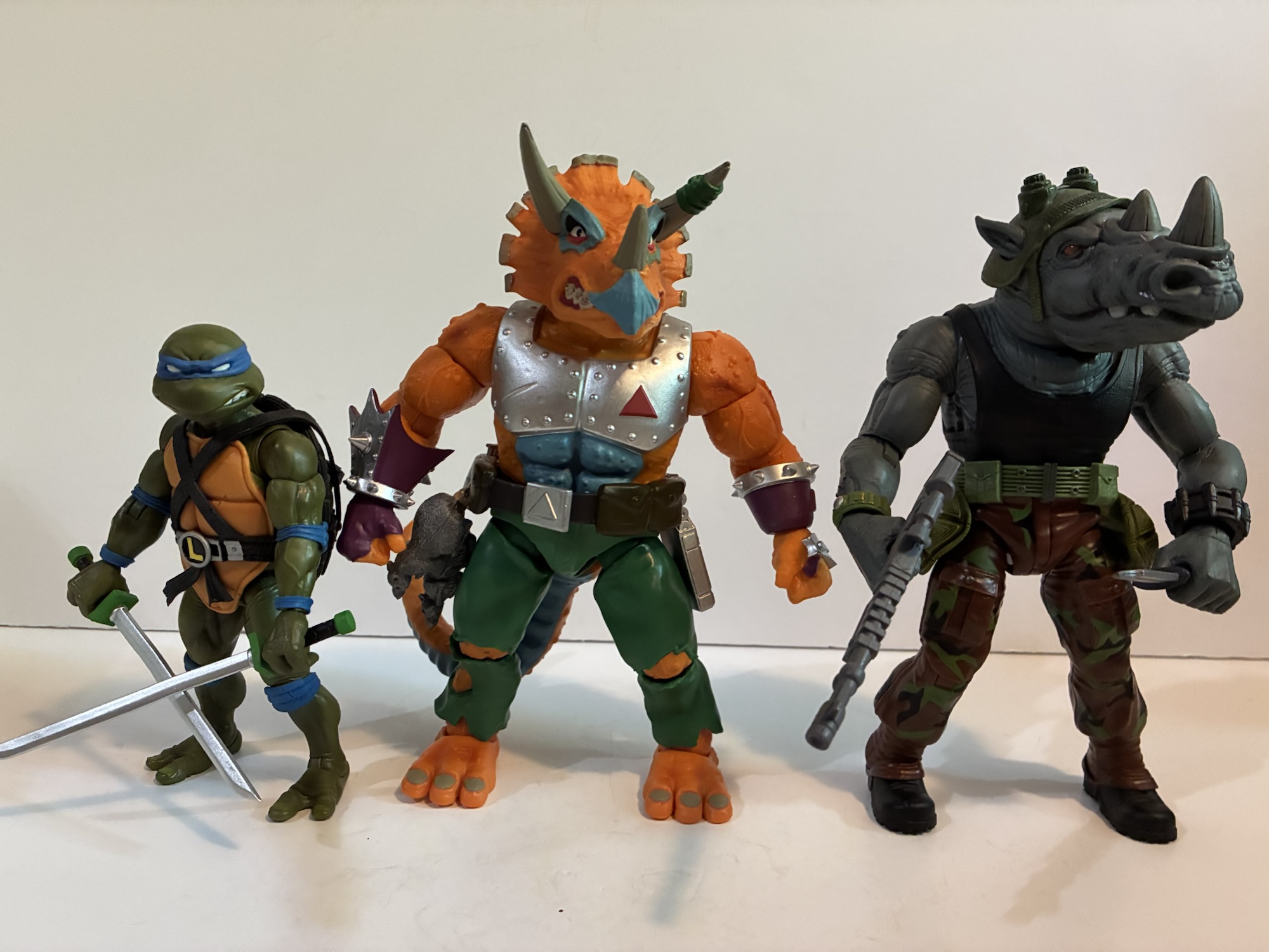

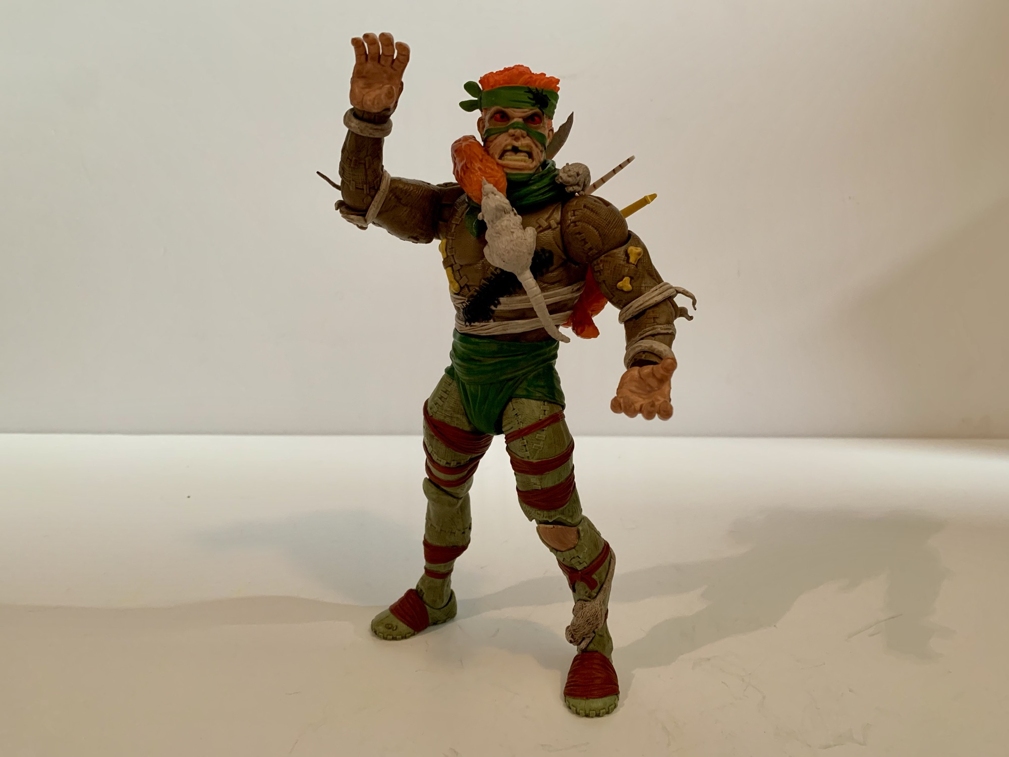
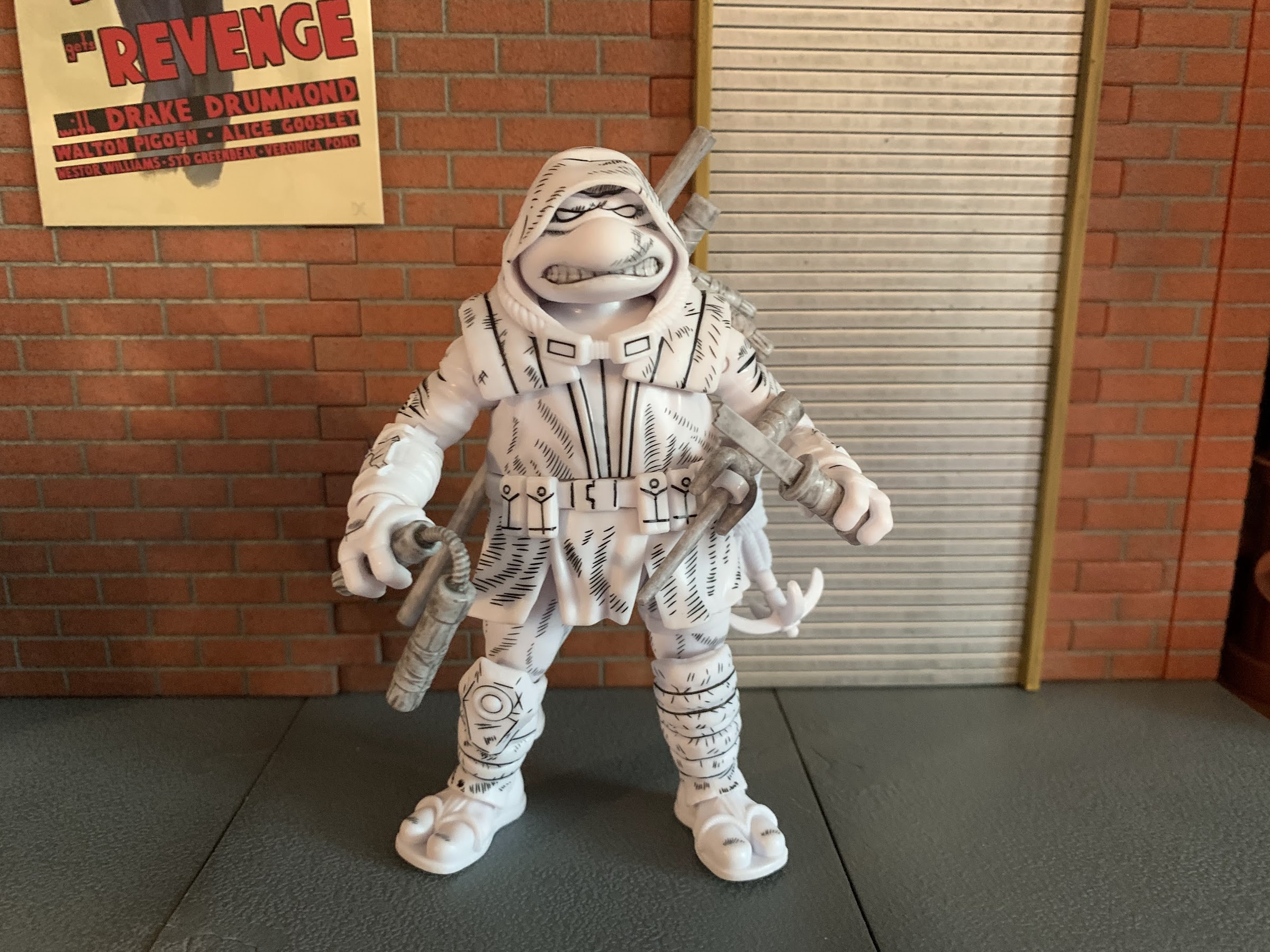
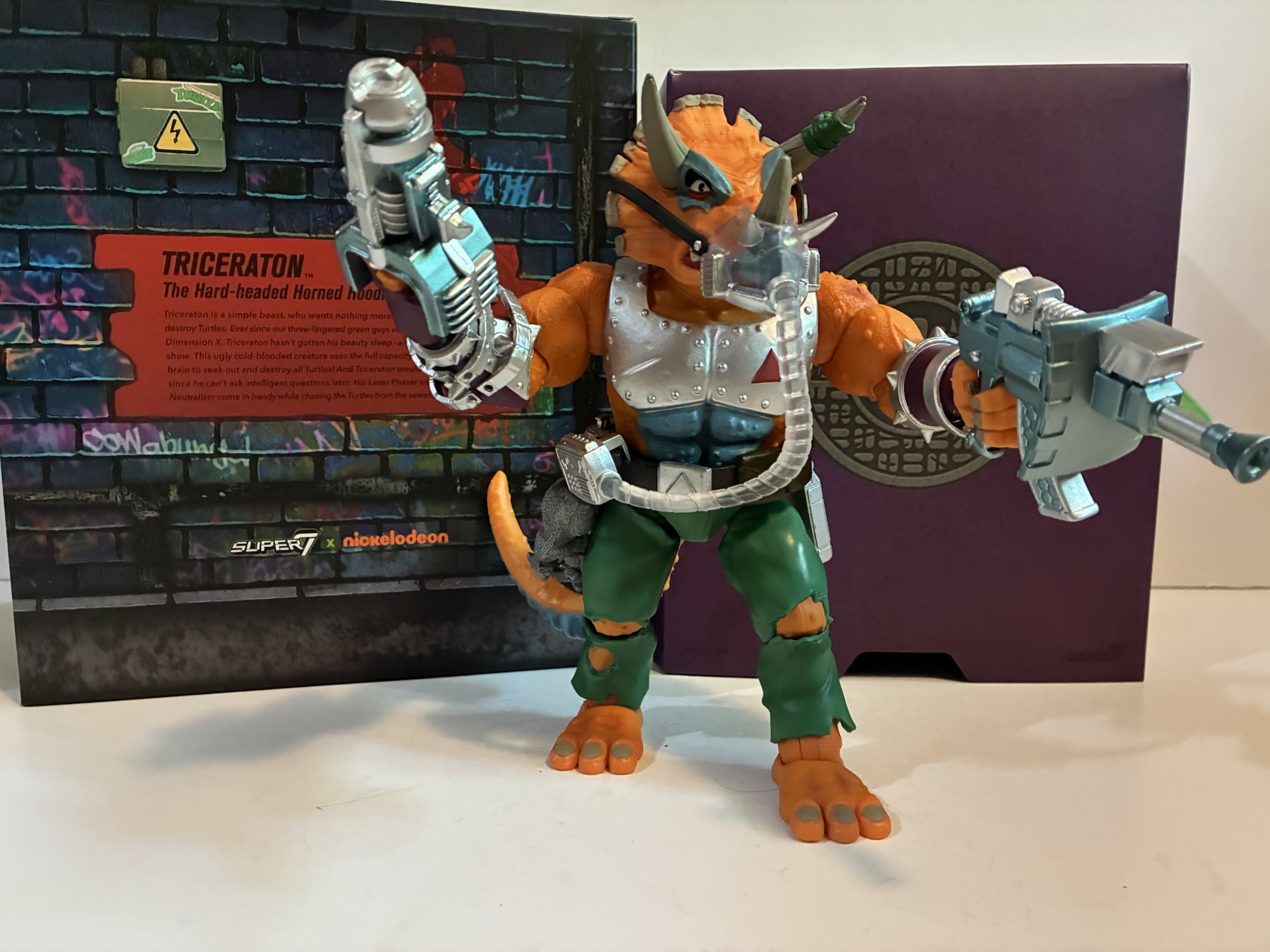
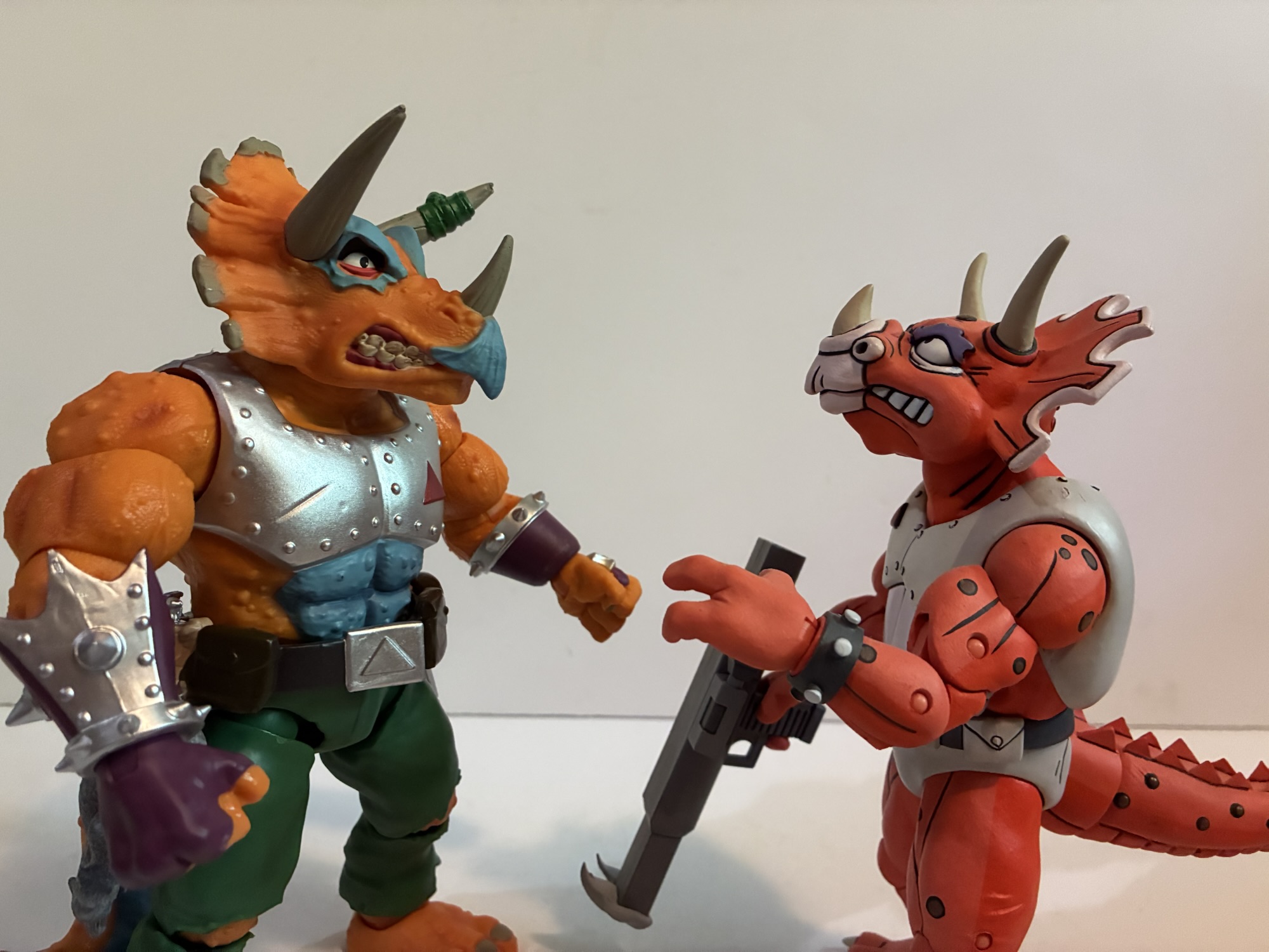
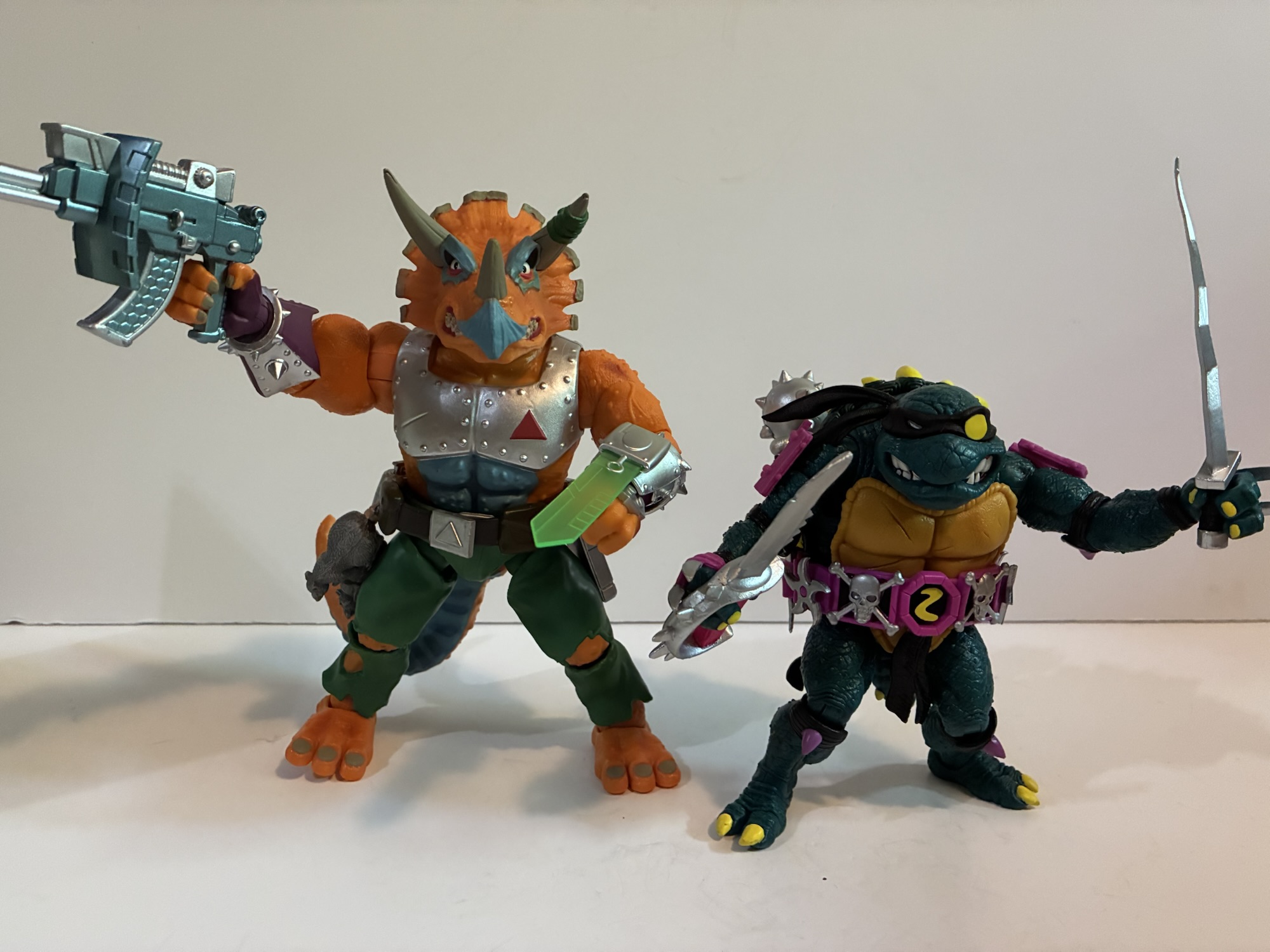
Triceraton comes in the old style of Ultimates! box complete with a purple, personalized, slip-cover. The figure is a beast at just about 8″ to the top of whatever that ridge is on the back of the head of a triceratops. He’s not just tall, but chunky, and there’s some weight to this boy. Shockingly, he might be the third biggest figure in the wave he was a part of thanks to Robotic Bebop and the massive Guerilla Gorilla. Like I said, the design does not stray from what Playmates did before. The skin is orange, there’s still the blue around the eyes, the right horn is wrapped in green, and he’s got that weird, blue, abdomen. The base color for most of the figure is orange, but Super7 elected to apply a wash to the skin which really adds some depth. It’s fully textured too and the finish is really strong. The armor on the torso is a lustrous silver and they nailed the shade of blue Playmates used for its own figure. The belt is now fully painted with brown and silver and the rats dangling from the belt are also fully painted. The silver and purple on the forearms is painted cleanly as is the fingerless glove on the right hand. The only painted part that looks off is the exposed flesh on the legs which is orange painted over green and it’s pretty obvious. That’s kind of it though as this is a strong looking action figure and it’s easily the figure’s best selling point.
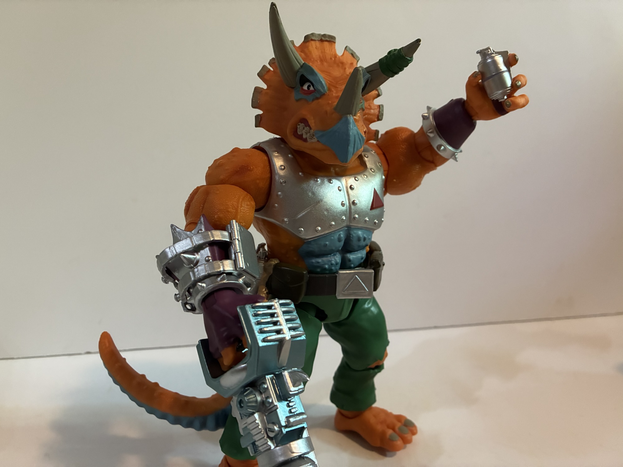

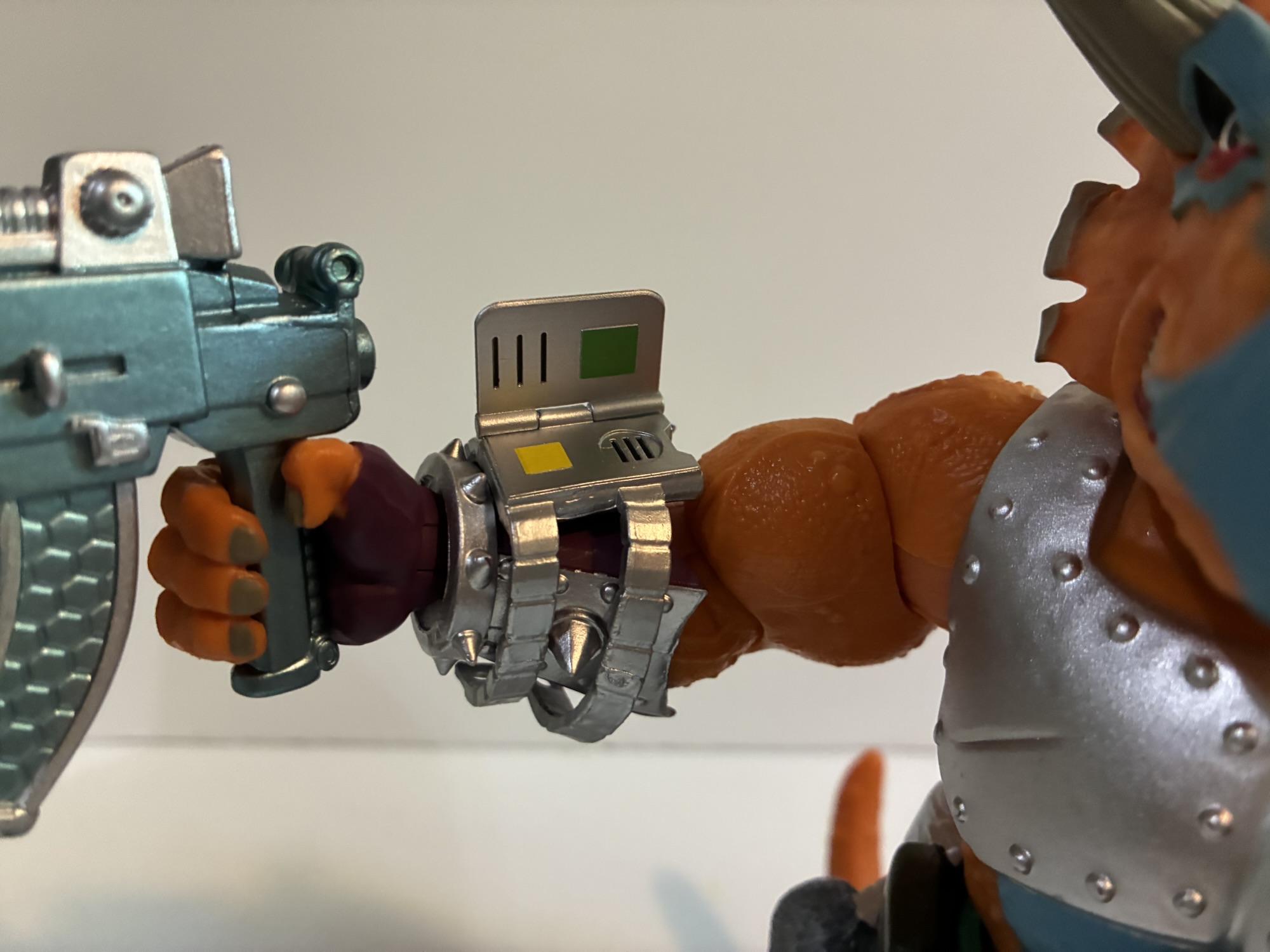
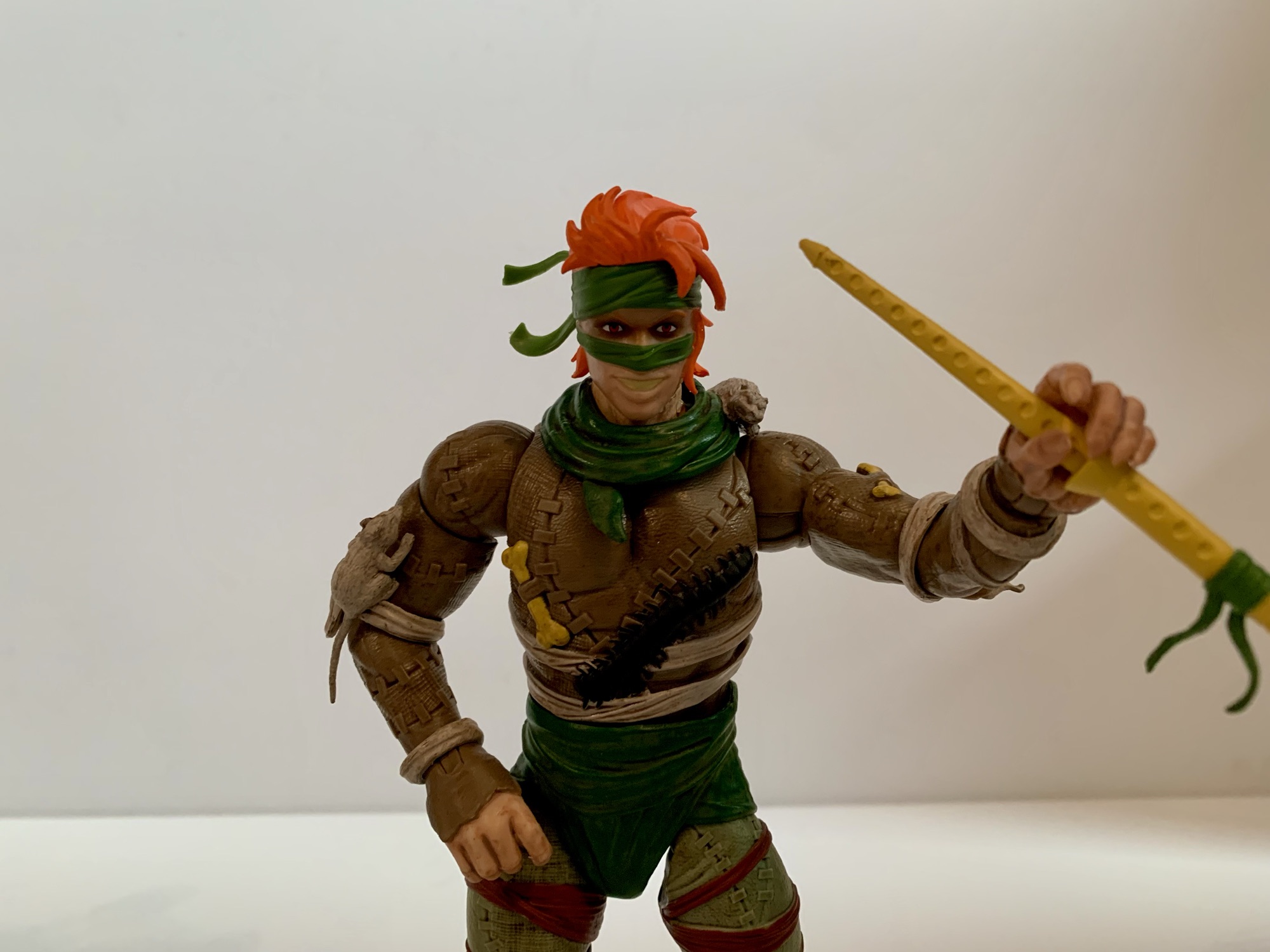
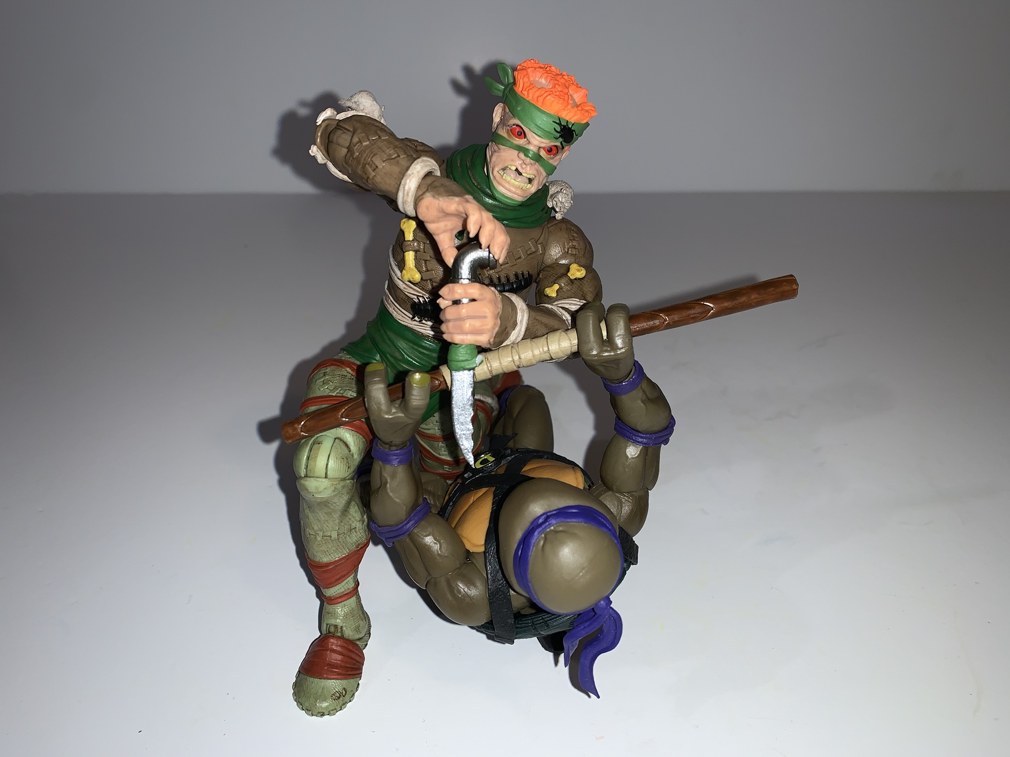
The figure also comes pretty loaded with accessories. We don’t get a second head, but we get three sets of hands: gripping, fists, and a clenching/style posed hand. He also has updated versions of his old guns. There’s the one that looks like a machine gun and one that looks like some laser or something. They’re both done on silver plastic, but hit with a spray of light, metallic, blue paint that looks really cool. That’s the old stuff, for new stuff we get a pair of canister grenades. They’re the same style that’s molded on the belt of the current and vintage version so it’s cool to get some as actual accessories. They’re also painted silver and they fit well in the clenching hands. We also get two wrist accessories. The first one appears to fit on the right forearm and has a communicator or something on it. It flips open and it’s all silver. It would have been neat if the screen was painted a different color, but it’s cool, though a little tough to get the clasps in place. For the left forearm, there’s a strap-on energy sword. It’s basically all silver with the blade done in translucent green. It’s very fitting for the line and looks pretty bad ass though it too is a bit of a pain to get strapped into place. Triceraton also has a respirator since Earth’s oxygen levels are poisonous to him. It’s done with a gummy plastic that’s very pliable. The mask and hose are transparent with the straps brown. It’s connected to a monitor that’s silver and clips onto his belt. It’s very easy to get onto the figure and I think it looks great, though like the wrist communicator, I wish the monitor had more detailed paint work. Lastly, there’s a third rat for him to snack on or you can just add it to Rat King, but he might not appreciate that it’s dead.
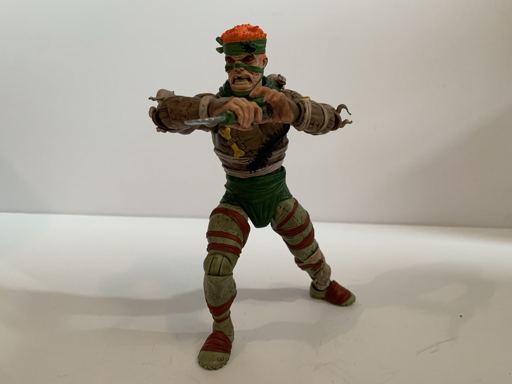
The figure looks great and comes with a lot of stuff. The old accessories are here and the new ones are actually pretty awesome, so why didn’t I want to pay full price? It all comes down to articulation. And not just how much the figure moves, but what some of the articulation choices did to the look of the figure. This guy is has more points of articulation than the original, but functionally there isn’t much of an upgrade here. For joints, we get head, shoulders, biceps, elbows, wrist, waist, hips, knees, ankles, and tail. Of those, the ones that function only as a swivel joint include the head, waist, and tail. If the head is on a ball joint, it’s not getting any benefit from it. The elbows and knees swivel, but the hinge joint is useless in both places. For elbow, the range of motion is maybe 30 degrees. It’s almost nothing. The bicep swivel basically doesn’t work. The wrists rotate and hinge fine, but the hinge for the gripping hands is the wrong hinge. The hips and ankles are pretty much the only joints that work well.


And there’s the knees. The hinge joint has decent range. It’s less than 90 degrees, but it’s what we’ve come to expect from this line. The aesthetics though are trash. This is a character with holes in his pants over his knees and Super7 did not consider that when cutting in the articulation. It can bend only a minimal amount before exposing the big, green, hinge right in the middle of that patch of orange “flesh.” It looks so hideous that I honestly can’t imagine ever posing this guy with his knees bent which sucks. Why they didn’t just confine the openings in the pants to be above the joint is beyond me. That would have been the simplest solution. Or they could have done an overlay for the pants. I get why they didn’t just use an orange hinge as then there would be an ugly orange block of plastic on the back of the knee and it too would look stupid. You could argue it would be better to have the eyesore on the back of the figure as opposed to the front, but Super7 seems to always prioritize a neutral pose and that’s their right. It’s just another example of Super7 encountering a problem during the engineering process of an action figure and having no answer. And rather than try to come up with one, they just say “screw it.”
This figure is a glorified 5 POA figure. You will get rotation at the head, shoulders, wrists, and waist. The hips articulation is only so useful without knee articulation and that’s a shame. A ball-joint at the waist would have been nice and another joint in the diaphragm too. The design of the figure seems accommodating for such with the chest armor and the divided abdomen thanks to the blue coloring. Super7 opted not to cut it up though which would be defensible if we were getting better articulation out of the joints already present. The head being just a swivel is pretty terrible too. The NECA Triceraton is a very similar sculpt and that guy can look straight up. There’s really no excuse for what’s present.

And that’s why I refused to pay full price for Super7’s Triceraton. There’s a lot I like about this figure and a lot that just drives me crazy. It’s a very good microcosm of the Super7 experience: it’s big, it looks good, it moves like shit, and costs too damn much. For $55, I obviously can’t recommend it which is why I didn’t buy it. For $32, which is what I paid for it, I think it’s acceptable. I have a big, orange, dinosaur that’s going to look cool in my TMNT collection and it only cost 2 dollars more than those silly vintage style figures Super7 does. He’s not going to be fun to play with and pose, but at least he has enough stuff that he can have his look changed up to some degree (though I’m probably going to just keep everything on him). And for $32 I think that’s good enough, but only just barely. I got mine from Big Bad Toy Store where the figure is still priced at $32 so if you want him, go get him.
Check out some more Super7 discount all-stars:

Super7 TMNT Ultimates! Wingnut & Screwloose
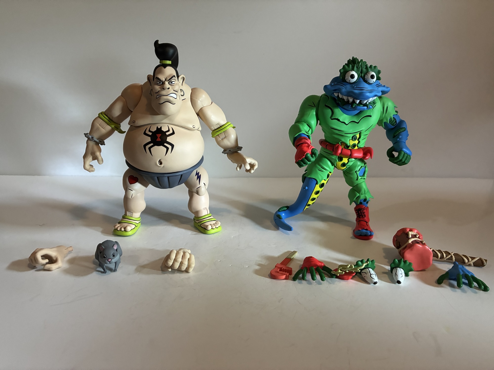
Late in 2023, Super7 started shipping the ninth wave of its line of Teenage Mutant Ninja Turtles Ultimates! action figures. I bought none. It was a wave with no compelling characters for me as it contained Slam Dunkin’ Donatello, Scumbug, Wingnut & Screwloose, Zak the Neutrino, and a flocked Master Splinter variant. Scumbug had been…
Keep reading
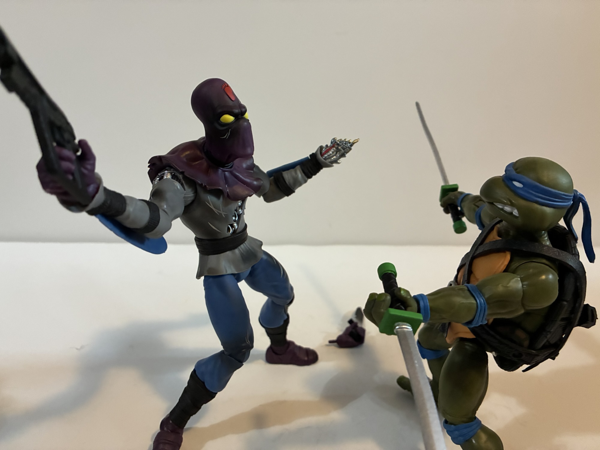
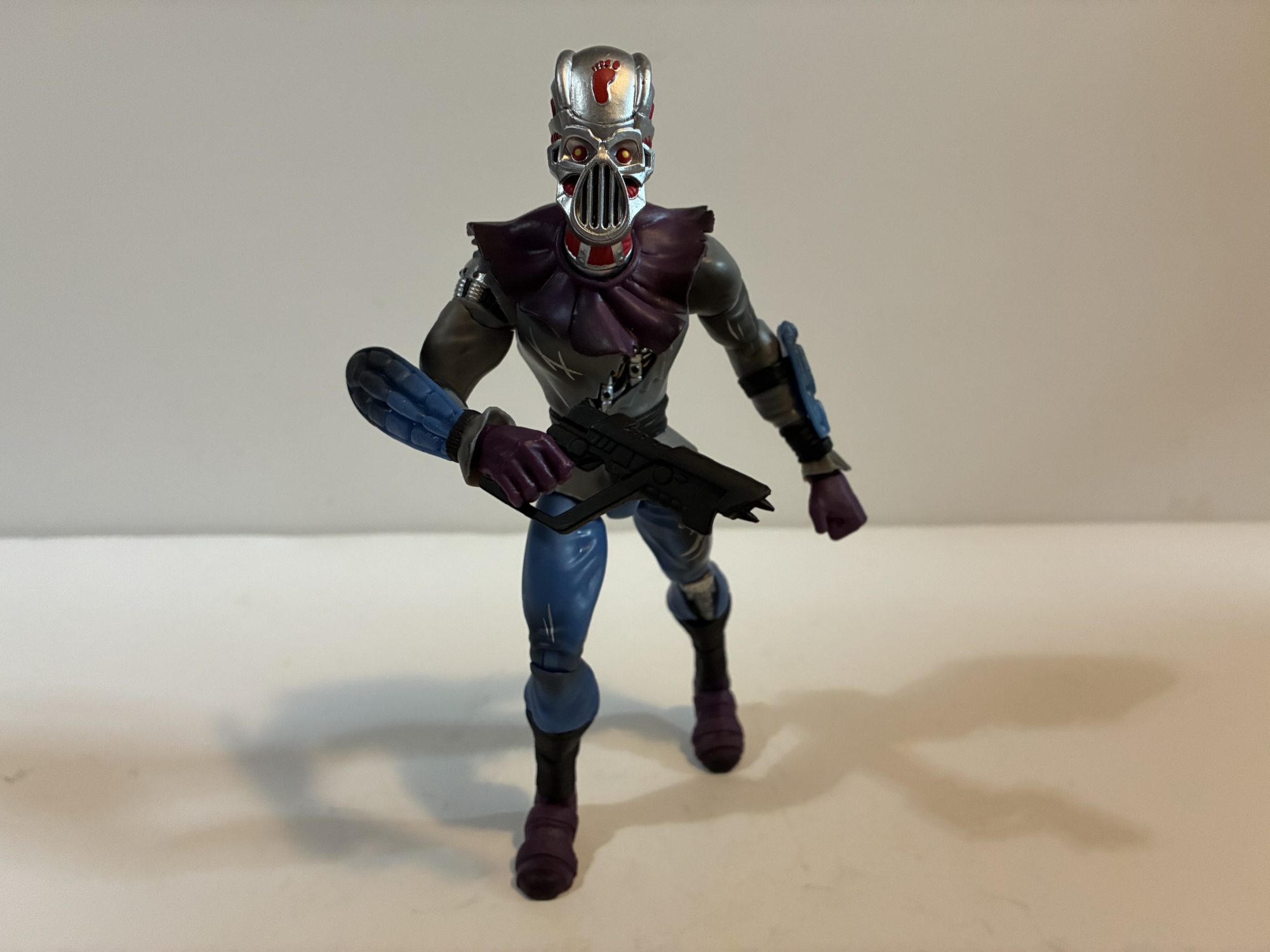
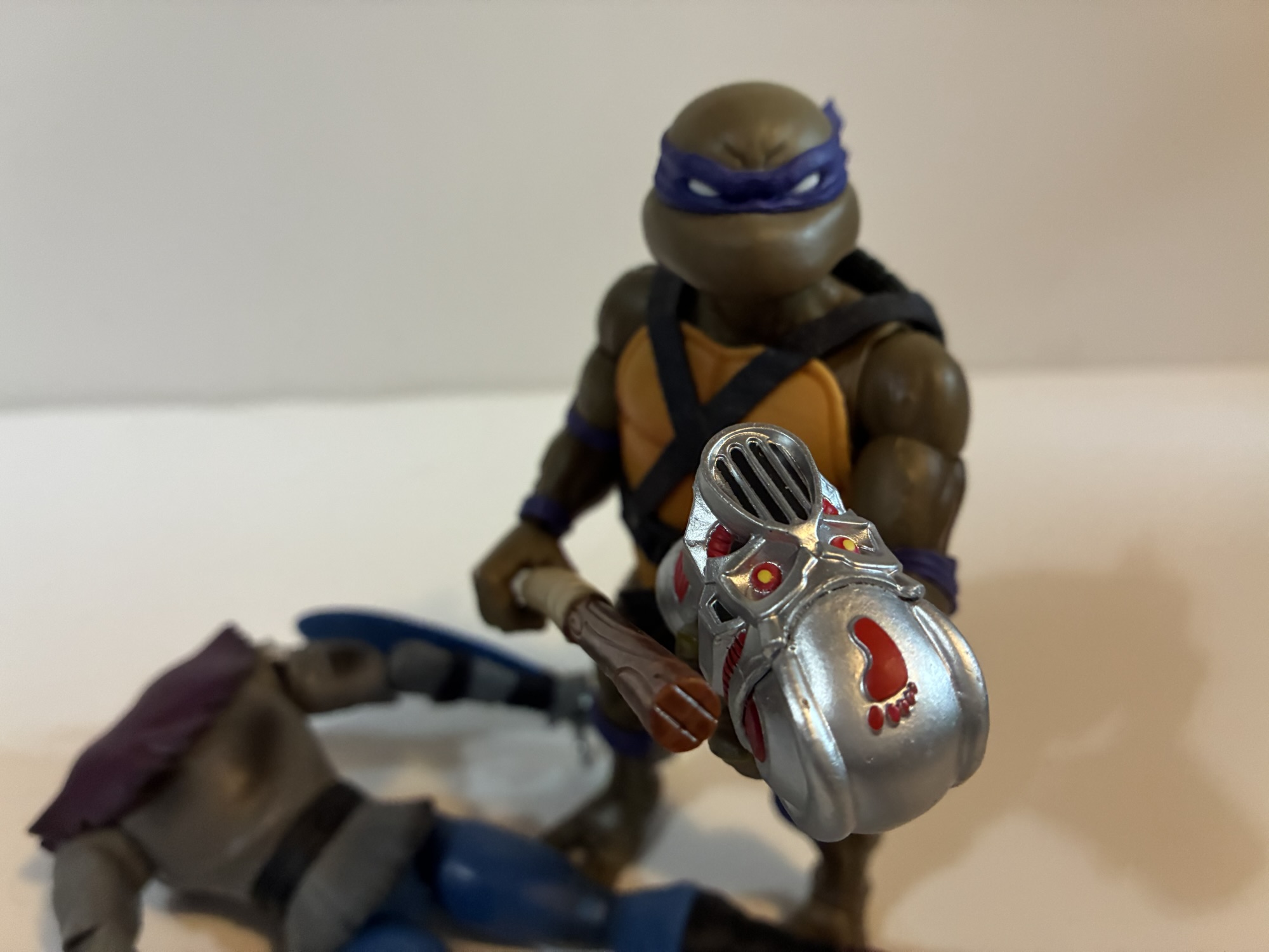
Super7 TMNT Ultimates! Foot Soldier (Battle Damaged)
The last Super7 review I did was for the wave of Teenage Mutant Ninja Turtles based on the 2003 cartoon and I concluded it by speculating it would be awhile before I found a reason to review another figure from Super7. That turned out to be a lie. With it being revealed that Super7 has…
Keep reading
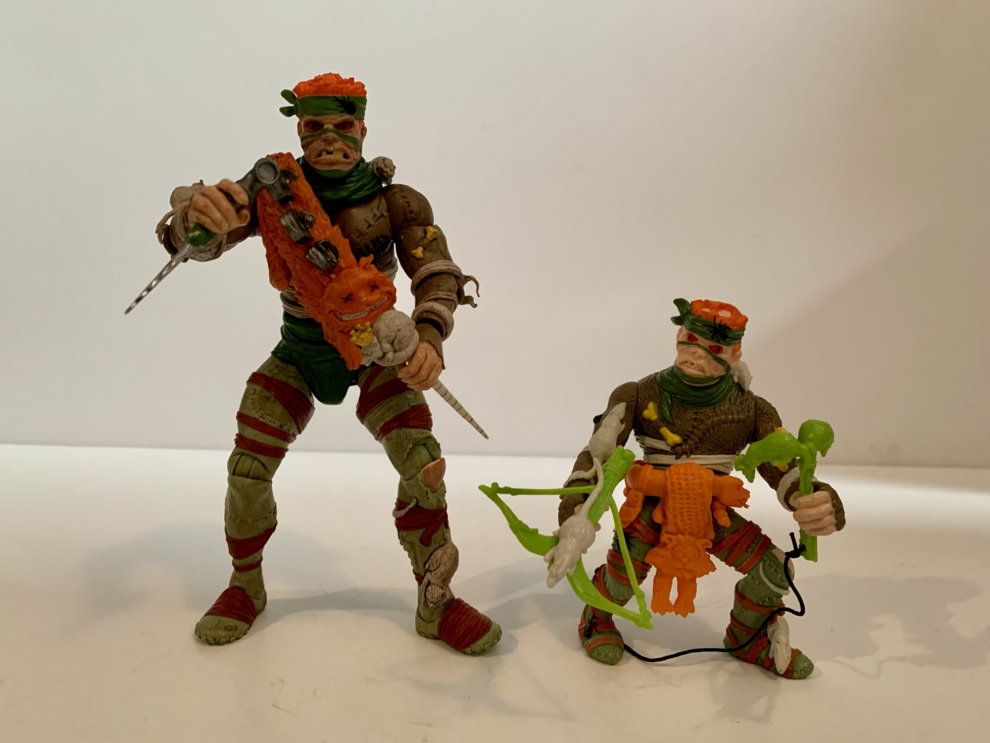
Super7 TMNT Ultimates! Mutagen Ooze Leonardo (now with the rest!)
If you’re into collecting action figures then you’re likely familiar with the concept of a variant. Tooling action figures, the process of cutting steel into molds in which plastic is inserted to create the figure, is the most expensive part of creating an action figure. That’s why it’s in the manufacturer’s best interest to get…
Keep reading