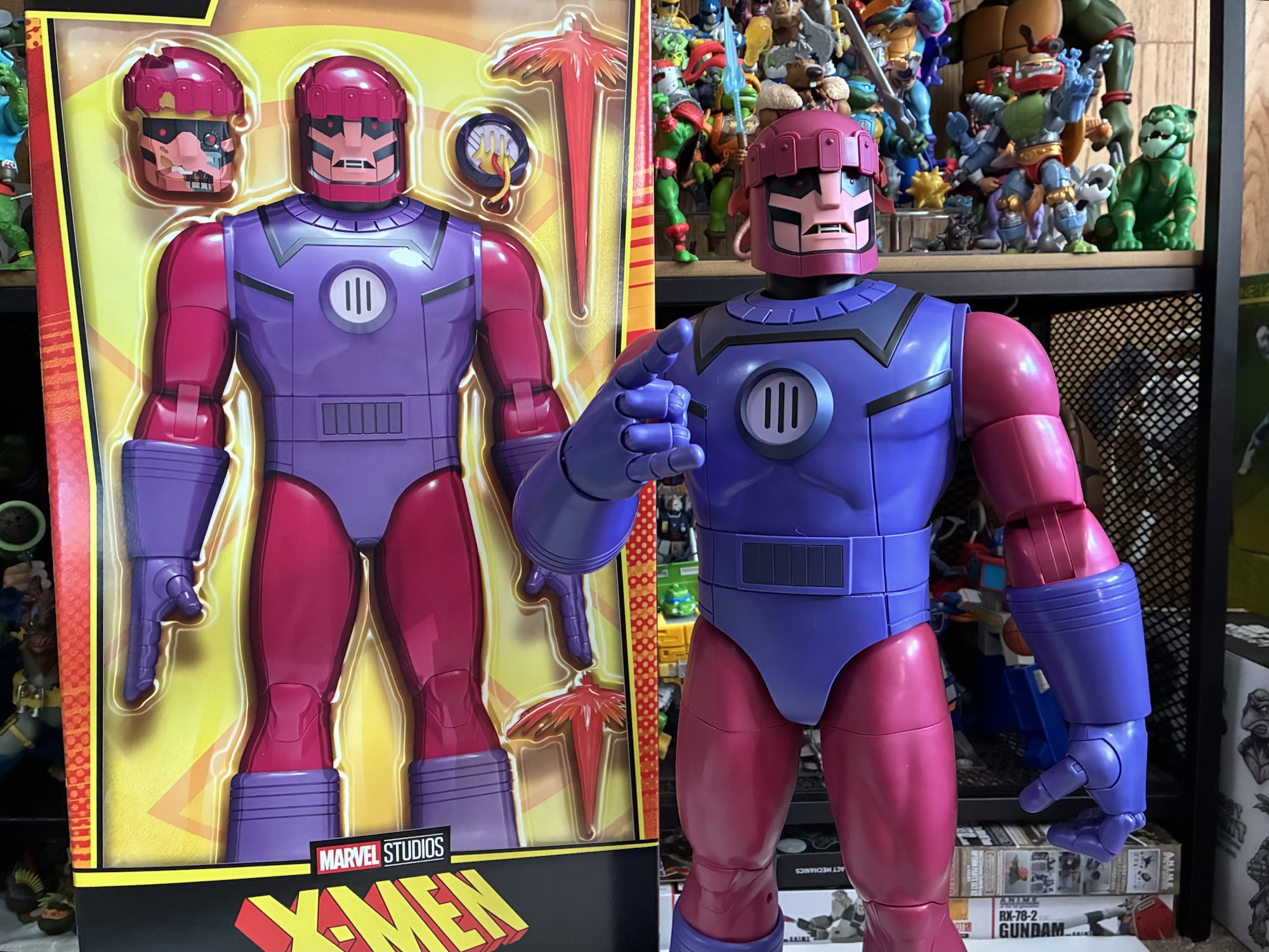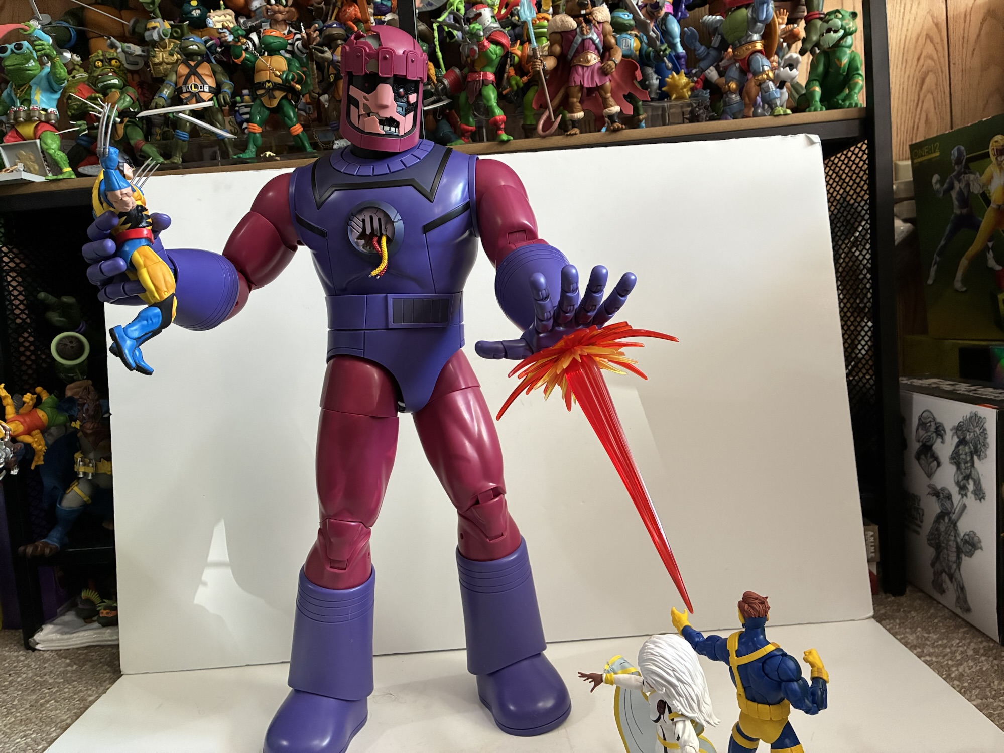
On July 1st, 2026, our long wait ends. X-Men ’97 returns to Disney+ with its greatly anticipated second season a little over two years after the conclusion of the first. It’s something I have been looking forward to pretty much ever since credits rolled on the finale and the only thing that stinks about it is that it arrives when I’m on vacation. As a result, I likely won’t have any thoughts up on this blog for a little while where that debut episode is concerned, but to tide things over we do have a toy to look at and it’s of a character that figures to be featured somewhat prominently in the second season of X-Men ’97: Warren Worthington the third, also known as Archangel.
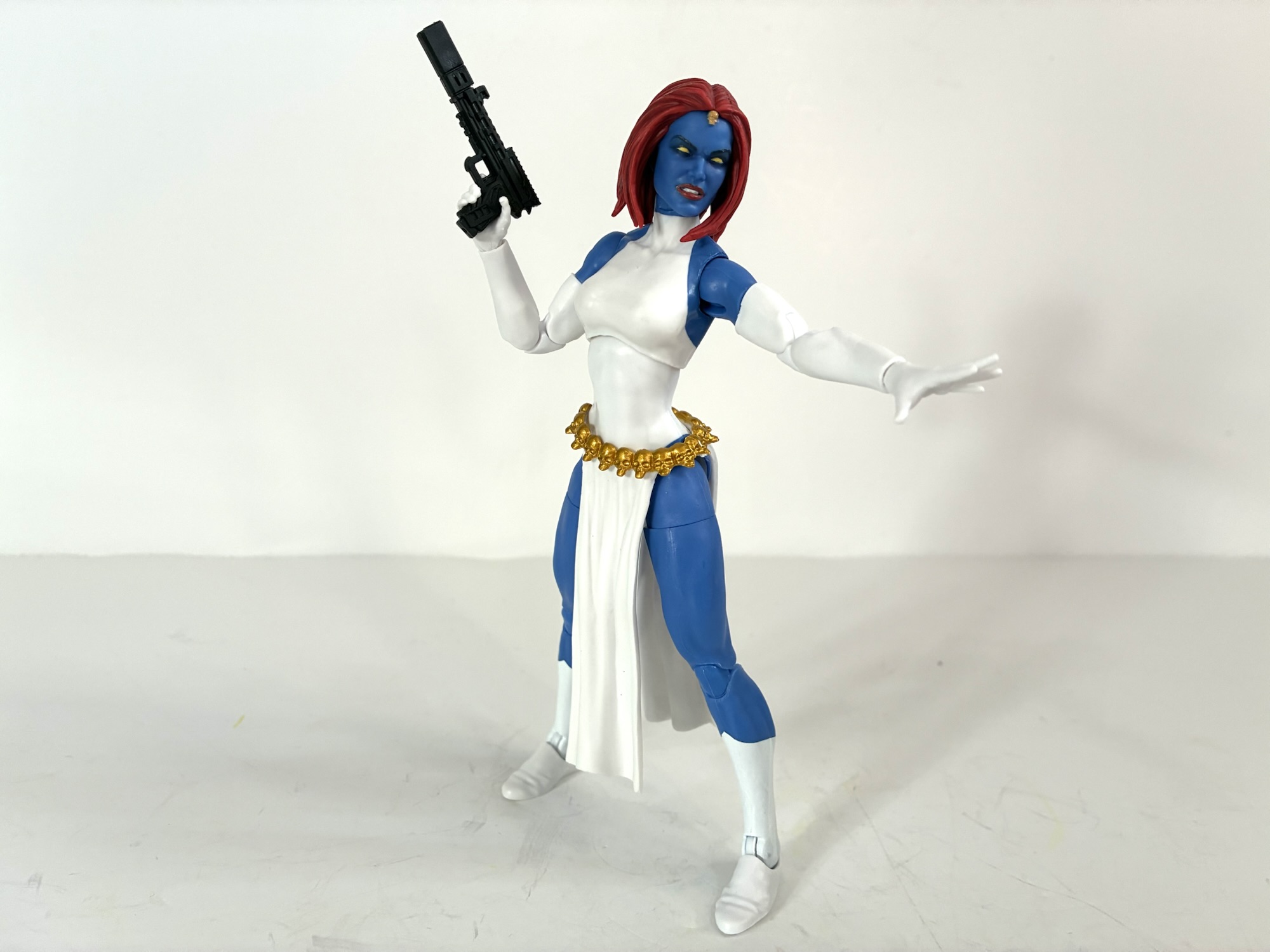
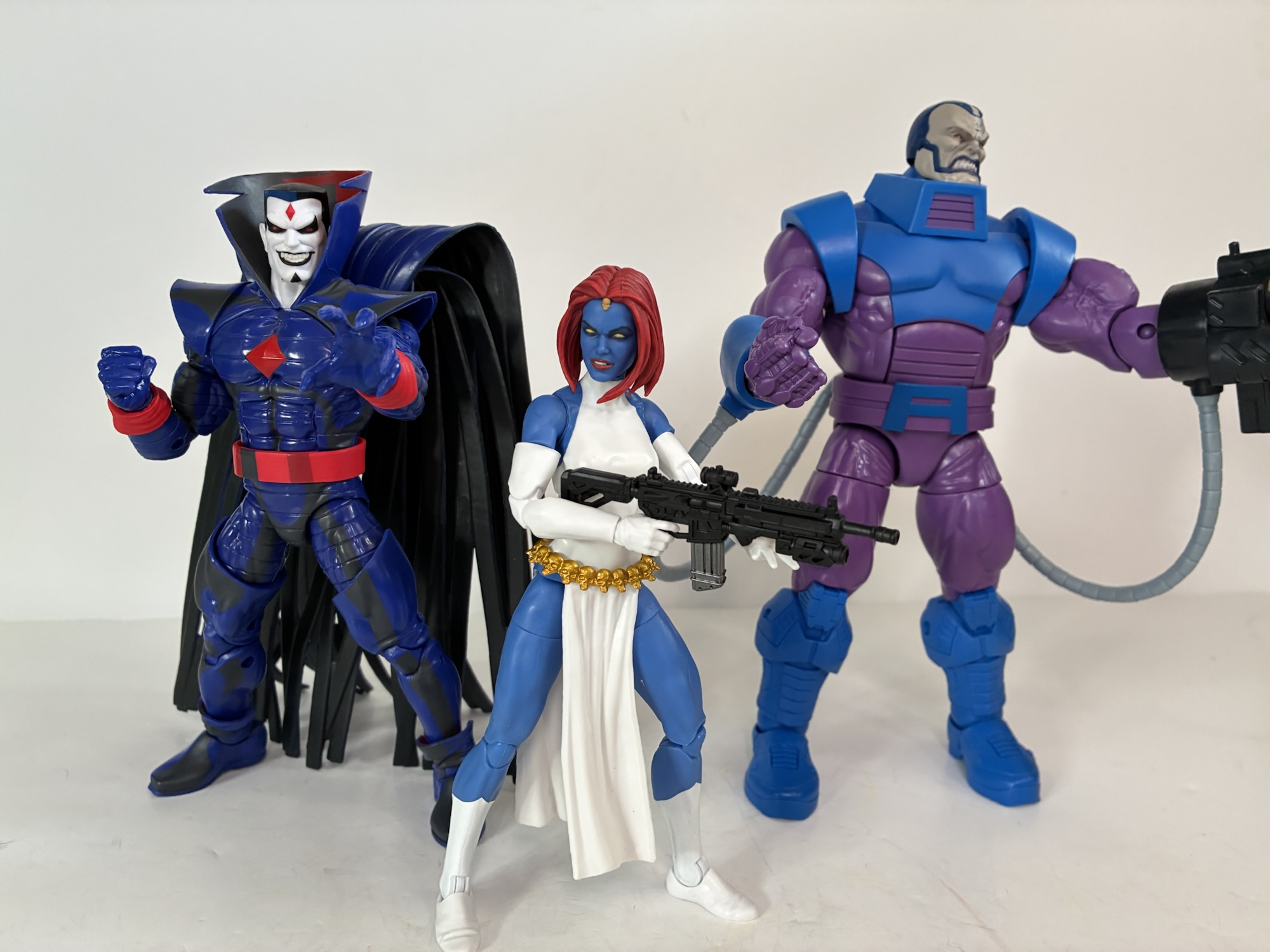
Archangel made his debut in the first season of the original series. He’s ambushed by Cable over his funding for a cure for mutation and winds up being the first victim of said cure when Mystique turns him into a slave of Apocalypse. In the process, Worthington’s feathery, angelic, wings were replaced with cold steel and his skin turned blue. He’d break free of Apocalypse’s control by the next episode, but his quest for revenge consumed him in his next appearance, “Obsession,” before a slightly milder version of the character appeared during the “Beyond Good and Evil” arc. That story was intended to be the show’s finale and at the end of it Archangel was to join the X-Men where he belonged, but a surprise order for new episodes extended the show and such plans were scuttled. During that arc, Archangel had returned to his Angel persona of blue and white, but for some reason when we meet him in X-Men ’97 he’s going to be sporting his original blue and pink Archangel look which is what this figure is based on. Will a reason be given in the show for the switch back? I don’t know. It could be whoever was in charge of the character designs just likes this look better, but I guess we’ll have to watch to find out.
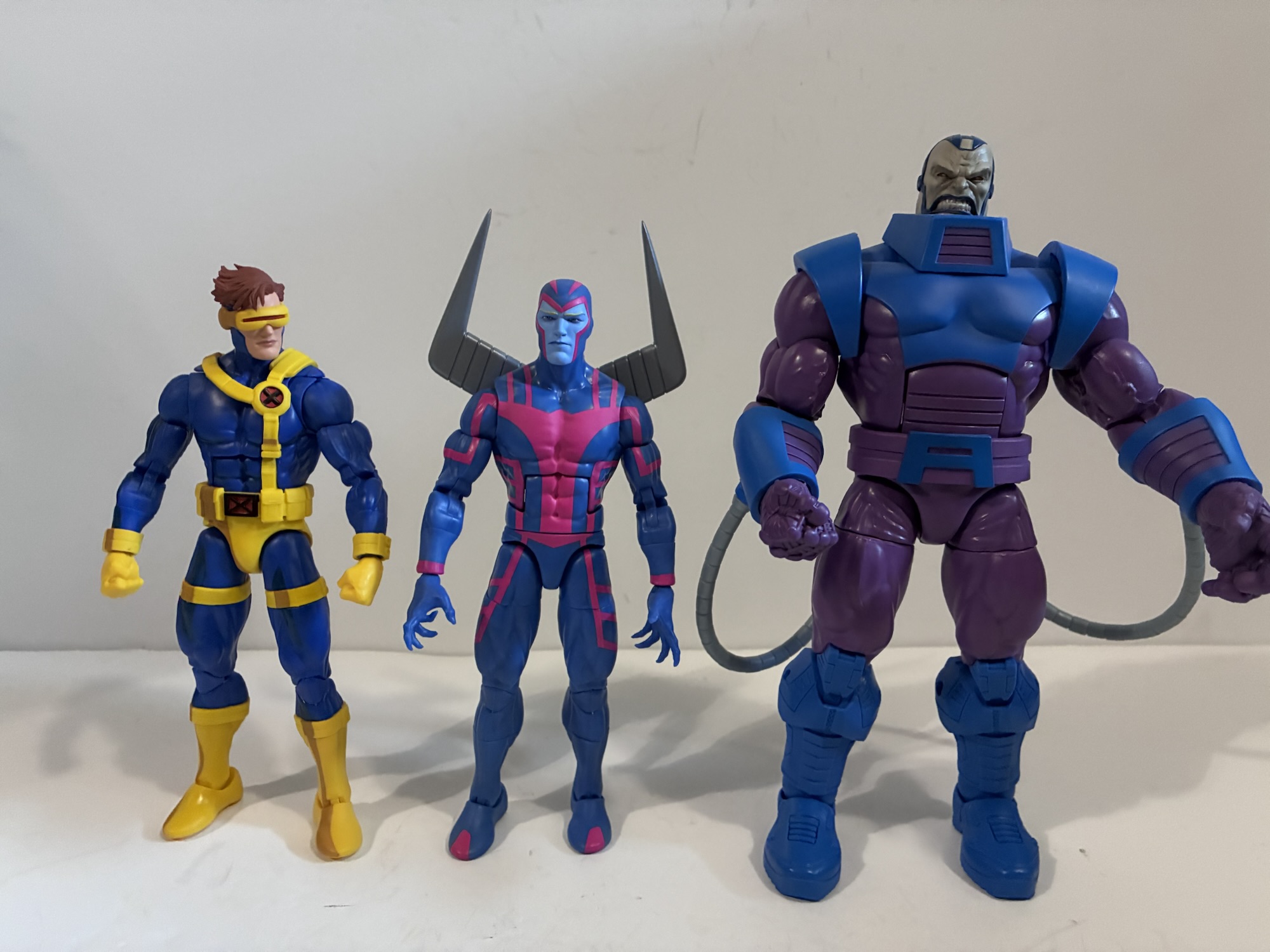
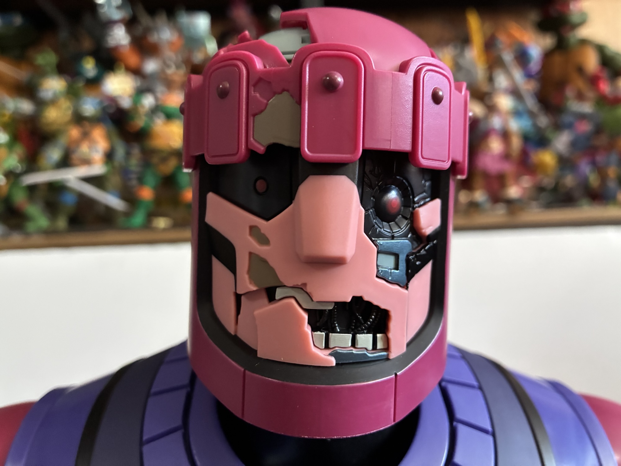
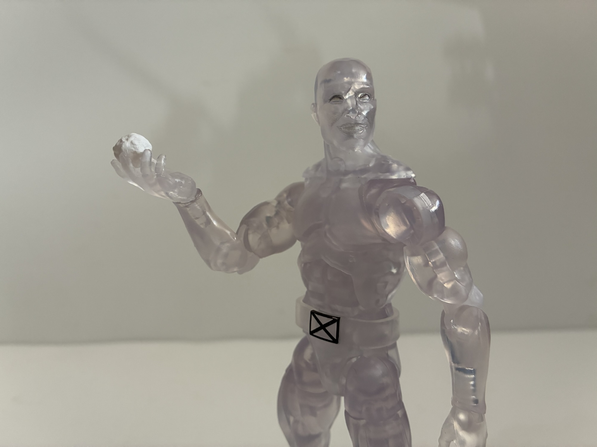
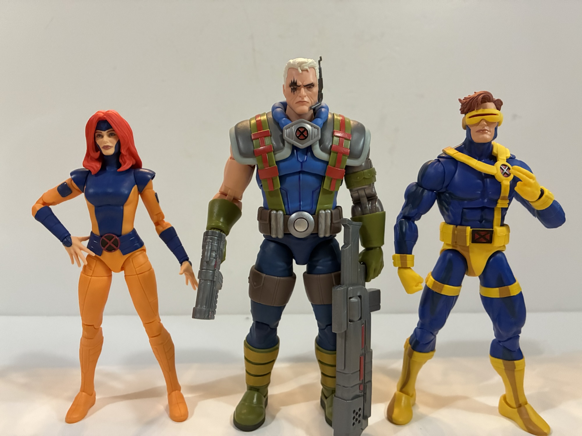
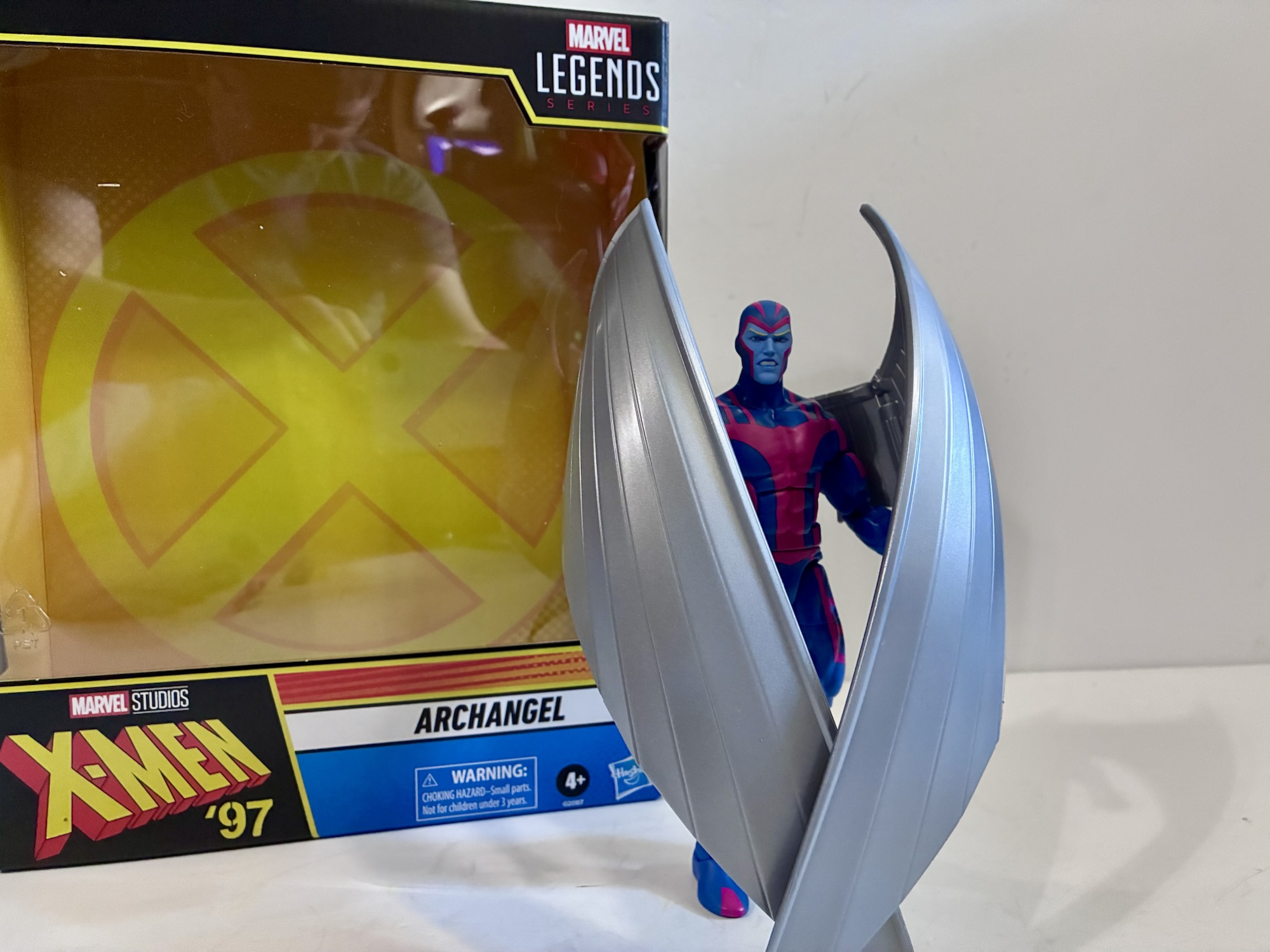
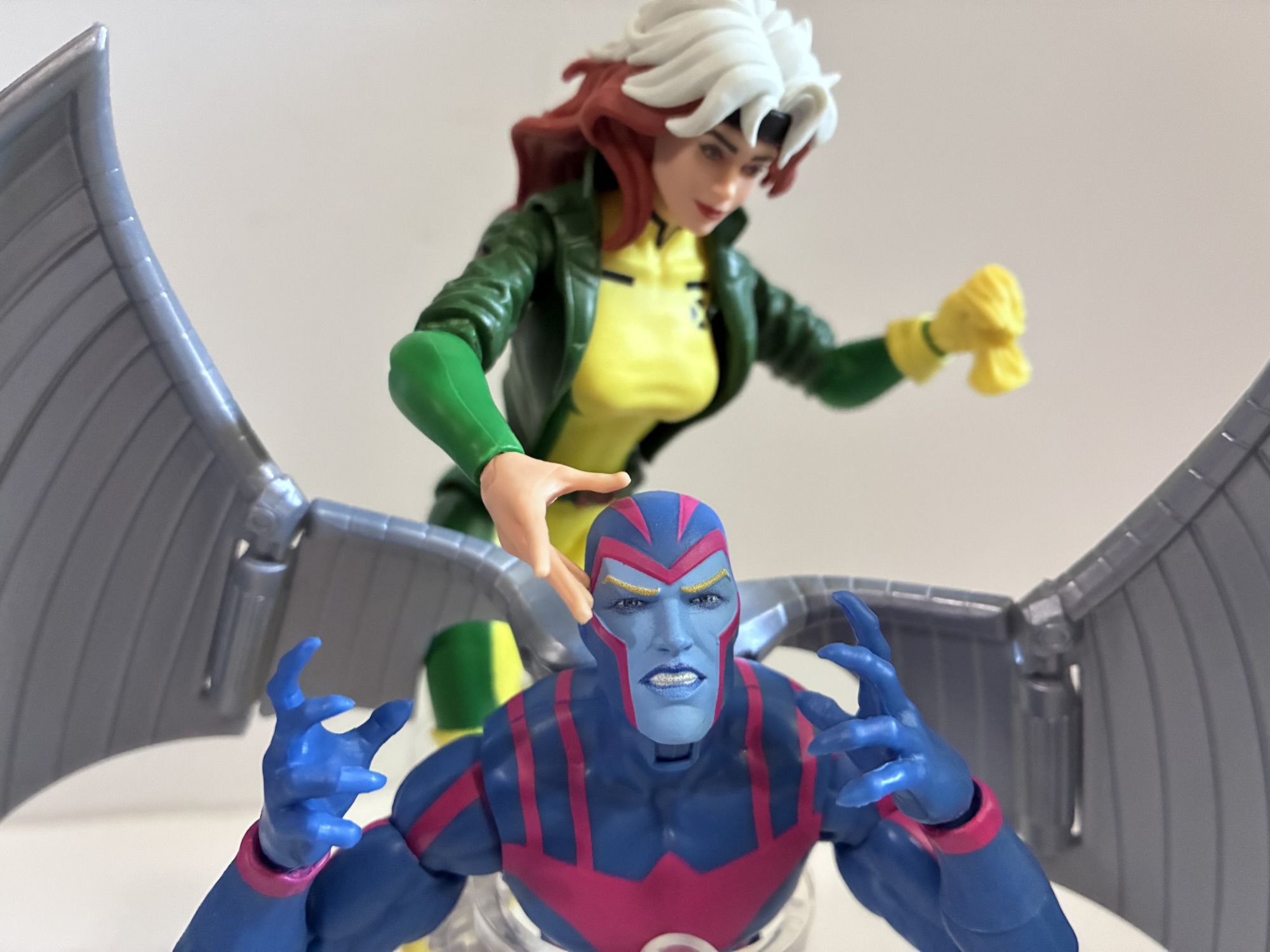
Archangel is considered a deluxe offering so he comes at an inflated sticker price and in a box as opposed to a blister card. The base figure is the same as the previously released Angel of a couple of years ago which is essentially just a modified version of the Vulcan sculpt. The only difference from that mold is that the torso had to be redone to exclude the butterfly joint in the shoulders in order to fit the ports for the wings. The body even still has the grooves in the forearms intended for characters with long gloves because it’s apparently too much to ask for Hasbro to just sculpt some smooth forearms. The costume is very similar to its appearance in the original series which is also quite similar to the look from the comics. It’s still blue with a pink design painted onto it and the application is pretty clean. The opacity of the pink varies as it transfers to different types of plastic which make up the body. It looks pretty damn good on the torso where the paint has a nice matte appearance. It gets a little thin on the thighs, but it’s not as noticeable as it was with the Gamerverse Venom and its white logo. The only difference between this version of the costume and the one from the 90s series that I can see is that the hands are the same color as the rest of the costume. In the older show, the sleeves ended at the wrist and Archangel’s hands were bare and matched the shade of blue of his face. He also tended to have dark, black, lines under his eyes which are not present here, but that’s probably for the best. They also decided to give him clawed hands which is an interesting choice. I would have preferred that they didn’t, but this (and the color of his hands) all appears to be part of the character design in X-Men ’97 so these aren’t critiques of the figure, but of the design.
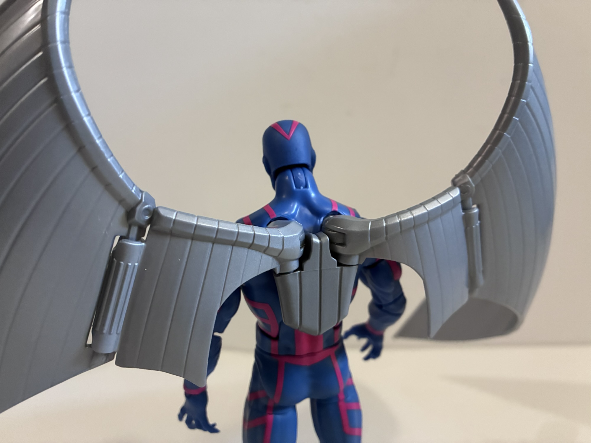
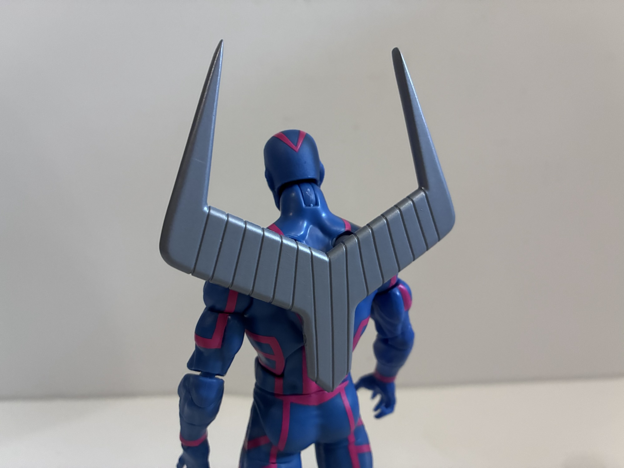
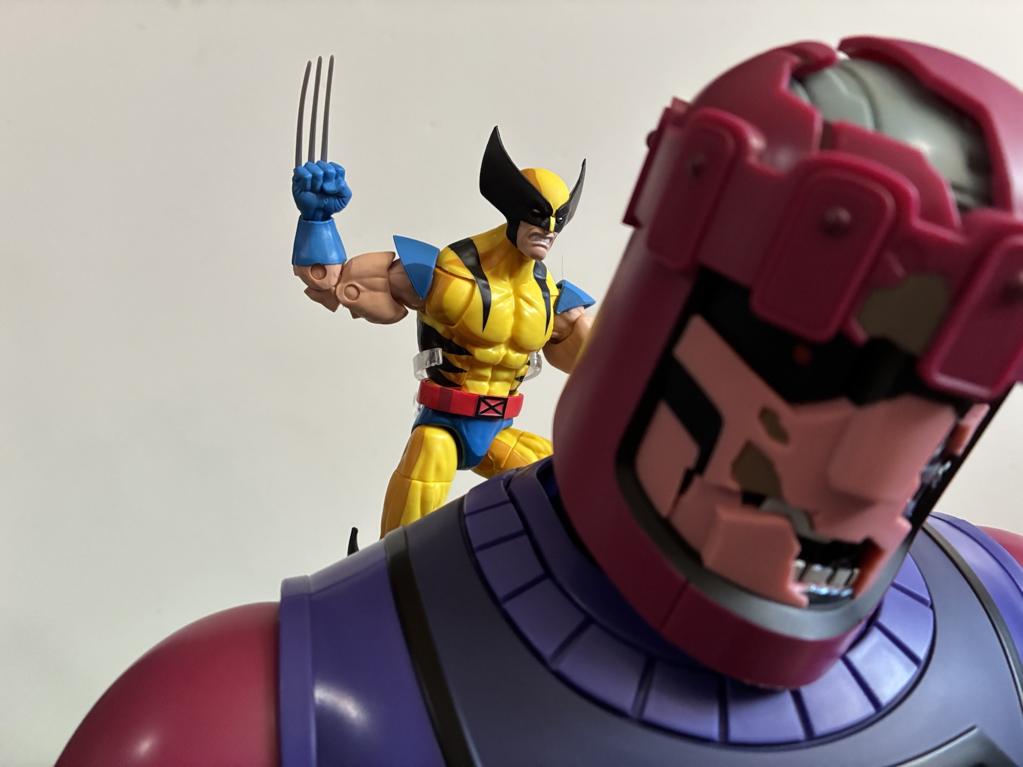
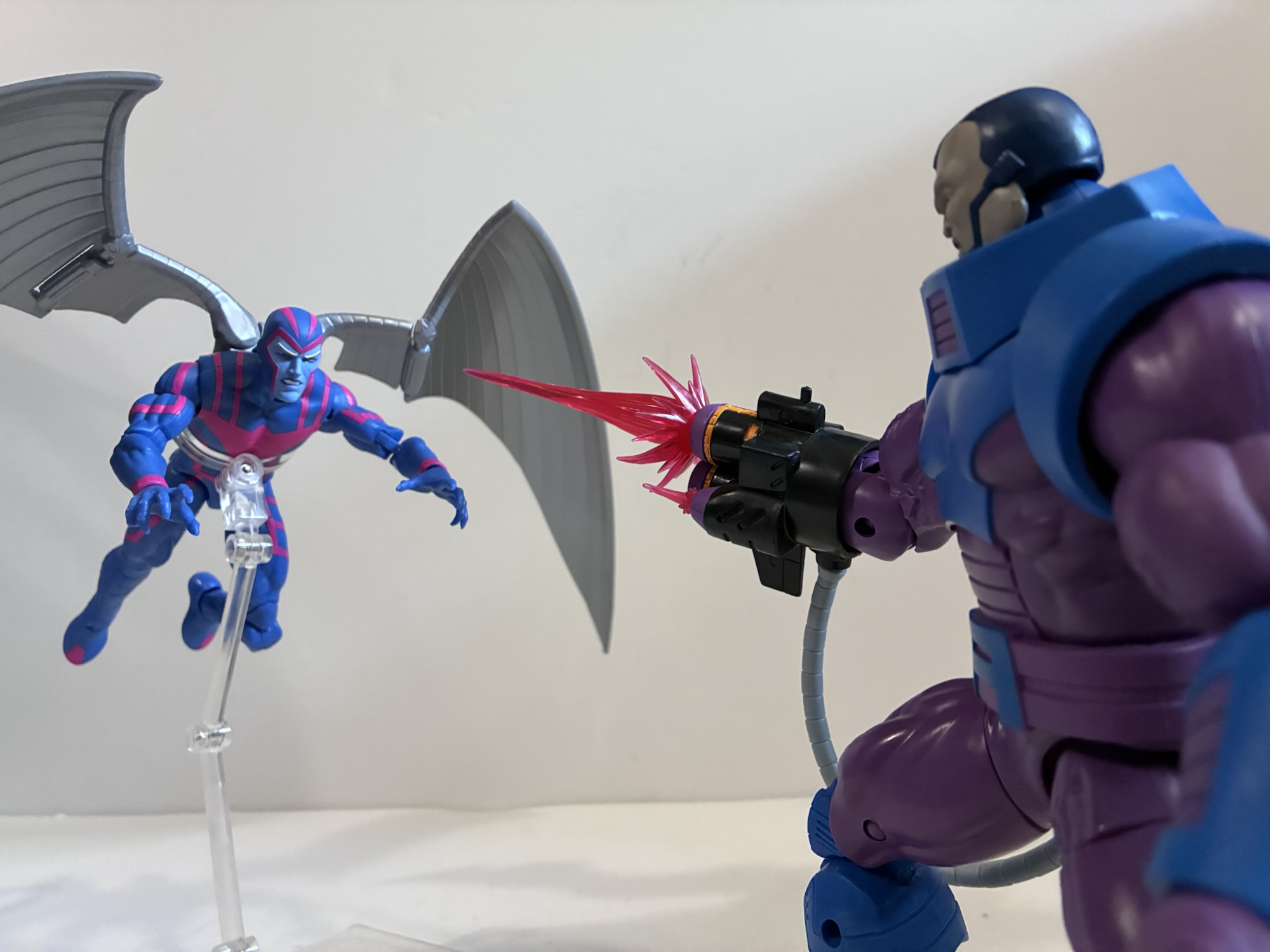
Archangel’s distinguishing feature is the pair of big, steel, wings on his back. For the show, Archangel’s wings are fairly simple and are represented by two somewhat triangular pieces of metal. In the comics, he could have all kinds of panels and metallic feathers and there are definitely some designs that are quite busy. This is a simplified look and it’s one I prefer. The wings clip into the figure’s back, but there’s also a joiner piece in the center they port into. The center piece basically just exists to match the look of the show, but it does provide some stability as well. There’s a hinge close to the center for flapping, but otherwise this central piece basically holds the wings in place. If you want to shift them up and down you’ll have to remove that piece, though it leaves behind something ugly. The wings are basically a light gray plastic and there’s no metallic paint applied. It would have been nice to see them fully painted to better reflect their look on television, but that’s not really how Hasbro does things. They do look fine, though I’m torn on how much I like the curve sculpted into them. Maybe something a little less severe would have looked better? If you don’t like them, Hasbro did include Archangel’s retracted wings. Resembling a tuning fork, this just plugs into the back like the standard wings and will take up far less shelf space. It’s a nice option to have, though I don’t know if I’ll be able to resist posing him with his wings out in a flying pose.
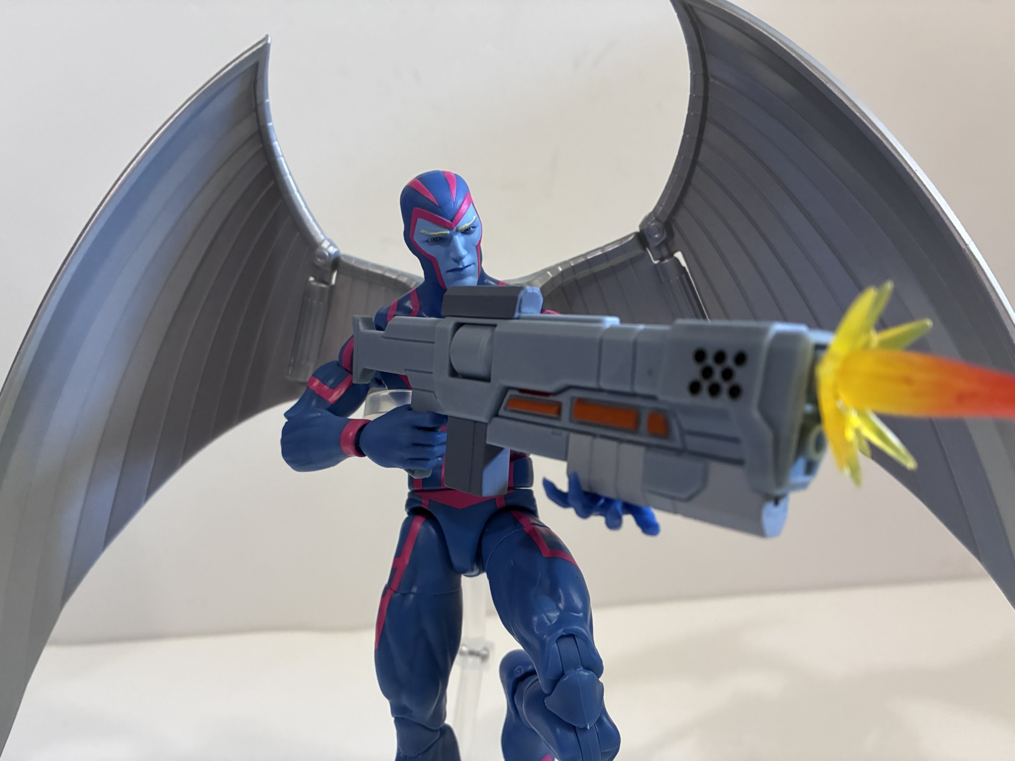
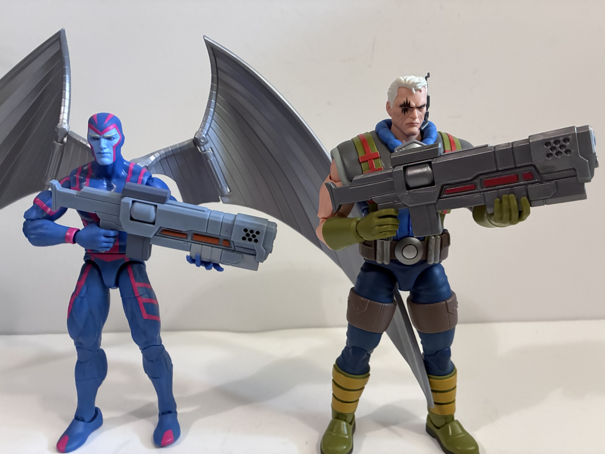
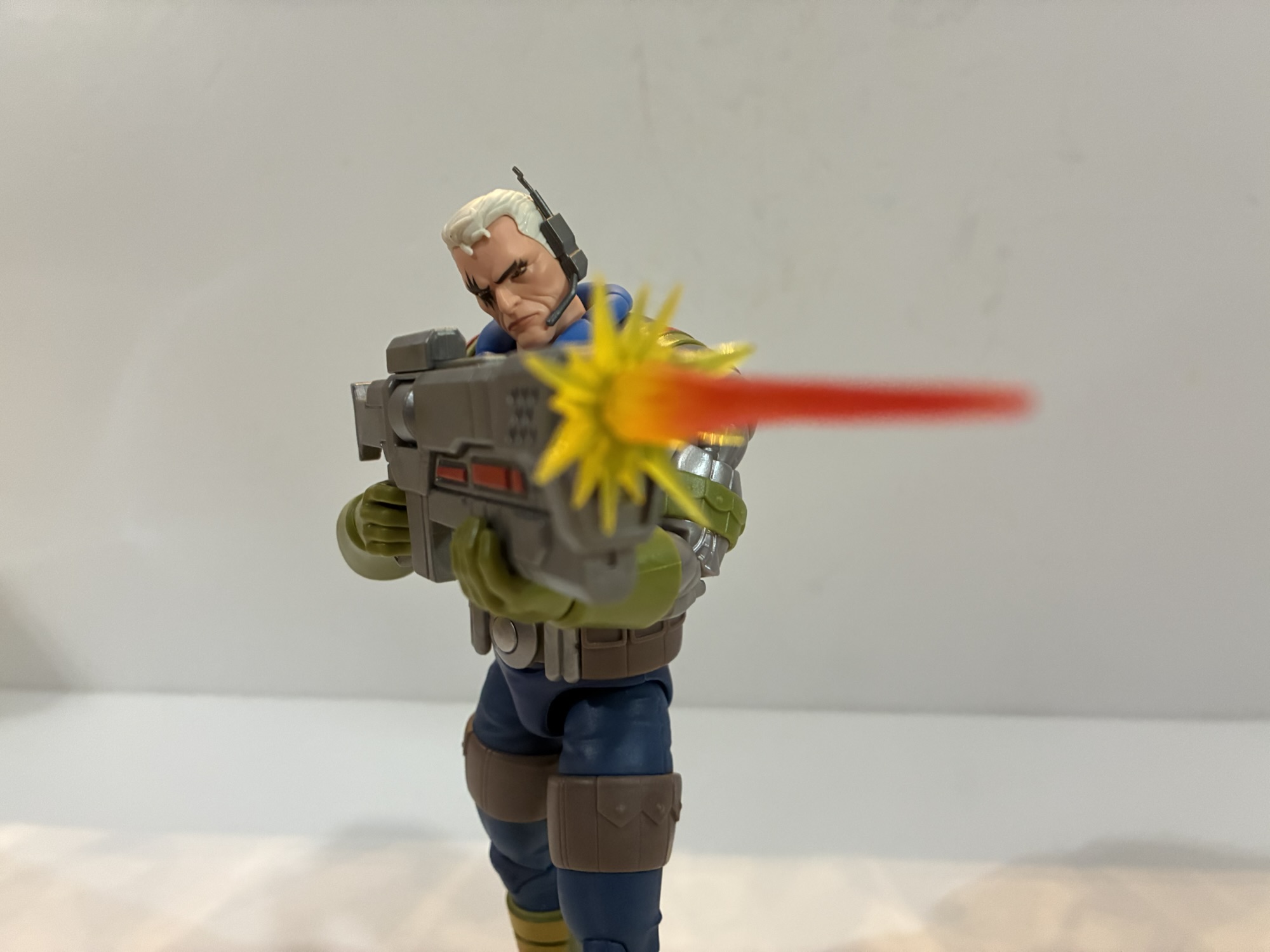
The other accessories are a bit minimal. Archangel has two portraits: neutral and a teeth gritting one. Both are cowled and it’s a shame we didn’t get an un-cowled look. If Ka-Zar wasn’t so expensive I’d consider buying one and painting the face blue as I always preferred Archangel with his blonde locks showing. By default, Archangel has a trigger finger right hand and a left fist. He also comes with a set of open, clawing, hands which are okay, but I already mentioned how I’m not a fan of his new talons. I’m also irritated we don’t get a right fist, despite one appearing on the back of the box. What would that have added to the budget? A penny’s worth of plastic? If that? The trigger finger hand is unusual, but they did decide to include a gun. Cable’s gun, to be exact as it’s the same one that came with the X-Men ’97 figure. It’s the bigger of the two guns and it has a new deco. The colors are more matte where as the original used a shiny plastic Hasbro loves for metallic objects. This new deco makes it a bit more animated looking, but it’s an odd accessory to include with Archangel. I assume he wields the gun at some point in season two, but getting it over a third head option, extra fist, or some feather blade accessories kind of sucks. A flight stand would have also been nice and, honestly, should be standard issue for a deluxe figure that has big wings on its back.
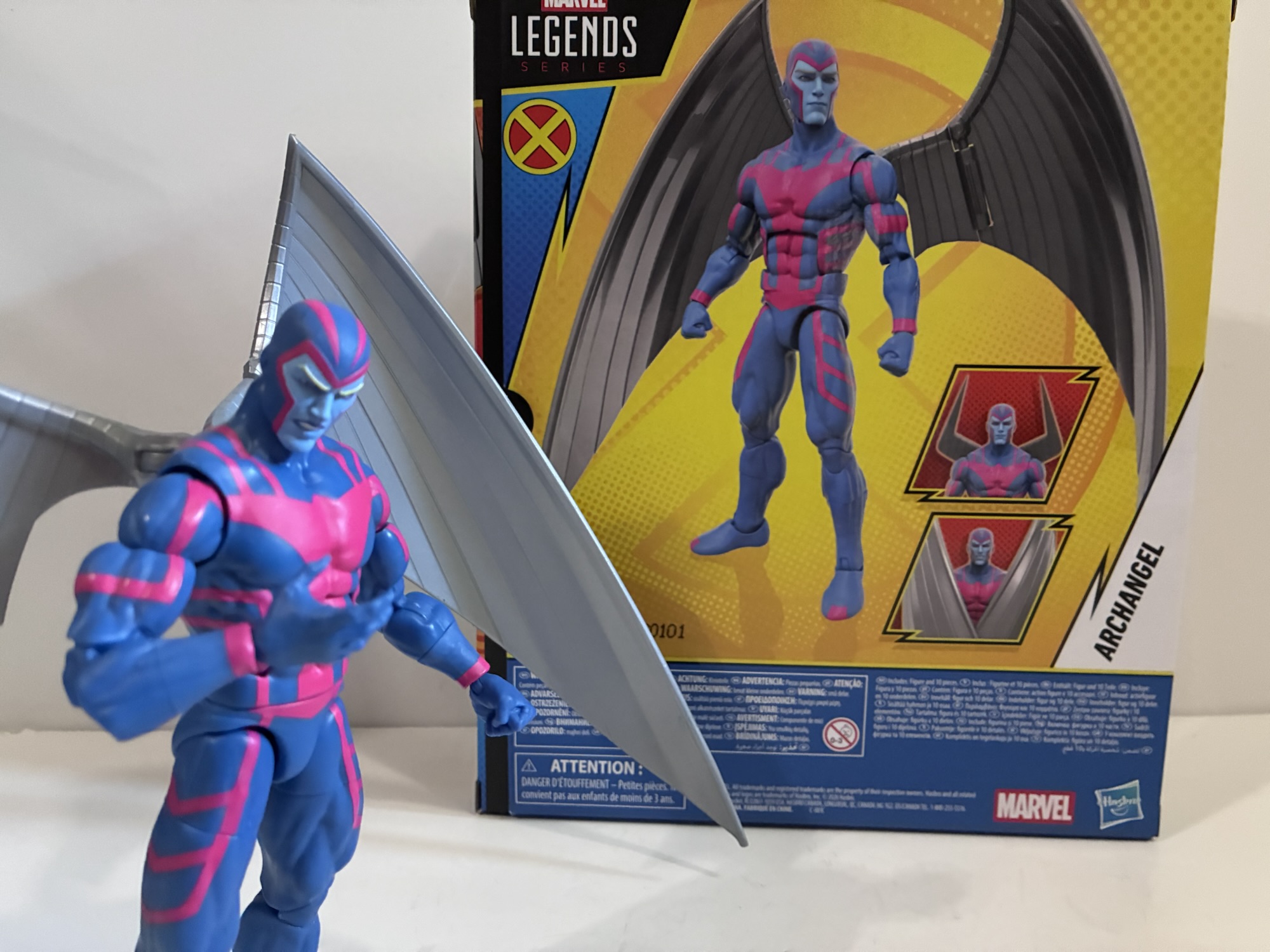
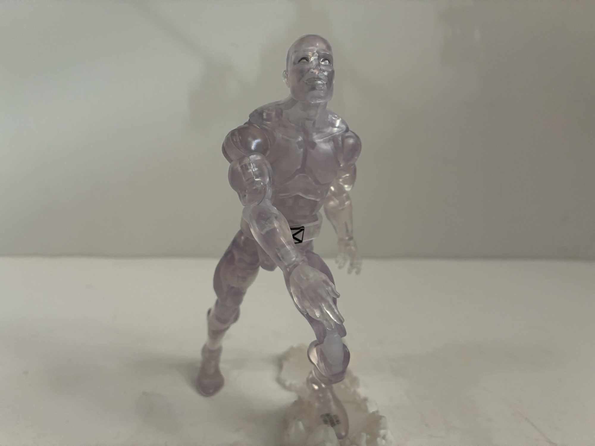
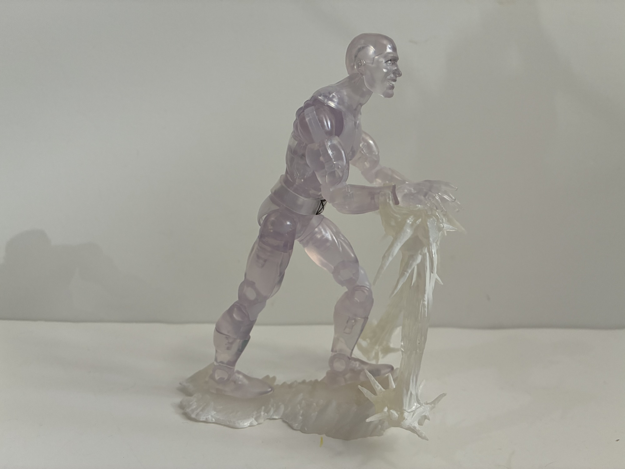
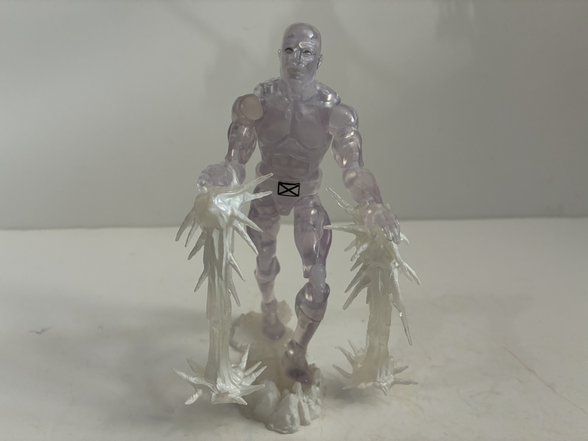
Archangel’s articulation is pretty standard for the line. If you have a figure on this Vulcan body (like Cyclops), then you know what to expect for the most part: hinged neck, ball-hinged shoulders, ab crunch, waist twist, bicep swivel, double-jointed elbows, wrist hinge and swivel, ball-socket hips, thigh swivel, double-jointed knees, shin swivel, ankle rocker and hinge. As stated earlier, the only change is the removal of the butterfly joint which does kind of suck for a flying character. Range otherwise is fine at all of the joints though the various swivels break-up the sculpt of the pink linework and musculature in a rather ugly fashion so they have limited utility. If you want Warren to wield the gun, the trigger hand does have a vertical hinge though the open, clawed, left hand is only so-so as as a stabilizing hand for the barrel. The wings have a hinge where they plug into the back and towards the middle so they can “flap,” and they can also wrap around to the front of the figure. As I mentioned earlier, you can take out the central mount to get swivel articulation, if that’s your preference. The joints are the usual tolerance for a Legends release with the exception of the left elbow. Mine is a touch on the loose side, but not so much that it can’t hold a pose or support the weight of the gun. I’ve never seen a loose elbow joint on a Legends release since they moved to the pin-less design so I’m thinking it’s a one-off with mine and likely not something afflicting all copies.
This X-Men ’97 Archangel is not an unwelcomed addition to the collection. As a reoccurring guest character in the original series, it always made sense to do a figure of Warren. While I don’t think any of the subtle changes to his look are an improvement, it’s not far enough removed from the 90s look for me to care all that much. What I do care about are the lackluster accessories and Hasbro getting cheap on us with the hand assortment while simultaneously upping the price. They’ve been doing that more and more with releases and it’s getting pretty annoying. Most Legends figures pull from the same pool of already sculpted hands so we’re just talking about the cost of plastic in most cases which is pretty damn negligible with something as small as a hand. And at the asking price of $40 it’s not as if this is a basic release. We’re paying an extra charge just because this guy has wings which is honestly kind of ridiculous. Back in the old days, Archangel was the same price as anyone else, but Hasbro likes to take any excuse it can to raise the price which is why they recently solicited a Doc Samson figure for $35 even though he’s really not deluxe sized and only comes with one extra head and one extra set of hands. I shudder to think what the X-Men ’97 Beast is going to cost since he actually has a backpack accessory – they’re practically breaking the bank! As a result, I’m far more excited for the return of X-Men ’97 than I am for this figure of Archangel. It’s not an underwhelming release, nor does it overwhelm the synapses. It merely whelms. He’ll slot into my animated X-Men collection, though I’ll always wish he had an unmasked head or another fist.
For more X-Men ’97 and ’97 adjacent releases from Hasbro, check these out:

Marvel Legends X-Men ’97 Cable
Today we finish our look at wave 3 of X-Men ’97 Marvel Legends action figures and I think I saved the best for last. Cable was one of the non-members of the X-Men to play a pretty substantial role in the original animated series. He showed up in multiple episodes in both the first and…
Keep reading
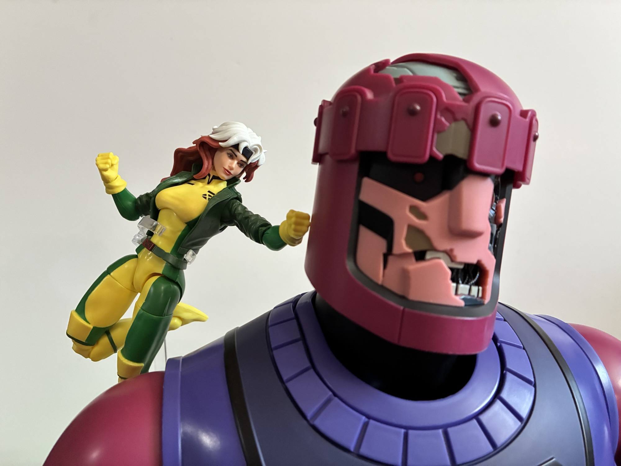
Marvel Legends X-Men ’97 Rogue
Previously, on X-Men reviews we looked at Magneto from the upcoming series X-Men ’97. The animated series may have been delayed into 2024, but the action figures from Hasbro are already here. And if you were collecting Hasbro’s line of figures based on the animated series from the 90s, this new line offers a chance…
Keep reading
Marvel Legends X-Men Retro Card Series Apocalypse
It is Halloween and that means it’s time for costumes, candy, and spooky fun. It’s also Halloween 2022, a pretty important date if you grew up loving those mutants who ran around in colorful spandex fighting for a better tomorrow. That’s because 30 years ago on this very night, the animated series X-Men premiered on…
Keep reading