Category Archives: toys

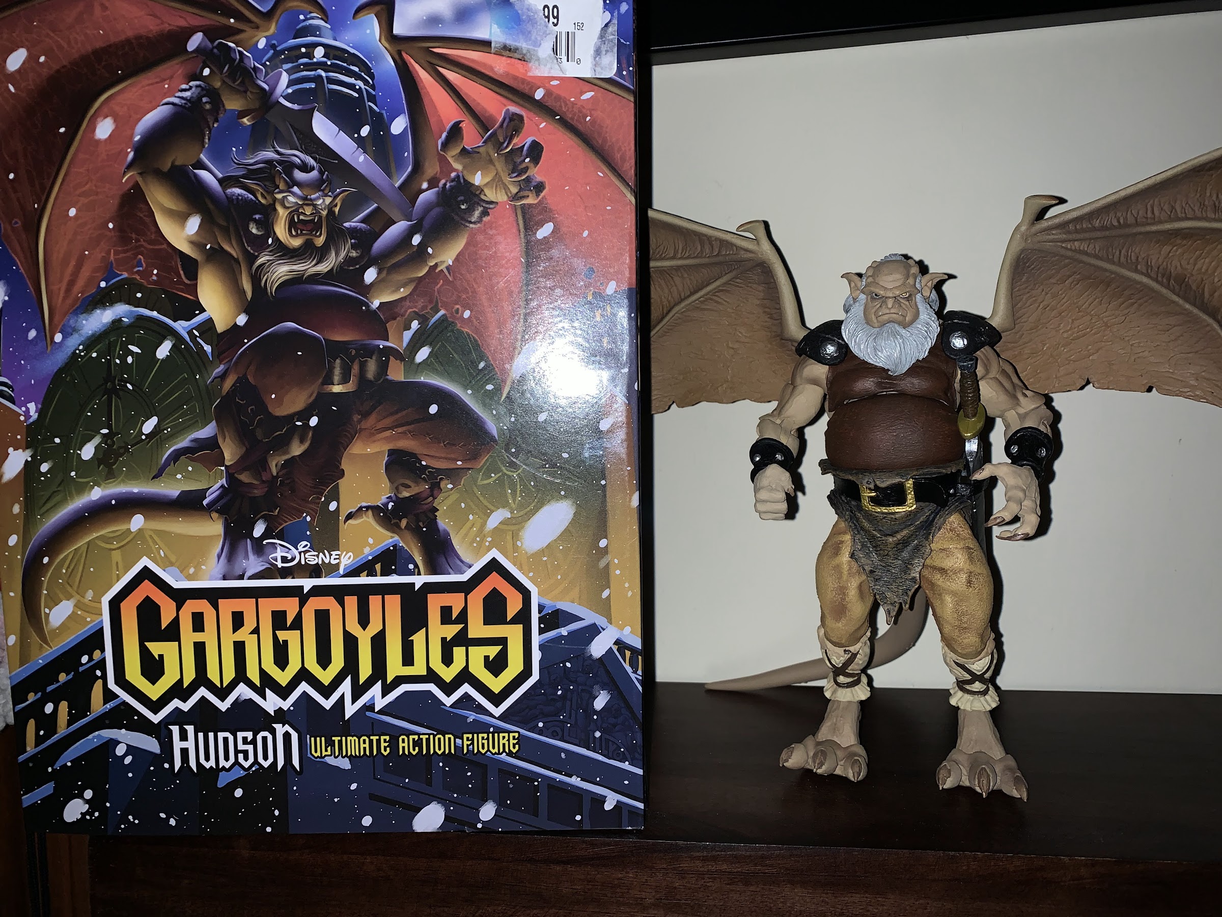
NECA Gargoyles – Ultimate Hudson

We’re coming out of Christmas with a figure of the year candidate.

Happy Boxing Day! It’s been a minute, but we’re back with another figure in NECA’s line of action figures based on the 90s cartoon/property Gargoyles – Hudson! Hudson, who was wonderfully brought to life by the late Ed Asner, was always my favorite character in the show. He’s basically the old veteran of the group. A bit surly, and at his happiest in a comfy chair with his TV and pal Bronx at his side. Though don’t mistake that for Hudson being some useless old geezer. When he’s called upon he’s still a ferocious warrior. Armed with his curved sword, he may not be the warrior he was in his youth, but he won’t back down from a fight. His biggest contribution to the Manhattan Clan though is his wisdom as Goliath often seeks his advice before rushing headlong into a confrontation. There’s no doubt about it, Hudson is pretty damn cool and I’ve been looking forward to this release for awhile. I just had to wait, because he was originally scheduled for release in September, which became October, and you get the idea. I actually ended up finding this guy at an FYE. At first, I was turned off by their inflated price, but eventually I came back and wound up walking out with him. The damage was $47 plus tax, probably close to $10 more if I could have found him at Walmart where he showed up in very small quantities weeks ago, but it’s only $5 more than the preorder I had secured so I figured the extra five bucks was worth it to have the figure now and not have to ship later.
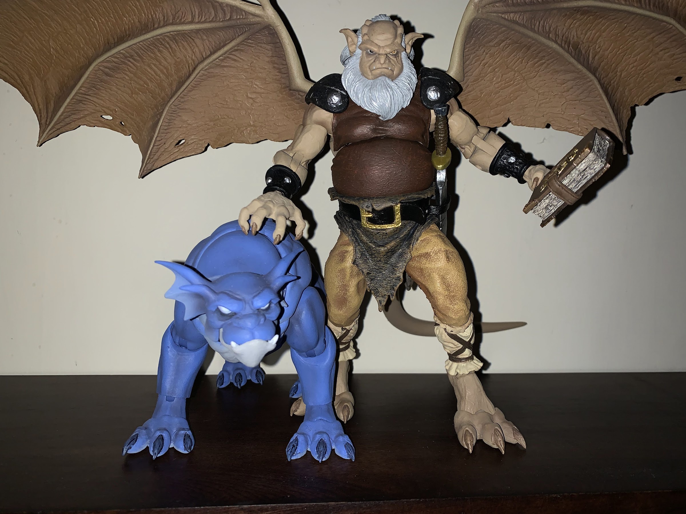
Good doggo.

Hudson comes in an oversized Ultimates styled box since he’s a pretty big boy. The cover of the box features some impressive artwork of Hudson by Djordje Djokovic with paint by Emiliano Santalucia. Hudson looks like he’s striking a ferocious pose or emerging from his stone state and it’s actually a bit festive as there’s snow falling around him. The rest of the box contains product shots of the figure plus a cross-sell of the rest of the line which includes headshots of the unreleased Lexington, Broadway, and Brooklyn. Once out of the box, Hudson feels pretty similar to the other figures we’ve seen in this line, except for Bronx, obviously. Posing him in a natural, gargoyle, stance puts the figure at about 7.5″ with his knees bent and standing on his toes. Some assembly is required, as was the case with the others, as both the tail and the wings need to be attached to the figure. Neither is particularly hard. I had to work the tail in deliberately, but once in it felt secure. The wings just snap into place and it can be done with the figure’s head on or off. The hair gets in the way a little, but it can be flexed out of the way without much trouble.

This guy looks frikken’ amazing!

With the figure assembled, I will just come out and say that this is the best release in the line so far. Hudson looks fantastic and, like Bronx, retains a lot of his animated look. For Hudson, I attribute that more to the fact that he wears more clothes so there was little where the NECA sculptor (Djokovic) could freelance by adding more musculature like we saw with Goliath. The default portrait is a stoic, or neutral, expression for Hudson. His eyes have visible pupils, with the left eye being blinded and colored yellow, and his mouth is set in something close to a scowl. It is undeniably Hudson and the quality of the sculpt is impressive. Equally impressive is the paint as it’s all nice and clean. His beard and hair are sculpted in white but have been brushed with gray and a hit of silver in places. The crispness of the ridges on his brow, around the nose, the lines under his eyes, are just awesome, for lack of a better word. And the rest of the sculpt is just as good. His clothing has a nice texture to it, the paint is really clean all over. There’s shading, the straps on his calves are nice and clean, the buckles and studs are all painted, and it just looks like no expense was spared. The wings are unique to Hudson. Yes, they’re still spread wide open so the shelf space needed to display him is immense, but they do look good. There’s shading on the wings and he has some tattered parts of the membrane with some holds in there to reflect a long, hard, life. If I’m going to nitpick the presentation at all, the tail is still bland looking as they do the tails in rubber with a bendy wire. There’s no texture or anything to it, but it’s also positioned behind the figure at all times. And the feet don’t look as good as the rest of the figure because there’s no paint wash on them. They just stand out a little as looking flat, but like I said, it’s a nitpick. This figure is gorgeous and once again makes NECA look like an outlier in the toy world right now, but in a good way. Hasbro is an outlier in a bady way as their prices seem rather high and the quality of the product low compared with their peers. Meanwhile, NECA is out here with prices not much different (I paid $47, but this guy should be $37 or $38) selling figures with mostly new tools, tons of paint, and plenty of accessories. They are the best deal in town right now.
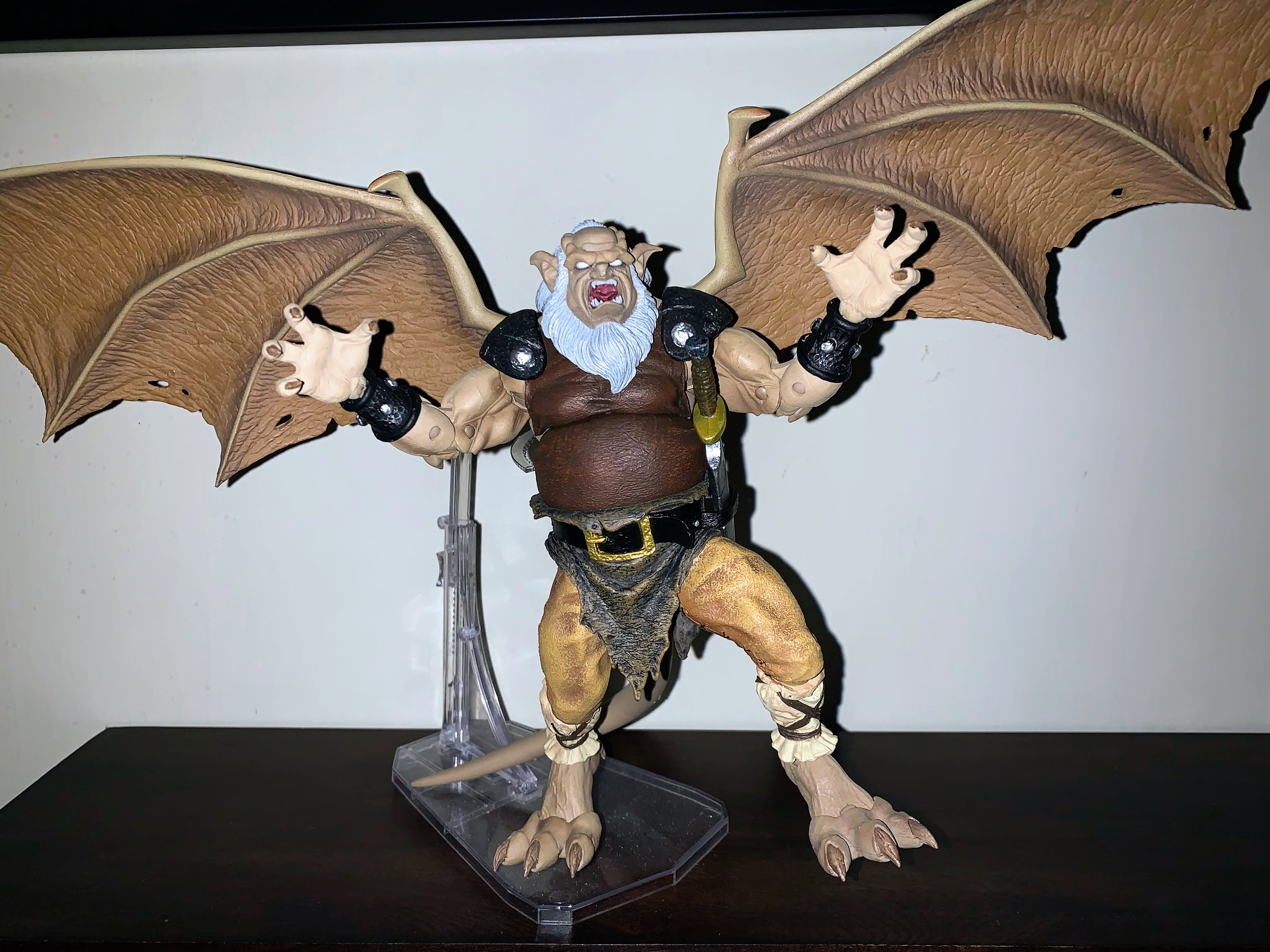
Most stands are going to struggle to hold up this big boy.

And we should talk about those accessories. Hudson isn’t loaded, but he has enough. He comes with fist hands in the package, but NECA also includes a set of open hands, a loose gripping left hand, a tight gripping right hand, and a tight gripping right hand with a vertical hinge. That last hand is to be used with his sword, which like the figure, is gorgeous. The blade has it’s unique shape we’re used to and it’s nice and thick and sturdy and comes to a point, safety measures be damned. There’s some intricate carving on both sides of the blade plus some sculpted weathering and damage to the blade customary of one that’s seen use for centuries or however long Hudson has lived. The texture is great and the paint has a silver finish to it to go along with the brown hilt with gold handguard. It looks perfect, and Hudson even has a loop in his belt to store it when he’s not brandishing the weapon. Lastly, we have an alternate head which is customary for this line as we need a neutral face and a battle face. The gargoyles all see their eyes go white and glow when they’re in battle and that’s what Hudson’s secondary face reflects. His mouth is open and both eyes are white. They have a pearl finish to create the illusion that they’re glowing and the quality of the sculpt and paint is every bit as good, if not better, than the default portrait. Talk about a homerun. And all of these parts are easy to swap so there’s a lot of fun to be had with the display options here.
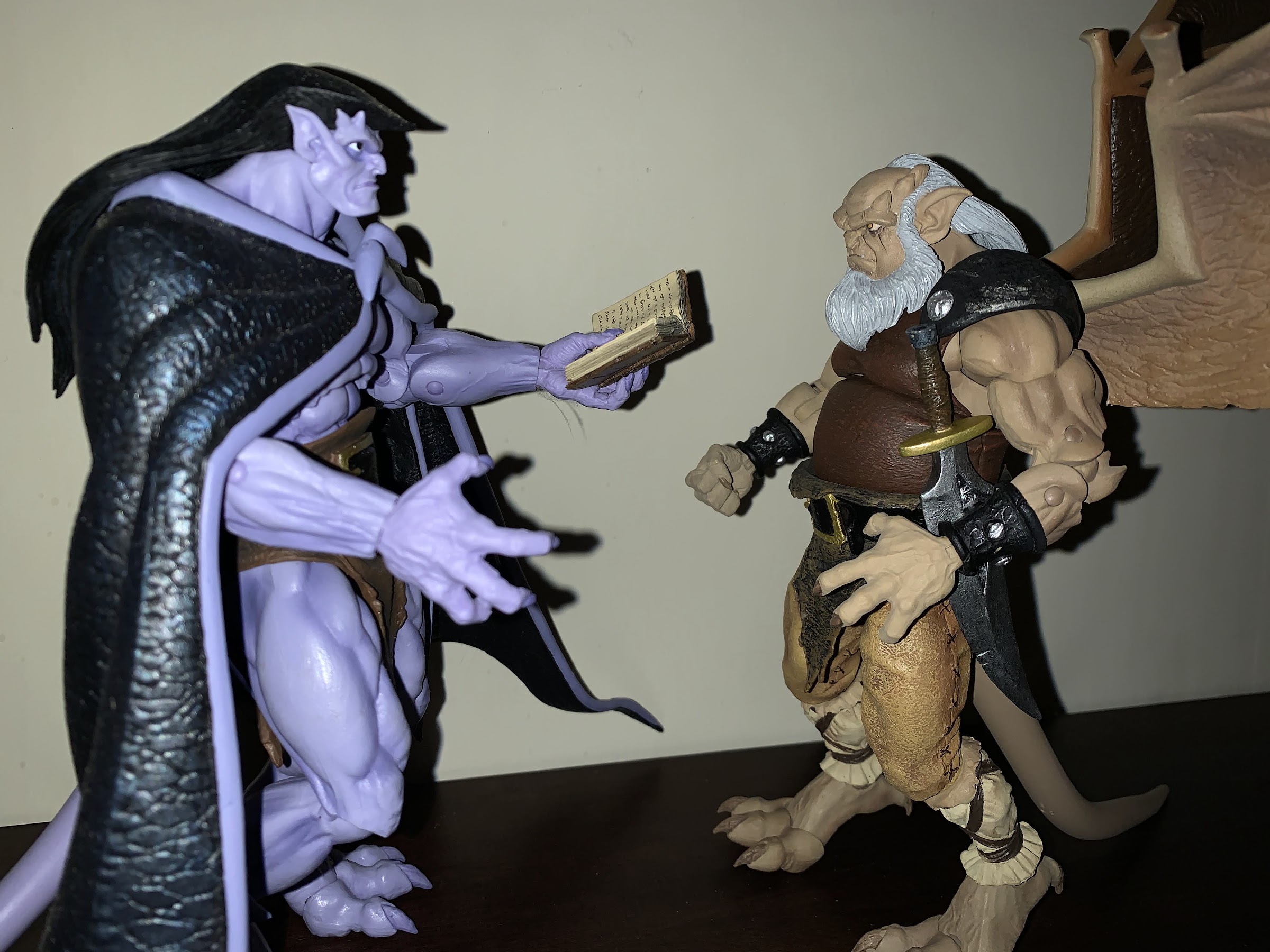
“Hello, old friend. Care to borrow this one when I’m finished?”

This figure feels damn near perfect, which means we’ve saved the worst part of it for last and that’s the articulation. Articulation hasn’t been a strong point for this line so far, and Hudson can be categorized as more of the same. The head is on a double-ball peg, but because he has long hair and a long beard, it’s pretty locked down no matter which head you use. There’s some flex to the hair, but that’s more for positioning the wings than anything. He can basically look left and right a bit, but not much more. The shoulders are ball-hinged and they’re limited by his shoulder pads which are a very, hard, plastic. He can only rotate as much as those will allow, but he can raise his arms out to the side just about horizontal. There is a biceps swivel and the double-jointed elbow works very well, though is a little unsightly when bent past 90 degrees. The wrists rotate and hinge and I already mentioned he does have the correct hinge direction for his sword hand, so that’s great. In the torso, there’s a diaphragm joint that mostly allows for some rotation. He can go back a little there which is good for some lunging and flying poses, but he can’t really go forward and there’s not much tilt. There’s a waist twist below that and the hips are the standard ball and socket joint. Hudson can damn near hit a split and he kicks forward pretty far and back pretty far. There is a thigh twist and the knee joint swivels and bend, but because of the unusual gargoyle anatomy, the range isn’t terrific. There is an ankle joint past that which contains a ratcheted hinge which is nice because they need to be strong. The joint also has a rocker and past that is the toe hinge which is what the figure is supposed to stand on. That hinge works fine and it has a little rocker action to it as well. The tail is on a ball hinge like the shoulders and it’s bendy so you can move it around a bit and also utilize it to support the figure in a stance. The wings are ball-hinged too so they can rotate and flap. They still make that scary, loud, clicking sound, but I’m happy to report no looseness like we saw with Demona.
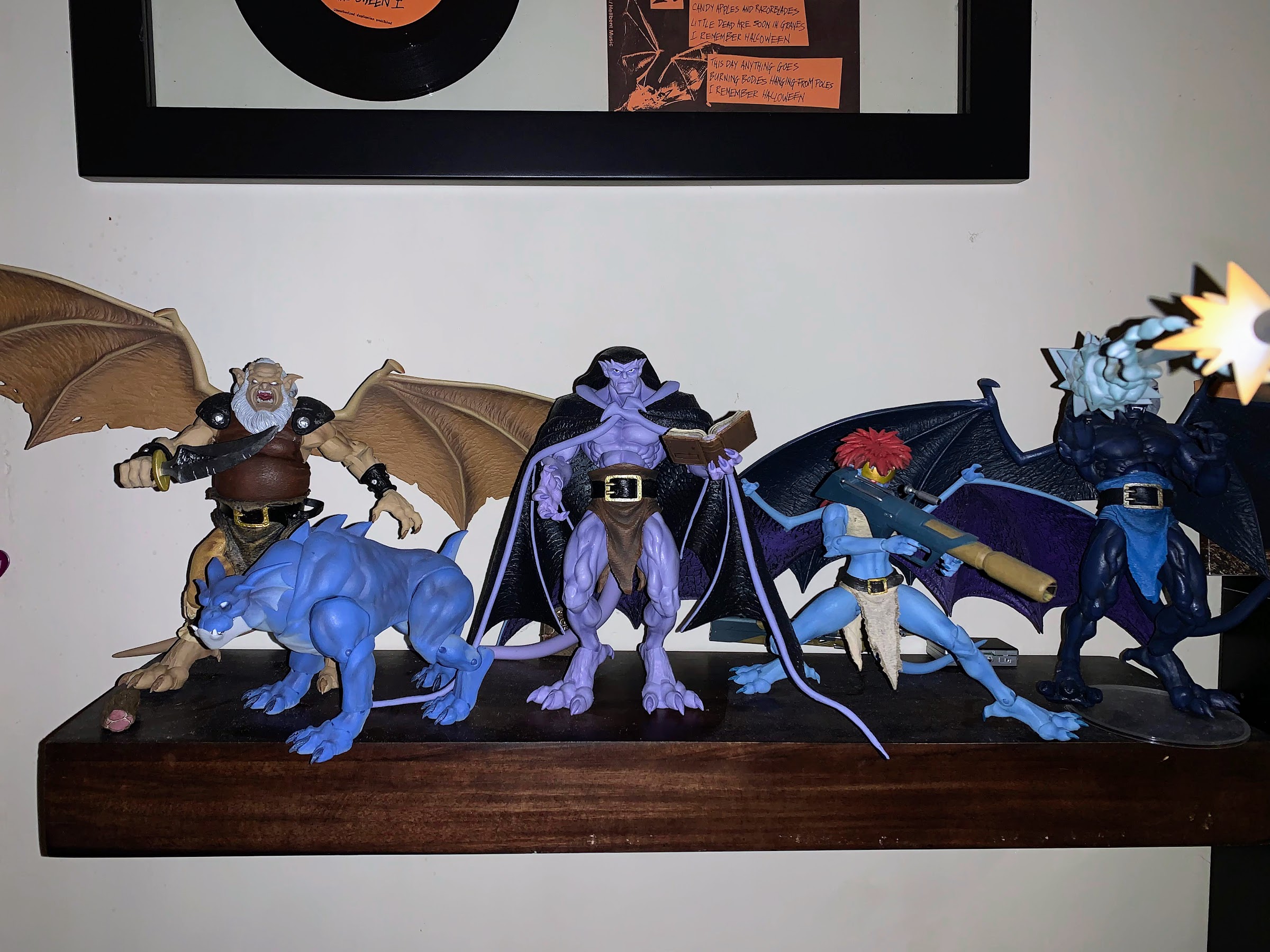
I surprised myself by fitting another gargoyle onto this shelf. There won’t be another without some smaller wing options.

Hudson’s articulation is limited, but I think it’s probably good enough. NECA clearly prioritizes the aesthetic of its figures and Hudson is certainly proof of that. His biggest posing limitations are the shoulders and what the wings bring to the table. It’s been said before, and it will be said again, that the things are an issue. Each figure just takes up too much room and packaging caped wings with other figures is too slow a delivery method. And if a character ever called for those wings, it’s Hudson. I wish he could assume a proper seated pose, but the legs kick out a bit too much. He could sit in a recliner, but not with these wings. I don’t know what it would cost to add a secondary pair of wings to each release, but whatever it is, I’d likely pay it because these guys are really hard to fit onto a shelf together.

Hudson may not be the most dynamic release, but he’s still a damn good one. He’s easily my favorite in the line so far and I am absolutely floored by some of the aspects of this figure. The sculpt is as close to perfect as I think NECA could get at this price point. The paint is terrific and is an area so many companies (charging more for their figures) skimp on, but NECA seems pretty insistent on painting every inch of their figures and they look great as a result. I don’t know if they’ll top this one, I don’t think I can even expect them to, but I am excited to see more and I am definitely excited to one day have the entire Manhattan Clan assembled on my shelf. Though right now, it’s looking like I’ll need multiple shelves to fit them all.

Check out more of NECA’s Gargoyles line of action figures!

NECA Gargoyles – Ultimate Bronx

Well, here’s something different. Bronx, the good gargoyle dog, is NECA’s fourth entry in its relatively young line of action figures based on the beloved Disney Afternoon series Gargoyles. And not only is Bronx here all on his own, he’s also got something for his buddy Goliath that collectors of this line have been begging…

Keep reading

NECA Gargoyles – Ultimate Demona

When NECA launched it’s line of action figures based on Disney’s Gargoyles, it seemed to imply that Demona would be figure number 2. She was not. That honor went to Thailog, the Goliath clone, and that might have had something to do with the many factory delays and shipping woes that were impacting the entire…

Keep reading

NECA Gargoyles – Ultimate Goliath

It was nearly 6 months ago that NECA unveiled one of its newest licenses for 2021: Gargoyles! I was incredibly pumped at the time to see that NECA had acquired Gargoyles because the license had so much potential. The show was basically a cult hit in the 90s often characterized as Disney’s answer to Batman:…

Keep reading
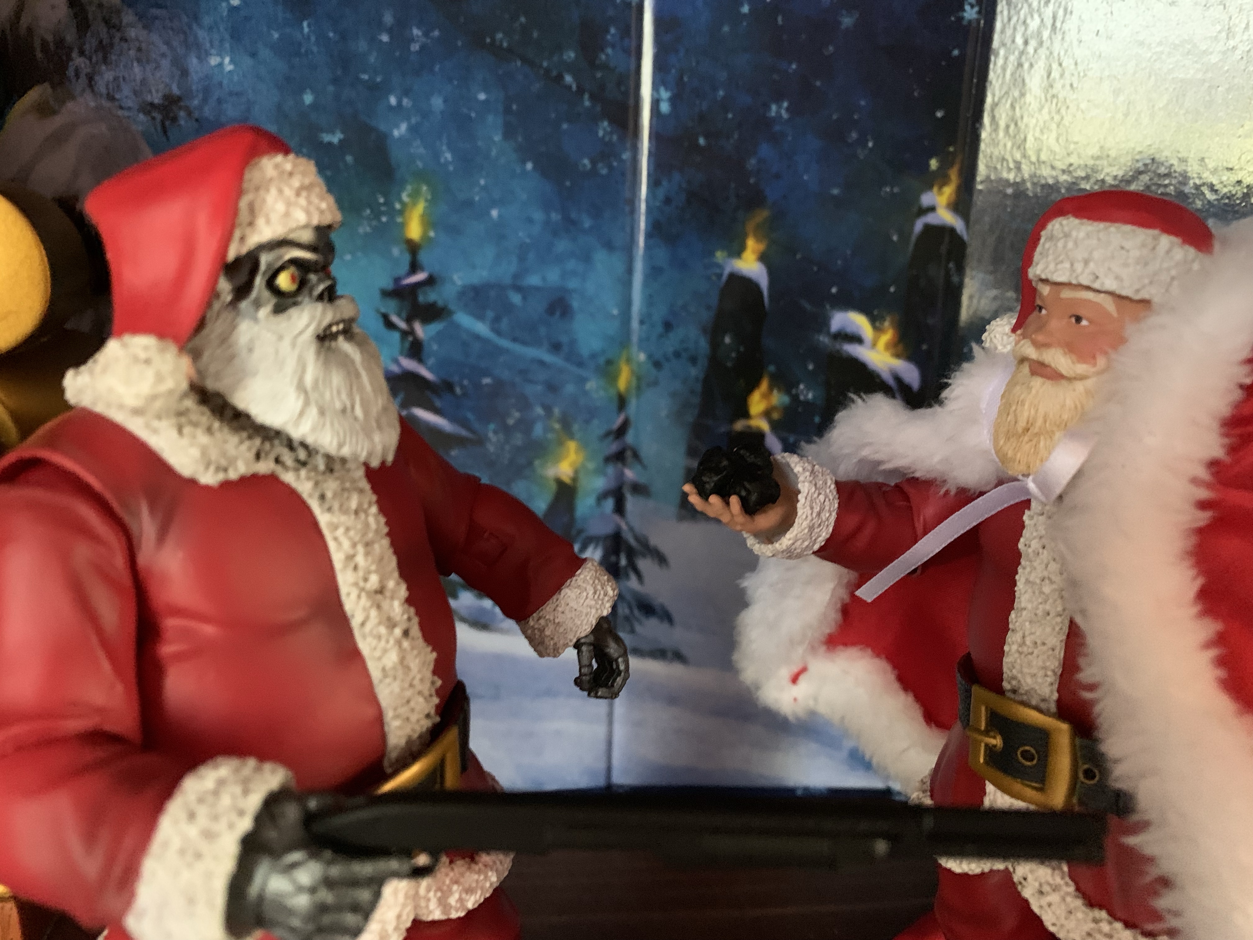
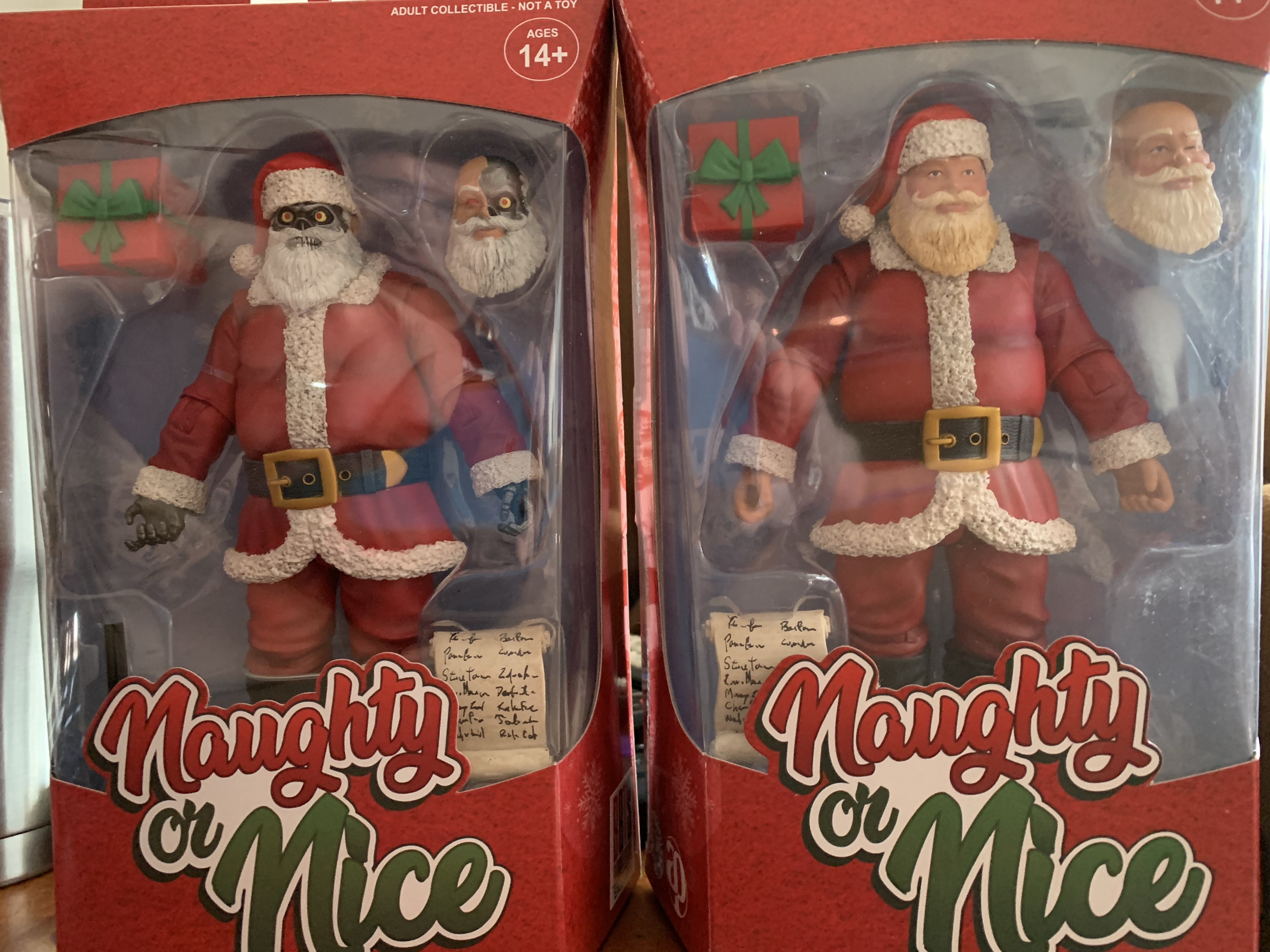
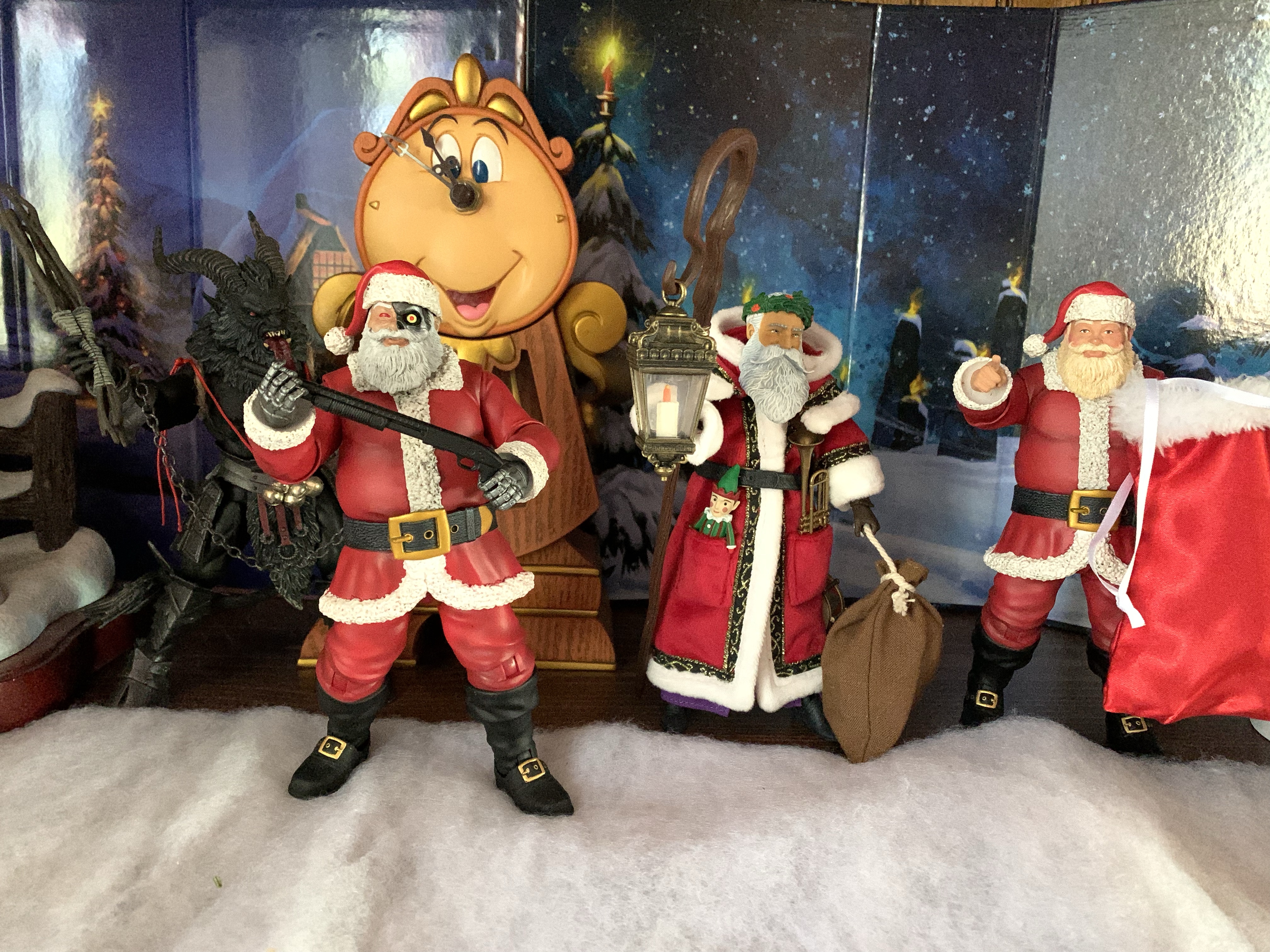
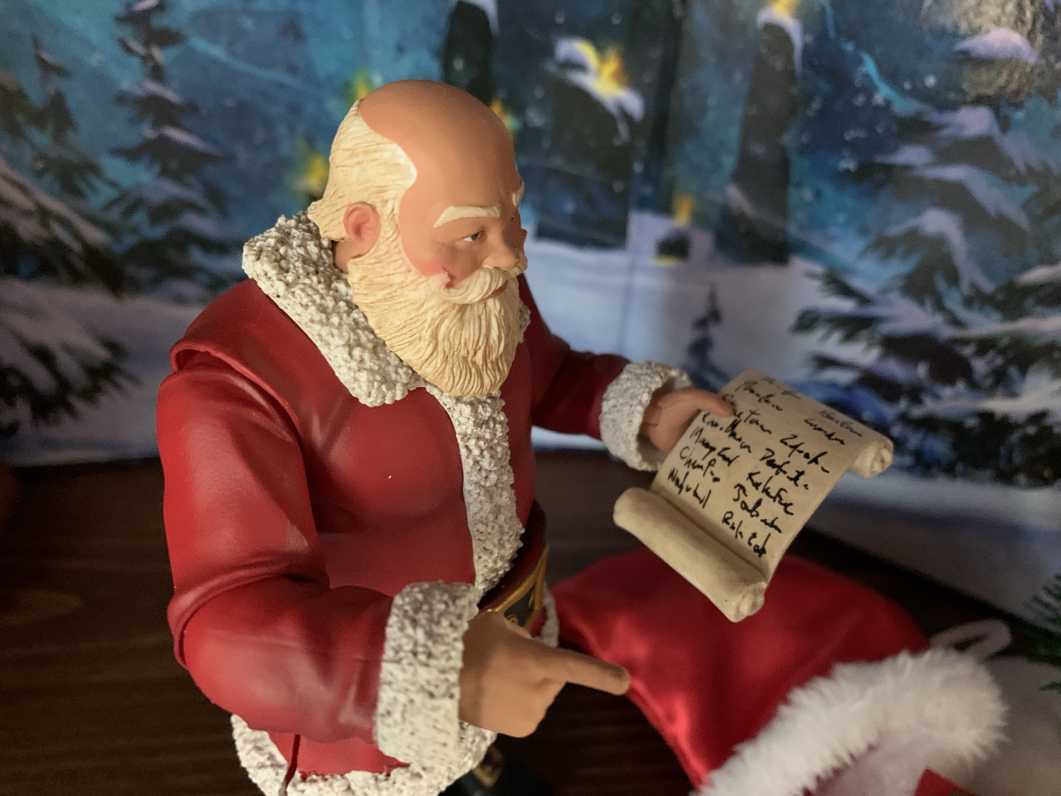
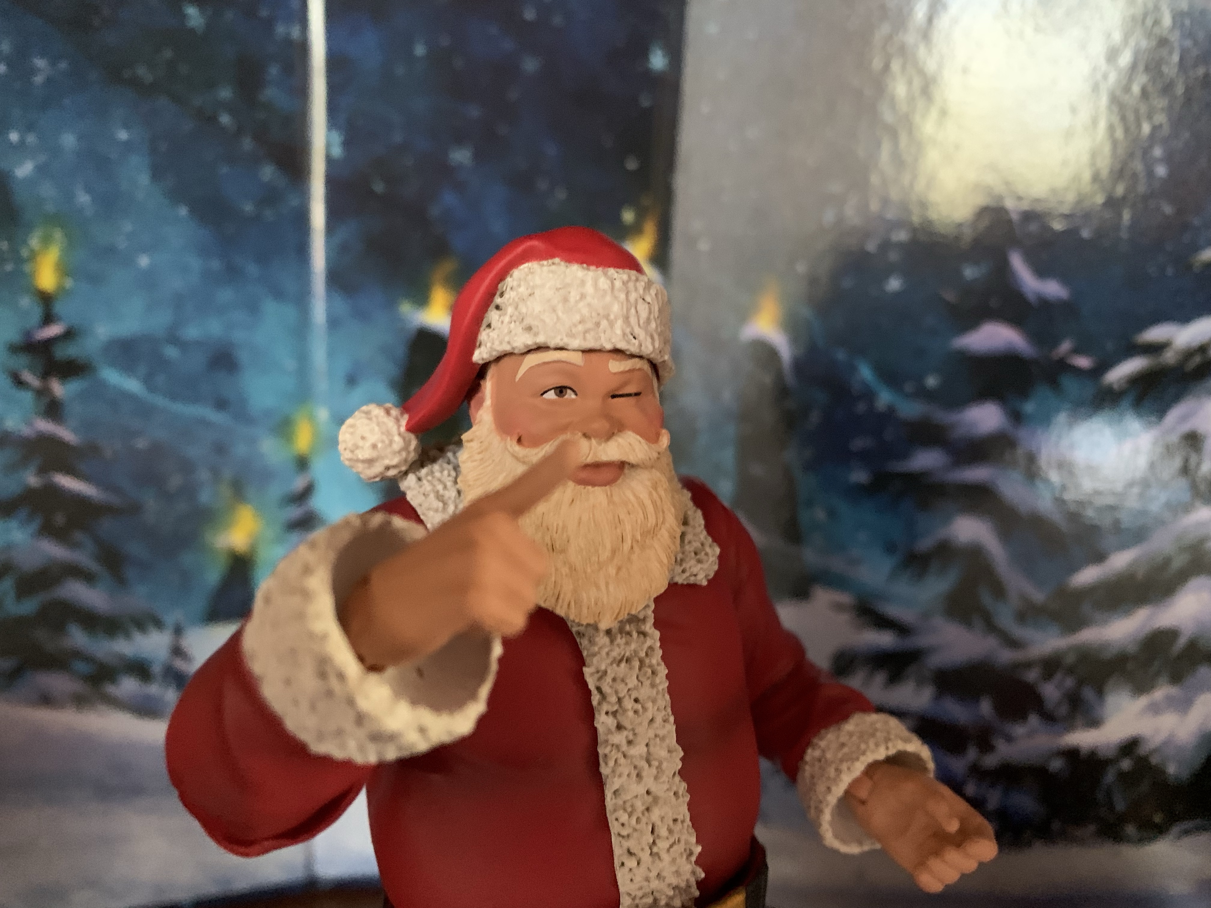
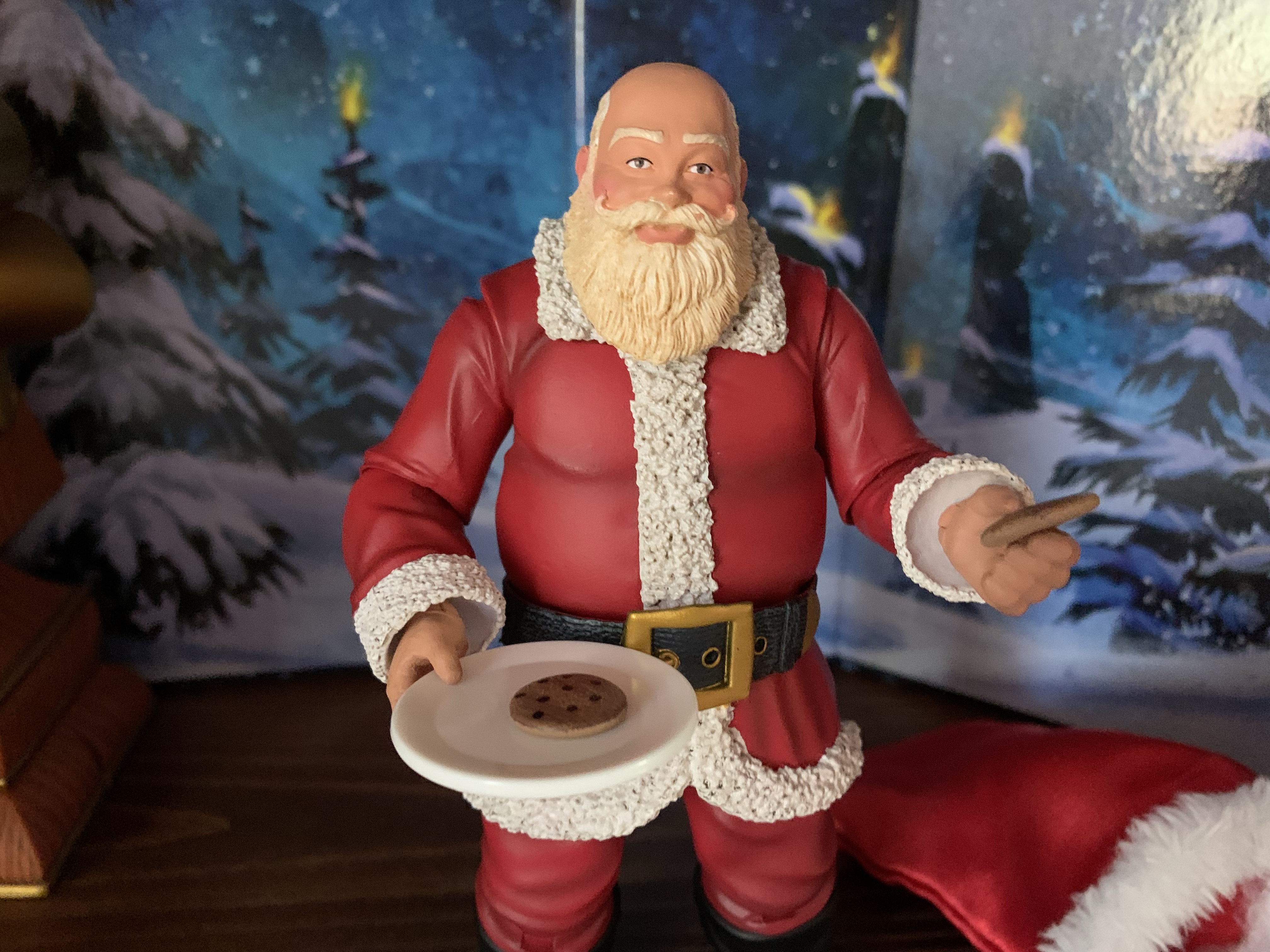
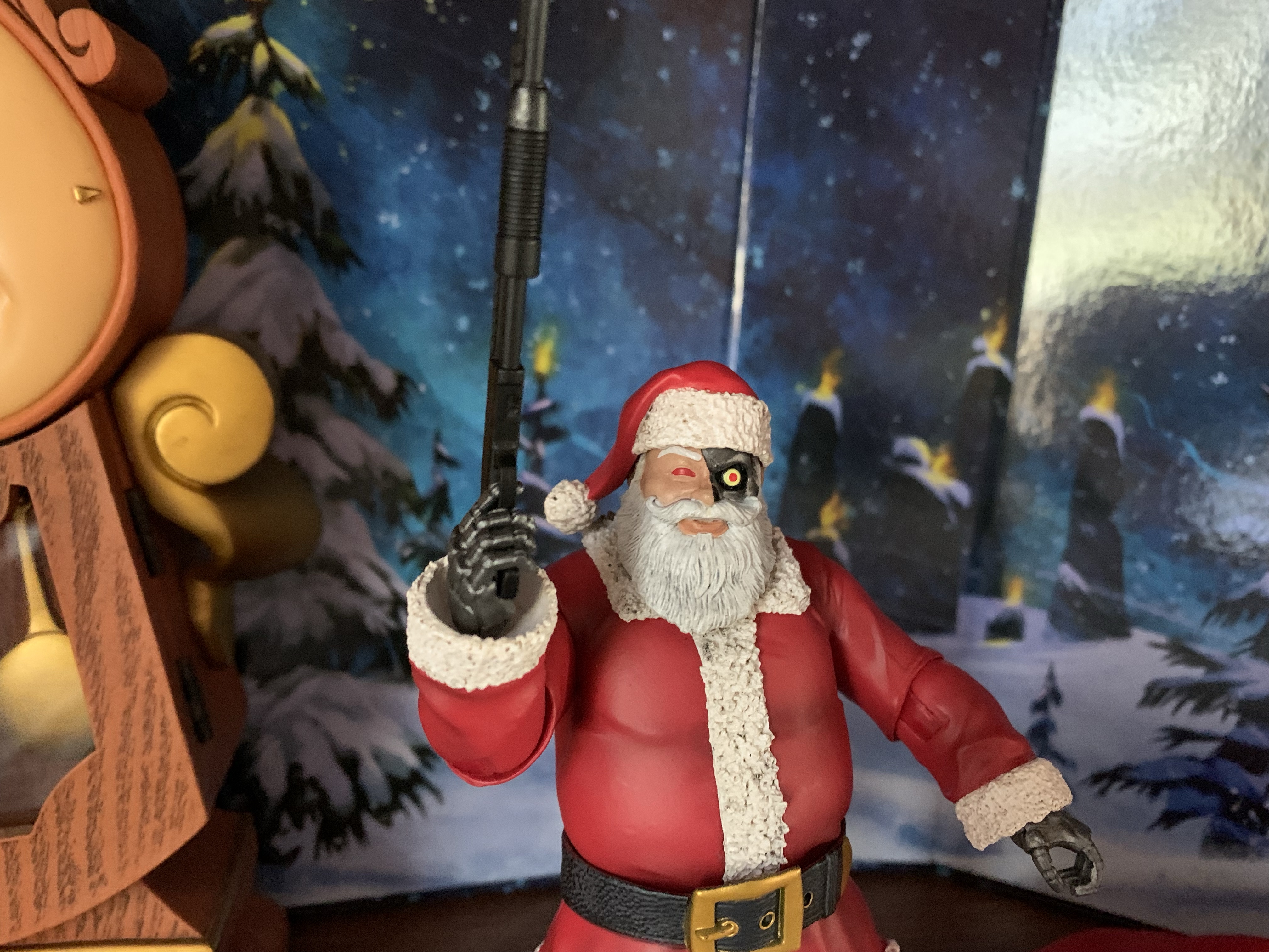
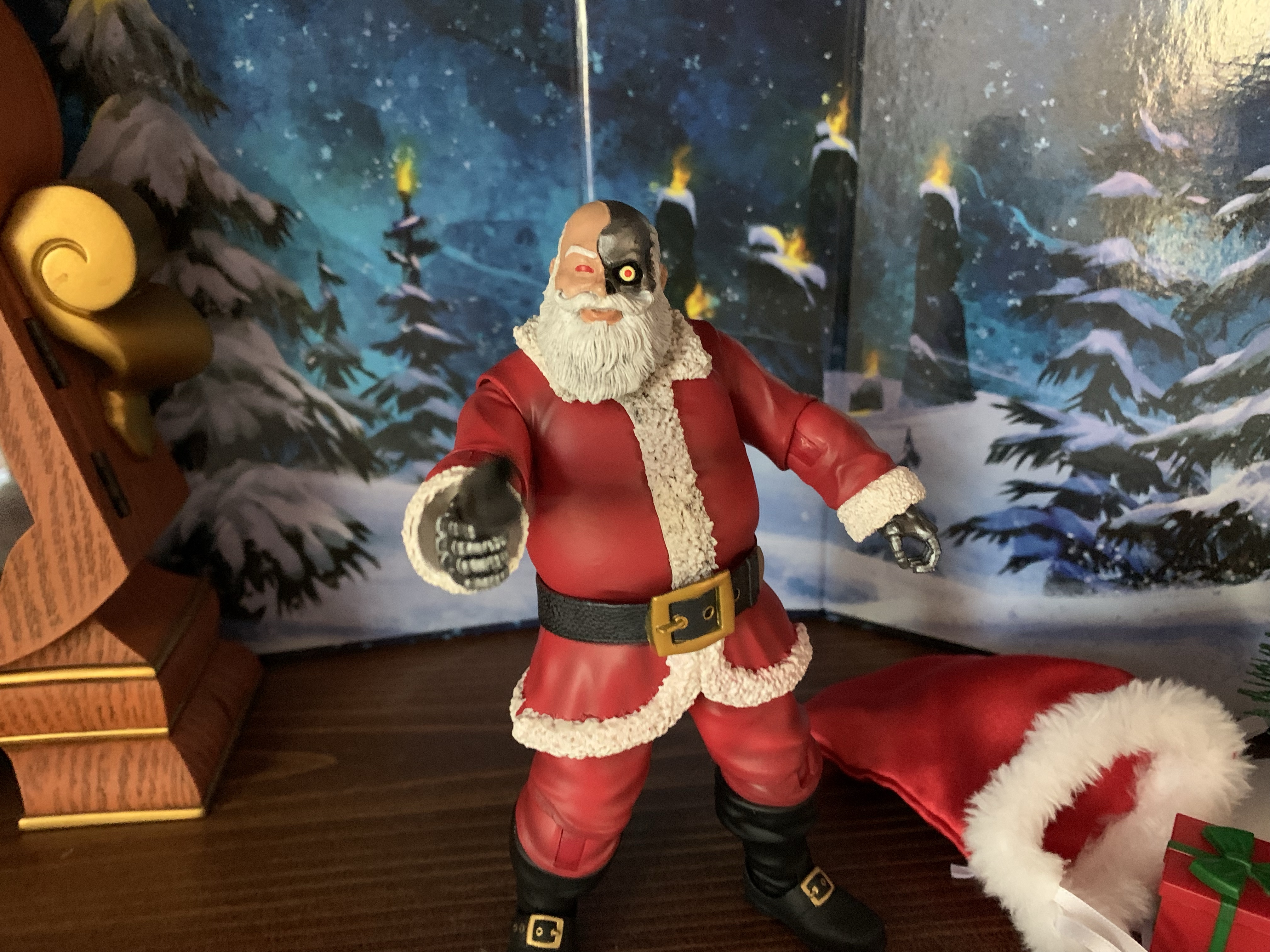
Naughty or Nice Classic Santa and Cyborg Santa

“What’s this?!”

It was looking like we were in for a photo finish this year. Last year, toymaker Fresh Monkey Fiction partnered with online retailer Big Bad Toy Store to launch the Naughty or Nice collection. Structured similar to a Kickstarter campaign, FMF posted several action figures for preorder with a minimum order quantity needed for the figure to go into production. The only difference was, since it was through BBTS there was no real obligation to buy. Payment wasn’t required until the product shipped, which was going to take about a year, so it felt like a pretty significant gamble on the part of FMF and BBTS. Essentially, they were banking on a line of Santa Claus themed action figures to be a big enough hit to take the risk, and so far it looks like it’s worked out.

The latest in Christmas action figures are here!

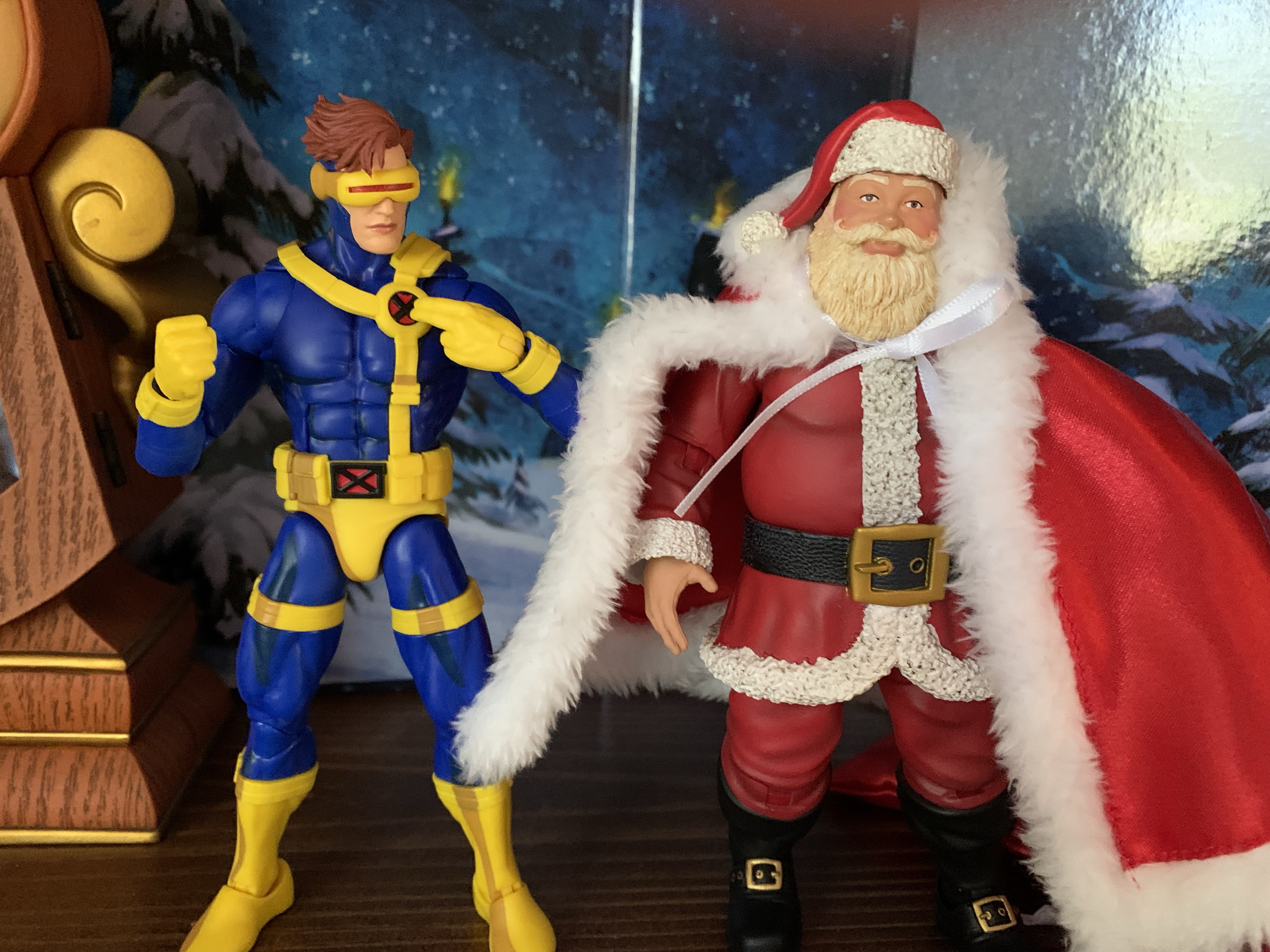
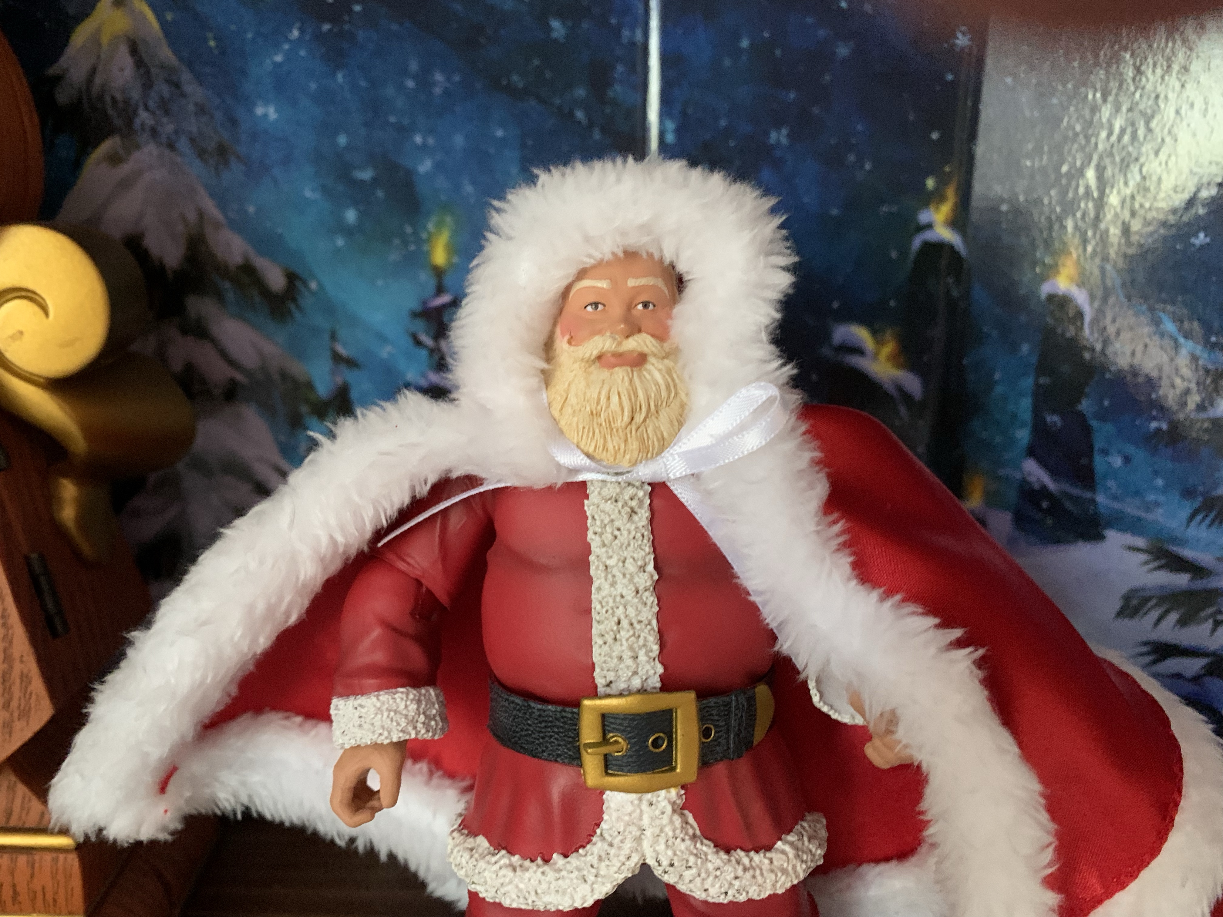
The goal from the get-go was to get these figures into the hands of collectors in time for Christmas 2022. That was looking a bit dicey going into November, but FMF came through as the figures arrived on Tuesday the 13th and BBTS began shipping them out the next day. I received my order on the 18th, a week before Christmas, ensuring at least 14 days or so of holiday display. As for what I ordered, that ended up being just two figures plus the accessory set. The line is essentially a series of Santa Claus figures. There’s a classic one, a black one, an army one, robot, pirate, and zombie. In addition to that, there were two versions of Krampus on the same buck and a bunch of elves and nutcrackers done in a five-points style. The main Santa body, which is used for every figure, is basically a 1:12 Santa. Some have described it as a “Marvel Legends” styled Santa, but it’s simpler than that as far as construction goes. The articulation setup is more like a Mythic Legions release, but the sculpt less ambitious. There’s also more paint than a typical Hasbro offering and, ultimately, they are their own thing. I ordered just the Classic Santa and the Cyborg Santa. I do like some of the others, but at $37 a piece I’m not sure I need any of the others. What attracted me to the Classic Santa should be pretty self-explanatory, while the Cyborg one just looked pretty cool. In what is planned to be my final Christmas themed action figure review of 2022, we’re going to take a look at both.

Some Figura Obscura and Fresh Monkey Fiction. Plus a clock.

The Naughty or Nice collection comes packaged in a window box with a hanger on the top. It’s pretty similar to a Hasbro window box or the old DC Direct boxes. The cardstock is a little thin, but it seems durable enough to protect the figure. It just may be difficult to get a mint one through the mail. The figure can be removed from either side, or the bottom, but not the top unless you want to destroy the box. Both figures are identical with the exception of the heads and hands, which is why I feel fine reviewing them together. The figures stand at about 6.5″ to the top of the head and close to 7″ with the hat on. The hat is removable and it plugs on just fine. It looks like FMF did not apply any paint to the inside of the hats so there should not be a cause for concern with paint rub, unless it comes from the head to the hat.

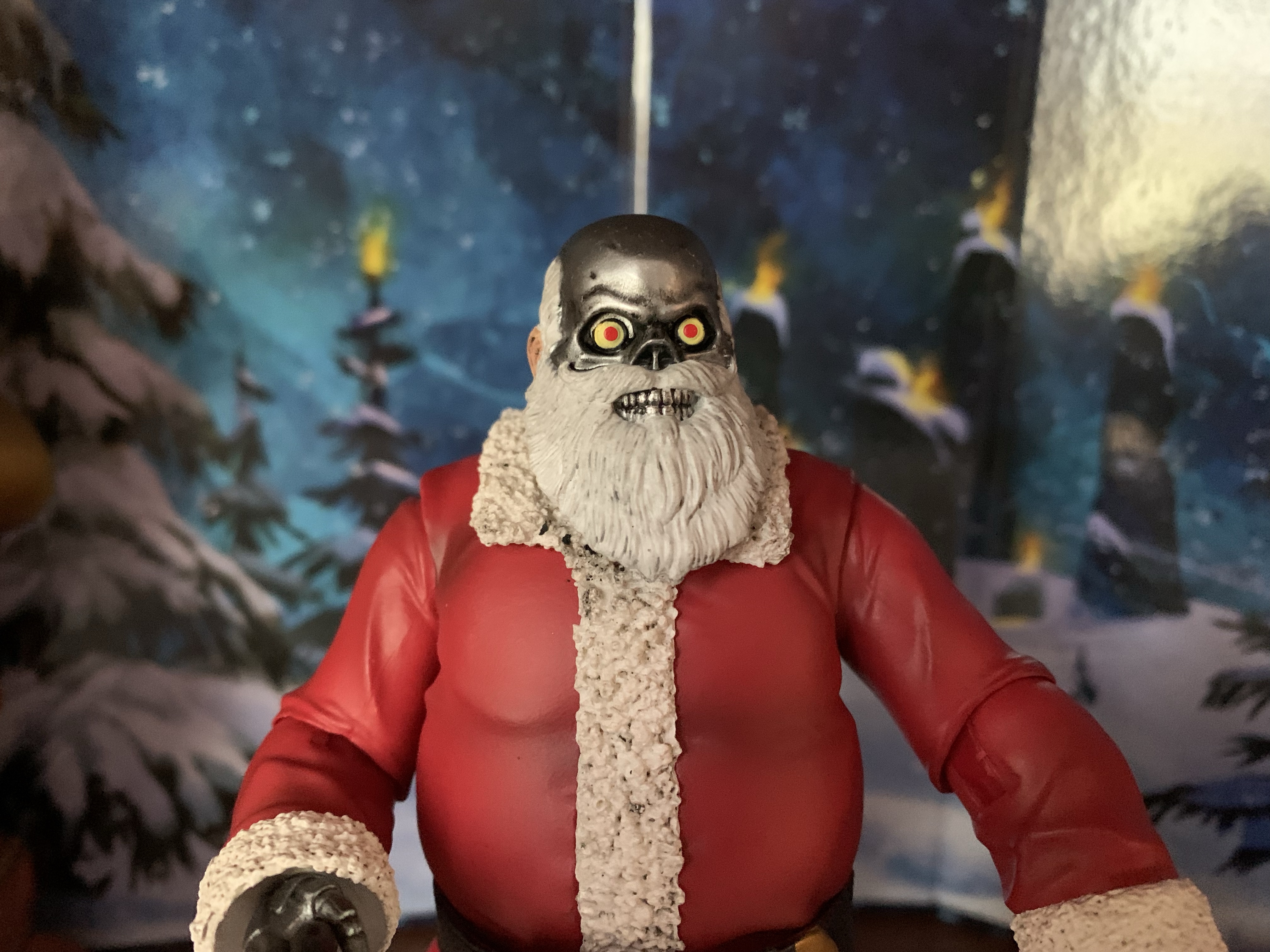
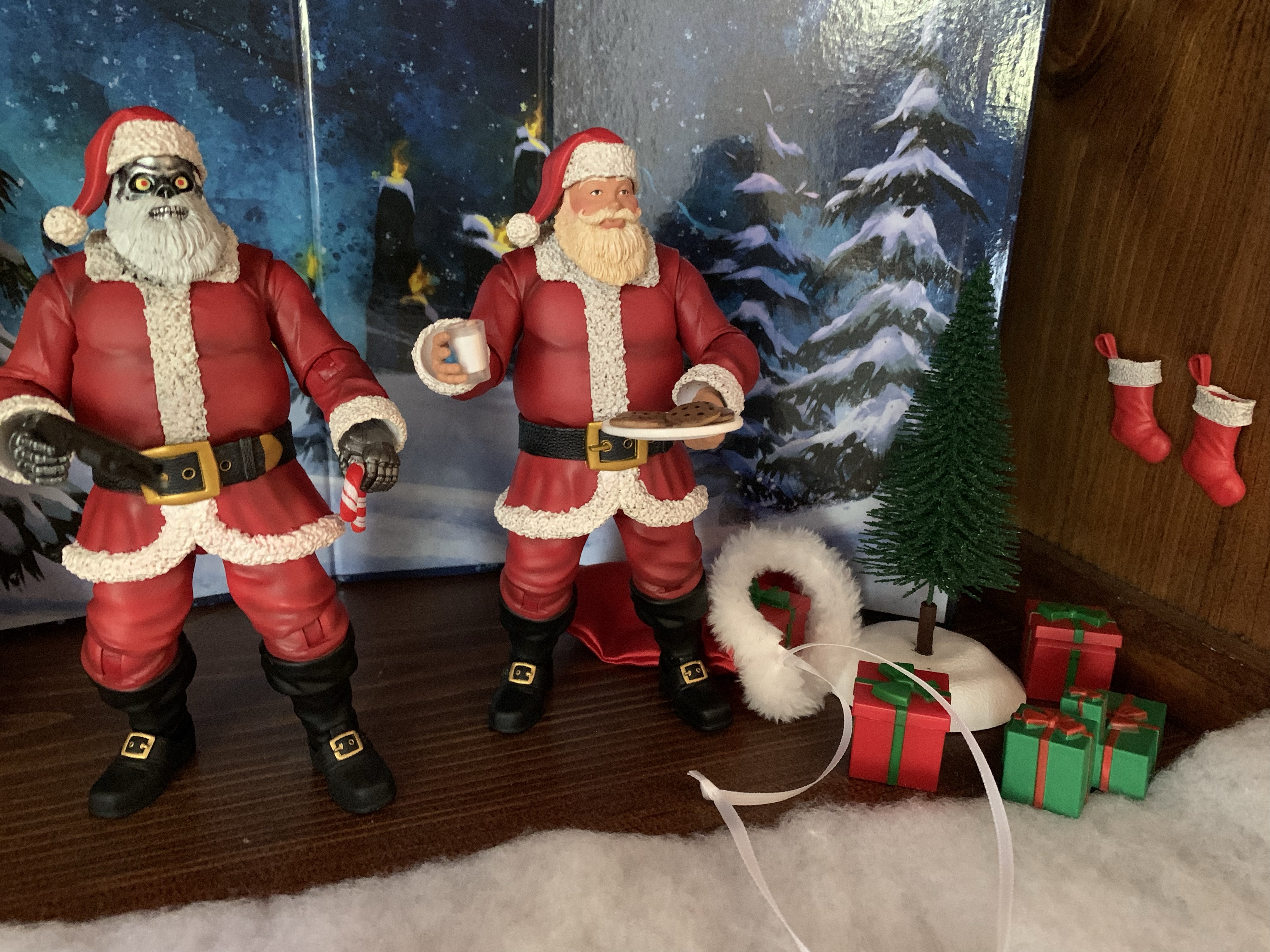
The figures present pretty well. The heads are fully painted as they were sculpted in white plastic while much of the body appears to be sculpted in red. My Classic Santa has a tiny chip on the tip of his nose and a small blob of flesh-tone on his moustache which is unfortunate, while Cyborg Santa’s default portrait looks terrific. The beard on Santa has some dry brushing over it with a light brown. This is different from the solicitation and even the cross-sell on the boxes where it was all white with some gray shading like Cyborg Santa. I’m guessing they wanted to differentiate the figure more from the others, but I definitely prefer the all-white approach to this one. It’s almost cream colored as a result and it takes some getting used to. The suit is also shaded which looks nice and helps to reduce the plastic look. I like the shading applied to the white portions of the suit as it gives this Santa a more hearty presence like he’s been going up and down chimneys all night. The paint is cleanly applied in most places. It’s not super crisp around the beard of Santa, but it’s good enough. The only issue I have with the paint is the choice to sculpt the boots in red and paint black over them. There’s a couple of small chipped areas where red shows through and the hinge down there seems to pick up pieces of red plastic which flake out. The foot is done in black so the hinge is black as well which is nice, but if I could make one suggestion going forward it would be for FMF to make the entire boot a separate mold that pegs into the lower leg which would also add a boot cut. The hands on both figures are ungloved and the sculpt for the Cyborg Kringle is wonderful. There’s some nice paint wash there as well and they just look great. The regular Santa has hands molded in a flesh color and it looks like they were paint too to give them a warm presence and not a plastic one.

These guys look nice at a stand still, but the one thing that I was really curious about was how these guys would move. They feel really nice and sturdy in hand and out of the box all of the joints were nice and tight. Some maybe a touch too tight, but I never felt like I was in danger of breaking anything while I was breaking them in nor did I need to apply any heat. The head is just on a big ball peg, which again, makes it feel like a Mythic Legions release as it’s the same setup as the Father Christmas figure. Because Santa has a beard and a coat, he really can’t do anything except turn his head as far as the beard will let him. There’s no down, and barely any up rotation. At the shoulder, we have a ball-hinge setup which can raise out to the side almost to a fully horizontal position. It can also rotate around, but you have to avoid rubbing the edge of the torso when doing so as it’s cut at a slight angle. The elbows are just single hinges and do not reach a 90 degree bend. There is a swivel point there as well which is okay, but these arms are pretty limited. The wrists rotate and hinge and I’m happy to report that Cyborg Santa’s trigger hand hinges vertically instead of horizontal which is a nice attention to detail. There’s a ball joint at the waist that mostly allows for rotation with barely anything forward or back. The hips are ball and socket joints and because the lower part of the coat and belt are one piece and done in a soft plastic, the legs can go out to the side way farther than they need to. They kick forward a decent amount, but nothing really back. The knees are like the elbows, a single hinge with a swivel, and also can’t hit a 90 degree bend. At the ankle, there’s a hinge and a rocker which works pretty well..

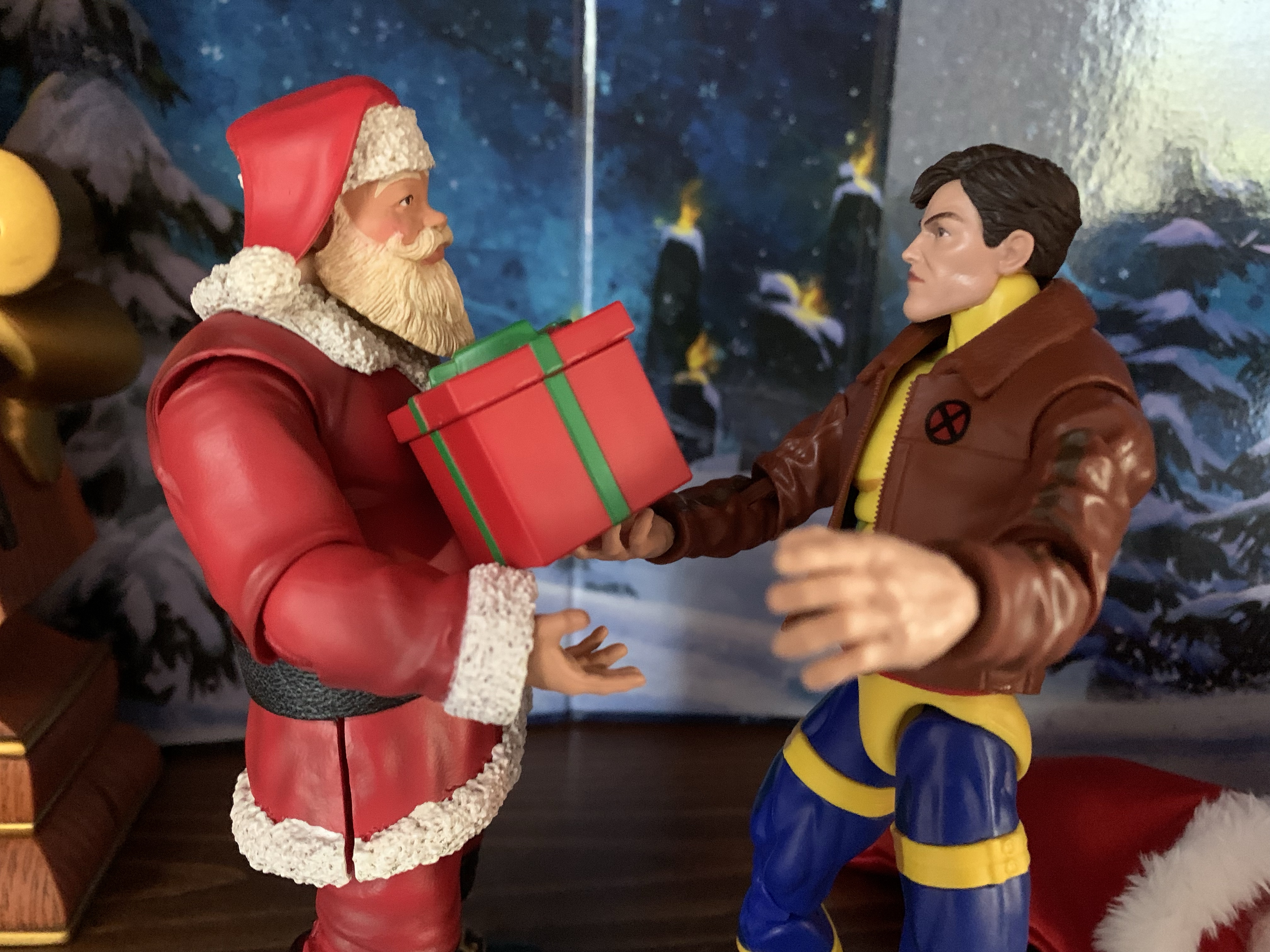
The overall articulation is merely functional. These guys aren’t going to get into any sort of exotic pose, which is probably expected of a Santa figure. The problem though is they struggle with basic stuff. Santa can’t really get his hands to his head for cookie eating or a finger by the nose pose. You can fudge some of these with perspective shots, but that’s it. Santa also can’t present one of the gifts with both hands under it which is unfortunate. Worst of all though, is Cyborg Santa can’t hold his shotgun in a convincing two-handed fashion. I can get two hands onto it, but not with one on the trigger. I would like to see some improvements for next year’s batch. I think the biggest addition they could make is a biceps swivel. I don’t know if it would solve all of the problems, but it could help. An upper torso joint would be a nice addition too, but I don’t see that happening. I also wouldn’t expect, or even ask for, something like a butterfly joint to help get the hands closer together. And anything that could improve the range of the elbow bend would be welcomed. I think the overall aesthetic of the figure base is good so I get not wanting to mess with it too much. A biceps swivel wouldn’t harm the look, as far as I’m concerned, while I can see some not wanting an upper torso joint. Mostly, I hope they don’t just rest on their laurels and do nothing to improve what was released here.

Both figures also feature some accessories, and some are shared. Both Santas come with a second head. For Classic Santa, it’s a winking face and it looks okay. The winking eye is just a straight, black, line and I feel like it could better. It’s not bad enough that I’ll never use it, but not the slam dunk I expected. For Cyborg Santa, the alternate head is a half Santa half robot look as we’re definitely going for a T-800 thing here. It’s awesome and I’m really torn on which head to go with for this guy. Classic Santa also comes with extra hands. His default ones are gripping hands and he also has a set of relaxed hands and a pointing right hand. The pegs on the hands are basically the same diameter as a Marvel Legends, just shorter, so one could conceivably swap hands with other figure lines. Both figures come with “The List” which is sculpted like a scroll of paper. It’s fine, but I wish the printing on the list itself was different. Santa should have a nice list and Cyborg Santa a naughty list, for instance. Both figures have a red gift box with a painted green ribbon and bow on it. It opens from the top and it’s fine. Both figures also come with a white display stand that is pretty unnecessary since they stand fine and it’s not attractive enough to force its way into the display.

“Merry Christmas, Morph!” “Wow! Thank you, Santa!”

Both figures also have their own unique additions. For Cyborg Santa, it’s a police style pump shotgun. It’s all black and it looks fine, but the problem is it’s too thin. He doesn’t get a good grip on it as a result and it’s a balancing act to pose it. Maybe they were worried about paint rub and thus overcompensated on the thickness of the weapon? It’s too bad and I already mentioned the posing issues with it. For Santa, we get a plate of cookies and a glass of milk. Everything is it’s own piece so the plate is separate from the cookies so you can place them on it or put one in Santa’s gripping hand. He can also grip the plate just fine, and if you’re persistent, you could probably balance it on one of the relaxed hands. The glass of milk is also two parts as it’s a transparent glass with the milk a separate piece of plastic so it can be empty or full. The only problem is, the gripping hands are too tight to grasp the glass while the relaxed hands are too loose. I wish one of the relaxed hands had been replaced with a hand designed specifically for holding the glass. It is possible to position it in such a way that will stay in Santa’s hand, but in an unnatural way. I suppose with enough heat, the gripping hand could be softened to the point where it could hold the glass, but I didn’t want to risk the paint transfer from the hand to the glass. My solution? Blue sticky tack.

“What the Hell is this?!”

We also have one more thing to talk about and that’s the accessory set. FMF sold a separate pack for about 22 bucks that contains the following: a cloak, a sack, an extra red present, a set of green presents, two stockings, two pieces of coal, a candy cane, another list, and another set of milk and cookies. I grabbed this mostly for the cloak and sack, but I’m having a bit of buyer’s remorse. The soft goods cloak has a real cheap feel to it. It’s thin, the white trim is like what you would find on a 3 dollar stocking, and the tie is done with cheap ribbon. It just doesn’t look great on Santa. I think it needs to be heavier and maybe the trim should be a shorter “fur” to add a touch of class. Santa can wear it with or without his hat, but I don’t know that I like it enough to use. The sack is basically the same deal as it’s done in the same style and there is a ribbon for the drawstring which I just don’t like the look of and it’s much too long. Santa needs a sack though, so I can see myself using this, but it could have better. The rest of the stuff is just “meh.” The stockings are solid plastic so you can’t fill them with anything. The Santas both have trouble gripping the candy cane, and the coal is just coal. The green presents are molded together and they add something to the display. The repeat items are unnecessary though – why do I need another set of milk and cookies or list? I guess I like being able to fill out the plate a bit more with the cookies, but how about some toys instead? I like the presents and stockings just to fill out a display, but this set could have been better and I don’t think it’s something I can recommend.

I’m not here to pick favorites, I’m just happy to have multiple representations of Santa Claus in my display.

The Naughty or Nice collection isn’t without its issues, but the total package of the Santa figures I purchased are still good enough to merit inclusion in a holiday toy display. I like the look of both figures and my only nitpick there is that I wish Santa’s beard was whiter. The sculpt is great and there’s enough paint to add a touch of class to both figures. These don’t look or feel cheap (provided you’re not using those soft goods in the accessory set) and can stand beside the Figura Obscura Father Christmas and not look out of place. Ultimately, I recommend these based on your own personal preferences. If you want a classic, Coca-Cola, styled Santa then the Classic Santa should be more than sufficient. The other figures are just about what amuses you. I thought Cyborg Santa looked cool so I bought him. If the gun situation was better, I might have talked myself into Sgt. Santa too. I can definitely see a lot of folks liking the look of Pirate and Zombie Santa and it would be easy to just go all-in to amass a larger, Santa, display. I personally wanted to like Krampus, but him being on the same Santa body just doesn’t do it for me. I want a naked, furry, Krampus and not one dressed like Santa, but the head sculpt looks pretty rad. He does have a tail, and there’s a plug on the Santa figures to cover-up the peg hole for that tail, though it’s not visible so I don’t consider it an eyesore.

Blue sticky-tack is your friend.

If you would like to add these or any of the other figures in the collection to your holiday display then head over to Big Bad Toy Store. Some of the figures have been going in and out of stock, but have since been re-stocked it would seem. Fresh Monkey Fiction also plans to make some of this collection available for preorder again when and if they do sell out, but those won’t be delivered until next year. Wave 2 is also up for pre-order and it looks like the major new addition from a sculpting perspective is a shirtless Santa which will also be used for a shirtless Krampus. I am probably going to order a figure or two from the second wave, so check back next year to see how those turned out!

Need some more Christmas toys?

Figura Obscura – Father Christmas

It was just last year that Four Horsemen launched a subline of its popular Mythic Legions brand of action figures called Figura Obscura. Practically speaking, there’s little difference between the two lines as Mythic Legions seeks to serve as a modular line of toys based on myth and legend and that doesn’t feature licensed characters.…

Keep reading

Figura Obscura – Krampus

Over the years, I’ve acquired quite a few action figures designed by the good people over at Four Horsemen LLC. They’ve been designing figures for companies for awhile now. My first exposure to the company was via NECA’s inaugural line of Teenage Mutant Ninja Turtles based on their appearance in the Mirage Studios comics. Lately,…

Keep reading

Transformers Generations Holiday Optimus Prime

We interrupt our regularly scheduled holiday posts with something very familiar to this blog: a toy review! Yes, we have ourselves another Christmas toy to talk about and it too comes from Hasbro. We already looked at a Star Wars toy at the end of November, and now we’re turning to what I suppose is…

Keep reading

Figura Obscura – Father Christmas

“Father Christmas, give us some money…”

It was just last year that Four Horsemen launched a subline of its popular Mythic Legions brand of action figures called Figura Obscura. Practically speaking, there’s little difference between the two lines as Mythic Legions seeks to serve as a modular line of toys based on myth and legend and that doesn’t feature licensed characters. Figura Obscura uses the same tools and approach, it’s just the character selection will apparently trend towards popular characters of folklore that don’t necessarily conform to the Mythic Legions aesthetic. The first figure was Krampus, and I loved him. The second was the Headless Horseman, and while I didn’t purchase that one, I do admit it looked awfully cool and I was tempted by it. Now, we have the third figure in the line and for it we’ve gone back to Christmas as Four Horsemen have delivered a character to pair with Krampus in the form of Father Christmas.

They sure know how to package a figure over at Four Horsemen.

Father Christmas, Santa Claus, Saint Nicholas – whatever you want to call him, he’s certainly a known character. And he’s a character that has had some different looks and interpretations over the years and is a natural pick for such a line. And Four Horsemen delivered. The figure was announced and solicited basically within 24 hours as it was December 2nd when the figure was teased and it was made available on the Four Horsemen website the next day. I know of some who had more of a Mythic Legions mindset when the thought of a Santa was floated that included armor, battle axes, or maybe a look that resembled a wizard or something. After all, this being just the third figure in the line, expectations could be allowed to go a little wild. For me, I was just hoping for a classic, European, take on the character: robes, a satchel, a ring of holly as a crown. I’m happy to say that I basically got what I wanted. After placing an order that Saturday morning, I had to wait a mere six days to have the figure in-hand and, spoiler alert, he’s a great addition to my Christmas display.

He’s got a hood for when it gets really cold.

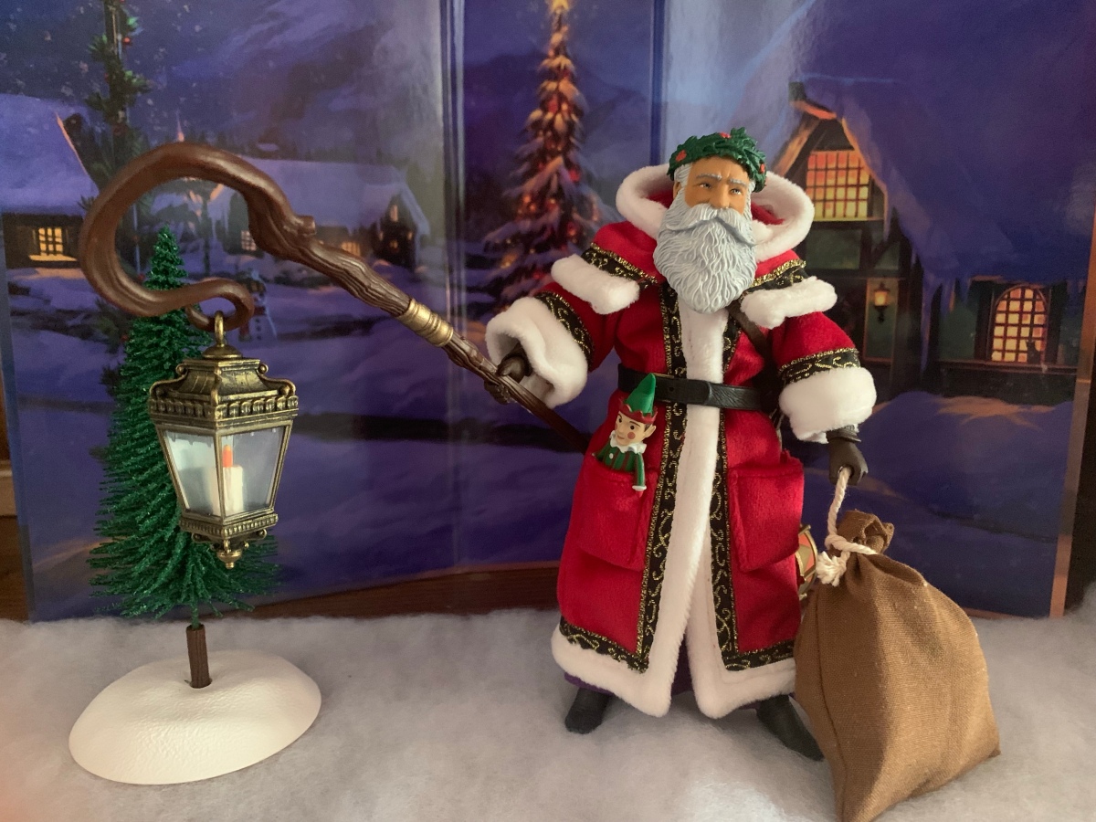
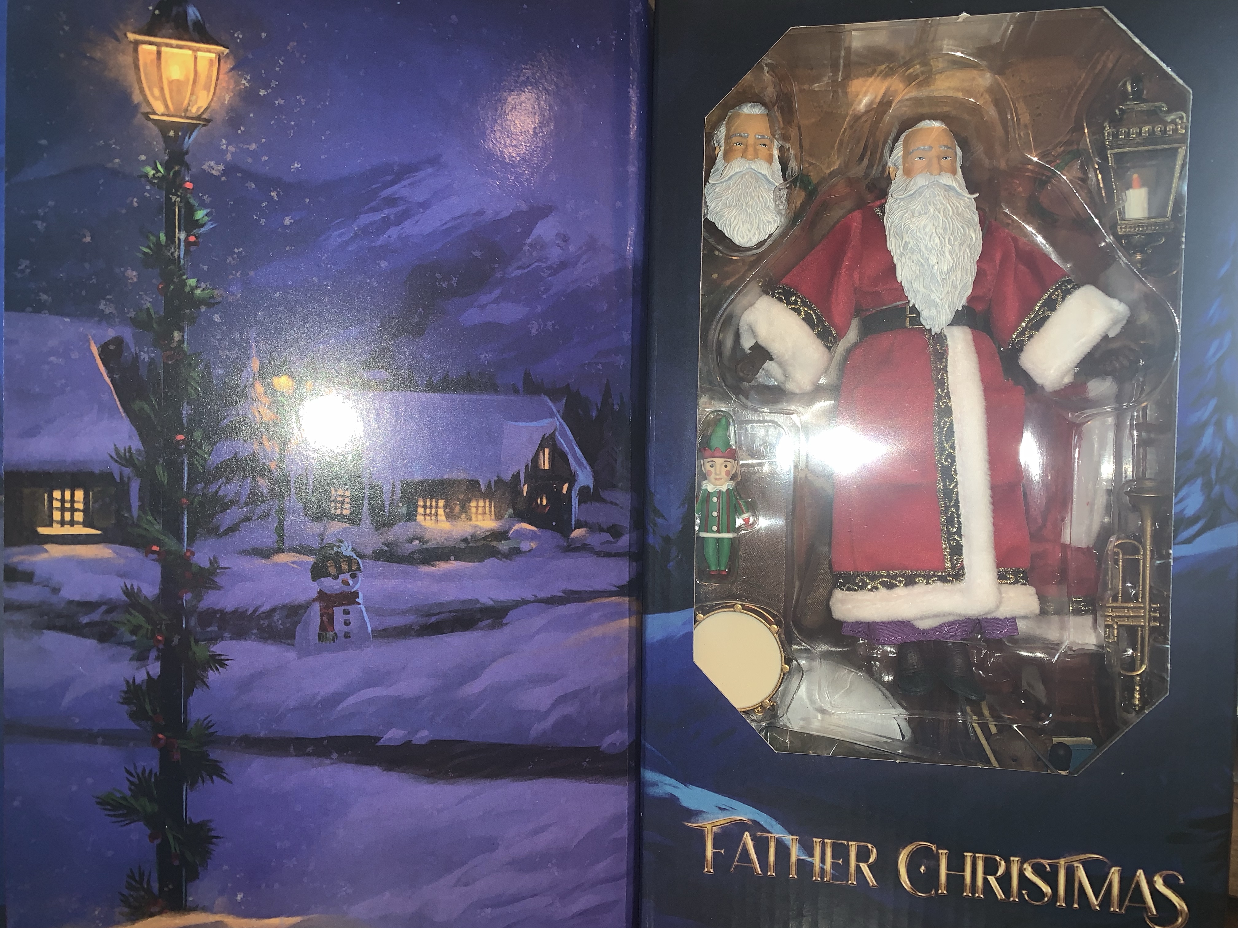
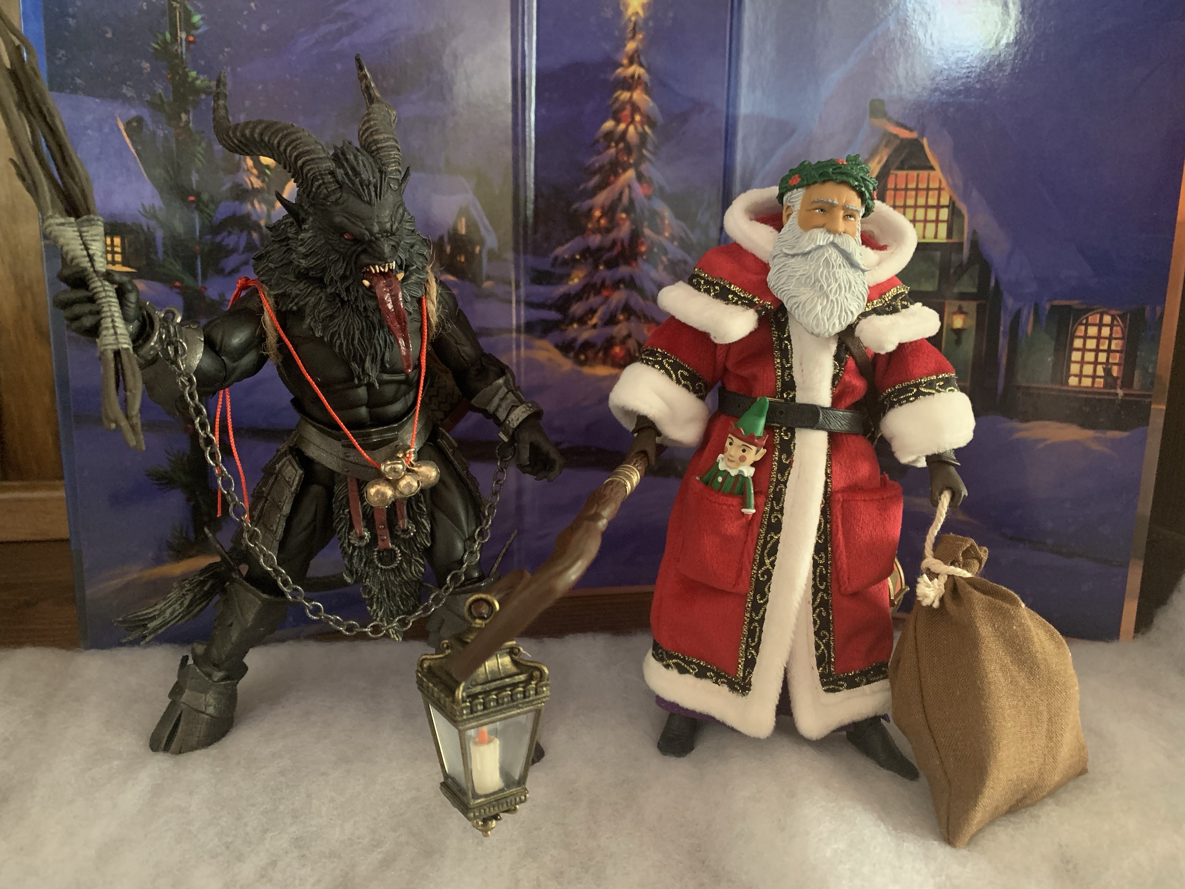
Father Christmas comes in the same style of box as Krampus. It’s a window box, but it’s wrapped with a thick, magnetized, cover that covers three sides of the box. Once removed, it can be used as a backdrop or just put back on the box. It has some lovely illustrations on it with a depiction of the character on the front and a quiet, snow-covered, village on the reverse. The figure itself is presented well in the box, but he’s not long for it! Once removed, Santa stands right around the 6″ mark. He’s pretty much eye-to-eye with Krampus and looks resplendent in his red robes. The tailoring on the soft goods coat is impeccable. It fits the figure well and the trim-work on it looks as good as any garment one would buy. Underneath the robe is another purple robe which is secured via Velcro on the figure’s rear. It’s basically just a thin, filler, robe to help hide the ordinary Mythic Legions body underneath which is garbed in leather armor and devoid of paint. That’s fine since he’s meant to be displayed with the soft goods. The headsculpt looks terrific though and he has this massive beard that goes all the way to his belt. The paintwork on the head is well done and I like that 4H used a wash on the hair. And I swear the right eye is shinier than the left to give it a “twinkle” effect. The only other part of the actual figure visible are the hands and feet. The hands are brown while the feet are more of a grayish, gun-metal, color which extends to the greaves that aren’t visible. He has a belt that fastens around the waist rather tight and mine was unfastened in the box, but it goes together painlessly. It’s just prone to popping off when handling the figure which can get a little annoying, but it does fit the figure well.

So are these guys friends? Enemies?

Let’s bust out the articulation on this guy now since it’s going to be the biggest weakness. The head sits on just a big ball so the only movement you get is just the head sliding around on that ball. And since this guy has a massive beard, it means he can’t look down. Range to the side is minimal as well, and looking up is hindered by the soft goods. The shoulders are just ball-hinges and they’re ball-hinges, nothing special. The elbows are single-hinged and swivel while there’s also a gauntlet swivel and a wrist swivel with horizontal hinges. Santa just has two gripping hands and I do wish he had some vertical hinges instead. There is a diaphragm joint, but it’s going to be limited by the robes, but you get some twist there. The hip articulation is fine and Santa can basically do a split if the robes are moved out of the way. He kicks forward just fine, back a little, and has some thigh rotation. The knees are single-hinged and can hit a 90 degree bend and there is a swivel there as well, but the shape of the greaves limit how far they’ll twist. The ankles rotate, hinge up and down, and also have a nice rocker. Lastly, the robe is wired so you can play around with that to create a windswept look and such. This articulation is purely basic and the soft goods hinder most of it, which is fine and expected, as far as I’m concerned. I wish the head worked better, but short of hinging the beard or something I don’t know how it could have been done much better. A joint in the lower neck would have helped, and even though I typically don’t love it, a hinge there would let him look up better. Personally, I don’t think it’s a big deal. The only change I really would have preferred is to have vertical hinges on the gripping hands, but that’s it.

He has a lot of stuff, but he can also store it all which is pretty cool. Well, except for the tree.

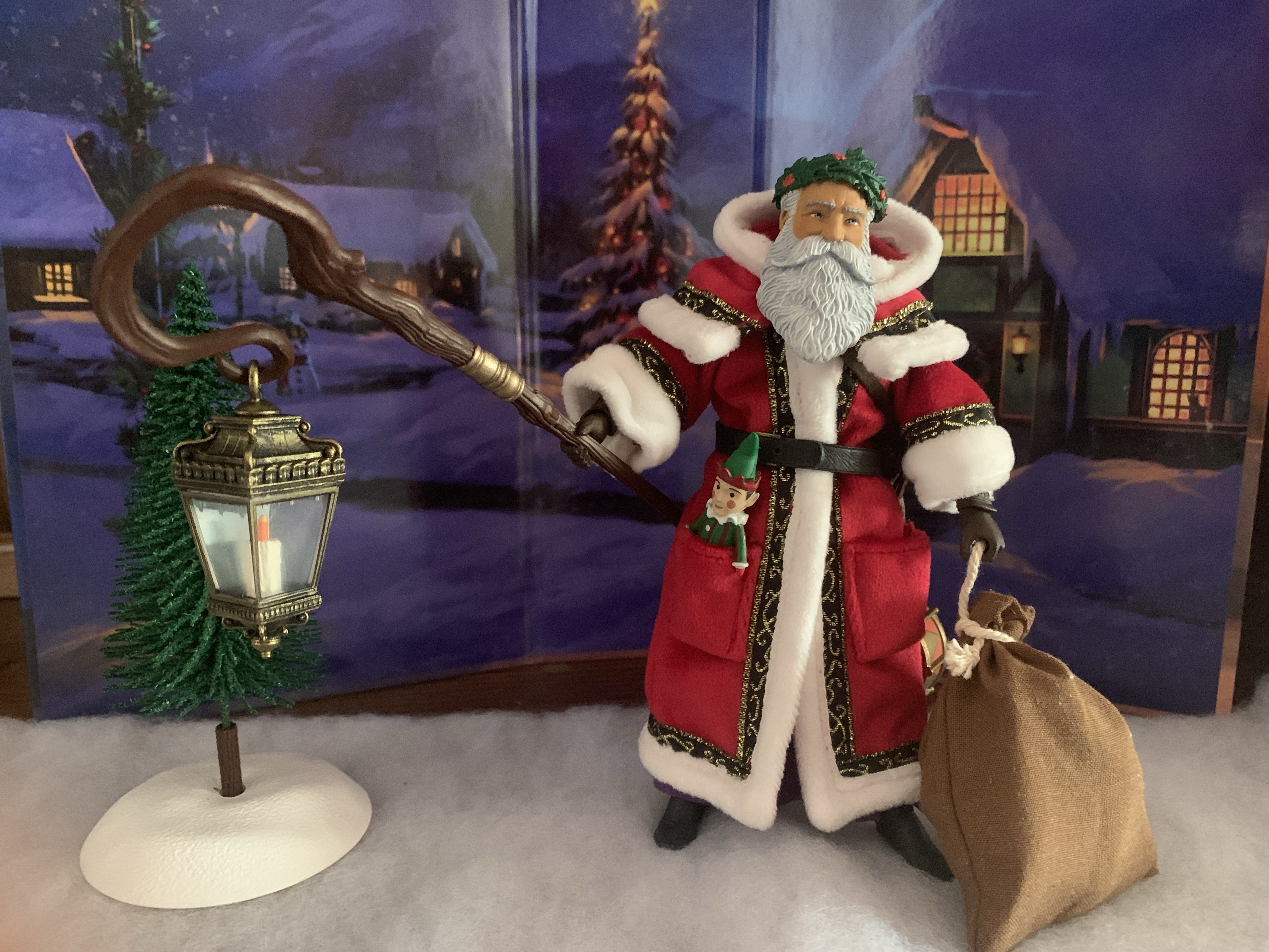
The articulation may not impress, but this guy is designed to “wow” with the soft goods and the stuff. And this guy has a lot of stuff. For starters, we have a separate soft goods hood that can hook under the chin. You pretty much have to pull the head off to get in there, but once in place it looks solid. As a hood, it can be tough to get it just right, but 4H included a wire in it so it can be laid down flat very easily and looks great. And if you prefer the hood down look, there’s a pair of holly crowns to put on the figure’s head. As far as I can tell, they’re identical to one another so one is basically just an extra, but it’s well-sculpted and well-painted. You also get a second head and this one has a shorter beard and a fuller face. I suppose this makes him look more like a modern Santa, but I do prefer the shorter beard look and will probably display this one. Mine does have a minor paint blemish near the right temple which is unfortunate, but not something that will be visible from the shelf. Father Christmas also needs a staff and he has this long, gnarly, one that looks like old oak. It ends with a hook and from that a lantern can dangle which also looks fantastic. It’s done with transparent plastic for the glass and paint job on the weathered, “metal,” portion is great. There’s a candle inside designed to look lit, and the only thing missing is an actual light source. There’s also a small evergreen tree that’s basically flocked, which makes it a tad messy to handle. It’s mostly made of green wire and slots into a piece of sculpted, plastic, wood which in turn pegs into a snowy base. It’s not terribly convincing as a small tree, it looks like something one might find with a model train display, but it’s nice for ambience.

He’s got a sack full of toys for all the good girls and boys.

What would Santa be without toys? Not much of a Santa! This guy has quite a few to deliver this year. For starters, there’s a doll that looks like an elf. The red coat has a deep pocket on each side and the elf fits rather nicely into one. For the other, we have a trumpet which looks lovely as well, or he could just hold it. There’s a satchel that can either be hung off a shoulder or over the neck. It’s full of stuff including a bear, nutcracker, book, candy cane, drumsticks, and more. And speaking of drumsticks, they pair nicely with the drum that Santa comes with. It has a chain affixed to it with a plastic hook on the end of it which clips right onto his belt. It’s so well done too that it looks like it should produce sound like an actual drum, but it’s all plastic. Lastly, we have a sack of goodies and some of them are meant to be a surprise so I won’t spoil them. Basically, you have two toys in there and two accessories. The accessories seem like they’re geared more towards the Mythic Legions enthusiast, but that’s all I’ll say on the matter. The sack itself is more soft goods with a rope around the top. The rope is held onto the sack via some brown thread which I like as it makes it easy to secure it. I wish NECA did something similar with the Santa figures I’ve purchased from them as manipulating the bags can be frustrating.

This drum looks incredible, I just wanted to slip in another shot of it.

With the Figura Obscura Father Christmas, I do think we have ourselves a case of “What you see is what you get.” The soft goods means he’s not going to pose all that dynamically, so if you like how the figure looks in pictures here or on Four Horsemen’s website then chances are you’ll like the figure in person as well. And if you do like it, you’ll want to head over there to secure one. Last year’s Krampus did get a re-release in red which was sold elsewhere so it’s possible this figure will follow a similar path, possibly in a green robe. This version though will likely be a Store Horsemen exclusive and once it’s gone that could be it. It presently retails for $60 which is steep, but I think it’s worth it given the quality of the soft goods and the abundance of stuff in the box. I also really get excited for Christmas so your mileage may vary. Personally, I am thrilled to add this one to my collection and I’m already wondering what next year may bring.

Looking for more holiday themed toys?

Figura Obscura – Krampus

Over the years, I’ve acquired quite a few action figures designed by the good people over at Four Horsemen LLC. They’ve been designing figures for companies for awhile now. My first exposure to the company was via NECA’s inaugural line of Teenage Mutant Ninja Turtles based on their appearance in the Mirage Studios comics. Lately,…

Keep reading
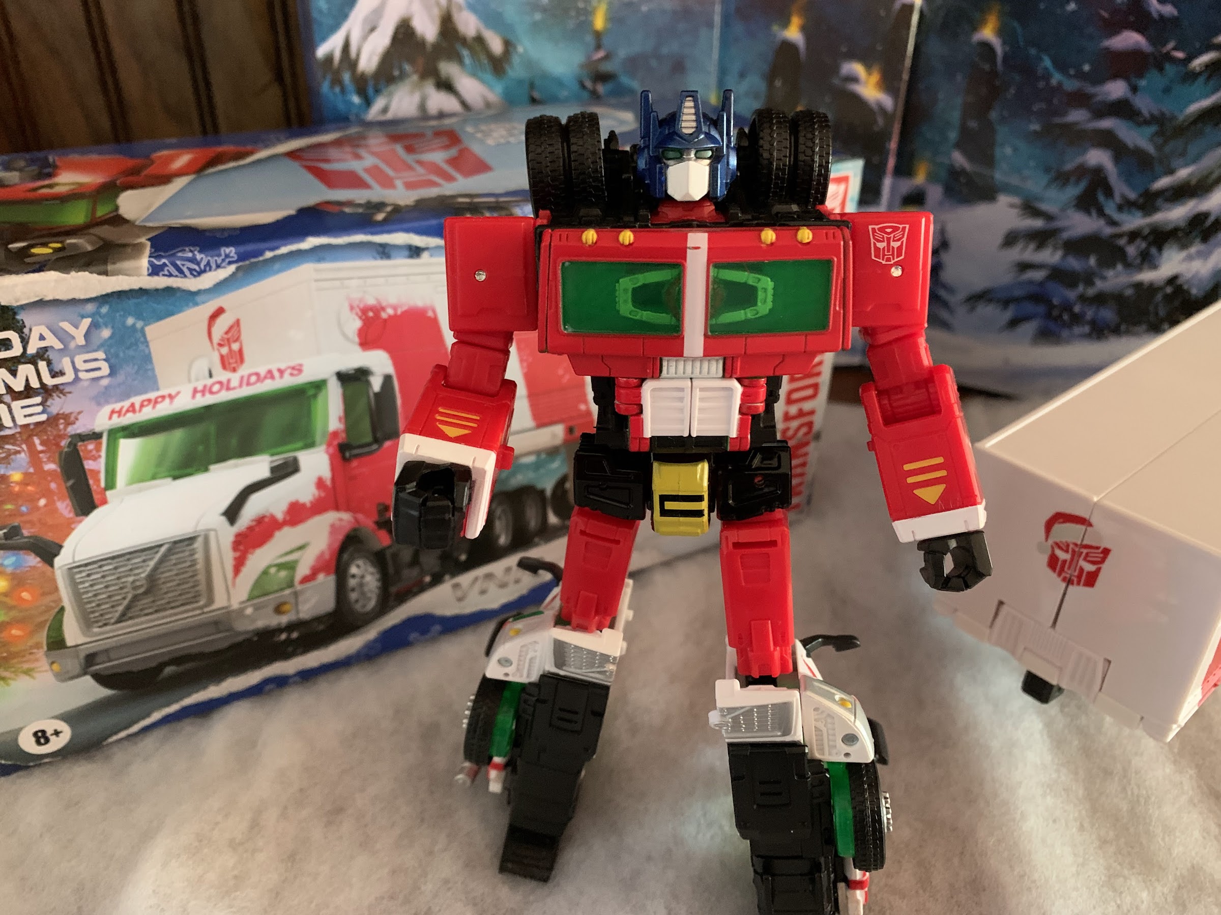
Transformers Generations Holiday Optimus Prime

We interrupt our regularly scheduled holiday posts with something very familiar to this blog: a toy review! Yes, we have ourselves another Christmas toy to talk about and it too comes from Hasbro. We already looked at a Star Wars toy at the end of November, and now we’re turning to what I suppose is…

Keep reading
NECA Gremlins Santa Stripe and Gizmo

The Christmas Spot is just around the corner, but before we can get to there we have a new Christmas action figure release from NECA Toys to talk about: Santa Stripe! NECA has done an admirable job of mining material from the film Gremlins and it’s sequel Gremlins 2: The New Breed, and Santa Stripe…

Keep reading
Transformers Generations Holiday Optimus Prime

Prime is here to…transform…your holiday!

We interrupt our regularly scheduled holiday posts with something very familiar to this blog: a toy review! Yes, we have ourselves another Christmas toy to talk about and it too comes from Hasbro. We already looked at a Star Wars toy at the end of November, and now we’re turning to what I suppose is Hasbro’s flagship franchise: Transformers. Like Star Wars, I don’t have a strong history with Transformers toys from my youth. I had one or two figures in the 80s and I couldn’t even tell you what their names were and I’m not even sure I could pick any of them out of a lineup of Generation 1 toys. When Generation 2 launched in the early 90s, I took a passing interest. I think I ended up with a mere four figures: Grimlock, Megatron, a fire truck, and Optimus Prime. Even though I wasn’t that into Transformers, that Optimus was a favorite toy of mine for at least a little while. I had to save up a lot of money to get it, 30 bucks in 1992 money, and I remember getting it on Halloween. I was pretty blown away by the diecast parts and the rubber tires on him and I quickly learned how to convert the figure with ease from robot to truck mode. The sound effects were neat, and once I had that Prime I basically had to get Megatron which I would for Christmas that year. I wasn’t that taken with that toy though as he was way bigger than Prime, had that camo deco that wasn’t show accurate, and just wasn’t a ton of fun to play with. Transformers was just filling a short gap for me between my obsession with Teenage Mutant Ninja Turtles and my blossoming love of X-Men. Despite my enjoyment of that Prime though, I let my sister sell it in a yard sale many years later. I think she got 50 cents for it.

I will never get used to Optimus Prime as this style of truck.

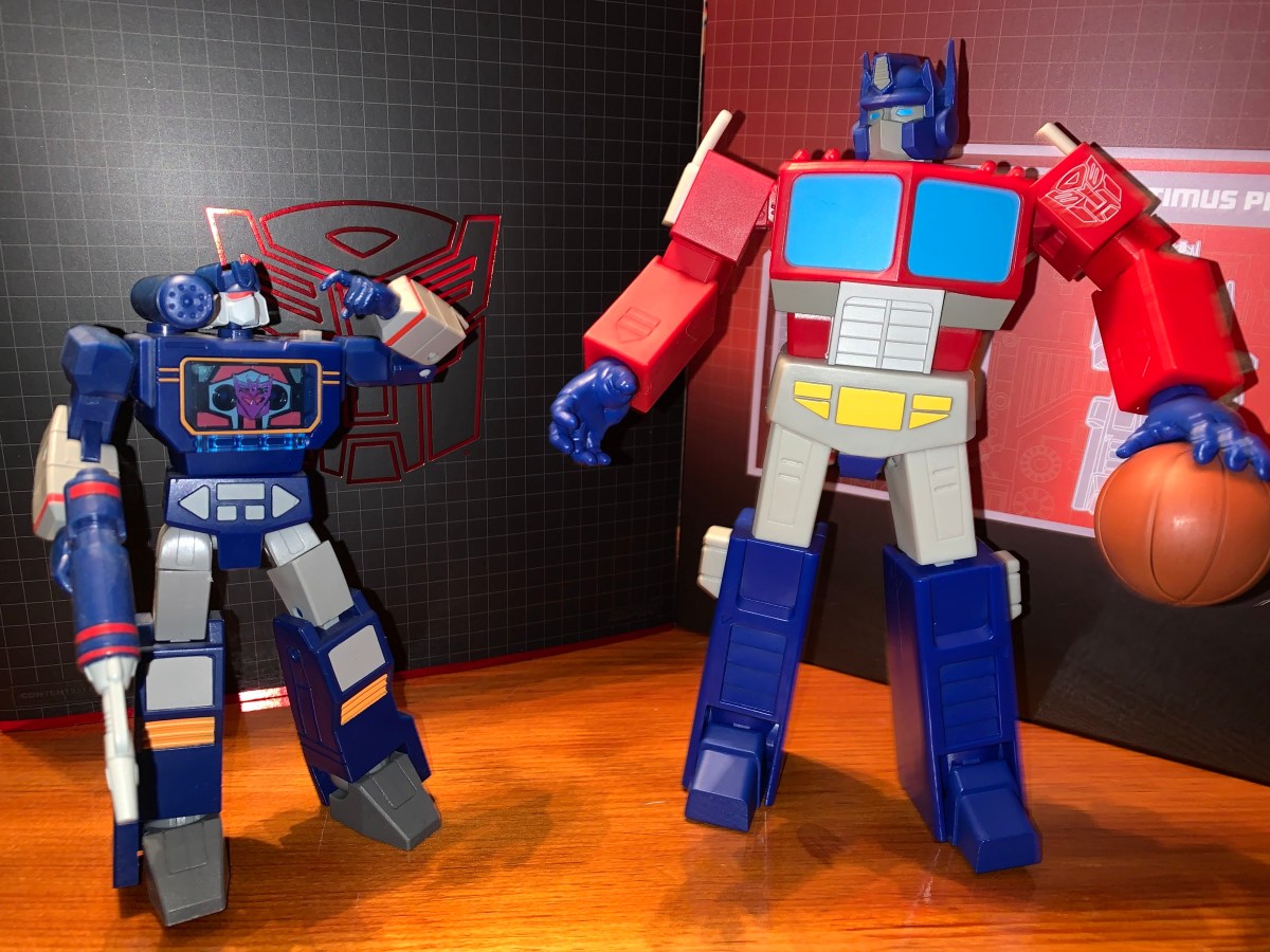
Even though Transformers has never really been my thing, I’ve still ended up with some toys here and there including the Masterpiece Prime and more recently the Super7 offering. Transformers as a franchise is something I have basically zero interest in. The show never worked for me, I don’t care about these characters, and the movies are terrible. Well, Bumblebee was okay, but it was basically just E.T. with robots. As a toy though, I think the bots to vehicles concept is wonderful – it’s two toys in one! In actual practice, I just tend to find them to be less fun. Most are either clearly better as a car or a robot and it’s rare you get two worthwhile toys out of it. I was also more of an action figure guy and the robots and their limited articulation sometimes frustrated me so it’s been easy to not get sucked in. I am a major sucker for Christmas though, so when Hasbro announced this holiday themed Optimus I was pretty interested and put in a preorder right away. As the weeks went by though, I started to have second thoughts. Is this something I really need? It’s not exactly priced in the usual impulse territory, and I wasn’t sure where I’d put it or how I’d display it. I was pretty close to just cancelling the preorder, and then I got the “processing soon” email from Pulse so I just let it ride. Was that a good choice? I guess it’s time to find out.

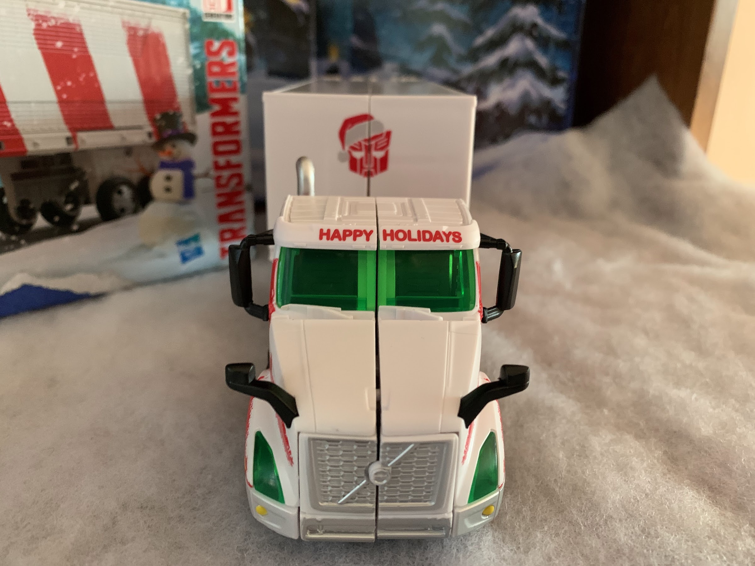
And this is why I prefer the classic style for Prime as you don’t get this ugly seam down the middle in truck form.

This Optimus Prime comes from the Generations subline. I don’t really know what that means, but I see other figures in this line at big box stores. It looks to me like the releases are focused on classic characters with a modern lens. I wasn’t sure what to expect as far as quality goes. My son has acquired a few Transformers figures here and there, including the movie Grimlock from last year, I want to say. That thing is pretty cool, though he doesn’t seem to place much value in it. My nephew had a Transformers phase (and it’s what lead me to get the Super7 figure) and he had more of the standard releases which is what I’m expecting of this figure. That’s to say it’s not a gigantic piece nor do I expect it to feature any diecast parts. Paint is minimal, as it probably should be for a figure with this many moving parts, and it’s not something I expected to be of the rugged nature and I would say my expectations are largely met.

For those who prefer the no trailer look.

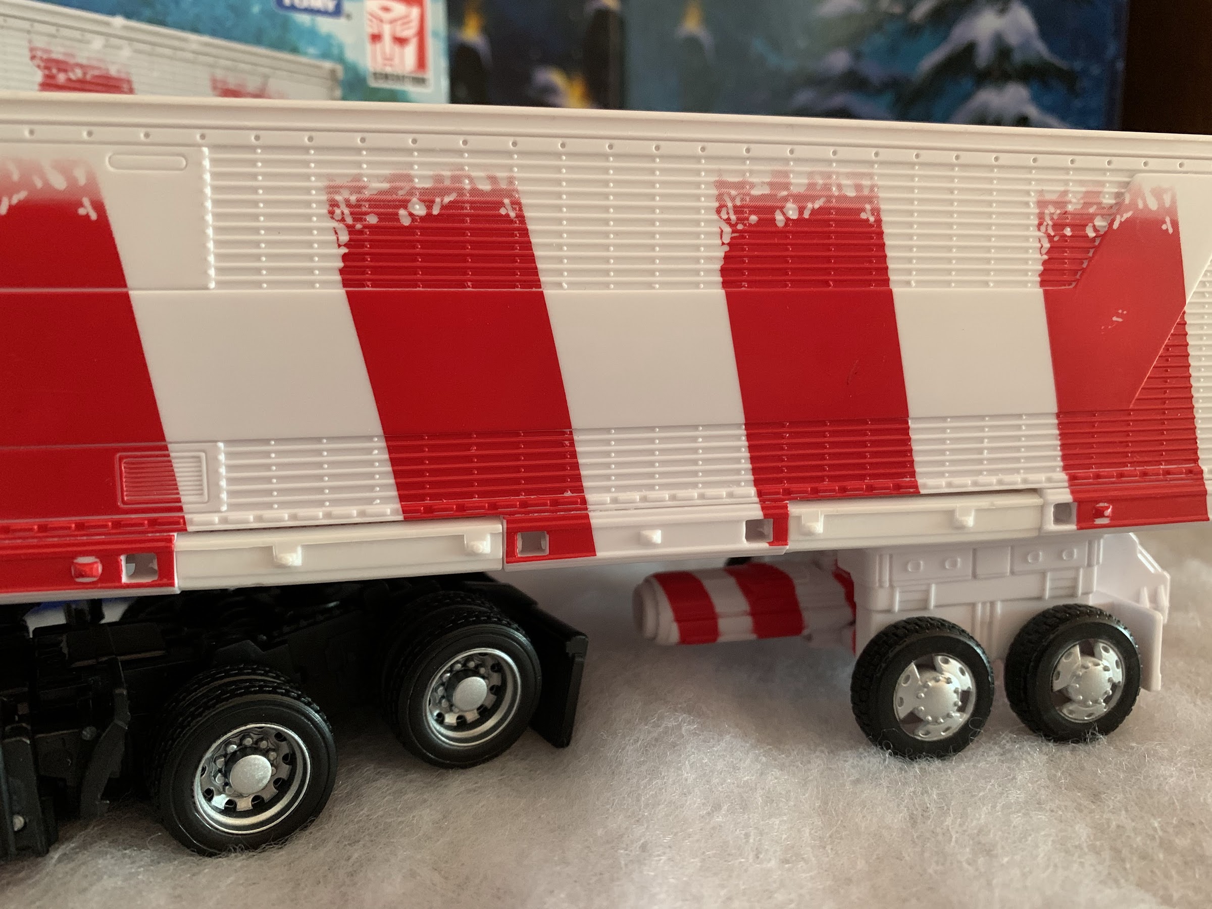
The figure comes in a nice holiday themed box that makes me think of the Hess truck releases over the years. I don’t know if Hess was a regional thing, but the company was a gas station in the northeast when I was a kid that always put out a special truck, or vehicle, each year. I had a few growing up and the trucks are still released through Speedway each year even though Hess no longer exists. Optimus Prime is certainly decked out for Christmas as he features a white and red color scheme. The trailer of his truck looks like a big candy cane and the “glass” on the cab of the truck is tinted green to drive the point home. Optimus is not in his standard Freightliner truck form with the flat front, but his more Peterbilt style as seen in the films, though this truck is actually a licensed model from Volvo. I prefer the gen 1 look for Prime as I think it’s better for transforming. This style of truck has an actual front-end which is something that needs to split down the middle. When in robot mode, it forms the side of his legs and it’s a bit clunky, but I guess this is the Prime the kids today are more familiar with. In addition to the colors, there’s some snow decals on the trailer to give the appearance that Prime is trucking through a blizzard to deliver some holiday cheer. The Autobots logo also has a festive Santa hat applied to it and the overall effect is achieved – this is clearly a Christmas toy. I am left wishing that Hasbro sought out a partnership with Coca-Cola for this one though. Imagine if Optimus was transporting Santa packs of Coke? That would have been pretty damn cool, even for someone like me who rarely drinks Coke products. Maybe Coke is still pissed about that Pepsi Prime variant from way back?

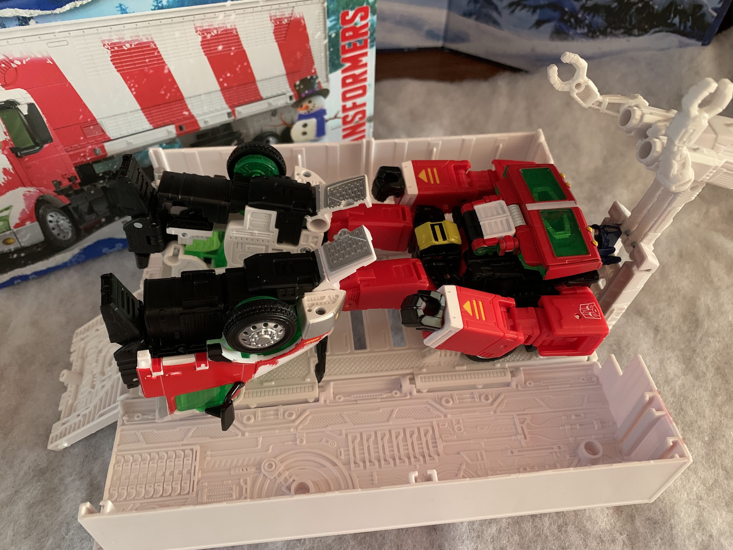
The trailer opens into a repair station, but it’s completely devoid of color and looks terrible.

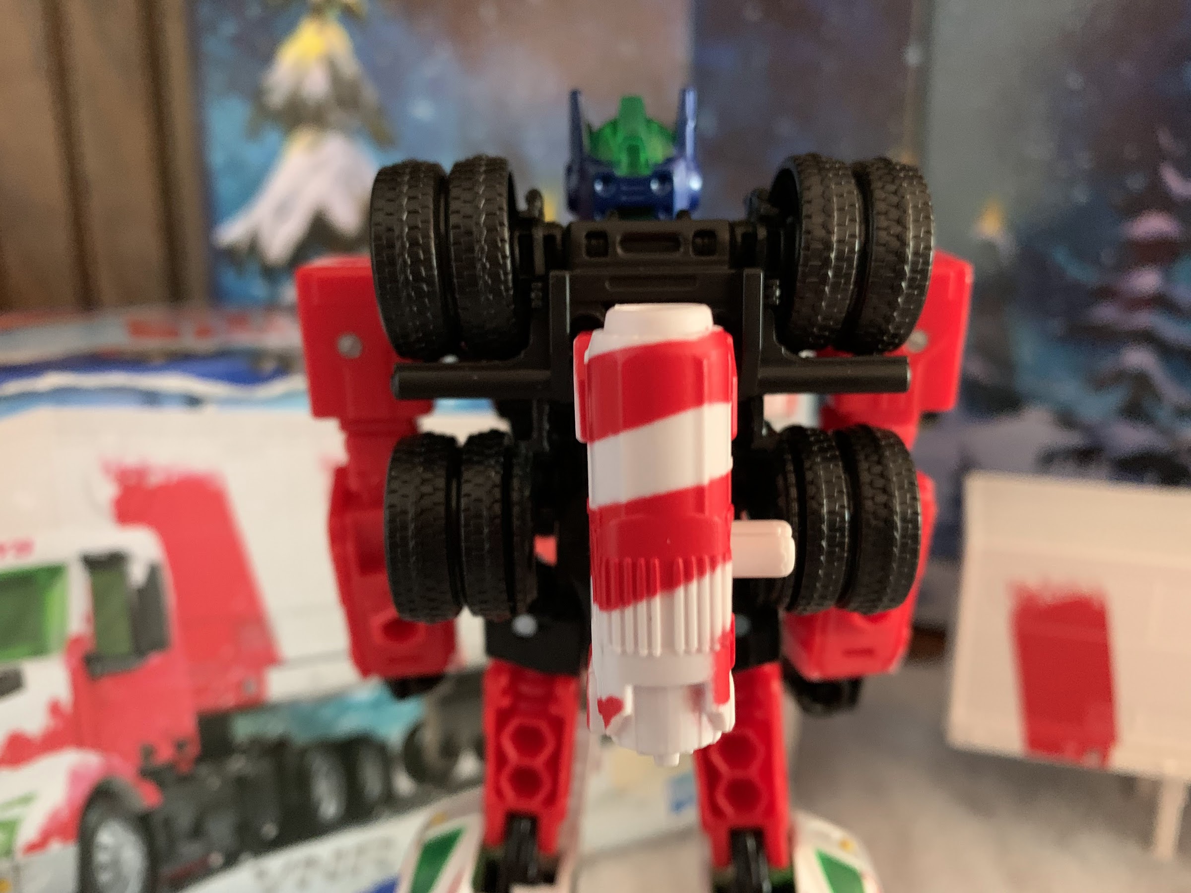
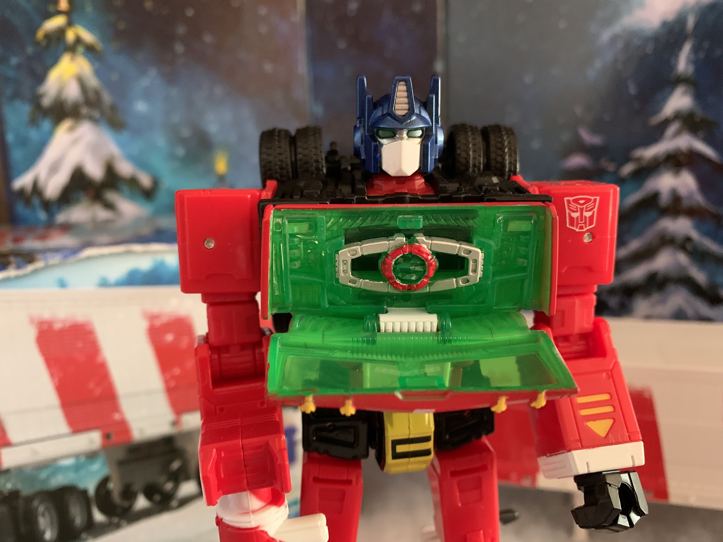
As a truck, it looks fine. I hate the seam in the middle of the front-end, but that’s the type of thing you just have to accept with Transformers. As a robot, the Christmas theme is a little less obvious, but still apparent. Prime stands around 7″ tall and basically looks like Optimus Prime. He has his standard blue head, but the rest of the body is pretty well dominated by the color red with some white and probably too much black. The underside of the truck is what forms the front of his legs so there’s more black than I would like for a Christmas toy. They should have just substituted that for a dark green. It’s basically not important in truck form, so it could have been any color, really. I get why they kept his head blue, but I would have gone with green like the Super7 ReAction figure of Christmas Prime. We do at least get a hit of green right in the center of the chest as the transparent green plastic is used there to house the Matrix of the Holiday Spirit. The only other thing I’m not crazy about, visually speaking, is how most of the tires of the truck are now positioned on the figure’s back rather than the legs. It gives Prime a very rugged appearance and it’s a little messy. As for the trailer, it opens up into a “battle station” like the G1 Prime. It’s basically just all white plastic inside and it’s incredibly dull to look at. It has an articulated fixture with some claw arms on it, I guess like a repair station for Prime, but it’s so lifeless looking that I’ll never display this thing open. It’s basically just a play feature for the kids.

He’s packing a candy cane flavored blaster!

When it comes to accessories, there’s not a lot to talk about. I suppose the trailer can be considered one, but we’ve covered that. It looks fine as a trailer, bad as anything else. Prime has his Matrix of the Holiday Spirit, which as far as I know, is just the usual Matrix of Leadership. Only now it has a red core with a green center. It’s fine and it’s something that’s basically expected to come with every Optimus Prime figure. It fits in his chest, or it can be removed, but the figure can’t actually hold it since both hands just have a hole through them. The only other accessory is Prime’s ion blaster which also has a red and white candy cane deco applied to it. In his hand, it looks okay. He doesn’t have trigger finger hands so it’s not the most convincing thing when the figure is brandishing it as a weapon. It has a hinge in the center so it can be folded and stored on the figure’s back. What’s far more notable about it though, is Hasbro left a slot for it on the underside of the trailer when Optimus is in truck form. When it’s placed there it, well, looks like a penis:

Hmmm…

Now that you’re done giggling, we can talk about the figure as an action figure. The set arrives in vehicle form and Optimus transforms in what Hasbro considers 37 steps. It sounds like a lot, but some of the steps are pretty basic and are simply “this little piece needs to move on a hinge 90 degrees – done!” As someone who doesn’t handle many modern Transformers, I found the directions mostly descriptive enough. There are no words, just images, likely so that Hasbro didn’t have to print this in multiple languages. The only part I found tricky was actually pretty early in the process, step 3, as it involves moving the rear cab panel down, but they didn’t engineer much in the way of anything to gain leverage with. And it being the first time, it’s hard to pinpoint where the piece separates. Plus, the hinge is on some transparent, green, plastic and that stuff is usually pretty damn fragile. It’s not really a good idea to do that type of piece on transparent plastic, and I’ve already seen people share images online of the part breaking, so definitely be careful with step 3. It can be freed up from the side, just don’t force it.

The gun looks less obscene when stored on the figure.

Once transformed, Optimus has what feels like the usual amount of articulation for a Transformer. The head rotates and can look down and up a little. The shoulders rotate and the arms can raise out to the side below the shoulder joint as there’s a hinge inside the shoulder housing. Past that is a swivel and an elbow hinge that achieves a 90 degree bend. The hands just rotate. At the waist is a twist and he can crunch forward a little bit at the same spot. The legs kick forward and back 90 degrees and he can even do splits, if you wish. The knees bend 90 degrees as well and that’s where the articulation stops. There’s nothing at the ankles which is what will limit the posing the most. The most exotic thing he can do is simulate a running pose or a walking one. He looks convincing enough in a “blasting” position too, but like most Optimus figures I encounter, can’t do a two-handed pose with his blaster. This one also has some extra bits and such to watch out for, mostly on the back of the calves related to the truck’s front end. The mirrors and smokestack could conceivably be a breaking point if this guy were to take a shelf dive or something and I definitely tried to avoid grabbing those parts when transforming the figure.

Of course, we have to work the Matrix into this guy somehow.

Which brings us to the last bit of info that’s probably worth having: the price. This guy retails for $56 via the Pulse website as well as other retailers. I have no idea if this guy is headed to any brick and mortar locations, so feel free to tack on a shipping charge as well. That’s a bit steep for a Transformer with no diecast, no rubber, and few accessories. I’m guessing the plastic box that is the trailer is contributing to the cost, as well as a smaller production run, but it definitely feels like there’s a Christmas surcharge here. I already mentioned I was contemplating cancelling this one before it shipped and it was mostly due to the price. If this were 35 bucks I would be far more likely to recommend it, but at more than 20 beyond that it’s a tough sell. I guess if you’re into Transformers you may want this in your collection, or perhaps being really into Transformers makes it easier to pass since you’re probably sitting on a mountain of Optimus Prime toys. As a result, this figure feels like it’s more for people like me: toy collectors who are into Christmas offshoots. And as a Christmas version of a popular character, it’s fine. I would have liked more accessories, maybe a blast effect for the gun or something other than the matrix that the figure can actually hold, but it does get the job done. This is clearly a Christmas toy on your shelf. It’s just the price that’s hard to get past. If you’re okay with spending $56 or more on this guy, then you’ll probably be content to roll him out each Christmas to decorate your house. If the thought of spending that much on a red, white, and green Optimus makes you recoil, then feel free to ignore it. And if you’re somewhere in the middle, maybe waiting it out will pay off in the form of a discount in the new year.

Want to read more about Transformers or maybe some Christmas toys? We’ve got you covered:

Super7 Transformers Ultimates! Optimus Prime

I think we’re over discussing the merits of non-transforming Transformers, right? It’s been done for a long time, but was really pushed to the forefront with the Hasbro RED series in 2020 and while there will always be a section of the fanbase that wants nothing to do with such a concept, it’s still an…

Keep reading

Figura Obscura – Krampus

Over the years, I’ve acquired quite a few action figures designed by the good people over at Four Horsemen LLC. They’ve been designing figures for companies for awhile now. My first exposure to the company was via NECA’s inaugural line of Teenage Mutant Ninja Turtles based on their appearance in the Mirage Studios comics. Lately,…

Keep reading
NECA Gremlins Santa Stripe and Gizmo

The Christmas Spot is just around the corner, but before we can get to there we have a new Christmas action figure release from NECA Toys to talk about: Santa Stripe! NECA has done an admirable job of mining material from the film Gremlins and it’s sequel Gremlins 2: The New Breed, and Santa Stripe…

Keep reading

Star Wars The Black Series Mandalorian Warrior (Holiday Edition)

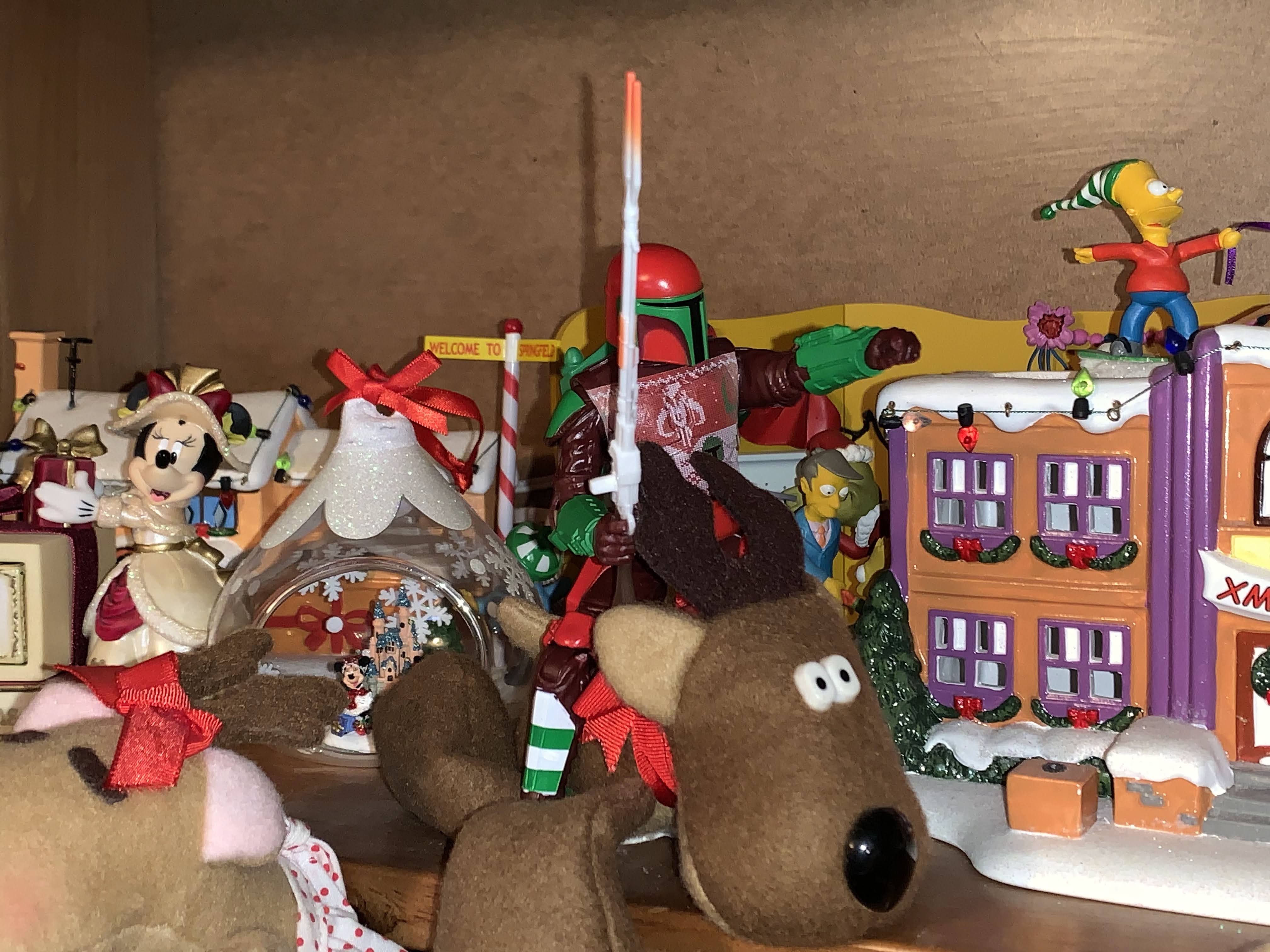
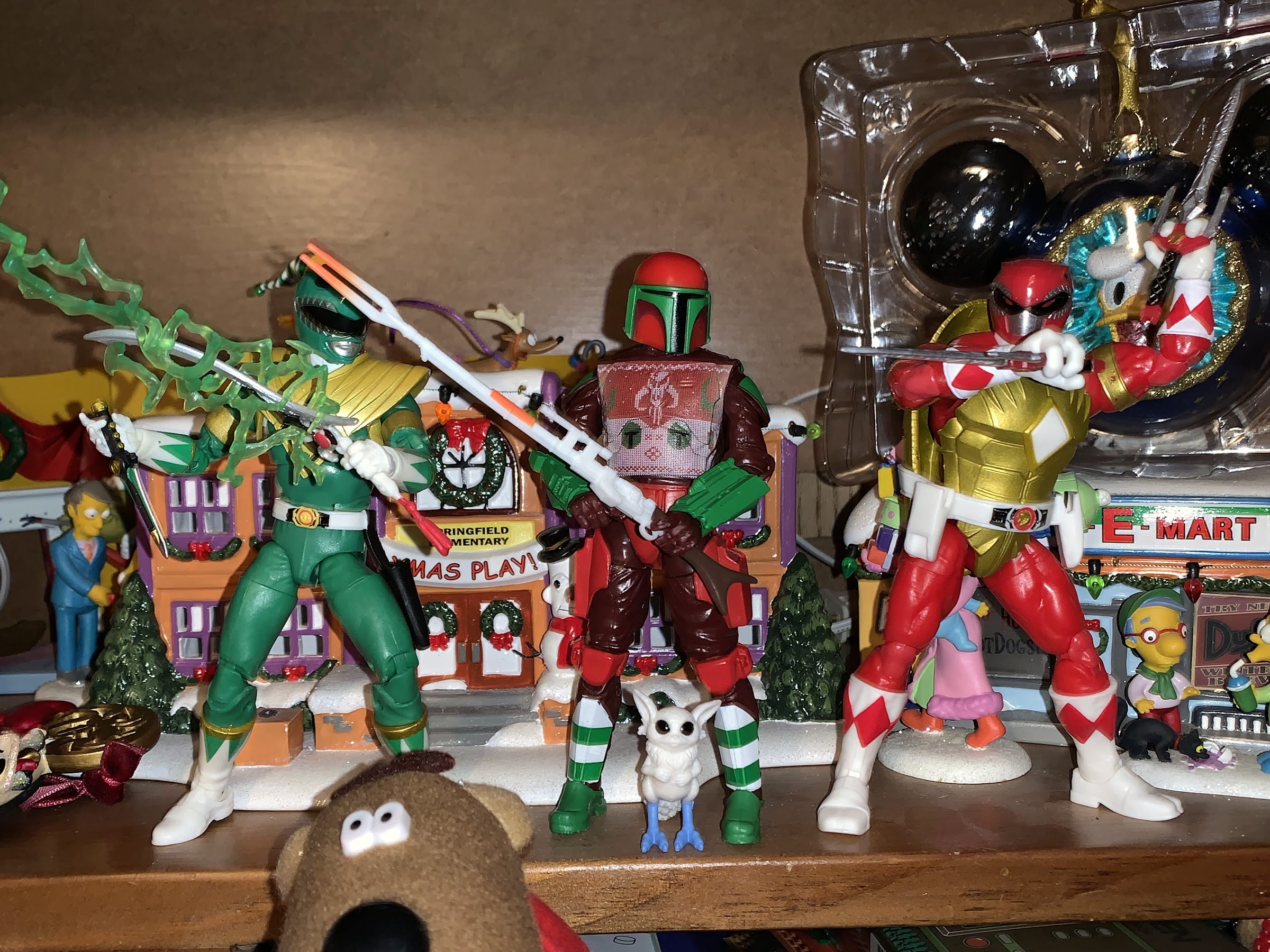
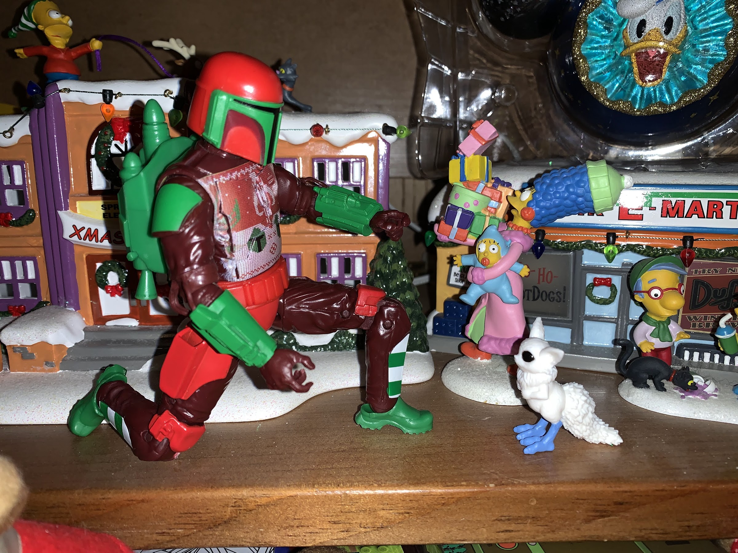
Straight from my Christmas shelf, it’s the holiday Mandalorian Warrior!

We’re getting to Christmas coverage at The Nostalgia Spot one day early this year with this look at one of the latest in the Holiday Collection from Hasbro’s Star Wars line of action figures referred to as The Black Series. I have previously looked at a figure from the very popular streaming show The Mandalorian from Hasbro’s The Vintage Collection. That’s a line of Star Wars figures that basically takes the old Kenner form and adds a whole bunch of articulation to it. I found that particular figure exceedingly charming and I’m a bit happy that I’m not a huge Star Wars fan or else I’d end up with a bunch of them (I’ve since only bought one more which I didn’t bother to review). Despite my preference, the clear most popular line from Hasbro in regards to Star Wars is the 6″ line known as The Black Series. I guess Star Wars collector wanted to see their favorite characters in a larger scale, or Hasbro simply ran out of 3.75″ figures and going to a new scale was an easier way to get someone to buy yet another Luke and Vader. Since I’m not a huge collector of Star Wars, it’s a line that’s never appealed to me. I always found the smaller scale for Star Wars as something that made the brand unique, plus it works way better for vehicles.

Special holiday figures demand special holiday packaging.

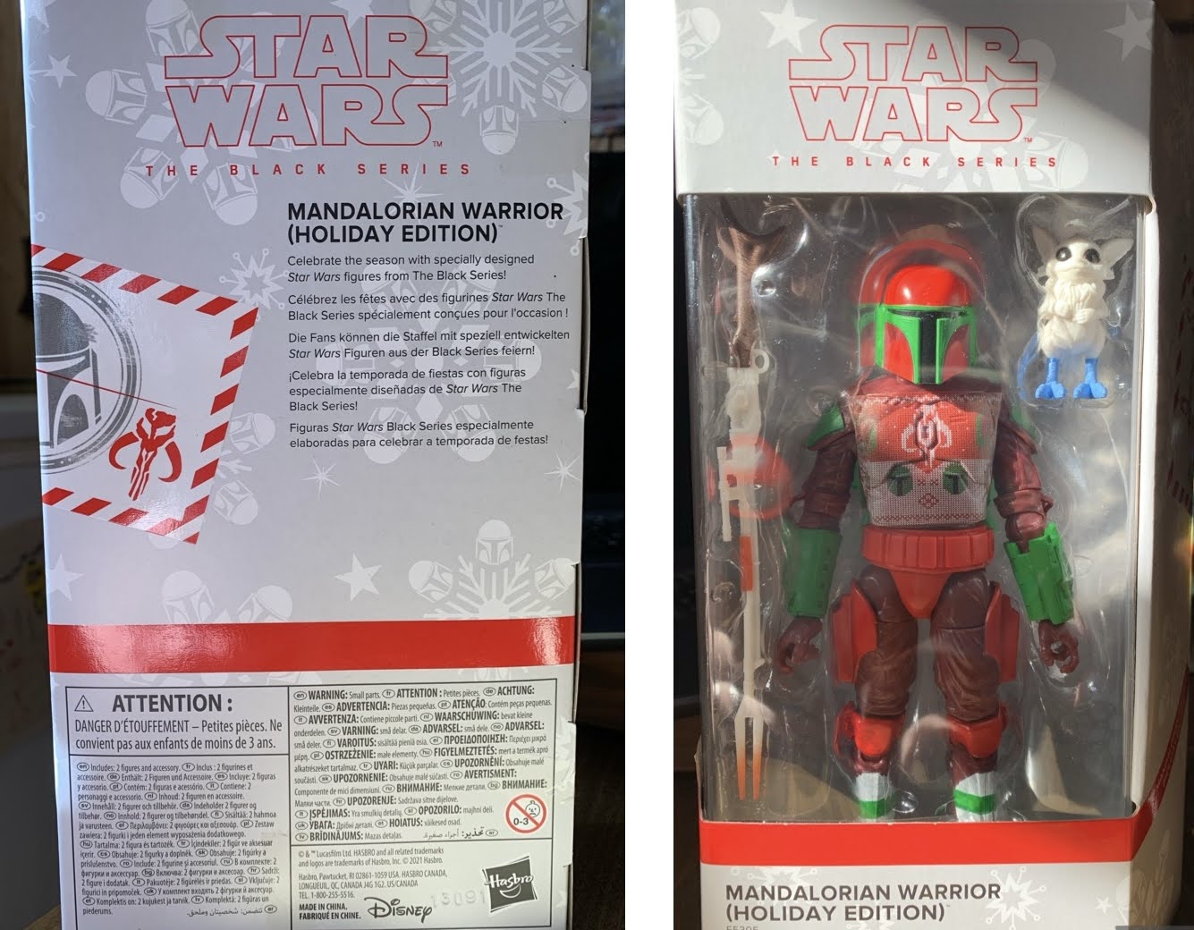
One way for Hasbro to get someone like me to buy a figure from its Black Series is to simply add some Christmas to it! Hasbro has been doing Christmas versions of Star Wars characters for a couple of years, if I’m not mistaken. This year’s lineup was actually supposed to drop last year, but delays at the factory or port, or both, caused them to miss Christmas 2021. Rather than drop them after the holidays, Hasbro simply held onto them to release later. There are a handful of these and they’re basically all just re-paints and re-decos of previously released figures to give them some holiday appeal. It’s been a desire on my end to add more Christmas toys to my annual display, so naturally this caught my eye. While I didn’t care for most of them, the holiday version of a Mandalorian Warrior stood out as being quite striking and festive so I decided to track it down. If you’re unaware, Hasbro arranged for each figure to be sold via a different retailer with this one landing with Target. It actually took me 4 tries to get this guy as I’d see him pop up on the app and I’d place an order for pickup only for it to be cancelled due to lack of stock. The fourth time was the charm though, and I even spied a couple on the pegs last time I was in there, so they appear to be shipping in some relative abundance. Perhaps the delay helped to make sure there would be enough product to meet demand. Nevertheless, lets rip this sucker open and give it a look.

“Fly away, Rodney!”

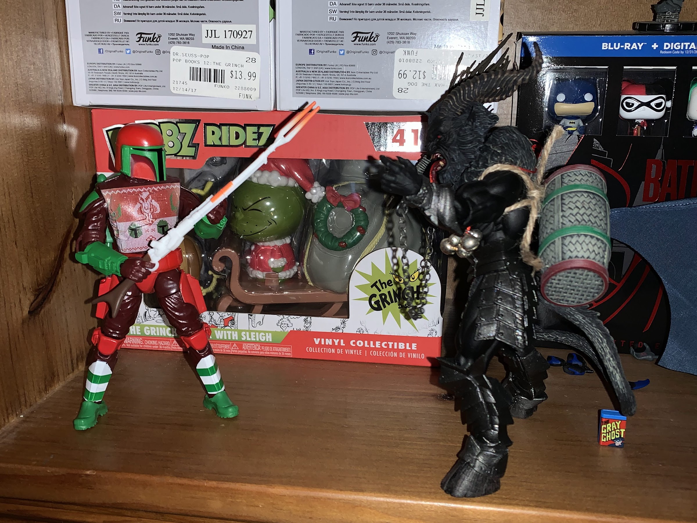
The Holiday edition of figures comes in a window box that’s desiged to resemble a wrapped present. The other benefit of these being delayed so long is that they retain the old window box packaging instead of the plastic free stuff Hasbro has switched to. I’m generally in favor of the move to eliminate needless plastic, but concede the window box is more attractive. I guess enjoy it while you can. It provides a straight-forward look at the figure inside and the accessories and if you’re an in-box collector it probably looks okay. Once removed, our nameless warrior stands a tick over 6″ at around 6.25″ and looks rather resplendent in his green and red attire. The helmet is rather striking at it’s predominantly red and green, but there’s a bit of shading applied in a dark red and, of course, we have the black visor. The shoulder pads, gauntlets, jet pack, and boots are done in green with red being applied to the belt, trunks, kneepads, and weapon holsters on his thighs. The rest of the figure is a reddish brown though his shin guards are white with thick, green, stripes. Much of the figure is done in molded, colored, plastic with the paint reserved for the helmet, shoulders, and shins. The only major deco is applied to the chest which has a festive, ugly, Christmas, sweater design applied to it. It’s the strong part of the figure and what basically ties it all together. The other colored parts look a bit cheap as a result, especially the trunks/belt and the jetpack. I’m left wishing they hit it with an enamel or clear coat that gave it a hard candy appearance. Just anything to apply a texture really would have helped.
I’m still working on acquiring Christmas figures, so it felt appropriate to pose him with some red and green figures from Hasbro for the time being.

As for the sculpt, this one is apparently an old one. I am not a collector of The Black Series, but my understanding is this was reworked from an old Jango Fett release from the earliest days of the line and it does show in places. I mentioned the finish as being cheap, but that’s more an issue of paint than sculpt. The feet are a bit odd as they’re very small. This guy looks like he’s wearing Crocs rather than boots. Maybe he’s supposed to and the feet are new? I’m not sure, but I suppose it doesn’t matter. By far, the worst offense this figure commits is featuring some sculpted wires that connect his biceps area to his forearms. Assuming it’s true that this is based on a Jango Fett figure, I suppose there was nothing Hasbro could do about the awkwardness involved in connecting two parts of the arm via wires, but here we have a fantasy creation that doesn’t need to be held down by that. Surely they had other arm molds without these annoying things they could have utilized? As it stands, we have two pieces of the figure joined by plastic. It can bend and flex, but stress marks appear rather quickly and I assume anyone that poses this frequently will eventually find these broken in short order. Hasbro must have determined they were too small to implement them like they do the cables on Apocalypse where they’re separate pieces that can be removed effortlessly. Not so here.
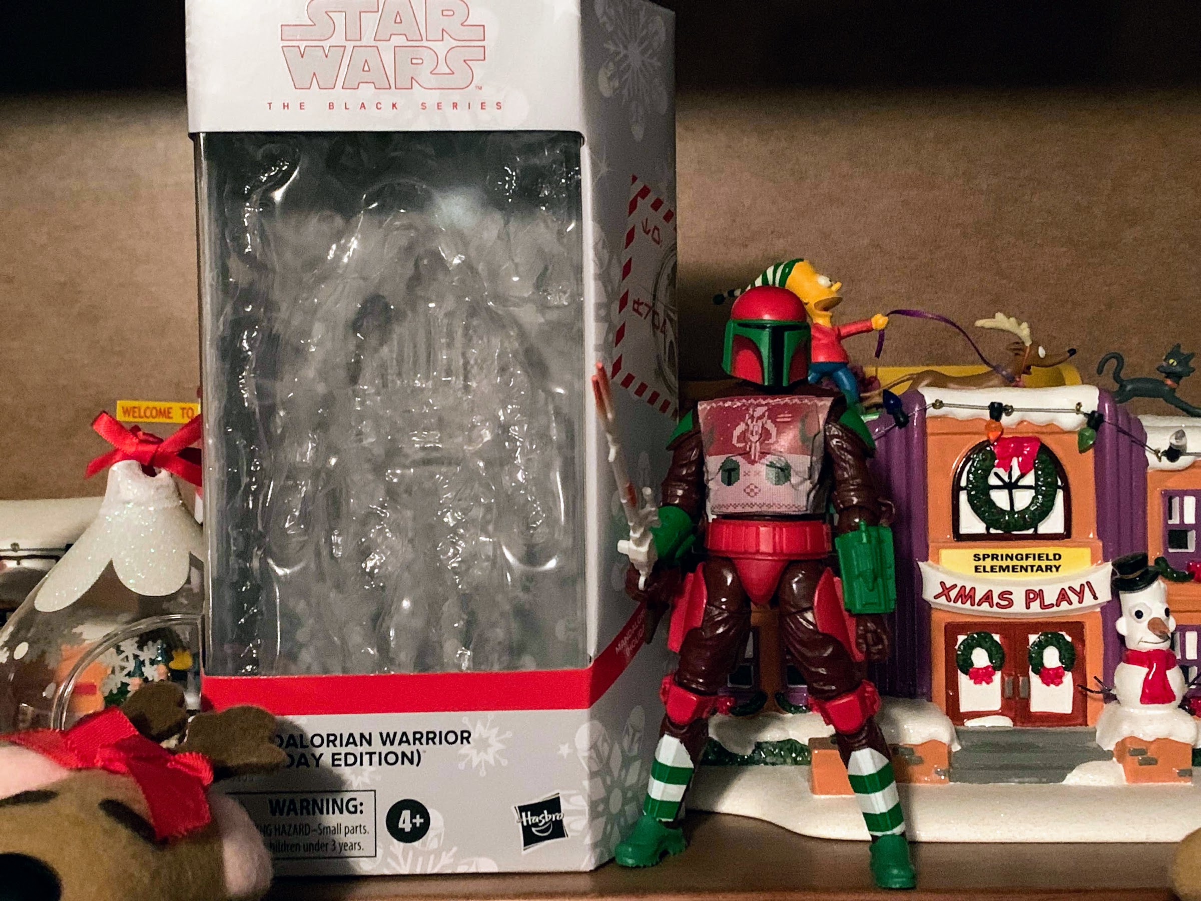
Though I suppose he could just battle Krampus.

I suppose that’s a good springboard to talk about the articulation. Here the figure shows its apparent age as well as this isn’t one to write home about. The head is on the typical Hasbro ball and hinge combo, but the boxy nature of the helmet means he basically can rotate and do little else. The shoulders feature the shoulder pads which prevent his arms from coming up to horizontal, but they can rotate around. The biceps do swivel, but as mentioned before, you need to be mindful of those sculpted wires when utilizing that function. There’s just a single hinge at the elbow, and the range is rather abysmal as he can’t even hit a 90 degree bend. The forearms swivel, which helps to keep those wires in-line, and the wrists swivel and hinge horizontally, not vertically as would be better. The armor means he does nothing in the torso and the waist is just a twist. The hips let the figure kick forward, but not back, and he can spread his legs far enough. There is a thigh cut and the knees are double-jointed. The ankles feature a hinge and rocker, but the range forward on the hinge is poor. The rocker is okay, but the feet are rather small so he can be tough to stand and pose. In addition to that, he’s a bit loose and floppy in the lower half which is unpleasant. The figure feels rather basic as a result, and it rears its head with the accessories as well.

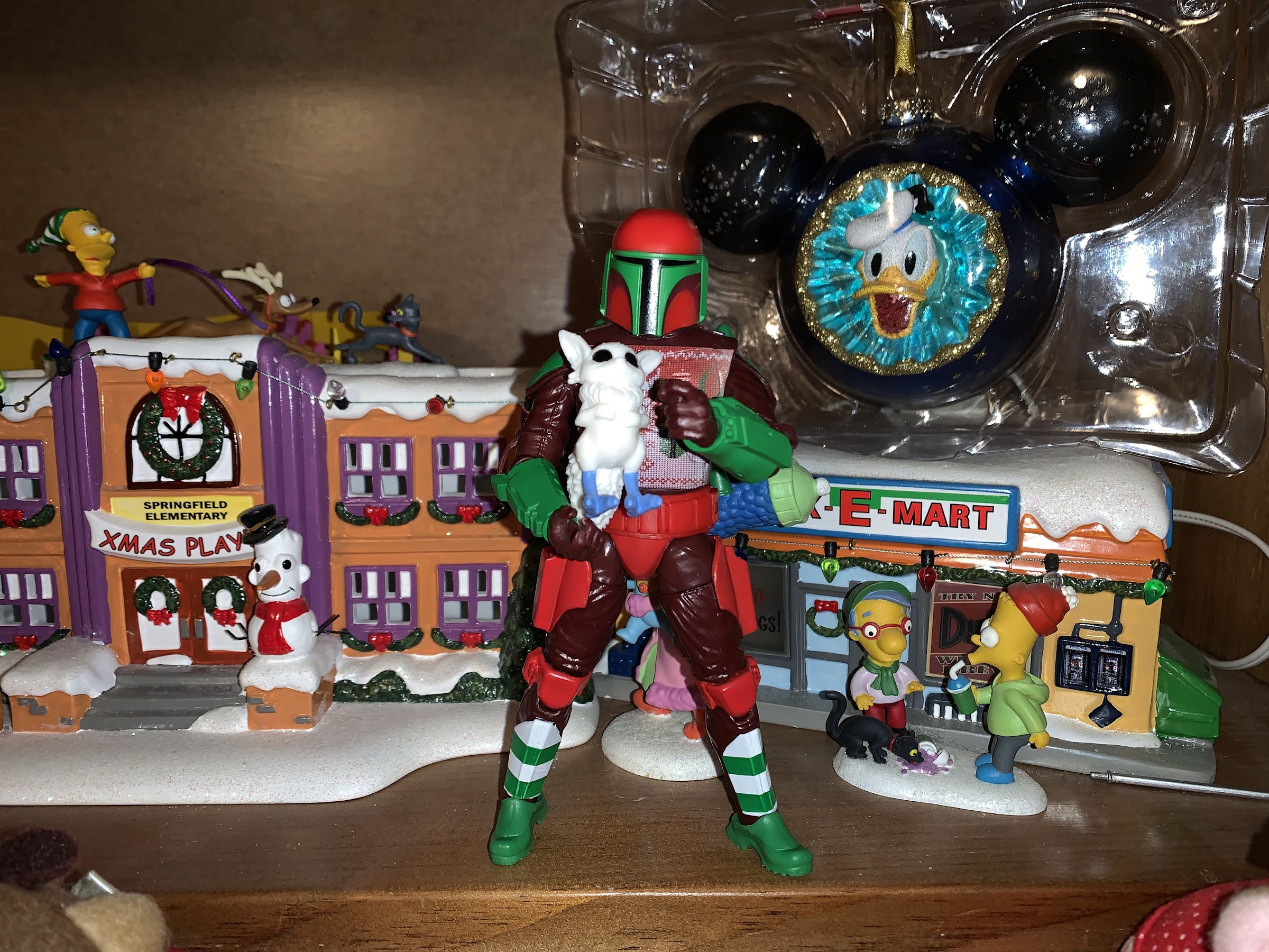
You also get this little guy in the box. Cool?

As for those accessories, the Mandalorian Warrior comes with few. He has no extra parts, but his hands are trigger finger hands so he can hold his weapon in either hand. And that weapon is a long rifle, the Amban blaster, which can fit in either hand, but he can’t really hold it properly. I was amused when Target’s solicitation shot even featured him holding the weapon in an unnatural manner. He can basically just carry it, but the lack of butterfly joints and the proper wrist range means he can’t hold it as if he’s firing it. He also can’t holster it anywhere and it’s a shame the two holsters on his thighs can’t store anything. The deco of the rifle is a bit interesting as it’s primarily brown, white, and orange which was done to make it resemble the Nerf version of the same. It’s a bit of a deep pull so many who get this might wonder why they didn’t give it more of a Christmas deco, but it seems appropriate to make it a “toy” version of the gun. The only other accessory is a small bogling, which is done in all white with blue feet. It’s cute, I suppose, and it frees up Grogu for a separate holiday release which is probably what Hasbro wanted to get casuals like me to buy two. And that other figure is the Walmart exclusive Scout Trooper which I may or may not get. I suppose the jetpack can be considered a third accessory since it is removable. It just plugs into the back and, as I mentioned before, is rather plain looking given the lack of paint.

“Well little guy, we’re pretty mediocre, but at least we’re Christmas!”

The holiday edition of the Mandalorian Warrior presently retails at Target for $26.49. That seems really high for a figure that is, as far as I know, just a re-paint. It probably has a smaller run than some other figures which may account for some of the increase, but I’m guessing the added price is mostly to take advantage of people like me who will impulse buy a Christmas Star Wars figure. As an annual decoration, I think it’s okay. It stands out on a shelf because of the color combo and the Mandalorian design, which is basically just Boba Fett, is pretty timeless and distinct. As an action figure, it’s pretty mediocre though as the paint is scarce, the articulation poor, and the accessories lacking. I would have preferred pistols that actually fit in the holsters to the rifle, and they must have done a Mandalorian figure that can holster the rifle like the Vintage Collection version, no? I don’t understand why they would reuse this old mold when better ones exist. Maybe because if they just did the actual Mandalorian it would be even more obvious that they wanted to separate Grogu off for another release? If that’s the reason then that’s lame. Ultimately, I don’t necessarily regret my purchasing decision here, but it doesn’t endear Hasbro to me either. It certainly drives home that Hasbro is a big company out to make as much money as possible, and I’ve helped them out in their quest for that. If you want what is essentially a Christmas Boba Fett, then this might do it for you. If you’re expecting what is the current level of quality of a Black Series release with a Christmas surcharge then this might disappoint you. And if you never needed to see Star Wars characters dressed for Christmas, then you can certainly skip this.


Playmates TMNT The Last Ronin PX Previews Exclusive (Chase)

What’s this?! A brand new TMNT sculpt from Playmates? And I bought it?!

A few years ago, Mattel launched a new subline of action figures based on their most famous IP: Masters of the Universe. The subline was titled Origins and it basically took the vintage toys of the 80s and updated them with more modern articulation while still preserving that vintage aesthetic. And ever since then, collectors have been barking up the tree of Playmates Toys, known throughout the world as the producers of the original Teenage Mutant Ninja Turtles line of action figures, for something similar. And so far, Playmates has said “nah.” Instead, the company seems more interested in reissuing figures from its back catalog and reworking the Classics line from 2012. This is all well and good for folks looking to add or replace vintage figures, and I guess the 2012 reissues are good for those who want a Shredder or Ryu figure? All right, those reissues are pretty terrible, but I’m guessing they’re doing well enough that Playmates sees little value in sinking money into a new line. Then again, who knows with Playmates as they recently re-sculpted a new turtle body for the Stranger Things two-packs. They look okay, though scale with nothing, making the whole thing feel very perplexing.

In-box collectors should be pretty happy with this one.

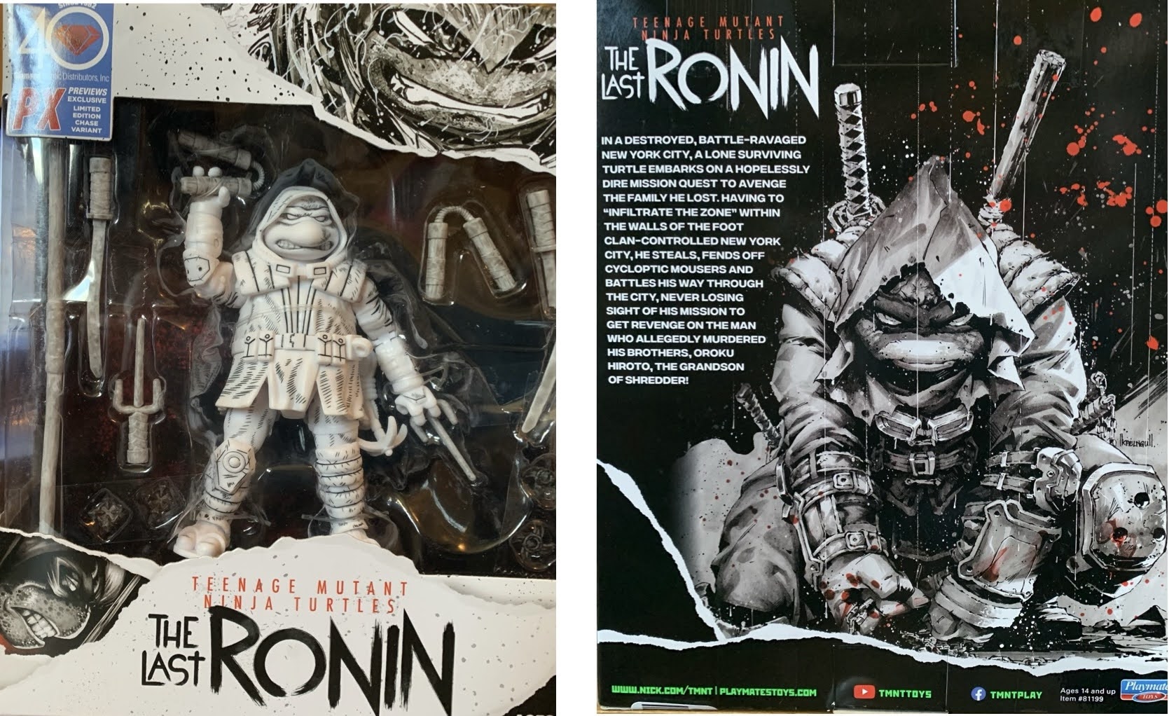
Since Playmates seems to delight in surprising us, they had a new figure to show off earlier this year based on The Last Ronin. The Last Ronin has been a popular addition to the TMNT universe and it’s a not surprise to see toys follow, it’s just a surprise to see one from Playmates. Especially one that would appear to present a solid enough blueprint for a hypothetical TMNT Origins line. I was initially going to pass on the figure when it was first shown, but my curiosity recently got the best of me. Playmates released two versions of the figure: a standard, painted one, and a black and white version with some hatching, “comic,” paint effects. For some reason, that black and white version really appealed to me, which sucks for me since it’s considered a “chase” version and virtually every retailer that carries it will apply a surcharge to it. Oh well. It comes in a nice window box though with artwork from the series on it and surprisingly no product shots. Since there’s no cross-sell, I’m assuming this is a one and done release, but I suppose if it does well Playmates could revisit it in the future.

This deco just does “it” for me.
Any Last Ronin figure is going to need some weapon storage, and this edition does a solid job. Still needs more though.

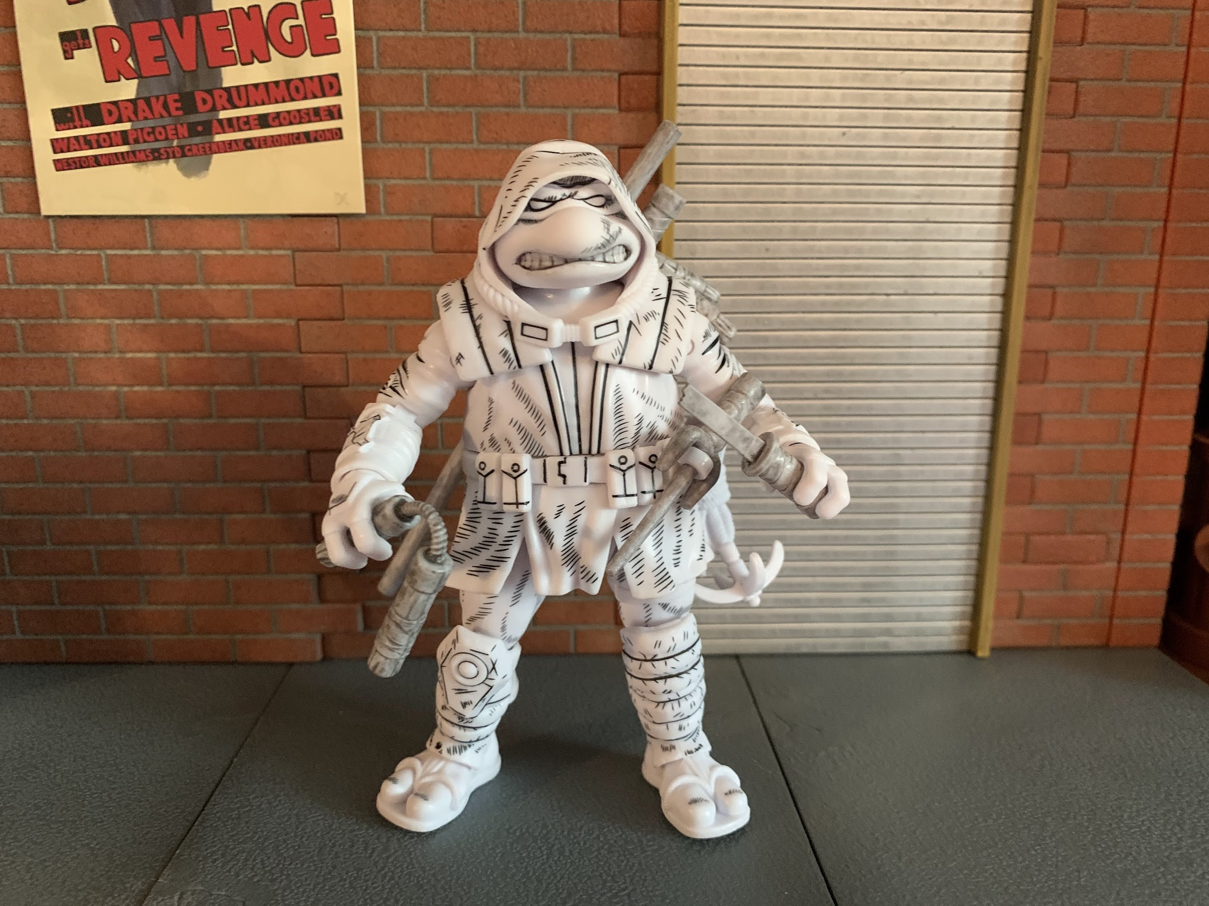
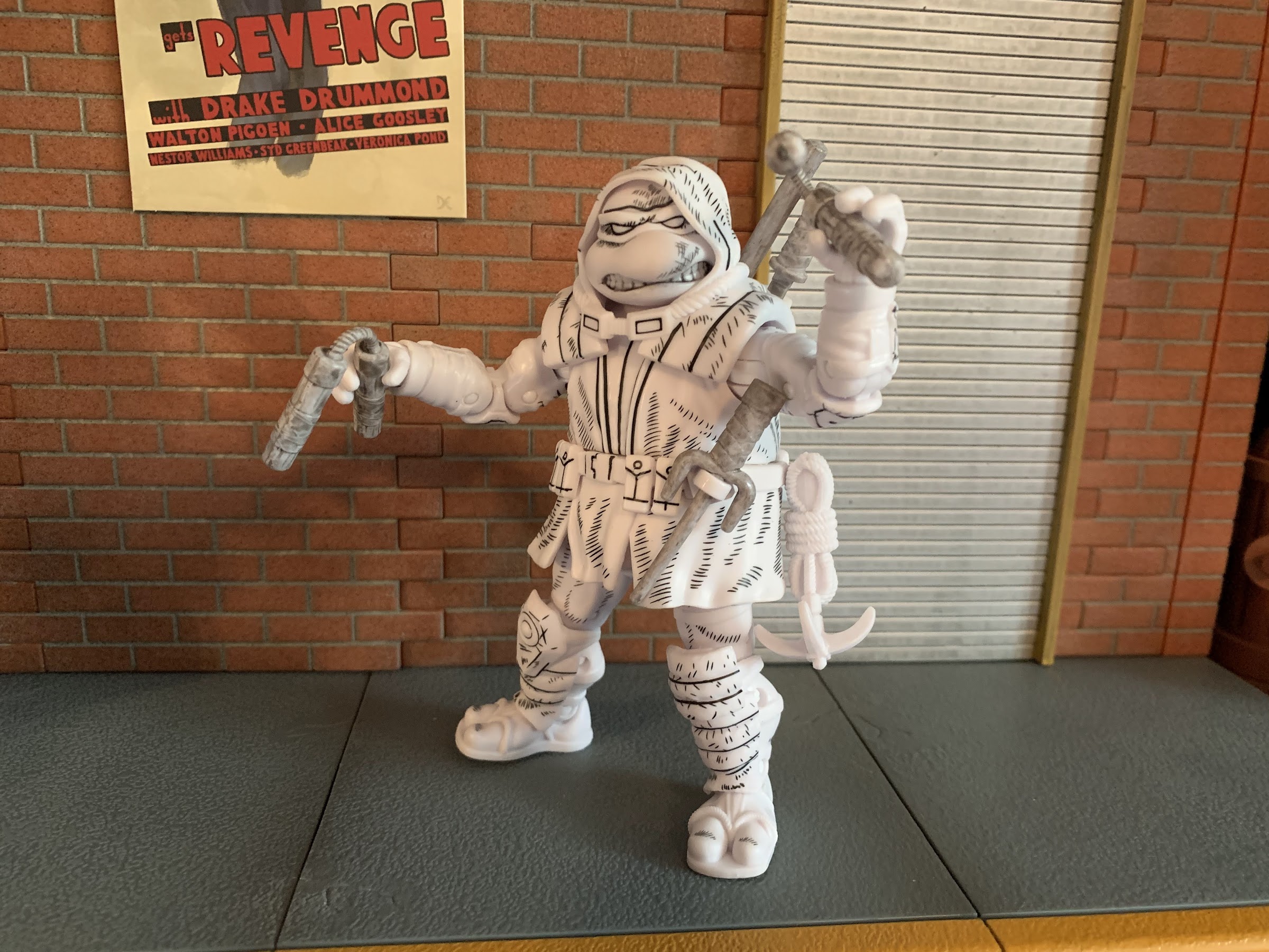
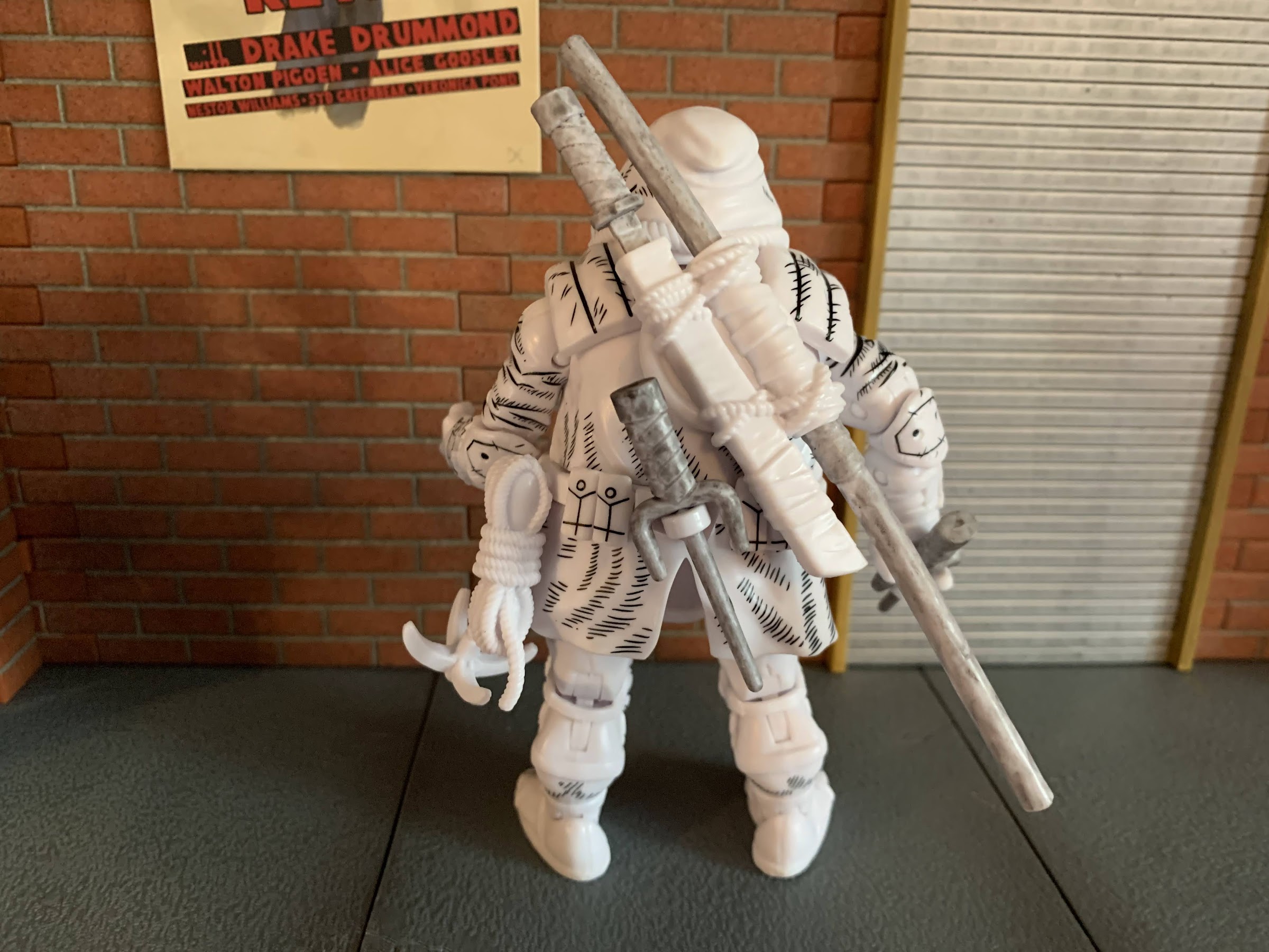
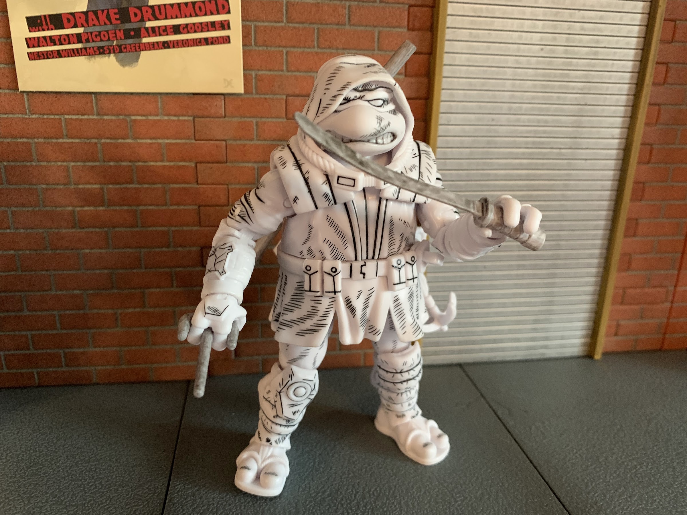
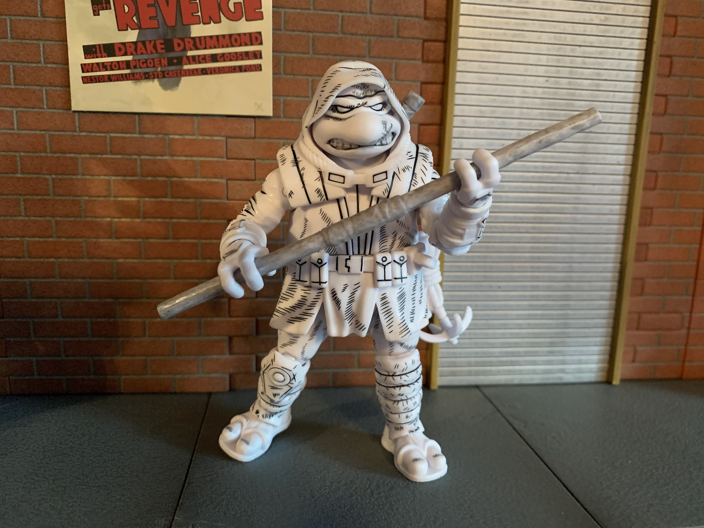
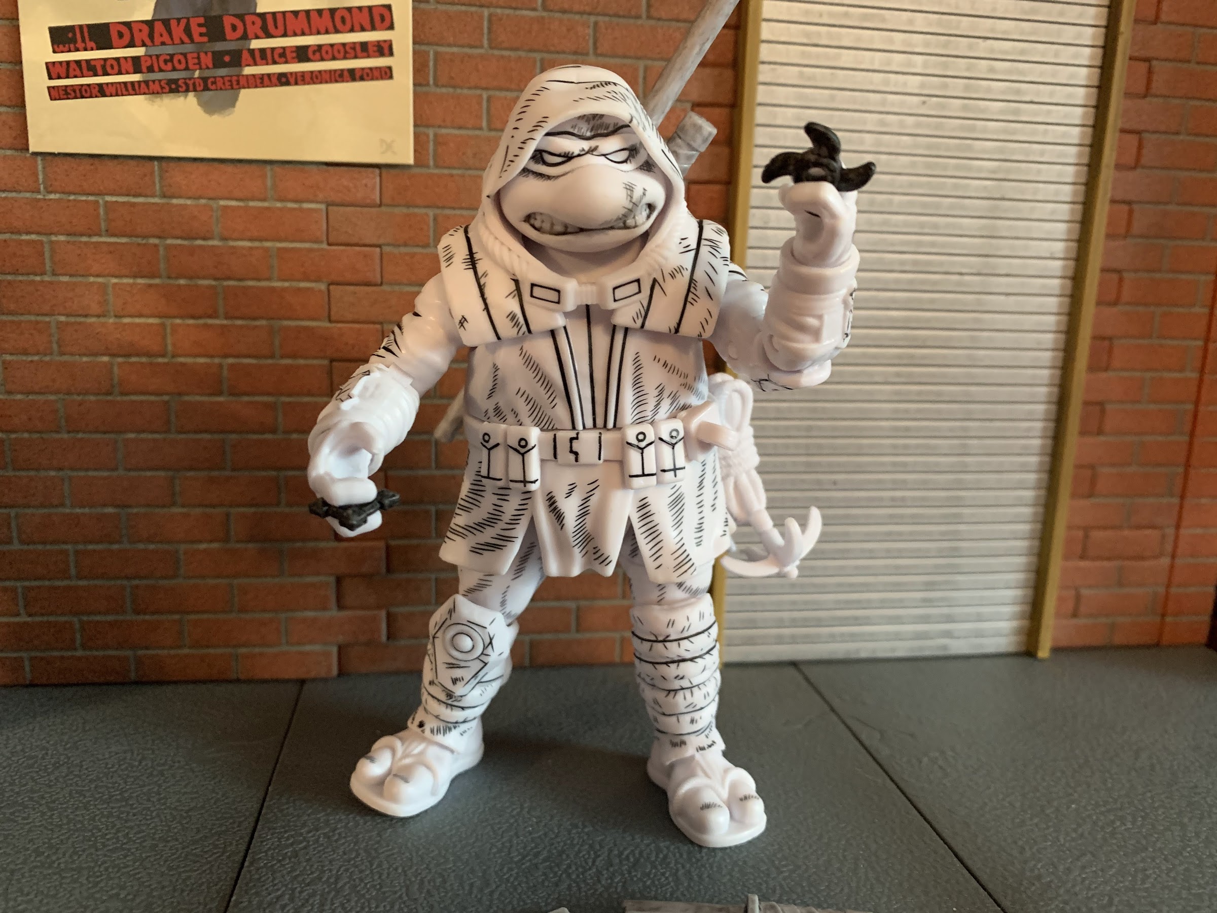
Even though this is considered the rare chase version, I am an opener so we’re going to talk about this figure. The figure stands around 4.75″ in height and is pretty close to the same size as a turtle from the vintage line. A direct comparison is a little difficult since those figures all had pre-posed legs, but the height is pretty close though the vintage figures are all chunkier. It’s especially noticeable when comparing the hands between the two releases. Even so, the face on this new figure definitely has a vintage look to it. He has visible teeth on both sides of his beak, but more of an effort has been made to round the features and add detail. He has way more teeth, for example, than a vintage figure and they don’t have a large gap of green (or white, in this case) between them. As far as sculpting goes, this guy is all unique as far as I know. He’s depicted in his overcoat complete with hood and it’s all done in plastic with no soft goods or removable pieces. The hood is a separate piece that doesn’t seem to peg into any part of the figure, but is nevertheless quite secure where it is. With heat, I’m guessing one could pry it off, but I’m not going to attempt any such thing. The bandana underneath is fully sculpted though from what I can tell. The goggles are part of the sculpt on the hood so you can’t do a goggles-on look, but I’m not particularly disappointed by that. The belt and bottom of the coat seems to be the only other overlay and it’s either glued or keyed in. It’s a slightly softer plastic, though the flex isn’t going to facilitate any extra poseability with the figure. The black linework on this guys is very clean save for the top of the bandana on mine and I love the added scuff marks and such all over him. I would have welcomed a little more in some places, especially the hands, feet, and weapon holsters, but it looks solid nonetheless. I also like how he has different knee pads since that asymmetrical look was so popular in the old line, though in this case it’s done to be accurate with the source material.

This sword could probably use some heat to straighten it out.

This guy is really charming to look at. It’s not the hyper-accurate to the source material the NECA version goes for, but it has a certain appeal for those who either grew up with or just collect the vintage line. He may lack the chunk of that old line, but I think he can fit into a vintage display without too much issue. The standard version might stand out a little more given it has far more paint apps, though a stark white figure doesn’t exactly have any comparables in the line either. This is a fun look though, it just might be a little too pricey for what it is. Most seem to list the regular version for around 30 dollars. If Playmates could do this level of quality at 20 or even 25 that would feel a lot more agreeable. Having this black and white version has made me more curious about the regular release and how many paint hits it has. Are all the ropes painted? Are there any wash effects? I don’t know if I’m 30 dollars curious, but maybe if this thing hits clearance I’ll add another.

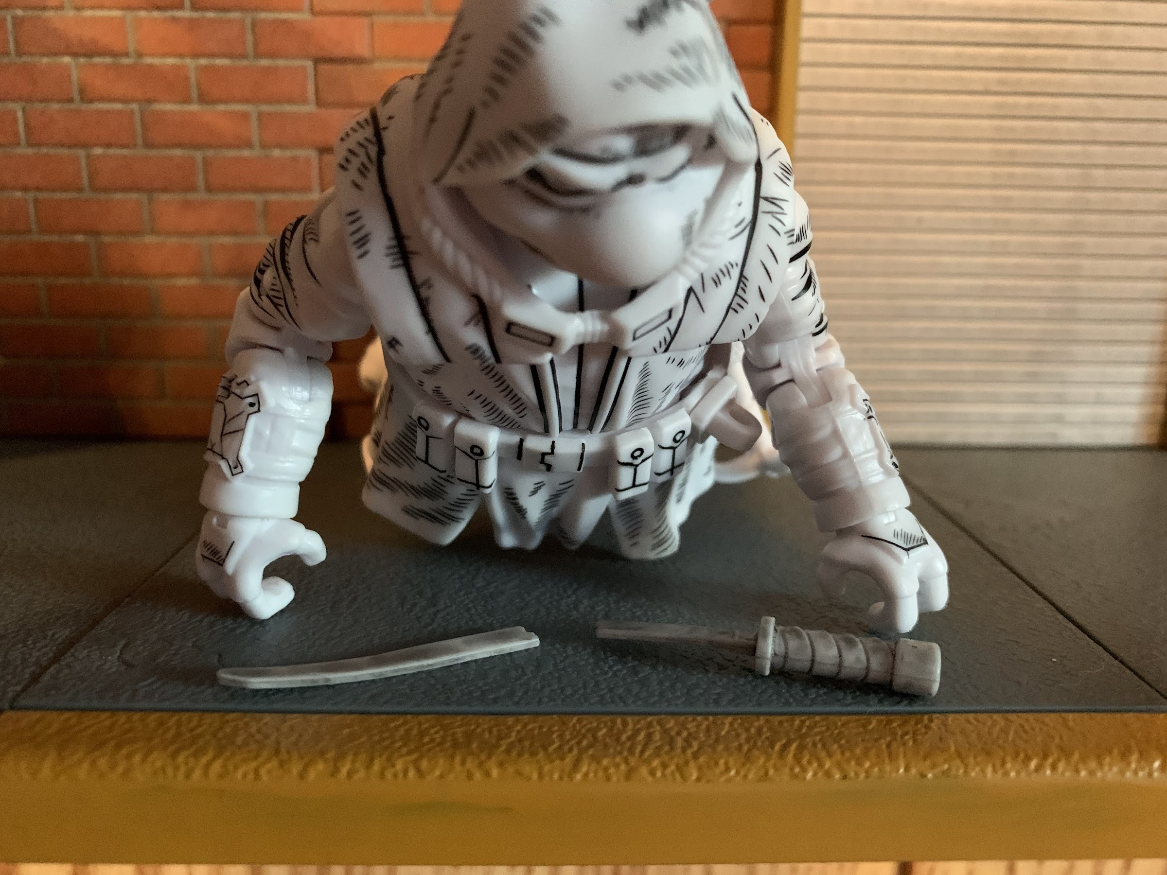
You also get the broken sword, which just reminds me of all of the broken swords I had in the old line.
Raph had a pair of sais, so Ronin gets two as well!

The big selling point of the Origins line is the addition of modern articulation, so it’s fair to wonder if this figure could be a model of things to come in a similar line from Playmates. And if that’s the case, well then there’s some good, and some not so good when it comes to this figure. The head appears to be on a ball peg, but the hood makes manipulating it rather difficult. I can get him to look left and right, and even up and down a little, but I’d call it more nuance posing than anything. The shoulders are ball-hinged and he can raise his arms up past a horizontal position, so that’s good, and there’s no real shell to prevent rotation all the way around too. The elbows are double jointed and bend past 90 degrees with ease and the wrists swivel and feature horizontal hinges which is a bummer since vertical would have been better. There is a waist twist and the legs attach via ball and socket joints. He can spread his legs basically as far as the skirt of the jacket will let him, which isn’t much, and the same is true for kicking forward and back. You get a tiny bit of thigh twist, or pivot, on that ball joint, but it’s not a lot. The knees are double-jointed and bend past 90 without issue while the ankles feature a hinge. The feet appear to peg into the hinge so you get a tiny bit of swivel there, but there’s no ankle rocker which is a bummer. That’s the biggest omission for me as being able to pivot down at the feet really opens up the stances available when posing a figure. Without it, there’s not a whole lot he can do below the waist. The other major omission is the lack of a biceps swivel. If they added those two points, which might not have cost them anything when they were tooling this guy, it would have made a world of difference. Instead, he moves just okay. It’s certainly below average for a modern figure, and this is a guy with a lot of weapons so it’s an extra bummer he can’t pose better. Yeah, he’ll pose better than your turtles from 1988, but that’s probably not the standard we should be holding Playmates to in 2022.

Donnie typically only wields one bo staff though, so he only gets one of those.
If you don’t want him wielding any of the more traditional TMNT weapons, he also has some shurikens he can turn to.

One of the hallmarks of The Last Ronin is the character is basically a one turtle army. He has all of the weapons of the core 4, and even more in the book, so this edition has to do the same. There are no extra hands or portraits so all of the accessories are weapons. In the box, you get: two sai, two nunchaku, one sword, one broken sword, one bo staff, two star-shaped shurikens, and two diamond shaped shurikens. It’s a good assortment and the only weapons missing are the tonfa the character wields in the book. There’s also a grappling hook that pegs onto the belt, though it’s just a lump of sculpted plastic and not something he can really do anything with. All of the weapons are sculpted in a light gray with a black wash added. The shurikens might be a darker gray, but they also have a much heavier wash on them making them appear more black than gray. The sculpt of the weapons is all solid. The ‘chuks are sculpted to have ropes instead of chains and they all feature wraps sculpted onto the handles. The sai are the only ones I don’t love since the bladed portions have been rounded off significantly and look a bit silly as a result, but I guess that’s because Playmates adheres to department store standards when it comes to safety. Like the book character, this figure has room for weapon storage, but he can’t store everything. There’s a slot for the bo on his back and a scabbard for one sword. There are two pieces for the sai, one on the rear and one on the front, and they even pivot so you can adjust them as needed. There’s no way to store the nunchaku though nor is there a place for the shurikens. He can at least hold everything and his hands are sculpted so the sai blade can go between his fingers if you wish. I just wish he had a true belt to slot some of this stuff into when he’s not holding it. I almost feel discouraged from displaying him holding any of the weapons he can otherwise store.

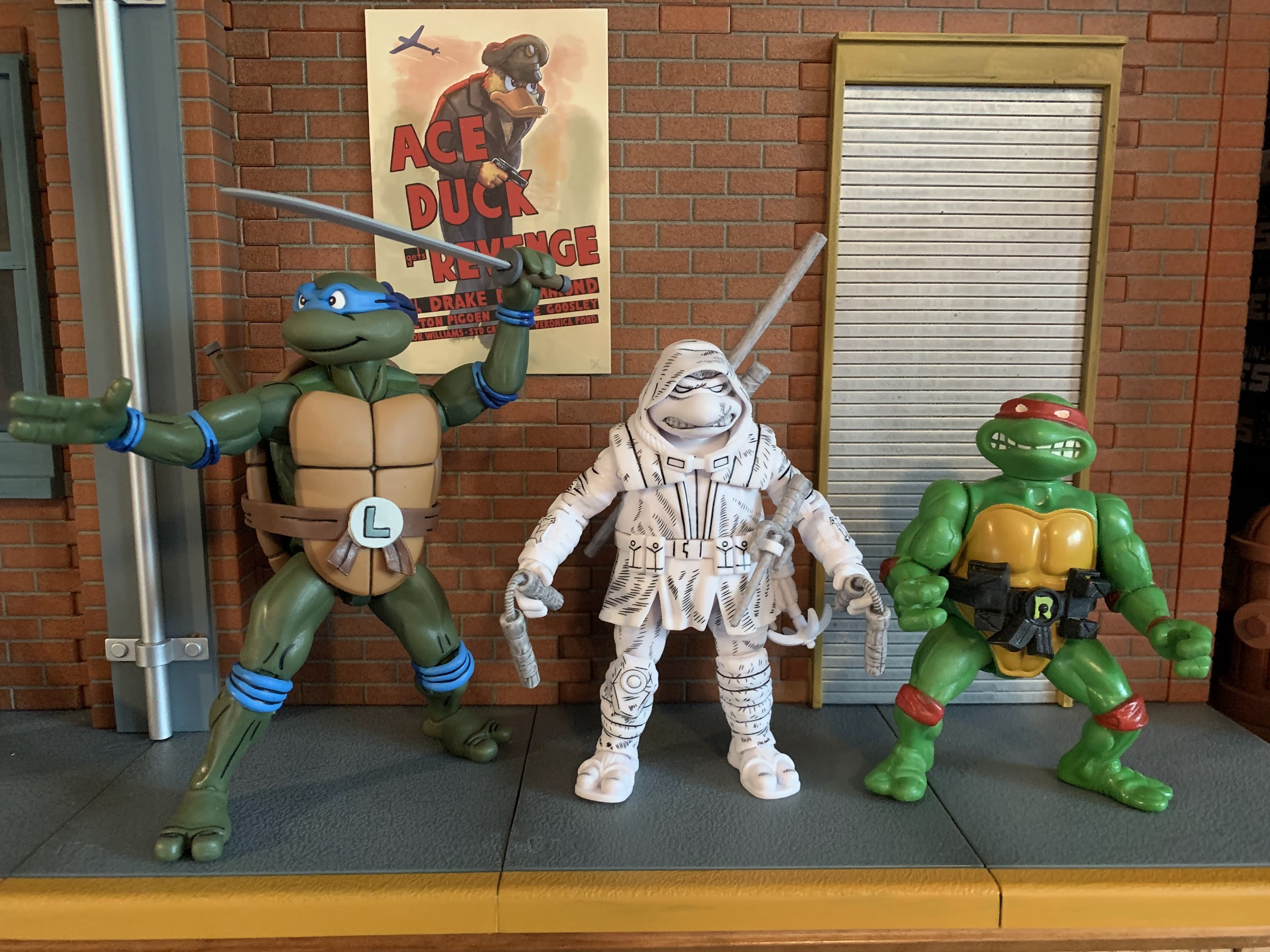
So where does this guy fit? We have a NECA toon on the left, and a Playmates vintage on the right. He’s close to the vintage, but decidedly less chunky. I think he mostly exists on his own, which is appropriate given the source material, but some may want him to blend more seamlessly with the vintage line than I do.

On its own, this Playmates version of The Last Ronin feels like a worthwhile release. The word I keep coming back to with this guy is “charming.” He’s a charming figure. It has enough of that vintage aesthetic going for it with the face, but it also brings its own flair to the shelf. As a one-off, it feels okay at this price point, but as a blueprint for a potential revival of the old line it does feature some room for improvement. I would like to see the articulation shortcomings addressed, and if they can’t get the price below 30 then it might not matter what they do. That feels way too close to the going rate for something from NECA, though an Origins-inspired line might not face competition from NECA, but Super7. Maybe a 30 dollar price tag is good enough if consumers are comparing that to the $55 remakes Super7 is doing? It’s hard to say. I’m not even sure I want such a line to exist as I feel pretty well covered at this point when it comes to TMNT toys. As a novelty, I could see myself kicking the tires on the four brothers at least, but as another line I’m all-in or nearly all-in on? I don’t know if the appetite is there, but I could be in the minority. Hopefully, if Playmates continues to do one-off styled releases, or even does more of those two-packs, they try to adhere to this style more than the 2012 Classics Collection mold which just doesn’t hold up very well. More of this, please, Playmates.


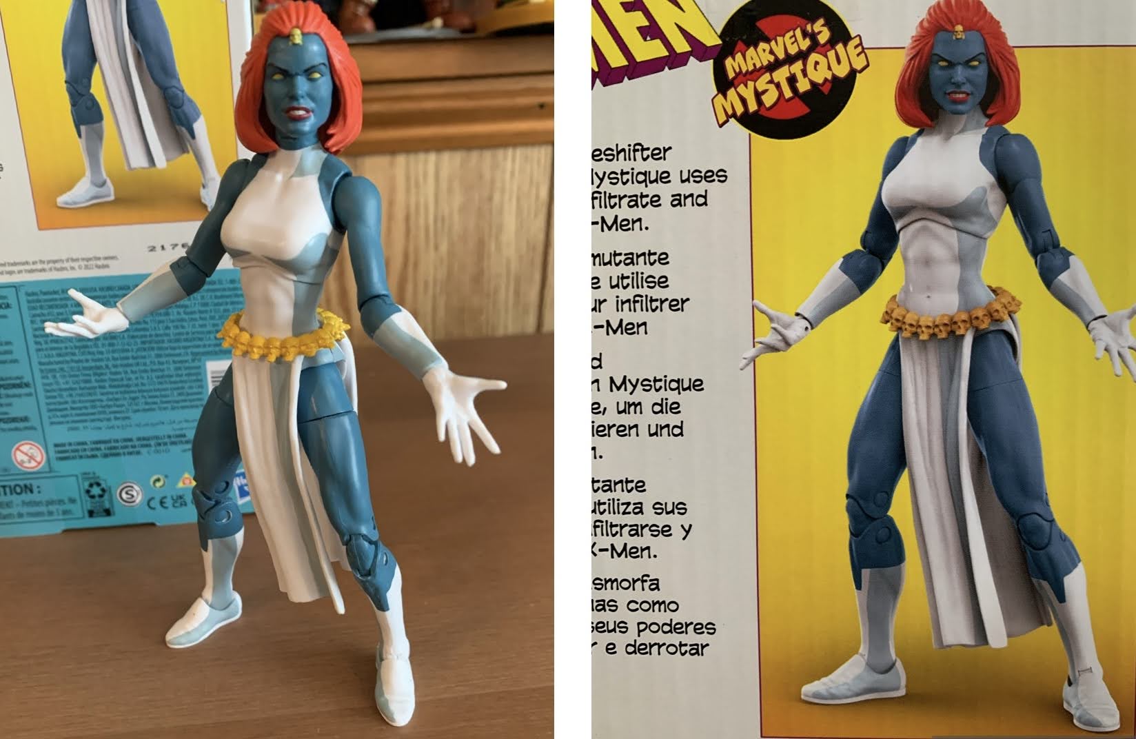
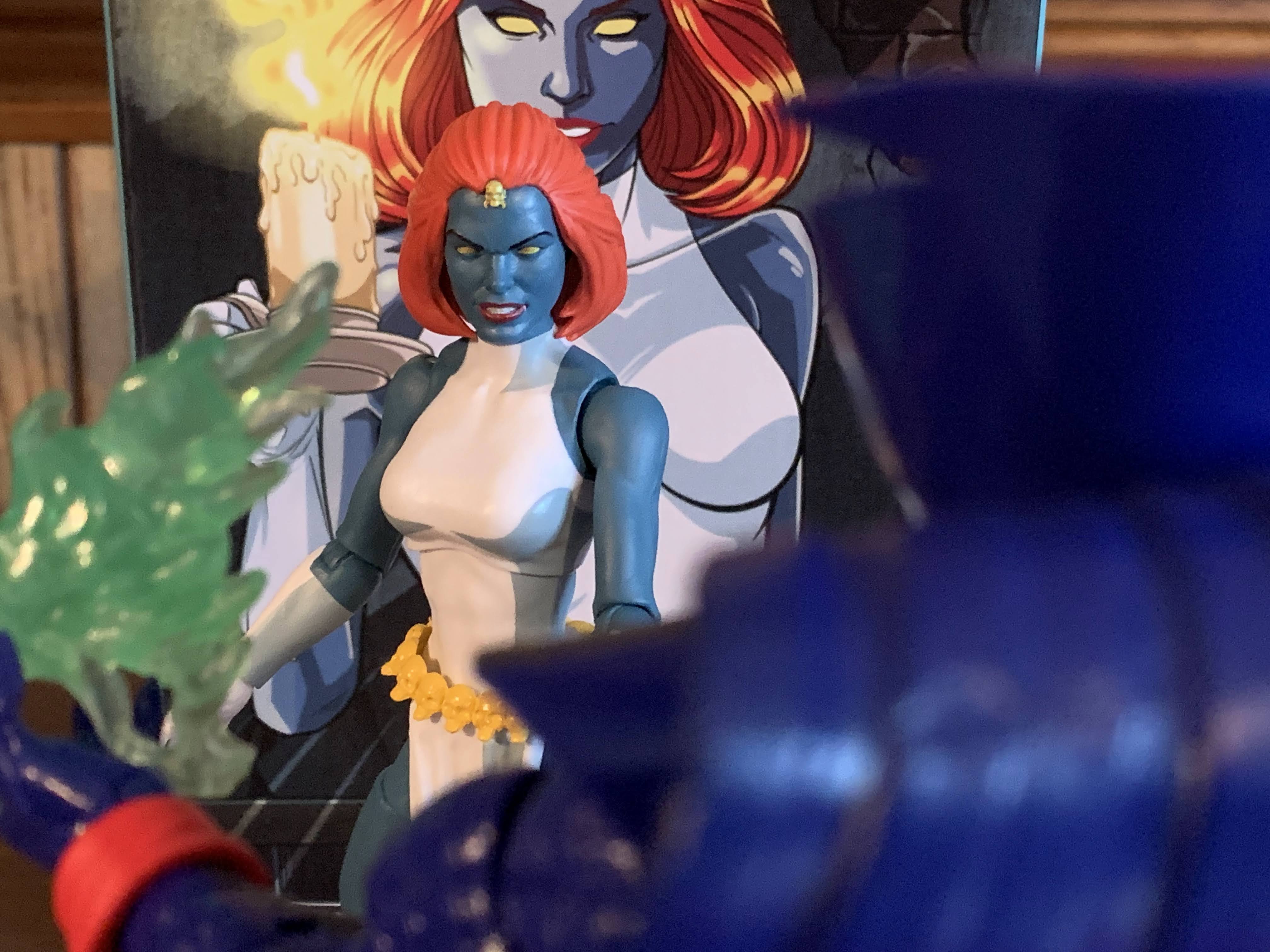
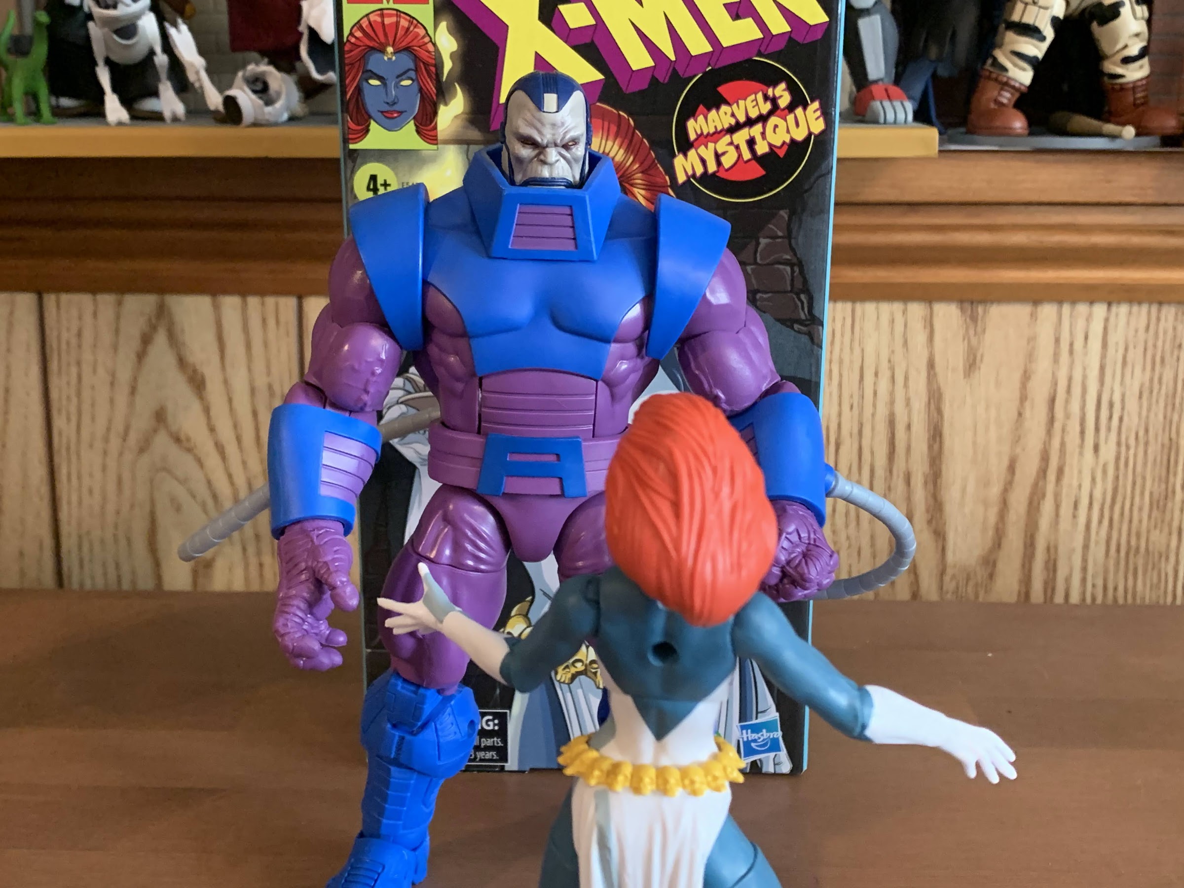
Marvel Legends X-Men Animated Series Mystique

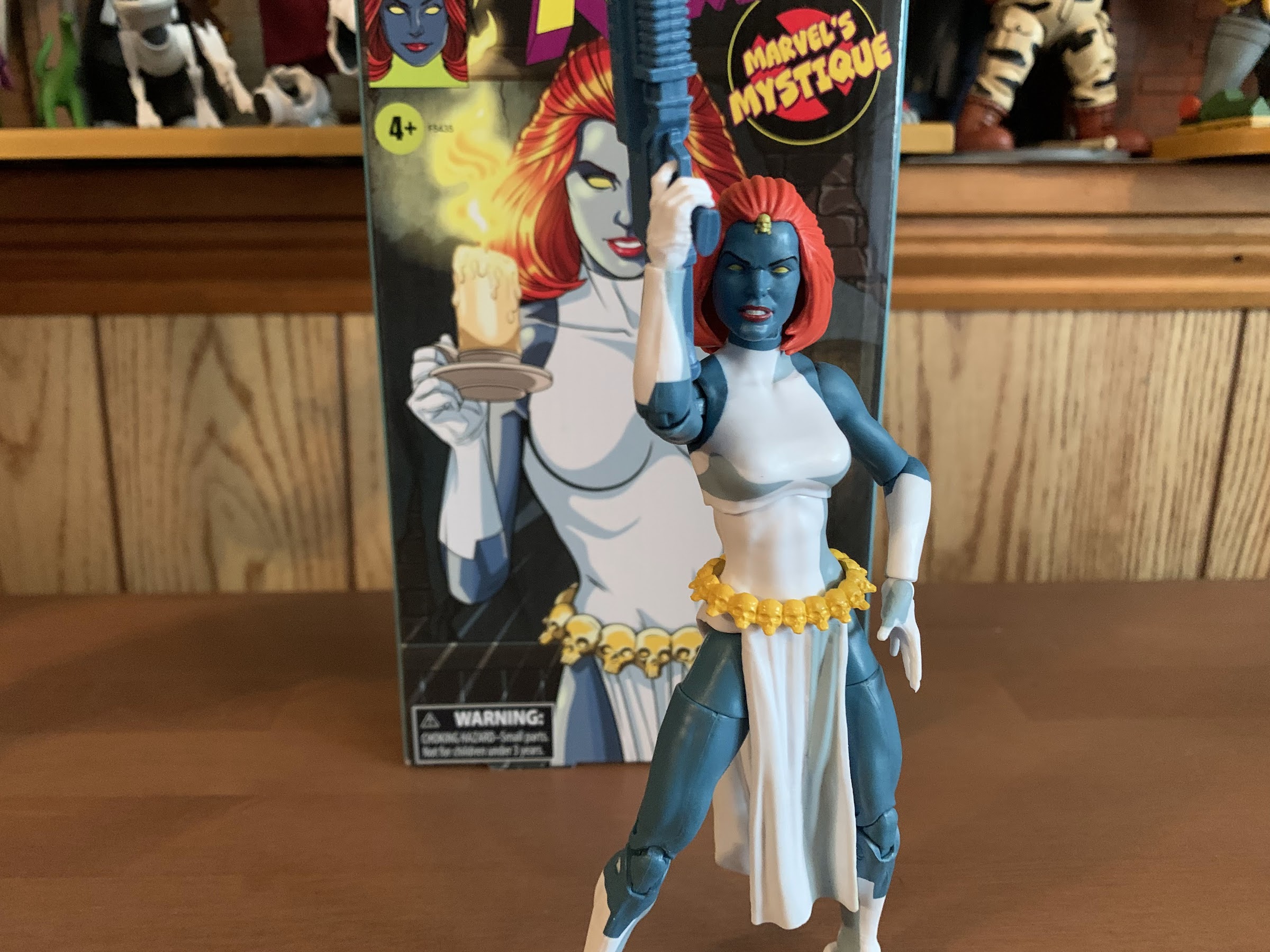
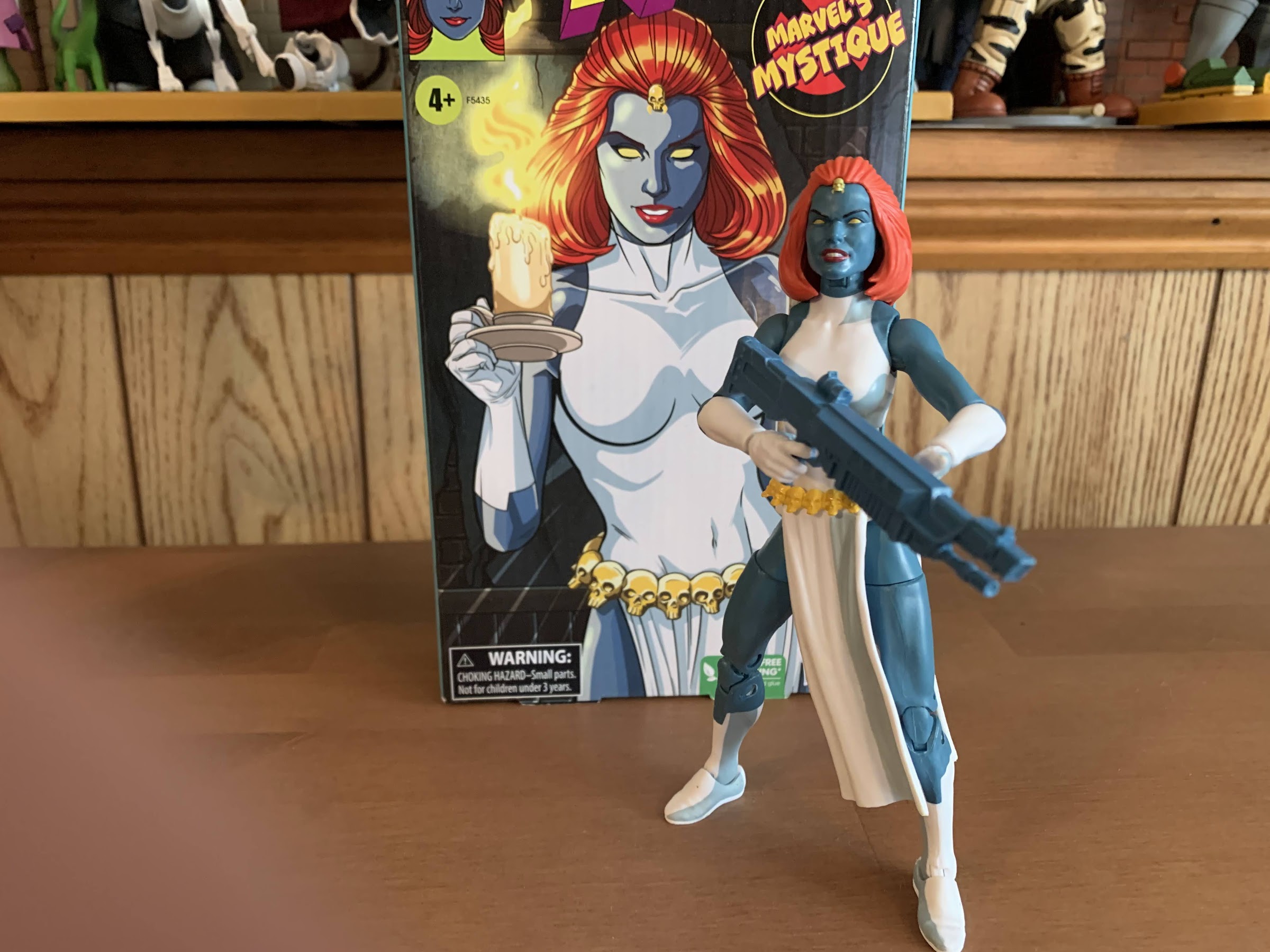
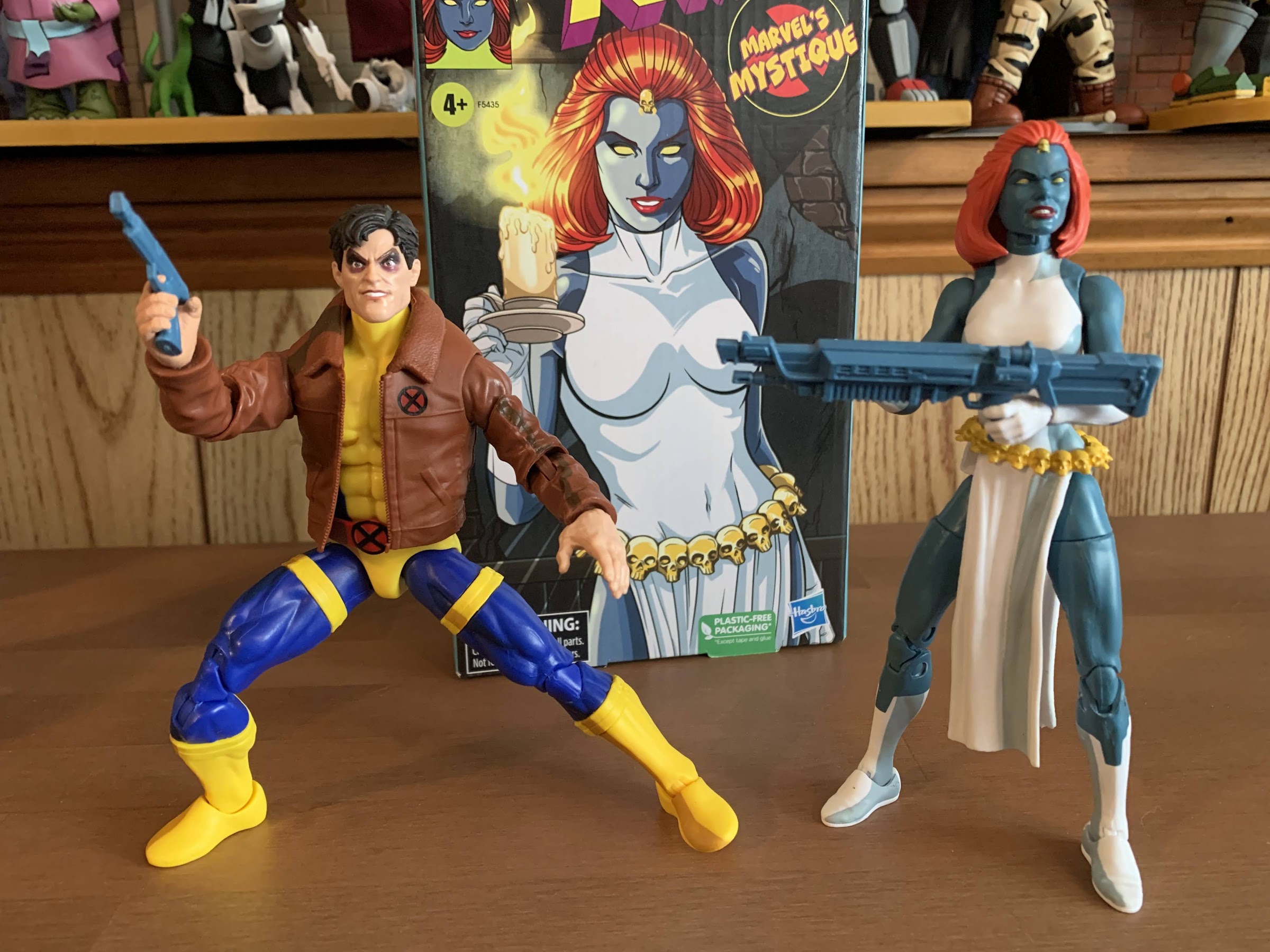
Mystique is bringing the big guns.

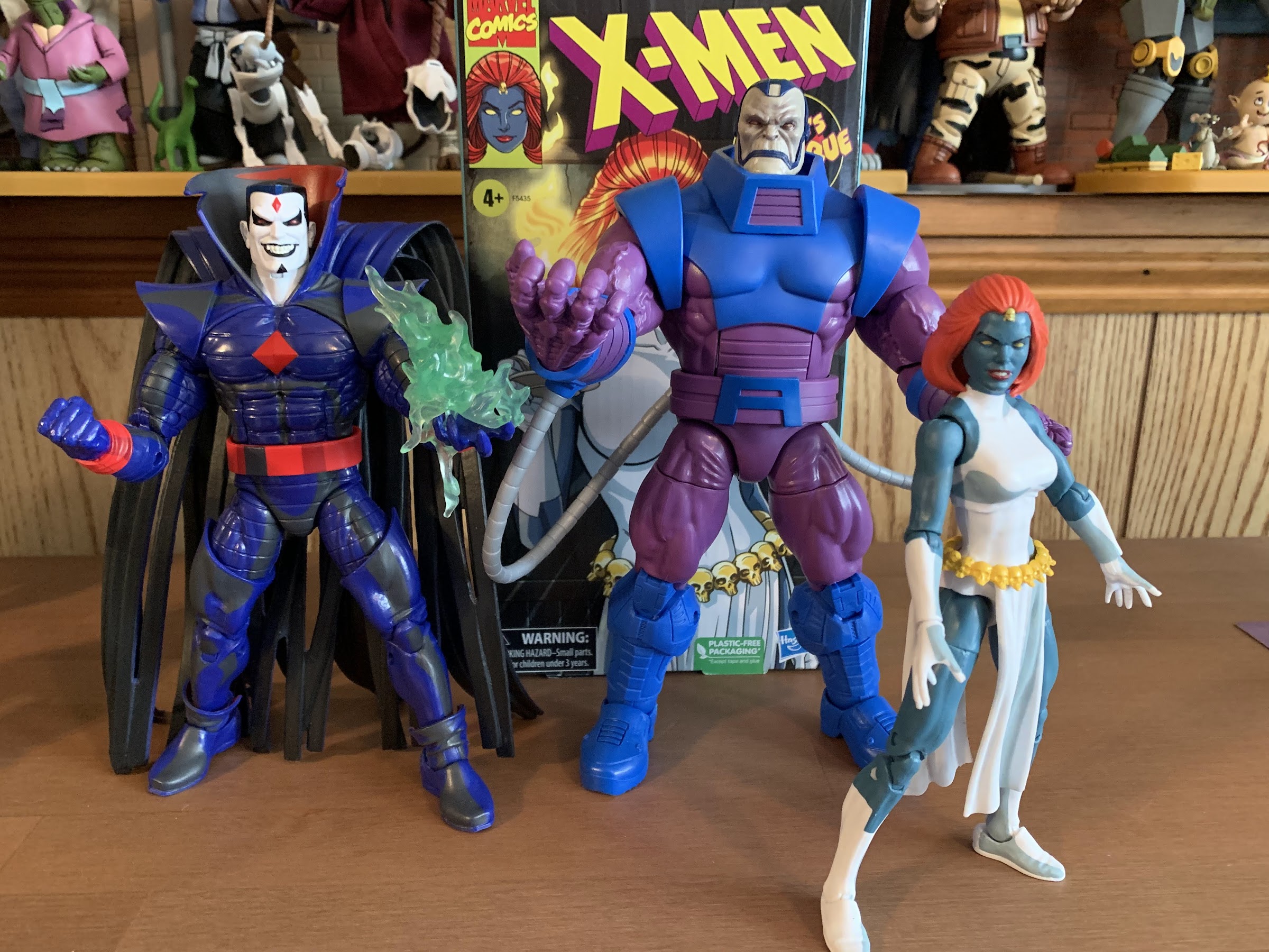
The penultimate figure in this series is a bit of a curveball. When one thinks of the animated series X-Men, the first villains that come to mind are Magneto, Sinister, Apocalypse, Sabretooth, and then it gets muddled. Graydon Creed made quite the impression in the show’s second season and may even be the most hate-able villain the show produced. Omega Red was certainly memorable since he was a very 90s sort of villain and being tied to Wolverine never hurts. And, of course, we have Mystique, the character Hasbro selected to be the second villain of the line (third if you want to count Morph). I think she has a claim to that fifth spot and I can certainly see an argument for Mystique as one of the most memorable villains of the show. It’s just that her character is very much tied to others. She does briefly cross paths with Sinister, and her box art appears to be inspired by that scene, but she’s not really associated with him. There’s her adopted daughter Rogue, biological son Nightcrawler, and her lackeys in the form of Pyro, Avalanche, and the Blob. All of those characters could certainly make an appearance in this line, and I would certainly argue that Rogue should be, but it strikes me as odd to get Mystique before some of these other characters. And it’s especially surprising considering she is, as I mentioned in the first setence, the penultimate figure of the line with the only remaining character set for release being Cyclops. Hasbro left open the possibility that they will return to the world of the X-Men animated series, but for now we basically have to consider it done which just makes this selection an odd choice.

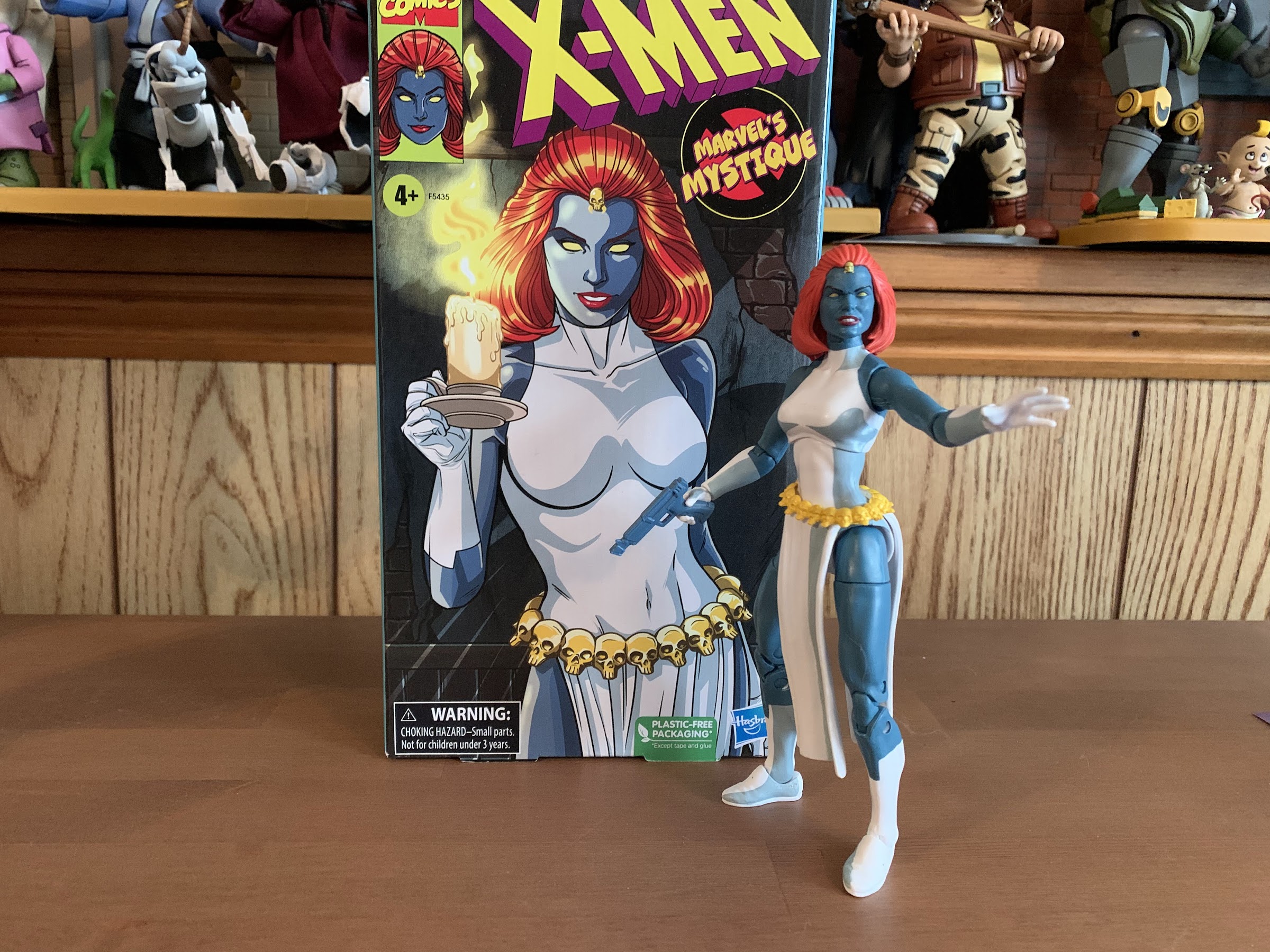
Are we all in agreement that the box art is the best thing about this line?

I don’t know how Hasbro settled on the characters for this line, but my guess would be it’s largely sales related and cost-oritented. You can’t do this line without Wolverine, and basically any member of the team can’t be considered a surprise. I’m guessing Hasbro skipped over Rogue and Gambit because of their recent retro card released figures, and the same is true for Beast who has a new figure shipping now. Magneto also had some recent figures, so maybe that’s why Hasbro went with an older figure like Sinister. He was prominent enough in the show that it was hardly an upset to see him released as soon as he was, and he pairs well with Morph who was a character they absolutely had to do. With Mystique, it’s possible she’s a favorite of someone on staff who pushed for her, but it seems more likely to me that this release has more to do with Hasbro and the Legends team wanting to get her back out there. Like most of this line, Mystique is a re-paint with some minor additions and the previous figure was released as a Walgreen’s exclusive. Retail exclusives can be a pain to track down, so putting out another version that’s easy to acquire is often a welcomed development. I could be wrong, but that’s my guess on how Mystique made it into this 8 figure line.

I don’t hate this figure, but I would like it a whole lot more if it actually looked like the render on the box.

Mystique comes in the customary VHS styled box with artwork by Dan Veesenmeyer. It depicts Mystique in a shadowy area holding a candelabra which gives it a real horror vibe which mixes well with the character’s blue skin and affinity for skulls. It might be my favorite illustration in this line so far. On the spine is the usual profile shot and on the rear is the customary product shot, only with this figure the product on the back is not representative of the figure inside. In what has become an annoying and, frankly, unacceptable trend with Marvel Legends of late the promotional renders for figures have been using the wrong molds. The actual figure is on the same female buck that the former Mystique figure utilized, while the render on the back appears to be based on the newer Shriek figure. It’s a much better base for a superhero line as the figure is well proportioned, looks like a woman of impressive physical fitness, and it’s an all-together better looking figure than what’s actually in the box.

“I have some information about your daughter…”

The render basically gives Mystique an unfortunate hurdle to overcome right out of the gate and I’m going to try to not let it impact my feelings here, but the simple fact is this older female body is just okay. It’s very slight and not particularly heroic looking (granted, she is a villain). It has articulation limitations as well which we’ll get to and it’s just a base body that I would like to see retired. Mystique does feature her cartoon accurate costume of a white, sleeveless, dress with long gloves and boots. The head has been reworked to give her a new hair piece which looks fine. I love her wicked grin which is very appropriate for the character and they got the little skull on her hairline correct. Her body is mostly colored plastic as she’s basically a two-toned figure of blue and white. The controversial cel-shading is also present and, once again, Hasbro made the odd choice to use gray instead of black and it’s a shade of gray that looks too close to the gray-blue of her skin. It’s applied okay here, certainly not as bad as some of the other figures in the line, but it still comes across as half-assed. She really should have multiple shades of gray, black, and blue to do her justice and considering she’s a character who often featured heavy shading in the show it really feels like a missed opportunity. There’s no shading on her hair or on her yellow belt and it just very much feels like an afterthought. The only shading is applied to the clothing. The belt is a floating piece and the skirt portion of her outfit is a part of the belt which is a little odd. I think an overlay might have worked better, but then you lose the articulation in the torso. I am forced to reiterate, once again, that I love the idea of putting shading on these figures, but if they’re not going to put the effort in then don’t do it. She really needs some on her face to bring her to life, but I’m not brave enough to try my hand at customizing. She also has a hole in her back which is unnecessary and unwanted.

“Lord Apocalypse!”
I don’t know if she ever had a gun this large in the show, but at least it opens up the smaller gun for another figure.

Mystique comes with a fair amount of accessories, though most are just reused from elsewhere. She has open hands out of the box with her right hand being more “cupped” than the left like she should be holding a long-stem glass. She has optional trigger hands and they’re for her two guns. One is a large, machinegun, type and the other a pistol. Both are just cast in the same blue-gray plastic used for her flesh which is pretty damn cheap on Hasbro’s part and it makes the larger gun, especially, look stupid in her hands. The pistol is the same gun that came with the movie Deadpool. At least being blue makes it kind of resemble the gun she used in “The Cure” and the one Morph was seen with at times. Her final accessory is a more thoughtful one, but again, Hasbro’s cheapness ruins it some. That accessory is a baby Nightcrawler wrapped in a brown blanket which has better shading than most of the figures in this line. This is a callback to the show and the scene of Mystique preparing to toss her unwanted mutant child off of a waterfall. The problem is, this baby is repurposed from a baby Hulk figure. It lacks Nightcrawler’s defining pointed ears and he has this pompadour styled hair that looks stupid. He also has a yellow pacfier, which he did not possess in the show. Lastly, Mystique’s portrait is inappropriate for posing her with the child. Had they included a secondary one with tears streaming down her face that would have been something. Should we give Hasbro credit for at least referencing the show? I guess, but I’m also the type who sees little point in doing something if you’re not going to do it right.

And the other character in need of a gun is Morph. This blue one looks a little like the gun he featured in “Till Death Do Us Part.”
I appreciate the thought, but that’s not Kurt.

The last thing we need to consider with this action figure is the articulation. Mystique, being essentially on the same body as Jean, has few surprises. The ball-hinged neck lets her look in all directions save for up since her hair gets in the way. The shoulders can lift out past horizontal and rotate fine while the arm articulation is limited to single-hinged elbows with a swivel point in the elbow. She can’t quite hit 90 degrees and the lack of a bicepts swivel is a disappointment. The wrists rotate and hinge with the right trigger hand featuring the proper, vertical, hinge so that’s good. The torso has the diaphragm joint under the bust which offers little more than some rotation and tilt with very little forward and back. There’s no waist twist, and the legs can barely manage a 45 degree spread. She does kick forward okay, but not back, and there’s a thigh cut for rotation there. The knees are double-jointed and they feel less gummy than Jean and Storm’s. There’s no boot cut and the ankles hinge forward and back a decent amount and rock side-to-side. It’s a mediocre spread of articulation. She can at least pose fine with the hand gun.

“Oh, my beloved child. Wait…you’re not my baby!”

Mystique is another bare minimum type of release from Hasbro in this line. She looks okay, the cel-shading is at least passable, and there’s a tiny bit of re-tooling with the head. They still half-assed the accessories and really should have just used the new body they had already made for other figures as I bet this belt and head would have fit just fine. Why they didn’t is not something I can figure out. And making the guns the same color of plastic as her body is just weird and cheap. Imagine if everybody ran around with guns that matched their skintone perfectly. That’s Hasbro not wanting to pay to change the color of the plastic in the machines. And the baby Kurt is a nice thought, but a poor execution. At least the box art looks great.

“So long, imposter!”

Mystique is presently available via Hasbro’s Pulse website and the Shop Disney webstore. Like all of the figures in this line, she comes with a slight upcharge that’s not really reflected in the product. Chances are, if you’ve been collecting this line then you’ll probably want to add Mystique to your shelf. She could have been a lot better, but by the standards of this line she’s actually one of the better releases. I suppose I’d stick her somewhere in the middle, and I probably prefer her to any of the X-Men women. I’m still left wishing she wasn’t the character we got with one of these precious 8 slots Hasbro budgeted for, but at least she’s not a dud. That means we only have one more figure to look forward to in this line, Cyclops, before we say “goodbye for now.” Hopefully it’s a good one, but it’s not looking like it will arrive before the year’s end so check back in 2023 for my thoughts on Cyke.

If we’re only getting a few villains out of this line, at least they fit reasonably well thematically.

Super7 TMNT Ultimates! Sewer Surfer Mike

Surf’s up, dudes!

We are back with one more look at Wave 6 of Super7’s Teenage Mutant Ninja Turtles line of Ultimates! action figures: Sewer Surfer Mike. This, like every figure in the line so far, is a recreation of a Playmates Toys figure from the vintage line of TMNT action figures, and in this case it’s of Mike the Sewer Surfer. That was the Michelangelo included in the inaugural disguise series which was basically the first of the “wacky” variants that Playmates would do. Many more followed, but for me, that first wave was the most memorable and Michelangelo as a surfer dude made plenty of sense. And it was a toy I really enjoyed as a kid. Something about that pink and blue wet suit was just a pleasing aesthetic for me. I loved the sculpted details like the octopus on one of Mikey’s legs or that metallic paint on his sunglasses. He also had a little, crab, buddy that affixed to his surfboard and it was just a fun, silly, figure. And because of that affection I had for it as a kid I had to get the Super7 version. There was at least one other compelling reason to get this, which we’ll get to, but it was largely a no-brainer. I really liked all of those disguised turtles, it’s one of the few waves I had every figure from, and the nostalgia is strong here.

He certainly looks the part.

Mikey comes in the standard Super7 Ultimates! box with slipcover on the outside and window box within. Mikey stands around 6″ and is basically in-line with the other turtles, as expected. Since he features a new outfit that’s all done as part of the sculpt, everything about this guy is new. The only parts Super7 could reuse were the hands and maybe the shins. He’s done in as much colored plastic as possible, which for Mikey is that deep, forest, green that distinguishes him from his brothers. The wet suit feature some painted details and it’s done in an acceptable fashion. There’s a lot of additional, fun, sculpted bits on this guy in the form of various sea creatures. Mikey looks like he was vomited up by a whale or something as he’s got crabs (the good kind), sharks, and seawood all over the place and it’s something I remember fondly of the original figure. I’m a little surprised some of these aren’t removable, but they weren’t on the old figure so I don’t hate it. I’d have kept them on, but I understand if some are disappointed just like how some out there wanted Scratch’s shackle to be removable. It is interesting that the default portrait for this figure has Mikey with his tongue hanging out. That is not how the original figure depicted him as he instead had a sly smile and shades. The shades, by the way, are removable this time. The second portrait is more in-line with the original. It doesn’t matter since both heads are in the box, but I found it a bit curious. He still features a big, yellow, belt and I am a bit disappointed there isn’t more paint here. I thought Super7 did a good job making Slash’s belt pop more, but with this one it’s like they didn’t even try. Despite that, I think he looks good and I’m as charmed with this version as I was the original when I was a kid.

He’s got some board wax and these oversized throwing stars, but the board is the main attraction.

What certainly adds to the fun factor here rests with the accessories. Mikey’s got a decent spread, and it starts with the optional hands. Mikey comes with two sets of gripping hands (vertical hinge and horizontal), fists, and style posed hands. For those gripping hands he has his trusty nunchaku. These are of the molded plastic variety and Super7 added some seaweed to them in keeping with the theme. The original figure did not come with these so I like that Super7 gave us some. The only issue is they’re very gummy to the point where I find the texture unpleasent. It’s a shame, because the sculpt and paint are nice, but they’re so soft that I couldn’t even get them into his gripping hands. He also has three cans of wax, I guess to maintain his board, and I initially wasn’t sure what they were. They’re painted okay, my blue and yellow one isn’t lined up properly, but don’t do much for me otherwise. He also has his starfish shurikens which is something that did come with the old toy, and most important he comes with his surfboard. It looks like the vintage one as it’s cast in orange plastic and has a decal on it. It’s disappointing to see a decal in place of paint or a printing, but that’s what we got. The little crab guy is included, but he no longer clips into the board and instead is intended to just be placed on it which doesn’t work as well since the board needs to lean forward. There’s also a foot strap for the board in case Mikey wipes out. It looks pretty cool, but it’s really crying out for a display stand of some kind. Similar to the Optimus Prime figure Super7 did, the fins on the underside of the board make it a challenge to actually pose Mikey in a surfing position. He’s a bit annoying to pose because while he can peg onto the board, nothing else does and his sunglasses just rest on his head unconvincingly so there’s a lot of balancing going on. Lastly, he has a weapon sprue which contains the shuriken, nunchaku, crab, and wax cans surrounded by a block and tackle. It would have been cool to get the block and tackle as an accessory, though admittedly I don’t know what I would have done with it. Just like I don’t know what to do with the sprue. These are being phased out from future waves and I consider that no great loss.

As is often the case, two heads are indeed better than one.

Of course, we also have that other head which is more vintage inspired. Put that on your figure with the shades and the look is mostly complete (the fit of the shades is rather poor) which frees up that other head for another figure. It’s no secret that a lot of folks weren’t crazy about Michelangelo’s alternate head from the Wave 3 release of Ultimates! I’ve been using that head, because I overall liked the alt heads more, but it is my least favorite of the four. It’s just an odd expression. They were going for a smile or a laugh, but it’s very blocky and he has huge gaps between his teeth. This one kind of carries that weakness forward, but overall both heads do a much better job of getting Mikey’s termperment across. And the good news is that Super7 was able to match the colored plastic very well between this release and that past one so, if you want to, you can swap out the old head with one of these. I’m definitely going to do that with my display, though I haven’t yet decided which head I want for which figure. And I suppose the inverse is true if you really want your Sewer Surfer Mike to have one of the old heads. The classic, vintage, head doesn’t look terrible, though I can’t see myself going in that direction, but it’s always nice to have options.

One clear and obvious negative with this figure are these gummy, awful, nunchuks. I love the seaweed and such, but he can’t even grip them easily because they’re so gummy.

Now, the big deal with this line of late has been articulation. Wave 5, which arrived at the same time as Wave 6, was pretty much a disaster as far as loose joints are concerned. The Wave 6 figures I’ve looked at have been much better. Slash was pretty great, and while Scratch had some odd engineering choices, he was at least plenty sturdy. Mikey, being a Wave 6 release as well, is more of the same which is a good thing. He articulates just like the other turtles so we have a double ball peg at the head that has subpar range because of how low it sits on the unarticulated neck. The shoulders are ball-hinged and he can just about get his arms out to the side. He has a biceps swivel and the elbows are single hinges with rotation and it’s fine. The wrists swivel and hinge and the hands swap fairly easily. In the torso, is a waist twist that does little and at the hips Mikey can almost do full splits (it’s the sculpted eel on his left thigh that keeps him from achieving a true split), kick forward, and can’t really kick back due to the shell. There is a thigh twist and the knees are single hinges with a swivel. At the ankle, we get hinges and rockers which continue to be the strong point of the line. The rest is just basic. The range is mediocre as he can’t quite hit a 90 degree bend at either the elbow or knee, but there are at least no surprises. We know what to expect and that the articulation is going to be a weak spot for this line, at least what is here seems fine as far as quality control is concerned. I’d love to see Super7 do better, but we’re at a point that we should expect this level of articulation and either accept ir or pass because it’s unlikely to change.

Whether you go with the tongue head or the closed mouth, I think it’s an improvement for the wave 3 Mikey.

This is a figure that is not likely to excite many, but it’s probably not going to let many down either. It feels like it should be regarded as a new baseline for the entire series. There’s a good amount of paint on the figure proper and it’s applied reasonably well. Yes, it’s not pristine upon close inspection, but it’s good enough. The articulation is not impressive, but is up to the line’s own standard and at 6 waves deep it’s mostly on the consumer at this point if they’re letdown in that department. And the figure also comes with enough, though I definitely would have appreciated some new hands like open palms for a more traditoonal surfing pose or maybe a “Hang 10” gesture. At least there is already plenty of new tooling with this guy so it doesn’t feel like Super7 cheaped out on us. My only true criticisms rest with the belt and nunchuks. The belt just needs more paint as it shouldn’t be all yellow like that. At least hit the cans with something. And that gummy plastic utilized for the chuks needs to take a hike. I get that they were looking for a flexible alternative for the weapons, but this isn’t the right solution. Mostly though, if you’re into this line and have been generally pleased then you’ll like this figure and if you liked the vintage one well then it’s a no brainer. The fact that his second head works well with the older Mikey might be reason enough for some to drop the $55 it costs to get this guy.

The new heads for Mikey are a bit “toony” compared with the other brothers, but it works well enough as far as I’m concerned.

S.H.Figuarts Dragon Ball Super – Ultimate Gohan Super Hero

As part of the promotion for the film Dragon Ball Super – Super Hero, Bandai released a wave of action figures from its S.H. Figuarts brand of characters from the film. The neat thing was, these releases were actually really cheap relative to other SHF releases with a MSRP of just $35. Of the four, the only one I grabbed initially was Goku as I was looking for a base version of Goku and that figure really stood out as better than the alternative to me. I was tempted by Piccolo as well because the headsculpts looked like an improvement over the figure I have, but ultimately I didn’t want to spend money for some new heads. Another temptation for me was the new Gohan. Depicted in his “Ultimate” form, the adult Gohan from the film looked really interesting because it would appear he’s on a newer body that could see some reuse down the road. At the end of the day though, I’m not a huge Gohan fan so I decided to pass. The question was rendered moot too when he sold out really quickly as there’s a legion of Dragon Ball collectors out there who have been waiting for a good interpretation of Ultimate Gohan.

Then Bandai put up for sale on its Premium Bandai webstore two characters from the film: Gamma 1 and Gamma 2. They’re the “sort of” villains from the film and I liked their look. I wasn’t sure if I liked it enough to pay the Premium Bandai upcharge to get them though, but once I finally saw the film, I ended up taking the plunge. The thing with those figures is they both come with optional parts for the Ultimate Gohan figure. I suppose I could have sold those parts to recoup some of the expense of those two figures, but instead I just went in for more and purchased the Gohan figure. Retailers opened up some additional preorders for him, at the slightly inflated price of $40 (he may have started off there too and I just forgot), and I grabbed one of them. I’ve had the figure for about a month now, and let me tell you something: I love it!

My Gohan, you’re looking unusually focused this morning.

Gohan comes in the usual window box and should look fairly routine from outside the box. Once removed, he stands just shy of 5.5″ to the top of his face, closer to 6.5″ if you want to go to the top of the hair. Gohan from the movie is depicted in his classic Piccolo training uniform. It’s a purple gi with red sash and he has the big, chunky, shoes he and Piccolo both feature in the movie. He basically only distinguishes himself from Piccolo via his black wriststraps. He’s in his “Ultimate” form which was his ascended form he learned from the Elder Kai during the Buu Saga. It’s basically Gohan’s ultimate form, hence the name, though it doesn’t come with a flashy transformation. If anything, he just has slightly bigger, spikier, hair. He’s also jacked and that comes through in the sculpt. It’s an interesting juxtaposition to Goku who keeps going through all of these different forms and hair colors to get more powerful, but his kid just bulks up a bit. I kind of like that about Gohan, though he has his own wild transformations too.

The new style for the shoulder joints can be a bit finicky to work with, but the reward is that they look so much better than the old style with the sleeve cuff pegged into the shoulder itself.

Like most figures in this line, Gohan is largely composed of molded, colored, plastic which minimizes the need for paint. I suppose “need” is a strong word and certainly a subjective one as many (myself included) would like to see more paint on these releases. It’s much harder to criticize them for that though at this lower price point. With Gohan, there appears to be a hint of shading on the legs, which they like to do for some reason. It’s not as visible with Gohan as it is with Goku and his orange gi, which almost works out better for Gohan. It adds just a touch of depth and comes across well. It’s also helped by the fact that the purple is quite matte on this figure giving him a nice finish. The chest is painted and it’s not a perfect match to the neck and arms. The chest has a matte appearance, while there is a touch of shine on the neck, but it’s not awful. The red sash is a separate, floating, piece though it is rather snug on the figure. It may cause some paint transfer if you’re not careful. Lastly though, the faces for this figure look terrific. I don’t know what Bandai did to improve their facial printing, but keep it up. The previous Goku figure looked nice, but Gohan is even better. These faces all look fantastic and it really brings the figure to life. The hair also looks nice and it’s even tricky to figure out where the seem is to remove the bangs because the fit is so good. The only blemish is a bit of mold release, roughness, on the side of the hair. It’s not very noticeable from a shelf, but it does kind of suck and I considered trying to exchange it, but opted not to. Aside from that though, I think this figure looks wonderful.

On one foot with not assistance, and on the flimsy plastic of the arena playset at that.

Adding to my enjoyment is the articulation. I’ve been a little critical of the various Goku figures as I acquire more of them because that figure has some limitations and some features that are a bit of an eyesore. This figure doesn’t solve every problem that Goku has, but it comes close. The head is on a double-ball peg with another ball joint at the base of the neck. He can move around nice and smooth and there’s great nuance posing afforded by this setup. It’s only weakness it he can’t look up very well so if you wanted to position him in a flying pose parallel with the ground it would look awkward. The shoulders have a newer style of joint similar to what Krillin has which means theres no pegged in shoulder piece to look stupid. The sleeve is just a floating piece the arms goes through and it pegs into a ball and hinge style of joint inside the torso. The end result is you get some up and down movement at just the shoulder before even engaging the hinge which allows the arms to be raised out. You do have to work with the sleeve to get them horizontal, but it’s do-able. There is still a butterfly joint and that may be the only limitation here as he doesn’t seem to reach across quite as far as Goku. A Kamehameha pose is still possible, but a little less natural looking. The rear of the joint is cleaner, though there will still be angles where it looks unsightly. The joint is all cast in purple though so at least it doesn’t look as ridiculous as Goku’s where the interior is flesh-toned. The rest of the arms are typical stuff with a biceps swivel, double-jointed elbow that goes well past 90 degrees, and ball-peg wrists.

This one needs a stand though.

In the torso, we get a ball-joint at the diaphragm. There is no hinge in there to lift the upper torso higher which seems cleaner, but the figure also doesn’t have much range forward and back. He can pivot a bit on the joint as well. Below that is a waist twist which feels like a ball-peg of some kind. It mostly lets him twist, but you do get some nuance posing out of it as well. At the hips, we have some kind of a ball-joint that works very well. Gohan can achieve full splits and kick forward plenty far, though can’t kick back because he does have sculpted cheeks. There’s a thigh twist below that which is very smooth and the double-jointed knees both look and function well. At the boot, there’s a swivel and the feet are ball pegs. They don’t have much range going forward and back due to the cuffs on the shoes, but the rocker works okay. There’s also a toe hinge if you like those.

The Masenko pose is a bit tricky. Anything that requires the figure to raise its arms above the shoulder is tough because of the shirt piece.

Most importantly, all of the articulation is really smooth. No stuck joints, no uncomfortable creeking or squeeking noises, and it’s all very visually appealing. That may not sit as well with some other folks as I can see some wishing Bandai sacrificed some of the form to get better range in places. The torso feels like the biggest issue as we could probably get a better ab crunch in there. The ankles also aren’t great, but I think that’s partly due to the character design and the shoes present. The shoulders still aren’t perfect, but I think they look much better this way and I’ll take the reduced range there for this visual. I would definitely be interested in seeing a new Goku on this body, though I don’t know what version (I did order the Super Saiyan 2 Goku, but it’s on the usual buck). Maybe a brand new Super Saiyan 3 or “Awakening Super Saiyan” Goku?

He can do a reasonable Kamehameha pose though.
Fire away, Gohan!

This is a bit of a budget release, but there are still some accessories to talk about. Unfortunately, they’re not particularly exciting. Gohan just comes with some extra hands and face plates. For faces, he has a stern expression, teeth-gritting, and a yelling one. For hands, we get fists out of the box plus Kamehameha hands, martial arts pose hands, and a set of open “Masenko” hands. That’s it. It’s expected given the price point, but still disappointing to only get a conventional spread of hands plus three facial expressions. An effect part would have been welcomed and, honestly, adds mere pennies to the cost. How about the Super Saiyan 4 Goku blast effect, but in yellow or blue? Just something to put in his hands for a Masenko effect, though his shoulders aren’t really made for the charging effect so maybe it’s better not to draw attention to that via an effect?

Bandai is really killing it lately with the faces.

If this is the new, standard, body going forward for Bandai then I think it’s pretty good. It could be better, but I think we’ll get a lot of nice looking figures out of this. And even though there are some short-comings, I still love this releasae. And I don’t even consider myself a fan of Gohan. Nothing against him, I don’t actively dislike the character, he’s just not my favorite. This figure though is one of my favorites in the line and I’ve been having a blast with him just posing and fiddling with him on my desk while he waits for me to write this review. And maybe that’s partly what took me so long as I drew out the process. He’s going to head for the shelf soon and join his buddies, but I am definitely looking forward to getting those extra parts with the Gamma brothers so I have an excuse to mess with this one again. If you thought you didn’t need it for one reason or another, I must encourage you to rethink that. And at 40 bucks, this feels like quite the steal. This figure is way better than the Apocalypse I reviewed recently, a figure I did ultimately like, and it costs the same. While lesser companies are getting more expensive, Bandai is actually getting cheaper and that’s awesome. Keep it up!

I wasn’t sold on him initially, but I’m pretty happy to have added Gohan to the shelf.

NECA TMNT Adventures Series Slash

The big, bad, alien, turtle is here to kick some ass!

As NECA continues to find success with its Teenage Mutant Ninja Turtles lines of action figures, the company has sought to branch out beyond the usual source material in an effort to give collectors more of what they want and also likely to just keep the hype train rolling. NECA started first with doing figures based on the original comic appearance of the turtles in the Mirage Studios series which has lead to video game, movie, and cartoon adaptations. The cartoon is, by far, the most popular and successful it would seem and a natural complement to that television show is the line of comics released by Archie while the show was in production titled Teenage Mutant Ninja Turtles Adventures. These comics started off as adaptations of the show, but soon went their own way. It’s through this comic that many characters fans would come to enjoy in both the Playmates toyline and the show actually originated. One of the most popular characters to debut in this fashion has been the sometimes evil mutant, sometimes alien, turtle Slash!

Slash is someone we’ve talked about recently as Super7 just sent out their take on the beastly snapping turtle. That figure is based on the Playmates release which really honed in on Slash’s debut where he was more bad guy than good. It likely made sense to someone in marketing to basically have an anti-ninja turtle in the ranks of the bad guys and that toy set the stage for the character’s introduction in the show, even though toon Slash would end up being quite different as far as temperament goes. Slash as he was presented in the comics was a little more nuanced. His home world was destroyed by industrialists which essentially sent him into a frenzy that landed him in an intergalactic prison of sorts where he befriended Krang. Not really knowing how evil Krang was, Slash helped him and was introduced as a villain to the Teenage Mutant Ninja Turtles, but he’d eventually come to realize that Krang was no friend of his and was taken in by the Mighty Mutanimals which basically made him a good guy. A lot of other takes on the character seem to have followed suit where Slash will start off as an adversary before becoming more ambiguous and even heroic. His debut was in an issue of the series written by Stephen Murphy, though I can’t find a credit for who actually created the character, but many on the Archie staff were unhappy with how the Mutanimals characters were treated when brought over to the cartoon and I assume Slash was no exception.

Per usual, NECA went all out with the artwork on the box hiring former TMNT Adventures artist Kevin Mitchroney to handle things.

Slash, being a popular character within the fanbase, makes some sense as NECA’s debut in the Archie universe. They have done two versions of the character already, one for the video game and one for the cartoon, but both utilized the standard ninja turtle mold. I like both interpretations of the character, but my main criticism with each release was that Slash was too small. He doesn’t necessarily need to be taller than the turtles, but he should have more mass. NECA seems to have heard that criticism from the fanbase as this version of Slash is on the newer Tokka base body. It’s amusing to me because in the vintage Playmates line, Tokka was basically a repurposed Slash so the cycle is complete! This body though gives Slash that thicker, more physically imposing, appearance that I think fans wanted from the other figures. TMNT brand director for NECA, Trevor Zammit, has even indicated they may redo the cartoon version on this body. They have been saying similar things about April for awhile too so I certainly wouldn’t hold your breath, but as the toon line gets further into deep cut territory it wouldn’t shock me to see a fan favorite like Slash revisited once again.

This figure shares most of its anatomy with the previously released Tokka.

Since this is the first in a new subline from NECA, we should talk a little about the box. It’s in the same shape as the Fugitoid and Loot Crate Claw Shredder packaging which is that of a trapezoid and features a window display on the front with artwork on the sides and product shots on the rear. All of the art is done by former Archie artist Kevin Mitchroney who also previously worked on the San Diego Comic Con exclusive carrying case from a few years back. It’s great to see NECA continue to seek out an authentic artist for these lines as it really does add to the presentation. Of course, ultimately the box is just trash that houses the action figure and mine has been ripped open, but I still think the box is pretty cool. Slash comes on a plastic tray that is easily removed from the box, if you want to preserve it, and the backdrop is that of his home world, if I’m not mistaken. Possibly my biggest pet peeve with this release starts here as every limb and accessory for this guy is held down by an annoying, plastic, tie-down. I hate these things so much because you have to pull on them to stretch them and then snip. You can try to rip past them, and I ended up doing that for the optional hands, but these little things get everywhere and leave your fingers sore. You also can’t do the rip technique for anything painted, which for a NECA figure is almost everything, as that could damage the paint. I find the tie-downs unnecessary as the bubble is plenty strong enough to keep the figure in place, but maybe it’s extra reinforcement to appease mint-in-box collectors, but screw them! NECA, please, ditch these things!

One thing NECA had to re-sculpt for Slash is the shell, which is a bit more vicious looking than Tokka’s. Note the unfortunate white blob of paint on the belt of my figure.
And speaking of unfortunate paint apps, paint rub might be a universal issue with this release.

With that out of the way, lets actually talk about the figure. Slash when standing upright is about 5.875″ tall. He is one of those characters that’s a bit hunched forward so he’s never as tall as he could be. He seems to scale well with the toon turtles, and I’m assuming if they do Archie turtles they’ll be the same height, and that promised mass is certainly on display out of the box. He is just a chunky boy. Most of the figure is cast in a muted green, but then painted over, to give him a matte finish. He has some black linework on his muscle lines and the plastron which helps the figure to pop. The warts on his skin are done in a darker green and the plastron brown. On the back, his shell is cast in a much richer green and features a lot of that linework featured elsewhere. It’s also on his belt, and the metallic portions are painted white with a hit of blue shading which gives him a very comic-like appearance. There’s no panel shading so the approach here is definitely similar to the Mirage line. As for the new sculpt, the new parts are the plastron, hands, shell, and obviously the head. I love this expression Slash is sporting with one eyebrow raised and his sharp teeth all on display. The paint on his head is really clean and: Look! – painted shoulder pauldrons! His trademarked blades are also quite pointy and a little sharp and if I have one critique with the sculpt it’s that I wish they were longer like they are on the box art. In terms of presentation issues, it’s basically just paint imperfections here and there. There’s a small blob of white on the back of the belt that I might try to remove and there’s a couple of rough spots. One is on the edge of the plastron above his right pectoral and the paint is pretty choppy around the thigh joint on the rear of the leg. There’s also a bit of paint transfer around the the knees on mine from the kneepad to the thigh. That joint was also stuck out of the box and I think it’s because of the paint there. When you use as much paint as NECA does, these blemishes are bound to happen and overall I’d say it’s at an acceptable level here. Especially since the alternative would be to use less paint which I am not in favor of.

This chunkier build is much more suitable for Slash than the turtle body, which is what the previous NECA Slash releases utilized.
And here he is with those past releases. I like all three, but I much prefer this body for Slash, though I wish his wrist blades were as long as the video game figure’s.

Slash, being a chunker, is not the most impressive figure when it comes to posing. He has pretty much all of the joints one would want, but his design limits his range. The head is on a ball peg and since it’s positioned forward he doesn’t get as much range as one might hope. He can look up a little, down a little, and to each side a little. Perhaps if he had more of a neck he could get better range, but as it stands it’s a bit lacking. The shoulders are ball-hinged, but he has those white pauldrons to be mindful of. The right one on mine sometimes wants to curl under the shell when positioning the arm which makes me worried about paint transfer. He basically isn’t going to get his arms out all the way to the side, and since he’s a turtle, he can’t rotate all the way around either as the shell gets in the way. We do have a biceps swivel after that and the elbows are double-jointed. Because of the elbow pad, he’s basically only good for a 90 degree bend. If you really work at it, you can possibly get him to go past that. The hands swivel and all feature horizontal hinges, which is a bummer for the accessories. It also kind of stinks that he can’t rotate his blades at all. In the torso, there is a waist twist that’s either single or a double-ball, but because he’s a turtle, it doesn’t allow for much movement. The hips are ball and socket joints with a thigh swivel. He can just about hit a full split, though the built-in thigh swivel doesn’t seem to want to move much on mine. Instead, the hip mostly pivots on the ball and socket, but that might be enough rotation for most. The knees are double-jointed, but like the elbows, you’re probably not getting past 90 here. The ankles are hinged and have a rocker and both work well. In terms of joint tolerance, I would say most of the joints are on the tight side. The right knee is the only one I had to heat up, but the shoulder hinges seem especially tight as well. The hips are a little on the loose side, but he’s holding himself up even at the widest stance possible so it’s not presently an issue. Because of the blades in his wrists, the wrist hinges are pretty tough to make much use of as you definitely don’t want to rub the hands on those mostly white blades. It mostly just highlights the need for vertical hinges as those would be far more preferable than what’s present.

In addition to the kris, Slash also come with one of these things.

Slash does come with a few accessories he can make use of in the form of weapons and spare parts. Out of the box, he’s equipped with fists, but he also has a set of gripping hands and clenchy, style, pose hands. Swapping them is a bit tricky because of the blades, and the fit is also rather snug, but do-able without any heat. In terms of weaponry, he has his kris sword which some refer to as a sai. It’s just a crooked, short, sword and it has the same white and blue paint app that his belt and blades feature which I like a lot. Based on most of his artwork, I think it could have been made a little bigger, but otherwise it gets the job done. Slash also comes with a bladed, hook, weapon and it’s mostly known as that thing that came with all of the vintage turtles. I have no idea if he actually used such a weapon in the comics, but I’m probably not going to make use of it. That’s it though. It’s definitely not a lot, but for most it will probably be enough. I think an extra head is always nice to have, but admittedly, I really like his present expression so I’m not sure another would be any better. I find it curious that he’s depicted with his little, toy, palm tree on the box art, but NECA declined to include one with the figure. It’s made more odd since they’ve already tooled such an accessory for the toon Slash. The only thing I really miss is just vertically hinged gripping hands. It would have also been cool if the bladed wrist weapons were removable just for some different posing opportunities.

He also looks rather menacing without a weapon.

Slash is a pretty cool looking figure. I suppose I didn’t need to write as much as I did up to now when I could have just said that and been done with it, but it’s the truth. He just looks cool. There are some issues with the articulation and paint, but the overall package seems to overcome that just fine. And since he’s the debut of a new line, there’s an added element of excitement at play as well. Slash is just the first, and still come to are Man Ray, Jagwar, and Dreadmon with more certain to follow. It would seem that NECA is prioritizing the Mutanimals first, and I think that’s a sound strategy since some of them have never been in plastic before. This figure is currently being sold at specialty retail for around $38 which is basically what NECA Ultimates are starting to retail for these days. It’s higher than I would like, but I have already seen this one discounted in some places. I do not know if there are any plans to bring any of this line to big box retailers like Target. The fact that Man Ray was unveiled quite a while ago and no preorder has gone up makes me think there’s a chance he’s going to one of the big stores initially, like Fugitoid, before specialty gets a crack at him. Unless the plan is only to do one figure from this line per year. I actually have little affection for the comic this figure is from so I don’t know how deep I’ll go on this line, but I liked this look enough for Slash that I got it anyway. I’ll probably do the same with at least Man Ray since he never had a proper appearance in the cartoon. For fans of those Archie comics though, this is pretty exciting and I hope they’re happy with how this figure turned out.

I’m guessing someone out there will want to see this guy with the Super7 figure, so here you are.