Tag Archives: dan veesenmeyer

Mondo X-Men ’97 1/6 Scale Storm

Behold! The fury of the Storm!

With the arrival of Storm, Mondo moves one step closet to completing the X-Men team from the original Fox animated series. She follows Jubilee, Gambit, Rogue, Cyclops, Wolverine, and Beast, but since this line got started during the launch of the very successful X-Men ’97, she arrives with that title upon her box. For fans who have been collecting this line, that distinction has been a little irritating at times. No, I can’t say most care about what’s on the box, but some of the figures within have too strongly favored the continuation as opposed to the original series, but with Storm that is not the case.

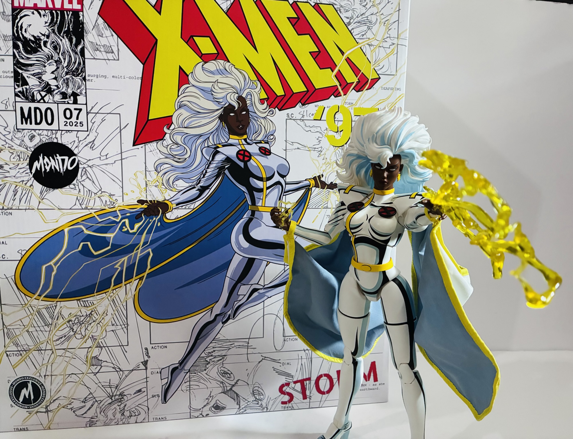
Storm comes in the usual, large, box with artwork on the front by former storyboard artist Dan Veesenmeyer. Images from those same storyboards are used to fill out the background and it’s tough to tell what episode. It might be “Slave Island” though it could be “Savage Land, Savage Heart.” Regardless, it’s Storm going off with her powers and it looks pretty neat. The figure inside is another sculpt from the renowned Alex Brewer with paint by Tom Rozejowski and Hilary Arce. Hector Arce is credited with the art direction while Jordan Christianson designed the packaging. It is a box like Beast’s and does not include a window like past releases, but that’s fine considering the contents are heavily wrapped to protect the paint.
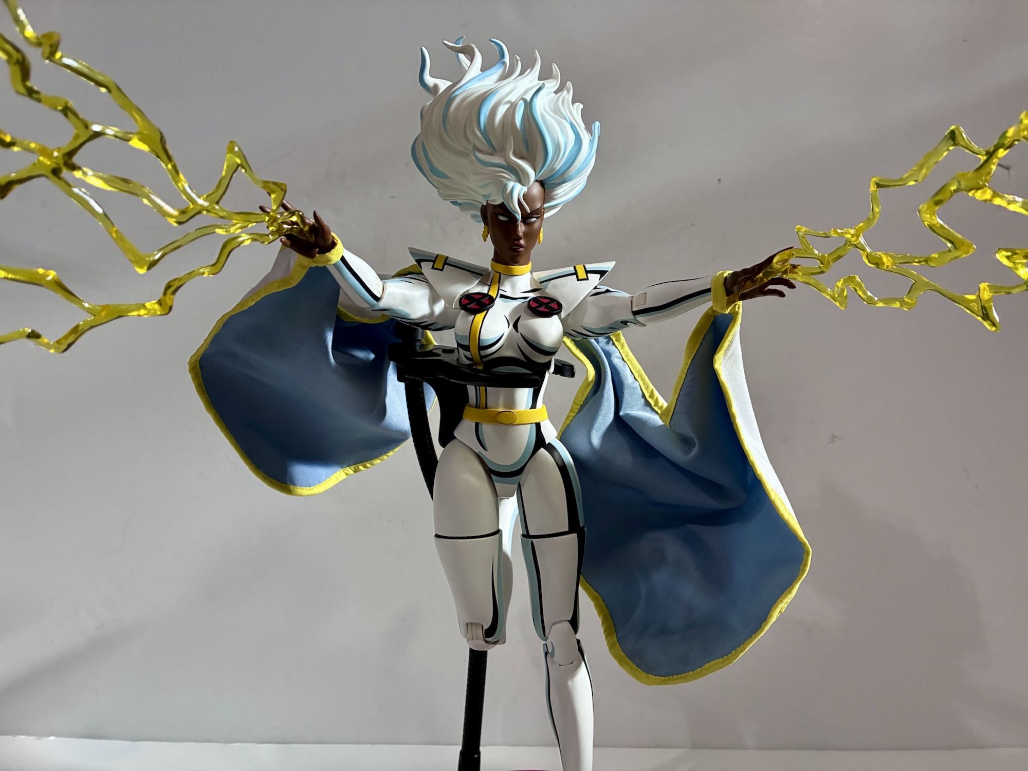
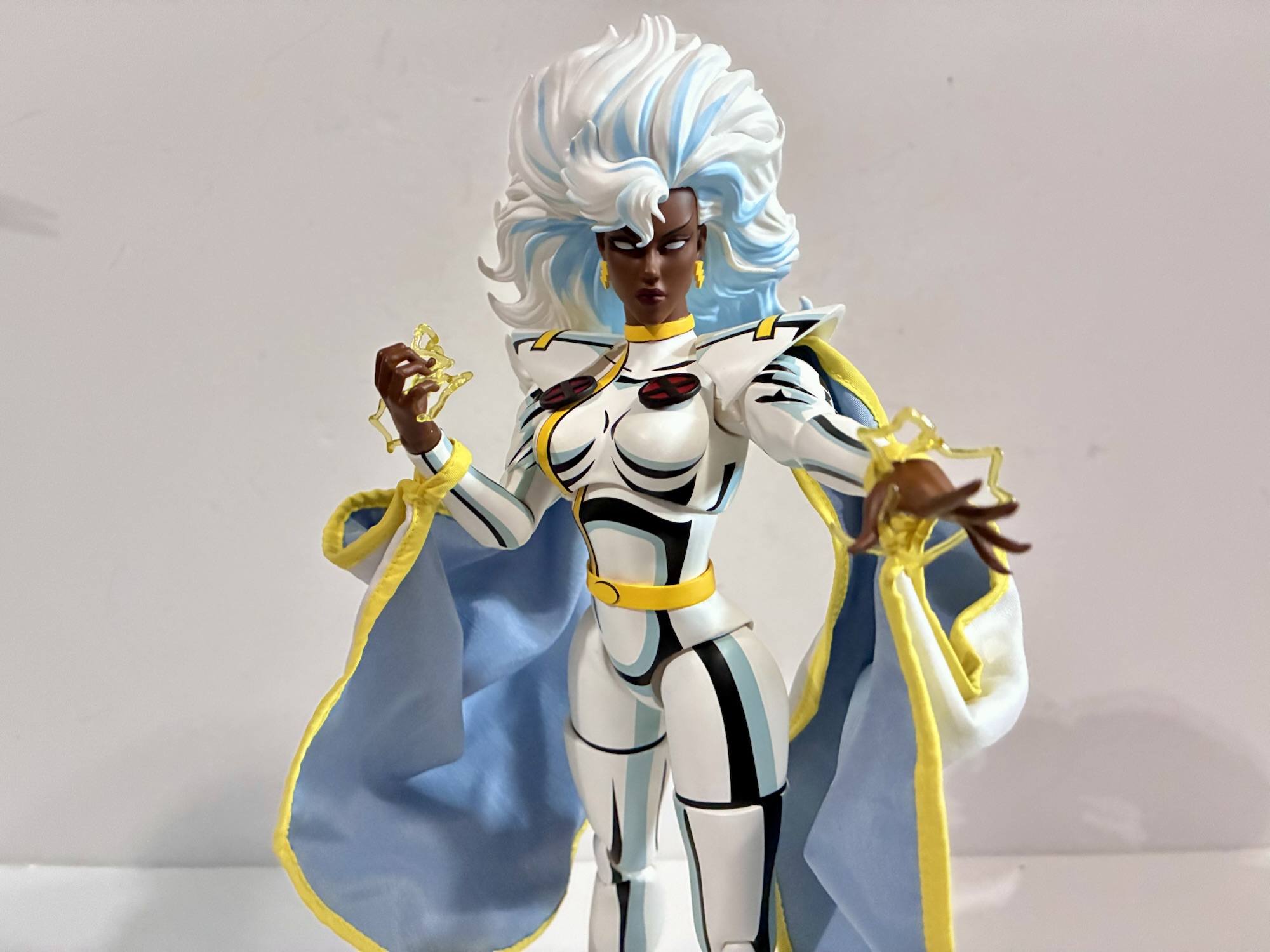
Out of the box, Storm stands about 11″ to where the top of her head would likely be under that rather large mass of white hair. Factor that in, and she’s over a foot tall making her one of the tallest in the line. As I alluded to in the opening paragraph, this is very much a Storm based on her appearance in the original animated series. The tell-tale mark in this case are her thigh-high boots and heels. In X-Men ’97, she ditches those for a more traditional boot line halfway up her calf. The sculpt is quite nice as Brewer was pretty generous with the curves. The costume, a bit of a point of contention amongst comic fans (Is it white? Silver? A glossy black?), is a cartoon-accurate white with a lot of black shading. There’s some gray-blue shading mixed in as well which helps make Storm look like she leapt off the screen. All of the yellow accents are where you would expect them to be as are her trademarked lightning bolt earrings. By default, she has her big, poofy, hair which will make her a bit tough to stand, but is animation accurate. The only critique I have for the sculpt is her face is still not quite what I picture for Storm from the show. Her chin comes to more of a pronounced point in plastic where her jaw was a bit more square, but with soft lines, in the show.
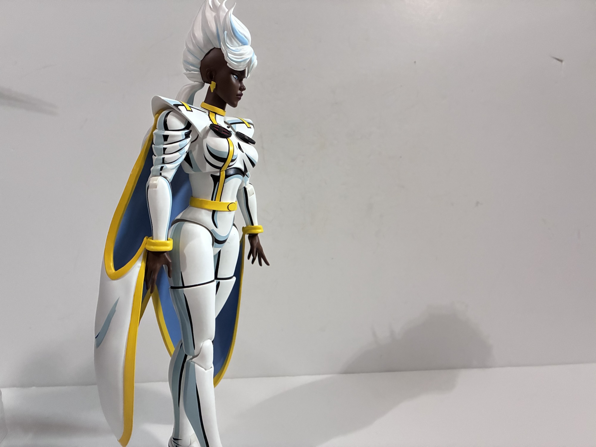
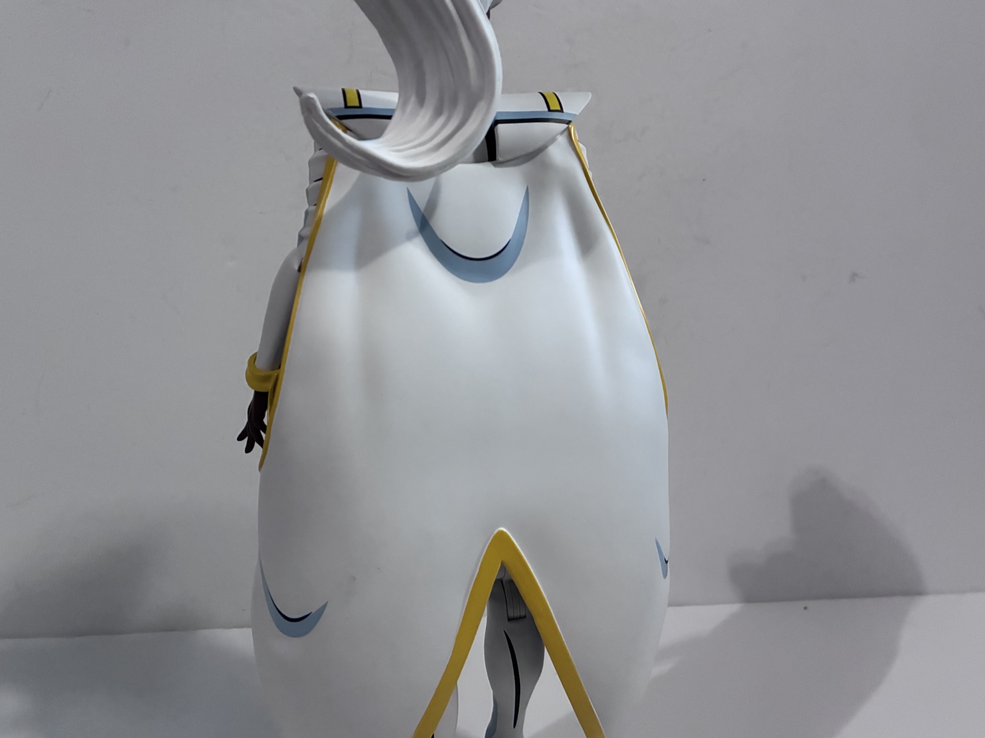
One of the challenges of creating Storm for this line rested with her cape. To preserve the look of the show, a painted cape made out of plastic is ideal, but since her cape connects to her wrists that basically kills any articulation in the arms. Mondo’s solution then was to give the collector options. Storm has an all plastic cape that’s well-painted and looks great. It includes her shoulder pads and plugs into her clavicle area with the yellow cuffs fitting over her wrists. It’s in a neutral position so Storm won’t be able to do much with her hands while wearing it, but if you’re the sort of person that just goes for a pretty vanilla pose on your shelf it will look nice. For those looking for something more poseable, there’s a soft goods cape as well. It’s actually two pieces and also includes the yellow cuffs, but it’s all soft goods. The outside portion is white while the inner part of the cape is gray. It’s not going to fool anyone and does look like a soft goods cape, but it does strike a nice compromise. And if you don’t like the look of the soft goods, yellow, wrist cuffs on it Mondo did include two optional yellow, plastic, ones. I think these are mostly intended for slipping over her wrists for those who don’t want to put the cape on at all, but they can be muscled over the soft goods cuffs too for a stronger, more saturated, look. Based on the pictures on Mondo’s website, it also is possible to remove the cape from the shoulder pads, but it doesn’t look easy so I have opted not to try. I’m also not sure which cape that applies to.
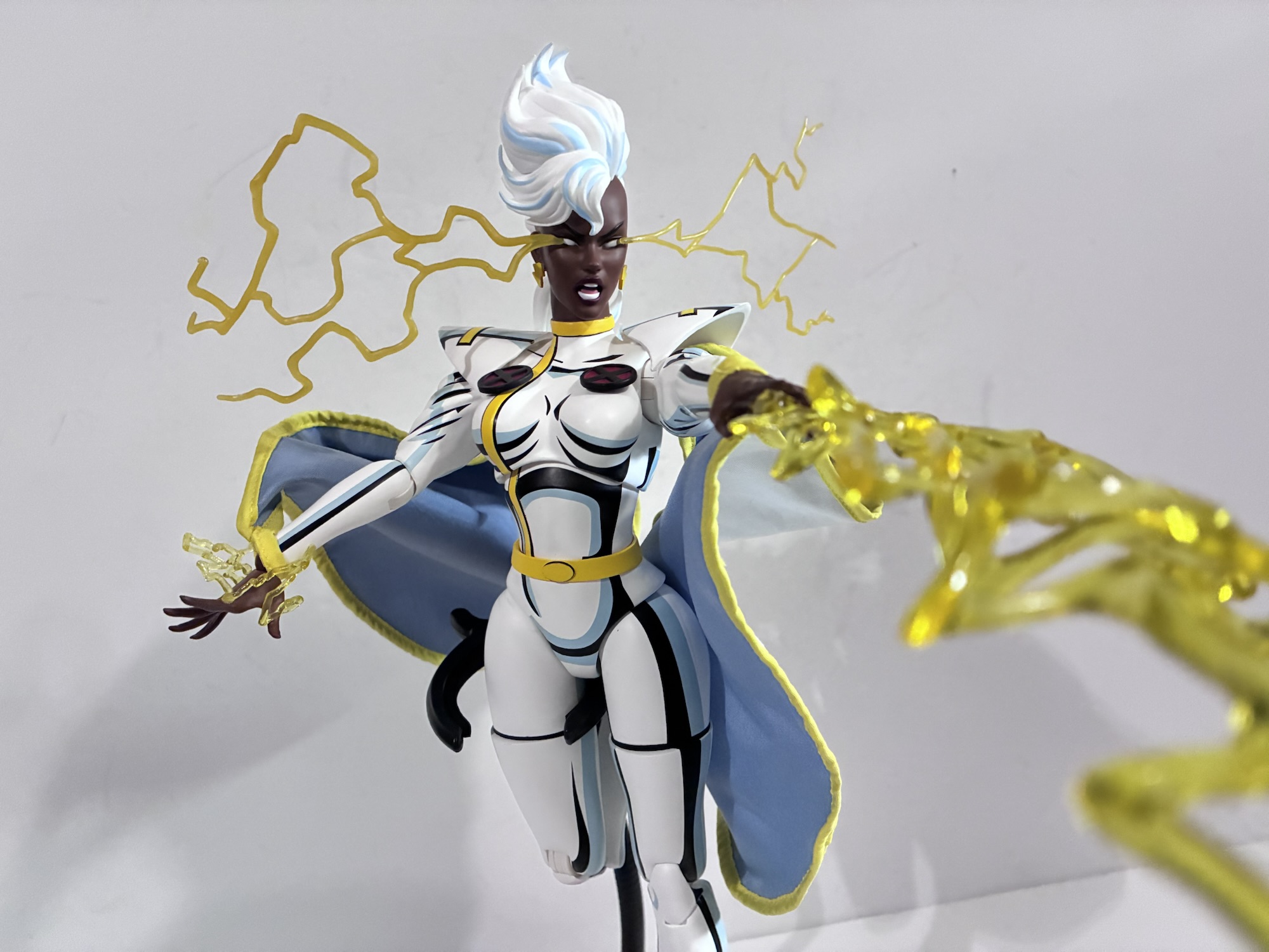
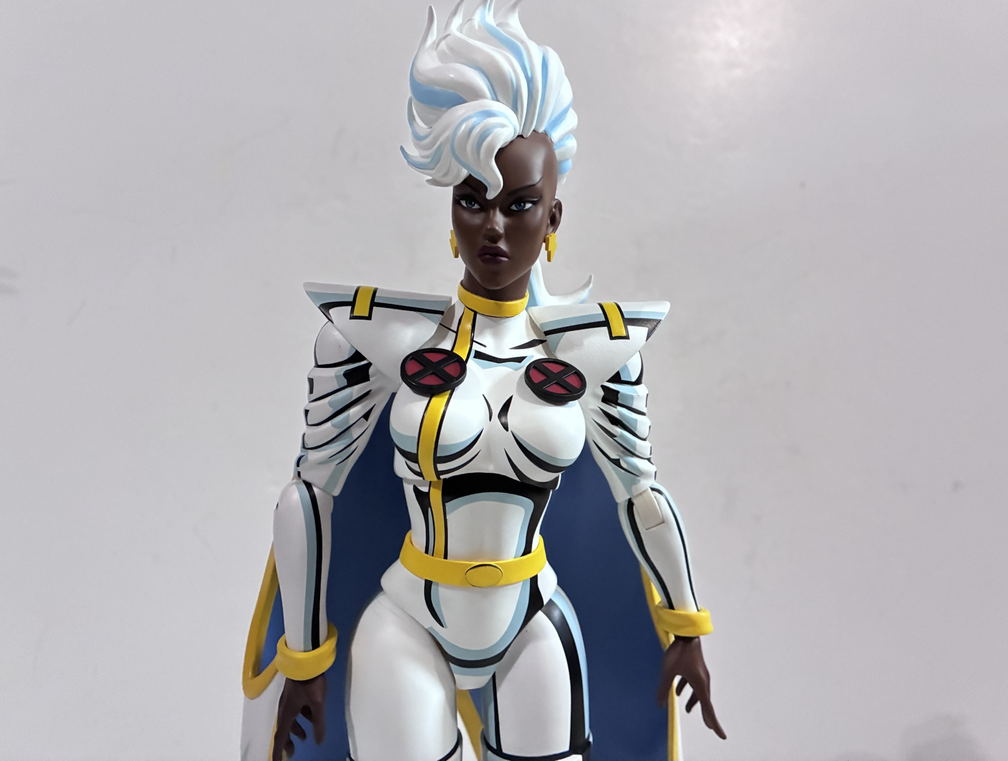
Storm may be wearing her ’92 costume, but she does have some ’97 inspired portraits to approximate her look in that series if it’s your preference. The default one features the big hair and her iris present while there’s an alternate one with the eyes whited-out. This is what happens whenever Storm uses her powers so if you’re posing her with lightning effects make sure you have the right eyes unless you want to look like a fool. The sculpts look to be identical with just the eye paint being different. It makes sense, though I wish her non-powered up look featured a smile. If you want her to look a bit more intimidating, there’s a slightly angrier expression where the wind is pushing her hair up. It’s definitely a cool look and one I’ll be hard pressed to ignore when it comes to my own, personal, display. For the X-Men ’97 enthusiasts, she also has a neutral portrait with mohawk and an angry one with that same mohawk hairstyle. The angry one features the added detail of little holes beside her whited-out eyes that can accommodate two lightning effects. I believe this is based on her grand entrance in the first episode of X-Men ’97. Also included in this timed edition of Storm is another neutral portrait with a ponytail hairstyle. I think this hairstyle made an appearance a couple of times in the original series, but I remember it most from the episode “Orphan’s End.” It’s a good spread, though I’m a little disappointed that none of the heads feature a smiling expression. She’s either stoic or angry and while Storm does tend to be quite serious much of the time, she’s not joyless.
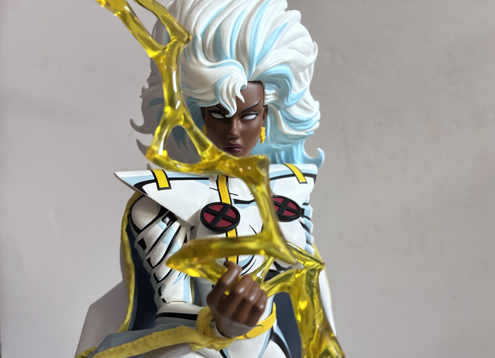
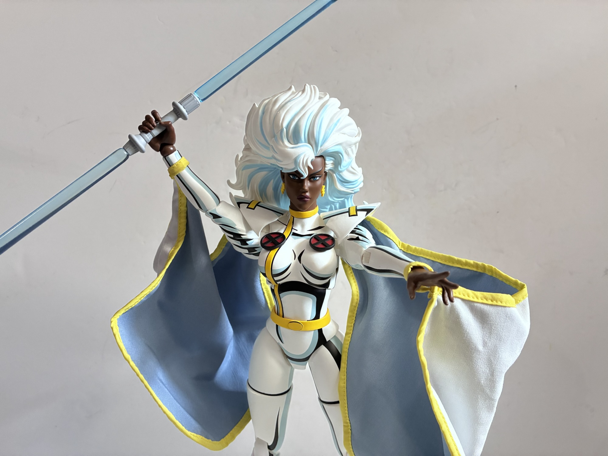
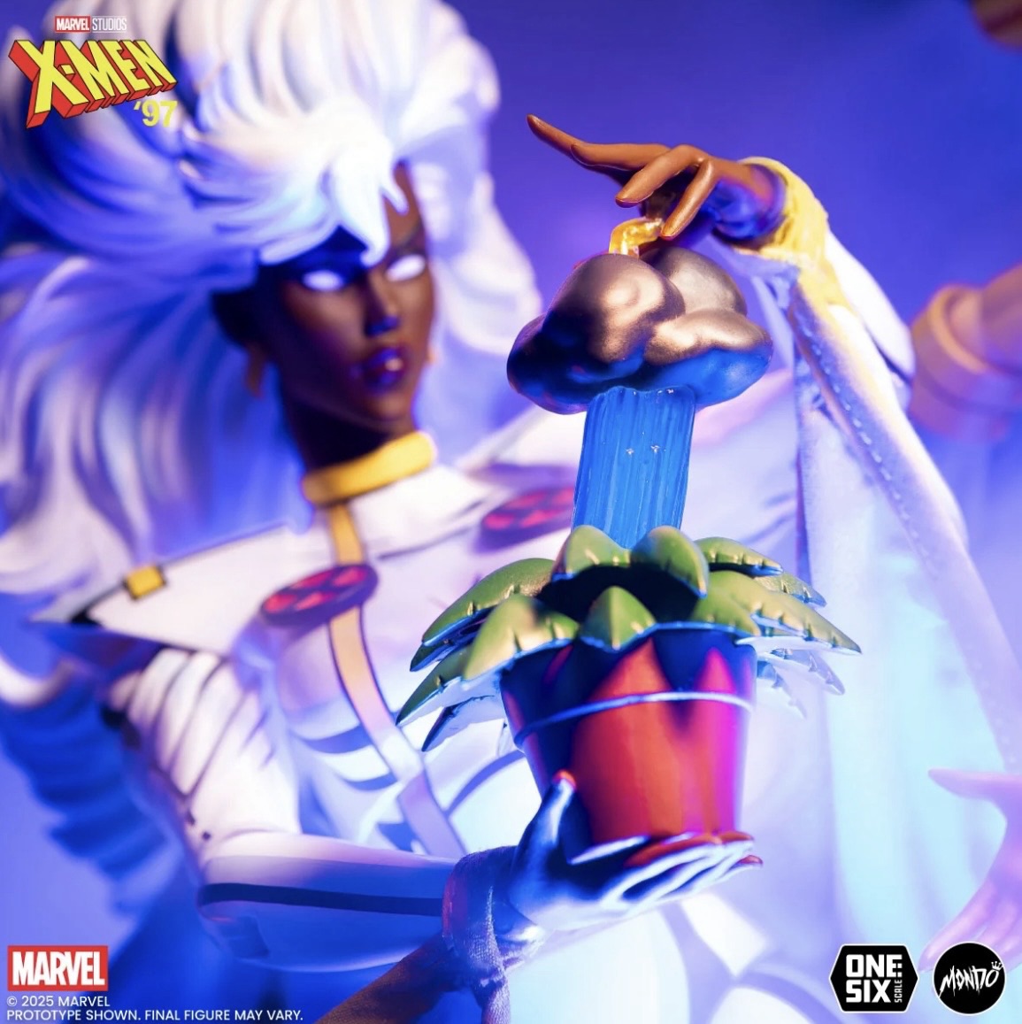
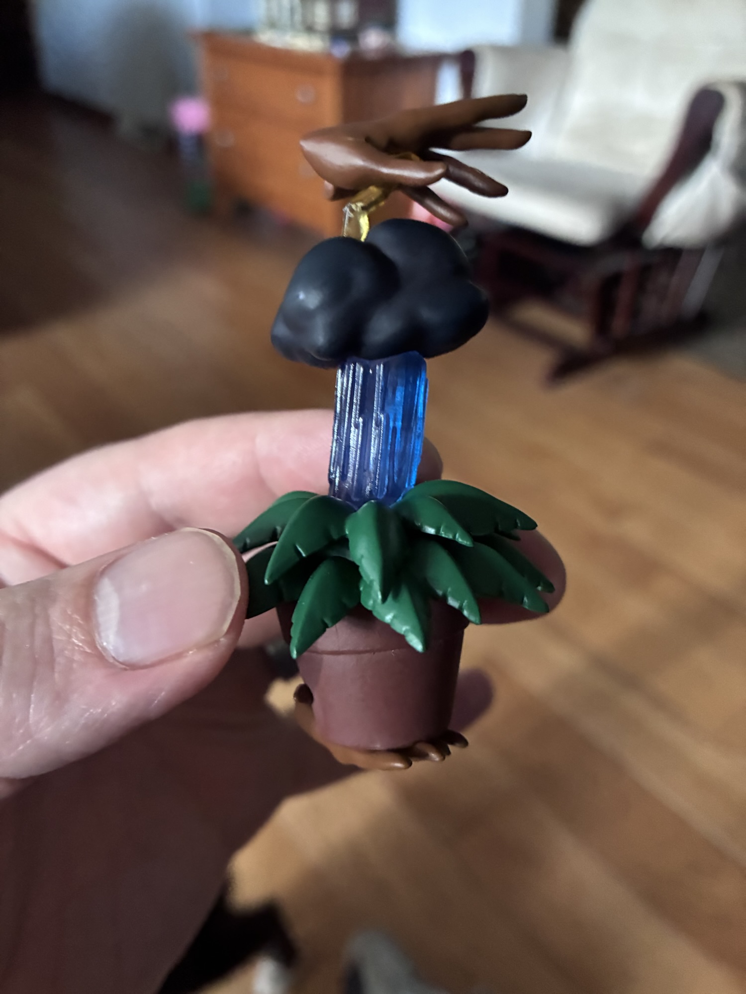
To go with all of those expressions is an assortment of hands. By default, Storm has these style posed hands. The kind of gesture she would make while reaching out and getting ready to direct her powers at a target, be it lightning, wind, or something else. She also has a similar set with little crackles of lightning affixed to them. They’re soft and pliable, but also do make it a little tough when trying to put her hands on (and swapping is not easy – go for heat). She also has two clenching hands with similar lightning effects on them and a set of gripping hands. For those gripping hands, Storm has the staff weapon featured in her battle with Callisto in the episode “Captive Hearts.” It’s the strange, double lightsaber weapon that has a gray handle in the center and translucent blue plastic for each end. It looks fine, but I’m surprised at the lack of paint in the center handle. The other handheld accessory is a large, translucent, yellow, lightning bolt. This feels like a direct callback to Storm’s original Toy Biz figure right down to the little, squared-off, grip on the side of it. It looks pretty neat and I do love it when Mondo slips callbacks into these packages. The hands that are likely to be among the favorites of anyone with this figure are the ones with lightning shooting from the finger tips in a wide arc. It’s more translucent yellow plastic and it’s an effect similar to what Hasbro attempted with their X-Men Storm, but executed far better because the plastic for the hands is not painted over translucent plastic. The last hand option is a unique piece. It’s a small plant with a right hand affixed to the bottom. Above the plant is a rainstorm and a dark cloud and affixed to that cloud is another lightning bolt connected to a left hand. Unfortunately, mine arrived with the hands basically parallel to each other which made it impossible to get onto Storm as the top needed to be facing the opposite direction. By heating it, I reshaped the little lightning bolt and was able to get it onto my figure, though this stressed where the lightning was glued into the cloud and it snapped when I took it off. Mondo is sending me a new one at no cost to me so it’s not a big deal, but something to watch out for if you get the same. The last accessory, is another mutant power suppressor collar like the ones Gambit came with. You should now have enough to reenact the episode “Slave Island” with Storm, Jubilee, and Gambit if you so desire.

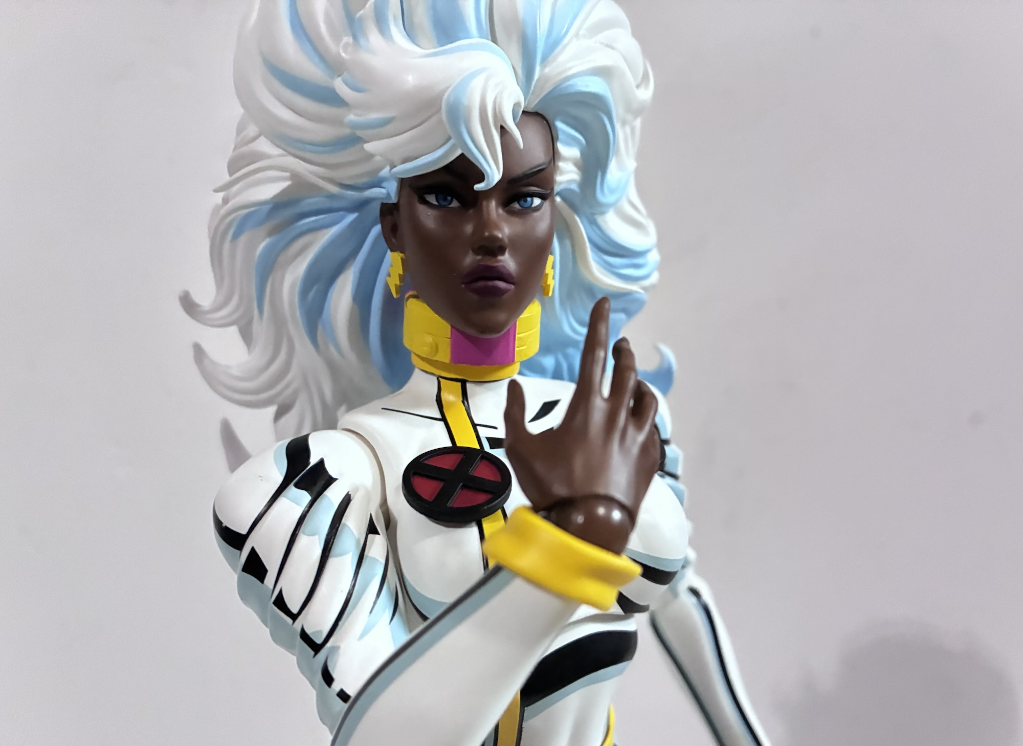
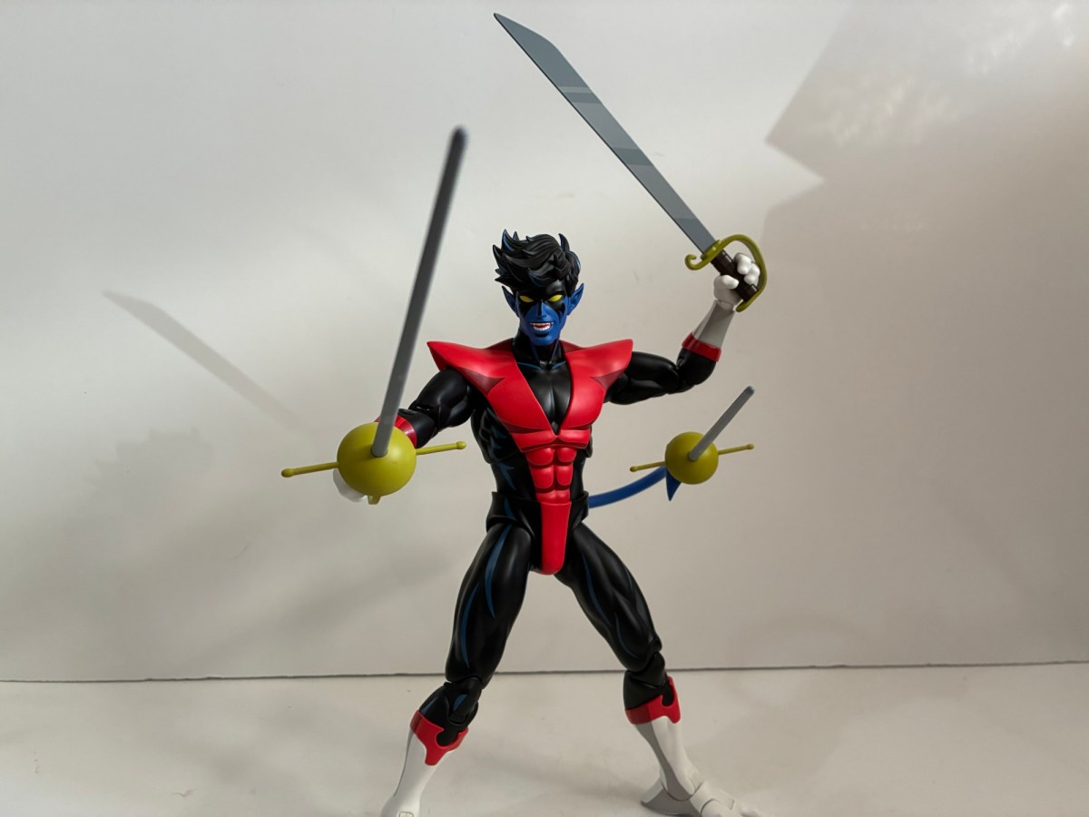
For articulation, Storm is pretty typical of the line. We get: double-ball head, ball-hinge shoulders, single hinge elbows with a swivel, ball wrists, diaphragm, waist, hips, thigh cut, double-jointed knees, hinge ankles and rockers, wired cape. The thigh cut is a nice addition since it’s hidden by the line of her boots. The torso works really well with its ability to arche back and forth at the diaphragm and a little at the waist. Plus you get the rotation and tilt you likely would want. The single-hinged elbows are a minor shortcoming, but the shoulders are the weakest point. Because her costume bunches up at the shoulders which is captured by the sculpt, she can’t raise her arms out to the side into a classic “T” pose. The range is about 45 degrees, but she can rotate at the shoulders without issue so it’s something that can be worked around to some degree. Even with the heels and big hair, Storm can be made to stand on her own with a little persistence. I don’t know that I’d leave her on a shelf like that, but the good thing is that I don’t have to. Mondo also included their new flight stand. Unlike the one I received with Nightcrawler, this one fit over the articulated post for me without having to disassemble it. The only problem is that she’s so slight of frame finding a place to use the claw on her is tough. It’s pretty much the bust area or nothing. I wish they had a smaller claw for smaller figures, but on the plus side this will work with pretty much all of the other figures in the line if you want to put Wolverine in a leaping pose or allow Magneto to hover.
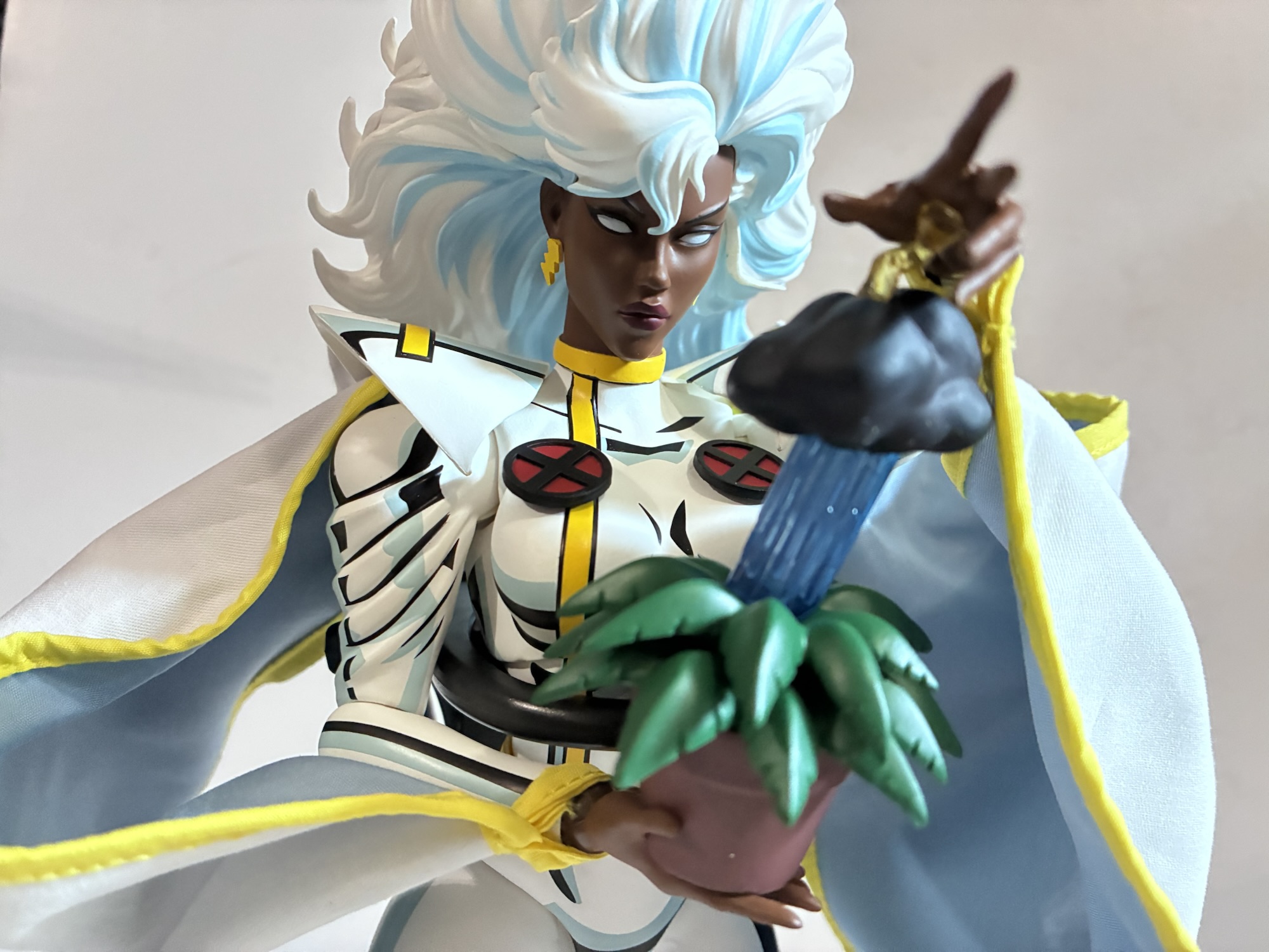
Like all of the figures in this line, Storm doesn’t come cheap. The MSRP is $245, but it also required a tariff fee and shipping which brought the total for me to north of $300. Is she worth it? If any of the others are then yes and by the standards of the line she not only features a lot of stuff, but looks great and articulates about as well as can be expected. I love all of the options and I appreciate Mondo giving us two kinds of capes for our display. The only downer for me is how Mondo doesn’t allow for us to swap the hair. If Storm could do so it would really open up the display possibilities. I love the eye lightning, but I don’t know if I’ll ever want to display her with her X-Men ’97 hairstyle when I’m mainly going for a ’92 look for my display. If the hair could be moved around it would solve that problem, Plus, that’s a lot of extra plastic to have to include. The issue with the tree accessory is unfortunate, but not a big deal for me. As of right now, I have not received my replacement part, but I have an “order” created for it by Mondo so I’m not concerned at the moment. I might also just try and repair the one I have since it is a clever little item. My criticisms here feel pretty minor though and at the end of the day I think Storm is one of the best figures in the line so far. It’s getting tough to pick favorites, but I’ve been really impressed by Storm, Beast, and Nightcrawler. Next up is Jean which Mondo is billing as the team completer, but we all know there’s still some pretty important characters still waiting for their own chance. Jean won’t be out until next year though so it’s going to be a little while before we have another figure in the line to talk about, but at least it’s not the last.

EDIT: Jean went up for preorder on September 22 with an expected ship date of November 2026 so apparently we are not done with X-Men this year!

UPDATE: I received my replacement “Storm Plant” from Mondo about two weeks after contacting them. The new part did have the hands in a new orientation, but unfortunately it’s still unusable. When the bottom hand is connected to the figure, the fingertips of the top hand are now pointing at her chest. Previously, they were pointed in the same direction as the bottom hand. I can only conclude the issue must be pretty widespread and I wonder if checking which direction the parts are going is even part of the factory review. It’s too bad they glued everything as not only would that have prevented the issue, it would have made it easier to get onto the figure. I think I’ll explore a permanent fix to the one I broke rather than ask for a third one.
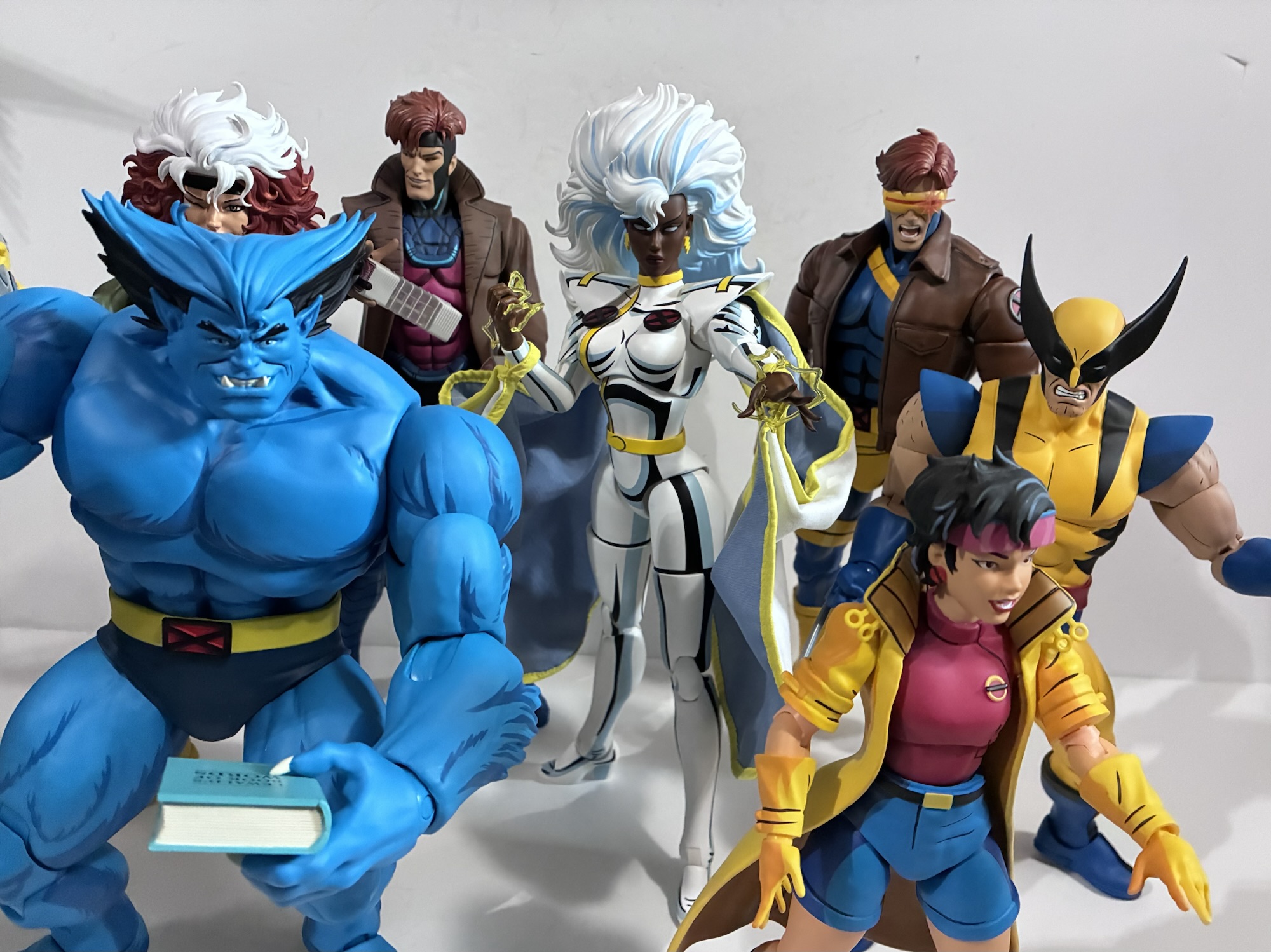
We are so close!

For more from Mondo’s X-Men line, see below:
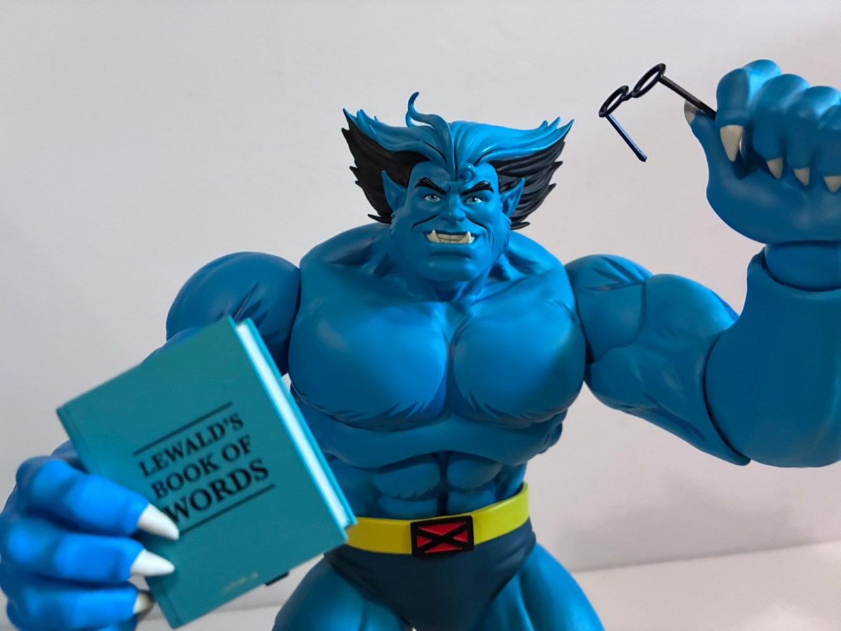
Mondo X-Men ’97 1/6 Scale Beast – Limited Edition

Back in the old Toy Biz line, it felt like we had to wait a long while for an action figure of Beast, or The Beast as the opening title of X-Men: The Animated Series referred to him as. Perhaps that was due to the character spending the bulk of the first season out of…

Keep reading
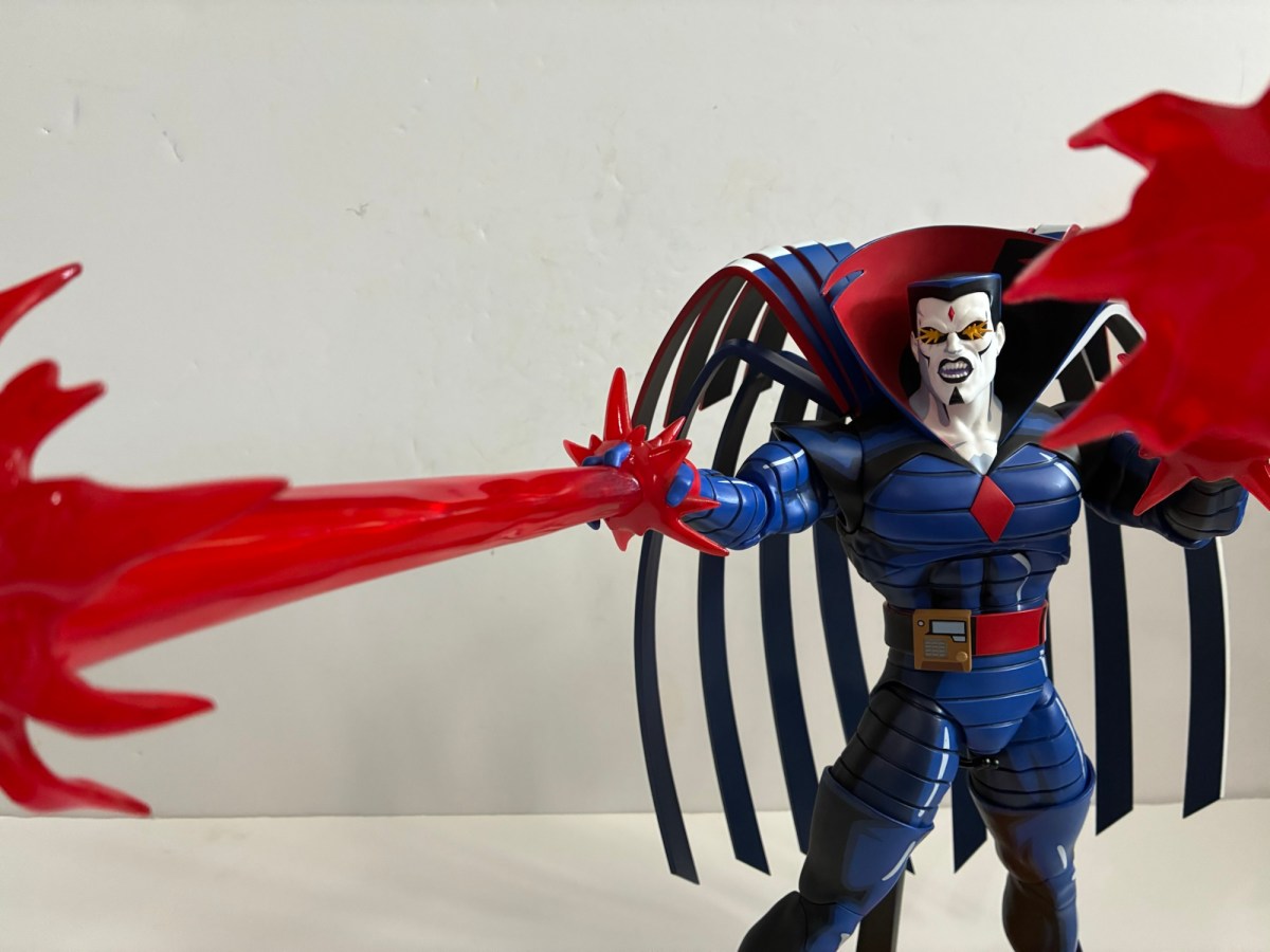
Mondo X-Men ’97 1/6 Scale Nightcrawler

Yes, I’m afraid this is another toy review that needs to begin with a word about tariffs. It was the talk of 2025 in the toy collecting community because it caused considerable delays, disruptions, and worst of all, increased prices across the board. One line impacted by the introduction of these new costs more than…

Keep reading

Mondo X-Men ’97 1/6 Scale Cyclops – Limited Edition

The leader of the X-Men has arrived.

After putting a real hurting on my wallet in 2023, Mondo decided to take it easy in 2024 with its line of sixth scale action figures based on the animated series X-Men which ran from 1992-1997 on Fox Kids. Two figures ended up getting released this year, Rogue and now the leader of the X-Men Cyclops. With Cyclops though we get a slight change because easily the biggest thing to happen to the X-Men in 2024 was the release of X-Men ’97. Well, some would argue for a movie staring a foul-mouthed merc and an old man as being the biggest business in the X world, but I’m going with the Disney+ series. Since the show turned out to be quite the hit, and because it’s a continuation of the original X-Men series, Mondo decided its figures could use a little rebranding which is why Cyclops is the first release to be billed as hailing from the new show. What does this mean for the figure itself? Not a whole lot.

Yeah, I know, this isn’t a fair comparison.

Cyclops still comes in the same style of window box with artwork from storyboard artist Dan Veesenmeyer. The difference between his release and the others is that the character model definitely resembles the look from X-Men ’97 and not the original show. That’s not a huge change as the costume is the same, but Cyclops has a slightly slimmer profile and the detail work is a dead ringer for the same in the new show. For the figure, there’s really no change and Mondo via its YouTube channel has basically admitted that the figures are going to hew closer to the original series. It’s just now they will be able to toss-in items and accessories pulled directly from the new show where it makes sense.

“To me, my X-Men!”

And we pretty much know this to be true because concept art for Cyclops was shown well before X-Men ’97 debuted. Here we have another sculpt by the awesome Alex Brewer with paint by Tomasz Rozejowski that really harkens back to 1992 and that original Fox series. Cyclops stands a full 12″ and is clad in his yellow and blue Jim Lee outfit which he wore almost exclusively in that show. Like prior figures in this line, there were two editions of Cyclops made available and I opted for the limited version which came with extra stuff which we’ll get to.

You may want to separate these two on your shelf.

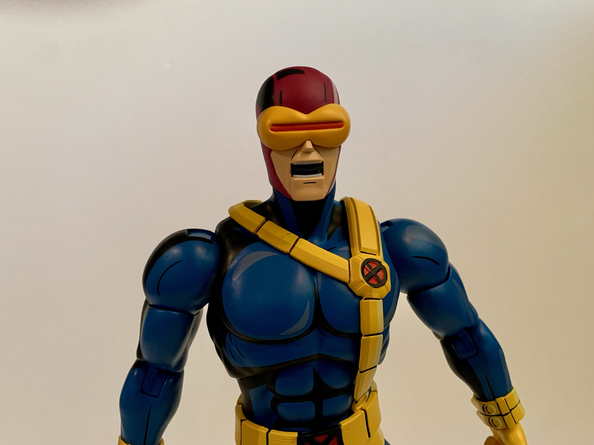
The sculpt for Cyclops may not be complex, but it gets the job done. He’s well-muscled and proportioned with a portrait that evokes the original series. The details one would expect are in place like the segmented straps on the belt or the pouches and straps. There’s even a little extra detail where the chest strap attaches to the lower belt that I don’t remember seeing in the show. The hair and the visor are all appropriate and the placement of the thigh straps appears spot-on as well (they’re also floating and slightly annoying as a result). That doesn’t mean there isn’t room for some nitpicks. Cyclops was nicknamed Slim early on, but by the 90s he was a pretty massive dude. This figure depicts him as a big guy, but maybe not quite as big as he could be. The legs look fine and so do the arms, but the chest and abdomen strike me as a bit undersized. It’s almost like Mondo aimed to fit this Cyclops figure in-between the 92 and 97 version. It could also be for a different reason which ties into the extra stuff. This version of Cyclops has removable arms and an optional flight jacket part like the Logan figure. If he were any bigger he might look huge with the jacket. If so, I disagree with the approach as the jacketed look should be a secondary concern, but the feature also seems to play a role with his shoulders being set apart from the body. These are all things mostly noticeable when the figure is just standing straight up and down, pose him and it’s less an issue, but it’s an expensive figure so we have to nitpick where it’s warranted.

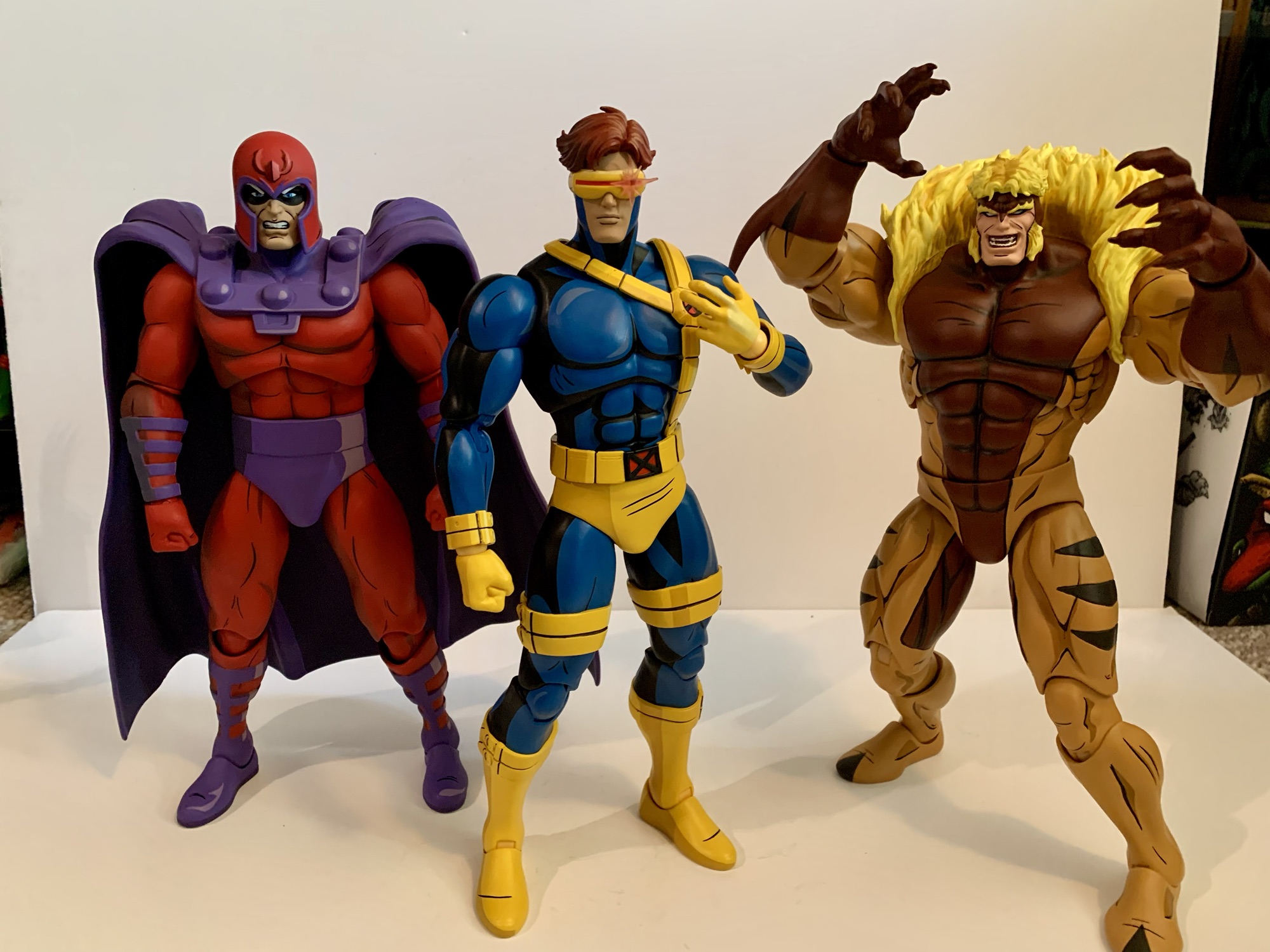
He scales well enough with the bad guys too.

What really offers no room for disappointment is the paint. Mondo just slays when it comes to that part of the presentation and Cyclops is no different. The base blue is the perfect royal blue and the lighter blue used to shade it and the blacks all make him pop. The yellow is the right shade with just a hint of red of in it to lessen that lemony look the Hasbro figure of the same has. The different shades of gold used to apply the cel-shading for the yellow looks great and everything is rich and full. There’s an impressive lack of paint slop and issues as well. With such an ambitious paint job some of that is expected, but I’m finding it hard to notice with this one. There’s a visible brush stroke on the chest strap, but apart from that I’m at a loss. This is some really impressive execution so Mondo better hang onto whatever factory put this one together.

Mondo decided it was important Cyclops be able to do stuff like this.

Cyclops comes with new branding, but he also comes with new articulation. Mondo tends to keep things basic with its figures as they prioritize aesthetics over function. And at this scale, I think that’s the right approach. However, there’s no denying that certain characters need to be able to hit certain poses and for Cyclops it’s being able to place a hand on the side of his visor to activate his optic blasts (even though we also see him do so without pressing a button in the show, but lets just go with it). In order to achieve that function, Mondo opted to incorporate double-jointed elbows into this one. And they work great, no problem hitting that pose and he can pretty much put his hand to his X communicator on his chest as well. And the aesthetics trade-off is nil, as far as I’m concerned. We’re all toy collectors and we’re used to double-jointed elbows. They look fine, better than the swivel joint used on Wolverine and Sabretooth that has some miscolored plastic, so I hope they do this more going forward.

This is a team that loves a good, brown, jacket.

Aside from that, the articulation is pretty much the same as other figures. The head is on a double-ball peg and the range is pretty nice. It is a little more gappy than past figures, but I’m guessing they prioritized plus range at the head given his unique skillset. The shoulders are the usual ball-hinges with a bicep swivel past that. Wrists are ball-hinged and they can be tight, but I didn’t experience any issues. The torso is where things get less impressive. Cyclops has the usual ball-jointed diaphragm and waist, but he also has that unique belt that goes around his chest. It’s connected to the belt at his waist so it’s going to get in the way. It has some play and will float when you manipulate the chest, but the range is okay, at best. Hips are ball-sockets with thigh swivels built in, but the rubber trunks will hinder the figure’s ability to kick forward and back. I can get him into one knee poses, but it’s awkward and one must be mindful of paint rub. Knees are double-jointed and the ankles hinge forward and back with an ankle rocker. The ankles are pretty tight, but I didn’t need to heat them up to get them working. Shoulders are really tight too, but again, no heat needed as I just went easy.

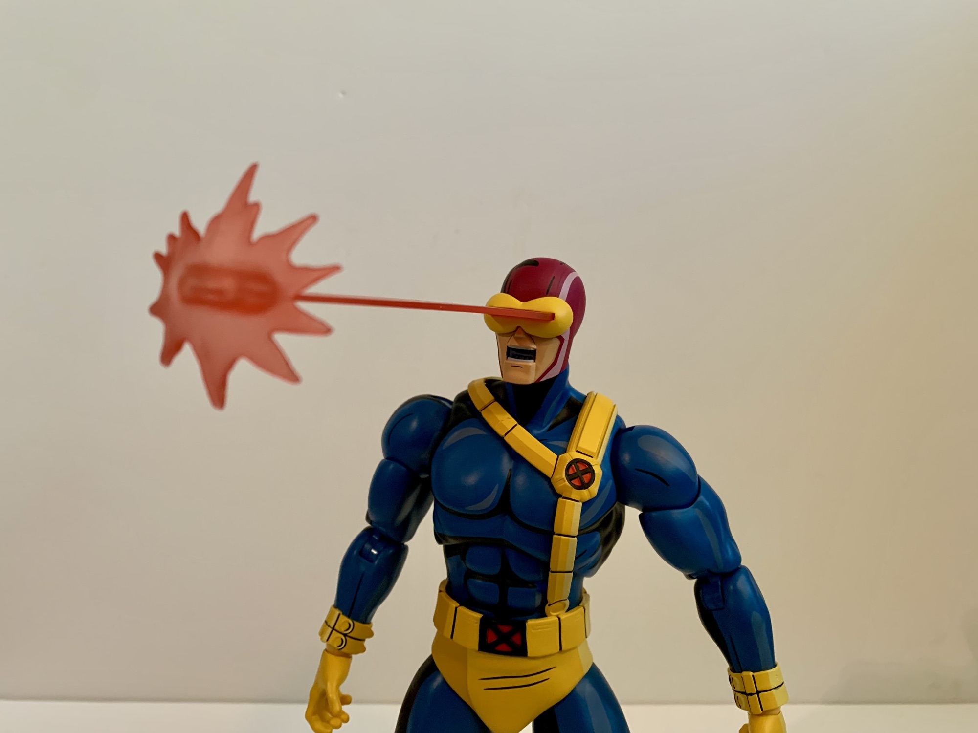
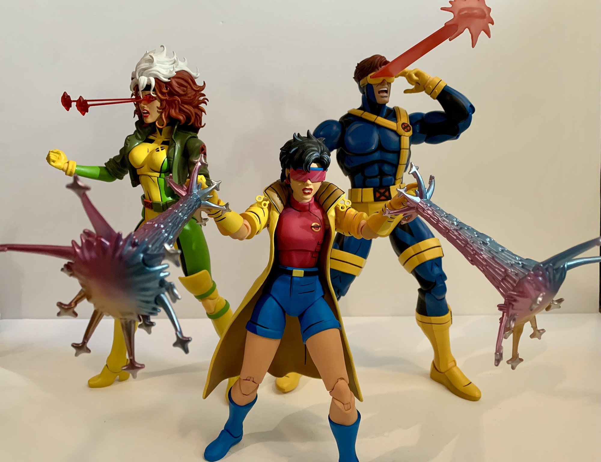
Cyclops has a ton of extra stuff to go through so let’s not waste any time. We’ll do the standard version accessories first which include a stoic head and a yelling head. Both feature interchangeable visors and come with a standard one by default. Getting the visors off and on is pretty painless, and both heads can use all of the visors. The extras are a visor with a lens flare and one with a slot in it for blast effects. And for blast effects we get two by default. The first is a pretty standard Cyclops blast. It’s 4″ long or so with a splash effect at the end. The easiest way to put it on is to slot it through the visor first, then plug it into the head. It can only go in one way so if it doesn’t fit just spin it around. The other blast effect is an arc with four short blasts. It strikes me as a very Marvel vs Capcom effect and it looks pretty cool. Both are done on translucent red plastic which feels appropriate for a Cyclops effect. They’re rigid so hopefully none arrived warp. I love the look of the blast, and the lens flare part is also pretty cool, so settling on a display is actually quite challenging with this guy. You’ll want to swap some stuff from time to time.

“I was raised by a cup of coffee.”

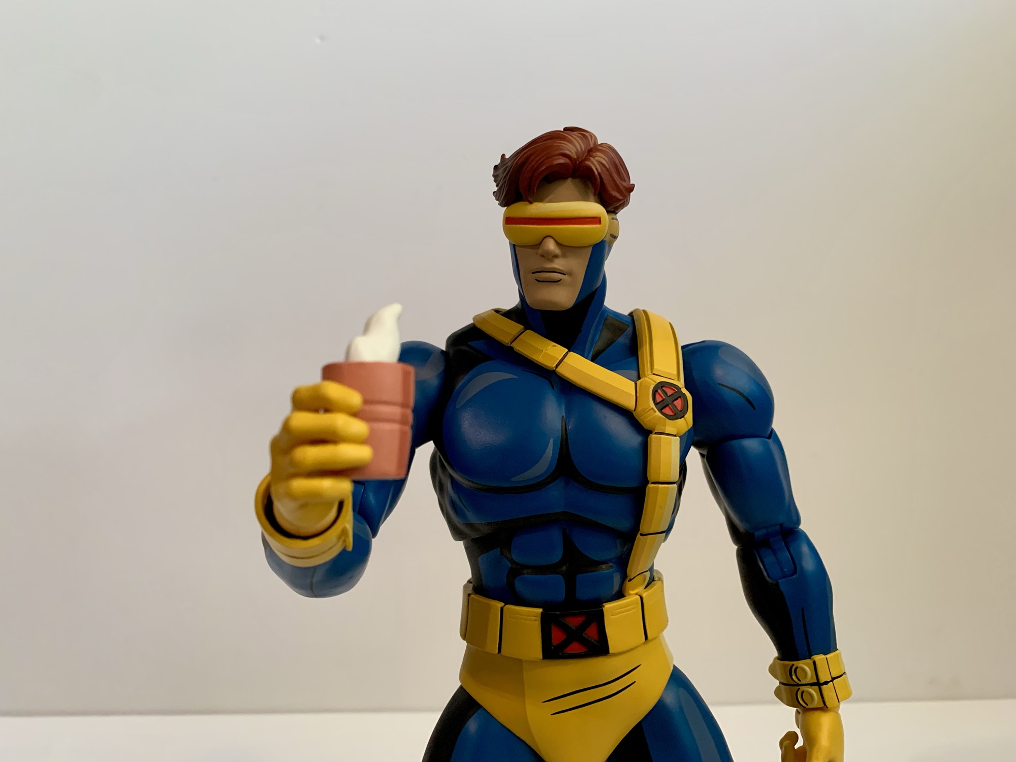
Cyclops also has an assortment of hands to make use of. By default, he comes with a set of fists which are always useful. In addition to that he has two clenching hands, two “finger bang” hands, a set of two-finger hands for his optic blasts, and a single right gripping hand. The gripping hand is for his cup of coffee which is included. This was seen a few times in the first season, most memorably for me in “Deadly Reunions,” and it’s a pink cup with sculpted steam wafting off of it. Even though Mondo included a gripping hand for it, I find the clenching hands work just as well to hold it. Swapping heads and visors is painless with this guy, but the hands are tough. The pegs going into the arms are ribbed when they probably don’t really need to be. The ball hinge also plugs into the hand and each hand is on its own, which is how Mondo always does it. Initially, I felt like the fists were more likely to come off at the hand and not where they’re supposed to in the forearm, so I heated the forearms of my figure with warm water. It’s made easier by the fact that the arms are designed to pop off. I was then able to get the hands out, but it was dicey. I’m reluctant to really jam any of the hands into his forearms as a result, though I haven’t had the same level of difficulty with the other hands.

Sometimes it gets cold out there.

That’s all the stuff that comes with the standard, $220, version. The $240 limited edition has a few more things including the aforementioned jacket. Swapping the arms isn’t too bad and the jacket arms come with bare fists. The fists are actually the exact same as the standard fists just painted flesh colored. They are removable, though I haven’t bothered since they’re in there pretty good. He sometimes wore gloves with the jacket in the show so the other hands work with this look as well. The arms are also double-jointed at the elbows just like the standard ones so there’s no loss of articulation in swapping them. I think he looks great with the jacket and it’s a tough call on how to display him. Right now, I’ve gone without, but I’ll be changing it from time to time for sure. Oh, and I had to try because this look is so close to Morph, but the Morph heads don’t fit. The opening is way too small, which is probably good so that I’m not tempted to attempt a very expensive custom.

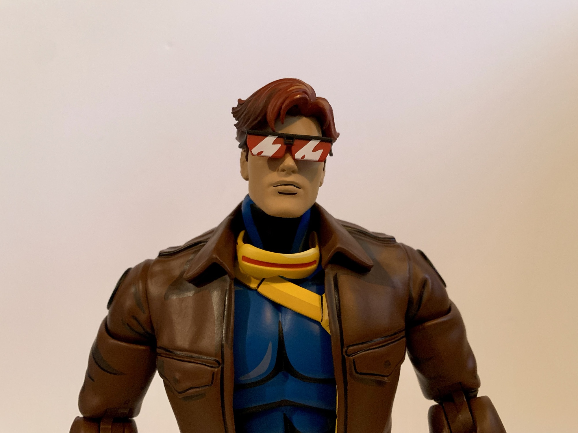
Cyclops would wear the jacket in the field plenty, but sometimes also to look more casual. To that end he has an uncowled head. It looks great and his eyes are painted red, which makes sense. Maybe some would have preferred brown eyes for the few times he was depowered in the show, but many won’t display him like that because he also has his shades. They’re black with the red lenses that have some white shading on them which looks nice. They’re a little brittle feeling, but have held up fine so far. They slot into his temples and look great when in place. He also has yet another visor that’s been removed so he can either hold it or stick it around his neck or something. It’s a nice touch. I will say, this head is the most X-Men ’97 looking part of the package, which could be intentional. This version also comes with another effect part that is one, massive, blast that’s almost 8″ long. It has a large splash effect at the end and it looks cool, but it’s heavy. There’s some drooping with this one so I’m reluctant to leave it in place for long stretches of time. It probably works best in tandem with an enemy getting blasted so there’s some added support for it.

Oh, but we’re not done! Mondo likes to toss in a goofy accessory with all of these special editions. We had the elf Jubilee portrait, Gambit as Mystique, and the Morph heads. With Cyclops, it’s a Sentinel head styled to resemble Cyclops. This is taken from the episode “Till Death Do Us Part – Part One” where Wolverine is battling Cyclops robots in the Danger Room. It looks the part and is pretty ridiculous when placed on the head of the figure, but it’s there if you want it. And Mondo went the extra mile and also included a swappable visor piece so he too can make use of the blast effects. It’s a little tighter a fit than the other visor, but it works. I’ll never use it, but it’s funny. Maybe it can be used as a head of a fallen Sentinel with Wolverine or something? Lastly, there’s also the usual Mondo stand. I don’t use them so I didn’t even take it out of the plastic. I wish they’d put an X emblem on it like the Logan one, but it’s fine.

“How do I turn these darn things off?!”

Ultimately, this is another home run by Mondo. Cyclops is a much needed addition to the roster of characters and he turned out pretty great. Did I have issues? Yeah, because nothing is perfect. I’d have liked to see a little more beef in the torso, but that is basically the end of my complaints. I do think the hands could have been made to swap easier and the hands are a longstanding issue with the line (though it’s been better, Magneto was rough). I get why things are tight though because these are big, solid, figures and loose joints would kill them. This figure poses reasonably well and the swappable effect parts and heads are all a ton of fun. This is probably the figure that is the most fun to pick a display, though Gambit and Jubilee are pretty great at that too.

It’s the Blast Squad!

Cyclops is definitely the last figure from this line to see release in 2024, but on-deck is another Wolverine. Alex Brewer has sculpted all of the figures in the line since the original Wolverine so Mondo wanted to get his take on the character and the looks we’ve had are promising. There’s also a retro Cyclops coming based on his look in the season finale of X-Men ’97. I have not gone for the variants in this line and I didn’t go in for that one either. We should also start seeing the first figures from the Spider-Man ’94 line very soon. I don’t plan on going all-in with that one, but expect at least a couple reviews of that line. Beyond that, we don’t know what’s next, but it sure seems like this line is going strong. If I had to guess, I’d say Storm will follow Wolverine, but I hope we get all of the core cast from the ’92 series. Even though it gets harder and harder to find room each time one arrives.

If you liked this review, then check out more from Mondo’s X-Men line:

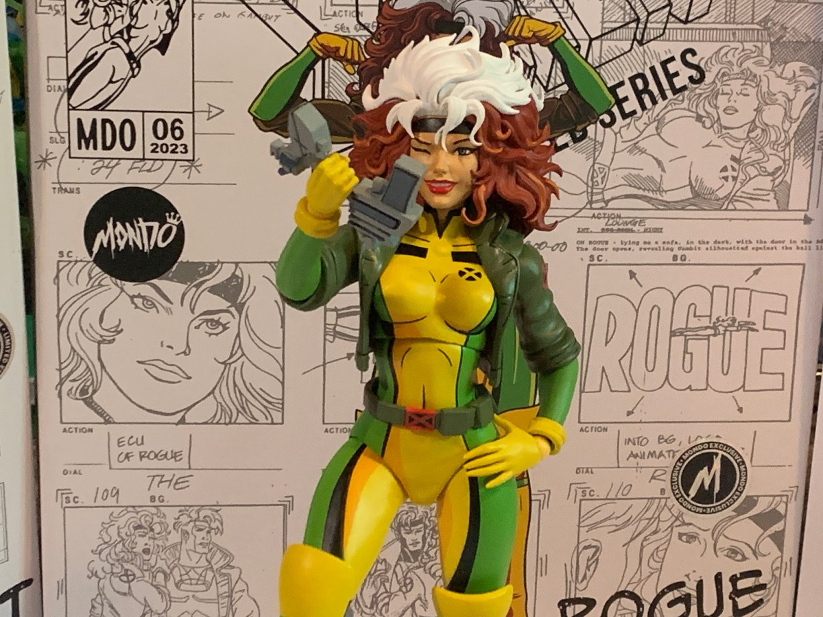
Mondo X-Men TAS 1/6 Scale Rogue – Limited Edition

The conclusion of X-Men ’97’s first season has left behind a void. For 9 consecutive Wednesdays, we had something awesome to get up for. Now the long wait for a second season has begun, but here to help fill the void while we wait is Mondo. Mondo has been dishing out some very impressive sixth…

Keep reading
Mondo X-Men TAS 1/6 Scale SDCC Exclusive Logan

Mondo has been absolutely killing it with its sixth scale line of action figures based on the now classic animated series X-Men. The company also really ramped up production in 2023 on the line by soliciting five new figures during the year. At over 200 bucks a pop, it was quite the hit to the…

Keep reading
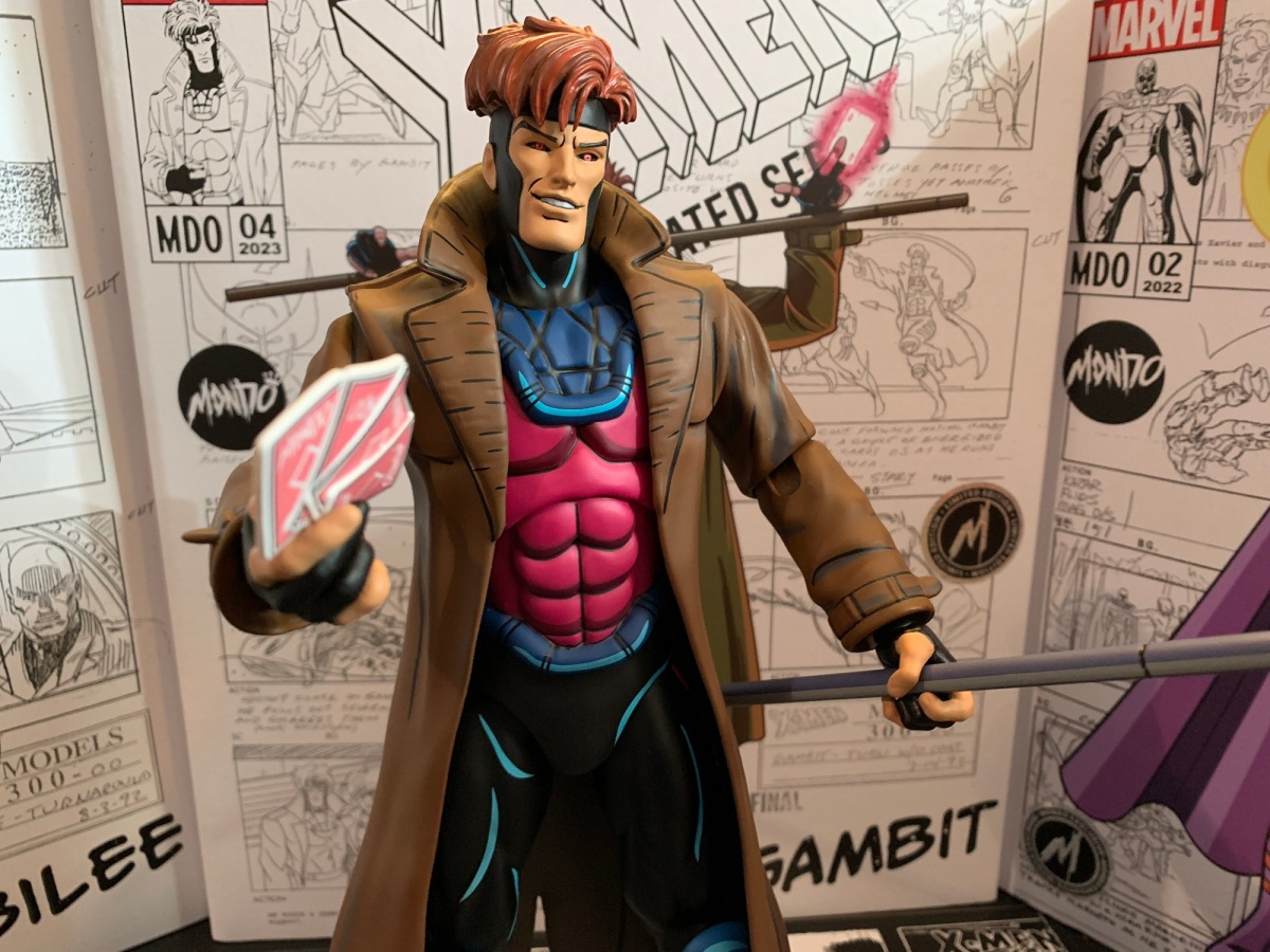
Mondo X-Men TAS 1/6 Scale Gambit

It is my belief that when it comes to X-Men, the animated series which debuted in 1992, the breakout star of the show was Gambit. Wolverine was the closest thing we had to a household name going into the show and was the de-facto pick for favorite character of many. And while the whole roster…

Keep reading
Marvel Legends X-Men Animated Series Mystique

Mystique is bringing the big guns.

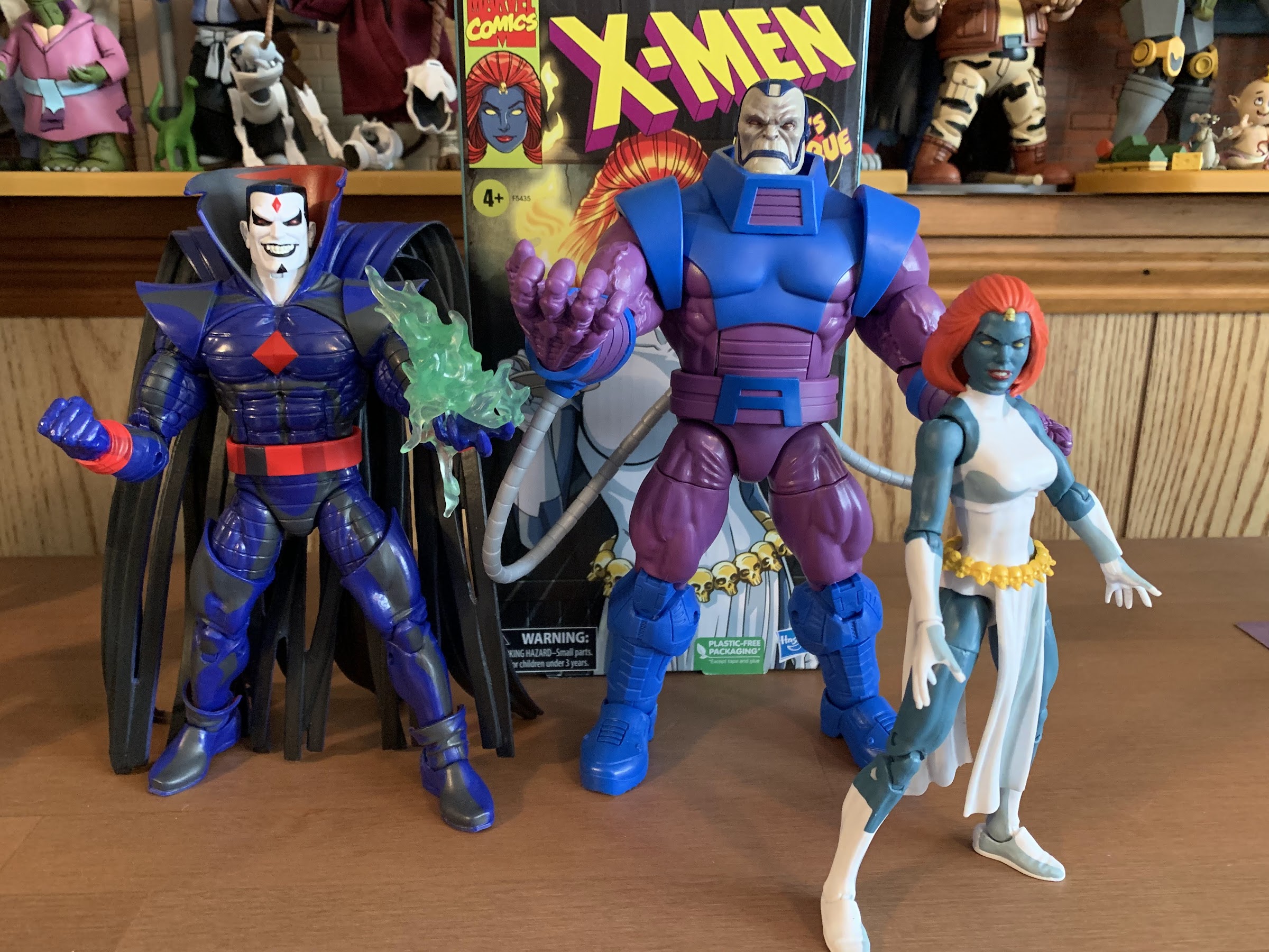
The penultimate figure in this series is a bit of a curveball. When one thinks of the animated series X-Men, the first villains that come to mind are Magneto, Sinister, Apocalypse, Sabretooth, and then it gets muddled. Graydon Creed made quite the impression in the show’s second season and may even be the most hate-able villain the show produced. Omega Red was certainly memorable since he was a very 90s sort of villain and being tied to Wolverine never hurts. And, of course, we have Mystique, the character Hasbro selected to be the second villain of the line (third if you want to count Morph). I think she has a claim to that fifth spot and I can certainly see an argument for Mystique as one of the most memorable villains of the show. It’s just that her character is very much tied to others. She does briefly cross paths with Sinister, and her box art appears to be inspired by that scene, but she’s not really associated with him. There’s her adopted daughter Rogue, biological son Nightcrawler, and her lackeys in the form of Pyro, Avalanche, and the Blob. All of those characters could certainly make an appearance in this line, and I would certainly argue that Rogue should be, but it strikes me as odd to get Mystique before some of these other characters. And it’s especially surprising considering she is, as I mentioned in the first setence, the penultimate figure of the line with the only remaining character set for release being Cyclops. Hasbro left open the possibility that they will return to the world of the X-Men animated series, but for now we basically have to consider it done which just makes this selection an odd choice.

Are we all in agreement that the box art is the best thing about this line?

I don’t know how Hasbro settled on the characters for this line, but my guess would be it’s largely sales related and cost-oritented. You can’t do this line without Wolverine, and basically any member of the team can’t be considered a surprise. I’m guessing Hasbro skipped over Rogue and Gambit because of their recent retro card released figures, and the same is true for Beast who has a new figure shipping now. Magneto also had some recent figures, so maybe that’s why Hasbro went with an older figure like Sinister. He was prominent enough in the show that it was hardly an upset to see him released as soon as he was, and he pairs well with Morph who was a character they absolutely had to do. With Mystique, it’s possible she’s a favorite of someone on staff who pushed for her, but it seems more likely to me that this release has more to do with Hasbro and the Legends team wanting to get her back out there. Like most of this line, Mystique is a re-paint with some minor additions and the previous figure was released as a Walgreen’s exclusive. Retail exclusives can be a pain to track down, so putting out another version that’s easy to acquire is often a welcomed development. I could be wrong, but that’s my guess on how Mystique made it into this 8 figure line.

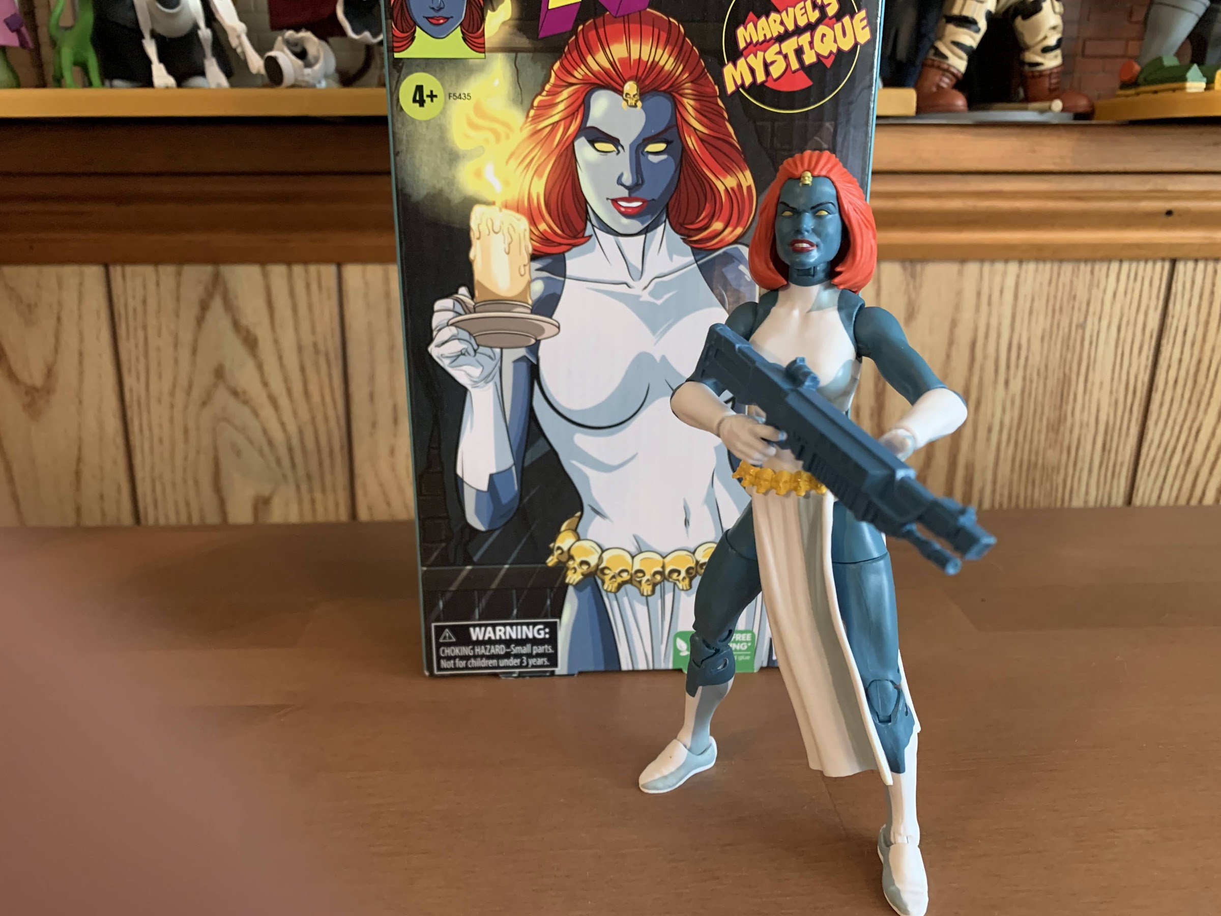
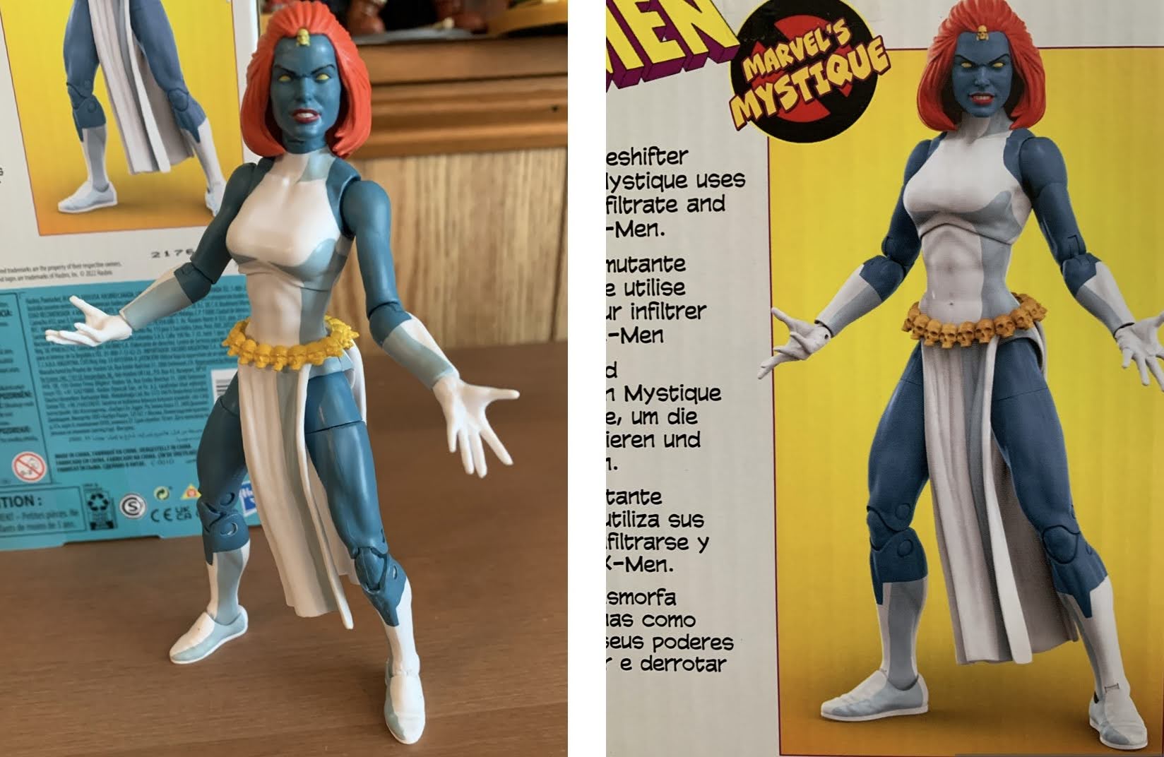
I don’t hate this figure, but I would like it a whole lot more if it actually looked like the render on the box.

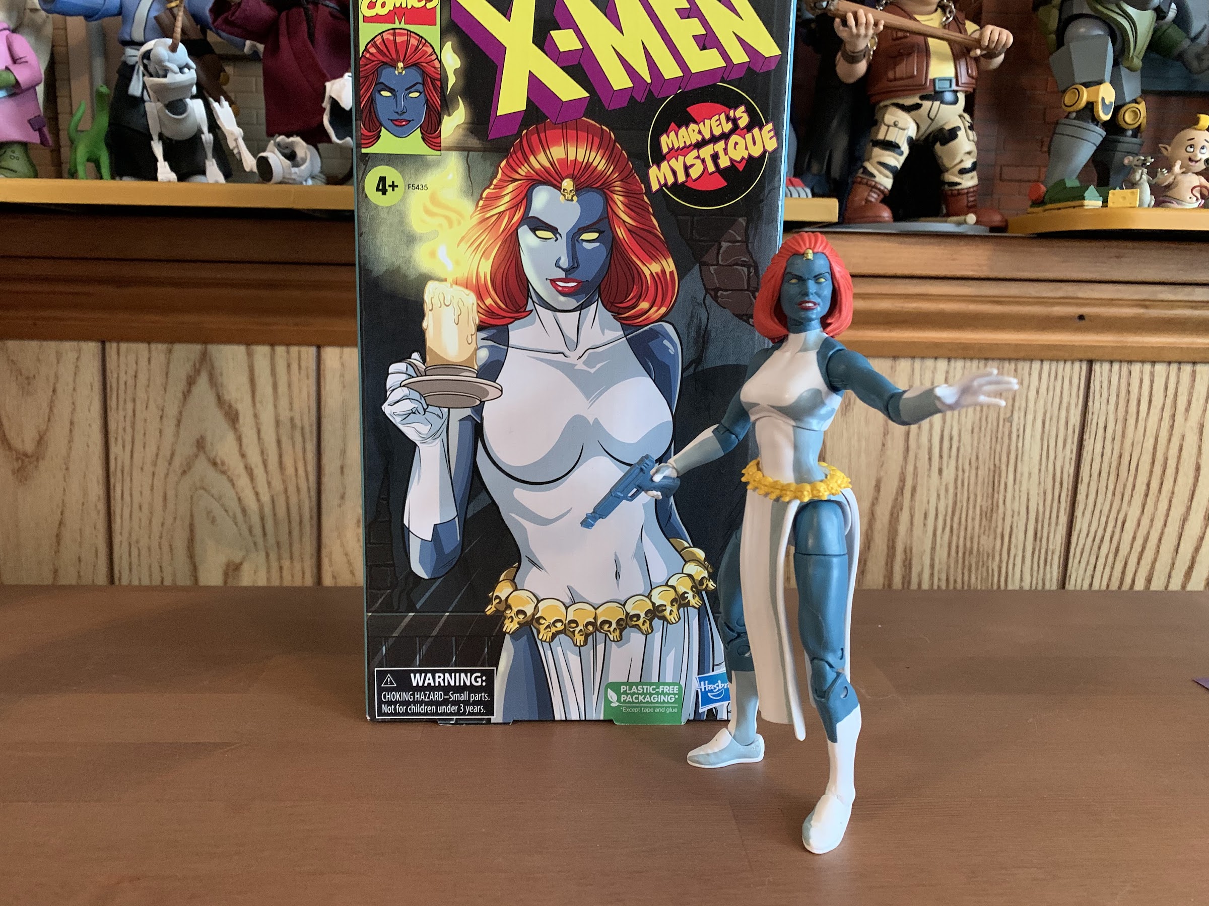
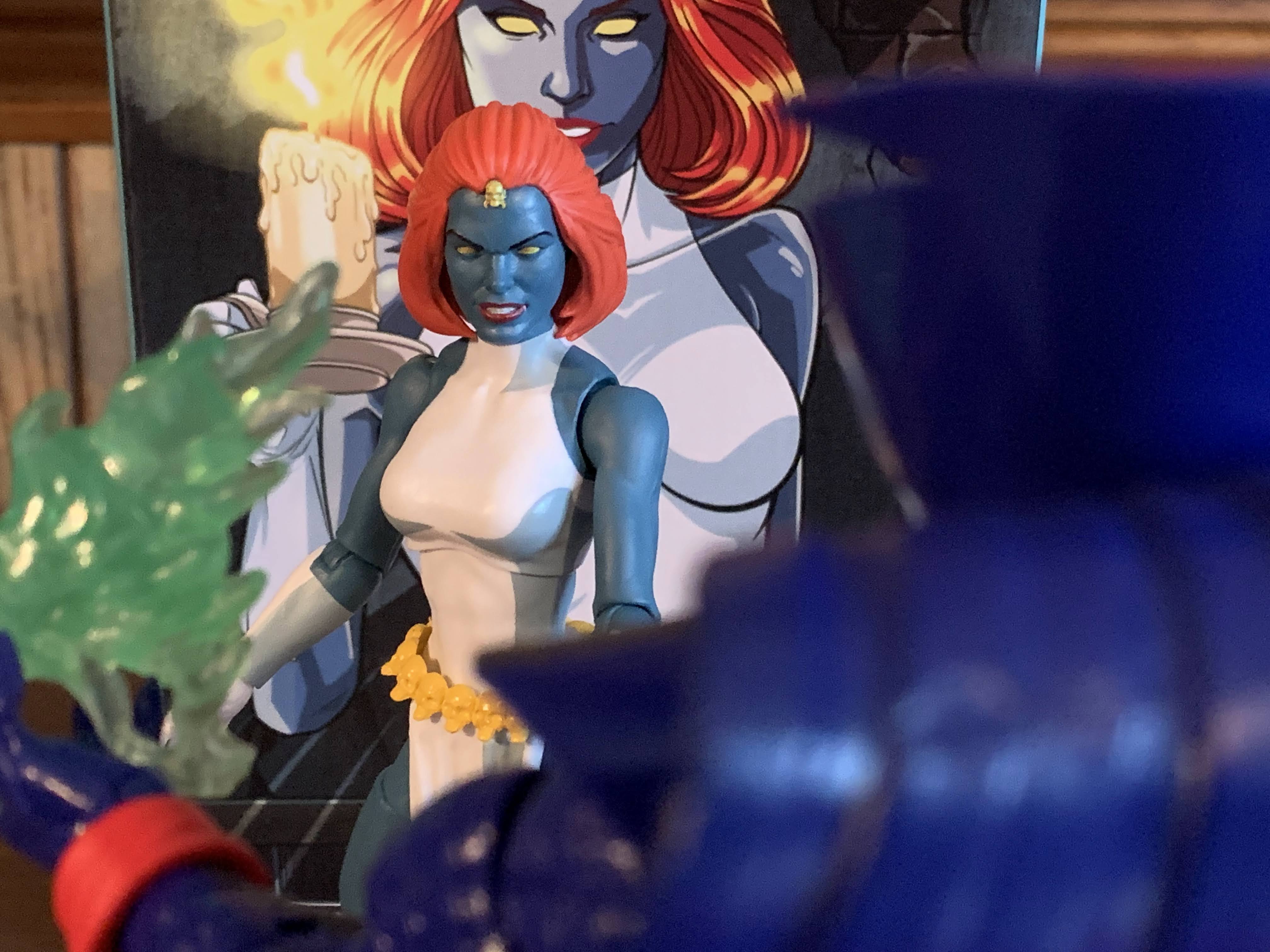
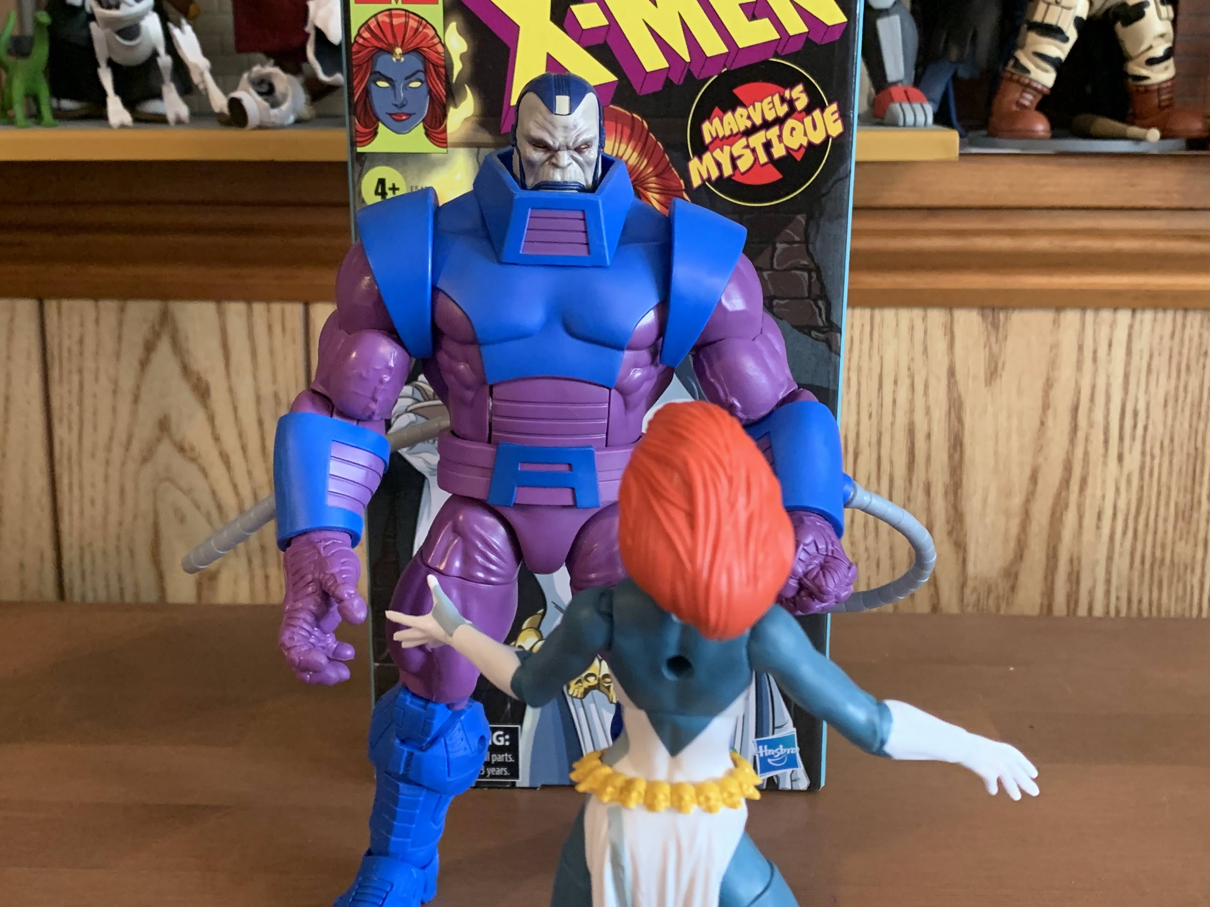
Mystique comes in the customary VHS styled box with artwork by Dan Veesenmeyer. It depicts Mystique in a shadowy area holding a candelabra which gives it a real horror vibe which mixes well with the character’s blue skin and affinity for skulls. It might be my favorite illustration in this line so far. On the spine is the usual profile shot and on the rear is the customary product shot, only with this figure the product on the back is not representative of the figure inside. In what has become an annoying and, frankly, unacceptable trend with Marvel Legends of late the promotional renders for figures have been using the wrong molds. The actual figure is on the same female buck that the former Mystique figure utilized, while the render on the back appears to be based on the newer Shriek figure. It’s a much better base for a superhero line as the figure is well proportioned, looks like a woman of impressive physical fitness, and it’s an all-together better looking figure than what’s actually in the box.

“I have some information about your daughter…”

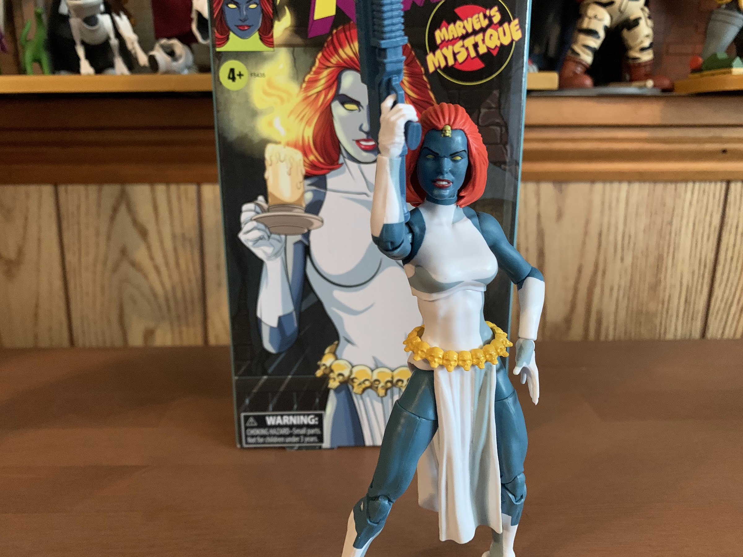
The render basically gives Mystique an unfortunate hurdle to overcome right out of the gate and I’m going to try to not let it impact my feelings here, but the simple fact is this older female body is just okay. It’s very slight and not particularly heroic looking (granted, she is a villain). It has articulation limitations as well which we’ll get to and it’s just a base body that I would like to see retired. Mystique does feature her cartoon accurate costume of a white, sleeveless, dress with long gloves and boots. The head has been reworked to give her a new hair piece which looks fine. I love her wicked grin which is very appropriate for the character and they got the little skull on her hairline correct. Her body is mostly colored plastic as she’s basically a two-toned figure of blue and white. The controversial cel-shading is also present and, once again, Hasbro made the odd choice to use gray instead of black and it’s a shade of gray that looks too close to the gray-blue of her skin. It’s applied okay here, certainly not as bad as some of the other figures in the line, but it still comes across as half-assed. She really should have multiple shades of gray, black, and blue to do her justice and considering she’s a character who often featured heavy shading in the show it really feels like a missed opportunity. There’s no shading on her hair or on her yellow belt and it just very much feels like an afterthought. The only shading is applied to the clothing. The belt is a floating piece and the skirt portion of her outfit is a part of the belt which is a little odd. I think an overlay might have worked better, but then you lose the articulation in the torso. I am forced to reiterate, once again, that I love the idea of putting shading on these figures, but if they’re not going to put the effort in then don’t do it. She really needs some on her face to bring her to life, but I’m not brave enough to try my hand at customizing. She also has a hole in her back which is unnecessary and unwanted.

“Lord Apocalypse!”
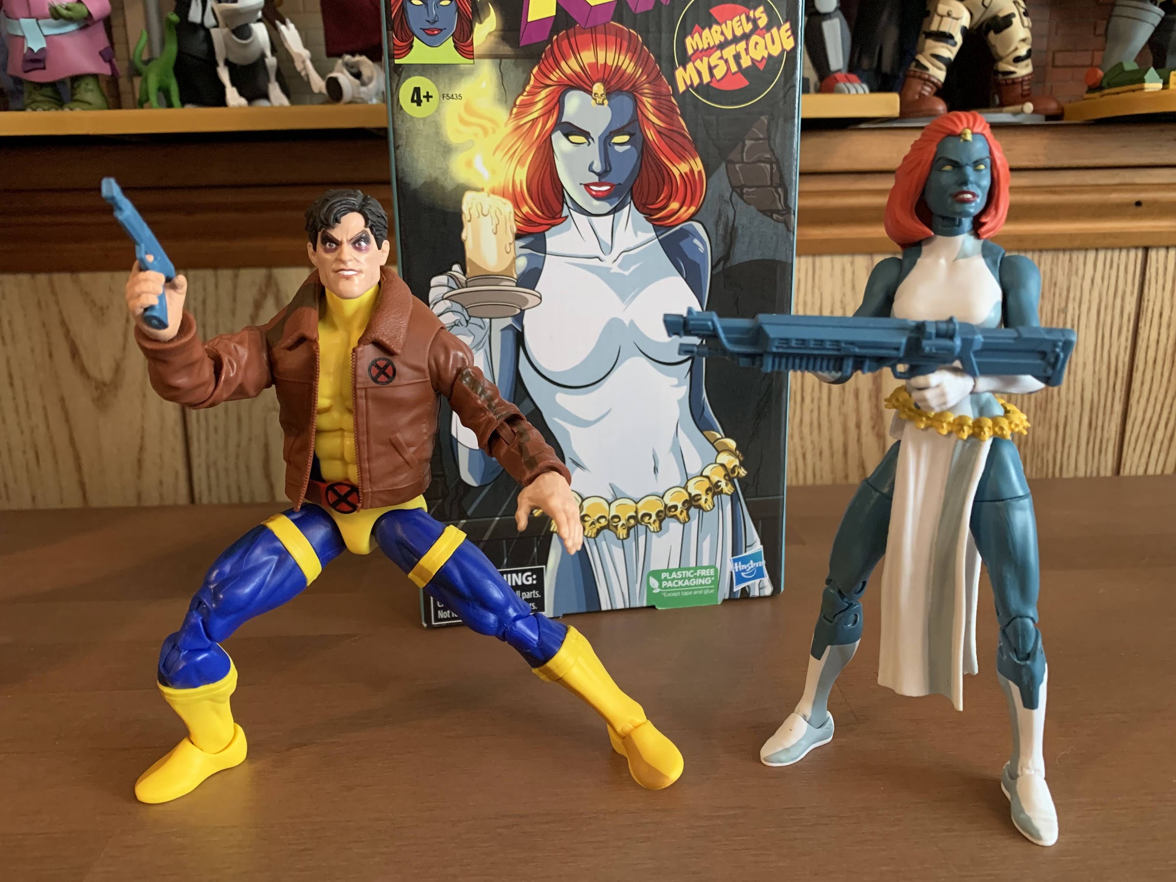
I don’t know if she ever had a gun this large in the show, but at least it opens up the smaller gun for another figure.

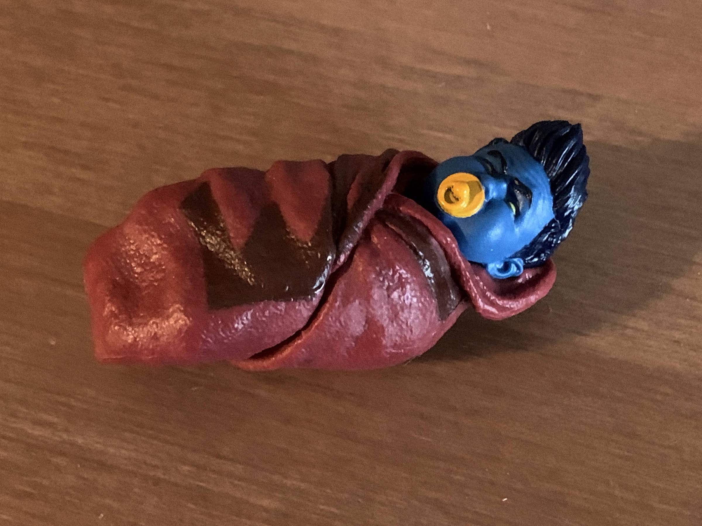
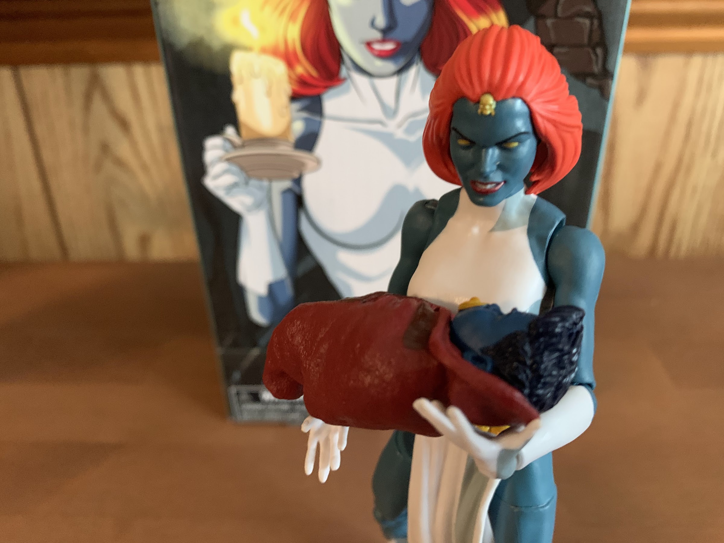
Mystique comes with a fair amount of accessories, though most are just reused from elsewhere. She has open hands out of the box with her right hand being more “cupped” than the left like she should be holding a long-stem glass. She has optional trigger hands and they’re for her two guns. One is a large, machinegun, type and the other a pistol. Both are just cast in the same blue-gray plastic used for her flesh which is pretty damn cheap on Hasbro’s part and it makes the larger gun, especially, look stupid in her hands. The pistol is the same gun that came with the movie Deadpool. At least being blue makes it kind of resemble the gun she used in “The Cure” and the one Morph was seen with at times. Her final accessory is a more thoughtful one, but again, Hasbro’s cheapness ruins it some. That accessory is a baby Nightcrawler wrapped in a brown blanket which has better shading than most of the figures in this line. This is a callback to the show and the scene of Mystique preparing to toss her unwanted mutant child off of a waterfall. The problem is, this baby is repurposed from a baby Hulk figure. It lacks Nightcrawler’s defining pointed ears and he has this pompadour styled hair that looks stupid. He also has a yellow pacfier, which he did not possess in the show. Lastly, Mystique’s portrait is inappropriate for posing her with the child. Had they included a secondary one with tears streaming down her face that would have been something. Should we give Hasbro credit for at least referencing the show? I guess, but I’m also the type who sees little point in doing something if you’re not going to do it right.

And the other character in need of a gun is Morph. This blue one looks a little like the gun he featured in “Till Death Do Us Part.”
I appreciate the thought, but that’s not Kurt.

The last thing we need to consider with this action figure is the articulation. Mystique, being essentially on the same body as Jean, has few surprises. The ball-hinged neck lets her look in all directions save for up since her hair gets in the way. The shoulders can lift out past horizontal and rotate fine while the arm articulation is limited to single-hinged elbows with a swivel point in the elbow. She can’t quite hit 90 degrees and the lack of a bicepts swivel is a disappointment. The wrists rotate and hinge with the right trigger hand featuring the proper, vertical, hinge so that’s good. The torso has the diaphragm joint under the bust which offers little more than some rotation and tilt with very little forward and back. There’s no waist twist, and the legs can barely manage a 45 degree spread. She does kick forward okay, but not back, and there’s a thigh cut for rotation there. The knees are double-jointed and they feel less gummy than Jean and Storm’s. There’s no boot cut and the ankles hinge forward and back a decent amount and rock side-to-side. It’s a mediocre spread of articulation. She can at least pose fine with the hand gun.

“Oh, my beloved child. Wait…you’re not my baby!”

Mystique is another bare minimum type of release from Hasbro in this line. She looks okay, the cel-shading is at least passable, and there’s a tiny bit of re-tooling with the head. They still half-assed the accessories and really should have just used the new body they had already made for other figures as I bet this belt and head would have fit just fine. Why they didn’t is not something I can figure out. And making the guns the same color of plastic as her body is just weird and cheap. Imagine if everybody ran around with guns that matched their skintone perfectly. That’s Hasbro not wanting to pay to change the color of the plastic in the machines. And the baby Kurt is a nice thought, but a poor execution. At least the box art looks great.

“So long, imposter!”

Mystique is presently available via Hasbro’s Pulse website and the Shop Disney webstore. Like all of the figures in this line, she comes with a slight upcharge that’s not really reflected in the product. Chances are, if you’ve been collecting this line then you’ll probably want to add Mystique to your shelf. She could have been a lot better, but by the standards of this line she’s actually one of the better releases. I suppose I’d stick her somewhere in the middle, and I probably prefer her to any of the X-Men women. I’m still left wishing she wasn’t the character we got with one of these precious 8 slots Hasbro budgeted for, but at least she’s not a dud. That means we only have one more figure to look forward to in this line, Cyclops, before we say “goodbye for now.” Hopefully it’s a good one, but it’s not looking like it will arrive before the year’s end so check back in 2023 for my thoughts on Cyke.

If we’re only getting a few villains out of this line, at least they fit reasonably well thematically.