We just had 11 consecutive weeks of action figure reviews on Super7’s line of figures based on The Simpsons. Things were getting pretty negative in that sphere as that line went out with a whimper. I don’t like reviewing bad figures and it’s mostly because everything I review here I buy for my own collection. Why would I want to buy a bad figure? That line let me down and I need a pick-me-up to run this Thursday. Enter Jada Toys and their shiny, new, Mega Man figure!
Jada is a company I have had little interaction with. I bought my kid a remote controlled car years ago that was made by Jada. It was a great toy, fairly inexpensive, and it worked really well for what it was. I have a good impression of Jada as a result, but it’s not like that product should lend itself well towards action figures. That’s a whole different ballgame. Less complicated in some respects, but also more so in other ways. Jada, possibly because the action figure market has expanded over the years, decided to get into that sphere and it has targeted licenses that have been underserved of late – mainly video games and food mascots. It’s an odd combo, but people like both things and there’s a ton of much beloved food mascots out there that have interested folks. None have really appealed to me, but they look so good that I’ve been tempted. Jada’s partnership with video game developer Capcom is where the most popular figures appear to be coming from. Street Fighter II has been the focus and again, not something that appeals to me, but still tempting because they look so good and have received a lot of positive buzz. Finally, and most recently, Jada has released figures for a license I do have interest in and that is Mega Man.

When it comes to the video games, I am a casual Mega Man fan at best. If I had to pick a favorite game in the series, it would probably be Mega Man X for Super Nintendo. Is that sacrilege to choose a game from the X franchise over the classic one? I have no idea, but it is what it is. In the 80s, Mega Man games were popular, but also hard. I had friends who owned them, but I never owned one myself because I sucked at them. Even so, television shows like Captain N: The Game Master had me convinced Mega Man was a Nintendo mascot. I’m not sure at what point I realized that wasn’t the case. Even though I’m not a huge fan of the games, I always really liked the character designs from the series, both the classic series and the X one. I watched the DiC animated show and considered getting into that toyline long ago, but never did. I’ve often been tempted by the many model kits and such out there, but I’ve never taken the plunge.
Jada made it easy to finally buy my first Mega Man action figure. Not only have their figures been well received so far, they’re also cheap. The figures in the Mega Man line will only set you back 20 bucks a piece. I think they’re considered 1:12 scale with the characters running small, but $20 for such a scale is almost unheard of now. And it’s not like Jada is scaling back on quality. These things are fully articulated, well-painted, and come with a suitable amount of accessories. And it’s all for a licensed toy line! Is this just entry level pricing and we’re being setup for increases to follow? I don’t know, and I almost hate praising a company for their low prices as that could signal to them they have some room to raise them, but it’s a pretty stark contrast between what Jada is selling for $20 and what a company like Hasbro is selling for $25 and up.

Mega Man comes in a box that’s adorned with game art. The actual artwork for Mega Man on the front seems to come from the Mega Man 7 or 8 era as he has a very anime look to him. It’s not the little, chubby, guy from the 8-bit era nor is it the hideous artwork from the US releases. It’s an attractive, tidy, box so if you like to keep things in-box it should serve you well as it’s also quite sturdy. Mega Man stands approximately 4 5/8″ to the tip top of his helmet. He’s a little guy, but if you’re buying this figure for your Marvel vs Capcom display then it will serve you well when it comes to scale. As he is known as the blue bomber, Mega Man is composed of different shades of blue. His torso, legs, and sleeves are a light blue while the boots, helmet, and forearms are a dark blue. The dark blue parts are also glossy which meshes well with the artwork. The light blue portions of the helmet as well as the facial features are painted and look nice. There’s a hint of blue shading on the light blue parts and the light just plays on it very well. It’s a nice looking figure with a good in-hand feel.

Mega Man’s accessories are perhaps not substantial, but better than adequate. We get two heads: a smile and an angry expression. Both are suitable for the character and I have a hard time choosing between the two. I suppose the smiling one when not in use can double as an extra life power-up. Mega Man also has four hands: a set of fists, a right curled gesture and a left wide open hand. I’m surprised the non fist hands are different, but the curled hand is intended to pair with the Mega Buster while the splayed hand is probably meant to harken back to some classic poses. And speaking of, we have a Mega Buster! Both of Mega Man’s forearms are connected to the bicep via a hinged peg and can be removed and swapped with the Mega Buster. The Mega Buster is a nice, glossy, blue with the yellow power indicator on it. You can rotate it any which way so it looks fine on either the left or right arm, though I always picture Mega Man with buster on the left arm. Lastly, to round things out we get an effect part. It’s a translucent, yellow, fireball with an acrylic stand. The stand has two joints in it and you’re supposed to basically put almost two right angles into it in order to get it to the right height. It works well though giving us a spread of two heads, four hands, a weapon, and a power effect. Who knew it was so hard to get that kind of spread with an action figure?

As you may recall, when I pointed out the affordable price for this figure I also mentioned there was no cut to the articulation budget as a result. Mega Man can do just about anything you need him to. The head is on a double ball peg so Mega Man can rotate, look down, and tilt. His range looking up isn’t great, but he does have a ball-jointed diaphragm. That joint will allow him to bend forward and back which should provide for the up range you need at the head. That joint also rotates and tilts a bit to the side with a waist swivel below. Shoulders are simple ball-hinges. Elbows are single hinges and that’s where you’ll get your bicep swivel. Hands rotate and hinge horizontally. Hips are simple ball sockets and Mega Man can do splits and kick better than 90 degrees forward. There is a thigh twist there while the knees are single-hinged and bend about 90 degrees. Ankles hinge back quite far, but not much forward and the ankle rockers work surprisingly well given the unique shape of the boots.

Mega Man moves very well. Even without butterfly joints, he gets solid range at the shoulders for Mega Buster poses. He can rest the curled hand on top of the buster or under it when firing straight out in front of his body, he just can’t achieve that when aiming out to the side. He can do running poses and he’s really good at standing on one leg thanks to the oversized feet so if you want to recreate some Mega Man Soccer you should have no problem. All of the joints are nice and tight too. The only joints that felt a little too tight were the knees as those hinged-peg style knees can be a little scary to move when tight. I didn’t need to heat anything up though to get things moving. I’ve had this guy living on my desk for over a month now and I’m constantly having fun fiddling with him and finding different poses.

This Mega Man figure from Jada Toys is a delight. It is a really fun toy to handle and behold and it comes with just about everything you need. There is very little to critique with it as a result. A neck joint might have helped with the head range and if they could have included mirror image versions of the two style pose hands that would have also been great. Otherwise, what else is there? An action stand? Maybe they could have worked a peg hole somewhere into the figure so it could use the effect part stand? I also have one fist that’s glossy while the other hands appear to have a matte coating on them. I’m guessing it’s an error, but not a particularly impactful one.
All that is to say whatever issues I have with this figure are nitpicks at best. For 20 bucks, I dare you to find a better value in the current action figure market. There are unlicensed figures of similar quality to this figure that cost considerably more. This isn’t from some huge company either. I don’t know how Jada is doing it, but I hope it continues. This Mega Man line is not one I’m going to go all-in on or anything as I’m not a big enough fan of the franchise. I’ll cherry pick my favorites, and at 20 bucks I won’t be waiting for a discount or anything. I’m tempted by Ice Man, but I’ll definitely get Cut Man and I’m very interested in seeing what they do with Guts Man. And if they do an X I’ll definitely grab him. This is a great line and if you have even a passing interest in Mega Man I urge you to give it a try. This toyline is going to be on a lot of “Best of” lists at the end of 2024.
Not a lot of video game inspired toys on this blog, but there’s still plenty of fun here:

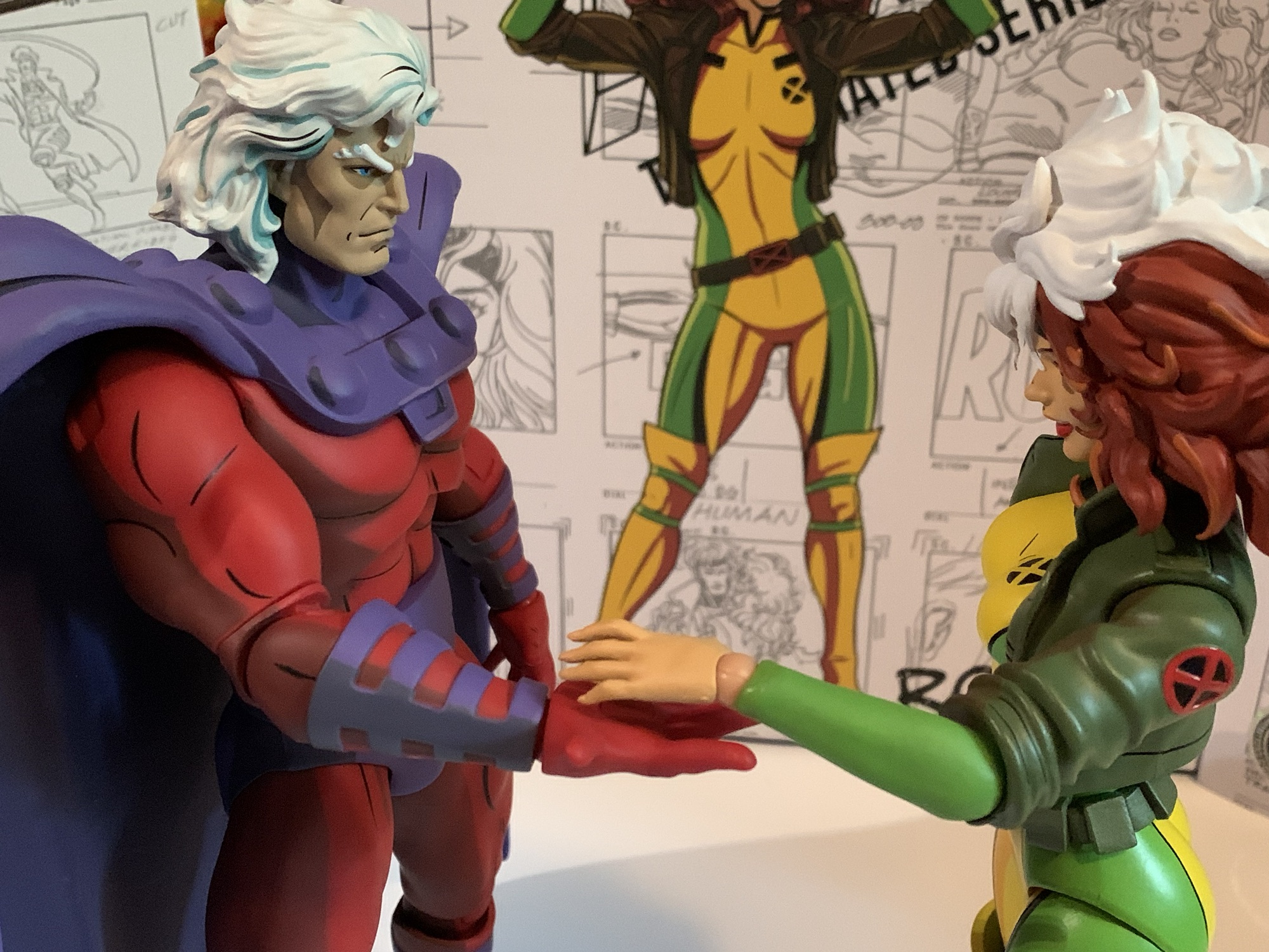
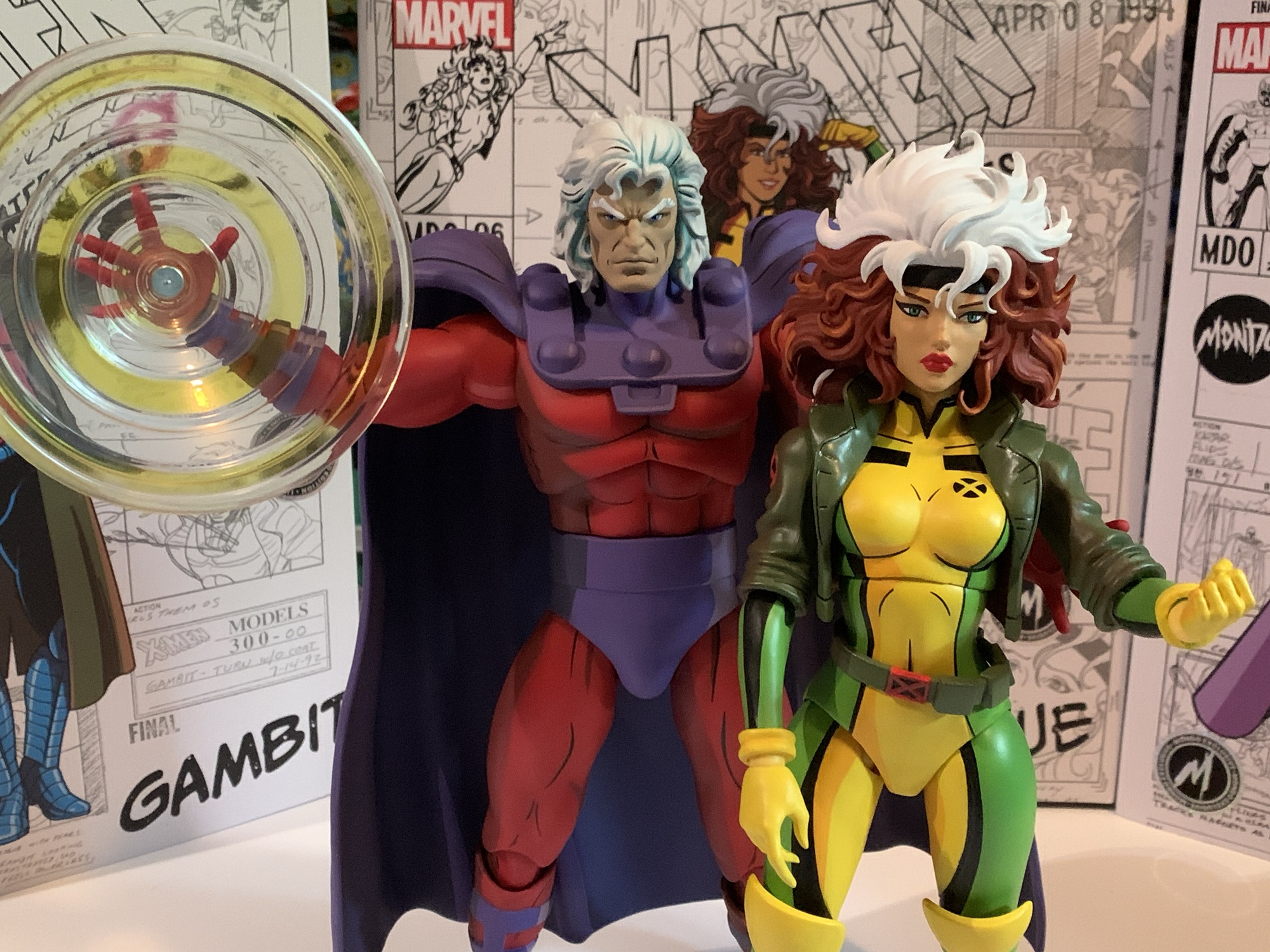
Marvel Legends X-Men Animated Series Wolverine
The toyline of my dreams was announced last October. In celebration of the 30th anniversary of the television series X-Men, Hasbro is doing a dedicated line of Marvel Legends with figures based on the look of the show. The show was obviously inspired by the designs of Jim Lee, but there are differences in the…
Keep reading
NECA Turtles in Time…Turtles!
Longtime readers of this blog might have noticed something in my review of the Turtles in Time Bebop and Rocksteady – they were paired up with the Turtles in Time Leonardo and Raphael. I’ve never reviewed those figures and they’ve been out for a long time. Well, I held off. Initially, I just wasn’t convinced…
Keep reading
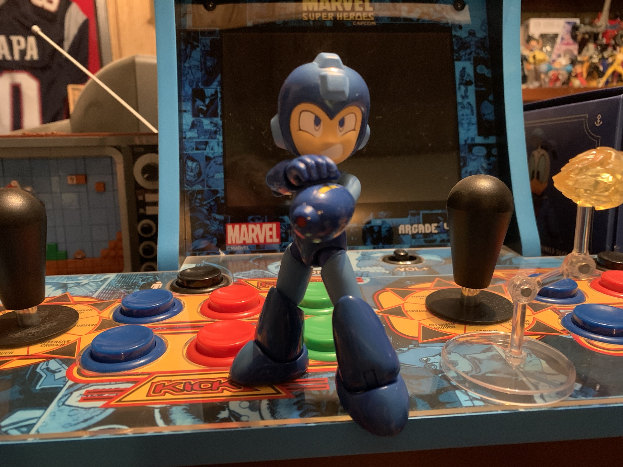
Arcade 1Up Marvel Super Heroes Counter-Cade
Arcade 1Up has been around for a few years now selling arcade cabinets at a reduced size and also a reduced price. The cabinets are significantly smaller than an actual arcade cabinet, but still plenty large enough to take up a lot of floor space in your home. And while they’re cheaper than the “real…
Keep reading