
Our first two looks at the inaugural wave of Ultimates! from Super7 based on The Simpsons have been two very episode specific takes. One was Deep Space Homer from the episode of the same name where Homer went to space and the figure presents the character in his space suit. The second figure was Poochie, a more-or-less one-off character (yes, I know he’s made cameos since) from a very memorable episode of the show’s last, great, season. Today, we’re getting what one might call a generic release, or an evergreen interpretation of a popular character from the show and that’s the bartender Moe Szyslak. Super7 basically laid it out when the first lineup was announced that they’re not that interested in doing the generic versions of the characters like Homer in his white shirt and blue pants, Marge in her green dress, and so on. At the time, it struck me as a bold decision, but as the line has been announced and the first wave has arrived it’s really started to make sense to me why an episode-specific approach is the way to go. The Simpsons is a show that will hit 800 episodes at the end of it’s current production order. If you’re sitting down to do a character that has appeared in even 100 episodes, let alone 800, it’s really hard to narrow down on how to present that character. However, when you distill that character down to a single episode appearance, well then it becomes more manageable. And ultimately, we remember and identify with the show through it’s most iconic lines, references, and yes, episodes. If I have Homer just standing there on my shelf then cool, it’s Homer. If I have Homer in a space suit, well then I’m thinking of jokes about carbon rods and alien, ant, overlords. It’s more rewarding for me. It’s not without its risks. What if they pick an episode I don’t care about? And even if it’s an episode I do like, there’s still a good chance that there’s an episode I like better. “Homer at the Bat,” “Mr. Plow,” basically any Treehouse appearance – all probably options I’d take over Deep Space Homer.
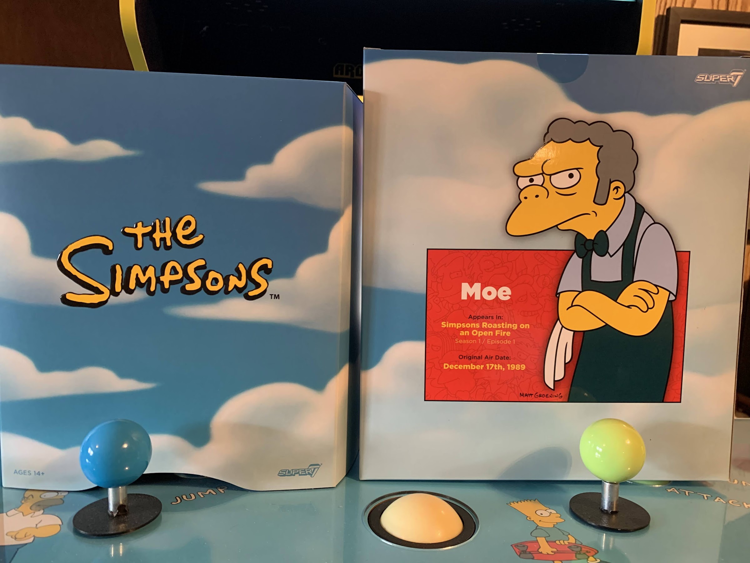
It’s not my toy line though. I’m not making them, and I respect Super7 for laying out their approach early and making what they want. As consumers, we either agree or disagree and vote with our wallets, so let’s talk about Moe, shall we? On the back of the box for each of the first two releases in the wave I noted we got the episode info from which the figure came from. With Moe, it’s episode number 1 “Simpsons Roasting on an Open Fire” because that was his first appearance. However, this figure is not from that episode as early versions of Moe looked a little different from the character he’d become. He had black hair and a pink apron, where as the show ended up settling on a gray-haired look and a blue…well, we’ll get to the apron in a minute. It was probably a good move to adopt this version of Moe for the figure, and it would have just been confusing to not list out his first appearance in this look, but this figure is a solid reminder that Moe has been with us since the beginning.
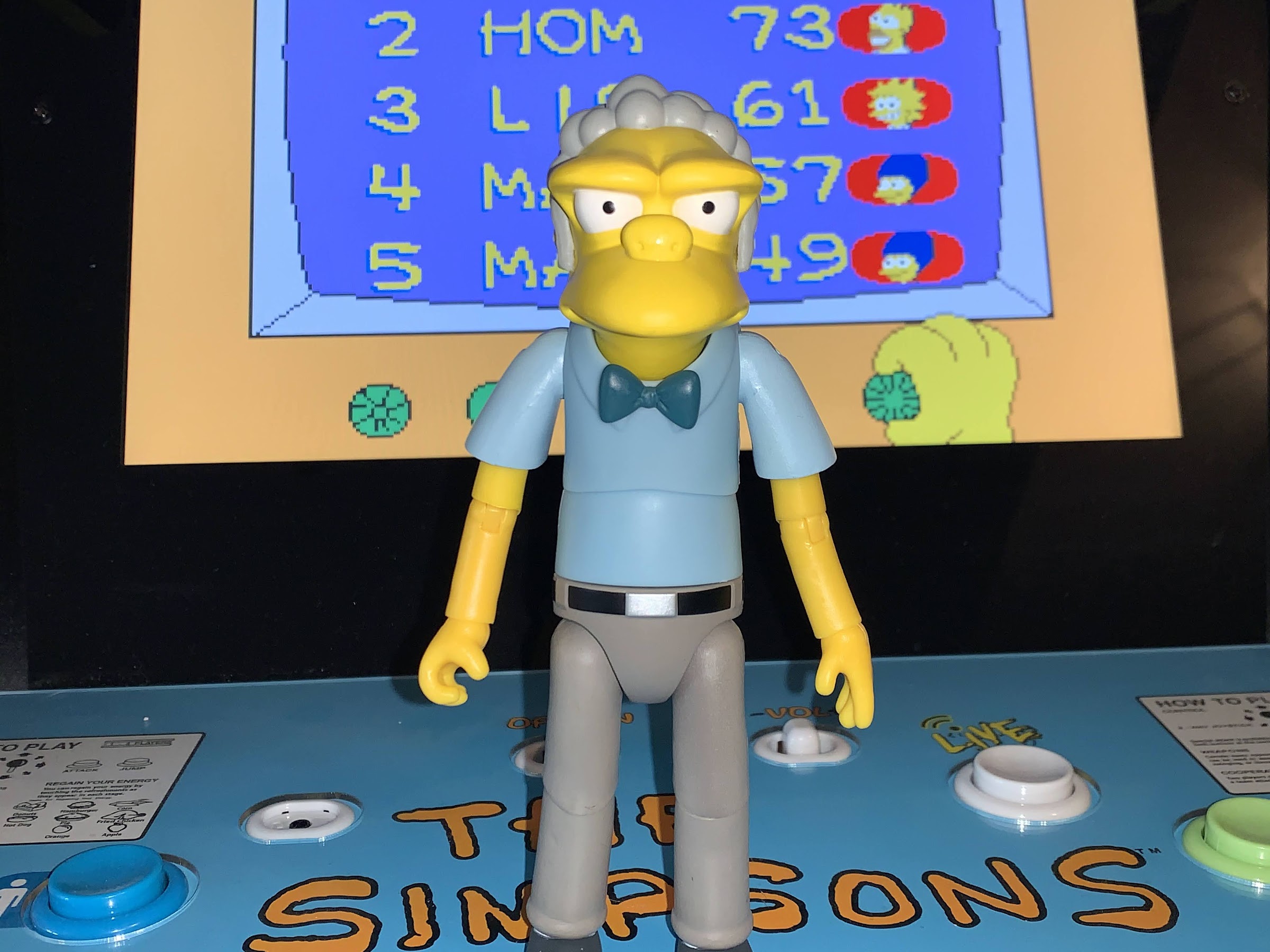
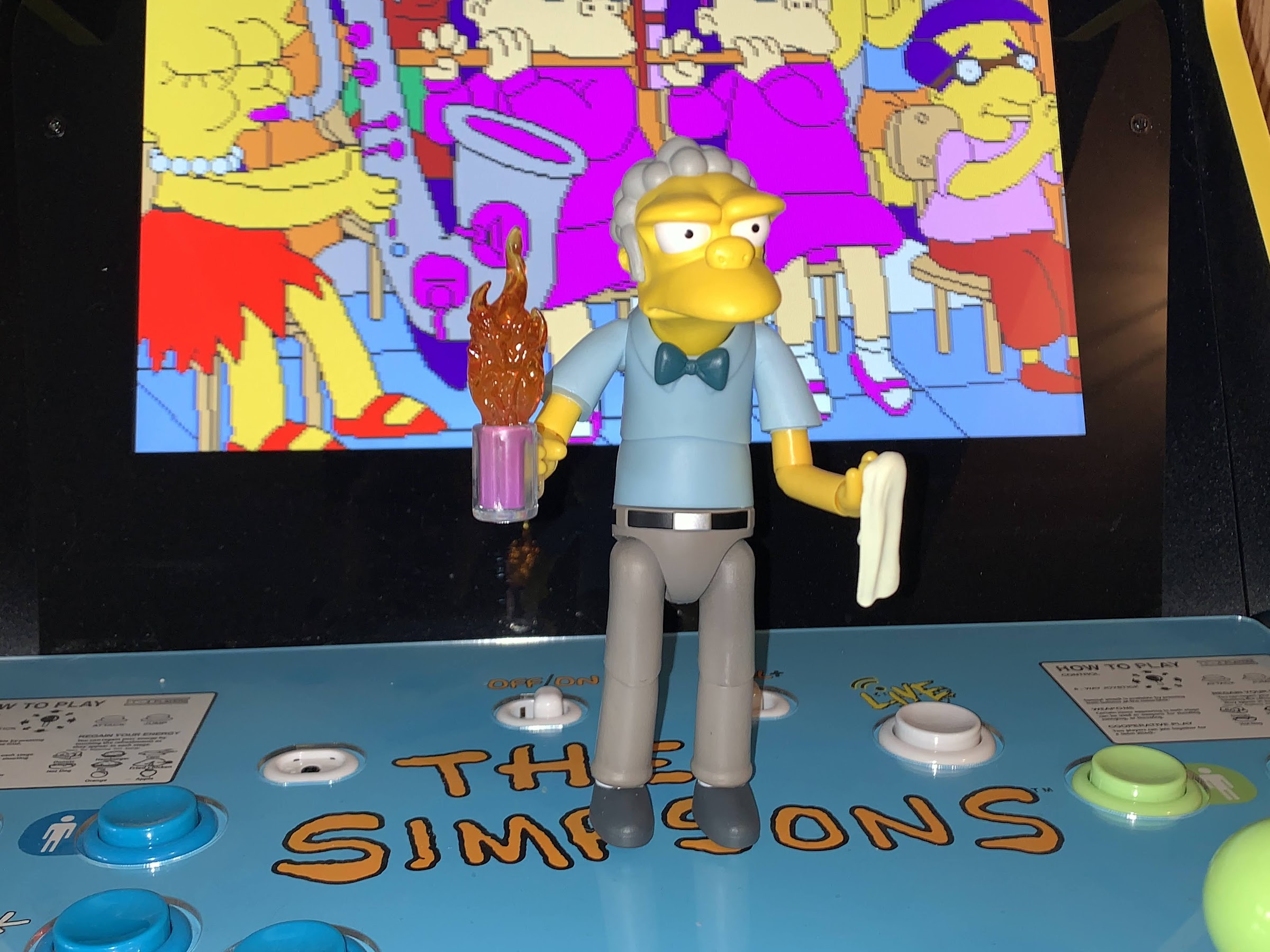
Moe stands at approximately 6.625″ to the top of his head and just a tick under 7″ to the top of his hair. His default portrait is his neutral expression, which is almost a scowl. I love Moe’s design because it’s very Season One. Following that season, they really didn’t design characters that look like Moe with his sloping forehead and excessive overbite. Like Homer, his head looks to be sculpted in yellow plastic, but also painted over to give it a matte finish. The gray of his hair looks to be a separately molded piece that’s also painted over to preserve that finish. Unlike Homer, his eyes are cleanly painted which is a surprise because they look like they’d be harder to paint than Homer’s, but it’s nice to see there’s no slop and bleeding edges. The neck is part of the head sculpt and it’s secured inside the shirt so there’s a nice seamless approach to whole situation up there. It’s exactly the approach I wanted from Super7, but wasn’t sure they’d actually take, so I’m very pleased here.
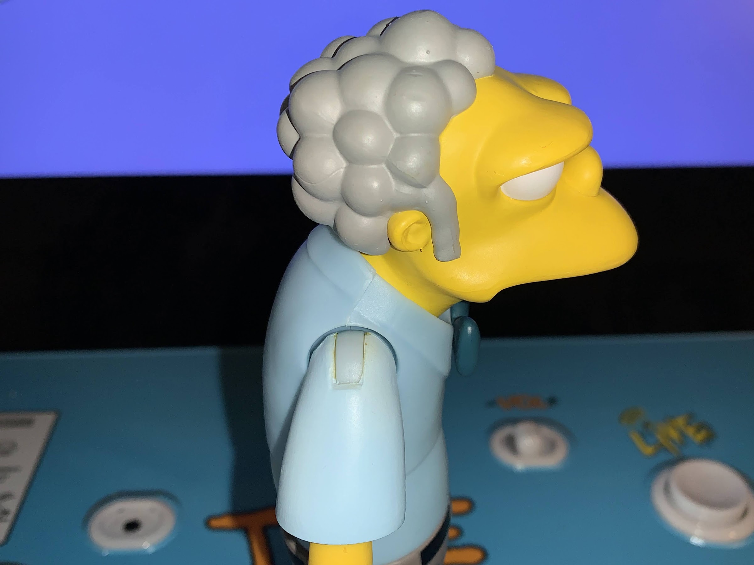
At the torso, we switch to the more traditional colored plastic with little to no paint approach we’re used to with Super7. Moe’s light blue shirt is all molded plastic with no paint hits. The only paint is the navy blue bowtie. The sleeves are where things threaten to go off the rails a bit. The entire arm, including the sleeve, is molded in yellow and the sleeves are painted blue. Super7 did a good job of matching the shade of blue to the torso, but what they didn’t do well is actually cover-up all of the yellow. For some reason, and it seems to be fairly consistent with other Moe figures, the right shoulder has some yellow peeking through at the hinge. And it even mixes a bit with the blue to leave a greenish hue there and it’s unsightly. Why didn’t they just do the sleeve and the arm in two pieces? We’ll get to it in the articulation, but they could have just plugged the bicep into the sleeve and it would have allowed them to mold the sleeve in blue. I can’t imagine they couldn’t have fit such a small piece onto the same mold as the torso so it’s really puzzling why this approach was taken. It’s less of an issue with the left shoulder, for some reason, though that one has a scuff on it. It feels like an unforced error and it’s one of those oversights that makes you wonder what the approach is when they’re planning these out? The rest of the aesthetics are mostly fine. The pants are molded in a slate gray with a clear coat applied to take the shine off, though there’s portions where the stuff didn’t quite take so he has some shiny spots. The feet are a darker gray with a stripe of white paint for the socks. It’s not super clean, but it’s in a tight spot and not plainly visible. The bare portions of the arms are just molded plastic without any sort of a coating and they, unfortunately, are rather shiny. It’s a bit frustrating when most of the figure is matte, save for one obvious place.
Despite some of these shortcomings, overall Moe looks like, well, Moe! He’s very onmodel and I think they nailed the likeness. The only thing missing is the apron. Where’s Moe’s apron?! He rarely is shown in this attire without it. I guess this is Moe reading to the homeless, or it would be if he had his copy of Little Women. The figure was solicited with a soft goods apron, and according to Super7, it was a screw up on their end. They didn’t go into specifics so we don’t know exactly what happened. I’m guessing soft goods are handled by a separate facility and shipped to the factory for packaging. Either they got there and were overlooked by the factory, or maybe they were late and Super7 decided to ship them anyway. The line was already quite behind schedule so I can see not wanting to hold things up for an apron, but it is pretty essential to the character’s look. Apparently there’s nothing to fear though as Super7 has said the aprons are on the way to their warehouse, and once in hand, they’ll ship them to everyone who ordered a Moe through them. For those who ordered the figure elsewhere, you’re encouraged to reach out with proof of purchase to get added to a list. This isn’t the first time something like this has happened with a Super7 release so I’m not concerned about them not upholding their end of the bargain. We just have to wait, and once in-hand, I’ll update this review accordingly (and I did, just skip ahead to the end if you want to hear about the apron).
With that out of the way, let’s get to the low point of the review: articulation. Homer was pretty limited, and Poochie rather poor in this department, so I’m not expecting much out of Moe. In his favor, Moe has a pretty simple design so getting basic articulation shouldn’t be an issue, but it seems this is always an adventure with Super7. Moe’s head is on a double-ball peg which connects at the base of the neck. He can rotate, but his stooped posture means it’s not really a side-to-side rotation. He can’t look to the side without also looking up. He can look down okay, but he can’t look up from a straight-ahead position. He does get some nice nuance posing, and the rotation feels nice and smooth. At the shoulders, things get a bit weird. He can raise his arms out to the side just past horizontal, so that’s good. His arms though are pinned in at an angle, so he can’t rotate all the way around freely. It’s the weirdest thing. I’ve never had a modern figure fight me at the shoulder like this one does. You can force the issue, but it feels like I’m doing something the figure doesn’t want me to do. At the bicep, we have nothing. I mentioned it in the aesthetics, but it’s odd they didn’t just peg the arm into the sleeve to get a swivel there. At the elbow, we do have a swivel and it works okay. The single hinge can hit 90 degrees and it can even bend back a little, which is weird and probably not useful, but I figured I’d mention it. The wrists swivel and hinge horizontally and they’re fine.
In the torso, we get the diaphragm joint that Super7 has been trying to implement for a few waves now. And here, it’s like most of their attempts in that it’s not particularly functional. Moe can rotate, but there’s no forward and back and no side-to-side either. There’s a waist twist below that which feels redundant. If they can’t do anything with the diaphragm joint, then why have it? It just breaks up the sculpt. I’m more than willing to sacrifice a small amount of sculpt to get articulation there, but if Super7 can’t figure it out then don’t bother because Moe is not a character that needs rotation there when he has rotation at the waist. With the apron, this will matter less. At the hips, we have ball and socket joints that let Moe damn near hit a split, so that’s great. He can’t kick forward all the way, but probably enough for Moe. There’s no range going back, and there’s really no thigh swivel. We get a tiny bit at the joint, but not enough to be considered a true point of articulation. The single-hinged knees can almost hit a 90 degree bend. There is a swivel there, but as we saw with Poochie, Super7 is using a rounded cut to try to hide the articulation a bit more and it basically kills the range on the swivel rendering it useless. It’s not really needed anyway since he has a swivel at the ankle and a hinge. The hinge goes back a bit, but has no range forward. And like Homer, there’s no ankle rocker. Why?! Why get rid of that?
So the articulation isn’t great. Is it better than Homer and Poochie? I guess? His design is so simple that it makes the range on most of the joints work better and Super7 largely avoided any unsightly joints. It could still be better though and I have no idea why they did the shoulders the way they did. I’m guessing there just wasn’t room because of how low his head sits in the body so they angled the pins, but it sucks. The diaphragm joint is useless and the ankles are terrible. He can only handle the most basic and vanilla of poses. As was the case with the others, you will need the accessories to sell the scene if you’re trying to recreate something because the figure just isn’t capable of a whole lot.
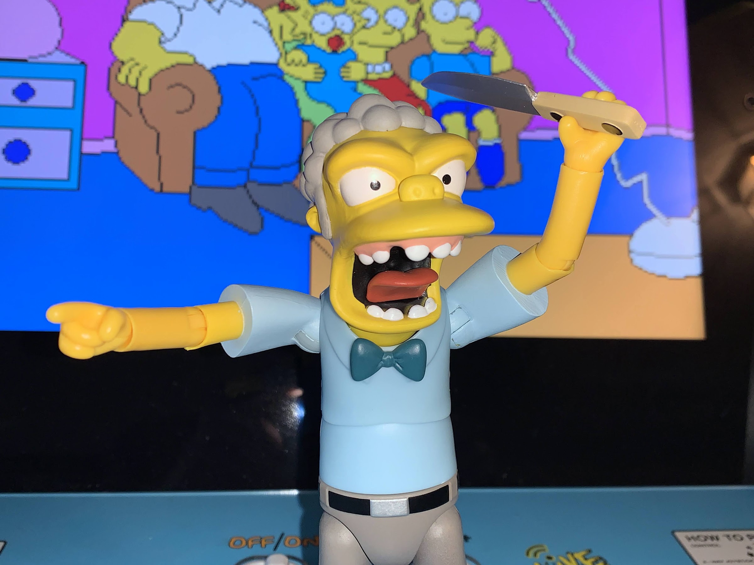
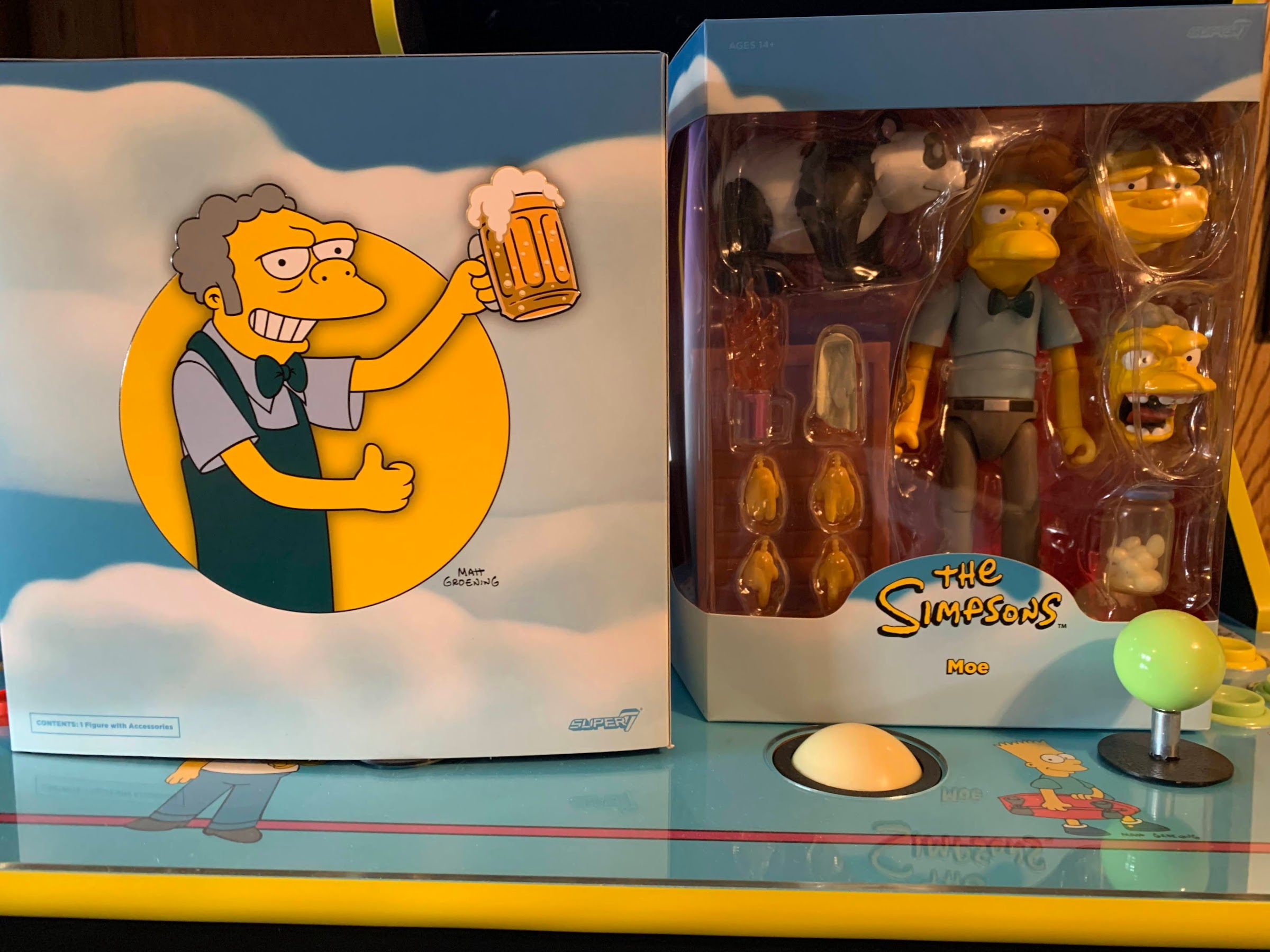
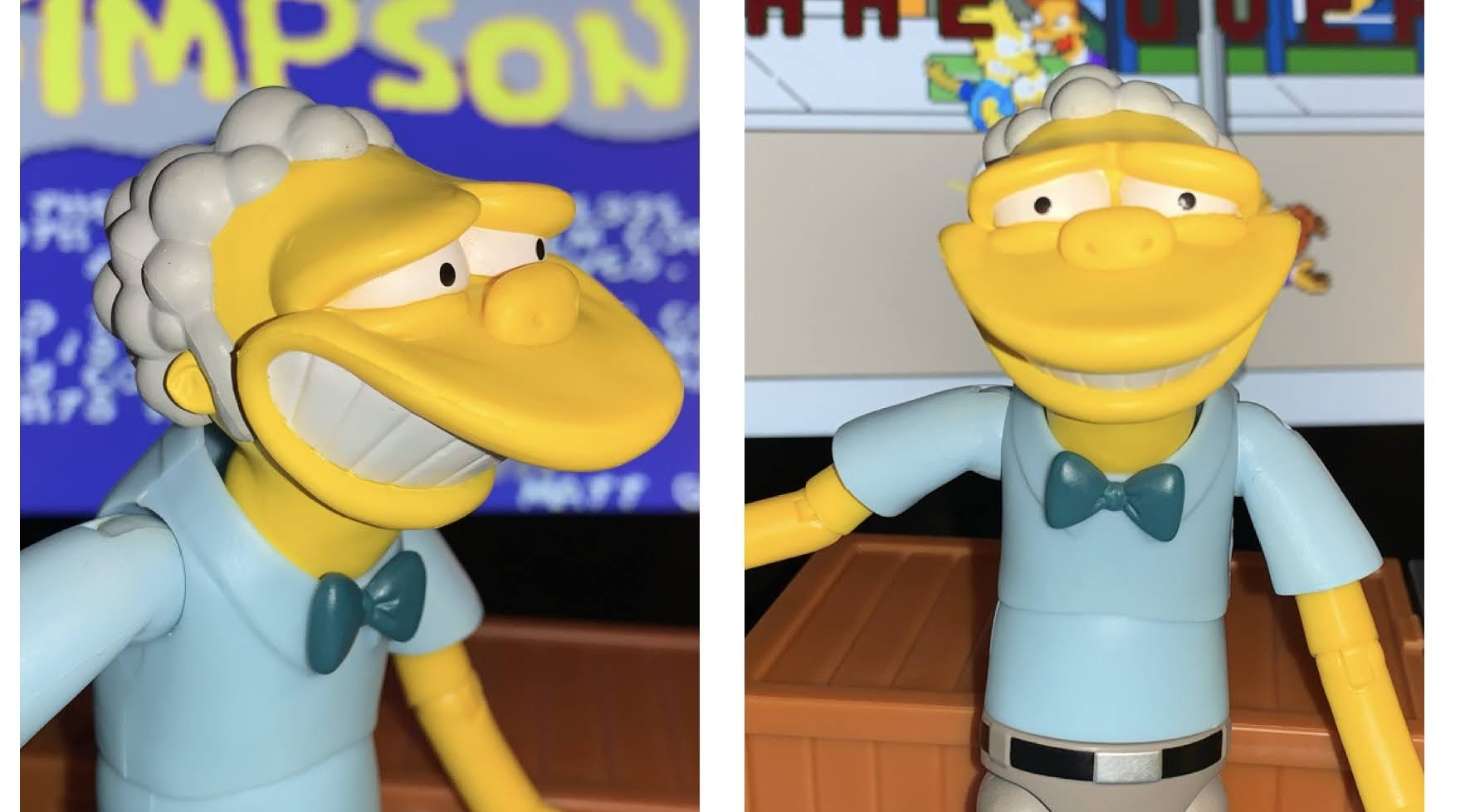
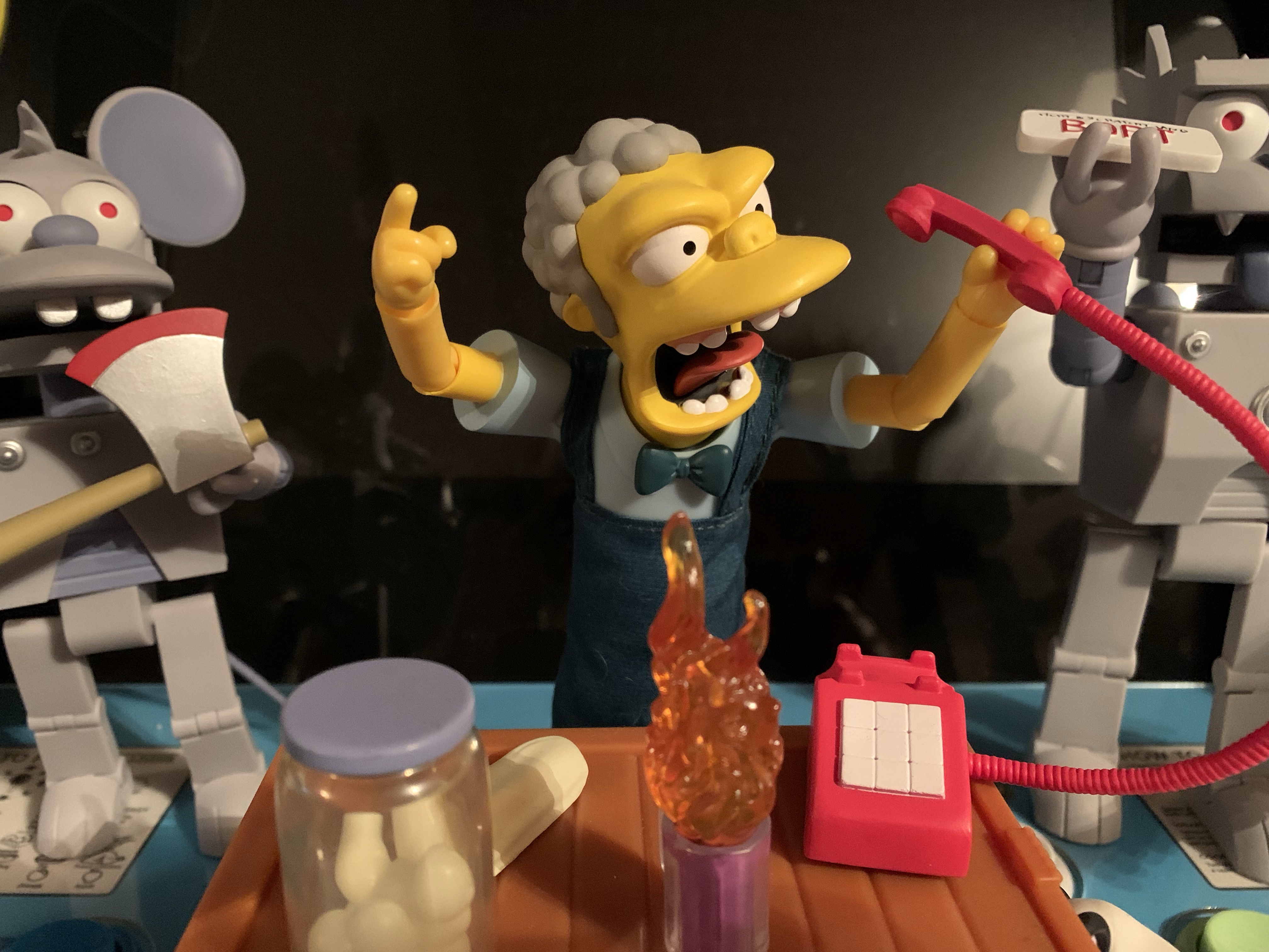
And with Moe, the accessories are going to be an issue. Not really that any are bad, but that there’s just so much he could have come with that it’s almost impossible for Super7 to please everybody. Even if you’re happy with what he does have, there’s probably something you miss or would have swapped in favor of something else, but let’s get into it and discuss that after. For hands, Moe is pretty well stocked as he has a set of fists hands, gripping hands, pointing hands, and relaxed hands. As was the case with the other two, the fists might be the most useless while the others are plenty useful. It would have been nice to get at least one trigger-finger hand since Moe is fond of robbing people. He doesn’t come with any guns, but other figures do. For heads, we have the stoic head he comes bundled with plus his smiling head from the Duff calendar shoot. It’s well painted, especially the eyes, and well sculpted, but not something I’ll ever display. The other head is his ugly, raging, screaming, head and it too is well sculpted and well painted.They even captured his missing tooth which I think Matt Groening hates, if I’m not mistaken, and is something the show phased out over the years. This is Moe at his most ugly and hate-filled and a true contender for shelf material.
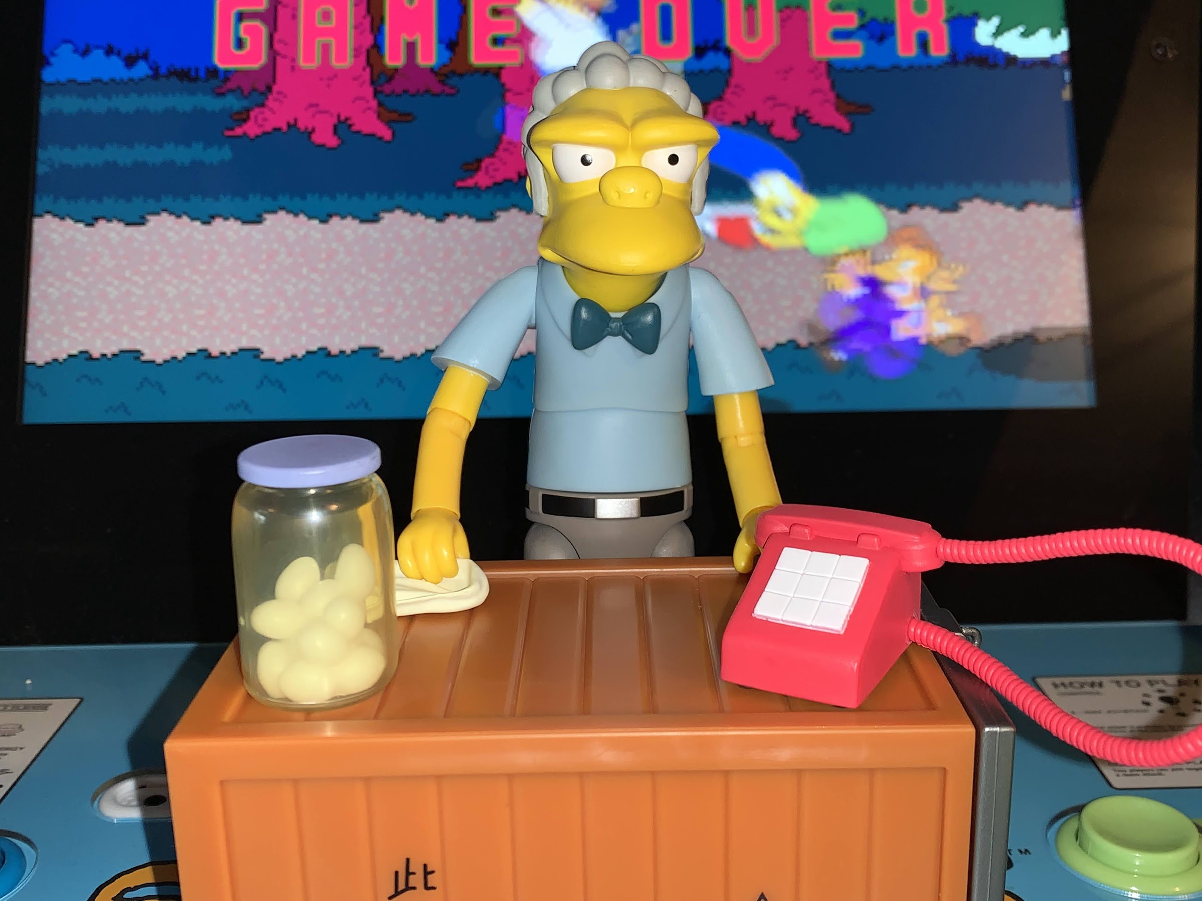
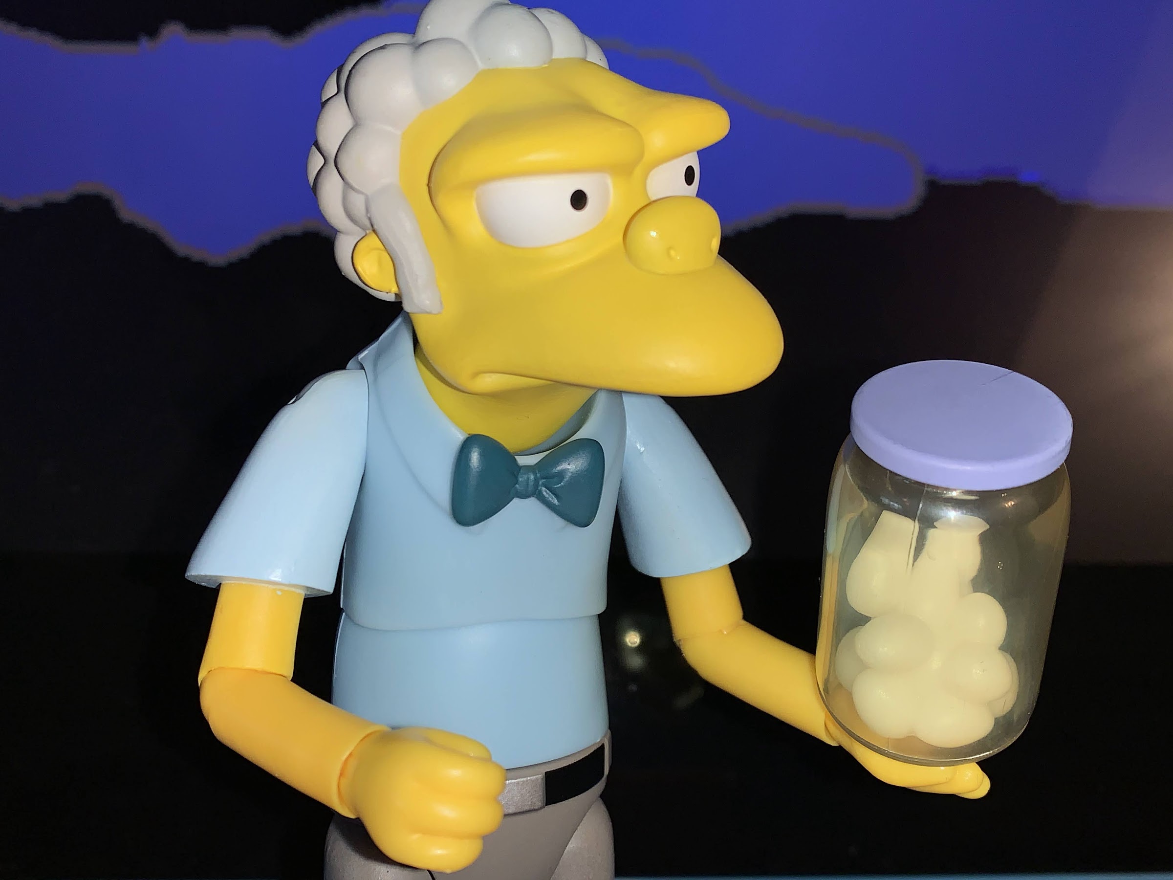
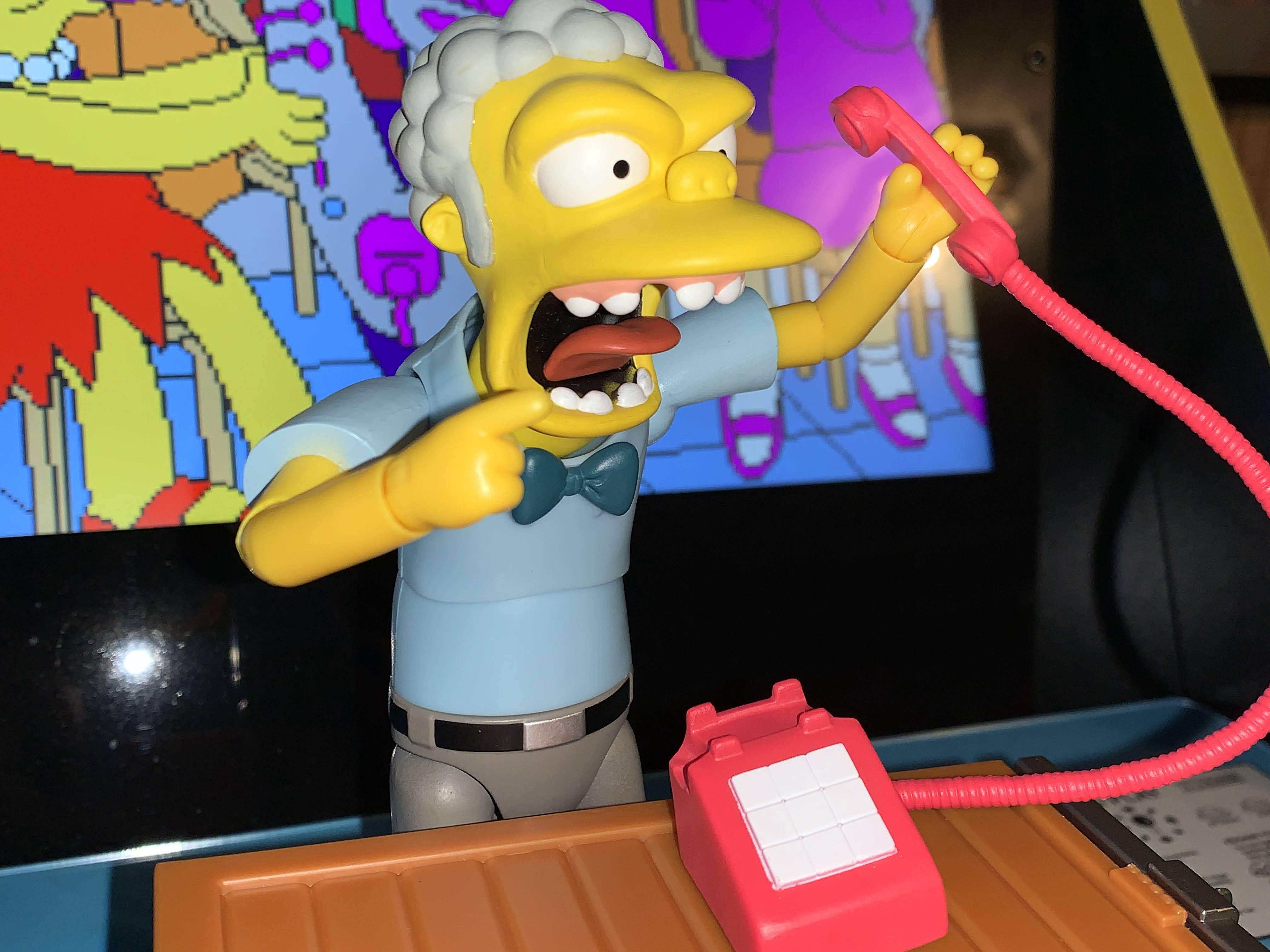
To go along with the raging head we get Moe’s phone. Everyone remembers Bart’s crank calls from the early years of the show that always sent Moe into a rage. The phone is sculpted all in red plastic with a white number pad that oddly only features 9 digits (that could very well be true to the show). The cord is flexible and the receiver slots in nice and tight on the base. I have a few phone accessories from other companies, and this one is every bit as good as those. Moe can hold the receiver with either the relaxed hand or for a tighter grasp, the gripping hand. Moe also has his trusty wash rag which he can either grip or have dangle off the ends of the fingers on his relaxed hands. It’s not soft goods and looks fine. Moe also comes with a mug of his signature drink: The Flaming Moe. Or is it the Flaming Homer? Since it comes with Moe, I guess he won. It’s done in translucent plastic with a purple insert to represent the beverage and then streaming from the top is translucent orange plastic for the flaming effect the drink is known for. What’s missing is “Moe’s” from the mug which is often featured on the mugs from his bar but the neat thing is the insert is removable so it can be an empty. It’s cool though and it’s an accessory I’ve been displaying with Homer more than Moe. We also get a jar of pickled eggs, because you need these onhand just in case Aerosmith is in your bar or you need to draw eggs to determine a designated driver. No black egg is visible, but the jar looks good using translucent, green, plastic with molded eggs inside. I wish they had filled it with something to better make it look like the eggs are actually in a liquid, but it’s fine. It’s also missing the bug which was in the solicitation, but I guess it either wasn’t worth the price/effort or the factory missed it. Everyone is demanding to know where’s Moe’s apron, well I want to know where is the bug?!
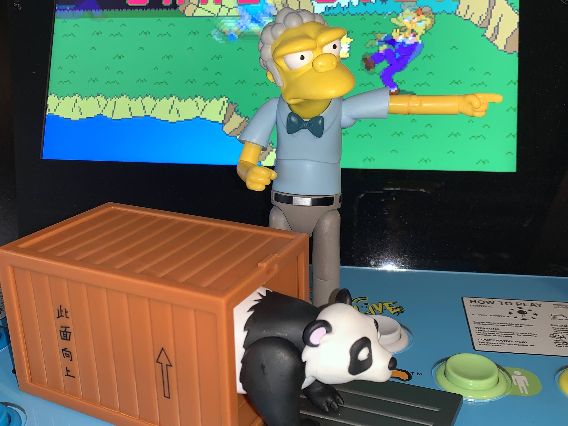
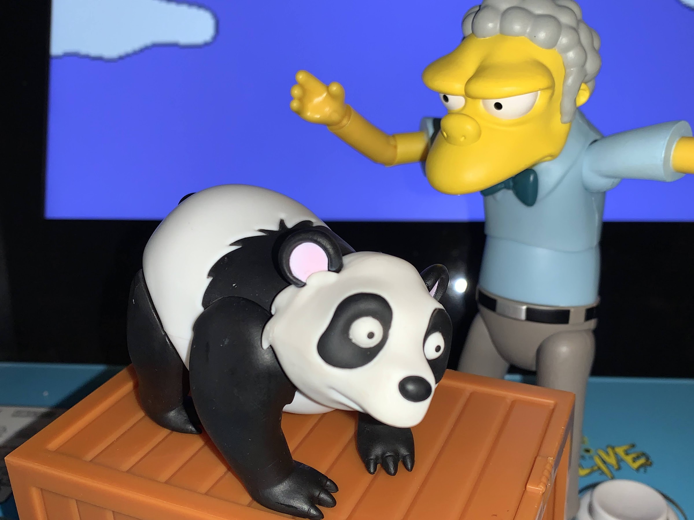
The last accessory is the most “out there” and it’s the panda from the episode “Cape Feare.” Lisa accuses Moe of sending Bart threatening letters, but she doesn’t actually say what she’s accusing him of, and Moe thinks she’s threatening to blow open his exotic animal smuggling ring. This prompts Moe to release a bunch of pandas from his bar and we get a panda and crate to mark that episode. The crate is pretty damn big, roughly 3 x 5 x 2.875″ and it’s made out of sculpted, brown, plastic, with a silver plastic front that latches. Dangling from that is a padlock which doesn’t do anything, but looks nice. On the side is an “up” arrow and some Chinese characters from the show which allegedly say something to the effect of “This side up.” I say allegedly only because I can’t verify that for myself on account of the fact that I can’t read these. And for inside the crate we have a panda. It’s a simply articulated figure that has a ball-jointed head and swivels at each leg. The head can look up and swivel, but gets very little side-to-side and no range looking down. The leg swivels are pretty useless and this figure is more of a slug figure than anything, but it didn’t need to be anything special. The little paint in use is applied cleanly and the panda looks cute.
That’s a substantial spread of accessories for Moe, and the crate and panda contain a lot of plastic on their own. Still, hard not to think about what could have been? I like the panda, but I look at that crate and think maybe we should have just got what Moe is most associated with – his bar! A little bar display to put the figure behind would have been awesome. Or maybe instead of the panda and crate we could have got the love tester? I’d have made that change, but it’s not my company. And we’re also missing the most obvious – beer! No bottles of duff or even Red Tick Beer? Some extra mugs or spilled beer effects would have been cool, though probably would have needed a bar to be on. We are getting a Duffman in Wave Two so I guess we’ll get some beer then, though it remains to be seen if any of the cans on his belt are removable. I still think a chunk of the bar made way more sense than the panda and his crate and it would setup to get a Barney who could have come with a barstool. Or a tap. It just feels like there’s no forward thinking with Super7, especially with this line. I want to see logical pairs in the character selection, but we get Moe Wave One with no Barney (I guess Duffman is a Moe-adjacent character) in sight. Krusty is in Wave Two, but no Mel or Sideshow Bob has been announced. Burns is in Wave Three, but no Smithers in the just announced Wave Four which also is the fourth wave to not feature a female character. That’s legitimately shocking as Super7 has said in the past they prioritize diversity where they can specifically sighting wanting to have a female in every wave of their Power Rangers line. To have four announced waves from The Simpsons without even one of the female leads getting a figure (Homer is getting his second figure in Wave Four) seems to fly in the face of that. Not to mention there are a bunch of other contenders for figures that happen to be female that they’ve chosen to overlook thus far.
I suppose that’s a topic for another day, for now, we have Moe. Moe has the distinction of being the first of the generic, all-purpose, releases in the line and I think he excels where we would expect and comes up short where we would expect. The missing apron is a bummer as I think it will complete the look of the character, but in terms of sculpt, Moe is great. I have some nitpicks with the paint, and we could debate the accessory selection forever. The same is even true for the alternate portraits. I love the screaming head, but not the smile. Would I want something else? Of course, but I can’t deny the smile is done well and maybe someone else will get more use out of it than me. For me, Moe is likely to scream into his phone for all eternity, but I may occasionally swap to the stoic head when it suits me. And that brings us to the final part of the review – the price. Moe retails for $55 and if you think that’s too much well I can’t really disagree. It’s a lot for a figure like this, but I do feel like Moe comes the closest to justifying the price based on how he turned out and how much stuff he comes with. Others are free to disagree and it’s hard to give a full-throated endorsement when so many retailers have been heavily discounting Super7 Ultimates!, but for me, a big Simpsons fan, I’m happy with this figure and happy to have him. Now just give me Duffman so he has some beer to serve.
UPDATE – On June 12th, I finally received Moe’s apron direct from Super7. It’s a simple, fabric, garment with Velcro at the back for the main portion of the apron and for each shoulder strap. It definitely took longer to get here than Super7 initially estimated as it didn’t actually ship until May 31st and then took quite awhile to reach me. It took so long that I had actually reached out to Super7 on the 9th of June to inquire if it had been sent yet and received a response that said “You should have received it by now, we’ll initiate another,” so even they basically thought it wasn’t coming. At any rate, it’s here and Moe does look much better with it on than without. Do the soft goods clash with the otherwise all plastic design? Yeah, a bit, but this is probably better than a plastic apron which would have little to no give. It’s fine, and even though it took awhile, at least it’s here and Super7 took care of the problem which is all one can ask for from a company when something goes wrong.
More from Super7 and the world of Springfield:

Super7 The Simpsons Ultimates! Poochie
We’re back with another look at a figure from Super7’s latest wave of Ultimates! based on The Simpsons. And for this one, we’re taking things TO THE EXTREME! That’s right, it’s Poochie, everyone’s favorite rockin’ dog. He’s got attitude to spare and he’s not afraid to show it off. Where would cartoon history be without…
Keep reading
Super7 The Simpsons Ultimates! Deep Space Homer
Slowly but surely I am clearing out all of the action figure preorders I placed in the year 2021. Of the ones that had been remaining, the line I was most looking forward to experiencing was the line of Super7 Ultimates! based on The Simpsons. It was August of 2021 when these suckers went up…
Keep reading
Super7 is Heading to Springfield!
Wednesday, August 18th, ended up being quite an eventful little day in the world of toy collecting. There were some reveals from major toy companies, leaks, and even those long neglected Street Sharks fans got something to get excited about late in the day. Personally, it was a good day for me too as I…
Keep reading
Leave a comment