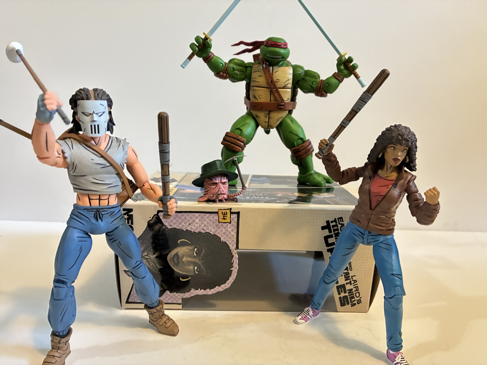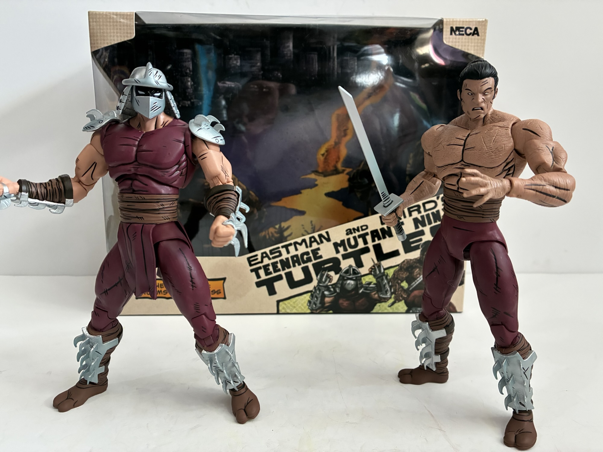
NECA’s dance with Teenage Mutant Ninja Turtles began way back in 2008 with a set of four turtles based on the first issue of the comic series. That set would then have other figures crafted around it of which most were cancelled, but when the license opened up and TMNT proved a hot seller they all found their way into the hands of collectors. A couple of years ago, NECA went back to the well and produced a new set of turtles based on their later look in the Mirage Studios run of comics based on the artwork of Jim Lawson. Those bigger, bulkier, turtles looked out of place with the old Shredder NECA produced based on his first appearance so it was all but assumed that an update would follow at some point. That update arrived in 2025 in the form of the Worms of Madness Shredder two-pack which was released at Walmart and also offered up to online retailers for the low, low, price of $60. More in some places. Despite my desire for a new Shredder based on his return appearance, I was not interested in this two-pack at that price. And that’s because the second figure in the set is basically a repaint of the initial one only shirtless and maskless so I played the waiting game. I knew it was only a matter of time before Walmart put this on clearance because they have a tendency to do just that, sometimes very quickly too. When the set was dropped to $30, I placed an online order and picked it up from my local store later that day. Mission accomplished!
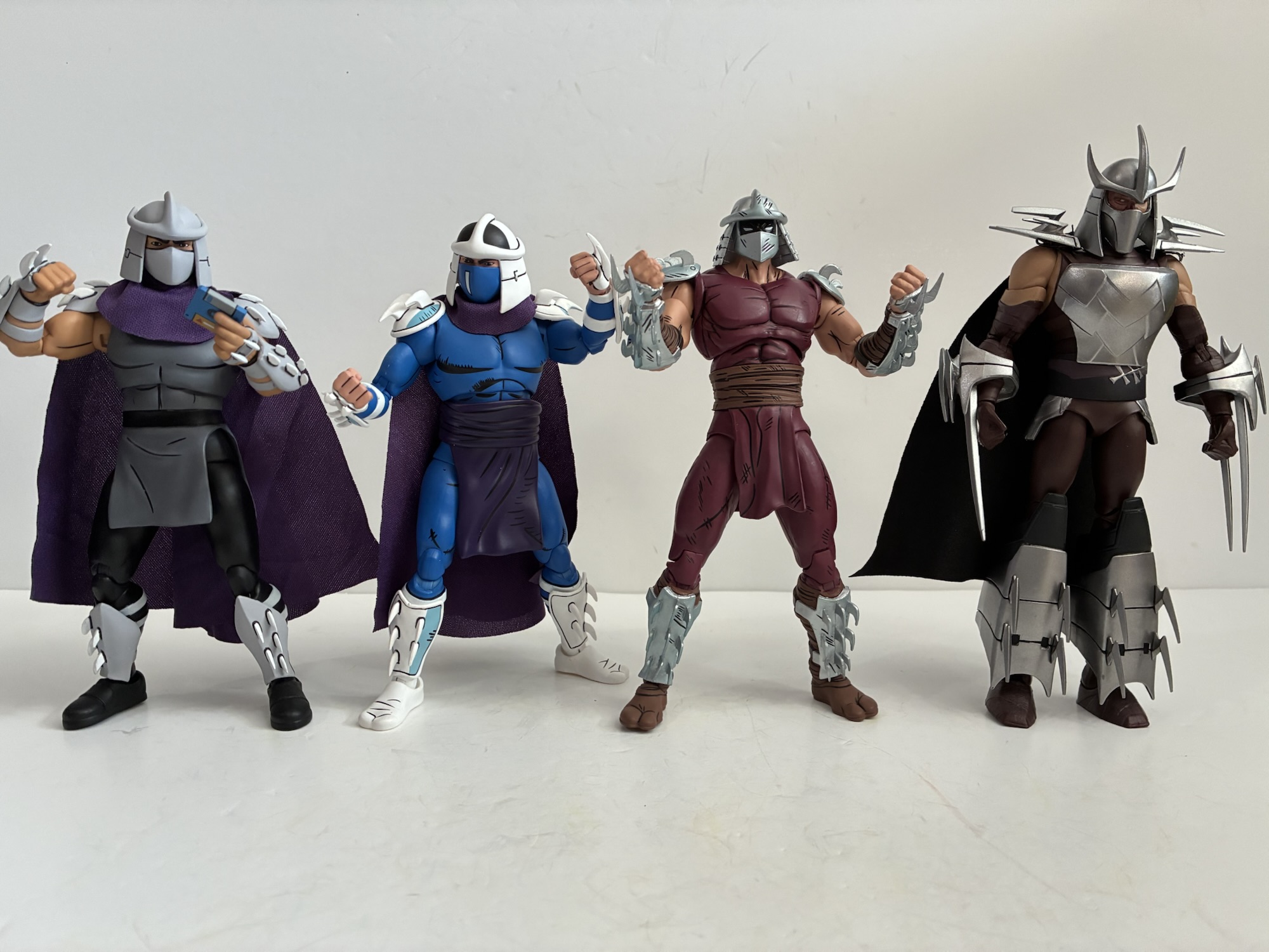
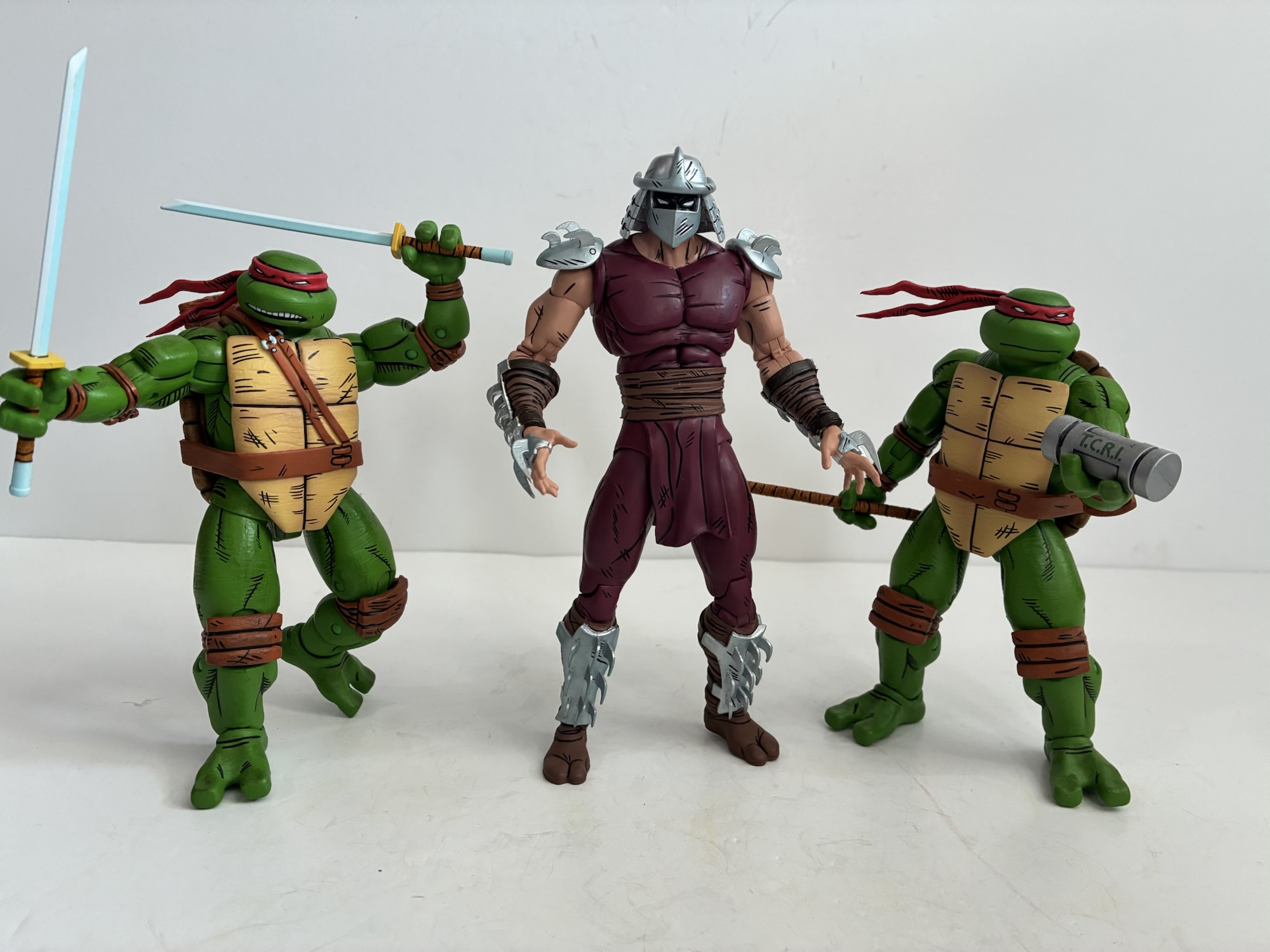
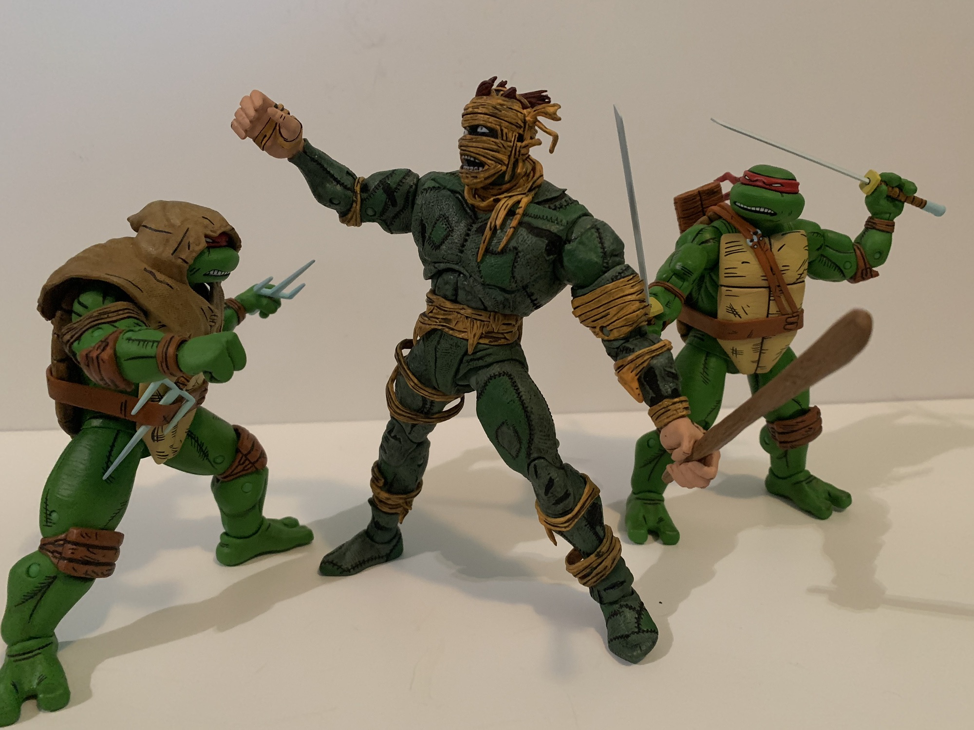
This set probably looks weird to someone not familiar with the Mirage run of comics and the name Worms of Madness isn’t helping. What most TMNT fans are likely aware of is that the Shredder was never intended to be some evergreen opponent for the turtles. Truly, I don’t think co-creators Kevin Eastman and Peter Laird ever expected to do multiple issue of what was ostensibly a gag comic which is probably why the Shredder was killed-off in that inaugural issue. When the franchise made the leap to children’s television and the toy aisle, the desire for a standard rival was created and the Shredder was the best fit. Perhaps Eastman and Laird felt the same for they laid the genesis for Shredder’s return in the Leonardo one-shot published in 1986. Considering that Shredder was literally blown up, it was going to be a hard sell to the reader for him to be alive all of a sudden. Enter the worms! I don’t know if I ever quite understood where these things came from, but essentially the Foot mystics had access to some special worm that could take on the form of whatever it ate. They basically gathered up whatever remained of the original Shredder, fed it to some worms, and from that we got a new Shredder (as well as the malformed clones NECA has already immortalized in plastic). The only truly relevant thing to know here is that when Shredder was brought back he took on a different look that was more reflective of the evolving art style in the books. He was taller, broader, and all together just more imposing to look at. This is a Shredder that will fit in with your Lawson turtles, and considering that NECA never reissued those first appearance turtles, this is likely the Shredder most will want in their collection over what has been made available up to now which makes this two-pack all the more frustrating since the other figure may not be something most people want.
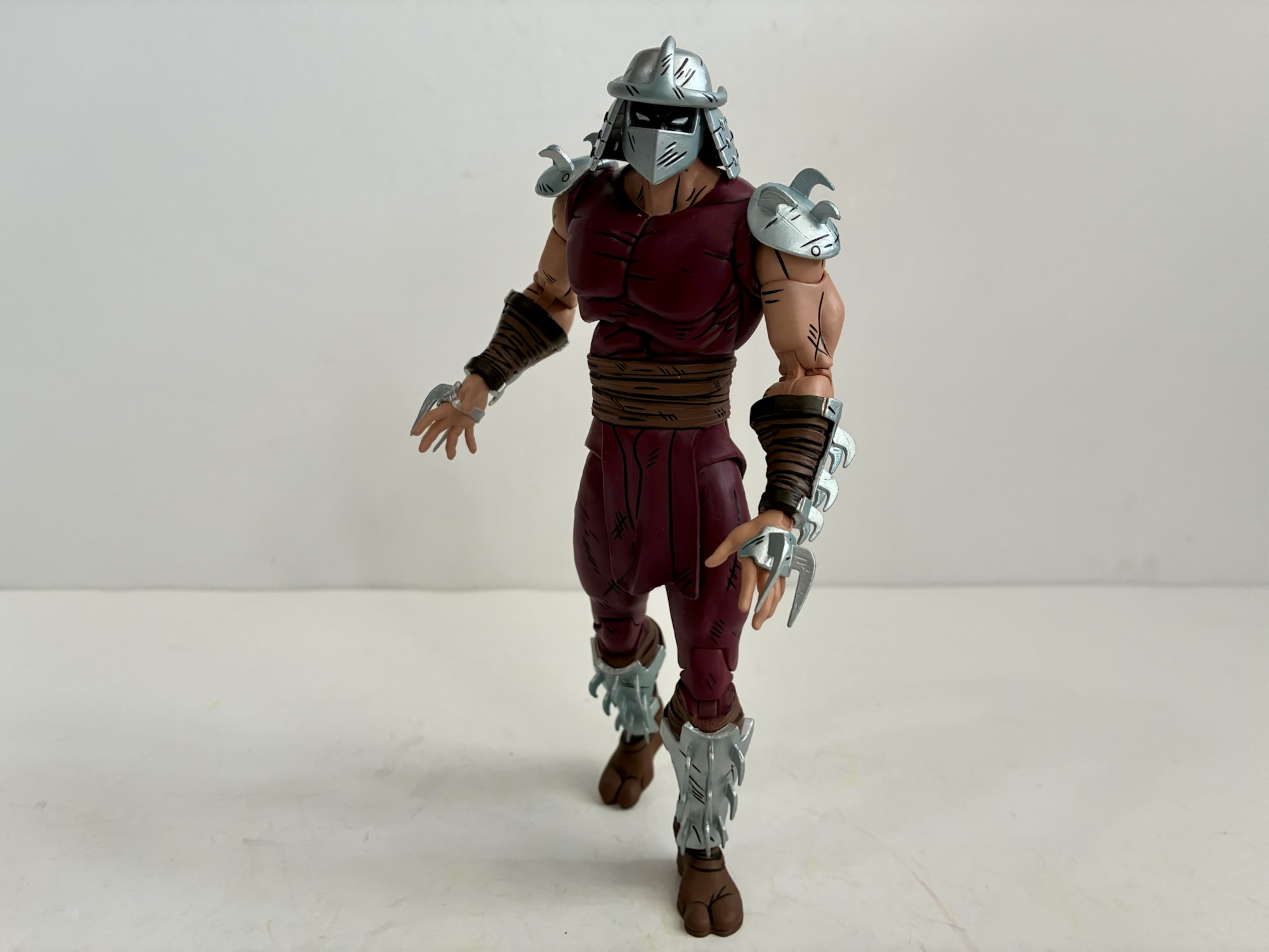
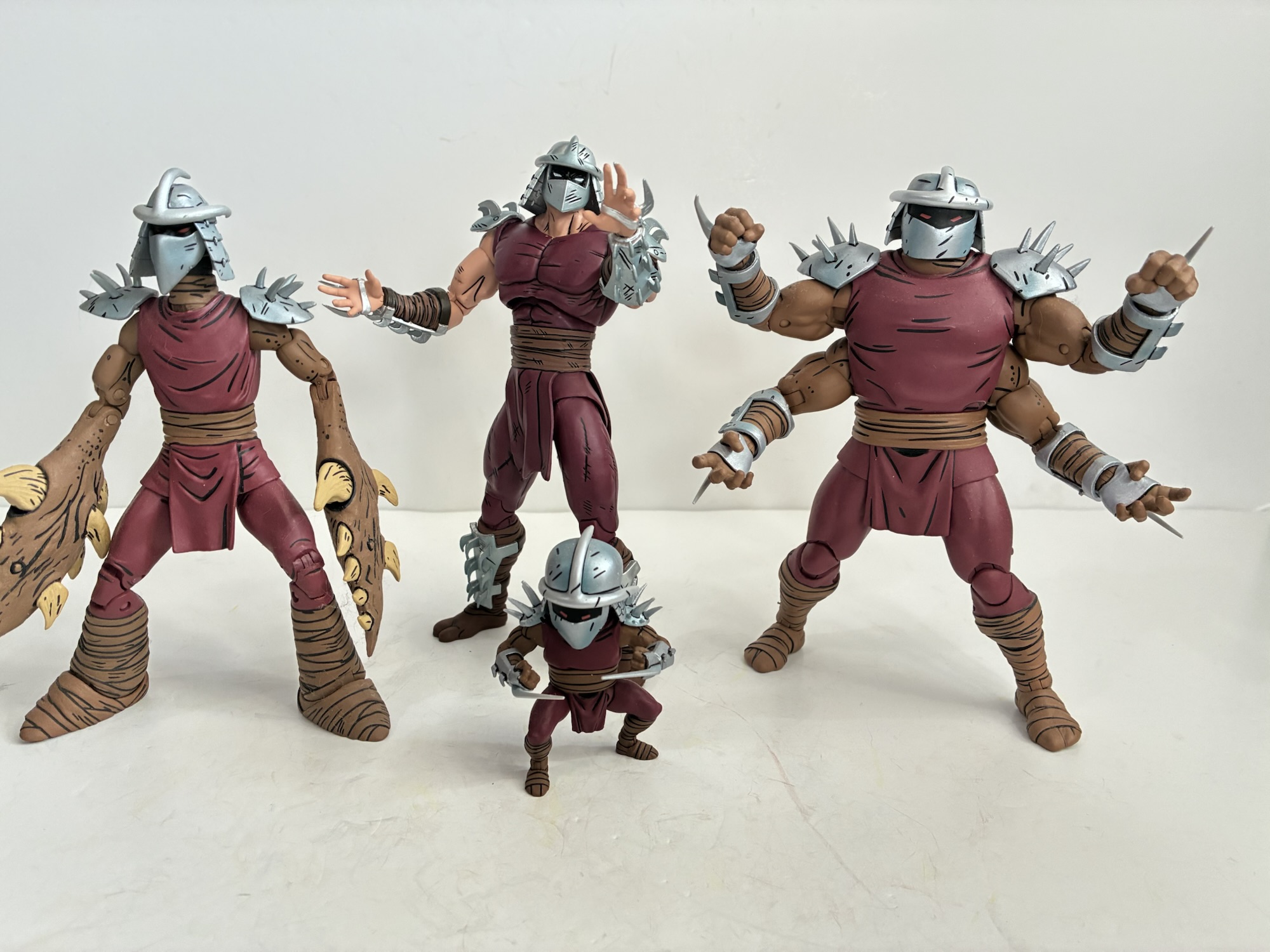
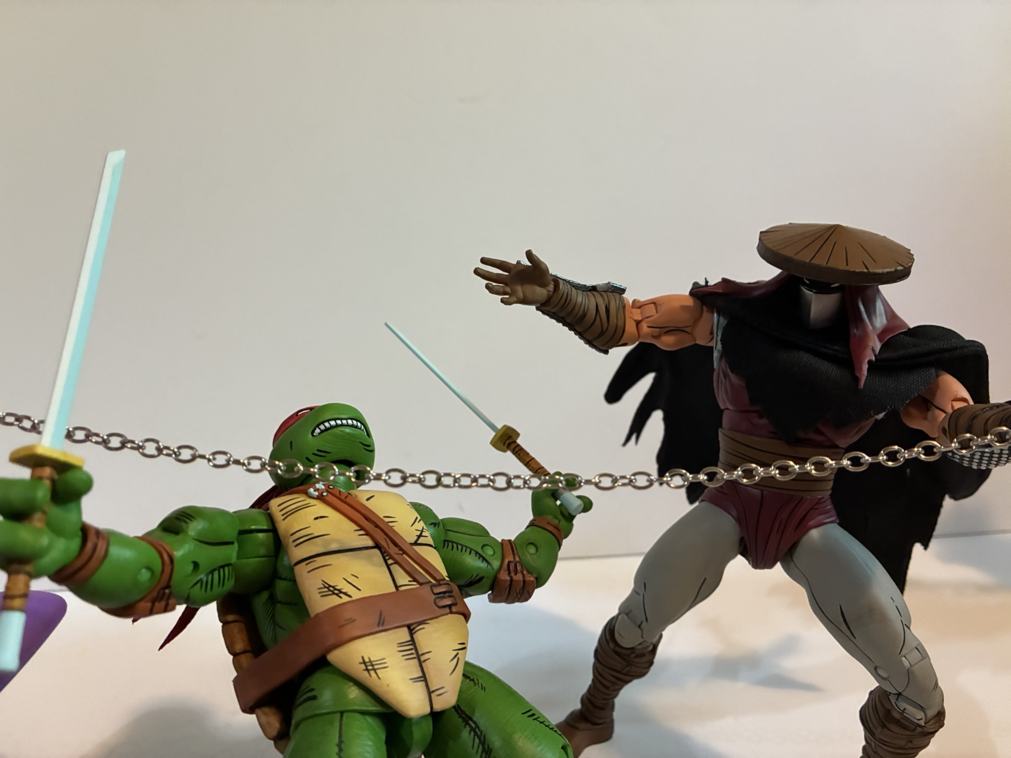
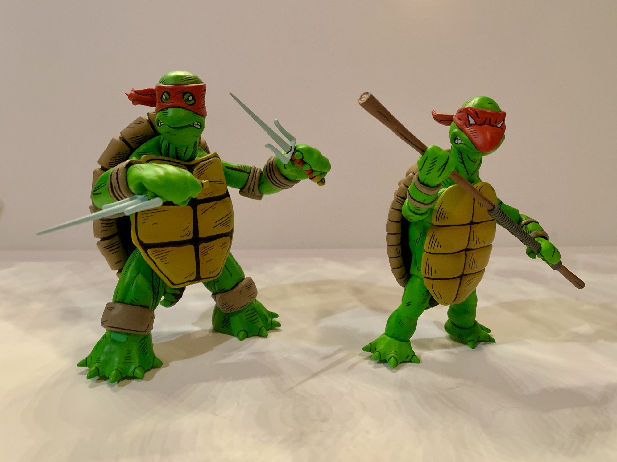
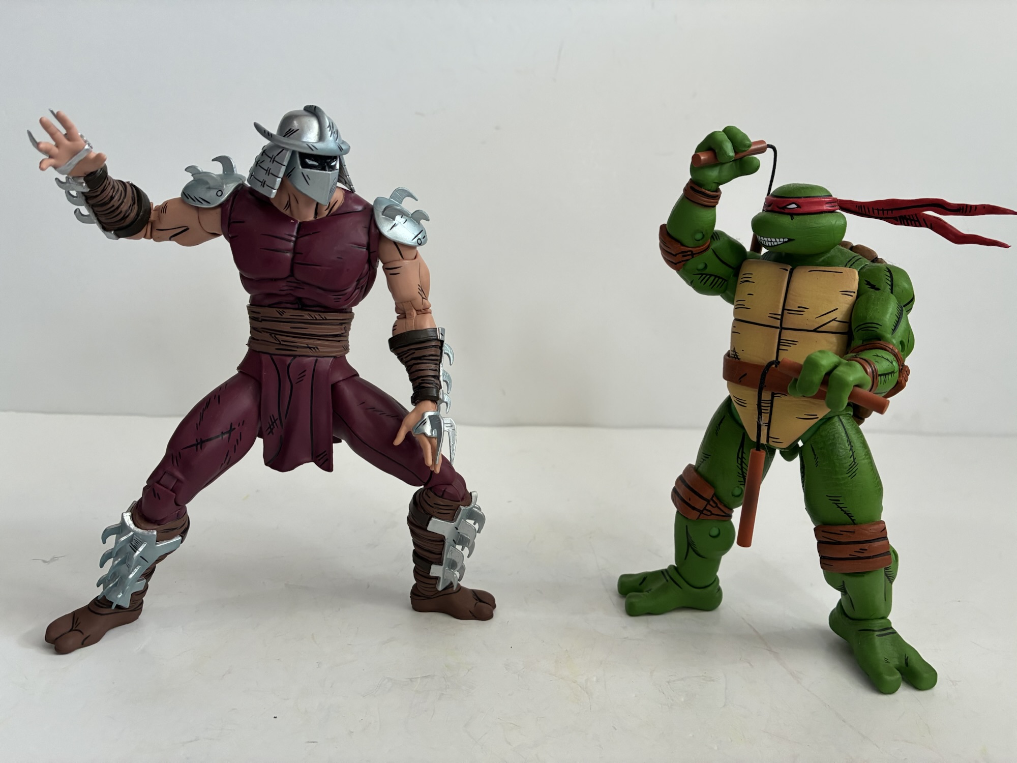
Shredder stands at a full 7″ and is another sculpt by Gurjeet Singh who previously sculpted the Foot Elite Assassin. The two are very similar stylistically and I would have expected them to share parts, but that doesn’t appear to be the case. Yes, they likely share some as the musculature of the abs on both is pretty much the same, but the sash is different. Shredder is also pin-less at the knees and elbows so while the arms appear to be more or less the same, some updates had to be made for Shredder in order for him to be pin-less. That must have been a driver for NECA with this figure as they probably could have just reused the arms, legs, and maybe even the chest and called it a day, but opted not to. Shredder is mostly clad in a skin-tight, dark red outfit that has a vague hint of purple to it. It’s more purple than the Elite and the browns on the sash, boots, and gauntlets are a more Earthy brown than the Elite. The metal portions are all a shiny silver with an ever so slight hint of blue. There’s also some sculpted distress details like this is a guy who has seen his share of battles. The black linework is frequent throughout and I continue to love the completely black-out flesh beneath the helm as that’s how the character was colored in the comics. He’s long of leg with a slightly undersized head which really conveys that comic look. This is definitely a more intimidating Shredder and I’m content with the looks of it.
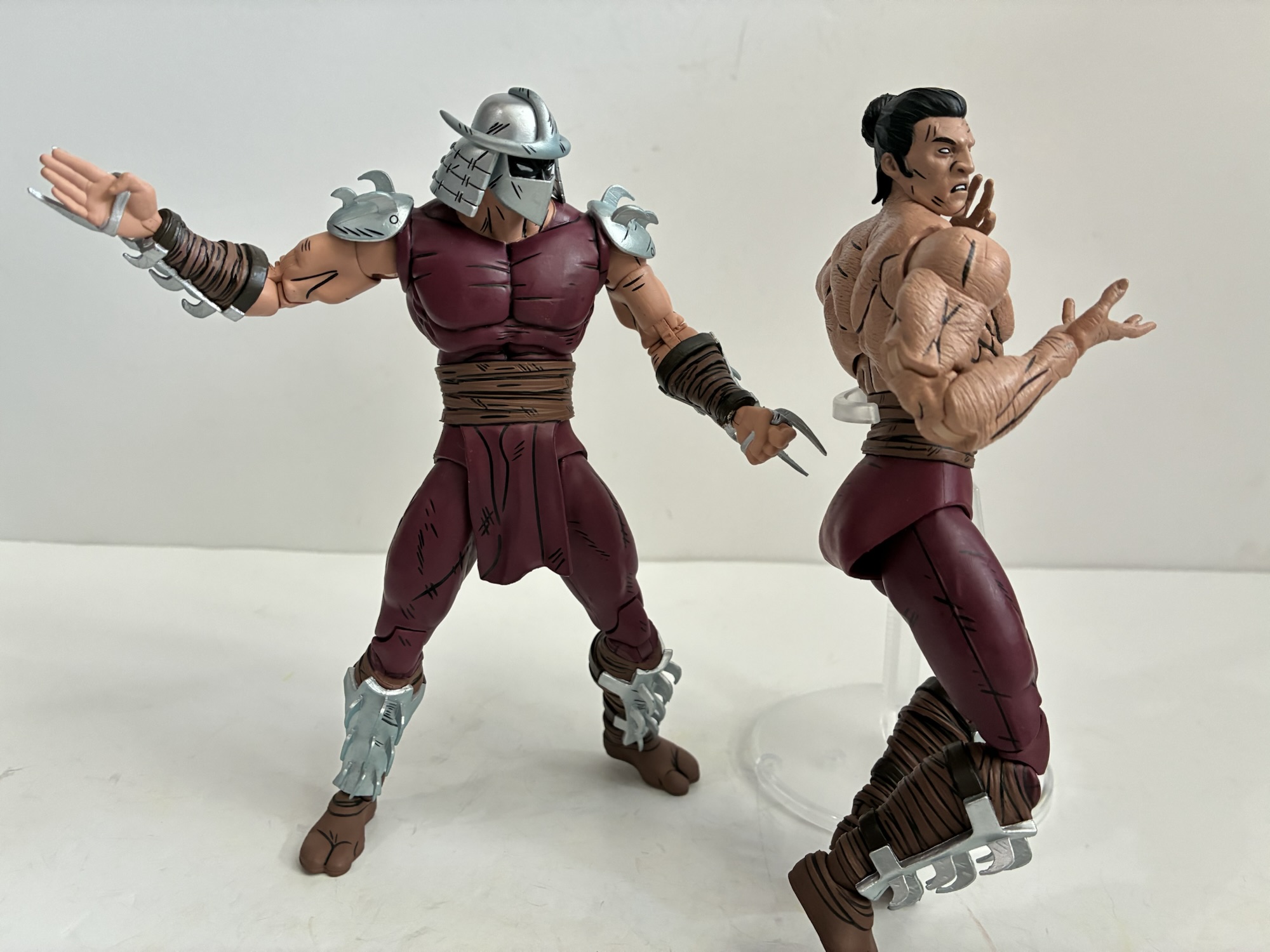
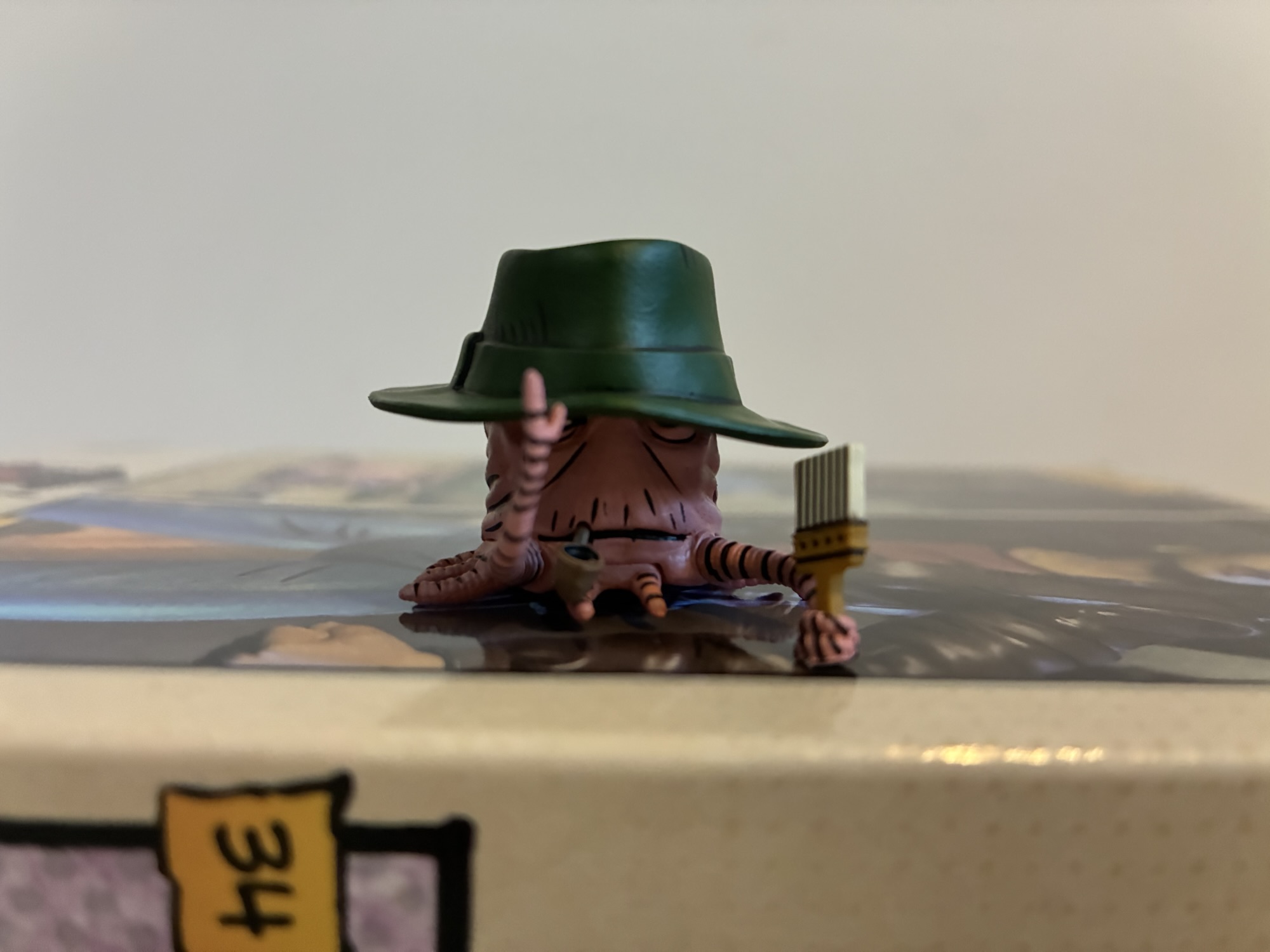
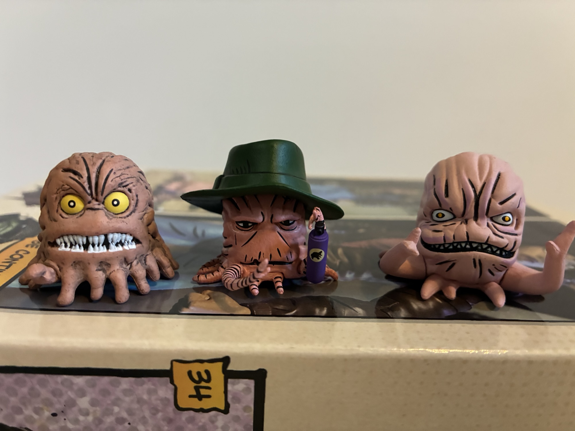
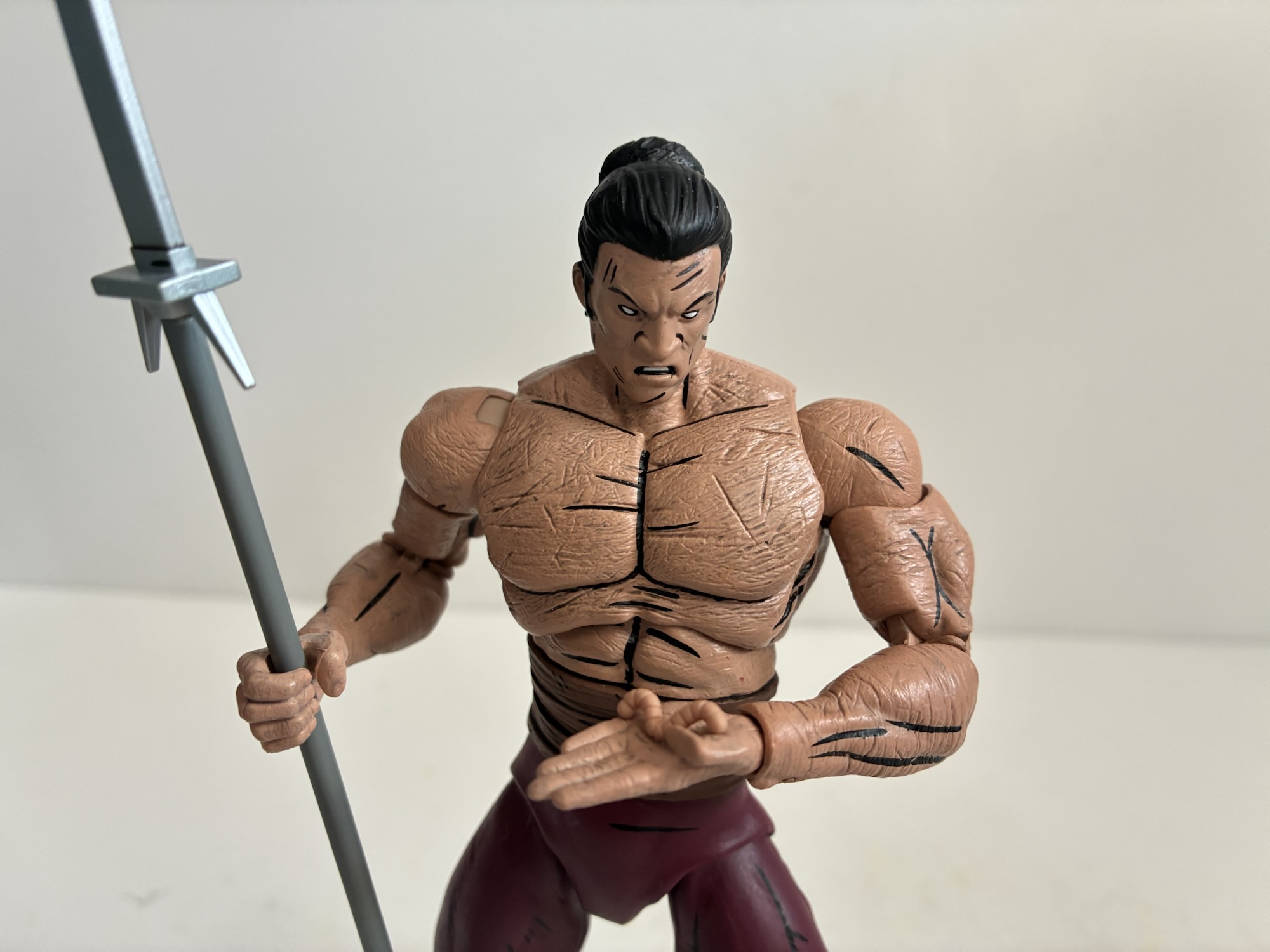
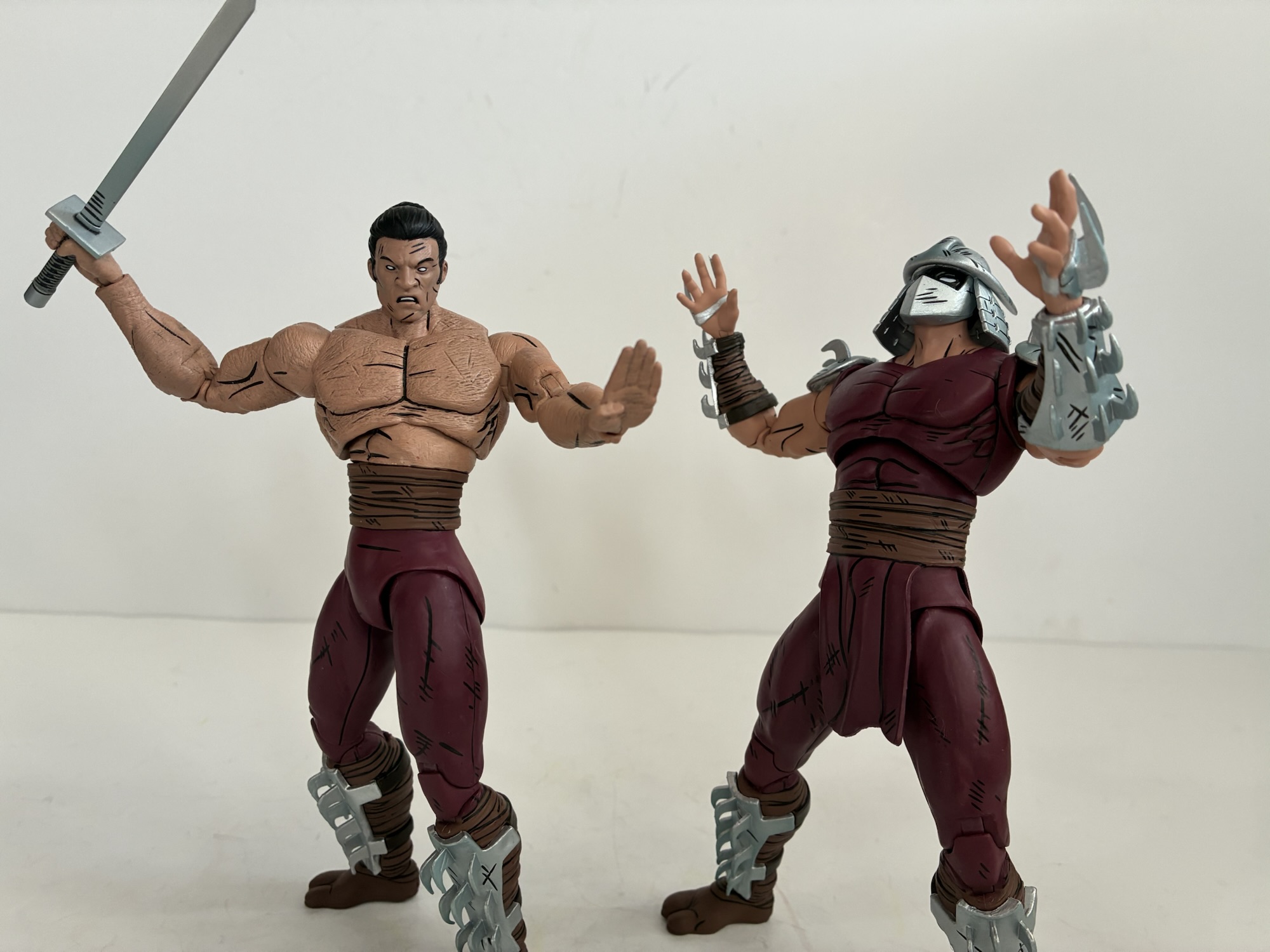
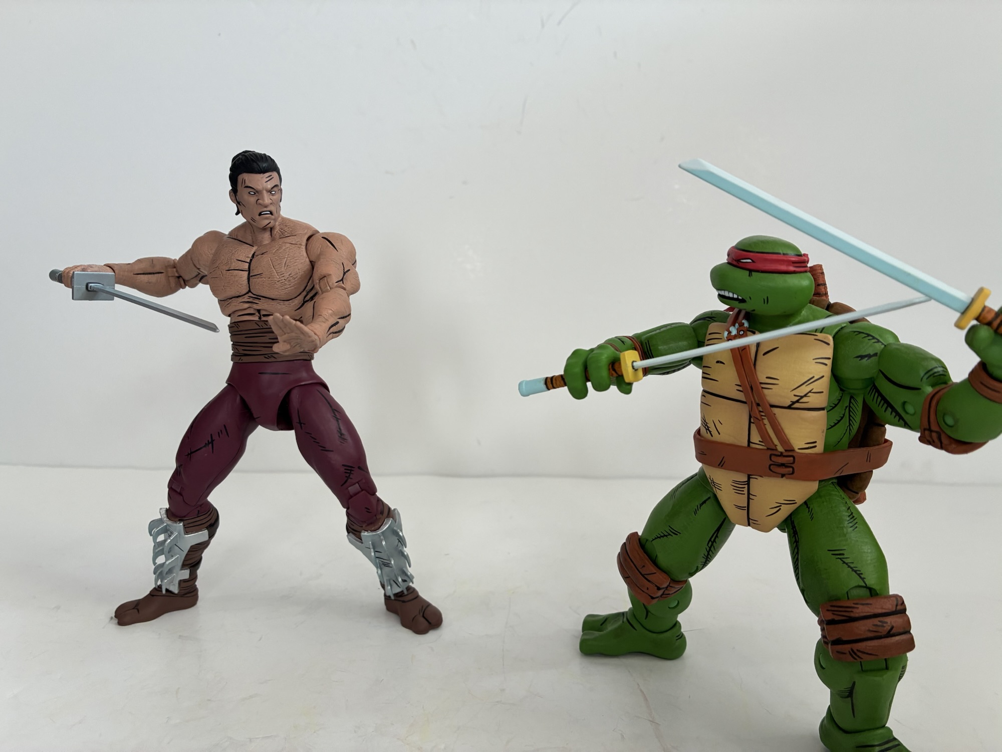
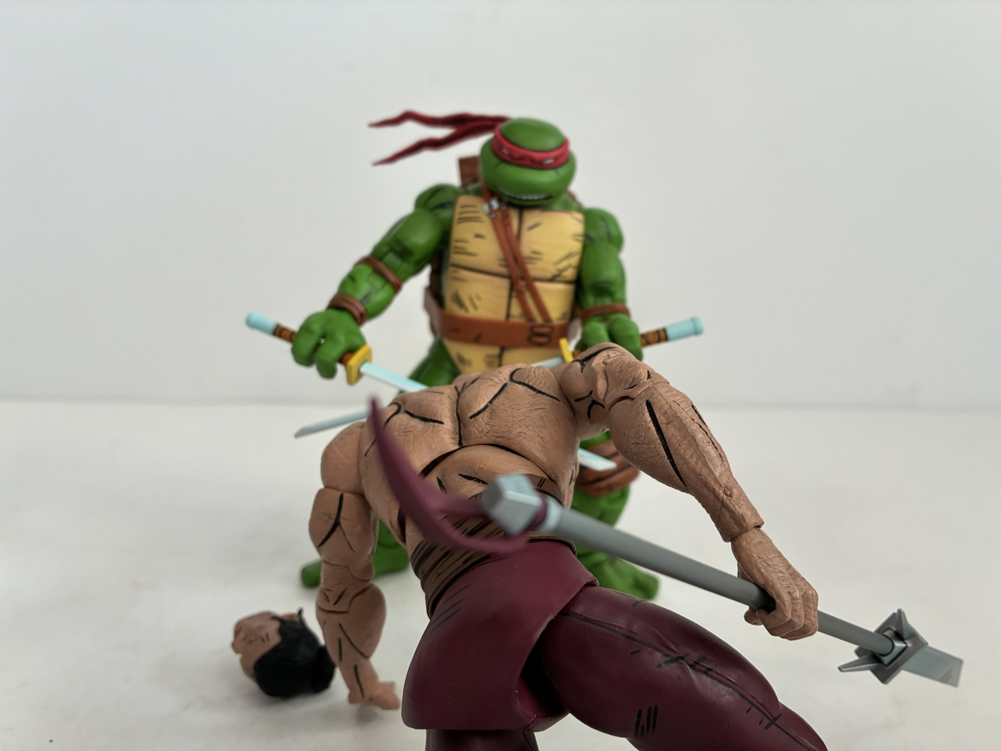
For accessories, Shredder has multiple sets of hands: fists, gripping, chop, and open. For weapons, he has a pair of swords that you’ve probably seen before as well as the smaller version of the bladed polearm (I think this came with Karai too). There’s also a tiny worm since you can’t have a Worms of Madness set without the worm. And then there’s the other Shredder. He’s his own figure, but in a way feels like an accessory. In the books, the turtles tangle with Shredder and eventually he removes his shirt and all of the armor on his head and arms to reveal his weird, wormy, body. It’s basically just a textured body with lots of lines carved into it. I’m thinking maybe to mimic the look of an earth worm? I don’t know, but for the figure you get a duplicate sculpt with different forearms to remove the wraps and armor. There are lots of subtle grooves in the torso with a paint wash applied to bring them out. I don’t know enough about toy making to know if this necessitated new molds or if this distress could be added to the sculpt without cutting into steel. The head is certainly new as it’s an unmasked Oroku Saki and it looks fine with clean paints. He does lose part of his sash, the bit that hangs over the crotch and rear, which exposes the odd sculpt of the bum area. Shredder has a big, droopy, butt that has a lot of area around the thigh hollowed out presumably to allow for more movement forward and back. It looks fine on the regular Shredder since he has a way to hide it, on the second figure it’s just out in the open and kind of funny looking. I guess be mindful of how you leave him on the shelf, unless you want to accentuate the buttocks then by all means do so. This figure also has the same assortment of optional hands as the other Shredder.
Since we’re dealing with two identical figures from a structural standpoint, the articulation is going to be the same across both. We get: double ball head, shoulders, biceps, elbows, wrists, diaphragm, hips, knees, and ankles. To my surprise, there is no glove or boot cut like we’ve seen with toon versions of the character from NECA. There’s also no vertical hinge for the gripping hands, something I’ve basically come to expect with NECA as much as it irritates me. As previously mentioned, the elbows and knees are pin-less and work just fine. Range at the head is acceptable while the standard Shredder has the shoulder pauldrons which interfere with the shoulders. I don’t know why they don’t either pin them to the shoulder itself or use a loop through the shoulder peg. The diaphragm joint gets a little forward and back and rotates easily, but there’s no waist cut. I don’t know why NECA has been omitting waist articulation of late with its Shredders, but I don’t like it. Hide a ball-joint behind that sash and let us get this figure into more natural poses. The diaphragm joint isn’t a great substitute because the figure looks ridiculous if turned more than 45 degrees. He does get decent range at the hips though I find the ankles to be a bit tough to work with. The left bicep on my Shredder is also binding and not rotating. The right arm is fine as are both on the Saki figure. I’m not sure if heating it would do much good as that could make shearing it off easier. It’s at least the only trouble spot between the two figures as nothing is too tight or too loose. It’s still pretty basic articulation by today’s standards so don’t expect import-level posing or even Marvel Legends caliber. For this line, it’s mostly as one would expect.
Is this the update people were hoping for out of NECA where Shredder is concerned? I think so as it looks the part based on his appearance in the comic and he definitely looks like he can hang with the updated turtles. Did anyone want to pay $60+ to get this and the shirtless variant? That is probably less of a slam dunk. I know personally I did not want this other figure. At all. I assume NECA added it to the mix to basically make a cheap (for them) two-pack since it’s two figures using essentially the same tooling. It’s too bad they didn’t pair him with the Foot Elite instead. And I say $60, but a lot of places have this set at $70 which is an even worse deal. I do have to wonder if NECA had gone with a swap-able torso instead could they have convinced more people to pay $50 for the release than what they sold at the two-pack price? Would it really make a difference compared with the actual costs? I can’t answer that, but I feel like there was an opportunity to up the perceived value of the package, but maybe dropping half a figure from the set isn’t as big a cost savings as I would imagine. All I know is that their basic, single pack figure is $35-$42 depending on where you get it. I wouldn’t pay that for the extra figure in this set so I needed to wait for it to be essentially free to feel comfortable buying this one. And I was fortunate that I ended up getting Shredder for even less than that. If you think this figure looks neat and can get it for the same price then I think it’s an easy recommend. As a two-pack with mostly ho-hum accessories, it’s a much harder sell. You have to really want shirtless, wormy, Shredder and place considerable value on him to make it worth your while. Maybe if they had included something fun with the set, like a wormy stump for his neck, that could have made a difference. Instead, I could never shake the perception that this set was a money grab and we were being forced to pay extra just to get the new Shredder we wanted, but sometimes that’s how the toy industry works.
If you enjoyed this look at Shredder then here are some Shredder-adjacent reviews you may find informative:

NECA TMNT Mirage Studios Elite Foot Assassin
NECA has gradually built out the ranks for Shredder’s Foot Clan via its line of action figures based on the pages of Teenage Mutant Ninja Turtles as published by Mirage Studios. The clan got started way back in 2016 with a box set released in conjunction with New York Comic Con. That set featured Shredder,…
Keep reading
NECA TMNT Mirage Studios Shredder Clones
NECA and Target’s Haulathon event which has seen a vast assortment of product dumped onto shelves recently was not content to limit the products to just the cartoon Teenage Mutant Ninja Turtles. Far from it, as an assortment of comic book based characters were also released and today we’re going to look at the first…
Keep reading
NECA Mirage Studios Teenage Mutant Ninja Turtles 4-Pack
When it comes to the popularity of Teenage Mutant Ninja Turtles a lot of the credit goes to Playmates Toys. Kevin Eastman and Peter Laird created the characters born out of a joke. Credit them for having the vision to think this joke had appeal beyond their small circle as they self-published Teenage Mutant Ninja…
Keep reading