If you’re going to market action figures to a fanbase as venerable as The Simpsons, you should probably go after what they love most. Simpsons fans love to make references to their favorite episodes and characters and one of the top episodes from the show is “You Only Move Twice” from the show’s seventh season. In that episode, Homer takes a job in another town forcing the Simpsons to move (again, hence the episode’s title) to another community that just so happens to be run by a Bondsian supervillain known as Hank Scorpio. Played by Albert Brooks, Scorpio is one of the most memorable one-off characters in the long history of the show. It’s probably not a stretch to call him the most memorable one-off character. He should have been brought back for the movie, but instead the writers and producers of The Simpsons decided to create a new villain for Brooks to play.
What makes Scorpio so great? In short: everything. He’s exceedingly nice and a quote machine. He’s an ideal boss, but also someone bent on world domination who won’t hesitate to murder in order to get what he wants. That aspect of the character is unveiled slowly, but effectively. If Super7 had polled Simpsons fans on characters they most wanted to see in this toy line I bet Scorpio would have fared well. Maybe not top ten, but certainly pretty high for a character that isn’t regularly seen or heard from. And since Super7’s approach with this line has been so episode-specific, he’s a natural fit, but can they stick the landing?

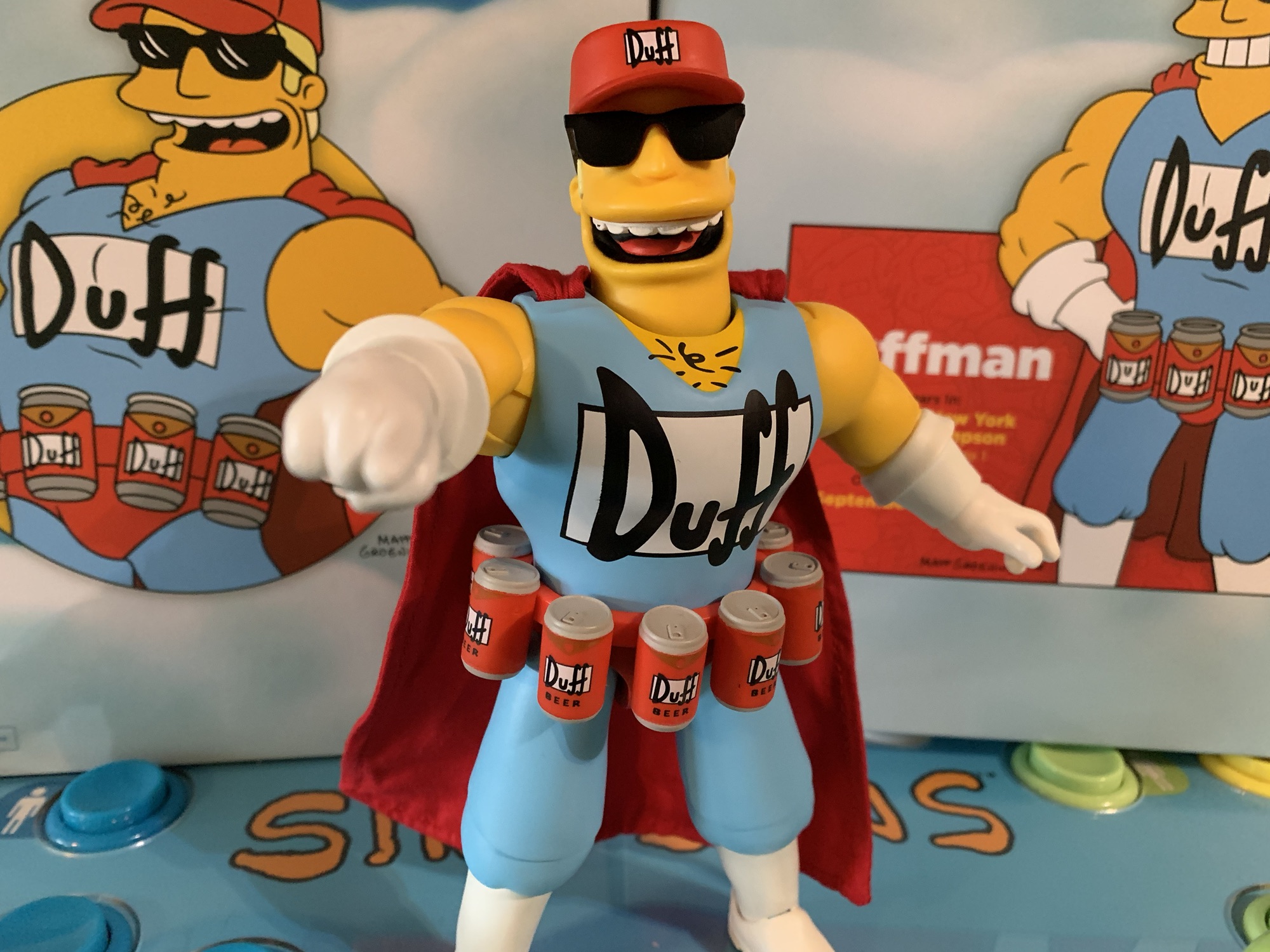
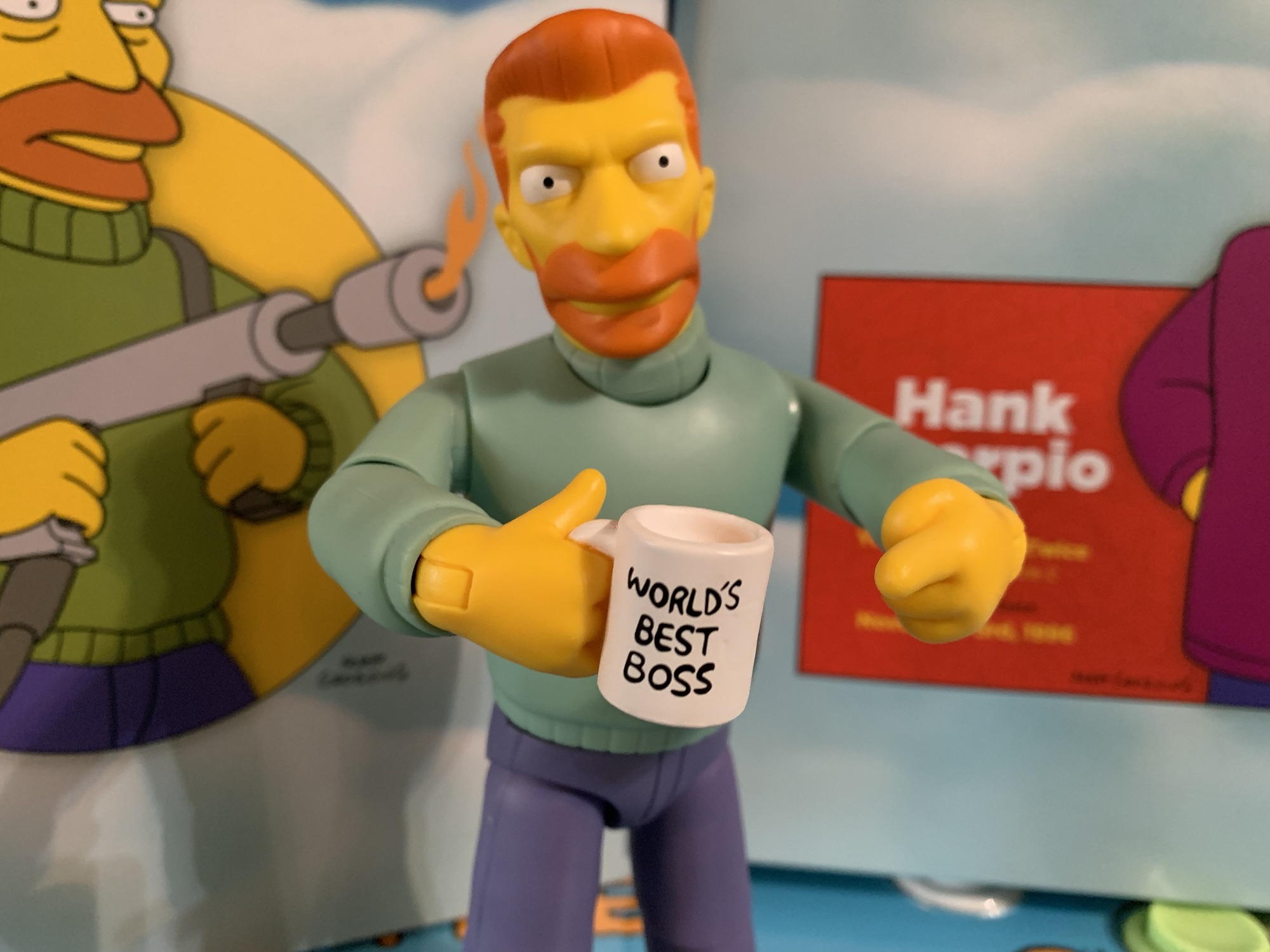
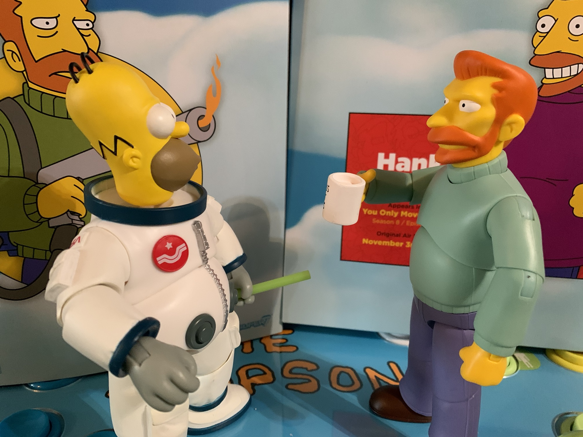
Scorpio comes in the standard packaging for the line and stands at about 6.75″ to the top of his head. He’s nearly a full 7″ when you factor in the hair. He’s presented in his mint green turtleneck sweater with blue-gray slacks and brown loafers. Out of the box, he’ll be sporting a big canister on his back that is looped onto his arms. Like the other figures from this wave, Scorpio has a pretty matte finish to him. Unlike Duffman, I think it’s all derived from a clear coat applied to colored plastic. Either way, it works and he has a nice appearance, albeit a very simple one. This isn’t a sculpt that demands much and what little paint is needed is basically reserved for the head. There his orange-brown hair and beard are fine and the eyes clean. The turtleneck is part of the head sculpt which is a little unusual, but fine. I think the head is glued into the plastic so there’s no mismatched colors when comparing neck to chest. This figure won’t catch one’s eye when amongst a sea of other figures, but it looks the part.
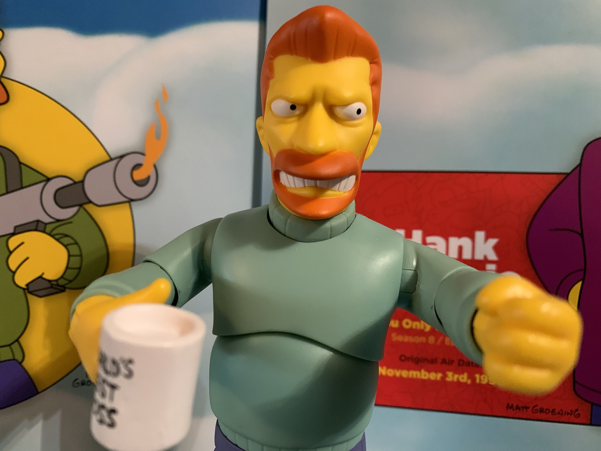
Where things start to get a little iffy for me concerns the accessories. For hands, we get a set of fists and gripping hands of different sizes. We also get a pointing left hand and a right hand that has a “World’s Best Boss” coffee mug permanently affixed to it. The mug isn’t hollow, but the inside is left as bare, white, plastic. Why not just a little hit of brown paint for coffee? He looks like he’s drinking milk. Either way, it’s a skimpy assortment of hands. For portraits, we get a stoic one, an angry side-eye with teeth showing, and a maniacal yelling portrait. The stoic and side eye look fine, but the maniacal head could have had a better paint job on the visible teeth. There’s a gray swash on them, or maybe the white mixed with the black paint used for the back of the throat. I wish the maniacal one also had more of a smile to it. It’s subtle in the episode, and this head has a very specific use, but I don’t think Super7 quite captured it.

And that head is intended for the flamethrower. He does have a grenade canister which is fine, but the main accessory is the flame thrower. For that, we get the gun, or wand, portion plus a tube that plugs into the back of it and the side of the tank on the figure’s back. The tube is cumbersome, but stays in place all right once you get it i place provided you don’t try and reposition anything. For that reason, insert it last. There’s also a flame effect for the end of the gun which is done in a translucent plastic that is orange at the base and yellow at the tip. It’s large and heavy and isn’t really the shape I think of when I think flamethrower. I’d have preferred something more narrow that streams out. Such a piece would have been lighter which would have been welcomed as this attachment will cause the barrel of the gun to sag.

There is another issue with this accessory and it’s that the figure isn’t articulated well enough to wield it properly. The gun is intended to be held with both hands, one on the back and one at the front. The right, gripping, hand is sculpted to hold the rear handle while the left is shaped for the grenade, but can rest on the front handle. The hands can sort of get in place, but the figure has only basic articulation. That means a double-ball peg head and neck setup, hinged shoulders, single jointed elbows, wrists that swivel and hinge horizontally, a ball-jointed diaphragm, ball-jointed hips, single-jointed knees, and hinged ankles with ankle rockers. What he needs are butterfly joints at the shoulders so he can bring his left arm across his body to properly aim the flamethrower. As it stands, he basically has to hold the gun across his belly and point his left shoulder at the target. In the episode, he basically fires from the hip. You can kind of fake his shooting pose from the episode, but any further scrutiny reveals it to be pretty ridiculous. In fairness to Super7, the glamour shots did the same thing so this isn’t a bait and switch, but how about some creativity? If butterfly joints are a no-go, why not a swappable left arm that’s preposed the way it needs to be? This is just the half-assed solution and the too heavy flame effect doesn’t help.

This brings me to my main critique of Hank Scorpio which is that this is not the “ultimate” expression of the character which is the mantra of the line. This figure sells out for this one scene of Hank Scorpio firing on the government operatives with his flamethrower. He basically can’t do much else aside from hold his coffee cup. Where’s the happy Hank we see all throughout the episode? No smiling portrait is a huge miss. And the back of the box depicts him with his coat on backwards, a memorable moment from the episode that he can’t achieve. Three of the figures in this wave came with soft goods, but Scorpio did not. He should have his coat, via soft goods or swappable arms and an overlay, but he doesn’t. If you’re going to call your product the ultimate expression of a character, then you better damn well do it. This isn’t it.
If you have been waiting decades to add a Hank Scorpio to your shelf then I suppose this figure will have to do. It’s not terrible, it just comes up way short as an expression of Hank Scorpio. I’m not demanding he be able to convert to workout gear so he can toss a shoe, but the lack of a sunny disposition is inexcusable. And since his flamethrower pose is executed poorly, I have a hard time recommending this figure. It’s a shame because this may very well be the only Hank Scorpio action figure we ever get. As has been the case with the first two figures (and most Super7 Ultimates! in general these days) you would be better served by waiting for a discount. The line is already dead so it’s not as if one’s inaction on the line at full MSRP is going to cause any long-lasting harm to it. If you also feel it’s just plain not good enough even at a discount then I wouldn’t really disagree.
Interested in reading more about Super7’s line of Simpsons Ultimates?:

Super7 The Simpsons Ultimates! Bartman
When I concluded my review of wave 1 of The Simpsons Ultimates! from Super7 I was thinking that I’d be back with more reviews later in the year. That was in February of 2023. We are now in April of 2024 and finally wave two has arrived (my original order was place January 5th, 2022).…
Keep reading
Super7 The Simpsons Ultimates! Duffman
In writing up my review of Bartman from Super7’s line of Ultimates! based on The Simpsons, I got a little hot. That figure had some errors in its presentation that annoyed me, but what annoyed me more was the refusal to just let the figure exist as Bart Simpson and Bartman. It was clearly designed…
Keep reading
Super7 The Simpsons Ultimates! Deep Space Homer
Slowly but surely I am clearing out all of the action figure preorders I placed in the year 2021. Of the ones that had been remaining, the line I was most looking forward to experiencing was the line of Super7 Ultimates! based on The Simpsons. It was August of 2021 when these suckers went up…
Keep reading