2025 was almost an end of an era for me. After being a regular buyer of NECA’s convention exclusive Teenage Mutant Ninja Turtles action figures since 2017, I found myself passing on such a set. If you’re new to the exclusive game, each year for San Diego Comic Con NECA makes an exclusive set of TMNT figures to sell at the convention, but also online before the event takes place. Usually the sale is spread over three days and sell-outs are guaranteed to happen, you just don’t know how fast. Some years it’s practically instantaneous, other years it may take a half hour to an hour, it depends on the set. This used to be the only way NECA was allowed to sell TMNT action figures, but ever since the license was freed up some by Paramount it’s been less essential for collectors to snag every last exclusive NECA comes up with.


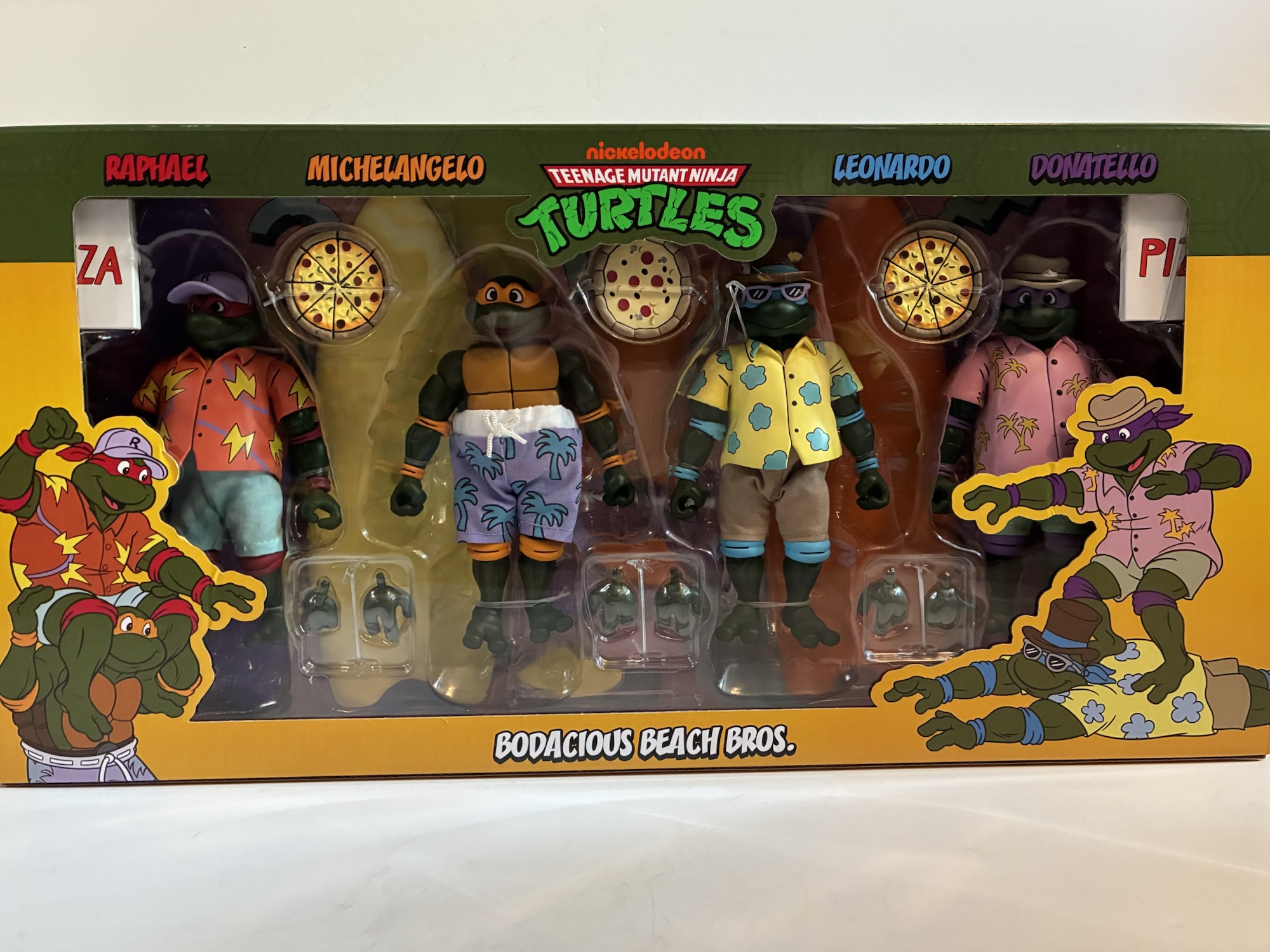
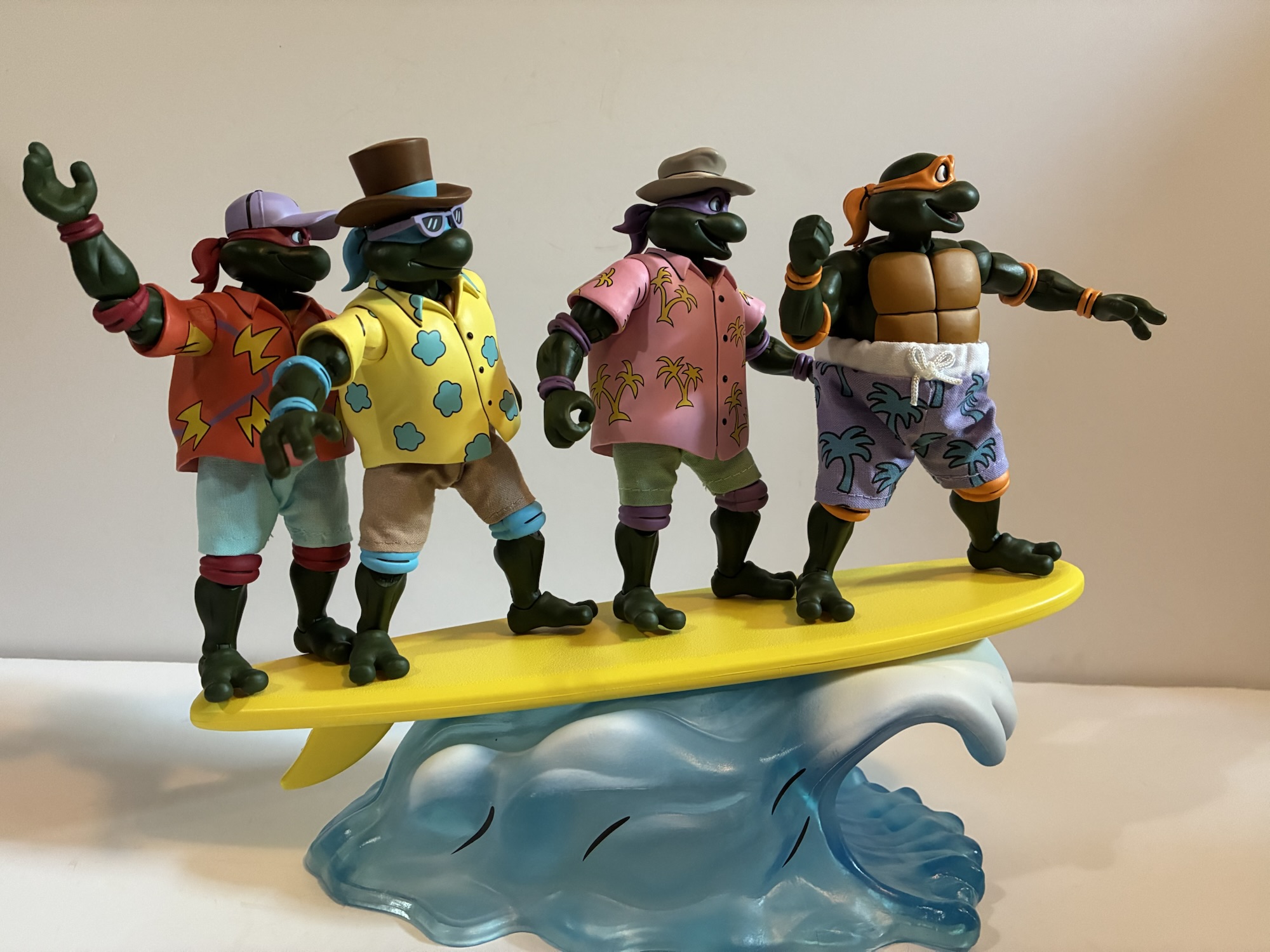
This year’s exclusive came from the toon subline based on the old Fred Wolf cartoon. It depicted the four brothers in beach attire which was all taken from different episodes of the show and paired them up with surfboards and a giant wave accessory. The sculpts looked to be new and more in-line with what we’ve seen from the Archie subline, but aside from that detail there wasn’t much to get excited about. It’s a fine looking set, I just never had beach turtles on my wants list when it came to the property. Four packs start at $150 and I was curious if this one would go higher since it was an exclusive. It can only be bought by non-attendees on NECA’s store and they did away with their flat-rate shipping a year or two ago so the price was expected to be substantial when all things were considered. When the item went up for sale, I took a look and found it would cost about $190 for me and I just wasn’t feeling it. Maybe I’m finally growing up, but I was able to walk away and break my streak of TMNT exclusives from NECA.
Apparently, I wasn’t the only one. The set hung around for an hour, then another, and it became clear that this wasn’t the most sought after exclusive NECA ever came up with. This was day one of a three day sale, mind you, so it certainly looked like NECA was going to have more than enough product to meet demand this go-around. Perhaps that made the company nervous? How else can one explain NECA out of no where sending a coupon out that evening for forty bucks off the set? They’ve never done that before and called it a loyalty deal. Supposedly, if you had bought a lot of TMNT product from them you got the email with the coupon code. I have bought a ton of TMNT stuff from NECA over the years, but not everything, and I didn’t get it. It didn’t matter though since it was a simple coupon code that was quickly shared online. Everyone who had already ordered had the code automatically applied to their order and for me it brought my total down almost to MSRP at $154 after shipping and all fees (yes, there is a tariff fee). It was enough to get me to pull the trigger and the set eventually sold out that day. I don’t know how it did the following days or what NECA charged at their booth, but it ended up being slightly less than what I would have paid at a retail store for a NECA four-pack.
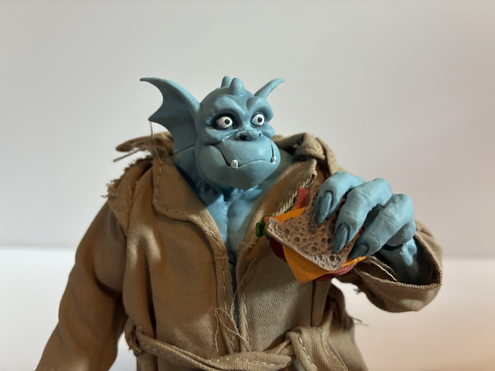
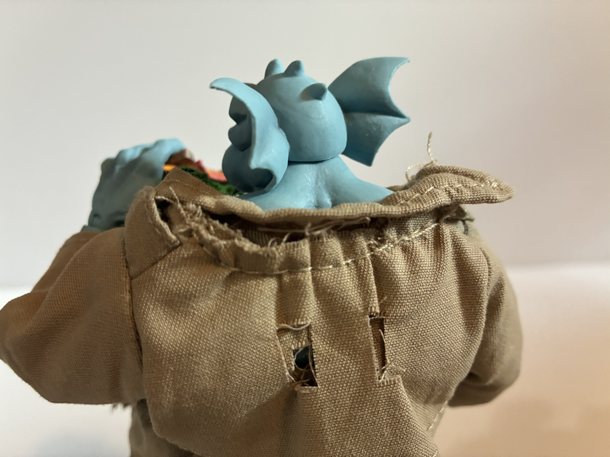
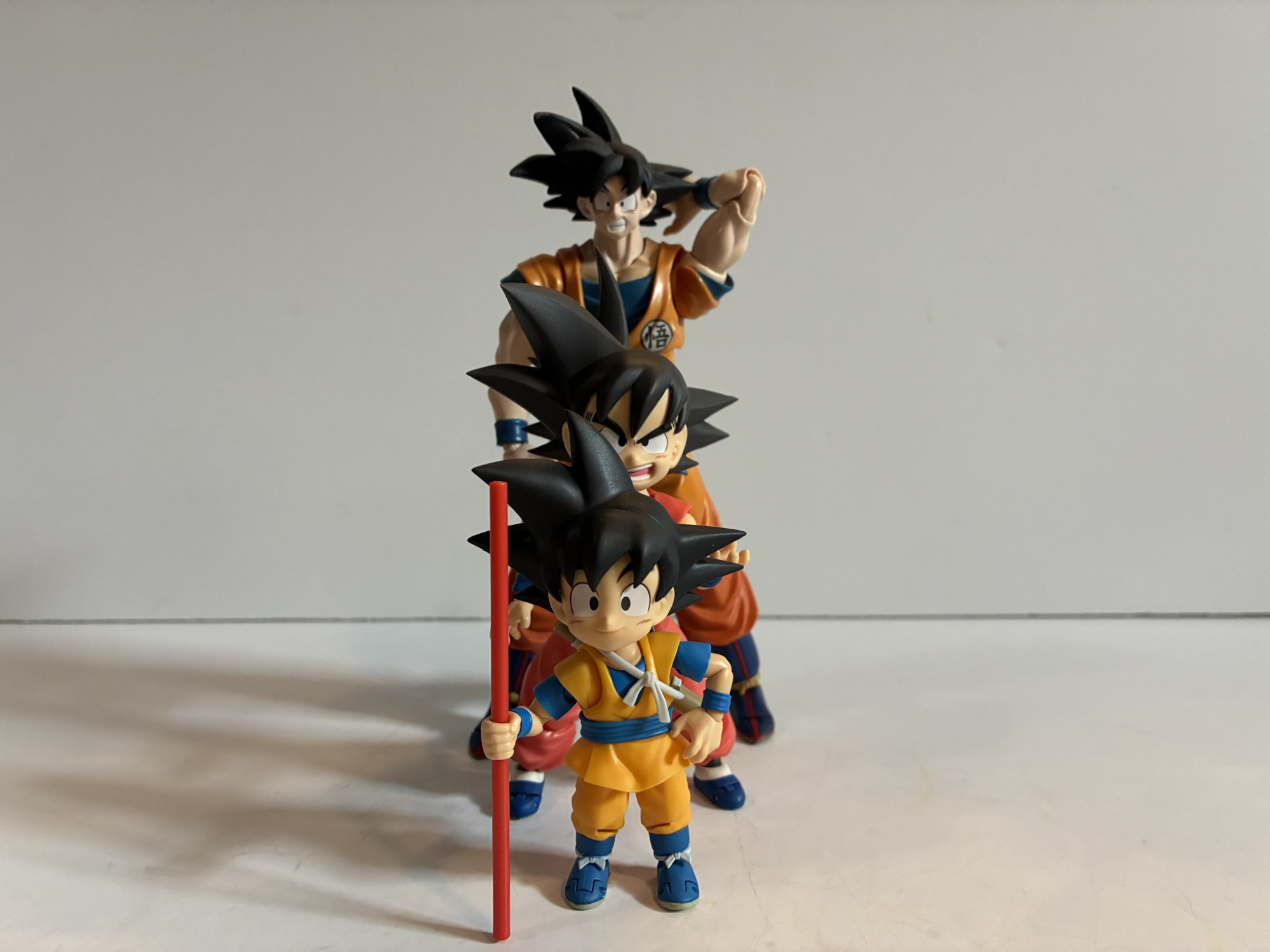
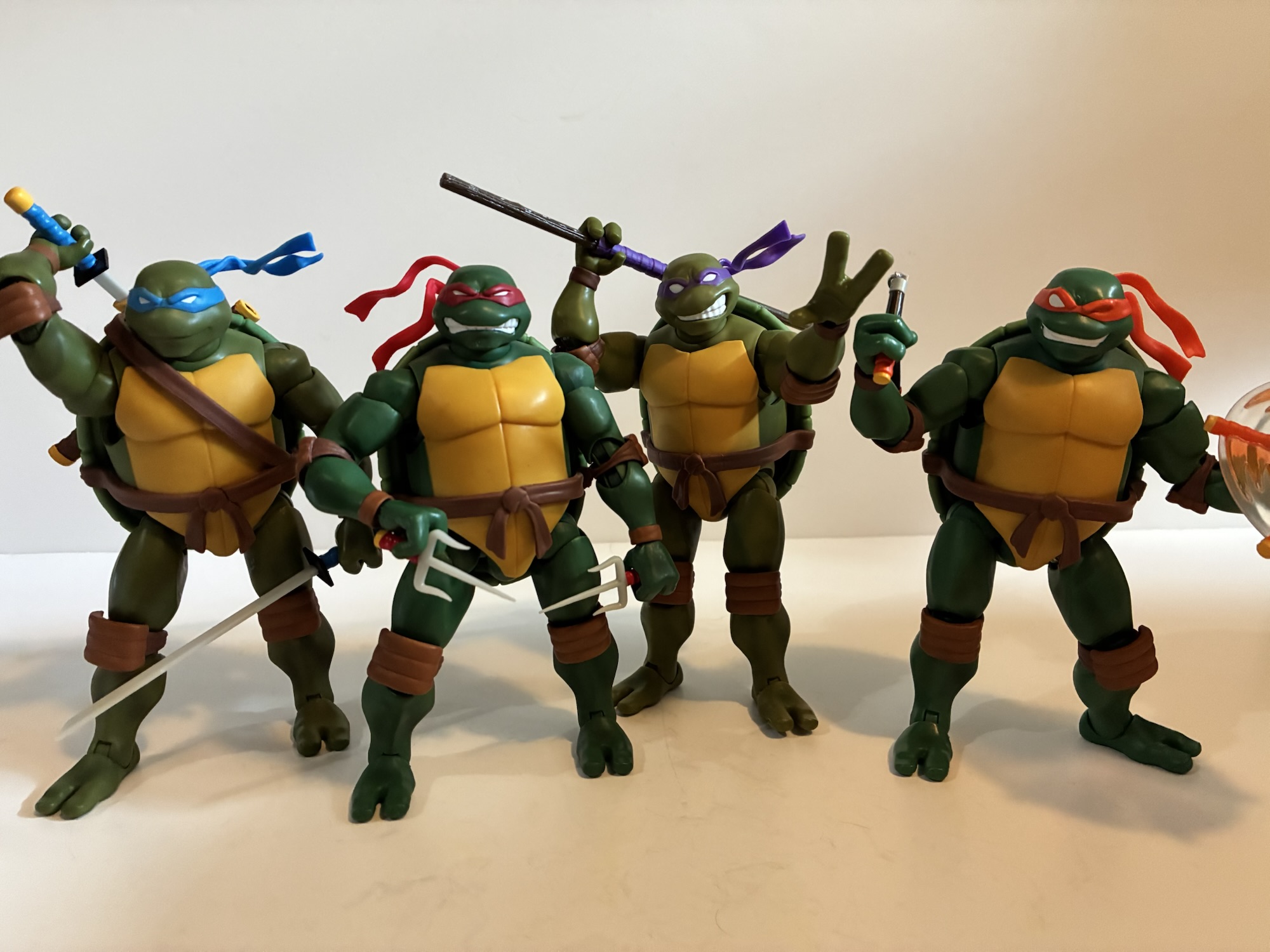
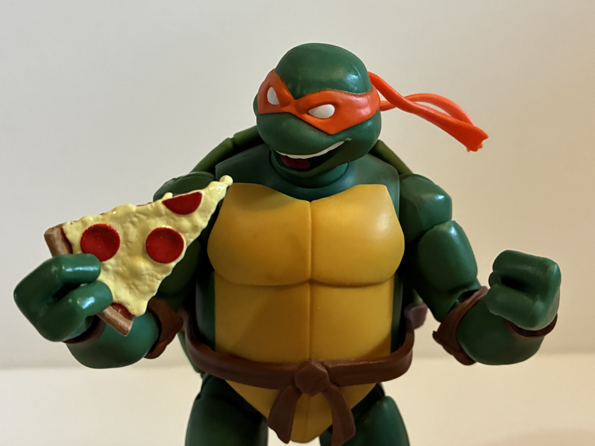
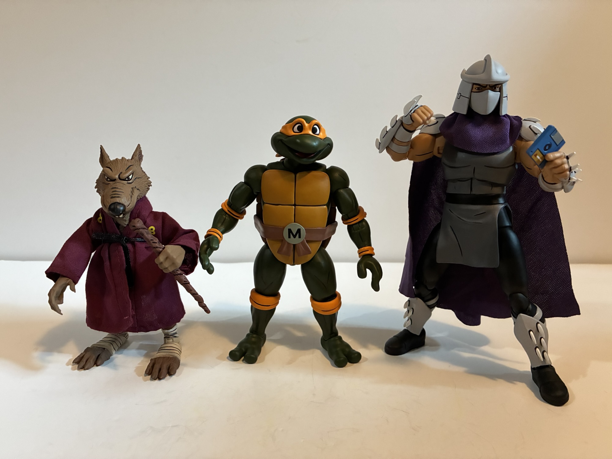
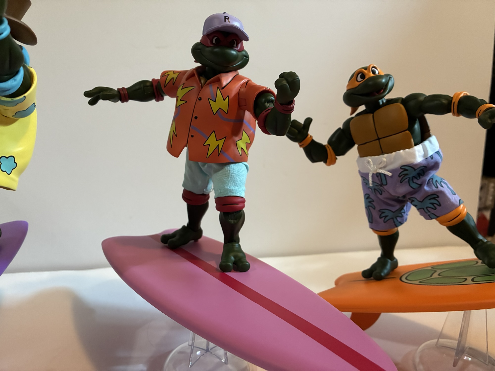
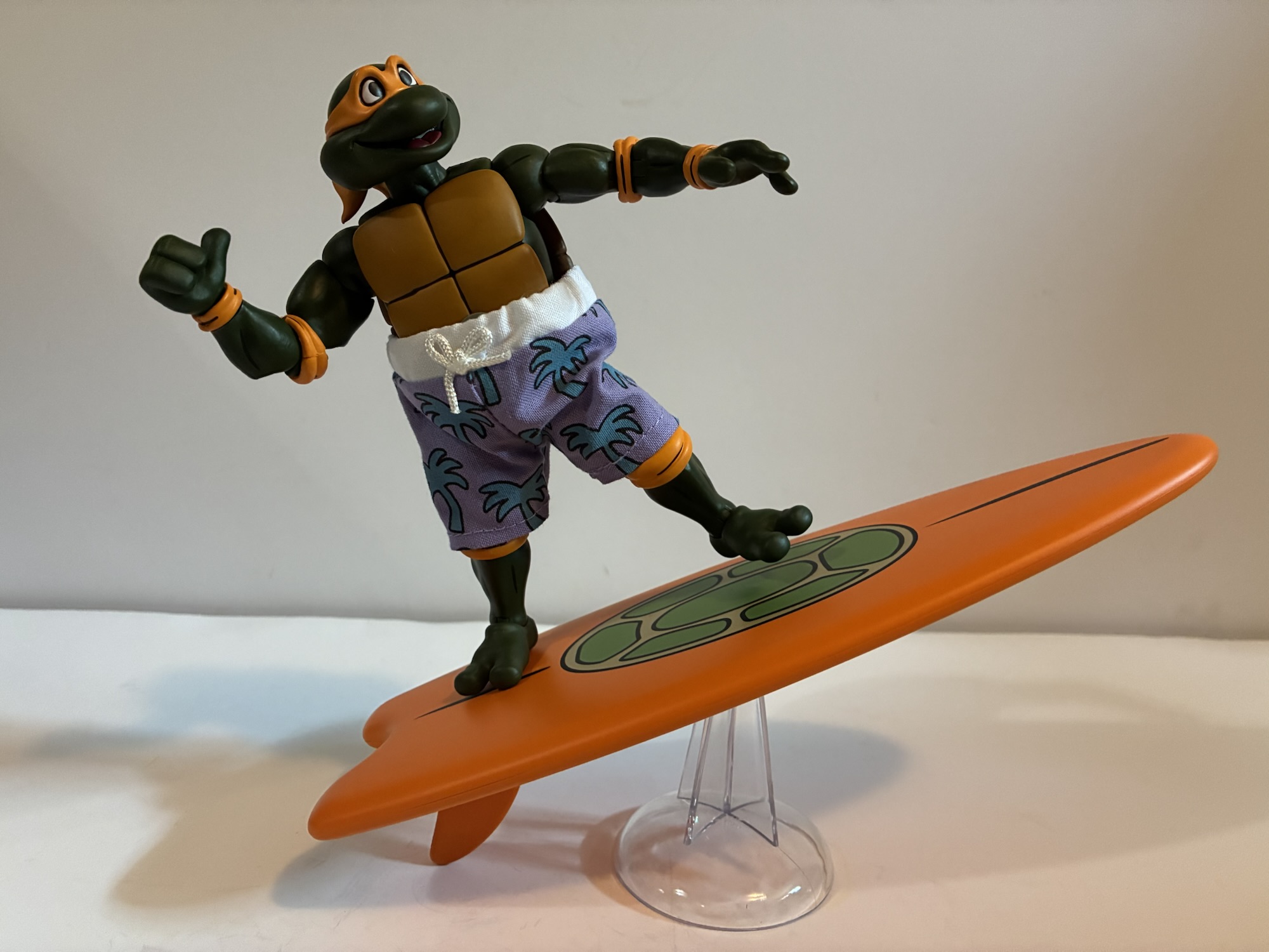
The price may have been right, but it was still a set that I wasn’t exactly jazzed about getting and my hope was that once in-hand I’d sing a different tune. The box it comes in is pretty massive as it’s basically a four-pack that you would find at Target, but it also goes deeper because of the giant wave accessory. The wave is in its own box that has the same colorway as everything else NECA does for this line, but doesn’t feature any graphics. Coincidentally, it’s one of two NECA convention exclusives this year to feature a wave effect and NECA also revealed a beach Slash that should pair nicely with this set. The figures themselves are all new sculpts that resemble the pin-less, Archie sculpts. Per Trevor Zammit at NECA, these are pretty much the new default turtles going forward so if you didn’t want this set don’t fret, I would expect more evergreen turtles to follow at some point on these bodies. Each turtle is in beach clothing taken from the show, though not all the same episode. It’s also a mix of materials as Leo, Raph, and Donatello have plastic shirts and soft goods shorts while Mikey just has soft goods shorts. Donatello and Leonardo also have ridiculous top hats while Raph has a more conventional baseball style hat. Mikey is hat-less and can easily be converted to a base Michelangelo if you so desire while the other three can’t without considerable work.

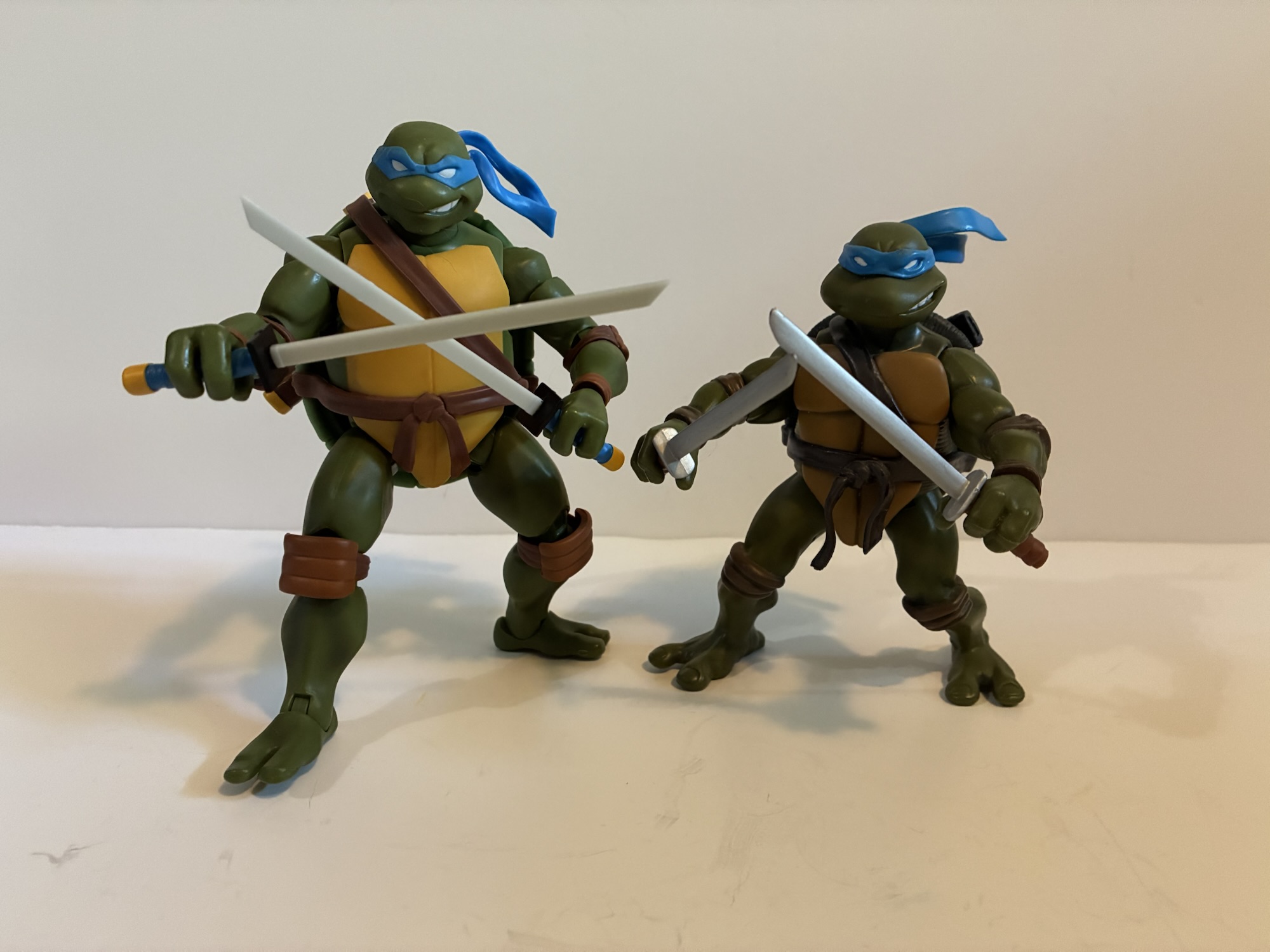
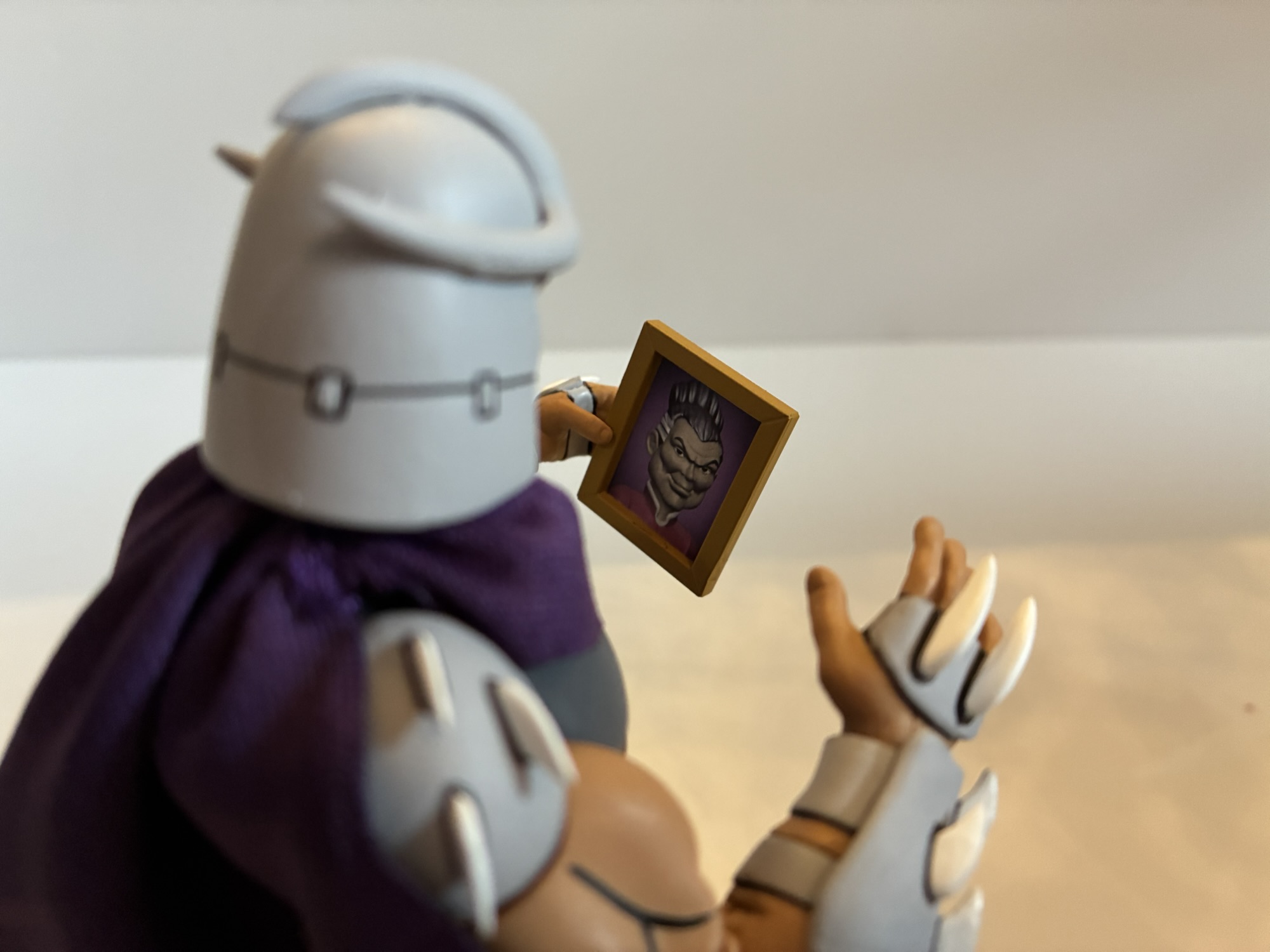
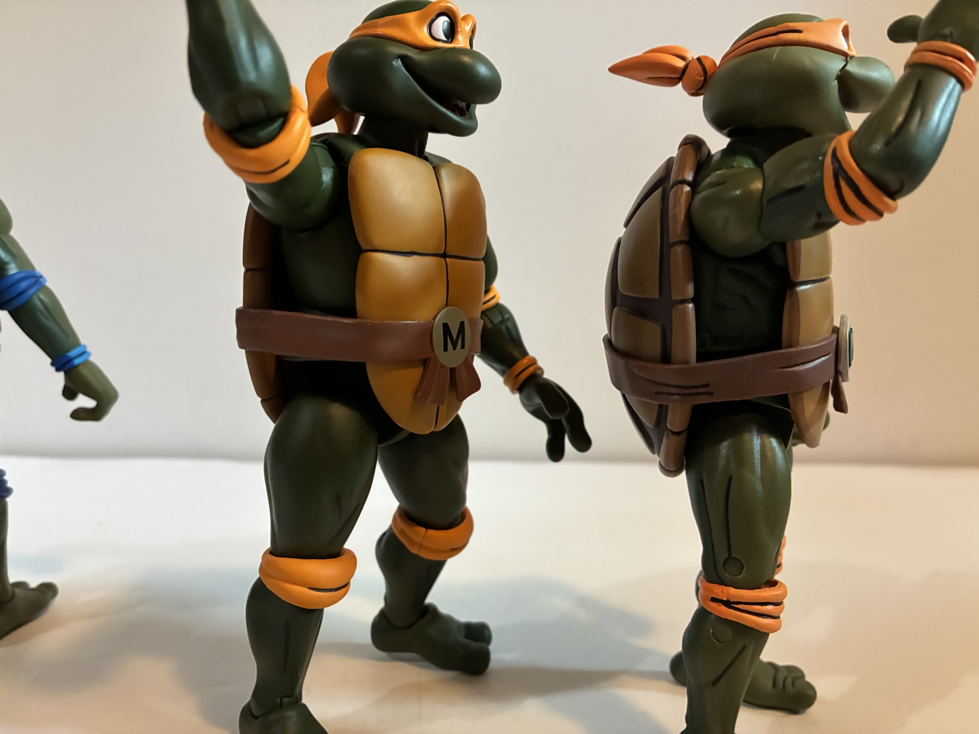
When I first took these boys out of the box I expected to find some mix of old and new. I took Michelangelo, being the most basic of the four, and compared him with the Stump Wrestling Raph since he’s practically a naked sculpt. To my surprise, these figures do not appear to share any parts. They may share some internals, basically what’s hidden by the shell and plastron, but that’s it. I figured the hands would be the same and the new ones even have that same, rounded, quality to them the Archie figures possess, but they’re all new as well. The Archie turtles appear to be just a touch bigger than these new toon bodies which in turn are bulkier than the old toon turtle body, but not really any taller. I’m not sure how I feel about this new look. There’s certainly a pleasing, toon, quality to these sculpts, but if anything I’ve felt the turtles were a little oversized for the line. They look too big mixed with the human characters, in particular. NECA basically fixed this with Shredder at least by giving us a new, bulkier, version of the villain. Do they intend to do more new sculpts of Casey, April, and others? Maybe. I guess these new ones help make Zach seem smaller.

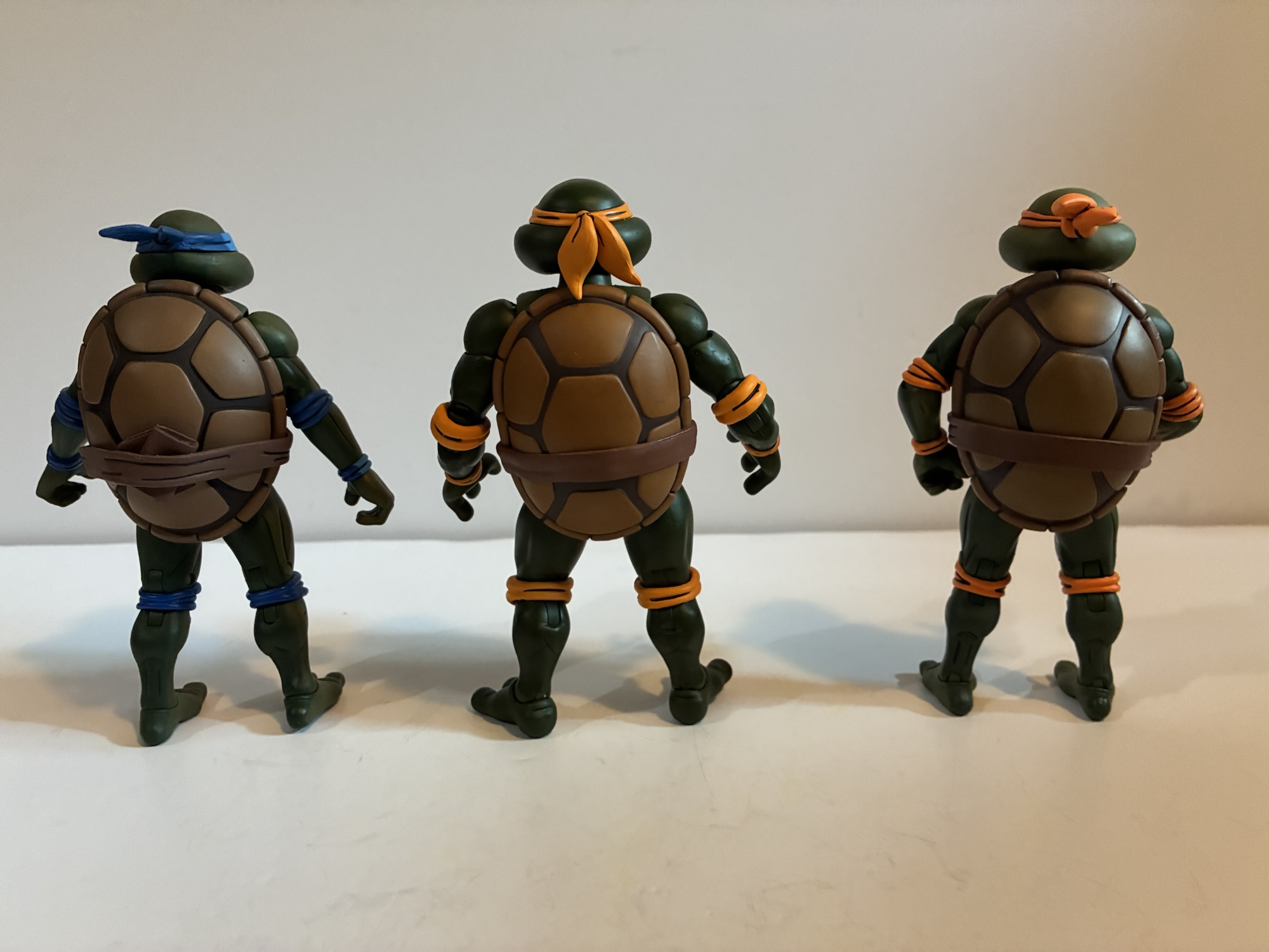
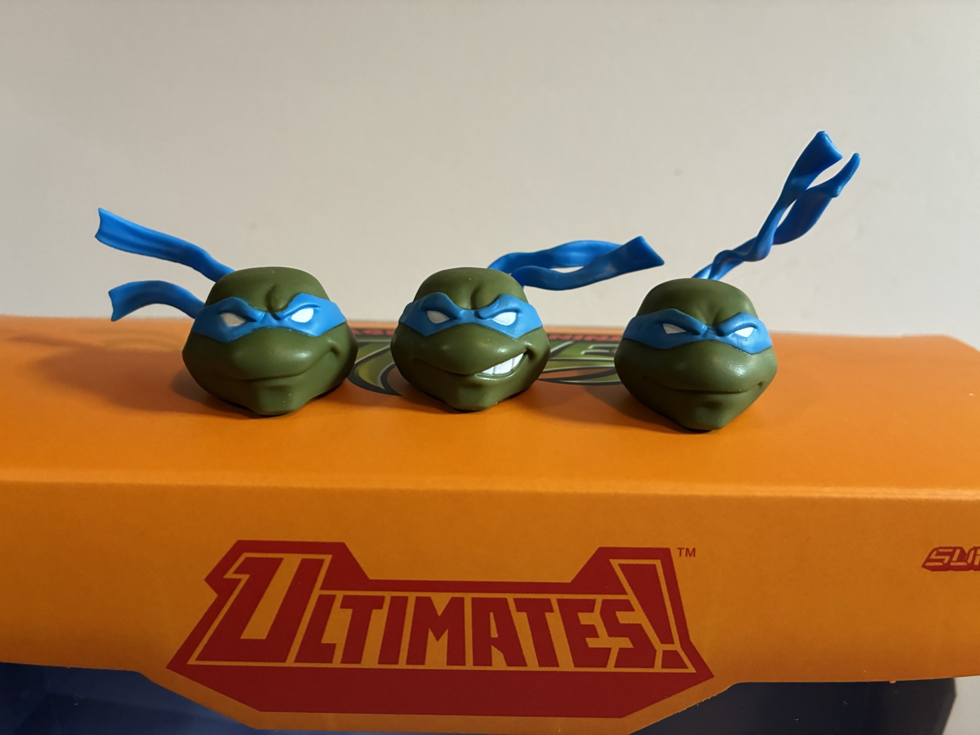
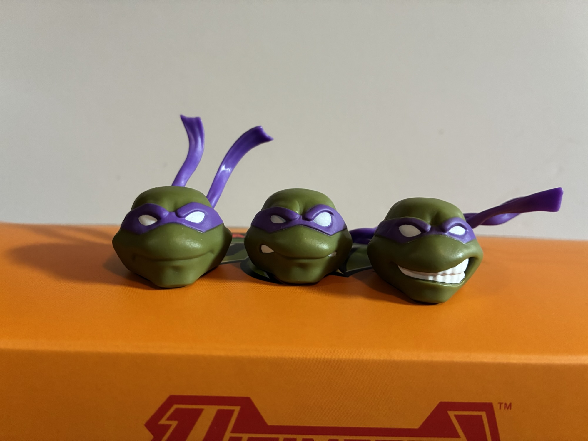
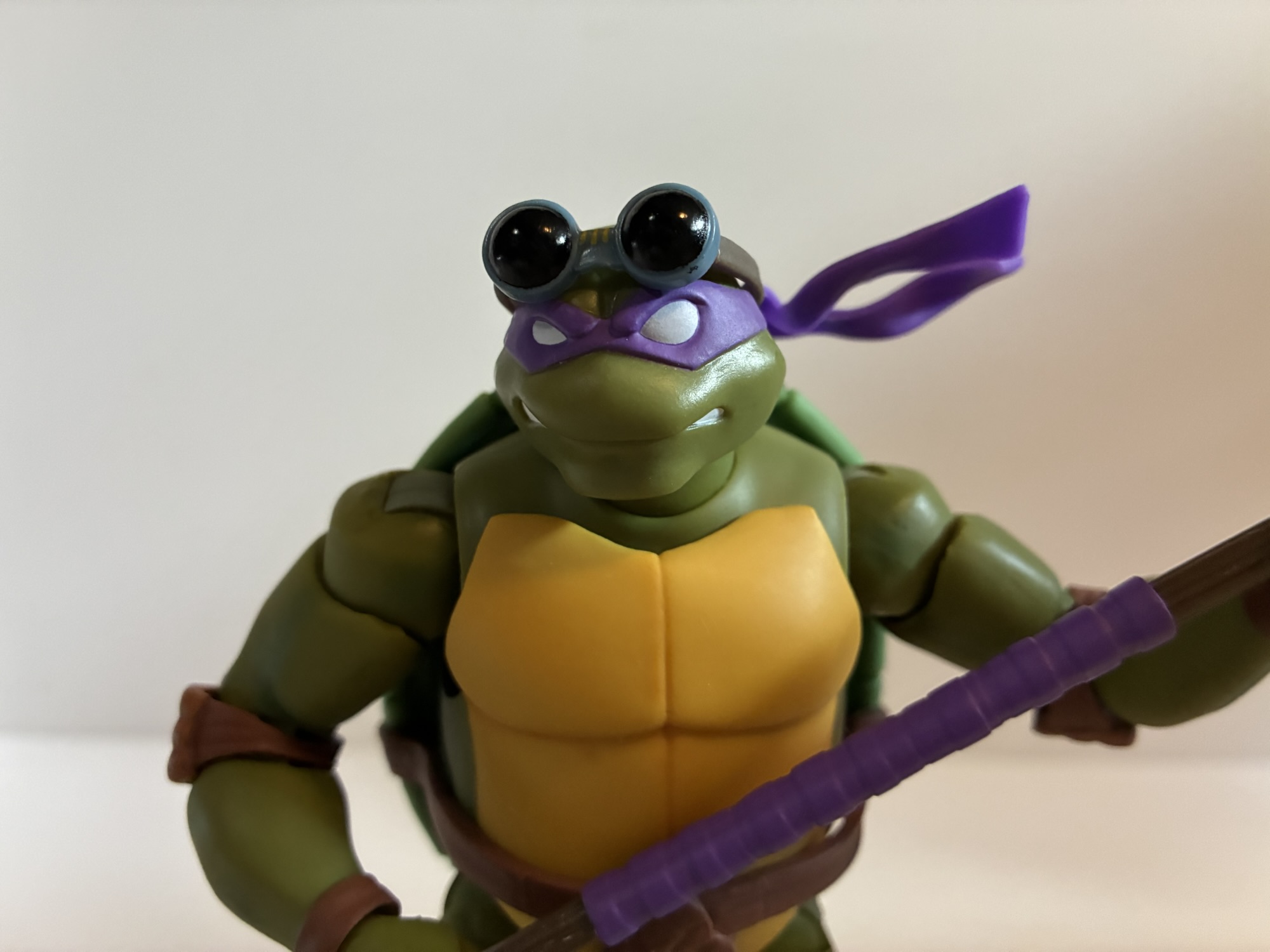
The figures also feature a much darker green for the skin. It’s definitely a lot closer to the Pizza Club reissues we saw a year ago or the Punk Turtles from that four-pack, but perhaps darker than both. We did just establish these are new sculpts, but if you were still hoping to mix and match with the old figures that’s not going to work. The colors will be off, plus the old hands are too small and the heads are as well even though they feature the same expression swapping tech. It’s an odd choice as I think the color of the turtles has always been pretty screen accurate. I know there are episodes where they’re darker, that’s just what happens with multiple studios working a show that’s trying to pump out as many episodes as it can in a short amount of time, but this does feel less accurate. I’m left to assume there is more of a subjective element at play here and NECA feels that these just look better with this shade of green. I did see someone speculate that maybe they’re darker since they’re at the beach and I suppose that’s possible too. Whenever new base turtles arrive we’ll dive into this more then, but for now I’m a little conflicted on where NECA is going with the turtles.

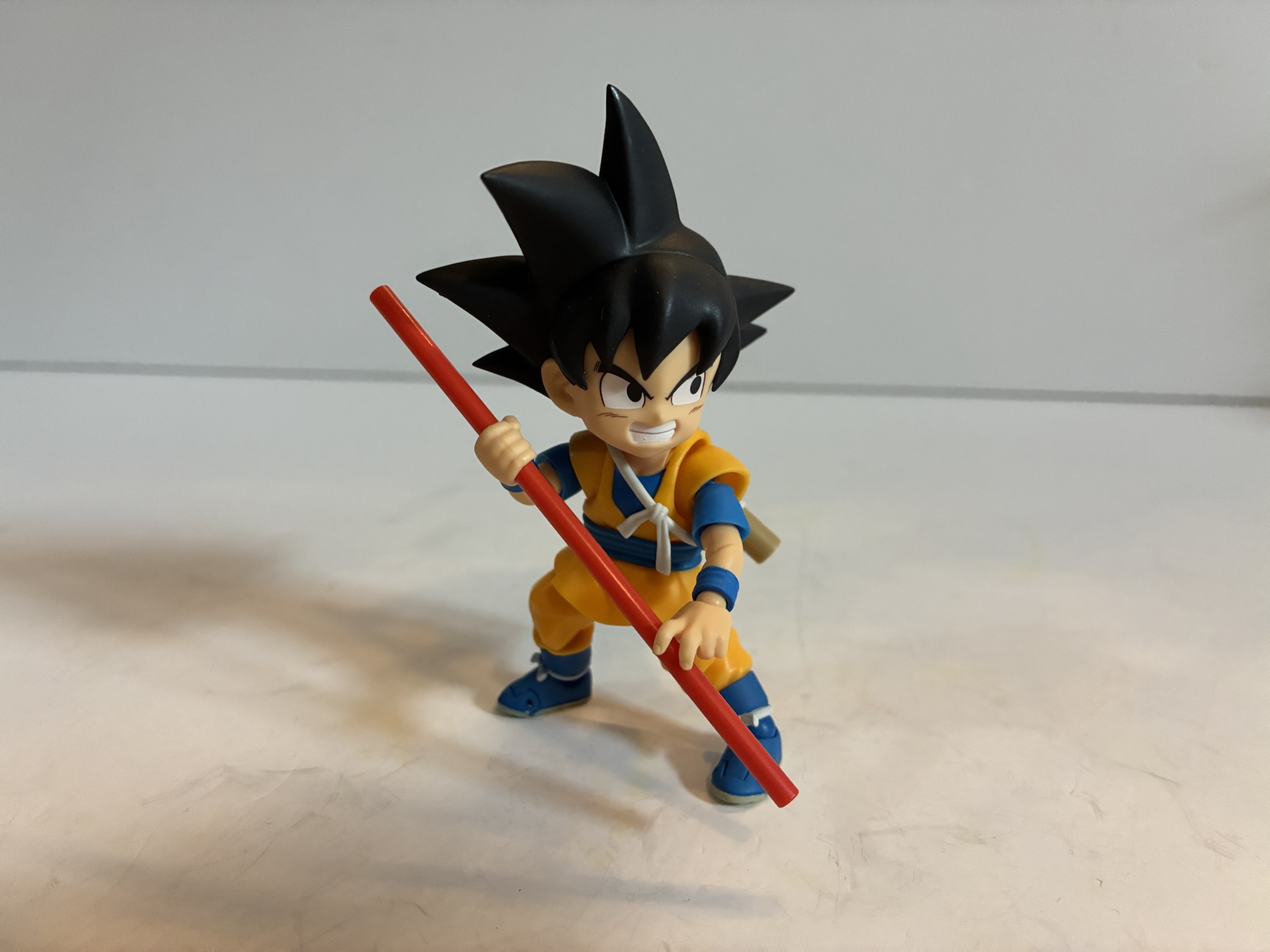
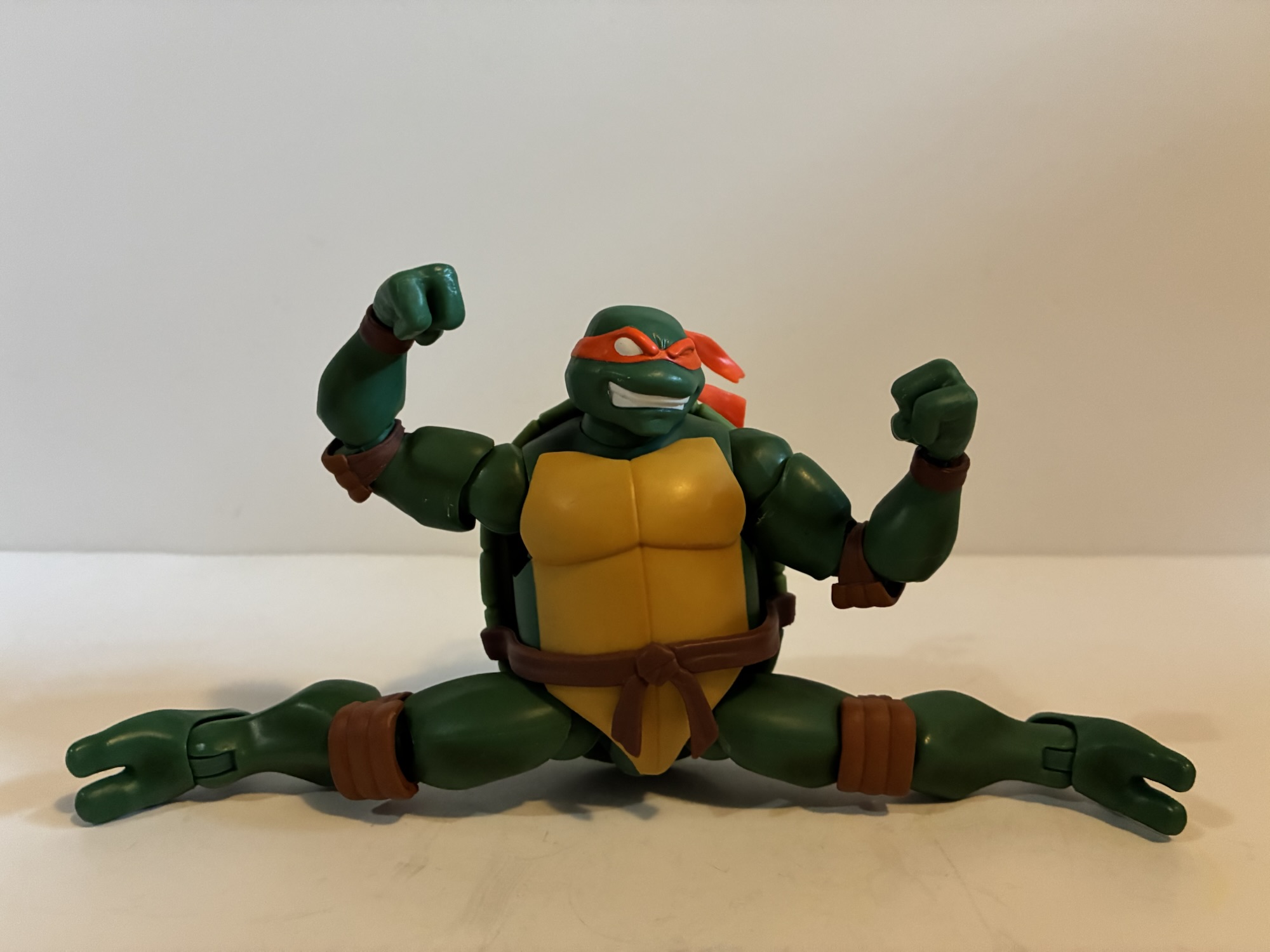
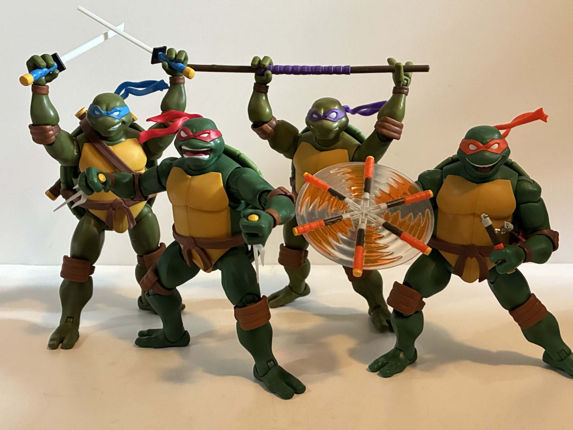
We’ll continue with the body talk here and just jump to articulation. If you have those Stump turtles then you know what to expect as the setup is basically the same. There’s a ball joint at the head and neck, hinged-ball shoulders, waist twist, diaphragm, bicep swivel, double-jointed elbows, wrists, ball-socket hips with thigh twist, double-jointed knees, and ankles that hinge and pivot. Because they’re turtles, the diaphragm joint is pretty useless. They also have elbow pads and knee pads which hinder the range at the elbows and knees. They go past 90 in both spots, but not to the degree you may expect. The hinge on the gripping hands is a horizontal one and not the preferred vertical, weapon-wielding orientation. Since these guys don’t come with any weapons, it’s not that big of a deal at the moment, but I hope it’s not indicative of what’s to come. There’s also a noticeable gap between the top of the thigh and the sidewall, if you will, on the shell with Michelangelo. The same gap is present on the old toon bodies as well as the Archie ones, but not to this degree. I wonder if there’s going to be a filler piece here like the plastic “diaper” on the Mirage Jim Lawson turtles? NECA may have skipped it since Michelangelo’s shorts hide it, but if so that’s kind of a cheap tactic. It probably does give him better range at the hips where full splits and high kicks are possible so I guess that could be their excuse. I do think most would have preferred this to just be a standard Mikey with soft goods pants though.
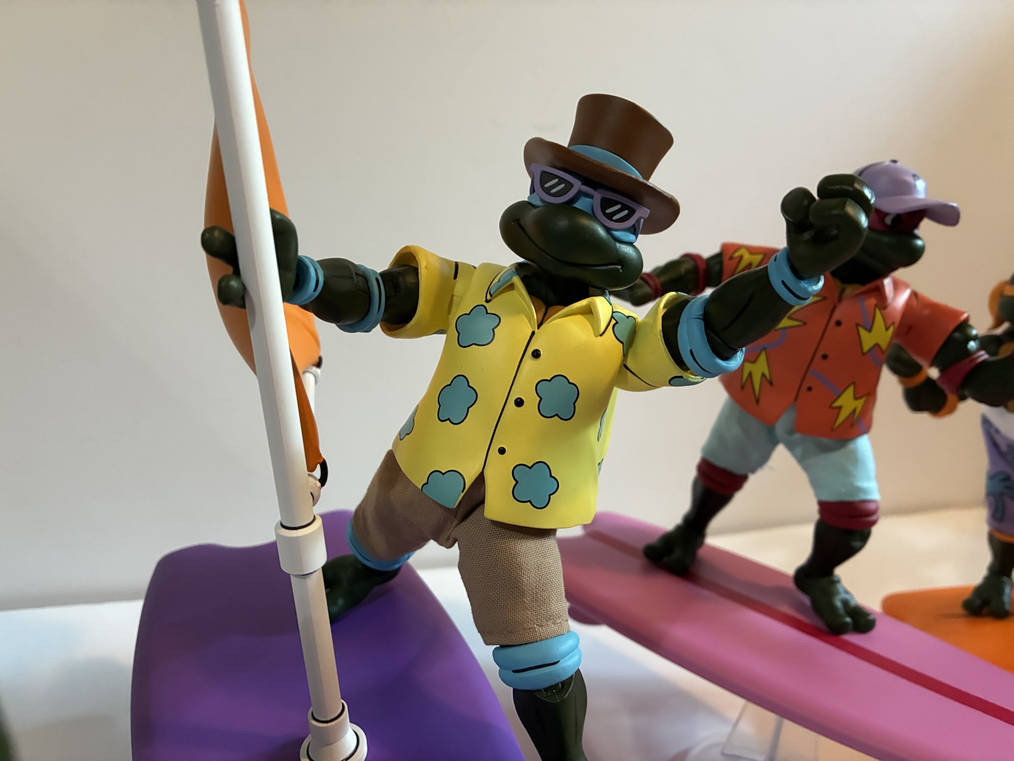
For Leo, Raph, and Don, we have a soft plastic overlay in place of the shell and plastron. The shoulder is also a different piece as it’s a sculpted sleeve. The arm plugs into that and you get your bicep swivel inside the sleeve so the articulation is essentially the same as it is with Michelangelo. The shirts are designed to seem big like they’re hiding a shell underneath. There’s even some of the plastron sculpted into the piece at the collar. Because it’s soft and there is no hard plastic underneath, these guys do move a little better at the waist as they can actually pivot some in addition to rotating. I still can’t get the diaphragm joint to do anything though even though I can see it at least. The hats are also pegged onto the head and appear to be further secured with glue as they don’t want to spin. They’re soft and it’s easy to peel them back some to see there’s a big peg sticking out of the top of the head so even if you could get them off it would look hideous. It sure would have been nice if NECA just made them separate. Leonardo also has sunglasses and they’re glued to his head like the ones with the Punk Turtles. While the plastic shirts help give a more toon appearance, I do find they clash a bit with the soft goods shorts. And I probably speak for most when I say I wish they went with soft goods all over so we could convert this whole group into a standard look, but then we wouldn’t buy the eventual four-pack release that’s sure to come, right?
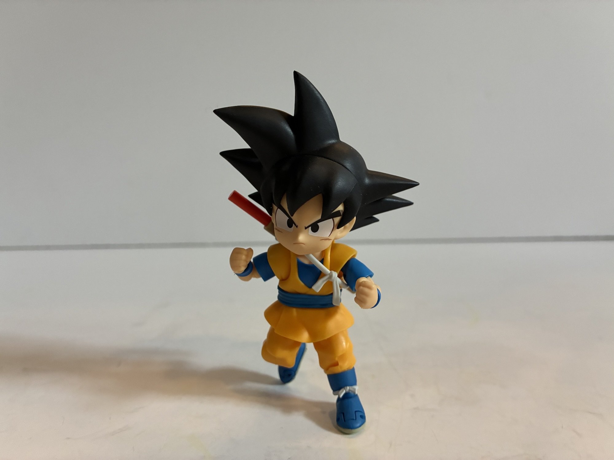
The paint across all four is mostly good. The cel-shading is gone as that appears to be a thing of the past now and instead they’re the same shade of green all over. The patterns on the shirts are handled very well and there’s some black linework painted onto the sculpts. Basically, NECA is taking the same approach now with this line as it does the Archie one when it comes to paint. These turtles do have massive pupils now and it’s a bit weird looking. Their eyes almost look dialated. Raph also seems kind of pissed, but maybe he didn’t pick the outfit? He also has some black linework on his hat that basically just goes from one “ear” (I realize they don’t have any, I just mean where an ear would be) over the top of the hat to the other. There’s a sculpted shape to the top of the hat though and I almost wonder if the line was supposed to follow that because it looks weird to see that left unpainted. I do have a couple of paint dots on the forearms of all but Leonardo. They’re very small and in the color of the turtle’s elbow pads. I’m not sure if it will come off, or if it would just be easier to go over it with a little dab of green paint.

Unfortunately, I do have a quality control issue right out of the box. Michelangelo’s left arm is barely hanging on at the bicep. The peg looks to have split as I can see right into it. It was obvious to my eye just looking at him. Had it not been I probably would have twisted the arm right off. In addition to that, Raph’s left shoulder won’t budge at the hinge and his arm has some wiggle at the bicep as well. It’s possible it just isn’t seated perfectly in the joint or it could also be defective, but just not to the extent of Michelangelo’s arm. Some hot water would likely free up that shoulder, but with Michelangelo basically broken I didn’t want to try without first reaching out to NECA. I emailed them after 5 PM on a Thursday and they got back to me before 9 AM the next day with a shipping label for me to return the entire package. Thankfully, I had only removed the turtles from the box so it was pretty easy to put everything back in its place and ship it out. NECA did say they would send me a replacement if one was available. Since it is a Comic Con exclusive, it’s possible they don’t have any to replace it with and if that’s the case they’ll refund me. It’s kind of annoying that they couldn’t commit as maybe I’d elect to keep it if I couldn’t get a replacement? At any rate, I’m writing this in between shipping the set back and receiving a new one from NECA so if it all went according to plan then you’ve seen a bunch of pictures and the review can continue on from here. And if not…
After just over a week after receiving the first set from NECA I had a new one. Michelangelo is now fine and the Raphael appears to be an improvement as well. The only new issue is my Raph has a little blemish on his nose. It’s not really visible because of the darkness of the skin, but can be felt. All in all though, a good customer service experience and no complaints from me. Now we can move onto the other stuff in the box.

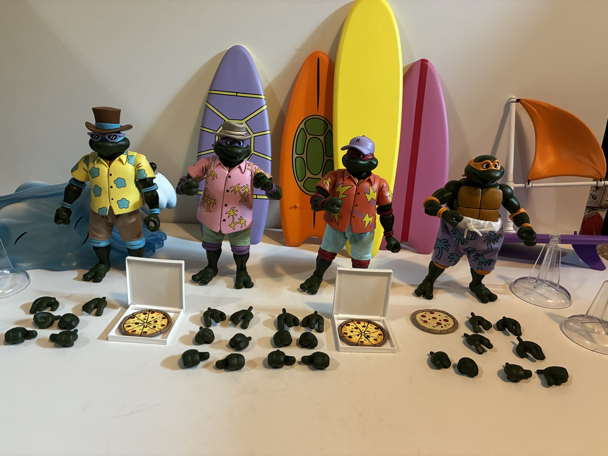
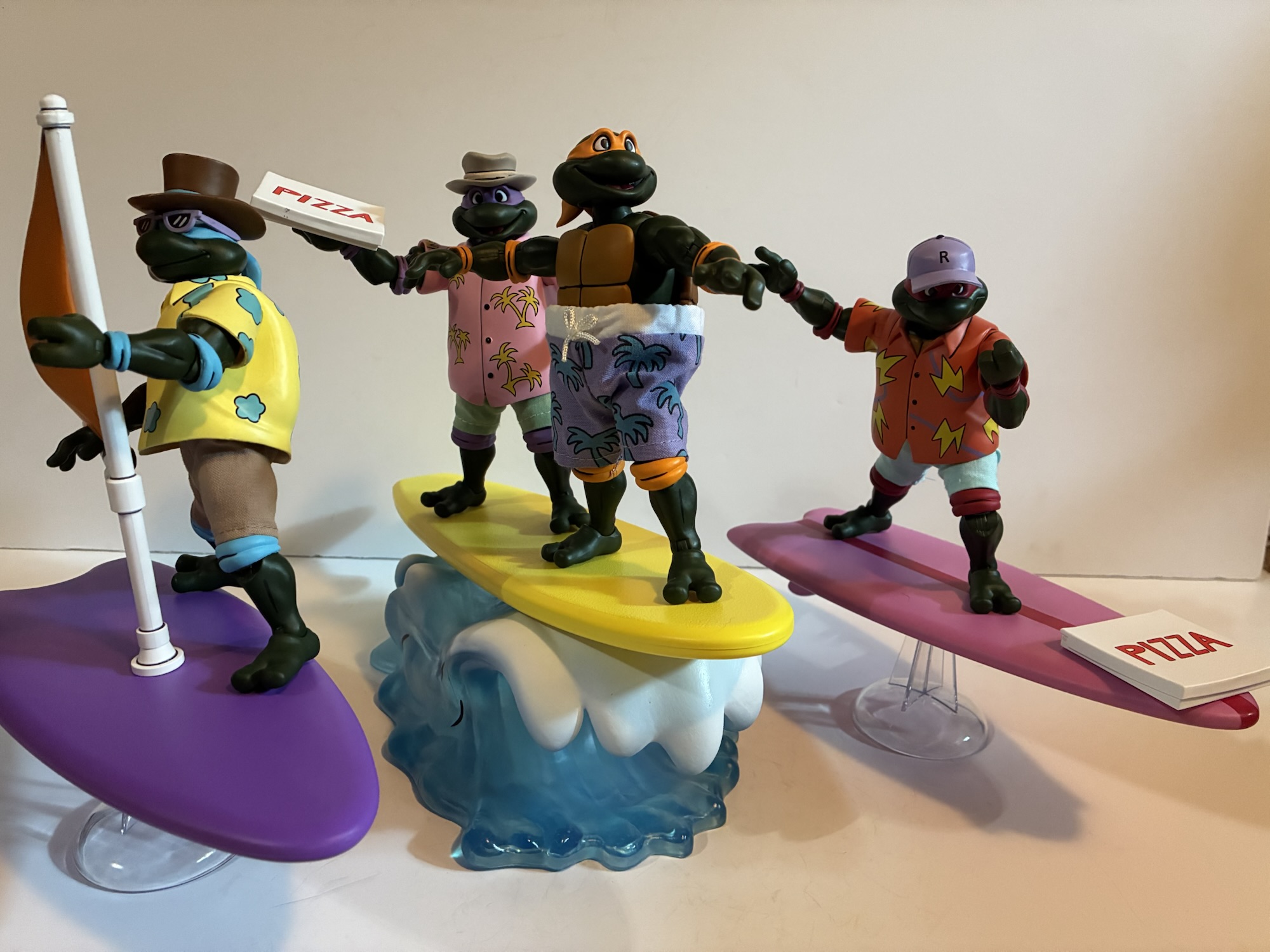
For hands, these turtles each have a set of gripping hands, fists, open, and thumbs up hands. We also get one extra set of open hands for good measure, I guess. Every hand as a horizontal hinge which is unfortunate for both the gripping and thumbs up gesture. Hopefully this doesn’t mean the eventual standard turtles aren’t missing the vertical gripping hand. Each turtle also comes with a surfboard. They’re not really color-coded to the turtles as we get a purple one with shell pattern, orange with a shell tamp, pink with red stripe, and a solid purple board with an attachable orange sail. These are all almost certainly taken from the cartoon, but it was still surprising to see we don’t have a simple blue, red, orange, purple pattern. The sail plugs into the purple board rather snugly. It won’t even rotate once inserted so maybe make sure it goes in the way you want it to because getting it out could be tricky. It’s hard plastic and probably would be easy to snap. The boards also need their fins attached to the underside and each comes with a clear, acrylic, stand like the old Turtles in Time figures NECA put out. Three of my stands work fine while the fourth is too loose. I’ll have to modify it so the boards can fit snug onto it. Right now, the board just tilts all the way back until the fin hits the surface it’s on.

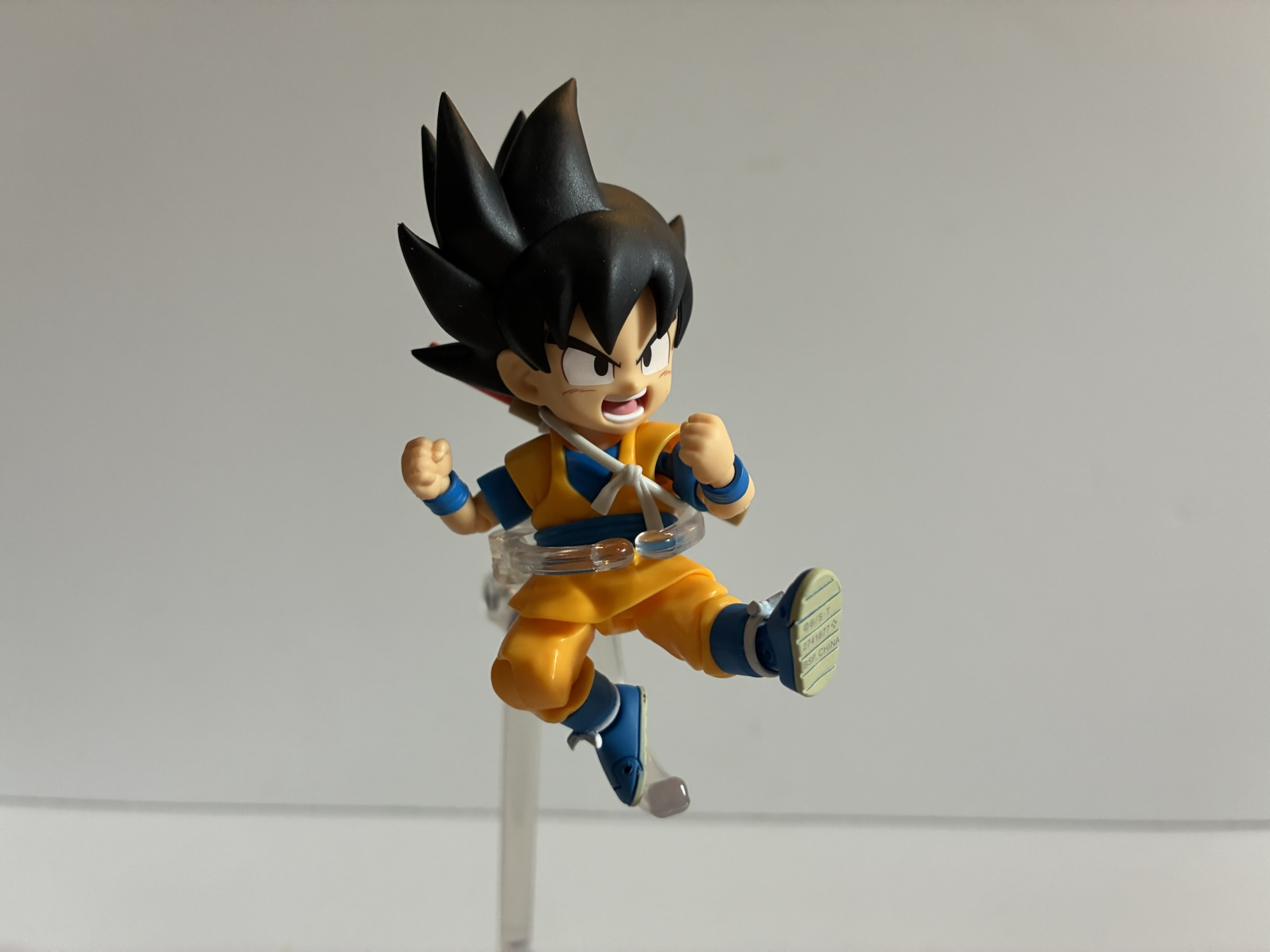
The big accessory, and what is probably the selling point, is the wave and fifth surfboard. The wave is done in translucent, blue, plastic, with white paint for the crest. There’s a black ball peg towards the front and that’s for the yellow board to plug into. The wave is about 8″ long and the board 11″ (the other boards are close to 9″) and once plugged in it will get your turtles about 4″ off of the surface it’s placed on. There’s some nice weight to the accessory and it does what it’s supposed to do. The board has no pegs on it for added stability, but does feature a rough surface which may help with grip. You can fit all four turtles onto it, though it gets pretty crowded. It completes the look and when all is said and done I’m guessing this thing is the only aspect of this set that will remain exclusive to it, but who knows? Maybe it will even show up in another line?

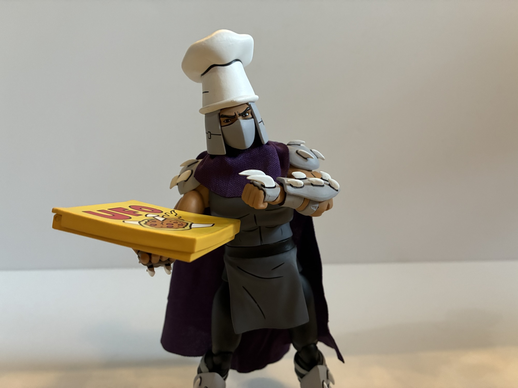
The only other accessories in the box are three pizzas and two pizza boxes that just say “Pizza” on them. They are the hinged style, so I guess that’s good. Is that enough? Considering it’s a convention exclusive and the figures are all new (though destined to be reused many times over) sculpts I think it feels about right. The only real negative for me is that the figures can’t just be converted to regular turtles. Michelangelo might be, but the rest aren’t and none of the old expressions work here. Considering the change in skin-tone it’s not as big of a loss as it would have been, but it’s still annoying to go from a solid assortment of expressions to just what we have here. I’ll withhold final judgement on the sculpts as far as their appropriateness for the source and as replacements of the old ones. I have felt for awhile that the turtles have fallen behind some of the more on-model sculpts we’ve seen in the line over the past few years so I wanted new ones, I just don’t know how much of an improvement these are.
That’s a discussion for another day, as for this one, should you get it? Only if you love the concept. If you never wanted and still don’t want beach turtles after reading this then feel free to skip it. Yes, it’s a little exciting to get your hands on new turtle sculpts a bit early, but we’ll get the real thing eventually. If on the other hand you really like the look of this one then, sure, go for it. Assuming it’s not now overpriced. I have a feeling demand was soft and that NECA still has a bunch of these. Will they put them back up for sale? Probably, though with these things they usually first do it as booth exclusives at later shows. If they go up on a website it probably won’t be for a little while and without fanfare. Costumes.com was the website that would get that stuff in the past and it might in the future. Convention goers looking to flip this for a quick buck probably won’t find many takers so if you play the waiting game on eBay you may eventually find people looking to just offload this one at cost, especially if they were able to take advantage of the $40 off promotion. We also know these figures are going to get two-pack releases in a different colorway eventually so, as I said before, the only real exclusive here may just be the wave. As for me, I’ll probably make these guys a summer time decoration and that’s all. It will help make them kind of fun, but it’s not a set I’ll likely do much playing with. Hopefully, I can get them back into the box without too much fuss, though I also kind of want to get rid of it since it’s so damn big. Ultimately, it’s a good convention exclusive because it has a theme, it’s executed pretty well, and it’s not something everyone needs.
The Bodacious Beach Bros. are just the latest in a long line of NECA convention exclusives:

NECA Mirage TMNT – The First Turtles SDCC 2024 40th Anniversary Edition
As the story goes, one night Kevin Eastman was drawing with his friend and partner-in-comics Peter Laird when the idea to doodle a ninja, anthropomorphized, turtle entered his brain. Laird was so amused by this drawing that he too drew his own take on it. What was done just to amuse each other eventually turned…
Keep reading
NECA Teenage Mutant Ninja Turtles III SDCC Four-Pack
2023 marked the 30th anniversary of the much maligned third entrant in the Teenage Mutant Ninja Turtles film franchise and you just had to know that NECA Toys would mark the occasion. It was almost too obvious that I thought maybe the company would zig when everyone was expecting a zag, but they didn’t and…
Keep reading
NECA Cartoon TMNT Premonition of a Premutation SDCC 4-Pack
It was a little over a month ago that San Diego Comic Con occurred, in person, for the first time since 2019. This was cause for a celebration, even if for those of us who take in the convention from the comfort of our homes saw little change. Even without the event taking place the…
Keep reading