Category Archives: Television

Mezco One:12 Collective Mighty Morphin Power Rangers Box Set

It’s morphin’ time!

When it comes to Mezco and its action figure offerings I have a very specific taste. To me, the majority of their super hero figures look little better than Mego. Some people like that aesthetic, but not me personally, and I’m certainly not into paying 100 bucks for the honor of owning such. Some frequent readers here may be surprised that I never reviewed either of the Teenage Mutant Ninja Turtles four-packs the company released last year and that’s because, to me, they looked like dried-out turds left out in the hot sun to bake. I saw plenty of folks singing the praises of that set and I think it’s great that they enjoyed it, it just wasn’t for me.

With Mezco, the stuff I typically am drawn to are their creations based on live-action properties. I love the look of their Batman ’89 and their Michael Keaton likeness under the cowl is spot on. I don’t love the approach they took with the silicon body, but if you want to read more about that there’s a link at the bottom of this one. I really liked their take on The Crow based on the 90s film. I didn’t get it, but I certainly gave strong consideration to doing so. And my favorite figure I picked up in 2023 was the Mezco Green Ranger from Mighty Morphin Power Rangers. It was a perfect character for Mezco to tackle because it was based on a live-action series where martial artists in spandex suits and helmets wield goofy weapons. The fact that the character is helmeted made it even more perfect because even though I said I prefer Mezco’s take on live-action properties, they don’t always nail the likeness. The Crow works because he’s covered in paint. The unmasked Tommy Oliver head they included with the Green Ranger is just okay. And that’s fine because I’d never display him unmasked.

It’s impossible to convey how huge this show was in 1993.

When I got that figure the plan was just to get the one. I’m strictly a casual MMPR fan who feels drawn to the toys of today because the toys of yesterday were so hard to come by when I was a kid and actively watching the show. The Green Ranger is the best of the rangers so it made sense as my lone representative for the series from Mezco. It turned out so well though that my attention turned towards the rest. There was a White Ranger released in 2024, but I don’t need two versions of the same character. Plus, I fell off the series right around that character’s debut. I have a full squad of rangers from the Hasbro Lightning Collection, but it’s merely adequate. Over time, as often happens, the flaws with those figures become harder to ignore. They’ve stood untouched on my shelf for years. I don’t intend to go down any extensive MMPR rabbit hole at this point, so why not splurge a little and get a set of Power Rangers that I’m really going to enjoy? Couple that with a milestone birthday in 2024 and I decided to say “screw it,” and gift myself an expensive set of Power Rangers.

Time went by. I scored a great deal on Entertainment Earth because of a promotion that applied even to preorders. Month after month would come and go with the product getting pushed out. Eventually, I got irritated by the whole thing and began questioning if I really wanted it. We had some expenses come up, the holiday season also came and went, and I just hated the idea of this expensive item coming due at any moment so I cancelled. Not a week later, product starts hitting. God damnit, Mezco. I lost the deal I had on the set and figured that was that. Then Big Bad Toy Store actually got the product and showed it as in-stock and ready to ship. And to my surprise, there was no additional markup. Usually with Mezco, BBTS will put up preorders at MSRP, but once the item actually hits, they jack up the price to capitalize on the FOMO purchases. Maybe they had a high number of cancellations on this one since it was sitting out there for so long (years, I want to say) and needed to just make sure they sell the product they have at the price quoted before they try to extract a little more. I don’t know. I ruminated on the subject a little then obviously gave in since we’re here today talking about this set.

The Mighty Morphin Power Rangers Box Set from Mezco checks in at a whopping $400. That’s a number more commonly associated with a video game console and not a set of action figures. Considering that most Mezco figures retail for $100 or more (I think the Green Ranger was $110) this set actually feels like a pretty good deal. That’s five figures each with a vast assortment of accessories at $80 a piece. I won’t call it a bargain because $400 is $400. Maybe a week long stay in a hotel for that kind of cash could be considered a bargain, but not action figures. The big question then is do these figures justify their cost? With the Green Ranger, my conclusion was a somewhat tepid “Yes.” The figure’s great, I just wasn’t convinced it absolutely had to cost what it did. And that was at a significantly higher price point. These figures are off to a better start by virtue of that fact, but an $80 action figure is still a pricey thing. I’m not sure if I spent that much on a single action figure in this scale in 2024. I did spend $75 on a figure so it’s not as if I’m far off the mark, but there is certainly something to prove with this set and expectations are and should be high for that price.

The accessory tray is pretty comprehensive.

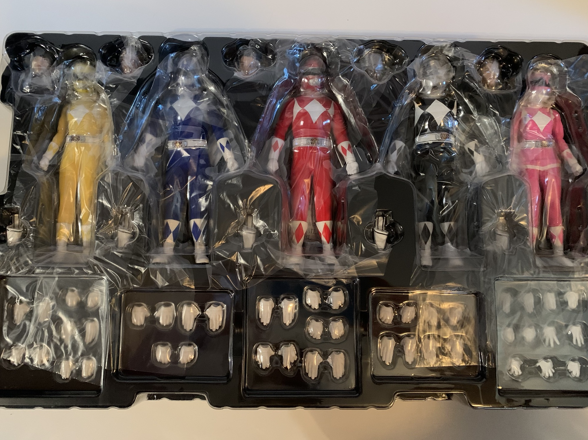
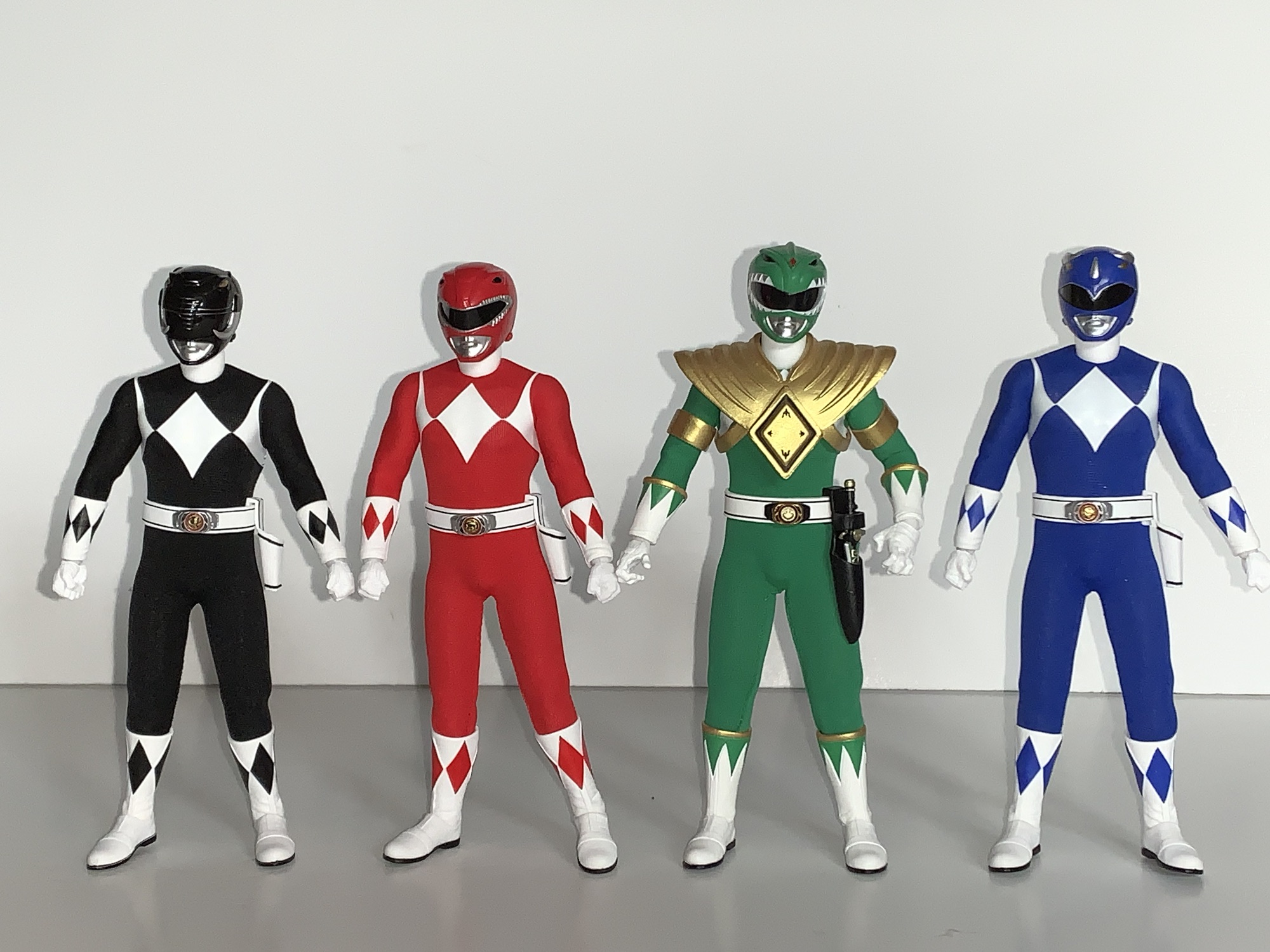
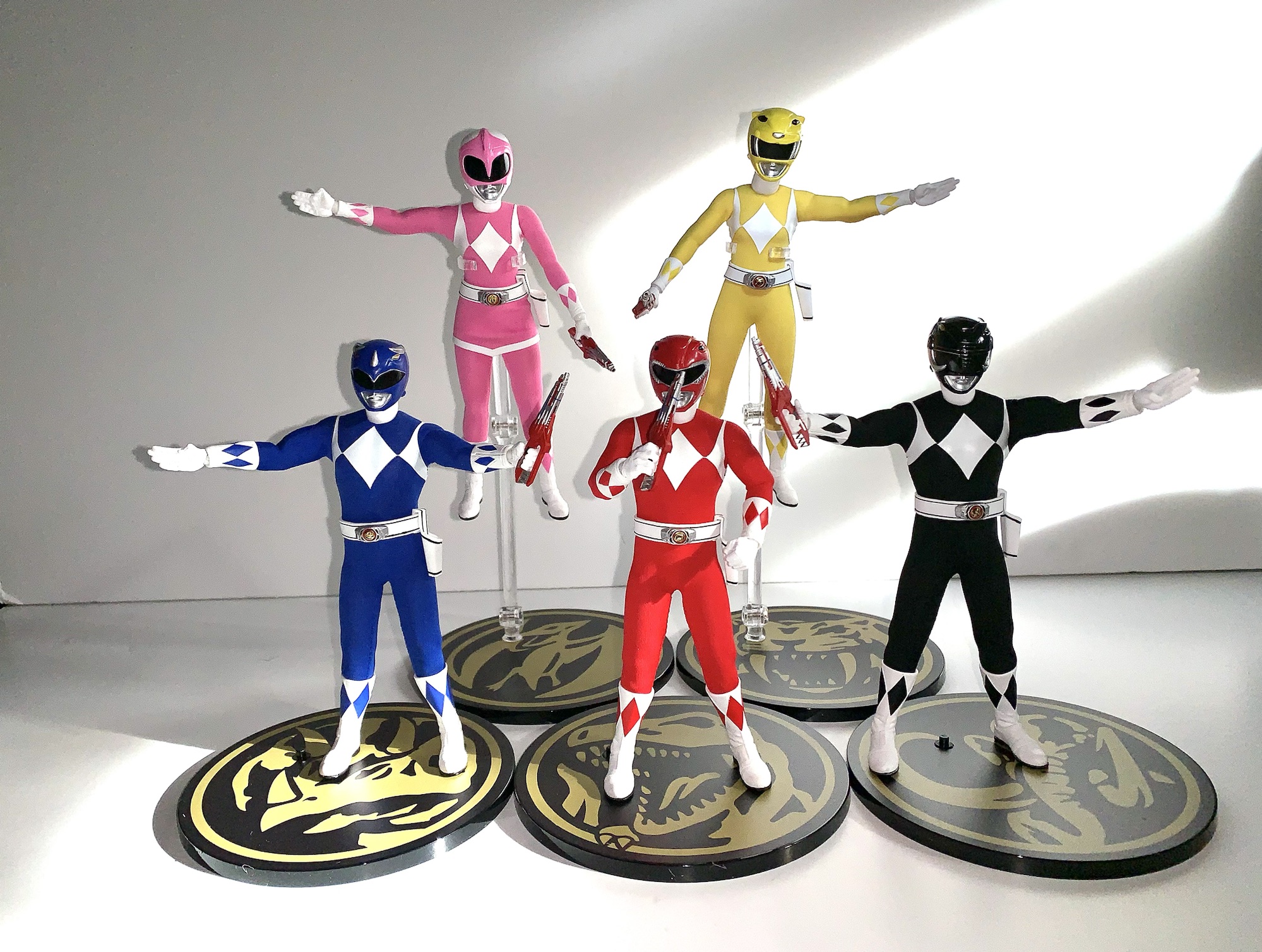
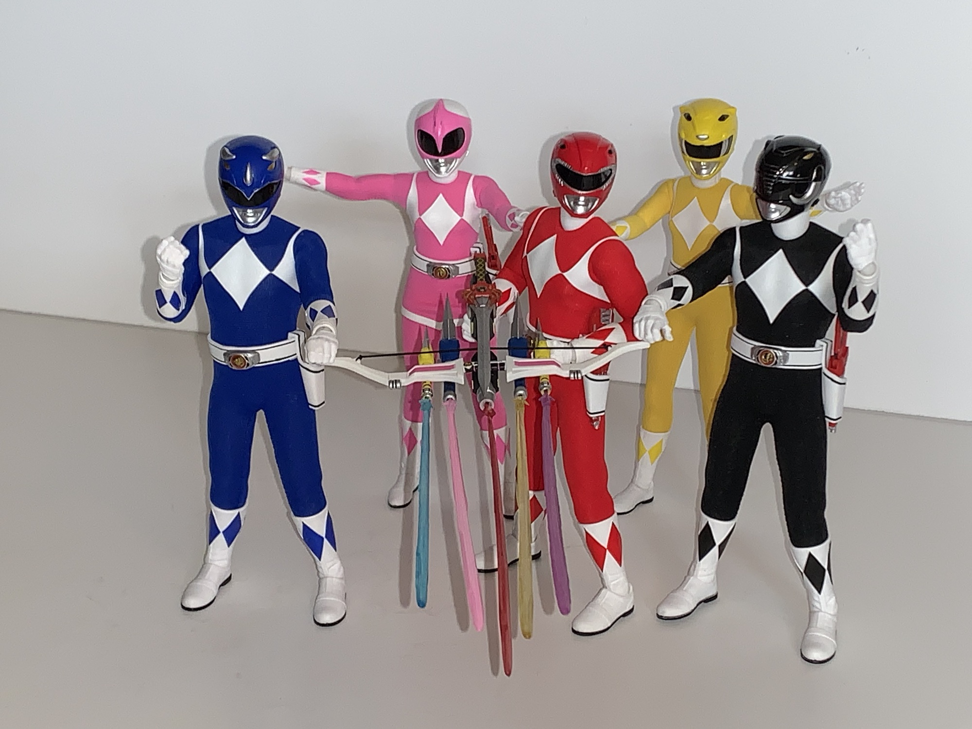
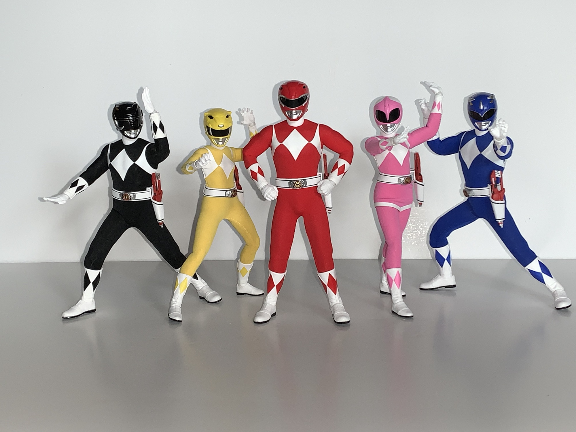
The figures come in a pretty large box with multiple trays within. The box has what I assume is new artwork commissioned for the release and it’s all fine, but it’s not a window box so if you want to not only hold the figures, but just see them, then you’re going to have to open it. Once removed you have your five figures. It’s actually more like two figures as the male rangers share a body and the two female rangers share a body. And that’s fine as the characters were fairly similar in the show when suited and I wouldn’t expect a sculpt tailor made for each figure. Especially because the helmets and soft goods are unique enough.

And there they are.

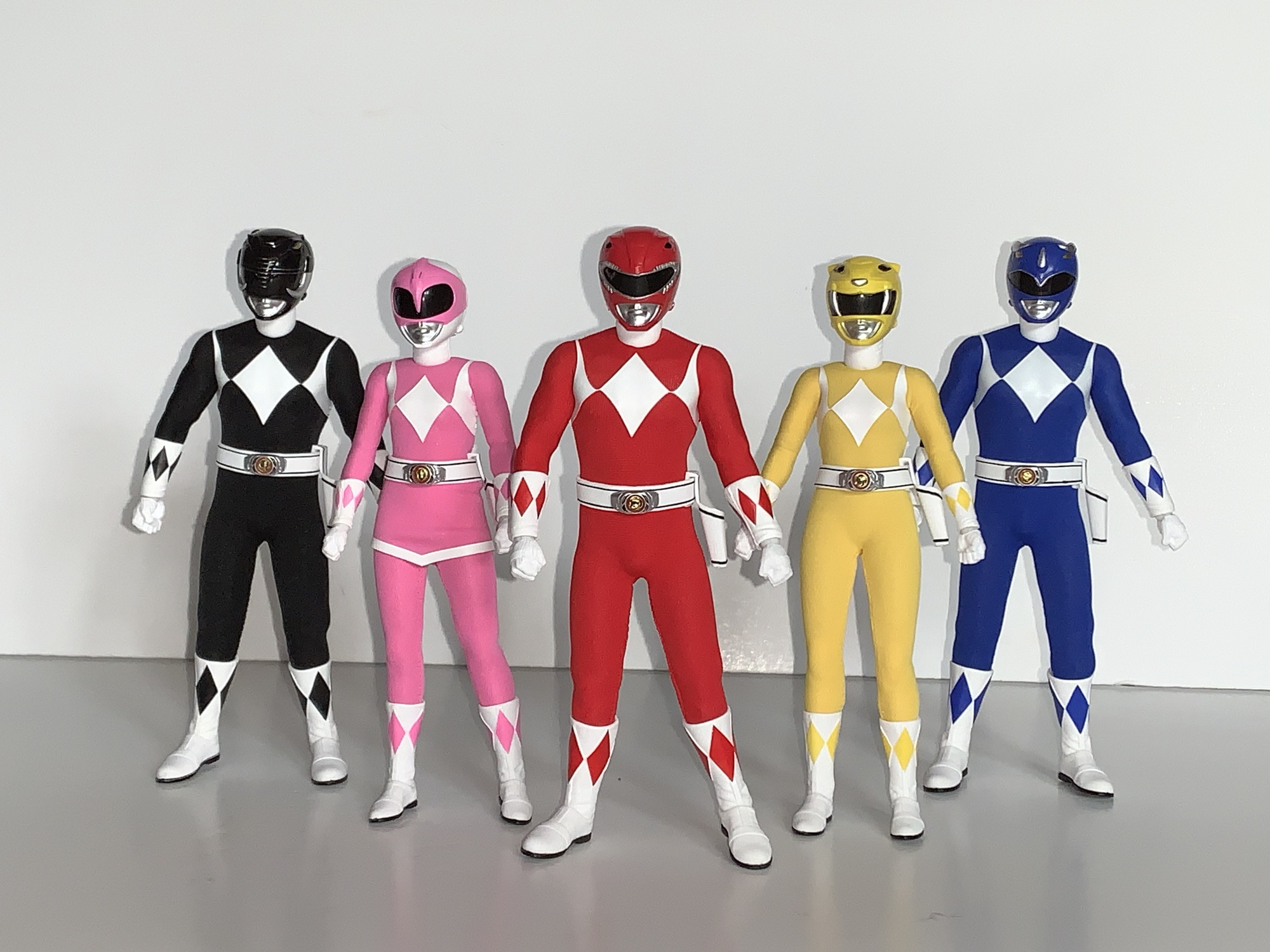
Just standing them all in a row and taking it in the look is impressive. From a normal distance, they look like miniature versions of the characters from the show. The helmets are the right shape. The details are all in place when it comes to the sculpt work on the helmets or the stitching in the gloves and boots which are sculpted in. The colors are bright and vibrant and the white vinyl or decals for the diamonds on the chest is nice and opaque, even, and straight. As is the case with Mezco, we have a mix of soft goods and plastic. The heads, gloves, and boots are all plastic while the body is covered by the soft goods. If you get up close, you can see the threading in the suits which I suppose isn’t screen accurate, but I’ve also never been that up close and personal with a real Power Rangers suit. They obviously take on the look of the characters when using the American actors since the Yellow Ranger was played by a male in all of the Japanese footage. And that’s fine. For an American audience, Trini is the Yellow Ranger and it would look out of place if the figure had a male body, even if that’s what we typically saw on TV. I think it would be cool if Mezco did a one-off Yellow Ranger release on the male body for those who want a Super Sentai display, but I don’t know if such a thing is likely.

There should be a lot more black around that morpher.

The presentation is strong, but not perfect. Nothing is, and when a figure costs 80 bucks we’re going to scrutinize the Hell out of it. The helmets on the males look fine, but the females do stand out a bit as oversized. I do think some of that is other toys and media playing tricks on us. The Lightning Collection, and most action figure lines, scale down the helmet heads slightly. Some of the older lines scale them down a lot to the point where one would question if a human head could actually fit in them. They’re pretty big on the show, but if you’ve spent years looking at figures where they’re a little smaller then it’s going to have an effect. Similarly, the Yellow Ranger being a male in the show more often than not means the figures usually look out of whack. However, in this case, I do think the helmet size is too big. For the Pink Ranger, it’s mostly fine. That helmet always looked bigger on the show, probably because of the size of the actress, so it’s not standing out. The other drawback I notice right away is that the diamonds on the chest, in particular the ones on the sides, have a wavy quality to them. They should be sharp, but it must have something to do with the vinyl coating in use here. What may bug the hardcore fan the most though is that the morphers are not the right color. They’re all silver here when in the show only the front is supposed to silver. The sides should be black, which is an odd detail for Mezco to screw up since they went through the trouble of making the coins in the morphers look so damn good.

We may have a slightly different body than Green, though Billy somehow seems to be a bit taller than Jason and Zack.

We’ll talk first about the male rangers: black, red, and blue. To my surprise, these do not appear to be identical to the Green Ranger I already have. I think much of them are shared, but there are some differences. Or at least one noticeable one. Under the suit, it feels like there’s just a basic action figure body. The Green Ranger I have at a little over 6.5″ while these new ones are right around 6.375″ which surprised me a bit. It looks like the Green Ranger is getting a bit more length out of the torso so perhaps it’s not the same body underneath. I don’t know if either figure is truly 1:12 scale, but it looks fine to me. The suit is stitched in the back so it’s not removable and the belts are an imitation leather. They’re painted with black striping and the Power Morpher is nicely detailed and personalized for each character. The blade blaster holsters are removable and they just tab on and off.

Posing is going to be pretty solid with some limitations thanks to the soft goods.

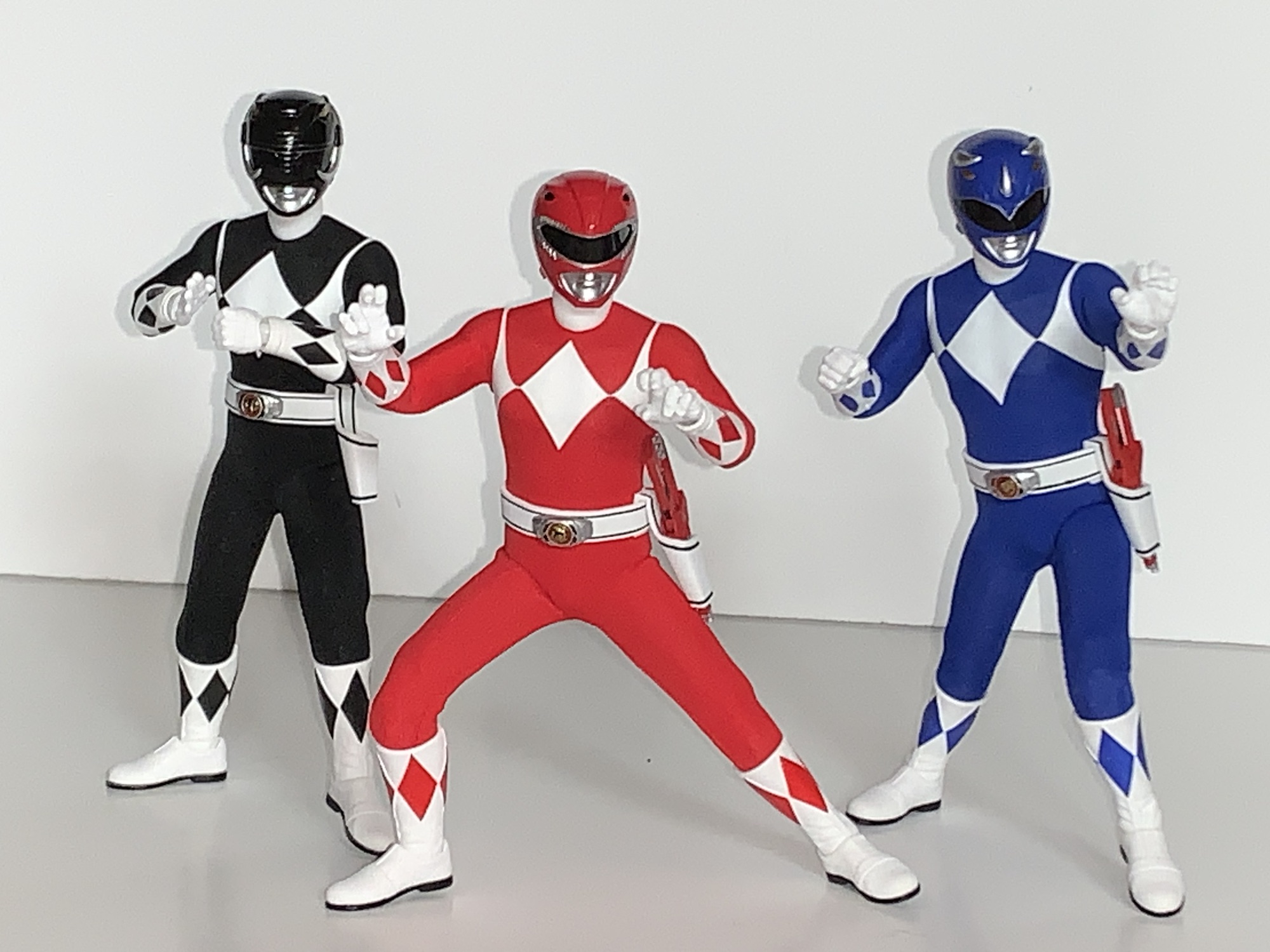
Running your fingers over these figures will allow you to feel out the articulation. It’s impossible to know exactly what’s underneath without taking one apart, but I’ll do my best. It sure feels like we have a ball joint in the base of the neck and I know we have a double ball at the head. The shoulders appear to be simple ball hinges and there is a bicep swivel, double-jointed elbows, a glove swivel, and ball hinge wrists. The diaphragm seems to feature a double ball and there is a slight waist twist. Hips are a mystery, but they got to the side a little better than 45 degrees and kick forward about 90 degrees. There is a dedicated thigh swivel, double-jointed knees, boot swivel, and a hinged ankle and rocker. Because these guys have different gloves and boots than the Green Ranger, those had to be re-sculpted and Mezco made at least one notable improvement and it’s with the ankle rocker. The Green Ranger’s ankles are pretty poor, but these new ones should have little trouble keeping their feet flat on a shelf. The actual boots do have an odd shape to them. In some poses it looks like they’re curving out. I’m not sure if it’s the connection to the leg that’s causing that. It can be posed away, for the most part, but out of the box I was wondering if the left and right shins had been swapped at the factory.

I like that the hands are nice and soft so swapping is easy and getting weapons into hands is as well.

The articulation is all basically there, save for a butterfly joint. It’s just limited by the soft goods and your own courage. If you try to put these guys into splits you’re going to have to stretch the material. I’m not saying the figures can’t do it, but I’m not willing to try. I wish I was some semi-famous YouTube guy who gets review samples so that I could really go the distance with these, but I’m not and I’m out a considerable amount of money should I break something. The joints that feel the most limited to me are the waist, shoulders, and those hips and it’s all because of the soft goods. The waist, for example, doesn’t feel like it wants to turn much. The shoulders don’t like being raised out to the side a full 90 degrees. The material is stretchy and it can probably take more abuse than I’m willing to dish out, but it’s also form-fitted to each figure. They’re not frumpy, which means if you leave these guys in a position that’s stressing the material it could stretch out permanently and lead to a poorer fit. That’s always going to be the limitation with this setup and it’s the same with other scales too. Have some fun with them in hand, but maybe don’t leave them on your shelf in anything too crazy.

As expected, the females share the same body.

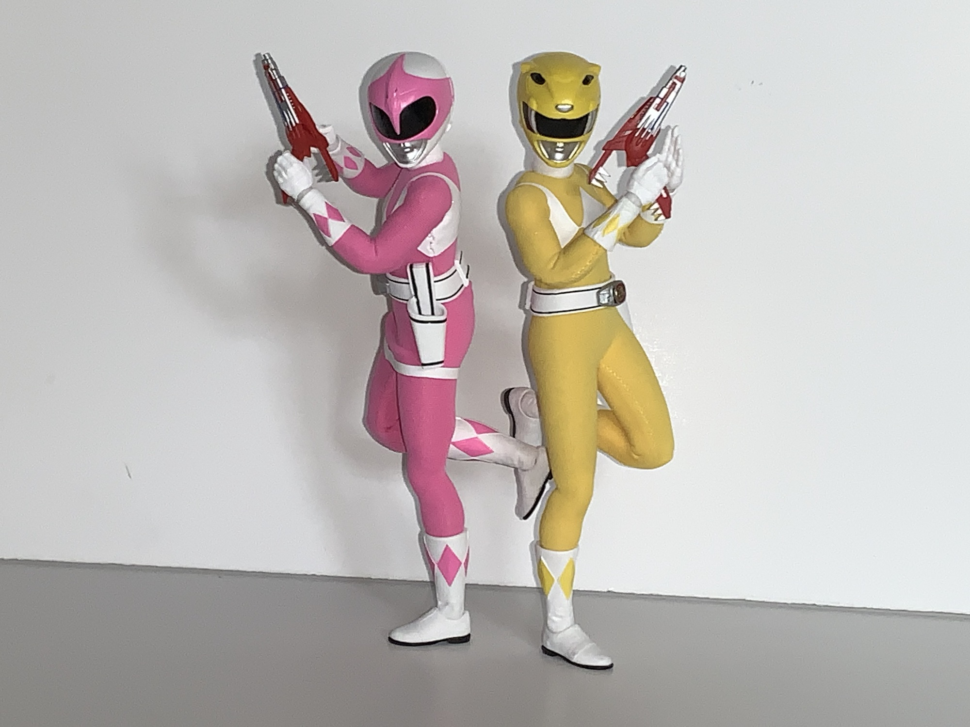
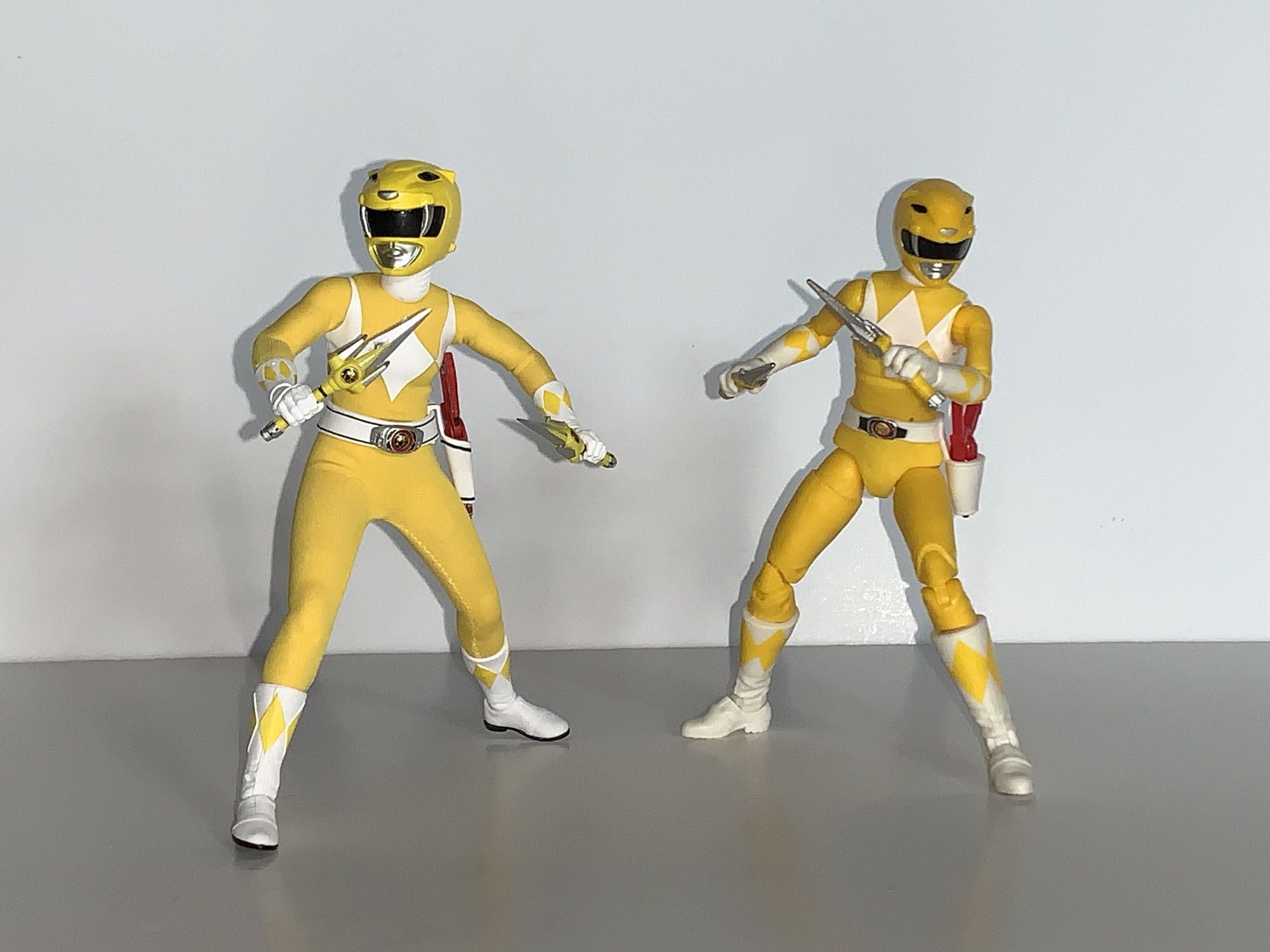
The female rangers are pretty much the same, only smaller, and with another detail I wasn’t anticipating. The pink and yellow rangers stand at just a tick under 6″ and I like the height separation between them and the boys. They have a more feminine shape with slender limbs compared to the males and a more defined hourglass shape to the torso without being unrealistically curvy. Kimberly, the Pink Ranger, has her skirt piece as well which seems to be just a separate piece that’s not sewn into place. The articulation feels to be the same, but the body underneath feels like it’s a silicon one. It’s my understanding Mezco tried this with a Spider Gwen figure and it’s being utilized here. The silicon body covers the torso, waist, and thighs and gives the figures a squishy feeling. These types of bodies are known for eventually cracking and tearing, but if it’s hidden underneath soft goods then who cares? I would think it’s an added expense so I’m surprised to see it in use here, but maybe this is a technique Mezco is going to utilize more going forward?

I find these two pose a little better than the boys. The torso and hips have a bit more range.

For whatever reason, this approach makes the women the more articulated of the pair. The actual articulation points are all the same, but they can really crunch forward and back in a way the males cannot. The legs seem to kick forward better as well and they also kick back all the way so they can theoretically do splits in both directions, though I still wouldn’t really advise it. The joints are stiff, but smooth, and if you have handled a figure like this in the past then you know what I mean. It’s a metal armature, basically, that’s inside the body so you do need to be somewhat mindful of that. Sometimes a joint can get pointed in a direction you weren’t expecting. As a result, the limb won’t move the way you want it to, but it’s just a matter of figuring out which swivel point got turned around and going from there. The one downside is it seems like joints can either separate or just aren’t tight enough. The right leg on my Pink Ranger doesn’t want to go out to the side and stay there. I don’t know if the hip is disconnected or if it’s just weak. It’s not floppy, but it sucks that the range isn’t there with her.

All of the characters come with an array of hands as well as an alternate, unmasked, portrait. The quality of the unmasked heads varies from character to character. I would say the Billy and Jason heads look really good, Zack and Kimberly okay, and Trini looks nothing like the actor. Billy doesn’t have his glasses which is technically accurate to the show, but for this era, I think most fans picture actor David Yost with his spectacles on. For hands, every Ranger comes with fists and gripping hands and then after that it varies. Red Ranger has a set of flat palms with his thumb to the side and a set of flats with his thumbs towards the palm. He also has martial arts posed hands (kind of his signature pose) and loose gripping hands. Black Ranger has the same, minus the martial arts posed hands, while Blue Ranger loses the flat palms with the thumb off to the side and the loose gripping hands, but picks up palm-striking hands. Yellow Ranger has the same spread as Black Ranger, plus a set of “Tiger Claw” hands. Pink Ranger has the most as she has the same spread as Yellow, but swaps the flat hands with thumbs turned inward in favor of splayed open hands like she just loosed an arrow. She also has an additional right hand specifically shaped for nocking an arrow. All of the male hands can be shared with each other and the same is true of the female hands, you just wouldn’t want to put a male hand on a female body and vice versa.

Each Power Ranger comes with their trusty blade blaster. These little gun to knives accessories are identical to the one that came with the Green Ranger meaning they’re capable of going from knife mode to handgun mode just as they did in the show. They’re hard plastic and well painted but Mezco did not include the “Power Rangers” writing on them. Some require a little extra oomph to push the dinosaur head forward when converting to the gun mode which can feel a little scary, but I haven’t had any issues. The actual blade doesn’t fold out and is instead a separate piece that pegs in. Mezco included five so you can have all five Rangers wielding their blade blasters in knife mode if you please or firing with the included blast effects. They’re a thin, translucent, red and likely made of an acrylic so do be careful when handling them. If you don’t want your Rangers to brandish these arms, they can be stored in the included holsters which is probably where most are likely to end up. Upon doing so though, it becomes clear that the blasters are a tad oversized compared to the ones in the show. They look big in their holsters and even the promo shots for this set seem to show a smaller weapon. This wasn’t something I really noticed with the Green Ranger since he doesn’t traditionally carry one of these things, but it’s plain to see here.

These are the weapons most associate with the Power Rangers.

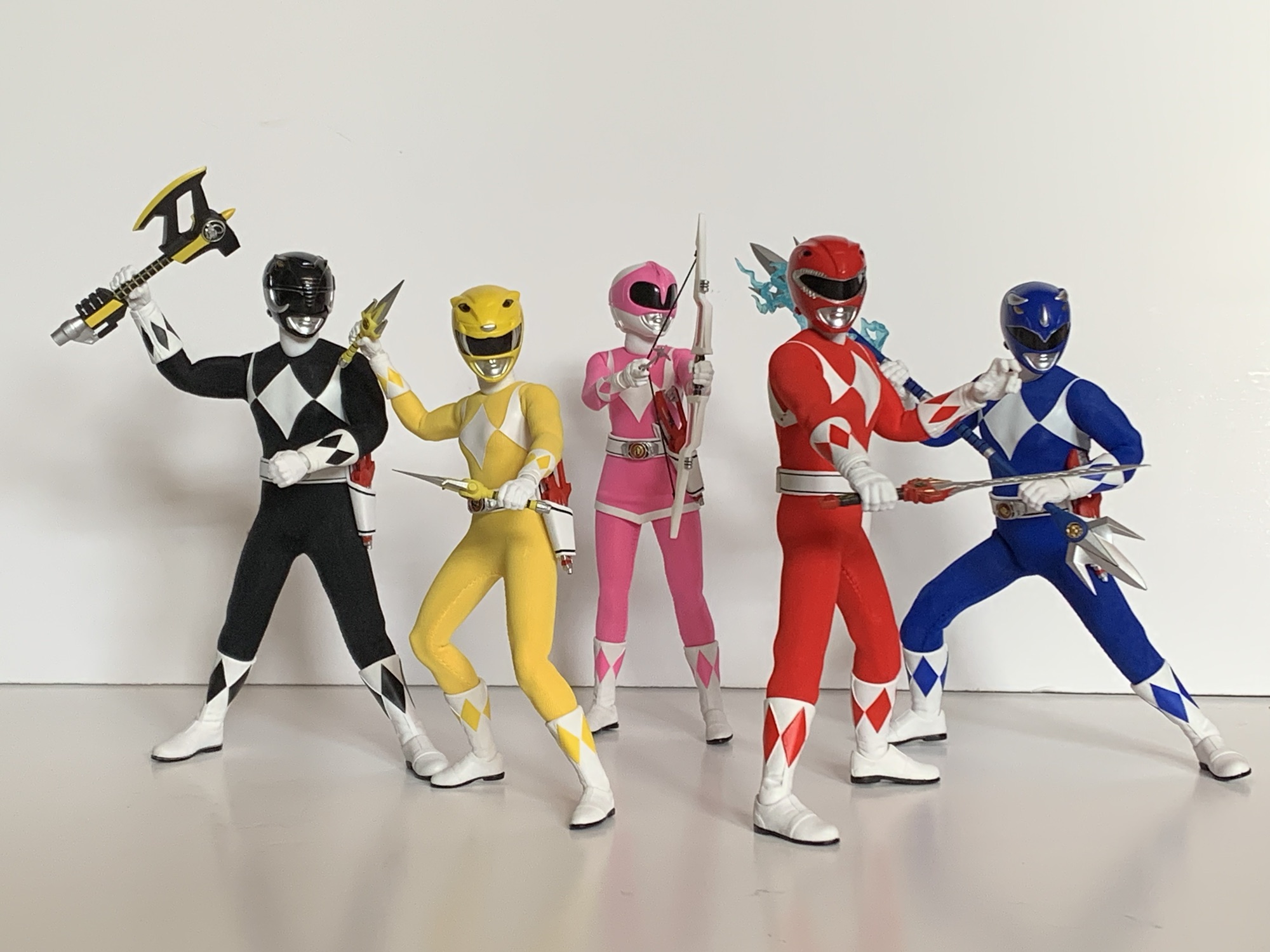
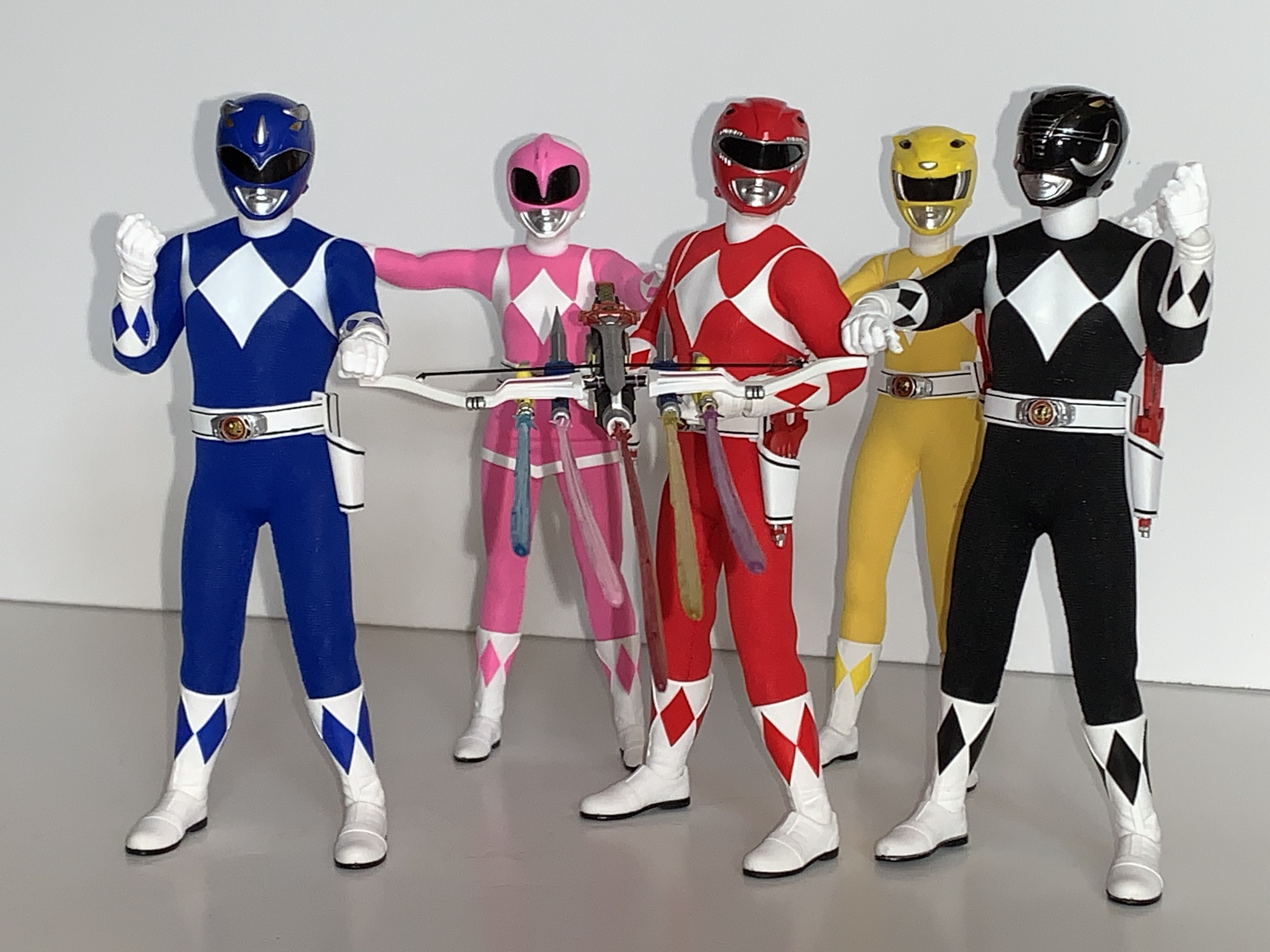
Each Ranger also has their signature weapon. For the Red Ranger, it’s the power sword which is lovingly painted and looks terrific. If you think it lacks a little something though there’s also the charged version which is basically the same sculpt but molded in translucent red. I honestly don’t remember the sword doing that in the show, but it probably happened. I doubt it looked like this though given the show had very cheap and simple special effects. It looks a little jarring in Jason’s hands and it’s not something I see myself using, but maybe I’ll come around on it. It does have the opposite problem of the Blade Blaster which is that it’s definitely too small. Mezco clearly played fast and loose with the scale on this stuff. For Billy the Blue Ranger, he has his lance which is sort of like a blue trident with a topper on both ends. In the show, he could separate it and brandish two, smaller, weapons so Mezco included a set of small, handheld, tridents. They also included two bigger ones and an adapter piece to facilitate connecting either set to form the actual lance. I’m not sure which is more screen accurate. One looks too big and one looks too small and I don’t think it had a silver center handle in the show. It’s at least made of a sturdy plastic. My Lightning Collection Blue Ranger’s lance always curved when held because the plastic was so soft. There are also some lightning effects for the lance included, which is always appreciated.

That foam gun is certainly something.

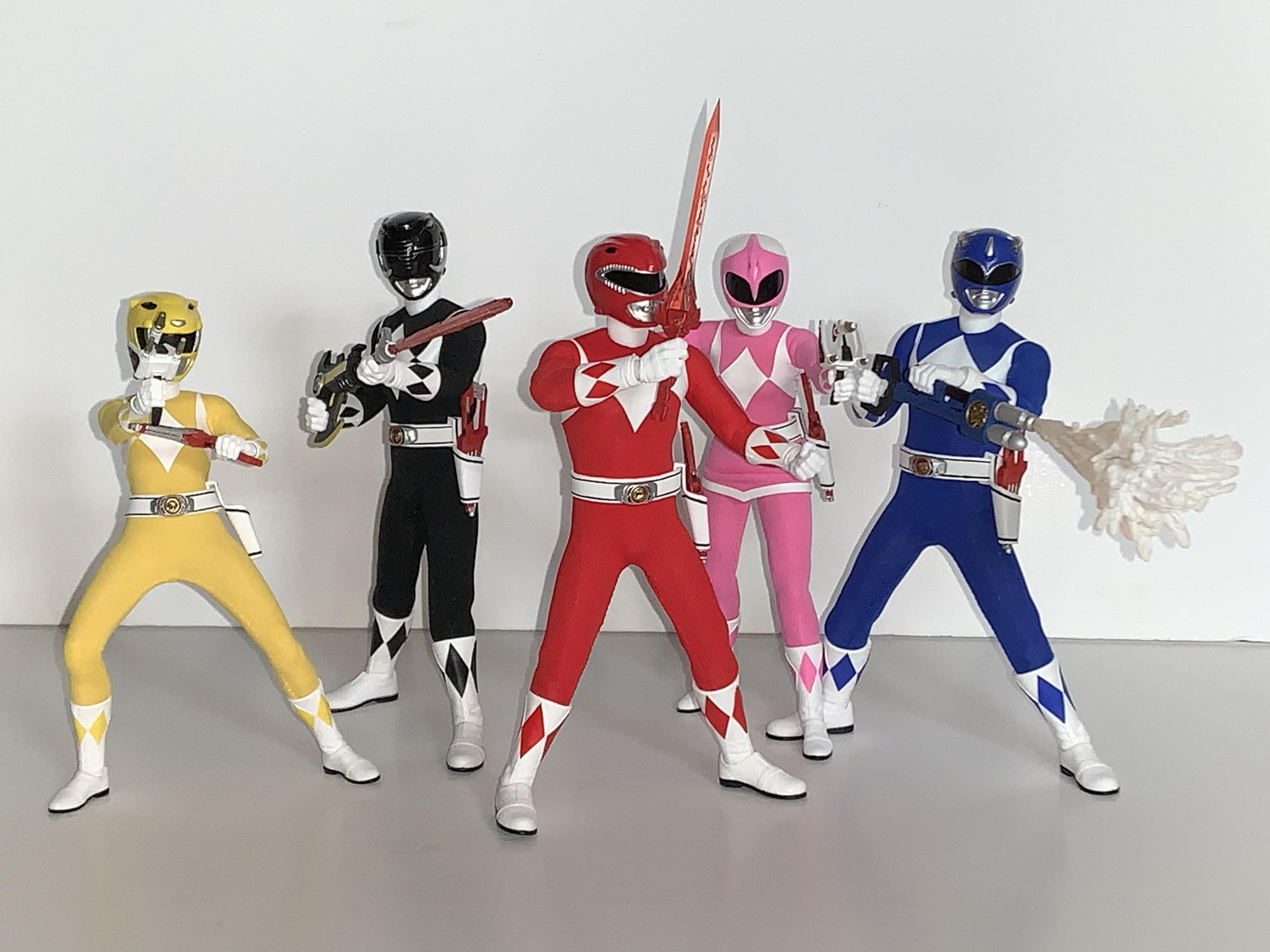
For Trini the Yellow Ranger, she has her daggers which also resemble sai. Again, they’re well painted and do what they’re supposed to, and unlike the other weapons so far, the size seems fine. Zack’s power axe also looks great and has a sliding handle so it can be wielded like a pump shotgun. Sizing for it seems fine and it can make use of the blast effects included. Kimberly has her bow (I guess power bow?) which also has a real string affixed to it which is stretchy. She has three arrows as well to wield and the weapon works well enough, though it’s always a challenge to get an action figure to pull off a bow look and she’s no exception. Also included are some optional weapons. For Billy, we get the Anti-Sonic Foam Gun which looks like an old Nerf double ball blaster, but painted blue. There’s a non zero chance that’s what the actual prop was. It has an optional effect part if you want Billy spraying foam on your shelf. I’m not sure that I do. There’s also three Thunder Slingers which are basically handheld slingshots, but made to look like something a Power Ranger would handle. They look great, but this is more stuff I’m likely to just look at once and then put away forever. And if you’re curious, yes, there were five of these in the show, but Mezco only provided three. I think they could also combine with the Blade Blaster, but no such functionality exists here.

When the Power Rangers combine their weapons they form the Mega Blaster. Rather than put tabs and holes into the weapons, Mezco just gives you an assembled Mega Blaster. Every component looks every bit as good as the individual weapons because I’m pretty sure its the exact same stuff just stuck together. There are even five effect parts so you can have the gun blasting the bad guys, which are going to have to come from another toy line for now. It’s cool and it at least makes things a little easier and lessens the risk of paint rub and such if we were expected to physically attach the weapons to each other. If I’m being honest with myself though, I kind of miss the fun of assembling the weapon. That’s part of the appeal of Power Rangers for me: combining weapons, combining robots. The blast effects are seemingly colored correctly, but tough to get straight and flimsy. I wonder if it would have worked better as one, big, piece?

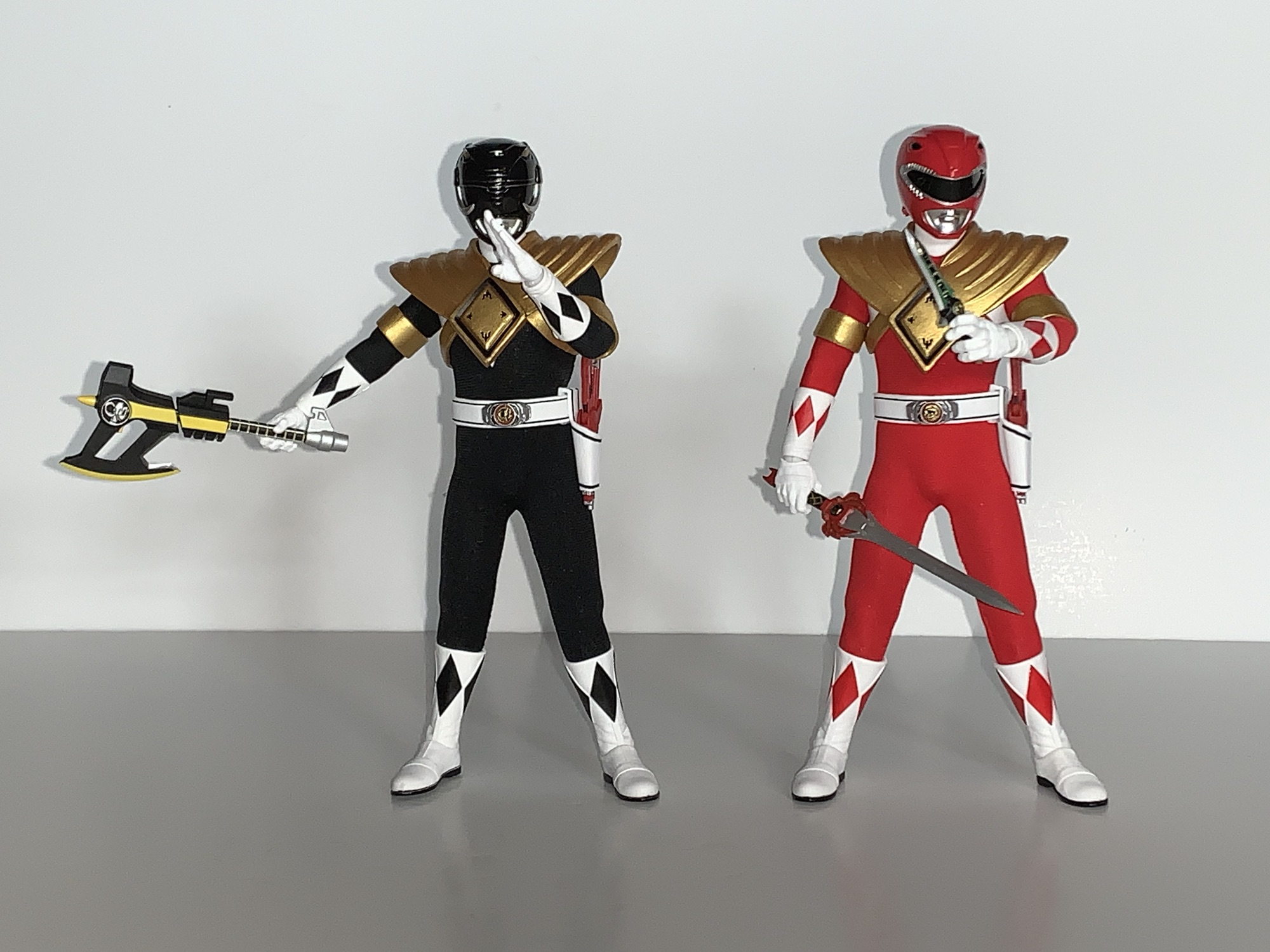
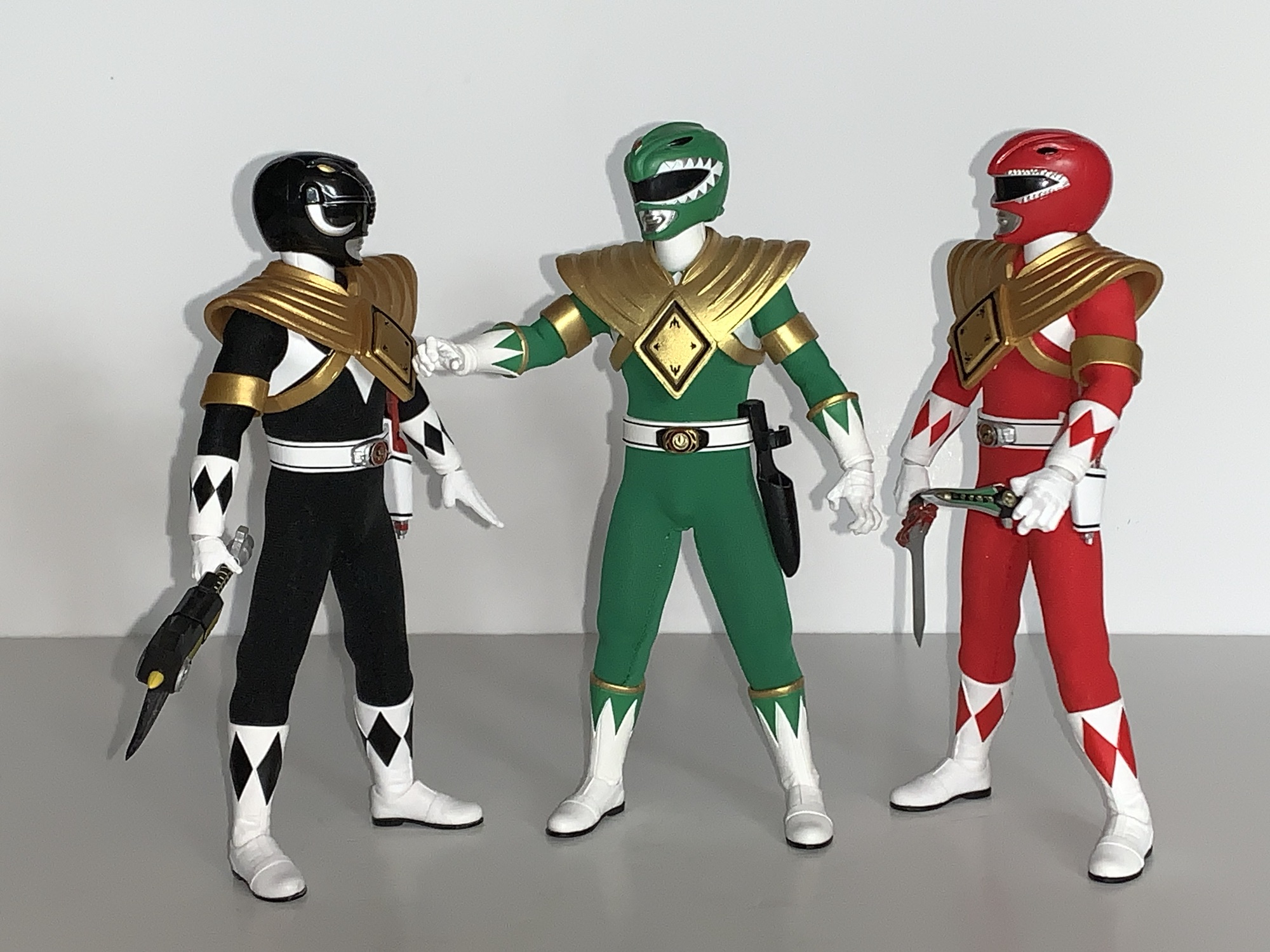
We’re not quite done yet though as we have a few more accessories in the box. Both the Red Ranger and the Black Ranger wore the Dragon Shield at points during the show so Mezco included two Dragon Shields and the armbands that go with them. They’re the same parts as the ones included with the Green Ranger so if you want a trio of armored up Power Rangers on your shelf you can do so. The arm bands are loose enough that you can slide them on without having to pop the gloves off. That also means they won’t fit the smaller female arms, but the shield itself is also way too big for them. Lastly, we have a stand for each figure which features a circular base with their respective Power Coin image printed on it and an articulating, transparent, plastic, armature. This is the standard Mezco stand, and while the base does take up a lot of real estate on a shelf, they do work well. A good stand is something every premium collectible should come with.

That is a lot of stuff and a lot of words. What have we learned after reading all of this? That these Mezco Power Rangers are as advertised. They capture the look of the American version of the show quite well. The Mezco approach is perfect for this property and this is basically a match made in Heaven. The articulation is pretty good, though the format will always breed some apprehension when it comes to extreme posing, but I think most will be satisfied with what these figures can do. There’s basically nothing left out when it comes to extra stuff. We get the unmasked portraits, 54 individual hands, weapons, blasters, extra weapons, the Mega Blaster, stands, and even some extra Dragon Shields. Oh, and those little baggies Mezco always includes for storing accessories if you decide to ditch the box. There’s nothing missing, as far as I’m concerned. I guess some folks may want individual morphers, but that’s an accessory for plain clothes Power Rangers, if you ask me. There are all kinds of other one-off weapons in the show, but none made an impact with me to the point where I want them included. I guess the Power Crystals might have been cool? Again, I’m reaching here as I would be unlikely to ever do anything with such in my display.

That’s not to say everything is perfect. While I think the proportions for the male rangers are pretty damn spot-on with the American show, there’s no denying that the Yellow Ranger looks off. The shape of the white diamonds on the torso of all of the figures are also off. It might be something where if you play with the suit enough you could smooth those lines out, but it’s certainly a hassle. The scale with the weapons is all over the place and the morphers on the belts are the wrong colors. Depending on your point of view, that’s either a bunch of nitpicking or a bunch of problems for figures that cost $80 a piece.

That means the real question is are these figures worth it? There is a part of me that looks at the price tag for this thing and can’t fathom how it could possibly be worth such an investment. Even big time Lego sets are usually in the $300-$350 range. This is beyond even that and when this thing was first announced I don’t think I could have envisioned me picking it up. On the other hand, if these Power Rangers were released individually over a couple of years at $80 a piece would I feel differently? Yes. My brain looks at an $80 Mezco figure of this quality and is able to both realize it’s still a lot to pay for a toy, but it’s not outrageous in this market. Mondo is doing The Real Ghostbusters at $101 a piece spread across probably 2 years, when all is said and done, and I’m in on them. And a Mondo sixth scale X-Men figure sets me back over $200 by itself and I’ll probably buy anywhere between 4 and 6 of those this year alone (if Mondo hits its goals).

This is an expensive hobby. Action figures are not thought of as luxury goods because the term luxury makes people think of limousines and monocles, but that’s what they are because they’re just baubles. Things no one needs that don’t perform a function; they just exist to be admired and fiddled with. They’re not even proper children’s toys which have some nurturing capabilities. Accepting all of that, I can definitively say that, for me, these figures are worth every penny. They’re fantastic for what they are. These are the only Power Rangers I will ever need. I have no use for my Lightning Collection set any longer and I cannot fathom buying another Power Ranger for myself for the rest of my life. These are exactly what I want as they look and feel like 1:12 scale Hot Toys figures. It’s the perfect format for me and for Mighty Morphin Power Rangers.

And I’m apparently not alone as this set now appears to be sold out everywhere. That doesn’t mean it’s gone, the very popular TMNT set has been reissued already and had a variant set released as well. Maybe Mezco wants to do a variant with the other actor likenesses? Maybe they want to do the movie suits? I don’t know, but Hasbro is more than willing to license the brand out so I wouldn’t rule anything out. And like most companies, Mezco likes money and if they feel the demand is out there then they’ll make more. You just never know with them because their communication is so terrible. If you’re a big fan of the property then I think you should get these and it might even be worth paying over MSRP. If you value each figure at $100 then $500 isn’t much of an overpay, or you can wait it out. And if you get it and completely disagree with what I’ve said here then I bet you’ll have no trouble unloading it at cost. It makes the set almost a risk free proposition. I don’t think that’s going to happen though. Most people who get this, aside from those who may run into quality control issues, are going to be thrilled with what they have.

If you want to check out more Power Ranger and Mezo talk then look no further:

Mezco One:12 Collective Mighty Morphin Power Rangers Green Ranger

Remember San Diego Comic Con? That event back in July? Well, it turns out people are still waiting on product tied to that event. It’s become such a huge event in the world of collecting that most companies that attend have some sort of event exclusive to either sell or give-away. The action figure producers…

Keep reading

Super7 Mighty Morphin Power Rangers Ultimate Megazord

We continue to bang out action figure reviews here in 2023 just in case there’s one that needs to sneak onto a year-end best of 2023 list. Is today’s figure such a contender? Probably not, but that doesn’t mean it isn’t worth talking about. Super7 has managed to crank out three waves of Mighty Morphin…

Keep reading

Mezco One:12 Collective Batman (1989)

When it comes to the world of more high end action figure collectibles, I’ve been able to get my hands on a few. Some rather prominent companies have yet to cross my path though, and it’s not really for any reason other than they either don’t make what I like or I don’t really like…

Keep reading


S.H.Figuarts Jiren – Final Battle Exclusive Edition

Whether you’re a Jiren fan or not, it’s hard to deny that this figure looks pretty cool.

It would seem that FOMO, the fear of missing out, is my primary motivation for purchases in Bandai’s S.H.Figuarts line of Dragon Ball action figures. The last one we looked at was a big one for me in Future Trunks from Dragon Ball Super. That dreaded FOMO was strong enough that it got me to buy a figure I knew was compromised and had no chance of truly satisfying me, but buy it I did. Today’s FOMO purchase was done almost for the opposite reason. Really, it happened only because I initially decided not to get that Trunks figure and put my money towards this one instead. And I am talking about Jiren.

This dude must live in the gym.

Jiren is the big bad guy from the so far final arc of the Dragon Ball Super anime. The series has continued in manga form, but as of right now there’s no real concrete proof the anime will resume. In terms of Dragon Ball bad guys, Jiren isn’t very interesting. The plot of that final arc is that the Gods of the many universes have decided to pit each universe against each other in a battle royale. For the victor, a wish from the Super Dragon Balls which are capable of granting any wish one can think of. For the losers, total annihilation in the form of getting wiped out of existence. It’s not even death, it’s just deletion. As a result, all of the warriors competing against our favorite heroes are just fighting for self preservation. While some are certainly bad guys, most are just like Goku, Gohan, and all the rest in that they just don’t want to be ended.

He’s more bulk than height.

Jiren, for his part, is not a bad guy. He is supremely confident bordering on arrogance, but he’s not the taunting type like Vegeta. Instead, when he determines that no one is worth his time he chooses to sit in a meditative state. It comes off as arrogance from the outside, but whenever he’s challenged he backs it up so it’s not like his arrogance is unearned. Furthermore, as a character design he’s a little boring for an Akira Toriyama character. His defining feature would be that he has a massive upper body and comparatively small legs. His head is almost like that of your garden variety alien just without the massive cranium. He also has those Frieza-like ear holes which show up in many character designs. As a result, he’s really just like a random video game boss from a plot-less arcade brawler. Our hero Goku just needs to get to him and then find a way to overcome him. Jiren isn’t evil, he’s also not exactly heroic, he’s just a guy.

“Don’t make me throw this at you!”

Because of my attitude towards Jiren I’ve never felt much of a pull to add him to my collection. I saw the figures before I ever saw him in the anime and was feeling incredibly underwhelmed by the design. The figures came and went though and they actually seemed to receive high marks from those who bought them. The sculpts, the way the articulation was implemented, and the overall size made them seem like really good action figures. Ordinarily, that’s not enough to get me to buy a figure of a character I’m not attached to, but then I went and got Ultra Instinct Goku and the desire to add a Jiren to pair with the figure manifested. When I felt similarly underwhelmed by Bandai’s 2024 convention exclusives, it was Jiren that I decided to preorder and Jiren alone.

He probably would need a bigger aura than the standard one. Maybe that’s why one wasn’t included?

Jiren comes in the standard event exclusive packaging with a black and red color scheme. This is Jiren as he appeared at the very end of Dragon Ball Super his body hulked up to gargantuan proportions and his uniform in tatters. Like Trunks, this event exclusive version has a new paint job and it’s trying to replicate Jiren’s red aura. His ordinarily pale purple flesh has a blush of pink to it while his black pants also have a shiny, red, hue applied that almost makes him look like he’s candy-coated. His flesh has a matte finish so this high gloss approach is far less distracting on Jiren than it is with Trunks. The only thing I don’t really care for is that his white gloves, once the pearlescent red overcoat is applied, makes them blend in a little too much with his arms. There’s not much contrast there aside from the gloss. The same is true for the boots, but since he’s still wearing pants it doesn’t look as noticeable. All that is to say that I don’t hate this approach and it’s executed well enough, but if I could have the standard paint job I’d probably choose that over it.

He’s destined to battle Goku for as long as both are on my shelf.

The selling point with Jiren is not the paint, but the sculpt. This is a big, beefy, boy. He’s really not extremely tall by SHF standards. He comes in at roughly 6.75″ making him noticeably taller than Goku, but he’s still shorter than a figure like Nappa or Orange Piccolo. What really stands out is just the bulk. Jiren has this huge, puffed-out, chest that really captures the look of the show’s art. If I have one consistent criticism with this line it’s that the chests on most figures aren’t big enough. They’re usually plenty broad, but view the figure from the side and it’s like their pectorals are nonexistent. It’s almost like they just drew their muscles on with a sharpie. Jiren does not suffer from that which makes him an interesting figure to look at and handle. I love chunky figures, and Jiren certainly fits the bill. His arms are massive as well and while his legs look small by comparison, they’re still thicker than Goku’s. I may not love the character design, but it would be hard to argue that Bandai didn’t nail what was presented to them.

Tag! You’re It!

I was pretty disappointed with how the Trunks figure had a bunch of accessories cut. With Jiren, that’s not a problem. He seems to have retained everything from the standard release including all four portraits: neutral, teeth-gritting, yelling, and a closed eyes with teeth gritting. The closed eyes head captures his frustrations when he finds he’s being overpowered late in the fight and also works as an expression for when he’s taking a blow on your shelf. They look good and the only aspect of them I don’t really care for is the thin, white, outline around the eyes. It makes it look like Jiren just has massive pupils, but when I look at stills from the anime it sure looks to me like he’s supposed to just have big, black, eyes. Any other colors are just shading and trying to create the illusion of a somewhat reflective surface.

I was surprised by the double-ball peg wrist joints.

For hands, Jiren has four sets to choose from: fists, clenching, chops, and splayed open. For his left, clenching hand, he also has an effect part. It’s basically a little handheld fireball and it’s made out of translucent orange plastic. There’s an indent for that specific hand which allows his thumb to slot into it so he gets a good grip on it. You don’t need the indentations if you just want to stand him with his palm pointed up holding it, but if you want to pose him like he’s going to throw it then you’ll want to stick it in his left hand. It’s always good to get an effect part, but it is pretty small and not something likely to stand out on your shelf. As was the case with Trunks, what we’re really missing is just an aura effect to pair with this exclusive paint job. A red aura makes too much sense here, but Bandai didn’t want to throw one in. He already cost $75 so I guess I can’t be too upset about the omission as I doubt I would have been willing to pay much more than that for a character I’m lukewarm on.

Looks like you missed, Jiren!

A bulky body presents challenges for anyone looking to cut it up and apply articulation, but it’s something the folks at Tamashii Nations are pretty adept at. Jiren’s torso is certainly cut-up for articulation, but not distressingly so. There’s no gapping at the base of the neck and he gets decent range there. The heads pop off very easily, but at least they go on just as easil, as they use that drum setup we’ve seen with figures like Krillin and Nappa. His shoulders are on big, butterfly, joints and they get okay range come across the chest, but that chest is so big that it can only do so much. It doesn’t go back really at all which is more disappointing than the range going forward. Range at the shoulder otherwise is fine and you get a bicep swivel, double-jointed elbow, and ball peg wrists. The double-ball peg wrist was a surprise as normally they use a ball hinge. It functions well enough, but if you want to get the most range you’ll have to accept a gap between the wrist and hand.

And now Jiren must pay the price for failing to land a blow.

The torso features what I assume is a double ball peg in the diaphragm. It’s mostly for tilt forward and back as there’s really no rotation. You get a little of that at the ball-jointed waist. Between the two, the crunching forward and back is nice and you get just enough rotation to make it work. This hips go out to the side almost to a full split and kick forward 90 degrees. He does have a sculpted ass so there’s nothing going back unless you kick the leg out to the side. The figure has thigh swivels, but mine won’t budge. I don’t know if that’s a common issue or not. It could be caused by the new paint job since it seems like a thick coat which may have required some tiny adjustments to the tooling that weren’t made. Or I just need to hit it with a hair dryer. Double-jointed knees are fine and the ankles are hinged. They didn’t leave enough space for the ankle rocker though so it’s pretty limited. There’s also the customary toe hinge if you want it.

Oh the agony of defeat – better luck next time, bud!

Jiren’s articulation is probably going to be good enough. He’s meant for strong, powerful, poses and he has the capability of pulling off such feats. I wish the diaphragm joint allowed for some rotation. I think their old hinged-ball joint would have made that possible. More so, I’m disappointed in the ankle rockers as he has some pretty small feet relative to his size and not being able to get them flat on a surface in some stances can make keeping the figure upright a challenge. It’s enough though and the combination of sculpt, paint, and articulation makes this a worthwhile release. It wasn’t the re-release I was hoping for, but it’s not one I regret buying. He fits in nicely on my shelf opposite Goku and now I kind of want a proper Dragon Ball Super Frieza to add to the confrontation. It looks like Bandai has taken this listing off of their website as he was available in February as an in-stock item, but that doesn’t mean he sold out. They may be holding back stock for in-person sales at conventions and pop-ups. For that reason, it may not be terribly expensive on the secondary market. If it’s a figure you feel like you need, then I do recommend tracking it down. If it only retails for a small markup then I’d consider it worth it as I don’t think we’re ever going to get another Jiren. What is out there is likely all that ever will be.

For more Dragon Ball Super action figure reviews look no further:

S.H.Figuarts Dragon Ball Super Goku Black – Super Saiyan Rosé

Our last look at an S.H.Figuarts release was the Dragon Ball GT Super Saiyan 4 Goku. Now, we look at a figure from the series that effectively replaced GT: Dragon Ball Super. And perhaps the most popular villain from that new series is Goku Black. Without getting into spoiler territory, Goku Black is basically an…

Keep reading

S.H.Figuarts Dragon Ball Super: Super Hero Orange Piccolo

When Akira Toriyama set out to draft the plot for Dragon Ball Super: Super Hero his original goal for the film was to take a favorite character of his and give him an upgrade. That character was Piccolo who had basically been left behind by the likes of Goku and Vegeta way back at the…

Keep reading

S.H.Figuarts Future Trunks – Super Saiyan Exclusive Edition

Trunks is back from the future and needs help cleaning up yet another mess.

When looking back on the anime adaptation of Dragon Ball Super, I think my favorite arc is the Future Trunks/Goku Black one. It does get messy at times, and like most things Dragon Ball it goes on longer than it needed to, but it had some real, emotional, stakes which isn’t often found in Dragon Ball. The time travel stuff is always a ton of fun and Dragon Ball has its own spin on how time travel works with new wrinkles introduced in Super. And it marked the return of fan-favorite character Trunks, the boy from the future. The future version of Trunks is much different from the younger one in the main timeline. That Trunks has had a relatively carefree life (though he technically did die once) whereas the future counterpart has only known hardship. And he’s basically just another son seeking his father’s approval, but he just so happens to be the son of Vegeta, not the sort of touchy feely dad. The saga provided some closure there, and unlike the Cell arc from Dragon Ball Z, Trunks got to be the hero of his own story as opposed to sitting on the sidelines waiting for someone else to take down the big, bad, guy. Though he still needed an assist from God.

I liked this version of Trunks so much that I even got the Dragon Stars version. It’s the only Dragon Stars figure in my collection to this day.

It was years ago that Bandai and Tamashii Nations released the Super version of Future Trunks in the S.H.Figuarts line. 2018, to be exact, and at a time when I wasn’t collecting this line like I am now. Even so, I considered getting it, but it seemed pretty pricey to me at the time. I had not yet been conditioned to the SHF pricing model (some would say that’s a good thing) and I decided not to get it. As you can probably guess based on where this has lead, I ended up regretting that decision. The figure is even more expensive now on the secondary market as it has never been re-released. And perhaps worse, the secondary market can be tricky to navigate when it comes to a figure as old as that one because bootlegs are a real problem. And since it’s an older figure, it’s also a bit dated and spending the extra coin in today’s dollars might just leave me with a serious case of buyer’s remorse. No, instead I’ve opted to bide my time in hopes that Bandai would return to Trunks. He is, after all, a fan-favorite and probably a safe bet to sell well. It’s just a question of whether or not the Super version is as popular as the one from DBZ.

The height is okay, but damn is Trunks tiny next to Goku and Vegeta.

2024 ended up being the year where my patience paid off. Maybe. Future Trunks was announced as a convention exclusive, but like most exclusives, it meant he was going to be a variant of the original release. To be specific, this is considered the Gallick Gun edition. Trunks has adopted one of his father’s signature moves and with it comes a purple aura. To achieve this effect, Bandai gave Trunks a coat of pearlescent paint with a purple hue to it. They also went with the translucent Super Saiyan hair which they’re rather fond of when it comes to convention exclusives. I didn’t love the look, but it wasn’t going to be a deal breaker. What bothered me more than the new deco is the cut in the accessory load-out. Gone is the standard Trunks head even though he can certainly perform the maneuver when not in his Super Saiyan form. Worse though, is the removal of the Hope Sword. In the anime (spoilers if you have yet to watch it), Trunks has his sword break while battling his foe. When all hope seems lost, Trunks basically creates a Spirit Bomb out of his broken sword. The effect part was this big, translucent, blue, sword that I think even necessitated its own stand. It was pretty awesome in the show and seeing it in figure form was a huge draw to that original figure for me. Having that get cut, plus an MSRP of $75 for this new version, really soured me on it.

And he’s even tiny next to…Trunks!

So I didn’t get it. What? But this is a review for that figure, you’re probably saying to yourself as you read this. Yes, obviously, I changed my mind. The regret of passing on that original figure was pretty hard to get over and still is. I didn’t preorder this figure, but unlike in past years Bandai apparently made more than what was ordered. Future Trunks was stocked after the fact on their webstore along with some other exclusives, and to make it even more enticing, Premium Bandai ran a free shipping promotion on its website for a week. And damnit, they got me. They got me for the Vegeta we looked at last week, they got me for the Trunks we’re looking at this week, and damn near got me on the Mini Goku, but I figured I was already giving them enough of my money. Now that I have paid for this figure, it’s time to sort out some feelings.

The paint job here is trying to sell the idea of an aura around him. Problem is, I don’t have the right color or know if they even make one in the proper shade.

Future Trunks comes in the event exclusive style box which, in this case, goes for a black and pink color combo. I’m surprised they didn’t go with more of a purple considering the theming, but whatever. It’s just trash to protect the figure inside. Trunks is, as advertised, in his Super Saiyan form and stands approximately 5.25″ to where I assume the top of his head would be with his hair extending far beyond that. Out of the box, he won’t have his scabbard across his back and to put that on you will have to remove his head. It’s not really one of those SHF heads that’s designed to come off and go back on easily and the spiky nature of his hair doesn’t help things. I went ahead and dunked him him in some hot water to make it easier. You will also likely need to remove the scarf piece that’s around his neck which tabs into the chest. The scabbard can then slide over an arm easily enough and there’s an extra tab hole behind the right shoulder to secure it in place, though it isn’t really necessary.

The Gallick Gun pose – it’s kind of goofy, but it’s what Bandai chose to hone in on with this edition.

It should be stated that this version of Super Saiyan Trunks is what some fans have dubbed Super Saiyan Rage. Trunks, during his battle with Black, taps into another fountain of power through sheer rage. His hair sticks up higher and becomes even spikier than usual similar to his Ultra Super Saiyan form from Dragon Ball Z, only this time it comes without much added bulk. His eyes do white out and his yellow aura develops a blue core which seemed to signify to the viewer that this was similar to Goku and Vegeta’s Super Saiyan Blue. It’s also seemingly just as powerful as he’s able to go toe-to-toe with Black in this form. It is an anime only thing, so who knows if Toriyama considered it canon, but Gohan’s Beast form sort of follows in its footsteps as a form that’s unique to half-saiyans.

We have a few charging effects in this line, but we’re really lacking in the beam department.

Bandai got the hair right, but not much else when it comes to the look. The outfit is all there and fairly accurate. Trunks has a more traditional jacket than the half one he used to sport and his pants are pretty much the same as they’ve always been. The figure though is just very slight. Put the new Vegeta next to him and they look like they’re two different scales. The height is okay, but the face, the arms, the torso – they’re all narrow and thin which isn’t something I see much in Dragon Ball. Place him beside the somewhat recent Future Trunks from the DBZ line, and it’s even more stark. That figure looks like it’s the more mature fighter, not this one who should be much older. Some of that is likely due to the jacket being all part of the sculpt. There isn’t a body underneath an overlay. It makes for a clean presentation, especially compared with the somewhat janky recent Future Trunks, but it definitely slims the profile. In order for Trunks to exist under this jacket, he’d have to be around 100lbs. He would be a very small man, which is not befitting the character from the show.

He’s still carrying that old blade. Well, actually, it must be a different one since he’s broken them before.

Aside from that issue, and it’s a rather big one, Trunks looks okay. The portraits have been given some enhancements and they’re nice and crisp. The paint on the body is clean and this new finish seems to achieve what it’s going for, whether I subjectively like it or not. The translucent hair is still kind of a sore subject for me. That might be going too far, but I don’t prefer it to painted hair. I think the best would be to go with a pale yellow and then a shiny coat of paint over it. The hair is coated like the rest of the figure so it has a shiny quality to it. I know it’s supposed to be the result of an aura, but it mostly reminds me of soap bubbles and the colors that dance around on their surface. It is what it is and I don’t hate it, it’s just not an improvement over what we had before. And since he doesn’t come with an aura effect to go with it, it does feel incomplete to me.

Silly boy, you can’t stop a god with a knife!

I’ve already mentioned how accessories were cut for this re-release, so just what was maintained? Well, for starters we get four portraits: smirk, teeth-gritting, yelling, and yelling with a side eye. They’re fine, but what’s missing is just a stoic, or grim, expression which is the expression I think of first when it comes to Future Trunks. I don’t think we really need the smirk, to be honest. And it would have been awesome if one of the yelling heads had whited-out eyes. For hands, we get a set of fists, gripping, splayed open, clenching, and one left, relaxed hand. I think the relaxed hand is here for him to hold his scabbard, though I don’t know for sure since it’s not in any of the pictures. The right, clenching, hand also has a hole in it and it’s for the effect part which is a little, translucent, purple, energy ball. It comes on an acrylic post that’s maybe a third of an inch long and it pegs into the hand via a ball socket. This is for his Gallick Gun charging pose which is one awkward pose. I guess Vegeta couldn’t have a Kamehameha stance so he does this thing where his palms are always pointing out as he charges the maneuver with his hands together. It’s achievable, but weird looking. Maybe that’s why he pretty much stopped doing it in favor of other attacks?

I warned you.

Lastly, Trunks has his trusty sword. We get two versions: regular and broken. The broken one serves a narrative purpose, but also it’s easier to slot into the scabbard. The hilt is painted green while the blade and pommel are silver, but like the figure itself, there’s a hit of pink on the blade so it matches the whole aura theme they’re going for. And like the DBZ counterpart, the pommel comes off so the sword can slide into the gripping hands. It only goes on one way, which is a bit annoying when you’re fiddling with such a tiny thing, but the figure gets a very tight grip on the handle. Almost too tight as it takes some elbow grease to get it out of his hands once there.

Everybody talks about the Father-Son Kamehameha, but what about the Father-Son Gallick Gun?

One area with this figure I have little to complain about is the articulation. Since the figure doesn’t utilize an overlay for the coat, all of the articulation is cut right into the figure and since the scabbard is secured via a sling, it doesn’t fall off constantly. The head is on a hinged ball peg, which I hate, but it does function fine. The scarf will limit his range though, and while it is removable, it leaves behind a giant hole in his chest so that’s not really a viable solution. Shoulders, biceps, elbows, and wrists are all standard stuff. The figure does have butterfly joints in the shoulders and they work well enough coming forward, but offer nothing going back. There’s a joint in the mid-torso that pivots a bit side-to-side and allows for some forward and back. A waist joint is where you’ll get most of your rotation and he can crunch forward and back thanks to it and the hips. Since this is an older release, he doesn’t have those annoying, sculpted, butt cheeks. Mai may be disappointed, but it allows for full splits going forward and back. Out to the side, you get about 45 degrees. If you can find a way to get the caps in his hips to slip over or under the thigh swivel then you may get more, but it’s hard plastic and not very forgiving. Beyond the hips, Trunks kicks forward well and the thigh swivel affords some pivot. The knees and ankle hinges are fine while the rocker is limited. There’s also a toe hinge if you want it.

How I imagine it would look to be in the presence of the Father-Son Gallick Gun.

I don’t want to overstate the articulation here. It’s not elite or anything by the standards of the line, but it’s functionally sufficient. Trunks can hit all of the Trunks poses well enough. He can hit his downward swing, jab, or have his hand on the handle while the blade is in the scabbard. It will work, and what holds the figure back is not the articulation, it’s almost everything else. The paint job is executed well enough. It’s something you either like or you don’t. The sculpt is dated and not true to the character. He may look off when posed with the new Vegeta, but that Vegeta sculpt is actually just as old. His proportions were never right and this is a version of the character begging for a redo just like the DBZ version received. The reason to get this figure is if you really like the character and feel better paying $75 for it as opposed to the $120 or so you’re likely to pay for a secondhand version of the old figure. That figure will have more stuff and a more true-to-the anime paint job, but will have all of the same problems as this one plus the older face printing. And if you’re thinking of using the updated face plates with the old figure, it’s probably not going to work. The flesh tone here has a purple hue to it. It may not be apparent when looking at the figure by itself, but place it beside another character and it stands out. He’d basically look like poisoned Trunks if you tried to mix and match.

He’s still Trunks and he’s still cool, but he could be so much better.

Am I content with my purchase? I still don’t know. This is an obvious compromise for my collection. It’s a character I want in my display, but not the version of the character I would like. If I could get the older version for a hundred bucks or less then I would not have bothered. Both are compromised takes on the character, but the original less so. And that Hope Sword is pretty damn cool. If you have that old figure and decide to get this one too then you could probably use the depowered head on the new body. The necks won’t match, but the scarf will hide it if you want. The only reason to do that though is if you really like Future Trunks. This version is okay, but not what I want. I would have much preferred they just give him a blueish hue and make him Hope Sword Future Trunks. At the very least, he should have his own aura to go with the Gallick Gun. A Hope Sword Trunks could have created his unique yellow and blue aura and would have looked way cooler. Plus such a display would lend itself well to being off on its own in a different part of your collection making the size issues less of a concern. Oh well. If you’re like me and really regret passing on the Super version of Future Trunks, I guess you may as well grab this one if you’re okay with the price. Once it’s gone though (and it’s no longer being offered on their website, but it may be making the convention and pop-up store rounds) I wouldn’t entertain paying so much as a dime more than MSRP. Hopefully, something better for Future Trunks is in our future.

If you like Trunks or are just really into Dragon Ball Super then you may like checking out these reviews:


S.H.Figuarts Super Saiyan God Super Saiyan Vegeta – Unwavering Saiyan Pride

Now more godly than ever.

I guess we’re making the first week of March Vegeta Week here on The Nostalgia Spot, and why not? He is royalty, after all. This one should be a short one since we’ve looked at this figure before. Multiple times. Bandai has been able to extract a lot of value out of their Super Saiyan Vegeta mold which I believe was an early 2.0 body for the S.H.Figuarts line. It was also the first figure in the line I got way back in 2018. It’s funny to look back on how smitten I was with that figure and now I look at it and seem to only notice the flaws. What has at least held up over the years is the overall look of the sculpt, which is good since Bandai hasn’t really changed it. It’s not perfect, but obviously good enough for me to keep buying it. I now have four versions of this figure, plus two more that also share some parts. For awhile, I had just one Vegeta figure and now there are many, but since he is Saiyan royalty I guess that’s fitting.

Goku could use a similar upgrade.

Much more recently, Bandai reissued it’s Super Saiyan God Super Saiyan Vegeta for the line’s 15th anniversary. That figure was one I had been hoping would see a revision because I had missed it back when it first came out and I have come to really enjoy the look of Super Saiyan Blue. I was, however, disappointed with the reissue because there were no updates to the original figure. In more recent times, Bandai has reissued figures aplenty, but always with improved face-printing. They didn’t do that for their special 15th anniversary figure and the result was a figure that looked dated. Fast-forward a few months after release, and we find out that another Super Saiyan Blue Vegeta is on the way and this one was ticketed to be part of the budget-friendly $35 subline. These are the figures shipped to brick and mortar stores that typically are of the most popular characters and are designed as an entry point for newcomers. Even though the price was far better than a lot of new figures in the line, I was still annoyed by the release since I had just spent good money on a lesser version. I got over it though, and when the Premium Bandai website was offering a free shipping promotion in February I decided to just grab this new Vegeta to seemingly right the prior wrong.

I have no shortage of Vegetas.

Dubbed Unwavering Saiyan Pride, this Super Saiyan Blue Vegeta is indeed very familiar. The body is exactly the same as the previous release, but the deco has been refined. The original was white and brown on the armor with a shade of blue for the bodysuit that bordered on purple. It’s a similar color to the manga. The re-release from a few years ago (which I didn’t bother to review) saw the blue altered to a more royal blue with the straps and plating on the armor lightened to a shade of tan. The white portions of the suit are a more off-white. This new Vegeta keeps the off-white while pairing it with a dull shade of yellow-brown that basically sits in between the prior two figures. The bodysuit is a new shade of blue with a touch more yellow. It reminds me of the ocean in the Caribbean giving it an almost warm feeling as opposed to the usual coldness blue imparts.

The faces on this one are so good.

This updated shade is likely here to play off of the new head sculpt. As far as I know, this portrait is entirely new. The shape of the hair is different from all of the other Vegeta figures I own. It fans out more which does seem to match his depiction in Dragon Ball Super – maybe we should think of this as a Toyotarou version? The hair is a light blue with a pearl finish. Like the body, there’s a touch more yellow making it lighter than the previous Super Saiyan Blue figure. It does help to give off the illusion of a radiating Vegeta and this figure would pair well with an aura effect.

I like the overall approach by Tamashii Nations here, but the execution is a little suspect. I suppose it should be expected at the lower price point, but there’s no reason to skimp on quality either. After all, it’s the same company on the box no matter the price. Paint is a little sloppy in places and most noticeably around the neckline. The blue is fuzzy and my figure has a blob of brown on the back of the neck which I guess is from the armor straps. The edgework around the armor isn’t as clean as it could be, and like the recently reviewed Old Style Battle Clothes Vegeta, some of the steel in the right elbow joint is visible suggesting it was slightly misaligned during assembly. More annoying though is the miscolored parts as the crotch piece is a darker blue from the rest of the legs. I think this is caused by the crotch being a slightly harder plastic and the legs having a little bit of a wash applied to them. I don’t know how well it shows in pictures, but in-hand and under normal lighting conditions it’s pretty noticeable.

Maybe my least favorite expression of the bunch, but it still gets the job done.

What did turn out well though are the portraits. These are Bandai’s best Vegeta expressions yet and they alone are worth the upgrade. We get four expressions this time: stoic, yelling, teeth showing, and a smirk. Maye instead of stoic I should call this Vegeta Resting Bitch Face because he looks kind of pissed. He looks really ticked off with the teeth-gritting expression and the smirk is the perfect, cocky, Vegeta we all know and love. I love all three, while the yelling one is a bit more specific. It’s also longer as a result and looks a touch off to me, but not terribly so. The rest of the accessories are the same old, same old: fists, clenching hands, martial arts pose hands, open hands, and a right thumb gesture. He also has the old style crossed-arms piece that connects at the biceps. I didn’t bother to try it out this time because I already have it on two of my Vegeta figures, three including the Namek Vegeta.

“Step aside, boy, I’ll handle the rest.”

Articulation is exactly the same as the past Vegeta figures. The new head doesn’t function any better or worse and they’re still sticking with that annoying hinged ball peg for the neck. The hips are the most restrictive part of the figure while the hinged joint in the mid-torso feels welcomed after handling the last two Vegeta figures that lacked it. It’s mostly fine, but showing its age here. We could use a Vegeta with better butterfly joints as well as better hips. The ball peg ankles also need to be fired into the sun.

Kick that imposter’s ass, Vegeta!

Is this a figure that’s worth $35? Absolutely. It’s not perfect and some aspects of it are dated, but compared to other brands at this or a similar price and it’s still damn impressive. It gets right what it needs to and that’s the color pallet and the expressions. This is probably the best Vegeta figure yet unless you really like Super Saiyan 4. I prefer a more traditional Vegeta and while Super Saiyan Blue might not be anyone’s idea of traditional, I do think the guy looks good in blue so if I had to get rid of all of my Vegeta figures but one this would be the one to keep. I do think we could do with an update and hopefully Bandai is willing to go beyond the anime and give us Vegeta figures from later in Super. Those would present an opportunity for something new. They also haven’t done his maxed out blue from the end of the anime. Perhaps an ascended Super Saiyan Vegeta on a new body could be in the cards? That would lend itself well to redos. We’re also getting a new base form Vegeta via the Dragon Ball Daima line this year and I’m interested in checking that out. For now though, I’m happy with this Vegeta and glad I didn’t pass on it. Even if I now have a small army of Vegetas.

I hope you like Vegeta…

S.H.Figuarts Dragon Ball Z Vegeta 24,000 Power Level

When a toy line is as long in the tooth as Bandai’s S.H.Figuarts Dragon Ball Z line, producers tend to start looking in all of the various crevices of the property for new material. We recently looked at a figure that did just that in Mecha Frieza, a version of the chief villain of the…

Keep reading

Super Saiyan God Super Saiyan Vegeta – S.H.Figuarts 15th Anniversary Ver.

To celebrate the 15th anniversary of the Bandai/Tamashii Nations action figure line, S.H.Figuarts, Bandai turned to the fans. There was a large roster of releases eligible for re-release to mark the occasion, and anyone who wanted to could cast a vote for their five favorites. The winner was, not surprisingly, Vegeta. And in particular, it…

Keep reading

S.H.Figuarts Dragon Ball GT Super Saiyan 4 Vegeta

We’re back with another action figure review from everyone’s favorite version of Dragon Ball: Dragon Ball GT! And really, the only thing people remember from Dragon Ball GT is the Super Saiyan 4 transformation. Designed to bring the Saiyans back to their more primal roots, the Super Saiyan 4 transformation is pretty much on an…

Keep reading

S.H.Figuarts Dragon Ball Z Vegeta – Older Style Battle Clothes

Still not a super Saiyan.

Vegeta is a character who has had a few looks throughout his time in Dragon Ball Z. Almost all of those looks are some variation on his Saiyan armor from his debut with minor tweaks and modifications. Since Vegeta has become one of the most popular characters from the long-running manga/anime, most of those looks have made it into plastic. At this point, it’s easier to pick out the few looks that haven’t received representation in the Bandai and Tamashii Nations action figure line S.H.Figuarts. Despite Vegeta’s popularity, his most recent figures have seen him locked behind the Premium Bandai delivery method. This is essentially a made-to-order process that comes in at a higher price than a general release item. For example, there’s currently a Vegeta hitting Target stores and other vendors for $35 since it’s mostly a reissue with updated deco. This Vegeta, despite also being mostly reuse of the prior Premium Bandai release, was marked at $60, but if you have always wanted to have Vegeta in his Frieza Saga look then you had to swallow your pride and pay the piper.

Did we need two different Namek Vegetas? Yes, of course.

The Old Style Battle Clothes Vegeta is what the fandom commonly referred to as Namek Vegeta back in the day. Even though he featured two distinct looks, the first one was so similar to his appearance in the Saiyan Saga that this is the look that ended up standing out. And it’s not drastically different from the former. It’s basically Vegeta in a black bodysuit with torso armor that looks largely the same as the previous armor just minus the giant shoulder pads. When Vegeta outfits Gohan and Krillin with battle suits he’s asked why his is different and he says it’s an older model and was apparently all that was available in his size on Frieza’s ship. As a look, it’s a little less dramatic and a little more subtle than what he had before. It does differentiate him from the rest of the bad guys in this era of the show and maybe that was the true point, or creator Akira Toriyama was just sick of having to draw those shoulder pads. It’s also a little bit of a preview of the look he’d feature in the Android Saga which basically just adds straps to the shoulder area and goes back to a more royal blue for the body suit.

The extra battle damage parts are the big draw here, I suppose.

I’m a bit of a Vegeta sicko so I was interested in adding this look to my collection. I was also curious how Bandai would integrate the battle damage into it as well which they showed off in the solicitation images. I was slightly hesitant though because I was a bit underwhelmed by the last Vegeta released via this method: Vegeta 24,000 Power Level. That one wasn’t a disaster, but it had some obvious flaws that ultimately frustrated me. This figure is built off of the same foundation and it was apparent even in the glamour shots. That’s not automatically a bad thing, but when the base of the figure is one that disappointed then it becomes more of a concern.

“Give me the Dragon Balls or die!”

Vegeta stands at about 5″ to where his head most likely would end and close to 6 1/8″ to the tip of his hair. I didn’t go back and check to see what I wrote for measurements on the 24k Vegeta, but they’re the same size. And as expected, there’s a lot of shared parts between the two, but not as much as I thought which might actually be a bad thing. What’s shared are the arms, neck, and everything below the waist. What’s not is the torso, which is expected since we’re talking a different sculpt with the need to integrate some new functionality. What also isn’t shared are the heads. The hair shape on the new Vegeta is a bit more narrow, the black has more of a satin finish, and as a result the faces are different. It’s a slightly frustrating choice because it means the faces aren’t interchangeable between the two. That would have been something fun to make use of, but we’ve been denied.

“Please, Kakarot, don’t let me be remembered like that idiot Yamcha!”

The look of the figure is something of a mixed bag. Even though I wish the heads were the same for some shared functionality, I’m not disappointed in how the Prince of all Saiyans looks from the neck up. The portraits are exquisite and I like this new finish on the hair. The torso is less flat looking than it was on the previous release, but the diaphragm cut still needs some work. I don’t want it gone, but it’s not particularly elegant. The neck is still a problem as there’s almost always a gap between the base of it and the torso. It needed to be larger and have a flange at the base that closes up those gaps. It’s a real bummer because the figure can’t look up using the head alone, but we’ll get more into that with the articulation. The armor is a nice white this time, which I prefer to the off-white of the 24k Vegeta. The body suit is navy as opposed to black which perhaps comes from Toriyama’s notes, but in the anime it’s clearly black. I would have preferred black, but I’m not particularly bothered by it. The shoulders though look awkward. They don’t seat into the torso very well, probably because they were designed for a figure with giant shoulder pads to work around. You can shove the shoulders deeper into the apparatus inside which is the better silhouette, but Vegeta loses his ability to place his arms at his side. If you pull them out slightly for better range, they look bulbous and disconnected from the body. I feel like they could have done a better job here as this just isn’t their best work.

“Oh Vegeta, you never fail to amuse me.”

And to add to that sentiment, we have minor QC issues on this one. The right ball hinge isn’t seated all the way into the wrist and protrudes more than usual. I’ll have to see if I can heat it up and force it in. The left elbow also has some of the steel joint inside visible as if the joint was misaligned slightly during assembly. It’s not a major eyesore, but it is uncharacteristic of this line. If you’re curious, this one was manufactured in the Vietnam factory which has had some great figures come out of it, as well as some that were of a noticeably lesser quality.

“I wish I was a Super Saiyan!”

Paint on Vegeta is, as expected, pretty minimal. It’s mostly limited to the face, the visible part of the torso around the neck, and the battle damaged parts. The paint on the torso doesn’t match the plastic used for the neck and face which is disappointing. The painted battle damaged parts look nice though and there the flesh matches much better, though it’s also aided by the distance between the abdomen and neck. We might as well talk about the parts now, but you have an optional chest piece, abdomen, upper back, and lower back. These pop off pretty easily and are a hard plastic. Vegeta was blasted through the abs by Krillin and the resulting damage is captured well. You have the brown panels, the exposed flesh, and the tattered remains of the bodysuit all sculpted and painted. They look great, no complaints here, though it does add to the gappy nature of the diaphragm joint since the upper part of the chest is a smaller piece than the default one.

“Are you crying?!” “How dare you call yourself the Prince of all Saiyans!”

In addition to the extra armor bits, we get the standard array of Vegeta hands: fists, clenching, open, and Big Bang Attack hands. For portraits, we get five different ones: neutral, shouting, teeth-gritting, sleeping, and weeping. These expressions are how the figure really sets it apart from other Vegeta figures and captures a moment in the series. The sleeping portrait is amusing as he does take a nap in the show which allows Gohan, Krillin, and Dende to sneak off with the Dragon Balls (it’s maybe Toriyama’s laziest solution to a problem) and make their wishes. The teeth-gritting face features terrific details with painted lines and beads of sweat. This is basically Vegeta realizing he’s screwed as he tries to take on Frieza. The weeping head is basically from the moment he accepts that he’s failed and the result of his pride being damaged beyond repair. It’s not from when he’s pleading with Goku to defeat Frieza, though you could probably use it as such if you really wanted to. They’re all very well detailed and I continue to be impressed with the expressions on these latest figures in the line though I’m surprised we didn’t get a cocky portrait from when he was boasting about being a Super Saiyan to Frieza. Again, if he could just share portraits with the prior release this wouldn’t be an issue. The final accessory is old reliable: the crossed arms piece. It’s the same as the 24k Vegeta’s crossed arms piece that separates in the middle and connects at the shoulder, it’s just color-matched for the new bodysuit.

“Gah! Bulma!”

Vegeta’s articulation is pretty much the same as the 24K Vegeta with all of the same pluses and minuses. I already mentioned the limited articulation at the head which is intended to be moved with the neck, but it’s gappy. Same for the torso joint which mostly rotates and is pretty limited going back and forth. The butterfly joint features poor range while the rest of the joints in the arms function as expected. The waist is basically just a pivot point as it doesn’t bend forward and back much at all, nor does it tilt to the side. The hips are able to kick forward just fine, back a little, but suck going out to the side for no real reason. The thigh twists and knees are fine while the ankles are on double ball pegs and don’t work very well. You also get a toe hinge which is fine.

There’s no sugar-coating that this is one of lesser releases in this line when it comes to articulation. It’s one thing for a NECA or a Super7 figure to not articulate all that well because those companies tend to be more aesthetic-focused. Tamashii Nations is all about the P.O.A. and it’s disappointing that they didn’t rework the 24k Vegeta more to make this Vegeta a better experience. These ball-peg ankles have got to go. They finally ditched them on Goku with the Legendary Super Saiyan release and it’s time for them to do the same with Vegeta. This torso also needs to be retired because the diaphragm joint is just bad. They stopped doing the hinged joint in the torso awhile ago, but it would have helped here.

And now it’s time for Vegeta to take a little nap.

Are the problems with the articulation going to matter much in the end? Yes, but maybe not as much as they would normally. If you’re buying this Vegeta it’s because of the very specific look. Bandai did a decent job there by providing the extra parts to capture the battle damaged look Vegeta had when he took on Frieza in his final form. There’s a good amount of portraits and the hands are as expected. The crossed arms piece is going to come with basically every Vegeta and at least it’s the newer version. The only things missing that could have added to the package would have been a new tail for Frieza Fourth Form designed to hold Vegeta in place since it’s a memorable portion of their fight. And then it also would have been nice to get an effect part which is something I wish came with every release. And since we’re paying a “premium” for a Premium Bandai figure, why not start including stands with those releases? A lot of these releases feel a little short when it comes to the value component and something as simple as a generic Tamashii Nations stand would help.

Since this is indeed a Premium Bandai release, the only way to get this Vegeta now is on the secondary market. Some e-tailers like Big Bad Toy Store might stock it, but since they have to pay MSRP like the rest of us it’s going to come at an inflated price. And with these things, it’s hard to know if the price will rise or fall on the secondary market. Bandai did just put Cooler back up for preorder so they have created the precedent that these aren’t just one and done. There’s always the possibility of a recolored edition for a convention exclusive as well, maybe in black? At $60, this Vegeta is already a hard sell. It’s relying entirely on one’s fondness for this specific look. I really can’t recommend anyone extend themself beyond that MSRP for this one as it’s just not good enough.

The Frieza Saga of Dragon Ball Z has been well-represented in action figure form:

S.H.Figuarts Dragon Ball Z Full Power Frieza

Frieza is the villain from Dragon Ball who just refuses to die. His initial battle with the heroes of Dragon Ball Z spans a whopping 30 episodes! Thank goodness that DBZ was a weekday show or else it would have taken more than half a year to see Frieza get taken down. And that’s just…

Keep reading

S.H.Figuarts Dragon Ball Z Vegeta 24,000 Power Level

When a toy line is as long in the tooth as Bandai’s S.H.Figuarts Dragon Ball Z line, producers tend to start looking in all of the various crevices of the property for new material. We recently looked at a figure that did just that in Mecha Frieza, a version of the chief villain of the…

Keep reading

Marvel Legends Spider-Man Unlimited

There’s got to be at least one person who has been waiting for this day.

When the decision was made to end the animated series Spider-Man, it didn’t mark the end of the webbed one’s adventures on the small screen. Momentum was building towards a Spider-Man movie which would eventually arrive in 2002 so it made sense to keep old webhead in the public spotlight. Apparently, it would have been too costly to just renew Spider-Man and see if Peter Parker ever did find Mary Jane (we had to wait until 2024 to find out), so Saban Entertainment set out to do something new. Various ideas were kicked around including going back to the beginning, but with Sony working on an origin story for the big screen Marvel squashed that. Ideas for Spider-Man 2099 were considered as well as some sort of alternate universe story with two Peters that Marvel also nixed (perhaps PTSD related following Maximum Clonage). What Saban and Marvel eventually settled on was Spider-Man Unlimited, a show cancelled after three episodes aired that has largely been forgotten. Until now!

It is an interesting look for Mr. Parker, I just wish Hasbro went all out with the shading for the figure.

Spider-Man Unlimited is back in action figure form. Hasbro has done almost every other incarnation of Spider-Man at this point so why not? He did have a cameo appearance in Across the Spider-Verse, just like basically every Spider-Man, and since the look from the show was pretty unique I suppose it makes sense to give it a go in plastic. If anything from the show is remembered fondly these days, it probably is the suit which is sort of a mix of Scarlet Spider and Spider-Man 2099. It’s still red and blue, but there are no weblines and the whole thing is heavily shaded. He also has the web cape of Spider-Man 2099. It’s not the sort of look that can be easily adapted from an existing figure so the fact that Hasbro was willing to invest in new tooling for this is actually a surprise. And there’s really no way to do the figure without also using a fair amount of paint when compared with a basic Marvel Legends release. It will be interesting to see how this thing sells and if Hasbro’s investment paid off.

I’m guessing we’ll never get Venom and Carnage from this show so this will have to do.

Spider-Man Unlimited is a bit of a throwback to a couple years ago when it comes to Spider-Man figures. I should point out that this suit was designed by Shannon Denton and Roy Burdine so if you like the look then thank them. The figure is mostly new tools because the spider logo on the chest is raised as are the legs running from them. Where they are not raised is on the arms and the red, spider, web-shooters are a separate piece. The calves have molded fins on them while the thighs and feet do not. In other words, the torso and shins are definitely new sculpt while the arms and thighs could have been sourced from another figure. The hands are conventional Spider-Man hands while the head is similar to past Spider-Man molds, but it looks too round to be from one of the symbiote costume figures and I want to say it’s all new. The web cape I’m not sure of as I don’t have any of the 2099 figures. It’s hard plastic and semi-transparent that’s slightly preposed.

Most of this figure has been molded in blue plastic. All of the red you see on the figure is painted except for the web shooters and head. And on the head, the eyes are painted and not all that well. There’s some bleed around them and it’s noticeable even from a distance. The paint on the torso though is pretty clean and impressively so. The only ugly spot is the seem between the back and front of the figure where blue shows throw. Paint on the legs is mostly fine. The red is not particularly opaque on the knee pieces, probably because that piece is a hard plastic and it just doesn’t adhere as nice. To my surprise though, the head doesn’t really clash with the painted neck so that’s a plus.

I need to do a second coat and touch-up the edges, but I like the added shading on the face. Can I keep myself from shading the rest?

What does stand out aesthetically here is the lack of shading. It’s not really Hasbro’s approach to do heavy shading on their figures, but it feels like a pretty big component for the look of this version of Spider-Man. Rather than shade it, the blue and red just seem all together darker than they probably should be. It is really apparent though since the image on the box is similar to the look from the show. In my opinion, the shading makes the suit look more interesting than it is, but to properly shade this it would need most of the blue to be covered in black. What’s easier is the face, which was always shaded on the front and basically outlined in red. I think a solid compromise would have been for Hasbro to include that shading, but they opted not to. I decided to try it myself, despite not really being a customizer and, personally, I think the shading adds something. I could easily see myself getting carried away and going over portions of the body too, but I feel like I’d be better served to just stop at the head.

A flight stand can really aid in posing this one given its limitations.

Accessories for Spider-Man Unlimited are what you would expect: fists, wall-crawling hands, and thwip hands. That’s all. No Peter portrait or web accessories. The articulation is where the figure feels a little dated. Most new Spider-Man figures have settled on a scheme that includes a ball-jointed diaphragm that Spider-Man Unlimited omits. He just has an ab crunch and a waist twist which really limits the “spider” posing. The other aspects are mostly conventional: ball-hinge head, ball-hinge shoulders, butterfly joint, bicep swivel, double-jointed elbows, wrist swivel and hinge, waist twist, ball socket hips, thigh cut, double-jointed knees, shin swivel, ankle hinge, ankle rocker. Range at the butterfly joint is a plus, while range at the hips is just okay. The waist twist, thigh cut, and shin cuts all are useful, but also all break-up the sculpt quite a bit so your mileage may vary when it comes to how useful they are. The ab crunch, being the only joint in the torso, at least works well enough, but I’m surprised they would go through the trouble of sculpting a new torso without implementing what passes for modern articulation. I don’t love what Hasbro does with its Spider-Man figures, I think they should do a ball joint in the diaphragm and waist, but it would be better than what we have here.

Even in bad TV shows, Spidey can still kick some ass.

Spider-Man Unlimited is a figure I never thought we’d get, but now that he’s here, I find myself surprised I own him. I have a bit of a fondness for odd looks sported by famous characters, especially when it’s tied to some forgotten media like Spider-Man Unlimited. I also kind of bought it because I kept striking out when heading to stores in search of other figures, and then when I saw this, it was like a bit of retail therapy to just buy it. It wasn’t anything I was planning on getting, but now that I have it what do I think? It’s okay. The figure looks fine, and I guess when you’re talking about a costume like this that’s what is most important. The articulation isn’t very good compared to the other Spider-Man figures Hasbro has done recently which aren’t exactly amazing either. And the usual complaints about a lack of accessories applies here too. I will forever remain puzzled how Hasbro was able to condition Marvel collectors to accept Spider-Man figures without web effects. If this costume is one you actually have fond memories of or just think is cool, you shouldn’t have much trouble locating this figure at retail be it online or in-store. I’ve seen it a few times now and more seem to be shipping out every day. It will set you back $25 should you decide to take the plunge with no one’s favorite Spider-Man.

Postscript: So I got kind of bored with this one just hanging out on my shelf. It’s not a bad figure, but the Spider-Man Unlimited TV show was so heavily stylized that it just really wasn’t doing it for me. I saw some customs online that looked really good, so I decided to take a stab at re-painting this one. I went with the outline approach and mostly copied the process of this custom on the channel Ken I Make It. Some others I saw put the blue on the inside of the sculpt to highlight the muscles, which looks pretty cool, but isn’t really in-line with the show. I liked the clean look with the spider logo outlined in black and decided to stick with this approach. Maybe I’ll get bored again some day and decide to do it differently, but I’m pretty content with the end result.

For someone who doesn’t really collect Marvel Legends, I sure have managed to look at quite a few Spider-Man figures:

Marvel Legends Spider-Man ’94 Spider-Man vs Carnage

Last year, Hasbro celebrated the 30th anniversary of X-Men, the animated series that premiered on Halloween 1992 and would become a ratings hit shortly thereafter for the Fox Kids Network. It was responsible for getting a lot of kids into the X-Men and Marvel comics in general and the first, prime, benefactor of that rise…

Keep reading

Marvel Legends Retro Card Scarlet Spider

It was in this space last year that I shared my fondness for the Scarlet Spider costume when I reviewed the Medicom MAFEX Scarlet Spider action figure. I don’t buy much from Medicom because their figures are really expensive for what they are, but I sometimes break my own rule when I think they’ve made…

Keep reading

Marvel Legends Retro Card Cyborg Spider-Man

Well, this is a figure that I never planned on reviewing. It’s a bit old at this point, but we’re looking at yet another Spider-Man retro card release from Hasbro and this time it’s Cyborg Spider-Man. Now, I remember seeing this quite some time ago at Target and thinking it looked fine, but I’m not…

Keep reading

Mondo Spider-Man ’94 1/6 Scale Venom – Limited Edition

Mondo is heading down the Spider-Man rabbit hole.

Mondo has had success with its sixth scale line of action figures based on X-Men and X-Men ’97 so it’s no surprise that the company has decided to dip its toe into another 90s animated Marvel series in Spider-Man. And when it comes to Spider-Man, I’m not sure what to call it. I always referred to the X-Men cartoon as simply X-Men, though in the ensuing decades there’s been an attempt to retcon it as X-Men: The Animated Series since that’s what happened with Batman. Only, Batman had “The Animated Series” tacked onto it from the very beginning even if it wasn’t technically the show’s name. With Spider-Man, I guess I always called it just Spider-Man, but over the years I’ve come to think of it as Spider-Man ’94. I don’t know why I feel the need to differentiate it in such a fashion, but I do sometimes refer to X-Men as X-Men ’92.

Whatever you want to call it, Spider-Man was a pretty entertaining show for an early teens kid in the 90s. I was introduced to the character of Spider-Man via public service announcements and that really cool CGi Spider-Man that dropped in as part of the Marvel logo at the end of Muppet Babies. I did catch a few stray episodes of Spider-Man and His Amazing Friends, but for the most part I didn’t know a ton about Spider-Man going into the premiere of the ’94 cartoon. I knew the basics, had a few comics, read the back of many trading cards, but a lot of Spidey knowledge would come from the show. And I liked Spider-Man well enough going into the whole thing, but the character I really liked and wanted to see on television was Venom.

As is typical of Mondo, the packaging is pretty nice.

I’ve explained my love of Venom in other posts on the subject, but he was one of the big characters of the 90s. Sure, he debuted in the 80s, but I feel like he took off in the 90s leading to his solo outing in Lethal Protector. When the Toy Biz Marvel Super Heroes line emerged, I didn’t buy Spider-Man, I got Venom! When the video game Maximum Carnage hit, I played that thing and kept saying “Where’s Venom?” until finally getting to the stage where he was playable. He was just cool. This big, brutish, version of Spider-Man with a great concept for his costume and artists that took advantage of it. When the show hit, he was saved for last in the opening title for a reason and I would tune into that show week in and week out waiting for the big guy to finally show up. And when that episode finally hit and the alien slime dripped down onto Eddie Brock I could have jumped out of my skin with excitement. Unfortunately, that would be just one of three episodes that featured the character, but it was still cool to finally see him in animation.

That’s definitely Venom from the old Spider-Man cartoon.

I liked the show Spider-Man well enough, but it wasn’t as high on my list as X-Men. As a result, I don’t know how deep I’m going to go on a line of sixth scale toys that retail for over $200 a piece and require a lot of shelf space to display properly. However, when Mondo announced they were doing Spider-Man I knew I was at least in for Venom. Which doesn’t make the most sense, if I’m being honest. Venom, as a character created for animation, has a weaker design compared to his comic book counterpart. He couldn’t have the many rows of teeth, the giant tongue, complicated eyes, and so forth because it would be a nightmare to animate. He also couldn’t be shaded like he was in the books where most artists would start with a blue base and then layer on the blacks. He kept his basic shape, but the eyes and mouth were simplified. The show added its own touch by cutting out slits on the tops of the white eyes which give him the illusion of slit-like pupils as if owing to a snake. The tongue was there, but not monstrous and usually absent the green slime. Standing out most though was this blue outline the character would have on one side, plus a red one on the other. It’s not uncommon to see blue used to shade black in both comics and animation, but the red was certainly an interesting choice. It’s certainly a unique look for Venom, even if it isn’t my favorite, but there’s charm and certainly a great deal of nostalgia baked into this look.

Venom is pretty damn large even when compared with the biggest characters from the X-Men line.

Mondo’s Venom comes in a massive window box that is structurally the same as what we see from the X-Men line. Conceptually, it’s relying on new artwork and for this release that artwork is done by Kris Anka with Jordan Christianson receiving credit for the package design. There’s a big web on the front with Venom in the middle with a black, blue, and red Spider-Man logo across the top. There’s a Velcro flap with a side portrait of Venom on the inside. The window for viewing the figure has a comic book-like character portrait in the top left corner that also includes the dates April 1995 through November 1996 with both endpoints marking Venom’s debut and final appearance in the show.

Sorry Wolverine, since we don’t have a Spidey you’ll have to do.

Packaging is fun and all, but the real treat is what’s inside. Venom is a big, hulking, brute of an action figure. Mondo lists him as 13″ and my tape measure has him at just a tick over 13.25″. He’s big and right up there with Sabretooth and Omega Red from the X-Men line. This is another sculpt by Alex Brewer and on paint for Venom is Mara Ancheta and, let me tell you, these two did a bang-up job. That should come as no surprise to anyone familiar with what Mondo has been doing at this scale, but Venom looks like a maquette from the show. He is as faithful to the screen as you’re going to find. His upper body is massive with huge shoulders and bulging biceps. It tapers well at the abdomen and he has these tree trunk legs that just really add to the bulk on display.

I can hear Hank Azaria’s voice in my head.

All of the show specific details are captured beautifully in this figure. The portrait is perfect. He has this slight indent on the center of his head which he was often drawn with. It was like the meeting point between the blue and the red outline and it gave him a bit of a “butthead” look in some stills. Here it’s subtle so we don’t have a butthead Venom, but we have an accurate one. The eyes are perfect and he has those unique Spider-Man ’94 eye slits plus the blue and red lips around his lizard-like maw. The default head has an open mouth and the teeth are painted exceptionally well. On the chest and back is the classic white spider logo and the black lines in the legs are slightly sculpted in. The forearms feature those veins that kind of looked like webbing to me as a kid and they’re colored in blue and red as they were in his second appearance. The white patches are also present, a detail Mondo certainly wouldn’t overlook. And the paint is just fantastic. Crisp, clean, and in the right amount. Venom isn’t the sort of character that’s going to pop like a Cyclops or even a Spider-Man, but he has what he needs. There’s tons of blue and red highlights on the muscles and the logic on play is well applied as the figure creates an illusion of a light source. There’s also a hit of gray in the spider logo under the pectorals and in the abs which looks great and adds definition. If you inspect the figure in great depth you might find a white spot here and there or a softer edge to some of the paint, but in terms of paint slop it’s pretty much pristine.

Venom triumphant!

Now, where these Mondo figures usually don’t shine is with the articulation, and despite Venom doing some thing different, he’s still largely the same. All of the points of articulation you could want are here, they just don’t have the range to create a variety of poses. There’s the usual double-ball peg head, the ball-hinged shoulders, ball-jointed wrist, ball-jointed diaphragm, ball-jointed waist, ball-socket hips, thigh twists, double-jointed knees, ankle hinges, and ankle rockers. The sort of new, or less often seen, are the bicep swivels with double-jointed elbows. I think Mondo is going to be doing this more and more going forward as we did see it with Cyclops and it’s a change I like. In terms of what works and what doesn’t, it’s largely a case of tightness. The shoulders are very tight. Hitting a T pose might be impossible for this guy and just basic rotation is tough. You also have to be mindful of the arm rubbing on the pecs as you don’t want to mess up the paint. The elbows will bend a little past 90 degrees, but he’s so bulky that going any further really isn’t going to do much. The diaphragm joint feels very limited. I’m getting not much forward and back, rotation is oaky, but again it’s a painted surface and I don’t want to mess anything up. The waist is really hard to get much use out of and I can’t get the ankle hinges to budge. The rockers work so standing him has been easy, but this isn’t a Venom for deep crouches or those real spider-like poses.

Venom has these itty bitty webs.

There’s no sugar-coating it, articulation is a shortcoming with this figure and with this line. It’s just a question of as a consumer are you willing to accept that as a trade-off for the aesthetic? And aiding that aesthetic is the boatload of accessories Mondo included with this one. I have the limited version, which has some extra stuff that I’ll be sure to call attention to. As far as what’s included with all, we have a bunch of hands. By default, Venom comes equipped with open hands but he has sets of fists, gripping, and clawing hands that swap in and out pretty easily. He also has an extra right hand which is gripping a Spider-Man mask from the scene in his debut episode where he tries to expose Spider-Man to the general public. The mask is sculpted and fully painted and looks cool. It’s also kind of amusing to me because Mondo’s Spider-Man figure (I initially passed on that one, but then ordered it via a third party through a sale and I’m still waiting on it) came with a hand holding the mask of Green Goblin. Is that going to be a thing for this line where every character comes with a hand holding the mask of another character?

He also has some big web lines with different attachments for the end. This attachment is basically the traditional web line.

Naturally, Venom also has some effect parts. And namely, effect hands. He has two fists that are angled with long strands of web shooting out. The web lines are close to 9.5″ in length and are made of soft plastic or rubber with a wire running through it. I’m not sure how useful the wire will be, but I suppose it’s better than not having it. The line ends with a plug hole and you can insert one of two splatter ends or one of two included web ends. I like them, but the connection on my figure’s left hand is pretty weak. Weak enough that I think it might fall off soon which is something to be mindful of. The web line on the right hand seems secure. And if these web lines just seem like too much, there’s also a set of hands with short, 2.5″, web lines shooting out. These do not have a wire, because it’s not needed, but they certainly require less shelf space if you want Venom shooting webs on your shelf.

And if you prefer, we have a splat effect too.

Venom has always been an expressive character so he needs multiple portraits. And for the standard edition you get three. The default one features an open mouth and Venom’s typical sinister grin. The alt head has that tongue you all want snaking out. As it was in the cartoon, the tongue is pink and there isn’t any slime on it as was common in the comic books. Often in the show the tongue would end as if there was slime on it, but it was just colored pink. I always wondered if that was by design or if they just didn’t paint on the slime. Either way, this head doesn’t reflect that which is honestly probably for the best because it was pretty weird looking. Lastly, we have the unmasked Eddie Brock portrait. There’s not much to say about it other than the likeness is spot on. He has somewhat of an agitated expression when I think most may have preferred a sinister grin, but it’s fine. Paint across all of the heads is pretty damn immaculate. I don’t use that word often to describe the paint job on toys because there’s usually something wrong on everything, however minor. With these it’s pretty damn hard to find anything though.

I think of this as the Lethal Protector head.

And now for the extra stuff. If you get the limited version, you get two extra portraits. The first is another tongue head with a more dramatic tongue covered in green slime. This feels like more of a comic head even though the actual head and face of the character is still undoubtedly Venom from the cartoon. I think of this head as the idealized version of the character, what we would have wanted to see all things being equal from the show, but animation budgets prevented it. It’s awesome though and I am guessing this will be the favorite of many. The other head is an Eddie Brock portrait in mid-transformation. The Venom “mask” is closing its mouth over Brock’s face as it would do in the show and it looks amazing. I can’t believe how well they managed to get the paint on this thing and it’s this Brock face that has that sinister grin I was looking for. To go with this is a big piece of Venom goo that clips around the waist of the figure to make it look like alien slime is shooting off his back. It plays up that mid-transformation thing, even though the figure is basically already in Venom form, but it’s neat. It’s soft plastic so it doesn’t feel like something that will scuff the figure or anything.

Poor Venom has no Spider-Man for his swing. Maybe one day…

The last accessory is what I affectionately refer to as Venom’s web sex swing. It’s from the debut episode of the character where he webs up Spider-Man in this web contraption, pulls off his mask, and dangles him over the edge of a building where the onlookers at street level try to get a picture or video of Spider-Man unmasked. It’s basically five parts: you have a Venom left hand which is how it attaches to Venom. Then you have the five web lines, two of which end in loops to go over the Spider-Man figure’s wrists and the other two weblines end on what’s basically a web belt. The plastic is fairly soft and pliable and, according to Mondo, this belt part is supposed to slide over Spider-Man’s legs and come to rest around his waist. I don’t have that figure, but I have my doubts that this thing will be easy to get onto Spider-Man. When/if I get Spider-Man maybe I’ll update this with a picture of it in action, or confirmation that I just couldn’t do it. There are promo shots of it, but who knows how Mondo pulled them off. I suppose you could separate the figure at the diaphragm, but I don’t blame anyone for not wanting to pull apart a 200 dollar action figure. I know I wouldn’t.

What a portrait!

Mondo’s take on Venom is pretty damn rad. If you don’t care for his animated look then that’s understandable, but if you’ve ever wanted a representation of Venom from the Spider-Man cartoon on your shelf then this is the one to get. Yes, it’s very expensive and I was even a little annoyed at the price this one came in at, but it’s Venom and I had to have it. The articulation won’t blow anyone away, but the presence this one has is pretty damn incredible. He has all he needs and the execution of the sculpt and the paint is as close to flawless as I think I’ve ever seen with an action figure in any scale. Yeah it costs a lot, but you’re getting a damn good product. If you want the limited edition, unfortunately it’s sold out and you’re going to have to try your luck on the aftermarket. My preferred head is in the limited version, but I don’t know that I’d pay more than the ten bucks Mondo charged for the extra stuff. The standard version should still be available in various places, just not through Mondo directly. If this looks like something you want in your collection, I think the expense is worth it. Just know what you’re getting: a big, kick ass looking Venom from the 90s Spider-Man cartoon.

We’ve got plenty more Venom and more from Mondo for you to check out:

Marvel Legends Walmart Exclusive Retro Card Venom

On Tuesday, I posted a review for the NECA TMNT Adventures Cryin’ Houn’ action figure, a figure that debuted during this year’s edition of Walmart Collector Con. Today, we’re looking at a true exclusive from that event. Cryin’ Houn’, and a lot of other figures released that day, were basically a first to market agreement…

Keep reading

Mondo X-Men ’97 1/6 Scale Cyclops – Limited Edition

After putting a real hurting on my wallet in 2023, Mondo decided to take it easy in 2024 with its line of sixth scale action figures based on the animated series X-Men which ran from 1992-1997 on Fox Kids. Two figures ended up getting released this year, Rogue and now the leader of the X-Men…

Keep reading

Mondo X-Men ’97 1/6 Scale Cyclops – Limited Edition

The leader of the X-Men has arrived.

After putting a real hurting on my wallet in 2023, Mondo decided to take it easy in 2024 with its line of sixth scale action figures based on the animated series X-Men which ran from 1992-1997 on Fox Kids. Two figures ended up getting released this year, Rogue and now the leader of the X-Men Cyclops. With Cyclops though we get a slight change because easily the biggest thing to happen to the X-Men in 2024 was the release of X-Men ’97. Well, some would argue for a movie staring a foul-mouthed merc and an old man as being the biggest business in the X world, but I’m going with the Disney+ series. Since the show turned out to be quite the hit, and because it’s a continuation of the original X-Men series, Mondo decided its figures could use a little rebranding which is why Cyclops is the first release to be billed as hailing from the new show. What does this mean for the figure itself? Not a whole lot.

Yeah, I know, this isn’t a fair comparison.

Cyclops still comes in the same style of window box with artwork from storyboard artist Dan Veesenmeyer. The difference between his release and the others is that the character model definitely resembles the look from X-Men ’97 and not the original show. That’s not a huge change as the costume is the same, but Cyclops has a slightly slimmer profile and the detail work is a dead ringer for the same in the new show. For the figure, there’s really no change and Mondo via its YouTube channel has basically admitted that the figures are going to hew closer to the original series. It’s just now they will be able to toss-in items and accessories pulled directly from the new show where it makes sense.

“To me, my X-Men!”

And we pretty much know this to be true because concept art for Cyclops was shown well before X-Men ’97 debuted. Here we have another sculpt by the awesome Alex Brewer with paint by Tomasz Rozejowski that really harkens back to 1992 and that original Fox series. Cyclops stands a full 12″ and is clad in his yellow and blue Jim Lee outfit which he wore almost exclusively in that show. Like prior figures in this line, there were two editions of Cyclops made available and I opted for the limited version which came with extra stuff which we’ll get to.

You may want to separate these two on your shelf.

The sculpt for Cyclops may not be complex, but it gets the job done. He’s well-muscled and proportioned with a portrait that evokes the original series. The details one would expect are in place like the segmented straps on the belt or the pouches and straps. There’s even a little extra detail where the chest strap attaches to the lower belt that I don’t remember seeing in the show. The hair and the visor are all appropriate and the placement of the thigh straps appears spot-on as well (they’re also floating and slightly annoying as a result). That doesn’t mean there isn’t room for some nitpicks. Cyclops was nicknamed Slim early on, but by the 90s he was a pretty massive dude. This figure depicts him as a big guy, but maybe not quite as big as he could be. The legs look fine and so do the arms, but the chest and abdomen strike me as a bit undersized. It’s almost like Mondo aimed to fit this Cyclops figure in-between the 92 and 97 version. It could also be for a different reason which ties into the extra stuff. This version of Cyclops has removable arms and an optional flight jacket part like the Logan figure. If he were any bigger he might look huge with the jacket. If so, I disagree with the approach as the jacketed look should be a secondary concern, but the feature also seems to play a role with his shoulders being set apart from the body. These are all things mostly noticeable when the figure is just standing straight up and down, pose him and it’s less an issue, but it’s an expensive figure so we have to nitpick where it’s warranted.

He scales well enough with the bad guys too.

What really offers no room for disappointment is the paint. Mondo just slays when it comes to that part of the presentation and Cyclops is no different. The base blue is the perfect royal blue and the lighter blue used to shade it and the blacks all make him pop. The yellow is the right shade with just a hint of red of in it to lessen that lemony look the Hasbro figure of the same has. The different shades of gold used to apply the cel-shading for the yellow looks great and everything is rich and full. There’s an impressive lack of paint slop and issues as well. With such an ambitious paint job some of that is expected, but I’m finding it hard to notice with this one. There’s a visible brush stroke on the chest strap, but apart from that I’m at a loss. This is some really impressive execution so Mondo better hang onto whatever factory put this one together.

Mondo decided it was important Cyclops be able to do stuff like this.

Cyclops comes with new branding, but he also comes with new articulation. Mondo tends to keep things basic with its figures as they prioritize aesthetics over function. And at this scale, I think that’s the right approach. However, there’s no denying that certain characters need to be able to hit certain poses and for Cyclops it’s being able to place a hand on the side of his visor to activate his optic blasts (even though we also see him do so without pressing a button in the show, but lets just go with it). In order to achieve that function, Mondo opted to incorporate double-jointed elbows into this one. And they work great, no problem hitting that pose and he can pretty much put his hand to his X communicator on his chest as well. And the aesthetics trade-off is nil, as far as I’m concerned. We’re all toy collectors and we’re used to double-jointed elbows. They look fine, better than the swivel joint used on Wolverine and Sabretooth that has some miscolored plastic, so I hope they do this more going forward.

This is a team that loves a good, brown, jacket.

Aside from that, the articulation is pretty much the same as other figures. The head is on a double-ball peg and the range is pretty nice. It is a little more gappy than past figures, but I’m guessing they prioritized plus range at the head given his unique skillset. The shoulders are the usual ball-hinges with a bicep swivel past that. Wrists are ball-hinged and they can be tight, but I didn’t experience any issues. The torso is where things get less impressive. Cyclops has the usual ball-jointed diaphragm and waist, but he also has that unique belt that goes around his chest. It’s connected to the belt at his waist so it’s going to get in the way. It has some play and will float when you manipulate the chest, but the range is okay, at best. Hips are ball-sockets with thigh swivels built in, but the rubber trunks will hinder the figure’s ability to kick forward and back. I can get him into one knee poses, but it’s awkward and one must be mindful of paint rub. Knees are double-jointed and the ankles hinge forward and back with an ankle rocker. The ankles are pretty tight, but I didn’t need to heat them up to get them working. Shoulders are really tight too, but again, no heat needed as I just went easy.

Cyclops has a ton of extra stuff to go through so let’s not waste any time. We’ll do the standard version accessories first which include a stoic head and a yelling head. Both feature interchangeable visors and come with a standard one by default. Getting the visors off and on is pretty painless, and both heads can use all of the visors. The extras are a visor with a lens flare and one with a slot in it for blast effects. And for blast effects we get two by default. The first is a pretty standard Cyclops blast. It’s 4″ long or so with a splash effect at the end. The easiest way to put it on is to slot it through the visor first, then plug it into the head. It can only go in one way so if it doesn’t fit just spin it around. The other blast effect is an arc with four short blasts. It strikes me as a very Marvel vs Capcom effect and it looks pretty cool. Both are done on translucent red plastic which feels appropriate for a Cyclops effect. They’re rigid so hopefully none arrived warp. I love the look of the blast, and the lens flare part is also pretty cool, so settling on a display is actually quite challenging with this guy. You’ll want to swap some stuff from time to time.

“I was raised by a cup of coffee.”

Cyclops also has an assortment of hands to make use of. By default, he comes with a set of fists which are always useful. In addition to that he has two clenching hands, two “finger bang” hands, a set of two-finger hands for his optic blasts, and a single right gripping hand. The gripping hand is for his cup of coffee which is included. This was seen a few times in the first season, most memorably for me in “Deadly Reunions,” and it’s a pink cup with sculpted steam wafting off of it. Even though Mondo included a gripping hand for it, I find the clenching hands work just as well to hold it. Swapping heads and visors is painless with this guy, but the hands are tough. The pegs going into the arms are ribbed when they probably don’t really need to be. The ball hinge also plugs into the hand and each hand is on its own, which is how Mondo always does it. Initially, I felt like the fists were more likely to come off at the hand and not where they’re supposed to in the forearm, so I heated the forearms of my figure with warm water. It’s made easier by the fact that the arms are designed to pop off. I was then able to get the hands out, but it was dicey. I’m reluctant to really jam any of the hands into his forearms as a result, though I haven’t had the same level of difficulty with the other hands.

Sometimes it gets cold out there.

That’s all the stuff that comes with the standard, $220, version. The $240 limited edition has a few more things including the aforementioned jacket. Swapping the arms isn’t too bad and the jacket arms come with bare fists. The fists are actually the exact same as the standard fists just painted flesh colored. They are removable, though I haven’t bothered since they’re in there pretty good. He sometimes wore gloves with the jacket in the show so the other hands work with this look as well. The arms are also double-jointed at the elbows just like the standard ones so there’s no loss of articulation in swapping them. I think he looks great with the jacket and it’s a tough call on how to display him. Right now, I’ve gone without, but I’ll be changing it from time to time for sure. Oh, and I had to try because this look is so close to Morph, but the Morph heads don’t fit. The opening is way too small, which is probably good so that I’m not tempted to attempt a very expensive custom.

Cyclops would wear the jacket in the field plenty, but sometimes also to look more casual. To that end he has an uncowled head. It looks great and his eyes are painted red, which makes sense. Maybe some would have preferred brown eyes for the few times he was depowered in the show, but many won’t display him like that because he also has his shades. They’re black with the red lenses that have some white shading on them which looks nice. They’re a little brittle feeling, but have held up fine so far. They slot into his temples and look great when in place. He also has yet another visor that’s been removed so he can either hold it or stick it around his neck or something. It’s a nice touch. I will say, this head is the most X-Men ’97 looking part of the package, which could be intentional. This version also comes with another effect part that is one, massive, blast that’s almost 8″ long. It has a large splash effect at the end and it looks cool, but it’s heavy. There’s some drooping with this one so I’m reluctant to leave it in place for long stretches of time. It probably works best in tandem with an enemy getting blasted so there’s some added support for it.

Oh, but we’re not done! Mondo likes to toss in a goofy accessory with all of these special editions. We had the elf Jubilee portrait, Gambit as Mystique, and the Morph heads. With Cyclops, it’s a Sentinel head styled to resemble Cyclops. This is taken from the episode “Till Death Do Us Part – Part One” where Wolverine is battling Cyclops robots in the Danger Room. It looks the part and is pretty ridiculous when placed on the head of the figure, but it’s there if you want it. And Mondo went the extra mile and also included a swappable visor piece so he too can make use of the blast effects. It’s a little tighter a fit than the other visor, but it works. I’ll never use it, but it’s funny. Maybe it can be used as a head of a fallen Sentinel with Wolverine or something? Lastly, there’s also the usual Mondo stand. I don’t use them so I didn’t even take it out of the plastic. I wish they’d put an X emblem on it like the Logan one, but it’s fine.

“How do I turn these darn things off?!”

Ultimately, this is another home run by Mondo. Cyclops is a much needed addition to the roster of characters and he turned out pretty great. Did I have issues? Yeah, because nothing is perfect. I’d have liked to see a little more beef in the torso, but that is basically the end of my complaints. I do think the hands could have been made to swap easier and the hands are a longstanding issue with the line (though it’s been better, Magneto was rough). I get why things are tight though because these are big, solid, figures and loose joints would kill them. This figure poses reasonably well and the swappable effect parts and heads are all a ton of fun. This is probably the figure that is the most fun to pick a display, though Gambit and Jubilee are pretty great at that too.

It’s the Blast Squad!

Cyclops is definitely the last figure from this line to see release in 2024, but on-deck is another Wolverine. Alex Brewer has sculpted all of the figures in the line since the original Wolverine so Mondo wanted to get his take on the character and the looks we’ve had are promising. There’s also a retro Cyclops coming based on his look in the season finale of X-Men ’97. I have not gone for the variants in this line and I didn’t go in for that one either. We should also start seeing the first figures from the Spider-Man ’94 line very soon. I don’t plan on going all-in with that one, but expect at least a couple reviews of that line. Beyond that, we don’t know what’s next, but it sure seems like this line is going strong. If I had to guess, I’d say Storm will follow Wolverine, but I hope we get all of the core cast from the ’92 series. Even though it gets harder and harder to find room each time one arrives.

If you liked this review, then check out more from Mondo’s X-Men line:

Mondo X-Men TAS 1/6 Scale Rogue – Limited Edition

The conclusion of X-Men ’97’s first season has left behind a void. For 9 consecutive Wednesdays, we had something awesome to get up for. Now the long wait for a second season has begun, but here to help fill the void while we wait is Mondo. Mondo has been dishing out some very impressive sixth…

Keep reading

Mondo X-Men TAS 1/6 Scale SDCC Exclusive Logan

Mondo has been absolutely killing it with its sixth scale line of action figures based on the now classic animated series X-Men. The company also really ramped up production in 2023 on the line by soliciting five new figures during the year. At over 200 bucks a pop, it was quite the hit to the…

Keep reading

Mondo X-Men TAS 1/6 Scale Gambit

It is my belief that when it comes to X-Men, the animated series which debuted in 1992, the breakout star of the show was Gambit. Wolverine was the closest thing we had to a household name going into the show and was the de-facto pick for favorite character of many. And while the whole roster…

Keep reading

Dec. 25 – The Simpsons – “‘Tis the Fifteenth Season”

Original air date December 14, 2003.

Well folks, we did it! We made it to another Christmas! These things come faster and faster each year which makes something like an online advent calendar helpful as it attempts to keep the season from going by even faster. It’s cliché, but the years go by even faster the older you get and if you have kids it seems worse. It’s great to stop, breathe, and just try to take it all in for I know if I’m fortunate enough to live to be an old man I’ll probably look back on my life and think it went by in a flash.

That’s the sort of melancholy vibes Christmas brings about for me, but it’s important to remember this is a day of fun. Of revelry! I try to save a good one for each December 25th, or at least a weird one (I did go with Samurai Pizza Cats one year), and this year I felt like turning the day over to America’s real first family: The Simpsons.

Homer is going full Grinch in this one. Well, sort of.

The Simpsons has been featured here before. Many times too. The show has staked its claim to Halloween via the Treehouse of Horror anthology series, but it was Christmas that marked the show’s debut. For years the show avoided the topic as how could anyone hope to top the show’s debut episode? Eventually, that fear subsided and the show started cranking them out. Not quite annually, but there’s certainly plenty at this point. And today’s episode comes from the show’s fifteenth season and is appropriately titled “‘Tis the Fifteenth Season.” At the time, it felt like quite the achievement to be on the air so long that it was celebrated, or at least marked, in the very title of the episode. Now, it almost seems quaint. Fifteen seasons isn’t even half the show’s current total. Will The Simpsons ever end? When I was a mopey teen angry the show wasn’t as funny as I remembered it being I would have said it needs to die, but now I’m just curious to see how long it can go. There’s a comfort in knowing that every fall a new season of The Simpsons debuts. It probably won’t go on forever, but that doesn’t mean it can’t try.

In almost any other episode, I would have liked this couch gag, but this is not the holiday couch gag I’m looking for.

The first episode aired of The Simpsons, “Simpsons Roasting on an Open Fire,” was pretty much a Homer (Dan Castellaneta) story. He was denied a Christmas bonus and Marge (Julie Kavner) spent all of the family’s extra money on getting a tattoo removed off of Bart (Nancy Cartwright). Rather than come clean, Homer takes a part time job as a mall Santa to earn extra money in hopes of providing his family with the kind of gifts he felt they deserved. Or rather, the type of gifts that would make him feel like a successful provider. Following that episode, Homer would take a back seat in future holiday outings. We had episodes centered around Bart, Lisa, and even Marge while Homer was like a sidecar. The kids need his help in the waning moments of “Grift of the Magi” to steal some toys, he and Flanders have a B plot in “Skinner’s Sense of Snow,” and that’s kind of it. In today’s episode, Homer is very much the focal point as he must learn the spirit of giving, then learn to reject materialism, then…become the Grinch? This one ends in a place one wouldn’t have predicted at the start, so let’s jump into it and see how we get there.

How is it that Itchy and Scratchy are able to exist in this space?

This holiday episode of The Simpsons begins with the standard, abbreviated, opening where we just jump right to Marge almost running Homer over in the driveway. The couch gag isn’t even holiday themed, it’s anime, which is a surprise. We’re not off to a good start here. The episode proper then begins not with Christmas, but Thanksgiving. The family is watching a Channel 6 holiday broadcast featuring Krusty (Castellaneta), Sideshow Mel (Castellaneta), Mr. Teeny, and a large woman dressed as a ballerina. Am I supposed to know who she is? Kent Brockman is appearing via cardboard cutout which Krusty informs us he’s contractually allowed to do because he’s in rehab. Again. Oh, and Itchy and Scratchy are present too which is really confusing. Are they someone in costume? Are they animation and we can’t tell because the whole show is animated? Anyway, Krusty informs the viewers for every dollar spent on Krusty merchandise he’ll be nice to a sick kid. And that hookers with a cold count as sick kids. Never change, Krusty.

Homer no like sweater.

It’s now time for Christmas decorating, and set to “It’s the Most Wonderful Time of the Year,” we see Homer and the kids putting up the decorations. Bart and Lisa (Yeardley Smith) twirl some string lights like a lasso and fling them on the bushes outside. Homer tries to do the same with a tree and inadvertently kills two birds in the process which he slyly covers with snow and walks off. Inside, the stockings are being hung with care one by one until we get to Grandpa (Castellaneta) who hangs an IV bag instead. Marge is shown putting the family dog, Santa’s Little Helper, in a festive sweater which he predictably hates. We pan over to Snowball II who is already in a sweater and doing her best to get it off. The camera continues it’s pan to find Homer also in a sweater and also desperately trying to remove it with his teeth like an animal. Never change, Homer.

Looks like someone forgot Lenny’s present.

We now are taken to the Springfield Nuclear Power Plant where it’s apparently already time to exchange Secret Santa gifts. Carl (Hank Azaria) is Homer’s Secret Santa and he has quite the present for the big guy: a new DVD player and the first season of Magnum P.I. Homer is quite happy with this extravagant offering (come on Carl, there had to have been a limit you blew by), but there’s a problem. No one has a present for Lenny (No, not Lenny!) and that’s because Homer is his Secret Santa. Realizing he forgot, Homer runs offscreen and we get to hear him battle with a vending machine. Lenny (Harry Shearer) can tell what’s going on and a scowl crosses his face before Homer returns with his gift: a roll of Certs. Homer seems pleased with himself, but Lenny doesn’t hold back and tells him that his gift flat-out stinks. Carl piles on too telling Homer he’s the most selfish man he knows (then why did you go all out on Homer’s gift, Carl?). Homer appears offended and tries to defend himself by saying Mr. Burns is the most selfish man around. He starts to bad mouth him, and Skinner, only for Burns to sidle up behind him without him knowing.

I’m surprised this hasn’t been utilized for a current plot.

Burns (Shearer) hears the insults, but laughs startling Homer. He declares that Homer’s very obvious description of him describes “Cathy in personnel” to a tee. Who is this mystery woman? No time for that, for Burns is here to hand out Christmas bonuses. This feels familiar. The bonus this year? A five dollar voucher to the plant cafeteria which no one is happy with. I guess it’s better than the series premiere when they got nothing? Burns has something special for Bart though, I guess because he knows Homer has a son? They’ve obviously crossed paths many a time, but I don’t get the sense that he’s giving Bart a gift because of any of that. The gift is, as Burns puts it, a confectioner’s card of a current baseball player. The way he phrases it he clearly doesn’t place any value on this card, but it’s a Joe DiMaggio card and a pretty famous one in card collecting circles at that. Not that Homer is aware. Burns refers to DiMaggio as a rookie for the New York Nine and when Homer says the name in disbelief (likely because he knows that Joe DiMaggio has long since passed his rookie days) Burns confirms it’s him and adds, “It seems they’re now letting ethnics into the big leagues.” He then turns away from Homer and is surprised to see Cathy (Tress MacNeille), from personnel! She looks exactly like Burns and he asks her how things in personnel are she has a one word response for him: Excellent.

Oh no! He must deftly lick it off!

Homer may not know how valuable the card is, but he knows it’s worth something so he takes it to the only place in town he’d logically go: The Android’s Dungeon. Homer finds Comic Book Guy (Azaria) eating some nachos from his usual perch atop his stool and asks if he can get any money for the card? Comic Book Guy takes one look at it and nearly has a heart attack as he turns up his cash register and empties its contents onto the counter. He greedily snatches the card from Homer, but then immediately begins to fret because he got nacho cheese on it. He reasons the only solution is to deftly lick it off, which he does. Homer just grabs his armful of cash and walks off remarking “Freak,” under his breath. We don’t know how much Homer just got, but probably not a substantial amount? Most stores only keep so much money on-hand, though I suppose a business that buys and sells might have more than usual. Either way, he probably didn’t get full value since that’s a card worth tens of thousands of dollars, but at least he’s happy.

Jesus was a prune? I guess I’ve learned something today.

We return to 742 Evergreen Terrace to find the rest of the family seated in front of the TV. A common past time for the Simpson family. They’re watching the 1986 “classic” Christmas with the California Prunes. Obviously, this is a parody of the 1987 sorta classic A Claymation Christmas which featured the California Raisins, a special I probably should have covered by now, but just have not. This could almost barely be considered a parody as we get to see some of this special which features claymation characters that look almost exactly like the California Raisins. There’s a soulful rendition of “Oh Holy Night” being played (and possibly sung by Karl Wiedergott since he’s listed in the credits, but not assigned a role), but with words adjusted to better fit prunes like “We are the fruit that your grandmother eats.” It’s also a nativity scene so if you ever wanted to see what Jesus would look like as a prune, well now you have. I think this is actually really close to the actual segment it’s parodying so if this seems ridiculous, there’s a more sincere version out there. Lisa declares it offensive to Christians and prunes. You know what it’s not offensive to? Animation fans, because this segment looks way too good to just be a quick gag on an episode of The Simpsons.

Comic Book Guy sure keeps a lot of cash in his register.

Homer then comes bursting into the room with his hands and pockets overflowing with cash. He declares they’re going shopping at the Springfield Heights Promenade. Marge jumps up with excitement declaring “That’s the rich people’s mall! Let’s shop till we droop!” Lisa corrects her to say it’s drop, but Marge just scolds her with “That’s a very violent image, Lisa.” Burl Ives then whisks us into Springfield Heights with his version of “Silver and Gold.” The tagline for this place is “Our prices discriminate because we can’t.” It’s basically a fancy outdoor marketplace. I’m not sure if it’s based on anything specific, but it has a similar vibe to Boston’s Quincy Market and there’s a hint a little ways in that might give that away. For a sight gag, we get an Abercrombie and Rich store and there’s a cart that will put your image on a Rembrandt. Moe is clearly pictured on such a painting. Seems almost too tacky for this place, but if it is anything like Quincy Market then it’s also a tourist trap and tourists buy all kinds of stupid stuff.

Cameos of Christmases Past.

Homer is handing out wads of cash to everyone in the family to go buy Christmas presents with. And when they’re done, he also promises to get a glorious Christmas tree for the home. In fact, he declares it will be so large that its absence from the forest will cause mudslides and flooding. Everyone cheers this except Lisa. That’s some nice attention to detail. We cut to Bart and Lisa shopping together and Lisa has stumbled upon a toy store called The Prodigy Barn. Very quickly there’s a cameo of the rich happiest kid in the world and his mom from “Marge Be Not Proud,” though his hair is now blond instead of brown. Inside, Bart is playing a video game console clearly modeled after the original PlayStation as he’s blasting state capitols on a map of the United States. He soon realizes that this game is trying to teach him stuff and reacts angrily tossing the controller at the screen and declaring “That’ll teach you to teach me!”

This may be more of a gift for Marge.

We jump to Marge shopping at Victor’s Secret, an obvious pun on Victoria’s Secret, where she’s looking to buy a present for her beloved Homie. She’s picked out some very large underwear that’s sort of tiger striped, but she needs the clerk to help her figure out if it’s the right size for Homer. Make that two clerks as they both easily fit into the underwear and Marge is delighted that it’s the right size. They (Castellaneta) then offer to gift wrap it for her and in order to do so they have to fold it like a flag. They stuff it into a tiny box and hand it over to Marge warning her to stand back when she opens it.

This episode is from before everything had Wi-Fi capabilities. I bet that astrolabe was obsolete in less than five years.

Outside of a store called Things Unnecessary, Homer is rummaging through his bag of goods with a contented look on his face. We then find out he’s bought the family all key rings. Cheap, stupid, key rings. He drops his gifts though when he catches a window display for a talking astrolabe. He immediately goes inside where a clerk with a British accent shows it to him. He wants to make it a gift for himself and notes how it is so unnecessary. The clerk (Shearer) laughs and remarks that he has excellent taste then lists the features which include a pad of paper and pen for writing upside down. Homer is pretty much sold, but then he looks at the price tag: 500 bucks. If he buys this he won’t have anything left for a tree. The astrolabe (I think it’s Azaria, but it’s not listed in the credits on IMDB) then announces that today is the birthday of comedian Margaret Cho, which makes this December 5th. We can also see the current coordinates for the location of this device which online sleuths discovered long ago point to Boston, hence my Quincy Market theory. “That’s the birthday I’m always forgetting, I must have it!” And with that, Homer has bought an extremely unnecessary and extremely expensive gift for himself.

What is it with sitcoms and their Christmas suicide jokes? I feel like I should apologize for how many there have been this year.

We cut to the car and the family is on the road. Bart asks if they can get their big tree now and Homer laughs nervously and confirms that they can as he also inspects the cash he has left which totals 2 bucks. He still insists that they’ll get a tree from the finest lot in town as he proceeds to lead the family to a rather unsavory part of town. Lisa is the first one to remark that she doesn’t like this neighborhood, but Homer just tells her to lock her door and avoid eye contact while he turns on the radio. It’s a version of the song “Convoy,” which was part of the plot of “Radio Bart” way back when, only now it’s “Christmas Convoy.” It’s our soundtrack to the sights which includes Gil preparing to hang himself with Christmas lights, some hobos roasting pigeons over a flaming drum, and a bloody snowman with an axe in its head.

Well, sufficient is certainly one way to describe it.

Homer pulls into a pretty sad looking tree lot and buys the best tree 2 bucks will get you, which is pretty brown and lacking in fullness. Homer presents it to the family as a great tree, but Marge points out that it looks a little dry. Homer tries to insist it just needs a little love, but when he rubs it the tree bursts into flames. I’m betting Homer thinks the tree will magically transform when decorated into a glorious one, like it did for Charlie Brown. We cut to the house and the partially burned tree is up. Homer remarks, “Isn’t it sufficient?” and pats it again once again causing the tree to go up in flames. He’s ready with a fire extinguisher and quickly puts it out, but Bart is left to wonder why they couldn’t afford a good tree? Marge asks Homer if there’s something he’s not telling them and right on cue we hear the astrolabe announce that it’s 6:31 PM in Montreal.

A man sobs alone with his astrolabe at Christmas time. Is there a sadder sight?

Marge rightly asks where that voice came from, but Homer tries to play it off as Maggie finally talking. She finds the astrolabe all wrapped up with a tag on it that says “To: Me, From: Santa.” Marge exchanges the gift for Maggie, who Homer was holding, and confronts him on the fact that he wasted their money on an extravagant gift for himself. Homer tries to reason with her that there’s a trickle down theory at play here: If he’s happy then he’s less abusive to the rest of the family. I should try that the next time I buy an expensive action figure. Lisa is the one to inform him that this time he was just plain selfish as sad music plays and the family leaves Homer with his toy. The astrolabe then announces “I am not returnable,” causing Homer to start sobbing. It then announces it will begin testing its smoke alarm for the next three hours which causes Homer to sob louder and announce, “This is sadder than Tuesdays with Morrie.”

Marge has opted for pettiness and I for one support her.

Where do Homer and Marge often settle their disputes? In bed, of course, as we find Homer trying to defend his selfish act. He tries to suggest that she is in fact selfish too for choosing to get her haircut at Supercuts instead of Regular Cuts, the joke being Supercuts is a pretty cheap place to get a haircut. And whoever does Marge’s hair deserves a lot. Marge is obviously not taking the bait and just points out to Homer that Christmas is the time to think of others, but he only cares about himself. He denies this accusation pointing out that he cared what they thought when they found out. She informs him that he can sleep on the couch tonight, but Homer just wants her to yell at him now and get it over with. Marge refuses instead opting to parcel out her anger over the next few days and weeks so she can jab at him when he seems most content. Homer can only groan as he grabs his pillow and flees.

This doesn’t seem like much of a punishment for Homer.

Homer has decided to stay up late watching Christmas specials with his selfish purchase. He’s also opted to unwrap it early as well and even declares that he doesn’t need Marge since he has the astrolabe. It responds to him by telling him that Columbia’s chief export is coffee. On television is The Year Santa Got Lost starring Jimmy Stewart (Castellaneta) as the voice of the mailman. It looks like another claymation piece and the characters all resemble toys from Rudolph the Red Nosed Reindeer, except for the mailman who just looks like a mailman. I guess he’s a nod to Special Delivery from Santa Claus is Comin’ to Town. It’s a very boring story that Jimmy is telling and Homer taps out insisting that Jimmy Stewart as a puppet is just wrong. On the next channel is Mr. Mcgrew’s Christmas Carol, a parody of Mr. Magoo. It’s sort of like the California Prunes from earlier in that this parody is so similar to the thing it’s parodying that it’s almost indistinguishable. Upon stumbling on this, Homer declares he loves that blind, senile, old man! He’s then interrupted by his father knocking on a window in his bathrobe claiming he can’t find his way back to the nursing home. Homer shouts at him, “I heard you the first five times!” then throws his shoe at the window. A bunch of snow falls off the roof and poor Grandpa is buried.

Oh that Magoo McGrew, that’s not a woman, you silly, old man!

We get to see some of McGrew (Castellaneta) which looks a lot like the actual Mr. Magoo’s Christmas Carol, the very first animated Christmas special made for television. I’ve never covered it because it’s, well, terribly boring. We get to watch McGrew mistake a potbelly stove for a pregnant woman which somehow leads to him sticking his head into a roaring fire. Homer laughs for, once again, old McGrew has mistaken something for something. As the special moves along, Homer comes to realize that McGrew is just like him. Well, except for the rich part. When it gets to the climactic scene at the cemetary, Homer is on the floor in front of the TV begging the ghost to spare McGrew and to take Tiny Tim instead! The ghost gestures to the headstone which reads Ebenezer McGrew. Homer then sees it as reading” Homer Simpson – Unloved by All. He cries out “Unloved by Al? No!” then the ghost gestures again and he reads it correctly and yells even louder.

Marge wanted to see more of this Star Trek Christmas Carol and I think I’m with her.

The next morning, Homer is still in the midst of a fretful sleep moaning on the couch “I’ll be good.” Lisa wakes him up with some concern in her voice and Homer just asks her what day is it? She tells him it’s Saturday, December 6h and Homer jumps up saying “Good! There’s still four more days till Christmas!” No one bothers to correct him. We next find the family at breakfast where Homer is talking about the amazing cartoon he watched the night before. He describes it and Lisa has to point out that what he watched was A Christmas Carol by Charles Dickens and that it’s been around for 160 years. Bart points out that television has been mining that thing for decades and he is certainly not wrong. What’s sort of implausible here is that someone who watches as much TV as Homer would be unfamiliar with it. Bart gets to prove his point by turning on the TV (there sure has been a lot of the family watching TV so far in this one) to reveal an Urkel parody and a Star Trek one. Marge thinks the Star Trek one looks pretty good. Homer then announces that TV and nightmares have joined forces to convince him to be a less selfish man. He vows to become the least selfish man in town and Marge reminds him that he’s made this promise before. Homer points out that this time he’s sober…ish. That’s a bit alarming since it’s only breakfast.

It really is the perfect gift for someone always getting stuff in his eye.

Time to see Homer put his words to action. We find Flanders (Shearer) and his two boys, Rod (Pamela Hayden) and Todd (Cartwright), taking some boxes of old clothes and lima beans to an area frequented by the homeless, only Homer beat them to the punch. He gave them his old clothes and we get to see a whole bunch of unhoused men dressed like Homer. One comes over to remark that these new pants smell worse than his old ones, but Homer just says “You’re welcome.” To the Nuclear Power Plant where Homer owes Lenny a present. A real present. Homer presents Lenny with a photo cube that’s full of pictures of them (and Carl) which Lenny seems to appreciate. And there’s another surprise, Homer filed down all of the corners so it won’t hurt if it comes into contact with Lenny’s frequently injured eye. He demonstrates by jabbing Lenny in the eye and he smiles uncomfortably and announces it only stings a little.

Marge has been waiting fifteen seasons for this.

Back at the house, the family is finishing up dinner when Homer goes to eat the last porkchop, catches himself, and then walks the platter over to Marge. He offers her the last porkchop and Marge is so overcome with emotion she doesn’t know what to do. Homer has never offered her the last porkchop and she happily accepts. She is super emotional about it as she’s basically sobbing while she eats it remarking that his thoughtfulness tastes so good and that tears are the sweetest sauce. She’s not even bothering to use utensils, just her hands, and all the rest of the family can do is stare at her. Homer also adds that she’s starting to creep him out.

I feel like we’ve been here before.

We then cut to the family at church where Ned and Homer are in charge of the collection plates, though they’re really more like baskets on poles. Homer gets to Burns who just deposits a coin into the basket so Homer jabs at him. He drops another coin in, but Homer is still not satisfied so he keeps jabbing him in the face. Burns finally relents by emptying his entire wallet into the basket, including his credit cards and eventually the wallet itself. He then angrily suggests that Homer take his blood too and pricks his finger, but only dust comes out which Burns acknowledges by saying “Yes, I’m old.” Ned happily empties his basket into a sack held by the Reverend Lovejoy (Shearer) who is only too happy to inform Ned that this week he came in a distant second to Homer who has a rather impressive haul. Homer announces he’s not looking for glory, he’s just trying to buy that stairway to Heaven Jesus sang about. When Ned corrects him that it was actually Led Zeppelin who sang that song, he just scoffs and tells him to get back to his bong, hippy! He and the reverend then smugly walk off leaving Ned to stew in anger. His kids come over and Todd asks him if he’s jealous of Homer with some shock in his voice. Ned confesses that he is a little jealous. To try and cheer him up, Rod confesses he’s jealous of girls because they get to wear dresses and Ned angrily responds with “One problem at a time, boy.” This was the era where Ned Flanders became a more bigoted Christian. I know some people don’t like this turn for Ned, but when a show is on for as long as The Simpsons characters are going to change with the times.

Homer: a man of many talents. Or maybe just this one?

We return, yet again, to the Simpson master bedroom only now things are far less frosty. Marge is delighted in Homer’s transformation and he has come to view being unselfish as a natural high like hiking or paint thinner. And he’s not done! Homer then unveils to Marge his latest gift to the town: an ice skating rink in the Simpson backyard. How he built that without Marge’s knowledge is not specified. Similarly, how could he, the man who couldn’t afford a Christmas tree, manage to buy all of the materials needed for a rink? I should stop asking questions. It’s a hit though as numerous people are skating on it. Comic Book Guy demonstrates he’s pretty nimble for a man of his generous waist even though his leap results in a fall. A fall that splits his pants. With a declaration of “Activate cloaking device,” he ties his coat around his waist, only for that to rip too. Overcome with depression, he chooses to engage candy bar sadly.

Nelson is showing off and giving Flanders the business here. What a guy.

Ned is shown making his way to the Springfield Men’s Mission singing “Here comes sandwiches,” to the tune of “Here Comes Santa Claus.” He has a plate of cheese on bread for the homeless who dwell here, but because this is Season 15 Ned we have to get a little peak in his head as he refers to this as Boozy Bum Lane. In other words, this is the Ned who partakes in charity not because it’s right or just a nice thing to do, but because he just wants to get into Heaven. He’s shocked to find the place empty, so shocked he even spells out the H word (no, not that one). And he soon realizes that everyone is at Homer’s where they can rent skates for free (how did he come into possession of all these skates? Shut up, Joe, just go with it) no matter how gross and black their feet may be. Ned is frustrated and dismayed to hear Gil (Castellaneta) refer to Homer as the nicest guy in town. Nelson (Cartwright) is also there to deliver his customary “Ha! Ha!” and add a dash of “Your position has been usurped!” He also makes a couple more passes to rub it in even laughing “You’re sad at Christmas!” While he does he demonstrates some really fine tandem skating with Sherri or Terri. Sometimes a guy surprises you.

Great sight gag, I approve!

After an act break, we return to the TV! Man, this episode has a lot of old Simpsons tropes between the bedroom scenes and the plot-advancing television spots. It’s the nightly news with Kent Brockman (Shearer) delivering a breaking news report on the nicest guy in town: Homer Simpson. He has to deliver it in his Brockman way though by first shocking and horrifying the viewer with the announcement that Santa Claus is dead! This gets a scream out of Bart and Lisa who are, strangely, the only ones watching the news in the house. Bart didn’t seem to believe in Santa way back in the first episode, but I guess he’s had a change of heart? Or maybe it’s just a part of him he can’t let go? This was all a clever setup by Brockman to declare that Santa might as well be dead, because Homer Simpson has stolen his spotlight. They then show a photo of Homer strangling Bart in front of Marge and Lisa, but it’s been digitally altered to replace Bart with an image of a bouquet of flowers.

Ned, you’re starting to freak me out a little bit.

Next door, Ned is practically steaming watching this report. He starts tugging on his moustache and assuring himself “Pain is the cleanser,” in an attempt to banish his jealous thoughts. Mel Gibson would approve. A ring of the doorbell gets him off the couch and it’s a pregnant woman (Hayden) who needs help with her car. An overzealous Ned offers to jump the car, rotate the tires, and even fold the map she’s holding. This just turns her off and, calling Ned a creep, the woman says she was looking for Homer Simpson. That is apparently the last straw as Ned vows to show the whole town that he’s nicer than Homer. That he can be the nicest man who ever lived! He then looks at a picture of Jesus on the wall and tells him he said nicest man, not man-god, and to keep his pants on. I don’t think Jesus wore pants, Ned. Hah!

Skinner and his mother asking the important questions here.

To make good on his boast, Ned has decided to go door-to-door dressed as Santa Claus handing out presents to everyone in town. His first stop is the Skinner residence where Seymour (Shearer) is flabbergasted by Ned’s mission. Agnes (MacNeille) barks at him, “What’s your angle, pervert?” and Ned is actually honest by answering “Giving in this world, living in the next!” In other words, he just wants to get into Heaven. When Skinner asks how he can possibly afford this on a widower’s salary, Ned informs him he rented out his house to a fraternity. We cut back to Ned’s home and there are Greek letters (Sigma, Chi, Sigma? I’m not up on frat business) above the door and a keg goes flying through the front window. We hear an agitated Rod also shouting “Stay out of our medicine cabinet!”

That’s quite an imagination you’ve got there, Homer.

Homer takes note of Flanders’ good deeds and scoffs at them. We see he’s already been to the Simpson house and gifted Bart a Krusty-branded version of Operation. We hear the toy groan when Bart “tweezes my wang.” I feel like they’re usually more subtle than that? Homer, apparently taking Ned’s bait, wants to outdo him and thinks the best way is to buy everyone a car. Lisa, ever the voice of reason, is there to tell her father that he doesn’t need to outdo Mr. Flanders and to remind him to remember the theme of the season. Homer seems to think it’s despair and Lisa goes on to share her feelings on the matter of gifts as a Buddhist. She thinks people would be better off without presents, which gets Homer thinking. We see a car, a Christmas sweater, and then an image of Budai (smiling fat dude often mistaken for Buddha), and they all combine into an image of Budai (Azaria) driving. He offers Homer some sage advice, “[…]attachment to material goods kills the soul.” Then, for some reason, Budai gets pulled over by the cops in Homer’s imagination and vows to never return to jail. Homer is satisfied now and decides he needs to take away everyone’s presents! He then thanks, Buddha which brings back his brain cloud to show Budai getting arrested and threatening the cops that they’re in trouble if he ever gets out.

Look at Santa’s Little Helper! He’s cuter than Bradford II!

And now it’s time for an extended Grinch parody! Homer, with assistance from Santa’s Little Helper, is going to go house to house stealing all the presents under the tree in town on Christmas Eve. And as he does so, he’s going to sing about to the tune of “You’re a Mean One, Mr. Grinch” which goes something like this: You’re a hero, Homer Jay. You’re as crafty as a skunk. They’ll thank you in the morning for stealing Flanders’ junk, Homer Jay! You’re a double-bacon genius burger, and just a little drunk!” As he does, we see clips of him walking like the Grinch, slithering like the Grinch, cutting down stockings like the drink, and chloroforming a toddler like the Grinch. Wait! That’s all Homer and not a good look for the big guy.

This sort of thing didn’t work out all that well for the Grinch, but maybe it will for Homer.

At dawn, Homer is seen driving the family station wagon into the center of town with a massive sack of stuff tied to the roof. He hops out of the car and douses the bag in gasoline before hopping onto the ground to put a hand to his ear. There he waits to listen to the thanks coming from the folks of Springfield. It’s a rather clever inverse of the Grinch. He wanted to hear sadness and anger over his stealing Christmas, but heard singing instead. Homer wants to hear the singing, but he just hears anger. First from Lenny, then Dolph (MacNeille), and then we start to jump around. Snake (Azaria) is shown shocked and saddened by the fact that he’s been robbed at Christmas and reflects, “Man, so this is how it feels.” In a season of Simpsons repeating Family Guy gags, I feel like I have to point out that Family Guy did a very similar joke where an inmate stabs himself to see how it feels. We then jump to a rather sad scene at Nelson’s house. He wonders if his dad came back in the night to steal their presents while his mom (MacNeille) just gruffly says “I wouldn’t put it past him.” She references the night he left and Nelson gets defensive insisting he just went to the store and when he gets back he’s going to wave those Pop Tarts right in her face! Poor, delusional, Nelson.

Definitely not a gracious mob.

Homer then pulls back a little disappointment in hearing anger, but he points out happily that a mob is approaching shaking its fists in anger! The show decides to let Cookie Kwan (MacNeille) and Drederick Tatum (Azaria) get some lines in before the mob begins pummeling a confused Homer with snowballs. Even the Simpson family joins in on the beating. And who comes to Homer’s aid? Why, it’s Ned Flanders, of course. He stands protectively between Homer and the mob to tell them what Homer did was wrong, but that maybe he was also wrong to give everyone those gifts? Ned gets bombarded with snowballs for suggesting such and knocked to the ground.

Well, I hope this hurts less than a football to the groin, Hans.

Now, it’s Homer’s turn to rise to Ned’s defense. He shouts out for everyone to wait and look to the sky for there is the Christmas they need. And in the sky high above Springfield is a brilliant, shining, star. Everyone is transfixed with Selma (Kavner) even declaring it a miracle. We cut abruptly to find out that it isn’t a star, but a flare fired by Hans Moleman (Castellaneta) who appears to have gone off the road and is stuck chest-deep in the snow. It’s his last flare too, but don’t worry, for rescue dogs have come to his aid! Oh, actually those are wolves and the McGrew-like Moleman is blind and confused and sure to die.

Homer’s big speech is a thing of beauty. Bravo to writer, Michael Price, who penned this one.

Back in the center of town, Ned is finishing up reading from the Bible, the same passage old Linus referenced in A Charlie Brown Christmas. Before he can finish though, Mayor Quimby (Castellaneta) buts in to say that Ned can’t pray on city property. Homer takes it from there, “Let’s just say that on this day, a million years ago, a dude was born who most of us think was magic, but others don’t, and that’s cool. But we’re probably right. Amen.” The crowd returns with an “Amen” as well, and I just love that summation by Homer. It sums up that Christian smugness so prevalent in American society since that’s the majority opinion.

He’s such a good boy!

Homer then decides, with Ned’s help, to return all the gifts! As the two toss gifts to the mob, we get the expected animation of Santa’s Little Helper doing his Max impression as well. To sneak in an extra joke, we also get to see Professor Frink (Azaria) open his present and find it’s a brassiere (his choice of words), but in the spirit of Christmas, decides to make pretend that he has boobs. Bart is shown sharing his sentiments that this is a great Christmas and that not even Moe’s (Azaria) annual suicide attempt can bring him down. We then cut to Moe on top of City Hall threatening to jump and no one taking him seriously. Moe vows to jump and that they’ll all be sorry, but then laughs and confesses he’s not going to do it, but slips and falls anyway.

And as for Moe…who did NOT die!

No one was paying attention to old Moe for they were busy launching into a rendition of “Hark! The Herald Angels Sing,” because we need to tie this back to Peanuts one more time. Moe actually gets to deliver the “Peace on Earth and mercy mild,” line so we see he’s not dead, just really, really, hurt. As the crowd sings, we cut back to the wrapped astrolabe on the roof of Homer’s car. We hear it say that today is the birth of Jesus, and also the birthday for singer Barbara Mandrell. Snake then steals it for good measure, a nice way to bring the whole story back around to the beginning. We fade out on the crowd singing. Merry Christmas!

I like that they got the astrolabe into the end somehow.

As far as Simpsons Christmas episode go, that is one of the most joke-heavy ones they’ve done. There are tons of one-liners and just silly moments for the sake of comedy. Yeah, there are plenty of holes one can go poking through it, especially if past episodes are brought up. I’m always a little surprised when this turns into a “Homer Loves Flanders” redux in the second half thus leading into the Grinch parody. It’s quite a ride considering where we started. There’s really no B plot as the plot of the episode just moves from one stage to the next. I like that about it and it is reminiscent of “Grift of the Magi,” another Christmas episode that just moved from one situation to the next. The difference there is that one morphed into a Christmas episode where as this one was pretty much committed the whole way through.

The stop-motion segments are great and really help to give the episode a “special” sort of feel.

As I mentioned during the write-up, there are a ton of moments where TV is used to advance the plot. I’m pretty much okay with it though as there was some great comedy to be found there. The Christmas special parodies were all well done, even if some played it mostly straight. The extra surprise of stop-motion utilized was pretty damn cool too and shout out to Chiodo Brothers Productions, Inc. for producing those segments. Some of the jokes could be described as easy or layups, but I found they worked. And try to keep in perspective that some of this stuff was still pretty novel back in 2003. Now, a Grinch parody feels a bit more played-out, though I’m struggling to think of many Magoo parodies so The Simpsons was and is still ahead of the curve there.

“‘Tis the Fifteenth Season” may honestly be the funniest Christmas episode of The Simpsons. That doesn’t mean it’s the best, but there’s a solid amount of laughs to be found. Some don’t like the portrayal of “Jerk Ass” Homer like we see in the first act and I also know folks who don’t like what Flanders morphed into in the 2000s. Such opinions are valid, but for me, it works. This is funny television. It’s not trying to make much of a statement, just lampoon Christmas specials. There isn’t really a cynical message either so if you don’t care for those types of Christmas specials then I don’t think this one qualifies. It’s just a bunch of stuff that happened at Christmas.

Merry Christmas from me and the Simpsons.

And that’s it for the 2024 edition of The Christmas Spot! If it’s the last time I do this 25 specials in 25 days thing then I feel like I went out with a pretty solid selection of Christmas episodes. There was some good, even some great, and some stinkers, but those are fun to read and write about. It was a lot though as I finish writing this one on December 23rd, possibly the latest I’ve taken to finish one of these. That’s partly why I feel like I need to take a step back because it’s become harder and harder to find the time (and material) to keep this up. Whether you read one or 25 of these things this year, thank you, and I hope you had some fun. Merry Christmas, Happy Hanukah, joyous Wednesday, and good luck in the new year!

That’s a wrap on Christmas 2024, but if you must have more here’s what we had to say on this day last Christmas and beyond:

Dec. 25 – Prep & Landing

We have reached another Christmas Day! It’s a great time to celebrate and enjoy the moment for tomorrow we mourn the passing of the season. It’s the great come-down every year. For this holiday, I am once again returning to my list of the best of the best when it comes to Christmas specials. This…

Keep reading

Dec. 25 – Rudolph the Red-Nosed Reindeer

Welcome to Christmas Day 2022! We made it another year and another long year is ahead of us until we make it back, but right now, it’s time to celebrate! And in keeping with the theme of this year’s countdown, we are once again looking at another much beloved Christmas special on this day. Before…

Keep reading

Dec. 25 – Mickey’s Christmas Carol

We made it! Another year in the books, and another Christmas has come. Indulge in it. Bask in it, for it only comes once a year, and not to get too dramatic, but you never know how many you’re going to get. And we’re ending this year’s edition of The Christmas Spot with another throwback…

Keep reading

Dec. 24 – Ice Age: A Mammoth Christmas

Original air date November 24, 2011.

When Pixar released Toy Story in 1995 it proved to the world that audiences would accept films created entirely within a computer. Prior to that, 3D animation was thought of as a gimmick, something for commercials and video games, but not something that could carry an entire feature length film. It’s similar to the prejudices traditional animation faced in the early days and in hindsight it was a pretty silly thought. Sure, when the medium was young and crude it wasn’t ready, but it needed to mature. It needed refinement and now it’s practically all we have when it comes to animated movies.

After the success of Toy Story, other companies broke through. Everyone remembers the great ant war of 1998 when Pixar’s A Bug’s Life went toe-to-toe with Dreamworks’ Antz, but not too long after came Ice Age. From Blue Sky Studios, Ice Age would be a commercial hit for 20th Century Fox in the 2000s beginning with the 2002. A franchise was born that technically isn’t yet concluded, but after the release of the third film in 2009, but right before the fourth in 2012, came a Christmas special. It’s not all that dissimilar from what contemporary Shrek did. These movies are expensive and time-consuming so studios found that it was more efficient to create television specials basically alongside film production since the same assets could be utilized. It’s not like hand drawn animation where most of the frames are different, it’s more like virtual stop-motion. These character models and environments already exist on a computer and before they get too outdated they can be put to more use.

After three movies, this was the core group (left to right): Diego, Manny, Ellie, Eddie, Crash, Peaches, Sid.

Ice Age, if you didn’t already figure it out, takes place at the dawn of man and stars a bunch of animals who have human intelligence. There’s a mammoth, saber-toothed cat, sloth, squirrel, and so on and they have their own misadventures which are often comedic in nature. John Leguizamo stars as the dimwitted sloth, Sid. Despite being a sloth, Sid isn’t physically slow, but is mentally, making him a good-natured idiot. By contrast, we have Ray Romano’s Manny the woolly mammoth. He’s a bit irritable and finds himself constantly annoyed by Sid, but he has a big heart so he can’t just find it in himself to ditch the sloth. Denis Leary plays Diego, the saber-toothed cat who starts off as a foe, but is soon turned friend. In the second film, Manny finds a lover in Ellie (Queen Latifah) and in the third film they welcome their daughter, Peaches (Ciara Bavo). Lurking throughout the series is Scrat (Chris Wedge), a squirrel forever chasing an acorn, but never quite getting it. He doesn’t interact with the gang a whole lot and is more like a side story, but he seems to be the most popular character in the franchise with many in the audience just wanting to see him get that nut. It’s sort of like wanting the Trix rabbit to just get some damn cereal once for all.

When it comes to Ice Age I’m pretty sure I saw the first three. I don’t know if I saw anymore than that. I also remember very little about the plots and events that take place in the films. I was older, I didn’t have kids or siblings to bring to the movies, so these were things I caught much later and mostly because I married someone five years younger than me. She had experienced the movies and liked them and wanted to share them with me. They’re kind of just fine. They always looked pretty good and Blue Sky Studios was plenty capable of animating in this style, I just never found myself drawn to the characters. Sid and Scrat work well as comedic relief, but like most comedic relief types there is a limit to how much is too much, more so with Sid than Scrat. Manny is very similar to Ray Romano’s sitcom character so he’s not exactly lovable and Diego is lacking in charisma. There was just nothing in this movies that clicked for me, but I’m willing to set that aside and take in a Christmas special. Maybe these characters will work much better over a 24 minute duration as opposed to a 100 minute one. And since it’s one of those Christmas specials that takes place before the birth of that Christ guy, it’s already interesting just to see where the story goes (or rather, begins).

And who could forget that lovable scamp, Scrat.

This one begins without any big song, or title, or anything like that. It just jumps right into the latest from Scrat, the squirrel who is always on the hunt for acorns. Set to the tune of “The Dance of the Sugar Plum Fairy,” (a little too obvious a selection, if you ask me), we see Scrat sneaking about and swiping acorns. He first takes one from a setting which includes a few yellow and orange gourds making me think this is Thanksgiving. He then moves onto a snowman which has three acorns set in it like buttons. It’s at least a cute visual as Scrat jumps inside the snowman and his face replaces the snowman’s face before he hops off essentially bisecting the snowman in the process. Then this thieving sequence goes full Grinch as Scrat finds acorns…hung on a clothesline? Just go with it. After swiping those he’s left with a giant sleigh of sorts full of the damn things. He tries to give it a pull, but he’s no Max. The sleigh, which is basically just a slab of bark, falls apart and all of his acorns go rolling away. You got greedy, Scrat.

Manny’s family heirloom is a big, round, rock. Things were simpler back then.

The proper story then begins as we find Manny rolling into frame a giant, round, rock and the actual title hits. Manny calls for his wife Ellie as he wants to surprise Peaches with the Christmas Rock. He says he just pulled it out of storage so I guess they have a cave for living in and maybe another cave for storage? Peaches, on cue, comes sliding down a hillside and collides with her parents knocking them over. She apologizes, but she’s also in the middle of a snowball fight with the possums Eddie (Josh Peck) and Crash (Seann William Scott) and can’t exactly stop running. They miss with their attempts at a volley and Peaches fires back using her snout encasing the two in snow. Upon realizing why her dad was trying to get her attention, Peaches excitedly races over to the Christmas Rock. Before Manny can get out a word of warning though, she decides to kiss it and her mammoth lips adhere to the stone. Rocks don’t really work like that, but it is a cartoon.

Peaches love rock.

Manny frees his daughter from the stone and then explains how this thing is a family heirloom. Ellie fills us in that the object of the rock is to catch Santa’s eye when he goes by on his sleigh. It lets him know that a kid lives there who is deserving of presents. I guess we’re just jumping right into Christmas here. It’s Santa’s show, nothing more. Don’t question it! Manny is so excited that he starts singing “Oh Christmas Rock,” which sounds like the song you think it does. Clearly, this rock is the custom of the ice age and the whole tree thing has yet to be invented. Until now!

Sid has a radical idea: how about a Christmas tree?

Well, first we have to hear from Diego. He questions why Manny is singing to a rock, but he just explains “Duh! It’s Christmas!” He asks Diego if sabers have any Christmas traditions and he explains how his dad used to bring home a gazelle and he and his family would devour it. He demonstrates by fashioning a gazelle out of snow, but once he starts digging in he realizes that he’s terrifying Peaches so he changes the story’s ending to playing with the gazelle and having a wonderful Christmas time. Now, Sid gets to wander over and take a look at this so called Christmas Rock. He wants to touch it, but Manny won’t let him and says he’ll break it. The others think this is preposterous, but Diego seems to agree with the mammoth. Sid then determines that a rock is a poor way to get someone’s attention. He suggests a tree instead which Manny scoffs at the suggestion of a Christmas Tree. Sid then settles on a nearby evergreen and gives it a sprucing up with earthworms, dead fish, a hedgehog for an ornament, and spider webs for garland.

It was so apparent that Sid would find a way to break the rock that there was no way to make it funny.

When Sid’s tree is finished even Diego has to admit it is pretty eye-catching. Sid thinks it could use something else, but he can’t quite put his finger on it. As he sizes up his tree, he’s backing up until he bumps into a tree and his ass gets stuck. When he frees himself from the tree, he finds he has a piece of ice in the shape of a star stuck to his butt. Feeling that’s the thing that will really scream “Sid” when added to the tree, the sloth climbs up it and jams the top of the tree through the center of the star in brutish fashion. Now, he’s satisfied, but the tree bends over all the way to the ground due to his weight. When Sid lets go, the tree snaps back into place sending the “star” whirling through the air like a shuriken. It nearly takes off Manny’s hair in the process and shatters against the Christmas Rock which elicits a gasp from all of the onlookers. Sid sort of laughs off the gasps as he goes to lean on the rock and asks them all what they did they expect? Then the rock cracks and crumbles as was foretold.

Now you’ve gone and made the mammoth mad, you dumb sloth.

All Manny can do is inspect the remains of his family heirloom. Sid has gone into full apology mode, but the angry, shaking, mammoth doesn’t want to hear it. For as angry as he looks, his voice doesn’t really match. Sure, he’s not happy, but I’m not sensing any rage here. He just gestures at Sid and tells him he shouldn’t be worried about how mad he’s made him, but how mad this will make Santa. It’s obvious that Manny is searching for words here as he devises a punishment for Sid: The Naughty List! This is apparently something Manny has just made up, but Sid wails with suffering at the thought of being left out of Christmas. As Manny leaves him to his misery, Ellie questions him about this solution he came up with. Manny dismisses any concern reasoning that Sid will get over it since only kids believe in this Santa stuff. Peaches overhears him though and immediately challenges him on his belief in Santa. Manny tries to take it back, but Peaches fires back that most hurtful of accusations: “The only one who deserves to be on The Naughty List is you, dad!” That sings even more than “I learned it by watching you!”

I think he may even be faster than Frosty, though he isn’t on his belly so it doesn’t count.

Peaches takes off leaving her parents alone. Manny tries to brush it off and says this Santa stuff won’t be hurtful to an adult like Sid. We smash cut to Sid to still wailing, still in tremendous emotional pain about being placed on The Naughty List. Crash and Eddie are there to console him as they tell him to stop crying. When Sid questions why they point out that his tears are freezing to the ground. He looks at his feet to find them encased in ice, then returns to his whimpering which is pretty much unintelligible. His frozen feet start to slide though and soon Sid is off sliding down the hillside leaving Eddie and Crash to look at each other with an uncharacteristic amount of worry in their eyes. At least, I think it’s uncharacteristic. They don’t seem to be the sort that usually cares much about feelings and such. Plus they were basically just shown delighting in being naughty.

Just a squirrel having a romantic dance with his nut.

That’s our act break, and when we return we find Scrat up to his usual antics again. There’s an acorn stuck frozen in a pond. Set to “Dance of Flowers” (I guess I should give them credit for not going with the Ice Skater’s Waltz), Scrat first has some difficulty in reaching the acorn due to his tendency to slip and fall. Eventually he gets a tongue on it and is able to wrap himself around the acorn and pluck it from the ice. So begins an ice skating routine between a squirrel and his nut. He treats the acorn like a dance partner as he skates about carving the image of an acorn in the ice as he goes along. At some point he slides through a hollow log on the surface of the ice and emerges with a big flourish of a finish. At the end of which he realizes he lost his acorn and what he’s holding instead is a giant spider which isn’t too happy to see him. We cut to black as the spider attacks. That certainly killed some time.

It would seem only the kid knows which way is north.

We now return to our regularly scheduled programming. Sid is still aghast about being put on The Naughty List. When he asks Diego how he got onto Santa’s bad side he quips “Because he doesn’t have a loser’s list.” As Diego walks off, Sid thanks him for trying to cheer him up completely oblivious to the insult. Peaches then comes over with a solution. She suggests they take their concerns to the source, the big man himself, Santa! To do so, they need to head to the pole (“The north one?”) and the two possums want to join them since they don’t want to be on that list either. As for Peaches, she wants to help out her Uncle Sid, but also prove to her dad that Santa Claus is real. Sid is convinced, but doesn’t think Peaches should go since the North Pole is a desolate, frozen, wasteland. We pull out for dramatic effect to reveal that everything is a frozen, desolate, place though one of the possums (I have no idea who is who) needs to remark that this place isn’t exactly Miami. A pointless joke since the visual did the trick already. Sid relents, then he and the possums quickly demonstrate that they have no idea which way the North Pole is as they all start walking in different directions. It’s the kid, Peaches, who has to point them north. They’re all gonna die.

Quite literally the blind leading the blind.

We next catch up with our clan marching to the tune of “The Twelve Days of Christmas” as sung by Sid. Great. They all join in with their own version of the song: Nine fleas a biting, eight pounds of earwax, seven frosty fingers, six frosty fingers (one snapped off), five…and they don’t get it out. It sounded like they may go with frosty fingers again, but they find themselves in white out conditions. One of the possums thinks they walked off the edge of the Earth, but Sid assures them it’s just your every day white-out and that they’ll be fine if they stick together, so of course they’re all separated. They all start walking around and calling out each other’s names. There’s a decent gag where one of the possums is looking for the other one, Eddie, and then remembers that he in fact is Eddie so even they can’t tell each other apart. They’re all reunited when the possums get squished between the butts of the two larger mammals.

It’s Prancer the rescue reindeer!

Sid, with a good idea for once, instructs them all to hold onto each other as he leads them through the snow since he has a self-assessed good sense of direction. Which means he’s going to march them off a cliff. This thing writes itself. Before Sid does do just that, we get a fake out where he stops to sneeze, but then marches them off the cliff to their certain doom. Only they get deus ex machina’d by a flying reindeer! It’s time to meet Prancer (T.J. Miller), a very modest, flying, reindeer. He celebrates himself and demonstrates his powers, but once he reveals his name the two possums laugh. I don’t get it. He’s annoyed. Sid thanks him for his help and wishes him a merry Christmas as he starts to wander off. Prancer seems shocked that Sid doesn’t want his help, but he assures the reindeer that they can take it from here. Then he walks off the cliff again. This time it’s Peaches who is there to save him ensnaring his neck with his snout as she declares that the reindeer is coming with them. Good idea.

Well, I bet Santa will definitely do a double-take when he sees that monstrosity.

It’s time to check in on the mammoth parents. Manny has reassembled his rock using mud and it looks pretty terrible. When he asks Diego what he thinks he asks him if he wants the Christmas answer or the real answer? It matters little for the thing falls apart soon after. Ellie then comes along in a panic because she can’t find Peaches and Sid and the possums are missing too. Diego informs the parents the last time he saw them they were trying to figure out how to get Sid off Santa’s Naughty List. Manny gets defensive at just hearing that before anyone can even look at him. He asks Diego if he can pick up Sid’s scent. The cat informs him that he can, but it makes his eyes burn. The mammoths insist that he does anyway and sure enough, he’s repulsed. He finds it and starts to follow it, but the effect of Sid’s musk is making him visibly woozy.

It’s so funny that Sid knows what a barf bag is even though it won’t be invented for thousands of years. Hardy har har.

Sid and the gang have resumed their journey along with Prancer. Sid inquires with the reindeer how long it will take them to get to the North Pole and this is apparently the first time the subject has been raised. Prancer is surprised to hear where this is leading and tells the group you can’t walk there, you have to fly. And it just so happens that they’re in the presence of a flying reindeer willing to give them a lift. We cut to them in the air with Sid on his back, the possums wrapped around his legs, and Peaches seated in his antlers. He basically just makes a bunch of standard airline references as he struggles with the weight of the mammoth on his antlers. Peaches asks him if she’s too heavy, but he insists she’s not while whispering under his breath that she very much is. Sid isn’t doing too well either as he asks Prancer if he comes equipped with barf bags. Pretty wild how they know all of this stuff before it’s been invented.

What Christmas miracle number is this? Two? The rock breaking was kind of a miracle too.

Before Sid can blow chunks all over Prancer, we cut back to Manny and Ellie marching through a blizzard in search of their daughter. The fact that they’re now flying is going to make it pretty hard to catch up with them, let alone track via Diego’s nose. And that’s also going to be impossible if Diego is covered in snow, as Manny soon discovers when looking for the cat. He pokes at what appears to be Diego’s head, but when the snow falls away we see it’s actually his butt. Diego’s head pops out the other end and he asks his friend if he’s glad he didn’t kiss him? That’s an odd thing to say. Diego then tries to resume tracking the group, but his sense of direction has been thrown off by the blizzard and he’s apparently lost the scent. He then spies some tracks, but they’re his own and we pull back to see the trio have been walking in circles. Manny is hopeless, but Ellie tells him that he needs to have faith that Peaches will be all right. I think she’s going to stick up for Sid here, even though he’s not the brightest sloth he can look after a kid, but no. She tells Manny to just believe in the magic of Christmas. Manny finds this suggestion absurd, as he should, but she begs him to go along with it. He half-heartedly says that he believes in the magic of Christmas. Then the blizzard stops, the skies open, and the northern lights are visible. Manny insists it was just coincidence while Ellie insists she doesn’t care how it happened, but she’ll take it. This is stupid.

Things are starting to look a bit more Christmassy.

Now, to resume the journey north with the other crew. Prancer lands in an area that doesn’t look like all of the rest. It’s still covered in snow, but there’s also bushes with large, purple, berries and birch trees that have red stripes on them instead of black. Peaches quickly confirms that the berries are sugar plums while the possums declare the bark to be peppermint bark. Sid is excited to find some yellow snow which he goes to consume, but Prancer stops him with a deadpan “No. Just no.” We don’t actually see the yellow snow, but just Sid’s reaction to it. I should have expected a yellow snow joke at some point, but after three movies I had just assumed it had been done before. Possibly more than once.

Look at that cute little guy! I know he’s threatening the mains with a stabbing, but he’s still cute!

Their foraging is soon interrupted by another sloth. He’s much smaller than Sid and blue with a big spear. He (Judah Friedlander) introduces himself as part of the “Santarouge,” that’s a portmanteau of Santa and entourage, if you’re trying to figure out how to pronounce it. He’s also pretty hostile. His purpose, and that of the others in his group, is to keep away those who would disturb Santa from his important work. Peaches doesn’t seem to mind the hostility and is delighted to have the existence of Santa confirmed and practically begs the little guy to let them meet with him. He refuses and points his spear in their direction. Sid, being the bigger mammal, tries to challenge him with the overused line of “You and what army?” The little blue guy snaps his fingers in a sassy way and countless more mini sloths appear each one armed with a spear and shield. He then gives the command to, “Raise heck.” We can joke about eating piss snow and kissing asses, but we draw the line at saying the word hell.

I guess we needed an avalanche.

As the mini sloths move in and surround the crew, Prancer decides he’s seen enough. Announcing that they’re no match for the power of flight, he takes off and…gets his head stuck in the ice. Okay, so somehow the group was backed into a corner of sorts where the environment curled over their heads. It’s pretty preposterous, but it’s one way to account for Prancer basically being able to just fly away. Seeing their new friend stuck, Peaches tells the others to grab a leg and pull. They do, which looks really painful for Prancer, but also causes a bunch of cracks to open in the snow and ice around them. We see a little ball of snow go bouncing away. It rolls and bounces off the side of a cliff and comes to smack Manny in the shoulder. How did they get all the way up there so fast without flying? Shut up! All you need to know is that little snowball was the start of an avalanche that consumes all of our main characters and the other sloths. All dead. The end.

Santa fashion hasn’t changed much since the ice age.

I’m not that lucky. We’re actually somehow only halfway through this snoozefest of a Christmas special. Which means it’s time to finally meet Santa Claus (Billy Gardell)! He has a cozy little cottage located somewhere nearby. He’s outside smacking some wood into the shape of toys while singing “Santa Claus is Coming to Town.” He basically looks like any old Santa. Not really much going on to make him look different. He tosses whatever he made into a giant sack which is seated on a crude looking sleigh. It’s one he needs to pull on his own so I guess there’s the crudeness I was looking for. You might think that him singing such a song would be a conflict with our plot since it makes mention of a list and checking it to see who is naughty and who is nice. He sings the line about the list, but then hums the rest. Oh, you clever writers! He then looks up from his work to see the incoming avalanche and accepts his certain demise with an utterance of “Nutmeg.”

Oh, look. They survived. Great…

After Santa gets taken out, we’re left to survey the carnage. It’s basically just a bunch of snow with trees sticking out. Oh, and bodies. Lots and lots of bodies. Everyone seems to be in one piece though, and once Manny and the others realize they’ve finally caught up to Sid and company, everyone starts looking for Peaches. Don’t worry though, she’s fine, but while mother Ellie is relieved, father Manny is pissed. He announces that there’s a grounding a coming, but when Peaches apologizes we realize he wasn’t talking to her, but Sid. That’s when Santa makes his entrance. Sid recognizes him as Santa immediately while Manny cautions him not to mistake every fat guy he sees for Santa. Santa takes exception to the fat crack and insists it’s the suit. Sid remarks he’s just as old and decrepit as he expected, which is a dumb thing to say of a healthy looking, well-fed, guy who just happens to have a white beard.

Behold! The Naughty List!

Santa is rather alarmed at what’s happened and notes that everything was destroyed. Sid is just concerned about the whole Naughty List thing, but when Manny interjects to tell him there’s no such thing Santa corrects him by saying, “There is now, Manfred!” He then unfurls a long scroll with a bunch of names on it and Manny’s gets added to it. It’s at this point that Manny realizes that this guy is the real deal. He tries to act astonished and even a tad giddy, but it’s just not in Ray Romano’s range. Diego is confused about seeing all of their names on this newly christened Naughty List and Sid just gestures to their surroundings as reason why. Santa is pretty upset since it’s Christmas Eve and he can’t possibly remake all of the toys and such for the good girls and boys and everyone looks sad.

Manny claims there’s 800 of these little buggers. Anyone want to count?

All except Manny. Now with the magic of Christmas coursing through his veins, the mammoth is unable to concede defeat. He insists there’s still time, but Peaches is there to point out that there’s only eight of them. Manny then draws her attention to the 800 or so other sloths. They’re surprised to see him refer to them and Manny remarks how it’s pretty bad that they never thought to give Santa a hand. Peaches is still skeptical, but Manny tells her to believe in him, just like he believed in her. Or something. That’s all the convincing she needs though as she sidles up to a little sloth with a drum around his neck. She tells him to “Hit it!” and he smacks her on the ass. Dude, she’s a minor! How inappropriate. She angrily instructs him to play the drum and he does as he’s told.

I guess up until now this one had gone rather light on the singing.

This is where Sid takes over because this is his story, I guess. He’s going to provide emotional support by leading everyone in “Deck the Halls.” Fantastic. The lyrics in use are not the traditional ones and there’s a bunch of puns. The possums point out that they don’t know what a hall is, or a season, but Sid insists they just go with it. As he leads the song, others make toys and point out how odd they’re acting. There’s a moment where Sid is picking up objects and declaring what is and isn’t a toy. When he comes to a boomerang-shaped rock he declared it’s not a toy, then throws it, and it boomerangs on him and strikes him in the skull. Little, toy, effigies of Manny, Sid, and Diego are made while one of the blue sloths discards a ball of twin since no one will want that. Except for the cat, Diego, who freakin’ loves the thing.

Are we done now? Please?

Manny is shown holding mistletoe in his trunk and he asks his wife what to do with it. She places it on a structure they have seemingly constructed out of the peppermint birch trees and you think they’re going to kiss, but no, it’s Sid who jumps up and kisses Manny remarking that “There’s just something about mistletoe.” Santa decides it’s his time to join in as we can see it’s getting dark. More visuals of animals putting together toys as the song nears its climax with Sid crediting all of the sloths with making this Christmas magic happen. Diego questions him, and he corrects himself to say it was all because of every one instead. Big finish, pose for an image, please make it stop.

This new sleigh is an improvement, I’ll them that. All of that purple fur trim leads me to believe there are some naked sloths lurking about.

Santa saunters over to show his appreciation for all that everyone has done and to marvel at his new sleigh. It looks pretty good, I guess, and it’s loaded with a massive sack of toys. Sid tells Santa that the mini sloths can help him build toys every year. The head mini sloth is taken aback by this suggestion, but thinks it over for a second and declares that they’re going to need hats. Cute hats. Sid also informs Santa that he probably has enough toys for all the kids in the world. Santa is impressed, but he can’t possibly deliver to the entire world in a single night.

Check out Prancer: the big failure!

That’s when Prancer steps in. He declares he’s going to give Santa the best Christmas present ever: himself. Sid gleefully hooks Prancer up to the sleigh and gives the order to take off, only he can’t. Oh, he tries, but it would seem this load is far too large for one reindeer. So much for that. Prancer is left to ponder failure, his first experience of it, but Manny isn’t ready to settle. He starts headbutting the back of the sleigh in an effort to get it moving. He offers words of encouragement, but it’s not those words Prancer hears. Instead, Manny sarcastically adds “Unless you know ten other reindeer,” and it’s that which catches the reindeer’s ear. He acknowledges he can’t do this by himself and takes off leaving the others stunned. As they watch him go, Santa lets out a grunt of resignation. Sid tries to cheer him up, but it isn’t working. He asks if he’s still on The Naughty List and Santa confirms that he is. Damn. Tough grader.

Oh, hooray! More reindeer!

We cut to Sid with the reigns in his mouth as he tries to pull the sleigh. We pull back to see the others are all hooked up as well, but they’re not moving very far. Sid pauses to inform us that they’ve moved about 30 feet and guesses that they should be able to make it around the world in about 8,000 years. I’m not doing the math to fact check the sloth. Santa lets out a bah humbug, but it’s a short lived feeling of resignation for up in the sky appears Prancer! You knew he was coming back. We all knew, and he brought his family! Do I need to list them off? No, I don’t think I do. For some reason the possums find the name Blitzen funny, funnier than Prancer. He doesn’t have a sense of humor though and flies the pair high into the sky where they’re forced to concede it’s actually a very fine name.

It’s not a moon shot, but a norther lights shot is still pretty good.

The reindeer are all hooked up to the sleigh and all that’s left is to see if they can get this thing off the ground. Well, first Manny and Prancer need to have a brief conversation so we can learn that the moral of this story is that you can’t do everything on your own. That’s it? They’re kind of jamming that in at the end, but okay. With all of the reindeer in place, getting Santa off the ground is no problem. As he takes to the sky, he calls back down to “Manfred” and chucks his list at him. Manny unfurls it to find the Naughty has changed to Nice. We also learn there are 989,000 or so mini sloths, if this list can be trusted. Sid is delighted to see his name on the Nice List as Santa deposits some presents.

Merry Christmas, Scrat. Enjoy the concussion.

Up in the sleigh, we find that little squirrel, Scrat, one more time. He finds his gift from Santa, a massive acorn. When he goes to eat it, the top pops off to reveal a smaller acorn inside. It’s basically an acorn nesting doll and eventually Scrat gets to the end of it to find a rather ordinary sized acorn. Hey, it’s better than nothing. When he goes to eat it he somehow loses his grip on it. It flies off the back of the sleigh and Scrat lunges for it, but he’s caught on a rope of some kind. He swings from the back of the sleigh and under it all the way to the front where he gets kicked in the head by a reindeer. He goes back and forth, this night of misery unlikely to end for him anytime soon.

And that’s it. Through a sloth, some mammoths, and other creatures, we learn the surprising origins of Santa and how he came to have reindeer and elves. I guess. They’re not really elves though, they’re sloths. Or maybe Santa had sloths until he found the elves and then told the sloths to take a hike. It doesn’t matter. What does matter is that the magic of Christmas lead a father to his child through a blizzard and an avalanche and helped save Christmas. This one tries to make the joke that “Isn’t it funny how corny Christmas specials are?” while also trying to be sincere at the same time. It fails at both. None of the attempts at obvious humor work and the examples of Christmas magic do not resonate at all. I can’t decide if this one is too cynical or not cynical enough? It doesn’t go far enough to be subversive and instead just treads water in this awkward middle ground.

I will say, I expected to hate Sid way more than I did. He was mostly tolerable.

It doesn’t help that I don’t care about any of these characters. The performances are so flat and wooden and the only ones that feel like they’re really trying are John Leguizamo and Ciara Bravo. Denis Leary sounds like he’d rather be anywhere else while Romano is just going through the motions. I just don’t think he’s a very good voice actor. His delivery works in live action where he can use his facial expressions to his advantage, but not here since his face is that of a hairy elephant. There’s not much the character can do except frown a bit. The Ellie character is such a nothing character, only there to offer support or worry about her kid. I felt bad for Queen Latifah since she had nothing to work with.

This is the sort of special that tries to make its viewer laugh and laugh often so there’s at least a few jokes that work here and there, but most lack impact. The story is slow and thank God we had the Scrat stuff to pad it out. That’s honestly the best part. That and the head mini sloth, but he has nothing to do after his initial introduction. Prancer is okay, but there’s obviously no drama since we know how he’s going to get that sleigh off the ground. And again, there’s nothing done to find humor here. They just let it play out so it lands like a wet fart.

Most people who watch this are probably going to have very little to take away. It’s just a thing that exists and there’s a pretty good reason why it’s not a special that has to air on network TV every year. Oh, it had a run, but probably because of the brand. For someone like me who has seen a lot of Christmas specials, I’m a harsher critic. I’m almost offended when a Christmas special so thoroughly wastes my time like this one. The animation is at least good, I’ll give it that, but I’m out on positive things to say. If you would like to waste your time with the characters of Ice Age, then you can find this streaming on Disney+. Hopefully, your Christmas Eve is a lot more fun and exciting than sitting in front of a TV and watching this thing.

Can’t wait until tomorrow for more Christmas? Check out what we had to say on this day last year and beyond:

Dec. 24 – Shrek the Halls

2021 marked an important anniversary in animation: Shrek turned 20. The animated film from DreamWorks is credited as really helping to launch the company as a viable competitor to Disney’s Pixar. Prior to Shrek, DreamWorks had found success at the box office with Antz and Chicken Run, but Shrek was the first to really explode…

Keep reading