Tag Archives: action figures

NECA TMNT Toon Vacation Bebop and Vacation Rocksteady

It’s vacation time, fellas!

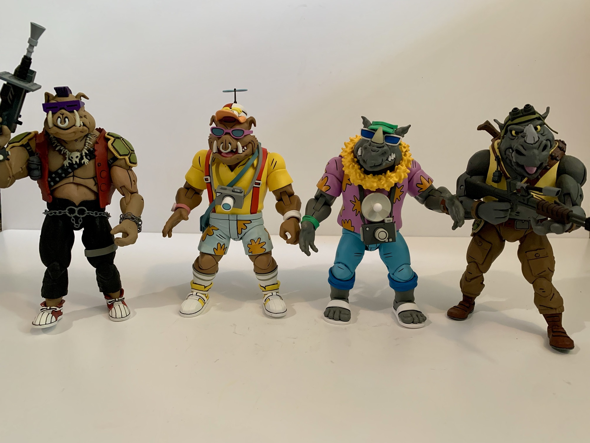
Pack your bags and grab the sunscreen because today we’re heading to Florida! It’s vacation time folks, and even the bad guys deserve a little fun in the sun sometimes. Coming from NECA Toys we have another fun variant of the duo Bebop and Rocksteady. Always more comic relief than true threat, the boys come dressed for the theme park as they accompanied the boss man down to Florida in an episode of the classic cartoon series which resulted in the further mutation of the punk frog Napoleon. As this line has gone on, I’ve become more and more drawn to the silly offshoots and Bebop and Rocksteady have provided ample opportunities for such. We’ve had them as rabbits, robots, and superheroes and now we have them as tourists. The only question is does anyone need a couple of dimwitted mutants in floral patterns?

Seems like with each subsequent release, Bebop and Rocksteady shrink a little more.

Bebop and Rocksteady come courtesy of the duo Tony Cipriano and Tomasz Rozejowski with contributions from Kushwara Studios. Paint is handled by the frequent pairing of Geoff Trapp and Mike Puzzo. If there are any reused parts from past versions of these two, it’s not apparent. Even the hands look like they’re new. They do share parts between each other, but for the most part this is an all new set. Not that they don’t feel familiar as the construction of these two is pretty consistent. They’re more visual than poseable, but the very loud outfits will help to boost their shelf presence even if they aren’t the most dynamic figures in your collection.

This smaller scale for the duo probably is more accurate to the source material.

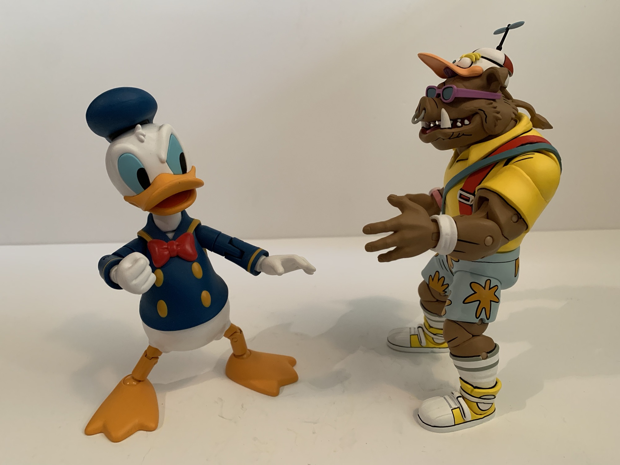
Rocksteady stands at around 6″ while Bebop is closer to 6.5″ which adheres to their presentation in the show. The two have similar, but different, outfits. Rocksteady is rocking the Hawaiin shirt in shades of purple and orange while Bebop went with a more bold choice with a yellow polo and red suspenders. Bebop brings in the floral print with the light blue shorts with orange flowers while Rocksteady seems to be wearing jeans with the cuffs rolled up. Bebop retains his usual style of kicks, opting for a matching yellow while Rocksteady has traded in his boots for flip flops. Bebop has more traditional sunglasses than his usual ones and Rocksteady has old man sunglasses with the strap going around his head. Neither are removable, nor is Bebops very fashionable “Not Donald Duck” hat with propeller. The propeller does not spin, unfortunately. Rocksteady actually has two hats: a blue visor or a yellow cabby hat which he switched to in the show.

“This is no vacation!”

These two look great for what they are. I feel like the Bebop and Rocksteady portraits keep getting better (well, except for Rhino-Man who was a little weird) and more aligned with how they looked in the show. There’s tons of paint and it’s pretty cleanly applied, but there will be some variation from figure to figure. My Bebop has an ugly spot near his suspenders on the back of his shirt, but it’s otherwise the only real paint defect. These figures are not pin-less, which is apparently something being rolled out by NECA slowly. It’s not that big of an issue on its own, but does create an eyesore with Bebop’s high socks. The factory went with a flesh colored pin even though the hole is cut through the socks. Gray would have been the more appropriate choice, or they could have painted them. There is also no cel-shading on these figures which continues to be something that NECA utilizes inconsistently. I’m not really bothered by it, but I would prefer NECA to just pick a lane with this stuff and stick to it.

These two come with an assortment of hands and vacation accessories. For both, we get a set of fists, gripping, and open hands. Rocksteady comes with a lei around his neck while Bebop has a satchel. Both also have a camera with a strap on it. Rocksteady’s features a large flash while Bebop’s is more compact. Unfortunately, neither can really be held as they’re too chunky for the gripping hands. You could heat them to wedge it in, but then you risk rubbing the paint. Plus, it’s unlikely they’d be able to hold the cameras in front of their face like they’re using it. There’s a large, blue, canister that looks like a water jug, but it might be some mutagen thing from the episode. I didn’t rewatch it. Unlike the cameras, the pair have no issues holding this thing by the handle. Lastly, we get a little rhino-fly. In the episode, a dragonfly has contact with Rocksteady and then contact with the mutagen to become this gross, little, abomination. It’s a fun little inclusion, though I wish he had a little acrylic stand or something because he really can’t do anything by himself. He basically needs to be held.

They can handle waving, but not much else.

Articulation for these guys is pretty basic stuff for a NECA figure. All of the cuts and joints you would expect are there, but they’re kind of limited. You have the ball joint at the head, but they mostly just rotate because there’s a lot of stuff in the way. The jaws are articulated, but the range is poor. The shoulders are ball-hinged and we get a bicep swivel as well. Double-jointed elbows are really limited by the fact that the neutral position for the arm is slightly bent. They’re also really tight and I can’t get better than a 90 degree bend out of them. Wrists rotate with a horizontal hinge. The shirts are basically overlays with not much inside them but a ball joint. They’ll rotate, but they won’t bend forward or back much. Ball-socket hips kick forward an okay amount but not back. They’ll go out to the side a solid amount though. There is a thigh swivel and double-jointed knees. Like the arms, the neutral pose is somewhat of a squat so the legs can’t go perfectly straight. Knee joints are tight, but even if you get both hinges working in tandem it won’t get you more than 90 degrees. The feet hinge forward and back a bit with an okay ankle rocker. Bebop’s is better than Rocksteady’s, but for the most part the pair move the same which is to say not very well.

“It’s more beautiful than I ever imagined!”

If you’re a collector of this line though from NECA Toys then that’s probably not a surprise. This line always favors aesthetics over articulation and Bebop and Rocksteady are no different. They are a little too far in one direction for my personal taste, but given that they’re goofy variants I’m more fine with it than normally. If these were the more evergreen interpretations of the characters I’d want more out of the torso and head, especially. And, come on, the propeller doesn’t whirl? Missed opportunity, NECA. A second one that’s sculpted like it’s spinning would have been fun too. And I’d be remiss if I didn’t mention that the box art features Rocksteady holding a little, red, flag from the episode which is not included. That’s just odd since that’s probably a pretty inexpensive accessory, but it’s also not some great loss.

“Do I know you?” “No, but I’m a big fan of your work!”

When it comes to variants of figures, I think more falls on how one perceives that look for the character. With Vacation Bebop and Rocksteady, that is very much the case. I can critique and praise aspects of these figures all I want, but at the end of the day the only people buying this set are those who are amused by these looks. I think they’re fun. I love the bright colors and I especially love how Bebop looks practically giddy to be heading out to an amusement park. Teenage Mutant Ninja Turtles was a silly, stupid, show and I want the toy line I’m collecting to reflet that so I didn’t hesitate to grab these. For $60, I can also understand how someone might look at these and conclude “I don’t need them.” If you’re not one of those folks though, then you can find this set at Target. It was part of the Cowabunga Collection released back in August, but it was stocked in generous quantities and is still pretty easy to track down well into November. It probably won’t last forever though and I wouldn’t guarantee on another production run so if it’s something you like you probably don’t want to wait too long.

If you like figures of Bebop and Rocksteady then you have no shortage of options these days:

NECA TMNT Cartoon Super Bebop and Mighty Rocksteady

2021 introduced a lot of good things for collectors of NECA’s Teenage Mutant Ninja Turtles line of action figures based on the classic cartoon. The toy maker still kept the line a Target exclusive when it came to brick and mortar, but it also started selling a lot of it online to coincide with each…

Keep reading

NECA TMNT Bebop and Rocksteady Target Exclusive Series

I have been rather fortunate when it comes to toy collecting in recent years. When I was a kid, toy collecting meant going to Toys R Us or a similar store and seeing what was on the shelf. Catalogs, commercials, and card backs were my main source of information. I assume there were newsletters and…

Keep reading

NECA Cartoon TMNT Mighty Hog and Rhino-Man

We did it! We finally made it to the end of the Haulathon releases from NECA Toys and we may have saved the best for last. Back in early 2020, I made a wish list for what I wanted from NECA and Teenage Mutant Ninja Turtles. It was only 10 deep, though there were some…

Keep reading

Super7 The Simpsons Treehouse of Horror ReAction

It just wouldn’t be Halloween without The Simpsons.

Happy Halloween fellow toy enthusiasts and fans of The Simpsons! Every year since 1990, there has been a Halloween edition of The Simpsons. The annual anthology style episode called Treehouse of Horror is basically appointment viewing each and every year. Sometimes it arrives before Halloween, sometimes on Halloween, and often times after Halloween (as it’s doing this year for some unknown reason). It would be nice if there could be some consistency when it comes to that aspect of the annual show, but at least with Halloween occurring on a Thursday this year it’s not a long wait until Sunday.

Here at The Nostalgia Spot, much time was spent on Simpsons action figures in 2024, and in particular, those from Super7. The company announced it had the license a few years ago to produce action figures based on the show, but it took a long time to get things moving along. As a result, Disney may or may not have grown impatient or they just didn’t like the returns they were getting from Super7 because the company yanked the license (along with all other Disney licenses) away and gave it to Jakks Pacific. That lead to three waves of Ultimates! figures getting released in a short window earlier this year with varying degrees of quality (most not great). I enjoyed some of those figures, but I also did not enjoy some and I was pretty harsh at times. This isn’t an apology though, the figures are what they are, and the criticism was warranted. When I finished that though I opined on if I should make a post about some Super7 figures based on The Simpsons that I did enjoy. Namely, the ReAction brand.

The ReAction figures are a little bigger than the new Jakks 2.5″ (Bart on skateboard) line, but a lot smaller than the Jakks 5″ line (far right).

Super7’s ReAction brand is its retro-style action figure. Loosely based on what Kenner started in the late 70s with Star Wars, these are approximately 3.75″ figures with five points of articulation: head, shoulders, hips. All of those points are simple swivels and Super7 has used this format for basically a whole bunch of licenses over the years. Personally, I don’t have any nostalgia for the original Star Wars line from Kenner so I typically am not interested in these intentionally ugly, limited articulation offerings from Super7. It also doesn’t help that they’re usually around 20 bucks (ouch). However, for some properties Super7 alters its approach slightly to basically sculpt and paint the figures to match the source material and that’s what it did with The Simpsons.

Each wave of Simpsons Treehouse of Horror ReAction consists of four figures.

Super7 did four waves of Simpsons ReAction. One was based on the movie within the show, McBane, while another was a series of Troy McClure two-packs (and they were great). The other two were devoted to Treehouse of Horror. Wave one consisted of Reaper Homer, Skeleton Marge, Inside Out Bart, and Kang as Bob Dole. The articulation across the board is terrible, but the sculpts are pretty nice and these figures are fully painted. What really helps sell them is the yellow paint for the skin, something the much larger and more expensive Ultimates! figures skimped on at times. The Marge sculpt, in particular, is very nice as she has a skeleton body with her normal head (in a horrified expression). Inside her rib cage is a trapped Snowball II and even the little kitty appears to be fully painted. She’s a bit tough to stand because the hips are a touch loose and her hair makes her top heavy, but overall she’s rather nice looking.

Finally! I have Bob Dole’s boneless face in plastic!

Homer also looks great. This take on the “Reaper Madness” segment where Homer became the Grim Reaper captures the likeness well. He has one skeletal arm and one normal one. Plus, he has two accessories: his scythe which he can hold okay with his left hand, and the scroll ordering him to kill Marge which he can hold with his right. He’s even more limited articulation wise, but these things are basically just little statues. Kang-Dole is depicted from the moment in the segment where Homer yanks the Bob Dole mask off of his head exposing the top of his eyeball. The Bob Dole mask is an accessory and it’s kind of creepy. The details on the figure are nice though and it’s certainly a memorable segment from the show. Inside Out Bart is perhaps the least interesting of the bunch. Even though the concept should lend itself well to figure form, there’s less paint since they were able to just mold him in pink and just paint a few veins here and there. His expression is also odd, but he has his cane and top hat and looks fine. It’s just the limited posing (even for this form as his legs do very little) of this form factor that lets the figure down since this character only exists for a dancing segment and he definitely can’t be posed in any dancing maneuvers.

Not the most creative character selection, Super7.

Wave two was surprisingly more of the same for Super7. It once again features a version of Homer, Marge, and Bart and then throws in a side character, which in this case is Groundskeeper Willie. Marge comes in her witch attire from “Easy-Bake Coven.” She has a laughing expression and comes with her broom. She, of course, can’t really ride the broom and even though she’s wearing a long skirt Super7 still gave her hip articulation by splitting the sculpt. I hate when they do that and it’s one reason why I’ve never been tempted by their Misfits ReAction figures. They left the robed Homer alone, but not Marge. It just looks stupid, and the limited articulation doesn’t add much. Still, she’s a good representation of this Marge, even if a little less exciting than the skeleton one.

Both Homers look pretty great.

Homer is in his Snake form from the segment “Hell Toupee.” That means he looks like regular Homer, only he has a gray shirt and hair. Somewhat to my surprise, Disney let Super7 sculpt his pack of cigarettes under his right sleeve. It’s a small detail, but they’re so averse to smoking in anything that I’m surprised they didn’t insist on removing it. He also comes with a corkscrew with Moe’s heart stuck on the end. It’s pretty gruesome for such a small item, but I appreciate his right hand being sculpted in such a way that he holds it properly. The Bart in this wave is technically not Bart, but Hugo from the segment “The Thing and I.” His shirt is a little darker than usual and his clothes are tattered. The remnants of his shackles are still on his ankles and he comes with a glass of milk and plate of fish heads. His grip on the glass is pretty loose and can get annoying as dropping that tiny accessory can lead to a long search for it. The plate of fish heads also just kind of rests on his right hand and can be precarious since it throws off his balance. Basically, once you get him right, don’t touch him! The sculpt looks nice though and he’s well painted, though the tattered bits of the hem of his shirt could have been done better. It’s basically seamless with his body so it looks odd upon close inspection.

Willie, with his Jakks counterpart.

The last figure in the wave is Groundskeeper Willie in his Freddy Krueger attire from “Nightmare on Evergreen Terrace.” He is perhaps the most preposed of the line (Hugo is as well) as his knees are bent and his arms are situated in such a fashion that he can hold his included rake with two hands. It basically just means he has one pose so the articulation on this guy is almost pointless. He looks great though and I’m definitely not upset about his inclusion or anything. I do think this line is open to criticism when it comes to character selection. We get two each of Bart, Marge, and Homer, but no Lisa? After the Ultimates! completely shut out her, Marge, and every female in Springfield it was disappointing to see the ReAction figures almost do the same. We could have easily received a witch Lisa instead of Marge, or maybe sorcerer Lisa, Einstein Lisa, snail Lisa, or a multitude of others. Hawk Lisa with a shrew Maggie (or whatever she was supposed to be in “The Island of Dr. Hibbert”) could have been a way to get both of the Simpson daughters into the line.

I love what Super7 gave us, but could we have sacrificed a Marge for a Lisa? I get that Homer and Bart are the most popular, but we needed a Lisa!

All other criticisms of character selection mostly stem from the line only lasting two waves. It’s a shame, because Treehouse of Horror is ripe for more figures. I might have preferred a fly Bart or werewolf Bart to the inside out one, but it’s not like Inside Out Bart is a bad pull or anything. Plus it comes from one of the best editions of Treehouse of Horror. With this line, Super7 had a great process. The sculpts were on model, they didn’t sacrifice on paint, and even the scale looks pretty good. I was certainly looking forward to more and it’s a shame this is it. If you want to collect what’s present here, you definitely won’t want to wait. Most places are sold out with figures only available on the aftermarket where folks are looking to get more for them now that the line is cancelled and no more are coming. At 20 bucks a piece, they were already too expensive for what they are. I could forgive it because at least they looked nice (and I got some of these on sale too), but at any more than that it becomes a really hard to sell. You have to be a hardcore fan of The Simpsons and Treehouse of Horror in particular to spend more than that, and if you are such a fan there’s a good chance you already have them. Happy Halloween!

For more Simpsons figures, and even some Treehouse ones, look no further:

Super7 The Simpsons Ultimates! Kang and Kodos

We are onto the third wave of Ultimates! from Super7 based on The Simpsons. Like past waves, plenty of questions abound when it comes to Super7’s character selection and they’re not unfounded. Perhaps the two most questionable inclusions in this third wave are the subject of today’s post: Kang and Kodos. These are two separate…

Keep reading

Super7 The Simpsons Ultimates! Devil Flanders

Last week, we concluded our look at the third wave of Super7’s line of figures based on The Simpsons and now we embark on the fourth and final wave. That’s right, Disney pulled the rug out from under Super7 and handed The Simpsons license over to Jakks. Their products will start rolling out this fall.…

Keep reading

Jakks Pacific The Simpsons Homer and Bart

I think it was early this year that we found out Super7’s line of ReAction and Ultimates! action figures based on The Simpsons was ending after just a couple of years. That meant Super7 was done after four waves of Ultimates! and four waves of ReAction figures. We had seen figures for a possible fifth…

Keep reading

NECA TMNT X Universal Monsters Raphael as The Wolfman and Leonardo as The Creature

Time to get spooky with a couple of turtles.

It’s the last Turtle Tuesday before Halloween, so this calls for something a bit spooky and what better way than to take a look at two figures from NECA Toys’ line of Teenage Mutant Ninja Turtles x Universal Monsters figure line? I haven’t been collecting this one because one; I have tons of TMNT stuff already to collect and two; I’m not a fan of the Universal Monsters. I think they’re fine, but I’ve just never been drawn to those movies or really cared about them. I didn’t even get a single release from the vintage Playmates line when they started this whole business that NECA has continued. I did get the Michelangelo as The Mummy because I just thought he looked cool so I have always been at least open to adding more to my Halloween TMNT display. It was just a matter of waiting for the right figure and at the right price.

Raphael and Leonardo have the honor of being the only turtles so far in this line to get a second figure. Both had a figure debut before these two with Raph cosplaying as Frankenstein’s monster and Leo going as Ygor from the same film. I don’t think anyone was complaining about Raph getting the Frankie treatment, but I definitely saw more than a few people who felt perplexed by the first Leo. Maybe this one makes up for that? For these figures, NECA has turned to two more recognizable monsters: The Wolfman and The Creature from the Black Lagoon. Interestingly, Leonardo already portrayed The Creature for Playmates making him the first repeat pairing in this line (for a turtle, April got to be The Bride in both as well) as it felt like NECA was actively avoiding the same pairings as Playmates. Leo also got to portray The Wolfman in that line so we’re looking at two characters who have been played by Leonardo in the past and now the present which is something that might be of interest only to me, noted Leonardo super fan.

The shells on these guys are pretty gnarly.

If you’re new to this line, this is basically what you expect. The only wrinkle that NECA has tossed into the gimmick is that the turtles are based on their look from the 1990 movie making this like an offshoot of NECA’s movie line. I feel that aspect is quite evident in the portrayal of Raph, but less so Leonardo, but that has more to do with the Creature’s facial features than anything. The line is definitely going for that NECA realism they like to put on a lot of their figures. These figures possess intricate sculpts and a lot of paint while making some sacrifices where articulation is concerned. Both come in the standard Ultimates style of packaging NECA is known for with new artwork on the front by Daniel Horne. The sculpts on both are by Tony Cipriano with contributions from Kushwara Studios and the paint is provided by Geoffrey Trapp and Mike Puzzo.

The sound of a wolf howling in New York is strange enough, but what’s really odd is some claim the wolf is howling, “DAAAAAAAMN!”

We’ll talk Raph first since he came out first. Raph as The Wolfman is about what you would expect. He’s clad in the familiar olive green shirt, but it’s been torn up along with his trousers. The head very much looks like Raph, but just covered in fur. He still has his pads and bandana and his hands and feet follow turtle anatomy rules, they’re just combined with a canine aesthetic. He has two portraits, one that’s neutral and one that’s in a yell. The yell is certainly the more fearsome of the two with the teeth prominent and well painted. The neutral expression is a lot of fun because it has an undeniable Muppet quality to it which I very much like since it was the Jim Henson Company that designed these original suits for the film. The most interesting part of the sculpt for me was the shell. NECA opted to cover even that in fur which certainly makes a statement. I suppose I never gave much thought to how the shell would be represented, but I was a bit surprised and amused by the decision. The detailing is all very nice though and the paint exceptional. The only downer with the presentation was the very sticky texture my figure possessed out of the box. In particular, the hands and belt. I’ve had this figure for months actually just letting it air out and it’s now finally reached the point where most of the tackiness is gone, but it was certainly unpleasant at first and I considered returning it.

I don’t think a mother could even love that face. Now, a giant sewer rat? Maybe.

Raph’s sculpt and paint are certainly nice, but the aesthetic of The Wolfman feels almost basic compared with The Creature. This is a true overhaul for Leonardo and one of the busiest sculpts I can recall ever owning. Every millimeter on this guy is textured. The scales form plates all over the figure’s body with lots of bony protusions on the limbs. The hands are webbed, there’s gills and fins aplenty, the weird fish lips, and the TMNT stuff like elbow pads and knee pads. Leonardo forgoes the belt in favor of netting which is done with soft plastic and draped over his torso. There’s also an extra rope with optional hooks and bobbers that he can wear. There’s a little shine to portions of the paint giving the figure a glistening quality like it’s an actual fish-man, err, turtle. There’s a gradient to the paint with dark green in the crevices giving way to a more yellow-green while the fins are almost bronze. The fins are very rigid so do take care to make sure this guy doesn’t take any shelf dives on you since I fear they’d chip easily. This figure is beautifully ugly. It’s an amazing sculpt and paint job, but also an off-putting one which I’m assuming is exactly what they were going for.

Raph has some bone sai and a fun “Muppet” head.

While these figures may carry a double licensing fee, NECA still finds a way to include enough stuff in the box to make them feel like a complete release. I already mentioned the second portrait for Raph, but both figures come with three sets of hands. For Raph, they’re gripping, fists, and open hands. For Leo, he has gripping, somewhat relaxed hands, and splayed open hands. Both figures also come with their signature weapons. For Raph, he has a pair of sai made from bone and the remnants of Talbot’s cane in the film. They look appropriately feral and Raph has storage for them on his belt. For Leonardo, he has two harpoons that are fashioned to resemble his katana. There’s rope wrapped around them in places and there’s a nice wood grain texture here. One harpoon also features a speared piranha which looks neat, though it would have been better if it was removable. He also lacks any weapon storage which is a bummer. I suppose you could thread the “swords” through his netting, and there are even some larger openings in it that may be intended for just that, but it’s awkward and I’d worry about it stretching over time.

That looks like it would hurt.

After the weapons and extra parts, Raph has just one more accessory in the form of a bear trap. It’s sculpted and painted really well to create the illusion of a rusted, steel, contraption and it does have real chain affixed to it. The trap can open and close as well. As for Leonardo, he has a bone forearm attachment which the box labels as a “fossil.” It clips onto the wrist and extends beyond his hand like a weapon. It’s very rigid though and a little hard to get in place, but it looks cool. He also has the necklace I mentioned with the optional hooks and bobbers, but no secondary portrait which might be a bummer for some. Lastly, Leonardo comes with a little tortoise buddy. It’s a slug figure that’s well textured and the paint is solid. He’s got a bit of a smile to his beak which makes him almost appear cartoony. It’s kind of a weird inclusion considering we didn’t get an extra portrait.

Leo comes with a friend.

Articulation for both figures is pretty basic and also limited. Both figures feature a ball-jointed head and neck with ball-hinges at the shoulders. They have the NECA double-jointed elbows that swivel above and below the elbow and they’ll struggle to hit a 90 degree bend because of the elbow pads. Wrists swivel and all hinge horizontally. There is a ball joint in the torso, but it’s pretty much worthless because of the shells. The hips are ball sockets and they go out to the side almost for splits, but forward and back is almost nonexistent. Especially for Leo who has fins on the back of his thighs that get in the way. The knees are double-jointed, and like the elbows, the kneepads will interfere. Raph has digitigrade feet so he gets an extra hinge joint in the ankle and one in the toe region while Leo’s feet are the usual hinge and rocker which offer little because of the sculpt.

He’s a happy little tortoise.

Of the two, Raph articulates a little bit better, but his digitigrade feet make him harder to stand. Leo’s sculpt is a massive hindrance to almost everything he can do. The shoulders and wrists are about the only things not impacted by the sculpt or an accessory. His hips and ankles are almost worthless. I’m surprised he didn’t get an articulated mouth, especially in light of the fact that he doesn’t have an extra head, but I’m not particularly bothered by it. Raph may move better, but he doesn’t articulate well. Both figures are very statue-like and aren’t going to be posed doing anything crazy. The sculpt and paint is what’s being counted on to sell these so if you’re a fan of the look that’s going to really be the determining factor on if you like these or not.

The best thing about this line is it creates a way for the turtles to hang around your Halloween decorations.

Raph and Leo are both sold in various places for around $35 a piece. I got Raph over the summer and held off on reviewing him until the timing made more sense while Leo is a figure I only acquired recently. I was leaning towards passing on him since I know even less about The Creature than I do The Wolfman, but Walmart had him on sale for $25 which was low enough to get me to bite. Hopefully he’s still on sale for those also interested in such a price. NECA is also doing black and white releases of all of the Universal Monster Turtles if that’s more to your liking. There’s a two-pack of Leo and Raph (Ygor and Wolfman) and a four-pack featuring the remaining four turtles which is a clever way to get both versions of Leo and Raph out there in black and white. Or it’s a terrible way to do it if you only want one. According to NECA, these repaints are also a bit of a stalling tactic as they work on more new sculpts for the line. With Leo and Raph getting two figures, it would stand to reason that Mikey and Donnie will follow suit and we still haven’t seen a Dracula in the line yet. Surely, NECA would not let the line end before getting to such a heavy hitter, it’s just a question of who is the most appropriate for such a prestigious character? And since I have three of the four turtles now, I suppose I’ll need to add Donatello. While I have actually been tempted by his Invisible Man mash-up, I might as well wait and see what his other figure turns out to be in case I prefer it. Maybe by next Halloween we’ll know what direction I went in.

Looking to add more action figures to your Halloween decorating? Here’s a few suggestions:

NECA TMNT x Universal Monsters Michelangelo as The Mummy

As the toyline and cartoon series started to go long, Playmates Toys turned to other ideas to keep the good times rolling on the Teenage Mutant Ninja Turtles. Long thought to just be some quick fad, the turtles outlived all expectations into the 90s spawning multiple films and video games and a cartoon series that…

Keep reading

NECA Misfits Ultimate Fiend Action Figure

When Glenn Danzig and Jerry Only reached a settlement over who owned the rights to The Misfits in the mid 90s (resolution: they both did), it set off a wave of new merchandise plus a new version of the band. What had once been a logo found mostly at punk and metal shows, the visage…

Keep reading

Super7 Ultimates! – The Worst – Robot Reaper

Happy Halloween, my fellow action figure enthusiasts! It’s a day for mischief, a day for candy, and a day to laugh at Death. Today, we’re laughing at a special kind of death, a robot death, and it comes courtesy of Super7’s in-house brand The Worst. The Worst is a line of action figures that’s basically…

Keep reading

NECA TMNT Adventures Mondo Gecko

Whoa man, it’s like a lizard dude

.The NECA Cowbunga Collection is a content creator’s dream. Here we are deep into October still talking about figures that dropped in August. This time it’s another Teenage Mutant Ninja Turtles Adventures action figure and it’s fan-favorite Mondo Gecko. Most TMNT fans probably know Mondo from the Playmates action figure line. He also made the jump to the cartoon series and he’s shown up quite a bit in other TMNT media ever since. Like a lot of those old toys though, Mondo is a Mirage Studios creation. Ryan Brown is the credited creator and Mondo would go on to appear in the Archie Comics Teenage Mutant Ninja Turtles Adventures books where he would be an ally of the turtles. He would then go on to become a member of the Mighty Mutanimals alongside the likes of Man Ray, Dreadmon, and others.

When it comes to NECA’s subline of figures based on TMNT Adventures, it would seem they have two priorities: Stump wrestling and Mighty Mutanimals. The first few figures started building out the Mutanimals before pivoting to the wrestling stuff. Mondo is a reminder that more Mutanimals are needed and likely coming. First unveiled at San Diego Comic Con 2023, Mondo arrives in the standard TMNT Adventures packaging with new artwork by artist Ken Mitchroney. He’s a sculpt by Tomasz Rozejowski and Kushwara Studios with paint by Geoff Trapp and Mike Puzzo. Because Mondo’s appearance in the comics is so close to his vintage toy, which also inspired his cartoon design, this figure is perhaps the least exciting one in the line so far. That’s just because he’s so familiar, but that doesn’t mean this isn’t a worthwhile release.

This is NECA’s second run at Mondo. As you can see, there’s a lot of similarities between his Archie and toon design, though no parts are shared.

Mondo stands at around 5.5″ to the top of his head and tack on another quarter of an inch for the hat. His design is almost exactly like the old Playmates toy with one obvious exception. He has the torn yellow shirt with skull emblem on the chest, the asymmetrical gloves and knee pads, high top shoes, and purple shorts and hat. The main difference is the long, black, hair. The old toy had it tied back in a ponytail while this Mondo just lets his hair down. His eyes are partially closed and his mouth is in an open position with a big smile which helps to expose those braces. It gives him a bit of a stoner look and there’s a toon quality to the face that’s appropriate for the line. I know some who aren’t crazy about the expression, but it works for me.

The little guy partly responsible for why Mondo looks the way he does.

Paint on Mondo is a little sparse compared with some releases, but I’d stop short at calling it lacking. The body is a rather bright, almost neon, green textured like a basketball to impart scaling. There’s some black curves painted on to highlight the scales as well and a lot of linework on the figure’s face. The teeth, eyes, and tongue are painted cleanly as are the gloves and shoes. The shirt is an overlay and the print on that is clean. The bare plastic in use for the green is not glossy or cheap, but the figure doesn’t pop as much as say Man Ray. The only area I don’t love are the hands. He has sculpted claws, but everything is green. His nails weren’t painted in the books from what I’ve seen, but this could be an odd spot where the sculpt should have been a little softer to make for pointed fingers as opposed to fingers with claws. In another deviation from the Playmates/toon design, there’s no blue on the character’s belly or the underside of the tail. The bright green also doesn’t match the box art nor does it match the comic. He should be a more olive green, very close to the turtles, and I’m guessing this was a creative choice by NECA to brighten the figure up. Perhaps to differentiate him from Slash too.

What do you think is in the cup? My guess is Mountain Dew.

Mondo comes with an assortment of accessories, most of which are expected. For hands, he has a set of gripping hands and open ones. He comes with a right hand in a devil horns gesture and a left in a hang 10 one. There’s also another right gripping hand that’s wider which is for holding his soft drink. It’s an all white cup with a straw that has a red diamond on it. There’s some black linework on it as well and it’s sharp looking. There’s also a microphone which is done all in black and is taken right from the books as he was a human musician who got mutated into this gecko man. There’s also an included gecko who is pretty cute and has his little tongue sticking out. He’s mostly green with some linework and yellow eyes. I wish they had painted the inner mouth black rather than leaving it green as it looks a little funky with the red tongue poking out, but it’s fine.

A guitar strap or microphone stand would have gone a long way here.

The two big accessories are Mondo’s instrument of choice and mode of transportation. Mondo has his trusty six string which is mostly teal with white accents. The paint on the fretboard is really clean and there’s volume and tone knobs sculpted in as well. I do have to point out that there are only five strings sculpted onto it even though there are six knobs at the end clearly indicating that this should be a typical guitar. It’s also lacking a strap so Mondo is forced to hold it if you want to display him with it which seems like an odd oversight. Mondo also has his skateboard which is all purple with a sting ray on the underside. It’s not as flashy as the cartoon board and it’s also not equipped with a motor. The wheels do turn and it has a single peg on the rear. My board did come with the front truck not glued on. There’s a sculpted tab on the underside for it that it slides onto and I’ll have to glue it myself if I want it to stay in place. Otherwise, it’s a skateboard and it does what it’s supposed to, we’ve just received a lot of boards from NECA at this point so it’s a little hard to be impressed by it.

Looks like the factory missed a spot of glue.

Articulation for Mondo is pretty much the norm for the line. We have a ball joint at the head, but the presence of the hair and open jaw is going to severely limit what he can do there. It’s primarily a swivel point and even that is limited. Shoudlers are ball-hinged and he has a biceps swivel past that. The bicep on the left arm of my figure doesn’t want to seat properly on the peg for the joint. I’ll have to try heating it to see if that works as right now the joint is basically working itself out when I mess with it. Elbows are double-jointed and this figure does feature pins. They don’t create much of an eyesore, but your mileage may vary. Hands rotate and hinge horizontally on all hands. No vertical hinges anywhere. The gloves are painted on, so repeated use of these hinges may expose the green plastic underneath so do be mindful.

It’s an easy fix.

In the torso is a ball joint in the diaphragm which rotates and tilts in all directions. Nothing crazy, but it’s there. There doesn’t appear to be anything at the waist while the hips are ball sockets that go out to the side for splits, but will be limited by the crotch overlay kicking forward and back as the legs will want to go off to the side. Forcing the issue will likely just result in the leg popping off. There is a thigh pivot built into that joint which works fine and the double-jointed knees bend a little past 90 degrees. The ankles feature the customary hinge and rocker setup and NECA wisely put the hinge right in the middle of the sneaker so it’s not really hindered by anything. It also appears to be smartly engineered so that paint rub or flaking won’t present an issue. Mondo is also rocking a tail and that’s connected via a ball hinge. There are no segments in the tail or a wire or anything so it’s pretty basic, but can be posed a bit. It’s also fairly short so it’s not the most useful third leg, but it can be utilized for added stability in certain poses.

The Mighty Mutanimals are nearly assembled with the addition of Mondo and it’s a natural way to display him, but…

Mondo Gecko is a solid release. The figure doesn’t possess much of a wow factor and part of that is due to it just being so similar to the toon figure and the vintage one, which has in recent years received an update via Super7. The articulation is okay and most of the accessories are solid. He’s not really the right shade of green, but I don’t think that’s really impacting my enjoyment of the figure at all. I do think he should have at least another head for those who aren’t crazy about the expression. I’m also surprised that the jaw isn’t hinged. This is definitely a figure for those who want to assemble the Mighty Mutanimals on their shelf. If you’re a more casual TMNT toy collector then you may feel like you’re covered when it comes to Mondo with one of the other releases.

…this also kind of rocks!

If this figure is to your liking and you want to add it to your TMNT Adventures collection then head to Target. There Mondo will run you $37. The figure is likely to see release at other retailers in the not too distant future as well. Adding Mondo means we’re just missing a proper Mutanimals Leatherhead as well as Wingnut. Once they’re out, the team is basically complete (some will claim they need Ninjara as well, but I don’t think of her as part of the core team) and I would imagine that NECA is already planning on a release for both. They may string us along a bit first, but I have faith that the full team will at long last be immortalized in plastic.

If TMNT Adventures is your thing then check out some of these reviews:

NECA TMNT Adventures Man Ray

Back when Teenage Mutant Ninja Turtles ruled the world, there was a lot of brand synergy between all of the various media being generated by this one mega popular piece of intellectual property. The comics came first followed by a toyline which necessitated the creation of an animated mini series to basically serve as a…

Keep reading

NECA TMNT Adventures Jagwar

The next figure in NECA’s line based on the Teenage Mutant Ninja Turtles Adventures comic series is a much anticipated one for fans of those books and its spin-off The Mighty Mutanimals. And that’s because this character is making his debut in plastic. Previously, we looked at Slash who has been pretty well-represented in some…

Keep reading

NECA TMNT Adventures Dreadmon

We’re almost done with all of these NECA Haulathon drops from March and up today is the last of the single-packed figures, the Mighty Mutanimal Dreadmon! Technically, he’s the third figure in NECA’s line of figures from the pages of Teenage Mutant Ninja Turtles Adventures since he’s listed as number 3 on the box. However,…

Keep reading

McFarlane Toys Batman: The Animated Series Wave 1

The lineup for McFarlane’s first wave of dedicated Batman: The Animated Series action figures.

Years ago, perhaps as many as 10 or more, DC Direct was filling comic book stores around the country with action figures based on the classic cartoon series Batman: The Animated Series. The figures were stylized to resemble their onscreen counterparts and it was a line that included many of the characters from the show as well as multiple vehicles. Eventually, DC (or parent company Warner Bros.) decided it no longer wanted in on the action figure market. The branch of the company devoted to toys was dissolved and the license was sold to McFarlane Toys. Since then, Todd’s company has devoted many resources to its DC Multiverse line which is sold at big box retail as well as specialty. The 1:10 line features more variations of characters than I can count and it has its own distinct style. Early in the line, a Batman based on BTAS was even released, though it wasn’t something that I found particularly enticing.

Here is your comparison to what DC Direct was doing in its final days and what we’re getting from McFarlane.

When the DC Direct line was alive and well, I wasn’t really in the collecting game. By the time I got back into it, I was left a little underwhelmed by the offerings available to me. They weren’t cheap, were quite limited in terms of articulation, and it wasn’t an evergreen line where characters were easily attainable. Instead, it was more of a blink and you miss it kind of deal. Towards the end of the line, there were some reissues and I would end up getting the last standard Batman from the line which featured the new tagline of The Adventures Continue. That Batman is fine. The likeness is good enough even if the articulation is pretty poor. It was retooled to have better hips and the paint job was more ambitious and a marked improvement over the Batmen to come before it. I would also add a Gray Ghost, purely out of nostalgia, but any ideas I had on getting more of the figures was pretty much dashed by the absurd aftermarket prices that had emerged. Figures were selling for hundreds of dollars and I just wasn’t interested.

The big selling point for the McFarlane line is the build-a-figure inclusion.

Last year, McFarlane made the wise move to begin reissuing these long out of production figures. McFarlane apparently has access to the molds so this was a pretty low cost way to get some characters out into the wild that fans have been clamoring for. The first wave arrived about a year ago now, but I’m just getting to it for reasons that will become clear as we move along. That first wave consisted of Batman, Robin, Mr. Freeze, Scarecrow, with a build-a-figure of The Condiment King. All four of the retail figures are straight reissues of past DCD offerings with the only new sculpt being The Condiment King. To differentiate these from the other figures, and perhaps to not crater their aftermarket value and risk angering their fanbase, a new deco was applied to each figure and the packaging is all new. These come in oversized window boxes that are honestly way bigger than they need to be, but whatever. It’s just the trash that surrounds the figure. Is this return to stores what fans and collectors have been waiting for? Read on and find out, though you may not like the answer.

What do we think of McFarlane’s attempt at cel-shading?

Let’s start with Batman. This is a reissue of the Batman that came with the Batcycle. He has a soft goods cape and an ab crunch to help make getting him on the bike a little easier. It’s a less attractive figure as a result, but what are you going to do? The main thing that’s going to stick out is the paint job, and that’s going to be true for basically all of these figures. McFarlane decided to attempt cel-shading with these figures. The final Batman from DCD did the same thing to fantastic results. There was blue in the cape, a little gray under the pectorals, and hits of blue on the gloves and boots. It was subtle, but very evocative of the show. This Batman does none of that. He has this ugly brown smear along the side of his face, a dark gray that’s slapped on the side of his body without much regard for anything, and very little blue one the boots and gloves. It’s hideous. DCD gave you the blueprint, McFarlane, why couldn’t you just follow that?

Robin and Freeze get these goofy-ass hips.

Unfortunately, the same is mostly true for the rest. Robin looks almost as bad as Batman with the same brown on his face, but the red and green of his costume at least works better with the shading. They completely missed the yellow on the inside of the cape which is also plastic so he won’t work as well with vehicles as Batman. Mr. Freeze has some pretty atrocious cel-shading as well, though it doesn’t appear to be as heavy as it is with Batman. Scarecrow is the only one who doesn’t look awful, but that’s because his costume of brown and red works better with the shading. It’s barely visible on the red portions while the dark brown doesn’t clash all that poorly. This is also second appearance Scarecrow and, overall, he looks the best of the bunch in terms of being on-model. Mr. Freeze would place second if this were a competition, but he’s too small and his oxygen tank is the wrong color. I don’t think scale is a strength of the line. Robin looks more like a reinterpretation of his old Kenner figure with the big head and dopey grin while Batman just plain looks bad.

It’s a lot of stuff, but how much of it is useful?

Each character does come with accessories. For Batman, it’s a bunch of hands including one with a grapnel gun molded in. He also has a Batarang that’s all black. He has fists, gripping hands, and Batarang hands plus a stand-alone grapnel gun that’s all black. Robin has fists, relaxed hands, gripping hands, and a hand with a molded grapnel gun in it. He also has a bollo that’s just a long piece of plastic. It would have looked better with a whirling effect. Scarecrow has open hands, a gripping right hand, and a left fist, plus an unmasked portrait. The gripping hand is for his scythe which looks pretty good, though I wish he came with two gripping hands or that the one gripping hand actually worked better. Freeze has his freeze gun and then a whole bunch of hands: fists, trigger hands, gripping hands, clenching hands, and open hands. The clenching and gripping hands look specific, like maybe he was supposed to have more accessories (a snow globe, perhaps) that were cut. It’s a comical amount of hands though for a guy who is just going to stand there holding his gun.

That’s not impressive…

Which brings us to articulation, which was never this line’s strong suit and part of that is due to the character designs. We’re talking ball peg heads, ball-hinge shoulders, single elbows, and wrists that swivel and hinge horizontally. Nobody has good range anywhere, save for maybe the head, but it’s at the hips where things get weird. Batman has updated ball socket hips so he can kick forward a reasonable amount and almost do splits. Scarecrow does too, only his range is terrible, but he has a thigh swivel built-in (Batman does not). Freeze and Robin have these awful hinge and peg hips. The hinge leaves this T shape in the cut on the side of the thigh. It allows for full splits, but looks ridiculous and is one of the ugliest joints ever conceived. Neither character can kick forward worth a damn too. All of the figures have double-jointed knees except for Freeze and Robin. Even without the extra hinge, Freeze can still bend his knee 90 degrees. Robin cannot. All of the figures have a swivel and hinge at the ankle with only Batman and Robin having an ankle rocker. Everyone except Scarecrow has a boot cut. The combination of poor articulation and tiny feet make all but Freeze tough to stand. He has large, boxy, feet so it’s not an issue, but his arms are the most limited because of his design. I wasn’t sure if he even had elbow cuts. They’re there, but functionally useless. He’s also the only one without a waist twist.

I like Condiment King’s sculpt and the paint is acceptable, but why is he so big? And I have him lurched forward a bit here just to get him to stand. In other words, this picture makes him look smaller than he is.

Given that these are all old molds and exclusive to Target you would think they’d come at a friendly price. They do not as all of them retail for around $30. Of course, if you get all four then you get a bonus fifth figure in The Condiment King. He is all new and comes with his backpack and twin guns: ketchup and mustard. The guns connect via a thread to the backpack so it limits his posing, but at least they’re here. As for the sculpt, it looks fine. Great even. This is one of the show’s silliest characters and it’s a fun inclusion as a BAF. It might not be the type of character everyone needs, but the hardcore will enjoy building him. His light blue costume with white accents is done well enough. Yes, there’s cel-shading, but it’s not as bad as it is with some of the others. The only spot I hate is the brown smear on the side of his face. Articulation is satisfactory for the line as he has single elbows but double joints at the knee and ball-socket hips, it’s just that the hips are way too loose. Combine that with the backpack and this is one tough figure to stand. The build quality of the guns is also questionable as the handle of the ketchup gun came off when I tried inserting it into his hand. It looks like the guns were molded in two pieces to get the string inside so it’s nothing a little glue can’t remedy, but still annoying. By far though, the biggest issue I have with Condiment King is his size. He’s way too big. He stands around 6.75″ to Batman’s 6.25″. He’s just overall big when in the show he’s just some guy who went nuts. He looks like he’d be more than a match for Batman at this size. It’s almost like he’s from an entirely different toyline.

Is $120 for 5 figures of worth it? It could be, but not these figures. The paint is not only a bad fit, it’s sloppy too. Batman’s cape feels cheap and the articulation cuts for his torso and the hips on Freeze and Robin are truly hideous. Scarecrow is the only figure of the five that comes close to earning his value, but he still doesn’t feel like a 30 dollar toy. All of them feel very fragile and very cheap. Moving these thin limbs, swapping the hands, all feel terrible. I don’t like handling these figures so I guess it’s good that they don’t pose well since the temptation to change things up isn’t really there.

What drove me to make this post though was where I did find some deals: the vehicles. McFarlane has not only reissued the figures, it’s also reissued the Batcycle and Batmobile with the Batwing also on the way (there’s also a Jokermobile, which was supposed to be a part of the old DCD line, but was cancelled). Initially, these vehicles were pricy, but still enticing, but I got both on sale. For the Batcycle, I think MSRP was 40 or 50 bucks, but I got it down to $10. At full price, it’s not bad, but at ten bucks it’s a real steal. It’s a straight re-release of the old bike including the base. It has battery operated lights, though you have to hold in the button on the bottom of the bike for them to be on as opposed to a switch. The base is reversible and can either resemble the Batcave or just a street and it allows for the bike to be tilted and there’s a little swoosh effect too. Instead of being all black, it’s now cel-shaded, but it turned out great! There’s a nice use of blue on it that really makes it resemble the bike from the show. And if you want Batman to play it safe, it also comes with a new head for Batman that features a helmet. They should have tossed in the same for Robin, but I probably wouldn’t use it anyway. The head looks fine, though it features a pale complexion. The tires are rubber and the thing feels solid. For what it is, it’s terrific.

The Batmobile is quite similar in that regard. It’s not fully painted out like the bike, but the sides are black and the top is a dark blue which helps it to resemble the look of the car in the show better than the original all black edition. The canopy slides forward and there’s room for two figures inside. The steering wheel telescopes which makes it easier to get figures in and out. The dashboard is all transparent plastic because this has a light-up feature as well for headlights, interior, rear lights, and the thruster in the back. Oh, and did I mention it’s big? This thing is a shelf hog measuring about 25.5″ long and a little over 8.5″ at its widest. It is a mostly hollow, plastic, box so it doesn’t have as nice a feel as the Batcycle. It does have nice wheels though that are rubber and the front ones can turn, though they are not connected to the steering wheel. The MSRP for this thing is $80, but I got it on sale for $40. Some people have found it for as low as $23! At $80, it’s a luxury item for the Batman enthusiast that has the room for it. At $40, it’s a great deal for the Batman fan that maybe doesn’t know what to do with it, but will figure it out in time. At anything less than that it’s a simple no-brainer. I’m not one who buys toys as an investment, but if you get a Batmobile for under forty bucks and sit on it for a year you’ll probably make some money.

What do we make of McFarlane’s foray into this old BTAS toy line? On one hand, I think it’s great that these molds are back out in the wild. I got Freeze and Scarecrow last year because I love Mr. Freeze and I thought Scarecrow looked good. I only recently got Batman and Robin because I wanted them for the Batmobile. Target lured me in with a sweet deal on that Batmobile and in turn got me to spend another sixty bucks (clever girl) I wouldn’t have otherwise. I think Scarecrow is fine, he’s limited, but he looks the part and I think aesthetics are what collectors are after most with a BTAS line. The Condiment King, if he was packed as a stand-alone figure, would be okay as well though I wouldn’t feel good about spending 30 bucks on it. Freeze is imperfect and too expensive while Batman and Robin are pretty bad. Why did I convince myself I needed them just to stuff in a toy car? I don’t know. It was more of a need for Batman, and then with only one figure shy of a Condiment King I figured why not get Robin? My older DCD Batman could not fit in the Batmobile with his sturdy, plastic, cape, plus he actually looks good and I don’t want him hidden. I’m fine hiding these two.

The figures are overpriced and kind of blow, but the Batmobile is pretty cool.

All that is to say, try and track down an actual DC Direct Batman if you want a Batman from this line. This one and Robin just aren’t worth it and unlike the vehicles, they seem to never go on sale. Mr. Freeze and Scarecrow aren’t worth your 30 dollars either, but if you do get Scarecrow you at least may not regret it in time since he looks fine. The vehicles are great though. If you have a DCD collection and passed on them then I think you should reconsider. Especially the Batcycle which looks pretty cool and isn’t too hard to fit into a display. The Batmobile presents obvious space concerns and I still don’t know where it’s going to end up in my house, but it’s an okay problem to have and now I’m wondering if I should consider the gargantuan Batwing. I shouldn’t, but if it ends up at Target for 40 bucks then I can’t be held responsible for my actions. As for the line itself, I wish McFarlane would spend a little to improve these figures. Better hips, better ankles, and figure out how to do proper cel-shading or just give up. No one will be angry if it goes away. This line is fueled only by a love of the show because if there was a better option out there then surely most would get that. Unfortunately, there isn’t and there likely won’t be in this scale anytime soon.

There aren’t a ton of Batman toy reviews here, but we do have some:

Batman – The Adventures Continue #50: Batman

If you’re a repeat visitor here at The Nostalgia Spot, then you’ve probably noticed that around here there is a high opinion of the television show Batman – The Animated Series. I did a re-watch of the series that spanned more than two years and also checked out the various films based on the property.…

Keep reading

The Hot Wheels Batman Series

I’m not much of a car collector, but when I was a kid I went through a Hot Wheels and Matchbox phase. My favorite car was a small, black, one that I only barely remember. I have no idea what make or model the car was, but what I liked about it was that it…

Keep reading

DC Collectibles BTAS #42 – Gray Ghost

I have long maintained that the best episode of the now classic Batman: The Animated Series is the Mr. Freeze story, “Heart of Ice.” It is not, however, my favorite episode of the show as that honor belongs to “Beware the Gray Ghost.” That episode introduced the character Gray Ghost, a superhero from television who…

Keep reading

NECA TMNT Toon “Binky’s Day Out” Slash V2

Here comes Slash…again!

In the far off time of 2020, NECA Toys released the Slash and Leatherhead two-pack as part of its line of action figures based on the 1987 cartoon Teenage Mutant Ninja Turtles. That two-pack was just the third two-pack that I would review here at The Nostalgia Spot. It wasn’t the third two-pack released as the turtles, Shredder, Foot, and Krang were all released before it, but they were re-releases of the figures previously released at San Diego Comic Con. The first all new two-pack was Bebop and Rocksteady followed by variants of the turtles and a Foot two-pack for those who wanted to army build. Slash and Leatherhead were basically part of the first wave of all new figures as that set was released alongside the Casey Jones and Slashed Foot and April O’Neil and Bashed Foot. Coincidentally, or perhaps by design, almost all of those figures have received updates over the past calendar year. April was retooled and released solo while Casey got a new variant in his business attire. Leatherhead got a release in the Archie line (with a Mirage one to follow soon) and now it’s Slash’s turn with the deluxe release Binky’s Day Out.

A gathering of Slash.

A Slash redo is something fans have wanted basically ever since the first one came out. It wasn’t a terrible figure, but it was a compromised one. NECA opted to repurpose the same body it used for the turtles and just tool a new shell, hands, feet, and head to go along with the accessories it devised for the set. The result was a Slash that had a solid headsculpt and some fun weapons, but he was way too small. When we got the Archie version of the character years later that reused the Tokka sculpt it drove the point home how most really wanted to see a new toon Slash. Well, we now have what we wanted as that Tokka sculpt has been repurposed once again to create a brand new cartoon Slash.

Even his gun is bigger!

Slash comes in the deluxe style packaging featuring some wonderful artwork by Tim Lattie and Aaron Hazouri. Like past solo releases in this line, the box art is meant to mimic the old f.h.e. VHS releases of the cartoon from back in the day. The sculpt for this figure is credited to Paul Harding and Tony Cipriano. If I’m not mistaken, Harding sculpted Tokka so I’m assuming that’s his contribution to this release with Cipriano sculpting the new bits. Paint is once again handled by the dynamic duo of Geoff Trapp (who NECA sometimes credits as Geoffrey so apologies to him if that’s his preferred name) and Mike Puzzo.

Backpack too.

Slash, being largely composed of reuse, stands as tall as Tokka and the Archie Slash at about 5.75″. The old Slash is around 5.325″ so there is a little added size here, but mostly we’re talking about added bulk. Slash is much thicker and his head is wider and sits lower on his body as it did in the show. I was pretty happy with the old headsculpt, but this one is undeniably better to my eye. He has the same kind of stupid grin with ugly teeth poking out. It’s the width of the head that really makes it look more like Slash as the previous one was pretty narrow relative to the source material. What really stands out though about this new figure is the paint. Slash is a much brighter green than his previous figure and is thus much brighter than the turtles. I’m not really sure why as he was the same shade of green as the turtles in the show. Artistic choice? Or maybe a factory screw up? I’m not sure, but it might annoy some.

Slash with his “daddy” and Raph, because why not?

Aside from that, the sculpt and overall presentation is quite nice with this new Slash. I’m a big fan of this chunky sculpt so I’m not surprised to see that it works fine here as well. The paint is clean and applied liberally. Oddly, he doesn’t feature the toon shading on the rear of the figure which has become one of those things NECA is really inconsistent about. I’m not sure how they determine which figures get it and which don’t. The shell on the rear of the figure is new sculpt and it’s this lumpy shell that matches the source material rather well. Arms and legs are basically the same as the past Slash save for the fact that the elbow pads lack spikes with this version. The hands are all new and Slash wears fingerless gloves and the paint is applied well there. He has his shoulder pads which are done in a soft plastic which might arrive a little warped. All of the metallic parts are painted a light blue which I kind of like, but is something I have to point out as inaccurate once again as they’re all gray in the cartoon.

Guns and toys. Okay, it’s not a toy rocket ship, but it sure looks like one to me.

Slash comes loaded up with a sizable selection of accessories. For optional parts, we get three sets of hands: fists, gripping, and trigger finger. I am happy to report that, like the Mirage Karai, the gripping and trigger hands feature a vertical hinge. Hopefully that’s a trend that continues. For heads, we get the default smile and a second one where his tongue is poking out. I think he made this face right after he went back to being dumb in the smart Slash episode. It’s fun though and I like it, though I understand those who think the two portraits are too similar. The hands are easy enough to swap, but the heads were a pain for me. I couldn’t get the default head off without heating it first, and once I did it was the ball joint in the neck that came free and not the socket in the head. I basically had to just keep trying to only heat the head and not any part of the neck, but since he has one those heads that juts forward rather than up, it was quite the trying experience. I did get it off eventually, and I would suggest maybe not pushing the heads all the way down if you want to be able to swap easily.

And if you don’t like the weapons this one comes with, the swords from the old Slash look pretty nice.
The old pizza works fine too.

Slash also has some weapons and accessories to properly outfit his person. He comes with a larger version of the backpack the old Slash came with. It’s a little cumbersome, but works well enough if you want it on him. I did not have to remove his head to get it on and off. For weapons, Slash has a handheld gun that’s mostly white and looks nice. It’s not the same pistol the old Slash came with so it’s nice to get a new gun. He also has this massive, two-handed, double-barreled gun that rests against his abdomen. One of these guns is a freeze ray and one is an anti-gravitational beam. I have no idea which is which as I haven’t watched the cartoon in years. There’s also a little, handheld, missile that kind of looks like a toy rocket ship. I think it’s the shield projector which is listed on the box. He also has his trusty Binky, the little, green, palm tree which comes with a plastic bowl and a little unmutated Slash to go with it. These are all new too as the old Slash came with a slightly different Binky and a much larger pre-mutated Slash. And if you’re curious, the weapons from the first Slash work just fine with this one too so if you want him to wield swords he can do that or make use of the other guns.

Let’s not forget about Binky!
The comparison you’ve been waiting for: Binky and “baby” Slash. New on the left, old on the right.

Articulation for Slash is exactly the same as Tokka and Archie Slash, so I won’t do a full rundown here (those reviews are linked at the bottom of this entry). I will say that Slash is a little loose. The Archie one was too and it’s mostly in the hips. They’re not floppy, but they’re pretty close. The figure has stood fine for me ever since I got him and only when I pushed it did he fall over. He is a little rear heavy, but should stand okay. Some joints are also pretty tight, like the knees and elbows, and the bicep swivels were stuck on mine. I actually never got the left one to work, but the right came free without any help.

“I’m gonna pulverize you do-gooders!” “Hey Slash, I hear they’re giving out free pizza a few blocks away.”
“Pizza!”

Is this new Slash an improvement over the previous one? Without question the answer is “Yes.” Still, if you have been content with that Slash all this time then maybe you’ll be fine to stick with it. There are also plenty of fans who do not like the cartoon’s portrayal of Slash and this probably won’t change their mind. It is not without its problems. I wish the articulation was tighter at the hips and the head swapping thing is really annoying. The bright green skin tone is a bit off-putting. I presently have my Slash amongst the villains from the “Night of the Rogues” episode where it’s not much of a bother for me, but when beside the turtles he does look off. And if you want to nitpick this guy further, he’s also probably a little too big now compared to the turtles. The same is true of Tokka, Bebop, Rocksteady, and probably other villains that don’t immediately spring to mind. That’s not something I take issue with, but if we’re discussing this as a review then it needs to be said.

“I wuv you, son.”

If you want to add this Slash to your collection you will have to turn to Target. He’s been in stock on the website for a bit, but might not be when this goes live because of my adherence to Turtle Tuesdays. Target is charging $37 for the figure, which it lists as Ultimate Slash, which is pretty much the going rate for a NECA solo release in this line. Since this figure does come with a fair amount of accessories, I think it’s a better value than some of the other recent releases. It’s not a perfect Slash action figure, but I think most will be happy with it and we shouldn’t need a version 3 in the future.

As promised, here’s out look at the figures this Slash is built off of as well as NECA’s first attempt at the character:

NECA TMNT Cartoon Slash and Leatherhead

NECA’s incredibly popular and white hot action figure line based on the Teenage Mutant Ninja Turtles cartoon series of the late 80s/early 90s has slowly rolled out its third wave. The wave consists of three two-packs and a single-packed deluxe figure, but perhaps to increase the numbers of individual items it can ship at once,…

NECA Cartoon TMNT Tokka and Rahzar

There is certainly a lot of Teenage Mutant Ninja Turtles product flying around these days, but I would guess collectors and fans of the property are paying the most attention to two toy makers in particular: NECA and Super7. One search for “NECA” on this blog will reveal that the company has produced a ton…

NECA TMNT Adventures Series Slash

As NECA continues to find success with its Teenage Mutant Ninja Turtles lines of action figures, the company has sought to branch out beyond the usual source material in an effort to give collectors more of what they want and also likely to just keep the hype train rolling. NECA started first with doing figures…


Jakks Pacific The Simpsons Homer and Bart

Another company is taking a whack at The Simpsons.

I think it was early this year that we found out Super7’s line of ReAction and Ultimates! action figures based on The Simpsons was ending after just a couple of years. That meant Super7 was done after four waves of Ultimates! and four waves of ReAction figures. We had seen figures for a possible fifth wave and listings for another wave of ReAction figures, but they will never see the light of day. If you’re curious about my thoughts on that whole mess, check out my review of King Size Homer linked at the bottom of this entry. Safe to say, I was let down and really not surprised that Disney pulled the plug. Super7 took too long to bring figures to market and frustrated the fanbase with its character selection. And once the backlog was unleashed earlier this year, the quality took a nosedive as well which would have only further irritated Disney.

It is entirely my assumption that Disney ended the deal with Super7 largely over money in that they probably wanted more. They also apparently had another partner ready and willing to dive into The Simpsons in Jakks Pacific. Unlike Super7, Jakks is a company that specializes in low cost action figures and toys released at mass market retail. You have probably seen their figures based on various Super Mario Bros. licenses and Sonic the Hedgehog. The Simpsons is apparently their next mountain to climb and it’s possible that Jakks either wouldn’t do the deal with Disney or wasn’t willing to pay as much as Disney wanted without some kind of exclusivity over the license. For fans of the property, it basically just means we’ve swapped out one company for another. The approach of the two is very different and it remains to be seen what the finished product will look like for Jakks when it comes to selection, but for now we have a few figures we can look at and assess.

I don’t have any of the figures from Playmates, but I can show you how they scale with Super7 Ultimates!

The Jakks approach for The Simpsons is a lot like their video game figures in that there are basically two lines: a 2.5″ line and a 5″ line. I don’t actually know what the measurements of the smaller line are because I have yet to buy any. They are small though and minimally articulated. It looks like this line will be how Jakks gets play sets into market as there’s already a Homer and living room set. The 5″ line is the one I’m more interested in as it’s a more fully articulated line of figures. The 5″ scale also has the added benefit of fitting in with the old World of Springfield toy line from Playmates that existed in the early part of the century. There’s also a third tier, a deluxe line, that’s starting to come out. These figures will feature more paint and come with dioramas and special features. I’m not sure about that line at this time as the price is around $25 for those and I’m not seeing the value, but maybe I’ll change my mind. There’s also a talking Krusty doll (I have it, it’s great for what it is) and a roleplay item in the form of Moe’s telephone. I might have to get that too, but it’s very much a “toy” and something I don’t need (not like that ever stopped me).

And I can also show you how they scale with the Super7 ReAction line.

Wave One of the 5″ line contains four figures: Homer, Bart, Willie, and Otto. I have so far only managed to find the two Simpson boys, but I do hope to run into Willie and Otto at some point. The figures are sold in window boxes with the same licensing art across all of them. It’s fine and sturdy and if you’re an in-box collector the window is generous and provides for a good look at the figure inside. Each figure will retail for about $13 and it looks like the aim is to do a figure with at least one accessory. As a first wave, this seems like a solid approach to get two family members and two fairly prominent side characters. Otto was definitely more of a factor early in the show’s life, which I do kind of appreciate since it’s those long-time fans that are mostly likely to buy these. After Super7 failed to release any women in their main line though, I’m a little remiss that Jakks did the same. It looks like we won’t have to wait long though for such characters to arrive as Wave Two is set to include Lisa along with Krusty, Moe, and another Homer. I guess Marge will have to wait until the third wave.

The scale here is not great.

Homer and Bart follow a pretty similar approach. Homer is around 5″ tall while Bart is a tick under 4″. You will likely notice right away that the scale is pretty far off for the pair. Bart is way too big, but it’s basically the same scale as what Playmates did. Toy companies have a tendency to make the smallest characters in a property bigger than they should be while the largest characters tend to be smaller than they should be. In the case of Homer, I think his size is perfect. His proportions look pretty good and I really have no complaints there. Bart, in addition to being too big, also doesn’t look proportional to me. His head is huge relative to his body and his arms and legs are too long. The arms and legs I can excuse since it’s probably to help facilitate articulation, but he’s not a great looking figure. I pretty much bought him because he’s, well, Bart!

Homer actually scales pretty well with little Hugo here. I think I prefer the kids be just a little too small than too big.

Both figures feature minimal paint applications. There’s really almost none to speak of. On Homer, it’s possible the only paint is the black hair that zig zags around his head and the pupils of his eyes. His mouth and the white part of his eyes look like they may be separate pieces of colored plastic glued into place. It’s certainly the case with the eyes, while I’m less certain about the mouth. For Bart, his pupils are painted along with some of the parts of his shoes. And with the shoes, the only paint might actually be the white circles on the inside of his sneakers (something Super7 failed to paint) as the soles of his shoes are all white and there’s a little excess plastic around his socks which makes me think that too is a molded piece. It’s possible the blue is painted on and then the white circles over that.

Similarly, this new Bart doesn’t look too bad beside an Ultimates! Homer.

The lack of paint basically means these figures have a very glossy appearance. From a collector’s standpoint, it’s the thing that bothers me the most. Yes, I know, we’re talking about a very low price point here, but if just the heads were at least painted it would give these figures a much nicer aesthetic. The other issue that stands out for me are the portraits. Both characters have a hint of a smile that’s really only visible from the side or a 3/4 angle. From the front, there isn’t much personality to convey. The Simpsons are a pretty animated bunch and I would have liked some more personality. Something else that kind of bums me out is that the heads don’t feel like they’ll be easy to remove. If Jakks had planned it better, perhaps we could swap portraits with future Bart and Homer variants to create more expressive poses.

My favorite detail about Homer’s behavior at work is how he always just takes the box of donuts from the break room and heads into the bathroom.

This line is a fully articulated one and Homer and Bart probably have as much articulation as one would expect of a Simpsons line. It’s also the same setup for both. There’s a swivel head, ball-hinged shoulders, biceps swivel, single-jointed elbow, wrist swivel and hinge, ball-jointed waist, ball-socket hips, single-hinged knees, and ankle swivels. Bart’s thighs can also swivel where they meet his shorts, though it’s tight enough that I wonder if it’s intentional. I was also able to get his lower leg to rotate at the knee which I only did because his lower leg was inserted backwards out of the box. Again, I’m not sure if it’s supposed to do that, but it did. Homer’s elbow range is a little less than 90 degrees, while Bart’s is a little more. The waist joint is mostly a rotation point, but there’s a tiny bit of tilt all around on the ball joint there. It’s decent and probably enough for this brand. The arms are a little ugly since both characters are bare armed, but what are you going to do? I suppose a more collector focused line would do swappable arm parts instead of joints, but that clearly isn’t what Jakks is going for. The only joint that’s really worth criticizing is the lack of an ankle rocker. I suppose a simple ball joint for the head would also be superior to what we have.

Eating and skateboarding, that’s pretty much what both characters like to do most. Aside from maybe watch TV.

Both figures do feature a primary accessory. I suppose for Homer we technically have two. For Bart, it’s his skateboard which features a single peg at the rear of the board and purple wheels that really spin. The board itself is red plastic with stickers applied for the other colors. I always thought of Bart’s board as more orange than red, but it’s fine. Even though Bart’s right hand is a gripping hand, he doesn’t come with a slingshot or anything. For Homer, he has a pink box of donuts with an articulated lid. Inside the box, are eleven donuts which are non removable. There’s one missing because it’s separate and Homer can hold it. It has a big bite missing and it’s Homer’s favorite donut with the raspberry glaze. It too appears to be two pieces of different colored plastic glued together. That approach must be way cheaper than paint for Jakks to go through all of this trouble assembling tiny donuts.

Homer’s box of donuts turned out pretty well.

Overall, I would say these figures of Homer and Bart are pretty much as expected. They look cheap and they feel cheap because they are cheap. Now, they don’t feel fragile or anything and they have a nice weight to them, but they definitely don’t feel like a true “collectible.” I’m far more pleased with Homer than I am Bart and it has everything to do with the scale and proportions on Bart. I’m tempted to buy the 2.5″ Bart to see if I like how he fits with Homer and maybe making that my way of collecting the Springfield kids. I like how Homer looks with the ReAction Hugo so it gives me optimism that He’ll look good with the smaller Bart.

They might not be the figures we want, but maybe they’re what we deserve?

If you’re looking to start another collection of The Simpsons action figures, these are currently showing up at both Target and Walmart and have been for quite a few weeks now. It actually took me awhile to find a Bart that didn’t have misaligned pupils which is what took me so long to get to them. Amazon is also selling the first wave and they can be found at other online retailers. The figures should retail for about $13 so it’s definitely an affordable line, but you also get what you pay for. I’m largely interested in this line and I do plan to buy more, but I’m not excited about it. It’s mostly a feeling of acceptance that is driving me to buy these as more than anything they just remind me of what I want from the brand. And that’s 5″ scale figures with more paint and more accessories. Not so much accessories in the form of “stuff,” but just in extra expressions via portraits and hands. I can pose Homer with his donuts, but his mouth isn’t open to bite into one nor can he just drool over them. These figures are very sterile, but The Simpsons should be anything but.

If these figures from Jakks Pacific aren’t really doing it for you, maybe you’ll like the stuff Super7 did:

Super 7 The Simpsons Ultimates! King-Size Homer

Well, we’ve done it. We’ve reached the last figure in Super7’s line of Ultimates! action figures based on The Simpsons. Did we save the best for last? No, not really, but I am happy to say today’s figure is definitely not the worst. And this fourth and final wave has featured multiple contenders for worst…

Keep reading

Super7 The Simpsons Ultimates! Kang and Kodos

We are onto the third wave of Ultimates! from Super7 based on The Simpsons. Like past waves, plenty of questions abound when it comes to Super7’s character selection and they’re not unfounded. Perhaps the two most questionable inclusions in this third wave are the subject of today’s post: Kang and Kodos. These are two separate…

Keep reading

Super7 The Simpsons Ultimates! Bartman

When I concluded my review of wave 1 of The Simpsons Ultimates! from Super7 I was thinking that I’d be back with more reviews later in the year. That was in February of 2023. We are now in April of 2024 and finally wave two has arrived (my original order was place January 5th, 2022).…

Keep reading

NECA TMNT Mirage Studios Karai as The Shredder

There’s a new Shredder in town.

Where do you take your heroic comic book franchise when you kill your main villain in the first issue? Well, you first undo that rash decision by bringing him back! Teenage Mutant Ninja Turtles co-creators Kevin Eastman and Peter Laird famously killed The Shredder in the first issue of their comic. They never intended to do a second so there wasn’t much thought given to the character, but it was The Shredder that would be selected to be the main foe for the Teenage Mutant Ninja Turtles as they made the leap to other forms of media. The comics basically followed suit by bringing Shredder back first as a clone, or rather, various clones. Once that was exhausted, the two had a new solution: offspring.

The daughter is a little more trim, but nearly as tall as daddy.

Credit to Eastman and Laird for selecting Karai as the successor to The Shredder. Most creators would probably turn to the son, but they decided to go with a daughter. Karai entered the picture during the City at War arc, a sort of grand finale to the Mirage era of TMNT. She, not surprisingly, set out to avenge her father who was murdered by the turtles. She decked herself out in traditional Foot ninja garb while also taking on the armor of her father, including his rather famous helm. Karai has since made the leap to other TMNT media and is pretty well known at this point, but for a time, she was basically only known to fans of the comic books.

Karai slots in pretty well with other figures in the line.

NECA’s take on Karai, dubbed Karai as The Shredder, depicts her as she first appeared as basically the new Shredder. She comes in the standard Mirage Studios box with brand new artwork by Kevin Eastman. The figure is a sculpt by May Thamtarana with paint by the usual duo of Geoffrey (no longer Geoff?) Trapp and Mike Puzzo. The figure is currently shipping to Target as part of the latest TMNT promotion there, but it’s expected this figure will see a wide release in the not too distant future.

Karai is depicted in her Shredder disguise which is not much different from the Foot ninja or the other versions of Shredder we’ve seen from NECA. She stands about 6.5″ tall and out of the box she comes unhelmed. She is understandably more slight than those Foot ninja or her father, but she does feature comic style muscle tone on her bare arms. The figure is predominantly a dark red with sculpted linework and painted details in black. Her skin has a slight olive tone to it which adds to the overall darker presentation of the figure versus the old Shredder. She features a pretty angry looking face with a somewhat messy head of hair like she’s either in battle or perhaps just discarded her helm. The painted details are all quite sharp and the armored portions of her attire are painted a lustrous silver with black detailing.

Realize your destiny, Karai.

Karai’s appearance gets kicked up a notch when the standard head is swapped with the helmed one. Not because there is anything wrong with the default look, but because the helmed head is just done so well. It’s the same silvery color as the bladed bits, but with a liberal use of black shading. Her eyes are just white slits in blackness and I love the shading on the mouthguard portion. The black around her eyes almost looks like it doesn’t quite fill the entire area though, but I think it’s intentional and not a defect of my figure. She absolutely looks like someone who would emerge from the darkness and take your life before you even knew what happened. Standing her beside NECA’s original Mirage Shredder also highlights how far the company has come with its paint applications. The old figure looks downright bland by comparison as there’s a lot of bare plastic and less shading. I suspect we’ll eventually get a new Shredder on an all new body (like we are with the cartoon line) to replace this one some day because it’s definitely fallen behind the newer releases when it comes to shelf presence.

If she doesn’t want to wear it she could always use it as a trick or treat bucket.

Karai also features an assortment of hands and weapons. For hands, she has a set of fists, gripping hands, and open hands. The gripping hands feature the much preferred vertical hinge, a change I’ve been calling for with NECA figures for awhile now, though unfortunately the hinge on my left hand is stuck. No amount of heat or messing with a blade has been able to get it to budge for me and it looks like the disc portion is protruding ever so slightly more than it is with the right hand so I’m thinking it’s a factory defect. The hands in general did feature tight hinges because they’re painted silver so you may need to break the seal, so to speak, to get them moving.

That’s a pretty nasty looking weapon.

While I love the vertical hinge, I do have to say that the gripping hands could have been executed better. Or maybe it’s the fault of the weapons, but Karai struggles to get a tight grip on most of them. She has a long, bladed, staff which features a shaft that’s just a little too thick for how her hands are molded. She can hold it, but it will fall out a lot and probably drive you nuts as you work her into a pose. Her long sword is basically the same and I believe it’s a weapon we’ve seen with the Foot Enforcer. She does have two, smaller, swords which both feature knuckle-guards. These work much better with her hands and maybe it’s because they’re the only newly tooled weapons in the set? She also has an empty mask she can hold or have placed on a shelf beside her. It’s all one piece and, no, it won’t fit over her unmasked portrait. It’s a fun inclusion and will probably be appreciated by toy photographers.

You can kind of see how chunky that sword handle is even in this shot.

Articulation for Karai is pretty much standard for the line. The head is on a double-ball peg and moves around pretty well. The helmeted head actually has better range as the hair of the standard portrait limits the range looking up. Shoulders are your standard ball hinge and the shoulder pauldrons will get in the way a bit when rotating or trying to raise the arms out all the way to the side. There is a biceps swivel, double-jointed elbows, and the wrists swivel and hinge. This figure is not pin-less, which ordinarily wouldn’t bother me, but her arms are so thin that I do find myself wishing they were pin-less. There is no forearm swivel with the armor that I can find which does disappoint me. I like being able to line them up with the hand blades, but the only way to do so is via the bicep swivel.

She wields these a lot better than the larger weapons.

In the torso there’s a ball joint just under her bust. This provides for a little back, a little forward, and a generous amount of tilt as well as rotation. There’s a ball joint in the waist as well, though her sash comes up pretty high over her abdomen and will limit the forward and back movement there making it mostly just a swivel point. The ball-jointed hips will allow the figure to hit full splits out to the side and swivel at the inner thigh. She does have a “diaper” covering on the crotch which limits her forward kicking. She can be forced into a 90 degree kick forward while kicking back is minimal. Double-jointed knees follow and the ankles feature the standard hinge and rocker. Because of the shin guards, I would have welcomed a boot cut, but NECA declined to give us one. Karai also has pretty small feet so she can be a little challenging to stand, but overall her articulation is fine and she’s likely more dynamic than most of the figures in the line given that she’s not nearly as bulky as most.

Karai was basically a no-brainer for the Mirage line and presenting her in her Shredder attire made the most sense. She does feature some other looks in the comics, but this is really the only one I need. I’m curious if NECA will do more variants of her to get more out of these molds. It seems like they’re committed to doing IDW color variants of all of the figures so it certainly wouldn’t shock me to see the same take place with Karai. I do think she turned out well, I just wish she could wield her weapons a bit better. It’s also a shame I have a seized wrist hinge, but hopefully that’s not a widespread issue. At approximately $37, she’s not a cheap figure, but a bit better value than some of the others currently out there by NECA. Karai should make for a nice addition to your TMNT Mirage Studios display, now hopefully we can get a better Shredder to join her.

We have plenty more from NECA and Mirage Studios Teenage Mutant Ninja Turtles:

NECA TMNT Mirage Foot Enforcer

When a regular Foot Ninja just won’t cut it, The Shredder has to turn to the Foot Enforcer. This brute of a specimen is bigger, stronger, and comes packed to the gills with an assortment of weapons designed to reduce the turtles into a pile of flesh and shell. And they’re needed, because how often…

Keep reading

NECA Mirage Shredder and Foot Clan NYCC Exclusive Set

The Shredder had a rough go at things for awhile when it came to plastic. He was featured rather prominently in the old Playmates line, though perhaps not as prominently as one would expect. Playmates never did do a movie version of him, aside from Super Shredder, and his figure was arguably the worst from…

Keep reading

NECA Mirage Studios Teenage Mutant Ninja Turtles 4-Pack

When it comes to the popularity of Teenage Mutant Ninja Turtles a lot of the credit goes to Playmates Toys. Kevin Eastman and Peter Laird created the characters born out of a joke. Credit them for having the vision to think this joke had appeal beyond their small circle as they self-published Teenage Mutant Ninja…

Keep reading

S.H.Figuarts Super Saiyan Son Gohan – The Fighter Who Surpassed Goku

The son of Goku who dresses like Piccolo.

When Goku shattered his ceiling and became the Super Saiyan of legend to topple the seemingly unbeatable Frieza, the story could have come to an end. Where could the hero go after attaining this awesome power and vanquishing the ultimate evil? The being responsible for not just the death of his father, but the destruction of his entire race? It is said that Dragon Ball creator Akira Toriyama gave consideration to ending things there, but doing so would have meant not following through with Goku’s son, Gohan. Plus it would have meant giving up untold millions in future Dragon Ball related products.

They’re a posse.

The story did continue and is technically still continuing to this day, though that aspect is a bit more muddled than ever before with the passing of Toriyama. Goku would survive his encounter with Frieza and return to Earth to take on a new challenge: Cell. As for Gohan, he had been introduced at the start of Dragon Ball Z as a gentle child with an incredible power hidden within. It was the type of power that only surfaced when Gohan was driven to extreme bouts of anger usually as a result of his loved ones being put in a position of danger. Both Gohan and Goku are what one could describe as gentile souls, but both view fighting from very different perspectives. For Goku, fighting is a thrill and a challenge. He wants to be the best and always improve just for the sake of doing so. For Gohan, fighting is an obligation. It’s a tool and the sort of tool one only turns to when it’s needed. If Gohan did not have to fight in order to protect those he loved then he likely wouldn’t fight at all.

I don’t have a Cell Saga Goku so this will have to do.

During The Cell Saga of Dragon Ball Z, Goku decided to train Gohan in order to meet this new challenge head-on. And it was during that year long training session that Goku discovered that his son had the potential to become even stronger than he was. He kept this discovery to himself, but it manifested in an extreme feeling of confidence in his son’s abilities. He may have overestimated them a touch, because while Gohan may be even stronger than anyone he stands against, he lacks the polish of a seasoned fighter as well as the killer instinct to finish what’s been started.

To my surprise, these are two completely different figures.

This latest action figure from Bandai and Tamashii Nations depicts Gohan as he was when emerging from that training session with his pops. He’s attained the level of Super Saiyan and physically he’s matured quite a bit from the little kid he was on Namek. And even though he spent his time training with his dad, he opted to honor his first trainer in martial arts, Piccolo, by sporting his purple gi and white cape. This figure naturally lends itself to comparisons with the previously released Super Saiyan 2 Gohan from later in his battle with Cell. Bandai just re-released that figure last year with a new deco as one of its convention exclusives. If you expected this new figure to share parts with that one though you would be mistaken. Even though it doesn’t make a whole lot of sense, this new Gohan is actually a little smaller than that one standing at around a tick under 4″ to the top of his face. His legs are shorter as is his torso and he’s a little more slender too. None of the parts from that figure have been recycled for this one. That’s both a good thing and a bad one as it means we get updated articulation with this figure, but you can’t swap heads and hands between the two.

Team Shorties.

As you probably have surmised based on that description, this Gohan is a bit of a dainty figure. He’s short and slight and one of the smallest overall figures in the line. Bare in mind, I don’t have the past Kid Gohan figures to compare him with, though I do have Kid Goku and Krillin. He’s taller than those figures, though they’re practically a different scale on their own. He’s most similar to Fourth Form Frieza as that’s a short, slender, figure. Krillin is similar as well, though even he’s a bit chunkier. Plus that dome is massive. The presentation is pretty typical though. The hair is a soft yellow with just the tiniest hint of shading. The flesh is pale, as Super Saiyans are often drawn, and the gi is purple plastic and it too has just a touch of shading on the front of the shirt and pants. It’s so faint that it’s barely noticeable. The only other paint is reserved for the face while the belt, wrist bands, and boots all appear to just be colored plastic.

I like the expressiveness of this scared or worried look, though I don’t know if I’ll ever really use it.

For portraits, Gohan has a decent assortment. There’s the neutral expression he comes equipped with plus a similar one that just features large eyes. That one has almost a scowl for an expression and I’m puzzled why Bandai didn’t just go with a smile? It feels more appropriate for the larger pupils. There’s also a teeth gritting expression, a yelling face, and one where he looks alarmed. That last one features some battle damage and I think it’s supposed to represent the face he makes when the head of Android 16 winds up at his feet. It’s a solid assortment of faces, but it’s a bit surprising there isn’t a more exaggerated scream with his eyes closed and tears running down his face to capture the moment he transforms. There’s also two head sculpts for the hair: one that’s neutral and one that’s windswept. It looks nice, but part of me looks at it and thinks that if Bandai was going to give us two hairstyles, why not just give us Super Saiyan 2?

The cape is going to lock the head down, but it does make him look pretty cool…

Gohan also has an assortment of hands. For sets, we get fists, flat palm, wide open, clenching “Kamehameha,” and a more nuanced clenching set. I’m not really sure what that last set is going for, maybe a reaching out kind of expression? I like them though and subtle differences are nice for hands. Lastly, Gohan also comes with his shoulder pads and cape setup. Unlike Piccolo or the Super Hero Gohan version, this cape set uses soft goods in conjunction with plastic shoulder pads. The fit is a little snug, but manageable, and it mostly looks fine. It feels like it’s just cotton and there is a wire running all around the edge. It’s not a very large cape though so it won’t pose much. The difference in material is noticeable, but I suppose it’s better than the plated, articulated, capes, though I understand those who do not like mixing materials in their displays.

Come on, Gohan! Get mad!

Gohan is constructed in a manner similar to his adult counterpart from the Super Hero film. I guess this would be considered the 3.0 body? I don’t know, though it’s not entirely the same. The head is on a double ball peg, which is nice, though it’s a little floppy. He’ll hold his pose, but perhaps not as well as he should. The neck is on a ball joint as well and is slightly gappy, but not out of the ordinary for the line. Between the two joints, Gohan has solid range save for looking up which is typical of these figures. The shoulders are ball pegs and the setup is very much like adult Gohan and Krillin. It’s not a true butterfly, but the small nature of the figure means he has decent clearance coming across the chest, but not much going back. The sleeves are basically a floating piece. They get in the way sometimes, but it’s not too cumbersome. Bicep swivels, double elbows, and wrist ball-hinges all work as expected and do what they’re supposed to.

You’re going to have to provide your own energy effect or steal one from another figure.

At the waist is a ball and socket joint and that’s it for the torso. If there is anything under the gi I can’t tell. It rocks forward and back a bit, but Gohan is not going to move as well as some of your other SHF figures. He will kick forward extremely well and can also do splits out to the side. He does have the butt cheeks sculpted on so kicking back doesn’t work well. The thigh twist is setup like other recent figures such as Future Trunks and adult Gohan which isn’t a look I love. They stick out too far, though either it’s less an issue here or it’s just the smaller figure that hides it somewhat because it’s not as bad on Gohan as it is with Trunks. The double-jointed knee will bend a bit past 90 degrees and at the ankle is a twist, hinge, rocker, and toe hinge. The range on the hinge is pretty poor, again a repeated issue of the line, while the rocker is solid. The toe hinge is what it is.

If you’re a big time collector of DBZ figures then chances are your Cell Saga display is much larger than mine.

All of that is to say that this version of Gohan is a pretty solid figure, though maybe not the most impressive. It’s a simple approach of a character with a simple design. The accessory loadout is good, though it’s lacking an energy effect or a Super Saiyan 2 portrait (I know, they’re saving that for a likely future release). The only real issue I have with this figure is the asking price of $65. This is a general release item, not a P-Bandai release, and $65 feels a little steep. I even forgot that it cost that much and assumed it was $50 until I went back and checked it out before writing this up. I guess we’re paying for the soft goods? I don’t know, Bandai’s prices have been creeping up so maybe this is just their new, non-Target, release price. I guess if you like this version of Gohan you’ll probably get it just for that. Those looking to construct a smaller collection might prefer to wait for a new Super Saiyan 2 version.

We have more from Dragon Ball Z’s Cell Saga:

S.H.Figuarts Piccolo: The Proud Namekian

When the S.H.Figuarts line was launched years ago and Dragon Ball Z was at the forefront, it wasn’t Goku who got to be the first figure out of the gate. Nope, it was Piccolo. That figure caught my attention when it was announced even though I had not purchased a Dragon Ball figure in quite…

Keep reading

S.H.Figuarts Dragon Ball Z Krillin – Earth’s Strongest Man

My Dragon Ball collecting was once simply focused on the original series, Dragon Ball, but has been expanding over the years. I’ve definitely leaned more towards Dragon Ball Super of late, but one of my Dragon Ball Z purchases last year was the event exclusive Nappa. I don’t know why I like Nappa so much.…

Keep reading

NECA TMNT Mirage Studios Rat King

RATS! Ahh-ooo-ahhh!

Rats! Is what Charlie Brown would say at the sight of today’s subject, the almighty king of the rats himself, the Rat King. Rat King has always been a favorite of mine when it comes to Teenage Mutant Ninja Turtles villains. Like a great many, I was introduced to the character via the cartoon series and the tie-in toy line, but like a lot of characters in the world of TMNT, Rat King has existed in many forms. When it comes to the original Mirage Studios line of comics, he was a bit more abstract than he was in the show. He’s basically shown to be a hallucination of Master Splinter – is he even real? Kind of, sort of. He first appeared in Tales of the Teenage Mutant Ninja Turtles which seemed to have an on again/off again relationship with what was canon in TMNT. Tales was a series not written by creators Kevin Eastman and Peter Laird and it basically meant that the two could use it or not when doing the main comic line. Splinter, after his hallucinations have passed, stumbles upon a shuriken-filled corpse that sure looks like Rat King from his appearance in Tales so I guess he was canon all along.

Make some room on your shelf for the king of rats!

Regardless of all of that, Rat King is a fun design and it’s no surprise that NECA opted to include him in their line of action figures. First unveiled at San Diego Comic Con 2023, Rat King has started showing up in both Target and Walmart over the past few weeks and should be readily attainable for most. And if not, expect him to show up at other outlets in the not too distance future. NECA’s take on the monstrous character mostly follows his initial appearance in the Tales story, but also with a nod to his later appearance during the City at War arc of the main comic.

The monster who lurks in the sewers.

Rat King is a figure sculpted by Brodie Perkins with paint by Geoff Trapp and Mike Puzzo. The box art was handled by TMNT co-creator himself, Kevin Eastman, and is of the standard size and design for the line. His character is credited as a co-creation of Jim Lawson, Eastman, and Laird which probably explains why he was included in the City at War arc. The figure itself stands a tick under 7″ giving him some nice size relative to other figures in the line. His default portrait is the monstrous one from his debut which is a head wrapped in bandages with only the eyes and mouth visible. The rest of his flesh is mostly black save for the bridge of his nose. A tangled mess of red hair pokes through the gaps in the wraps with some of the spots of his scalp featuring hair that’s cropped close to the head. Either he shaved it or he’s fond of pulling his hair out..

The design of the comic Rat King is similar to that of the cartoon, just a whole lot grimier.

The body of the Rat King is a patchwork of green and black. There’s a rough texture to the clothing, like that of a burlap sack, with patches and stitch marks all over. The yellow-orange wraps are found in various places like the biceps, waist, and forearms. The suit covers his entire body save for the hands and there’s a black paint wash over everything giving this guy a real grime to the presentation. He actually looks like a creature that emerged from a sewer. The wraps on the upper body and arms are sculpted-in while the legs are separate, floating, pieces. I assume this was done because the placement of said wraps changed with his appearances in the comics, but they come across as more annoying than anything since they’re prone to falling down. This figure, unlike some recent additions, is not pin-less at the knees and elbows. Normally, this isn’t something I bother pointing out, but with Rat King it’s a bit of a shame because the pin on the left arm goes through the wraps and NECA opted not to paint it. Instead, he has green circles in the wraps which is unsightly in a similar manner to how Hasbro used to make Spider-Man figures in its Marvel Legends line.

“Sorry little buddy.”

Aside from that blemish, the figure is quite a sight to behold. It’s large and gangly in the limbs and really evokes the source material well. I love the broad shoulders and chest which gives him a presence beyond just scary, smelly, guy. He actually looks like he’d stand a chance in a brawl with our heroes, though he’s probably better off relying on his clever tricks and such because the only weapon he’s bringing to the fight is a stick. It’s shaped similar to a baseball bat and it will have to do. He also has an assortment of rats, but I don’t see how they’ll be of much use. They’re all brown rats and he has three of them: sitting, crawling, and grasping. As best I can tell, the grasping rat is intended to grab onto the end of the bat while the other two can be balanced on the figure as you see fit.

Someone felt we needed two styles of fists with this guy.

For optional parts, Rat King has an assortment of hands and a secondary portrait. With the hands, NECA made at least one curious choice. We get two sets of gripping hands with one being tighter than the other. The bat seems to work fine with both, so it’s a little odd, but not as odd as the fists. For those, we have two sets once again. One has the thumb coming over the fingers and the other features the thumb tucked under the fingers. Why two sets? I have no idea. It feels like they had room in the budget and didn’t know what to do with it or something. I’d have taken more rats, personally. He also has a set of open, clawing, hands. These are the most monstrous looking as they’re covered in warts and don’t have any wrappings on them. The alternate portrait is what I’d call handsome Rat King. It more resembles his City at War appearance as his jaw is visible and he has a smile. The eyes are also all white and more of his scalp is visible. It’s a more confident Rat King and it really gives this guy two worthwhile display options: as a monster of the sewers or the more cool and calculating villain he’s sometimes shown to be.

Seems like a bit of a mismatch, but looks can be deceiving.

Articulation for Rat King is pretty standard for the line. A double-ball peg in the neck gives his head nice range in all directions with the exception of range looking up as he has one of those necks that’s angled forward instead of straight up. There are ball-hinges at the shoulder, bicep swivels, double-jointed elbows, and hinges at the wrist. The bulkiness of the arms means the elbows won’t bend much past 90 degrees and even though he comes with two sets of gripping hands, none feature the preferred vertical hinge for melee weapon wielding. There’s a ball in the diaphragm that allows for some forward and back as well as rotation and tilt. There’s a basic waist cut, ball-jointed thighs that swivel and kick forward 90 degrees and go out to the side for splits. Knees are double-jointed, but like the biceps, won’t go much past 90 because of the thigh meat. Ankles swivel and hinge and they work just fine.

Get him, boys!

Rat King should do what Rat King needs to. The wrist hinges are unfortunate, but expected with NECA these days. Finding poses is no trouble, with or without the rats, and the only thing I don’t like about moving this guy around are those damn bandages on his legs. They’ll almost never stay where you want them to and I’m tempted to either glue them or take them off all together. I suppose once he’s on a shelf it won’t matter, but they really needed to be tighter.

Rat King is a great addition to the Mirage line of TMNT from NECA. While I find myself really drawn to the bright colors and cartoony nature of the toon and Archie lines more and more, these gritty Mirage figures feel like they’re more in NECA’s wheelhouse. I’ve always associated NECA with horror stuff and Rat King is a character that plays to NECA’s strengths. He’s also a great design from the books and a well-executed action figure with only a few nitpicks to draw attention to. Should you wish to add him to your collection, he’ll set you back about $37. It’s not cheap, but it feels like a better value than some of the other recent figures we’ve looked at so you won’t hear me complaining.

If you like Rat Kings and comic turtles then we’ve got you covered:

NECA TMNT Mirage Studios Splinter

When NECA started down the path of Teenage Mutant Ninja Turtles with the 2008 release of the four titular characters, it didn’t go very far. After the turtles came April, but as a convention exclusive, and then nothing else. It would be years before their Shredder, which was shown off at the very same convention…

Keep reading

NECA TMNT Mirage Foot Enforcer

When a regular Foot Ninja just won’t cut it, The Shredder has to turn to the Foot Enforcer. This brute of a specimen is bigger, stronger, and comes packed to the gills with an assortment of weapons designed to reduce the turtles into a pile of flesh and shell. And they’re needed, because how often…

Keep reading

NECA TMNT Cartoon Rat King vs Vernon

When I last reviewed a NECA Teenage Mutant Ninja Turtles two-pack it was the Splinter vs Baxter Stockman set and I referred to it as potentially the last essential set for some. The key word there being “some” as I am not “some” and didn’t consider myself “some” when I wrote that, for there are…

Keep reading