

Last week, we concluded our look at the third wave of Super7’s line of figures based on The Simpsons and now we embark on the fourth and final wave. That’s right, Disney pulled the rug out from under Super7 and handed The Simpsons license over to Jakks. Their products will start rolling out this fall. Super7 had shown a potential fifth wave for this line that contained Marge, Lisa, and Groundskeeper Willie, but it shall never see the light of day. The character selection was already a hot topic with this line, but now that we know the end point it has put those decisions in an even brighter spotlight making subjects like today’s figure all the more perplexing and irksome.
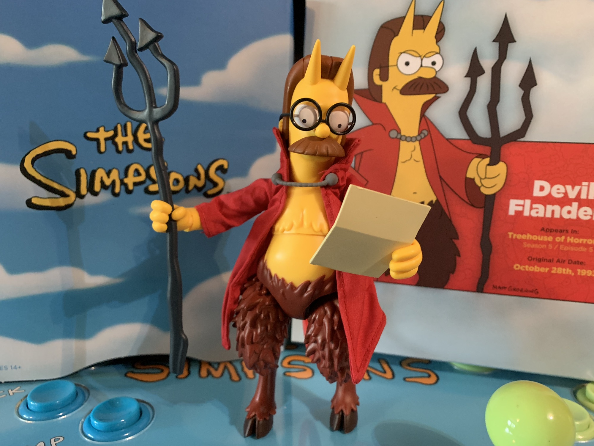
Devil Flanders appeared in one segment of the annual Treehouse of Horror titled “The Devil and Homer Simpson.” It’s a classic sketch where Homer sells his soul to the devil for a doughnut, and that devil happens to be Ned Flanders (It’s always the ones you least expect). Treehouse of Horror is very popular with fans of The Simpsons so selecting characters from those episodes is hardly controversial. It’s just puzzling when we get a character like Devil Flanders before a regular Ned Flanders. It’s also here at the expense of a Marge or Lisa and doesn’t really pair with any of the previously released figures aside from the Treehouse of Horror connection it shares with Kang and Kodos. We don’t have a standard Homer to pair him with, for example, and it’s not like astronaut Homer is an appropriate fill-in. It’s also the only Treehouse figure in the wave. Wouldn’t it make more sense to do a whole Treehouse of Horror themed wave instead like what Super7 did with ReAction? Time it with Halloween and it practically sells itself.

Criticisms aside, Devil Flanders is at least an interesting take on Flanders and one of the better one-off pulls from the Treehouse of Horror anthology series. The only real concern I had going in was what would the quality be like? Wave 2 seemed to increase the quality of the line when it came to paint and accessory count, but Wave 3 represented a step back. Kang and Kodos had their size to rely on which gives them a great deal of shelf presence (at a terrible price), but Ralph and Mr. Burns? They disappointed. Bad paint or no paint, odd choices for accessories, and even the sculpts and choice of expressions felt lacking. Given that the line was axed before those waves were completed, it did not bode well for the fourth wave and Devil Flanders is certainly proof of that.
Devil Flanders arrives in the usual box, but without the slipcover. Wave 4 is the cut-off for slipcovers apparently as Super7 has begun phasing them out across the board to save money, presumably. I can’t imagine it’s much per figure, but over 2,000 figures I suppose it adds up. I don’t really care since I’m not an in-box guy, though I had been saving these boxes and keeping the unused accessories within. I guess it’s a bummer they won’t be uniform.
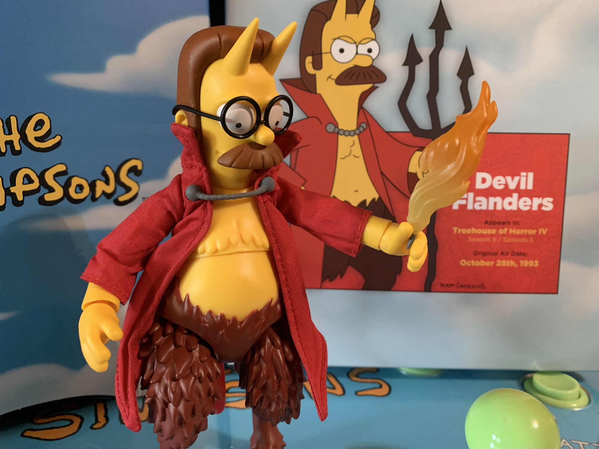
Devil Flanders stands at approximately 6.875″ to the top of his head and about 7.325″ to the tip of his horns. He is a satyr-like creature with a human torso and goat legs. He also marks the return of soft goods to the line as he has a soft goods robe. The glasses have actual lenses in them and what little paint is here is fairly clean. That’s just the problem though, there’s barely any paint. Super7 went with yellow plastic for his human parts and plainly painted brown for the goat legs. The yellow at least has a matte coating on it while the goat legs do not appear to. They’re quite shiny and cheap looking. The robe also didn’t turn out very well. It’s wrinkly and frumpy and just seems unnecessary. Why not just do it in plastic? I think it would have looked better. The Super7 of old would have given us both options like they did with Splinter in the TMNT line, but that’s apparently no longer in the budget. His tail is also present, but preposed in a U-shape. It’s disappointing he can’t twirl it like he did in the episode. Instead it’s just there. The body is also hollow and has a real cheap feel to it. This does not feel like a high quality collectible nor does it resemble one in any other way.
The presentation may be lackluster, but it’s nothing compared to the quality control. First of all, Ned comes with three expressions and they are a pain to swap. Don’t even bother trying to get one of the alternate heads on without first heating them up. You’ll just stab yourself on his horns or break his glasses. That’s an annoyance, but one that can be dealt with (especially if you’re just a set it and forget it sort), but what’s beyond that are the legs. Something went very wrong at the factory because the slots on his legs where they join the ball joint in the hip is way too big. His legs are floppy and just fall off. Constantly. If you’re able to get him to stand consider yourself lucky. They’ll go back on, but they’re terrible and it’s ridiculous something like this could see release. Did Super7 just not care since the line was dead? Did someone actually approve this shoddy factory output? It definitely feels like a case of cut corners all around because we know we’re going to have to clearance the line anyway. This is garbage.
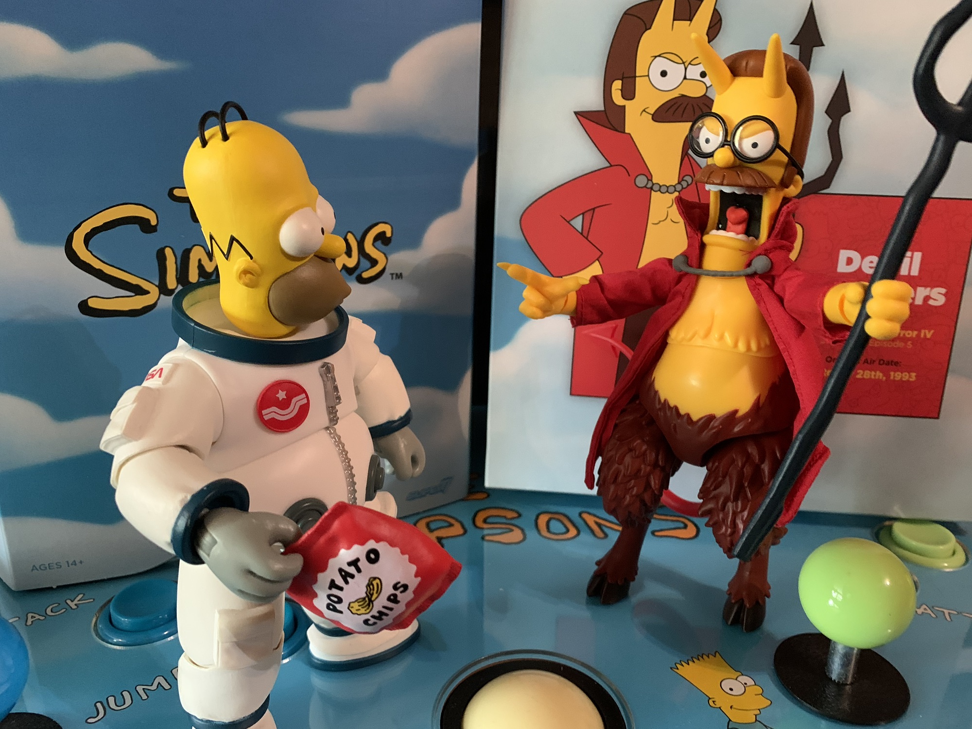
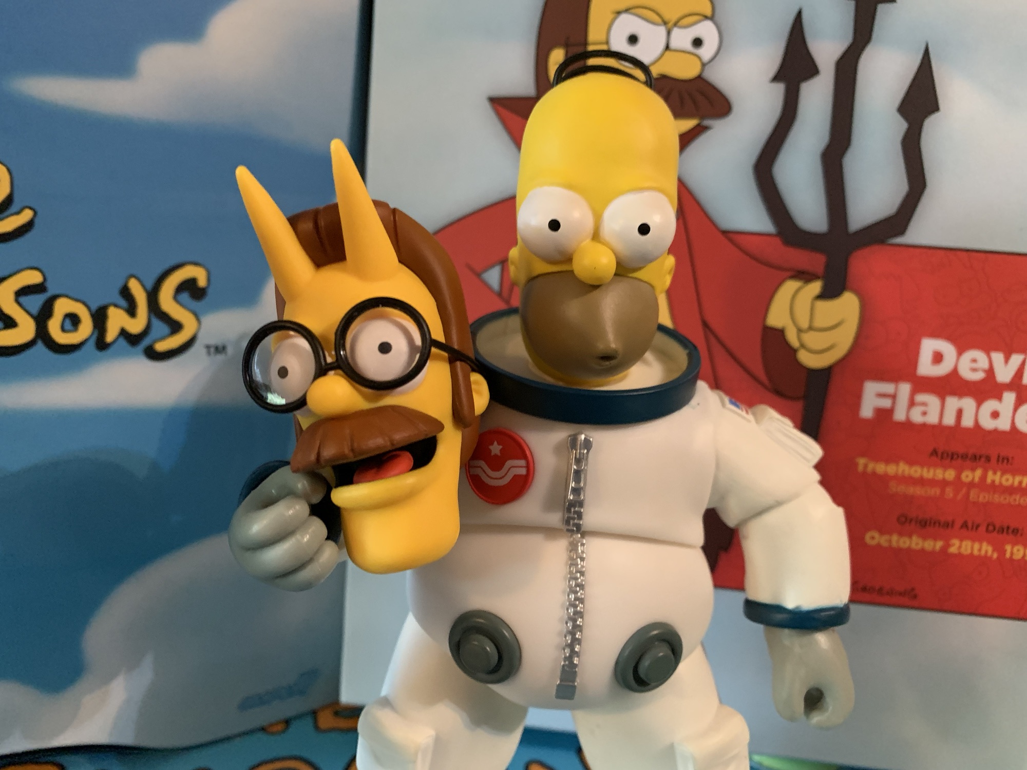
Maybe the accessories can rescue this one? If such a thing as legs that won’t stay on can be overcome, I have to say the accessories are just ho-hum. Flanders has three portraits: neutral, an open-mouth smile, and an angry yell. They’re fine and I’m okay with them. For hands, he has a set of gripping hands, relaxed, a pointing right hand, and a tighter gripping left with his thumb up. The pointing right hand has a claw on the end of the finger which is a nice touch as that’s something that really only appears in the episode when he does indeed gesture towards Homer. The tighter gripping hand seems to be for his flaming pen. It’s a little, gray, stick, with a translucent flame coming off of it. He can hold it okay and it pairs with the unsigned contract for one doughnut that Homer is to sign. That’s on a thin piece of plastic with a crease in it. The handwriting is well-printed and it looks good. Lastly, Ned has his pitchfork which is ugly and misshapen like it is in the episode. It’s oddly cast on very soft, flimsy, plastic and I have no idea why. It doesn’t make it any easier to get it into his hands and it means it’s likely to arrive warped. It’s an odd call.

The array of accessories is fine, but I’m guessing most people will be left wondering one thing: where’s the forbidden doughnut?! That’s a layup of an accessory and probably one that would have been easy to make and even reuse. Had Super7 planned this line out better, there could have been a standard Homer already available so that Ned could come with a Doughnut-headed Homer accessory. That’s easy! Were they just hoping to double-dip somewhere down the line by doing a regular Homer and then a Doughnut Homer? Possibly, or maybe they just didn’t put much thought into it. You certainly are allowed to think that given it doesn’t look like much thought or care went into this line at all.
Should we talk about the articulation? It hasn’t been the strongest point of this line and Devil Flanders is no exception there. The head is on a double-ball peg and it’s the only point of articulation that’s any good. The shoulders are hindered by the soft goods as are the elbows, which probably wouldn’t bend 90 degrees anyway. All of the wrists are horizontal hinged and the diaphragm joint does almost nothing. It can’t even twist as it just binds and wants to return to a neutral position. The hips we’ve been over and they’re useless. If you can get him to stand it’s only going to be in a neutral position. There are knee joints, but they do nothing because of the shape of the leg and the ankles basically do nothing as well since he has hooves. He might as well be a statue from the waist down. Actually, the figure would be better if he was a statue from the waist down since that would mean the legs wouldn’t fall off and he’d likely be easier to stand. The robe is also wired so you can pose it a bit, but it’s not really large enough to do a whole lot with. I’ll concede that it’s better than nothing.

Devil Flanders is what the kids on social media call hot garbage. This is a bad action figure that would be overpriced at $35, but is sold for $55. I know the license got yanked away and Super7, for some reason, admitted to that before this wave arrived which likely set sales expectations way back. I think they cheeped-out, but the problem with that is whether the line is dead or not, the box still says Super7 on it. When you put your company’s name on something, there should be an element of pride associated with it. There should be an expectation of a certain level of quality and this figure comes up way short. This is a reputation-damaging release by Super7. Brian Flynn did acknowledge the problems with this figure in an interview on the Robo Don’t Know YouTube channel where he instructed listeners to reach out to Super7 if you’re having problems with Flanders. Well, I did, and guess what – there’s nothing they can do. If I had bought it off of them directly, they would have given me a credit, but all of the figures they have in their possession have this issue. They told me to go to the retailer and so I did. BBTS stepped up and refunded me for this thing when Super7 would not. I hope that gets charged back to them (they also shared with me they have fielded lots of complaints on this line). This figure should not have been released in this state. Cut corners on packaging and paint apps if you want, but if the figure can’t even stay together then what the hell are you doing? Don’t buy this. Don’t buy it at $55 and don’t buy it at $35. I wouldn’t even recommend buying it at $25. If after reading this you still think you might want a Devil Flanders in 1:10 scale at least wait until it’s under 20 bucks. It will happen, because consumers aren’t dumb enough to pay $55 for this trash. Do better, Super7.
Here are several other Super7 Simpsons figures of varying quality, though all are better than Devil Flanders:

Super7 The Simpsons Ultimates! C. Montgomery Burns
We wrap-up our look at Wave 3 of Super7’s Ultimates! line of action figures based on The Simpsons today with the main villain of the series: Charles Montgomery Burns. Mr. Burns has been around since the beginning and, like Ralph, is a worthy inclusion in the line at this stage and it’s only odd that…
Keep reading
Super7 The Simpsons Ultimates! Ralph Wiggum
Last week, we talked about two out of left field choices by Super7 for its line of action figures based on The Simpsons. This week, we’re discussing a fan favorite character that belongs and his inclusion is only perplexing given that there is no member of the Simpson family in the wave. Ralph Wiggum was…
Keep reading
Super7 The Simpsons Ultimates! Kang and Kodos
We are onto the third wave of Ultimates! from Super7 based on The Simpsons. Like past waves, plenty of questions abound when it comes to Super7’s character selection and they’re not unfounded. Perhaps the two most questionable inclusions in this third wave are the subject of today’s post: Kang and Kodos. These are two separate…
Keep reading
Leave a comment