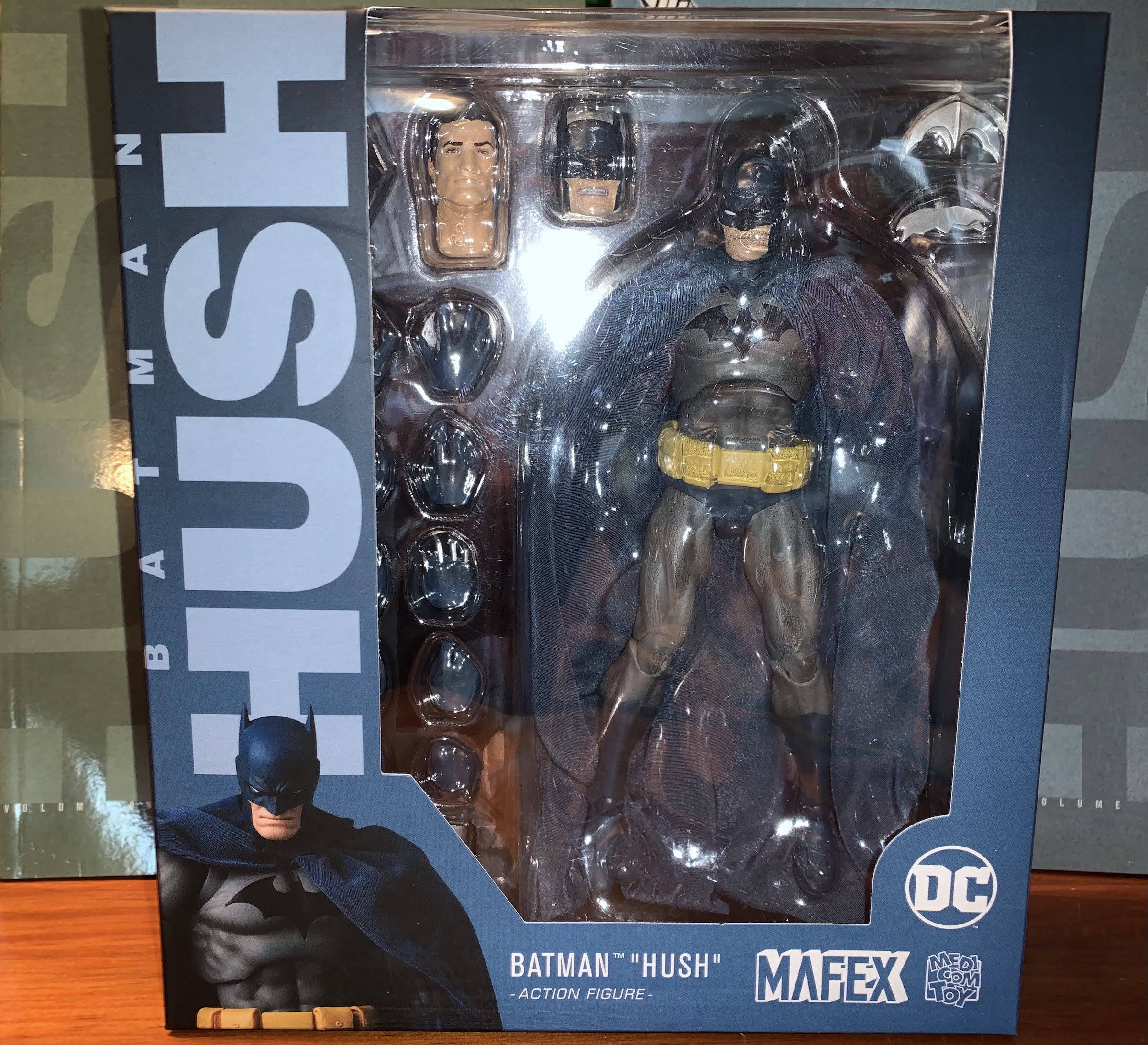
They finally wore me down. It was nearly five years ago that I reviewed the Medicom MAFEX Batman (Hush Ver.) action figure and concluded that it would probably be the only figure I’d get. Then along came Superman. As a kid, I liked Superman well enough. I think the first pair of superhero themed pajamas I ever got were Superman ones. The films were pretty popular, but once Batman hit in 1989 Superman took a back seat to the caped crusader, who then took a backseat to the mutants from Marvel. I moved on, though when the Man of Steel toyline showed up from Kenner in 1995 I did dabble in it to get the flying Superman figure which is most notable for featuring the new mullet design of the hero. I think my thought process at the time was I should have at least one Superman in my vast action figure collection and I may have even planned on getting a villain, but it would be my only figure from the line. And for much of my life afterwards, I felt like I didn’t need a Superman in my modern figure collection until I laid eyes on that Hush Superman from Medicom.
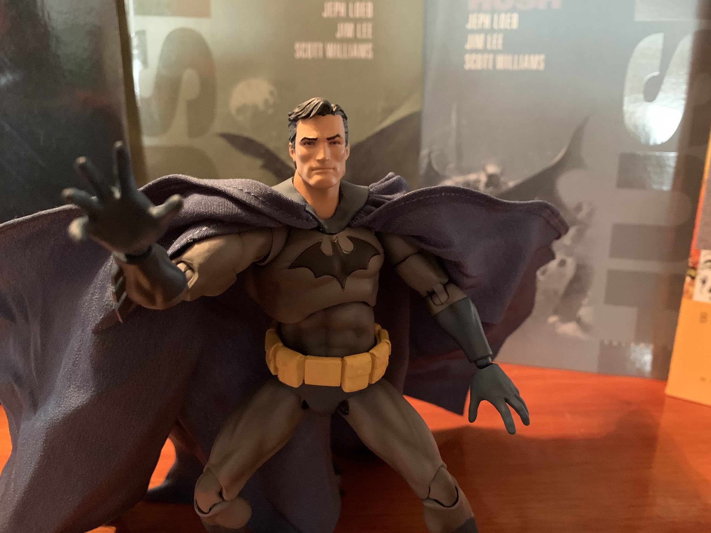
Medicom came much closer to the source art with Superman than it did Batman.
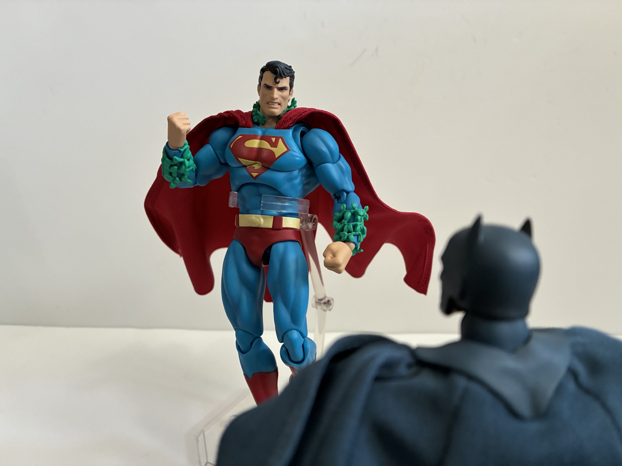
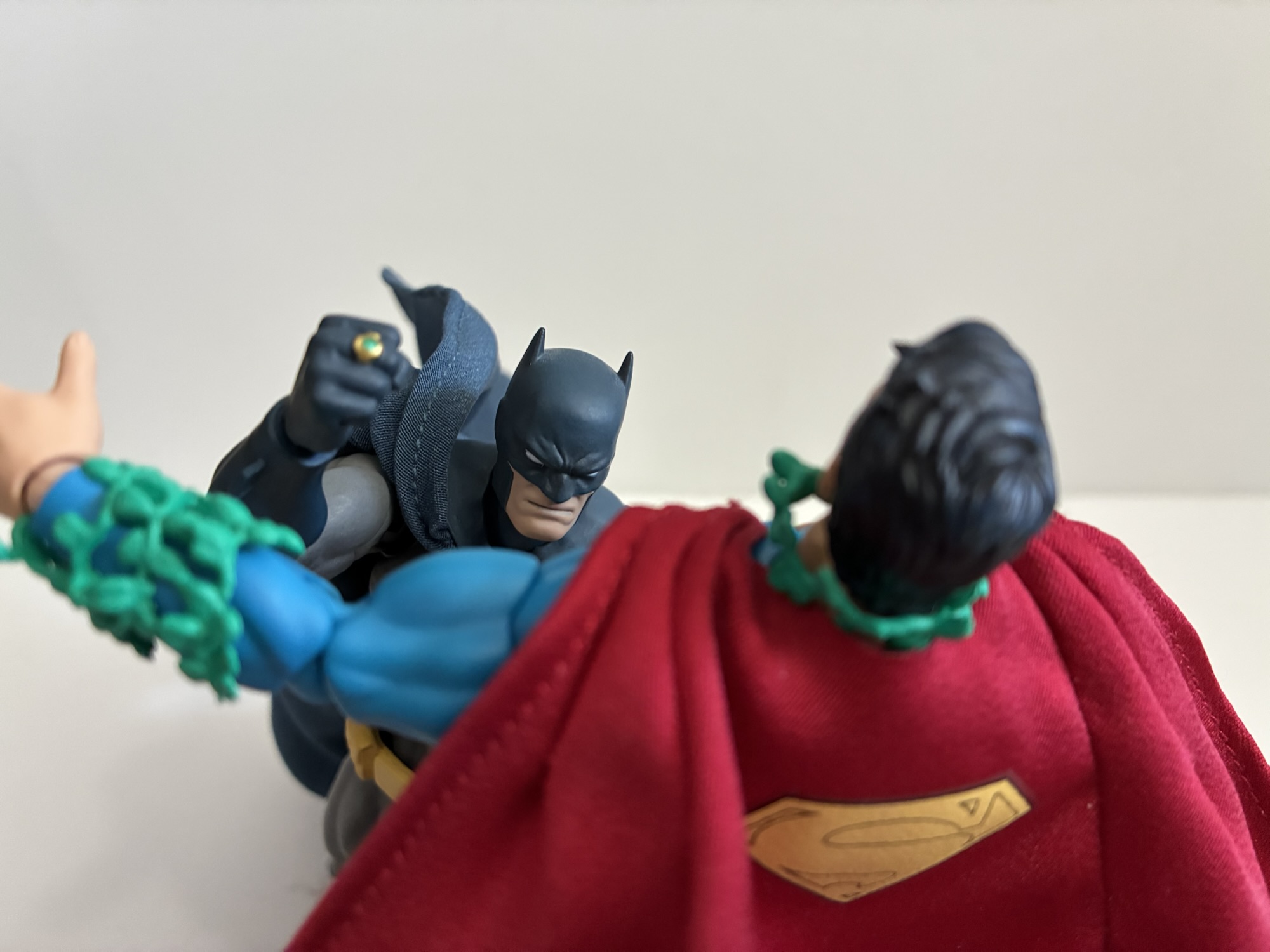
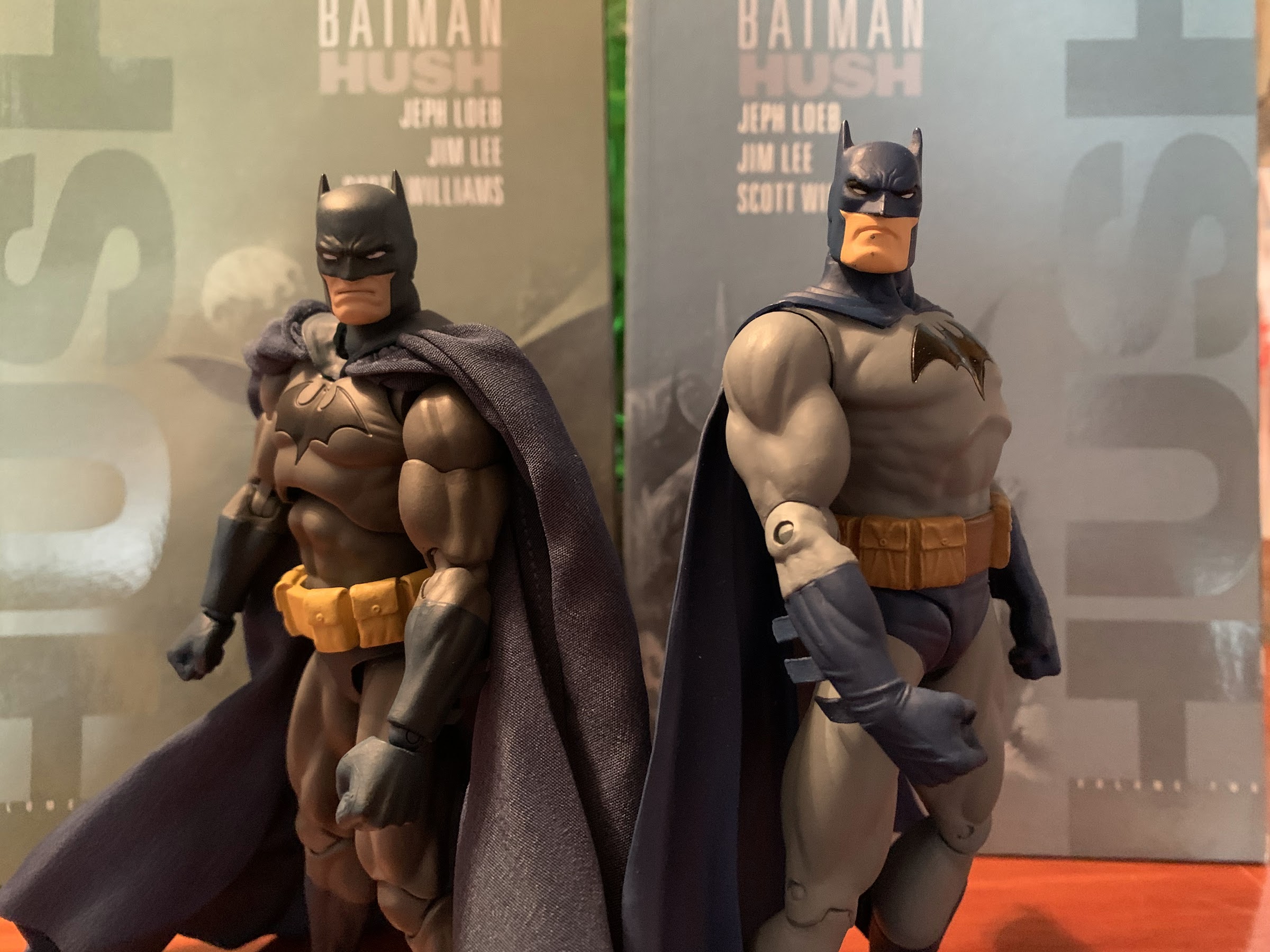
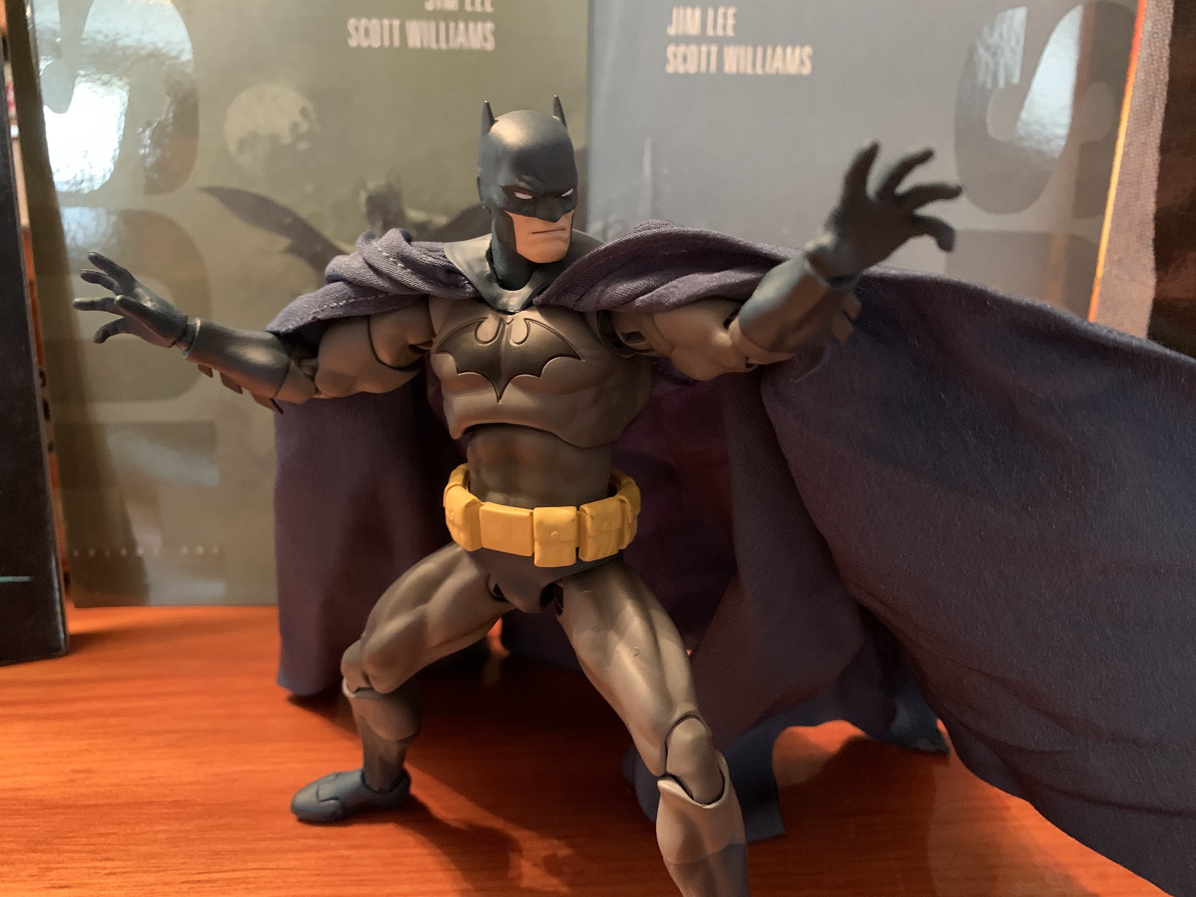
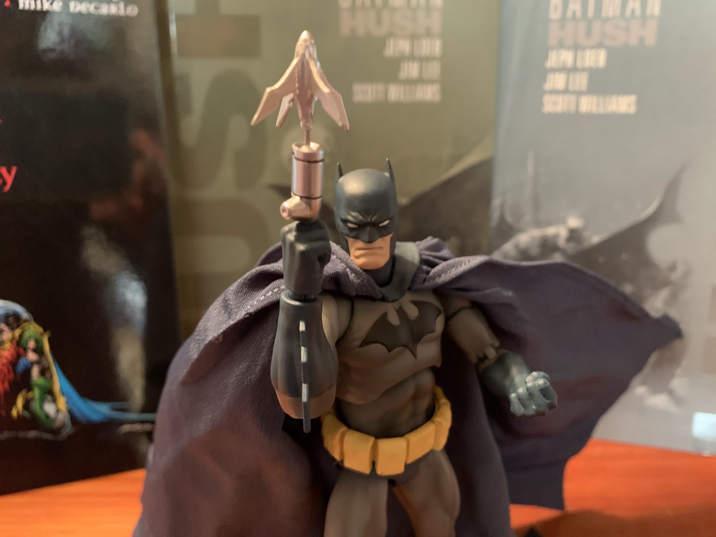
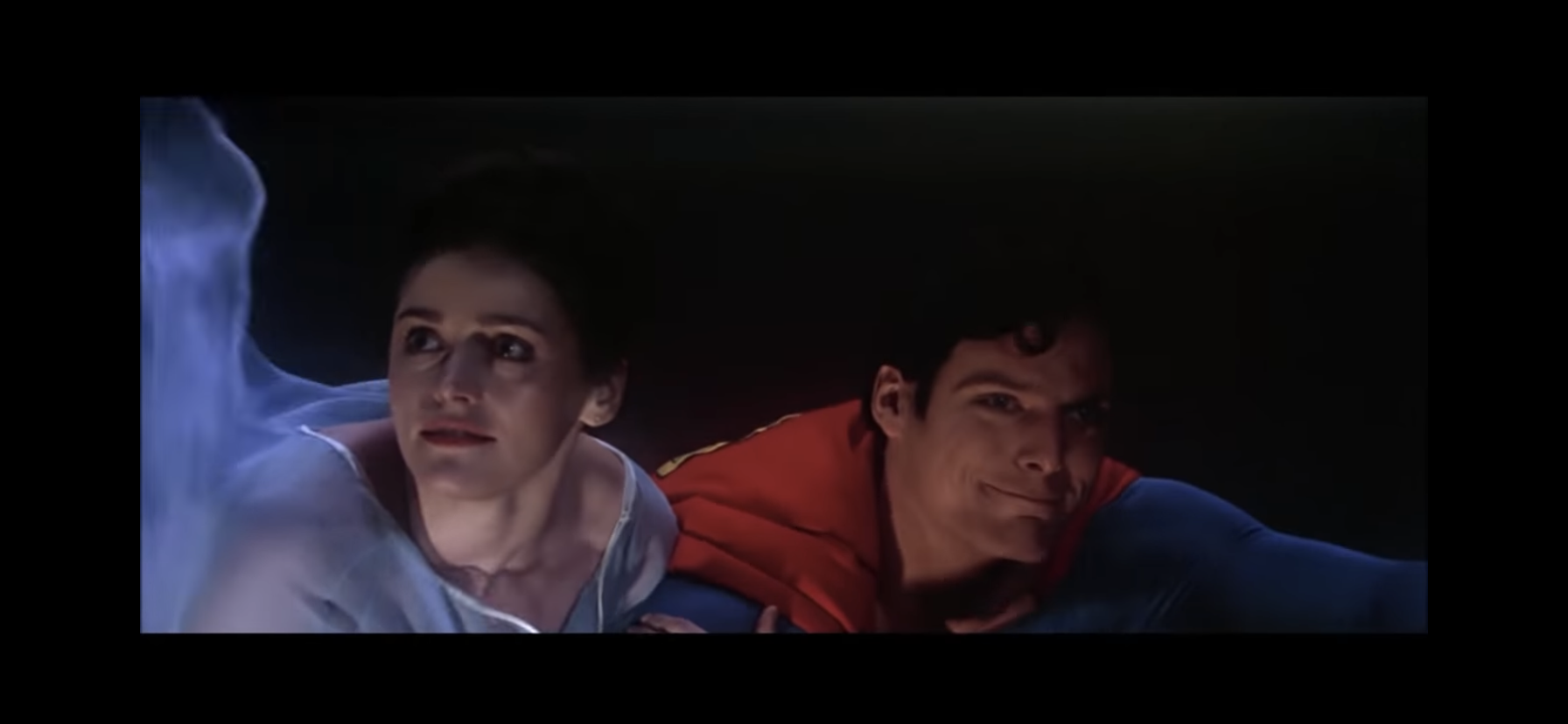
When Jim Lee took over the Batman books it seemed like the goal was to get his take on as many characters as possible as fast as possible. The Hush storyline included a ton from Batman’s rogues gallery and also managed to sneak in an appearance from the man of steel himself. In it, Superman gets possessed by Poison Ivy and Batman has to deal with him armed with his Kryptonite ring. The storyline was fine, but I did really dig Lee’s take on both Batman and Superman so an action figure based on his looks obviously appeals to me. It’s just that MAFEX releases are so expensive and I wasn’t blown away by Batman. I was able to resist the call of Superman despite how good the figure looked. Then it came back and I was able to do so again, and again, and again. Well, I don’t know what reissue we’re onto now, but I finally caved when yet another reissue went up for preorder early this year.
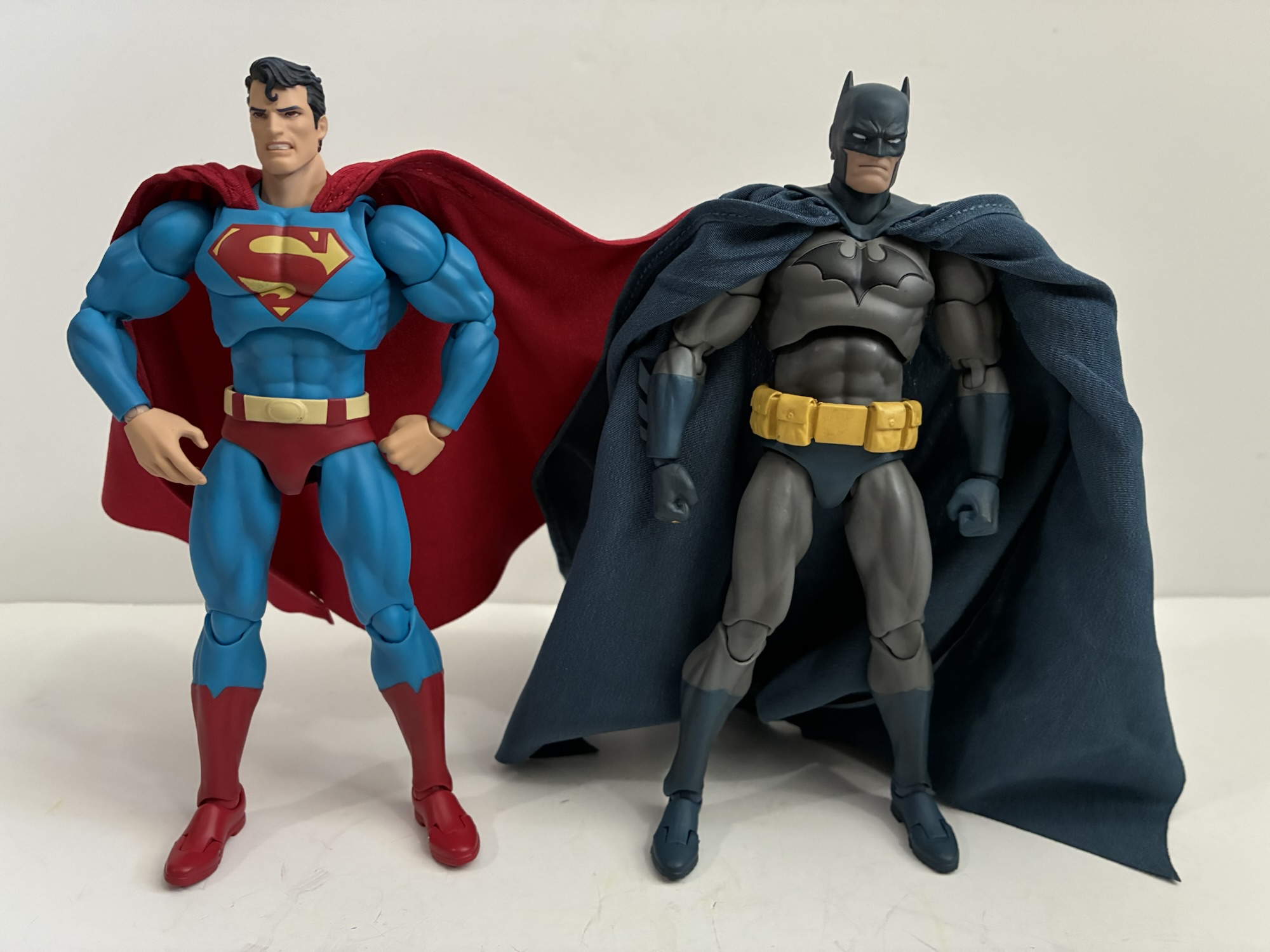
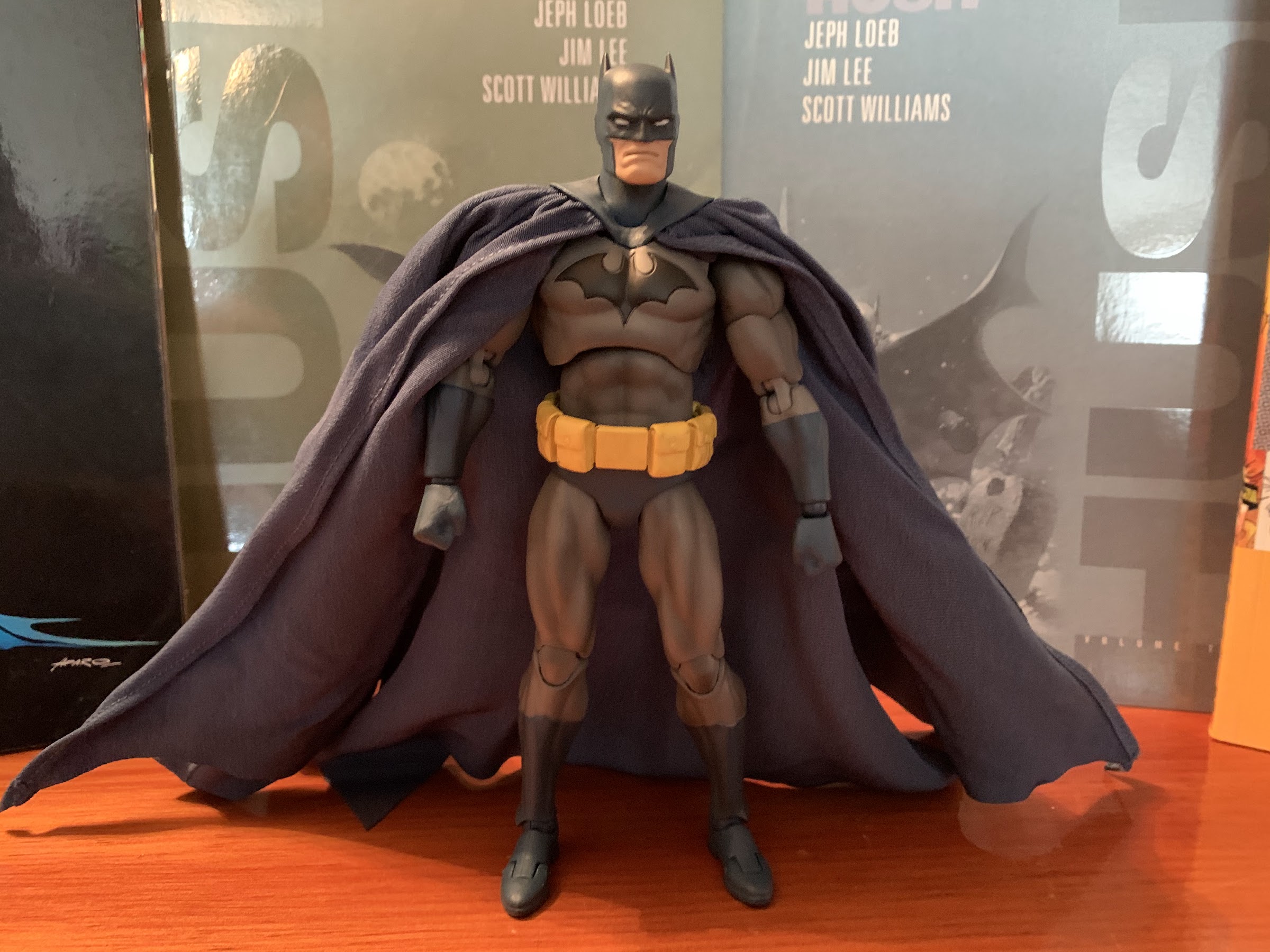
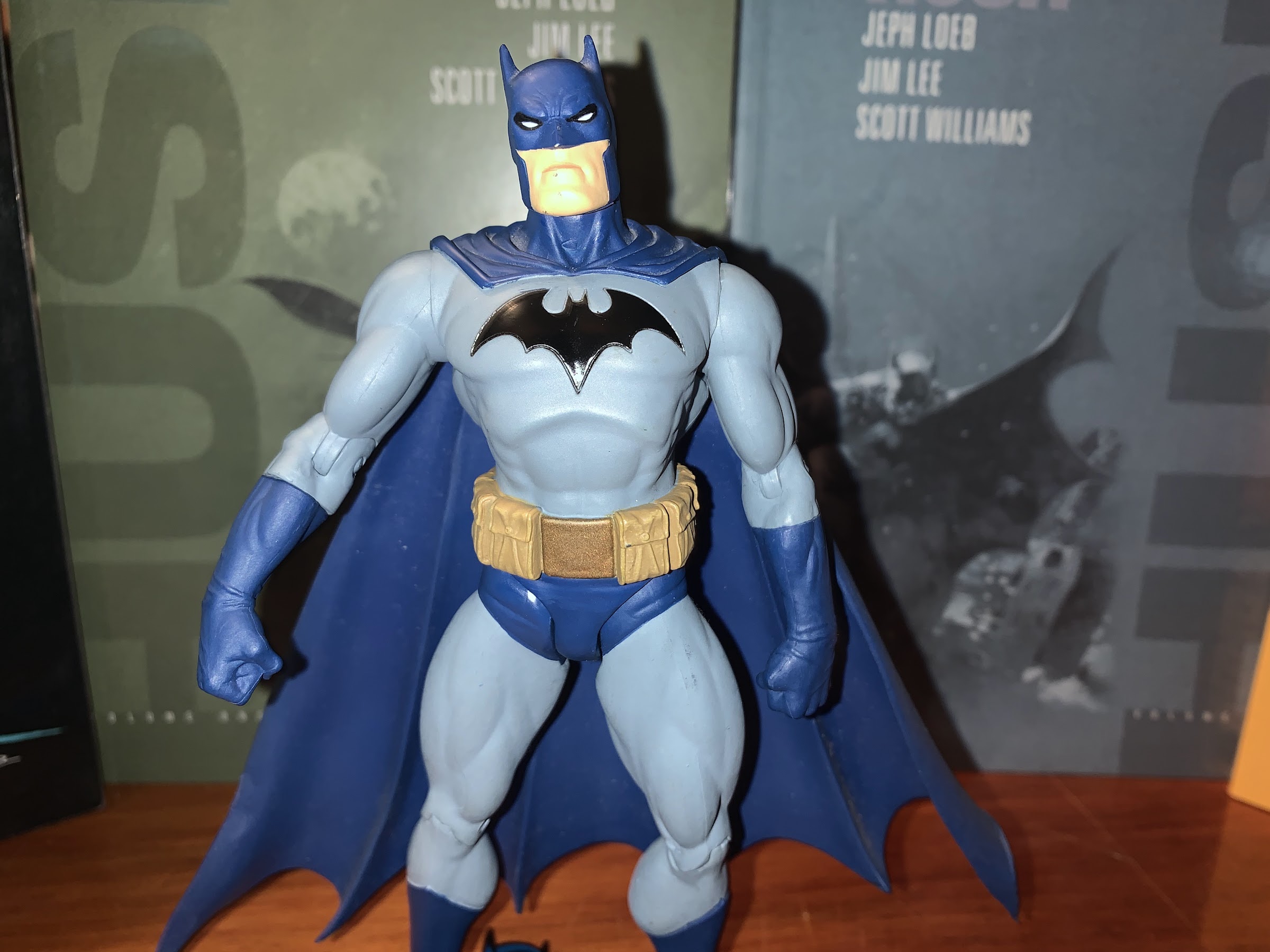
The sculpt is barely different from Batman, but executed so much better.
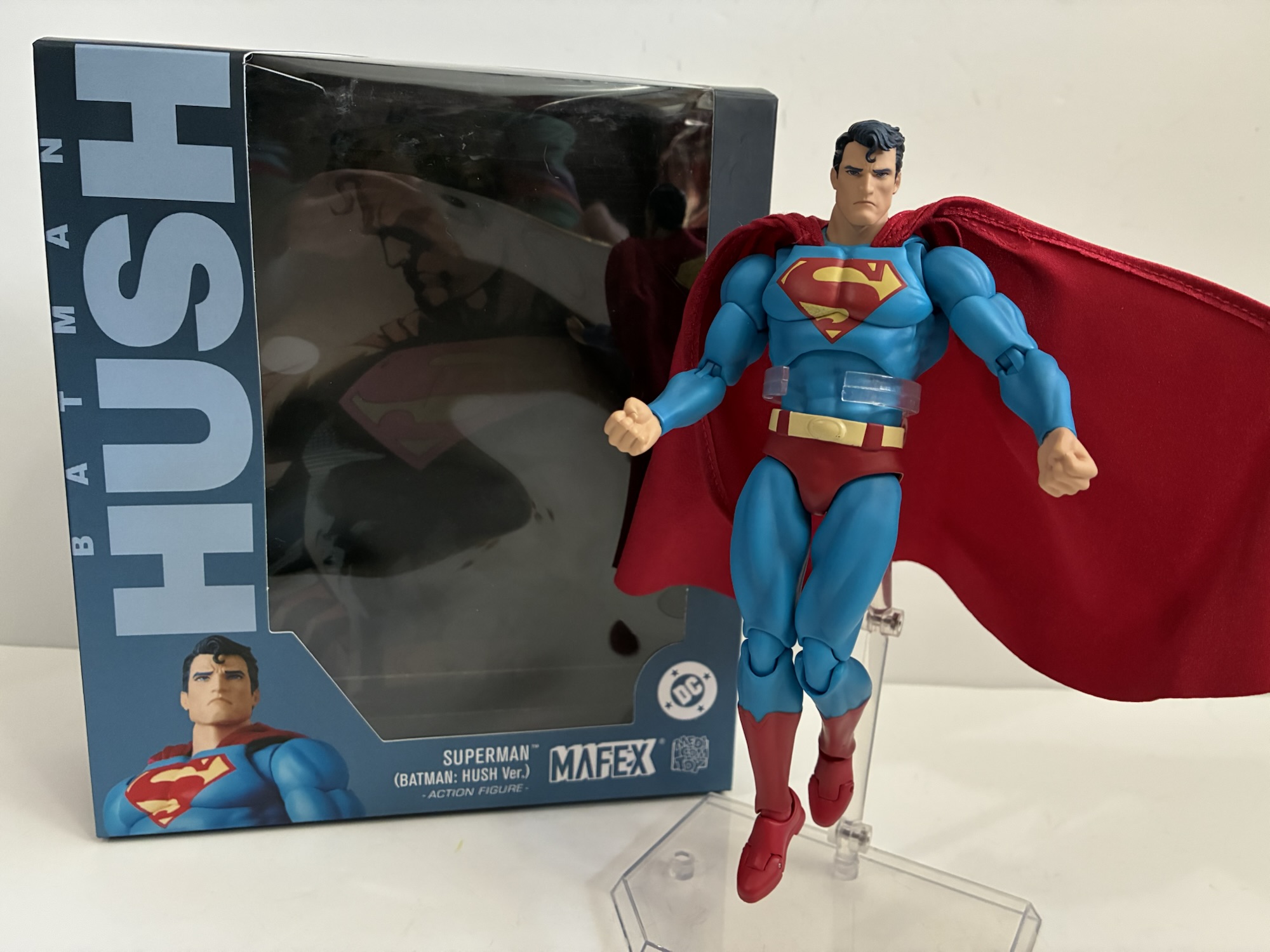
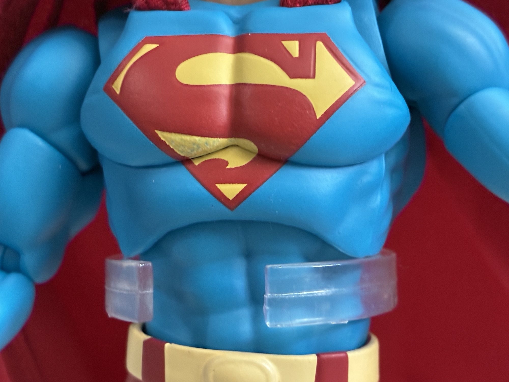
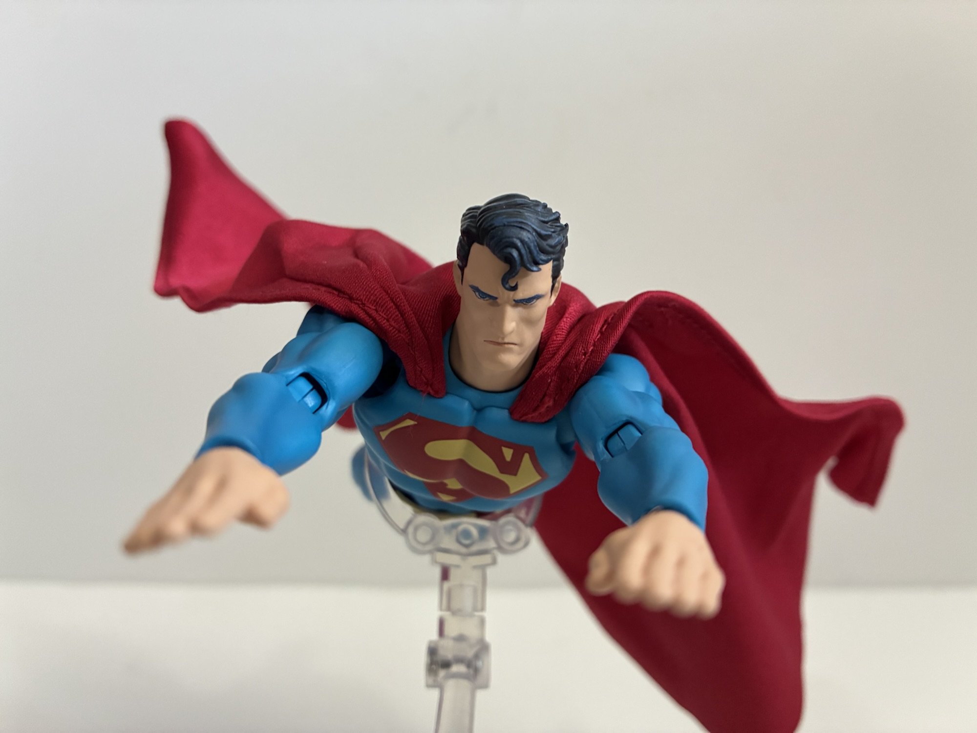
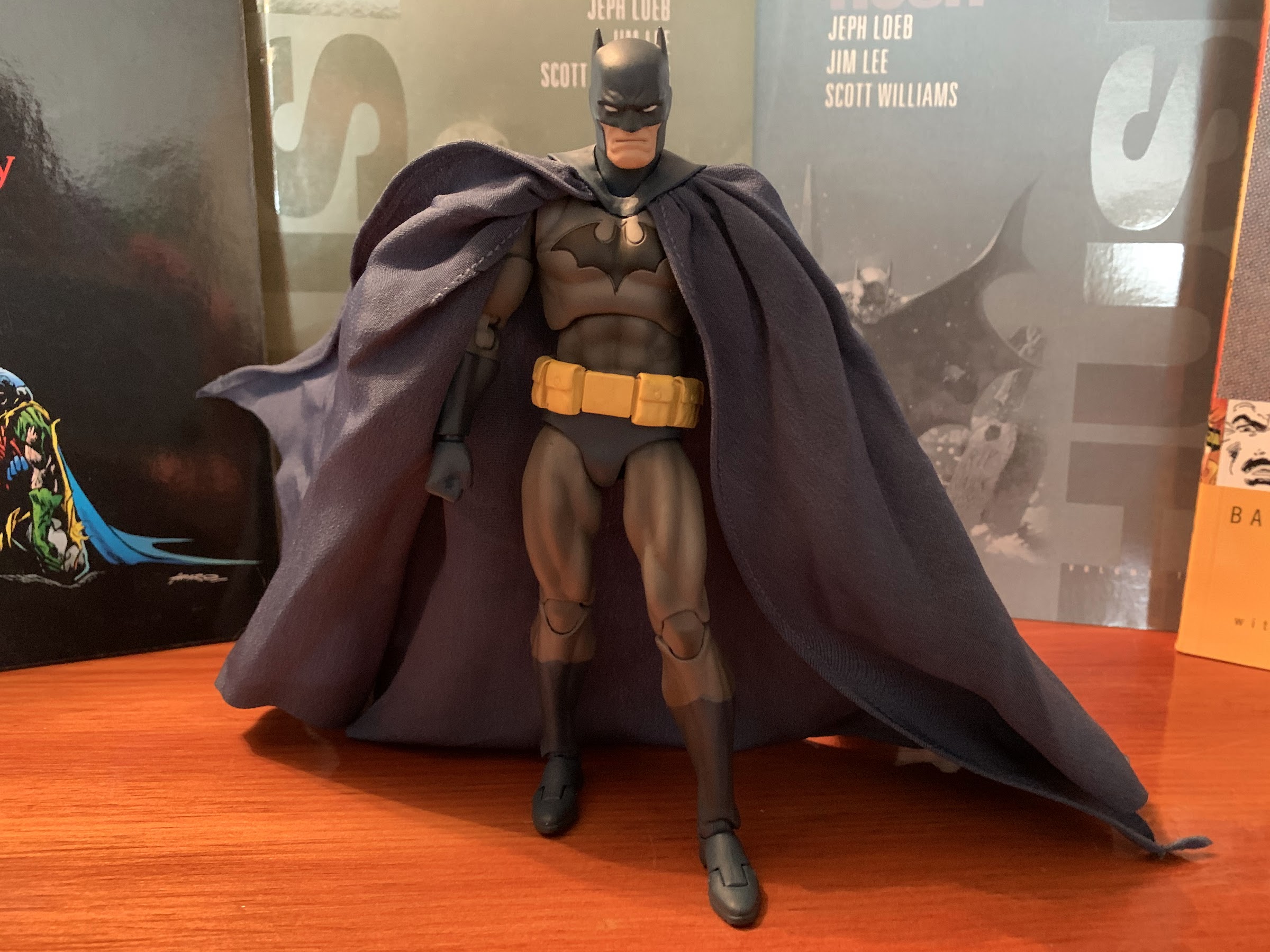
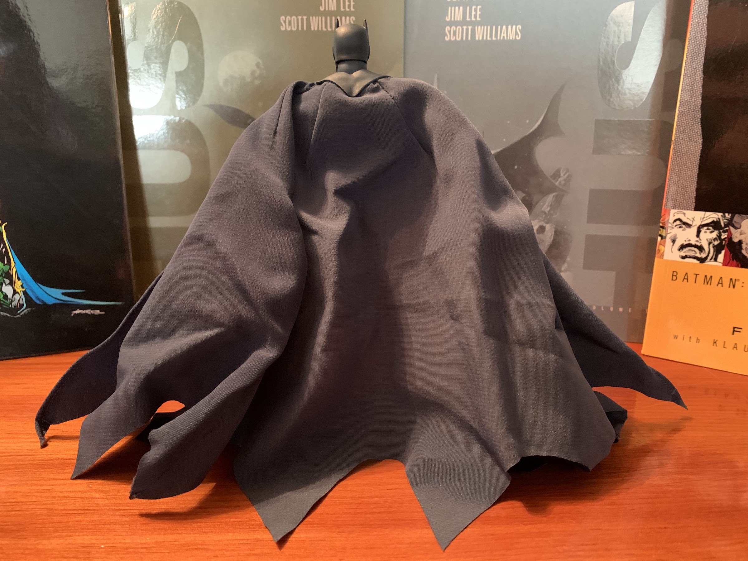
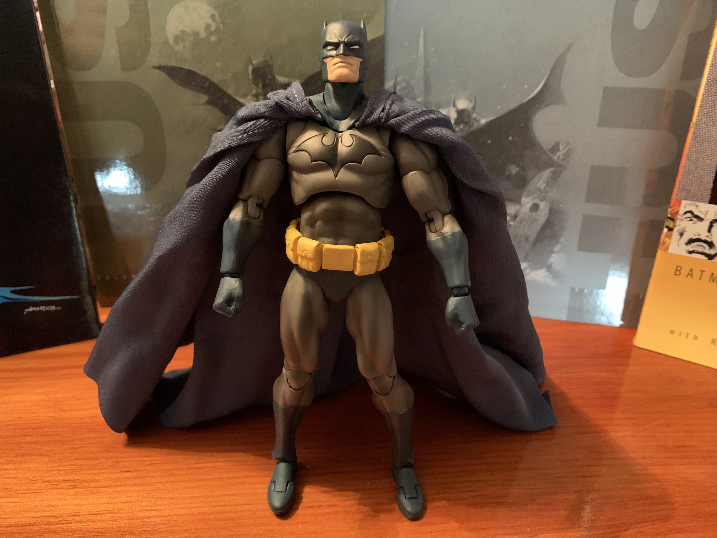
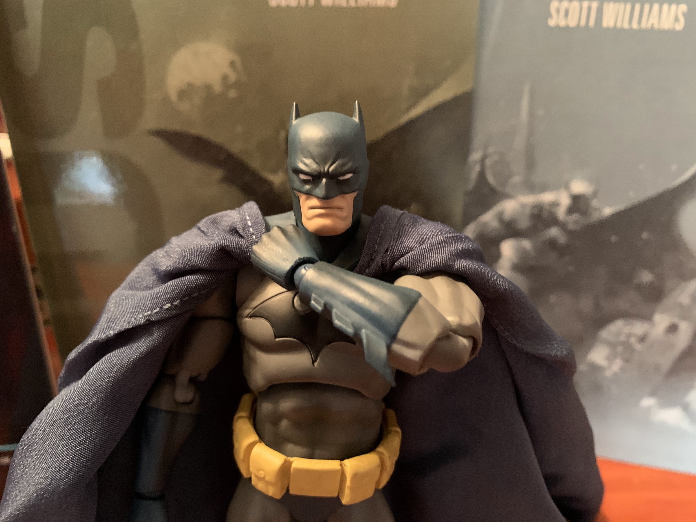
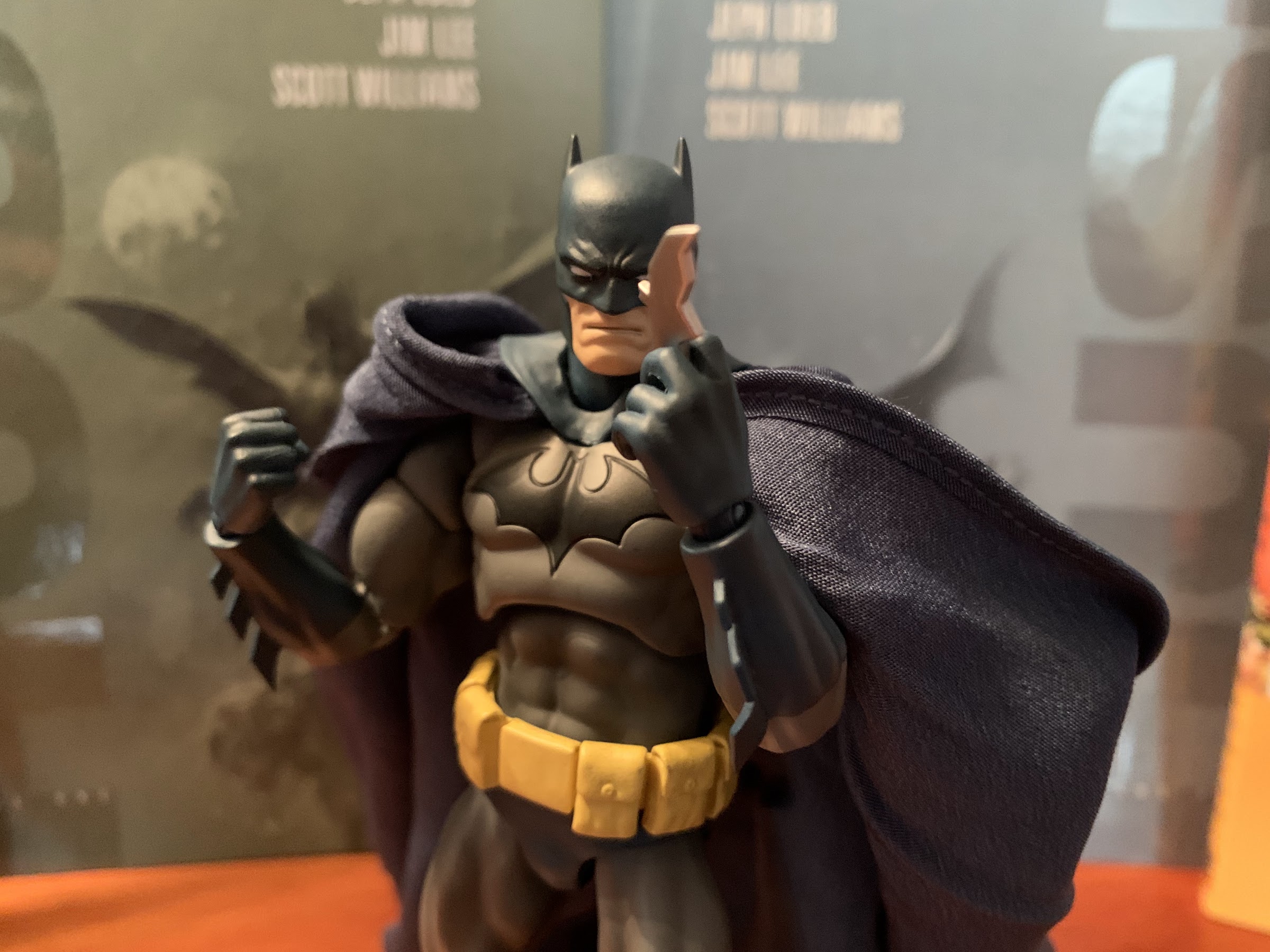
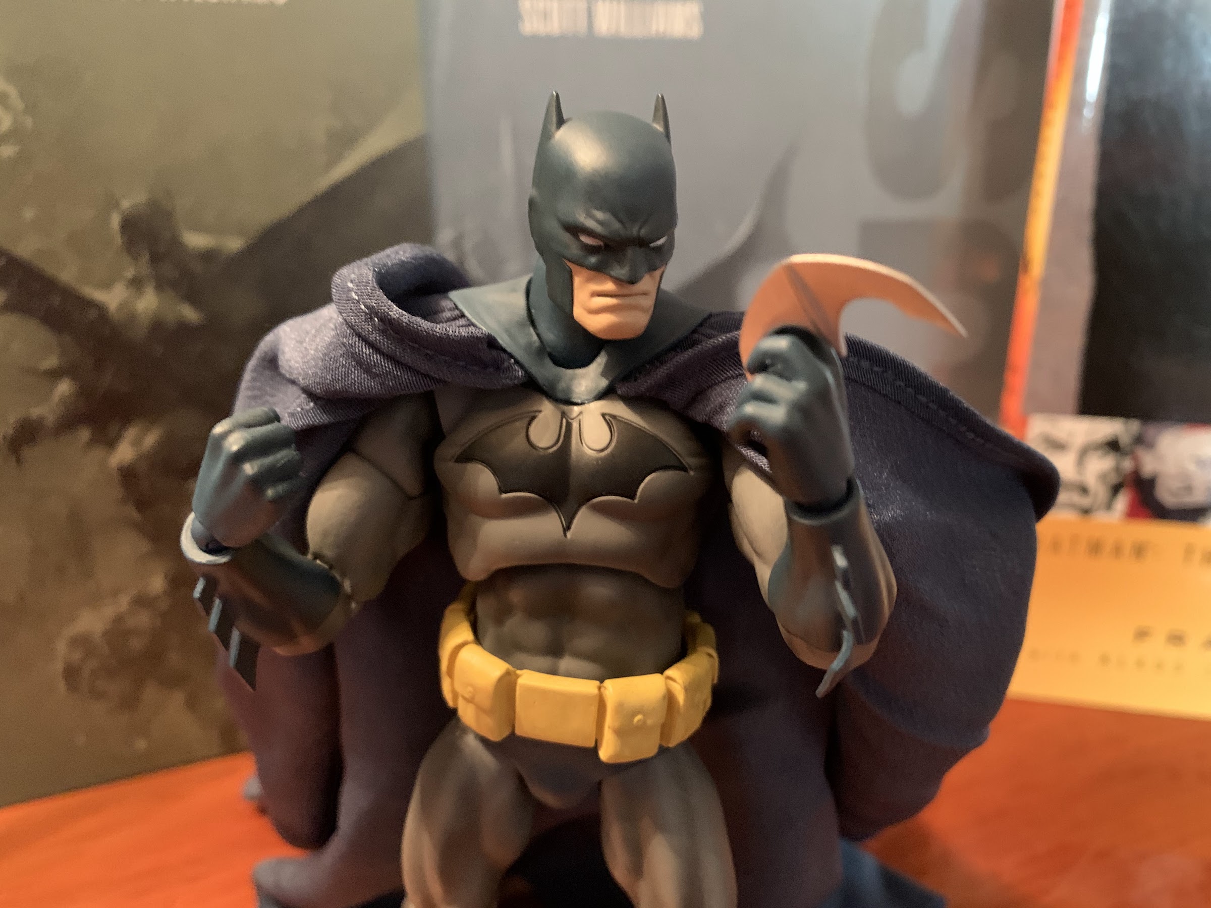
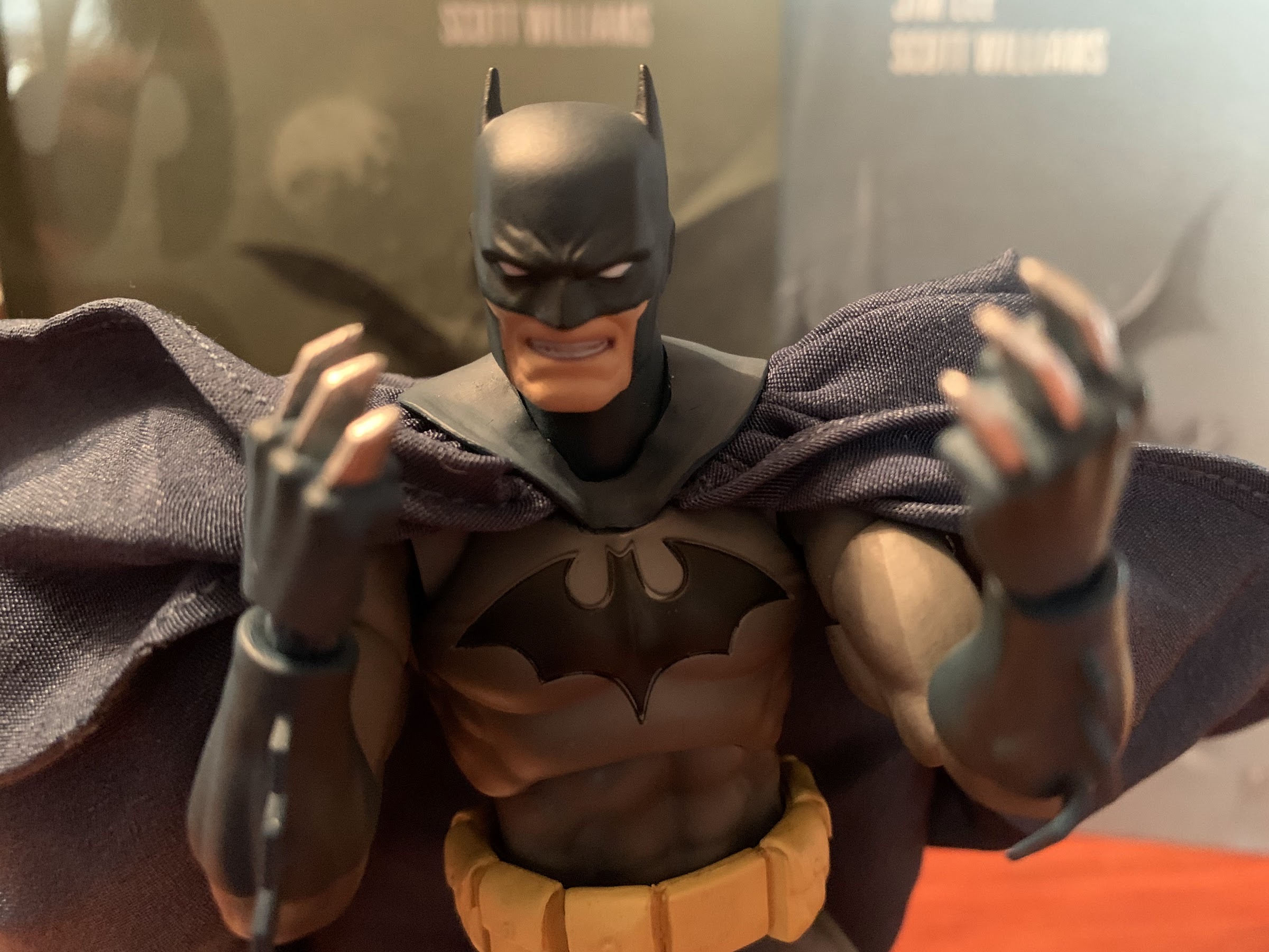
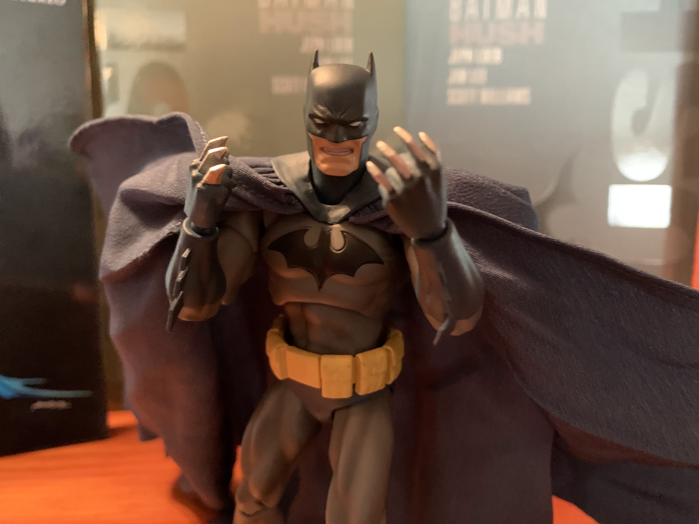
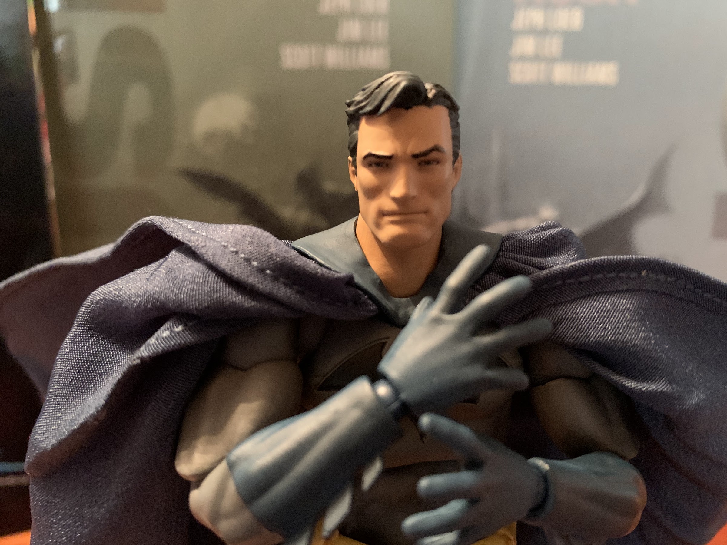
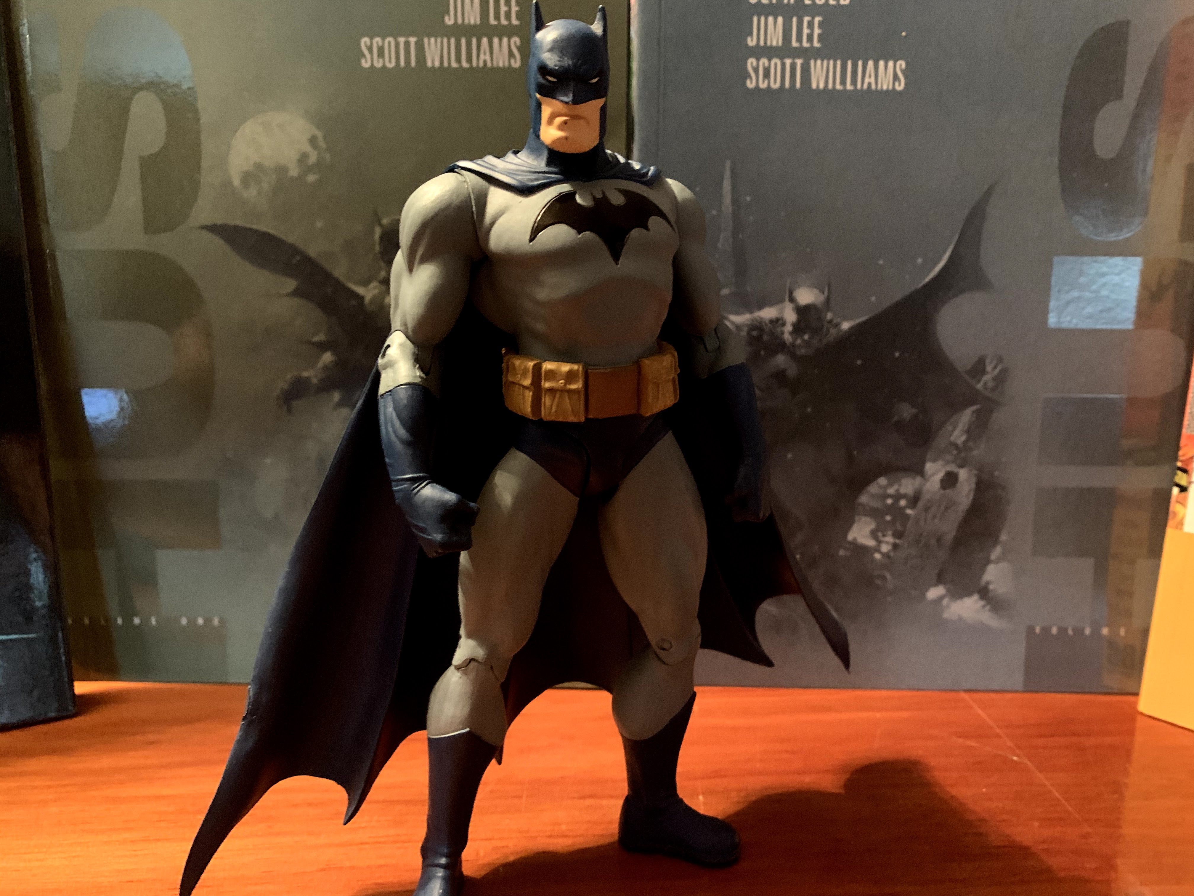
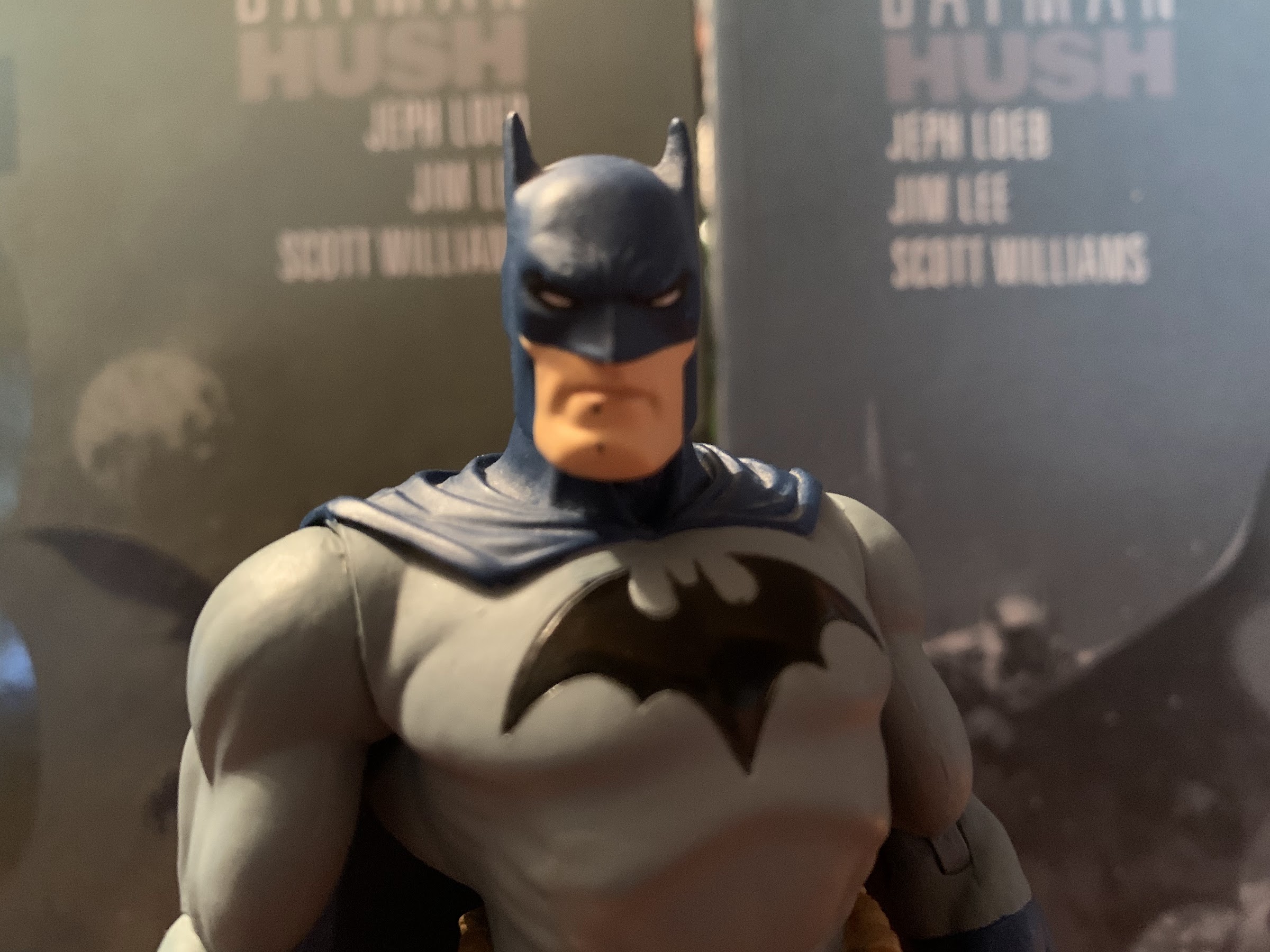
Superman has the typical Hush packaging and stands at approximately 6.375″ to the top of his head. He sports a very serious expression befitting his look in the book that borders on a scowl. The colors are slightly muted compared with a typical Superman. The red is just a little bit darker and the blue a little deeper. It’s most apparent on the yellow portions of the costume where the yellow is so pale it’s bordering on off-white. The hair is black but hit with blue highlights while the paint on this face is crisp and clean. The sculpt of the boot tops is present, but soft, giving them a painted-on appearance. The cape is soft goods and permanently affixed to the chest. The yellow shield is present on the rear of the cape and the printing is clean. The one blemish on my figure is on the right pectoral where the yellow in the “S” logo is scratched exposing some of the blue beneath. It’s a real unfortunate eyesore and in a tough place to touch-up with an equally tough shade of yellow to try to match to. I wish I had been able to see it before opening the box so I could have attempted an exchange, but he’s also sold out so it may not have done me any good.
The poor paint right in the middle of the chest is such a bummer.
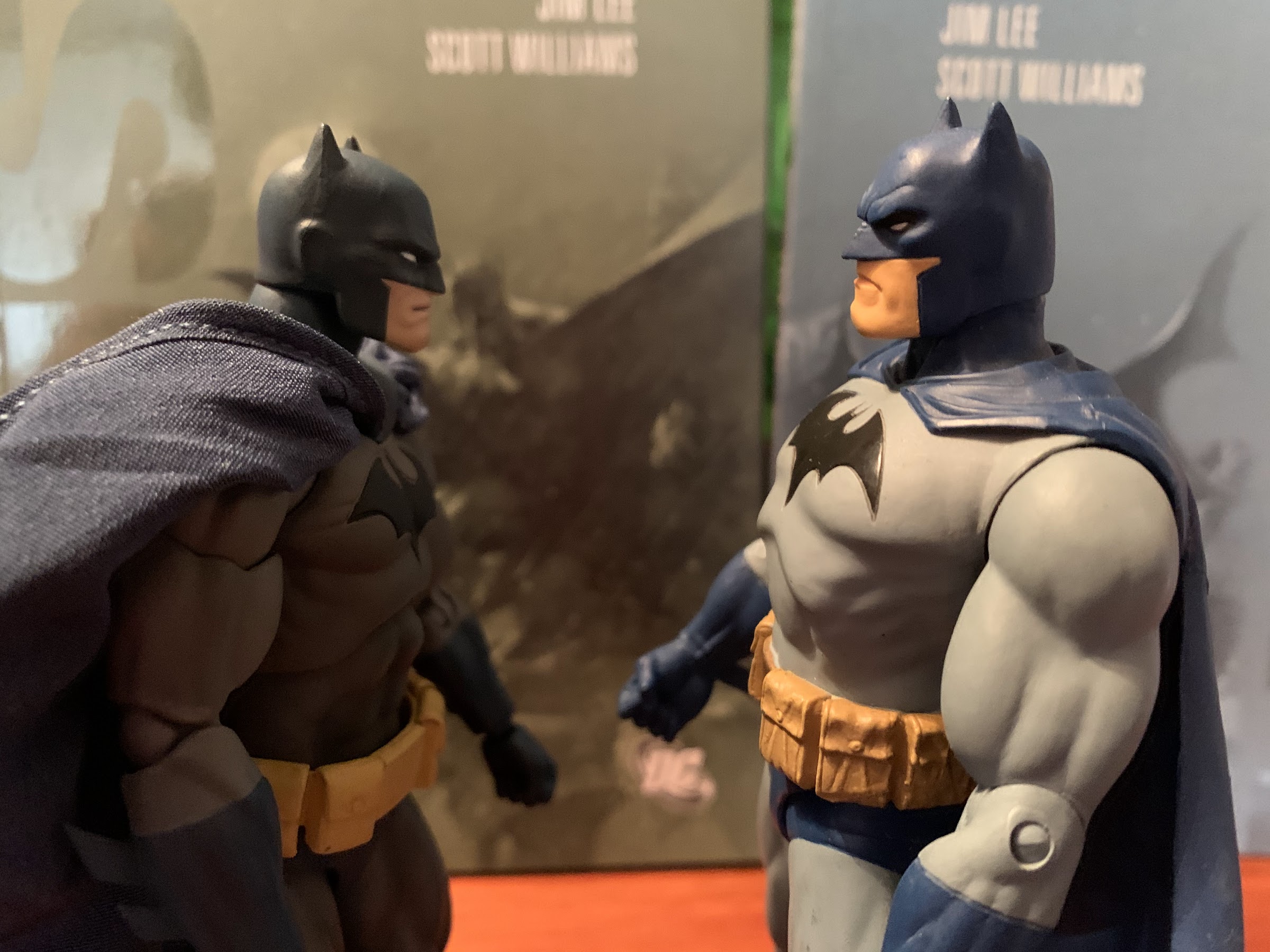
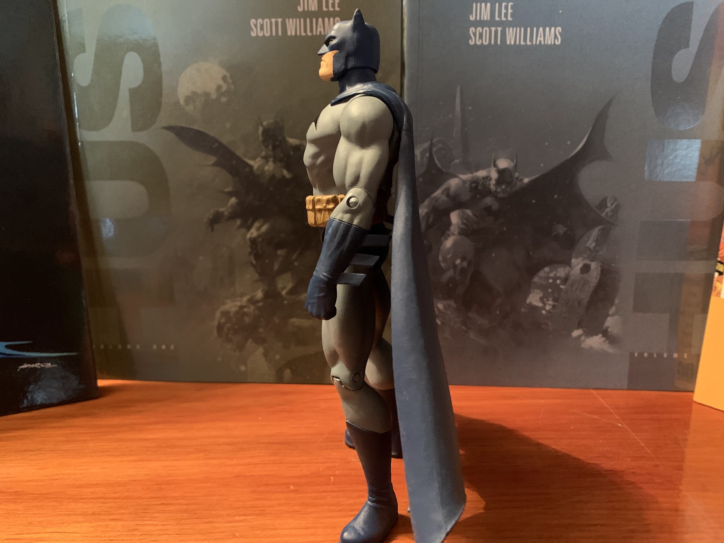
In terms of sculpt, there’s actually quite a bit of reuse here when compared with Batman. It makes Superman an interesting case in how perception can be altered in subtle ways. I don’t like how skinny Batman is. Jim Lee’s take on the character is built like a tank, but his figure is most certainly not. Much of the arms and legs are shared with Superman with the only differences being the forearms to remove Batman’s “fins” and the boot tops which have a slightly different shape to them. Otherwise, the main difference is all in the chest. Superman has a much fuller, broader, chest which really adds to the aura the figure projects. The abdomen may even be the same as Batman’s, though Superman’s sculpt looks more defined so it could be different. The chest plus the smaller cape seems to be all it takes to make him look more imposing compared with Batman and his narrow chest and massive cape.
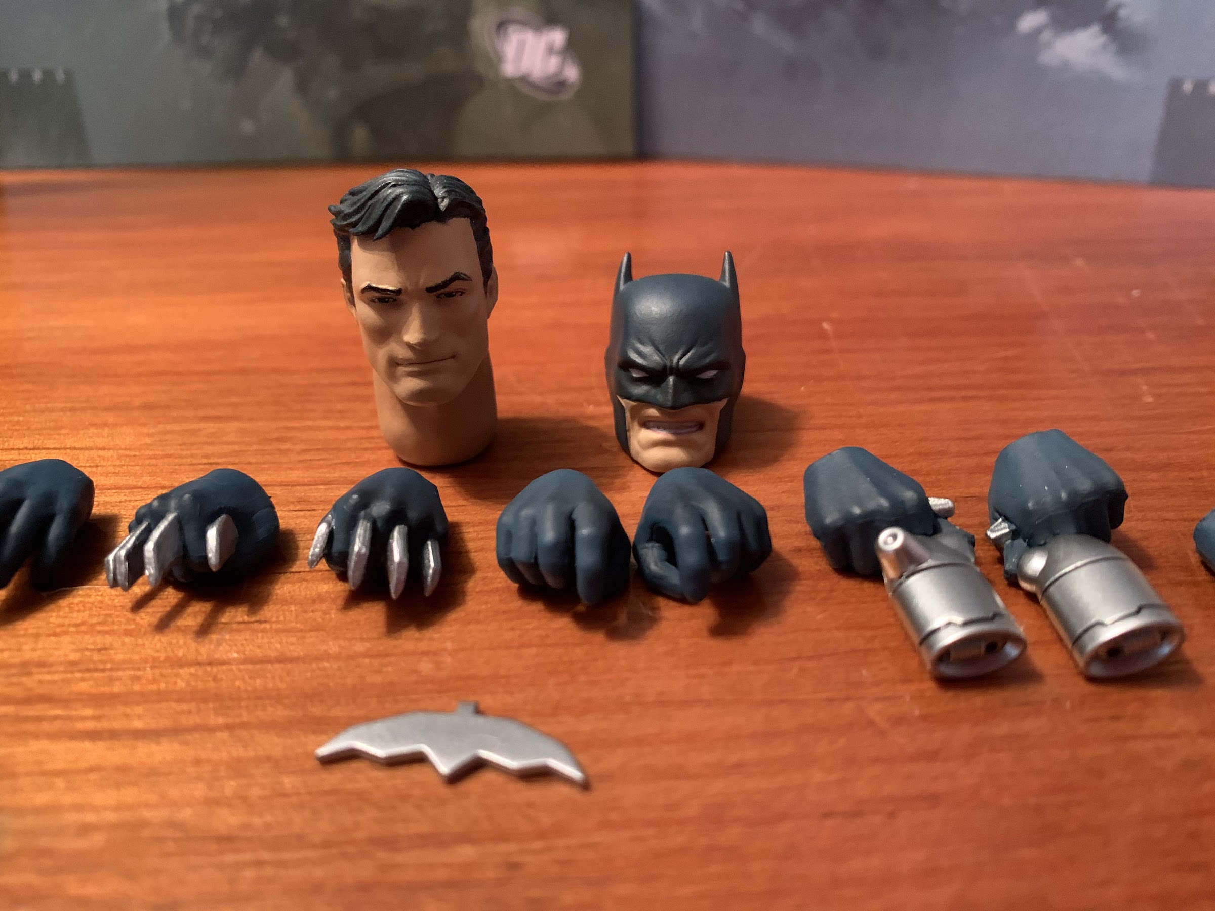
Most of the accessories are devoted to making Superman look like his possessed self from the book.
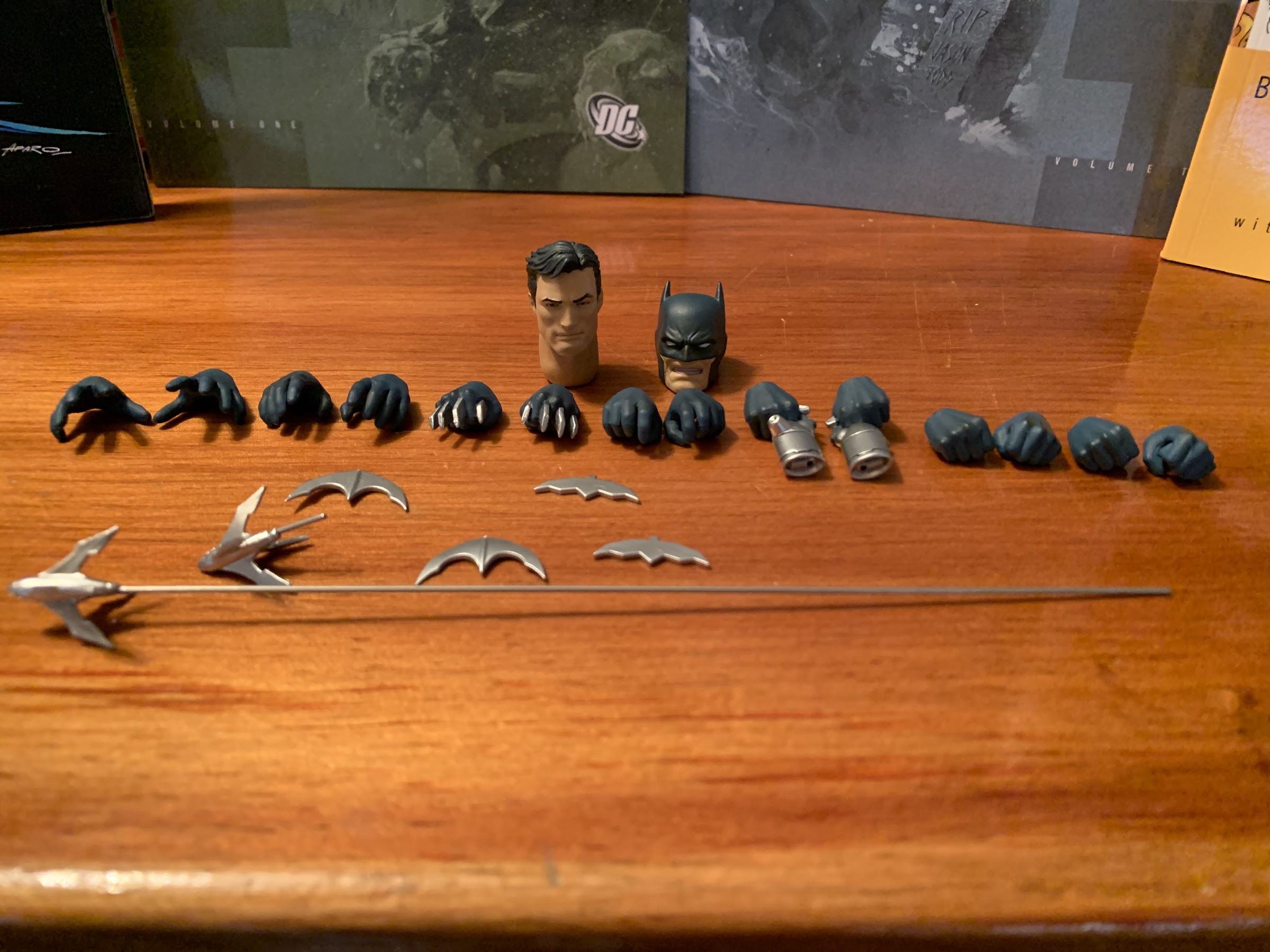
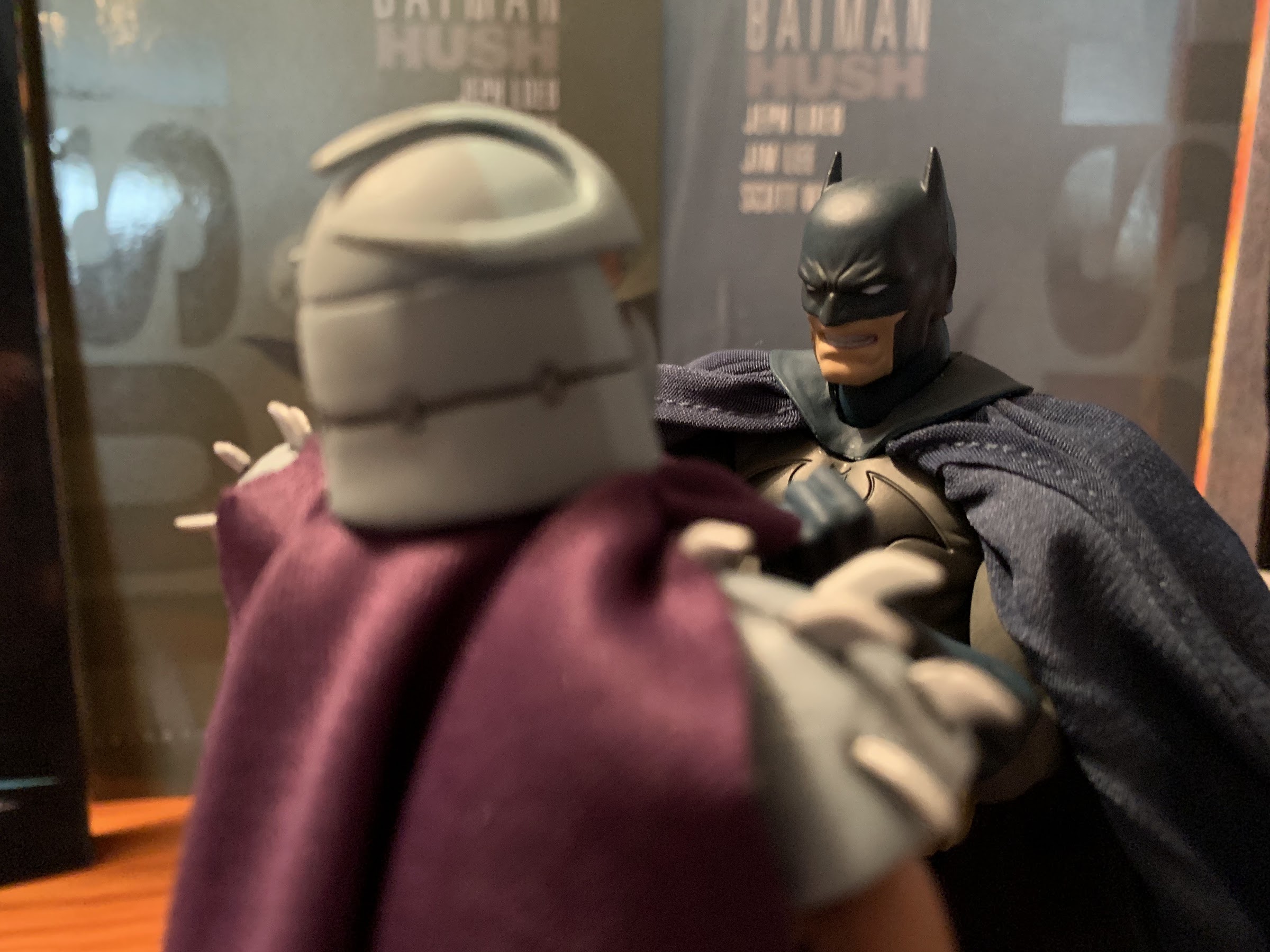
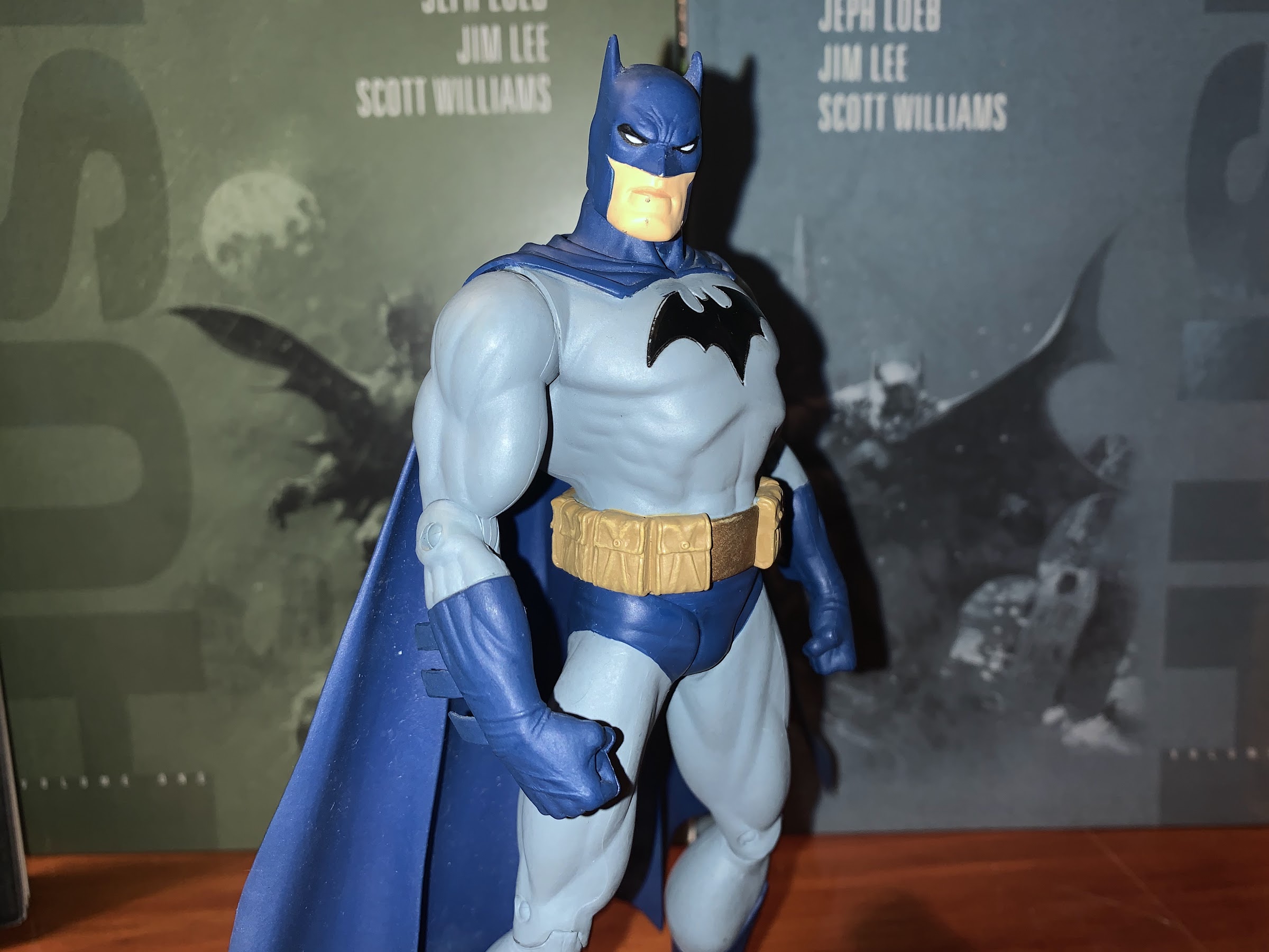
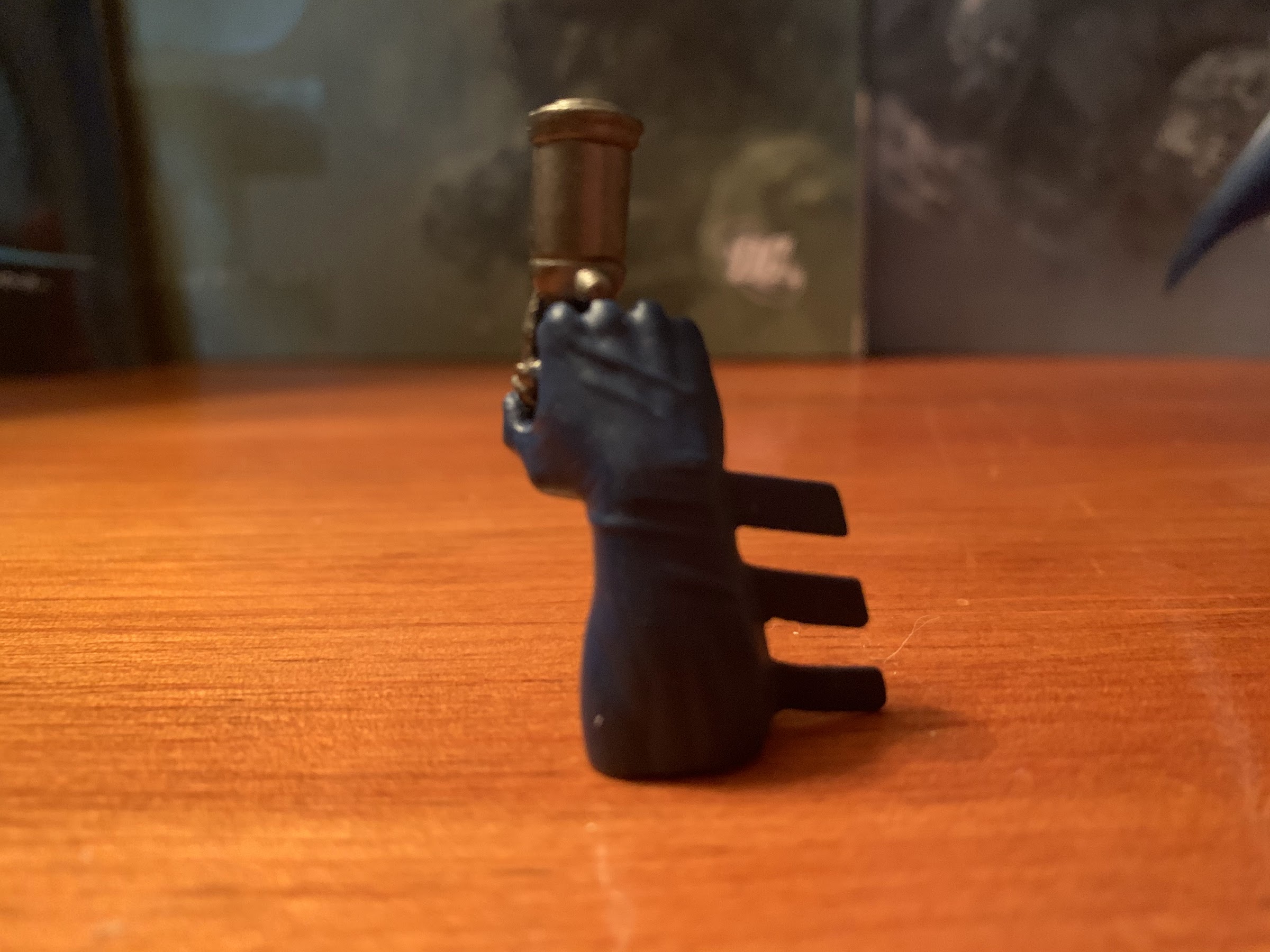
Accessories included with Superman are somewhat light. He has just the one alternate portrait which is red-eyed and angry as it represents him when he’s under Ivy’s control. To better sell the effect he also has some leaf garland to wrap around his neck and forearms which looks fine enough. Out of the box he comes equipped with fists, but he also has a set of flat palms, relaxed hands, open hands, and fists with a small gap between the thumbs and fingers that can hold the edge of his cape. There’s also a bonus right hand for Batman that’s a fist with the Kryptonite ring sculpted onto it. A solid inclusion, though it will only look right on the blue and gray Batman as opposed to the black and gray that followed it. Swapping the heads and hands is pretty painless so that’s a plus. Also included is the usual MAFEX stand which is always appreciated as it is a pretty good one. I just wish we got a smiling portrait or an effect one like laser eyes. I get why the Ivy parts are included, but I’ll honestly never use them.
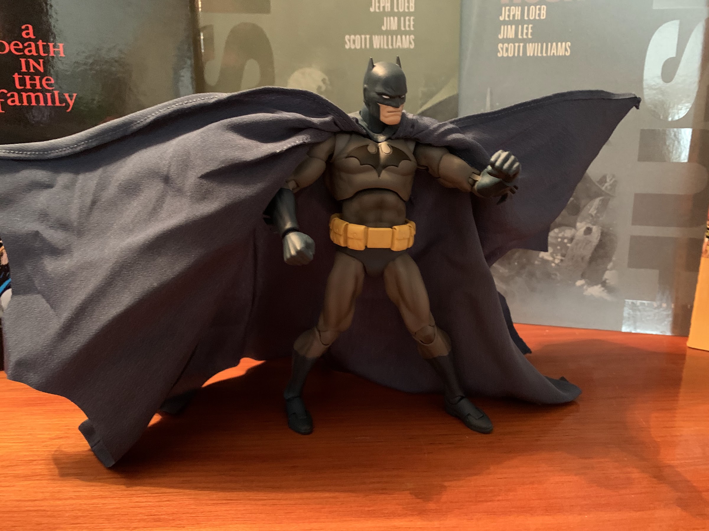
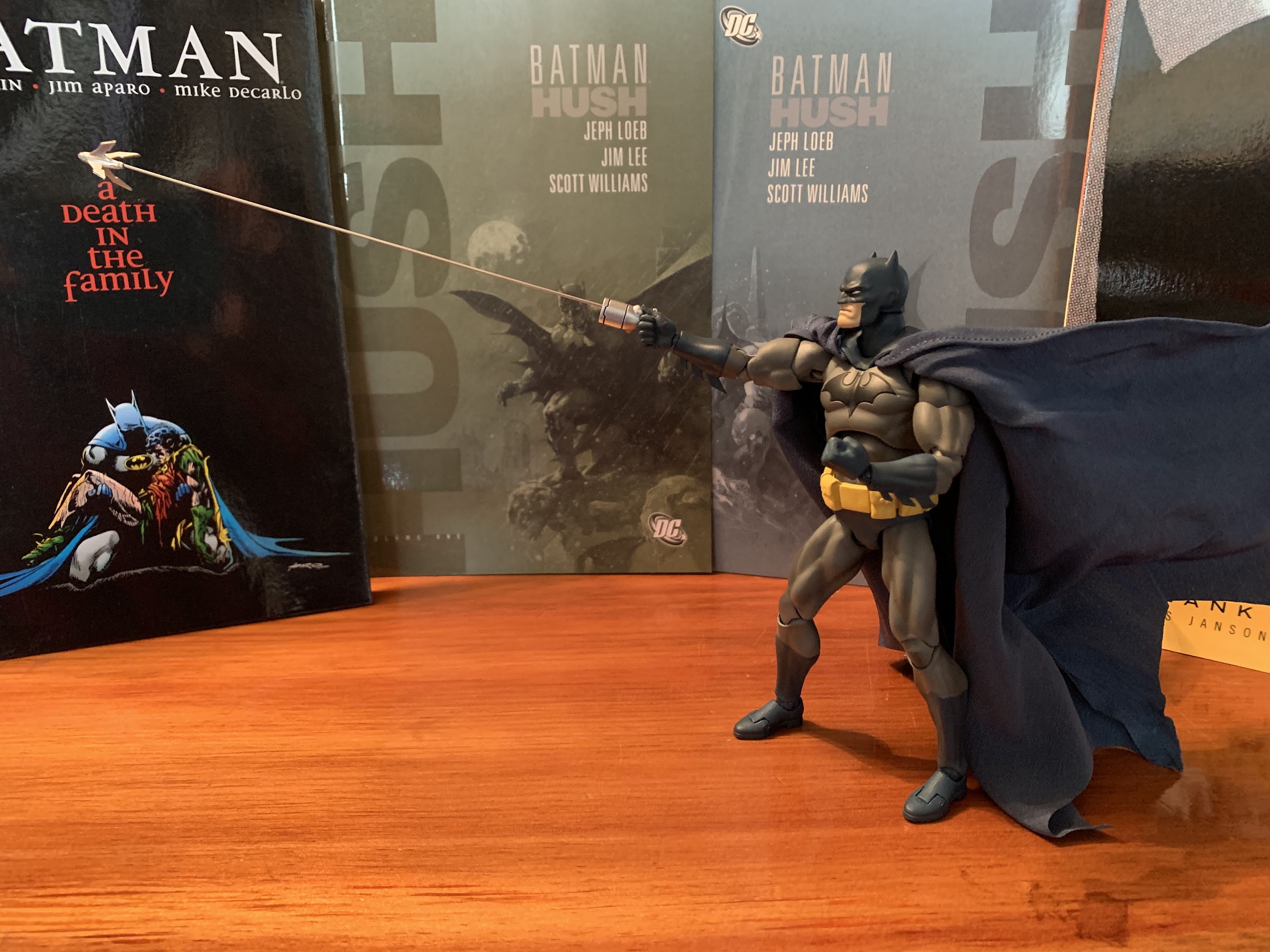
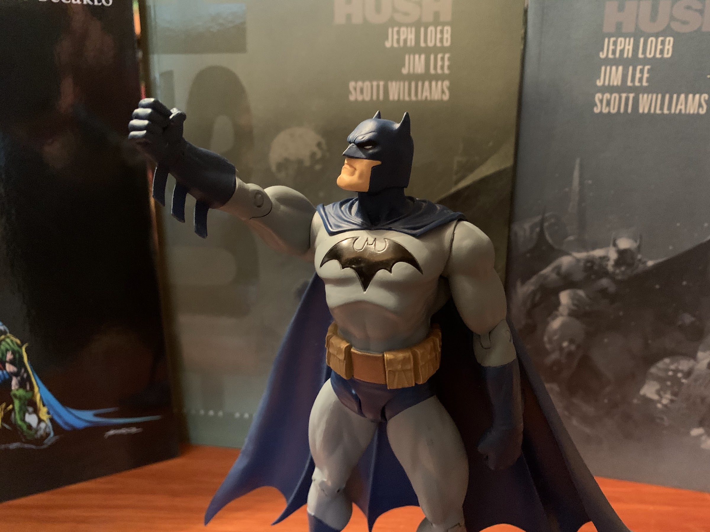
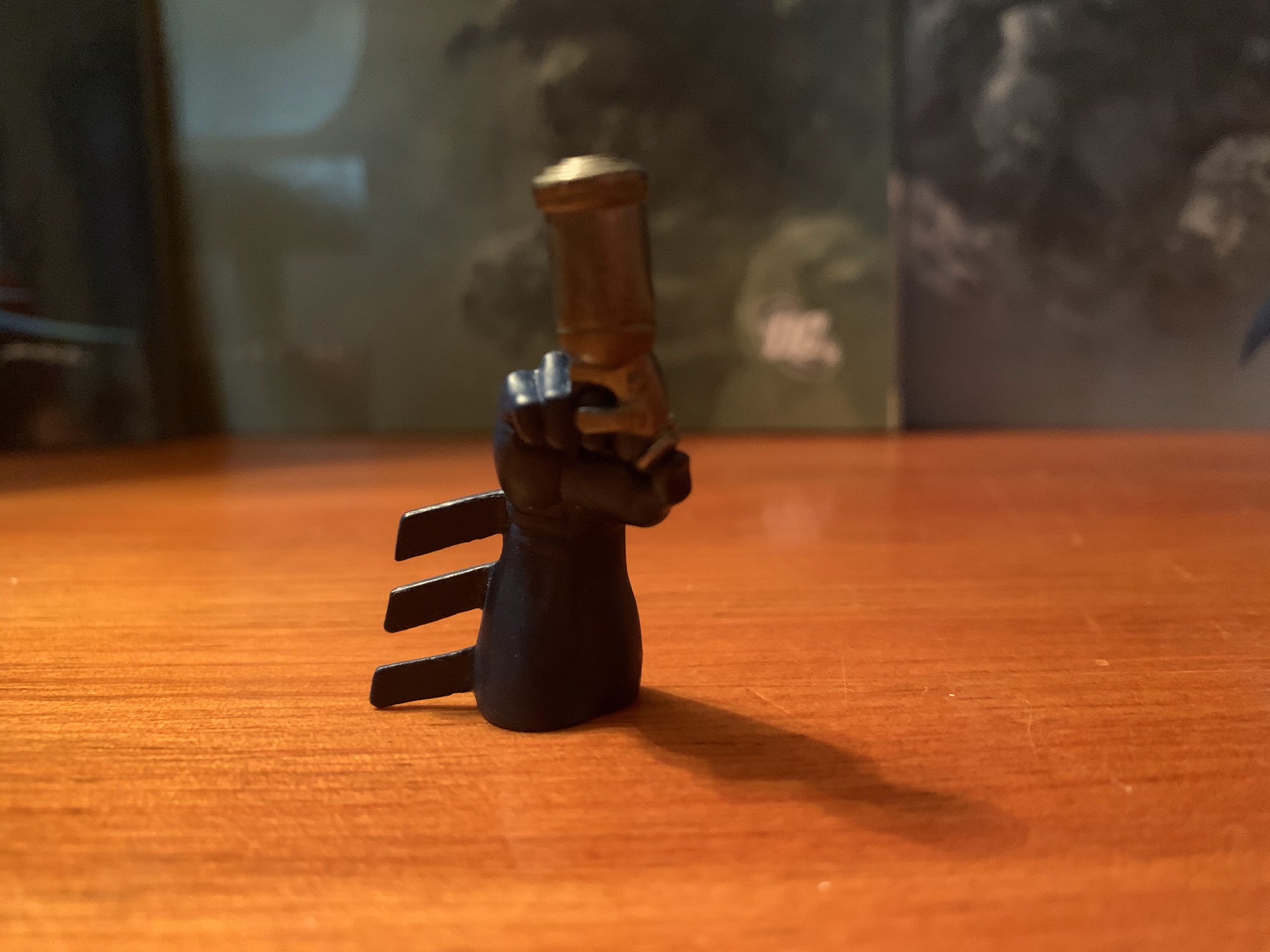
He comes bundled with Batman’s Kryptonite ring fist to help give the caped crusader a fighting chance.
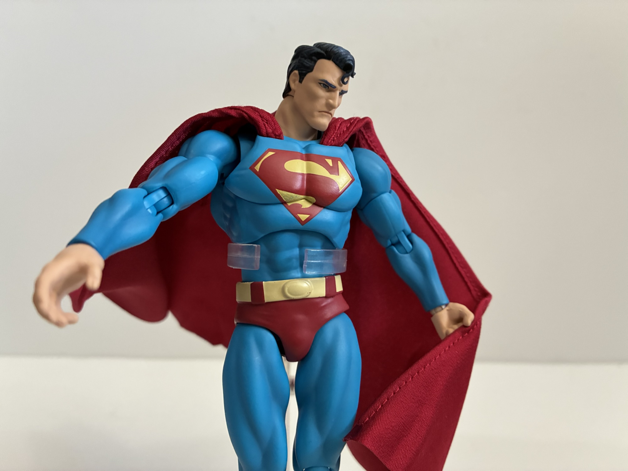
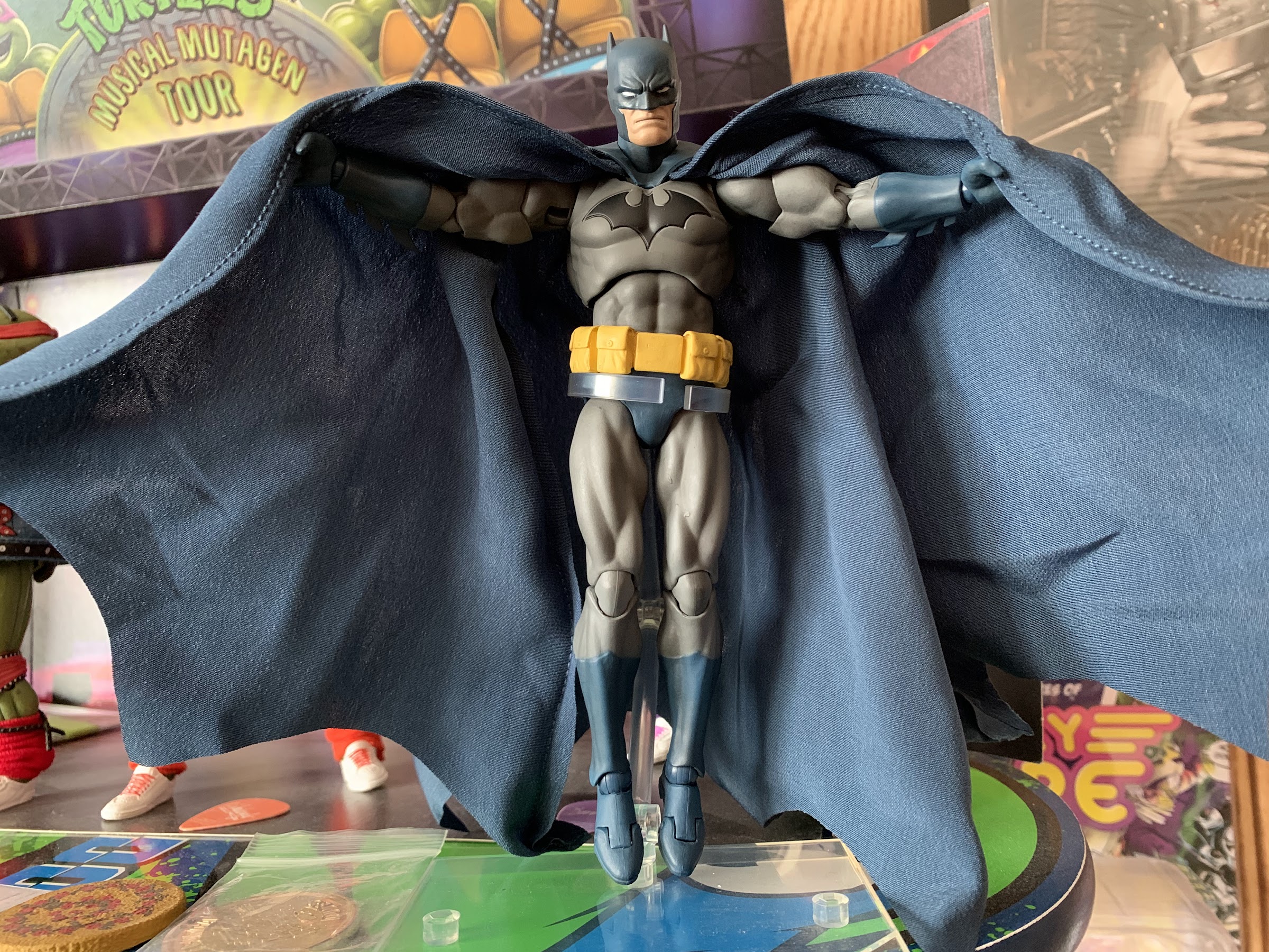
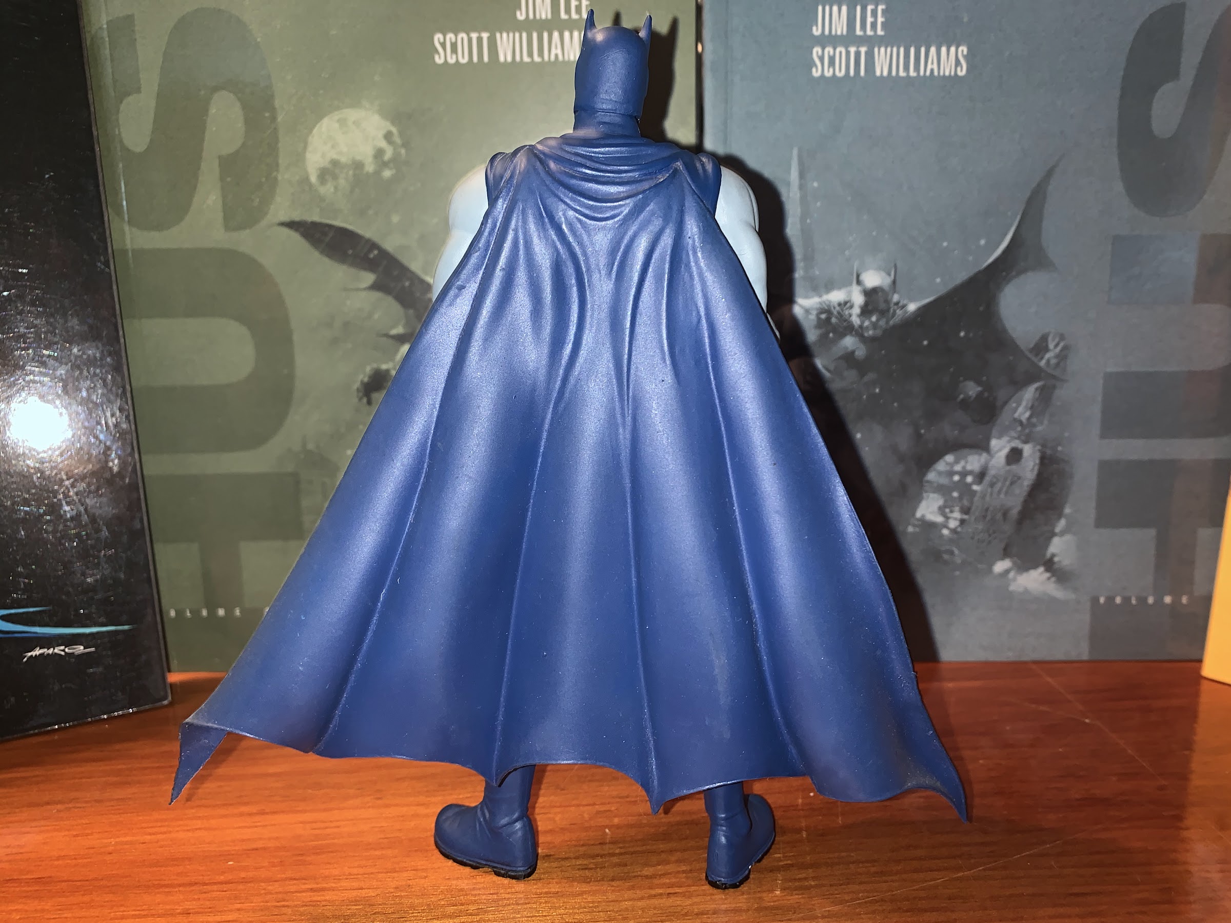
Articulation for Superman is the same as Batman. It’s a fairly robust list of articulation points: head, neck, shoulders, butterfly, bicep, elbow, wrist, diaphragm, waist, hips, thigh, knee, ankle, and toe. The head has pretty good range with its bent double ball peg approach. He can’t quite look all the way up using just the head and neck, but a little tweak of the diaphragm joint will accomplish that. The forward crunch will mostly come at the waist as the chest is a bit too bulky. There’s tilt there and very few restrictions to be found in the upper body. The hips are those pesky drop-down hips, but they’re smoother than the ones on Batman The thigh swivel works well and is completely hidden as all of the rotation happens at the ball joint. I don’t know why Bandai and Tamashii Nations can’t figure this out as they keep giving us those horrid things in their Dragon Ball line. The ankles don’t get much forward range, but going back works well and they even swivel. The ankle rocker works well and there’s the toe hinge if you like it. The only joint I have an issue with is the knee. It looks fine and the range is good, but when it’s bent all the way the kneecap pops out slightly from the thigh and gets stuck. I have to push it back in from the front before bending it back. I guess the lesson here is don’t bend the knee all the way, though it should work. The cape is also wired and it’s all in the sides. It’s a nice, light, material so it works just fine as intended and it’s not so big that it needed more wires throughout like Batman’s.
Best Superman ever? Probably.
I finally gave in and dropped $100 on a Superman figure and I would say he is mostly worth the wait. No, I’m not convinced any figure in this scale is truly work the ask of $100, but compared with Batman I would say I’m much happier with this Superman. He just looks fantastic and the articulation is more than sufficient to hit a lot of Superman-type poses. Truly, my only real complaint is with the paint as the scuffing on the chest of my figure is unacceptable at this price point. I probably could have received some compensation from Big Bad Toy Store for this, but I knew they didn’t have any stock left so I didn’t bother. It’s not their fault Medicom provided them a scuffed-up figure. The accessories could also be better or more robust at this price point. Removing cost from the equation and, yeah, this is a great Superman figure to own. Especially if it’s going to be the only Superman figure you own. And for me that’s almost certainly the case.
If this figure review interested you then maybe you’ll enjoy these:
You may have been wondering why I decided to devote an entry earlier this week to a nearly twenty year old action figure of mediocre quality, and if so, now you know why. I wanted to take a look at the DC Direct Batman based on his appearance in the Jeph Loeb written, Jim Lee…
James Gunn’s highly anticipated Superman has finally arrived in theaters. Is this the film Superman fans have been waiting for? The start of a mega franchise executives are hoping for? Or is it just a nice movie about a super guy and his super dog? Read on to find out!
When it comes to the world of more high end action figure collectibles, I’ve been able to get my hands on a few. Some rather prominent companies have yet to cross my path though, and it’s not really for any reason other than they either don’t make what I like or I don’t really like…
When Batman: Arkham Asylum was released in 2009 it ushered in a new era for the caped crusader where video games were concerned. Prior to that, Batman had not had a good video game in a long, long, time. Depending on your opinion of his efforts, you may have gone all the way back to The New Adventures of Batman and Robin for the Super Nintendo, or even further back to the Sunsoft classic Batman for the Nintendo Entertainment System. His outings on the PlayStation and Nintendo 64 weren’t particularly memorable and he all but skipped on the PlayStation 2 era. The low point may have been the cancellation of the The Dark Knight video game tie-in as it felt like DC throwing up their hands and saying, “We can’t make this work with Batman.”
Rocksteady Studios was up to the challenge and Arkham Asylum proved so good that Sony basically ripped it off for its successful Spider-Man video games. Rocksteady was able to craft a simple, but relatively malleable, combat system for Batman that had some challenge, but mostly succeeded in making the player feel like they were playing as Batman. Random thugs weren’t going to get the better of Batman unless they were in mass quantities and heavily armed. The one-button attack system made handling Batman a breeze and the stealth elements added on top of that complemented the action well. If there was one critique, it was that the environment was a little closed off so for the sequel Rocksteady gave Batman run of the city. Arkham City was more of a sandbox game, but mostly played the same. Boss encounters also had more variety and many still view it as the pinnacle of Batman video games.
In this one, Batman has to work with Catwoman to quell a prison riot.
For the sequel, Rocksteady bowed out. Enter WB Games Montreal which crafted Arkham Origins for release in 2013. The game was mostly well received, but not as enthusiastically as its predecessor. WB Games Montreal did receive praise for largely carrying forward the game mechanics fans had grown accustomed to and the franchise continued to roll along. Developed alsongside that release, was Arkham Origins Blackgate. Blackgate was the handheld version of the game released on the PlayStation Vita and Nintendo 3DS. Development on Blackgate was entrusted to Armature Studio which had cut its teeth previously on the Metal Gear Solid HD Collection also released on the Vita. Blackgate would be the studio’s first original game and it too was released in 2013.
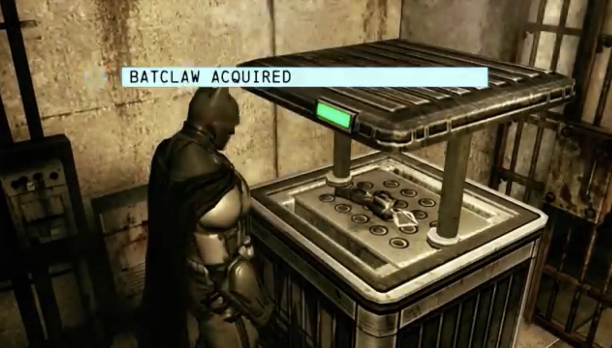
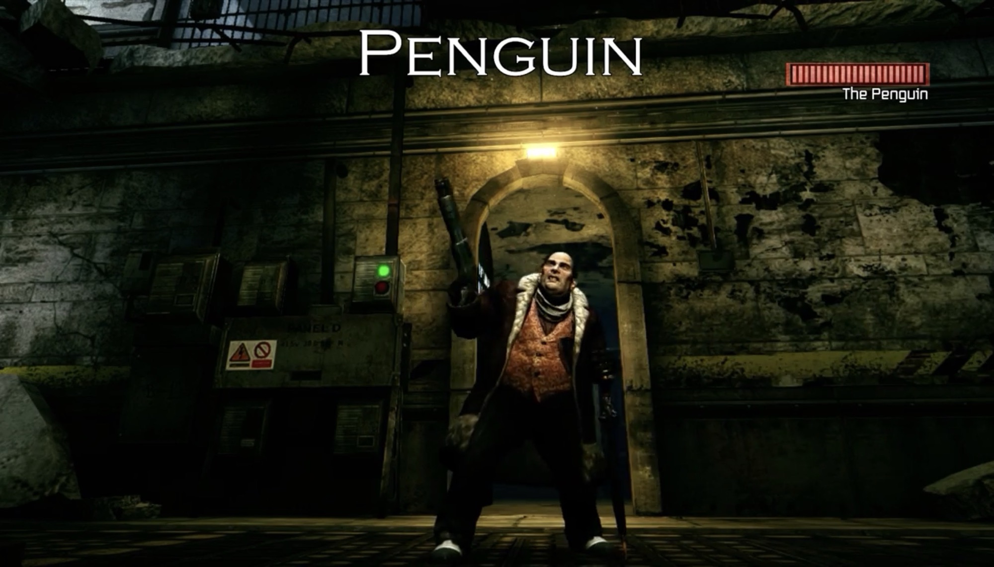
When Blackgate came out I was instantly intrigued. As an owner of the PlayStation Vita and the 3DS, a portable take on the Arkham series of games held some appeal. Blackgate also wasn’t a direct port of any of the console games. It was its own thing and is technically a sequel to Arkham Origins as far as plot goes. Batman (Roger Craig Smith) encounters Catwoman (Grey DeLisle) at the start of the game which serves as the tutorial mission. Shortly after, there’s a prisoner revolt in Blackgate prison and Batman heads in to investigate. Three of the biggest crime bosses in Gotham: Joker (Troy Baker), Black Mask (Brian Bloom), and the Penguin (Nolan North), have taken over and each rule over a segment of the prison. Catwoman is also there, but willing to aid Batman in helping to free the hostages the criminals have taken and ultimately save the day. Batman will have to explore Blackgate in a non-linear fashion acquiring various gadgets to help him progress through the prison.
This is how you will be viewing Batman most of the time – from the side.
I did not play Blackgate in 2013, but always wanted to. Recently, I had a chance to rectify that and I was intrigued by what I found. I know I read reviews in 2013 for the game and ultimately passed, but what I had read I had mostly forgot. What I did know going in was that Blackgate was a 2.5D action game. The environment and character models are all rendered in 3D, but gameplay is largely restricted to a 2D plane. There are some moments in the game where Batman can move into the foreground or background, but they are few and far between. Other times the environment will curve or swing into either the foreground or background, but having Batman just walk in a straight line will cause him to just follow the path. It’s also what the cool people on the internet refer to as a Metroidvania. That’s a non-linear action title that plays in a style similar to Metroid and the nonlinear entries in the Castlevania series.
Utilizing stealth and Batman’s Detective Mode is crucial to surviving Blackgate.
Despite the perspective change, Blackgate plays a lot like its big brother on the home consoles. The systems are largely still intact. When it comes to combat, the player is encouraged to chain attacks together with just the press of one attack button. There’s a separate parry button with onscreen indicators for when to use it as well as the ability to perform a cape stun maneuver. Successful attacks continue the chain as do successful paries. Early in the game, enemies will likely be a cakewalk, but tougher ones are introduced later that either have weapons or a means of defending themselves. For criminals armed with firearms, Batman can’t take them head-on. For those enemies you’re expected to play it sneaky either via alcoves high up or by utilizing passages in the ground. Batman can perform stealth takedowns when in the proper position and they are preferable to running in Leroy Jenkins style.
Why does he always need to re-find his equipment every game?
As Batman makes his way through Blackgate, he will encounter gates that prevent him from progressing deeper. In order to progress he will have to either upgrade his hacking device or uncover a new tool. At the start of the game, he is only armed with a Batarang and grapnel gun, but along the way he’ll acquire the Bat Claw, the line launcher, and an explosives gel gun. The claw allows Batman to pull down things like vent covers while the line launcher lets him cover long gaps and even opens up the background and foreground elements to a degree. The explosive gel can only be used on specific spots to blow holes in the environment. At any point Batman can also enter Detective Mode as he can in the other games which can reveal weak points in walls and other secrets and help Batman progress. The three boss characters can be encountered in any order and as such it means there aren’t any items tied to any of them. Most just require you to use Batman’s base abilities in a certain way to clear the encounter. Also hidden throughout Blackgate are weapon and armor upgrades, new costumes, and collectibles that just add a little extra length to the game. One playthrough takes about 7 – 8 hours and the only reason to go back is to defeat the boss characters in a different order to unlock another costume.
All of the boss encounters are uniquely constructed – none of that “Ride the big guy” stuff from Arkham Asylum.
Playing through Blackgate is largely an enjoyable experience, but there are some quirks that hamper things. The locked perspective takes away the ability for Batman to just point and shoot his grapple gun and can make navigation a chore at times. There is one area in particular where Batman has to deactivate a bomb with a timer on it and I could see where I needed to go, but the rules of the game wouldn’t let me just go there because it was in the background. A lot of context items are all assigned to the X button as well which can get clunky when you don’t want Batman to interact with the environment. X also makes Batman run so you can imagine how that might get in the way. Blackgate is also broken up into different maps and navigation can be a chore. The map system isn’t particularly intuitive and it’s also locked to the menu screen so you constantly have to refer back to it. Batman also can’t simply exit a section and has to work his way back to an exit which gets very tedious. There is no fast travel system. There’s not a lot of variety to the scenery, though apart from that the game generally looks and runs smooth. Story advancement is done with stylized still image cutscenes, but fully voiced which might feel like a downgrade for the handheld, but I honestly didn’t mind. Voice acting is strong while the overall sound design is fine, though a bit repetitive. Music is a little sparse, but it suits the vibe of the game.
Back in 2013, I passed on Blackgate because the reviews were just kind of ho-hum. No one seemed impressed by the game and since there was Arkham Origins available for the main console experience it probably made Blackgate seem worse by comparison. More than ten years removed from that environment, Arkham Origins Blackgate plays like a slightly different sort of game and it’s honestly pretty fun. It probably drags on a little too long as it feels like that 8 hour runtime is padded out by lots of backtracking. Repeat playthroughs would certainly go much quicker, but there’s really no reason to go back. The extra costumes are all pretty terrible and of the era. There are no classic looks for Batman which is a little disappointing, and while I like the standard costume enough, it would have been cool to go old school. The boss encounters also aren’t great. They’re not as repetitive as they were in the original Arkham Asylum, but they are underwhelming. Especially the final boss which left me thinking “That’s it?”
Batman: Arkham Origins Blackgate must have sold well enough because there are plenty of copies floating around for a decent price. The Vita experience was a good one and I don’t know if the same is true of the 3DS. The game is also available on Steam so it’s rather playable. What works best is the novelty of a portable Batman experience on par with what the console games were doing while also not trying to be an exact copy. I’d like to see another Batman adventure in a similar style, maybe one that plays a little faster and actually does more to separate itself from the console games so we’re not constantly comparing the two as we play.
In the far off land of 2021 we received word that a new animated Batman series was in development and attached to it was none other than Bruce Timm. Timm was one of the main creative minds behind Batman: The Animated Series and the DC Animated Universe it spawned so this news was met quite…
If you’re a repeat visitor here at The Nostalgia Spot, then you’ve probably noticed that around here there is a high opinion of the television show Batman – The Animated Series. I did a re-watch of the series that spanned more than two years and also checked out the various films based on the property.…
Last year, when Warner Home Media announced a new Blu Ray set for the series Batman Beyond, I decided to wait. I had been an early consumer for the similar Batman: The Animated Series set the prior year and had some misgivings. The price on that set fell and a slimmed down version was even…
When I was a kid, the only superheroes with any box office success to speak of were the biggest heroes from Detective Comics: Superman and Batman. The Superman films starring Christopher Reeve were probably the first superhero movies I ever saw. If not them then the honor would belong to Batman (1967). It wouldn’t be long until Tim Burton’s take on the Dark Knight rocked the box office and became a merchandizing juggernaut. It followed a tetralogy of Superman films that had really run out of steam. Batman was the new “It” hero for the film world and no one else mattered or could find success. Not until Fox and Sony started winning audiences over with their takes on X-Men and Spider-Man. The Marvel Cinematic Universe followed, and even though during that era there was a trilogy of very successful Batman movies from director Christopher Nolan, it feels like Warner Bros. and DC have been trying to emulate the Marvel method with its films with little to show for it.
Enter James Gunn. After entrusting the DC film universe to Zack Snyder to middling results, Warner Bros. searched for someone to spearhead a second attempt at a shared DC film universe. Gunn was known to them through work he had already done for the studio including including films The Suicide Squad and the HBO series Peacemaker. Gunn of course was the director for three very successful Guardians of the Galaxy films for Disney and Marvel and the prevailing thought at Warner must have been if Gunn can take a relatively unknown comic franchise like Guardians and turn it into a mega-successful film franchise then surely he can do the same for the already famous characters of DC? His first task: create a new franchise with Superman serving as the anchor character to kick things off.
Superman may be one of the most famous superheroes in the world, but it feels like his time as the most popular has long since past him by. Film attempts at reviving the character have not been received all that well and Batman has taken over as the face of Detective Comics. It almost feels like at some point in the 80s a rift developed between the two fictional characters that carried over into the fandom. If you were a Batman fan then you thought Superman was lame. If you were a Superman fan then Batman was a joyless, grim-dark, sadist. The talk of a Batman vs Superman movie became a thing that eventually happened and even when comic book royalty like Jim Lee took over the Batman books he made sure to work in a Batman vs. Superman scene into his Hush story. This can probably be traced back to Frank Miller’s The Dark Knight Returns which contains probably the most famous and iconic physical stand-off between the two the atmosphere of which helped to influence Burton’s Batman which helped define the character for the next decade-plus.
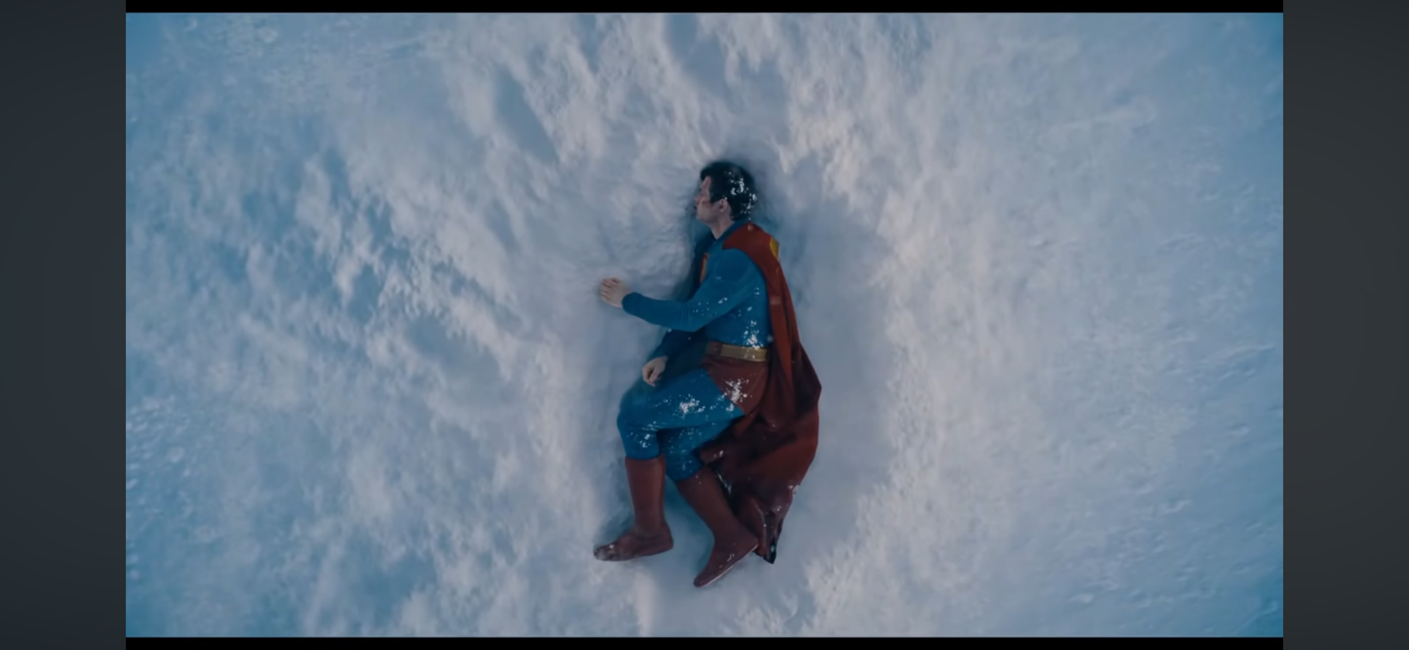
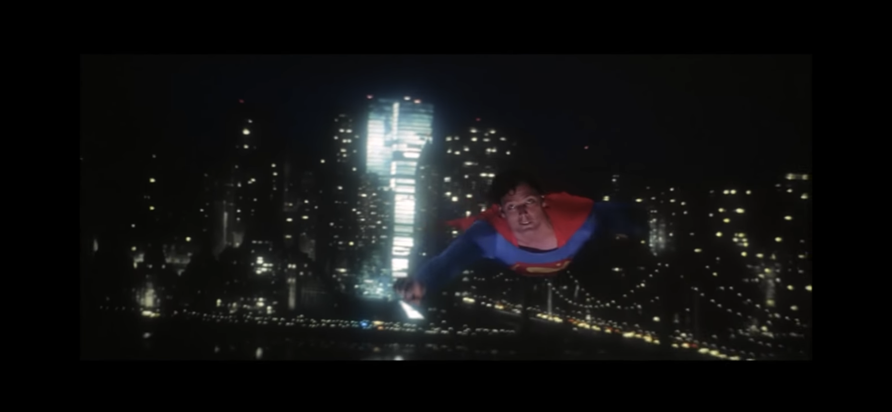
The film begins with Superman looking less like his usual self and more like Yamcha.
All of this is to say that Superman arrives with a great deal of expectation. There’s expectation from the studio that this will be the catalyst for a mega-successful film franchise to follow, and not just for Superman himself. There’s the hope from fans of the character that this is the movie that will get him right and do justice for the character that many feel the previous films failed at. And then there’s the naysayers, the anti-Superman crowd and Snyder loyalists which has been stoked by recent cries that Superman is getting too political because Gunn dared to point out that he’s an immigrant and his story is an immigrant story. The film drops at a prescient time for such notions as currently immigration is the focal point of the current administration in the United States with ICE raids and protests against said raids often dominating the news. Can this film possibly serve both crowds and win over a large majority of move-goers this summer?
Despite how this looks, this is thankfully no “Trial of Superman” type of film.
No, probably not. Those who have decided that this new movie is too political and against their conservative leanings going into it are not going to be swayed. And those who thing Superman sucks of only Snyder’s portrayal mattes have made up their minds already so why bother convincing them otherwise? For that other crowd though, I do think many are going to leave the theater with some measure of satisfaction. This is the portrayal of Superman that they were likely looking for, and while the film is far from perfect, it’s also pretty far from terrible.
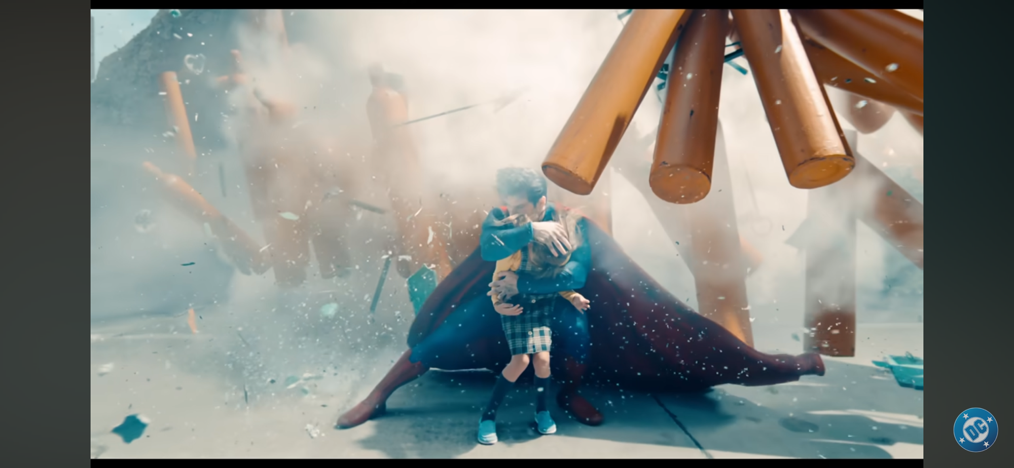
Superman (played by David Corenswet) opens at an interesting time for the character: his first defeat. Some text overlay is present to inform the audience that Superman has been on this world for 30 years and revealed himself to the public 3 years prior to the events of the movie. This is not an origin story, though if you know nothing about Superman going into it you’ll have the gaps filled in enough without a lot of direct exposition. Superman also gets to open the film in a Yamcha pose. If you are a Dragon Ball Z fan then you know what I am referring to as the character is laying in a fetal position in a crater in the arctic. If you saw the first trailer then you saw this scene. It’s an interesting way to introduce the audience to the character as it informs us that this is a Superman who can feel and experience pain. Some takes on the character make him basically invulnerable to all things not Kryptonite. This Superman is indeed a super-powered individual and no mortal man could ever hope to best him at any physical test, but other super-powered beings can perhaps stand a chance.
This film very much wants to remind you that Superman’s priority is safeguarding the people (and animals) of the planet he now calls home.
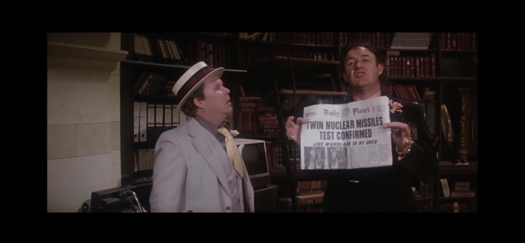
The Superman of this universe is an eternal optimist. He is here on this world to do good, as his biological parents instructed via a pre-recorded message, and that’s his goal. When a fictitious foreign power tries to invade a neighboring country, Superman puts a stop to it with his own brand of justice. That lays the foundation for one of the film’s central conflicts – can a man of his power who owes no allegiance to any nation be allowed to act in such a way? To Superman, he is doing right. The invasion would have cost lives and Superman prevented that. To an adult in the political world, there’s more nuance. The invading country (Boravia) claimed it was liberating the people of the country it invaded (Jarhanpur) from an oppressive regime. Lives would have been lost, but they would have better off in the end, or so they claim. Superman disagreed and since he holds the power it’s his opinion that supersedes all others. He consulted no political authority before acting as he did and the fear is what if he’s wrong?
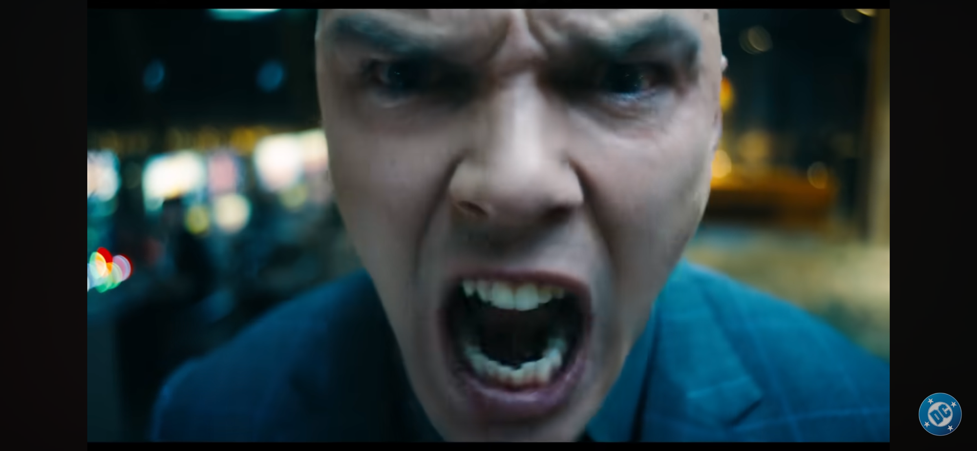
Hoult’s cocky and obsessive Luthor is hopefully a villain with real staying power.
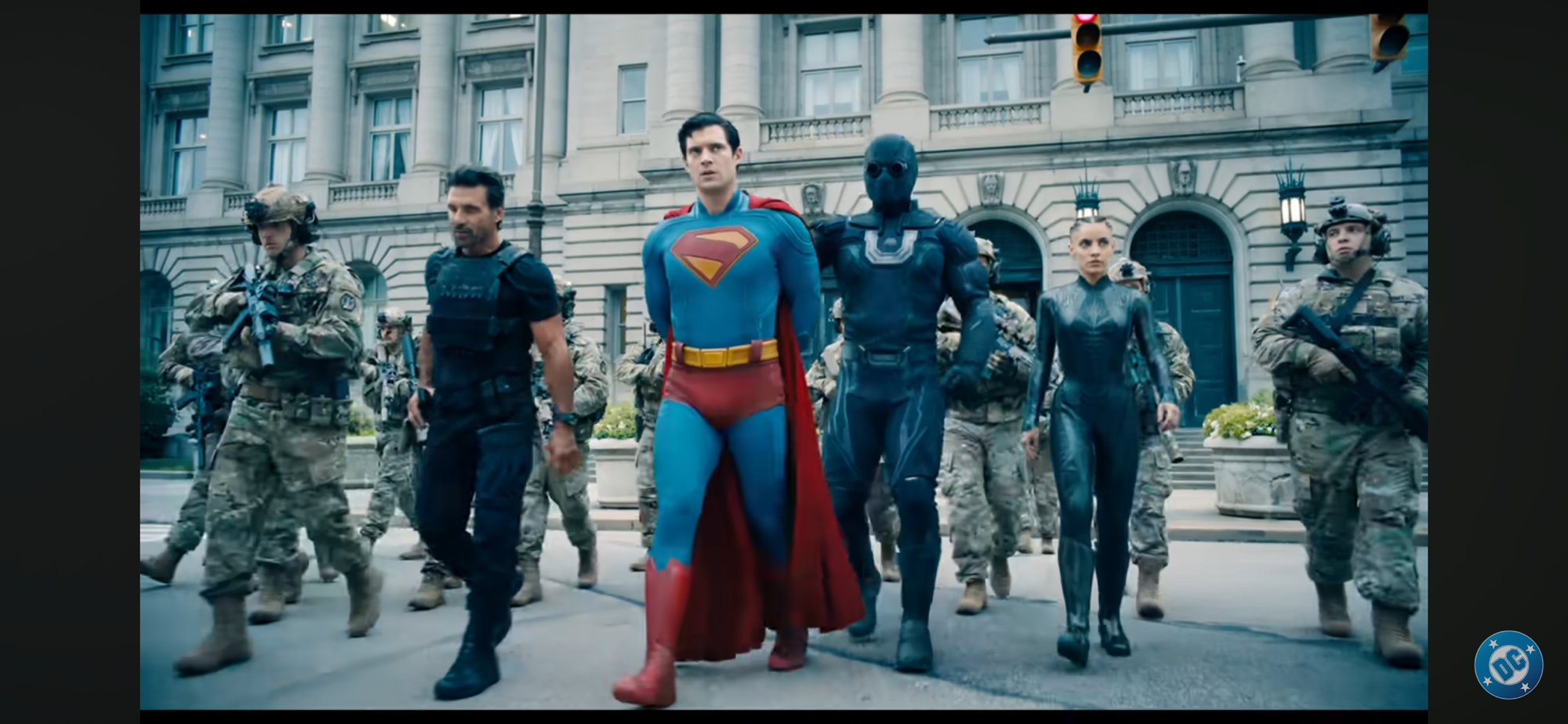
To a man like Lex Luthor (Nicholas Hoult) this is a very scary proposition. He has some sympathizers in the US government, but none are eager to go toe-to-toe with Superman who is not only extremely powerful in his own right, but also extremely popular. Luthor is motivated by more than just fear though. He’s not a man out to make the world a better place, but a better place for him. He’s greedy and jealous and his jealousy towards Superman has been all-consuming. He wants to out Superman as someone the public should fear, and then he wants to kill him. He has been studying Superman these past three years and has used his considerable wealth to hire some very smart people to help him do that. Among his ranks are two creations: Ultraman and The Engineer. Ultraman is an incredibly strong creation of mysterious origins while The Engineer (María Gabriela de Faría Chacón) is some sort of techno-engineered human capable of breaking her body down into tiny nanobots.
The Justice Gang has a role to play, but not a sizeable one.
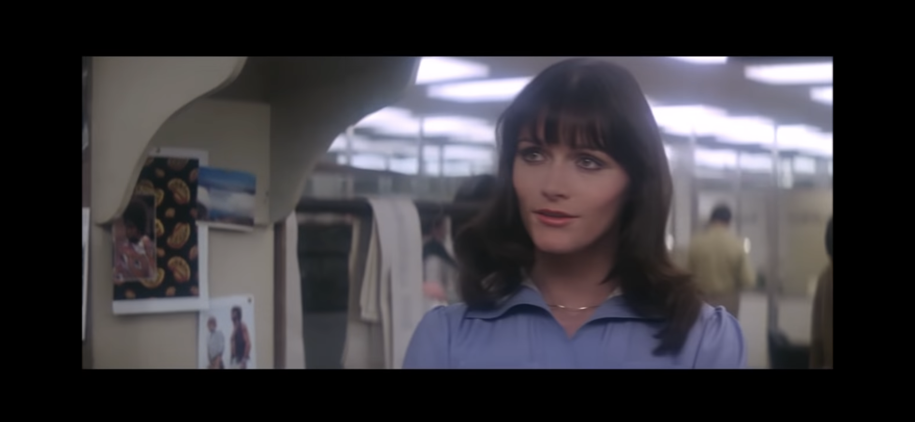
Other heroes, or metahumans, exist in the world including the Justice Gang (working title). This group consists of Green Lantern (Nathan Fillion), Hawkgirl (Isabela Merced), and Mister Terrific (Edi Gathegi). If you know nothing of those heroes from the comic books good luck understanding what their powers are beyond a superficial level. The film isn’t interested in sifting through lore and all one needs to know for the film and their presentation is they’re some pretty powerful people. There’s also the Daily Planet crew where Clark Kent is employed and we meet the usual suspects for a Superman film. Lois Lane (Rachel Brosnahan) is the lead reporter and the one we’ll spend the most time with. Along with her is Jimmy Olsen (Skyler Gisondo) who is traditionally a photographer, but in this film I don’t know what his role is. He’s not a reporter, even though he has the best sources, and he defers to others and operates like an assistant. Perry White (Wendell Pierce) serves in his customary role as the editor-in-chief.
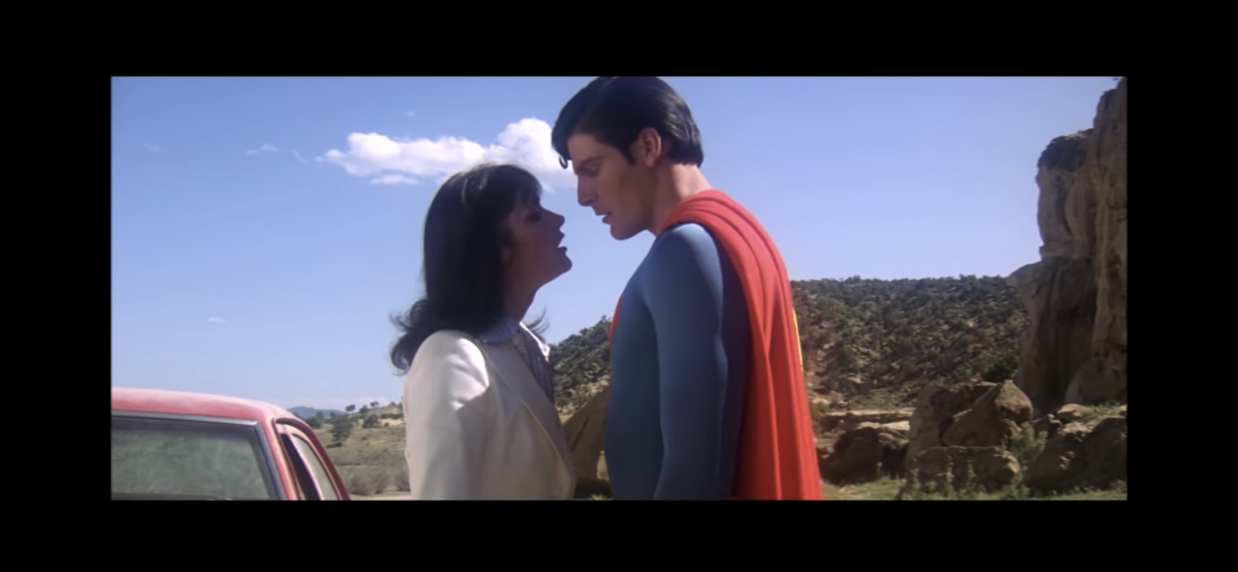
The film is primarily concerned with presenting Superman as a force for good and what is morally right and just. Cronenswet is perfectly suited for such a role. He has an innocent charm about him as well as the physique. He doesn’t wrestle with his decisions of what is right and what is wrong because he feels he knows inherently the difference between the two. An interesting dichotomy is displayed when he and the Justice Gang take on a kaiju-like beast in Metropolis. Superman struggles with the beast because he wants to subdue it and take it to an intergalactic zoo of some kind while the other heroes see killing the creature as the quickest way to neutralize the threat. Superman, for all his power, doesn’t appear to subscribe to the theory that might makes right, he’ll use his considerable might as he deems necessary, but he’s not a killer. This juxtaposes with the cynical world around him. Lois, in particular, clashes with him because of her more jaded, but also typical, outlook for an adult woman in a modern day setting. She can raise these issues with Superman, but all they do is frustrate him because seemingly no one else sees the world as clearly as he does. The only thing I don’t like about this Superman is his costume. Yes, it’s pretty close to his classic look, but he has that texture and piping that has become commonplace in super hero movies and TV shows. It’s uninspired and overdone and looks like Superman through the lens of The Boys.
Holt definitely gets the most opportunity to steal some of the spotlight.
Hoult’s Luthor is a proper villain for Superman, one who can’t ever hope to match him physically, but can do so in other ways. He’s portrayed as a very smart, savvy, and even patient man since he’s been working to put his plans into motion for years at this point. He’s also prone to emotional outbursts and Hoult is able to straddle a fine line between lethal mastermind and over-the-top theatrics. The background conflict between the two warring nations feels like a clear proxy for conflict in the middle east. Gunn has been working on this film since 2022 so it’s hard to say if that conflict is meant to be a stand-in for something as politically charged as Israel and Palestine, but present day audiences are likely to go there.
If you were hoping to see a lot more of the reporters at The Daily Planet then you may be disappointed.
And that’s where Superman is likely going to come up short for some people. Those who want the movie to have a very clear stance on present day topics like the current one in Gaza are going to be left wanting more. The criticism, if there is any, is largely toothless. The moral questions of whether or not Superman is right or wrong is basically introduced, but mostly dropped. It serves as a catalyst for the plot which then quickly becomes just another sci-fi, comic booky, conflict where the fate of the world is at stake. The film provides a resolution to the plot, but not really any of the other stuff. And amidst the climax the human characters basically get swallowed up. If you’re someone who feels the Daily Planet staff is an integral part of the Superman experience then you too will be left underserved. The film literally puts the only important characters from that group (and even the non-important ones who get little face-time) in a bubble to ride the whole thing out. I won’t go so far as to say the Daily Planet stuff could have been stricken from the film without any loss, but it’s close. On the plus side, the film is at least confident with its sci-fi. It doesn’t get bogged down in the how or why these things can happen, they just can. For some viewers that may be frustrating while others are more apt to just accept the reality of the film for what it is.
DC and Warner are probably counting on this dog to move some merch and he probably will.
The other character I have to mention is the one likely to help offset some of the losses in the adult audience and that’s Krypto. The super canine was introduced in the initial trailer and you won’t have to wait long to see him on the big screen. I have never been a Krypto fan. Even as a kid it felt like pandering to a young audience that I saw through despite my enjoyment of dogs. He’s probably here to help pander to that younger audience once again and maybe win over some dog people who ordinarily wouldn’t care about Superman. His portrayal is better than expected as Krypto is not some well-trained companion, but a force of chaos. He’s a bit unruly and pup-like and it’s probably because he’s a bit neglected being forced to live in Superman’s Fortress of Solitude (it’s never actually called that in the film, but you get the idea). He has not been socialized with other dogs, probably because he’d accidentally destroy them, and Superman isn’t available to train him. He’s still a good boy though so the audience is probably going to enjoy him more than I did. I know my kids left the theater saying he was their favorite part.
John Murphy and David Fleming handled the score with liberal use of the Superman theme composed by John Williams. I was very happy to hear that theme returned as there’s no reason to ever craft a new Superman theme. The films makes use of it in different ways adjusting the tempo and intonations, but it’s unmistakable. I do wish at some point there was a performance a bit closer to the one from the 70s, even if just over the end credits, but the film denied us that. It’s also worth noting that even though this is a launching point for a new DC film universe, it doesn’t feel like one. Yes, there’s a mid-credits and a post credits scene, but they’re not teasers. There isn’t any obvious setup for a future film or story and the plot is self-contained. It may seem a bit ridiculous to praise a film for telling a story and committing to it, but the Marvel Cinematic Universe has become exhausting to follow and it’s nice to just sit and watch a film without wondering “What’s next?”
Okay, I’ll admit it, he’s a good boy.
Superman is a good film. It’s probably not the genre or character-defining moment some want it to be, but if you’re in the market for a good Superman story presented in a capable manner then there’s enough here to enjoy. Where the film comes up short is in its approach to plot points many would consider topical. If you wanted a strong denouncement of the immigration policies in the US or criticism of what’s going on in Gaza well you’re not really going to get it. Should the film have gone farther? Perhaps. I don’t think it would have hurt commercially as the people refusing to see the film because it’s “woke” have already made up their mind and aren’t going to give it a fair shake anyway. There’s always a danger in playing it safe because it can turn off the audience you were likely to have anyway and alienates the one you never were going to appeal to. And it’s never a bad thing to take a stand on what’s right, provided it’s truly the position of those making the art. Those who wanted to see more of Superman’s supporting cast might also be left disappointed. This isn’t a solo Superman story, but it’s also not one heavily reliant on others, but maybe we needed that after films and stories all too willing to place the character on the back burner. It’s also 129 minutes long and feels just about right so while there are things I might have liked to have seen included, I can’t say I wanted another bloated 150 minute comic book movie. Hopefully, Gunn and DC can stick with telling more Superman stories and be less concerned with telling the story of the Justice League or whatever else you know they want to build to. My fear is this is an outlier just to establish Superman and DC is going to just go back to trying to emulate what Marvel has done. Not every film needs to be building towards something bigger and better. There are plenty of Superman stories worth telling. We have the cast and hopefully we have vision at the top to usher in a new era for the character.
If you’re interested in more thoughts on Superman in film then perhaps you’ll find these worth your time:
It might be hard to convince younger people today that superhero movies were once huge financial risks for production companies. It might further surprise them to learn that only one comic book company seemed to figure the whole thing out, and it wasn’t Marvel. While Marvel struggled to get Hollywood interested in its characters, Detective…
Original Air Date: October 4, 1997 Directed by: Toshihiko Matsuda Written by: Paul Dini, Stan Berkowitz, Alan Burnett, Rich Fogel, Steve Gerber Animation: TMS – Kyuokoichi Corporation Running Time: 61 minutes Also Known As: Superman: The Animated Series episodes 39, 40, 41 “World’s Finest: Parts 1, 2, and 3” When Warner Bros. launched its own…
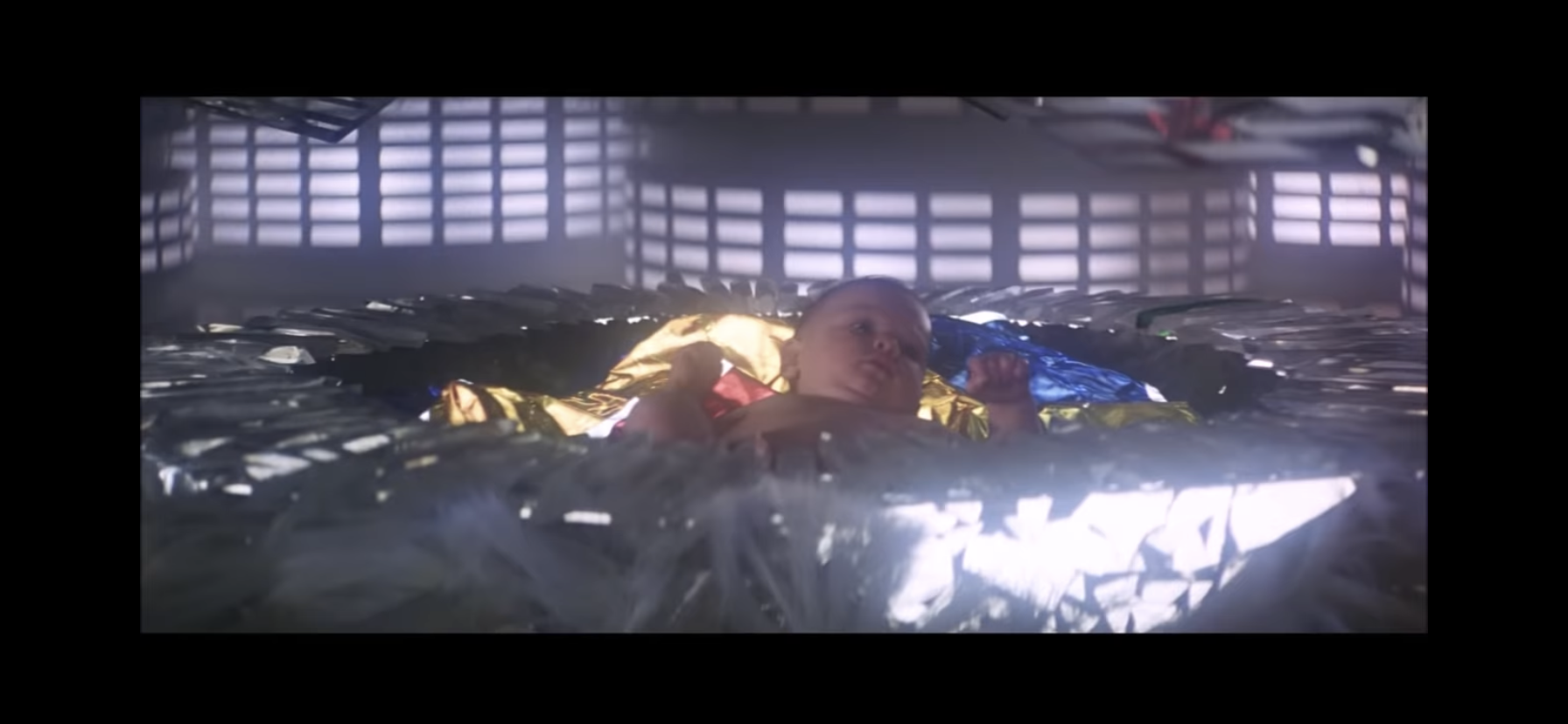
When the original Superman was conceived for a theatrical release, the producers on the project were ambitious. Convincing audiences that a man could fly sure seemed like enough ambition for one film, but not Superman. Alexander and Ilya Salkind decided it would be more prudent to shoot the film and its sequel at the same…
It’s time for your favorite holiday tradition: Christmas with the Joker!
Yesterday, the United States celebrated the Thanksgiving holiday so you know what that means? The Christmas season is underway! And it’s one that feels like it could not have come any sooner. We need a little Christmas, right this very minute, and today it’s coming to us via an unexpected source: The Joker. Yes, the Clown Prince of Crime is getting into the Christmas spirit today for, what else, an action figure release. This is yet another old one from DC Collectibles re-released via McFarlane Toys. The first such set of figures we looked at released this way didn’t go that well. Will this Joker fare any better? Will the magic of Christmas help to elevate him above his brethren? Let’s find out together.
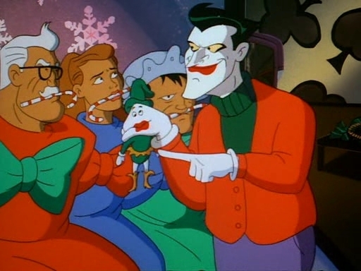
Joker, as seen in the episode from which this figure is based on.
It was years ago (2017, if I’m not mistaken) that DC Collectibles released a Joker action figures based on the episode of Batman: The Animated Series “Christmas With the Joker.” In just the show’s second episode it not only introduced audiences to its version of the Joker, but also made it a Christmas special. Since the show was debuting in September, that meant it had to be held back a bit, but still managed to air in November. Nonetheless, it’s not one of the show’s better episodes, but the mere fact it features the Joker and it’s a Christmas episode helped it to remain memorable.
He certainly looks happy to be celebrating the holidays with us.
When this figure was first released, I considered getting it. I don’t know why I didn’t, I guess maybe I was trying to save money? I probably feared that getting even one action figure from this line of Batman figures would open the floodgates so I held off. When it went on clearance I still held off. When it got a re-release with a pearl finish? Oh yeah, I held off. And when that re-release also received the discount treatment? By then I had become a pro at ignoring this Christmas Joker so it was a piece of cake to do so yet again.
He’s definitely not going to scale with the McFarlane Batman Santa.
Now, it’s 2024 and McFarlane Toys has decided it needs to re-release this Christmas Joker. I don’t know why in 2024 that I feel like now is the time to jump in, but it’s what I’ve done. The wave one figures from McFarlane were borderline terrible. I like the sculpt of the Scarecrow and Freeze is okay, but the Batman and Robin figures were just plain bad. The paint jobs are pretty hideous and the toys feel cheaper than ever. These figures were fragile when originally released, but they didn’t feel cheap. I don’t know what McFarlane is doing, but these feel comparatively worse. Still, for a Christmas figure I just expect it to stand there and look festive. My demands of this figure are pretty minimal and should be easy to please. I’m not sure it’s capable of meeting even those unambitious demands.
“Now here’s a Santa I can really get behind!”
Joker comes in the normal packaging which is a big window box that’s entirely too large. There is no Christmas theming to the packaging which feels like a real missed opportunity. Make it look like a wrapped gift and you stand to sell two of these per person, Todd. Joker is depicted as he was for most of that episode, well, aside from the hat. He wears the hat for all two seconds, but this figure has one molded to its head. In another missed opportunity, McFarlane could have included a non-hatted head to switch to, but maybe this one was never designed for a removable head? Aside from the hat, Joker is sporting a Christmas sweater that’s a simple red with a green turtleneck underneath. From the waist down, he’s basically your standard Joker with purple pants and white and black shoes.
“Here Harvey, you look like you could use a little Christmas spirit.”
The sculpt is fine, but the paint is not. Joker isn’t as bad as the other figures, but the detail work is pretty awful. His mouth and teeth are sloppy and my figure had a big black smudge on his chin that I’ve mostly been able to remove with a Magic Eraser. His eyes are outlined in black, but he has no eyebrows to speak of. The edges of the white on the Santa hat aren’t particularly sharp, but what isn’t dreadful with this release is the cel-shading. McFarlane added some dark red to the right side of the figure and some dark purple to the pants. There’s also a hit of dark green on the inner sweater. It’s far more purposeful than some of the other figures and the color choices are fine. If all of the figures looked like this there probably wouldn’t be many complaints about the shading. There’s also still a lot of bare plastic here including basically all of the white parts and pants. The original release looks like it was almost all painted, by comparison, so if you can get that one instead for a decent price you may find it the better piece.
Yuck.
What’s not any different is the feel of this thing. It’s cheap and it’s pretty junky. The MSRP appears to be $30 though Target initially offered it for $25 (and it is a Target exclusive). Even at the lower end, it doesn’t feel great. This is more like a $15 figure and the articulation is befitting that price range as well. You get very little here as the head only rotates. If it’s supposed to look up or down mine won’t budge. The shoulder pins are fine and the elbows bend almost 90 degrees. The hips are those awful hinges that DC used to utilize and they both look and feel like absolute shit. He can do splits, but you won’t want him to. Kicking forward and back is minimal while the knees do what they’re supposed to. There’s basically nothing but swivels at the ankle. As an action figure, this thing is terrible for $25 and truly god-awful at $30.
He’s got a candy cane. Cool?
All that said, few are going to buy a Christmas themed Joker action figure to put him in crazy poses. Well, some might want to, but usually these holiday themed figures can get away with subpar articulation if the presentation is there. And aiding in the presentation are the accessories. Joker comes with an assortment of hands: fists, gripping, and what we’ll call candy cane hands. He has these candy cane holding hands because he comes with a candy cane – imagine that? It’s basically a tight trigger finger hand. It would have been nice if regular trigger hands could have worked, but I guess they didn’t want to make a really fat candy cane. As for the candy cane itself, it’s fine. It may not be fat, but it is a pretty big candy cane, but at least those custom hands hold it well.
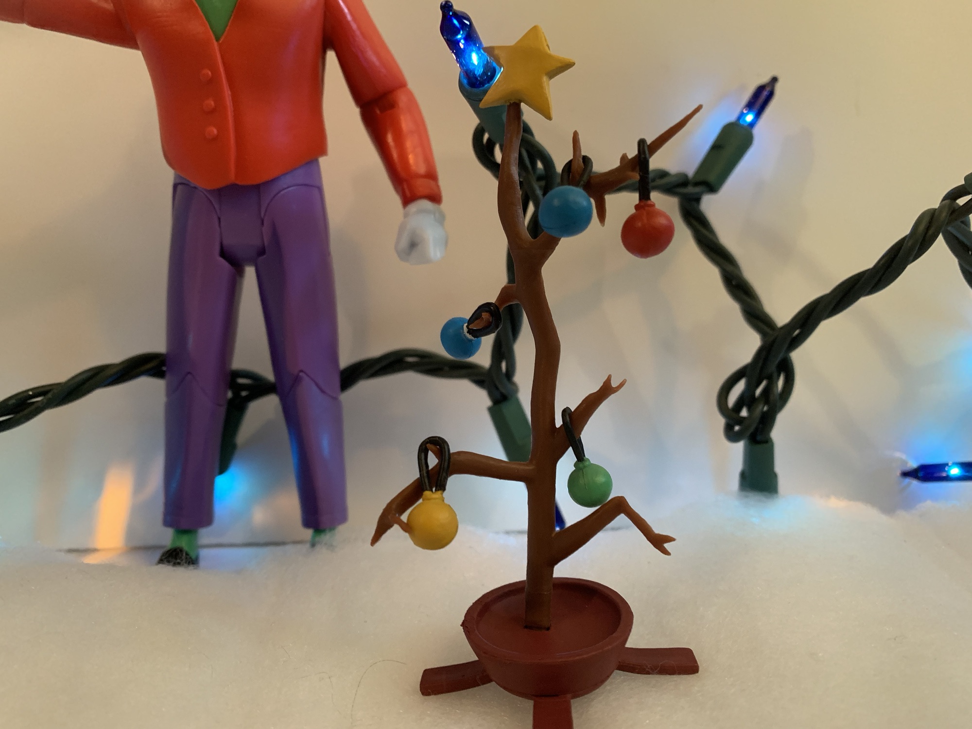
Joker’s sad little tree.
Joker one-ups the Teenage Mutant Ninja Turtles we looked at earlier this week by coming with his own Christmas tree. This tree makes Charlie Brown’s tree look robust by comparison as it’s really more of a stick. There isn’t a single needle left on this dead piece of pine and it has some twigs poking off of it from which ornaments can be hung. Joker comes with five ornaments: one red, yellow, and green and two blue. One of the blue ones should have a white star painted on the top, but McFarlane cut that from the budget. They’re all spherical with a plastic, black, loop molded onto them so they can be placed on the tree. I wish the loop was just a little bigger as it’s challenging to get them onto some of the smaller branches. Some aren’t angled well for an ornament and the plastic is kind of brittle. I had stress marks on one of the lower limbs as I tried to get a loop over it and had to abandon that idea. His candy cane hands can sort of pinch the hoops on these ornaments so he can hold them, which is a good design choice. There’s also a yellow-painted star molded to the top of the tree.
This little guy enjoys causing mayhem just as much as Joker.
Lastly, Joker comes with his little elf buddy, Laughy. He’s a hand puppet, but not the kind you stick your whole hand into. He’s literally Joker’s fist with a face painted onto the side with an elf costume molded to it. The paint is thick and flakey, but otherwise the hand looks pretty good. It plugs into Joker’s right arm and the fit is rather tight (compared with the incredibly loose alternate hands). There’s a standard, horizontal, hinge which is fine, but the limited range at the shoulder and Joker’s head make it hard for truly convincing posing. If his elbow could actually bend past 90 degrees that would have helped too. Even with the articulation limits, this is probably my favorite accessory of the bunch and I can’t see myself ever displaying Joker without it. Also included is the torso for Maxie Zeus as this is a build-a-figure wave. To complete Maxie you’ll need to also purchase Two-Face, Batgirl, and a Batman variant that’s an homage to an old Kenner toy. I did get Two-Face and if that Batman variant were at all desirable I might have convinced myself to get the rest to complete the figure, but there’s no way I’m spending 30 bucks on a terrible Batman figure.
“Wow Laughy, a shotgun? You shouldn’t have!”
This Christmas themed Joker figure is more or less what I expected. The articulation and overall feel of the figure is truly subpar, but in-line with the first wave of figures. I wish the paint on the Joker’s head was better, but at least the cel-shading is done reasonably well. I also wish he was cheaper, but considering I got the figure at a slight discount I guess I should feel a little better about it. For $30, I can only recommend this for the Christmas enthusiast who also happens to love Batman: The Animated Series. If a Christmas figure does nothing for you then the only reason to get this is for the build-a-figure part. From what I can tell based on the parts I have, the Maxie Zeus figure is going to be a lot like The Condiment King meaning the sculpt is above average, but the scale is way off. He’s a big boy, but hopefully he’s not as floppy in the hips as Condiment King for those who get him. I feel bad for those diehards who really want a Maxie Zeus (I personally did not care for that episode) because they have to get a Batman variant they probably don’t want as well as a holiday themed Joker they may or may not want. For those who don’t, hopefully there’s enough people like me out there willing to buy your unwanted Christmas Joker. At a reasonable discount, of course. That might be the best way to go about getting this guy.
For more Christmas figures or to see what inspired this release check out the below:
Ho! Ho! Ho! It’s the jolly one – Santa Claus! Oh, wait, no, it’s the somber, moody, one: Batman Santa! Yes, it’s our first Christmas themed post of 2023 and it’s an action figure review – shocking, I know. McFarlane Toys has held the DC license for several years now, but this is my first…
Episode Number: 2 Original Air Date: November 13, 1992 Directed By: Kent Butterworth Written By: Eddie Gorodetsky First Appearance(s): Robin, Joker, Summer Gleason, Arkham Asylum An interesting choice for a second episode of a series. It’s a Christmas episode, which feels kind of inline with Batman thanks to Batman Returns. It’s also the debut of…
It was looking like we were in for a photo finish this year. Last year, toymaker Fresh Monkey Fiction partnered with online retailer Big Bad Toy Store to launch the Naughty or Nice collection. Structured similar to a Kickstarter campaign, FMF posted several action figures for preorder with a minimum order quantity needed for the…
The lineup for McFarlane’s first wave of dedicated Batman: The Animated Series action figures.
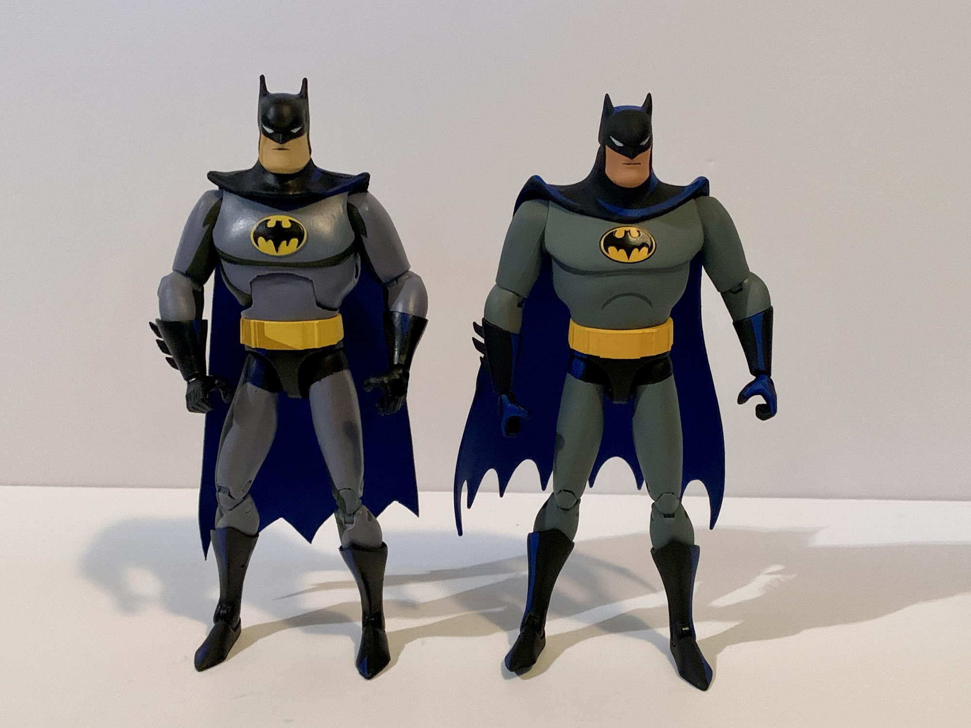
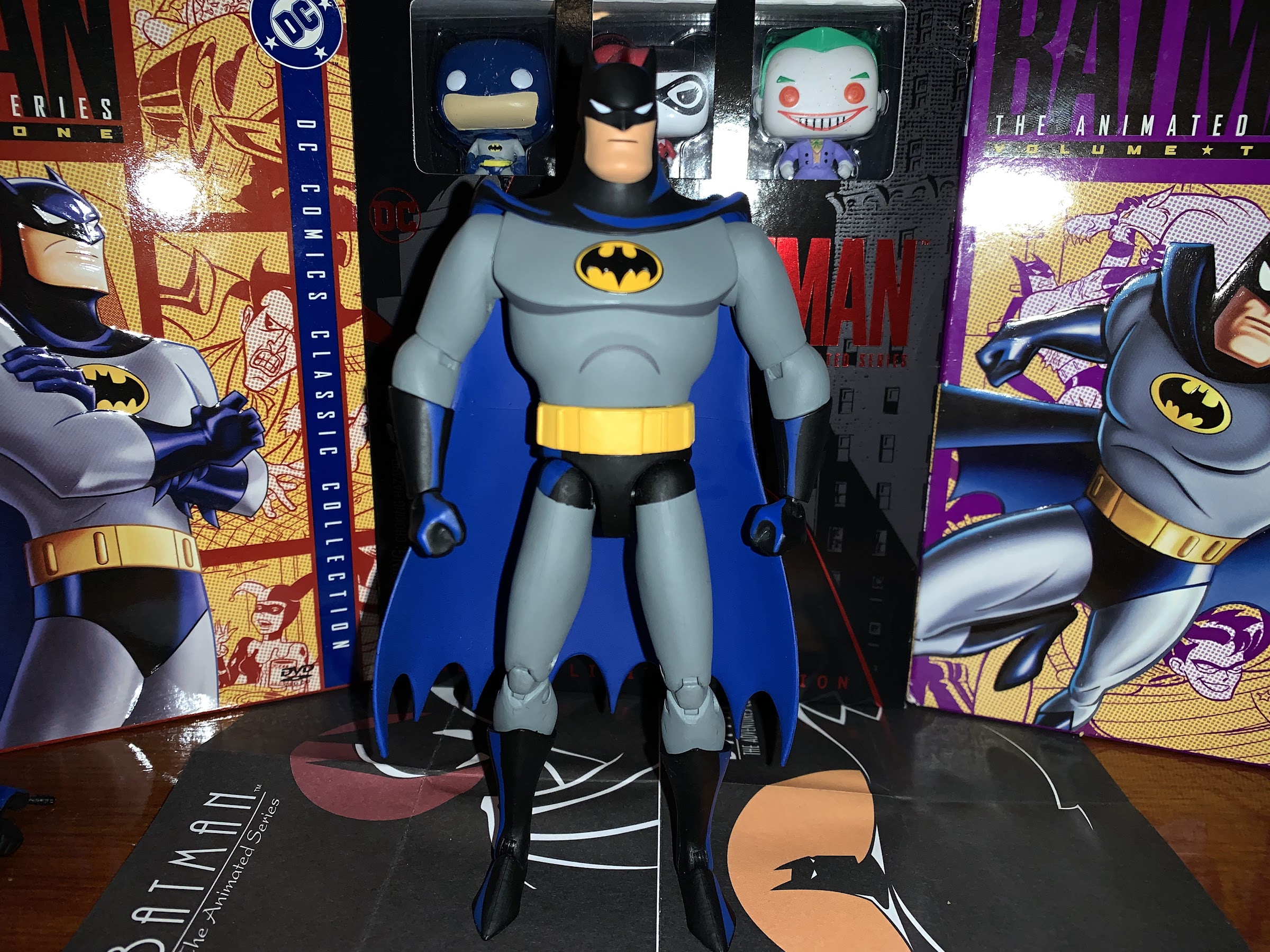
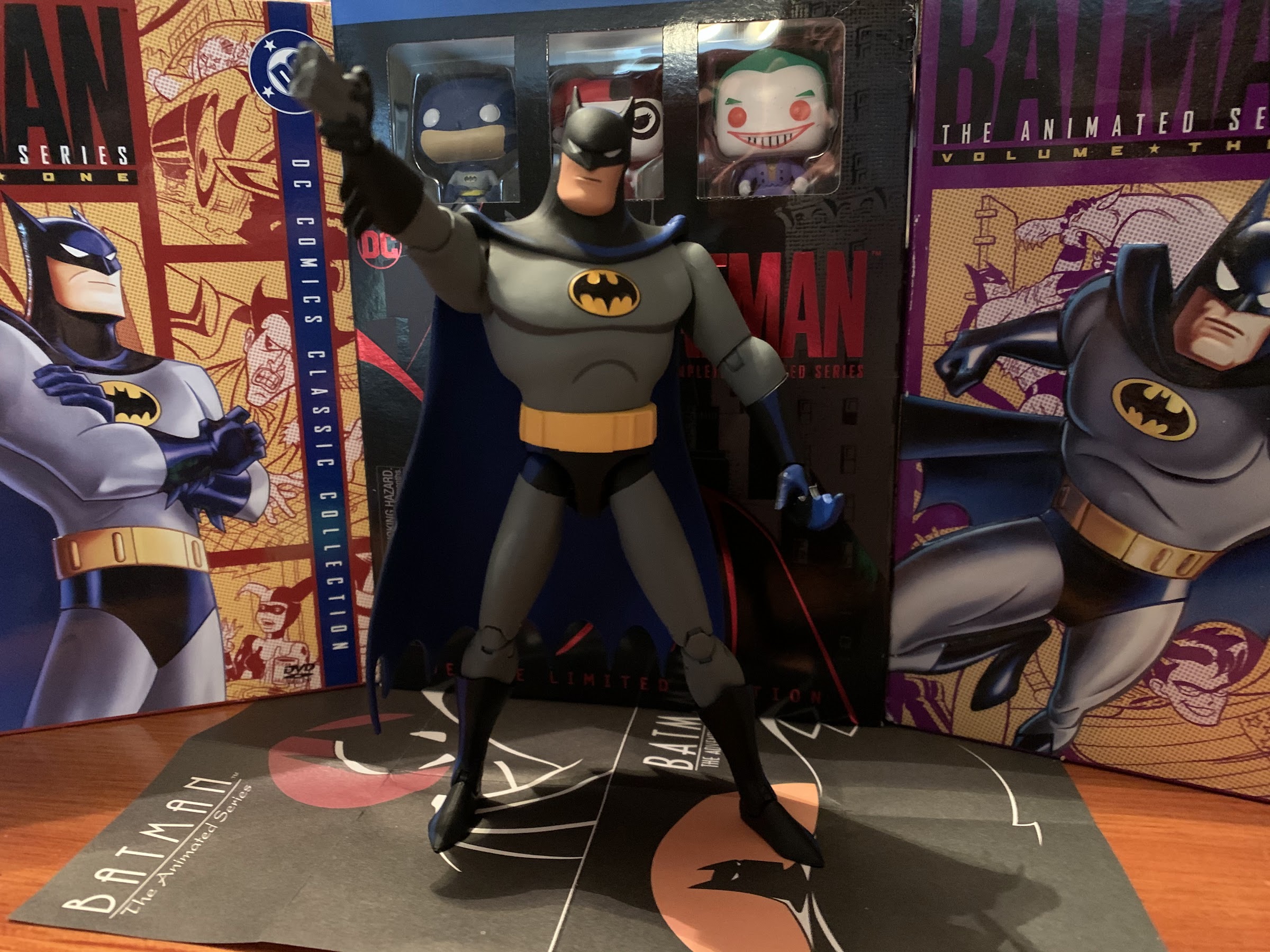
Years ago, perhaps as many as 10 or more, DC Direct was filling comic book stores around the country with action figures based on the classic cartoon series Batman: The Animated Series. The figures were stylized to resemble their onscreen counterparts and it was a line that included many of the characters from the show as well as multiple vehicles. Eventually, DC (or parent company Warner Bros.) decided it no longer wanted in on the action figure market. The branch of the company devoted to toys was dissolved and the license was sold to McFarlane Toys. Since then, Todd’s company has devoted many resources to its DC Multiverse line which is sold at big box retail as well as specialty. The 1:10 line features more variations of characters than I can count and it has its own distinct style. Early in the line, a Batman based on BTAS was even released, though it wasn’t something that I found particularly enticing.
Here is your comparison to what DC Direct was doing in its final days and what we’re getting from McFarlane.
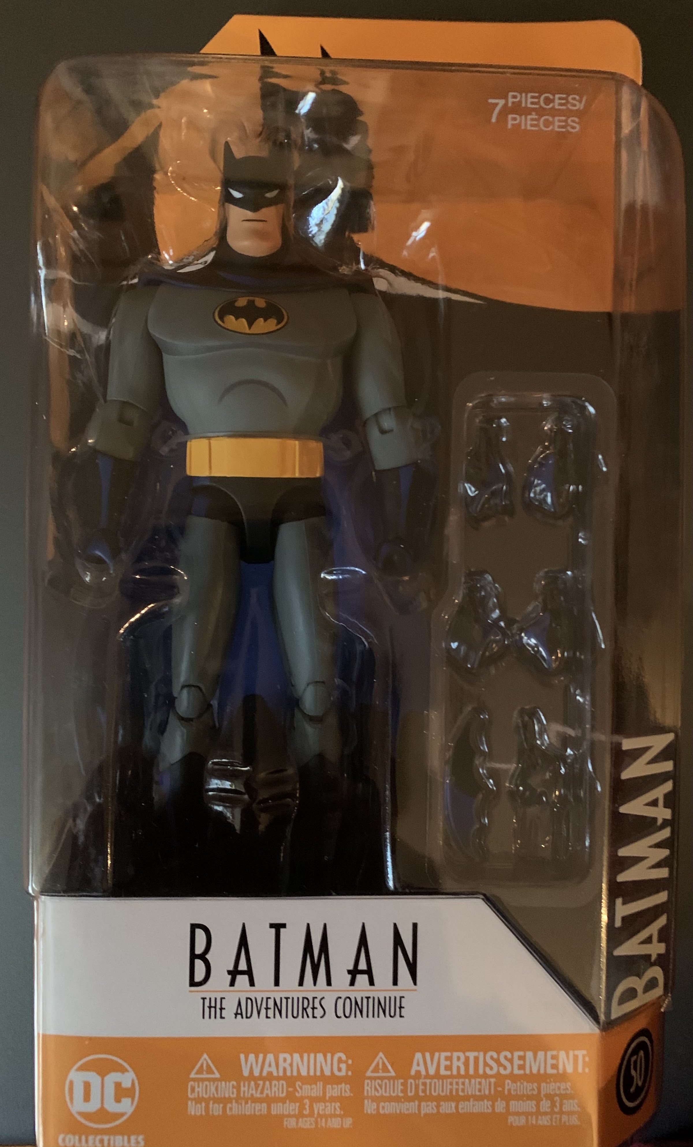
When the DC Direct line was alive and well, I wasn’t really in the collecting game. By the time I got back into it, I was left a little underwhelmed by the offerings available to me. They weren’t cheap, were quite limited in terms of articulation, and it wasn’t an evergreen line where characters were easily attainable. Instead, it was more of a blink and you miss it kind of deal. Towards the end of the line, there were some reissues and I would end up getting the last standard Batman from the line which featured the new tagline of The Adventures Continue. That Batman is fine. The likeness is good enough even if the articulation is pretty poor. It was retooled to have better hips and the paint job was more ambitious and a marked improvement over the Batmen to come before it. I would also add a Gray Ghost, purely out of nostalgia, but any ideas I had on getting more of the figures was pretty much dashed by the absurd aftermarket prices that had emerged. Figures were selling for hundreds of dollars and I just wasn’t interested.
The big selling point for the McFarlane line is the build-a-figure inclusion.
Last year, McFarlane made the wise move to begin reissuing these long out of production figures. McFarlane apparently has access to the molds so this was a pretty low cost way to get some characters out into the wild that fans have been clamoring for. The first wave arrived about a year ago now, but I’m just getting to it for reasons that will become clear as we move along. That first wave consisted of Batman, Robin, Mr. Freeze, Scarecrow, with a build-a-figure of The Condiment King. All four of the retail figures are straight reissues of past DCD offerings with the only new sculpt being The Condiment King. To differentiate these from the other figures, and perhaps to not crater their aftermarket value and risk angering their fanbase, a new deco was applied to each figure and the packaging is all new. These come in oversized window boxes that are honestly way bigger than they need to be, but whatever. It’s just the trash that surrounds the figure. Is this return to stores what fans and collectors have been waiting for? Read on and find out, though you may not like the answer.
What do we think of McFarlane’s attempt at cel-shading?
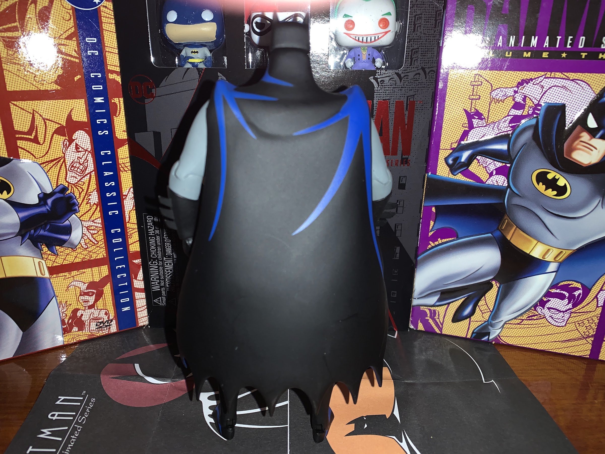
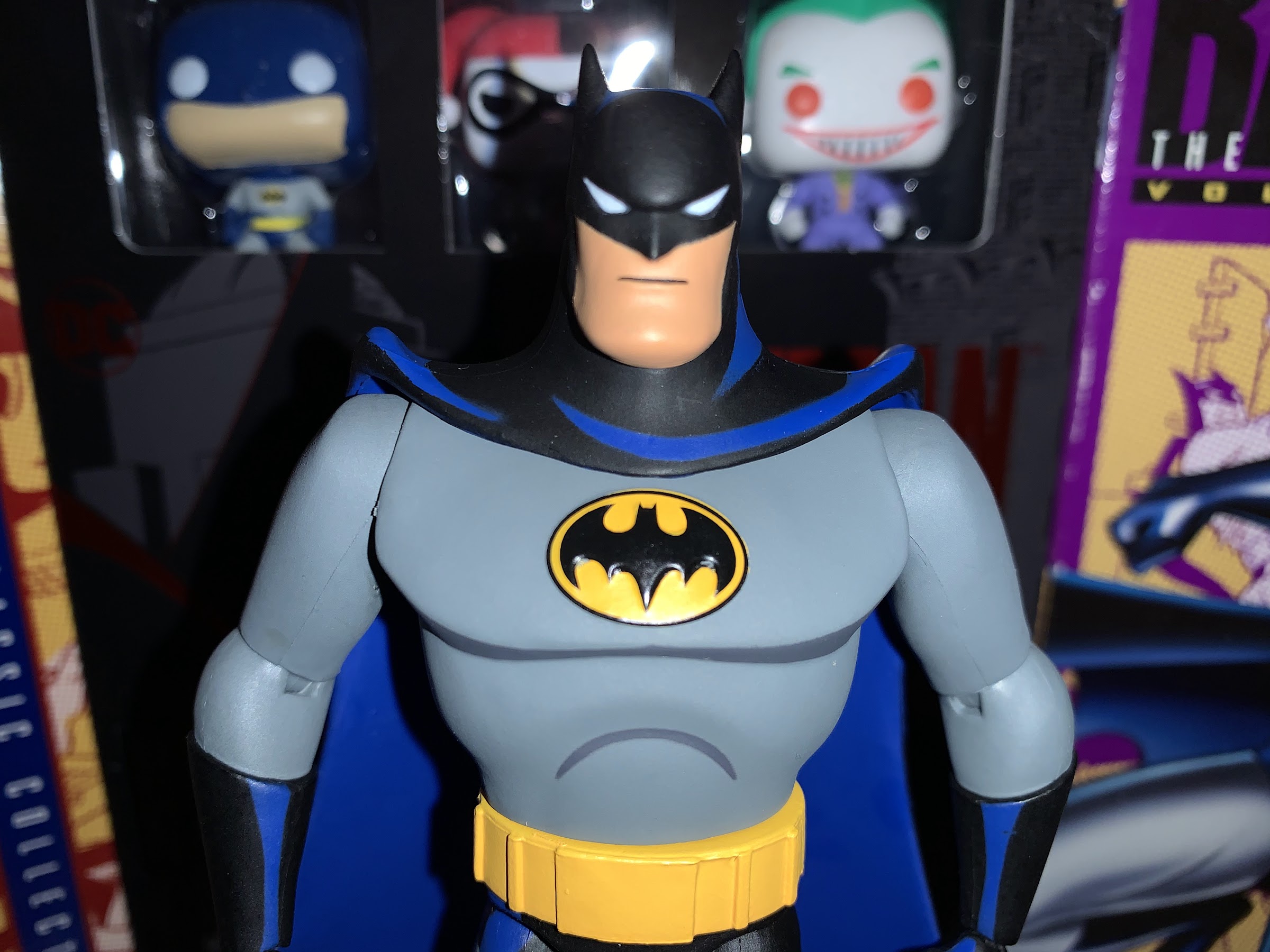
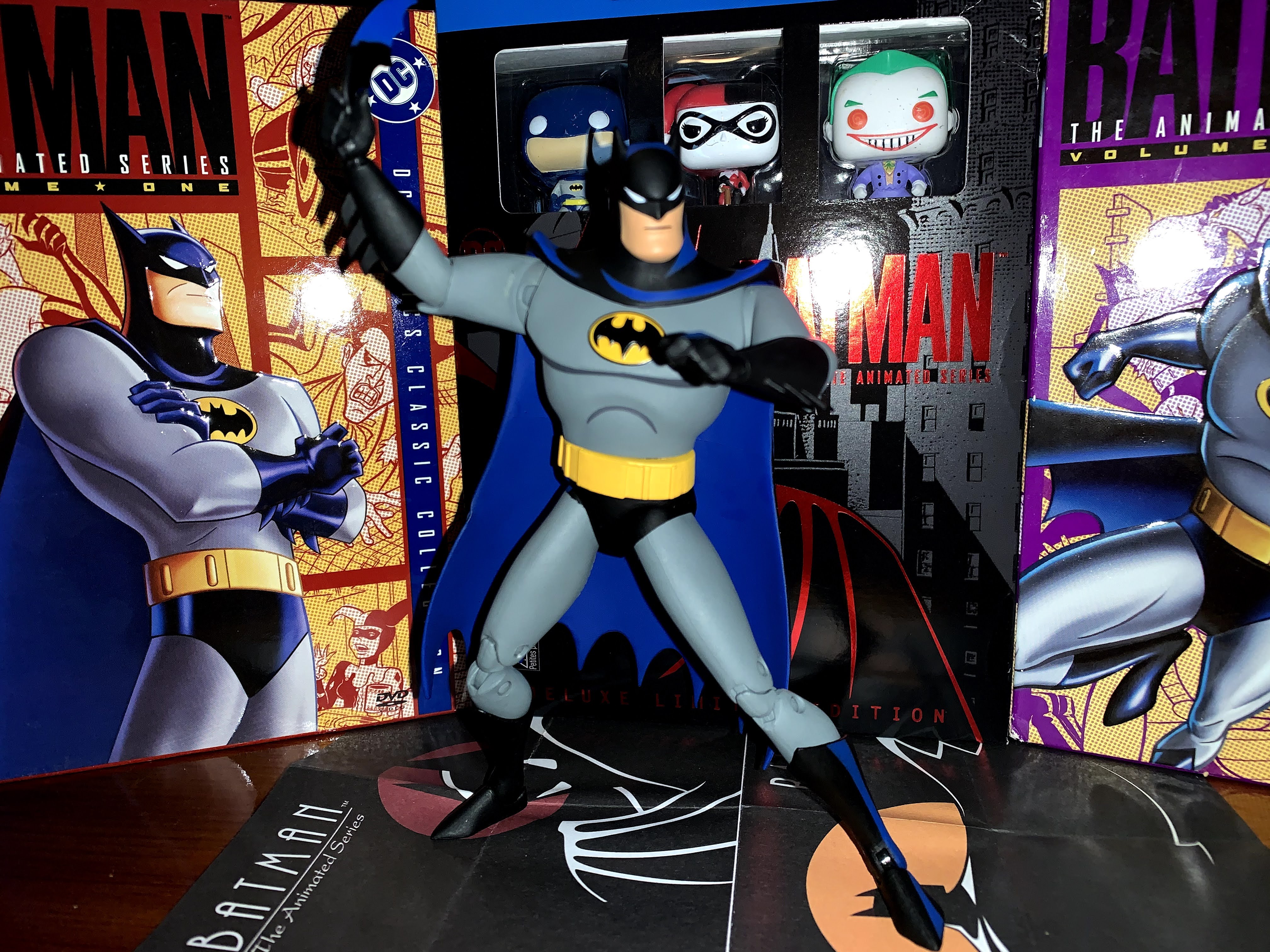
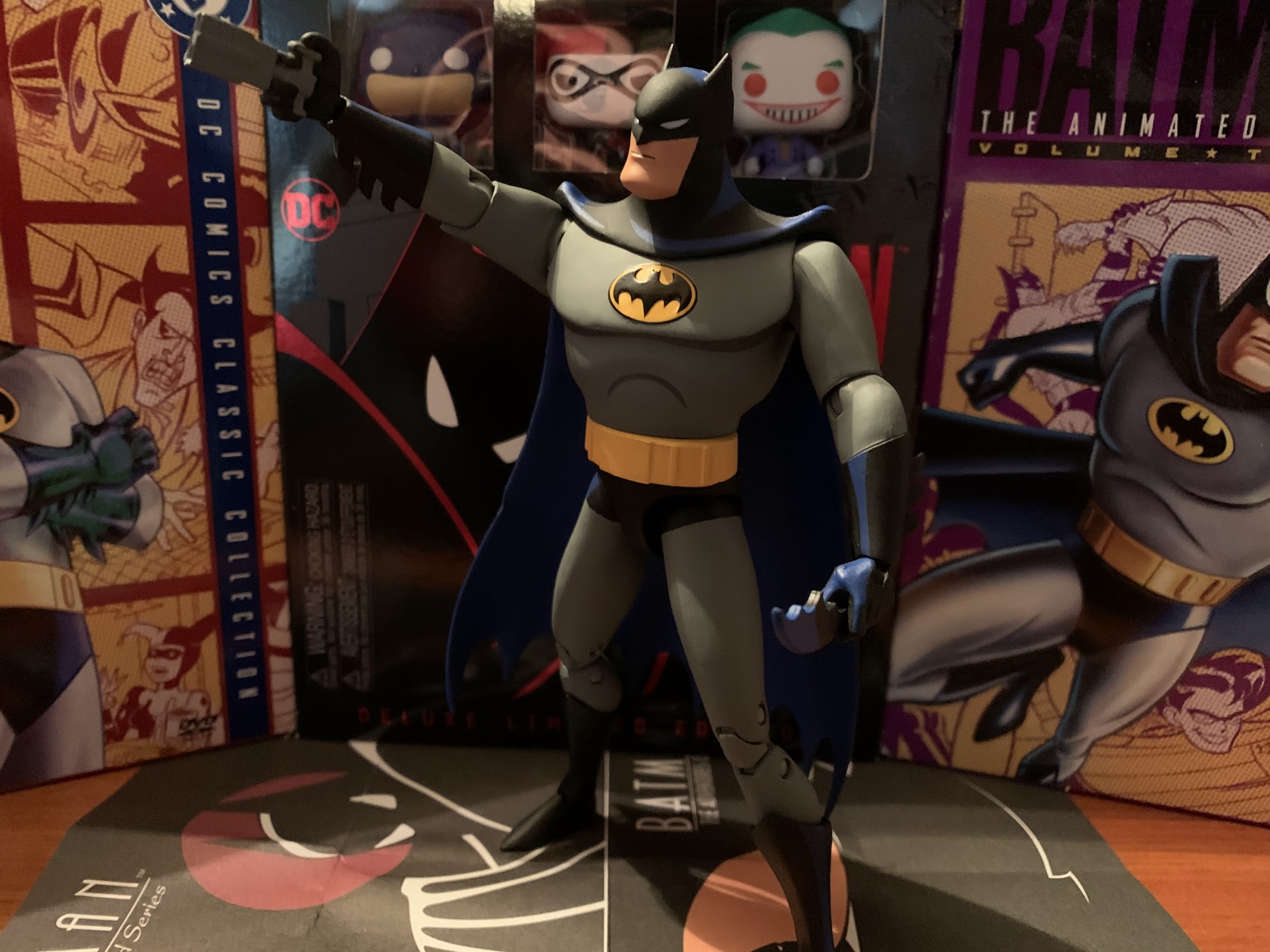
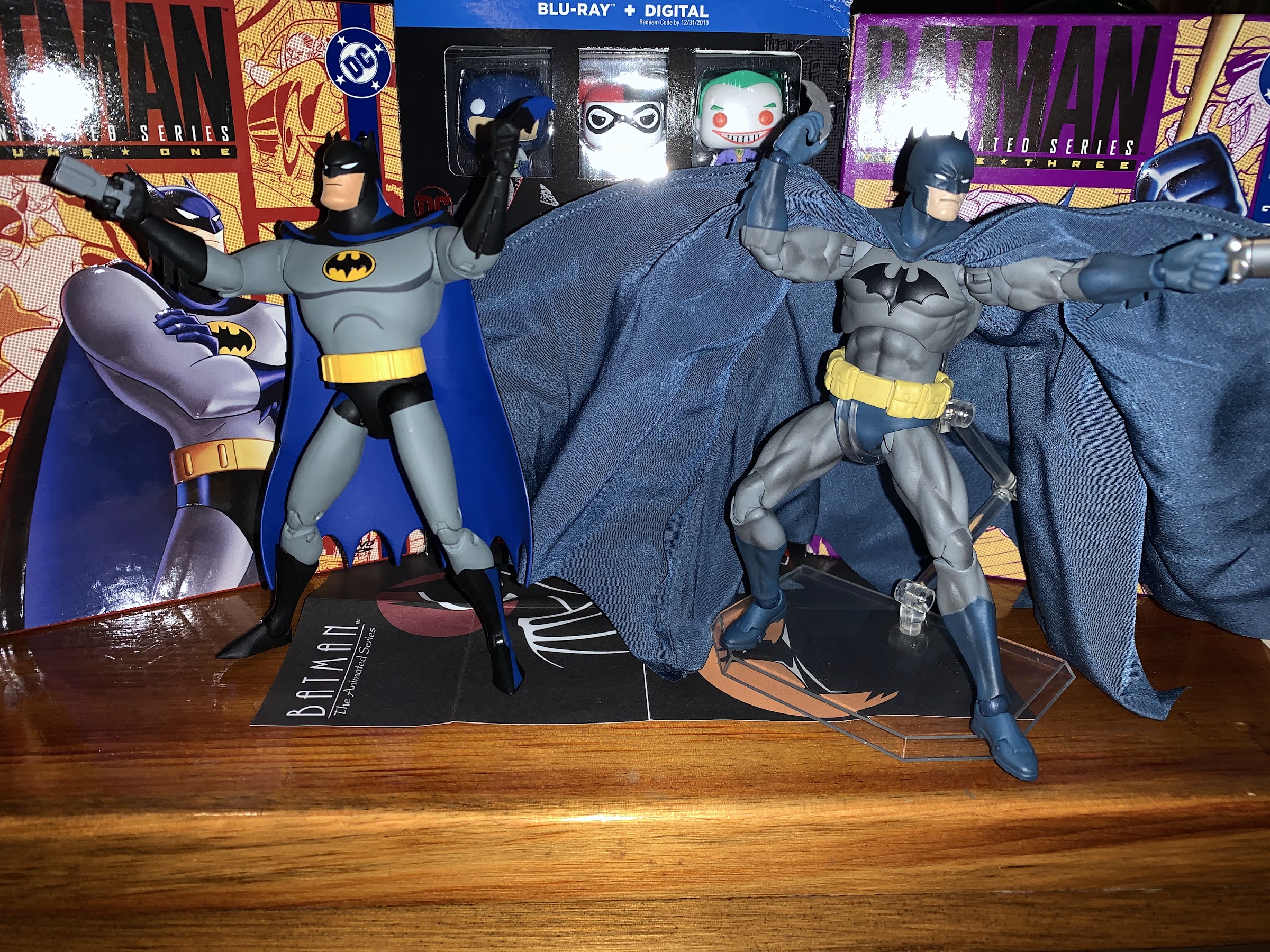
Let’s start with Batman. This is a reissue of the Batman that came with the Batcycle. He has a soft goods cape and an ab crunch to help make getting him on the bike a little easier. It’s a less attractive figure as a result, but what are you going to do? The main thing that’s going to stick out is the paint job, and that’s going to be true for basically all of these figures. McFarlane decided to attempt cel-shading with these figures. The final Batman from DCD did the same thing to fantastic results. There was blue in the cape, a little gray under the pectorals, and hits of blue on the gloves and boots. It was subtle, but very evocative of the show. This Batman does none of that. He has this ugly brown smear along the side of his face, a dark gray that’s slapped on the side of his body without much regard for anything, and very little blue one the boots and gloves. It’s hideous. DCD gave you the blueprint, McFarlane, why couldn’t you just follow that?
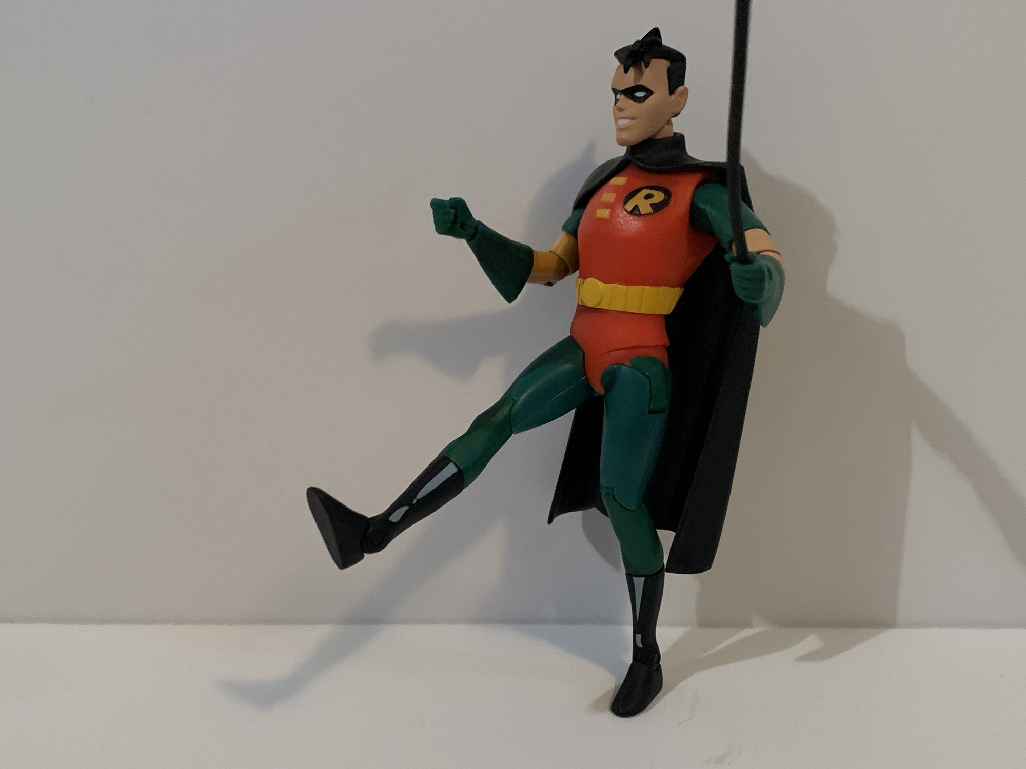
Robin and Freeze get these goofy-ass hips.
Unfortunately, the same is mostly true for the rest. Robin looks almost as bad as Batman with the same brown on his face, but the red and green of his costume at least works better with the shading. They completely missed the yellow on the inside of the cape which is also plastic so he won’t work as well with vehicles as Batman. Mr. Freeze has some pretty atrocious cel-shading as well, though it doesn’t appear to be as heavy as it is with Batman. Scarecrow is the only one who doesn’t look awful, but that’s because his costume of brown and red works better with the shading. It’s barely visible on the red portions while the dark brown doesn’t clash all that poorly. This is also second appearance Scarecrow and, overall, he looks the best of the bunch in terms of being on-model. Mr. Freeze would place second if this were a competition, but he’s too small and his oxygen tank is the wrong color. I don’t think scale is a strength of the line. Robin looks more like a reinterpretation of his old Kenner figure with the big head and dopey grin while Batman just plain looks bad.
It’s a lot of stuff, but how much of it is useful?
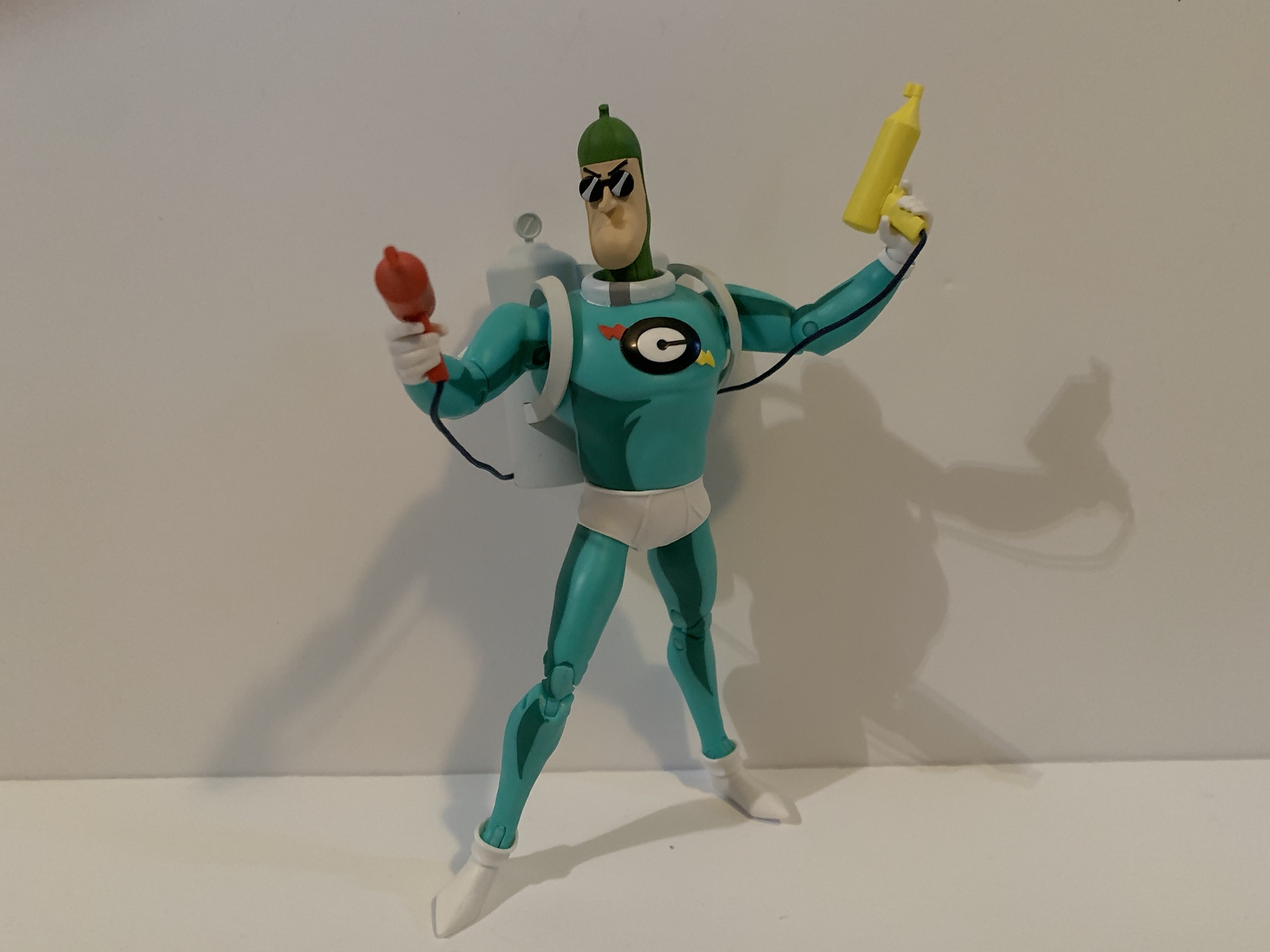
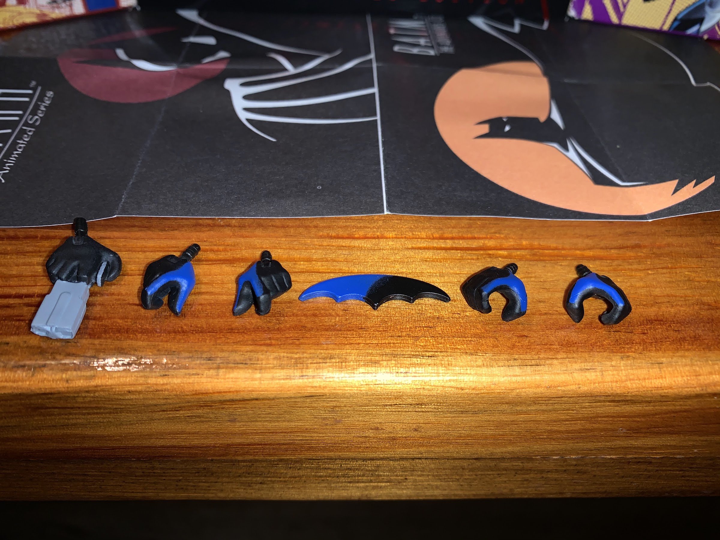
Each character does come with accessories. For Batman, it’s a bunch of hands including one with a grapnel gun molded in. He also has a Batarang that’s all black. He has fists, gripping hands, and Batarang hands plus a stand-alone grapnel gun that’s all black. Robin has fists, relaxed hands, gripping hands, and a hand with a molded grapnel gun in it. He also has a bollo that’s just a long piece of plastic. It would have looked better with a whirling effect. Scarecrow has open hands, a gripping right hand, and a left fist, plus an unmasked portrait. The gripping hand is for his scythe which looks pretty good, though I wish he came with two gripping hands or that the one gripping hand actually worked better. Freeze has his freeze gun and then a whole bunch of hands: fists, trigger hands, gripping hands, clenching hands, and open hands. The clenching and gripping hands look specific, like maybe he was supposed to have more accessories (a snow globe, perhaps) that were cut. It’s a comical amount of hands though for a guy who is just going to stand there holding his gun.
That’s not impressive…
Which brings us to articulation, which was never this line’s strong suit and part of that is due to the character designs. We’re talking ball peg heads, ball-hinge shoulders, single elbows, and wrists that swivel and hinge horizontally. Nobody has good range anywhere, save for maybe the head, but it’s at the hips where things get weird. Batman has updated ball socket hips so he can kick forward a reasonable amount and almost do splits. Scarecrow does too, only his range is terrible, but he has a thigh swivel built-in (Batman does not). Freeze and Robin have these awful hinge and peg hips. The hinge leaves this T shape in the cut on the side of the thigh. It allows for full splits, but looks ridiculous and is one of the ugliest joints ever conceived. Neither character can kick forward worth a damn too. All of the figures have double-jointed knees except for Freeze and Robin. Even without the extra hinge, Freeze can still bend his knee 90 degrees. Robin cannot. All of the figures have a swivel and hinge at the ankle with only Batman and Robin having an ankle rocker. Everyone except Scarecrow has a boot cut. The combination of poor articulation and tiny feet make all but Freeze tough to stand. He has large, boxy, feet so it’s not an issue, but his arms are the most limited because of his design. I wasn’t sure if he even had elbow cuts. They’re there, but functionally useless. He’s also the only one without a waist twist.
I like Condiment King’s sculpt and the paint is acceptable, but why is he so big? And I have him lurched forward a bit here just to get him to stand. In other words, this picture makes him look smaller than he is.
Given that these are all old molds and exclusive to Target you would think they’d come at a friendly price. They do not as all of them retail for around $30. Of course, if you get all four then you get a bonus fifth figure in The Condiment King. He is all new and comes with his backpack and twin guns: ketchup and mustard. The guns connect via a thread to the backpack so it limits his posing, but at least they’re here. As for the sculpt, it looks fine. Great even. This is one of the show’s silliest characters and it’s a fun inclusion as a BAF. It might not be the type of character everyone needs, but the hardcore will enjoy building him. His light blue costume with white accents is done well enough. Yes, there’s cel-shading, but it’s not as bad as it is with some of the others. The only spot I hate is the brown smear on the side of his face. Articulation is satisfactory for the line as he has single elbows but double joints at the knee and ball-socket hips, it’s just that the hips are way too loose. Combine that with the backpack and this is one tough figure to stand. The build quality of the guns is also questionable as the handle of the ketchup gun came off when I tried inserting it into his hand. It looks like the guns were molded in two pieces to get the string inside so it’s nothing a little glue can’t remedy, but still annoying. By far though, the biggest issue I have with Condiment King is his size. He’s way too big. He stands around 6.75″ to Batman’s 6.25″. He’s just overall big when in the show he’s just some guy who went nuts. He looks like he’d be more than a match for Batman at this size. It’s almost like he’s from an entirely different toyline.
I mostly just wanted these two. Freeze still sucks for 30 bucks, but Scarecrow? He’s at least okay, though he can barely stand or hold onto his scythe.
Is $120 for 5 figures of worth it? It could be, but not these figures. The paint is not only a bad fit, it’s sloppy too. Batman’s cape feels cheap and the articulation cuts for his torso and the hips on Freeze and Robin are truly hideous. Scarecrow is the only figure of the five that comes close to earning his value, but he still doesn’t feel like a 30 dollar toy. All of them feel very fragile and very cheap. Moving these thin limbs, swapping the hands, all feel terrible. I don’t like handling these figures so I guess it’s good that they don’t pose well since the temptation to change things up isn’t really there.
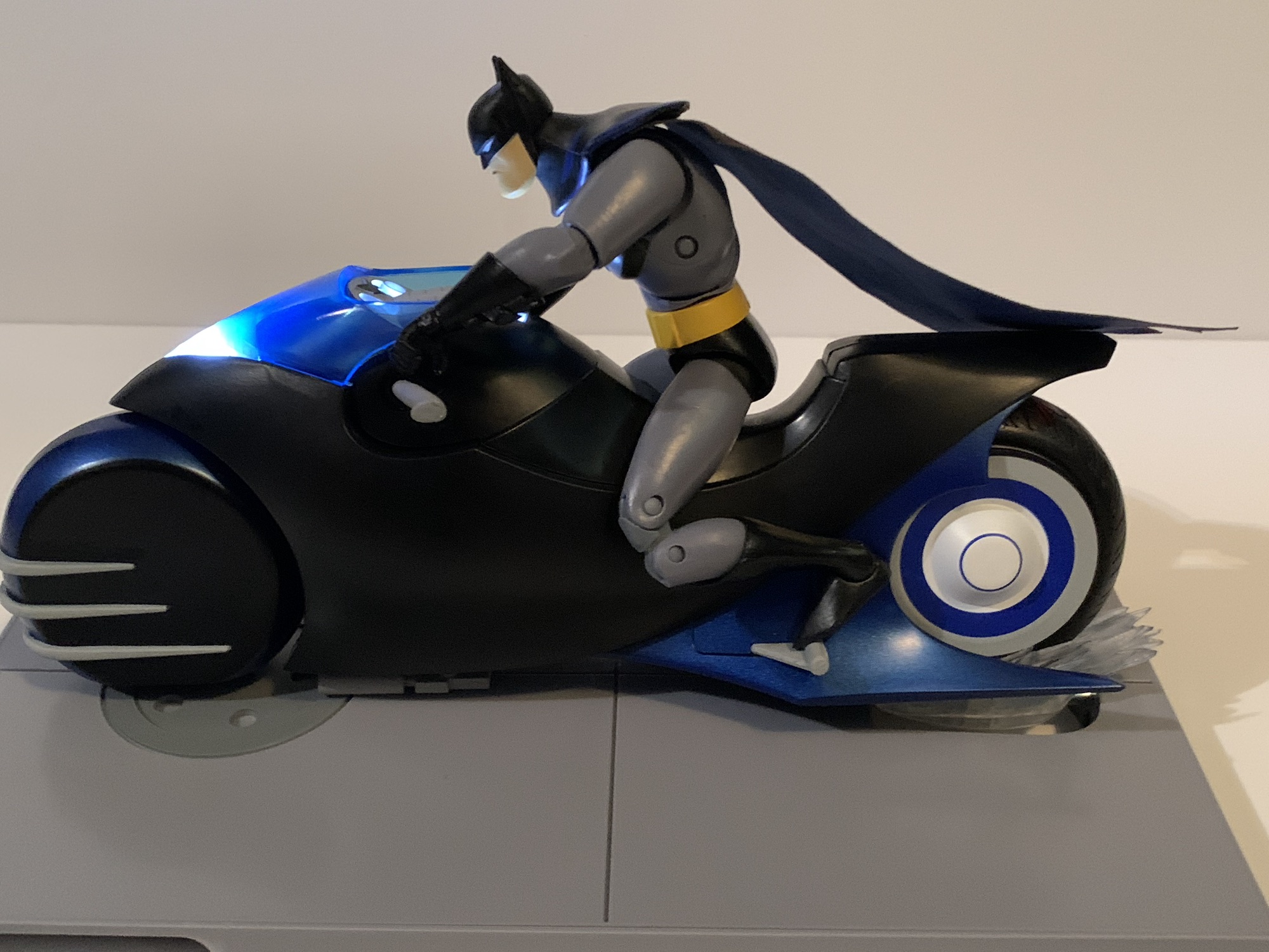
The Batcycle is pretty cool, though even with the added ab crunch this Batman can struggle to sit on it in a convincing manner.
What drove me to make this post though was where I did find some deals: the vehicles. McFarlane has not only reissued the figures, it’s also reissued the Batcycle and Batmobile with the Batwing also on the way (there’s also a Jokermobile, which was supposed to be a part of the old DCD line, but was cancelled). Initially, these vehicles were pricy, but still enticing, but I got both on sale. For the Batcycle, I think MSRP was 40 or 50 bucks, but I got it down to $10. At full price, it’s not bad, but at ten bucks it’s a real steal. It’s a straight re-release of the old bike including the base. It has battery operated lights, though you have to hold in the button on the bottom of the bike for them to be on as opposed to a switch. The base is reversible and can either resemble the Batcave or just a street and it allows for the bike to be tilted and there’s a little swoosh effect too. Instead of being all black, it’s now cel-shaded, but it turned out great! There’s a nice use of blue on it that really makes it resemble the bike from the show. And if you want Batman to play it safe, it also comes with a new head for Batman that features a helmet. They should have tossed in the same for Robin, but I probably wouldn’t use it anyway. The head looks fine, though it features a pale complexion. The tires are rubber and the thing feels solid. For what it is, it’s terrific.
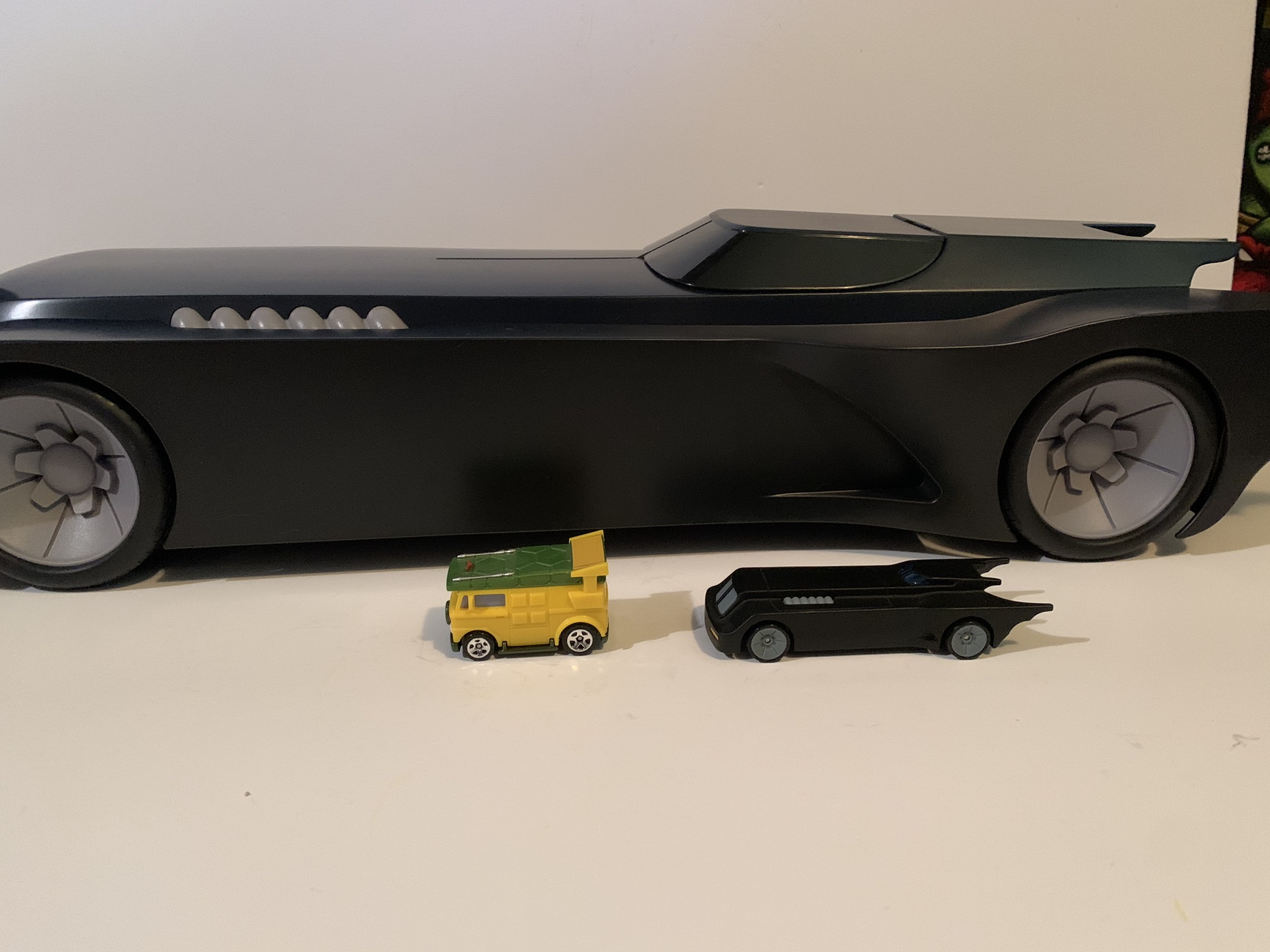
The Batmobile is big. The last image on the right is with a standard Hot Wheels Turtle Van and the oversized Batmobile, not the standard Hot Wheels edition.
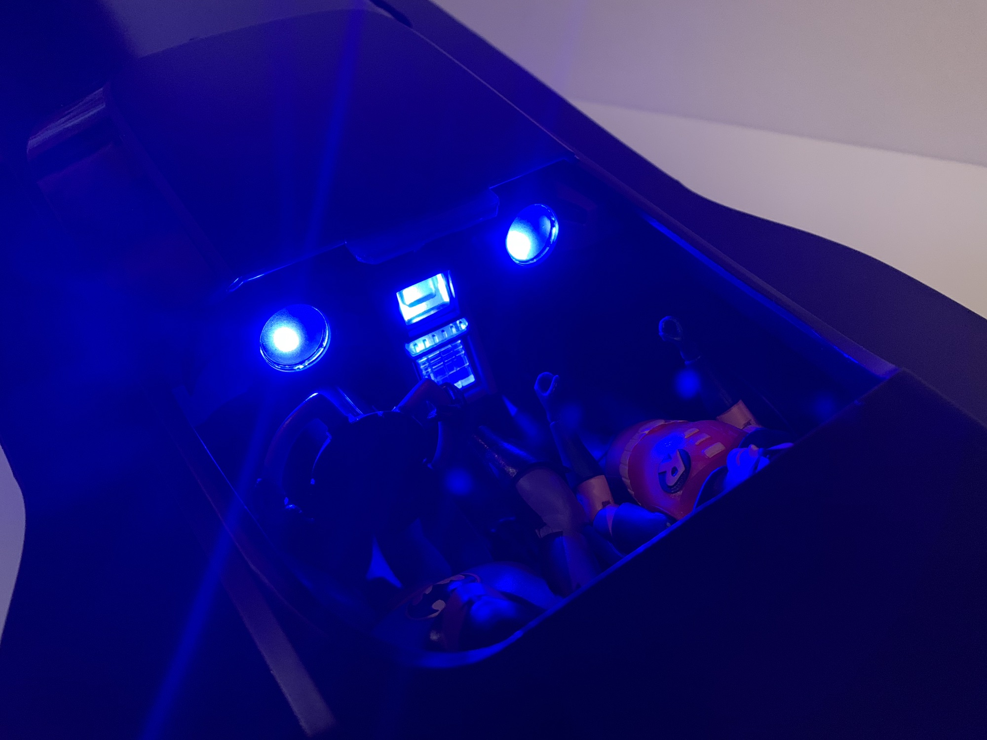
The Batmobile is quite similar in that regard. It’s not fully painted out like the bike, but the sides are black and the top is a dark blue which helps it to resemble the look of the car in the show better than the original all black edition. The canopy slides forward and there’s room for two figures inside. The steering wheel telescopes which makes it easier to get figures in and out. The dashboard is all transparent plastic because this has a light-up feature as well for headlights, interior, rear lights, and the thruster in the back. Oh, and did I mention it’s big? This thing is a shelf hog measuring about 25.5″ long and a little over 8.5″ at its widest. It is a mostly hollow, plastic, box so it doesn’t have as nice a feel as the Batcycle. It does have nice wheels though that are rubber and the front ones can turn, though they are not connected to the steering wheel. The MSRP for this thing is $80, but I got it on sale for $40. Some people have found it for as low as $23! At $80, it’s a luxury item for the Batman enthusiast that has the room for it. At $40, it’s a great deal for the Batman fan that maybe doesn’t know what to do with it, but will figure it out in time. At anything less than that it’s a simple no-brainer. I’m not one who buys toys as an investment, but if you get a Batmobile for under forty bucks and sit on it for a year you’ll probably make some money.
The lights are pretty nifty, and two figures can fit inside though Robin’s lack of a soft goods cape means he’ll sit rather wonky.
What do we make of McFarlane’s foray into this old BTAS toy line? On one hand, I think it’s great that these molds are back out in the wild. I got Freeze and Scarecrow last year because I love Mr. Freeze and I thought Scarecrow looked good. I only recently got Batman and Robin because I wanted them for the Batmobile. Target lured me in with a sweet deal on that Batmobile and in turn got me to spend another sixty bucks (clever girl) I wouldn’t have otherwise. I think Scarecrow is fine, he’s limited, but he looks the part and I think aesthetics are what collectors are after most with a BTAS line. The Condiment King, if he was packed as a stand-alone figure, would be okay as well though I wouldn’t feel good about spending 30 bucks on it. Freeze is imperfect and too expensive while Batman and Robin are pretty bad. Why did I convince myself I needed them just to stuff in a toy car? I don’t know. It was more of a need for Batman, and then with only one figure shy of a Condiment King I figured why not get Robin? My older DCD Batman could not fit in the Batmobile with his sturdy, plastic, cape, plus he actually looks good and I don’t want him hidden. I’m fine hiding these two.
The figures are overpriced and kind of blow, but the Batmobile is pretty cool.
All that is to say, try and track down an actual DC Direct Batman if you want a Batman from this line. This one and Robin just aren’t worth it and unlike the vehicles, they seem to never go on sale. Mr. Freeze and Scarecrow aren’t worth your 30 dollars either, but if you do get Scarecrow you at least may not regret it in time since he looks fine. The vehicles are great though. If you have a DCD collection and passed on them then I think you should reconsider. Especially the Batcycle which looks pretty cool and isn’t too hard to fit into a display. The Batmobile presents obvious space concerns and I still don’t know where it’s going to end up in my house, but it’s an okay problem to have and now I’m wondering if I should consider the gargantuan Batwing. I shouldn’t, but if it ends up at Target for 40 bucks then I can’t be held responsible for my actions. As for the line itself, I wish McFarlane would spend a little to improve these figures. Better hips, better ankles, and figure out how to do proper cel-shading or just give up. No one will be angry if it goes away. This line is fueled only by a love of the show because if there was a better option out there then surely most would get that. Unfortunately, there isn’t and there likely won’t be in this scale anytime soon.
There aren’t a ton of Batman toy reviews here, but we do have some:
If you’re a repeat visitor here at The Nostalgia Spot, then you’ve probably noticed that around here there is a high opinion of the television show Batman – The Animated Series. I did a re-watch of the series that spanned more than two years and also checked out the various films based on the property.…
I’m not much of a car collector, but when I was a kid I went through a Hot Wheels and Matchbox phase. My favorite car was a small, black, one that I only barely remember. I have no idea what make or model the car was, but what I liked about it was that it…
I have long maintained that the best episode of the now classic Batman: The Animated Series is the Mr. Freeze story, “Heart of Ice.” It is not, however, my favorite episode of the show as that honor belongs to “Beware the Gray Ghost.” That episode introduced the character Gray Ghost, a superhero from television who…
When it comes to the world of more high end action figure collectibles, I’ve been able to get my hands on a few. Some rather prominent companies have yet to cross my path though, and it’s not really for any reason other than they either don’t make what I like or I don’t really like what they make. Mezco is more of the latter as their approach to superhero characters with soft goods come out looking like Mego to me. There’s nothing wrong with that aesthetic, if you like it that’s fine, but me personally? Not really. And it’s definitely not something I have any interest in spending upwards of 90 to 100 dollars on. The company seems to have a really dedicated following though so there’s obviously a market for what they do. As for the company itself, I’ve heard mixed things. I’ve read too many horror stories from people trying to get a replacement for a defective product and having their concerns go unanswered. The company is known for its lengthy delays on product with zero communication about where any of it is. And they do the thing that a lot of companies do where they launch something with rendered images and the waiting to actually see what the figure will look like usually lasts until release.
This body takes some getting used to.
The Bat Ass.
Needless to say, I’ve approached the company with some degree of trepidation. I’ve been able to ignore most releases from Mezco because I just don’t like the product, but the one that did catch my eye was their reveal of Batman from the 1989 film of the same name released on this day 34 years ago. The Michael Keaton version of the dark knight has always been a favorite of mine. It fits right in with the theme of this blog as Keaton’s Batman was my introduction to a more grim version of the character. Prior to the Tim Burton-directed film showing up on my television (my family rarely saw films in the theater when I was a kid) my only point of reference for Batman was the Adam West version. No disrespect to Mr. West and his show, which I adore for different reasons, but this Batman was an all together different animal. I had lots of the Toy Biz and Kenner releases that tied-in with that film and its sequel and Batman was a pretty big deal following the release of that film for basically the rest of time. The funny thing with that film though is that most attempts at action figures have failed to “wow” me. I’ve basically disliked them all for one reason or another and the best ones have all been in larger scales that I’d rather not collect. When Mezco showed off their version, it was the first time where I saw that depiction of Batman in a 1:12 scale that I felt matched up the 1:4 or 1:6 scale figures out there. Once I was able to get over the price, I did commit to buying one. And then the wait began. And it went on and on and on….
He moves reasonably well, but there’s a fear element that comes into play every time.
That’s about as far as I dare go with a kick.
Three years! That’s how long it took for this product to go from flashy internet pictures to reality. No excuse has been given as to why it took so long. Mezco would just put up a release window, and when that came and went they’d bump it to the next quarter and we did that dance for years. Did they have issues with the license? Maybe, but a lot of companies have their hands in Batman so that seems unlikely. Was it this new-fangled seamless body they had been working on? Very possible, but it’s not something they haven’t attempted before. Maybe they were forced to time it to the release of The Flash which features Keaton’s Batman? Again, maybe, but probably not from the start. If such a mandate came down it was probably pretty late in the game. Did Mezco have cash issues? I don’t know, but I suppose you can never rule it out. For whatever reason, it took a long time for this figure to get to me. I had honestly given up on ever seeing it. I wasn’t that worried about it since I ordered through Big Bad Toy Store so I didn’t pay upfront. Those who had through Mezco certainly had more to worry about and more to be angry about, at that. They all got their figure a couple of months ago, as they should. I had to wait a little while longer and in the interim I’ve often found myself not really knowing how to feel about this one. I normally avoid reviews of anything I plan to review myself, but my curiosity got the better of me with this release. Now that I have my own figure in-hand, I’m still sorting out my feelings on this one.
The white residue is annoying and seems to have accumulated the most under the arms.
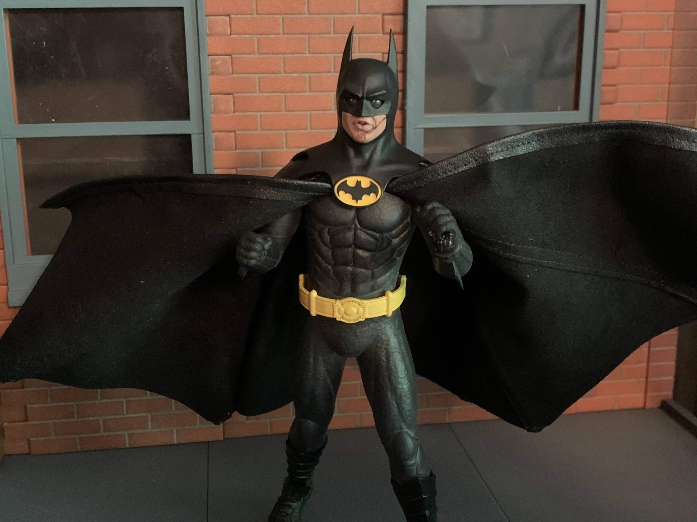
Batman arrives in a plain, but somewhat flashy, box. It’s all black with the film’s logo on it which is honestly how it should be. Inside, the figure and its many accessories are housed on a tray and everything is packaged rather well which is obviously a good thing. If you’re going to charge as much as Mezco does, then you damn well better make sure the product gets to people in good shape. Out of his packaging, Batman stands at right around 6.25″ to the top of his head. Michael Keaton is not an especially tall man meaning this figure isn’t true 1:12 scale, but it’s fine. The film often did its best to try and shoot Keaton from angles that kind of hid how short he is. Low angles and isolated shots were relied on with the one scene that really broke from that being Batman’s run from the Joker with Ms. Vale in tow. And wouldn’t you know, he kind of looks goofy in some of those shots. Mezco took some liberties with his height, but also with the cowl. I may prefer the 1989 movie, but when it comes to costumes I much prefer his look from Batman Returns. Well, the cowl anyway. I could take or leave the armored torso of that film, but the cowl was more stream-lined and appeared to be made of a thinner material. In the first film, it’s more rounded on the sides and quite thick. It did help it to cast more shadows around his mouth and eyes, but at the cost of almost looking squished. Mezco’s take on the cowl strikes me as somewhere in-between the 89 version and the one we see in Returns. And it looks pretty good. I see the Keaton likeness in the opening of the cowl as well as in the eyes. And the details of the suit itself also look pretty nice, save for one thing.
This setup sucks. Big time.
All of that white stuff. Batman is basically coated in powder as part of the shipping process. The body, being seamless, is basically rubber with a metal skeleton underneath it. It’s like a high-end version of those rubber, bendy, figures that were pretty common once upon a time. To prevent it from cracking or sticking to things during transportation, the suit is coated in a powdery substance that looks terrible, but should gradually ware off. Handling this figure is honestly the best thing you can do for it. Some have turned to vinyl coatings and such, but I don’t know if that’s recommended for long-term use. At least I know I’m not willing to try it, but I will concede that I’ve seen some sharp looking results from those who have taken that route. This rubber body does create a disconnect between the hard plastic of the hands and cowl and the rest. It’s more muted and not as dark. It’s also hard not to shake the feeling that the head is a bit oversized for this body. In the movie, it kind of was due to the cowl, but perhaps not to this extent. He’s also not meant to be displayed like this as just a body with a head so I don’t want to be too critical, but it is a $100 action figure so I don’t know that it’s really possible to be too critical.
This is the best I could do with the cape, and as you can, it’s still not flush. I’m not OCD, but this drives me nuts.
It also fits him like a poncho so you’re going to want to take advantage of those wires to pose some of that away.
With a cape added, the figure starts to look more like its big screen counterpart. That is, if you can get the damn thing on. Mezco included two capes with this figure: a wired one and a non-wired one. Both capes are fairly large and feel like a faux leather material on the outside and plush on the inside. There’s a lot of material here that basically covers the entirety of the figure, but it’s quite wide giving Batman a bell shape. This is what I don’t like about soft goods at this scale. They just don’t have the proper weight to behave like a larger cape would. It should, at some point, start to come back towards the body instead of just continuing to fan out. It’s why I much prefer the wired cape as that can be controlled some, but it has its own problems. Both capes affix to a ring under the head and it’s supposed to snap-in to the collar on the figure. The problem is, the squishy body doesn’t provide enough resistance and working it in becomes an extremely frustrating process. Plus, Mezco decided to make the heads connect via a magnet. It’s honestly not a bad idea as this costume prevented Batman from being able to move his head so why bother with a ball joint? The issue this creates though is if you can’t get that cape to snap-in properly, the magnets in the head and body are not strong enough to just hold it in place. There’s a gap that’s left behind and it looks stupid. Part of the problem is the cape is sewn to the ring around its entirety leaving very little room for the chest. There are product shots on the back of the box that are clearly using a different cape because of how it comes out of the bat logo on the chest. There’s just way too much cape here. And even with the wires, the cape is still a chore to maneuver. I’ve seen many people just clip it behind the figure to get that more tapered look, but that hardly seems acceptable to me for a figure in this price range. They also did the same thing Medicom did with its Hush Batman in not using enough wires. Mezco included a wire in basically every other seem rather than all. Why cheap out there?
My pictures aren’t going to do these faces justice, but trust me when I tell you they look great including bloody-faced Batman.
There’s another magnet in the belt which works with the grapnel gun accessories, but unfortunately not the Batarangs.
The rubber body is essentially confined to the torso, hips, and the limbs. It ends just past the elbows on the arms where the gauntlet begins which is a standard, harder, plastic. The same is true at the legs where the body ends just past the knee and the boots are done in plastic. The belt is floaty and also plastic and there isn’t much holding it in place. There’s a groove sculpted into the waist for it, but it’s going to move around constantly. The squishy texture of the body is definitely an unusual sensation with an action figure. It feels more springy than a stress ball, almost like handling a water balloon. The legs and arms have a nice shape though, while the torso is sculpted well from the front. From the side, he loses a bit of shape. Poor Batman has no ass, but at least Mezco gave him some nice, large, shoulders that tape well at the bicep. Someone should show Hasbro that this is how you sculpt a shoulder in relation to the bicep. There is some sculpting on the back and I have to assume it’s accurate to the film. I don’t recall ever seeing Batman’s back without a cape. There’s even a sculpted seam on the rear of the cowl that, again, I’m willing to just concede is accurate to the film as I can’t recall a good shot of the back of Batman’s head.
“Joker’s robbing the bank, better summon the Batmobile!”
“I remember you being a lot bigger.”
Where this figure is going to shine brightest is with the heads. The figure comes with an articulated head which is by far the worst in the set, but even it looks okay. The eyes articulate on it, so they’re very large in relation to the rest giving him a real surprised look. I don’t care for it personally, but I get why Mezco did it as the figure can’t turn his head so this gives people at least some ability to allow Batman to look to his left and right. The neutral head without the eye gimmick is plenty fantastic. The Keaton likeness is damn near perfect and I love how the eyes came out. He looks confident like he’s about to knock some sense into some hoodlums and all of the cowls have this nice, satin, finish to them that really captures the look of the film. The one drawback that’s basically present on every headsculpt is that the Batman logo is not painted as cleanly as it could be. All seem to feature at least a little yellow on the bat logo, and that’s really not excusable at his price range. Especially on a figure with very little paint. The other portraits include one with a slightly open mouth like he’s talking and a battle-damaged one from after he wrecks the Batwing. The mouth is open on it like he’s taunting the Joker with his own catchphrase (“You ever dance with the devil in the pale moonlight?”) and there’s even a touch of scuffing applied to the ridge over his left eye. It looks great and while I think the vast majority of people who get this figure will just stick with the neutral head, these other ones are totally viable for a display as well.
The head with the moving eyes helps a little bit when trying to sell an action pose, but it only goes so far.
I do like the wired accessories to the point where I think I’m going to have to display him with at least one.
That basically concludes the aesthetics portion of this review. Now, considering all of the attention this unique body construction has received, I think we’ll just jump right into articulation. As stated previously, this figure is basically a metal skeleton with rubber coated over it. I expected it to be a bit stiff out of the box, but was surprised at how smoothly it moves, for the most part. Mezco does include a brief instruction sheet with this release that basically cautions against moving any of the joints past 90 degrees. Doing so will risk taring a hole in the body itself and you don’t want to do that to your $100 toy. I wish they had included an image of the body itself without the suit over it as I think it would be helpful to know how the figure is truly constructed. I found that moving the arms out to the side was a piece of cake, but sometimes they don’t really want to rotate forward at the shoulder and I have to assume something is getting in the way. I was able to bring the arm out, and then forward, and that usually worked. For whatever reason, it’s more of an issue with the right shoulder than the left and the hips seem to function the same. Out to the side is no problem and Batman can do some splits, but going forward can be finicky.
He’s also got this big ass thing if you find the grapnel gun too understated.
It also articulates, though it doesn’t have any wired accessories.
In addition to that basic movement, we also get rotation at the biceps, a bend at the elbow, a twist at the glove, and little ball-hinges at the wrists. The legs can rotate a bit at the thigh and bend at the knee. The boots also swivel and at the ankle we get a little range going back, almost nothing forward, and a little bit of range at the ankle rocker. The knees and elbows both have no issue hitting a 90 degree bend. I think they could go further, but I’m not pushing it. There is some rotation at the waist, which Mezco doesn’t draw attention to, and even an ab crunch. Engaging such is kind of scary though, but it appears to work pretty well. It at least allows for some adjustments when posing the figure if you want it to be as tall as possible or maybe rotate a little to work with the accessories. Mezco recommends not leaving the figure in anything extreme for too long. I’m not sure what passes for extreme. Can he be left on the shelf with a bent elbow or his arms out to the side? I don’t know. It doesn’t seem particularly stressful for the arms to be out to the side, but I can totally see a bent elbow perhaps doing so. It feels like there’s enough material over the skeleton to prevent issues of the steel becoming exposed in most places. With this figure, it’s really going to be a case of “time will tell” as what happens if it starts to dry out? Will this body become brittle after awhile and split in places? I don’t know, and I don’t know if Mezco could honestly answer that or not. It’s a risky everyone is taking who purchases this figure.
Remember his bomb? It’s okay if you don’t.
And I think this tiny, little, thing is his smoke bomb.
If you like accessories, Mezco certainly has you covered. Batman is known for an assortment of wonderful toys and we get just about all of them in this set. For starters, he has four sets of hands: fists, gripping, a wider set of gripping hands, a trigger right hand, and a more open left hand. For the tighter gripping hands, he has four Bataranges. They’re sculpted well and have a touch of silver paint at the tips and look like the real deal from the film. He also has a fifth Batarang connected to a thin, bendy, wire for him to use like a grappling hook or an offensive weapon. There’s also a tiny vile of his smoke bomb stuff (at least, I think that’s what it is) which he can hold and he also has the little remote for the Batmobile. There’s a silver shuriken, which I don’t remember at all from the movie, and he has his time bomb which is this little steel-colored gadget. It has a really intricate sculpt and I’m surprised at how far they took it for something that’s largely obscured by the gripping hand.
You also get an action stand, which I think is pretty typical of Mezco releases.
For the trigger hand, we get the grapnel, or spear, gun. Batman can hold it effortlessly and it also features a magnet of its own so that it can attach to the right side of his utility belt. There’s a hook attached to a bendy wire that can also peg into it like it’s being fired or you could extend it entirely. He also has a second hook with no wire. It’s supposed to slot into the end of the gun like it’s loaded, but mine doesn’t seem to fit. I don’t know if it’s defective, but I’ve seen plenty of images of others who got it to work properly. We also get the collapsed version of the grapnel gun. This is what he has attached to his belt in the getaway scene that he has Vicki grab onto. It also can attach via a magnet to his belt and it can accept the bendy wire hook. There’s also that gigantic, double-grapnel hook gun which Batman uses to escape from the museum. It slides over the figure’s forearm and the two firing mechanisms are articulated so it can spread out like it’s going to fire a line to either side. It feels a little delicate, but it looks really cool and it’s well-painted, just be sure to go easy with it. Especially since the gauntlet portion is painted silver and it would be a shame if that rubbed off on the figure. Lastly, Mezco includes a stand that features either a peg for the foot to slot into or you can slot in a transparent arm which is also included. It’s a solid stand and a pretty conventional one at that. The base is the Batman logo, though like the movie poster, it’s a traditional Batman logo and not the one on the figure’s chest with the two added points at the base of the bat. It’s fine, though this figure doesn’t need much help standing and the metal skeleton makes it heavier than a typical figure. It’s also a little strange since Mezco doesn’t recommend leaving the figure in any crazy poses, though if you just want him with his arms out it can work for that. I’m still happy to have it, even if I end up using it for a different figure.
It’s only a matter of time until Batman gets his own “Bat-verse” film or special.
There’s a lot going on with Mezco’s take on this version of Batman. There’s also some baggage too considering the long wait, especially if you were one of those individuals who paid upfront and had Mezco just hanging onto your money with no communication for three years. There are certainly issues with this figure, and some of them should not be. The biggest offender for me is the cape, which is just not well-engineered and poorly designed. It has me considering a third party cape, which is pretty absurd for an action figure in this price range. The seamless body is also something I’m still not entirely sold on. It looks okay, and the white residue is not as bad in person as I thought it would be. I still wonder if it was necessary though. Do we really care if we see joints in our action figures? Plus, with the cape you can hide a lot of that if you want to. It seems to pose okay, but I’m also afraid to pose it. It’s not a fun way to make a toy.
At least we can all feel a little safer now knowing Batman is out there.
At the same time though, the likeness is fantastic. This is the best looking Michael Keaton Batman I’ve seen. I think it rivals the figures in a larger scale. NECA did one in a 1:12 scale a few years back that was okay. It was almost too accurate to the film though and he had kind of a frumpy look. Mezco took some creative licensing with their adaptation and I think the figure benefits from that. It has me really wondering what I would do if they announced a Batman Returns version with the same approach. Would I be down for another one of these seamless bodies? Ehh, it’s a tough call. I know I wouldn’t be if it had the same cape and I definitely wouldn’t pay upfront and order through Mezco. I’m almost left hoping I don’t even have to make that decision. Considering the price of this figure and the unknowns surrounding how this body will hold up long-term, I have a hard time recommending it. I definitely don’t at the current aftermarket/post release price which is around $170-$185. It’s just not worth that kind of money. It’s barely worth considering at the MSRP which was $110, if I’m not mistaken. What it comes down to, for me, is how much you value having a little Michael Keaton on your shelf. If that’s worth a lot to you, then I think you’ll ultimately be satisfied with this figure. Excepting the cape, it looks great and it has a lot of accessories. If you don’t have much of an attachment to the Keaton Batman and you just thought it might be fun to have this version of the character with your other Batmen, then it’s probably a luxury you can do without.
If that’s not enough Batman for you, I have a few more toy reviews you can check out:
If you’re a repeat visitor here at The Nostalgia Spot, then you’ve probably noticed that around here there is a high opinion of the television show Batman – The Animated Series. I did a re-watch of the series that spanned more than two years and also checked out the various films based on the property.…
I’m not much of a car collector, but when I was a kid I went through a Hot Wheels and Matchbox phase. My favorite car was a small, black, one that I only barely remember. I have no idea what make or model the car was, but what I liked about it was that it…
You may have been wondering why I decided to devote an entry earlier this week to a nearly twenty year old action figure of mediocre quality, and if so, now you know why. I wanted to take a look at the DC Direct Batman based on his appearance in the Jeph Loeb written, Jim Lee…
If you’re a repeat visitor here at The Nostalgia Spot, then you’ve probably noticed that around here there is a high opinion of the television show Batman – The Animated Series. I did a re-watch of the series that spanned more than two years and also checked out the various films based on the property. What I have never touched upon are the toys. Back in the 90s, there was a toyline from Kenner that was sold wherever toys were sold. It was fine, from what I remember, though I was too into X-Men to spare many resources when it came to that one. Of more interest to people my age now, is the line of action figures released by DC Collectibles. Over the past several years, I’ve seen this line sold at various comic shops and at online retailers, but I’ve never been able to pull the trigger. The figures do an okay job of matching the television show’s aesthetics, but at the cost of articulation. The figures never looked particularly imaginative, and since they usually featured a rather high price point I was never able to convince myself this was a line worth investing in.
2020 marked the end of DC Collectibles. As that part of DC’s business was winding down, a final line of figures based mostly on BTAS was making its way to retail. Dubbed Batman – The Adventures Continue, many of these figures were re-releases of past figures that may have been limited releases, or were changed-up in some way. Some also never made it out and were cancelled, like the new Catwoman featuring an unmasked head. And some were also separate from BTAS, but appeared to emulate the show’s style like the Knightfall Azrael as Batman figure. I don’t know what the numbers ended up being like for this apparently final wave of figures, but I had a hard time tracking any down. Though I also was not frequenting any comic shops and was mostly limited to online shopping. They appeared to sell out rather quickly though, which was unfortunate as I held off on pre-ordering any because the promotional shots left a lot of unanswered questions for me. They were basically limited to just the figure, and it wasn’t clear if any accessories were even being included. It had me thinking these were just leftovers that DC was trying to make a quick buck off of, which was really driven home by the fact that the images for the actual Batman figure matched the aesthetics of a previously released figure that came with the Batcycle. That Batman had a rather ugly ab crunch so he could fit properly on the bike. It’s a necessary evil for a figure with that kind of need, but as a stand-alone figure it made little sense.
Pictured: not the figure that was released. In this case, that’s probably for the best, but I can understand if some felt misled.
When the Batman figure was finally released though, it ended up being in the style of the original Batman figure from the BTAS line. Only this figure had re-tooled and improved articulation and a new paint job. When it came to BTAS, many figures cheated and just gave Batman a black cape and cowl even though it’s clearly blue in the show. They just go with black because Batman is often only shown at night so much of his cape and cowl are painted black with blue highlights. For the DC Collectibles figure, they did him all in black, but made the underside of the cape blue which looked okay. For this new one, someone finally had the bright idea to just paint the damn figure like the animators painted the character – what a concept! That means he’s still mostly black, but with blue accents and shading. It looked terrific in promotional images, and even though I was still unsold on the actual figure, this Batman at least looked enough like the character from the show that I wanted it, even if it would be my lone figure based on the classic series.
Batman may like to dwell in the dark, but we’re gonna need that flash to bring out those sweet blue accents.
Of course, by the time all of that was determined the figure was sold out. There is one retailer still, to this day, taking pre-orders on the figure at MSRP, but every month they push the release out another month leaving me to believe it will eventually just get cancelled. As far as I know, DC Collectibles is all done and product is out the door, but I could be wrong. At any rate, being unable to track this figure down at brick and mortar or finding it sold out everywhere online, I was left to turn to the dreaded secondary market. A lot of the figures form this final wave have been marked up by a few sellers considerably, as they know numbers were low. How much did I want this figure? Enough to pay essentially double the MSRP on it? As the weeks and months dragged on it became evident to me that I was just too curious about this figure to not give in. And the longer I waited, the higher the price would likely climb, so give-in I did.
Hopefully the artwork in the background is making it obvious that this is the proper way to paint a Batman from this show.
The Adventures Continue line all come packaged on a standard, non-resealable, blister. There’s a shadowy Batman on the back of the card with a yellow (interesting choice) backdrop. There are no product shots or cross-sells on the package, but there is a little booklet inside the box showcasing the other figures in the line. The figure is easy to get a look at and the accessories are in plain view as well. The actual Batman figure is held in place by one plastic tie at the waist and the cape is fed through the back of the blister, which is quite tight. When removing him, definitely be careful with that cape as you don’t want to scratch it.
That emblem is just perfection.
Once removed, Batman stands about 6.5″ tall and I believe that’s roughly the same height as the prior BTAS figures. The paint job on him is pretty damn flawless. I am very impressed with what is before me. The gray of his costume is a matte finish with some shading on his muscles. The black and blue is also nice and saturated and the added blue on the cape just makes this guy pop. From what I can tell, the entire cape is cast in blue plastic and it’s the black that’s been added. All of the other pieces are likely the reverse including the hands and head. He’s got a nice, square, jaw and his eyes are narrowed as some hoodlum must have just pissed him off. The proportions look great and if I have any issues there it’s with the hands, which seem a bit small. The bat logo on his chest is all molded and painted and I am in awe of how clean it turned out. I really wasn’t expecting that considering even Medicom had some issues with a much simpler logo on their figure. The only area where the paint could have been improved is around the trunks, where the line work on the thighs isn’t as sharp. The belt is also just a bright yellow and I feel like it would have benefitted from a little shading, at least around the center buckle. Overall though, I’m quite pleased with how this figure looks and this is definitely the best representation of this version of Batman that I’ve seen.
I have a feeling this is going to be the default look for most collectors with this figure because it’s basically his only interesting pose.
The aesthetics of this guy weren’t a tremendous concern for me going in, what gave me pause was the engineering and articulation. Even keeping my expectations low, I can’t say this figure is well articulated. I’m not sure he’s even fair in that regard. If you add up all of the points of articulation, he sounds fine, but it’s just not particularly functional. For starters, the cape is just soft plastic that hangs off of his back. It looks fine and I wasn’t expecting anything extravagant, but no posing is present there. At the head, we have just a single ball joint. He can turn his head to the side a bit, but his massive chin will prevent him from looking too far off to the side. If set looking straight ahead, he can look up and down a little, but once you turn it you basically loose any up-down articulation which sucks for grapple gun poses. At the shoulders we have ball-hinges and they’re pretty tight. I handled this guy with kid gloves since he was a secondary market purchase and should he break I am screwed. His arms will raise out to the side, and rotate forward and back until they hit the cape. When rotating forward, watch his pecs as you don’t want the arms to rub on the edges. At the elbow, we have single joints and a swivel with no biceps swivel. He can’t achieve a 90 degree angle at the elbow, and once bent he ends up with this weird elbow point that sticks out. It’s not a great setup. At the wrist, we have rotation and in-out hinges with no vertical hinges. There’s a waist twist, but he can only go so far before it looks weird. At the thigh, this is the area most improved over past releases as he has a more standard ball-joint where the leg meets the torso. He can do splits and kick forward and back. There is no thigh swivel, which stinks, but now he does have double-jointed knees which work just fine. He does swivel at the boot, and at the ankle we have hinges and rockers. The ankles are easily the best part of the figure, which is a good thing because he has small feet and you really need good rockers to get him to stand well.
The grapple gun pose is less convincing.
What holds this figure back is the lack of any thigh twist and the subpar arm articulation. You really don’t know how much you’ll miss something as simple as a thigh cut or twist until it’s gone, but it’s the legs that really add that dynamic quality to any pose. Some probably miss that ab crunch he was advertised as having, but I find that whole chest area too important to the sculpt of this particular version of Batman to want it broken up. I normally am not a fan of ab crunches, but I do like diaphragm joints, but the square-ness of Batman’s chest doesn’t lend itself well to such a joint so I’m not sad it isn’t present. I’ll make that sacrifice, but the arms and thighs could have easily been better. On the plus side, nothing is loose so this guy will hold a pose on your shelf. I am a little concerned about shelf dives out of him though since his feet are so small and he has a lot of added weight on his back due to the cape. He does have a peg hole on his right foot, but the feet are so small and thin resulting in a rather shallow peg hole that doesn’t fit any stands I have.
I suppose they did all right covering Batman’s essentials, but this is still an unimpressive array of accessories.
As far as accessories go, this Batman is pretty limited. He comes with fists out of the package and five additional hands: a set of gripping hands, a set of “batarang hands,” and a right hand with a grapple gun molded into it. He also has a batarang which also features the two-tone black/blue shading which looks pretty cool. It basically just rests in the included batarang hands so that you can position the figure as if he’s about to wind-up and throw it. If you want a tighter grip, it will fit in the gripping hands as well, but looks less elegant. Otherwise, those gripping hands serve no purpose on their own with this release. I don’t know if other figures come with something that would make sense for Batman to hold or not. I would have preferred something more dynamic like open hands or an alternate head in their place. The hands at least look fine and all have that blue shading on them. The paint on the grapple gun hand isn’t as clean. It will look fine from the shelf, but close inspection reveals they didn’t fill the space between his index and middle fingers where the grapple gun is exposed with gray paint. They also painted the area his thumb rests on the gun all black when it should probably be gray. The hands are easily removed from the figure and swapped, so that’s a plus.
Maybe with a good stand something more dynamic could be done with his lower half to sell this pose.
When all is said and done, this figure either met my expectations in some areas or exceeded them. I expected limited articulation, and I definitely found that. I expected the accessories to be a lon the slim side with nothing truly exciting, and that’s true as well. Where the figure exceeded expectations is with the paint-job. This is a very clean figure with some nice shading and little touches that really help it make a statement. I wish the articulation allowed him to show off a little more, but he looks sharp. It does feel like a missed opportunity that DC Collectibles couldn’t give us a second cape that draped around the arms for Batman’s more casual stance. The figure is so static that such an accessory would have made a lot of sense. And those gripping hands stand out as another missed opportunity since we could have had something else, like an effects piece for the grapple gun, which would have really been cool.
To close this one out, I guess we’ll compare the $25 figure to the $95 one. An unfair comparison to be sure, but it does drive home how static the BTAS Batman is. And yet, I do quite like him just for that toon aesthetic.
I had to pay over retail for this guy, but I’m not really bothered by that now that I have him. He really does get the job done and better than any of the other DC Collectibles versions of this character. I had considered going all out and springing for the expressions edition of the figure, but I’m glad I didn’t. That one has worse articulation and doesn’t have the paint touches this one has. Sure, extra heads are cool and all, but if the figure doesn’t really look the way I want it to then they won’t help much. Now I’m just left wondering if I want to add any other characters. Some are still easy to come by, most are not. The Joker from this line looks bad so he’s not something I want, but what about Mr. Freeze? He’s an awesome villain, though his figure looks even more static than Batman. I do wish I had grabbed Gray Ghost, and the H.A.R.D.A.C. Batman looks to have a really neat sculpt. We’ll see. If this ends up being the only figure I get from this line, at least I picked a good one and the most essential one, at that.
You may have been wondering why I decided to devote an entry earlier this week to a nearly twenty year old action figure of mediocre quality, and if so, now you know why. I wanted to take a look at the DC Direct Batman based on his appearance in the Jeph Loeb written, Jim Lee illustrated, story Hush in anticipation of a look at what should be a much better figure based on the same Batman. The MAFEX Batman should be everything the DC Direct one was not as MAFEX action figures pride themselves on being highly detailed as well as super articulated. They’re also super expensive so they should be awesome.
My only experience with Medicom prior to this was nearly 15 years ago. Back then, Medicom was known to me for vinyl toys which were often stylized and often pretty expensive. Medicom did a deal with musician Glenn Danzig back then, and if you have not noticed that’s a favorite subject at The Nostalgia Spot, and I grabbed one. Medicom issued three figures, one based on each of Danzig’s bands, and I grabbed the one based on the band Danzig. The figure is basically a vinyl doll, it swivels at the arms and fists, but nowhere else. It might have swiveled at the head if not for the hair-sculpt. It was stylized though with its own unique look featuring an oversized head and fists with a somewhat round nose and underbite. It was cool, but also around $75 in 2006 money so it was hardly cheap and the reason why I only grabbed one.
I am very excited to open this guy up.
My experience with Medicom is not at all applicable to its MAFEX line of figures. The only comparison is that both are expensive. I have seen plenty of MAFEX offerings over the years that looked pretty good and were thankfully not attractive to me since they do a lot of superhero stuff. I’ve also had some reservations as I’ve seen and heard many complaints about the MAFEX quality control over the years. Joints breaking, paint applications iffy, and so on. Often times reputations are earned, but it’s also important to remember not everyone’s experiences, or expectations, are the same. I’ve certainly seen a lot of complaints about NECA’s quality control online recently and yet I own somewhere in the neighborhood of 75 NECA figures and have yet to have one break. The worst I encountered was my toon Slash which arrived with a detached backpack strap which was easily fixed with a dab of glue.
I feel like his thighs look bigger here than they do on the figure, but it could just be perspective messing with me.
Even with that reputation starting to build for MAFEX, it wasn’t the thing still giving me the greatest pause, it was the price. And it’s not necessarily the idea of spending around $100 on a figure. When I saw this Batman unveiled I was very interested as I felt this was THE Batman for me and I’d never need another and that has a pretty high price for me. It’s more what you get for the price. Each MAFEX figure is 1:12 scale which is fancy for six inch scale, for the most part. They’re not identical, but most people won’t notice the difference. You’re getting a figure with a good sculpt and a lot of articulation to go along with numerous extra parts like hands and heads, as well as character appropriate accessories and often (always?) a stand. It’s a good assortment of stuff, but the fact remains that quality figures in this scale just don’t carry this high a price. Bandai’s SH Figuarts are very comparable in terms of scale and quality and they usually retail for $60, at their high end (up until recently, of course, as we’re currently seeing a rise across the industry in prices). What is MAFEX doing to justify the added cost? It’s possible the licenses they go for just plain cost more, but Bandai has done Marvel and kept the price down, so that leaves me largely with one conclusion.
Here he is!
And here’s that cape!
And that conclusion is “because they can.” We’ve been seeing a lot of boutique style collectibles start to crop up that really push what is expected in terms of price. And I think some manufacturers have realized that collectors are willing to pay a lot, and some are now willing to charge a lot as a result. Action figures are not known for having fantastic profit margins, but they do exist and most companies figure out a price that works for them. And then we have other companies that want more. It’s basically just capitalism at work, and if collectors buy it then producers are going to charge it. Did I want to contribute to making it acceptable to buy a 1:12 figure at $100? The short answer is, “No,” but I am both making an exception here and I felt I should have some personal experience with such a product before forming a final opinion, so here we are. And maybe I’m just ill-formed and Medicom pays its employees way better than the competition and thus, has to charge more. I doubt that’s the case, but since it’s a possibility I figured I would mention it.
Sculpted bat logo – good. Paint not quite lining up with the sculpt – bad.
I am going to keep this review objective, because that’s what I always do, and because subjectively I’m almost guaranteed to enjoy this action figure. The version of Batman depicted in Hush is fantastic, as far as I’m concerned, and this figure need only capture that. Price is a factor though, so I have to keep that in mind. This figure by itself might be great, but it needs to justify its cost. I can overlook some lazy sculpting or iffy paint in a Marvel Legends and still declare it’s pretty awesome because that figure costs around $25, but such things are not so easily overlooked when the price is quadrupled.
Good elbow clearance.
Well, for starters, MAFEX presents a good figure. The figure comes packaged in a collector friendly window box with appropriate colors and artwork. The rear features numerous product shots to demonstrate how the figure can be posed, and unlike a Lightning Collection release, I suspect all of these potential poses are actually achievable. I do wonder if these are actual product shots though as the colors are a bit different and the figure looks a bit beefier, especially the legs. It’s likely they’re just edited post photo, or the figure depicted is a final test sample that turned out a little differently. The figure comes in a blister tray with some actual Jim Lee artwork serving as the backsplash. The tray has a plastic overlay to keep everything in place and the included stand is taped to the back. I recommend removing that stand before removing the tray cover because that cover is the only thing securing all of the accessories and figure. Don’t do what I did and remove the cover and decide now is a good time to take off the stand and accidentally dump all of your parts on the floor. It’s not a fun time searching for batarangs on a carpeted floor.
I have real mixed feelings about this cape.
There is no tape or tie-downs inside the box, so once that tray cover is removed you are free to pull your Batman out. He is pretty light to the touch and your first reaction is likely going to be, “Wow, that’s a big cape!” It’s massive and made of some kind of cotton, I assume. It’s well put together, but it will arrive wrinkled. Had Mafex used spandex or something more rubbery it likely would not wrinkle so easily. The stitching is clean though and I don’t see any fraying, so that’s a plus. It’s glued under the cowl and it’s a little messy and I worry about that piece eventually lifting off of the torso. Holding and moving Batman feels a lot like handling a SH Figuarts release. The joint system is pretty familiar and just the overall build quality feels pretty much the same, and that’s a good thing. The only negative for me right out of the box is that one of the blades on his left forearm came out bent and curled over, which you’ll see in virtually all of the images in this post. Since taking all of the pictures I was able to apply some heat to that curled blade and straighten it out a little. It’s not where it needs to be and it’s something I’ll have to keep at if I want to straighten out completely, or just learn to live with.
I’m actually a little surprised at how well the old figure looks next to the luxury model. If only he didn’t have the paint blemishes on his face.
Here the Mafex figure shows off its superior head-sculpt, but the DC Direct one still gets to brag about its massive chest.
Once placed on a surface, Batman stands right around 6.5″ to the top of his ears, probably a little less. He’s shorter than the DC Direct figure I looked at who was around the same height to the crown of his noggin. The Mafex version is also less substantial. He’s a leaner Batman in comparison, which is not really page-accurate if we’re being technical. His chest could use a bit of beefing up as well as his thighs, though his biceps and shoulders look pretty good. The head shape is much better on this version and more reflective of the art, as is the color palette utilized which is a pale blue, almost a gray-blue, for the cape, cowl, gloves, boots, and trunks. The yellow belt is also pale and a little dingy. I think a touch of brown might have better achieved the effect they were going for, but in checking the source material this looks pretty close. The paint on this figure isn’t terrific. The head-sculpt must have been cast in blue because it shows through the flesh-colored paint around his mouth. There’s even a blue line under his lip, which isn’t great. It also shows through the teeth of the alternate head. On a shelf, it’s probably not a big deal, but this is a pricey figure so this shouldn’t be an issue. The paint around the bat emblem on his chest doesn’t fill the sculpted-out symbol giving it a gray outline, which is irritating. There’s a gray speck on one of the belt pouches and the paint around the boot cuffs is bad. It’s frustrating because there’s not a lot of paint that needed to be done, and what little there is wasn’t done particularly well. At least, the eyes came out well and there does appear to be a wash on the gray parts that looks good and brings out the musculature of the figure, though there is some paint slop on the left thigh of my figure.
Sad bat blade 😦
Lets see what this guy can do!
The overall presentation of the figure is a mixed bag. The sculpt is good enough, even factoring in the price, but the paint is not while the cape size is going to be more subjective. I think the cape could have been smaller, but it could also work at this size with some improvements. I think the bulk of the cape, in particular how it bunches up at the shoulders, contributes to my feeling like this Batman seems undersized. If I flip the cape over a shoulder and just look at how it compares to the head and width of the upper body it looks pretty good. The cape in the books is certainly large, but it’s illustrated rather thin and heavy, almost leathery in behavior like a, you know, bat! There’s not a lot of material around the neck area as there is with this figure so that’s what’s throwing things off for me. If it wasn’t glued under the cowl way up inside the shoulders and on the pectorals, it would look so much better. They just brought it forward way too far.
Lets see the 03 model pull this off!
I definitely have some nits to pick when it comes to the presentation of the figure, but I also haven’t talked about the articulation, so lets get to it. His head is on a ball peg which sits inside a neck piece that also connects via a ball peg in the torso. He can turn his head and look down pretty well, but the range going up isn’t great. What also isn’t great is that neck wants to turn with the head most of the time, and sometimes it doesn’t, and you may end up with Batman’s adam’s apple on the side of his neck or something. Something inside it also kind of chewed up the edge of the neck on mine as it rotated. It’s not a big deal because it sits far enough down in the torso that it can’t be seen unless you’re looking for it, but it’s something to watch out for. The shoulders are on ball-hinges with a butterfly joint that allows Batman to reach all the way across his chest. There’s a swivel at the biceps and double-jointed elbows that go well past 90 degrees and don’t look terrible. The hands are connected via ball pegs so they have pretty good range of motion, but they do pop off a little easily, which is better than the alternative. In the torso we have a ball-peg in the diaphragm so he can rotate and tilt pretty well. There is a waist swivel, but it’s a little tight. The belt is a separate piece that has a little give, but it’s either glued down or pegged in somewhere. The trunks are also a separate piece, but they’re pretty small and stay out of the way. The legs are on ball hinges so they can kick forward and back and raise out to the side far enough, but not a full split. They also can drop down for a little extra mobility and swivel at the thigh. The knees are double-jointed and molded at a slight angle so they look a little funky, but the joint is pretty clean. At the ankle we have a ball-hinge so they can raise up a little, go back a good amount, and rock side-to-side, though it takes a little finagling. There’s also a toe hinge.
Time to fly!
Is that your grappling hook or are you just happy to see me?!
The articulation is quite good. I like that Mafex avoided creating any real ugly joints on this guy. The clumsiest area is probably the shoulders where that giant cape works to the figure’s advantage. And speaking of the cape, it too is articulated. There are four, metal, wires running through it that connect at the cowl. Two wires run along the outer edge and then two more are inside. The wires on the outer part work very well to help pose this massive thing, while the two inner wires do very little. They basically help the cape to hold its shape, but what is missing is a center wire which would have aided this figure a whole lot. It certainly adds a fun dynamic to the figure since you can do a lot with that cape. And if you find it looks too bunched up at the shoulder, I recommend taking that outer wire and just sort of folding it back as opposed to trying to tuck the whole thing behind a shoulder.
We’ve got a lot to talk about.
Extreme close-up!
We’ve talked about the sculpt, and we’ve now discussed the articulation, so really the last place for this figure to justify its cost rests with the accessories. And it’s a good thing that this figure has a boatload of accessories. For starters, he comes with a fairly neutral head and can swap to a teeth-gritting one. Both are pretty effective at evoking the Batman persona and which you display may come down to which has the better paint application. There’s also a Bruce Wayne head which has its own neck piece. The paint on that head looks much better since it’s probably not molded in blue and it’s fine, though who is going to display this figure as Wayne? Swapping heads is not terrible, but that neck joint is guaranteed to give away before the head so don’t be surprised when that neck releases the first time. Joining the three heads are seven sets of hands! Ready for them all: fists, fists with tiny tracks sculpted in them, fists with batarangs poking through from between the fingers, open hands, slightly open hands, curled hands (batarang hands), and grapple gun hands. That is a lot of hands, and they all actually seem viable. The fists with the tiny channels in them might stump some initially, but the opening is just wide enough to slide the cape edges into them and I think that’s their main function.
Do you prefer the figure be in focus…
…or the hook?!
Those channel hands can also handle the grappling hook wire, which is another accessory. There are two hooks: one with a short cable and one with a long cable. Both peg into either grappling gun hand rather easily and look pretty cool. The wire on the longer one is metal and it does not appear to be bendy, so don’t snap it! It pegs in fairly gently too, so don’t force it, but it’s in snug enough for posing. I love that they used metal since it’s unlikely to sag or loose its shape. It’s also light enough that it doesn’t cause the arm to slowly drop. The grapple gun hands also look nice and are page-accurate as far as the placement of the trigger goes. I half-expected the paint job to be lacking with these hands, but they turned out well. Swapping hands is a bit of an exercise in patience. The hands pop off easy enough, but every hand except for the fists he comes packaged with are rather snug. You can even see that the diameter of the peg hole is smaller on the extra hands versus the fists. Nevertheless, they will go on, just be patient and don’t try to jam them on there. The ball joint that the pegs are on will fight you, but it’s manageable. I did not feel discouraged from swapping hands, which I sometimes do with other figures.
Swing!
Locked and loaded.
What would Batman be without some batarangs? Not much of a Batman, I’d argue. This figures comes with four: two bat-shaped ones and two more rounded ones. Both work well with the curled, style-posed, hands that I referred to as “batarang” hands before. They can slide in between the middle and index finger, or even wedge between the thumb and index finger. The channel fist hands can also work with them, though I don’t know how natural it looks. It’s hard for me to decide how to eventually pose this figure on a shelf as I like the batarangs, but the grapple gun attachments are also really cool and unique to this figure. Decisions, decisions…
Old reliable.
For those who prefer a more moon shaped batarang.
Lastly, Batman comes with an included stand. I think all Mafex figures come with this particular stand and it’s pretty straight-forward. It comes in three pieces: the base, the articulating arm, and the claw. Snap it together and you’re good to go – or are you? If your stand is anything like mine, it will be way too loose to support the figure. He stands fine with out it, but if you want a swinging pose or something a bit more dramatic then you’ll need to grab a small, phillips head screwdriver and tighten each joint. Once you do then you should be fine as I had no problems getting the stand to support the figure’s weight, so long as I didn’t throw off the center of gravity too much. I wish there was a pre-drilled hole or something on the base to support a wall mount, but oh well. I suppose nothing is stopping me from adding one myself.
And then of course we’ve got these hands with a rather nasty application of the batarang.
I’m guessing he doesn’t use these on your garden variety hoodlum.
In terms of accessories, this figure came out quite well. There isn’t really anything missing. The only thing I would have liked to have seen included was yet another fist that had his Kryptonite ring sculpted onto it for battles with Superman. Apparently, that’s been included though with the Mafex Superman so that’s cool since you wouldn’t pose Batman with it on unless you have Superman, which I obviously do not and do not plan to get. That’s pretty much it though, these accessories are great, they’re easy to work with, and the only throw-away one really is the Bruce Wayne head. It looks fine, I’m just never going to choose to display a Batman figure without his mask.
I should probably show you the Bruce Wayne head since it did come with the figure.
He is rather handsome.
As expected, I do like this figure. I have some quibbles about the overall aesthetics, but I think it looks like Batman and it’s easy to tell this is the version of the character from the Hush books. The articulation is great and I very much enjoy the accessories, but I’m still not sold on that price tag. This guy came out last summer and can still be purchased at various online shops and probably in some local comic book stores. No matter where you buy him, he’s going to end up costing right around $100 which is a lot for a figure in this scale. Some places will have him for around $80-$85, but they’ll likely have steep shipping charges while a place like Big Bad Toy Store has cheap shipping, but prices this guy at just under $95. Comparing him to my SH Figuarts Vegeta, which I paid $50 for not on clearance, and there’s just no comparison when it comes to value. That figure is physically shorter than this one so there’s less plastic involved, but the articulation is there, the sculpt is there, he has a ton of extra hands and faces, and is also an import figure of a popular licensed character. I can accept this Batman costing more than that figure, but nearly twice as much? No way.
“WHERE’S THE MUTAGEN?!”
“Help! Krang!”
That’s what it comes down to with the Mafex Batman figure from the pages of the Hush story. He’s a nice figure and if you like that version of the character you will like this action figure. What you are unlikely to enjoy about it is the sticker price. There are plenty of collectors out there who will convince themselves they’re getting an item that is definitely worth a hundred bucks and be fine with it – whatever floats your boat. I just, objectively speaking as someone who likes this figure, don’t see a justification for that kind of price here. And I especially don’t considering the iffy paint and slight inaccuracies when it comes to the source material and the sculpt. At this price and at this scale this figure should be objectively flawless in those areas, and it’s not. However, I still enjoy it and I’m happy to have it. It’s possible for an action figure to be both good and overpriced. I’m just not going to make a habit out of buying Mafex action figures.
“Nice costume, dude! Who’s your tailor?”
I bet you would like some comparisons, so here’s a couple: NECA Shredder and Super7 Raphael.
Lastly, if you like this figure and feel like it’s worth adding to your collection, then by all means do so. However, I do want to point out there is a new version coming out any day now. It changes the color scheme of the figure swapping out the blue parts for black ones, but it also looks like Mafex did some adjustments with the cape. I think it’s still the same material and still features four wires, but the promotional images make it look like they adjusted how it’s glued to the figure and basically did it in the same manner I suggested in my review (this isn’t me taking credit for that since that figure was obviously designed way before I posted this, just in case anyone were to think I was trying to do so) which looks a lot better. They’re just promo images though in which the figure is supposed to look awesome, so maybe seek out some reviews or something. It does look like some people already have it. Mafex also swapped out the Bruce Wayne head, and maybe some hands, in favor of a gargoyle base for the figure which looks fantastic. I’m actually kind of mad at myself that I can’t be happy with a black and gray Batman as that edition honestly looks better than this one. I’m a blue boy though, so here we are. Whichever version you decide to get, or don’t, will result in you having a pretty nice Batman figure. Your wallet may just disagree on how valuable that is.
And a final comparison with the Hasbro White Ranger and SHF Vegeta.
Probably the best pose in this entry, it’s all downhill from here!
In the mid 90s the action figure underwent a rather substantial change. The gross, detailed, sculpted works of 80s and early 90s toy lines had started to fade away. In their place was the super hero from the likes of Toy Biz and Mattel which opted for simple sculpts, subtle paint, and a fairly standard roll out of articulation. Sure, there were some intentionally done “super articulated” editions of characters like Spider-Man, but largely the action figure had been distilled to the following joints: head, shoulder, elbow, leg, knee. All either swivel or hinges. Some might have a waist twist, or a wrist swivel, but most followed that general format.
Then came McFarlane. Founded in 1994 by comic book artist and writer Todd McFarlane, the new approach was a return to sculpting. McFarlane reasoned that the only thing holding figures back from being highly detailed was just a little bit of effort. A mold costs the same whether it’s intricate or plain, and mold creation is the biggest cost in producing action figures. Of course, it’s a little more nuanced than that since better molds require better artists spending more time than before and we all know time is money, but his point was made. McFarlane’s line of action figures, largely consisting of his Spawn character, blew away the competition when it came to sculpts. What they did for sculpting was felt in the toy world, especially by Toy Biz who was making action figures based on the various characters of Marvel Comics. Toy Biz started to produce collector grade figures as well, but this came at the downside of a reduction in articulation and a heightening of the scale. Kids and collectors who had been dying for a Jim Lee era Jean Grey finally got one in the Onslaught wave of figures marketed to specialty shops, but she was way out of scale with what had come before and awkwardly pre-posed.
He strikes an impressive pose. Too bad it’s his only pose.
While McFarlane continued to refine its sculpts, it did so at the cost of articulation. Many of the McFarlane figures of the late 90s and early 2000s were little more than mini statues. Some had basic articulation, but a lot of it wasn’t particularly functional as the figures were meant to assume one, specific, pose and that was it. Toy Biz was not content with that sort of approach as it released a new line of Spider-Man Classics. These were carried by major toy retailers making them easier to get ahold of than the previous Onslaught series, and best of all the figures were highly articulated while still retaining an impressive approach to sculpting. The Venom figure in particular was quite ambitious as it referenced a classic piece of artwork in which the alien costume is extending from the face of Eddie Brock. From the front, the figure looks like a Venom one, but with an elongated maw. From the side though, one can see the smiling visage of Brock underneath. It was a sculpt that rivaled what McFarlane was producing, to a degree, but the figure also retained an impressive array of articulation.
His proportions are arguably better from the side. Except the ears.
That line was the precursor to the now long-running Marvel Legends. Toy Biz would embark on a journey through the Marvel Universe that included impressive sculpt-work for its era combined with a great degree of articulation. Hasbro now has control of the line and has continued to release affordable action figures of popular characters at retail that combine quality sculpts with functional articulation. Some would probably argue that the line has become the greatest line of action figures of all time considering its longevity and overall quality. I don’t collect it any longer, but it is a remarkably consistent product.
Lets turn on the flash to bring out those cape folds. It’s a pretty fine cape, all things considered.
Naturally, Toy Biz’s success lead to rival DC trying its own hand at collector-grade action figures of its classic characters. The company launched DC Direct to differentiate its products from the more mass market stuff that was being handled by Mattel. Unfortunately, DC Direct was seemingly always behind the curve when it came to its toys, and its 2003 line of action figures based on the Batman story Hush by writer Jeph Loeb and renowned artist Jim Lee is a great example.
For those who prefer their Batman bathed in light.
Jim Lee became famous largely for his work on X-Men in the early 90s. By the middle part of the decade he had gone freelance and worked on other properties while creating his own super hero team in WildCats. He ended up being a pretty big get for DC when they brought him onboard to work on Batman. The Hush story was basically DC’s way of getting Lee to draw Batman and basically every character of importance in his sphere. It could have been a mess, but it was actually a pretty entertaining read. Lee’s Batman was also a pretty big hit which paved the way for the action figure line. At the time, I was a casual at best fan of Batman. I had enjoyed the films and the animated series, but I dabbled infrequently in the comics. I found myself quite taken by Lee’s interpretation of the caped crusader, which made the action figure very appealing.
The worst place for paint defects.
Lee’s Batman is a muscle-bound, brooding, guy in a cape. He’s marked by a square jaw and short ears on his costume. He reminds me a bit of a cross between the Bruce Timm Batman and, oddly enough, the Adam West Batman. It’s the squareness of the head combined with those short ears that evokes both of those styles for me, but it’s Lee’s unique talents that bring it together. He has a gray and blue color scheme with a black emblem on his chest. The blue is a pale blue, and something about the choice of saturation really works for the character. I’ve always felt it made more sense for Batman to dress in black, or at least a really dark blue, but illogical as this outfit may seem, it looks terrific. It quickly became my favorite interpretation of the character and remains so to this day.
The extent to which his right arm can be raised.
Because I liked the design so much, I felt drawn to the figure released in 2003 by DC Direct. Unfortunately, it wasn’t particularly cheap and the articulation was a real turn-off. I would see this figure on my many trips to GameStop or comic shops and I’d debate with myself if it was worth picking up. By today’s standards, I don’t think it was expensive, but I honestly can’t remember. I want to say it was over 10 bucks, but not as high as 20, and in a world where Marvel Legends were often 6-8 bucks that felt like a lot. I was also in college and money wasn’t abundant and my addiction to Legends meant I had only a little cash to consider spending on other lines. Eventually, I caved, probably sometime in 2004 and this edition of Batman has remained the last 6″ scale Batman I’ve purchased over the ensuing years. And he’s basically always occupied a prominent spot in my home, usually on a nightstand or dresser, so I guess money well spent.
You’ll have to pretend he’s holding a grapple gun, because I can’t get that hand off.
Once upon a time, this figure came in a window box with the Hush era logo emblazoned upon it, but I’ve long since disposed of that box. Once removed, Batman stands six and a half inches to the top of his “ears” and strikes quite the intimidating posture on a shelf. His square-jawed head is set in a bit of a scowl with a lot of linework around the all-white eyes that have been tightened into narrow slits. The area around his neck has been sculpted for his cape with is almost seamlessly glued into the sculpted folds. It’s a rubbery material that hangs off of the figure and fans out ending at about the ankles. It’s smaller than what is depicted in the comic, but definitely more wieldy. Batman’s chest is puffed out with impressive mass and the logo is sculpted into his chest and painted a glossy black which contrasts well with the otherwise matte approach of the other colors. It’s hard to tell if the body is molded in gray or painted gray, but there’s definitely a paint application to bring out the muscles in his torso and biceps. The gloves have some nice detailing on them and the “fins” that stick off are slightly bendy so there’s less of a chance of any snapping. The belt is painted and features a tremendous amount of pouches, which was the style at the time. A black or gray wash has been applied to give it a worn, grimy, appearance which is suitable for the source material. There’s a liberal amount of gray paint on the legs and the blue-painted boots are fairly clean. A wash has been applied to them to bring out the folds around the ankle and the soles of the boots are painted black. The paint is sufficiently clean everywhere on my figure except the face, which unfortunately has a trio of blue dots around the mouth and chin. It also looks like some of the flesh-colored paint wound up on the very tip of his nose. I’ve never been able to get that speck off, even though I’m pretty sure the head is sculpted in blue plastic.
The grapple gun hand. It’s fine.
Even more than 15 years later, the figure largely looks the part. This is a very muscled Batman, but not overly so. The only aspect of the sculpt I’ve ever been not completely sold on are the rather massive thighs this guy has. It just seems like either they should be a little smaller, or the shoulders a little wider to compensate. The head might also be just a wee bit too small, but it’s pretty negligible. This looks good and I doubt anyone was really complaining about the figure’s aesthetics when it came out in 2003.
I think I would have preferred a second head since his posing sucks anyway. And maybe that one would have had a better paint job.
What they were critiquing though is the articulation, or lack thereof. With this figure, what you see is what you get. He’s not exactly pre-posed, but how he stands when removed from the box is basically all he can do. The head is on a ball-peg and it’s easily the best part about the figure, articulation-wise. Batman can rotate all the way around as well as look up pretty far, and even look down. There’s also a little tilt for good measure and no gapping is present when positioning his head. It’s great. After that though, everything gets bad. His shoulders are on some kind of a ball-peg system. They can rotate all the way around, but there’s no hinge and very little outward movement. The right arm can come out maybe 30 degrees while the left barely moves. This is for a reason, I suspect, we’ll get to when we talk about the accessories. And for the same reason, only the right wrist swivels at the glove while both arms have a single, elbow, hinge. There is no torso or waist articulation of any kind, which is a real bummer as a waist twist would help this guy out. At the leg, the thighs peg into the crotch so they can only go forward and back. He can extend pretty far in both directions, but the crotch starts to get ugly and weird looking as you do it. Plus, there’s a lot of rubbing and I would worry that extensive movement would harm the paint. You may be thinking to yourself, “Well, this is an older figure and there’s no rubbing yet,” but I also basically set this guy and left him as-is for 18 years. Batman does have knee hinges, but no boot cut.
The stand is pretty cool, at least.
Because of the limited articulation, Batman is little more than a statue. You can pose him looking down from a high perch, looking straight-ahead, or looking up at a target, but that’s kind of it. The range on those elbow and knee hinges is terrible and his left hand is pre-posed at an awkward angle so he can’t even fake throwing a punch. His legs also come off of his body in such a wide stance that you basically can’t bend his knees at all and expect him to stand. A boot cut would have been nice as you could then move his feet and get him into a slight perch. One of the more iconic images from the Hush books is Batman on a ledge with one foot raised and placed on a gargoyle statue, a simple pose that this figure cannot hope to imitate. About the only thing he can do is aim his grapple gun because one of his two accessories is a swappable right hand with the grapple gun molded into it. I believe that is why his right arm has more range than the left so he can aim it in a semi-natural way, but it’s not that convincing. I also can’t get his hand to come off anymore to actually use it, but it’s not something most people likely chose to utilize in their display as it’s painted rather poorly and isn’t page accurate. The only other accessory is a display stand which is fine. It’s in the shape of the Batman logo of the era and it’s screen-printed rather well. There are two pegs on it, but curiously only one foot has a peg hole. The other has an indentation like one is supposed to be there, but nope. He stands fine without it, but the added stability is nice to have. Plus, the stand adds a little flair to the display which is welcomed considering this figure just can’t do much of anything.
So did you like that crossover with TMNT?
I didn’t have a Marvel Legends handy, so here’s a Hasbro Black Ranger and an old school Toy Biz Venom.
This is the type of figure that we had to deal with back in the early 2000s. Not everything was super-articulated, or even functionally articulated, and this Batman qualified. Now, obviously I’ve had this guy on display in my home as the lone Batman figure for years despite its shortcomings so clearly it got something right. It’s partly the result of a better figure just not coming along and capturing my attention, and the fact that I’m not a dedicated Batman collector has certainly helped to keep this guy around. This is a figure that is no longer available at retail, but the secondary market is plentiful enough for a figure almost 20 years old. And it’s a figure that really has not appreciated one bit. It’ll set you back only around 20 bucks if it’s something you want, and that’s for a figure in-box. If you’re shopping loose you might find a better deal. The sculpt is there, and the paint is solid, but the articulation is severely lacking so this is likely no one’s favorite depiction of Batman from this era. You can do better, though probably not cheaper if it’s a Hush Batman you’re after. I do like it, but it’s hard not to see a missed opportunity whenever I look at it.
We’ll end on a comparison with the RED Soundwave and the SHF Vegeta.
It might be hard to convince younger people today that superhero movies were once huge financial risks for production companies. It might further surprise them to learn that only one comic book company seemed to figure the whole thing out, and it wasn’t Marvel. While Marvel struggled to get Hollywood interested in its characters, Detective Comics did not. That’s because DC held what were easily the two most identifiable superheroes in existence: Superman and Batman. Both had successful runs in theaters as serials or theatrical animation. Both also made the jump to television and in the 1970s the most recent to find success on both the small and big screen was Batman by way of the Adam West starring show and film. That Batman, created in the 60s, was the definition of camp. It was pretty delightful, but come the 70s audiences seemed to want something else. The comics pivoted back more towards a serious tone, though it would take Hollywood awhile to do the same. In the 70s though, one hero was available to take comics to new heights on the big screen and his name was Superman.
I don’t think it’s a great stretch to say Superman is the most recognizable superhero in the world. He’s the first thing that comes to mind for me when I hear the term “superhero” and he can do all of the things I think of when I hear the term “super.” He can fly, he’s incredibly strong, invulnerable, absurdly fast, and to top it all off he can do other things like shoot lasers from his eyes and has super…blowing…power. There’s no way to phrase that without sounding awkward. Throughout the years, Superman also has been known to possess what is basically a super constitution as he fights for truth, justice, and the American way all without ever telling a lie (except for those that protect his secret identity). He’s so pure a character, that it’s hard not to take a cynical approach sometimes when interacting with him. And depending on the current temperature of society, it can make the timing difficult. Maybe that’s why Superman has mostly spun his tires in the world of modern cinema, but apparently 1978 was the perfect moment for him to hit the big screen because the film, Superman, was a massive hit.
This is a long movie, partly because we apparently need to see every decision made before this baby was sent rocketing through space.
Directed by Richard Donner, Superman is a film that had a long development cycle. There were numerous script rewrites and it took a long time to develop the proper techniques to convince an audience that what they’re seeing was plausible. Making a man fly is almost ho-hum in this modern world full of computer-generated imagery, but in the 70s it had yet to be perfected. On a technical level, Superman was extremely ambitious, but apparently that wasn’t enough. The visionaries behind it, Alexander and Ilya Salkind, together with producer Pierre Spengler, decided it wasn’t enough to make one movie and settled on filming two at the same time. It was a laborious process that was always behind schedule and over budget leading to constant conflict between Donner and the Salkinds eventually leading to the director’s firing before the sequel could be completed.
Jeff East plays young Clark and they try to make him look like Reeve, but it’s not very convincing.
The film also assembled a pretty large cast of actors, some of which were heavy hitters and others were virtual unknowns. Christopher Reeve was cast in the lead role of adult Clark Kent and Superman after a lengthy search. Looking over the list of actors offered or asked to audition is pretty entertaining as Donner and the producers tried to find someone who could both act and look good in spandex. To give the film star power, the Salkinds brought in Marlon Brando to play Superman’s father, Jor-El, and paid him a princely sum to do so. Fellow Oscar winner Gene Hackman was cast as antagonist Lex Luthor while Margot Kidder played Lois Lane.
The film makes no attempt to hide the fact that Metropolis is just New York City.
Superman as a film is designed to introduce the audience to the character as if it were the first time. This necessitates a rather laborious beginning where we see the events that lead to planet Krypton’s demise while Brando chews up screen time looking rather disinterested the whole time. Following that, the setting shifts to Earth where we need to see John and Martha Kent (Glenn Ford and Phyllis Thaxter) happen upon the young boy who spent years traveling to their planet in an odd-shaped pod. The film is forced to fast-forward to Clark’s teenaged years (where he’s awkwardly played by Jeff East with Reeve dubbed over) before we can finally get to Clark’s adult years when he officially dawns the cape and blue tights. It’s a long process to get to our hero, and it’s awkwardly paced. Donner clearly had some bullet points he wanted to hit, but the speed at which he hits them reduces their impact. When Clark’s adoptive father suffers a heart attack at the farm, we’ve only just met him and it’s hard for the actors to get the audience to feel the dread and fear of the moment the way their characters do.
Kidder is a lot of fun as Lois Lane, especially when paired with Clark Kent, even though that pairing feels nonsensical at times.
At least when we finally get to Metropolis and the main meat of the film, it starts to soar. Kidder’s Lois Lane, who embodies a manic, hyper, persona as a go-go-reporter livens the film up and she plays off of Reeve’s bumbling Kent very well. Their first scenes together are movie magic and I wish we could spend more time with them, but the film is well over an hour at this point and needs to bring in its hero. Superman and Lane’s scenes together are far less interesting. There’s a romantic angle imbued into them that’s forced, and made painfully obvious during the infamous flying sequence where Lane recites a poem in her mind via voice over directed at her new super beau.
The Daily Planet just making it easy for Lex.
It’s also at this point the film’s main antagonist, Lex Luthor, is introduced. Hackman is charismatic in the role and he plays off of his bumbling sidekick Otis (Ned Beatty) and the dashing Eve Teschmacher (Valerie Perrine) in an entertaining fashion, but he doesn’t get enough time to convince us of his evil genius. The film just basically gives him kryptonite, and his scheme to create some expensive real estate for himself comes together quite rapidly. He’s at least wise enough, and I give the film credit for this, to know that Superman will be his enemy and that he needs to have a plan in place to deal with him before Superman is even aware of his existence. And his plan, at least as it pertains to Superman, is a good one. His overall plan though comes across as a bit camp, which is something this movie sort of struggles with. For much of the picture it plays things pretty straight, only slipping in a corny little line from the comics here and there, but Luthor’s plan feels like full camp to me. Some of Superman’s scenes are similar and it’s hard to know how the movie wants them to be interpreted. I think in most cases they’re playing it straight, but years of Superman parodies have left me damaged.
Kryptonite is not his only weakness.
I don’t want to spoil the ending of the film, even though it’s over 40 years old at this point, but it is a problem with the film. The only aspect of the ending that I like is it asks Superman to make a decision that is essentially the character choosing to take the advice of his adoptive father over that of his biological one. Brando’s Jor-El hangs over the film as he’s able to pass on knowledge to his son via some crystals he packed in his space pod. The two even appear to have actual conversations which is rather confusing and feels like an unnecessary cheat. It’s hard not to make a biblical connection here as well as Jor-El gifts his only son to humanity for he sees potential in mankind and that child is Superman. The only thing missing is a resurrection angle. At any rate, the ending is setup early via a quote from Jor-El to his son, but it still feels kind of cheap and like a deus ex machina.
Show off.
When Superman soars though, it’s pretty damn fun. The special effects have obviously aged quite a bit since 1978. You know you’re looking at an old movie when you watch it, but it’s not so aged that it takes the viewer out of the fantasy. The flying stuff looks fine, the only aspects of the effects that really stand out are the miniatures used for much of the climax. In fairness to them, no one ever envisioned these scenes being viewed in HD when they were shot and I suspect that’s a major part of the problem. Possibly the best part of the film occurs when Superman outs himself and is just soaring around Metropolis knocking off conventional crooks. There’s also a more extravagant scene where he saves Air Force One from a crash landing. It probably didn’t need the added drama of having the airplane be Air Force One, but it’s a great scene. It was so good that nearly 30 years later Superman Returns went back to that well to reintroduce the audience to Superman. The only issue with the film is it takes so long to get to that point, and it’s a relatively small portion of the film, but the moments are at least captivating enough to enrapture even the youngest viewer.
The score for this film is fantastic, except for maybe this scene. Though there it’s not really the score’s fault.
A part of the film that has not aged at all is the score. Composed by the renowned John Williams, Superman has what I consider a perfect score. There has never been a character or franchise more perfectly suited for its theme than Superman and the Williams composition. It’s triumphant, wonderous, and jubilant. Is it controversial to say this is the best main theme John Williams has come up with? I love the main theme from Star Wars, and Jaws is an all-timer, but Superman takes it to another level. I have to assume Williams had the old Superman theme, from the Fleischer cartoons, in the back of his head so a hat tip to those classics should be granted.
The film probably makes you wait too long to get to these moments, but at least when it does it pays off.
I had not seen Superman since I was a kid before re-watching it for this film. It was my choice for family movie night, and in that role is probably miscast. It was tough sledding for a five and a four-year-old to sit through for two and a half hours, even with an intermission. Thankfully, I didn’t go with the three hour cut. Yes, this film has multiple cuts at this point, but the original theatrical cut is probably still the best. The scenes Donner added back in years ago aren’t memorable and just increase the film’s already generous running time. The film also suffers for being shot with its sequel. There’s a sense one gets when viewing this that a lot is being intentionally held back to introduce in the sequel. It just feels like a setup for Superman II, a far more confident and direct film that many prefer to the original. It’s also a film I have not seen in decades so I’m not certain it’s the superior film, but I’m fairly certain it is.
Superman is the type of hero who can save the world from a super villain like Lex Luthor, but also finds time to help a little girl get her cat out of a tree.
Superman is still a worthwhile watch in 2021 and it’s better than any of the films starring the hero to come since the year 2000. Superman is a pretty simple character with a simple premise, but modern filmmakers struggle with him when they become fearful of how powerful he is or fail to see the character’s appeal. To make a moody, timid, Superman is to totally miss what’s appealing about him. He’s the ultimate hero who is nearly infallible. He doesn’t have to be perfect, but he’s a character that is always striving to be perfect. And even though I was probably more let down by this re-watch than I was rewarded, whenever that familiar John Williams score kicked up and the character came into view, I was a kid again and I was completely enthralled in what was playing before my eyes.