It’s the last Turtle Tuesday before Halloween, so this calls for something a bit spooky and what better way than to take a look at two figures from NECA Toys’ line of Teenage Mutant Ninja Turtles x Universal Monsters figure line? I haven’t been collecting this one because one; I have tons of TMNT stuff already to collect and two; I’m not a fan of the Universal Monsters. I think they’re fine, but I’ve just never been drawn to those movies or really cared about them. I didn’t even get a single release from the vintage Playmates line when they started this whole business that NECA has continued. I did get the Michelangelo as The Mummy because I just thought he looked cool so I have always been at least open to adding more to my Halloween TMNT display. It was just a matter of waiting for the right figure and at the right price.
Raphael and Leonardo have the honor of being the only turtles so far in this line to get a second figure. Both had a figure debut before these two with Raph cosplaying as Frankenstein’s monster and Leo going as Ygor from the same film. I don’t think anyone was complaining about Raph getting the Frankie treatment, but I definitely saw more than a few people who felt perplexed by the first Leo. Maybe this one makes up for that? For these figures, NECA has turned to two more recognizable monsters: The Wolfman and The Creature from the Black Lagoon. Interestingly, Leonardo already portrayed The Creature for Playmates making him the first repeat pairing in this line (for a turtle, April got to be The Bride in both as well) as it felt like NECA was actively avoiding the same pairings as Playmates. Leo also got to portray The Wolfman in that line so we’re looking at two characters who have been played by Leonardo in the past and now the present which is something that might be of interest only to me, noted Leonardo super fan.

If you’re new to this line, this is basically what you expect. The only wrinkle that NECA has tossed into the gimmick is that the turtles are based on their look from the 1990 movie making this like an offshoot of NECA’s movie line. I feel that aspect is quite evident in the portrayal of Raph, but less so Leonardo, but that has more to do with the Creature’s facial features than anything. The line is definitely going for that NECA realism they like to put on a lot of their figures. These figures possess intricate sculpts and a lot of paint while making some sacrifices where articulation is concerned. Both come in the standard Ultimates style of packaging NECA is known for with new artwork on the front by Daniel Horne. The sculpts on both are by Tony Cipriano with contributions from Kushwara Studios and the paint is provided by Geoffrey Trapp and Mike Puzzo.

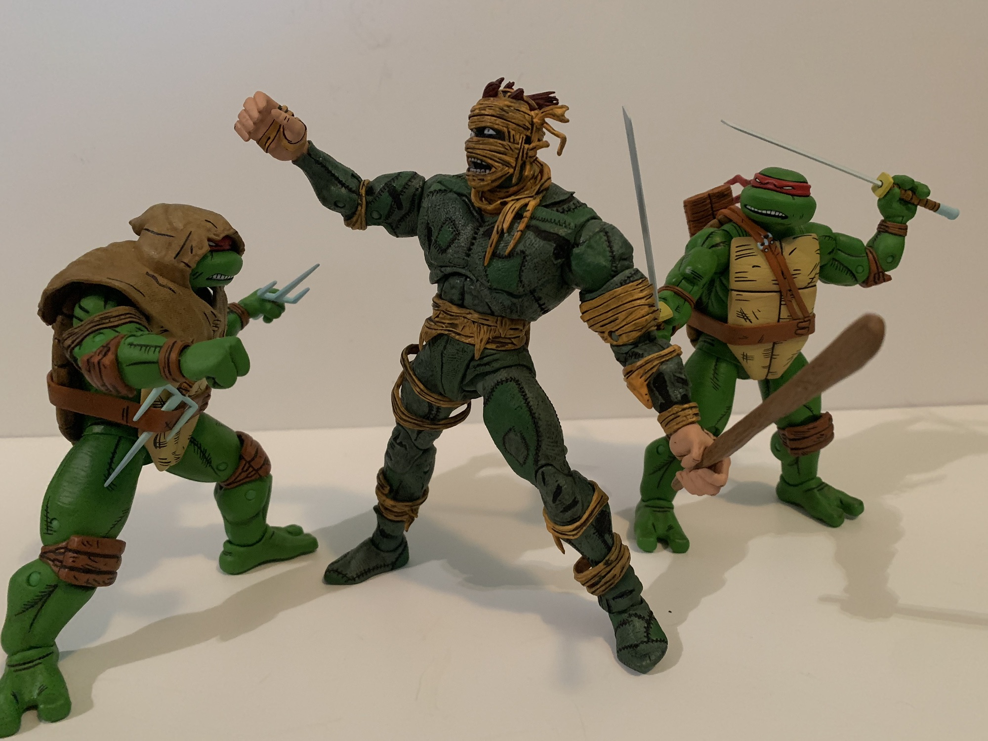
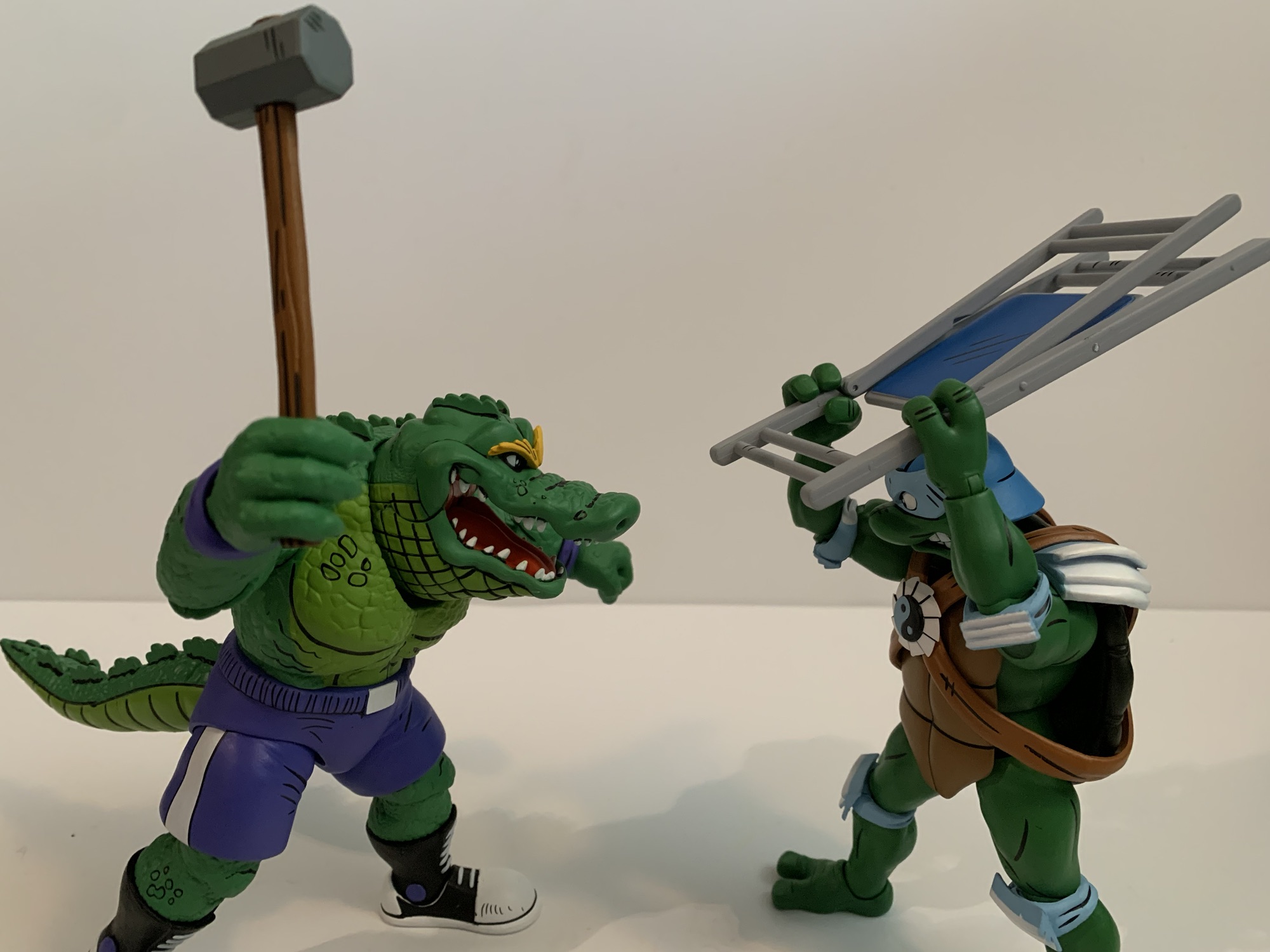
We’ll talk Raph first since he came out first. Raph as The Wolfman is about what you would expect. He’s clad in the familiar olive green shirt, but it’s been torn up along with his trousers. The head very much looks like Raph, but just covered in fur. He still has his pads and bandana and his hands and feet follow turtle anatomy rules, they’re just combined with a canine aesthetic. He has two portraits, one that’s neutral and one that’s in a yell. The yell is certainly the more fearsome of the two with the teeth prominent and well painted. The neutral expression is a lot of fun because it has an undeniable Muppet quality to it which I very much like since it was the Jim Henson Company that designed these original suits for the film. The most interesting part of the sculpt for me was the shell. NECA opted to cover even that in fur which certainly makes a statement. I suppose I never gave much thought to how the shell would be represented, but I was a bit surprised and amused by the decision. The detailing is all very nice though and the paint exceptional. The only downer with the presentation was the very sticky texture my figure possessed out of the box. In particular, the hands and belt. I’ve had this figure for months actually just letting it air out and it’s now finally reached the point where most of the tackiness is gone, but it was certainly unpleasant at first and I considered returning it.

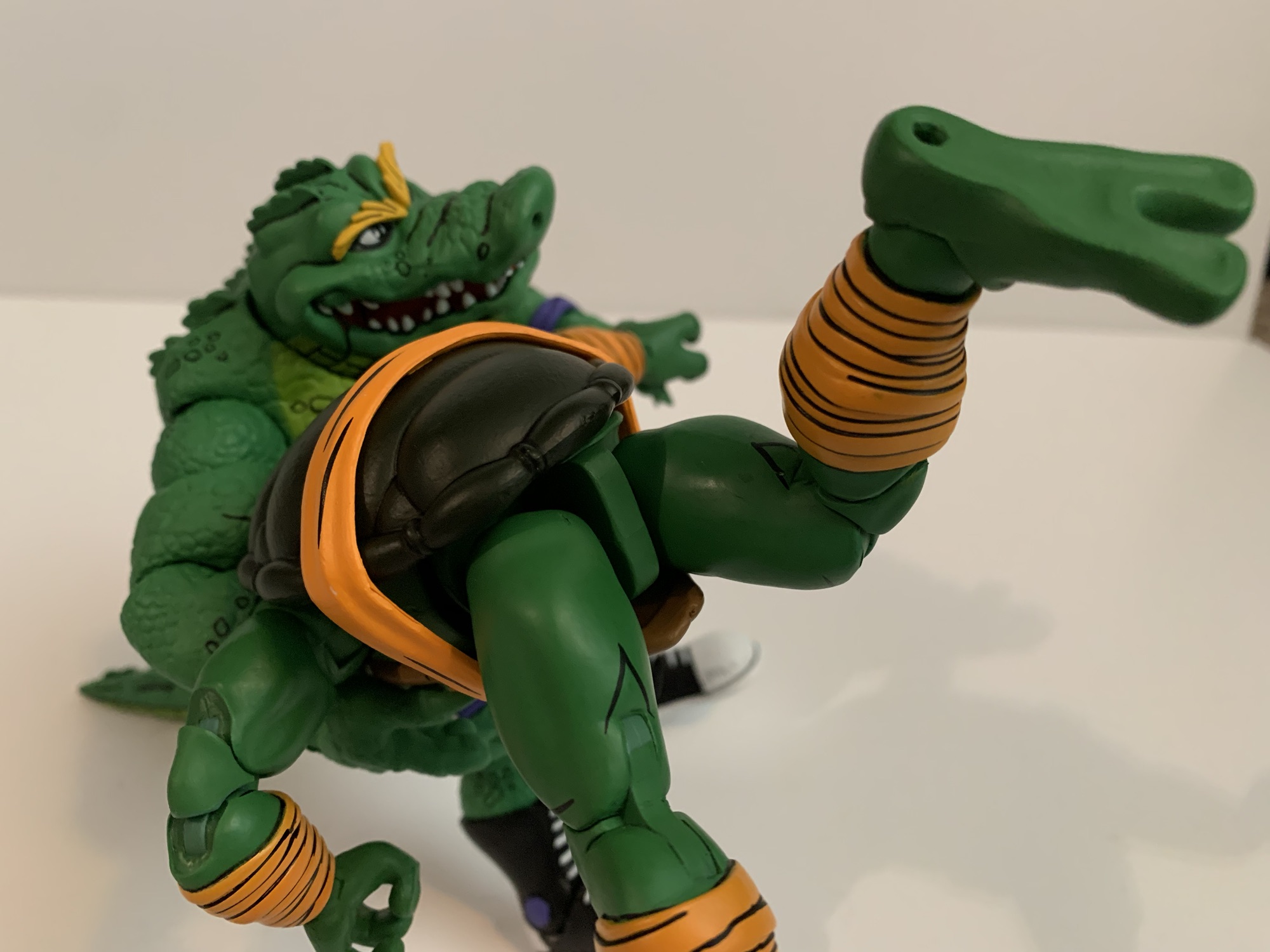
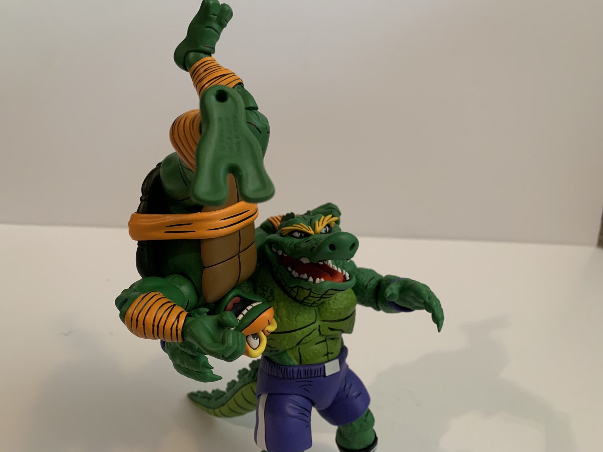
Raph’s sculpt and paint are certainly nice, but the aesthetic of The Wolfman feels almost basic compared with The Creature. This is a true overhaul for Leonardo and one of the busiest sculpts I can recall ever owning. Every millimeter on this guy is textured. The scales form plates all over the figure’s body with lots of bony protusions on the limbs. The hands are webbed, there’s gills and fins aplenty, the weird fish lips, and the TMNT stuff like elbow pads and knee pads. Leonardo forgoes the belt in favor of netting which is done with soft plastic and draped over his torso. There’s also an extra rope with optional hooks and bobbers that he can wear. There’s a little shine to portions of the paint giving the figure a glistening quality like it’s an actual fish-man, err, turtle. There’s a gradient to the paint with dark green in the crevices giving way to a more yellow-green while the fins are almost bronze. The fins are very rigid so do take care to make sure this guy doesn’t take any shelf dives on you since I fear they’d chip easily. This figure is beautifully ugly. It’s an amazing sculpt and paint job, but also an off-putting one which I’m assuming is exactly what they were going for.

While these figures may carry a double licensing fee, NECA still finds a way to include enough stuff in the box to make them feel like a complete release. I already mentioned the second portrait for Raph, but both figures come with three sets of hands. For Raph, they’re gripping, fists, and open hands. For Leo, he has gripping, somewhat relaxed hands, and splayed open hands. Both figures also come with their signature weapons. For Raph, he has a pair of sai made from bone and the remnants of Talbot’s cane in the film. They look appropriately feral and Raph has storage for them on his belt. For Leonardo, he has two harpoons that are fashioned to resemble his katana. There’s rope wrapped around them in places and there’s a nice wood grain texture here. One harpoon also features a speared piranha which looks neat, though it would have been better if it was removable. He also lacks any weapon storage which is a bummer. I suppose you could thread the “swords” through his netting, and there are even some larger openings in it that may be intended for just that, but it’s awkward and I’d worry about it stretching over time.

After the weapons and extra parts, Raph has just one more accessory in the form of a bear trap. It’s sculpted and painted really well to create the illusion of a rusted, steel, contraption and it does have real chain affixed to it. The trap can open and close as well. As for Leonardo, he has a bone forearm attachment which the box labels as a “fossil.” It clips onto the wrist and extends beyond his hand like a weapon. It’s very rigid though and a little hard to get in place, but it looks cool. He also has the necklace I mentioned with the optional hooks and bobbers, but no secondary portrait which might be a bummer for some. Lastly, Leonardo comes with a little tortoise buddy. It’s a slug figure that’s well textured and the paint is solid. He’s got a bit of a smile to his beak which makes him almost appear cartoony. It’s kind of a weird inclusion considering we didn’t get an extra portrait.

Articulation for both figures is pretty basic and also limited. Both figures feature a ball-jointed head and neck with ball-hinges at the shoulders. They have the NECA double-jointed elbows that swivel above and below the elbow and they’ll struggle to hit a 90 degree bend because of the elbow pads. Wrists swivel and all hinge horizontally. There is a ball joint in the torso, but it’s pretty much worthless because of the shells. The hips are ball sockets and they go out to the side almost for splits, but forward and back is almost nonexistent. Especially for Leo who has fins on the back of his thighs that get in the way. The knees are double-jointed, and like the elbows, the kneepads will interfere. Raph has digitigrade feet so he gets an extra hinge joint in the ankle and one in the toe region while Leo’s feet are the usual hinge and rocker which offer little because of the sculpt.

Of the two, Raph articulates a little bit better, but his digitigrade feet make him harder to stand. Leo’s sculpt is a massive hindrance to almost everything he can do. The shoulders and wrists are about the only things not impacted by the sculpt or an accessory. His hips and ankles are almost worthless. I’m surprised he didn’t get an articulated mouth, especially in light of the fact that he doesn’t have an extra head, but I’m not particularly bothered by it. Raph may move better, but he doesn’t articulate well. Both figures are very statue-like and aren’t going to be posed doing anything crazy. The sculpt and paint is what’s being counted on to sell these so if you’re a fan of the look that’s going to really be the determining factor on if you like these or not.

Raph and Leo are both sold in various places for around $35 a piece. I got Raph over the summer and held off on reviewing him until the timing made more sense while Leo is a figure I only acquired recently. I was leaning towards passing on him since I know even less about The Creature than I do The Wolfman, but Walmart had him on sale for $25 which was low enough to get me to bite. Hopefully he’s still on sale for those also interested in such a price. NECA is also doing black and white releases of all of the Universal Monster Turtles if that’s more to your liking. There’s a two-pack of Leo and Raph (Ygor and Wolfman) and a four-pack featuring the remaining four turtles which is a clever way to get both versions of Leo and Raph out there in black and white. Or it’s a terrible way to do it if you only want one. According to NECA, these repaints are also a bit of a stalling tactic as they work on more new sculpts for the line. With Leo and Raph getting two figures, it would stand to reason that Mikey and Donnie will follow suit and we still haven’t seen a Dracula in the line yet. Surely, NECA would not let the line end before getting to such a heavy hitter, it’s just a question of who is the most appropriate for such a prestigious character? And since I have three of the four turtles now, I suppose I’ll need to add Donatello. While I have actually been tempted by his Invisible Man mash-up, I might as well wait and see what his other figure turns out to be in case I prefer it. Maybe by next Halloween we’ll know what direction I went in.
Looking to add more action figures to your Halloween decorating? Here’s a few suggestions:

NECA TMNT x Universal Monsters Michelangelo as The Mummy
As the toyline and cartoon series started to go long, Playmates Toys turned to other ideas to keep the good times rolling on the Teenage Mutant Ninja Turtles. Long thought to just be some quick fad, the turtles outlived all expectations into the 90s spawning multiple films and video games and a cartoon series that…
Keep reading
NECA Misfits Ultimate Fiend Action Figure
When Glenn Danzig and Jerry Only reached a settlement over who owned the rights to The Misfits in the mid 90s (resolution: they both did), it set off a wave of new merchandise plus a new version of the band. What had once been a logo found mostly at punk and metal shows, the visage…
Keep reading
Super7 Ultimates! – The Worst – Robot Reaper
Happy Halloween, my fellow action figure enthusiasts! It’s a day for mischief, a day for candy, and a day to laugh at Death. Today, we’re laughing at a special kind of death, a robot death, and it comes courtesy of Super7’s in-house brand The Worst. The Worst is a line of action figures that’s basically…
Keep reading