It’s December 1st and you know what that means – time for Christmas specials! Not to “well, actually,” myself, but the Christmas special viewing season began before today in my house as it’s annually the day after Thanksgiving. What you may call Black Friday, I dub the start of the Christmas Special Season. And this year, it’s a shorter than usual one since Thanksgiving occurred on the 28th of November which is the latest the holiday can take place which means we have less time than usual to squeeze in some favorite seasonal viewing.
Not that any of that has any impact on this year’s edition of The Christmas Spot. It’s always 25 days of 25 festive topics which most often take the form of a holiday special walkthrough. It’s actually been years since I did something other than a holiday special on one of the 25 days of Christmas (sorry Family Channel/ABC Family/Freeform/Whatever you’re called now, I’m stealing your bit) – will this year change that? I don’t know! I just know I have my work cut out for me.
To kick things off this December I am righting a wrong. It was many years ago I made a post about Christmas specials staring Mickey Mouse. You know that guy, right? He’s often celebrated as the first global cartoon star following his debut in 1928. I have no idea if that is accurate or not, there were a lot of cartoon characters that came before Mickey, but when you’re a company as big and powerful as The Walt Disney Company and you’ve lasted longer than many of your competitors you basically get to write your own history. I think we can all agree that Mickey is pretty damn popular and recognized around the world even to this day as the brand ambassador of a mega-corporation. He’s even still starring in current Christmas specials and probably will continue to do so long after many of us expire.
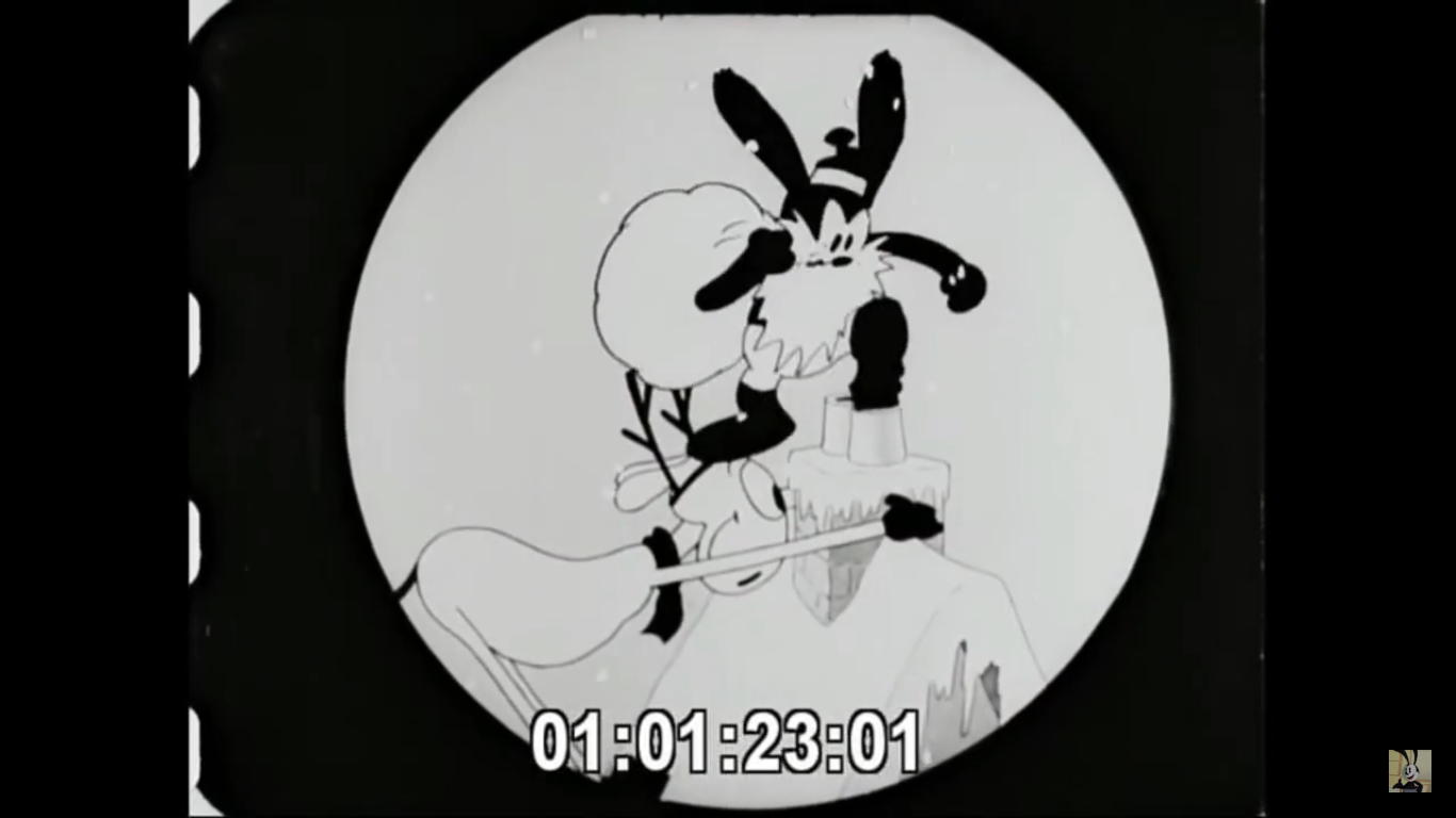
Back when I did that post though, I failed to mention Mickey’s first ever Christmas cartoon: Mickey’s Orphans. Released in 1931, it stars Mickey (Walt Disney), Minnie (Marcellite Garner), and Pluto and features the characters taking in some orphaned kittens (mice taking care of kittens – how absurd) on Christmas. The Wikipedia entry for the cartoon states it’s a remake of an Oswald the Lucky Rabbit cartoon (that guy who was famous before Mickey) titled Empty Socks. Well, I’ve watched Empty Socks and I don’t see how it could be classified as a remake. That cartoon features Oswald playing Santa for some orphans (who also happen to be feline) and they’re basically brats and they actually end up burning down the house. This one has the orphans coming to Mickey’s house and, yes, they’re pretty destructive. I can see how the Oswald short influenced this one, but calling it a remake seems like it goes too far.
This being a short from 90+ years ago, it should come as no surprise that it’s in black and white and the audio and visual quality isn’t exactly pristine. Mickey cartoons are often cited as being technically great, but not as entertaining as the stuff from Warner Bros or even the later cartoons from Disney staring Donald Duck. As someone who has watched a lot of cartoons from that era, I can mostly go along with that. Mickey cartoons tend to feature a lot of just singing and dancing. There are some that are quite entertaining though, and on a technical level even the oldest ones can often impress in some way. Mickey became more of a bland every man character much later into the 30s when he could play off of his more comedic sidekicks, Donald and Goofy. In ’31 he was allowed to be a bit less polished, more of a rascal, though this being a Christmas cartoon in which he takes in orphans don’t expect a whole lot of that stuff. He’s actually just going to roll over and take it in this one.

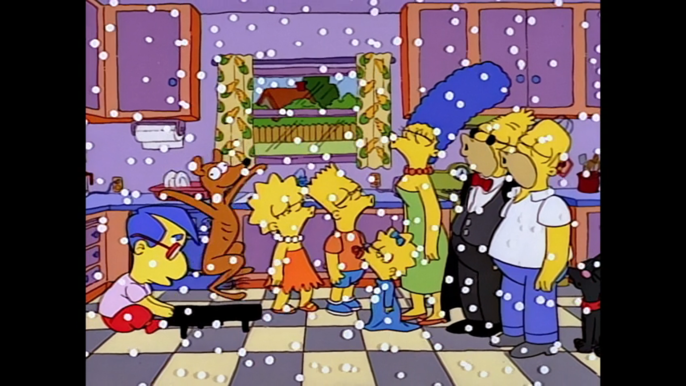
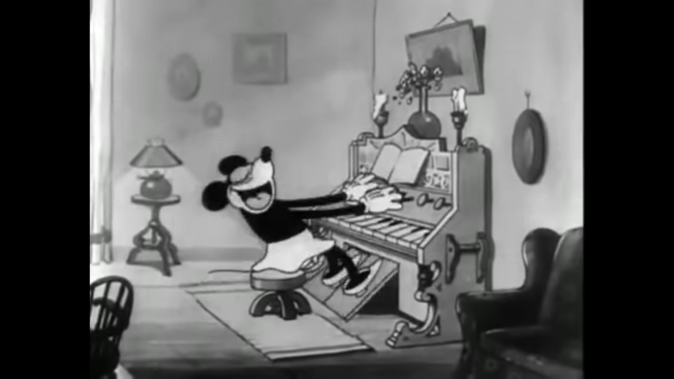
The cartoon begins with a robed figure walking through the snow at night. The wind is howling and it’s whipping the individual’s ragged clothing around. The figure is carrying what looks like a picnic basket with its right arm. It’s a nice shot that doesn’t rely on a repeating background and “Silent Night” is helping to set the mood as a somber one. The individual then comes to a warmly lit house and we hear Minnie Mouse before we see her. The individual looks through a window to find Minnie playing “Silent Night,” but not singing it (she just keeps saying “La la la” because I guess she has trouble with lyrics), at a piano. I think? I don’t know, it has two large pedals that she’s working over. Nearby, we see Mickey decorating the Christmas tree. Each time he places an ornament we hear a little chime. He grabs two candy canes and then taps the ornaments in time with the music. We pan over to see Pluto asleep by the fire. He’s looking well fed as he snores.

Outside, the ragged figure runs over to the front door and lays the basket down in front of it. The person picks up a bundle from inside it, kisses it, then places it back in the basket and rings the doorbell. They take off as Mickey opens the door. An eager Pluto runs out and returns quickly with the basket. He sniffs at it, and from inside pops out a little kitten. Pluto doesn’t seem thrilled, but Mickey happily scoops up the little fella and brings it over to Minnie. She thinks it’s adorable, though it’s oddly hostile towards Mickey as it bites him on the finger. He’s such a good-natured man-mouse though that he laughs it off. Meanwhile, Pluto is still sniffing around that basket and soon another kitten pokes its head out and whacks him on the nose. Then an impossible amount of kittens burst forth!

The kittens soon overrun the place swinging on clocks, bouncing on pianos, and pulling on poor Pluto’s ears and tail. Another kitten has displaced the couple’s parrot in its cage while another group ride a chandelier like an amusement park ride. Mickey gets his tail tied around his ankles and there’s a long shot of the kittens just going nuts in the living room. To their credit, Mickey and Minnie seem unphased by all of this as they continue to smile. Minnie whispers an idea into Mickey’s ear, who in turn does the same with Pluto. The two soon depart, but not before Mickey grabs a deer mount from the wall. I wonder what they could be up to?
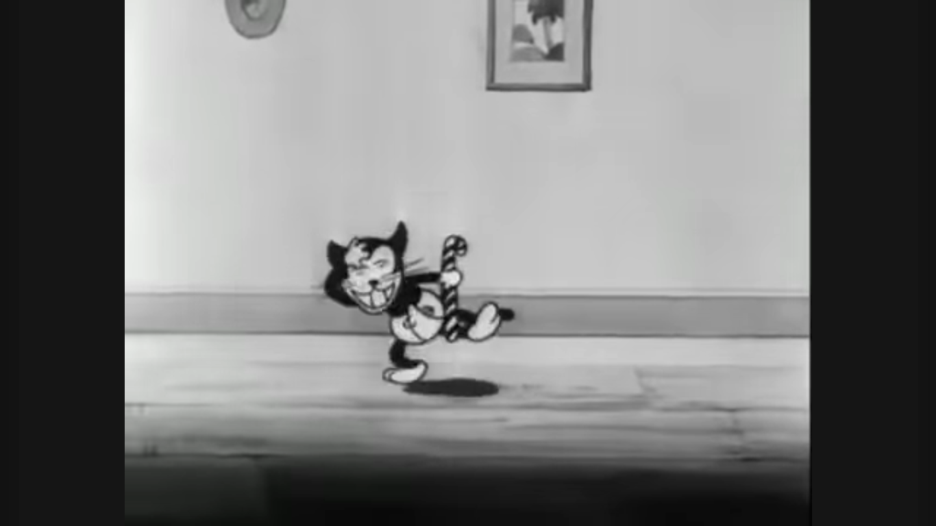
With Mickey gone, it means Minnie has to look after all of the kittens. One needs help blowing its nose while another is tugging her skirt and seems anxious about something. I thought maybe it dirtied its diaper, but apparently the little tyke is just hungry. Minnie does what any responsible adult would do and gives the hungry toddler a candy cane. The little cat licks it all over then starts strutting around using it like an actual cane. That thing is going to get real gross real fast.
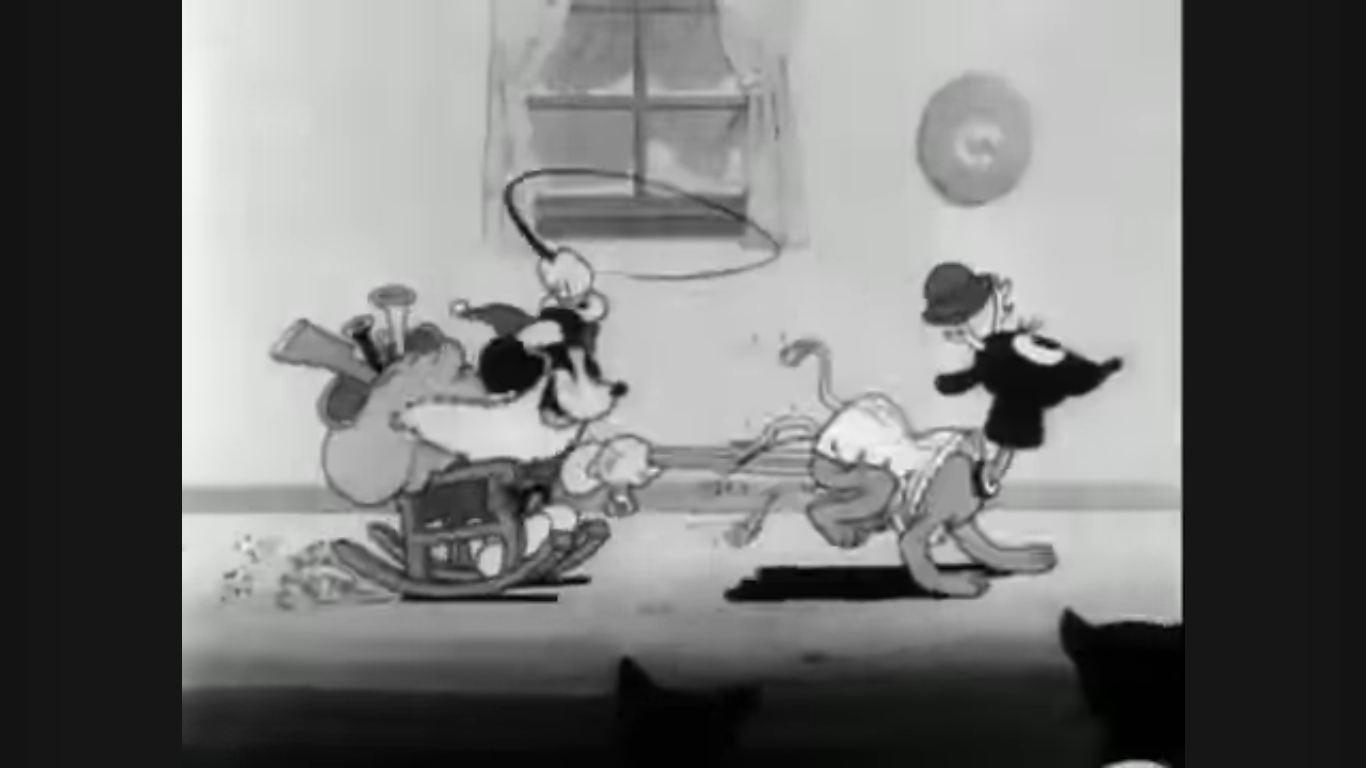
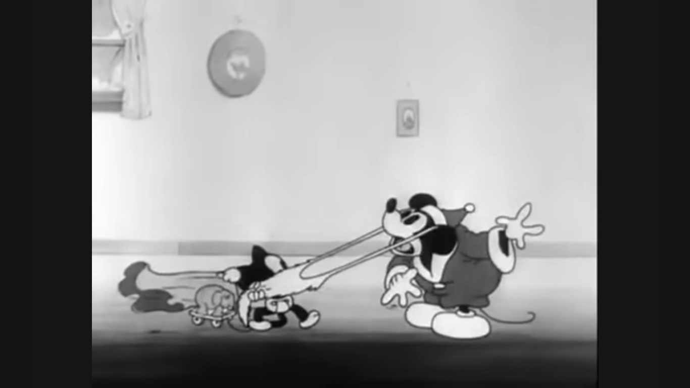
Minnie then takes a seat at the piano once again. The pedals have strangely disappeared. She starts playing “Jingle Bells” which is apparently Mickey’s cue to come bursting through the front door. He’s dressed like Santa Claus and being pulled on a sleigh by Pluto who’s sporting the deer head like a helmet. Mickey is whipping him, which seems a bit cruel, and he’s apparently enjoying it since he has that same big, dopey, grin plastered on his face. When the sleigh comes to a stop, Mickey hops off with a big sack of presents, but the little monsters don’t even wait for him to start handing out gifts. They run him over and all dive into the sack. Each one comes running out with something until there’s nothing left, just a final kitten clutching the sack itself. It stops to ask Mickey, “Are you Santa Claus?” Mickey smiles and nods and the kid responds by blowing him a raspberry and tugging on his beard so hard that he topples over. Ungrateful brat!
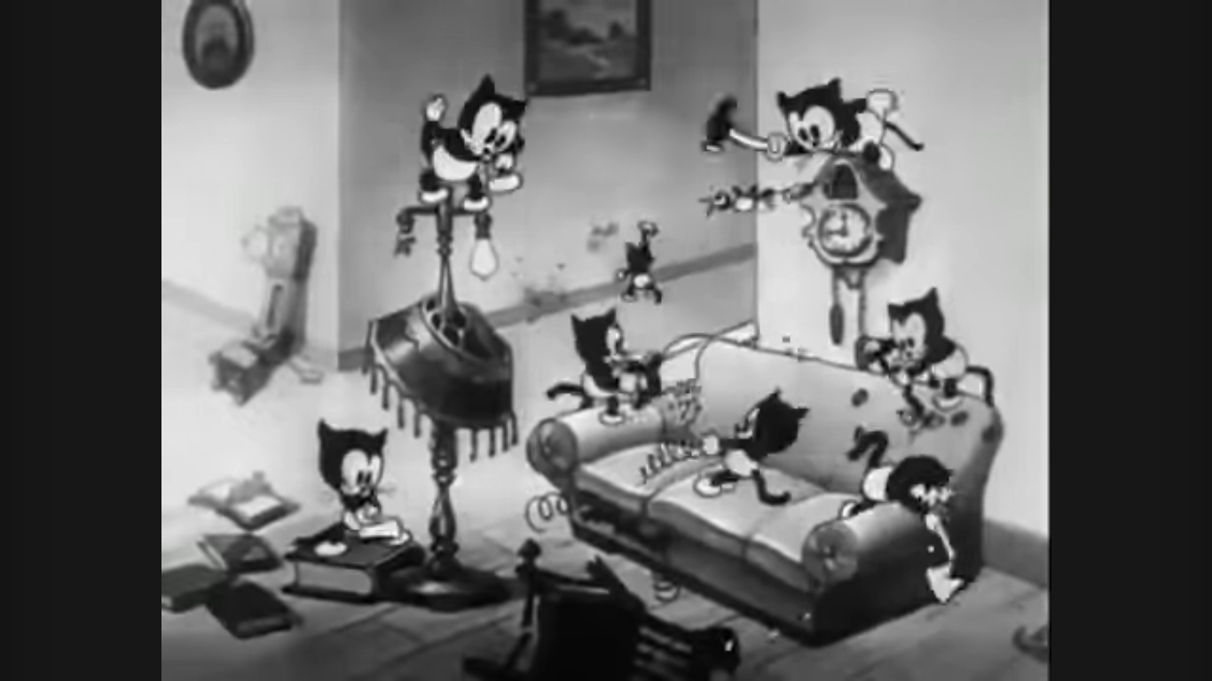
With the gifts distributed, the children return to their path of destruction. A series of them start a marching band and some have actual instruments while others are just banging on household items. The music is livelier now too and kind of sounds like it could be a version of “Ain’t We Got Fun.” Whatever it is, it doesn’t sound Christmassy. A bunch of the kids somehow got ahold of saws and hammers and we get to see them destroying Mickey and Minnie’s furniture. A bunch are also smashing other objects with more conventional toys while a trio of kittens wielding pop guns use them to break some stuff and blast Mickey in the bum. Meanwhile, the construction crew of kittens has moved on from the living room to the piano and they’re hacking that thing up. I guess they weren’t a fan of Minnie’s playing?

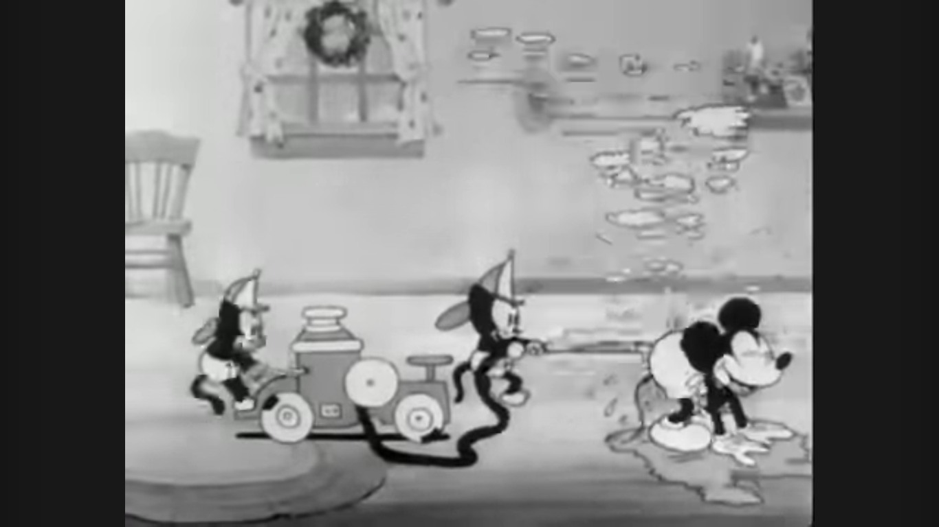
More destruction ensues as the kids smash windows and basically anything else of value in the house. A kitten comes riding by on a train (did you ever hear how Walt loved these things? Of course there’s a toy train in this picture) and smashes into Mickey. He does a flip and ends up seated on the caboose. He waves to Minnie as they drive by and she’s up on a sofa like she’s trying to escape the carnage, but the two happily wave to each other like their house isn’t getting demolished. I guess Walt pays them well. The kitten conductor drives the train under an end table so the back of Mickey’s head smashes into it and knocks him from his perch. Another kitten is shown shooting Pluto in the butt with a toy canon and when the dog runs into the wall the deer head he was wearing pops off and lands on his butt creating some weird chimaera of a creature that frightens the kid.
Mickey seems like he doesn’t know what to do, which just makes him more of a target. A kitten operating a toy steam shovel uses it to scoop coals out of the fireplace and drop them down Mickey’s pants. He starts hopping around which alerts the kitten fire brigade to come to his rescue. Two kittens come riding in on a toy fire truck and blast Mickey in the butt. He enjoys the relief it brings and just sort of stands there soaking it all in. Quite literally. On all fours. It’s an odd sight to be sure.
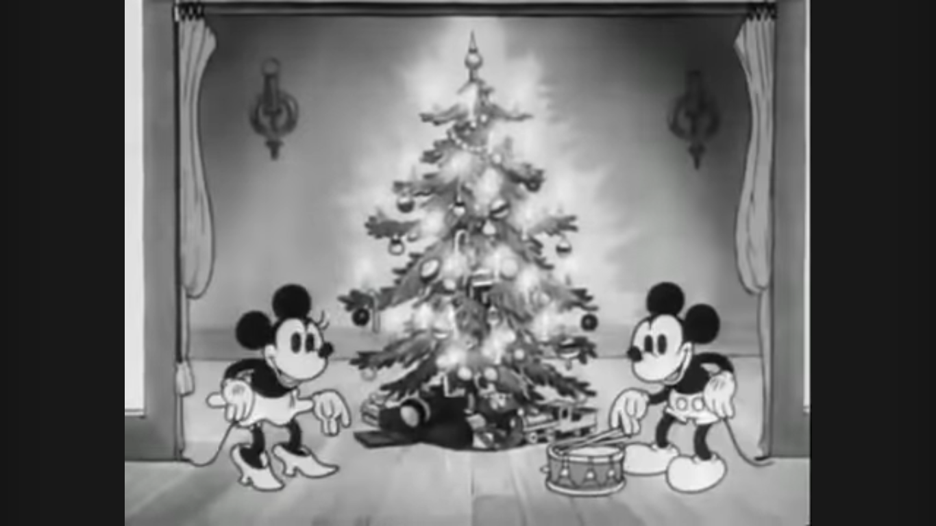
Minnie then gets everyone’s attention with a little horn. She’s standing by a curtain and Mickey comes over to help her reveal what’s behind it by playing a drum. After a vintage drum roll, the curtain is pulled back to reveal the Christmas tree. It’s quite a lovely sight as it’s full of ornaments and lit with several candles. These things must have been extreme fire hazards back in the day. The kids all cheer and then attack! The tree has some more gifts under it, but the kittens cover the tree by climbing all over it and as they disperse what’s left behind is a standing, old, stick. Mickey and Minnie can only look on with shock and awe and for the first time there appears to be a twinge of sadness on their faces.

If you think this is where the kittens realize they’ve been a naughty bunch and have treated these mice poorly, think again! Nope, there is no moral here as that’s the end. Mickey and Minnie can only stare at what’s left of their tree and are left to ponder what their Christmas might have been like if these wretched orphans hadn’t been dumped on them.
What a weird cartoon. It is similar to the Oswald short I mentioned coming in as in both some orphans just act like rotten kids and there’s no comeuppance for them. They just spread destruction at Christmas and that’s it. We’re supposed to laugh at their wickedness, I suppose, and that’s enough. We’re not really supposed to care about Mickey and Minnie and what’s left of their house. I suppose making sure orphans are in a safe environment at Christmas is something to aspire to. Minnie and Mickey’s physical possessions aren’t really that important, but these two take these kids into their home, go to great lengths to give them a special Christmas, and get nothing in return. It’s definitely not the kind of cartoon you would see starring Mickey Mouse in 2024.
There isn’t a whole lot to this one. There are some visual gags, but they’re not inventive or creative. It’s just kids being destructive in pretty standard ways. Mickey’s makeshift Santa entrance had a little cleverness to it, but it’s not like he used household objects to create toys like Grampy did in Christmas Comes But Once a Year. Visually, it’s a nice looking black and white short. Disney has always been on top of the animation game and that was true back then just as it so often has been throughout the decades since. The music is probably all public domain stuff. There’s a few Christmas numbers, and I think I even heard Beethoven, and it’s fine. There’s almost no dialogue save for the little kitten asking Mickey if he’s Santa and a few remarks by Minnie. The audio always comes across as more dated to me than the black and white visuals and that’s true here.
Mickey’s Orphans is a pretty unremarkable Christmas cartoon from the famous mouse, which is probably why it’s quite forgettable. There weren’t any scenes from this used in the broadcast of Mickey’s Christmas Carol like we saw with On Ice and Mickey’s Good Deed. Like a lot of what makes up the legend of Mickey Mouse, it mostly just gets credit for being first and not much else. Still, at only about seven minutes it’s hardly much of an investment of your time if you want to check it out. It can be found on YouTube and other free streaming platforms with ease as Disney isn’t very protective of its old black and white cartoons. If you want to own it then that’s a different story. This was released in the Walt Disney Treasures line on the very first Mickey Mouse in Black and White set, but it’s now long out of print and quite expensive. It’s also the only set I didn’t buy back when they were more affordable and that’s because these cartoons can be hard to sit through. Do I really want to spend all of that money just to say I own them even if I’ll never watch them all? The answer has, so far, been “No.”
Can’t wait until tomorrow for more Christmas? Check out what we had to say on this day last year and beyond:

Dec. 1 – Christmas Comes But Once A Year (1936)
We’re back with another year of The Christmas Spot! And to kick things off this year we’re taking a look at a bonafide Christmas Classic. Christmas Comes But Once A Year may not be the household name that Rudolph and Frosty are, but for Gen X and millennial kids it’s probably familiar because it was…
Keep reading
Dec. 1 – 35 Years of The Christmas Tape
Welcome back to another year of The Christmas Spot! This year we’re kicking things off with a post I’ve been sitting on for a few years now. When I utter the title “The Christmas Tape,” I’m curious what comes to the minds of readers. It sounds both generic and specific and I suspect a few…
Keep reading
Dec. 1 – Frosty the Snowman
Welcome back, lovers of Christmas, to the 7th edition of The Christmas Spot! If you missed the introduction a few days ago, we’re doing things a little differently this year. Yes, you’re still getting a dedicated write-up each day through Christmas about a beloved or not-so-beloved holiday special, but this year we’re also going retro…
Keep reading