Category Archives: toys

NECA Cartoon TMNT Accessory Set

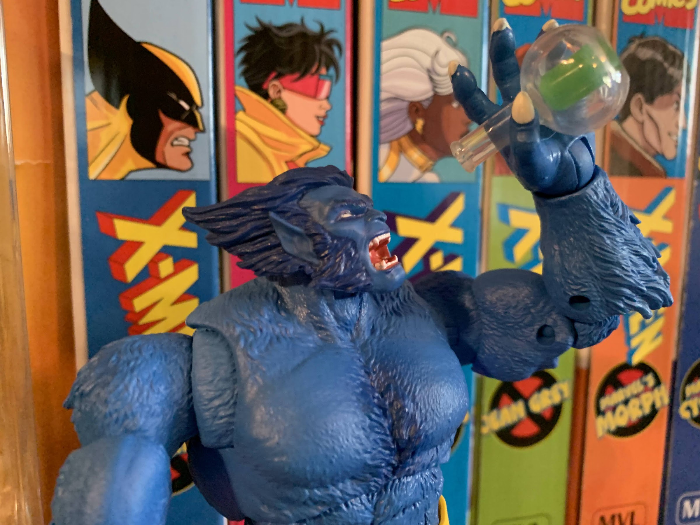
We’re well into the cold of winter and spring feels like it’s just around the corner which means it must be time for another NECA Haulathon. Haulathon, if you don’t recall from last year, is basically a tandem promotion between NECA and Target which was just an excuse to get NECA some more visibility in store (and online) to sell a bunch of stuff to collectors. The tacky name certainly implies the two companies want a bit of a frenzy to be set-off that gets collectors storming into stores and ransacking the display leaving nothing but dust and empty shelves in their wake. Despite that feeling, it felt a bit more controlled in practice. Much of the stuff on sale had been made available via preorder months in advance so only a few items were actually brand new for TMNT collectors. That certainly helped, and when the promotion returned in the late summer it was done in pretty much the same fashion with only a handful of items being actually new to purchase.

That was the before times, this is now. NECA, for whatever reason, decided to do things differently for this latest Haulathon. Maybe there was pressure from Target to not offer pre-sales or maybe NECA just didn’t want to burden their own warehouse with individual orders? Or maybe there was such a backlog it made the logistics too cumbersome – I don’t know. What I do know is this latest incarnation of Haulathon cares not for your wallet. NECA has unleashed a vast assortment of product which is mostly concentrated to the Teenage Mutant Ninja Turtles license. If you’re an all-in collector, prepared to get hurt. In the toon line alone, we’re getting five two-packs, one deluxe release, and an accessory set, which is the subject of today’s inaugural Haulathon 2023 post. I’ll skip the math, but it also comes with the unfortunate rise in prices that I think many were bracing for, but few may have expected to hit this hard. It would seem the standard price for a two-pack is now $60, up from $52 when the line launched. The movie two-packs already hit that price point so it wasn’t unexpected, but still disappointing. The lone deluxe figure shot way up though to $50, beating out the previous high of $40 set by Chrome Dome. As for the accessory set, it doesn’t really have a precedent since this is the first of its kind for the line. The movie series has had a pair of sets and I think the first was $50 and the second $60. Some other licenses that NECA dabbles in have come in lower, but this one is on the high end at $60. Expected? I suppose, but it would have been nice if it could have hit that $50 sweet spot. We’ll talk more about that later though, for now, all that matters is what’s in the box and is it worth getting?

“Finally, I gets some head protection.”

The toon accessory set has been a long time coming for collectors of this line. There are so many one-off items and smaller characters that made sense for such a thing. Plus we’ve seen the line already cram tons of little doodads into various releases because there is just so much. Every collector of this line likely has a container, drawer, whatever full of stuff with no where to put it all. The accessory set is going to add to that, but it’s also going to deliver some items meant to pair with the someday sewer lair. NECA showed off said lair last year at conventions and it was expected a portion of it would go up for sale in the fall, but that has yet to happen which almost leaves a pit in my stomach since NECA could come looking for more money any day now. That’s a problem for future me, and if NECA reads these, I beg of you to at least hold off a month or so before putting something like that up on your website! Some of us don’t expect to get tax refunds in April.

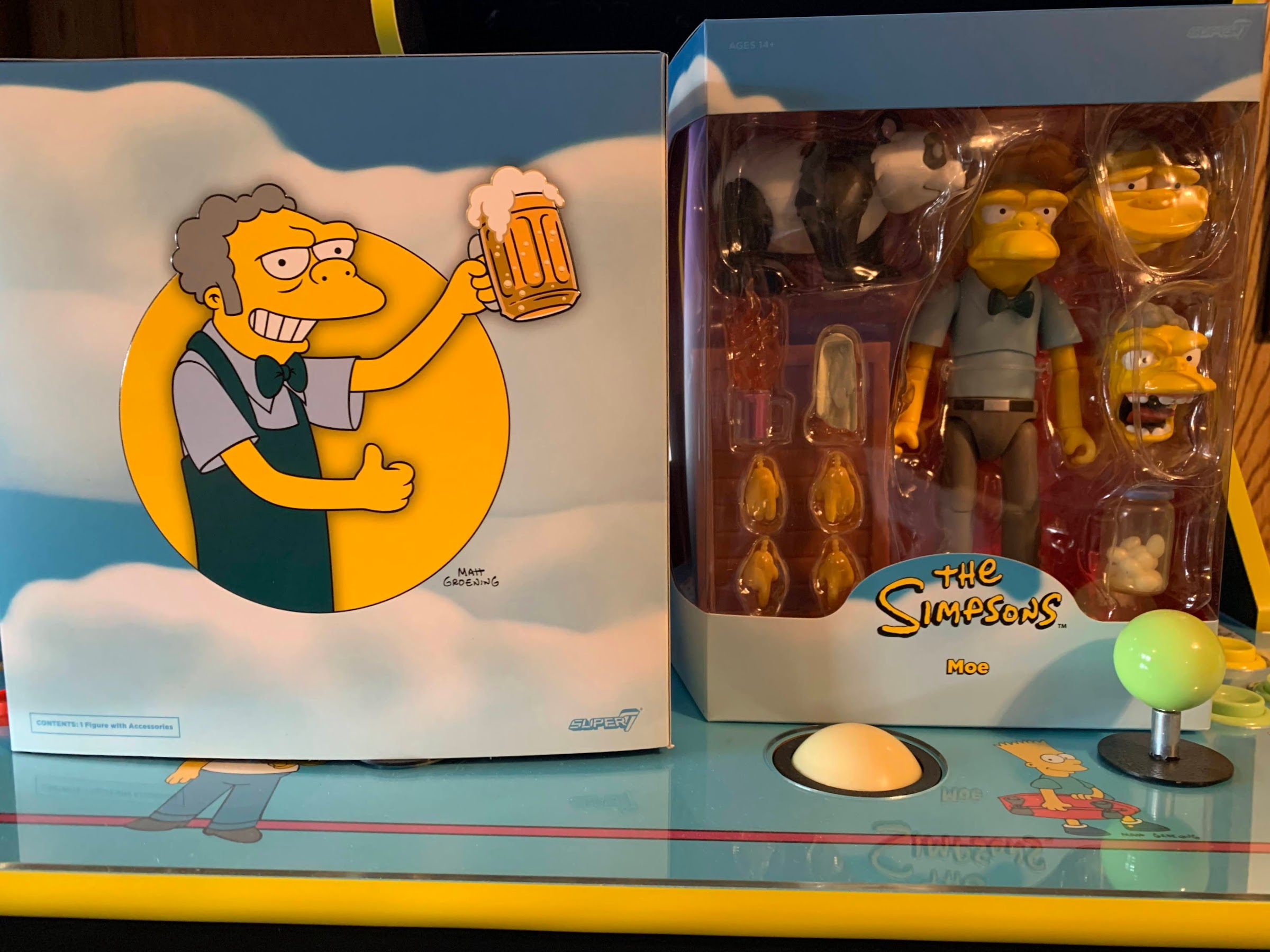
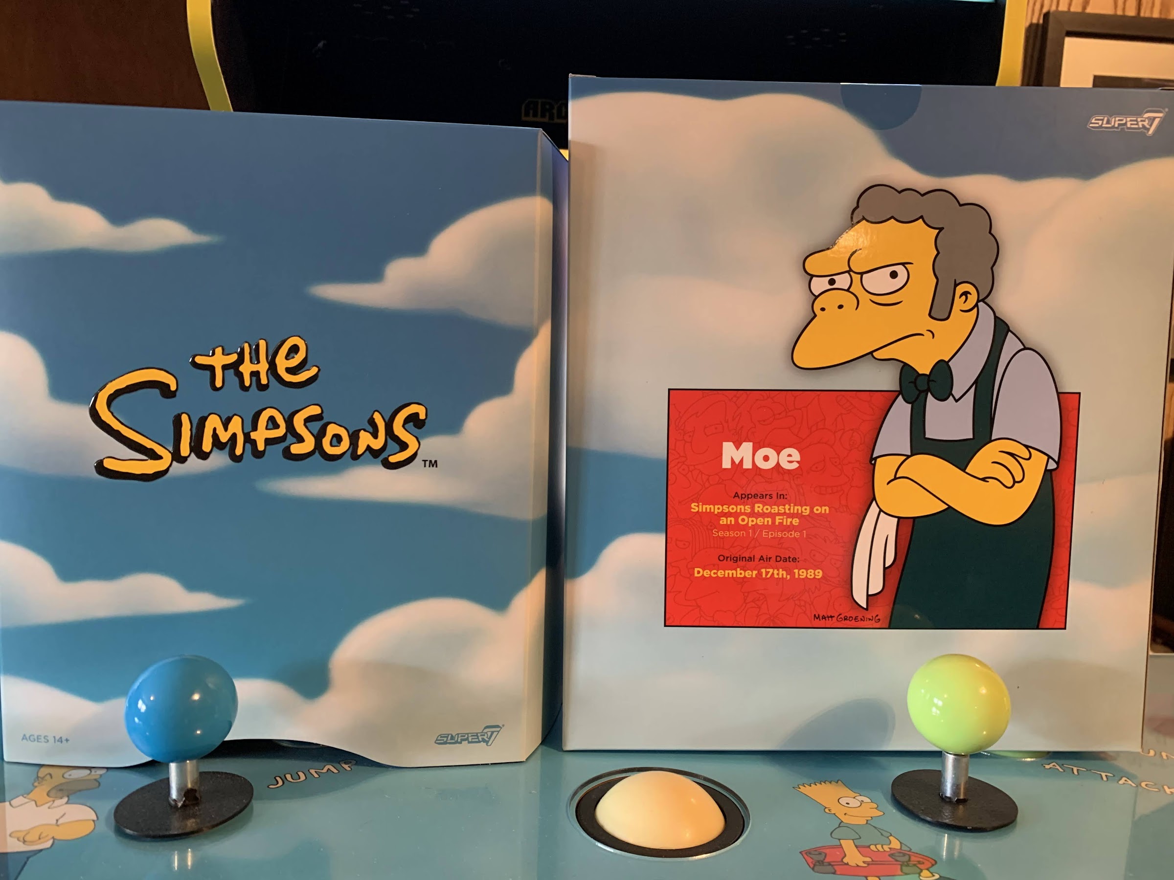
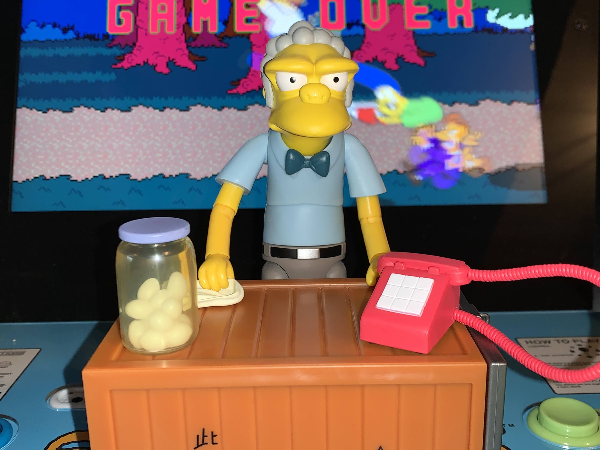
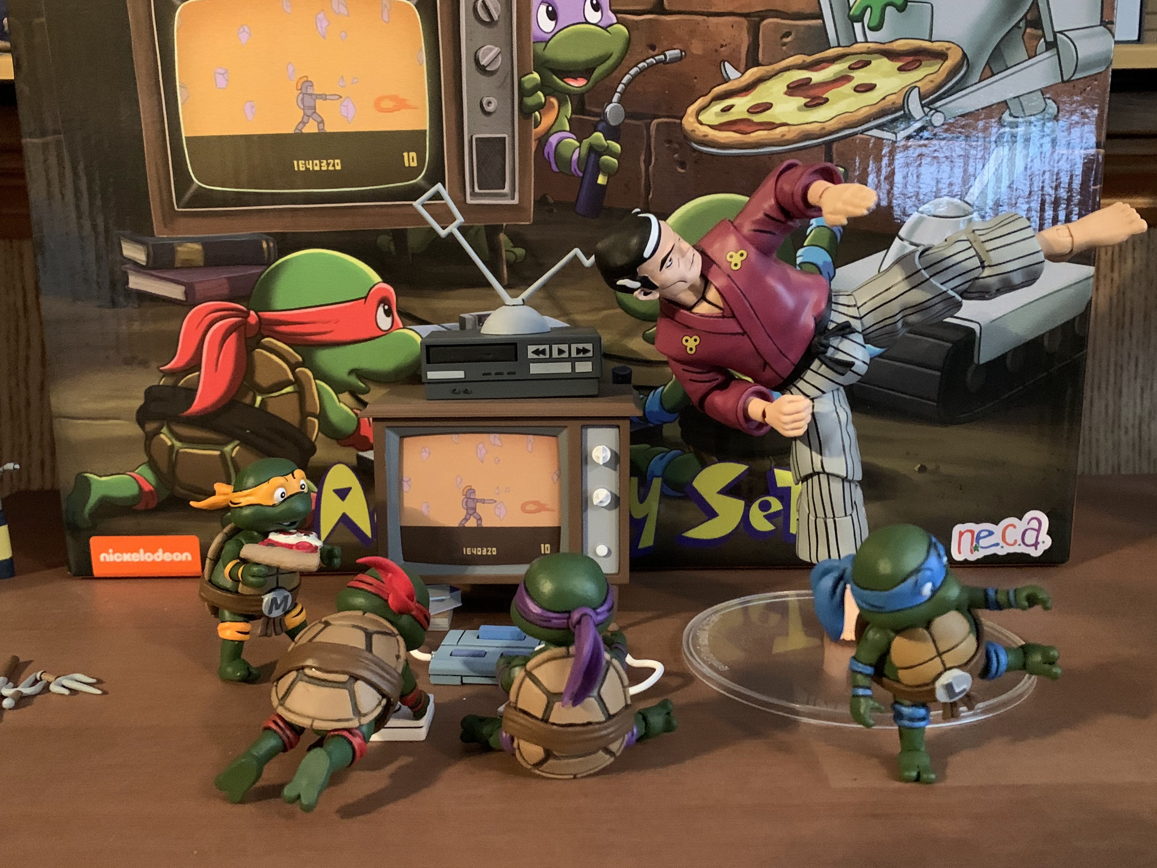
The accessory set comes housed in an oversized box with some toon-inspired artwork on the front showcasing a bunch of the items contained therein. On the reverse, we get some product shots and a partial list of the contents contained in the box. Unfortunately, there’s no window display so you won’t be able to inspect the contents before buying. It seems most stores are getting between 1 and 3 sets in this first wave of shipments and it’s been the early favorite of many as it’s flying off the shelves faster than anything else included with Haulathon. The store I found my set in only had the one, if others were there before I happened upon it I couldn’t tell. It was a packed endcap and this set had to be sort of wedged in on-top of other items just to fit. It’s possible there was only one sent to this store, and also possible the overflow was kept in the back to be put out later in the week -who knows? If you’re having trouble finding a set though, it’s expected to be made available this Friday (if you’re reading this the week this entry is posted) on Target’s website.

Who wants more Mousers and baby pizza monsters?

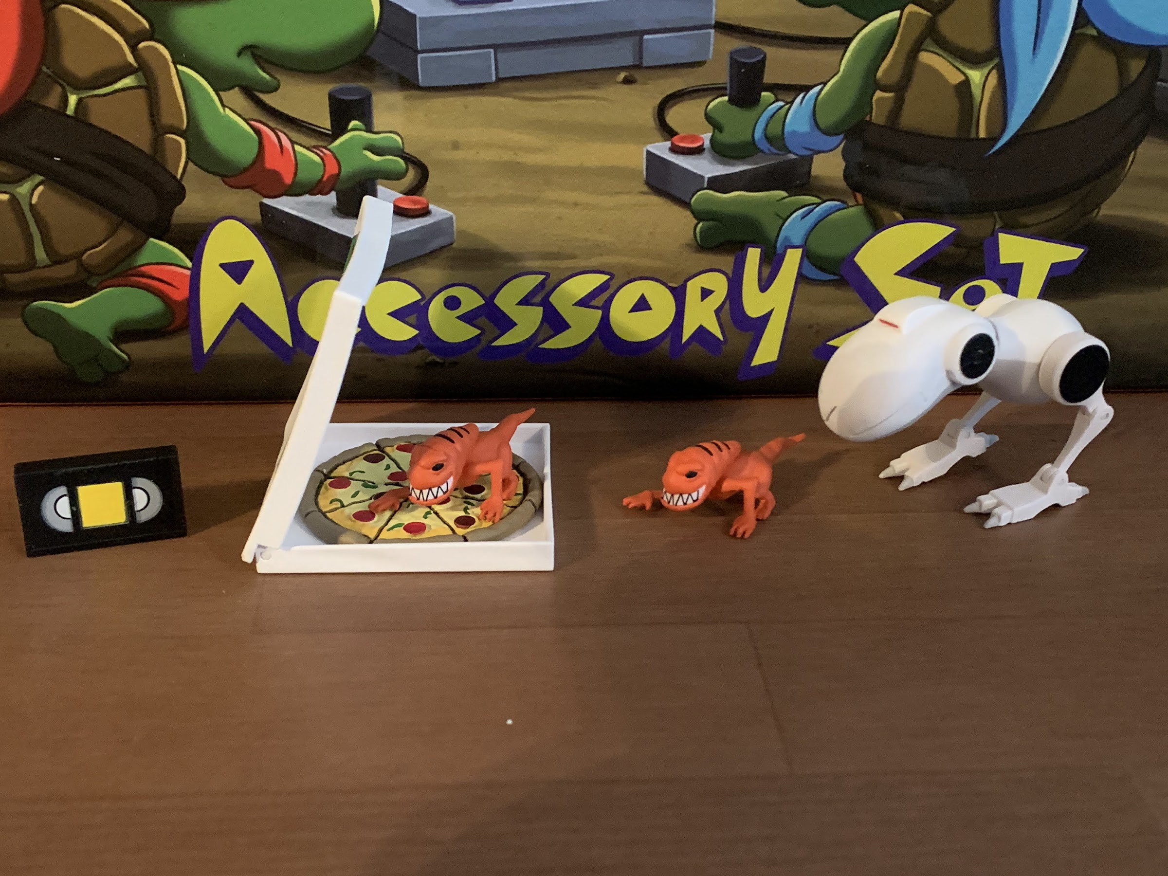
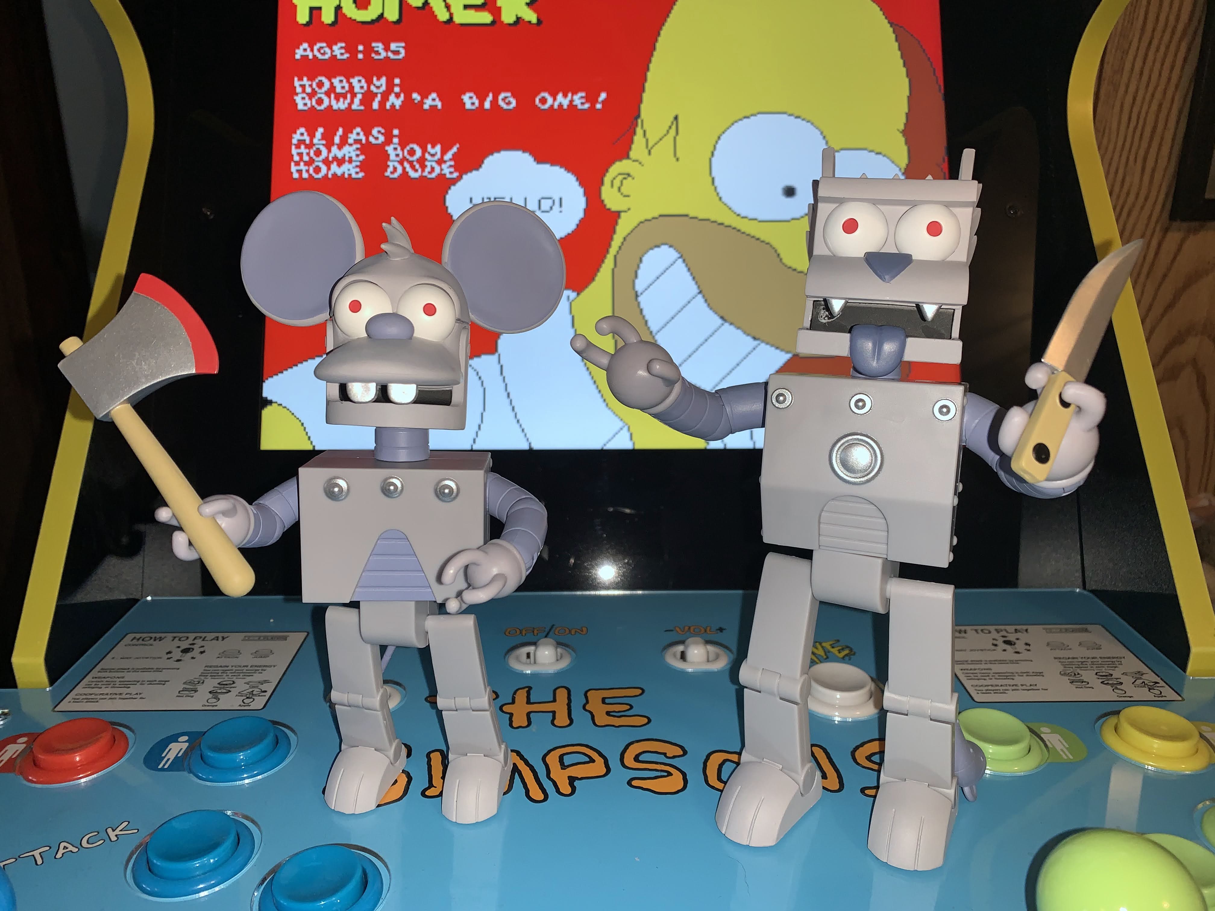
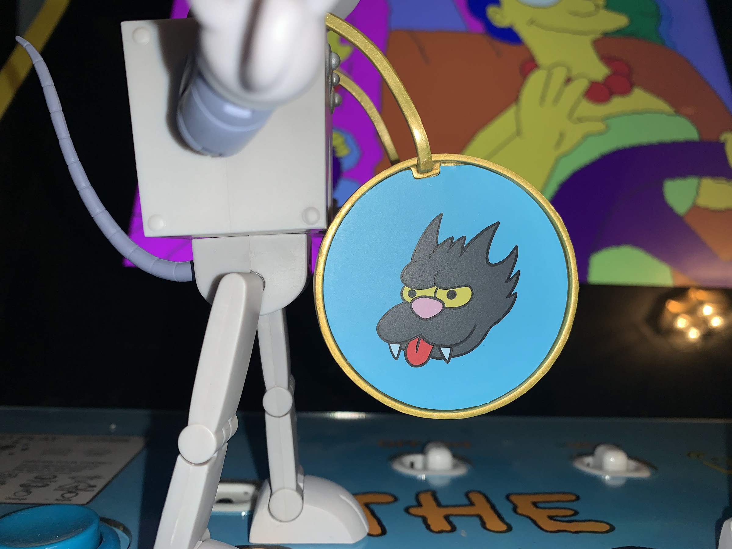
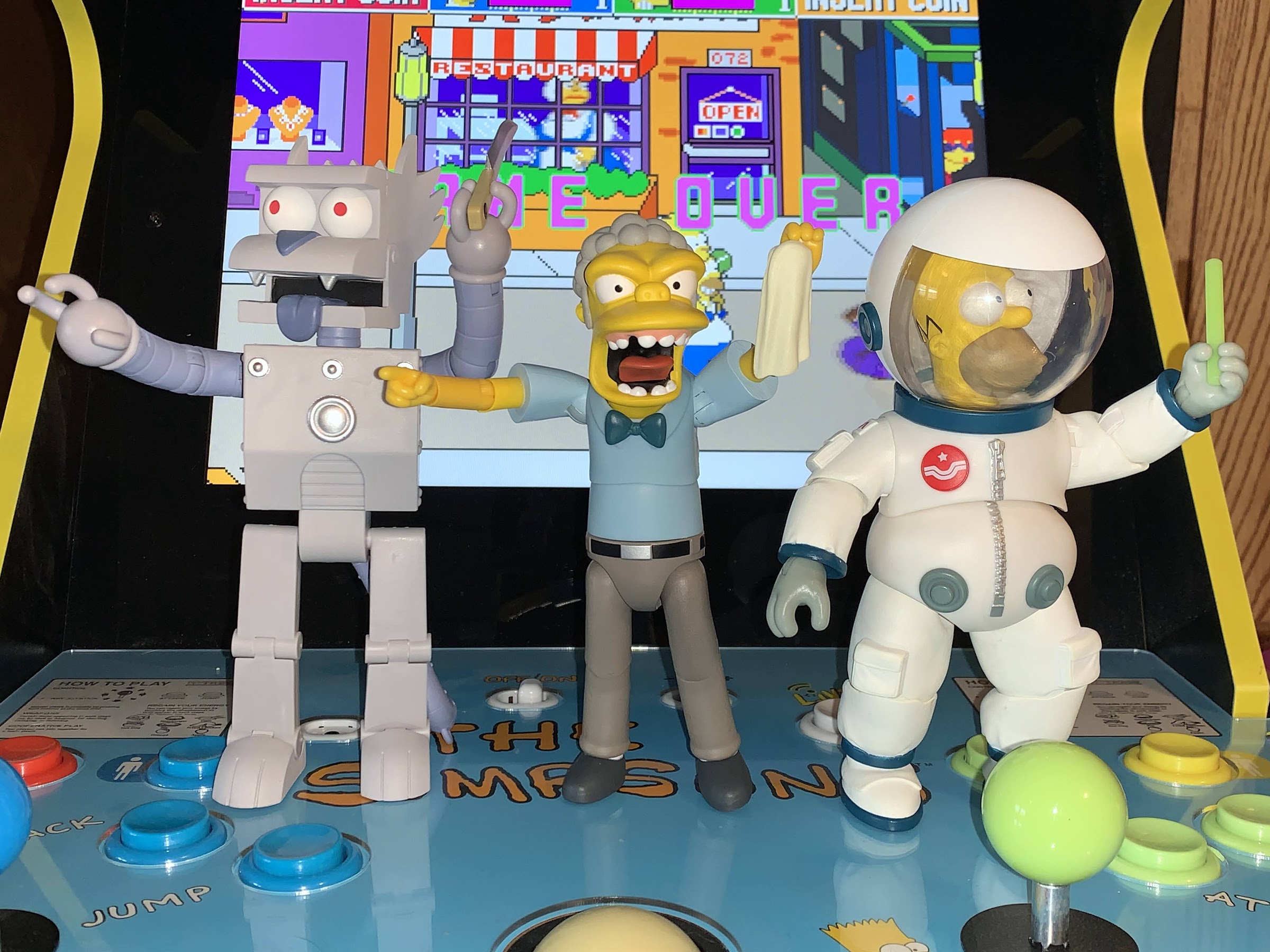
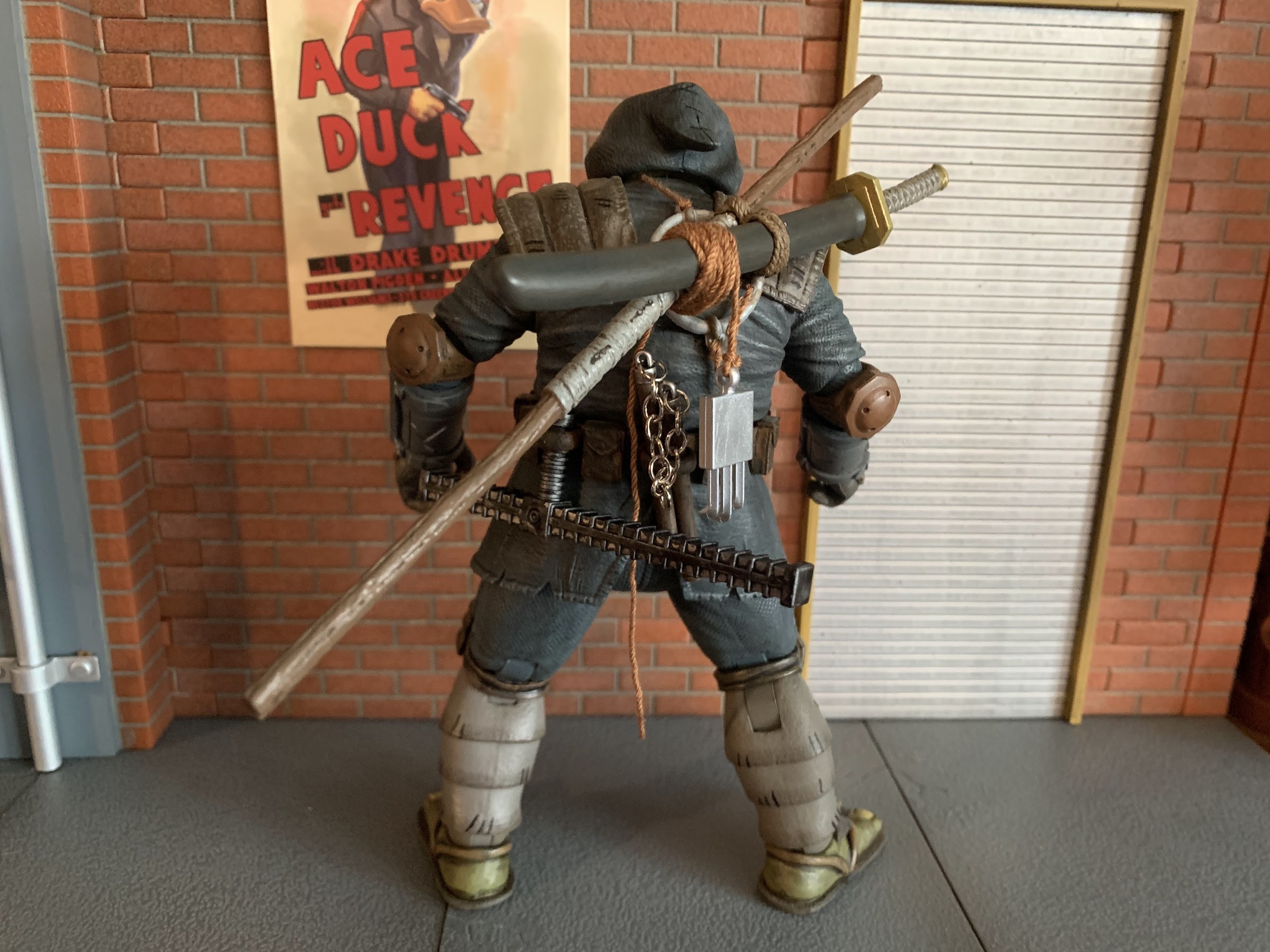
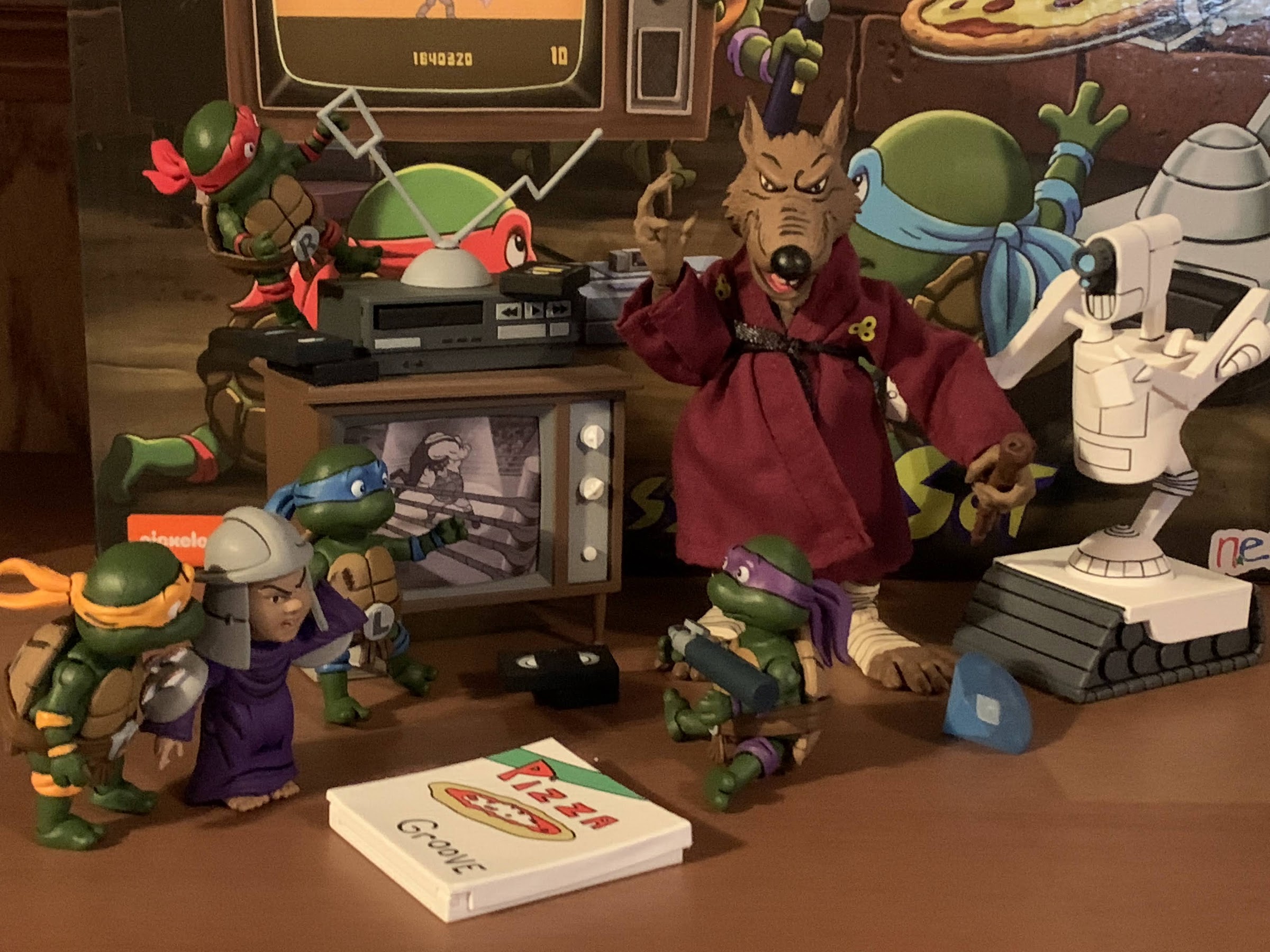
First thing we’ll talk about is the stuff that’s familiar. There’s a Mouser included and it’s just like the other Mousers we’ve received. Mine is stuck at the base of the neck, but is otherwise fine. There’s another pizza box of the hinged variety with a full pizza inside that’s removable. The deco this time around is Pizza Groove and it’s yet another box to add to the stack. There are two pizza monsters included in the set only this time it’s a new sculpt. That’s definitely welcomed as we have had multiple opportunities to get the other, standing, little, monster and I definitely didn’t need more of those. These ones are crawling and they look fine and should add a little variety to your display. Also returning is a VHS tape, this one with some yellow on the front where a label would be. The back of the box says there are two tapes included, but my set only had the one which seems to be the norm.

I do like this new Baxter portrait, though I’m surprised that the backpack doesn’t open.

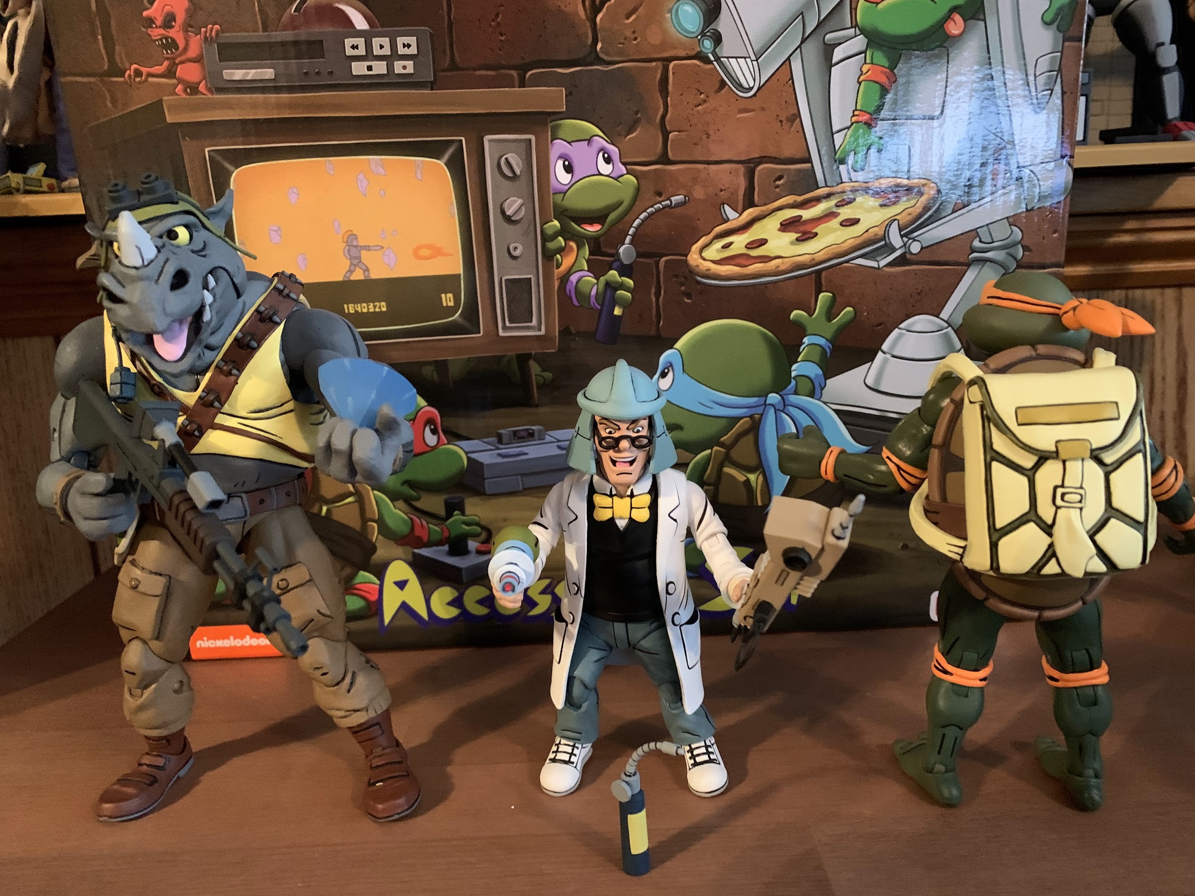
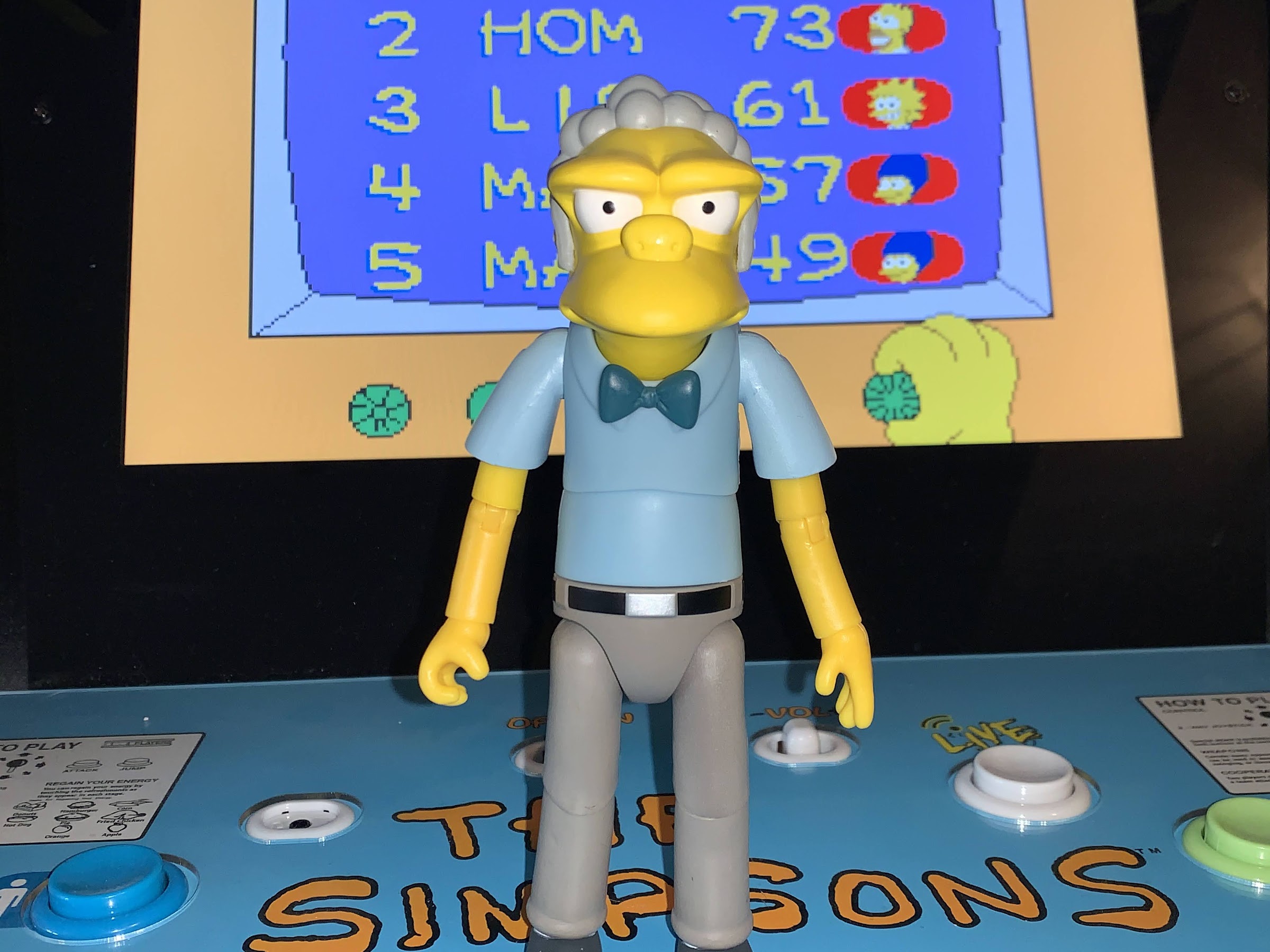
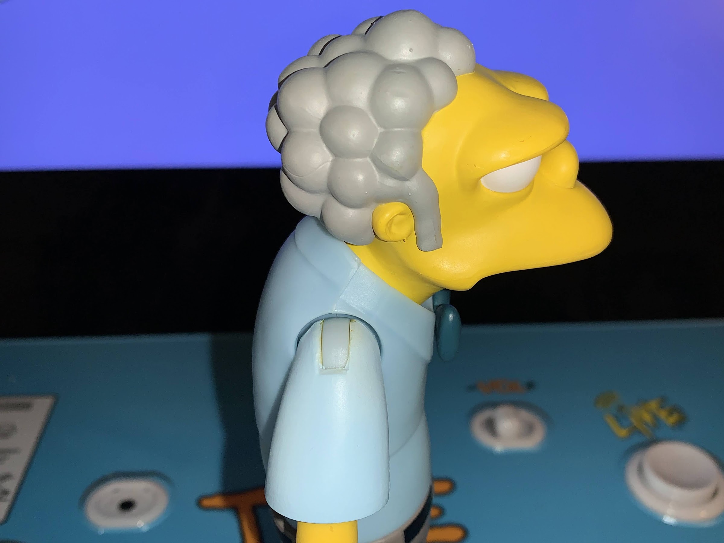
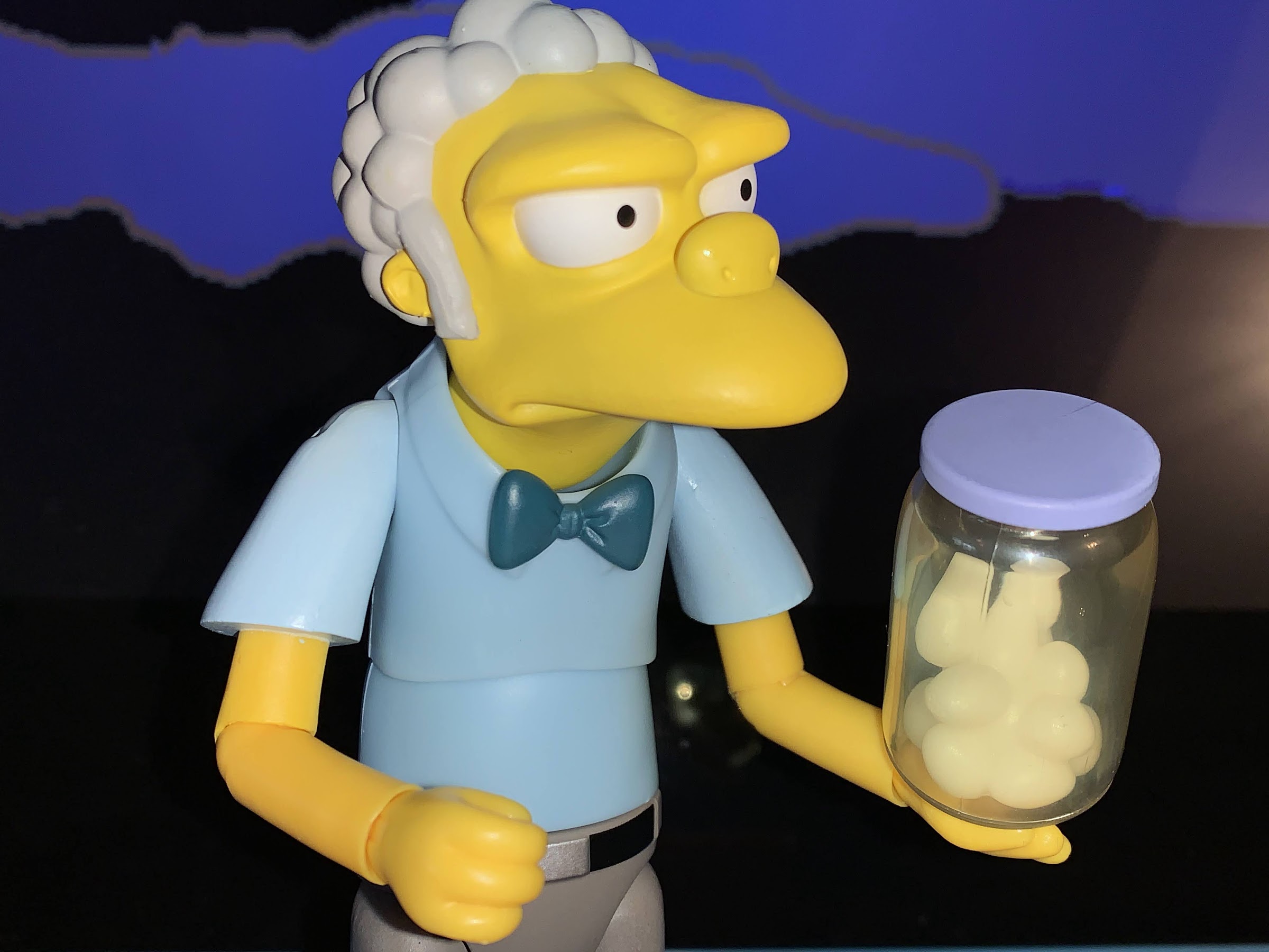
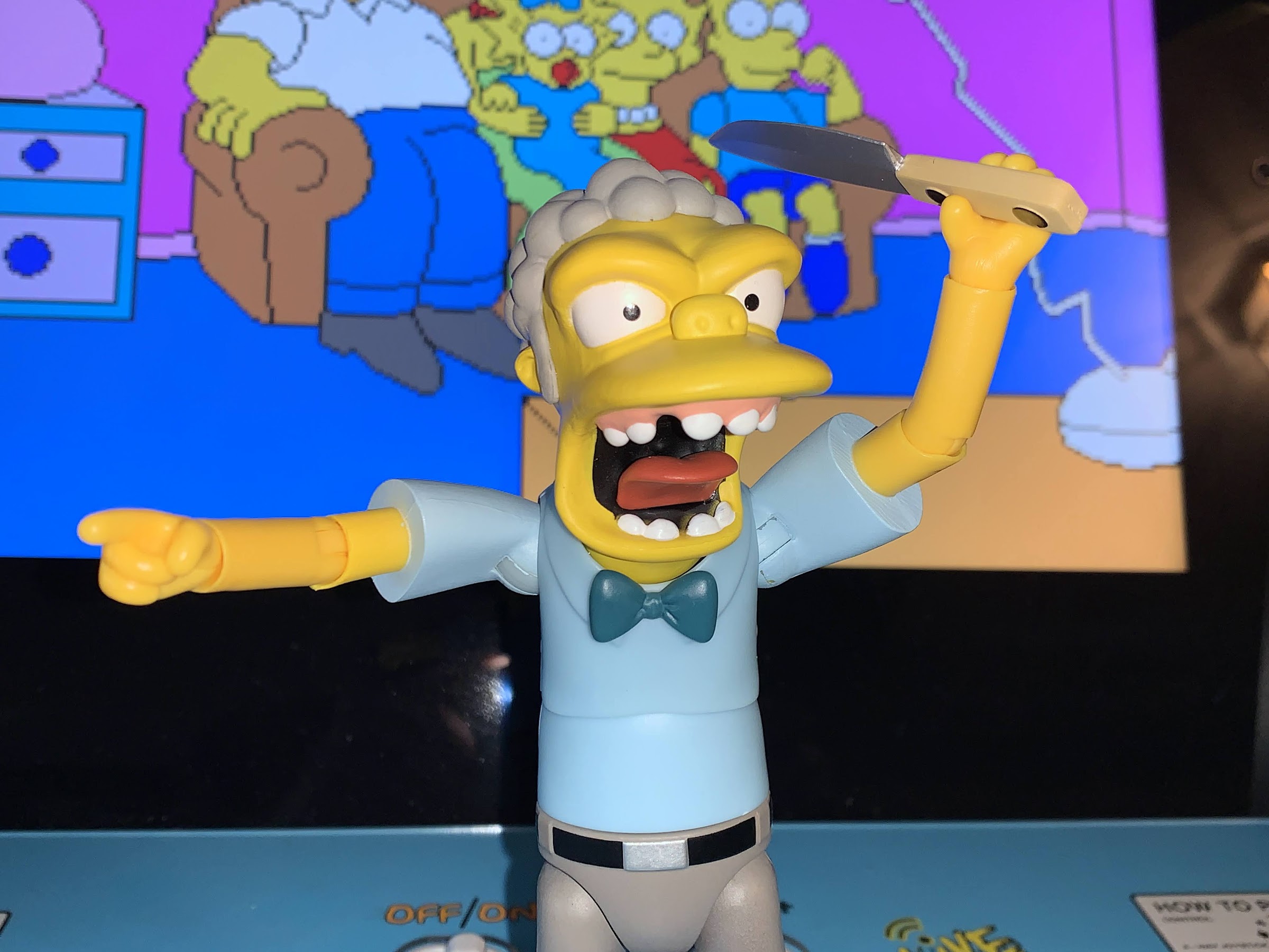
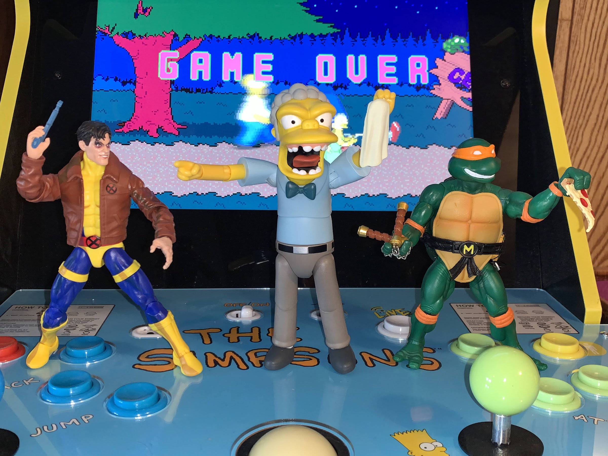
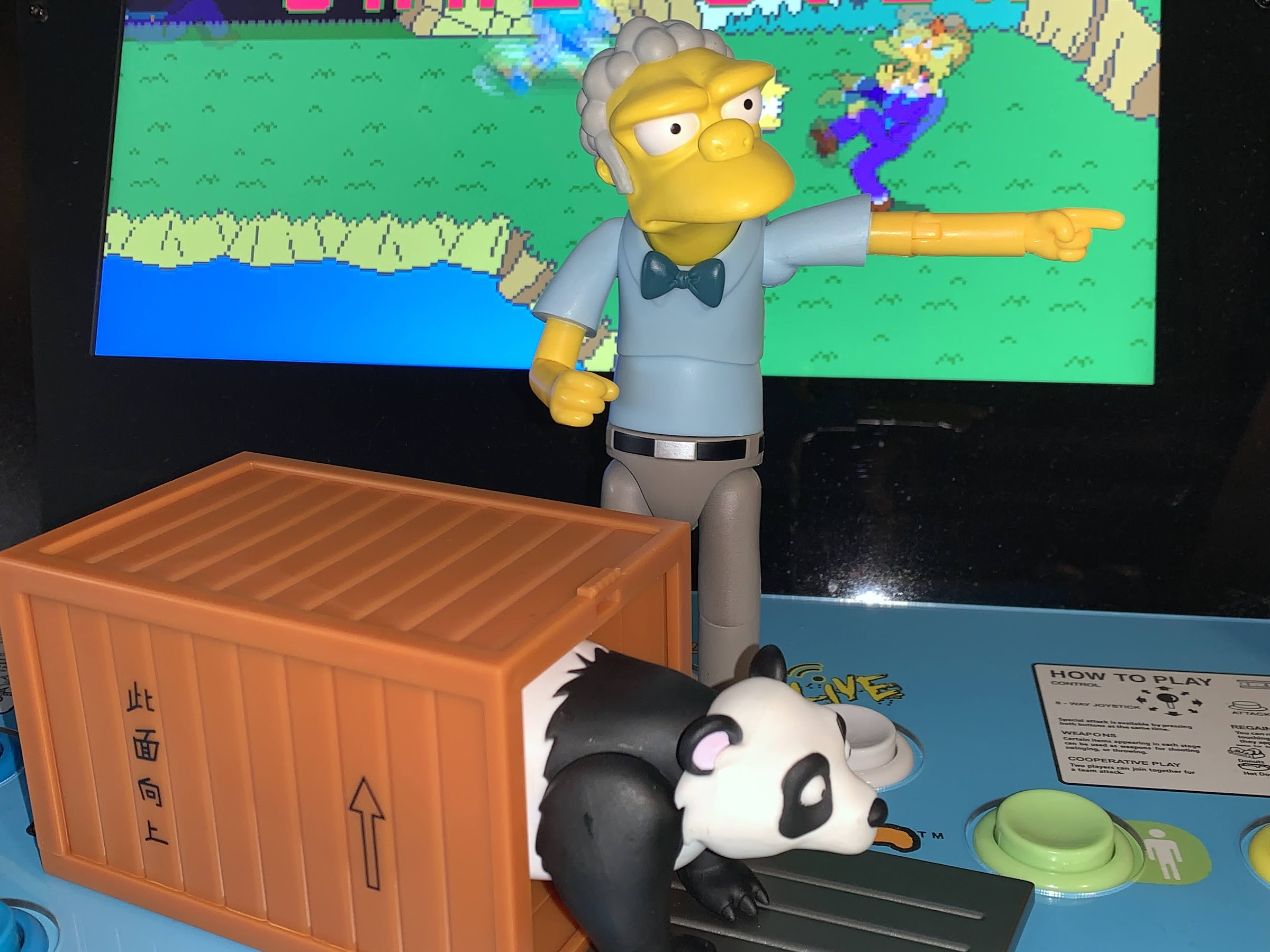
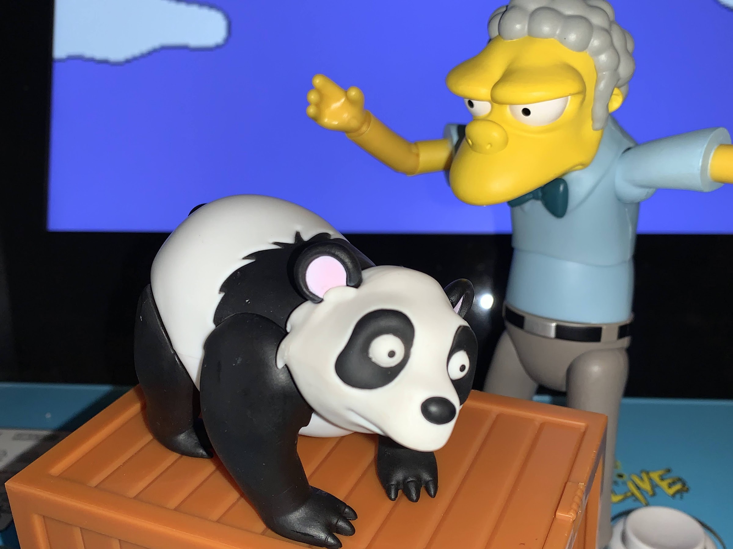
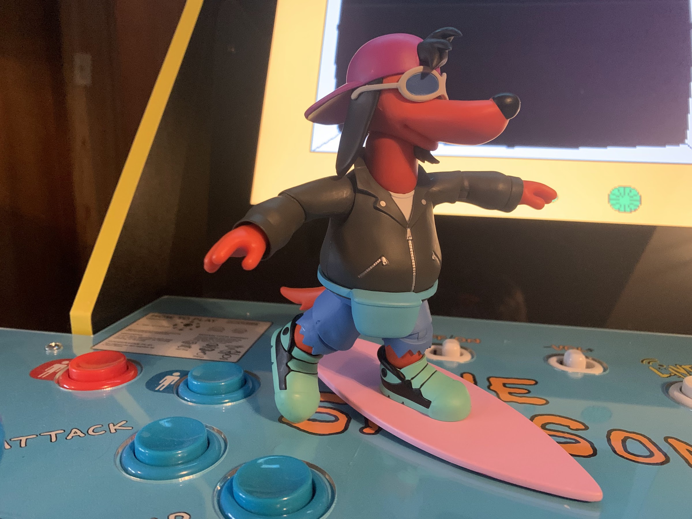
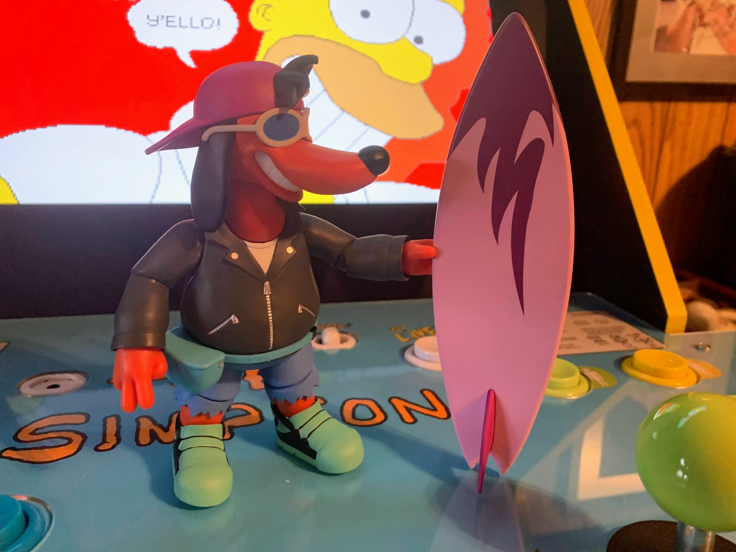
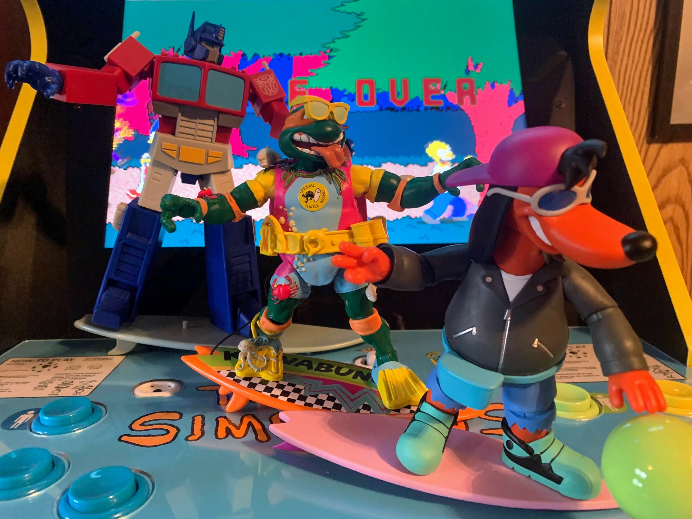
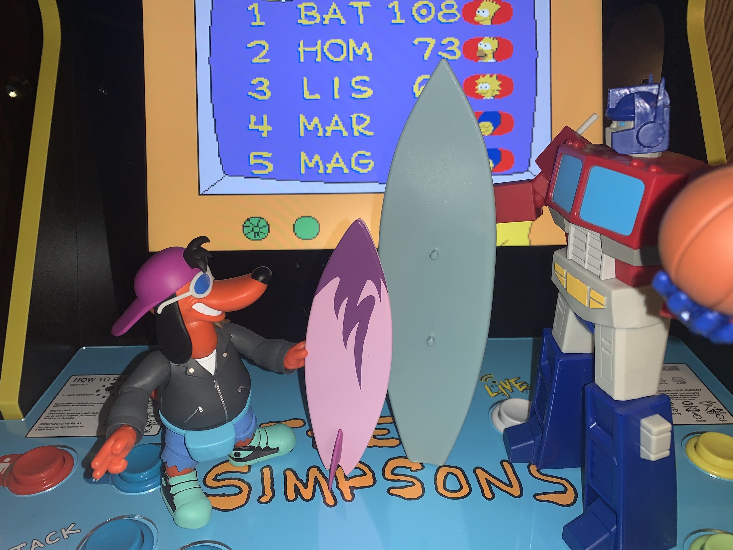
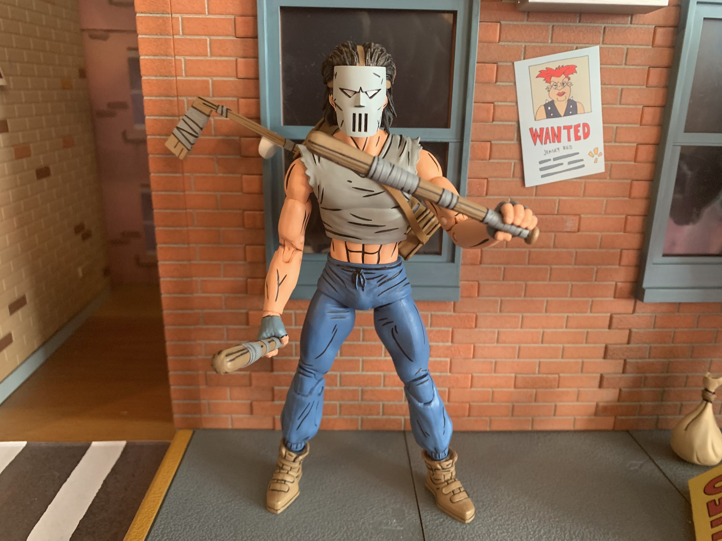
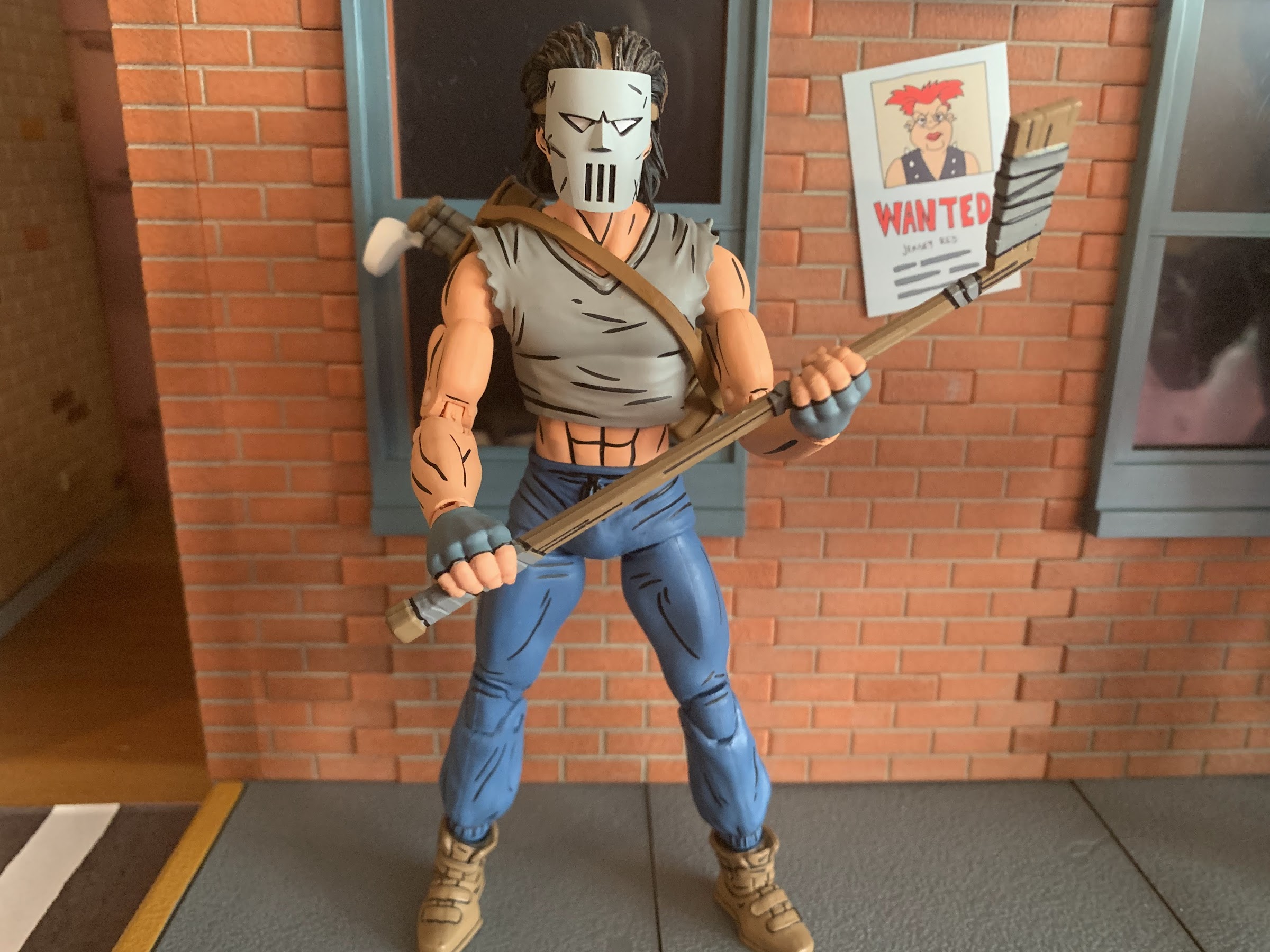
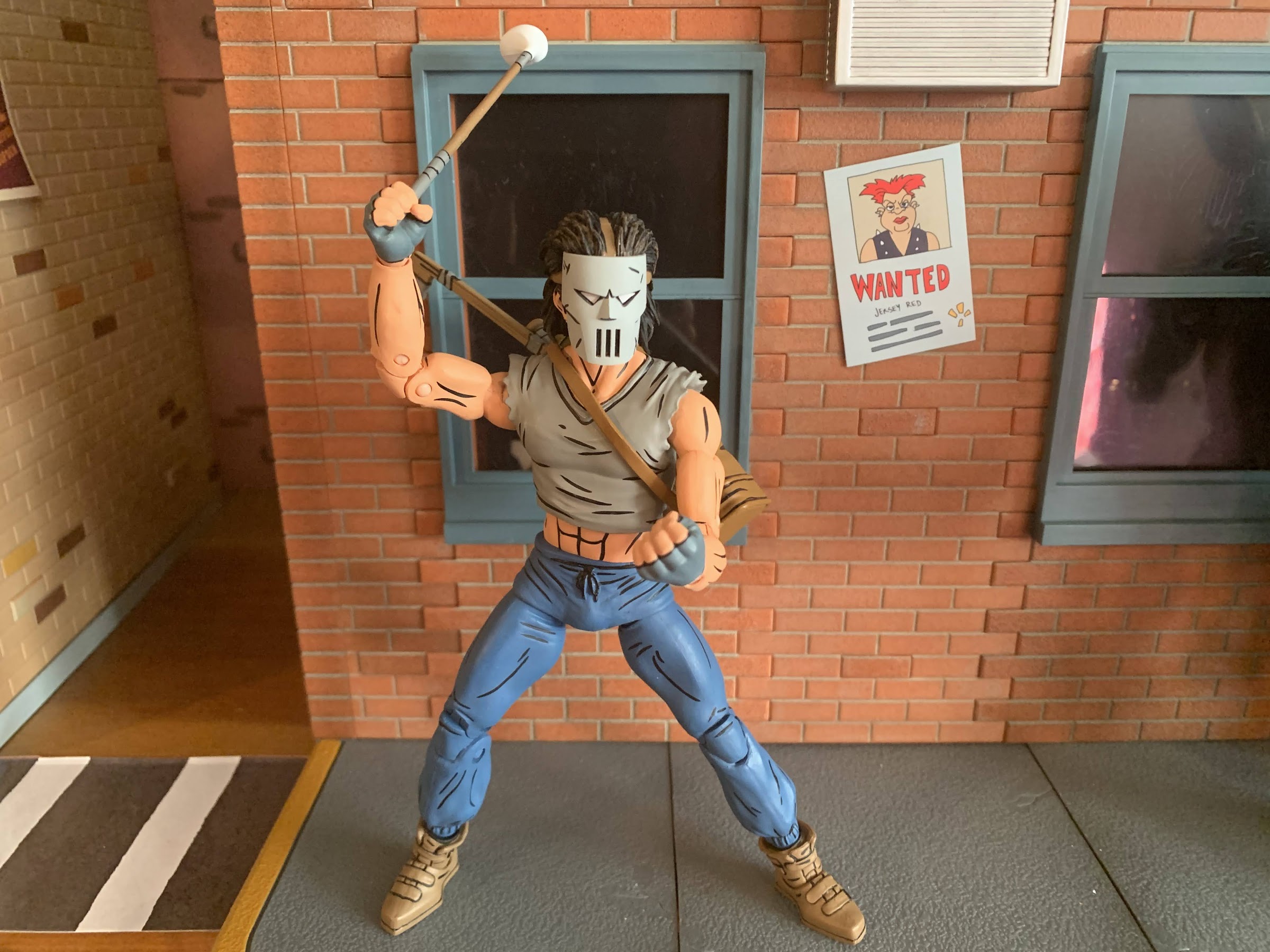
That’s the new-old stuff, the rest is all new. We get a portrait of a wedge of cheese which I think is from Rat King’s lair? It’s something to be added to a diorama, I suppose, and by itself doesn’t really add much. There’s an oversized gem, the Star of Hoboken, which would make a nice centerpiece on a coffee table. There’s a little blow torch for when Donatello needs to “do machines,” but no flame effect included which is a bit of a bummer. We get a turtle-themed backpack which can fit on any of the heroes if you would like, though it can’t open. There’s also a ray gun, which is how the box labels it. I’m sure it’s pulled from a specific episode and possibly has a specific purpose, but I don’t recall it. At least it’s something to broaden the weaponry of turtle foes (even though it’s Michelangelo who is pictured on the box holding it). Lastly, we have a few accessories that definitely feel specific to previously released figures. The first is Rocksteady’s helmet which he wore during the original mini series and maybe a few times after. He was predominantly without it, but since the original Playmates figure had one, many still associate the character with the helmet. It’s just an olive drab dome with goggles molded onto it and it looks fine. I feel like it could have used some more linework or something to make it pop more like a lot of the accessories in this line, but NECA opted to keep it simple. We also get the Turtle Tracker, which is a handheld device used by Baxter. It looks pretty cool and it’s a rather involved sculpt which perhaps is what made it difficult to incorporate into another release. And then lastly, we have a new head for Baxter. I’m happy to say this one has his glasses (my previous Baxter came missing them and NECA has yet to replace it) and he’s also wearing Shredder’s helmet. This is from a season two episode (“The Curse of the Evil Eye”) where he briefly usurps Shredder with some magical device. I think his face looks better than the standard one and I’m left wishing the helmet and hair on that release were removable, but oh well. The helmet had a gem on the front of it in the episode which is not present for some reason.

Because the collection just wouldn’t be complete without Big MACC.
This brings new meaning to the phrase “Big MACC Attack.”

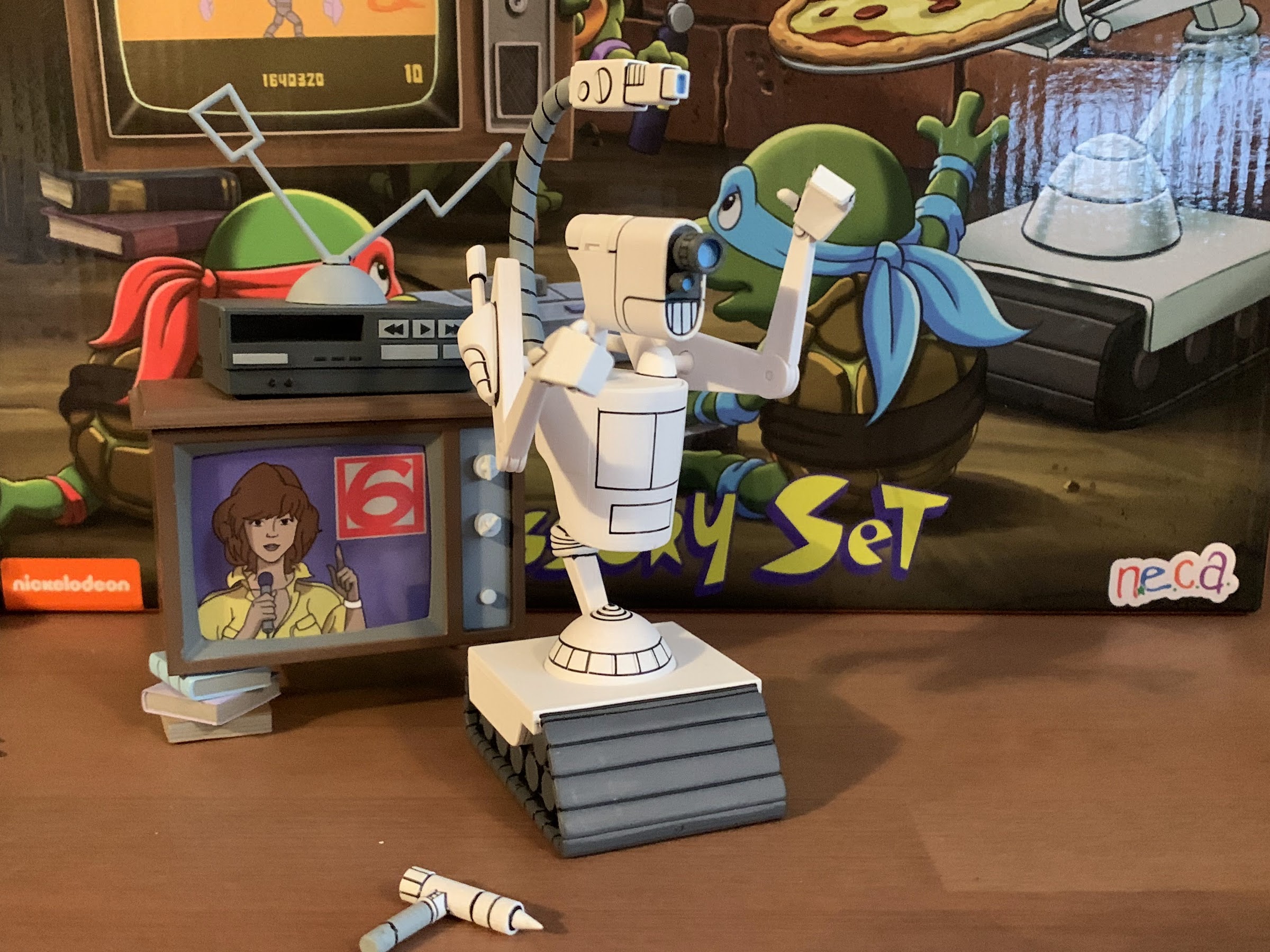
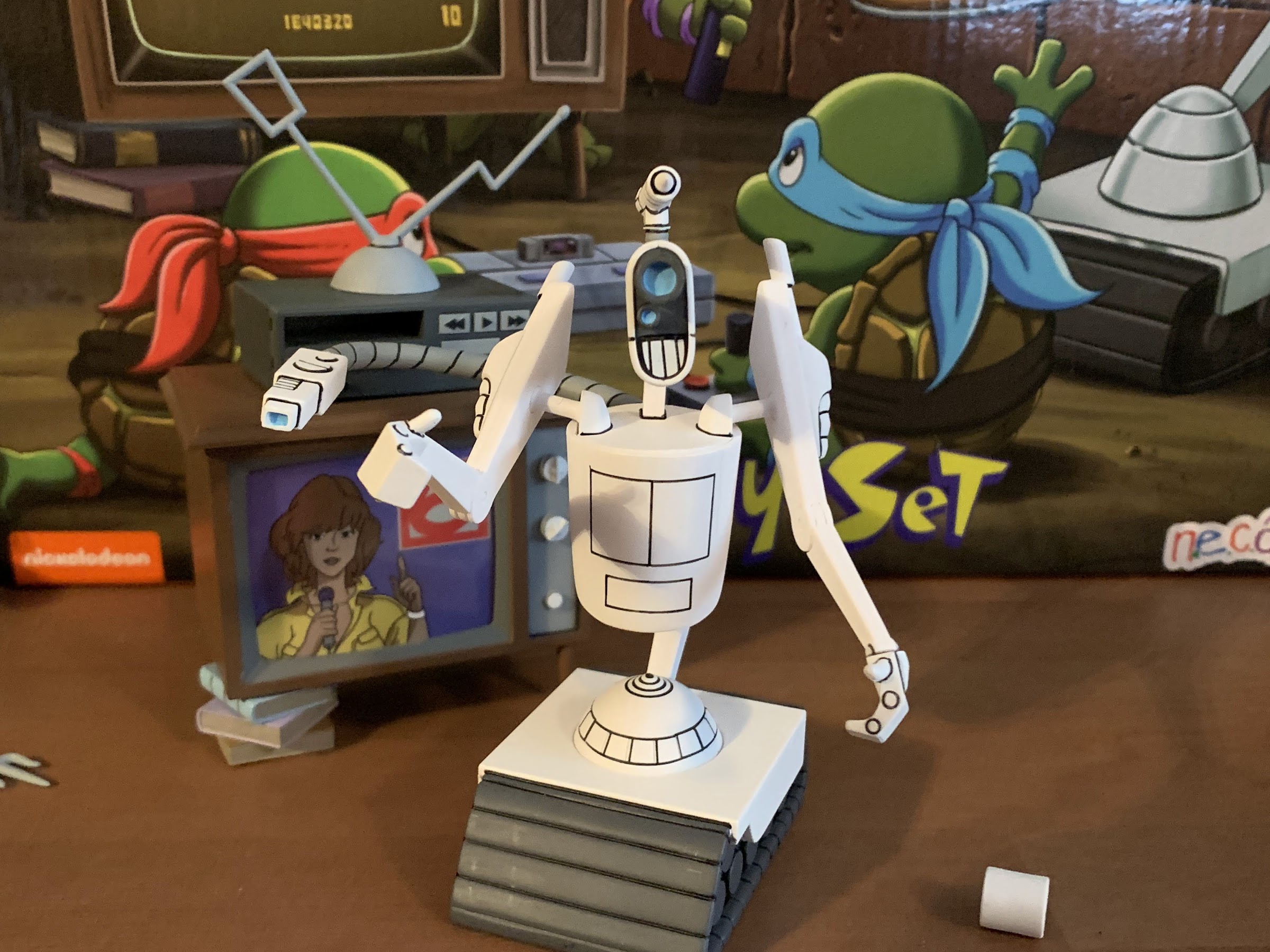
That stuff is the window dressing for this set. The filler, if you will. I suppose some really wanted that Rocksteady helmet and I know of a few who weren’t happy with how the Baxter figure turned out so they may welcome the new head. The real selling points for this set are the next few items we’re going to talk about. Up first is Big MACC. He’s a robot from an early episode that’s basically a foe, but by the end of the episode has been converted to an ally. He’s got a bit of a Short Circuit vibe to his design, but he’s essentially a set of treads with a body on top. As a figure, it’s very light and feels quite delicate. The base is hollow while the torso is connected to the apparatus below it with a double ball peg so it can twist and pivot. The arms are connected via double ball pegs so they rotate and have some pivot to them as well. There’s a hinge for an elbow joint on each and the head is joined to the neck via a double ball peg. There’s nothing at the hands and the big gun which is affixed to a tail of sorts has no articulation aside from a swivel. I’m a little surprised it’s not on a bendy wire, but I guess it’s fine. MACC is made of a hard plastic though so everything feels especially delicate. There’s a second gun plugged into his head which can be removed and replaced with a filler piece which is a nice touch. The main body is all white with black linework and it’s applied very clean. If you wanted a Big MACC figure, you have it, and it’s fine. I wish the hands could rotate and I’m surprised the base can’t, but he’s just a set and forget it kind of figure.

This might seem kind of silly to outsiders, but this TV is awesome. And here’s the cheese picture, since I forgot to include it in the shot of “new” stuff.

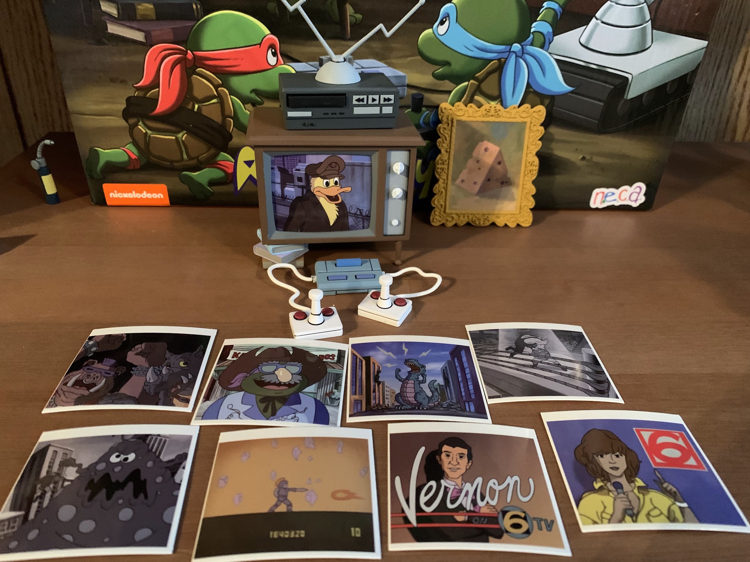
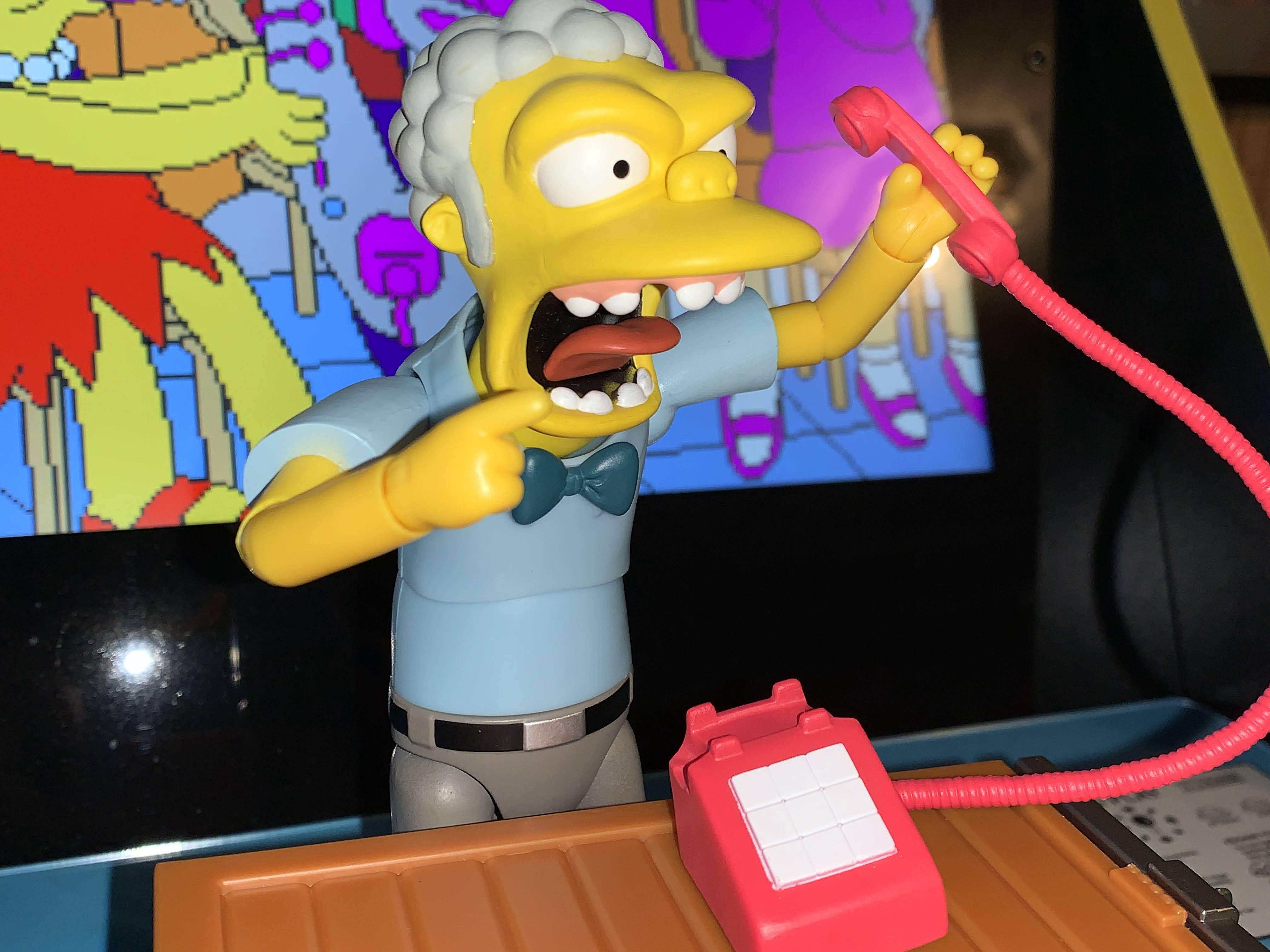
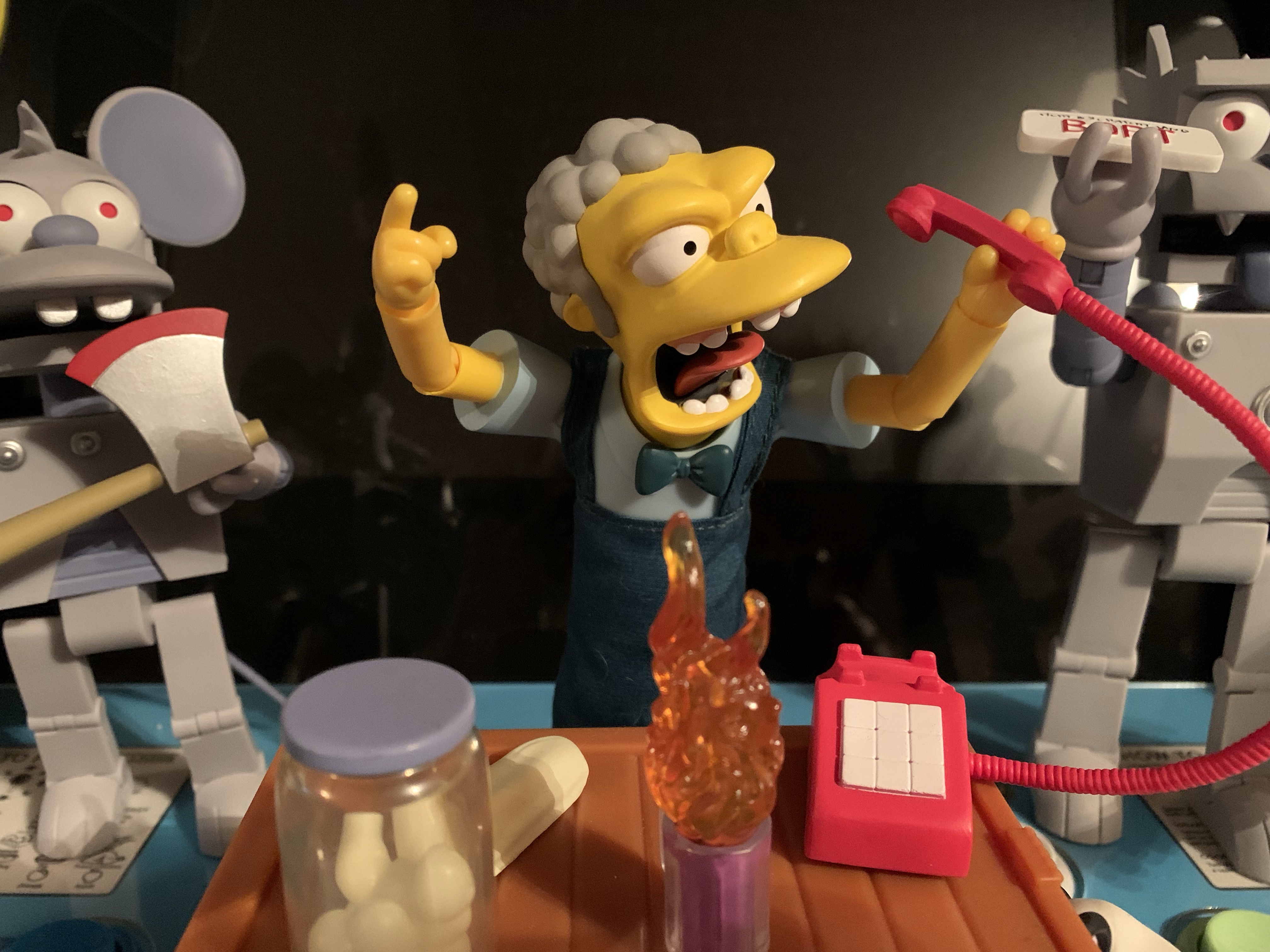
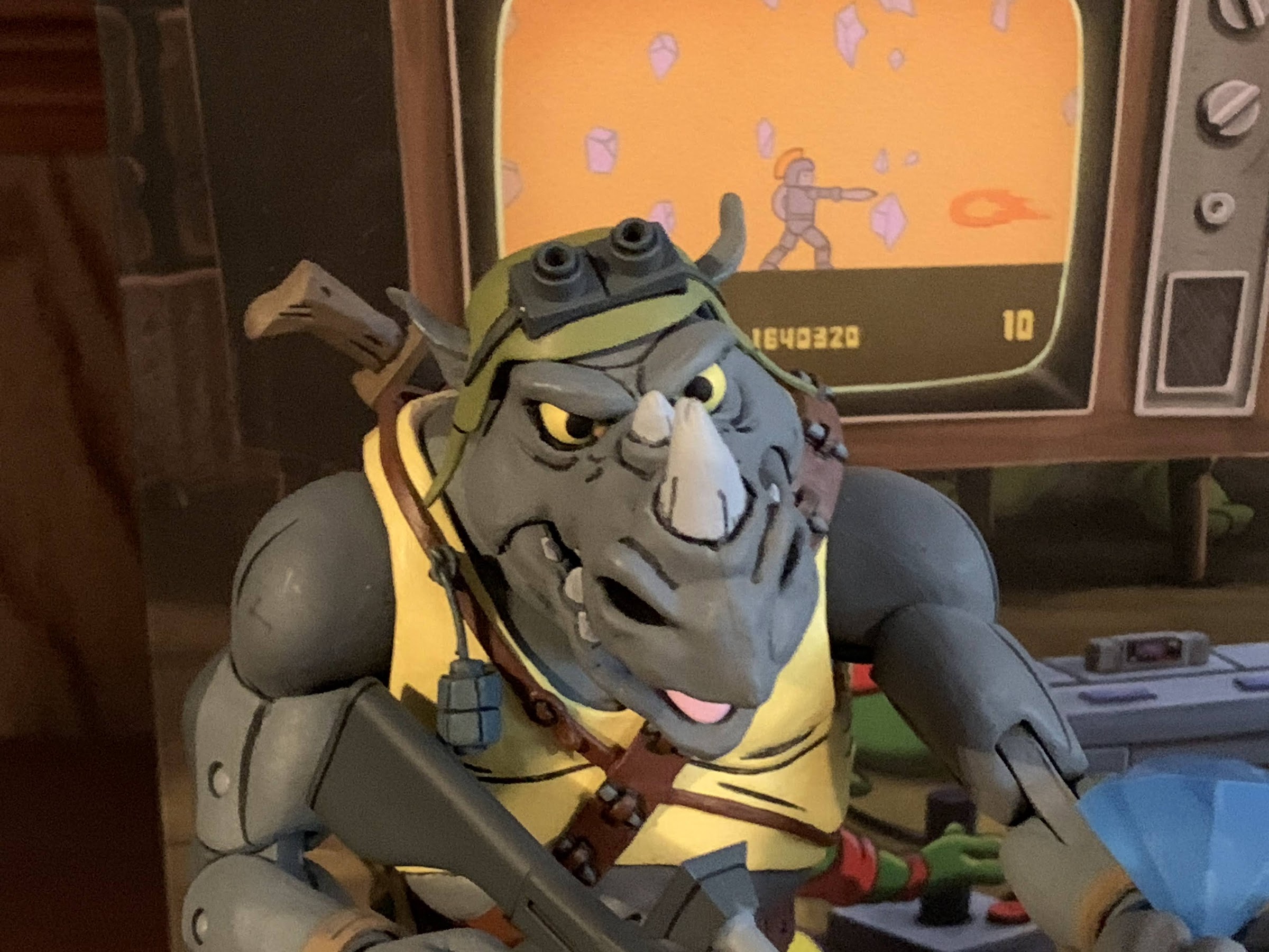
Our next item is one that will serve a greater purpose when the lair is available and it’s the television. This all plastic TV is an entirely new mold from the TV we’ve seen NECA release via other sets in the past. It’s a wood panel TV with dials and it has the missing front leg which has been replaced with a stack of books. On top of the TV we get a VCR and some rabbit ears for optimal reception. What’s neat is the VCR can actually accept one of the VHS tapes NECA has released and included in this set. It doesn’t have a little flap or anything, but it’s still a fun touch. The sculpt and paint are a bit plain, but it does have the added effect of featuring a removable top and a slot for the screen. NECA included 9 pieces of glossy cardstock to serve as the screens. They all feature different images so your turtles can watch a variety of programs. One is also clearly an old video game and NECA included a game console as well! It kind of resembles a Super Nintendo, but with a sleeker design. The controllers are more 2600 though and they’re connected to the console via a soft wire each. There’s a peg hole on the back of it which I’m not sure what that’s intended for, but it’s a neat little inclusion even though it doesn’t connect to the TV in any way. I’m betting the one in the show didn’t either.

They’re so cute!

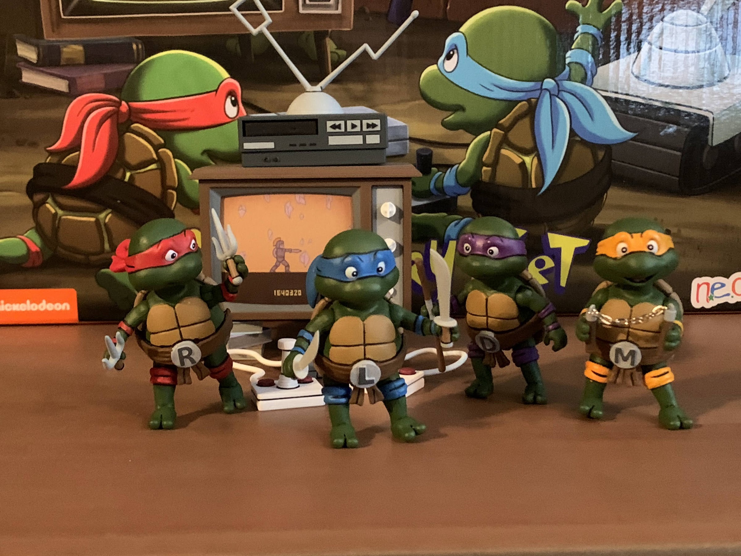
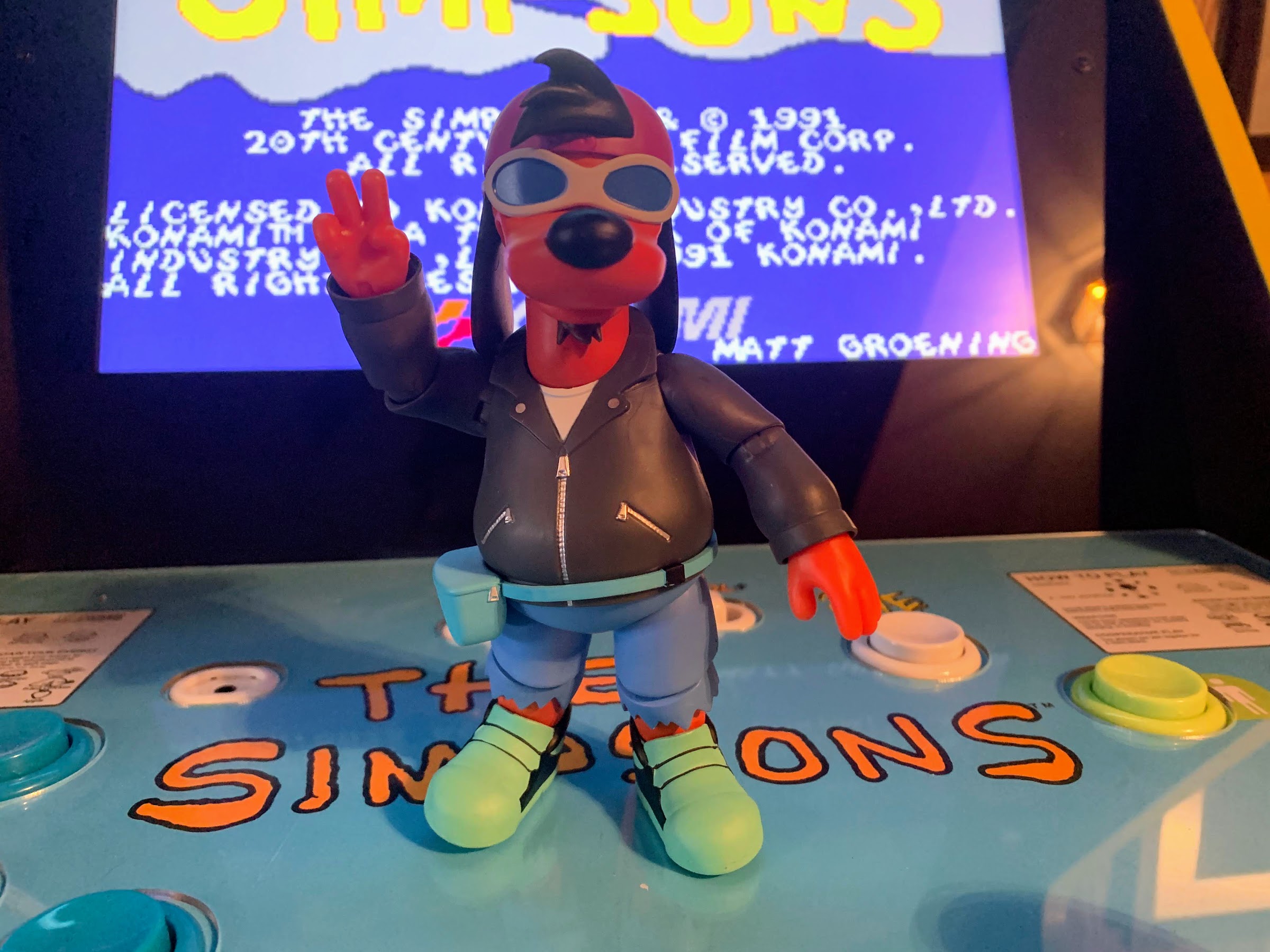
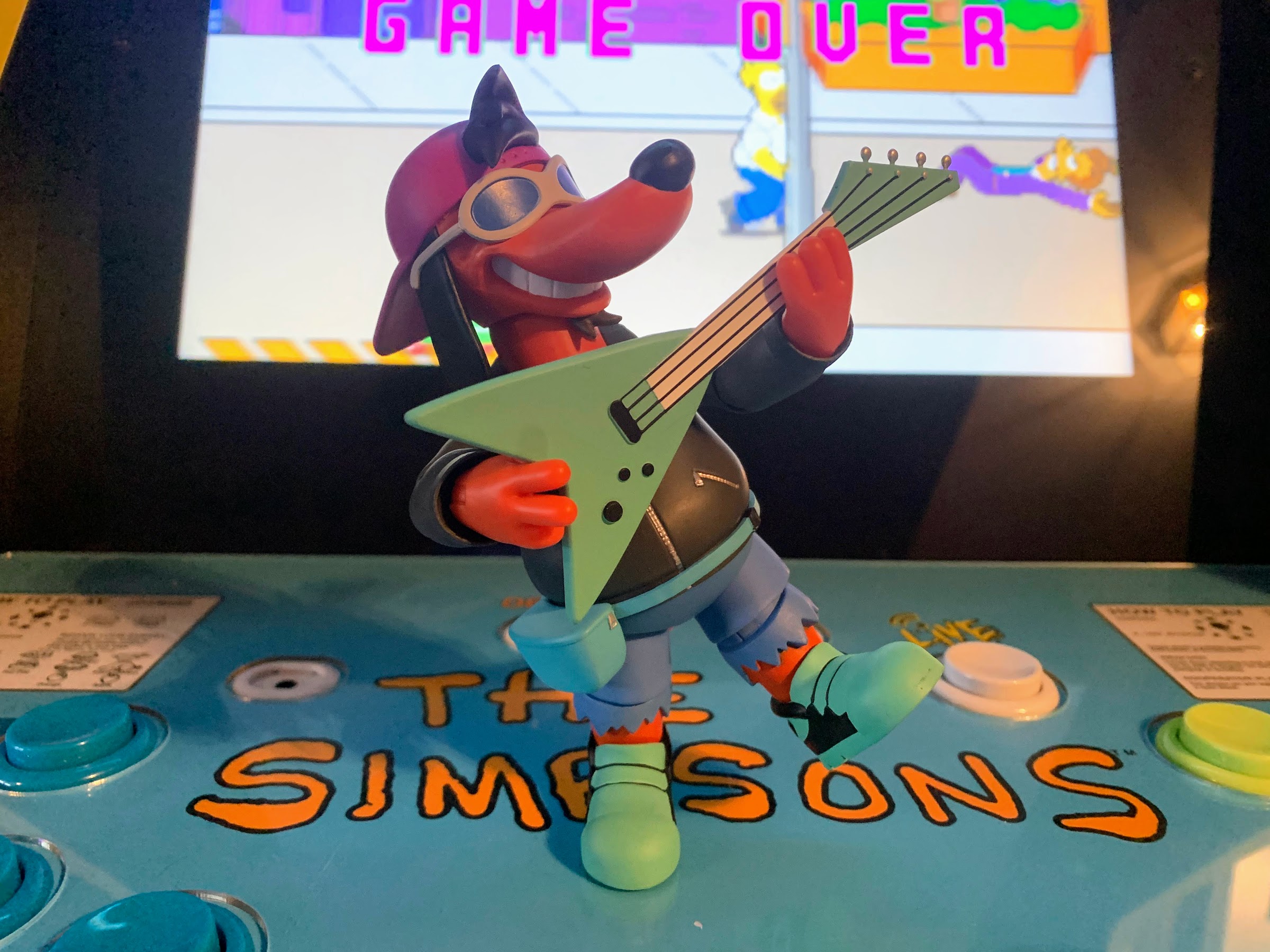
The TV would be the star of the set if not for the inclusion of the baby turtles, or turtle toddlers. There was an episode where the turtles were transformed into child versions of themselves and NECA has included those characters in this set. All four are essentially the same mold, but with a different head and belt buckle. They’re quite dainty standing at around 2.38″ each. Donatello has a nervous expression, Mikey a big smile, Leo a more subdued smile, and Raph looks pissed. Each also comes with tiny versions of their signature weapons and Mikey’s even feature actual chains. They can’t store their weapons, but they couldn’t in the episode either. The figures are all well painted, but NECA decided not to attempt its form of cel-shading with these guys (they also didn’t with Big MACC). There’s still plenty of linework and the paint is applied rather well. There’s also a little articulation built into them. We have a ball joint at the head, hinged shoulders that rotate, ball-socketed hips, and hinged ankles with a rocker. The ankles feel pretty delicate and it’s hard to tell if the ankle is rocking or just stressing the peg. Definitely be careful. There’s also a lot of weight on the back of these guys due to the shell which makes standing them a challenge. Stepping poses help, or just lurching them forward can help too. I actually could get one-footed stances as well which surprised me. There’s no peg holes in the feet so I may end up using some sticky tack in the end to keep these little guys secure and I do wish they came with little stands to help. They can sit, but not very well, but well enough to stabilize them by holding into something. Ultimately though, they’re super cute and that’s what they’re meant to be. Chances are, if you’re interested in this set it’s due to the inclusion of the baby turtles. Now we just need the geriatric turtles to complete the set!

Just passing the time.

Accessory sets are a bit of an odd thing to review, but there you go. It’s definitely the type of item that the completist collector will get the most out of. There’s some deep pull accessories and definitely a bunch of this stuff will work better with the lair. I’m definitely happy to have the TV and I think NECA would be foolish to not make sure that everyone who wants that item can get it because it will help sell that aforementioned lair. I’m actually surprised it’s not included with that. The baby turtles are pretty wonderful and I’m happy to have them. Big MACC is okay, I didn’t need it, but I don’t hate having it. That’s likely why the character is in here. And I will get some use out of that alternate Baxter head. The rest is just stuff that I have no attachment to. It’s filler, some of which will go into my display and some won’t. Is it worth 60 bucks? Ehh, that’s a tough call. We probably could have got the baby turtles in a set similar to the Mouser one which was 30 or 35 bucks. These little guys sold that way with maybe a few of these items tossed in would have sold me. The only thing I “needed” other than them was the TV, which I think could have come with the lair, but maybe it couldn’t? Hopefully it not being sold there means that item will be a little easier on the wallet? That’s probably a pipe dream. I don’t want to speculate on the cost of that, but the street scene was $150 I think so it’s not going to come cheap. Let’s just hope NECA gives us a little breather before that thing goes up for sale.

NECA TMNT Cartoon The Wrath of Krang!

We’re back for 2021, and right now it looks like a lot like 2020 as we have a new Teenage Mutant Ninja Turtles action figure to talk about – Android Krang! Hopefully, this doesn’t mean 2021 is a lot like 2020 going forward, but if it’s going to copy anything from 2020 then let it…

Keep reading

NECA Cartoon TMNT Premonition of a Premutation SDCC 4-Pack

It was a little over a month ago that San Diego Comic Con occurred, in person, for the first time since 2019. This was cause for a celebration, even if for those of us who take in the convention from the comfort of our homes saw little change. Even without the event taking place the…

Keep reading

NECA TMNT Turtles in Disguise

When NECA started on this journey into the Teenage Mutant Ninja Turtles cartoon it first began with a video game. An adaptation of a video game, to be more precise. The 2016 San Diego Comic Con exclusive contained a four pack of the famous, green, pizza destroyers in a pixel deco. They were the first…

Keep reading

Super7 The Simpsons Ultimates! Robot Itchy & Scratchy

They do not bring you love.

We’re back with the fourth, and final, review of the inaugural wave of Super7 Ultimates! from The Simpsons. And today, you’re getting a two for one as we’re looking at two figures: Robot Itchy and Robot Scratchy. This pair hails from the Season 6 episode “Itchy & Scratchy Land” which was one part Westworld and one part Disneyland parody. In it, the titular family takes a trip to the theme park that Bart is dead serious about attending, Itchy & Scratchy Land. Now, this is yet another “controversial” release from Super7 as we’re getting the robotic duo before the more traditional cartoon pair. It’s an odd pull for the first wave of a toyline, but that’s Super7. They zig when others zag. This duo does have the advantage of being another episode specific release and I’m on record as being in favor of that approach. Would I like just a regular Itchy and Scratchy? Sure, but I also get a kick out of these and it’s something different. And ultimately, no pun intended, we have to review the figures for what they are so set aside your beliefs on character selection and join me in taking a deep dive into these two figures.

Super7 basically maximized the space in this box.
Customary episode info on the back. Look at Itchy, isn’t he so cheeky concealing that knife behind his back?

Now, you may think that these two figures share a lot of the same parts. And if you did you would be wrong. I probably could have split them up, but the engineering is essentially the same and they share a lot of accessories, even if the actual figure molds are different. Both figures comes in the same Ultimates! box the others come in with artwork from the show and a little note on where these guys hail from. These two definitely take up a lot more real estate in the box versus their line-mates with only Homer really coming close to that sort of presence. These are pretty big figures with Scratchy being the tallest figure in the line so far. He comes in at around 7.5″ to the top of his head and about 8″ to the tip of his ears. Itchy is 6.5″ to the top of the head and 7.5″ to the top of his ears. What really makes them look big though is their heads which are just massive relative to the other figures. The torso is very boxy as well which adds to the bulk, though they’re not that heavy. That likely owes to the torso being relatively hollow and the legs are quite thin. That’s not to say they’re light or feel cheap, but the weight is definitely not evenly distributed as they both have heavy heads and light bodies.

Of course, you can’t have Itchy without Scratchy.
Even in robot form, Scratchy doesn’t get to inflict much harm upon Itchy.

We’ll start with Itchy first since he always comes first when the duo is brought up. These two figures do not share a single part as far as I can tell. The arms and legs on both figures essentially look the same, but everything about Scratchy is noticeably bigger. Super7 probably could have fudged it and told us to deal with it, but they didn’t and that’s something I definitely appreciate. The heads, like all of the heads in this line, are fully painted. They’re sculpted on gray, but painted over, which gives them a nice finish. Itchy’s really well sculpted. The inner ear is painted purple, the teeth a shiny silver, and the white and red paint on the eyes is very cleanly applied. I like that the pupils are recessed which gives them a nice touch. The nose is also painted a gray-purple. The hair effects are glued in and the only other seems present is the one circling his dome which is part of the design of the character so it’s fine.

Commence with the screaming.

The rest of the figure is, unfortunately, mostly bare plastic. It gives the body a different finish than the head and a far cheaper look. Super7 did paint the bolts on the front of the chest and the abdomen has some of the gray paint applied as well. Unfortunately, the bolts on the side of the figure are not painted. That’s in keeping with the look of the show, but Super7 seemed to decide the front of the figure needed another hit of paint on those bolts so why not do the same with the other bolts? Aside from the lack of paint, the sculpt looks mostly good. The arms look like they could have been bendy arms, but Super7 opted to go in a more traditional manner. This means the articulation lines look a bit off, but they’re not bad and I prefer this route over the bendy arm approach. The sculpt is there, it’s the finish that holds it back.

That’s what makes robots work.

With Scratchy, we pretty much have the same situation. The head is well-painted and well-sculpted. There’s little to no slop or bleeding on the edges and the seems are all really clean. Like Itchy, he has some silver paint apps on the chest with the bolts across the top and this big cap in the middle. His abdomen is not painted, but it’s also not supposed to be so I can’t knock it for that. He’s bigger than Itchy though so the lack of paint anywhere else stands out more. The torso looks especially bland and the larger tail on the figure is practically begging for some shading somewhere. He even has a wheel at the base of his tail, a detail I never noticed until this figure, but it’s not painted so it’s just a lump on his tail. Super7 has a great sculpt here, but they’re letting it down with the lack of paint.

They can handle these weapons okay.

For articulation, we can basically talk about both at once because the engineering is exactly the same. The heads are on a hinged ball peg, but it does almost nothing. The hinge is really tight, but even if you loosen it up, the oversized heads means there’s not really much room for them to do anything except look up. There’s really no tilt or room to look down, but you do get rotation. The hinged shoulders rotate just fine and they can come out to just about horizontal. I could probably force it, but I don’t want to break my toys. At the elbow, we have the standard swivel and hinge combo that won’t get you a 90 degree bend. Their arms are basically tubes so the swivel is useless. The wrists swivel and hinge and the hinge is actually built into the arm so you effectively can hinge the hand in any direction so that’s an added bonus of this slightly unconventional approach. There’s no articulation in the torso, but since it’s a box I wouldn’t expect any. The waist does twist and the hips just swivel forward and back. Because of the design, they kick all the way forward and back, but you get no split articulation. The knees are also just hinges, though they can hinge in both directions as far as you want because there’s no knee cap or anything else to get in the way. The ankles just hinge forward and back, but the range is pretty limited there and there’s no ankle rocker. The tail on each figure can rotate and hinge, though the hinge is fairly limited. Scratchy’s tail essentially functions as a third leg which is nice to have as the leg hinges aren’t the strongest. They’re not loose, but the top-heavy nature of each figure does mean you have to be mindful of how they’re posed or else they might topple over.

Unfortunately, they’re not really cut out for firearms.

When it comes to accessories, these figures are pretty loaded, though we do have a lot of repeat accessories between the two. For starters, both figures come with some extra hands. Itchy has a set of open hands and a set of “gripping” hands. Their hands are a unique design so they’re not traditional at all, but they seem to get the job done. Scratchy has a set of the open hands, but only one hand that I’d call a gripping hand. It’s odd that he didn’t get two of those. Both figures also have an alternate head. As far as I can tell, the alternate head is exactly the same as the standard head, the only difference is they’re not glued at the seems. This is so Itchy can lift the top of his head off to expose his circuits and Scratchy can remove his face to do the same. Both are references to the episode they’re from. And the innards are well-painted and well-sculpted. The pieces fit together pretty well too. I had to work at it initially, but leaving them in place helped to better form-fit them in place. That’s all to say they look exactly the same when assembled so I’m surprised Super7 even bothered with the glued heads. I guess the added cost to the figure is just raw materials since it’s all tooled already, but it’s a surprise all the same. Only one of my pictures (not included the boxed shots) features the default heads as I’d rather keep the ones that separate on them and you should be able to see how well the pieces fit together.

You may need to get a bit creative with the chainsaw.

For the accessories the two do share, we have a tiny arsenal and some rather common implements of destruction associated with the pair. Both come with an oversized, red-brown, mallet. The “gripping” hands work fine with the handles, but two-handed poses are a real challenge. The mallets aren’t painted, but they do have a nice, satin, finish so they look pretty nice. The pair also each come with an axe. They work just as well as the mallet as far as holding things and the axe head is nicely painted with a shiny silver and a red blade. It’s the same as the mallet as far as how it’s handled so it works just as well, and just as bad, I suppose. They also each have a tommy gun, though Scratchy has a hard time holding that one properly and Itchy isn’t much better. You can finagle it into their hands, but not in a realistic manner. I know we’re talking about a cartoon, robot, cat, and mouse, but they should be able to aim the gun. The gun itself is like the mallet in that it’s just plastic, but it has a nice finish so I’m not bothered by the lack of paint. The chainsaw is another accessory that Itchy has an easier time wielding than Scratchy. Neither can wield it particularly well as they just don’t have the clearance in the arms, but it can be fudged a bit more convincingly than the gun. The chainsaw itself has a nice, shiny, paint job on the metallic portion with red on the main housing. It looks nice, though I wish the handle on the top was a bit more pronounced and usable like the handle on the rear, but it’s fine.

The drum hangs too low, but at least it looks nice.

Those are the shared accessories, but both also come with some unique ones as well. For Itchy, he has a wearable drum and two mallets for striking the drum. It looks really nice though. It’s red with gold trim and it’s done rather well. The face of the drum is painted with a light blue and has a cartoon Scratchy head on it that is probably printed, but I suppose could be painted on. Either way, it’s nice and sharp and it definitely catches the eye. The mallets are rather basic, just a beige handle with an oversized, off-white, top. They’re fine and Itchy holds them well so no complaints there. The only thing I don’t like is it hangs a bit lower than I’d like. I wish it could hook onto his torso somehow to sit higher as more than half of the drum sits lower than his crotch. Overall, it looks all right and I think the drum by itself looks great, but it is slightly ruined by the fit.

Sure, the baby axe is cute, but it can’t stand so it’s like petting a cat: What’s the point?

With Scratchy, we get some unique stuff as well. Scratchy has a butcher’s knife which slots well into his “gripping” hand. It has a nice, shiny, blade and looks nice for what it is. I like that it is sized appropriately for the figure and doesn’t look dinky in his hand. I also like that it can be used with Moe or any other figure for that matter. Scratchy also comes with the robot baby axe from the parade scene. It looks like the regular axe only smaller and with painted metallic legs. Unfortunately, Super7 went cheap on this one as the legs are not articulated. And since it’s a straight up and down design for the most part it doesn’t stand well. The legs do not sit flush on a surface so it feels rather pointless as a result, which is a shame because it was a good idea, just poor execution. Lastly, Scratchy comes with what I think will unquestionably be the accessory of the year. I’m, of course, talking about the much in-demand BORT license plate. It’s a simple, white, rectangle with “BORT” sculpted onto it and painted red with Itchy & Scratchy Land on top of the plate. It looks awesome for what it is and it’s a tremendous inclusion as it references one of the best bits to ever appear on an episode of The Simpsons. If I am to nitpick it, it’s not to scale with the figures as the vanity plates in the episode were much smaller, but I don’t care. BORT license plates for everyone!

Behold! The most sought after vanity plate in all existence!

Robot Itchy and Scratchy are pretty much on par with the rest of the line. The sculpts are pretty great, there’s some missing paint apps which detract from the look and the articulation is mediocre at best. The high accessory count, and some fun inclusions, do help add value to the total package which is $55 a piece. These two are a bit interesting in that their sculpts are quite possibly the best in the line so far, but the missing paint on the bodies stands out more to me. I think Super7 did a great job in isolating what made this particular episode of the show so fun. As always, they could have done more like add some blood spraying effects or something (especially in place of the extra head), but the execution isn’t matching the imagination from those who designed the product. The baby axe being a total dud is a bummer and Scratchy only having the one “gripping” hand is an odd choice. I don’t think the gun or chainsaw pose well with the figures, but they also have enough other stuff that it’s not that big of a deal. If they weren’t so expensive, they would work well as army builder figures since there are quite a bit of display options available. And even though the articulation isn’t great, they do match the movements and poses of their animated counterparts better than some of the other figures I’ve received from Super7.

Well, that’s a wrap on Wave One of The Simpsons Ultimates! It’s not without its flaws, but overall I’d call it a success.

Ultimately, pun definitely intended, how much you like this pair will come down to how much you like The Simpsons, how much you like this particular episode, and the design of the two robots. I love the episode, and I find the design of the Itchy and Scratchy robots to be fun, so I like these enough. I think they could be better, and Super7 is pushing it at their current price levels, but I don’t regret the purchase. These are pretty fun, but definitely for a niche audience, so buy accordingly.

Need to catch-up on the rest of The Simpsons Ultimates! from Super7?

Super7 The Simpsons Ultimates! Deep Space Homer

Slowly but surely I am clearing out all of the action figure preorders I placed in the year 2021. Of the ones that had been remaining, the line I was most looking forward to experiencing was the line of Super7 Ultimates! based on The Simpsons. It was August of 2021 when these suckers went up…

Keep reading

Super7 The Simpsons Ultimates! Moe

Our first two looks at the inaugural wave of Ultimates! from Super7 based on The Simpsons have been two very episode specific takes. One was Deep Space Homer from the episode of the same name where Homer went to space and the figure presents the character in his space suit. The second figure was Poochie,…

Keep reading

Super7 The Simpsons Ultimates! Poochie

We’re back with another look at a figure from Super7’s latest wave of Ultimates! based on The Simpsons. And for this one, we’re taking things TO THE EXTREME! That’s right, it’s Poochie, everyone’s favorite rockin’ dog. He’s got attitude to spare and he’s not afraid to show it off. Where would cartoon history be without…

Keep reading

Beast Kingdom DAH-048 Space Jam: A New Legacy Bugs Bunny

He may be the greatest cartoon star of all time, but Bugs Bunny is surprisingly underrepresented when it comes to the world of action figures.

When I became a dad for the first time it made me get reacquainted with children’s television. I’m guessing all new parents go through this where they watch shows with their little one and find a great many of them intolerable. Perhaps that’s too strong a word, but it did cause me to reflect on what I was watching at a young age. And some of that was the same, namely Sesame Street which is like a rite of passage in the US. I watched a lot of Mr. Roger’s Neighborhood which basically has a sequel series in the form of Daniel Tiger’s Neighborhood which my kids watched a little of. There was also a lot of new stuff which didn’t click with me, because why would it? I’m not the intended audience, but it did have the affect of making me want to share the stuff I liked with my own children.

That temptation is essentially a form of nostalgia and it’s also big business. Go to any kid’s clothing retailer and you’ll find clothing with 80s and 90s properties that children today are not exposed to unless it’s through their parents. That stuff is for the parents to clad their children in. And it’s fine, having kids is pretty fun and that’s part of it. You also only get so many years to dress your kids as you want before they develop their own tastes. For me, I wanted to show my kids the old cartoons I grew up with. This may come as a shock, but I wasn’t in a rush to show them Teenage Mutant Ninja Turtles. Why? Because that cartoon sucks. I may have loved it as a kid, but it’s very much a relic of it’s time and not meant to cross the generational divide. Cartoon shorts from animation’s golden age? That stuff had already stood the test of time and it was those cartoons that I made sure to seek out. I already had a pretty large collection of Disney shorts via the Walt Disney Treasures line, but a gap in my collection was definitely the stuff from Warner Bros. Part of that was they just didn’t release their shorts in a manner that appealed to me. I love what Disney did by releasing character specific collections arranged in chronological order. Instead, Warner did the Golden Collection as well as a handful of spotlight releases that were either character specific or themed in some way. There were a lot of repeat cartoons across releases and it was all quite cumbersome. I wanted those shorts though, so I went out and got all 6 volumes of the Golden Collection and introduced them to my kids when they had the capacity to follow along with them.

Beast Kingdom is really good at boxes. I’m not sure if I’d consider them particularly good at action figures.

Looney Tunes, the show that aired on Nickelodeon, was an early favorite of mine. It was usually the last kid’s programming of the night on Nickelodeon and it was often the show I watched after getting ready for bed. I loved those cartoons and I’m happy to say my kids share that affection. My daughter, in particular, became a pretty big fan of Bugs Bunny and she even carried around a stuffed Bugs for a solid year and a half or so with her when we went most places. When we went to Disney World in 2021, it wasn’t a Mickey or a Minnie head poking out of her carry-on but good ‘ole Bugs. Showing these cartoons to my kids was a way for me to get reacquainted with them too as most of these I had not watched in over twenty years and it was great. I always intended to review the Golden Collection for this blog, but found it just too cumbersome to do. There’s just so much content, some of it great, and some of it not so great. It also suffers in that these shorts were meant to preempt a movie and be consumed in small doses, but when you arrange an entire disc of Road Runner cartoons it gets really repetitive. The characters are still great though, and it’s a shame that Warner Bros has allowed their profile to slip (and more recently, have removed the post 1950 shorts from HBO Max). The Looney Tunes, as they’re commonly referred to now, were still pretty huge in the 90s which is why we got a film like Space Jam.

This Bugs Bunny is obviously from the new Space Jam movie and the quality of the soft goods is probably its best feature.

Warner seemed interested in reviving these characters, or maybe it was more that Lebron James wanted to match Michael Jordon in yet another way. Regardless, it lead to Space Jam: A New Legacy in 2021 that just paired James with the same characters Jordan starred with back in 1994 only now it was less interesting. I saw the movie and was so entertained that I fell asleep. The original Space Jam is hardly what I would consider high art. Jordan is as wooden as a basketball court and the plot is pretty stupid, but the character animation holds up pretty well and it has its moments. It’s entertaining, and my kids love it. I don’t think they ever asked to watch the new one again. It tries too hard to find more of a heart at its center and falls on its face as a result. It’s also too long and the characters in 3D CG just lack the same charm that they possess in 2D. The only good thing I can say about it is it lead to new toys. The Looney Tunes are severely underrepresented in the world of toys and collectibles. The best ones might be the McDonald’s super hero toys featuring Bugs, Daffy, Petunia, and Taz with snap-on DC super hero costumes. DC Direct also had a line of more diorama styled toys a few years ago that were pretty neat for what they were. The toys that showed up at big box retailers for the new film though weren’t of any interest to me, but I was hoping we might get something flashier in the collector realm.

The paint applications aren’t exactly pristine and Beast Kingdom seemed to have a hard time matching the paint on the face to the paint used on the rear. Remember, this is an 80 dollar figure.

Enter Beast Kingdom, holders of many licenses and makers of interesting toys. I’ve looked at one Beast Kingdom figure in the past, a Donald Duck figure from their Dynamic Action Hero line, and found it to be…okay? It presents pretty well, but the quality did not really justify the cost. Beast Kingdom is very good at the presentation of collectibles, but at the expense of the actual figure inside the fancy box. I question if they price their figures at a certain level to add prestige because it doesn’t look like the construction of the figure inside justifies it. At any rate, the experience was positive enough that I was willing to give them another look when they unveiled a Bugs Bunny from Space Jam: A New Legacy. Now, I personally just want a Bugs Bunny figure as seen in the classic shorts. I’d love a line of the character with various artists’ interpretations, but I was willing to settle for this one because the basketball uniform was done with soft goods that could be removed. The sculpt is still Space Jam, but I think the model is also pretty stock for Bugs. I just wasn’t in love with the price which was $80, so I waited. Once I could get it for almost half off did I finally roll the dice and now I can tell you all about the experience.

The neck on my figure won’t stay together leading to a very floppy head and shoulders situation when it comes to posing.

Bugs Bunny arrived in his fancy box, as expected. It’s very glossy and a pain to photograph, but it’s very much themed to match the film the character is taken from. On the front, we get a shot of the figure that’s probably a digital render and on the side is some artwork. It’s a fairly thick cardstock that lifts off of the box like a board game box. Inside is another image of Bugs on a slip cover that just lifts off to reveal a tray underneath that contains the figure and all of its accessories. Behind the tray is where they hid the figure stand. The tray is black with a clear cover that’s taped down. Once you get that off you can finally get at the figure. Immediately upon lifting Bugs out of his plastic coffin his left leg fell off so we weren’t off to a great start. His tail and feet are wrapped in plastic and it’s kind of a pain to get off. I assumed they were worried about plastic transfer or something, but once I got the plastic off I realized they were bagged because those parts are flocked – interesting.

The flocked tail and feet are certainly a choice.

Once out and de-plasticked, Bugs stands at approximately 6.25″ to the top of his head and nearly 8.75″ to the top of his tallest ears. He’s in his own scale, and even though it’s not the same license, I thought he would scale a bit with the Donald Duck I have, but it’s not even close. No matter, since I envision him being displayed solo, but that might bother some folks. Bugs is mostly colored plastic. The gray on his head, the pink of his nose, and the black for his pupils and inner mouth make up the bulk of the paint on the figure. Even though it’s not much, it’s not especially clean. The gray around the eyes doesn’t quite reach the edge of the white portions and it’s off enough that it’s visible from afar. It’s also noticeably darker than the gray paint on the back of his head which is awfully distracting. The pink inside the ears has the same issue and one can see why Beast Kingdom avoids painting its figures since it kind of sucks at doing it. I’m also not a fan of just painting the inner mouth black. There should at least be a tongue, and most images of Bugs would paint the inner mouth a dark red. The white portions are also begging for some paint too since the buck teeth get lost in the white fur. At least a black outline, or a black line down the center, would solve that. He has dimples for his whiskers, but since they’re not outlined you’d never know they’re there. Oh and speaking of, he’s also missing his whiskers! Maybe they weren’t in the movie? They’re on the artwork so that’s a bit bizarre. The flocked feet strike me as an attempt to make the figure better resemble the 3D model in the film. It works, but it’s really odd that they only did it on the feet. It’s just as odd with the tail, but since it’s on the back of the figure I don’t care as much, but the feet look silly.

This expression, including the posing of the ears, is pretty much lifted directly from the movie.

For a largely unpainted figure, I will say that the plastic doesn’t have an overtly shiny appearance. The hands feel like a soft vinyl so they don’t reflect the light as much as the white on the face. The eyes and the mouth are the only real shiny areas which will vary from face to face and we’ll talk about in the accessory section. Where Beast Kingdom seems to spend the most money is on the soft goods. The basketball jersey is textured like an actual jersey and the printing is very clean. It’s not a decal and the stitching is really well done. I mentioned I have no plans to display the figure with the jersey on, but it’s done so well that it did make me reconsider. If it was the Space Jam jersey of my youth, I may have given in, but I just have no affection for this one. It’s not as loose-fitting as the jersey appears to be in the film and I’m actually surprised it’s not very stretchy. Getting it off will require removing the figure’s arms, which shouldn’t be hard since the right arm fell off shortly after the left leg when I initially picked the figure up, and I’ll likely have to remove the head. Getting the trunks over the tail will likely be the hardest part of the process. His belly is painted white underneath, about as well as the face and ears, and there’s no other sculpting. He can definitely be displayed naked, and I’m surprised that Beast Kingdom didn’t make it easier to get the jersey off without cutting it.

This is about as close to a “What’s up, doc?” face as you’re going to get from this one.

The look of the figure is certainly a mixed bag. The paint is poor and the flocked feet bizarre, and then there’s also the face. It’s definitely based on the film, but it’s like a low detail version. I can’t fault a figure based on the new Space Jam movie for looking like its source, but it could be better at actually looking like the source. Mostly though, the figure just feels cheap. Really cheap. The shoulders are very loose and floppy and it seems part of the problem is the torso isn’t held together very well. It keeps splitting at the neck, which makes the head extremely floppy. I have to keep pinching it to get the head to stay in place, but manipulating the figure causes the joints to get loose once more. The only fix would be to try to glue the piece together, but I’d be afraid of the glue seeping out or getting into a joint and screwing it up there. This is absolutely not a premium collectible despite its price.

Naked, as nature intended.

We may as well go right into the articulation since it plays into the looseness. The head is on a single ball peg and he can rotate, look up, look down, and gets some nice nuance posing. Manipulating it will loosen the neck and create a bobble head, but pinching the neck back together solves that to a point, but the gap never stays closed so it’s going to get loose again real quick. The shoulders are on a hinged ball peg so they can raise out to the side a touch past horizontal and get a little forward and back movement at the ball. The bicep pegs into another ball hinge at the elbow which in turn pegs into the forearm. This gives the figure a swivel point above and below the ball-joint plus a bend at the elbow that goes past 90 degrees. It functions well, and it’s at least nice and tight, but ball elbows are the type of joint that look a bit unsightly to me when the arm is out straight. When the elbow is bent it looks fine. The wrists are on another ball-hinge so they rotate and move up and down on that hinge and they work fine. There’s no articulation in the torso at all or at the waist. Our next point is at the hips which uses another ball and socket joint like the shoulder. Bugs can kick forward almost to horizontal and he kicks back a little. Bugs can’t do splits, but his legs go out to the side past 45 degrees. The knees are just like the elbows, so we get rotation above and below and a bend that goes past 90. The ankles are the same setup as the wrists but with a forward-facing pin for an ankle rocker. The hinge goes forward pretty far, but they cut the shin at an angle so the range back isn’t as far as it should be. The rocker works fine. The tail is the last spot and it just swivels.

He sort of looks like classic Bugs. Right?

Bugs moves well enough for the source material. He’s easy to stand since his feet are so large and most of the joints are plenty tight. It’s the shoulders and head that are loose and a pain to pose as a result. I’m a little surprised at the lack of posing for the ears, but since Beast Kingdom loves the ball-hinge joint I’m glad we don’t have ears on ball-hinges. Bugs works best going for basketball poses like running, jumping, and shooting. He struggles with more traditional Bugs Bunny poses as he can’t really get his hands onto his hips, and trying to do so means fighting with the loose shoulders. I would have loved to get him to lay down as he appears on top of the Warner logo in many a cartoon, but he really can’t do that either. He can basically stand and his big feet mean you can pose him on one foot with the other more relaxed, but he could be better. The lack of any articulation in the torso is a killer there. It’s surprising to me that they didn’t try something there since he’s intended to wear clothes, but at least the solid torso means he has a cleaner appearance when not in the costume.

It looks like Beast Kingdom may have initially planned on the eyes being swappable, but these things don’t budge and the feature isn’t advertised or mentioned in the instructions. Bummer.

For accessories, Bugs has a spread of hands and faceplates to go with a couple of props. For faces, Bugs gets three portraits: smile, worried, and carrot chomping. Interestingly, it looks like the eyes were going to be removable as they just slide over some pegs, but they’re totally fused. My guess is it wasn’t working in the testing phase so they just cut that feature. There’s zero looseness so I don’t think they could be removed now, but it would have been nice as he has wide open eyes, upward looking eyes, and partially closed eyes. The gray on the faces are all painted poorly, but at least the eyelids look fine. Every face has the same issue with the gray on the face being slightly darker than the gray painted onto the head of the figure which is distracting when viewing the figure from the side or when his head is positioned at an angle. Both are white pieces painted gray so I don’t know how they messed that up. The worried face has a little extra pink paint for the gumline and that is surprisingly sharply painted. The bare teeth though really draw attention to the lack of detail paint there. He needs some shading or something because the teeth are practically lost in the white fur. For hands, Bugs comes with a set of fists, open hands, and a set of hands that are open and slightly curved for palming a basketball. There’s also an additional left, gripping, hand with the pinky finger raised for holding a carrot. For ears, we get two relatively straight-up ears that have a gentle curve to them as well as a right ear bent past 90s degrees and a left ear with a less severe bend to it. The hands slide off and on the wrist pegs fairly easily and the ears key-in to the head in designated spots making it virtually impossible to mix-up the right and left ears. The faceplates are also easy enough to swap and they stay on just fine as well.

Even Jordan can’t fly like this.

As for props, Bugs comes with his signature carrot. The tip has been bitten off and it has a long, green, leaf coming out of the back of it. It slides into the gripping hand easily and is the accessory likely to get the most use from me. I just wish the side-mouth carrot chomping head featured a puffed out cheek to simulate a mouthful of carrot. His signature accessory from the film is the silver basketball. It has a very shiny, silver, paint job and the lines on the ball are sculpted in and painted black. It’s done surprisingly well and it also has a magnet in one spot. The magnet goes with his palming hands which also feature magnets in them so he can effortlessly hold the ball. The last item included is a display stand. It is quite interesting. The base is translucent, blue, plastic with “Tune Squad” printed on the top and “Bugs Bunny” on the front. The actual arm that pegs in is black and it’s articulated like a wire. It’s coated in black plastic so it feels like an old payphone cord (how’s that for a dated reference?) only it holds its shape. It’s about 7.25″ tall and it holds whatever shape you want to put it into. It’s very different, but also quite useful. The hinged claw at the end can grasp the figure just fine and you can even try to get the clothing over it to better hide it. It’s plenty strong enough to support the figure, though the base is light so if you try to go too far forward it will tip. It’s primary function is probably to pose Bugs as if he’s going for a dunk and it works just fine for that. Too bad he lacks a hoop to really convey that action.

We need to get some shots for scale in here before we end this one since he’s such an oddball scale. On the left is Homer from Super7 and on the right we have a toon Shredder from NECA.

The accessory loadout is plenty good for a Bugs Bunny from Space Jam. He’s got a ball and a carrot plus some different expressions. As a more evergreen Bugs Bunny, it still works okay, though I think that version of Bugs would maybe have some gag effects and probably different expressions. A basketball hoop, even if it was just the backboard that could be stuck to a surface, is about the only thing missing. And if they insists on doing the flocked feet, I think they should have included a set of unflocked feet for those that didn’t care for the look. The feet don’t even look flocked in the promo images and it wasn’t a listed feature so I’m right to be surprised by the inclusion.

And in this one, we have a Marvel Legends Cyclops and a fellow rabbity thing in Max from Boss Fight Studio’s Sam and Max line.

Let’s cut to the chase: as an 80 dollar collectible figure this release from Beast Kingdom stinks. There’s no way the quality is there to support that price. Even at nearly half off, I still think the quality is suspect. This feels more like a $30 figure with issues that can be overlooked because it was only 30 bucks. At the $45 I paid, those problems can’t be dismissed as minor. And if I’m reviewing it at the $80 it was released at it’s junk. The looseness is aggravating and even ignoring that the figure just feels cheap. Even so, when you get him posed and on a shelf, the figure looks okay. For its source material, it looks good enough. I still think the flocked feet are dumb and just distract more than anything, but the soft goods are really well done and he’s plenty expressive. Especially if you want him in a basketball pose as the stand works well and the ball turned out great. As a more traditional Bugs, it’s fine, but represents a compromise. To most people who look at it, they’ll just recognize the character for what he is. For people who are bigger fans of Bugs Bunny and the classic shorts, they’ll probably be able to tell that this is a Space Jam release trying to get by as a Golden Age Bugs. If you’re okay with that and think the figure looks good enough for your display then I can tepidly recommend this figure for purchase provided it’s found at a deep discount. I’d say $40 is the absolute most one should consider, but even less is preferable especially if you’re like me and have no interest in the Space Jam branding. Otherwise, it’s just not worth it.

“And that’s the end!”

If you liked this post then maybe you will want to check out these ones as well:

Beast Kingdom Disney Dynamic 8ction Heroes Classic Donald Duck

Few brands are as immensely popular as Disney, which is why it’s a bit surprising that the company’s presence in the world of action figures has always felt a little lacking. It’s thought (and maybe even confirmed by the company) that Disney’s interest in properties like Marvel and Star Wars stemmed from them being unable…

Keep reading

Lego 71030 Looney Tunes Minifigures

When it comes to classic cartoons, few would argue against the merits of Warner Bros Studios’ Looney Tunes. Pretty much all of the major studios were invested in cartoon shorts in the 1930s into the 1960s and Warner was a gold mine for hilarious content. The Leon Schlesinger produced Merrie Melodies and Looney Tunes churned…

Keep reading

Dec. 15 – Bugs Bunny’s Looney Christmas Tales

Once upon a time, Bugs Bunny was a big enough star to land numerous television specials. He’s still a recognizable character across the world, but I sometimes feel as if Bugs isn’t as loved as he should be. I can’t recall the last time I saw him standing next to a Warner Bros. logo in…

Keep reading

Super7 The Simpsons Ultimates! Moe

“It’s a Flaming Moe! I’m Moe, I’m the one who invented it!”

Our first two looks at the inaugural wave of Ultimates! from Super7 based on The Simpsons have been two very episode specific takes. One was Deep Space Homer from the episode of the same name where Homer went to space and the figure presents the character in his space suit. The second figure was Poochie, a more-or-less one-off character (yes, I know he’s made cameos since) from a very memorable episode of the show’s last, great, season. Today, we’re getting what one might call a generic release, or an evergreen interpretation of a popular character from the show and that’s the bartender Moe Szyslak. Super7 basically laid it out when the first lineup was announced that they’re not that interested in doing the generic versions of the characters like Homer in his white shirt and blue pants, Marge in her green dress, and so on. At the time, it struck me as a bold decision, but as the line has been announced and the first wave has arrived it’s really started to make sense to me why an episode-specific approach is the way to go. The Simpsons is a show that will hit 800 episodes at the end of it’s current production order. If you’re sitting down to do a character that has appeared in even 100 episodes, let alone 800, it’s really hard to narrow down on how to present that character. However, when you distill that character down to a single episode appearance, well then it becomes more manageable. And ultimately, we remember and identify with the show through it’s most iconic lines, references, and yes, episodes. If I have Homer just standing there on my shelf then cool, it’s Homer. If I have Homer in a space suit, well then I’m thinking of jokes about carbon rods and alien, ant, overlords. It’s more rewarding for me. It’s not without its risks. What if they pick an episode I don’t care about? And even if it’s an episode I do like, there’s still a good chance that there’s an episode I like better. “Homer at the Bat,” “Mr. Plow,” basically any Treehouse appearance – all probably options I’d take over Deep Space Homer.

It’s rare to see Moe look so happy.
Now that’s more like it. Moe like it?

It’s not my toy line though. I’m not making them, and I respect Super7 for laying out their approach early and making what they want. As consumers, we either agree or disagree and vote with our wallets, so let’s talk about Moe, shall we? On the back of the box for each of the first two releases in the wave I noted we got the episode info from which the figure came from. With Moe, it’s episode number 1 “Simpsons Roasting on an Open Fire” because that was his first appearance. However, this figure is not from that episode as early versions of Moe looked a little different from the character he’d become. He had black hair and a pink apron, where as the show ended up settling on a gray-haired look and a blue…well, we’ll get to the apron in a minute. It was probably a good move to adopt this version of Moe for the figure, and it would have just been confusing to not list out his first appearance in this look, but this figure is a solid reminder that Moe has been with us since the beginning.

“Hey! Hey! I may be ugly and hate-filled but, I’ve, umm, what was the third thing you said?”

Moe stands at approximately 6.625″ to the top of his head and just a tick under 7″ to the top of his hair. His default portrait is his neutral expression, which is almost a scowl. I love Moe’s design because it’s very Season One. Following that season, they really didn’t design characters that look like Moe with his sloping forehead and excessive overbite. Like Homer, his head looks to be sculpted in yellow plastic, but also painted over to give it a matte finish. The gray of his hair looks to be a separately molded piece that’s also painted over to preserve that finish. Unlike Homer, his eyes are cleanly painted which is a surprise because they look like they’d be harder to paint than Homer’s, but it’s nice to see there’s no slop and bleeding edges. The neck is part of the head sculpt and it’s secured inside the shirt so there’s a nice seamless approach to whole situation up there. It’s exactly the approach I wanted from Super7, but wasn’t sure they’d actually take, so I’m very pleased here.

I don’t like how they did the shoulders which actually doesn’t look as bad under the harsh lighting here as it does in hand.

At the torso, we switch to the more traditional colored plastic with little to no paint approach we’re used to with Super7. Moe’s light blue shirt is all molded plastic with no paint hits. The only paint is the navy blue bowtie. The sleeves are where things threaten to go off the rails a bit. The entire arm, including the sleeve, is molded in yellow and the sleeves are painted blue. Super7 did a good job of matching the shade of blue to the torso, but what they didn’t do well is actually cover-up all of the yellow. For some reason, and it seems to be fairly consistent with other Moe figures, the right shoulder has some yellow peeking through at the hinge. And it even mixes a bit with the blue to leave a greenish hue there and it’s unsightly. Why didn’t they just do the sleeve and the arm in two pieces? We’ll get to it in the articulation, but they could have just plugged the bicep into the sleeve and it would have allowed them to mold the sleeve in blue. I can’t imagine they couldn’t have fit such a small piece onto the same mold as the torso so it’s really puzzling why this approach was taken. It’s less of an issue with the left shoulder, for some reason, though that one has a scuff on it. It feels like an unforced error and it’s one of those oversights that makes you wonder what the approach is when they’re planning these out? The rest of the aesthetics are mostly fine. The pants are molded in a slate gray with a clear coat applied to take the shine off, though there’s portions where the stuff didn’t quite take so he has some shiny spots. The feet are a darker gray with a stripe of white paint for the socks. It’s not super clean, but it’s in a tight spot and not plainly visible. The bare portions of the arms are just molded plastic without any sort of a coating and they, unfortunately, are rather shiny. It’s a bit frustrating when most of the figure is matte, save for one obvious place.

So he has this crate that can kind of fake being a bar, but his look is definitely missing something that should be pretty obvious to fans of the show.

Despite some of these shortcomings, overall Moe looks like, well, Moe! He’s very onmodel and I think they nailed the likeness. The only thing missing is the apron. Where’s Moe’s apron?! He rarely is shown in this attire without it. I guess this is Moe reading to the homeless, or it would be if he had his copy of Little Women. The figure was solicited with a soft goods apron, and according to Super7, it was a screw up on their end. They didn’t go into specifics so we don’t know exactly what happened. I’m guessing soft goods are handled by a separate facility and shipped to the factory for packaging. Either they got there and were overlooked by the factory, or maybe they were late and Super7 decided to ship them anyway. The line was already quite behind schedule so I can see not wanting to hold things up for an apron, but it is pretty essential to the character’s look. Apparently there’s nothing to fear though as Super7 has said the aprons are on the way to their warehouse, and once in hand, they’ll ship them to everyone who ordered a Moe through them. For those who ordered the figure elsewhere, you’re encouraged to reach out with proof of purchase to get added to a list. This isn’t the first time something like this has happened with a Super7 release so I’m not concerned about them not upholding their end of the bargain. We just have to wait, and once in-hand, I’ll update this review accordingly (and I did, just skip ahead to the end if you want to hear about the apron).

Also missing is the bug from the pickled eggs jar, but I think we can forgive them for that one. Or should Super7 mail everyone a tiny spider?

With that out of the way, let’s get to the low point of the review: articulation. Homer was pretty limited, and Poochie rather poor in this department, so I’m not expecting much out of Moe. In his favor, Moe has a pretty simple design so getting basic articulation shouldn’t be an issue, but it seems this is always an adventure with Super7. Moe’s head is on a double-ball peg which connects at the base of the neck. He can rotate, but his stooped posture means it’s not really a side-to-side rotation. He can’t look to the side without also looking up. He can look down okay, but he can’t look up from a straight-ahead position. He does get some nice nuance posing, and the rotation feels nice and smooth. At the shoulders, things get a bit weird. He can raise his arms out to the side just past horizontal, so that’s good. His arms though are pinned in at an angle, so he can’t rotate all the way around freely. It’s the weirdest thing. I’ve never had a modern figure fight me at the shoulder like this one does. You can force the issue, but it feels like I’m doing something the figure doesn’t want me to do. At the bicep, we have nothing. I mentioned it in the aesthetics, but it’s odd they didn’t just peg the arm into the sleeve to get a swivel there. At the elbow, we do have a swivel and it works okay. The single hinge can hit 90 degrees and it can even bend back a little, which is weird and probably not useful, but I figured I’d mention it. The wrists swivel and hinge horizontally and they’re fine.

For those not into the hate-filled and suicidal side of Moe, we have this headsculpt!

In the torso, we get the diaphragm joint that Super7 has been trying to implement for a few waves now. And here, it’s like most of their attempts in that it’s not particularly functional. Moe can rotate, but there’s no forward and back and no side-to-side either. There’s a waist twist below that which feels redundant. If they can’t do anything with the diaphragm joint, then why have it? It just breaks up the sculpt. I’m more than willing to sacrifice a small amount of sculpt to get articulation there, but if Super7 can’t figure it out then don’t bother because Moe is not a character that needs rotation there when he has rotation at the waist. With the apron, this will matter less. At the hips, we have ball and socket joints that let Moe damn near hit a split, so that’s great. He can’t kick forward all the way, but probably enough for Moe. There’s no range going back, and there’s really no thigh swivel. We get a tiny bit at the joint, but not enough to be considered a true point of articulation. The single-hinged knees can almost hit a 90 degree bend. There is a swivel there, but as we saw with Poochie, Super7 is using a rounded cut to try to hide the articulation a bit more and it basically kills the range on the swivel rendering it useless. It’s not really needed anyway since he has a swivel at the ankle and a hinge. The hinge goes back a bit, but has no range forward. And like Homer, there’s no ankle rocker. Why?! Why get rid of that?

And for everyone else, we have this beautiful face!

So the articulation isn’t great. Is it better than Homer and Poochie? I guess? His design is so simple that it makes the range on most of the joints work better and Super7 largely avoided any unsightly joints. It could still be better though and I have no idea why they did the shoulders the way they did. I’m guessing there just wasn’t room because of how low his head sits in the body so they angled the pins, but it sucks. The diaphragm joint is useless and the ankles are terrible. He can only handle the most basic and vanilla of poses. As was the case with the others, you will need the accessories to sell the scene if you’re trying to recreate something because the figure just isn’t capable of a whole lot.

“As usual, a knife-wielding maniac has shown us the way.”

And with Moe, the accessories are going to be an issue. Not really that any are bad, but that there’s just so much he could have come with that it’s almost impossible for Super7 to please everybody. Even if you’re happy with what he does have, there’s probably something you miss or would have swapped in favor of something else, but let’s get into it and discuss that after. For hands, Moe is pretty well stocked as he has a set of fists hands, gripping hands, pointing hands, and relaxed hands. As was the case with the other two, the fists might be the most useless while the others are plenty useful. It would have been nice to get at least one trigger-finger hand since Moe is fond of robbing people. He doesn’t come with any guns, but other figures do. For heads, we have the stoic head he comes bundled with plus his smiling head from the Duff calendar shoot. It’s well painted, especially the eyes, and well sculpted, but not something I’ll ever display. The other head is his ugly, raging, screaming, head and it too is well sculpted and well painted.They even captured his missing tooth which I think Matt Groening hates, if I’m not mistaken, and is something the show phased out over the years. This is Moe at his most ugly and hate-filled and a true contender for shelf material.

“You jerks haven’t paid your tab! Out!”
“And you freaks can beat it too!”

To go along with the raging head we get Moe’s phone. Everyone remembers Bart’s crank calls from the early years of the show that always sent Moe into a rage. The phone is sculpted all in red plastic with a white number pad that oddly only features 9 digits (that could very well be true to the show). The cord is flexible and the receiver slots in nice and tight on the base. I have a few phone accessories from other companies, and this one is every bit as good as those. Moe can hold the receiver with either the relaxed hand or for a tighter grasp, the gripping hand. Moe also has his trusty wash rag which he can either grip or have dangle off the ends of the fingers on his relaxed hands. It’s not soft goods and looks fine. Moe also comes with a mug of his signature drink: The Flaming Moe. Or is it the Flaming Homer? Since it comes with Moe, I guess he won. It’s done in translucent plastic with a purple insert to represent the beverage and then streaming from the top is translucent orange plastic for the flaming effect the drink is known for. What’s missing is “Moe’s” from the mug which is often featured on the mugs from his bar but the neat thing is the insert is removable so it can be an empty. It’s cool though and it’s an accessory I’ve been displaying with Homer more than Moe. We also get a jar of pickled eggs, because you need these onhand just in case Aerosmith is in your bar or you need to draw eggs to determine a designated driver. No black egg is visible, but the jar looks good using translucent, green, plastic with molded eggs inside. I wish they had filled it with something to better make it look like the eggs are actually in a liquid, but it’s fine. It’s also missing the bug which was in the solicitation, but I guess it either wasn’t worth the price/effort or the factory missed it. Everyone is demanding to know where’s Moe’s apron, well I want to know where is the bug?!

“Aww crap, they’re onto us! Out! Out!”

The last accessory is the most “out there” and it’s the panda from the episode “Cape Feare.” Lisa accuses Moe of sending Bart threatening letters, but she doesn’t actually say what she’s accusing him of, and Moe thinks she’s threatening to blow open his exotic animal smuggling ring. This prompts Moe to release a bunch of pandas from his bar and we get a panda and crate to mark that episode. The crate is pretty damn big, roughly 3 x 5 x 2.875″ and it’s made out of sculpted, brown, plastic, with a silver plastic front that latches. Dangling from that is a padlock which doesn’t do anything, but looks nice. On the side is an “up” arrow and some Chinese characters from the show which allegedly say something to the effect of “This side up.” I say allegedly only because I can’t verify that for myself on account of the fact that I can’t read these. And for inside the crate we have a panda. It’s a simply articulated figure that has a ball-jointed head and swivels at each leg. The head can look up and swivel, but gets very little side-to-side and no range looking down. The leg swivels are pretty useless and this figure is more of a slug figure than anything, but it didn’t need to be anything special. The little paint in use is applied cleanly and the panda looks cute.

“Aww, don’t get on the box!”

That’s a substantial spread of accessories for Moe, and the crate and panda contain a lot of plastic on their own. Still, hard not to think about what could have been? I like the panda, but I look at that crate and think maybe we should have just got what Moe is most associated with – his bar! A little bar display to put the figure behind would have been awesome. Or maybe instead of the panda and crate we could have got the love tester? I’d have made that change, but it’s not my company. And we’re also missing the most obvious – beer! No bottles of duff or even Red Tick Beer? Some extra mugs or spilled beer effects would have been cool, though probably would have needed a bar to be on. We are getting a Duffman in Wave Two so I guess we’ll get some beer then, though it remains to be seen if any of the cans on his belt are removable. I still think a chunk of the bar made way more sense than the panda and his crate and it would setup to get a Barney who could have come with a barstool. Or a tap. It just feels like there’s no forward thinking with Super7, especially with this line. I want to see logical pairs in the character selection, but we get Moe Wave One with no Barney (I guess Duffman is a Moe-adjacent character) in sight. Krusty is in Wave Two, but no Mel or Sideshow Bob has been announced. Burns is in Wave Three, but no Smithers in the just announced Wave Four which also is the fourth wave to not feature a female character. That’s legitimately shocking as Super7 has said in the past they prioritize diversity where they can specifically sighting wanting to have a female in every wave of their Power Rangers line. To have four announced waves from The Simpsons without even one of the female leads getting a figure (Homer is getting his second figure in Wave Four) seems to fly in the face of that. Not to mention there are a bunch of other contenders for figures that happen to be female that they’ve chosen to overlook thus far.

I suppose that’s a topic for another day, for now, we have Moe. Moe has the distinction of being the first of the generic, all-purpose, releases in the line and I think he excels where we would expect and comes up short where we would expect. The missing apron is a bummer as I think it will complete the look of the character, but in terms of sculpt, Moe is great. I have some nitpicks with the paint, and we could debate the accessory selection forever. The same is even true for the alternate portraits. I love the screaming head, but not the smile. Would I want something else? Of course, but I can’t deny the smile is done well and maybe someone else will get more use out of it than me. For me, Moe is likely to scream into his phone for all eternity, but I may occasionally swap to the stoic head when it suits me. And that brings us to the final part of the review – the price. Moe retails for $55 and if you think that’s too much well I can’t really disagree. It’s a lot for a figure like this, but I do feel like Moe comes the closest to justifying the price based on how he turned out and how much stuff he comes with. Others are free to disagree and it’s hard to give a full-throated endorsement when so many retailers have been heavily discounting Super7 Ultimates!, but for me, a big Simpsons fan, I’m happy with this figure and happy to have him. Now just give me Duffman so he has some beer to serve.

Moe can now be fully clothed and still angry.

UPDATE – On June 12th, I finally received Moe’s apron direct from Super7. It’s a simple, fabric, garment with Velcro at the back for the main portion of the apron and for each shoulder strap. It definitely took longer to get here than Super7 initially estimated as it didn’t actually ship until May 31st and then took quite awhile to reach me. It took so long that I had actually reached out to Super7 on the 9th of June to inquire if it had been sent yet and received a response that said “You should have received it by now, we’ll initiate another,” so even they basically thought it wasn’t coming. At any rate, it’s here and Moe does look much better with it on than without. Do the soft goods clash with the otherwise all plastic design? Yeah, a bit, but this is probably better than a plastic apron which would have little to no give. It’s fine, and even though it took awhile, at least it’s here and Super7 took care of the problem which is all one can ask for from a company when something goes wrong.

More from Super7 and the world of Springfield:

Super7 The Simpsons Ultimates! Poochie

We’re back with another look at a figure from Super7’s latest wave of Ultimates! based on The Simpsons. And for this one, we’re taking things TO THE EXTREME! That’s right, it’s Poochie, everyone’s favorite rockin’ dog. He’s got attitude to spare and he’s not afraid to show it off. Where would cartoon history be without…

Keep reading

Super7 The Simpsons Ultimates! Deep Space Homer

Slowly but surely I am clearing out all of the action figure preorders I placed in the year 2021. Of the ones that had been remaining, the line I was most looking forward to experiencing was the line of Super7 Ultimates! based on The Simpsons. It was August of 2021 when these suckers went up…

Keep reading

Super7 is Heading to Springfield!

Wednesday, August 18th, ended up being quite an eventful little day in the world of toy collecting. There were some reveals from major toy companies, leaks, and even those long neglected Street Sharks fans got something to get excited about late in the day. Personally, it was a good day for me too as I…

Keep reading

Super7 The Simpsons Ultimates! Poochie

The dog no one loved.

We’re back with another look at a figure from Super7’s latest wave of Ultimates! based on The Simpsons. And for this one, we’re taking things TO THE EXTREME! That’s right, it’s Poochie, everyone’s favorite rockin’ dog. He’s got attitude to spare and he’s not afraid to show it off. Where would cartoon history be without Poochie? That’s actually a serious question. The joke of the episode “The Itchy & Scratchy & Poochie Show” is that Poochie is the type of character shows introduce when things are getting stale, the audience is getting bored, and some network executive has a master plan to re-engage the audience. It’s happened in the real world, and The Simpsons poked fun at it with Poochie and via Roy, the joke character added to the family in the same episode. It arrived during Season 8 which was show-run by Bill Oakley and Josh Weinstein. Oakley has explained via the podcast Talking Simpsons that basically everyone on the show around that time thought it was going to end very soon. Animated sitcoms, or animated shows in general, don’t typically go past 100 episodes which The Simpsons had done by then. To basically have fun while the thing flamed out, Oakley and Weinstein set out to “break” the show in some respects by doing these ludicrous episodes. It created some wonderful television via the episode Poochie is from or the frequently memed “22 Short Films About Springfield” episode. It was less successful with “The Principal and the Pauper,” but we don’t need to get into that one.

He’s so in my face!

Because of the episode’s popularity, Poochie is a pretty well known character and the character’s name is basically short-form to explain the concept of a late addition character to a failing show, even though the phenomenon predates Poochie by decades. For casual fans of The Simpsons, maybe it’s a surprise to see Poochie in wave one of a new action figure line, but for a Simpsons diehard like myself it makes perfect sense. Especially considering Super7’s approach to its licensed properties which is often just “We’re going to make our favorite characters because it’s our company and our decision.” That approach can sometimes bite them in the butt, and maybe it will with The Simpsons since they’ve decided not to do standard versions of the family for now, but in this case I’m totally fine with getting a Poochie figure in wave one. He’s as good as a fireworks factory, as far as I’m concerned.

Just try not to get smashed in the face with attitude – you can’t!

Poochie comes in the standard Super7 Ultimates! styled box and, like Deep Space Homer, we get the episode info on the rear of the inner box. Poochie himself is depicted as he was in the show-within-a-show The Itchy & Scratchy & Poochie Show. This means he has a leather jacket, magenta hat, and blue shorts. This differs from his concept art in the episode and some of the marketing images of the character from the episode (and box art for this figure) where he wore jeans and a flannel. It’s funny how that image of Poochie is the one that first comes to mind for me, even though he was depicted very differently when the family was properly introduced to the character via the cartoon. I think I personally like the flannel look to the character as it’s more 90’s to me. The jacketed look screams “The Fonz” and is slightly out of place, though Poochie’s facial hair and hat tie it together. Despite that, I am good with Super7’s decision to go with this version of Poochie as all of his accessories are going to come from his debut cartoon and would be slightly out place with the other design. It’s just too bad the designs were so different that Super7 couldn’t get both looks into a single figure, but that would basically require an entire second figure.

Hey! I hear you guys like boxes!
There is a part of me that wishes we got flannel Poochie. And a set of crossed arms.

Out of the box, Poochie stands at around 5.5″ to the top of his head. This makes him the shortest figure in this first wave and it remains to be seen if the upcoming Bartman will be shorter or not. It’s an odd character to figure for scale since he isn’t a living person in Springfield. About the only scale we have is from the Treehouse of Horror IX segment “The Terror of Tiny Toon” where Bart and Lisa enter an episode of the show. At the end, Itchy and Scratchy emerge from the TV and they’re basically the size of an actual mouse and cat compared with the Simpson family. I suppose Poochie could have been sized as a dog, but it’s not like those Treehouse segments are canon so Super7 just made an executive decision and sized him as he is and I’m fine with it. He only needs to scale with Itchy and Scratchy, assuming Super7 ever makes them.

The scale seems fine with Poochie. He doesn’t technically exist in the same world as the regular occupants of Springfield.

Now, as far as sculpt goes, Poochie looks pretty on-model. He’s a little rounder than he probably should be, but the round dimensions fit the Simpsons overall aesthetic. I do think he should have been slimmer, but it’s not a dealbreaker for me. The portrait is what’s important and his default smile looks nice. Like Homer, his head is sculpted in the appropriate color for his fur, orange, but also painted over to give it a matte appearance. It does contrast a bit with the hands which are bare plastic, but I can understand not wanting to paint hands. The other portions of the head are very clean and I think it’s because we’re dealing with a lot of separate pieces glued together. The paint on the sunglasses is clean as is the nose and goatee. If there’s any paint on the hat, ears, or hair it’s also cleanly applied, though I think we may be dealing with just colored plastic for the black portions. The torso looks to be molded in gray with a clear coat applied to give it a matte appearance. The zippers and white shirt underneath the jacket are painted and done well. The teal fannypack is a separate piece and is a floating belt held on just by pressure, which I do have some concerns about loosening over time. For now, it looks good and stays in place. The lower half is molded in blue and the exposed ankles are painted. It’s really the only part of the figure where the paint gets a bit sloppy, but it’s only noticeable when looking at the figure from below and the orange overrun can be seen on the cuffs of the pants. The sneakers are done rather neatly and overall I’d say he’s a pretty sharp looking figure. If the proportions were just a little more screen-accurate I’d call him damn near perfect. As is, he’s more “very good” as opposed to “excellent.”

He’s quite a bit shorter and chunkier than an average sized Marvel Legends figure and a great deal bigger overall than a smaller scaled line like Plunderlings.

With Homer, the main area of disappointment was the articulation. I think that’s going to be a weakness for the line just given the designs, but I’m hoping for a little better with Poochie who, despite being a dog, should be pretty informative for where the line is going. He has the usual double-ball for the head and he actually get to pair that with a ball-joint at the base of the neck. He rotates well, but the ears get in the way. To get him to look up, you basically have to turn his head to the side so the ears can clear the shoulders. He looks down well, but only gets a minimal amount of tilt when turning his head to the side. Super7 could have put the ears on hinges, or made them softer, but I don’t blame them for not wanting to sacrifice some of the look to get a little added range here. At the shoulders, Poochie can raise his arms out to the side just fine. His arms can’t be positioned perfectly straight though and the single-jointed elbow gives only mediocre range, less than 90 degrees when fully bent. They do swivel there, but lack a true biceps swivel and the shape of the cut makes them cumbersome to fuss with. The hands rotate and hinge in a horizontal fashion. He does feature a waist twist, but it’s more like a pivot as he can’t go very far unless you really want to force it. If this were a free sample I might try that, but since I paid $55 for him I’m not going to push it. The tail is on a ball and hinge and works better than most Super7 tails I’ve encountered. At the hips, we have more ball and socket joints, but the roundness of the lower half and the position of the pegs means he can’t come anywhere close to a split. I don’t know if he even quite hits 45 degrees there. The legs don’t kick forward much, or back, and at the knees we get the single hinge and swivel combo. The cut for the hinge is weird and rounded off so the swivel really doesn’t look good unless it’s in a neutral position. It’s basically the same issue at the elbows. The hinge at least gets close to 90 degrees with the bend, though there’s basically no thigh swivel at the ball joint. The ankles are hinged, but the sneakers prevent much in the way of functional articulation. His foot can go back a little, but not forward at all. There is an ankle rocker, but again, the shape of the sneaker prevents much movement.

The limited articulation and lack of peg holes on the board means he’ll struggle to “surf.”

This is a line I’m not expecting much out of when it comes to articulation, but is it enough with Poochie? In some ways, he’s actually worse than Homer which I didn’t anticipate. They kind of botched the lower half, and where I’m happy about the sacrifices they didn’t make at the head to get more range in, I feel the opposite about the legs. I think they could have done better at the knees and probably should have engineered the feet in a way that produces a better ankle rocker. This guy does come with skateboard and surfboard accessories so having solid range at the ankles is rather important, but they opted not to really try. And it’s weird for as round as he is that his waist twist isn’t better. Which brings me back to the question of “Is it enough?” It’s close, but considering Poochie has some pretty memorable poses from his brief appearances in the show that this figure can’t duplicate, I’m going to have to side with “No.” I don’t think it kills the figure, but it should be better.

At least the board looks nice.

The area the figures in this line are relying on to cover up those articulation shortcomings will be the accessory loadout. Poochie has quite a bit. Some of it is a bit ridiculous, but that’s Poochie. What’s he going to do with a surfboard – I don’t know, but he needs it! And he has one – a big, purple, surfboard. Interestingly enough, this is the third surfboard I have from Super7 and it’s the third unique sculpt. The boards that came with Optimus Prime and Michelangelo aren’t that different, so I’m a little surprised they didn’t reuse one, but credit to them. Or maybe they’re dumb for not doing so and saving a few bucks – I don’t know. Like those two boards though, this one doesn’t have a stand so the presence of the fin on the underside means it’s not very functional. And unlike Prime and Mikey’s boards, there are no pegs on this one so it’s the worst performing of the three. Poochie will do better holding it than he will riding it. And I suppose that’s what he does in the show because Poochie is a poseur – he’s probably never surfed in his life! He can be posed standing beside it with the board placed in a vertical position, but his limited articulation means he can’t carry it under an arm like he did in the show.

Super7 has had a lot of practice when it comes to surfboards.
“Hey Prime! Your board sucks! Ha! I’m so in your face!”

If the waves aren’t your style, there’s also a skateboard. It’s orange, and kind of stubby looking, but it does feature real wheels if that matters to you. It has a peg on it so he can stand on it relatively easy and even do some one-footed poses, so that’s nice. He also has his flying V guitar which is done in a teal that matches his shoes and is well-painted. He doesn’t hold it all that well, but it can be faked a bit. To interact with these various objects, Poochie has some extra hands. He comes with fists in the box, which admittedly aren’t very useful for a character like this, but they can be swapped out with a set of relaxed hands, gripping hands, and “Peace” sign hands. The relaxed hands have the thumb positioned under the hand and not out to the side, so they can function as a loose gripping hand and works well with the guitar. The standard gripping hands are more appreciated than the fists, but surprisingly not that useful. You don’t need them for the guitar, and they’re a little tight for the surfboard. They’re more useful if you want Poochie to hold something that doesn’t come in his box. Poochie also has two extra heads: a smile in which his teeth are visible, and an open mouth. The paint is clean across all three heads, though the open mouth head doesn’t feature any paint inside the mouth so he just has an orange lump where his tongue should be. It’s a different look too as the snout is very round on that head, but flatter on the other two. It’s okay, but far and away my favorite of the three is the smile baring teeth. It’s also a shame none of the heads do anything with his ears so there’s no windswept look to pair with either board which feels like a real miss. Swapping heads isn’t too bad, but swapping hands on this guy sucks. The hands are recessed quite far into his sleeves so getting those fists out was a pain. I had to heat the forearms to loosen them and it was still a challenge. The other hands are much easier to get out since there’s more to grip, but I don’t think I’ll ever put those fists back in after this review is concluded.

Note: Poochie died on the way back to his home planet.

Poochie is a solid release in this inaugural line of figures from The Simpsons and Super7. As an accurate depiction of the source material, I think Poochie isn’t quite as good as Deep Space Homer. His body is a touch off-model and his posing isn’t what it should be. Plus he has some shortcomings with the accessories that shouldn’t be. Does that make Poochie a bad release? No, because the likeness is good enough, the paint is good enough, and it has that fun factor that really only a Poochie figure could have. I can look at this thing standing on my shelf and have my head bombarded with lines from the show. In that, it’s a success. Is it a $55 success? That’s where Super7 is always going to find the sledding tough. We’re talking about a 5.5″ action figure with limited articulation and just an average amount of paint hits. It’s a tough sell no matter how you look at it. I do like the feel of Poochie a bit better than Homer who had a very light feel to him despite being rather chunky. This figure is solid with good heft and the matte applications and color combination of the design help it pop like a figure based on an animated show should. I’m a pretty big fan of the show and the episode Poochie hails from, so for me, I’m content with the purchase. Casual fans may need to approach with more caution.

Super7 The Simpsons Ultimates! Deep Space Homer

Slowly but surely I am clearing out all of the action figure preorders I placed in the year 2021. Of the ones that had been remaining, the line I was most looking forward to experiencing was the line of Super7 Ultimates! based on The Simpsons. It was August of 2021 when these suckers went up…

Keep reading

Super7 is Heading to Springfield!

Wednesday, August 18th, ended up being quite an eventful little day in the world of toy collecting. There were some reveals from major toy companies, leaks, and even those long neglected Street Sharks fans got something to get excited about late in the day. Personally, it was a good day for me too as I…

Keep reading

Lego Simpsons: The Kwik-E-Mart and Mini Figures Series 2

Last year, Lego released its first set and series of mini figures styled after The Simpsons, the animated institution that has anchored Fox’s Sunday Night lineup longer than Justin Bieber’s been alive. Debate the merits of the program’s more recent seasons all you want, but it couldn’t diminish my curiosity for a set of Legos…

Keep reading

Super7 The Simpsons Ultimates! Deep Space Homer

He has arrived from the far reaches of space. At least, I think he did since it took him awhile to get here.

Slowly but surely I am clearing out all of the action figure preorders I placed in the year 2021. Of the ones that had been remaining, the line I was most looking forward to experiencing was the line of Super7 Ultimates! based on The Simpsons. It was August of 2021 when these suckers went up for pre-order and I was pretty damn excited to see someone making new figures for The Simpsons. The Playmates World of Springfield line from the late 90s and early 2000s was never my cup of tea while the stuff McFarlane did was more diorama based than action figures. I had experience with Super7, and while some of that was good and some not as good, it felt like a property they could handle. To show my support, I preordered that entire first wave direct from Super7 which meant paying upfront, paying a lot for shipping, and enduring a lengthy wait. I wanted to make sure they knew at least one person out there was really excited for The Simpsons, and at long last, my toys have been delivered.

Super7 always has great packaging, but this is probably my favorite as it’s both attractive and useful as a reference.

Up first is Deep Space Homer which is a version of Homer Simpson based on the episode of the same name. If you needed a refresher, Super7 has you covered since they put that information right on the box which includes information on which season this figure is from, the episode number for that season, and the original air date (this episode is almost 29 years old which makes me feel rather old). The box and packaging is standard Super7, but since this is a new line I can mention it in greater detail. The slipcover is a cloudy blue sky with the logo for the show embossed on the front. On the rear is a character image of Homer floating in space and it’s very well done. The interior box continues with the cloudy sky theme and includes another image of Homer on the back plus all of the episode info I mentioned before. The front is where our window lies and the rear insert inside the box features the portraits of many of Springfield’s finest. It’s very well done and it presents the figure well so if you’re an in-box collector this should make you pretty happy. Though I don’t know how in-box collectors display these – with or without the slipcover? I’m guessing they don’t bother with the brown shipper box they come in, or maybe they do? I can’t pretend to understand the ways of the in-box collector.

Space: where no Simpson has gone before.

Homer is fairly easy to remove from the packaging without causing any permanent damage to the box. Unfortunately, Super7 has switched to those annoying tie-downs that NECA often uses which need to be snipped in order to get the figure out. Usually, they just use the blister alone to keep the figure in place with usually one twist-tie, but this entire wave of Simpsons figures all used these clear, plastic, things that I hate. Once he’s out, Homer stands right around 7″ to the top of his dome, not including his two hairs above that. He’s probably going to be the character everyone is designed to scale around so putting him right at that 7″ mark feels appropriate. He’s a pretty chunky figure given that he’s wearing a spacesuit. My main concern when Super7 announced this line was how the unique yellow complexion would be handled. With Homer, only his head features visible skin on account of the space suit and for his head it appears that they cast it in yellow, but then painted over it with more yellow to give it a matte finish. And it looks good! His muzzle looks to be a separate piece that is glued in. It could be cast in yellow, or it could be cast in brown, or any color really, but it’s also painted and the finish is nice. The eyes are just painted over the plastic and they’re just okay. The edges are not very clean as the white bleeds onto the flesh at the edge. Will it be noticeable on a shelf? No, but it could have been better. I’m left to wonder if maybe a black outline around the eyes could have solved this issue while also adding a little more pop to the look? It’s just as likely that they would have looked bad that way too and I’m not brave enough to paint them on myself to find out. The black line for the spiky bit of hair that goes around his head is pretty clean, and for the two hairs on top of his head Super7 used black, plastic, wire. It looks really good and it seems pretty secure too.

Little details like this are why Super7’s episode specific approach works best.

For the body, Super7 basically just went with white plastic. It has a pretty matte appearance so it looks rather nice. The body appears to be unpainted, but the limbs have a layer of white paint applied. It’s most notable at the joints, but it’s likely what is helping to achieve this look. He has a tiny American flag on his left shoulder and a NASA logo on the right (did they have to pay for that?) and both appear to be decals. The zipper on the front of the suit is really nicely done in a chrome-like silver and the logo on the chest is cleanly applied. The only somewhat sloppy bits are the blue trim at the neck, wrists, and ankles. There’s some blue bleeding onto the top of my figure’s suit from the neck, and as was the case with the eyes, it’s just not a very clean line at the ankles and wrists. It sticks out a little more too since we’re talking blue on white whereas the yellow overpowers the white around the eyes a bit when standing at a distance. The space helmet, which just pops on and off and is held on by pressure, is fairly clean. It looks like they used a white acrylic for the rear, and a clear for the front and painted white onto the clear portion. It looks a little different as a result, but it’s on the top of the dome and not that noticeable. The interior is painted for the blue trim at the base which you have to be mindful of when putting it on and off as paint could rub off onto the figure’s head which wouldn’t look very good. I assume the yellow could also potentially rub off onto the clear helmet too.

To complete Homer’s look from the episode, Super7 went with three distinct portraits. The default one is a pretty stoic expression, but on the rear of the figure is written in black ink “Insert Brain Here” which was a prank the guys played on Homer in the episode. It’s amusing, but the actual expression on Homer’s face is just too plain. Too boring. I would have preferred a smile, or better yet, Super7 could have made his muzzle swappable to get a bunch of expressions into the box. I’m curious if they tried that out or not during the planning stage. Homer’s next expression is a more quizzical look. He’s making an “Ooo” face, or I suppose it could be played off as a whistle. It’s a good expression though because I can “hear” it when I look at it. His third expression is probably the most fun as he has an open mouth and his head is tilted back. This is to imitate Homer floating after the wayward potato chips from the episode and it’s the look I’m guessing many will utilize. The space helmet can fit over all of the heads, though it’s a little tricky with the opened mouth head and I probably wouldn’t bother with it for that one. Swapping the heads wasn’t as easy as I’d like it to be. The hole on the default head is noticeably larger than either extra head so I just went ahead and applied hot water to each before putting it on. That seemed to work fine as the soft plastic snaps in place rather easily. They unfortunately don’t go right back on after doing that so I may have to heat them each time I wish to change a head.

“Mmm…salt…”
Because we need to know how ants behave in space.

Homer has some other stuff to round out his look from the episode. I know a lot of people want Super7 to just make standard versions of the Simpson family, but by being so episode specific it does help to narrow down the accessories. For Homer, we get the ever important inanimate carbon rod. It’s a green cylinder of plastic that also glows in the dark. In Rod we trust! We also get a bag of potato chips – ruffled. The logo could have been applied to the red bag a little better as the red bleeds through the white, but it’s fine. To go with that are seven individual chips. They’re actually fully painted so I’m curious what color the plastic is underneath (probably yellow) and they look pretty convincing. Homer can hold them, or you can pile them into the open mouth head. Homer also comes with the ant colony from the episode, before he smashes into it. The paint inside it is transparent, sort of like stained glass, and tiny ants are visible. It’s pretty neat and I wonder how expensive this silly, little, thing was. It can also stand on its own which is nice. To interact with these things, Homer has three sets of hands: fists, tight grip, and loose grip. His hands are cast in gray plastic so there’s less chance of paint rub with his accessories. The tight gripping hands can hold the chips between the thumb and index finger and they can also pinch the top of the potato chips bag. The loose hands aren’t really needed for much, basically just the ant farm if you want Homer to hold it. They do come in handy though if you want Homer to enjoy a nice Flaming Homer if you happen to have Moe. Or is it a Flaming Moe since it came with Moe?

In Rod we trust!
Careful! They’re ruffled!

You probably only need to take one look at this Homer figure to know that the articulation isn’t going to be impressive. And it’s not, but we have to talk about it. The head is on a double-ball peg, though the lower ball doesn’t have much play. He can rotate, look up, and there’s a little tilt. The shoulders can’t be raised out to the side very far without the patches on the sleeves obstructing things. They can rotate around and the elbow bends almost 90 degrees, which is more than I was expecting. There is a swivel at the elbow and the wrists rotate and hinge in and out for all hands. The clearance is actually really well done here and you get a lot out of those hinges, which again, was not something I expected. We get a diaphragm cut on this guy which is some sort of peg system. It might be a double-ball, but it basically just allows for rotation with minimal forward and back. I don’t think a spacesuit is meant to allow for much there anyway, so it’s forgivable. At the hips, we get some fancy new ball and socket joints. I much prefer these to the peg system Super7 usually uses. Again though, not a whole lot of range. Homer isn’t coming anywhere close to a split, nor does he kick forward and back much. There is a thigh swivel and, like the elbows, you get almost a 90 degree bend at the knee despite the bulk of the pants. The knees also swivel and we get a swivel and hinge at the ankle that doesn’t offer a whole lot. What happened to the ankle rocker, Super7? That’s really my one, true, complaint with the articulation. I expected something very limited given this is a Simpsons character in a spacesuit, but I still expect an ankle rocker. This is, unfortunately, a trend with the line we’ll have to talk about again. Having that pivot point just opens up the stances available and, without it, Homer basically has to keep himself in a rather vanilla stance.

Limitations aside, I am pretty happy with this release from Super7. My only real concern going in was alleviated with the paint app, and the overall sculpt and presentation is handled really well which is what I care about most. The paint and at least some of the articulation could have been better, but as is, I’m still enjoying what I have here. Accessories, expressions, and the overall look are things we’re unlikely to get a true consensus on, but as an expression of this particular version of Homer Simpson, I think Super7 nailed it. Is it worth $55? That’s harder to say. For me, someone who is a big Simpsons fan and a big fan of action figures, it is. It’s not a slam dunk and I am influenced by the fact that I paid for this figure over 18 months ago so that pain is a thing of the past. The figure still doesn’t have that premium, collector, feel to it. The packaging and presentation does, but the figure itself comes up a little short if I’m being honest. That will probably be enough to turn away casual Simpsons fans or casual action figure fans that may love The Simpsons. I feel like this is a solid entry point for this line and this license for Super7 so hopefully it’s a sign of things to come. Check back soon to hear my thoughts on the rest of the first wave in the coming days.

Arcade1Up – The Simpsons

When it comes to arcade cabinets, there are few that would interest me as far as a purchasing decision is concerned. One such cabinet though has always been The Simpsons arcade game, and it’s not really because of the game’s quality. The game is fine, one of the better brawlers out there, it’s just limited…

Keep reading

Super7 is Heading to Springfield!

Wednesday, August 18th, ended up being quite an eventful little day in the world of toy collecting. There were some reveals from major toy companies, leaks, and even those long neglected Street Sharks fans got something to get excited about late in the day. Personally, it was a good day for me too as I…

Keep reading

The Simpsons: Hit & Run

After a long stretch of posting about Christmas and Batman exclusively, it’s time to get things back on track here at The Nostalgia Spot. Here’s a subject I’ve been sitting on for quite some time. I love The Simpsons, and I also love video games, so it stands to reason I should love Simpsons video…

Keep reading

NECA Dungeons & Dragons Warduke Ultimate Action Figure

War were declared.

When it comes to the subject of New Year’s Resolutions, I consider the topic to be a fairly silly one. If there’s something in your life that you could improve upon, or a habit that should be broken, don’t wait for a new year to try to make that change – just do it! Making a resolution for the sake of one is also silly, sort of like giving up something for Lent, but people are going to do it anyway. I abstain from the practice, though if I were to make a resolution for 2023 it might have been to narrow my toy collecting a bit. For the most part, I tend to stay in my lane, but every so often I stray. I also widened that lane in 2022 due to the launch of collectibles based on the X-Men cartoon from 30 years ago. That caused me to broaden my Marvel collecting a bit more than it probably needed to go, but I can’t say I regret it. Mostly, it just felt like my collecting was expanding because other lines I was interested in started showing up or expanding. I’m talking about Gargoyles, Disney Ultimates, and soon I’ll be talking about The Simpsons. My Dragon Ball collecting continued to grow, and Bandai launched a line from its Robot Spirits brand focusing on my favorite Gundam series. Plus NECA’s Teenage Mutant Ninja Turtles rolled along and then there was the Christmas splurge. Yeah, if anything, I might have dove into the ranks of Christmas toys more than I should have because now I’m struggling to make room for everything I have and that’s a problem that isn’t going away. Which is why now isn’t really the best time for me to once more go outside my comfort zone, but sometimes a toy so cool comes along that it becomes hard to ignore. And that is why, my friends, I’m going to tell you all about NECA’s latest from its line of action figures based on Dungeons & Dragons – Warduke!

Obviously, a totally different scale here, but I don’t mind. I want Warduke to tower over others.

Warduke is a character born in the 80s, or late 70s, and was featured in LJN’s line of D&D toys back then. I’m assuming he appeared in some actual campaign materials as well and I think he was featured in the animated series. That said, I have no familiarity with the character other than I’ve seen images of him before. I never got into the show and my brief dance with D&D in middle school didn’t cross-over with anything featuring Warduke. I was a DragonLance guy and I will say I see some influence in the designs of some of the dragon riders from those books likely borrowed from Warduke. Basically the blue-tinted scale mail and winged helm. Neither is probably all that original in the fantasy world, but considering both are D&D properties I wouldn’t be shocked to find out some of Warduke made it into DragonLance. As for Wardule himself, his design is pretty damn original and unique owing in large part to the half-armored/half-naked look he presents. Say what you will about the effectiveness of his attire in actual combat, you can’t deny it’s striking in figure form. There’s an outlandish element to it, but he pulls it off somehow. He should look silly, downright stupid, but it works. And since I do have that Hasbro Drizzt figure from a couple of years ago, I was able to convince myself to just grab this figure and enjoy it for what it is and hope I don’t end up falling down a D&D rabbit (esquilax?) hole. This guy also received a lot of hype and praise in the toy world with the chief championer of Warduke being Dan Larson of Secret Galaxy. A prominent toy collector from my native New Hampshire is basically the tipping point so let’s find out if the hype is warranted or not.

Warduke demands that you buy him!

Warduke is part of NECA’s Ultimate line of figures and comes in the standard five-panel box. The front cover features some lovely artwork of the character by Daniel Horne that’s very evocative of old school Dungeons & Dragons game manual covers. The rest of the box is reserved for product shots and the front flap opens to reveal a look at the figure inside. I love the use of the classic D&D font and who doesn’t love a box advertising the fact that it’s figures are evil? Once removed from his prison, Warduke stands a mighty 7.5″ to the top of his head and 8.25″ to the tips of the wings on his legendary dread helm. The entirety of the figure, or near entirety, is painted and the portions that should be matte are, and the ones meant to shine a bit under light do. The blue of the helm and armor pieces are especially eye-catching as it has a nice, metallic, sheen to it. The face behind the helm is entirely black, his helmet is sort of tiered with blue outside and a black one inside, with the red eyes being the only spot of color there. The paint is quite clean and crisp throughout which continues to be NECA’s strong suit. I don’t know how they achieve such consistency at their prices, but whatever they’re doing other companies need to start copying.

Warduke has this bisected design where he’s sporting this stylish blue armor on one side and he’s pretty much naked on the other.

The costume for Warduke is, in a word, intense. His torso is layered with straps and jewelry and his midsection features a garrish belt looking like a WWE take on a D&D champion. His torso and arms are well-muscled, though I feel like he could have used just a touch more bulk. The image on the box cover is a hulking being with a more exaggerated upper torso that I think would have looked better. This figure seems to be going for a slightly more realistic interpretation. It’s really only an issue for me when Warduke is just standing at attention as once posed with weapons in hand he looks more intimidating. His arms also can’t be placed at his sides which looks a little goofy, but again, you’re not going to pose him that way so it’s a moot issue. There’s a nice paint wash applied to his furred loincloth which adds a lot of depth to the piece and I love how the shoulder pad looks distressed as if he’s been through many a battle. This is the type of figure where there’s so much to take in upfront you’re bound to miss something. I keep spotting new things or finding something else to appreciate each time I pick him up which makes me want to fiddle with him, even if there’s a delicate component to all of the stuff on him that also makes me want to handle with care. I’m pretty sure I didn’t notice the satchel on the rear of his belt when I first picked him up or even the asymmetrical boots. And even though there’s a lot here, NECA was pretty smart with how it affixed everything to the figure. The straps on his torso are all separate pieces, but they’re glued down in places to keep them from lifting too far off of the figure. The necklace is either keyed in or glued as well so it lays relatively flat like a real necklace should. Often, plastic necklaces on figures don’t work out too well when they’re separate or removable because they lack the necessary weight to behave like a necklace should. The sculpt is just all-together incredible so I have to shout out the credited sculptor, Thomas Gwyn, for his work here. Jon Wardell and Geoffrey Trapp are the credited painters and they deserve a ton of praise for how this this figure turned out as well.

Sometimes you don’t need a big, flaming, sword to get the job done.

Let’s jump right into the accessories since they’re a big part of the aesthetics with this guy. Warduke comes with a pair of gripping hands in the box with the right gripping hand having the thumb off to the side. He has a second right, gripping, hand where the thumb is still towards the side of the hand, but it’s attached to the fingers to make it a bit tighter. I’m left to assume that one is intended to work better with the shield and the other one with the weapons. He also has a pointing, right, hand when he needs to point out the next person to die. For the gauntlet hand, he has a second, loose, gripping hand. Again, I think it’s for the shield since this hand is far too loose for any of the weapons. There’s no gesture, or style posed, left hand which is a bit of a bummer, but he does have lots of weapons – three to be exact. First we have his long sword which has a gold hilt with a red jewel embedded in it that matches the helm, necklace, and right boot. The pommel has a claw grabbing a sphere and it’s all in gold with the handle in brown. The blade has a nice silver finish and comes to a long point and it looks like the type of thing one would rather not see opposing them. If you need Warduke to look more menacing, it has a flame effect which slides down the blade all the way to the hilt. It’s a bit tight, but easy enough to get on. It’s cast in translucent yellow plastic with some orange added to the tips of the flames and it looks really awesome. I don’t think Warduke needs flaming weapons to cause a man to void his bowels, but you never can look too intimidating when you’re an evil gladiator.

This one is really tight so be careful.

If Warduke wants to dial things down a bit he does have a short sword. It has a gold and blue hilt and features the same red jewel in the hilt. The blade looks a bit more worn than the sword and I assume that’s intentional as it has a black wash applied to it. Lastly, we also have a dagger. It’s a curved and rather nasty looking item with a handle all done in blue to match his scale mail. It’s more of an ornate looking weapon and I assume this is what Warduke might use to intimidate someone or just to finish off a victim. The blade is a bit more pristine like it’s something the mighty warrior treasures and takes special care of. All three bladed weapons have a scabbard to slot into. The long sword is affixed to Warduke’s right shoulder strap. It’s brown with gold trim and has the red jewel on it as well. The fit is tight, so maybe be careful with that one. The short sword has a gold and blue scabbard which hangs from Warduke’s left hip via a gold chain. It’s a real chain so it flops around when handling the figure and is something to be mindful of. There’s a lot of sculpted details to the design of the gold on the scabbard and it’s just a really nice looking piece. The sword also slips in with relative ease. On the right hip is a brown scabbard for the dagger. It’s wider and comes to a point and features a red diamond strapped to it. It’s pretty damn tight, but I got the dagger to go in. Unfortunately, the once pristine blade came out streaked with brown and scratched a bit. I took a magic eraser to it to get some of that brown off, but that also takes off the paint wash and doesn’t do much for the scratches. I think I’ll try heating the scabbard before placing the dagger back in since I think Warduke is destined to be posed with sword and shield.

He’s even got storage for his big, awesome, shield!

Warduke’s final accessory is his massive shield. It’s a circular shield with a horned skull on the front. The skull lacks a lower jaw so it definitely reminds me of the Danzig logo to a point. The skull is also raised on the shield, well off of it, so it has a ton of depth. It’s a gray, but brushed with black which really makes it look like a metal object. The rear of the shield is also sculpted and features an 8-pointed star that kind of resembles a sun. There’s a “metal” handle towards the front of the shield with a faux leather strap in the rear. I found it easiest to remove Warduke’s hand, affix it to the handle, and then slide it on from there. It’s a little tricky to get the hand flush with the forearm doing it this way, but it’s also going to be hidden behind the shield so one need only seat it far enough that it won’t fall. The shield can work with the left arm, but it’s a little harder getting the rear strap over the gauntlet. The loose, left, gripping hand is pretty easy to get on though, but it’s not as secure a grip as the right hand. The hands are a bit pliable so getting the weapons into them isn’t too great a chore. The alternate right hand is definitely trickier. I had to break the seal on the thumb and index finger to flex it enough to get a weapon into it, but it does get a better grip than the default one. Especially with the very thin handle of the short sword. There’s a lot of paint here though so definitely air on the side of caution when trying to jam weapons into those hands. If it’s not going easy, just heat the hands up with some warm water and you should have no problems. The shield can also slot over the rear scabbard if you wish so he can basically store everything he comes with save for the extra hands and flame effect when not in use.

Time to fire it up.

Normally, people seem to want to save the best for last. This figure pretty much went all out on the sculpt, so it’s probably not a shocker to hear that the articulation isn’t the equal of the sculpt. Just look at this guy and try to figure out how to articulate him. He’s not some lithe ninja character so he doesn’t need a ton, but it’s definitely compromised and has at least one preventable flaw that shouldn’t be. At the head, it feels like we’ve got a double-ball peg. It can rotate and tilt up and down or to the side. The helmet sits right on the necklace though and since it’s all painted you definitely need to be careful. The shoulders are ball-hinged and they were the most tight of any of the joints out of the box. He can almost get his arms out to the side in a full horizontal pose. Rotating them is definitely squeaky, but doable. Both arms have obstacles to contend with. For the right arm, it’s the big scabbard behind it. For the left, it’s the massive shoulder pad. In both cases, I think you’re going to get enough range. There’s a biceps swivel which works fine on both arms. The elbows are single-hinged and they give you about 90 degrees of bend. They also pivot which is more useful for the shield arm than the sword arm, if you’re using the shield.

I’d much prefer a gripping hand with the proper hinge than this “clawed” hand that doesn’t have a ton of use.

At the wrists is where we encounter our first problem. And really, the only major problem I have with this release. All of the hands can rotate and all hinge, but guess what direction that hinge moves in? It’s a horizontal hinge on all hands, so it goes in and out. What we should have, at least for the weapon hands, are vertical hinges that move up and down. That is the appropriate hinge for any character wielding a melee weapon or even a gun. Very few weapons benefit from this setup – maybe a staff? For the shield, it’s not really important, but for sword wielders it’s a perplexing oversight. NECA is very inconsistent in this department which I discussed in my review of the quarter scale Leonardo figure they did recently. We have some figures that get the right hinge, and plenty of others that do not. It’s like they have some people on staff aware of it, and some who just don’t understand. It’s really weird though that a character like Warduke would have such an oversight. The left gripping hand is also a little loose for my liking. The peg looks slightly slimmer than the alternate hand, but it causes the hand to just spin on its own due to the weight of his weapons. I could put the shield on that arm, but I’d much prefer the shield cover the bare arm than the cool metallic one.

“I will destroy you elf!”

In the torso, we have a diaphragm joint. It’s not going to do a whole lot because of all of the straps in place. You get a little side-to-side out of the diaphragm and some twist. There’s basically no forward and back. I can’t tell if the figure has a waist twist or not as it doesn’t seem to want to move. Twisting the figure just causes the diaphragm to move and it’s probably stressing those straps, which appear to be glued down to the belt, and I’d hate for them to break. The wrists are a curious oversight, while the torso is kind of just bad when it comes to articulation. Here though, there isn’t an obvious or easy fix so I take it as an example of NECA prioritizing the look of the figure over the articulation. I wish they had sacrificed a little something to get a better twist into this one, but that’s more of a subjective complaint on my part. I get why they did it this way. At the hips, we have ball and socket joints and they work pretty well. The loincloth is going to get in the way, but Warduke can kick forward almost to a full 90 degrees with his right leg, a little less with the left. The legs rotate at the joint and you get some decent range there and he actually can get pretty far out to the side with his splits. The knees are single-hinged and bend about 90 degrees. They pivot like the elbows and that works fine. There’s also a boot cut you may not notice given the swivel at the knee, but it’s there. The ankles hinge forward and back a decent amount and the ankle rocker is pretty good.

“And your little cat too!”

Warduke is a figure that poses well enough below the waist. You can get a good base for this figure, but the upper body is definitely limited. He can lift his weapons over his head well enough and position his shield, but the limitations in the torso make it tough to really do a swinging pose. He can’t gesture forward with the bladed weapons due to the hands lacking the proper hinge and he’s best posed in what I would call a “ready” position. Action shots are not this guy’s strong suit. Is it enough? Probably, because the sculpt and paint are so good. I do wish NECA had tried a little harder to get more out of the torso, or maybe tried something a bit more exotic like a butterfly joint to make up for it. It probably would have looked bad on the right shoulder, but the left could have hidden it under the shoulder pad. At least then he would have had one arm that could bring a weapon out in front in a slashing motion.

Ultimately, this guy is just a badass figure worthy of your dollar.

Criticisms of the articulation aside, this is a really lovely figure. I could tell before buying it that the articulation was going to be limited and I really didn’t care. The sculpt, paint, and overall design of the character are just too damn cool. He can move enough to look like the badass he is and that’s really all I need out of this guy. And you can’t beat the price. This guy is $35 with maybe some stores out there charging a bit more. He seems to only be available at specialty shops and via NECA’s Amazon store, but we might see him show up at Walmart or Target in the near future. There are enough buying options that it shouldn’t be too hard to get him at MSRP. And in this day and age, $35 is a good price for a collectible quality action figure, especially of this quality. Marvel Legends keep hovering around 30 bucks it seems and Hasbro recently solicited a $35 Spider-Man that’s just the same old Spidey buck and with limited accessories. Place that figure beside Warduke and it gets blown away. There is no way such a figure should cost the same as this one. Does that mean I think NECA should up its prices? No! Please don’t! NECA is presently the best value in toy collecting and their quality control right now is maybe the best ever for the company. There’s a lot that could go wrong with this figure given the intricacies of the design, but it all turned out pretty damn great. If you’re an old school D&D fan that remembers Warduke, you owe it to yourself to get this guy. And if you just like badass and well made action figures then you should probably just go ahead and grab him as well. This guy may have come out in January, but I think it will still be high on many a year-end list come next year.

Hasbro Dungeons & Dragons Drizzt Do’Urden and Guenhwyvar

I was quite surprised when Hasbro unveiled a deluxe action figure set starring the Forgotten Realms hero, Drizzt Do’Urden. Drizzt was a character I was familiar with going back into my middle school days when I traded Star Wars novels for Dragonlance. Even though my nose was buried in stories about Raistlin Majere and Tanis…

Keep reading

NECA TMNT Quarter Scale Toon Leonardo

We’re not yet far enough removed from the holidays that Christmas has left my brain. And if you were to ask me what my favorite Christmas present was as a kid I wouldn’t hesitate to say my Super Nintendo. I had a real “Ralphie moment” in that I found it last having failed to notice…

Keep reading

NECA Gargoyles – Ultimate Hudson

Happy Boxing Day! It’s been a minute, but we’re back with another figure in NECA’s line of action figures based on the 90s cartoon/property Gargoyles – Hudson! Hudson, who was wonderfully brought to life by the late Ed Asner, was always my favorite character in the show. He’s basically the old veteran of the group.…

Keep reading

NECA The Last Ronin (Armored)

The last of the TMNT has arrived!

When it comes to multimedia based on the Teenage Mutant Ninja Turtles, we find ourselves in a rare dry spell when it comes to television and movies. The final episode of Rise of the Teenage Mutant Ninja Turtles aired in 2020 with no new television series announced since. The show did receive a long-delayed finale in the form of a movie released on Netflix last year, but that hardly makes up for the otherwise lack of presence for TMNT on TV or on the big screen. The last transitions were much quicker when it came to the 2003 series to the 2012 series to Rise, but the dearth may soon be over as there is a new movie scheduled to arrive this summer. We’ll have to wait and see what that means for the franchise, but one aspect of TMNT has just continued plugging along and it’s the comics from IDW. There’s a main series that’s been running for years now, but much of the attention has been sucked up by the sidestory, The Last Ronin.

The Last Ronin is a flash-forward to a possible end for the Teenage Mutant Ninja Turtles when the lone surviving turtle has long graduated from the term “teenage.” I covered every issue here and found it to be mostly entertaining, but what I really loved about it were the character designs. Upon reading that very first issue one of my takeaways was “Man, it would be really cool to get an action figure of this guy.” NECA’s Randy Falk agreed when he basically gushed over the series so it was not a surprise at all when the company unveiled their own take on The Last Ronin.

This guy is certainly a different style of turtle from what we’re accustomed to seeing.

The titular turtle arrives in the standard NECA Ultimates box with a fifth panel and artwork on the front. The art comes straight from IDW’s Ben Bishop and Luis Antonio Delgado. It’s mixed with product shots on the rear and inside panel and it’s the type of packaging that will likely catch the eye of someone who hasn’t been paying attention to TMNT and stumbles across it in Target. And how could it not? This figure depicts The Last Ronin, who I will just call Ronin from here on out since I remain committed to not spoiling anything, as he appears in issue number one. He’s sporting the black bandana, heavy hooded jacket, full pants, shoes, and gloves. Basically, he looks the opposite of how most envision a ninja turtle as he is covered from head to toe. Well, he has sandals on so I guess not head to toe literally, but the point remains. The turtles usually run around all but naked, but this guy does not. He’s also a hell of a lot taller than your standard turtle coming in at about 6.5″ to the top of his head, a little taller with the hood. This is in stark contrast to the old Mirage turtles or the cartoon ones, though a bit closer to the movie figures. In fairness, the Ultimates line from NECA is usually treated as a 7″ scale line whereas the cartoon line is closer to a 1:12 line. It’s not a huge difference, but worth mentioning. Despite that though, this turtle is supposed to be bigger than the rest. I think the reason given is because he continued to mutate the older he got. In the books, I want to say he’s taller than April or at least as tall, which is in contrast to the turtles normally being shorter than her. He’s also bulkier, wider, and less lean. At the same time, the head is smaller than usual and the limbs longer. He’s an altogether different sort of turtle than we’re used to seeing.

This comparison needed to happen.

The sculpt for this one was handled by Paul Harding and he continues to impress whenever he’s handed something TMNT related by NECA. There’s a lot of detail on this guy that might not jump out right from the start, but a closer examination reveals a truly impressive figure. The face looks great. He’s got his teeth gritting, there’s wrinkles in the flesh, and the eyes are focused and angry. This is an older turtle and that point is driven home when you pop the hood off to reveal the ages spots on the top of the head. The hood just clips into the back of the head so it doesn’t pose a problem when posing and there’s an optional bandana “tail” if you prefer, though no down hood accessory like we saw with Renet. There’s great texturing on the jacket and shoulder pads with almost a mesh texture on the sleeves and undershirt. The pads and forearm gauntlets have some nice aging done to them to make it look like this is a turtle who has been in a few scraps. There’s detailing with black line work, as has been customary with all of the comic styled turtles from NECA, and a healthy dose of shading. Because this character is so muted in contrast with more colorful portrayals, the paint doesn’t scream out for attention like it did with the Utrom, but it’s still very clean and very well applied. Because he has a coat, this is the rare TMNT figure without an exposed shell, but you can get a sense that it’s there due to the subtle nature in which the creases are sculpted into the body. The rear also features the hoop and rope that is famously depicted on the cover of the first issue. NECA chose to do it with a combination of a sculpted ring and brown thread. It works into the body and I’m guessing it’s tied off somewhere inside of the figure, but it is a bit fragile looking so beware. And since that ring contains two hoops for weapon storage, you have to be very careful when inserting and removing weapons. Or at least, I’m making the assumption that you should be careful when doing so.

Which turtle is he? Does it matter when he’s got the equipment to be all of them?

This turtle has a bit of an awkward look to him compared with the usual turtle, but he still has all of the articulation we’ve come to expect. And actually, with no visible shell he’s basically freed up to have a bit more than usual. The head sits on a double ball peg, but it sits right on top of the figure with barely any neck. I guess it’s due to the clothing? The look is right, but the lack of a neck means he has minimal range. He can rotate, but up and down is barely there and there’s not much nuance posing to speak of. The shoulders are ball-hinged and they’re a little tight. He can’t quite get to a horizontal pose, but can rotate around with the shoulder pads only impacting that part a little. The elbows are the controversial NECA double elbows with a hinge and swivel at the top and bottom. With a sleeved figure, it works fine and it isn’t the eyesore it is on a figure with bare arms. Still, I don’t know that it was the right call as we’ve seen the traditional double elbow work fine with the movie figures and the larger scaled figures and here we basically just get to a 90 degree bend. The forearm gauntlets really get the in the way of the bottom hinge being able to do much of anything. The swivel at both points works fine. At the wrists, we have the usual swivel and hinge and, I know I must sound like a broken record at this point, but NECA went with the wrong hinge once again for the gripping hands. This guy has a ton of weapons so it really sucks that he has horizontal hinges instead of vertical ones. This is a figure that should have both, but he lacks the ones he really needs most and it’s a shame. At the waist, we get a twist which is unusual for a turtle, but with no visible shell it’s not an issue here. It feels like a ball-peg, but you basically get nothing other than rotation at the spot. At the hips, the usual ball and socket are present and they get to almost a full split. There’s a little thigh rotation and double-jointed knees that bend past 90. At the ankles, we get a swivel plus hinges and an ankle rocker and they work okay. The ankle doesn’t go as far back as I’d like due to the shape of the shoe, but it goes forward pretty far. Usually it’s the opposite.

He can balance on one foot, so he’s got that going for him.

The end result is you get a figure that poses just alright. There’s not a ton of dynamic range here, but he is a bulkier turtle than we’re used to so not a ton was expected. He has these nice, big, feet so he can do some one-foot poses if you wish. The hips allow for some wide stances so he can look fairly menacing if you need him to. With this design, I am left wishing that NECA experimented with a butterfly joint so we could have a figure that can reach across its body, but I’m not aware of any NECA figure having that style of joint so that’s not something I could have expected. There’s just some two-handed poses I wish he could do with his weapons that he just can’t. I also feel like the heads needs to be better. Sit the head a little higher and that probably solves the issue. He’s a turtle, after all, he can have a neck.

Weapon storage for days!

The articulation, shortcomings and all, is probably still as expected. Where this figure is going to shine is with the overall presentation and the extras, and this guy has a lot of extras. Let’s start with the extra parts, shall we? Ronin has one extra head featuring a screaming or yelling expression. It’s every bit as good as the default one and it’s hard to pick a favorite. Popping one off for the other is also easy so changing things up is actually encouraged. There are two bandana tails, one is a swoop and the other goes straight back. They just peg in so they can be rotated. He also has his goggles which are sculpted plastic with an elastic band. To get them on, you will want to take the hood or bandana off first, slip the goggles over that, and then replace either the hood or bandana. This keeps the elastic under whatever is pegged in which will help to keep the goggles on as this guy’s head is basically a sphere so that elastic just wants to slide off right away. It’s definitely tricky to do with the hood, but pretty easy without. You could also just stick the goggles under the head which is how he carries them in the comic. For hands, we have fists, gripping, and open. The right gripping hand appears to be slightly more relaxed than the left with more spacing between the fingers which makes it good for the included sai if you want to put the center blade in between the fingers, which is always a popular look for TMNT even if it’s not exactly practical in a fight.

That lone sai is one of many weapons Ronin comes with. The idea is that this guy is like four turtles in one so he has the weapons of all. That means in addition to the sai he has one set of nunchaku, a katana, and a bo staff. The sai is a great sculpt. It’s a bit wider than usual and quite rigid and pointy. The “metal” has a nice luster and finish to it and it might be my favorite sai that NECA has done. The nunchaku feature two plastic handles connected via a real chain. The handles have a sculpted grip to them that looks nice and is different from the usual taped look we get. The bo staff is a bo staff. It has some tape and it’s well-sculpted and it looks fine. The katana is quite lovely. It’s long like a katana should be with a curved blade. The handle is lovingly sculpted and the paintjob is pristine as it has the same finish as the sai. The blade has some nicks carved into it making it look like a well-worn sword, but also one that has been lovingly cared for. It comes with an included black sheath which slots into one of the loops on the ring on the figure’s rear. There’s another slot there for the bo as well. The sai and nunchaku each have their own place on his belt and there’s a third loop on said belt for his tonfa. The tonfa is one of Ronin’s seemingly preferred weapons and it has a square design and it certainly looks like something you wouldn’t want to get struck with. It’s a little tough getting it into the belt loop, but it can be done and he can store all of his weapons. He also has a grappling hook which is a plastic claw type of instrument with more brown thread affixed to it. It can be wrapped around a stored weapon or bundled up and crammed through an unoccupied belt loop if you want. It’s kind of tough to pose since the rope is a literal string, but it’s cool to have. Lastly, we have a handful of throwables. Ronin has four shurikens which are really pointy. They’re presented in a gunmetal color and he can hold them between a thumb and finger. The last item is a grenade. It’s a tiny spherical object that can basically just be placed in one of the open hands or a gripping hand, though it more rests within them as opposed to being gripped. He has no storage for the shurikens or grenade so try not to lose them.

This dude, simply put, is bad ass.

All of these elements add up to one impressive release from NECA. This figure of The Last Ronin is one of the best figures released in 2022. It perfectly captures the look of the character from the comic which is a comic that I think is going to be highly regarded years from now as one of the best TMNT stories ever told. This figure isn’t perfect, but it is very good and it’s just the start. NECA released alongside it an unarmored variant which they rather cleverly bundled with the missing tonfa (Ronin had two) and broken katana featured in the story which encourages collectors to get both even if they prefer one look to the other. I’m tempted by that other one, but haven’t taken the plunge just yet. More are coming as NECA has decided to make The Last Ronin a full-fledged subline for TMNT. Flashback versions of the turtles and Splinter are coming as are two versions of the Foot Patrolbot. I think I’m all-in so if you’re curious about any of those releases check back as they start to make their way to stores. It sounds like Leonardo is up next, but we’ll have to wait and see. This line has the potential to be the best TMNT subline NECA has going, and given the quality of the cartoon, Mirage, and movie lines that’s saying something.

Check out more of our Last Ronin coverage:

Playmates TMNT The Last Ronin PX Previews Exclusive (Chase)

A few years ago, Mattel launched a new subline of action figures based on their most famous IP: Masters of the Universe. The subline was titled Origins and it basically took the vintage toys of the 80s and updated them with more modern articulation while still preserving that vintage aesthetic. And ever since then, collectors…

Keep reading

Teenage Mutant Ninja Turtles – The Last Ronin

I don’t read a lot of comics these days. Actually, I suppose I never truly read a lot of comics even when I was very much into X-Men and Spider-Man. Back in the 90s, I received most of my comic lore from trading cards. They were cheaper and fun to collect. When it came to…

Keep reading

Teenage Mutant Ninja Turtles – The Last Ronin #5

After lending Tuesday to the gargoyles for one week, the turtles are back on Turtle Tuesday and this time it’s for the latest (and final) issue in the The Last Ronin storyline. The Last Ronin is a concept for the final story of the Teenage Mutant Ninja Turtles dating back to the days of Eastman…

Keep reading

Marvel Legends X-Men Retro Card Marvel’s Beast

Welcome, Professor McCoy, to The Nostalgia Spot.

2022 was the year a dream toyline of mine was made a reality. Hasbro finally decided to do a line of Marvel Legends based on the animated series X-Men, which premiered 30 years prior on Halloween 1992. The line was staggered with a release coming every 6-8 weeks or so and ended up totaling 8 figures, pretty standard for a single wave. There was hope on my part that the line would continue into 1993, when the show really took off, but that was not Hasbro’s plan. As a result, several characters from the show are still outstanding, and while Hasbro has referred to this break as a pause, that’s hardly a guarantee of anything going forward. If this were a romantic relationship, it would be dead, and maybe it should be since the line was subpar. I am a glutton for punishment apparently so I do want to see it continue so that we can get the missing X-Men and some of their most notable villains, but I can’t count on that. That means I’ve had to take matters into my own hands. I’m probably playing right into Hasbro’s thinking in doing so, but so be it, which is why I now have Marvel’s Beast to talk about.

We need to ponder the potential release, or non-release, of Beast in the X-Men Animated Series subline.

Beast, or The Beast, had an interesting run in the television show. He was part of the team, but basically written out of the first season pretty quickly as he was arrested and held for trial for the bulk of the episodes. He’d be released at the end of that first season and was able to become a recurring character as a result. Beast has always been one of those characters where the viewer is not supposed to judge a book by its cover. He looks like a beastly creature and adopted a name to play off of that, but in reality he’s pretty gentle, thoughtful, empathetic, and highly intelligent. Since he’s a well read individual, the writers of the show had a lot of fun with him as they could make him rather wordy and insert lines from famous writers and poets into his vocabulary as he was quite fond of quoting others. Some viewers found it annoying, but I was always rather charmed by Beast. And mostly, I just liked him because he was blue! Blue is my favorite color so a big, blue, furry, creature is aesthetically pleasing for me. Especially because I just really like the shade of blue used for his fur. It stands out and it’s a fun, somewhat ridiculous, design.

I prefer him naked.

This figure of Beast is a re-release. There’s been a prior blue version as well as a gray version and Hasbro apparently felt now was the time for another re-release. This one differs in that the shade of blue is different, more of a cobalt, and it’s all together brighter than that past one. There’s also less shading and he comes with a new head and some new accessories. It’s my thinking that certain figures from the animated series were not in play last year because of planned releases like this one or figures that were recently released on a retro card like Rogue and Gambit. It’s also my feeling that if we get a Beast in a 2024 or 2025 from the show he’ll basically just be this figure with some cel-shading and maybe a new head. And since I just really like how this blue turned out, I took the plunge with this figure as a stand-in. Maybe a permanent stand-in? Who knows? I’ll probably want that damn box when and if it comes so, yeah, this could easily be a double-dip for me, but at least I’m future proofed.

Beast! No!

The retro card is a throwback to the Toy Biz days and features artwork by David Nakayama. It’s a lovely card and many collectors like to keep one mint and open another, but I am not one of those guys. Beast stands right around 7″ if you stand him up straight, though practically speaking he’s a little shorter since this is a character that is almost always in some kind of a hunch or crouch. He comes out of the box sporting a white lab coat which is one of the new additions. It’s not an original idea to pair Beast with a lab coat as Toy Biz did the same early in the Marvel Legends line, but some people who already have the older Beast might want it. It’s decent, but the quality of the soft goods isn’t going to impress. Mine has several stray threads and if I intended to display Beast with this coat on I’d probably do some trimming. It does have a chest pocket on the left side which is neat.

The coat is not the best quality, but I also don’t know how much of a draw it truly is for collectors.

Getting the coat off is rather easy and once done we have our furry blue boy in all of his glory. This Beast is clearly inspired by the artwork of Jim Lee, as nearly all of the retro card releases seem to be. He has a stoic expression which features his completely white eyes and his teeth poking over his upper lip. This is where the distinction between show and comic comes into play as Beast in the show always had pupils, but in the comics he was often depicted this way. I prefer my Beast with pupils, but I can’t hold that against a figure that is trying to emulate a comic look. His hair is a darker blue and the body has lots of sculpted fur on it. There are hits of dark blue shading in the middle of the chest and shoulders which makes up the bulk of the paint on this guy. Otherwise, there’s just the belt and upper legs. The trunks are sculpted in navy and the belt in yellow with the X logo painted on. The upper thigh piece appears to be sculpted in navy and the parts of his exposed fur are painted and Hasbro did a good job of matching the blue paint to the blue plastic. The area around his ab crunch though is less successful as far as color-matching goes as it appears that was sculpted in navy as well. The rest of the paint is basically reserved for the white claws on the hands and feet and it’s done okay. It’s not the cleanest application of paint I’ve ever seen, but at least it’s not egregiously bad or anything. The proportioning on the sculpt is very well done for a Marvel Legends release. His chest and shoulders have plenty of mass and so do the legs and biceps. He should fit in pretty well with your other X-Men releases from this era of the comics, or show, in my case.

Fascinating!

I already mentioned the coat, but Beast does come with some other things as well. For hands, he has a somewhat tight gripping right hand and a loose gripping left hand. He also has a right fist and a left fully open hand. I would have preferred just two sets of gripping hands that match each other, so two tight and two loose, as the loose gripping hand is a nice style pose hand. The fist I find useless while the open hand is fine. It would be a bit more useful with better articulation, but we’ll get to that. The claw paint on all of the hands is pretty consistent in that it’s passable. Beast also gets a second head and this one is from the older release. It’s a screaming head and it’s pretty well painted and the inside of the mouth is sculpted. The hair on it is slightly more narrow, enough so that it throws off the aesthetic for me. I like the wider hair look of Beast, but this older head probably wasn’t going for that. It’s fine, but I’ll never use it as I just don’t think of Beast as a screamy sort of character, but artists have had fun drawing him like one for years. Beast also comes with a pair of beakers, one containing the X-Gene and another a green liquid. They’re fine and they look nice since they’re cast in transparent plastic with a colored fill to create the illusion of a liquid inside. They’re also two different designs with one featuring a more spherical base and they certainly work with the lab coat if that’s the look you want. Lastly, Beast has a pair of glasses. They’re cast in transparent plastic with the ear pieces painted black. They’re pretty terrible though because there’s nothing to hold them onto his face. They’re rubbery and soft so they don’t pinch at all and there are no holes or any way to key them in. I’m glad they didn’t do that, but these could have been manufactured in a stronger material so that they gripped his head better. Or they could have been designed to fit between his brow and his nose. Whatever, it is what it is, and at least they fit in his pocket. I received a Baxter Stockman figure last year from NECA that came missing a pair of glasses, and since NECA still has not sent me the replacement they promised, I’ll give these to Baxter for now.

Lastly, we need to rundown the articulation on this blue boy. Beast has quite a bit, and most of it I like, but he’s not without his problems. For starters, he has the usual ball hinge at the neck only with this figure the ball basically sits right on top of the hinge. His head is low so it affects the range. He can rotate and tilt a bit and he does have up and down, but since he’s a character who crouches a lot I would like even more range looking up. His shoulders are ball-hinged with butterfly joints. He can raise his arms to the side no problem and the butterfly joint goes way back, but hardly anything forward. He has a biceps swivel and double-jointed elbows that will bend past 90 degrees even with his rather generously sized biceps. The wrists swivel and hinge with all of the hinges being of the horizontal variety which is appropriate, in this case. In the torso, we have a diaphragm joint that runs along the bottom of the rib cage. It mostly affords rotation as any movement to the front, back, or tilt is minimal at best. Below that is an ab crunch that is mostly hidden behind the floating belt. It basically only has 3 positions so you get one click back and one click forward. It’s okay. At the hips we have some ball and socket joints and he can nearly hit a full split. He kicks forward about 90 degrees with no movement to the rear. There’s a thigh cut below that and double-jointed knees which work just fine. The ankles have a ratcheted hinge, from the feel of it. It will go back all of the way with two clicks of movement, but it goes forward only one click. He has a very nice ankle rocker and he also has a fairly well-engineered toe hinge as well. I wish the toe hinge was a little more firm, but it seems to be usable.

For Beast, it’s a solid mix of articulation points and approaches and, for the most part, I think it works. Where it’s lacking just a bit is with the ab crunch and the butterfly joints not coming forward more. Beast is known for that one-handed pose on the ground in a crouch not unlike Spider-Man. He has the big, open, hand for such, but he really can’t hit it convincingly. If you get him in a crouch with the hand down he looks silly because he doesn’t have the range in the head to be looking forward. More range back in the diaphragm would have helped. It does make me think his proportions might be just a little off in that his arms should be longer. It wouldn’t surprise me if he’s a character where artists cheat at times and when he’s just standing around his arms look fairly normal in length, but when posed in a more “beastly” manner they mysteriously get longer. It’s just a bummer he really can’t do his classic Jim Lee pose from the cover of X-Men #1. He can stand on one hand though, if you’re patient. I wouldn’t recommend leaving him like that on a shelf without a stand, but I was able to pull it off.

It’s kind of a Beast pose.

This Beast is probably as good as a Marvel Legends version of the character is likely ever to get. Yeah, he can’t hit all of the “Beast poses,” with ease, but he still poses well. Mostly though, the sculpt looks great for the character so it’s no wonder why Hasbro has re-released it multiple times at this point. The extras like the lab coat do little for me, but this new, stoic, head is definitely more of what I envision for the character. Yeah, I want a smiling portrait with pupils in the eyes (like the box art, I might add), but I can’t really hold that against the figure since this is a comic interpretation and he has white eyes in the comics. Mostly, I just like this blue and I love how it pops on the shelf. I think the shading on the figure is enough, though maybe some hits on the calves and forearms would have livened things up, but it’s fine. The prior version looks over-shaded to me so I prefer this dialed-back approach. The only other thing to mention is the cost. This figure, for whatever reason, is considered a deluxe release so it’s going to cost you around $35 or more in some places to add him to your collection. Considering it’s nearly 100% reuse, there’s not much in the package to justify the price aside from Hasbro just doing whatever it wants. Compared to other releases at this price point it’s not a good value, but if you need a Beast (or have doubts about Hasbro doing more animated X-Men) you’re probably going to pay it. At least the figure looks nice enough.

More from the world of X-Men:

Marvel Legends X-Men Retro Card Series Apocalypse

It is Halloween and that means it’s time for costumes, candy, and spooky fun. It’s also Halloween 2022, a pretty important date if you grew up loving those mutants who ran around in colorful spandex fighting for a better tomorrow. That’s because 30 years ago on this very night, the animated series X-Men premiered on…

Keep reading

Marvel Legends X-Men Animated Series Wolverine

The toyline of my dreams was announced last October. In celebration of the 30th anniversary of the television series X-Men, Hasbro is doing a dedicated line of Marvel Legends with figures based on the look of the show. The show was obviously inspired by the designs of Jim Lee, but there are differences in the…

Keep reading

X-Men: The Art and Making of the Animated Series

A few years ago, I talked about my love of X-Men, the animated series, via a book review of Previously…on X-Men by Eric Lewald. That book chronicled the development of the 92 animated series that helped propel the Fox Kids Network to the top of the Saturday morning leaderboards through notes from the author and…

Keep reading

NECA Mirage Studios TMNT Casey Jones

Casey has arrived to bust some skulls.

Where there be turtles, there be Casey Jones – the bad ass vigilante of New York City! Casey was an early addition to the comics and he’s basically been included with every iteration of Teenage Mutant Ninja Turtles since. And in all of them he tends to wear a hockey mask and bludgeons bad guys with sports equipment. It’s a pretty simple design, but it has stood the test of time. When NECA Toys started dipping its toe into TMNT back in 2008 it was probably assumed that Casey was on the short list of figures the company was likely to put out. Unfortunately, the line only extended one figure past the turtles (April) and fans never got their favorite vigilante in plastic. Things have changed since then and Casey Jones is no stranger to NECA or plastic. He’s been released as part of the toon line and received three separate releases in the movie line. And now, at long last, he finds himself released as part of NECA’s line of action figures based on the artwork of Mirage Studios.

How many Caseys is too many? And I even skipped one of the movie releases.

Casey Jones comes in the now standard single pack release. It’s a trapezoidal window box emblazoned with original artwork by TMNT co-creator Kevin Eastman. There’s product shots on the rear and a little cross-sell on the bottom. I’ll say upfront that this release from NECA is slightly controversial among some of the more hardcore members of the TMNT collector community. Like Renet before him, Casey comes in his reinterpreted IDW colors. That means a gray shirt instead of a red one and brown shoes in place of his black ones. I don’t know why NECA is doing things this way, but it looks like a red variant is coming too. Will it be stuck behind that Auto T bullshit the Mirage-accurate blue Renet was? Probably, but that hasn’t been confirmed. One would think the standard colors would be the standard release with the modern variant the slightly more expensive specialty option, but then that would make too much sense, now wouldn’t it? For all I know, this is the preferred look of the character by someone like Kevin Eastman. Personally, I don’t care that much because I’m used to seeing these books in black and white. Mirage Casey Jones is black and white in my head even though he had a red shirt on the cover of the Raphael one-shot. And unlike Renet, where I most definitely preferred the blue outfit to the red one, with Casey I’m less definitive. Red, gray, – it’s just a shirt. He at least stands out on my shelf a bit more considering the Foot all wear red and there’s Renet as well, but I certainly wouldn’t complain if he had a red shirt either. I guess if it’s that important to you then wait and find out how the red version is getting released. Or paint the damn thing yourself.

Casey seems to share some parts with the Foot.
He’s not exactly equipped to handle the Utrom, but then again, neither are the turtles.

With that out of the way, lets look at the figure for what it is. Casey Jones stands approximately 6.5″ tall which feels right for the line. He’s comprised largely of parts reused from Shredder and the Foot as he has the same upper arms, thighs, and probably torso as those releases. What’s new is the shirt overlay for the torso, the hands, calves, shoes, forearms, and namely the head. His default portrait is masked and I like that the mask is a separate piece that’s glued down to the face. It gives it some nice depth, even though the eye slits are painted and we don’t need to see his eyes underneath it. It’s very similar to the cartoon figure’s mask, but it is different and looks just as cool as it always does. There’s paint basically everywhere on this guy with a lot of black linework throughout which really helps it to pop on a shelf. He’s depicted in sweat pants and they have some sculpted wrinkles in them and the lower leg is a bit baggy which looks nice. This is a very lean Casey, which does match-up with how he was drawn in the comics. He’s not as bulky as the toon version, but he’s menacing enough in appearance. Despite that, I do wish he had a little extra bulk in the midsection as there’s a lot of plastic for the hips, especially on the rear of the figure, which is a little unsightly. Overall, he looks good, it’s just a character design that’s not made to impress so he’s a bit less exciting than someone like Renet or the Utrom.

You gotta have the hockey stick!

In terms of accessories, NECA outfitted Casey with a decent allotment. He’s basically known for having a bunch of weapons at his disposal, so NECA gave him his customary hockey stick, a pair of baseball bats, and a golf club. The stick and bats all feature sculpted tape around portions of them and are well-painted. The two bats are identical, which is a bit of a bummer, but I get why NECA wouldn’t want to sculpt two different ones for this release. At the same time, we’ve seen bats in other lines so it feels like they could have pulled from there. The club is a white wood style club and it looks fine, though it’s comically small. I’m not a big golfer or anything, but I have played the game and own a set of a clubs so I know how big they’re supposed to be. This club barely comes up past Casey’s knee so he must have found a youth model or something. It’s also very thin so he doesn’t grip it that well with two of his gripping hands. All of the weapons can be stored in his equipment bag. It has a square design to it so I’m not entirely sure what it’s supposed to be. It doesn’t look like a normal sports equipment bag or a golf bag, but it works. It’s easy to get onto the figure and looks fine. It’s brown and features the same black line work as the figure so it has a nice appearance.

I’m sure it wouldn’t feel too nice to get smashed over the head with this driver, but it sure is comically small.

Casey also has a few extra parts he can make use of. For one, he has a set of fists and a set of gripping hands. He wears fingerless gloves and those details are painted on. The gloves begin just past the hinge so that doesn’t get in the way and I can’t tell just which part of the hand is painted. Is it the gray glove portion or the fingers? Either way, the colors look fine and I’m not seeing any paint rub on the weapons so that’s a good thing. I do wish he had a different set of hands than the fists though. His gripping hands basically look like fists when he’s not holding anything so they feel redundant. Maybe some open hands, a finger pointing hand, or just different degrees of gripping hands would have been a better use of the budget. And this figure does commit the sin of not having the proper hinge on the gripping hands. Casey should have a vertical hinge, but instead he gets the mostly useless horizontal design. He has one extra, right, gripping hand as well and I think it’s meant for the golf club as it’s the only hand that gets a decent hold on that item. He does get an extra head and this one is unmasked. He’s a pretty ugly dude though so you might prefer to leave the mask on. He looks as he should, so that’s not a criticism of the figure, just the reality of the character design. Lastly, just like the movie version, he comes with a mask that can either be held or hung from the handle of one of his weapons stored in his bag. It looks quite nice and it’s a different mold from the mask on the default head as the eye slits are open. The straps are a soft plastic and, if you really want to, it can fit over the unmasked head, but you’re far better off just displaying him with the masked head than going this route unless you really like the look of the eyes from behind the mask.

That takes us to articulation and if you have Shredder or the Foot from this line then you know what you’re in for. The head is on a double-ball peg and he can look down okay and rotate, but looking up is blocked some by the hair. He can look up, it’s just only a little. He does have some nuance posing there, so overall I like it. The shoulders are your typical ball hinges. He has a hard time getting his arms up to a horizontal position, but the shirt is cut back enough that rotation isn’t a problem. I do wish NECA would improve these shoulders though as it’s a consistent issue. There’s a biceps swivel and double-jointed elbows that bend past 90 degrees with ease. He is fully painted so you may need to heat some of the joints, but for me, my figure was fine out of the box. We already mentioned the wrists and in the torso he has some kind of diaphragm joint that isn’t usable because of the shirt overlay. It feels like a ball joint and you get the tiniest amount of range there, so little that it’s not worth counting. The waist twist is fine, but not the prettiest due to how slender his abdomen is in relation to the pants. A ball joint probably would have looked nice and might have also functioned better. At the hips we have the standard ball and socket. Even with the “diaper” piece, Casey can damn near hit a full split so that’s good. They’re also not loose which is even better. There is a thigh twist there that works quite well and the knees are double-jointed and go past 90. There is a boot swivel at the top of the shoe and at the ankle we have a hinge and rocker. The range on the hinge is pretty poor as it only goes back a little and barely any forward. The ankle rocker also isn’t the best as it’s pretty steep and limited, plus it also feels a bit gummy so I’m worried that I’m stressing the peg more than spinning it on the joint.

“Enough standing around, let’s kick some ass!”

The articulation is rather basic. It’s par for the course for this mold and this line in general as NECA definitely does not prioritize making super-articulated figures. They want it to look like the comic first and foremost and then add a suitable amount of articulation where it makes the most sense. As a result, we have a figure that doesn’t really feature any eyesores brought on by the articulation, but it also isn’t very dynamic. The wrist hinges and the ankles are my biggest areas for critique, and to a lesser extent, the waist and shoulders. The limited ankle articulation makes him harder to stand than expected, and it’s not helped by the added weight on the figure’s back brought on by the bag. He’s not as tipsy as the movie Casey, but I do feel like NECA could have done better at the ankles. The wrists are what they are and it’s something NECA has lately been overlooking, unfortunately. I would like them to make it a point of emphasis going forward. I also do think they could have done the shirt overlay a little differently to give us some added range in the diaphragm. It shouldn’t be that hard to at least give us some twist there and I don’t think much sacrifice in the sculpt would have been needed, if any. I think it’s something just brought on by the desire to reuse parts for the torso from figures that had a full shirt and were never going to move there anyway so there was no reason to engineer it differently. Considering they’re planning on two releases, at least, for this figure, maybe a little extra tooling could have been done?

“When you’re the best of friends…”

At the end of the day, if you want a Casey Jones for your Mirage Studios TMNT display you’re going to get this figure. Or you’re going to get the red one. Or you’re going to get both! And I think, for the most part, those who do pick this figure up will be content with the end product. He looks pretty nice, there’s a decent amount of articulation, and he has the weapons most expected. I have some nitpicks with the figure and those nitpicks combined with the character having a less than impressive design result in me viewing this one as the weakest in the Mirage line, but that doesn’t him bad or anything. He’s pretty average for a NECA release, and at least for NECA, that’s still a good product. The paint is clean, I had no stuck joints, and perhaps most importantly, the price isn’t too bad. You should be able to find this figure at specialty shops and even Walmart where he’ll range from $35-$38 and that’s not bad in today’s climate. If the red version does end up being an Auto T release, expect to have to shell out $40 for that one. For some, the character has to have a red shirt and I get that, but for me, I’ll pocket the five bucks and go gray.

More from NECA and Casey Jones!

NECA TMNT Mirage Studios Renet

Welcome to the first Turtle Tuesday of 2023! 2022 is the year that NECA returned to the Mirage Studios subline of Teenage Mutant Ninja Turtles action figures it started way back in 2008. When the line was announced to return, it was essentially taking the place of the Turtles in Time figures that had been…

Keep reading

NECA TMNT Movie Ultimate Casey Jones

I swear this blog is not just a NECA Teenage Mutant Ninja Turtles blog, even though that’s what it has looked like lately. I’ve just been getting crushed with new releases lately, but it looks like a drought of some length will be incoming soon. Before that can happen though we need to talk about…

Keep reading

NECA TMNT Cartoon Casey Jones and Slashed Foot Soldier

Something that is likely common to most of humanity is a desire to be successful. We all measure success differently, be it professional, financial, or something else, but we all strive for it. And sometimes success can feel like a burden. Take NECA’s line of action figures based on the Teenage Mutant Ninja Turtles property.…

Keep reading