Category Archives: toys

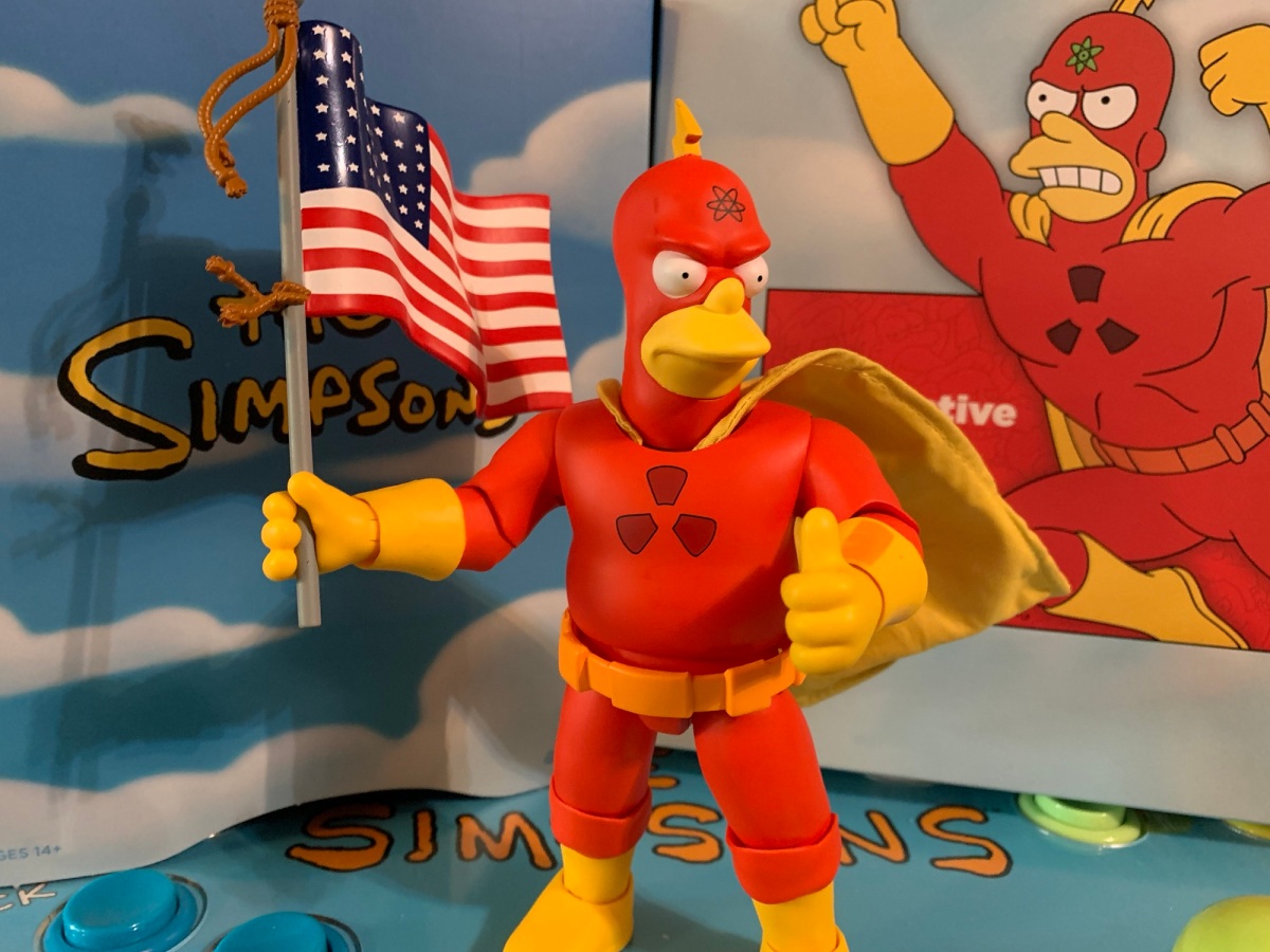
Super7 The Simpsons Ultimates! Radioactive Man

He’s not just Springfield’s hero, he’s America’s hero.

Last week, we started on our journey through the fourth and final wave of Ultimates! from Super7 based on The Simpsons. It did not start well. Devil Flanders represented a new low point for the line and maybe for Super7 as a whole. I know I certainly do not own a worse Super7 figure than that one. This week, we’re going to rely on a man, a radioactive man, to right the ship.

Pardon some of the poor quality, but here we have the three Radioactive Men from left to right: comics, Richter, Wolfcastle. This figure seems to clearly be of Richter, though it’s not perfect. Note, the comic Radioactive Man usually has his nose uncovered unlike how he’s depicted here.

Radioactive Man is, and stop me if you’ve heard me say this already, a curious choice for a toy line’s fourth wave. He’s recognizable to fans of The Simpsons, but likely not high on anyone’s list of wants that would warrant inclusion at this stage. And it’s even more perplexing because, in the show, there are basically three versions of Radioactive Man. There’s the comic book hero whom we’re lightly introduced to in the show’s second episode. His proper introduction occurs in “Three Men and a Comic Book” which we talked about before since it’s the main inspiration for the Bartman figure from the second wave. Comic book Radioactive Man is a comic book superhero like any other. He’s big and musclebound and wears a cape and cowl. The second Radioactive Man is portrayed on TV by the late actor Dirk Richter. The show, in the world of The Simpsons, is a lot like the 60’s Batman show (even though that existed as well in the show’s canon). It’s campy, and Richter doesn’t exactly feature a body with “heroic” proportions. The final Radioactive Man is played by Springfield regular Rainier Wolfcastle for the Radioactive Man movie which was the subject of one episode. He is basically like the comic book version, but with a different profile.

“Is that supposed to be me?”

So which Radioactive Man did Super7 produce? I don’t know. This figure references the comic book hero on the box and the accessories seem to indicate that, but he doesn’t look like the heroic Radioactive Man from the show. He looks more like Richter’s Radioactive Man, at least his body, with a comic book head. I can definitely say this is not the Wolfcastle version, and even though that’s only from one episode, I would argue that version is the most memorable. This Radioactive Man is rather frumpy in appearance. There’s no muscle definition to the sculpt. The arms and legs are sculpted in such a way as to make the costume appear baggy. The hands and feet are fairly large like a hero might possess, but that’s it. It’s cosplay Radioactive Man.

It’s a guy in red and yellow pajamas – isn’t that what you wanted?

The approach is unfortunate because the figure just looks very bland. It’s mostly yellow and red plastic with just a touch of paint here and there. The paint applications are just okay to mediocre. There’s a little bleeding around the muzzle of my angry portrait while the eyes feature the same on the stern face. The atomic logo on the stern face is also off-center and there are little, red, blemishes on the yellow, plastic, gloves. The red is at least coated with a matte spray and looks pretty good. It’s probably on the yellow as well, but it doesn’t do much to take-away from the cheap look it has. The lower legs are sculpted to appear baggy, which I don’t care for and it makes for a bit of an ugly knee joint. The thing I dislike most though is how they did the cape. It features a big, cavernous, carve-out for the head and that’s because the cape needs to loop over the ball-joint inside. It takes away from the figure’s neck and makes the cape look like it’s just emerging from inside the chest? I wish they had done it the same way they did Duffman’s cape, which is how the licensing art on the box does it as well, because this just doesn’t look good.

Beware of stuck joints that strip away paint.

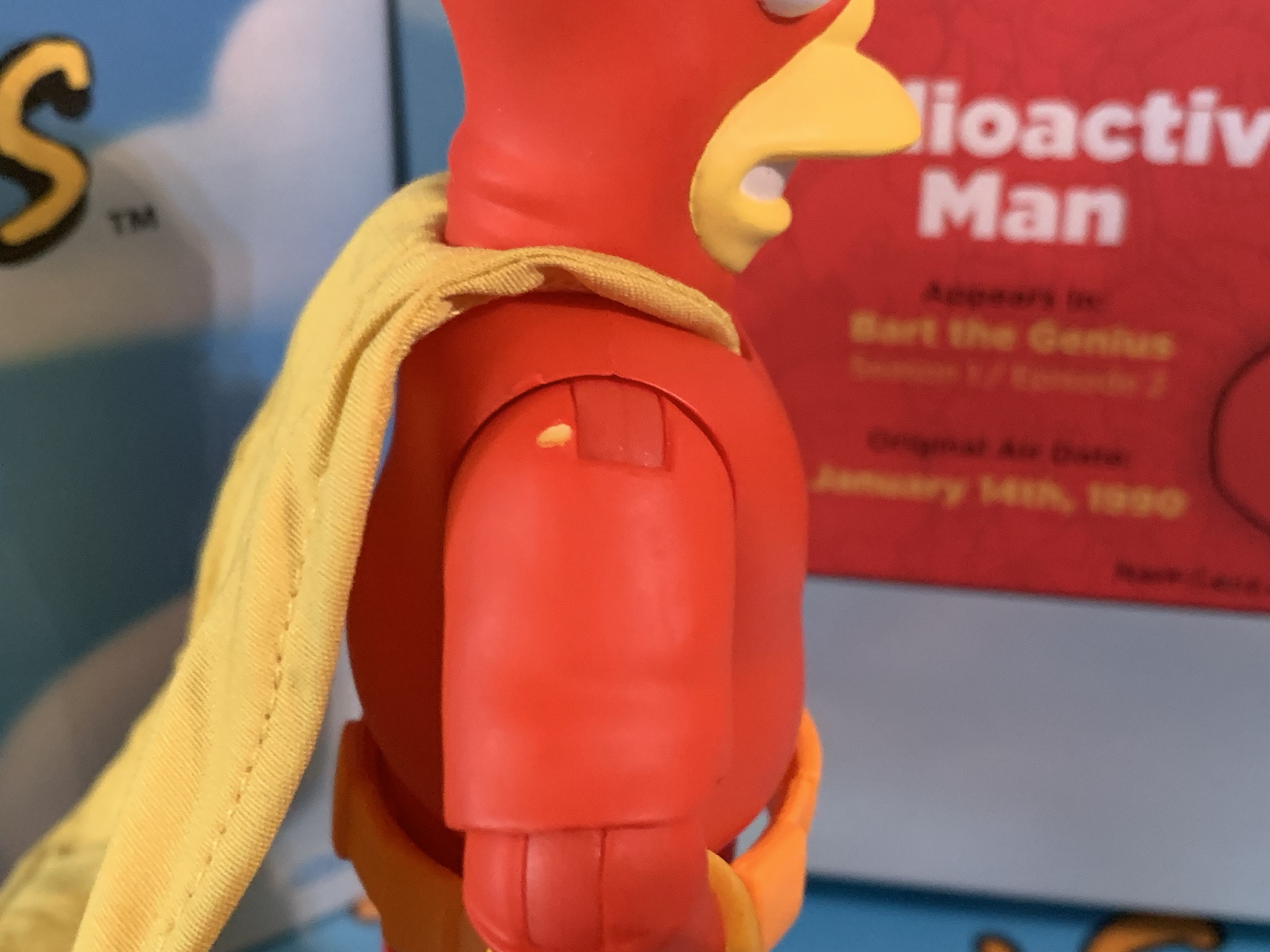
The look of the figure may be a bit more on the subjective end, but the quality is definitely more objective. Like Flanders, this is a figure that doesn’t have a premium look or feel to it despite the $55 asking price. The shoulders are really tight and the red paint on them chips and flakes off with relative ease. I have a large, yellow, blemish, behind the right shoulder on mine. I’m afraid to move him much as a result because I don’t want any more paint to chip-away. The head appears to be misshapen when it comes to the socket. It’s extremely wide at the base, and then deeper in the head where the ball should snap-in which is quite narrow. The end result is that the stern head just barely pops on while the angry one fits a little better. It takes minimal effort to knock it off and will likely drive anyone nuts who is trying to pose this thing. The hips, like Flanders, are also unnaturally loose. They’re not as bad as Devil Flanders as they will mostly stay where you position them, but while moving and posing the figure expect them to fall off unintentionally. In particular, the right leg on mine is prone to coming off.

Not the best logo placement on the right.
This is about as good a flying pose as the articulation will allow. Granted, I’m using a pretty bad flight stand here.

I suppose the head and hips are less of an issue with a figure that you either won’t want to pose or really just can’t pose well. Like many figures in this line, Radioactive Man does not prioritize articulation. He’s just going to stand on your shelf, desk, whatever in a pretty neutral pose. His head doesn’t look up well enough for a head-on flying pose as seen on the cover of Radioactive Man #1, and the range of the arms and such aren’t going to lend to anything dynamic. The shoulders are super tight and can’t reach a horizontal position anyway and elbows and knees won’t reach 90 degrees. The hip range is quite good at least while the waist twist is surprisingly limited. The cape is wired and I will say that while I may have not always liked the soft goods in this line, at least the capes have always been wired which is a good thing.

“Hey, ma! It happened again!” I don’t know why he’s talking like Cletus.

If you’re hoping for the accessories to help sell this one, well, you may be let down. This is a very light release as we get just the two portraits and a small assortment of hands: fists, a single gripping right hand, a pointing left hand, a relaxed right hand, and a thumb’s up left. It’s weird to have only one gripping hand. It’s also weird we get the one relaxed hand as two of them would make for okay flying hands, but since he can’t look forward anyway I suppose it’s not necessary. For his gripping hand, he has an American flag. It looks pretty good, it’s not accurate to an actual flag, but I’m guessing that’s on purpose. For the relaxed hand, he has a comic book that can slot between the thumb and index finger. It’s Radioactive Man introducing Neutrino. Not a particularly memorable sight gag from the show. It’s also very flimsy and warped out of the box, but the printing is nice and sharp.

He’s got a comic. Cool?
He’s just a big Hacksaw fan.

That is all though. It seems like a very uninspired set of accessories. Maybe they wanted to do a gag smoking head and hands accessory, but after the Krusty issue it had to be cut? If this is indeed Dirk Richter, why not include some punching effects to really drive that home? The flag is about as sterile as it gets. I get it that Radioactive Man is sort of like the show’s Superman in imagery, but it doesn’t really make for a fun, or funny, release. This is a comedy series, after all, but I’m left wondering where’s the comedy? If they had gone with Wolfcastle, we could have had a goggles portrait which is really the character’s most iconic moment from the show. And if it had been a more comic look for the body, a Wolfcastle alternate head would have worked just fine. Anything referencing the show within a show could have been funny, but instead I’ve got this frumpy looking Radioactive Man in a Hacksaw Jim Duggan pose. Neat?

I guess these guys go together?

When it comes to Radioactive Man I just don’t see what reason Super7 is putting forth for Simpsons fans to buy this. It really is a figure for the completists or for that one hardcore Radioactive Man fan out there, but then again, the odd approach might annoy that person more than me. I don’t know who this figure is for and I don’t see anything here that is making a strong argument for your money. What is becoming an all too common refrain with this line is the recommendation to not buy it, but wait it out. It’s unlikely to sell out and will probably be heavily discounted as soon as this summer. Perhaps next week we’ll look at a figure that can turn things around for Simpsons Wave Four, otherwise this line is going to go out with a whimper.

Here’s a look at more stuff from Super7’s take on the World of Springfield:

Super7 The Simpsons Ultimates! Devil Flanders

Last week, we concluded our look at the third wave of Super7’s line of figures based on The Simpsons and now we embark on the fourth and final wave. That’s right, Disney pulled the rug out from under Super7 and handed The Simpsons license over to Jakks. Their products will start rolling out this fall.…

Keep reading
Super7 The Simpsons Ultimates! C. Montgomery Burns

We wrap-up our look at Wave 3 of Super7’s Ultimates! line of action figures based on The Simpsons today with the main villain of the series: Charles Montgomery Burns. Mr. Burns has been around since the beginning and, like Ralph, is a worthy inclusion in the line at this stage and it’s only odd that…

Keep reading

Super7 The Simpsons Ultimates! Ralph Wiggum

Last week, we talked about two out of left field choices by Super7 for its line of action figures based on The Simpsons. This week, we’re discussing a fan favorite character that belongs and his inclusion is only perplexing given that there is no member of the Simpson family in the wave. Ralph Wiggum was…

Keep reading

Super7 The Simpsons Ultimates! Devil Flanders

I guess being left-handed is the mark of the devil after all.

Last week, we concluded our look at the third wave of Super7’s line of figures based on The Simpsons and now we embark on the fourth and final wave. That’s right, Disney pulled the rug out from under Super7 and handed The Simpsons license over to Jakks. Their products will start rolling out this fall. Super7 had shown a potential fifth wave for this line that contained Marge, Lisa, and Groundskeeper Willie, but it shall never see the light of day. The character selection was already a hot topic with this line, but now that we know the end point it has put those decisions in an even brighter spotlight making subjects like today’s figure all the more perplexing and irksome.

Ned has come to offer you a deal.

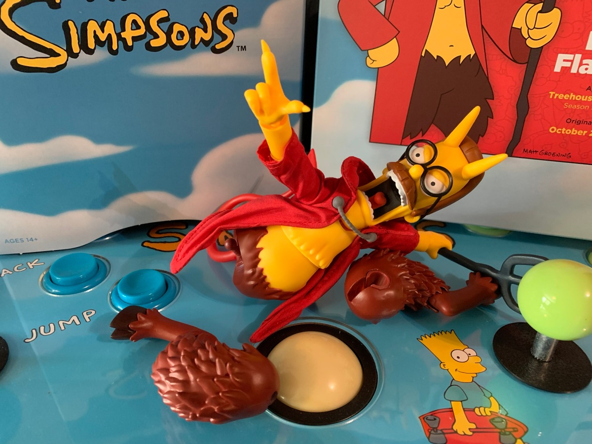
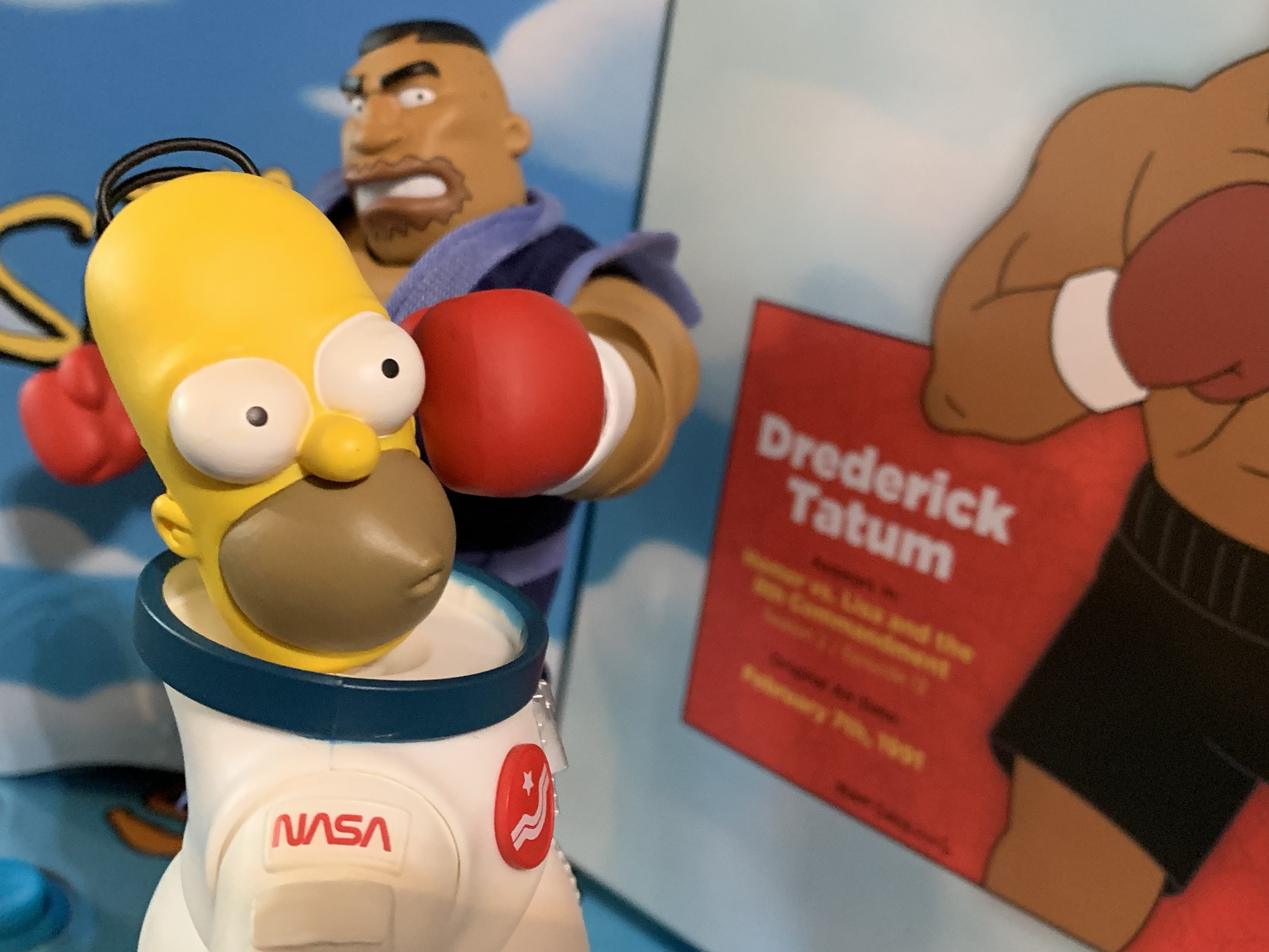
Devil Flanders appeared in one segment of the annual Treehouse of Horror titled “The Devil and Homer Simpson.” It’s a classic sketch where Homer sells his soul to the devil for a doughnut, and that devil happens to be Ned Flanders (It’s always the ones you least expect). Treehouse of Horror is very popular with fans of The Simpsons so selecting characters from those episodes is hardly controversial. It’s just puzzling when we get a character like Devil Flanders before a regular Ned Flanders. It’s also here at the expense of a Marge or Lisa and doesn’t really pair with any of the previously released figures aside from the Treehouse of Horror connection it shares with Kang and Kodos. We don’t have a standard Homer to pair him with, for example, and it’s not like astronaut Homer is an appropriate fill-in. It’s also the only Treehouse figure in the wave. Wouldn’t it make more sense to do a whole Treehouse of Horror themed wave instead like what Super7 did with ReAction? Time it with Halloween and it practically sells itself.

I guess he can just go with the Treehouse of Horror stuff?

Criticisms aside, Devil Flanders is at least an interesting take on Flanders and one of the better one-off pulls from the Treehouse of Horror anthology series. The only real concern I had going in was what would the quality be like? Wave 2 seemed to increase the quality of the line when it came to paint and accessory count, but Wave 3 represented a step back. Kang and Kodos had their size to rely on which gives them a great deal of shelf presence (at a terrible price), but Ralph and Mr. Burns? They disappointed. Bad paint or no paint, odd choices for accessories, and even the sculpts and choice of expressions felt lacking. Given that the line was axed before those waves were completed, it did not bode well for the fourth wave and Devil Flanders is certainly proof of that.

Devil Flanders arrives in the usual box, but without the slipcover. Wave 4 is the cut-off for slipcovers apparently as Super7 has begun phasing them out across the board to save money, presumably. I can’t imagine it’s much per figure, but over 2,000 figures I suppose it adds up. I don’t really care since I’m not an in-box guy, though I had been saving these boxes and keeping the unused accessories within. I guess it’s a bummer they won’t be uniform.

Who needs a flaming pen?

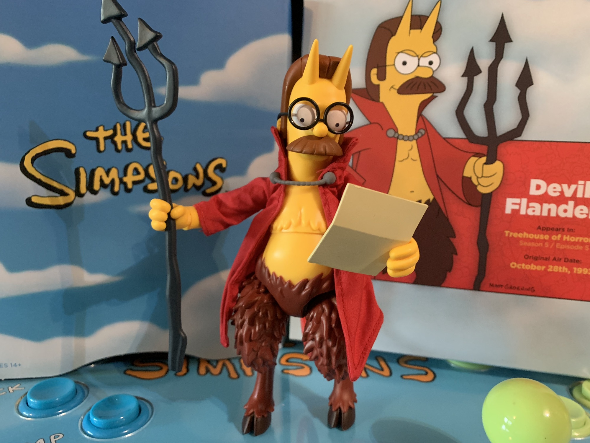
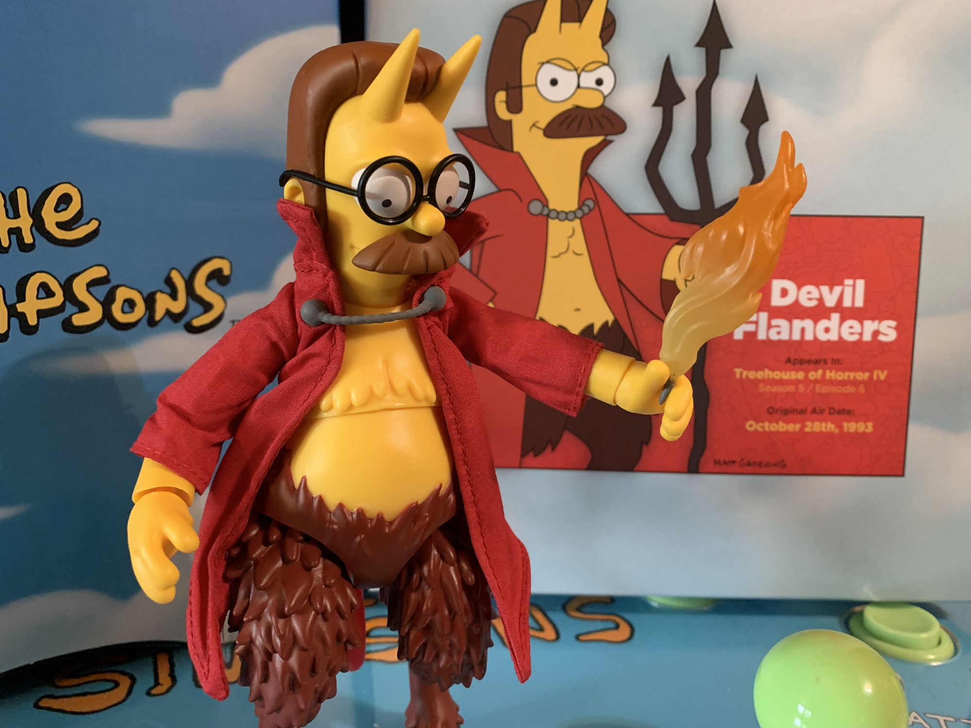
Devil Flanders stands at approximately 6.875″ to the top of his head and about 7.325″ to the tip of his horns. He is a satyr-like creature with a human torso and goat legs. He also marks the return of soft goods to the line as he has a soft goods robe. The glasses have actual lenses in them and what little paint is here is fairly clean. That’s just the problem though, there’s barely any paint. Super7 went with yellow plastic for his human parts and plainly painted brown for the goat legs. The yellow at least has a matte coating on it while the goat legs do not appear to. They’re quite shiny and cheap looking. The robe also didn’t turn out very well. It’s wrinkly and frumpy and just seems unnecessary. Why not just do it in plastic? I think it would have looked better. The Super7 of old would have given us both options like they did with Splinter in the TMNT line, but that’s apparently no longer in the budget. His tail is also present, but preposed in a U-shape. It’s disappointing he can’t twirl it like he did in the episode. Instead it’s just there. The body is also hollow and has a real cheap feel to it. This does not feel like a high quality collectible nor does it resemble one in any other way.

I got so frustrated swapping the heads just once that I didn’t bother with this one.

The presentation may be lackluster, but it’s nothing compared to the quality control. First of all, Ned comes with three expressions and they are a pain to swap. Don’t even bother trying to get one of the alternate heads on without first heating them up. You’ll just stab yourself on his horns or break his glasses. That’s an annoyance, but one that can be dealt with (especially if you’re just a set it and forget it sort), but what’s beyond that are the legs. Something went very wrong at the factory because the slots on his legs where they join the ball joint in the hip is way too big. His legs are floppy and just fall off. Constantly. If you’re able to get him to stand consider yourself lucky. They’ll go back on, but they’re terrible and it’s ridiculous something like this could see release. Did Super7 just not care since the line was dead? Did someone actually approve this shoddy factory output? It definitely feels like a case of cut corners all around because we know we’re going to have to clearance the line anyway. This is garbage.

“I think I’ll just stick with the potato chips.” “You are not smarter than me!”

Maybe the accessories can rescue this one? If such a thing as legs that won’t stay on can be overcome, I have to say the accessories are just ho-hum. Flanders has three portraits: neutral, an open-mouth smile, and an angry yell. They’re fine and I’m okay with them. For hands, he has a set of gripping hands, relaxed, a pointing right hand, and a tighter gripping left with his thumb up. The pointing right hand has a claw on the end of the finger which is a nice touch as that’s something that really only appears in the episode when he does indeed gesture towards Homer. The tighter gripping hand seems to be for his flaming pen. It’s a little, gray, stick, with a translucent flame coming off of it. He can hold it okay and it pairs with the unsigned contract for one doughnut that Homer is to sign. That’s on a thin piece of plastic with a crease in it. The handwriting is well-printed and it looks good. Lastly, Ned has his pitchfork which is ugly and misshapen like it is in the episode. It’s oddly cast on very soft, flimsy, plastic and I have no idea why. It doesn’t make it any easier to get it into his hands and it means it’s likely to arrive warped. It’s an odd call.

I guess the scale is fine whether you like the cut of his jib or not.

The array of accessories is fine, but I’m guessing most people will be left wondering one thing: where’s the forbidden doughnut?! That’s a layup of an accessory and probably one that would have been easy to make and even reuse. Had Super7 planned this line out better, there could have been a standard Homer already available so that Ned could come with a Doughnut-headed Homer accessory. That’s easy! Were they just hoping to double-dip somewhere down the line by doing a regular Homer and then a Doughnut Homer? Possibly, or maybe they just didn’t put much thought into it. You certainly are allowed to think that given it doesn’t look like much thought or care went into this line at all.

Should we talk about the articulation? It hasn’t been the strongest point of this line and Devil Flanders is no exception there. The head is on a double-ball peg and it’s the only point of articulation that’s any good. The shoulders are hindered by the soft goods as are the elbows, which probably wouldn’t bend 90 degrees anyway. All of the wrists are horizontal hinged and the diaphragm joint does almost nothing. It can’t even twist as it just binds and wants to return to a neutral position. The hips we’ve been over and they’re useless. If you can get him to stand it’s only going to be in a neutral position. There are knee joints, but they do nothing because of the shape of the leg and the ankles basically do nothing as well since he has hooves. He might as well be a statue from the waist down. Actually, the figure would be better if he was a statue from the waist down since that would mean the legs wouldn’t fall off and he’d likely be easier to stand. The robe is also wired so you can pose it a bit, but it’s not really large enough to do a whole lot with. I’ll concede that it’s better than nothing.

“Help me! I command you to help me!”

Devil Flanders is what the kids on social media call hot garbage. This is a bad action figure that would be overpriced at $35, but is sold for $55. I know the license got yanked away and Super7, for some reason, admitted to that before this wave arrived which likely set sales expectations way back. I think they cheeped-out, but the problem with that is whether the line is dead or not, the box still says Super7 on it. When you put your company’s name on something, there should be an element of pride associated with it. There should be an expectation of a certain level of quality and this figure comes up way short. This is a reputation-damaging release by Super7. Brian Flynn did acknowledge the problems with this figure in an interview on the Robo Don’t Know YouTube channel where he instructed listeners to reach out to Super7 if you’re having problems with Flanders. Well, I did, and guess what – there’s nothing they can do. If I had bought it off of them directly, they would have given me a credit, but all of the figures they have in their possession have this issue. They told me to go to the retailer and so I did. BBTS stepped up and refunded me for this thing when Super7 would not. I hope that gets charged back to them (they also shared with me they have fielded lots of complaints on this line). This figure should not have been released in this state. Cut corners on packaging and paint apps if you want, but if the figure can’t even stay together then what the hell are you doing? Don’t buy this. Don’t buy it at $55 and don’t buy it at $35. I wouldn’t even recommend buying it at $25. If after reading this you still think you might want a Devil Flanders in 1:10 scale at least wait until it’s under 20 bucks. It will happen, because consumers aren’t dumb enough to pay $55 for this trash. Do better, Super7.

Here are several other Super7 Simpsons figures of varying quality, though all are better than Devil Flanders:

Super7 The Simpsons Ultimates! C. Montgomery Burns

We wrap-up our look at Wave 3 of Super7’s Ultimates! line of action figures based on The Simpsons today with the main villain of the series: Charles Montgomery Burns. Mr. Burns has been around since the beginning and, like Ralph, is a worthy inclusion in the line at this stage and it’s only odd that…

Keep reading

Super7 The Simpsons Ultimates! Ralph Wiggum

Last week, we talked about two out of left field choices by Super7 for its line of action figures based on The Simpsons. This week, we’re discussing a fan favorite character that belongs and his inclusion is only perplexing given that there is no member of the Simpson family in the wave. Ralph Wiggum was…

Keep reading

Super7 The Simpsons Ultimates! Kang and Kodos

We are onto the third wave of Ultimates! from Super7 based on The Simpsons. Like past waves, plenty of questions abound when it comes to Super7’s character selection and they’re not unfounded. Perhaps the two most questionable inclusions in this third wave are the subject of today’s post: Kang and Kodos. These are two separate…

Keep reading

MOTU – Turtles of Grayskull Deluxe Sla’ker

That’s one happy turtle.

It’s a Tuesday, and I have a new Turtles product to talk about, so let’s make it another Turtle Tuesday! And today brings us the second in the line of deluxe Masters of the Universe Origins – Turtles of Grayskull line exclusive to Target – Sla’ker: The evil cybernetic snapping turtle! This is Slash, the evil turtle from Dimension X (as billed by Playmates) and Faker, the cybernetic copy of He-Man. It’s from the Target exclusive build-a-figure line of deluxe figures which, once all released, will allow collectors to build a figure of Metal-Roboto. The first such figure in this line was Mouse-Jaw, who despite carrying the “deluxe” label, was a pretty basic figure for the line. He just came with a Mouser and the build-a-figure parts, but cost more money. Sla’ker takes a different approach. There’s no little buddy character this time, but instead this guy is just a whole lot bigger than the norm.

Sla’ker is going to tower over the rest of the figures in this line.

Sla’ker comes in a blister box style of packaging and he dominates the window on said box. That’s because this figure stands just a tick under 7″, though more noticeable than the figure’s height is just how big of a melon this guy has. The head is huge, maybe too big, but there’s certainly a more impressive look to the figure as a result. Otherwise, the body is just a pretty standard MOTU Origins body. It’s my understanding this one was created for the MOTU x WWE line and they needed something bigger for Andre the Giant. And I’m pretty sure this body is being utilized for the Walmart exclusive Krang which I’d love to tell you more about, but Walmart exclusives are an incredible pain in the ass to track down.

Having Sla’ker go bare-chested provides for a better look at whatever this stuff is.

The look of Sla’ker is pretty much as advertised. The body is a pale blue, like Faker, but the head is very much Slash (the Playmates interpretation). Despite the deluxe naming, there’s no extra paint which is unfortunate as there’s a broken piece sculpted into the left eye, but since it’s unpainted it doesn’t stand out at all. The gold chest armor has a slash taken out of the chest and underneath that is a decal of robot stuff. Since this is TMNT, the gears on the decal are pizzas. The armor can be removed easily enough by taking off the head and separating the body at the waist, but the decal looks much cooler through the slash, if you want my opinion. The shell is done the same as it is for the other turtles and it can be removed and used a shield. Since this is Slash, the shell is spiky and purple and looks cool, though it’s still hollow and a little cheap to the touch. The rest of the armor, including spiked shoulder pauldrons, belt, and bracers go for hot pink which feels like a call-back to the Playmates figure. The fingers and toes are clawed, as they should be, and the open mouth is fully sculpted out which is a nice detail. There is a bit of an unsightly seem to it, but it’s only really visible from the side.

He should be able to do some damage with these.

For weapons, Sla’ker has a pair of swords that are more like over-sized knives. They’re very much in line with the same weapon the original Playmates Slash came with, only now his hand blades have been incorporated into the handguard. It’s weird to have a Slash-inspired figure without the blades on the hands themselves, but this is an okay substitute. Like the other turtles, there is a slot on the back of the shell to store weapons, but it can only accommodate one sword at a time. The only other accessories in the box are the Metal-Roboto parts which include the head and the crotch which has includes the legs down to where the boot cut would be. Unfortunately, the head is going to use some other method of connecting to the body when it eventually comes out and can’t be swapped to another figure. I also personally hate it when build-a-figures like this released in a series don’t come with parts that can connect to the parts we just got. Mouse-Jaw came with an arm. It would be more tidy if this figure came with the torso, but oh well.

The removable shell is still a thing with Sla’ker.

Sla’ker may be bigger than the norm, but the construction is exactly the same which means the articulation is essentially the same. With one detail. For whatever reason, the ankle rockers on this figure just plain don’t work. They’re more like swivel joints. Is that by design? I can’t tell. It could just be the engineering is subpar and they’re not working as intended. If it’s an intentional choice then it truly is a bizarre one and also not a good one. You never know how much you’ll miss ankle rockers until they’re gone. As a result, Sla’ker is tough to pose dynamically. The figure is better off with a pretty neutral base. The size of the figure relative to the rest at least imparts some shelf presence even when posed in a pretty vanilla manner, but it’s a shame it doesn’t move as well as the other figures. Every other joint is fine and the tolerance is good.

We’re gonna need more turtles!

Sla’ker is a figure I wasn’t going to get. Then I got Mouse-Jaw and felt the compulsion to complete the build-a-figure, but like Mouse-Jaw I was going to hold off for a clearance event. Obviously, that didn’t happen and I paid the full $25 for Sla’ker. What got me to change my mind? He just looked cool on the pegs. I’ll be surprised if he doesn’t end up getting discounted at some point, though maybe with this figure being more of a TMNT character than a MOTU one it will sell better? That all depends on who is buying this line: MOTU fans or TMNT fans. A lot of people may have also grabbed Mouse-Jaw for cheap and thus could rationalize paying full price for this one with the money saved on Mouse-Jaw, because once you get one piece of a build-a-figure it can lead to wanting the rest, so what should you do? If taking one look at this figure doesn’t do a whole lot for you, or the poor ankles will drive you nuts, then go ahead and play the waiting game. It’s a Target exclusive and I’m guessing they ordered just as many of this figure as they did Mouse-Jaw. If you have to have it now though, then you’ll probably be content enough. Just don’t expect to be able to put this figure into any crazy poses.

“I wish I had a body.”

For more thoughts of mine on this MOTU x TMNT line, look no further:

MOTU – Turtles of Grayskull Raphael

Mattel’s Turtles of Grayskull line rolls on with wave two. This Teenage Mutant Ninja Turtles x Masters of the Universe collaboration is a continuation of the Masters of the Universe Origins toyline. That’s a line of roughly 5.5″ figures designed to capture the aesthetic of the original MOTU toyline, but with some modern articulation engineered…

Keep reading

MOTU – Turtles of Grayskull Deluxe Mouse-Jaw

Nothing can be simple in this day and age of retail toy sales which is why the new mash-up of Masters of the Universe and Teenage Mutant Ninja Turtles toyline features ostensibly 3 SKUs: standard, deluxe, and deluxe with build-a-figure parts. The standard releases are, as you may have expected, released abroad and you can…

Keep reading

MOTU – Turtles of Grayskull Leonardo and Donatello

These days, there isn’t much the Teenage Mutant Ninja Turtles haven’t crossed-over with. Back in the day we had Star Trek, trolls, and the Universal Monsters. More modern times have seen cross-overs with the likes of WWE, Ghostbusters, and Mighty Morphin Power Rangers. Throughout all of that, as well as the action figure license seemingly…

Keep reading

Super7 The Simpsons Ultimates! C. Montgomery Burns

It’s a bit odd seeing Burns just standing there all alone with no Smithers at his side.

We wrap-up our look at Wave 3 of Super7’s Ultimates! line of action figures based on The Simpsons today with the main villain of the series: Charles Montgomery Burns. Mr. Burns has been around since the beginning and, like Ralph, is a worthy inclusion in the line at this stage and it’s only odd that he’s arriving before the likes of Marge and Lisa. Burns is a Springfield regular as owner of the town’s nuclear power plant and boss to Homer Simpson. He starts off as just a mostly horrible boss type, but soon morphs into an almost cartoonishly evil character. He’s also a joke machine for old world references owing to the fact that he’s 109 years old. He’s a horrible man, but a powerful one, and all his power rests with his bank account. Take that away and he’s a pathetically weak old man who couldn’t even wrestle a lollipop from a baby.

He’s taller than a child, but not as tall as the show’s more classically trained super villain.

Burns has the usual Ultimates! packaging with slipcover which is soon to be the old style as you’ll see when we get to Wave 4. One thing I have not mentioned yet with this third wave is how terrible the plastic bubble that holds the figures in place has been. I don’t know what happened, but this is usually something Super7 does well and I should sing the praises of it more since they tend to package their figures in plastic bubbles with few tie-downs. I enjoy buying NECA figures, but I hate unboxing them because of those damn things. With this wave, some of the figures have been a real bastard to get out. It’s too tight, especially around the extra heads. I had to cut both Ralph and Burns’ heads out of the thing because I could not get them out. It sucks because I like to keep these boxes and store the accessories in them so I’d rather not mangle them, but oh well.

Look! He’s crowning!

Burns stands at approximately 6.75″ to the top of his head. He is famously of poor posture and if he was capable of standing fully upright he’d be a little taller. He’s sporting a dark green business suit with white undershirt and black tie. Right away, we have a problem. Modern Simpsons reference art places Burns in a green suit, but it’s very much a blue green while this figure has more of a forest green to his suit. Much of the classic era of the show would put Burns in a blue suit and I’m not sure how Super7 settled on this particular shade of green. The solicitation images have a more blue-green tone to the suit so I think this is just a case of the factory not producing the proper color. Did Super7 approve it? Probably.

At least they got the posture right.
“You there! How dare you make me look bad with that painted, yellow, head of yours!”

Continuing with the trend of the third wave, Burns does not feature much paint. He’s matte, but the head isn’t painted yellow like the figures that came before it. The body is pretty much all green and the white and black parts are painted over. The left side of my figure’s shirt is painted horribly with a ton of green showing through. The exposed portions of his white socks are also painted, but the ankle hinges are cast in a pale white. The paint will flake off when moving them, but that comes with the territory of painted hinges. What stinks is there’s a lot of transfer from the green plastic to these hinges and the paint that flakes off around the hinge will expose green plastic as well. For a $55 figure with what should be a simple paint application it doesn’t look great.

Burns has a right to be pissed given the shoddy nature of this paint job.

Aside from that, the overall sculpt is acceptable. His shoes have a funny shape to them, but it’s not necessarily wrong, just more noticeable in 3D. The portrait looks good which features the standard Burns look with exaggerated overbite, though I would have preferred a hint of an evil smile. The spots near his left temple are sculpted on, but not outlined so they look a bit weird. The nose appears to be a separate piece that had to be glued on which created an unnatural seam line. It’s not awful, but a little surprising that it was deemed necessary. The figure looks okay, but plain and the lack of paint on his head gives off a cheap appearance. He almost more resembles his character model from a PlayStation 2 era Simpsons game because of this lack of detail.

I guess it’s good he comes with this accessory since I do feel like he owes me money. Maybe not a trillion, but something.

The articulation on Mr. Burns is pretty limited and in some ways downright poor. He has good range at the neck, but that’s pretty much it. The shoulders are pretty standard and the elbows lack the ability to hit a 90 degree bend. This is more problematic with Burns as his default posture in the show features his elbows bent at 90 degrees and hands hanging like a T-Rex or something. He can’t quite do this, but does get probably close enough for most. His waist is ball jointed which is situated deep inside the torso because of his long coat. It’s basically just a pivot point as the coat is hard plastic. He can’t kick forward really at all, but it’s actually not because of the coat, the joint is just terrible as I pulled him apart to check it out. Knee range is terrible while the ankle hinges work fine. He has an ankle rocker, but it too is pretty limited.

Bobo is along for the ride, but should look way grosser.
There’s a lot of character packed into this evil laughing head, but I can’t see myself every displaying it.

This line is definitely not striving for articulation and instead prioritizing the sculpt and accessories to bring these characters to life. While Burns fares better than Ralph Wiggum from last week, he’s still not as well-thought out as he could be. Burns has his “hooked” hands by default, but he also has a set of relaxed hands, “Excellent” hands, and a set of gripping hands where his right hand is much wider than the left. He also has the more usual two alternate portraits: an evil laugh with side-eye, and an eyes closed contented face. The evil laugh, which also doubles as an angry yell, is pretty self-explanatory and capable of adding a dash dynamism to your display while the contented expression is pretty much only useful for when he’s holding his teddy bear Bobo. Bobo is displayed as he was post being frozen, though not with the same level of detail as he was in the show. This is rather perplexing since it’s far harder to capture detail in animation than it is on a 3D model, but it’s true of Bobo. He has one dangling eye and stuffing popping out, but there’s no texture. Bobo looks so gross and sponge-like in places in the show so this depiction feels very underwhelming. Burns can at least clutch him to his bosom fairly easily.

Good old Blinky.
Did anybody want this?

Burns also comes with a serving tray featuring Blinky, the famous three-eyed fish who debuted in Season Two and resurfaces on occasion. Like Bobo, there’s not much texture to the fish and the paint on his fins where the body meets the lettuce he’s being served on is not applied very well. It’s also a missed opportunity that the lid to the serving tray Kodos comes with doesn’t also fit over Blinky. Burns also has an issue of Burns Weekly. It’s a soft piece of red plastic with an image of Burns printed on it. It’s very flimsy and there’s no attempt at sculpting on the edges to make it resemble an actual magazine. Very lazy, and also not really welcomed. I’d much prefer a copy of Burns’ autobiography Will There Ever Be a Rainbow? Lastly, we also get Burns’ trillion dollar bill which is on another piece of soft plastic with printing on both side. It looks fine, but it’s unnaturally thick for a bill. I guess it’s fine though since it makes it easier for the figure to hold and more durable. He basically only has one hand that can hold it, the left “Excellent” hand has the thumb positioned under the palm so the bill (or magazine) can be slotted in between effectively enough.

Well, at least Mr. Burns got what he wanted.

Burns is only slightly better than Ralph and it comes on the strength of more accessories and overall a better sculpt, but in comparison to the first two waves of the line he’s pretty underwhelming. I’m assuming the paint on the front of mine is unique to my copy and not a reflection of every Burns figure Super7 puts out, but the paint apps have been spotty in general so who can say how uncommon it is? It definitely doesn’t look and feel like a premium collectible so it’s impossible to recommend at $55. Plus, without a Smithers to pair him with the figure feels almost incomplete, because what is Burns without his sycophantic righthand man? Only get this if you absolutely have to have a Mr. Burns figure in this scale, and even then you should probably wait for the eventual discounted price that is almost sure to come before the year is through. Next up is wave four of this line and if you thought wave 3 was a little disappointing, then you haven’t seen nothing yet.

Join me as I journey through Super7’s take on The Simpsons:

Super7 The Simpsons Ultimates! Ralph Wiggum

Last week, we talked about two out of left field choices by Super7 for its line of action figures based on The Simpsons. This week, we’re discussing a fan favorite character that belongs and his inclusion is only perplexing given that there is no member of the Simpson family in the wave. Ralph Wiggum was…

Keep reading

Super7 The Simpsons Ultimates! Kang and Kodos

We are onto the third wave of Ultimates! from Super7 based on The Simpsons. Like past waves, plenty of questions abound when it comes to Super7’s character selection and they’re not unfounded. Perhaps the two most questionable inclusions in this third wave are the subject of today’s post: Kang and Kodos. These are two separate…

Keep reading

Super7 The Simpsons Ultimates! Krusty the Clown

If you’ve been following along with my reviews on the second wave of Super7’s The Simpsons Ultimates!, then you will have noted that I’ve had a bit of a love/hate relationship with this wave. For the most part, the sculpts and deco have been on point, it’s some of the little things that have been…

Keep reading

MOTU – Turtles of Grayskull Raphael

Mattel’s Turtles of Grayskull line rolls on with wave two. This Teenage Mutant Ninja Turtles x Masters of the Universe collaboration is a continuation of the Masters of the Universe Origins toyline. That’s a line of roughly 5.5″ figures designed to capture the aesthetic of the original MOTU toyline, but with some modern articulation engineered into the form. For the first wave, I took a look at both Leonardo and Donatello. As someone who is a TMNT fan, but not a MOTU fan, the turtle boys are the only ones that appeal to me. Despite that, I did end up getting the Mouse-Jaw figure despite that being a MOTU character, but he came with a Mouser so that works, right?

The gang is not quite all here.

Raphael is the turtle of the line’s second wave which also includes Ram Man, Beast Man, and Shredder. I’m not likely to get either MOTU character in this wave, but I’m also not sold on Shredder. I guess I need to see him in person. Raph I knew I wanted so I went ahead and just preordered that one. This should be a pretty easy review since this figure is essentially the same as the prior turtles. That’s the whole idea behind the line which is one base body creates many toys. The new stuff is the armor and accessories and the new head.

I’ll take a picture of the shell shield, but if you display your Turtles of Grayskull like this you’re a monster.

Raphael could basically be described as Raphael x Ram Man. I don’t know anything about Ram Man, my MOTU knowledge is only surface level, but from what I gather he’s a stout fella with a hard head and helmet to go with it. I assume he rams people, and while Raph may be hot-headed, he’s not known for bashing folks with his brain so he’s also equipped with some weapons. Unlike the Donatello-At-Arms figure, the helmet is removable so this figure can strip down to a fairly basic Raph with barbarian underwear.

“I could get used to this.”

Right off the bat, I have to say the green on this Raph pops. It’s hilarious to me that Mattel has done a better job at recreating Raph’s classic shade of green than Playmates has with its reissues. The head gives me 2003 vibes like it did with the previous turtles while this figure has way more of Raph’s red worked into the figure. The bracers and greaves are red, he has red on the helmet, a red belt, red on the chest, and a piece of red armor on his shoulder. The shell is the same piece and is a matte brown and the paint applications overall are a little cleaner with this figure than they were with my wave one offerings. I may not care about Ram Man and I think his design is kind of boring, but this is working for me. I think Raph is my new favorite in the line and it’s mostly because the colors work and he looks great with or without the helmet.

Raph could do some damage with these.

As for weapons, Raph apparently can’t have normal sai he needs something bigger. The first sai is more like a tri-bladed sword. It has a long handle and the weapon is larger than Raph’s leg. It’s done all in silver and he can grip it just fine. It also slots into the holster on the back of the shell pretty well. The other sai is a bit more involved. It’s basically a glove that fits over his right fist which is kind of a Fisto thing, only Raph is taking it a step further (or three) by having giant blades coming off the top of his fist. If the outer blades were as long as the center one he’d look like he’s cosplaying Wolverine. It’s a cool weapon, though it looks more like a Shredder weapon to me and that’s primarily to do with how he armed himself in the 2012 series. Like the other turtles, the shell does come off and can double as a handheld shield. The chest armor, like the helmet and glove sai, are just pressure fitted so no straps to deal with. The shoulder armor can slide off as well so if you want to get this guy pretty close to naked it’s not too difficult. There’s also another mini comic included, but it’s not the advertised continuation of the story from the first wave. It’s just panel art, no dialogue bubbles, and seems to be pretty scattershot. I guess we have to wait until Wave 3 for the rest of the story?

“You don’t scare me, ugly!”

The articulation for Raph is exactly the same as it was with Leo and Donnie. It’s solid as the shoulders, head, elbows, and knees have good range despite the simple approach. The waist twist is just a waist twist, but the ankles feature hinges and rockers. My lingering complaint is still that the hands only have horizontal hinges when vertical would be preferable for melee weapons. It’s fine.

“You better not be cuttin’ in on my territory, bub!”

The bottom line here is if you dig the look of this mash-up and enjoyed Wave One then you’ll be plenty happy with this interpretation of Raphael. The line needed a Raph and it got a pretty good one. Wave Two should be arriving in stores around you as I type this. It’s also available at various online retailers and I got mine from Amazon. MSRP is 20 bucks, which is a little higher than the standard MOTU Origins price, but that’s likely due to Mattel having to pay Viacom for the license. Wave 3 should be coming soon and I’ve seen some people who already have it, plus there’s the deluxe figures and I’ll be checking some of them out. This line has legs, so we’re definitely not close to being done.

The Turtles like playing with other IP, MOTU is just the latest:

MOTU – Turtles of Grayskull Leonardo and Donatello

These days, there isn’t much the Teenage Mutant Ninja Turtles haven’t crossed-over with. Back in the day we had Star Trek, trolls, and the Universal Monsters. More modern times have seen cross-overs with the likes of WWE, Ghostbusters, and Mighty Morphin Power Rangers. Throughout all of that, as well as the action figure license seemingly…

Keep reading

MOTU – Turtles of Grayskull Deluxe Mouse-Jaw

Nothing can be simple in this day and age of retail toy sales which is why the new mash-up of Masters of the Universe and Teenage Mutant Ninja Turtles toyline features ostensibly 3 SKUs: standard, deluxe, and deluxe with build-a-figure parts. The standard releases are, as you may have expected, released abroad and you can…

Keep reading

Hasbro MMPR x TMNT Shredder

We’ve looked at the two-packs from Hasbro’s Mighty Morphin Power Rangers x Teenage Mutant Ninja Turtles line of action figures based on the comic book crossover, but have we saved the best for last? Coming in on his own is the arch nemesis for the turtles: The Shredder! And since this is a line specializing…

Keep reading

Super7 The Simpsons Ultimates! Ralph Wiggum

This is the story about a boy who just wanted to be loved.

Last week, we talked about two out of left field choices by Super7 for its line of action figures based on The Simpsons. This week, we’re discussing a fan favorite character that belongs and his inclusion is only perplexing given that there is no member of the Simpson family in the wave. Ralph Wiggum was featured in the very first episode of The Simpsons, but as a character, he wasn’t really developed until Season Four’s “I Love Lisa.” Up until that point, he was just some kid who was a little heavy-set, but made little impression. “I Love Lisa” made Ralph the character he is today. He’s more than a little slow, but genuine, and very impressionable. Unfortunately, he gets bad advice from his dad, the chief of police, which basically sets him up to have his heart broken by Lisa, but it all turns out well in the end. It’s not my favorite episode of The Simpsons, but it is one I adore and there are few episodes I’ve watched more than that one.

He wants to be loved, but not touched.

As an action figure, Ralph is a bit of a hard sell. The character is certainly beloved and not particularly difficult to translate to 3D, but it’s not one that presents a lot of opportunity for articulation or flashy paints. And since Super7’s Ultimates! line carries a base price of $55, Ralph is especially tough to value as he’s the same price as Homer, Moe, Krusty, and up to this point basically everyone except the massive Kang and Kodos. Super7 is one of those companies that has no problems asking its consumers to pay more for bigger characters, but never do they charge less for the small. And with Ralph, it’s hard to argue that Super7 has done much of anything to alleviate that.

The height of Ralph seems fine when compared with Bartman, but the rest? Eh, no.

Ralph stands at approximately 4.25″, probably a tick under. He’s just a little shorter than Bartman, which is proper for true scale, though his larger proportions make him look odd beside Bart. Ralph’s height is fine, but the rest isn’t really in scale. Unfortunately for Super7, there’s an entire episode about Bart and Ralph being paired up so there’s no shortage of reference images. Ralph’s hands and feet are gargantuan in comparison to Bart’s and the two do not look good side-by-side. I think this is a case of Super7 just not wanting to go smaller on Ralph than they did because then the asking price would look even more foolish. A lot of action figure lines tend to add a little to the smallest characters, and take a little from the largest to try to find a happy medium and I do think that’s true here. How much it bothers collectors is likely to vary from person-to-person, it’s just a shame the line ended up being a brief one because there’s really no one to pair Ralph with on the shelf if not Bartman. I guess he always was a bit of a loner.

Even with the adults his proportions just seem too big. His feet are bigger than Moe’s.

Aside from the scale, the sculpt on Ralph is fine. He has his almost blank expression where he’s smiling and it’s captured. He has his blue shirt and brown pants and basically the only paint is reserved for the eyes, shirt, and belt. His head does not appear to be painted yellow and instead Super7 just went with a matte coat. It’s a step back from the paint jobs we saw in the second wave of the line and I’m curious if these final two waves (which shipped at the same time and only a few weeks after the second) were rushed or had cuts made to them since Disney was pulling the license. The paint on the blue shirt is applied all right, but there are some blemishes. It also chips and flakes around where the arms plug into the shoulders leaving behind ugly, yellow, spots. By far though, my least favorite thing about the presentation of the figure is how Super7 did Ralph’s hair. Ralph has this very thin, wispy, hair in the show and Super7 opted to sculpt it in soft, black, plastic and glue it to his head. The end result is it’s just far too thick and he almost looks like he has dreadlocks. I think the proper way to do the hair would have been to sculpt it into his head and just paint it. Or do it with with something thinner, like the bristles you might find on a brush. This choice doesn’t work very well. You can especially see it in the reference art on the box how the diameter of his hair should be smaller than his pupils, but with the figure it’s the opposite.

At least it covers up the awful hair.

There isn’t much to say about Ralph’s articulation. It’s terrible. He’s barely better than a ReAction figure. The head just rotates and so do the shoulders. His elbows have little range as do the hinges in his hands. He has a waist twist, and everything below that is essentially useless. I don’t know what they were trying to do with the ankles as there’s basically a brown post that goes into his feet. There is a hinge, but it does almost nothing. There’s a gap between the end of his pants and shoes as a result and it looks bad. Ralph was never going to have terrific range at these joints, but it’s like they didn’t even try.

The only accessory you need?

A little statue like Ralph is relying on accessories to create value. I often get the sense with Super7 that they start at the $55 price and then try to add enough stuff to hit their cost target. With Ralph, I don’t really get that sense and instead this figure feels like a cost-saving one. The most popular character in the line that will probably sell the best so let’s produce it cheaply and maximize profit! Ralph has no extra hands and one extra head. That head is exactly the same as the default one, except it has a melted ice cream cone glued to the forehead. That’s it. The heads are really hard to swap too and I can’t see myself ever wanting to use this reference from a later episode that’s also a dated joke that hasn’t aged well. Why no toothy grin? Or better yet, a grin with red crayon all over the teeth? This is just bad.

“Go banana!”

Ralph’s other accessories include a banana, jar of paste, Valentine, sign, and computer. The banana and jar of paste have hands sculpted to them which I guess is fine. The jar has a removable top with paste at the end of a brush inside it, but Ralph’s range of motion is so terrible he can’t hold it with the top on. The Valentine is what you would expect and features the “I Choo-Choo-Choose You” remark and there’s a picture of a train. It’s great for what it is and if it wasn’t included there would be riots. There is a “WARNING DO NOT HUG” sign that can be hung around Ralph’s neck which, again, is from a much later episode. I would have preferred his Idaho costume instead. The sign is all plastic so it doesn’t even hang properly and looks stupid. The computer is an old, boxy, design and Ralph is practicing spelling “CAT” on it and there’s a picture of a cat. It too is from a post golden age episode, but at least it’s the Super Nintendo Chalmers scene so I’ll allow it, but there isn’t really anything for Ralph to do with it. He can’t hold it and he doesn’t have a desk to put it on. It just sits there.

“Miss Hoover! I’m all out of ice cream!”

For such an iconic character, Ralph’s accessories are severely underwhelming. And considering how small he is and that he has just one alternate head, he should have more. Where is his key to the town? Where’s the leprechaun that tells him to start fires? He could have had soft goods and another head to recreate his George Washington costume. He could have had his TV dinner he needs someone to microwave for him or his box of Star Wars collectibles. What about the cat he likes talking about so much? A box of crayons with a missing red crayon? There’s just so much! Obviously, Super7 could not have given us everything, but it’s like they tried to impress us with deeper cuts from later in the show’s life when they would have been better served to just focus on “I Love Lisa” and deliver as much from that episode as possible like a facial expression from the exact moment his heart rips in two.

If you’re a fan of The Simpsons and collecting this line, should you get Ralph Wiggum? I mean, as a character, of course. He’s probably the most popular character in the wave. As an action figure that costs $55? Absolutely not. Super7 did not earn your money with this release. The paint is mediocre, the sculpt is too large, the articulation is practically non-existent and the accessories uninspired. This is a dud of a release. Yeah, mixed in on your shelf with the rest of the line (provided he’s not next to Bartman) Ralph will look okay, but no one is likely to see it and go “Oh wow! I love that Ralph!” If I wasn’t going all-in on this line as a show of support so it would go on for awhile (oops), I would have passed or at least cancelled my preorder when Super7 figures started routinely hitting the discount rack. I suggest anyone who does have an interest in Ralph to just wait for such an event.

We’ve got more from Super7 and The Simpsons:

Super7 The Simpsons Ultimates! Kang and Kodos

We are onto the third wave of Ultimates! from Super7 based on The Simpsons. Like past waves, plenty of questions abound when it comes to Super7’s character selection and they’re not unfounded. Perhaps the two most questionable inclusions in this third wave are the subject of today’s post: Kang and Kodos. These are two separate…

Keep reading

Super7 The Simpsons Ultimates! Krusty the Clown

If you’ve been following along with my reviews on the second wave of Super7’s The Simpsons Ultimates!, then you will have noted that I’ve had a bit of a love/hate relationship with this wave. For the most part, the sculpts and deco have been on point, it’s some of the little things that have been…

Keep reading

Super7 The Simpsons Ultimates! Hank Scorpio

If you’re going to market action figures to a fanbase as venerable as The Simpsons, you should probably go after what they love most. Simpsons fans love to make references to their favorite episodes and characters and one of the top episodes from the show is “You Only Move Twice” from the show’s seventh season.…

Keep reading

NECA TMNT Toon Samurai Adventure Michelangelo and Space Adventure Donatello

It’s time to go on an adventure!

I think most people understand that when it comes to a toy line the most popular figures are of the most popular characters. The problem is, what do you do when everyone has the most popular characters? You make them again, but different! That’s sort of the genesis of the variant action figure of a popular character. When Playmates Toys struck success with Teenage Mutant Ninja Turtles it didn’t take them long to get the main turtles back onto pegs, but in a different form. There were the gimmicky Wacky Action Turtles which had wind-up features and there was the disguise series of standard action figures of the turtles, but with fun disguises. And we’ve talked about them before because Super7 has already remade three of the four (it would seem they have no desire to make Undercover Don) and I’ve reviewed them all. Now it’s NECA’s turn to try to extend the life of their line of figures based on the classic cartoon series by dipping into the Playmates well with this two-pack of Samurai Adventure Michelangelo and Space Adventure Donatello.

Normally, samurais are the domain of Leonardo.

Recently, Super7 has run into issues with Playmates where the company really doesn’t like them remaking their toys. Is it because they want to re-release them to stores as they have with many old figures? Maybe, or it could just simply be a company protecting its interests and the right to make that call at some point in the future. With NECA, it would seem their way around that same issue is to switch up the characters. Playmates did Sewer Samurai Leonardo so NECA does it with Mikey instead. Raphael the Space Cadet becomes Space Adventure Donatello. Same concept, different character and different design. These aren’t 1:1 recreations and they’re coming from a toy line that is doing very well. That certainly gives NECA a lot of pull with Viacom when proposing these sorts of things and if they want to humor Playmates or not.

And space is typically reserved for Raphael.

These two figures are creations by the fine folks at NECA with the obvious tip of the hat to Playmates. Michelangelo and Donatello never sported these looks in the cartoon, but you could probably fool someone with a poor memory of the show as it’s not far-fetched for that program. They also both follow the Punk Turtles and Pizza Club releases in introducing more facial expressions for collectors to mix into their collection. Though like the Punk set, these heads are better suited for the newer figures and not the older Turtles in Disguise due to the shade of green utilized. In some way, these figures exist on their own. I don’t have the Pizza Club editions since I already have two sets of the Turtles in Disguise release and the original NECA turtles, but I do have the Punk Turtles and the heads are a little different. Where those are dark green and matte, these new ones are the same shade of green, but glossy. The shade of Michelangelo’s bandana is also darker than what came with the Punk Turtles. Does it match the Pizza Club Mikey? I don’t know, but the lack of consistency is irksome.

And rabbits. They’re allowed to go into space too.

That said, these expressions should work okay with at least the Punk and Pizza Club editions and not so well with the older figures. The two expressions that come with Michelangelo, an open mouth and a teeth-gritting one, are brand new while the mouth included with Donatello is an old, closed, expression we’ve seen before. That’s disappointing considering I think even the Pizza Club Donatello comes with this one. The only new head part with Donnie is the top which features a covering and purple goggles similar to the old Raph the Space Cadet figure. You can at least swap out the expression if you wish, but only having angry eyes is a bummer.

Sort of reminds you of the old title card, no?

We’ll talk Mikey first. He very much looks the part of a samurai, but with a lot of color. The helmet is almost exactly like the old Leonardo figure, but done in bright yellow with lots of black linework. The main suit is a pale blue with black and yellow trim. The almost salmon-shaded armor looks good and also gives the figure a toy impression rather than something going for realism. Paint is mostly clean, but there are some parts where the black bleeds into the yellow on the forearms and shins. There is a waviness to the belt which I don’t think is supposed to be present, but otherwise the figure looks good. The helmet plugs into the peg hole where the bandana knot usually goes (no such piece is included so if you want him to go helmet-less you will have to salvage that from another figure) and it’s easy to slot in, but sits rather loose. The helmet will stay on, but don’t be surprised if it falls off a lot while posing the figure.

Old expression, but at least he’s got cool shades now.

Donatello’s space suit is a bit more understated when compared with Mikey’s samurai armor or Raph’s old suit. It’s an off-white color with black linework and some gray and light blue accents. It doesn’t pop like some other looks in this line, but it’s appropriate for an astronaut turtle. The helmet is done with transparent plastic and the back is painted. It’s nice and clear with no odd blemishes anywhere. Paint is very clean on this figure and even the more complex parts of the head are painted well. Donatello’s goggles are done in transparent plastic with purple rims and they look great. They even flip-up if you prefer and removing the helmet is simple enough.

“Whoa dude, mellow out!”
Double-jointed elbows on a turtle? No way!

The articulation for both figures is actually better than most turtles. That’s because the costumes allow for some degree of freedom where shells are concerned. Both figures have the standard setup in the head, neck, shoulders, and hips while also having an easy to access waist twist. Both figures feature double-jointed knees and ankles that pivot and hinge forward and back. Donatello has single-jointed elbows that bend about 90 degrees while Michelangelo gets a NECA first for a turtle in this line: double-jointed elbows. Despite the presence of elbow pads and bulky sleeves, Mikey can bend his elbow past 90 degrees which is pretty cool. All of the hands feature horizontal hinges though, which is a real bummer. A samurai with a bunch of melee weapons and dual-wielding astronaut should have vertically hinged gripping and trigger hands.

This is one well-armed turtle.
What’s the coolest weapon in the set? It’s almost always the one with the chain.

This set comes loaded with accessories. We already covered the heads for Michelangelo which include standard and angry eyes, but he also comes with an assortment of hands: gripping, fists, and style posed. Donatello has fists, gripping, trigger finger, and style posed hands. When it comes to weapons, these turtle boys are stacked! Michelangelo has a set of katana, a spear, a studded club, a circular-handheld blade, and a little sickle with a chain affixed to the handle that’s attached to a weight. They’re all fully painted and done well at that. The chain on the sickle is real chain and it will be hard settling on a display for this guy. Donatello comes with a pair of wacky looking pistols. They’re yellow and green and the muzzle makes me think of corn on the cob. Nonetheless, they’re based on an old roleplay toy for TMNT (thanks Johnny Nostalgia for that info) and are a fun deep cut as a result. Donatello also has this handheld device that looks like it could be something that is designed to propel him through space. It’s actually based on the old Wacky Action Donatello which came with an all gray version and even showed up in the cartoon as an aid for swimming. Donnie can hold it or it can peg into his back. He also has a little backpack device that can plug into the same spot as well.

To boldly go where no turtle has gone before. Well, except Raph. And those Star Trek turtles. And…

That’s a ton of stuff, but aside from the one peg hole on Donatello’s back the big thing missing here is weapon storage. Michelangelo especially has all of this gear, but no where to put it. No sheath, no hooks, no nothing. It’s a bizarre oversight. Donatello could have easily had holsters for his guns especially considering these designs are uniquely NECA and not based on anything. I can forgive the figure not having a spot for that giant thruster thing, but the sidearms? Bad design.

The only item storage on these figures.

The cool thing is if you want these figures to look more like the vintage ones it’s easy to just swap heads to make the samurai Leo and the space turtle Raph. Since the bodies aren’t really color-coded to Mikey or Donatello, there’s no clash of colors or anything. The necks are barely visible so any prior turtle release should work relatively okay for a full head swap, and with Donnie’s upper head being fully painted, he can use any mouth expression from before as well. It even seems like NECA tried to arm Michelangelo with weapons similar to the other turtles. He just needed a second one of those handheld bladed weapons to have two sai stand-ins. It does lead me to wonder what might follow. Surely NECA has plans for a Leo and Raph set in some sort of non-cartoon look, or maybe they will pull from the show? Leonardo as a musketeer would work as a toy and I’m sure there’s some look for Raph in there that doesn’t immediately come to mind. They can’t do an Undercover Don type of figure since they’ve essentially already done that, but they could do a beach one or something.

How will Raph and Leo respond to these bodacious outfits?

The real question is do I want more turtles in the style of the cartoon, but in looks that didn’t actually appear in the cartoon? I’m thinking it’s going to be a case-by-case thing. I was initially planning on passing on this set as something I didn’t need, but I liked the idea of getting some new expressions and there was the fear that when a Leo and Raph set comes along that I’d be remiss if I skipped this one. I believe that is what the kids refer to as “FOMO” and it sure is an effective marketing strategy. This line has been a big hit for NECA so I’m not shocked to see them try to stretch it beyond the show, just so long as we don’t miss out on the few characters we’re still missing from said show (I’m mainly talking Tempestra), but I have no real worries there. This set is exclusive to Target and will set you back 60 bucks if you’re so inclined. It’s a solid value given all of the stuff in the box and the quality of the figures and I’m having some fun here. If you come across it in your travels and the designs get your attention then I think you’ll find plenty to enjoy here.

We have plenty more TMNT where this came from including more NECA and what served as inspiration for this set:

NECA TMNT Toon Punk Disguise Turtles

Another year, another Haulathon. Haulathon, and the very similar Fall Geek Out, have become basically the only instances each year where NECA releases Target exclusive Teenage Mutant Ninja Turtles merchandise as well as non-exclusive merchandise. It’s honestly not a lot of fun as it just creates a frenzy of panic where collectors aren’t sure what…

Keep reading

Super7 TMNT Ultimates! Sewer Samurai Leonardo

Well, after looking at the Wave 6 Slash a couple of weeks ago we can now finally turn our attention to a Wave 5 release from Super7’s line of Teenage Mutant Ninja Turtles Ultimates! series of figures: Sewer Samurai Leonardo. The thing with TMNT is, you have the four good guys, a few core allies,…

Keep reading

Super7 TMNT Ultimates! Space Cadet Raphael

It feels like it’s been awhile since we had a proper Turtle Tuesday around here, but today that streak ends. It also feels like a long time since we had a new wave TMNT Ultimates! from Super7 to talk about – and that’s because it has! Not including the glow-in-the-dark variant of Leonardo I looked…

Keep reading

Super7 The Simpsons Ultimates! Kang and Kodos

They do not come in peace.

We are onto the third wave of Ultimates! from Super7 based on The Simpsons. Like past waves, plenty of questions abound when it comes to Super7’s character selection and they’re not unfounded. Perhaps the two most questionable inclusions in this third wave are the subject of today’s post: Kang and Kodos. These are two separate releases, but since the figures are practically the same it makes sense to review the two at the same time. These aliens could be described as fan favorite characters and they owe much of that status to their close ties to the annual Halloween celebration that is Treehouse of Horror. For awhile, these two aliens could be counted on to make at least a cameo appearance, but the show seems to have mostly dropped that. They’ve probably appeared in more than they’ve missed, and their debut occurred in the very first installment of the Halloween tradition. Still, they take up two slots of a wave that includes four figures and not one of them is an actual member of the Simpson family (though one does make it into this wave as an accessory) which is more than a little bizarre. Why not save the pair for a Treehouse-themed wave? Devil Flanders is in the fourth wave, so they’re only one figure short. Oh well, Super7’s poor planning is not the fault of these figures so let’s just see if they can stand on their own merits.

Robot Scratchy has been overthrown.

The aliens of The Simpsons are green, octopus-like creatures with one eye and a massive maw that is constantly overflowing with saliva. The aliens apparently need a very specific type of mix to the air they breath so they are most often seen in a large glass helmet that covers their head, but still allows for their tentacles to be free. I had never paid much attention to how many tentacles each alien has, but if Super7 can be assumed to have done its homework then the answer is five. Kang and Kodos are siblings and in one episode Kang refers to Kodos as his sister, though I think they refer to the character as a “he” in later episodes. Since they are largely from the Treehouse of Horror anthology episodes, their appearances are basically non-canon anyway so their circumstances change to suit the jokes and situations each plot presents. They did have one non-Treehouse appearance, but it’s an episode most consider to be pretty terrible and I have no idea if it’s considered canon or not by the show’s writers. Regardless, as action figures these two present an obvious challenge since there isn’t a whole lot to articulate. They’re also massive and come at an inflated price of $75 each. That was too rich for me initially, though once the line was cancelled I felt better about extending myself to make sure I had a full collection. Plus, I took advantage of an influencer discount at Entertainment Earth (Preternia, if you’re curious, since that guy is always alerting me to great action figure deals) and free shipping was just enough to get me to bite now rather than hold out for a possible discount later. These two arrived in a massive box which was honestly pretty exciting.

“We find your lack of mass amusing.”

The packaging for Kang and Kodos is consistent with the first two waves so slipcovers are included. The cardstock in use for their oversized boxes is thicker than usual and both actually got a little beat up in transit. They’re too big to save anyways so I tossed them, but they’re definitely two of the bigger Ultimates! boxes I’ve encountered. I think both the Power Rangers T-Rex and Dragonzord were wider, but these were deeper and taller. They’re also held in place with lots of tie-downs and twist-ties which is annoying, but they did seem to keep everything in place.

Everything about this pair is big.

Kang and Kodos are exactly the same size. Their “heads” are a little over 7″ alone and once you put the dome on their bodies you’re talking about something that’s over 11″ tall. They are big and impressive to look at, but I stress the “look at” part. In-hand, they feel shockingly cheap. Shockingly because they don’t look how one would expect them to feel. The heads are hollow so they’re very light. Some parts of the heads appear to be painted and some appear to be colored plastic made to fit in place. The mouth area is all painted well, but the green spots on the tops of the heads can be iffy. Kodos, in particular, has some bad paint up there where some of the spots are unfinished. Worse though are these domes. They’re plastic and are manufactured in two halves and then glued together. I think, because they don’t want to separate. Both were pretty scuffed up right out of the box and since they were packaged well I’m assuming they went into the box in this condition. Once again, it’s Kodos that gets the worst of it as their dome has a pretty nice scrape on it near the top and also a random black dot. Unfortunately, both eyesores are on different sides so one is always visible and the seams around the whole thing do limit the display options. Oddly, Kang’s was packaged differently and included a soft, plastic, hose around the tip of the dome though the tip on Kodos’ dome arrived fine without it. Kang also had more plastic wrapped around his head for some reason. Kodos has what appears to be some tape stuck over the left side of the eye that I’m having a hard time getting off too.

It doesn’t photograph well, but the domes are scuffed up on mine. Hopefully it’s an isolated issue.

The domes and badly painted spots are my only gripes about the presentation with these two because they have the size to earn their spot on a shelf. If they can fit, that is. I’ve been displaying my collection on the Arcade 1-Up editions of The Simpsons arcade game and these two aren’t going to fit. If I was determined to pull it off I probably could, but I doubt I’d be able to add any others. Instead, they’re going on a stand beside the cabinet and I’ll probably stick Devil Flanders with them as well.

They basically pose just enough to use their accessories.

For articulation, there’s not a lot to speak of. The heads rotate on the base and the eye is articulated as well. It’s basically a marble that can be moved around which is a nice touch. The two front and one rear tentacle are connected with hinged pegs so they can move a bit, but the range for the hinge is pretty minimal. The two side tentacles function as the arms and are connected to the body in the same manner, but they’re skinnier so the range is better. They’re also segmented and each features an “elbow” and a “wrist” for additional posing. All of the joints are the same hinged peg and they don’t do a ton. I’m not sure if a ball joint would have been better. There would likely be better range, but the sculpt would likely be broken up even more. You’re basically just going to pick your favorite accessories and pose them accordingly.

There are quite a few food-based accessories.

And for accessories, we get a lot of stuff just pulled from the show. Kodos features two tentacle ends that come to a soft point which can be swapped with a tentacle holding a salt shaker, ray gun, serving tray, or the big book on how to cook for forty humans. The ray gun is a really fun design and well painted. The tentacle piece holding onto it is kind of like a “trigger” tentacle and it pegs into the handle of the gun and can be removed. Without the gun, it sort of looks like a thumb’s up gesture. The other items have the tentacle molded to them. The serving tray or dish is a domed one and the dome does come off, though Super7 didn’t provide anything to place in it. I guess they can serve potato chips or a cream pie if you have Homer and Krusty. The other portrait for Kodos is a laughing expression and it’s a nice complement to the more menacing, default, portrait. It’s a bit more visually engaging and I feel drawn to it over the standard look.

Ladies and gentlemen, the only Simpson of wave 3.
At least she scales reasonably well.

For Kang, he has a cheeky grin by default and his alternate portrait is the same as the one included with Kodos except his eye is closed. It’s kind of lame as a result because the moveable eye is the best piece of articulation the two have. If you want the two laughing on your shelf then I guess it’s fine. Kang also comes with his hitchhiking sign that says “Earth Capital.” His default right tentacle ends in a hook shape which can hold it in place if you wish, or it has a peg hole and can be affixed to the gun-holding tentacle end, which Kang also comes with. His other parts are tentacles holding a knife and fork so you can pair the two up for a dinner scene. Kang’s best accessory though is his daughter, Maggie, following the loss of her baby legs. Maggie looks pretty vicious as she has a wide grin with visible sharp tooth. Her pacifier is on one of her tentacles and her head can rotate. She’s painted well and is the only Simpson included in wave three. Since she is in variant form, I guess it makes sense given that was the case for Homer and Bart. If you want to place her with them, she does scale pretty well.

“Go ahead and eat me. At least I’ll be able to die saying I had dinner plans.”

These two look pretty damn good and the accessories included are fine. I would have preferred a better secondary portrait for Kang, perhaps an angry one that pairs with the angry one included with Kodos, but otherwise I’m pretty satisfied with what’s included. I just wish the domes turned out cleaner. They display all right, but look pretty bad up close and for seventy-five bucks it’s inexcusable. That’s the big hindrance with these two as that asking price is crazy. I don’t know what they cost to manufacturer and ship obviously, but when Super7 asks for a premium on these larger figures, but still charges $55 for Bartman and Ralph it definitely makes the consumer feel as if they’re not getting a great value. The cheap in-hand feel of this pair doesn’t help as they don’t feel like $75 figures. I’m left wondering if it would have been better to just do them as soft vinyl figures outside of the Ultimates! line. They would have sacrificed articulation, but that would have been no great loss and looked and felt a whole lot better. They also probably would have been $200 a piece considering Super7’s Super Size vinyl figures are $300 and in some cases are not much bigger. This is what we got though so if you want a Kang and Kodos in this scale better ready that wallet or hope for a clearance event down the road. These two may not have been ordered in the quantities other figures were so it’s hard to know if it will happen, but I’d say it’s more likely than not. Just watch out for a run on them as Halloween approaches.

We have plenty more from the world of Springfield and Super7:

Super7 The Simpsons Ultimates! Krusty the Clown

If you’ve been following along with my reviews on the second wave of Super7’s The Simpsons Ultimates!, then you will have noted that I’ve had a bit of a love/hate relationship with this wave. For the most part, the sculpts and deco have been on point, it’s some of the little things that have been…

Keep reading

Super7 The Simpsons Ultimates! Bartman

When I concluded my review of wave 1 of The Simpsons Ultimates! from Super7 I was thinking that I’d be back with more reviews later in the year. That was in February of 2023. We are now in April of 2024 and finally wave two has arrived (my original order was place January 5th, 2022).…

Keep reading

Super7 The Simpsons Ultimates! Hank Scorpio

If you’re going to market action figures to a fanbase as venerable as The Simpsons, you should probably go after what they love most. Simpsons fans love to make references to their favorite episodes and characters and one of the top episodes from the show is “You Only Move Twice” from the show’s seventh season.…

Keep reading

Marvel Legends X-Men ’97 Nightcrawler

The newest member of the animated team.

Since we don’t have a post this week for Turtle Tuesday I decided we should have a Mutant Monday. X-Men ’97 has returned the mutant superheroes to the spotlight and one of the main beneficiaries has been Hasbro. Their first wave of Marvel Legends based on the new show arrived last fall and, aside from Wolverine, found themselves in the clearance section by Christmas. The second wave arrived in-time with the premiere of the show, and wouldn’t you know, that seems to have helped sales as the wave rarely hangs around on the pegs longer than a day or two. Hasbro’s poor timing with wave one likely wasn’t the fault of the company, but Disney who had originally scheduled the show for a fall 2023 premiere, but opted to move it to the spring. This sort of thing has happened to Hasbro quite frequently with the MCU releases as well, but what are they going to do? The House of Mouse is far too powerful to concern itself with how well action figures are selling.

X-Men ’97 has seen the return of all of the principal cast members of the original X-Men cartoon as well as many of the cameo characters. And one such character is Nightcrawler. He appeared in two episodes of the original series and was an ally to the X-Men, but never a member. That happened a lot in the original series, but X-Men ’97 appears to be more willing to have a fluid team of mutants for the show’s fifth episode saw Nightcrawler reemerge and the sixth episode even added him to the opening title like a full-fledged member of the team. As I write this, the eighth episode has yet to air so it remains to be seen how long the fuzzy, blue, elf plans on hanging around. After all, Bishop received the same elevation early on, but has since left the team.

He looks good beside his new teammates.

Nightcrawler is a pretty classic character at this point having been part of the first expansion of the X-Men way back in the first giant-sized issue of the book. Had the pilot “Pryde of the X-Men” been picked up as a full series, Nightcrawler would have been on television sets every Saturday morning in several households. His absence didn’t seem to harm his popularity as I personally had many friends who referred to Nightcrawler as their favorite. Perhaps that was helped by his inclusion in the first wave of Toy Biz action figures for the property, his inclusion in the arcade and Genesis games, or maybe people just think he’s neat. While he’s never been my absolute favorite, he’s always been near the top and it’s mostly for his design as a blue devil which goes back to creators Len Wein and Dave Cockrum. I like the dichotomy of his appearance being devilish, but his spirit being one of faith, which is a fun juxtaposition and plays on expectations. I suppose it’s a little derivative of Beast, who despite his appearance and name is a gentle soul who relies more on brains than brawn, but I’m fine with both existing.

The two portraits Hasbro went with are just okay.

Nightcrawler’s appearance in X-Men ’97 is identical to his appearance in the first cartoon which was simply an adaptation of his original look. Marvel apparently nailed his look on the first try because he hasn’t changed much since the ’70s. As an action figure, it’s a relatively easy costume to capture since it’s just red, black, and white. Since I’m not a regular Marvel Legends buyer I can’t say with absolute certainty how much of this figure is new sculpt. My understanding is the torso is reused from a past Nightcrawler, but the head and limbs are new. It’s surprising Hasbro would spend money to re-tool Nightcrawler’s unique hands and feet if there was nothing wrong with the old ones, but maybe there was room in the budget and these can be used elsewhere? I’m not sure how such decisions are made, but collectors aren’t likely to complain in this case.

We’re a Creed away from a full family reunion.

Nightcrawler’s head is the most obvious connection to X-Men ’97. Similar to the wave one Gambit, his hair is a bit embellished. Unlike Gambit, I think this is less indicative of the source material though as his hair in the show seemed a bit more tame. The head is molded in blue with black dry-brushing on the hair to create some texture, but not quite the flat, black, shading of the show. That is reserved for the face and it’s applied well as is the yellow for his eyes. His default portrait has the vaguest hint of a smile while his alternate portrait is more of a grimace like he’s going into a fight almost reluctantly. I wish the default portrait featured his big, toothy, grin as that is the enduring image I have of Nightcrawler from the show and it’s even reflected in the artwork for him as well. Neither portrait is bad, it’s just there were better options out there.

This is a figure that would have definitely benefited from an included flight stand.

The body of the figure is mostly black plastic with little need for paint. The red portions on the upper torso are actually a red, plastic, insert which allows the shoulder pads to be soft and obviously reduces the need for paint. The red on the abdomen and crotch is painted and Hasbro actually did a really good job of matching the shades of red here. The painted portions of his wrists and shins is just okay. The red trim on the left arm is poorly applied and it doesn’t come up all the way to the shin cut either on both legs. The left arm is the only spot that’s bad enough to be visible from the shelf. The tail is pre-posed and not bendy and I suppose it’s okay. It would have been nice to have another option since Nightcrawler so often has his tail curl in front of him, or even wield a sword, but accessories were apparently not in the budget. In addition to the second head we just get two sets of hands: fists and style-posed. No gripping hands and no swords for said gripping hands even though his character card in the show features him dual-wielding his sabers.

“What is this?!”

Articulation is where an acrobatic character like Nightcrawler needs to shine and this figure has some good about it and some not so good. The ball-hinge is in play so you’ll get decent up and down range, but little in the way of nuance. The arms are standard for Marvel Legends and he does have butterfly joints in the shoulders, but they’re almost useless because there’s no cut in the chest to let the arms come forward. The torso only features an ab crunch and a waist twist with no diaphragm articulation. Hips are ball and socket joints and the knees and ankles are standard stuff with no boot cut. The tail is just a swivel joint. The lack of a diaphragm joint and proper butterfly joints means he can’t do Nightcrawler-type crouches. His articulation should be on par with Spider-Man, but it’s not. It isn’t terrible and for Marvel Legends it’s fairly typical, but that means it’s also not impressive.

Siblings need to look after one another.

I picked up this Nightcrawler for my animated X-Men shelf and he’ll look fine there, but this is an action figure that definitely could have been better. The almost complete lack of accessories means the aesthetics and the articulation have to carry the $25 asking price and they’re not quite up to task. Hasbro spent some money on new tools here so it’s a shame they didn’t use that money to just make the body work better. And they already have past gripping hands and swords they could have tossed in, but opted not to which is to say nothing of a BAMF! effect. It’s a figure that’s pretty illustrative of Marvel Legends these days, a sort of high floor action figure line without much of a ceiling. This figure makes me want to see what a company like Medicom would do with the character, though I can’t see myself being excited about paying their asking price.

If you want to read more of my thoughts on the action figures from X-Men ’97 then read on:

Marvel Legends X-Men ’97 Gambit

Everyone can relax – Gambit has returned. Or arrived, since I’ve never reviewed a Gambit action figure in this space, but that’s because I haven’t bought a Gambit figure in about 20 years until now. When X-Men arrived on airwaves in the fall of 1992, hardly anyone on that team could be considered a true…

Keep reading

Marvel Legends X-Men ’97 Jean Grey

If you are reading this the day it goes live then Happy X-Men ’97 Day! Today is the day the long-awaited sequel series to X-Men debuts on Disney+. Rather than fast-track a review of the first two episodes to this blog, I decided instead to do what I most often do: review an action figure!…

Keep reading

Marvel Legends X-Men ’97 Bishop

We’re going to keep this Marvel/Mutant Monday thing going for one more week! After taking a look at a trio of figures from Hasbro’s new X-Men ’97 line of figures in its Marvel Legends catalog I’ve decided to do one more: Bishop. The first three figures I looked at were basically all missing pieces to…

Keep reading

Super7 The Simpsons Ultimates! Krusty the Clown

Hey! Hey!

If you’ve been following along with my reviews on the second wave of Super7’s The Simpsons Ultimates!, then you will have noted that I’ve had a bit of a love/hate relationship with this wave. For the most part, the sculpts and deco have been on point, it’s some of the little things that have been botched by Super7 which just calls into question what kind of fans did they have working on this line? At least with the fourth and final figure we don’t need to have a debate about worthiness. Krusty the Clown is a character that goes all the way back to the original shorts and has been a mainstay ever since. He may not share the name Simpson, but he’s certainly an A-lister worthy of a slot in the line’s second wave.

Super7 wasn’t allowed to provide Krusty with smokes, but if you have a Gremlins figure you should have a ready supply of toy cigarettes.

Still, Krusty is not without some level of controversy. Originally, Super7 solicited a figure that would have a smoking portrait, a cigarette holding hand, and even a smoking monkey in Mr. Teeny. The Simpsons licensing department was okay with all of this, and probably even found it appropriate, but the Disney team disagreed. Smoking is a big no-no with The House of Mouse. The company even discourages characters from smoking in their films and television shows. Apparently, The Simpsons is grandfathered in as characters like Patti and Selma still light-up Sunday nights on Fox, they just can’t do so as action figures. Super7 was forced to course correct, dropping the smoking portrait for a grumpy one. Mr. Teeny is still present, just without a cigarette in his hand, and in place of the extra hand we get a jagged, metal, Krusty-O.

Krusty is another figure that’s basically right in the standard height range.
He wouldn’t be much of a clown if he didn’t come with a pie.

It is what it is, and you’ll see in my pictures that I was able to make do. Krusty isn’t going to live or die on his ability to smoke anyway and this figure is another good sculpt with a pretty good paint job. Krusty stands at around 7.125″ to the top of his head, nearly 7.5″ to the top of the tuft of hair on top. He’s depicted in his traditional attire of a pink shirt, green pants, oversized clown shoes, with a blue bowtie to top it off. His default portrait is a big, open mouth, “Hey-hey!” expression which looks okay. It’s an expression that works well in 2D, but in 3D it looks a bit odd that we can’t see any of his bottom teeth. Something else is off with it though and it took me awhile to narrow it down, but his pupils are too small. They’re tiny. Just compare my images of this figure to the licensing art over his shoulder. The other figures in the line have larger pupils as well. It may sound like a small thing, but it really throws off the look of the character. Like the other figures in the wave, he has a very matte finish, though I’m finding a few hot spots on the portraits here and there. The exposed portions of his arms unfortunately aren’t painted yellow like Duffman’s. Like a lot of Super7 figures, it’s a mix of good and not so good.

They don’t put nobodies on cereal boxes.
This is the wave of little buddy characters.

For accessories, Krusty gets a bunch of white-gloved hands. He has a set of open gripping hands, a set of closed gripping hands where the index figure connects to the thumb, a set of open hands, and a right hand with a glass of something permanently affixed to it. The contents of the glass is a translucent, off-white, substance. I have no idea what this is supposed to be. I guess it could be lemonade? My grandfather used to like rum and lemonade, so I guess we can go with that. The promotional shots had a green substance instead which also isn’t an obvious cocktail, but it’s better than this which looks like coconut oil. Would Disney not allow a brown liquid? That would have made the most sense. Both sets of gripping hands can handle the large, silver, microphone that he comes with which I suppose is needed for hosting an awards show or something. He also has a box of Krusty O’s which advertises the jagged, metal, Krusty-O right on the front. And back, as the image is the same, but it looks pretty good. There’s also a cream pie which is best held with an open hand. As for the “bonus” jagged, metal, Krusty-O, it’s…here. It doesn’t do anything and is just a little piece of silver plastic. Pretty uninspired as a make-up item.

“Don’t you even think about stealing my smokes.”
“Now! Now! Now! Now! Now!”

For optional portraits we have a screaming Krusty (“We want to go to Mount Splashmore!”) and a grumpy Krusty. The screaming head is just that, a screaming head where his mouth is wide open and eyes shut. Krusty can often be found wailing so I’m fine with it. The grumpy head probably has the most personality to it. He looks pissed, or impatient, and even his hair is sagging with displeasure. The narrow eyes work better with the tiny pupils than the standard head. It’s highly likely I use this one for my display. We also get Mr. Teeny, another slug figure to place on the shelf. He’s on roller skates, but they don’t move or anything. His hand is still up like he’s supposed to have a smoke so it’s a bit of an off position. His head can swivel and he has a side-eyed expression that’s a bit mischievous. There were promo images of him holding the cereal box under his right arm, but it doesn’t work in practice. Lastly, Krusty may not be able to smoke, but he still gets to sport a smoking jacket. Or maybe it’s just a bathrobe? Either way, it’s pink with purple trim and there’s a nice K stitched onto it. It looks fine and I’ve been using it for my display, but I might return it to the box.

WARNING: Do not ingest the jagged, metal, Krusty-O.
The jagged, metal, Krusty-O may work better as a Bartman accessory.

Krusty’s articulation is like the rest – pretty basic, but the cuts you would expect to be present are there. We have a double-ball peg at the head, hinged ball pegs at the shoulders, single-jointed elbows, wrists that swivel and hinge horizontally, a ball-joint at the waist, ball-socket hips, single-jointed knees, and ankles that hinge and rock side-to-side. The range is pretty much the same as the other figures. The hinge joints can’t quite hit 90 degrees and the legs don’t kick out very far. The knees are pretty tight while the left ankle on mine is a little loose. Not so loose that he’s falling over, but looser than I’d like. He’s mostly good for pretty basic poses – he won’t be riding a tiny bicycle on your shelf or do backflips. Instead he can stand there with his glass of whatever or scream into a microphone.

“Ugh, what’s this gonna cost me?”

Krusty is, perhaps without much surprise, my favorite of the line’s second wave. I think he’s my favorite overall for The Simpsons Ultimates! as he looks the part, the accessories are fine, and the finish is solid. My only real gripes are that I wish the glass of something had some color to it and his eyes weren’t distracting bad on the smiling portrait. I also would have probably preferred a more neutral, default, portrait to the opened mouth one, but it’s fine. The jagged, metal, Krusty-O is pretty lame, but there isn’t anything truly missing. I would have preferred a tiny bicycle instead, but it’s not like he’d be able to ride it anyway. If you’re all-in on this line, then this figure is an obvious must have and if you’re a cherry-picker then I think this is the one to get from wave two. You can probably still play the waiting game if you don’t want to fork over $55 for the privilege of owning it, but I don’t think you’ll regret much if you do decide to pay full price.

And now it’s time for the updated group shot.

Want to see more from The Simpsons Ultimates! or where I sourced that cigarette from?

NECA Ultimate Flasher Gremlin

I’ve had NECA’s Ultimate Flasher Gremlin on my “want” list for awhile now. I grabbed the Ultimate Gizmo last summer, and while he’s fairly limited as an action figure, he is fun to have on display in my home. He has occupied a little section of my knick-knack shelf in the living room area of…

Super7 The Simpsons Ultimates! Hank Scorpio

If you’re going to market action figures to a fanbase as venerable as The Simpsons, you should probably go after what they love most. Simpsons fans love to make references to their favorite episodes and characters and one of the top episodes from the show is “You Only Move Twice” from the show’s seventh season.…

Super7 The Simpsons Ultimates! Duffman

In writing up my review of Bartman from Super7’s line of Ultimates! based on The Simpsons, I got a little hot. That figure had some errors in its presentation that annoyed me, but what annoyed me more was the refusal to just let the figure exist as Bart Simpson and Bartman. It was clearly designed…