As the story goes, one night Kevin Eastman was drawing with his friend and partner-in-comics Peter Laird when the idea to doodle a ninja, anthropomorphized, turtle entered his brain. Laird was so amused by this drawing that he too drew his own take on it. What was done just to amuse each other eventually turned into something that would change both of their lives as well as the lives of many others.

In 1984, the first issue of Mirage Studios’ Teenage Mutant Ninja Turtles hit shelves and became an indie darling. That comic would go on to inspire a toyline, which beget a cartoon series, and a phenom was born. The Teenage Mutant Ninja Turtles, once thought of as a fad, are still relevant today now more than 40 years from their inauspicious beginnings. To celebrate the milestone, NECA partnered with co-creator Kevin Eastman to create an action figure two-pack of those inaugural turtles. Sculpted by Paul Harding with paint by Geoff Trapp and Mike Puzzo, the set was sold as a two-pack at San Diego Comic Con as well as a presale on NECA’s own website. The First Turtles are just the latest in what are sure to be more celebratory figures to come. It’s on the heels of Playmates’ own Original Sketch Turtles which can currently be found at Target and on Amazon. Those turtles were the more refined, second pass, versions of the characters which bare a strong resemblance to what would be featured in that first comic, where as these originals are quite crude by comparison.

The set sold by NECA comes in a rather large box adorned with new artwork by Eastman. It also features a lenticular slipcover depicting the drawings changing from black and white to color. The rear of the slipcover is almost bare white as the idea here was for convention goers to be able to have Eastman sign or even doodle on the box for them. I suppose that is still possible for other convention appearances to come. The interior box is a fairly typical NECA window box that displays both figures and their accessories quite well. The only thing missing is the actual original drawings which I’m surprised by, but maybe there were legal reasons. This really is a pretty nice display item, but I’m no in-box collector so let’s rip into this one.

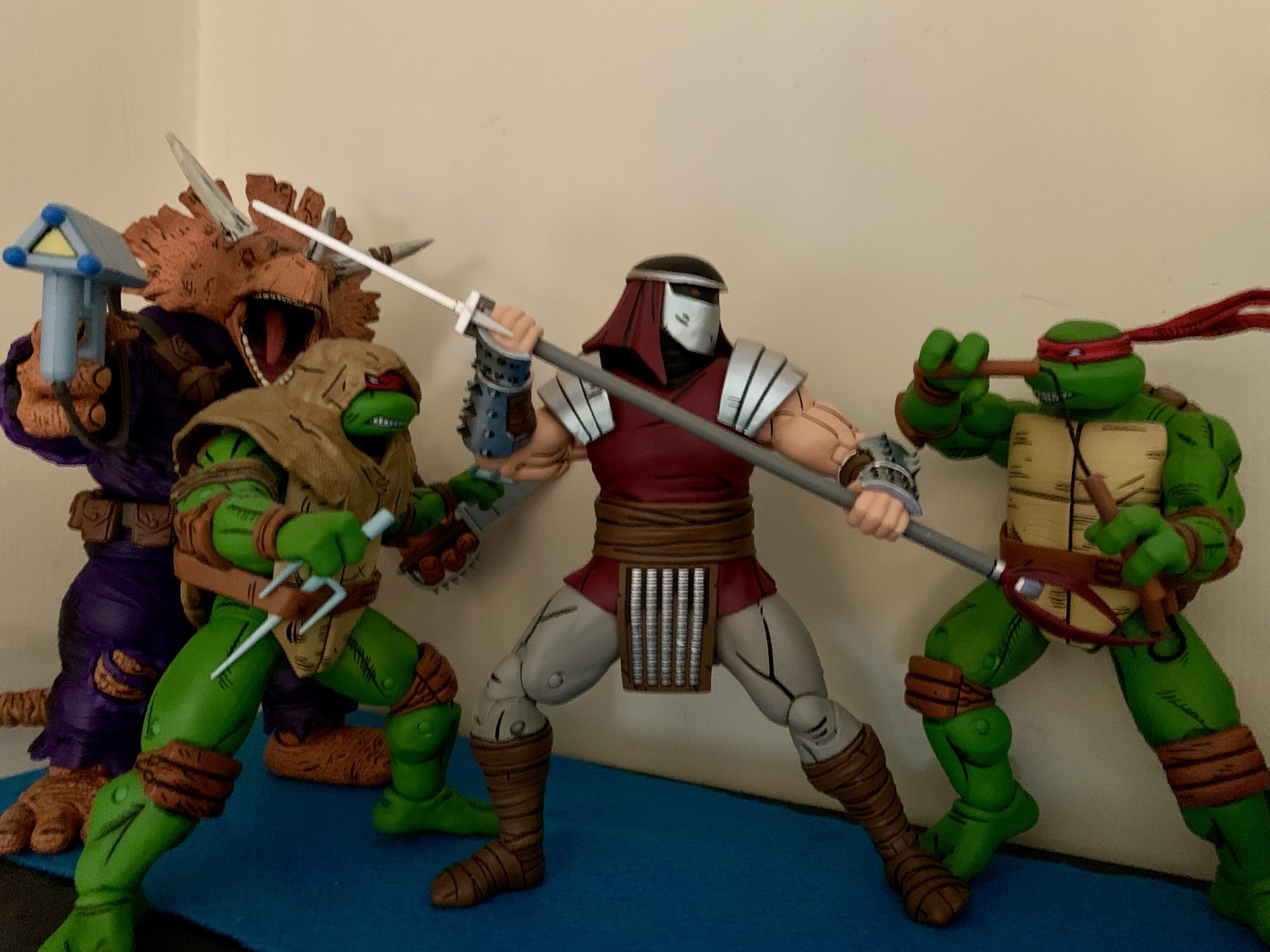
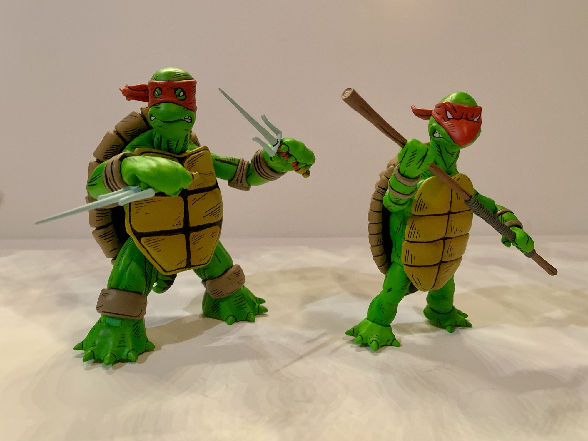
First of all, the figures here are presented fully painted in color that’s basically a match for what NECA did with the Jim Lawson turtles released in 2023. The original drawings were never colored by Eastman and Laird, but since Eastman worked closely with NECA on this release it can be assumed that this is how he and Peter likely would color them today. We also don’t really know how tall they envisioned these guys to be or if any consideration was really given. Eastman probably had input there, but I don’t know if Laird had any involvement (he’s essentially retired after having sold the property to Viacom over a decade ago). Based on interviews Trevor Zammit of NECA has given, it sounds like NECA had some freedom to figure out how to present these two. Eastman’s turtle, which was really more tortoise-like in some respects, was made bigger and chunkier while the more lithe version Laird came up with is shorter and thinner.

We might as well discuss the Eastman turtle first since it was the one said to be created first. The figure stands roughly 5.75″ to the top of its head. He may not be the tallest figure in the line, but he’s definitely a big boy. This turtle is quite chunky and there’s a nice heft to the figure. The shell is quite large and another area where NECA had to exercise some creative freedom since the drawing depicted the character from the front. Now, these turtles are not intended to be any, one, turtle from what followed. This isn’t Michelangelo or Raphael, it’s just a ninja turtle. Still, he has some recognizable traits from the turtles that followed. He’s sporting the red bandana along with brown elbow and knee pads and wrist wraps. There is no belt, but there is a tail. The original turtle also did not hold any weapons, but did have nunchaku affixed to both forearms which this figure does as well. The weapons are fused together, but do have real chain links affixed to them. They tab into a slot on the inner wrist band and are quite easy to work with.

What really stands out about the first turtle is the portrait and proportions. The head is more egg-shaped with barely any sort of beak. The eyes also feature pupils and areas of green around the eyes are visible through the eyeholes on the bandana. The hands and feet are large and more closely match that of an actual turtle. The hands look more like flippers for swimming through the water while the feet are quite tortoise-like. He has five digits on each limb as opposed to the three and two that would follow. The paint job is truly exquisite as there is tons of black hatch lines all over. The articulation cuts are not very prominent making this figure look almost like a statue. While subjectively many may find this turtle to be crude and even a bit ugly, objectively the figure is nothing short of a work of art when compared with the original sketch.

The same is true of the Laird turtle. This one clocks in at around 5.375″ and is far less substantial in mass when compared to the Eastman turtle. Laird’s turtle is similar to Eastman’s in style, but different. There’s a mask in place, but on this turtle it extends over a pronounced beak essentially wrapping around where the nose would be. It does feature the nunchaku on the forearms, but there are no chain links present this time and the straps holding them on are the only other garments on the turtle. There are no pads or belts, and the hands and feet feature four digits instead of five. He still is more turtle-like than the finished design, but the leaner proportions make him a bit more convincing as a ninja, even if still comically implausible. The paint job here is just as good as it is on the Eastman turtle, and despite the smaller size, this figure still has substantial weight to it.

Where the two figures also differ concerns the articulation. The more slender Laird turtle was likely easier to work with and articulates slightly better than the Eastman variety, though neither turtle is intended to be placed in poses many would consider “dynamic.” Both feature neck and head articulation with basic arm articulation. There are no double joints on either figure and the range at the hinge joints is probably going to be less than 90 degrees for most. The bandana knot and tail swivel while the hips are ball sockets with thigh swivels engineered into them. Neither turtle is going to be able to hit a split or kick forward all that far. The Laird turtle gets to have hinges at the knees and ankles with an ankle rocker. The Eastman turtle, who has big stumps for legs, just has one set of hinges below the kneepads. There is basically no ankle to be found on this guy so that’s it.
Safe to say, if it’s articulation that you prioritize in your action figures then these are not for you. I think for most, they’ll pose them like the original drawing and call it a day. And that’s definitely a viable display option, but it would mean ignoring all of the goodies in the box. NECA decided to load this pair up with all of the weapons you would expect and more. That means we get a set of katana, nunchaku, sai, and a bo staff. There’s also a nunchaku with a whirling effect that even spins and looks really nice. There’s a tonfa as well if you prefer more of a Last Ronin vibe. All of the weapons are fully painted and look great. There’s a slight crudeness baked into some of them as well such as a chip in the blades of the katana and the wraps of the bo being off-center. They also appear to be based off of the original sketch of the four that followed which, if so, is a logical choice.

In order to properly wield such weapons each turtle comes with an alternate set of gripping hands. The standard hands are an open style and the gripping are just that. They feature horizontal hinges, unfortunately, but at least they work with the clip-on nunchaku just fine. Both turtle can adequately wield any of the included, though aside from those clip-on ‘chuks there’s no weapon storage to be found. NECA also decided to give each figure one optional portrait. The default ones from the drawings are what I would deem stoic, while the alternate ones are angrier and feature exposed teeth, something we would be most accustomed to seeing out of the TMNT. It’s an appropriate alternate, for sure.
NECA’s send-up to the origin of the Teenage Mutant Ninja Turtles is a worthy inclusion in the year-long 40th anniversary celebration. It’s cool to see both of the co-creator’s original vision celebrated here in action figure form. While they don’t exactly put the “action” in action figure, they make for a great display piece and it’s something that I think diehard TMNT collectors will want to add. Since this was a San Diego Comic Con exclusive, it’s now unfortunately sold out and only available on the after market. NECA sometimes sells remaining stock online and at future conventions, but the likely easiest path to owning this set for those that missed out is to keep an eye on retail. It’s expected that some stores are going to be home to an another version of this set where the figures will be painted in black and white, but with red bandanas and weapon handles. It looks like it’s going to contain everything from this set as well, though the slipcover will probably be dropped. The SDCC version was priced at $70 so expect something similar for the retail version. Listings for it have already been spotted at Walmart, but NECA’s own solicitation did not mention any store by name so I don’t think this will be exclusive to Walmart. Needless to say, I really dig this set for what it is and I think every TMNT collector should try to pick up the version they like best.
More from the world of Teenage Mutant Ninja Turtles:

Playmates TMNT Original Sketch Turtles
Last week we took a Turtle Tuesday off which feels like a rarity for this blog. And that’s because there seems to be new stuff featuring the Teenage Mutant Ninja Turtles branding coming out all of the time. And it’s only going to become more plentiful as the franchise celebrates its 40th anniversary this year.…
Keep reading
NECA Mirage Studios Teenage Mutant Ninja Turtles 4-Pack
When it comes to the popularity of Teenage Mutant Ninja Turtles a lot of the credit goes to Playmates Toys. Kevin Eastman and Peter Laird created the characters born out of a joke. Credit them for having the vision to think this joke had appeal beyond their small circle as they self-published Teenage Mutant Ninja…
Keep reading
Super7 TMNT Ultimates! Classic Rocker Leonardo
When I was a kid, I had parents with divergent musical tastes. Dad likes oldies from the 50s and 60s while mom was more into modern rock (then 80s). One area where their tastes overlapped was Bruce Springsteen. We had several of his records in my house and I distinctly remember that cover to Born…
Keep reading