When looking back on the anime adaptation of Dragon Ball Super, I think my favorite arc is the Future Trunks/Goku Black one. It does get messy at times, and like most things Dragon Ball it goes on longer than it needed to, but it had some real, emotional, stakes which isn’t often found in Dragon Ball. The time travel stuff is always a ton of fun and Dragon Ball has its own spin on how time travel works with new wrinkles introduced in Super. And it marked the return of fan-favorite character Trunks, the boy from the future. The future version of Trunks is much different from the younger one in the main timeline. That Trunks has had a relatively carefree life (though he technically did die once) whereas the future counterpart has only known hardship. And he’s basically just another son seeking his father’s approval, but he just so happens to be the son of Vegeta, not the sort of touchy feely dad. The saga provided some closure there, and unlike the Cell arc from Dragon Ball Z, Trunks got to be the hero of his own story as opposed to sitting on the sidelines waiting for someone else to take down the big, bad, guy. Though he still needed an assist from God.

It was years ago that Bandai and Tamashii Nations released the Super version of Future Trunks in the S.H.Figuarts line. 2018, to be exact, and at a time when I wasn’t collecting this line like I am now. Even so, I considered getting it, but it seemed pretty pricey to me at the time. I had not yet been conditioned to the SHF pricing model (some would say that’s a good thing) and I decided not to get it. As you can probably guess based on where this has lead, I ended up regretting that decision. The figure is even more expensive now on the secondary market as it has never been re-released. And perhaps worse, the secondary market can be tricky to navigate when it comes to a figure as old as that one because bootlegs are a real problem. And since it’s an older figure, it’s also a bit dated and spending the extra coin in today’s dollars might just leave me with a serious case of buyer’s remorse. No, instead I’ve opted to bide my time in hopes that Bandai would return to Trunks. He is, after all, a fan-favorite and probably a safe bet to sell well. It’s just a question of whether or not the Super version is as popular as the one from DBZ.

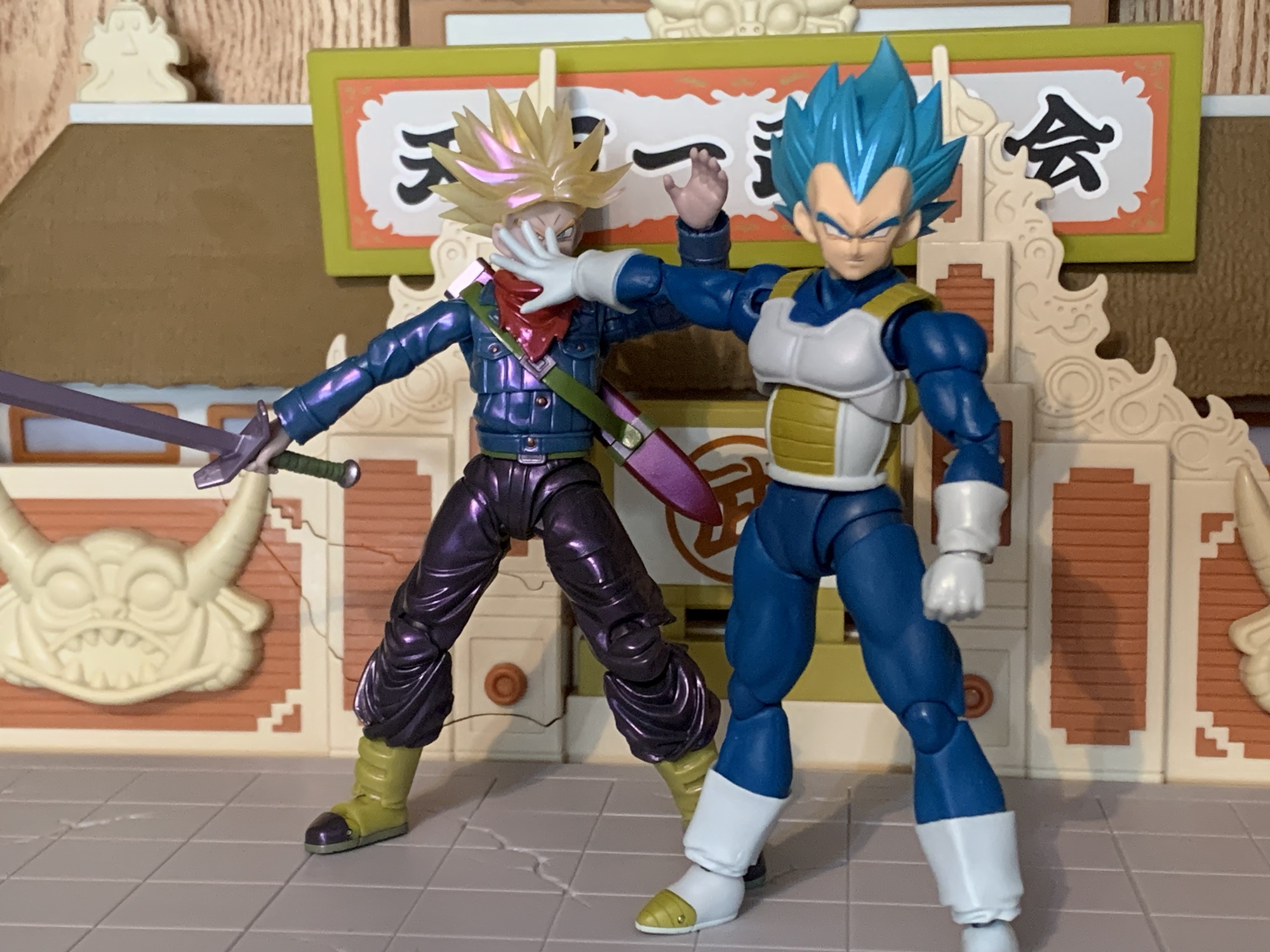
2024 ended up being the year where my patience paid off. Maybe. Future Trunks was announced as a convention exclusive, but like most exclusives, it meant he was going to be a variant of the original release. To be specific, this is considered the Gallick Gun edition. Trunks has adopted one of his father’s signature moves and with it comes a purple aura. To achieve this effect, Bandai gave Trunks a coat of pearlescent paint with a purple hue to it. They also went with the translucent Super Saiyan hair which they’re rather fond of when it comes to convention exclusives. I didn’t love the look, but it wasn’t going to be a deal breaker. What bothered me more than the new deco is the cut in the accessory load-out. Gone is the standard Trunks head even though he can certainly perform the maneuver when not in his Super Saiyan form. Worse though, is the removal of the Hope Sword. In the anime (spoilers if you have yet to watch it), Trunks has his sword break while battling his foe. When all hope seems lost, Trunks basically creates a Spirit Bomb out of his broken sword. The effect part was this big, translucent, blue, sword that I think even necessitated its own stand. It was pretty awesome in the show and seeing it in figure form was a huge draw to that original figure for me. Having that get cut, plus an MSRP of $75 for this new version, really soured me on it.
So I didn’t get it. What? But this is a review for that figure, you’re probably saying to yourself as you read this. Yes, obviously, I changed my mind. The regret of passing on that original figure was pretty hard to get over and still is. I didn’t preorder this figure, but unlike in past years Bandai apparently made more than what was ordered. Future Trunks was stocked after the fact on their webstore along with some other exclusives, and to make it even more enticing, Premium Bandai ran a free shipping promotion on its website for a week. And damnit, they got me. They got me for the Vegeta we looked at last week, they got me for the Trunks we’re looking at this week, and damn near got me on the Mini Goku, but I figured I was already giving them enough of my money. Now that I have paid for this figure, it’s time to sort out some feelings.
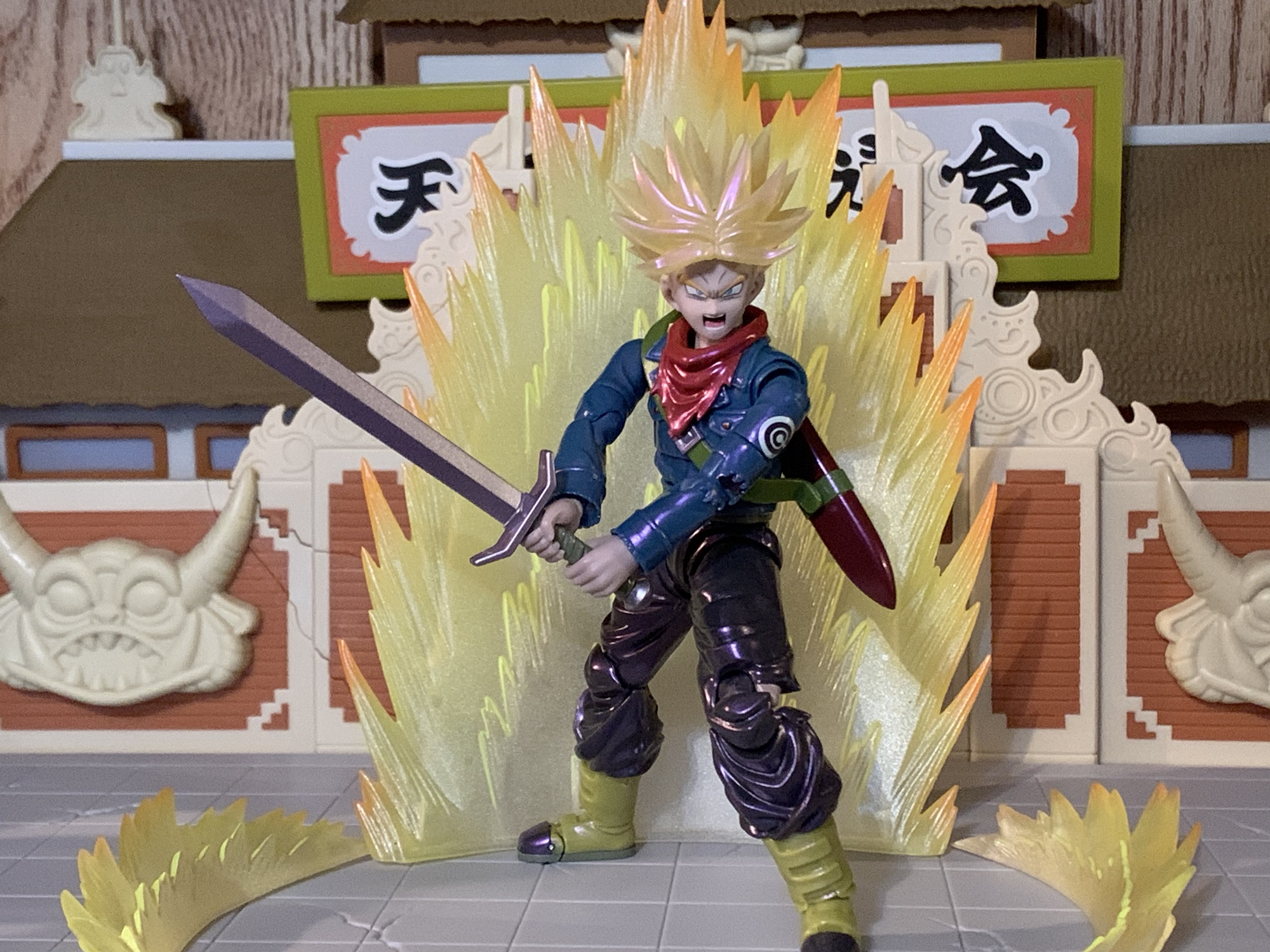
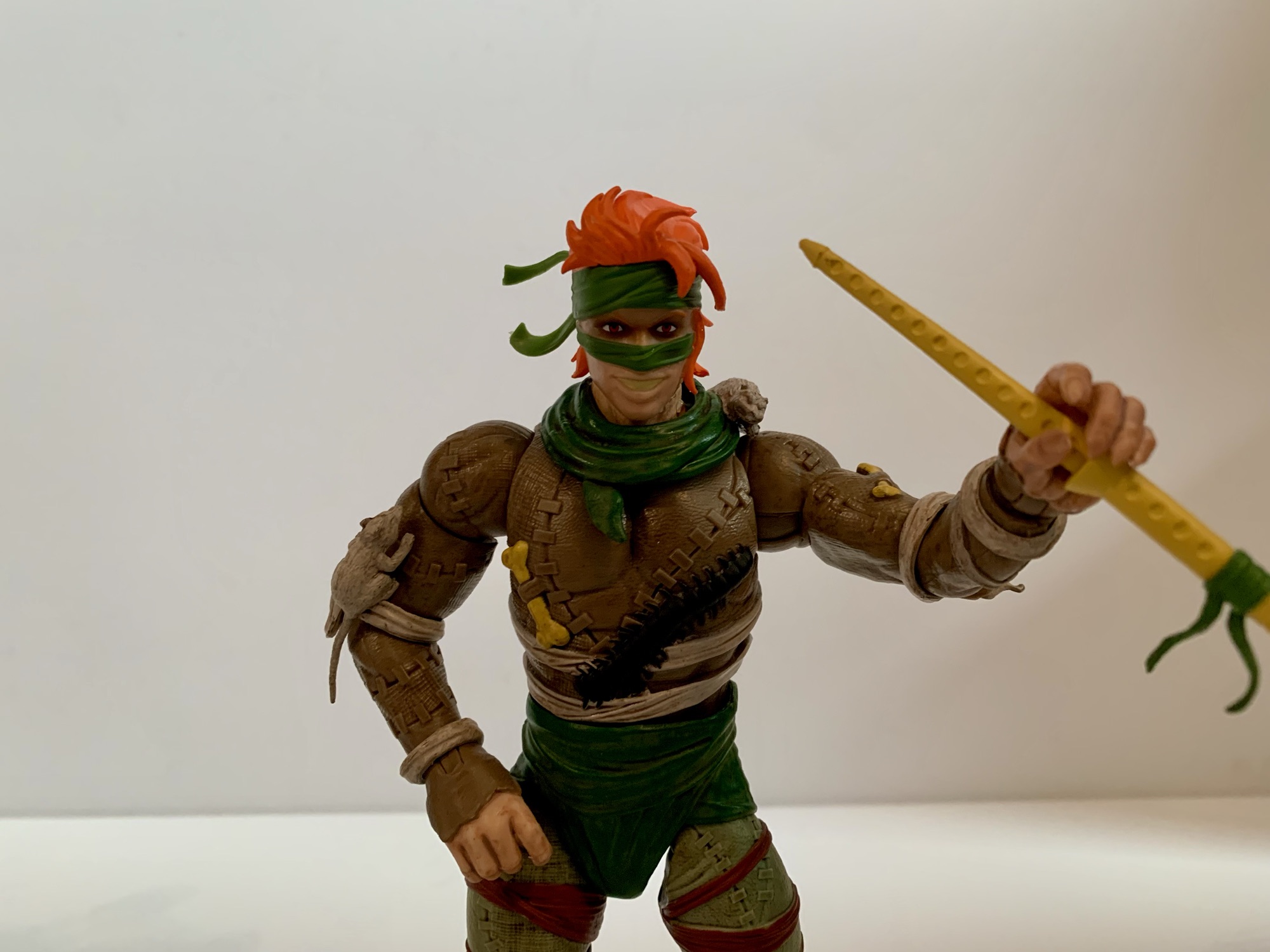
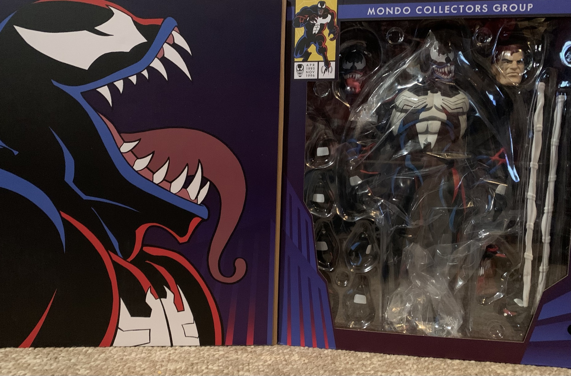
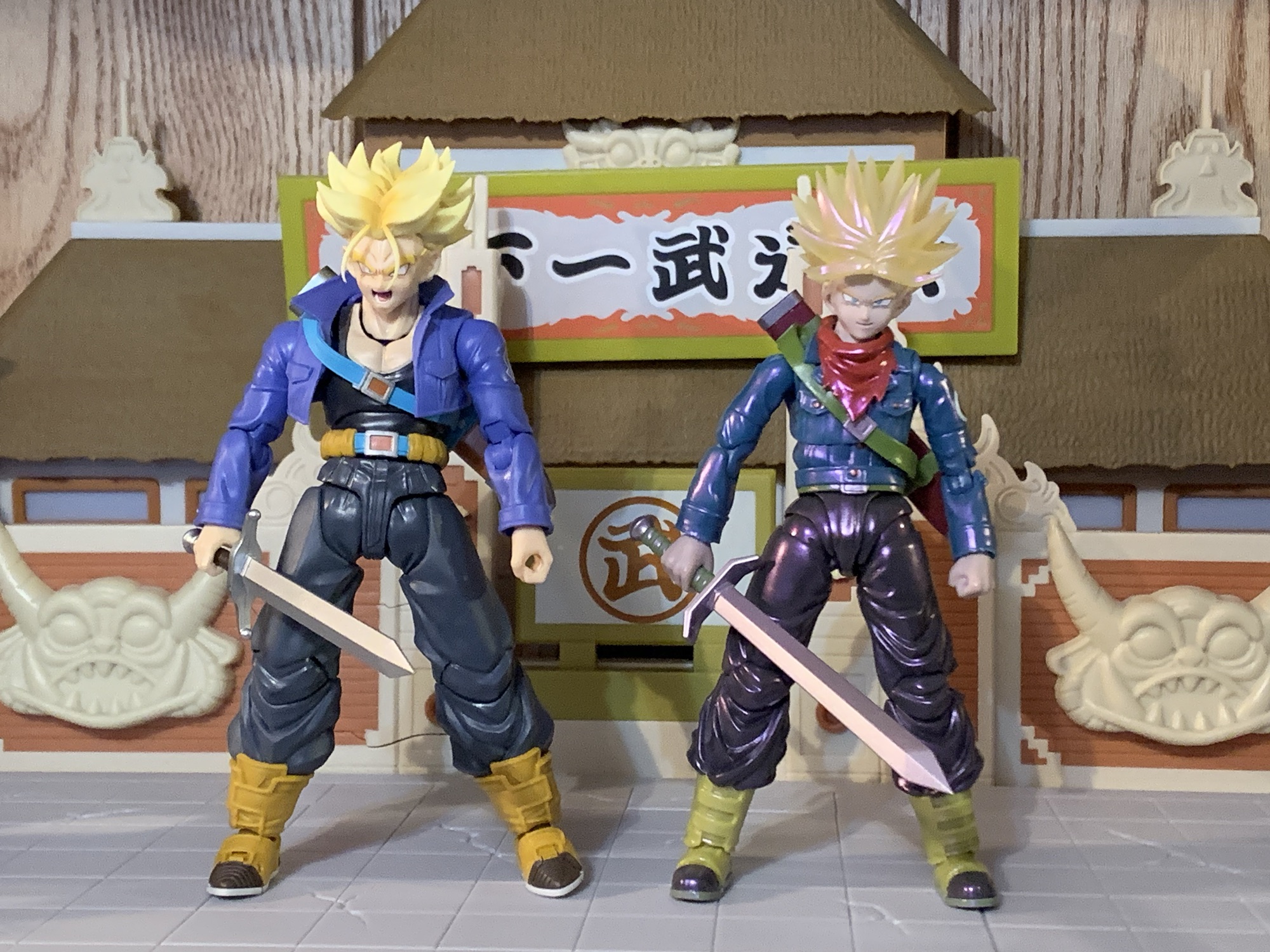
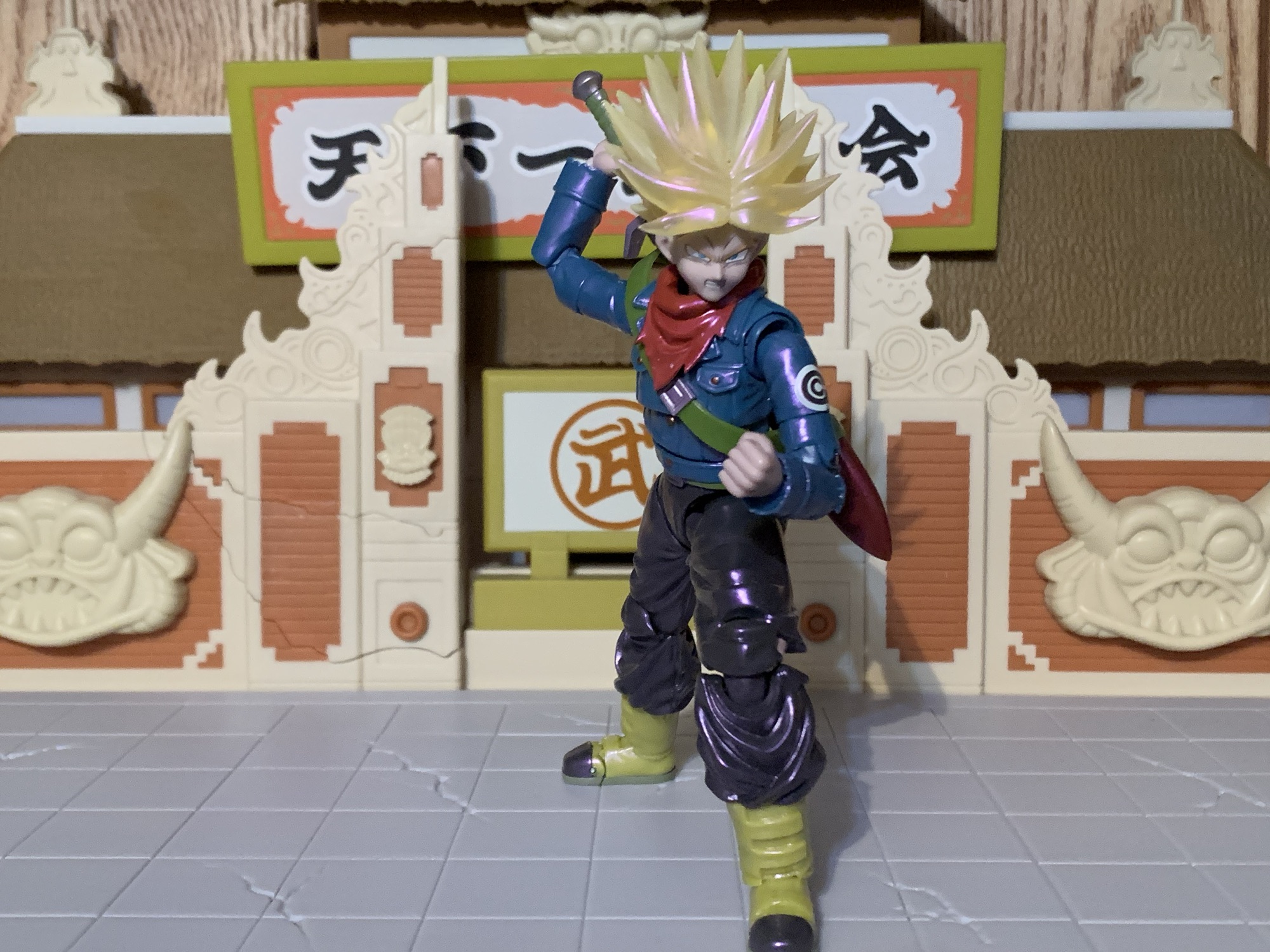
Future Trunks comes in the event exclusive style box which, in this case, goes for a black and pink color combo. I’m surprised they didn’t go with more of a purple considering the theming, but whatever. It’s just trash to protect the figure inside. Trunks is, as advertised, in his Super Saiyan form and stands approximately 5.25″ to where I assume the top of his head would be with his hair extending far beyond that. Out of the box, he won’t have his scabbard across his back and to put that on you will have to remove his head. It’s not really one of those SHF heads that’s designed to come off and go back on easily and the spiky nature of his hair doesn’t help things. I went ahead and dunked him him in some hot water to make it easier. You will also likely need to remove the scarf piece that’s around his neck which tabs into the chest. The scabbard can then slide over an arm easily enough and there’s an extra tab hole behind the right shoulder to secure it in place, though it isn’t really necessary.

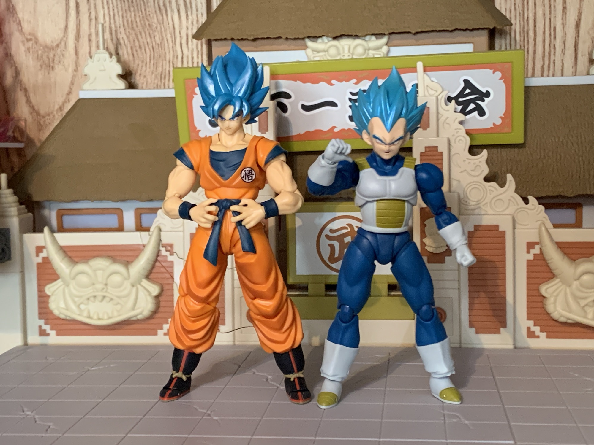
It should be stated that this version of Super Saiyan Trunks is what some fans have dubbed Super Saiyan Rage. Trunks, during his battle with Black, taps into another fountain of power through sheer rage. His hair sticks up higher and becomes even spikier than usual similar to his Ultra Super Saiyan form from Dragon Ball Z, only this time it comes without much added bulk. His eyes do white out and his yellow aura develops a blue core which seemed to signify to the viewer that this was similar to Goku and Vegeta’s Super Saiyan Blue. It’s also seemingly just as powerful as he’s able to go toe-to-toe with Black in this form. It is an anime only thing, so who knows if Toriyama considered it canon, but Gohan’s Beast form sort of follows in its footsteps as a form that’s unique to half-saiyans.

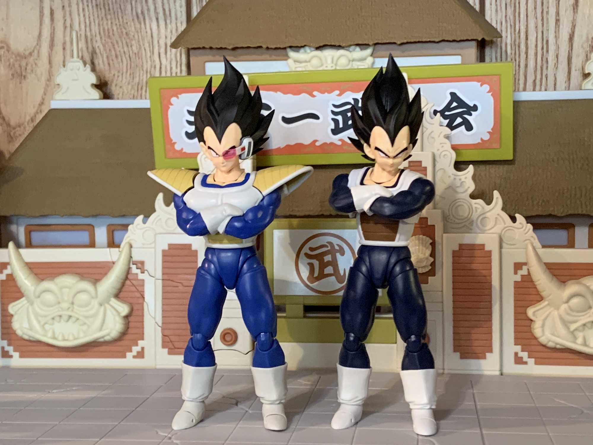
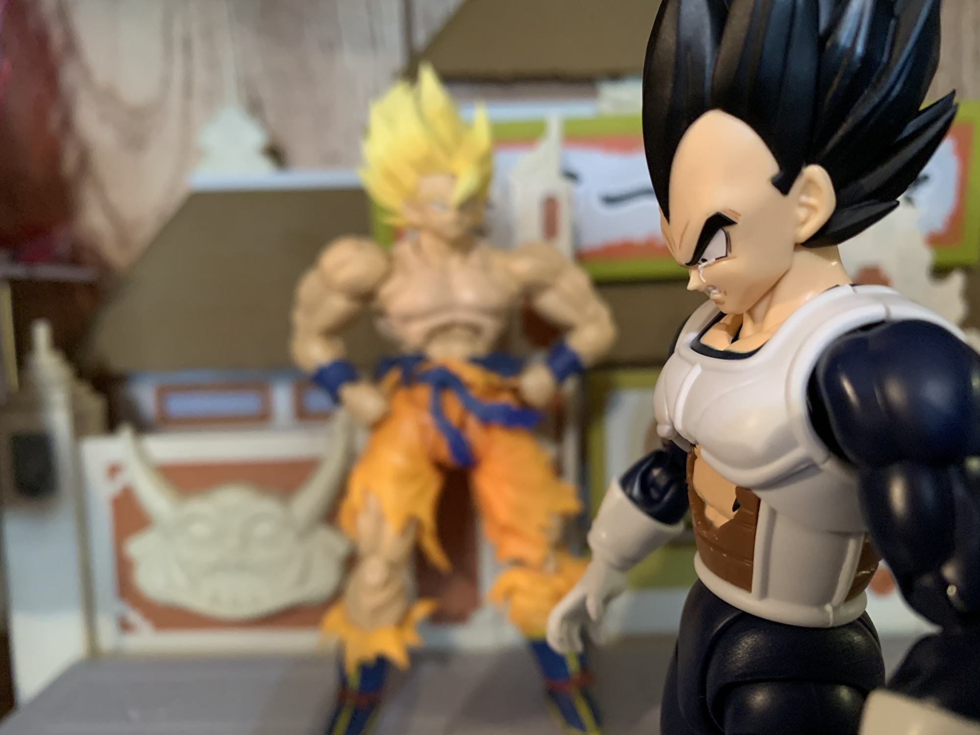
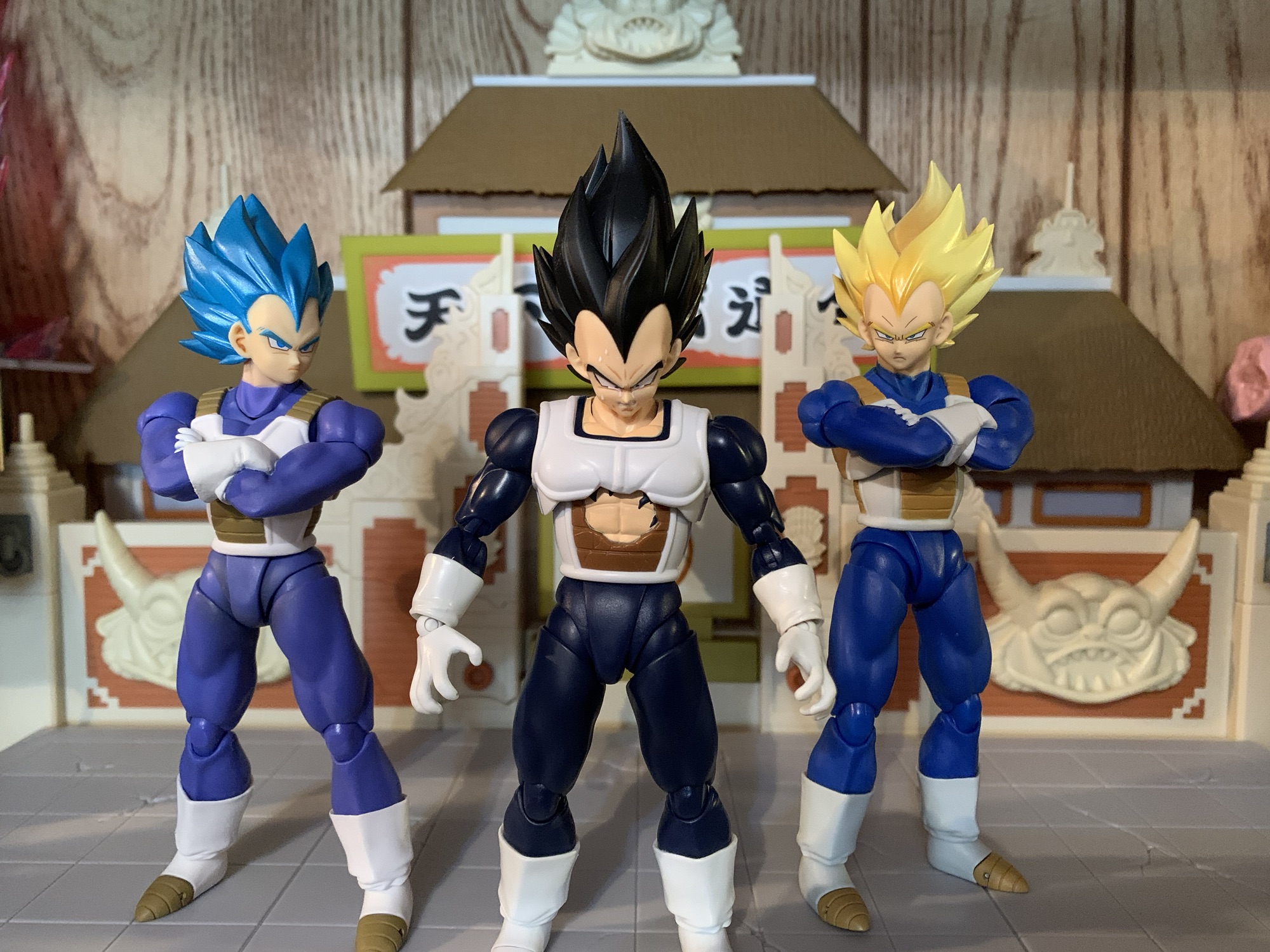
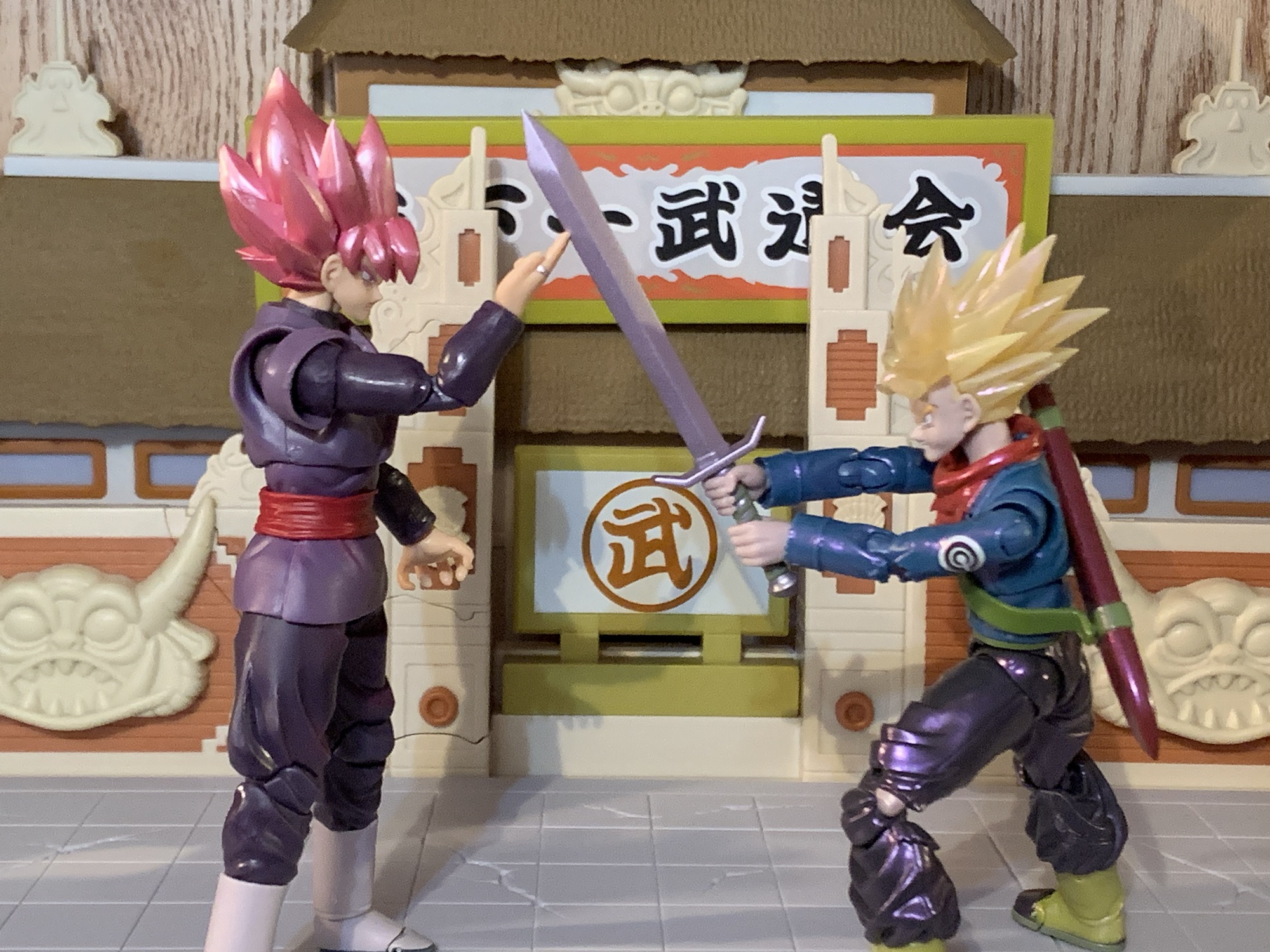
Bandai got the hair right, but not much else when it comes to the look. The outfit is all there and fairly accurate. Trunks has a more traditional jacket than the half one he used to sport and his pants are pretty much the same as they’ve always been. The figure though is just very slight. Put the new Vegeta next to him and they look like they’re two different scales. The height is okay, but the face, the arms, the torso – they’re all narrow and thin which isn’t something I see much in Dragon Ball. Place him beside the somewhat recent Future Trunks from the DBZ line, and it’s even more stark. That figure looks like it’s the more mature fighter, not this one who should be much older. Some of that is likely due to the jacket being all part of the sculpt. There isn’t a body underneath an overlay. It makes for a clean presentation, especially compared with the somewhat janky recent Future Trunks, but it definitely slims the profile. In order for Trunks to exist under this jacket, he’d have to be around 100lbs. He would be a very small man, which is not befitting the character from the show.

Aside from that issue, and it’s a rather big one, Trunks looks okay. The portraits have been given some enhancements and they’re nice and crisp. The paint on the body is clean and this new finish seems to achieve what it’s going for, whether I subjectively like it or not. The translucent hair is still kind of a sore subject for me. That might be going too far, but I don’t prefer it to painted hair. I think the best would be to go with a pale yellow and then a shiny coat of paint over it. The hair is coated like the rest of the figure so it has a shiny quality to it. I know it’s supposed to be the result of an aura, but it mostly reminds me of soap bubbles and the colors that dance around on their surface. It is what it is and I don’t hate it, it’s just not an improvement over what we had before. And since he doesn’t come with an aura effect to go with it, it does feel incomplete to me.
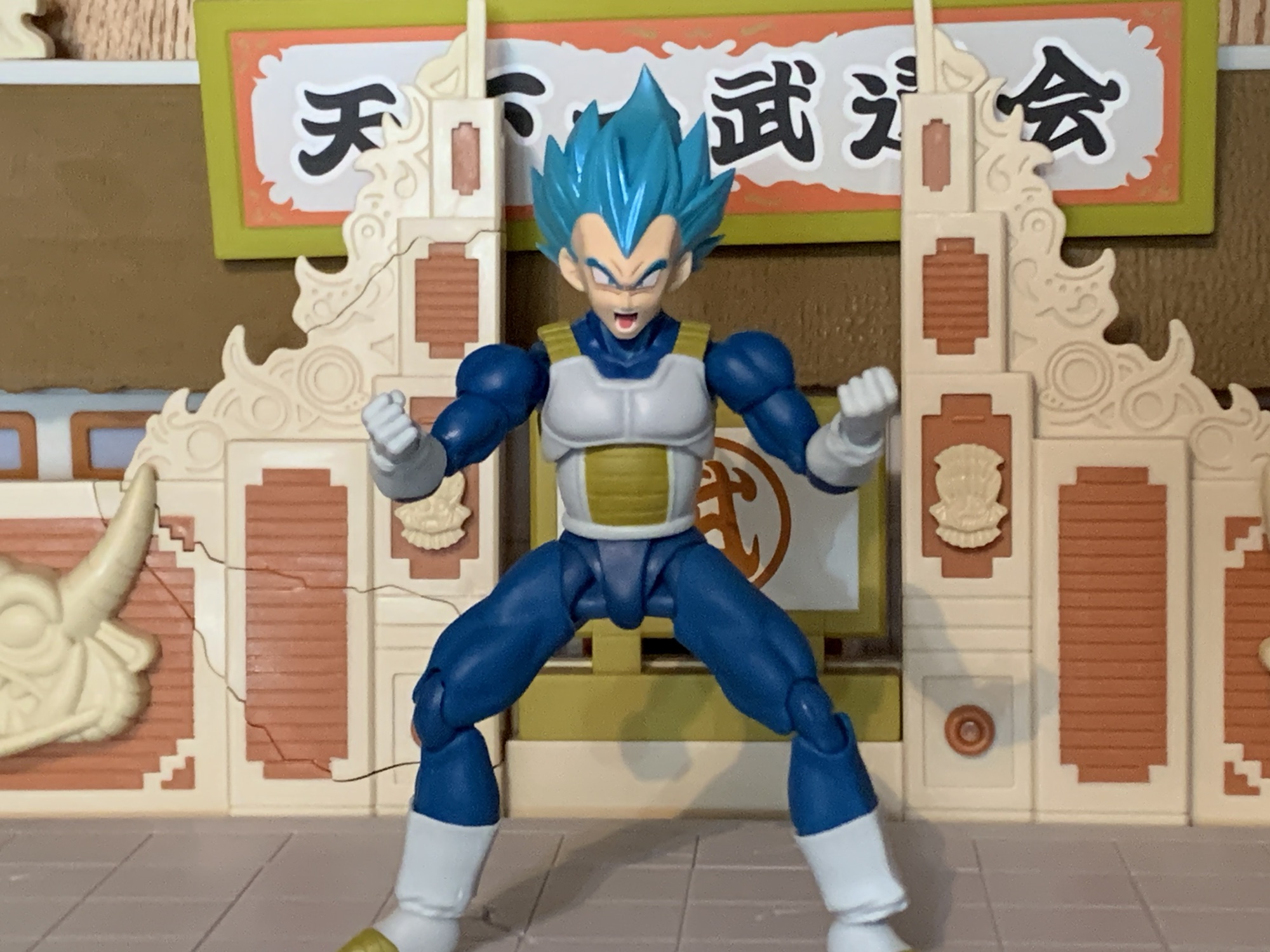
I’ve already mentioned how accessories were cut for this re-release, so just what was maintained? Well, for starters we get four portraits: smirk, teeth-gritting, yelling, and yelling with a side eye. They’re fine, but what’s missing is just a stoic, or grim, expression which is the expression I think of first when it comes to Future Trunks. I don’t think we really need the smirk, to be honest. And it would have been awesome if one of the yelling heads had whited-out eyes. For hands, we get a set of fists, gripping, splayed open, clenching, and one left, relaxed hand. I think the relaxed hand is here for him to hold his scabbard, though I don’t know for sure since it’s not in any of the pictures. The right, clenching, hand also has a hole in it and it’s for the effect part which is a little, translucent, purple, energy ball. It comes on an acrylic post that’s maybe a third of an inch long and it pegs into the hand via a ball socket. This is for his Gallick Gun charging pose which is one awkward pose. I guess Vegeta couldn’t have a Kamehameha stance so he does this thing where his palms are always pointing out as he charges the maneuver with his hands together. It’s achievable, but weird looking. Maybe that’s why he pretty much stopped doing it in favor of other attacks?
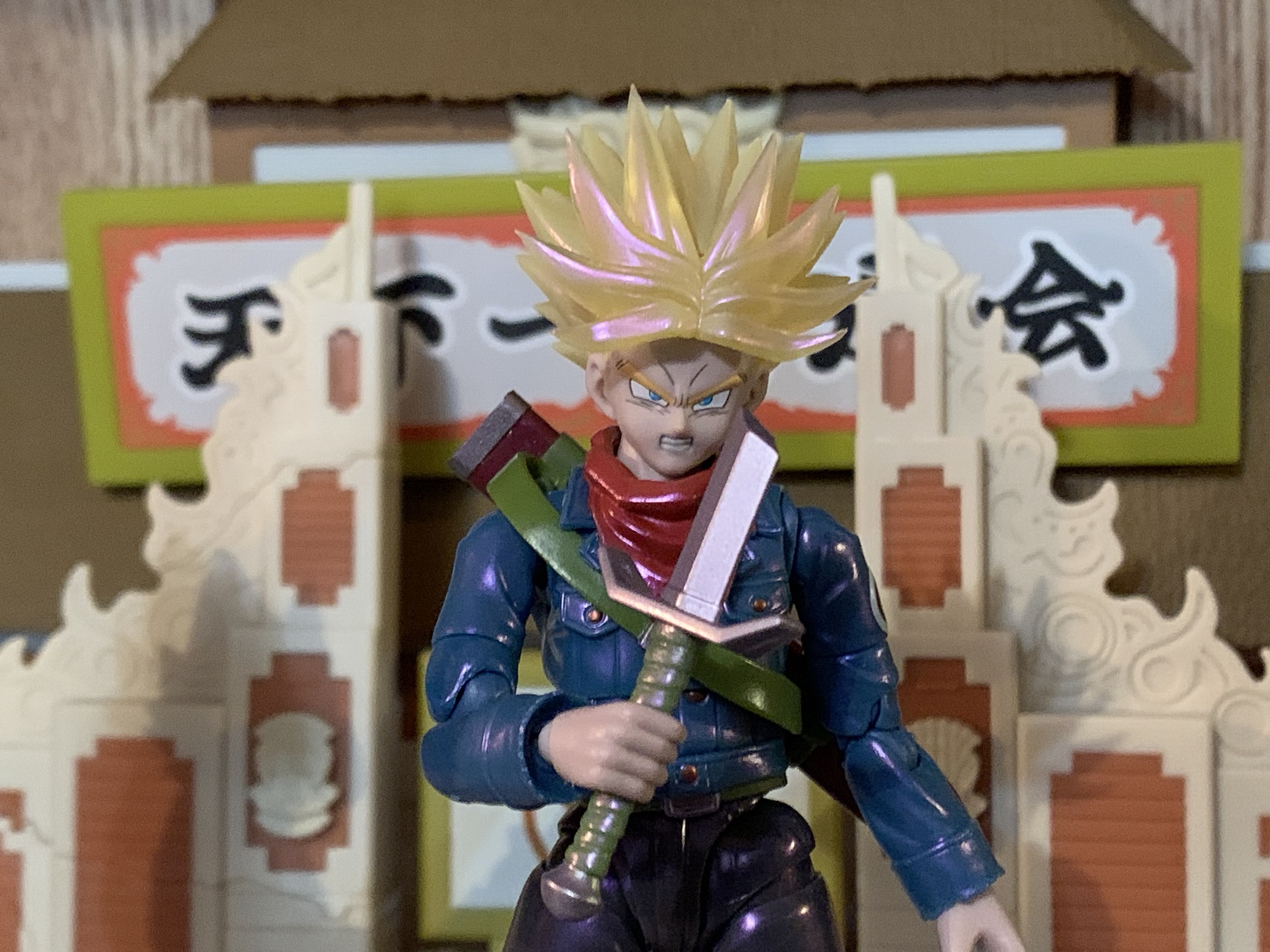
Lastly, Trunks has his trusty sword. We get two versions: regular and broken. The broken one serves a narrative purpose, but also it’s easier to slot into the scabbard. The hilt is painted green while the blade and pommel are silver, but like the figure itself, there’s a hit of pink on the blade so it matches the whole aura theme they’re going for. And like the DBZ counterpart, the pommel comes off so the sword can slide into the gripping hands. It only goes on one way, which is a bit annoying when you’re fiddling with such a tiny thing, but the figure gets a very tight grip on the handle. Almost too tight as it takes some elbow grease to get it out of his hands once there.

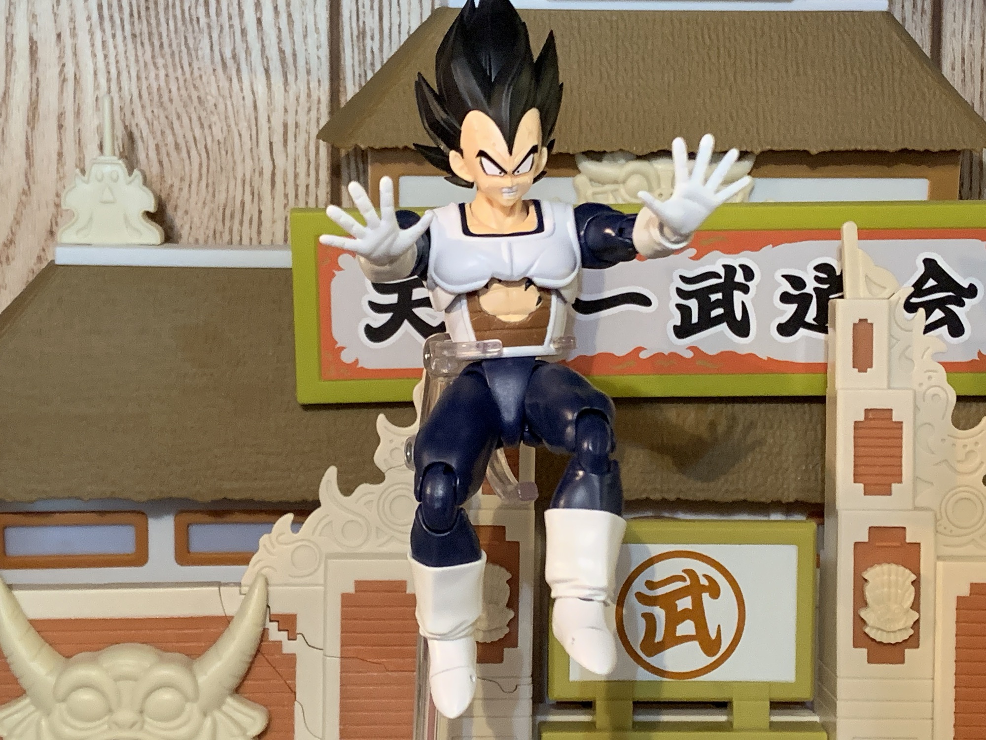
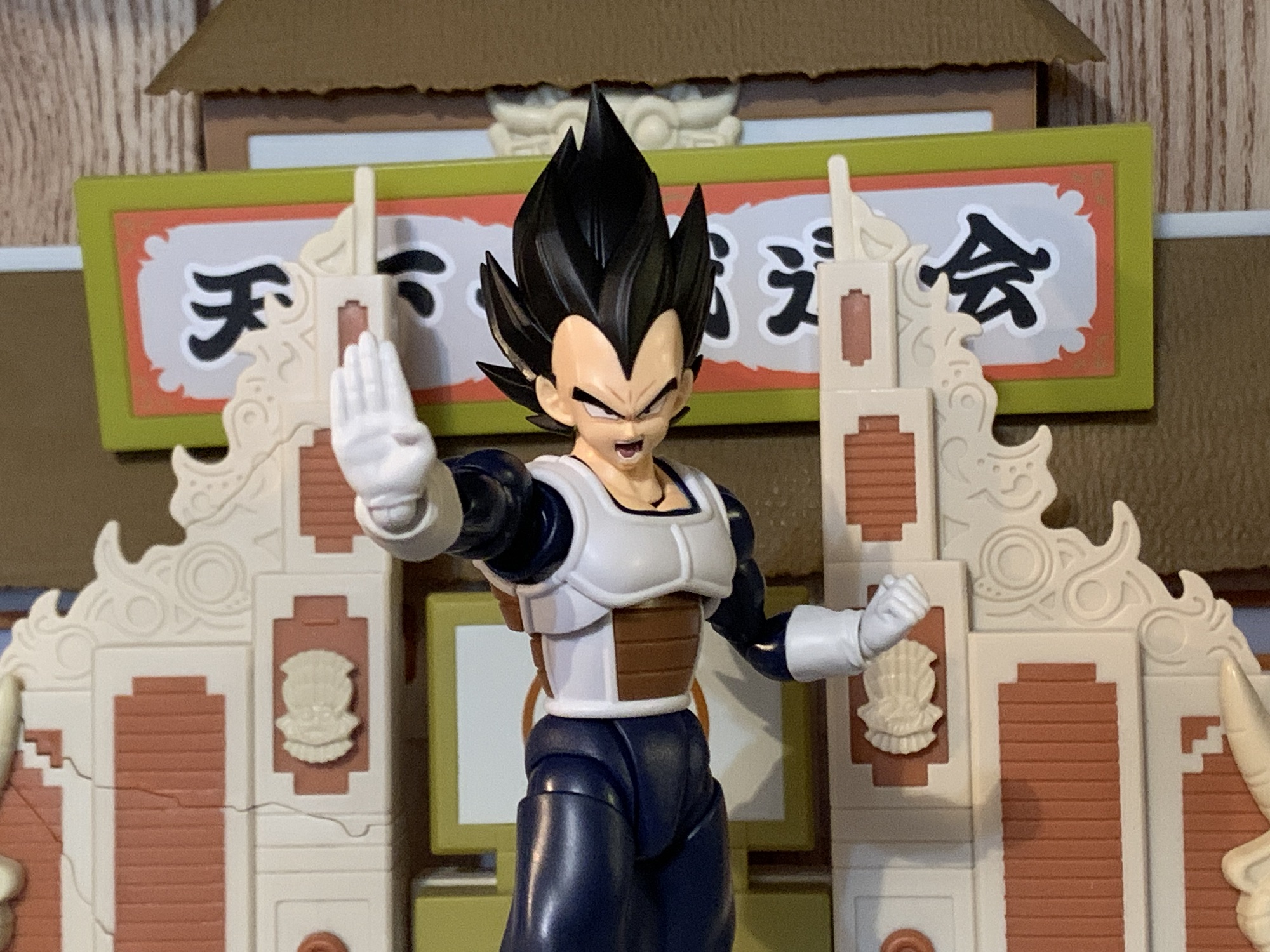
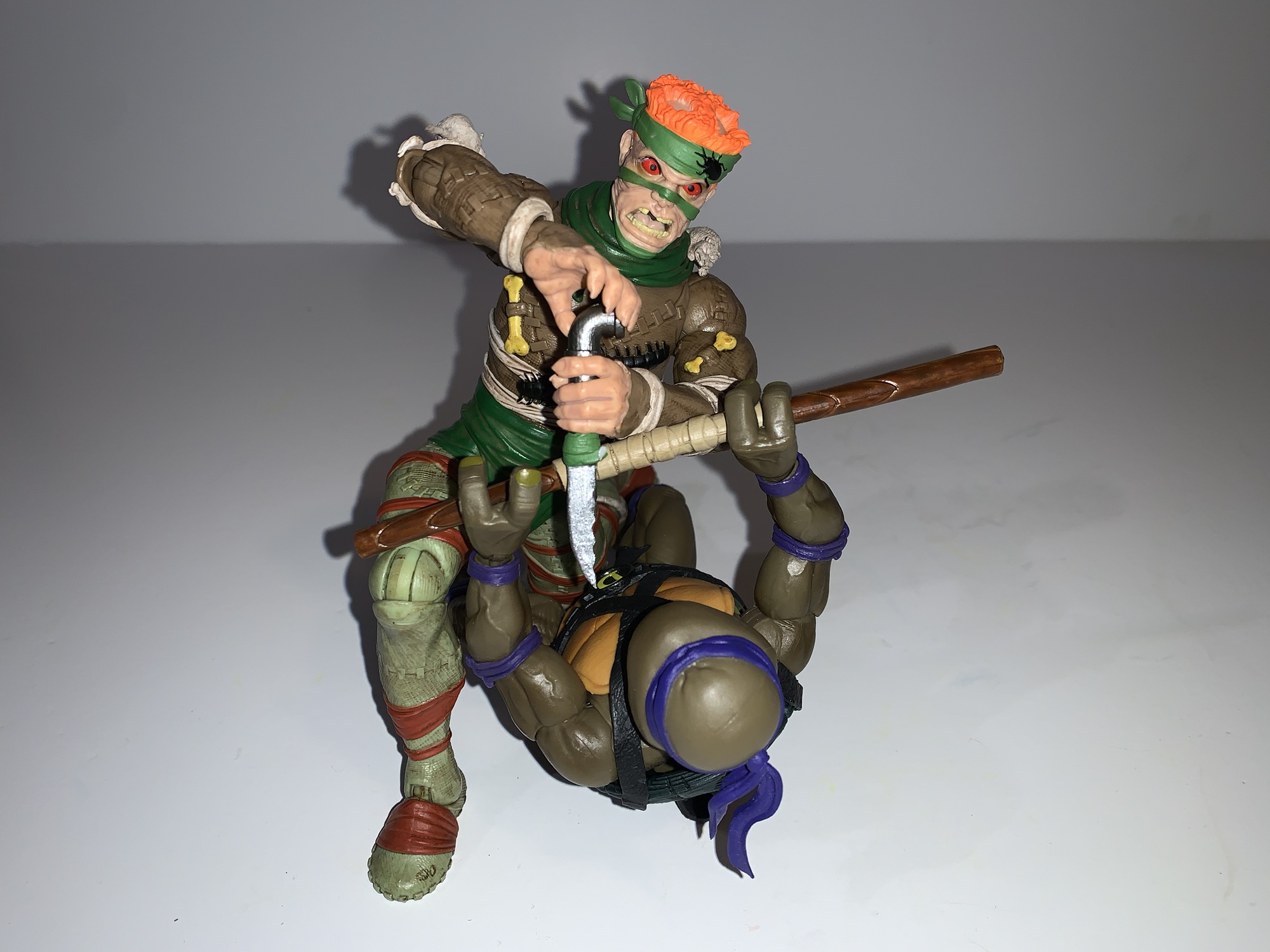
One area with this figure I have little to complain about is the articulation. Since the figure doesn’t utilize an overlay for the coat, all of the articulation is cut right into the figure and since the scabbard is secured via a sling, it doesn’t fall off constantly. The head is on a hinged ball peg, which I hate, but it does function fine. The scarf will limit his range though, and while it is removable, it leaves behind a giant hole in his chest so that’s not really a viable solution. Shoulders, biceps, elbows, and wrists are all standard stuff. The figure does have butterfly joints in the shoulders and they work well enough coming forward, but offer nothing going back. There’s a joint in the mid-torso that pivots a bit side-to-side and allows for some forward and back. A waist joint is where you’ll get most of your rotation and he can crunch forward and back thanks to it and the hips. Since this is an older release, he doesn’t have those annoying, sculpted, butt cheeks. Mai may be disappointed, but it allows for full splits going forward and back. Out to the side, you get about 45 degrees. If you can find a way to get the caps in his hips to slip over or under the thigh swivel then you may get more, but it’s hard plastic and not very forgiving. Beyond the hips, Trunks kicks forward well and the thigh swivel affords some pivot. The knees and ankle hinges are fine while the rocker is limited. There’s also a toe hinge if you want it.

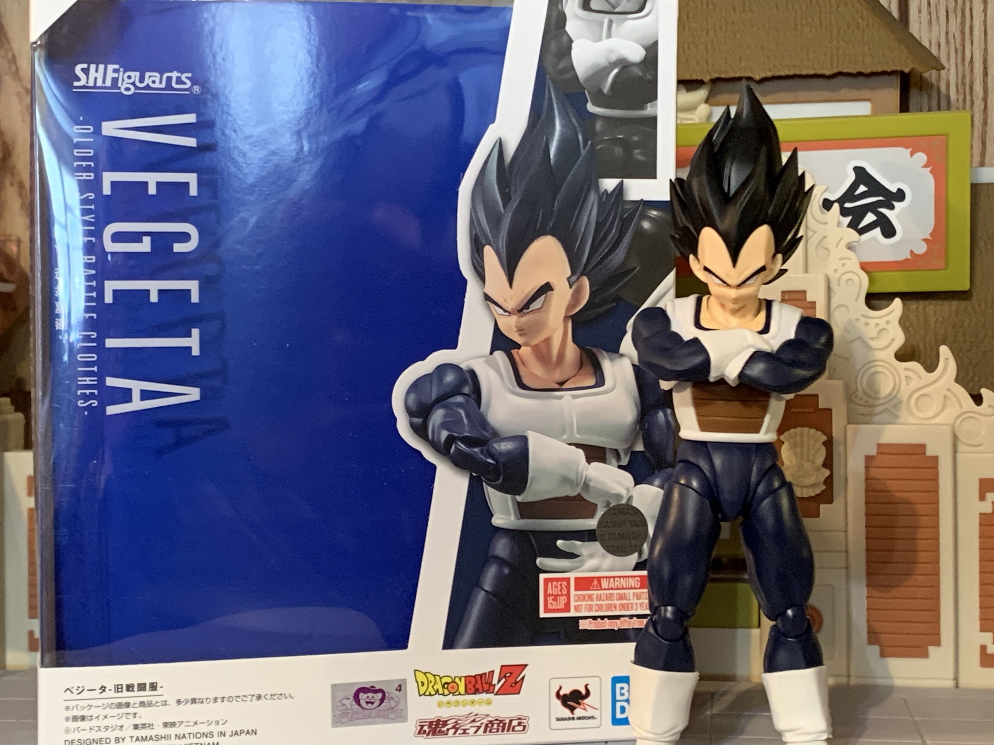
I don’t want to overstate the articulation here. It’s not elite or anything by the standards of the line, but it’s functionally sufficient. Trunks can hit all of the Trunks poses well enough. He can hit his downward swing, jab, or have his hand on the handle while the blade is in the scabbard. It will work, and what holds the figure back is not the articulation, it’s almost everything else. The paint job is executed well enough. It’s something you either like or you don’t. The sculpt is dated and not true to the character. He may look off when posed with the new Vegeta, but that Vegeta sculpt is actually just as old. His proportions were never right and this is a version of the character begging for a redo just like the DBZ version received. The reason to get this figure is if you really like the character and feel better paying $75 for it as opposed to the $120 or so you’re likely to pay for a secondhand version of the old figure. That figure will have more stuff and a more true-to-the anime paint job, but will have all of the same problems as this one plus the older face printing. And if you’re thinking of using the updated face plates with the old figure, it’s probably not going to work. The flesh tone here has a purple hue to it. It may not be apparent when looking at the figure by itself, but place it beside another character and it stands out. He’d basically look like poisoned Trunks if you tried to mix and match.
Am I content with my purchase? I still don’t know. This is an obvious compromise for my collection. It’s a character I want in my display, but not the version of the character I would like. If I could get the older version for a hundred bucks or less then I would not have bothered. Both are compromised takes on the character, but the original less so. And that Hope Sword is pretty damn cool. If you have that old figure and decide to get this one too then you could probably use the depowered head on the new body. The necks won’t match, but the scarf will hide it if you want. The only reason to do that though is if you really like Future Trunks. This version is okay, but not what I want. I would have much preferred they just give him a blueish hue and make him Hope Sword Future Trunks. At the very least, he should have his own aura to go with the Gallick Gun. A Hope Sword Trunks could have created his unique yellow and blue aura and would have looked way cooler. Plus such a display would lend itself well to being off on its own in a different part of your collection making the size issues less of a concern. Oh well. If you’re like me and really regret passing on the Super version of Future Trunks, I guess you may as well grab this one if you’re okay with the price. Once it’s gone though (and it’s no longer being offered on their website, but it may be making the convention and pop-up store rounds) I wouldn’t entertain paying so much as a dime more than MSRP. Hopefully, something better for Future Trunks is in our future.
If you like Trunks or are just really into Dragon Ball Super then you may like checking out these reviews:

S.H.Figuarts Dragon Ball Z Super Saiyan Trunks: Infinite Latent Super Power
In the waning days of Toys ‘R Us, I found myself at one of the nearby stores in need of something. What that something was, I don’t recall, but since everything was hitting clearance I had a look around the store. TRU had started carrying the Bandai/Tamashii Nations S.H.Figuarts line of action figures which, at…
Keep reading
S.H.Figuarts Dragon Ball Z Super Saiyan Trunks – The Boy from the Future
The most captivating character in all of Dragon Ball Z for me back in the 90s was unquestionably Trunks. The offspring of Bulma and Vegeta who traveled back in time to warn the heroes of the day about impending doom on the horizon was unique for many reasons. For one, he actually looks like a…
Keep reading
S.H.Figuarts Dragon Ball Super Event Exclusive Color Edition Super Saiyan God Super Saiyan Son Goku Kaio-Ken
My isn’t that title a mouthful? This version of the classic character Goku comes to you from Bandai via New York Comic Con. If I were to simplify that title, I’d call it shiny Super Saiyan Blue Kaio-Ken Goku, which is still pretty wordy. I guess blame Dragon Ball creator Akira Toriyama for the obsession…
Keep reading