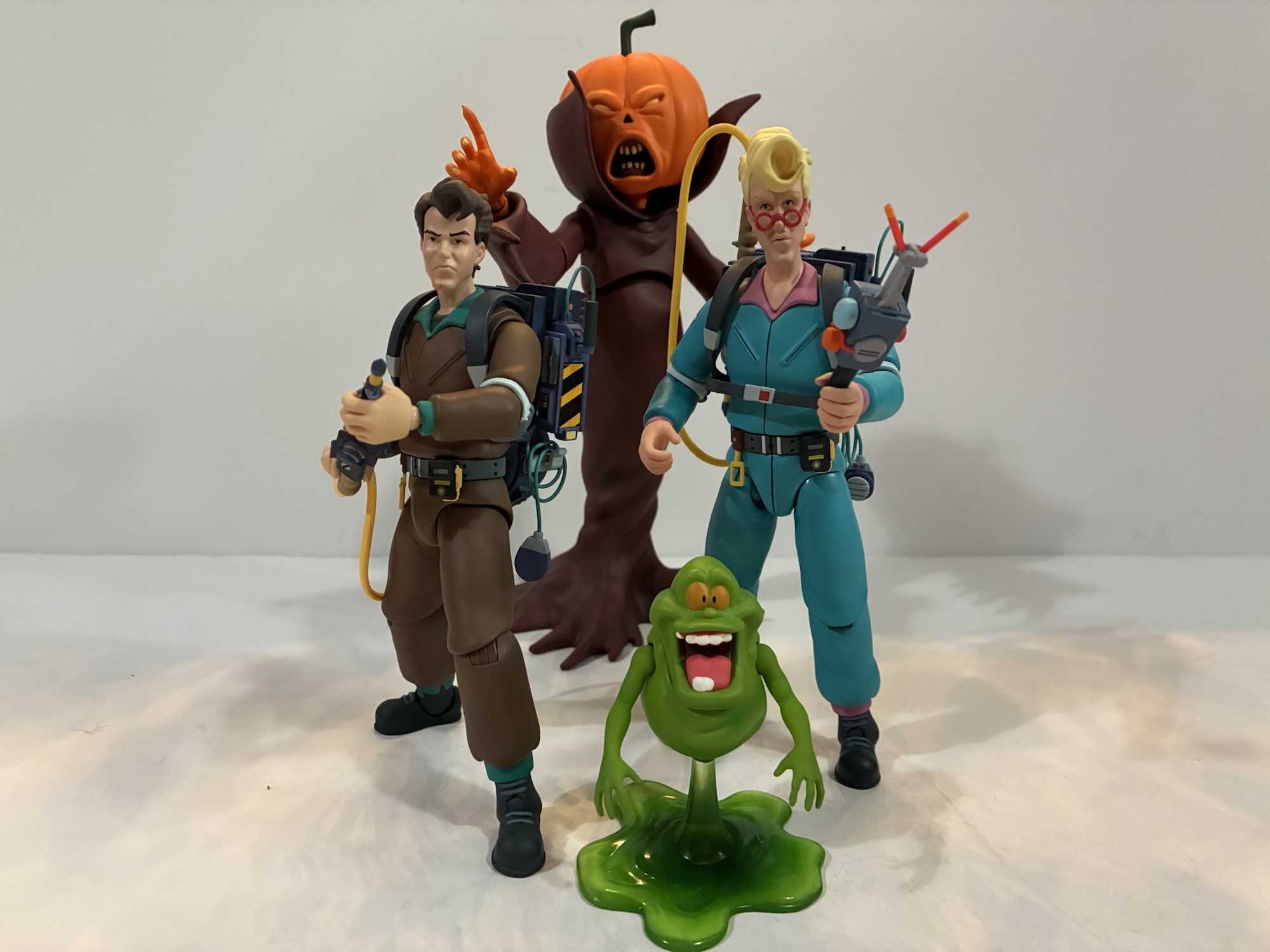
If you have seen the first season of X-Men ’97 then you may be wondering why Emma Frost, aka the White Queen, is receiving an action figure in the show’s companion toy line. She didn’t play a big role in the show having a speaking role in just one episode and then what amounted to a cameo in a later one. I think she was among the characters shown off in concept art before the show’s premiere so that could be a contributing factor here. Or, she’s set to play a bigger role in the show’s second season. As of this writing, only one trailer has been shown for X-Men ’97 season two and Emma Frost was not present in it. At least I think she wasn’t. It was only shown to attendees of New York Comic Con and for non-attendees we’re left with essentially bootleg cell phone videos from the panel. If she was in it and I missed it that certainly wouldn’t surprise me. Hasbro did use the event to unveil a massive made-to-order Apocalypse figure from the show and we definitely know he’s a big player in season two based on how the first season ended. Could the same be true for Emma?
Those heels means she towers over someone like Jean.
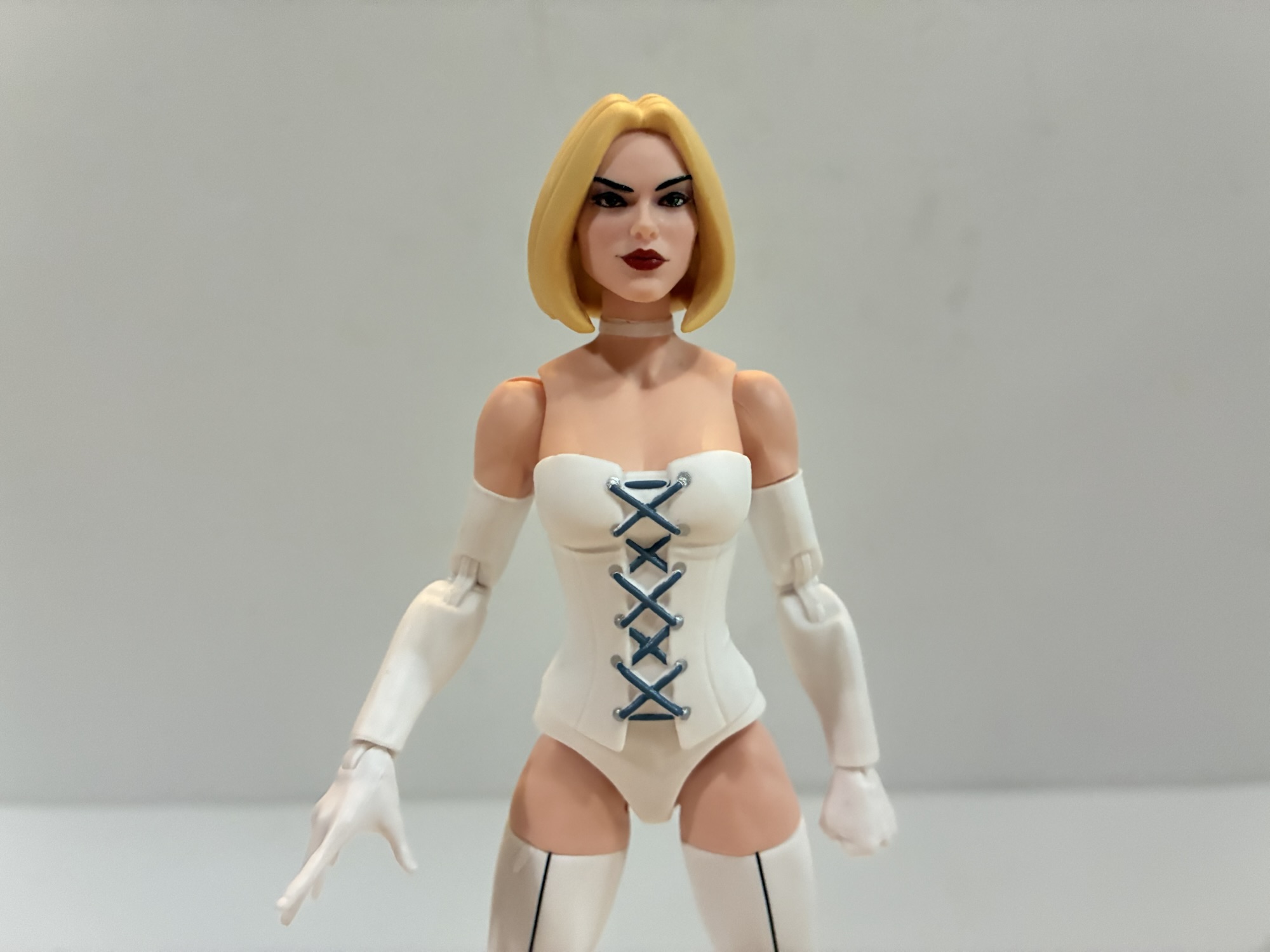
It’s also possible this figure exists because it’s a relatively cheap release for Hasbro. Yes, like Wolverine, this Emma Frost is basically the same Emma Frost we’ve received before in the Legends line, but with minor updates that last year’s Goblin Queen benefitted from as well. The basic formula for this X-Men ’97 line is to take existing molds, add an animated head, and call it a day it would seem. Emma mostly follows in that direction, but she does have a new corset that is slightly less revealing this time around. I don’t have the older Hellfire Club release, but I have seen pictures and I do not like it. She looks like the sort of person who had some bad plastic surgery. This Emma, while the details of her face and hair are toned down to match the animated style, looks like a young Sharon Stone. As such, I think that comic book fans may take more of an interest in this release than some of the other ones in this wave.
That’s a bummer.
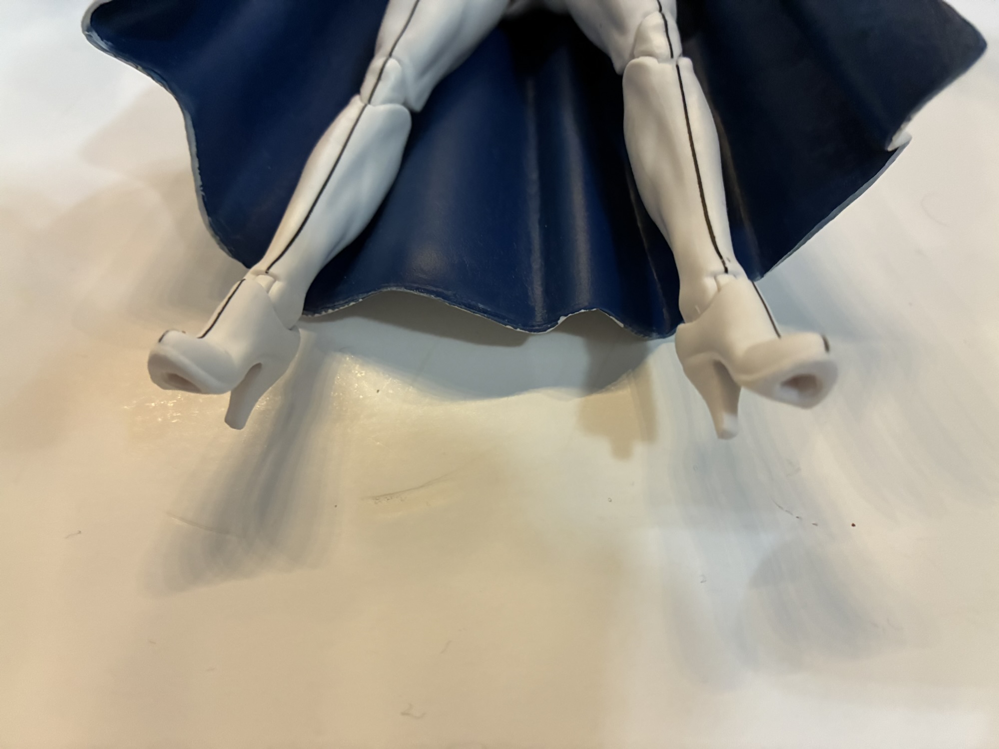
Emma is not much to talk about aside from the appearance. The hair is a soft yellow and her face is well painted. Her default portrait has a slight smugness to the expression which suits her. The body is fairly clean and composed mostly of colored plastic – flesh and white. There is some paint on the corset strings and a line running down the front of her boots that’s applied well. The cape is also nice with white on the outside and blue on the inside. My figure does have a splotch of gray paint on the back of her default portrait which I’ll have to try and remove. The figure isn’t as detailed as comic versions, but it works for the source material very well and I think there’s enough here that it can appear on a comic shelf.
The cape makes her harder to stand, but she looks kind of ridiculous without it.
The rest of the figure is basically nothing to write home about. We get one extra portrait which features a smile and a windswept sculpt to the hair. I do like it, but I wonder why Hasbro doesn’t make the hair swappable between the two heads? For hands, we get a set of fists and a set of open hands. No power effects, though more important is no stand. Emma sports some high heels and as a result can be a pain to stand. Without the cape, it’s fairly easy to find a neutral stance to get her to stand in. With the added weight of the plastic cape though it becomes more of a challenge. It’s do-able, but don’t expect to get much use out of her articulation as a result.
These things are going to drive you crazy if you want to get her into any kind of semi-dynamic pose.
And speaking of, the cape plus the heels makes her articulation functionally useless. The head can barely rotate because of the large fur trim on the cape and it locks her shoulders down. Her right arm is more exposed than the left so you can get something out of the elbow, but not much. There is a joint inside the corset, but it’s useless. They way Hasbro did the heels means she has more of an ankle swivel than an ankle rocker. If you want to ditch the cape then, yeah, you’ll get more. Standard arm, hips, thigh, and knee articulation is present, but she looks a little goofy without the cape on account of her long neck. I suppose the real play here is to get a third party soft goods cape, but that can be just as expensive as the figure itself.
This is the maximum amount of nuance I could get out of her legs. And she fell over shortly after.
Emma Frost is basically a barely functional action figure. It looks good in the limited poses available, but it’s not a figure you’re going to want to mess with. Maybe swap the portraits here and there, but that’s it. I thought she looked nice and since she’s a classic X-Men villain I decided to grab her, partly out of fear she’ll sell out. And she did initially and may be one of the harder figures to find in the wave. Mostly, I did worry I’d like her in season two and wish I had purchased the figure, though if she does show up chances are she’ll have a different look. Do I regret my decision? Yes and no. It’s not a great figure, but it’s also not one likely to end up on clearance. And if I just want a White Queen to look good on my shelf, she does accomplish as much. If that’s all you care about then you may be fine with this one. As long as you know what you’re in for.
If you like X-Men ’97 and are interested in more action figure reviews then check these out:
The television event of 2024 for me was none other than X-Men ’97. I loved that show and I can’t wait for the second season to come around. It’s just a shame we may still be as much as a year away, but to somewhat tide us over until then we have this third wave…
I knew who the X-Men were when the show premiered in 1992, but I didn’t know much about them. That show really was the proper introduction to the franchise for me and one thing I couldn’t wrap my head around as a kid was that these were heroes who didn’t really have a secret identity.…
I’m always going to have a soft spot for Morph. It was rare to see a character killed off in a children’s show, but that was the fate of old Morph who didn’t make it out of the show’s second episode. I wouldn’t call it traumatizing, but there was definitely a haunted quality to that…
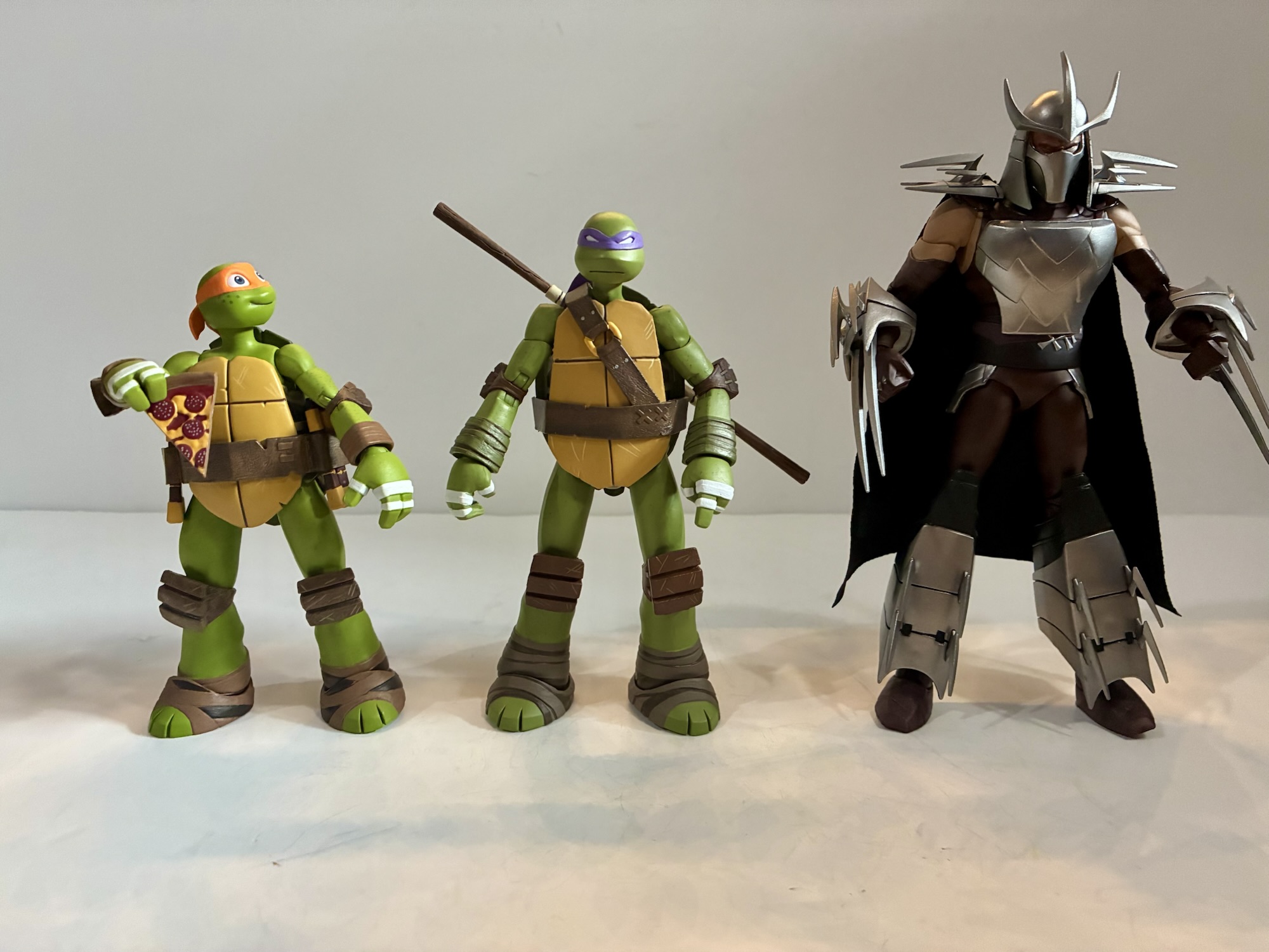
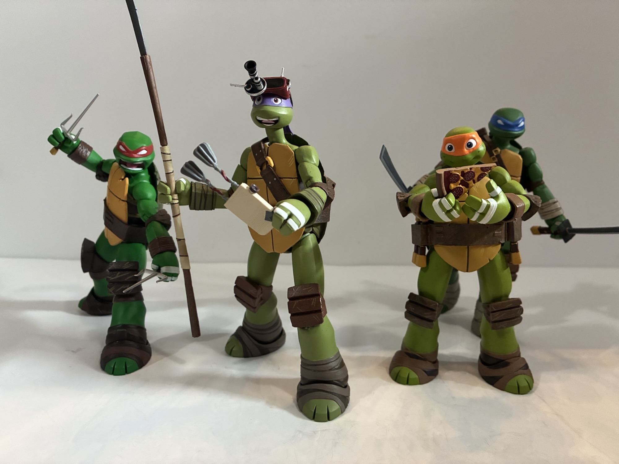
We are onto the third member of the Teenage Mutant Ninja Turtles and its everyone’s favorite hot head. Raphael got softened for the 1987 cartoon series to make him sarcastic and a bit of a goof-off. He didn’t take anything too seriously and had a certain dry wit about him. It’s quite different from his comic book portrayal where he was emotional, easily angered, and often confrontational not just with his enemies, but even his family. That Raphael was immortalized on the big screen and seemed to convert a lot of viewers into Raph fans. Perhaps that’s why his personality has mostly been kept the same for future iterations of the character, though with both Rise of the Teenage Mutant Ninja Turtles and Mutant Mayhem, his character has once again seen a softening.
Sort of like Wolverine, Raph is a bit of a short king.
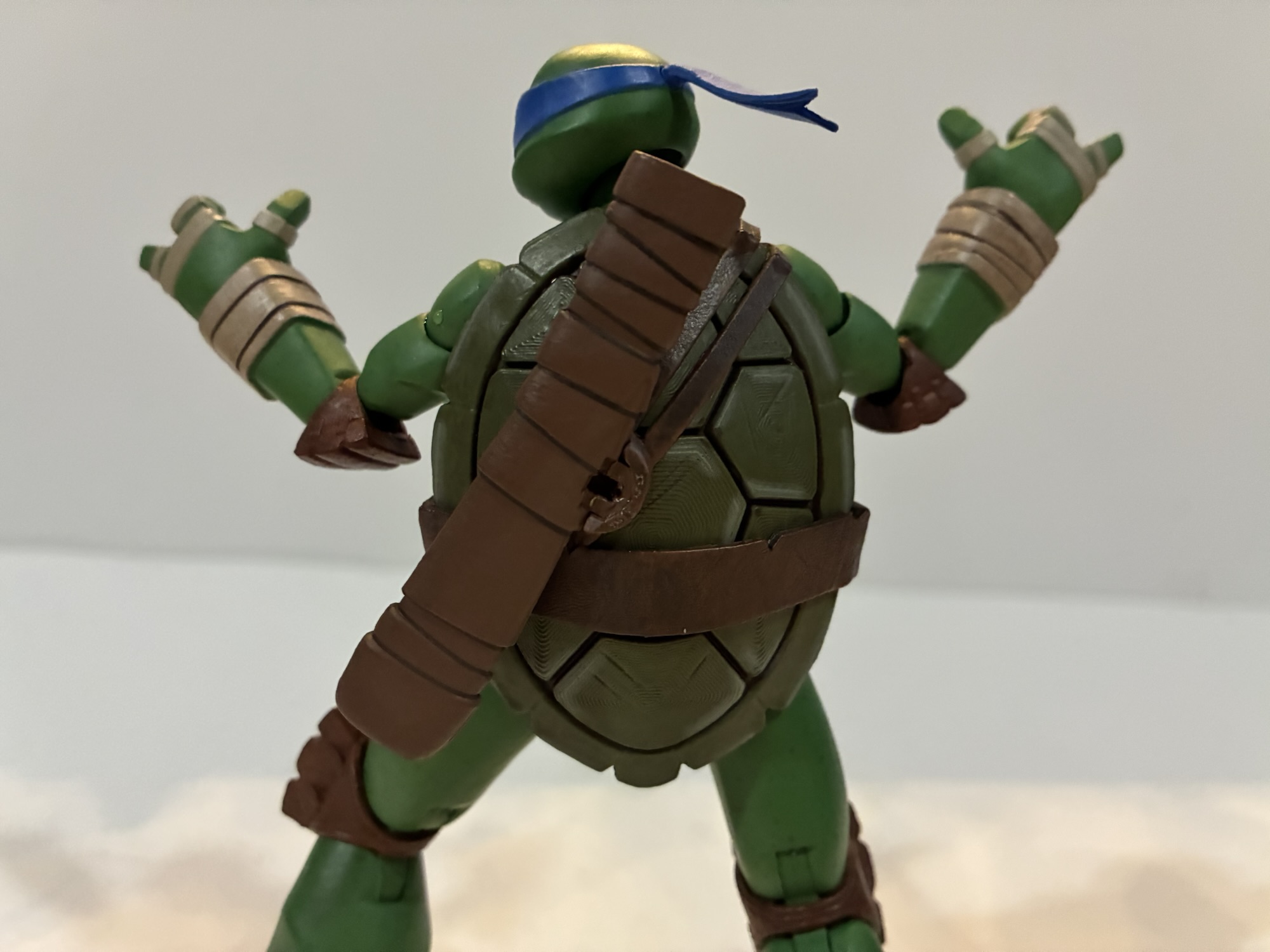
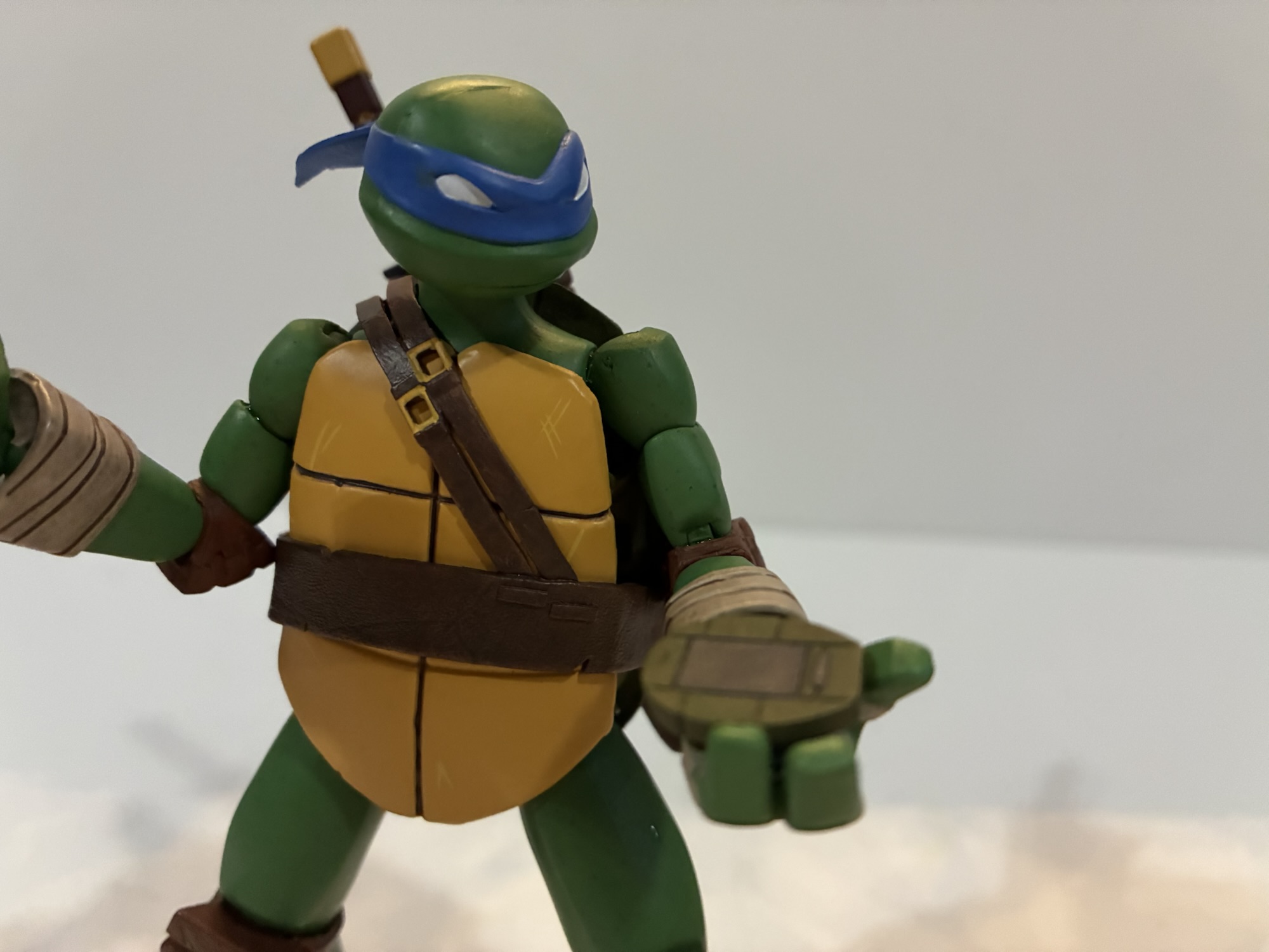
For the 2012 show, Raphael was confidently in angry teen mode. He could clash with his brothers, in particular Leonardo, and was often irritated by Mikey, but his love for them is never in doubt. And since it was a Nickelodeon show, he had to keep the potty mouth in check. NECA’s take on the character is another sculpt by May Thamtarana with paint by Geoff Trapp and Mike Puzzo. Box art is by Ciro Nieli and Raph is number 3 in the wave making him the first being reviewed by me in proper order. Out of the box, Raph stands at about 5.375″ and unlike the previous two he’s sporting his non battle mode portrait, though since it’s Raph it still presents as a scowl.
As good as he looks, something’s off with that green.
Raph is another excellent sculpt by Thamtarana. His proportions are well captured as are the little details that make Raph, Raph. His neck and limbs are just slightly larger than his brothers as he is the more brawny turtle. There are some harder edges to the shape of his thighs and biceps and his wrist and foot wraps are the proper color. Like Donatello, there appears to be no shared parts between Raph and Leonardo, or Raph and Don for that matter. The only parts the turtles continue to share are hands. Raph has a more battle-damaged shell and his plastron has that lightning bolt like crack in the top left. He looks great, except for one thing.
I thought it might help to get an array of Raphs to illustrate my point as well as a picture from the source material.
Raphael is just not the correct shade of green. He’s a deep green similar to his Playmates counterpart. In the show, his complexion was far more pale and hued very close to Michelangelo. This darker green appears to be more common in licensing art and some of the offshoots of the show, like the Half Shell Heroes. The question here is did NECA have this color forced upon them based on the reference material Viacom supplied? Or did they just mess it up? Considering how detail-focused director Trevor Zammit is with the ’87 toon line it’s hard to imagine him not knowing what color Raphael is supposed to be. And if your first thought is, “Well, since it’s a newer show maybe he’s not that familiar with it,” know that he is on record as saying the 2012 series is his favorite depiction of the turtles. The prototypes on display at New York Toy Fair showed the same so the only thing I’m willing to rule out is that this wasn’t a factory error NECA had to roll with. It just is what it is and collectors will have to decide for themselves if it’s a deal breaker or not.
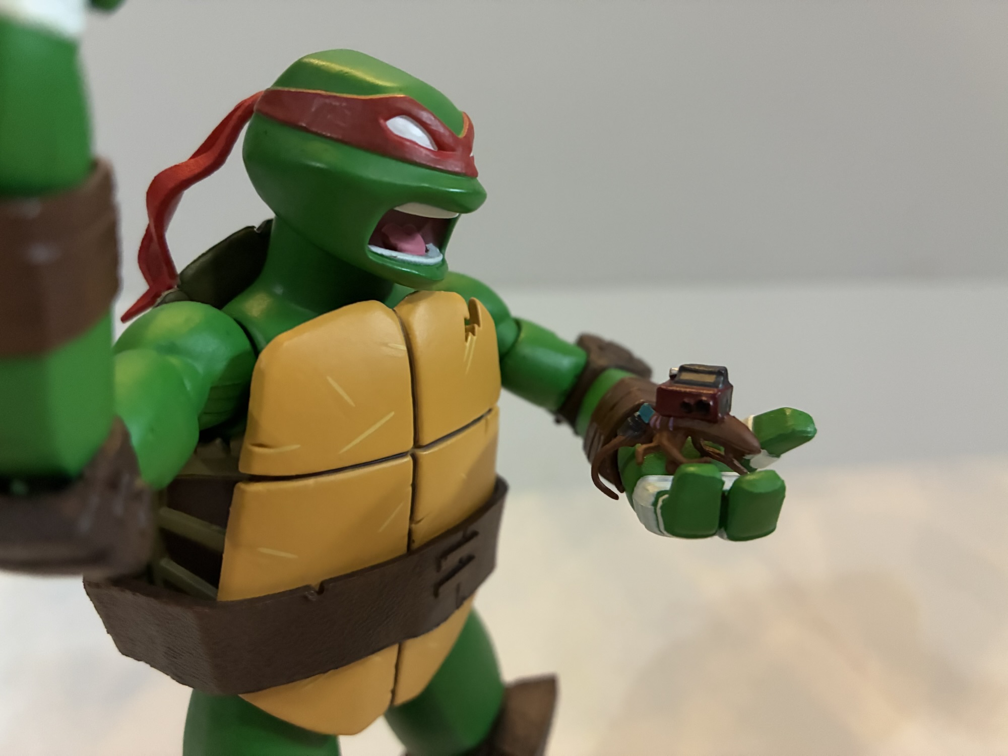
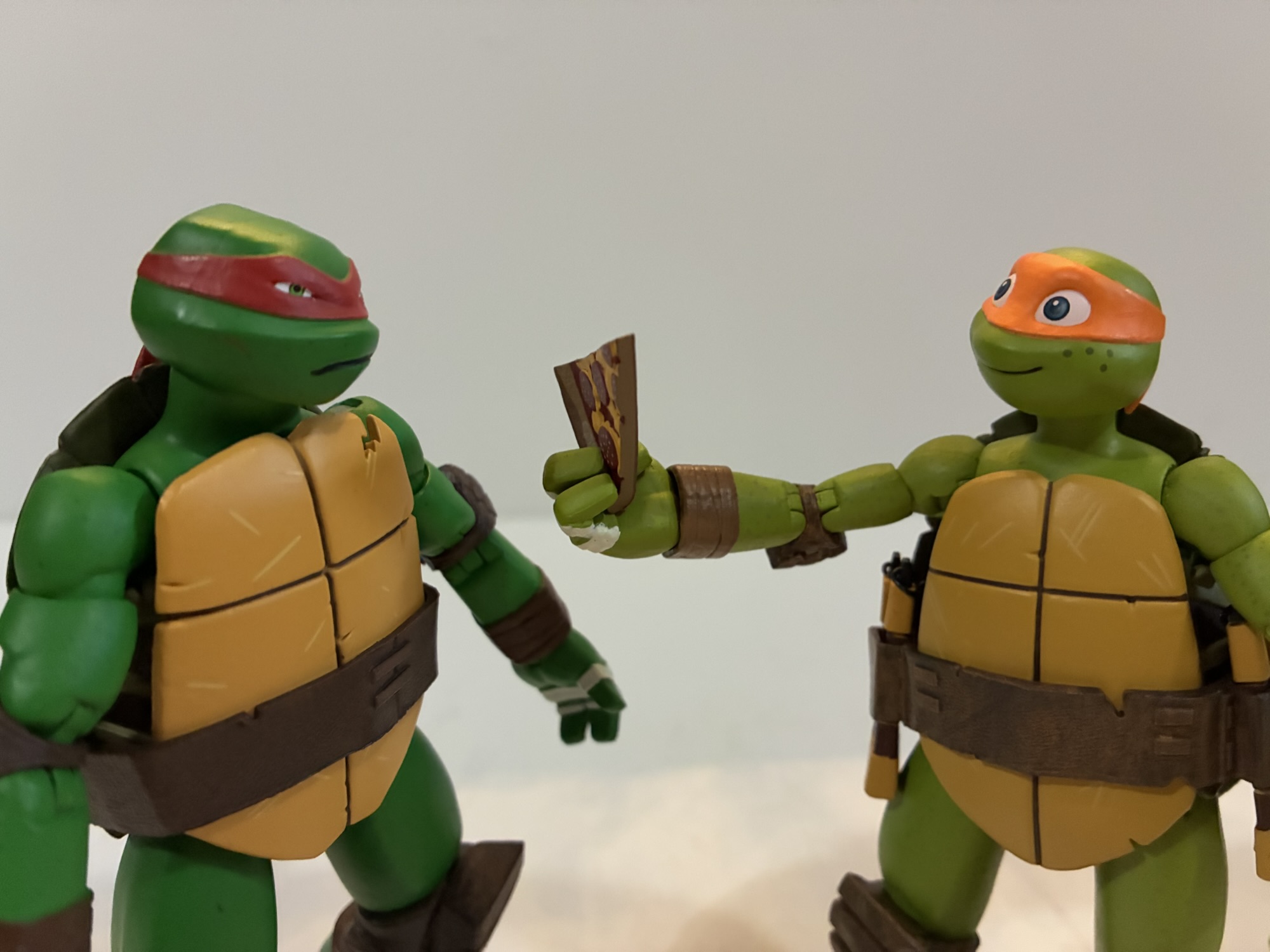
Raph comes with a buddy and a not-buddy.
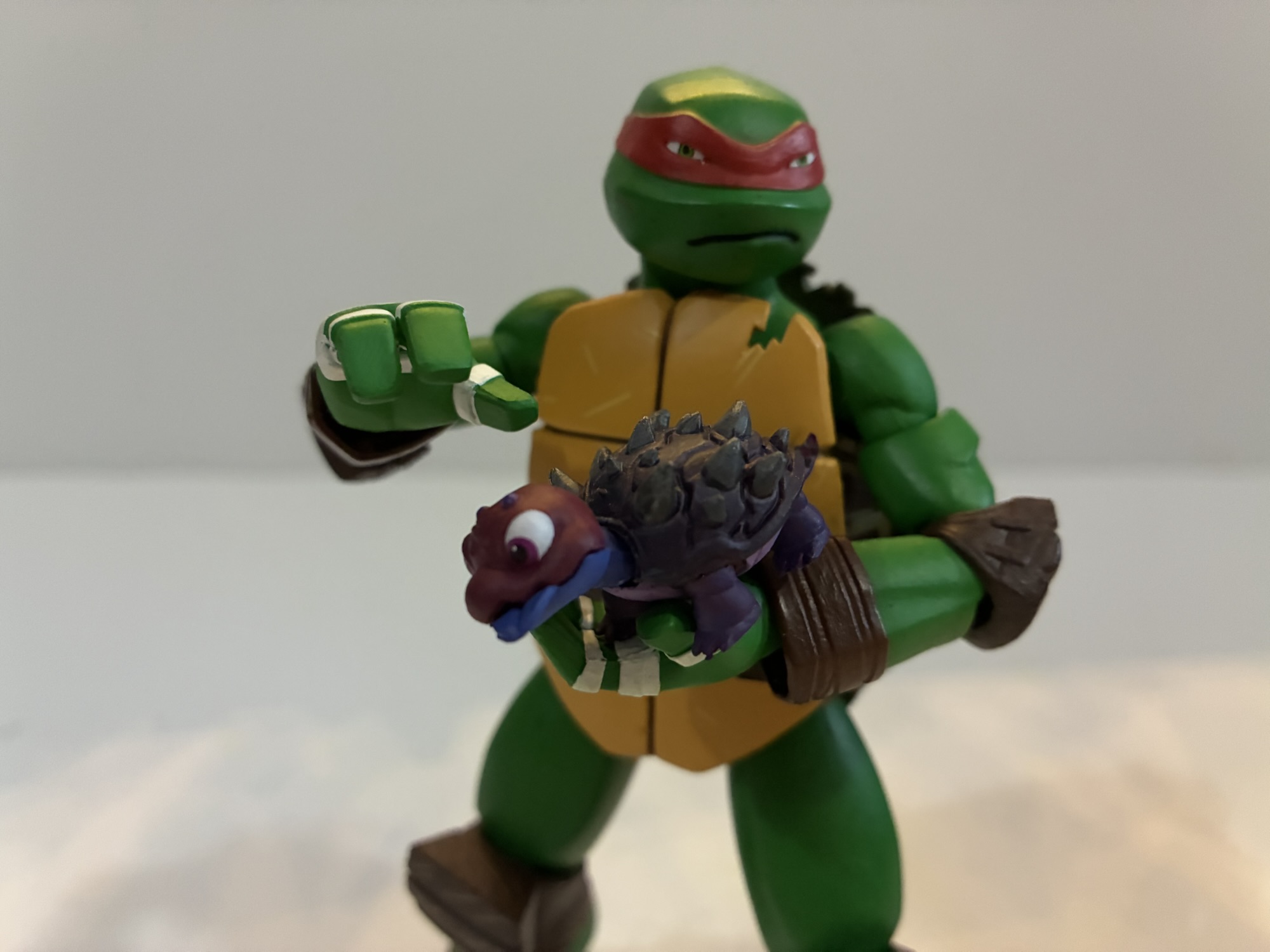
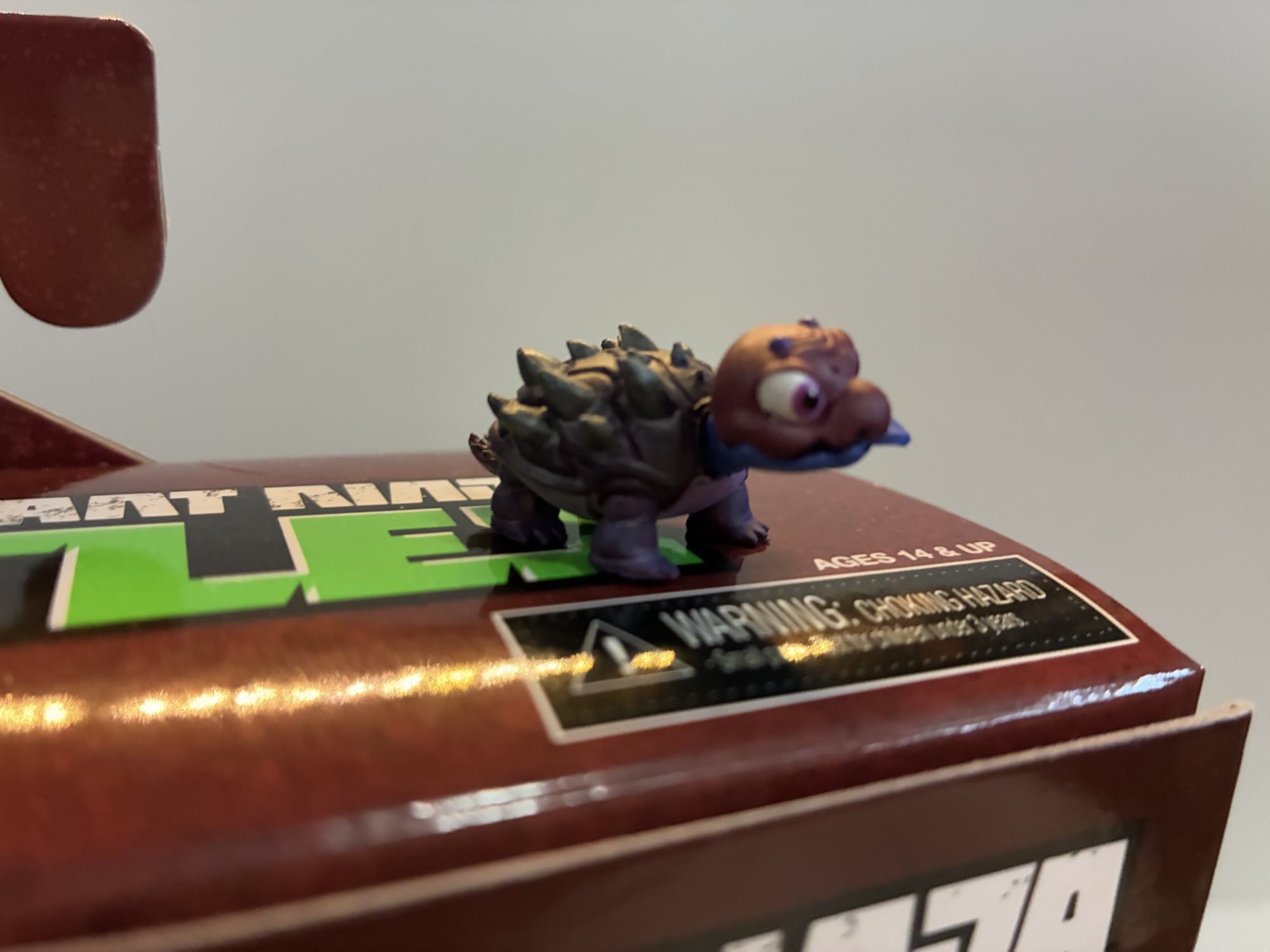
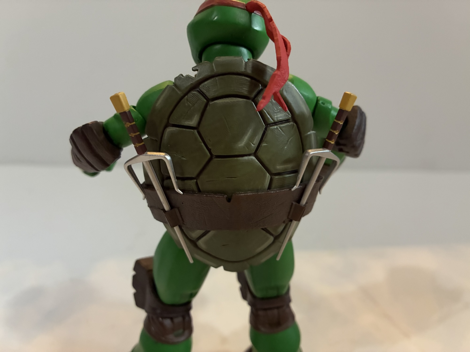
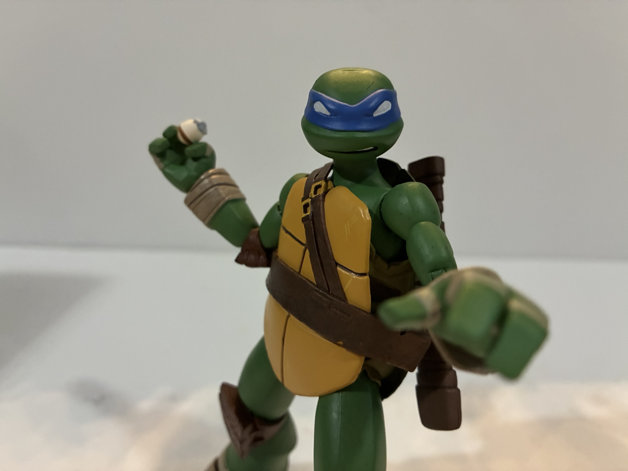
Obviously, for me Raph’s complexion was not a deal breaker since I bought it knowing full well it was wrong. I can’t say I dislike this color, but I would have definitely preferred him to be screen accurate. To go along with the figure we get a secondary portrait featuring his whited-out eyes and a yell. For hands, we get the usual gripping hands, fists, and a set of the relaxed open hands Leo came with. Raph also has the slice of pizza, smoke bomb, and T-phone. For unique accessories, there’s Chompy, the baby space turtle Raph took in for a little while. You may be wondering why he didn’t come with Spike, his first pet turtle, but he’s coming with someone else. Raph also comes with his nemesis: a tiny cockroach with a tracking device. Raph hates cockroaches and this little guy would go on to become the Cockroach Terminator. He looks good, but there’s almost too much paint and it gets a little messy. Lastly, Raph has his trusty sai. They’re very thin and rigid with zero give so they’re a little scary. Do be careful with them. Because of the thinness, you may be tempted to try and fit them into the tight gripping hands, but I would still advise to just play it safe and heat those hands first. He has his weapon storage on the rear of his shell which works well.
“Want this last slice I found under my bed?”Weapon storage.
Raph’s articulation is exactly the same as Leonardo and Donatello. His range is no better or worse than either as well, though Donnie’s thinner arms seem to get a little more range at the elbow. Like Donatello, my Raph did not have any stuck or stubborn joints. He has been pretty free and easy since coming out of his box. He does present his own frustrations, but they’re not really articulation related. The sai handles are so thin that he doesn’t get a great grip on them. They won’t really fall out, but they’ll spin around a lot when handling him. And if you’re the sort who likes to have their Raph hold his sai with the middle blade between his fingers then you will definitely want to heat the hands first. And I would reheat them to remove the sai as well. It certainly looks cool to display him this way, but I’m hesitant to leave him for too long like this out of fear it might warp the sai.
Too bad Leo has to remain eyes-out.
Raph is another solid entry in NECA’s 2012 Teenage Mutant Ninja Turtles toy line. He is structurally the same as his brothers so if you like them you’re probably going to enjoy Raphael as well. He just comes with the unfortunate caveat that he’s not the right shade of green. And we’re not talking about a minor difference here, but a pretty obvious one. Like I said in the write-up, if that doesn’t bother you then you’re sure to like this figure. If it does, well, it might be the only thing you can see. I confess, it does bother me and it’s in the back of my mind every time I look at the figure, but I wasn’t going to not get Raphael. This isn’t a line I plan to go deep on with variants and such, but if NECA ever does a corrected Raph I might have to bite at that.
Miss any of our TMNT 2012 coverage? Check these out:
We were able to get through some of the logistics of this line with Leonardo, so for this second review we can just get right to it. One of the best decisions the 2012 iteration of Teenage Mutant Ninja Turtles made was bringing back veteran voice actor Rob Paulsen. He’s voiced countless characters over the…
We’re going to start this one off with a question: When you order directly from a producer, do you expect to be first in line for product? NECA’s recent launch of its Teenage Mutant Ninja Turtles action figure line based on the 2012 Nickelodeon series raised this question. On September 16, NECA launched the line…
Playmates Toys has been the master toy license holder for Teenage Mutant Ninja Turtles for as long as I’ve been aware of TMNT. In the 80s, the toy line produced by Playmates was excellent: fun sculpts, imaginative characters, crazy set pieces, and tons of vehicles. It was a great companion to the animated series airing…
I’m always going to have a soft spot for Morph. It was rare to see a character killed off in a children’s show, but that was the fate of old Morph who didn’t make it out of the show’s second episode. I wouldn’t call it traumatizing, but there was definitely a haunted quality to that scene, “Wolverine! Fall Back!” Come on, Morph, don’t you know that Wolverine has a healing factor? He’s the toughest, most unkillable, son of a bitch around! You didn’t need to take that Sentinel blast for him! Why, Morph? Why?!
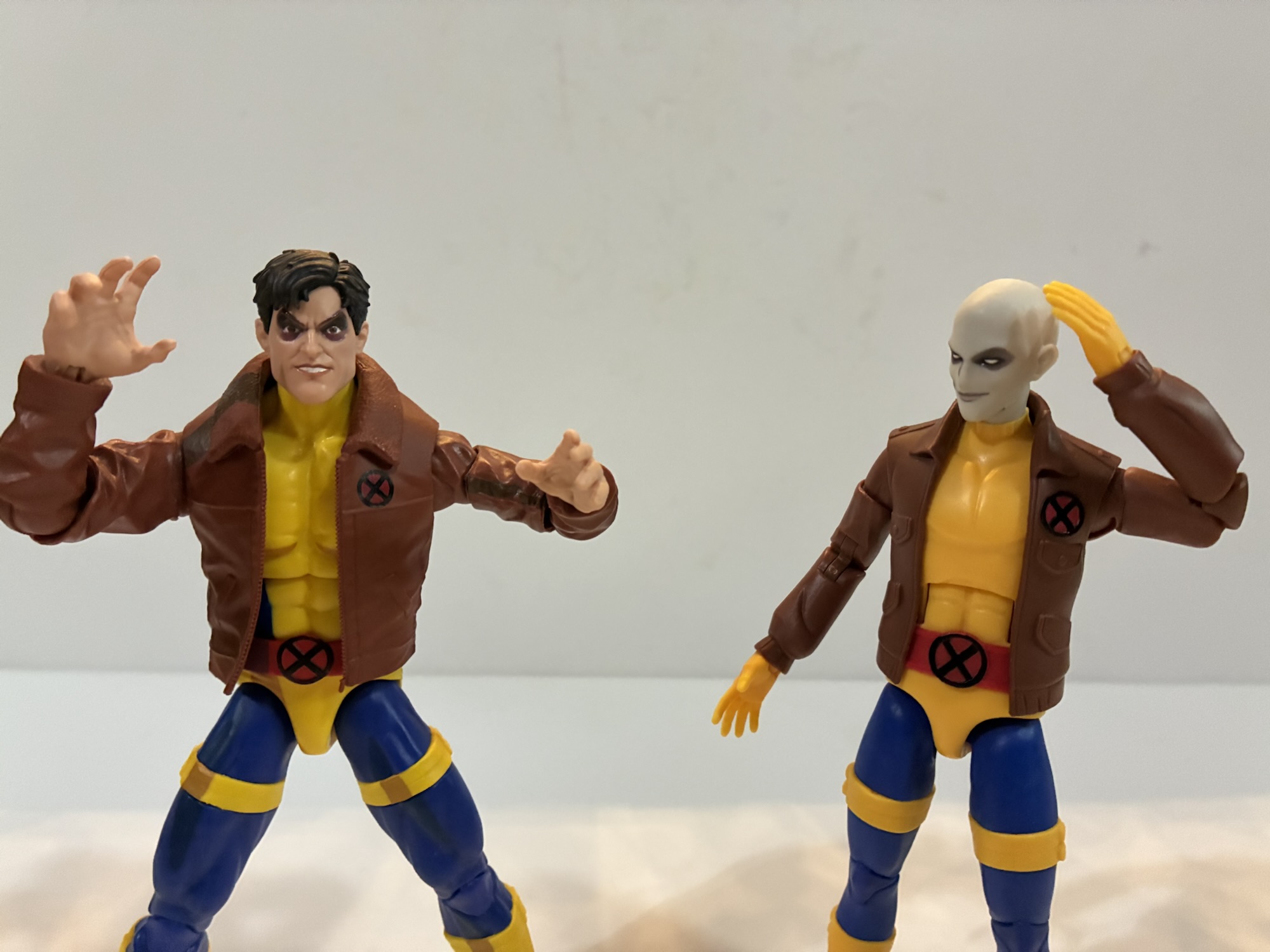
Of course, Morph didn’t stay dead. Turns out, when you kill off a character in a kid’s show the kids who make up the audience want that character brought back. That’s why the character has stuck with me these past 30 years, though I never did take it upon myself to write a letter to Fox Kids to express my sorrow over the death of Morph. Enough other kids did though that Morph tested really high with audiences as a fan favorite so the show brought them back as evil Morph for the second season premiere. Morph had quite the long arc that year that ended with them kind of back to their old self, but the trauma of getting blasted meant that Morph needed some time away. Returning for the episode “Courage” only confirmed that even more and we didn’t see Morph again until the series finale. Now, X-Men ’97 is a thing and really for the first we get to see Morph as a fully functioning member of the team.
Morph is so slender this time around it almost gives them a juvenile look.
The X-Men ’97 version of Morph is similar to the ’92 version, but borrows some from the comics. Morph has a weird history in that the character was originally called Changeling in the comics and began life as a villain. The character would get cancer and have a change of heart offering to take Xavier’s place to basically fake the professor’s death which is why the writing staff for the cartoon decided to use the character as a sacrificial lamb in the first plotline. Changeling was just off the table because of the DC character of the same name, so Changeling became Morph. And since Morph proved popular, Morph got to be a character during the Age of Apocalypse where they sported a new look that included basically a gray, nose-less, face. That’s apparently the visage our Morph now feels most comfortable with in X-Men ’97. It makes sense as it’s like a blank face, and with Morph being a shapeshifter, it seems like a solid choice.
92 vs 97My Morph with a Casting Cave head.
The action figure for Morph appears to be entirely new. Morph is now presented as more slender than the old Morph. That Morph conformed to the Jim Lee era the show was based on where basically all of the guys were jacked and all of the women were bombshells. This Morph still retains the old X-Men blue and yellow training uniform as well as the flight jacket, they’re just slim and slender. This depiction in plastic might be just a touch too slender, but considering it’s all new sculpt, I do wonder if the intent here is to repurpose this as a New Mutants base? The Sunspot, who I didn’t buy, that’s part of this wave also has a New Mutants look which is likely to be reused for more characters, but this Morph is almost a dead ringer for a character like Cypher. I guess we’ll see. There is some clear stylization in the chest which I have mixed feelings on which probably has little utility going forward. It’s almost like Hasbro tried to match the cel-shading on the pecs, but with sculpt instead of paint. It’s odd looking, but the jacket at least takes away from it. The jacket, like Logan’s, is also very plain to conform with the look of the show which I like. There’s not a lot of paint here, but at least there isn’t a lot of mis-matched colors.
Not a lot of paint…
At least, there are no mis-matched colors concerning the base figure and the optional hands. Morph comes with a set of fists, a right open hand, and a left relaxed hand. Morph also has an alternate portrait and it’s their more humanoid look. It’s very stylized conforming to the show, but I don’t like this look for Morph. It doesn’t look anything like the ’92 version which I always found very distinct. Worse though, Morph’s neck is gray to match the default head which causes a clash when using the alternate head. The figure really needed another neck piece, or they could have made the neck part of the head sculpt. On one hand, I’m glad that isn’t the case because the articulation would probably suffer, but it does make the unmorphed head look silly and it’s something I’ll never use.
“Who are the X-Men?!”
There is one other accessory and it’s an odd one. Morph comes with the head of Henry Peter Gyrich, the bigot who was spearheading the Mutant Control Agency in the show and is the guy indirectly responsible for Morph’s death so he has some connection here. He’s also in the new show and by including his head here it also feels like a callback to the old Toy Biz Morph which came with a Cyclops, Wolverine, and Evil Morph head to simulate the shape-shifting powers the character possessed. Though here, I think the Gyrich head is much better utilized by placing it on a suited Legends body to create a whole new character. For me, the only suitable body is the Professor X body that came with the hoverchair. And since I also have the Savage Land Xavier, I don’t mind sacrificing him for this new character. For a non-super-powered character, Gyrich is a pretty big villain in the series so having him isn’t bad. It makes me wonder if we’ll get Trask in a fourth wave.
“What was I thinking with that look?”
Morph’s articulation is what one would expect of a Marvel Legends release. The slender frame does mean the range is pretty good in places like the knees and elbows, but there’s also still some limitations. The mediocre ball hinge is in place at the head and I don’t know why any new sculpt would go this route unless getting the figure to look all the way up is really important. The arms feature standard articulation (you really don’t need me to list it all out do you?) while the torso opts for an old ab crunch and waist twist. The belt is keyed in and not floating, but the twist is below it anyway so it doesn’t interfere, but it also means you can’t pull it down to hide the joint. Legs are also fairly typical. The thigh straps hide the thigh swivel okay and there is a boot swivel, something not all figures have.
I look forward to the continuing adventures of Wolverine and Morph.
Morph is probably going to move as much as you want the figure to. It’s just always a shame when Hasbro spends money on a new sculpt and doesn’t put the best articulation it can into the figure. I mostly like the figure. It’s a good representation of the character, but I also admit my soft spot bias for Morph. I had some critiques with the articulation, and the extra portrait is useless, but my biggest complaint would just be it has a cheap look due to the lack of paint. The yellow also hues slightly orange when compared with other blue and yellow outfits. The figure would look a lot better with actual paint, but Hasbro appears to be going to even greater lengths these days to avoid having to paint figures. I guess it’s just something we’re going to have to get used to. If you like Morph’s depiction in X-Men ’97 then this is fine.
If you liked this review and want to see more from X-Men ’97 then check these out:
Since we don’t have a post this week for Turtle Tuesday I decided we should have a Mutant Monday. X-Men ’97 has returned the mutant superheroes to the spotlight and one of the main beneficiaries has been Hasbro. Their first wave of Marvel Legends based on the new show arrived last fall and, aside from…
The television event of 2024 for me was none other than X-Men ’97. I loved that show and I can’t wait for the second season to come around. It’s just a shame we may still be as much as a year away, but to somewhat tide us over until then we have this third wave…
I knew who the X-Men were when the show premiered in 1992, but I didn’t know much about them. That show really was the proper introduction to the franchise for me and one thing I couldn’t wrap my head around as a kid was that these were heroes who didn’t really have a secret identity.…
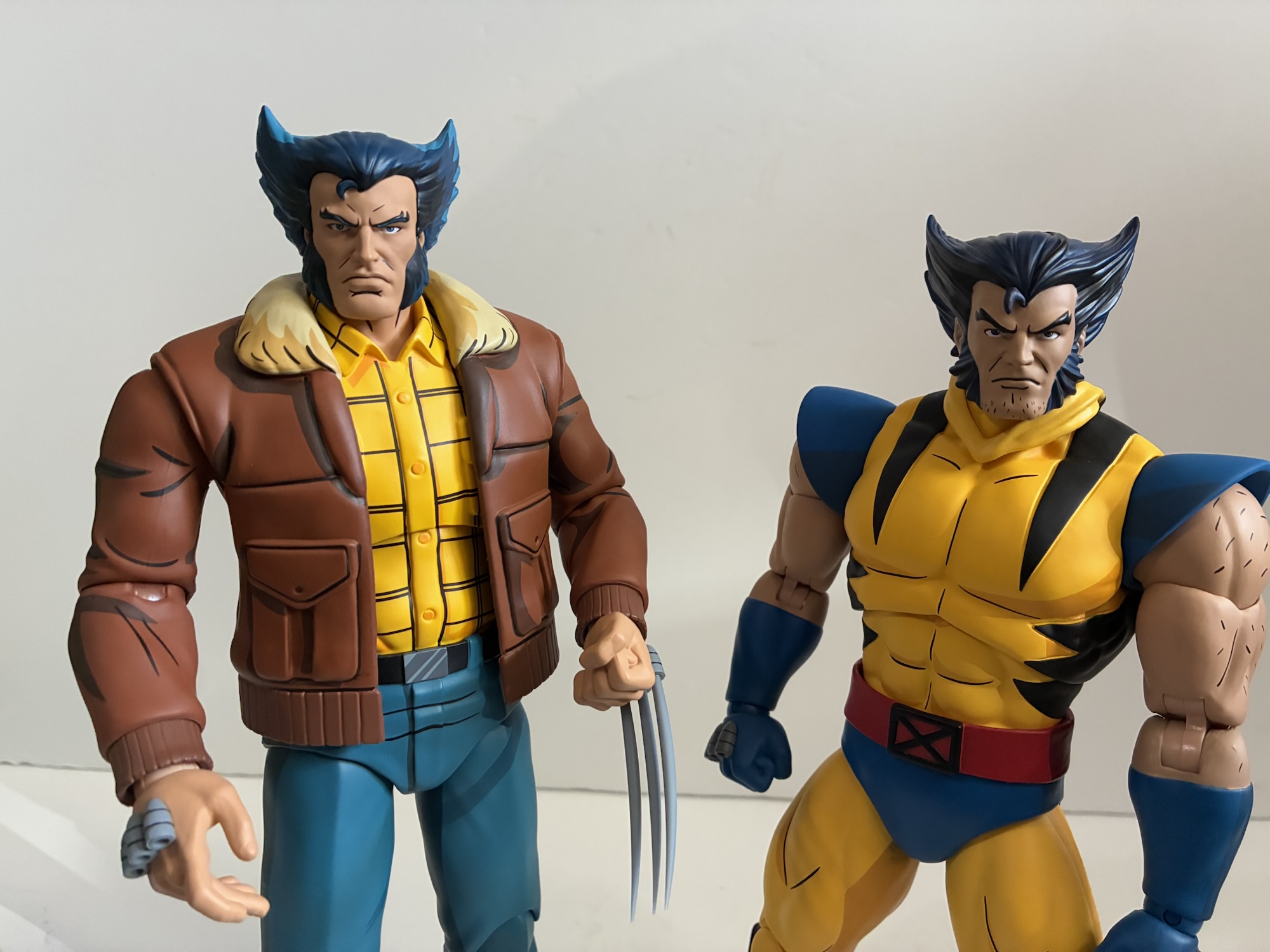
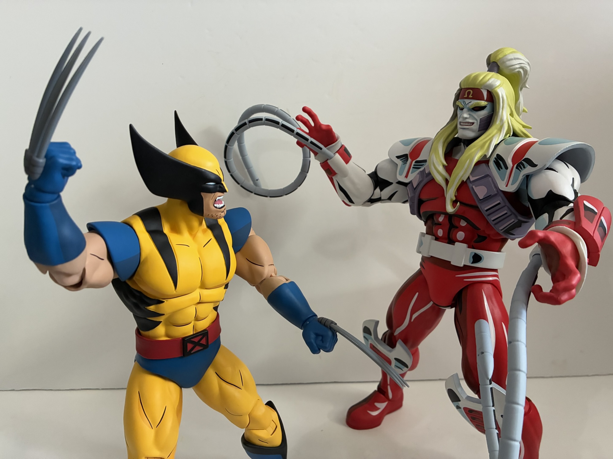
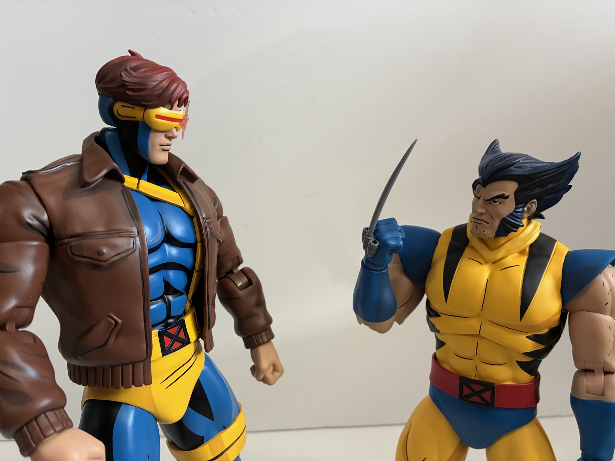
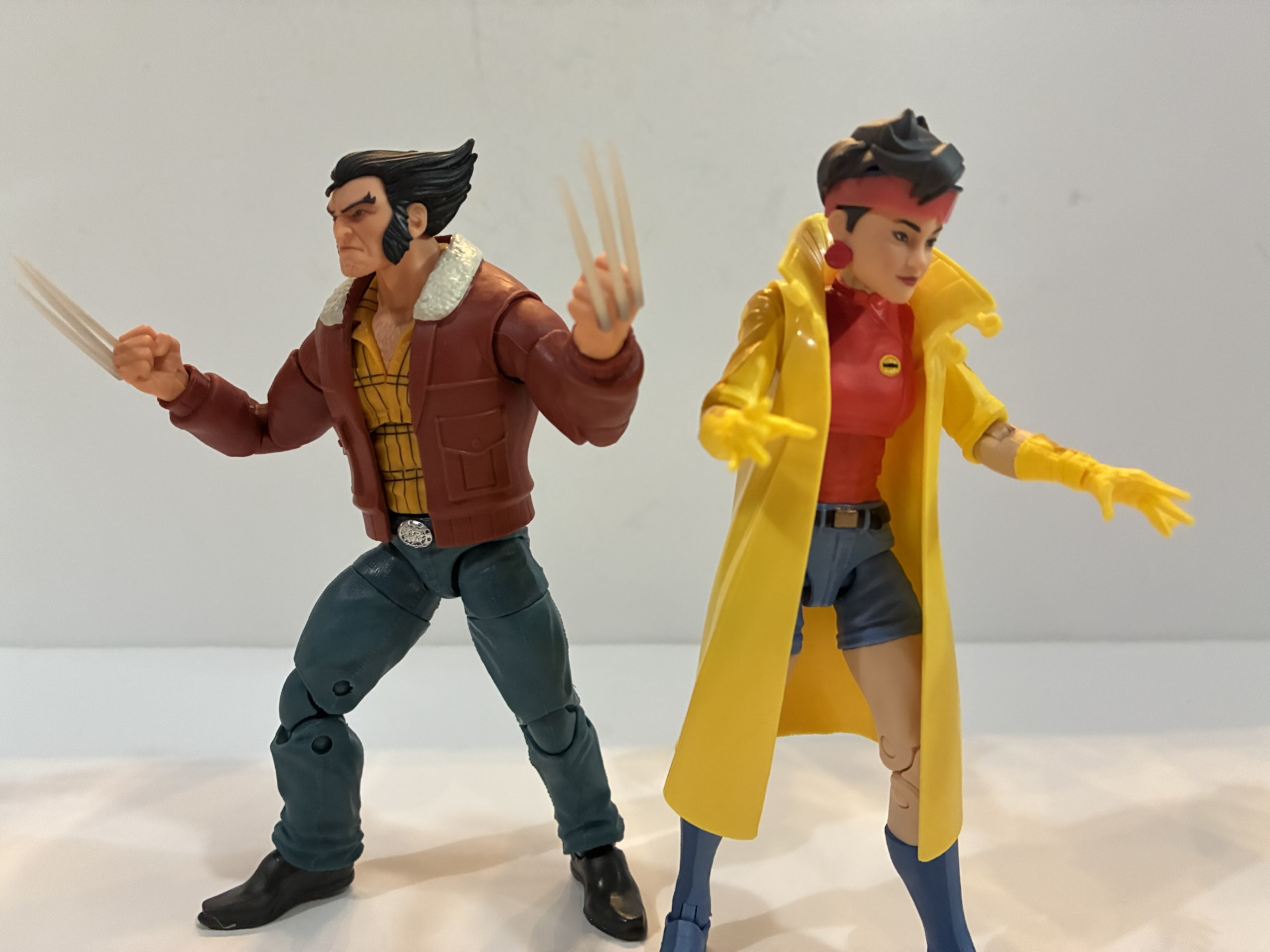
Back in 2021, Mondo unveiled for San Diego Comic Con a sixth scale Wolverine action figure based on the X-Men animated series from the 90s. It was a presale to coincide with the 30th anniversary of the show’s premiere and product went out in 2022 closer to that actual anniversary. At the time, Mondo wasn’t planning on doing more, but the response was so enthusiastic that their one-off turned into a whole line. To sculpt the next figure, Magneto, Mondo enlisted the work of Alex Brewer – a fast rising sculptor in the toy world. Alex would go on to knock it out of the park with Magneto which naturally lead to more work for Brewer. It’s basically been his style and vision that has come to define the line, and as it’s pivoted to include X-Men ’97 as well, the need for a Wolverine to fit in with the style of the rest of the line became more apparent.
Things have improved over at Mondo over the past few years.
Wolverine has the unique standing of being the first in the line and now the 9th. Well, technically this is the third attempt at the character as we did get Wolverine in his civilian attire, but that’s pretty different from his business look. When Mondo had that initial Wolverine sculpted, they weren’t planning on more which meant not much consideration was taken for scale. That Wolverine was nearly 11″ tall, and as the line went on it became pretty apparent that he was too tall. This new Wolverine not only allows for a chance for Brewer to do the character, but also to correct that scale issue. And Mondo has for this new one which stands at about 10.33″ to the top of his head putting him in that 5’3″ – 5’4″ range which feels fitting for Wolverine. Even though the box says X-Men ’97 on it, it’s still adorned with production art from the original series with new artwork by Dan Veesenmeyer that portrays the updated look. Tom Rozejowski, a name we see a lot with NECA products, handled the paint for Wolverine and Tommy Hodges also gets a sculptor credit. I’m thinking he may have done the base, but I don’t know for certain.
This is actually the third Logan in the line. The new, unmasked, portraits are actually different here and are more or less interchangeable.
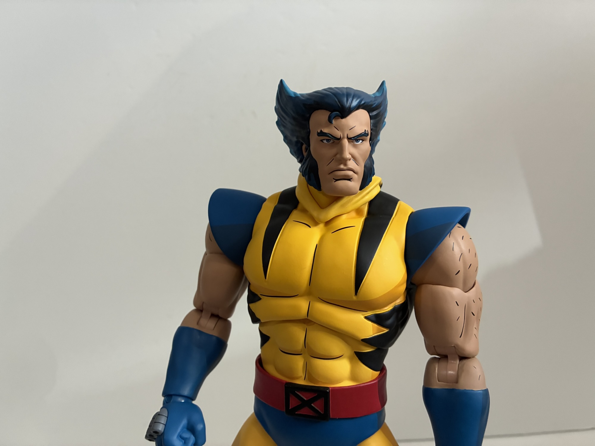
Mondo has been trying to straddle the line between X-Men ’92 and X-Men ’97 with these more recent releases. This figure definitely has a more ’97 look to it. While the costume is the same, there are some telltale differences and it’s mostly in the body hair. The original series left Wolverine’s chin free of hair for the most part, save for perhaps some close-ups. The hair on his arms was usually done with lines across the shoulders and biceps. For ’97, he has some chin stubble and the hair on his arms is done with several short lines In addition, the angle of the mask fins is slightly steeper and they don’t stretch quite as high. Of course, that aspect of the ’92 series was hardly consistent, but it’s in comparison to the model sheets. The yellow of the costume is also just a little bit darker, a touch more gold, and the same is true of the blue parts. In comparing this figure with the original release, the cel-shading is also less prominent. We have primarily two shades of blue on the new figure compared with three on the original. The same is true of the belt, though the yellow on the old figure only utilized two shades, but there’s more of it. The black portions of the shirt are also sculpted in now. There’s no paint slop, but it doesn’t quite fill the entirety of the sculpted-out area. There is no shading on the flesh, and like the rest of the color palette, it’s a touch darker as well compared with the old figure.
He’s also much shorter compared with his foes.
I have mixed feelings on the updates and changes. I find the overall sculpt more suitable for Wolverine. Not only is he shorter, he’s stockier. The original is very leggy and the torso slightly slender. I think the portraits are an improvement as well even if they have a very ’97 style. There is an included ’92 masked portrait, but the only aspect of it that reads ’92 is the shape of the fins. The stubble is still present. I definitely prefer the more vibrant paint job of the original and the approach to the arm hair. The arm hair with the new release is missing something. The show tended to show his arm hair as always breaking his silhouette, regardless of how much of the arm is visible. That makes it hard to translate to 3D so Mondo just went with these dashes that almost look like a dot pattern. I think they would have been better served keeping the same approach as the first figure. The flesh tone also feels a touch too dark. It’s certainly not bad, I just wish he better fit the ’92 style since that’s how the line began. I’m still going to have this one replace the original on my shelf and that one will be returned to his bed box, but I’m definitely always going to see X-Men ’97 when I look at him as opposed to the original series.
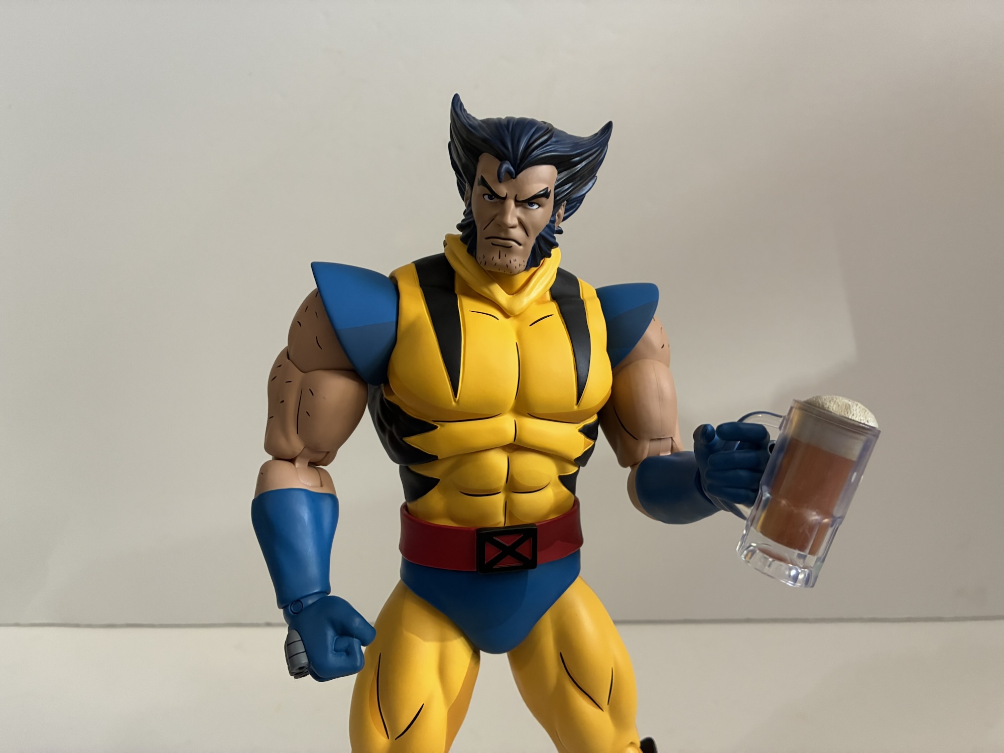
If you have the NECA Flasher Gremlin then your Wolverine will have access to a tall frothy one as well.
Am I being unfair? After all, the box does indeed say X-Men ’97 so it’s not hiding what it’s trying to be, but the line is trying to placate both and is not shy about its intentions so I don’t think so, but I’ve said my piece. Not only is the sculpt redone to conform to Brewer’s style, but the articulation scheme Mondo utilizes has also changed since that first Wolverine release three years ago. This figure embodies those changes, some for the better, and some not so much. This is an aesthetics forward line, but Mondo has room for improvement and this Wolverine is proof of that. The joints are all the the same as Cyclops, the most recent release in the line: head, shoulders, double-jointed elbows, biceps, wrists, diaphragm, waist, hips, double-jointed knees, ankles. The original figure used a different style of double-jointed knees similar to what NECA used to make use of with a hinge above and below the knee. This allowed for some swivel at those joints, but it is a little odd looking, though perhaps only odd because we’re so used to the other style. It also used a swivel joint above the elbow in place of a bicep swivel that was ugly and persisted for quite a few releases. The range at all of the joints present is pretty typical, except for a few places that have become an issue recently.
“Hey Cyclops!”“Next time I use these!”
If you saw my Egon Spengler review, you will note I had issues with that figure at the neck and hips. Mondo textures the ball joints for a more snug fit, but they may have went overboard. The ball joint inside the neck was stuck on that figure and the hips were pretty stuck too. Wolverine has the same issues. I had to use a lot of force to move the double ball peg in the neck, though the hips required a hot water bath. Out of the box, they just wouldn’t budge and I put more force into it than I probably should have. After the hot water bath they moved better. I applied some lubricating oil to the hips and neck and it didn’t appear that any had been applied by the factory, but once the figure cooled down it mostly went back to the way it was out of the box. In addition to that, the diaphragm joint remains useless. With a lot of effort, I can get the torso to rotate there a click to each side, which is hardly much to speak of. There’s no forward or back. Also of a nuisance, the red belt rubs off onto the abdomen very easily and the blue of the trunks will transfer to the thighs as well. I’ve been able to rub these instances off, but I worry if I let it sit that way then it would become more stubborn.
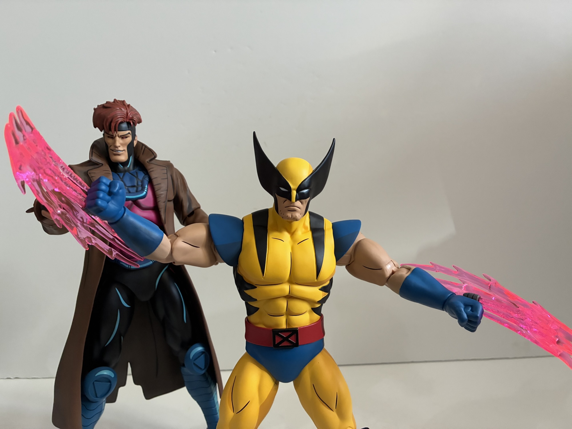
“Light me up, gumbo!”“Hey cajun, next time someone tries to save your life have sense enough to let them do it.”
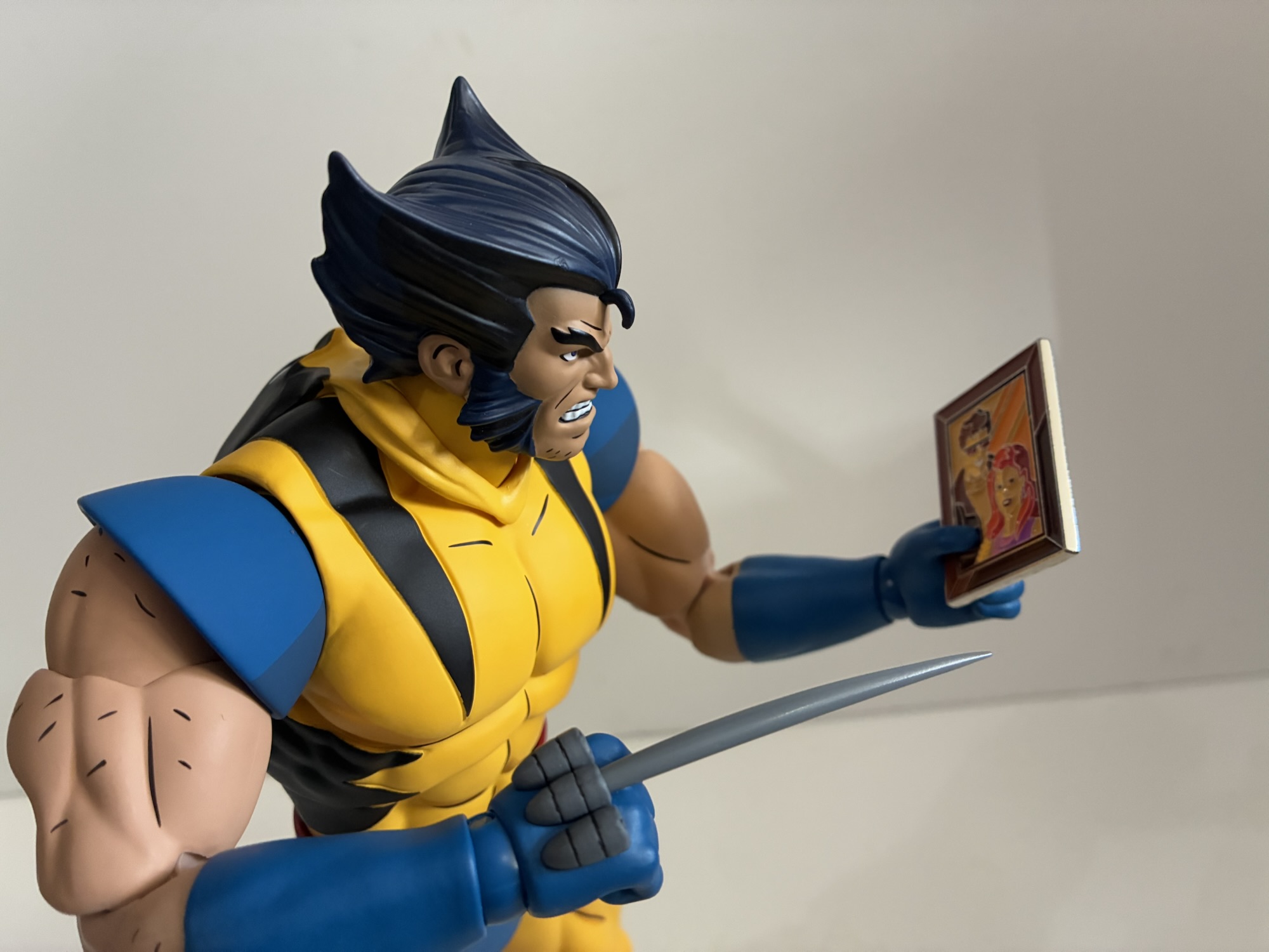
Wolverine is a bit tough to pose as a result, and it’s especially a bummer because he has a lot of stuff to be posed with. For heads, we get that ’92 inspired portrait I mentioned before as well as ’97 masked portraits featuring a neutral, growling, and yelling expression. If that’s not enough, he also has two unmasked portraits: neutral and a teeth gritting/growl. They’re both really similar to the portraits that came with the Logan figure which is kind of disappointing as it would have been nice to get different expressions to share between the two. That figure though was all the ’92 series while this one is updated for ’97. It’s not much of a difference, just stubble and a different approach to the shading. He also has a more pronounced single bang of hair and his ears are fully visible. With how subtle the difference is, it’s kind of shocking they bothered to sculpt new portraits, but they do look good.
“That hurts, Wolverine.”“Grrr…!”
For hands, Wolverine is actually a touch light. We have fists, gripping, and his “Come here,” gesture from the cover of Wolverine #1. I’m surprised there are no relaxed hands or pointing hands, but I guess most are likely to keep the fists in place any way. Packaged behind the figure is the traditional Mondo figure stand though this one has the X logo painted on it. I only call this out because I sometimes leave these stands in the box since they’re not really needed, but if you want to find Wolverine’s claws you’ll need to remove it as they’re hidden behind it. Mondo provided 8 claws so you essentially get two extras. They’re just gray plastic and they’re the same as the ones that came with Logan. I wish they were white to better match the show, maybe with a touch of light blue, but this plastic may not take well to paint. They clip in easy enough though and they’re compatible with all of the hands in the box. You also get a set of charged claws as seen in the first episode of X-Men ’97. They’re done with translucent pink plastic and they clip into the backs of his hands in place of the claws. There’s also an included mask for draping over his neck when using an unmasked portrait, a similar accessory to what we saw with the Marvel Legends version of the same. Mondo also through in another picture of Scott and Jean from the episode “Captive Hearts,” only this time it’s an enamel pin instead of a picture frame accessory.
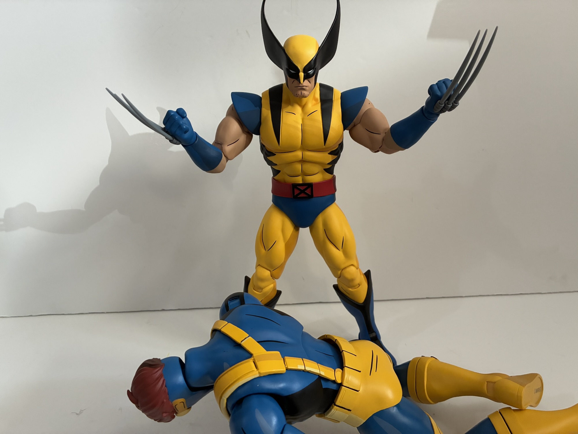
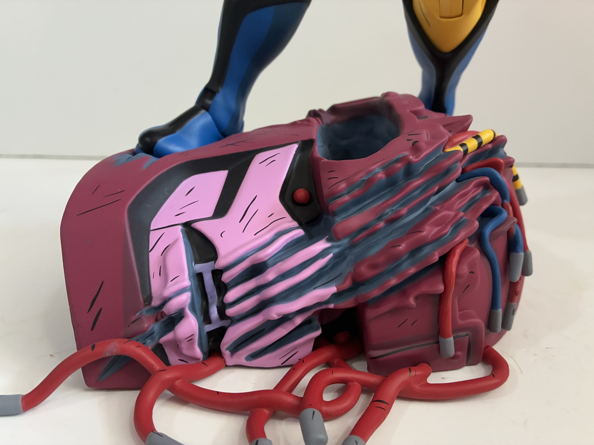
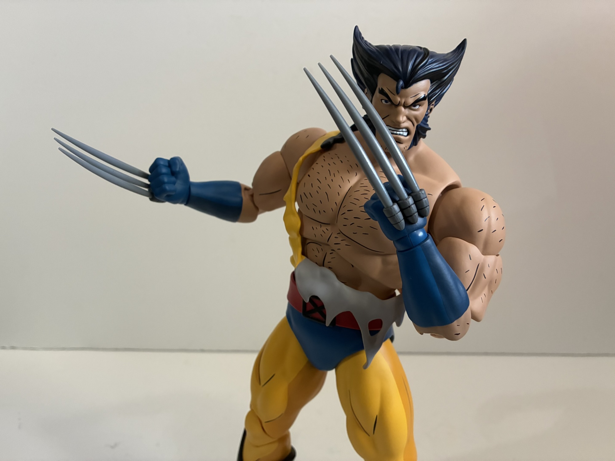
The limited edition Wolverine also comes with even more stuff like an entire second torso. Yeah, this is the first figure I’ve ever bought with a swappable torso as there’s a bare one since Wolverine always seems to get his shirt blown off in a big fight. To help sell the damage there’s a strip of the tattered remains of his shirt included made out of a soft plastic. You just place it over a shoulder to complete the look, or you can have him go completely shirtless which is a look from the show. To accommodate this change, the arms need to pop out easily and they do, which you will want to take advantage of when unwrapping the figure anyway as there are plastic bags over the arm pegs. The shoulder pads slot over the shoulder pegs and are conveniently stamped for left and right, should you get them confused. The torso separates easy as well. Unfortunately, the diaphragm joint on this torso works no better than the regular one. Lastly, Wolverine has some Sentinel parts as well including the remnants of a head that serves as a base and a chunk of a fallen robot with wires dangling from it. It has three claws holes to go over one of Wolverine’s hands to complete the look. The base has two, deep, indentations for Wolverine’s feet which gives him a secure base, though does limit things since his stance is left kind of boring. He can kind of crouch on it, but I can’t decide if that looks more dynamic or if it just makes Wolverine look like he needs to poop. The foot holes are designed for Wolverine, but I did find Gambit can fit in them as well. Cyclops and the original Wolverine have feet that are too big.
This is pretty cool, but I wish they worked in more foot-holes for different poses.
For the most part, this Wolverine redo is much like past releases in this line. It captures the likeness well and certainly comes with enough stuff to help justify the hefty price tag of $245. This one was also solicited before all of this tariff nonsense with has really jacked up the price on subsequent releases, but I’ll complain about that in reviews of figures actually impacted. This Wolverine does capture the look of X-Men ’97 very well, just at the cost of not capturing the original series as well. I like the extra torso and stuff, but I personally would have traded it for more ’92 accurate arms and heads. Mostly, I’d rather the figures seek to emulate the look of the original series and make the ’97 heads the one-off for those that want it that way. The articulation issues with the neck and hips are unfortunate and really something Mondo needs to correct. If they want to charge this kind of money for their products then the quality needs to be there. They’re pretty receptive to feedback, and I do plan on dropping them a line regarding it. If you don’t have the previous Wolverine then this one is worth getting if you’re collecting this line. And even if you do have it, I think it’s enough of an upgrade to consider. It does fit the style of the other figures better, but if you’re happy with that one then maybe you don’t feel this is necessary. The limited edition is sold out, but the standard version is still available. It’s slightly cheaper, but may come with tariff surcharges depending on where you buy it from.
The team is filling out.
We have plenty more from Mondo’s line of X-Men, including a couple of Wolverines at that:
Mondo has been absolutely killing it with its sixth scale line of action figures based on the now classic animated series X-Men. The company also really ramped up production in 2023 on the line by soliciting five new figures during the year. At over 200 bucks a pop, it was quite the hit to the…
When San Diego Comic Con was cancelled for 2021, many of the entities that would have sold exclusive merchandise at the event pivoted to web sales. And since the 2020 iteration of the famed event was also canceled due to the COVID-19 pandemic, many seemed to expect the same for 2021, or the massive delays…
After putting a real hurting on my wallet in 2023, Mondo decided to take it easy in 2024 with its line of sixth scale action figures based on the animated series X-Men which ran from 1992-1997 on Fox Kids. Two figures ended up getting released this year, Rogue and now the leader of the X-Men…
We were able to get through some of the logistics of this line with Leonardo, so for this second review we can just get right to it. One of the best decisions the 2012 iteration of Teenage Mutant Ninja Turtles made was bringing back veteran voice actor Rob Paulsen. He’s voiced countless characters over the years, but many know him as Raphael from the original TMNT cartoon. For the 2012 show, the decision was made to have Paulsen play a different turtle: Donatello. It made sense to move him off Raph who is almost never portrayed in the same manner as he was in that cartoon. He’s more aggressive, frequently angry, and not the wise-cracking fellow from the old show. Not that Paulsen couldn’t adapt to a different style, but hearing his take on another turtle was an opportunity for something different.
It felt like it made sense to show Donnie with the shortest and tallest figures from wave one.
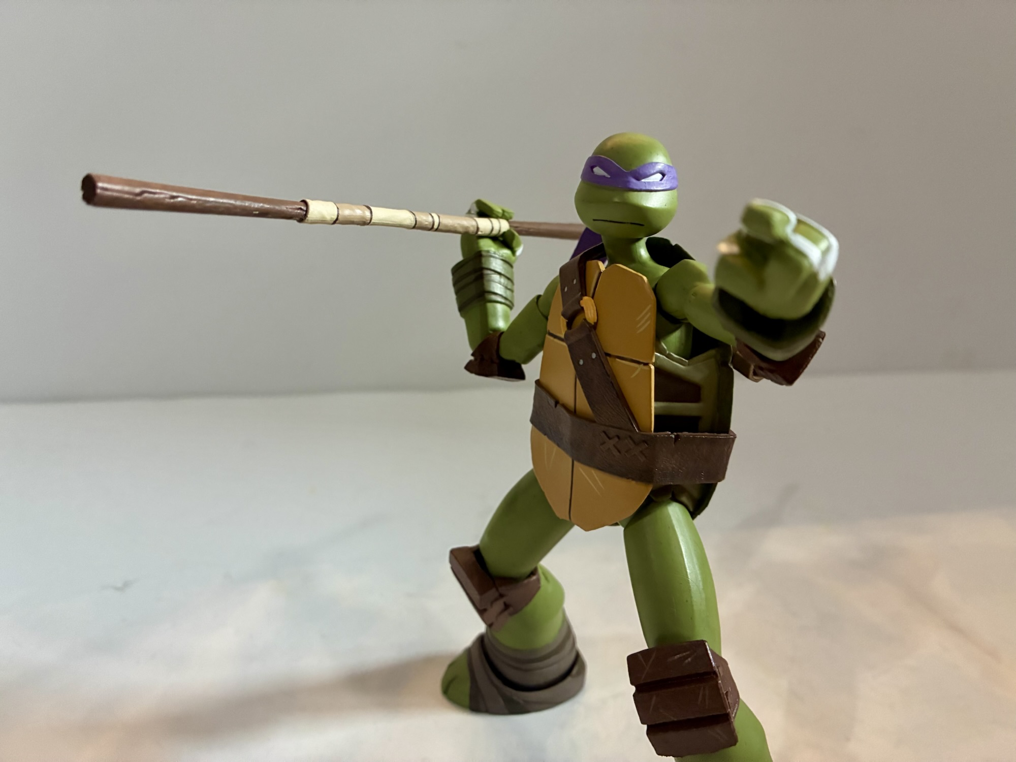
Donatello in the 2012 show is similar to past versions of the character. He’s the brains, able to come up with clever gadgets and such, but he’s also pretty introspective, insecure, and about as confused about his place in the world as most teenagers. It was fun seeing an episode where Donatello questions the worth of his bo staff. As a kid, I always saw that weapon as decidedly lame compared with what the other turtles had. Combine that with the more feminine purple of his bandana and it made Donatello the lamest turtle to my six-year-old brain. This Donatello is one I can appreciate and he has more nuance than perhaps any of his brothers. His affection for April is a long-running story and a bit tragic in some ways.
This thing can be fiddly.“All right, a real weapon!”
NECA’s interpretation of Donatello comes courtesy of sculptor May Thamtarana with paint by Geoff Trapp and Mike Puzzo. Ciro Nieli did the illustrations on the box just as they did for Leonardo. Donatello stands a tick under 5.875″ giving him considerable height over his brothers, but leaving him shorter than Shredder. As the tallest turtle in the show, this strikes me as appropriate. His sculpt is almost entirely different from Leonardo’s and that’s going to be true of his brothers as well. From what I can tell, the only parts shared between the turtles are the hands. Everything else is unique which is pretty impressive and can also be a sign of variants to come.
You know Donatello is always going to have gadgets.
Donatello is very well built for not only is he taller his proportions are pretty on-model. His limbs are longer and compared to some of his brothers thicker, or thinner, depending on the turtle. His belt and plastron have the same weathered approach as Leonardo and by default he’s sporting his battle portrait. NECA and Thamtarana really nailed the shape of Donnie’s head which is smaller and rounder than the others and sits pretty high. Like Leo, he’s the most on-model interpretation of this character we have seen yet cast in plastic. He also comes with some minor assembly required. The holster for his bo is a separate piece which plugs into his shell. There’s a hole in the shoulder strap to accommodate this. The actual part is a softer plastic than basically everything else in the box and I saw some people express frustration with getting it in place. Mine went in without issue, but I also got to it shortly after it was delivered in a fairly cool climate which may have helped. If it were warm and more pliable it might have been a different story.
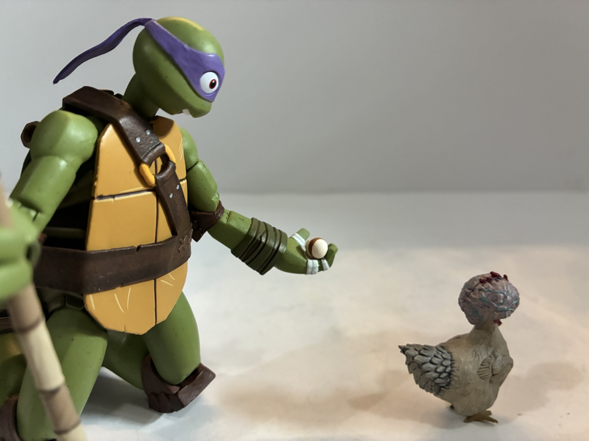
“Having a chicken around really pays off!”
Donatello comes with gripping hands by default as well as a set of open hands and a set of pointing hands. The right open hand is more of a C-grip hand and I assume it’s for his other accessories. He does have an alternate portrait with his pupils visible and a big, open-mouthed, smile which exposes the gap between his front teeth, a hallmark of the character. It’s a great likeness and it’s exactly the kind of portrait we want to see with these figures. He also has his trusty bo staff which can separate at the tape. This makes it a little easier to slot into his holster, but also allows for it to be switched with the included bladed end creating a naginata. Donnie’s lame weapon got a little upgrade in the show. He also has more unique accessories in the form of his microscope goggles and a homemade tracking device that appears to be made out of a Game Boy and egg beater. The goggles don’t get a snug fit on either head, but will probably stay if placed on a shelf. Donnie also has the same T-phone, smoke bomb, and pizza slice as the rest. His last accessory is Dr. Cluckenstein, the big-brained chicken. She looks good, though is just a slug figure with no articulation. Mine also came with one of the toes broken off which is a bummer. It’s the only real quality control issue I had with the wave.
Poor little fella has a broken toe.
Donatello has the same articulation as Leonardo with the only difference being his shape provides for more range in places. He can look up much better than Leo and his shoulders are easier to engage with. He’s also the figure I had the least amount of issues with out of the box as far as stuck joints are concerned. Knees and elbows all worked fine as well as the ankles. He has the same horizontal wrist hinges as Leonardo, though it’s less of an issue with his chosen melee weapon. His gripping hands are just as rigid though so you’ll want to heat them up before trying to get him to hold his staff. Even the C-grip hand isn’t particularly good for anything without some heat if you want him to actually grip something with any authority. I did have issues swapping heads again, though in this case the default portrait came off fine, it’s just the alternate didn’t want to go on. I just heated it up and that was that.
They’re a lovable bunch.
Donatello is an overall better release than Leonardo and might be the best in the line. I’ll reserve judgement for that until I’ve spent more time with the rest of wave one, but I think he just comes together in a nicer package. His articulation is slightly more forgiving, his accessories more purposeful, and best of all he has two worthy portraits for your display. He’s still not as articulated as he could be, but if you just want an on-model Donatello from the 2012 series you’ll be hard pressed to do better than this.
We have plenty more from Teenage Mutant Ninja Turtles to refer you to:
We’re going to start this one off with a question: When you order directly from a producer, do you expect to be first in line for product? NECA’s recent launch of its Teenage Mutant Ninja Turtles action figure line based on the 2012 Nickelodeon series raised this question. On September 16, NECA launched the line…
I think most people understand that when it comes to a toy line the most popular figures are of the most popular characters. The problem is, what do you do when everyone has the most popular characters? You make them again, but different! That’s sort of the genesis of the variant action figure of a…
Is this it? Have I finally hit the point where my Teenage Mutant Ninja Turtle toy collecting is out of control? It just might be, for today we have Donatello’s Portable Portal Generator, the latest piece from NECA’s line of toys based on the vintage cartoon series. And it’s not that this is a bad…
I knew who the X-Men were when the show premiered in 1992, but I didn’t know much about them. That show really was the proper introduction to the franchise for me and one thing I couldn’t wrap my head around as a kid was that these were heroes who didn’t really have a secret identity. Yeah, when they weren’t on the job they wore normal clothes, but the characters didn’t have any hang-ups about using their powers out in public if the situation arose. That just seemed so foreign a concept to me as someone raised on Superman and Batman. I didn’t realize super heroes could walk a different path.
All hail the short king.
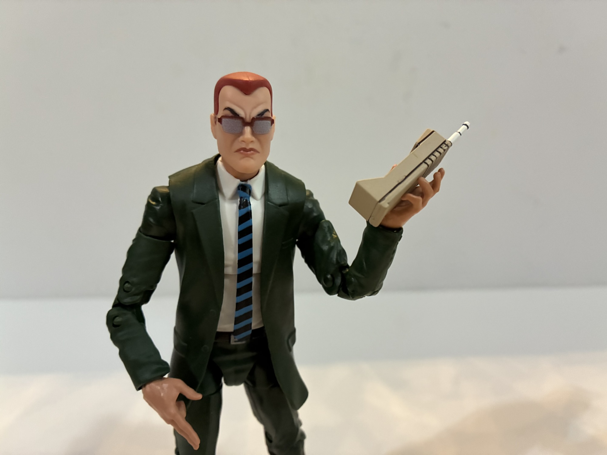
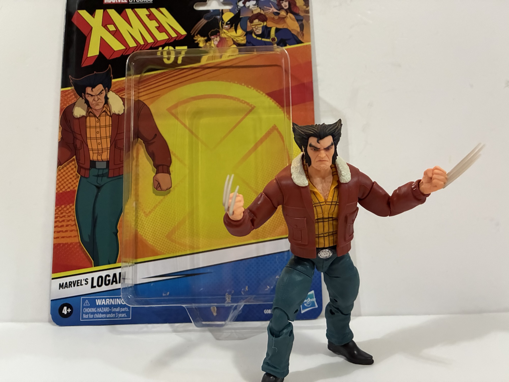
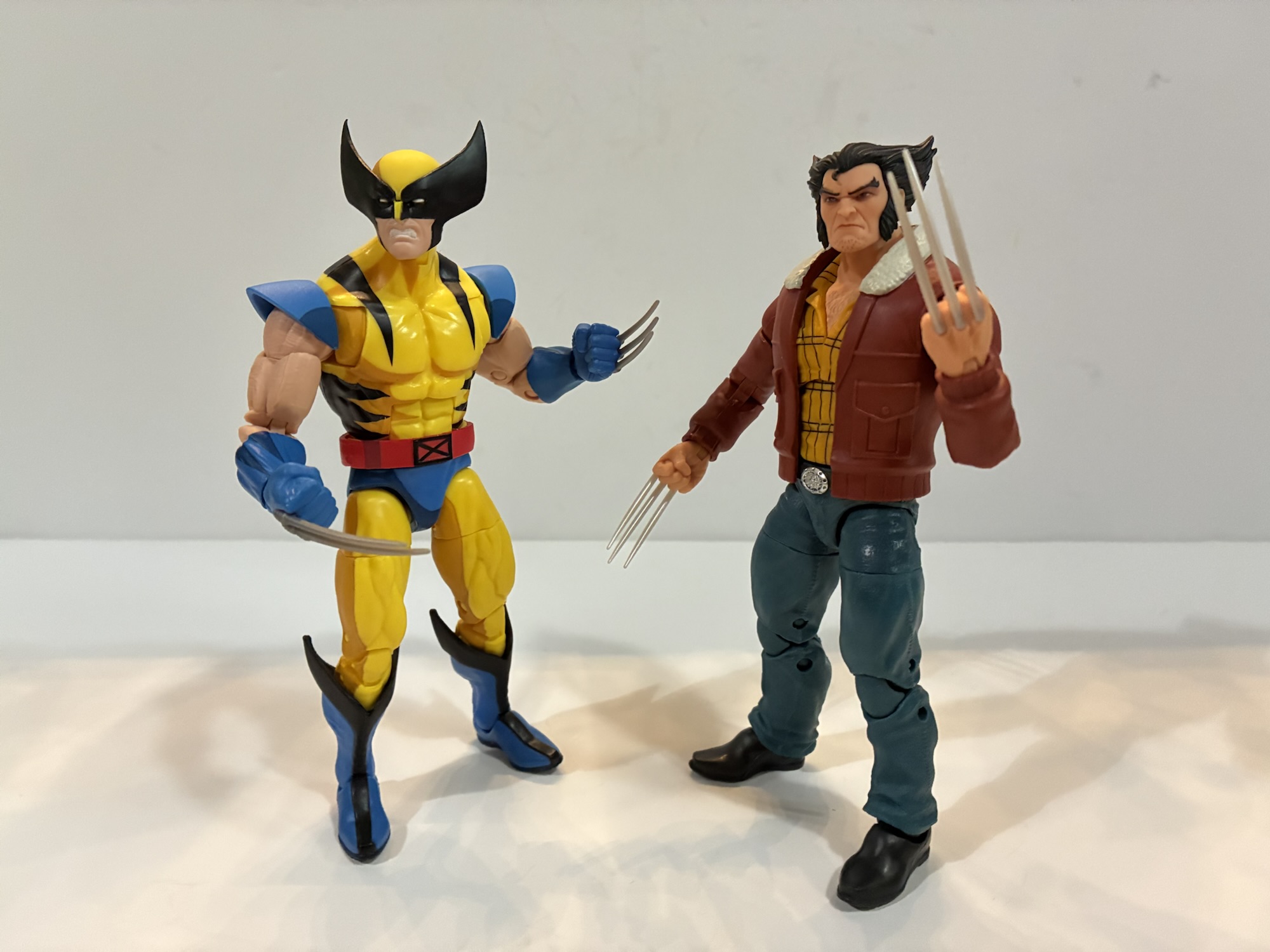
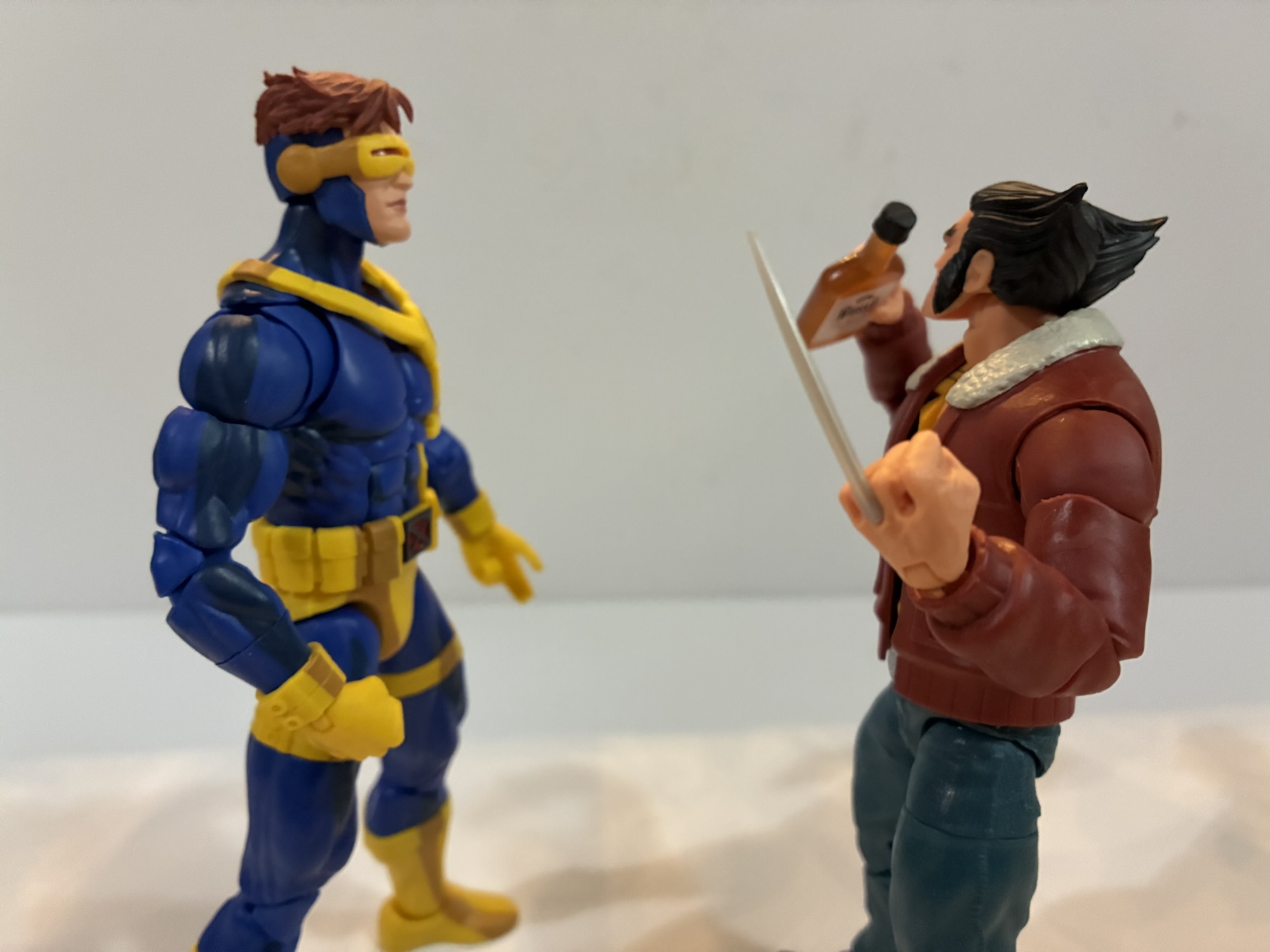
During the course of the show, I got familiar with the non-costumed looks of the X-Men and by far the most memorable is Wolverine. He would ditch the tights in favor of some work pants, a yellow plaid shirt, and a bomber jacket with a furred collar. I don’t know if this look was directly pulled from the comics, but the show definitely made it iconic. It’s just another of the many classic looks for the character and it was immortalized in plastic way back during the Toy Biz era. And since every wave of X-Men figures could use a Wolverine, it’s hardly a surprise we’re getting the look in Marvel Legends.
I don’t have the 97 Wolverine, but it’s essentially the same figure as the 92 one.
This figure is almost entirely reuse. Past Wolverines have utilized these parts including even the head which is reused from the first X-Men ’97 Wolverine. The clawed hands are from the Weapon X release and feature the slightly longer middle claw which is an odd choice as that’s not something carried over into the show. The coat overlay is probably new and the arms might be as well, but that’s it. Does it matter? Yes and no. The coat has that animated look to it. It’s very smooth and untextured while the pants are textured like denim. This isn’t consistent with the source material and it’s a bit frustrating. Yeah, in the grand scheme of things it’s not a big deal, but it just serves as a reminder that Hasbro is not committed to accuracy with this line. It’s also odd to get the same Wolverine head recycled here, though the complexion is a touch redder which is odd. If you want a new unmasked portrait you have to get the new two-pack with Storm (I passed).
“What am I supposed to do with this?”
The figure is compromised, but looks all right. The accessories, on the other hand, are pretty unimpressive. Wolverine has his clawed hands, as usual, and the claws can actually pop off. They’re unpainted, gray, plastic and pretty bland looking. It can be hard to get them straight too and the claws on my figure’s right fist are kind of driving me crazy. The other options include a left fist without claw holes and an optional right hand that’s in a unique shape. That shape is to facilitate the use of a hand of playing cards which is also recycled from a past release. They’re fine? It might be more fun to give them to Gambit, but they don’t add a whole lot to the experience with Logan here.
“Now this is more like it!”
Articulation is pretty standard. Ball-hinge head, ball-hinge shoulders, bicep swivel, double-elbows, wrist swivel and hinge, diaphragm joint, waist twist, ball-socket hips, thigh swivels, double-jointed knees, ankle rocker and hinge. The cowboy boots that he appears to be wearing are kind of annoying. He’s tricky to stand and the coat limits the torso articulation. The diaphragm joint doesn’t really do a whole lot and the collar of the coat also interferes with the head. You’re going to be hard-pressed to get him into a low, Wolverine, crouch. It’s unfortunate this follows the Gamerverse Wolverine because the articulation in that makes this look like a hunk of crap.
“Logan! This is a school!”
Logan is what he is. The figure is only worth pursuing if you have a fondness for this look. Yeah, the pants and the belt are wrong, but it’s also instantly recognizable as Wolverine’s civilian look from the cartoon. That’s what got me to buy this even if I was a little hesitant. It’s also Wolverine so it might appear in large numbers. If you’re unimpressed, and I mostly am, then it may pay to wait this one out to see if it ever goes on sale. It’s October as I write this so the holiday shopping season is pretty much here and things have a habit of going on sale during this time of year. That might be the approach to take.
If you like this review then check out these other X-Men ’97 releases:
We’re going to keep this Marvel/Mutant Monday thing going for one more week! After taking a look at a trio of figures from Hasbro’s new X-Men ’97 line of figures in its Marvel Legends catalog I’ve decided to do one more: Bishop. The first three figures I looked at were basically all missing pieces to…
Since we don’t have a post this week for Turtle Tuesday I decided we should have a Mutant Monday. X-Men ’97 has returned the mutant superheroes to the spotlight and one of the main beneficiaries has been Hasbro. Their first wave of Marvel Legends based on the new show arrived last fall and, aside from…
The television event of 2024 for me was none other than X-Men ’97. I loved that show and I can’t wait for the second season to come around. It’s just a shame we may still be as much as a year away, but to somewhat tide us over until then we have this third wave…
We’re going to start this one off with a question: When you order directly from a producer, do you expect to be first in line for product? NECA’s recent launch of its Teenage Mutant Ninja Turtles action figure line based on the 2012 Nickelodeon series raised this question. On September 16, NECA launched the line on its own webstore where their fans could purchase the four turtles as a bundle. If they wanted to add Shredder, then the order would qualify for free shipping. It seemed like a solid deal. Then on September 28th, the same selection of characters appeared on Walmart’s website as in-stock. Those who took advantage of the NECA sale were still waiting for their order to ship, but someone who waited it out could order from Walmart that weekend and get their figures a few days later. A bit of a raw deal, but it’s just toys, right?
It’s another installment of turtles from NECA.
It gets a little more complicated when the reality that NECA fulfills all its own orders is introduced. In other words, whether you order through NECA direct or Walmart, you’re just ordering from NECA. It all gets packaged and shipped by NECA, and even though the people who ordered directly from them were charged upfront, the people who ordered through Walmart essentially jumped the line. And then following that came the shipping woes. Numerous reports of wrong orders, wrong tracking numbers, duplicate tracking numbers, and partial shipments. Several people who ordered from NECA ended up getting shipments of just Michelangelo and Shredder with an assurance the rest would ship later. This on top of NECA’s well publicized shipping woes of the prior year just added to an overall bad experience. I got my set through NECA. I ordered on the 16th of September and didn’t receive a partial shipment. I got the whole thing on October 29th. I don’t really care about when I get stuff, as long as I get it, but it is annoying to see the same company prioritize different orders. Just better communication would solve most of the issues, but apparently that’s too hard.
The likeness is pretty damn good here.
It’s a shame there was such consternation in the collector sphere for this line because I think it had a lot of positive buzz leading up to release. The Teenage Mutant Ninja Turtles Nickelodeon show was a hit both commercially and critically. It’s held in high regard by old and new TMNT fans for its successful melding of the classic comic book tales and some new stuff. It’s really one of, if not the, best takes on the franchise. As part of the 40th anniversary, Nickelodeon wanted to celebrate a lot of eras of TMNT and do so by merchandizing the hell out of it. Super7 had the 2003 cartoon shopped to them while NECA got 2012. And while I grew up on the 87 toon, the 2012 series was the one I watched with my kids. They loved it and for them it’s “their” Teenage Mutant Ninja Turtles so this franchise holds a special place in my heart. When NECA announced they were doing figures from this show I was very much onboard.
He comes with a decent assortment of stuff, but I’m guessing most will just rock the swords.
And up first is the leader in blue – Leonardo. Unlike other iterations of the turtles, this is a property that can’t get by with one sculpt for four boys. The turtles from this show all had a unique appearance. It wasn’t just a different colored bandana or a belt with a shoulder strap. As a result, it feels more appropriate to give each turtle his own review. I did get Shredder as well, so we’re going to have a lot of TMNT content for a little while. I’m not sure how quickly I’ll get these reviews out because we also have Christmas to talk about, but we’ll see how it goes.
I don’t really know what these hands are for, but he comes with them.
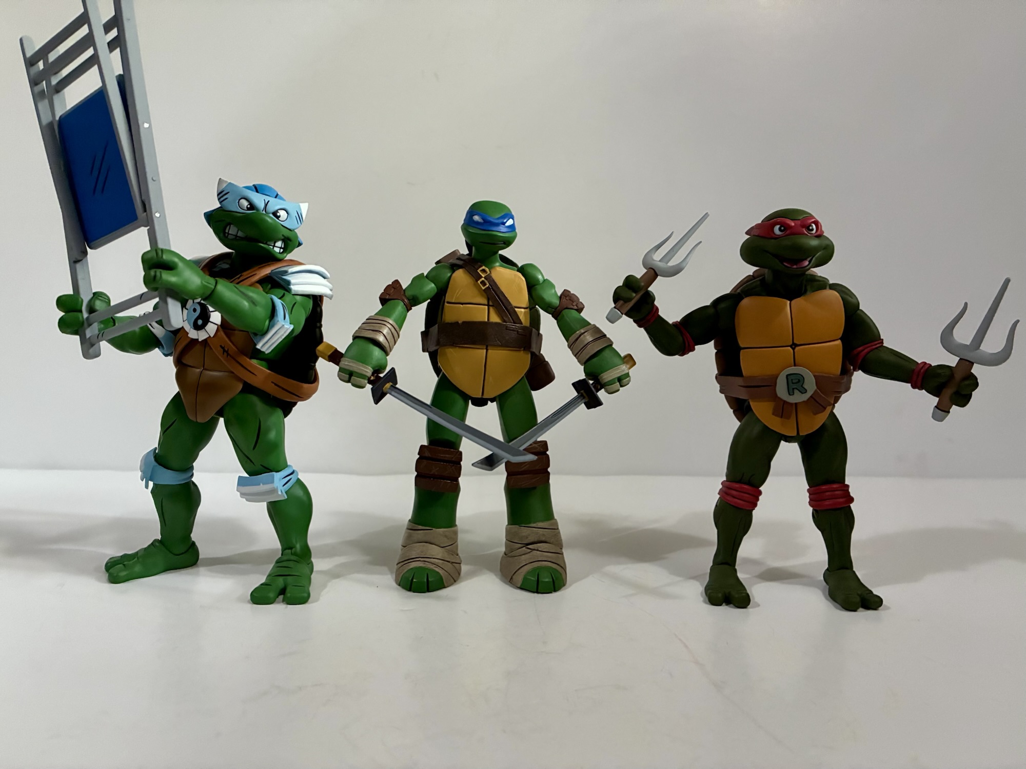
Each turtle is sold as an “Ultimate” version with the standard five-panel packaging. It’s adorned with artwork by Ciro Nieli. The sculpt is by a name new to me, May Thamtarana, with paint by the usual NECA duo Geoff Trapp and Mike Puzzo. There’s no photography on the box which is a bit unusual, but it does have some spine art which will create a mural for those saving boxes. Leonardo, despite being the leader, is actually numbered 4 in the series which is just wrong. Everyone knows it goes Leonardo, Donatello, Raphael, then Michelangelo. That’s the only order I’ll accept.
Scale on this line is going to be pretty interesting.
Leonardo stands at right around 5.5″. If you’re curious about scale, that would put him at a height of 5’6″ in 1:12 scale, 4’7″ in 1:10 scale. I think it’s safe to say that NECA is going for 1:12 with this line based on that. I tried to find an official height chart for the show, but came up empty. I saw lots of unsourced claims that Leonardo is supposed to be between 5’4″ and 5’6″ with one outlier saying he was a mere 5’1″. I did see one piece of production art for Leatherhead that placed Michelangelo at an even 5′ while NECA has the figure at about 5.125″ tall. In other words, I think this is close enough.
He has a gun. Cool?
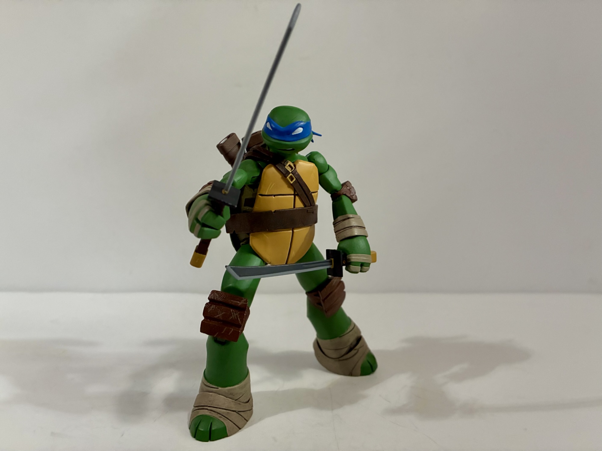
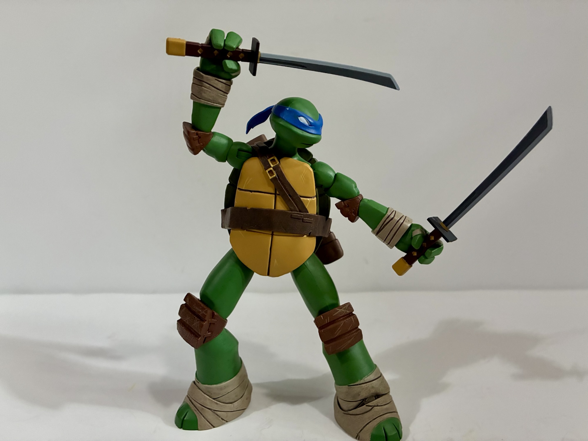
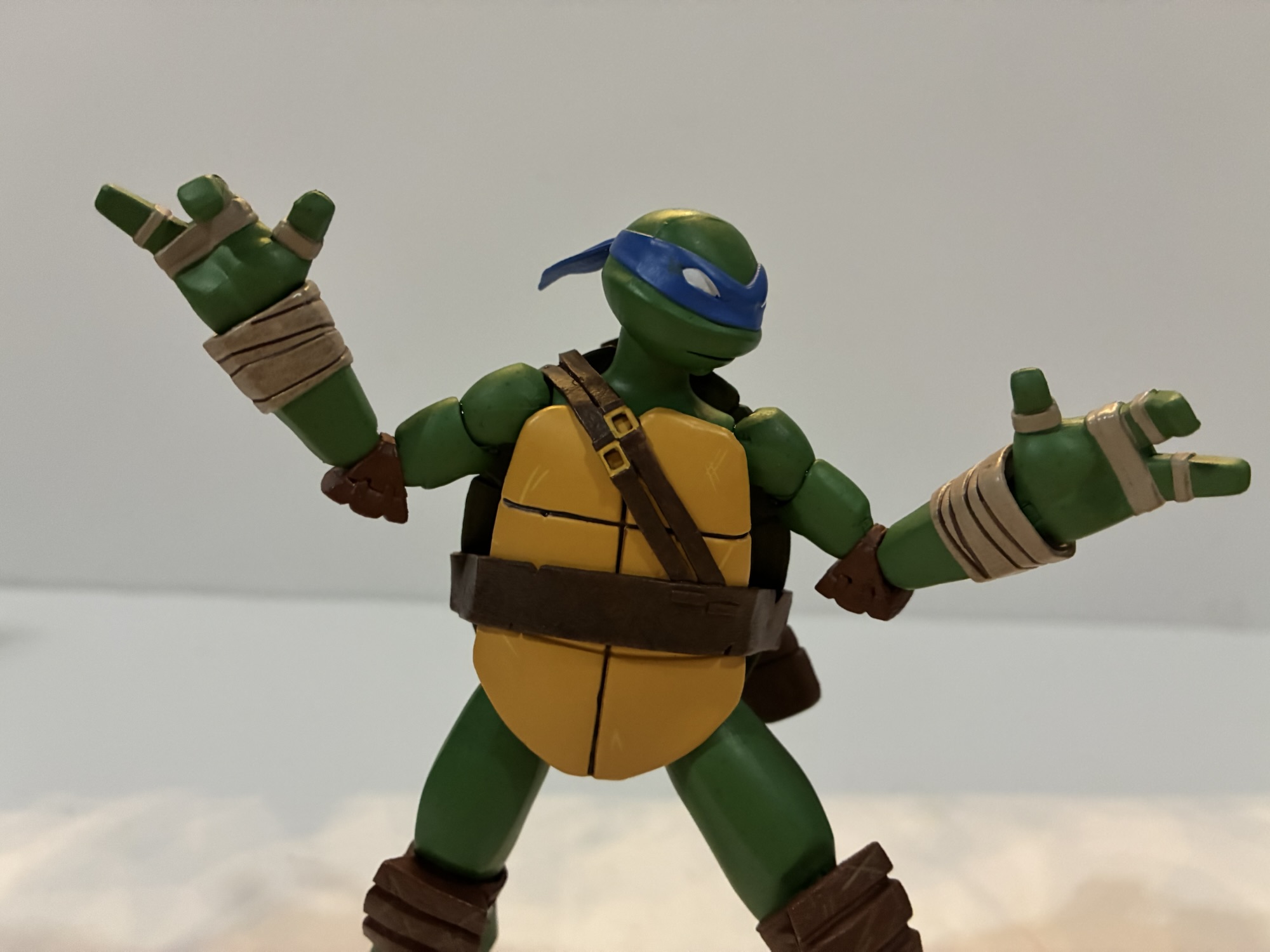
What is going to be this line’s strong suit is the overall look and proportions of these characters. From the unique proportions to the shape of the limbs it’s all very evocative of the show. NECA, as usual, utilized a liberal amount of paint to bring Leo to life. The body may be molded in green plastic, but it’s coated with paint as well to give it a rich, matte, finish. There’s some nice dry-brushing on the wraps present on the wrists and ankles and some weathering to the shell. He comes ready for battle with whited-out eyes and a little slit of teeth visible which was applied cleanly. The only shortcoming I’m noticing in the presentation department are the knee pads, which while textured very nicely, do give off a shiny appearance like they’re not painted. The right-most scabbard also has some sloppy, white, paint inside it and I’m not sure why they bothered as it seems to interfere with the swords as well. On one hand, it’s some nice attention to detail if that was always visible in the show, but I’d also rather be able to insert a sword into it easily.
If it wasn’t already useless, I can’t even get this alternate head onto the figure because the ball joint keeps popping out of the neck.
Where we are going to run into some issues is with the accessory load-out. When NECA debuted these figures at Toy Fair earlier this year each turtle appeared to have the battle portrait and a more casual one. When it came time to ship them, that was still true of 3 of the 4 turtles, but not Leonardo. His alternate portrait has his eyes closed like he’s meditating. I know there was a storyline where he was unconscious a few episodes, but literally no one wanted this portrait in place of one where his eyes are open with visible pupils. It’s either really bad judgement on NECA’s part or a naked attempt at making a future accessory pack or variant figure more enticing. I usually have to reserve this mini rant for Super7, but if NECA is going to call this the “Ultimate” Leonardo figure, then he needs a portrait where his damn eyes are open. As for the portrait itself – it’s fine. If that’s what you want for your Leonardo. I can’t see myself ever using it and that’s especially true since I can’t get his default head off without having the neck joint come out with it.
This scabbard keeps falling off, which is really annoying.
Aside from that major boner, the rest of what’s in the box is pretty solid. Leonardo has his two katana, and in keeping true to the show, one is shorter than the other. Maybe it’s hard to find matching swords when you live in a sewer? It’s funny that they bothered to add this detail to the show since it’s not an obvious or dramatic difference, but it’s represented here. The swords are well-painted, but the hands he has to hold them are extremely rigid. Heat them up, don’t try to shove them into his hands, no good will come of that. In addition to those gripping hands, Leo also has a set of fists, relaxed open hands, and these odd looking hands that kind of look like a “hang loose” gesture. He also comes with a smoke bomb (basically a little egg), T-phone, and a slice of pepperoni pizza. Those three things are included with each turtle. His unique accessory is a gun that I think he acquires from The Kraang in an episode. I don’t remember it, and NECA doesn’t list out the accessories on the box, but it looks pretty cool. It’s just as hard for him to hold as his swords if you don’t heat up a hand, but he can support it with an open hand for a two-handed pose.
Everybody comes with a T-Phone, pizza, and smoke bomb.
I was curious how these turtles would pose given their more slender profile vs other iterations of the gang. For the most part though, these are NECA figures and they handle like NECA figures. The head is a double ball-joint with decent range. The neck is angled though so Leo doesn’t look up very well, but aiding that is a diaphragm joint that basically just allows the entire shoulder and neck area to rock back and forth a bit. It’s not dramatic, but it’s also not nothing. Arms are fairly basic: shoulder ball-hinge, bicep swivel, double elbows, wrist swivel and hinge. The gripping hinge is the wrong one as once again NECA failed to provide a vertical hinge for a sword-wielding character. It’s perhaps my biggest pet peeve with the company as they’re incredibly inconsistent about it. Most of the Ultimate releases in the toon get the correct hands, but we’re starting off on the wrong foot with the 2012 line. Seriously, I’d trade the stupid gun for better hands. Or a better alternate portrait.
You can pose him with the smoke bomb if you really want to.
The rest of the articulation is also pretty standard. There’s a waist twist, but the shell really limits it. The side panels seem to extend a lot lower than usual too which cuts it off further. Ball-socket hips, thigh swivel, double-jointed knees, and ankle hinges and rocker round it out. The shell/plastron interferes with range at the hips. The plastron is soft, but not that soft. He won’t kick out a full 90 degrees nor can he do splits. The ankle rockers gave me some trouble out of the box, but I seem to have them moving now without having to heat them up. I didn’t have any issues with the usual trouble spots of knees and elbows, but the shoulders are pretty tight. And since the arms are so thin, they can be a bit harrowing to manipulate. It’s hard to engage the shoulder hinge without putting strain on the bicep peg. If you’re used to NECA articulation, then I don’t think he’s necessarily much better or worse than we typically see. I do wish we would get some real innovation at this point when it comes to TMNT figures because the same old articulation schemes are getting hold. I feel like we should have ab crunches by now. If Hasbro can make a Hulk clap than surely someone can make a turtle bend over.
To match eyes or not?
Leonardo isn’t the lead-off homerun I was hoping for with NECA’s new TMNT 2012 toyline. He looks great, but the little issues with things like his scabbard, the way too tight gripping hands, the wrong hinge articulation, and that lame alternate portrait really put a damper on him. He’s also the only figure in this first wave, including Shredder, to not come with a little buddy character and that’s a bummer. The gun accessory is really well done for what it is, but it’s just so useless. I’ll never display Leonardo with a gun, which just puts more of a spotlight on what’s missing. He’s the best looking 2012 Leonardo we’ve received provided you want to display him in battle mode and that’s going to have to be good enough if you’re into this version of the franchise.
We don’t have a lot of TMNT 2012 toy talk here, but we have some plus a lot of Leonardo:
Playmates Toys has been the master toy license holder for Teenage Mutant Ninja Turtles for as long as I’ve been aware of TMNT. In the 80s, the toy line produced by Playmates was excellent: fun sculpts, imaginative characters, crazy set pieces, and tons of vehicles. It was a great companion to the animated series airing…
When I was a kid, I had parents with divergent musical tastes. Dad likes oldies from the 50s and 60s while mom was more into modern rock (then 80s). One area where their tastes overlapped was Bruce Springsteen. We had several of his records in my house and I distinctly remember that cover to Born…
It’s been said before and it will be said again: everyone is making Ninja Turtles. It feels like the list of companies not making Teenage Mutant Ninja Turtles is smaller than the list of those who are. Viacom has not been shy about licensing the brand out to toy makers and it’s reaching a point…
The self-professed mall babe is back with a new look.
The television event of 2024 for me was none other than X-Men ’97. I loved that show and I can’t wait for the second season to come around. It’s just a shame we may still be as much as a year away, but to somewhat tide us over until then we have this third wave of Marvel Legends action figures from Hasbro. The first two waves were undoubtedly done based on concept art of whatever Disney and Marvel were willing to share with the toy maker at the time. It seemed to fill-in some of the gaps left behind by Hasbro’s brief dance with the original X-Men cartoon via the VHS style box releases while also getting in a few show specific characters and looks. This third wave feels like a post season one wave. It contains characters we didn’t really know were going to be in it as well as some different looks for those we did know were coming. Up first, is Miss Jubilee.
She’s sized pretty well for what she is.
Jubilee, unlike some other characters, did get a slot in that VHS line based on the original show from 1992. That Jubilee was pretty much a hodgepodge of past Jubilee releases with some half-assed and poorly applied cel-shading. I don’t know if it’s my least favorite in that line, but it’s in contention. This update is based on the end of the first season following a minor wardrobe update. The look, from what I understand, is from the comics when she went through a vampire phase. Yeah, I don’t know. I wasn’t reading and I don’t care to know more than that. It’s basically just an all black, skin-tight suit, with her customary yellow trench coat. It’s not a look I care about, but maybe it has some utility for the ’92 display? Let’s find out!
The stars of the show.
Jubilee is a pretty basic figure. She has a brand new headsculpt that more or less matches the look of the show. I think it’s a little full in the face, but definitely more on model than what we’ve had before. The body is mostly reuse from past Jubilees, but updated with pinless joints. The arms might be new, but I am not certain. I think the upper diaphragm is also new, but it’s basically black plastic with minimal paint near the chest. The arms are yellow plastic while the coat is a thinner plastic. It has some pliability, but it’s also really shiny giving it this very rain coat quality. It’s okay, but cheap looking.
This one is definitely an improvement over the old figure, but not the look I prefer.
Jubilee’s accessories are surprisingly robust. She has a set of open hands, a left fist, and a right C-grip hand. I don’t think any of these are new, but that’s fine. Her C-grip hand is for a soft drink she comes with which looks fine and calls back to her origins as a mall rat. She also has some new effect hands and these are a massive improvement over those little swirly things the 92 Jubilee had. They appear to be a translucent acrylic which ends in star shapes and has this nice transition of colors from purple to blue. They’re permanently affixed to a set of open hands which almost appear to be insert-molded into these things. It’s a bummer because it means it won’t work with other Jubilee figures unless those ones also feature black gloves. And since the fingers of said gloves are inside the effects, it also means that painting them yellow or blue isn’t going to be a perfect solution. They look great for this figure, but only this figure.
This looks better, but that old coat still kind of sucks.
Jubilee’s articulation is pretty basic. She has a double-ball joint at the head, ball-hinge shoulders, double-elbows, bicep swivel, wrist swivel and hinges, diaphragm joint, ball-socket hips, thigh swivel, boot swivel, double-jointed knees, and ankles with hinges and rockers. The lack of a waist twist stinks and the presence of a jacket would have made hiding a butterfly joint fairly easy, but we don’t get either. The double-ball head is okay, but it has that annoying quality where the neck-ball pops out often when removing the head. I had to heat it up and pull that joint out of the head to do it properly. Why did I remove the head? Well…
Ok, yeah, now we’re ready to rock!
Jubilee’s original ’92 look is by far my preference. While I like these new effect parts, I would much rather have Jubilee in her more colorful threads. Swapping heads with the 92 figure is pretty easy. I found the old heads don’t want to go on this new body all that easily, but getting the new head on that old body was a piece of cake once I got the peg out. I also found I much preferred the look of this new coat to the old one. Getting it off was also pretty easy as was putting it on the old figure. Getting the old coat off the old figure was more difficult as that plastic is a bit thicker and less forgiving, but I still was able to do it without popping the arms out at the shoulder. The end result is, for me, a much better representation of Jubilee. She still has the ugly shading on her sleeves, but I could remove that if I so desire. I may yet try to paint the hands in the effect parts, but for now she can continue using the dumb swirly ones. I could also repaint the C-grip hand if I want her to be able to enjoy her soft drink. It’s just a matter of making sure I can match the shade of yellow in use here, but I’m just happy the old sleeves mix well with the new coat.
I obviously bought this Jubilee not intending to enjoy it for the figure it is. If you like the updated look, then it’s fine. The articulation is just so-so and it has a cheaper look than usual, but the new effect parts are nice and she does match the source material well enough. She also makes for a suitable kit-bash if that’s your aim. Do with that information what you will.
If you liked this one then check out these other X-Men ’97 reviews we have:
Previously, on X-Men reviews we looked at Magneto from the upcoming series X-Men ’97. The animated series may have been delayed into 2024, but the action figures from Hasbro are already here. And if you were collecting Hasbro’s line of figures based on the animated series from the 90s, this new line offers a chance…
Everyone can relax – Gambit has returned. Or arrived, since I’ve never reviewed a Gambit action figure in this space, but that’s because I haven’t bought a Gambit figure in about 20 years until now. When X-Men arrived on airwaves in the fall of 1992, hardly anyone on that team could be considered a true…
If you are reading this the day it goes live then Happy X-Men ’97 Day! Today is the day the long-awaited sequel series to X-Men debuts on Disney+. Rather than fast-track a review of the first two episodes to this blog, I decided instead to do what I most often do: review an action figure!…
Pictured: Not Sergeant Bananas, but also Sergeant Bananas.
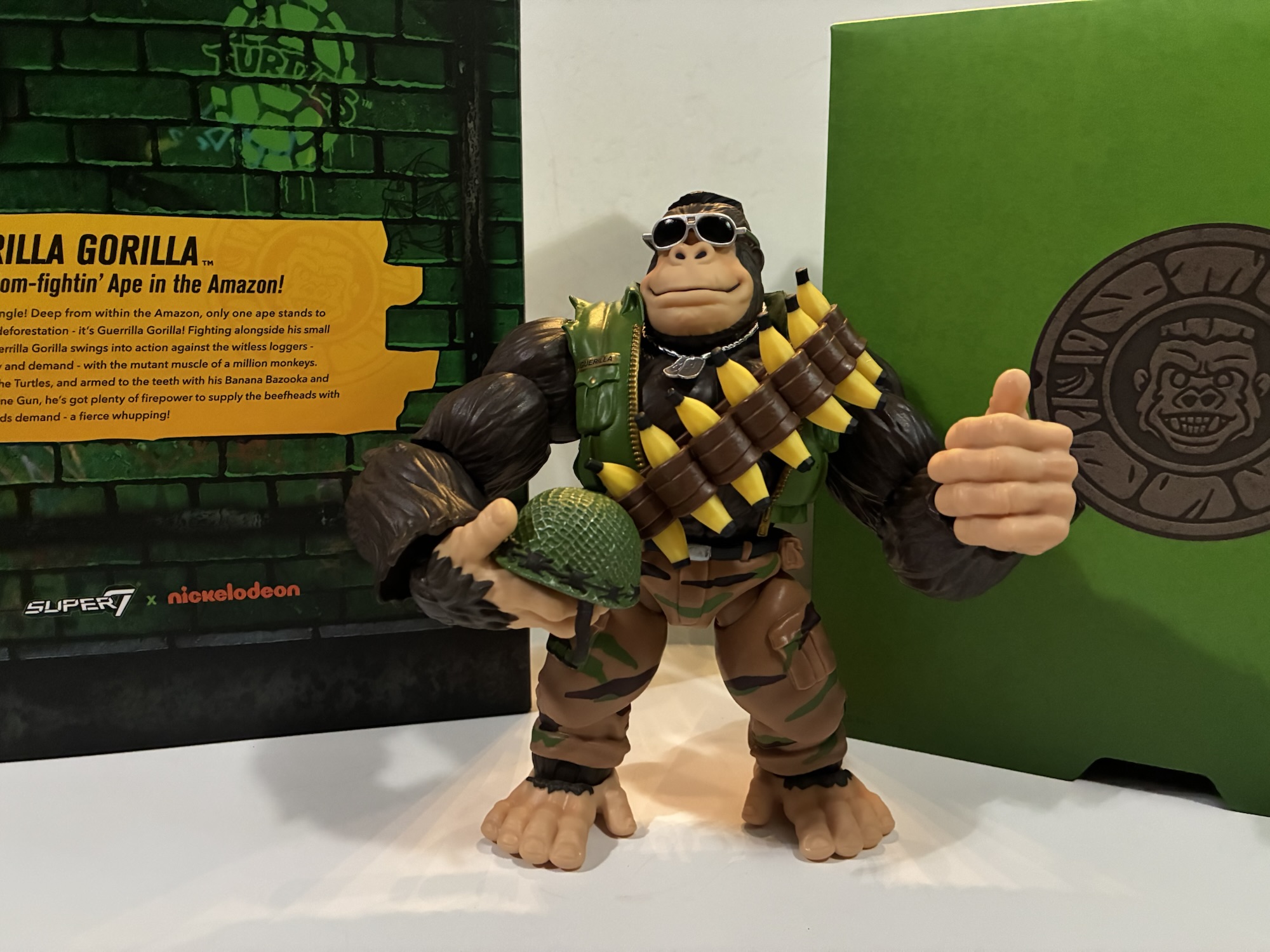
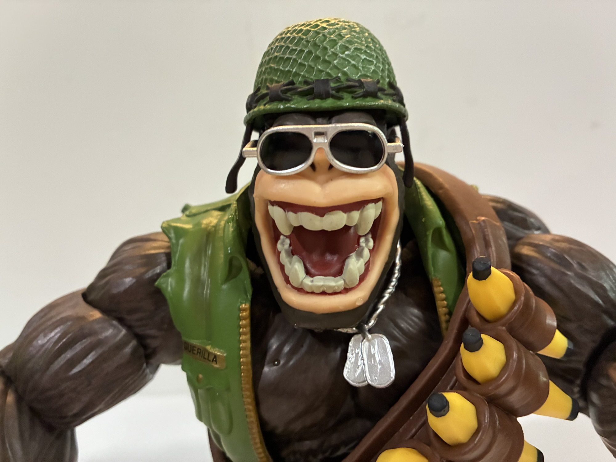
It feels like the last few times I’ve made a Super7 Teenage Mutant Ninja Turtles post I’ve wondered if it’s my last one so I’m going to stop trying to predict that. This one comes courtesy of Big Bad Toy Store and their generous summer of deals. I wasn’t going to pick up this particular action figure because it came at a pretty large MSRP, but when it was slashed nearly 50% I decided to bite so here we are to talk about Guerilla Gorilla.
Someone at Super7 must have loved Sergeant Bananas. Their love for that ape in a banana-print onesie apparently was so vast that they could not take “No” for an answer. It’s pretty surprising. I’ve never met a TMNT fan who loved Sgt. Bananas. I had the figure as a kid and he was fine. I liked his little buddy, Larry the Lemur, quite a bit, but Sgt. Bananas was one of those characters who never made the leap from figure to cartoon. He never even showed up in the Archie books. And therein lies the problem for Super7. Looking back on it, this figure is where we should have been clued into the fact that Super7 was having some issues getting stuff approved because of Playmates Toys. Originally, some just thought Sgt. Bananas must be independently owned, but he was likely created by the team at Mirage Studios for the toy line which means he’s owned by Paramount as they got everything with the purchase of the franchise. The problem for Super7 is that Playmates was able to exercise control over the characters that only appeared in their toyline when it comes to Super7’s. Making a series of vinyl blind box toys? Sgt. Bananas is on the table! Making a Playmates homage toyline though, well, you’re going to have to do without.
Between height and heft, the addition of Guerilla Gorilla is the largest one yet to the line.
And that’s how Super7 landed on Guerrilla Gorilla. The company so badly wanted to make Sgt. Bananas that it instead pivoted to this similar character who appeared in an issue of Teenage Mutant Ninja Turtles Magazine. I was pretty tapped into TMNT during this time, but I had no idea there was a magazine. I’m not surprised since pretty much everything that was popular had a magazine. Guerrilla Gorilla debuted in issue number 4 titled Bungle in the Jungle. The issue is by Ryan Brown with art by Jim Lawson. In it, the turtles meet Guerrilla who is basically a freedom fighter out to protect the jungle from deforestation. According to Turtlepedia, he and Sgt. Bananas are the same character and there is some sort of legal distinction needed. They’re both mutant gorillas with an army motif, but they don’t look all that similar aside from that. Sgt. Bananas had the pretty goofy banana print uniform while Guerrilla is more understated, generic, army ape with an olive vest and camo pants. If you’re asking me to pick a design then, yeah, I’ll take Guerrilla Gorilla, but I’m not married to either one.
He even makes Bebop and Rocksteady look slight.
The whole thing becomes a little crazy to me when we start talking price. Despite the character looking to be only slightly larger than the turtles in the magazine, Super7 decided Guerrilla Gorilla needed to be massive in comparison. And that uptick in size meant an uptick in price all the way up to an MSRP of $75. That seems nuts to me for Super7 to essentially ask TMNT fans to pay that kind of dough for a character they’ve probably never even heard of. That seems to be part of the Super7 brand though – we make the stuff no one else would, or something like that. I think they like to be perceived as a little “out there” and their co-founder Brian Flynn is quite fond of tossing around the word “bonkers” to describe a lot of what they do. I just don’t think it makes much business sense, and if the quality isn’t there then people start to get pissed. It doesn’t seem like a company on great footing these days, but what do I know? I’m just a dude with a blog.
He comes with a ton of stuff, and each banana in the bandolier is removable, but how useable is it all?
Guerrilla Gorilla comes in the standard Ultimates! style packaging including the now discarded slipcover. It’s probably the biggest box yet in the TMNT line, though it’s not as big as some of the Power Rangers stuff I’ve received. Out of the box, our ape friend stands around 8.5″ to the top of his crew cut. More than just the height though is the sheer mass of this thing. This is a heavy toy. You could probably really hurt someone with this thing if wielding it like a club. And it might even hold up pretty well too because it’s quite solid. For more dimensions, each arm on this guy is about 6″ long. His wingspan is around 15″ – this is a big, freaking, action figure for 1:10 scale. Stick a turtle next to him and they’re going to look puny. Even the bigger characters in the line look a little small when they’re next to this guy. Of the figures I have, the only one similar in terms of height and mass is the Triceraton, but Guerrilla has him beat. If you’re of the opinion that size matters then you’ll probably be pleased with this one.
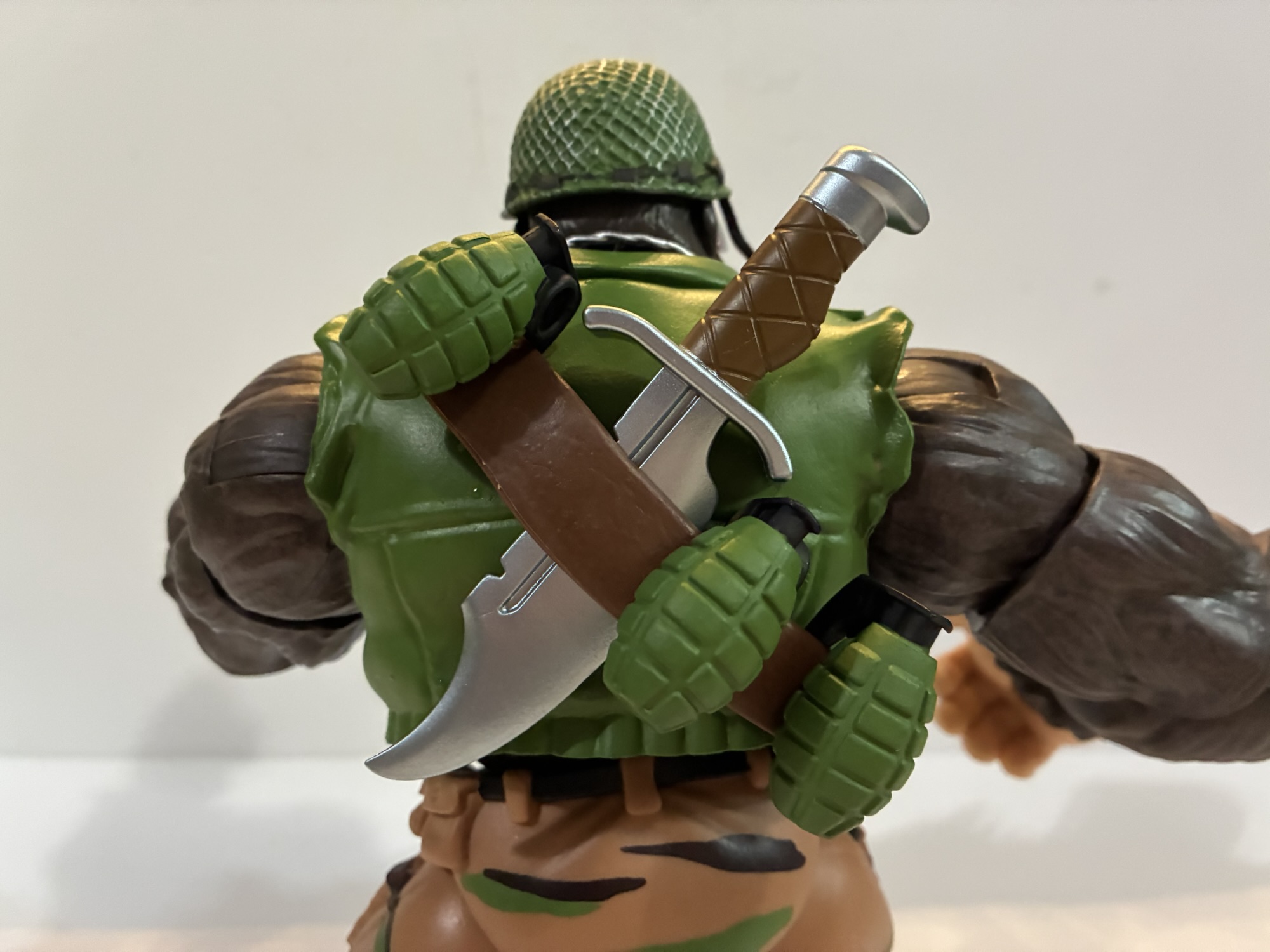
He’s a big guy so he needs a big knife.
Size is but one aspect of presentation, the rest is devoted to sculpt and paint. As far as sculpt goes, this guy seems fine. I like his portrait and there’s solid texture on the furry parts without being too overdone or realistic for the line. He’s mostly molded in brown plastic, but there’s paint applied to give it some definition. The skin portions are a little bland by comparison and come across as a little plasticky, but it’s not bad. Super7 continues to do a solid job with jackets as his vest looks really nice and I like the shade of green in use here. The gold of the zipper is painted well. The camo pants are just okay. There’s nothing wrong with them, the pattern is just a little on the minimal side. If they were fully painted I think they’d look a lot better and it’s the unpainted stuff that just brings this one down a smidge because the area is just so damn big. There’s no hiding it.
He can get down into some gorilla type poses, but don’t expect too much beyond that.
The articulation, on the other hand, is a bit of a stumbling block. It tends to always be the case with Super7 and I’m at least happy to report this guy isn’t a floppy mess. Loose joints would absolutely sink him at this size and weight so Super7 seemed to take extra care to make sure everything is tight. The factory applied shock oil in places to help lubricate joints including the elbows and wrists and it does help, but he’s also really stiff. Swapping parts is not fun. As of this writing, I haven’t been able to get his right hand removed though I’m assuming I’ll be able to with some heat. I was able to remove the left and it takes some effort to insert another one. The default head came off, but I had to kind of snap it back. There’s a chip missing from the double ball peg inside and I don’t know if I did that or if it’s just a factory thing. I could not get his alternate head on, but I’m assuming some heat will do the trick as the opening doesn’t look any smaller with the naked eye. It’s just that this plastic has zero give. There’s no flex at all.
I mentioned the double ball head already, but you also get ball-hinged shoulders, biceps, single elbows, wrist hinge and swivel, diaphragm joint, waist cut, ball-hinge hips, thigh swivel, single knees, ankle hinge and rocker. The head sits real low so it’s not going to do a ton while the shoulders are extremely tight. They’ll move, but it takes some force and there’s no smoothness to the hinge so it basically behaves like a ratcheted joint. The bicep swivel appears to be like a sleeve over a post so it moves independent of the forearm. Most import toys do something similar and we saw the same with the recently released Gamerverse Wolverine by Hasbro. The elbows swivel too and the range is fine. I’ve found the wrists and ankles to work pretty well as do the hips. The knees start off slightly bent, but will form a 90 degree angle when bent all the way. The diaphragm joint has really no forward and back range and is basically another swivel point. He can stand upright, or be pitched forward with knuckles on the ground. He’s stable, but obviously he’s not going to do a whole heck of a lot. With all of the plastic here, and the jacket overlay, I do wish they tried working a butterfly joint into this guy as that would have helped with the weapons, but that’s also not Super7’s style.
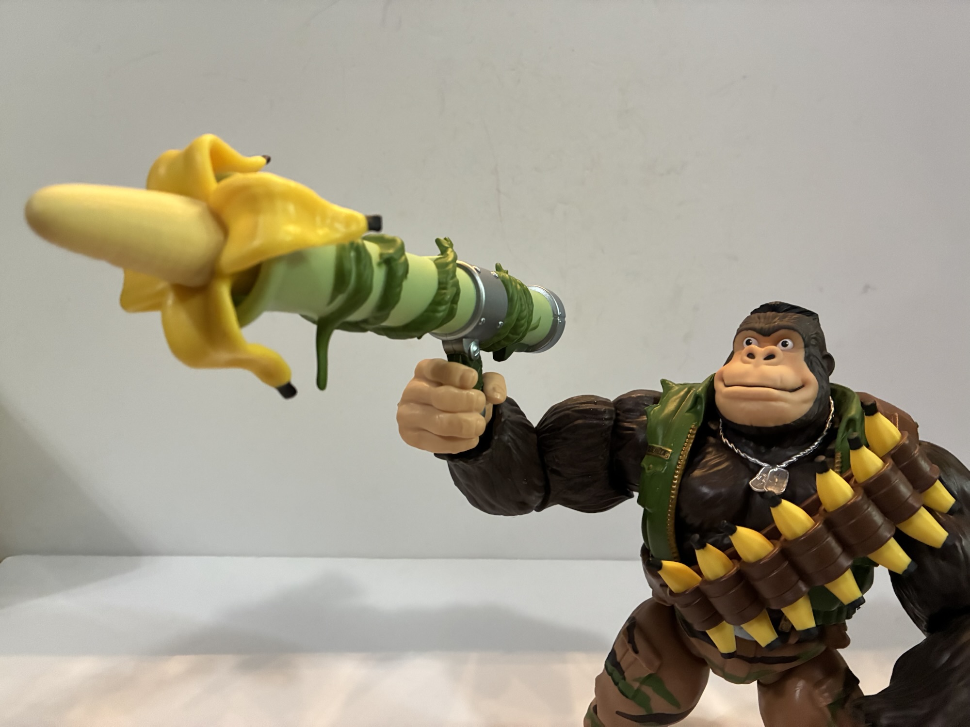
He comes with two ammo options for the bazooka: banana and coconut.
Super7 could have just stopped at “Giant Monkey Man,” but they decided he also needed to come with a ton of stuff. I guess they really took the whole “Ultimates!” moniker to heart here as there’s not much else Guerrilla Gorilla could come with. For starters, he has 10 available hands. I don’t even know how to describe most of them as they’re just different levels of gripping hands plus the customary fists and open variety. There is one that’s an obvious trigger finger hand and it has the preferred vertical hinge. There’s an opposite hand with a less pronounced trigger finger that also has the proper hinge. He also has the yelling head as an alternate portrait and it looks good. The helmet also fits on it just fine. He has a set of sunglasses and they fit the standard, smiling, portrait better than the yelling one, but you can fudge it if you’re determined. He comes wearing an empty bandolier and there are seven bananas to slot into the openings on it. In case he gets hungry, or maybe they’re ammo? I don’t know with this guy. He also has three grenades, a big ass knife, a machine gun, and a bazooka.
I don’t know if you can get a trigger finger into there. If so, it’s going to take a lot of heat.
The machinegun is painted silver with a plain, black, painted handle and it has sculpted vines on it that basically serve as a sling. He can wear the gun over his shoulder if he wants and it will stay in place rather well. The bazooka has no potential for weapon storage (you can slide the knife and grenades under the bandolier if you so desire) and he basically has to hold that one. It comes with a gigantic banana sticking out of the end which can be removed and replaced with a coconut. A coconut makes more sense as a projectile, but when have TMNT weapons ever made sense? The issue with basically all of the weapons, and especially the guns, is that the hands offer zero give. If you want him to hold anything, you’re going to have to heat these hands up to get them nice and pliable. Otherwise you’re just going to strip paint or worse. He can hold the grenades and bananas just fine while you should probably heat up a gripping hand if you want him to hold the knife.
You can finagle some weapon storage out of this guy.
Posing him with the weapons is another story. I kind of hate how they designed this bazooka. It looks fine, the silly premise suits the line, but it has a handle and trigger on it set way back. If your ape holds it as intended it looks more like he’s holding a small gun. It doesn’t rest on his shoulder. I tried using an open hand to just balance it on his shoulder with the hand on top, but that didn’t really work either. The machine gun works only slightly better. The hard plastic vines sculpted to it means it looks a little ridiculous. I wish he could hold it in a firing pose with the vine around his shoulder. The vine really needed to be a separate piece like a true strap so it could be soft and pliable. Then it probably would work the way I want it to. I also can’t envision getting a trigger finger onto the actual trigger with it. It, like everything, is super rigid with no pliability so the end result would probably be a busted trigger guard or worse if I tried to force the issue.
The rare sergeant who can boast he takes bigger turds than the size of the private before him and actually mean it.
Guerrilla Gorilla is, in many ways, a great encapsulation of the Super7 experience. They got so excited and gung-ho about making a massive gorilla figure that they didn’t really stop and take the time to envision a more practical build. It’s great that the figure is so big and has this shelf presence about it by virtue of its size, but it doesn’t do a lot of the little things well as a result. And it never needed to be this big. Would anyone care if he was the same size or even a little smaller than Bebop? I know I wouldn’t. The incredibly tight hands and some of the joints suck a lot of the fun out of handling this thing. I’ve seen many people who claim Super7 is really a company for in-box collectors and this Guerrilla Gorilla figure makes them look right. That said, it’s not an awful release. If you’re the one weirdo out there who wanted this character as a figure then you’re probably really happy. And you may have even been happy to drop $75 on it. I did not care one bit about the character or his more famous version so it was a nonstarter at that price. Given the size and amount of stuff in the box, the MSRP really isn’t all that bad. For $40? Yeah, I went in on that to see how it was and to add a unique piece to the Turtle shelf. I’m content with him, warts and all, at that price provided I don’t shear his hand off trying to swap stuff. I have a feeling we’ll never see another Guerrilla Gorilla from anyone else so if you ever had an interest in the character now is probably the time to get on it. Even though the figure is just okay, I would not be shocked if a couple of years from now he’s a bit expensive on the aftermarket because he’s such an oddball character. That’s a dumb reason to buy a toy, but all I’m saying is if you think you may want him in your collection best to do it now while you can score one on clearance rather than later when $75 might look like a good deal.
The Super7 Ultimates! line may be winding down for TMNT, but we’ve already taken a look at quite a few here:
My summer of discounts continues today with yet another Super7 Ultimates! release. Back when wave 7 of Super7’s line of Teenage Mutant Ninja Turtles was unveiled I quickly locked in a preorder for three figures: Punker Don, Robotic Bebop, and Triceraton. By the time the line released way, way, late, I only ended up with…
The last Super7 review I did was for the wave of Teenage Mutant Ninja Turtles based on the 2003 cartoon and I concluded it by speculating it would be awhile before I found a reason to review another figure from Super7. That turned out to be a lie. With it being revealed that Super7 has…
Who isn’t making Teenage Mutant Ninja Turtles action figures these days? It’s becoming a far easier thing to keep track of than just who is making them. For years, it was the domain of Playmates Toys and only Playmates Toys. NECA tried to get in on that TMNT action in 2008 and it ended prematurely…
Reinforcements have arrived for both ghosts and Ghostbusters.
It’s a Halloween miracle! The second figure in the Mondo The Real Ghostbusters line of action figures, Egon Spengler, had been bumped to November. Even when I got my shipping notification from Mondo it said a delivery date of November 1st. It felt almost cruel to receive a Ghostbusters toy the day after Halloween, but that’s life in 2025 where government action has thrown a giant wrench into shipments coming from overseas. To my delight, Egon managed to get to me faster than anticipated and there are now two Ghostbusters on my shelf for Halloween 2025!
They look pretty good together.
For Egon, I decided to forego the companion ghost Mondo offered of Boogieman. If you have not been following along, Mondo’s license to produce figures based on The Real Ghostbusters necessitated an MSRP over $100 per figure. That’s a lot of cheddar and while I whipped out the old credit card for Peter and Samhain, I did not feel the need to do so for Boogieman. Samhain is perhaps the most memorable ghost for me from the old cartoon not named Slimer and Stay Puft so it made sense to splurge and have him be my lone ghost representative on the shelf. The only downside to that is I do think I’m missing out on some more elaborate ghosts as Peter and Samhain, being first out the door, may have been forced to shoulder more of the tooling costs than what followed as all of those seem to come with more stuff. Oh well. I’ve made my decision and I’m sticking to it. Plus it’s not as if Egon is entirely alone.
This is a lot of box.
Egon comes in a pretty large box for what’s inside. It’s modeled after a ghost trap and it’s very nice, though perhaps a bit over-the-top. Egon is another sculpt by Alex Brewer and he’s mostly unique. Mondo has stated the forced MSRP did allow them to put more money into things like materials and tooling which basically means the Ghostbusters won’t all have to share the same body. It would have been easy to just tool up one figure and release it four times. Egon, in addition to the obvious change being the head, appears to have new legs and maybe a new torso. The neck part is definitely new as there’s no undershirt present, but that may be glued into the same torso as Peter. The boots and hands are the same and probably the arms. He’s taller than Peter at around 6.75″ which also further confirms that this line is bigger than true 1:12 scale, but the figures do at least scale well with each other.
Some shots for scale but also to compare blues and grays.
The sculpt is certainly on-model and the most on-model representation of Egon we’ve ever had and are likely to ever have. The face has that neutral, but also thoughtful, expression that is pure Egon. The man is always thinking. There’s a slight bagginess to the jumpsuit and even his adam’s apple looks pretty damn accurate to the source material. What may not be is the paint. The quality of the application of which is mostly pretty good. The trim on the jumpsuit, the facial details, boot trim – all that stuff is damn near perfect. The only thing that could be better is the opacity on the white of the “No Ghosts” logo on his right sleeve. What may not be accurate is the shade of blue used for the jumpsuit. It’s a more saturated, less yellow, blue than I picture when I think of The Real Ghostbusters. I had to go back to the show to see if my memory was betraying me and I found that, no, it’s not. This shade is closest to the opening title animation, but still a more vibrant blue than even that. Once episodes start, the blue gets toned down to damn near gray in a lot of episodes. If I’m just speaking for me, I don’t hate it or even really care all that much. Blue is my favorite color and this shade Mondo used does really pop in-hand. If I’m being an honest reviewer though, it’s not 100% accurate to the show and that might bother some. And at $101, you’re certainly allowed to be pretty demanding of the final product.
I do like this scared portrait and more trap effects are always fun.
Egon’s accessories are both familiar and new. In terms of familiar, he has his proton pack, trap, beam effect, and gloved gripping hands. These are all the exact same items Peter came with and are the same quality. I was hoping for a running change with the holster on the proton pack to utilize a more pliable plastic, but Mondo is thus far sticking with the rigid one. I haven’t had any issues with it, but I’m also not engaging with it much. For new stuff we get a secondary portrait which depicts Egon in a state of fright. It’s not a hysterical fright, but like Peter’s angry expression, it appears to be intended to be used in conjunction with the proton beam effect. Egon also has his own trap element which appears to be for the Sandman. Boogieman wasn’t an actual ghost and did not get sucked into the trap in his debut episode hence why Egon doesn’t come with that. The sculpt and paint effects are fantastic and this is one of the best pieces of ingenuity to come out of this line.
The ghost bomb.
Egon also has his PKE Meter. This is the little handheld device used to measure ghost activity. Mondo even engineered it to have a pop-out antenna like it did in the show which is really cool at this scale. The detail on this little thing is pretty incredible and the paint is flawless as well. It can also be clipped to the little, yellow, ring dangling from his belt. If the particle thrower isn’t enough firepower for you, Egon also comes with a ghost bomb. It too has a pop-out element built in and it’s a neat little device that I do not remember from the show, but is cool to have. It’s hard to get the cylinder to actually pop out and stay and I couldn’t fit it into any of Egon’s hands. It would be nice to have more options. Lastly, Egon has his own little ghost buddy and it’s the nameless blue-white blob leading the pack of ghosts in the original opening title. It’s pretty cool to get this guy in plastic form after seeing him countless times in that opening. I felt like the Muncher from Afterlife was based on this guy, but I have no idea if that’s true or not, which makes me want to call this guy Muncher. Either way, he’s structurally similar Slimer and is about the same size so you can have him hanging around with your busters or ghosts, as you see fit. His arms swivel, but that’s all the articulation you’re going to get. His stand is actually different which surprised me, but still the same height and engineering.
“I’m getting some very interesting readings from this snowman.”
Egon’s parts may have been retooled, but his articulation is functionally the same as Peter’s. You get joints at the head, shoulders, elbows, wrists, waist, hips, knees, and ankles. All pretty standard stuff with no double joints. The shoulders are ball-jointed with some forward and back play, but not enough to consider the joint a true butterfly joint. Egon won’t be able to hold his beam out in front, but he can hold it across his belly/chest like Peter to get a “good enough” blasting pose. He can hold the other items well and he also stands just fine. Mondo does include a small, disc, stand for those concerned about shelf dives, but it’s definitely not needed. The only other negative here is Egon wasn’t as smooth out of the box as Peter. The hips and especially the ball-joint in the neck were pretty stuck for me. I was able to get the neck moving with heat, but once it cooled back down it went back to the same level of tightness as before. The hips I hit with some lubricating oil and it helped a bit, but he’s still not moving as well as Peter which is a shame.
Next year there should be four of them.
Egon in most respects is every bit as good as Peter, but with more stuff. That might make him the superior release for some, but which figure you prefer is going to come down to which Ghostbuster was your favorite and how your figure turned out. The price is high, but the quality of the paint and scult are terrific. Peter handled quite well, but Egon is a step behind which is disappointing at this price. I also maintain that we should be getting more hands in the box. The gloved hands feel unessential to me, but I understand why they’re included. We just need non gripping hands for when they’re not holding accessories and wider hands when they come with bigger accessories like ghost bombs. Egon could really use a pointing hand for adjusting his glasses or just for pointing in general. Ray has already been solicited at this point without any such things included, but I’d love it if they could find room in the budget to add a few extras to his set that could then be shared with Egon and Peter. Winston is basically on his own there though. If you ever wanted premium The Real Ghostbusters collectibles, this is basically your only option. I’m overall content with Egon, but I do wish he was nicer in hand. Nevertheless, I look forward to adding Winston and Ray in the future so I can assemble the full squad for some busting action. Happy Halloween!
Here’s some more Ghostbusters and spooky content to enjoy on Halloween:
I didn’t do a big 2024 wrap-up type of post like I sometimes do, but if I did I would have awarded toy producer Mondo with the biggest reveal of the year when they debuted their line of action figures based on The Real Ghostbusters. The Real Ghostbusters was one of many 80s properties to…
When Tim Burton created The Nightmare Before Christmas while working for Disney I don’t think the powers that be had any idea what kind of a gift he had just given them. Obviously they didn’t since they didn’t even believe enough in the film to release it as a Disney film instead opting to put…
Happy Halloween, my fellow action figure enthusiasts! It’s a day for mischief, a day for candy, and a day to laugh at Death. Today, we’re laughing at a special kind of death, a robot death, and it comes courtesy of Super7’s in-house brand The Worst. The Worst is a line of action figures that’s basically…