Come 1996 the Nicktoons were an established brand. Launched in 1991, Nickelodeon had tremendous success with the likes of Rugrats and The Ren & Stimpy Show and soon more shows followed. Nickelodeon seemed to be a bit stingy with their in-house shows when it came to renewals as when a network looks to renew a successful show, it often has to pay more per episode to bring everyone back. That may have been why there seemed to always be new shows in the pipeline. The original block of 3 shows soon became 4 when Rocko’s Modern Life was added, and then gradually more shows were added and some would be dropped from the Sunday morning timeslot.
I kept up with Nicktoons for the first several years, but I started to drift away as I entered my teens. The last Nicktoon I remember being excited about was Aaaah! Real Monsters which launched in 1994 and I probably only followed the first batch of episodes from that show. I was moving towards the edgier stuff and sleeping in on Sundays so Nicktoons were no longer appointment viewing for me. One show I really only experienced through osmosis was Hey Arnold! Hey Arnold! premiered in 1996 and was a far more grounded show than the Nicktoons that had preceded it. Doug was the only direct comparable as that too centered on just some kid of middle school age trying to navigate adolescence. Only Doug was interested in tooning things up as the character Porkchop was a true cartoon dog in that he possessed unreasonable intelligence and communication skills. Plus Doug was always dipping into his imagination which allowed the show to go places a typical school setting couldn’t provide. With Arnold, we really don’t get any of that. Arnold is just a kid who lives with his grandparents who run a small apartment building in the city. He has friends, kids he’s not on good terms with, and mostly the show could be described as a slice of life piece.
Where Arnold distinguishes himself is via his good nature. He is a very empathic individual without a mean bone in his body. He can get angry with others, but he’s not retaliatory or mean-spirited. He’s comfortable voicing his concerns and mostly he seems to just want to make the world a better place in any way that he can. The character is a creation of Craig Bartlett and he actually originated in a pretty foreign place compared to this show: Pee-Wee’s Playhouse. Bartlett created the character for that show which may explain his unusual design featuring the football-shaped head. He liked Arnold enough to retain control of the character and centered a show around him, which Nickelodeon picked up. The show itself seeks to portray a modern, urban, setting and how kids in the city behave and interact with each other. There are certainly some more “wacky” premises to certain episodes, but my overall impression of the show always came back to that it’s very grounded compared to its contemporaries.

I say I experienced Hey Arnold! largely through osmosis because it was never a show I sought out. My sister liked it and if I was using our family computer it meant she had control of the television in the same room so that’s how I saw a lot of this period of Nickelodeon. I don’t know how much of the show I saw. I certainly saw enough to know who Arnold was and who his best friend was. I knew Helga was the school bully with a bad homelife who harbored a secret crush for little football head. I knew Arnold didn’t have parents, but I don’t know if it was ever explained why. And I knew the show had a Christmas episode in its first season. It’s one of the few episodes I can recall with any specificity as it was surprising in how moving it was. I say surprising, but for anyone who watched the show regularly, I don’t think it was. For me coming at it as just another Nicktoon, I wasn’t expecting to be moved to tears by its resolution. Because it wasn’t a favorite show of mine, I kind of lost track of it resulting in “Arnold’s Christmas” being something close to a one and done for me as opposed to an annual viewing. When I compiled my updated list of the 25 best Christmas specials, it was one I considered, but ultimately declined to include. Consider this entry a re-appraisal of “Arnold’s Christmas” as I know many people younger than me absolutely consider it among the best of the best and likely the best Christmas special produced by Nickelodeon.

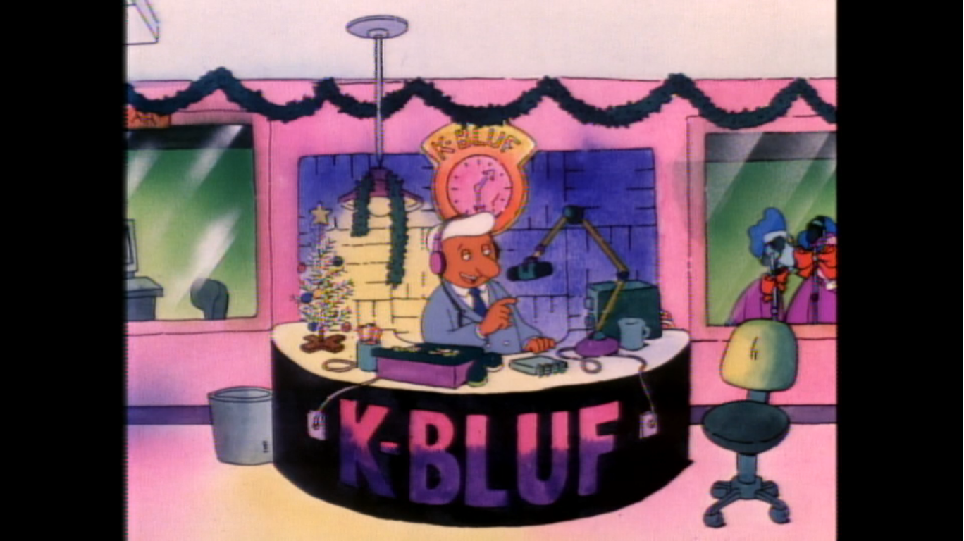
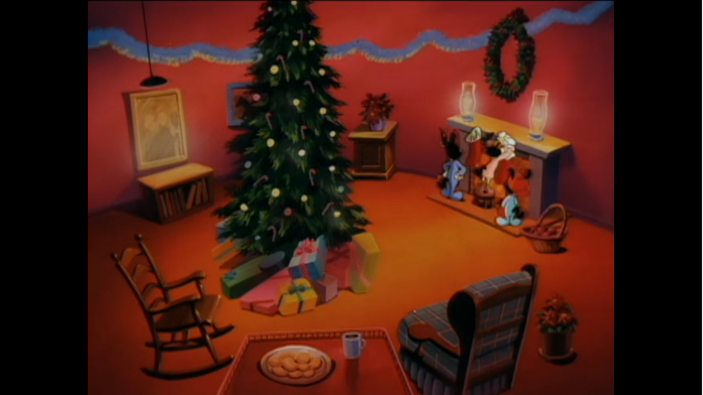
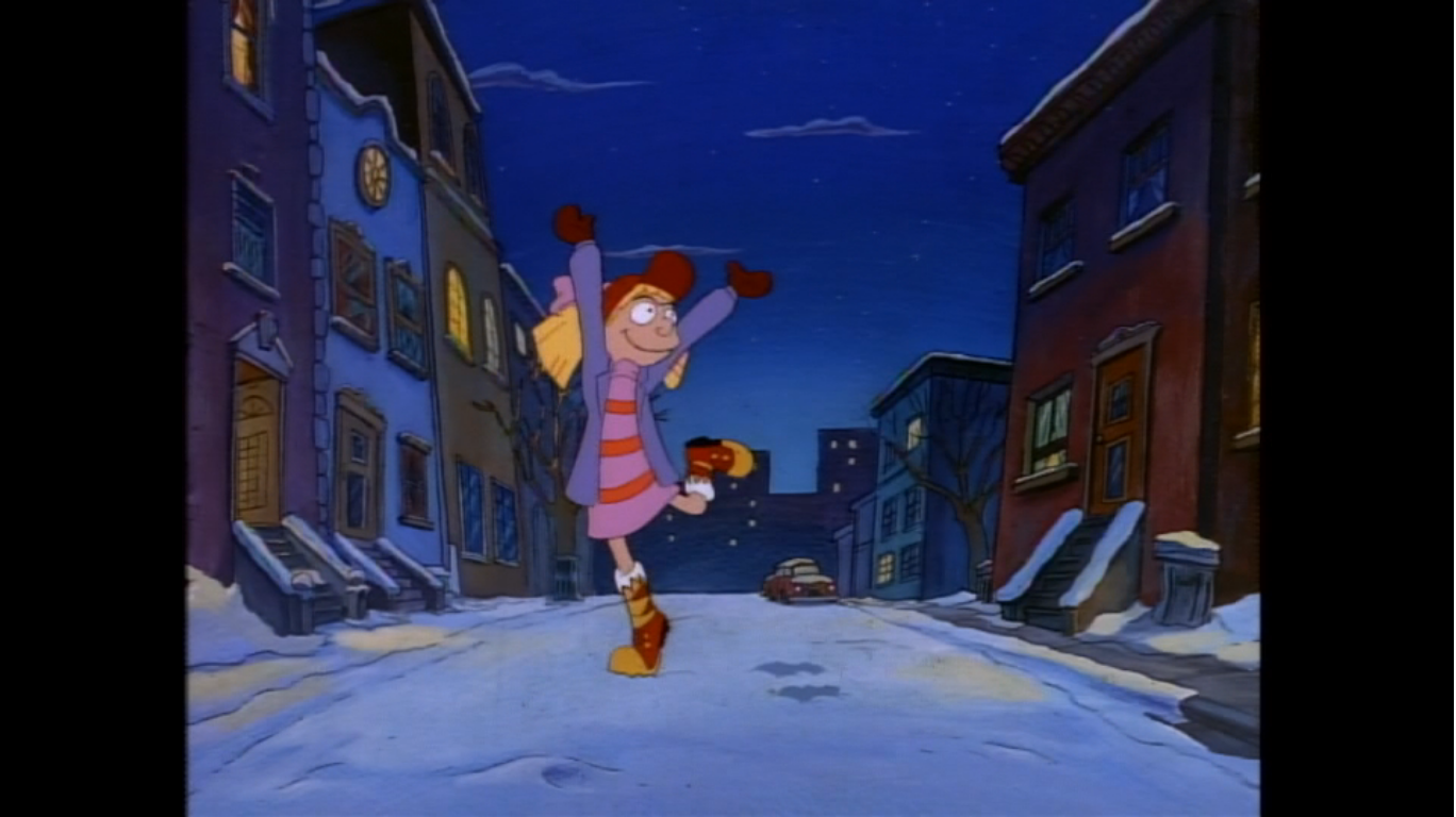
Like many Christmas episodes, this one foregoes the usual opening title for a more festive one. We see many scenes of kids playing in the snow and some of the tenants of the apartment building are skating over frozen streets. There’s an Arnold-shaped snowman and the whole sequence is set to an original instrumental by series composer Jim Lang that sounds vaguely “Christmas” without actually sourcing some public domain music. As the music fades out, we see the kids running in the street and the camera soon finds Helga (Francesca Marie Smith) walking on a sidewalk with her only friend, Phoebe (Anndi McAfee). Phoebe is delighted by the presence of Christmas all around them, but when she asks Helga what she likes best about this time of year she gets the very Helga response of “Presents, dummy!” Well, not exactly, but that’s her tone as she details her feelings on the holiday which can be distilled to getting as much stuff as possible before it’s all over.

Soon, Helga’s gaze finds a store display advertising Nancy Spumoni snow boots.This is apparently her version of the Red Ryder BB gun as she details all of the features of the boots as she circles the display practically drooling over them. Another kid, Rhonda (Olivia Hack), chimes in to remind Helga that this is the hot item basically all of the girls their age wants this year and they’re hard to come by. Helga dismisses her take as she’s feeling confident she’ll get what she wants this year. And if she doesn’t, it sounds like she intends to make sure her parents pay somehow. Possibly physically.
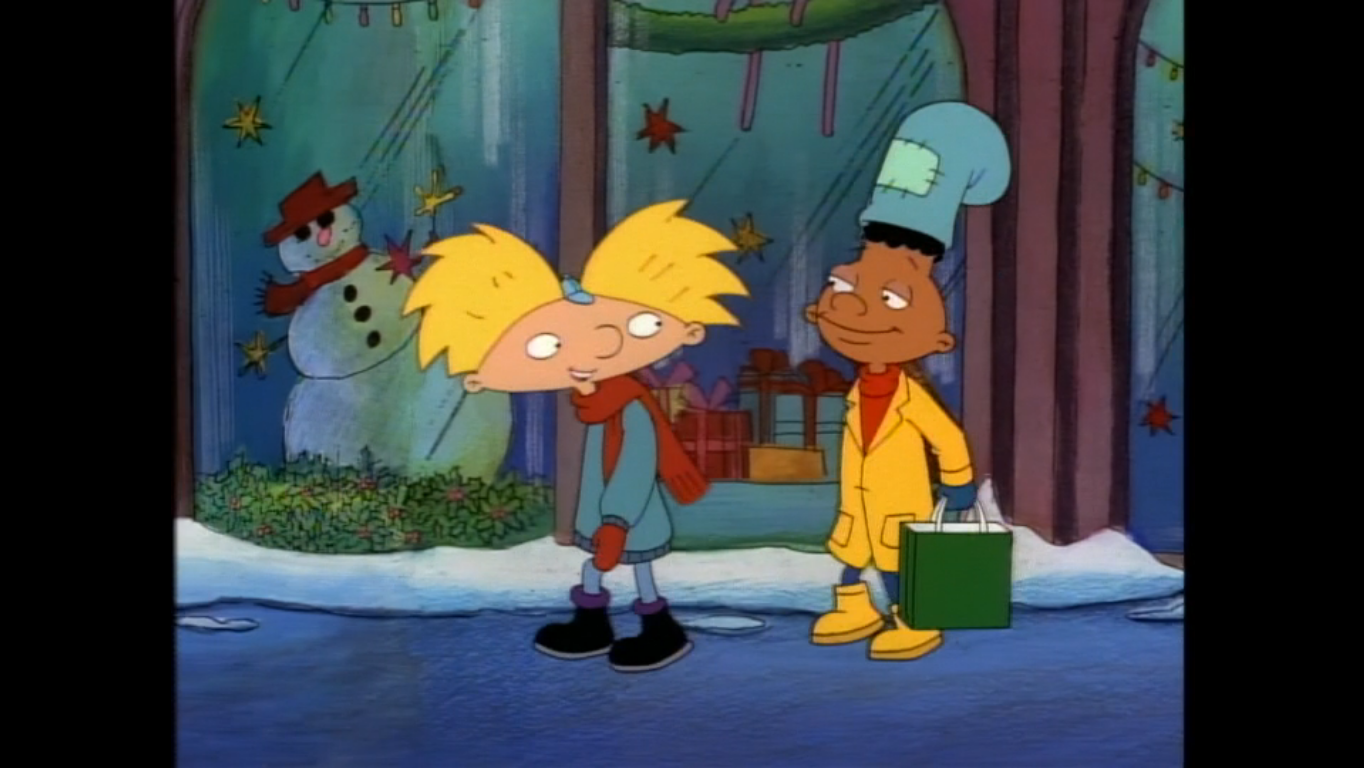
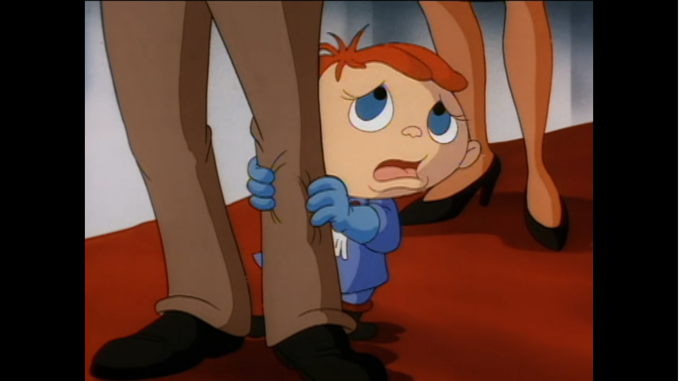
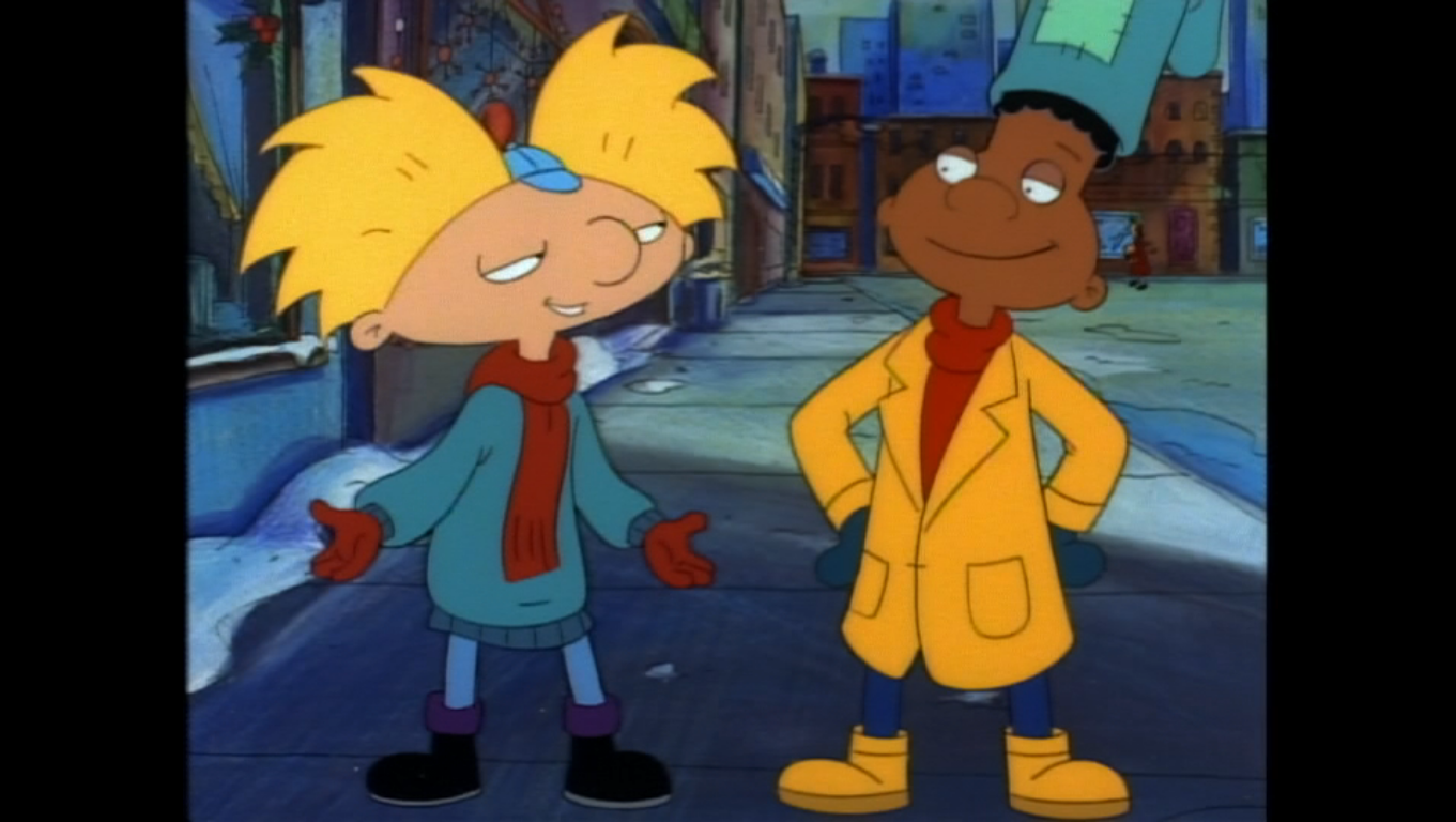
We then cut to Arnold (Toran Caudell) walking with his best friend Gerald (Jamil Walker Smith). Gerald is carrying a shopping bag which makes it look like they just got done with some Christmas shopping. Arnold is asking Gerald what he got each member of his family and Gerald responds that he got a tie for each one, including his four-year-old sister. Arnold tells him he can’t just get ties for everyone on his list and shares his philosophy on gift-giving which is that each gift you give should mean something and come from the heart. Gerald appears to be moved by this and decides he can give the tie he got for his sister to his grandfather and find her a toy or something. He then takes off and when Arnold asks where he’s going he tells him to the store to return the present he got for Arnold. Arnold just smiles, and as he walks off we see Helga had been eavesdropping on the conversation. As Arnold walks off, she goes into her usual routine of listing off the things about Arnold she despises before a switch seems to flip in her head and she does a 180 and lists off all of the things she adores about him. She vows to get him the perfect gift for Christmas, something that will cause him to pine for her the way she does him, and as she wraps an arm around a lamppost a delivery truck passes by splashing mud all over her.

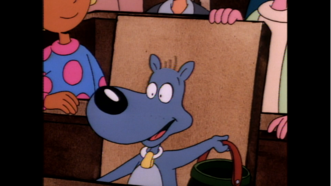
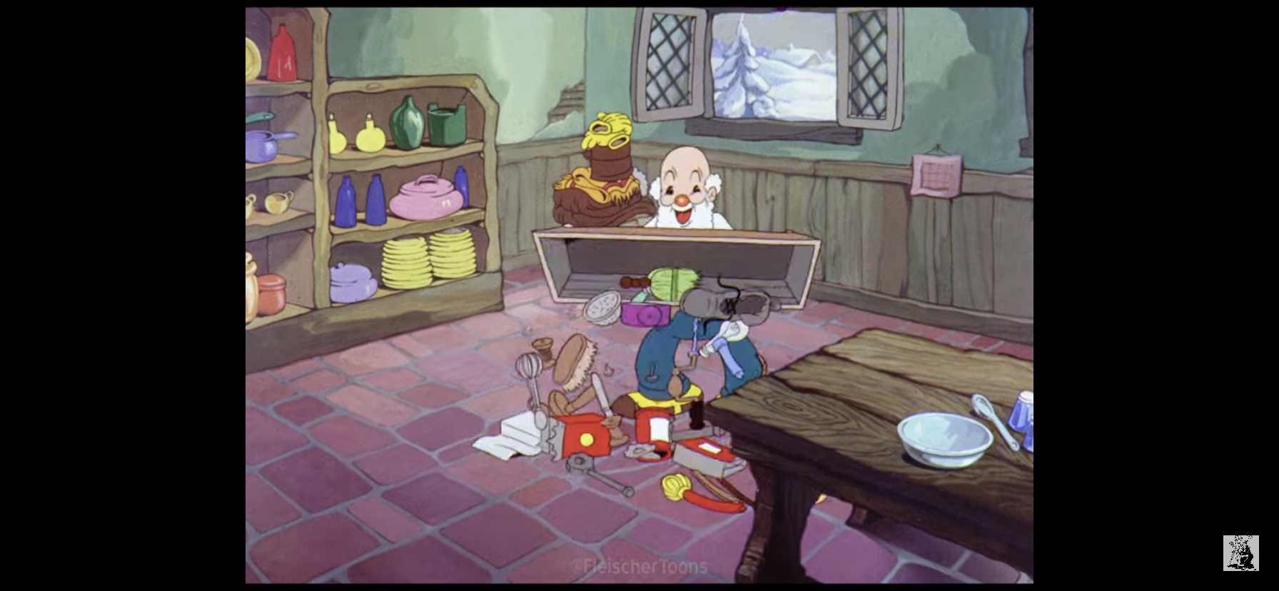
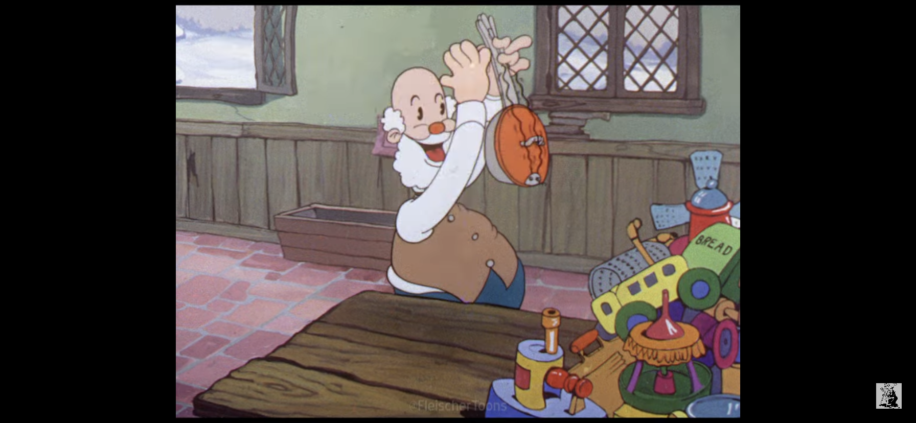
We shift to the apartment building Arnold resides in and get a peek at Mr. Hyunh (Baoan Coleman) ascending the stoop to enter the building. He pauses and looks over his shoulder just before he enters and the wind appears to whisper something. He enters and walks into a festive setting. Arnold’s grandmother, Gertrude (Tress MacNeille), appears to be finishing up decorating the tree and shouts “Happy Thanksgiving!” to all of the tenants present in the common area. I don’t know if it’s a joke that she says Happy Thanksgiving or if it actually is Thanksgiving. The events that follow don’t appear to last a month, but I suppose there could be a big time-jump that’s not explained. Arnold’s grandpa, Phil (Dan Castellaneta), announces they can now draw names for their annual secret Santa. Oskar (Steve Viksten) passes around a bowl and everyone pulls a name, only they’re all Oskar. They call him on his bullshit and he just laughs it off before they pass out the real names. From what little I remember of this show, I do recall Oskar being a selfish d-bag who mostly gets away with it due to his cheerful disposition. Phil requests Gertrude play some Christmas music as they start over and she starts playing “Yankee Doodle” on the piano which is a lowkey funny joke as no one reacts to it. I’m starting to think grandma is just a wee-bit senile. They all take a name, including Arnold, who gets Mr. Hyunh. He looks at the older fellow with a look of disappointment, but one that clearly stems from him being at a loss as to what he could get him for Christmas.

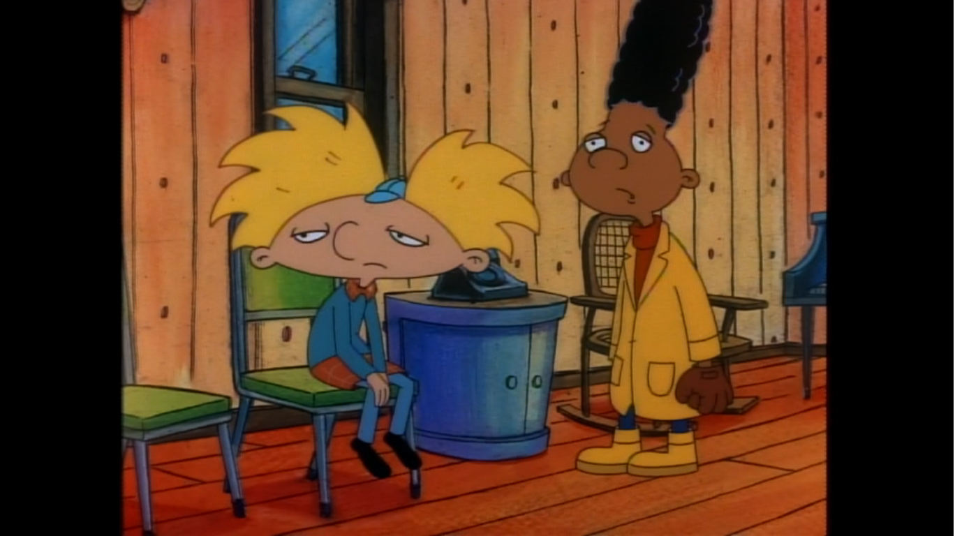
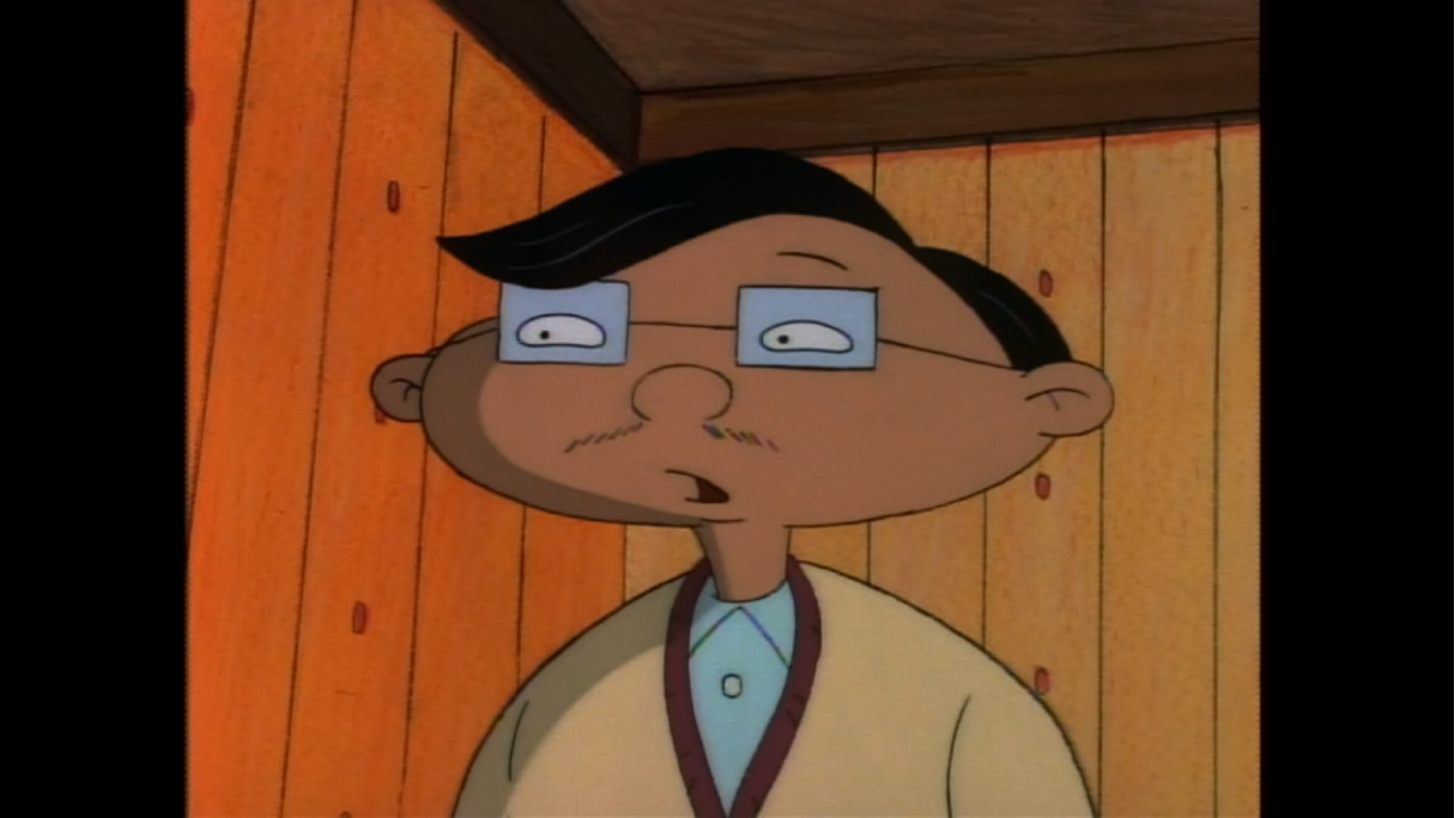
We find Arnold and Gerald in the middle of a snowball fight. Arnold has told Gerald about his problem, but Gerald doesn’t see it as any big deal and tells him to just get Mr. Hyunh a tie. Arnold reminds him how he feels about gift giving, so Gerald makes the logical suggestion: go talk to him. Arnold brightens up immediately at the suggestion and doesn’t even seem to mind the snowball that smashes into his head. We cut to Arnold seated on Mr. Hyunh’s couch as a somewhat uncomfortable Mr. Hyunh sits across from him and asks Arnold what he wanted to ask him. The apartment seems rather sparse and has bananas on the wall paper, which I wonder if that was Mr. Hyunh’s doing or Arnold’s grandparents? Arnold says he just wanted to check-in with him, and at this point it must be obvious to Hyunh that Arnold is his secret Santa for why else would he be so inquisitive all of a sudden? They make some small talk where Arnold learns that Mr. Hyunh dislikes candy and has a whole bunch of sweaters. He has so many that even offers one to Arnold who declines and Mr. Hyunh almost looks hurt by the rejection.

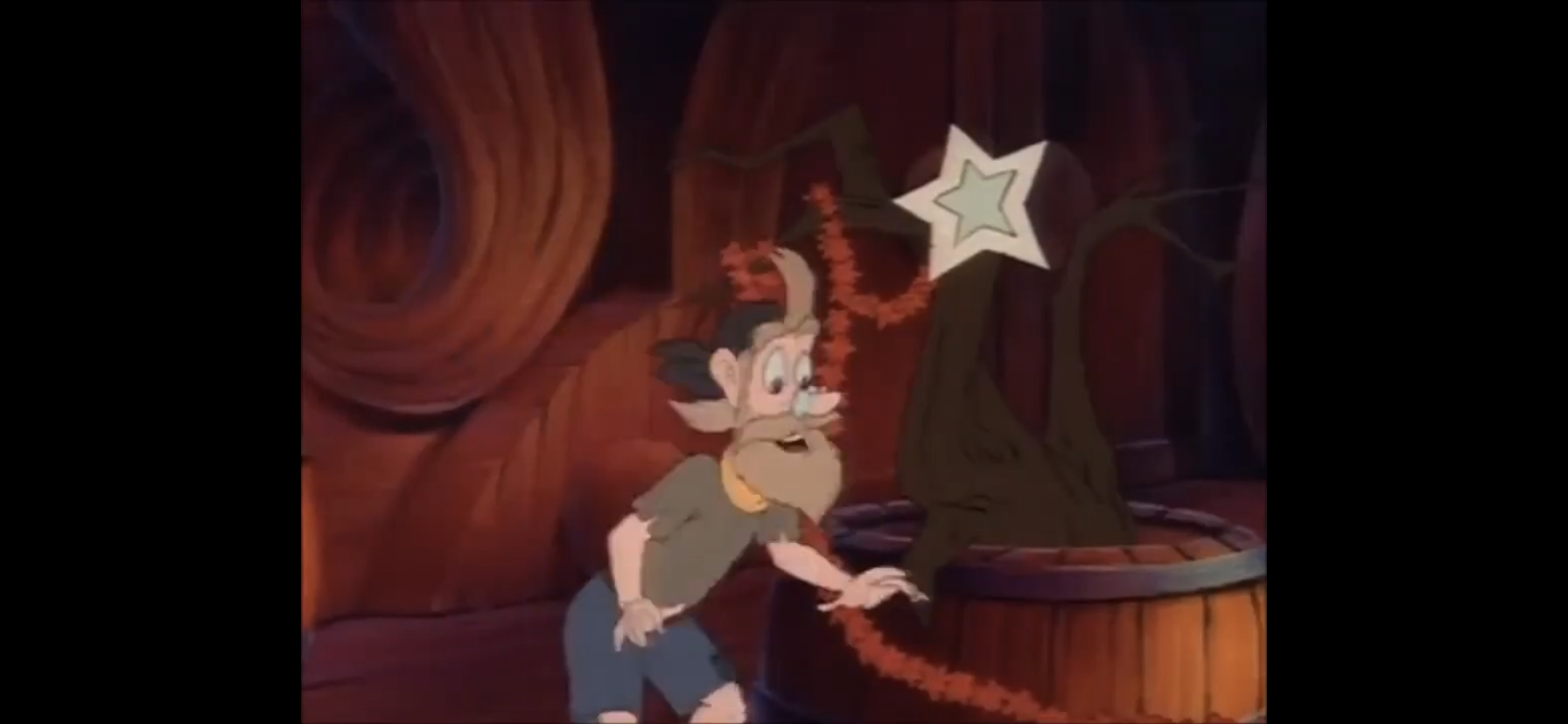
Mr. Hyunh then reveals that this time of year is always hard for him as it causes him to think about his long lost daughter Mai. Arnold asks about her and we’re shown a flashback. Mr. Hyunh apparently hails from Vietnam, though the show never says this. He describes his former home as being a place torn apart by war. He had a baby daughter there, and when things were getting rough he was able to flee his home and is shown amongst a bunch of other citizens at what appears to be the US embassy trying to get to safety. The helicopter though is full, but Hyunh makes the hard decision to hold his small daughter up in the soldier’s face who accepts the child. As the helicopter takes off, he shouts out the name of the city where his daughter will be taken so that Hyunh can hopefully find her. Unfortunately, this all took place 20 years ago. Hyunh only somewhat recently was able to get out of Vietnam and to the US and he’s so far been unable to track down his daughter. It’s a heartbreaking story, and one that certainly has parallels to real world events. Relations between the US and Vietnam were rather frought for understandable reasons and they didn’t normalize until 1995 so it tracks that Mr. Hyunh would not have been able to arrive where he is until relatively recently. For the viewer, that real world connection is mostly irrelevant as the show gives enough information on its own to understand the situation Mr. Hyunh finds himself in and certainly enough to feel empathy for him, but it sure does underscore the pain for those who understand the inspiration here.
Following that tale, Arnold is able to walk away from the encounter knowing what Mr. Hyunh wants for Christmas most. The only problem is, how does one go about finding a proverbial needle in a haystack? He must have shared this desire with Gerald, because we cut to the two of them walking through the streets with Gerald calling Arnold crazy. He even refers to Mr. Hyunh as the “monkey man guy” so apparently his unique wallpaper is well known. Arnold doesn’t think he’s crazy though and knows Mr. Hyunh is just a guy who wants to be reunited with his daughter and if there’s anything Arnold can do to help make that happen he’s going to try. Gerald then reminds him of the impossibility of the situation and we also find out that it’s already Christmas Eve! He tells Arnold that the only way he can hope to find Mai is via a miracle, but this doesn’t get Arnold down as he points out that Christmas is the most likely time of year for a miracle to occur. Touché, Arnold.

We then smash cut to Helga angrily digging through a bunch of toys in a department store. She’s still looking for a gift for Arnold and is frustrated by her lack of ideas. She wants something big and flashy. A train catches her fancy, but she dismisses it as too juvenile. She cries out “What would Arnold want for Christmas?” and we hard cut to Arnold saying “Here it is!” Only he isn’t eyeballing some shiny toy, but standing outside of a government building with Gerald. Arnold tells Gerald he called a bunch of government offices today and they all pointed him here, which is some office of records or something. He’s convinced that the information they need is in this building, they just need to find it.

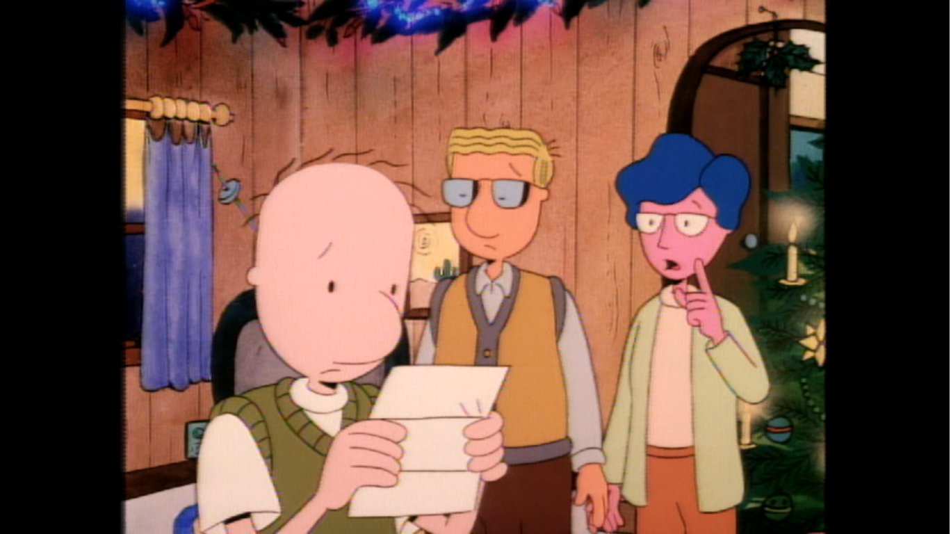
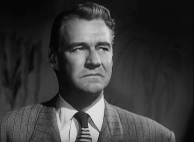
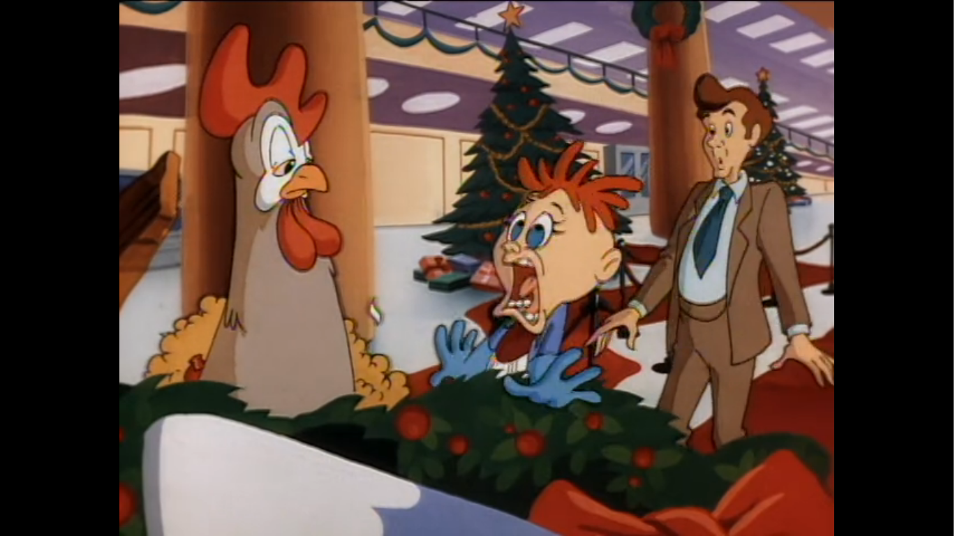
The two enter and find it sparsely populated upfront. That’s because it’s Christmas Eve and there’s an office party taking place. There’s no visible alcohol, but it’s pretty clear that the attendees are enjoying some spirits as one is wearing a trash bucket on his head and laughing. Recognizing this as a lost cause, the two head further into the building and find one, middle-aged, man working on his own in a darkened room. He is Mr Bailey (Vincent Schiavelli), the department supervisor, and he’s a busy man who doesn’t want to be bothered. Arnold explains the situation to him, and Gerald chimes in as well, though the whole time Bailey doesn’t break his concentration and continues typing away. Once they’ve finished their pitch, Mr. Bailey tells them he’s touched by their story (which reads as sarcasm, on his part), but informs them that what they’re asking would take hours and resources he doesn’t have right now. He basically tells them to beat it, and even suggests checking out the party down the hall, and the two boys look defeated as they head for the door.

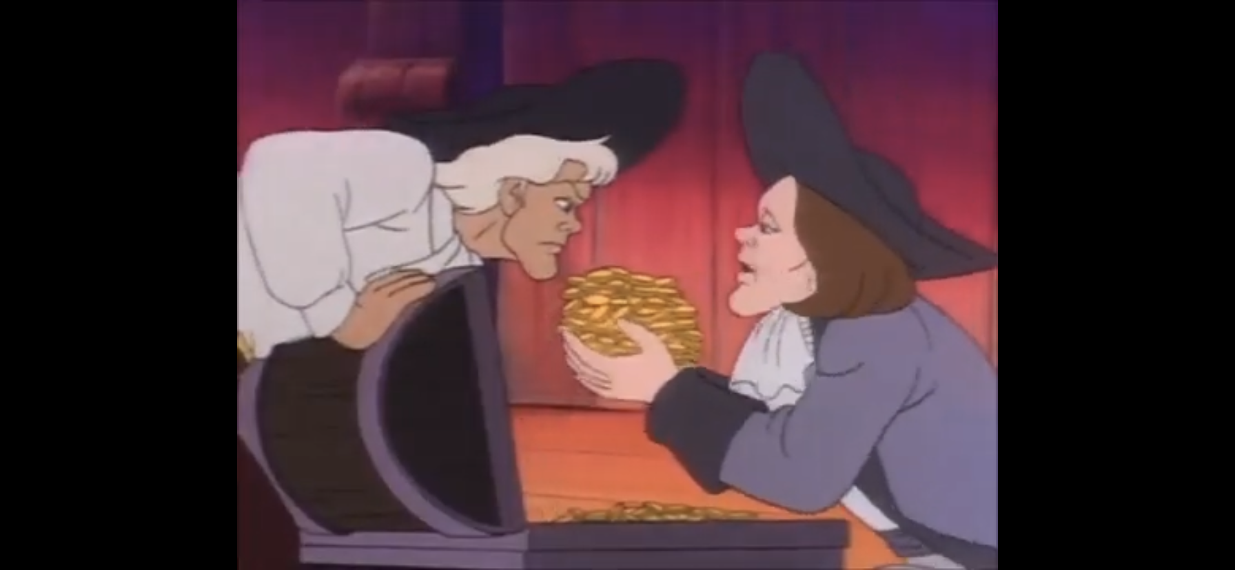
As they walk out, Bailey gets a phone call. It’s his wife, and when he informs her that he hasn’t done the Christmas shopping yet Arnold perks up. They listen in on the phone call, and when he’s through Arnold has a proposition for Mr. Bailey: he’ll do his Christmas shopping for him in exchange for Bailey’s help in tracking down Mai. Bailey seems understandably reluctant to entrust his money (300 bucks) and shopping to two kids he’s never met, but concedes he really doesn’t have time to do the shopping so he agrees to Arnold’s proposal, but on one condition: Arnold has to get everything on the list by closing time, or no deal. Arnold happily agrees and he and Gerald take a wad of money and Bailey’s shopping list and set out to accomplish this fairly tall order. It’s Christmas Eve, and not particularly early in the day, so they have their work cut out for them. Unsurprisingly, Arnold is not dismayed at all, but quite the opposite. He’s certain they’ll fill the list and Mr. Bailey will find Mai and Mr. Hyunh will have a merry Christmas!

The first stop on the shopping spree is a store called Budnick’s. Is this a reference to another Nickelodeon show? Maybe, or maybe it’s a coincidence, but I’m going to go with “yes” because it makes me happy. Before we can get a glimpse at this list though, we first need to check-in with Helga. She’s contemplating a skateboard for Arnold and talking up the gift to herself to the point where it seems like she’s found the perfect gift. Then another kid pops up, Stinky (Christopher Walberg), to tell Helga that it is a great gift. How does he know? Because Arnold has one just like it! The kid’s a bit odd as he’s tall and gangly and actually steps over the display of skateboards to enthusiastically tell Helga all about it. A dismayed Helga returns the skateboard to the rack and slinks off, but hey, at least she didn’t get Arnold something he already had!
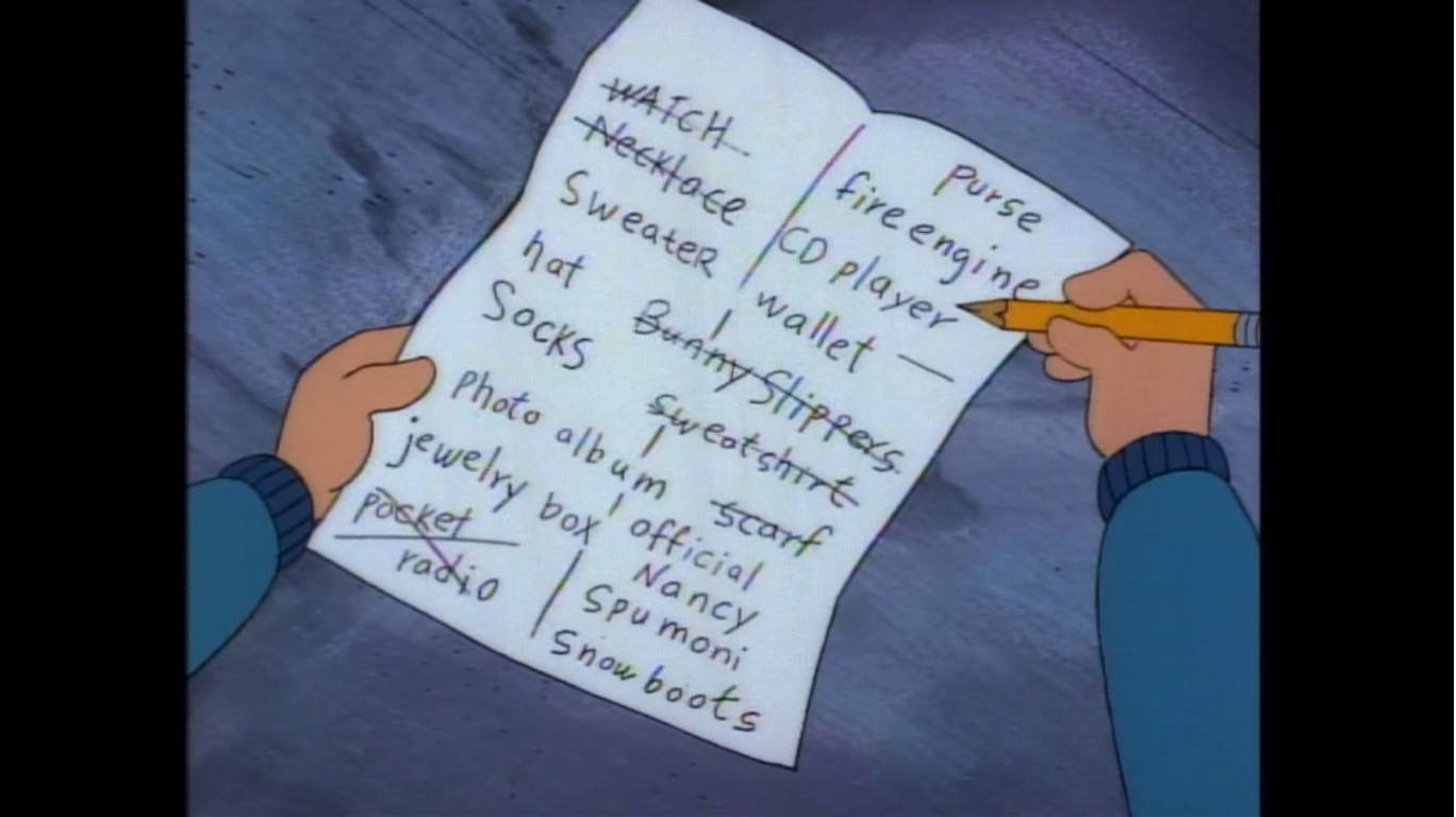
We then get a glimpse of Arnold and Gerald shopping nearby. They’re grabbing some clothes off the rack, Arnold selects a watch, and they take all of their stuff to gift wrapping. Once done, we see them running back out onto the city streets where they head for another store: Tildales. Inside, they purchase what looks like a Walkman before running off to another store to get a typewriter (these bags they’re carrying just got a whole lot heavier). They race out of there and actually take a breather by sitting on a bench. There they can take stock of what they have left to buy and it turns out they’re down to one last item: Official Nancy Spumoni Snow boots. It’s clear judging by Arnold’s optimism that he has no idea how sought after these silly boots are, and if Gerald is aware, he has no immediate reaction.

We cut back to Helga who has, once again, found the perfect gift for her beloved Arnold. It’s some video game called The Frozen Tundra Death Warrior 7000! It doesn’t sound like the sort of thing Arnold would like, but what do I know? Helga disagrees as she thinks it’s flashy and something Arnold will be delighted to find underneath his Christmas tree. As she convinces herself of the gift’s majesty, she vocalizes her desires and wishes which include an admission of love for Arnold and the hope that this gift will inspire him to feel the same way about her as she does him. She even declares that this must be the truest meaning of Christmas. Worth noting, the price tag on this game is 100 bucks so Helga is really throwing some coin around to impress Arnold. As she clutches the game to her chest, she’s startled when she turns around to spy Arnold and Gerald on their mission for those fancy snow boots. She quickly hides the game behind her back. She addresses the pair in her usual bully fashion, referring to Arnold as football head and Gerald as tall hair boy (she’s very creative). She pokes fun at them for their last minute shopping, but when Arnold asks what she’s shopping for she’s happy to whip out the video game. She boasts how anyone receiving that for a gift would be really impressed, but Gerald takes a look at it and corrects her by noting it’s expensive and flashy, but not exactly personal. Apparently he really did take Arnold’s message to heart when it came to gift giving. Helga basically has a defeated look on her face as Gerald hands the game back with a “No offense,” that likely doesn’t help salve her wounds.

Arnold reminds Gerald that they have to get going, but takes the time to wish Helga a, “Merry Christmas,” before departing. After he leaves, Helga fumes and slams the game into a shopping cart that just rolled up out of no where behind her. She then notices that Arnold dropped something. It’s the list that Mr. Bailey gave him and Helga picks it up and sees the Nancy Spumoni snow boots written on it and her face begins to glow. She then follows the pair as Arnold asks a clerk (Maurice LaMarche) if they have any of the boots in stock and the guy calls over his co-workers and makes Arnold ask again so they can all laugh at his expense. He tells Arnold how sought after they are and offers a waiting list that may pay dividends by the fourth of July, but that won’t work for Arnold. As Arnold leaves the store, Helga looks on with curiosity.

A montage follows that shows Arnold and Gerald dashing to the subway and to various stores around the city. Each one just contains more clerks and more laughter from them when Arnold asks if they have any snow boots in stock. When the montage is over it’s nearly 6 o’clock and Gerald reminds him they need to get back for closing time. They’re just going to have to tell Mr. Bailey that there just aren’t any boots out there. Arnold, in a defeated voice, just voices disbelief that there isn’t one pair of the boots out there in the city. They return to Mr. Bailey lacking the snow boots, but not exactly empty-handed since they did get everything else on his exhaustive list. If you thought Mr. Bailey would be an understanding guy well then you’re as naive as Arnold. No snow boots, no deal, is what they get from Bailey who seems more angry than appreciative of what the boys did for him. Arnold and Gerald are forced to leave and they sulk on a bench outside. Helga is lurking behind a tree as she has apparently been following them this whole time. Arnold conveniently summarizes the plot of this episode for Helga to hear as she now knows that Arnold is after those boots just so some guy will help him locate a missing person. Arnold thanks Gerald for sticking with him through all of this and notes that he needed a miracle to pull this off, but just came up short. Gerald tries to cheer him up by letting him know that what he did is more than anyone would do to help someone and even tosses in a “That’s what Christmas is all about, Arnold.” Arnold is still pretty downtrodden by the whole thing, though he seems almost too tired to be truly sad or angry. As the two walk off, the camera lingers on Helga as she now knows the whole story.
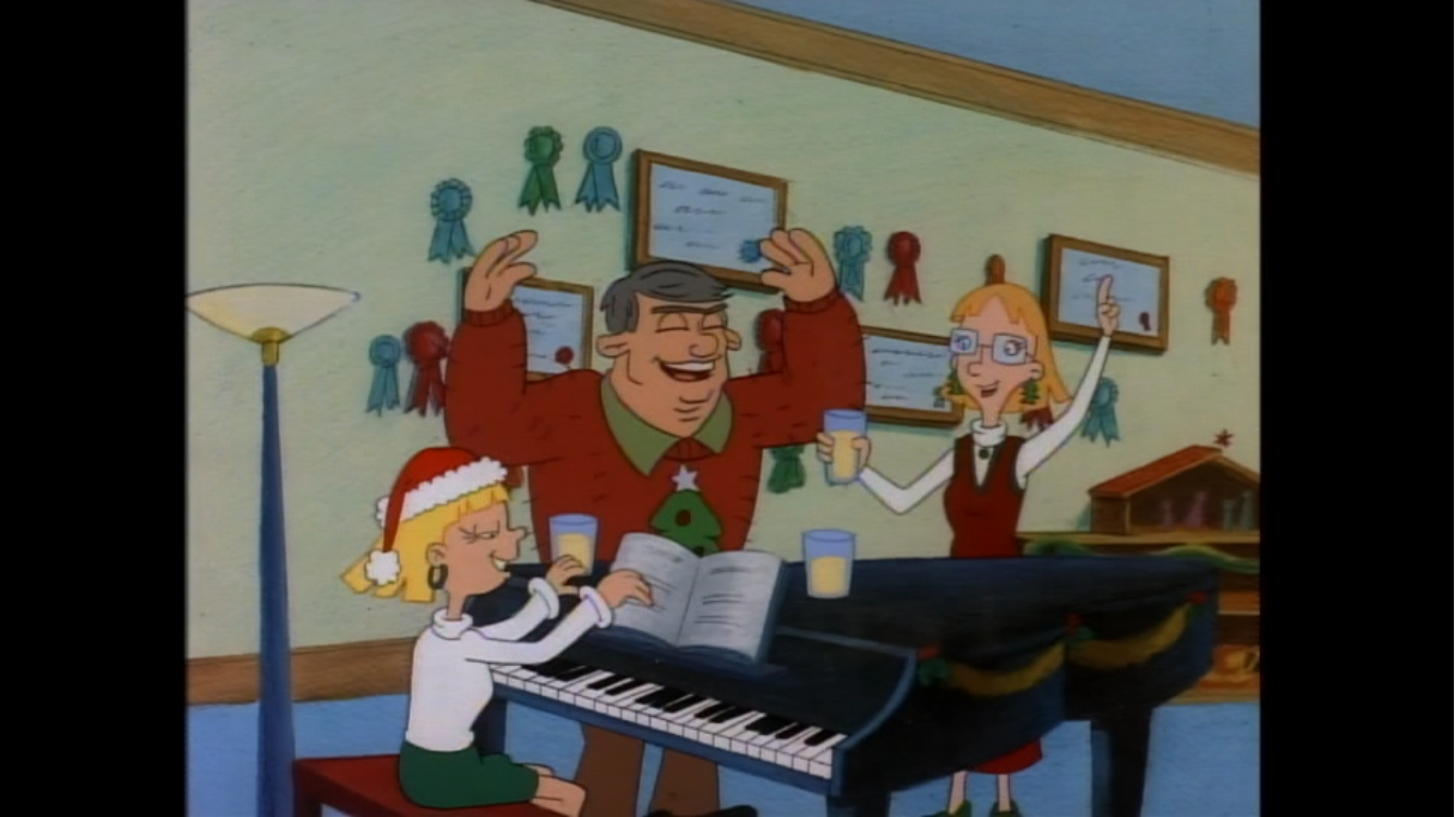
At the Pataki house, Helga’s family is belting out their own drunken rendition of “Jingle Bells.” The thing with Helga’s mom (Kath Soucie) is she’s always shown drinking something in the show, usually coffee, but her mannerisms imply she’s basically drunk. And here, she seems to be drinking eggnog. Actually, it’s quickly confirmed to be eggnog. Basically, she’s an alcoholic, but the show must not have been allowed to spell it out so plainly so they have to tiptoe around it. Her father, Bob (LaMarche), is just a boisterous asshole who pays no attention to Helga and both parents are far more invested in Helga’s older sister, Olga, who they view as the golden child. Helga comes into the house with her shoulders slumped as she heads into the living room and collapses on the couch. Her mom comes over and asks where she’s been all day and Helga replies curtly, “Out, Miriam.” She always addresses her parents by name as she seems to think they aren’t worthy of being called mom and dad. Miriam does note that her daughter looks depressed, but doesn’t actually ask her anything or attempt to investigate why. Instead, she just hands over a Christmas present. Helga opens the box and finds one of the things she had been longing for: Official Nancy Spumoni Signature Snow Boots! She immediately brightens up while her mom tries to tell her how long she had to wait in line just to get them.
After giving her mom a quick hug, Helga throws them on and races outside to bask in the afterglow of the perfect Christmas present. As she spins her way through the snowy streets, a realization hits her. Arnold’s list has fallen out of her pocket and is staring up at her. Her shoulders immediately slump once more as she regards it as she whines out loud, “Not another moral dilemma!” She then goes over her emotions, how she’s happy because she got what she wanted which typically would be enough for her; more than enough, really! Then she notes how Arnold is not happy because he won’t be getting what he wanted this Christmas, which involves these silly snow boots. She finally knows what it will take to get Arnold the perfect Christmas present, the other thing she’s been longing for. It also means giving up what she refers to as really boss snow boots, which will end up with her getting nothing. One could interpret this scene as the show talking down to its audience by so explicitly laying out the stakes for Helga and Arnold, but I think it’s a worthwhile exercise so we stop and think about how this is all going through Helga’s head in the moment. She was on the wrong end of Christmas at the episode’s start, so in order for her to undertake the selfless act we all know is coming, we really need to see her internal dilemma before us so that it’s believable. And the fact that the scene ends with Helga once more slumping her shoulders and then dropping to her knees really helps to sell it. She’s arriving at the right conclusion, but she’s not happy about it, and she even admits out loud that she’s going to end up with nothing. No boss snow boots. No affection from Arnold. Nothing.
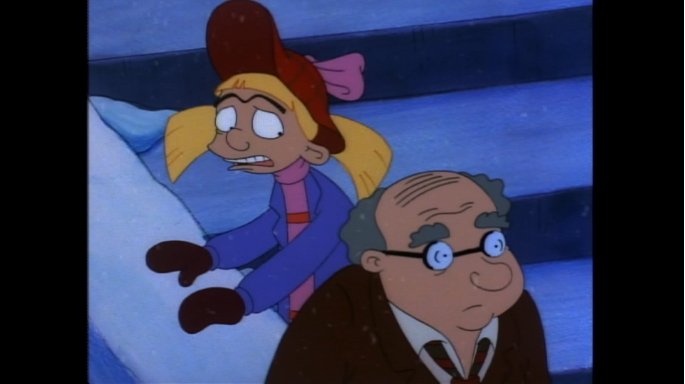
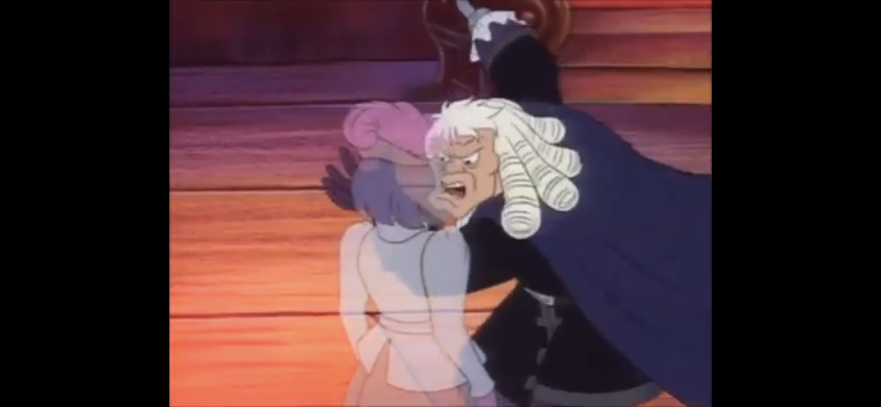
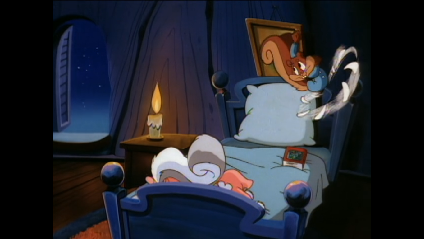
In Arnold’s room, we find the little guy laying in bed just staring at the ceiling. He imagines what it must have been like for Mr. Hyunh to watch his daughter fly out of his life as he just lays there. We then cut to the government building and Mr. Bailey is shown locking up. Helga comes running up and tosses the wrapped snow boots into his arms and orders him to get back in there because they have a missing person to find! If you thought Bailey would be delighted to get the sought after boots he needed, well you were once again mistaken. He tells Helga to go home and hands her back the box. It’s Christmas Eve and he wants to get out of there. Helga tries pleading with him, but he just keeps heading for his cab and reiterates to her that he just wants to go home. Helga then makes one final plea, “For pity’s sake, are you really that cold? Look in your heart. We’ve got a choice here, either you and I work all night to find a certain lost daughter, or you can leave now. But if you leave now, that little football-headed kid will never believe in miracles again.” Mr. Bailey says nothing, but he turns away from his cab and he has a frozen, almost emotionless, look on his face as the scene fades to black.
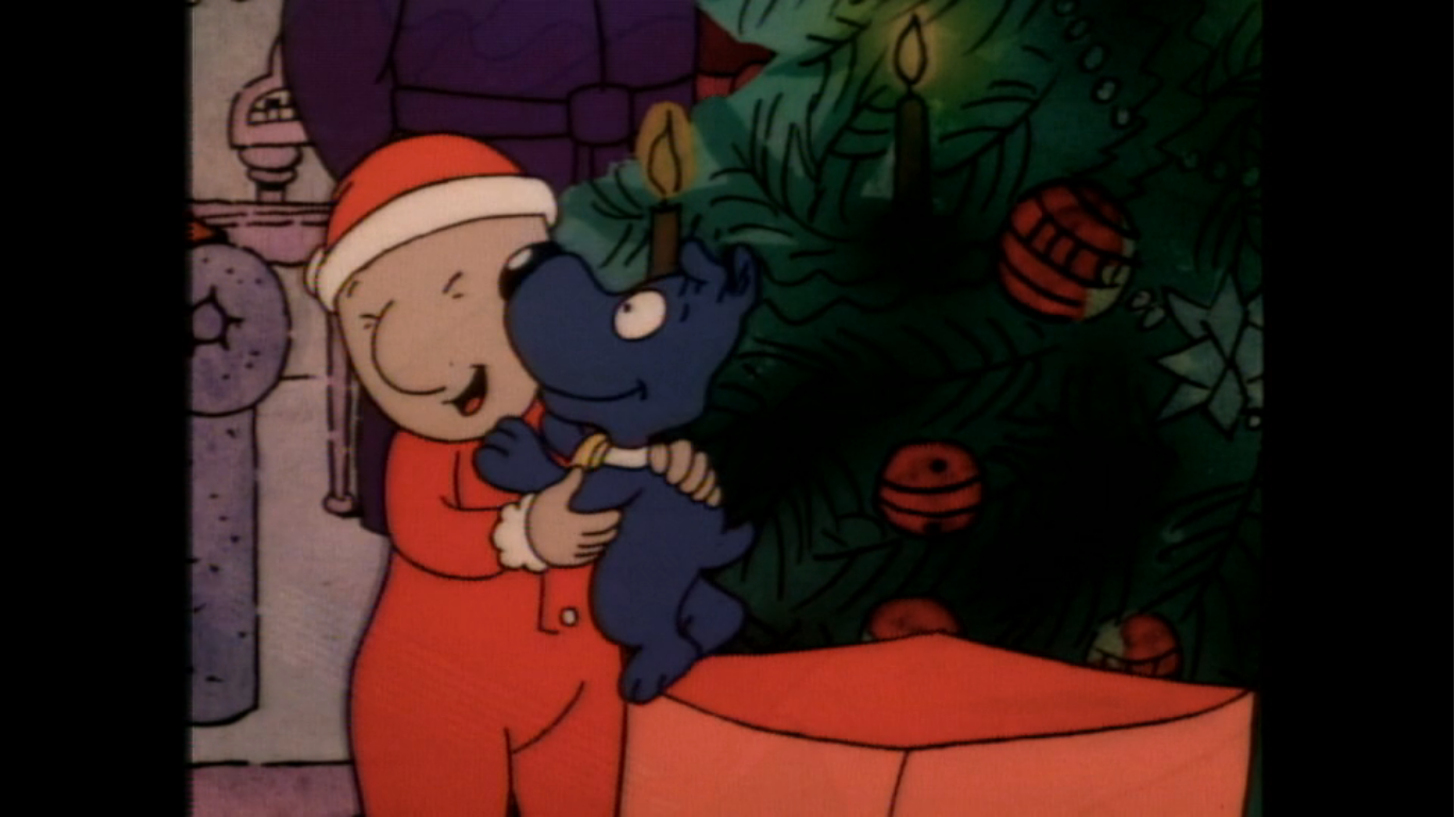
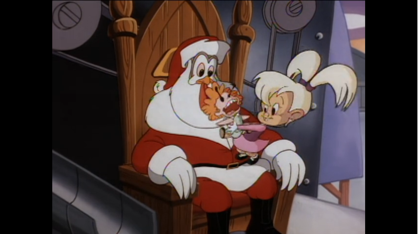
The next morning, Gerald shows up at the apartment house to wish Arnold a merry Christmas. Arnold still looks defeated as he’s seated in a chair while others seem to be basking in the merriment of the holiday. He returns Gerald’s gesture, but has the look of someone who didn’t sleep a wink last night. Across the room, the gift exchange is underway and Oskar opens his gift to find a bag of coal. He asks who could do such a thing, and Ernie (Dom Irrera) smiles and in an unconvincing manner states “Wasn’t me!” Grandpa Phil then announces that’s the last of the presents, but Ernie points out that Mr. Hyunh didn’t get one. Arnold’s shoulders slump further as his grandfather looks under the tree to make sure he didn’t miss any. Mr. Hyunh states it’s okay and he doesn’t need a present and would seem to prefer just staring into the fireplace. Arnold then drags himself off of his chair to go talk to him, but is interrupted by the doorbell. As Grandpa Phil angrily goes to see who would bother them on Christmas, Arnold seems to just stare at Mr. Hyunh who isn’t looking in his direction. Gerald comes to stand beside his friend as I’m assuming he expects Arnold to tell Mr. Hyunh what they attempted to do the prior day, but Arnold just can’t seem to bring himself to do so.

Without saying anything, Grandpa Phil comes back into the room with a big grin on his face and brings a young woman into the room with him. She’s smiling and is clearly of asian descent, but she just continues to smile in the direction of Mr. Hyunh and waits for him him to turn around. A whisper of “Mai” can be heard and I think the implication is that it’s Mr. Hyunh’s daughter’s name echoing in his head, as it did early in the episode when was climbing the stoop, but it also seems to get him to turn around. She continues to smile at him while Mr. Hyunh just looks on with a stunned expression on his face. The moment is allowed to linger for a beat, before Mai finally breaks the silence by asking “Father?” He returns her question with “Mai?” and the two quickly embrace as Mr. Hyunh declares “I can’t believe it!” Arnold looks on with shock while the others mostly smile. Ernie can be seen quietly crying in the background. Mr. Hyunh then introduces Mai as his daughter to everyone. Arnold offers up a “Merry Christmas, Mr. Hyunh,” while Phil attempts to put a bow on the whole thing by declaring that Mr. Hyunh got his present after all.
Arnold then confesses to Gerald that he basically can’t believe this happened and questions how it could have? Gerald just matter-of-factly declares it a miracle, the one Arnold had been counting on, and there’s really no explaining a miracle. He then suggests that maybe Arnold has a Christmas angel looking out for him, and Arnold almost seems receptive to the idea. We’re then shown through the window that Helga is standing in the street looking on. She’s in her socks too, so she apparently did end up surrendering those boots to Mr. Bailey, as expected. She looks happy though and nearly overcome with emotion as she whispers softly to herself, “Merry Christmas, Arnold.”

A sweet ending for a sweet story. It’s obvious that Mr. Bailey and Helga returned to his office after their encounter outside and were able to find Mai and somehow connect with her to orchestrate this meet-up. If she was escorted to Arnold’s house by Helga or not is unclear. What is a touch confusing about the final scene is we see Gerald arrives and it’s clearly daylight, probably late Christmas morning. When we cut to Helga the sun is much lower and it’s approaching dusk. I’m going to chalk it up to an artistic choice that the director just felt it would look better for Helga to be standing outside on a darkened street than a busy one in broad daylight, because hours definitely did not pass between when Gerald arrived and when we pan to Helga. No matter, as the impact of the moment is still felt. Mr. Hyunh’s reunion with his daughter is sweet and tear-jerking, and Helga’s almost silent offering to Arnold is just as tender. There’s a touch of sadness as well since Helga gave up a lot to orchestrate this, and not just snow boots, but her own Christmas with her family even if her home life isn’t ideal. She also likely will get in a lot of trouble for giving those boots away, but we also know she won’t tell anyone what happened to them. She’ll probably tell her mom they were stupid and she sold them. Or her mom won’t even notice, because they usually don’t pay much attention to her. And Arnold is likely never to know what Helga did for him this Christmas which adds a touch of tragedy to the scene, but in looking at Helga’s expression, it would appear she did not end up with nothing after all.

The story told through Mr. Hyunh is probably still the main takeaway. Even if Arnold and Helga are at the center of the show, it’s hard to argue that Hyunh’s story didn’t steal the episode. It’s pretty crushing, and frankly impossible, for me as a father to put myself in his shoes and the shoes of many real life people who had to make that terrible choice to give up their child in the hope that it would provide them a better life. Knowing there are many real life Mr. Hyunh’s out there who probably never found their child in the end is equally heartbreaking and for a show like Hey Arnold! to shine a light on the refugees of Vietnam is a noble cause. This isn’t something I ever saw touched upon by another show in this demographic and it’s that aspect of it that has really helped it to endure over the years since its premiere.

One watch of this episode and it’s easy to see why so many people adore it and why it is worthy of being considered among the best. Am I ready to reorder my list from a few years back to include it? No, but if I should return to that list I’ll certainly consider it. As a Christmas special, it is a bit formulaic and predictable. On the surface, a bratty kid learning the true of meaning of Christmas via a selfless act is pretty by the numbers, but the show found a new and captivating way to approach it. It’s also handled expertly and I love how several scenes are allowed to just linger and breath for maximum effect. The reunion of father and daughter is a clear example of that, as is all of the monologuing conducted by Helga throughout to really illustrate what she’s thinking as her emotions are a bit more complex than they appear to be on the surface. I also really liked the score utilized throughout and felt the show did a great job of not spreading itself too thin. Hey Arnold! is a show with a vast assortment of supporting characters that the episode really could have been bogged down by, but the writers involved knew we didn’t need to see how every kid in Arnold’s class is spending Christmas this year and the episode benefits from that.

If you would like to catch this episode of Hey Arnold! this holiday season then I would say you’re in luck as it’s a pretty available show. It’s presently streaming on both Paramount+ and Hulu and there’s always the possibility one of the Nickelodeon channels airs it this month. It’s also available to rent digitally if you don’t have a subscription to either service or cable and it’s been made available on DVD. If you’re like me and have a pretty substantial collection of physical media due to a love of Christmas specials, then this one is definitely worth owning.
Can’t wait until tomorrow for more Christmas? Check out what we had to say on this day last year and beyond:

Dec. 9 – The Smurfs Christmas Special
If the 70s were defined by Scooby Doo when it came to Hanna-Barbera, then the 80s belonged to The Smurfs. The little blue creations of Pierre Culliford, better known by his pen name Peyo, had an animated series that basically spanned the entirety of the 80s totaling an insane 258 episodes. And once the 80s…
Keep reading
Dec. 9 – “Robot Chicken’s Santa’s Dead (Spoiler Alert) Holiday Murder Thing Special”
Yesterday, I sung the praises of American Dad! for its ability to give me fresh, Christmas, content seemingly on an annual basis. I should also apply the same to Robot Chicken, for even though it goes about making people laugh in a completely different manner from a more traditional animated show, it does have a…
Keep reading
Dec. 9 – Space Goofs – “Holiday Heave Ho”
Come the late 90s I was definitely losing track of what was airing on Fox Kids. X-Men came to an end, as did Spider-Man and The Tick. They were replaced with Silver Surfer and a new Spider-Man cartoon that was pretty awful. There was also that live-action Teenage Mutant Ninja Turtles show called The Next…
Keep reading