In some ways, Secret Wars was bad for comics. Commercially, the 80’s event was hugely successful for Marvel even though it seems to have just a lukewarm reception by fans in some circles. It helped to establish the belief that events sell and Marvel seemed hellbent on taking that approach in 90s. One of Spider-Man’s big plotlines was Maximum Carnage. It was a multi-issue arc with a bunch of heroes and villains teaming up to form super teams, and like Secret Wars, it didn’t seem like fans thought much of the finished product, but it sure seemed to sell well. And if it had not we wouldn’t have the extremely derivative Maximum Clonage (sic) to follow. Also referred to as The Clone Saga, Peter Parker was suddenly confronted with multiple versions of himself thanks to The Jackal and no one knew who the real Peter was. It’s the storyline that brought us the Scarlet Spider and it’s also the storyline that gave us Kaine.
“Don’t look at me!”
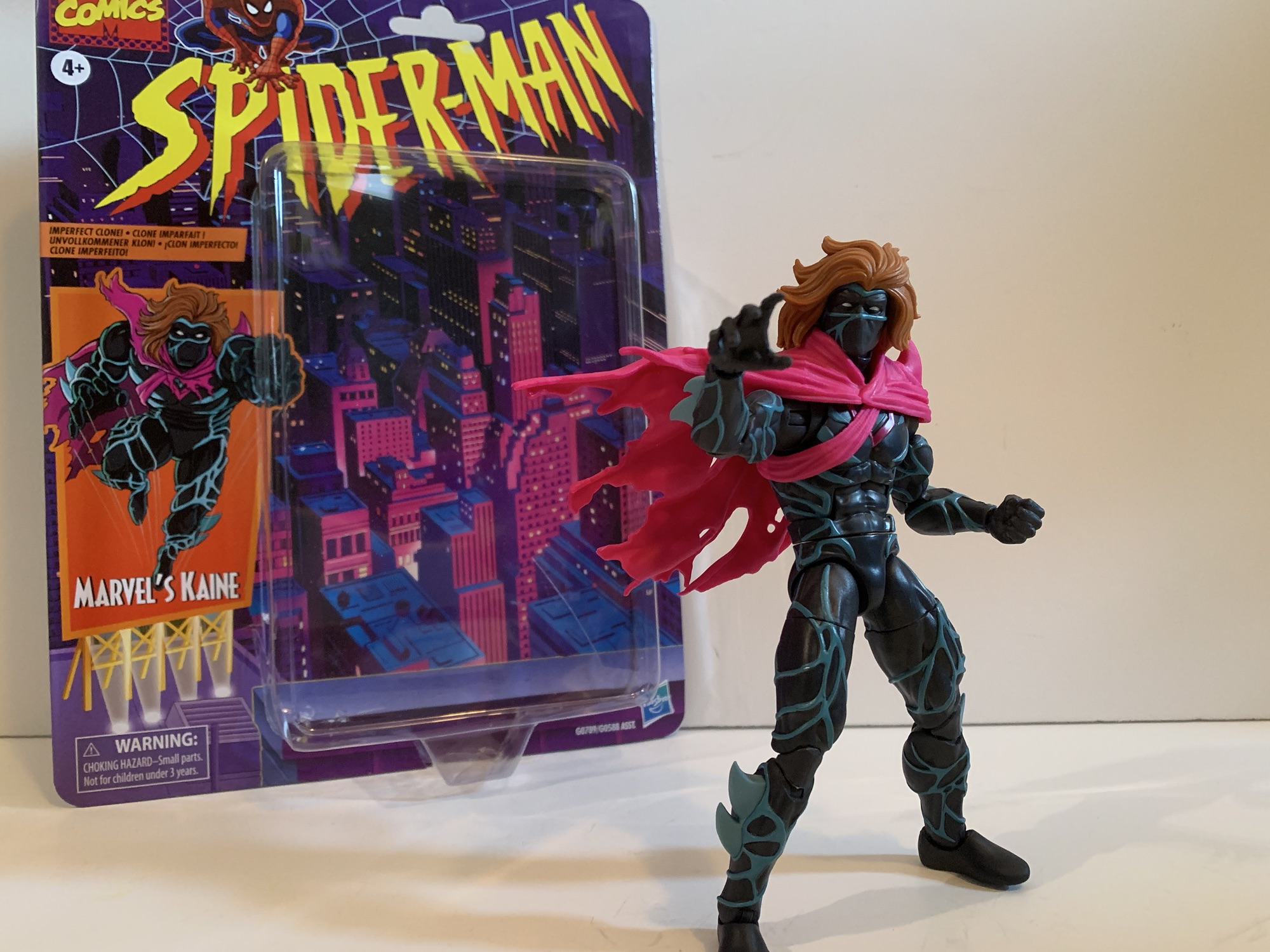
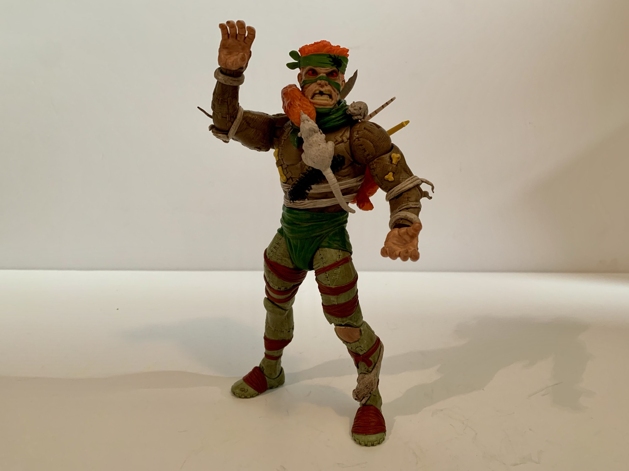
Kaine was yet another clone of Peter. He was the like the goth Peter before Sam Raimi came up with the idea for Spider-Man 3. Clad all in black with this weird, blue, membrane running throughout and a tattered cape, he caused some trouble for both Spider-Man and Scarlet Spider before eventually being outed as yet another clone. Kaine was actually the point where I fell off the story as a kid. It just got way too soap opera-like for my taste and I got enough of that at home from a mother who would monopolize the television on Saturday to watch all of the episodes of All My Children she had recorded during the week.
That’s more sculpt and paint than we’re used to with Hasbro.
Kaine may have been a lame addition to the story, but if I’m being honest, he did look kind of cool. When Hasbro unveiled a Kaine figure last year, I took one look at it and said to myself, “Why not?” As a Marvel Legends figure, it looked interesting and the crazy pricing we’re seeing from the world of action figures makes these $25 ones feel more susceptible to impulse buying now. Kaine comes in the retro Spider-Man packaging which makes sense given his era. He never did get a single card release in that line, so I guess this is like making up for lost time. There was a Maximum Clonage box set that contained a Kaine figure that was probably exclusive to some store. It was a classic Toy Biz repaint and I think they used an Archangel body for the base and just slapped a cape on it. Maybe if he had made the jump to the actual show he would have been given a more prominent release, but honestly it’s all Kaine really deserved.
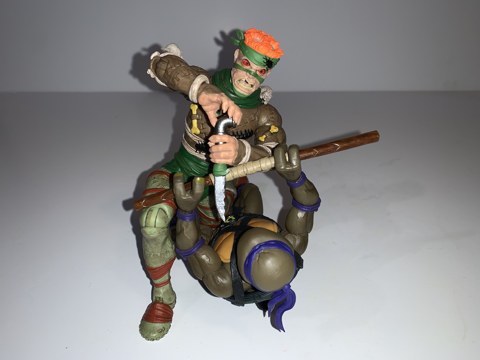
The cape looks nice and dramatic, but it will get in the way.
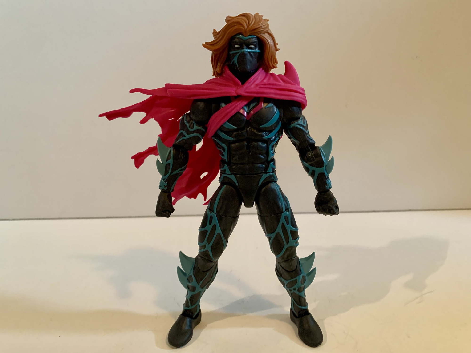
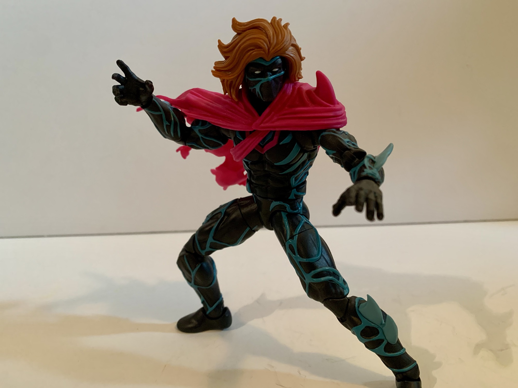
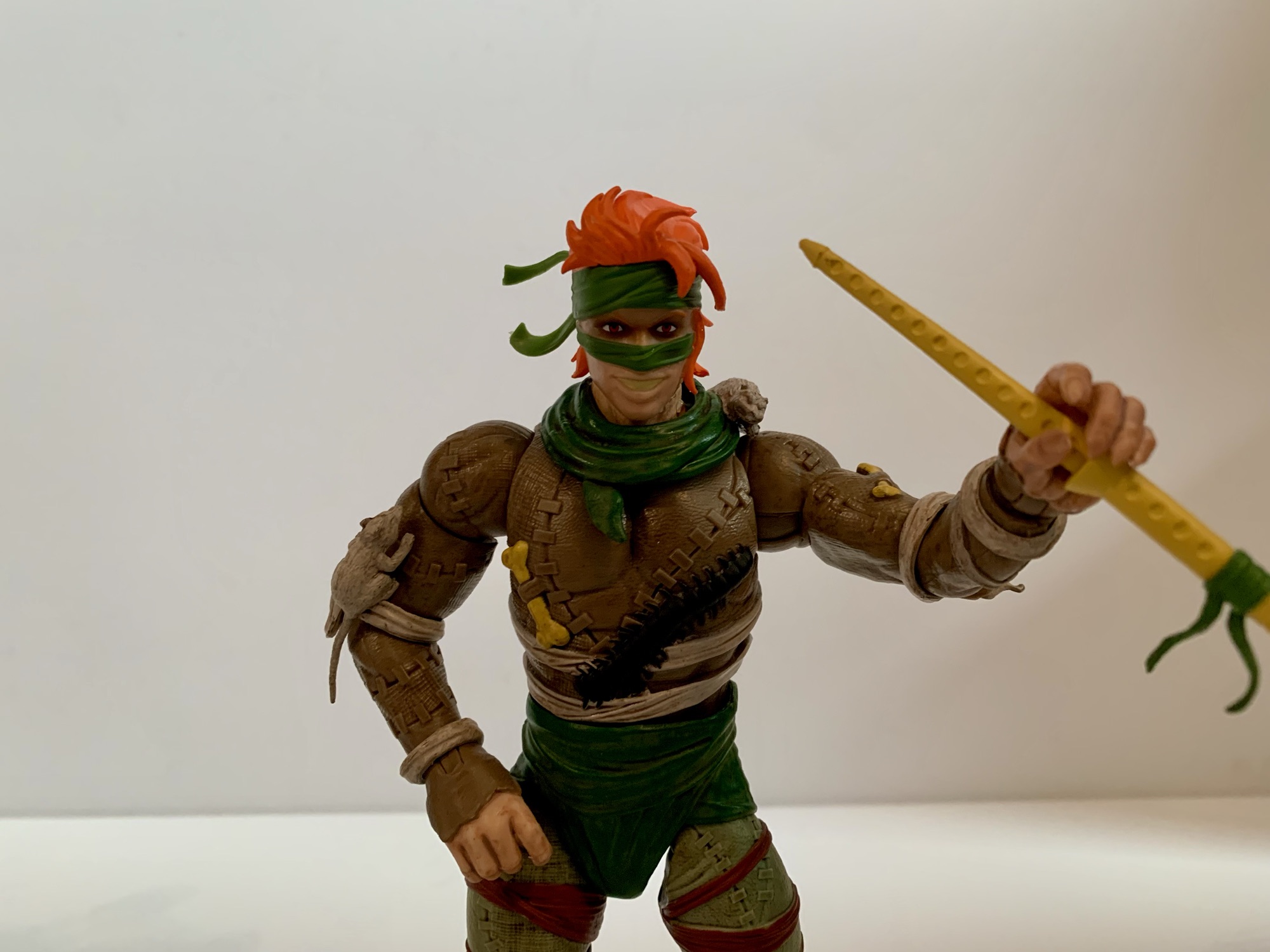
Hasbro apparently felt like he deserved better, because this Kaine figure goes harder than I would have predicted. This figure is basically all new sculpt. The blue veins are all sculpted and painted as are the fins, or blades, on his forearms and shins. Even the crotch piece has sculpted veins. The hair, head, and cape are all new as well and the only reuse this figure can take advantage of rests with the hands and feet, which I’m sure are recycled from tons of figures. This does come at a cost for the consumer as Kaine only comes with one set of alternate hands, but that’s how it goes. He has fists and open, style posed, hands. The cape is sort of an accessory because you can remove it, but the straps for it on the torso are much harder to get off so it’s really not designed to be removed, but you may want to and we’ll get to why in a bit.
Krillin: “I don’t think even the Dragon Balls could get us a mane like that!”
What I find really striking about this figure is that wonderful head of hair. Kaine looks like he walked out of a shampoo commercial or something. Fabio would be jealous as his hair never looked this good while hawking imitation butter. It, as well as the cape, are just one shade though. There’s no paint added which is a bit of a bummer as I think a wash would really help liven this figure up and also reduce that plastic look. I find this figure looks a lot better on my desk when the lighting is getting dim because it takes away that plastic sheen. Still, by the standards of the line, Kaine is an impressive looking figure and if you’re a customizer of some talent you can probably get this to look even better with minimal effort.
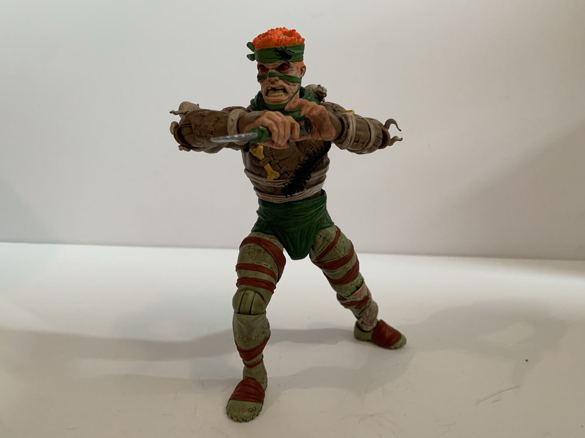
The articulation is basic by Legends standards. He should be able to pose well enough, even with the cape.
Since this is an all new body you may wonder if it has some articulation surprises. And the answer there would be, “Not really.” They had to make new molds to produce this figure, but I bet they just took an existing digital sculpt and then added the details to it before cutting steel. As a result, Kaine feels like a lot of Marvel Legends. He has the hinged ball neck, ball hinged shoulders, butterfly joints, bicep, double-elbows, swivel and hinge wrists, ab crunch, waist twist, ball hips, thigh cuts, double knees, and ankles that hinge and rock. Range at these joints is also all typical Marvel Legends stuff. He can almost do splits, kick forward 90 degrees, and the ab crunch works well enough. Where this figure is limited is the head and that left shoulder. The combination of the big hair and the plastic cape really lockdown the head. He can turn to the side a bit, look down, and barely look up. The left shoulder is also restricted by that cape, but really only in a sense that it can’t rotate all the way around. It does a decent enough job of getting out of the way with most movement and once you’ve settled on a position you can just reposition the cape. It’s not nearly as bad as it looks like it would be, though I’m sure there will be people getting custom soft goods capes for this guy.
Which one is the real Peter Parker?!
How do we feel about having a Marvel Legends Kaine? Fine. He’s a solid entrant for the line and it feels like real effort was put into making an accurate representation of the character in plastic form. Now I understand there’s some debate over just what color the blue vein things should be. He often was drawn to have gray instead of blue. Not being a massive fan of the character, I don’t care. I like the light blue on black so I’m happy. I’m not happy about the lack of accessories, but I expect that of Legends now. I have a weird soft spot for the trash of the 90s, so that’s primarily why I have Kaine. He’ll go with my Scarlet Spider and look like his goth cousin and that’s cool. And if you too think he looks cool then by all means drop $25 and grab him. I don’t know if he’ll be anyone’s favorite release in the line come the end of the year, but he certainly won’t be the worst.
We have more Spider-Man and Maximum Clonage stuff here if that’s your thing:
It was in this space last year that I shared my fondness for the Scarlet Spider costume when I reviewed the Medicom MAFEX Scarlet Spider action figure. I don’t buy much from Medicom because their figures are really expensive for what they are, but I sometimes break my own rule when I think they’ve made…
Last year, Hasbro celebrated the 30th anniversary of X-Men, the animated series that premiered on Halloween 1992 and would become a ratings hit shortly thereafter for the Fox Kids Network. It was responsible for getting a lot of kids into the X-Men and Marvel comics in general and the first, prime, benefactor of that rise…
When I was a kid, one of my favorite past times was drawing. Like most, I started really young with a box of crayons and coloring books. I’d eventually start keeping markers, colored pencils, and other instruments in a plastic McDonald’s case that came from a Happy Meal. It was blue and had a map…
The villain who can be anyone he chooses to be and this is what he chose.
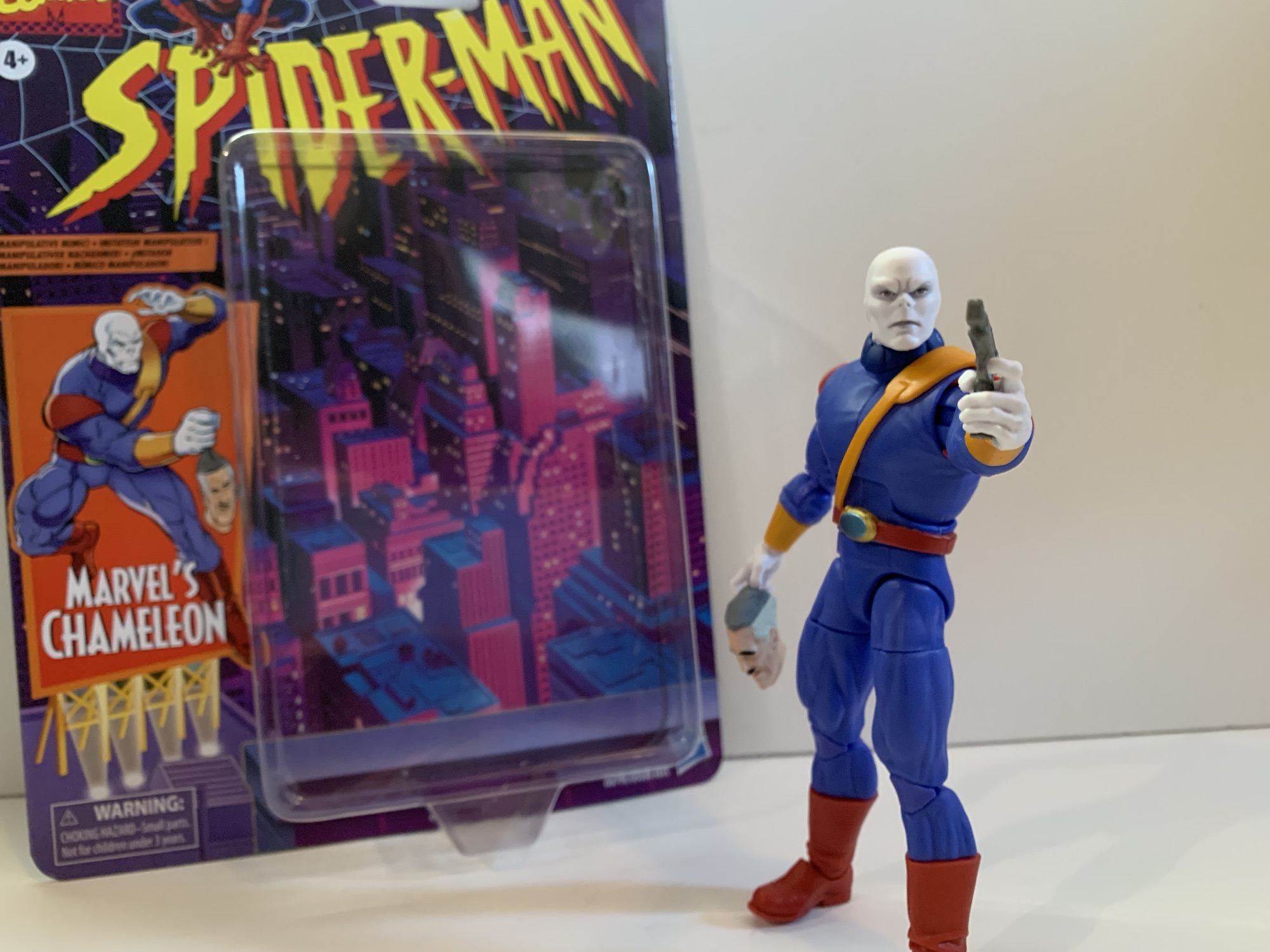
I had a bit of an impulse buy a few weeks back with the Marvel Legends Spider-Man Unlimited action figure from the show of the same name. What I didn’t mention was that he was not alone for hanging on the pegs that day with him was The Chameleon. Like Spider-Man Unlimited, The Chameleon is based on his appearance in a Fox Kids animated series, it’s just that this one is based on the more popular, more celebrated, Spider-Man which debuted in 1994. I can’t say that I was ever particularly fond of The Chameleon. He literally doesn’t talk so he doesn’t have much personality in the show. He’s just a shape-shifter in a purple outfit who received a featured slot in his own episode before becoming more of an ensemble type of villain. And for a villain that isn’t going to banter with Spider-Man, he’s probably best suited for that type of role.
Chameleon with animated Venom and the Walmart exclusive animated Spider-Man.
I have not been collecting figures based on Spider-Man like I did X-Men. That largely had to due with Hasbro’s release model. I would have loved to have added Doc Ock to my display, but I had zero interest in paying for a cruddy looking Aunt May figure just to get him. The two-pack approach really killed my enthusiasm for that line. I was never going to be as into it was I was X-Men, but I definitely would have bought more if I could have just picked up the characters I actually wanted. Chameleon was at least released as a retro card all by himself. He’s in his animated duds and mostly looks the part. My affection for the show, and boredom at not having bought anything recently at the time (damn, that changed fast) is what motivated me to pick up this release. Was that a smart move? Ehh…
And now with the rest of the animated figures I own.
Chameleon stands at approximately 6.5″ making him look a great deal larger than the animated Spider-Man released on a retro card. That’s more of a problem with that Spider-Man than Chameleon, but he does seem really big. Everyone was kind of big in that show, ordinary people on the streets seemed to all be jacked, so I guess it’s not that big of a deal, but I did expect him to be all together smaller. I have no idea how much of this figure is reused, but I’d wager it’s some and maybe that’s how he ended up tall and pretty thickly built. Even though he’s from the cartoon there’s no cel-shading or anything like that on him. He’s played straight up. The head is really well done with a lot of deep grooves in his lethal expression. There’s a little bit of what looks to be an almost silver paint around the eyes and in the creases of his brow. That combined with the really well applied eyes gives him an eerie look. Almost lifelike. It’s striking and it really gives Chameleon the appearance of a cold-blooded killer.
This belt is a pain in the ass to get straight.
The rest of the body is essentially bare plastic. I don’t think there’s another hit of paint on this guy. The only painted part is the belt. Since it has a shoulder strap, Hasbro did it all in one piece. It’s an orange plastic which matches the cuffs on his sleeves. The actual belt portion is painted red and the device on his belt buckle is painted gold and green. It’s somewhat soft, but the choice to make it all one piece means you’ll likely have to mess with it to get it on straight. The harness is pretty tight with no real room for play so it tends to want to pull up on the belt. It’s really challenging to get that belt buckle centered, if not impossible, so it may drive some folks a little nuts if they hate stuff like that. I wish they had just done it in two pieces similar to what they did with the strap on Cyclops. His shoulder pads are also a softer plastic that are keyed into the shoulder joint. I’m guessing the peg for the arm goes through a loop to sort of hold it in place. It moves with the arm, but getting them to mirror each other is a chore. The shoulder pad on the right shoulder of mine is seated nicely into the body while the left one is not so more of it is visible. In trying to jam it back in I actually damaged it slightly with my thumbnail so I guess I should learn to live with it.
At least he has fists?
Chameleon has the usual accessories for a Legends release which is to say he doesn’t come with much. Though, he does come with more than usual. Out of the package, he’s equipped with two trigger finger hands and he also has a set of fists he can turn to. For those trigger hands we get a pair of guns: a pistol and a much larger gun. They’re both a dull silver and they are the exact same two guns that came with the VHS Mystique. And if you’re buying more of this wave, they’re the exact same two guns that come with Agent Venom. I think the pistol also came with movie Deadpool so Hasbro has certainly got a bunch of mileage out of these two. Lastly, we also get a “mask” of one J. Jonah Jameson. It’s designed to resemble a rubber mask that’s been pulled off of someone’s head and is just hanging from something – like a hand. It’s both creepy and kind of funny looking. I like it, but I hate that they sculpted finger holes for it in the back. If you want Chameleon to hold his arm out and have the mask just hang from his fingers it will look stupid. If he holds it as his side it looks passable, but a little odd. I wish they had just sculpted it with the mask coming to a point in the center of the head like it’s going through his fist. Hell, since it’s an all new sculpt, just make it an extra hand like Mondo did for the Venom hand holding Spider-Man’s mask or the Spider-Man hand holding the mask of the Green Goblin. That would have been the way to go.
He also has a bigger gun.
You can probably take one look at this figure and conclude that it’s not going to articulate all that well, and you would be right. The head is on the old ball-hinge, but the oversized collar renders the hinge nearly useless. He can basically just turn his head to the side. Arms feature the usual hinged ball at the shoulder, bicep swivel, double-jointed elbow, swivel and hinge at the wrist. The trigger hands have the superior vertical hinge while the fists go with an appropriate horizontal one. The torso feature an ab crunch that has crappy range going forward, decent range going back. There’s a waist twist, ball-socket hips that can almost hit splits out to the side, kick forward a decent, and a thigh twist in each leg. The double-jointed knees are tight, but otherwise fine. There is a boot swivel that’s pretty ugly, but there if you want it, and the ankles hinge forward and back and there is an ankle rocker. Range at the ankle is mediocre. This figure is pin-less so that’s nice, but it also means that knees and elbows are a slightly lighter shade of purple than the rest of the body so you’re swapping one eyesore for another. I will say, on this figure the miscolored parts aren’t as bad as I’ve seen it on some others.
Sure to be everyone’s favorite accessory is this JJ mask. It doesn’t make sense for this version of Chameleon, but who cares?
Chameleon is pretty mediocre when it comes to articulation. He’s going to just stand there on your shelf. I don’t know why they’d go with the ball-hinged neck given the big collar. The collar is a floating piece so I guess if you want Chameleon to have more range looking up and down you could remove it, but I’d have preferred a double-ball peg so he could have more tilt for nuance posing. I don’t need him to look up at the sky or down at his toes. No butterfly joint when he comes with guns is a bit of a bummer, but I do like the unbroken appearance of the chest. He’s actually pretty broad-chested compared with a lot of Legends and the proportions are pretty damn good. Chameleon is an example for how a character doesn’t need a complicated design to look good in plastic if you just get the proportions right.
Standing tall. Standing proud.
And that’s what it all comes down to for me with Chameleon. Yeah, he doesn’t impress with the articulation and there are some design flaws that bug me, but he looks like the character from the show. He’s a big dude and he’s sculpted as such. The matte finish across the board just makes him look nice and they really nailed the face. He comes with an extra set of hands, two guns, and the mask accessory which is practically a motherload for a Marvel Legends figure being sold at the standard price. For that reason, I can’t really be down on this guy. He’s fine. If you like Chameleon as he appeared in the Spider-Man cartoon from the 90s then I think you’ll be happy with this one. He’s not going to be one you fiddle with much, but when you look to your shelf and see him standing there staring a hole through your soul you’ll probably think “Man, Hasbro kind of nailed that one.”
We have plenty more action figure reviews from the Spider-Man cartoon of the 90s:
Last year, Hasbro celebrated the 30th anniversary of X-Men, the animated series that premiered on Halloween 1992 and would become a ratings hit shortly thereafter for the Fox Kids Network. It was responsible for getting a lot of kids into the X-Men and Marvel comics in general and the first, prime, benefactor of that rise…
When I was a kid, my dad took me to some local convention or trade show. I have no idea why because my dad wasn’t the type who would go to such an event. He liked car shows, but from what I can remember this was more of a hobby show. It was early in…
It was in 2021 that Hasbro released a PulseCon exclusive Venom figure on a Spider-Man retro card. The retro card series is meant to stir-up nostalgia for all of the adults who were buying toys and watching cartoons in the 90s as the retro card is a facsimile of the old cards Toy Biz used…
When it comes to Mezco and its action figure offerings I have a very specific taste. To me, the majority of their super hero figures look little better than Mego. Some people like that aesthetic, but not me personally, and I’m certainly not into paying 100 bucks for the honor of owning such. Some frequent readers here may be surprised that I never reviewed either of the Teenage Mutant Ninja Turtles four-packs the company released last year and that’s because, to me, they looked like dried-out turds left out in the hot sun to bake. I saw plenty of folks singing the praises of that set and I think it’s great that they enjoyed it, it just wasn’t for me.
With Mezco, the stuff I typically am drawn to are their creations based on live-action properties. I love the look of their Batman ’89 and their Michael Keaton likeness under the cowl is spot on. I don’t love the approach they took with the silicon body, but if you want to read more about that there’s a link at the bottom of this one. I really liked their take on The Crow based on the 90s film. I didn’t get it, but I certainly gave strong consideration to doing so. And my favorite figure I picked up in 2023 was the Mezco Green Ranger from Mighty Morphin Power Rangers. It was a perfect character for Mezco to tackle because it was based on a live-action series where martial artists in spandex suits and helmets wield goofy weapons. The fact that the character is helmeted made it even more perfect because even though I said I prefer Mezco’s take on live-action properties, they don’t always nail the likeness. The Crow works because he’s covered in paint. The unmasked Tommy Oliver head they included with the Green Ranger is just okay. And that’s fine because I’d never display him unmasked.
It’s impossible to convey how huge this show was in 1993.
When I got that figure the plan was just to get the one. I’m strictly a casual MMPR fan who feels drawn to the toys of today because the toys of yesterday were so hard to come by when I was a kid and actively watching the show. The Green Ranger is the best of the rangers so it made sense as my lone representative for the series from Mezco. It turned out so well though that my attention turned towards the rest. There was a White Ranger released in 2024, but I don’t need two versions of the same character. Plus, I fell off the series right around that character’s debut. I have a full squad of rangers from the Hasbro Lightning Collection, but it’s merely adequate. Over time, as often happens, the flaws with those figures become harder to ignore. They’ve stood untouched on my shelf for years. I don’t intend to go down any extensive MMPR rabbit hole at this point, so why not splurge a little and get a set of Power Rangers that I’m really going to enjoy? Couple that with a milestone birthday in 2024 and I decided to say “screw it,” and gift myself an expensive set of Power Rangers.
Time went by. I scored a great deal on Entertainment Earth because of a promotion that applied even to preorders. Month after month would come and go with the product getting pushed out. Eventually, I got irritated by the whole thing and began questioning if I really wanted it. We had some expenses come up, the holiday season also came and went, and I just hated the idea of this expensive item coming due at any moment so I cancelled. Not a week later, product starts hitting. God damnit, Mezco. I lost the deal I had on the set and figured that was that. Then Big Bad Toy Store actually got the product and showed it as in-stock and ready to ship. And to my surprise, there was no additional markup. Usually with Mezco, BBTS will put up preorders at MSRP, but once the item actually hits, they jack up the price to capitalize on the FOMO purchases. Maybe they had a high number of cancellations on this one since it was sitting out there for so long (years, I want to say) and needed to just make sure they sell the product they have at the price quoted before they try to extract a little more. I don’t know. I ruminated on the subject a little then obviously gave in since we’re here today talking about this set.
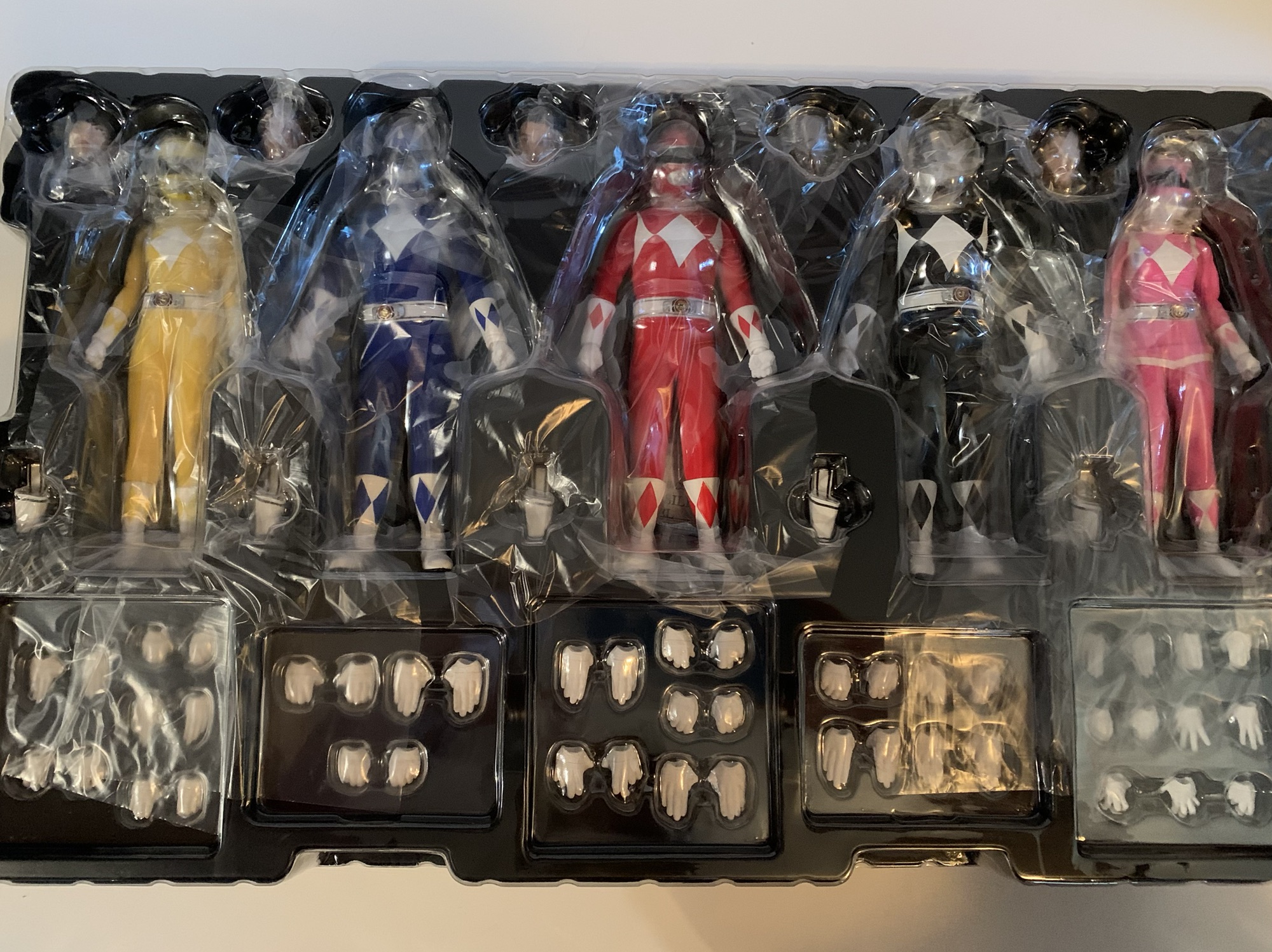
Some nice new artwork for the box.Lots of plastic baggies to keep things as protected as can be.
The Mighty Morphin Power Rangers Box Set from Mezco checks in at a whopping $400. That’s a number more commonly associated with a video game console and not a set of action figures. Considering that most Mezco figures retail for $100 or more (I think the Green Ranger was $110) this set actually feels like a pretty good deal. That’s five figures each with a vast assortment of accessories at $80 a piece. I won’t call it a bargain because $400 is $400. Maybe a week long stay in a hotel for that kind of cash could be considered a bargain, but not action figures. The big question then is do these figures justify their cost? With the Green Ranger, my conclusion was a somewhat tepid “Yes.” The figure’s great, I just wasn’t convinced it absolutely had to cost what it did. And that was at a significantly higher price point. These figures are off to a better start by virtue of that fact, but an $80 action figure is still a pricey thing. I’m not sure if I spent that much on a single action figure in this scale in 2024. I did spend $75 on a figure so it’s not as if I’m far off the mark, but there is certainly something to prove with this set and expectations are and should be high for that price.
The accessory tray is pretty comprehensive.
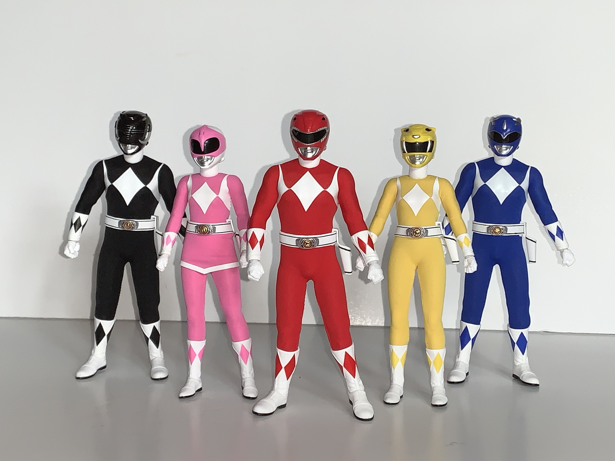
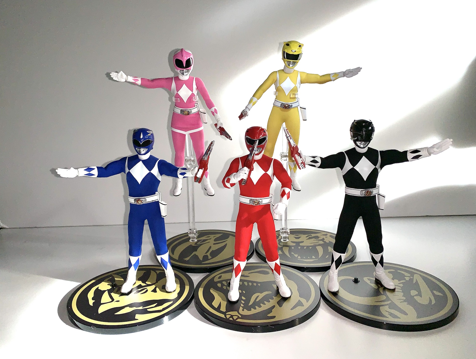
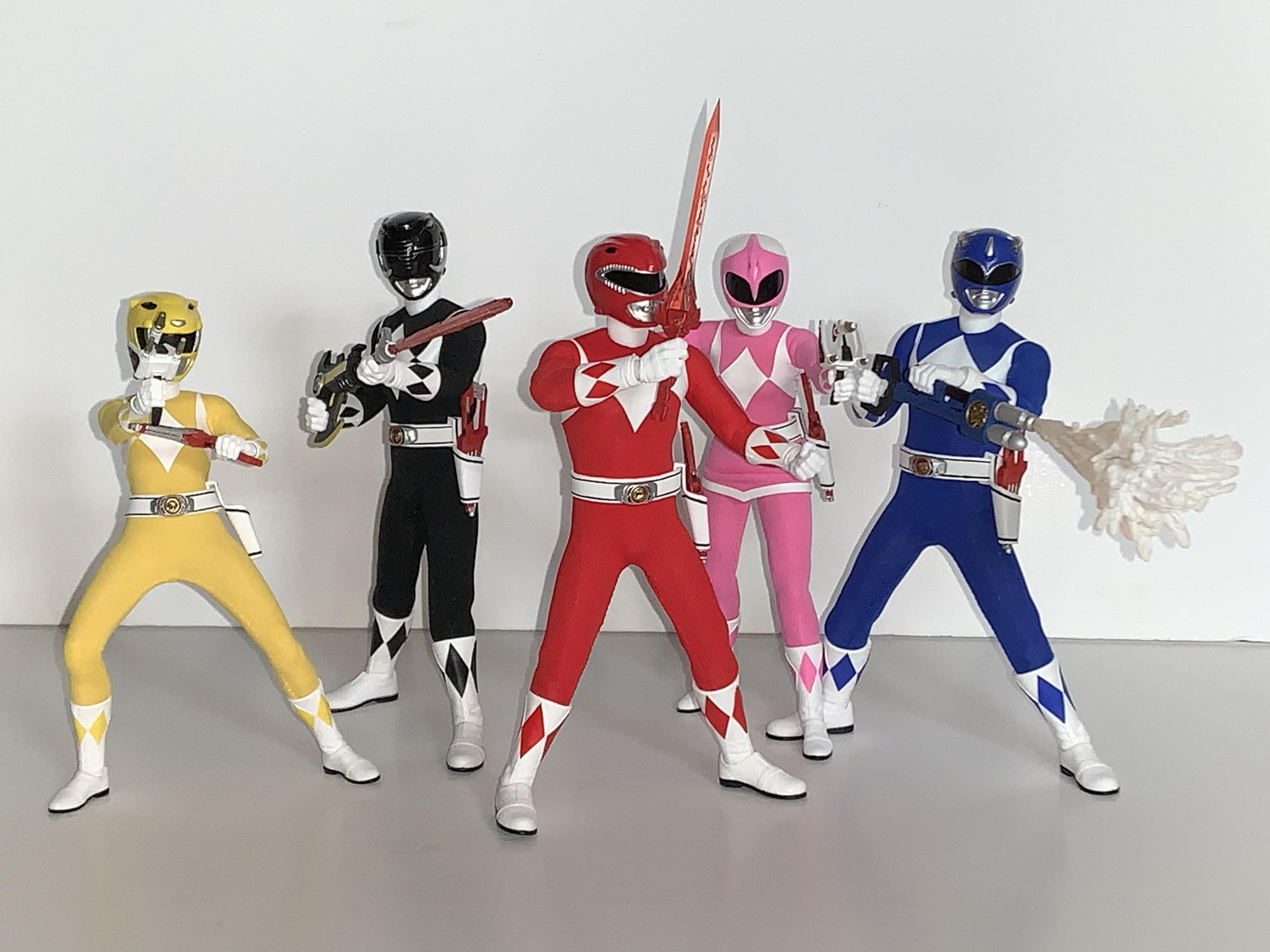
The figures come in a pretty large box with multiple trays within. The box has what I assume is new artwork commissioned for the release and it’s all fine, but it’s not a window box so if you want to not only hold the figures, but just see them, then you’re going to have to open it. Once removed you have your five figures. It’s actually more like two figures as the male rangers share a body and the two female rangers share a body. And that’s fine as the characters were fairly similar in the show when suited and I wouldn’t expect a sculpt tailor made for each figure. Especially because the helmets and soft goods are unique enough.
And there they are.
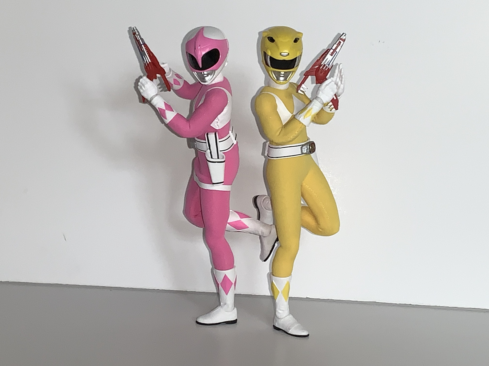
Just standing them all in a row and taking it in the look is impressive. From a normal distance, they look like miniature versions of the characters from the show. The helmets are the right shape. The details are all in place when it comes to the sculpt work on the helmets or the stitching in the gloves and boots which are sculpted in. The colors are bright and vibrant and the white vinyl or decals for the diamonds on the chest is nice and opaque, even, and straight. As is the case with Mezco, we have a mix of soft goods and plastic. The heads, gloves, and boots are all plastic while the body is covered by the soft goods. If you get up close, you can see the threading in the suits which I suppose isn’t screen accurate, but I’ve also never been that up close and personal with a real Power Rangers suit. They obviously take on the look of the characters when using the American actors since the Yellow Ranger was played by a male in all of the Japanese footage. And that’s fine. For an American audience, Trini is the Yellow Ranger and it would look out of place if the figure had a male body, even if that’s what we typically saw on TV. I think it would be cool if Mezco did a one-off Yellow Ranger release on the male body for those who want a Super Sentai display, but I don’t know if such a thing is likely.
There should be a lot more black around that morpher.
The presentation is strong, but not perfect. Nothing is, and when a figure costs 80 bucks we’re going to scrutinize the Hell out of it. The helmets on the males look fine, but the females do stand out a bit as oversized. I do think some of that is other toys and media playing tricks on us. The Lightning Collection, and most action figure lines, scale down the helmet heads slightly. Some of the older lines scale them down a lot to the point where one would question if a human head could actually fit in them. They’re pretty big on the show, but if you’ve spent years looking at figures where they’re a little smaller then it’s going to have an effect. Similarly, the Yellow Ranger being a male in the show more often than not means the figures usually look out of whack. However, in this case, I do think the helmet size is too big. For the Pink Ranger, it’s mostly fine. That helmet always looked bigger on the show, probably because of the size of the actress, so it’s not standing out. The other drawback I notice right away is that the diamonds on the chest, in particular the ones on the sides, have a wavy quality to them. They should be sharp, but it must have something to do with the vinyl coating in use here. What may bug the hardcore fan the most though is that the morphers are not the right color. They’re all silver here when in the show only the front is supposed to silver. The sides should be black, which is an odd detail for Mezco to screw up since they went through the trouble of making the coins in the morphers look so damn good.
We may have a slightly different body than Green, though Billy somehow seems to be a bit taller than Jason and Zack.
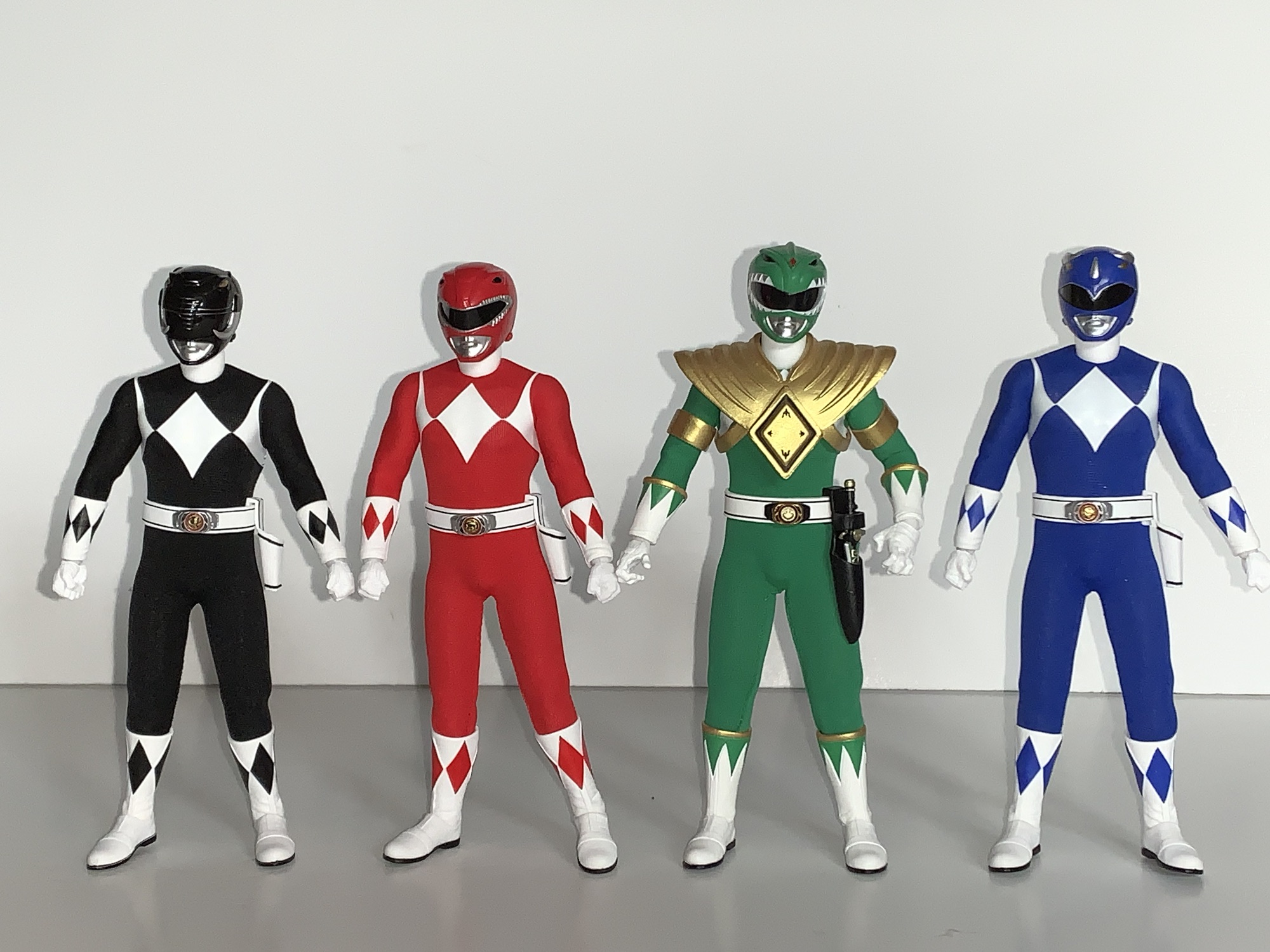
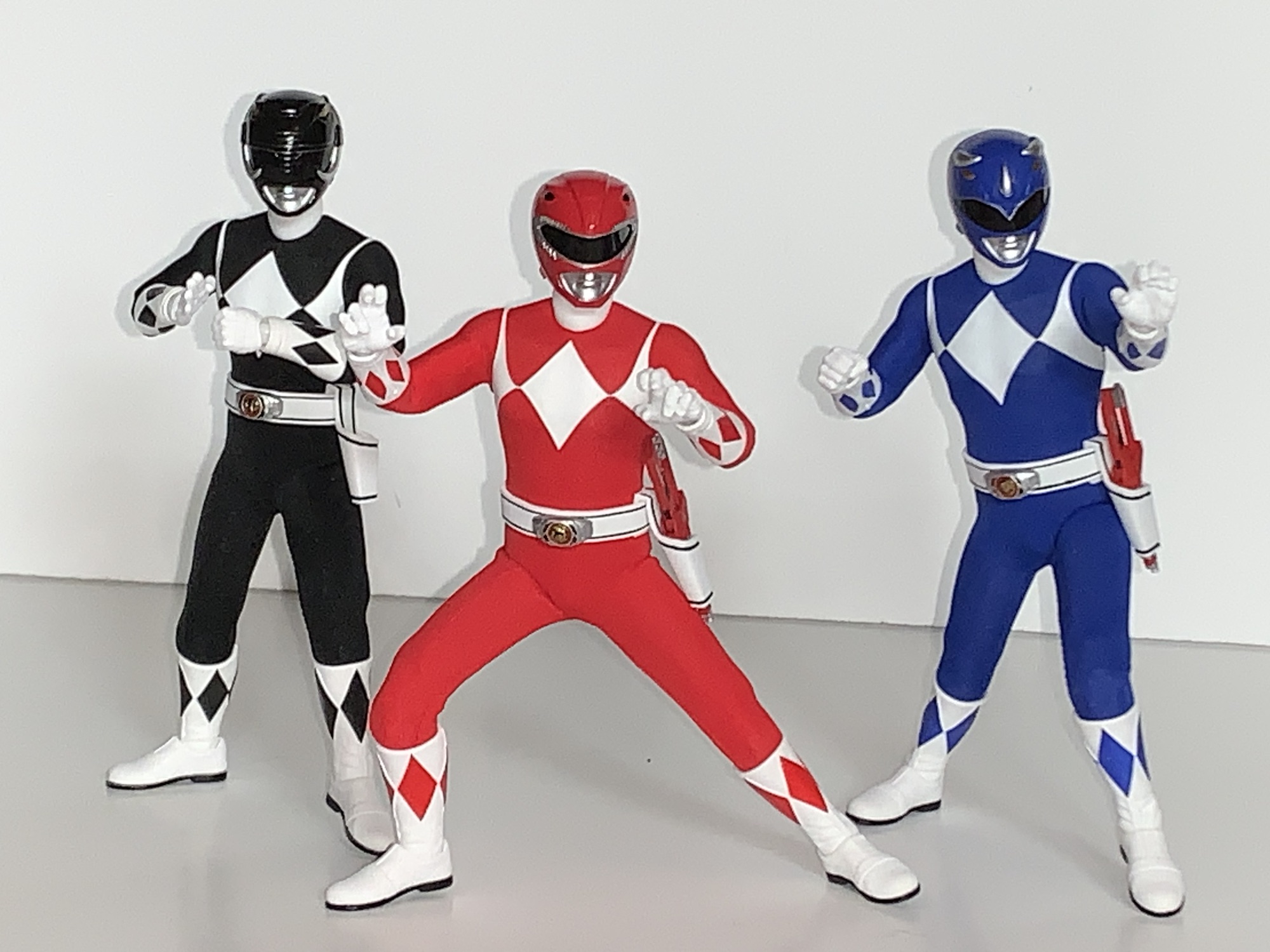
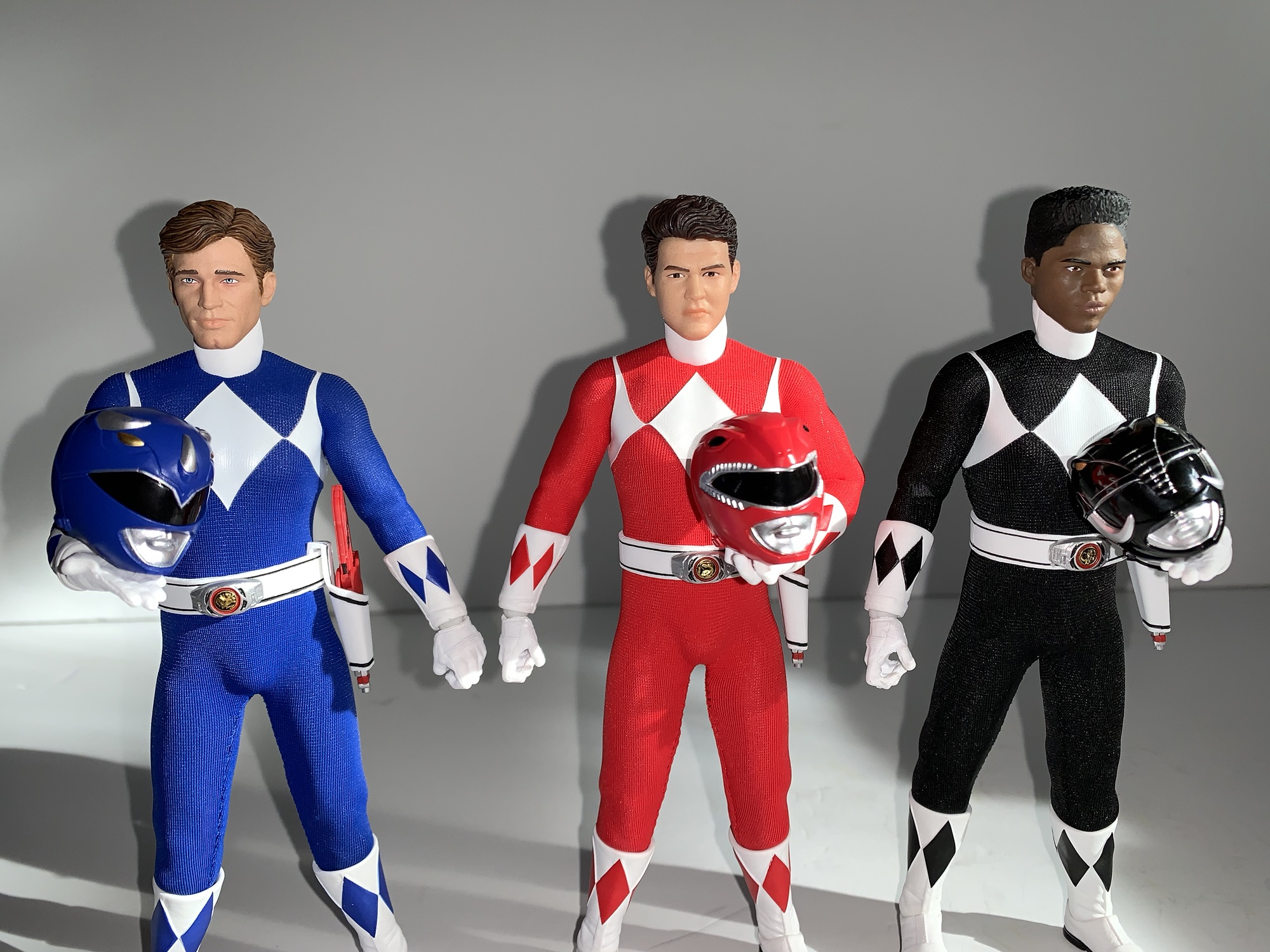
We’ll talk first about the male rangers: black, red, and blue. To my surprise, these do not appear to be identical to the Green Ranger I already have. I think much of them are shared, but there are some differences. Or at least one noticeable one. Under the suit, it feels like there’s just a basic action figure body. The Green Ranger I have at a little over 6.5″ while these new ones are right around 6.375″ which surprised me a bit. It looks like the Green Ranger is getting a bit more length out of the torso so perhaps it’s not the same body underneath. I don’t know if either figure is truly 1:12 scale, but it looks fine to me. The suit is stitched in the back so it’s not removable and the belts are an imitation leather. They’re painted with black striping and the Power Morpher is nicely detailed and personalized for each character. The blade blaster holsters are removable and they just tab on and off.
Posing is going to be pretty solid with some limitations thanks to the soft goods.
Running your fingers over these figures will allow you to feel out the articulation. It’s impossible to know exactly what’s underneath without taking one apart, but I’ll do my best. It sure feels like we have a ball joint in the base of the neck and I know we have a double ball at the head. The shoulders appear to be simple ball hinges and there is a bicep swivel, double-jointed elbows, a glove swivel, and ball hinge wrists. The diaphragm seems to feature a double ball and there is a slight waist twist. Hips are a mystery, but they got to the side a little better than 45 degrees and kick forward about 90 degrees. There is a dedicated thigh swivel, double-jointed knees, boot swivel, and a hinged ankle and rocker. Because these guys have different gloves and boots than the Green Ranger, those had to be re-sculpted and Mezco made at least one notable improvement and it’s with the ankle rocker. The Green Ranger’s ankles are pretty poor, but these new ones should have little trouble keeping their feet flat on a shelf. The actual boots do have an odd shape to them. In some poses it looks like they’re curving out. I’m not sure if it’s the connection to the leg that’s causing that. It can be posed away, for the most part, but out of the box I was wondering if the left and right shins had been swapped at the factory.
I like that the hands are nice and soft so swapping is easy and getting weapons into hands is as well.
The articulation is all basically there, save for a butterfly joint. It’s just limited by the soft goods and your own courage. If you try to put these guys into splits you’re going to have to stretch the material. I’m not saying the figures can’t do it, but I’m not willing to try. I wish I was some semi-famous YouTube guy who gets review samples so that I could really go the distance with these, but I’m not and I’m out a considerable amount of money should I break something. The joints that feel the most limited to me are the waist, shoulders, and those hips and it’s all because of the soft goods. The waist, for example, doesn’t feel like it wants to turn much. The shoulders don’t like being raised out to the side a full 90 degrees. The material is stretchy and it can probably take more abuse than I’m willing to dish out, but it’s also form-fitted to each figure. They’re not frumpy, which means if you leave these guys in a position that’s stressing the material it could stretch out permanently and lead to a poorer fit. That’s always going to be the limitation with this setup and it’s the same with other scales too. Have some fun with them in hand, but maybe don’t leave them on your shelf in anything too crazy.
As expected, the females share the same body.
The female rangers are pretty much the same, only smaller, and with another detail I wasn’t anticipating. The pink and yellow rangers stand at just a tick under 6″ and I like the height separation between them and the boys. They have a more feminine shape with slender limbs compared to the males and a more defined hourglass shape to the torso without being unrealistically curvy. Kimberly, the Pink Ranger, has her skirt piece as well which seems to be just a separate piece that’s not sewn into place. The articulation feels to be the same, but the body underneath feels like it’s a silicon one. It’s my understanding Mezco tried this with a Spider Gwen figure and it’s being utilized here. The silicon body covers the torso, waist, and thighs and gives the figures a squishy feeling. These types of bodies are known for eventually cracking and tearing, but if it’s hidden underneath soft goods then who cares? I would think it’s an added expense so I’m surprised to see it in use here, but maybe this is a technique Mezco is going to utilize more going forward?
I find these two pose a little better than the boys. The torso and hips have a bit more range.
For whatever reason, this approach makes the women the more articulated of the pair. The actual articulation points are all the same, but they can really crunch forward and back in a way the males cannot. The legs seem to kick forward better as well and they also kick back all the way so they can theoretically do splits in both directions, though I still wouldn’t really advise it. The joints are stiff, but smooth, and if you have handled a figure like this in the past then you know what I mean. It’s a metal armature, basically, that’s inside the body so you do need to be somewhat mindful of that. Sometimes a joint can get pointed in a direction you weren’t expecting. As a result, the limb won’t move the way you want it to, but it’s just a matter of figuring out which swivel point got turned around and going from there. The one downside is it seems like joints can either separate or just aren’t tight enough. The right leg on my Pink Ranger doesn’t want to go out to the side and stay there. I don’t know if the hip is disconnected or if it’s just weak. It’s not floppy, but it sucks that the range isn’t there with her.
The boys.And the girls.The unmasked portraits are pretty hit and miss.
All of the characters come with an array of hands as well as an alternate, unmasked, portrait. The quality of the unmasked heads varies from character to character. I would say the Billy and Jason heads look really good, Zack and Kimberly okay, and Trini looks nothing like the actor. Billy doesn’t have his glasses which is technically accurate to the show, but for this era, I think most fans picture actor David Yost with his spectacles on. For hands, every Ranger comes with fists and gripping hands and then after that it varies. Red Ranger has a set of flat palms with his thumb to the side and a set of flats with his thumbs towards the palm. He also has martial arts posed hands (kind of his signature pose) and loose gripping hands. Black Ranger has the same, minus the martial arts posed hands, while Blue Ranger loses the flat palms with the thumb off to the side and the loose gripping hands, but picks up palm-striking hands. Yellow Ranger has the same spread as Black Ranger, plus a set of “Tiger Claw” hands. Pink Ranger has the most as she has the same spread as Yellow, but swaps the flat hands with thumbs turned inward in favor of splayed open hands like she just loosed an arrow. She also has an additional right hand specifically shaped for nocking an arrow. All of the male hands can be shared with each other and the same is true of the female hands, you just wouldn’t want to put a male hand on a female body and vice versa.
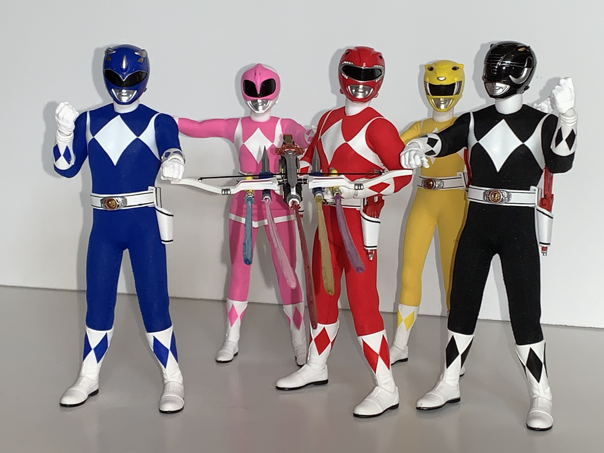
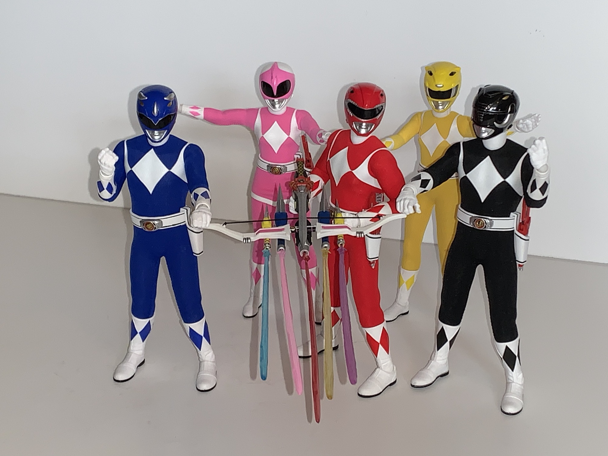
I’m guessing most will pose the Rangers with their signature weapons, but I’ve also liked the Blade Blasters.Remember the combined Blade Blaster attack?
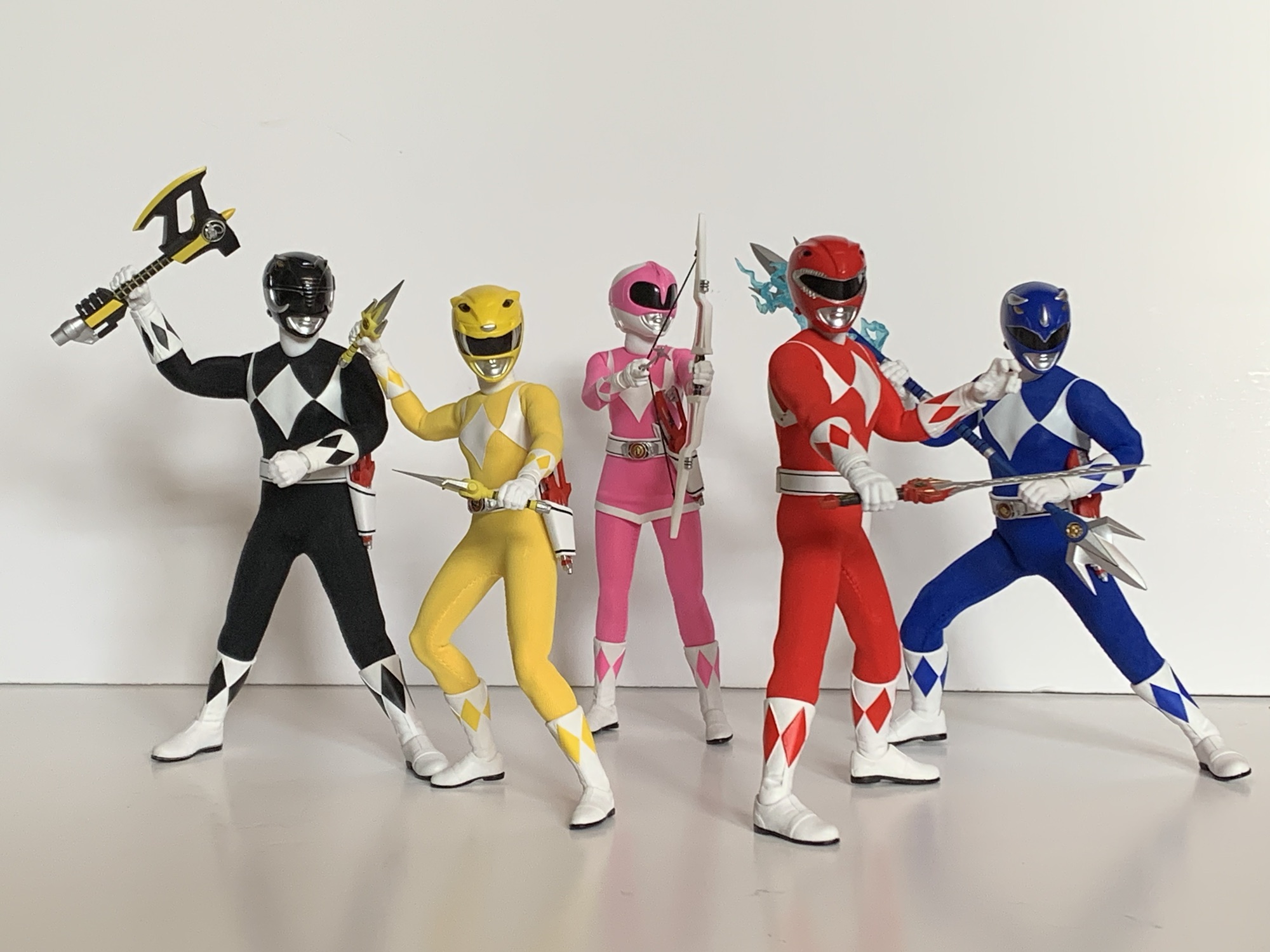
Each Power Ranger comes with their trusty blade blaster. These little gun to knives accessories are identical to the one that came with the Green Ranger meaning they’re capable of going from knife mode to handgun mode just as they did in the show. They’re hard plastic and well painted but Mezco did not include the “Power Rangers” writing on them. Some require a little extra oomph to push the dinosaur head forward when converting to the gun mode which can feel a little scary, but I haven’t had any issues. The actual blade doesn’t fold out and is instead a separate piece that pegs in. Mezco included five so you can have all five Rangers wielding their blade blasters in knife mode if you please or firing with the included blast effects. They’re a thin, translucent, red and likely made of an acrylic so do be careful when handling them. If you don’t want your Rangers to brandish these arms, they can be stored in the included holsters which is probably where most are likely to end up. Upon doing so though, it becomes clear that the blasters are a tad oversized compared to the ones in the show. They look big in their holsters and even the promo shots for this set seem to show a smaller weapon. This wasn’t something I really noticed with the Green Ranger since he doesn’t traditionally carry one of these things, but it’s plain to see here.
These are the weapons most associate with the Power Rangers.
Each Ranger also has their signature weapon. For the Red Ranger, it’s the power sword which is lovingly painted and looks terrific. If you think it lacks a little something though there’s also the charged version which is basically the same sculpt but molded in translucent red. I honestly don’t remember the sword doing that in the show, but it probably happened. I doubt it looked like this though given the show had very cheap and simple special effects. It looks a little jarring in Jason’s hands and it’s not something I see myself using, but maybe I’ll come around on it. It does have the opposite problem of the Blade Blaster which is that it’s definitely too small. Mezco clearly played fast and loose with the scale on this stuff. For Billy the Blue Ranger, he has his lance which is sort of like a blue trident with a topper on both ends. In the show, he could separate it and brandish two, smaller, weapons so Mezco included a set of small, handheld, tridents. They also included two bigger ones and an adapter piece to facilitate connecting either set to form the actual lance. I’m not sure which is more screen accurate. One looks too big and one looks too small and I don’t think it had a silver center handle in the show. It’s at least made of a sturdy plastic. My Lightning Collection Blue Ranger’s lance always curved when held because the plastic was so soft. There are also some lightning effects for the lance included, which is always appreciated.
That foam gun is certainly something.
For Trini the Yellow Ranger, she has her daggers which also resemble sai. Again, they’re well painted and do what they’re supposed to, and unlike the other weapons so far, the size seems fine. Zack’s power axe also looks great and has a sliding handle so it can be wielded like a pump shotgun. Sizing for it seems fine and it can make use of the blast effects included. Kimberly has her bow (I guess power bow?) which also has a real string affixed to it which is stretchy. She has three arrows as well to wield and the weapon works well enough, though it’s always a challenge to get an action figure to pull off a bow look and she’s no exception. Also included are some optional weapons. For Billy, we get the Anti-Sonic Foam Gun which looks like an old Nerf double ball blaster, but painted blue. There’s a non zero chance that’s what the actual prop was. It has an optional effect part if you want Billy spraying foam on your shelf. I’m not sure that I do. There’s also three Thunder Slingers which are basically handheld slingshots, but made to look like something a Power Ranger would handle. They look great, but this is more stuff I’m likely to just look at once and then put away forever. And if you’re curious, yes, there were five of these in the show, but Mezco only provided three. I think they could also combine with the Blade Blaster, but no such functionality exists here.
This is a well put together piece of plastic.This is a contender for shelf pose.The blast effects probably need some tweaking.The more I look at it, the more I think they should have made this blast one piece.
When the Power Rangers combine their weapons they form the Mega Blaster. Rather than put tabs and holes into the weapons, Mezco just gives you an assembled Mega Blaster. Every component looks every bit as good as the individual weapons because I’m pretty sure its the exact same stuff just stuck together. There are even five effect parts so you can have the gun blasting the bad guys, which are going to have to come from another toy line for now. It’s cool and it at least makes things a little easier and lessens the risk of paint rub and such if we were expected to physically attach the weapons to each other. If I’m being honest with myself though, I kind of miss the fun of assembling the weapon. That’s part of the appeal of Power Rangers for me: combining weapons, combining robots. The blast effects are seemingly colored correctly, but tough to get straight and flimsy. I wonder if it would have worked better as one, big, piece?
For when they want to cosplay as Tommy.“Hey guys, what gives?”
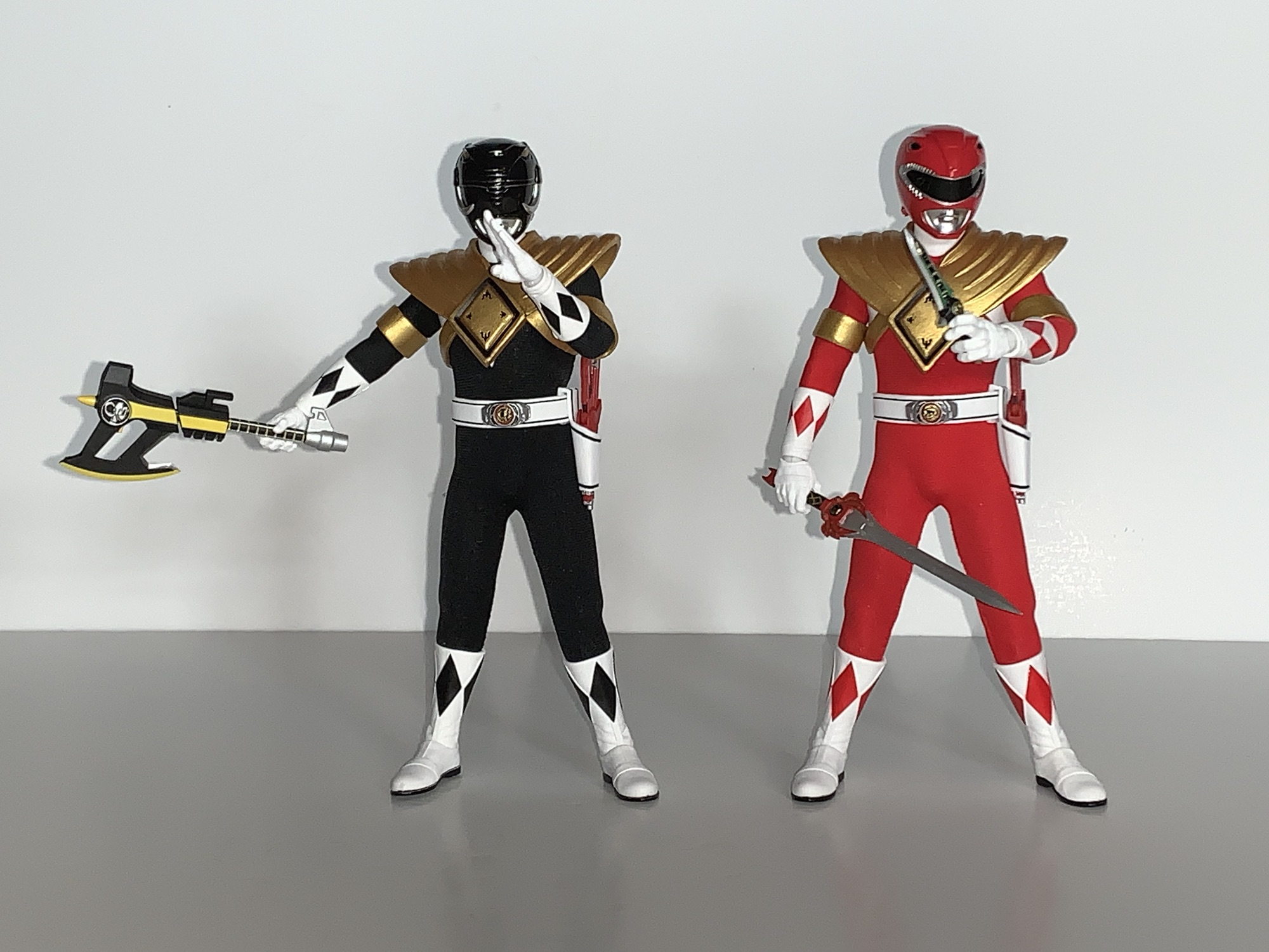
We’re not quite done yet though as we have a few more accessories in the box. Both the Red Ranger and the Black Ranger wore the Dragon Shield at points during the show so Mezco included two Dragon Shields and the armbands that go with them. They’re the same parts as the ones included with the Green Ranger so if you want a trio of armored up Power Rangers on your shelf you can do so. The arm bands are loose enough that you can slide them on without having to pop the gloves off. That also means they won’t fit the smaller female arms, but the shield itself is also way too big for them. Lastly, we have a stand for each figure which features a circular base with their respective Power Coin image printed on it and an articulating, transparent, plastic, armature. This is the standard Mezco stand, and while the base does take up a lot of real estate on a shelf, they do work well. A good stand is something every premium collectible should come with.
And who could forget about the individual stands?
That is a lot of stuff and a lot of words. What have we learned after reading all of this? That these Mezco Power Rangers are as advertised. They capture the look of the American version of the show quite well. The Mezco approach is perfect for this property and this is basically a match made in Heaven. The articulation is pretty good, though the format will always breed some apprehension when it comes to extreme posing, but I think most will be satisfied with what these figures can do. There’s basically nothing left out when it comes to extra stuff. We get the unmasked portraits, 54 individual hands, weapons, blasters, extra weapons, the Mega Blaster, stands, and even some extra Dragon Shields. Oh, and those little baggies Mezco always includes for storing accessories if you decide to ditch the box. There’s nothing missing, as far as I’m concerned. I guess some folks may want individual morphers, but that’s an accessory for plain clothes Power Rangers, if you ask me. There are all kinds of other one-off weapons in the show, but none made an impact with me to the point where I want them included. I guess the Power Crystals might have been cool? Again, I’m reaching here as I would be unlikely to ever do anything with such in my display.
That’s not to say everything is perfect. While I think the proportions for the male rangers are pretty damn spot-on with the American show, there’s no denying that the Yellow Ranger looks off. The shape of the white diamonds on the torso of all of the figures are also off. It might be something where if you play with the suit enough you could smooth those lines out, but it’s certainly a hassle. The scale with the weapons is all over the place and the morphers on the belts are the wrong colors. Depending on your point of view, that’s either a bunch of nitpicking or a bunch of problems for figures that cost $80 a piece.
Blue Ranger helps illustrate the difference in proportions between the two brands.Hasbro Black is definitely better equipped to wield the Power Axe in blaster mode.One has a big head and one has a small head. Too bad we can’t split the difference.If you like the laser arrow, then the Hasbro one has a leg up, but look at those mismatched pinks.The Hasbro Red Ranger is horrible proportioned and the colors are all over the place, but the Mezco Jason definitely has sword envy.What you’ve been waiting for, direct comparisons to the Lightning Collection. These are the originals, not the Remastered editions.
That means the real question is are these figures worth it? There is a part of me that looks at the price tag for this thing and can’t fathom how it could possibly be worth such an investment. Even big time Lego sets are usually in the $300-$350 range. This is beyond even that and when this thing was first announced I don’t think I could have envisioned me picking it up. On the other hand, if these Power Rangers were released individually over a couple of years at $80 a piece would I feel differently? Yes. My brain looks at an $80 Mezco figure of this quality and is able to both realize it’s still a lot to pay for a toy, but it’s not outrageous in this market. Mondo is doing The Real Ghostbusters at $101 a piece spread across probably 2 years, when all is said and done, and I’m in on them. And a Mondo sixth scale X-Men figure sets me back over $200 by itself and I’ll probably buy anywhere between 4 and 6 of those this year alone (if Mondo hits its goals).
No matter how you pose them or what you place in their hands, these are going to look good on your shelf.
This is an expensive hobby. Action figures are not thought of as luxury goods because the term luxury makes people think of limousines and monocles, but that’s what they are because they’re just baubles. Things no one needs that don’t perform a function; they just exist to be admired and fiddled with. They’re not even proper children’s toys which have some nurturing capabilities. Accepting all of that, I can definitively say that, for me, these figures are worth every penny. They’re fantastic for what they are. These are the only Power Rangers I will ever need. I have no use for my Lightning Collection set any longer and I cannot fathom buying another Power Ranger for myself for the rest of my life. These are exactly what I want as they look and feel like 1:12 scale Hot Toys figures. It’s the perfect format for me and for Mighty Morphin Power Rangers.
There’s no denying how awesome this looks.
And I’m apparently not alone as this set now appears to be sold out everywhere. That doesn’t mean it’s gone, the very popular TMNT set has been reissued already and had a variant set released as well. Maybe Mezco wants to do a variant with the other actor likenesses? Maybe they want to do the movie suits? I don’t know, but Hasbro is more than willing to license the brand out so I wouldn’t rule anything out. And like most companies, Mezco likes money and if they feel the demand is out there then they’ll make more. You just never know with them because their communication is so terrible. If you’re a big fan of the property then I think you should get these and it might even be worth paying over MSRP. If you value each figure at $100 then $500 isn’t much of an overpay, or you can wait it out. And if you get it and completely disagree with what I’ve said here then I bet you’ll have no trouble unloading it at cost. It makes the set almost a risk free proposition. I don’t think that’s going to happen though. Most people who get this, aside from those who may run into quality control issues, are going to be thrilled with what they have.
If you want to check out more Power Ranger and Mezo talk then look no further:
Remember San Diego Comic Con? That event back in July? Well, it turns out people are still waiting on product tied to that event. It’s become such a huge event in the world of collecting that most companies that attend have some sort of event exclusive to either sell or give-away. The action figure producers…
We continue to bang out action figure reviews here in 2023 just in case there’s one that needs to sneak onto a year-end best of 2023 list. Is today’s figure such a contender? Probably not, but that doesn’t mean it isn’t worth talking about. Super7 has managed to crank out three waves of Mighty Morphin…
When it comes to the world of more high end action figure collectibles, I’ve been able to get my hands on a few. Some rather prominent companies have yet to cross my path though, and it’s not really for any reason other than they either don’t make what I like or I don’t really like…
For all of the success the cast of Looney Tunes have had on the silver screen, it’s rather surprising that they have never been given the chance to helm a feature in their native medium. Sure, we had Space Jam and Looney Tunes: Back in Action, but both were live-action/animation hybrid films with one of those centering on a real life wanna-be baseball player. The Looney Tunes are cartoons, first and foremost. They make the most of their medium with wacky, screwball, antics and while those traits are able to show up in a live-action hybrid, they’re still limited and hamstrung by the technology available at the time. And yes, there was a Bugs Bunny/Road Runner movie, but that was not a true feature. It was basically a package film where some shorts were grouped together to pad out a feature sitting – hardly an honest to goodness attempt at a Looney Tunes movie.
That has all changed with The Day the Earth Blew Up: A Looney Tunes Movie, but it almost didn’t happen. The Peter Browngardt-helmed picture was conceived as an HBO Max exclusive back when Warner Bros. was going all-in on making the streaming platform a real Netflix competitor. The announcement came in 2021 and the first look at San Diego Comic Con in 2022, but following that things got murky. If you have been paying attention to the Looney Tunes franchise over the past few years, then you know how the franchise has been jerked around by Warner. A new set of cartoons were commissioned for theaters, but plans were quickly dashed and they were put on Max and Cartoon Network instead. Another live-action hybrid film was announced, Coyote vs ACME, and was allowed to go into production before ultimately getting cancelled. That film, which is finished or nearly finished, sits in limbo as a likely tax write-off for the horribly mismanaged corporation that is more than comfortable with turning its back on the stars that made it a household name.
The Day the Earth Blew Up was possibly heading for a similar fate, but was eventually allowed to be shopped around to find another distributor. In other words, Warner Bros. wasn’t going to distribute it on its own. Oh no, it felt better about taking someone else’s money for the privilege of doing so. The film’s budget is estimated to be at a mere 15 million, peanuts for a company of Warner’s size, but perhaps that’s what saved it. The Coyote vs ACME budget is estimated at somewhere in the neighborhood of 70 million making it a far more enticing tax write-off to the villains running the show. The fact that this little 2D animated film was so cheap is likely what saved it. And riding in to save it is Ketchup Entertainment. I don’t like pumping up corporations as heroes, but I’ll make an exception here. Ketchup acquired the North American distribution rights to the film and is the reason why the Looney Tunes property is getting a shot. I don’t know if it will pay off for them, but I’m doing my part to make sure that it does.
Porky and Daffy are your starts with not a rabbit in sight.
Now, most folks would have probably assumed that if a Looney Tunes movies was to happen it would be either helmed by Bugs Bunny or presented as an ensemble. It’s not. The Day the Earth Blew Up is a Porky Pig (Eric Bauza) and Daffy Duck (Bauza) vehicle that also brings Petunia Pig (Candi Milo) along for the ride. And it’s a smart premise to start from. Out of all the characters in Looney Tunes, the best, most logical, duo to center a film on is Porky and Daffy. Sure, they started out as adversaries with Porky in a hunter role and Daffy his would-be prey, but they would evolve over the years into unlikely partners. Often, Porky was the everyman of the group while Daffy was the instrument of chaos. His unpredictable nature would get Porky into trouble and foul things up. Later, Daffy would transition away from his looney roots to a schemer and Porky would be his sap. Sometimes, Porky got to be more of the comedic relief with Daffy a hapless protagonist as seen in the Duck Dodgers cartoons. For a sequence of cartoons that exist in increments of about 8 minutes, it’s pretty incredible how the relationship between these two has been presented over the years.
For this film though, we’re going back to basics. The Looney Tunes Cartoons which Browngardt oversaw were not shy about their affinity for Bob Clampett’s style. And it makes sense because the guys who outlived everyone (namely Chuck Jones and Friz Freleng) got to see their interpretations of the characters become the more recognized. Now, with everyone long gone, the animators of today are able to shine a spotlight on the guys who were left behind like Clampett and Tex Avery. Porky and Daffy are very much their Clampett interpretations with Porky a bit of a worry wart and Daffy his more looney self (and they get a lot of use out of that word in the movie). They’re given a backstory where they were found by a man named Farmer Jim (Fred Tatasciore) who raised them and eventually left his house and property to them with the advice to always stick together and take care of their home. In the modern day, they have stuck together, but have mostly let that house fall into a state of disrepair. A wayward asteroid puts a hole in their roof which proves a major problem for the pair as the local HOA rep (Laraine Newman) was due that day to come by and inspect the property.
We have ourselves an alien invasion plot, which gives the film a 50s vibe despite its modern setting.
Things do not go Porky and Daffy’s way and they’re given ten days to repair the roof or see their home condemned. The problem there is not only do they not have enough money for repairs, they don’t have jobs! This leads to a series of job failures by the duo until they eventually happen upon Petunia Pig who, as a flavor inventor for a local gum company, is able to get them factory jobs. Unfortunately, the hole in their roof was caused by an interstellar being (played by Peter MacNicol) who plans to use the factory’s gum and its much celebrated rollout of a new flavor as a way to seize control of the population! Daffy, Porky, and Petunia are the only beings on Earth capable of saving it, a prospect likely not to give anyone much confidence.
It’s an honest to goodness plot for the film rooted in 1950’s sci-fi movie tropes. If you were expecting something more scatter-brained and suited for their usual format, this isn’t it. This is a real feature that has real conflict, character growth, and a proper resolution. At 90 minutes, there are times when the film starts to feel a little long, but smart use of musical bits help break things up. No, this isn’t an actual musical, but it’s not afraid to use some licensed music to help speed things up and it’s usually done in a humorous way.
The movie does a great job of inventing characters that take advantage of the medium.
And humor is the film’s main goal as it never forgets its roots. The Day the Earth Blew Up is a very funny movie and it’s able to pull it off without an overreliance of recycled gags from the shorts. If you’re expecting a classic misdirection bit to occur between two characters then you may be surprised to hear there isn’t one. Less than 24 hours removed from seeing the film for myself, I’m having a hard time coming up with a bit lifted directly from an old short. There’s a reoccurring spit-take joke, but the spit-take is not a uniquely Looney Tunes gag so I’m not sure I’d count that. You’re going to get stutters from Porky and Daffy’s “hoot hoot” routine, but that’s expected. Instead, the film just relies on good timing and creative gags to induce laughter. It’s about as fresh as one could expect Looney Tunes humor to appear in 2025.
The voice cast and music do a great job of uplifting the movie. Eric Bauza has basically made himself a modern day Mel Blanc with how many characters he’s able to voice. I’ve seen some criticism of his Porky voice on the internet that I mostly don’t agree with. His Porky is not going to be mistaken for any other cartoon character. The stuttering has been toned down slightly, but I think that’s for the best since we’re talking 90 minutes vs 8. And his Daffy is just plain terrific. Do these characters sound exactly like they did in 1950? No, of course not, how could they? Mel Blanc is dead and has been for over 30 years. It’s my personal pet peeve when people criticize a film or show when the characters sound different either because a new actor took over or an existing one is aging. It’s what happens, folks. These characters get to outlive us all and it’s part of their appeal. The alternative is stitching things together with old tapes or A.I. which strikes me soulless. Or there’s recasting in the case of someone who is just getting old, but that’s taking away someone’s job. In short, yes, these characters sound different. Get over it!
The movie may star Porky and Daffy, but Petunia makes a mark as well.
In addition to Bauza we have Candi Milo as Petunia Pig. She does a fantastic job with the character, and unlike Porky and Daffy, she practically gets to start with a blank slate. Petunia was seldom used in the golden era, and when she was, she didn’t have much personality of her own. This film rectifies that making her a very ambitious scientist with a bit of a quirky side to her. The chemistry between she and Porky feels genuine and not tacked on and she’s allowed to be funny, just like the boys. MacNicol’s invader character, who is never given a name, is an interesting antagonist in that it’s allowed to remain somewhat mysterious while also getting to join in on the comic relief. Often with things happening to it as opposed to a result of something the invader does. Joshua Moshier’s score lives up to the reputation of the brand. He was able to record with a live orchestra and the film is all the better for it.
The star of the show is not really the characters or the voices, but the animation. Glorious 2D animation! If you have seen the more recent Looney Tunes Cartoons or the Animaniacs reboot on Hulu then you have a pretty good frame of reference for how The Day the Earth Blew Up looks. In my reviews of some cartoons from those respective shows, I’ve often come to the conclusion that they look as good as they possibly can for a modern production. Everything is digital, but with a hand-drawn flourish. This isn’t the puppet-like animation you find with adult animated sitcoms like Bob’s Burgers and The Simpsons. There’s actual squash and stretch animation here with exaggerated movements and excellent effects animation. Since this is a feature, it does look better than the TV counterparts, but not dramatically so. It’s a very interesting movie to look at and in some of the faster paced sequences it made picking out the visual gags and little touches more fun. I look forward to being able to watch this at home some day so I have the benefit of being able to linger on a scene a little longer than I could in a theater.
Hopefully, this won’t be all.
We had to wait a long time for a proper Looney Tunes movie, but The Day the Earth Blew Up was worth the wait. It’s another feather in the cap of this venerable franchise and it does nothing to harm its legacy, it only adds to it. It’s a funny, engaging, film that’s a treat for the eyes and should find little trouble in appealing to both kids and adults, provided both have at least some affection for Looney Tunes styled animation and humor. My two kids loved it, but I’ve also raised them on Looney Tunes (the Looney Tunes Golden Collection is one of the best purchases I ever made) and my daughter brought her well worn, much loved, Bugs Bunny plush to the theater with her so he could see his buddies in action. Unfortunately, the franchise is in the hands of Warner Bros. who can hardly be trusted as proper caretakers. For that reason, I’m skeptical we’ll get a sequel or another Looney Tunes movie in this style, but at least we have The Day the Earth Blew Up. If you’ve ever loved the Looney Tunes or 2D animation, then I urge you to check it out while it’s playing in theaters because who knows if we’ll ever get this chance again?
Love the Looney Tunes? Then we have some more reviews of things that may interest you:
When it comes to classic cartoons, few would argue against the merits of Warner Bros Studios’ Looney Tunes. Pretty much all of the major studios were invested in cartoon shorts in the 1930s into the 1960s and Warner was a gold mine for hilarious content. The Leon Schlesinger produced Merrie Melodies and Looney Tunes churned…
Let’s try this one more time for 2023 – can we find a good Looney Tunes Christmas special? And more importantly, a good Bugs Bunny one? We’ve looked at two already that were merely okay. Nothing terrible, but hardly holiday classics. For our final go at this, I’m feeling a little more optimistic and that’s…
It feels like, at this point in time, we have hit peek 90s nostalgia. I can recall when it felt like 70s nostalgia hit pretty hard and then the 80s arrived not too far after. It’s inevitable whenever a generation that spent much of their adolescence in a given decade hits adulthood. And by adulthood…
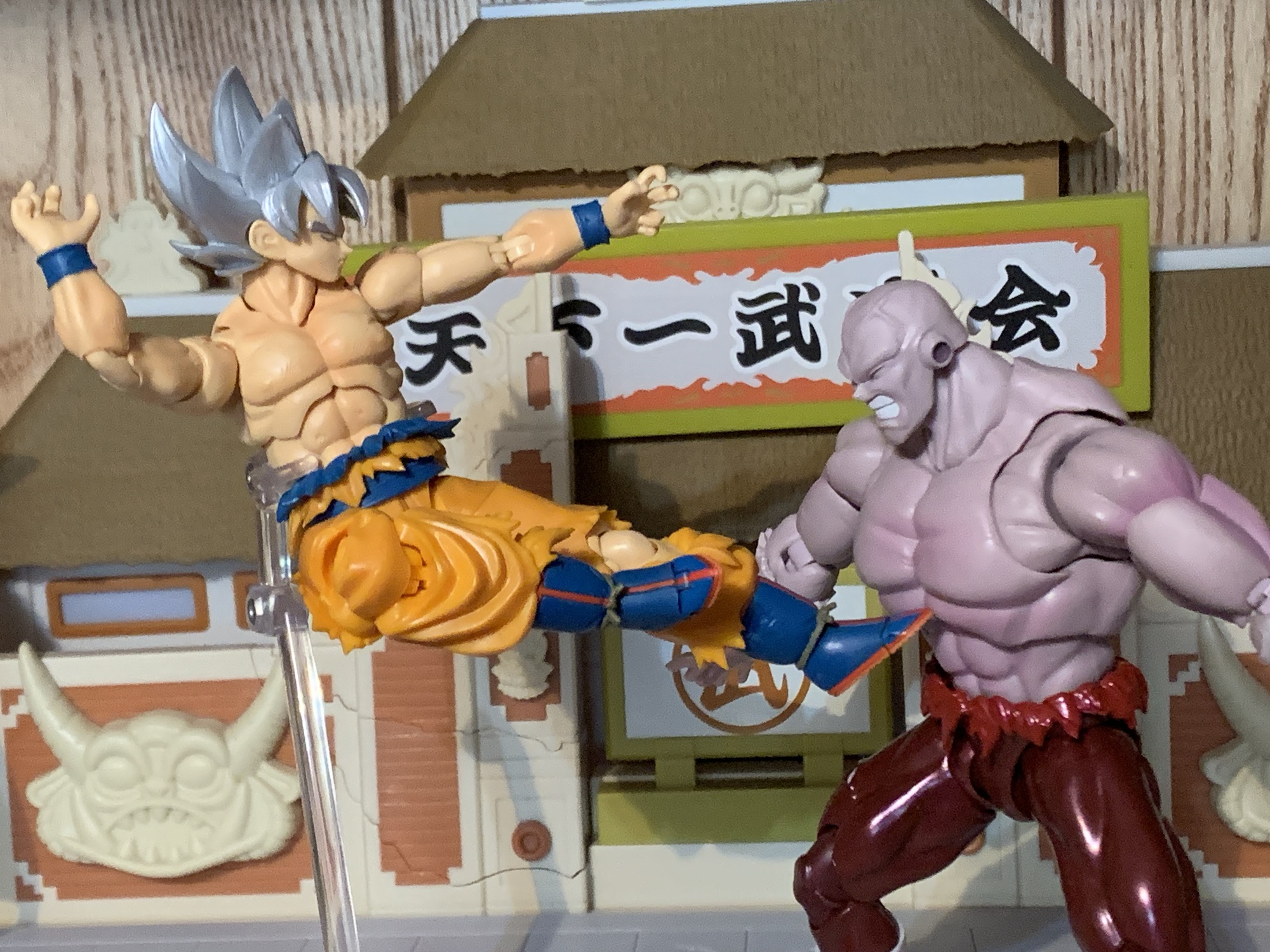
Whether you’re a Jiren fan or not, it’s hard to deny that this figure looks pretty cool.
It would seem that FOMO, the fear of missing out, is my primary motivation for purchases in Bandai’s S.H.Figuarts line of Dragon Ball action figures. The last one we looked at was a big one for me in Future Trunks from Dragon Ball Super. That dreaded FOMO was strong enough that it got me to buy a figure I knew was compromised and had no chance of truly satisfying me, but buy it I did. Today’s FOMO purchase was done almost for the opposite reason. Really, it happened only because I initially decided not to get that Trunks figure and put my money towards this one instead. And I am talking about Jiren.
This dude must live in the gym.
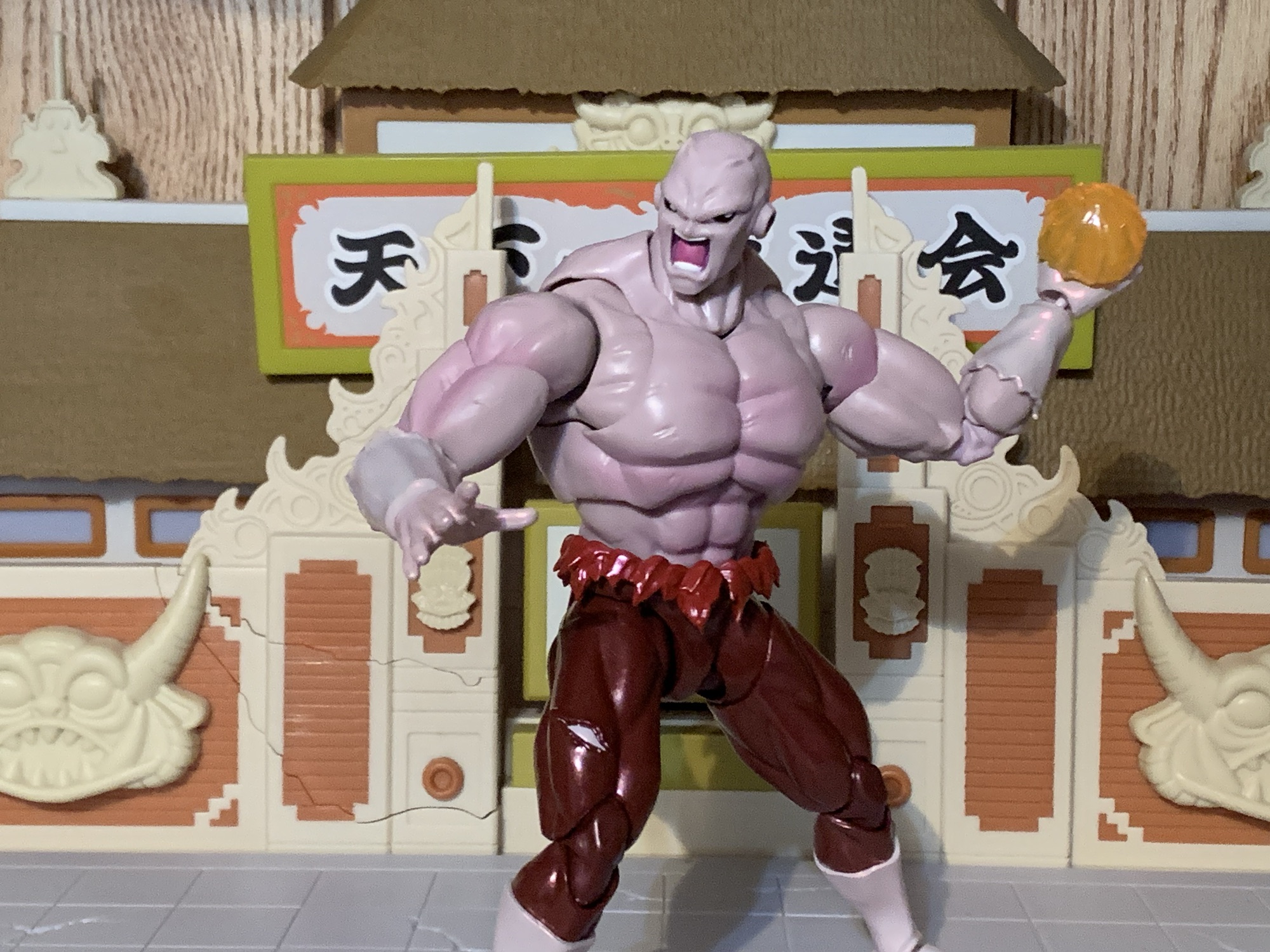
Jiren is the big bad guy from the so far final arc of the Dragon Ball Super anime. The series has continued in manga form, but as of right now there’s no real concrete proof the anime will resume. In terms of Dragon Ball bad guys, Jiren isn’t very interesting. The plot of that final arc is that the Gods of the many universes have decided to pit each universe against each other in a battle royale. For the victor, a wish from the Super Dragon Balls which are capable of granting any wish one can think of. For the losers, total annihilation in the form of getting wiped out of existence. It’s not even death, it’s just deletion. As a result, all of the warriors competing against our favorite heroes are just fighting for self preservation. While some are certainly bad guys, most are just like Goku, Gohan, and all the rest in that they just don’t want to be ended.
He’s more bulk than height.
Jiren, for his part, is not a bad guy. He is supremely confident bordering on arrogance, but he’s not the taunting type like Vegeta. Instead, when he determines that no one is worth his time he chooses to sit in a meditative state. It comes off as arrogance from the outside, but whenever he’s challenged he backs it up so it’s not like his arrogance is unearned. Furthermore, as a character design he’s a little boring for an Akira Toriyama character. His defining feature would be that he has a massive upper body and comparatively small legs. His head is almost like that of your garden variety alien just without the massive cranium. He also has those Frieza-like ear holes which show up in many character designs. As a result, he’s really just like a random video game boss from a plot-less arcade brawler. Our hero Goku just needs to get to him and then find a way to overcome him. Jiren isn’t evil, he’s also not exactly heroic, he’s just a guy.
“Don’t make me throw this at you!”
Because of my attitude towards Jiren I’ve never felt much of a pull to add him to my collection. I saw the figures before I ever saw him in the anime and was feeling incredibly underwhelmed by the design. The figures came and went though and they actually seemed to receive high marks from those who bought them. The sculpts, the way the articulation was implemented, and the overall size made them seem like really good action figures. Ordinarily, that’s not enough to get me to buy a figure of a character I’m not attached to, but then I went and got Ultra Instinct Goku and the desire to add a Jiren to pair with the figure manifested. When I felt similarly underwhelmed by Bandai’s 2024 convention exclusives, it was Jiren that I decided to preorder and Jiren alone.
He probably would need a bigger aura than the standard one. Maybe that’s why one wasn’t included?
Jiren comes in the standard event exclusive packaging with a black and red color scheme. This is Jiren as he appeared at the very end of Dragon Ball Super his body hulked up to gargantuan proportions and his uniform in tatters. Like Trunks, this event exclusive version has a new paint job and it’s trying to replicate Jiren’s red aura. His ordinarily pale purple flesh has a blush of pink to it while his black pants also have a shiny, red, hue applied that almost makes him look like he’s candy-coated. His flesh has a matte finish so this high gloss approach is far less distracting on Jiren than it is with Trunks. The only thing I don’t really care for is that his white gloves, once the pearlescent red overcoat is applied, makes them blend in a little too much with his arms. There’s not much contrast there aside from the gloss. The same is true for the boots, but since he’s still wearing pants it doesn’t look as noticeable. All that is to say that I don’t hate this approach and it’s executed well enough, but if I could have the standard paint job I’d probably choose that over it.
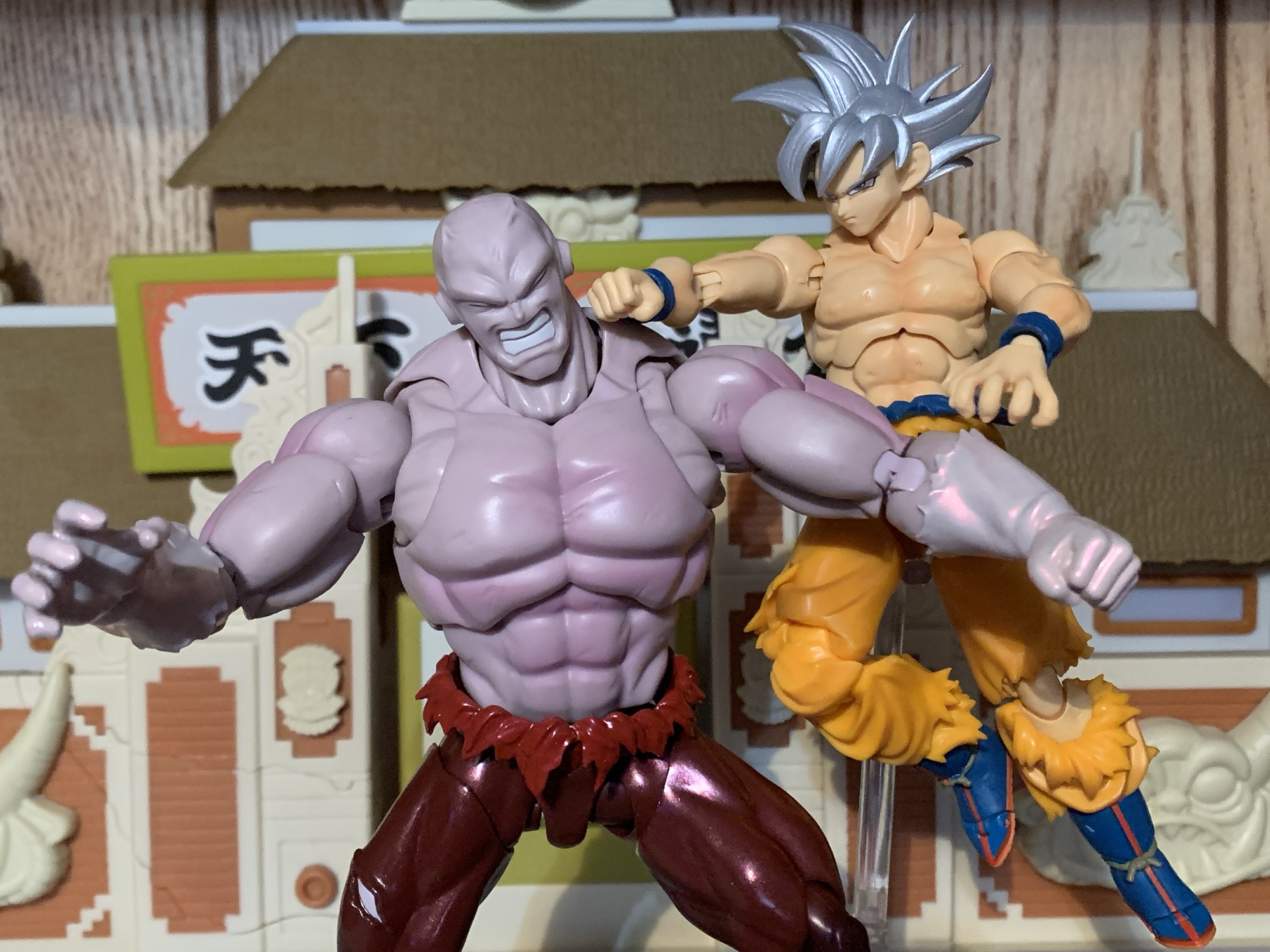
He’s destined to battle Goku for as long as both are on my shelf.
The selling point with Jiren is not the paint, but the sculpt. This is a big, beefy, boy. He’s really not extremely tall by SHF standards. He comes in at roughly 6.75″ making him noticeably taller than Goku, but he’s still shorter than a figure like Nappa or Orange Piccolo. What really stands out is just the bulk. Jiren has this huge, puffed-out, chest that really captures the look of the show’s art. If I have one consistent criticism with this line it’s that the chests on most figures aren’t big enough. They’re usually plenty broad, but view the figure from the side and it’s like their pectorals are nonexistent. It’s almost like they just drew their muscles on with a sharpie. Jiren does not suffer from that which makes him an interesting figure to look at and handle. I love chunky figures, and Jiren certainly fits the bill. His arms are massive as well and while his legs look small by comparison, they’re still thicker than Goku’s. I may not love the character design, but it would be hard to argue that Bandai didn’t nail what was presented to them.
Tag! You’re It!
I was pretty disappointed with how the Trunks figure had a bunch of accessories cut. With Jiren, that’s not a problem. He seems to have retained everything from the standard release including all four portraits: neutral, teeth-gritting, yelling, and a closed eyes with teeth gritting. The closed eyes head captures his frustrations when he finds he’s being overpowered late in the fight and also works as an expression for when he’s taking a blow on your shelf. They look good and the only aspect of them I don’t really care for is the thin, white, outline around the eyes. It makes it look like Jiren just has massive pupils, but when I look at stills from the anime it sure looks to me like he’s supposed to just have big, black, eyes. Any other colors are just shading and trying to create the illusion of a somewhat reflective surface.
I was surprised by the double-ball peg wrist joints.
For hands, Jiren has four sets to choose from: fists, clenching, chops, and splayed open. For his left, clenching hand, he also has an effect part. It’s basically a little handheld fireball and it’s made out of translucent orange plastic. There’s an indent for that specific hand which allows his thumb to slot into it so he gets a good grip on it. You don’t need the indentations if you just want to stand him with his palm pointed up holding it, but if you want to pose him like he’s going to throw it then you’ll want to stick it in his left hand. It’s always good to get an effect part, but it is pretty small and not something likely to stand out on your shelf. As was the case with Trunks, what we’re really missing is just an aura effect to pair with this exclusive paint job. A red aura makes too much sense here, but Bandai didn’t want to throw one in. He already cost $75 so I guess I can’t be too upset about the omission as I doubt I would have been willing to pay much more than that for a character I’m lukewarm on.
Looks like you missed, Jiren!
A bulky body presents challenges for anyone looking to cut it up and apply articulation, but it’s something the folks at Tamashii Nations are pretty adept at. Jiren’s torso is certainly cut-up for articulation, but not distressingly so. There’s no gapping at the base of the neck and he gets decent range there. The heads pop off very easily, but at least they go on just as easil, as they use that drum setup we’ve seen with figures like Krillin and Nappa. His shoulders are on big, butterfly, joints and they get okay range come across the chest, but that chest is so big that it can only do so much. It doesn’t go back really at all which is more disappointing than the range going forward. Range at the shoulder otherwise is fine and you get a bicep swivel, double-jointed elbow, and ball peg wrists. The double-ball peg wrist was a surprise as normally they use a ball hinge. It functions well enough, but if you want to get the most range you’ll have to accept a gap between the wrist and hand.
And now Jiren must pay the price for failing to land a blow.
The torso features what I assume is a double ball peg in the diaphragm. It’s mostly for tilt forward and back as there’s really no rotation. You get a little of that at the ball-jointed waist. Between the two, the crunching forward and back is nice and you get just enough rotation to make it work. This hips go out to the side almost to a full split and kick forward 90 degrees. He does have a sculpted ass so there’s nothing going back unless you kick the leg out to the side. The figure has thigh swivels, but mine won’t budge. I don’t know if that’s a common issue or not. It could be caused by the new paint job since it seems like a thick coat which may have required some tiny adjustments to the tooling that weren’t made. Or I just need to hit it with a hair dryer. Double-jointed knees are fine and the ankles are hinged. They didn’t leave enough space for the ankle rocker though so it’s pretty limited. There’s also the customary toe hinge if you want it.
Oh the agony of defeat – better luck next time, bud!
Jiren’s articulation is probably going to be good enough. He’s meant for strong, powerful, poses and he has the capability of pulling off such feats. I wish the diaphragm joint allowed for some rotation. I think their old hinged-ball joint would have made that possible. More so, I’m disappointed in the ankle rockers as he has some pretty small feet relative to his size and not being able to get them flat on a surface in some stances can make keeping the figure upright a challenge. It’s enough though and the combination of sculpt, paint, and articulation makes this a worthwhile release. It wasn’t the re-release I was hoping for, but it’s not one I regret buying. He fits in nicely on my shelf opposite Goku and now I kind of want a proper Dragon Ball Super Frieza to add to the confrontation. It looks like Bandai has taken this listing off of their website as he was available in February as an in-stock item, but that doesn’t mean he sold out. They may be holding back stock for in-person sales at conventions and pop-ups. For that reason, it may not be terribly expensive on the secondary market. If it’s a figure you feel like you need, then I do recommend tracking it down. If it only retails for a small markup then I’d consider it worth it as I don’t think we’re ever going to get another Jiren. What is out there is likely all that ever will be.
For more Dragon Ball Super action figure reviews look no further:
It’s sort of interesting to me that the first Dragon Ball action figure I review after the passing of creator Akira Toriyama is one based off of the artwork of his protege – Toyotarou. Toyotarou basically lived the dream of fanfic artist and writer turned official. It’s rumored that he worked on the fan-fic manga…
Our last look at an S.H.Figuarts release was the Dragon Ball GT Super Saiyan 4 Goku. Now, we look at a figure from the series that effectively replaced GT: Dragon Ball Super. And perhaps the most popular villain from that new series is Goku Black. Without getting into spoiler territory, Goku Black is basically an…
When Akira Toriyama set out to draft the plot for Dragon Ball Super: Super Hero his original goal for the film was to take a favorite character of his and give him an upgrade. That character was Piccolo who had basically been left behind by the likes of Goku and Vegeta way back at the…
Trunks is back from the future and needs help cleaning up yet another mess.
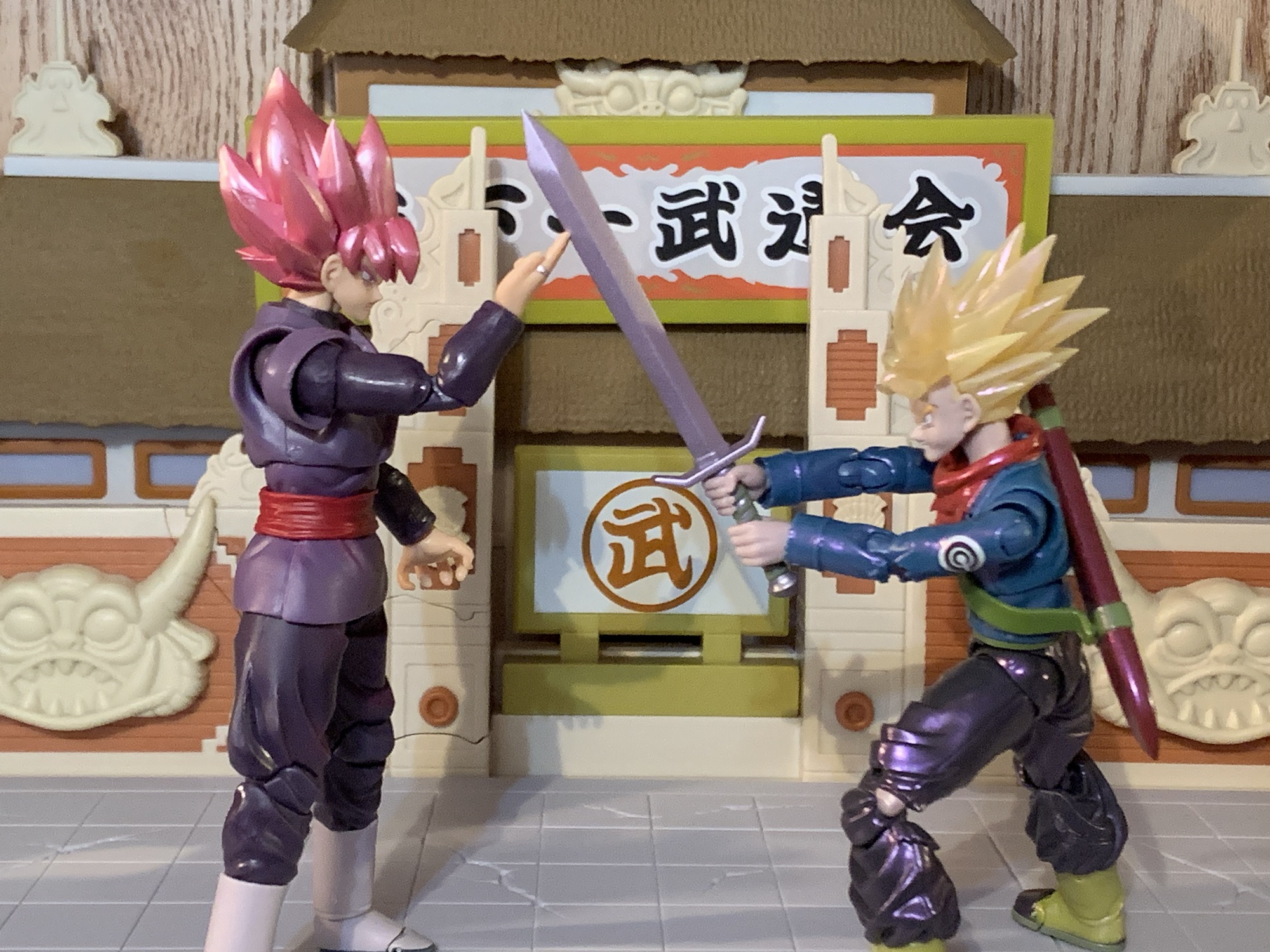
When looking back on the anime adaptation of Dragon Ball Super, I think my favorite arc is the Future Trunks/Goku Black one. It does get messy at times, and like most things Dragon Ball it goes on longer than it needed to, but it had some real, emotional, stakes which isn’t often found in Dragon Ball. The time travel stuff is always a ton of fun and Dragon Ball has its own spin on how time travel works with new wrinkles introduced in Super. And it marked the return of fan-favorite character Trunks, the boy from the future. The future version of Trunks is much different from the younger one in the main timeline. That Trunks has had a relatively carefree life (though he technically did die once) whereas the future counterpart has only known hardship. And he’s basically just another son seeking his father’s approval, but he just so happens to be the son of Vegeta, not the sort of touchy feely dad. The saga provided some closure there, and unlike the Cell arc from Dragon Ball Z, Trunks got to be the hero of his own story as opposed to sitting on the sidelines waiting for someone else to take down the big, bad, guy. Though he still needed an assist from God.
I liked this version of Trunks so much that I even got the Dragon Stars version. It’s the only Dragon Stars figure in my collection to this day.
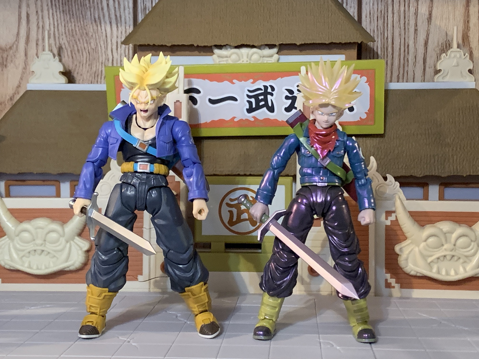
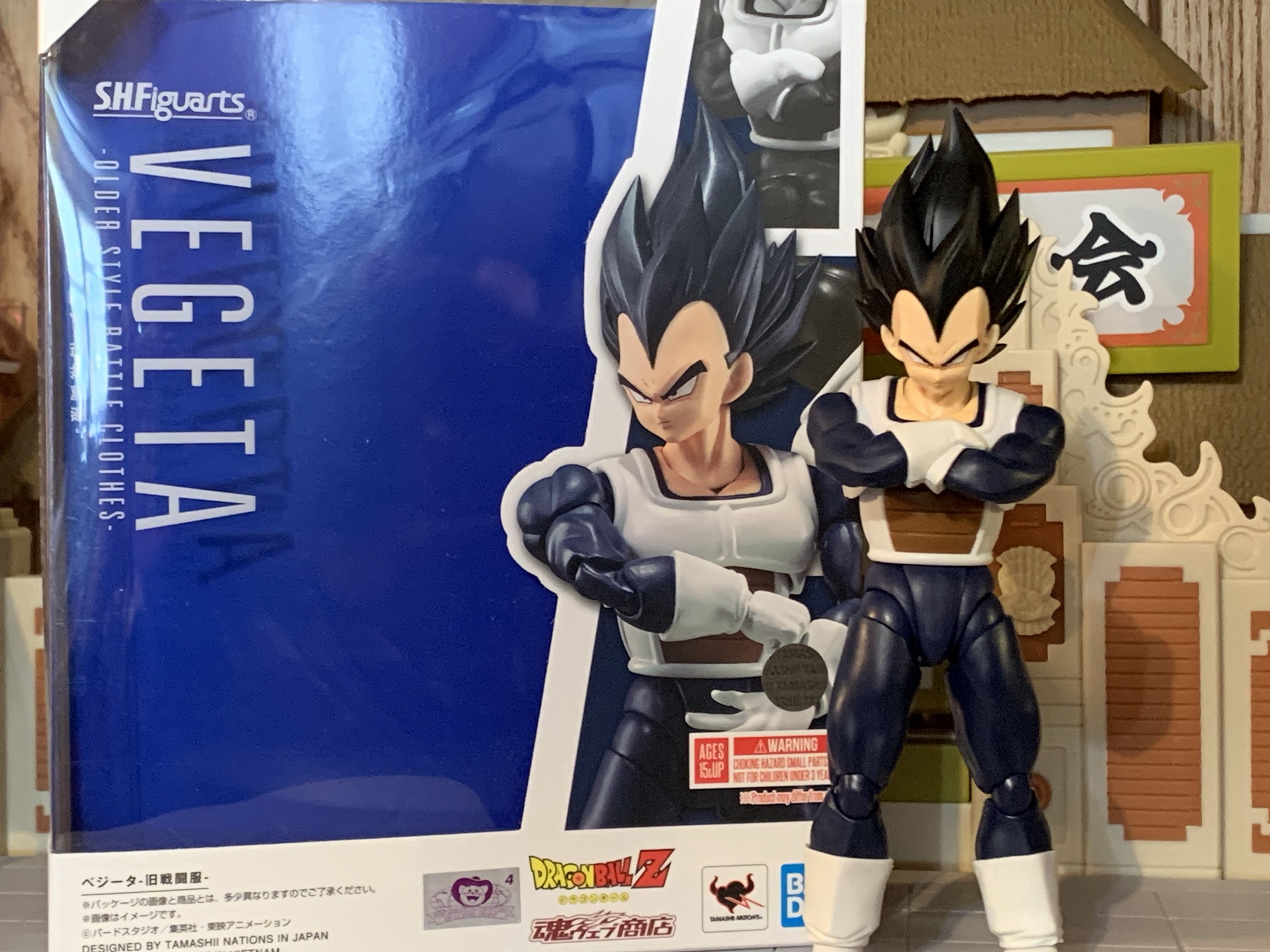
It was years ago that Bandai and Tamashii Nations released the Super version of Future Trunks in the S.H.Figuarts line. 2018, to be exact, and at a time when I wasn’t collecting this line like I am now. Even so, I considered getting it, but it seemed pretty pricey to me at the time. I had not yet been conditioned to the SHF pricing model (some would say that’s a good thing) and I decided not to get it. As you can probably guess based on where this has lead, I ended up regretting that decision. The figure is even more expensive now on the secondary market as it has never been re-released. And perhaps worse, the secondary market can be tricky to navigate when it comes to a figure as old as that one because bootlegs are a real problem. And since it’s an older figure, it’s also a bit dated and spending the extra coin in today’s dollars might just leave me with a serious case of buyer’s remorse. No, instead I’ve opted to bide my time in hopes that Bandai would return to Trunks. He is, after all, a fan-favorite and probably a safe bet to sell well. It’s just a question of whether or not the Super version is as popular as the one from DBZ.
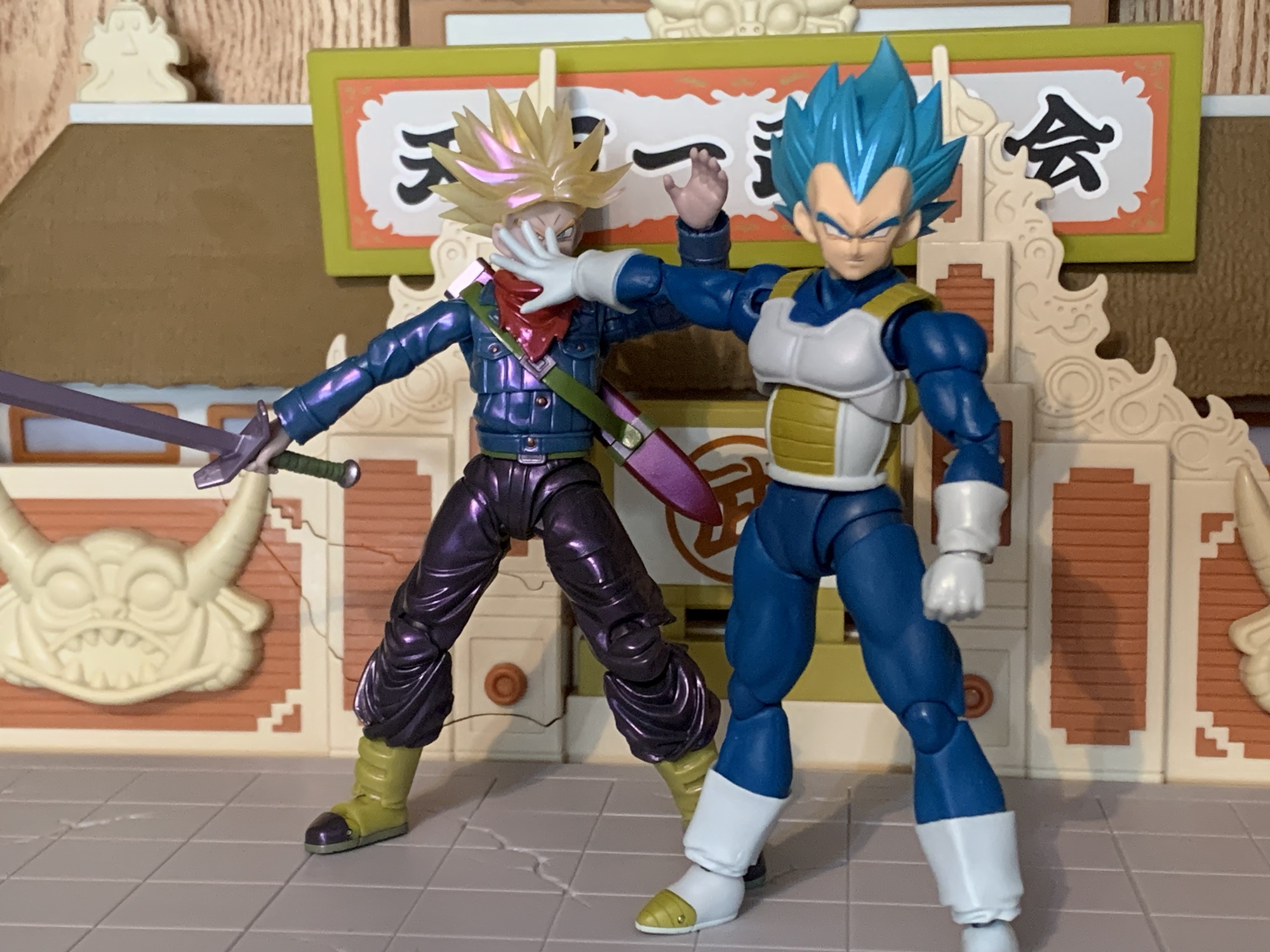
The height is okay, but damn is Trunks tiny next to Goku and Vegeta.
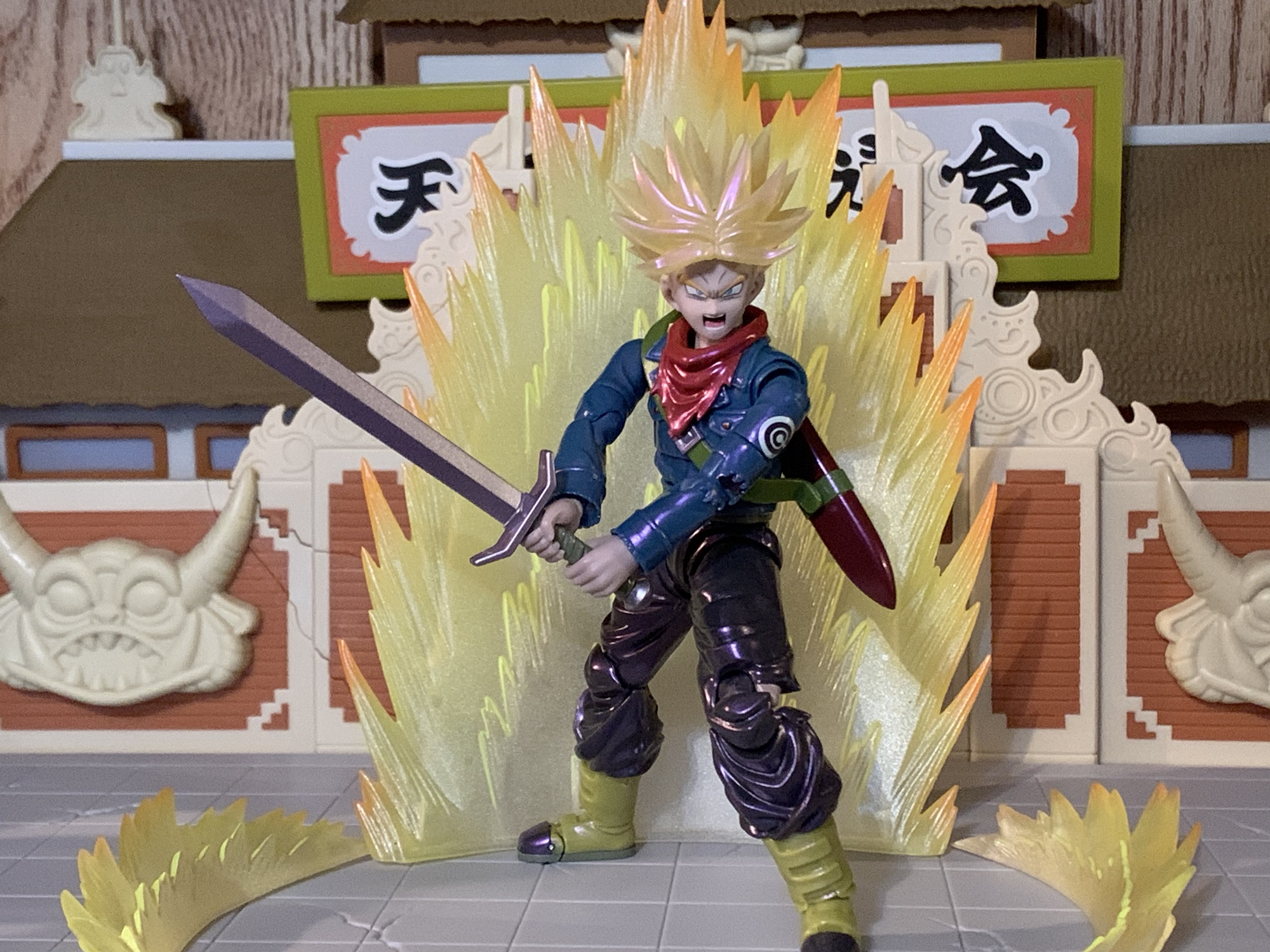
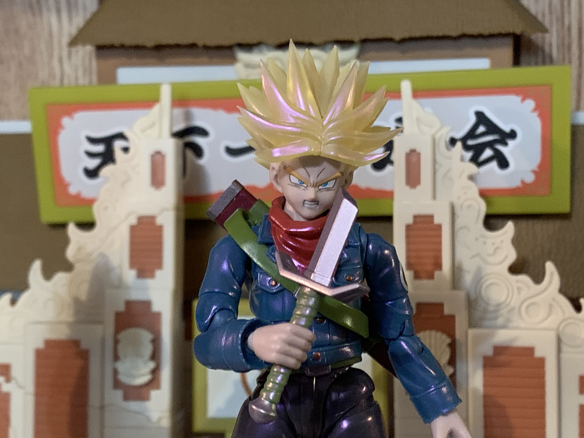
2024 ended up being the year where my patience paid off. Maybe. Future Trunks was announced as a convention exclusive, but like most exclusives, it meant he was going to be a variant of the original release. To be specific, this is considered the Gallick Gun edition. Trunks has adopted one of his father’s signature moves and with it comes a purple aura. To achieve this effect, Bandai gave Trunks a coat of pearlescent paint with a purple hue to it. They also went with the translucent Super Saiyan hair which they’re rather fond of when it comes to convention exclusives. I didn’t love the look, but it wasn’t going to be a deal breaker. What bothered me more than the new deco is the cut in the accessory load-out. Gone is the standard Trunks head even though he can certainly perform the maneuver when not in his Super Saiyan form. Worse though, is the removal of the Hope Sword. In the anime (spoilers if you have yet to watch it), Trunks has his sword break while battling his foe. When all hope seems lost, Trunks basically creates a Spirit Bomb out of his broken sword. The effect part was this big, translucent, blue, sword that I think even necessitated its own stand. It was pretty awesome in the show and seeing it in figure form was a huge draw to that original figure for me. Having that get cut, plus an MSRP of $75 for this new version, really soured me on it.
And he’s even tiny next to…Trunks!
So I didn’t get it. What? But this is a review for that figure, you’re probably saying to yourself as you read this. Yes, obviously, I changed my mind. The regret of passing on that original figure was pretty hard to get over and still is. I didn’t preorder this figure, but unlike in past years Bandai apparently made more than what was ordered. Future Trunks was stocked after the fact on their webstore along with some other exclusives, and to make it even more enticing, Premium Bandai ran a free shipping promotion on its website for a week. And damnit, they got me. They got me for the Vegeta we looked at last week, they got me for the Trunks we’re looking at this week, and damn near got me on the Mini Goku, but I figured I was already giving them enough of my money. Now that I have paid for this figure, it’s time to sort out some feelings.
The paint job here is trying to sell the idea of an aura around him. Problem is, I don’t have the right color or know if they even make one in the proper shade.
Future Trunks comes in the event exclusive style box which, in this case, goes for a black and pink color combo. I’m surprised they didn’t go with more of a purple considering the theming, but whatever. It’s just trash to protect the figure inside. Trunks is, as advertised, in his Super Saiyan form and stands approximately 5.25″ to where I assume the top of his head would be with his hair extending far beyond that. Out of the box, he won’t have his scabbard across his back and to put that on you will have to remove his head. It’s not really one of those SHF heads that’s designed to come off and go back on easily and the spiky nature of his hair doesn’t help things. I went ahead and dunked him him in some hot water to make it easier. You will also likely need to remove the scarf piece that’s around his neck which tabs into the chest. The scabbard can then slide over an arm easily enough and there’s an extra tab hole behind the right shoulder to secure it in place, though it isn’t really necessary.
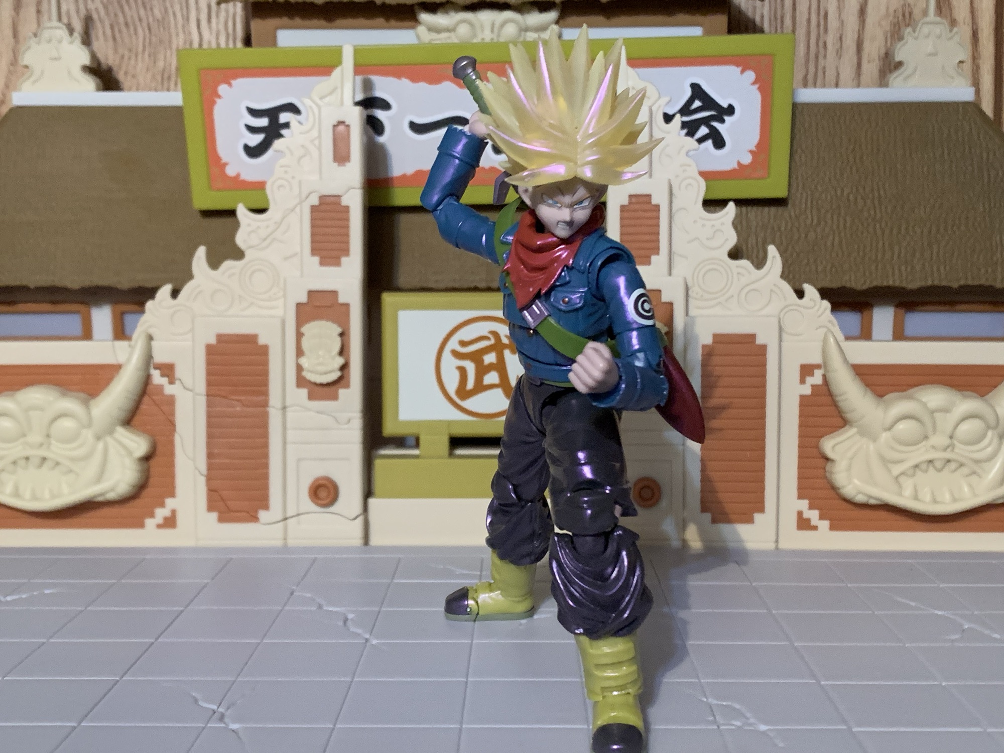
The Gallick Gun pose – it’s kind of goofy, but it’s what Bandai chose to hone in on with this edition.
It should be stated that this version of Super Saiyan Trunks is what some fans have dubbed Super Saiyan Rage. Trunks, during his battle with Black, taps into another fountain of power through sheer rage. His hair sticks up higher and becomes even spikier than usual similar to his Ultra Super Saiyan form from Dragon Ball Z, only this time it comes without much added bulk. His eyes do white out and his yellow aura develops a blue core which seemed to signify to the viewer that this was similar to Goku and Vegeta’s Super Saiyan Blue. It’s also seemingly just as powerful as he’s able to go toe-to-toe with Black in this form. It is an anime only thing, so who knows if Toriyama considered it canon, but Gohan’s Beast form sort of follows in its footsteps as a form that’s unique to half-saiyans.
We have a few charging effects in this line, but we’re really lacking in the beam department.
Bandai got the hair right, but not much else when it comes to the look. The outfit is all there and fairly accurate. Trunks has a more traditional jacket than the half one he used to sport and his pants are pretty much the same as they’ve always been. The figure though is just very slight. Put the new Vegeta next to him and they look like they’re two different scales. The height is okay, but the face, the arms, the torso – they’re all narrow and thin which isn’t something I see much in Dragon Ball. Place him beside the somewhat recent Future Trunks from the DBZ line, and it’s even more stark. That figure looks like it’s the more mature fighter, not this one who should be much older. Some of that is likely due to the jacket being all part of the sculpt. There isn’t a body underneath an overlay. It makes for a clean presentation, especially compared with the somewhat janky recent Future Trunks, but it definitely slims the profile. In order for Trunks to exist under this jacket, he’d have to be around 100lbs. He would be a very small man, which is not befitting the character from the show.
He’s still carrying that old blade. Well, actually, it must be a different one since he’s broken them before.
Aside from that issue, and it’s a rather big one, Trunks looks okay. The portraits have been given some enhancements and they’re nice and crisp. The paint on the body is clean and this new finish seems to achieve what it’s going for, whether I subjectively like it or not. The translucent hair is still kind of a sore subject for me. That might be going too far, but I don’t prefer it to painted hair. I think the best would be to go with a pale yellow and then a shiny coat of paint over it. The hair is coated like the rest of the figure so it has a shiny quality to it. I know it’s supposed to be the result of an aura, but it mostly reminds me of soap bubbles and the colors that dance around on their surface. It is what it is and I don’t hate it, it’s just not an improvement over what we had before. And since he doesn’t come with an aura effect to go with it, it does feel incomplete to me.
Silly boy, you can’t stop a god with a knife!
I’ve already mentioned how accessories were cut for this re-release, so just what was maintained? Well, for starters we get four portraits: smirk, teeth-gritting, yelling, and yelling with a side eye. They’re fine, but what’s missing is just a stoic, or grim, expression which is the expression I think of first when it comes to Future Trunks. I don’t think we really need the smirk, to be honest. And it would have been awesome if one of the yelling heads had whited-out eyes. For hands, we get a set of fists, gripping, splayed open, clenching, and one left, relaxed hand. I think the relaxed hand is here for him to hold his scabbard, though I don’t know for sure since it’s not in any of the pictures. The right, clenching, hand also has a hole in it and it’s for the effect part which is a little, translucent, purple, energy ball. It comes on an acrylic post that’s maybe a third of an inch long and it pegs into the hand via a ball socket. This is for his Gallick Gun charging pose which is one awkward pose. I guess Vegeta couldn’t have a Kamehameha stance so he does this thing where his palms are always pointing out as he charges the maneuver with his hands together. It’s achievable, but weird looking. Maybe that’s why he pretty much stopped doing it in favor of other attacks?
I warned you.
Lastly, Trunks has his trusty sword. We get two versions: regular and broken. The broken one serves a narrative purpose, but also it’s easier to slot into the scabbard. The hilt is painted green while the blade and pommel are silver, but like the figure itself, there’s a hit of pink on the blade so it matches the whole aura theme they’re going for. And like the DBZ counterpart, the pommel comes off so the sword can slide into the gripping hands. It only goes on one way, which is a bit annoying when you’re fiddling with such a tiny thing, but the figure gets a very tight grip on the handle. Almost too tight as it takes some elbow grease to get it out of his hands once there.
Everybody talks about the Father-Son Kamehameha, but what about the Father-Son Gallick Gun?
One area with this figure I have little to complain about is the articulation. Since the figure doesn’t utilize an overlay for the coat, all of the articulation is cut right into the figure and since the scabbard is secured via a sling, it doesn’t fall off constantly. The head is on a hinged ball peg, which I hate, but it does function fine. The scarf will limit his range though, and while it is removable, it leaves behind a giant hole in his chest so that’s not really a viable solution. Shoulders, biceps, elbows, and wrists are all standard stuff. The figure does have butterfly joints in the shoulders and they work well enough coming forward, but offer nothing going back. There’s a joint in the mid-torso that pivots a bit side-to-side and allows for some forward and back. A waist joint is where you’ll get most of your rotation and he can crunch forward and back thanks to it and the hips. Since this is an older release, he doesn’t have those annoying, sculpted, butt cheeks. Mai may be disappointed, but it allows for full splits going forward and back. Out to the side, you get about 45 degrees. If you can find a way to get the caps in his hips to slip over or under the thigh swivel then you may get more, but it’s hard plastic and not very forgiving. Beyond the hips, Trunks kicks forward well and the thigh swivel affords some pivot. The knees and ankle hinges are fine while the rocker is limited. There’s also a toe hinge if you want it.
How I imagine it would look to be in the presence of the Father-Son Gallick Gun.
I don’t want to overstate the articulation here. It’s not elite or anything by the standards of the line, but it’s functionally sufficient. Trunks can hit all of the Trunks poses well enough. He can hit his downward swing, jab, or have his hand on the handle while the blade is in the scabbard. It will work, and what holds the figure back is not the articulation, it’s almost everything else. The paint job is executed well enough. It’s something you either like or you don’t. The sculpt is dated and not true to the character. He may look off when posed with the new Vegeta, but that Vegeta sculpt is actually just as old. His proportions were never right and this is a version of the character begging for a redo just like the DBZ version received. The reason to get this figure is if you really like the character and feel better paying $75 for it as opposed to the $120 or so you’re likely to pay for a secondhand version of the old figure. That figure will have more stuff and a more true-to-the anime paint job, but will have all of the same problems as this one plus the older face printing. And if you’re thinking of using the updated face plates with the old figure, it’s probably not going to work. The flesh tone here has a purple hue to it. It may not be apparent when looking at the figure by itself, but place it beside another character and it stands out. He’d basically look like poisoned Trunks if you tried to mix and match.
He’s still Trunks and he’s still cool, but he could be so much better.
Am I content with my purchase? I still don’t know. This is an obvious compromise for my collection. It’s a character I want in my display, but not the version of the character I would like. If I could get the older version for a hundred bucks or less then I would not have bothered. Both are compromised takes on the character, but the original less so. And that Hope Sword is pretty damn cool. If you have that old figure and decide to get this one too then you could probably use the depowered head on the new body. The necks won’t match, but the scarf will hide it if you want. The only reason to do that though is if you really like Future Trunks. This version is okay, but not what I want. I would have much preferred they just give him a blueish hue and make him Hope Sword Future Trunks. At the very least, he should have his own aura to go with the Gallick Gun. A Hope Sword Trunks could have created his unique yellow and blue aura and would have looked way cooler. Plus such a display would lend itself well to being off on its own in a different part of your collection making the size issues less of a concern. Oh well. If you’re like me and really regret passing on the Super version of Future Trunks, I guess you may as well grab this one if you’re okay with the price. Once it’s gone though (and it’s no longer being offered on their website, but it may be making the convention and pop-up store rounds) I wouldn’t entertain paying so much as a dime more than MSRP. Hopefully, something better for Future Trunks is in our future.
If you like Trunks or are just really into Dragon Ball Super then you may like checking out these reviews:
In the waning days of Toys ‘R Us, I found myself at one of the nearby stores in need of something. What that something was, I don’t recall, but since everything was hitting clearance I had a look around the store. TRU had started carrying the Bandai/Tamashii Nations S.H.Figuarts line of action figures which, at…
The most captivating character in all of Dragon Ball Z for me back in the 90s was unquestionably Trunks. The offspring of Bulma and Vegeta who traveled back in time to warn the heroes of the day about impending doom on the horizon was unique for many reasons. For one, he actually looks like a…
My isn’t that title a mouthful? This version of the classic character Goku comes to you from Bandai via New York Comic Con. If I were to simplify that title, I’d call it shiny Super Saiyan Blue Kaio-Ken Goku, which is still pretty wordy. I guess blame Dragon Ball creator Akira Toriyama for the obsession…
I guess we’re making the first week of March Vegeta Week here on The Nostalgia Spot, and why not? He is royalty, after all. This one should be a short one since we’ve looked at this figure before. Multiple times. Bandai has been able to extract a lot of value out of their Super Saiyan Vegeta mold which I believe was an early 2.0 body for the S.H.Figuarts line. It was also the first figure in the line I got way back in 2018. It’s funny to look back on how smitten I was with that figure and now I look at it and seem to only notice the flaws. What has at least held up over the years is the overall look of the sculpt, which is good since Bandai hasn’t really changed it. It’s not perfect, but obviously good enough for me to keep buying it. I now have four versions of this figure, plus two more that also share some parts. For awhile, I had just one Vegeta figure and now there are many, but since he is Saiyan royalty I guess that’s fitting.
Goku could use a similar upgrade.
Much more recently, Bandai reissued it’s Super Saiyan God Super Saiyan Vegeta for the line’s 15th anniversary. That figure was one I had been hoping would see a revision because I had missed it back when it first came out and I have come to really enjoy the look of Super Saiyan Blue. I was, however, disappointed with the reissue because there were no updates to the original figure. In more recent times, Bandai has reissued figures aplenty, but always with improved face-printing. They didn’t do that for their special 15th anniversary figure and the result was a figure that looked dated. Fast-forward a few months after release, and we find out that another Super Saiyan Blue Vegeta is on the way and this one was ticketed to be part of the budget-friendly $35 subline. These are the figures shipped to brick and mortar stores that typically are of the most popular characters and are designed as an entry point for newcomers. Even though the price was far better than a lot of new figures in the line, I was still annoyed by the release since I had just spent good money on a lesser version. I got over it though, and when the Premium Bandai website was offering a free shipping promotion in February I decided to just grab this new Vegeta to seemingly right the prior wrong.
I have no shortage of Vegetas.
Dubbed Unwavering Saiyan Pride, this Super Saiyan Blue Vegeta is indeed very familiar. The body is exactly the same as the previous release, but the deco has been refined. The original was white and brown on the armor with a shade of blue for the bodysuit that bordered on purple. It’s a similar color to the manga. The re-release from a few years ago (which I didn’t bother to review) saw the blue altered to a more royal blue with the straps and plating on the armor lightened to a shade of tan. The white portions of the suit are a more off-white. This new Vegeta keeps the off-white while pairing it with a dull shade of yellow-brown that basically sits in between the prior two figures. The bodysuit is a new shade of blue with a touch more yellow. It reminds me of the ocean in the Caribbean giving it an almost warm feeling as opposed to the usual coldness blue imparts.
The faces on this one are so good.
This updated shade is likely here to play off of the new head sculpt. As far as I know, this portrait is entirely new. The shape of the hair is different from all of the other Vegeta figures I own. It fans out more which does seem to match his depiction in Dragon Ball Super – maybe we should think of this as a Toyotarou version? The hair is a light blue with a pearl finish. Like the body, there’s a touch more yellow making it lighter than the previous Super Saiyan Blue figure. It does help to give off the illusion of a radiating Vegeta and this figure would pair well with an aura effect.
He’s got the hands for a classic Vegeta stance, but those hips won’t let him go much lower.This pose makes me wish he had an effect part, but for 35 bucks one isn’t expected.
I like the overall approach by Tamashii Nations here, but the execution is a little suspect. I suppose it should be expected at the lower price point, but there’s no reason to skimp on quality either. After all, it’s the same company on the box no matter the price. Paint is a little sloppy in places and most noticeably around the neckline. The blue is fuzzy and my figure has a blob of brown on the back of the neck which I guess is from the armor straps. The edgework around the armor isn’t as clean as it could be, and like the recently reviewed Old Style Battle Clothes Vegeta, some of the steel in the right elbow joint is visible suggesting it was slightly misaligned during assembly. More annoying though is the miscolored parts as the crotch piece is a darker blue from the rest of the legs. I think this is caused by the crotch being a slightly harder plastic and the legs having a little bit of a wash applied to them. I don’t know how well it shows in pictures, but in-hand and under normal lighting conditions it’s pretty noticeable.
Maybe my least favorite expression of the bunch, but it still gets the job done.
What did turn out well though are the portraits. These are Bandai’s best Vegeta expressions yet and they alone are worth the upgrade. We get four expressions this time: stoic, yelling, teeth showing, and a smirk. Maye instead of stoic I should call this Vegeta Resting Bitch Face because he looks kind of pissed. He looks really ticked off with the teeth-gritting expression and the smirk is the perfect, cocky, Vegeta we all know and love. I love all three, while the yelling one is a bit more specific. It’s also longer as a result and looks a touch off to me, but not terribly so. The rest of the accessories are the same old, same old: fists, clenching hands, martial arts pose hands, open hands, and a right thumb gesture. He also has the old style crossed-arms piece that connects at the biceps. I didn’t bother to try it out this time because I already have it on two of my Vegeta figures, three including the Namek Vegeta.
“Step aside, boy, I’ll handle the rest.”
Articulation is exactly the same as the past Vegeta figures. The new head doesn’t function any better or worse and they’re still sticking with that annoying hinged ball peg for the neck. The hips are the most restrictive part of the figure while the hinged joint in the mid-torso feels welcomed after handling the last two Vegeta figures that lacked it. It’s mostly fine, but showing its age here. We could use a Vegeta with better butterfly joints as well as better hips. The ball peg ankles also need to be fired into the sun.
Kick that imposter’s ass, Vegeta!
Is this a figure that’s worth $35? Absolutely. It’s not perfect and some aspects of it are dated, but compared to other brands at this or a similar price and it’s still damn impressive. It gets right what it needs to and that’s the color pallet and the expressions. This is probably the best Vegeta figure yet unless you really like Super Saiyan 4. I prefer a more traditional Vegeta and while Super Saiyan Blue might not be anyone’s idea of traditional, I do think the guy looks good in blue so if I had to get rid of all of my Vegeta figures but one this would be the one to keep. I do think we could do with an update and hopefully Bandai is willing to go beyond the anime and give us Vegeta figures from later in Super. Those would present an opportunity for something new. They also haven’t done his maxed out blue from the end of the anime. Perhaps an ascended Super Saiyan Vegeta on a new body could be in the cards? That would lend itself well to redos. We’re also getting a new base form Vegeta via the Dragon Ball Daima line this year and I’m interested in checking that out. For now though, I’m happy with this Vegeta and glad I didn’t pass on it. Even if I now have a small army of Vegetas.
When a toy line is as long in the tooth as Bandai’s S.H.Figuarts Dragon Ball Z line, producers tend to start looking in all of the various crevices of the property for new material. We recently looked at a figure that did just that in Mecha Frieza, a version of the chief villain of the…
To celebrate the 15th anniversary of the Bandai/Tamashii Nations action figure line, S.H.Figuarts, Bandai turned to the fans. There was a large roster of releases eligible for re-release to mark the occasion, and anyone who wanted to could cast a vote for their five favorites. The winner was, not surprisingly, Vegeta. And in particular, it…
We’re back with another action figure review from everyone’s favorite version of Dragon Ball: Dragon Ball GT! And really, the only thing people remember from Dragon Ball GT is the Super Saiyan 4 transformation. Designed to bring the Saiyans back to their more primal roots, the Super Saiyan 4 transformation is pretty much on an…
Vegeta is a character who has had a few looks throughout his time in Dragon Ball Z. Almost all of those looks are some variation on his Saiyan armor from his debut with minor tweaks and modifications. Since Vegeta has become one of the most popular characters from the long-running manga/anime, most of those looks have made it into plastic. At this point, it’s easier to pick out the few looks that haven’t received representation in the Bandai and Tamashii Nations action figure line S.H.Figuarts. Despite Vegeta’s popularity, his most recent figures have seen him locked behind the Premium Bandai delivery method. This is essentially a made-to-order process that comes in at a higher price than a general release item. For example, there’s currently a Vegeta hitting Target stores and other vendors for $35 since it’s mostly a reissue with updated deco. This Vegeta, despite also being mostly reuse of the prior Premium Bandai release, was marked at $60, but if you have always wanted to have Vegeta in his Frieza Saga look then you had to swallow your pride and pay the piper.
Did we need two different Namek Vegetas? Yes, of course.
The Old Style Battle Clothes Vegeta is what the fandom commonly referred to as Namek Vegeta back in the day. Even though he featured two distinct looks, the first one was so similar to his appearance in the Saiyan Saga that this is the look that ended up standing out. And it’s not drastically different from the former. It’s basically Vegeta in a black bodysuit with torso armor that looks largely the same as the previous armor just minus the giant shoulder pads. When Vegeta outfits Gohan and Krillin with battle suits he’s asked why his is different and he says it’s an older model and was apparently all that was available in his size on Frieza’s ship. As a look, it’s a little less dramatic and a little more subtle than what he had before. It does differentiate him from the rest of the bad guys in this era of the show and maybe that was the true point, or creator Akira Toriyama was just sick of having to draw those shoulder pads. It’s also a little bit of a preview of the look he’d feature in the Android Saga which basically just adds straps to the shoulder area and goes back to a more royal blue for the body suit.
The extra battle damage parts are the big draw here, I suppose.
I’m a bit of a Vegeta sicko so I was interested in adding this look to my collection. I was also curious how Bandai would integrate the battle damage into it as well which they showed off in the solicitation images. I was slightly hesitant though because I was a bit underwhelmed by the last Vegeta released via this method: Vegeta 24,000 Power Level. That one wasn’t a disaster, but it had some obvious flaws that ultimately frustrated me. This figure is built off of the same foundation and it was apparent even in the glamour shots. That’s not automatically a bad thing, but when the base of the figure is one that disappointed then it becomes more of a concern.
“Give me the Dragon Balls or die!”
Vegeta stands at about 5″ to where his head most likely would end and close to 6 1/8″ to the tip of his hair. I didn’t go back and check to see what I wrote for measurements on the 24k Vegeta, but they’re the same size. And as expected, there’s a lot of shared parts between the two, but not as much as I thought which might actually be a bad thing. What’s shared are the arms, neck, and everything below the waist. What’s not is the torso, which is expected since we’re talking a different sculpt with the need to integrate some new functionality. What also isn’t shared are the heads. The hair shape on the new Vegeta is a bit more narrow, the black has more of a satin finish, and as a result the faces are different. It’s a slightly frustrating choice because it means the faces aren’t interchangeable between the two. That would have been something fun to make use of, but we’ve been denied.
“Please, Kakarot, don’t let me be remembered like that idiot Yamcha!”
The look of the figure is something of a mixed bag. Even though I wish the heads were the same for some shared functionality, I’m not disappointed in how the Prince of all Saiyans looks from the neck up. The portraits are exquisite and I like this new finish on the hair. The torso is less flat looking than it was on the previous release, but the diaphragm cut still needs some work. I don’t want it gone, but it’s not particularly elegant. The neck is still a problem as there’s almost always a gap between the base of it and the torso. It needed to be larger and have a flange at the base that closes up those gaps. It’s a real bummer because the figure can’t look up using the head alone, but we’ll get more into that with the articulation. The armor is a nice white this time, which I prefer to the off-white of the 24k Vegeta. The body suit is navy as opposed to black which perhaps comes from Toriyama’s notes, but in the anime it’s clearly black. I would have preferred black, but I’m not particularly bothered by it. The shoulders though look awkward. They don’t seat into the torso very well, probably because they were designed for a figure with giant shoulder pads to work around. You can shove the shoulders deeper into the apparatus inside which is the better silhouette, but Vegeta loses his ability to place his arms at his side. If you pull them out slightly for better range, they look bulbous and disconnected from the body. I feel like they could have done a better job here as this just isn’t their best work.
“Oh Vegeta, you never fail to amuse me.”
And to add to that sentiment, we have minor QC issues on this one. The right ball hinge isn’t seated all the way into the wrist and protrudes more than usual. I’ll have to see if I can heat it up and force it in. The left elbow also has some of the steel joint inside visible as if the joint was misaligned slightly during assembly. It’s not a major eyesore, but it is uncharacteristic of this line. If you’re curious, this one was manufactured in the Vietnam factory which has had some great figures come out of it, as well as some that were of a noticeably lesser quality.
“I wish I was a Super Saiyan!”
Paint on Vegeta is, as expected, pretty minimal. It’s mostly limited to the face, the visible part of the torso around the neck, and the battle damaged parts. The paint on the torso doesn’t match the plastic used for the neck and face which is disappointing. The painted battle damaged parts look nice though and there the flesh matches much better, though it’s also aided by the distance between the abdomen and neck. We might as well talk about the parts now, but you have an optional chest piece, abdomen, upper back, and lower back. These pop off pretty easily and are a hard plastic. Vegeta was blasted through the abs by Krillin and the resulting damage is captured well. You have the brown panels, the exposed flesh, and the tattered remains of the bodysuit all sculpted and painted. They look great, no complaints here, though it does add to the gappy nature of the diaphragm joint since the upper part of the chest is a smaller piece than the default one.
“Are you crying?!” “How dare you call yourself the Prince of all Saiyans!”
In addition to the extra armor bits, we get the standard array of Vegeta hands: fists, clenching, open, and Big Bang Attack hands. For portraits, we get five different ones: neutral, shouting, teeth-gritting, sleeping, and weeping. These expressions are how the figure really sets it apart from other Vegeta figures and captures a moment in the series. The sleeping portrait is amusing as he does take a nap in the show which allows Gohan, Krillin, and Dende to sneak off with the Dragon Balls (it’s maybe Toriyama’s laziest solution to a problem) and make their wishes. The teeth-gritting face features terrific details with painted lines and beads of sweat. This is basically Vegeta realizing he’s screwed as he tries to take on Frieza. The weeping head is basically from the moment he accepts that he’s failed and the result of his pride being damaged beyond repair. It’s not from when he’s pleading with Goku to defeat Frieza, though you could probably use it as such if you really wanted to. They’re all very well detailed and I continue to be impressed with the expressions on these latest figures in the line though I’m surprised we didn’t get a cocky portrait from when he was boasting about being a Super Saiyan to Frieza. Again, if he could just share portraits with the prior release this wouldn’t be an issue. The final accessory is old reliable: the crossed arms piece. It’s the same as the 24k Vegeta’s crossed arms piece that separates in the middle and connects at the shoulder, it’s just color-matched for the new bodysuit.
“Gah! Bulma!”
Vegeta’s articulation is pretty much the same as the 24K Vegeta with all of the same pluses and minuses. I already mentioned the limited articulation at the head which is intended to be moved with the neck, but it’s gappy. Same for the torso joint which mostly rotates and is pretty limited going back and forth. The butterfly joint features poor range while the rest of the joints in the arms function as expected. The waist is basically just a pivot point as it doesn’t bend forward and back much at all, nor does it tilt to the side. The hips are able to kick forward just fine, back a little, but suck going out to the side for no real reason. The thigh twists and knees are fine while the ankles are on double ball pegs and don’t work very well. You also get a toe hinge which is fine.
There’s no sugar-coating that this is one of lesser releases in this line when it comes to articulation. It’s one thing for a NECA or a Super7 figure to not articulate all that well because those companies tend to be more aesthetic-focused. Tamashii Nations is all about the P.O.A. and it’s disappointing that they didn’t rework the 24k Vegeta more to make this Vegeta a better experience. These ball-peg ankles have got to go. They finally ditched them on Goku with the Legendary Super Saiyan release and it’s time for them to do the same with Vegeta. This torso also needs to be retired because the diaphragm joint is just bad. They stopped doing the hinged joint in the torso awhile ago, but it would have helped here.
And now it’s time for Vegeta to take a little nap.
Are the problems with the articulation going to matter much in the end? Yes, but maybe not as much as they would normally. If you’re buying this Vegeta it’s because of the very specific look. Bandai did a decent job there by providing the extra parts to capture the battle damaged look Vegeta had when he took on Frieza in his final form. There’s a good amount of portraits and the hands are as expected. The crossed arms piece is going to come with basically every Vegeta and at least it’s the newer version. The only things missing that could have added to the package would have been a new tail for Frieza Fourth Form designed to hold Vegeta in place since it’s a memorable portion of their fight. And then it also would have been nice to get an effect part which is something I wish came with every release. And since we’re paying a “premium” for a Premium Bandai figure, why not start including stands with those releases? A lot of these releases feel a little short when it comes to the value component and something as simple as a generic Tamashii Nations stand would help.
Since this is indeed a Premium Bandai release, the only way to get this Vegeta now is on the secondary market. Some e-tailers like Big Bad Toy Store might stock it, but since they have to pay MSRP like the rest of us it’s going to come at an inflated price. And with these things, it’s hard to know if the price will rise or fall on the secondary market. Bandai did just put Cooler back up for preorder so they have created the precedent that these aren’t just one and done. There’s always the possibility of a recolored edition for a convention exclusive as well, maybe in black? At $60, this Vegeta is already a hard sell. It’s relying entirely on one’s fondness for this specific look. I really can’t recommend anyone extend themself beyond that MSRP for this one as it’s just not good enough.
The Frieza Saga of Dragon Ball Z has been well-represented in action figure form:
Frieza is the villain from Dragon Ball who just refuses to die. His initial battle with the heroes of Dragon Ball Z spans a whopping 30 episodes! Thank goodness that DBZ was a weekday show or else it would have taken more than half a year to see Frieza get taken down. And that’s just…
I can remember a time in my life when I was just dying to see Goku, the hero of Dragon Ball Z, become that which was prophesized: a Super Saiyan! The seed for such a transformation wasn’t planted very early in the show and really only started being mentioned as the original version of the…
When a toy line is as long in the tooth as Bandai’s S.H.Figuarts Dragon Ball Z line, producers tend to start looking in all of the various crevices of the property for new material. We recently looked at a figure that did just that in Mecha Frieza, a version of the chief villain of the…
Conventions are always a great time, even from home, because lots of toy companies use them to show off their latest and greatest. Last year had a number of surprises from NECA where Teenage Mutant Ninja Turtles were concerned. And some of those surprises were pretty damn big. When those conventions end, it’s always fun to rearrange the list in my head of what I’m looking forward to the most. Vaulting to near the top of that list was a figure I hadn’t even really considered would be shown: Shredder. Not just any Shredder, but the Shredder from the Archie Comics run of Teenage Mutant Ninja Turtles Adventures.
I have detailed in several of these figure reviews that I wasn’t a regular reader of the Archie run of TMNT. I should rectify that some day, but I had honestly forgotten what Shredder looked like in those books. I mostly saw those issues via the covers and covers alone and on those he was often depicted as he was in the cartoon. In the books themselves, Shredder was usually colored with a blue body suit and purple cape. The metallic portions of his traditional outfit was colored white with blue highlights. This isn’t that unusual as if you take a look at just about any depiction of Wolverine in a comic his claws are often white. We know they’re steel and probably wouldn’t be white in reality, but that’s comic book coloring logic. The cartoon went with gray for Shredder with minimal shading. The toy went with blue. Shredder was all over the place, but this white and blue look was certainly unique and something about it works. It’s classy!
I could have easily filled this with a bunch of NECA Shredders, but most probably just want to compare this one to the toon Shredder.
NECA is rounding out its line of TMNT Adventures slowly but surely. There’s basically a three-issue arc or so in the comic that NECA has focused on. In it, we meet Slash who comes into contact with Krang. They meet Bellybomb and he in turn helps Krang take over Shredder’s body. Yeah, it’s a bit weird, but since Krang is a brain I guess it makes sense that he can take over the body of other people. He doesn’t have to always ride around in an android’s stomach. That’s why if you come cross this Shredder in a store you may be surprised to see Krang on his shoulders. This figure is Krang as Shredder (Kredder?), but NECA wisely included a traditional Shredder head in the box. It’s a little more eye-catching with Krang in place and likely to get some double-takes by people unfamiliar with this depiction. I suppose NECA is taking a risk with impulse buyers in that the Shredder head isn’t front and center, but I’m guessing most people into this line basically know what they’re in for.
“There, there, Krang, you’ll have a body some day. Just not mine!”
This Shredder, or Krang, comes in the same style of window box as other figures in the line. It’s adorned with original artwork by Ken Mitchroney which all features the Krang head in place. The figure is an entirely new sculpt by Tomasz Rozejowski with a credit to Kushwara Studios. Paint is once again handled by the duo of Geoff Trapp and Mike Puzzo. And following in the footsteps of the Stump Wrestling turtles, this Shredder is pinless. NECA is gradually making the move to a pinless approach with the elbows and knees of its future figures and the results have been smooth. I’m not exactly offended by the presence of pins, but the ones NECA has used in the past can be a bit on the large side. They’re usually good about using the proper color and painting over them when necessary, but there have been a few where they stick out a bit too much (mostly their Bebop and Rocksteady figures, for some reason) so I’m happy to see them gone. Especially because we’re not losing any function, and as we’ll see when we get to the articulation, we’re not running into any new issues either.
Shredder has enough chunk to compete with the turtles.
This Shredder is a much beefier version of the character than we’ve received in the past. The NECA Shredder mold is getting quite long in the tooth. It’s been used for multiple versions of the Mirage Shredder as well as toon and video game versions. It’s not terrible, but it’s a very lanky Shredder. This new sculpt is likely also the base for the new Ultimate Toon Shredder that should start showing up any day now (unless it’s being held back for another Target event that everyone will surely love) and I think fans are going to be pleased. He’s big in the arms and broad in the chest and stands at a commanding 6.75″ and should look formidable beside the turtles. The sculpt has that slightly soft, rounded, but muscled look to it that was featured in the comics. The body is a dark, flat, blue with basically all of the muscles outlined with black. The details on the white portions of the costume are also brought out with black linework with a hit of light blue for shading. The face guard is dark blue with a nice swash of white and the visible portion of his face is a warm flesh tone and the detail work is impressive.
“Ha! You may have fancy black pajamas, but no weapons to save you!”
There’s almost nothing for me to critique when it comes to the presentation, but I’ll do my best. The linework is exceptionally clean. Given the presence of white surfaces, it could have gone off the rails in places, but it does not. I had to hunt for paint imperfections and I found one, black, speck on the right forearm band. That’s basically it. Aside from that, my criticisms are more subjective. There’s a cut in the abdomen that goes through the top of Shredder’s abs. I wish the cut went above the abs instead and followed the rib cage, but maybe that wouldn’t move as well. He also still has a soft goods cape that’s very basic. I’m fine with the choice of soft goods over plastic, but it’s very thin and there’s no wire. It’s basically the same cape as what’s included with the toon Shredder which is a pretty basic cape with just some minor tailoring around the neck. With the exception of Dark Turtle, capes in the toon TMNT line have been pretty weak and that has apparently carried over to the Archie line.
We now have two Archie Krangs. Left is old, right is new.
This edition of Shredder has a pretty solid assortment of accessories. I’ve been reviewing this as if it’s a Shredder, but the actual, default, head is Krang. Krang follows the same styling as the one included with Bellybomb only this time he has an angrier expression. Or rather, he’s showing more teeth and his eyes aren’t as asymmetrical as the prior one. His tentacles are on little ball joints so they can move a little bit, but he plugs onto the ball joint like any other portrait would. Which is why it’s a shame that the Krang that came with Bellybomb wasn’t equipped to do the same. Did they not want to tip their hand that this was coming? Maybe, but that’s a silly reason not to do it. It would have been a great way to get multiple portraits for Krang into the mix so it feels like a missed opportunity. Krang is very well painted though and if you’re only going to have one Krang head for a figure at least it’s a good one. You may notice there are no pictures of Shredder with Krang for a head. That’s because once I swapped heads I couldn’t get the Shredder one off. I actually had the whole neck apparatus come out, and since I’m not going to display this figure as Krang, I wasn’t going to go through the trouble of getting this head off.
This polearm looks like it would hurt.
The rest of the accessories are a mix of obvious and perhaps not so obvious. For hands, Shredder has a set of fists, open, gripping, and fists with his signature blades on them. The blades kind of come and go in the comics and it was pretty important to have an array of hands without them. Still, I do wish we got a set of open and gripping hands with the blades in place too. For the gripping hands, Shredder has this big poleaxe of sorts. It basically looks like a bo staff topped with a bladed head that’s serrated on one side while the other side almost looks like a giant bottle opener. It’s cool though and I like the size. It’s also pulled right from the comic and if this Shredder was only going to have one weapon then they picked the right one. Shredder also has his little banzai tree which, sort of like Slash from the cartoon and his “binky,” is an important item to Shredder so it’s a fun thing to have even if it’s not the most exciting. It’s really well painted and I might just keep it on my desk.
Now Shredder has his own binky.
Shredder features a new articulation scheme in some respects, but the end result is mostly the same as usual. He has a double ball joint for his head, hinged shoulder pegs, bicep swivels, double-jointed elbows, forearm swivel, wrist swivel and hinge, diaphragm ball joint, ball-socket hips, swivels at the hips, double-jointed knees, shin swivels, hinged ankles and an ankle rocker. The elbows and knees both have no trouble bending past 90. They’re a little stiff out of the box, but not exceptionally so and I didn’t have to heat anything with this figure. The diaphragm joint swivels side to side with a decent arch back and a slight crunch forward. There’s no waist articulation, which is odd, but maybe it’s not present because the oversized sash would negate its use. The forearm and shin swivels are really well integrated into the sculpt to basically be seamless. At first, I couldn’t even tell where the shin was swiveling as it’s not at the very top of the boot. The gripping hands also feature vertical hinges, finally, which is great to see. More of that please, NECA. Though it is a bit ironic that the pole weapon doesn’t get much use out of them, but if you want to give him a sword or gun it will work well. Nothing is loose, nothing is floppy, and nothing was so tight I felt like it was going to break. The only joint that’s being stubborn for me is the right shin swivel. The factory generously lubricated the elbows and knees, which I’ve actually never seen before, and it certainly seemed to help.
“You freaks will never have my body!”
This Shredder is just a fantastic figure to behold. I just keep finding my eyes drawn to this guy and he’s been on my desk for weeks because I don’t want to place him on my shelf and then rarely touch him. If this is how the new toon Shredder is going to turn out, then folks are going to be very happy. I doubt it tops this one though because I just love this color combo. The white and dark blue just pop well and in such a different manner than other figures in the line. I’ve grown accustomed to a lot of bright colors with this group, but Shredder proves you can pop with dark. This Archie line has really become the most exciting TMNT line for me. Maybe NECA’s 2012 line will top it eventually, but for now I am far more excited to see what’s next from TMNT Adventures than I am from the cartoon or comic lines. Only thing we really need now are proper Archie turtles. Those wrestling ones are great fun and were maybe the best figures I got in 2024, but I think the people want some more conventional looks as well. I’m sure they’re coming, as are more Mutanimals and familiar foes and they’ll all have a hard time topping this Shredder. If you’re looking to add him to your collection, he’s currently shipping to Walmart stores in the US. Since it’s TMNT Adventures, he should eventually make his way to other places, but if you don’t want to wait you’ll have to brave your nearest Walmart. Good luck!
Check out these other figures from NECA’s line of figures based on TMNT Adventures:
Sometimes, a character design so fun and outrageous can be enough to motivate one into dropping $35 on an action figure. Such was the case with NECA Toys’ Bellybomb figure from its subline of Teenage Mutant Ninja Turtles action figures based on the characters from the Archie Comics series. Of course, in this case it…
.The NECA Cowbunga Collection is a content creator’s dream. Here we are deep into October still talking about figures that dropped in August. This time it’s another Teenage Mutant Ninja Turtles Adventures action figure and it’s fan-favorite Mondo Gecko. Most TMNT fans probably know Mondo from the Playmates action figure line. He also made the…
When I was a kid, I didn’t really get a lot of comic books. I most often would encounter them at the grocery store and I always hoped my mom would end up in the check-out aisle with the comics instead of candy so I could maybe convince her to get me one. And when…
When Super7 unveiled their tenth wave of Ultimates! action figures for Teenage Mutant Ninja Turtles they learned an important lesson: don’t mess with the classics. For years, Super7’s line of figures has essentially focused on remaking the vintage figures first released by Playmates Toys in a new scale with updated articulation, sculpting, and paint. Fans have come to expect that when a new figure is revealed in the line, it’s going to harken back to those old figures. When Super7 messed with expectations and revealed a Rat King that did not much resemble that old toy, the Internet revolted! After what must have been a sizable amount of backlash, Super7 relented. They pulled their new Rat King, which fans dubbed Hot Rat King because of his lovely cheekbones and smile, and replaced him with Karai, a character never released in the vintage line who was essentially immune to backlash. Rat King was retooled to better fit that vintage aesthetic and moved to wave 11 where he has now seen release.
Internet rage accomplished something by making sure this figure never came to be.
In truth, the original take on Rat King Super7 first sent out there wasn’t exactly the company trying to do something different. Rather, it was forced upon them. Ever since this line gained steam it has been at odds with what Playmates is doing. That company still holds the master toy license for TMNT and because of that has a lot of influence with Viacom, who owns TMNT. Even though Viacom owns all of the designs, the company is sensitive to the relationship it has with Playmates and is at least willing to hear them out when it comes to what Super7 is doing. They got Super7 to ditch the weapon sprues that used to come with all of their figures and has also been able to extract some meaningful change. Playmates is protective of what it sees as being unique to the figures it still controls, and since they started re-releasing much of these old toys (including Rat King), they actually do have a leg to stand on. Super7 hasn’t come out and said just what orders they’re receiving from Viacom, but it sure seems like if a look only existed in the toyline then it’s no longer fair game. Since that Playmates Rat King is pretty unique, Super7 must have felt like they couldn’t really do it justice so instead they based their version of the character off of his appearance in the video game Shredder’s Revenge. He had a bit of anime styling, a pipe, but was still recognizable as the character from the cartoon. Fans, apparently, just weren’t interested.
No stupid, sexy, Rat Kings here.
To their credit, Viacom listened to both the fans and Super7 and allowed the company to do a more faithful recreation of Rat King from his Playmates days. And by faithful I mean they pretty much let Super7 just redo that old figure. When I heard he was getting a redo, I just figured it would mean a new head or two that better reflected that ugly, old, design. I was not expecting to get a figure that had all of the little sculpted oddities of that old one. The new Rat King is barely different from what Playmates did. He has the same face, same rats, same odd yellow bones, and giant centipede all sculpted into the body. The only real differences that I can easily spot are that Super7 did not include the pair of black bugs on the figure’s lower half (though they did retain the one on the headwrap) and they adjusted the placement of the rat who was on the original figure’s left foot. There, the change wasn’t to appease anybody, it was just to move the rat up so it wouldn’t interfere with the ankle joint.
The Super7 Rat King takes the title of tallest Rat King at 7.75″
Aside from those minor changes, this really is the upscaled and modernized version of the Playmates figure most fans wanted. Rat King is still an ugly dude with red eyes, missing teeth, missing patches of hair, and this weird, patchwork, suit of unknown origin. The centipede on the chest is now painted black, but the rest is basically the same. The rats are still essentially one color and the stitches in the suit are unpainted. The texture of the shirt has also been changed. On the original it’s dimpled, but here there’s just a lot of linework giving it a rough appearance. I always assumed it was fashioned out of many, many, rat pelts or perhaps the pelts of those who threaten the rats. Either way, it probably smells horrible. The figure is pretty well painted as there are numerous wraps of green, white, and brown on the figure and everything is covered in a dark wash to really give Rat King a grimy appearance. This is a dude who lives in a sewer surrounded by rats and he very much looks the part. This is a figure I can almost smell.
Unfortunately, I don’t have a Super7 Splinter to pose him with.
This is a figure who is impressively ugly. That’s a compliment to whoever sculpted Rat King. His face is covered in scars like maybe he was a burn victim and every bit of this thing is textured. His clawed hands can be painful to work with because they’re so pointy as is the hair in some places. It’s a figure that takes me back as I used to love looking over those Playmates figures to see what I could find hidden in the sculpt. I know we started this thing off by pointing out how Super7 got into trouble by deviating too much from the old toy, but I almost wish they sculpted more weird stuff into the figure to give us some more stuff to look for. The only other criticism I could levy at the sculpt is I wish the chest was just a little broader. He’s got these big arms, but comparatively small chest. At least it’s not really noticeable when he’s wearing all of his stuff.
Rear of the cat bandolier when wearing conventionally.It’s a little less cumbersome to wear the cat backwards.
The original solicitation was pretty light on accessories limiting Rat King to a single instrument, some rats, and extra heads and hands. This one really outfits the Rat King with weapons some of which call back to the vintage figure. It would seem that was the line Super7 was given by Viacom: you can recreate the old figure, but you need to do something new for accessories. The most memorable accessory from that vintage figure is the dead cat belt. Rather, it’s actually a snake that serves as the belt, but it had a dead cat draped over the front like a loincloth. It was cartoony which is how Playmates was able to get away with packaging a dead cat with its figure, and I’m sure Super7 felt like they had to pay tribute to that very odd attire. And they did, only it’s no longer a belt but a bandolier. The snake is gone and it’s just a dead cat that fits over the should and there’s a rat biting its tail to complete the circuit. It’s all orange with a black wash and the teeth and X eyes are painted. It’s a good way to meet the fans and Playmates halfway. I’m pretty sure it’s intended to go over the chest of Rat King, but you can also drape it over him reverse which looks just as good if not better since the cat is pretty cumbersome. Especially if one makes use of the weapon storage built in.
This is a Rat King who likes to get stabby.
In what is likely a reference to the toon version of Rat King, the bandolier has what appears to be the remnants of soda scans built into the front. These act as holsters for Rat King’s three, primary, accessories. The first is a crudely fashions knife. It’s a serrated blade jammed into a piece of pipe and then bound with the same green material Rat King uses to fashion that attractive diaper he features. The blade looks dented and dulled and you know anyone who gets stabbed by this thing better be up to date on their tetanus shot. The middle holster is for Rat King’s scepter. Not much of that old figure really played into the fact that this guy thought of himself as a king so this accessory is a pretty thoughtful one. It’s just a seated rat and the handle of the scepter is his tail. He has a gold crown atop his head and it leads me to wonder who the real king of rats is: the Rat King, or this little guy. The third holster is for his pipe. It’s usually referred to as a flute and it’s something that appeared in the cartoon, though it resembles a clarinet more than anything. It’s all yellow with a green wrap on it and it’s basically the only remnant of the Shredder’s Revenge version of the figure that was scrapped.
“Me know not how play ‘dis ding.
In order for Rat King to utilize his toys, he’s going to need some hands. And for Rat King we get a set of fists, open, gripping, and a set of pipe playing hands. These hands are kind of pinched in the middle like he’s making a “Too Sweet” gesture as made famous by the nWo in WCW in the mid 90s. The instrument can slot into these hands just fine, but the articulation makes holding it in a convincing manner a tad cumbersome. He also doesn’t really have a portrait intended for playing this thing. For heads, we get the vintage inspired head as well as an alternate expression where he’s yelling. For the third head we get the Hot Rat King. For the few who were looking forward to that figure, Super7 included one of the heads. It’s the smiling portrait and the sculpt certainly presents a far more attractive version of the character. It’s not painted as well as the other heads though as it looks like they didn’t paint the skin tone on and instead hit it with a wash. He’s got a bit of a jaundiced look going on as a result when I would have preferred a warmer complexion, not that I plan to use this head (sorry, Hot Rat King). The final accessory is a little bit of a callback to the original figure. That one came with a rat grappling hook and this Rat King has his own version of the same. The old one was comprised of two rats while this is just a single rat with a really long tail and some mighty incisors to serve as the hook. It’s all sculpted plastic so it can’t really do much and I don’t see a storage spot for it on the bandolier, which is a bummer. I suppose you could loop it basically anywhere, it’s just a tad tricky figuring out how to make it look like it’s hanging naturally.
This Rat King was made for shampoo commercials.The instrument is more this guy’s style than the other guy.
That’s all the stuff that comes in the box, but one pressing question remains: can he articulate worth shit? Articulation is not this line’s strong suit as I would describe it as an aesthetics forward line. And Super7 has some antiquated views on what articulation is needed and what isn’t. In the case of Rat King, the articulation is about what is expected of this line. It’s mostly basic stuff: double ball-jointed head, shoulder-hinged arms, bicep swivel, single-jointed elbows, swivel and hinge wrists, ball-jointed waist, pin and hinge hips with a thigh swivel, single-hinged knees, and ankles that hinge and feature an ankle rocker. All of the wrist hinges are horizontal which is disappointing as even the pipe hands would be better with vertical hinges. The waist joint, despite being a ball-joint, is basically a swivel only point as there’s no real forward and back motion. The right shoulder on my release is very tight at the hinge. Rotation is fine, but that hinge sucks to move every time. It looks a little funky, like it was miscut at the factory, so maybe that’s only a problem with my figure. The left wrist is also a little tight in that it’s hard to get the hands to seat all the way into the joint. There’s a slight gap which honestly isn’t the worst thing in the world as it comes out easy enough. Rat King also has floating wrist straps that can slide over the joints, if need be.
“Your place or mine?”
By far, the best thing about the articulation with Rat King is that there’s no looseness. My wave 11 Rapper Mike was pretty floppy in the hips, but Rat King does not suffer from the same fate. The range there is also pretty nice as he can kick forward about 90 degrees and perform some splits out to the side. The knees and elbows won’t give you 90 though, but that’s become expected of this line. I’m just happy that the exposed knee on the figure’s left leg is not broken up by the articulation so it looks fine even when bent because they painted the exposed part. The previously released Triceraton unfortunately can’t say the same thing. I do wish there was a joint in the abdomen, but then they would have had to move the centipede (so what?) and it’s a shame he can’t convincingly play his pipe, but since that thing is really here for Hot Rat King then I guess who cares?
“The sewers belong to me now, reptile!”
Rat King is not a perfect action figure, but he is a damn good one. For a Super7 Ultimates! release, the usual caveats apply where articulation is concerned, but aside from that there’s little to complain about and plenty to praise. The sculpt is what most TMNT fans want – a highly detailed throwback to the vintage Playmates figure with lots of paint. I love the gross factor added by the wash and the new open mouth portrait especially looks terrific. The accessories are appropriately themed for Rat King and I enjoy the new take on the cat belt and its available weapon storage. The only thing missing that somewhat surprises me are some stand-alone rats, but considering he has three on his person plus three more across the accessories then I guess we’re doing fine when it comes to meeting the rat quota. Mostly, Rat King is exactly what fans of this line want. He’s well-executed and is a figure that earns its $55 asking price. There are no wait for a discount encouragements here this time. If you’re a fan of Rat King and that old Playmates release then I think you’ll enjoy this one. And if you’re one of the few bummed out that Hot Rat King was scrapped, at least you get a head with this package. Hot Rat King may be gone, but he hasn’t been forgotten.
The King of Rats is well-represented in action figure form:
Rats! Is what Charlie Brown would say at the sight of today’s subject, the almighty king of the rats himself, the Rat King. Rat King has always been a favorite of mine when it comes to Teenage Mutant Ninja Turtles villains. Like a great many, I was introduced to the character via the cartoon series…
When I last reviewed a NECA Teenage Mutant Ninja Turtles two-pack it was the Splinter vs Baxter Stockman set and I referred to it as potentially the last essential set for some. The key word there being “some” as I am not “some” and didn’t consider myself “some” when I wrote that, for there are…
Robotic Bebop might be the reason, or one of the reasons, why wave 7 of Super7’s line of Teenage Mutant Ninja Turtles Ultimates! figures was so delayed. If you recall, this was put up for order back in the winter of 2022. Robotic Rocksteady, who we reviewed here back in November of 2023, was supposed…