Jakks Pacific The Simpsons – The Rest of Wave 1 and Wave 2

Lets blast through some new(ish) Simpsons figures!

Back in October, we took a look at the very first wave of action figures from Jakks Pacific based on The Simpsons. At the time, I only had two figures from that inaugural wave: Homer and Bart. It was a series of great interest to myself and other Simpsons fans since it’s existence basically meant that other recent Simpsons figures from Super7 were coming to an inglorious end. My feelings on Super7’s output was mixed, at best. Some of those figures I really like and some were really bad. I wish the two could have coexisted, but that was not to be. Jakks Pacific, for their part, crafts far more affordable action figures and also makes them available at standard retail outlets like Target and Walmart. While I don’t love giving either store my money, at least it means it’s possible to find these things somewhere nearby for visual inspection before buying. At the time of my first review, I wasn’t sure if I was going to continue reviewing the line since it is fairly basic, but now that I have quite a bit more I felt like it warranted a follow-up to see how things are going in Simpsons Land.

If you’re new to the Jakks experience, The Simpsons is split between 3 figure lines: 2.5″, 5″, and Deluxe. The primary line is that 5″ one which boasts the most articulation while the smaller line is centered around playsets which the smaller scale makes far more feasible. The deluxe figures are so far limited to three: Count Burns, Homer as the Incredible Bulk, and Radioactive Man. These figures have a bit more paint, but also a built-in gimmick. Radioactive Man has a light-up chest while Burns pops out of a coffin or something. I’m actually not sure what Homer does, but he by far has the most elaborate paint job of the lot seeing that he’s splotched with green and yellow flesh. They retail for 20-25 bucks depending on where you find them and are a curious set. The gimmick takes away from the presentation and makes them seem more like kids toys, but the deluxe price point does not. I’ve ignored them thus far. Burns has some appeal for me being that he’s a Treehouse of Horror character, but he honestly looks pretty cheap. Homer is all right, but I’m not paying that to get him.

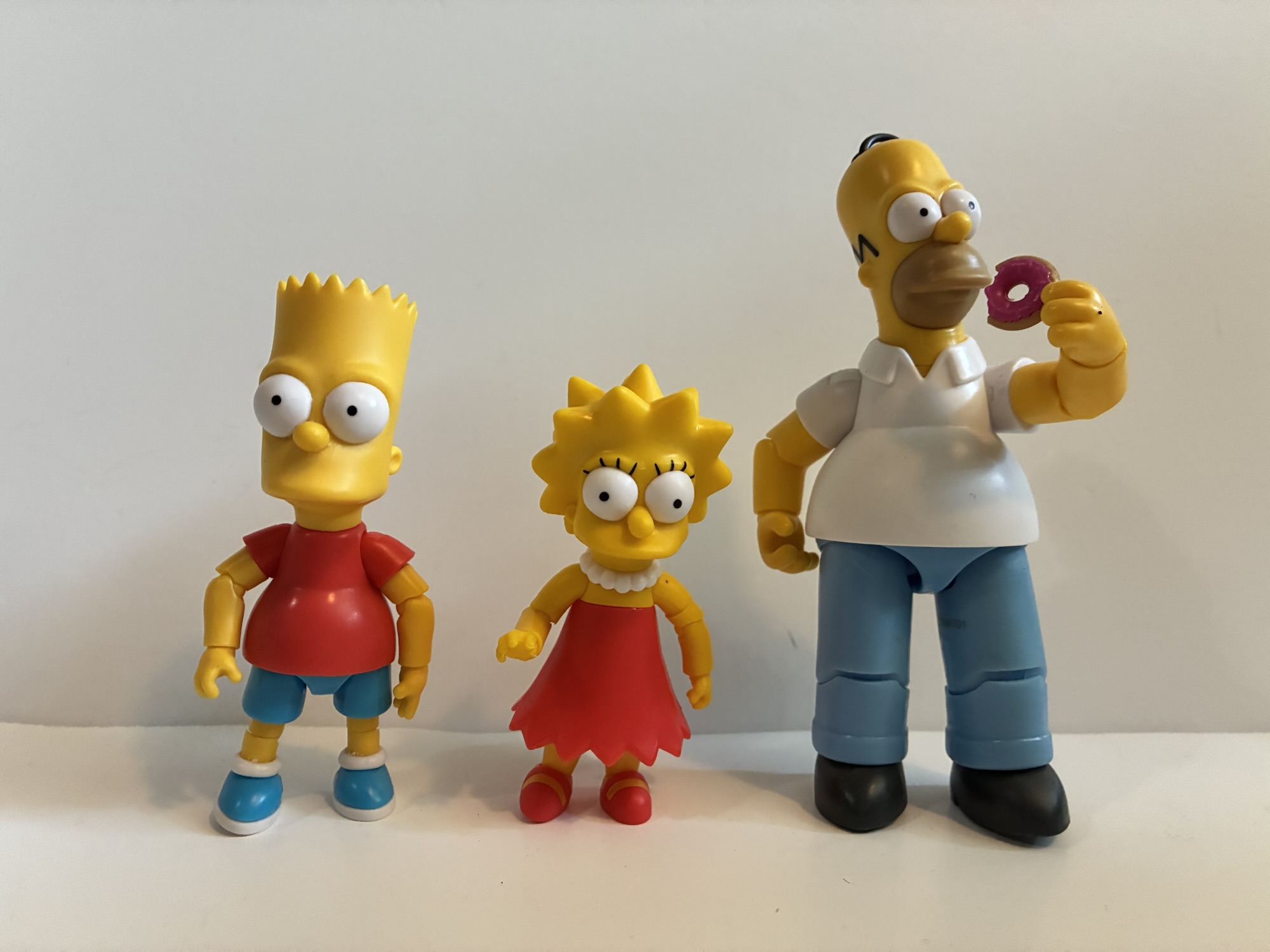
I’ve basically stuck with the 5″ stuff though I’ve dabbled in the 2.5″ as well since they’re so cheap and at least two characters make a whole lot of sense for that scale. Since my initial review, I’ve managed to acquire the rest of the first wave as well as all of wave 2, save for the Homer repeat. I also grabbed 2.5″ Bart and Lisa to see how they scaled with 5″ Homer as well as the Walmart exclusive Bartman.

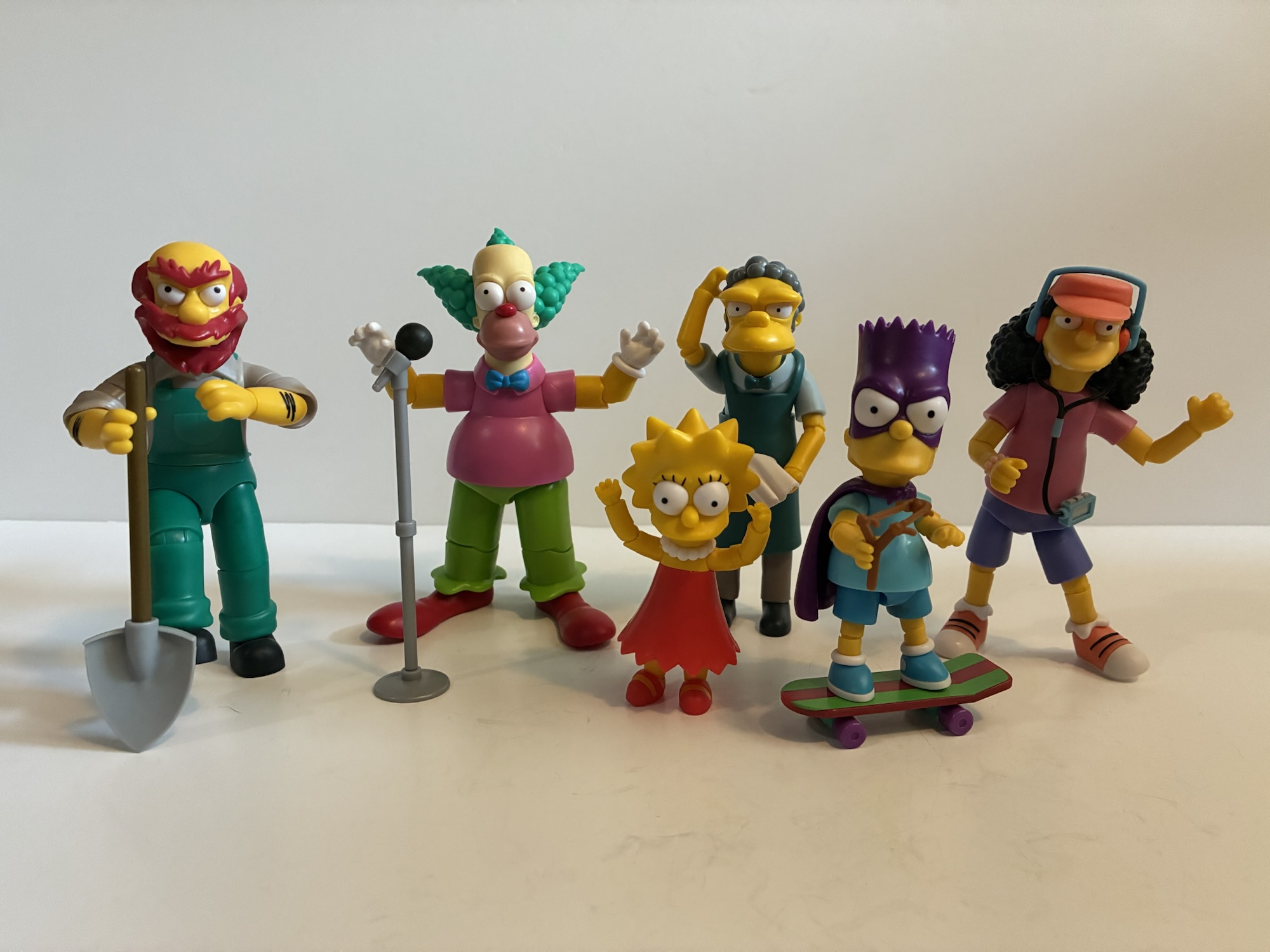
Let’s start with Bartman since he’s the most familiar. This is basically the same Bart figure from the first wave, but with a new head, cape, and slingshot. He’s sporting the blue t-shirt which is what Bartman usually was drawn with as he was more of a licensing art character than a show one. The new head has a scowl on it befitting the character and it looks like it’s molded in two main pieces: the cowl and the lower head. Jakks sticks with colored plastic and avoids paint which is true of Bartman. His left hand has also been replaced with a fist when compared to regular Bart which helps to sell the illusion that he’s drawing his slingshot (which is held in his canonically correct right hand as Bart is a lefty). The cape is just plastic, but looks okay. You just can’t position it at all which kind of stinks since he does come with a skateboard. And that skateboard is the exact same one that comes with regular Bart. If you like that Bart then you’ll probably like Bartman. He has all the pluses and minuses of that release, but with a cool superhero motif.

Rounding out wave one is the duo of Groundskeeper Willie and early season star Otto Mann, the bus driver and local burn-out. Otto features a somewhat involved sculpt, especially when compared to Homer and Bart. He’s sporting his hat, headphones, Walkman, and bracelet on his right wrist. His big hair is present which limits the posing of his head to essentially nothing. He looks pretty on-model though with his partially closed eyes and trademark overbite. Paint is sparse as even the headphones look like they’re composed of different colored plastic. The tape deck is painted as are the black lines on his shoes. Otto’s sole accessory is Bart’s left-handed guitar. The sculpt is nice, but the lack of paint is a detraction as it’s just a red brick for the body and a light brown for the neck and fretboard. It also lacks a strap, but it’s light enough that Otto can hold it without much trouble. He looks nice and if I had one nitpick about the sculpt it’s that he should be slouched a little more, but overall it’s solid.

Willie is another involved sculpt and a damn good one at that. He’s probably my favorite of the first wave. And even though, at a distance, it looks like he’d require more paint, it’s still mostly colored plastic. Even the green overalls are molded and laid into the gray undershirt. All of the red for his hair is separate and the only obvious paint is the white for his teeth and the black hair on his arms. He has an open mouthed expression like he’s possibly yelling at someone, but it also works with his bagpipes accessory. It too is mostly colored plastic and Jakks went to great lengths to not have to paint the red pattern, though they did paint the end of one of the horns with a metallic gold which was an unexpected flourish. Willie’s other accessory is a shovel which is comparatively plain and not likely to see much use as a result, but it’s still nice to see a figure with two accessories instead of one. Unlike Otto, Willie does have pretty bad posture which is appropriate for him. I’m not really getting into articulation because it’s basically all the same, but it’s good enough here that Willie can handle his bagpipes in a convincing manner.

So many scales going on here.

That concludes wave one, but before we move onto wave 2 I’ll mention the 2.5″ Lisa and Bart I picked up. I grabbed them thinking they may actually scale better with the adults than the 5″ line’s version, but as expected, they’re just too small. They don’t move much either and each has one accessory: Bart his skateboard and Lisa her saxophone. They look okay so if the smaller scale is more your thing you may like it, just don’t expect much.

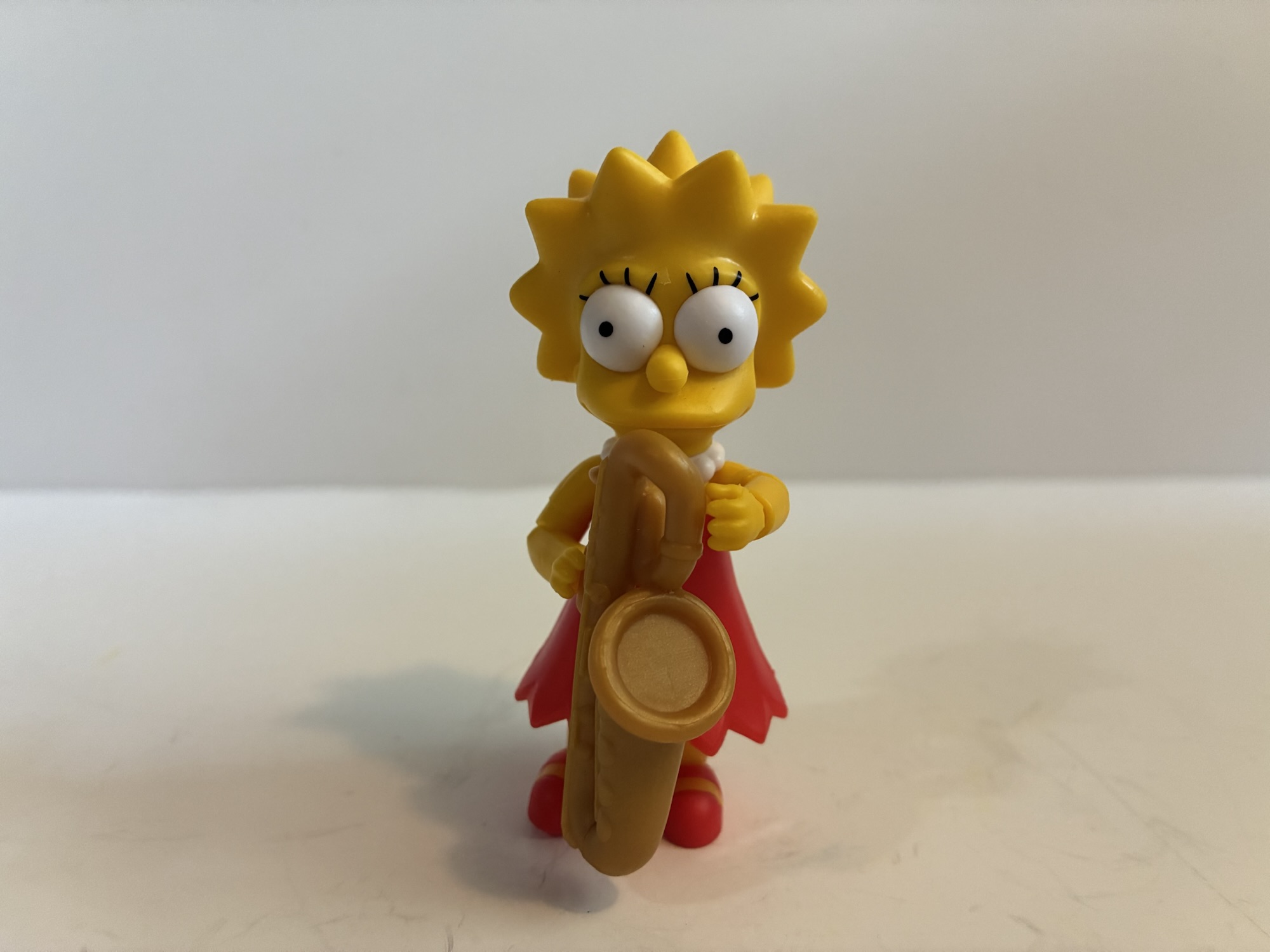
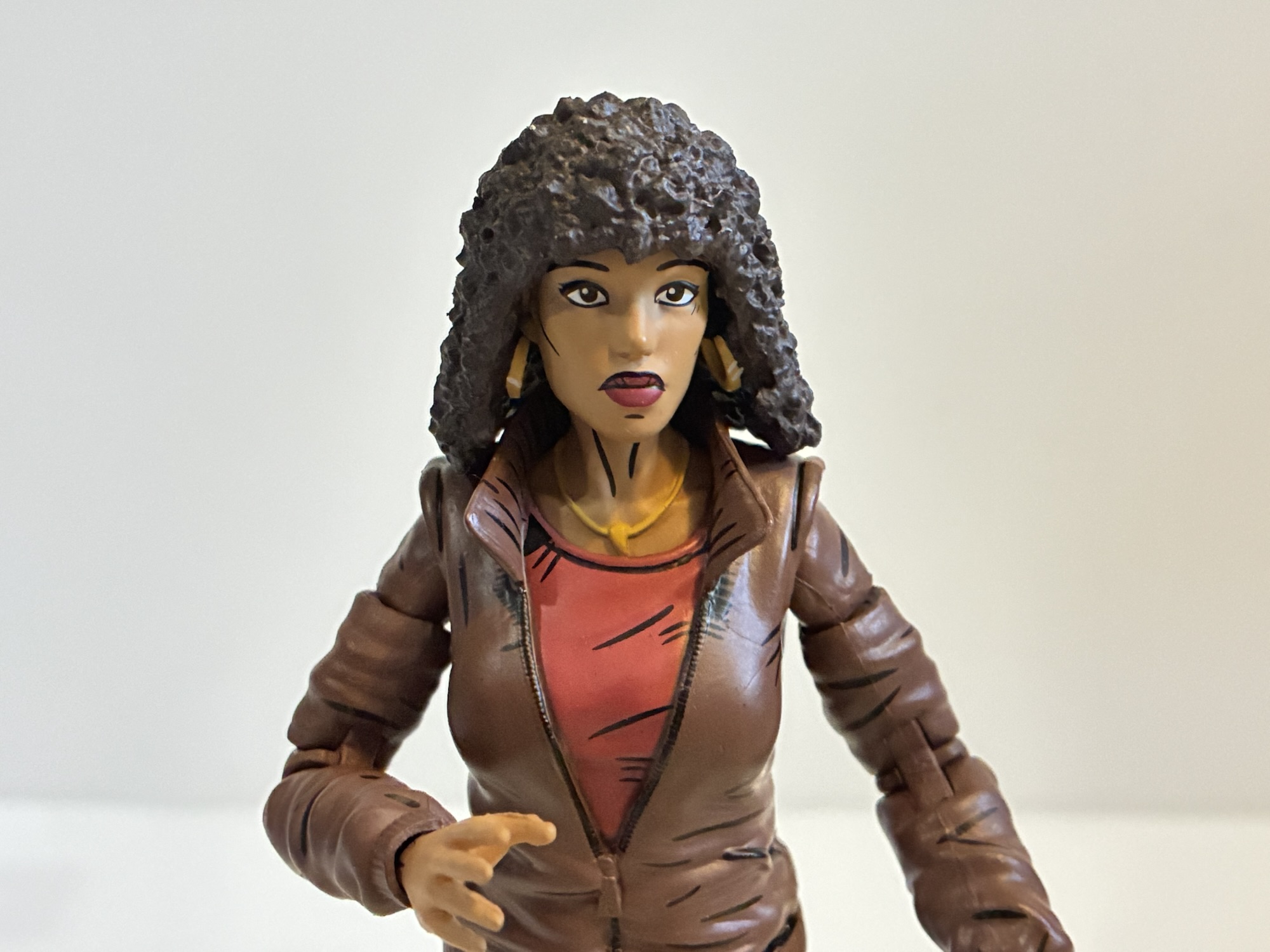
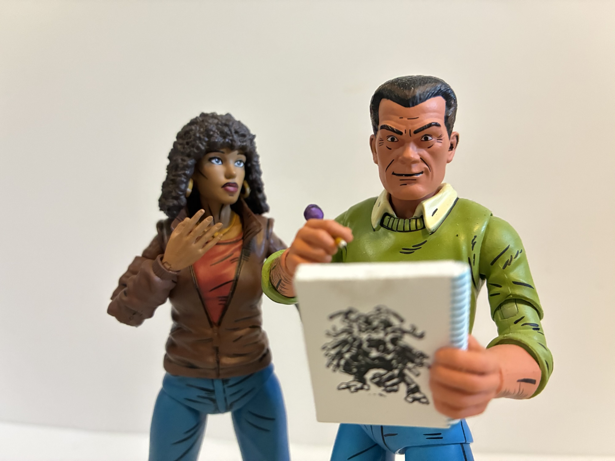
The second wave of 5″ figures consists of Krusty the Clown, Lisa Simpson, Moe the bartender, and Homer again. The Homer is the same as the wave one figure so evidently Jakks felt it needed to make sure it kept shipping the Simpson family figures to keep them in a state of constant availability. And from what I’ve seen, you can walk into pretty much any store that carries this line and find a Homer and a Bart on the pegs, but not in huge numbers so I guess it’s working. We’ll start with Lisa since she’s a member of the titular family. Like Bart, she’s oversized for proper scale standing at about 3.25″. And it’s not so much that she’s too tall, she’s too big proportionately speaking. Her head looks huge compared with Homer’s. She’s also the worst articulated figure in the line so far since her skirt means that she can’t do much with her legs. She comes with her saxophone, which is a solid chunk of gold plastic, which she struggles to wield properly. A little hand was sculpted onto it as a cheat, but her tiny hands still struggle to hang on. You may need to heat it, shove it on, and forget about it.

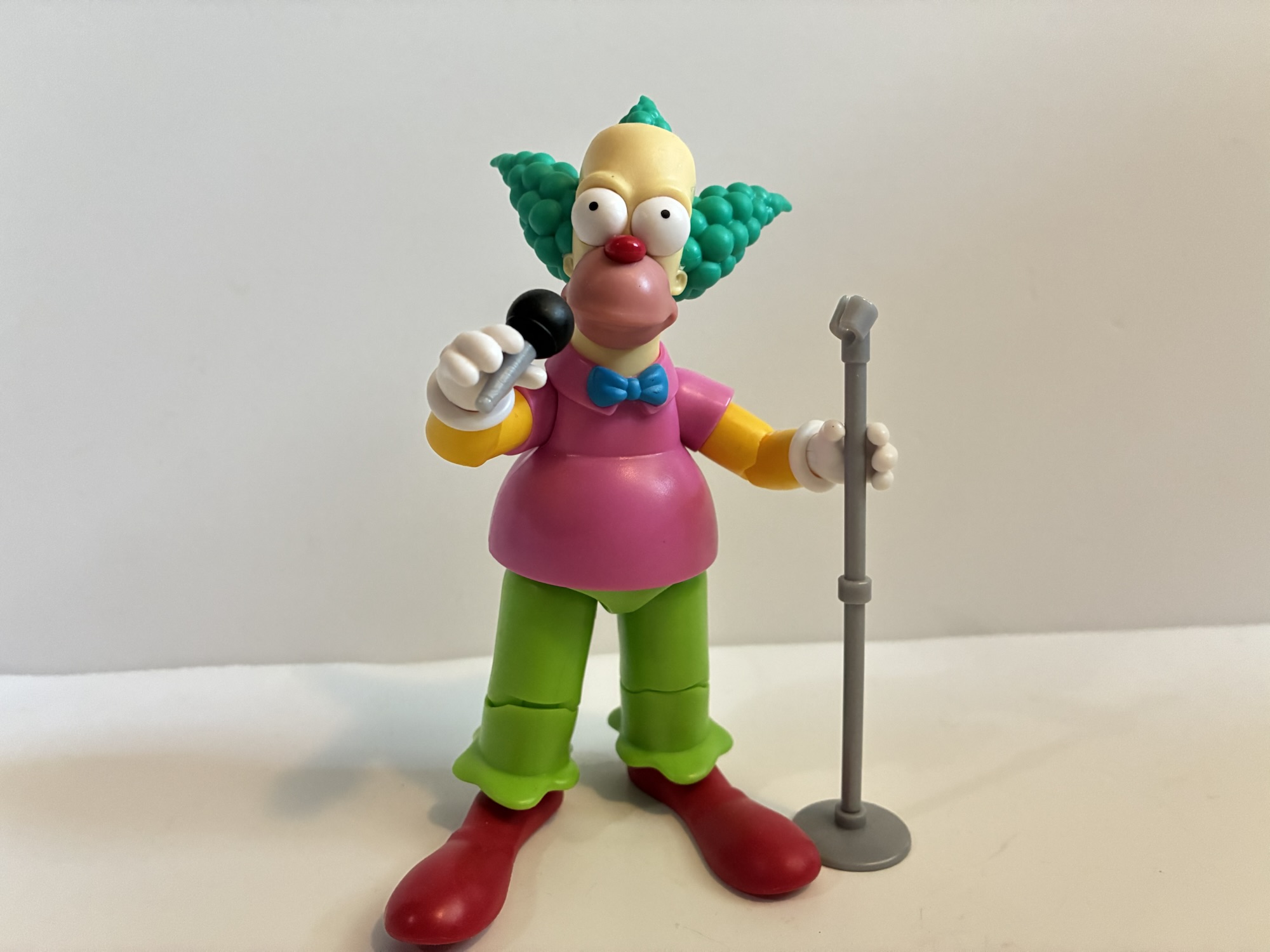
We next turn to Krusty who’s depicted in his standard attire. Like Homer, he suffers a bit from a bland expression. It’s a neutral one which just doesn’t work all that well for Krusty. I think of him as either “On” (Hey! Hey!) or miserable. This face just lacks any and all emotion. The pupils on mine also seem to be misplaced slightly so he’s kind of looking up all the time. The rest of the sculpt is fine though and captures all of the details one would expect. He has his huge clown shoes which makes him relatively painless to stand and they also feature the most generous ankle rocker in the line so far. The rest of the articulation is basically the same as Homer, though my figure’s knees were really stuck out of the box. For an accessory, he has a microphone and stand which is fine. I prefer it to a pie. It’s just too bad his mouth is closed so it doesn’t look like he’s actually speaking into his lone accessory.

Our last character of wave two is the bartender Moe, inventor of the Flaming Moe. He is what you would expect and it’s kind of eerie how similar the figure looks to the Super7 one. Almost like it’s the same mold scaled down. The apron he wears is an overlay that can be removed if you want. It’s buttoned in the back, but I haven’t taken it off out of fear it might be hard to get back on. With it on, it severely limits the movement in his legs, but it is somewhat soft so it’s not impossible to move his legs if you’re determined. He has a neutral expression which works for Moe and he comes with two accessories: his rag and his phone. The rag is exactly like the Super7 version as it’s a piece of molded plastic so that it can hang from his fingers. The phone is slightly more elaborate as it features a removable receiver, also just like the Super7 accessory. I love these old phone accessories for some reason so I like it here, but it could use an angry head to go with it.

These miscreants can’t do much, but they look pretty good doing nothing.

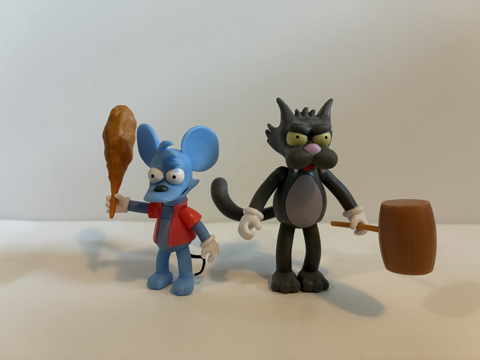
I have two more characters to highlight before we’re done and they come from the 2.5″ line: Itchy and Scratchy. These little guys feel right at home in the smaller scale so much that I don’t think I have any interest in 5″ versions. They have the same limitations as Bart and Lisa which is no elbow articulation, knee, wrist, waist, and their legs move as one piece. Still, the sculpt looks great on both and they actually feature a solid amount of paint. Itchy comes with a club while Scratchy comes with a mallet. The limited articulation means they can’t do much with their accessories, but they look good in a pretty vanilla pose. It would be awesome if at least Scratchy could be pulled apart with gruesome wounds left behind, but Jakks is probably hoping to court some kids with this line so I get why that isn’t the case.

Death to Poochie!

The Jakks Pacific Simpsons line keeps on chugging and it’s hard to find fault with much of what’s here. My main gripe still remains the scaling between the adults and kid characters as well as Jakks’ utter avoidance of painted parts. Still, the figures are about 13 bucks in most places with the 2.5″ figures retailing for $5. Of the line so far, I think Willie is my favorite, but I also really like how Moe turned out. My only other gripe is just availability. These figures have been the kind that you can’t pass up. While I did eventually see Otto and Willie get restocked in a few places, I’ve never come across Moe and Krusty more than once. The 2.5″ are just as bad as I only saw Itchy once and could not find a Scratchy for the life of me. A fellow collector helped me out with him which was greatly appreciated. I assume they’ll be restocked at some point since the demand is obviously there, but Jakks has been slow to course correct so far.

If you do like this line, you can find it almost everywhere action figures are sold. Bartman is exclusive to Walmart and, at the time, was easy to track down. I’m not sure if that is still the case. I’ve found not many Walmarts around me carry the line. Most Target stores seem to stock it, but only at a case at a time so they go fast. They can also be found at Gamestop and the 2.5″ line has also shown up at Five Below. Online retailers do carry the 5″ line, but some force you to purchase by set or by case which is unfortunate. They also tend to add a buck or two onto the price and if shipping is a factor that can drive the price up. This isn’t a line that would survive at 20 bucks a figure because the quality isn’t there. They’re not terrible and look fine as-is, but a 20 dollar figure carries different expectations. Though in all honesty they’re not far off from your typical Marvel Legends figure when it comes to paint and accessories. I just wish Jakks made the parts on these guys easily swappable so we could get different portraits, but we’ll speak more on that when we take a look at wave three.

Jakks Pacific The Simpsons Homer and Bart

I think it was early this year that we found out Super7’s line of ReAction and Ultimates! action figures based on The Simpsons was ending after just a couple of years. That meant Super7 was done after four waves of Ultimates! and four waves of ReAction figures. We had seen figures for a possible fifth…

Keep reading

Super7 The Simpsons Ultimates! Moe

Our first two looks at the inaugural wave of Ultimates! from Super7 based on The Simpsons have been two very episode specific takes. One was Deep Space Homer from the episode of the same name where Homer went to space and the figure presents the character in his space suit. The second figure was Poochie,…

Keep reading

Super7 The Simpsons Ultimates! Krusty the Clown

If you’ve been following along with my reviews on the second wave of Super7’s The Simpsons Ultimates!, then you will have noted that I’ve had a bit of a love/hate relationship with this wave. For the most part, the sculpts and deco have been on point, it’s some of the little things that have been…

Keep reading

NECA TMNT Toon “Crouching Panda, Hidden Turtles” Ultimate Panda Khan

Remember Panda Khan? Well he’s back – in toon form!

I encounter the sentiment often that the majority of Teenage Mutant Ninja Turtles fans in my age group (the over 40 club) associate the property with the vintage toyline first and foremost. The cartoon was a big hit, but it could only appear for a half an hour at a time where as the toys were always there and always willing to go on adventures. That is why when it comes to characters in the TMNT universe, most seem to think of the toy first, toon second. NECA is well aware of this and has seen from afar that just making modern action figures based on the old toys is a tough road to travel if Super7 is any indication. And while many characters from the toyline did eventually make the jump to animation, not all of them did. To get around this technicality, NECA has decided to make toon versions of those characters as basically a What-if? homage and it’s how we got ourselves a NECA Panda Khan.

Panda Khan has a little bit of size to him.

Panda Khan is a character that exists outside of TMNT media. If all you knew of him was the old Playmates toy, then that was probably not something you were aware of. The character was created by Monica Sharp and Dave Garcia and appeared in his own comic as well as some published by Mirage Studios. The character is actually named Li Yang, but goes by Panda Khan and he was essentially setup for the same deal as Stan Sakai’s samurai rabbit, which turtle fans know as Usagi Yojimbo. For one reason or another, Panda Khan’s appearance in the cartoon never happened and he forever remained one of those characters who existed for TMNT fans in toy form, but no where else. The character is now owned by Gaelstone Media who cut a deal with NECA for Panda Khan to appear in their toyline. The figure was unveiled last summer and can now be found at Target as part of this spring’s edition of Haulathon.

Samurai troopers assemble!

Panda Khan in the Playmates line was basically a samurai Panda and not much has changed over the 30+ years. NECA has taken the same, basic, approach to the character, but livened it up with colors most would associate with the cartoon. The character is a solo release and comes in the same f.h.e. style packaging as other ultimate or deluxe releases in the line with artwork by Aaron Hazouri. There’s a rather elaborate (by modern toy packaging standards) bio on the back that’s basically a setup for an episode of the show that never came to be and is rather clever. The front fifth panel is held in place by Velcro and behind it is a nice window box to see the figure. If you wanted to keep this guy in-box, it would display pretty well, but this isn’t the sort of place that leaves a toy in its box.

One irksome paint defect with my figure is this black line on his teeth.

Panda Khan stands roughly 7″ to the tops of his ears giving him some decent size for NECA’s toon line. More so than the height is the heft. This is a chunky figure with a satisfying in-hand feel. The upper body is dominated by shades of blue as he’s sporting a light blue kimono with a dark blue vest over it. Clashing with that are the bright green pants, but with TMNT designs it often feels like the clashing is the point. On his shins, forearms, and shoulders are armored bits which are a darker shade of light blue rimmed with yellow and studded with red. He also has skirt armor with a similar approach and all of these panels are held in place by sculpted-in red straps which match nicely with the red bandana across his brow and sash around his waist. It’s a nice design and it pairs well with both Usagi and the samurai Michelangelo released previously. I do find the choice to have an armored skirt with no torso armor a little odd, but I guess they didn’t want to come too close in design to the Playmates release. The kimono looks like it should continue past the belt, but I guess he tucks it into his pants? I personally would not have gone with the green pants either, but I suppose it’s more interesting than black or blue.

If you want a more primal arsenal.

The cartoon styling for the face is very evocative of the Usagi Yojimbo design. The default portrait is a classic TMNT teeth gritting pose and he also has a more stern expression to swap to. I like the look of both, but the paint on the teeth of mine is sloppy on one side which is a bummer. For that reason, I’ll probably stick with the stern expression, but I also find it fits the look of the show a little better (the teeth-gritting expression is something I associate with the toys more than the show). The alternate head also has an added ponytail which is a bit interesting. I think it’s a NECA touch as I didn’t encounter any images online from the comics of Panda Khan with a ponytail. If you like it (or don’t) NECA has you covered too because the top of the head is removable and interchangeable between the two portraits so you can mix and match as you see fit. NECA is always doing small, clever, things like that which I really appreciate. The paint on the teeth is the only negative I can find with the presentation here as the rest is pretty clean and crisp. This is another Tomasz Rozejowski sculpt and he really nailed it.

You can fit the claws in here, but probably not much else.

In addition to the extra portrait, Panda Khan comes with the usual assortment of hands: fists, open, and two sets of gripping hands. I suppose that part is unusual as Panda Khan’s gripping hands are the same size, but one set features a horizontal hinge while the other features the melee appropriate vertical hinge, a practice I’m happy to see NECA start paying more attention to. For those gripping hands, Panda Khan has his trusty blade: the Morning Qi. The old Playmates figure featured a sword that resembled a rather conventional katana while this one has a bit more of a squared-off design to the blade. There’s a sculpted Yin Yang near the hilt and the weapon is painted very well. The hilt is pretty thick, but the figure can grip it just fine. There is a little give to the fingers of the gripping hand, but perhaps not enough to alleviate any fears of paint rub. If you miss the the old school katana of the original figure, you could always hand him one of Samurai Michelangelo’s blades, though it might look pretty small in his hands. If you have the Super7 Leonardo then you may prefer the look of one of his katana. As for me, I’m pretty content with Morning Qi here.

If you want something more like a katana, the Super7 Leonardo swords work all right.

The sword and the appropriate hands to wield it are probably all most would need, but NECA included a few more accessories in this package to better outfit this warrior panda. We have some optional equipment in the form of a bamboo hat and backpack. The hat plugs into the top of his in place of his ears and also includes a chin strap. It looks nice and the plug was a good choice to help keep the hat in place, though part of me feels like a toon version of the character would have impossibly had his ears poking through the hat. It might have looked kind of funny if NECA had done the same. The backpack can slide onto his arms pretty easily and even features a removable lid. The interior of the backpack isn’t very large, but it can store his other weapons which are two bladed instruments that slide over the fingers of either the gripping hands or the open ones. These claws give him a more primal method of attack since they’re reminiscent of actual panda claws. They’re neat, though probably too violent for a cartoon unless he’s being unleashed on robots. I do wish NECA had made the backpack just a little bit bigger so we could have fit the extra hands in it as well, but at least it’s not entirely useless. There’s no weapon storage for the sword though, but I guess you could wedge it between the backpack and the figure’s back or have it sticking out of the backpack itself.

And this brings us to the portion of the review that’s often the least fun to talk about: articulation. I’ve said it before, and I’ll say it again, the NECA toon TMNT toyline is an aesthetics forward line where articulation is not quite an afterthought, but certainly not a priority. Panda Khan for sure embodies this approach as the articulation present is super basic. The double-ball joint at the head allows for swivel and tilt, but no range looking up. Being a tall character, he can at least look down. The ball-hinged shoulders are basic while the pauldrons will impede range going out to the side. They and the other armored pieces do flex, but you probably wouldn’t want to push it and leave them in such a state. The double-jointed elbows are pin-less and the range is quite good, but the joint is not very aesthetically pleasing. There is a bicep swivel, but the range in the arms is not sufficient enough for a two-handed sword pose, unfortunately. The waist twist barely moves while the hips are severely restricted in all directions. The single-jointed knees can swivel, but they don’t bend 90 degrees. He’s one of those characters that also is always semi-crouched as his legs can’t be just straight. The hinge at the ankle is limited while the ankle rocker is fine.

Those robots sure do cut nice and clean.

Panda Khan is a figure that can’t do much. Even expecting that of a bigger and bulkier character, I still can’t stress enough how limited the figure is. There’s no reason for the head to not work better and I wish they had made it a priority to allow the figure to grip the sword convincingly with two hands. Especially since that’s how they chose to depict him on the box art. There’s just a lot of stuff getting in the way when it comes to the numerous overlays on the torso and in the hip area. No one expects anything too crazy out of a giant panda, but he is supposed to be a samurai and should be capable of more.

If you’re a regular NECA TMNT collector, none of that is a surprise. The figure at least does look pretty good and I continue to be impressed with how clean the paint job is given the abundance of it. The only visual things about this guy that let me down is the sloppy paint on the teeth of the default portrait and I don’t like how those elbows look. They have a very McFarlane appearance to them as a lot has been chopped out. NECA is still new to the pin-less approach so perhaps it’s something that needs more refinement. They can get away with it on the turtles who feature elbow pads, but figures like Panda Khan aren’t able to do the same. And as always, your enjoyment of this guy will come down to how you think it looks. If you like the look of this one and don’t think it needs to pose all that well then it’s actually a pretty easy recommend. At $35, it’s a bigger character with plenty of accessories that features a ton of paint. With prices expected to rise in the very near feature, Panda Khan may soon feel like a bargain. And it should be pretty easy to track down. The figure is available online at Target.com and also being stocked in-store. I got mine via the website and wish I had waited for an in-store figure so that I could have perhaps landed a better paint job. I’d encourage anyone else interested in Panda Khan to do the same.

We have plenty more NECA Teenage Mutant Ninja Turtles for your to peruse:

NECA TMNT Toon “Start Shredding the News!” Ultimate Shredder

I am back! If you’re a regular reader then you probably didn’t notice much as far as content goes, but I’ve been out of commission for weeks now due to my laptop crashing. I was able to fix it, but it took some time to get around to it and it’s been a really long…

NECA TMNT Toon Samurai Adventure Michelangelo and Space Adventure Donatello

I think most people understand that when it comes to a toy line the most popular figures are of the most popular characters. The problem is, what do you do when everyone has the most popular characters? You make them again, but different! That’s sort of the genesis of the variant action figure of a…

NECA Cartoon TMNT The Tale of Usagi Yojimbo

The early issues of Teenage Mutant Ninja Turtles released by Mirage Studios include a few guest stars here and there. One of them comes from the pages of Usagi Yojimbo, the samurai rabbit by the name of Miyamoto Usagi. The pairing of samurai rabbit and ninja turtles was a big enough success that it migrated…


Super7 Vintage Collection Glenn Danzig – Samhain and Danzig era

I’ve got a couple Danzigs coming at you today.

For a guy as tied into comic books and the properties associated with them, Glenn Danzig has had a lot of disinterest when it comes to toys based on his own likeness. It was about 20 years ago that musician and publisher of his own books partnered with Medicom to produce a trio of vinyl figures of his own likeness from his time with The Misfits, Samhain, and the band that bares his namesake. Those figures were very stylized and not exactly what one would call an action figure. It was mostly in-line with the snippets of Glenn’s own collection of toys that are floating around on the internet which seems to focus on Japanese properties and soft vinyl. This approach is in contrast with what his former and now current bandmate Jerry Only has done who had a doll of himself (and then Misfits guitarist Doyle) sold in the early 2000s and has partnered with Super7 to produce a ReAction figure of himself. He also went the Medicom route as well with a figure stylistically the same as what the company did with Glenn.

Previously, the only Danzig toy of any kind I’ve had is this big fella on the left from Medicom. There was a Samhain and a Misfits version of that guy as well.

I don’t know if Glenn Danzig has ever said specifically why there aren’t more toys of him out there. I’m sure he doesn’t mind the income that comes with such deals, but I know he did throw some shade at Jerry for those dolls that wound up in Hot Topic’s clearance section eventually. It was awhile ago, but NECA’s Randy Falk, in response to a question from another user on social media, mentioned he had been trying to get Glenn onboard with the company to do a figure of him, but the singer always brushed him off. NECA tends to do realistic portrayals of music personalities which leads me to think that Glenn just isn’t interested in such a thing. We saw similar sentiment out of actor Elias Koteas when NECA was trying to secure his likeness to do a Casey Jones figure and, for him, he indicated it just seemed weird that people would want a tiny version of himself to mess around with. Maybe Glenn feels similarly about the whole thing, or maybe he knows the internet or a show like Robot Chicken would have too much fun at his expense if such a thing existed?

The style of these Danzig figures is clearly based off of the old Masters of the Universe line. Since I don’t have any of those, here’s an Origins He-Man for comparison.

That hypothesis seems to track with what Super7 has recently released. Brian Flynn of Super7 teased a deal with Danzig years ago in a conversation with The Fwoosh. I didn’t try and look it up again, but I want to say it was in either 2020 or 2021 and may have been part of the San Diego Comic Con at home thing. That deal was apparently not an easy one and Super7 never elaborated on what they were doing, but it turns out they had Danzig in mind for a new line they wanted to launch. It’s possible Glenn said “No,” to ReAction and Ultimates and this came about as a compromise – who knows? Super7 calls the line it’s Vintage line and it’s heavily inspired by the original Masters of the Universe toyline from Mattel. And by inspired by, I mean it’s basically the same thing. They’re 5.5″ figures with super basic articulation in a preposed stance. Glenn was obviously onboard with this depiction of him in plastic, though it still came with more controversy. It was sometime last year that retailers abruptly cancelled the line indicating that word came down from Super7 that they weren’t happening. Super7 blamed it on retailers auto-cancelling items that have been outstanding for too long, which makes no sense since I’ve had stuff on preorder from the same retailers for Super7 product that literally took years to deliver. Danzig, for his part, seemed to be confused by the whole thing so he wasn’t expecting it. The Jerry and Misfits Fiend figures in the same style were not cancelled, so it was definitely an issue with Glenn and Super7. Was the company having an issue with approvals and playing hardball or something? I don’t know, but something fishy was going on. Either way, the figures went back up for preorder eventually and started rolling out at the end of 2024.

The first two figures in this line to arrive are figures of Glenn based on his appearance with Samhain and one based on his early 90s Danzig look. They’re packaged on a cardback the exact same dimensions as a MOTU figure. There’s even a castle, but instead of it being Castle Grayskull it’s a castle sporting the Samhain/Danzig/Golden demon skull. The Samhain figure, based on the album cover for Initium, has a blister bubble with the shape of a skull blown in while the Danzig one has an inverted cross. The castle on the Initium card is also bloodied. It’s a thin card so it’s not the most sturdy, but I suspect the packaging is nice enough that many will just leave this on card.

On second thought, maybe don’t fuck with He-Man?

And that’s because the figures themselves are not the most interesting to handle. These are faithful interpretations of the MOTU style which is a mold that is over 40 years old at this point. Those figures were designed during a time when action figures were almost exclusively the domain of children. They were engineered to be durable and functional first and foremost. The form was also still really new so there hadn’t been much in the way of innovation beyond some swivel joints. They were also designed for maximum profit so the molds were just used over and over recolored and joined with new accessories and new heads to flesh out the cast of characters.

And that brings me to the subject of vintage inspired releases. Super7 very clearly wants to be as faithful as it can to the old toys in this style at the expense of perhaps even saving a few bucks. There is really nothing modern about these Danzig figures, but the molds are not exactly the same. The torso is the only intended shared part between these two. Samhain Danzig has fingerless gloves on while Danzig era Glenn has just wristbands. Since the arms are one piece, that’s an entire new mold. Samhain Glenn also has boots with buckles on them while Danzig era Glenn has long pants that go over his boots. Or he’s supposed to, but my figure has the correct right leg, but the wrong left leg which is the Initium figure’s leg.

I find Super7’s approach here kind of interesting, and a bit frustrating. The company could have saved itself some money if its molds for the legs and arms ended at the boot and wrist. This would have also given us another point of articulation if the hands and feet were separate pieces, but then that would break with the original line’s articulation which is just a swivel at the head, shoulders, and waist and a ball-hinge at the hips. How much does the consumer value this slavish adherence to a format from the early 80s? I don’t think many care and would happily trade the inaccuracy for a couple of swivel points. You may be thinking that a wrist swivel or a boot swivel won’t do much, but these guys are packaged with microphones that they can only hold in their right hand and not turn towards their face. It’s kind of dumb looking.

Those are my thoughts on the approach here, as for the figures themselves they look about as good as you could get out of this form factor. These are exaggerated, hulked-up, takes on Glenn Danzig from two different points in his life. The Initium head has the old devilock hairstyle which obscures the face while the Danzig era figure has the side part long hair and sideburns. The face on the Danzig era figure does look like Glenn, albeit it looks more like an older Glen to me than an early 90s one. He’s got some of that modern grump to him. The Samhain Glenn has no facial features to really take in. Even his eyes are unpainted. His selling point is the blood paint job which does look pretty damn cool. Both also feature Glenn’s tattoo on his left bicep. I’m honestly not sure if it was finished when the Initium album cover was shot, but I don’t really care. The batwings on the Fiend in the middle is a little smooshed looking, but it’s fine considering the size we’re dealing with. I think he also had some other skulls added to it for Unholy Passion and November Coming Fire. I don’t know when they were added, but they’re featured on the Medicom figure.

The only accessory each figure comes with is a microphone that has a bit of wire trailing off of it. The Danzig era figure does have the skull-cross pendant which is affixed via a plastic wire. It’s not a bendy wire and has a tendency to want to float. I’m curious if I heat it up if I can get it to lay flat on his chest, but I think it’s just not heavy enough. That figure also has the skull belt buckle which is painted silver and looks decent enough. The presentation across both figures is pretty clean and the paint kept to a minimum. I wish the Samhain figure had a little paint on the buckles of his boots or something, but I’m definitely not surprised by the omission.

“Hey man, what’s up with the bear?” “I vibe with this bear.”

Are these stylized takes on Glenn Danzig worth adding to your collection? I guess it all depends on what your initial reaction to them is. If your first thought is “These look pretty cool,” then you’ll probably like them. If you’re buying them to keep on card then you’ll be even more pleased since they don’t really do much out of the box. I personally wish they were engineered like a MOTU Origins figure, but that’s just me. These will set you back about $30 so they’re not exactly cheap. A MOTU Origins figure is about half that and a much better figure, but none of them are Glenn Danzig. For the price, I do wish they had more stuff. Maybe a dagger for Danzig era Glenn and that weird mask he sometimes wore for Samhain performances? The mic makes sense, but is kind of lame. That said, I have a rather extensive Danzig collection so I had to add these and I’ll be adding the Misfits ones soon as well. If I have anything to say about them you know I’ll say it here, but I could have saved myself a lot of words by just saying what you see is what you get. If you like it then cool, and if you don’t you probably won’t regret passing on them.

Here’s a look at some related figures you may find interesting:

NECA Misfits Ultimate Fiend Action Figure

When Glenn Danzig and Jerry Only reached a settlement over who owned the rights to The Misfits in the mid 90s (resolution: they both did), it set off a wave of new merchandise plus a new version of the band. What had once been a logo found mostly at punk and metal shows, the visage…

Super7 Ultimates! Ghost Papa Emeritus IV

If you’re reading this the day it went up then you should know April 25, 2025 as Skeleta day! This is the day that Ghost unleashed its latest album upon the masses and there’s a lot of hype surrounding this one. It’s arguably the band’s first release since it saw its popularity explode in recent…

MOTU – Turtles of Grayskull Skeletor

When it’s come to the Turtles of Grayskull line by Mattel, I have mostly stayed in the Teenage Mutant Ninja Turtles side of the pool. I have all four turtle boys plus Sla’ker, who is more Slash than Faker if you ask me. The one exception has been Mouse-Jaw, but the classic Masters of the…


NECA TMNT Mirage Studios April (Version 2) with Professor Obligado

Say “Hello” to her little friend.

Back in 2008, when NECA was planning out a line of Teenage Mutant Ninja Turtles action figures that they hoped would run for a long time, they turned to the turtles’ most trusted ally when it came time to do a fifth figure. The line wasn’t long for this world, and that figure of April O’Neil from issue two of the Mirage Studios run of comics ended up as a convention exclusive. She had a couple of variants, and came packaged with Mousers as well, but she was also the end of the line. Be it poor sales or issues with the master license holder, NECA’s Mirage run of turtles was brief, but has since been resurrected. We’re almost nearing a point where it feels like NECA, not Playmates, is releasing more unique sculpts per year when it comes to this franchise and it’s no surprise that in 2025, in the month of April no less, NECA has decided to return to the character once looked to as the most logical release after the turtles themselves.

An updated April for your updated turtles and newish Casey.

Version 2 of April is presently shipping as part of the Target Haulathon, that oh so expensive time of year for those who collect NECA TMNT. The old figure is one I never bought. April was a little rough in her debut appearance and creators Kevin Eastman and Peter Laird were not too proud to admit that it took them awhile to really learn how to draw April. That figure fits in well with those early TMNT figures NECA produced as they’re based on the first issue, but for those looking for an April that vibes with the more recent output from NECA a new figure was needed. For inspiration, NECA turned to issue #11 which has become somewhat infamous online over the years. Namely, for those who want to champion that April was originally conceived as being black or at least mixed race. While it was true that her name came from April Fisher, a woman who is of a mixed race, Eastman and Laird have always been pretty clear over the years they envisioned her as a white woman. In issue 4, she received a new hair style – a perm. Combine that with the name thing and the fact that Eastman and Laird often used people in their orbit to base April’s looks on and you can see why this became such a big thing.

Apparently, Eastman has at least embraced this retcon of sorts as this new April from NECA depicts her as a black woman. And why not? NECA already did a white April (well, many if you count the cartoon and movie lines) and people seem to like this idea. Some don’t, which is often the case when you start talking about race because there are racist assholes out there, but this is Kevin and Peter’s baby and if they like this depiction of April then that’s good enough for me. We know Kevin at least does since he did the artwork for the box. I guess Peter could hate it, or he could be fine, or indifferent, it doesn’t matter. It’s an April action figure and all that really matters to most would be is it any good?

“You know, I’m something of an artist myself.”

April is a figure sculpted by Richard Force and Tim Miller. Or I should say, April and her boxmate are sculpted by the duo. I’m not sure if one sculpted April and one sculpted her pack-in, but at least we know they both contributed where as most toy companies don’t give us that much info. Paint is credited to Geoff Trapp, Mike Puzzo, and Holly Knevelbaard. April stands at around 6″ to the top of her hair. She’s depicted in her outfit from issue 4 of a pink shirt, blue jeans, sneakers, and a brown jacket. At least those were the colors in the earliest color versions I have seen, though for me I’m most accustomed to seeing April and everyone else in black and white.

Not a figure made for the classic (and probably sexist) female pose.

The presentation for April is fairly basic. That’s not necessarily a negative, it’s just the reality of an action figure based on a normal woman. There’s no crazy super powers to capture or outlandish costume, it’s just a woman in casual attire. She has her poofy hair which is done in brown with some light brown brushed over it. Her expression is serious, but fairly neutral. There’s some linework on her cheekbones and her lips are red and outlined in black. She has a simple gold necklace sculpted around her neck and some big hoop earrings which appear to be part of the sculpt for the hair. The jacket and shirt feel like they’re an overlay, but the material is more firm than usual. There’s a lot of black linework on the clothing and the paint job on the sneakers is pretty complex and mostly clean. The paint is sharp and the appearance of the figure is too. My only critiques would be it looks like they missed a paint app on the zipper of her coat as it’s just left brown. They also gave April a serious case of “flat butt,” why did you do her dirty like that NECA?

This little guy gets all the stuff.

April comes with three sets of hands: open, fists, and gripping. That’s it. I wish we got a second portrait from the panel where she shows off her new haircut as she just looks really happy in that shot and it would be nice to give her the option of being happy on the shelf. Her articulation is pretty basic for the line as well. If you have Kirby or Baxter then you should have a pretty good idea of how April moves. Her hair really limits the range at the head to basically a swivel. The shoulders, elbows, wrists, and knees all work well and as expected. The range at the hips is good, but she can’t quite hit a split. Ankles are a bit limited and for some reason the left ankle on mine doesn’t want to pivot (it’s gummy and just snaps back into a neutral position). The waist is a ball joint, but it just swivels for the most part because of the size of the overlay. The torso isn’t going to do anything and the gripping hands have the wrong hinge, not that she has anything to hold. Her feet being relatively small, she can be a deceptively difficult figure to stand. I’ve had her topple over numerous times already in the short while I’ve had her.

That’s April, but she’s technically not alone. Joining her is Professor Obligado, an Utrom ally with a series of short stories by Stephen Murphy. He’s very similar to other Utrom characters we’ve received in that he’s a little more than a slug figure as he has two articulated tentacles. He also gets the bulk of the accessories as he has a fedora, pipe, pick axe, paint brush, can of ink, and two extra tentacles one of which has a can of some spray molded to it. He looks fine and the swapping features are fun, but I would have liked something for April. It’s almost like NECA saw doing another April as an obligation, but rather than make her as much fun as they could, they threw in another character after doing the bare minimum.

At least Casey has weapons to spare.

This review has taken on a negative tone, but I should stress that this figure of April isn’t a bad one. It’s just fine. There’s nothing special about it, it does what you would expect, and the execution when it comes to the sculpt and paint is up to NECA’s standards. The articulation isn’t great, but still what one would expect of the line. It just lacks imagination. Obligado is fine, and those who really dig the Utrom characters will enjoy adding him to the mix. That doesn’t shake the feeling that I only bought this figure because I want an April and I would have bought anything. At least she turned out far better than the cartoon one. If you’re feeling inclined to pick this one up, April sold out online, but can be found at Target. If you don’t want to shop there for any reason, know that she’ll eventually show up elsewhere, but with the current state of things who knows what she’ll cost? Right now, the MSRP is $35 and hopefully it stays that way.

There are plenty more heroes and villains from NECA’s TMNT line of figures based on the original comics:

NECA TMNT Mirage Studios Karai as The Shredder

Where do you take your heroic comic book franchise when you kill your main villain in the first issue? Well, you first undo that rash decision by bringing him back! Teenage Mutant Ninja Turtles co-creators Kevin Eastman and Peter Laird famously killed The Shredder in the first issue of their comic. They never intended to…

NECA TMNT Mirage Studios Rat King

Rats! Is what Charlie Brown would say at the sight of today’s subject, the almighty king of the rats himself, the Rat King. Rat King has always been a favorite of mine when it comes to Teenage Mutant Ninja Turtles villains. Like a great many, I was introduced to the character via the cartoon series…

NECA TMNT Mirage Studios Kirby

Say the name “The King” to a comic book fan and they will immediately know of whom you speak. Jack Kirby is a titan in the world of comics. Creator or co-creator of a great many characters known throughout the world today, it’s hard to imagine what a comic book would look like without his…


Marvel Legends Professor X with Hoverchair

All right kids, back in your seats. Teacher is here.

Most view superheroes as idealized versions of people. Superman has all the power he needs to mete out justice as he sees fit. He’s a man who is super fast, super strong, basically invulnerable, and he even has laser eyes for good measure. Not every character can be Superman though and as the stable of superheroes increased over the years there was more room for nuance. I’m sure some folks in marketing at Marvel Comics scoffed at the idea of a team of superheroes being led by a middle aged paraplegic, but that’s the direction Stan Lee and Jack Kirby went in when they created the X-Men. That team was founded by Professor Charles Xavier, a powerful, telepathic, mutant (which is basically used to mean a superhero born with their powers) who just so happens to be confined to a wheelchair. Unlike a character like Daredevil, a blind superhero whose enhanced, super, senses essentially negate his disability, Xavier’s powers do not help him walk. Sure, some writers have played around with that over the years, but at his core Professor X is a man with a disability able to thrive in a world of super powered individuals.

He’s a bit of a little guy.

I don’t know for certain, but in a world where even female characters were treated like radioactive material, I can imagine folks at Toy Biz not being too excited about doing a Professor X figure. It took a little while for the head man to make his debut in that old toy line, but I was honestly pumped when he did. I think he may have been the final character from the cartoon series X-Men to be released and complete the team. I know we had to wait awhile for Beast and Morph, but I can recall getting those two figures on Christmas (1994, I want to say) and the following Easter Chuck was sitting beside my Easter basket (along with Ahab, a figure not exactly high on my wants list). And aside from having a blue suit instead of green, he was pretty faithfully depicted as he was in the show complete with his 90s, stylish, hoverchair. Because of the cartoon and Jim Lee’s run on X-Men, it’s the hoverchair I most often associate with Xavier. Hasbro certainly knows that’s the case for many which is probably why they released Xavier in a deluxe package with his famous chair.

Hope you like this gesture, because it’s kind of all he can do.

This figure was released a few years ago, but in 2024 Hasbro made it available once again to preorder. Having since acquired several characters from the cartoon in Marvel Legends form, I felt like I needed Xavier to pull it all together. The addition of the chair does make for additional cost. This thing was a whopping 50 bucks, by far the most I have ever spent on a Marvel Legends figure. I was pretty skeptical it would be worth that in the end, but when you’re basically one figure short of a full squad it’s the kind of thing one will extend themselves on. Toy companies are aware of this phenomenon, which is why I fully expect Xavier to be the last release in Mondo’s very awesome, but very expensive, line of X-Men figures. Trying to imagine what a sixth scale Xavier in his hoverchair will set me back is already giving me anxiety.

His chair comes loaded with a TV and some games so he doesn’t get bored.

That is a topic for another day, today we’re in the more familiar realm of 1:12, or there about. Xavier comes in an oversized window box and is featured prominently in the center. His chair is amusingly split in half so we can see one half of the chair on each side of the figure. The backdrop contains artwork of the entire, animated, team in a style that resembles the cartoon. Beast, for example, has pupils. It displays well, but I could not care less about that fact. Once removed, the chair requires some assembly. There are four pieces to it: each side, a backrest, and a cushion. The backrest slides onto either half while the cushion plugs into a slot in the center of one of the pieces. Then you just push it together. It’s pretty intuitive and most probably won’t need to consult any instructions. Not that there is any. I’m surprised they didn’t print some on an inside flap of the box.

I like the thought of this base, but not so much the execution.

The chair looks pretty good from a sculpting standpoint. It’s not painted though, so you get some of that swirly plastic effect Hasbro seems to love when it’s trying to create the illusion of a metal material. There is a big seam down the middle which is unfortunate. It makes me wish that at least the front was a third piece that snapped over the assembled halves, essentially the same concept as the backrest, to at least get rid of the seam there. On each armrest there’s a control panel that slides out. One has a monitor while the other a keyboard and at least those two parts are painted. Even though the artwork seems to be evocative of the cartoon, the design of the chair is from the comic. The most obvious distinction is the shape of the front and lack of headlights. The chair sits fine as-is, but there’s also an included base. It’s a white post with a transparent piece of plastic over it in the shape of smoke, I guess? The transparent portion is frosted over with white paint and the plumes are pointed so, to me, it looks more like ice. I don’t think ice is what they’re going for here, but it gives the figure a little height.

Cool hat, bro.

As for Xavier himself, he’s depicted in his green suit with white shirt and blue and black tie. He has a very serious expression on his face with his signature, arched, eyebrows. His right hand is in a two-finger gesture while his left hand is open, but curled. He has no extra hands which is unfortunate. He should at least come with another right hand so he doesn’t always have to be making this very specific gesture. And because the damn thing cost 50 bucks – throw in some hands! Outside the chair, Charles stands just a tick over 6″. He has a slight build with a very big head relative to his body. It strikes me as a little off as Xavier from this era was usually portrayed as being rather broad shouldered. This figure makes him look like a weenie. Most of the figure is colored plastic with the belt and tie being where the most paint is utilized. The jacket portion of the torso is an overlay while the sleeves are part of the sculpt. This is pretty standard, but the small shoulders means some white sticks through the gap between the arms and jacket. There is also a slight discoloration to the arms vs the shoulders with the shoulders being noticeably darker and shinier. This is an older figure so it does feature pins in the joints. I don’t find them particularly distracting, but there must have been suit guys made over the past few years on pin-less bodies, no? I’m surprised he didn’t get a minor cosmetic upgrade as a result.

Hey professor, you got some…ugh…stuff…squirting out of the back of your head.

Articulation for Charlie is pretty typical stuff for Legends. We have: ball hinge neck, ab crunch, ball-hinged shoulders, biceps swivels, wrist swivels and hinges, waist swivel, ball-socket hips, thigh swivel, ankle hinge and rocker, double-jointed elbows and knees. Range at the hips and shoulders is mediocre and the ankles are pretty limited too, though I guess that doesn’t matter much for a character who will be seated. He’s going to do what you need him to do, but if that’s something you want him to do is outside Professor X’s typical wheelhouse then you won’t be impressed. Like standing. This guy is really hard to stand because the range on the ankle hinged is poor and his feet are tiny. Again, for this guy it doesn’t matter, but if you wanted to swap in a different Xavier and use this body as a custom for someone else you may be disappointed.

If you’re curious, it can kind of fit the head of the X-Men ’97 Jean.

I have critiques for the presentation and articulation on this set, but the bulk of my criticism is going to reside with the accessories. I suppose one could consider the hoverchair itself an accessory, but since this is a set that’s double the price of a typical Legends release I think of it more like a two-pack where the hoverchair is almost like its own thing. And the hoverchair has the effect part stand and also a little blankie that can go over the lap of its occupant. That’s all fine, but for Xavier himself the accessory count is slight. He has his Cerebro helmet which is more of a classic design than one that’s evocative of the 90s or animated series (if you want a more TV helmet, the new Target exclusive Savage Land Xavier comes with one). It fits on his head fine though you may have to mess with it to get it aligned just right. It also has an effect part that plugs into the back. Its done in white plastic with a pearlescent coating. The shape is like a splatter effect and it’s supposed to represent his psychic powers which are sometimes illustrated with such a shape. For me, I think of them as being colored pink or blue (even the box art opts for pink), though I’m sure someone colored them white at some point in the comics. It’s just this color and this shape make it look like he’s getting hit in the back of the head with a balloon filled with milk, or a substance that’s much more disgusting.

Obviously, this is how everyone is going to display this guy.

For optional parts, we have the head of the Shadow King. Your mileage may vary, but for me, the Shadow King was always one of the lamest characters associated with X-Men. I loathe his episodes from the show so this isn’t an accessory that’s going to appeal to me. That being said, the sculpt and paint on the head is fine. There’s more paint on this thing than probably on the entirety of the rest of the set. It’s also just a head and it’s not meant for this figure. My understanding is that this head is designed to fit on the Kingpin body so if you want to create a Shadow King for your collection you need to go out and get yourself another Kingpin. Which is fine as a throw-in if they had room in the budget, but this head is the only other accessory in the box. We don’t get a second portrait for Charles, we don’t even get any extra hands! I wish he had some neutral hands for just when he’s sitting in his chair or at least one alternative to the pointing fingers hand. A portrait where he’s calling out commands to his X-Men would be appreciated too and I would happily trade this Shadow King head for accessories for Xavier that flesh him out. That’s the character I want. That’s what’s driving my purchasing decision. Not a random part that’s only useful if I go out and buy a whole other figure.

This set may be more expensive than your typical Legends release, but the end result is pretty much the same. This Charles Xavier figure is what you buy if you have a collection of Marvel Legends X-Men and you just want an Xavier. It’s going to slot into your display and anyone who sees it will know that’s Professor X. It’s not going to “wow” anybody though and there are a lot of shortcomings. The actual figure strikes me as a better representation of a 60s and 70s Xavier who was drawn more like an older guy. As a 90s Chuck, this guy is too small and slight. The chair looks fine, but the lack of paint also makes it look cheap. And if they had just done the thing in three pieces where the front portion that covers the characters legs was one piece it would have cut out that hideous seam right down the middle. The accessories are a bummer because the figure feels underbaked, and given that this is a re-release it’s an added bummer because they could have improved the figure at no added expense. There are better suit-guy molds at Hasbro they could have used or just more hands. It’s almost like they want you to go out and buy that Savage Land Xavier in the flight suit if you’re unsatisfied with this one and toss him in the chair instead. I prefer my Xavier in his green suit though, and I don’t like the portrait of that new Xavier. Plus, his assortment of hands are almost as bad as they are here (he comes with trigger finger hands – why would Xavier need trigger finger hands?!).

Obligatory, “To me, my X-Men,” shot.

Should you get this one? I don’t know. It’s really just to fill out a collection which is honestly the worst reason to buy something. I try not to do it because money and space are precious resources and I don’t like wasting either on something I don’t love. And to get this guy into your display it’s going to take some work since he does demand quite a bit of shelf space. It looks okay, so I don’t hate it. I would like it a whole lot more if it were $35 instead of $50 so maybe I should have held out for a sale. One may come, one may not, as X-Men are pretty hot right now thanks to X-Men ’97 so anyone waiting for a sale somewhere is probably taking a risk.

There are more reviews here of X-Men action figures if you’re looking to fill out a shelf:

Marvel Legends X-Men Animated Series Wolverine

The toyline of my dreams was announced last October. In celebration of the 30th anniversary of the television series X-Men, Hasbro is doing a dedicated line of Marvel Legends with figures based on the look of the show. The show was obviously inspired by the designs of Jim Lee, but there are differences in the…

Marvel Legends X-Men Retro Card Marvel’s Beast

2022 was the year a dream toyline of mine was made a reality. Hasbro finally decided to do a line of Marvel Legends based on the animated series X-Men, which premiered 30 years prior on Halloween 1992. The line was staggered with a release coming every 6-8 weeks or so and ended up totaling 8…

Marvel Legends X-Men ’97 Jean Grey

If you are reading this the day it goes live then Happy X-Men ’97 Day! Today is the day the long-awaited sequel series to X-Men debuts on Disney+. Rather than fast-track a review of the first two episodes to this blog, I decided instead to do what I most often do: review an action figure!…


Super7 Ultimates! Ghost Papa Emeritus IV

Papa IV has arrived!

If you’re reading this the day it went up then you should know April 25, 2025 as Skeleta day! This is the day that Ghost unleashed its latest album upon the masses and there’s a lot of hype surrounding this one. It’s arguably the band’s first release since it saw its popularity explode in recent years. Ghost is a hard band to wrap one’s head around. It’s this satanic, doomy, metal act that has also successfully blended pop elements with its music to create something that’s certainly catchy and unique, but also not typically what one would consider mainstream. For me personally, I’ve gone from seeing Ghost as the oddball band filling the opening slot on a show, to an Iron Maiden support act, to headlining its own tour in small arenas, to selling out large arenas and now playing in some of the largest venues we have. And fronting the band for much of this era has been Papa Emeritus IV.

A gathering of Papas (left to right): Papa I, Papa IV, Papa III

Papa IV took over for Papa III and is the son of Papa Nihil who fronted the band back in the 70s when only three songs were produced: Kiss the Go-Goat, Mary on a Cross, and The Future is a Foreign Land. Like his predecessors, Papa IV tends to take the stage in a somewhat flamboyant suit his face a mask of black and white, but when the situation calls for it he’s known for dawning wings or his full vestments as the leader of the clergy. Super7 has produced figures of the three Papas to come before him (they have not done Papa Nihil) so it was hardly a surprise when this figure went up for preorder last year. I have all of the predecessors, but I only reviewed the first one as they’re fairly similar. This one is perhaps the most different one yet though so I figured, why not? Plus it’s certainly topical.

Papa III: “He keeps asking to be let out of the box? Says he’s sick of smelling his own flatulence.” Papa IV: “Why would I want to smell that? Leave him in the box.”

Papa IV comes in the standard Ultimates! box, though now without a slipcover (because those surely add considerable cost…). He’s clad in his black suit and shiny blue coat. The figure is, as expected, a mixture of old and new parts. This costume required a bit more new this time around due to the cuffs on the sleeves a different style shirt, and the pattern on the pants. I’m guessing that Super7 got to reuse the lower torso, upper arms, calves, hands, and feet. If you’re worried about Super7’s bottom line then maybe it will comfort you to know they saved a little with some repeat accessories.

Papa IV is probably the most flamboyant frontman for Ghost yet.

The most obvious new piece of sculpt work is the head. This Papa has slicked back gray hair and his own distinct pattern of black and white on his face. Super7’s attempt to capture the likeness is satisfactory. I don’t think they nailed it as well as they did with Papa III, but it looks okay. I think it’s just a little narrow in the face and the hair isn’t particularly convincing. The forehead on mine is also a little scratched and I don’t know if that’s intentional or not. I don’t know why it would be. I should also mention he stands at roughly 6.75″ putting him in-line with the other Papa figures.

“Ugh, we cool? Hang loose?”

If you want this figure to looks its best, you will want to take advantage of the optional vestments. For this iteration, Super7 did it in two layers. There’s basically a poncho that goes over the head (or neck, since you’ll have to take the head off) and then a cape that goes around that and it’s fixed with a Velcro clasp. It’s very colorful, and the portrait that goes with this look is a little cleaner looking and seems to work better for me with the pope hat. Unfortunately, this two garment approach makes the look more cumbersome. The material bunches up around the neck making Papa look like he’s wearing a scarf. It’s also quite restricting when it comes to the arms. Both garments are wired so you can do some posing, even if they just typically hang there when he wears this outfit. Also, take care when swapping heads. On mine, the neck piece has a tendency to want to pop off with the head which can be quite annoying.

Papa IV comes with a bunch of hands. He has five sets total plus an extra right hand in a “Hang Loose” gesture. The other sets are basically for his different costumes. For the standard look, we have black hands which come with sets of gripping, open, and fists. The other hands are black with bronze bones painted over the digits. For those, we get a set of gripping hands and relaxed hands plus the lone hang loose hand. The only other accessories are the microphone and stand which has come with all of the Papa Ultimates! releases.

There’s just too much material here.

Articulation for this figure is the same as the rest as well. Double-ball at the head, single ball at the neck, single hinged elbows and knees, standard shoulders and wrists with an ab crunch. The ankles hinge and rock. It’s all decent, but unspectacular. He can hit basic poses, and with all of the vestments on he can basically do nothing but stand there, but the more nuanced mannerisms you may be accustomed to seeing from the stage are a bit out of reach.

And that’s Papa IV. A figure I want to like a lot, but it just has too many problems holding it back. The soft goods not fitting very well is a real bummer because, off of the figure, they look really nice. I was pleased to see the two piece approach. If you compare it to the render Super7 used to sell the figure it’s almost laughable, if not down right deceitful. The base figure underneath is at least decent. Not great, but it’s unmistakably Papa Emeritus IV. It would have been interesting if they could have done the cuffs on the sleeves with soft goods, though I doubt they could have gotten them to hang realistically. That’s the issue with soft goods at this scale – they lack the weight needed to look like the real deal.

This is likely how you’ll want to display this Papa.

Nonetheless, I’m guessing this isn’t the last we’ll see of this mold. Papa Emeritus IV wore these vestments mostly just in music videos. On tour, he wore something different. There’s also his previous look as Cardinal Copia which Super7 passed over. This could be easily repurposed into a figure of the cardinal, either as an Ultimate or maybe a Deluxe release (which Papa II has been re-released as and is the version I have). If that does happen I can’t say I’d be interested in buying this one again. Now, if they do a Papa V Perpetua (spoiler: he went up for preorder today) then that will get my attention as I like the new look. Hopefully Super7 can do it justice because this one is pretty lacking.

I may have only reviewed one figure from the band Ghost, but I do have other ghostly reviews you can check out:

Super7 Ultimates! Ghost – Papa Emeritus I

I feel like I have a pretty interesting relationship with the band Ghost. They came to my attention in 2010 with their album Opus Eponymous and came at the recommendation of one of my friends. It wasn’t so much a recommendation based on quality, but more of a “You have to hear this,” because it…

Figura Obscura – The Ghost of Christmas Past

For past few years Four Horsemen have been bringing us surprise Christmas figures each holiday season. The first was Krampus and the second Father Christmas. Last year, Four Horsemen surprised us with the Ghost of Jacob Marley. A ghost character, especially one in 19th century clothing, can make for a fun design and figure, but…

DC Collectibles BTAS #42 – Gray Ghost

I have long maintained that the best episode of the now classic Batman: The Animated Series is the Mr. Freeze story, “Heart of Ice.” It is not, however, my favorite episode of the show as that honor belongs to “Beware the Gray Ghost.” That episode introduced the character Gray Ghost, a superhero from television who…


JoyToy TMNT April O’Neil

We’ve got another April, is this one worth getting excited over?

The JoyToy line of 1:18 scale Teenage Mutant Ninja Turtles has been a, well, joy to collect! We’ve talked about the turtles, their chief adversary the Shredder, and his two cronies Bebop and Rocksteady. Now, just in time for the month of April, is their friend and liaison to the human world April O’Neil herself. April has seemingly always had a bit of a rough go of things when it comes to toys. The old Playmates figures were a bad fit, stylistically speaking. Most of those sculpts were detailed and a bit gross where as April was basically a Fujiko style bombshell in the cartoon. Playmates tried a few different things including even taking something of a Barbie or She-Ra approach to the character, but few would cite an April figure as their favorite. To I think everyone’s surprise, even NECA’s entry in its toon line was kind of bad. I felt it was the worst figure in an otherwise stellar line when it dropped back in 2020 and it seemed like April was just a character that was always going to be snakebit.

She’s tiny, but feisty.

When I saw that JoyToy was turning its gaze towards the ravishing reporter I was a little skeptical of how it would turn out. April has been a tough nut to crack and it would seem a smaller scale would only add to the challenge. I’m happy to report my fears were unfounded as JoyToy’s take on the ’87 version of the character just might be the best April figure that’s ever been brought into being.

She seems to be sized okay when compared with the rest.

April is packaged in the same window box as all of the rest with a few product shots around the box. She also comes with the same sewer street scene base that the turtles came with as well as a logo disc stand. The direction of the character is clearly inspired by the 1987 cartoon series. This line, so far, has been an interesting mix of the 87 looks and the 2003 looks and if I had to predict what direction JoyToy was going to go with I would have probably thought 2k3. Or something all its own. This April is instead very much an ’87 version as she features the same haircut, the yellow jumpsuit, white boots, and comes packaged with Channel 6 equipment. The only deviation from the cartoon with this figure is that her jacket is open revealing a black t-shirt underneath which matches some black gloves she’s sporting as well. The ’87 look is probably the most iconic for April so it makes sense to see JoyToy adopt it here.

This April also works for Channel 6.

April also appears to be pretty true to her proportions from the cartoon as well. She’s fairly tall for a woman and the figure checks in at right around the 4″ mark. If you do the math, that would make April a 6′ tall woman. That might be a little overboard, but she is wearing healed boots. What’s more important is how she scales with the rest of the line. With the turtles, she’s about the same height, and if anything she’s just a touch taller. These turtles seem to exist in their own universe where they’re depicted as much taller than is typical for them. Against Shredder, she’s noticeably shorter, but not by a whole lot which basically conforms to the cartoon scaling. What is more noticeable is she’s far more slender than the very chunky turtles and muscular Shredder. She is long of leg and certainly has hips. Her sometimes much celebrated curves from the show have been toned down to a more realistic bust as well, but she’s hardly what I would call petite in that area so put down your pitchforks, fellas. If you consider the ’87 version to be the source material for this one then it’s pretty damn true to the source in terms of her shape and height.

The accurate proportions mean a pretty nice sculpt, all in all. The face has a hint of a smirk like she’s fearlessly pursuing a hot story with no regard for the danger it may be putting her in. The jumpsuit is loaded with detail in the form of seams and wrinkles. There’s a pack going around her torso which is a separate piece and the pocket on her right thigh is no longer a pocket, but a pouch held on by straps which could be slipped off if you so desired. Maybe JoyToy felt that yellow would clash too much on the shelf so they covered this one with a black wash. The jumpsuit has a dingy appearance as a result and even the boots are dirty. This is apparently a reporter who prefers to be behind the camera instead of in front of it. There’s also a wash applied to the hair which helps take away that plastic look. My only criticism would be that I think the boots would have popped rather nicely without the wash, but I understand why it’s here and I think it’s part of the character they’re trying to get across. The details on the face are handled well, though the printing for the eyes came out quite glossy. It almost looks like she has tears in her eyes. I found it distracting out of the box, but the longer I have this figure the less I notice it.

I very much like the look of this one and I’m happy to report that it moves perhaps better than any other figure in the line. The head may be the most limited as the collar of her coat plus the sculpt of her hair prevents the figure from looking up, but the range otherwise is solid. She has a butterfly joint at the shoulders which may be a first for the line (I skipped the Foot) and it gives her a little range going forward and back which will come in handy later. She has a bicep swivel plus a swivel at the elbow which can bend a little past 90 degrees. The ball hinges at the wrists work well, though they are more exposed than the wrists on the other figures in the line (but also move better). There’s a ball joint in the diaphragm and at the waist so she can bend forward and back and rotate at both places. Legs go out to the side almost to splits and kick forward just fine and there’s the usual thigh swivel. The double-jointed knees work as expected while the ankles hinge allow the feet to move forward and back a generous amount. The only spot that I’m less than satisfied with is the ankle rocker which barely moves. If you push the foot forward as far as it can go you can eek out a bit more from the rocker, but it definitely could be better.

Aside from those ankle rockers, April can basically do what most will probably want her to do. I don’t find myself fighting with this one as I pose her which I had to do to some degree with the other figures in the line. Nothing was stuck or loose and the figure can do cool ninja poses or reporter stuff – it’s your call. Some people may not like how exposed the wrist joints are, but they don’t bother me and since they work fine I’m not going to complain about them. Who would have predicted that an April figure would be the most fun to mess with in a TMNT action figure line?

She don’t need no stinkin’ turtles to save her.

April also comes with a generous selection of accessories. For hands, we have a set of gripping hands, open hands, a right trigger finger hand, a left wide gripping hand, and a left “peace” hand gesture. She also has a set of red boxing gloves if you want your April to mix it up or maybe just be trained by Splinter or the turtles. She has one alternate head, a first for the line, which features a surprised expression. It looks fine, but has the same glossy eyes of the default portrait. For her hands, she has an assortment of reporter equipment. There’s a microphone with a Channel 6 logo on it. The logo is fairly plain, but I suppose it gets the job done. She also has two cameras: a handheld 8mm and a larger camcorder. The camcorder works well with the trigger hand or she can carry it via the handle on top. Lastly, she has her Turtle-Com which is in an open position. Nothing on the accessories articulates so the handle on the camcorder can’t be folded in nor can the Turtle-Com be closed. They are pretty well painted though which is impressive for such a small scale.

These are our smallest Mousers yet (I think, maybe the 2k3 Playmates ones are smaller). Left to right: Mattel Mouse, JoyToy, NECA, JoyToy.

Lastly, April also comes with a pair of buddies. Or rather, a pair of foes. Joining April in what is a bit of a throwback to her Mirage origins are two Mousers. These little guys follow the same basic design as the comic and the cartoon of this almost bird-like posture with a big, chomping, head. The sculpt is on point while paint is kind of minimal. The main body is just white plastic with a few hits of black at the hips, toes, and the jaw hinge. There’s a red stripe where the “eye” is assumed to be as well. Articulation for these little guys is pretty much the same as the Mousers we got from NECA. The head rotates and can look up and down. The jaw opens and closes while there’s another joint at the base of the neck for added nuance. The hips are simple swivel joints while the knees and ankles are hinges. It’s literally the exact same setup as the NECA versions and the only real difference is the scale and the eye appears to be bigger relative to the rest of the body. And these little guys are great, it’s an awesome pack-in accessory and I love that we got two of them.

Now the turtles have someone to document their epic confrontations.

I can’t believe I’m saying this, but this April figure is my new favorite in this line. And I’ve really enjoyed the other figures to come out. It’s a terrific take on the 87 version of the character, and as much as I enjoy this scale, I do wish I could blow it up into a 1:12 version for my toon collection. The NECA April redo was better, but still hardly what I’d call perfect. This one gets all of the details right and she comes with plenty of stuff and can move pretty well. We in the toy collecting world call that the total package. The only real negative here is the same as the major one with the rest of the line: she’s not for sale in the US. That doesn’t mean she’s unobtainable for those in the west, but your options are limited. And with all of the tariff business going on these days, it may get harder to import this one before it gets easier. I purchased my figure from LT Cave for about 40 bucks. That’s fairly steep for this scale, but compared with a Star Wars Vintage Collection figure which may run you $25 these days it feels like a good deal. I’m also willing to spend a little extra on a toyline that has an endpoint for me. April was released alongside Splinter, but I wasn’t really into the look they came up with for the character. JoyToy has also shown a Slash, Tokka, and Casey, but I’m good. The one I do really want though is Krang and I placed a preorder for that one which may do it for me. I’m sure I’d be happy with the other figures as well, but I don’t need them and this is going to be an awesome little collection when all is said and done. If you do decide to undertake the hassle of importing these then I think you’ll come away impressed just like I have.

There’s plenty of stories out there.

Missed our coverage of the other JoyToy TMNT figures?

JoyToy TMNT Rocksteady and Beebop

No, that is not a typo you see in the title of this entry. This is a review of the JoyToy versions of classic Teenage Mutant Ninja Turtles henchmen Beebop and Rocksteady. I don’t know why it says Beebop on the box, but this is a Chinese company and English is probably not the primary…

Keep reading

JoyToy TMNT Shredder

Every hero needs a villain, and for the Teenage Mutant Ninja Turtles that number one villain is The Shredder. Setup as a foil in his original appearance, Shredder really became the main guy when the cartoon series was put into development. That show needed a villain who was always around and Shredder was the best…

Keep reading

JoyToy Teenage Mutant Ninja Turtles

It’s been said before and it will be said again: everyone is making Ninja Turtles. It feels like the list of companies not making Teenage Mutant Ninja Turtles is smaller than the list of those who are. Viacom has not been shy about licensing the brand out to toy makers and it’s reaching a point…

Keep reading

NECA TMNT Toon “Start Shredding the News!” Ultimate Shredder

Shredder is back, but is he better than ever?

I am back! If you’re a regular reader then you probably didn’t notice much as far as content goes, but I’ve been out of commission for weeks now due to my laptop crashing. I was able to fix it, but it took some time to get around to it and it’s been a really long time (for me) since I’ve talked about toys. I’ve been going a little crazy not being able to do so because it’s a compulsion – I like to voice my opinions on the stuff I buy. I wasn’t sure where to start when it came time to finally making a new entry, but I figured I should make it as topical as possible and talk about a new NECA drop from its mega popular Teenage Mutant Ninja Turtles line and that’s Ultimate Shredder.

Original NECA Shredder on the left with the new Archie Shredder on the right.

Shredder was included as part of the inaugural release for this line way back at San Diego Comic Con 2017. That Shredder was a reworked version of the original Mirage Shredder that was cancelled (but eventually released) and then repurposed for a set based on the 1989 arcade game. Because of that, the likeness to the cartoon version of the character wasn’t perfect, but it was still far and away the best representation of the character ever committed to plastic. Not that the competition was stiff. I didn’t go back and re-read my thoughts on the figure (I think I will after I write this), but I’m pretty sure I was pretty happy with it. It’s a very good representation of the character from the show and it was done with a level of quality we hadn’t seen before. In 2025, the figure is certainly showing some age, but it’s still not even close to being a bad figure. The thing that stands out the most to me when I look at it is just the torso. It’s lacking in articulation and the figure doesn’t have the same amount of paint figures in the line are prone to contain so it looks a little cheaper.

He scales pretty well with the good guys.

NECA seemed to think that was enough to warrant a redo. And since Shredder is THE villain from the show, it makes sense. Revealed last year is this “Ultimate” take on the character. It’s a noticeably chunkier Shredder that largely corrects all of the aspects of the original release that were inaccurate to the source material. And as I theorized when I looked at the recent Archie Shredder, it contains some of the parts used to craft that figure (but probably not as many as you would have expected). And by and large, it’s an improvement. If you opened this review wanting to know if this Shredder is better than the old one then the answer is yes, in almost every way. The real question when it concerns this figure is will most want to spend $35 on another Shredder?

And he fits in pretty well with his crew.

Shredder comes in the Ultimate style packaging designed to mimic the old f.h.e. home video releases. Titled “Start Shredding the News!”, this is a figure sculpted by Tomasz Rozejowski with a credit also going to Kushwara Studios. Paint was handled by the frequent duo of Geoff Trapp and Mike Puzzo and Susan Capone is credited with tailoring. The artwork for the box was done by Aaron Hazouri and it’s a fun image of Shredder in front of several villains from the show all of whom have been captured in plastic by NECA save for Mr. Ogg (and I’m fine if he never gets a figure). There are product shots of the figure and it’s all pretty nice. I will say that Shredder looks off model to me, but I also don’t save the packaging so it’s not something I care about. And if you enjoy reading the little blurbs they put on the boxes, then you’ll probably get a kick out of this one.

Many plots in 80s and 90s cartoons revolved around a very important floppy disc.

Shredder stands at approximately 6.875″ tall to the tip-top of his helmet. If we bring in the old Shredder, we find he’s closer to 6.5″ while Archie Shredder is basically right at 7″. I do like this height differential when we bring in a turtle. More than the height though, this Shredder is chunkier, thicker, and it fits in better with the turtles than the slender old one. The wraps on the forearms are now accurate to the show as are the spikes on the shoulder pauldrons. The sculpt is all new compared with the original so there’s not much else to compare aside from the paint job and overall approach. That original Shredder had some embellishments on it to give it a gritty feel. Maybe it was a holdover from the Mirage take, but he has little scuffs and marks on his armor. The blades are also painted gray where as they’re white on the new Shredder which is more in-line with the show.

“For book club this month, we have this diary by the Kojima brothers. No, Rocksteady, not the guy who created Metal Gear…”

The paint is what stands out the most as a change. The paint on the original Shredder has cel-shading with grays and blues on the armored parts. On this new Shredder it’s all light gray with white blades. There is no cel-shading. There’s black linework throughout, but not shading like we saw with most of the line. I’ve always been kind of torn when it comes to NECA’s cel-shading. I don’t think it’s bad, it’s just not that ambitious and the black outlines and such seem good enough to me. I do wish this new Shredder had some shading on the helmet, at least. Just a little hit of white in places would help to create that illusion of steel the cartoon often utilized. A black line in the center of the faceguard might have worked well too, but that’s something that may have been tried and was nixed because it didn’t look right. Both the old and new have a soft approach to the chest in contrast with the Archie Shredder which is pretty faithful to the show. NECA reused the abs from the Archie Shredder which isn’t accurate, but it doesn’t look bad. I would have preferred total accuracy, and maybe just not doing the black lines for the abs would have done it, but it’s not ruining my enjoyment of the figure or anything.

What is not different across all three figures is the cape and this cape kind of sucks. It’s a very cheap looking material and it’s an almost shiny purple. The cartoon Shredder had a softer purple color to his cape and the way this one bunches up around the neck also doesn’t look great. We should be able to see his neck, but it’s all swallowed up by the cape. And there’s no wire in it. There’s some tailoring around the neck to keep it in control, but it’s nothing extravagant. Capes are a weak area for this line with only Dark Turtle having a good one. It’s a shame that the big villain of the series couldn’t get a comparable one to the Loot Crate figure.

This Shredder comes with a whole bunch of new stuff as is befitting the Ultimate release model. For hands, we get fists, gripping, open, and a left hand with a tight grip. That hand is designed to hold some of his smaller accessories like a wad of bills which appear to be Shredder bucks and a little blue floppy disk. He also has an amulet which he can hold in that tighter hand or with basically any hand since it’s a necklace. The gripping hands are for use with the Medi-Laser, an item from the first episode of the third season. It’s a gun that heals things, so not exactly a dastardly villain weapon, but Shredder stole it in the episode so that’s why it’s here. And it’s a new sculpt. It’s painted really well and looks pretty nice. The gray piece in the handle is also removable which I think is intentional because it was pulled out in the episode as a way to deactivate the gun. It’s tiny, so don’t lose it, but that’s a cool touch. Shredder also has a yellow book which is the diary of the Kojima brothers. It’s from a season 5 episode and Shredder used the book to summon some dead guys. Shredder also comes with a picture of his mother (aww!) which is in the same style as other pictures in frames we’ve seen before. The image inside is a render of the character and it looks okay, but it’s obviously not a figure and I wouldn’t hold my breath on one coming in the future.

Lastly, we’ve got some extra heads to talk about. Shredder’s default portrait is what you would expect, but it has the creative inclusion of being able to remove the crest. This is useful for the other helmeted head which doesn’t have a faceguard. but has the crest with the completed Eye of Sarnath from the season two episode “Curse of the Evil Eye.” The face sculpt and paint looks nice and the crests swap easily so you can power-up Shredder if you want. It unfortunately doesn’t swap with the Baxter Stockman head with Shredder’s helm and I’m surprised the Eye wasn’t on that Baxter head. Removing the crest on either head allows for the use of the included chef’s hat. I think this is from “Pizza by the Shred” and it’s the kind of silly, goofy, inclusion I like. We need a proper delivery boy Michelangelo now. Lastly, there’s a completely unhelmeted head which is very well done. Swapping heads is, unfortunately, just as difficult with this release as it was with the Archie Shredder. Use heat and I guess try to keep the cape dry if using water. If you wanted to, you could also probably use any of these heads with the Archie Shredder, but I can’t get the head off of mine and I don’t want to heat it up and find out. The hands, at least, are pretty painless to work with. One note with my figure is the right gripping hand is really loose. All of the other hands are find, save for that one. A little coating of super glue on the post could possibly remedy that.

Shredder looks pretty good and he comes with a lot of stuff, but can the thing move? As is often the case with NECA, the answer is “Ehh, for the most part.” NECA never sells out for articulation and this Shredder is basically the same as the Archie one when it comes to articulation. It’s completely pinless and the elbows and knees were lubricated at the factory so they move pretty freely. Nothing is loose or overly tight. With Archie Shredder, I couldn’t get the waist to do anything, but this one has a waist swivel that is unencumbered and moves fine, but it’s just a swivel. There’s no ball peg so all of your crunch is going to come from the diaphragm joint, and like Archie Shredder, it’s not very effective. It rotates and tilts a bit, but it barely moves forward and back. The posing is very basic. It’s better than the original Shredder from 2017, but not by a lot. It did drop the toe joint though, but since that old Shredder has a bad toe joint I don’t consider it a loss.

And that’s NECA’s “Ultimate” take on the Shredder. Does it live up to that name? For the most part. It looks like the character from the show which is what the line places the greatest amount of importance on. There’s no real quality control issues and it comes with a lot of stuff for $35. I have seen some people complaining that he doesn’t come with a sword and I suppose that’s valid. If you have been collecting this line for awhile then you probably have no shortage of swords laying around so I don’t personally care, but if you’re going to call a Shredder release the ultimate version then I don’t blame you for thinking it should have a sword. The same could be said of the lack of a communicator, but again, that’s another thing I personally don’t need more of. My only real complaint is just the cape. I don’t like this cape, I’ve never liked it, and I know NECA can do better.

The battle that will never end.

If this release is something that interests you then you can currently find this guy at Target stores. As of this writing, the first online drop has not happened and I don’t know when Shredder is going to be made available there. I found this guy in stores and there were a lot of them. It’s part of yet another Haulathon and this time the figures are being stocked in a cardboard display stand which, from my experience, could be literally anywhere. I nearly missed it in my store because it was in a little opening between sporting equipment and home lighting. Yeah, really odd placement. He was stocked with Dark Leonardo, Hunter Leonardo, and the Mirage Battle Damaged Shredder. This is the only release I personally wanted and I’m not sure how much I’ll be buying from this latest round of releases (a pair of two-packs are expected, Panda Khan, and more Mirage figures), but this is the one I had to have. And since it’s Shredder, I’m guessing it will be the most sought after, but also the most plentiful so don’t panic if you haven’t found it yet and keep looking out. And help each other out, if need be. Good luck!

If you’re interested in more Shredders and all things turtles, we got you covered:

NECA TMNT Adventures Shredder

Conventions are always a great time, even from home, because lots of toy companies use them to show off their latest and greatest. Last year had a number of surprises from NECA where Teenage Mutant Ninja Turtles were concerned. And some of those surprises were pretty damn big. When those conventions end, it’s always fun…

Keep reading

NECA Cartoon TMNT Accessory Set

We’re well into the cold of winter and spring feels like it’s just around the corner which means it must be time for another NECA Haulathon. Haulathon, if you don’t recall from last year, is basically a tandem promotion between NECA and Target which was just an excuse to get NECA some more visibility in…

Keep reading

NECA TMNT Secret of the Ooze Keno with Scooter

Pizza’s here!

It was a little less than two years ago that NECA unveiled not one, but two, Teenage Mutant Ninja Turtles exclusive items for San Diego Comic Con. One of those, the four pack of turtles from the movie Teenage Mutant Ninja Turtles III, I purchased and reviewed in this space as I often do. The other, the first ever action figure of Ernie Reyes Jr. as Keno from the movie Teenage Mutant Ninja Turtles II: The Secret of the Ooze, I passed on. Not because I disliked the release or was limiting myself to only one item, but because NECA wanted 100 bucks for it. I have said in this space before that I do not like the second movie in the TMNT film franchise. I found it enjoyable as a kid, but it’s a bad movie. Reyes Jr. gives a fine performance as Keno and he’s not the reason the movie is bad, it’s a lot of things. Still, I was interested in adding a Keno to my figure shelf because he was a part of it and a part of my childhood. And if I was going to add a Keno, a Keno from the beginning of the movie where he’s delivering pizzas is my ideal Keno. I’m just not willing to spend 100 bucks on it.

I guess two Kenos are better than one?

Driving the price of Keno was the inclusion of his scooter, but driving the price even higher was a bunch of swag being tossed in. If you ever purchased one of the NECA themed Loot Crates then you know what I’m talking about. You get an action figure that’s worth maybe half the value of the total package while the rest is made up of a t-shirt, keychain, and other assorted junk. It was all stuff I didn’t want and didn’t want to pay roughly 40 bucks for. The following summer, NECA released a Keno and Foot two-pack that I did end up getting. It depicted Keno from his test with the Foot Clan as he was trying to gain admission. Again, not my preferred Keno, but I figured why not? Maybe a month or so ago we found out that Keno and his scooter were coming back. NECA didn’t say how or when, just that it was happening. Fast forward another couple weeks, and he’s a surprise inclusion at Walmart Collector Con. Best of all, he retails for the now standard two-pack price of $60. Waiting almost two years got me the price I wanted, but it also got me to buy a different Keno set I might have passed on had I just spent the 100 bucks in the first place so I’m actually out $120, but I have two Kenos. And a scooter. And a plus-sized Foot ninja. Win?

“Hey! It’s that kid we’re friends with for one movie!”

The Keno and scooter set is exactly the same as the one sold for Comic Con. As far as I know, there was no stamp or sticker or anything put on the box of that release, it was just the extra stuff that ended up being exclusive. The figure, accessories, and the deco all appear to be identical. This is Keno from his first appearance as a delivery boy for Roy’s Pizza. He’s in his long-sleeved shirt and jeans and has the scooter and other equipment to make sure those pizzas arrive fast and hot. The figure is the exact same height as the training Keno at roughly 6.3″, but by default this one has a unique portrait with a very wide smile. He looks ready to laugh and it’s not a very good likeness. His forehead seems huge and there’s just these deep grooves around the mouth area that really makes it protrude almost like a feline. The sculpt for Keno’s signature mullet looks fine, but the paint around it is sloppy. It looks like they would have been better off doing the head in two pieces so the hair didn’t need to be painted as carefully. It’s not typical NECA quality.

I do not care for this portrait.

The sculpt for the rest of the body is mostly fine. The shirt is done with an overlay for the torso while the sleeves are molded as part of the arms. There is a disconnect between the painted red on the overlay and the rest plastic used for the arms with the sleeves being noticeably darker. Again, an unusual issue for NECA since they tend to just paint over everything anyway, but they apparently opted not to with the arms. The white portions of the shirt are covered in tiny spots to simulate dirt and grim, I suppose. I honestly didn’t notice it in the promo shots and thought my figure might be defective. I then thought that maybe these new splatters were an update to differentiate it from the first release, but nope, both have it and once I saw it on the figure I started noticing it in the photography. The shirt is greasy and gross in the movie, but it looks more authentic for someone handling greasy pizza. Here it looks more like he was riding his bike behind a truck in a rainstorm.

Back to work, kid!

I mentioned my dislike for the default portrait so it’s probably a good thing that Keno comes with an alternate head. This is the same head that’s included with the training Keno set and it’s a more subtle smile. This one looks like Reyes Jr. to me so it’s the one I’ll rock. And it also works out that I had the more intense head on my training Keno so I won’t have to display them with the same head (you can also use that head on this figure, if you were wondering). For hands, we get a set of fists, gripping, and open hands. And since he is a pizza delivery boy, he comes with the warming sleeve or whatever those things are called for the pizza box to go into. And yes, there is a pizza box as well. To my surprise, there’s no actual pizza in the box, but that’s probably because they would have had to sculpt a newer, smaller, pizza because this box is tiny compared to what came with the turtles. I think the thickness of the sleeve forced them to go smaller because the scale looks fine, but maybe it too is a little small. It’s hard to say. It’s also possible the pizza box that came with the turtles isn’t in proper scale.

“All right! Keno with the hook-up!”

Articulation for Keno is fairly basic. We get a double-ball peg at the head which works fine, but the hair will limit posing somewhat. Shoulders are ball-hinged, elbows are single hinges with a swivel, wrists rotate and there is a hinge. NECA gave Keno’s gripping hands a vertical hinge which is normally the preferred way to go, but since he has them to primarily grip handle bars, it’s actually not the best choice. I usually find myself complaining about the lack of vertical hinged gripping hands when it comes to NECA figures, but here we have the opposite. There is a diaphragm joint in this guy, but the overlay makes it functionally useless. Waist does rotate and there are ball-socket hips that swivel. He can kick forward all right and almost hit splits, but again, the overlay causes problems. If one were to cut the slits already present in the side of the shirt it might allow him to hit full splits, if you care. The knees are double-jointed and they’re the kind with the peg and hinge at the top and bottom so you get a little swivel out of the top of the knee as well, if you want. Ankles hinge forward and back and rock side-to-side.

“What the hell is this, man? You think this little thing is going to feed the four of us?! He’s holding out on us!”

Keno can hit some of his martial arts poses from the film, but nothing crazy. He does have one real flaw when it comes to articulation and it concerns the other half of this release: the scooter. The scooter is basically being priced like a stand-alone figure. It’s made up of a fairly hard plastic and has actual rubber tires. The handle bars rotate and rotating them does cause the front wheel to turn with them which is cool. There isn’t much detail on the dash, but the entire body of the scooter looks pretty convincing. The plastic has a little shine to it which works for a motor vehicle. The headlights are non-functioning, but they’re at least cast in translucent plastic. The scooter even has accessories of sorts, or you could just think of it as some assembly required. The carrying case for the pizza goes on the back and the frame for it has to be plugged into the scooter first. After that, it just tabs on and looks good. Best of all, it’s fairly lightweight and the scooter has no issues supporting the weight of the case with or without the pizza pocket inside it. There’s also a kickstand to keep the bike upright, though it’s a little loose and I found it giving out on me a lot when trying to pose Keno with the bike.

And that’s the inherent flaw with this set: Keno cannot sit on this thing convincingly. He just doesn’t have the range of motion in his torso to get hunched over properly. Or, the scale is messed up and he just can’t reach the handlebars in a normal, seated, position. He’s always going to look a little goofy and unnatural on this thing. The best pose is probably to have him in the process of getting on or off the bike or it’s to just have him stand beside it. It’s a real bummer because if you’re going to put out a figure and vehicle combo then you should make sure the two are truly compatible. If it’s the torso range that’s the cause, then NECA should have gone soft goods with the shirt. We see Batman figures come with cloth capes for that very reason when they’re being paired with a Batmobile. Or they should have gone back to the drawing board if it was a matter of scale and figured something out. Either way, it’s a bummer.

Maybe he’s just better suited to do martial arts stuff instead of deliver pizza?

To summarize, we have a figure of Keno with a sloppy paint job and iffy likeness with at least one of the heads. He comes with an out of scale pizza box, but at least it can be hidden in the pizza warmer thing. He also has a scooter that looks great, but doesn’t really work with the figure. And this package will set you back 60 bucks. Is it worth it? On the surface, a 1:10 scale action figure and vehicle combo at 60 bucks is a pretty good deal. There are not a lot of figure and vehicles out there in this scale for cheaper. On the other hand, it’s an imperfect figure that doesn’t work well with said vehicle. And it’s a part of NECA’s movie subline of Teenage Mutant Ninja Turtles which actually has a pretty sterling reputation. These are some of the best figures NECA has ever done, but unfortunately, Keno lowers that bar. He doesn’t lower it as much as Danny did, but he’s not the equal of the turtles or even the other Keno which I enjoyed quite a bit. This is an underwhelming release and I’m glad I didn’t pay 100 bucks for it in 2023 because then I might have been kind of pissed. Now I’m just disappointed. I like that I have a Roy’s Pizza Keno in my collection, but that’s where my enthusiasm ends. If you want to pick this up and sort out your own feelings on the subject, Keno is currently exclusive to Walmart like most of the movie collection. As of this writing it is still in stock on Walmart’s website (fulfilled by NECA) and I assume it will start showing up in stores as well.

Did I mention I blog a lot about TMNT? Here’s a few other relevant reviews you might find interesting:

NECA TMNT Secret of the Ooze Keno and Foot Soldier

I’ve been spending parts of the past month or so ducking in and out of any Walmart I come across in search of the Masters of the Universe Origins Turtles of Grayskull Krang. You see, it’s a store exclusive and if you know anything about toy collecting it’s that toy collectors hate store exclusives. Especially…

NECA TMNT Secret of the Ooze 4-Pack and Accessory Set

It’s that time of year when a lot of folks are reflecting on the past year and all of the things that happened. This usually coincides with list-making for favorites and worst of the year in basically every category you can dream of. And for action figure enthusiasts, there’s definitely a lot of list making.…

NECA TMNT Secret of the Ooze Ultimate Shredder

For the first time in a long time we went a week without a blog entry here. That’s because I took a much needed vacation and didn’t schedule anything. I’ll probably be backing off a little bit as we dig deeper into 2022 since there’s a certain holiday I need to get crackin’ on if…


S.H.Figuarts Deadpool & Wolverine Deadpool

Marvel’s cheekiest hero gets the premium treatment.

Despite the fact that I own dozens of them, I don’t really consider myself a fan of Hasbro’s Marvel Legends series of action figures. They largely are able to get a purchase out of me thanks to Hasbro’s exclusivity agreement with Marvel/Disney which basically makes them the only game in town. Despite that, I will say perhaps my favorite Legends figure that I own is Deadpool from the movie subline. Specifically, I like the Deadpool that came in the two-pack with Negasonic Teenage Warhead. By Hasbro standards, or really any action figure standards, it’s a damn fine release. It’s well sculpted, it’s painted well, it comes with enough stuff, and it also poses pretty well. I liked it so much that I bought the almost identical re-release from the Deadpool & Wolverine movie.

“Wait! Who the hell are you?!”

I may like that figure, but I have always been interested in something a bit more premium. Legends may be the only game in town when it comes to retail in the US, but for specialty shops and online we have the imports. And in this case, I’m talking the Bandai/Tamashii Nations S.H.Figuarts line. I am very familiar with the brand thanks to all of the Dragon Ball product that’s been released and I’ve had my eye on the Deadpool offerings for awhile. I passed on the first take because Bandai, for some reason, did not include any guns in the package. Deadpool kind of needs those so no guns meant no sale. I don’t know why that was, if it was a Bandai thing or a Disney one. Warner Bros. did ban guns from being included as accessories with DC action figures – did Disney briefly consider the same? I say briefly because it didn’t impact Hasbro or really any other figure release I can think of. The issue was rectified with the Deadpool 2 version of the character, but that featured the much darker and drab color palette from late in that movie which wasn’t really what I wanted. For Deadpool & Wolverine though, I finally found a version of the character I was willing to throw some money at.

Bandai left, Hasbro right.

This version of Deadpool is, I assume, very similar to the past ones in the line. Just like the Legends version, little needed to be re-sculpted to make it work and it’s the sort of release where you really need to look closely to see what’s changed. The most obvious change though is just the color. This Deadpool is a bright red where as the others were noticeably darker. I would say the old costume was the color of dried blood, pretty useful for a character who gets shot and stabbed a whole bunch. The bright red does make the figure look cheaper by comparison. Bandai likes to stick with colored plastics as much as possible over painted parts and Deadpool is no exception. The red parts have that plastic look to them despite being richly textured. The black, both painted and non, has more of a satin finish to it. I’m not sure there’s really anything Bandai could have done to alleviate the issue with the red aside from throwing a wash on it. He does get pretty dirty in the film so it wouldn’t look terrible, but I get why they wouldn’t want to do that. It’s just one of those things that can’t be helped.

“Gasp! It’s Hugh!”

The good news is that’s basically my only complaint when it comes to the look of the figure. Aside from that red, he looks awesome. This figure is well proportioned to resemble actor Ryan Reynolds (and his stunt guys) in suit from the film. I like the head size, the shoulders, the length of the limbs – all of it. If this weren’t such a heavily articulated figure I’d say he looked like he stepped out of the movie. The hits of gold all seem to be in the right place and accounted for on the chest and the back of the hands. The belts, holsters, and straps are all where they should be. There are multiple textures throughout the body that help make the figure come alive along with little folds and creases in certain parts. He looks great, and standing the figure next to the Hasbro offering, you can tell which one cost more money.

Deadpool also comes pretty well stocked with accessories and extra parts. For starters, we get a whopping ten sets of hands. That makes sense since Deadpool is a pretty expressive character and since he wears a full mask he tends to use his hands a lot. For those hands, we get sets of fists, fists with blades poking out, gripping, c-grip, finger-bang, thumbs up, trigger finger, relaxed, chop, and splayed open. Some of these hands have clear multiple uses. The “finger bang” hands are also pointing hands while the c-grip hands can be used to make a heart gesture. There’s basically nothing missing here aside from a middle finger gesture, but maybe Disney wasn’t okay with that? Deadpool also comes with 3 sets of interchangeable eye plates along with the set he’s wearing in the box. There’s a little tool included to help pry them out, though it’s still a little tricky even with it. For eyes, we have what I’d call neutral, happy, angry, and surprised. On their own, the differences are subtle, but it makes a difference when you get them into the head. Again, Deadpool is a very expressive character so these inclusions are much appreciated and I assume a lot cheaper for Bandai than doing three extra heads.

Deadpool also comes with his usual assortment of weapons. For melee attacks, he has two katana. Like they are in the film, the katana are a little small and thin. I don’t know if they’re technically katana as a result, though I also don’t know if they’re technically small enough to be considered wakizashi. They look nice though with some gold inlaid in the hilt. For storage, he has the scabbards that go on his back and that part plugs in. These swords don’t actually slot into them though, I’m guessing to prevent paint rub, and instead the figure has two dummy sword hilts to plug into them instead. Similarly, we get a sheathed knife that plugs into his right calf. If you want Deadpool to actually brandish his little knife, there’s an empty sheath to swap it with and a little knife all by itself. Lastly, we have the two desert eagles (I think) and their holsters. Unlike the bladed weapons, these do go into the holsters when not in use. They are the black versions of the weapon and not the gold ones he acquires during the film. It would have been nice to get the gold ones, but maybe that’s for a future re-release. The guns look fine otherwise, though I find his trigger hands are quite snug with them. Posing them convincingly is more challenging than I’d like.

“Who invited you?”

That’s not everything though, as Deadpool has one other accessory of note: Headpool. Headpool is the decapitated and decrepit remains of a Deadpool from an alternate universe. He has this old school leather pilot’s helmet with a propeller on top that allows him to basically float around. What’s left of his mask just dangles in tatters while his exposed skull is free to yammer away, despite no longer having a voice box. He’s basically a visual joke in the movie that Bandai brought to life. The head is well sculpted and painted and the little propeller does rotate, but that’s it for articulation. I’m surprised the jaw doesn’t move. Also included is a clear, acrylic, post that plugs into the head at one end and features a c-clamp on the other. It’s designed to clip onto Deadpool’s forearm, which works well enough, but I wish it had an optional platform to just stick him on the shelf beside Deadpool or a way to plug into Deadpool’s back so that he’s hovering over his shoulder. With the setup provided, he’s really only useful in one pose and I don’t know how many collectors will want to clip this guy onto Deadpool’s arm? I definitely don’t so it feels like a wasted accessory.

“Ohh that’s pretty cool…”

That’s a pretty good spread, all things considered, but there are some obvious omissions. The last Deadpool Bandai released came with some gun effect parts that I would have liked to have seen included. I guess we’re getting Headpool instead, but I would honestly trade him for the gun parts. Also not included is an unmasked head. For me, this isn’t a big omission as I’d never display him unmasked, but I understand people who think one should be included. Obviously, releasing the figure without one means that Bandai didn’t have to pay Reynolds for his likeness. If that keeps the figure’s price down a bit, then that’s a worthwhile trade-off as far as I’m concerned. Hasbro did the same, and as far as I know, the only figures with the Reynolds likeness are coming from Hot Toys. Maybe Bandai will come back to this with an unmasked head? It’s possible, but none of their other Deadpool figures featured such so I wouldn’t hold my breath.

Deadpool: “Snikt!” Wolverine: “What the fuck are you doing?”

This Deadpool figure comes with a lot more parts than its Hasbro counterpart, but it also features more articulation. Or at least it should. The Hasbro one is pretty well articulated on its own with only a few areas of weakness (basically the waist). This figure should remedy that, though I have to say upfront that posing this guys can be quite annoying. He is what I’d call a “fiddly” figure. He has so much extra stuff keyed into his body that will constantly pop off on you when posing him. The knife especially. It’s best to just take that off and pose him then replace it when you’re done. I already mentioned that the eyes are not the easiest things to swap, but they pale in comparison to the hands. For most, I needed to heat them up in order to get them onto the wrist pegs. This is unusual in my experience with a SHF release and it definitely does knock the fun-factor down since this figure has so many damn hands and so many possible expressions and poses to take advantage of. I basically did a lot of these pictures with a bowl of hot water at the ready that also eventually needed to be reheated. I tried to plan out my pictures as much as possible to get through as many as possible while the water was still warm enough to do its job. It makes me wish Bandai did the Medicom thing of putting the extra hands on acrylic posts to keep the entry hole as wide as necessary. I don’t know if that practice actually works or if it’s just confirmation bias at play, but I didn’t have any issues with my Medicom figures in the past.

“All right kid, hand over the pizza!”

With that out of the way, lets rundown this articulation. We have a double-ball at the head, ball at the base of the neck, butterfly joints, shoulder ball hinges, bicep swivel, double-jointed elbows, ball hinge wrists, ball-jointed torso, ball-jointed waist, ball-jointed hips, thigh swivel, double-jointed knees, ball-hinged ankles with ankle rocker, and a toe joint. That’s basically the standard SHF setup and most of it works as intended. You will get great personality out of the head and the elbows and knees bend well past 90 degrees. At the hips, the holsters pose issues when trying to bring the legs out for full splits. Going forward and back isn’t an issue, but out to the side is as he can’t even really get to 45 degrees. The butterfly joints work well, but he has these shoulder pads that really make getting much use out of the bicep swivel more trouble than it’s worth. The figure is going to fight you at times in the shoulder region as a result. There is rotation in the diaphragm, but that waist seems to mostly offer forward and back. He can at least get a decent crunch going forward and arch his back enough until the scabbards get in the way, but the figure is more limited than I expected.

“Ow! Fuck! I wasn’t really gonna shoot him!” “No one messes with our pizza, dude!”

This is a figure where the articulation is there, but you have to work for it. I wish Bandai had done the shoulders differently when it comes to the padding up there and I also wish they had come up with a more creative solution for the belt and the impediments there. Maybe just make those holsters peg into the belt so they can swing out of the way? That would probably make the suit less accurate to the source, but if the actual holster itself still pegged into the thigh maybe it wouldn’t matter? The old hinged ball in the diaphragm may have helped too. That setup can lead to gapping issues, but if it’s on the back of the figure (and amongst a lot of black) it may have been worth the sacrifice. This is an expensive figure, most US retailers have it at $90, so a little extra engineering should be expected. Especially when so much of what’s in the box is likely reused from past Deadpool figures.

Wolverine: “I gotta get the fuck outta here.”

I bought this version of Deadpool because I wanted a premium version of the character for my shelf. Did I get what I paid for? For the most part, yes. It looks better, it’s more expressive, and even though it can be a chore to pose it does ultimately pose a little better than the cheaper Hasbro offering. Is it just worth more than 3x what that Hasbro figure costs? Honestly, probably not. If you’re comparing the two as apples to apples then, yes, this Deadpool figure is the superior action figure. It’s just going to be a more subjective exercise when value is added to the equation. I’ve been pretty happy all these years with that first movie Deadpool I bought. Hell, I still enjoy the old Toy Biz Marvel Legends Deadpool. I really didn’t need the updated Legends figure for the new movie, but I wanted more Deadpool. I certainly did not need this one, but I’m happy to have it. A more rational and cost-conscious person could probably buy one of the Legends offerings and be perfectly content with that as well. If you have the money and want the best Deadpool on the market, then yeah, go for it. If you’re content with the Hasbro figure then I don’t blame you if you come to the conclusion that you don’t need this.

Bandai did also release a Wolverine to pair with this Deadpool. Unfortunately, it’s just not good enough for me to buy. Priced at $85, the figure is not much different from the Hasbro offering in terms of what’s in the box except for the fact that it doesn’t have an unmasked head. I don’t place much value in that when it comes to Deadpool, but I absolutely do when it comes to Wolverine. And what I couldn’t get past is the lack of sleeveless arms. The Bandai Wolverine is basically a look we never saw in the movie. When Wolverine had the sleeves on he went unmasked. He only masks up at the end when his suit is pretty beaten up and dirty. The proportions look way better than the Legends figure which is quietly kind of terrible in that area. The saving grace of that figure is the fantastic Hugh Jackman portrait. And with that figure, I can compromise at $25, but not at $85. If Bandai comes back with the Wolverine I want I’ll get it, but for now, Deadpool is going to fly solo on my shelf. Well, not exactly, since he has plenty of Deadpools to keep him company. And Headpool, how could I forget about Headpool?

If you’re looking for more Deadpool figure reviews we have more Deadpool figure reviews:

Marvel Legends Deadpool & Wolverine Deadpool

Despite the amount of reviews presents on this blog, I still do not consider myself a Marvel Legends collector. That’s because my interests are somewhat narrow when it comes to the Marvel brand. Over the years I’ve developed a fondness for Deadpool as depicted on film by Ryan Reynolds. I think the comic book character…

Marvel Legends Deadpool & Wolverine Wolverine

It might be hard for the young folk to believe, but once upon a time movies based on comic book characters were treated like box office poison. Unless you were Superman or Batman, you just didn’t belong in cinema. Even those characters weren’t bulletproof. Superman had a nice run, but fizzled out with the fourth…

Marvel Legends Deadpool 2 Two-Pack

Look through my various toy reviews and you’ll probably notice that I’m not much of a Marvel guy. That wasn’t always the case for me though as I was huge into Marvel Legends once upon a time. I basically stopped around the time Hasbro was awarded the Marvel license. I felt there was a dip…