You can’t wear a business suit for every occasion.
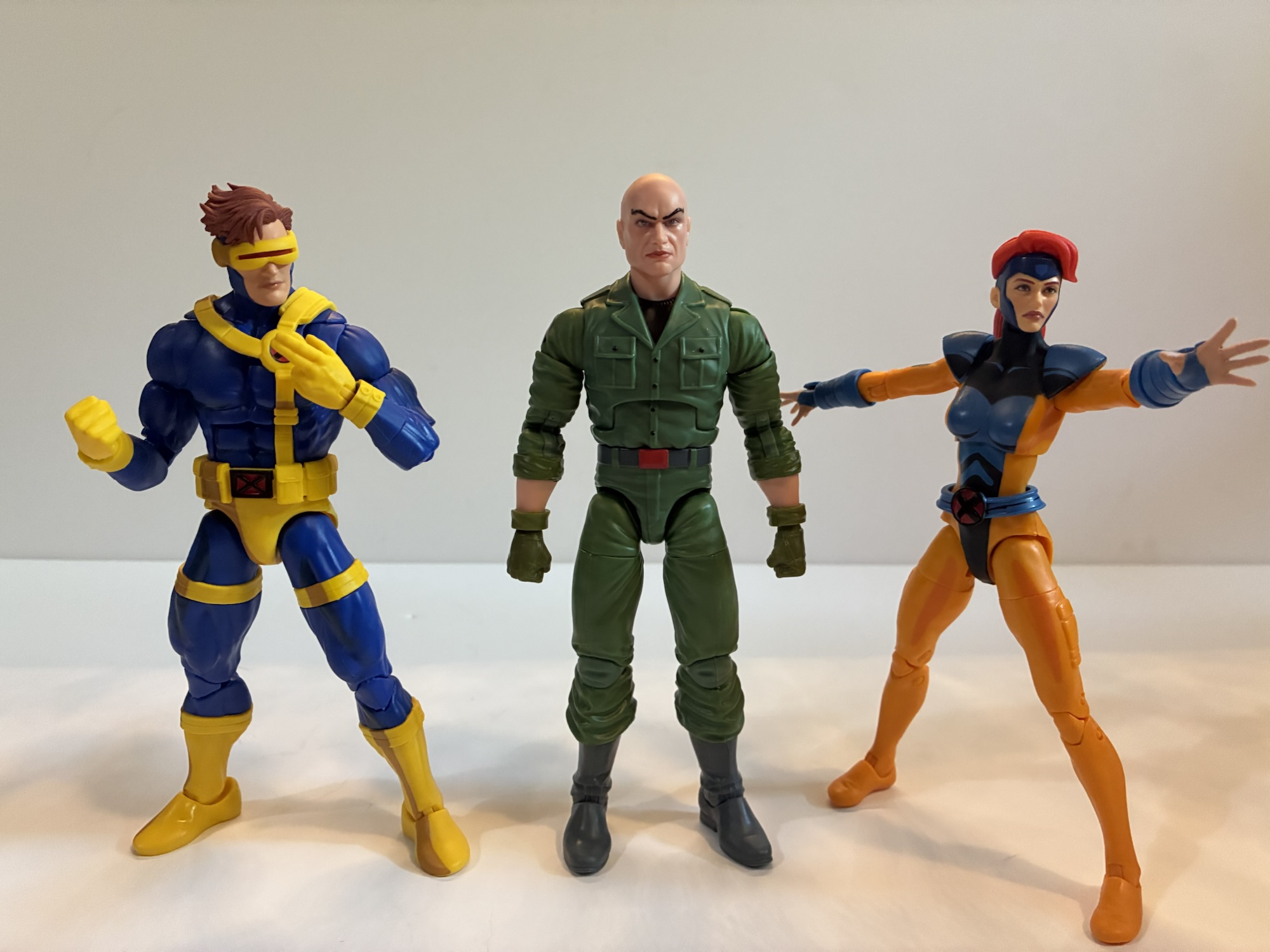
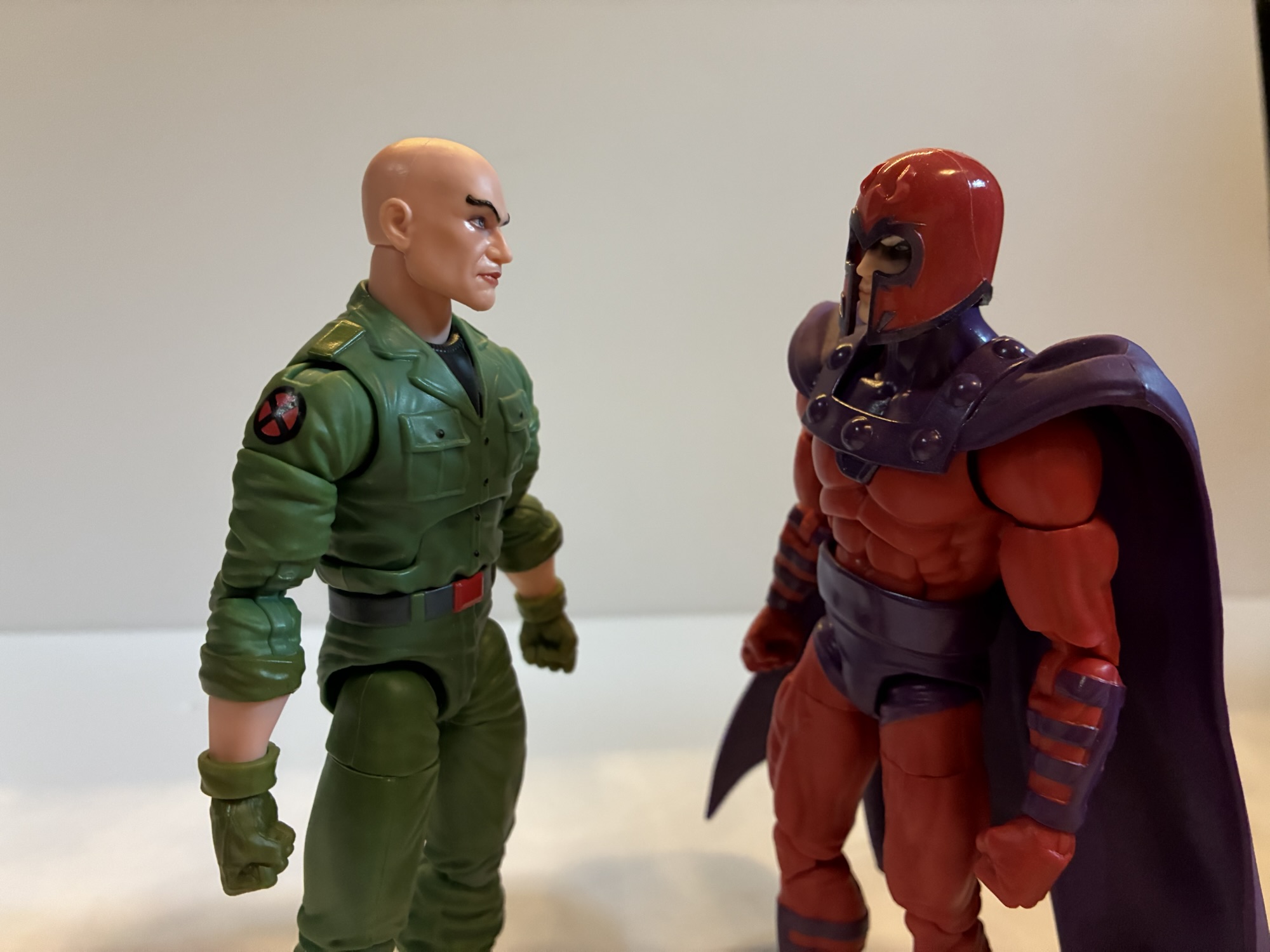
It feels like lately I’ve been getting swayed by clearance and discounts when it comes to my action figure purchases. Such is the case for today’s post on Professor X from the Marvel Legends line of action figures. Target had an exclusive version of Xavier featuring the character in his jumpsuit which showed up in the spring. Having recently purchased a different, more traditional version of the professor it wasn’t something I felt I needed. I wasn’t entirely satisfied with that figure though, so I was a little interested in this new one. Plus, the jumpsuit look feels like it’s pulled straight from the old animated series as this was the look Xavier sported for the entirety of the second season. And in that season, he and Magneto found themselves stranded in the Savage Land where a device Mr. Sinister had negated mutant powers, but somehow managed to cure a paraplegic like Charles Xavier. Of course, the X-Men destroy the machine to get their powers back thus dooming the world’s paraplegics to a life of paralysis. Seriously guys, you probably should have thought that one through a little better. I know this outfit showed up in the comics as well, but the combination of the look plus Hasbro’s decision to release it on a retro card definitely has me thinking X-Men ’92.
This is definitely a more 90s interpretation of Charles vs the older figure.Xavier definitely has some size to him.
When I buy one version of a character that I’m not crazy about I hate to compound the issue by buying another version of the same character. Especially when I don’t love that other version either. And with this Xavier it’s the face I don’t love. Xavier is often illustrated with pronounced cheek bones, but in three dimensions that makes for a bit of a lumpy appearance. Hasbro has also introduced more detailed face printing in recent years and sometimes they overdo it. That strikes me as the case here with Chuck as his eyes are rimmed with black and his lips are painted. The shade is almost like a slightly metallic peach and doesn’t look like a natural lip shade to me. It actually reminds me of a shade of lipstick my grandmother used to wear. I feel like he’s a wig away from being able to cosplay as a Golden Girl. This is in contrast to what I would want him to look like which is the animated series which took a very plain look to its character designs with mostly smooth features and no shading for the lips.
Some like this face, some don’t, but all can agree that Chuck has some crazy eyebrows.
Basically what I’m saying is that, apart from the bald head and the pronounced eyebrows, this portrait doesn’t scream Xavier to me. As for the rest of the sculpt – it’s fine. I think this body is reused from a past release, but I can’t be certain. The legs may be from Wonder Man though I’m not sure about the arms and torso. I don’t have enough Legends figures to know. Whether they are or are not, it doesn’t matter so long as they work for this figure and in this case I would say that they do. Most of the figure is colored plastic with paint reserved for the black undershirt and the belt. There are some black buttons painted onto the shirt and the rolled up sleeves were painted a lighter shade of green from the rest which is a nice touch. And we get some X logos printed on the shoulders. The greens are mostly consistent, but the legs and arms appear to have a touch more yellow to them than the torso. The knees and elbows are also a little off which is typical of these pin-less joints from Hasbro. This figure is not the worst offender in that regard and the difference is pretty subtle.
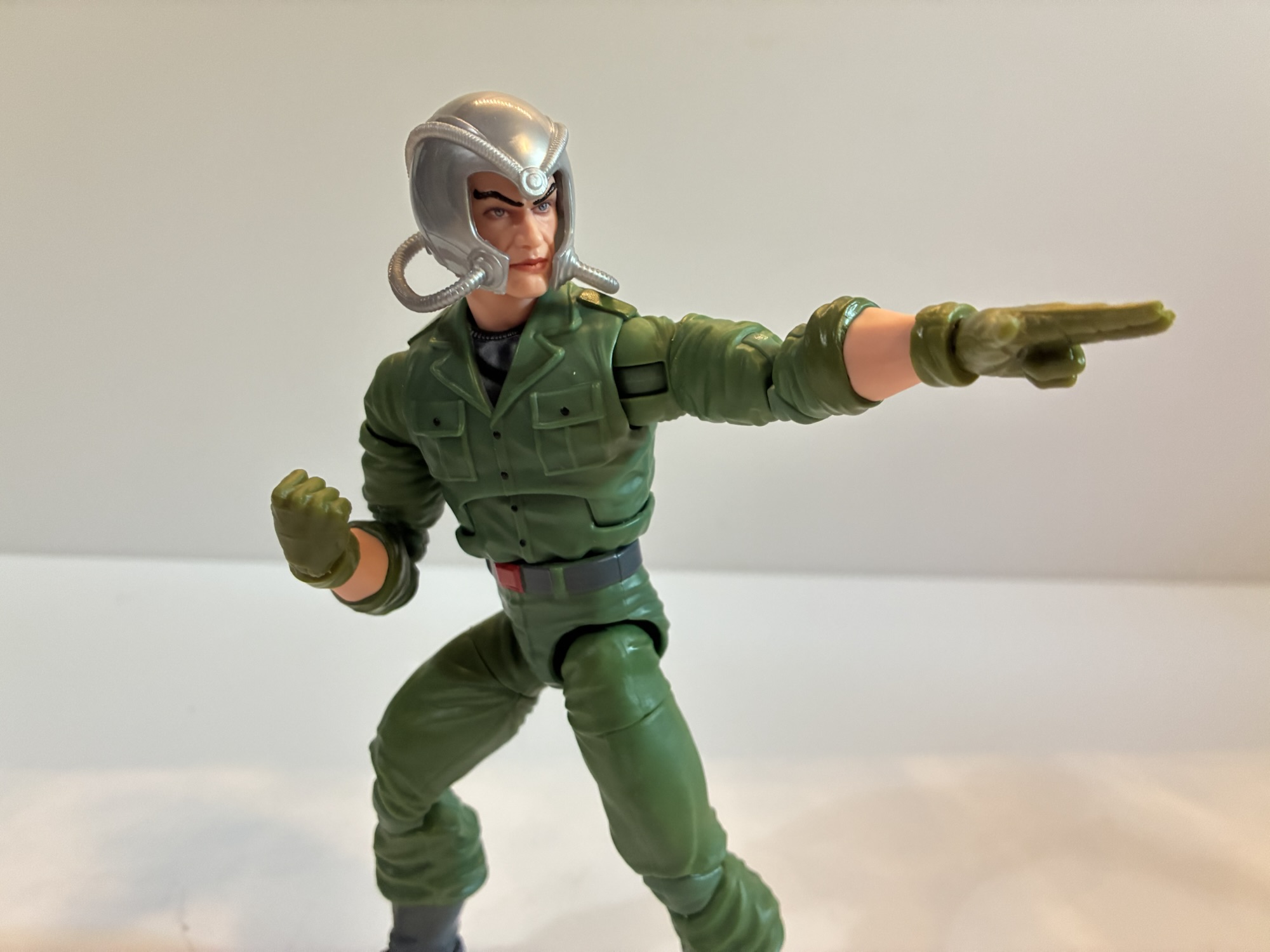
He’s got the helmet, even though he’s not supposed to have his powers in this state.
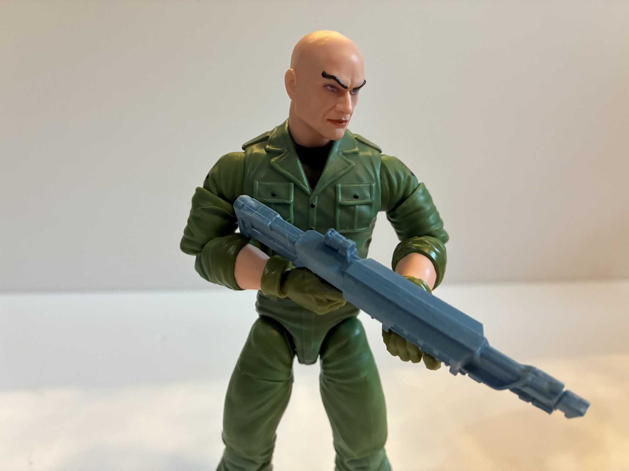
Xavier comes with just a few accessories, which is often the case for Legends these days. He has two sets of hands: fists and trigger hands. I have no idea why Professor X would come with trigger finger hands, but I guess if you want him to wield a gun he can. He also has a fifth hand which is a two-finger pointing left hand for doing mental power poses. It actually has some sculpted in lines to make it look like an actual glove which is surprising. It may be the same hand that came with the Age of Apocalypse Gambit so that may be how they justified the tooling cost. Chuck also comes with a new Cerebro helmet. At least, I think it’s new. It’s different from the one that came with hoverchair Charlie and it’s fine. It’s that swirly, gray, plastic Hasbro favors over shiny paint for metallic objects and it fits on his head just fine. There’s a hole on the back which had me thinking that was for X-Men ’97 Jean’s ponytail, but the helmet really doesn’t fit on her head because of her hair.
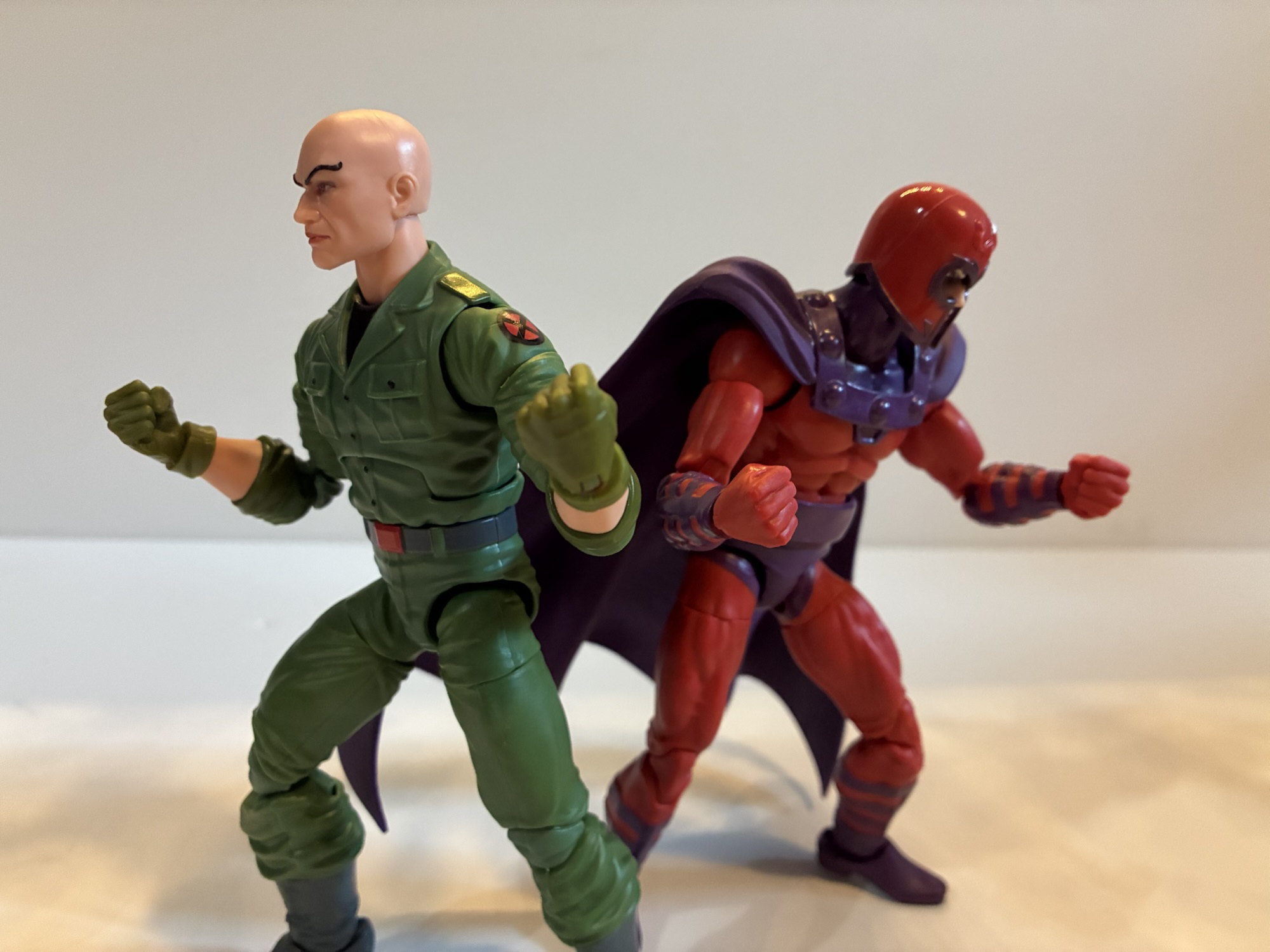
“We must fend them off, Magnus!”So much for pacifism.It’s a tight fit, but he can get into this chair and wear the former helmet.“So we meet again, old friend.”
Xavier’s articulation is pretty standard Legends fair, though it has its own quirks. The head is a double ball peg and it’s actually the best double ball peg setup I’ve seen from Hasbro. The lower ball isn’t as deep as it normally is in the neck and he gets good range looking up, down, and tilt thanks to another joint at the base of the neck. Of course, the lack of any hair to work around is playing a role, but good is good. From there we have typical shoulder ball pegs, bicep swivel, double-jointed elbows, wrists, ab crunch, waist twist, hip, thigh, double-jointed knees, boot cut, and ankle hinges and rockers. The range on the ab crunch is pretty poor going forward and back, but aside from that the other joints are fine. The two-finger pointing hand and the trigger hands all have vertical hinges which is interesting. Not so much the trigger hands, but the two-finger gesture is an odd choice. I’m not sure which direction I’d want the hinge to go in this case. The waist twist being above the sculpted belt is a bit unfortunate because it’s ugly. If they could have set it inside the belt it would have looked better, but also cost more.
In the chair where he belongs.
The articulation is fine and it’s probably plenty for Charles Xavier, a guy who traditionally doesn’t walk. The figure also can fit into the hoverchair if you wish and he did sport that look in the show as well. This is a pretty fine Marvel Legends figure. If I liked the portrait sculpt then I’d be pretty happy here and probably would have paid full price. Since I don’t, I still question my decision to buy it as I don’t think it’s an improvement over the other Xavier I have. At any rate, he’s another addition to the animated shelf and he won’t look awful. And if I display him with the helmet I’ll probably barely notice the face. Plus, the new X-Men ’97 Morph is coming with a head for Henry Gyrich and even the Legends team had that head on the hoverchair Xavier body. Perhaps I’ll do the same eventually leaving this as my default Xavier. Even though this has been discounted for a couple of weeks now, I still see this one at Target so you may be able to find it if you’re interested. I paid $17 for it, but if they keep lingering maybe they’ll go even lower? That might be a gamble worth taking.
Professor X isn’t much on his own, so here’s some other figures that might catch your fancy:
Most view superheroes as idealized versions of people. Superman has all the power he needs to mete out justice as he sees fit. He’s a man who is super fast, super strong, basically invulnerable, and he even has laser eyes for good measure. Not every character can be Superman though and as the stable of…
It was two years ago that Hasbro made the announcement that it was wading into the weeds of X-Men, the cartoon series that aired on the Fox Kids Network from 1992-1997. The line was released across eight installments in 2022 (plus a ninth if you include the obviously animated-inspired Apocalypse released on a retro card)…
This week, the long wait for an in-person San Diego Comic Con comes to an end. For the first time since 2019, attendees, creators, and the like will be invited back into the city of San Diego for a celebration of all things comics, movies, and general “nerd” culture. One of the many panels this…
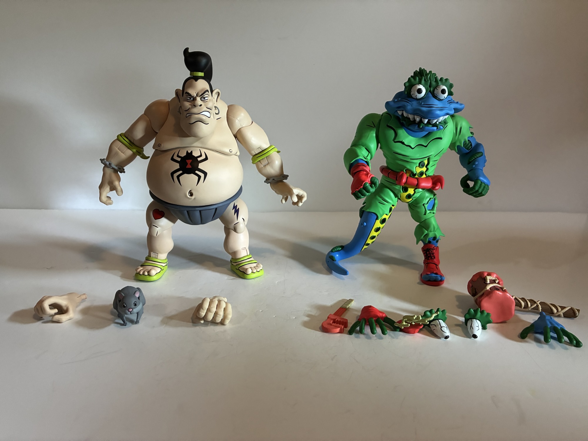
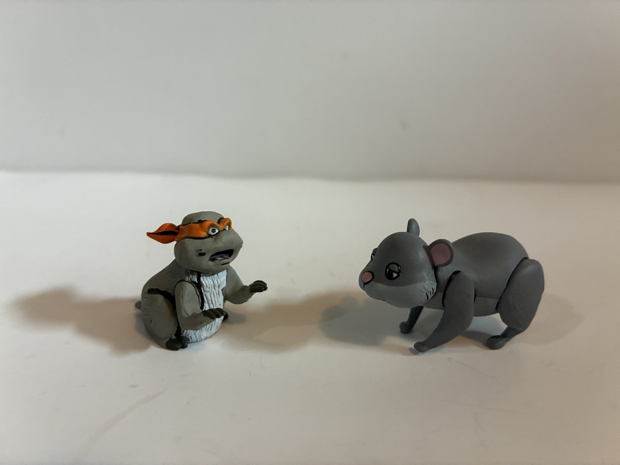
Recently on #TurtleTuesday, I talked about a set of figures from JoyToy that lured me in just by being good toys. This week, it’s a two-pack that got me in spite of my feelings on the product in part via that annoying drive to have a complete collection and by retail’s favorite trick to lure in extra purchases: the discount. Target recently had a promotion on toys that meant consumers could get ten bucks off any toy purchase over $40. What’s a toy that is over $40 and in my line of sight? NECA Teenage Mutant Ninja Turtles two-packs!
This past spring, Haulathon returned to Target which meant more NECA TMNT figures based on the original cartoon series. Among those was a two-pack featuring the classic characters Tattoo and Wyrm. Yes, that “classic” is meant to be sarcastic as neither character fits that descriptor. Both were featured in the original toy line by Playmates, but I don’t recall either being a fan-favorite. Tattoo was perhaps one of the most boring releases in the entire line. He was simply a sumo wrestler who came with a bunch of stick-on tattoos you could apply in any which way you wanted to the actual figure. Wyrm was more typical of the line and a gross-out, mutated, worm. If any of these two were more beloved than the other it was probably Wyrm. For me, I owned neither as a kid. Tattoo didn’t interest me and Wyrm may have been a little too gross. Truth be told, I don’t remember ever passing him up at the store so had I been given a chance to buy Wyrm maybe I would have done so, but just because I can’t remember it doesn’t mean it never happened. Plus, he’s a mutant earth worm. That’s definitely not as cool as a wolf or a snapping turtle.
Not a ton in the box for this set.
Tattoo made his small screen debut in “Planet of the Turtleoids Part 1,” which was the closest thing to an event moment the cartoon series had. He’s a bit of a throw-away villain who opens act 1 and is dealt with pretty quickly. As for Wyrm, he actually never appeared in the show so why is NECA able to include him in the toy line? In addition to NECA embarking on more “What If?” type releases as seen with Panda Kahn, Wyrm did appear in animated form during the 90s, it just wasn’t the show. He was featured as an animated character in a commercial for the action figure alongside Chrome Dome, Dirtbag, and Groundchuck. The other three made their television debut during the Planet of the Turtleoids arc which makes one wonder if Playmates thought the same would be true for Wyrm? Or maybe it’s just coincidence? Wyrm would finally get to appear in the 2012 series, but he never did officially appear in the 1987 one.
Tattoo is more round than tall.
We might as well start by talking about Tattoo since his name comes first on the box and he’s the least interesting of the two. Tattoo is a big, chunky, figure and what you see is pretty much what you get. He stands about 6.25″ to the top of his head and he’s literally a big guy in sumo gear. The show did adopt some of his tattoos for animation like a black widow on his stomach and a lightning bolt on his leg, but they kept it pretty simple for animation. As is typical of the line, everything is painted on Tattoo even if the bare plastic underneath is the same color. You do have to watch out for the joints as they are painted over and that type of plastic won’t hold the paint. That means the elbows, especially, will flake off after repeating use. As has been the case for a few releases now, the old bisected shading with the dark on back and light on front is no longer in use here. Paint is mostly clean, though the right shoulder on my figure has some weird scuffing. It looks similar to a situation I had with the Neutrino Zak and I was able to get that off with a Magic Eraser. Hopefully it works here.
This blemish above the shoulder is a bit of a bummer.
Tattoo looks fine, it’s just that he’s not a very interesting design. I didn’t really want him, but if I wanted Wyrm I had to buy him. For accessories, he just comes with a set of clenching hands and a set of gripping hands. He also has a really large hamster which is technically himself. That’s because in the show this hamster, or gerbil, somehow was mutated into Tattoo. Yeah, it was pretty bizarre and is easily his most noteworthy fact. The articulation for Tattoo is poor. His head, being set forward and not on top of a neck, just pivots. His has articulation at the ponytail, shoulder ball hinges, bicep swivels, double-jointed elbows, swivel and hinged wrists, a diaphragm joint, a waist swivel, ball-socket hips, single hinged knees, and ankle hinges with rockers. The range of motion everywhere is pretty limited save for maybe the diaphragm, though even that just rotates. The elbows are pin-less, but also pretty ugly once bent. The left one is fused on my figure, but I don’t know if I’ll even bother to heat it up. He stands in a semi crouch which means his hips and knees do almost nothing. The range at the knees is probably less than 45 degrees, and since the joints will flake it makes this the sort of figure that is just begging you not to mess with it.
Not the nicest looking elbow joint.
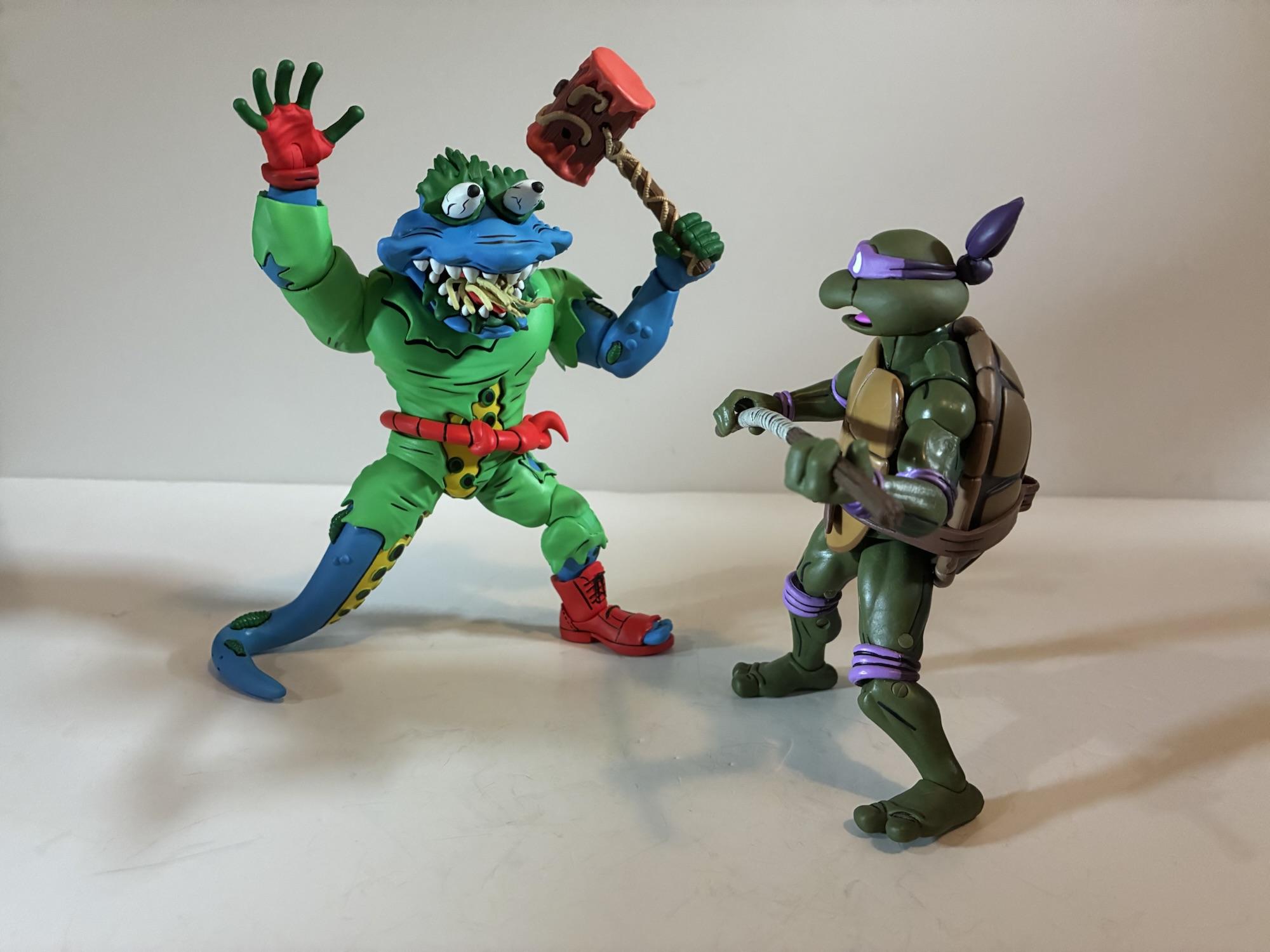
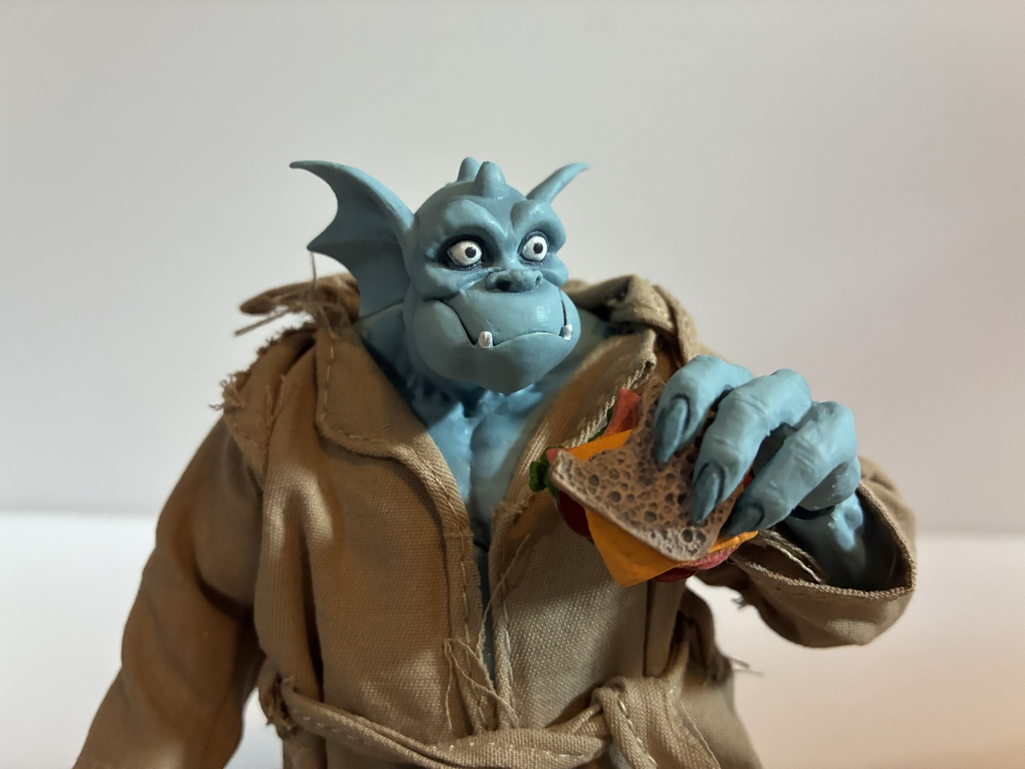
Wyrm, by contrast, is far more of a typical design for the old Playmates line. NECA adapting him for this toon line actually means he’s a little more striking than a lot of the figures in the line since so many of those toy designs had to be toned down for animation. With Wyrm, you’re really just getting an updated version of that old toy as there isn’t much separating the two. He has some size to him as he’s about 6.25″ from the bottom of his booted foot to roughly the top of his head. He’s another character with a head that slopes forward and he has hair and a hat on top of his head to make it a bit more subjective just how tall this one is. He’s very bright though as the flesh is this royal blue while his outfit is basically a neon green onesie. In looking over my toon collection, I can say there isn’t much of either shade within it so this guy should pop. There’s obviously a lot of green in the display, but nothing as bright as this shade with the closest being Zork. The blue also stands out as it’s more saturated than Chakahachi or Rex-1. If you want to slot him in with the Night of the Rogues grouping, he’ll stand out amongst them. He feels like he belongs with the likes of Scumbug and Antrax.
Wyrm fits the aesthetic of the line much better than Tattoo.
Wyrm, as the name implies, is a mutated worm. And since he’s from the old toy line, he contains a lot of hallmarks one remembers from the line. The designers (who were mostly Mirage Studios artists) loved asymmetry with their mutants and that shows up here with Wyrm sporting a blue glove on his left hand and a red one on his right. It also shows up where it most often did: the feet. Or rather in this case, a foot and a tentacle. Wyrm’s left leg is fairly humanoid. It ends in a red boot with the toe ripped open exposing his digits of which he has only four to go with five digits on his hands. The right leg is basically a tentacle or worm tail. It’s blue on the outside and yellow on the inner part with little green and black suckers. It’s the most memorable aspect of the character’s design and I’m surprised he doesn’t have a tentacle left arm, though this is probably more manageable from a play point of view.
Donatello is right to be scared.
The design plus NECA’s ability to execute when it comes to the sculpt and the paint is what is going to sell Wyrm to most people. I suppose now is as good a time as any to list the credits which include Tony Cipriano and Kushwara Studios for the sculpt and the duo of Geoff Trapp and Mike Puzzo on paint. The detail work is all nice, but not overdone since this is supposed to be Wyrm as a cartoon. Still, animators would have hated this guy with his tattered clothes and this pattern of suckers on the inner, right, leg. He has a few bumps on his flesh and also what appear to be leaches in certain places. I think he’s supposed to be an earth worm, but he’s more like a tentacle monster. The eyes are bulgey and veiny and rimmed with dark green slime (I guess?) which helps make them stand out. The teeth and the green sludge in his mouth are all painted well and there’s a suitable abundance of black linework and detailing throughout. Like Tattoo, the toon shading is not in effect here and the approach is basically no different from what we’ve seen out of NECA’s Archie line. My assumption is that’s the approach we can expect going forward and I don’t hate it.
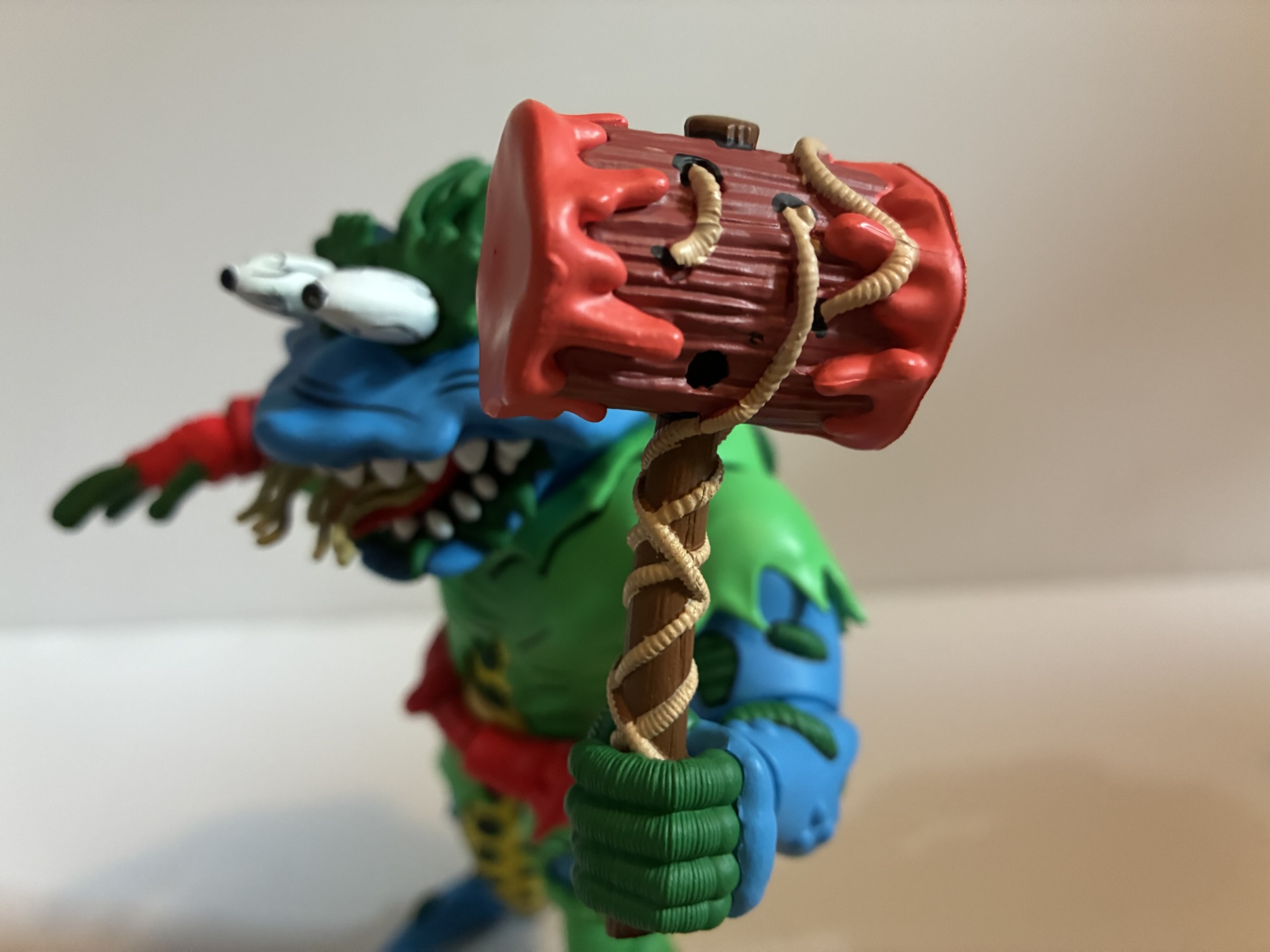
This mallet has been used to commit crimes.
Wyrm comes with a lot more stuff than Tattoo. He does equal the big guy in the hand department as he has just two sets: gripping and open. The right gripping hand is much tighter and I think it’s so he can get a solid grip on the included monkey wrench. The wrench is a salmon color with tape around the handle. It doesn’t articulate or anything and it’s just a wrench. The vintage toy came with the same, but it had some kind of rodent attached to it as well. The other weapon is a big old mallet and it fits into the slightly wider left gripping hand rather well. It has a wood grain texture and sculpted worms throughout it, or just one really long worm. Both ends of the head are covered in red slime. I guess it’s supposed to be blood? The shade of red is a little light, but what else could it be? It’s certainly one of the most gruesome accessories in the line up to this point.
NECA came up with a genius idea to replicate the original toy’s action feature.
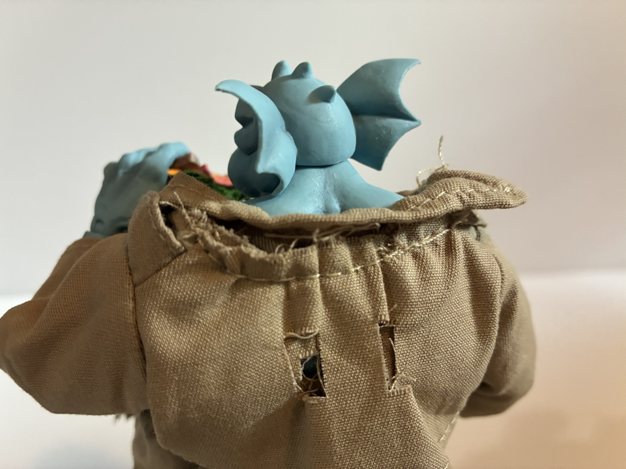
That’s not all though, as Wyrm has a couple more extra parts he can utilize. The old toy had an action feature which was bug-out eyes and these little worms in his mouth that would pop out. NECA isn’t going to include an action figure on a line aimed at adults, but it can simulate the effect with optional parts. Wyrm comes with a second set of eyes which are elongated. To use them, you simply pop out the stock ones and pop these ones in. They’re keyed in such a way that you can’t mix them up and that green goop behind his eyes doubles as an easy way to find some leverage to pop them out. For the worms, NECA included a bonus tongue. You open Wyrm’s mouth as far as it will go and just lay this one over the sculpted tongue inside his mouth. This new one has the worms sculpted onto it and they’re done in a soft plastic so they feel similar to bristles on a toothbrush, just much thicker. It’s a clever way to simulate the effects on the old figure and I’m left surprised NECA was able to get away with reproducing it here when Super7 has run into so many issues with their Playmates homage line. I guess you get more leeway from the licensor when you’re bringing in more money for them.
“Dude, you are one big rodent.”
It’s a good thing that Wyrm comes with so much stuff and looks so good, because he articulates about as poorly as the worst of this line. There’s not much he can do as we have articulation at the head, jaw, neck, shoulders, elbows, wrists, waist, hips, thighs, knee, and ankle. The elbows are single-jointed so that also serves as the bicep swivel. The gripping hands at least have a vertical hinge so that’s okay. The head is fairly restricted by the placement and shape and there’s no articulation in the torso aside from what ends up being a basic waist twist despite the fact that it’s a double ball peg (it’s way too deep in the chest and the base of it is in a sculpted out cone of plastic so it can’t go anywhere – I took it apart to see). The knee is double-jointed, but that left leg isn’t very useful because we have to contend with the right one. For that, NECA went with a rubber tentacle over a heavy gauge wire. It will bend, but getting Wyrm to stand is a chore. I can get him standing, but it never seems to last long. This is a figure that ever since I got him I find toppled over every morning. The old figure went with a plastic, pre-posed, right leg which actually made him fairly easy to stand. NECA’s approach here is fun, but what good is the bendy wire? It’s just kind of a pain in the ass. I’ll probably bust out a disc stand for this guy and see if that helps keep him standing.
Also scary is Tattoo.
Wyrm’s articulation is obviously better than the old figure, but it’s so limited that functionally it’s not that much different. The range at his elbows is mediocre so you’re mostly going to post his arms with his shoulders and the swivel point. The legs need to be in a specific position to keep him standing if you’re not using a stand so he almost feels like a 5 POA style figure. We’re used to articulation in this line taking a back seat to the aesthetics, but in the case of Wyrm it’s more noticeable than most. He also will have the same paint-flaking issues as Tattoo, though it’s only really noticeable on the back of the left knee.
This is a set of what you see is what you get. If you like the look of Tattoo and Wyrm and want them in your collection then that should be the motivating factor. The accessories for Wyrm do make things a bit more interesting and I definitely enjoy his look far more than I do Tattoo’s. The real problem here is the asking price of $65. That’s at the high end for NECA two-packs (though there’s the threat of price increases looming meaning this could be the new floor) and thus a harder sell. This set isn’t nearly as good as the similarly priced Antrax and Scumbug or even some of the cheaper sets like Space Don and Samurai Mikey. This may be the first two-pack where I really notice the budget as it feels like Tattoo was only bundled with Wyrm because he could be done a bit cheaper. Just one extra set of hands and a slug figure so Wyrm could get extra stuff and a unique bendy wire leg. There’s also nothing unifying the two characters aside from the fact that both were featured in the vintage toy line. In the circles I frequent, I found most people were only interested in one half of this set with most favoring Wyrm but there were a few only interested in Tattoo. Maybe that can create some opportunities for folks to split a set? They’d almost have to be local though with the cost of shipping these days.
If you think these guys look cool and you’re okay with the price, go for it. This stuff almost never hits clearance as it is.
If you want this set your only option right now is Target. They’ve been in-stock on the website for some time, but may be gone by the time this goes live. They should be sold in stores as well, though I personally have yet to see either Haulathon two-pack show up on shelves. International buyers should be able to get these on the Haulathon website. The set gets a tepid endorsement by me. The quality is there relative to the rest of the line and I do genuinely like the look of Wyrm. Tattoo may be boring, but he looks the part of the character from the show, he’s just severely lacking in the accessory department. He should have slapping hands and a yelling portrait, at least. Wyrm looks great, it’s just a problem of cost. Even at the discounted price I got this set at, I still feel like I paid $55 for Wyrm and that’s a terrible deal. I definitely envy those who look at this set and see two characters they need in their collection.
We have plenty more thoughts on NECA’s line of TMNT Toon figures for you:
I’ve been looking forward to this one for awhile. Antrax and Scumbug only appeared in the cartoon series Teenage Mutant Ninja Turtles once, but like last week’s figure review, they were present in the toy line long before their animated debut. And these later period episodes, such as “Night of the Rogues,” tended to just…
I encounter the sentiment often that the majority of Teenage Mutant Ninja Turtles fans in my age group (the over 40 club) associate the property with the vintage toyline first and foremost. The cartoon was a big hit, but it could only appear for a half an hour at a time where as the toys…
When it comes to character selection in NECA’s line of action figures based on the 1987 cartoon Teenage Mutant Ninja Turtles I think it’s safe to say we’re well into the weeds. This latest batch to arrive at Target as part of the company’s branded Haulathon have certainly illustrated that. Aside from heroic versions of…
San Diego Comic Con is always an exciting time of year for toy collectors. Even for someone like me who has never considered actually going to the event, I get up for it because I know the coverage is going to be coming fast and furious. Some years are bigger than others, but for me I think I can say that the 2025 edition has been the most surprising. I went into it with certain expectations some of which were met, but some were not and that’s not unusual. What was unusual for me is that some of the things I basically considered a “lock” did not come to pass and I left the event being perhaps most excited about a company and a product line I definitely didn’t see coming. Let’s start with the familiar though and my bread and butter franchise: Teenage Mutant Ninja Turtles
TMNT
NECA is heading down the 2012 TMNT rabbit hole this fall.
As has been the case most years, the Teenage Mutant Ninja Turtles had no shortage of coverage this year at the convention. There was even a dedicated brand panel that covered releases from several companies. We still have Playmates for vintage re-releases and some modern takes, NECA is hitting on the toon, Archie, and Mirage, Super7 has the 2003 edition of the show, and now we have Mondo doing sixth scale stuff. Mondo’s line is their own take on a post 1990 film franchise and it looks interesting, but isn’t really on my radar for the time being. I don’t have the space or funds for another Mondo sixth scale franchise. Super7 also reaffirmed its commitment to 2k3 by unveiling silhouettes for the next wave which will include Hun, April, and a motorcycle Raphael and Shell Cycle. This would seem to be the nail in the coffin for the vintage inspired figures Super7 started off with which is really frustrating considering the figures missing (topped by Heavy Metal Raph). I’m done with the 2k3 series after Shredder, and possibly done with Super7 after that as well.
NECA has been the company at the forefront for TMNT the past several years, but their showing was surprisingly light. They did announce a line of turtles based on their appearance in the game Fortnite, but that might have been the most noteworthy. There was a leak the week before SDCC of one of their reveals for the toon line, granny Bebop and baby Rocksteady, though that release wasn’t going to blow anyone away (even if it is entertaining). The only new figure shown for the toon line otherwise was a beach Slash. There was also no big display with dioramas and such, just figures in a case. It’s pretty clear that NECA wasn’t going all out for SDCC. Is that a shift in strategy? It certainly costs money to put these big displays up and staff a booth plus rental space isn’t cheap. Are they going to pivot more to social media for reveals? Is New York Comic Con considered their flagship event? Or did the reappearance of Toy Fair earlier this year just mean all of the stuff that would have been revealed at SDCC was instead shown there?
NECA didn’t have a lot of surprised in their booth, but this certainly was the most standout one.
I don’t know the answer to any of those questions, but I was very surprised at the lack of Tempestra. She has become the biggest missing piece for the toon line, even if she is very much a B-tier character in her own right. I’m not sure why they’re slow-walking that one. They mocked up an arcade cabinet accessory for a still unreleased movie April variant more than two years ago that most assumed was really made for a Tempestra. What I did like, even though none of the figures shown were new reveals, was how the 2012 TMNT line is shaping up. The sculpts look fantastic and they’re all dated for this year and will be sold as single releases so no four or two packs. I don’t think it’s been confirmed where we’ll be able to buy them, but they’re among my most anticipated releases for the second half of 2025. The only other showing that excited me was Garfello, i.e. Garfied cos-playing as a ninja turtle, which was unexpected. It looks great and comes with Odie and is the sort of silly release I’m very likely to get.
As for the rest, there wasn’t much to be excited by. Playmates is re-releasing its remastered turtles minus the bumpy texture a lot of people didn’t like. We actually knew about that going into SDCC, but that was basically the official launch. Mezco also showed off 1990 movie turtles for its One:12 line. They look worse than the NECA releases (which are coincidentally being re-released in single packs this year), but will probably cost more than twice as much.
Mondo
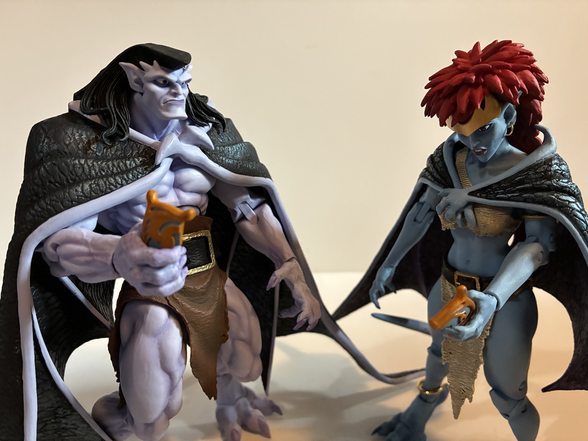
No one does animated X-Men better than Mondo.
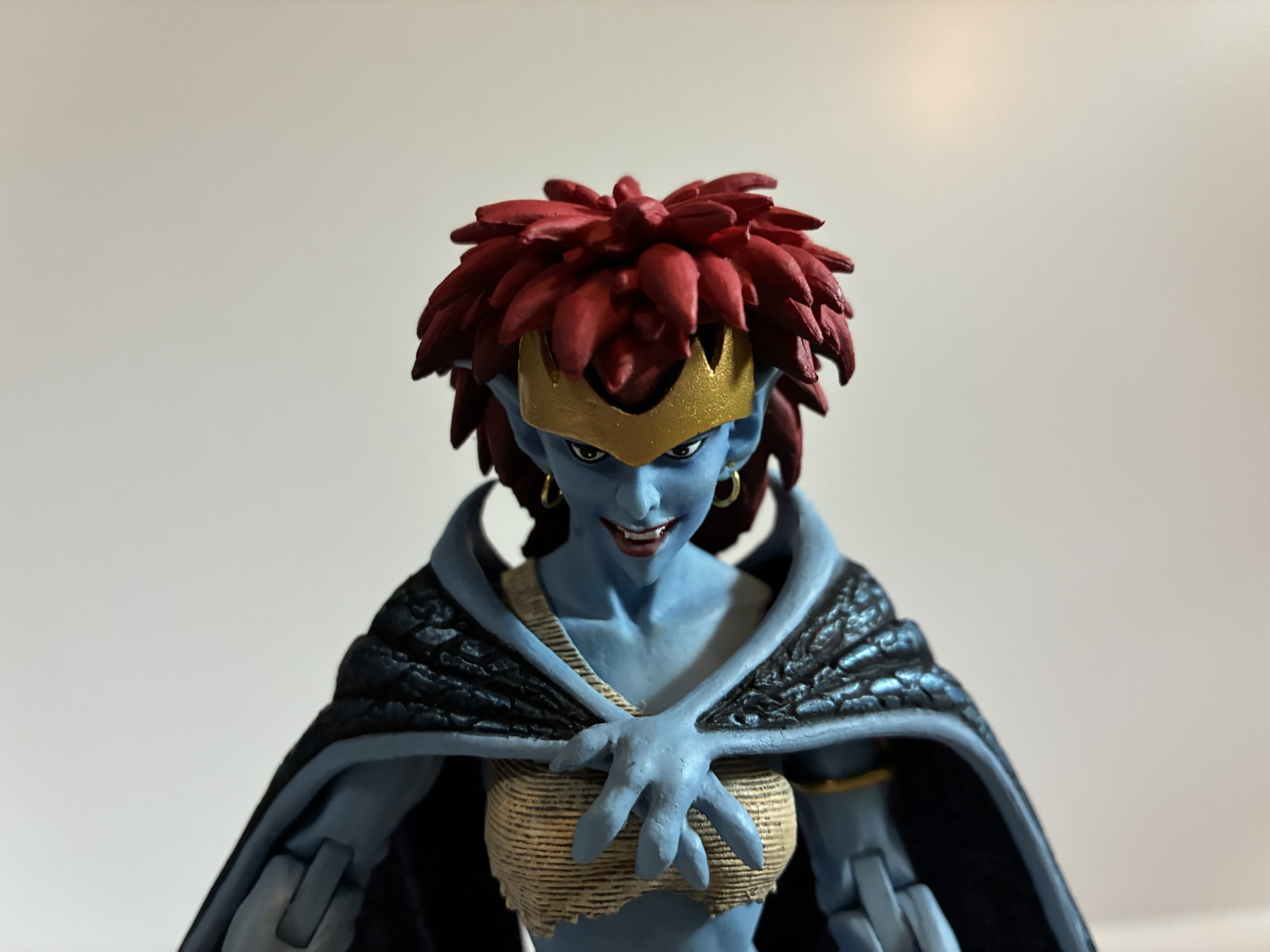
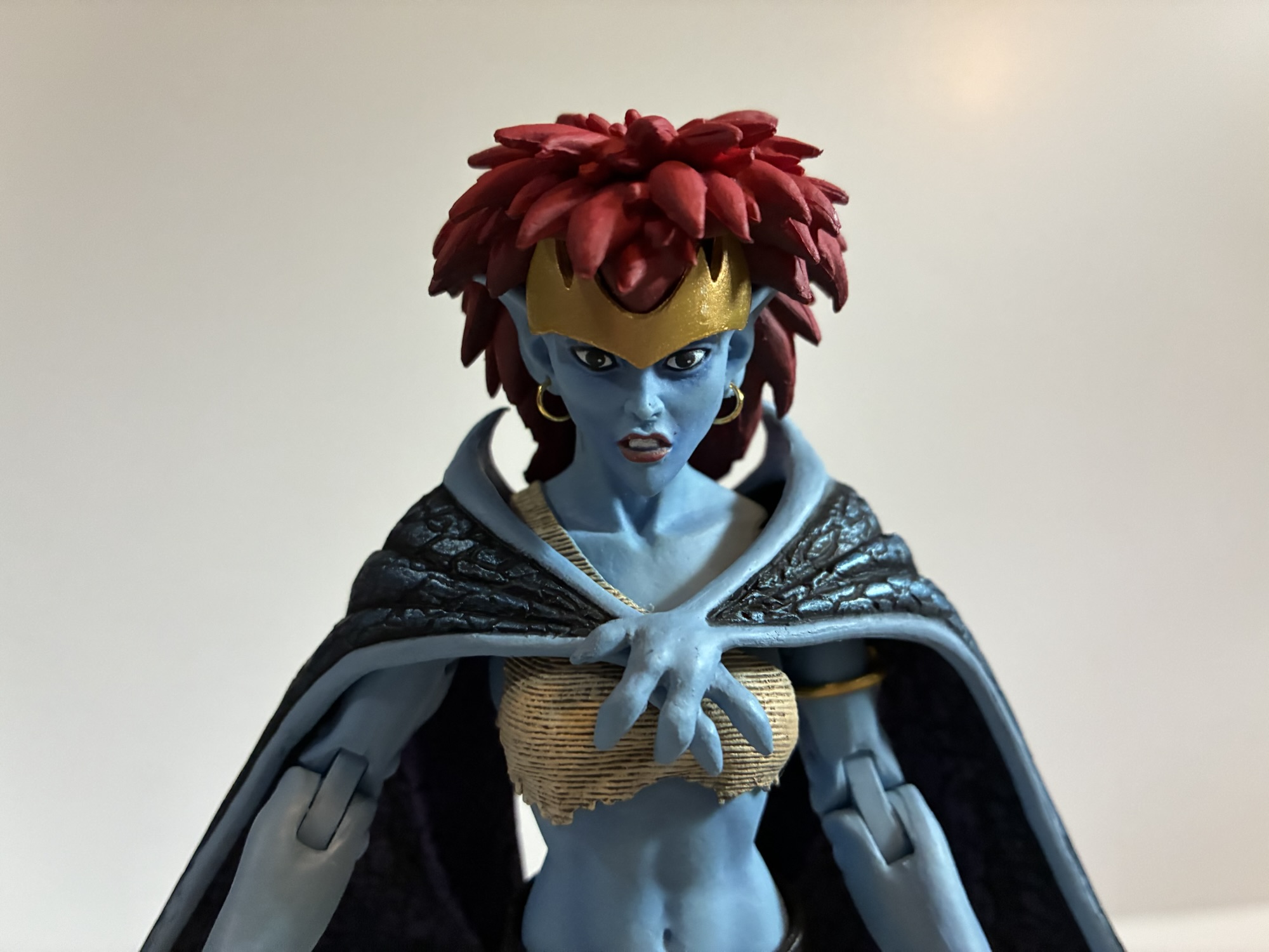
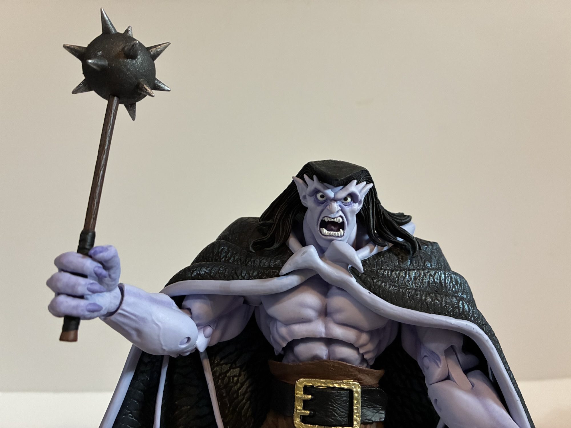
We’ll pivot from an IP to a company here as Mondo had a lot to show off. Perhaps more than any other company, though I confess I’m not interested in everything they do (like Masters of the Universe and ThunderCats). What gets my attention first and foremost when it comes to Mondo are their plans for their X-Men animated line of sixth scale figures. It’s a line that is becoming much harder to collect because of the tariff situation in the country, but I’m in too deep to dump it. Heading into the event, we knew the next figure to be solicited was likely to be Mr. Sinister who had already been shown. There was also the reveal of an event exclusive Savage Land Rogue which went up for preorder before the show. They were both at the event along with the next figure: Storm. She looks awesome and was my guess for next up. It didn’t end there though as we also got to see concept art for the next figure and it’s Beast! I’m glad he’s a little ways off since he might be an expensive one. Perhaps things can improve economically before going up for order, though there’s always the chance things get worse. Little is likely to change before Sinister goes up though which is happening in August. I love the look of the figure and he’s an A-list villain from the show, but I do not look forward to the sticker with that one.
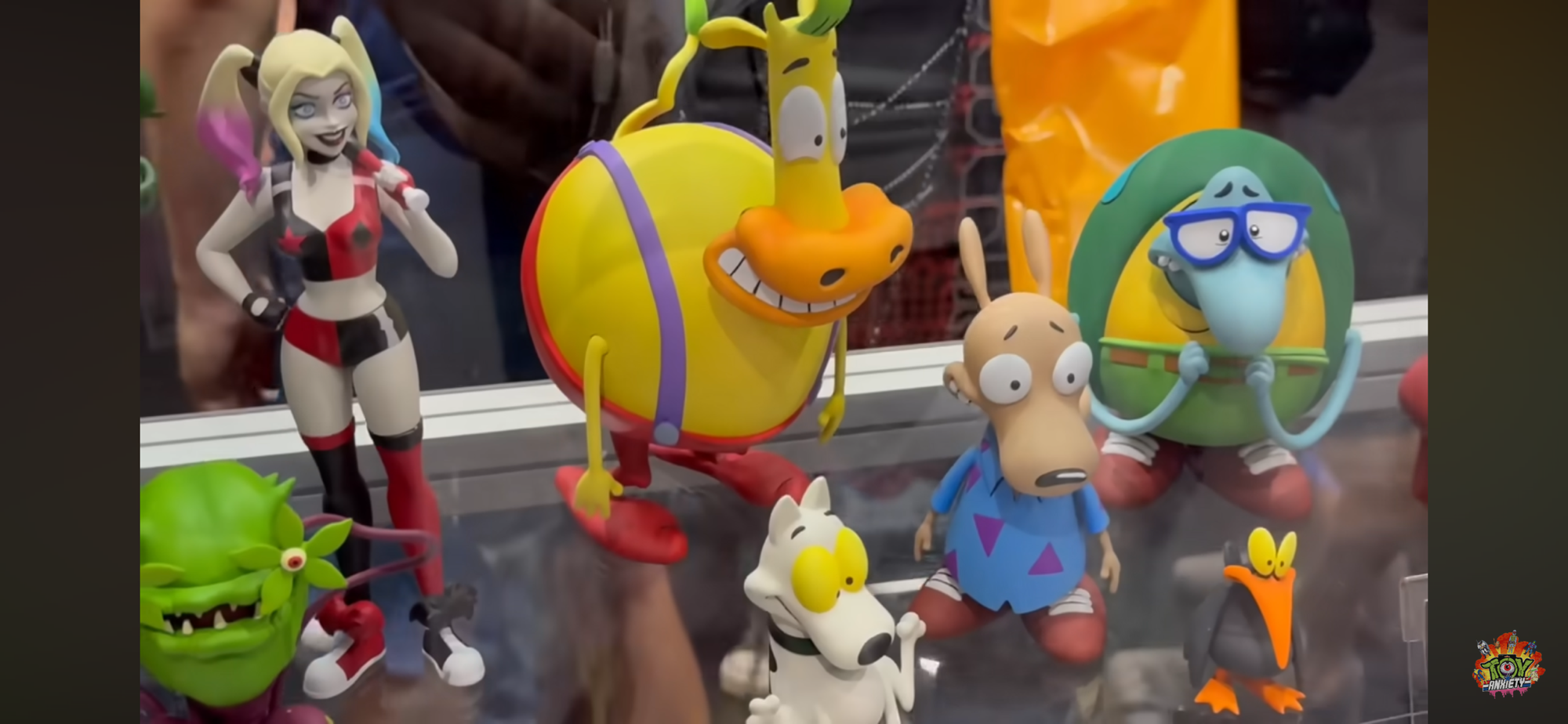
That was a hoot!
That’s the only sixth scale line I’m in, but Mondo did reveal more Marvel and DC figures (Superman, Two-Face, Dr. Doom, Lizard) in their other lines which all seemed solid. What really caught my eye though were their Mondo Squads which are more statuesque figures with swappable parts and sold in bundles of characters. Previously, they had done a set of characters from the Nicktoon Aaahh!!! Real Monsters and now they’re moving onto Rocko’s Modern Life. I love Rocko and this set of the titular character plus his mates Heffer and Filbert is pretty much an automatic buy from me. We don’t have a lot of Rocko merch out there so the scarcity will help. Also shown is a squad of Beavis and Butt-Head with their couch and the four fellows from King of the Hill (Hank, Bill, Dale, Boomhauer). Similar to Rocko, I may have to get King of the Hill since there’s so little out there for the franchise that I have really grown to love in recent years after previously dropping off around Season 5. Mondo also teased future squads based on Rugrats and The Ren & Stimpy Show.
The last of the real Ghostbusters makes his debut in Ray.
Mondo is also heavily invested in The Real Ghostbusters, which was probably the biggest reveal of the 2024 show. We’re still waiting on the first release to drop (once again, thank you tariffs), but we have now seen all four of the busters and their companion ghosts. And, to no one’s surprise, everything looks great. I still have reservations about the price, but it is what it is and we’ll talk more about that when Peter finally arrives (hopefully sometime in August). Mondo also revealed that Janine will follow the boys and she’ll be in her more traditional secretary attire. To sweeten the package, she’ll come with her desk and an alternate lower half for a clean cross-legged sitting position. I’m guessing all of this extra stuff means she’s going to retail for $202 like the Ghostbuster + Ghost package we’ve seen up until now, but maybe that won’t be the case. That will be a tall ask and is probably something I won’t be interested in.
Marvel Legends
It’s all X-Men ’97!
I knew Hasbro would have some X-Men ’97 stuff for us, but I wasn’t prepared for just how much and how much I’d like it. We learned what wave three will be and those figures were all on-hand for folks to gawk at: Morph, Jubilee (final suit), Sunspot (final suit), Emma Frost, Cable (first outfit), Wolverine (classic civilian clothes). All of them looked pretty damn good. I’m mostly looking to supplement my ’92 display with these so Cable and Wolverine were locks. My dissatisfaction with the ’92 Jubilee puts the ’97 one on my radar, though I’m disappointed she’s in her black jumpsuit. Maybe I’ll swap heads with the ’92 one? Maybe even arms and coat? Emma just looks great though a classic take on the White Queen was enough to get me to put in a preorder and I love Morph so I’m in for the ’97 version. The only one I didn’t preorder was Sunspot. Nothing against the figure, I just don’t really care about Sunspot.
Gambit, what did they do to you?!
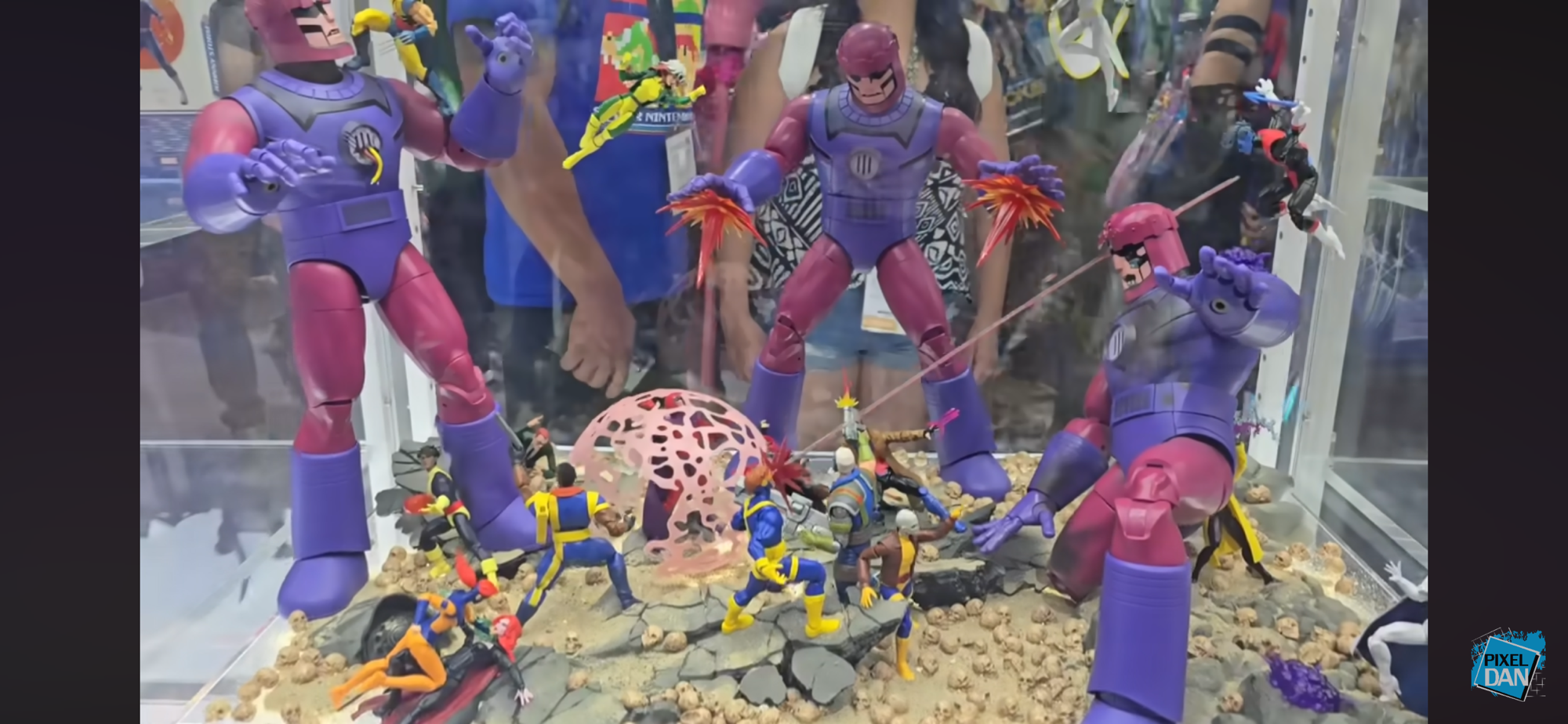
That wasn’t all though as we got a nice look at the made-to-order Sentinel which went up last year and there were some two-packs announced. We can look forward to a finale Cyclops and Jean (Marvel Girl), finale Wolverine and Storm, and a pairing of Rogue and Gambit from their basketball scene in the first episode. None are essentials for me and I don’t think I’ll be getting any, but I love to see how all-in Hasbro is with X-Men ’97. The one set that I would have had the most interest in is the basketball two-pack, but it is unfortunately the worst looking set of the two. That’s because it looks like Hasbro repurposed its Starting Lineup body of NBA players for its shirtless Gambit. That sculpt has a very unpleasant looking ab crunch in the middle of it. It worked okay for Starting Lineup because all of those figures had a jersey. Gambit doesn’t have that luxury and it looks terrible. It’s honestly one of those “How did this get approved?” moments that comes along once in awhile.
Aside from that, I had little to be critical of with Hasbro’s panel. They also revealed their next made-to-order figure: Mephisto. Mephisto was previously released many moons ago by Diamond in their Diamond Select line. Marvel Legends has not touched him though because he’s basically Marvel Satan and not afraid to show it. There was going to be one attached to the Engine of Vengeance HasLab if it hit a certain number of orders, but that product didn’t even fund. The Legends team had previously stated Mephisto could not be released any other way, but there was almost certainly some gamesmanship in those statements. Something obviously changed and now Mephisto is on the way, though he won’t be showing up at Walmart or Target. He is coming with his own throne and this thing sure looks familiar.
Hey! I know that skull!
Crystar fans can probably spot where this thing is from and the Legends team was not shy about stating it’s based on the cover of issue 8 by artist Michael Golden. We’ve covered that issue here and that’s because it’s also the cover musician Glenn Danzig stole from to come up with a logo for his band Samhain which then became the logo for the band Danzig. The Legends team, once again, was not at all shy about pointing that out and might even be hoping for some cross-sale appeal with that fanbase. As for Danzig, no comment has been made. The item was shared in the official Danzig fan group on Facebook and has since been removed so either he’s not happy or the moderators for that group think he would not be happy to see it. Fans have frequently traded and sold issues of Crystar there so it’s not like the group hides from the connection, but maybe he’s salty that he won’t get a cut? He probably thinks he made the image famous, and he probably did, but he has also made a lot of money off of art he never owned so I think we can call it square on this one, Mr. Danzig. Especially if Marvel never came looking for a cut of those t-shirts. Either way, the throne looks awesome and yes, I’m buying it. I don’t even care about Mephisto, but this thing looks too good to pass up. It’s an open preorder that closes August 26th and will set you back $80 when it ships next year.
As for other odds and ends, I continue to be impressed with the offerings from Jada Toys, even if the IPs they traffic in have little or no appeal to me. Except for Frosty the Snowman, I will get that. Big Bad Workshop had a variant of its upcoming action figure of The Tick on display and he might already be my most anticipated for next year. I love The Tick and it’s been at the top of my most wanted for a few years now and I hope the line is a success. We also know who will be the next character: Chairface Chippendale. The Naughty or Nice collection is also continuing and we’re finally getting a Mrs. Claus. I assume she will go up for preorder around Christmas time and hopefully will fund. She’s not the design I would have gone with, but I’ll be happy to have a Mrs. Claus join Santa on my shelf some day.
And that’s a wrap! Thanks to all of the people who cover this event every year and whose videos I snipped screen grabs from: Pixel Dan, Toy Anxiety, Robo Don’t Know. Toyark.com also has some great coverage if you prefer still shots. All of the folks involved help people like me who can’t make it to the con enjoy from my home or wherever I happen to be.
If you liked reading this here’s some related content you may enjoy:
Mondo has been absolutely killing it with its sixth scale line of action figures based on the now classic animated series X-Men. The company also really ramped up production in 2023 on the line by soliciting five new figures during the year. At over 200 bucks a pop, it was quite the hit to the…
After taking a trip to the past with Rocko’s Modern Life during the spring, it seems only fitting that I also take a look at the Rocko’s Modern Life movie from 2019: Static Cling. To be fair, the term “movie” is definitely used loosely when applied to this piece of media. Static Cling was originally…
There’s been a hole in my Danzig collection for quite some time. It was a hole that was easy to fill and actually quite cheap considering most Danzig records fetch well over $100 these days, but an important piece was missing. And that piece is not what one would necessarily expect, but I would assume…
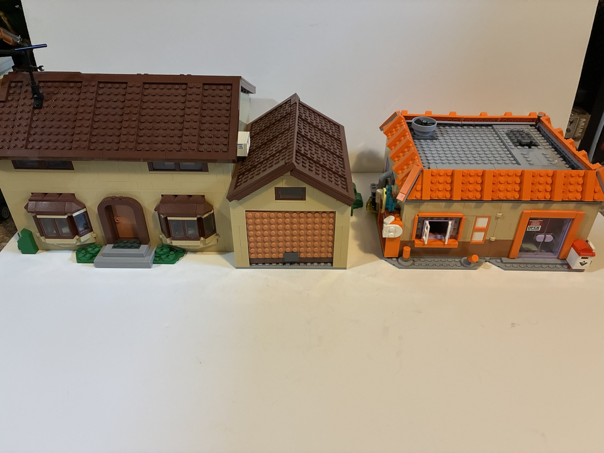
It has been just over 10 years since I last posted about a Lego set featuring The Simpsons. That last set, the Kwik-E-Mart, came out in 2015 and was preceded by the home of the Simpson family the year prior. Those sets along with two waves of mini figures seemed to sell pretty well, but for whatever reason Lego decided that was enough Springfield for now. I don’t know why they’re suddenly back ten years later with a new set, but I’m not complaining. I was hoping for at least one more set plus another wave of mini figures since we were missing so many iconic characters from the show: Principal Skinner, Superintendent Chalmers, Lenny, Carl, Barney, Jimbo, and many more. It was unlikely that we’d ever get every character we wanted, but it felt like a third wave would have really filled in the most crucial gaps.
That didn’t happen. Is a third wave now on the table since we have a new set to talk about? I don’t know, but for now we do have Krusty Burger. When I was left to ponder new sets for Lego, I’m a little surprised at myself for not having Krusty Burger pretty high on my list. If I had to make a wager on what was most likely, I was going to go with The Android’s Dungeon the local comic book store run by Jeff Albertson better known simply as Comic Book Guy. It’s small, has some nerd appeal, and works well with existing figures. Maybe it could have led to us getting a Lego Stan Lee? Instead, we have Krusty Burger, the local fast food establishment run by the clown of the same name. Many episodes (and even the movie) have scenes set at Krusty Burger and some are quite memorable. It’s a perfectly cromulent selection by Lego so let’s see how it turned out.
This set comes with a total of 7 mini figures, though some are repeat customers.
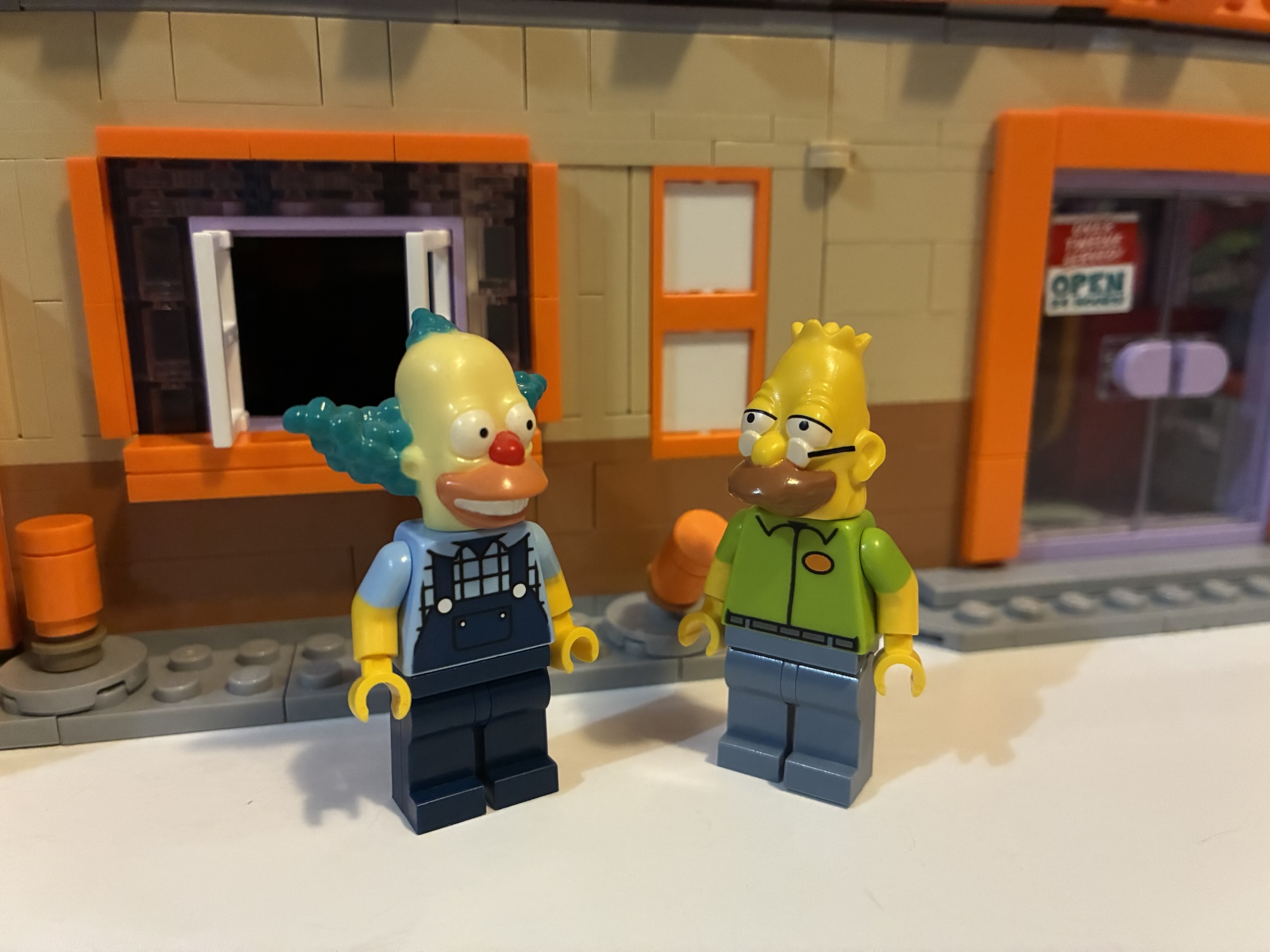
The Krusty Burger set contains 1,635 pieces and seven mini figures. Of the mini figures, four are repeat characters: Homer, Bart, Lisa, and Krusty. Bart and Lisa are exactly the same as some past releases. They have neutral expressions and Bart comes with a slingshot while Lisa has her saxophone. Homer also has a neutral expression, but he at least gets some grease stains added to his shirt. Krusty is all new and he’s in his farmer Krusty attire from the episode “Coming to Homerica” complete with hat. It’s a bit interesting to me because Jakks Pacific recently released a Krusty Burger in their toy line featuring a Krusty in the exact same outfit except theirs omitted the hat.
The character selections were made for their ties to the restaurant and Krusty and with some headswaps with old figures we can almost make Grandpa from his time at the restaurant (though he wore the old uniform in his time there).
The rest of the figures are of new characters. Working at the Krusty Burger is the squeaky-voiced teen. He is a teen of many names in the show and also many jobs. He’s in a green and gray uniform which is a color combo seen in more recent seasons of the show. In the old days the workers often had purple shirts. He looks the part and also has his hat on which is non-removable. Also there to enjoy a Krusty burger is officer Lou. I assume he’s included because of the scene from “22 Short Films About Springfield” where he discusses visiting a McDonald’s in Shelbyville which confuses fellow officers Wiggum and Eddie. We also already have a Chief Wiggum (two, actually) so he pairs well with him. Lastly, we have Sideshow Bob. He’s featured in a green shirt and blue pants which would appear to be the default style guide for Bob these days. He’s here I guess because of his connection to Krusty and he is a pretty big name character. He unfortunately doesn’t look the best as Lego really went conservative with his outlandish hair.
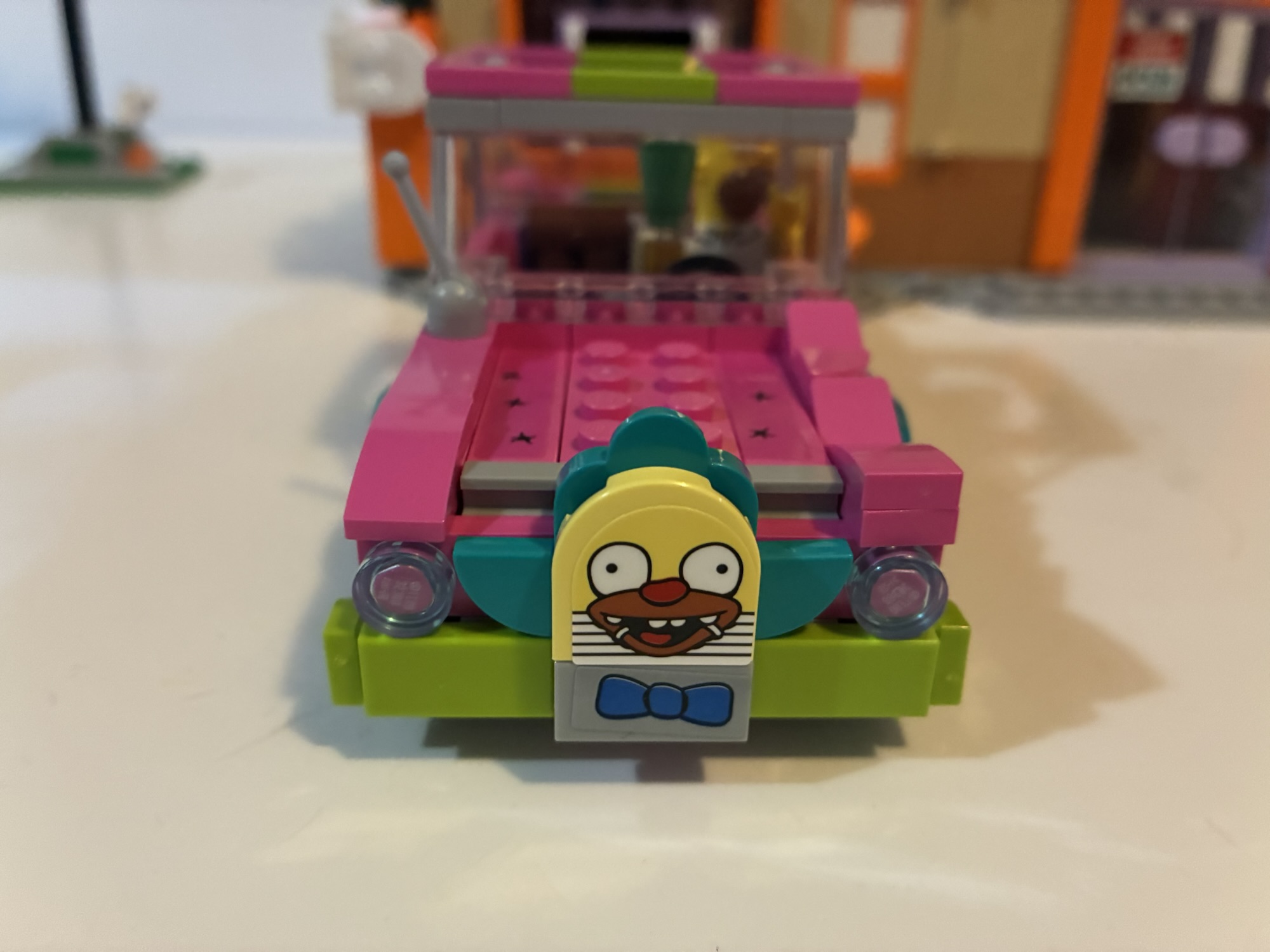
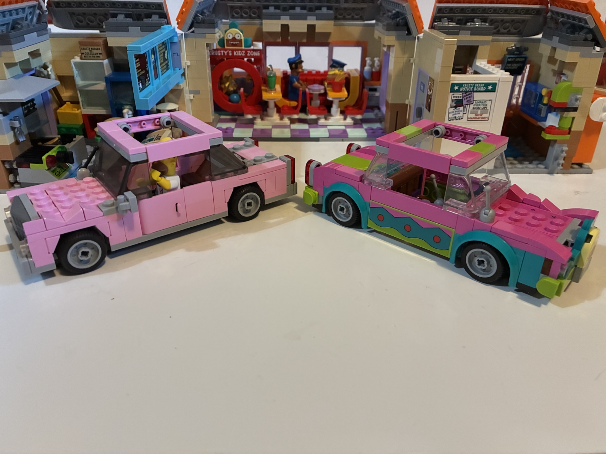
Homer’s Krusty-fied car turned out fine, but I wish we had a Homer as Krusty to go with it.
Just like the previous two Simpsons sets, The Krusty Burger also comes with a vehicle. This time it’s Homer’s sedan, but redone to match the episode “Homie the Clown” when Homer became a Krusty impersonator. It has the Krusty visage on the front and also comes complete with speed hole decals for the hood. The build is pretty much exactly the same as the standard version of Homer’s car which includes no roof. I guess this is so Marge could fit inside, but I really hate the no roof look. Why not give us an optional one? It also has exposed studs on the hood like the original which is also something I don’t care for. I would have preferred a smooth exterior there. And while I think this is a solid inclusion, it does make me wonder why we didn’t just get a Homer as Krusty mini figure? That obviously would have cost more money because they would need to cast a new head, but they could have made up for it by just having Krusty come with his default head instead of the one with the hat. Or drop Bart or Lisa from the set – I don’t know. I want a Homer as Krusty!
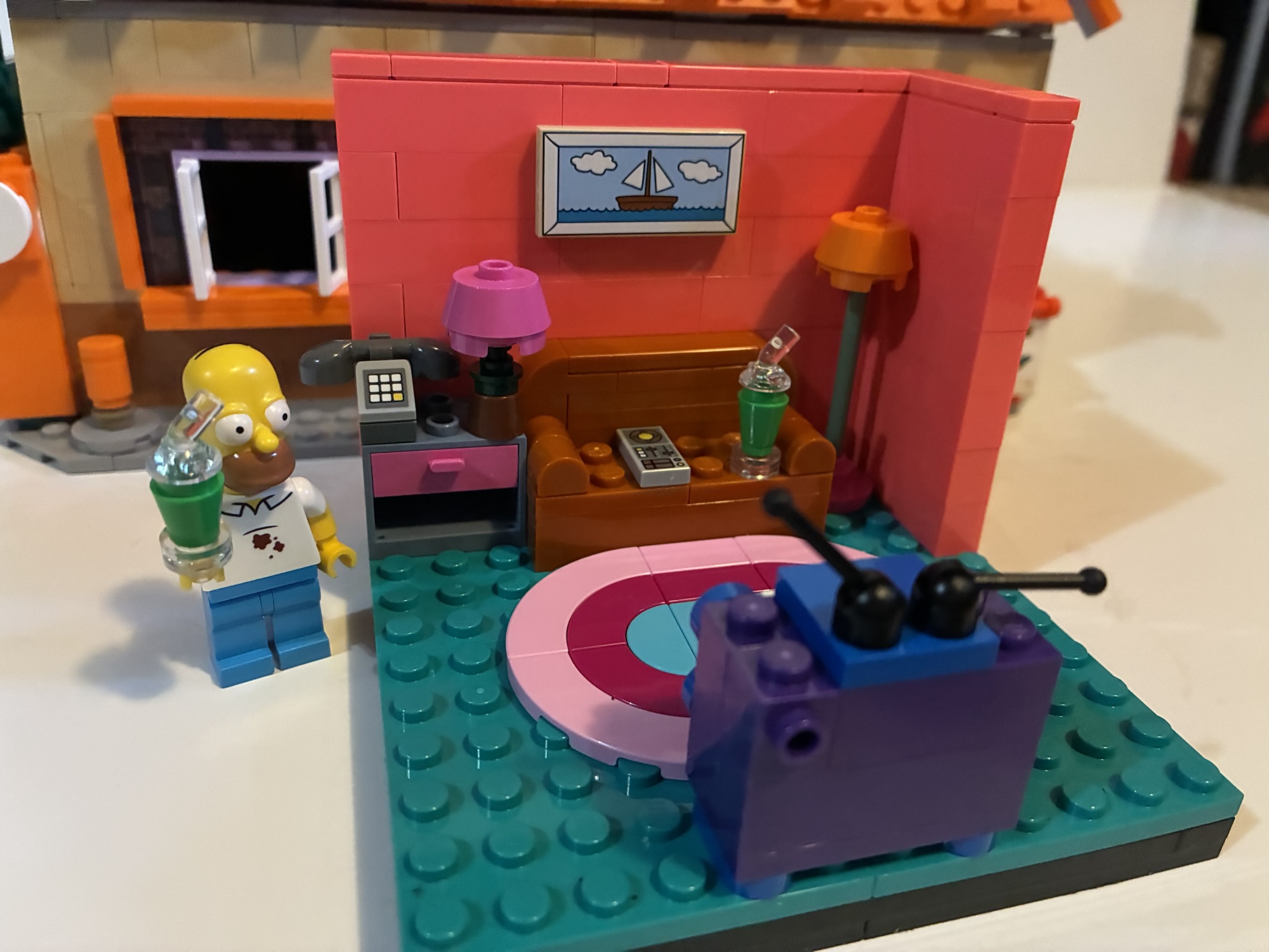
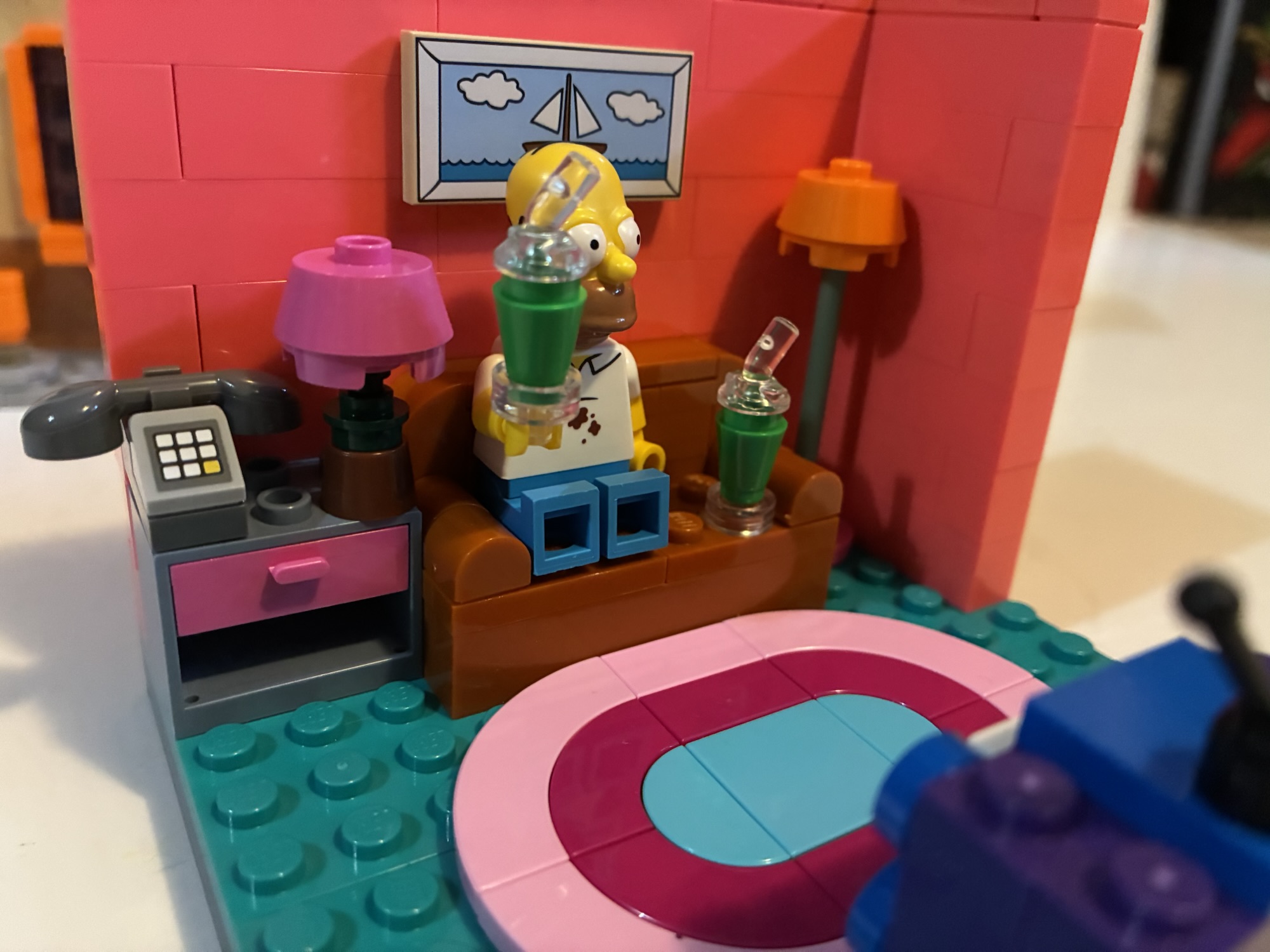
This little living room set that was a throw-in for people who ordered from Lego is a nice little item, especially for those unable to get the Simpson’s house.
If you ordered this set from Lego directly then you also get a mini set of the Simpson living room. It’s the couch, TV, and end table, and a lamp and it’s basically a cut-away. The TV is the same as the one included with the house only this one comes with a screen featuring a Krusty Burger commercial. A mini figure can easily fit on the couch if you want, but it’s not a couch that is to scale with the house. It can really only accommodate two figures so no family couch gag is happening here. Still, it’s a fun little throw-in and considering the Simpson house set is 11 years old there may be a lot of people buying this set who don’t already have it. This isn’t exactly a substitute for the whole house, but it’s better than nothing.
The Krusty Burger is by far the smallest Simpsons set from Lego so far.
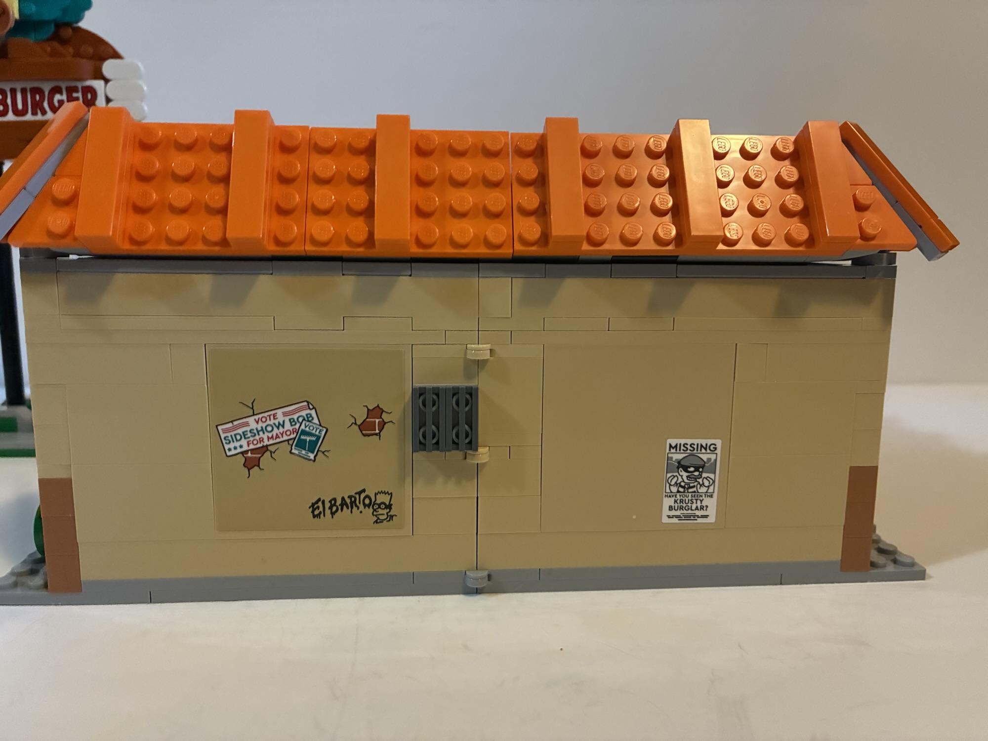
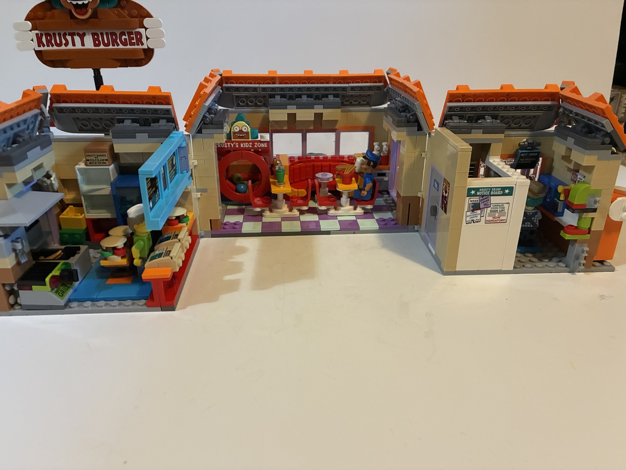
As for the Krusty Burger itself, it’s the smallest of the three sets and by a noticeable margin. It’s pretty self-contained with nothing surrounding it aside from the buildable sign. The layout is a bit odd as the front door is right next to the drive-through window, but that’s how it’s depicted in modern episodes. The right side of the building has a lot of windows while the backside features a rear door and an overflowing grease container. It’s done well with translucent yellow bricks and feels like the sort of thing one would likely find behind an actual Krusty Burger. The left side of the building features the drive-through menu and intercom which pretty much matches the depiction of the same from “Lisa vs Malibu Stacy.” You get to see what everything costs which depicts this restaurant as frozen in time back to the early 90s. My one critique as a fan of the show is that it lists milkshakes on the menu. Krusty Burger doesn’t sell shakes, it sells partially gelatinated, non-dairy, gum-based beverages.
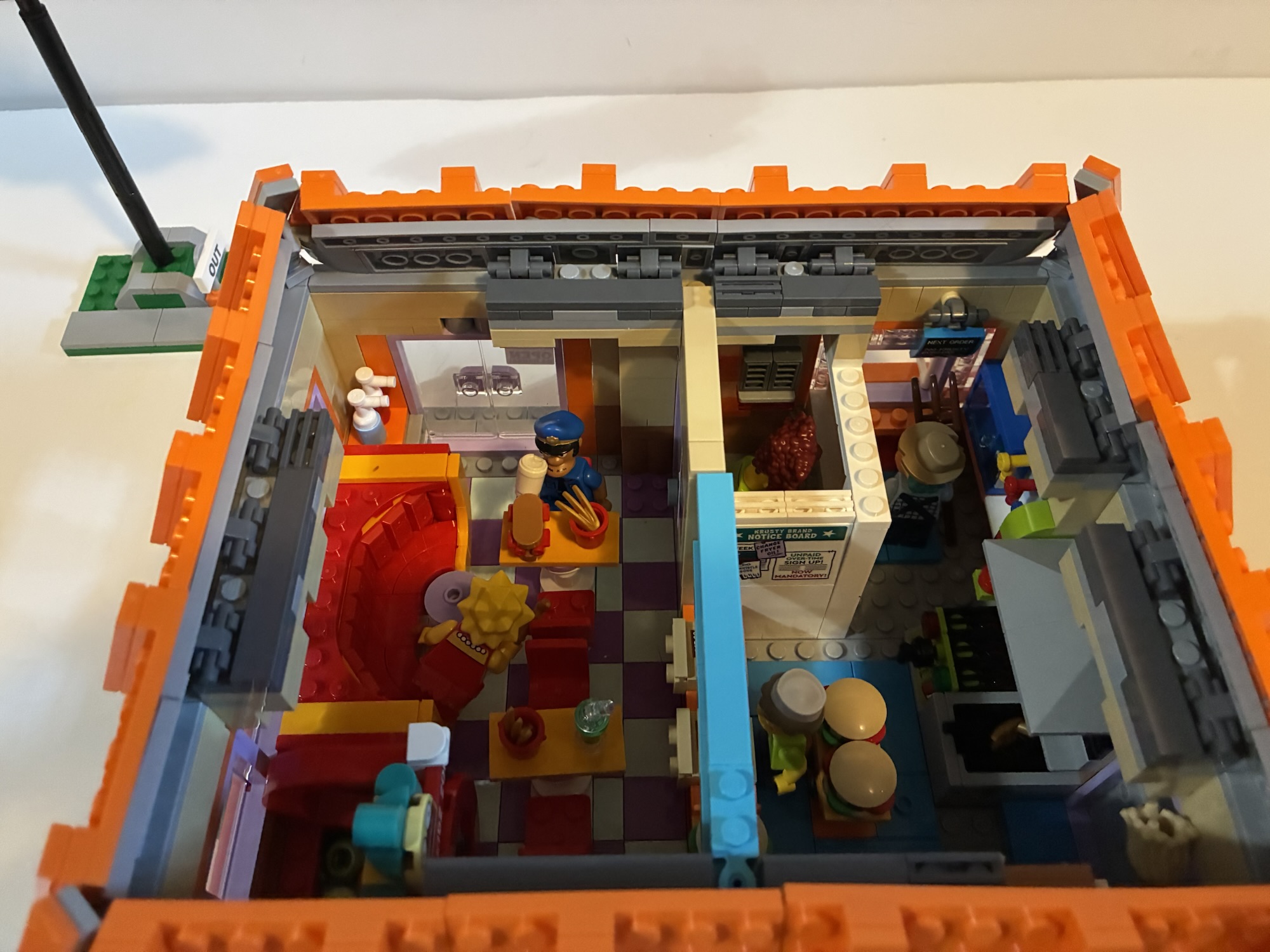
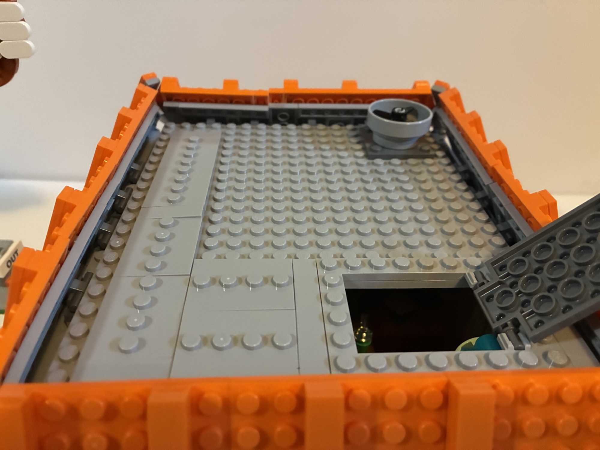
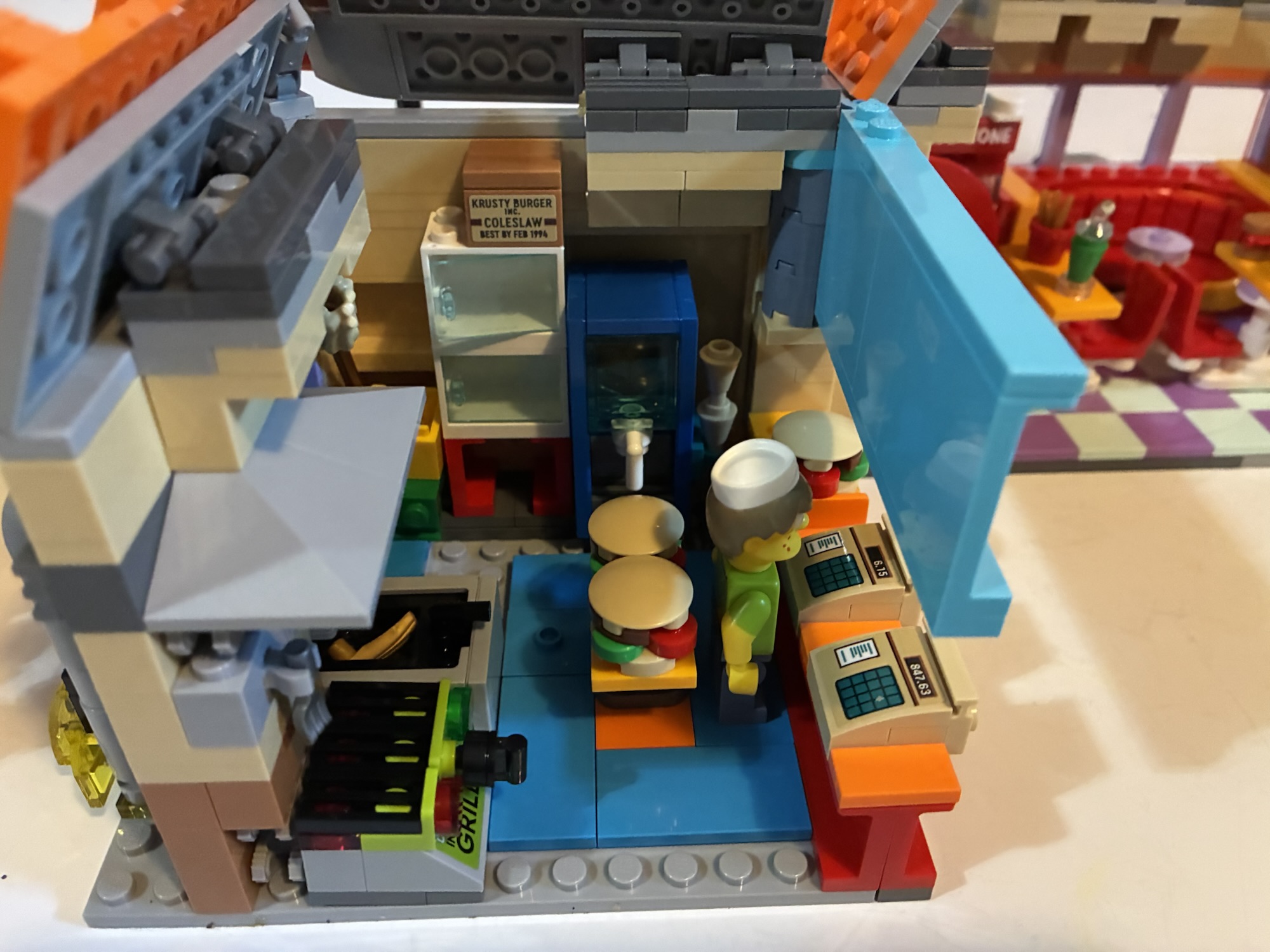
To access the interior, you have to first remove the roof. It just rests on top of the set and there’s a big fan on it that doubles as a handle. There’s also roof access for your mini figures via a little trap door. Once removed, one side of the building can open up which basically breaks the kitchen in half and isolates the dining room in the center. If facing this open set, the left part is the counter and kitchen. There’s a large menu over the counter and two registers. Behind the registers is a small area to fit a mini figure with a prep table behind it that contains some massive burgers. The burger build is creative, but does lead to comically large sandwiches. The deep fryer can be found here as well which has a removable fry basket. For the french fries, Lego is using Wolverine’s claws, but in gold. I’ve seen them do some funny stuff with their hot dog shape, but I wasn’t expecting Wolverine claws for fries here. Also back here you’ll find some storage and an ice cream machine that’s forever out of order. The contents are basically just water which is a nice touch.
It takes up considerable more space when opened to access the various rooms inside.
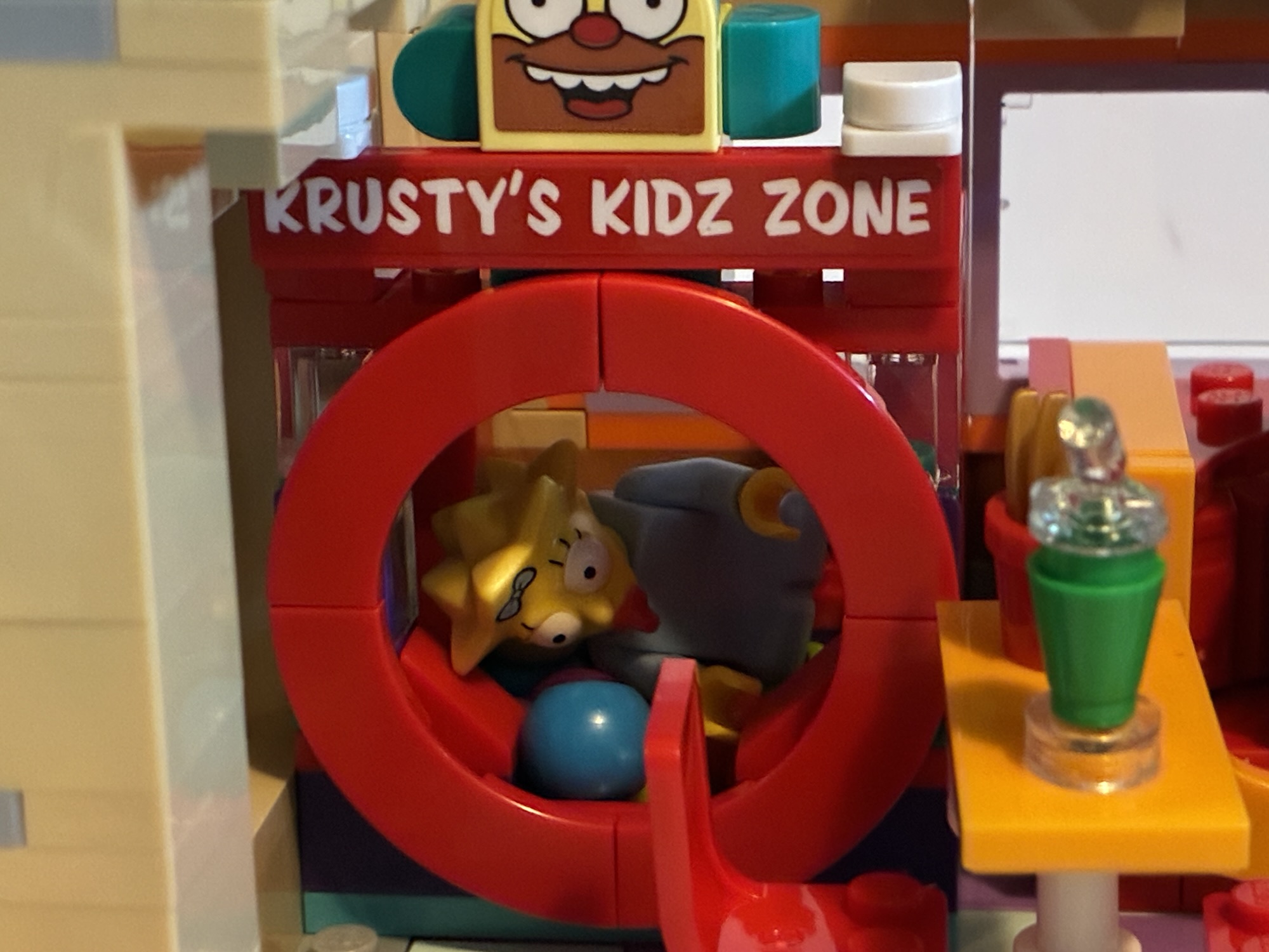
The center of the build contains the dining area. It’s pretty cramped as it contains one booth and two tables each of which has two stools. Tucked into the corner is Krusty’s Kidz Zone which is a small ball pit. It’s cute, though I would have probably preferred more seating to fit as many figures into this thing as I wanted. Having the Simpson family at one table and the cops at the other would have made sense. Some food is intended to go into this area including Krusty’s version of the Ribwich. It’s made with those tiny Lego cars which is pretty amusing. I had previously seen those in a Christmas tree set.
The right side of the build contains the bathroom and the rest of the kitchen. The bathroom is pretty small and walled-in. For the image on the box, Lego even removed the side wall to make it present better which you could also do if you chose to display the set open. The bathroom is in a pretty sorry state as the sink appears to be overflowing, the toilet is leaking, and there’s no toilet paper left on the roll. It’s what one would expect of a Krusty Burger. The part of the kitchen that’s behind it is the drive-through window. There’s a nice little in-joke on the order screen and there’s also a drink machine in this area.
There are a lot of references throughout the set which is what we’ve come to expect as Simpsons fans with basically anything like this. Lego did a good job with the past sets and they do an adequate job here. This set did begin life as a Lego Ideas design and the pitch was pretty similar to what we got. One of the main differences though was that it was going to come with Marge’s station wagon instead of Homer’s Krusty-fied sedan. It is surprising to me that we have now had three sets from Lego that all came with vehicles, but we still don’t have Marge’s car. And with this set in-hand, a Simpson fan is likely to immediately wonder what could be next? I’m not holding my breath, but now that we have a Krusty Burger I would so love a Skinner house so we could recreate the Steamed Hams sketch in Lego form. The house could be pretty small as we only need the dining room, kitchen, and then they can do whatever with the upstairs. Just having that setup would surely be unforgettable.
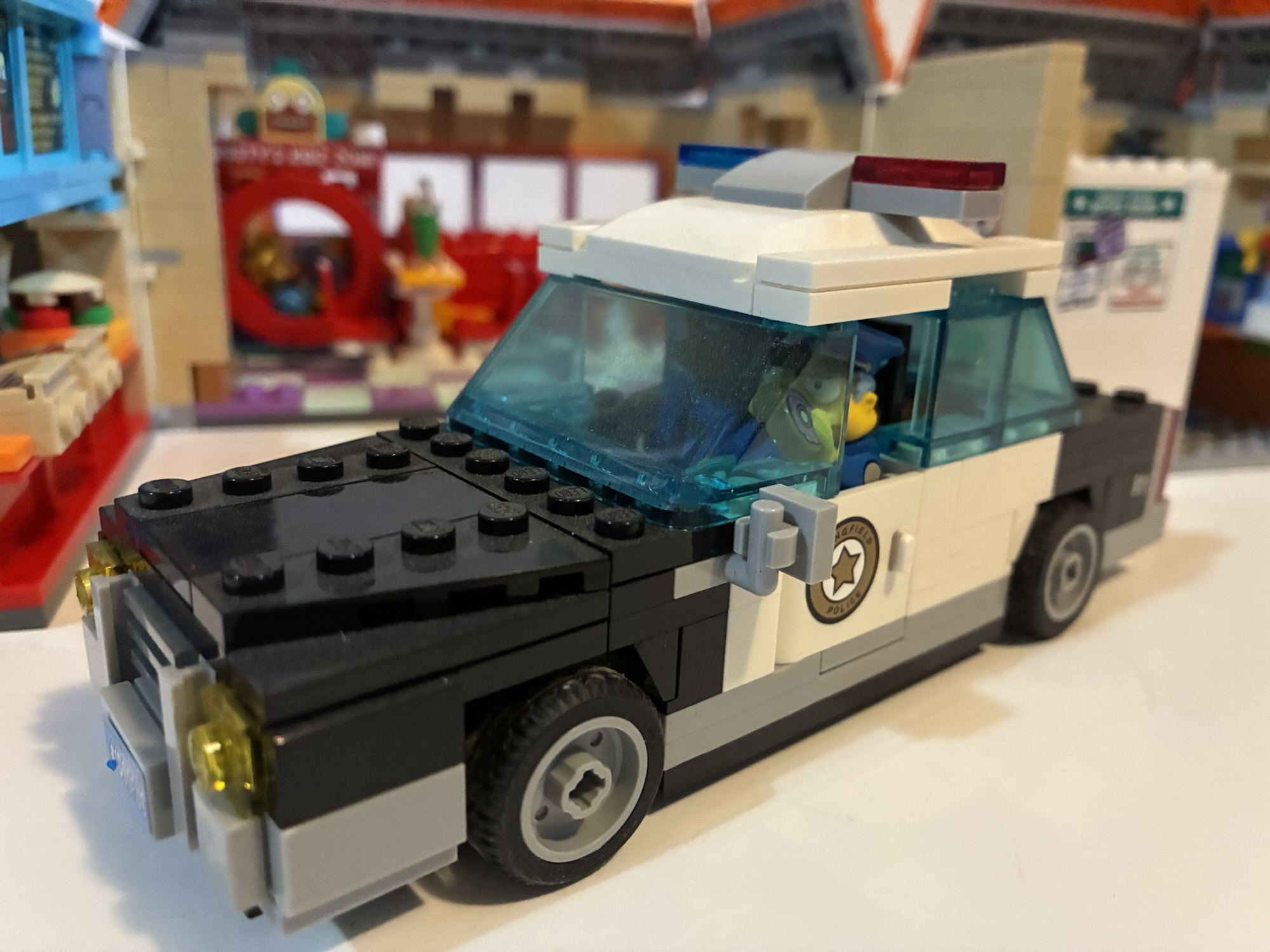
If you were curious, the answer is “Yes, you can fit both cops into the previously released cop car.”
The Krusty Burger is a pretty quick and enjoyable build. It’s not very big, but I’m also not surprised that it didn’t get the same love as the Kwik-E-Mart given that ten years have past and costs have changed. The set will set you back $210 making it the most expensive Simpsons set so far, especially per brick. Given the cost, I do wish there were more printed bricks and less stickers. This one came with two sticker sheets and if I have one major complaint with Lego it’s stickers. My Kwik-E-Mart’s stickers are curling on the front and it’s become an eyesore. I don’t have the same issue with other Lego sets that I have, but a lot of them also don’t have exterior stickers like that one. The Krusty Burger does though, and I hope it doesn’t end up in a similar state one day.
As a Simpsons fan, I almost can’t not recommend this Lego Krusty Burger. Sure, I would have packed in more references to the show, probably would have preferred some different characters for mini figures, and definitely would have done things differently with the car, but everything that’s here is still done pretty well. It looks good and there are certainly a lot of memorable scenes from the show one could stage here. It may be small, but it doesn’t look drastically out of place with the other sets. Hopefully, this isn’t the last we see of The Simpsons and Lego and hopefully the next collaboration isn’t ten years away. There’s a lot more Lego could do with Springfield even if there are aspects of it they’d never touch, and I am certainly ready for whatever comes next.
If you missed my other Lego Simpsons reviews or want to see what else is out there check below:
Last year, Lego released its first set and series of mini figures styled after The Simpsons, the animated institution that has anchored Fox’s Sunday Night lineup longer than Justin Bieber’s been alive. Debate the merits of the program’s more recent seasons all you want, but it couldn’t diminish my curiosity for a set of Legos…
When I was a kid, the coolest and most colossal Lego sets were often pirate ships or castles. These things required hours upon hours to assemble and cost a lot of money. My parents, when looking to spend money on me at Christmas or for a birthday, opted for video games or a bicycle as…
Back in October, we took a look at the very first wave of action figures from Jakks Pacific based on The Simpsons. At the time, I only had two figures from that inaugural wave: Homer and Bart. It was a series of great interest to myself and other Simpsons fans since it’s existence basically meant…
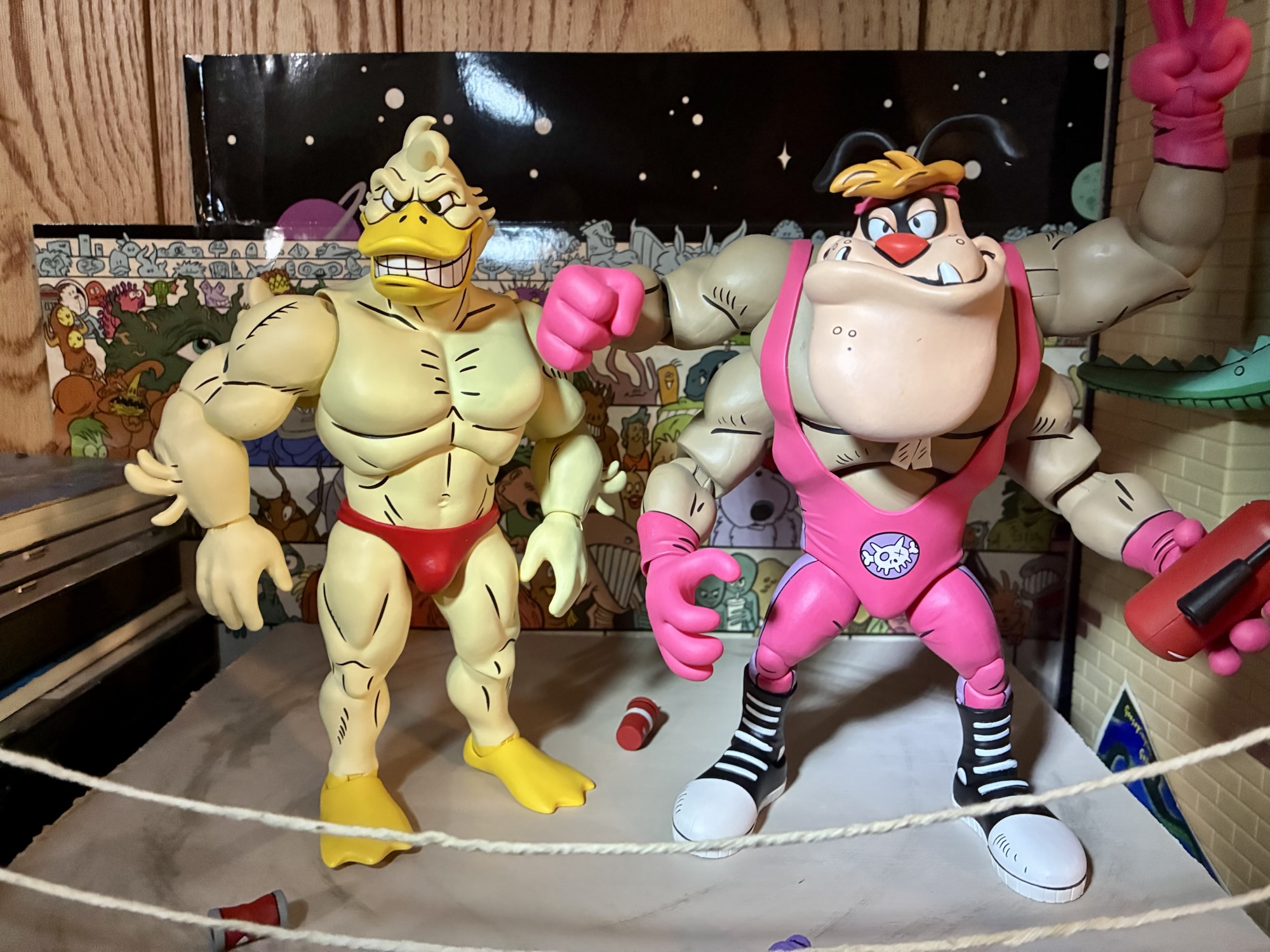
I would wager that when it comes to the Teenage Mutant Ninja Turtles character Ace Duck most fans will immediately go to the Playmates figure as their first frame of reference. His creation is credited to the trio of Jim Lawson, Steve Murphy, and Ryan Brown, but I don’t know if any had a hand in his original look. That version of Ace, who was an anthropomorphic duck dressed like an old fighter pilot, made one appearance in the 1987 cartoon series as basically a show within a show. He flashed across the screen of the TV in the sewer lair in the episode “Attack of Big MACC.” That was it for old Ace as he never got to be a featured guest like many other characters who first appeared in the toy line. The character wouldn’t get a substantial look until he showed in the pages of Teenage Mutant Ninja Turtles Adventures published by Archie, only there he wasn’t a fighter pilot, but a pro wrestler.
He’s one big duck.
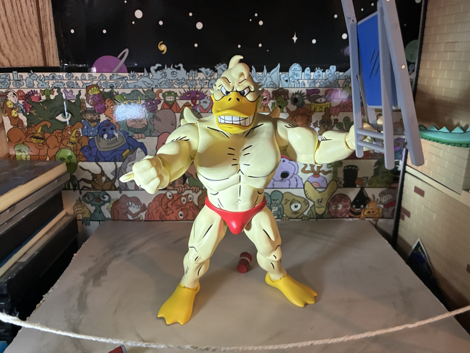
NECA’s TMNT Adventures line of action figures has been committed to giving fans basically everyone associated with the fictional Stump Wrestling. We have the turtles, Leatherhead, and Cryin’ Houn’, and now we have Ace Duck. This version of Ace is quite different from his Playmates counterpart. The only things the two share are the fact that they’re both ducks and they both have wings. While the original Ace is of average build for a human, this duck is massive. The phrase beefcake comes to mind, but also feels inappropriate for the massive mallard since he’s not a mammal. He’s a big boy and would have fit right in with the WWF of the early 90s. Even the whole duck thing probably could have worked in the promotion that introduced the Gobbledy Gooker. He also has a bit of a Buddy Rogers thing going on as he’s kind of a pretty boy. Part of me wonders if this design was influenced by Daffy Duck’s foil in the short Muscle Tussle because even the trunks are the same to go along with the physique. As a character, he’s neither friend nor foe to the turtles and even though he’s depicted as champion, he sure seems to lose a lot.
Ace Duck with the Ace Duck most know him as.
Ace Duck from NECA comes in the usual packaging with new artwork by Ken Mitchroney. He’s a big figure and comes courtesy of Walmart Collector Con which actually took place several months ago where he was available as a preorder. NECA is now finally shipping the figure and it’s expected that he’s just first run at Walmart and will eventually be available from other outlets. This chiseled sculpt was handled by Tomasz Rozejowski with paint by Geoff Trapp and Mike Puzzo.
It might take two turtles to topple this guy.
Ace Duck stands right around the 7″ mark and as high as 7.25″ to the top of the curl of feathers on his head. I’m pretty sure the first impression most are likely to have when looking at this figure is that he sure is bulgy, in more ways than one. He is jacked as his shoulders are quite broad and his chest is puffed out like a man (or duck) of such musculature would be. He’s also quite bulgy down…there. It’s quite the comical look when compared with the old Ace and borders on ridiculous, but I mean that in a good way. Since this is just a big duck in a Speedo, there’s not much being asked of the paint department. He’s a pale yellow all over save for his beak and his feet, which are a light orange. There’s plenty of black linework on the figure to highlight the musculature and some of the feathers. He has a set of tiny wings on his back which are barely visible from the front. I guess he skips wing day when in the gym. The only other embellishments on the sculpt are the little feathers on his forearms.
I love this cocky expression.Itty, bitty, wings.
Ace is just a big muscle duck, but what helps sell the character in plastic form are the expressions. By default, Ace looks pretty angry and ready to get down to business in the ring. His teeth are showing and he’s got a legitimately intimidating glare. The head most (including me) are likely to find more enjoyable though is the cocky grin. For that, Ace’s eyes are partly closed and looking to his right and his beak is shaped in the form of a wry smile. This is him preening for the audience or just looking in a mirror. It just goes so well with the vibe of this figure. The third portrait features a squawking Ace. His mouth is open in a cartoonish shape with a big, red, tongue flopping out. His eyes are also all red with black circles in them indicating he’s dizzy. This is pulled straight from a panel in the comics where Leatherhead is swinging him around by the feet. This one also works for a punch drunk look or an impact which is definitely a worthwhile inclusion for a pro wrestler action figure.
This right hand is basically included just for this.
The rest of the items are in the box are reserved for hands and one accessory. For hands, Ace has a set of fists, relaxed, and gripping hands. He also has a left hand that’s somewhere in between a pointing gesture and a relaxed look and a right hand that’s puzzling to me. It’s almost like the start of a thumb’s up gesture or a guitar picking form. It looks so specific that I’m guessing it’s lifted from a panel, and sure enough, it is. There’s a panel where he’s basically posing after slamming Leatherhead and saying “later gator” where he’s making this gesture with his hand. The last item in the box is a folding chair. It’s the exact same accessory that came with the turtles and even the colors are the same. It’s a solid accessory to have for a wrestling figure and I like that we now have two in the collection instead of one.
He’s not above getting dirty.
The approach to articulation with Ace is pretty basic. While the turtles were used to show off NECA’s first attempts at traditional pinless double-joints, Ace is going more old school. There’s articulation at the head, shoulders, elbows, wrists, diaphragm, hips, knees, ankles, and wings. Both the elbows and knees are single-jointed, but they will swivel at the point of entry as well. There is a thigh swivel, but it’s pretty limited and I was surprised by the lack of a waist twist. You will need to use the diaphragm joint for that and it’s pretty limited. Mostly, the figure is just so bulky that the range in a lot of places is hampered. The shoulders aren’t going to get much use out of the hinge and the elbow swivel isn’t as good as a proper bicep swivel. The hinge for the gripping hands is of the horizontal variety which is unfortunate. The legs have very little range kicking forward, though they actually kick backwards a decent amount.
You’re gonna need a bigger chair, Leo.
Ace isn’t going to do a whole lot on your shelf. In that, he’s a lot like Leatherhead and Cryin’ Houn’ who I also felt were really limited in the articulation department. Ace is probably a littler better than the hound, but a little worse than Leatherhead. None of them are going to be celebrated for their articulation and the best articulated figures in this line so far are probably the turtles. With Ace it’s just a little disappointing because there’s not much that NECA had to work around. He’s practically naked and it’s just the bulk of the sculpt that impedes things. And while I do like the sculpt, I do think there was a happy medium some where to make this guy more articulated without having to jeopardize the aesthetics. The hips, in particular, stand out as an area where there’s no real reason for why they’re as limited as they are.
Or not.
Ace Duck is another solid entry in NECA’s Archie Comics inspired toy line. The articulation shortcomings are basically a feature of the line at this point and collectors likely know what they’re in for with that. The sculpt is on point and this is a figure that just puts a smile on my face because he’s so damn fun to look at. The accessory count is suitable with three portraits and a folding chair to go along with 8 hands. The only other thing I failed to mention so far is the price. Ace Duck will set you back $50 if you can find him at Walmart (currently available for order as I type this) and may cost a little more when he makes his way to specialty retailers. That’s certainly a steep price and I guess it’s owing to his size and potential for reuse. The sculpt is such that maybe NECA can reuse it for other muscle guys though none in this particular line come to mind. He’s the same price as Cryin’ Houn’ who was a little bigger, but came with less stuff, so he doesn’t feel like a lesser release. I just wasn’t crazy about the price tag with that figure either. I do like this figure a bit more and if you’re okay with the price and its shortcomings then I can safely recommend it. It has a premium feel in-hand and it’s a musclebound space duck in trunks – what’s there not to like?
That duck has a family!
If you missed our look at the other Stump Wrestling figures from NECA then check these out:
I’ve said it before and I’ll probably say it again, but no toy collector enjoys hearing the phrase “Walmart Exclusive.” Such was the case for today’s figure, and many others, around the time of San Diego Comic Con. Walmart had their own collector con which is just a marketing way to say that a bunch…
We are rolling right along with more reviews of NECA’s TMNT Adventures line of action figures and we’re also staying within the realm of Stump Wrestling. When the turtles wound up in the intergalactic wrestling federation, they didn’t just encounter aliens, they also encountered an old foe. I don’t know how Leatherhead wound up as…
When I was a kid, I didn’t really get a lot of comic books. I most often would encounter them at the grocery store and I always hoped my mom would end up in the check-out aisle with the comics instead of candy so I could maybe convince her to get me one. And when…
What drives my decision to buy an action figure can take on many forms. The most boring reason to get something is for the sake of completion. If you collect anything then you’re probably familiar with that impulse: you have everything else and you don’t want your collection to be incomplete. That can be a hard thing to shake and can lead one to buy something they don’t really enjoy for any other reason. Then there’s also matters of price and availability which can be an influence, but I think the best reason to buy an action figure (or really anything) is because you simply like it. When it comes to JoyToy’s line of Teenage Mutant Ninja Turtles action figures, I don’t feel that compulsion to have a complete set so I’m picking my spots. The four turtles, April, Shredder, Bebop, Rocksteady, and Krang feels like a pretty complete set, but then along come Slash and Tokka.
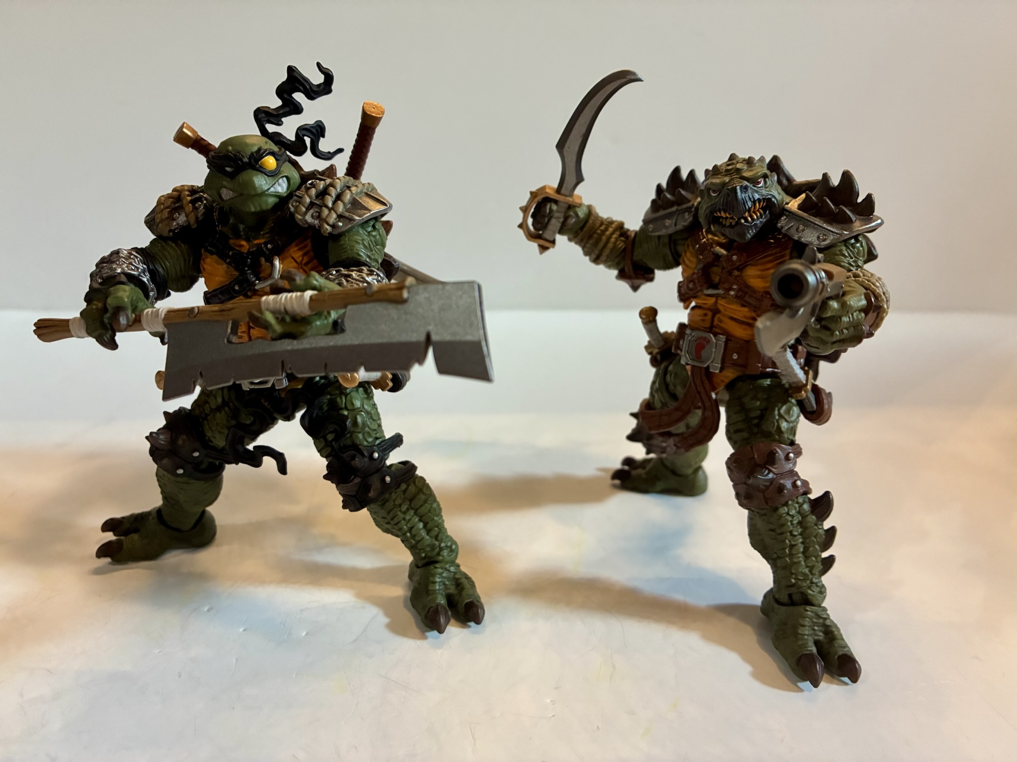
These two bring more bulk to the line.
Slash and Tokka are two characters that I certainly have some degree of affection for. They’re not Tattoo or Hot Spot, but characters I actually like and have enjoyed across various takes on the franchise. Still, neither felt essential to me so when JoyToy originally solicited the pair I felt content to pass them over. Then people started getting them in-hand, I watched some reviews, poured over some visuals, and suddenly found myself placing an order for the pair. They just looked damn fun and with these figures retailing in the $30-$40 range they don’t feel as overpriced as they would have 3 or 4 years ago. And with this line being in a smaller scale, I can delude myself into thinking I have space for more turtle figures.
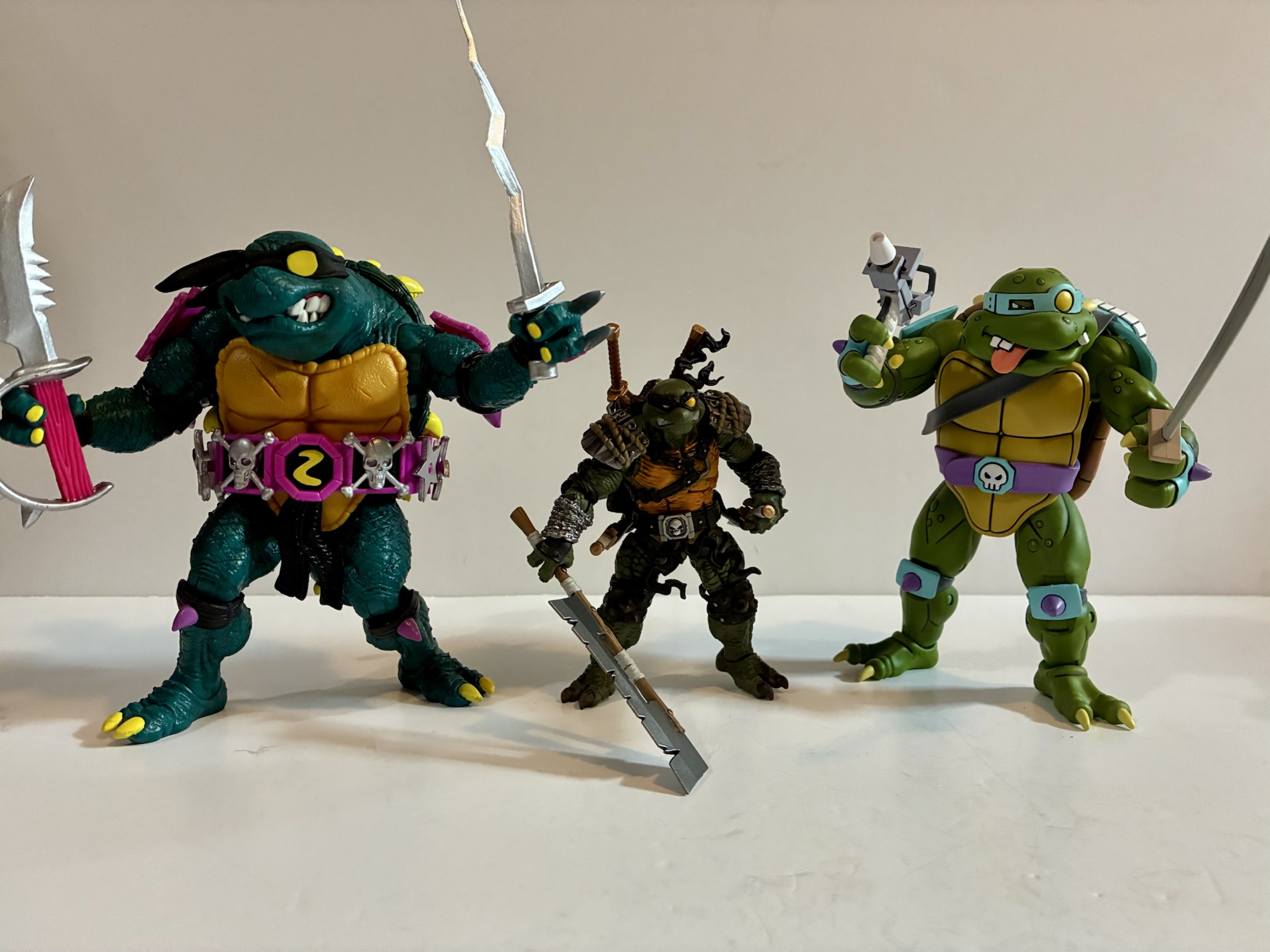
Left to right: Super7, JoyToy, NECA.L to R: Playmates, JoyToy, NECA .The theme here seems to be familiar, but new. Slash even has a secondary head to better match the cartoon version of the character.
Slash and Tokka, both being mutated or alien turtles, are able to share some parts which is why they were sold together. From a production standpoint, it makes perfect sense even though from a thematic one it’s pretty odd to get a Tokka without a Rahzar (don’t worry, he’s coming). JoyToy decided to lessen that notion and appear to have made these two work as a pair, if you like. They have a pirate theme between the two of them and one could easily envision them as a pair of deviants patrolling the high seas for whatever it is they desire most. And it works! I like what JoyToy has done here and even once more logical pairings arrive via future figures I’ll probably still keep this pair close to each other in my display.
Be they friend or foe? I guess that’s for you to decide.
Both Slash and Tokka are loosely based on their appearance in the classic animated series. This means they also draw some inspiration from the vintage figure line by Playmates since they were influenced by the cartoon as well (or vice versa). Both characters stand a tick over the 4″ mark making them a little taller than the turtles, but a little shorter than Bebop and Rocksteady. Compared with the turtles, they’re not so much taller than them, but chunkier. They’re bigger boys and a bit more intimidating as a result. Tokka does come with the Foot logo stand while Slash gets them sewer one – does that mean Slash is intended to be more of a good guy and Tokka a bad guy? Maybe, though your head canon is as good as any here.
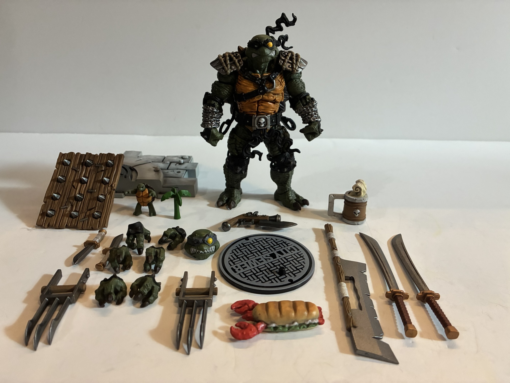
JoyToy really packs the box full of stuff with this line.
Let’s talk Slash first. This is a Slash based on his original appearance in Archie comics which was loosely adapted by Playmates. He has the black bandana and the skull belt buckle we know from the Playmates version. A lot of the other embellishments resemble that figure, but with an added degree of realism. The shoulder pauldrons resemble steel now, but are still bound by rope and fully painted. The elbow and knee pads are black and spiked and his shell features numerous spikes as well in a similar pattern. What’s new are the chains wrapped around his forearms and a harness around the chest. On the backs of his hands are some armor plates, but what’s missing are his blades which is a bit unusual, but the animated design did the same thing. His shell also has some handles bolted onto them that serve as weapon storage, similar to the other turtles. He also added some belt loops for additional weapon storage which is going to come in handy because he has a lot of stuff.
Even the shells are different.
The overall aesthetic for Slash is to take that old design and up the detail and realism. His skin is heavily textured with thick scaling. There’s a a lot of knicks and grooves cut into the plastron and there’s just a lot of added texture to every surface of this guy. The belt has a softer texture befitting a leather belt and the tassels on it and the bandana are frozen in a windswept look. Paint is pretty clean and crisp on this guy and it looks like a paint wash was utilized to really bring out those details. Like the turtles, Slash does have a belt that doesn’t wrap around the back of the shell. This is just part of the design JoyToy is going for and while it doesn’t make sense for turtle anatomy, it doesn’t really bother me personally. Your mileage may vary.
Not to be out done, here’s all the stuff Tokka comes with.
Tokka, as expected, uses a lot of the same parts. Between the two, they share shoulders, biceps, abdomen, thighs, and feet. In addition to that, the elbow pads, knee pads, and belt appear to be shared between the two with the belt buckle and tassels swapped out for Tokka. That’s a lot of shared parts, but there’s also a lot of unique stuff. I was surprised that JoyToy opted to do a different shell since the Playmates figures shared the same. Tokka’s lacks spikes and instead is more plated in appearance like an actual snapping turtle. His calves are also different as he has spikes along the sides of them. And in keeping with past versions of the character, Tokka has five digits on his hand as opposed to three like Slash and the other turtles. JoyToy could have easily decided to just give him the same hands as Slash and I doubt anyone would have really cared, but it’s cool they decided to sink more money into this figure than they had to.
They have plenty of implements of destruction.
Tokka has a very similar look to Slash in terms of approach. There’s a lot of detail here and the paint is kept pretty clean. His head sits lower than Slash owing to the fact that his neck is more forward than straight up. His beak is colored black like the Playmates and toon design while his overall complexion is darker than his cartoon counterpart and basically the same as Slash. He has two hooks attached to his shell for some weapon storage and instead of chains around his forearms he has rope. His shoulder pads are spiked like the old design, but the shape is more square than round as previously depicted. Of the two, I enjoy the Slash design a bit more, but that’s merely a subjective take on my part. Tokka is of the same quality and he fits in well with the rest of the line.
Slash is one of the few figures in the line to come with an extra portrait.
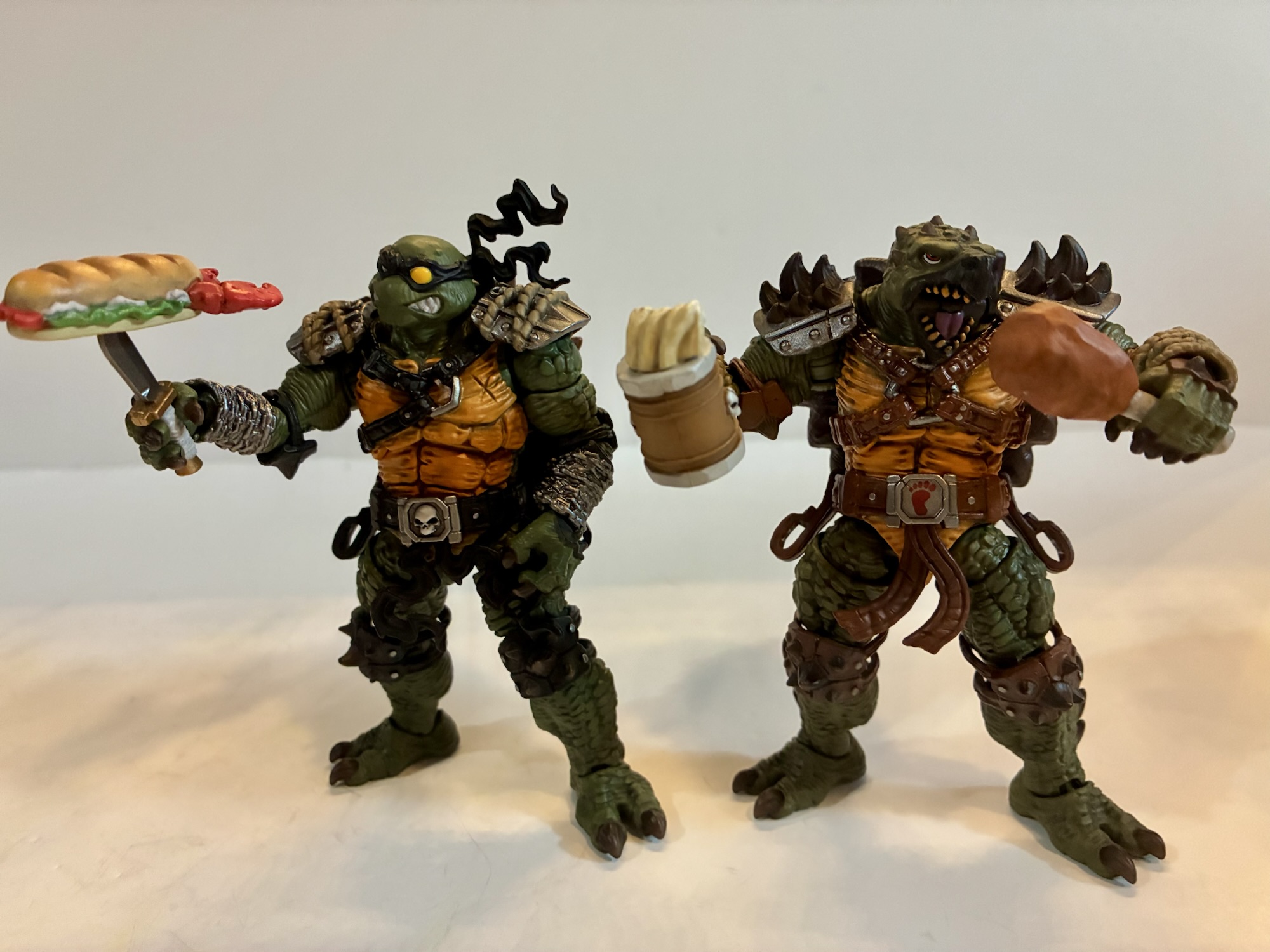
Both Slash and Tokka come with a ton of stuff. Some of it is shared and some of it isn’t. We’ll start with Slash who comes with four sets of hands: fists, gripping, wider gripping, and trigger finger. He also has a second head which is not typical of the line, but it features his metal headband from the cartoon so if you want a more toon-like appearance you have the option. In terms of the usual stuff, Slash has the City Sewer disc stand and a chunk of the white, marble, diorama piece. He also comes with a pre-mutated version of himself which is just a little slug figure. It stands on two feet so maybe it’s supposed to have been just exposed to mutagen? I don’t know. He also has his “binky,” the little palm tree forever associated with the character.
Are these blades a good enough stand-in for Slash’s usual ones?
In terms of weapons Slash is pretty well-stocked. If you felt he was missing the blades on his hand then JoyToy has you sort of covered via two bladed weapons he can hold in his hands. They’re like oversized Wolverine attachments as each has three, large, blades extending from them. They’re not quite the same as the more traditional setup, but it suits the character. In terms of bladed weapons, Slash has a pair of daggers which can fit in the loops on his belt and a pair of katana which can be stored in his shell. The katana feel like a callback to the cartoon as that version of the character carried two swords. He also has a large bladed weapon mounted to a pole. I guess it’s like a glaive and probably has a proper name that I don’t know. The blade is almost as large as the staff it’s affixed to and it’s pretty nasty looking as it’s all chipped. I certainly would not want to be on the receiving end there.
I’m starting to think of these guys as food monsters.
If melee combat is not how you feel your Slash should approach things then he also has a firearm. A small, old-fashioned, pistol that probably runs off of black powder and has a knife affixed to it for extra stabbing power. To keep Slash protected while he fires on his foes (or reloads) is a large, spiked, shield that can fit over his forearm and also has a handle for added stability. Slash can easily hide much of his bulk behind this thing and fire from behind it if he wants to. For when things slow down, Slash also has a big old mug of beer and a lobster roll sandwich to snack on. The mug is again of an old-fashioned design of wood with banded steel. There’s a froth effect that’s removable. The sandwich is basically a giant lobster between two pieces of bread and is a bit funny. I’m guessing a turtle like Slash has no issue just biting through the shell when he’s hungry. The roll also has a slot on the bottom of it so you can stick it on the end of a dagger which is a nice touch. I kind of like the idea of Slash and Tokka as a pair of gluttonous pirates who like to kick ass then settle down for some chow.
Awe!
Tokka is just about as stacked as Slash and shares some of the same accessories. He too comes with the same piece of the diorama base while his disc stand is the Foot branded one. He also comes with the mug, shield, and pistol as well as the same spread of hands though via different sculpts. There’s a baby Tokka as well, but it’s a different sculpt from the little Slash as it’s in a more neutral pose and has its own unique shell. Those represent the shared parts, but for the actual melee weapons Tokka is all new. He has two, curved, daggers which can slot into his belt and he also has two, larger, curved swords. They have a handguard so, if you want, you can hang them off of the hooks on his shell. However, I think those hooks are intended to house his massive anchor weapon. It’s just a big anchor with some wrappings around it to form a handle and a piece of sculpted chain attached to the end. It can go across the hooks when not being held, though it is a little finicky, but not likely to fall out on its own. Tokka also has two handheld bladed weapons similar to Slash’s only his feature one, big, blade as opposed to three smaller ones. Lastly, he has some food of his own in the form of a turkey leg with a big bite taken out of it. I find it amusing since NECA opted for the same with its cartoon Tokka. I guess he just really likes turkey.
The gun and shield combos is pretty cool.
The two figures share enough parts that articulation is basically the same for both. The approach is also basically in-line with what we saw out of JoyToy when it came to the other turtles. We have ball pegs at the head and wrists with hinged balls at the shoulders, bicep swivel, single-hinged elbows that swivel, a ball joint in the diaphragm, ball-jointed hips, thigh swivel, double-jointed knees, ankle hinges, and rockers. Tokka also has the added benefit of a hinged jaw. They’re pretty chunky so the range in places isn’t the best. Heads are always a bit limited with these turtle designs, though if you swap to the toon head for Slash you get a little more range since you won’t have to deal with the bandana tassels. The ball-jointed wrists work fine, but the hands pop off pretty easily and it is a mild annoyance when posing. Elbow pads and knee pads are floating so they can get out of the way to a point, but you’re basically only getting 90 degrees of movement at both spots. The shoulders are a bit restricted because of the pauldrons and I do wish we could get better range there for convincing two-handed poses. They can kind of do it, but it’s a very limited window.
Well done, boys!
The articulation is probably going to be enough for most people. The numerous accessories and hand options help to make these two pretty expressive even if the range isn’t the best in some places. The overall is aesthetic is damn sharp though and I really like how this pair turned out. As I said in the intro, I wasn’t planning on getting either figure, but once I saw how well they turned out and how fun they were I was unable to resist. JoyToy TMNT figures are not sold in North America so if you want to add this pair to your collection you will need to go through an import store. I got mine via LT Cave and it probably only took about 10 days for them to arrive. The constantly evolving tariff situation in the U.S. makes getting these a little trickier each day so if you want them my suggestion is to get them sooner than later because who knows what tomorrow will bring?
If this review has you considering more JoyToy for your TMNT collection then look below:
It’s been said before and it will be said again: everyone is making Ninja Turtles. It feels like the list of companies not making Teenage Mutant Ninja Turtles is smaller than the list of those who are. Viacom has not been shy about licensing the brand out to toy makers and it’s reaching a point…
No, that is not a typo you see in the title of this entry. This is a review of the JoyToy versions of classic Teenage Mutant Ninja Turtles henchmen Beebop and Rocksteady. I don’t know why it says Beebop on the box, but this is a Chinese company and English is probably not the primary…
The surprise line of the past year has unleashed perhaps its very best with Krang. Krang dates back to the 1987 cartoon series Teenage Mutant Ninja Turtles. Because that show became such a household name, it’s sometimes easy to lose sight of just how insane a character design Krang is. Krang was created by David…
When I was a kid, the only superheroes with any box office success to speak of were the biggest heroes from Detective Comics: Superman and Batman. The Superman films starring Christopher Reeve were probably the first superhero movies I ever saw. If not them then the honor would belong to Batman (1967). It wouldn’t be long until Tim Burton’s take on the Dark Knight rocked the box office and became a merchandizing juggernaut. It followed a tetralogy of Superman films that had really run out of steam. Batman was the new “It” hero for the film world and no one else mattered or could find success. Not until Fox and Sony started winning audiences over with their takes on X-Men and Spider-Man. The Marvel Cinematic Universe followed, and even though during that era there was a trilogy of very successful Batman movies from director Christopher Nolan, it feels like Warner Bros. and DC have been trying to emulate the Marvel method with its films with little to show for it.
Enter James Gunn. After entrusting the DC film universe to Zack Snyder to middling results, Warner Bros. searched for someone to spearhead a second attempt at a shared DC film universe. Gunn was known to them through work he had already done for the studio including including films The Suicide Squad and the HBO series Peacemaker. Gunn of course was the director for three very successful Guardians of the Galaxy films for Disney and Marvel and the prevailing thought at Warner must have been if Gunn can take a relatively unknown comic franchise like Guardians and turn it into a mega-successful film franchise then surely he can do the same for the already famous characters of DC? His first task: create a new franchise with Superman serving as the anchor character to kick things off.
Superman may be one of the most famous superheroes in the world, but it feels like his time as the most popular has long since past him by. Film attempts at reviving the character have not been received all that well and Batman has taken over as the face of Detective Comics. It almost feels like at some point in the 80s a rift developed between the two fictional characters that carried over into the fandom. If you were a Batman fan then you thought Superman was lame. If you were a Superman fan then Batman was a joyless, grim-dark, sadist. The talk of a Batman vs Superman movie became a thing that eventually happened and even when comic book royalty like Jim Lee took over the Batman books he made sure to work in a Batman vs. Superman scene into his Hush story. This can probably be traced back to Frank Miller’s The Dark Knight Returns which contains probably the most famous and iconic physical stand-off between the two the atmosphere of which helped to influence Burton’s Batman which helped define the character for the next decade-plus.
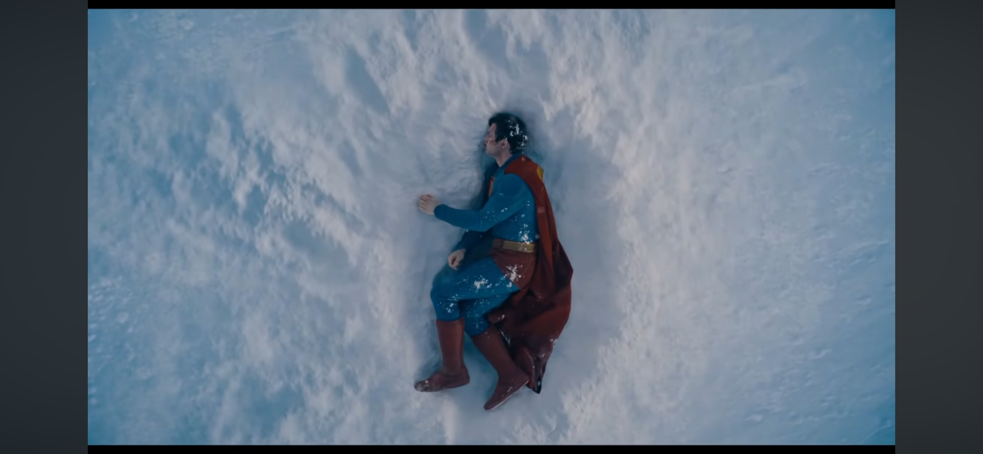
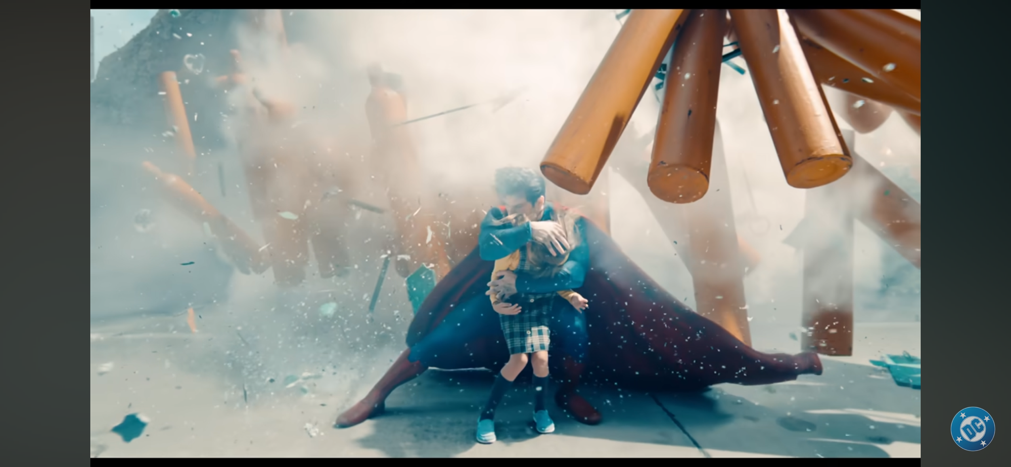
The film begins with Superman looking less like his usual self and more like Yamcha.
All of this is to say that Superman arrives with a great deal of expectation. There’s expectation from the studio that this will be the catalyst for a mega-successful film franchise to follow, and not just for Superman himself. There’s the hope from fans of the character that this is the movie that will get him right and do justice for the character that many feel the previous films failed at. And then there’s the naysayers, the anti-Superman crowd and Snyder loyalists which has been stoked by recent cries that Superman is getting too political because Gunn dared to point out that he’s an immigrant and his story is an immigrant story. The film drops at a prescient time for such notions as currently immigration is the focal point of the current administration in the United States with ICE raids and protests against said raids often dominating the news. Can this film possibly serve both crowds and win over a large majority of move-goers this summer?
Despite how this looks, this is thankfully no “Trial of Superman” type of film.
No, probably not. Those who have decided that this new movie is too political and against their conservative leanings going into it are not going to be swayed. And those who thing Superman sucks of only Snyder’s portrayal mattes have made up their minds already so why bother convincing them otherwise? For that other crowd though, I do think many are going to leave the theater with some measure of satisfaction. This is the portrayal of Superman that they were likely looking for, and while the film is far from perfect, it’s also pretty far from terrible.
Superman (played by David Corenswet) opens at an interesting time for the character: his first defeat. Some text overlay is present to inform the audience that Superman has been on this world for 30 years and revealed himself to the public 3 years prior to the events of the movie. This is not an origin story, though if you know nothing about Superman going into it you’ll have the gaps filled in enough without a lot of direct exposition. Superman also gets to open the film in a Yamcha pose. If you are a Dragon Ball Z fan then you know what I am referring to as the character is laying in a fetal position in a crater in the arctic. If you saw the first trailer then you saw this scene. It’s an interesting way to introduce the audience to the character as it informs us that this is a Superman who can feel and experience pain. Some takes on the character make him basically invulnerable to all things not Kryptonite. This Superman is indeed a super-powered individual and no mortal man could ever hope to best him at any physical test, but other super-powered beings can perhaps stand a chance.
This film very much wants to remind you that Superman’s priority is safeguarding the people (and animals) of the planet he now calls home.
The Superman of this universe is an eternal optimist. He is here on this world to do good, as his biological parents instructed via a pre-recorded message, and that’s his goal. When a fictitious foreign power tries to invade a neighboring country, Superman puts a stop to it with his own brand of justice. That lays the foundation for one of the film’s central conflicts – can a man of his power who owes no allegiance to any nation be allowed to act in such a way? To Superman, he is doing right. The invasion would have cost lives and Superman prevented that. To an adult in the political world, there’s more nuance. The invading country (Boravia) claimed it was liberating the people of the country it invaded (Jarhanpur) from an oppressive regime. Lives would have been lost, but they would have better off in the end, or so they claim. Superman disagreed and since he holds the power it’s his opinion that supersedes all others. He consulted no political authority before acting as he did and the fear is what if he’s wrong?
Hoult’s cocky and obsessive Luthor is hopefully a villain with real staying power.
To a man like Lex Luthor (Nicholas Hoult) this is a very scary proposition. He has some sympathizers in the US government, but none are eager to go toe-to-toe with Superman who is not only extremely powerful in his own right, but also extremely popular. Luthor is motivated by more than just fear though. He’s not a man out to make the world a better place, but a better place for him. He’s greedy and jealous and his jealousy towards Superman has been all-consuming. He wants to out Superman as someone the public should fear, and then he wants to kill him. He has been studying Superman these past three years and has used his considerable wealth to hire some very smart people to help him do that. Among his ranks are two creations: Ultraman and The Engineer. Ultraman is an incredibly strong creation of mysterious origins while The Engineer (María Gabriela de Faría Chacón) is some sort of techno-engineered human capable of breaking her body down into tiny nanobots.
The Justice Gang has a role to play, but not a sizeable one.
Other heroes, or metahumans, exist in the world including the Justice Gang (working title). This group consists of Green Lantern (Nathan Fillion), Hawkgirl (Isabela Merced), and Mister Terrific (Edi Gathegi). If you know nothing of those heroes from the comic books good luck understanding what their powers are beyond a superficial level. The film isn’t interested in sifting through lore and all one needs to know for the film and their presentation is they’re some pretty powerful people. There’s also the Daily Planet crew where Clark Kent is employed and we meet the usual suspects for a Superman film. Lois Lane (Rachel Brosnahan) is the lead reporter and the one we’ll spend the most time with. Along with her is Jimmy Olsen (Skyler Gisondo) who is traditionally a photographer, but in this film I don’t know what his role is. He’s not a reporter, even though he has the best sources, and he defers to others and operates like an assistant. Perry White (Wendell Pierce) serves in his customary role as the editor-in-chief.
The film is primarily concerned with presenting Superman as a force for good and what is morally right and just. Cronenswet is perfectly suited for such a role. He has an innocent charm about him as well as the physique. He doesn’t wrestle with his decisions of what is right and what is wrong because he feels he knows inherently the difference between the two. An interesting dichotomy is displayed when he and the Justice Gang take on a kaiju-like beast in Metropolis. Superman struggles with the beast because he wants to subdue it and take it to an intergalactic zoo of some kind while the other heroes see killing the creature as the quickest way to neutralize the threat. Superman, for all his power, doesn’t appear to subscribe to the theory that might makes right, he’ll use his considerable might as he deems necessary, but he’s not a killer. This juxtaposes with the cynical world around him. Lois, in particular, clashes with him because of her more jaded, but also typical, outlook for an adult woman in a modern day setting. She can raise these issues with Superman, but all they do is frustrate him because seemingly no one else sees the world as clearly as he does. The only thing I don’t like about this Superman is his costume. Yes, it’s pretty close to his classic look, but he has that texture and piping that has become commonplace in super hero movies and TV shows. It’s uninspired and overdone and looks like Superman through the lens of The Boys.
Holt definitely gets the most opportunity to steal some of the spotlight.
Hoult’s Luthor is a proper villain for Superman, one who can’t ever hope to match him physically, but can do so in other ways. He’s portrayed as a very smart, savvy, and even patient man since he’s been working to put his plans into motion for years at this point. He’s also prone to emotional outbursts and Hoult is able to straddle a fine line between lethal mastermind and over-the-top theatrics. The background conflict between the two warring nations feels like a clear proxy for conflict in the middle east. Gunn has been working on this film since 2022 so it’s hard to say if that conflict is meant to be a stand-in for something as politically charged as Israel and Palestine, but present day audiences are likely to go there.
If you were hoping to see a lot more of the reporters at The Daily Planet then you may be disappointed.
And that’s where Superman is likely going to come up short for some people. Those who want the movie to have a very clear stance on present day topics like the current one in Gaza are going to be left wanting more. The criticism, if there is any, is largely toothless. The moral questions of whether or not Superman is right or wrong is basically introduced, but mostly dropped. It serves as a catalyst for the plot which then quickly becomes just another sci-fi, comic booky, conflict where the fate of the world is at stake. The film provides a resolution to the plot, but not really any of the other stuff. And amidst the climax the human characters basically get swallowed up. If you’re someone who feels the Daily Planet staff is an integral part of the Superman experience then you too will be left underserved. The film literally puts the only important characters from that group (and even the non-important ones who get little face-time) in a bubble to ride the whole thing out. I won’t go so far as to say the Daily Planet stuff could have been stricken from the film without any loss, but it’s close. On the plus side, the film is at least confident with its sci-fi. It doesn’t get bogged down in the how or why these things can happen, they just can. For some viewers that may be frustrating while others are more apt to just accept the reality of the film for what it is.
DC and Warner are probably counting on this dog to move some merch and he probably will.
The other character I have to mention is the one likely to help offset some of the losses in the adult audience and that’s Krypto. The super canine was introduced in the initial trailer and you won’t have to wait long to see him on the big screen. I have never been a Krypto fan. Even as a kid it felt like pandering to a young audience that I saw through despite my enjoyment of dogs. He’s probably here to help pander to that younger audience once again and maybe win over some dog people who ordinarily wouldn’t care about Superman. His portrayal is better than expected as Krypto is not some well-trained companion, but a force of chaos. He’s a bit unruly and pup-like and it’s probably because he’s a bit neglected being forced to live in Superman’s Fortress of Solitude (it’s never actually called that in the film, but you get the idea). He has not been socialized with other dogs, probably because he’d accidentally destroy them, and Superman isn’t available to train him. He’s still a good boy though so the audience is probably going to enjoy him more than I did. I know my kids left the theater saying he was their favorite part.
John Murphy and David Fleming handled the score with liberal use of the Superman theme composed by John Williams. I was very happy to hear that theme returned as there’s no reason to ever craft a new Superman theme. The films makes use of it in different ways adjusting the tempo and intonations, but it’s unmistakable. I do wish at some point there was a performance a bit closer to the one from the 70s, even if just over the end credits, but the film denied us that. It’s also worth noting that even though this is a launching point for a new DC film universe, it doesn’t feel like one. Yes, there’s a mid-credits and a post credits scene, but they’re not teasers. There isn’t any obvious setup for a future film or story and the plot is self-contained. It may seem a bit ridiculous to praise a film for telling a story and committing to it, but the Marvel Cinematic Universe has become exhausting to follow and it’s nice to just sit and watch a film without wondering “What’s next?”
Okay, I’ll admit it, he’s a good boy.
Superman is a good film. It’s probably not the genre or character-defining moment some want it to be, but if you’re in the market for a good Superman story presented in a capable manner then there’s enough here to enjoy. Where the film comes up short is in its approach to plot points many would consider topical. If you wanted a strong denouncement of the immigration policies in the US or criticism of what’s going on in Gaza well you’re not really going to get it. Should the film have gone farther? Perhaps. I don’t think it would have hurt commercially as the people refusing to see the film because it’s “woke” have already made up their mind and aren’t going to give it a fair shake anyway. There’s always a danger in playing it safe because it can turn off the audience you were likely to have anyway and alienates the one you never were going to appeal to. And it’s never a bad thing to take a stand on what’s right, provided it’s truly the position of those making the art. Those who wanted to see more of Superman’s supporting cast might also be left disappointed. This isn’t a solo Superman story, but it’s also not one heavily reliant on others, but maybe we needed that after films and stories all too willing to place the character on the back burner. It’s also 129 minutes long and feels just about right so while there are things I might have liked to have seen included, I can’t say I wanted another bloated 150 minute comic book movie. Hopefully, Gunn and DC can stick with telling more Superman stories and be less concerned with telling the story of the Justice League or whatever else you know they want to build to. My fear is this is an outlier just to establish Superman and DC is going to just go back to trying to emulate what Marvel has done. Not every film needs to be building towards something bigger and better. There are plenty of Superman stories worth telling. We have the cast and hopefully we have vision at the top to usher in a new era for the character.
If you’re interested in more thoughts on Superman in film then perhaps you’ll find these worth your time:
It might be hard to convince younger people today that superhero movies were once huge financial risks for production companies. It might further surprise them to learn that only one comic book company seemed to figure the whole thing out, and it wasn’t Marvel. While Marvel struggled to get Hollywood interested in its characters, Detective…
Original Air Date: October 4, 1997 Directed by: Toshihiko Matsuda Written by: Paul Dini, Stan Berkowitz, Alan Burnett, Rich Fogel, Steve Gerber Animation: TMS – Kyuokoichi Corporation Running Time: 61 minutes Also Known As: Superman: The Animated Series episodes 39, 40, 41 “World’s Finest: Parts 1, 2, and 3” When Warner Bros. launched its own…
When the original Superman was conceived for a theatrical release, the producers on the project were ambitious. Convincing audiences that a man could fly sure seemed like enough ambition for one film, but not Superman. Alexander and Ilya Salkind decided it would be more prudent to shoot the film and its sequel at the same…
Since I was a young lad, I’ve always been drawn to “heavy” music. My dad was an oldies guy, which during my childhood was primarily music from the 50s and 60s. My mom was into modern rock and while her sensibilities weren’t exactly heavy, they definitely were compared to what my dad listened to (which back then was primarily Neil Diamond). As a result, I often tended to prefer the music my mom would put on compared with what my dad would select not truly realizing what it was I liked most about music. The first band I really gravitated towards was Aerosmith and my very first cassette tape was the album Pump. My first CD purchase would end up being Big Ones which I didn’t realize was just a compilation of songs I had been listening to for awhile, but at least they were all songs I enjoyed (even if my mom owned all of those CDs already). From there, I’d get my own “boom box” for my bedroom and my preferred radio station would become Worcester’s WAAF which skewed much heavier than my mom’s preferred Rock 101. By the time I was heading into middle school I found myself getting into bands I was hearing on the radio like Tool, Korn, and Worcester’s own beloved Godsmack. As I entered into high school my tastes went heavier thanks to friends and easily accessible mp3s traded in AOL chat rooms. Bands like Metallica would eventually come out and shit on mp3 files that were so accessible, but without those I may have never discovered bands like Children of Bodom, In Flames, and Opeth.
And without Black Sabbath, most of those bands wouldn’t exist. I don’t know if I truly appreciated that as a kid, but it certainly became apparent as I went on my heavy metal journey. Danzig would become my favorite band in high school and it’s hard to imagine that band existing without Sabbath (Glenn Danzig, as well as many other artists, was not shy about borrowing Sabbath riffs). As a kid, I was definitely aware of Black Sabbath, and as a child of the 80s I was very aware of Ozzy Osbourne. He had a reputation as a mad man and his songs were frequently featured on radio and MTV. Probably more so than Sabbath at that point, but it’s not as if one had to listen to the radio for very long to hear something like “Paranoid” or “War Pigs.”
My first Black Sabbath album would be the classic Sabbath Bloody Sabbath. There’s nothing I could say about that album that hasn’t been said before: it’s perfect. I’d also be lying if I said Black Sabbath was one of my favorite bands. It’s not as I tend to favor more up-tempo stuff, but I always liked the group and enjoy listening to it. I also think Black Sabbath is perhaps the most influential band ever. That’s not to say other acts haven’t been incredibly influential, but just in my little circle of music I indulge the most in, it’s Sabbath by a mile.
Few bands today could pull-off what Black Sabbath and Ozzy Osbourne just did with the Back to the Beginning concert. Taking place at Villa Park in Birmingham, UK, Back to the Beginning is a giant celebration of Black Sabbath and its frontman Ozzy Osbourne who has been suffering with Parkinson’s disease which is forcing his retirement from the stage. This made the show both a celebration and a farewell and for a lot of artists and fans it might be the last time they get to express to the boys of Sabbath how much their music influenced them. Osbourne is of course not the only member of the band and joining him on stage for the finale was guitarist Tony Iommi, bassist Geezer Butler, and for the first time in 20 years drummer Bill Ward. These four men came to define heavy metal and started something they likely could never have imagined back when they started, and though the band has not been without drama and controversy over its 50 years of existence, the guys of Black Sabbath have remained well-respected and much loved by their peers.
A lot of artists were on-hand to celebrate Ozzy and Black Sabbath.
Back to the Beginning was a non-profit all day concert played before 45,000 fans and an untold number of others watching at home. It featured performances by the bands Mastodon, Rival Sons, Anthrax, Halestorm, Lamb of God, Alice in Chains, Gojira, Pantera, Tool, Slayer, Guns N’ Roses, Metallica, and concluding with a short set of solo Ozzy material and a set by Black Sabbath. Mixed into the bill were performances by super groups. Organized by Rage Against the Machine guitarist Tom Morello, the super groups featured the talents of Jake E. Lee, Billy Corgan, K.K. Downing, Vernon Reid, Travis Barker, Ronnie Wood, Sammy Hagar, and many more. Artists appeared for free with the event offering travel reimbursements. I have no idea how many took advantage of that, but I hope a lot of the bigger acts flew on their own dime.
Because of the massive bill, set lists were kept pretty short. Most acts only had 15 minutes and change-overs were done quickly via a revolving stage. While one act performed, the crew could set up for the next one out of sight. In between acts, video messages were played alongside public service announcements for the charities the show was benefitting including Acorns Children’s Hospice, Birmingham Children’s Hospital, and Cure Parkinson’s. Despite the sadness of seeing Ozzy and the boys one final time, the mood was definitely celebratory. Other musicians could often be seen offstage watching and enjoying seeing their peers perform. The crowd certainly had favorites, but was responsive for pretty much all of the acts and especially so when they went into covers of classic Sabbath and Ozzy material.
Maynard James Keenan performing with Tool.
Being a dweller of the United States, attending this show was out of my budget, but I was able to watch the livestream. The show was almost always electric and Mastodon kicked things off in strong fashion. The format for most of the acts was to play about 3 songs (Slayer, who specializes in short, fast, songs managed to squeeze in 6 into 26 minutes) which took the form of two originals and one cover. Some of the choices for covers were great fits and some surprising too. Anthrax unleashed an excellent version of “Into the Void” during their set while Slayer kind of surprised with “Wicked World” which they wove their own song “South of Heaven” into. Alice in Chains did an excellent version of “Fairies Wear Boots” while my favorite on the day belonged to Tool and their cover of “Hand of Doom.” It just worked so well as a marriage of Tool and Sabbath and really drove home where the influence originated.
The super group performances also proved to be a ton of fun. The first such set included a really kick ass performance of Osbourne’s “The Ultimate Sin” with Lizzy Hale on vocals. That first super group performance concluded with perhaps the biggest surprise of the night with Yungblood on vocals for “Changes” proving that the Sabbath influence can run deeper than most would expect. The second super group performance included some of the biggest fireworks on the day. Just check out the lineup for the first song, the Judas Priest classic “Breaking the Law”: Billy Corgan, K.K. Downing, Tom Morello, Adam Jones, Danny Carey, Rudy Sarzo. Corgan is not exactly anyone’s idea of a Rob Halford stand-in (Priest couldn’t appear due to a prior commitment opening for The Scorpions that same day, but sent a pre-recorded message), but he did quite well. And that was just the start. Sammy Hagar took over for a couple of songs and his voice still sounded strong before giving way to Papa V Perpetua for a performance of “Bark at the Moon.” That’s not the song I would have chosen for Papa, but he brought fantastic energy and delivered a great performance that had the crowd popping. The biggest surprise appearance of the show followed when Steven Tyler took the stage for “Train Kept A-Rollin,” “Walk this Way,” and “Whole Lotta Love.” It was nice to see Led Zeppelin get featured as they’re certainly up there as influential acts in the world of rock and metal. Tyler, at 77 years young, sounded fantastic and moved well on stage. I was left thinking if any other band is going to attempt their own version of Back to the Beginning in the near future it’s Aerosmith who had to call off their own farewell tour due to a vocal injury to Tyler.
Papa V Perpetua performing “Bark at the Moon” in front of 45,000 screaming metal heads.
Following the second of two super group performances it was time for the more noteworthy acts to take the stage. Among them were Guns N’ Roses and Metallica. It’s hard to overstate the influence both acts have had on the world of heavy metal, but their performances left me more in awe of the elder statesmen performing on the day by comparison. It surprised me that Hagar and Tyler both sound better today than Axl Rose and James Hetfield, but I guess that’s just life and in fairness to Hetfield I don’t know if anyone has toured as much as Metallica has.
Parkinson’s disease may have forced Ozzy into a chair, but it’s a throne befitting The Prince of Darkness.
Perhaps it’s a good thing I found those two acts a bit underwhelming because it helped lower expectations for the Ozz-man himself. Ozzy, being left unable to walk thanks to Parkinson’s, was raised from below in the stage in a thrown befitting a heavy metal king. At age 76 and following a pretty hard life, I’m not going to lie to you and say Ozzy looked like a man younger than that, but he definitely sounded like something close to his old self. I think he sounded better than the last time I saw him back in 2005 and perhaps not running around like a mad man on stage contributed to that. Joining him on stage for a set of his solo material was Tommy Clufetos, Zakk Wylde, Mike Inez, and Adam Wakeman. They kicked things off with “I Don’t Know” and followed with “Mr. Crowley,” “Suicide Solution,” “Mama, I’m Coming Home,” and ending with “Crazy Train.” All through-out the performance Ozzy frequently thanked the crowd and extended blessings like a man truly grateful to be there. He would also drink water and hit his throat with a spray. There was also an old English tea cup beside his chair, though I never saw him drink from it.
After the set of Ozzy material came Black Sabbath. Perhaps knowing that Osbourne could only handle so much, their set was brief consisting of “War Pigs,” N.I.B,” “Iron Man,” and concluding with “Paranoid.” Before going into “Paranoid,” Ozzy noted it would be their last song ever and took time once again to thank the crowd. It was hard not to get choked up by that admission and perhaps the emotion of the moment also affected Ozzy’s vocals as it was the only time he faltered. Or maybe he was just at the end of what he could handle at his age. When the song was over there was a long, loud, ovation followed by fireworks. The broadcast focused on the fireworks, but onstage the band presented Ozzy with a cake and amateur footage captured this. It did appear more celebratory than mournful and everyone just looks really happy and content.
Black Sabbath performing for what is likely the final time.
And that was really the whole vibe of the show. This was a bunch of artists putting on a big show over their shared love and appreciation of Ozzy Osbourne and Black Sabbath. The only similar thing I can recall seeing was the concert for Freddie Mercury. That one occurred after the singer’s death and while it wanted to celebrate the life of Mercury, it did wind up feeling a bit sad in the end. It was nice that this show didn’t wait until then. The guys are still around and even able to perform. Ozzy can’t run around on stage like he used to, but who cares? He was there, he sounded great, and most of all he got to feel the love and appreciation from the crowd and his peers. Before his performance, a video was shared of all of the artists showing up earlier in the day many of whom were eager to see Ozzy and tell him what he meant to them. There were a lot of shots of Ozzy and others posing for a big group photo and I bet a lot of the people in that photo will display it prominently in their own home. They’ll probably hunt down autographs for years of everyone in the picture whenever their paths cross. It was a great show, and while it wasn’t without the occasional hiccup (Tyler kind of blew the surprise thinking his mic wasn’t on before taking the stage) there wasn’t any moment where a performance felt ruined or anything. If you’re a metal head and didn’t see this one then I urge you to check out the rebroadcast. At over 8 hours, it’s definitely worth the money and I think you’ll have a good time.
Recently I took a look at the NECA Gargoyles release “Vows” which featured Goliath and Demona repackaged with a small upgrade for Goliath and some new accessories. It was a purchase brought on by news that NECA had cancelled the Gargoyles line of action figures which motivated me to reconsider some releases I had passed on. Today is another such release and quite possibly the last Gargoyles release from NECA that I’ll ever buy. The only figures I did not purchase are the Steel Clan robot gargoyle and the video game Goliath variant. There’s also a toon variant of Goliath that was sold with a copy of the Sega Genesis Gargoyles rerelease on modern consoles from Limited Run Games and I have no idea if that was ever fulfilled or not (looks like it was as it’s available to order right now from their website). It’s also likely to be the most expensive missing figure so there’s little or no chance I’ll ever go for that one.
“I’ll trade you these snacks for those wings.”“Done!”
This release, titled NECA Presents The Silver Falcon starring Broadway, is just the previous Broadway figure in a trench coat. The selling point is a new portrait and some new accessories as well as the much coveted caped wings. All of the other gargoyles to receive the caped wings accessory had them bundled with a new figure making Broadway the one and only gargoyle collectors were expected to re-buy in order to get this accessory. It basically went against how NECA had previously indicated these wings would be distributed when they said the wings would be packed with human characters and smaller ones like Bronx and Lexington. Lexington would eventually come out without any such wings. Perhaps he ended up costing more than originally thought? We were also supposed to get MacBeth who I am guessing would have come with Hudson’s wings. Instead, Hudson has to go without and so does Angela and Thailog while Broadway only gets them if you really want to see him in a coat.
If you want to use the old wings with this guy you certainly can.
Because of that, I initially passed on this one. I was hoping it would eventually wind up on sale somewhere, but NECA doesn’t clearance their items at Target and I couldn’t find this one on sale anywhere. It’s possible there are a lot of folks like me looking to buy now that the line is done. I also grew sick of the amount of opened wings on my shelf and felt like I just needed to tidy things up and getting these wings for Broadway would definitely help there as it leaves just Hudson and Angela (who I hope to actually outfit with Demona’s caped wings now that I have two sets) as the lone gargoyles with their wings extended on my “good guys” shelf. I also don’t hate the idea of Broadway sporting a trench coat on my shelf, but will he actually keep it? Let’s find out.
Those wings! Those are the style everyone wanted, but NECA never delivered.
This version of Broadway comes in an attractive box with a black and white interpretation of the figure on the cover. It is by Djordje Djokovic with paint by Emiliano Santalucia and features some nice, silver, embossed lettering. The profile shot of Broadway is the most toon-like illustration associated with this line and if I cared about packaging I’d probably hang onto this one, but I don’t. Broadway the figure is exactly the same figure as previously released a couple of years ago. The only difference is the default portrait is a new one where he has a closed, but full, mouth and looks pretty happy. It’s a good, light-hearted, take on a pretty light-hearted character and is meant to pair with the numerous food accessories included here and with the original release.
This new portrait is for stuffing his face.The stitching on the coat is pretty sloppy all over.
The look here is inspired by the episode of the same name, “The Silver Falcon,” featured early in the show’s second season. In that episode, we see Broadway’s love for old detective, noir, type films manifest in this look. Elisa’s partner, Matt, has gone missing and Broadway has volunteered his services in finding the missing detective. The trench coat starts off looking rather sharp, but gradually deteriorates throughout the course of the episode until it’s nothing but rags in the end. He also loses the hat. For this release, NECA is using a plastic hat and a soft goods coat. The hat is shaped to fit in between Broadway’s ears and it has indents inside it that fit over the spikes on his head making it useable with all three portraits. The coat itself is pretty basic. There’s a wire in the collar which allows for some posing as well as a wire running through the sash. The wire protrudes from one end on my release which is annoying and something to watch out for. The coat is not very accurate to the show as it’s missing buttons on the back and a belt buckle on the front. It’s also poor quality as it contains numerous loose strings along the seems. I have soft goods trench coats from multiple NECA releases and this is by far the worst of them all. I’ve left them in place for this review, but I’ll probably try to clean this thing up with some scissors when I’m done.
“Did I ever tell you I love a gargoyle in uniform?”
The big inclusion is obviously the caped wings. They’re styled like Goliath’s where they’re molded together in both the front and the back so the only way to put it on is by removing Broadway’s head first. In the episode, the trench coat hides his wings until he needs them at which point they rip out the back of the coat. He never drapes them over his coat, but should you wish to NECA did cut out two holes in the back of the jacket to allow the pegs to slot into the wing holes. It’s more trouble than it’s worth as trying to find the holes in the coat followed by the ones in the figure is more than a little frustrating. You can just get away with dropping them over his neck if you want, but it’s probably just best to use them without the coat. And they’ll work fine in that fashion. The wings are painted to match Broadway’s other wings, though there’s some sloppy linework right on the front of mine which bugs me. It involves the teal bleeding over the black outer wing membrane and I can’t tell if that black is the base color of the plastic or not so I’m hesitant to try and remove it. I think it’s safe, but I’d need to test it.
You can count on Broadway to bring the snacks.“Why are these jars impossible to open?!”
The other accessories included are the two original Broadway portraits we’ve seen already as well as some hands: open, fists, and a gripping left hand. The gripping hand is quite wide and seems to be intended to hold the sandwich he comes with. It looks to be a ham and cheese with some lettuce and tomato on wheat bread. There’s a bite missing and, as far as little plastic sandwiches go, this looks pretty damn good. Broadway also has a pot of chili, a takeout container with what appears to be lo mein, and a jar of jalapeno peppers. Everything looks pretty good. The pot has some nice dry brushing on it to make it resemble cast iron and there’s a ladle sticking out of the top. The contents are also molded like it’s boiling which makes me think it’s based on a specific shot from the show. The lo mein is convincing as well and the pepper jar is probably as good as it can be. There’s some paint spray inside of it that creates a cloudy appearance. I don’t know if it’s intentional or just a result of how the peppers were painted. He does not come with a lone pepper, but if you have Goliath then you’ll have one. My only disappointment here is I wish he had a biting portrait. NECA may have been able to get away with just doing eyeballs on the roaring portrait. Yeah, he still would have looked angry, but he could really use a head where he’s taking a bite and not just a mouthful.
“Hey Demona!” “Ugh, you repugnant ape!”
And that’s kind of it. The figure itself is exactly the same so it articulates the same only now he doesn’t have any open wings to get in the way. That makes him a little easier to pose, but he’s still pretty limited. I do think, out of all of the Gargoyles, this figure is the most toon-like as his face retains that look. As a result, it is one of the better looking figures in the line perhaps second to Hudson. From that perspective, I suppose if fans were expected to buy multiples of a figure then Broadway isn’t the worst one to have to rebuy, though it’s still unnecessary. I’ll probably just toss this in a drawer and leave my original Broadway on display with the updated wings. The trench coat looks like crap so I have little incentive to keep it on my shelf. The extra food accessories are fine, but hardly worth the asking price. As a result, it’s hard not to look at a release like this one and conclude that it was part of the problem with the line as opposed to a benefit. It’s a shame NECA never found a good solution for the wing issue and instead turned to low effort variants like this one. They set a bad precedent and discourage the fanbase. I doubt this specific release killed the line, but it certainly didn’t save it.
“Don’t worry partner, I’ve got your back!”
Does this conclude my journey with NECA and Gargoyles? Perhaps. As I mentioned earlier, the only figure I didn’t buy that wasn’t a variant is the Steel Clan robot and the only reason why I didn’t is because it’s more like an army builder. I have the armored Xanatos which is basically the same figure with only minor changes and a different deco. Perhaps I’ll go back and review figures like that as well as the others that I didn’t bother to post a review of. We’ll see. It’s a shame the line had to end though. I was looking forward to MacBeth and Coldstone, though I honestly didn’t need anything beyond them. It’s a solid assortment that we have right now, it just stinks knowing it would have felt that much more complete with those two (well, mostly MacBeth, but Coldstone is a kick ass design and the prototype looked awesome so it would have made for an interesting release). As for the future of Gargoyles – who knows? The comics from Dynamite are still going with the Demona mini series launching in July (after several delays thanks to the fiasco with Diamond Comics going bankrupt) and Mondo is working on their own figures, but in sixth scale. These figures are a chore to cram onto a shelf in 1:10 scale, imagine sixth scale? I’d love to see a company try Gargoyles again with a more toon aesthetic, but NECA giving up on the line probably isn’t tempting other companies to want to try their hand. As long as the franchise is still around and producing new content though, there’s always chance.
It’s been awhile since I last took a look at a Gargoyles release from NECA and there’s a good reason for that. While I was super pumped when NECA announced it had acquired the license for Gargoyles back in 2021, I found the figures to be a case of diminishing returns. Goliath, the first figure…
It’s been awhile since I’ve posted a review on an action figure from NECA’s line of figures based on the Disney Afternoon animated series Gargoyles. That’s not due to me not getting any figures, it’s more just me not having a ton to say. Or maybe it would be more accurate to say that I…
We are getting oh so very close to assembling the original Manhattan Clan in action figure form! Disney’s take on gothic beasts originally included the following gargoyles: Goliath, Hudson, Bronx, Brooklyn, Broadway, and Lexington. The clan would grow from there, but those six are still the first that come to mind for me when I…
It’s been awhile since I last took a look at a Gargoyles release from NECA and there’s a good reason for that. While I was super pumped when NECA announced it had acquired the license for Gargoyles back in 2021, I found the figures to be a case of diminishing returns. Goliath, the first figure released, was promising, but had some notable flaws. The flaws would then be shared by just about every figure to follow and while fans practically begged NECA to address the main issue, the company failed to do so. Instead, it quietly cancelled the line after releasing over a dozen characters and a few variants. What was that issue? Wings. Big, honkin’, wings. These things came packaged with their wings spread wide open sucking up tremendous shelf space. The only solution NECA came up with was to include the caped or folded wings with other releases. To get Goliath’s, you had to get Bronx. Brooklyn’s came with Elisa while Demona’s were packaged with Xanatos. If you wanted Broadway’s you had to re-buy Broadway in his detective guise and if you wanted the same for Angela, Hudson, or Thailog, well – you were just plain out of luck as none of them received the wings they were looking for.
Is that why the line came to a premature end? I don’t know. Sales initially were said to be hot. NECA boasted that its Goliath was one of the fastest selling figures they ever had for a new product line. Things must have cooled following that. Perhaps momentum was stunted a bit when the second figure was Thailog, essentially a Goliath repaint. Demona and Bronx followed roughly six months later as part of the inaugrual Target Haulathon which made the pair perhaps harder to acquire than it should have been. They eventually made it to other retailers and by the end of the year we had Hudson. There was a pretty wide gap in releases between Hudson and Brooklyn/Broadway who arrived basically at the same time. Did that slow sales down? Maybe, only NECA knows. The property was untested in this collector space and it’s possible a lot of folks were just happy to get Goliath and didn’t necessarily need anymore. Maybe they didn’t like Goliath after they got him and dropped the line? There weren’t any drastic quality control changes and most of the figures turned out roughly the same. Deciding which figure was best ended up being a fairly subjective exercise. There were a lot of unique sculpts so it wasn’t a low cost line. The boxes were fairly large as well and swallowed up almost as much retail shelf space as they did collector shelf space. Allegedly, Walmart was the first to sour on the brand and stopped ordering it and I guess other retailers must have followed suit. This means the other figures shown off – Coldstone, MacBeth, and Gabriel, are likely to never see the light of day which is a shame.
If you were curious what a Best Buy Open Box item might refer to, this seems to be the extent of it.
For me, my number one issue definitely were those wings. The wide open wings were the most dramatic, but not practical. The caped wings solved the space issue, but their design really hinders articulation and posing too. What I really wanted were just some relaxed wings. Collectors started referring to them as the A wings since they kind of make an A shape when at rest. They didn’t have to be articulated, just more manageable. In addition to that though was the articulation in general. NECA rarely prioritizes articulation with its figures. They tend to have an acceptable amount of articulation points and styles, but NECA is very much an aesthetics forward company. And the gargoyles are basically big, naked, monsters so they don’t present too much options for hiding articulation as well. Even so, almost all of them have their necks at a forward angle that really limits how their heads can be positioned. The torso joints offer little and these guys can’t hit most of their signature poses. Plus you add in their anatomy which makes them hard to stand to begin with and you can see how we might have some issues. My collection is largely a bunch of characters in vanilla poses as a result. They’re not very fun to handle and as a result I kind of stopped wanting to talk about them. I didn’t even review every figure I have for that reason.
Goliath gets 3 new expressions with the neutral one being a holdover. The hair is also new.
With the line’s cancellation, it has me rethinking where I left off. When I found myself losing interest in the line it made it easier to pass on some releases, especially variants. I passed on the Steel Clan and instead just got the armored Xanatos. I passed on the video game variant of Goliath as well as the Detective Broadway. I also passed on the subject of today’s post (I swear I’m getting to it), the Goliath and Demona two-pack, but when a Best Buy open box option popped up I decided to grab it since it was nearly 50% off.
Demona also gets 3 new expressions, but sadly no new hair.
This set, dubbed Vows, contains the same figures we’ve already looked at before of Goliath and Demona, but with one change. That change rests solely with Goliath who has had his head replaced with two new hairsculpts that function like Demona’s. The original release of Goliath just had two portraits with the same hairsculpt: neutral and angry. This one makes use of swap-able face plates so you end up with four expressions and two stylized pieces of hair giving you eight total display options. It’s the approach I thought NECA would have taken from the start and I’m surprised they didn’t, but at least it’s been remedied here. And the expressions packaged in this set for Goliath feel a little more alive to me and more evocative of what we saw out of the character in the show. There’s a stern expression that’s pretty much the same as the one that came in the first release, a smile, a teeth baring expression, and an angry yell. The yell doesn’t feature the whited out eyes so he’s not on the attack rather he’s probably pleading with Demona to not do something evil. His default hair sculpt is the same as the original release and it’s basically his normal look. The second has the hair more spread out and over his shoulders. It’s not exactly wind blown, but it’s a little messy. I call it his sexy hair.
The Phoenix Gate is sort of the main attraction as far as the accessories go.
As for Demona, she is also the same figure as before. And since she already had the face plate technology, there’s basically no change to her. We don’t even get another hair piece. What we do get are more expressions. Her default one is the same as the default one from before, but she adds to it a surprised look, a smile where her teeth are visible, and an angry look that also has a hint of surprise to it. It sort of looks like she smelled a fart. I like them, though the surprised face features a right eye that’s not in alignment with the left. It’s a little higher and tilted which is a bummer because I kind of like this expression the best. Since it’s an issue with the sculpt I’m assuming they’re all like this too.
Demona! No!
The rest of the accessories contain the usual mix of hands and a couple of unique items. For both we get fists and open hands. Both also have a gripping right hand and a trigger right hand. Demona also has a clawing left hand. I think of it as a spell-casting hand or a gesture where she’s reaching for something. Goliath’s gripping hand seems to be intended to work with the mace he comes with. I’m assuming this is another throwback accessory to the original Kenner line since the first Goliath didn’t feature such an item (Broadway, Brooklyn, and Lexington all did), or it’s the mace used to smash the gargoyles in the first or second episode. That would truly be a morbid inclusion. Demona has a new laser rifle that’s mostly blue plastic with a little black paint. It’s probably a direct pull from the show, but I don’t recognize it immediately. I was hoping the effect part that came with Xanatos would work with it, but the opening is too small. They also come with two versions of the Phoenix Gate item from the show: one fully formed and one broken in half. That’s where the whole vows theme comes into play as they each took half of the magical artifact for safekeeping when the two trusted each other. My how times have changed.
Goliath gets a mace, even though he has no real need for one.
What I have not yet mentioned are wings and with this set each figure comes with the caped wings and that’s all. It’s an odd choice because this set came out so long after the single releases of each character. Why wouldn’t NECA include both wing options? It seemed like this was a way to get newcomers to the line to jump on with two of the most popular characters in the franchise, but to not include the other wings is an odd choice. I do realize I spent quite a bit of time complaining about those wings, but my issue isn’t with the wings themself, just that they’re the only default option for every character. At the time this set came out, both Demona and Goliath were still fairly easy to come by. It wasn’t like they had sold out and become sought after by newcomers to the line. NECA gave the fanbase that had been collecting this whole time little incentive to double dip here. The accessories are fine, I like the new portraits, but enough to rebuy the pair? Goliath’s caped wings also came with Bronx, a character I doubt many would pass on. Demona’s previously came with Xanators and I guess some collectors may have passed on him if they were only interested in the gargoyles. I didn’t review that figure, but I did buy it, so I had no need for either wings in this set.
Demona has some new firepower which is always appreciated.
Is all of that enough? Bare in mind that I didn’t even mention the MSRP on this set yet. This thing was $70. Gargoyles fans were expected to drop seventy bucks for a few new portraits and the Phoenix Gate. That’s nuts. I don’t know what NECA was thinking with this one. Yes, it’s reuse of existing molds so that naturally makes the cost lower, but who did they think would buy this? I got it for $40 and honestly that’s even too much considering I already owned both figures and the wing options within. I only was willing to do it for a few reasons. One, I did like the new expressions. I’ve never been satisfied with Goliath’s default expressions and these seemed much better. Two, my original Demona wasn’t great. Her wings were floppy and the factory didn’t paint the claws on her right foot. And, after a few years standing on my shelf, her shin has become warped and I was hoping this one would be less gummy. And three, we never got caped wings for Angela. She and Demona share the same body and can share the same wings. Of course, Angela is shaped like Demona, but colored like Goliath, so I’m going to have to try to paint a set of wings to match. I honestly don’t know if I’m up to the task, but I have two sets of caped Demona wings so I might as well try.
These wings should work fine with the Angela figure, provided they’re re-painted.
As for the figures themself, they’re exactly the same as before. Same pros, same cons. Goliath is hard to pose, but with his tail he’s not that hard to stand at least. The caped wings mean his arms can’t do much though so he’s just going to stand there. The open wings work fine as well, provided you have them. Demona is also the same. Her caped wings really don’t want to plug into her back, or rather, the right peg doesn’t want to. I can probably get it in if I heat it up, but I have yet to try. I didn’t have any issues with the other caped wings and my first release. Demona is still really frustrating though because she’s basically always looking down slightly. I wish NECA had given her a second hair sculpt with her ponytail up or articulated or something. The angle of her face just drives me crazy. She’s also hard to stand because female gargoyles in the show keep their knees straight and stand on their toes while the males bend at the knees, making weight distribution simpler. A stand for the women would have been nice. These figures also really needed a neck joint or alternate portraits that allowed them to look forward while flying gliding parallel with the ground. NECA got some great sculpts out of Djordje Djokovic, but they really needed their engineers to do something more with them. They probably thought they were doing him a favor by not cutting them up more, but really they did him a disservice since these things just don’t pose well.
And the old wings will work just fine as well.
Should you buy this set? No, probably not. If you have been admiring the line from afar and want to try and get into it before it disappears forever, then I guess, yeah, this is probably preferable to buying the figures individually. It’s $70 and Demona alone costs $36 while Goliath was $32, I want to say. I think NECA charged a little less with him on purpose to lure fans in. Right now on Big Bad Toy Store, you can get Goliath for $26 and Demona for $42. They also have the Vows set, but priced at $80 which is crazy. If that set came with both sets of wings then I could see going for that, but you can also find it cheaper. It mostly comes down to preference. If you prefer these caped wings then definitely go Vows. If you like the big, open, dramatic wings then get the individual releases. You’ll get more expressions with this set though. For Goliath, I don’t think anyone is really missing the book and jalapeno pepper, though the first Demona had two guns that turned out pretty nice plus her grimoire. She’s a bit more of a toss-up. Wouldn’t it have been nice if NECA just made this two-pack the ultimate release of both characters like the box suggests? There’s a balancing act to doing reissues like this where you want to put enough new in the box to entice existing customers, but also make it a good jumping on point for newcomers. I don’t think NECA satisfied either group here which seems like a shorthand way to describe the Gargoyles line in general – so close to being great, but oh so painfully short.
“How dare you turn our daughter against me, Goliath!”
If you’re curious what I thought of these figures the first time around see below:
It was nearly 6 months ago that NECA unveiled one of its newest licenses for 2021: Gargoyles! I was incredibly pumped at the time to see that NECA had acquired Gargoyles because the license had so much potential. The show was basically a cult hit in the 90s often characterized as Disney’s answer to Batman:…
When NECA launched it’s line of action figures based on Disney’s Gargoyles, it seemed to imply that Demona would be figure number 2. She was not. That honor went to Thailog, the Goliath clone, and that might have had something to do with the many factory delays and shipping woes that were impacting the entire…
Well, here’s something different. Bronx, the good gargoyle dog, is NECA’s fourth entry in its relatively young line of action figures based on the beloved Disney Afternoon series Gargoyles. And not only is Bronx here all on his own, he’s also got something for his buddy Goliath that collectors of this line have been begging…