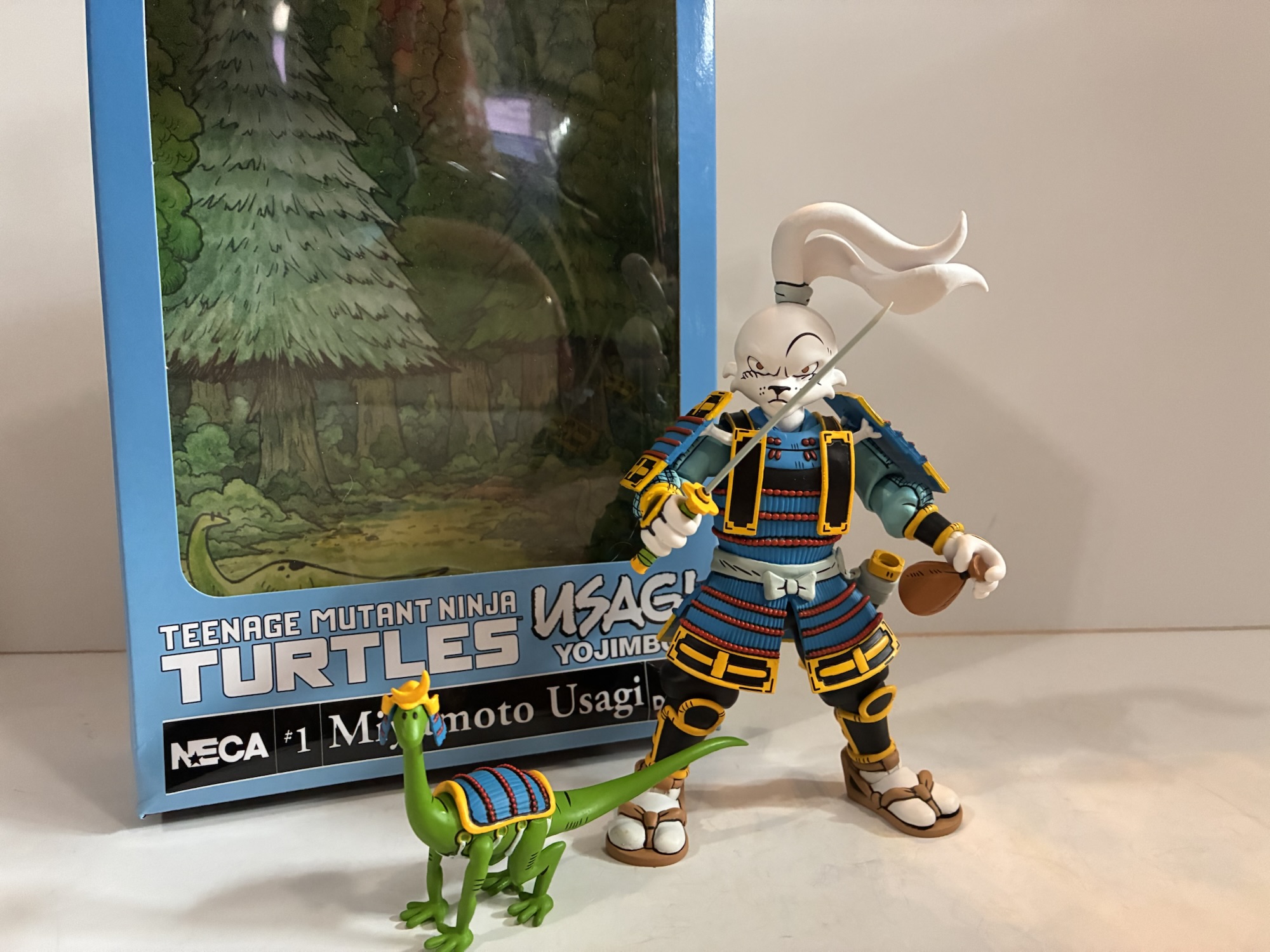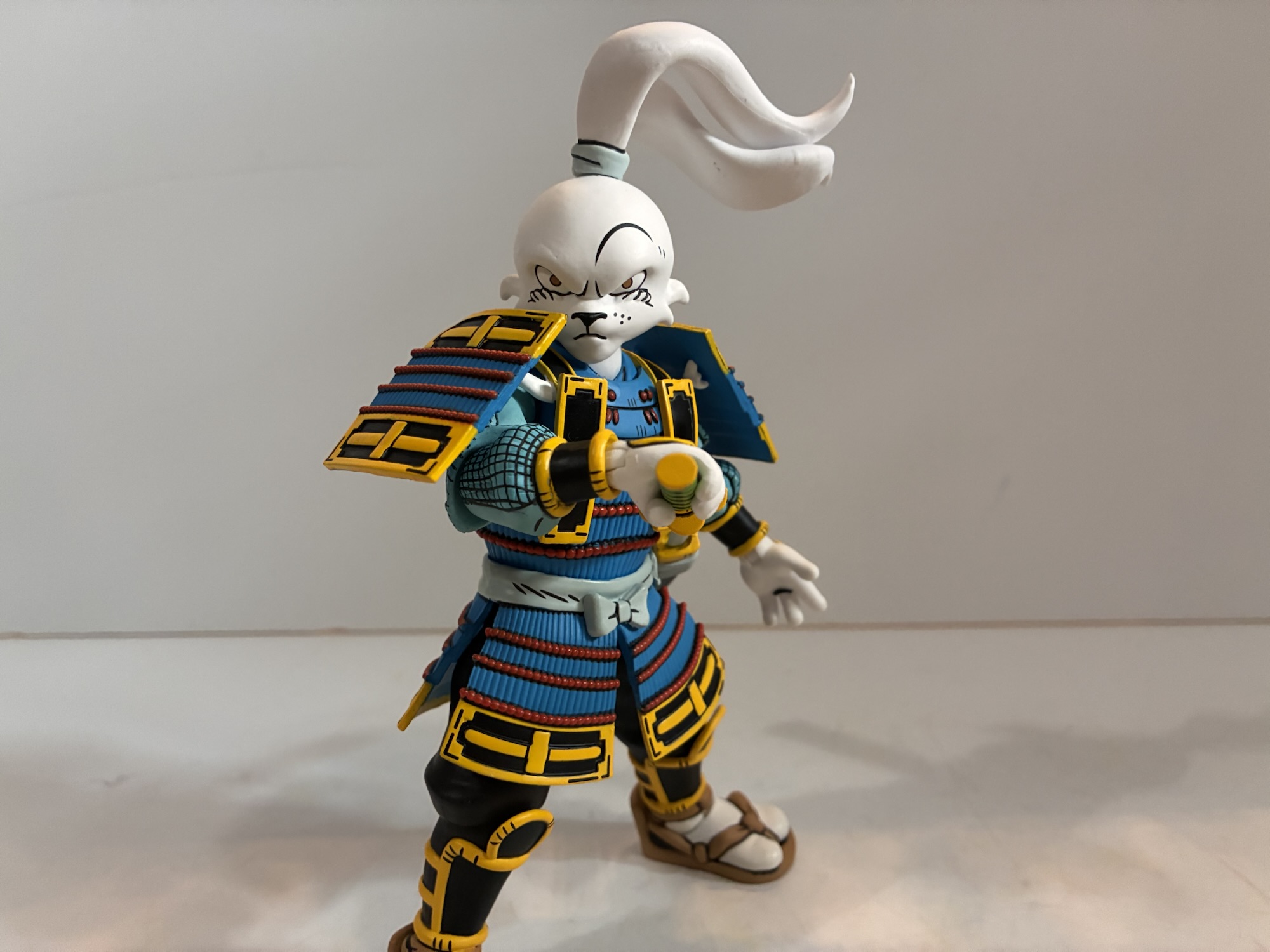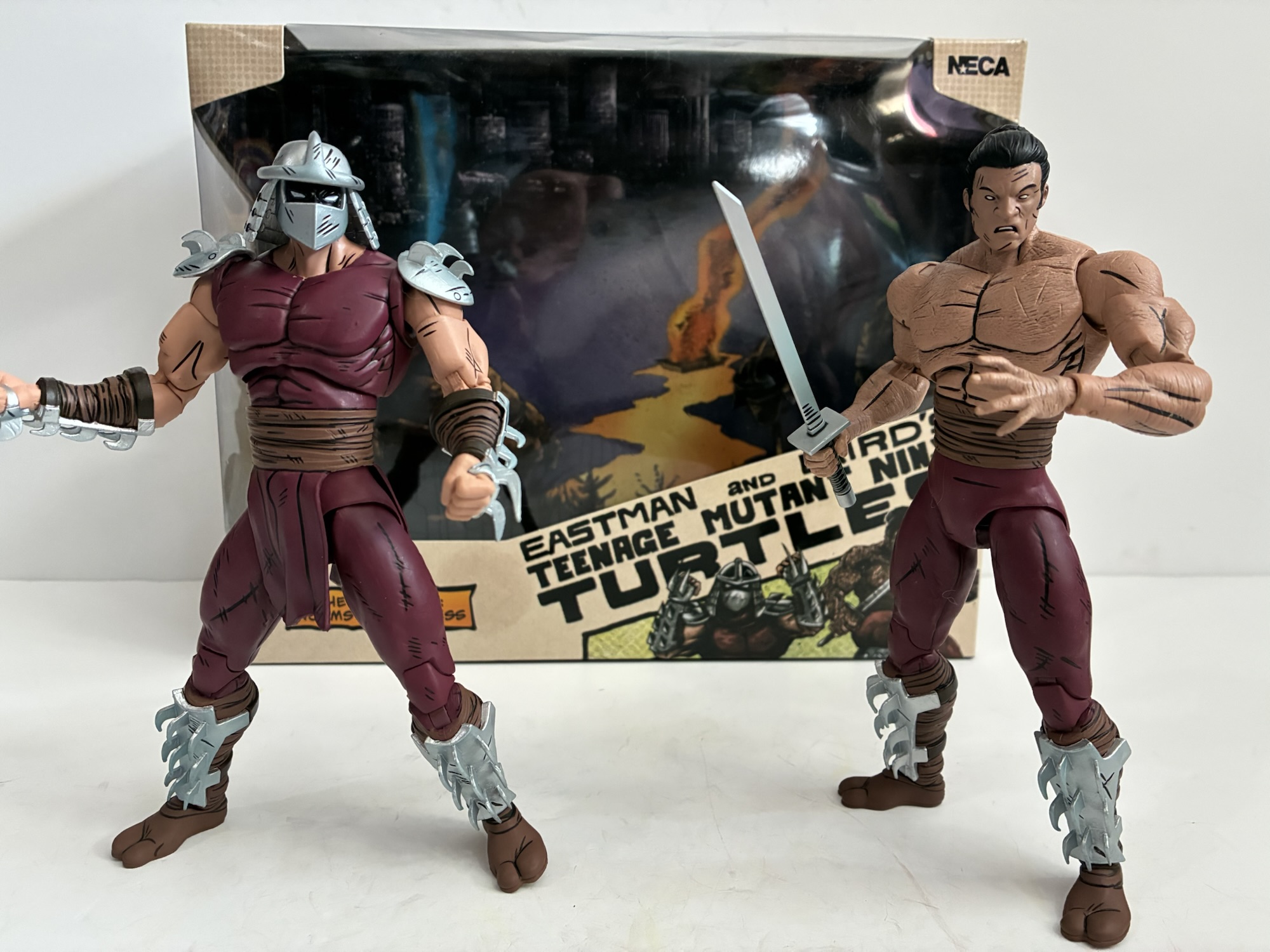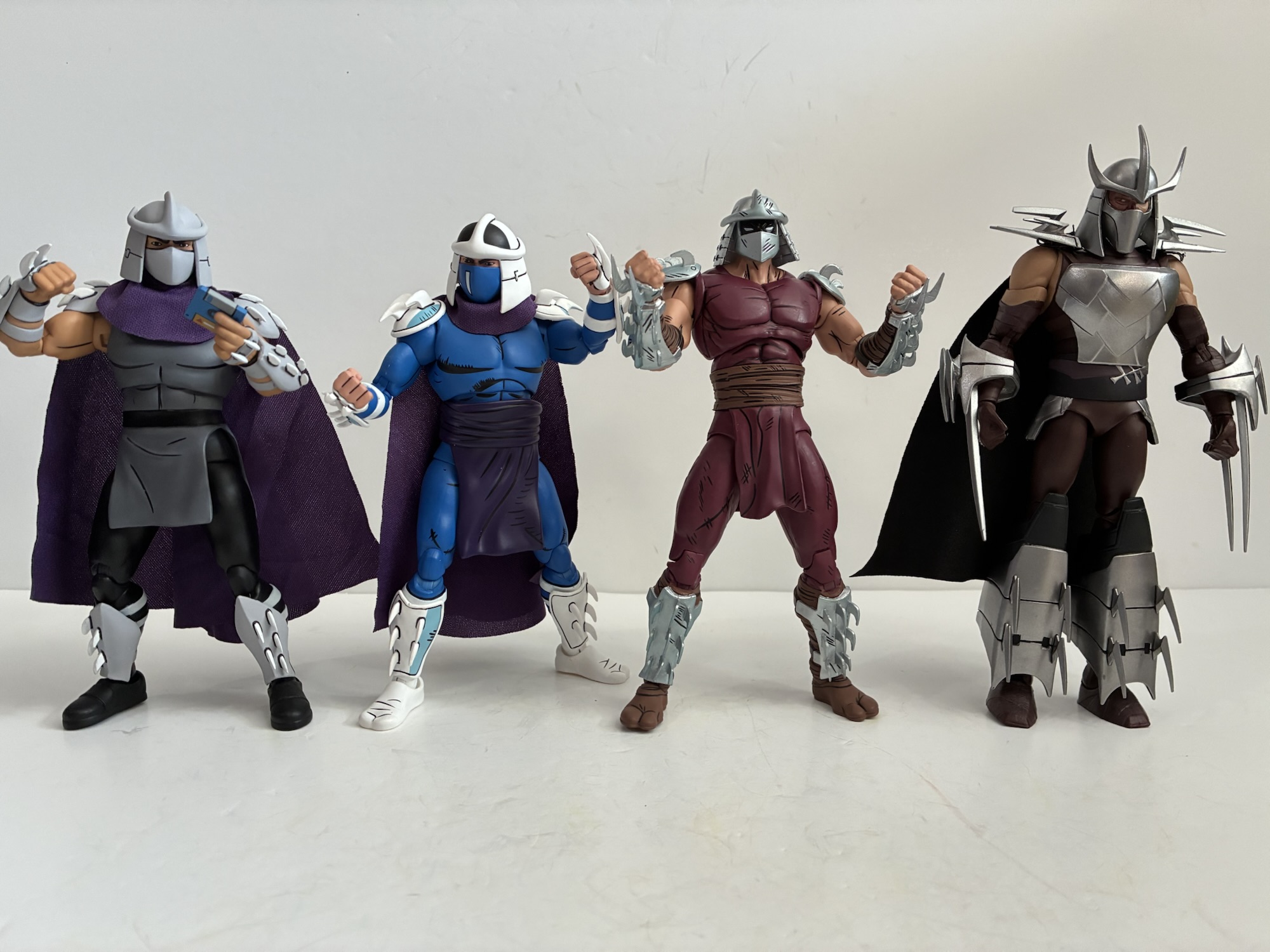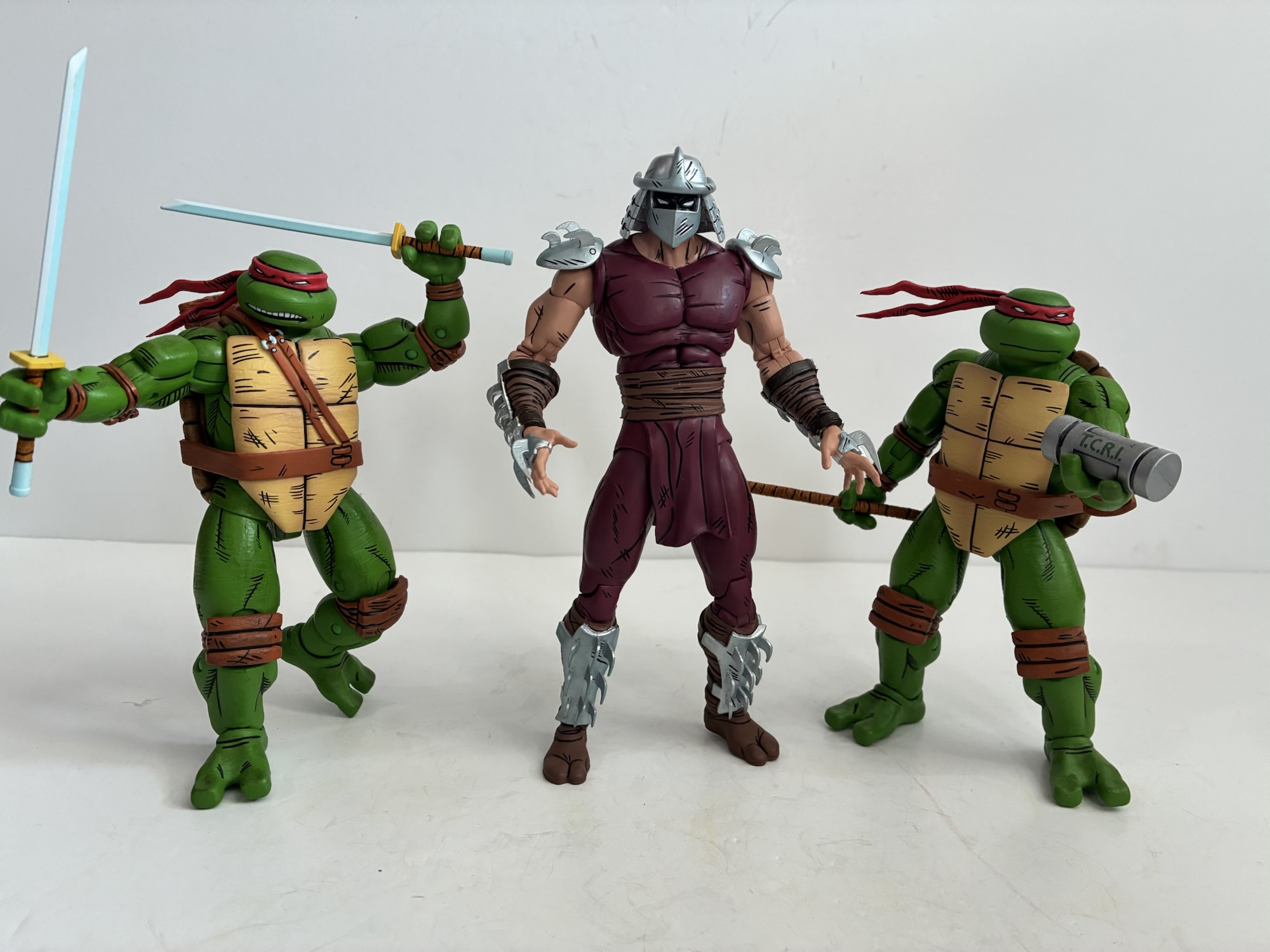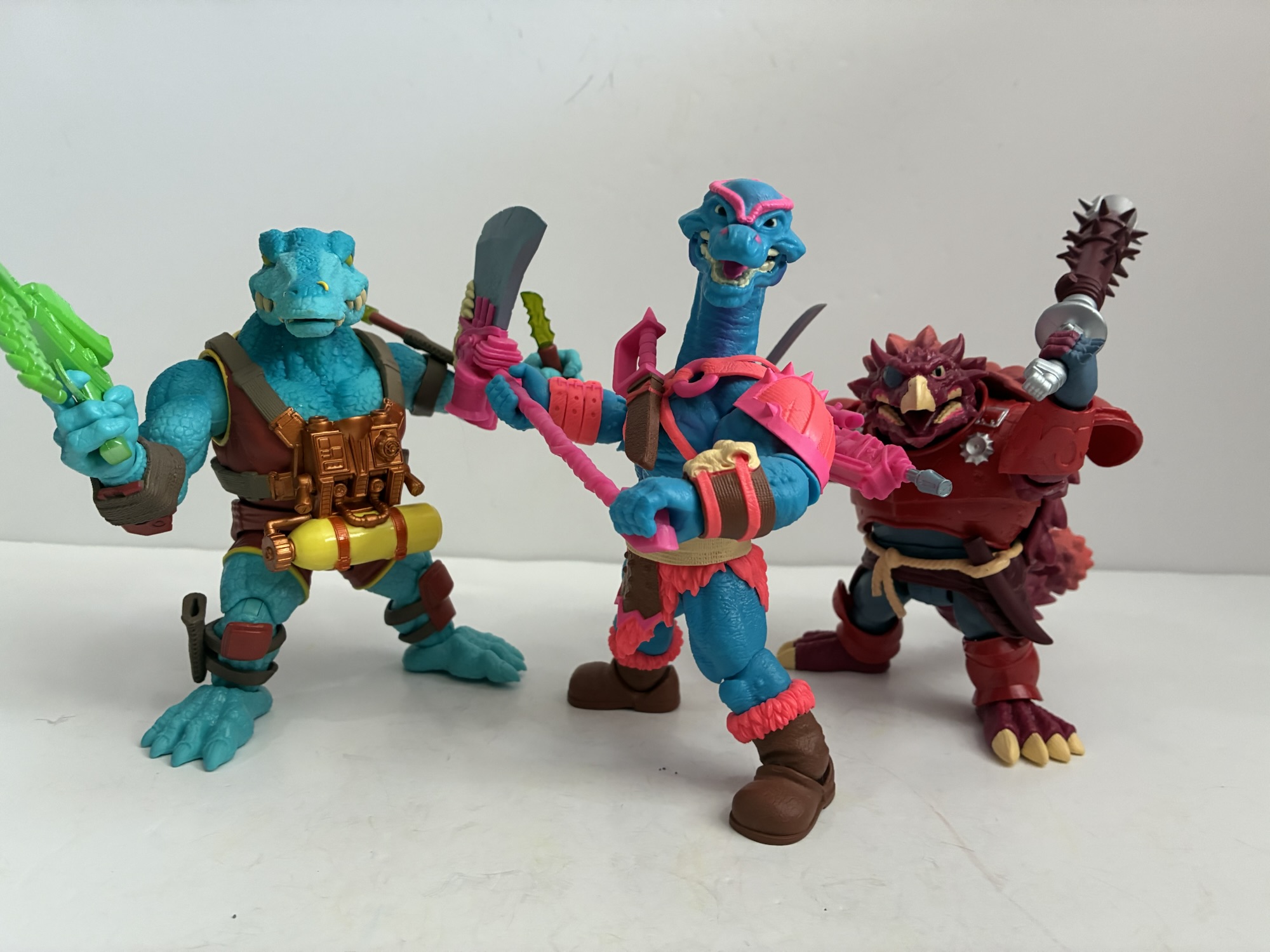
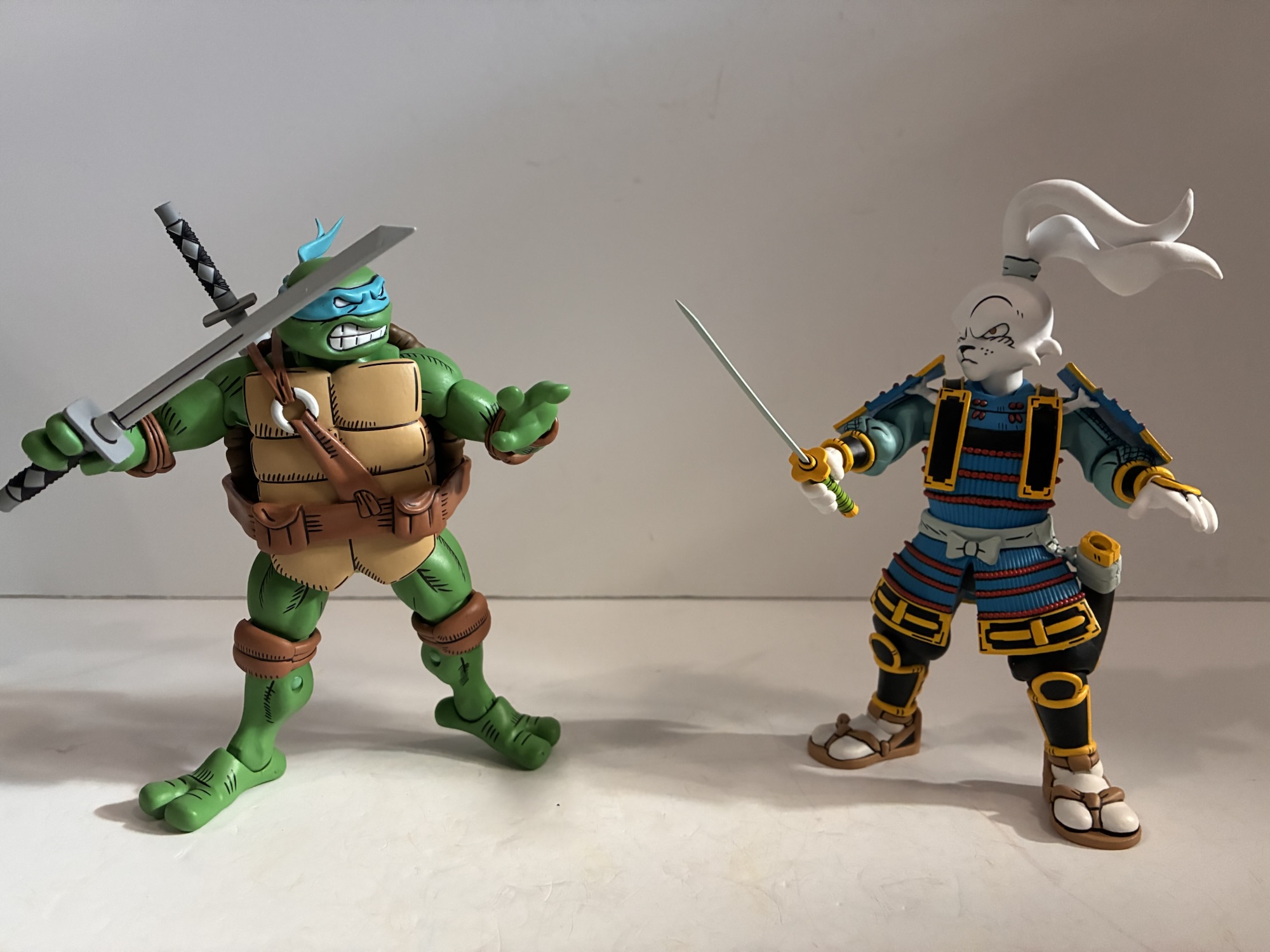
Last week, we took a look at the first figure in a line of action figures based on the artwork of the legendary Stan Sakai, creator of the comic Usagi Yojimbo. That first figure was the rabbit himself, Miyamoto Usagi, and he was drawn from the latest crossover between the two franchises which took place in 2023. Now, we turn to the turtles. NECA has given us a lot of turtles over the years, but only a few can trace themselves back to a specific artist. And, like these ones, they’re usually found in the comic subline of Teenage Mutant Ninja Turtles and this time we’re getting Sakai’s take on the heroic reptiles. It feels like more often than not it’s Usagi who is coming into the world of TMNT and his look is reinterpreted based on whatever the look of that medium happens to be so getting action figures based on Sakai’s artistry feels like something that has been long overdue.
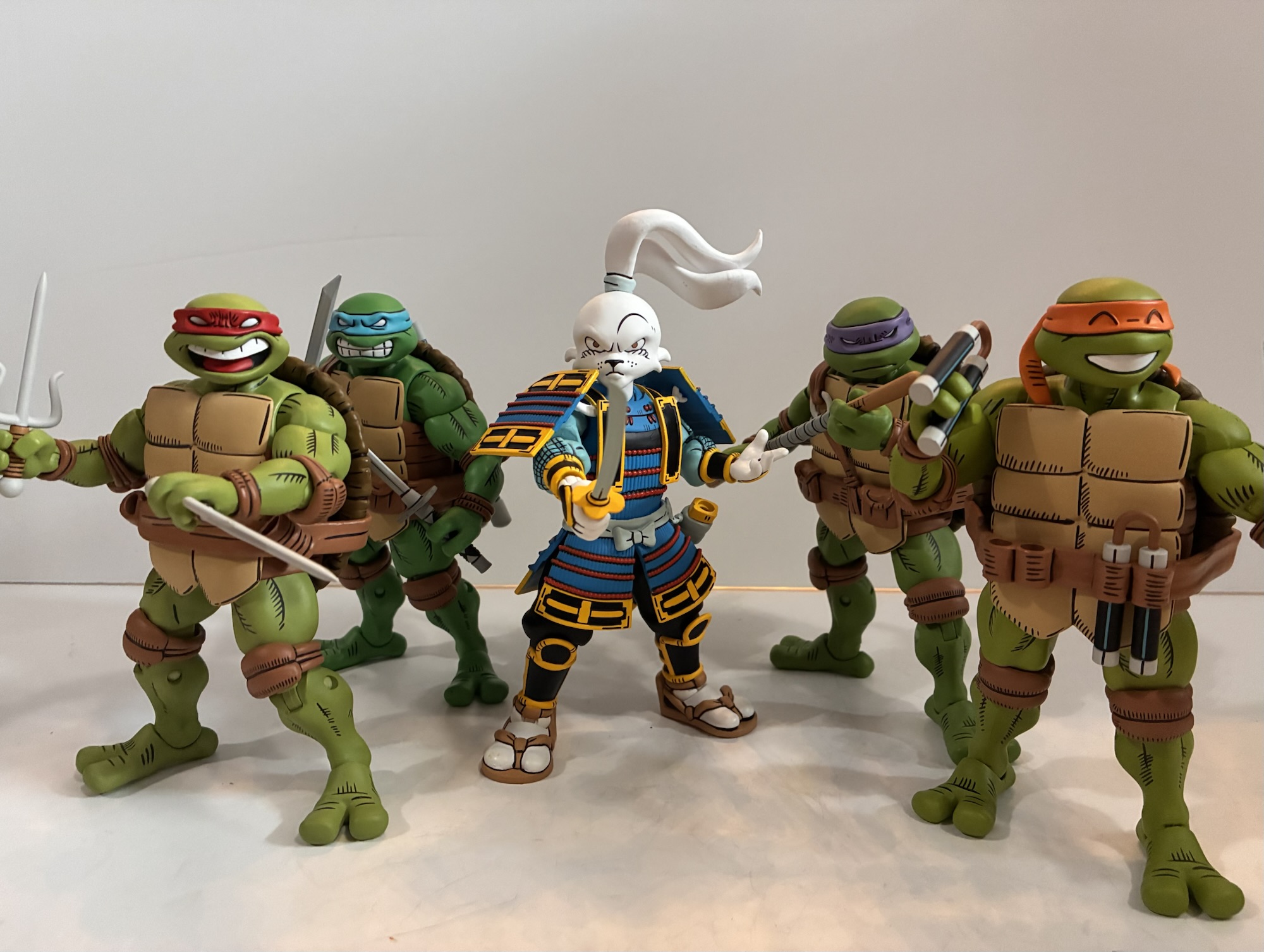
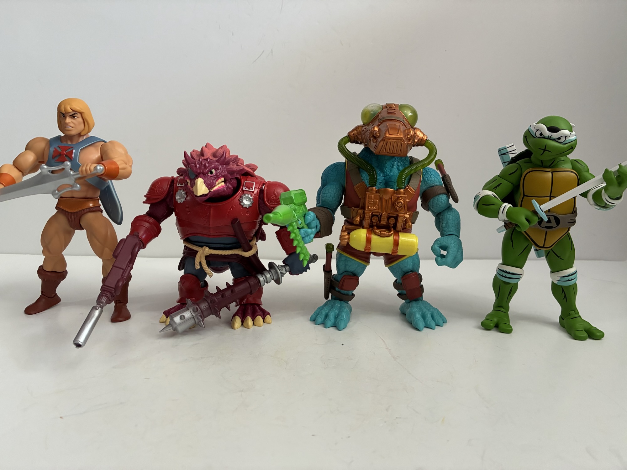
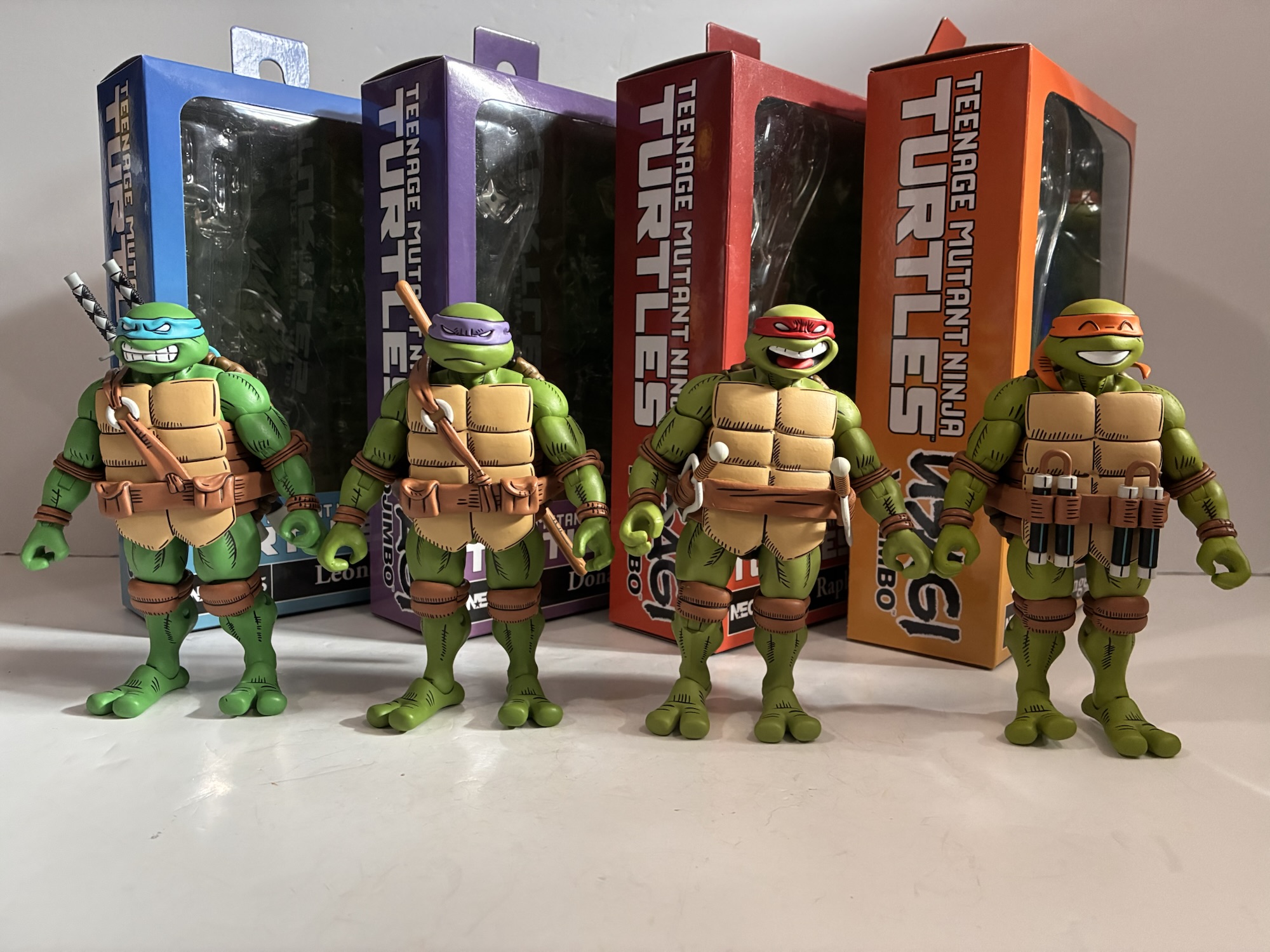
Now, you may be wondering why I decided to give Usagi his own write-up while mashing all four turtles into a single one. And if your assumption is because this is essentially the same figure times four then you are absolutely correct. Like most TMNT lines, the turtles all share the same body and the only distinguishing characteristic between the four are their belts, portraits, and weapons. And while Usagi got three heads and multiple accessories, the turtles mostly share all the same stuff and even their alternate portrait isn’t unique. It does lead me to assume that NECA budgeted more for Usagi and the savings in reusing tools for the turtles was put into his figure. I’m not entirely sure how the licensing works here. Sakai is obviously compensated for Usagi while Paramount is getting their money for turtles, but is Sakai getting anything for his design work on the turtle figures? Does Paramount get any money for the Usagi figure since it still says “Teenage Mutant Ninja Turtles” on the box? I don’t know the answers to any of that, but one would assume a line with essentially two licensing fees would be more expensive to produce, but the cost to the consumer is essentially the same as most NECA products so I suppose that’s a good thing. The boxes are also all the same save for the main color and the credits for these guys are the same as those for Usagi which will be linked at the end of this entry.
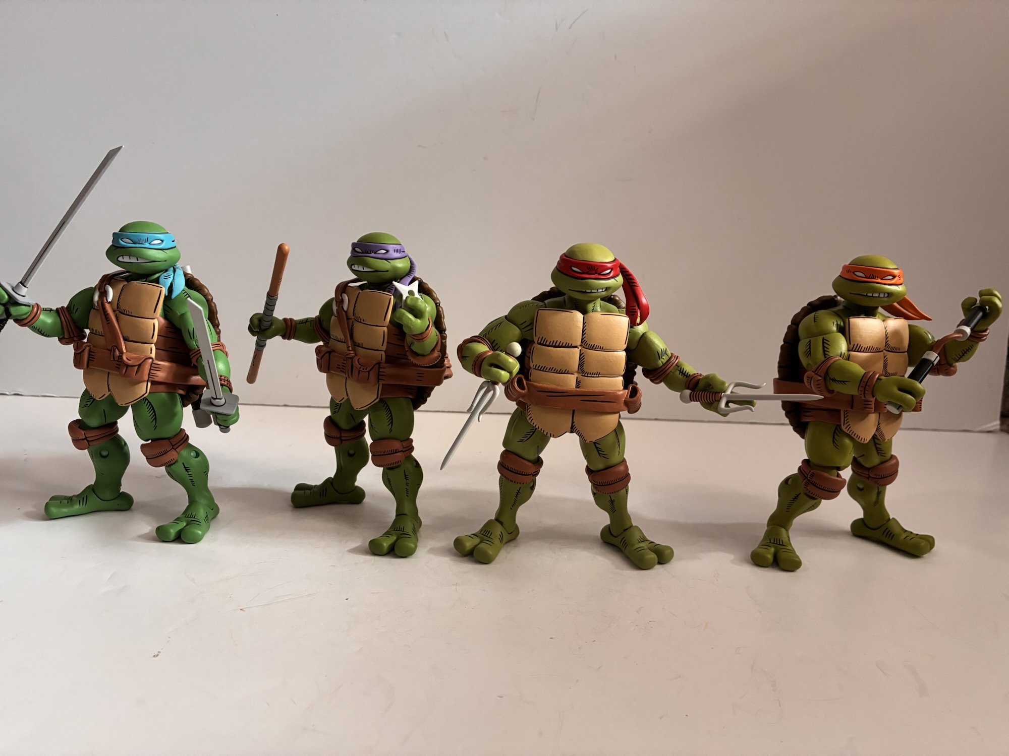
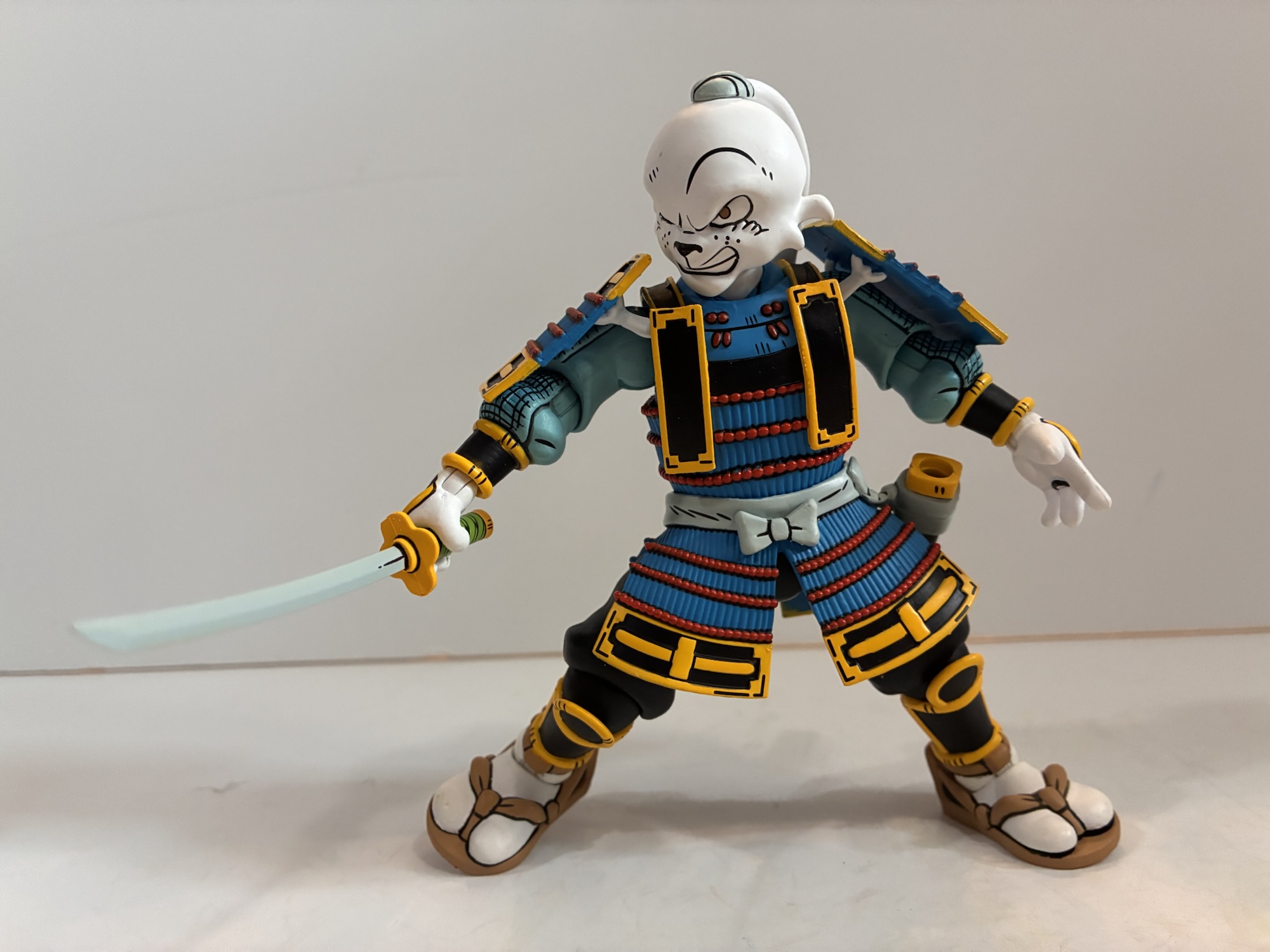
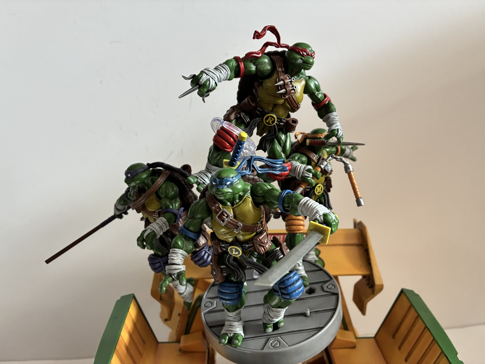
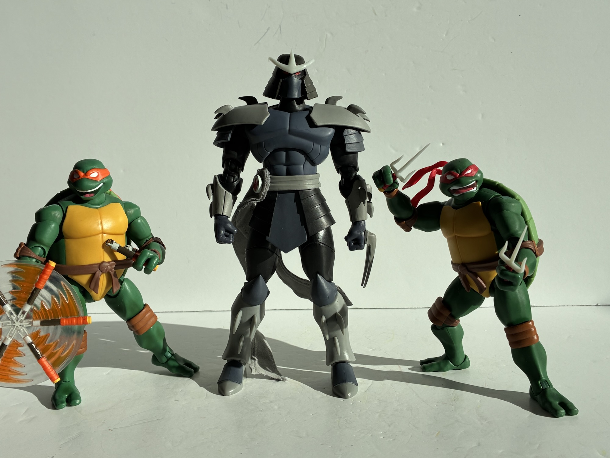
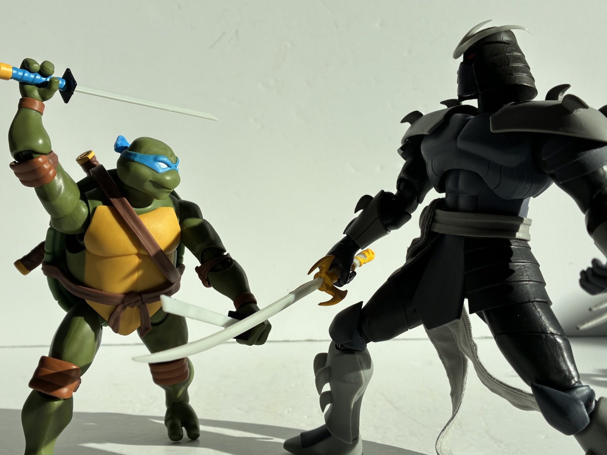
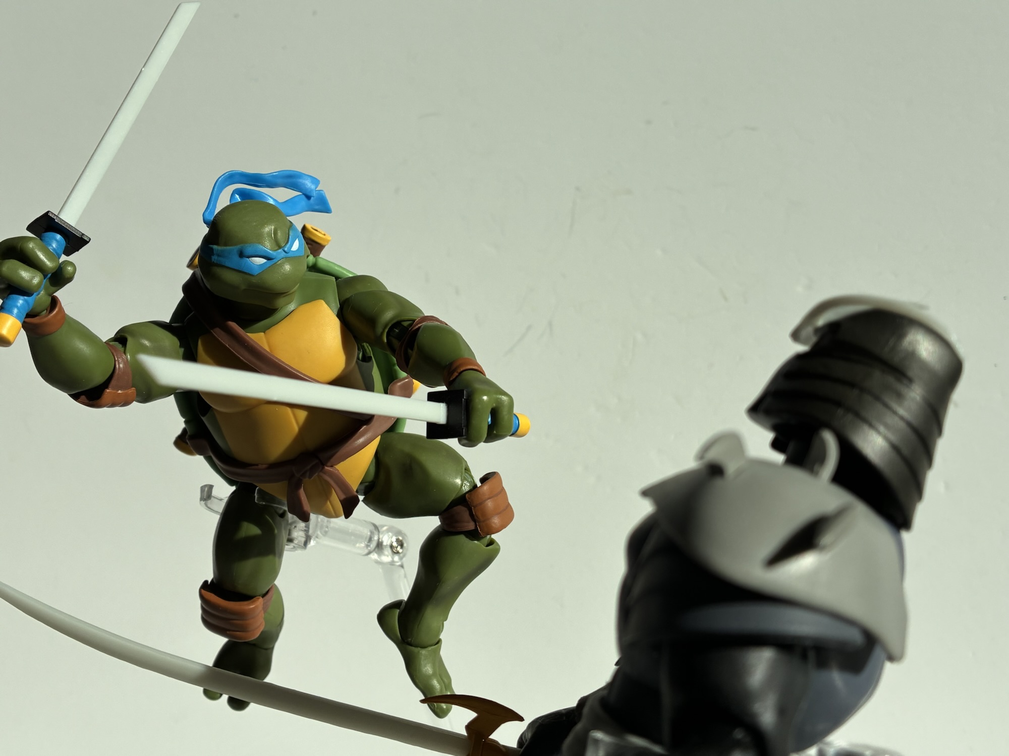
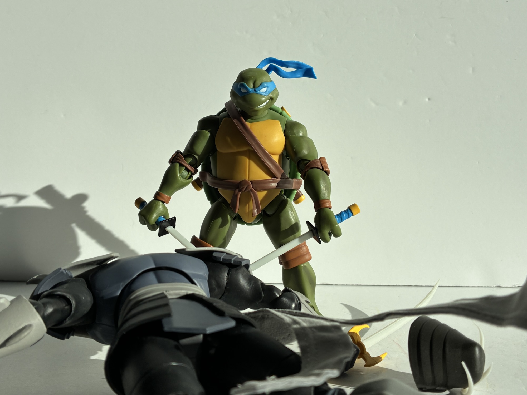
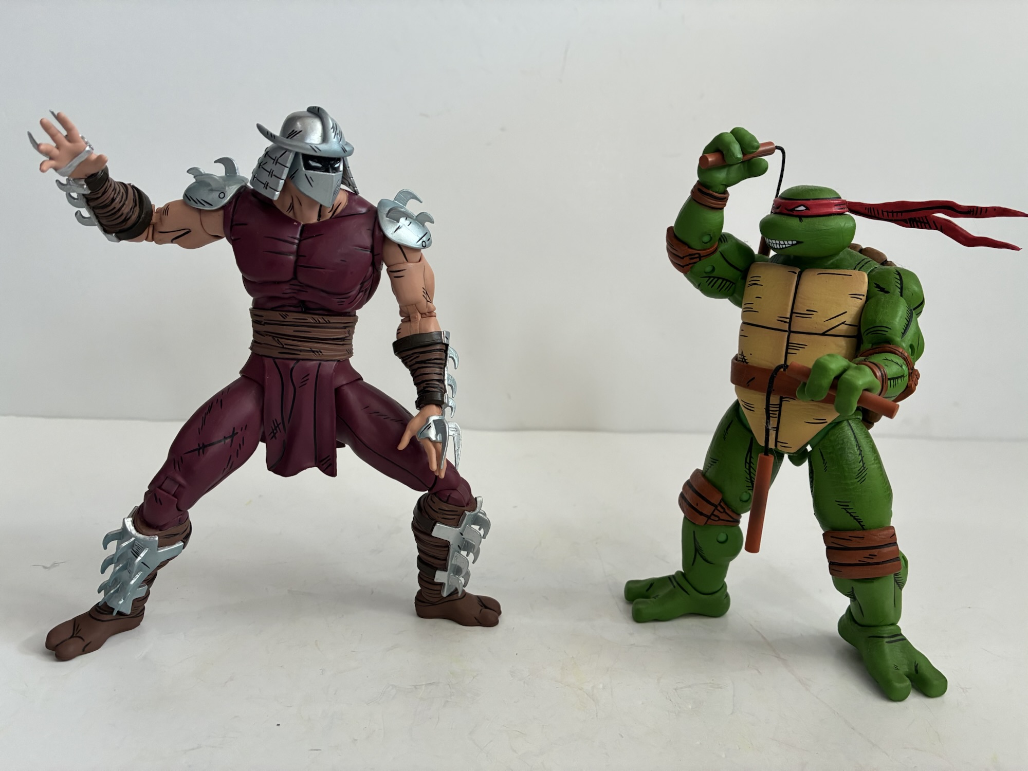
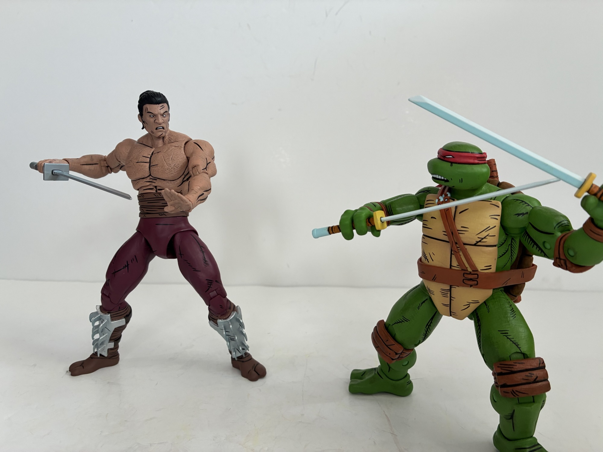
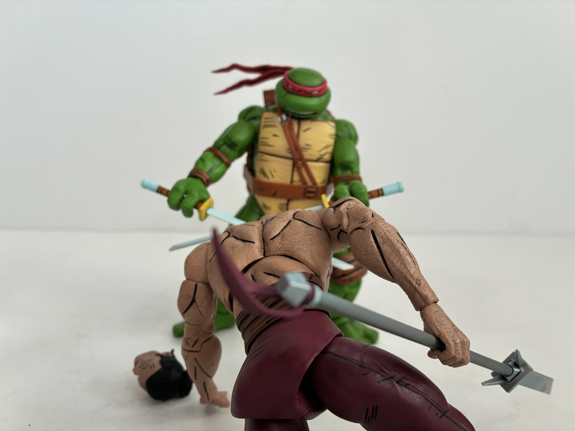
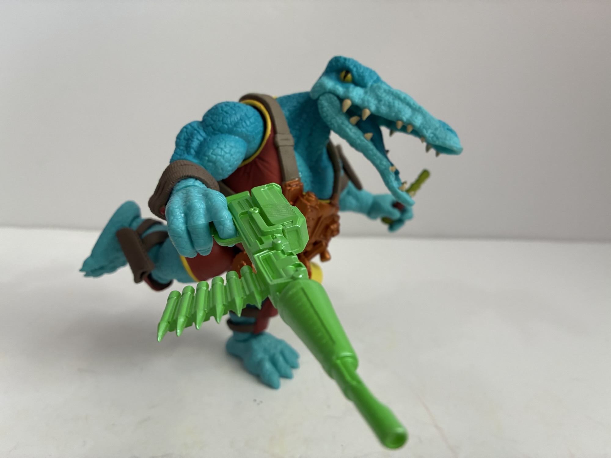
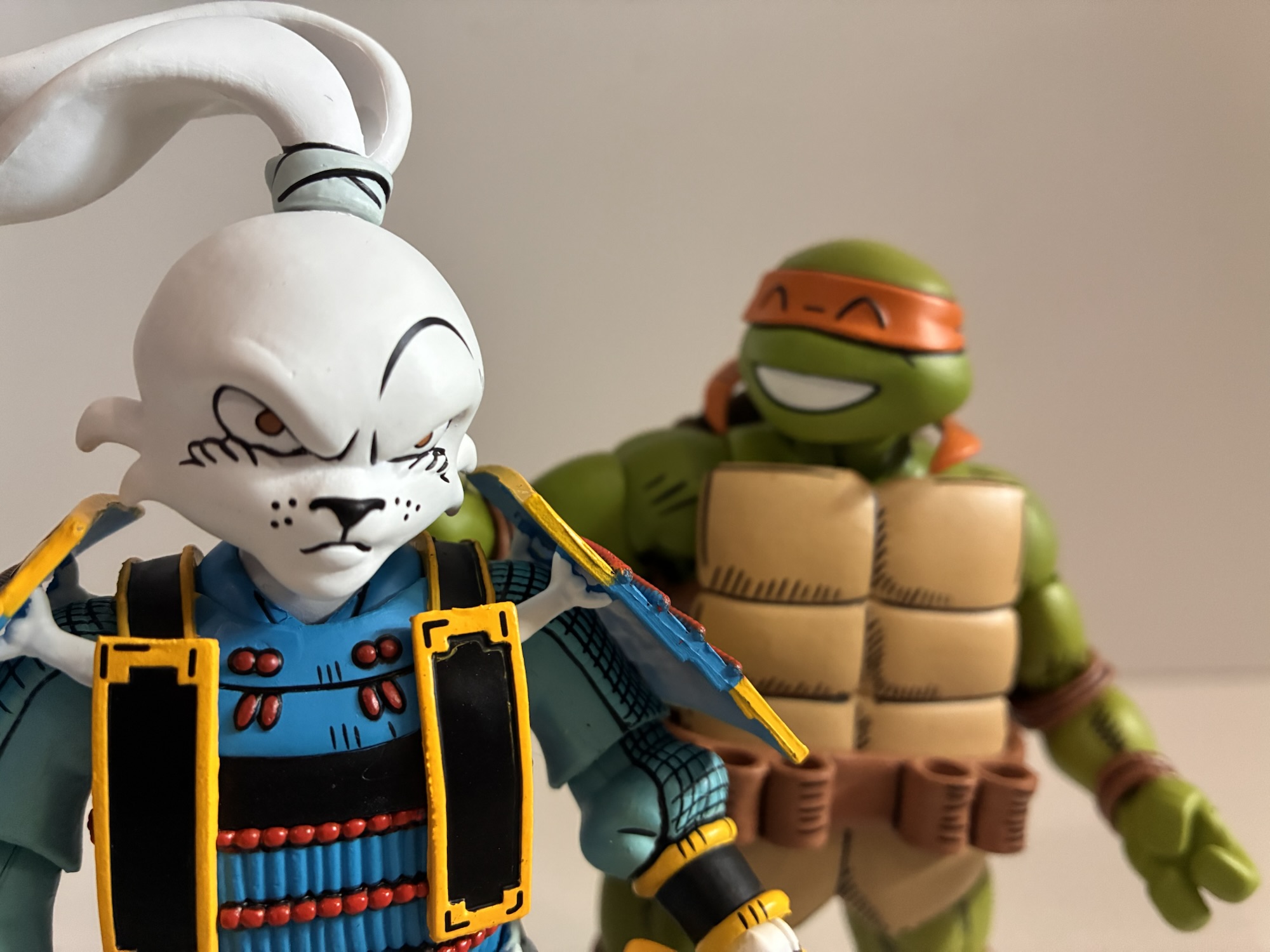
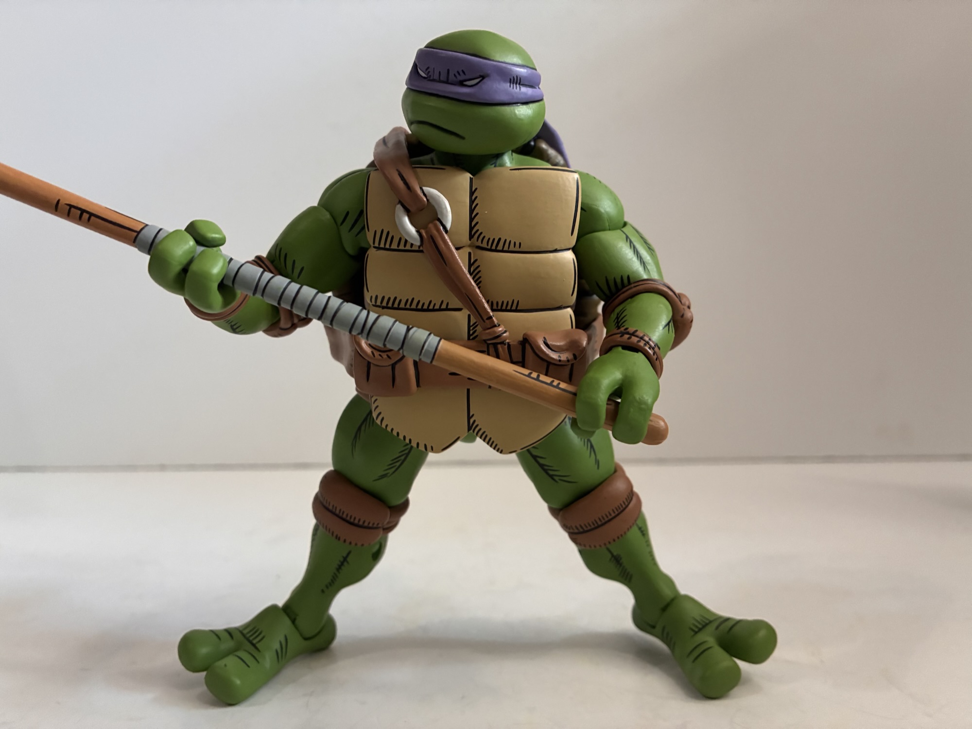
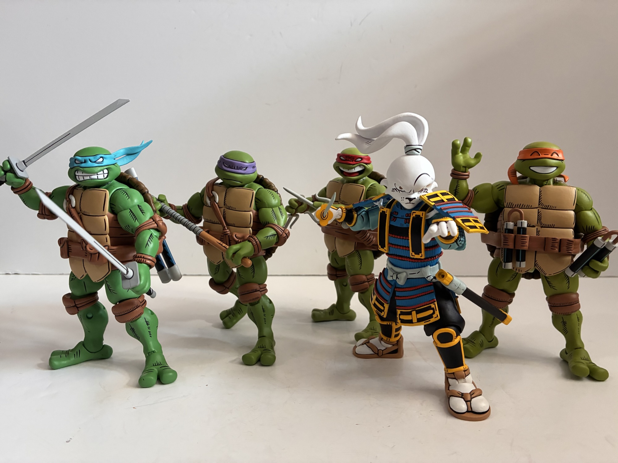
Sakai’s take on the turtles has proven quite popular. NECA indicated a lot of positive feedback to the reveal which happened over a year ago and in my own circle of collectors it seems everyone really likes them. Sakai’s approach is a somewhat boxy proportioned turtle, but one that retains a lot of soft, round, edges. The plastron is quite rectangular with a fang-like quality to the base. The limbs are chunky, but muscled, and the feet are a tad oversized. The shell is in the shape of an oval with a simplified pattern in the middle of a large, elongated, hexagon in the center flanked by six, soft, pentagons. I say “soft” because the two on the side barely feature a point in the center making them more like a quadrilateral. The turtles each have their own coloration which seems to correspond with the 2012 series. Donatello may be a touch more saturated and Raph more pale (he’s no where close to the shade of green of NECA’s 2012 Raphael, but that one also doesn’t match the source). The only color is reserved for the bandanas and Leo and Donnie’s are almost a pastel shade of blue and purple, respectively. The belts are all unique with both Leo and Don getting some pouches on the front. All of the turtles have weapon storage and Michelangelo rolls with the unique holsters on the front of his belt as opposed to the back. Leonardo’s scabbards are also arranged in a parallel fashion as opposed to an X.
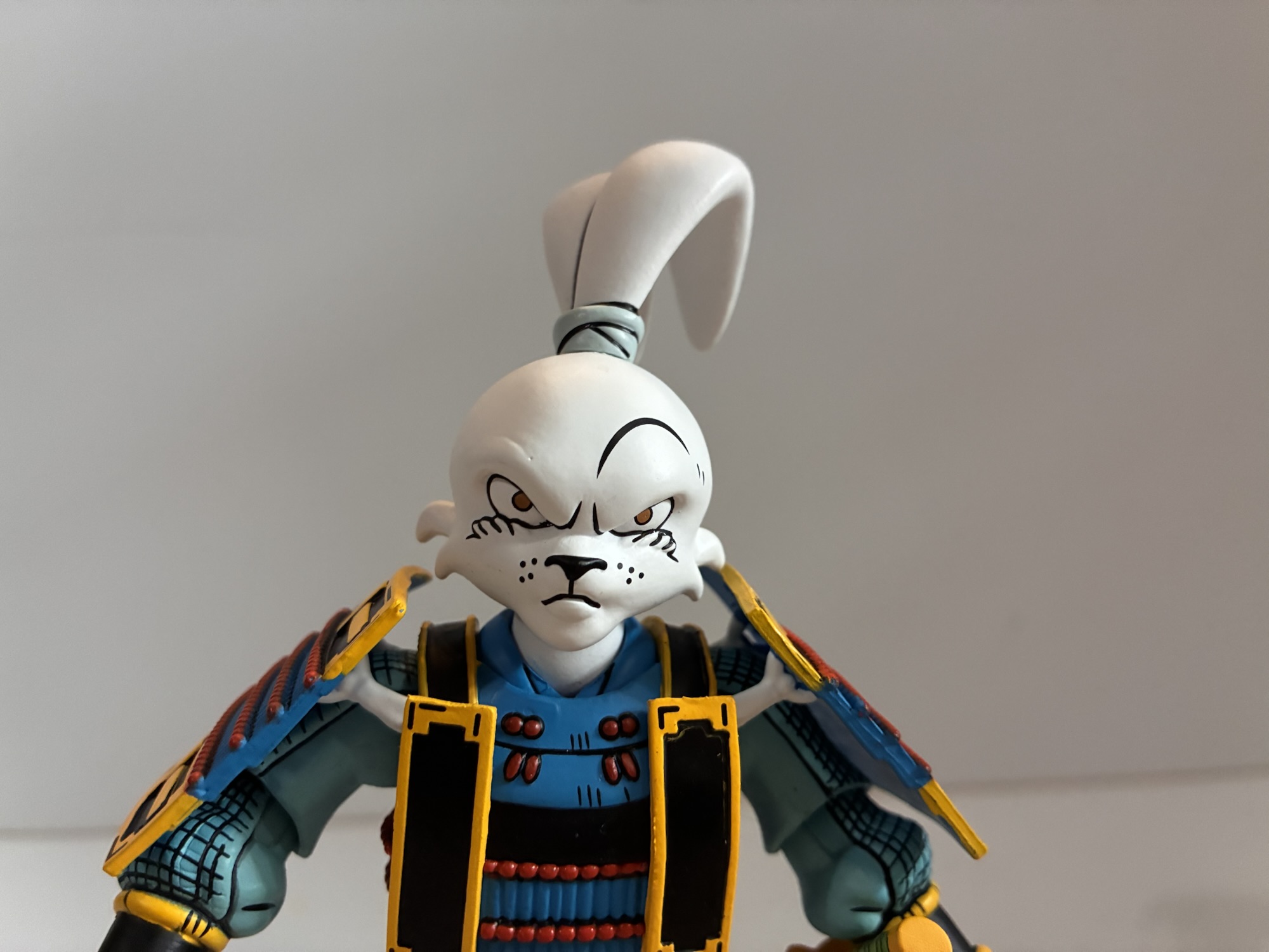
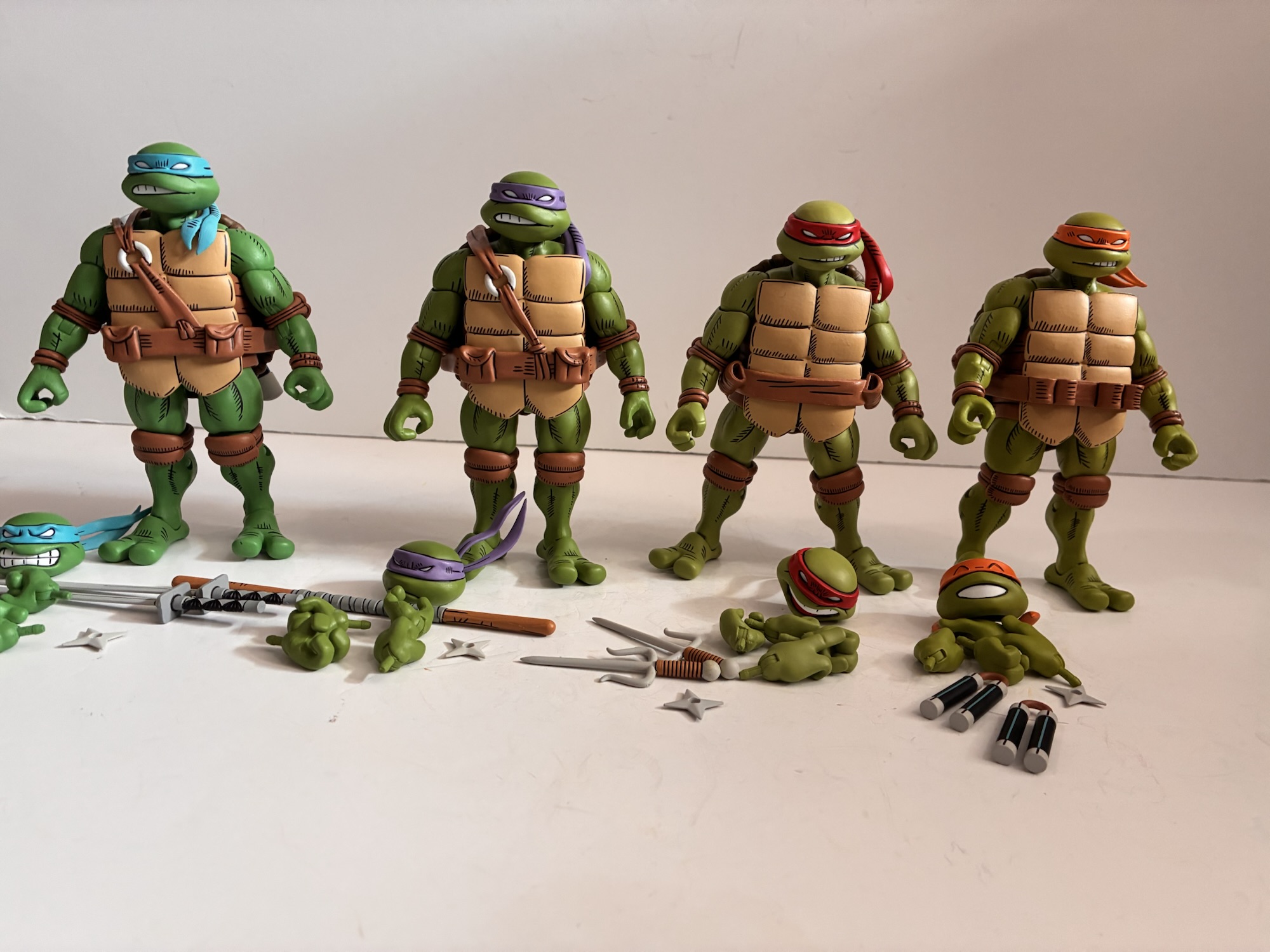
The paint is in the same style as NECA’s other comic interpretations. The colors are nice and matte and there’s an abundance of black linework painted onto the figures. It’s everywhere and really adds to the comic vibe of the source. It’s very clean and crisp with very little paint slop to be found. There’s a fleck of orange on Mikey’s plastron that I assumed transfered from the bandana tails in the packaging. I can’t really find any imperfections on Raphael and Donatello while Leonardo may be missing a tiny bit of black in his teeth. And speaking of, each turtle comes with a unique portrait by default. I really like how the open mouthed expressions on both Leo and Raph accentuate that rounded-off look Sakai gave them via the curl of their lips. There’s also this excess of black lines in Raph’s brow that really captures his personality. Donatello has a very stoic, almost grumpy, expression by comparison and Mikey has a cheerful one. He has inverted “U” shapes to represent his closed eyes and his smile is flat white with no teeth lines sculpted or painted on. It’s adorable. I think it’s the personality captured by these portraits combined with the clean presentation that really sold the public on these designs. They’re inherently charming and I find it impossible not to love them.
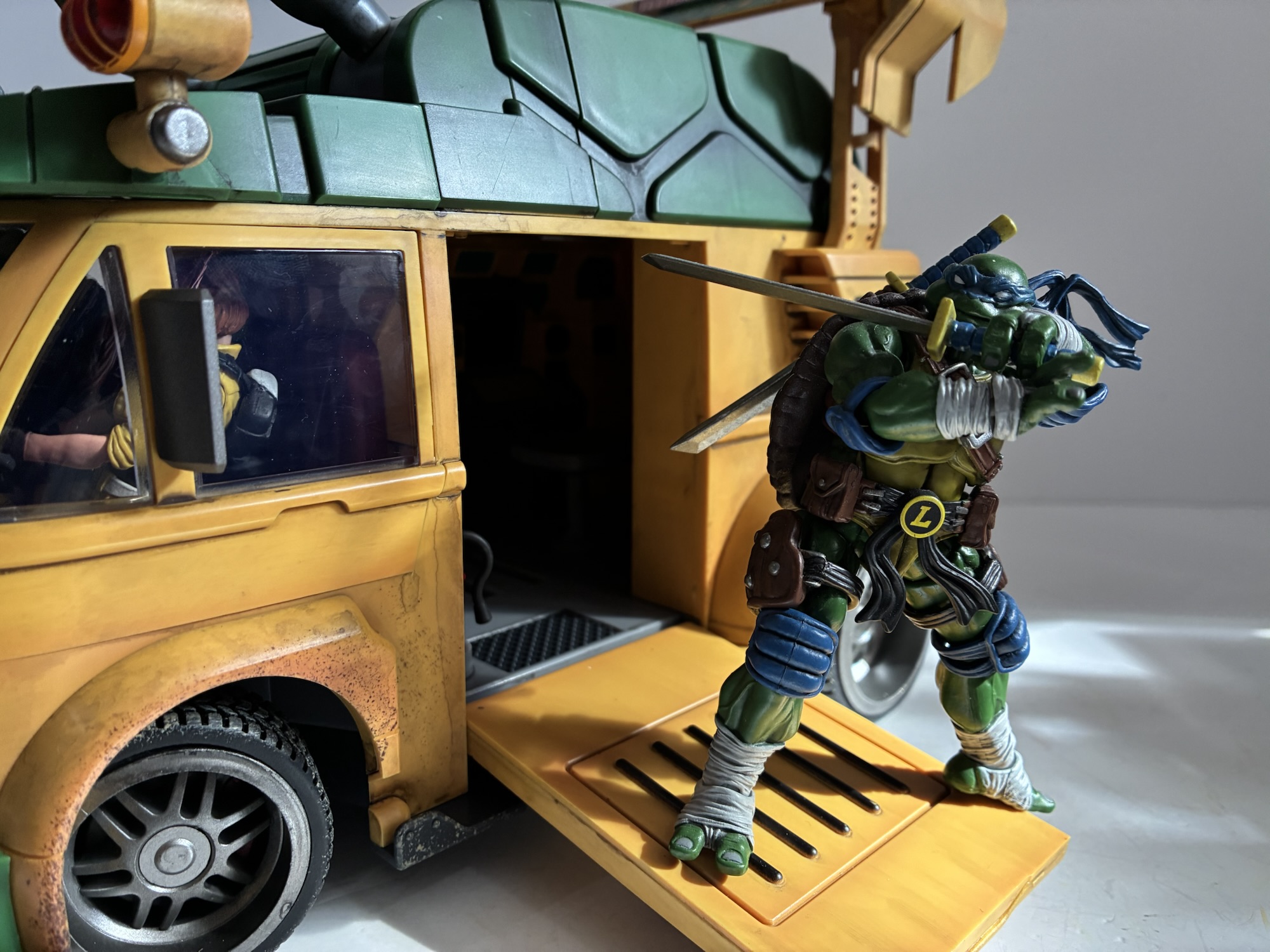
As for the rest of the stuff, well that’s a little less exciting. Each turtle comes with a set of gripping hands and a set of fists. Donatello also gets a set of more relaxed gripping hands, Raphael a set of finger pointing/sai grip hands, while Leo and Mikey each get a set of open hands. For alternate portraits, each turtle has basically a frown with one side of their mouth baring teeth – the classic TMNT expression. Donatello and Leo share the same portrait with the right side of the mouth open while Raph and Mikey have their grimace to the left. Each turtle also has a throwing star if that’s something you value. What most actually do want and expect are the unique weapons for each turtle. Raph’s sai have some nice size and the brown handles match his padding. Leonardo’s swords have a black and gray diamond pattern on the hilt and slot into the scabbards seamlessly. Donatello’s bo is in one piece as opposed to the break-away model we often see, but it looks fine and the paint on the gray wrappings with black outlining is clean. Mikey is perhaps the laggard here as his nunchaku are all plastic. The handles are black with a blue line that I think is a nice touch, but the connecting plastic for each handle is just plastic. There’s no bendy wire and they’re quite rigid so there’s no posing here. They fit into his belt just fine, so that’s a plus. The gripping hands across the board are also reasonably soft so getting weapons into hands is not much of an issue. If you want Raph to hold his sai in a more unorthodox manner then you may want to soften the hands up a bit, but otherwise you should be good to go out of the box with these guys.
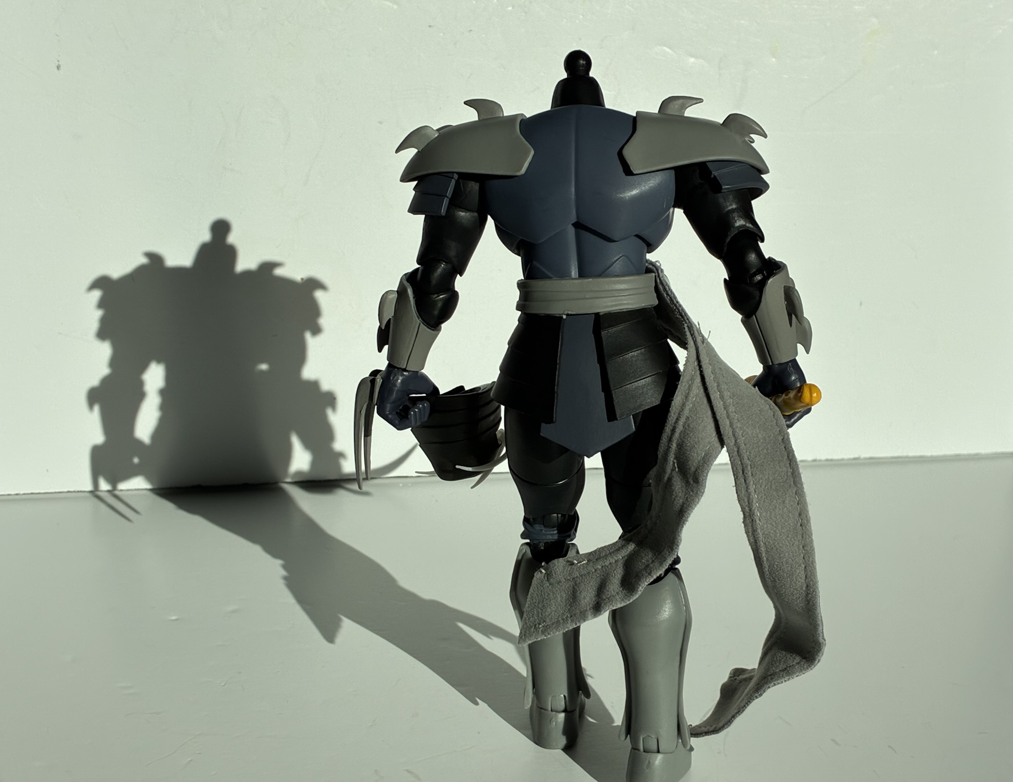
These being NECA figures, one likely has low expectations for the articulation and if so then expectations met. Though, in a way, NECA underperforms here and it’s related to one issue. The sidewalls, the tissue between the plastron and shell, is one, big, piece with these designs. It’s like the whole shell and plastron is one big overlay. Ordinarily, NECA doesn’t do that and you can see the hip joint when looking at a turtle figure from the side. The movie turtles do this as they had to match the movie, but those designs were less restricting and probably because actual people had to wear those things. With these figures, the plastic extends well past the hip and onto the thigh. It essentially takes away most of the hip range, one of the few spots where NECA’s turtle figures are ordinarily okay as they can get their legs out to the side for splits. These ones are limited to maybe 45 degrees there, and there’s no usable waist twist to take advantage of. Kicking forward is severely restrained by the placement of the plastron and the shell prevents the leg from going back. There’s also the slightly odd aesthetic of NECA utilizing pinned joints at the knees, but opting for pin-less at the elbow. It’s an all together odd double-joint as the top is like the old style NECA double jointed elbows where the top would peg into the thigh with a hinge below it and the bottom would do the same. Except here we get the peg and hinge on top, but just a hinge on the bottom thus necessitating the need for a pin through the calf. I think they did this with the movie Shredder/Foot, but I don’t know if I’ve seen it outside of that. As for the rest, the arms are fairly basic and the head range is probably what one would expect. Leonardo does get the preferred vertically hinged gripping hands, but for some reason no one else does.
The end result with the NECA Stan Sakai turtles is pretty much in-line with what I had to say about Miyamoto Usagi – if you love the look of these designs then that’s the only reason to get them. They’re not going to pose well and the value is less with the turtles than it was with Usagi because of all the shared parts. The design of these turtles was never going to lend itself well to articulation, but I do wish NECA had gone lighter on the sidewalls to free up the hips. Someone willing could probably trim that area and open these guys up a bit, but I’m not that someone. I do think they look great. On a technical level, they’re not as impressive as the Usagi figure, but the stylization is wonderful. NECA’s strength is in translating art to plastic and they certainly nailed it here. The execution of the paint is damn near flawless, and while this isn’t the most demanding paint job I’ve ever seen, it’s still impressive to see how clean it is on this scale. Based purely on aesthetics, these turtles are instant favorites for me. I think if I could only save one set of turtles in a fire it would likely be the NECA movie figures or maybe the Bandai ones, but these guys would be hard to ignore too. Though if I’m being practical I should probably put the original Mirage turtles ahead as they’d be the hardest to replace. At any rate, these guys look great and I am quite pleased just looking at them. They bring me joy, and in the end, isn’t that what this hobby is all about?
If you liked this one we have plenty of related topics to interest you here:

NECA TMNT Usagi Yojimbo – Miyamoto Usagi
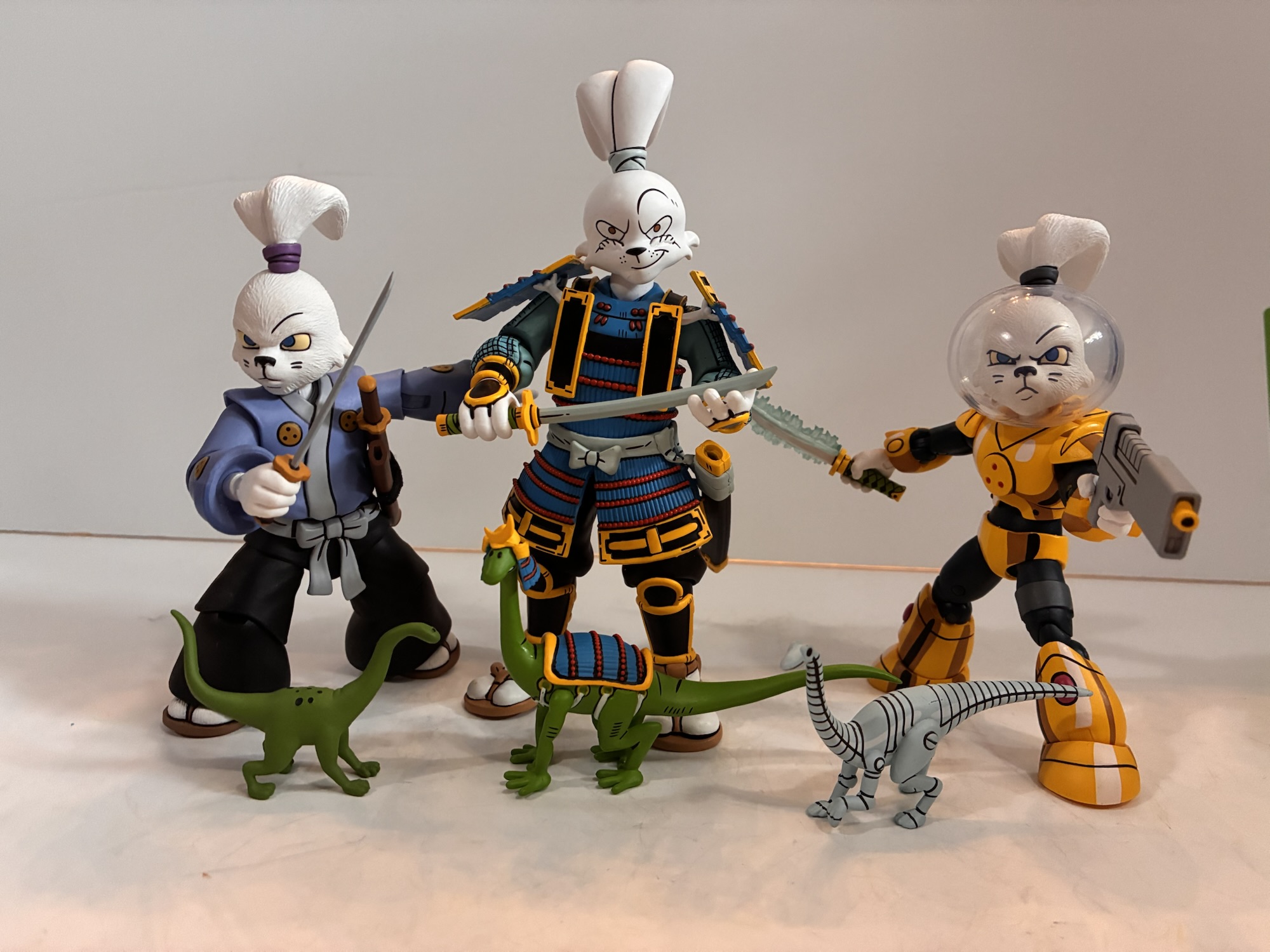
Stan Sakai stumbled into a pretty good thing when he met the co-creators of Teenage Mutant Ninja Turtles, Kevin Eastman and Peter Laird, and struck up a creative friendship. It would seem all liked and appreciated each others work with Eastman and Laird’s ninja turtles and Sakai’s samurai rabbit. The fateful little pairing would eventually…
Keep reading
NECA Mirage Studios Teenage Mutant Ninja Turtles 4-Pack
When it comes to the popularity of Teenage Mutant Ninja Turtles a lot of the credit goes to Playmates Toys. Kevin Eastman and Peter Laird created the characters born out of a joke. Credit them for having the vision to think this joke had appeal beyond their small circle as they self-published Teenage Mutant Ninja…
Keep reading
NECA TMNT Toon The Adventures of Space Usagi
When it comes to NECA’s Teenage Mutant Ninja Turtles line of action figures based on the old cartoon, I’ve pretty much been all-in. The only figures I’ve passed on have been the style guide variants for the turtles. That will probably change in 2024 as the collection has grown quite large and has hit on…
Keep reading