Category Archives: Television

Dec. 1 – American Dad! – “The Best Christmas Story Never Told”

img_1104Oh hell yeah, it’s time for Christmas posts! Welcome back for the year 2020 as The Christmas Spot comes at you with 25 days of Christmas posts! 2020 has been a crazy year with a lot of new normals tossed our way, but at least each year the calendar gets turned over to Christmas and for close to one month things seem consistent with prior years. And like year’s past, we’re turning this place into an advent calendar and looking at 25 festive topics. Most of which will be like this one, a write-up of a beloved or not so beloved Christmas television special. It may be one from the past, or it may be relatively current, but one thing is certain and that’s it will be Christmas. I have nothing against the other seasonal holidays occurring around this time, it’s just that Christmas is my jam and I want to share my enthusiasm with all of you.

For this year, we’re turning things over to an animated sitcom that has become fairly reliable when it comes to Christmas. American Dad! premiered after the Super Bowl in 2005 and immediately found itself in the shadow of Family Guy. That’s because the show is co-created by Family Guy creator Seth MacFarlane and at the time it premiered it was being billed as the Family Guy replacement. This was during the hiatus for Family Guy following its cancellation, though the show would eventually return. As such, it felt like many Family Guy fans were immediately dismissive of American Dad! because it wasn’t the show they wanted. They wanted more Family Guy, not an imitation. You would think things would improve following the revival of Family Guy, but instead fans of that show once again seemed to look down on American Dad! as now that their beloved show had returned, what need of this new one did anyone have?

img_1109

Like Family Guy and Bob’s Burgers, American Dad! has become a reliable source for Christmas specials over the years.

Which was unfortunate, because American Dad! had very little in common with Family Guy. I suppose it resembled Season One of Family Guy to a point as both shows were influenced by the classic sitcom All in the Family. While Family Guy only borrowed from that show a little, American Dad! was practically a reimagining of that program in animated form. The show was co-created by eventual show-runners Mike Barker and Matt Weitzman and once the pilot was basically sold to Fox, MacFarlane backed away as he was soon pulled back into Family Guy duty. The show was conceived as a liberal’s answer to the Bush era political climate of the time. The conservative leading man, Stan Smith (MacFarlane) would be positioned opposite his young adult daughter Hayley (Rachael MacFarlane), a college-educated liberal, and rely on the conflict inherent in that relationship for several plots. Stan was presented as boorish and unfailingly patriotic, and as a member of the CIA he took national security very seriously to the point of suspecting anyone with brown skin as being a terrorist. Hayley was often the voice of reason, though also saddled with the usual college stereotype of being lazy and more interested in getting high than actually working to promote change in the political landscape. She would be paired with a boyfriend turned husband, Jeff Fischer (Jeff Fischer), that Stan hates which is basically the same relationship Archie Bunker had with “Meathead” in All in the Family.

img_1106

In this episode, Stan is going to learn the true meaning of Christmas and we’re going to learn about Roger’s past, seen here laying face-down in a mix of snow and vomit.

Eventually, the show found a niche and relied less on the Stan/Hayley dynamic. The rest of the family would play a more prominent role in furthering stories. Francine (Wendy Schaal) is portrayed as a stay-at-home mom and is the caretaker of the house and kids. She began life in the show as being a stereotypical conservative ideal, but over the years has developed her own quirks and failings, making her feel like a more fleshed-out character. Son Steve (Scott Grimes) has been molded into being Stan’s opposite ideal for a son. He’s a geek who likes comics and Dungeons & Dragons, but also is emotionally Stan’s opposite as he’s sensitive and comfortable with expressing his “non manly” emotions. As is the case with all MacFarlane shows, there’s a talking animal and in this one it’s a goldfish named Klaus (Dee Bradley Baker) who is a former German athlete trapped in the body of a fish. He’s mostly just there to make observations and the family often ignores him. By far, the big breakout character of the show is definitely Roger the alien (MacFarlane), who saved Stan’s life years ago and as reward is being kept safe from the government in the Smith household. He begins the show as an Alf knock-off, but the writers eventually found another role for him and that’s as an alien of many personalities. He often leaves the home in disguise and will even live other lives as he devotes himself to the roles he plays. He’s also literally the show’s worst character as he’s a sociopathic narcissist and will do whatever it takes to get what he wants. In that aspect, he somewhat resembles Cartman of South Park fame.

For what Wikipedia considers the show’s third season (it’s complicated), a Christmas episode was commissioned. It would be the first of several, as the very conservative Stan and his family naturally lend themselves well to the holiday. The episodes have become some of the show’s finest as they’re pretty big in spectacle and only seem to grow more and more outlandish. There would be a continuity established as well as the Smith family becomes the enemy of Santa. Because the show’s broadcast schedule is a bit erratic, not every year brings with it a new Christmas episode, but it’s certainly something I look for each year.

Since I have never covered American Dad! before in one of these countdowns, it would seem the best place to start is with that first Christmas special. “The Best Christmas Story Never Told” premiered on December 17, 2006. Some places consider that Season 3 of the show, though it would appear it’s production Season Two. Writing of the episode is credited to Brian Boyle with staff writers Laura McCreary and Erik Durbin also receiving credits. Boyle is also executive producer on the series, but has received a written by credit on several other episodes, including the 2014 Christmas episode “Dreaming of a White Porsche Christmas” which interestingly is similar to this one as it presents an alternate reality for Stan at Christmas.

img_1105

The Smith family ready to bask in the glow of the town Christmas tree.

While I do think American Dad! is quite different from Family Guy, it does amuse me that this inaugural Christmas episode begins the same way as Family Guy’s first Christmas episode. The whole family is gathered in the town square for the annual lighting of the town Christmas tree. Stan is quite jubilant about the whole thing, while Roger is face-down in the snow and booze (and vomit) since Christmas makes him feel like a failure. It’s here Roger’s origin is retconned a bit, possibly for the first time, as he reveals he’s been on Earth for over 40 years. In other words, he had a lengthy existence before meeting the Smith family. Stan doesn’t care and implores him to acknowledge the holiday. When it’s announced the lighting has been cancelled at the last minute due to the town being unable to celebrate a secular holiday on town property, Stan gets angry as a crew moves in to demolish the place. Stan rages it’s the liberals and atheists telling them how to celebrate their holiday, and when a passerby tries to reason with Stan, Stan laments he can’t wait for The Rapture. As Stan tells them they’ll be left behind, Francine tries to smooth things over by telling the other family they’re free to use their pool after they’ve been raptured, provided it’s not boiling. Francine then suggests they go to church instead and Stan dismisses that suggestion on account of church being boring. He then declares he needs to go someplace where he can learn the true meaning of Christmas – the mall!

img_1107

Take note of the little person working the camera.

Stan contentedly looks on as his kids sit on Santa’s lap and ask him for toys. He remarks that this is what Christmas is all about and as he does so the show decides to use a regrettable slur for little people and even has Hayley, who should know better, use it casually as well. The kids then implore their father to get something for Roger for Christmas, but Stan doesn’t want to since Roger isn’t Christian. Roger has no say at the moment for he’s passed out in a baby stroller. Stan then takes sight of The 99 Cent Depot and decides he can spare a buck for Roger.

img_1108

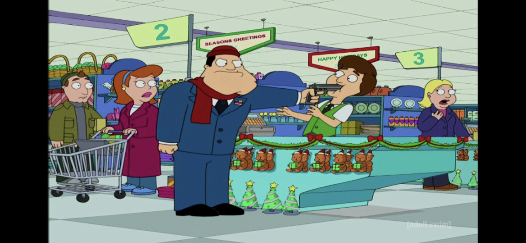
I bet you expected Stan to react this way to “Happy Holidays.”

Stan heads to the register and asks for one of the store’s wares. The clerk hands him a cassette of disco’s greatest hits from 1974-1980 and Stan deems this satisfactory. When the clerk tells him it costs $1.07 due to taxes, Stan suggests they change the store’s name, but the clerk points out that’s not his decision. Stan smiles and is satisfied with that response, but when he wishes the clerk a “Merry Christmas,” (you know where this is going) and gets a “Happy Holidays” in return his mood changes. Angry, he demands that the clerk acknowledge his holiday, but the same excuse about the sign is not enough to sway Stan this time. He pulls out a gun to demand action and we cut to Stan being tossed outside by security. When he calls back to remind them he had a gun, a gift-wrapped gun is tossed to him.

img_1110

Did you take note of that little person two pictures ago?!

At the Smith household, Stan is still visibly outraged by the “liberals” who are destroying Christmas. The family tries to reason with him, but he’s more than a little stubborn. Stan then rhetorically asks the family who is to blame for all of this, and they respond with exhaustion in their voices because this is something Stan must remind them of often, Jane Fonda. Apparently Stan blames Ms. Fonda for spreading liberal ideas through her protests against the war in Vietnam and it’s not something he’s about to let go of. A ring of the doorbell gets Stan’s hopes up momentarily as he thinks carolers have arrived. He opens the door to the costumed group, but finds out they’re only here to spread awareness of the Holiday Rapist and hold up a flier. This is the tipping point for Stan as he demands they refer to him as the Christmas Rapist. He slams the door and sets to destroying the festive decorations in the house, including tossing most of them through the living room window. Steve begins to cry that Daddy destroyed the toys Chinese kids made for him while Francine scolds Stan for his behavior. She tells him he’s sleeping on the couch tonight which Stan tries to protest by pointing out the now missing window and the presence of the Christmas Rapist on the loose.

img_1111

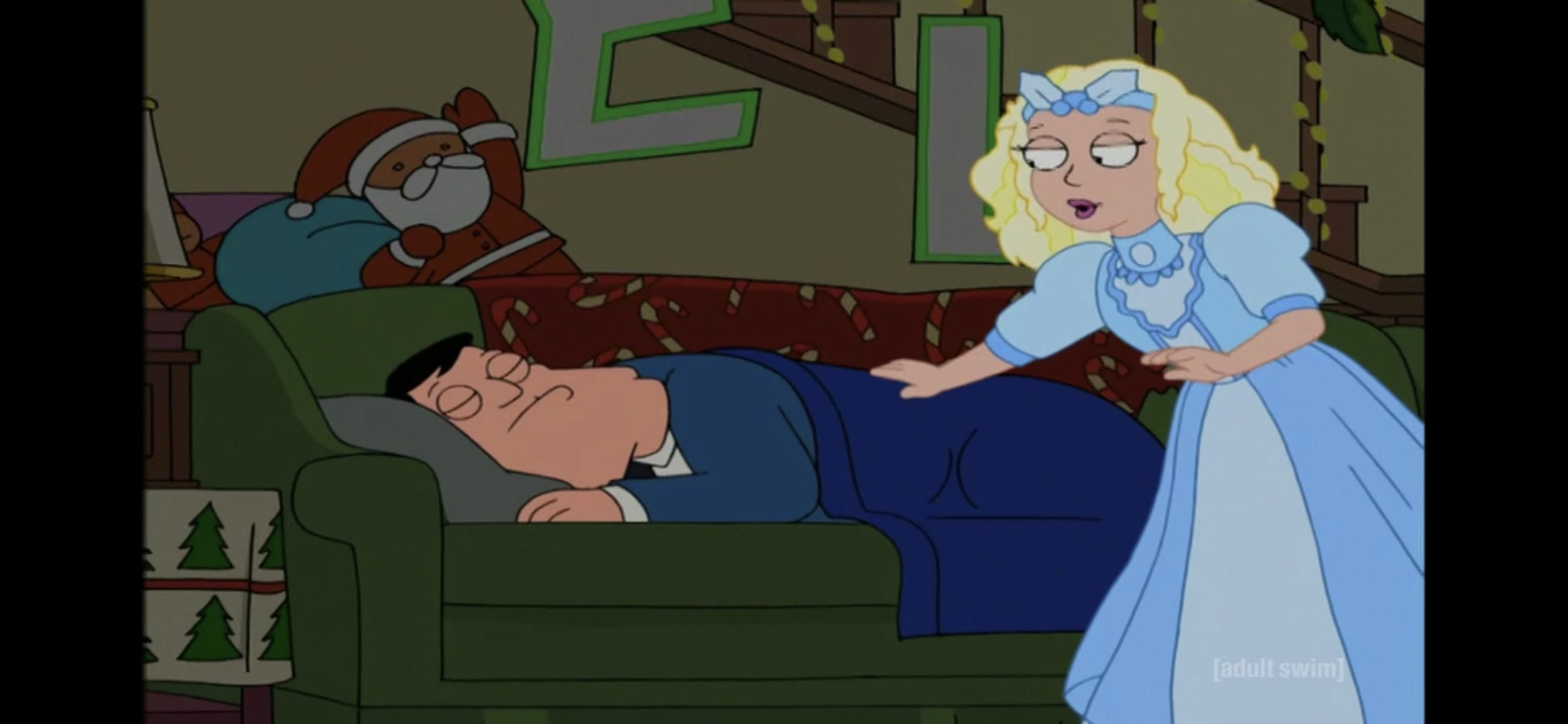
The Ghost of Christmas Past has been assigned Stan Smith this year. Unlike other ghosts, she apparently works alone on Christmas.

Stan is shown sleeping on the couch (in his suit, for some reason) looking a bit cold when a woman materializes beside him. She’s quite fairy-like I suppose, and when she wakes Stan he snaps open his eyes and shouts “Holiday Rapist!” and dives behind the couch before quickly correcting himself with “Christmas Rapist.” The woman then explains, in a faux British accent, that she’s the Ghost of Christmas Past (Lisa Kudrow) and she’s here to help Stan lean the true meaning of Christmas. He soon brightens up and the ghost takes him all the way back to 1970.

img_1112

The idyllic Christmas of Stan’s youth.

There the two peek into the Smith home where a young Stan is opening his Christmas presents. Stan is amazed that they’re really back in 1970 and the woman reassures him by mentioning how things are different. One of those mentions is Jane Fonda, who is presently filming to movie Klute nearby causing Stan’s eyes to narrow in a menacing fashion. He then takes off running, much to the bewilderment of the ghost, who just calls for him to come back, dropping the accent. When he doesn’t obey, she just starts grumbling to herself about how this is her first turn as Past and she already screwed it up. Apparently, she used to be a Tooth Fairy. She then reveals to us her name is Michelle, and mentions she should have just stayed with some guy named Chad.

img_1114

Jane Fonda on the set of Klute. Fonda, and the other celebrities of this episode, were offered to voice themselves, but all turned the show down. I bet they would have said “Yes,” to The Simpsons.

Stan is able to track down the filming location for Klute and watches as Jane Fonda (uncredited, but sounds like Wendy Schaal) is filmed feeding a cat, and then herself. She explains her decision to eat the cat food to the director which just irritates Stan even further. Stan is grossed out and remarks “You are so dead,” to himself.

img_1115

In order to find Stan, Michelle is going to need Francine’s help.

Back in the present, Michelle appears in Francine’s room and splashes her with water in order to wake her up. She explains to Francine what happened, and when Francine gets mad Michelle asks rhetorically if she blames mothers who lose their kids at the mall. When Francine gives her an “Are you serious?” look in response, Michelle answers the question emphatically herself with a, “No! No, you don’t!” Realizing what Stan is up to, Francine reluctantly drags herself out of bed and heads for the bathroom. When Michelle expresses her impatience, Francine tells her she isn’t going back to that filthy decade without some Purell.

img_1116

Stan makes an important discovery, and we find out Donald Sutherland is a real creep. Maybe that’s why he declined to voice himself.

Filming wraps for the day and Stan keeps close as Fonda retreats to her dressing room accompanied by Donald Sutherland (Chris Diamontopoulis). It’s while watching these two interact that Stan realizes it was Sutherland who put those liberal ideas into Fonda’s head. He then corrects himself that Fonda isn’t his target and that he must instead kill Donald Sutherland! Sutherland immediately confronts him as he was apparently standing beside Stan, but he’s a bit clueless and asks Stan if he’s here to give Fonda her massage. Stan decides that he is indeed here to do just that remarking that it would be rather nice to do so. Sutherland then leaves him to it and as Stan closes the door to Fonda’s dressing room we hear him announce his arrival and tells her to finish her cat food.

img_1117

Roger, about to make a life-changing discovery.

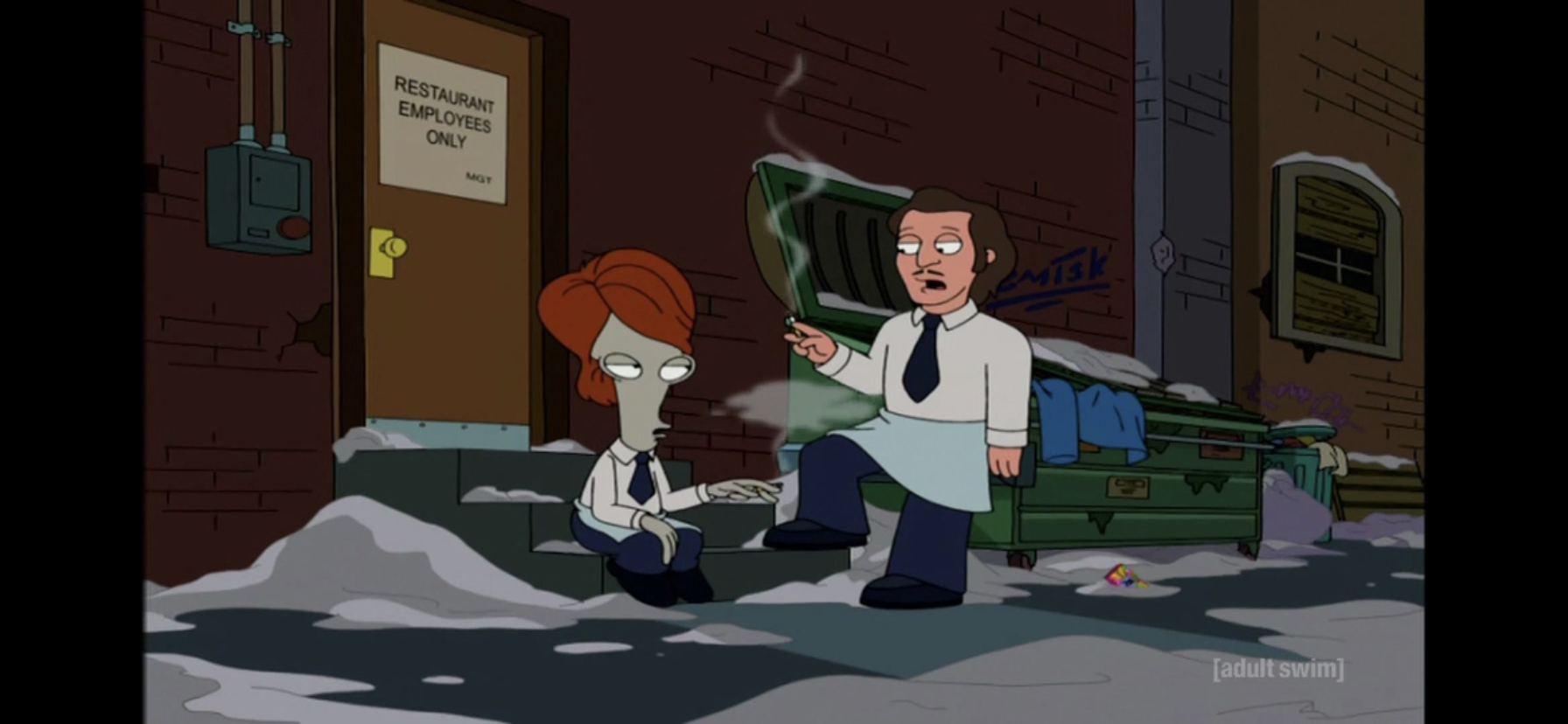
Stan then follows Sutherland and Fonda out to a restaurant, Elaine’s, but is prevented from entering since he’s not on the list. He then goes around the back to sneak in with the restaurant staff while stashing his gun in his pants. Once he disappears inside, we see some waiters come out for a smoke break. One of them is clearly Roger in disguise. When the other waiter asks if he got the part he tried out for he replies, “No, they were looking for someone more flesh-colored with a nose.” The other waiter tells him to give up on his dreams and leaves him. As Roger sits dejected, he notices something in the snow. It’s the disco tape that fell out of Stan’s jacket before he went inside. When Roger reads the title he announces it’s from the future! And since he’s an alien from outer space, he deems that plausible.

img_1118

The encounter that will doom Christmas.

At the restaurant, Stan is finishing up in a restroom when a hairy-looking dude emerges from a stall. Stan notices the man is smoking marijuana, and Stan admonishes him for doing so. The guy doesn’t seem bothered by it, and goes on to introduce himself as Marty, Marty Scorsese (Grimes). When Stan begins to gush and says he loves his films, Marty is shocked and assumes Stan has seen his film of a guy shaving. Stan is amused, but then assures him he’s going to be great, but that he’ll never win an Oscar if he’s hooked on drugs. Marty agrees, and starts humorously removing all of the drug paraphernalia on his person which includes many bags, joints, and even a bong in his pants. Stan is touched, and the two have a nice, men’s room, hug.

img_1119

The artists don’t usually get to draw dinosaurs so let’s throw ’em a bone!

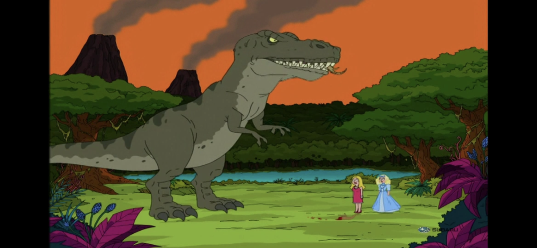
Meanwhile, Michelle has overshot her magic and taken Francine back to the Jurassic period. They observe some cute little dinosaurs running past before a T-Rex eats them causing the two to scream before Michelle gets them out of there. You can’t play around with time travel and not show a dinosaur at some point.

img_1120

Stan assuming his cool, assassin, pose.

Feeling quite satisfied, Stan returns to the task at hand:  killing Donald Sutherland. He spots Sutherland and Fonda having dinner and when Sutherland suggests Fonda get involved in politics, he offers to talk about them over a drink at “my place.” Stan counters as he pulls out his gun with, “Let’s talk about it over your brains. Maybe all over the place?” Before he can pull the trigger, and before anyone seems to notice him, Michelle and Francine appear and pull him aside. The two express their anger with Stan, and when Francine says they won’t allow him to kill Jane Fonda, Stan corrects them to point out he’s now targeting Sutherland, the lanky, Canadian, Kiefer-spawning bastard! That doesn’t matter much to Michelle and Francine as they’re not about to let Stan murder anyone and they quickly take him back to the present.

img_1121

Something clearly went wrong.

Or do they? When the trio arrive, they find the Smith living room looks different. It’s drab, with cinderblocks for furniture and Communist posters on the wall. When Francine calls out for Steve and Hayley, a Russian man comes down the stairs firing a shotgun at them. They quickly run out into the street and find the country is now under the dominion of the Russians! Michelle gets to turn all glowy and dramatic as she informs Stan that he destroyed America! Francine then pauses to pee beside a car as she’s been holding it in since the 70s.

img_1124

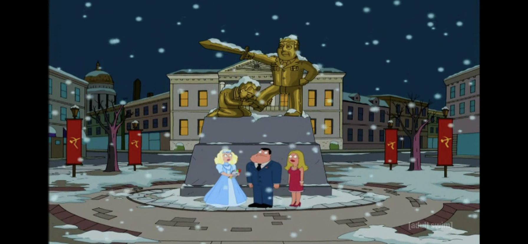
A monument commemorating the birth of this new, Russian, empire.

Michelle then does some sleuthing on some tablet she has to try and figure out what happened. She knows Stan did something, but he insists he did nothing that would change the past. She has him go over what he did while in 1970 and when he gets to the part about meeting Scorsese in the bathroom Michelle gets a hit. It seems by getting Scorsese off drugs, he never went on to make Taxi Driver. And since he didn’t make Taxi Driver, John Hinckley never became obsessed with actress Jodi Foster and thus never attempted to impress her by assassinating President Reagan. Since Reagan didn’t survive an assassination attempt, he lacked the good will to beat back Mondale in the presidential election of 1984 and upon becoming president, Mondale would hand the country over to Russia. Stan then realizes that in order to stop Russia from overtaking America, he needs to travel back to the past and film Taxi Driver. When Francine objects to point out how crazy that conclusion is, Michelle steps in to say Stan is right as she’s apparently just as crazy as he is.

img_1125

Roger and his precious tape.

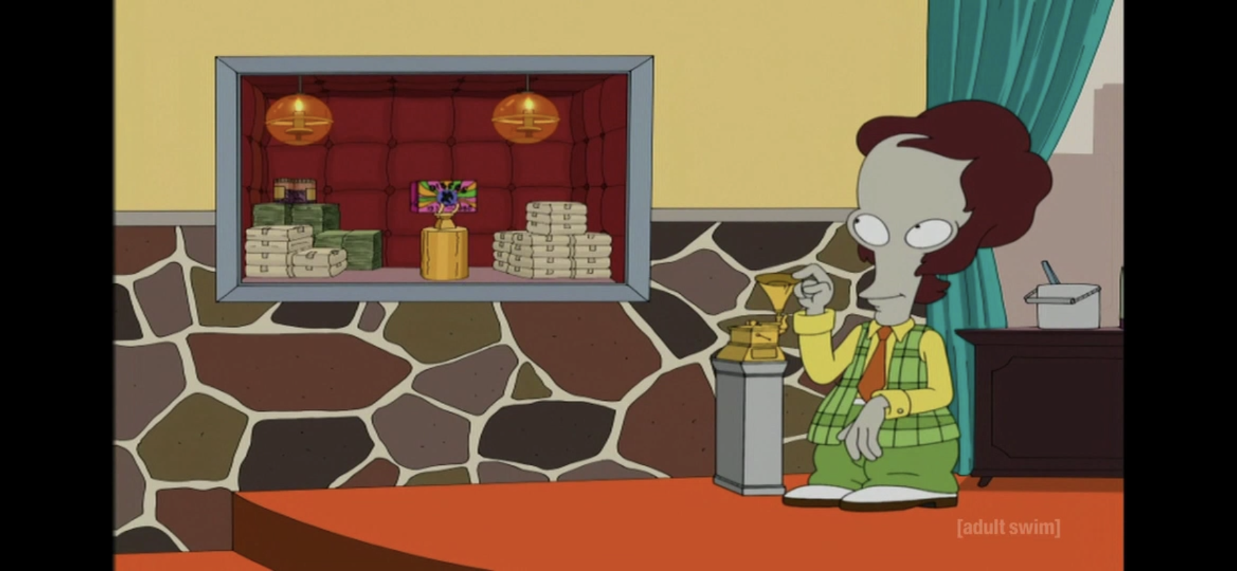
As those three set out to right Stan’s wrong, we check-in on Roger who’s about to make his first million selling disco songs to Clive Davis. He’s been milking that cassette he found like Biff from Back to the Future Part II and having a good time of it. He celebrates his fortune by heading to a nightclub and shouts at the sky for his mom to see him now! He then tells her to stop looking while he snorts some cocaine, and then tells her she can look again as he resumes dancing.

img_1126

Stan Smith is not a Robert DeNiro fan.

On the set of Taxi Driver, Stan is watching as Robert DeNiro (Diamantopoulis) rehearses. DeNiro is talking to himself in the mirror and Stan objects. He instructs DeNiro to talk at himself in the mirror and not at the mirror, which DeNiro finds absurd and quits. Francine is pissed at Stan for driving DeNiro away, but he assures her it’s fine since they only need Hinkley to fall for Jodi Foster. Michelle, once again, goes along with Stan who is now delighted he can make Taxi Driver with the leading man he thinks would be best:  John Wayne.

img_1127

Ever wonder what Taxi Driver would look like with John Wayne in the lead role?

At a showing of the finished film, Stan, Francine, and Michelle find John Hinckley in the audience and observe him watching the film’s climax. In it, Foster’s character is tied up and about to be set on fire by Native Americans doing an inflammatory dance routine. Wayne shows up in his cab and emerges, old and fat and with a mohawk under his traditional cowboy hat. He shoots all of the Native Americans and rescues Foster as a boom mic comes into the shot and knocks over a background, indicating they shot and edited this thing rather poorly. When it’s over, Francine immediately starts asking Hinckley what he thought and when Francine suggests that Foster was pretty hot he acts disgusted. Realizing their plan failed, Michelle identifies one last resort.

img_1129

Roger did not take Larry’s advice and switch off speaker phone.

In 1981, Regan is staying at the Hilton and he’s about to be shot. Only now, he’s not. Meanwhile, high above Roger is partying away when his phone rings. It’s someone named Larry, who informs Roger his last album only sold 90 copies and that disco is dead. He’s broke. Roger can’t believe it and when he asks how he could be broke when he has a bunch of investments and race horses, he then says “I thought you were feeding them?!” indicating there was some confusion over what to do with the race horses once purchased. Roger then tries to kill himself by jumping through the window of his penthouse, but that glass is pretty damn thick and he just gets knocked out.

img_1130

It’s time for Stan to get nuts!

At ground level, Michelle has spelled it out for Stan that in order to save Christmas (remember, this is a Christmas episode) he needs to shoot his idol, Ronald Reagan. Stan insists he can’t do it, but he’s reminded he needs to do it if he wants Christmas back. Stan reasons they could learn Russian and be happy, though he also laments he’ll probably miss a lot of elevators at first while he learns how to say “Hold the door,” in Russian. He then reminds Francine that they’ll be fine as long as they’re together as a family, indicating that maybe he has learned the true meaning of Christmas. Or at least one of them. Michelle then informs him there’s no guarantee Hayley and Steve exist now, and if he really wants to save Christmas and his family, he’s going to have to shoot Reagan. Stan reluctantly agrees, and when Michelle reminds him that he just has to “wing him” Stan laughs and thanks her for reminding him indicating that he was probably going to shoot to kill.

img_1131

If you’re doing A Christmas Carol, even loosely like this one, you still have to have this scene.

As Reagan is shown leaving the hotel. Stan makes his way through the crowd like a crazy person. He pulls out his gun and then starts shouting “Merry Christmas!” over and over as he opens fire. The screen goes white and then fades to reveal Stan and Francine asleep in their bed. Francine wakes up and immediately wakes Stan who runs to the window and opens it. He sees a paper boy outside who looks almost exactly like the kid on the cover of Paper Boy for the Nintendo Entertainment System. When he asks the kid what day it is, he responds that it’s Christmas and Stan then barks at him to get off his lawn!

img_1132

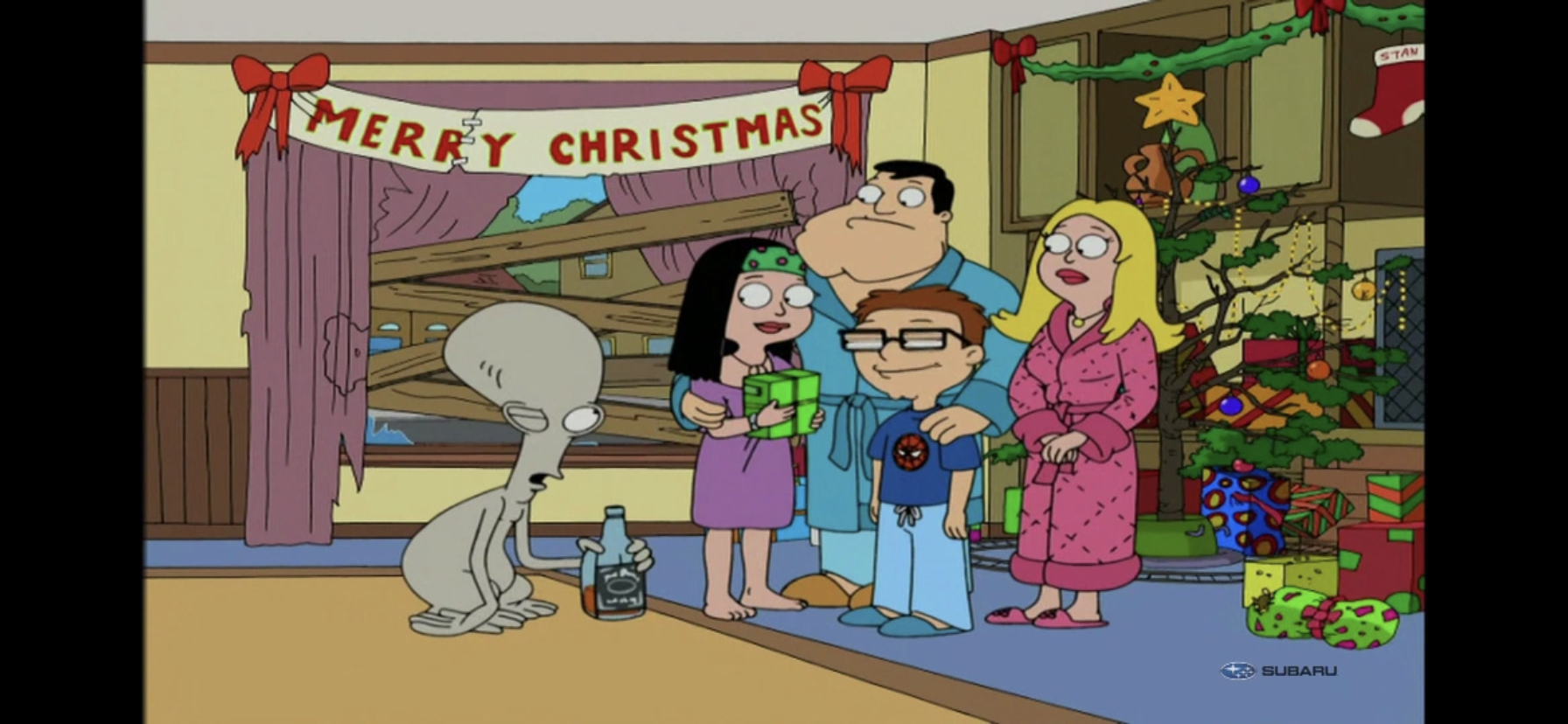
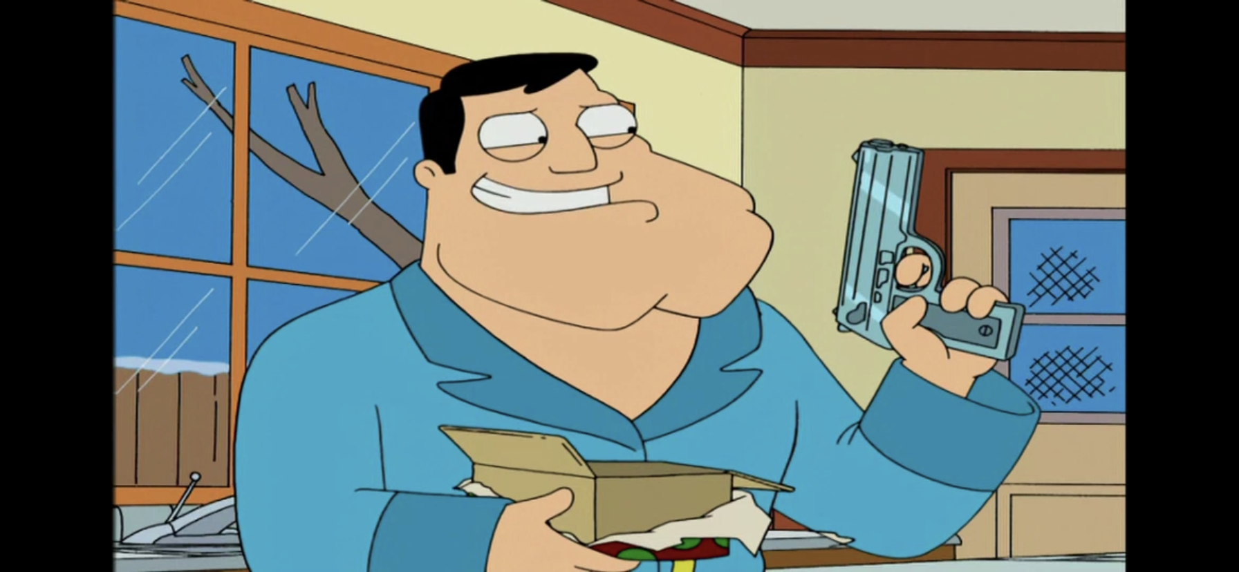
Stan mostly puts Christmas back together.

Downstairs, Stan has boarded up the broken window and re-setup the mangled tree. The gifts are re-wrapped and Hayley and Steve come down the stairs overjoyed to see that Christmas is back. Roger then comes into the room drunk explaining that Christmas reminds him how he created disco and then lost all of his money. The family laughs at him and then Stan is summoned into the kitchen by Michelle. There she thanks him for bailing her ass out by giving him a gift. He opens it to find a shiny, new, Glock. Michelle says she had just enough time to hit the mall last night for it, and when Stan questions how she got it so fast apparently bypassing the waiting period, she reminds him that he only shot Reagan. He never hit James Brady, and thus there was never passage of The Brady Bill which means guns are as easy to buy as a stick of gum. Stan is delighted and mugs for the camera with a “Best Christmas ever!”

img_1133

Roger no longer needs to be depressed that he hasn’t accomplished anything in his time on Earth, now he can lament that he lost his fortune when disco died. Also, his genitals are located near his armpit.

This is a pretty great early episode of American Dad! Stan is very much the conservative whack-job throughout and it’s obvious that the absurd War on Christmas notion is what drove the writers to craft this plot. It’s also possible they worked backward from the premise of what if Stan had to shoot his hero in order to save Christmas? The show is jam-packed with jokes as almost every sentence Stan utters is a joke of some kind. They’re just understated jokes, which is one of the main differences between American Dad! and Family Guy. Family Guy seems to rarely trust its audience with knowing what is and isn’t a joke and everything is practically screamed at the audience. American Dad! is far more confident, and while it does get absurd and thrust things into the forefront at times, it rarely feels obnoxious.

Since Stan is essentially an easy target, there are some jokes in this episode that could be considered easy, maybe even lazy. Even with those though, the show goes the extra mile to add a spin to make them seem less conventional. A perfect example is Stan’s argument with the clerk over his holiday greeting. The episode makes a point of demonstrating that Stan can be agreeable and even sympathetic to the plight of the working man who has to do as he’s commanded when the clerk makes the comment about not being able to change the name of the store from The 99 Cent Depot to The $1.07 Store to account for tax. Stan accepts that, but he can’t accept the kid saying “Happy Holidays” even though he’s directed to by his boss who can and probably will fire him for saying anything else. And because Stan’s a maniac, it has to escalate to Stan pulling a gun for added comedic effect.

img_1128

Coming up with a plot that involves Stan finding the true meaning of Christmas thus saving the holiday doesn’t take a ton of creativity. Having Stan replace John Hinckley Jr. as Reagan’s would-be assassin? Now that’s genius!

If the episode did begin with the premise of Stan shooting Reagan to save Christmas, then the writers also did a good job of making that happen. While American Dad! mostly behaves like a sitcom, it’s not afraid to get fantastical and do some crazy stuff. Granted, so many shows have done a variation of A Christmas Carol or It’s a Wonderful Life that weren’t particularly crazy, but it’s still quite a leap to have your characters time travel. This show will get way more fantastic in that regard, but this episode is largely able to rise above the notion of being an adaptation of that holiday classic without really feeling like one. Normally I hate to give time to anything that indulges in the trope, but American Dad! makes it work quite well.

img_1113

Lisa Kudrow is pretty wonderful as Michelle, The Ghost of Christmas Past. The show gives her a lot to work with and her personality meshes well with the character.

The only downside with this episode is that it’s actually pretty light on Christmas. It begins festive enough, but once we jump back in time it’s actually easy to forget that this is a Christmas episode of American Dad! It manages to hang onto its premise though and that’s Stan needing to learn the true meaning of Christmas, which the episode defines as basically family time. It’s actually a surprisingly warm conclusion for a show not afraid to do cynical or dark endings. Of course, there’s a touch of the show’s cynicism in the ending since Stan has created a world in which guns are even more accessible. This probably isn’t my favorite Christmas episode from this show, but it’s definitely a good measuring stick for all of them. And since I’ve managed to avoid American Dad! (not intentionally, it just happened that way) while doing this countdown for years now, you can safely assume it will return next year as there’s a lot more I can turn to.

img_1134

“Best Christmas ever!”

American Dad! currently airs on both TBS and Cartoon Network almost daily. As a result, you should have no problem finding an airing of this episode at some point this month, and probably more than once. And if cable isn’t your thing, the show is streaming on Hulu and also available on physical media and for digital purchase all over the place. This should be an easy one to find and it comes recommended.

Can’t wait until tomorrow for more Christmas? Check out what we had to say on this day last year and beyond:

Dec. 1 – DuckTales – “Last Christmas!”

It’s that time of year once again! Every day goods are a little pricier, egg nog is invading the dairy case at every grocery store, and red and green versions of every candy in existence flourish in the seasonal section of department stores. Yes, it is Christmas time and it would be obnoxious if it…

Keep reading

Dec. 1 – George & Junior’s Christmas Spectacular

Welcome to the inaugural post in this year’s edition of The Christmas Spot! We’re giving you a write-up each day in December as we march towards Christmas that will hopefully help give you a sense of that wonderful Christmas feeling. This year’s countdown is starting things off with a mostly forgotten short from 1995’s What…

Keep reading

Hasbro Lightning Collection Mighty Morphin Green Ranger

Go! Green Ranger! Go!

In the early days of the ongoing Covid-19 Pandemic I found myself filling the social hole in my heart with toys. That has continued, but in the earliest days I went backwards. I grabbed some toys that I had wanted as a kid, but never got, and I talked about them here. One such toy was the Bandai Dragonzord and Green Ranger from Mighty Morphin Power Rangers. Toys from the show were shockingly hard to come by in 1993 and beyond, and it was something I always wanted despite not really being a huge Power Rangers fan.

Another thing you should know about me is that I’m kind of anal when it comes to toys. Especially my own, and it seems to extend to toys my kids own. I treat my toys well, and as a kid, if I broke one it really ate me up inside. When I got those Power Rangers toys for myself, I also grabbed a Red Ranger and Pink Ranger for my son and daughter. Over the summer, my nephew visited and he wanted to play Power Rangers with my kids. He was nearly 4 at the time, but he’s notoriously mean to his toys. Still, I didn’t want to be the grumpy uncle so I let him play with my Green Ranger. I do not blame the 4 year old for what happened, I blame myself for allowing it to happen. Needless to say, I wouldn’t be telling you this if it was an uneventful play date. It was not, as when I went to put the Green Ranger away at the end of the day I found his head was flopping around. Somehow, the kids managed to break the housing for the neck joint that is in the figure’s chest. It’s an odd setup for head articulation, as I found when I opened the figure up. My attempts at repairing the break failed, so now I have a Green Ranger with a floppy head. Oh, joy.

“Hey man, sorry to hear about your neck.” “Thanks. It’s…it’s fine.”

Just as I was when I was a kid, the broken toy has bothered me ever since. It looks okay on a shelf, the head just sits a little lower than before, but it’s enough to make me want to replace it. Rather than replace it with a vintage toy though, I was able to score a recent release: the Hasbro Lightning Collection Green Ranger. This figure is sold everywhere, but a new packaging variant was released to Target this fall. It’s rather snazzy, though the figure is the same as the other versions out there. I was drawn to it because it’s a more show accurate version of the character. It has the gold armbands, dragon dagger, and black holster. And since it’s a great deal smaller than the vintage figure, it looks a little better beside the Dragonzord than the vintage figure, which is basically the same size as the zord. It’s still not even close to scale, but it is a bit more aesthetically pleasing.

Not a bad look for you mint-in-box collectors.
One blade just isn’t enough.

2020 has been a year for me to get reacquainted with Hasbro. Over the summer I bought a Peter Venkman, a Deadpool two-pack, and more recently a Soundwave from the Transformers RED line. The Green Ranger is definitely similar to the Deadpool I acquired earlier. The body may even be identical to that figure with different paint applications. The neck, torso, and legs especially look to be the same and the articulation is quite familiar at this point. This isn’t a bad thing as the figure differs where it needs to and this sculpt is able to pack-in a great deal of articulation while remaining pleasing to the eye.

Yup, that’s a Green Ranger all right.
You gotta be in shape to wear an outfit like this.

From an aesthetic point of view, the Green Ranger certainly looks the part. The figure is mostly green plastic with the feet and forearms cast in white plastic. The sculpt-work is quite nice. The helmet features all of the details I remember from the show while the gloves and boots contain detail I didn’t even know was there! That’s standard definition for you, but in looking at some pictures from the show today I was able to confirm that these details, like ribbed material across the knuckles, was indeed present in the show. Where things are less impressive is with the paint. The paint application to the gloves and boots is quite sloppy in places with the gold parts in particular. The helmet could have also used a bit more to give it less of a plastic look and the dragon’s teeth around the visor are all silver rather than silver teeth on white. There’s more slop around the morpher and there’s a green dot on the inside of the right foot that really stands out on the white of the boot. At least the paint on the golden shield is neat as that would have really stood out if it was sloppy. I ordered this guy online, but I wish I had run across it in-store so I could have looked a few over and found a better one, but maybe they’re all like this. I should also point out that the chest is unpainted. The shield doesn’t appear to be designed to be removed, but if you did the figure wouldn’t be show accurate as he’s missing the white diamond. Hasbro actually worked in a piece of white plastic in the butterfly joint to create the impression that the undershirt was accurate. It seems rather lazy on their part.

Insert Jason David Frank’s unmistakable “Suh-ya!”

The articulation on those old Bandai toys was pretty impressive for 1993, and isn’t even too bad by 2020 standards, but it doesn’t come close to matching what this guy can do. Nearly everything is articulated here. He can rotate at the head and look up and down as well. The arms can go all the way around and come out to 90 degrees. There’s a butterfly joint that works really well and is also hidden by the shield, which is a nice benefit of that piece. There’s a bicep swivel and double-jointed elbows that allow for a full curl. The wrist rotates and there’s a hinge as well. There’s a ball-joint in the diaphragm that allows Tommy to tilt and rotate with an ab crunch below that which allows him to go back a bit and forward pretty much all the way. Just watch out for the lower point of his shield. The legs can go forward, but not really back. There’s a thigh swivel, double-jointed knees, boot cut, and ankle hinges with ankle rockers. Really, the only things he lacks are a true waist swivel and a toe hinge, neither of which are really needed. The only thing I wish he had was a side-to-side hinge on at least one hand for wielding his sword or dagger. He can achieve a variety of poses though and is well-balanced so he can even do the old one foot kicking position.

I always did like that evil sword.
Now we’re having fun!
Here’s an image you can hear.

The Green Ranger comes with a few accessories. He has his trusty Dragon Dagger which fits into his holster and he’s able to hold just fine. He can’t quite get it to his “mouth,” but you can get him into poses where it looks like he’s at least getting ready to summon the Dragonzord. He can play it off to the side, but it doesn’t really look the part. He also has his evil sword, or Sword of Darkness, if I remember it correctly. It’s the sword he used when he was in the employ of Rita Repulsa. It’s a nasty looking, curved, blade with a tassel at the end that’s sculpted plastic. It looks cool and it gives him something else to wield aside from the dagger. There’s also a green lightning effect piece that can attach to it that looks pretty impressive. He also has two extra hands. He come with gripping hands in the box which work well for both weapons. The extra hands are a closed, left, fist and an open, pinching, right hand that’s probably meant to work with the dagger as the hand pressing the flute buttons. Lastly, he comes with an alternate, unmasked, head featuring Tommy with his long hair and green bandana. It looks fine, but I’m probably never going to use it. Both weapons are well-sculpted and the paint is fine on both of them, which is a relief considering the paint issues on the main figure. The paint on the alternate head also looks great and they even remembered his lone earring.

Hey! It worked!
He can also go unmasked if that’s your preference.

Fans of the Power Rangers seems pretty enthused about Hasbro’s Lightning Collection and it’s easy to see why based on this one figure. This figure really looks great, especially considering it retails for right around 20 bucks. I even scored this for less as Target had a promotion running at the time that I wasn’t able to use on the NECA products I had purchased. It’s a shame the paint wasn’t a little better, but that’s pretty much the only negative piece of criticism I have for this one. The sculpt is quite good and the articulation is fantastic. It may be hard to get him into a proper flute mode, but I honestly don’t know how Hasbro could have done better. Best of all though, is that this figure just hits the right nostalgia points. If I had this toy when I was 10 I would have been over the moon. Similarly, whenever I see him next to the Dragonzord I’m going to get that little rush of excitement. Like I said, I’m not a huge Power Rangers fan, but this figure makes me want to be. Wish me luck in suppressing that urge, for the sake of my wallet.


Transformers R.E.D. Generation 1 Soundwave

For today’s photos, red feels like an appropriate backdrop.

Full disclosure here: I’m not much of a Transformers guy. Transformers took off when I was a wee one and I kind of missed the boat. I had some friends and cousins really into it, and I even had a few myself that were gifted to me, but it was nothing I gravitated towards. And I say that as someone who very much enjoys the concept of toys that can switch between two modes of play – that’s just economical! I did get into the Generation 2 stuff a bit. I remember saving up, what was a lot of money at the time for a kid, to get the Generation 2 release of Optimus Prime, and I would also get a Megatron and a few others. It was a mostly passing fad as it basically occupied the brief period of time when I was transitioning from being a Teenage Mutant Ninja Turtles kid to one obsessed with the X-Men.

Since I didn’t grow up enamored with Transformers, I’ve very rarely dabbled in the collector scene for it. When I was younger and had my first post college job and more disposable income than I was used to, I did dabble in the Masterpiece line. I picked up the US release of Optimus Prime and I grabbed the Takara release of Megatron to pair with him. And that’s where I left the Transformers. It’s just too expensive a line for me to collect when I don’t have tremendous interest in it.

One character though that I have always had affection for is Soundwave. I feel like that’s fairly common as Soundwave is just so decidedly 80s in his design. He’s a tape deck that can turn into a robot, and better yet, he has tapes that transform into robotic, animal, sidekicks. He’s awesome, and there’s a part of me that has always wanted a kick ass Soundwave. Maybe I should have grabbed a Masterpiece version of the character or the G1 reissue from a few years ago. I didn’t, and instead I’ve turned my attention to the R.E.D. release of the character from Hasbro.

Walmart took special care to make sure this box got banged around before it got to me.

R.E.D. stands for Robotic Enhanced Design. It’s a bit of a controversial line in the Transformers collector community because these are Transformers that do not transform. What?! It doesn’t seem to make sense to have Transformers that literally do not do as their name suggests, but it’s also not a new concept. I remember seeing non-transforming Transformers released to stores not long after the Michael Bay films hit. Transformers are notoriously expensive, whether new or vintage, versus a standard action figure. It’s not at all surprising that Hasbro has sought to introduce cheaper versions to retail, especially as a whole new generation of kids got sucked in. I know I’m not eager to drop 30 bucks on a good Transformer for my kid when I don’t know how much play he’ll actually get from it. Plus, having a non-Transforming option means parents aren’t called upon to transform the toy every ten minutes.

The extra stuff gets its own panel, which is actually really helpful.

The difference with R.E.D. versus those other releases is that this one is not really aimed at casual fans, but collectors. That doesn’t mean casuals (like me) or even kids can’t enjoy them, but they’re definitely collector-focused. And the whole purpose is to produce robots that resemble their animated counterparts in a way that a transforming toy cannot. It’s not a secret that the old cartoon took a lot of liberties with the design of its characters. The show could have directly adapted the toys, but that probably would have resulted in character designs deemed too complex for animation, plus lesser robot designs could be improved for the aesthetics of the show. And now, collectors who grew up on that show can add some Transformers to their display that reflect the robot look of that cartoon. And honestly, from a collector’s point of view, it doesn’t feel that controversial a move considering the vast majority of collectors are going to display their toys in robot form anyway.

Hooray for product shots!

Even though my affection for Soundwave is deeply rooted in the fact that he could transform into a 1980s styled boom box, I still find the robot form immensely satisfying. And since the R.E.D. line retails for less than $20, I decided to take the plunge and add a Soundwave to my toy collection. The line comes housed in an attractive, red, window box. It’s shaped like a trapezoid with the figure in the center and off to the side is a window for the accessories, which are in their own, separate, tray. First of all, I think some may be taken by surprise at the size of the figures in this line. Soundwave stands pretty much right at 6″, which is pretty small for a Transformer. This line is likely designed to scale with itself, but it also feels like a typical size for a Hasbro action figure release. And it even feels like one as far as articulation and accessories go, which I’ll get to in a moment. If you’re a dedicated Transformers collector looking to mix and match your display with these guys and traditional G1 or Masterpiece figures, then you might be disappointed.

Meet your new friend, The Cannon.
Hasbro saved some sculpt-work for the rear of the figure, including that (non-functioning) volume slider.
You can see how high the head sits from the side, which is great for articulation.

Considering the primary goal of this line is really the aesthetics, I have to say Hasbro pretty much nailed this one. Soundwave looks like he stepped out of the old cartoon and onto my shelf. The paint is clean and vibrant and the physical structure of the character looks pretty good. I could maybe nitpick the broadness of the shoulders, but considering I’m not a big Transformers fan that feels unnecessary. He looks great to me, and I assume most will be quite satisfied with how this guy looks. My only criticism of how this figure looks is that he could have benefited from a bit more paint. The head is a little plain and something to bring out the facial details would have added some more “pop” to the look. There’s a little bit of paint slop here and there, but relegated to minor dots and blemishes. You can also see some residual plastic from the mold extraction process, but thankfully those blemishes are mostly found on the rear of the figure.

The other advantage to this design is that Hasbro can cram in quite a bit of articulation without worrying about the transforming function. First off, the cannon that mounts on his shoulder is prone to popping off. This isn’t a huge deal for a collector, but if you were thinking of this for a kid know that cannon is going to annoy someone who wants to play with this. For posing, I recommend not fighting it and just popping it off, pose your figure, then replace. Soundwave’s head is on a ball joint and rotates fine, but the cannon gets in the way a bit. He can look way up as Hasbro has the head seated pretty high, and he even looks down a little bit with some side-to-side tilt. The shoulders are also ball-jointed, but the blocky-ness poses a problem. There’s a butterfly joint, but it just can’t do much because of the chest. Hasbro clearly didn’t want to break up the chest with any articulation, and there is a reason for that beyond aesthetics, and it is an issue, but honestly it’s actually less an issue than one would expect just looking at this guy. The elbows are double-jointed and he can go way past 90 degrees as he can come up and touch his own shoulder. There’s a bicep swivel and the hands are on ball-hinges with swivel action. You can keep them recessed in his forearm or pop the ball-joint out of the socket slightly for additional range of motion. There is a waist swivel and the legs can go out and to the side. There is a thigh swivel and the knees are double-jointed and he can bend as far back as a Yoga instructor. The feet are also ball-jointed and can rotate all around and have an overall fantastic range of motion.

“I feel empty inside…”
“I now feel complete”

The final piece of articulation is in that chest. Soundwave may not be able to transform, but he still has a functioning tape deck. There’s a button near his head that causes the tape deck to pop open and he even comes with a non-transforming tape to insert. Honestly, this was the capper for me on this figure as if he couldn’t do that I would have passed. Since he can though, we’re all good! The eject function isn’t very strong on mine and it basically just cracks open enough to slip a fingernail behind it, but it works well enough. Overall, considering how blocky he is, I am really impressed with the amount of articulation Hasbro crammed into this guy. The only thing that’s unfortunate is that cannon, and I don’t even know why they made it removable considering he has no need to transform. They could have put it on a ball-joint and called it a day, but I guess that was just too much money to spend on one toy. He feels really nice to hold with solid weight. Nothing feels fragile. There is potential to damage the figure though via his articulation. The crotch piece, where the leg is affixed to the figure, has a sharp edge and when I was messing around with the figure it actually scraped my figure’s right thigh, essentially removing a tiny chunk right on the corner of the thigh piece. There’s a little mark on the other thigh as well so I must have done the same there without noticing. It’s something to be wary of though.

Not a lot is included, but I’d say he at least comes with the essentials.
Other robots assemble!
Wait! You’re not a real robot!

In addition to the figure looking great, the accessories do as well. Especially the tape which is fully sculpted and painted and looks great whether it’s in Soundwave’s chest or out. It’s his coolest accessory, but the not the only one. In addition to the fists he comes packaged with, Soundwave also has two additional hands. One is designed to work with his eject button to make it look like he’s about to summon one of his robot minions, while the other is a simple trigger finger. That one works with Soundwave’s blaster which also looks sharp. It’s well-sculpted and has the right amount of paint on it to really make it stand out. The hands are easily removable, though I had trouble getting Soundwave to hold his gun. I ended up heating up the hand to get him to grip it, as it just had little to no give and I didn’t want to scrape up the plastic. And now that I have the gun in his hand, I do not plan to remove it. It’s a solid assortment of accessories, though some may have preferred an open hand option. I do wish we got a transformed Laserbeak as well to pose on his shoulder, though that probably would have tilted the costs beyond what Hasbro wanted.

Modern day Hasbro All-Stars.

If I am only going to own one Soundwave, I feel like this figure scratches that itch. There will always be a part of me that desires a transforming version of the character, but I’d definitely display him in his robot form anyway so this will do. I just love how he turned out from a visual standpoint. There’s a nice balance to the molded plastic and painted parts and he’s just really fun to look at. Maybe a little bit of shading, especially on the head, could have brought an even greater level of detail, but this is fine. If you’re not philosophically opposed to non-transforming Transformers, then I think this will make you happy. The only real negative is that stupid cannon, but I suppose I could glue it in. And the only other impediment is the scale, but that only matters if you intend to place this figure alongside other, non-R.E.D. Transformers. For me, this is great and I think I’ll keep him beside my Weltall figure which complements him well. If you want to snag one of your own, your only option right now is Walmart. Yeah, I know, I prefer not to shop there (especially during a pandemic), but he has regularly been in stock online if that helps. For 20 bucks, I say grab him now if you’re even slightly interested and return him if it ends up not being your thing, but I think most who do take the plunge will be pretty happy with the end result.

You probably shouldn’t pick a fight with him, Soundwave.

S.H. Figuarts Dragon Ball Kame-Sennin (Master Roshi)

The legendary martial arts master has arrived!

Collecting certainly has a gambling component to it. Sometimes, when a new action figure is released it can pay off to wait a bit and see if the price comes down or a retailer has a sale. Other times, that strategy can completely backfire. Such was the case with the S.H. Figuarts release of Kame-Sennin, better known to westerners as Master Roshi from Dragon Ball. A couple of years ago I started my Dragon Ball figure collection with a Goku from this line. Seeing how readily available he continued to be gave me confidence that a character like Master Roshi, a less popular though still much beloved figure from the anime, would play out the same way. It did not. Maybe Bandai had less confidence in the figure than it does some others, or maybe it had something to do with western distribution seemingly picking up after the figure’s release, but this guy came and went pretty fast. Subsequent figures have not, and I scored several this past summer on a sale, but Master Roshi was seemingly lost.

Well, I finally gave up. When Bandai released a Jackie Chun figure, which is basically Master Roshi in black and with a wig in place of his glasses, I figured that closed the door on a re-release. And thus I was forced to turn to the secondary market. To lessen the blow, I actually sold some figures from my collection that weren’t going to see a shelf which essentially paid for this one, but it still stings to know I could have had this figure for considerably less had I acted sooner. Is there a lesson here or did I simply just play the game and have it go against me? If there is one, it’s simply make sure you get the figures you don’t want to live without. I can have a Dragon Ball collection without a kid Chi Chi and be content, or without a version of Bulma that only appeared in the show’s ending credits. I cannot have one without Master Roshi though.

Master Roshi comes well equipped to add some sizzle to your display.

For this figure, Bandai opted to present Master Roshi in his somewhat official outfit: his orange and blue martial arts uniform. He has quite a few different looks in the manga and anime that are a bit more casual, and if I’m being honest that’s how I tend to picture him in my head, but by going in this direction it gives the figure a bit more versatility. You can go for a comic pose, pose him with his shell, or display him ready for a fight. He can’t do his bulked up Kamehameha pose, but that’s to be expected as it basically requires a whole new sculpt. The figure stands right around the 5 and a half inch mark which allows him to scale pretty well with the rest of the line. His trademarked red and green sunglasses are removable and fit on both of his heads and they rest well on the figure. The orange and blue are both plenty vibrant and it’s mostly just colored plastic. There’s no real paint flourishes on display here which is par for the course. Bandai certainly could have opted for something here to bring out the folds in the shirt, but it’s really not supposed to possess many as it hangs long and loose on the character in the show. I think it looks fine, but I know some others out there wish there was a little more flair to these figures as far as paint is concerned.

Note the plug inserted into the figure’s back to fill the peg hold needed for the turtle shell.

Master Roshi comes loaded with the usual assortment of articulation. It’s certainly needed to get him into various martial arts poses, but with this figure the articulation does detract some from the sculpt. The issue lies with the shirt which is very large relative to the figure. Bandai obviously felt it couldn’t do something like a soft rubber piece over an articulated figure and have it work, and they’re probably right. Instead, a lot of the joints have to be baked into the shirt and it does give it this choppy, scalloped, look. It’s unfortunate as it’s a bit of an eyesore, but ultimately, I think Bandai made the right call since the alternative would be to have very little articulation in the torso and arms. Perhaps soft goods could have been utilized, but that would have been just as, if not more, controversial a choice. The only area of the sculpt that does sort of bother me resides in the character’s elbows. There’s a big, circular, component that just jumps out and looks unnatural. The good thing is, simply posing him with bent elbows largely conceals this. Roshi does have a peg hole on his back to keep his shell sturdy, but if you don’t want to display him with that on, Bandai provided a little, orange, peg to fit into that hole to cover it up. Considering the hole is on the figure’s back, this really wasn’t something Bandai had to do, but it’s pretty cool that it did.

The old man can still move.
Though this requires little in the way of dexterity.

Master Roshi’s shirt may look a bit odd, but at least it does deliver in making this figure fully articulated. His head has the usual range of motion expected of this line. He can look up, but not down much as his beard hinders him a bit. There’s a joint at the base of the neck, but the head moves so smoothly that it’s hard to move the neck without taking the head off completely. The shoulders have terrific range and are also butterfly-jointed with that part of the articulation being completely hidden by the shirt which is pretty cool. There’s a bicept swivel and the elbows are single-jointed with his hands are on ball joints. They are buried a little in the sleeves so the range might not be as great as other figures in this line, but it’s fine. In the torso there’s a lot going on with upper torso articulation and waist articulation. The upper torso basically just allows him to pivot a bit without full rotation. The waist is similar though you could probably get him to turn all the way around if you were determined, but I wouldn’t advise it. The legs are on ball joints and swivel just below that joint. He has double-jointed knees and terrific range at the ankle with rotation and rocker action. Lastly, we have the toe hinge for when he needs to get a little taller, maybe to sneak his perverted, old, man eyes over a window sill or something.

It really is a nice looking shell.
Can’t forget about the Dragon Ball!

Master Roshi has a solid assortment of accessories and interchangeable parts. For starters, he has an optional head that’s basically his pervert face. It works with or without his glasses and it’s not hard to imagine many fans posing him in such a position. Only thing missing is a way to make it look like his nose is gushing blood. You can also swap the bearded portion on each head in effect doubling your range of available expressions. He also has five sets of hands to go along with the fists he comes packaged with. He has gripping hands for his staff, a set of pointing/pinching hands, a set of martial arts styled hands, an open left gripping hand for use with the Dragon Ball, a left hand making a “peace” symbol, a relaxed open palm left hand, and a firm open palm right hand. He has his trusty staff or cudgel and his three-star Dragon Ball. And then, of course, he has his big old turtle shell. It clips into his back and it also has straps that can pop in to make it look like it’s something the character simply slipped his arms through. The peg on the back of the figure makes it sit nice and I really like the sculpt of this thing. It has that very “Dragon Ball” look to it as far as the texture goes with lots of line work and I do enjoy the almost lilac color it has. Bandai even saw fit to make the middle panel of the shell removable so you can still use the action stand with the figure, whether he’s wearing the shell or not. Lastly, Bandai included an action stand for him which is always appreciated. It’s a real nice allotment of stuff that Master Roshi comes packed with. If anything is missing, I guess it would be Turtle? That’s probably asking too much though since he would require quite a bit of plastic. The only other obvious omission is the lack of Kamehameha style hands. I guess Bandai didn’t see the point since he can’t bulk up, or maybe they figured they’d include those hands with the Jackie Chun release. I can’t say I miss them since I wouldn’t pose him like that, but I can see that being a disappointment for some. Especially Dragon Ball Z collectors who may have wanted to line up all of the Z fighters performing Master Roshi’s signature technique.

Look who decided to join the party.
Of course, we have to bring in Goku too. These three look pretty great together.

Making use of Roshi’s accessories is not quite as smooth as it is with other figures. His head pops on and off just fine, though you do have to make sure the ball-joint is orientated properly. The hands are a bit trickier though. The cuffs of the shirt mean the pegs are recessed and they want to move all over the place when pressing a hand onto them. I don’t feel like I’m ever in danger of breaking anything, but it is annoying. The straps on the shell are also a bit troublesome. I find it’s easier to insert the top peg first on each strap before putting it on Roshi’s back. Then you have to kind of finesse the bottom pegs into their respective hole. It at least doesn’t need to be real snug, but if you don’t have patience for such things it could drive you mad. Once you have the setup you want, the hands at least all function the way they should. He can hold his staff with either gripping hand with no problem and the Dragon Ball rests in the open hand just fine. He also stands well with or without the shell on his back making the action stand Bandai included feel unnecessary which can free it up for another figure in your display, should you desire such.

I am so sorry, Bulma.
Maybe I should look into acquiring Lunch so he has someone of-age to menace.

Master Roshi fits in well with the other Dragon Ball releases so far. I maintain that the kid versions of Goku and Krillin are a bit too big, but it doesn’t stand out as much with Master Roshi as it does with Bulma. She’s still the odd one of the bunch though as she should probably be taller than Master Roshi, but instead she’s pretty close in height. It almost looks like he’s designed to scale to Goku and Krillin, with Bulma and the others scaling better with each other. The only other disappointing aspect of the display is just in the choice of attire. Roshi mostly wore this get-up during the training sequences where Krillin wore his yellow gi and Goku sported his blue pants and white tank top look. By the time the two get their Turtle School gi, they’re at the World Martial Arts Tournament where Roshi is in a formal, black, suit. Oh well. I’m definitely glad this version isn’t in the black suit, but I am still partial to his beach bum look when Goku and Bulma first meet the old man.

Yes, I realize I need a dedicated shelf for my Dragon Ball guys.

Acquiring this figure of Master Roshi more or less finishes off my humble Dragon Ball collection from Bandai. The only other figures released in the line include an alternate version of Bulma, Jackie Chun, Lunch, and kid Chi Chi. I don’t really feel a need to grab any of those, though if Jackie and Lunch ever make it to a sale I could be persuaded. The big omission so far is a Dragon Ball version of Yamcha and I would like to have him. Tien, Chiaotzu, Grandpa Gohan, Adult Goku, and Piccolo Jr. would all be intriguing as well. And if they could get an Oolong into one of those releases that would also be great. At least with Master Roshi in the fold I no longer feel like I have a major hole in my collection. He looks awesome and he really is one of my favorite characters from the show. Hopefully he won’t be my last acquisition from this line.


S.H. Figuarts Dragon Ball Z Yamcha

Look out boys, here comes Yamcha!

Today’s action figure review comes courtesy of online retailer Big Bad Toy Store. No, I have not hit the “big time” where I’m getting freebies for review. Rather, BBTS had a Twitter give-away for an action figure and yours truly happened to be selected. Which is pretty cool, so thanks go out to Big Bad for the hook-up because otherwise I would likely have never had the chance to talk about this figure.

Gotta love that window box packaging.
There aren’t many characters who get featured as a corpse as part of their own product shots.

Yamcha comes straight from the anime Dragon Ball Z. I have reviewed a few of the figures from S.H. Figuarts in the Dragon Ball line, but I’ve largely avoided Dragon Ball Z. That’s because I only have room (and money) for one high-end anime property and if I had to choose I’m taking Dragon Ball over Dragon Ball Z. If I were to reverse course though, and maybe one day I will, I’d probably prioritize the earlier episodes of DBZ like the Saiyan Saga, which is where this figure comes from.

What’s this guy have to smile about?!
I wonder what shampoo he uses?

Yamcha is basically known to the fanbase as the punching bag of DBZ. He’s routinely one of the least powerful warriors and his most famous pose is lying dead in a crater. He makes himself an easy target because he’s often brash and quite arrogant, only to wind up getting his ass handed to him. He’s so bad that I even tried to make referring to someone as a “Yamcha” an insult amongst my friends back in my high school days, but I never really got the phrase over. Yamcha would change in later arcs and in Dragon Ball Super he became more self aware of his lot in life. This has made him actually endearing, to a degree, to the point where Yamcha may be able to refer to himself unironically as a fan favorite these days. After all, being outclassed by Goku is hardly meaningful anymore since virtually no one from those early episodes can hope to stand with him.

Now we’re getting serious.
Here comes the “dreaded” Wolf Fang Fist!

As mentioned earlier, this figure comes from the Saiyan Saga of DBZ so it depicts Yamcha in his orange Turtle School gi complete with big hair. He’s right at the six inch mark which I assume is pretty much average for the line and leaves him about 3/4 of an inch taller than the Vegeta from the same line (not factoring in Vegeta’s giant hair). It’s hard to say what Yamcha’s most popular look is since he’s one of the characters who seems to always change his look, but this one is certainly right up there. He maintained this look through the Frieza Saga before switching to an awful bowl cut that thankfully didn’t last long. It’s a simple look though and I suspect there’s a lot of parts reuse in this figure as he’s essentially Goku. I can’t confirm that though because I don’t have a Goku. The only real difference between he and Goku are the shoes and the lack of a blue undershirt, because Yamcha is first and foremost out to attract the ladies. The more skin showing the better.

I’m more of an energy blast guy, myself.
Solar Flare or “hands up?” Yamcha is not above backing down from a fight.

The S.H. Figuarts line from Bandai is known for its high quality and abundance of articulation. Yamcha is no exception as there’s very little he can’t do as far as posing goes. His joints are all nice and tight with none being too tight so he has no trouble holding a pose. His head sits on a ball joint with surprising range of motion considering the giant hair behind him. The hair keeps him from looking up, but he can do pretty much anything else. There’s a hinge in the middle of his hair if you want to make his hair more billowy than usual, though it doesn’t do much to free up the head any further. He has a joint at the base of his neck that honestly isn’t really needed since he can look pretty far down without engaging it. The shoulders are ball-jointed with butterfly joints as well to allow him to reach across his chest and form a proper Kamehameha pose. The bicep swivels and the elbows are double-jointed. The hands are on ball-pegs with hinges in them so they can rotate and turn in and out. There’s an upper torso joint under the gi that provides for tilt and rotation there as well as another ball-joint at the waist. The legs can go out, forward, and back pretty much without restriction and swivel there as well. The knees are double-jointed and the feet are on ball pegs. There’s a toe hinge and articulation at the knot in his belt, for good measure.

Yamcha with his former lover and the guy she left him for.

Were Bandai leaves itself open for criticism with this line is in the amount of articulation taking away from the sculpt. With Yamcha, it’s not much of an issue because the gi lends itself well to hiding articulation. It’s a flowing, roomy, garment with lots of folds to stash stuff in. Contrast this with Vegeta who is often in skin-tight outfits where the various seems and breaks in the sculpt really stand out. There are still odd parts where things look messy, like the crotch and mid-torso. The sleeves of the gi are also pegged into his shoulders and not attached to the main part of the uniform which is rather odd looking. The other frequent complaint I see is the lack of paint, and there, Yamcha isn’t much of an exception. Bandai sticks with colored plastic for the most part and almost never applies a wash or anything to bring out some of the detail. This figure though does have a wash applied to the sides of the pants, chest, crotch, and sleeves. I’m torn on if I prefer this look to what I’ve seen more recently in the Dragon Ball figures. Kid Goku, Krillin, and even Tao have really no wash applied to them and look mostly fine to me. The effect here does work in certain lighting and poses, though in others it stands out more than I’d like.

I had to…

Yamcha comes packed with an assortment of facial expression and hands to complete his look. He has four distinct expressions for you to choose from, and swapping is simple and effortless. The bangs of his hair pops off to gain access to the face plate and the seems left behind are minimal. For expressions, Yamcha has a cocky grin, an open mouthed yell, a teeth-gritting face, and a stern face. If this were a Dragon Ball version of the character I’d want a frightened/shocked look, or a love-struck one for when he encounters Bulma, but for a Saiyan Saga Yamcha this is a strong assortment. He also has four sets of hands: closed fists, wide open palms, Kamehameha open hands, and martial arts pose hands. There’s some room for criticism in this area as Yamcha really doesn’t need the wide open, Solar Flare, styled hands. What he could really use are pointing hands for his Spirit Ball technique. The Kamehameha hands and martial arts pose hands give him enough range for his other signature maneuvers though, the Kamehameha and Wolf Fang Fist.

He actually he let himself get killed by this!
There is some nice sculpting going on here.

Lastly, Yamcha comes with one other important accessory: the Saibaman. This little green guy is notoriously the one who killed Yamcha. Or rather, it was a Saibaman who felled him and left him dead in a crater and that creature was not distinct from any other Saibaman. This little guy stands a shade under 3″ and is positioned in a permanent crouch. He’s largely colored plastic with very little paint but has quite a bit of sculpting details all over. The eyes and claws on the hands and feet are basically the only parts painted. He’s at least cast in two shades of green so he more or less looks the part, but really could have used a paint wash to bring out the grooves in the skin and the veins in the head. He’s minimally articulated and it’s largely a what you see is what you get affair. His head can rotate side-to-side a bit and the arms rotate at the shoulders on simple pegs. Oddly, the right wrist is on a peg and can rotate, but the left does not. What he’s missing is articulation at the leg, because with a simple swivel there he’d be able to really grab onto Yamcha for his self-destruct attack. Instead, if you want to attempt that you basically need to make Yamcha hug the little alien, which looks a bit silly. This makes the accessory something to pose opposite Yamcha like the two are about to face-off. It’s not nothing, but it’s a shame Bandai didn’t sink a few extra pennies into the sculpt to make it really work. Though if we’re on the subject of small changes that could have made a big difference, I wish instead of the standard one-color backdrop in the box that Bandai had printed the infamous crater instead!

Seriously, Yamcha! This should be a freakin’ mismatch!
Well, looks like this one is over.

There’s room for nitpicks with this release, but at the end of the day this is easily the best Yamcha figure ever made and likely will ever be made, at least as far as the Saiyan Saga is concerned. It’s another high quality release from Bandai via the SH Figuarts brand. There are very few poses he can’t pull off and the screen accuracy aspect is fantastic. Sure, the Saibaman is essentially a foot note for the release, but it’s not as if Yamcha is missing anything. Sure, some might have preferred another energy wave accessory, but this is fine. Though I’m guessing there are some diehard collectors out there rooting for a proper stand-alone Saibaman figure. Until that happens, this will have to do. If you ever wanted to add Yamcha to your collection, it would be hard to pass on this one.


Boss Fight Studio Captain Mimi LaFloo

After a disappointing 2019 for Bucky O’Hare, 2020 has managed to be far more kind. No new figures were released last year, but this year has seen three new releases in the line including two new sculpts. I know 2020 has been a rather lackluster year, to say the least, so we need to take our wins where we can. Closing out the year for the Bucky O’Hare line is Captain Mimi LaFloo. She is just the second figure in the line to not be featured in the vintage Hasbro line of action figures from the early 90s. And unlike First Mate Jenny, she was never even planned for that line making her about as new a thing as any figure can get for this line.

I love the blister art on these things.

Fans of the cartoon series Bucky O’Hare and the Toad Wars should be familiar with Mimi. She debuted in the third episode of the series, “Home, Swampy, Home” which was my pick for best episode in the entire run. She returned in the “The Artificers of Aldebaran” as a full-fledged captain of her own ship, The Screaming Mimi, though she still had yet to hire a crew (funds are notoriously tight for the mammal frigates). Even though she originated with the cartoon, she is still depicted here in her Continuity Comics colors in her captain’s uniform. It’s not that drastic a change and really the outfit just features more color and detail when compared with her cartoon counterpart.

You may be wondering how Mimi is #12. Not pictured: Bruiser(#10), CC Dead-Eye (#6), Holiday Bucky(#8). That leaves the count one off (#9), which possibly refers to the unreleased Stealth Dead-Eye. There’s also an unreleased Aniverse Bucky.

When Mimi was announced as the next figure, a lot of chatter I saw online surrounding the announcement was surprise, with a tinge of disappointment. Sure, Mimi isn’t part of the main crew like Blinky and Willy, nor is she one of the heavy hitters on the villain’s side like Toadborg and Al Negator, but she really was one of the best characters to come out of that vintage cartoon. She’s a strong-willed fighter and takes orders from no one, and since she’s basically the only female other than Jenny to receive much air time it’s not that surprising a company like Boss Fight Studio, which strives for diversity with its toys, would be drawn to her. I actually had her fairly high on my wants list when I broached the subject a while back, so while I shared in the surprise that some of my fellow collectors exhibited, I was certainly not dismayed. Plus, I think it’s exciting to see Boss Fight step outside of the Hasbro comfort zone with this property.

Mimi arrives on the standard, resealable, blister card Boss Fight is known for with artwork provided by Continuity Comics to go along with a character bio on the reverse. She stands a tick over the 4″ mark, nearly 4 1/2″ including the ears, and comes bundled with the usual assortment of accessories. She comes out of the package sporting a smile which can be swapped out in favor of one of two extra faceplates: an open mouthed winking expression and a smile with exposed teeth. She has two trigger finger hands to go along with two pistols featuring a sculpt unique to her as well as a set of fists and a set of open hands. The pistols are the same shiny, metallic, silver we’ve seen with the other figures and fit easily in her hands. Her card art seems to depict her with a pistol and a small shotgun-like blaster that is unfortunately not a part of the figure’s loadout. She also has little nubs on her belts to holster the weapons. Lastly, she has a removable hat that’s designed to sit at an angle over one ear. There’s molded plastic inside the hat to fit over an ear as opposed to just hanging or resting on her head. You can even adjust the positioning a bit to sit higher or lower, though you can’t fit the hat in between her ears if you wish her to look a bit more regal.

I prefer her with the hat.

Where this line earns its keep is with the sculpt, and Mimi fits right in. She’s well-sculpted with lots of detail in the exposed fur on her person. Her uniform is a truly spectacular shade of blue with lots of bright yellow and red trim which is right at home in this line. The boots might be my favorite part of the sculpt as they have a really interesting look to them with straps and stars affixed over the top of the foot. Being a fox, she also sports a big, bushy, tail that not only looks great, but acts like a third leg making it relatively easy to position her on a shelf. The inclusion of the tail, and the fact that she’s a female, lends herself well to direct comparisons with Jenny. Both feature much slimmer arms than say Bucky, but they don’t feel fragile. Mimi has a bit more going on with her accents like the shoulder pads and the hem of her top, which hangs like a skirt.

“Don’t call me, Foxy.”

This line has become known for containing specific accessories like the faceplates. I do like the simple default look, but this figure might be the only one where I’m not sure which face I like best. I found the winking one a touch odd looking in promotional images with its combination of an open mouth and a wink, but in person I find it pretty eye-catching. It captures the character’s playful side well and adds a little “fun” to the display. The toothy smile is intended to be the more fierce or battle expression. It’s kind of odd because the smile on the front of her face looks like any old smile, but look closer and you’ll see gritting teeth on the character’s left side. It’s similar in approach to Dead-Eye’s teeth-gritting expressions, but it just looks odder on a fox to not see teeth the whole way down the side of her muzzle or at least a continuation of the lipstick. I would not be at all surprised though if this is a Continuity mandate and refers to how they draw her. And speaking of Continuity, I also feel I should point out that she does not have the tuft of blonde hair she featured in the cartoon. My guess is that was a show addition and not something reflected in the Continuity art, so I don’t consider it a shortcoming, but felt like I should acknowledge it.

Mimi seems to have a “thing” for Bucky. Considering she’s a fox and he a rabbit, he’s right to be wary.

When it comes to articulation, Mimi should feel rather familiar. This line has done a good job of getting as much articulation as it can into what are fairly small figures. Her head is on a ball-joint and can rotate quite freely. She has little restriction in her design and can look up and down as well as tilt her head side-to-side. The shoulders are ball-jointed with hinges that allow her arms to go out, but she does have those shoulder pads that prevent her from reaching straight up. She does not possess a bicep swivel, but does have a swivel at the elbow along with a standard hinge, and a wrist swivel. On her torso, there’s a waist swivel behind her belt and her legs are attached via ball-pegs. The skirt of her uniform does hinder her legs a bit, and Boss Fight did put slits in the side to loosen it somewhat, but functionally the range of motion is pretty good. Her legs can swivel at the top of the knee, and her knees are single-hinged. She does not have a boot cut or a toe hinge, since her feet are rather small, but there is a hinge hidden behind those boot straps. She also gets some rocker-motion at the ankle. Lastly, she has that tail which is on a ball joint and has a hinge for good measure. The only disappointment is that, like Jenny, her ankle hinge is susceptible to paint flaking. And underneath the yellow paint is blue plastic. My figure’s paint flaked off immediately out of the package exposing a blue eyesore. The boot straps can hide it a little, but not all the way. On the plus side, at least she has that tail for balance so I should be able to get her into a pose (if I wish) that does conceal the blemish. Her boot just probably won’t be flush with the shelf.

Oh captains, my captains!

All in all, Captain Mimi LaFloo is pretty great, as expected. She may not be the character a lot of fans were hoping to come next, but I can’t imagine any of them being upset once they have her in hand. Not only is her sculpt great and the paint app clean, but the engineering is probably the best yet. Her faceplates are super easy to swap as are the hands and her pistols can effortlessly be fit into her trigger hands properly. This is great as I’ve had difficulties with that aspect of pretty much every release in this line to some degree, though I’d say each subsequent figure has been an improvement. She scales well with the line and I am truly thrilled to finally have her in my collection after being introduced to the character nearly 30 years ago.

The only thing these two agree on is that we need more Bucky O’Hare figures!

The elephant in the room though, as they say, is “what’s next?” This is the first time I’ve reviewed a figure in this line and didn’t know what would be following it. On the cross-sell, there are no silhouettes to tease an upcoming figure and Boss Fight Studio has been silent on the matter. They did show unpainted prototypes of some mini figures with tiny vehicles akin to a Kid Robot blind box figure, but that was back in February. In the hobby world, no news is often bad news and I know the fear is that Mimi could be the last in the line. Since the first release, Boss Fight Studio has acquired numerous other licenses and it’s possible they’ve outperformed Bucky. There could be difficulties in renewing the license and my initial fear when I saw those mini figures was that maybe Boss Fight felt it needed a lower-priced option to make Bucky viable.

The complete line of Bucky O’Hare figures from Boss Fight Studio, for now?

There’s also the simple possibility that COVID, which has reeked havoc upon all of Boss Fight’s releases this year, has simply forced this property to the sideline for now. It took a long time for Bruiser to come out, and pre-orders for Mimi opened in August of 2019. I’d be understanding of Boss Fight if it didn’t want to unveil another figure that collectors would have to wait over a year for. Still, it’s never a good sign when a company won’t even pay lip service to something so fans are going to continue to fear the worst, but hope for the best. If this is the end, it’s a shame the line went out with a less popular character like Mimi LaFloo because there will be some fans who will blame the character for the line’s end, even though the character would probably share little or no blame. This is my favorite toy line going though, and I really hope it continues into 2021 and beyond because there are still many characters I’d love to have. If this is it though, at least I have a tremendous, modern, Bucky O’Hare display as-is which is something I didn’t think was possible just five years ago. Thank you, Boss Fight Studio!


NECA TMNT Cartoon Triceraton Infantryman and Roadkill Rodney

That Triceraton cartoon has some real “Karen” energy.

Wave 4 of NECA’s Target exclusive Teenage Mutant Ninja Turtles cartoon line continues with its second two-pack release: the Triceraton Infantryman and Roadkill Rodney. The Triceraton has been adapted for basically all iterations of the Teenage Mutant Ninja Turtles save for the live-action films. The Triceraton frequently appeared in the collections of kids in the early 90s as it was a somewhat early release in the Playmates line of figures. Despite that distinction, it was a late addition to the cartoon universe not showing up until the Season 7 episode “Night of the Dark Turtle” where the character took a backseat to a crazed Donatello who basically fancied himself as Batman. As for the Roadkill Rodney, it was an early addition to the cartoon universe as it appeared in the original mini series that got the whole TMNT craze kickstarted. Despite that though, this tiny robot went without a figure entirely until now.

The Triceraton basically looks like a mutated triceratops, as the name would suggest. In the cartoon, they’re a race of space reptiles looking to conquer and enslave Earth. In order to make that a reality, the Triceraton Empire sends a whopping five units to Earth to get the job done. You can probably guess how that turned out. Among those numbers was Captain Zorax and his attendant, Zork. If you prefer those two to what we have here then you’re in luck as they should be released soon as a two-pack of their own. What is contained in this two-pack is the lowly infantryman (infantry…dino?) whom the Playmates figure was based on. The major distinction between the three is in the color of their scales as this fellow happens to be mostly orange with an armored onesie. Being a soldier, he’s packed with weapons and this two-pack is being advertised by NECA as an “army builder” set as many fans may want two or three of these brutes in their collection as opposed to one. Never mind the fact that many Target stores limit these sets to one per customer.

Don’t laugh at his space onesie!
He can really look up should he find himself in the rare position of being shorter than his foe.
The tail is not cartoon accurate, but NECA is counting on you either not noticing or not caring. You can also see the “pants folds” on the sides of the thigh from this angle.

The Triceratons are a rather brutish race of reptiles and therefore are rather large. This figure from NECA captures that reality as it’s one of the largest in the series thus far standing at roughly 7 and a half inches tall which puts it on par with the likes of Leatherhead and Granitor. Being that he is a big dude, there’s a lot of parts reuse at work here and I suspect that will be very true of the other Triceratons to come. The arms and legs are likely shared with Leatherhead, as is the tail. It would not surprise me at all if the torso is as well, but it’s impossible to say given the presence of the armor in place. I don’t mind parts reuse at all, especially since it keeps costs down, but there are aspects where it’s a negative here as there are sculpted folds on the back of his leg that don’t make a lot of sense. They’re there because these were previously meant to be pants, but the Triceraton has decided to forgo such a restrictive garment. They’re on the back/side of the thigh, so it’s not super noticeable, but worth pointing out. The other shortcoming with this direction rests in the tail. In the show, the Triceratons have smooth tails, but since this guy is using Leatherhead’s tail, it has a dual fin running down the top of it. Again, reuse is par for the course with figures, but it does harm NECA’s credibility when they claim to be making the definitive versions of these characters when they’re not entirely screen accurate.

Sorry Mikey, it’s yet another bad guy who can probably squash you like a bug.

The obvious new pieces of plastic rest with the head, hands, and feet. And it’s the head that really needs to shine and indeed it does. While I prefer basically every version of the Triceratons to their cartoon counterpart (the Triceratoons?), I cannot argue that this figure doesn’t look the part. The shading and line work that has become a staple of this line are at incorporated here and the figure very much looks like it originated from a cartoon source. It’s pretty clean, though there’s some paint build-up at the base of one horn on mine and it’s a little messy around the eyes, but not too bad. If you have always longed for a cartoon version of the Triceraton, then this should satisfy that hunger, tail be damned.

The oversized feet make it pretty easy to find a walking pose for this guy.
“Hey dude, are you like, related to Cheesasaurus Rex?!”

In terms of articulation, there are no surprises here. The Triceraton is basically articulated just like Leatherhead before him, with the only difference really being the lack of a hinged jaw with this guy (a real missed opportunity, to be honest). The giant “fins” on the back of his head (I’m sure a paleontologist would be able to tell me the proper term for that part) are surprisingly not a deterrent to the head movement as this guy can look much higher than basically every other character NECA has done so far and can also tilt his head side-to-side quite well. Ball-joints at the shoulders and thighs allow for proper rotation, and double-jointed knees and elbows have become standard for basically everyone in this line except the turtles themselves. He has swivels and hinges at the wrist and the ability to swivel at the bicep and thigh. His feet are on ball-and-socket joints so they can rotate and rock a bit side-to-side. There’s articulation in the upper torso which is probably on a ball-joint, but the armor limits the movement here to basically a swivel. It’s soft plastic, so you can kind of force the character into the desired positions, but at risk of possibly marring the paint on that armor. He’s got plenty of range though for a behemoth who is mostly just going to blast away at his enemies and if you are able to army build these guys you shouldn’t have a problem finding a variety of styles and poses for your display. The only thing missing for me, and I say this a lot with this line, is a butterfly joint at the shoulders so he could properly two-hand hold his weapons. The way NECA does their torsos though, often layering rubbery plastic over a harder base to distinguish characters, basically makes such a joint impossible.

Bang!
The design of this bazooka is great. It fits the figure well and I just really like the look of it.

The Triceraton may be a large hunk of plastic, but he also comes packed with a vast assortment of weapons and accessories. This is an improvement over Traag and Granitor and I suspect it’s due to those rock boys not lending themselves well to parts reuse. The Triceraton has five hands; a set of gripping hands (which work as fists as well) and a set of open hands. He also features a trigger hand (right) and if I have one, small, complaint it’s that NECA didn’t just go ahead and give us two trigger hands since now all of your Triceratons are expected to be right-handed. As for weapons, he has the rifle/bazooka the Triceratons were shown wielding in the cartoon, plus two additional guns that appear to match what Bebop and Rocksteady were wielding in their debut episode. And yes, I am definitely giving those to my Bebop and Rocksteady for my display.

The more realistic rifle can kind of balance in his trigger hand, or be jammed into a gripping one.
The machinegun only works in the gripping hand and it looks a bit goofy as a result.
At least both seem to work just fine with their true masters, Rocksteady and Bebop.

The only downside with the Triceraton arsenal, is he can’t really wield the majority of his weapons convincingly. The trigger hand basically just fits his bazooka, and it’s a unique handsculpt for the Triceraton which features a larger opening and two fingers (as opposed to the three of Bebop/Rockstead/Leatherhead). The trigger hand works great with the bazooka since they were literally made for each other. It, and the open hands, are fairly soft and pliable which helps in getting the hand into his hand. The trigger hand is too big though for the other guns. You can kind of fake it with the rifle, but the shorter machinegun looks silly. The gripping hands he comes with are much harder and quite restrictive. You can get the machinegun into it, but it sits high and really calls out attention to the fact that the trigger is well above his hand. The rifle is harder to get in and if you’re determined to do so you’ll want to soften those hands up with some heat lest you want orange paint scraping off of the hands and onto the handle. The guns were definitely designed for Bebop and Rocksteady, and for them, the rifle works well. The machinegun is a bit loose in their trigger hand, but a great deal better than the Triceraton.

These little guys have had to wait over 30 years for proper figures!

With this set you get not one, but two, Roadkill Rodney robots. That makes sense since the machines always showed up in pairs in both the cartoon and video games and because they’re rather small (about 3 1/4″) compared with most figures. Don’t let their size fool you though as there’s a lot of personality baked into these suckers. For starters, the sculpt is perfect and these guys look like they were pulled from the show. That’s to be expected, but it had to be stated as well. Since they’re armless, legless, robots there’s really very little articulation to speak of, but that doesn’t mean there isn’t some clever engineering going on here. The “arms” rotate and bend, and there is a swivel above the wheel. The wheel itself can also spin like a proper tire would, though it’s rather stiff as it’s meant to hold its position once set. The front of each unit opens and a blaster can be pulled out. It appears to work exactly as it was depicted in the show, which is both a compliment to NECA and to the animators of that original mini series who could have just fudged it. It’s almost stupidly satisfying to open and close that portion of the figure, and best of all, it doesn’t feel super fragile.

This little gun is pretty cool.
They also come packed with a piercing headache.

Since these guys balance on one wheel, they need a way to stand. NECA included a smoke trail base that clips into a hole on the wheel to accomplish that feat, but that’s not the only thing NECA packed into this box. There’s also a pair of rock formation bases, but these aren’t intended for the main figure, just the heads! Yes, that’s right, you can remove the head from the figure and clip it onto this formation. Remove the top plate of the head and you even have a drill attachment that can be placed on the unit to make it look like it’s coming up through the ground. And for your figure proper, you have a battle damaged dome with three holes in it to accommodate one sai from Raphael. The only drawback is that NECA made the top of the head swap-able for the battle damaged portion. If they had made it a whole separate headsculpt then we could have effectively got four units out of one box. And doing it that way would also have eliminated the largest shortcoming with these robots which resides in how difficult it is to remove those headplates from the figure since NECA declined to sculpt an opening. Instead, you have to choose between displaying the figure proper, or just the head if you want to take advantage of the rock base. I suppose if you do add the rock base to your set you could use the rest of the body as just some discarded carcass on the battle field, but given the choice, I’d rather have two functioning robots. To sum it all up, since there’s a lot here, you get: two robots, two battle damaged domes, two drill bits, two smoke cloud stands, and two rock formation bases.

Back off, reptile!
The longer coils would have worked better if they held their shape after bending. As long as I can get one to work with the Electrified Turtle figure I’ll be content, I guess.

Lastly, the Roadkill Rodney robots (holy alliteration) also come with their signature weapons: the metal coils. The figures come equipped with short, bendy, coils on each side and a much longer pair to share. It was smart of NECA to make the long ones bendy so you can stretch them out and wrap an end around another figure, be it a turtle foe or a misbehaving Bebop and Rocksteady. It’s not fully poseable though, so while you can uncoil the tentacle it will immediately try to recoil itself. It makes it tough to pose with a turtle since those figures are so light and it’s also not quite long enough to wrap around their waist. You’ll probably prefer to wrap it around a forearm or something. That said, i’m quite eager to pair these guys with the upcoming Electrified Turtle figure featured in the next release from Loot Crate. That figure is intended to be from the classic arcade game, but I think an electrified turtle at the end of a cartoon Roadkill Rodney tendril will work fine in any TMNT display.

Being that this is an army builder set, this one has a bit of a utilitarian feel to it. The characters are a personality-less grunt and a pair of faceless androids, but they’re still pretty fun to look at and handle. It’s a bit surprising to get the Triceraton this early in the line since it came at the tail-end of the original cartoon’s run (the following season was the start of the redesigned “Red Sky” era), but I view that as a testament to how recognizable the Triceraton is to the entire TMNT franchise. For what he is, I think the Triceraton turned out well. He’s not really threatening to become my favorite in the line, but I’m happy to have him. The Roadkill Rodney, on the other hand, is a clever little design. Both figures though, feature unfortunate and preventable shortcomings. The Triceraton has all of these weapons, but only one works well. The Rodneys have a bunch of effects pieces, but the coils could have been done better and those little plates are really frustrating to swap in and out.

Do you army-build this set for more Triceratons and Rodneys, or do it for more Bebop and Rocksteady guns? Maybe both? Maybe neither? Hard to say.

NECA is hoping collectors will want multiple sets, but I don’t know how successful that will be. In the cartoon, there were three Triceraton grunts so some devoted to having an accurate display may want 3 for that reason. There won’t be much variety in the display though since every Triceraton will be right-handed and will probably feature the same weapon since the other two aren’t a great fit. Having some extra Rodney robots popping out of the ground will add some character to any display, but is that worth another 52 bucks? I’m not sure. I was lucky enough to find a pair of these sets in-store. I bought both and sent one off to a fellow collector. I also was able to order one from Target that hasn’t arrived yet and I’m not sure if I’ll keep it or send that one along to another collector too. What’s tempting me most about keeping it is the chance to have another set of Bebop and Rocksteady guns in the event the Easter Bunny versions coming via Loot Crate do not have weapons.

As has been the case, this set is a Target exclusive and is profoundly difficult to find on shelves. It was sold online, briefly, on October 28th and is unlikely to be offered online again. Since it is an army builder, I’m cautiously optimistic that NECA will make the set available again sometime in 2021 as a made-to-order pre-order like it did with many of the sets released during the summer, but there’s no guarantee of that at this time. For now, your best bet is to stalk your local Target stores and figure out the local rep’s stocking schedule. And definitely ingratiate yourself to an online community of collectors who help each other out. A very helpful resource is the #CollectorsHelpingCollectors hashtag on Twitter as it’s literally just fellow collectors picking up the most sought after items and passing them along at cost to fellow collectors. And as always, don’t feed the scalpers!


X-Men: The Art and Making of the Animated Series

A few years ago, I talked about my love of X-Men, the animated series, via a book review of Previously…on X-Men by Eric Lewald. That book chronicled the development of the 92 animated series that helped propel the Fox Kids Network to the top of the Saturday morning leaderboards through notes from the author and extensive interviews with the folks that helped bring that series to life. Now, Lewald is back with his wife Julia with a complementary piece all about the artists and artwork that went into creating that series, X-Men: The Art and Making of the Animated Series.

There are probably a few individuals out there who first wrinkled their nose at the thought of an art book based on the animated series starring the X-Men. That’s because the show was somewhat famously underserved by Saban Entertainment who had little interest in sinking much money into the art and animation that went into the show. It’s not that the show was abysmal to look at, it’s more that it was always going to be compared with Batman: The Animated Series. Both shows launched in 92 on Fox, though X-Men only in a sneak preview with the proper launch coming in January of 1993. Batman was on weekday afternoons, while X-Men was allowed to reign over Saturday morning. The other big difference though was Batman had the might of Warner Bros behind it which produced the series and just licensed it out to Fox. X-Men had the backing of Marvel, which wasn’t what it is today. Marvel was a bit touch and go for many years even when it was starting to take over the news stand with a lot of help from the mutants who starred in this series. Rather than self-finance though, Marvel licensed it out to Saban who partnered with Graz Entertainment. The budget was never going to be the same, nor was the confidence. X-Men was unproven outside of the comic book world, and thus received just a one season order initially, followed by a second, before eventually the big order came in.

X-Men on the front, bad guys on the rear. What does it say about me that I think I prefer this to the cover?

Despite all of that, and a legend who had no idea how the property should be presented (::cough:: Stan ::cough::), the show was a smashing success. It’s interesting to look back on because I think many consider Batman to be the superior show. And yet, X-Men was the ratings champ and my favorite of the two. And when it came to my friends, most liked Batman, all loved X-Men. I don’t know why that is, though I have some theories. Batman was a known property and the show reflected the Tim Burton films. Whenever something goes from the big screen to the small one (especially in the 90s), there’s a feeling that the TV version is inferior. The X-Men may have lacked the recognition of Batman, but it also lacked any sort of baggage. Batman was also quite great at being a moody, superhero, show with a lot of style. It was also mostly rooted in that, where as X-Men was an ensemble with more characters to lean on. Batman was almost devoid of personality as a character by choice, while basically every member of the X-Men (well, maybe not Cyclops) was rather colorful able to display a wide range of emotion and even drop a one-liner or two. Or maybe it was just the prestige of being on Saturday morning? Either way, it was a good time to be alive.

It’s an art book, so expect a lot of artwork!

Both shows were part of a gradual maturation taking place in children’s cartoons. We basically had left the wacky and cheap 80s in favor of something that actually had respect for its audience. Shows like The Pirates of Dark Water and my beloved Bucky O’Hare and the Toad Wars were quite different in tone from the likes of Thundercats and Teenage Mutant Ninja Turtles. Most of those shows still featured a character that could be turned to for comedic relief, and even Batman has the Joker. X-Men didn’t really feature that though. Morph could have been that character, but he was killed off rather quickly. It’s a drama starring people in bright spandex that captivated me as a kid. The serialized nature and some of the nuance of the show asked something of me, and I was willing to rise to the program as a mere 7 year-old. It’s no surprise to me that when I look back on my youth, X-Men is there and always will be as it was far and away my favorite program.

Perhaps the most rewarding aspect of the book is getting to read the descriptions that go along with each storyboard panel.

And despite what you may think, a lot of really talented and devoted artists contributed to this show. Knock the animation all you want, but I’ve always been rather insistent that the show looks pretty great in stills. Sure, pick through it and you’ll find some weird stuff or miss-colored limbs and costumes, that’s true of a lot of shows from that era. Where this book is able to shine is with the stuff not broadcast. All of the developmental art that went into the show; costume ideas, height charts, storyboards, are quite rewarding to look at. When Lewald and his team were handed this property, there were decades of material to cherry-pick for the show and a lot of ideas were cast aside. There’s also plenty of production art, like cels and such, that are quite interesting to look at. Especially some of the backgrounds, like the lair of Mr. Sinister, which featured several layers of artwork to make it right.

And it’s not just art! The books is broken out into six chapters, plus an intro and an afterword, with each containing a detailed breakdown of what went into each section. Some of this stuff is lifted from the prior book, so it will be a bit familiar for those who read it, and some of the details are new. Since this book is focused on the art of the series, you’ll hear additional nuggets about what went into a character’s look or a particular background. There’s a lot of ink spent on the various cameos that occurred throughout the series and some of the other details may surprise and amaze. One such nugget came from Director and Storyboard Artist/Supervisor Larry Houston who pointed out how difficult it was to animate a character like Mr. Sinister. His irregular cape basically forced Houston to storyboard the character with as little motion as possible. Basically, the camera was either directly in front or behind him and he was basically never allowed to rotate. It’s fun to go back and watch the series with such information in hand and it gives some newfound appreciation for all of the work Larry and his team had to do before sending an episode off to Korea for animation.

When the X-Men ruled the world!

There’s a lot to unpack in this book and I don’t want to reveal too much since a lot of the enjoyment I had was uncovering things I either didn’t know or really paid little attention to. There’s also some nice additions to this one like a collection of all of the episode logs and a picture to go along with it. Some time is spent on looking back at the X-Men craze, like the Pizza Hut promotion and the action figure line from ToyBiz, which might make you wish for a third book that covers all of that tie-in merch. The book itself is also quite lovely. It’s hardbound with new cover art from Houston, I think. There’s no explicit “Cover” credit, just a case credit to Houston with ink by Rick Hoberg and colors by Laura Martin. It’s a bit confusing as the inside of the front and back cover are storyboards which were definitely done by Houston, so the credit may be referring to that. Regardless, the cover, featuring the main team including Morph and Bishop, and the rear cover featuring the villains of the series look great. Pages are nice and thick and the whole thing totals 288 pages. Since it’s mostly artwork, it’s not a tremendously long read, but it’s hardly brief. I mostly read it while sipping a morning or afternoon coffee (first starting my read, appropriately enough, on a Saturday morning) over the course of a week. It was a wonderful, leisurely, trip back to the 90s and my youth that not only left me wanting more, but also with a desire to go back and revisit the show once again.

One of my favorite inclusions in the book is the visual episode guide with accompanying logs, a tremendous resource to have on-hand.

X-Men: The Art and Making of the Animated Series is a great companion to Previously…on X-Men. It’s a book intended to satiate fans of the show, but would also probably entertain casual fans as well. I had a great time engaging with the art from the property, and while I already had a pretty terrific appreciation of the art that went into the show, I think those who might not have that same level of appreciation will likely leave with a bit more. Eric and Julia Lewald do a great job of recounting their time with the show and the various artists and executives they speak with bring a lot to the table. It’s my assumption that anyone with a love for this old show will be delighted by this book and it’s something I plan to flip through again.


Boss Fight Studio Astral Projection Jenny

Back off, Psylocke!

Sometimes it can be easy to lose sight of how good an action figure in a particular line is when it’s one of the first released. I’ve been really impressed with all of the figures in Boss Fight Studio’s Bucky O’Hare line, but recency bias certainly plays in a role in my favorites. And the most recent have been (in order of most recent) Bruiser, the Storm Toad Trooper, and the four-armed Dead-Eye Duck. It’s hard to top the sheer spectacle and massiveness of Bruiser, and any toy with extra arms is inherently fun, especially when it’s a pirate duck. Back in November 2017 though, I was pretty floored by First Mate Jenny and this variant I just purchased from Boss Fight Studio has quickly reminded me of that.

Just like with Stealth Mission Bucky, we get updated card art and a character bio from Neal Adams and Larry Hama, respectively.

Jenny had a long wait to reach the vast majority of Bucky O’Hare collectors. She was famously, or infamously, dropped from the vintage Hasbro line of figures back in 1991 because the company didn’t think boys wanted a girl, cat, action figure. This despite the fact that her toy was already complete and in production and despite the fact that she’s Bucky’s freakin’ first mate! She was going to see release in wave 2, but the line was cancelled and who knows how many fully-carded Jenny action figures were destroyed. Some were saved and have made it into the hands of collectors over the years, but the vast majority had to wait until Boss Fight came along and rectified the whole situation.

Astral Projection Jenny comes with the same stuff you remember from wave one, only now it’s clear and purple!

And that first figure is wonderful. I was really looking forward to both Bucky and Jenny when Boss Fight announced them, but I was more so looking forward to Bucky because he’s the star, after all. It was Jenny that basically stole the spotlight though with her clever engineering, terrific sculpt, and fun accessories. Like Stealth Mission Bucky though, I initially passed on the variant Boss Fight put out. And that variant is Astral Projection Jenny. Jenny, being part of a secret society of psychic cats, has the ability to astral project her consciousness leaving her physical body behind. She’s basically depicted as a ghost-like being when doing this who can’t be seen, nor can she interact with the physical world. It’s an interesting choice for a variant for obvious reasons, which we’ll get into. I was somewhat surprised that Boss Fight went in this direction instead of doing an “Aniverse” Jenny that matched the figure’s colors to the cartoon which is mostly a matte gray armor finish and pink hair as opposed to silver and white. I don’t know if I would have been more likely to pick that one up sooner, but it was something that surprised me.

Jenny is an 80s girl at heart so the hair has got to be big!

Astral Projection Jenny is essentially the wave one version of the character cast in translucent plastic with some mild paint variations. Her body is painted, clear, plastic which gives her an ethereal quality. The white of her fur is done with a pearl coat, while the black is largely the same as before. Actually, it appears the black portions may be mixed into the plastic to give it a smoky quality, and probably because black over clear plastic wouldn’t achieve the desired effect. The silver of her armor also has a pearl quality to it as opposed to the chrome of the original and the hot pink gems are now purple. The hair has been given a light brush of teal to impart that ghost-like quality of this form. The only other change is with the effects pieces which have had the pink swapped out in favor of purple.

Jenny has likely awakened a few furries in her time.

Aside from the change in color and choice of plastic, this version of Jenny is essentially the same figure as before. She has a lot of articulation for such a small, somewhat dainty, figure. Her massive poof of hair helps to make her the tallest, non Bruiser, figure in the line at right around 5″. She’s articulated at the neck, though her hair can limit her movement there. She has ball-joints at the shoulders with hinges and swivels at the elbow. Her hands are on pegs so there’s only swivel articulation there. She has a mid-torso swivel in place of a waist one with ball-joints at the thigh. The knee is on a single hinge with swivel articulation and she has a hinge and swivel combo at the ankle. Her tail is on a ball-joint and serves the added function of adding stability to the figure. Jenny’s frame is quite slim and her feet are tiny, so having that tail is most helpful for posing. I find she’s the most fun of all of the figures in this line to pose as a result, though that does come at a cost. At least with my original figure, I have a lot of paint-flake at the those ankle hinges where the chrome rubs off of the joint leaving behind black plastic. Boss Fight probably should have cast her feet in gray plastic to minimize this, but unfortunately didn’t have that foresight. I don’t think it will be as big of an issue with this version though since the plastic is transparent, but it’s something to look out for.

Jenny is also fun to pose because Boss Fight came up with some really fun effects pieces. For starters, her default hands are gripping hands which is odd since she doesn’t come with a gun. She also has fists and two styled hands, one that’s more open and one that looks like a heavy metal hand gesture or an “I love you” gesture. Two other hands are totally flat and surrounded with “psychic energy.” If you’re familiar with the Marvel Comics character Psylocke, these are essentially her psychic knives. They’re rather cool, though I actually prefer the other effects pieces which are these circular, star-burst, pieces that can be affixed to Jenny’s wrists before inserting one of the hands. They’re really fun and work exceptionally well with those styled hands, though fists work well too. It’s nice having two Jenny figures as now I can display one with the knives and one with the bursts.

With Wave 1 Jenny, and yo can see where the paint has flaked off on my Jenny’s ankle. It’s a minor tragedy.
Me trying to figure out an action shot of Jenny astral projecting.
Fun tip: a winking face from one side functions like an eyes-closed face!

In addition to all of that, Jenny also comes with four different faceplates, an improvement over Bucky’s three. Like with Bucky though, the range of expressions isn’t particularly diverse. Her default look is a smile and she also has an open-mouth version, a winking face, and another where the eyes are a bit narrowed with more of a wry smile. It’s a subtle difference from the default look. For most, the winking face is the clear winner since it’s very different from what the rest of the line features and certainly possesses a playful quality. I do like the more focused expression too, though I wish for this version that Boss Fight had re-painted the eyes to match the look of the card art, or just blank them out. I also wish we had a closed eyes face for the Wave 1 Jenny to make her appear to be astral projecting to work with this figure. Even making one of the face-plates that came with this figure the eyes closed one would have sufficed. That’s wishful thinking though. The important thing is I like these expressions and that it’s easy to swap from one to the other, unlike Bucky who is a bit of a pain.

Cheers!

Astral Projection Jenny is a fun spin on what was already a fantastic figure. My only gripe about the original release is the paint flaking issue, and I don’t see that being as big of an issue with this version due to the choice of plastic. Otherwise, she’s damn near perfect and getting this version was a great reminder that Jenny has a claim to the crown of best in the line. This is a hard line to pick a favorite though which is a great problem to have. If this is a figure that interests you, head on over to www.bossfightshop.com and grab one of your own. And if you want more Bucky reviews, check back soon for a review of the newest figure in the line, Bucky’s admirer and Jenny’s rival: Captain Mimi LaFloo.


Boss Fight Studio Stealth Mission Bucky O’Hare

He (quietly) goes where no ordinary rabbit would dare!

It’s been almost three years since toy maker Boss Fight Studio started shipping out it’s first figures in its Bucky O’Hare line of products. Ten figures have followed with an eleventh soon to be released and I’ve been an enthusiastic supporter of the line since day one. When the product first launched, my family had recently welcomed a new addition. We were in a new house and getting acclimated to our new life. At the time, I was pretty cautious with money and I set some limits on myself, especially when it came to a hobby like toy collecting. And when it came to Bucky specifically, I told myself I’d stay away from variants. Well, my restrictions have loosened over the years and a recent sale at Boss Fight Studio has allowed me to go back and grab some of those variants I had passed on initially, variants like the third release in the Bucky O’Hare line: Stealth Mission Bucky O’Hare.

It may be “just a repaint,” but Continuity Comics contributed new card art from Neal Adams plus a new bio on the rear from Larry Hama.

This variant is basically a straight re-paint or recasting of the inaugural Bucky O’Hare figure. It’s actually the second Bucky variant I’ve purchased as I couldn’t resist the Holiday Bucky that Boss Fight Studio released alongside Dead-Eye Duck. As you could probably guess from the naming convention of the figure, this is Bucky in a stealth suit, which is the same as his standard suit only it’s black and blue with a camo deco. This isn’t a look that appeared in the animated series nor did it appear in the comics. It’s a look dreamed up by the designers at Boss Fight Studio and approved by Continuity Comics. They even supplied some new Bucky artwork for the card back which features the new look.

Gettin’ sneaky.

Bucky O’Hare stands at about 3.75″ which stretches to about 4.5″ if you include highest point of the ears. Since this a repaint it includes all of the same accessories and articulation as before. What you’re paying for is the new aesthetic, and I must say I do enjoy this black and blue look. The blue is more like a deep turquoise while the black is almost a graphite color in places. Bright green are the lenses of Bucky’s goggles which contrasts well with the deeper colors of the costume. His fur is still that light green we’re used to, only now it has streaks of black across it to break-up his image. Even his guns are black though there’s a slight blue hue to the metallic coating on them. It’s a sharp look, and even though it’s one I initially passed on that was entirely due to cost, not look.

Bucky auditioning for the role of Fall-Out Boy.

For a small figure, Bucky’s articulation is rather robust. His head sits on a ball joint that mostly rotates as opposed to being able to look up and down. The ears swivel, as does his little tail and his cape fits into a peg hole on his back with a satisfying “pop” and stays in place. The shoulder tassels and belt are separate pieces of plastic and can be moved and repositioned as desired. Which is necessary at times to free up the articulation at the shoulders, which are ball-jointed. He has single-hinged elbows with a swivel there and at the wrist where the glove meets the arm. There’s a waist swivel and ball-joints at the legs with single-hinged knees and a swivel there as well in place of a true boot-cut. The ankles are on hinges and they can rock side-to-side. There’s a toe hinge as well to top it all off.

Not much differentiates the two extra faces.
Face #1
Face #2
Face #3

Bucky’s big feet make him easy to pose and stand. To add some variety to those poses he has some swappable parts. First off, he does have two pistols which are his primary weapon and accessory. He comes packaged with trigger-finger hands on both arms so he can dual wield, if you so desire. The pegs on his belt are to store the pistols when not in use and they clip on rather easily. You can put them on the front, back, or side, though doing so adds some bulk. If you want to change-up his hands he has two additional sets. One set are fists and the other contains an open palm and a pointing hand. To swap them, just give a firm tug on the figure and off it comes. It’s a little tricky because there isn’t much to grab onto between the wrist and elbow of the figure, but I’ve never feared breakage there. Bucky also has swap-able faceplates, and unfortunately they’re the weakest aspect of the figure. The default face is a frown with a closed mouth. The other faces both feature an open mouth and one has what I would call a relaxed frown and the other a deep frown. It’s the type of thing where the difference between the two isn’t obvious right away. I’ve also always had a hard time getting the optional faces to sit flush on the figure. It can be done, it just requires more effort than it’s worth, in my opinion.

The comparison shot you’ve been waiting for!

There’s not much more to say than that. This is a re-paint of what I already considered a great figure to begin with. I love Bucky O’Hare and I love the design of the character and Boss Fight Studio really nailed the likeness. I wish the optional faces worked better than they do, but I also like the default face that’s there and so it doesn’t bother me that I can’t go with something else, especially since there’s not much difference between the three. Even though I had passed on this figure for more than two years at this point, I still always wanted it and figured I would get it at some point. My plan was to actually buy it in-person with my Aniverse Storm Toad Trooper earlier this year at Boss Fight’s retail location, but COVID messed that up and since they have no plans to reopen I just figured I’d go the online route. He’s a fun figure and I hope there’s more to come. If you would like to secure one of your own, head on over to www.bossfightshop.com to find it and other figures in the series.