Category Archives: Television

S.H. Figuarts Dragon Ball Kame-Sennin (Master Roshi)

The legendary martial arts master has arrived!

Collecting certainly has a gambling component to it. Sometimes, when a new action figure is released it can pay off to wait a bit and see if the price comes down or a retailer has a sale. Other times, that strategy can completely backfire. Such was the case with the S.H. Figuarts release of Kame-Sennin, better known to westerners as Master Roshi from Dragon Ball. A couple of years ago I started my Dragon Ball figure collection with a Goku from this line. Seeing how readily available he continued to be gave me confidence that a character like Master Roshi, a less popular though still much beloved figure from the anime, would play out the same way. It did not. Maybe Bandai had less confidence in the figure than it does some others, or maybe it had something to do with western distribution seemingly picking up after the figure’s release, but this guy came and went pretty fast. Subsequent figures have not, and I scored several this past summer on a sale, but Master Roshi was seemingly lost.

Well, I finally gave up. When Bandai released a Jackie Chun figure, which is basically Master Roshi in black and with a wig in place of his glasses, I figured that closed the door on a re-release. And thus I was forced to turn to the secondary market. To lessen the blow, I actually sold some figures from my collection that weren’t going to see a shelf which essentially paid for this one, but it still stings to know I could have had this figure for considerably less had I acted sooner. Is there a lesson here or did I simply just play the game and have it go against me? If there is one, it’s simply make sure you get the figures you don’t want to live without. I can have a Dragon Ball collection without a kid Chi Chi and be content, or without a version of Bulma that only appeared in the show’s ending credits. I cannot have one without Master Roshi though.

Master Roshi comes well equipped to add some sizzle to your display.

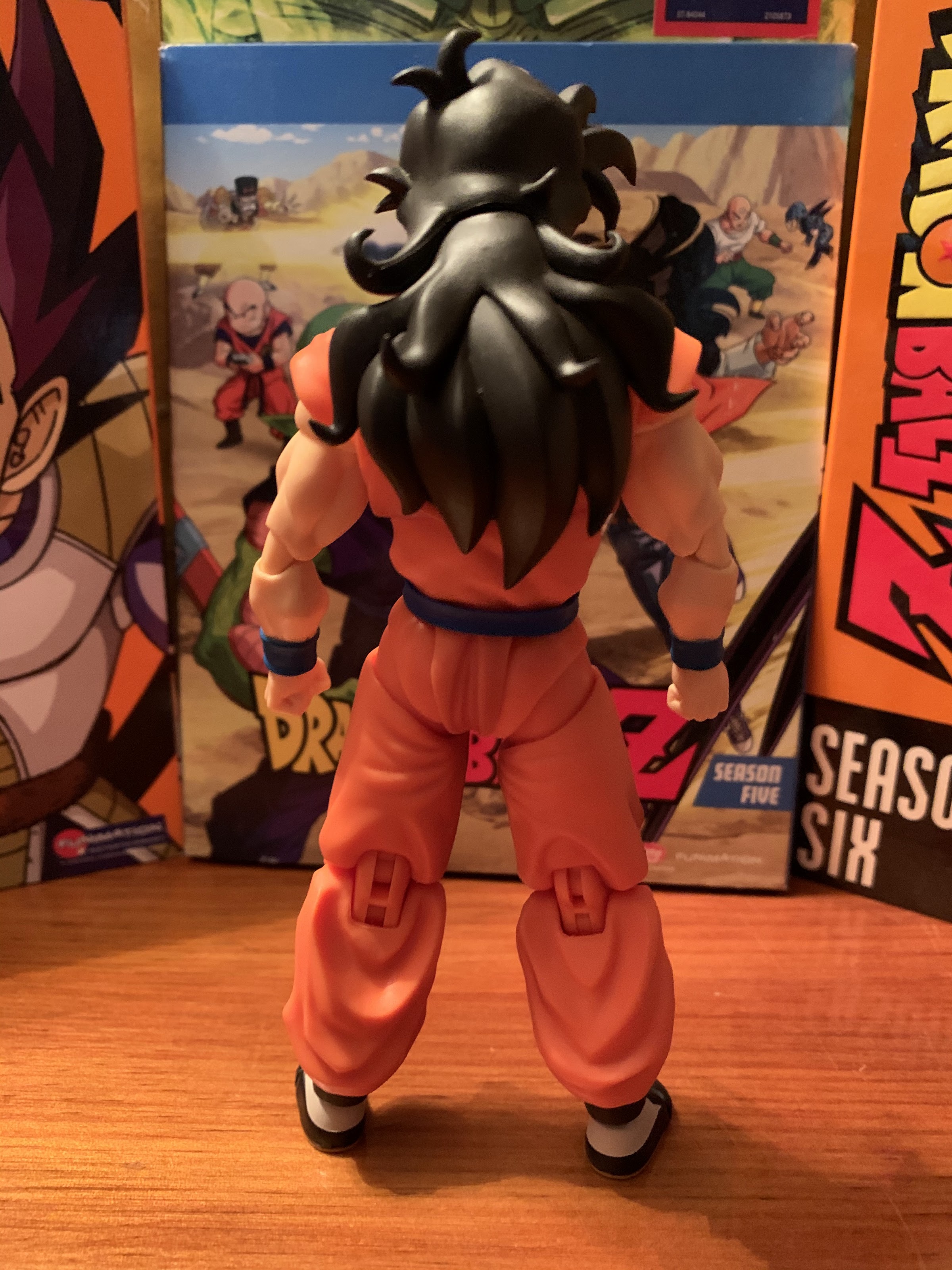
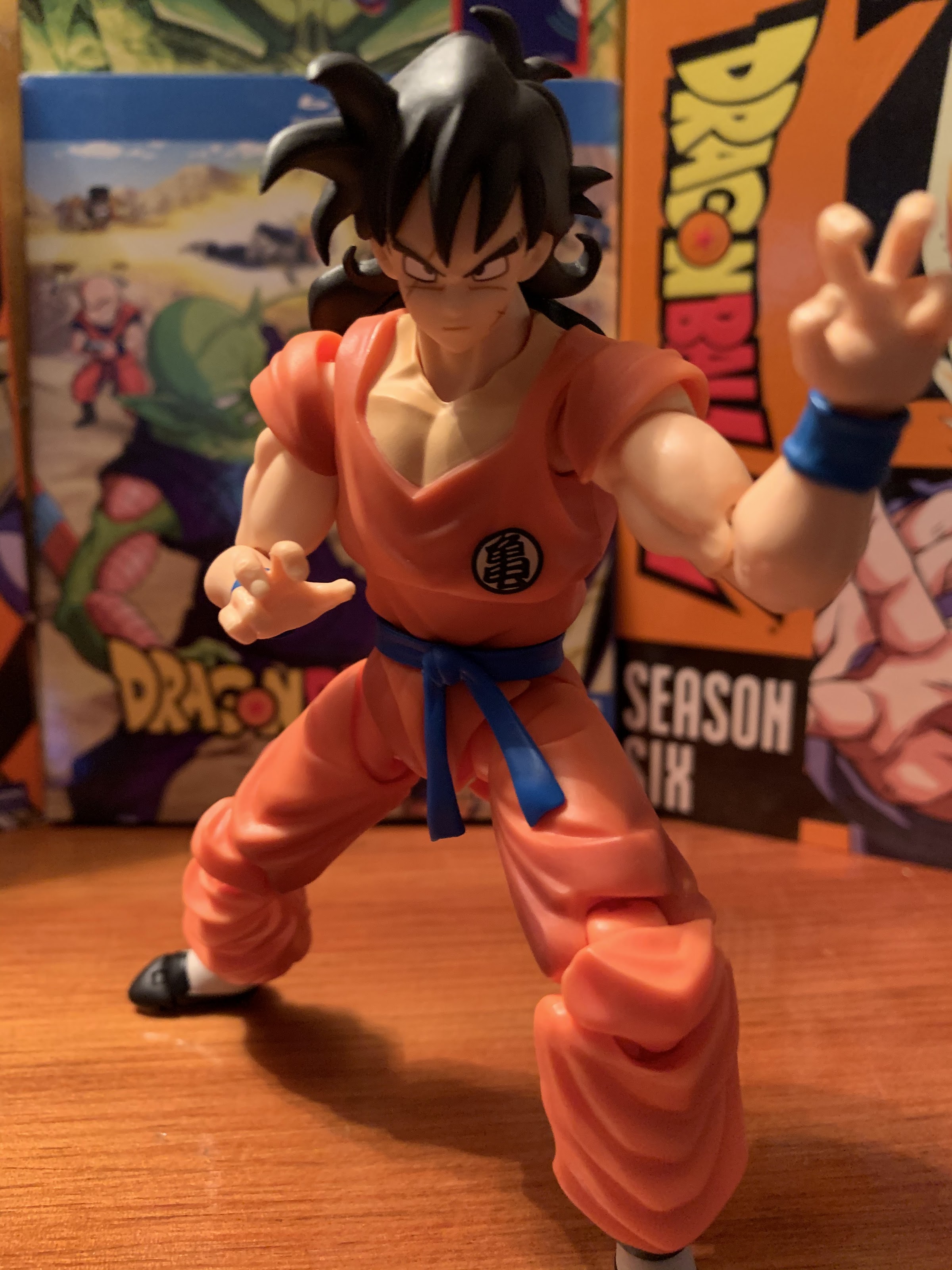
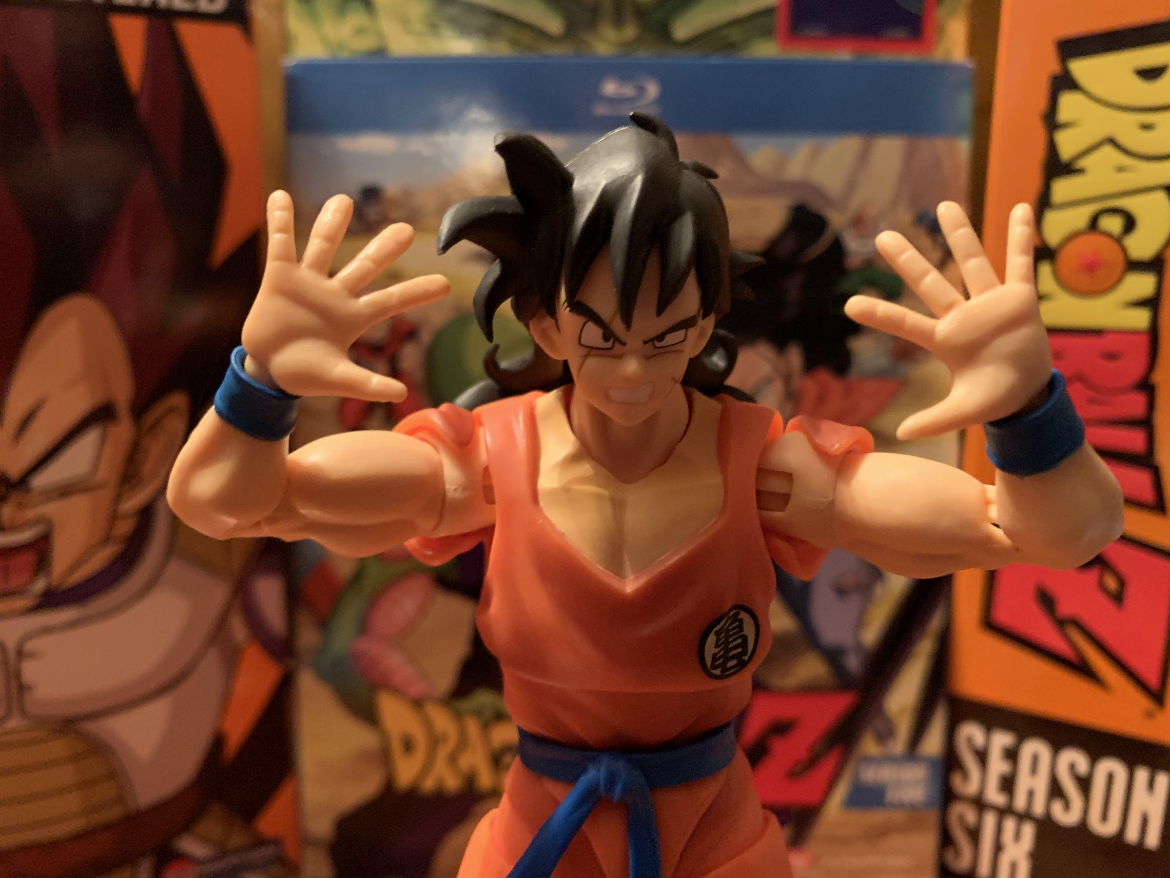
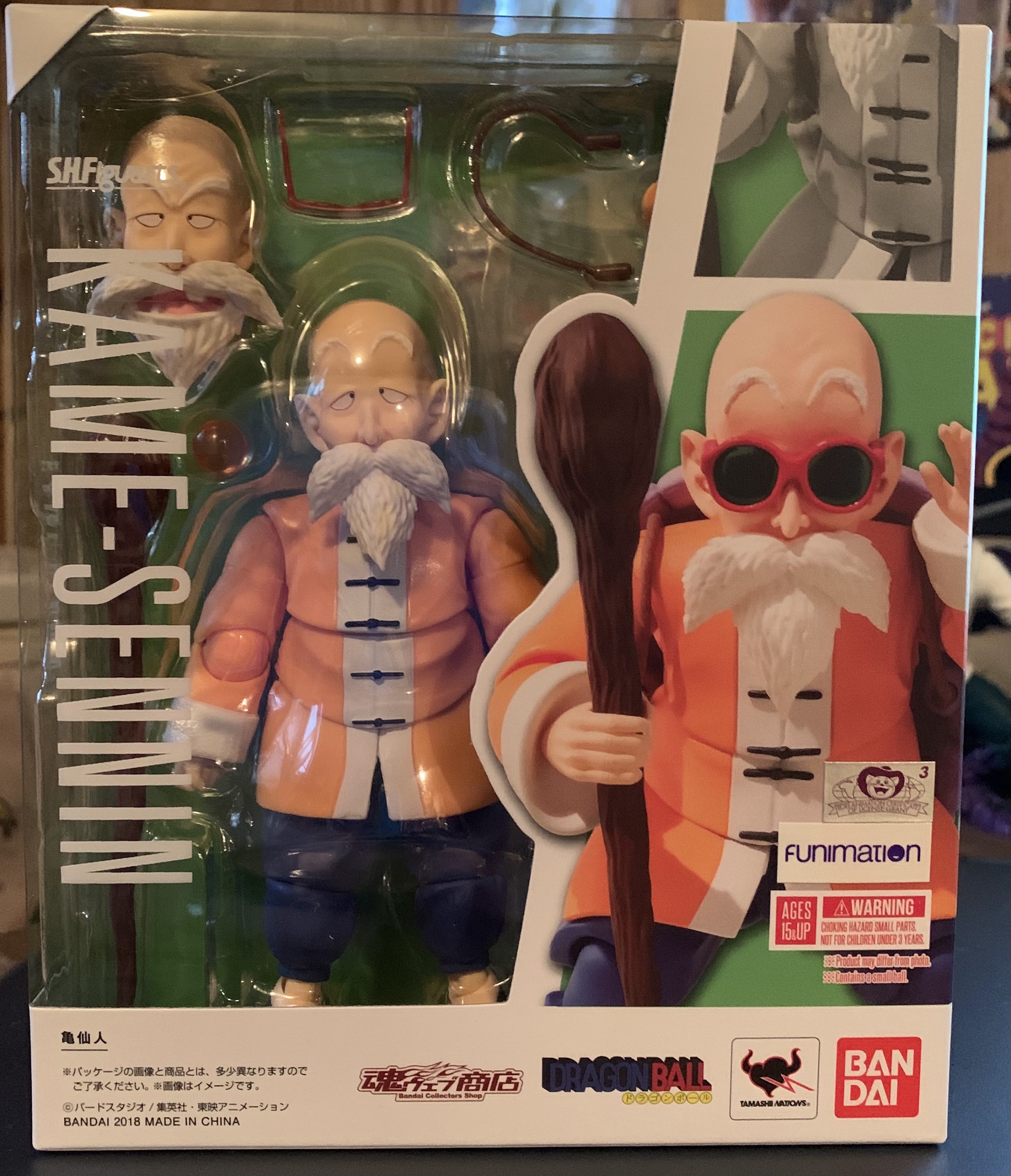
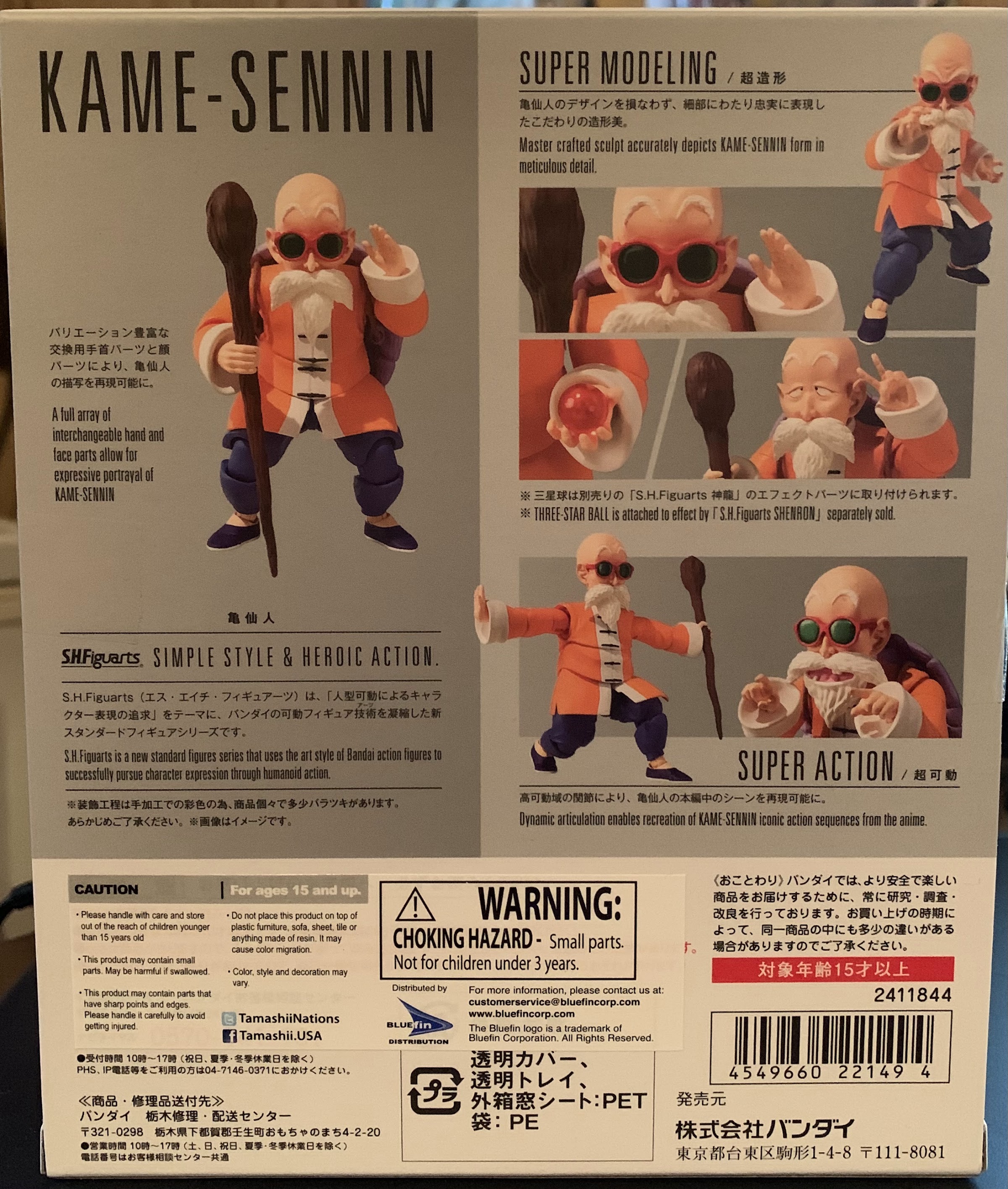
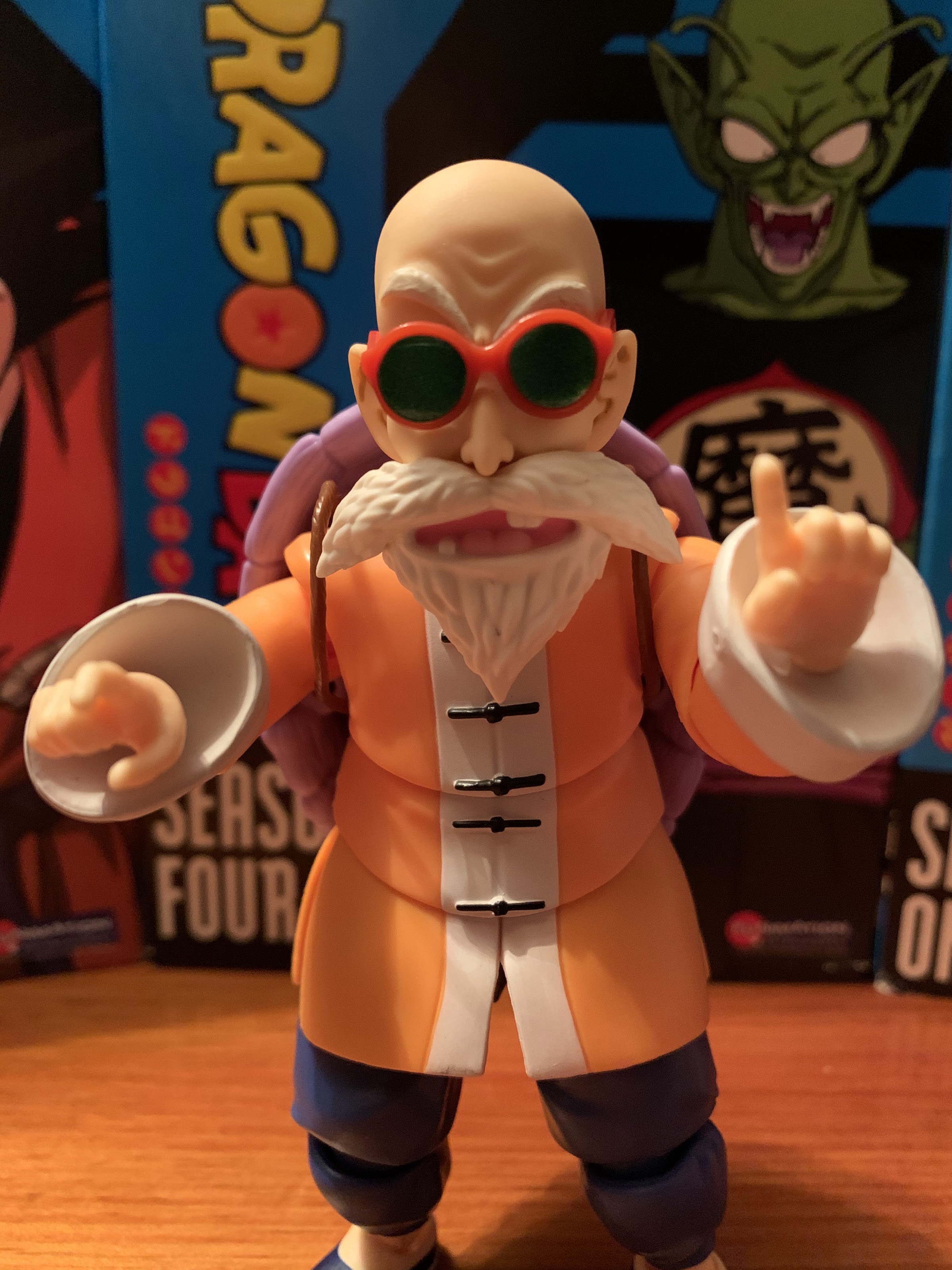
For this figure, Bandai opted to present Master Roshi in his somewhat official outfit: his orange and blue martial arts uniform. He has quite a few different looks in the manga and anime that are a bit more casual, and if I’m being honest that’s how I tend to picture him in my head, but by going in this direction it gives the figure a bit more versatility. You can go for a comic pose, pose him with his shell, or display him ready for a fight. He can’t do his bulked up Kamehameha pose, but that’s to be expected as it basically requires a whole new sculpt. The figure stands right around the 5 and a half inch mark which allows him to scale pretty well with the rest of the line. His trademarked red and green sunglasses are removable and fit on both of his heads and they rest well on the figure. The orange and blue are both plenty vibrant and it’s mostly just colored plastic. There’s no real paint flourishes on display here which is par for the course. Bandai certainly could have opted for something here to bring out the folds in the shirt, but it’s really not supposed to possess many as it hangs long and loose on the character in the show. I think it looks fine, but I know some others out there wish there was a little more flair to these figures as far as paint is concerned.

Note the plug inserted into the figure’s back to fill the peg hold needed for the turtle shell.

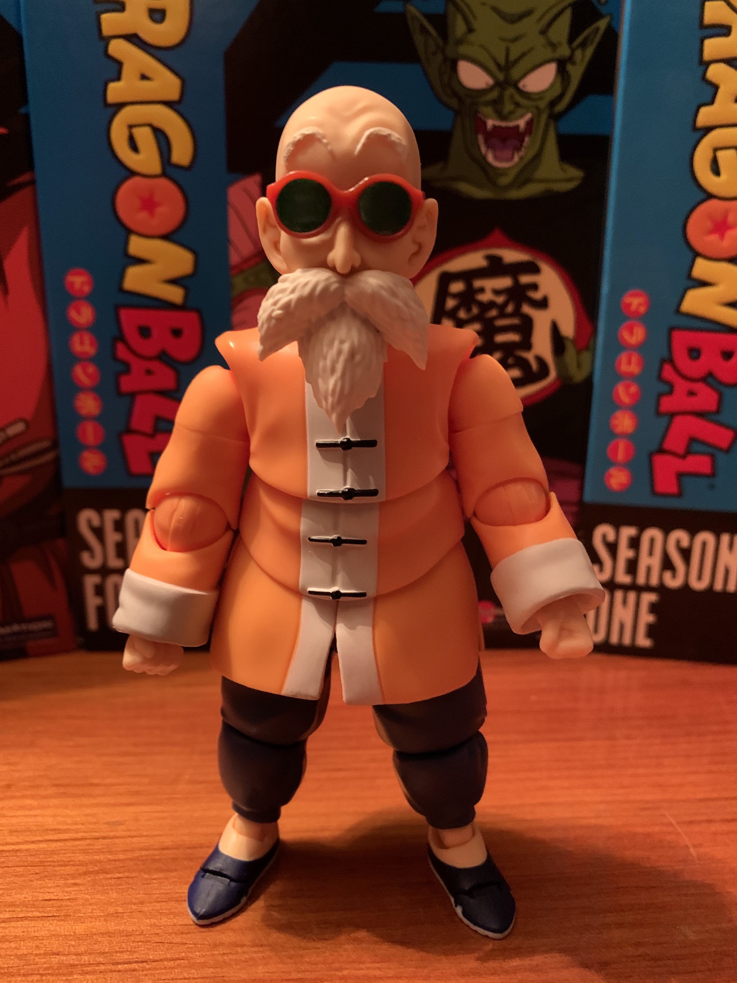
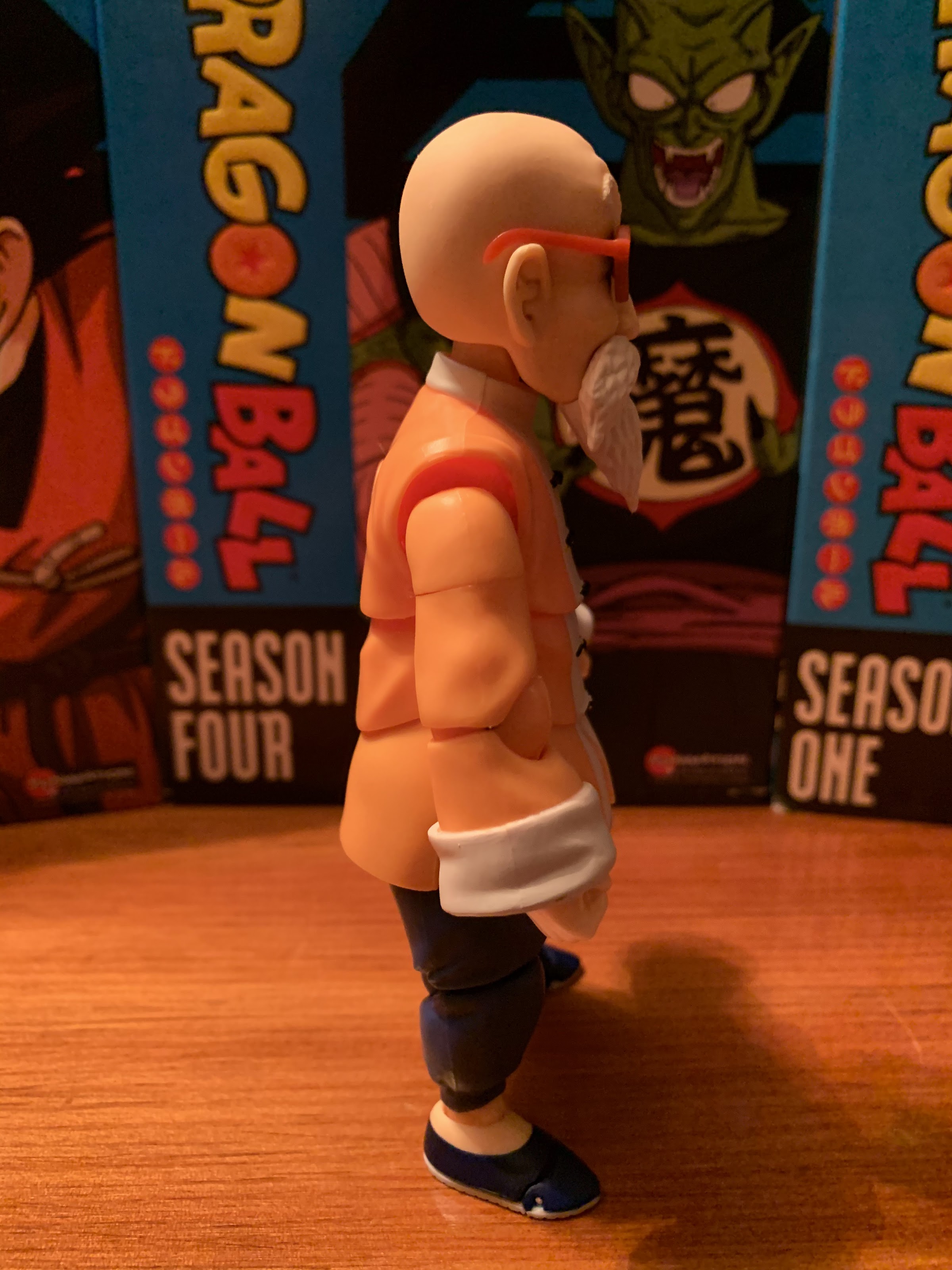
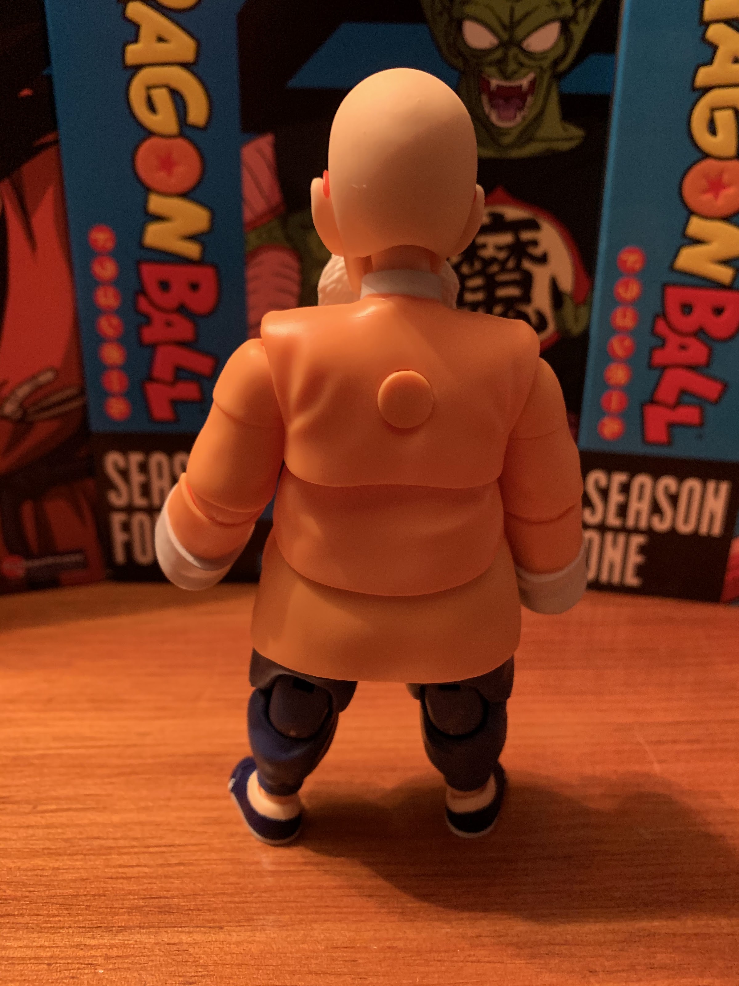
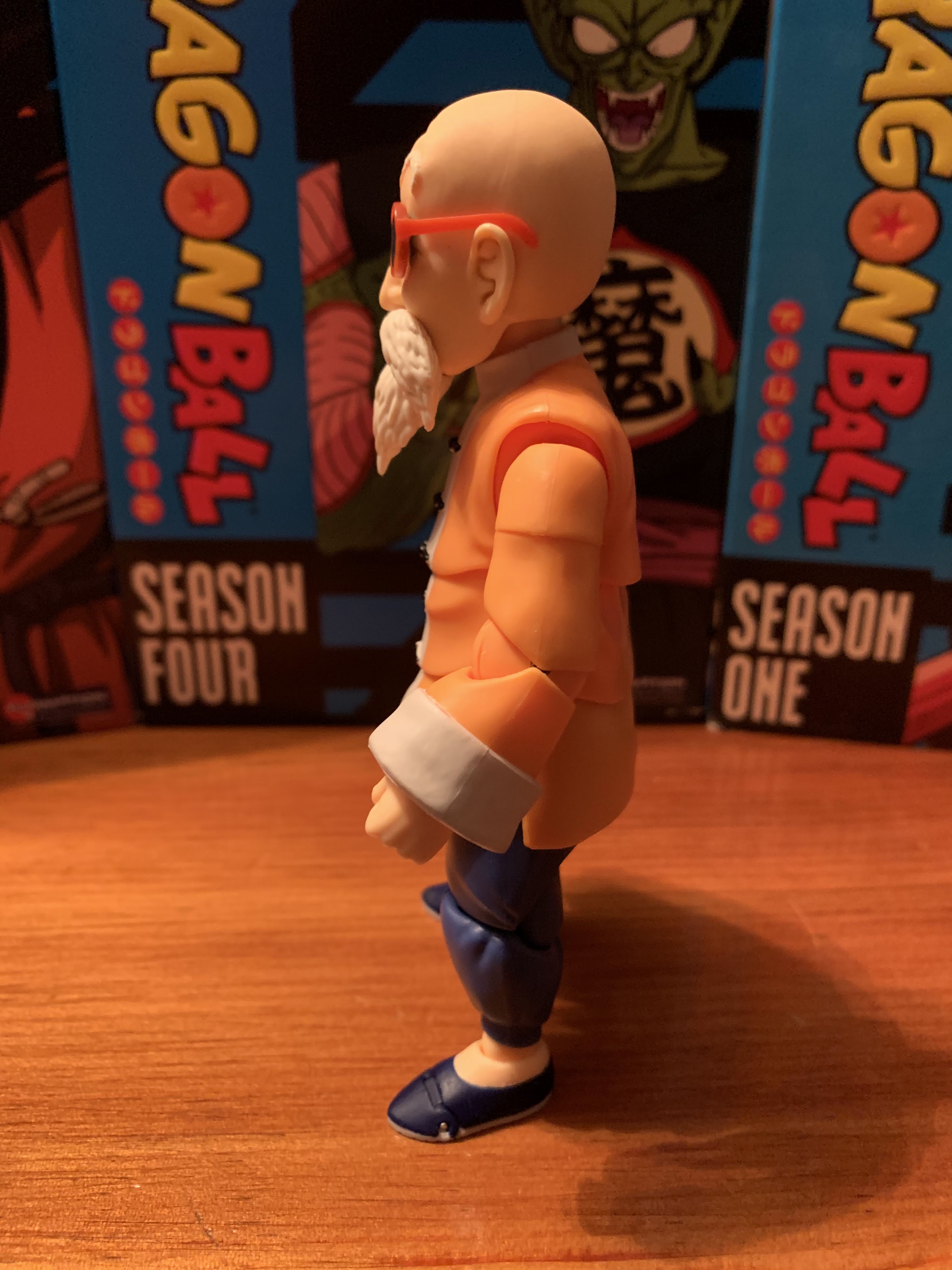
Master Roshi comes loaded with the usual assortment of articulation. It’s certainly needed to get him into various martial arts poses, but with this figure the articulation does detract some from the sculpt. The issue lies with the shirt which is very large relative to the figure. Bandai obviously felt it couldn’t do something like a soft rubber piece over an articulated figure and have it work, and they’re probably right. Instead, a lot of the joints have to be baked into the shirt and it does give it this choppy, scalloped, look. It’s unfortunate as it’s a bit of an eyesore, but ultimately, I think Bandai made the right call since the alternative would be to have very little articulation in the torso and arms. Perhaps soft goods could have been utilized, but that would have been just as, if not more, controversial a choice. The only area of the sculpt that does sort of bother me resides in the character’s elbows. There’s a big, circular, component that just jumps out and looks unnatural. The good thing is, simply posing him with bent elbows largely conceals this. Roshi does have a peg hole on his back to keep his shell sturdy, but if you don’t want to display him with that on, Bandai provided a little, orange, peg to fit into that hole to cover it up. Considering the hole is on the figure’s back, this really wasn’t something Bandai had to do, but it’s pretty cool that it did.

The old man can still move.
Though this requires little in the way of dexterity.

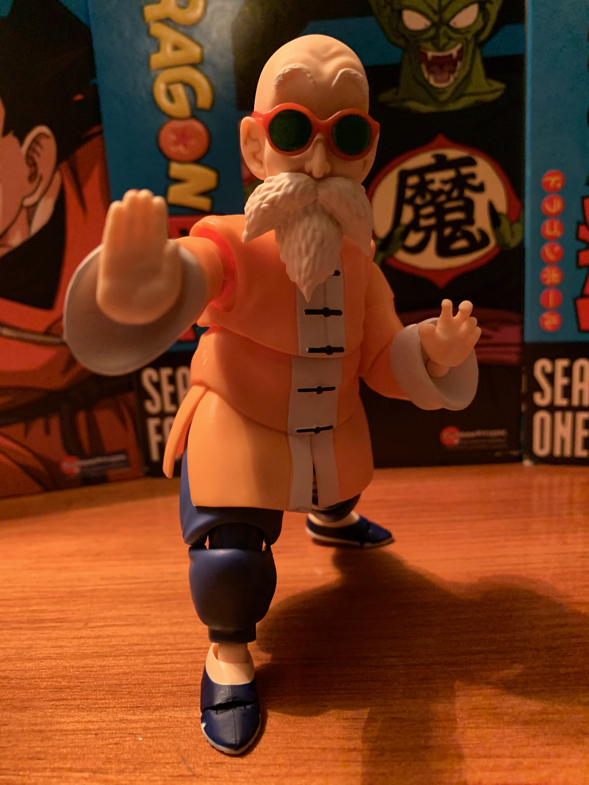
Master Roshi’s shirt may look a bit odd, but at least it does deliver in making this figure fully articulated. His head has the usual range of motion expected of this line. He can look up, but not down much as his beard hinders him a bit. There’s a joint at the base of the neck, but the head moves so smoothly that it’s hard to move the neck without taking the head off completely. The shoulders have terrific range and are also butterfly-jointed with that part of the articulation being completely hidden by the shirt which is pretty cool. There’s a bicept swivel and the elbows are single-jointed with his hands are on ball joints. They are buried a little in the sleeves so the range might not be as great as other figures in this line, but it’s fine. In the torso there’s a lot going on with upper torso articulation and waist articulation. The upper torso basically just allows him to pivot a bit without full rotation. The waist is similar though you could probably get him to turn all the way around if you were determined, but I wouldn’t advise it. The legs are on ball joints and swivel just below that joint. He has double-jointed knees and terrific range at the ankle with rotation and rocker action. Lastly, we have the toe hinge for when he needs to get a little taller, maybe to sneak his perverted, old, man eyes over a window sill or something.

It really is a nice looking shell.
Can’t forget about the Dragon Ball!

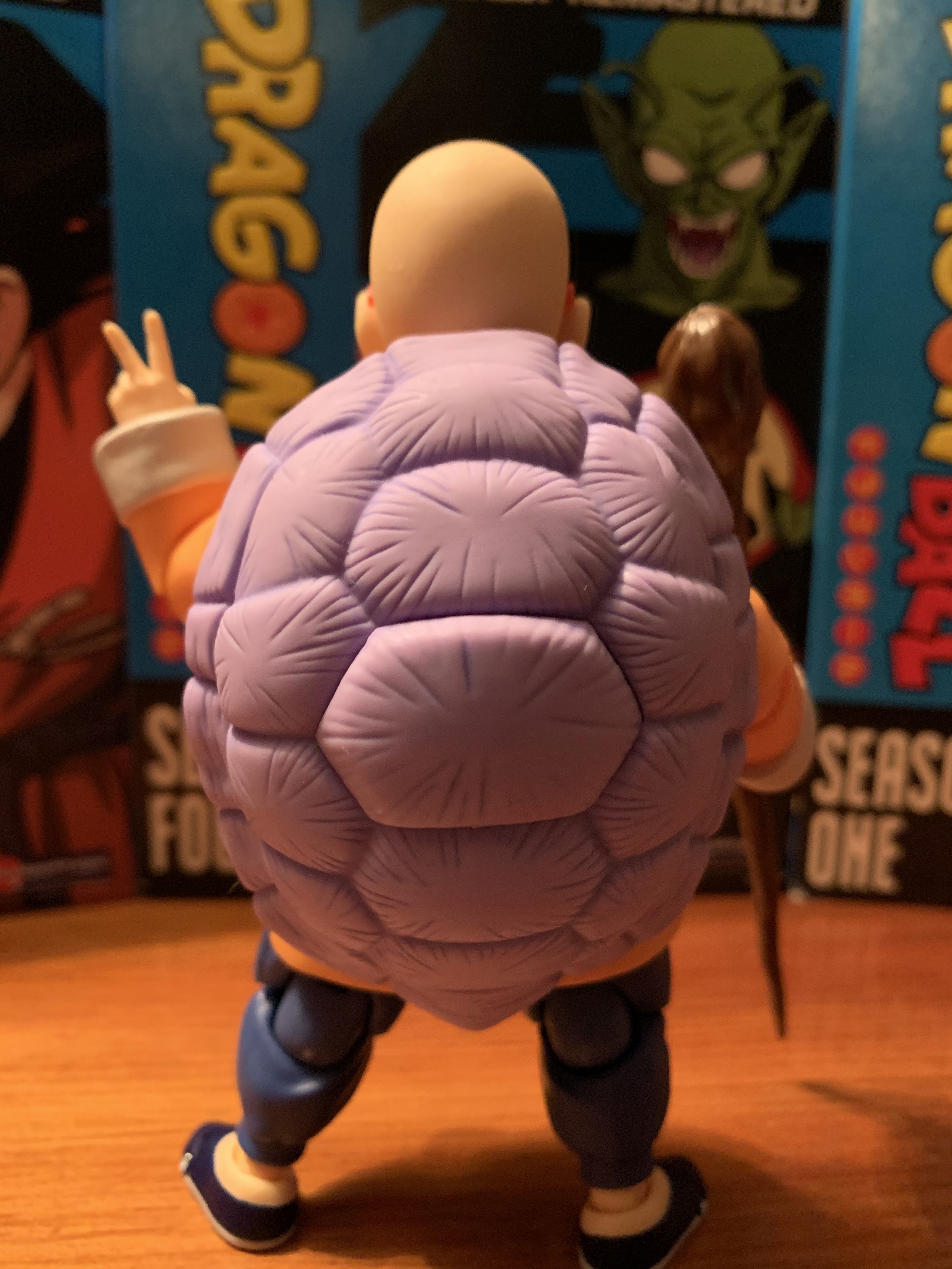
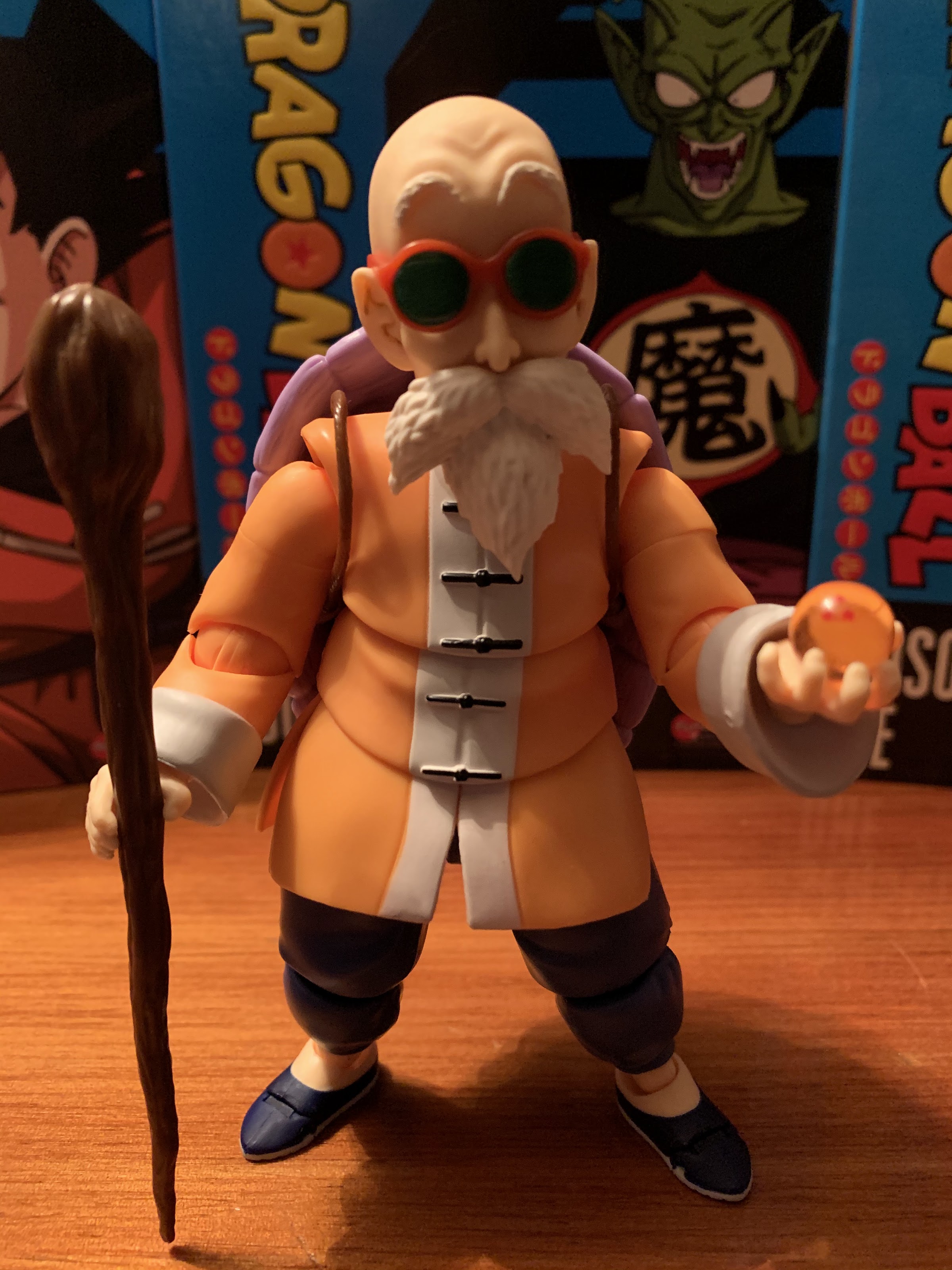
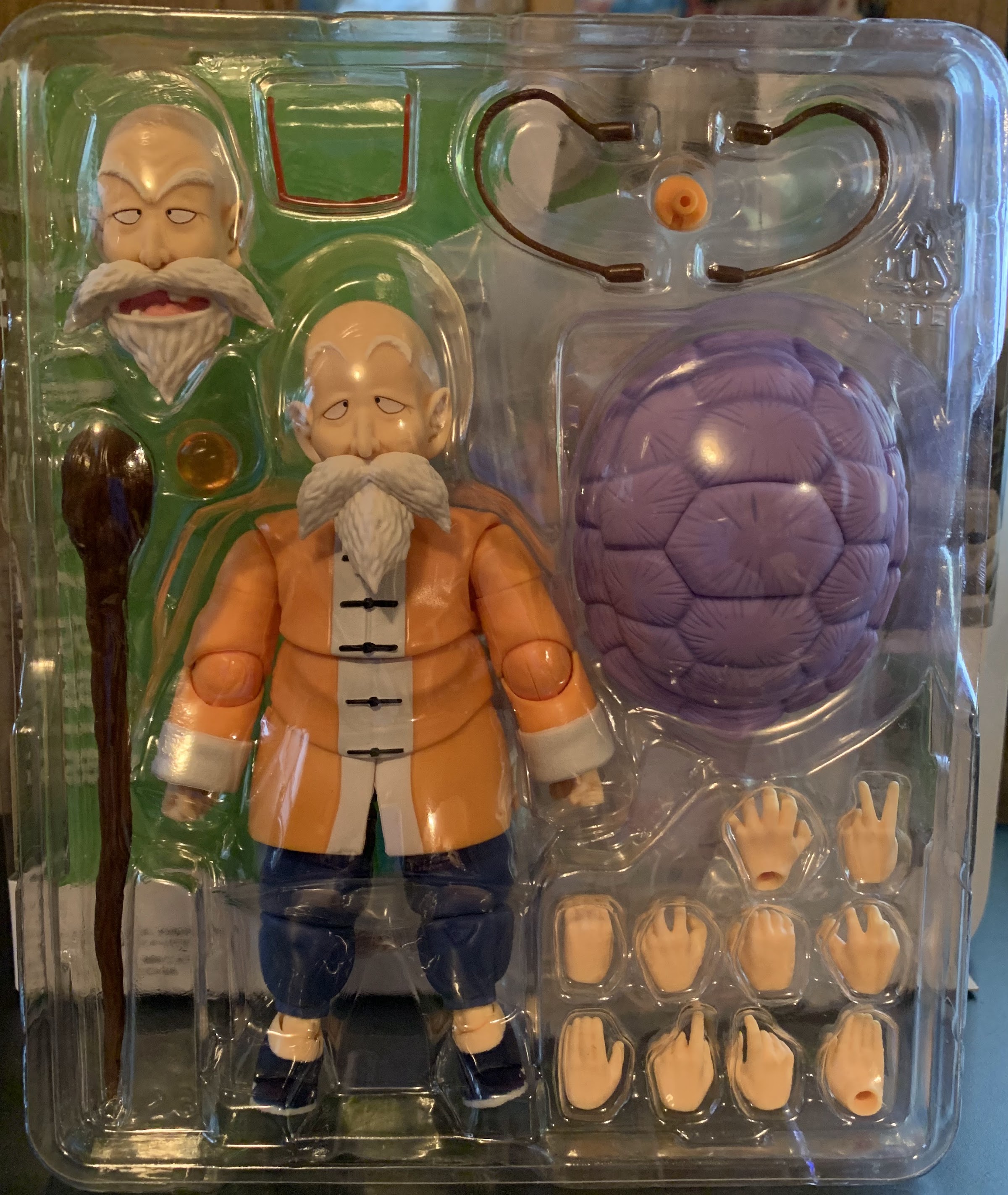
Master Roshi has a solid assortment of accessories and interchangeable parts. For starters, he has an optional head that’s basically his pervert face. It works with or without his glasses and it’s not hard to imagine many fans posing him in such a position. Only thing missing is a way to make it look like his nose is gushing blood. You can also swap the bearded portion on each head in effect doubling your range of available expressions. He also has five sets of hands to go along with the fists he comes packaged with. He has gripping hands for his staff, a set of pointing/pinching hands, a set of martial arts styled hands, an open left gripping hand for use with the Dragon Ball, a left hand making a “peace” symbol, a relaxed open palm left hand, and a firm open palm right hand. He has his trusty staff or cudgel and his three-star Dragon Ball. And then, of course, he has his big old turtle shell. It clips into his back and it also has straps that can pop in to make it look like it’s something the character simply slipped his arms through. The peg on the back of the figure makes it sit nice and I really like the sculpt of this thing. It has that very “Dragon Ball” look to it as far as the texture goes with lots of line work and I do enjoy the almost lilac color it has. Bandai even saw fit to make the middle panel of the shell removable so you can still use the action stand with the figure, whether he’s wearing the shell or not. Lastly, Bandai included an action stand for him which is always appreciated. It’s a real nice allotment of stuff that Master Roshi comes packed with. If anything is missing, I guess it would be Turtle? That’s probably asking too much though since he would require quite a bit of plastic. The only other obvious omission is the lack of Kamehameha style hands. I guess Bandai didn’t see the point since he can’t bulk up, or maybe they figured they’d include those hands with the Jackie Chun release. I can’t say I miss them since I wouldn’t pose him like that, but I can see that being a disappointment for some. Especially Dragon Ball Z collectors who may have wanted to line up all of the Z fighters performing Master Roshi’s signature technique.

Look who decided to join the party.
Of course, we have to bring in Goku too. These three look pretty great together.

Making use of Roshi’s accessories is not quite as smooth as it is with other figures. His head pops on and off just fine, though you do have to make sure the ball-joint is orientated properly. The hands are a bit trickier though. The cuffs of the shirt mean the pegs are recessed and they want to move all over the place when pressing a hand onto them. I don’t feel like I’m ever in danger of breaking anything, but it is annoying. The straps on the shell are also a bit troublesome. I find it’s easier to insert the top peg first on each strap before putting it on Roshi’s back. Then you have to kind of finesse the bottom pegs into their respective hole. It at least doesn’t need to be real snug, but if you don’t have patience for such things it could drive you mad. Once you have the setup you want, the hands at least all function the way they should. He can hold his staff with either gripping hand with no problem and the Dragon Ball rests in the open hand just fine. He also stands well with or without the shell on his back making the action stand Bandai included feel unnecessary which can free it up for another figure in your display, should you desire such.

I am so sorry, Bulma.
Maybe I should look into acquiring Lunch so he has someone of-age to menace.

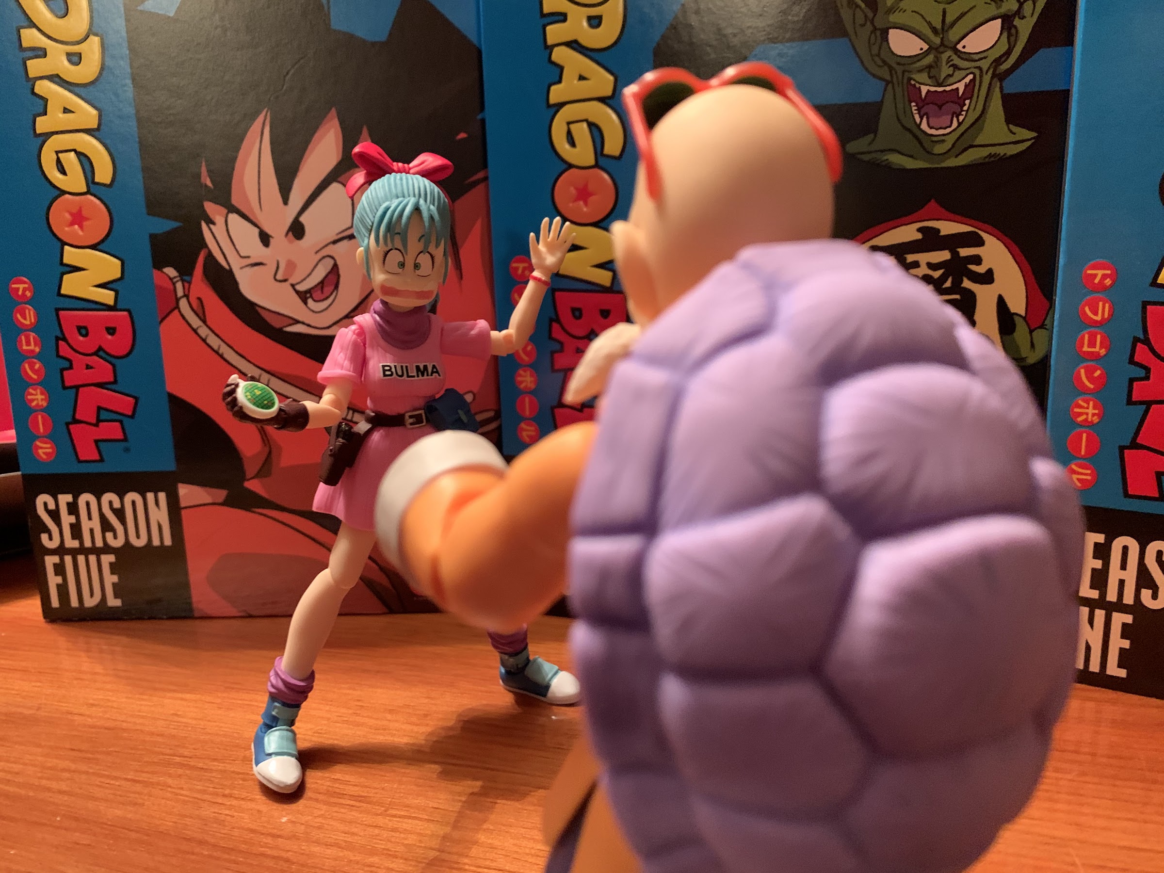
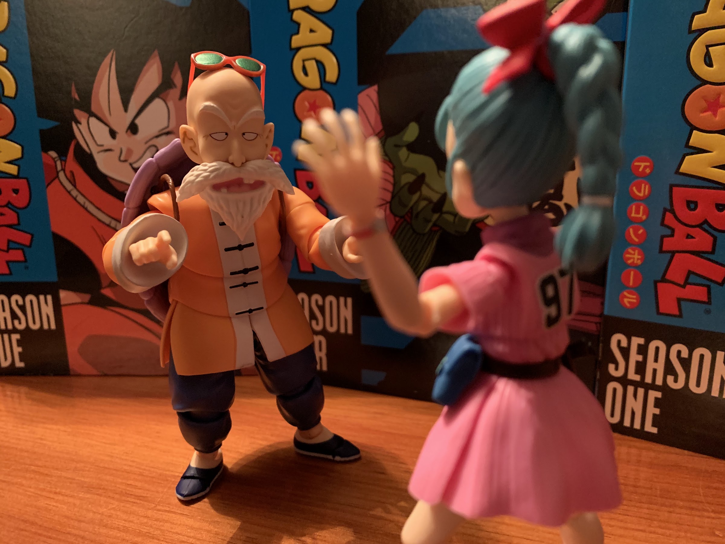
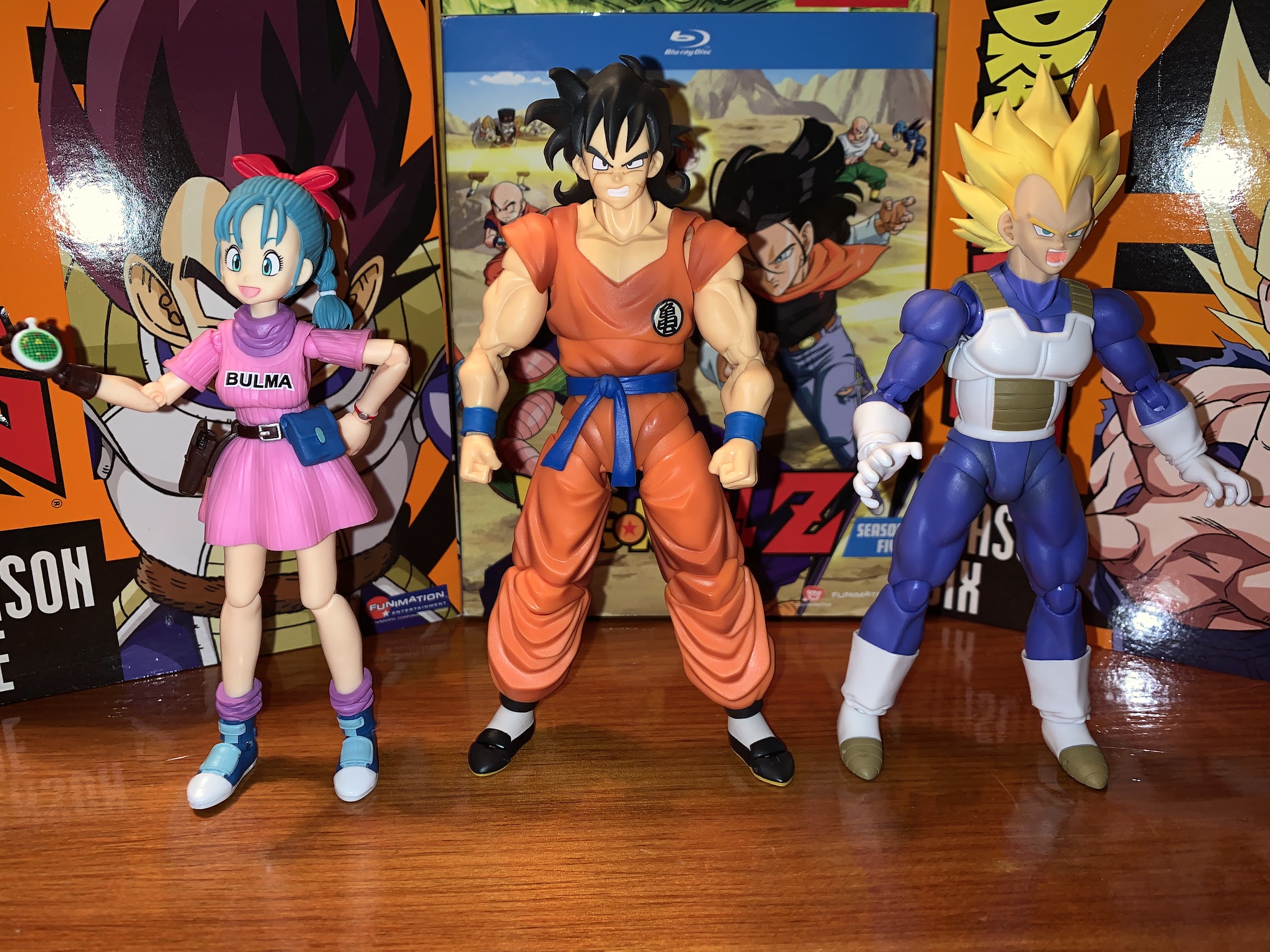
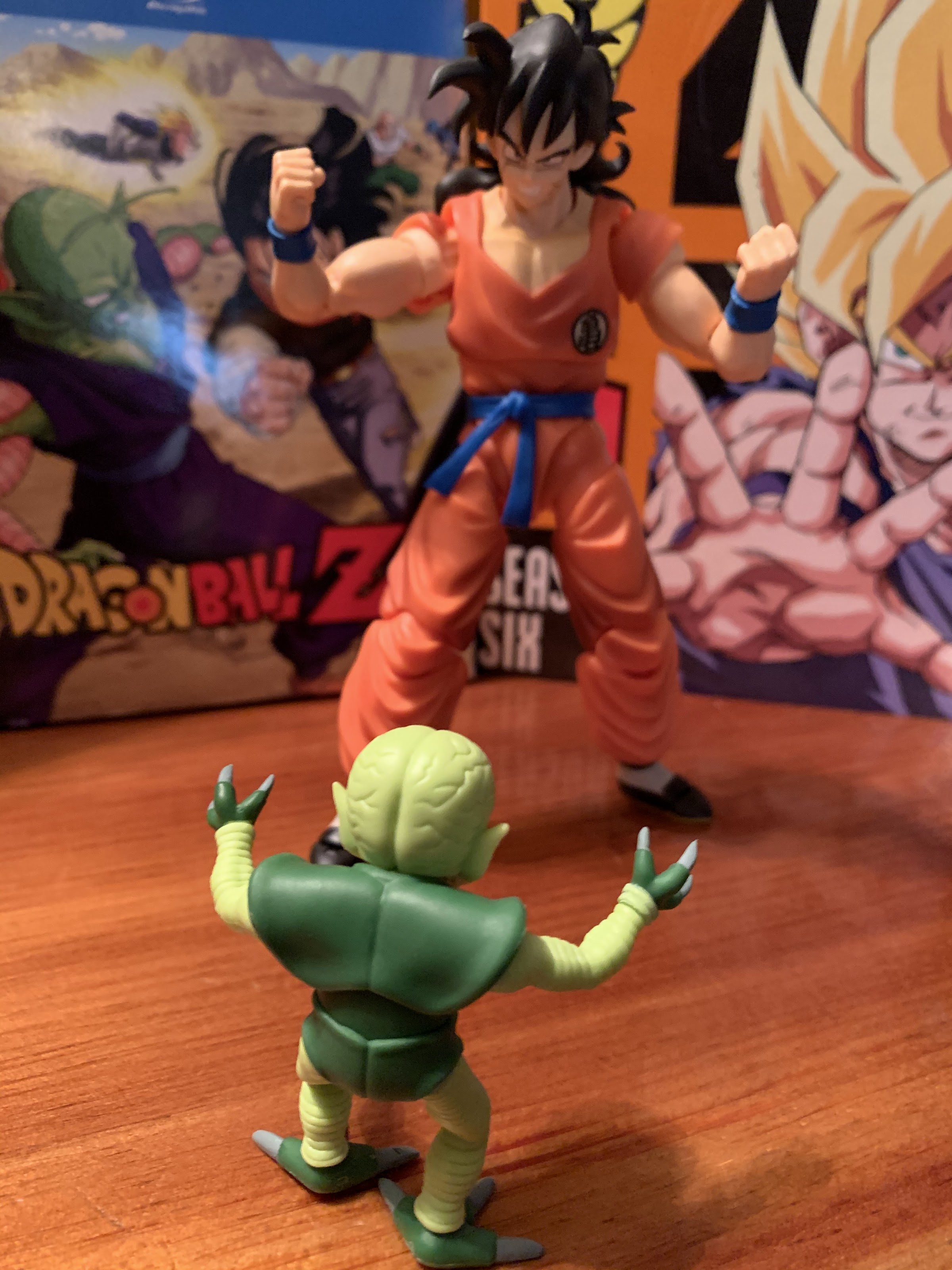
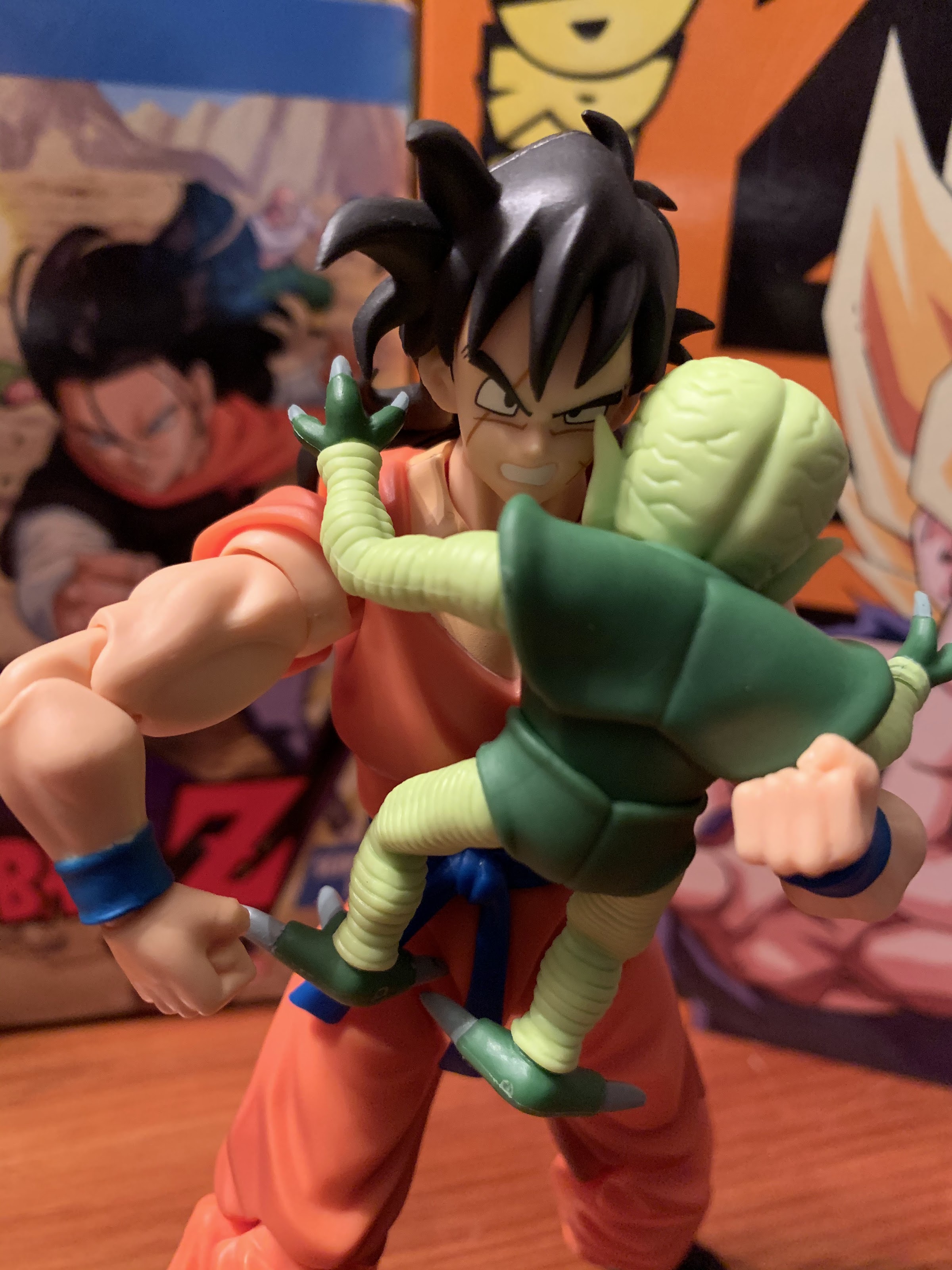
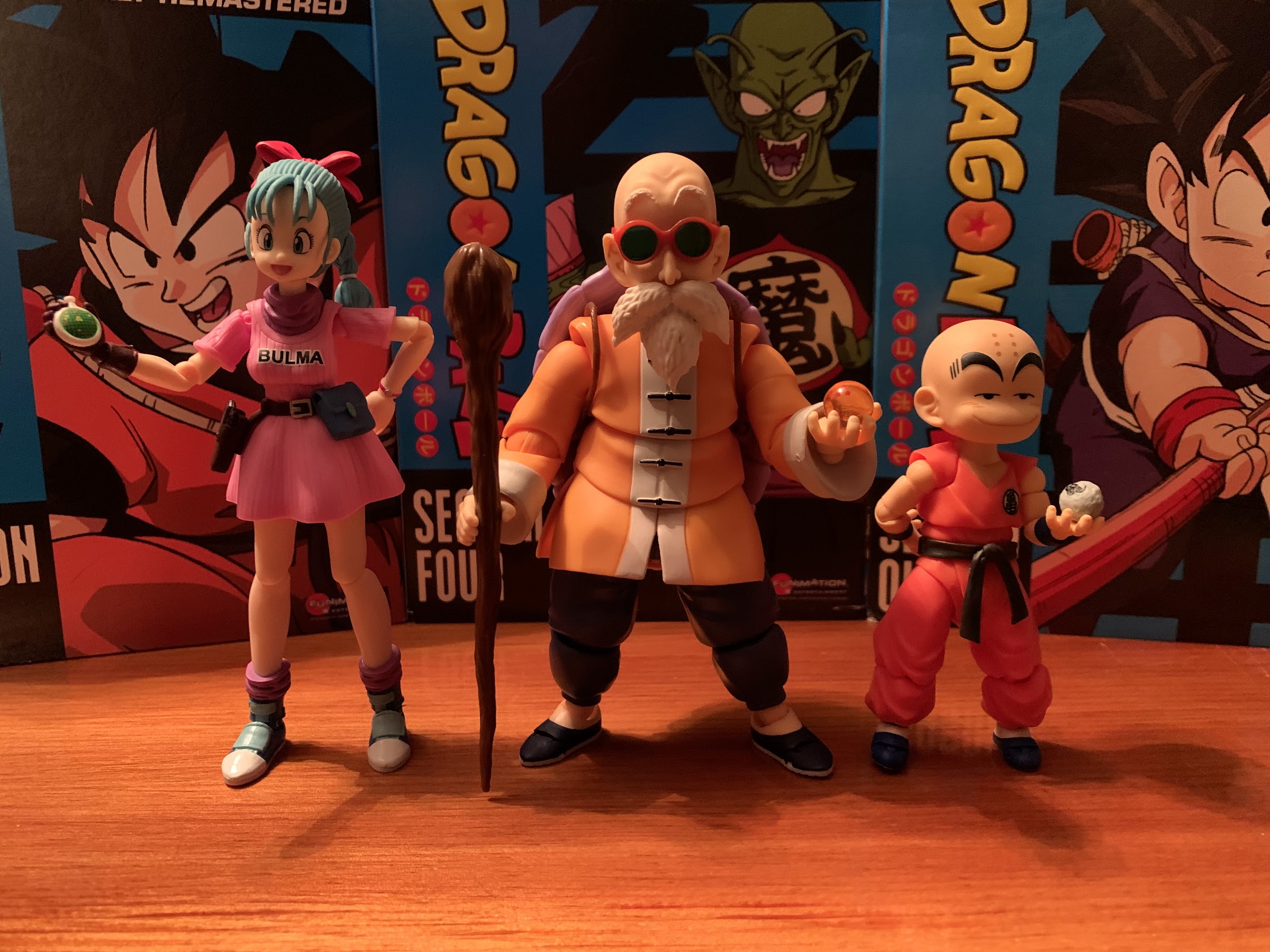
Master Roshi fits in well with the other Dragon Ball releases so far. I maintain that the kid versions of Goku and Krillin are a bit too big, but it doesn’t stand out as much with Master Roshi as it does with Bulma. She’s still the odd one of the bunch though as she should probably be taller than Master Roshi, but instead she’s pretty close in height. It almost looks like he’s designed to scale to Goku and Krillin, with Bulma and the others scaling better with each other. The only other disappointing aspect of the display is just in the choice of attire. Roshi mostly wore this get-up during the training sequences where Krillin wore his yellow gi and Goku sported his blue pants and white tank top look. By the time the two get their Turtle School gi, they’re at the World Martial Arts Tournament where Roshi is in a formal, black, suit. Oh well. I’m definitely glad this version isn’t in the black suit, but I am still partial to his beach bum look when Goku and Bulma first meet the old man.

Yes, I realize I need a dedicated shelf for my Dragon Ball guys.

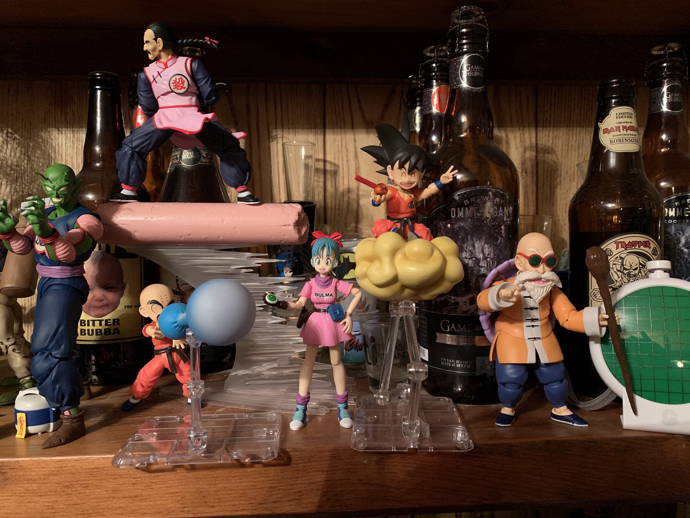
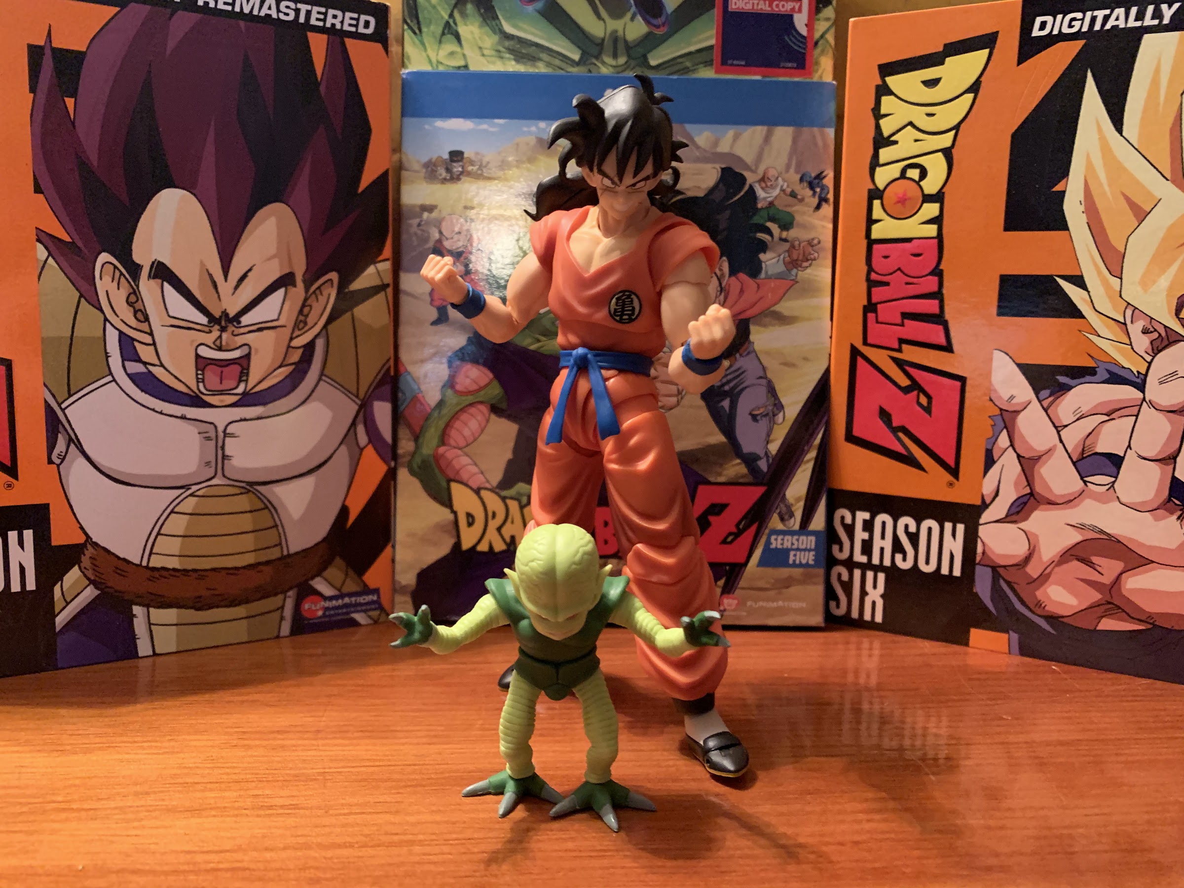
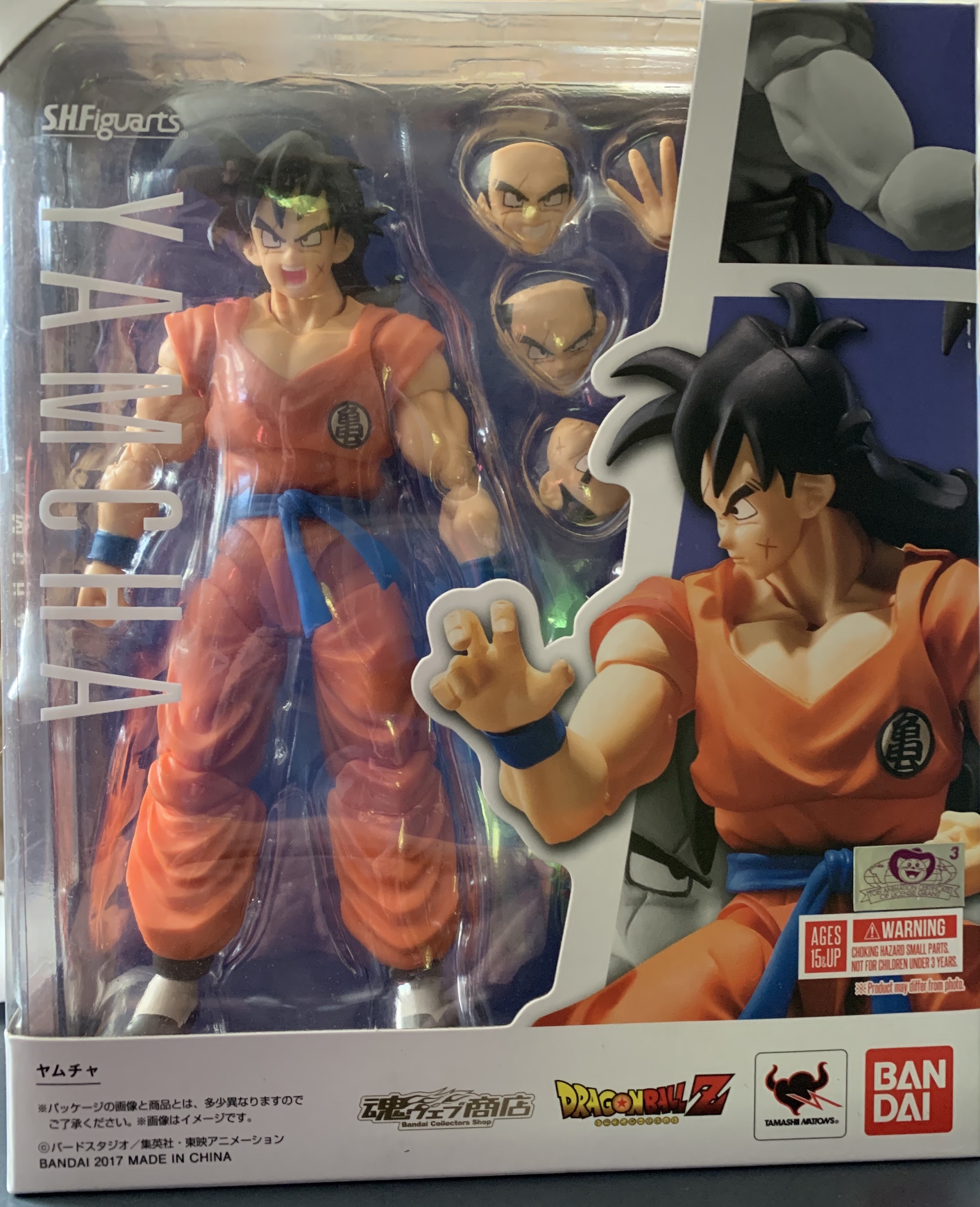
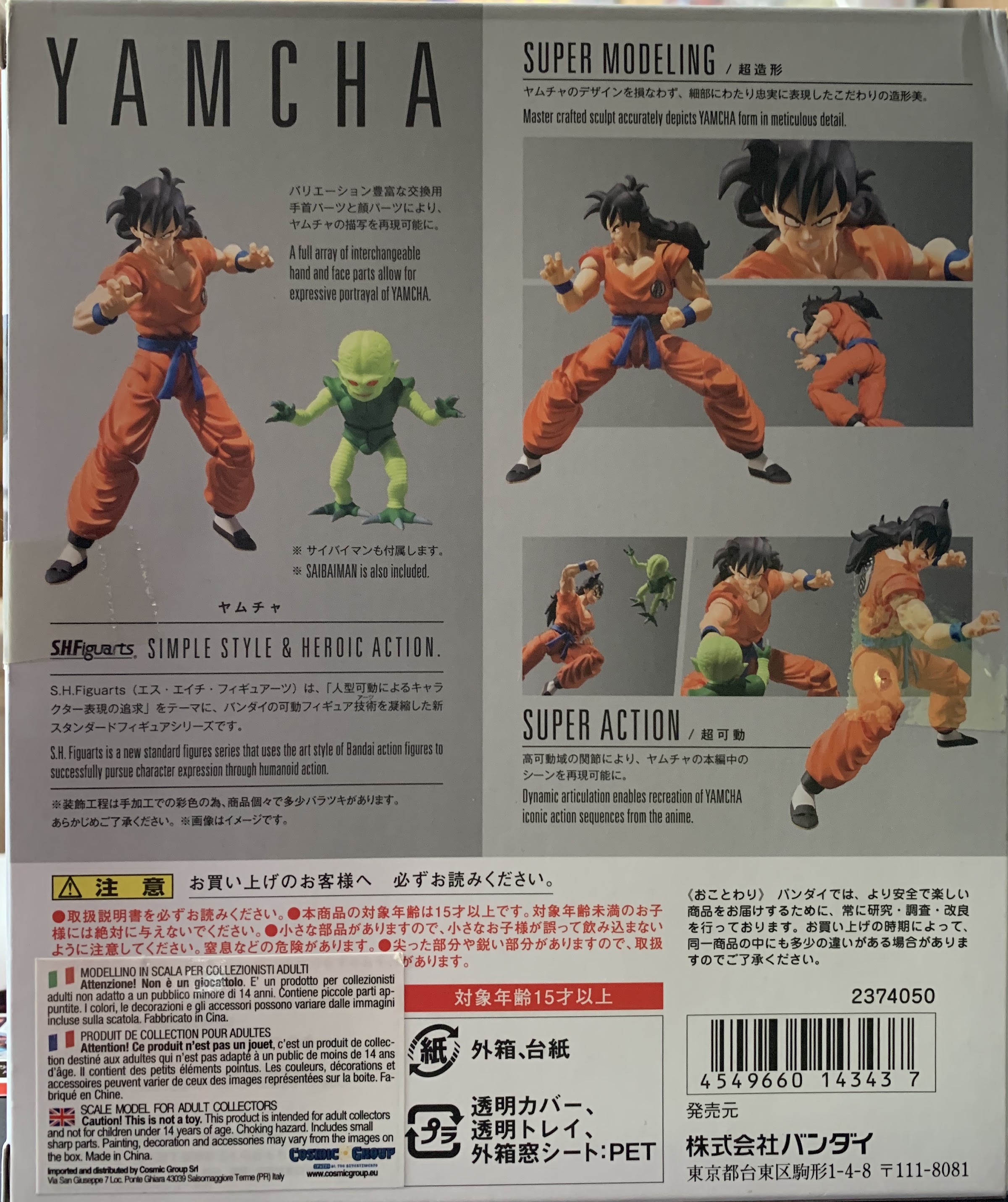
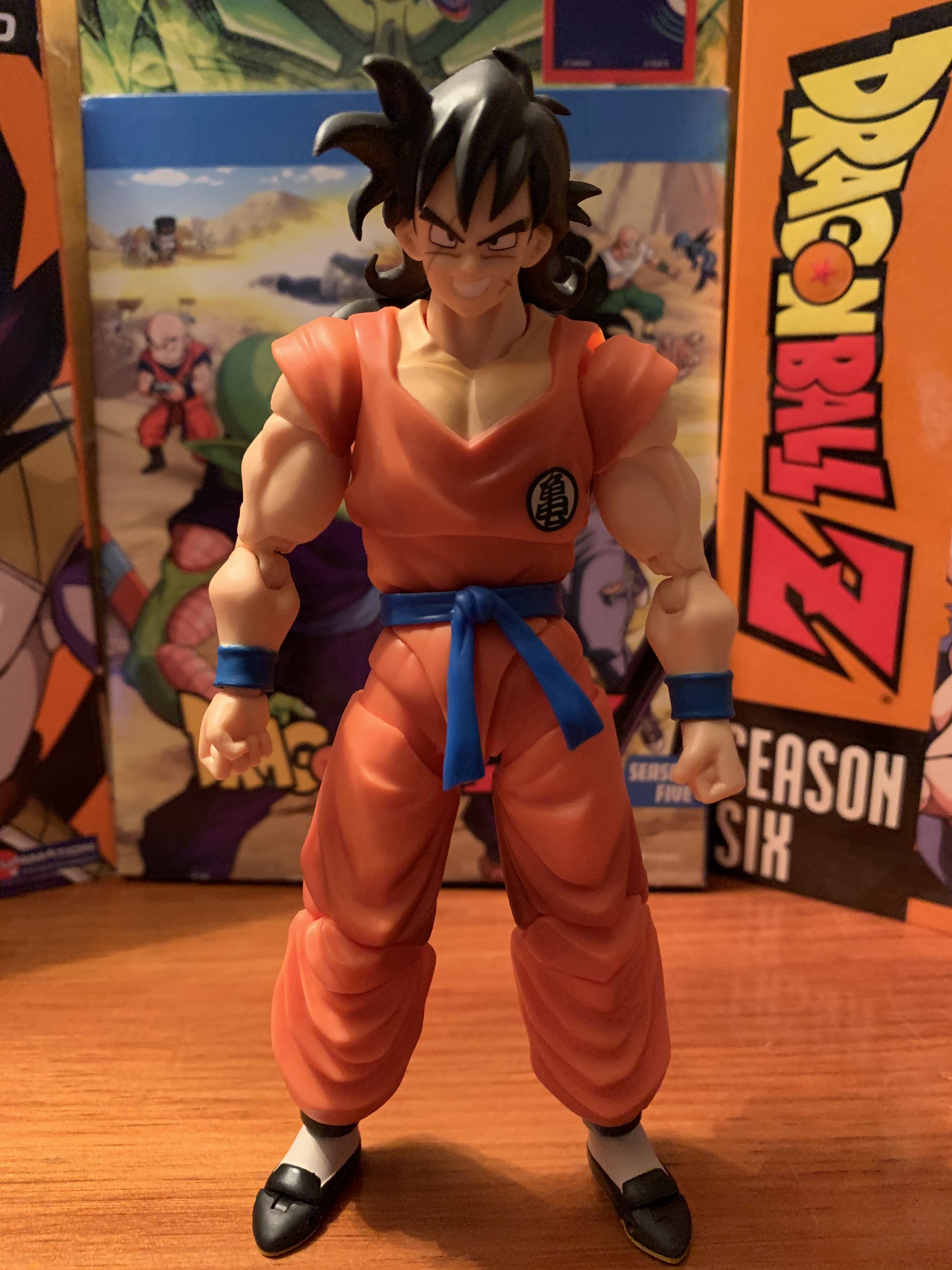
Acquiring this figure of Master Roshi more or less finishes off my humble Dragon Ball collection from Bandai. The only other figures released in the line include an alternate version of Bulma, Jackie Chun, Lunch, and kid Chi Chi. I don’t really feel a need to grab any of those, though if Jackie and Lunch ever make it to a sale I could be persuaded. The big omission so far is a Dragon Ball version of Yamcha and I would like to have him. Tien, Chiaotzu, Grandpa Gohan, Adult Goku, and Piccolo Jr. would all be intriguing as well. And if they could get an Oolong into one of those releases that would also be great. At least with Master Roshi in the fold I no longer feel like I have a major hole in my collection. He looks awesome and he really is one of my favorite characters from the show. Hopefully he won’t be my last acquisition from this line.


S.H. Figuarts Dragon Ball Z Yamcha

Look out boys, here comes Yamcha!

Today’s action figure review comes courtesy of online retailer Big Bad Toy Store. No, I have not hit the “big time” where I’m getting freebies for review. Rather, BBTS had a Twitter give-away for an action figure and yours truly happened to be selected. Which is pretty cool, so thanks go out to Big Bad for the hook-up because otherwise I would likely have never had the chance to talk about this figure.

Gotta love that window box packaging.
There aren’t many characters who get featured as a corpse as part of their own product shots.

Yamcha comes straight from the anime Dragon Ball Z. I have reviewed a few of the figures from S.H. Figuarts in the Dragon Ball line, but I’ve largely avoided Dragon Ball Z. That’s because I only have room (and money) for one high-end anime property and if I had to choose I’m taking Dragon Ball over Dragon Ball Z. If I were to reverse course though, and maybe one day I will, I’d probably prioritize the earlier episodes of DBZ like the Saiyan Saga, which is where this figure comes from.

What’s this guy have to smile about?!
I wonder what shampoo he uses?

Yamcha is basically known to the fanbase as the punching bag of DBZ. He’s routinely one of the least powerful warriors and his most famous pose is lying dead in a crater. He makes himself an easy target because he’s often brash and quite arrogant, only to wind up getting his ass handed to him. He’s so bad that I even tried to make referring to someone as a “Yamcha” an insult amongst my friends back in my high school days, but I never really got the phrase over. Yamcha would change in later arcs and in Dragon Ball Super he became more self aware of his lot in life. This has made him actually endearing, to a degree, to the point where Yamcha may be able to refer to himself unironically as a fan favorite these days. After all, being outclassed by Goku is hardly meaningful anymore since virtually no one from those early episodes can hope to stand with him.

Now we’re getting serious.
Here comes the “dreaded” Wolf Fang Fist!

As mentioned earlier, this figure comes from the Saiyan Saga of DBZ so it depicts Yamcha in his orange Turtle School gi complete with big hair. He’s right at the six inch mark which I assume is pretty much average for the line and leaves him about 3/4 of an inch taller than the Vegeta from the same line (not factoring in Vegeta’s giant hair). It’s hard to say what Yamcha’s most popular look is since he’s one of the characters who seems to always change his look, but this one is certainly right up there. He maintained this look through the Frieza Saga before switching to an awful bowl cut that thankfully didn’t last long. It’s a simple look though and I suspect there’s a lot of parts reuse in this figure as he’s essentially Goku. I can’t confirm that though because I don’t have a Goku. The only real difference between he and Goku are the shoes and the lack of a blue undershirt, because Yamcha is first and foremost out to attract the ladies. The more skin showing the better.

I’m more of an energy blast guy, myself.
Solar Flare or “hands up?” Yamcha is not above backing down from a fight.

The S.H. Figuarts line from Bandai is known for its high quality and abundance of articulation. Yamcha is no exception as there’s very little he can’t do as far as posing goes. His joints are all nice and tight with none being too tight so he has no trouble holding a pose. His head sits on a ball joint with surprising range of motion considering the giant hair behind him. The hair keeps him from looking up, but he can do pretty much anything else. There’s a hinge in the middle of his hair if you want to make his hair more billowy than usual, though it doesn’t do much to free up the head any further. He has a joint at the base of his neck that honestly isn’t really needed since he can look pretty far down without engaging it. The shoulders are ball-jointed with butterfly joints as well to allow him to reach across his chest and form a proper Kamehameha pose. The bicep swivels and the elbows are double-jointed. The hands are on ball-pegs with hinges in them so they can rotate and turn in and out. There’s an upper torso joint under the gi that provides for tilt and rotation there as well as another ball-joint at the waist. The legs can go out, forward, and back pretty much without restriction and swivel there as well. The knees are double-jointed and the feet are on ball pegs. There’s a toe hinge and articulation at the knot in his belt, for good measure.

Yamcha with his former lover and the guy she left him for.

Were Bandai leaves itself open for criticism with this line is in the amount of articulation taking away from the sculpt. With Yamcha, it’s not much of an issue because the gi lends itself well to hiding articulation. It’s a flowing, roomy, garment with lots of folds to stash stuff in. Contrast this with Vegeta who is often in skin-tight outfits where the various seems and breaks in the sculpt really stand out. There are still odd parts where things look messy, like the crotch and mid-torso. The sleeves of the gi are also pegged into his shoulders and not attached to the main part of the uniform which is rather odd looking. The other frequent complaint I see is the lack of paint, and there, Yamcha isn’t much of an exception. Bandai sticks with colored plastic for the most part and almost never applies a wash or anything to bring out some of the detail. This figure though does have a wash applied to the sides of the pants, chest, crotch, and sleeves. I’m torn on if I prefer this look to what I’ve seen more recently in the Dragon Ball figures. Kid Goku, Krillin, and even Tao have really no wash applied to them and look mostly fine to me. The effect here does work in certain lighting and poses, though in others it stands out more than I’d like.

I had to…

Yamcha comes packed with an assortment of facial expression and hands to complete his look. He has four distinct expressions for you to choose from, and swapping is simple and effortless. The bangs of his hair pops off to gain access to the face plate and the seems left behind are minimal. For expressions, Yamcha has a cocky grin, an open mouthed yell, a teeth-gritting face, and a stern face. If this were a Dragon Ball version of the character I’d want a frightened/shocked look, or a love-struck one for when he encounters Bulma, but for a Saiyan Saga Yamcha this is a strong assortment. He also has four sets of hands: closed fists, wide open palms, Kamehameha open hands, and martial arts pose hands. There’s some room for criticism in this area as Yamcha really doesn’t need the wide open, Solar Flare, styled hands. What he could really use are pointing hands for his Spirit Ball technique. The Kamehameha hands and martial arts pose hands give him enough range for his other signature maneuvers though, the Kamehameha and Wolf Fang Fist.

He actually he let himself get killed by this!
There is some nice sculpting going on here.

Lastly, Yamcha comes with one other important accessory: the Saibaman. This little green guy is notoriously the one who killed Yamcha. Or rather, it was a Saibaman who felled him and left him dead in a crater and that creature was not distinct from any other Saibaman. This little guy stands a shade under 3″ and is positioned in a permanent crouch. He’s largely colored plastic with very little paint but has quite a bit of sculpting details all over. The eyes and claws on the hands and feet are basically the only parts painted. He’s at least cast in two shades of green so he more or less looks the part, but really could have used a paint wash to bring out the grooves in the skin and the veins in the head. He’s minimally articulated and it’s largely a what you see is what you get affair. His head can rotate side-to-side a bit and the arms rotate at the shoulders on simple pegs. Oddly, the right wrist is on a peg and can rotate, but the left does not. What he’s missing is articulation at the leg, because with a simple swivel there he’d be able to really grab onto Yamcha for his self-destruct attack. Instead, if you want to attempt that you basically need to make Yamcha hug the little alien, which looks a bit silly. This makes the accessory something to pose opposite Yamcha like the two are about to face-off. It’s not nothing, but it’s a shame Bandai didn’t sink a few extra pennies into the sculpt to make it really work. Though if we’re on the subject of small changes that could have made a big difference, I wish instead of the standard one-color backdrop in the box that Bandai had printed the infamous crater instead!

Seriously, Yamcha! This should be a freakin’ mismatch!
Well, looks like this one is over.

There’s room for nitpicks with this release, but at the end of the day this is easily the best Yamcha figure ever made and likely will ever be made, at least as far as the Saiyan Saga is concerned. It’s another high quality release from Bandai via the SH Figuarts brand. There are very few poses he can’t pull off and the screen accuracy aspect is fantastic. Sure, the Saibaman is essentially a foot note for the release, but it’s not as if Yamcha is missing anything. Sure, some might have preferred another energy wave accessory, but this is fine. Though I’m guessing there are some diehard collectors out there rooting for a proper stand-alone Saibaman figure. Until that happens, this will have to do. If you ever wanted to add Yamcha to your collection, it would be hard to pass on this one.


Boss Fight Studio Captain Mimi LaFloo

After a disappointing 2019 for Bucky O’Hare, 2020 has managed to be far more kind. No new figures were released last year, but this year has seen three new releases in the line including two new sculpts. I know 2020 has been a rather lackluster year, to say the least, so we need to take our wins where we can. Closing out the year for the Bucky O’Hare line is Captain Mimi LaFloo. She is just the second figure in the line to not be featured in the vintage Hasbro line of action figures from the early 90s. And unlike First Mate Jenny, she was never even planned for that line making her about as new a thing as any figure can get for this line.

I love the blister art on these things.

Fans of the cartoon series Bucky O’Hare and the Toad Wars should be familiar with Mimi. She debuted in the third episode of the series, “Home, Swampy, Home” which was my pick for best episode in the entire run. She returned in the “The Artificers of Aldebaran” as a full-fledged captain of her own ship, The Screaming Mimi, though she still had yet to hire a crew (funds are notoriously tight for the mammal frigates). Even though she originated with the cartoon, she is still depicted here in her Continuity Comics colors in her captain’s uniform. It’s not that drastic a change and really the outfit just features more color and detail when compared with her cartoon counterpart.

You may be wondering how Mimi is #12. Not pictured: Bruiser(#10), CC Dead-Eye (#6), Holiday Bucky(#8). That leaves the count one off (#9), which possibly refers to the unreleased Stealth Dead-Eye. There’s also an unreleased Aniverse Bucky.

When Mimi was announced as the next figure, a lot of chatter I saw online surrounding the announcement was surprise, with a tinge of disappointment. Sure, Mimi isn’t part of the main crew like Blinky and Willy, nor is she one of the heavy hitters on the villain’s side like Toadborg and Al Negator, but she really was one of the best characters to come out of that vintage cartoon. She’s a strong-willed fighter and takes orders from no one, and since she’s basically the only female other than Jenny to receive much air time it’s not that surprising a company like Boss Fight Studio, which strives for diversity with its toys, would be drawn to her. I actually had her fairly high on my wants list when I broached the subject a while back, so while I shared in the surprise that some of my fellow collectors exhibited, I was certainly not dismayed. Plus, I think it’s exciting to see Boss Fight step outside of the Hasbro comfort zone with this property.

Mimi arrives on the standard, resealable, blister card Boss Fight is known for with artwork provided by Continuity Comics to go along with a character bio on the reverse. She stands a tick over the 4″ mark, nearly 4 1/2″ including the ears, and comes bundled with the usual assortment of accessories. She comes out of the package sporting a smile which can be swapped out in favor of one of two extra faceplates: an open mouthed winking expression and a smile with exposed teeth. She has two trigger finger hands to go along with two pistols featuring a sculpt unique to her as well as a set of fists and a set of open hands. The pistols are the same shiny, metallic, silver we’ve seen with the other figures and fit easily in her hands. Her card art seems to depict her with a pistol and a small shotgun-like blaster that is unfortunately not a part of the figure’s loadout. She also has little nubs on her belts to holster the weapons. Lastly, she has a removable hat that’s designed to sit at an angle over one ear. There’s molded plastic inside the hat to fit over an ear as opposed to just hanging or resting on her head. You can even adjust the positioning a bit to sit higher or lower, though you can’t fit the hat in between her ears if you wish her to look a bit more regal.

I prefer her with the hat.

Where this line earns its keep is with the sculpt, and Mimi fits right in. She’s well-sculpted with lots of detail in the exposed fur on her person. Her uniform is a truly spectacular shade of blue with lots of bright yellow and red trim which is right at home in this line. The boots might be my favorite part of the sculpt as they have a really interesting look to them with straps and stars affixed over the top of the foot. Being a fox, she also sports a big, bushy, tail that not only looks great, but acts like a third leg making it relatively easy to position her on a shelf. The inclusion of the tail, and the fact that she’s a female, lends herself well to direct comparisons with Jenny. Both feature much slimmer arms than say Bucky, but they don’t feel fragile. Mimi has a bit more going on with her accents like the shoulder pads and the hem of her top, which hangs like a skirt.

“Don’t call me, Foxy.”

This line has become known for containing specific accessories like the faceplates. I do like the simple default look, but this figure might be the only one where I’m not sure which face I like best. I found the winking one a touch odd looking in promotional images with its combination of an open mouth and a wink, but in person I find it pretty eye-catching. It captures the character’s playful side well and adds a little “fun” to the display. The toothy smile is intended to be the more fierce or battle expression. It’s kind of odd because the smile on the front of her face looks like any old smile, but look closer and you’ll see gritting teeth on the character’s left side. It’s similar in approach to Dead-Eye’s teeth-gritting expressions, but it just looks odder on a fox to not see teeth the whole way down the side of her muzzle or at least a continuation of the lipstick. I would not be at all surprised though if this is a Continuity mandate and refers to how they draw her. And speaking of Continuity, I also feel I should point out that she does not have the tuft of blonde hair she featured in the cartoon. My guess is that was a show addition and not something reflected in the Continuity art, so I don’t consider it a shortcoming, but felt like I should acknowledge it.

Mimi seems to have a “thing” for Bucky. Considering she’s a fox and he a rabbit, he’s right to be wary.

When it comes to articulation, Mimi should feel rather familiar. This line has done a good job of getting as much articulation as it can into what are fairly small figures. Her head is on a ball-joint and can rotate quite freely. She has little restriction in her design and can look up and down as well as tilt her head side-to-side. The shoulders are ball-jointed with hinges that allow her arms to go out, but she does have those shoulder pads that prevent her from reaching straight up. She does not possess a bicep swivel, but does have a swivel at the elbow along with a standard hinge, and a wrist swivel. On her torso, there’s a waist swivel behind her belt and her legs are attached via ball-pegs. The skirt of her uniform does hinder her legs a bit, and Boss Fight did put slits in the side to loosen it somewhat, but functionally the range of motion is pretty good. Her legs can swivel at the top of the knee, and her knees are single-hinged. She does not have a boot cut or a toe hinge, since her feet are rather small, but there is a hinge hidden behind those boot straps. She also gets some rocker-motion at the ankle. Lastly, she has that tail which is on a ball joint and has a hinge for good measure. The only disappointment is that, like Jenny, her ankle hinge is susceptible to paint flaking. And underneath the yellow paint is blue plastic. My figure’s paint flaked off immediately out of the package exposing a blue eyesore. The boot straps can hide it a little, but not all the way. On the plus side, at least she has that tail for balance so I should be able to get her into a pose (if I wish) that does conceal the blemish. Her boot just probably won’t be flush with the shelf.

Oh captains, my captains!

All in all, Captain Mimi LaFloo is pretty great, as expected. She may not be the character a lot of fans were hoping to come next, but I can’t imagine any of them being upset once they have her in hand. Not only is her sculpt great and the paint app clean, but the engineering is probably the best yet. Her faceplates are super easy to swap as are the hands and her pistols can effortlessly be fit into her trigger hands properly. This is great as I’ve had difficulties with that aspect of pretty much every release in this line to some degree, though I’d say each subsequent figure has been an improvement. She scales well with the line and I am truly thrilled to finally have her in my collection after being introduced to the character nearly 30 years ago.

The only thing these two agree on is that we need more Bucky O’Hare figures!

The elephant in the room though, as they say, is “what’s next?” This is the first time I’ve reviewed a figure in this line and didn’t know what would be following it. On the cross-sell, there are no silhouettes to tease an upcoming figure and Boss Fight Studio has been silent on the matter. They did show unpainted prototypes of some mini figures with tiny vehicles akin to a Kid Robot blind box figure, but that was back in February. In the hobby world, no news is often bad news and I know the fear is that Mimi could be the last in the line. Since the first release, Boss Fight Studio has acquired numerous other licenses and it’s possible they’ve outperformed Bucky. There could be difficulties in renewing the license and my initial fear when I saw those mini figures was that maybe Boss Fight felt it needed a lower-priced option to make Bucky viable.

The complete line of Bucky O’Hare figures from Boss Fight Studio, for now?

There’s also the simple possibility that COVID, which has reeked havoc upon all of Boss Fight’s releases this year, has simply forced this property to the sideline for now. It took a long time for Bruiser to come out, and pre-orders for Mimi opened in August of 2019. I’d be understanding of Boss Fight if it didn’t want to unveil another figure that collectors would have to wait over a year for. Still, it’s never a good sign when a company won’t even pay lip service to something so fans are going to continue to fear the worst, but hope for the best. If this is the end, it’s a shame the line went out with a less popular character like Mimi LaFloo because there will be some fans who will blame the character for the line’s end, even though the character would probably share little or no blame. This is my favorite toy line going though, and I really hope it continues into 2021 and beyond because there are still many characters I’d love to have. If this is it though, at least I have a tremendous, modern, Bucky O’Hare display as-is which is something I didn’t think was possible just five years ago. Thank you, Boss Fight Studio!


NECA TMNT Cartoon Triceraton Infantryman and Roadkill Rodney

That Triceraton cartoon has some real “Karen” energy.

Wave 4 of NECA’s Target exclusive Teenage Mutant Ninja Turtles cartoon line continues with its second two-pack release: the Triceraton Infantryman and Roadkill Rodney. The Triceraton has been adapted for basically all iterations of the Teenage Mutant Ninja Turtles save for the live-action films. The Triceraton frequently appeared in the collections of kids in the early 90s as it was a somewhat early release in the Playmates line of figures. Despite that distinction, it was a late addition to the cartoon universe not showing up until the Season 7 episode “Night of the Dark Turtle” where the character took a backseat to a crazed Donatello who basically fancied himself as Batman. As for the Roadkill Rodney, it was an early addition to the cartoon universe as it appeared in the original mini series that got the whole TMNT craze kickstarted. Despite that though, this tiny robot went without a figure entirely until now.

The Triceraton basically looks like a mutated triceratops, as the name would suggest. In the cartoon, they’re a race of space reptiles looking to conquer and enslave Earth. In order to make that a reality, the Triceraton Empire sends a whopping five units to Earth to get the job done. You can probably guess how that turned out. Among those numbers was Captain Zorax and his attendant, Zork. If you prefer those two to what we have here then you’re in luck as they should be released soon as a two-pack of their own. What is contained in this two-pack is the lowly infantryman (infantry…dino?) whom the Playmates figure was based on. The major distinction between the three is in the color of their scales as this fellow happens to be mostly orange with an armored onesie. Being a soldier, he’s packed with weapons and this two-pack is being advertised by NECA as an “army builder” set as many fans may want two or three of these brutes in their collection as opposed to one. Never mind the fact that many Target stores limit these sets to one per customer.

Don’t laugh at his space onesie!
He can really look up should he find himself in the rare position of being shorter than his foe.
The tail is not cartoon accurate, but NECA is counting on you either not noticing or not caring. You can also see the “pants folds” on the sides of the thigh from this angle.

The Triceratons are a rather brutish race of reptiles and therefore are rather large. This figure from NECA captures that reality as it’s one of the largest in the series thus far standing at roughly 7 and a half inches tall which puts it on par with the likes of Leatherhead and Granitor. Being that he is a big dude, there’s a lot of parts reuse at work here and I suspect that will be very true of the other Triceratons to come. The arms and legs are likely shared with Leatherhead, as is the tail. It would not surprise me at all if the torso is as well, but it’s impossible to say given the presence of the armor in place. I don’t mind parts reuse at all, especially since it keeps costs down, but there are aspects where it’s a negative here as there are sculpted folds on the back of his leg that don’t make a lot of sense. They’re there because these were previously meant to be pants, but the Triceraton has decided to forgo such a restrictive garment. They’re on the back/side of the thigh, so it’s not super noticeable, but worth pointing out. The other shortcoming with this direction rests in the tail. In the show, the Triceratons have smooth tails, but since this guy is using Leatherhead’s tail, it has a dual fin running down the top of it. Again, reuse is par for the course with figures, but it does harm NECA’s credibility when they claim to be making the definitive versions of these characters when they’re not entirely screen accurate.

Sorry Mikey, it’s yet another bad guy who can probably squash you like a bug.

The obvious new pieces of plastic rest with the head, hands, and feet. And it’s the head that really needs to shine and indeed it does. While I prefer basically every version of the Triceratons to their cartoon counterpart (the Triceratoons?), I cannot argue that this figure doesn’t look the part. The shading and line work that has become a staple of this line are at incorporated here and the figure very much looks like it originated from a cartoon source. It’s pretty clean, though there’s some paint build-up at the base of one horn on mine and it’s a little messy around the eyes, but not too bad. If you have always longed for a cartoon version of the Triceraton, then this should satisfy that hunger, tail be damned.

The oversized feet make it pretty easy to find a walking pose for this guy.
“Hey dude, are you like, related to Cheesasaurus Rex?!”

In terms of articulation, there are no surprises here. The Triceraton is basically articulated just like Leatherhead before him, with the only difference really being the lack of a hinged jaw with this guy (a real missed opportunity, to be honest). The giant “fins” on the back of his head (I’m sure a paleontologist would be able to tell me the proper term for that part) are surprisingly not a deterrent to the head movement as this guy can look much higher than basically every other character NECA has done so far and can also tilt his head side-to-side quite well. Ball-joints at the shoulders and thighs allow for proper rotation, and double-jointed knees and elbows have become standard for basically everyone in this line except the turtles themselves. He has swivels and hinges at the wrist and the ability to swivel at the bicep and thigh. His feet are on ball-and-socket joints so they can rotate and rock a bit side-to-side. There’s articulation in the upper torso which is probably on a ball-joint, but the armor limits the movement here to basically a swivel. It’s soft plastic, so you can kind of force the character into the desired positions, but at risk of possibly marring the paint on that armor. He’s got plenty of range though for a behemoth who is mostly just going to blast away at his enemies and if you are able to army build these guys you shouldn’t have a problem finding a variety of styles and poses for your display. The only thing missing for me, and I say this a lot with this line, is a butterfly joint at the shoulders so he could properly two-hand hold his weapons. The way NECA does their torsos though, often layering rubbery plastic over a harder base to distinguish characters, basically makes such a joint impossible.

Bang!
The design of this bazooka is great. It fits the figure well and I just really like the look of it.

The Triceraton may be a large hunk of plastic, but he also comes packed with a vast assortment of weapons and accessories. This is an improvement over Traag and Granitor and I suspect it’s due to those rock boys not lending themselves well to parts reuse. The Triceraton has five hands; a set of gripping hands (which work as fists as well) and a set of open hands. He also features a trigger hand (right) and if I have one, small, complaint it’s that NECA didn’t just go ahead and give us two trigger hands since now all of your Triceratons are expected to be right-handed. As for weapons, he has the rifle/bazooka the Triceratons were shown wielding in the cartoon, plus two additional guns that appear to match what Bebop and Rocksteady were wielding in their debut episode. And yes, I am definitely giving those to my Bebop and Rocksteady for my display.

The more realistic rifle can kind of balance in his trigger hand, or be jammed into a gripping one.
The machinegun only works in the gripping hand and it looks a bit goofy as a result.
At least both seem to work just fine with their true masters, Rocksteady and Bebop.

The only downside with the Triceraton arsenal, is he can’t really wield the majority of his weapons convincingly. The trigger hand basically just fits his bazooka, and it’s a unique handsculpt for the Triceraton which features a larger opening and two fingers (as opposed to the three of Bebop/Rockstead/Leatherhead). The trigger hand works great with the bazooka since they were literally made for each other. It, and the open hands, are fairly soft and pliable which helps in getting the hand into his hand. The trigger hand is too big though for the other guns. You can kind of fake it with the rifle, but the shorter machinegun looks silly. The gripping hands he comes with are much harder and quite restrictive. You can get the machinegun into it, but it sits high and really calls out attention to the fact that the trigger is well above his hand. The rifle is harder to get in and if you’re determined to do so you’ll want to soften those hands up with some heat lest you want orange paint scraping off of the hands and onto the handle. The guns were definitely designed for Bebop and Rocksteady, and for them, the rifle works well. The machinegun is a bit loose in their trigger hand, but a great deal better than the Triceraton.

These little guys have had to wait over 30 years for proper figures!

With this set you get not one, but two, Roadkill Rodney robots. That makes sense since the machines always showed up in pairs in both the cartoon and video games and because they’re rather small (about 3 1/4″) compared with most figures. Don’t let their size fool you though as there’s a lot of personality baked into these suckers. For starters, the sculpt is perfect and these guys look like they were pulled from the show. That’s to be expected, but it had to be stated as well. Since they’re armless, legless, robots there’s really very little articulation to speak of, but that doesn’t mean there isn’t some clever engineering going on here. The “arms” rotate and bend, and there is a swivel above the wheel. The wheel itself can also spin like a proper tire would, though it’s rather stiff as it’s meant to hold its position once set. The front of each unit opens and a blaster can be pulled out. It appears to work exactly as it was depicted in the show, which is both a compliment to NECA and to the animators of that original mini series who could have just fudged it. It’s almost stupidly satisfying to open and close that portion of the figure, and best of all, it doesn’t feel super fragile.

This little gun is pretty cool.
They also come packed with a piercing headache.

Since these guys balance on one wheel, they need a way to stand. NECA included a smoke trail base that clips into a hole on the wheel to accomplish that feat, but that’s not the only thing NECA packed into this box. There’s also a pair of rock formation bases, but these aren’t intended for the main figure, just the heads! Yes, that’s right, you can remove the head from the figure and clip it onto this formation. Remove the top plate of the head and you even have a drill attachment that can be placed on the unit to make it look like it’s coming up through the ground. And for your figure proper, you have a battle damaged dome with three holes in it to accommodate one sai from Raphael. The only drawback is that NECA made the top of the head swap-able for the battle damaged portion. If they had made it a whole separate headsculpt then we could have effectively got four units out of one box. And doing it that way would also have eliminated the largest shortcoming with these robots which resides in how difficult it is to remove those headplates from the figure since NECA declined to sculpt an opening. Instead, you have to choose between displaying the figure proper, or just the head if you want to take advantage of the rock base. I suppose if you do add the rock base to your set you could use the rest of the body as just some discarded carcass on the battle field, but given the choice, I’d rather have two functioning robots. To sum it all up, since there’s a lot here, you get: two robots, two battle damaged domes, two drill bits, two smoke cloud stands, and two rock formation bases.

Back off, reptile!
The longer coils would have worked better if they held their shape after bending. As long as I can get one to work with the Electrified Turtle figure I’ll be content, I guess.

Lastly, the Roadkill Rodney robots (holy alliteration) also come with their signature weapons: the metal coils. The figures come equipped with short, bendy, coils on each side and a much longer pair to share. It was smart of NECA to make the long ones bendy so you can stretch them out and wrap an end around another figure, be it a turtle foe or a misbehaving Bebop and Rocksteady. It’s not fully poseable though, so while you can uncoil the tentacle it will immediately try to recoil itself. It makes it tough to pose with a turtle since those figures are so light and it’s also not quite long enough to wrap around their waist. You’ll probably prefer to wrap it around a forearm or something. That said, i’m quite eager to pair these guys with the upcoming Electrified Turtle figure featured in the next release from Loot Crate. That figure is intended to be from the classic arcade game, but I think an electrified turtle at the end of a cartoon Roadkill Rodney tendril will work fine in any TMNT display.

Being that this is an army builder set, this one has a bit of a utilitarian feel to it. The characters are a personality-less grunt and a pair of faceless androids, but they’re still pretty fun to look at and handle. It’s a bit surprising to get the Triceraton this early in the line since it came at the tail-end of the original cartoon’s run (the following season was the start of the redesigned “Red Sky” era), but I view that as a testament to how recognizable the Triceraton is to the entire TMNT franchise. For what he is, I think the Triceraton turned out well. He’s not really threatening to become my favorite in the line, but I’m happy to have him. The Roadkill Rodney, on the other hand, is a clever little design. Both figures though, feature unfortunate and preventable shortcomings. The Triceraton has all of these weapons, but only one works well. The Rodneys have a bunch of effects pieces, but the coils could have been done better and those little plates are really frustrating to swap in and out.

Do you army-build this set for more Triceratons and Rodneys, or do it for more Bebop and Rocksteady guns? Maybe both? Maybe neither? Hard to say.

NECA is hoping collectors will want multiple sets, but I don’t know how successful that will be. In the cartoon, there were three Triceraton grunts so some devoted to having an accurate display may want 3 for that reason. There won’t be much variety in the display though since every Triceraton will be right-handed and will probably feature the same weapon since the other two aren’t a great fit. Having some extra Rodney robots popping out of the ground will add some character to any display, but is that worth another 52 bucks? I’m not sure. I was lucky enough to find a pair of these sets in-store. I bought both and sent one off to a fellow collector. I also was able to order one from Target that hasn’t arrived yet and I’m not sure if I’ll keep it or send that one along to another collector too. What’s tempting me most about keeping it is the chance to have another set of Bebop and Rocksteady guns in the event the Easter Bunny versions coming via Loot Crate do not have weapons.

As has been the case, this set is a Target exclusive and is profoundly difficult to find on shelves. It was sold online, briefly, on October 28th and is unlikely to be offered online again. Since it is an army builder, I’m cautiously optimistic that NECA will make the set available again sometime in 2021 as a made-to-order pre-order like it did with many of the sets released during the summer, but there’s no guarantee of that at this time. For now, your best bet is to stalk your local Target stores and figure out the local rep’s stocking schedule. And definitely ingratiate yourself to an online community of collectors who help each other out. A very helpful resource is the #CollectorsHelpingCollectors hashtag on Twitter as it’s literally just fellow collectors picking up the most sought after items and passing them along at cost to fellow collectors. And as always, don’t feed the scalpers!


X-Men: The Art and Making of the Animated Series

A few years ago, I talked about my love of X-Men, the animated series, via a book review of Previously…on X-Men by Eric Lewald. That book chronicled the development of the 92 animated series that helped propel the Fox Kids Network to the top of the Saturday morning leaderboards through notes from the author and extensive interviews with the folks that helped bring that series to life. Now, Lewald is back with his wife Julia with a complementary piece all about the artists and artwork that went into creating that series, X-Men: The Art and Making of the Animated Series.

There are probably a few individuals out there who first wrinkled their nose at the thought of an art book based on the animated series starring the X-Men. That’s because the show was somewhat famously underserved by Saban Entertainment who had little interest in sinking much money into the art and animation that went into the show. It’s not that the show was abysmal to look at, it’s more that it was always going to be compared with Batman: The Animated Series. Both shows launched in 92 on Fox, though X-Men only in a sneak preview with the proper launch coming in January of 1993. Batman was on weekday afternoons, while X-Men was allowed to reign over Saturday morning. The other big difference though was Batman had the might of Warner Bros behind it which produced the series and just licensed it out to Fox. X-Men had the backing of Marvel, which wasn’t what it is today. Marvel was a bit touch and go for many years even when it was starting to take over the news stand with a lot of help from the mutants who starred in this series. Rather than self-finance though, Marvel licensed it out to Saban who partnered with Graz Entertainment. The budget was never going to be the same, nor was the confidence. X-Men was unproven outside of the comic book world, and thus received just a one season order initially, followed by a second, before eventually the big order came in.

X-Men on the front, bad guys on the rear. What does it say about me that I think I prefer this to the cover?

Despite all of that, and a legend who had no idea how the property should be presented (::cough:: Stan ::cough::), the show was a smashing success. It’s interesting to look back on because I think many consider Batman to be the superior show. And yet, X-Men was the ratings champ and my favorite of the two. And when it came to my friends, most liked Batman, all loved X-Men. I don’t know why that is, though I have some theories. Batman was a known property and the show reflected the Tim Burton films. Whenever something goes from the big screen to the small one (especially in the 90s), there’s a feeling that the TV version is inferior. The X-Men may have lacked the recognition of Batman, but it also lacked any sort of baggage. Batman was also quite great at being a moody, superhero, show with a lot of style. It was also mostly rooted in that, where as X-Men was an ensemble with more characters to lean on. Batman was almost devoid of personality as a character by choice, while basically every member of the X-Men (well, maybe not Cyclops) was rather colorful able to display a wide range of emotion and even drop a one-liner or two. Or maybe it was just the prestige of being on Saturday morning? Either way, it was a good time to be alive.

It’s an art book, so expect a lot of artwork!

Both shows were part of a gradual maturation taking place in children’s cartoons. We basically had left the wacky and cheap 80s in favor of something that actually had respect for its audience. Shows like The Pirates of Dark Water and my beloved Bucky O’Hare and the Toad Wars were quite different in tone from the likes of Thundercats and Teenage Mutant Ninja Turtles. Most of those shows still featured a character that could be turned to for comedic relief, and even Batman has the Joker. X-Men didn’t really feature that though. Morph could have been that character, but he was killed off rather quickly. It’s a drama starring people in bright spandex that captivated me as a kid. The serialized nature and some of the nuance of the show asked something of me, and I was willing to rise to the program as a mere 7 year-old. It’s no surprise to me that when I look back on my youth, X-Men is there and always will be as it was far and away my favorite program.

Perhaps the most rewarding aspect of the book is getting to read the descriptions that go along with each storyboard panel.

And despite what you may think, a lot of really talented and devoted artists contributed to this show. Knock the animation all you want, but I’ve always been rather insistent that the show looks pretty great in stills. Sure, pick through it and you’ll find some weird stuff or miss-colored limbs and costumes, that’s true of a lot of shows from that era. Where this book is able to shine is with the stuff not broadcast. All of the developmental art that went into the show; costume ideas, height charts, storyboards, are quite rewarding to look at. When Lewald and his team were handed this property, there were decades of material to cherry-pick for the show and a lot of ideas were cast aside. There’s also plenty of production art, like cels and such, that are quite interesting to look at. Especially some of the backgrounds, like the lair of Mr. Sinister, which featured several layers of artwork to make it right.

And it’s not just art! The books is broken out into six chapters, plus an intro and an afterword, with each containing a detailed breakdown of what went into each section. Some of this stuff is lifted from the prior book, so it will be a bit familiar for those who read it, and some of the details are new. Since this book is focused on the art of the series, you’ll hear additional nuggets about what went into a character’s look or a particular background. There’s a lot of ink spent on the various cameos that occurred throughout the series and some of the other details may surprise and amaze. One such nugget came from Director and Storyboard Artist/Supervisor Larry Houston who pointed out how difficult it was to animate a character like Mr. Sinister. His irregular cape basically forced Houston to storyboard the character with as little motion as possible. Basically, the camera was either directly in front or behind him and he was basically never allowed to rotate. It’s fun to go back and watch the series with such information in hand and it gives some newfound appreciation for all of the work Larry and his team had to do before sending an episode off to Korea for animation.

When the X-Men ruled the world!

There’s a lot to unpack in this book and I don’t want to reveal too much since a lot of the enjoyment I had was uncovering things I either didn’t know or really paid little attention to. There’s also some nice additions to this one like a collection of all of the episode logs and a picture to go along with it. Some time is spent on looking back at the X-Men craze, like the Pizza Hut promotion and the action figure line from ToyBiz, which might make you wish for a third book that covers all of that tie-in merch. The book itself is also quite lovely. It’s hardbound with new cover art from Houston, I think. There’s no explicit “Cover” credit, just a case credit to Houston with ink by Rick Hoberg and colors by Laura Martin. It’s a bit confusing as the inside of the front and back cover are storyboards which were definitely done by Houston, so the credit may be referring to that. Regardless, the cover, featuring the main team including Morph and Bishop, and the rear cover featuring the villains of the series look great. Pages are nice and thick and the whole thing totals 288 pages. Since it’s mostly artwork, it’s not a tremendously long read, but it’s hardly brief. I mostly read it while sipping a morning or afternoon coffee (first starting my read, appropriately enough, on a Saturday morning) over the course of a week. It was a wonderful, leisurely, trip back to the 90s and my youth that not only left me wanting more, but also with a desire to go back and revisit the show once again.

One of my favorite inclusions in the book is the visual episode guide with accompanying logs, a tremendous resource to have on-hand.

X-Men: The Art and Making of the Animated Series is a great companion to Previously…on X-Men. It’s a book intended to satiate fans of the show, but would also probably entertain casual fans as well. I had a great time engaging with the art from the property, and while I already had a pretty terrific appreciation of the art that went into the show, I think those who might not have that same level of appreciation will likely leave with a bit more. Eric and Julia Lewald do a great job of recounting their time with the show and the various artists and executives they speak with bring a lot to the table. It’s my assumption that anyone with a love for this old show will be delighted by this book and it’s something I plan to flip through again.


Boss Fight Studio Astral Projection Jenny

Back off, Psylocke!

Sometimes it can be easy to lose sight of how good an action figure in a particular line is when it’s one of the first released. I’ve been really impressed with all of the figures in Boss Fight Studio’s Bucky O’Hare line, but recency bias certainly plays in a role in my favorites. And the most recent have been (in order of most recent) Bruiser, the Storm Toad Trooper, and the four-armed Dead-Eye Duck. It’s hard to top the sheer spectacle and massiveness of Bruiser, and any toy with extra arms is inherently fun, especially when it’s a pirate duck. Back in November 2017 though, I was pretty floored by First Mate Jenny and this variant I just purchased from Boss Fight Studio has quickly reminded me of that.

Just like with Stealth Mission Bucky, we get updated card art and a character bio from Neal Adams and Larry Hama, respectively.

Jenny had a long wait to reach the vast majority of Bucky O’Hare collectors. She was famously, or infamously, dropped from the vintage Hasbro line of figures back in 1991 because the company didn’t think boys wanted a girl, cat, action figure. This despite the fact that her toy was already complete and in production and despite the fact that she’s Bucky’s freakin’ first mate! She was going to see release in wave 2, but the line was cancelled and who knows how many fully-carded Jenny action figures were destroyed. Some were saved and have made it into the hands of collectors over the years, but the vast majority had to wait until Boss Fight came along and rectified the whole situation.

Astral Projection Jenny comes with the same stuff you remember from wave one, only now it’s clear and purple!

And that first figure is wonderful. I was really looking forward to both Bucky and Jenny when Boss Fight announced them, but I was more so looking forward to Bucky because he’s the star, after all. It was Jenny that basically stole the spotlight though with her clever engineering, terrific sculpt, and fun accessories. Like Stealth Mission Bucky though, I initially passed on the variant Boss Fight put out. And that variant is Astral Projection Jenny. Jenny, being part of a secret society of psychic cats, has the ability to astral project her consciousness leaving her physical body behind. She’s basically depicted as a ghost-like being when doing this who can’t be seen, nor can she interact with the physical world. It’s an interesting choice for a variant for obvious reasons, which we’ll get into. I was somewhat surprised that Boss Fight went in this direction instead of doing an “Aniverse” Jenny that matched the figure’s colors to the cartoon which is mostly a matte gray armor finish and pink hair as opposed to silver and white. I don’t know if I would have been more likely to pick that one up sooner, but it was something that surprised me.

Jenny is an 80s girl at heart so the hair has got to be big!

Astral Projection Jenny is essentially the wave one version of the character cast in translucent plastic with some mild paint variations. Her body is painted, clear, plastic which gives her an ethereal quality. The white of her fur is done with a pearl coat, while the black is largely the same as before. Actually, it appears the black portions may be mixed into the plastic to give it a smoky quality, and probably because black over clear plastic wouldn’t achieve the desired effect. The silver of her armor also has a pearl quality to it as opposed to the chrome of the original and the hot pink gems are now purple. The hair has been given a light brush of teal to impart that ghost-like quality of this form. The only other change is with the effects pieces which have had the pink swapped out in favor of purple.

Jenny has likely awakened a few furries in her time.

Aside from the change in color and choice of plastic, this version of Jenny is essentially the same figure as before. She has a lot of articulation for such a small, somewhat dainty, figure. Her massive poof of hair helps to make her the tallest, non Bruiser, figure in the line at right around 5″. She’s articulated at the neck, though her hair can limit her movement there. She has ball-joints at the shoulders with hinges and swivels at the elbow. Her hands are on pegs so there’s only swivel articulation there. She has a mid-torso swivel in place of a waist one with ball-joints at the thigh. The knee is on a single hinge with swivel articulation and she has a hinge and swivel combo at the ankle. Her tail is on a ball-joint and serves the added function of adding stability to the figure. Jenny’s frame is quite slim and her feet are tiny, so having that tail is most helpful for posing. I find she’s the most fun of all of the figures in this line to pose as a result, though that does come at a cost. At least with my original figure, I have a lot of paint-flake at the those ankle hinges where the chrome rubs off of the joint leaving behind black plastic. Boss Fight probably should have cast her feet in gray plastic to minimize this, but unfortunately didn’t have that foresight. I don’t think it will be as big of an issue with this version though since the plastic is transparent, but it’s something to look out for.

Jenny is also fun to pose because Boss Fight came up with some really fun effects pieces. For starters, her default hands are gripping hands which is odd since she doesn’t come with a gun. She also has fists and two styled hands, one that’s more open and one that looks like a heavy metal hand gesture or an “I love you” gesture. Two other hands are totally flat and surrounded with “psychic energy.” If you’re familiar with the Marvel Comics character Psylocke, these are essentially her psychic knives. They’re rather cool, though I actually prefer the other effects pieces which are these circular, star-burst, pieces that can be affixed to Jenny’s wrists before inserting one of the hands. They’re really fun and work exceptionally well with those styled hands, though fists work well too. It’s nice having two Jenny figures as now I can display one with the knives and one with the bursts.

With Wave 1 Jenny, and yo can see where the paint has flaked off on my Jenny’s ankle. It’s a minor tragedy.
Me trying to figure out an action shot of Jenny astral projecting.
Fun tip: a winking face from one side functions like an eyes-closed face!

In addition to all of that, Jenny also comes with four different faceplates, an improvement over Bucky’s three. Like with Bucky though, the range of expressions isn’t particularly diverse. Her default look is a smile and she also has an open-mouth version, a winking face, and another where the eyes are a bit narrowed with more of a wry smile. It’s a subtle difference from the default look. For most, the winking face is the clear winner since it’s very different from what the rest of the line features and certainly possesses a playful quality. I do like the more focused expression too, though I wish for this version that Boss Fight had re-painted the eyes to match the look of the card art, or just blank them out. I also wish we had a closed eyes face for the Wave 1 Jenny to make her appear to be astral projecting to work with this figure. Even making one of the face-plates that came with this figure the eyes closed one would have sufficed. That’s wishful thinking though. The important thing is I like these expressions and that it’s easy to swap from one to the other, unlike Bucky who is a bit of a pain.

Cheers!

Astral Projection Jenny is a fun spin on what was already a fantastic figure. My only gripe about the original release is the paint flaking issue, and I don’t see that being as big of an issue with this version due to the choice of plastic. Otherwise, she’s damn near perfect and getting this version was a great reminder that Jenny has a claim to the crown of best in the line. This is a hard line to pick a favorite though which is a great problem to have. If this is a figure that interests you, head on over to www.bossfightshop.com and grab one of your own. And if you want more Bucky reviews, check back soon for a review of the newest figure in the line, Bucky’s admirer and Jenny’s rival: Captain Mimi LaFloo.


Boss Fight Studio Stealth Mission Bucky O’Hare

He (quietly) goes where no ordinary rabbit would dare!

It’s been almost three years since toy maker Boss Fight Studio started shipping out it’s first figures in its Bucky O’Hare line of products. Ten figures have followed with an eleventh soon to be released and I’ve been an enthusiastic supporter of the line since day one. When the product first launched, my family had recently welcomed a new addition. We were in a new house and getting acclimated to our new life. At the time, I was pretty cautious with money and I set some limits on myself, especially when it came to a hobby like toy collecting. And when it came to Bucky specifically, I told myself I’d stay away from variants. Well, my restrictions have loosened over the years and a recent sale at Boss Fight Studio has allowed me to go back and grab some of those variants I had passed on initially, variants like the third release in the Bucky O’Hare line: Stealth Mission Bucky O’Hare.

It may be “just a repaint,” but Continuity Comics contributed new card art from Neal Adams plus a new bio on the rear from Larry Hama.

This variant is basically a straight re-paint or recasting of the inaugural Bucky O’Hare figure. It’s actually the second Bucky variant I’ve purchased as I couldn’t resist the Holiday Bucky that Boss Fight Studio released alongside Dead-Eye Duck. As you could probably guess from the naming convention of the figure, this is Bucky in a stealth suit, which is the same as his standard suit only it’s black and blue with a camo deco. This isn’t a look that appeared in the animated series nor did it appear in the comics. It’s a look dreamed up by the designers at Boss Fight Studio and approved by Continuity Comics. They even supplied some new Bucky artwork for the card back which features the new look.

Gettin’ sneaky.

Bucky O’Hare stands at about 3.75″ which stretches to about 4.5″ if you include highest point of the ears. Since this a repaint it includes all of the same accessories and articulation as before. What you’re paying for is the new aesthetic, and I must say I do enjoy this black and blue look. The blue is more like a deep turquoise while the black is almost a graphite color in places. Bright green are the lenses of Bucky’s goggles which contrasts well with the deeper colors of the costume. His fur is still that light green we’re used to, only now it has streaks of black across it to break-up his image. Even his guns are black though there’s a slight blue hue to the metallic coating on them. It’s a sharp look, and even though it’s one I initially passed on that was entirely due to cost, not look.

Bucky auditioning for the role of Fall-Out Boy.

For a small figure, Bucky’s articulation is rather robust. His head sits on a ball joint that mostly rotates as opposed to being able to look up and down. The ears swivel, as does his little tail and his cape fits into a peg hole on his back with a satisfying “pop” and stays in place. The shoulder tassels and belt are separate pieces of plastic and can be moved and repositioned as desired. Which is necessary at times to free up the articulation at the shoulders, which are ball-jointed. He has single-hinged elbows with a swivel there and at the wrist where the glove meets the arm. There’s a waist swivel and ball-joints at the legs with single-hinged knees and a swivel there as well in place of a true boot-cut. The ankles are on hinges and they can rock side-to-side. There’s a toe hinge as well to top it all off.

Not much differentiates the two extra faces.
Face #1
Face #2
Face #3

Bucky’s big feet make him easy to pose and stand. To add some variety to those poses he has some swappable parts. First off, he does have two pistols which are his primary weapon and accessory. He comes packaged with trigger-finger hands on both arms so he can dual wield, if you so desire. The pegs on his belt are to store the pistols when not in use and they clip on rather easily. You can put them on the front, back, or side, though doing so adds some bulk. If you want to change-up his hands he has two additional sets. One set are fists and the other contains an open palm and a pointing hand. To swap them, just give a firm tug on the figure and off it comes. It’s a little tricky because there isn’t much to grab onto between the wrist and elbow of the figure, but I’ve never feared breakage there. Bucky also has swap-able faceplates, and unfortunately they’re the weakest aspect of the figure. The default face is a frown with a closed mouth. The other faces both feature an open mouth and one has what I would call a relaxed frown and the other a deep frown. It’s the type of thing where the difference between the two isn’t obvious right away. I’ve also always had a hard time getting the optional faces to sit flush on the figure. It can be done, it just requires more effort than it’s worth, in my opinion.

The comparison shot you’ve been waiting for!

There’s not much more to say than that. This is a re-paint of what I already considered a great figure to begin with. I love Bucky O’Hare and I love the design of the character and Boss Fight Studio really nailed the likeness. I wish the optional faces worked better than they do, but I also like the default face that’s there and so it doesn’t bother me that I can’t go with something else, especially since there’s not much difference between the three. Even though I had passed on this figure for more than two years at this point, I still always wanted it and figured I would get it at some point. My plan was to actually buy it in-person with my Aniverse Storm Toad Trooper earlier this year at Boss Fight’s retail location, but COVID messed that up and since they have no plans to reopen I just figured I’d go the online route. He’s a fun figure and I hope there’s more to come. If you would like to secure one of your own, head on over to www.bossfightshop.com to find it and other figures in the series.


NECA TMNT Cartoon Traag and Granitor

Reinforcements from Dimension X have arrived!

After I posted my review of NECA’s take on Metalhead from the classic cartoon Teenage Mutant Ninja Turtles I thought I’d have a little break based on the upcoming release schedule for the line. Turns out, that break ended up being almost exactly one month as while I was out toy-hunting for my kids I happened upon the latest two-pack from NECA: Traag and Granitor!

And when I say it was a chance encounter, I mean it. This set started rolling out maybe a week or two ago in parts of the country. Like all of the NECA product based on the old TMNT cartoon, this set is exclusive to Target and a pain to find. The sets usually start showing up in California first and then gradually make their way east. As a denizen of the north east, I’m used to waiting a bit for them to show up in my area. Though in the case of Wave 3, I never saw a damn thing and had to purchase product from Canadian retailers that were willing to ship to the US. Well, either NECA or NECA’s vendor squashed that going forward so I was back to the old-fashioned way, since these guys have yet to appear on Target’s website (despite indications from NECA it was supposed to happen last Friday).

My kids love the show Bluey and a set for that toyline was supposed to release on the 4th. I went out looking for it locally, but while on my way my wife texted me to say she just scored a set online at Walmart. Since I was already out early on a Sunday, I decided to take a drive. While browsing Target’s app I had been keeping an eye on this set since it was supposed to go up any day now. I noticed when I looked at the stores in my area, there was actually one store across the border in New Hampshire that listed the item as in stock. I couldn’t do store pick-up though, and I have found it’s hard to get anyone at Target to answer the phone before 9, so I made the half hour drive to the store. Sure enough, the little inventory machines they have in some aisles indicated there were two sets in stock, but they weren’t on the shelf. I asked a clerk in electronics and he didn’t think they had anything since they never show on the app, but that he’d check in the back. Lo and behold, they did indeed have a set! It seems the store did its monthly inventory the night before, and someone actually scanned the sets into the inventory. This is unusual as a NECA rep is the one that stocks the section, not a Target employee, but in this case it worked out for me. It was especially surprising as I had yet to see anyone in the region on social media or even eBay list a set so this store may be one of the first in all of New England, maybe even including the tri-state area, to receive stock. Needless to say, after feeling rather snake-bitten with the last wave, I’m feeling quite fortunate today.

And it was a great set to get lucky with because Traag and Granitor are practically all new. Traag did receive a figure in the vintage Playmates line, but he looked nothing like his cartoon counterpart while Granitor never received a figure. And this was despite the two appearing in the first mini series as they debuted in episode four “Hot-Rodding Teenagers from Dimension X” when they crossed over into the dimension of the Turtles in pursuit of those pesky Neutrinos. And being made of stone means these guys are pretty unique looking to begin with so there’s little opportunity to reuse parts from already released figures. They’re big, dense, and chunky. I want to say beefy, but that doesn’t seem appropriate for beings made out of stone. And to top it all off, these guys have been a long time coming as NECA unveiled them years ago as part of the video game line, since both appeared as bosses in the original arcade game, but soon moth-balled them for the release we now have.

Traag and Granitor come in the standard window box format you should all be familiar with at this point. You get a nice look at the figures from the front with some licensing art beneath. The backdrop for the two has actually been changed from the sewer one we’re accustomed to and replaced with the Technodrome in Dimension X, which is very appropriate. The side and rear panels feature product shots of the figures in action while the rear also includes the series bio (sadly, not character specific) along with promotional shots of two of the sets to come as well as the previously released Metalhead. Since these boys are on the larger side, this is the oversized box previously used for Bebop and Rocksteady so if you’re a mint-in-box collector you’ll need to plan for a little extra room on the shelf for these guys.

Buns of stone.

In terms of likeness, Traag and Granitor are like a lot of this line – damn near flawless. Traag stands around 6 5/8″ while Granitor is slightly taller at 6 7/8″. Both feature a ton of sculpting to capture that rock appearance. They share some parts between the two in particular at the hands and basically from the abdomen down. The upper body is probably the same as well, but with different parts glued onto each to differentiate the two as they were quite different in the show. The plastic is very rigid and not that pliable, rubbery, stuff we’ve seen in some of the figures (in particular, the human figures like Casey and April) which really enhances the feel of the pair in-hand. Traag has very rocky shoulders while Granitor possesses a rock collar at the base of his neck and these huge shoulders and biceps. Of course, their heads are where they differ the most. Both are helmeted, but Traag has a flatter face and his open-mouth expression is a dead-ringer for how I continue to picture the character in my head. Granitor has this huge nose and these triangular eyes that make him look a great deal more evil than the general. If I have any criticism of the sculpt, it would be that Granitor’s head probably could be a little smaller as he was quite the pinhead in the show. I think the prototype head from a few years ago was a little better, but you’re not going to mistake this guy for someone else. The legs also probably should be longer, but I’m guessing these guys are just so big that NECA was limited to what it could do there and it was certainly more important to capture their massive upper-body.

General Traag seemed to always be making this stupid face in the show.
Meanwhile, Granitor looks ice cold! He’s not planning on playing nice with those Neutrinos.

Where I can’t render a single complaint with these two is with the paint app. This line just keeps getting better in regards to the paint and these guys look amazing. Traag, in particular, is an almost perfect recreation of a difficult deco to capture from the show. He’s mainly a red-orange, with a softer orange used for highlights that imparts a volcanic glow quality to the texture. Granitor is a bit cooler with shades of gray and both feature a lot of black line-work where appropriate. It’s all been applied in a very neat and clean fashion, which is especially impressive considering how much is here. There’s a little badge on the chest of each and both feature a belt complete with ammo and a holster for their gun. The belt is soft plastic, which has been the case with a lot of this line, so you do need to be a bit careful with the accents on it as they’re just glued on.

As far as articulation goes, these two are not quite as robust as some of the other figures in this line. That has a lot to do with the sculpt which only allows for so much. In terms of the points of articulation, it’s fairly similar with past figures. There’s a ball-joint at the head which affords the typical range of motion and both heads are on a neck with articulation at the base. Traag can look up, but not much down. Meanwhile, Granitor’s neck is quite long and thin and reminds me of an analog joystick on a video game controller, only without the tension that pulls it back to center. As a result, his range of motion feels a bit more dynamic and it’s a satisfying joint to play with, though also a bit scary since it’s so thin. The shoulders are on ball-joints and here Traag gets a bit more use as he can raise his arms outward, while Granitor’s massive shoulders are a hindrance, though his ball-joints are extended from his body more to at least provide for some functional range of motion. The elbows are double-jointed, though the top joint doesn’t have much range due to the bulky nature of the bicep. You still get close 90 degrees out of both. The triceps area swivels at that second elbow joint and the hands swivel and are on hinges. The hinges are pretty tight on mine, so a little heat goes a long way. The upper torso is on a ball-joint and you get a lot of twist there and it’s also nice and tight. The waist does swivel, but it was super tight on both of my guys to the point where I haven’t bothered to get it moving so be careful there (edit: I got it loosened up with just some added effort). The ball-joints at the thigh allow for some forward and outward motion, but nothing really backwards. There is a thigh swivel, but it doesn’t offer a ton. The knees are single-jointed at the hinge, but there is a tiny bit of swivel articulation at that point. The ankles are on hinges and have some outward, rocking, motion. Watch out for paint-flaking though as the entire boot and foot is painted over the base color. It’s not as visible as it was with Leatherhead at least, but still disappointing to see NECA isn’t casting the feet in the base color of the boot still.

“Lord Krang, please forgive us for our posture.”

The articulation is a bit less than what maybe some were expecting, but all in all I think it’s fine. These are big, bulky, rock creatures and they’re not looking to strike much in the way of dynamic poses. They basically lumber around, shoot their guns, and that’s about it. The upper torso is what really helps give them some posing options, and despite the fact that they’re rather top-heavy, they’re still fairly easy to stand. The only pose I wish I could pull-off that they just can’t do is to have them on one knee paying fealty to their lord Krang. Their arms are so long that they can even mostly pull off the ability to two-hand grip their pistol as they do in the show which is pretty cool as most NECA TMNT figures can’t do something like that since they lack a butterfly joint at the shoulder and chest.

Stuff.
“Can I interest you in the finest retro-mutagen Dimension X has to offer?”
“Traag! You must eliminate those radical teenagers before they start a rock concert! No offense…”
“Have you seen this boy?!”

Since these guys are so big and mostly new molds, it shouldn’t be a surprise that the only true negative here is the lack of accessories. It’s a business, so it’s to be expected, but still a bit disappointing. Both figures have a trigger finger right hand and an open, stylized, left hand. There are no optional hands to switch in and out, but I’m honestly not really missing them. Maybe a pointing finger for Traag, since he is a general after all, would have been fun, but it’s not a big loss. Their main accessory that both feature is a pistol. It’s a new sculpt and it’s painted up in a dark and light blue scheme that I find really appealing. It honestly probably has a bit more flourish to it as far as the paint is concerned when compared with the show, but that’s for the better. The only drawback is the hands of these guys are very rigid so you may want to heat up the hands before placing the gun in to avoid any paint scraping, which would be tragic. The pistols also fit into the holster on their belts in a snug manner. They also come with the Dimension X communicator many of the villains have featured in this line. In this case, the sticker decal is of Krang, but it appears to be the new Krang that’s expected to be released in November with the android body. The final, plastic, accessory is a mutagen canister. This time it’s painted gray instead of blue. It’s fine, though not really applicable to these guys and I think it’s just included because it was cheaper than doing a new one, like the weather bomb Traag unleashes. I was expecting that to come with them so it’s a bit disappointing to see it excluded, but again, I get it, it all has to do with costs. Lastly, they do come with three wanted posters each featuring one of the Neutrinos. They’re printed on a transparent plastic giving them a holographic effect which is pretty neat. They’re in a little bag taped to the underside of the blister so don’t throw it out by mistake!

Pictured with fellow big boy, Leatherhead.

Traag and Granitor are yet another addition to the many rogues of Teenage Mutant Ninja Turtles. It’s great to see them as part of Wave 4 since, even though they appeared infrequently in the show, they felt important. That’s probably owing to their debut appearance in just the fourth episode and those early episodes just feel a lot more important to the show than what followed. It’s especially great to finally have a Granitor since he was overlooked back in the day. I’m very happy with how these boys turned out and my only real issue is trying to find room for these bulky beings on my shelf. I’m really going to need that street diorama, NECA!

Poor Raph, he’s really going to need a few more allies.

Traag and Granitor is just the first two-pack in Wave 4 of this line. They’re being rolled out slowly across the US at Target, though considering I found my set in New Hampshire I would expect them to be in every state this week so start looking! There should also be an online release at some point, but that can be a real shit-show as product usually goes fast. Follow NECA on twitter (or me @samhainsgrim) with alerts switched on for your best chance to land them. This looks like it’s going to be a pretty awesome wave as up next on or around the 15th is the Triceraton Infantryman (Infantry-dino? Infantry-reptile?) and Roadkill Rodney (2) set followed by a big one on the 29th, Master Splinter and Baxter the Fly! The Triceraton officers, Zarax and Zork, finish things off on November 12th alongside the deluxe Krang with his android body. This line is hotter than hell right now so don’t go to sleep on it. NECA also isn’t offering any more made-to-order sets in 2020 so if you can’t get these guys at Target over the next couple of months the wait will only get longer. Plug yourselves into a toy community, stay vigilante, don’t feed the scalpers, and good luck!


NECA TMNT Cartoon Metalhead

Metalhead has arrived to join the ranks of friend or foe, you decide!

It took longer than anticipated, but at long last I now have a complete Teenage Mutant Ninja Turtles Wave 3 from NECA as I have in my hands the Deluxe Metalhead! Metalhead was released back in July alongside the Casey Jones and Slashed Foot Soldier set at Target stores in the US. While distribution numbers are not particularly high for this line as-is, it seemed most stores that received stock only received two copies of Metalhead. Re-stocks over the ensuing weeks were sparse and it soon became obvious that Metalhead was the figure most sought after from this wave, simply because he was the hardest to obtain. It was hard enough that NECA even put Metalhead up on their webstore for a week in August as an open pre-order. Fans could pre-buy the figure and NECA would deliver at a later date (right now, estimated to be in November). It’s a pre-order model that Super7 has utilized for awhile now and it was something NECA had to hear a lot about from angry fans on social media that couldn’t find this guy in stores. It probably didn’t help that Super7 even had their own version of Metalhead up for pre-order for a large chunk of the summer.

Fans might be driving NECA up a wall with all of the complaining about how difficult it is to find their product, but at least they’re not complaining about the figure. And that’s because Metalhead is one fine hunk of plastic. This is the first of the deluxe line of TMNT figures from NECA which means it’s a stand-alone figure, not a two-pack, and it’s priced a little higher than the other figures. In this case, Metalhead will run you $30 at retail as opposed to the $26 we pay per figure with the two-packs, so it’s not a big change. The figures come packaged in NECA’s five-panel window box that it utilizes for a lot of its Ultimate releases and the figures in this line will largely consist of new tooling and sculpts that can’t easily be leveraged for other figures, thus justifying the added cost. Originally, NECA envisioned these deluxe figures having their own release in between waves of two-packs, but NECA’s move to stagger their releases (and the delays caused by COVID) obviously altered the company’s strategy. It remains to be seen how the next deluxe figure’s release, Android Krang, will be handled when it ships sometime this October.

First of all, the move to the deluxe format has one obvious advantage: the packaging. I’m not ragging on NECA’s window-box packaging for the two-packs, but it’s basically the same thing from release to release. With this deluxe release though, NECA did something fun. Referencing the old f.h.e. VHS releases of the cartoon, NECA created new artwork depicting The Mighty Metalhead. It looks just like an oversized VHS right down to the font utilized on the cover. The panel on the front opens up to reveal the figure and some nice photography of it in action. Mint-in-box collectors should be really happy with this release, and I even placed an order via NECA’s pre-order to potentially do just that. For this release though, I’m cracking this sucker open!

Metalhead is a big, beefy, boy despite not containing any organic matter. He’s noticeably taller than the turtles, coming in at about six and a half inches, and much wider too. He’s obviously based on his animated series look which was also similar to the old Playmates toy. The biggest change is in the vac-metal chest, which is just a shade of orange here, and in the absence of an exposed brain in his head. He’s mostly gray, with a yellow “mask” and green feet. I love the linework, as I usually do with NECA’s cartoon releases, and there’s some nice texture work as well. He looks great, like he was pulled directly from the cartoon, and has inserted himself into the conversation for best figure released in this line. I have no issues with the sculpt work here, though some of the paint leaves room for nitpicks. There’s a bit of slop in the linework, like with his feet, and some stray paint around the elbow pads. The paint on the rear knee joint also flaked off exposing gray plastic in an area that’s otherwise supposed to be black. It’s the rear of the figure, so it’s not a huge deal, but I was expecting a higher level of quality with the deluxe release instead of arguably a lesser one.

This big boy can also move, and when it comes to articulation, Metalhead’s unique construction actually affords him a little more movement than his organic brothers. He has all of the usual articulation: ball-jointed head, shoulders, and legs with single joints at the elbows and double-joints at the knees. His ankles are on ball-pegs and can go up and down and rotate with some rocker action. He swivels at the hips, biceps, and wrists and his hands have a hinge as well. What he has that the turtles lack is an articulated jaw and a waist swivel. The jaw adds a lot of expression to the figure and is done so well that it’s not even apparent his mouth can open when looking at him. The waist swivel is hidden by the belt and it adds in some extra poses for the figure, especially when using one of his attachments. Since it does mean his shell is in two pieces, he looks pretty bizarre from the rear when his waist is turned, but I’m guessing folks aren’t going to have his shell showing in their display. He also has an articulated lever on his back, an on/off switch from the show, which is a nice touch. It’s fun to play with, but if you’ve read or watched a review of this figure already then you know that it’s a piece one needs to be mindful of. It can snap, and you’ll want to make sure Metalhead is positioned on your shelf in a manner in which he’s unlikely to fall, lest he land on his back and break that thing off. He moves well, and the bulkiness of his sculpt interferes only a little. The pads at the elbows do appear to prevent him from bending a full 90 degrees and the lack of a butterfly joint can make it a little tricky to get him into a proper pose with his vacuum cleaner attachment, but inserting such a joint would have messed up the chest portion and I understand NECA being unwilling to make that sacrifice.

Metalhead required a lot of independent tooling to create, and if you’ve been collecting toys for awhile you should know that means the figure is probably going to be light on accessories. In the case of Metalhead, that’s not exactly true. He comes with the usual assortment of hands one would expect: fists, gripping, and open. To go with those hands are three distinct accessories that provide Metalhead with some varied display options. One accessory is a drill attachment for his hand. It has a little peg inside it that fits into the wrist socket and is the go-to accessory for many a robot in animation. His second optional hand attachment is pretty fun: a vacuum cleaner. It snaps in like the drill hand and contains a hinge joint at the base like, you know, an actual vacuum cleaner. Should NECA make good on its tease to release a sewer lair diorama, I foresee many Metalheads converted to the role of turtle maid. And lastly is Metalhead’s defining ability in the cartoon and Turtles in Time: his chest cannon. Metalhead’s “pectorals” are on hinges and open to reveal a peg-hole for his chest laser. In the show, it popped out of his chest, but that obviously won’t work for an action figure. The peg-hole approach works just fine and NECA even added a second hole to feed a little wire into it. It’s a hard, prehensile, wire, like what we’ve seen on the battle-damaged Foot Soldiers, and you do probably want to be careful with it so as not to strip-off any of the plastic coating it. This is my favorite of the accessories and I assume it’s the favorite of most of the collectors who get their hands on this guy.

Metalhead is a tremendous amount of fun as an action figure. He is a terrific likeness in regards to the source material, and if you’re like me and always wanted a cartoon-accurate version of the character, this release should satisfy that craving. The only thing disappointing about this figure is the availability. I wish I had received my copy before or during NECA’s pre-order window so I could have ended this review by posting a link of where to order, but unfortunately I wasn’t able to do that. Hopefully, anyone who wanted one got their order in or found another, scalper-free, way to get one. Wave 3 is still showing up in Target stores in the US, so there’s still a chance a store near you gets one. And I assume the factory order NECA places for those who pre-ordered won’t be an exact one-for-one order so there likely will be leftovers that either get made available on NECA’s website or get shipped to Target around the end of the year. It’s also possible he gets a new paint deco and release as part of NECA’s Turtles in Time figures in 2021, though probably without the vacuum.

That also closes the door on my look at the third wave of cartoon releases from NECA’s Teenage Mutant Ninja Turtles license. It’s been the most exciting wave yet for me as I had the first seven sculpts via the San Diego Comic Con release, so this was the first retail wave in which I was after every set. While there were some ups and downs, and I actually never found any of these in a physical store, I was left largely impressed and satisfied. I do think Metalhead is the star of the wave, and he should be since he’s the most expensive of the bunch, but that’s no slight on the likes of Casey Jones or Leatherhead as they were mighty impressive as well. As of right now, we don’t have a date for Wave 4. We know Krang in his android body is expected in October. He’s the next deluxe figure so we know he’ll cost at least $30, but he’s also damn big so it won’t shock me if NECA needs to up that price. International retailers are taking orders for the Granitor and Traag two-pack, so I think it’s reasonable to assume that is the next two-pack headed our way and it certainly would be appropriate if Krang arrives at retail alongside his two most loyal soldiers. Beyond that, Wave 4 should also include the much anticipated Splinter and Baxter the Fly two-pack, a two-pack of Triceraton officers Zorax and Zork, and another two-pack containing a Triceraton soldier and a pair of Roadkill Rodney robots. It’s going to be an expensive fall, so start saving now!

As for me, I’m happy for a break. It’s been a month of NECA posts on this blog, almost all of which were Teenage Mutant Ninja Turtles related. I’ll look to add a little more variety in September, though I still have one TMNT post in progress to come in a week or so. We’re also rapidly approaching fall, so I need to get Christmas on the brain and get to work on that feature for December. It’s always busy around here, even if the posts slow down.


NECA TMNT Cartoon April O’Neil and Bashed Foot

The true subjects of today’s post.

There’s a line from one of my favorite Christmas movies, Bad Santa, in which the main character, Willy, says to The Kid, “Well, they can’t all be winners,” when The Kid pulls a candy corn out of his advent calendar. Bad Santa isn’t a movie for everyone, but the sentiment expressed by Willy in that moment could be applied to this latest two-pack from NECA’s Teenage Mutant Ninja Turtles line.

When it comes to the original cartoon series, the list of essential characters goes something like this: the four turtles, Splinter, Shredder, Bebop, Rocksteady, Krang, and April O’Neil. We have received versions of almost all of those characters from NECA, and now it’s April’s turn. All of the characters NECA has targeted thus far have arguably become the definitive take on that particular character from the show upon release. Some might argue in favor of a different set of turtles, but few would argue anyone has created a better Shredder or Bebop and Rocksteady. The expectations are now set for this line and fans pretty much assume that NECA will nail the likeness on any character it does, but maybe such an expectation is unrealistic.

Unfortunately, the line’s first lackluster offering is the ravishing reporter April O’Neil. When it comes to the sculpt released here, there’s a lot to be desired. April stands just a tick taller than her turtle allies, when she should at least be a head taller. I have her at 5 1/2″ and the turtles at about 5 1/4″. She has her yellow jumpsuit complete with white boots and all the details appear to be in place, but the proportions are off especially when it comes to her head. I think most fans are accepting of a figure that is maybe a little too short or too tall, but missing on the facial likeness is perhaps the greatest disappointment. Her face appears to be too full and round, and the size of her head is far too big for her body. I think that’s largely a product of her face being too large as her hair was fairly poofy in the show, but few would deny that something is off here.

When it comes to nailing down the scale and look for these figures there’s an admitted challenge. The original show could be wildly inconsistent when it came to scale, colors, and so on. When NECA did its initial figures for the Turtles, it cited the first series which was animated by Toei and was a mere five episodes. It allowed for the company to have a more consistent look to reference, which mostly came in handy when it came time to color the Turtles as the sculpts were actually reused from the arcade series. April appears in every episode from that inaugural season, and it would seem it would have made the most sense to base her sculpt on that season. Maybe that’s what NECA did, and maybe it didn’t, either way it’s a shame an integral character like April failed to live up to expectations.

The image on the left is what I think of when I hear the name April O’Neil.

I don’t want this to turn into a rant or anything, as a subpar NECA figure still gets a lot right. And when it comes to April she possesses a lot of the articulation one would come to expect of a NECA figure in 2020. For starters, her head is on a ball-peg and it’s pretty easy to pop her head off and on, which is good as it’s preferred for one of her accessories. She has ball joints at the shoulders and then she has some funky double-jointed elbows. There are basically two ball joints on top of each other. The first joint is in her sleeve, and the second is part of the bare portion of her arm. Her arms are quite thin, and I had to heat her up to get any movement out of the upper joint. The yellow portion of the joint is painted, and as you could probably guess if you’ve read my review of the other figures in this wave, the paint flakes off quite easily. Fortunately, the plastic is also yellow so it’s not nearly as much of an eyesore as it is with Casey, Leatherhead, and Slash. The bicep also swivels where the sleeve meets the arm and then it also swivels at the triceps at the second ball joint. April’s wrists are just on pegs and can rotate, she also has hinges in her hands, but they feel really fragile. The watch on her left hand is a separate piece of soft plastic and will fly off if you’re not careful when switching hands. April’s upper torso is on a ball joint just below her bust and she gets a lot of motion out of that joint which makes up for the lack of a waist swivel. Her thighs can rotate at the joint and are on ball-pegs, and she does have double-jointed knees, but the top joint doesn’t really do much. She can still bend her leg rather far at the knee so it’s not a big deal. There’s no boot cut on her, and her feet just have vertical hinges so no rocker or swivel motion is available. It kind of stinks because I envisioned displaying her on one knee with her camera sneaking a shot of a battle or something, but she can’t quite pull that off without being able to rotate her ankle. Oh well.

April could stand to be taller and probably not so thin.

Aside from her head, the body sculpt is pretty good. The arms feel a little thin and flimsy, but they’re obviously trying to make her noticeably smaller and slimmer than the other figures in this line. I do still wish she was a little taller and fuller though, I don’t think she needs to be quite so thin. I do like the very bright yellow NECA went with and the black line work helps make the figure have that extra pop when looking at it. I do see some room to argue that maybe yellow plastic with a wash instead of so much paint might have worked just as well, or better. Some of that black line-work does get a bit messy in places, but overall it’s pretty clean. NECA did match the plastic of the foot hinge to the white of her boots, thankfully, but that also means from behind the white hinge is visible among the otherwise gray backside of her boots. If one part of the hinge has to be off, might as well let it be the back. There’s also some nice attention to detail with the little white, o-rings, on her pants and the tape recorder on her belt.

April is not lacking in the accessory department.

If April is a bit underwhelming, well at least she tries to make up for it with a bunch of fun accessories. She comes packaged with open palm hands and she has a set of gripping hands as well. She comes with a Channel 6 microphone as well as a corded microphone affixed to a reel-to-reel recorder. It’s on a strap, like a purse, and this is where it’s nice that her head pops off easily if you want it to go across her body. I suppose you could also just drape it over her shoulder too. She also has a Channel 6 camcorder which she can carry by the top handle or hold via the fold-down handle for when she wants to record something. She has her Turtle-com, which opens and closes, though doesn’t feature the face of a turtle on the inside. She also has the Maltese Hamster from the episode of the same name, which is a bit fun though it doesn’t do anything. Lastly, there’s a little, baby, pizza, monster. I have to assume an ultimate, adult, version is in our future at some point. He’s pretty cute, despite being vicious, and even though he’s non-articulated he’s packing a lot of personality in that sculpt.

With April being part of a two-pack, one would naturally look to the second figure in the pack to perhaps help elevate the total package. Unfortunately, April comes bundled with what I would consider the least exciting figure in this line so far. The Bashed Foot Solider is essentially the same Foot Soldier that has been released in two-packs with the Turtles and in a double-pack as part of Wave 2, only now it has a new torso with some battle damage. This one is referred to as the Bashed variant because the wound appears to be blunt in nature, perhaps a jab from Donatello’s bo staff, and is basically a rip in the clothing with some exposed metal and wires beneath. The effect is neat, but if this figure weren’t packed with a character as important as April then I’m not sure I’d have bought it. I think it would have been neat to bundle it with an undamaged Foot to give consumers more of a say in the matter. Bundling it with April feels like a bit of ruthless capitalism.

Now in the unlikely event you do not already have a Foot Soldier, the articulation here is the same. He has ball-joints at the neck, shoulders, and hips with swivels at the thigh and bicep. The hinge joints at the knees and elbows are double-jointed and the wrists are on pegs. He also has some ankle articulation and stands pretty well. He comes with the same the rifle other Foot and even Bebop and Rocksteady came with, but also has a new gun that’s bit more cartoonish looking. It’s not my favorite weapon design from the show, but I welcome the additional variety for the bad guys. He also has the same assortment of hands which include fists, gripping hands, and karate chop hands plus a pair of open hands that are new this time around. There’s another communicator, this one with an image of the Bebop action figure on the other end, and a pair of ninja stars. The ninja stars appear to be a deliberate throwback to the Playmates line as one is even brownish-orange like the old toys.

If that all sounds familiar it’s because it’s the same round of accessories the Slashed Foot Soldier came with as part of the Casey Jones two-pack. The only difference between those sets is the sticker on the communicator and the battle damage on the torso. I think many fans expected April and Casey to come together, so it was a bit disappointing to see that wasn’t the case. While I liked the battle damage of the Slashed Foot quite a bit, this one doesn’t excite me. It’s not that it isn’t done well or anything, but it hardly feels essential.

Let’s see what you had for breakfast!

Which is the downside to these figures being released as two packs, because April does feel essential. Unfortunately, she’s a letdown as well so I can comfortably say this is the least glamorous two-pack released in this line thus far. And based on the promotional images for what’s up next, it looks like this will be the low bar for a long while. It’s definitely the set that fills me with the least amount of excitement. These things are hard to get a hold of, so there’s a sense of glee whenever one can be acquired, but the lackluster results mostly squash that enthusiasm. There’s little to sugar coat here, this April is a poor representation of the cartoon character. Since it’s largely her head that’s the problem, perhaps NECA can remedy that at a later date. The company has big plans for the lines and is exploring concepts for vehicles and even a sewer lair. Perhaps an alternate head is included with one of those along with alternate happy heads for the Turtles as well? It’s a long shot, but hopefully NECA is receptive to criticism and doesn’t just dig in its heels because mostly I’m just surprised this one made it past the approval stage. It’s the burden of success, I suppose.

Smile for the camera, Donnie.

I do also want to stress that it isn’t all bad. April is subpar, but anyone who sees her still knows it’s April O’Neil from the 80s cartoon. She has a ton of neat accessories and is certainly not lacking there. It’s hard to even come up with an accessory she should have come with that isn’t present. Maybe swap-able cat parts like the upcoming Vernon is going to feature? That’s just wishful thinking though, and how many collectors would prefer to display mutated cat April as opposed to a more traditional April? Probably few, though then again, that head…

In terms of battle-damaged figures, it’s pretty hard to top that slashed Foot Soldier.

For now, April will be a part of my cartoon Teenage Mutant Ninja Turtles display. She’s April, so she has to be! I’m just thankful she has so many killer accessories so I can hide that melon behind a big old video camera or maybe wrap her up in Leatherhead’s net for the time being. This is the last two-pack of Wave 3 though, and as mentioned in the prior paragraph, more additions to the Channel 6 news crew are indeed on the way, but not until 2021. The next wave is probably going to be staggered like this one and it appears that the rock soldiers Granitor and Traag are up next. A deluxe Krang is coming as well in October and you know that will be a big hit. For now, at least until I get my hands on Metalhead, it appears I’ll get a reprieve from cartoon turtles, but NECA is hardly slowing down. Super Shredder, Toka, Rahzar, Splinter, Baxter, and on and on are all expected this year! Enjoy the breather while it lasts!