Category Archives: Comics

X-Men: The Animated Series – The Adaptations

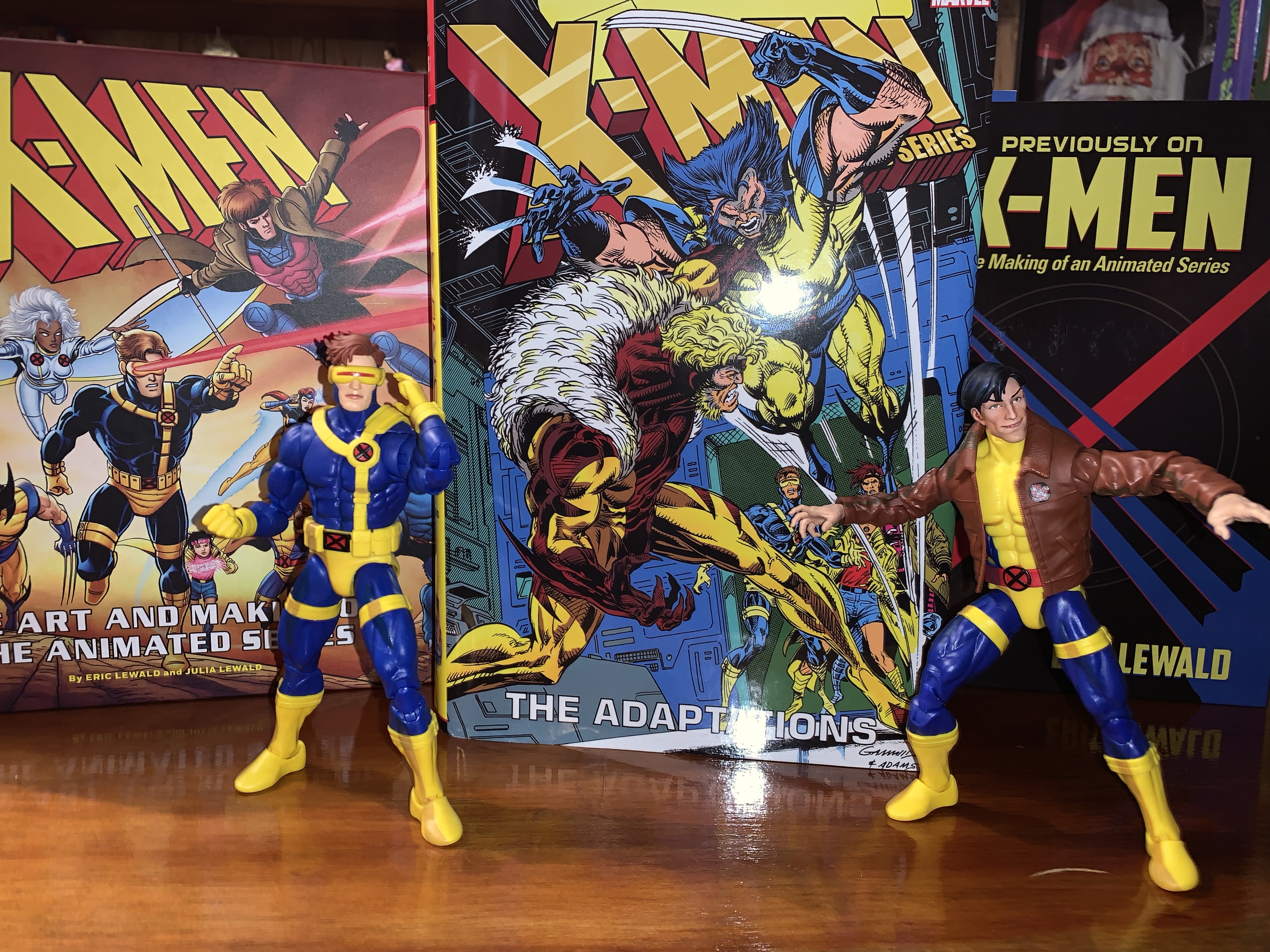
I can’t seem to get enough X-Men merch based on the 90s cartoon series.

Halloween 1992 was when things really changed for the X-Men. A high-selling comic book was about to blow open and enter the mainstream with a hit new Saturday morning cartoon series. Spearheaded by Eric Lewald for Saban Entertainment, X-Men would become the highest rated children’s program on the Fox Network and the overall highest rated children’s program in 1993. At least, until a little show called Mighty Morphin Power Rangers came along. Even following that, the show remained a hit for the network and it’s likely that without the success of the cartoon we never would have had the film series that followed.

When Fox agreed to bring the spandex-clad mutants to network television it did so with Saban and Graz Entertainment who had their own ideas for the show. Lewald was the showrunner who oversaw a team of writers that crafted the inaugural season, most of whom were unfamiliar with the comic from which their characters were taken from. As a result, the first season was largely unique. It was not pulled from the comics with the exception of the “Days of Future Past” arc. Sure, the characters largely acted and behaved like their comic book counterparts, but the plots and character history were pretty much all new. I don’t think this necessarily played a huge role in what followed, but if the new show wasn’t just copying and pasting what the comic books had done then it made sense for a comic companion to tag along. Enter X-Men Adventures, a comic book adaptation of the animated series. Writer Ralph Macchio (no, not that Ralph Macchio) was handed the teleplays for the first season and was paired with varying teams of artists to bring the show to the pages. The first issue arrived in November 1993 and would run until March 1996 concluding with the “Dark Phoenix” arc. After that, the book split away from the cartoon series rather than adapt what was dubbed Season 4 and beyond, but up to that point, it had largely remained in lockstep with the show.
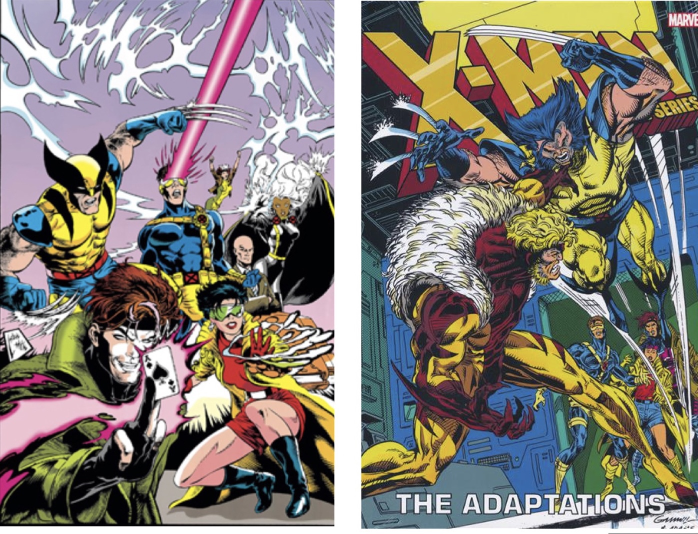
The two covers available for this collection.

As a kid, I didn’t bother with X-Men Adventures despite my love for the cartoon. In my mind, it felt redundant. Why buy a comic version of something I already saw on TV when I could get a comic book that told a whole, new, story? Now that I’m older and fond of reminiscing on things I enjoyed as a child, I’m more curious about something like X-Men Adventures. Surely, the comic would present opportunities to frame things differently. How would it handle something like the death of Morph? Would the characterizations be the same? Would some characters assume more of a spotlight or less of one? I probably could have answered such questions with relative ease and not much of an expense. Being a 90s comic, X-Men Adventures isn’t terribly hard to come by secondhand, especially if you’re one who is unconcerned with condition.

Rather than scour the back issues at a local comic shop, I turned to a new publication: X-Men: The Animated Series – The Adaptations. That mouthful of a title was released earlier this year. It’s a hardcover collection of X-Men Adventures totaling the first 41 issues, or said another way, all of the issues that mirrored the show. It’s a heavy, meaty, tome that’s nearly 1,000 pages with most of them devoted to the old issues. The paper is a nice white, though it has some transparency and isn’t as thick as it could be. The main cover illustration is the same as the very first issue of X-Men Adventures by Steve Lightle. The version I have is the variant cover which depicts Wolverine battling Sabretooth in the War Room and it’s done by Kerry Gammill and Greg Adams. The collection is expensive with an MSRP of $125. That was too rich for me so I played the waiting game eventually scoring one for less than $60 off of eBay. This one had bent corners that likely had been damaged during the shipping process. The eBay listing also had a typo in the title which may have helped to keep it on the site long enough for me to notice. Either way, I was willing to accept some cosmetic damage in exchange for a price that was more than half off. Now several weeks later, I’ve read this thing cover to cover and am ready to share my thoughts.

This one isn’t going to shy away from Morph’s death.

X-Men Adventures volume 1, which is thought of as the first season, spanned 15 issues which is longer than the show’s 13 episode first season. As such, the first season of books is more expansive than that season and also more expansive when compared with the seasons that followed. My guess would be that with the show being new, and being tinkered with practically right up until air date, there was a lot less that was nailed down and thus there was more room for Macchio’s own interpretation. It’s also interesting that the characterizations of the book’s characters are far more reliant on their comic history. This is seen most with Magneto who is very much a villain in these books as opposed to a friendly rival. He’s not going to team-up with these X-Men to take down the Sentinels and he’s far more willing to inflict pain upon them as well. The costumes for the characters also all mirror the comics. Jean is more yellow and blue with long hair, Apocalypse isn’t purple, and Sabretooth doesn’t have the massive physique of his animated counterpart. Fights, like Wolverine vs Sabretooth, can be more violent with actual blood spilled and our boy Wolverine is also free to smoke cigars and drink beer.

By far, the thing I was most interested in seeing was how the books handled the death of Morph. In the show, his death is essentially offscreen, though the characters deal with it in a pretty realistic manner. It wasn’t some Saturday morning “zapped to another dimension” sort of end for old Morph. In the books, it’s foreshadowed with a rather grizzly depiction of Morph with half of his face burned off. I’m not sure the character needed to have these visions, but it was an interesting way to go about it. When the time comes for him to actually die, it’s handled in a far more personal manner with Beast cradling Morph in his arms as he draws his dying breath. Of course, the character would be brought back in Season Two which was never the plan at the time. It does muddy things a bit since his death was so final in the books. Did the Mutant Control people haul Beast away and just leave Morph’s corpse behind for Sinister to come along and swipe? Apparently so, because no other explanation is offered.

Wolverine is allowed to fight like, well, Wolverine!

Morph’s death was one area where the books could go into more detail and be a bit more showy than the cartoon. It’s also pretty unique as the rest of the issues largely unfold in a more expedited fashion after the first season. The first 15 issues are far more dense and interesting as a result, while the rest are still enjoyable, but missing that extra component. Some stories, like the Omega Red confrontation or Wolverine’s parlay with Alpha Flight, end far too abruptly to feel satisfying. If you didn’t like how the X-Men defeated Omega Red in the show, then you really won’t like it here. And since comics always seem to operate with the idea that any issue could be someone’s first, there’s a lot of needless exposition from characters explaining their thoughts, motivations, powers, etc. too plainly. It feels demeaning to the reader and like a dumbing down of the material at times, something the show seems careful to avoid.

The other aspect of these stories that threw me the most was just the changing art styles. These books never seemed to have a single vision for very long when it came to the art. Andrew Wildman was the penciler for the first six issues. He had a slightly more realistic style than some, but it’s not bad. Chris Batista then takes over for two issues and he has a more streamlined approach which actually might suit the animated look a bit better, though I think I still prefer Wildman. Wildman would return for the 9th issue and hang around through issue 13 and then back again for the final issue of the first season. In between is an issue by Nick Napalitano. All three pencilers for that first season complement each other well, but later seasons have more divergent takes, some of which I like and some of which I don’t. By the end, Ben Herrera was handling a lot of the load and I’m just not into his style. It’s very reflective of what the 90s comics were producing at the time, and even then, it wasn’t a style I enjoyed. My least favorite issues were the ones done by Hector Collazo. He seemed to take to heart that this comic was an adaptation of a cartoon because his style could best be described as toony. I’d enjoy it on a Looney Tunes or Animaniacs book, but not an X-Men one.

The art style isn’t consistent for all 40+ issues so readers are likely to enjoy some more than others.

Reading through this book basically gave me what I was looking for: familiar stories told through a different lens. The only downside for me was how the second and third seasons were more streamlined with less room for freelancing, if you will. The first season was by far the most enjoyable part of the book, though I am curious about the issues not included. Following the third season, Macchio basically was allowed to continue writing stories for this version of the X-Men, but ones that didn’t follow the show. Those works are collected in another trade paperback that I should probably give some thought to acquiring. If you’re someone like me curious about what another interpretation of the beloved show could look like, this isn’t a bad experience. I don’t think it’s worth the asking price so I’d recommend getting it used or on sale. The actual quality of the book is pretty nice, though there are the occasional page that came out slightly blurry from the printer. It seems to be an issue that becomes more frequent further into the book. It may also be something that’s not consistent from copy to copy. Either way, it’s a tough ask at full price. A lot of places have it marked down to around 80 dollars, which is still a lot, but better than $125. I’m not sure I’d even recommend it at that price, but definitely consider a look if you ever find it closer to 50 bucks.

Interested in living in the world of X-Men as established by the animated series?

Previously on X-Men: The Making of an Animated Series

A lot of cartoons made an impact on me as a child. My first love was The Real Ghostbusters. Its goofy cast of characters and excitement were plenty of fun and there were interesting toys to supplement the series with, which was pretty much the goal of all cartoons in the 80s. The Teenage Mutant…

Keep reading

X-Men: The Art and Making of the Animated Series

A few years ago, I talked about my love of X-Men, the animated series, via a book review of Previously…on X-Men by Eric Lewald. That book chronicled the development of the 92 animated series that helped propel the Fox Kids Network to the top of the Saturday morning leaderboards through notes from the author and…

Keep reading
Dec. 18 – X-Men – “Have Yourself a Morlock Little X-Mas”

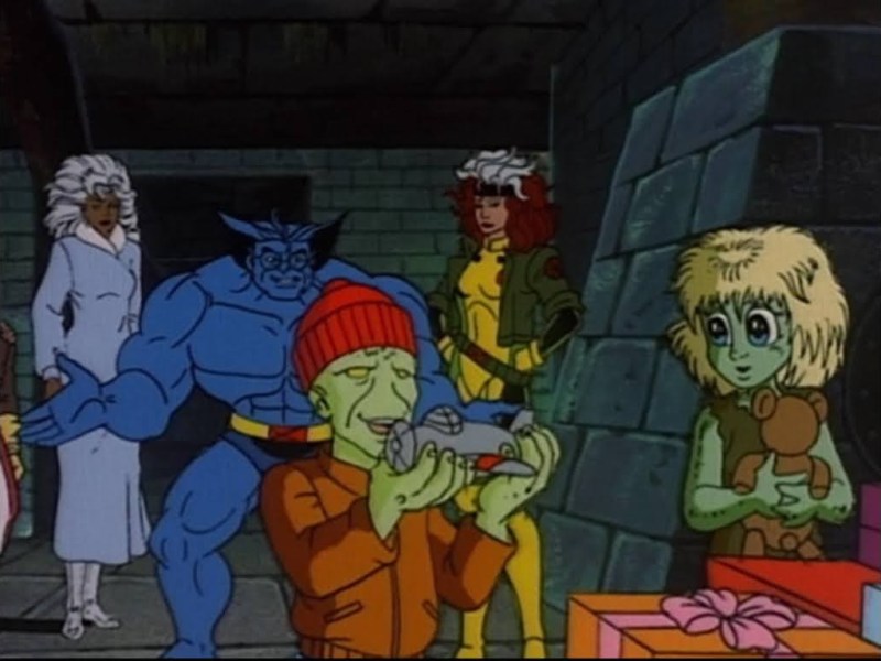
Today, The Christmas Spot temporarily alters it’s name to The X-Mas Spot. As a sort-of celebration for the animated series X-Men turning 30 this past Halloween we’re going to look at the show’s lone holiday special – “Have Yourself a Morlock Little X-Mas.” The show X-Men was a pretty serious affair as far as kid…

Keep reading

McFarlane Toys Gold Label Batman Santa (Blue Suit)

He only has a naughty list.

Ho! Ho! Ho! It’s the jolly one – Santa Claus! Oh, wait, no, it’s the somber, moody, one: Batman Santa! Yes, it’s our first Christmas themed post of 2023 and it’s an action figure review – shocking, I know. McFarlane Toys has held the DC license for several years now, but this is my first experience with the line. I’ve never been a big DC guy, though I do enjoy the Batman. McFarlane’s DC Multiverse line is a 1:10 scale action figure line that seems fine, but it has its own aesthetic and it’s not one that I’m particularly drawn to. It’s not very comic-like, and more of a grittier, militaristic, interpretation. It’s like a toyline based on the aesthetic found in Rocksteady’s Arkham series of Batman video games. If you like it – great, and if you don’t that’s fine too. I thought that by now I would have bought at least something from the line, but even the animated characters didn’t do much for me so I never had reason to dip my toe into the McFarlane waters. That is, until Todd decided to pair Batman with Santa.

He’s Batman in a Santa hat and robe with beard. Also, he can’t lower his arms past this pose.

The Batman Santa figure is a case of what you see is what you get. It’s Batman, and he’s dressed as Santa. I’m not aware of any story to pair with this one and there’s some artwork that goes along with it which is fine, but I’m always down for Christmas variants of characters I love. This figure is part of the Gold Label series which, as far as I can tell, is more of an excuse to tack on five bucks to the usual price as I don’t see anything all that special in the box. It comes in a clamshell package and was sold exclusively on McFarlane’s webstore in two versions: red and blue. The red is undoubtedly a more traditional take on Santa, but I like blue and blue feels more appropriate for Batman. The figure was 30 bucks, though there was a bundle to get bother versions for $50. It sold out by the time I made my purchase (even though both versions were still available as singles) so I didn’t even get a chance to consider double-dipping here, but I don’t think I would have. I only need one Santa Batman, or Batman Santa, for my holiday decorating this year.

Lot of texture on this guy. He just might be bullet proof because, you know, Santa always has to worry about getting shot at.

Batman comes in at right around 7.375″ to the top of his hat. If this Batman is reusing any parts from a past release in the main line I’m not aware, because I don’t regularly purchase figures in this line. The Bat suit he’s wearing seems pretty modern to me and very much in that style I described going in. It’s textured like Kevlar and is armor-plated on the chest and lower legs. It’s almost all done in blue plastic without any shading or much in the way of paint. He has a silver Bat logo on the chest as well as silver shoulder pads and gauntlets. The gauntlets are held on by “straps” which are sculpted into the forearms. The same is true of the kneepads, but McFarlane didn’t paint the straps. Some white might have looked nice, but oh well. There’s a lot of paneling on the boots, but it’s all black plastic. It makes me wonder why they didn’t go with a less-detailed sculpt. Come to think of it, this getup would have been pretty appropriate for a Batman ’66 release.

I do like how they chose to paint the face.

Where paint is used is on the trim of the hat, robe, beard, face, and the cuffs of the sleeves. In almost all cases, the paint is white. I can’t quite tell what’s going on with the hands. It almost looks like they painted white over blue, even if it would have made more sense to just cast them in white. Then again, maybe it wouldn’t if nothing else on the figure is molded in white. The paint is mostly fine though and is cleanly applied. I wish the white was a bit more white, but it has a dingy quality to it. I suppose that fits the line’s aesthetic better than a pure white would, though I also can’t tell if it’s intentional or just the result of painting white over a very bright blue. The masked portion of the face is painted black which I love. It looks like a classic, 70s, Batman. It helps sell this blue color scheme, which honestly makes Batman look more like a Hannukah character than a Santa one.

“Thank you for assisting with the decorating today, Mr. Freeze.” “I was…what? Decorating?!”

And that Santa element is captured in really just three features of the figure. The head features a Santa hat which is part of the sculpt as well as a beard. To go along with that is the long overcoat with a utility belt holding it in place. The belt is black with a series of pouches painted white that make up about 2/3rds of the belt itself. It’s not a lot, but it’s certainly enough to get the point across. I think just some more color would have helped, but otherwise this is a Batman Santa and it’s what I wanted. The bladed forearms and shoulder pads are the only things I’m not that sold on. While I like that they do provide for a splash of color, they also make Batman look more like the Shredder than Batman. Is this what the character looks like in the comics now? It’s bizarre to me, someone who hasn’t opened a Batman comic in 20 years.

Here is your accessory for your 30 dollar action figure.

And that’s mostly all you’re going to get, a Batman that’s dressed like Santa. For accessories, we get a sack of presents. It’s blue plastic with silver painted gifts oozing out of the top. Batman can’t hold it, it can just sit on a surface beside him. And that’s it as far as action figure accessories go. No extra hands, no extra heads, no additional weapons or toys. How about a Christmas-themed grapnel launcher? Or Batarang? Or little Charlie Brown tree with a bat for a star? The artwork features a sleigh that would have been pretty cool, but admittedly not practical at this price. If this figure is reusing a ton of assets, then I’m a little annoyed at the lack of accessories for the price. If it’s not, then I guess it’s more acceptable, but still not great. You do get a little disc stand with the figure which at least helps to stand it on cotton “snow” as seen in my pictures. There’s also a plastic piece that snaps together and the artwork insert can slot into that to create a backdrop of sorts. It’s not a bad idea and I like the artwork on it, but I wish it had something else on the reverse side. Something like a true backdrop such as the Batcave decorated like Santa’s workshop. Instead, it’s just the same image on both sides. Opportunity wasted.

This is pretty much the extent of his articulation.

This figure is basically designed to just stand there in front of that backdrop with the sack of presents beside it, but it is still an action figure so we should talk about the articulation. It’s not great. The head just swivels side-to-side as the hat and beard prevent any up and down movement. There’s also no tilt to be found. The shoulders are big ball-hinged pegs that can raise out to the side past a horizontal position. The shoulder pads are soft enough to move out of the way and the arms rotate just fine. There’s some slight up and down play, but no real butterfly joint. The biceps swivel is fine and the double-jointed elbows bend well past 90 degrees, but the joint is hideous and strangely he can’t straighten his arms out or place them at his side. They’re always bent slightly. The hands are on a ball hinge or something similar, but the cuffs of the sleeve render the joint pretty useless. There’s no forearm swivel either, which I always hate on figures with gauntlets like this one since you can’t position them and I don’t like the default placement of them either.

He’s a pretty big Batman. Also, notice where the other Batmen position those blades on their gauntlets? This one can’t do that.

In the torso, the figure has a diaphragm joint, but the coat won’t let it do much of anything. The waist twist works fine though and the legs can kick forward all the way and kick back some as well. They go out to the side for full splits, but don’t appear to feature a thigh twist of any kind. The knees are double-jointed, but despite that I can’t get them to go past 90 degrees. There’s no boot cut, and the ankles are pretty restricted by the design of the boot. They bend back pretty far, but not forward. The ankle rocker doesn’t appear to work and there’s a fairly useless toe hinge as well.

No sleigh? No problem!

Despite the coat being fairly flexible and featuring an open design on the front and back, it still makes it hard to do much with this figure when it’s combined with the articulation scheme. Batman Santa can stand there, he can do splits if you want, or assume a walking pose. He has gripping hands, but nothing to grip, which seems like a bad idea as the hands aren’t expressive. Even if he had a grapnel hook or a line to swing from, his arms are really short and he wouldn’t be able to grab something over his head. It’s not a figure you’re going to do a whole lot with, but it didn’t have to be this way.

“All right Batman, I’ll let you handle the deliveries this year, but the milk and cookies are MINE!”

Batman Santa is an action figure that doesn’t articulate well, has some weird proportions, and is a pretty terrible value considering the price tag and the lack of accessories. It’s an online only figure too so you have to pay a shipping charge as well. The cost of this guy was $39.28 for me before taxes and that’s pretty expensive for a McFarlane figure. You really need to be a Christmas weirdo to want this figure, which is what I am. And now that I have it, how do I feel about it? Well, I’m happy to have a Batman as Santa action figure, even if this actual figure barely scratches that itch. It’s a novelty, and one that probably doesn’t justify the price. If you like it, I guess go for it. If you want an action figure that behaves more like an action figure then it will probably let you down.

This Batman Santa isn’t the first Christmas themed action figure we’ve looked at on this blog, how does it stack up with these?

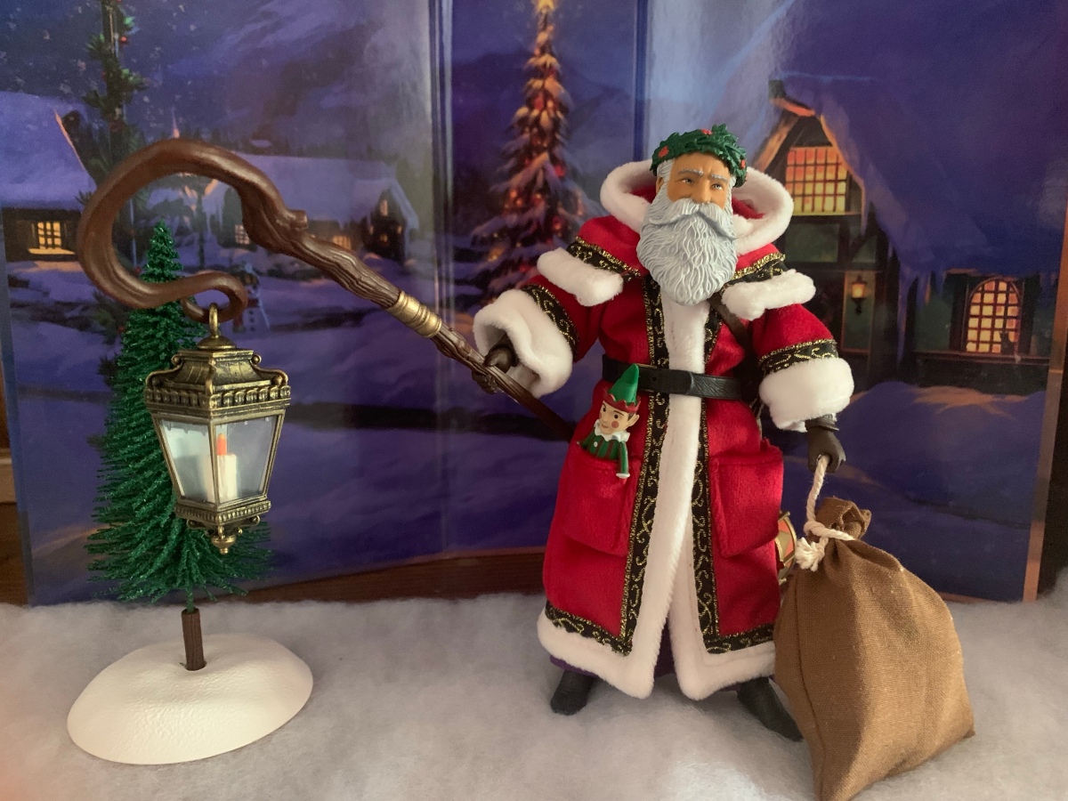
Figura Obscura – Father Christmas

It was just last year that Four Horsemen launched a subline of its popular Mythic Legions brand of action figures called Figura Obscura. Practically speaking, there’s little difference between the two lines as Mythic Legions seeks to serve as a modular line of toys based on myth and legend and that doesn’t feature licensed characters.…

Keep reading

Transformers Generations Holiday Optimus Prime

We interrupt our regularly scheduled holiday posts with something very familiar to this blog: a toy review! Yes, we have ourselves another Christmas toy to talk about and it too comes from Hasbro. We already looked at a Star Wars toy at the end of November, and now we’re turning to what I suppose is…

Keep reading

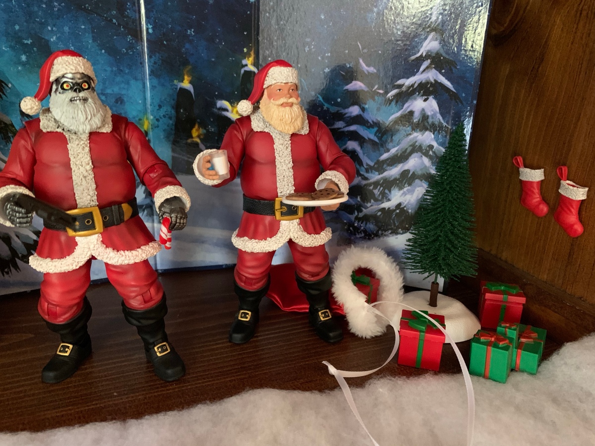
Naughty or Nice Classic Santa and Cyborg Santa

It was looking like we were in for a photo finish this year. Last year, toymaker Fresh Monkey Fiction partnered with online retailer Big Bad Toy Store to launch the Naughty or Nice collection. Structured similar to a Kickstarter campaign, FMF posted several action figures for preorder with a minimum order quantity needed for the…

Keep reading

Marvel Legends X-Men ’97 Magneto

New show, new toyline, that’s how the world works.

It was two years ago that Hasbro made the announcement that it was wading into the weeds of X-Men, the cartoon series that aired on the Fox Kids Network from 1992-1997. The line was released across eight installments in 2022 (plus a ninth if you include the obviously animated-inspired Apocalypse released on a retro card) and you probably don’t need to be a huge fan of the property to know that eight figures just isn’t enough to properly capture the series in action figure form. Fans can debate on what the biggest omission was and it would certainly be easy to select one of the several X-Men not included, but for me, the one I missed the most was Magneto.

Magneto has long been one of my favorite villains in anything. While he really wasn’t the big baddie he could have been in the show, he still had tremendous presence and was a captivating figure. I was delighted to see Mondo turn to him second for their line of sixth scale figures based on the show and they basically nailed the likeness of the character. In a perfect world, we would all be enjoying X-Men 97 right now, the sequel series to X-Men from the Fox days set to launch on Disney+ in early 2024. It was going to launch this fall which would have coincided with the 31st anniversary of the original show’s premiere, but I guess it just wasn’t meant to be. The show could be pushed back, but the tie-in merch was basically locked into their release windows so we at least have a new line of Marvel Legends based on the show to talk about.

He’s a bit of a slender boy.

As someone who is a big fan of that original animated series, I saw this X-Men 97 line as a chance to add to what Hasbro gave me in 2022. And I think some of that attitude is present in the character selection as we’re getting four characters right out of the gate not featured in the VHS line: Rogue, Gambit, Bishop, and the subject of this post, Magneto. Hasbro knows people like me will supplement that line with these figures which have a more animated look than a standard Marvel Legend release, even if it’s based on the new series instead of the old one. The characters are all coming on blister cards with artwork from the show on the front and they’re a mix of old and new tools. Unlike the VHS line though, these are definitely designed to resemble the source material where as the VHS line was very inconsistent with its approach. The line was actually pretty bad, if I’m being honest, but I keep buying this stuff anyway because nostalgia is a hell of a thing. If you think Marvel Legends are only getting worse these days then I guess I’m part of the problem as I’m still buying compromised visions of the characters I love.

There’s no cel-shading in this line, but he does have shadowy eyes. I just wish they went a bit heavier on the shading like the source material.

I’m looking at Magneto first because, as I said, he was the one I missed the most from the VHS line. He’s also the figure that best fits the style of the 92 series as not much has changed. I don’t collect enough Marvel Legends to know if the parts here are new or not, but they’re new to me. Out of the box, he stands at approximately 6.25″ to the dome of his helmet. We’ll get the accessories out of the way right now as he just has clenchy hands out of the box and a set of fists. He’s depicted in his classic attire from episode 3 of the original series: helmet, purple cape, red gloves. His costume changed here and there throughout the show. Sometimes he had purple gloves, something the part of his costume covering his neck and upper chest was red, but this is how he looked in Season One (and how he’ll presumably look, at least in the early going, of the new show). The crest on his helmet isn’t painted, but it doesn’t appear to be in the new show either. An outline might have helped though. The helmet has a very glossy appearance, but since it’s supposed to be metal I’m okay with that. The rivets holding his cape on are also shiny and there’s a little pearl quality to the purple portions of the wrists and shins. Those parts are painted, and the application is just okay. There’s some red poking through on the left shin of my figure and the lines aren’t all clean.

“Why is my hand shrunken when opened?”

The red portions of the costume are just colored plastic, but they have a nice, matte, finish. The cape is also colored plastic with a similar finish. I like how they sculpted in some shape into the shoulders which adds a little flair to the look. There is no cel-shading with this line, but Hasbro did paint the face with some black around the eyes as Magneto is often depicted in both the comics and animation. I like it, but I think they could have gone a little heavier with the black. There’s also some missed spots in between the eye and the eyebrow. The helmet is a separate, non-removable, piece and the face is painted underneath it. I don’t like the lipstick and I feel like his eyes are a little too high, but the face is okay enough.

The dainty hands are more pronounced when compared with Cyclops.

What I can’t shake though is the feeling that Magneto is just too small. X-Men 97 is a continuation of the original series so it stands to reason that the characters are the same size as they were back then. In that original series, Magneto was around 6’3″ and was basically eye-to-eye with Cyclops and Gambit if not a touch taller. With this figure, he is shorter than both Cyclops and Gambit. He’s also a touch slighter of build in comparison with the VHS Cyke. Maybe the new show is going for a slimmer profile with its characters and if so, criticism revoked, but the height is still an issue. Also of issue are the clenching hands which are almost comically undersized. Compare his open hand with Cyke’s two-finger hand and it’s like comparing a child to an adult. The fist hands are fine, and actually look like they’re reuse from Cyclops, and it’s even easier to see how small the clenching hands are by comparing them with the fists as there’s no way those two hands could be the same. The only big parts of the figure are his feet, which look terrible. They look like loafers and not boots. Magneto is a character that’s all about presence, so his size feeling off is a bigger deal here than it might be with other characters.

These two will never see eye-to-eye.

Articulation for Magneto is a touch limited for a Marvel Legends release, but that’s not exactly a deal-breaker. The head is on a hinged ball peg so you get range looking up and down, but it lacks the nuance of a double-ball peg. The shoulders are standard ball hinges and they raise out to the side past horizontal and rotate as far as the cape allows. The cape can be moved as it’s glued down to the figure’s chest, but also pegs into the middle of the back which can be popped out easily if you need it to. There are no butterfly joints, but I’m okay with that. There is a biceps swivel and double-jointed elbows that go past 90. They’re not the best looking elbows, and the entire figure has a bit of a gummy feel, but they work. The wrists swivel and both sets of hands feature horizontal hinges.

Lets bring in Gambit for another size comparison.

In the torso is an ab crunch that actually works really well going forward and back. There is a waist twist below the sash that works, but it gets ugly if you go too far. The hips are simple ball socket hips which can almost hit a full split going out to the side. They kick forward 90 degrees and kick back a little bit as well. There is the standard thigh cut which works fine and double-jointed knees that bend past 90 without issue. The ankles hinge forward and back and at least these ugly feet have solid range. The ankle rocker is also there and works fine.

If only he had an effect part of his own.

The articulation isn’t amazing or anything, but at least what is here works about as well as it could, minus the tactile issues. It’s enough for Magneto who basically just raises out his arms and floats around. What is lacking are the accessories since there basically is none. No un-helmeted head, no flight stand, no power effects. Just a figure with mis-matched hands. Is it enough? This figure cost me $26 and it’s a pretty bare bones release, all things considered. Any way you slice it, that isn’t great value. That’s probably why a lot of Marvel Legends are clearance buys for many people out there.

Yeah, he doesn’t look as good or come with as much stuff as the Mondo version, but it is almost a tenth of the price.

I bought this Magneto to go with my VHS set of figures. I know others are buying it for their comic collection. Presumably, there are people out there buying the figure to put on an X-Men 97 shelf, but with the show not out I guess it’s not surprising there isn’t a lot of folks going in that direction. For what I wanted out of this Magneto, it works. It’s undersized and lacking in bells and whistles, but otherwise looks the part. Is that worthy of your twenty-six dollars? That’s for you to decide. As for me, I don’t regret this one and compared to the VHS line he’s honestly among the better of those figures. It’s just a terrible value for what you’re getting, but as long as Hasbro is the only game in town it’s all we got.

Interested in more figures based on the animated X-Men?

Marvel Legends X-Men Animated Series Wolverine

The toyline of my dreams was announced last October. In celebration of the 30th anniversary of the television series X-Men, Hasbro is doing a dedicated line of Marvel Legends with figures based on the look of the show. The show was obviously inspired by the designs of Jim Lee, but there are differences in the…

Keep reading

Mondo X-Men TAS 1/6 Scale Magneto

If you showed a random individual this blog and asked them what my favorite cartoon was as a kid I’m guessing they would go with Teenage Mutant Ninja Turtles. And they wouldn’t be wrong as that was my favorite for a time, but come 1992 I was starting to drift away from that show. Batman:…

Keep reading

Marvel Legends X-Men Animated Series Cyclops

I wasn’t sure he would make it in time, but Hasbro managed to ship Cyclops before the end of the year. Cyclops marks the final figure (for now) in Hasbro’s X-Men animated series subline of Marvel Legends. It has been…a ride. What was once a dream line of mine to see brought to fruition, turned…

Keep reading
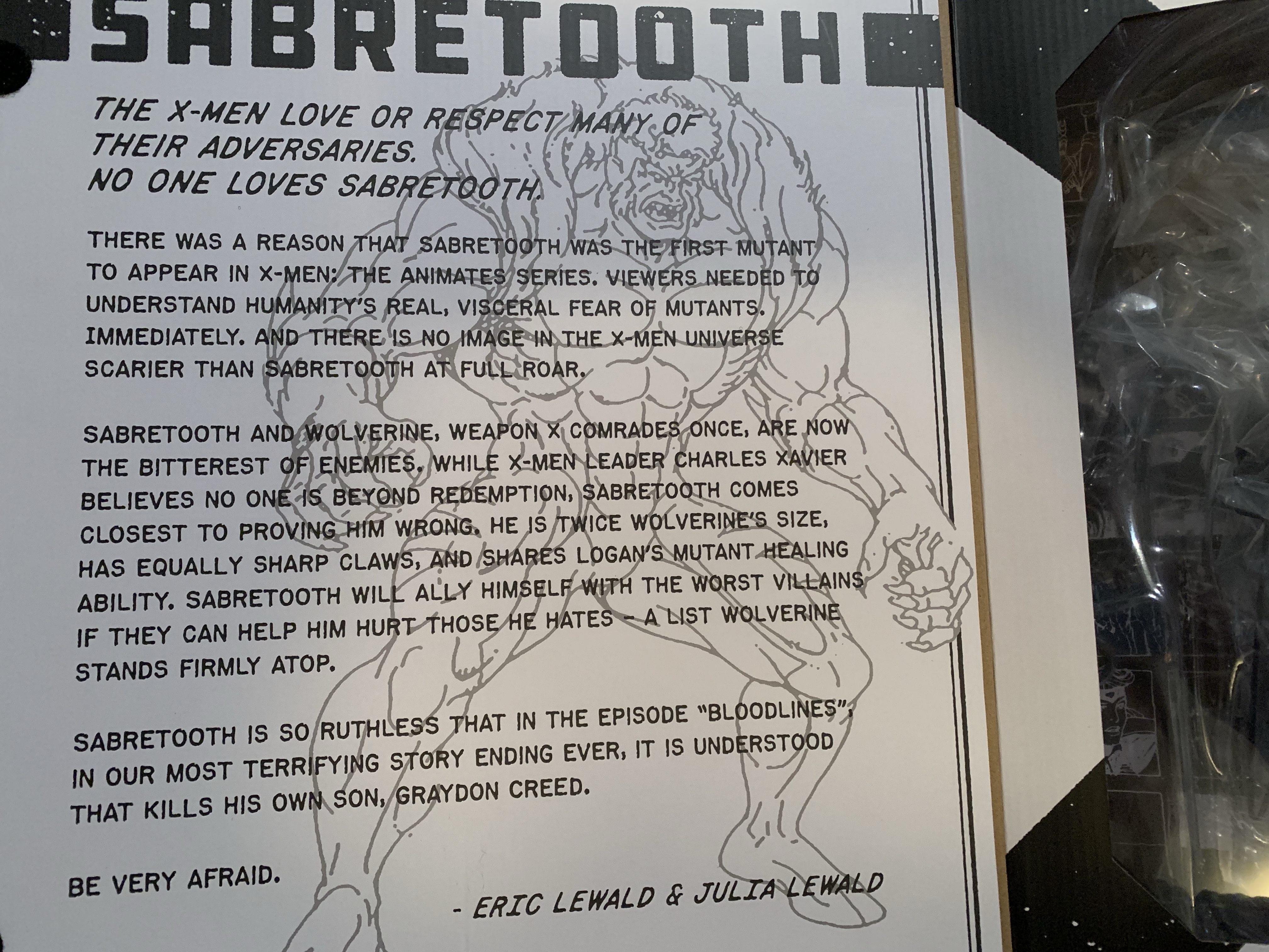
Mondo X-Men TAS 1/6 Scale Sabretooth

No one loves Sabretooth? I love Sabretooth.

It’s Halloween 1992. You’re sitting in front of the television with a bowl of candy and your costume in pieces. Coming on is a prime time airing of Fox’s newest superhero cartoon: X-Men. You’ve seen the comics at the grocery store and in other places. You know Wolverine, you know there’s a guy who shoots lasers out of his eyes and that the bad guy can stick to your refrigerator. Outside of that though, there’s still a lot to be discovered. The theme song kicks in composed by Ron Wasserman which gets your blood pumping. A dazzling array of colorful costumes and bright lights play before your eyes – it’s too much to take in with just a single viewing, but as the characters line up for a colossal battle they slam together and the logo “X-Men” overtakes them. The screen is then filled by the snarling, angry, face of someone you don’t know. He’s massive! And scary! And he sends a police car hurtling towards the screen!

That character is Sabretooth and he has the honor of being the first character shown in an episode of X-Men. In less than a year, the X-Men will practically be household names. It will be the highest rated show on Saturday mornings and it will stay there through reruns all summer finally ceding the throne in the fall to a little show called Mighty Morphin Power Rangers. It’s kind of a big deal considering Fox was also airing Batman at the same time which was coasting off of Batman Returns and starred a character that had already been a household name for decades. As for Sabretooth, I had never given much thought to him being the first character we see in the show following the opening credits (which prominently displays all of the heroes and a bunch of the villains, including Sabretooth), but it was apparently by design. Sabretooth is the fourth release in Mondo’s line of sixth scale action figures based on X-Men, and on the inner flap of his box there’s a write-up for the character by the showrunner, Eric Lewald, and his wife and fellow writer Julia which explains why Sabretooth was chosen to essentially lead-off the series. And it’s because he’s big, intimidating, and scary. They wanted the viewer to understand why humanity would fear mutants. X-Men was not a show that was going to show its characters in stark black and white tones, and it was important to see how something like the Mutant Control Act could come about while also showing why it was fundamentally flawed in the episodes to come.

Sabretooth may be listed as figure 5 on the box, but he’s the fourth release.

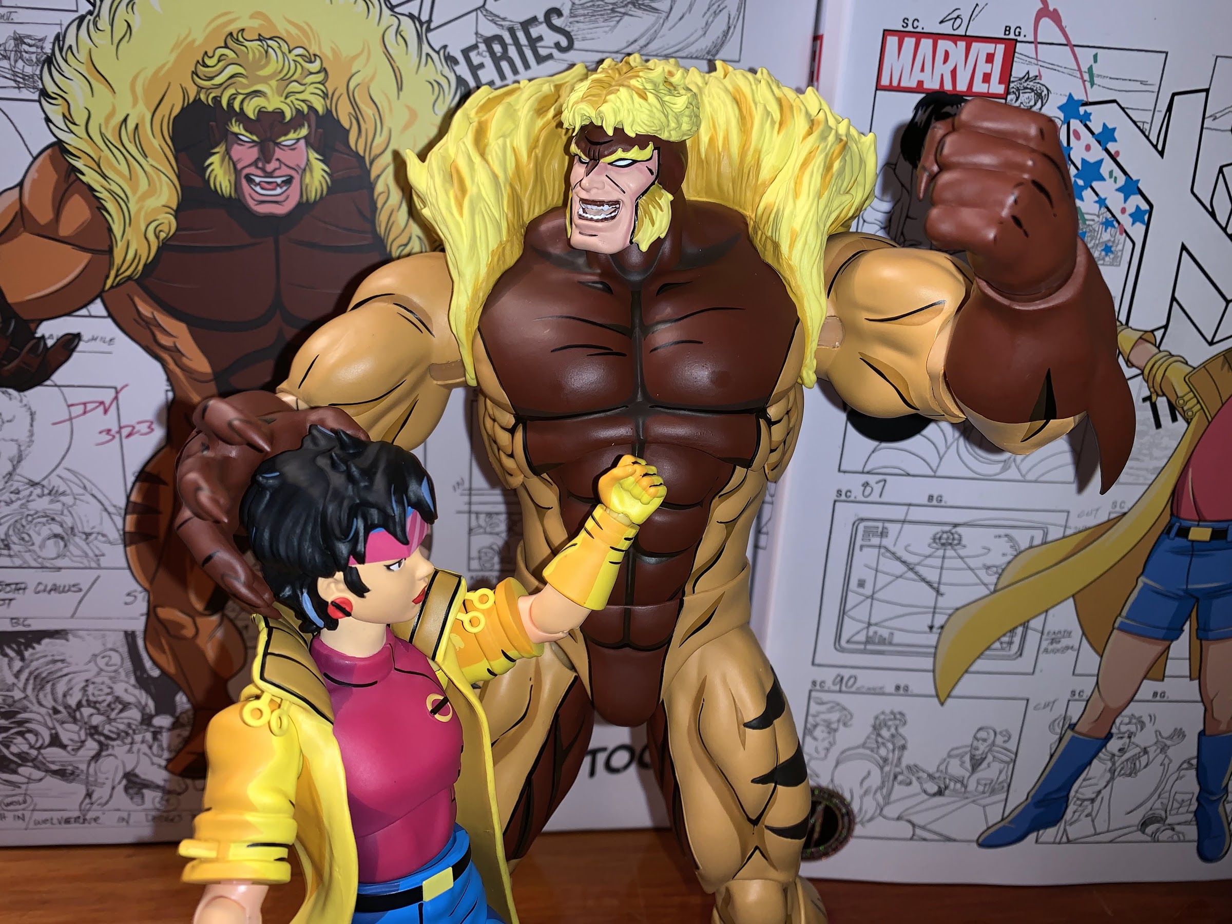
It’s always fun to learn new details on decades old shows, but it’s also more fun to get a brand-spankin’ new action figure! As mentioned before, Sabretooth is figure number four in this line of action figures from Mondo, even though he was actually solicited fifth. Somehow, he leap-frogged over Gambit, but I’m not complaining. Spoiler alert, Sabretooth is probably the best year in the line and it’s a line that’s been trending in the right direction. Each release has been better than the last. While I subjectively prefer Magneto to Jubilee, I can’t argue that her figure is just a little bit better when it comes to function. Magneto had some ticks about him and his articulation is very limited due to his cape, but Jubilee remedied a lot of the little things. Sabretooth has an even cleaner sculpt and the quality control on the joints is superb. It’s not a perfect figure, but it is pretty damn close.

Poor Sabretooth…

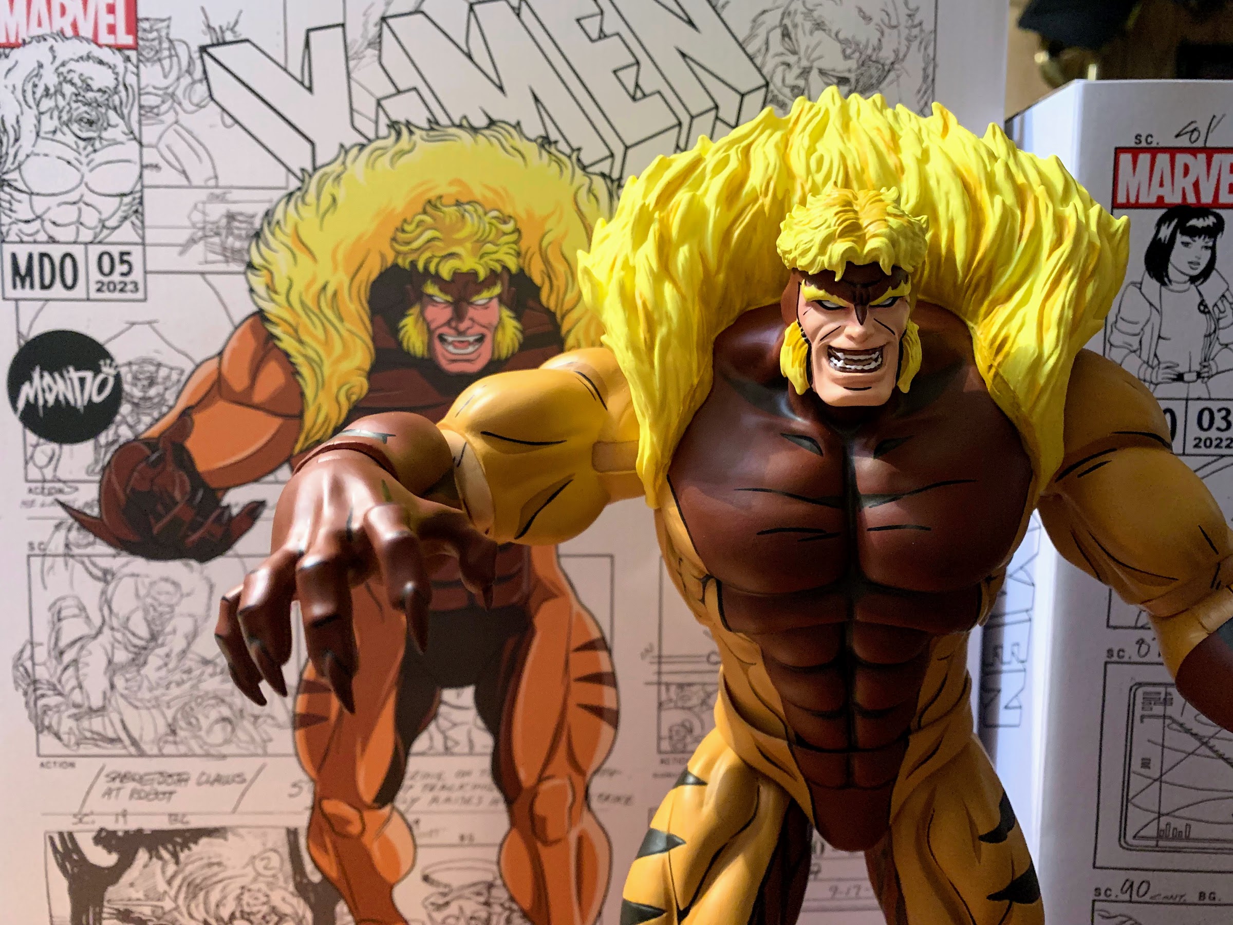
Sabretooth comes in a massive box adorned with production artwork from the series and a new illustration by storyboard artist on the show, Dan Veesenmeyer. Sabretooth is the biggest figure in the line, so he gets the biggest box – makes sense. It has a front flap that opens up to reveal a window behind it, but Mondo packages their figures so well in plastic that the window isn’t very revealing for in-box collectors. It at least allows space for that write-up I mentioned which is both enlightening and pretty damn entertaining as it contains the line, “No one loves Sabretooth.” It also contains a reveal, of sorts, in that we the viewer are supposed to interpret that Sabretooth murders his son, Graydon Creed, at the end of the episode “Bloodlines.” The Friends of Humanity essentially leave their disgraced founder to suffer at the hands of Sabretooth and it’s hard to imagine the cold-hearted fiend taking it easy on the mutant racist just because they’re kin, but still a bit shocking to have his end confirmed.

He’s bigger than the others, but he could be bigger.

Out of the box, Sabretooth stands an impressive 12.5″ to the top of his head and around 13″ to the top of his mane. This makes him the tallest figure in the line, though he’s not much taller than Magneto. As was the case with past releases in this line, it’s likely that Sabretooth isn’t true sixth scale. The model sheet with height references from the show had him at 6.5′. You may think that’s too short and you would be correct as the model sheet has him with bent knees and hunched forward. I’m guessing that’s how he was supposed to be drawn more often than not, though in his early appearances we see him splayed out in a hospital bed which makes him look far bigger. Six and a half feet at sixth scale is exactly 13″, but this figure is 13″ when standing upright so it’s not exact. I personally get it as making this figure much bigger would make things a lot more difficult. Bigger equals more weight and that’s more of a burden on joints. It’s also added cost and this guy was already $240 as is. The figure can work at this size, and it’s actually more of a problem with Wolverine who came in much too tall. If he were the proper height the display would look better. As it stands, the only scale-related issue I have with Sabretooth is that he needed to be downsized not just in height, but all around, so his head size is small compared with the other figures in the line. Not egregiously so, but it noticeably and at this price point we have to get picky.

Who ya got? The egg-suckin’ piece of gutter trash or the runt?!

Issues of scale aside, the rest of the presentation on this figure is pretty damn fantastic. Once again, we’re dealing with a sculpt from Alex Brewer with the paint master being handled by Mark Bristow. This figure presents Sabretooth as he appeared in the show’s first season in which he made multiple appearances with most coming in the the show’s third and fourth episodes. This means he has the red-brown chest that continues all the way up to his cowl. Later appearances would have the red stop at his pecs. He also seemed to be drawn smaller in those later appearances, but we’re done dissecting his height. This edition of Sabretooth sports a costume design very similar to the Jim Lee redesign that was in the comics, but there are some subtle differences most notably being that the sleeves don’t feature any red on the back. Instead, they’re orange and the red begins at the gloves. Sabretooth’s costume always was a bit tricky to figure out as he looks almost nude, but his face is a different color implying it’s all a bodysuit. The episode “Weapon X, Lies, and Videotape” would toss us a curveball though in having Sabretooth remove a glove revealing his forearm and hand to be the same color as his apparent sleeve implying he’s just plain naked. I think it was an animation error, but then there’s also a scene where Sabretooth basically transforms from a relatively normal looking person into the costume we see today so I have no idea what was going on there.

Sabretooth called the head of Talos an ashtray on the show which is kind of surprising that the censors allowed any reference to smoking to sneak in.

This version of Sabretooth is known less for the costume and more for just being a hulking monster. He is way bigger than he often was drawn in the comics and it’s almost all in his upper body. His shoulders and chest are just plain massive. His abs were also ridiculous with some shots in the cartoon giving him a 12-pack as his abs basically continued into his crotch. His design is over-the-top and I am here for it. This is how I picture Sabretooth in my head and basically every action figure I ever owned of the character have left me unimpressed because he just wasn’t big enough. For me, this figure is a long time coming as he looks like he stepped out of my VCR and into my room. While Mondo didn’t go as crazy on the abs as the show sometimes did, he does have an 8-pack and that feels appropriate. His shoulders and biceps are appropriately large as is the chest. His body tapers in towards his waist as it did in the show and his legs are long. The claws on his fingers are pronounced just enough and rather pointy too. We talk about shelf presence a lot in the action figure world, but this is a figure that has shelf presence to spare.

Protect yourself and your pet: buy a muzzle.

And a lot of that is due to the excellent paint job. The sculpts have been good in this line, but it’s the paint that really makes them next level. Anyone who turns their nose up at cel-shading on action figures has never held one of these figures in their hands. It’s impressive, and Mondo selected the exact right tones to shade this figure. Even better, is all of the black linework around every muscle and feature on this sculpt that really gives it that pop. And even with all of this paint, it’s applied in a very clean manner. You have to go hunting with this guy to find imperfections. Some of this has to be hand-painted so there will be some variations from figure to figure, but on my copy at least there’s little to no paint slop to be found. There’s just little spots here and there along the black lines where it could have lined up with the sculpt a little better, but it’s by and large pretty damn good. The only thing I would categorize as an eyesore on this figure are the elbows, which are unpainted. They have black linework on then, but the joint is bare plastic and it’s not a perfect match for the painted parts. It can be hidden some by bending the elbows. It’s also going to show up more under harsher lighting, and in my photos which I utilized a flash for most it’s more visible than it is on my shelf as I type this.

He sure does love his explosives!

Sabretooth comes with a pretty substantial spread of accessories, though he’s a character that also doesn’t demand a whole lot. For heads, we get two to choose from: snarling/yelling and an open-mouth smile. I think both work very well and suit the character and it is hard to choose between the two. I’ll probably go with the smirk more often than the snarl, but I do enjoy both. For hands, we get three sets: fists, C-grip, and what Mondo describes as dramatic. They’re basically open, clawing, hands and what I think many will choose to pose him with. The gripping hands work with a pair of accessories. One, is the head of Talos (or ashtray) from “Weapon X, Lies, and Videotape.” It’s the head and the circuitry for the neck. Nothing articulates, but it’s painted very well and it’s a fun, episode-specific, inclusion. The other accessory he can grip is a handheld detonator and it goes with the explosives. This is from the episode “Cold Vengeance” where he and Wolverine battle in Alaska. Both aspects of the accessory are well-sculpted and well-painted and it’s another fun inclusion. I honestly can’t see myself ever displaying Sabretooth with the Talos head in hands, but I could with the explosives.

Does a mutant healing factor contribute to a healthy head of hair?

If you got the special timed edition of the figure from Mondo then you also got more stuff. For an extra 15 bucks, you get a third portrait of Sabretooth unmasked and sporting a smirk. This from the end of the episode “Bloodlines” referenced on the packaging flap. It looks great, but like the Fairy Tale Theater Jubilee head, it doesn’t match the rest of the figure as Sabretooth was out of costume for that scene. It’s still cool to get an unmasked head, but I’ll probably never use this and would have preferred a standard head with a new expression. Maybe unconscious? The timed edition also comes with the muzzle the X-Men put Sabretooth in when he was captured in “Beyond Good and Evil Part III.” You can basically slot it over either of the standard heads and then pop the head on to complete the effect and it looks pretty cool. It’s definitely a worthwhile inclusion. Lastly, we get a blaster and two trigger hands to hold it. The blaster is, once again, pulled from the episode “Weapon X, Lies, and Videotape” and it looks accurate to the show. This is an item I can see getting added to my display when I want to change things up because it looks pretty damn cool. The trigger hands also work well with the detonator, arguably better than gripping hands.

Sabretooth isn’t really a gun guy, but he pulls it off.

For the timed edition, I’d say that’s a pretty robust assortment of accessories. And if you wanted to save a bit of money and go the standard route, I don’t think you’re missing out on anything essential. Sabretooth is a brawler at heart, so really just the heads and hands are all he truly needs, but I’m always happy to have more. Where this line is typically not that impressive is the articulation. The characters really didn’t move all that well in the show so one could argue they don’t need to do much, but why be limited by the source material if you don’t have to be?

“Ya done nice, girly! And as a reward I’ll finish you off clean and fast!”

Sabretooth has a double-ball for the head that lets him look up and down a bit and rotate. There’s some nuance posing, and perhaps more important than the range, it’s easy to swap heads without scuffing anything. The shoulders are standard ball-hinges and he can get his arm up to about horizontal and rotate. There’s no biceps swivel, but he does have a swivel at the elbow which contains a single hinge that will bend about 90 degrees. The wrists are hinged ball-pegs so he can rotate and move the hand up and down or in and out depending on the direction of the hinge. And unlike Wolverine and Magneto, I had no issues getting the hands to rotate on the peg. In the diaphragm, there’s a big ball joint that lets the figure lean back a bit and forward a bit. It can rotate and tilt to the side as well. The waist is another ball joint, but it’s deep in there and the figure has one of those rubber diaper pieces so you won’t get much back and forth, but you will get rotation. The hips are big ball pegs that allow the legs to go out to the side past 45 degrees. He can kick forward as well, but not a full 90 with minimal range going back. The thighs do swivel, and the knees are double-jointed with swivels above and below the knee. The ankle hinges forward and back and have an ankle rocker. It’s the only joint that feels a tad stubborn, especially the right ankle, so the range isn’t quite what I’d like.

“Back off, dweeb!”

The articulation is basic, and the figure is quite heavy so there are limits to how it can pose. Aside from the ankle, nothing was stuck. The knees are a touch looser than I’d like and I’m sort of questioning if the double-joint makes sense here. Between the bending and the swiveling, the figure can sometimes want to kick out. I have had no issues getting him to stand, but I often don’t feel comfortable leaving him be in some poses. It does work better to have the figure in a crouch, which makes sense for the character, and I did leave him standing unsupported for days without falling. Mondo does include its usual stand and it’s actually slightly different. There’s more weight in the base so it probably works better than it typically does. And it’s actually usable with Sabretooth since he doesn’t have a cape or giant coat to get in the way. I’m not presently using it, but I did consider it this time around.

With each release, it gets harder to find space, but it’s a good problem to have.

Mondo is not trying to give collectors a super articulated line, just enough to create some distinct poses. What Mondo prioritizes is the aesthetic and it’s hard to imagine anyone making a better Sabretooth figure than what we have here. I love this figure. This is the Sabretooth I wanted when I was a kid. Maybe not at this size, but definitely these proportions. The sculpt is awesome, the paint incredible, and there’s plenty of stuff in the box. I am as pleased as I could be with this release. If Mondo were doing this line at 1:12 scale they wouldn’t be able to keep the stuff in stock. By doing sixth scale, it does shrink the market because this line needs a lot of space and it’s not cheap to collect, but it is so much more satisfying to behold than what some other companies have done with this property. If you’re in on this line and cherry-picking, this is a cherry to go after.

If this review has you wondering about the rest of the line, see below:

Mondo X-Men TAS 1/6 Scale Jubilee

When one hears the phrase “mall babe” it implies a certain visual. Probably a short, young, girl with intentionally messy, short hair. There’s a certain confidence the phrase exudes so she has to have style. Maybe hot pink, bright blues, and certainly a long yellow coat with gloves to match! There has to be an…

Keep reading

Mondo X-Men TAS 1/6 Scale Magneto

If you showed a random individual this blog and asked them what my favorite cartoon was as a kid I’m guessing they would go with Teenage Mutant Ninja Turtles. And they wouldn’t be wrong as that was my favorite for a time, but come 1992 I was starting to drift away from that show. Batman:…

Keep reading
Mondo X-Men TAS Wolverine 1/6 Scale SDCC Exclusive Action Figure

When San Diego Comic Con was cancelled for 2021, many of the entities that would have sold exclusive merchandise at the event pivoted to web sales. And since the 2020 iteration of the famed event was also canceled due to the COVID-19 pandemic, many seemed to expect the same for 2021, or the massive delays…

Keep reading

Star Wars: The Vintage Collection Boba Fett (Vintage Comic Art)

Make way for the Fett man!

I’ve been collecting action figures in some capacity for my whole life, and it occurred to me now that I’ve never owned the Fett man. That’s Boba Fett, who is one of the most iconic characters from Star Wars and also pretty noteworthy in the world of action figures. I am not the place for Star Wars history, but it’s my understanding that the original Boba Fett figure was hard to come by as safety standards prevented its release because of the missile firing action it possessed. Or it was released, then recalled, something like that. Needless to say, that original Boba Fett is a prized possession for vintage Star Wars collectors and the notoriety surrounding it has only added to the character’s popularity.

I didn’t collect the original Kenner line of Star Wars toys, but I did get into The Power of the Force which debuted in the 90s. My interest in it was somewhat of a passing one. I think I got a bunch of money for a birthday to do as I pleased and saw it as the right time to build up a Star Wars collection. Following that, it didn’t move much farther so I had plenty of gaps in my collection (the only Han Solo I had was the mail-away one in Storm Trooper armor you could get via Froot Loops), but the only one I was a little bothered by was my lack of Boba Fett. He just wasn’t in stock that day, and really, not a ton was as I ended up with quite a few figures from the Shadows of the Empire line. I would have opportunities to get Boba Fett later, and his spaceship, but when push came to shove I just didn’t want it enough.

I’m guessing a lot of folks leave these on card because it does display well.

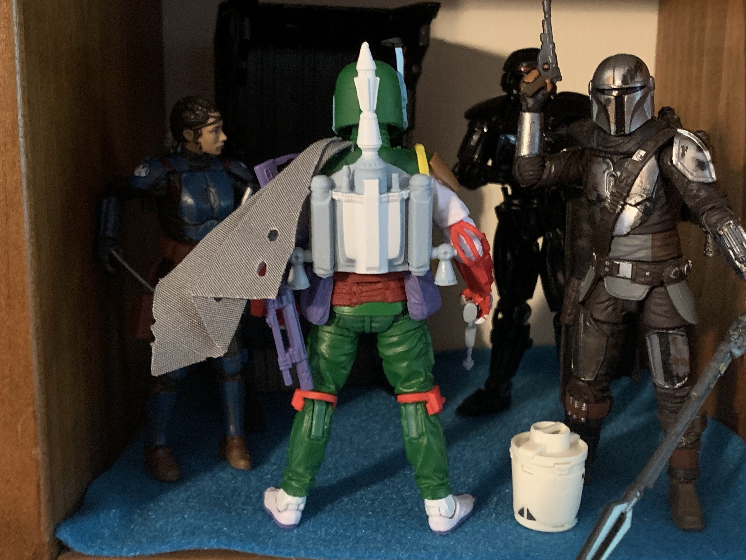
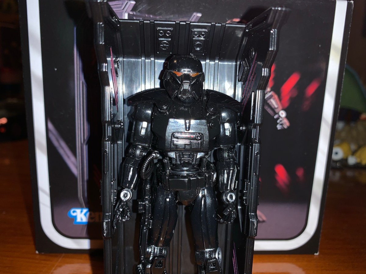
As an adult, I don’t buy many Star Wars figures, but I do have a trio from The Vintage Collection. This is the Kenner homage line, but with more articulation and more paint. I liked the Mandalorian I picked up, but I really didn’t care for the Dark Trooper. I was so unimpressed with that figure that when I went to post my review I couldn’t be bothered to retake my photos which had come out rather blurry. I almost didn’t post it, but I took the time to write it so I let it slip through. I thought I was done with The Vintage Collection, but then I came across this Boba Fett the other day. I had previously considered getting the Kenner colors version of basically the same figure a few months back, but Hasbro wanted $26 for it so I wasn’t all that tempted. For some reason, $20 felt that much better when it came to this new one so let’s talk about it.

I just find the little guy charming and he does kind of fit in with the Christmas figures.

This Boba Fett is labeled as the Vintage Comic Art variant. As far as I know, the sculpt is 100% reuse from past Boba Fett figures and it’s part of a wave of Fett variants because the guy sells. This one is exclusive to Target which is where I found it. For some reason, it didn’t scan when I tried to buy it, but it wasn’t due to a register lock, so an associate just entered a price for me. I got it for $20, which is actually a buck cheaper than it’s supposed to be (thanks Target employee!) so I guess I have a tiny bit of surplus value in it. I’ve actually had that happen a couple of times at Target where I tell the associate the right price and they give it to me for less anyway. One older woman let me have a $4 Hot Wheel for a buck because I think she just felt that’s what it was worth which amused me.

Just look at that guy – such a bad ass!

Anyway, I don’t know where this look for Boba Fett comes from, but I’m going to assume it’s from a comic book adaptation of The Empire Strikes Back since that’s what’s listed on it. Again, other places could better inform you on the history of this thing, but what attracted me to it was the colors. This figure is cast mostly in a rich, dark, green with mostly red and white mixed in. Maybe it’s my love of Christmas influencing me a bit, but this color scheme works for me. It just pops, and I like where the red is utilized. What really works though is the helmet which has this blue shading on it between the black and white. And that little dot of white on the top of the helmet is just – chef’s kiss! It looks great! And I found myself taking it to the register against my better judgement. I think what also works in its favor is the size. As an homage line, we’re talking about a 3.75″ figure, give or take, where that colored plastic look comes off better. On the few Black Series figures I have, the red plastic in particular comes across as cheap, but it’s not as noticeable in a smaller scale.

I’m not in love with the soft goods or the appearance of the jetpack, but it’s not like they’re displayed prominently.

The presentation is rather lovely for this scale and the figure also comes with a couple of accessories. There’s a non-removable soft goods cape affixed to the back of the figure’s left shoulder. It has some holes in it so that it looks weathered, I suppose, though it does throw off the look of the figure a little bit. On the other hand, the plastic cape on the Din Djarin figure is a bit of a pain to deal with so I can’t say I mind too much. On the figure’s back is the jetpack with a non-removable missile, which is a little disappointing. The paint on it isn’t super detailed, but I’m guessing it wasn’t in the comic it’s based on too.

“Stick ’em up, unless you can tell me where I can stick this handgun then please help me!”

For weapons, Boba Fett gets a sidearm and a short rifle with a sling on it. The handgun is basically cast all in a light blue, while the rifle is solid purple. It’s an interesting look, for sure, and it works for me as a toy. There are no optional hands, but both hands are trigger-finger hands so he can hold a weapon in either hand. He can casually hold the rifle in two hands, the classic Boba Fett pose, though he can’t aim it with two hands. I like both, but I’m disappointed that he doesn’t have a holster for the sidearm. Now, he doesn’t have one on the card art, but maybe just give him one anyway? Or find a way to include one on his back or something. I feel like he has to be displayed holding the handgun or else it will get lost. The rifle at least has the sling so it can go over a shoulder, but the handgun has to be just shoved somewhere it’s not supposed to go if you want to store it.

Articulation is just okay. It’s a bit of a bummer that he can’t really do a two-handed, gun-firing, sort of pose.

The articulation on this guy is exactly the same as Din Djarin. I’m guessing some of the parts are the same, but there’s plenty that isn’t. This figure is going to pose much better than those old Kenner figures and really about as well as The Black Series. The limitations the Holiday Mandalorian I have possesses are pretty much the same here. It’s the torso that’s limiting since Fett wears armor so you don’t get anything in the diaphragm. The lack of butterfly joints at the shoulder prevent some of those gun holding poses you would like to have and the knees and elbows are single-hinged. The only joints I don’t like really are the hips, which are hinged ball pegs. Ball and socket joints would work better and I don’t see how they would cost anymore other than the expense of switching from one thing to another. The feet are a little on the small side so this guy might fall over here and there, but once you find a pose it seems to be fine.

The big thing with this series and figure is just the cost versus what you get. Should a 3.75″ figure cost over 20 bucks? I think in the minds of most the answer is “No.” I do wish we got a little more for our buck like maybe an effect part for the jetpack. This one doesn’t even have holes to accept the effect parts that came with the Dark Trooper which did bum me out a bit. A removable missile or a blasting missile effect would have been awesome too. I’d have taken that over the sidearm. My feeling with a lot of what Hasbro is doing (and it’s worse in the Marvel Legends line) with its prices is that they’re going up without the consumer feeling like they’re getting something extra. In fact, they seem to be cutting back on a lot of paint apps, accessories, etc. This one isn’t that bad as we at least get two guns and a fun paint job, but there’s no way to really downplay that the asking price is more than we’re used to.

At least he can handle this pose.

As someone who never owned a Boba Fett before, I’m happy with this being my first. I think he looks cool, he looks fun, and he adds something to my modest nook of Star Wars figures. It’s the appearance that sells this, so if you like it go out and grab one. If you’re not a completist though, maybe double-check and make sure you don’t prefer a different variant as there’s no shortage of Boba Fett these days. This figure is exclusive to Target in the US and my store at least got a whole bunch so I don’t think it will be super hard to find, but it might be the type of release where if you wait too long you could miss your chance.

If you would like to read more Star Wars toy reviews, I’ve got a few more you can check out:

Star Wars: The Vintage Collection Dark Trooper

I’m back with another Star Wars action figure review! Actually, I don’t do these very often. This is only the third such review out of me because I usually don’t collect Star Wars. Sure, I think the franchise is fine and I did collect figures as a kid, but it’s not something I’m drawn to…

Keep reading

Star Wars The Black Series Mandalorian Warrior (Holiday Edition)

We’re getting to Christmas coverage at The Nostalgia Spot one day early this year with this look at one of the latest in the Holiday Collection from Hasbro’s Star Wars line of action figures referred to as The Black Series. I have previously looked at a figure from the very popular streaming show The Mandalorian…

Keep reading

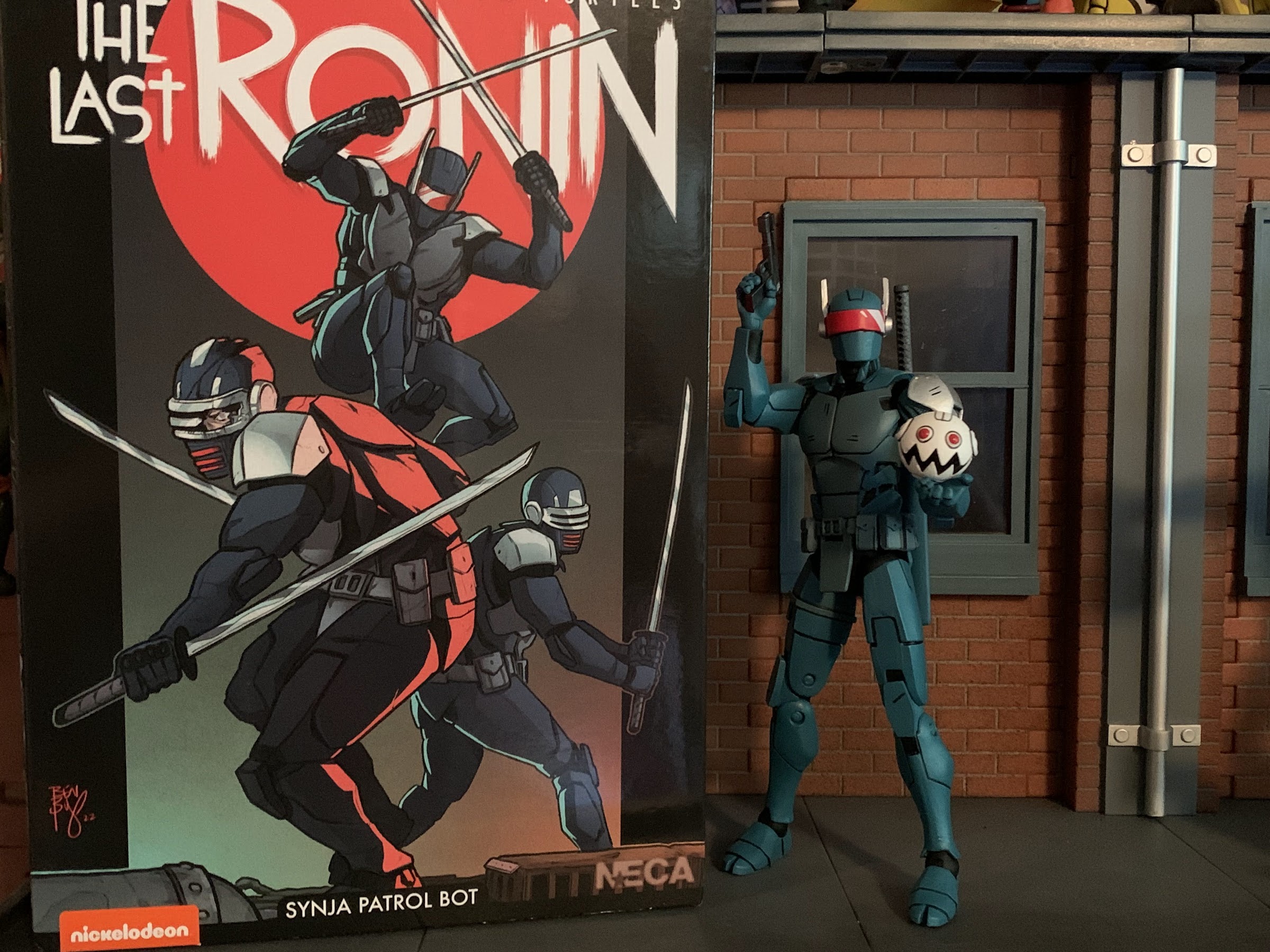
NECA TMNT The Last Ronin Best Buy Exclusive Synja Patrol Bot

He’s here to…patrol, and stuff.

I thought the string of Turtle Tuesday posts was going to end with last week’s item, but then I got a surprise email from Best Buy. The Synja Patrol Bot I had preordered months ago was actually getting moved up instead of bumped out, and to my surprise, it was going to be delivered in two days! I was pretty skeptical, but sure enough, two days later I had my action figure before I had even finished my morning coffee.

The Synja Patrol Bot is like the Foot ninja of The Last Ronin, the comic story about the very last Teenage Mutant Ninja Turtle from IDW Publishing. These are the guys the titular character has to deal with upon his return to New York and they seem a bit more formidable than its predecessors. I read those books over a year ago at this point so my memory is a bit fuzzy, but I think they’re cybernetically enhanced humans. Either way, they have an aesthetic that I really like of the techy ninja. Think the Cyborg Ninja character from Metal Gear Solid. I’ve always liked that look, and since these guys have a blue and gray color scheme to them it makes me like them all the more.

Army builders need heads, and this figure has you covered. Plus it has this weird, white, robot, thing.

This figure is essentially an army builder and it’s the first release for this mold. There is a second on the way that’s mostly black and white and I’m not sure what the plan on that is as far as release goes. This one is exclusive to Best Buy and it’s one of three that went up in the spring. The other being Michelangelo as “The Wanderer” and a three-pack of IDW re-colored Shredder clones. I have never bought an action figure from Best Buy prior to today and I would have to say the experience is a bit mixed. On one hand, the order was fulfilled and in a very timely fashion which is better than some big box retailers. And then on the other hand, the box came smashed to shit. It was one oversized, empty, cardboard box and the figure was inside that without anything else. I am not an in-box collector, but if I was I’d be pretty unhappy because the figure box was beat up pretty well. If you are an in-box collector, I guess buyer beware.

Ninjas don’t always stick with swords.

The patrol bot was sculpted by Paul Harding and comes in NECA’s Ultimates packaging with artwork from IDW’s Ben Bishop. The box is numbered “6” though this is the third figure based on The Last Ronin to see release thus far. Out of the box, the figure stands at approximately 6.375″ in height. The sculpt is largely a mixture of turquoise and black plastic with gray and silver paint as needed. There’s also a lot of black paint to fill some of the gaps in the character’s circuitry and linework customary of NECA’s comic-inspired offerings. It’s a very nice sculpt all around with lots of detail and great proportioning. The paint is applied fairly well, though there’s some spots here and there that are imperfect. The only one that bothers me is this tiny dot of silver almost dead center on the figure’s chest. There’s also a little scuff mark on the front flap which covers the crotch, but overall it feels acceptable for a mass-produced item.

“He killed my buddy!”

The accessory load-out with this figure makes it clear that NECA wants you to buy more than one. The default head features a metallic visor with a red grill over the mouth. I’m not certain on the hierarchy of the patrol bots, but there’s another head that features a large, red, visor and antennae. Both look pretty nice and the paint is quite sharp. I love the lens flash on the antennae head, though that head is really hard to get onto the ball joint and will require heat. There’s also a third head that’s a battle-damaged version of the default head. It has an exposed, left, eye and the look of shock implies this guy has taken his last breath. Part of the skull is also missing exposing some wiring and what appears to be a socket of some kind. It comes in the box affixed to a stump of a neck with wiring hanging out of the bottom of it. Getting the head off of such a small piece was a little bit of a challenge, but do-able. And since it came on a ball socket of its own, getting it onto the figure is a piece of cake. To further differentiate any additional patrol bots you may add to your collection, NECA also included a small sticker sheet. It has just two stickers and they both appear to be a badge or symbol signifying rank. They go on the left breast, if you want to use them. I’m not sure that I will.

I don’t know if I’ll use the stickers, but this is from the back of the box and shows you where they go. Photo by Stephen Mazurek.

In addition to the heads and stickers, the patrol bot also comes with three sets of hands and a pair of weapons. For hands, we get these open, clenching, hands by default plus a pair of fists and trigger/gripping hands. The clenching hands are a bit odd as they don’t really work with anything. He can hold one of the extra heads with it to a point, but they’re mostly of the style-posed variety. The trigger hands are intended to be used with the included handgun and sword. The handgun is painted with a gun metal finish and looks pretty nice and slots into the hands easily or can be stored on the right thigh. The sword comes with a scabbard that plugs into a peg hole on the left shoulder blade. The blade has a metallic finish and the handle is done in gray with a little black paint on the design. The black isn’t the cleanest, but it’s not terribly applied either. Lastly, we get this creepy looking head that looks like an evil version of the Fugitoid. I don’t really remember it, but the Baxter Stockman of this universe made more than just Mousers so I think it’s something like that. It’s all white with red eyes and some black linework. There is a peg hole on the underside so maybe it will have a use down the road. I don’t know what to do with it though, and I imagine it’s the one accessory army-builders won’t be excited about.

He can kick high, though his slender feet mean you’ll probably need a stand of some kind to keep him upright in such a pose.

For articulation, the Synja does some things different, and some things as expected. The head is on a double-ball peg so you get plenty of range there, especially because the neck is on a ball peg as well. The shoulders are the standard hinged-ball pegs and they rotate fine, but can’t quite hit a horizontal pose out to the side without some help. That’s because the shoulder pads get in the way, but you can pop the arms off relatively easily and re-insert the peg so that the shoulder pad is tucked into the shoulder joint to get that full “T” pose, if you desire. There’s a biceps swivel and single jointed elbows, which is a bummer. You will get a 90 degree bend out of the joint, plus a swivel, but I don’t know why NECA felt like it couldn’t do a double-joint here. The wrists swivel and hinge and, unfortunately, all of the wrist hinges are of the horizontal variety. The gripping hands, at least, should have vertical hinges. This is a freaking ninja robot that also has a sidearm, it’s begging for vertical hinges!

The diaphragm joint allows for some nice nuance.

In the diaphragm, we have a double-ball peg setup. It allows the figure to rotate there as well as bend forward and back and get some side-to-side tilt as well. The amount it bends forward isn’t terrific, but it’s better than we’re used to with NECA. It does get gappy though. At the waist is a standard swivel joint which is a little bit of a bummer. Another ball peg here would probably give us that forward and back crunch we’re really looking for, but oh well. The hips are the ball and socket joints NECA is known for and since NECA decided to forego a “diaper” piece over the crotch we get some nice, unobstructed, range here. Full splits and the ability to kick forward and back. The little flap in the front hanging off of the belt as well as the butt cheeks on the rear are both soft plastic that don’t offer much resistance at all, a very wise decision on NECA’s part. There’s a full thigh swivel on this guy where the ball pegs into the thigh and double-jointed knees below that. The knees are a tad gummy though and getting both hinges to work is more challenging than it should be, but get them both going and you will get better than a 90 degree bend. Be warned, it looks like the hinge is turquoise plastic painted black so it will probably flake eventually, though it’s holding better than usual on my figure. It’s also possible the turquoise I’m seeing is paint rub from the kneecap. At the ankles, we have a hinged ball peg which pegs into the shin. This lets you rotate at the joint as well as make use of the hinge which has good range going forward and back. There’s also a rocker which works great.

A vertical wrist hinge would help a whole lot even with the sidearm.
Even with some of the figure’s limitations, two-handed sword poses are still possible.

You’re not going to confuse the Synja Patrol Bot with an S.H.Figuarts release, but it does articulate better than most NECA releases. I really like how the diaphragm joint turned out, and even though I wish it had double elbows, it is possible to get the figure to grip the sword with both hands. The lower half is pretty fantastic with my only issue there being the overall gummy feel to the knees. If this figure had a ball-jointed waist it would really take it up a notch, and the missing vertical hinges at the wrists continue to be a sore spot for me when it comes to NECA’s TMNT releases.

Sorry pal, but you’re on your own.

The Synja Patrol Bot is a nice release from NECA. It’s definitely going for that army builder crowd with the extra heads and even the added stickers to differentiate the figures from each other in your display. The only slip-up there might be with the included white, Mouser, thing, head as another battle-damaged part would have been more useful for the army builder crowd. For those who want even more variety though, the white version will provide for that. As for me, I don’t intend to get more than one. I sort of forgot I had even pre-ordered this figure and since doing so I’ve come to the decision that I’m likely not going to continue with The Last Ronin. The figures are great and all, it’s just an issue of resources. And it’s not just the money needed to acquire the whole collection, it’s the space. I’m not the type who wants to just buy stuff and toss it in a closet. I want it out and in the open, but that’s just not possible with so much TMNT coming from not just NECA, but other places as well. The figure of the Last Ronin is a great stand-alone piece and now it has a friend too. I still intend to continue buying the toon, Mirage, and even the Archie stuff so rest assured there will be no shortage of TMNT on this blog.

Interested in more Last Ronin coverage? Look no further:

NECA The Last Ronin (Armored)

When it comes to multimedia based on the Teenage Mutant Ninja Turtles, we find ourselves in a rare dry spell when it comes to television and movies. The final episode of Rise of the Teenage Mutant Ninja Turtles aired in 2020 with no new television series announced since. The show did receive a long-delayed finale…

Keep reading

Playmates TMNT The Last Ronin PX Previews Exclusive (Chase)

A few years ago, Mattel launched a new subline of action figures based on their most famous IP: Masters of the Universe. The subline was titled Origins and it basically took the vintage toys of the 80s and updated them with more modern articulation while still preserving that vintage aesthetic. And ever since then, collectors…

Keep reading

Teenage Mutant Ninja Turtles – The Last Ronin

I don’t read a lot of comics these days. Actually, I suppose I never truly read a lot of comics even when I was very much into X-Men and Spider-Man. Back in the 90s, I received most of my comic lore from trading cards. They were cheaper and fun to collect. When it came to…

Keep reading

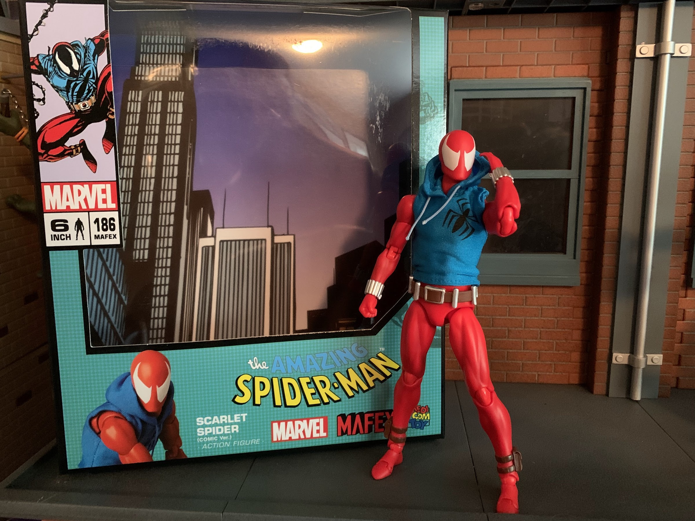
Medicom MAFEX Marvel No. 186 Scarlet Spider

Wait! Why is Spider-Man wearing a hoodie? Answer: it was the 90s, baby!

When I was a kid, one of my favorite past times was drawing. Like most, I started really young with a box of crayons and coloring books. I’d eventually start keeping markers, colored pencils, and other instruments in a plastic McDonald’s case that came from a Happy Meal. It was blue and had a map of the United States on it, if you’re the curious type. As I got older I got into comic books and those characters became my inspiration for my drawing. I’d draw Marvel characters as well as my own, which usually looked an awful lot like an existing character because, hey, I was a kid!

One of my favorite subjects was Spider-Man. He’s a pretty popular guy and he certainly was with me. The problem with drawing Spider-Man is he has all of those web lines on his costume. Now, I’m not criticizing the man’s threads. That costume is iconic and one of, if not the, best superhero costumes of all-time. I just didn’t like to draw it because it was time consuming and definitely a little tedious. Enter the Scarlet Spider! Scarlet Spider debuted during the infamous Clone Saga in issue 52 of Spider-Man. I still remember seeing the cover to Web of Spider-Man #118 with Scarlet Spider on the cover. I took one look at that costume and said “Yeah, now that I can handle!” It was basically the same general idea as Spider-Man, only all red and no web lines. Easy! The clone of Peter Parker, Ben Reilly, had created his own persona and it had a bit of a D.I.Y. vibe to it with the exposed web shooters and blue hoodie, and it worked for me. The Clone Saga itself was a bit of a mess and probably ran too long. It also ended with the reveal that it was Reilly, and not Peter Parker, who was the REAL Peter Parker leading to Ben Reilly’s turn as Spider-Man that brought back the web lines and I personally didn’t know how to feel about it. Like Wolverine losing his adamantium, I wasn’t crazy about the guy I knew as Peter Parker being revealed to not be Peter Parker.

The figure comes with three different portraits, two of which I will never use.

Like most things in comics, eventually the status quo was restored. Ben Reilly was a clone after all, and then he died. Then he came back, because no one ever dies in comics. I honestly haven’t read much Spider-Man since the 90s so you’re better off heading to a wiki at this point if you want to know more, I’m just here for that costume. Scarlet Spider became a favorite of mine to draw and as a result I have a nostalgic attachment to the costume. The character was never done justice by Toy Biz back in day as his figures were always lame repaints. I had a 12″ version of the character with the hoodie painted on and some rubber overlays added to the wrists and ankles of what had previously been a Spider-Man figure. The inaugural line of Spider-Man Classics, the precursor line to Marvel Legends, also featured a Scarlet Spider repaint that I believe was exclusive to a retailer, possibly KB Toys. I never got it, or any other Scarlet Spider that followed. When I started getting Spider-Man figures here and there again starting with the Pulsecon exclusive Venom, my appetite for a Scarlet Spider came with it. Unfortunately, the Marvel Legends version (which actually looks pretty good from what I’ve seen) is a little old at this point and prohibitively expensive on the aftermarket. I’m not paying an inflated price for a Hasbro figure, but a Medicom one? Now that was intriguing.
I think the figure in the middle is unquestionably superior to the other two, but is it $70 better?

When Medicom unveiled their version of Scarlet Spider under their MAFEX branding, I decided to give it a go. The price is awful, as it was for the only other MAFEX figure I own, the Hush Batman, but I’d rather overpay for a boutique figure than something previously sold at Target. I had some nits to pick with that Batman figure and my overall attitude towards MAFEX is that it’s too expensive. The Marvel license probably doesn’t come cheap, but in general, I think Bandai makes better figures than Medicom and they’re usually at least in the $65 range. This figure will basically set you back about 100 bucks if you reside in the US, and I’ll tell you upfront it’s not a figure that justifies its price tag. That doesn’t mean it can’t be good as one could pay 50 bucks for a perfectly cooked steak and find it delicious, but overpriced compared with a chain restaurant’s $25 prime rib. It’s more a question of “Do you want to pay $75-$90 for a loose Marvel Legends figure, or $100 for a brand new MAFEX version of the character?”

Yeah, I wish the spider logo was bigger, but damn does he look cool or what?

Obviously, you know which option I chose and now I’m going to tell you how happy (or not) I am with that decision. Scarlet Spider comes in the MAFEX window box with artwork from the comic on the front and product shots of the figure on the sides and rear. This one is branded with The Amazing Spider-Man in the traditional font with the actual name of the character off to the side in a rather unglamorous and understated fashion. This isn’t the type of figure mothers at Toys R Us are going to be confused by, but it was somewhat amusing to me. Right off the bat though, Medicom is doing Medicom things which is namely using character art that doesn’t match the figure inside. The picture of Scarlet Spider on the top left looks to be from his early days. The red, or scarlet, of his costume is dark with lots of black shading and the hoodie has the big, spider, logo across the chest. The figure inside is a bright red, no shading, and has a small spider logo over the heart. It’s my understanding that this version is a later version of the character as he’s come and gone over the years. Why the person designing the packaging wouldn’t choose a better representation of the figure inside is beyond my understanding. And if Marvel dictated that this version of the character be featured on the box, why not make the figure match? It’s puzzling.
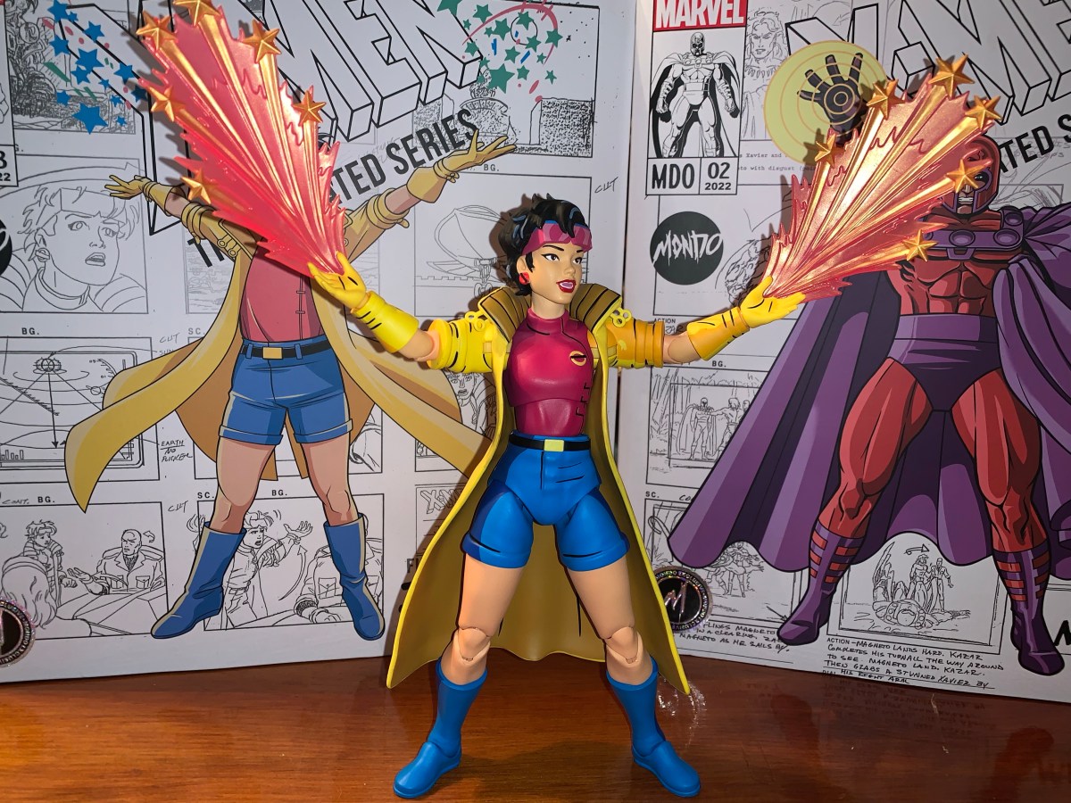
The hoodie is fine, certainly fine enough to not want to spend more money on a different one.

Right off the bat, we’re kind of off to a bad start. Not because the picture is wrong, but because the figure seems to be based on a version of Scarlet Spider that isn’t my favorite. And I don’t get the sense that I’m alone in that regard. Is it a deal breaker? Obviously not since I bought it anyway, but I wish he had the character’s original hoodie. The belt is also different with this one having a more traditional buckle instead of the red-buttoned belt. I’m honestly less irritated by that change, but felt it was worth pointing out. The shape of the eyes on the mask are also more of a traditional Spider-Man eye shape, but this is rendered moot by the inclusion of a head with more of a 1995 look to the eyes so I won’t count that as a knock. Still, I have encountered multiple collectors in the market for custom hoodies for their $100 figure to get the right logo on it. I can’t bring myself to drop another $30 on an already expensive figure in an attempt to improve it, but if it really bothers you there do appear to be some nice customs out there.

Is Scarlet Spider a little big or Venom a little small? Both things can be true. This looks okay to me though.

With that out of the way, let’s talk about the actual figure. Scarlet Spider stands at approximately 6.25″ tall making him a little oversized. The MAFEX line is a 1:12 scale line so that would make the character about 6’3″ which is on the tall side for a Spider-Man clone. At the same time, if you’re looking to fudge him into a Marvel Legends display this should work pretty well as most of those Spider-Man figures are around the same height, with a few exceptions. The figure is basically cast in all red plastic with very little paint. The paint is limited to the eyes, belt, and little pouches on his ankles. And at the ankles, it’s not as fine as it could be as the top of the straps wasn’t painted over leaving them red. A nitpick, perhaps, but this is a $100 figure, after all. I can’t tell if the web shooters are painted or not, but they’re a nice, lustrous, silver. They’re definitely separate pieces from the arms, but they may be painted over for added effect. On the body itself I’m not detecting any shading which is a bummer. I think some dark red over the bare plastic would have helped spruce this one up. Personally, I would have loved an ambitious paint job with a lot of black shading, but I’m not surprised we didn’t get that. Medicom did do a comic paint Spider-Man years ago so maybe we’ll get such a variant in the future (do I really want to be tempted by such), but for this release Medicom is definitely playing it safe. I also would have liked some outlining around the eyes, be it dark red or even black to add a little pop to the presentation. They are at least raised as part of the sculpt, which is better than nothing.

He’s got you now, Ben!

The overall sculpt is definitely going for a lean, but muscular, build suitable of Scarlet Spider. The soft goods hoodie is done well and I rather enjoy the almost metallic sheen it posseses. The logo is printed on, and despite being too small at least looks fine. There’s no logo on the back. The drawstrings are connected to the hood and don’t actually function, but respond a bit to posing despite lacking a wire. The hood itself is wired and the figure looks good with it on or off. I will say, the hoodie helps add a little extra bulk to the torso which is a good thing as without it I think he’d look too lean and shapeless. The torso doesn’t taper much from the chest to the abdomen so he would probably look stupid without the hoodie. Maybe that’s by design as we wouldn’t want him to look frumpy either, but if you’re someone with a lot of money looking to utilize this body for custom action figures you may be letdown. I do like that the hoodie fits tight enough that we can see some of the muscle definition showing through. If you did want to get a custom hoodie I’m not sure how difficult it would be to get this one off given its tightness, but the head is easily removed and he can raise his arms up to the heavens to it’s probably more than manageable.

The paint may be basic, but at least the figure makes up for it with a whole bunch of stuff.

The costume is a rather simple one, which is basically what drew me to it. Simple can be nice, and Medicom did a fine enough job capturing this particular version. I think his chest could be bulked out more and maybe even the abs to a degree. He looks fine from the front or back, but viewing the figure from the side makes him look rather thin. Aside from that, the proportioning looks good and while the paint doesn’t impress, what’s there at least isn’t sloppy. How much you enjoy the look of this figure will be determined by how much you like this particular version vs the original Scarlet Spider costume. Even if you’re someone who doesn’t like the over-articulated aesthetic of a MAFEX release, the hoodie, web shooters, and belt hide some of the seams on this guy and the only minor eyesore resulting from the articulation is that the knees and elbow pieces are an ever so slightly different shade of red from the rest of the figure. Under a white light, you’ll notice it more, but in natural lighting it blends fine.

This figure comes with too many web effects to make use of at once, which means your Hasbro offerings can finally get some decent webs!

For accessories, Medicom did what Hasbro don’t and loaded this guy up with plenty of hands and web effects. We do get three heads: standard eyes, wide eyes, and what I’ll call “classic” eyes. The classic eyes look more like the box art (even the image of the figure on the front of the box is using these ones) and those early first appearances of the character. The default eyes look like standard Spider-Man eyes to me and the third set are even larger and a bit more expressive without getting as stylized as some Spider-Man eyes tend to get. For hands, we get a set of fists, thwip, gripping, open, and relaxed hands. There’s also another set of open hands with magnets in the palms and a set of feet with magnets in the soles so he can scale a metal wall or refrigerator. All of the extra hands and feet come on little acrylic stands to I guess make sure the openings on them don’t warp in the package. The fists are what come on by default, and as such they slide off and on the easiest and actually won’t really fit on any of the little acrylic pieces when not in use. The extra hands, for their part, go on easily enough and at no point was I afraid of breaking anything. The heads require a bit more effort, but aren’t too bad either. I was a little apprehensive about the feet, but they too go on and off with little effort. Overall, a much better experience than the one I had with Batman.

He has magnetic hands and feet if you want him in a wall-crawling kind of pose provided you have some metal on your wall. It stayed in place for me, but I personally wouldn’t trust it longterm.

To go along with the extra bits are a whole bunch of web effects. We get two short “thwip” effects and two longer ones. These have a little loop on them and are meant to be slotted over the wrist peg and then the hand can be placed over them. It’s a simple, and effective effect made easier by the exposed web shooters this costume features. We also get two “L” shaped webs which basically feature handles for the gripping hands. I wish there was a little nuance to the handled part, but it works fine. We also get two additional “L” shaped webs where the handle portion is actually a spiral of web. There’s a loop where the long portion ends and the spiral begins that a hand can go through with the rest of the spiral portion riding up the forearm.

I really like these web lines that coil around the forearms, but I wish he could grip this figure 8 one better.

Lastly, we get another swinging web that basically ends in a figure eight. It has a lovely look, but the issue with this figure is that the gripping hands are lumps of plastic with a hole through them. The fingers are connected to the palms, so the only way for the figure to grip the webs is to start at one end and slide them through. I would like to have the figure grab an inner portion of the figure eight, but it’s essentially impossible without some modification to the figure or the accessory. You can try to use the relaxed hand instead like he’s in the process of letting go, but making the fingers flex on the gripping hands would have been the way to go. As for the effects themself, the web lines look the part. They’re just white plastic with some knots and such sculpted into them. I’m happy to have so many, as Hasbro is terrible about giving us web effects with its figures so the extra will be put to good use. Of course, Hasbro also doesn’t give us gripping hands so they’ll only go so far. Medicom also packs in a display stand so you can actually display your figure in mid-swing. It’s just a plain, acrylic, stand, but it gets the job done. It articulates at the base, the midway point, and at the “claw” where the figure slots in. There’s also a straight peg included and a second, narrower, claw that I believe is more for grabbing a thigh instead of a waist. There’s also yet another piece that’s basically a “J” shape with a peg above it. I don’t see how that peg plays a role in posing this figure, but the J piece acts like a seat if you want to try and balance the figure on it as opposed to having a claw piece grab it.

Some of these leg poses were tricky out of the box. I had to hit this one with some silicon spray to get them moving well enough that I wasn’t afraid of snapping anything.

Medicom’s major boast with its MAFEX line concerns articulation. This is a “super” articulated line that should blow away anything you’re likely to find at a brick and mortar retailer. With this guy, we get a double-ball peg setup at the head. Medicom likes to use this angled peg that I don’t think adds much, but combined with the ball-peg at the base of the neck means you get a figure that can look up, down, and packs some nuance as well. The shoulders are ball-hinges which peg into a socket inside the chest. You get some up and down play, and the arms raise out past a horizontal position. There’s a butterfly joint here as well which allows for some back and some forward range, but not a ton. At least with this figure, we’re not dealing with any aesthetic trade-off with the joint as the soft goods hide it. There’s a biceps swivel, double-jointed elbows that bend well past 90 degrees, and ball-hinged wrists. Either the hinges at the wrist are really tight, or the web shooter interfere with their range as I can’t get much out of them which is unfortunate.

Do I want to put this figure on a shelf or on the fridge? Shelf? Or fridge?

In the torso, we get ball joints in the diaphragm and the waist. This allows the figure to bend back rather far as well as crunch forward. There’s tilt and rotation at both joints and overall I would say this is a very well done torso. It also helps that we once again have the soft goods to hide any ugliness these joints might create. I’ve never been a big soft goods guy, but maybe this figure is winning me over? The hips are where I lose a little bit of my enthusiasm as Medicom loves the drop-down hinged joint with ball and sockets. They’re finicky, and they’re the only joints that scare me as sometimes I feel like they’re fighting me, especially the left hip which might actually be stuck. Kicking forward is a chore and he gets to about horizontal when you get everything in proper alignment. Drop the hip and you get just a little bit more range which is why I don’t really like the design. He can at least do splits and the thigh swivel at the socket works great. The double-jointed knees are fine and at the ankles we get more hinged ball pegs. They can bend forward and back plenty fine while the ankle rocker is a little more cumbersome, but functional. They’re also tight enough that the figure has no issues standing on its own.

Shelf, it is!

Aside from the hips, I mostly like what this figure does as far as articulation goes. I can’t quite get him into some of the deep crouches Spider-Man is known for, but part of that is the stuck left hip. I may try to hit it with oil to see if lubrication helps alleviate the issue. If it didn’t have the more delicate drop-down setup, I’d just pop the leg off and try to diagnose the issue that way. Or if it was 70 dollars cheaper, I’d be more aggressive with it. I can still basically get the figure into the poses I want, especially since I’m mostly interested in using the stand, but it’s never much fun to fear moving a part of an action figure like I do with the hips on this guy.

Is the MAFEX version of Scarlet Spider worth the $105 asking price some retailers have it listed for? Probably not, but what 1:12 figure could be? None really, this is an expensive commodity, but given the lack of alternatives I can’t say I blame anyone for just going for it. That’s what I did as I’m not a regular MAFEX buyer nor am I amassing a giant collection of Spider-Man stuff. I just get things here and there so for me I was able to rationalize the occasional splurge with this one. I certainly don’t blame those who can’t, and given the frequency of higher budget releases this year, one could easily argue that I should have passed on this one all-together since I don’t make any money off of this blog, so I’m collecting just for fun as opposed to content. At the same time, if you do grab this figure and can look past the price and the fact that it’s not based on first appearance Scarlet Spider, I think you’ll be plenty happy. There are things that could be better, but at the end of the day it has enough stuff to make sure it looks good on your shelf and it probably will get the attention of anyone who comes looking. And that’s definitely what you want from an expensive collectible.

Interested in more Spider-Man figures or maybe you’re curious about another MAFEX release?

Marvel Legends Spider-Man (Animated)

It was in 2021 that Hasbro released a PulseCon exclusive Venom figure on a Spider-Man retro card. The retro card series is meant to stir-up nostalgia for all of the adults who were buying toys and watching cartoons in the 90s as the retro card is a facsimile of the old cards Toy Biz used…

Keep reading

MAFEX No. 105 – Batman: Hush

You may have been wondering why I decided to devote an entry earlier this week to a nearly twenty year old action figure of mediocre quality, and if so, now you know why. I wanted to take a look at the DC Direct Batman based on his appearance in the Jeph Loeb written, Jim Lee…

Keep reading

The 2023 San Diego Comic Con Reaction Post

It’s the second most wonderful time of the year!

You probably heard, but Hollywood is essentially on strike right now. Two large unions are fighting for better pay, benefits, and assurances that they won’t be replaced by artificial intelligence while major studio heads like Bob Iger are tossing stones from their golden mansions. I am firmly on the side of labor when it comes to most strikes, but this isn’t a strike post. It’s a comic con one as the just recently wrapped San Diego Comic Con of 2023 had a decidedly different feel to it in light of the work stoppage. Unions frown upon any of their members even promoting their projects right now, and with good reason. Without the glitz of Hollywood, it meant Comic Con could go back to being about comics for at least one year. Though for me, every year is all about the toys!

I don’t know when it started, but Comic Con has become a huge spot for toy producers to show off what’s coming in the next few months to a year and 2023 was no exception. I sat glued to my phone once preview night started and fought with myself to put it down all weekend since I couldn’t be there in person. Now that it’s over, I’m going to tell you what I think because my opinions are very, very, important and the fate of the companies involved, nigh the entire industry, is dependent upon securing my approval.

NECA TMNT

That is one big ass Krang! Photo: Pixel Dan

Let’s start with the old standby – NECA and their many versions of Teenage Mutant Ninja Turtles. In some respects, this year’s display felt slightly subdued, but I think that’s because NECA has really branched out beyond just the cartoon and movies. They basically showed off a little bit of everything and undoubtedly they’ve held stuff back for the conventions to come. And that’s fine by me, I was kind of happy that I took one look at the new TMNT toon stuff and didn’t feel like I necessarily needed any of it. And some of that is tempered by the fact that I know I have a major expense in the sewer lair diorama to look forward to. On the toon side though, I’m definitely in for the street turtles. While I prefer the season one street looks to these, I’m still happy to have what they showed. That’s it though. I’m probably going to get more, and the giant Krang was certainly the show-stealer, but I’m definitely in more of a wait and see how I feel mode when some of this stuff starts becoming available.

These wrestling turtles so perfectly nail that Archie aesthetic I love. Photo: The Fwoosh

On the movie end, we just had some new Secret of the Ooze figures to look at. There was kick-boxing Keno, some new Foot, and two versions of Professor Jordan Perry. Is that too much of the professor? For me, yeah, and I can probably ignore all of these. Oh, and there was a pretty neat Shredder throne on display, but that’s another thing I don’t need. The comics end was far more exciting with a bunch of new figures based on The Last Ronin shown. They all look pretty damn good, but I may be out on that subline for the simple reason that I can’t buy, and display, everything TMNT from NECA. The Mirage line is getting some new figures as well, with the big one being Rat King who looked fantastic. That is definitely going on the “must buy” list. As for Archie, that may have stolen the show with a brand new Mondo Gecko unveiled and the much demanded Wrestling Turtles! Even if the models shown for the turtles were so early that they didn’t feature any articulation, I couldn’t have been more excited! I’ve wanted that black suit Raph ever since I was a kid and my dad bought me TMNT Adventures #10. I must have read that thing cover-to-cover at least a dozen times.

As for disappointments, there wasn’t much to be found. All of the new stuff looked good, so any disappointment was likely just the result of something not being shown. And the big one, for me, is Tempestra. I thought there was a very good chance we would see her from the toon line, especially after the profile boost given to the character thanks to Shredder’s Revenge, but she remains the elusive final member from the Night of the Rogues. I feel confident she’s coming though, so I’m not that broken up about it. I’d also like to see a new toon Shredder, or an Archie one, but again that’s probably coming, we just don’t know when. And hey, that Turtle Van is looking pretty sweet!

Super7

All right, when can I have them?! Photo: The Fwoosh

Super7 has cast such a wide net these days that maybe I should break their display up, but then again, there wasn’t a ton for me. The biggest though, by far, was the official unveiling of the new line of Misfits figures. These are being done in a retro, Masters of the Universe, style which is pretty cool. It means they won’t be as expensive as Ultimates, but definitely better than ReAction. I’ve felt for awhile that Super7 needed something in between those two lines, and maybe this is it. Would I like an Ultimate Glenn Danzig some day? Sure, as long as it’s good, and some of the figures Super7 has done of real people haven’t turned out so hot. This line, which features Skeleton Danzig, Jerry Only, The Fiend (aka Crimson Ghost), Samhain Danzig, and early 90s Danzig, already has hit on some great designs. We just need a Doyle to round things out. I’m also amused by how Super7 is basically just following the Medicom blueprint when it comes to Glenn Danzig.

On the disappointing side, well, there just wasn’t anything from the other lines I care about at Super7. Well, they did have TMNT Wave 8 on display and that’s looking fine, but there was nothing from the Disney or Simpsons Ultimates or even any new ReAction that I saw for either. Super7 usually doesn’t unveil new Ultimates at Comic Con, and they also don’t always go with a robust display. If they have something anticipated that they just got from the factory or something, they may bring that, but not always. I’m just concerned for both of those lines. The most recent Disney wave based on The Rescuers failed to secure enough preorders to go into production. Is the line in jeopardy? Sort of similar is that The Simpsons Wave 4 is still listed with an ambiguous “TBD” on the pre-order status page. It could be an oversight and they just haven’t updated it, or it could mean that no progress is being made and until it goes into production it should be considered as “in jeopardy,” as far as I’m concerned. It’s not exactly a star-studded wave and features two figures at $65 so nothing would surprise me.

Hasbro

Now that’s a figure worthy of the Master of Magnetism. Photo: The Fwoosh

I am certainly not the biggest Hasbro fan, but the company had my attention going into the convention because we knew that Marvel Legends based on the highly-anticipated X-Men ’97 were likely to be shown. And they were! Coming in Wave 1 is Wolverine, Rogue, Gambit, Storm, Bishop, and Magneto all with new sculpting to make them better resemble the upcoming show. For me, someone who collected the VHS line of X-Men based on the 1992 cartoon, I wanted to see if some of these could be fudged into that line. We have no assurances that Hasbro intends to come back and finish that team, so plucking Gambit and Rogue from this one might be our best option. And, for the most part, they look okay. Rogue has her green jacket and black headband and Gambit has a more “toon” appearance to his face. Neither face-sculpt looks truly like the ’92 show, but Hasbro was unlikely to give us that in the VHS line anyway. There is no cel-shading though, so that might throw off the display a bit, but given how half-assed Hasbro’s approach to that style was maybe it’s for the best? Wolverine is essentially the same as that release too, just now he has an unmasked portrait and pin-less limbs, so collectors waiting on a non-cel-shaded version of that figure should be happy. I personally don’t need it. And with Storm and Bishop featuring new hairstyles, I can pass on them as well. That Magneto though is a must have and I’m happy to see that Hasbro shaded his face. He could use some accessories, but this is Hasbro we’re talking about so that’s hardly a surprise.

I don’t know if I’m as happy as Pixel Dan is about this Crystar, but I’m definitely in “gimme gimme gimme” mode! Photo: Pixel Dan

Hasbro also gets credit for one of the biggest surprises as they showed off a figure of Crystar! Yes, Crystar The Crystal Warrior is coming to Marvel Legends and the figure looks pretty sweet. It’s all done in translucent plastic with a blue hue and he has his sword and shield to round things out. The comic he hails from is pretty forgettable, except for the fact that the iconic Danzig skull was lifted from the cover of issue 8. Naturally, this is one I need for the Danzig collection more than anything.

And that’s pretty much it for me. I did see other great stuff like Jada’s Mega Man line and NECA had some new Gargoyles to show, but the above stuff is what really stood out for me and got me excited. Mondo also unveiled an Omega Red in their sixth scale line based on the X-Men animated series and he looks unsurprisingly spectacular, I just wish they’d slow down a bit as that line is killing me financially. Special shout out to all of those working hard during the convention covering this stuff for people like me who can’t go. I’m talking about The Fwoosh, Pixel Dan, Toy Shiz, Toy Bro, and loads of others. The excitement is now over, we have lots to look forward to, and the next convention or show lurks on the horizon. This golden age of toy collecting appears to be going strong, weap for my wallet!

Teenage Mutant Ninja Turtles: Shredder’s Revenge

In the late 1980s the arcade scene in the US was still going strong. Classic style arcade games like Donkey Kong and Pac-Man were being overtaken by a new genre of quarter-munching pain: the brawler. Or the beat-em-up. If you’ve played one, then you can picture what I’m talking about. It was usually a one…

Keep reading
The Saga of Crystar – Crystal Warrior #8

There’s been a hole in my Danzig collection for quite some time. It was a hole that was easy to fill and actually quite cheap considering most Danzig records fetch well over $100 these days, but an important piece was missing. And that piece is not what one would necessarily expect, but I would assume…

Keep reading
Super7 is Heading to Springfield!

Wednesday, August 18th, ended up being quite an eventful little day in the world of toy collecting. There were some reveals from major toy companies, leaks, and even those long neglected Street Sharks fans got something to get excited about late in the day. Personally, it was a good day for me too as I…

Keep reading

NECA TMNT Mirage Studios Splinter

Splinter has arrived and he didn’t arrive alone.

When NECA started down the path of Teenage Mutant Ninja Turtles with the 2008 release of the four titular characters, it didn’t go very far. After the turtles came April, but as a convention exclusive, and then nothing else. It would be years before their Shredder, which was shown off at the very same convention April was released at, was released as a con exclusive himself along with three of his henchmen. And it seemed to take the success of the eventual cartoon and movie lines that pushed NECA to go back to the original comics. It’s been an interesting line as it started with perhaps less-requested characters with the Fugitoid and Renet, but now we’re getting to those heavy hitters fans were dreaming of fifteen years ago. And some of those heavy hitters come in pint-sized packages like the beloved Master Splinter.

He’s a little guy.

Splinter sets the bar as shortest figure in the line. Coming in at a tidy 3.5″, he’s very much a little guy. Especially when placed with the recently released turtle four-pack who are taller and bulkier than the 2008 figures. I said he comes in a pint-sized package, but that was an embelleshment on my part as the actual box he’s in is the same as most of the other single releases. It features new art by Kevin Eastman which matches the look of the figure pretty well. My memory is a bit fuzzy, but I do believe first appearance Splinter in the books was a bit more fuzzy and frayed looking than the figure here, but that would be very hard to pull-off in plastic.

I noted Splinter is 3.5″ tall, but I should add that is in his neutral stance which features bent knees. It’s basically how he came out of the box and how he likely should be posed, but someone who wanted him to be taller for the sake of being taller could get a little more out of him. He’s sculpted all in brown plastic with a lot of black dry brushing over him. The black is heaviest on the top of his snout and extends to around his eyes which creates a striking portrait. It’s a solid approximation of the comic art and if there’s anything I think could have been done better with the sculpt and paint it’s the claws on Splinter’s hands and feet. They’re a bit soft in sculpt and all brown so they just blend into the fingers and toes. It matches the art on the box so I can’t knock the figure for its accuracy, it’s just one of those design choices that works better in print than sculpt.

This is probably a better foe for the sensei.

The shading on the figure covers the entire body, but it’s almost irrelevant since Splinter features a soft goods robe. Just like his cartoon and movie counterpart, the robe is wrapped around him and fastened with a brown ribbon. It’s a maroon color and it looks fine. It’s a lot of material and a little frumpy looking. It might have been neat to see it look a little more worn since this is a rat who lives in the sewer. I don’t like the ribbon used for the belt as it just doesn’t look like any belt one would expect a robe to fastened with. It’s a criticism I had for the movie and cartoon Splinter. A piece of stretchy material, like the additional belt on the Foot and Shredder movie figures, with a knot glued onto it would have been my preference, but it’s fine.

Since he doesn’t have much, Splinter gets all of the pre-mutated guys and some ooze too.

The figure, despite being small, has most of the same articulation one would expect of a NECA figure. The head feels like it’s on a double ball peg and it has great range in all directions. The shoulders are ball-hinged and can raise out to the side fine, but rotation is going to be limited by the robe. It’s something that can be worked around though as that’s the benefit of the robe being slightly oversized. The elbows are single-hinged with a swivel and will bend to 90 degrees. The wrists swivel and hinge horizontally as well. In the torso is a diaphragm joint that feels like a ball-joint, it could be a double, but you get rotation, a little forward “crunch,” and some tilt. The hips are ball-jointed and can go out to the side for splits. They kick back rather far, but not really forward a whole lot. There’s a little thigh pivot and the knees are single-hinged and swivel. You do get about a 90 degree bend at the knee, but again, he’s meant to stand with his knees bent to about 45 degrees so the practical range is limited. The ankles hinge and pivot with the ankle rocker being a bit flat, but functional. The tail is connected via a hinged ball peg so you get rotation and the hinge can direct it a bit. The tail itself is also bendy, though the wire only goes about halfway through it so it’s a bit limited.

And he also comes with this guy.

Splinter has decent articulation, though it’s hard to argue that he’s not meant to mostly just stand there on your shelf. He can hit a few battle ready poses and also stand on one foot if you want to place him in a side-kicking pose. I’m a little surprised that NECA did not include an articulated jaw as they did with the cartoon Splinter, but I don’t hate the exclusion. The profile looks good so if they felt they couldn’t get that joint in there without harming the presentation then that’s a decision I support. I only mention it as some may have expected it based on past versions of the character and may miss it.

The old and the new. The Utrom on the left came in the Foot four-pack and the turtle on the far right came with the 08 figures.

Since Splinter is such a small figure, he does come with a pretty robust assortment of accessories to justify his price tag. Big figures cost more money for both NECA and the consumer, but that rarely applies to small figures. To get more plastic into this, Splinter comes with three sets of hands: relaxed, gripping, and pointing. The gripping hands have the less desireable horizontal hinge. I’m surprised we didn’t get flat, chop, styled hands as well. Splinter also has his walking stick and that he can grasp with the gripping hands or the relaxed hands. The relaxed hands can also rest on top of the stick too so you have some options when posing him with it. There’s a small tea kettle with articulated handle and a little cup to go with it. The kettle has some nice black linework on it while the cup is blank. Splinter can hold the kettle by the handle and palm the cup well and it’s a nice little pair of accessories. I do wish NECA had ripped-off Super7 and included a steaming effect for the cup, but it’s fine as-is.

Cartoon Splinter is bigger than comic Splinter, but the opposite is true for the Mouser.

Those are the accessories for Splinter, the rest are basically extra characters. Up first is a brand new Mouser. It’s painted all in gray with some light blue shading on it to create a metallic effect that looks really nice. It’s also covered in the usual black linework and looks rather sharp. As far as I know, the entire sculpt is brand new as it doesn’t share any parts with the cartoon Mouser. If it shares any parts with the Mouser released back in 2008 I’m not sure as I don’t have any of those. It functions just like the toon one with an articulated jaw that features a fully-sculpted interior, hinge at the base of the head, ball-jointed neck which allows for a lot of rotation and tilt, leg swivel, hinged knee, and hinged ankle. The hinged joints in the legs are plenty tight so the figure has no trouble standing and overall it’s a nice addition that I’m sure collectors will want more of.

Who’s for tea?

Splinter also comes with an assortment of slug figures for accessories. We get a new Utrom that has more of a surprised expression on its face. It’s very close in size to the previously released stand-alone Utrom that came in the Shredder convention set, it just drops the articulation entirely. It’s well-painted with a lot of dry-brushing that makes it look dirty and gross. We also get a pre-mutated Splinter that’s in sort of a martial arts pose. To go with him are four, baby, turtles. Stylistically, they’re very similar to the pre-mutated turtles the 2008 figures came with, but they’re all new sculpts and noticeably smaller. They’re nicely painted and they almost look like they’re smiling so they bring a cute factor to the package. The last item is the broken cannister of ooze. It’s a new sculpt and it’s basically upside down with a big puddle of the stuff spreading out from it. It serves to create a nice little display with the other slug characters and I prefer it to just a plain cannister.

“Michelangelo! You have neglected your training for too long!”

And that’s NECA’s take on Splinter. It’s a small figure with a bunch of stuff that NECA hopes will offset the price of the figure. I got my figure at Target where it retails for $37 which is about the same price as figures like Jagwar and Dreadmon, but less than Zog and the Shredder clones. Is $37 too much? It’s hard to blame folks who feel like it is. The added accessories are nice, but would I trade some of them to knock this release down to $30? Sure. As for the figure itself, I think it gets the job done. I think it could have more hands and a better belt, but this Splinter will look nice on your Mirage Studios shelf which is rapidly becoming shelves in many collections. It’s an essential release if you’re a TMNT Mirage collector, and if you can stomach the price I think you’ll be happy enough.

Fancy yourself a collector of NECA’s TMNT Mirage line? Here’s some more reviews to take a look at:

NECA TMNT Mirage Studios Triceraton Zog

Haulathon 2023 has brought some pretty big releases to NECA’s line of Teenage Mutant Ninja Turtles action figures. And I mean big in a literal sense. REX-1 was tall and hefty and the multi-armed clone of Shredder was no slouch either. Those two seem to pale in comparison to Zog, the Triceraton warrior from NECA’s…

Keep reading

NECA TMNT Mirage Studios Shredder Clones

NECA and Target’s Haulathon event which has seen a vast assortment of product dumped onto shelves recently was not content to limit the products to just the cartoon Teenage Mutant Ninja Turtles. Far from it, as an assortment of comic book based characters were also released and today we’re going to look at the first…

Keep reading

NECA Mirage Studios TMNT Casey Jones

Where there be turtles, there be Casey Jones – the bad ass vigilante of New York City! Casey was an early addition to the comics and he’s basically been included with every iteration of Teenage Mutant Ninja Turtles since. And in all of them he tends to wear a hockey mask and bludgeons bad guys…

Keep reading

NECA Mirage Studios Teenage Mutant Ninja Turtles 4-Pack

The turtles are back…in red!

When it comes to the popularity of Teenage Mutant Ninja Turtles a lot of the credit goes to Playmates Toys. Kevin Eastman and Peter Laird created the characters born out of a joke. Credit them for having the vision to think this joke had appeal beyond their small circle as they self-published Teenage Mutant Ninja Turtles in 1984. It was basically perfect timing from there as the product quickly got the attention of Mark Freedman and his Surge Licensing brand which, much like Mirage Studios, existed largely in name only. He saw the property’s potential as a kid’s product and was able to get Eastman and Laird to grant him permission to shop the IP to toy companies. Aside from a prototype created for Mattel, no major producer bit, except for Playmates. Known more as a doll company, Playmates wanted to get into the action figure business and took a chance on the franchise. They co-developed a television mini series with Fred Wolf to help sell the toys, and the rest is history.

Because of that early involvement and ridiculous level of success, Playmates has been intertwined with the TMNT franchise ever since. And for a long time, they were the only ones to make action figures based on the property. Then, in 2008, NECA Toys released it’s own version of the brothers. Marketed to collectors and sold outside the usual avenues occupied by Playmates, NECA sent to market a version of the turtles that had never really been done before in toy form. Based on their original appearance in Teenage Mutant Ninja Turtles #1, the turtles hit retail with hopes of more Mirage inspired characters to follow. Then, it stopped. Details are murky, but some have blamed Playmates for stepping in and essentially squashing the toy line by exercising its contractual rights as the master toy license holder. It also could have just been poor sales. NECA’s Randy Falk indicated years ago that the comic turtles weren’t big sellers. Anecdotal evidence suggests he may be correct as I personally can recall seeing both the standard issue and black and white variants hanging around comic shops for years and only finally vanishing after hitting clearance. It’s possible NECA was just a little too early and TMNT nostalgia just wasn’t ready to take off in 2008. Only a select few know for sure why the line was ultimately cancelled.

The biggest weakness of this set is the amount of stuff in the box.

Flash-forward 15 years later and NECA is back with a new iteration of the Mirage Studios Teenage Mutant Ninja Turtles. If fans weren’t ready for turtle nostalgia in 2008, they certainly are now. The property is now owned by Viacom who has wielded its mighty powers to loosen the toy license and we’re basically swimming in TMNT action figures from various companies. And since then, those 2008 figures have become far more sought after. Where once they could be had for clearance prices, they now command over 100 dollars a piece on the secondary market. This helped turn them into a magnet for bootleggers and some have even suggested that the physical molds were swiped from whatever factory NECA had been using. If NECA felt their dance with TMNT was over, it’s possible they let them go. Either way, because of a desire to do something different or because the figures have been bootlegged to hell and back, NECA decided to forego ever reissuing them. Instead, they opted to do new turtles based on later issues and for fans who have been dying to get ahold of some affordable Mirage turtles their wait is finally over.

The original 2008 figures have commonly been referred to as the Peter Laird turtles by fans. That’s likely due to Laird being the one who worked with NECA at the time when they were in development. They also seem to clearly be based on a singular image from the first issue which has been credited to Laird over the years. I have no idea how much of that is true as Eastman and Laird had a unique drawing style in which the two literally drew the same issue switching off in an unconventional manner as they passed papers back and forth. That’s why it’s just easier to consider them first appearance turtles. As the franchise took off, Eastman and Laird moved to the business side and away from doing the actual art which allowed for other artists to come into the fold. One such artist was Jim Lawson, who would go on to do pencils for a number of TMNT books. Initially, his take on the turtles was to emulate what Eastman and Laird had settled on when he stepped in while adding a little of his own influence. Eastman and Laird both loved Lawson’s work and have heaped praise upon it over the years. With their encouragement, he brought more of his own style into the books which can easily be seen during the City at War arc. His turtles were rather blocky, their heads almost resembling inverted mushrooms, and it’s that style that I think most comic book fans associate with the name Jim Lawson.

My attempt at recreating the TMNT #4 cover. Most know that as the cover to the first NES game.

For this release, NECA hired Paul Harding as the sculptor and directed him to design the turtles based on Lawson’s art, but not his later work as seen with City at War, but his earlier stuff when he first started on the book. Because of that, this set is being marketed as the Return to New York Turtles, though Harding clarified on Twitter that he didn’t expressly design them based on that story. It’s an appropriate shorthand though to place these figures into an era of the original comics. NECA’s approach to comic figures, unlike some companies, is to be very stylized and to try and emulate a certain artist’s approach rather than adapt a character from a generic model sheet or reference material. American comics have almost always allowed for an artist to imprint their own style onto established characters and such can be seen across basically all of the major comic books published by the likes of Marvel and DC. It’s both a cool approach for fans and a wise one for a toy producer since it opens up the possibility to re-release popular characters like the turtles over and over with slightly different looks.

I love how NECA handled the deco on Leo’s swords.

With all of that background out of the way, lets finally talk toys! This long-awaited NECA four-pack has recently started showing up at Target and was even sold online via Target’s website on June 25th. It seems like Target may have actually purchased stock from NECA for this release in contrast with the usual vendor-driven system they usually have in place for NECA. That’s likely due to this being timed with the drop of new toys by Playmates for the upcoming Mutant Mayhem film and because this release is the actual turtles, not some obscure side character that could possibly shelf-warm. This set will sell, even at the steep price of $150. The real question is – is this worth that steep price? If you’ve been waiting years to get a set of official Mirage turtles, that answer might be an easy “Yes” regardless of how this set turned out. If you are like me and have those 08 figures, or maybe even bootlegs you’re happy with, do you need to drop a bunch of money on yet another set of turtles? Read on.

Don’t mess with this pair.

The turtles come packaged in what is essentially NECA’s standard four-pack box. It’s an oversized version of the Ultimates, or Deluxe, releases with a front flap and window on the package. It’s adorned with new artwork by Kevin Eastman which looks great. This is the type of box that will display well for you in-box collectors. For the rest of you, you probably only care about the contents. Each turtle is on the same buck so you basically have four nearly identical figures inside. The main difference between each is the headsculpt which just features a different expression for each turtle. Since this is a Mirage set, they’re all in red bandanas with brown straps and pads giving them a very uniform look. There’s also a different deco applied to the plastron of each figure with Raph’s featuring the most “scuffs” than the other three. They’re done with black lines as opposed to being sculpted in.

The Mirage line has been rapidly expanding over the past year.

The turtles stand at approximately 5.875″ in height. They’re quite chunky in appearance and fully-painted in a fairly neutral shade of green with lots of black linework to emulate the comic art. The linework is present on the pads, bandana, and belt and really sells the look well. It’s all relatively clean and consistent across the board. The only area I see as being a bit uneven is the linework around the bandanas. On a shelf, it’s fine, but up close there are some parts where there’s a smidge of green in-between the black line and the start of the red mask. My Michelangelo also has what looks like a scuff behind his right eye so there’s a little green showing. My Leonardo also has a speck of brown on his right bicep, but in general, I don’t see much in the way of color transfer throughout the four figures.

The paint is acceptable as is the level of quality control present throughout my set. Harding did a really good job of honing in on a design style for the turtles and capturing that with his sculpt. The only thing I personally would have changed are the legs which look really chunky. I think they could have been shrunk as the calf muscles basically extend outside the profile of the thigh muscles. That’s more of a subjective critique though than an objective one as these look quite close to the source material from what I can tell.

Shredder is looking a bit dated by comparison.

I think these figures are pretty much a homerun from a presentation point-of-view and that’s definitely where NECA’s strong suit lies. Where it often does not is with articulation, and these guys aren’t necessarily bad, but they’re not likely to wow anyone. Since the figures are essentially the same, they articulate the same as well. The heads are on a double ball peg (and in case you ever mix-up the heads, they’re stamped with the character’s initial inside) and the range is solid looking up, down, and all around. The shoulders are hinged-ball pegs and they can’t quite raise out to the side all the way. They rotate fine until they hit the shell, and past that is a biceps swivel. This joint was the only joint I had any issues with as 7 out of the 9 biceps joints in my set were stuck. I used the hot water to cold water method to get all of them working. The peg for the joint is pretty snug so I also pulled out a little before twisting and it required a pretty forceful twist. The peg is rather thick, so it should be pretty durable, but if you leave the joint in a hot water bath for too long and then try to twist it you could shear it off, so be careful. Once I essentially broke the seal on the joint it was fine.

Despite that, he still looks pretty good opposite these figures.

With that out of the way, the elbows are the next spot and NECA opted for double-joints this time. This is a welcomed addition as the cartoon turtles feature hinged pegs for the elbows and I wasn’t sure what to expect with these. The addition is worthwhile too as they can bend past 90 degrees at the joint. The wrists swivel and feature horizontal hinges. There are no vertical hinged hands in this set at all. That’s disappointing as the toon turtles had vertical hinges for the hands. The Turtles in Disguise set I believe came with two sets of vertical gripping hands, and this continues to be a problem with NECA. Where they once did a decent job of including the proper hinge, they seem to have essentially abandoned it for TMNT. Gargoyles characters get it, so I don’t understand the oversight. This is a set where essentially one set of tools creates four figures and it’s also something they’re likely to reissue many times so the fact that they couldn’t find it in the budget is absurd to me. It’s my biggest pet peeve with NECA of late.

For those who would like a more direct comparison.

At least at the waist we get an improvement over the 2008 turtles. NECA included a waist twist which they set fairly high behind the plastron to conceal it. It’s not going to provide the same amount of range a waist twist would with a non-shelled character, but it works all right. NECA added a “diaper” over the hips as well, but it doesn’t seem to get in the way. It does have the tendency to shift a bit though and my Leonardo has more of the part visible on his right leg than his left by quite a bit. The legs can kick forward past 90 degrees before the leg wants to go off to the side while the shell keeps them from kicking back. They also can hit a split. After that it’s pretty typical as we get a pivot point for the thighs where the ball connects with double-jointed knees past that which bend just a touch beyond 90 degrees. The ankles have the hinge and rocker setup, though the chunky nature of the ankles does restrict some of the range, but there should be enough to keep your figures flat-footed in most stances. These guys also have tails and there is a swivel point there if you want it. The bandana tassel also pegs in, and while it doesn’t really spin freely, you can reposition it if you want by removing it and re-inserting it even if you can’t get it to swivel.

Nothing is stopping you from swapping heads, but the default is (Clockwise from top left): Leonardo, Donatello, Michelangelo, Raphael.

The level of articulation is acceptable, aside from the lack of proper hinges for the gripping hands. Where this set surprises in the wrong way is with the accessories. If you have the Turtles in Disguise set or most of the other four-packs NECA has done over the past few years then you’re accustomed to getting a bunch of stuff in these boxes. With these turtles, despite the amount of tooling needed to produce these guys, we don’t really have much. Each turtle comes with a set of gripping hands out of the box, and then there is one set of fists, open hands, style pose hands, and gripping hands with more space between the fingers. Those hands are intended for use with Raphael when he grips his sai with the middle blade going through his fingers. Since it’s four sets the boys have to share, you can’t have all four turtles with their hands in a style pose or chop. There’s at least an entire set of four alternate bandana tassels that can be swapped in and out. The figures come with the bandana draped over their right shoulder and each one has a straight bandana piece to swap to.

There may not be a ton in the box, but at least they didn’t screw up the weapons.

Of course, the main accessories are the weapons. Each turtle has his signature weapons and they all appear to be new sculpts. For Leo and Raph, the metal portions of their weapons are painted the way I’ve wanted metal to be done for a long time now: white with light blue shading. It looks so good and is much better than the flat gray so many companies use. Even the very expensive Mondo sixth scale Wolverine has flat gray claws. I attribute it to the idea of metal being white as “wrong” since we know it isn’t white in real life, but that’s how it often looks in print or in animation. With Leo, the effect is perfect, though with Raph the blue shading is basically all over. I think if they did it exactly how they did Leo’s katana it would have turned out better, but it’s minor. Mikey’s nunchaku are done similar to the movie figures with brown, plastic, handles connected via black thread. Donnie’s bo is done in an orange-brown with a slightly lighter brown wrap, which is an interesting choice. Perhaps an off-white would have contrasted more, but basically every Donatello figure does that with his signature weapon so I don’t mind the difference. There’s also three gear-like throwing weapons included painted in the same light blue as Raph’s sai and the shading on Leo’s katana. Why three instead of four? It’s an odd choice, but one I can’t get too worked up over since I’m not going to use these anyway.

You get three of these buzz saw things, if that’s something that interests you.

Lastly, we get a couple of accessories that are specific to Raph from the comics. His bandaged right arm is included as a swappable piece, but since all four turtles are the same mold, it can actually work with any turtle. The right arm pops off easily (the left does not) to facilitate swapping. The bicep was stuck on this arm as well, but I was able to free it up. Also included is Raph’s hood which is done in a soft plastic. It slides over his head easily after you remove the bandana piece and it’s a cool look for him. There’s a texture to the hood that helps sell the illusion it’s made from a rough fabric and it has some black linework as well. It looks good enough that I think I’m going to use this for my display since it does break things up a bit.

Raph’s sneaking outfit is the most substantial accessory. Since all four turtles are essentially the same, they can all wear this thing and the right arm on all four pops off with ease.

That’s it though. Four extra sets of hands for four figures, an extra set of bandana pieces, three throwing weapons, and Raph’s hood and arm. The melee weapons are a given because every set of turtles needs to include those, but why so skimpy on the hands? How about an extra head for each turtle? Especially since they’d function as an extra head for any turtle given they all look the same. With so many shared parts and the high price tag of $150, it feels light. It’s like we’re paying an undisclosed “Turtle Tax” since this is a set NECA knows will be in high demand and can make a larger profit on. Maybe I’m completely wrong and the profit margin is unchanged from past four-packs. And maybe I’m just still salty about the lack of vertically hinged hands.

“All right, Round Head, let’s go bust some skulls!”

Basically, what I said several paragraphs ago is what applies most here: if you’ve been waiting years for a set of Mirage turtles then you’re going to get this set. And you’re probably going to be relatively happy with the outcome. The figures are fun to handle and pose and look great together. I think they pair well with most of the other Mirage releases, though placing them with Shredder does make me wish we had a beefier Shredder for them to fight. They’ll look great with Zog though or the Shredder clones or even just off on their own. In spite of the inflated price point, I do think they’re worth getting even for those who have the original Mirage turtles given the difference in style.

I figured I’d end on a pic of these two, for no particular reason…

If you’re on the hunt for these boys you can keep an eye on Target’s website. Set alerts for if they come back in stock as you never know. They also have shipped in waves to Target stores so keep checking there. If your store is like mine, they’re being stocked on an endcap in the toys section rather than in the usual NECA section. Since these are a Mirage release, it also stands to reason they’ll be sold in other places after this initial Target run is over. NECA hasn’t come out and said that, but it would be crazy for them not to make the actual turtles available to as many customers as possible.

Interested in more NECA Mirage Studios releases?

NECA Mirage Teenage Mutant Ninja Turtles

A dozen years ago, toy company NECA dipped its toe into the world of Teenage Mutant Ninja Turtles for the first time, and shockingly it failed to stick around. That’s incredible to hear for collectors currently chasing down Bebop and Rocksteady at Target, but it’s the truth. There are a lot of folks at NECA…

Keep reading
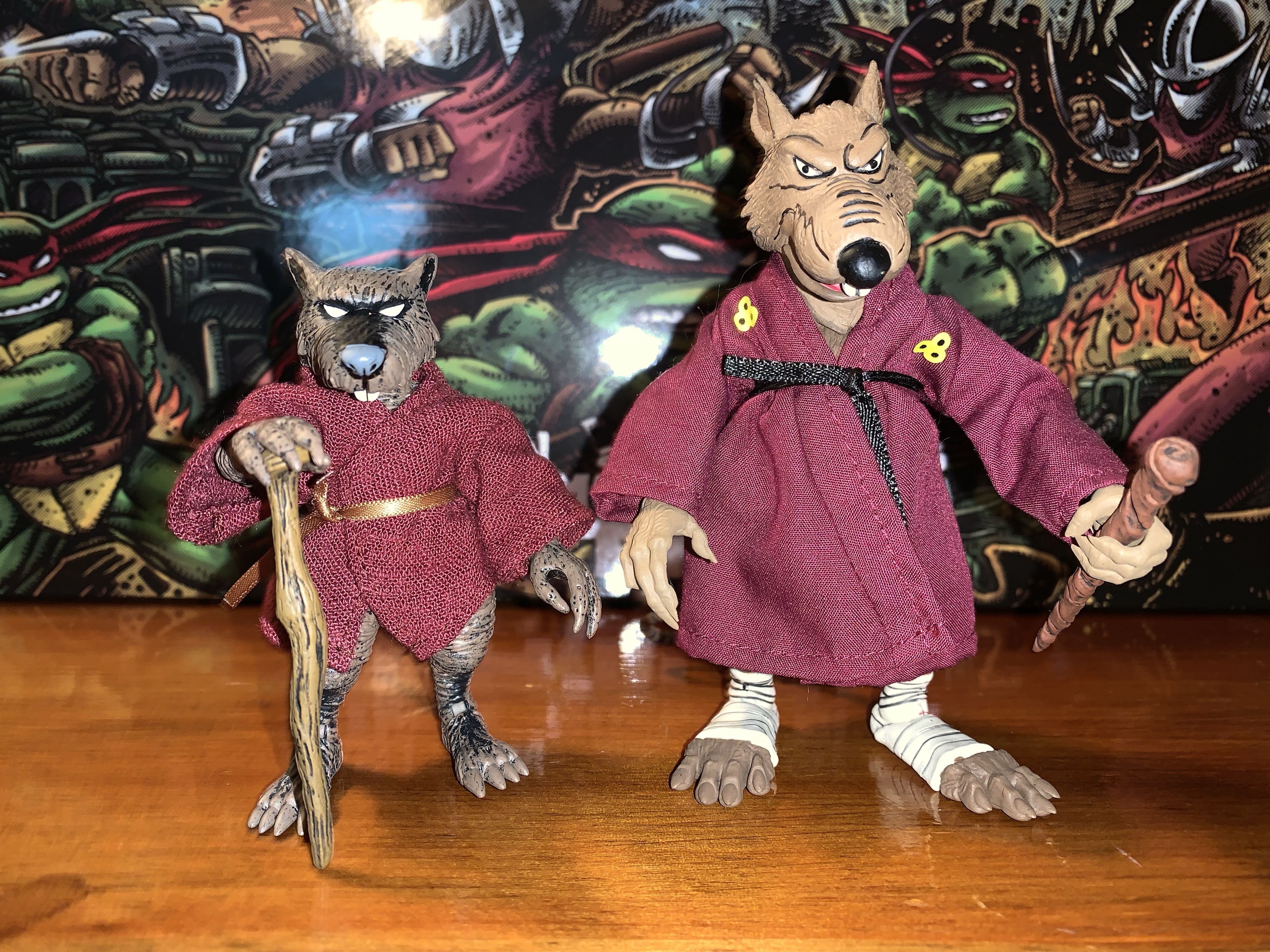
NECA TMNT Mirage Studios Triceraton Zog

Haulathon 2023 has brought some pretty big releases to NECA’s line of Teenage Mutant Ninja Turtles action figures. And I mean big in a literal sense. REX-1 was tall and hefty and the multi-armed clone of Shredder was no slouch either. Those two seem to pale in comparison to Zog, the Triceraton warrior from NECA’s…

Keep reading

NECA TMNT Mirage Studios Shredder Clones

NECA and Target’s Haulathon event which has seen a vast assortment of product dumped onto shelves recently was not content to limit the products to just the cartoon Teenage Mutant Ninja Turtles. Far from it, as an assortment of comic book based characters were also released and today we’re going to look at the first…

Keep reading