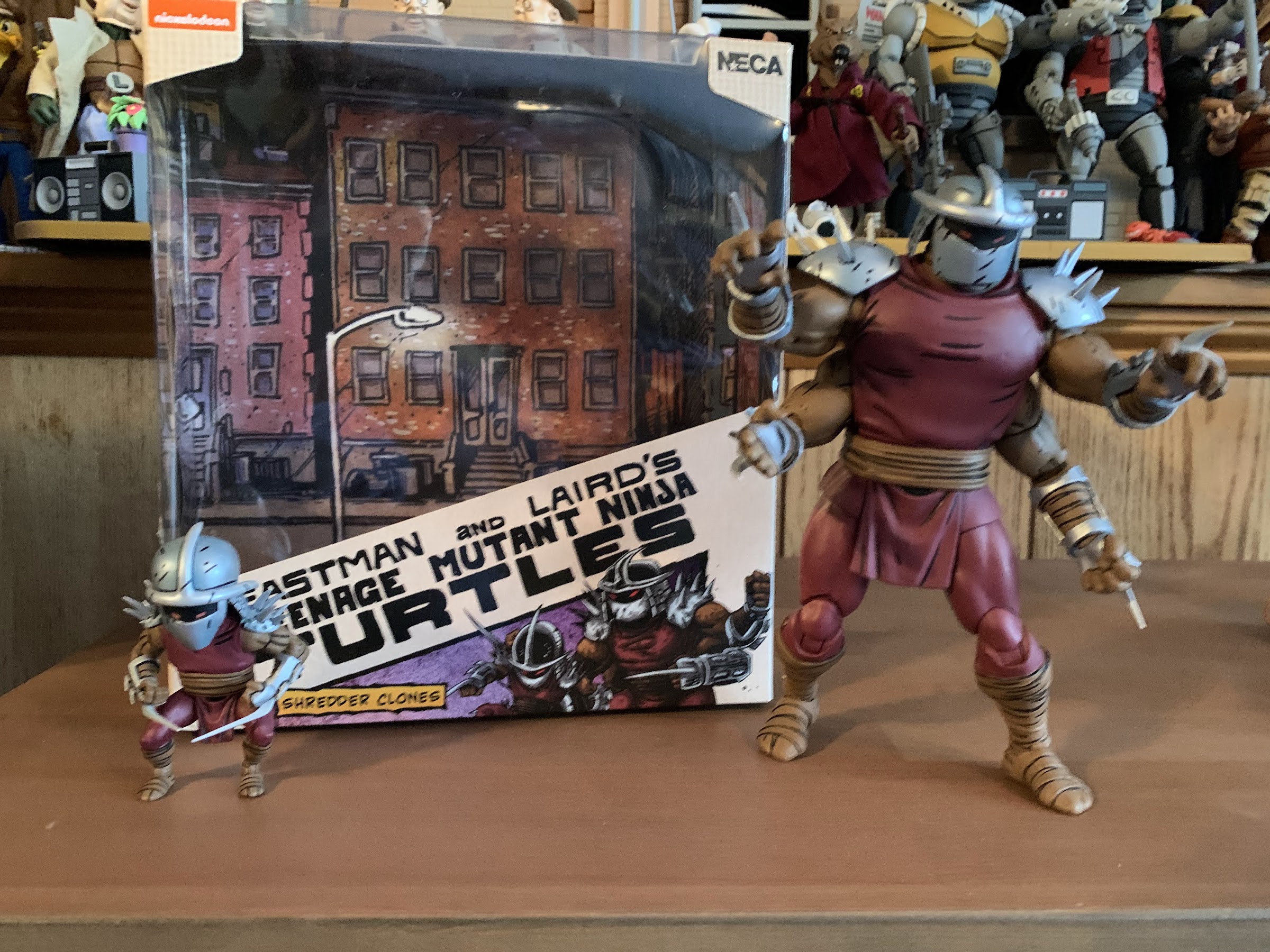
When NECA started down the path of Teenage Mutant Ninja Turtles with the 2008 release of the four titular characters, it didn’t go very far. After the turtles came April, but as a convention exclusive, and then nothing else. It would be years before their Shredder, which was shown off at the very same convention April was released at, was released as a con exclusive himself along with three of his henchmen. And it seemed to take the success of the eventual cartoon and movie lines that pushed NECA to go back to the original comics. It’s been an interesting line as it started with perhaps less-requested characters with the Fugitoid and Renet, but now we’re getting to those heavy hitters fans were dreaming of fifteen years ago. And some of those heavy hitters come in pint-sized packages like the beloved Master Splinter.
He’s a little guy.
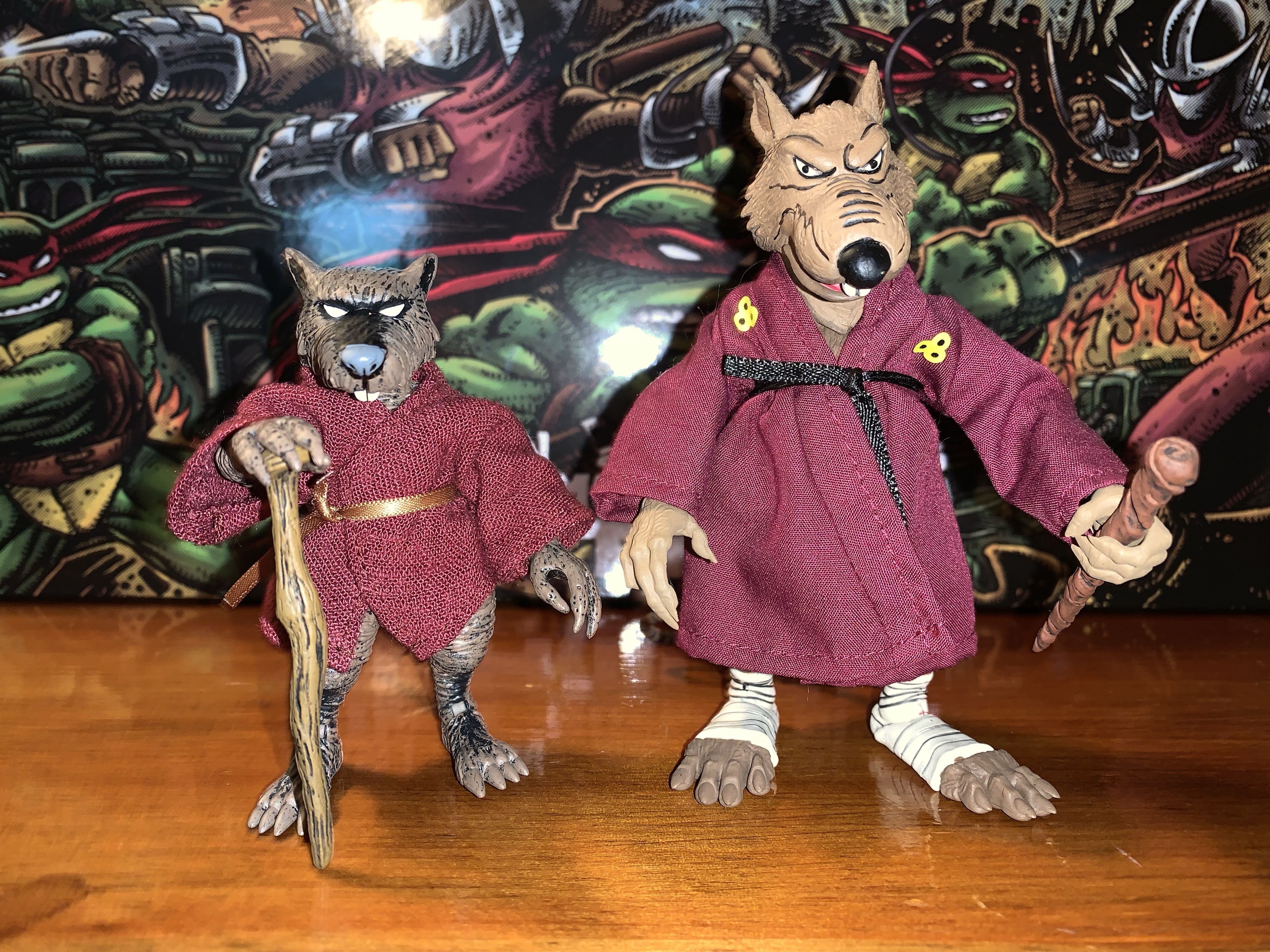
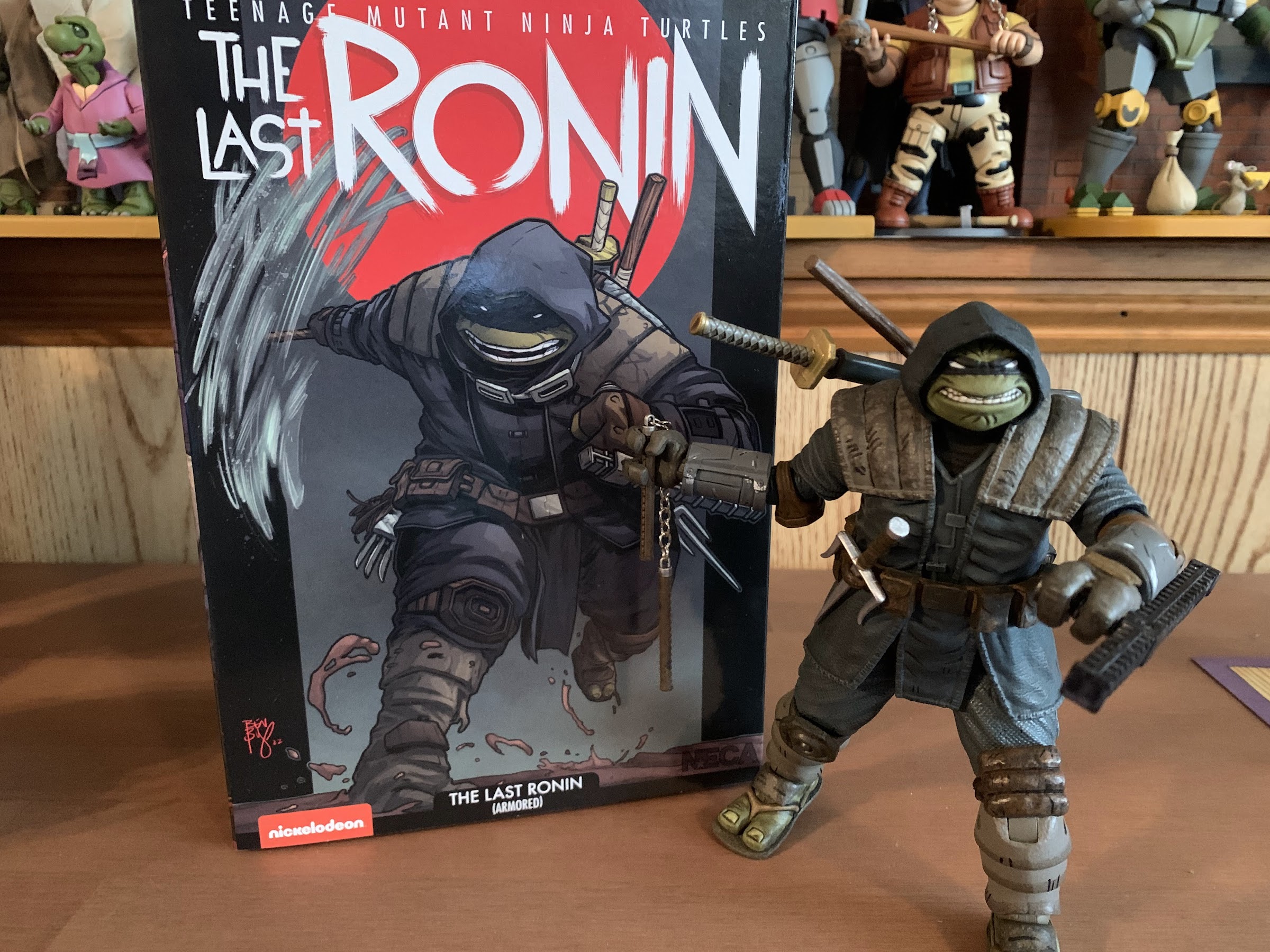
Splinter sets the bar as shortest figure in the line. Coming in at a tidy 3.5″, he’s very much a little guy. Especially when placed with the recently released turtle four-pack who are taller and bulkier than the 2008 figures. I said he comes in a pint-sized package, but that was an embelleshment on my part as the actual box he’s in is the same as most of the other single releases. It features new art by Kevin Eastman which matches the look of the figure pretty well. My memory is a bit fuzzy, but I do believe first appearance Splinter in the books was a bit more fuzzy and frayed looking than the figure here, but that would be very hard to pull-off in plastic.
If you prefer your Splinter with the 08 versions.
He apparently got a boost in size when making the leap to animation.“You have got to be kidding me.”
I noted Splinter is 3.5″ tall, but I should add that is in his neutral stance which features bent knees. It’s basically how he came out of the box and how he likely should be posed, but someone who wanted him to be taller for the sake of being taller could get a little more out of him. He’s sculpted all in brown plastic with a lot of black dry brushing over him. The black is heaviest on the top of his snout and extends to around his eyes which creates a striking portrait. It’s a solid approximation of the comic art and if there’s anything I think could have been done better with the sculpt and paint it’s the claws on Splinter’s hands and feet. They’re a bit soft in sculpt and all brown so they just blend into the fingers and toes. It matches the art on the box so I can’t knock the figure for its accuracy, it’s just one of those design choices that works better in print than sculpt.
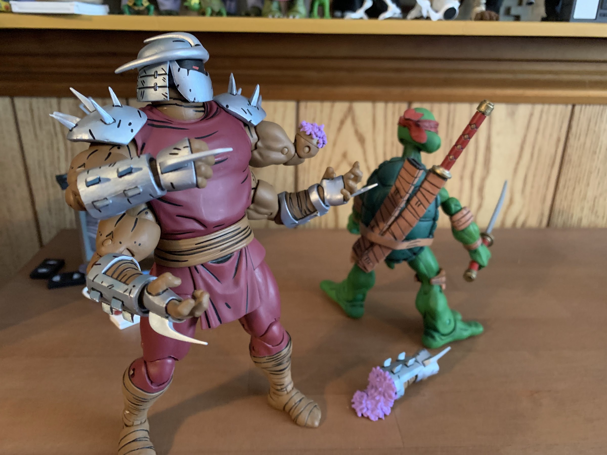
This is probably a better foe for the sensei.
The shading on the figure covers the entire body, but it’s almost irrelevant since Splinter features a soft goods robe. Just like his cartoon and movie counterpart, the robe is wrapped around him and fastened with a brown ribbon. It’s a maroon color and it looks fine. It’s a lot of material and a little frumpy looking. It might have been neat to see it look a little more worn since this is a rat who lives in the sewer. I don’t like the ribbon used for the belt as it just doesn’t look like any belt one would expect a robe to fastened with. It’s a criticism I had for the movie and cartoon Splinter. A piece of stretchy material, like the additional belt on the Foot and Shredder movie figures, with a knot glued onto it would have been my preference, but it’s fine.
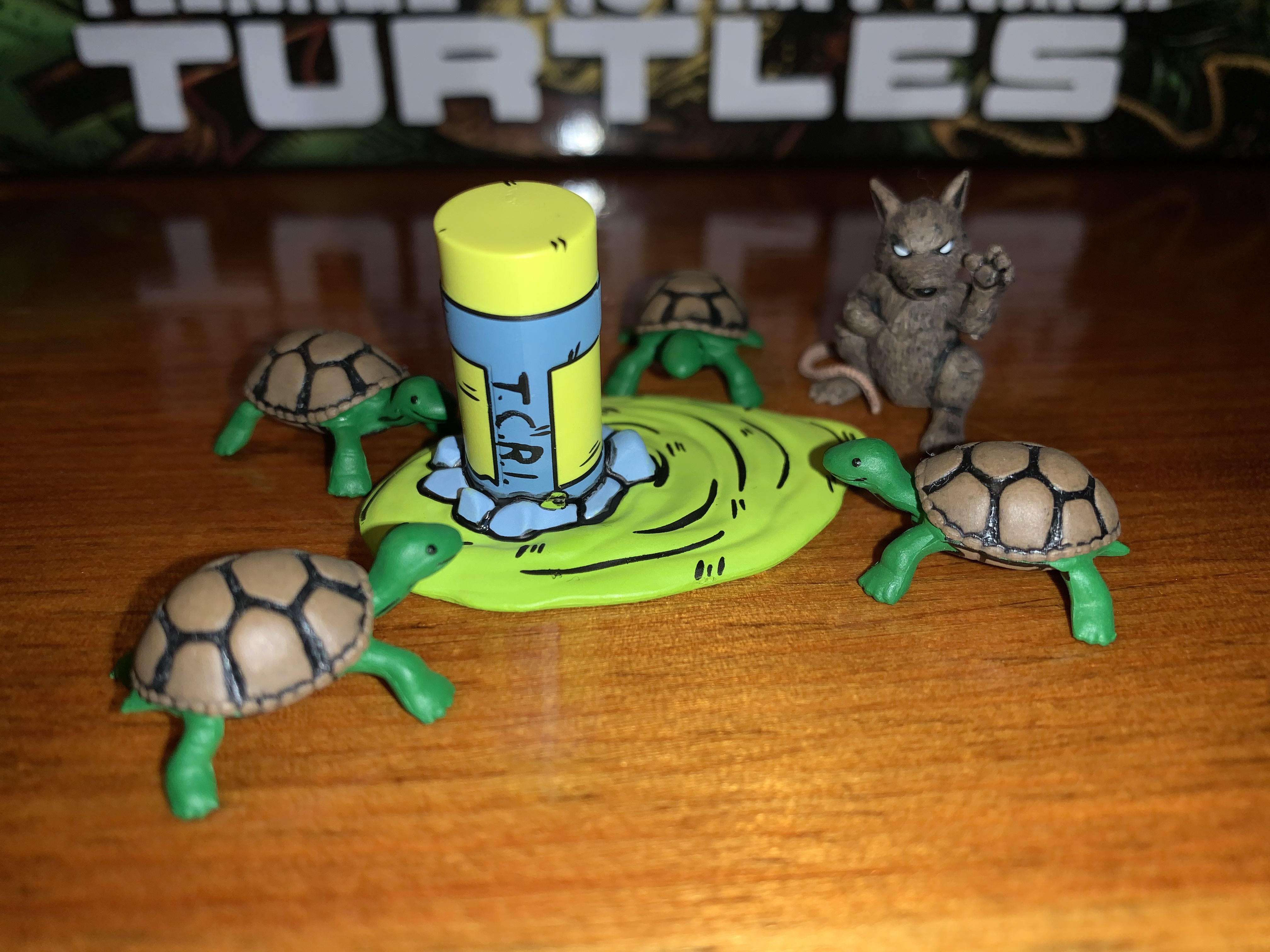
Since he doesn’t have much, Splinter gets all of the pre-mutated guys and some ooze too.
The figure, despite being small, has most of the same articulation one would expect of a NECA figure. The head feels like it’s on a double ball peg and it has great range in all directions. The shoulders are ball-hinged and can raise out to the side fine, but rotation is going to be limited by the robe. It’s something that can be worked around though as that’s the benefit of the robe being slightly oversized. The elbows are single-hinged with a swivel and will bend to 90 degrees. The wrists swivel and hinge horizontally as well. In the torso is a diaphragm joint that feels like a ball-joint, it could be a double, but you get rotation, a little forward “crunch,” and some tilt. The hips are ball-jointed and can go out to the side for splits. They kick back rather far, but not really forward a whole lot. There’s a little thigh pivot and the knees are single-hinged and swivel. You do get about a 90 degree bend at the knee, but again, he’s meant to stand with his knees bent to about 45 degrees so the practical range is limited. The ankles hinge and pivot with the ankle rocker being a bit flat, but functional. The tail is connected via a hinged ball peg so you get rotation and the hinge can direct it a bit. The tail itself is also bendy, though the wire only goes about halfway through it so it’s a bit limited.
And he also comes with this guy.
Splinter has decent articulation, though it’s hard to argue that he’s not meant to mostly just stand there on your shelf. He can hit a few battle ready poses and also stand on one foot if you want to place him in a side-kicking pose. I’m a little surprised that NECA did not include an articulated jaw as they did with the cartoon Splinter, but I don’t hate the exclusion. The profile looks good so if they felt they couldn’t get that joint in there without harming the presentation then that’s a decision I support. I only mention it as some may have expected it based on past versions of the character and may miss it.
The old and the new. The Utrom on the left came in the Foot four-pack and the turtle on the far right came with the 08 figures.
Since Splinter is such a small figure, he does come with a pretty robust assortment of accessories to justify his price tag. Big figures cost more money for both NECA and the consumer, but that rarely applies to small figures. To get more plastic into this, Splinter comes with three sets of hands: relaxed, gripping, and pointing. The gripping hands have the less desireable horizontal hinge. I’m surprised we didn’t get flat, chop, styled hands as well. Splinter also has his walking stick and that he can grasp with the gripping hands or the relaxed hands. The relaxed hands can also rest on top of the stick too so you have some options when posing him with it. There’s a small tea kettle with articulated handle and a little cup to go with it. The kettle has some nice black linework on it while the cup is blank. Splinter can hold the kettle by the handle and palm the cup well and it’s a nice little pair of accessories. I do wish NECA had ripped-off Super7 and included a steaming effect for the cup, but it’s fine as-is.
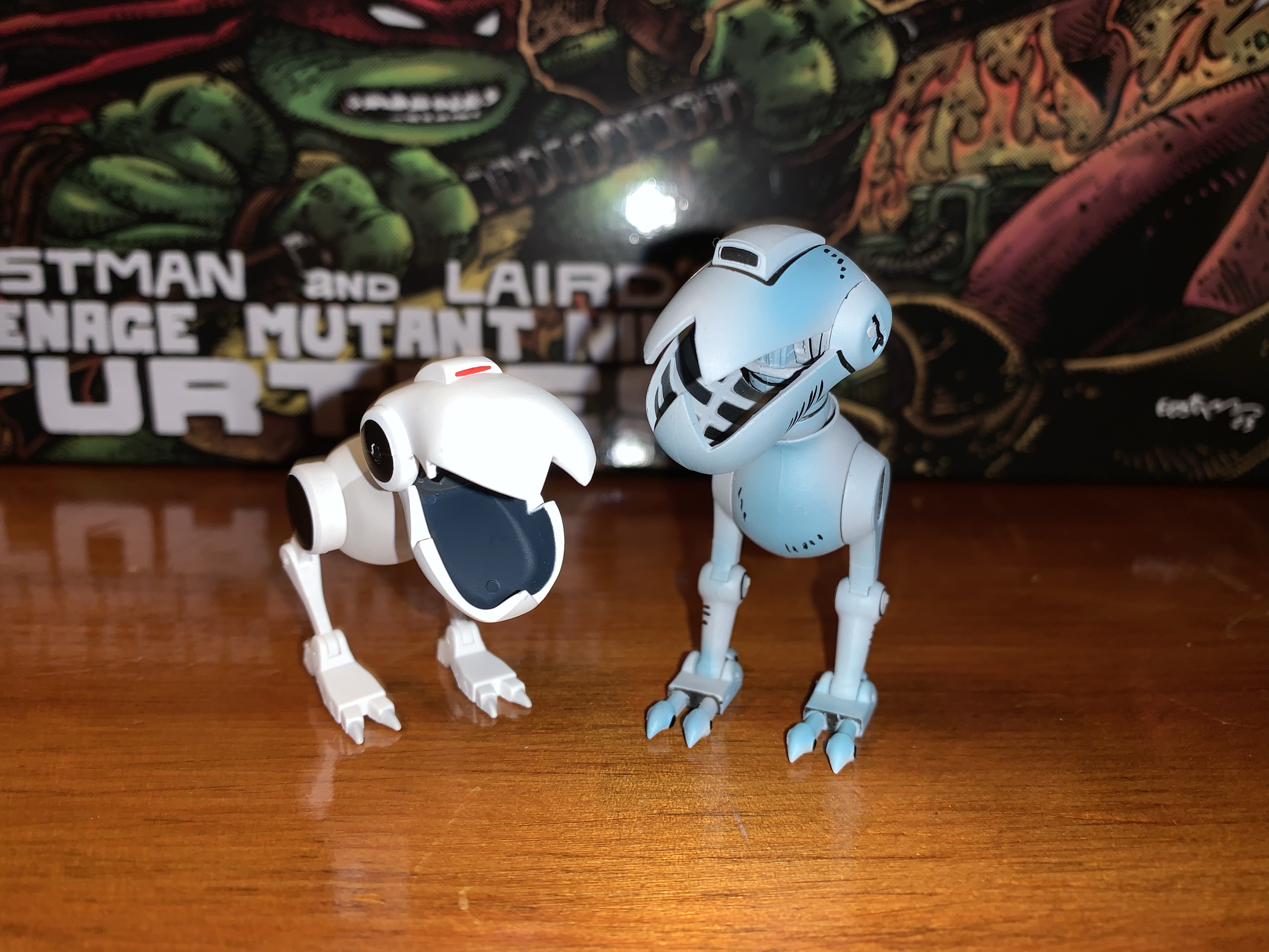
Cartoon Splinter is bigger than comic Splinter, but the opposite is true for the Mouser.
Those are the accessories for Splinter, the rest are basically extra characters. Up first is a brand new Mouser. It’s painted all in gray with some light blue shading on it to create a metallic effect that looks really nice. It’s also covered in the usual black linework and looks rather sharp. As far as I know, the entire sculpt is brand new as it doesn’t share any parts with the cartoon Mouser. If it shares any parts with the Mouser released back in 2008 I’m not sure as I don’t have any of those. It functions just like the toon one with an articulated jaw that features a fully-sculpted interior, hinge at the base of the head, ball-jointed neck which allows for a lot of rotation and tilt, leg swivel, hinged knee, and hinged ankle. The hinged joints in the legs are plenty tight so the figure has no trouble standing and overall it’s a nice addition that I’m sure collectors will want more of.
Who’s for tea?
Splinter also comes with an assortment of slug figures for accessories. We get a new Utrom that has more of a surprised expression on its face. It’s very close in size to the previously released stand-alone Utrom that came in the Shredder convention set, it just drops the articulation entirely. It’s well-painted with a lot of dry-brushing that makes it look dirty and gross. We also get a pre-mutated Splinter that’s in sort of a martial arts pose. To go with him are four, baby, turtles. Stylistically, they’re very similar to the pre-mutated turtles the 2008 figures came with, but they’re all new sculpts and noticeably smaller. They’re nicely painted and they almost look like they’re smiling so they bring a cute factor to the package. The last item is the broken cannister of ooze. It’s a new sculpt and it’s basically upside down with a big puddle of the stuff spreading out from it. It serves to create a nice little display with the other slug characters and I prefer it to just a plain cannister.
“Michelangelo! You have neglected your training for too long!”
And that’s NECA’s take on Splinter. It’s a small figure with a bunch of stuff that NECA hopes will offset the price of the figure. I got my figure at Target where it retails for $37 which is about the same price as figures like Jagwar and Dreadmon, but less than Zog and the Shredder clones. Is $37 too much? It’s hard to blame folks who feel like it is. The added accessories are nice, but would I trade some of them to knock this release down to $30? Sure. As for the figure itself, I think it gets the job done. I think it could have more hands and a better belt, but this Splinter will look nice on your Mirage Studios shelf which is rapidly becoming shelves in many collections. It’s an essential release if you’re a TMNT Mirage collector, and if you can stomach the price I think you’ll be happy enough.
Fancy yourself a collector of NECA’s TMNT Mirage line? Here’s some more reviews to take a look at:
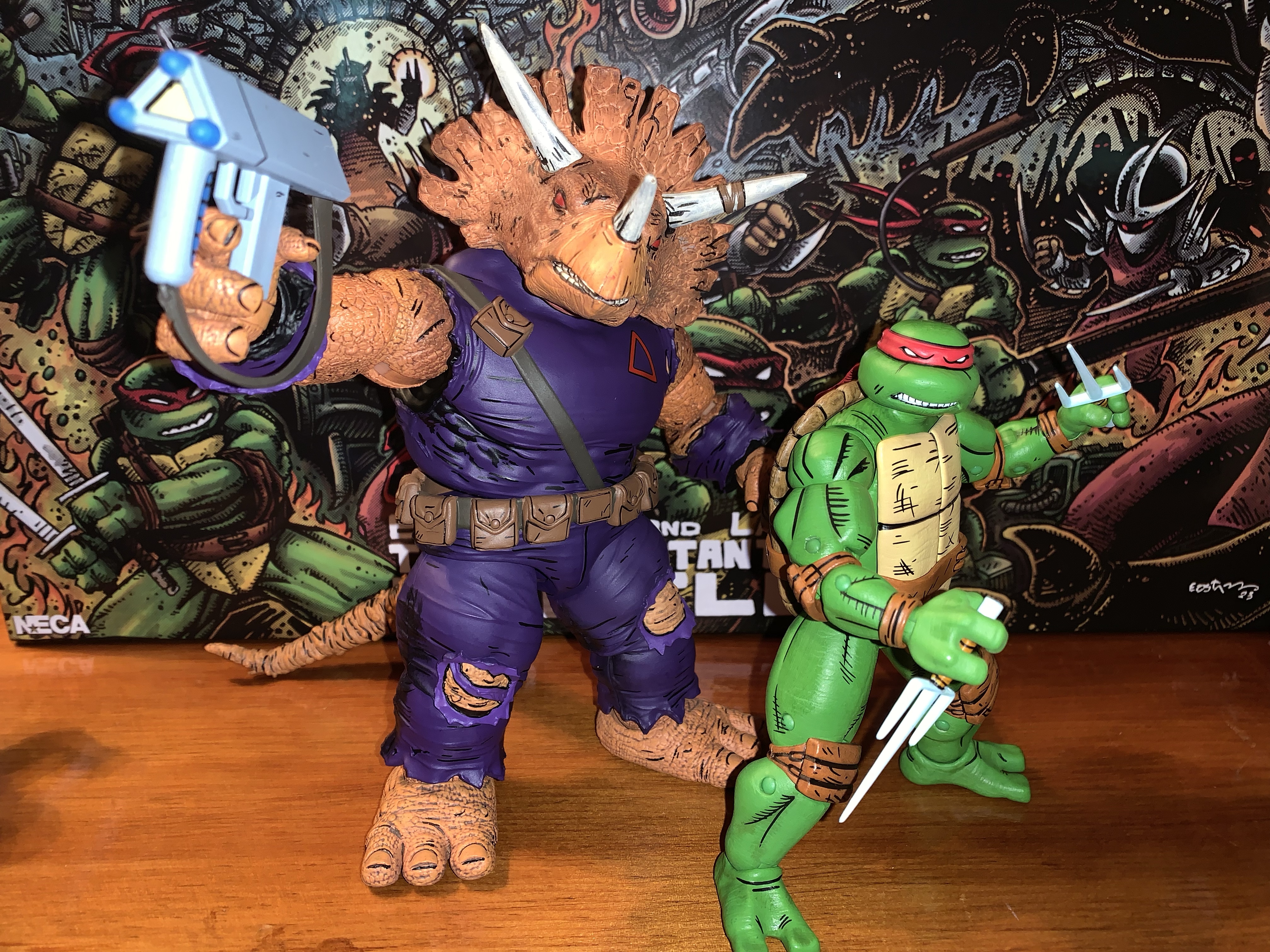
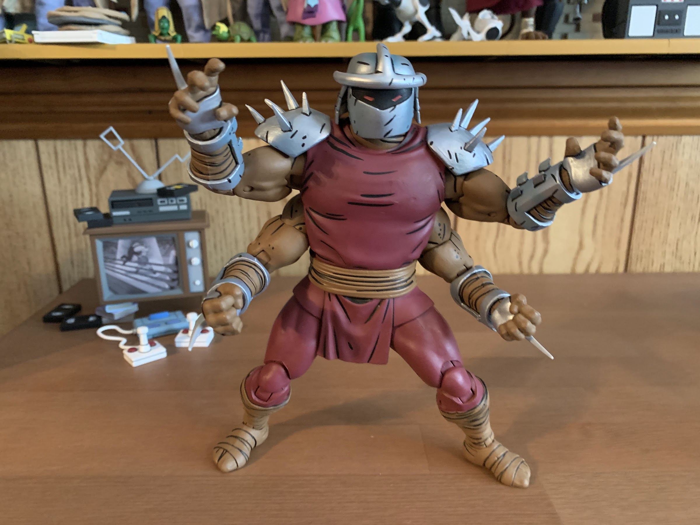
Haulathon 2023 has brought some pretty big releases to NECA’s line of Teenage Mutant Ninja Turtles action figures. And I mean big in a literal sense. REX-1 was tall and hefty and the multi-armed clone of Shredder was no slouch either. Those two seem to pale in comparison to Zog, the Triceraton warrior from NECA’s…
NECA and Target’s Haulathon event which has seen a vast assortment of product dumped onto shelves recently was not content to limit the products to just the cartoon Teenage Mutant Ninja Turtles. Far from it, as an assortment of comic book based characters were also released and today we’re going to look at the first…
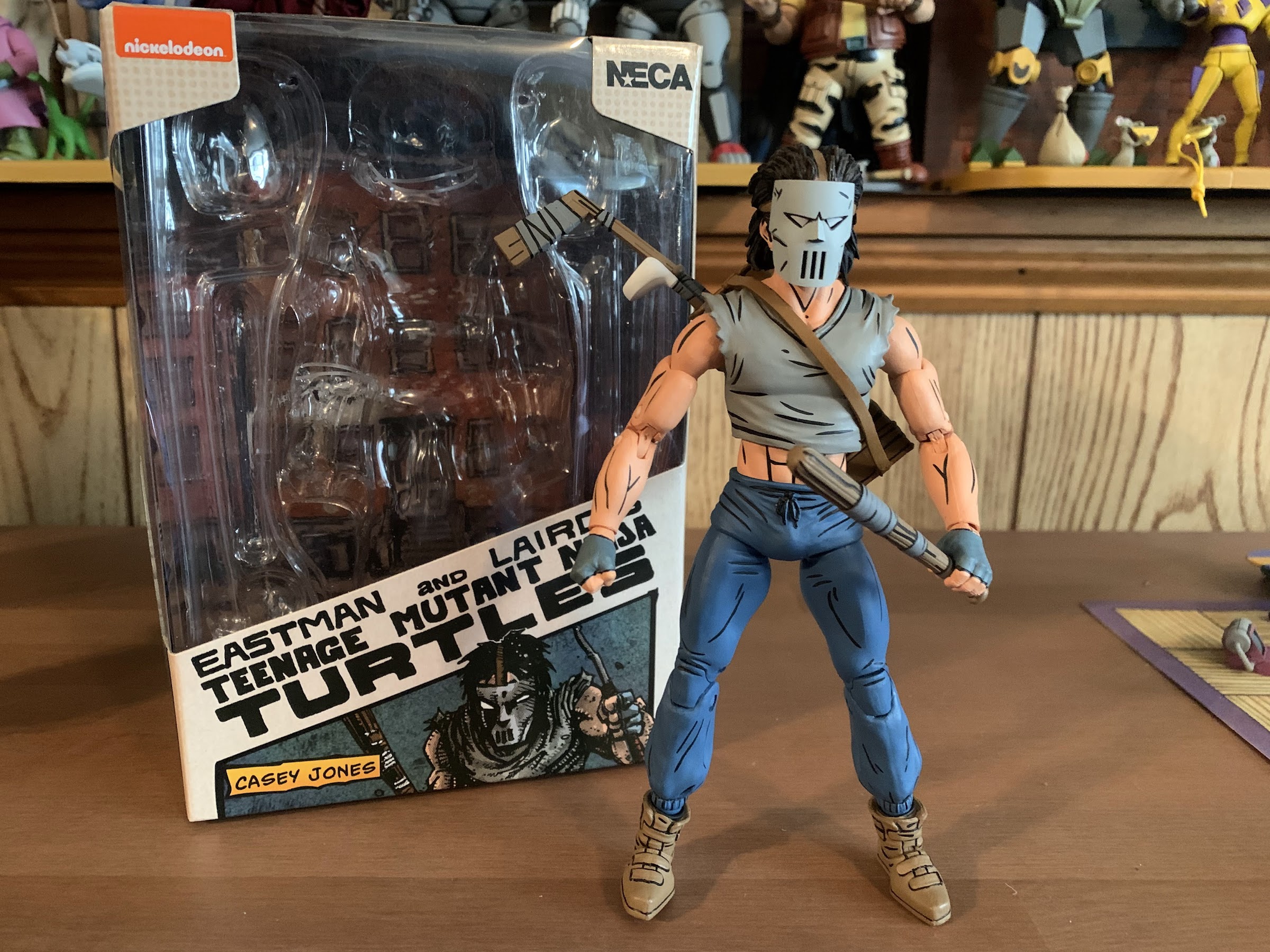
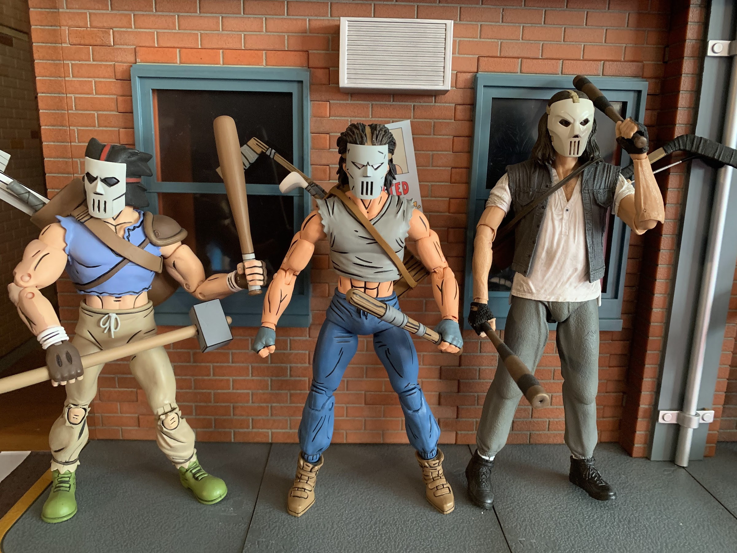
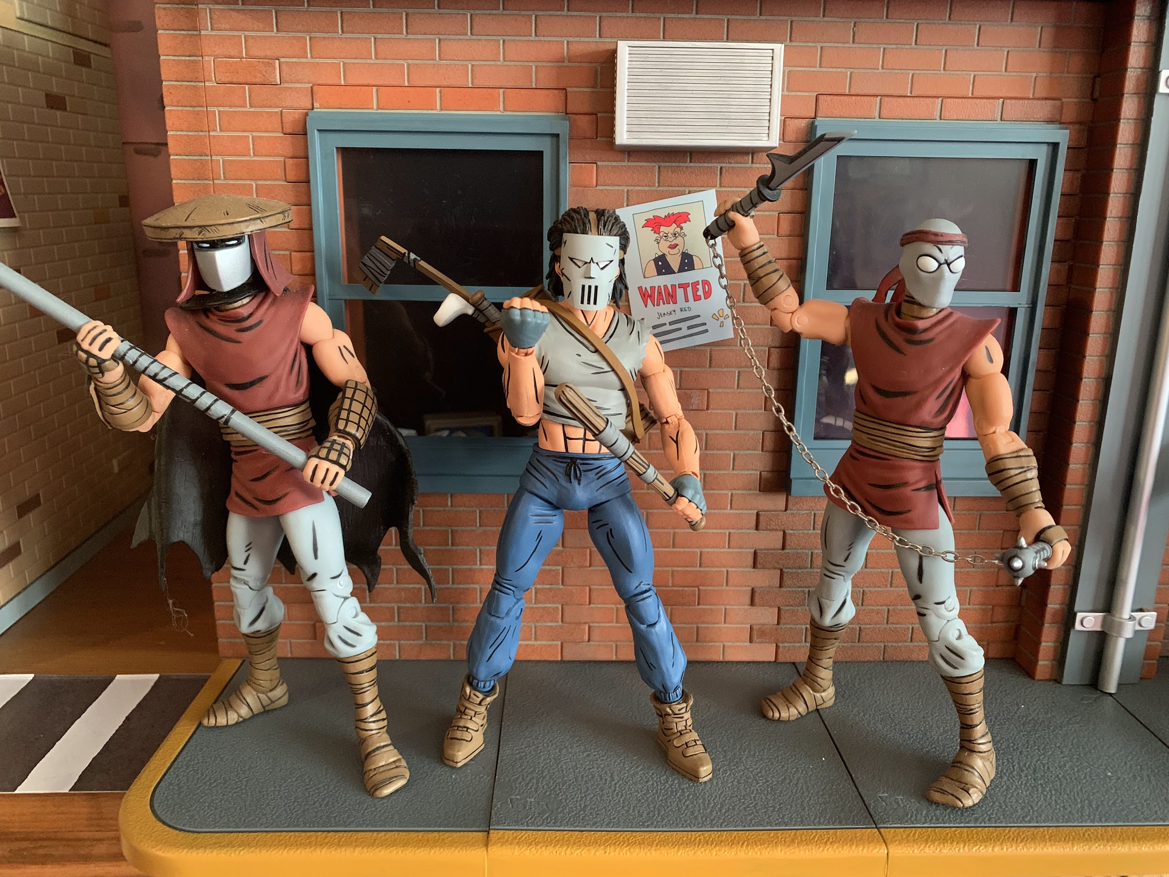
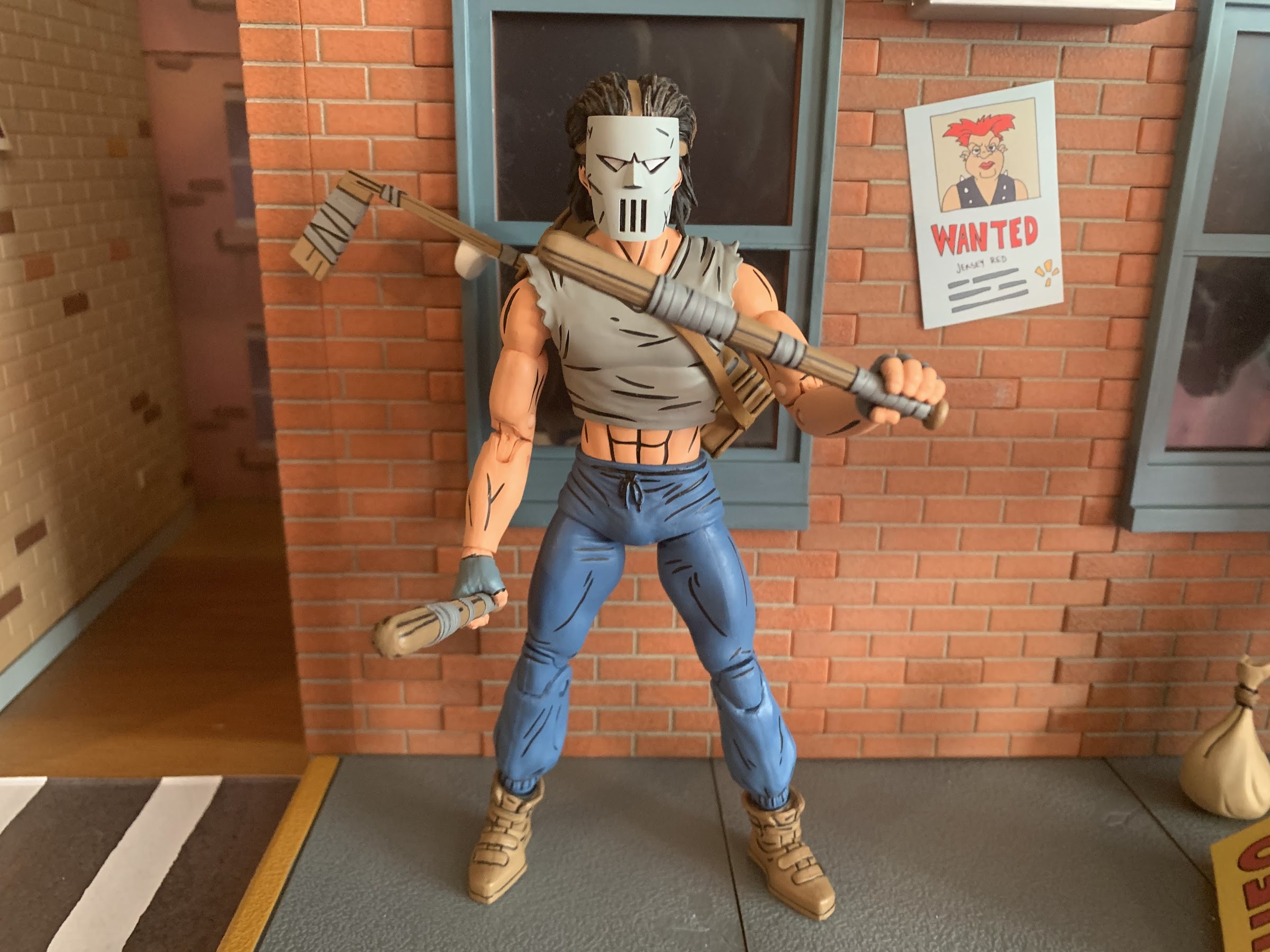
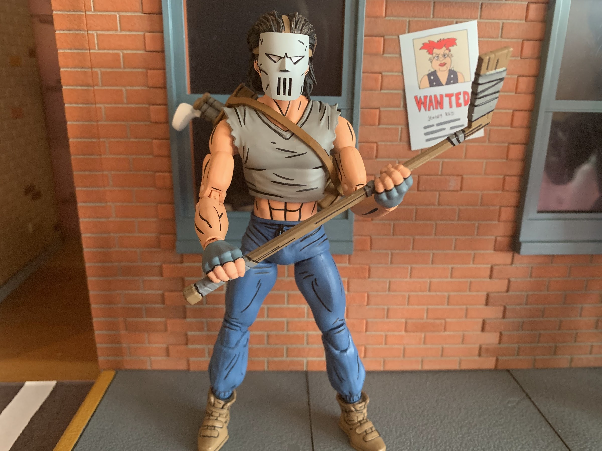
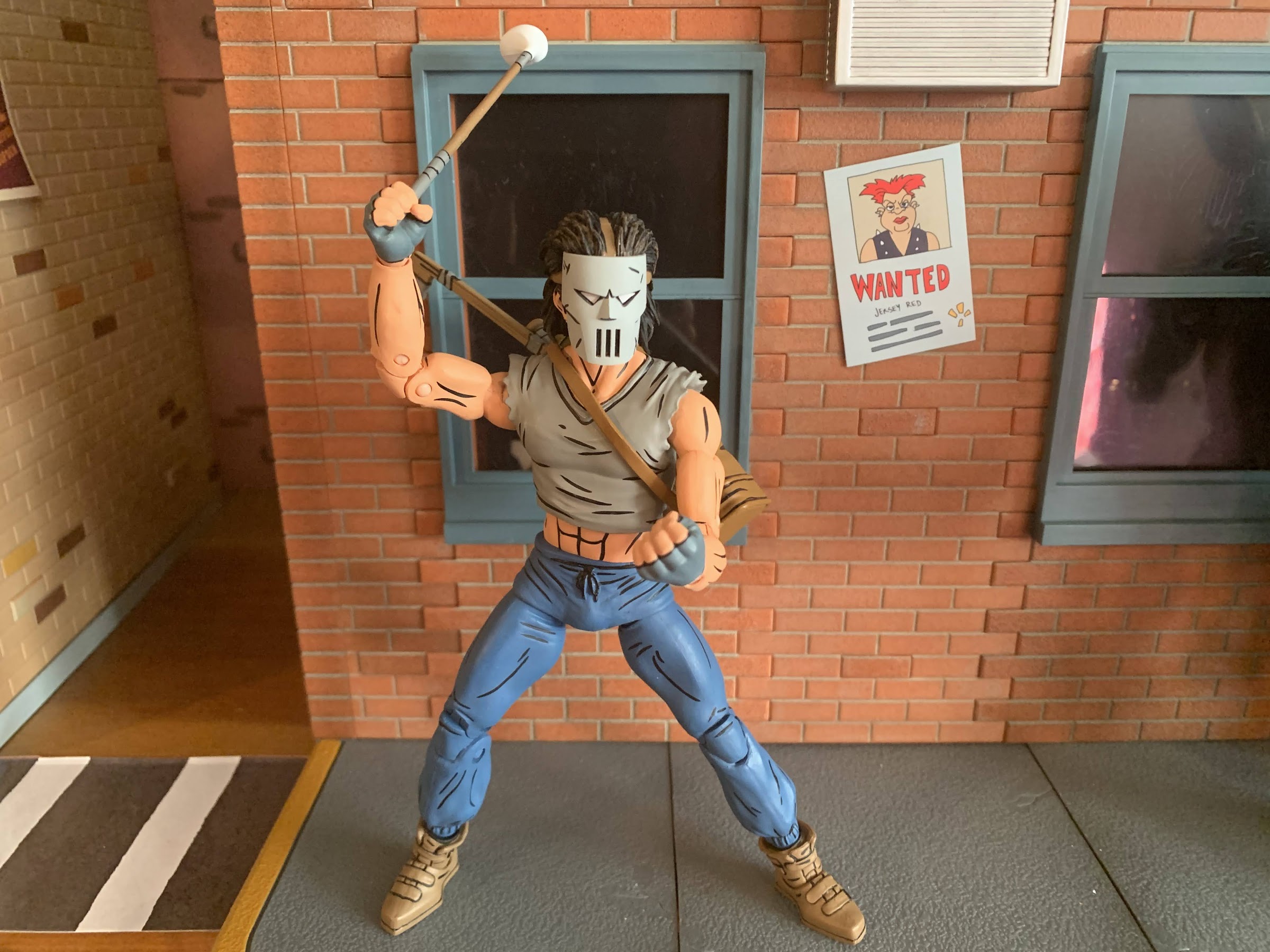
Where there be turtles, there be Casey Jones – the bad ass vigilante of New York City! Casey was an early addition to the comics and he’s basically been included with every iteration of Teenage Mutant Ninja Turtles since. And in all of them he tends to wear a hockey mask and bludgeons bad guys…
When it comes to the popularity of Teenage Mutant Ninja Turtles a lot of the credit goes to Playmates Toys. Kevin Eastman and Peter Laird created the characters born out of a joke. Credit them for having the vision to think this joke had appeal beyond their small circle as they self-published Teenage Mutant Ninja Turtles in 1984. It was basically perfect timing from there as the product quickly got the attention of Mark Freedman and his Surge Licensing brand which, much like Mirage Studios, existed largely in name only. He saw the property’s potential as a kid’s product and was able to get Eastman and Laird to grant him permission to shop the IP to toy companies. Aside from a prototype created for Mattel, no major producer bit, except for Playmates. Known more as a doll company, Playmates wanted to get into the action figure business and took a chance on the franchise. They co-developed a television mini series with Fred Wolf to help sell the toys, and the rest is history.
New artwork from TMNT co-creator Kevin Eastman!
A nice window box to show you what’s inside.
Because of that early involvement and ridiculous level of success, Playmates has been intertwined with the TMNT franchise ever since. And for a long time, they were the only ones to make action figures based on the property. Then, in 2008, NECA Toys released it’s own version of the brothers. Marketed to collectors and sold outside the usual avenues occupied by Playmates, NECA sent to market a version of the turtles that had never really been done before in toy form. Based on their original appearance in Teenage Mutant Ninja Turtles #1, the turtles hit retail with hopes of more Mirage inspired characters to follow. Then, it stopped. Details are murky, but some have blamed Playmates for stepping in and essentially squashing the toy line by exercising its contractual rights as the master toy license holder. It also could have just been poor sales. NECA’s Randy Falk indicated years ago that the comic turtles weren’t big sellers. Anecdotal evidence suggests he may be correct as I personally can recall seeing both the standard issue and black and white variants hanging around comic shops for years and only finally vanishing after hitting clearance. It’s possible NECA was just a little too early and TMNT nostalgia just wasn’t ready to take off in 2008. Only a select few know for sure why the line was ultimately cancelled.
The biggest weakness of this set is the amount of stuff in the box.
Flash-forward 15 years later and NECA is back with a new iteration of the Mirage Studios Teenage Mutant Ninja Turtles. If fans weren’t ready for turtle nostalgia in 2008, they certainly are now. The property is now owned by Viacom who has wielded its mighty powers to loosen the toy license and we’re basically swimming in TMNT action figures from various companies. And since then, those 2008 figures have become far more sought after. Where once they could be had for clearance prices, they now command over 100 dollars a piece on the secondary market. This helped turn them into a magnet for bootleggers and some have even suggested that the physical molds were swiped from whatever factory NECA had been using. If NECA felt their dance with TMNT was over, it’s possible they let them go. Either way, because of a desire to do something different or because the figures have been bootlegged to hell and back, NECA decided to forego ever reissuing them. Instead, they opted to do new turtles based on later issues and for fans who have been dying to get ahold of some affordable Mirage turtles their wait is finally over.
If you’re wondering the answer is “No,” the arm, blaster, thing does not fit on the new turtles.
These old figures have some outdated engineering, but still look pretty damn cool.
The original 2008 figures have commonly been referred to as the Peter Laird turtles by fans. That’s likely due to Laird being the one who worked with NECA at the time when they were in development. They also seem to clearly be based on a singular image from the first issue which has been credited to Laird over the years. I have no idea how much of that is true as Eastman and Laird had a unique drawing style in which the two literally drew the same issue switching off in an unconventional manner as they passed papers back and forth. That’s why it’s just easier to consider them first appearance turtles. As the franchise took off, Eastman and Laird moved to the business side and away from doing the actual art which allowed for other artists to come into the fold. One such artist was Jim Lawson, who would go on to do pencils for a number of TMNT books. Initially, his take on the turtles was to emulate what Eastman and Laird had settled on when he stepped in while adding a little of his own influence. Eastman and Laird both loved Lawson’s work and have heaped praise upon it over the years. With their encouragement, he brought more of his own style into the books which can easily be seen during the City at War arc. His turtles were rather blocky, their heads almost resembling inverted mushrooms, and it’s that style that I think most comic book fans associate with the name Jim Lawson.
My attempt at recreating the TMNT #4 cover. Most know that as the cover to the first NES game.
For this release, NECA hired Paul Harding as the sculptor and directed him to design the turtles based on Lawson’s art, but not his later work as seen with City at War, but his earlier stuff when he first started on the book. Because of that, this set is being marketed as the Return to New York Turtles, though Harding clarified on Twitter that he didn’t expressly design them based on that story. It’s an appropriate shorthand though to place these figures into an era of the original comics. NECA’s approach to comic figures, unlike some companies, is to be very stylized and to try and emulate a certain artist’s approach rather than adapt a character from a generic model sheet or reference material. American comics have almost always allowed for an artist to imprint their own style onto established characters and such can be seen across basically all of the major comic books published by the likes of Marvel and DC. It’s both a cool approach for fans and a wise one for a toy producer since it opens up the possibility to re-release popular characters like the turtles over and over with slightly different looks.
I love how NECA handled the deco on Leo’s swords.
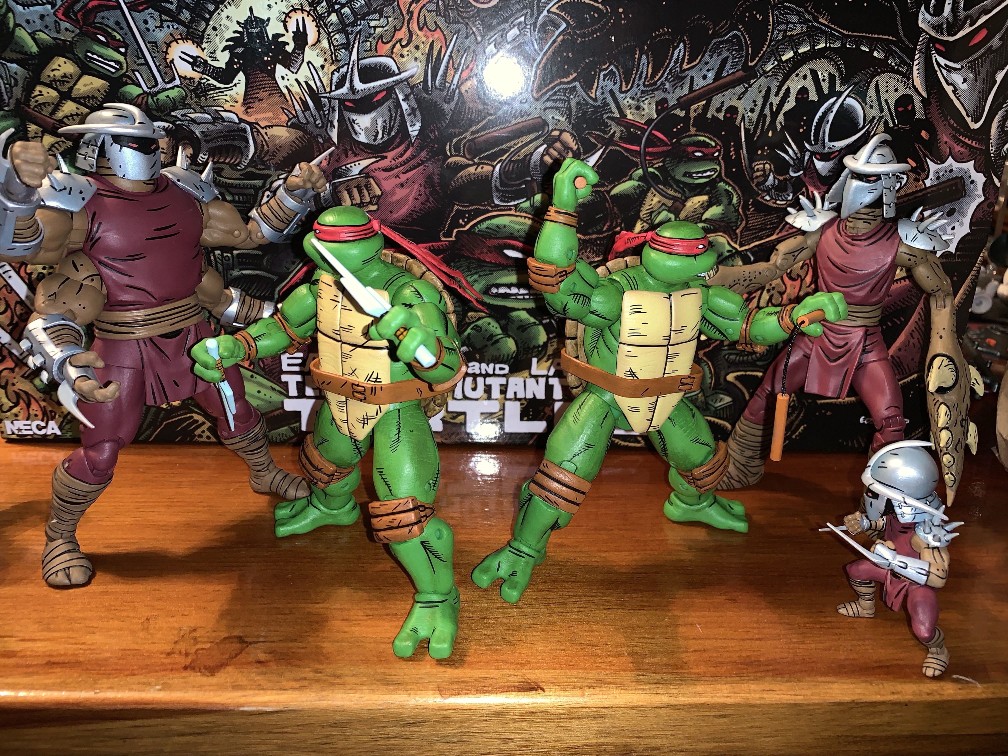
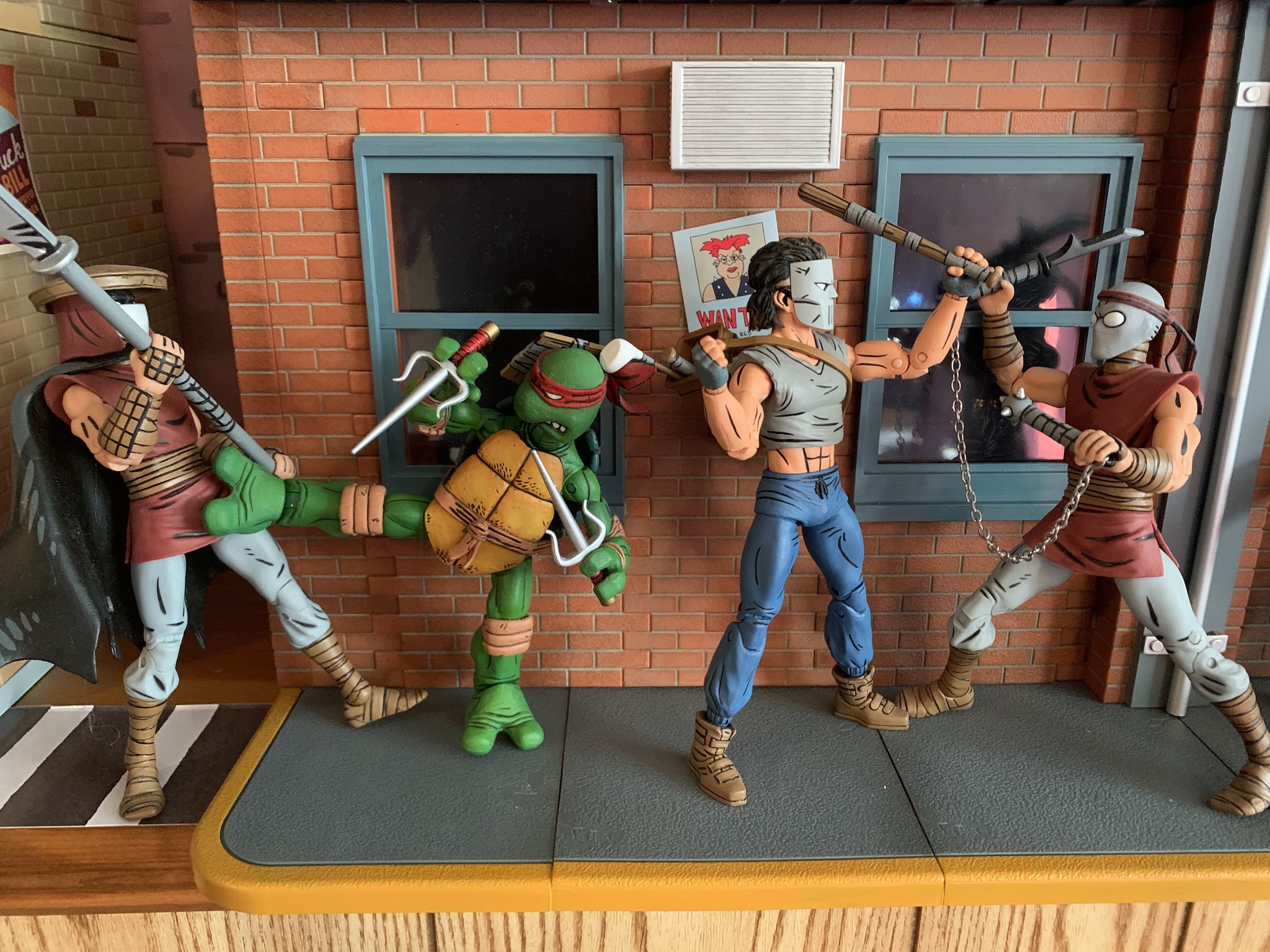
With all of that background out of the way, lets finally talk toys! This long-awaited NECA four-pack has recently started showing up at Target and was even sold online via Target’s website on June 25th. It seems like Target may have actually purchased stock from NECA for this release in contrast with the usual vendor-driven system they usually have in place for NECA. That’s likely due to this being timed with the drop of new toys by Playmates for the upcoming Mutant Mayhem film and because this release is the actual turtles, not some obscure side character that could possibly shelf-warm. This set will sell, even at the steep price of $150. The real question is – is this worth that steep price? If you’ve been waiting years to get a set of official Mirage turtles, that answer might be an easy “Yes” regardless of how this set turned out. If you are like me and have those 08 figures, or maybe even bootlegs you’re happy with, do you need to drop a bunch of money on yet another set of turtles? Read on.
Don’t mess with this pair.
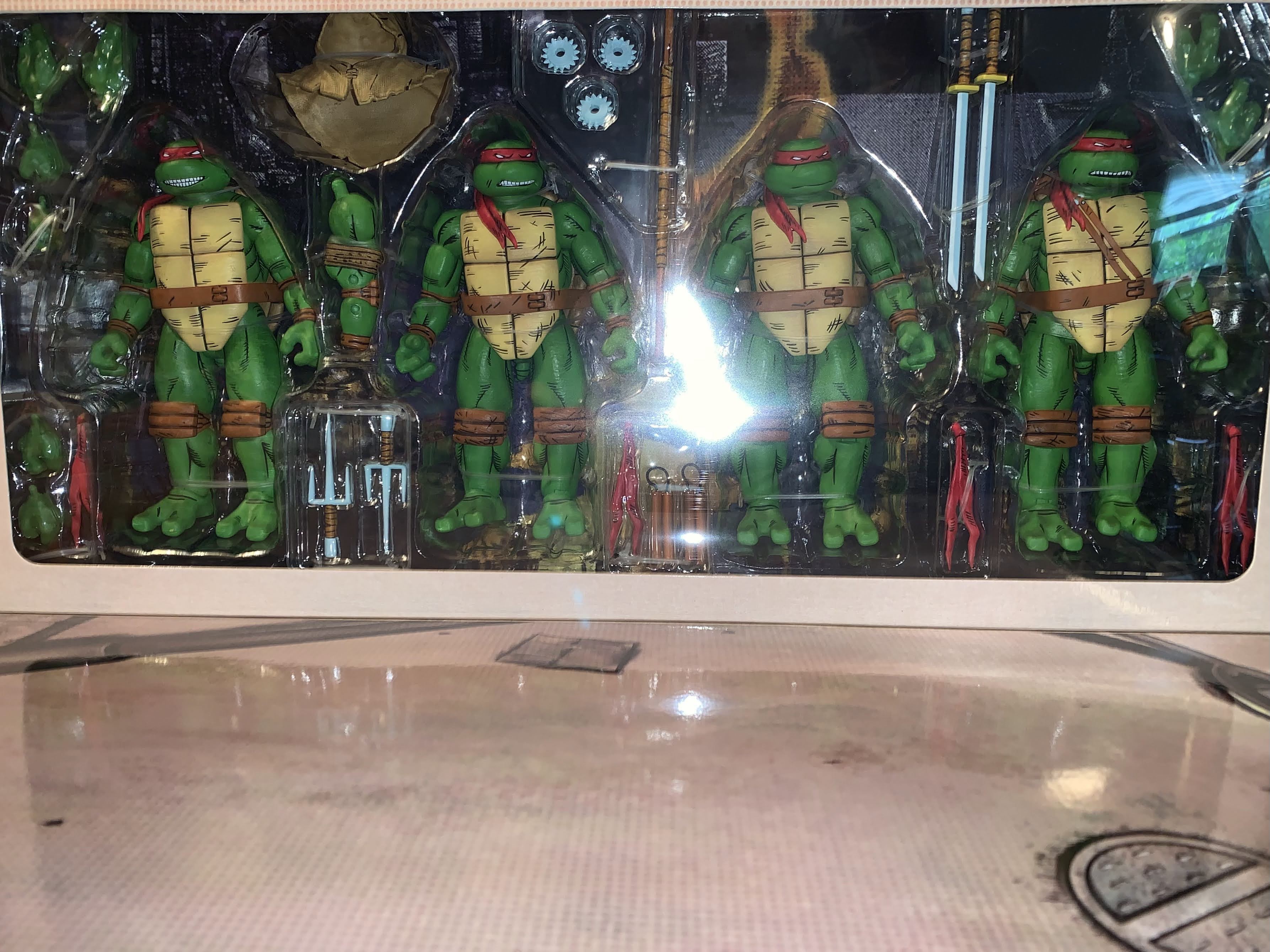
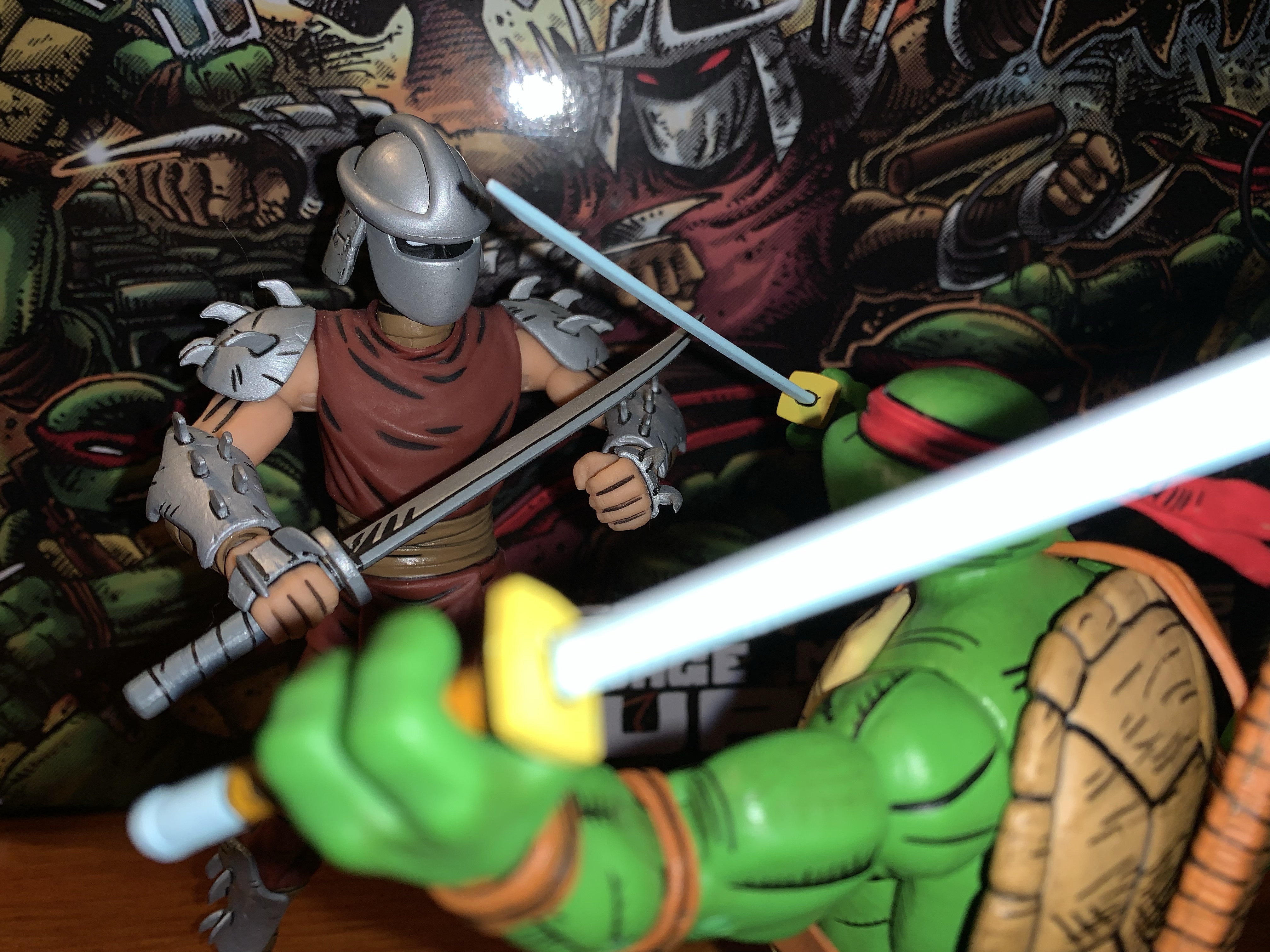
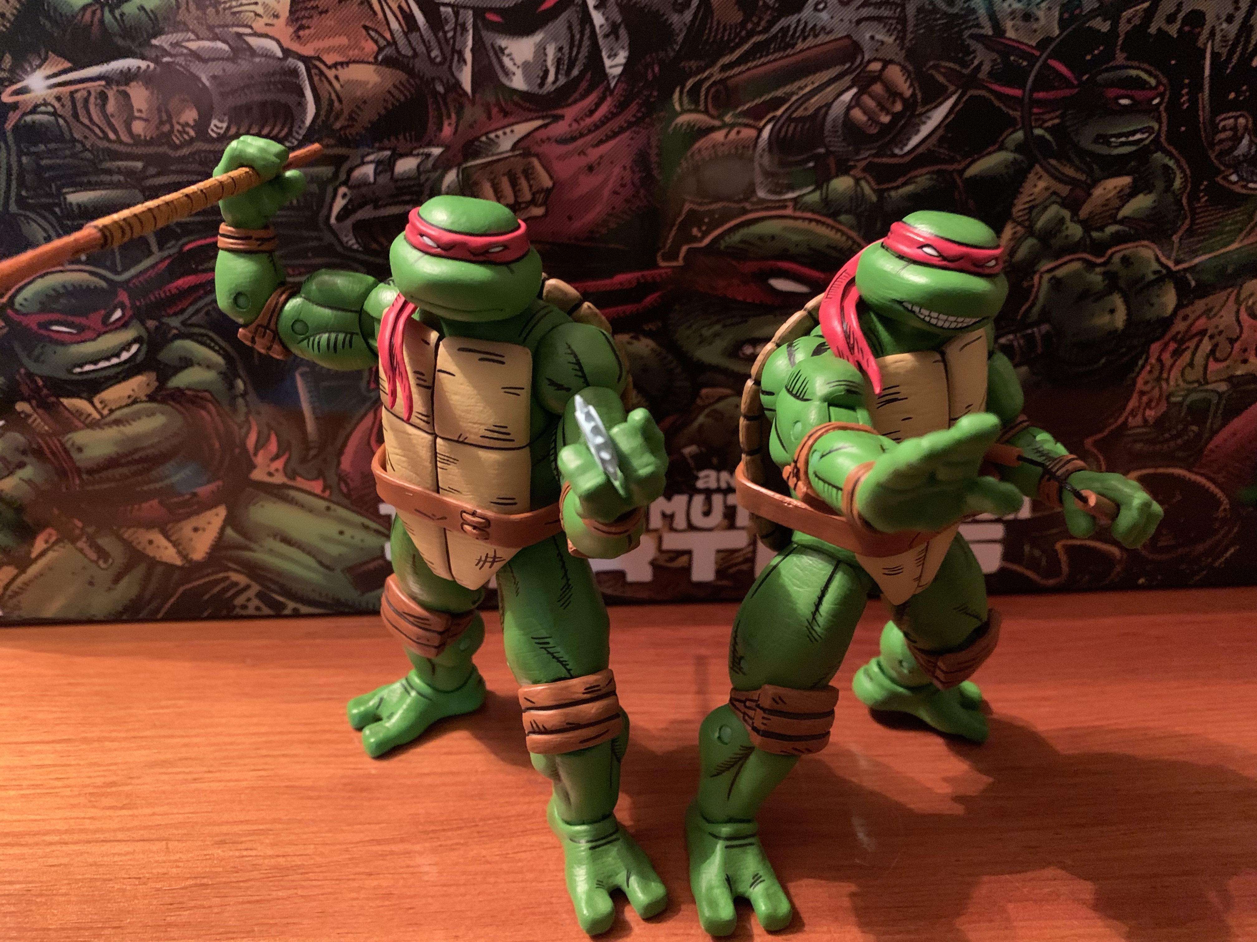
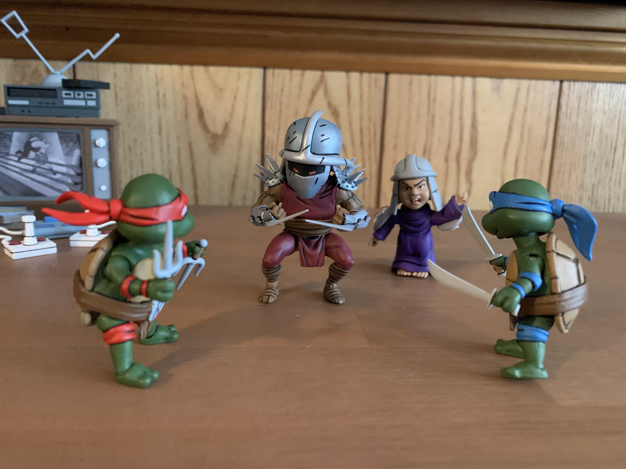
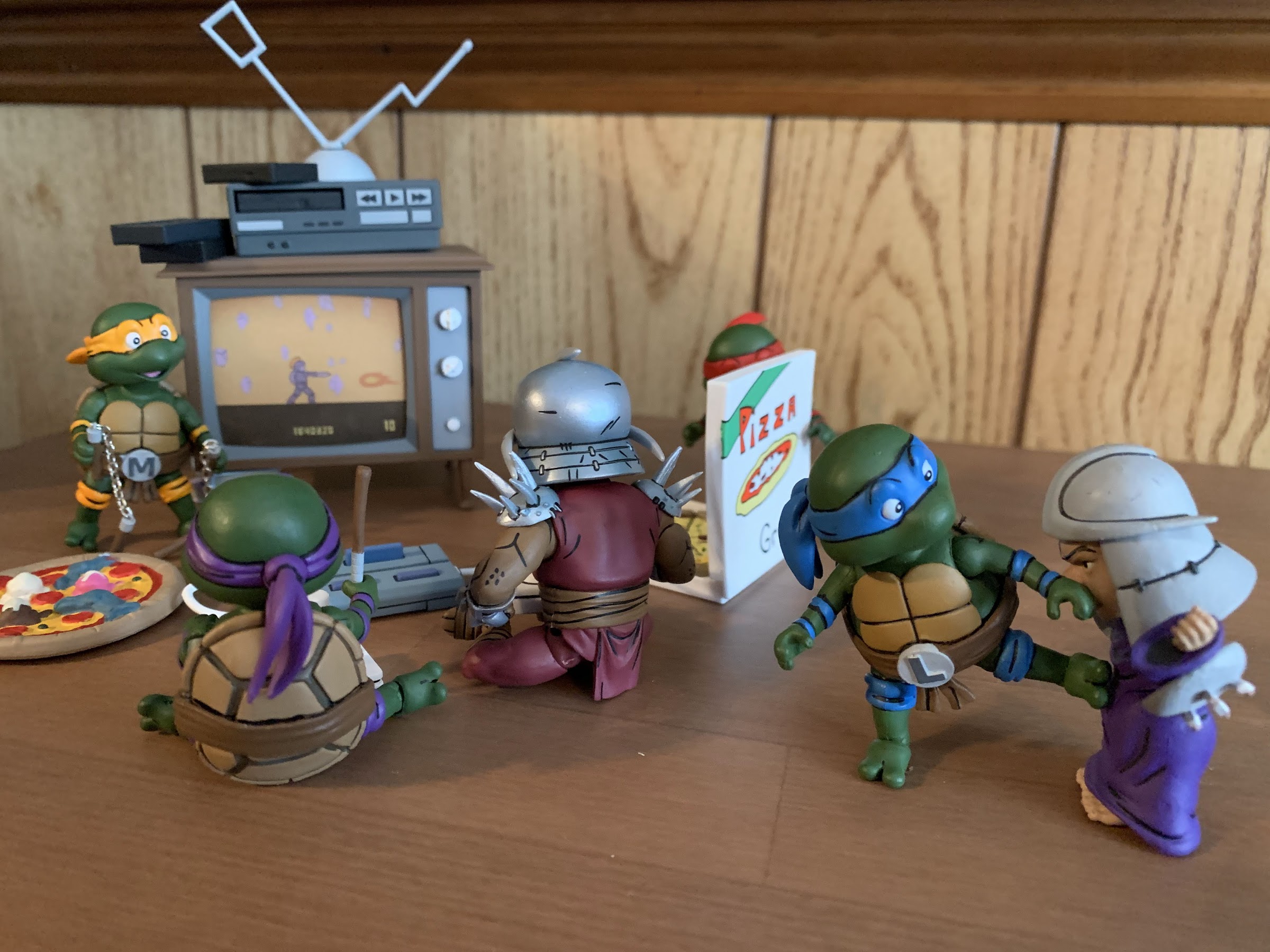
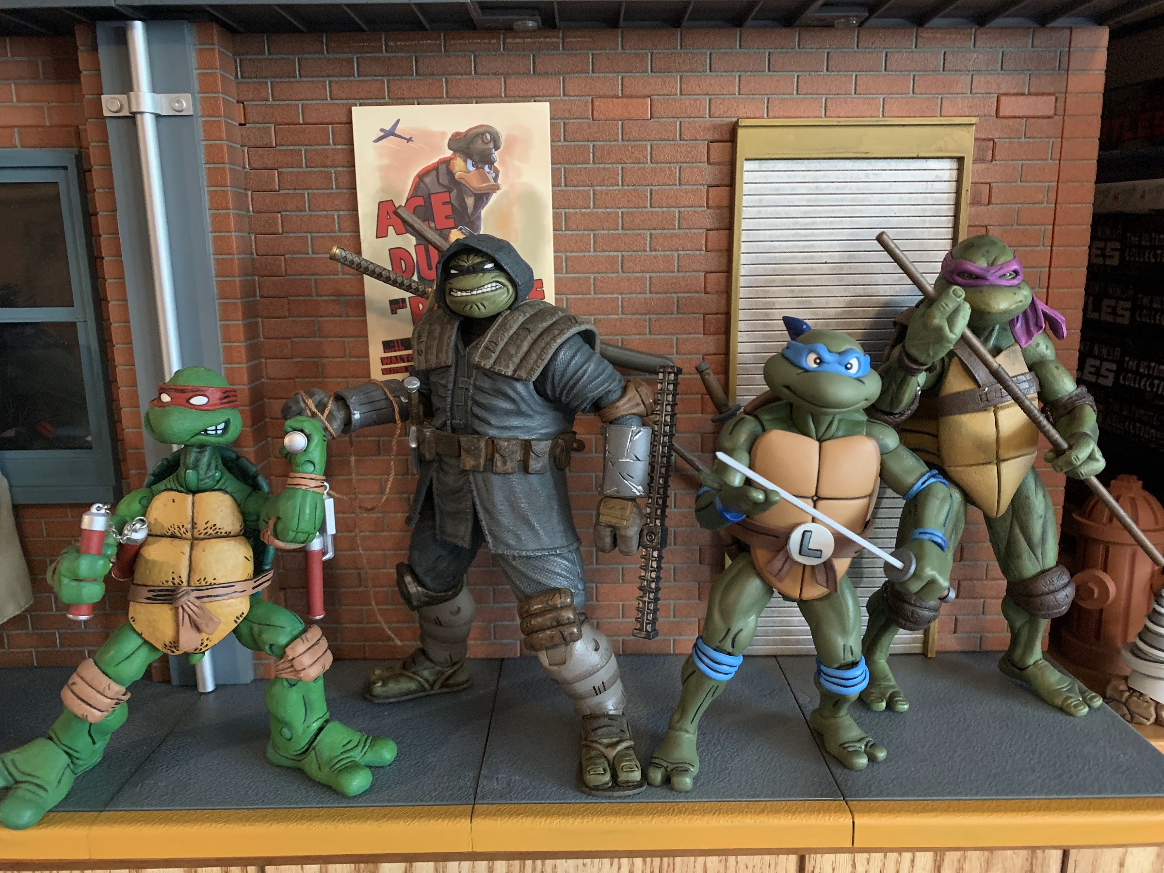
The turtles come packaged in what is essentially NECA’s standard four-pack box. It’s an oversized version of the Ultimates, or Deluxe, releases with a front flap and window on the package. It’s adorned with new artwork by Kevin Eastman which looks great. This is the type of box that will display well for you in-box collectors. For the rest of you, you probably only care about the contents. Each turtle is on the same buck so you basically have four nearly identical figures inside. The main difference between each is the headsculpt which just features a different expression for each turtle. Since this is a Mirage set, they’re all in red bandanas with brown straps and pads giving them a very uniform look. There’s also a different deco applied to the plastron of each figure with Raph’s featuring the most “scuffs” than the other three. They’re done with black lines as opposed to being sculpted in.
The Mirage line has been rapidly expanding over the past year.
The turtles stand at approximately 5.875″ in height. They’re quite chunky in appearance and fully-painted in a fairly neutral shade of green with lots of black linework to emulate the comic art. The linework is present on the pads, bandana, and belt and really sells the look well. It’s all relatively clean and consistent across the board. The only area I see as being a bit uneven is the linework around the bandanas. On a shelf, it’s fine, but up close there are some parts where there’s a smidge of green in-between the black line and the start of the red mask. My Michelangelo also has what looks like a scuff behind his right eye so there’s a little green showing. My Leonardo also has a speck of brown on his right bicep, but in general, I don’t see much in the way of color transfer throughout the four figures.
The paint is acceptable as is the level of quality control present throughout my set. Harding did a really good job of honing in on a design style for the turtles and capturing that with his sculpt. The only thing I personally would have changed are the legs which look really chunky. I think they could have been shrunk as the calf muscles basically extend outside the profile of the thigh muscles. That’s more of a subjective critique though than an objective one as these look quite close to the source material from what I can tell.
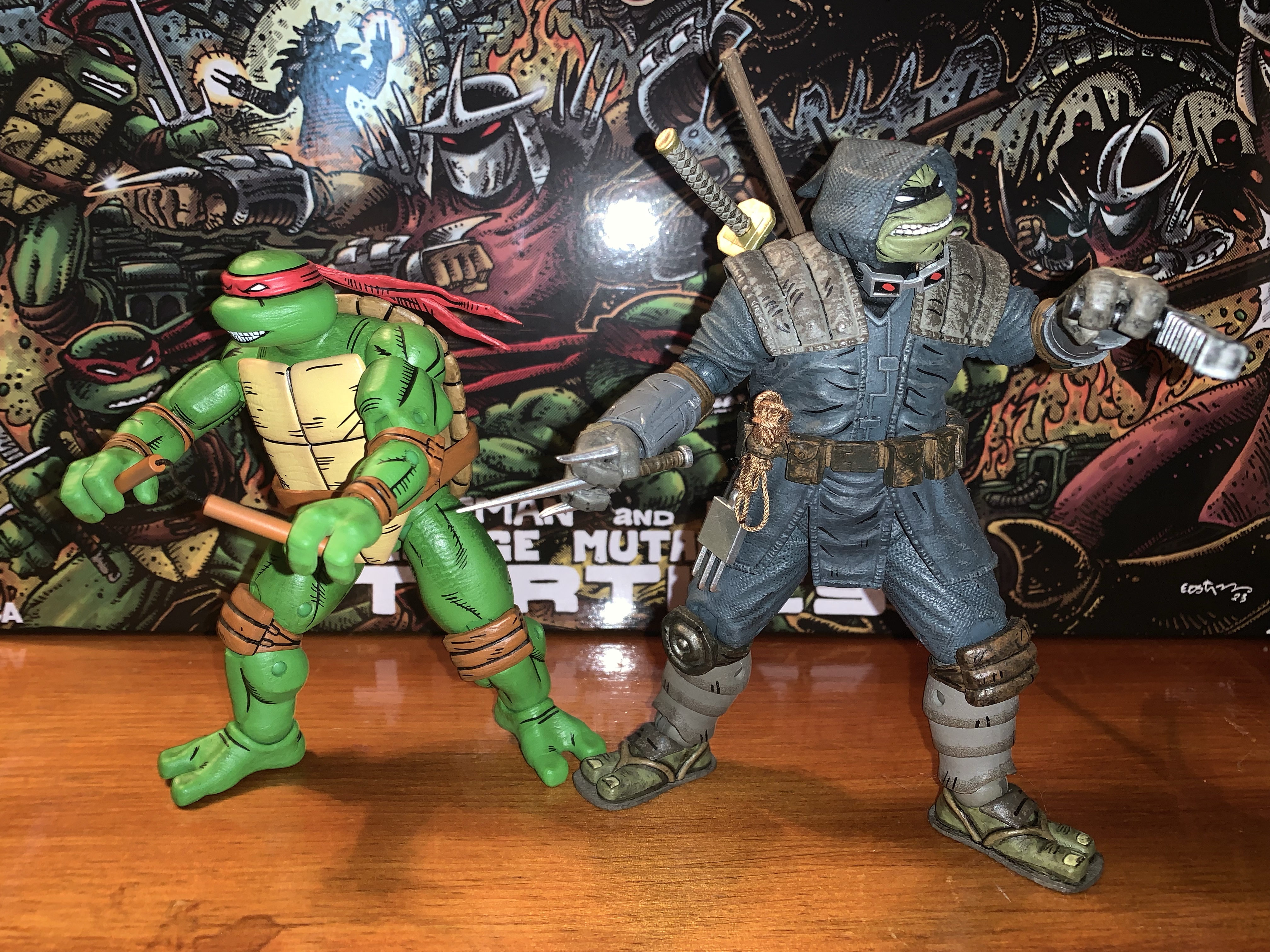
Shredder is looking a bit dated by comparison.
I think these figures are pretty much a homerun from a presentation point-of-view and that’s definitely where NECA’s strong suit lies. Where it often does not is with articulation, and these guys aren’t necessarily bad, but they’re not likely to wow anyone. Since the figures are essentially the same, they articulate the same as well. The heads are on a double ball peg (and in case you ever mix-up the heads, they’re stamped with the character’s initial inside) and the range is solid looking up, down, and all around. The shoulders are hinged-ball pegs and they can’t quite raise out to the side all the way. They rotate fine until they hit the shell, and past that is a biceps swivel. This joint was the only joint I had any issues with as 7 out of the 9 biceps joints in my set were stuck. I used the hot water to cold water method to get all of them working. The peg for the joint is pretty snug so I also pulled out a little before twisting and it required a pretty forceful twist. The peg is rather thick, so it should be pretty durable, but if you leave the joint in a hot water bath for too long and then try to twist it you could shear it off, so be careful. Once I essentially broke the seal on the joint it was fine.
Despite that, he still looks pretty good opposite these figures.
With that out of the way, the elbows are the next spot and NECA opted for double-joints this time. This is a welcomed addition as the cartoon turtles feature hinged pegs for the elbows and I wasn’t sure what to expect with these. The addition is worthwhile too as they can bend past 90 degrees at the joint. The wrists swivel and feature horizontal hinges. There are no vertical hinged hands in this set at all. That’s disappointing as the toon turtles had vertical hinges for the hands. The Turtles in Disguise set I believe came with two sets of vertical gripping hands, and this continues to be a problem with NECA. Where they once did a decent job of including the proper hinge, they seem to have essentially abandoned it for TMNT. Gargoyles characters get it, so I don’t understand the oversight. This is a set where essentially one set of tools creates four figures and it’s also something they’re likely to reissue many times so the fact that they couldn’t find it in the budget is absurd to me. It’s my biggest pet peeve with NECA of late.
For those who would like a more direct comparison.
At least at the waist we get an improvement over the 2008 turtles. NECA included a waist twist which they set fairly high behind the plastron to conceal it. It’s not going to provide the same amount of range a waist twist would with a non-shelled character, but it works all right. NECA added a “diaper” over the hips as well, but it doesn’t seem to get in the way. It does have the tendency to shift a bit though and my Leonardo has more of the part visible on his right leg than his left by quite a bit. The legs can kick forward past 90 degrees before the leg wants to go off to the side while the shell keeps them from kicking back. They also can hit a split. After that it’s pretty typical as we get a pivot point for the thighs where the ball connects with double-jointed knees past that which bend just a touch beyond 90 degrees. The ankles have the hinge and rocker setup, though the chunky nature of the ankles does restrict some of the range, but there should be enough to keep your figures flat-footed in most stances. These guys also have tails and there is a swivel point there if you want it. The bandana tassel also pegs in, and while it doesn’t really spin freely, you can reposition it if you want by removing it and re-inserting it even if you can’t get it to swivel.
Nothing is stopping you from swapping heads, but the default is (Clockwise from top left): Leonardo, Donatello, Michelangelo, Raphael.
The level of articulation is acceptable, aside from the lack of proper hinges for the gripping hands. Where this set surprises in the wrong way is with the accessories. If you have the Turtles in Disguise set or most of the other four-packs NECA has done over the past few years then you’re accustomed to getting a bunch of stuff in these boxes. With these turtles, despite the amount of tooling needed to produce these guys, we don’t really have much. Each turtle comes with a set of gripping hands out of the box, and then there is one set of fists, open hands, style pose hands, and gripping hands with more space between the fingers. Those hands are intended for use with Raphael when he grips his sai with the middle blade going through his fingers. Since it’s four sets the boys have to share, you can’t have all four turtles with their hands in a style pose or chop. There’s at least an entire set of four alternate bandana tassels that can be swapped in and out. The figures come with the bandana draped over their right shoulder and each one has a straight bandana piece to swap to.
There may not be a ton in the box, but at least they didn’t screw up the weapons.
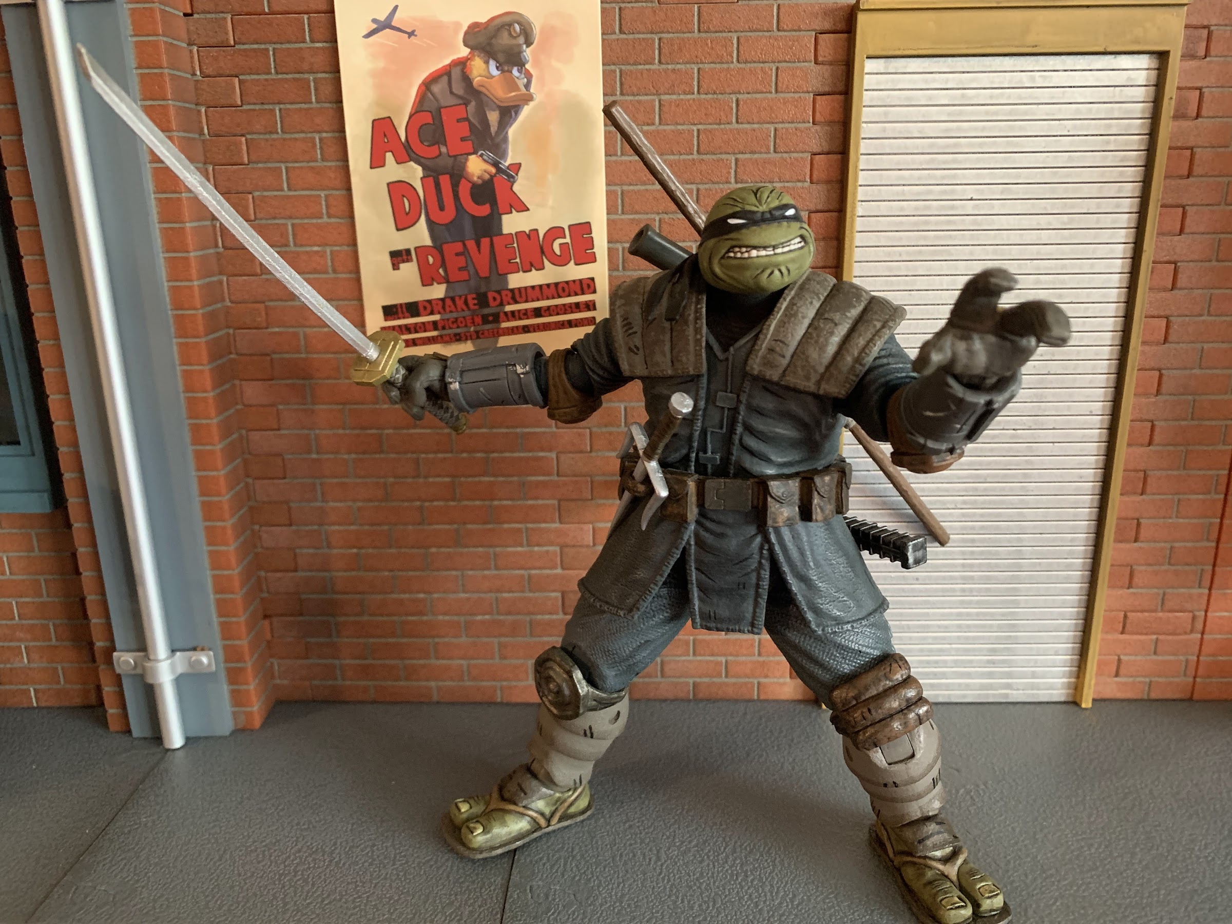
Of course, the main accessories are the weapons. Each turtle has his signature weapons and they all appear to be new sculpts. For Leo and Raph, the metal portions of their weapons are painted the way I’ve wanted metal to be done for a long time now: white with light blue shading. It looks so good and is much better than the flat gray so many companies use. Even the very expensive Mondo sixth scale Wolverine has flat gray claws. I attribute it to the idea of metal being white as “wrong” since we know it isn’t white in real life, but that’s how it often looks in print or in animation. With Leo, the effect is perfect, though with Raph the blue shading is basically all over. I think if they did it exactly how they did Leo’s katana it would have turned out better, but it’s minor. Mikey’s nunchaku are done similar to the movie figures with brown, plastic, handles connected via black thread. Donnie’s bo is done in an orange-brown with a slightly lighter brown wrap, which is an interesting choice. Perhaps an off-white would have contrasted more, but basically every Donatello figure does that with his signature weapon so I don’t mind the difference. There’s also three gear-like throwing weapons included painted in the same light blue as Raph’s sai and the shading on Leo’s katana. Why three instead of four? It’s an odd choice, but one I can’t get too worked up over since I’m not going to use these anyway.
You get three of these buzz saw things, if that’s something that interests you.
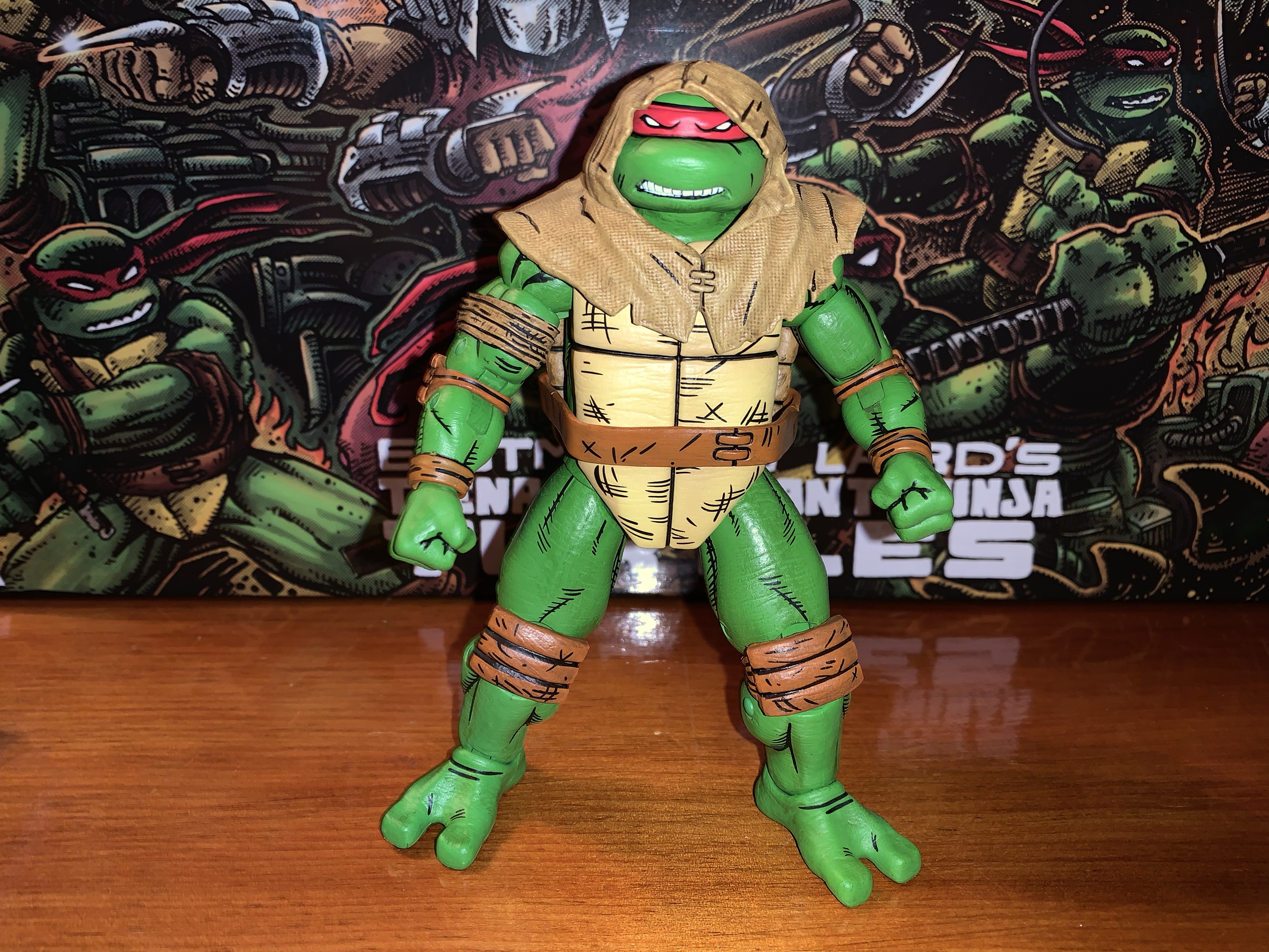
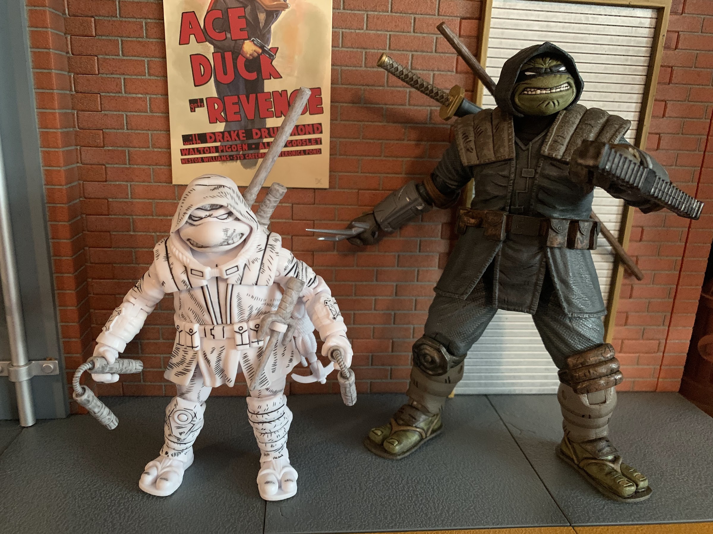
Lastly, we get a couple of accessories that are specific to Raph from the comics. His bandaged right arm is included as a swappable piece, but since all four turtles are the same mold, it can actually work with any turtle. The right arm pops off easily (the left does not) to facilitate swapping. The bicep was stuck on this arm as well, but I was able to free it up. Also included is Raph’s hood which is done in a soft plastic. It slides over his head easily after you remove the bandana piece and it’s a cool look for him. There’s a texture to the hood that helps sell the illusion it’s made from a rough fabric and it has some black linework as well. It looks good enough that I think I’m going to use this for my display since it does break things up a bit.
Raph’s sneaking outfit is the most substantial accessory. Since all four turtles are essentially the same, they can all wear this thing and the right arm on all four pops off with ease.
That’s it though. Four extra sets of hands for four figures, an extra set of bandana pieces, three throwing weapons, and Raph’s hood and arm. The melee weapons are a given because every set of turtles needs to include those, but why so skimpy on the hands? How about an extra head for each turtle? Especially since they’d function as an extra head for any turtle given they all look the same. With so many shared parts and the high price tag of $150, it feels light. It’s like we’re paying an undisclosed “Turtle Tax” since this is a set NECA knows will be in high demand and can make a larger profit on. Maybe I’m completely wrong and the profit margin is unchanged from past four-packs. And maybe I’m just still salty about the lack of vertically hinged hands.
“All right, Round Head, let’s go bust some skulls!”
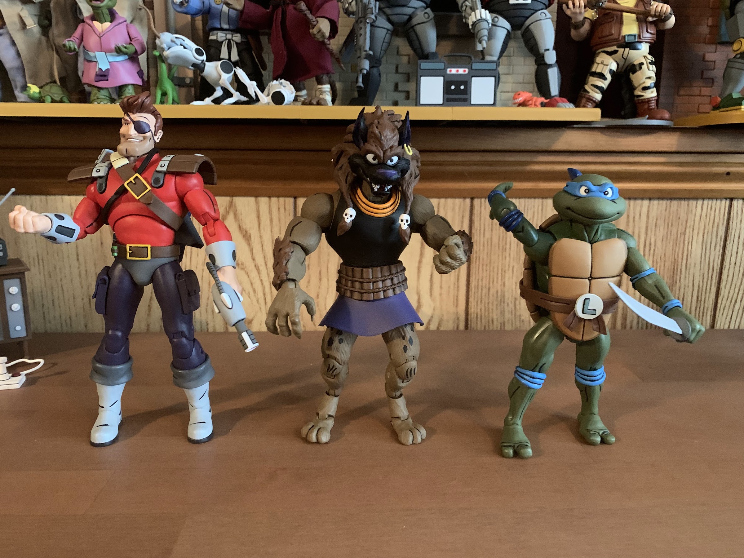
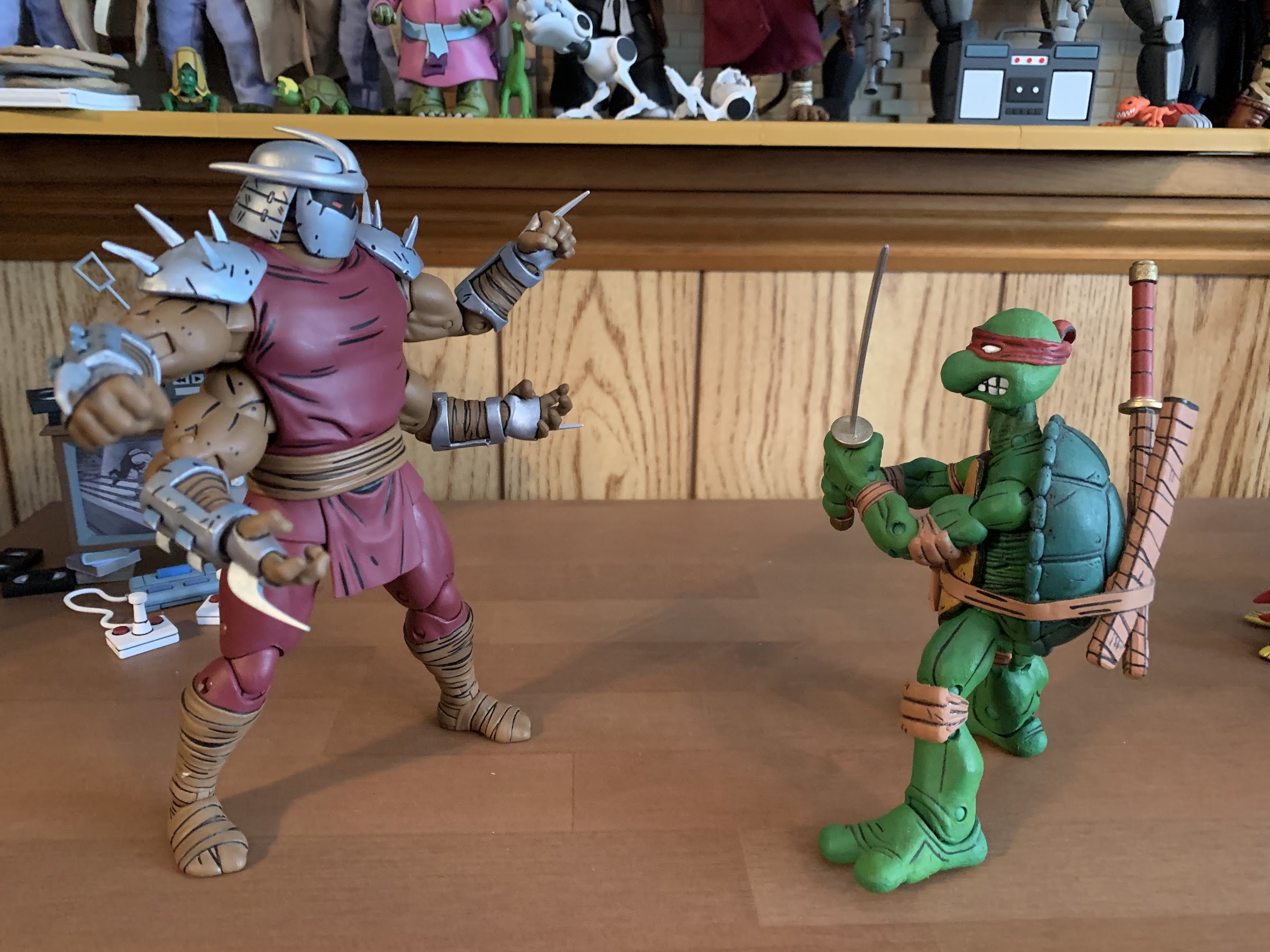
Basically, what I said several paragraphs ago is what applies most here: if you’ve been waiting years for a set of Mirage turtles then you’re going to get this set. And you’re probably going to be relatively happy with the outcome. The figures are fun to handle and pose and look great together. I think they pair well with most of the other Mirage releases, though placing them with Shredder does make me wish we had a beefier Shredder for them to fight. They’ll look great with Zog though or the Shredder clones or even just off on their own. In spite of the inflated price point, I do think they’re worth getting even for those who have the original Mirage turtles given the difference in style.
I figured I’d end on a pic of these two, for no particular reason…
If you’re on the hunt for these boys you can keep an eye on Target’s website. Set alerts for if they come back in stock as you never know. They also have shipped in waves to Target stores so keep checking there. If your store is like mine, they’re being stocked on an endcap in the toys section rather than in the usual NECA section. Since these are a Mirage release, it also stands to reason they’ll be sold in other places after this initial Target run is over. NECA hasn’t come out and said that, but it would be crazy for them not to make the actual turtles available to as many customers as possible.
A dozen years ago, toy company NECA dipped its toe into the world of Teenage Mutant Ninja Turtles for the first time, and shockingly it failed to stick around. That’s incredible to hear for collectors currently chasing down Bebop and Rocksteady at Target, but it’s the truth. There are a lot of folks at NECA…
Haulathon 2023 has brought some pretty big releases to NECA’s line of Teenage Mutant Ninja Turtles action figures. And I mean big in a literal sense. REX-1 was tall and hefty and the multi-armed clone of Shredder was no slouch either. Those two seem to pale in comparison to Zog, the Triceraton warrior from NECA’s…
NECA and Target’s Haulathon event which has seen a vast assortment of product dumped onto shelves recently was not content to limit the products to just the cartoon Teenage Mutant Ninja Turtles. Far from it, as an assortment of comic book based characters were also released and today we’re going to look at the first…
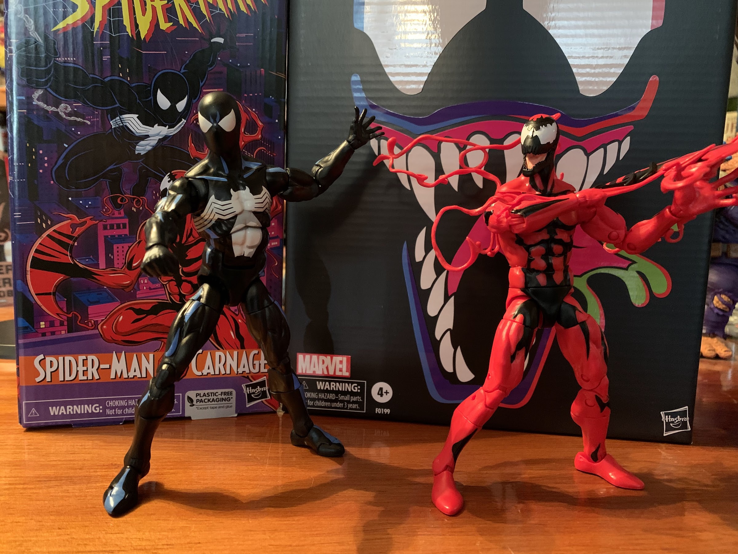
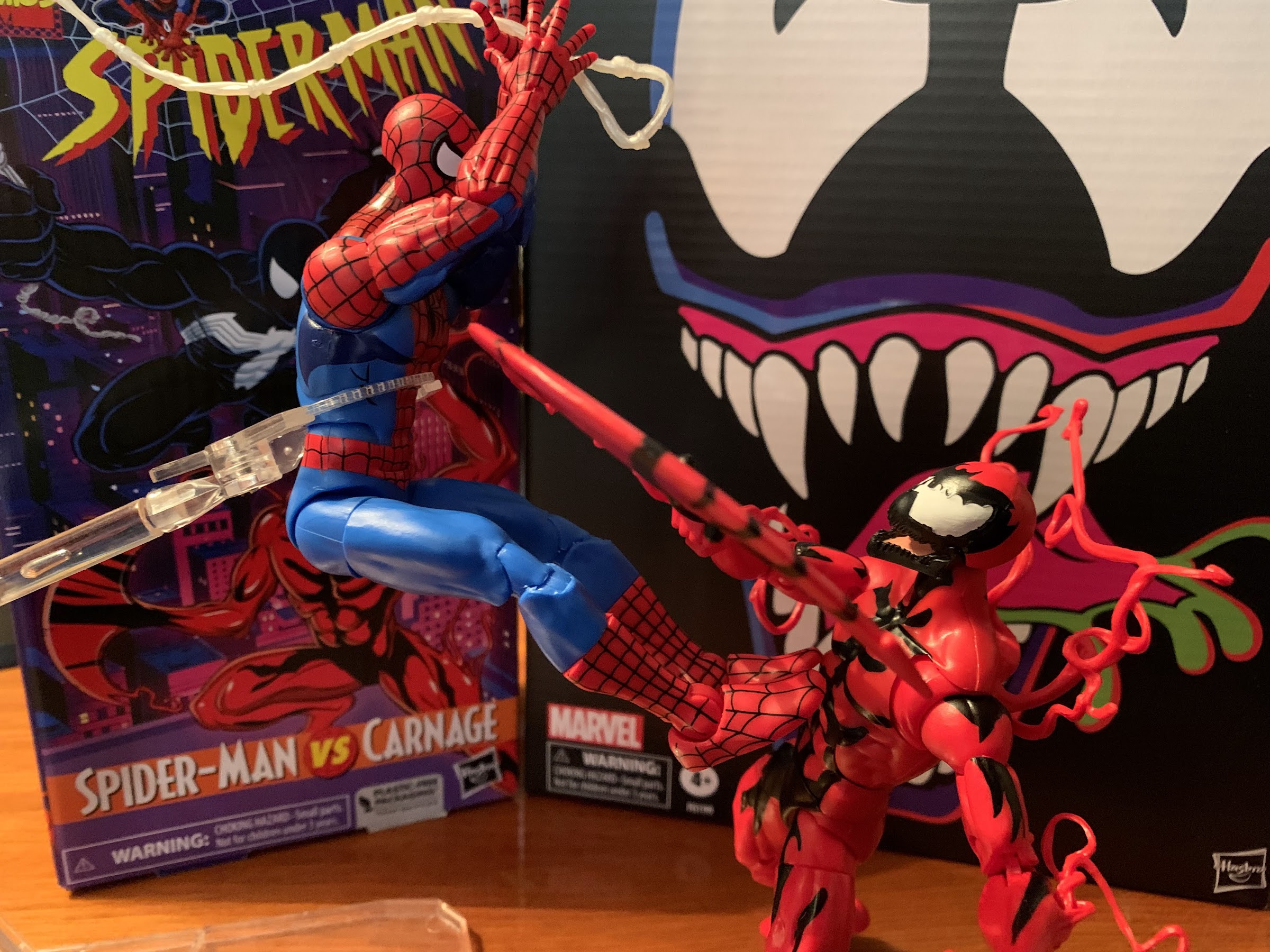
It’s not Spider-Man vs Venom, but I guess it’s the next best thing?
Last year, Hasbro celebrated the 30th anniversary of X-Men, the animated series that premiered on Halloween 1992 and would become a ratings hit shortly thereafter for the Fox Kids Network. It was responsible for getting a lot of kids into the X-Men and Marvel comics in general and the first, prime, benefactor of that rise in popularity was Spider-Man. Spidey had taken a couple of swings at television and found modest success, but certainly nothing on the level that some of the other prime kids’ shows that were contemporaries. I personally recognized Spider-Man more from his public service announcements or the Marvel Productions animatic that would follow a show like Muppet Babies. With X-Men being a hit though, it opened the door for more Marvel cartoons and Spider-Man was next in line arriving in sneak peak fashion, just like the X-Men, in the fall of 1994.
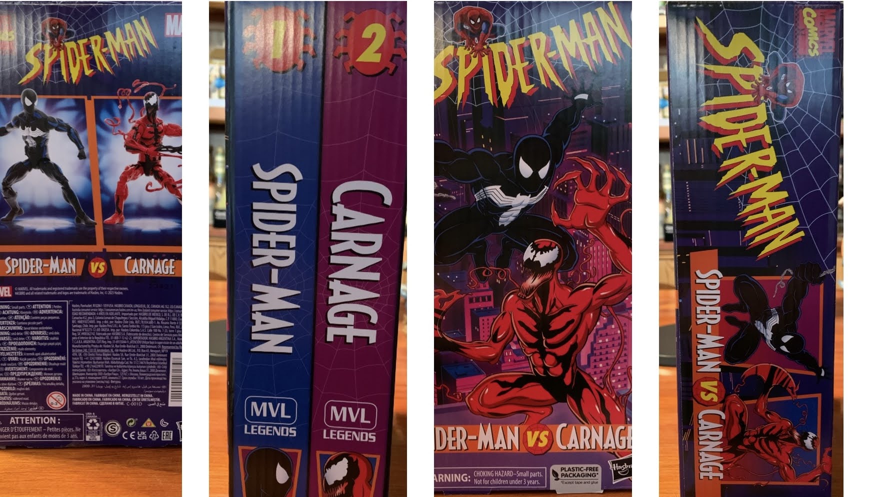
You guys still into the VHS inspired packaging? I think I still am, but this would have been way cooler if it was actually two boxes and a slipcover instead of just one, big, box.
The Marvel Legends VHS series for X-Men must have been received well for the company to do the same with Spider-Man. That is easy to understand. What is not is why now? The X-Men wave has almost sold out on Hasbro’s website and it’s expected the remaining figures will eventually get there (Cyclops was just added to shopDisney in April) which suggests that a second wave is certainly in order. The 8 figures Hasbro did release hit on some members of the team and some notable villains, but more remain. Why not come back around with another 8 in 2023, 30 years after the show really took off since only 3 episodes premiered in ’92, and then come back with Spider-Man in 2024 to, you know, coincide with that show’s 30th anniversary? It seemed like it was setup perfectly for just that, but apparently Hasbro and the Legends team got impatient or they feel like they need to space the X-Men releases out more or that line is dead and they’re not ready to admit it. I personally don’t get it and I will be a little ticked off if they don’t come back to X-Men to finish off the team, at least, even though that product line was rather poor. I’m a sucker for that cartoon though so I was committed to filling out the roster, as imperfect as it was, and not having the likes of Gambit, Rogue, or Magneto leaves my shelf feeling incomplete.
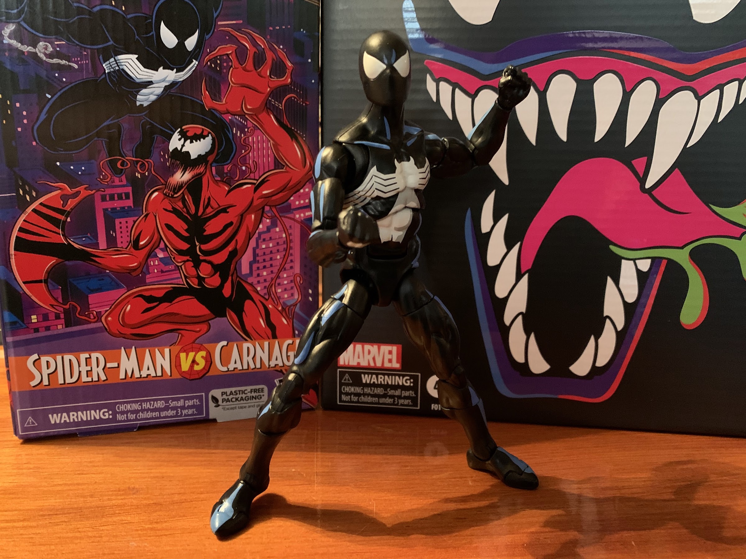
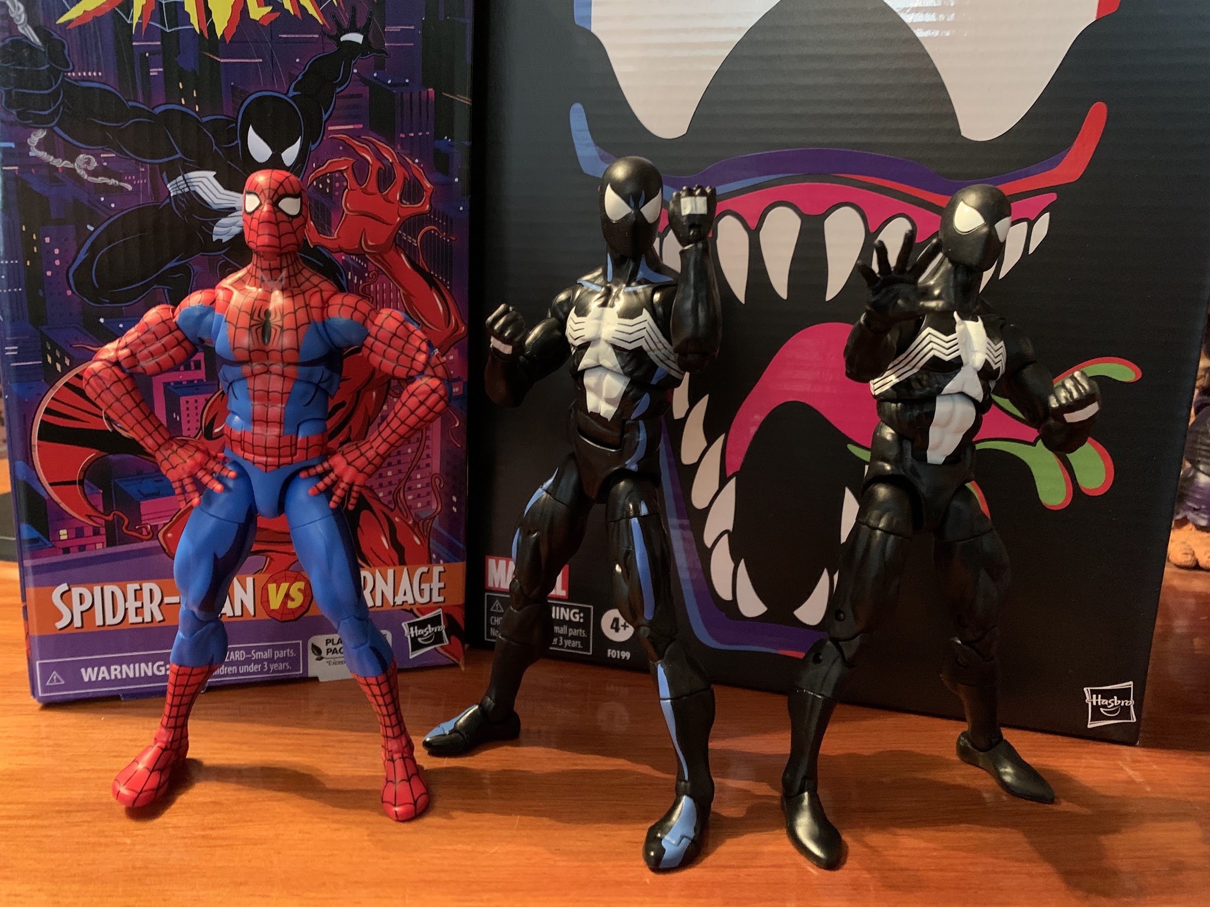
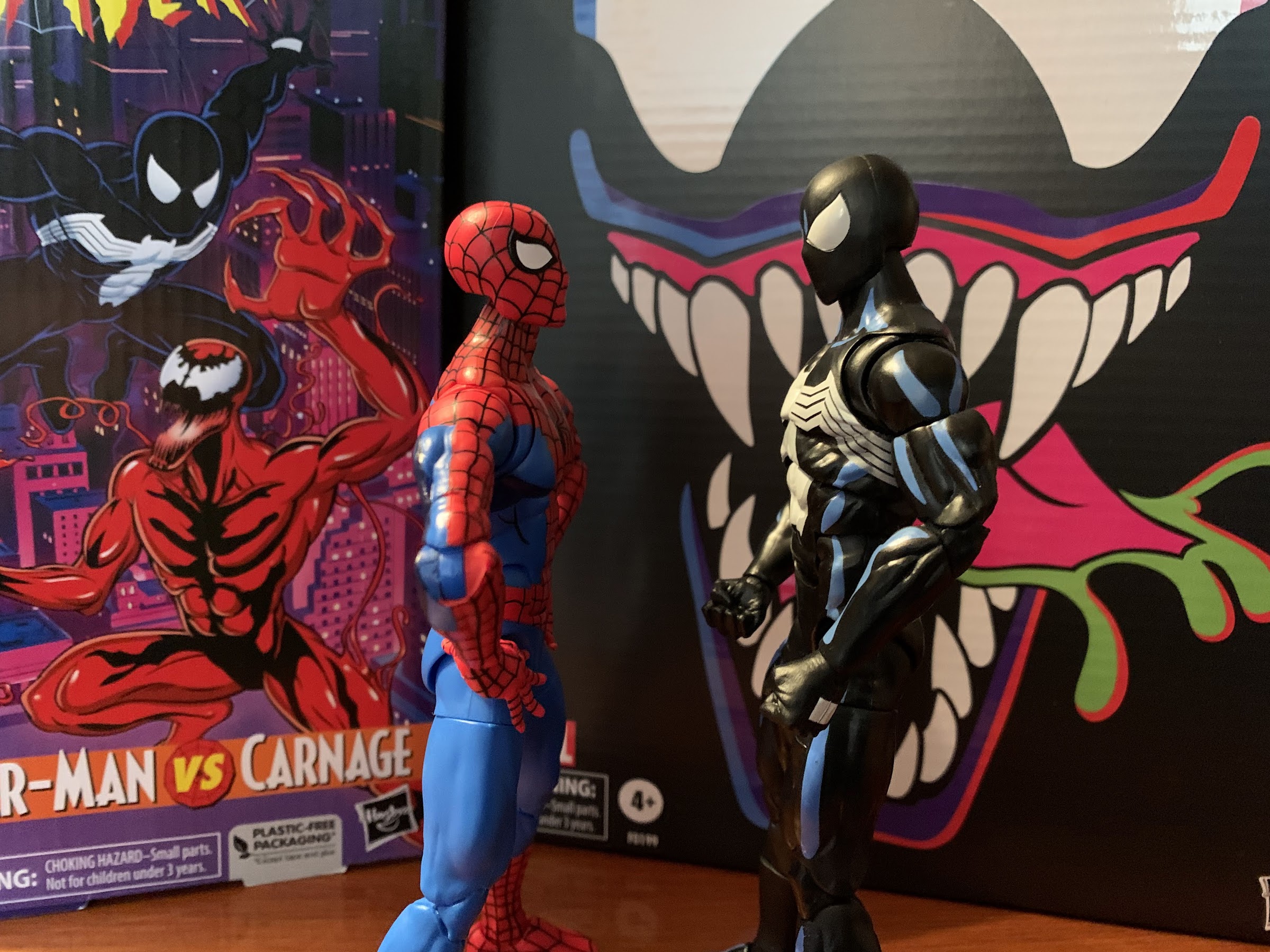
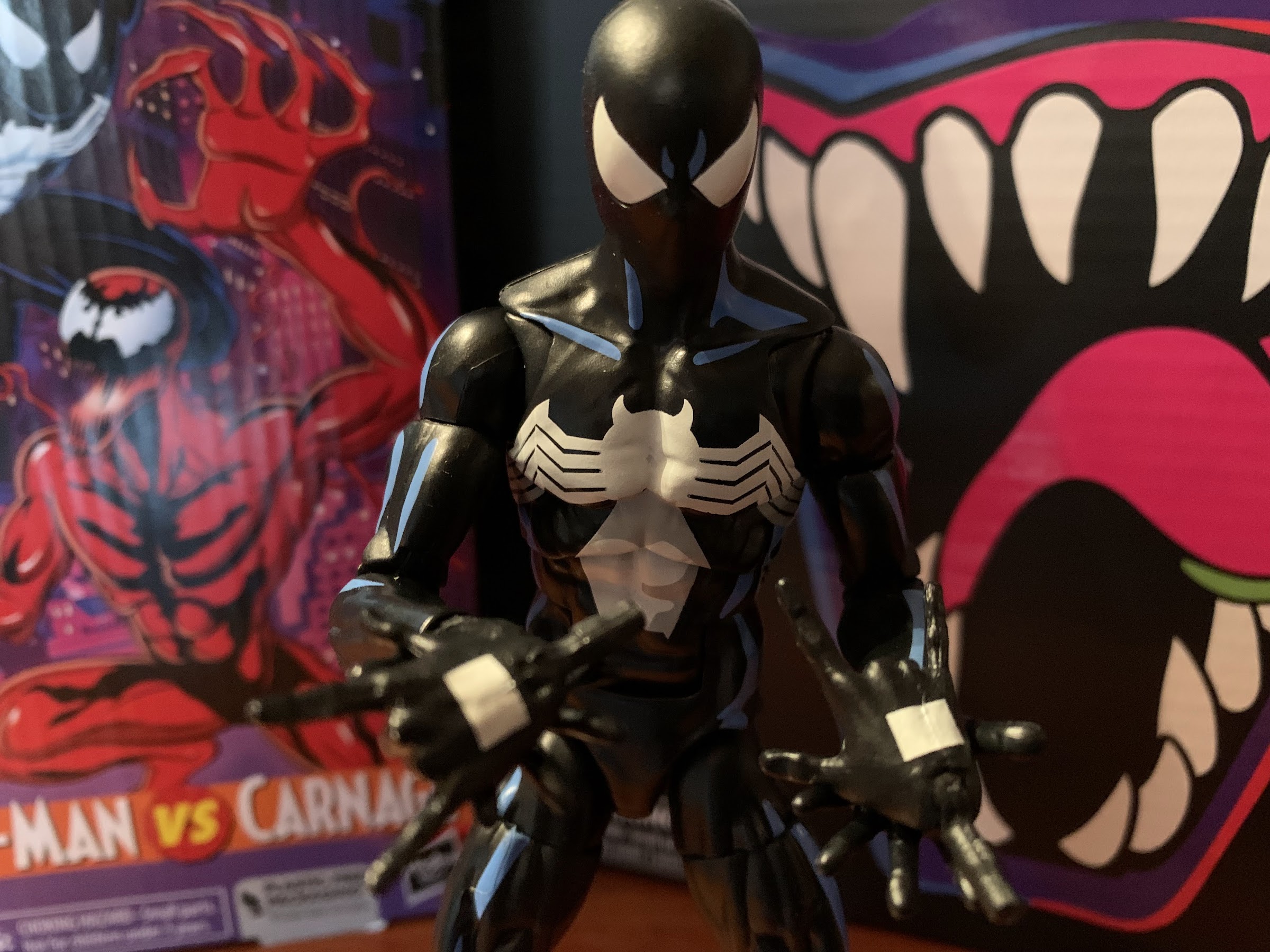
It’s Spider-Man once again, who is the same, but different, as the last black-costumed Spider-Man we saw.
That aside, Hasbro’s approach to Spider-Man could be described as the same, but different. We’re still getting VHS styled boxes with TV show inspired artwork, only now they’re apparently coming in two-packs. I guess that’s great if you didn’t like the gap in releases between the figures in the X-Men line, but it stinks if you only want one of the two figures (and I think that will be true for many with the upcoming Doc Ock and Aunt May two-pack). Hasbro doesn’t think it’s worth their effort to credit the artist on the box, but good thing we have social media as I was able to find out that it’s Harry Moore once again who did the art on the retro card release too. The box is designed to look like a slip cover with two VHS tapes in it, but it’s just one box with the two figures inside. Like the X-Men line, this one is likely to be a collection of repaints with minimal investment made in the tooling of new parts. These figures aren’t direct adaptations of the characters you saw onscreen. It would have been great if that was what Hasbro committed to, but at this point no one should be surprised. A big feature of the X-Men line was also the cel-shading approach to the paint. It was something that was not applied consistently from release to release. Some figures looked okay, some looked terrible, but it mostly came down to the application being cheap and unfocused. With this line, we’re going to have two figures where one is shaded, and the other is not. It looks like cel-shading isn’t going to be as big of a focus here, but it’s hard to know why with anything Hasbro does.
Yeah, it’s pin-less and has some toe joints, but the only reason to get this figure is if you like the shading.
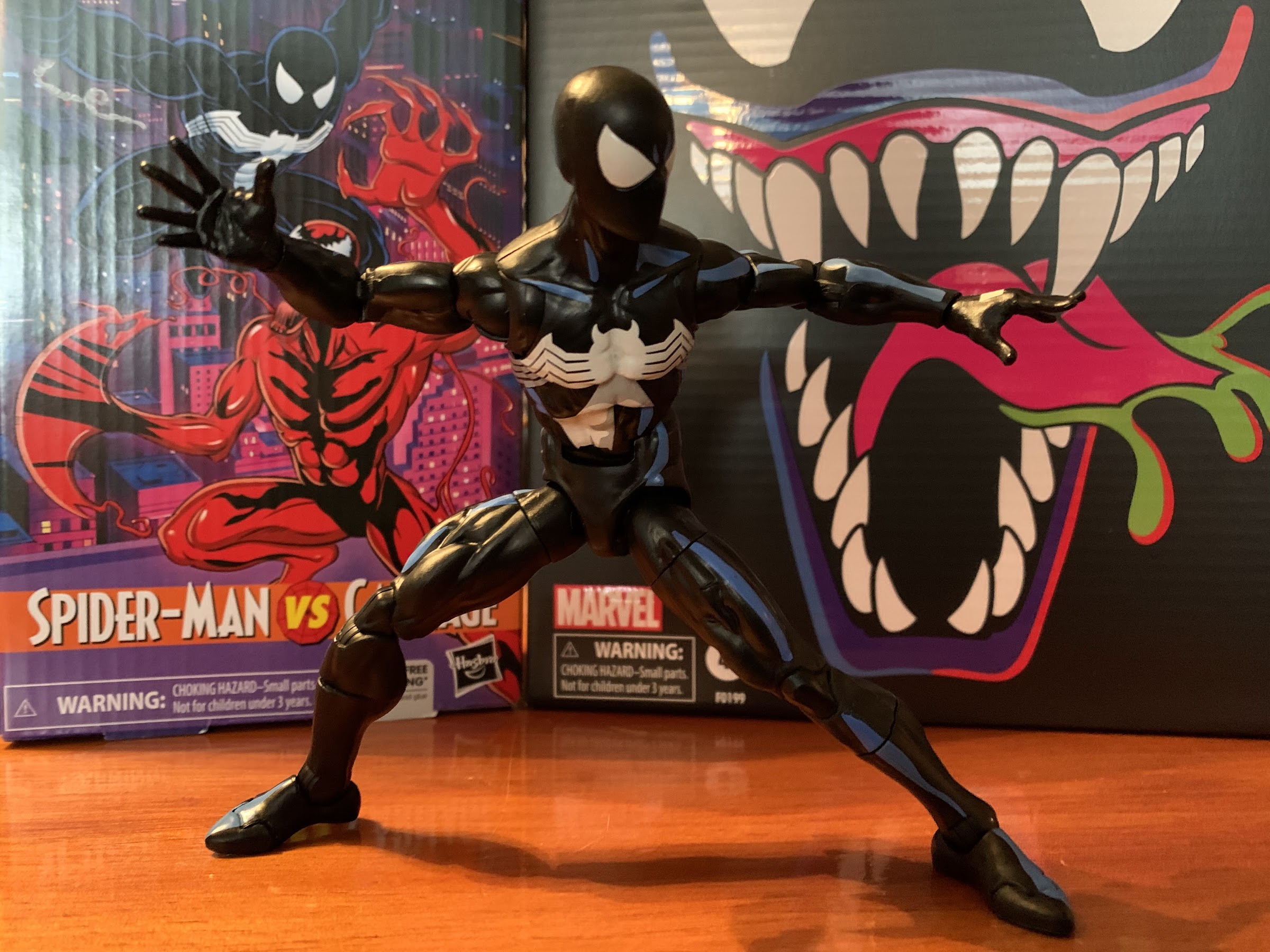
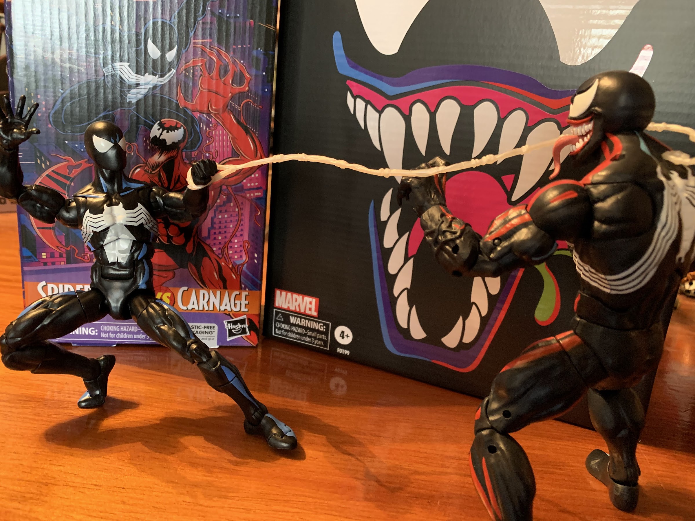
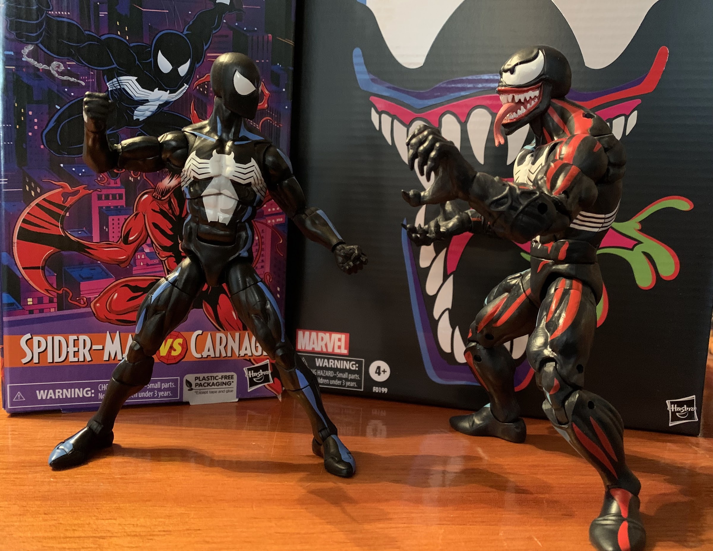
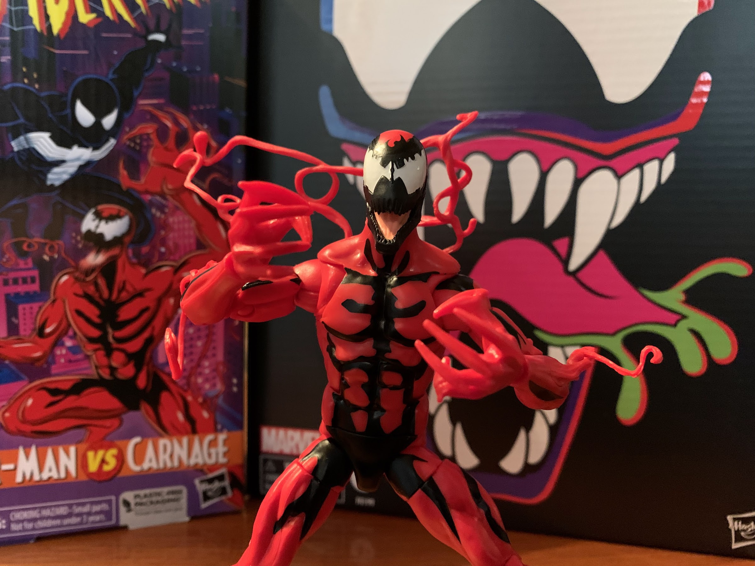
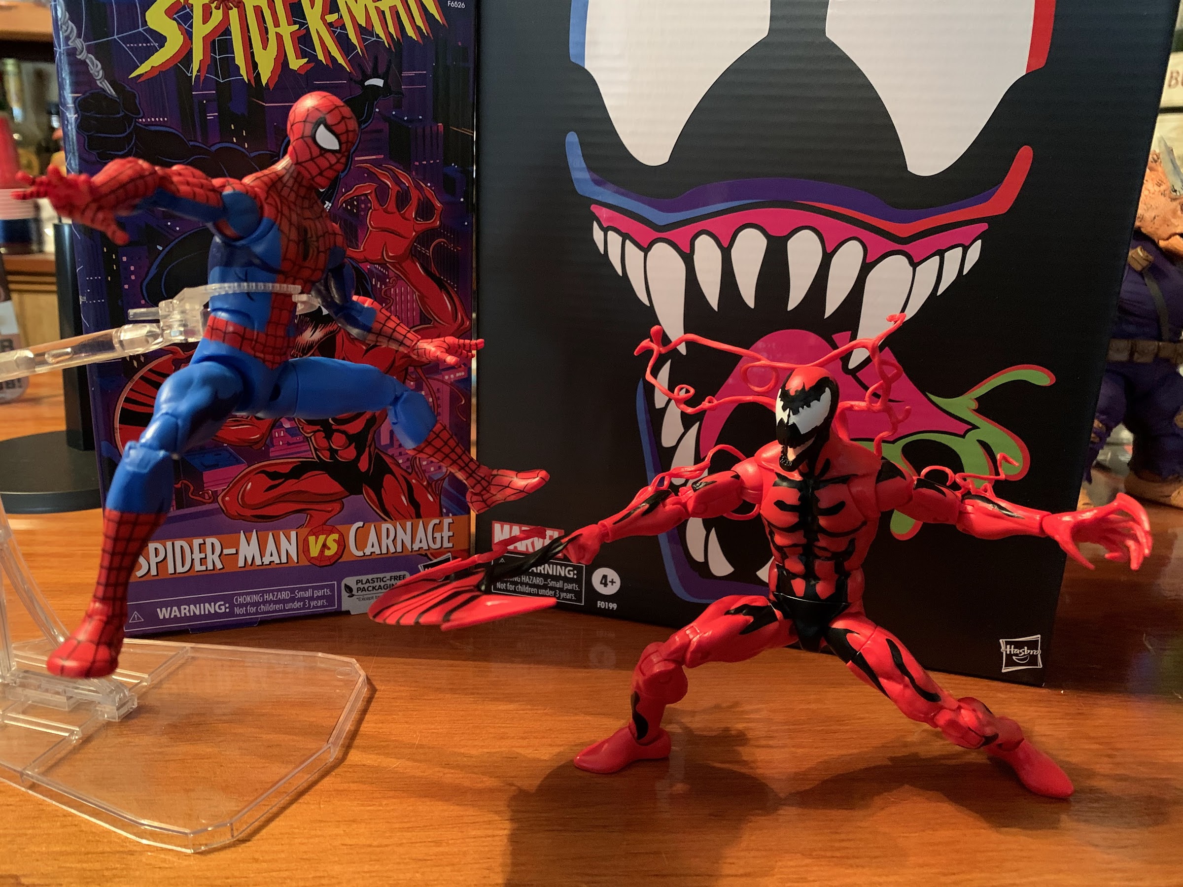
We’ll start with Spider-Man first. This is the symbiote, or black suit, Spider-Man from the show since we already received a standard, animated, Spider-Man via the retro card release late last year. Thematically, it makes some sense to pair symbiote Spidey with Carnage, a fellow symbiote, though anyone who watched the show can point out that Spider-Man never fought Carnage while wearing the black costume. Interestingly, this Spider-Man is a repaint of the figure that came in the Renew Your Vows two-pack last year. The animated Spider-Man from last year was on the noticeably smaller Amazing Fantasy figure mold making this figure basically not scale with the other Spidey. Cool. The sculpt is also much more cut than that one so this is a Spider-Man that looks almost absurdly ripped and lumpy for this source. The head appears to be the exact same as the retro card black costume Spider-Man and so are the hands, and for that matter, the torso. Whatever your preferred body is, none are particularly great for the animated Spider-Man as he was very broad shouldered and full in the chest which neither figure is. This one is pin-less in the arms and legs, so it has that going for it.
I don’t consider myself a Legends collector, and yet I now have 5 Spider-Men (Web-Man and Cyborg version not pictured).
“We’re the same guy, just in a different costume.” “If you say so.”
What is going to be most divisive with this release is probably the paint. The figure is cast in black plastic so the only paint present is the white and the blue. Yes, blue, as this figure is shaded like the show. Or rather, like basically every version of black-costumed Spider-Man. Just doing him in all black won’t show up on print or on TV, so he (and Venom) have always been shaded blue. In the show, Spider-Man was outlined in blue and the muscles were also done in blue. For the figure, Hasbro appears to have tried to outline the abdomen with blue while also hitting both clavicles. For the limbs, it’s just a few lines down the meat of the arms and the front of the legs. There are a couple of lines in between the eyes, and almost nothing on the back of the figure. There’s also none on the hands. It looks okay, but there doesn’t appear to be a ton of thought put into the blue on the arms. And, as usual, I think the figure would have benefitted from a little more. Something on the crown of the head would have looked nice, and maybe some under the pecs. And maybe just more curves to the lines would have helped with the biceps looking the worst out of all of the spots, but it’s probably as good as we could have expected out of this line. The rest of the paint is reserved for the eyes, hands, and the spider logo which has some gray shading. That is not consistent with the show, but it looks okay on the front, though I don’t know what they were going for on the back. The spider itself is pretty clean, though the white on the hands is too thinly applied. The eyes, which have a little luster to them, look okay.
“What am I supposed to do with these?”
“Nice split, spider dweeb!”
There’s no point in devoting a full paragraph to accessories for this guy as he just comes with the standard array of hands: fists, wall-crawling, and thwip. The thwip hands are useless since this version of Spider-Man shoots webs out of the back of his hands so why not drop them for a set of gripping hands? Or web accessories? It’s like the people who design these figures have little or no attachment to these characters, but any average fan would say “This doesn’t make sense.” Anyway, this guy should be pretty familiar when it comes to articulation too since he’s like most of the other Spider-Man releases. We get a double ball peg at the head that feels rough. It has some gapping issues and they did that thing where they cut out a chunk of the rear of the neck which shouldn’t be necessary for a figure that has no hair. Even with that, he doesn’t look up all that far and the head just wants to fight me for some reason. The shoulders are ball-hinges on butterfly joints. He can raise his arms out to the side fine while the butterfly joint provides okay range going back and forward, but nothing crazy. They also didn’t continue the paint on the spider logo on the rear so when the arms are all the way forward you get a gap. There’s a biceps swivel and the elbows are double-jointed. I cannot get the top hinge on the right arm of my figure to budge, but I was able to get the left one to move. He gets a little better than 90, so nothing impressive, but it doesn’t look ugly. The wrists swivel and hinge.
Go web! (Web not included)
Yeah, it doesn’t make sense, but they look good when they’re matchy-matchy.
In the abdomen we get a ball joint that lets the figure bend back and forward a little bit. It creates gaps in both directions so it’s better used for rotating and pivot and the range going to the side is pretty good. Below that we have an ab crunch that does what it’s supposed to and at the hips we get the utterly useless drop-down hinged hips. With the hinge up, he can kick forward about 90 degrees and he doesn’t really kick back due to the sculpted butt cheeks. With the hinge down, he kicks forward…about 90 degrees. Maybe a little better and more straight, but you’re gaining practically nothing. With the hips up or down, he can’t achieve a full split. It’s pretty crazy the amount of figures I have that can do a split, and yet none are Spider-Man. There is a thigh cut, but not only does it break up the anatomy it breaks up the blue shading as well. The double-jointed knees work better than the elbows and they go well past 90. There is a boot cut if you want it, but again, it breaks up the sculpt and the shading. At the ankle, we get a hinge that lets the feet go forward and back an acceptable amount, though it’s kind of ratcheted so finding those in-between positions is a challenge. The ankle rocker works well and we also get a toe hinge which is fine. Aside from the addition of the toe hinge, this figure moves as well as the previous symbiote Spider-Man which I would categorize as good, but not good enough for a Spider-Man figure. There’s plenty of things to nitpick, but mostly it’s just scrap those garbage hips. Ball and socket hips would work better and cost less than the silly hinge. The whole thing also has a gummy feel and ultimately posing this guy isn’t really a fun experience.
This entry won’t have the maximum amount of Carnage, but it will have enough.
He wanted a picture with his daddy.
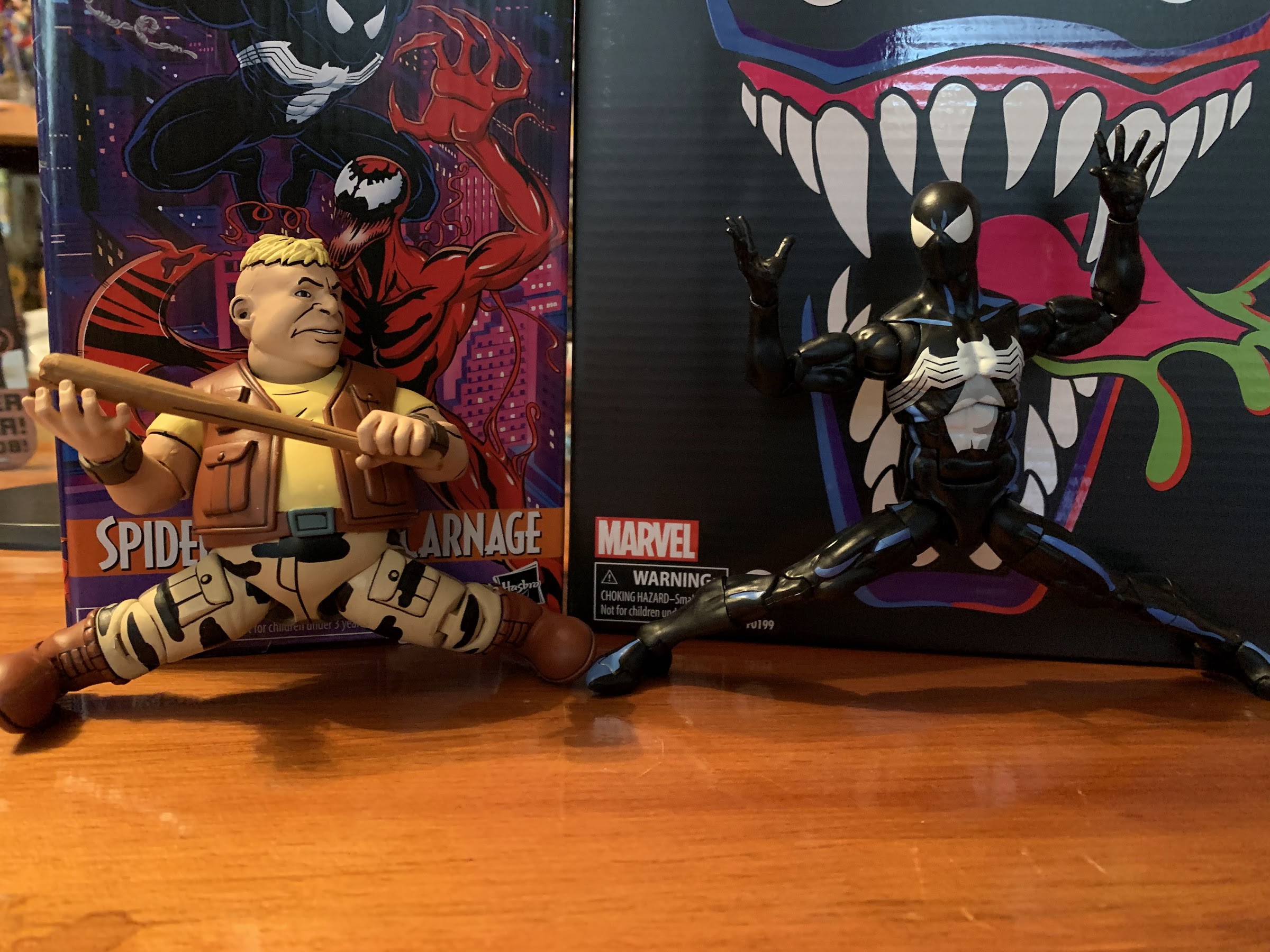
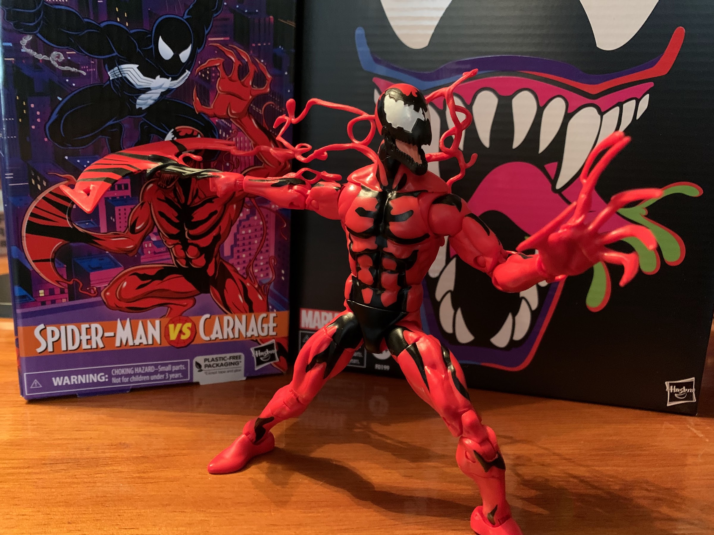
Okay, that’s enough about Spider-Man, let’s talk about Carnage. This figure is a partial reissue of the Monster Venom wave Carnage from about four years ago. Some stuff is the same, while some stuff is different. The head, hands, and probably the arms are the same while the torso and legs are actually different. That older figure lacked butterfly joints while this one has them. It appears to be the same torso we saw with Web-Man, who shared a torso with Spider-Man 2099, if I’m not mistaken, and probably several others. He is a very bright red, which isn’t really what I’d call show accurate, and the black paint for the various swirls and lines on Carnage is understated compared with a comic version of the character to attempt to match the show. The head is clearly the comic inspired head so it doesn’t really match the show aside from the amount of black on it. The Carnage in the show had a much stubbier head as opposed to the elongated one from the comics. There was one shot of the symbiote right after it attached to Cletus Kasady that looked like the comic book character, but that was pretty much it. I think there should actually be a bit more black on the torso to really match the look of the show, but that’s not Hasbro’s goal apparently so I don’t why I feel the need to point out the inaccuracies. This figure also has some tendrils plugged into the arms and a removable one that slots into the back. That aspect of the character wasn’t seen much in the show where animation and the ability to do it well is a concern, but I prefer Carnage with them so they don’t bother me. I think he looks okay, he just doesn’t really look like the character from the show. He’s much too lean and suffers from that Marvel Legends “tiny shoulders” syndrome that so many figures in this line possess. The figure also struggles with trying to be somewhat inspired by the animated series without looking cheap. It seems to me if they just committed to a more toon-accurate paint job that would have solved that issue to a point, but I’m just some guy with a blog so what do I know?
Why use the regular hands when you can use these?
I basically feel the same way about this head as I do the hands. Plus it’s a pain to get on anyway.
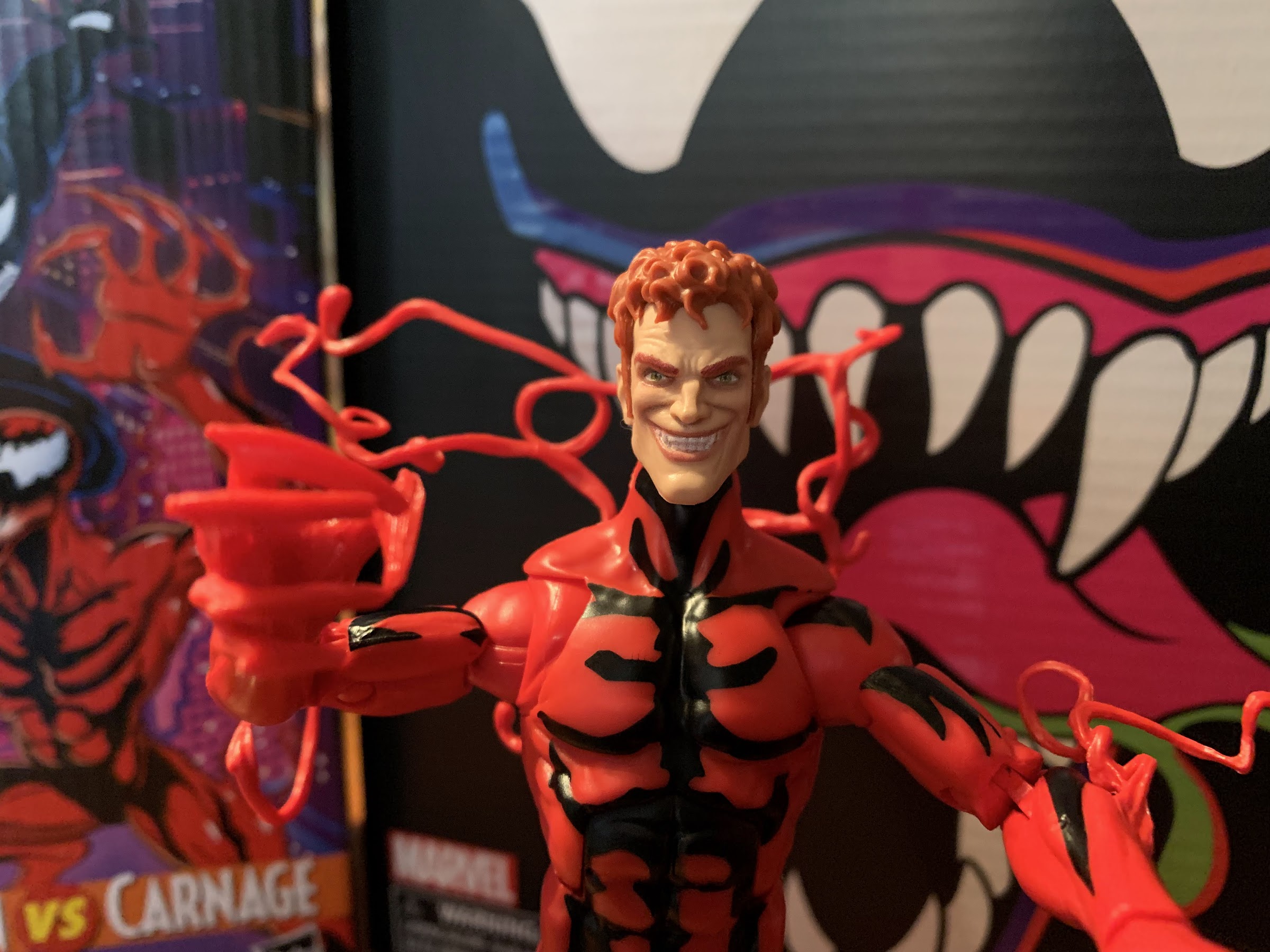
When it comes to accessories, Carnage fares better than Spider-Man. Again, these are all reused from past releases, but you get a second head that’s of Kasady and he looks pretty creepy. There’s no paint on the hair, so that’s a bummer, but at least the face appears to be done with face printing making it much better looking than the original release. It’s a comic inspired look, but you probably could have guessed that. If you have the older figure, it might be fun to have this head on that, but I’ll probably never use it. For hands, Carnage has two open hands by default where his fingers look long and bladed. They’re basically style posed, though the right hand is more curled like it’s trying to grip something. The fingers on that hand also don’t end in points and are rather stubby so they look stupid. You’ll never use it though because the optional hands are way better. For the left, we get a more exagerrated, clawing, hand that also has some added tendrils on it. I think it looks great save for the added blob on the index figure which is just a bizarre design choice as it makes it look like he has six fingers. For the right hand, we get a fisted hand that’s affixed to a big, symbiote, axe head. I like how it’s sculpted to have slime separating the fist from the axe and then the axe head itself has a neat design with a little hook in it. It’s painted too so we get some black lines that look nice and help sell it. They also gave the figure a vertical hinge on this hand which is appreciated. The only downside is it is pretty heavy, and the hinge fairly loose, so posing it can be a tad frustrating.
Spider jump!
For articulation, we have a pretty standard Marvel Legends figure. The old ball hinge is in place for the head and the figure can look up and down without issue as well as rotate. He even gets a touch of tilt on the ball, so that’s okay. The shoulders hinge out to the side less than 90 degrees so that’s disappointing. Web-Man can get his arms out to the side without issue which has me thinking these two share a torso, but the arms are actually different. The butterfly joint provides for solid range going back, but not much across the chest. There’s a biceps swivel and the double-jointed elbows will let the figure bend past 90 degrees there. The wrists swivel and hinge and all except the axe hand hinge horizontally. In the torso, we get an ab crunch that works well going forward and back with no gapping issues present. Hasbro also continued the black paint so that looks good. The waist has a twist which looks pretty ugly because there’s nothing to hide it, but it does work. At the hips we get the standard ball and socket setup and, what do you know, he can do a split. It’s a miracle! There’s a thigh cut below that which works fine, but breaks up the black paint. The double-jointed knees also work fine and you get a boot cut if you want it. The ankles hinge forward and back all the way and rock side-to-side just fine. I think the legs are basically the same as the old release, they just don’t have the plug holes for more tentacles. In other words, more old Spidey parts shared with Web-Man and other Spider-Man figures. Aside from the shoulders, he moves well enough. There’s still gummy-ness to the joints with Carnage, but it isn’t as pervasive as it is with Spider-Man.
Spider kick!
Overall, this release is basically what I expected it to be. It’s a bunch of parts reuse, with a different paint job. As a kid, it always bothered me that every Venom figure I bought was just black plastic when in the comics he was clearly blue. Obviously, that’s because an all black look wouldn’t work, so he had to be shaded blue and even some artists made blue his dominant color (he was very much black in his first appearances though). Because of that, I always wanted a Venom or a Spider-Man in the symbiote costume that took a similar approach so that’s what drew me to this set. Plus, I did like the cartoon series and it’s where most of my Spidey knowledge came as prior to that it was all from Spider-Man and his Amazing Friends and the occasional stray comic book. This figure from Hasbro has its problems, but it comes close to satisfying that urge for me and I think it looks better than the more plain release from the retro card line. It’s pretty absurd that he’s so much bigger than the red and blue Spider-Man when they’re supposed to be the same character from the same show and the accessories blow, but at least the base figure looks fine.
Worth it? Eh, I guess if you like what you see, it’s okay given the apparent new going rate for Marvel Legends.
With Carnage, this is a character all new to me in figure form. Well, new in the sense that I had not purchased a Carnage since the Toy Biz Carnage II figure from the Spider-Man line way back in the 90s. I was never a huge fan of the character, he was just Venom without a conscience, but he did look cool and I certainly spent many hours playing Maximum Carnage back in the day. As a figure, he’s fine. He looks good, moves well enough for the character, and I like the optional parts. I like them so much that I consider the main hands rather useless, but it’s fine. And when I got that animated Venom in 2021 I knew I wanted to add a Spider-Man and a Carnage to my little display so I at least achieved that. As for this series going forward, I might have been interested in that Doc Ock, but the Aunt May he’s bundled with looks bad and I’m not paying for her. This set retails for $53 on Hasbro’s Pulse website. If you’re a member, you get free shipping, but if you’re not then tack on the price of shipping as well. This was the last order I made with my subscription and I don’t intend to get more. At this price, it’s something a fan of the show can possibly talk themselves into. The box is nice, if that interests you at all, and the figures are I guess the usual level of quality for Marvel Legends. Had they just given Spider-Man some worthwhile accessories it would have been much easier to recommend, but since they didn’t it puts this one squarely in the niche category. Few Marvel Legends are worth their asking price these days, and these are no exception. If you’re primarily a comic book collector and already have these figures, then don’t bother. If it looks like something you like and you know what to expect, give it a shot. Or wait awhile for the next warehouse sale when you can probably get it for 40-something where it would be a much easier recommend. That’s probably not going to happen for awhile though. There’s also shopDisney which is supposed to carry this and may be more aggressive with its sale prices if it hangs around a few months. You can also get free shipping there, though you have to spend $75 I think. If you time it right, and have a wife or kids that love Disney, it’s not a tough threshold to meet. At least it’s easier to get than the stupid Walmart exclusive.
Need to know more about what Marvel Legends has done for Spider-Man? Check these out:
When I was a kid, my dad took me to some local convention or trade show. I have no idea why because my dad wasn’t the type who would go to such an event. He liked car shows, but from what I can remember this was more of a hobby show. It was early in…
It was in 2021 that Hasbro released a PulseCon exclusive Venom figure on a Spider-Man retro card. The retro card series is meant to stir-up nostalgia for all of the adults who were buying toys and watching cartoons in the 90s as the retro card is a facsimile of the old cards Toy Biz used…
One of the most iconic costumes in the world of superheroes is definitely that of Spider-Man. I put that classic red and blue with webbed detailing right up there with Superman and Batman. I would argue that there’s no more iconic costume in the world of Marvel than Spidey’s, and the crazy thing with Spider-Man…
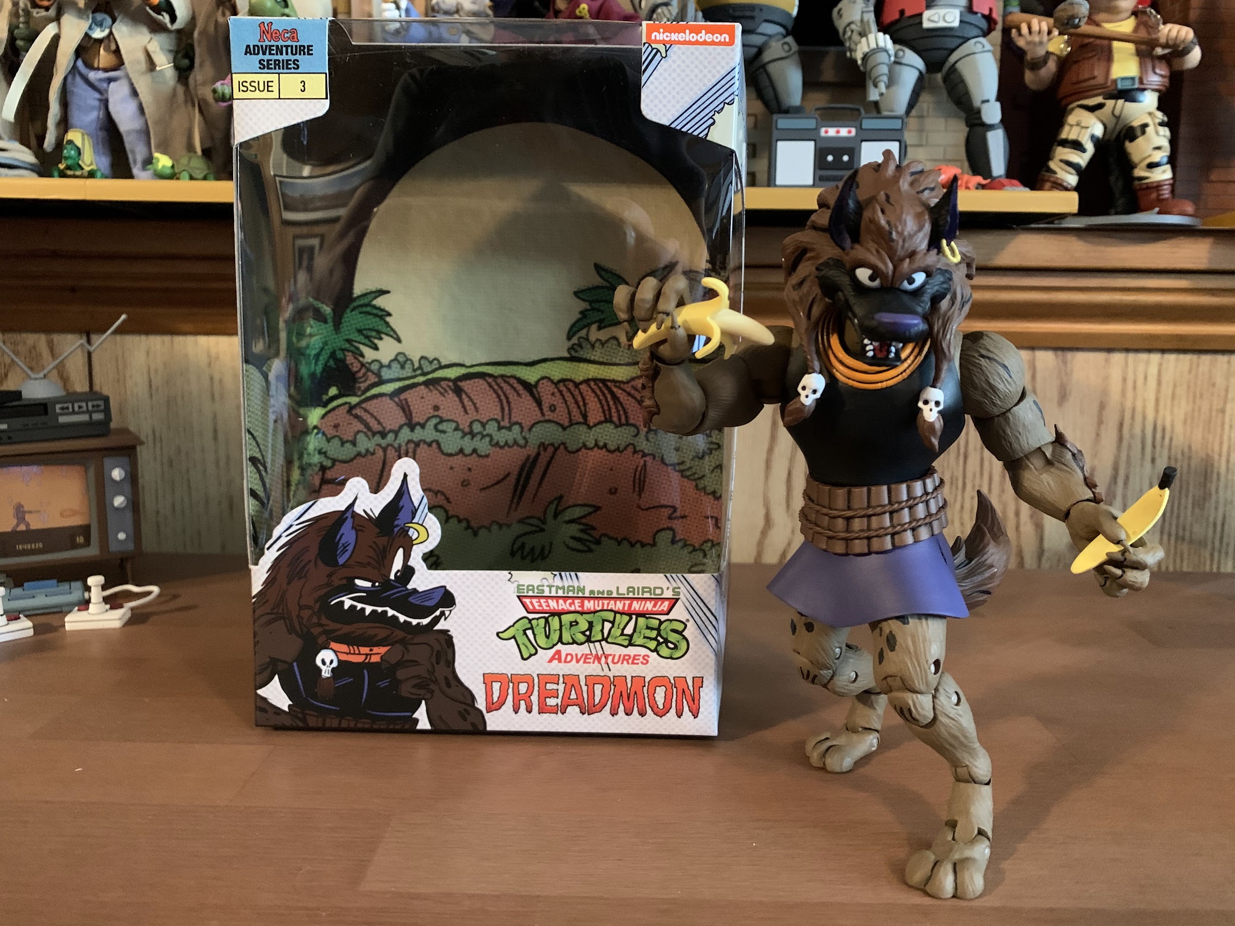
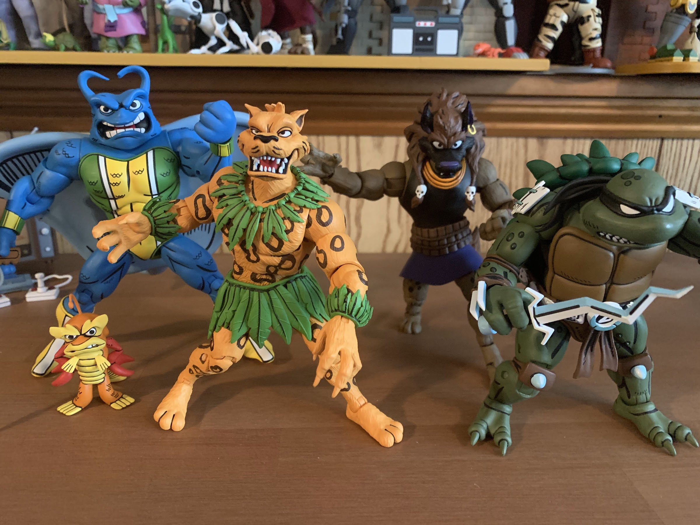
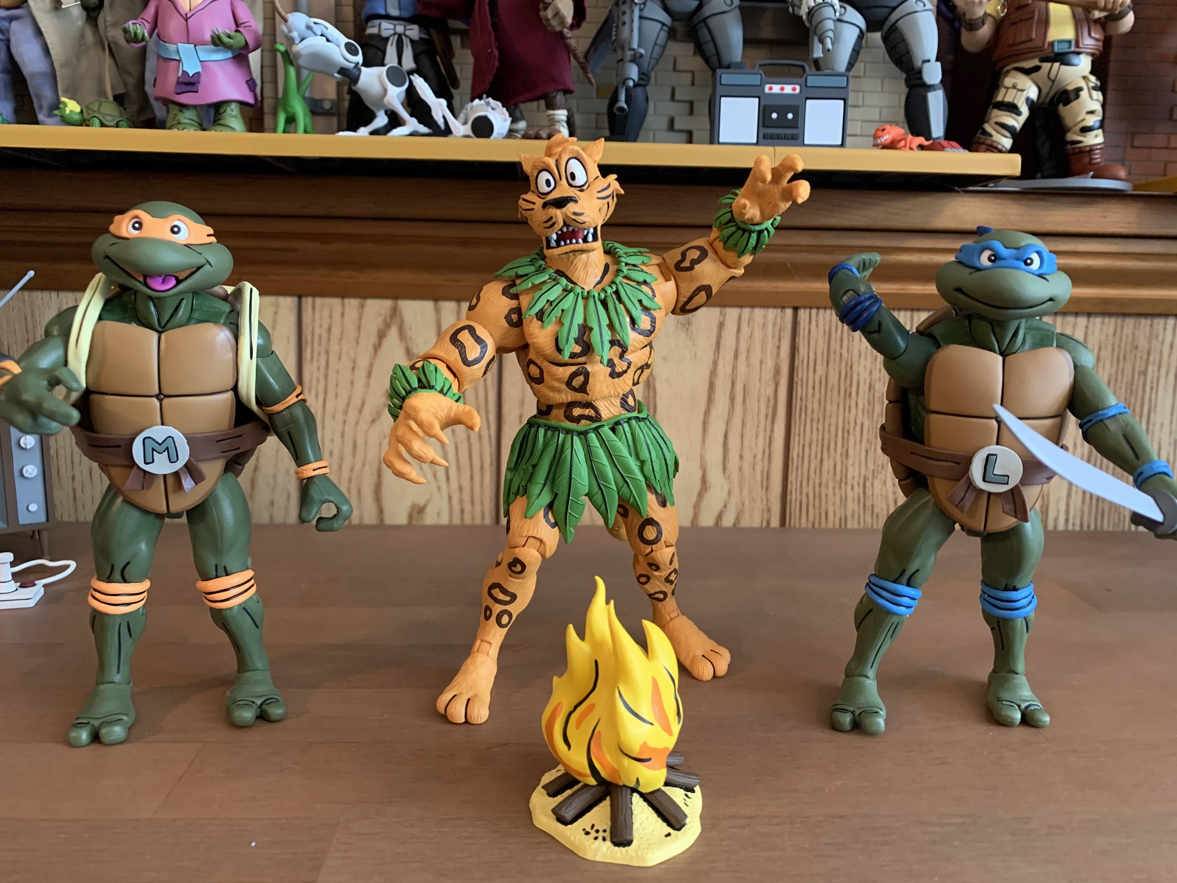
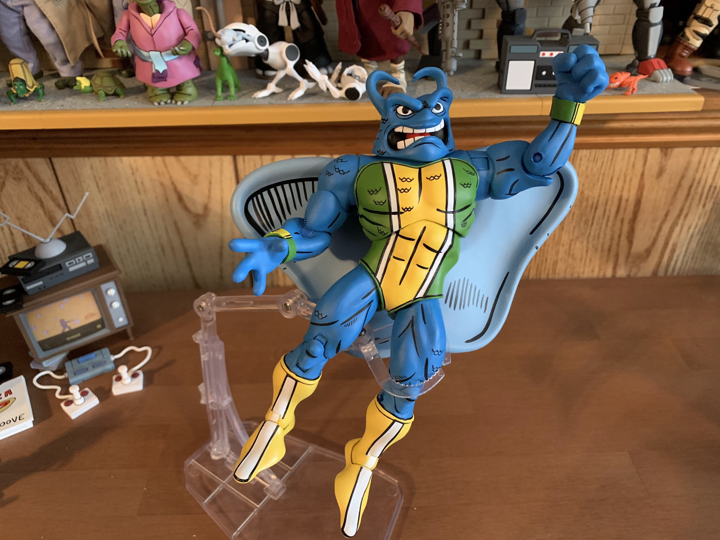
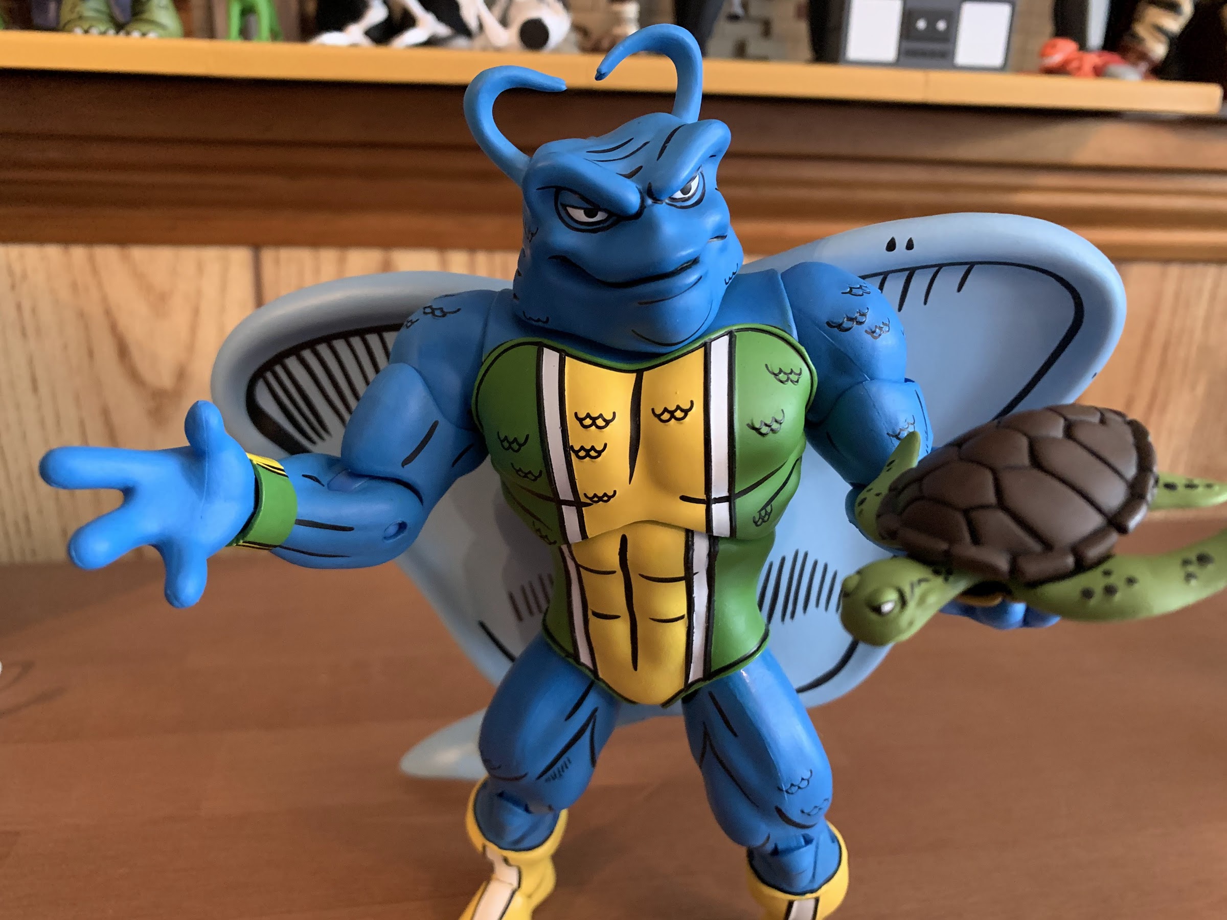
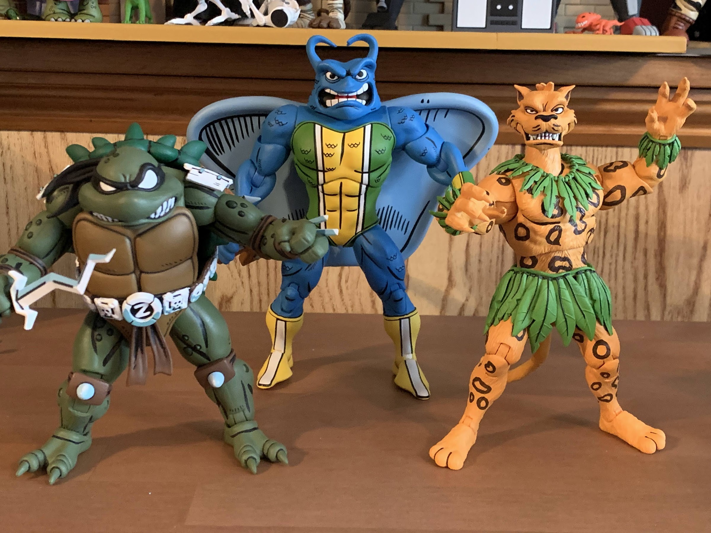
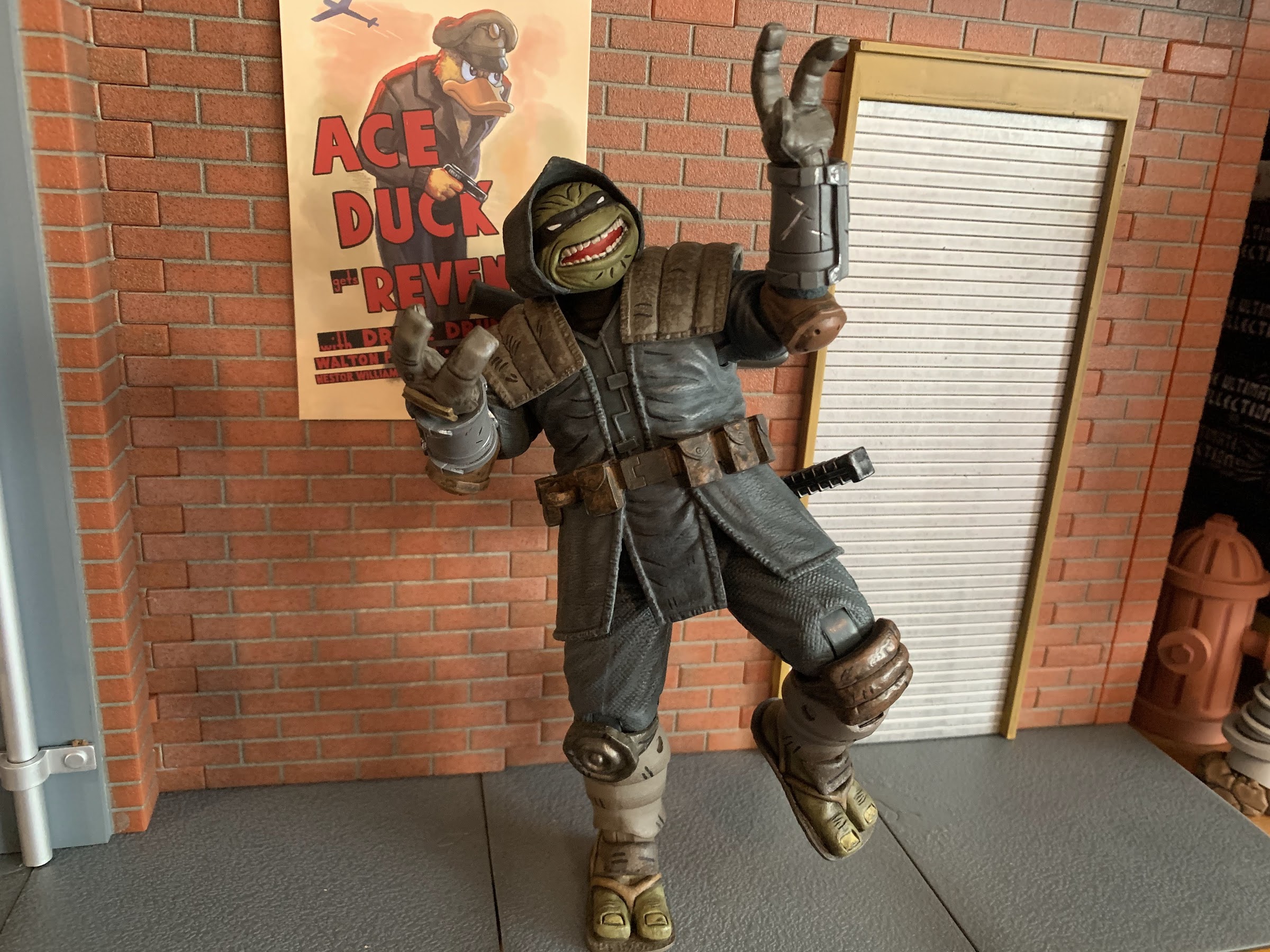
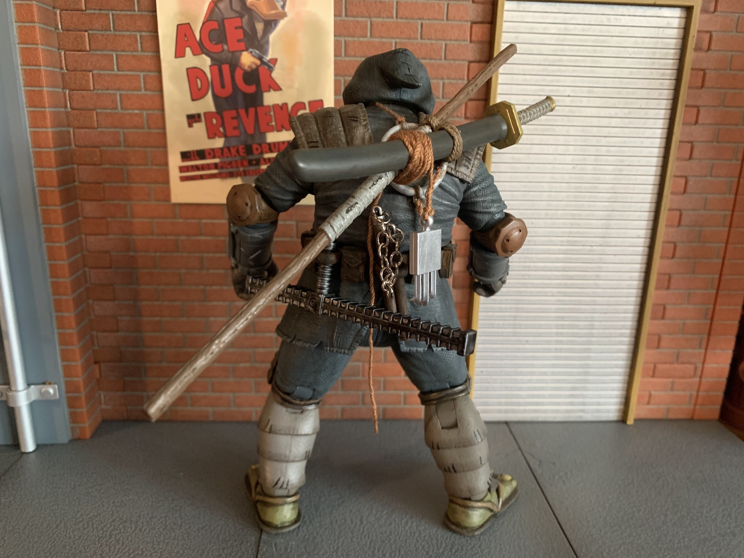
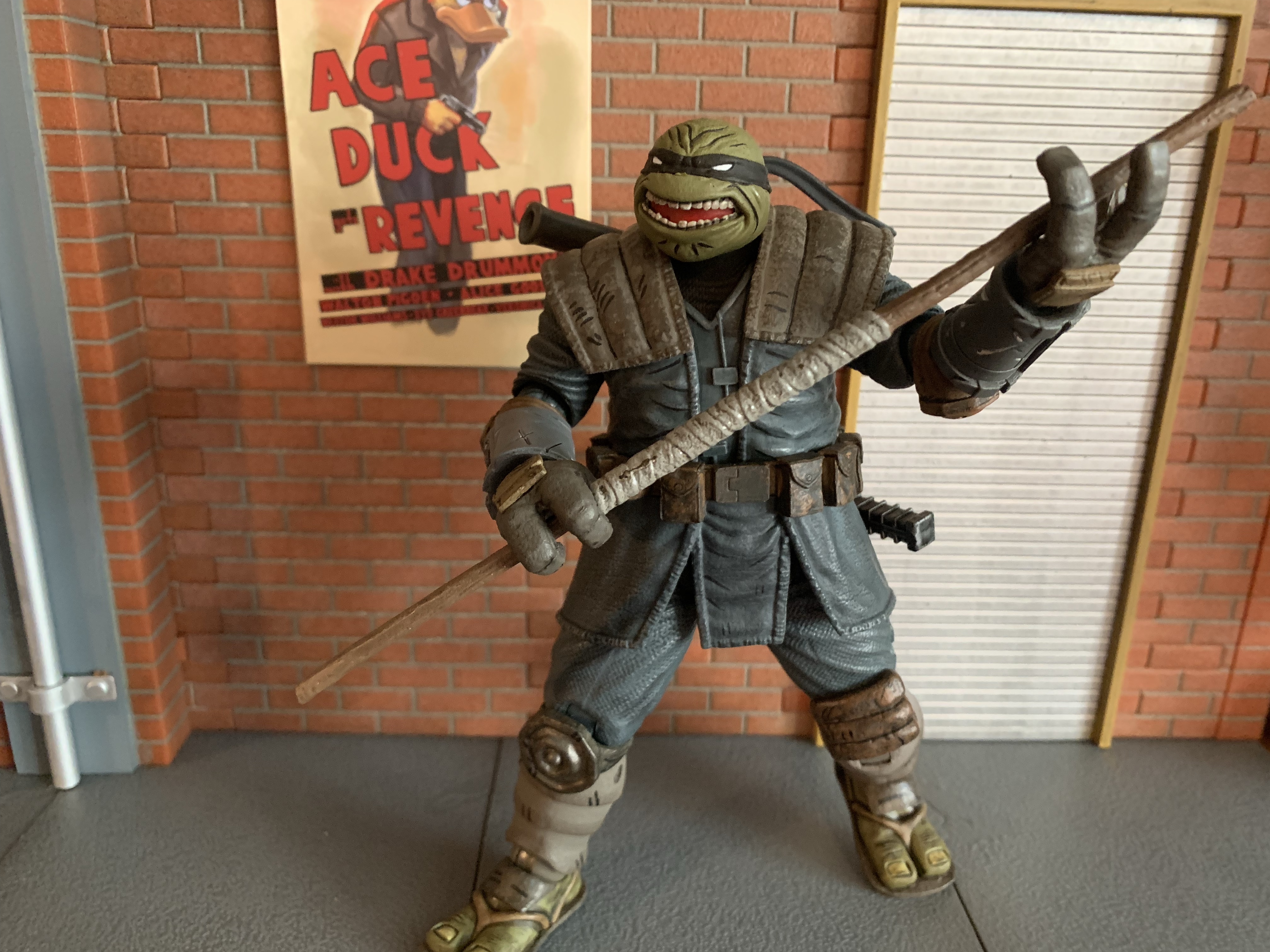
We’re almost done with all of these NECA Haulathon drops from March and up today is the last of the single-packed figures, the Mighty Mutanimal Dreadmon! Technically, he’s the third figure in NECA’s line of figures from the pages of Teenage Mutant Ninja Turtles Adventures since he’s listed as number 3 on the box. However, Dreadmon was the most recent to actually hit stores as Man Ray and the actual number 4 figure Jagwar were released on the first weekend with Dreadmon following a week later. I don’t know why they shipped out of order, but it hardly matters in the end. Like Jagwar, this is Dreadmon’s first go at plastic. I could not confirm if he started off as action figure concept art like Jagwar did, but like Jagwar, Dreadmon has basically only existed in comic form. He started off with Archie in issue #15 in an adventure where the turtles and Jagwar encounter him and he’s also made the jump to IDW, albeit with a pretty substantial redesign. As another member of The Mighty Mutanimals, Dreadmon continues to put us on the path to one day assembling the full team which is something a lot of fans have been dreaming about for 30 years now.
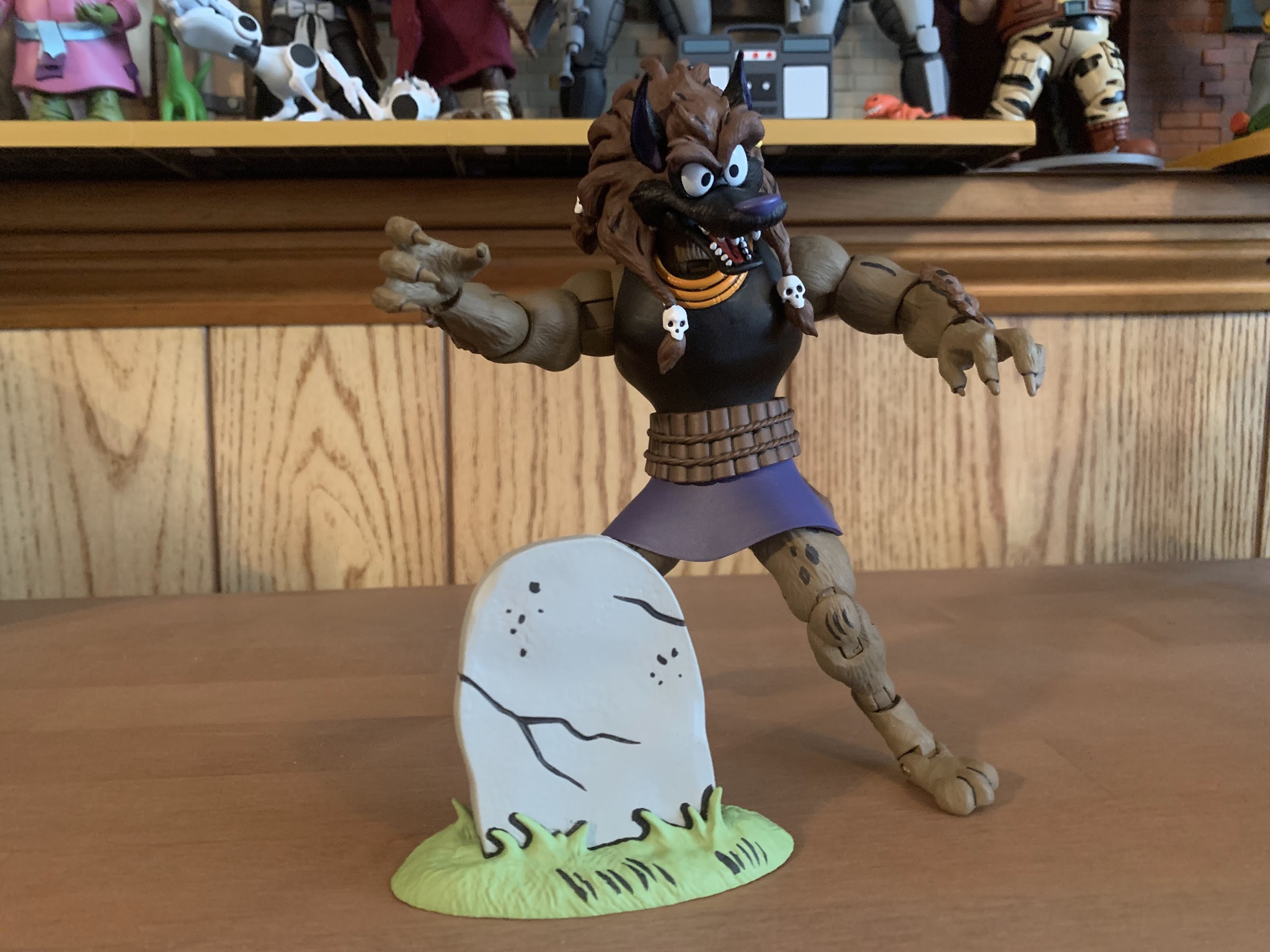
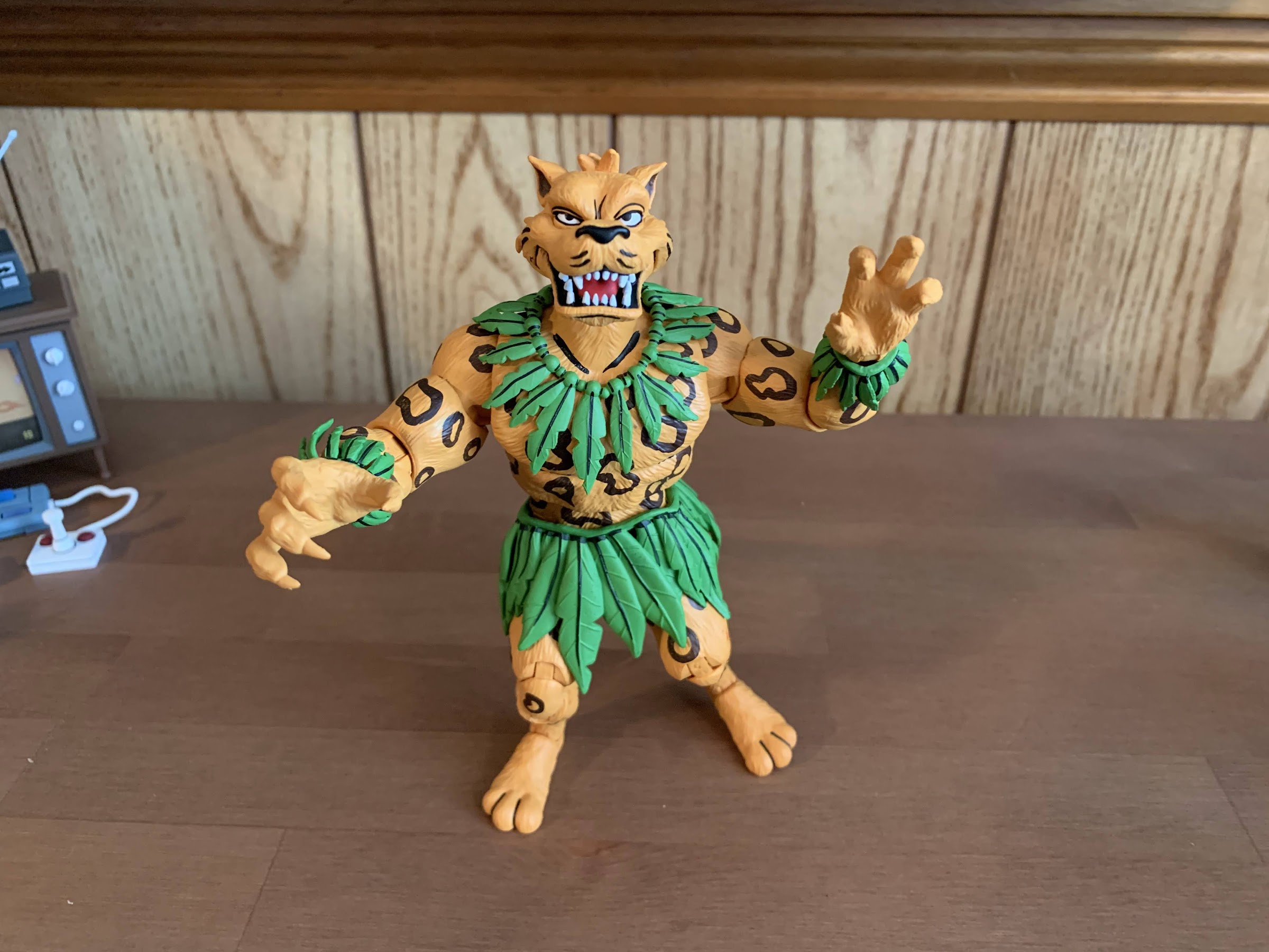
Dreadmon comes in the same style box as Jagwar featuring new artwork from Ken Mitchroney, who was also the illustrator for Dreadmon’s debut issue. Out of the box, Dreadmon stands around 6″ to where his head most likely would end and 6.75″ to the highest point of his mane. I’m measuring him with his legs bent slightly as he’s intended to be posed, but you could possibly get him a little taller, or shorter, depending on how you position the legs as he’s one of those characters that really stands on his toes. As for what he is, he appears to be some sort of wolf man. The newer version of the character has clearly landed on jackal, but wolf seems fine for this version. Like Jagwar, he’s not a mutant and is actually a thief who was magically turned into this beast by a talisman. He’s of South African descent and his family escaped apartheid to Jamaica where a young version of Dreadmon became a street thief before eventually turning a corner after his encounter with the good guys. Even though the Archie books always had a reputation for being like kid version of the more serious Mirage comics, it’s pretty cool how a lot of the characters born within those books have a pretty mature backstory.
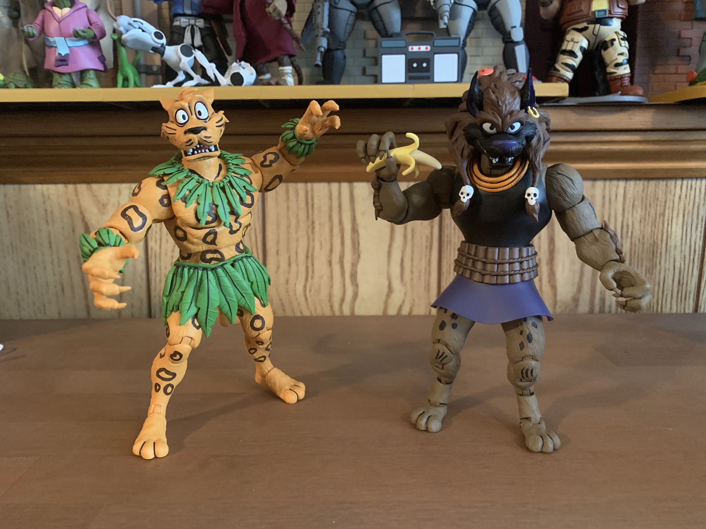
These two share quite a few parts. And a love of fruit.
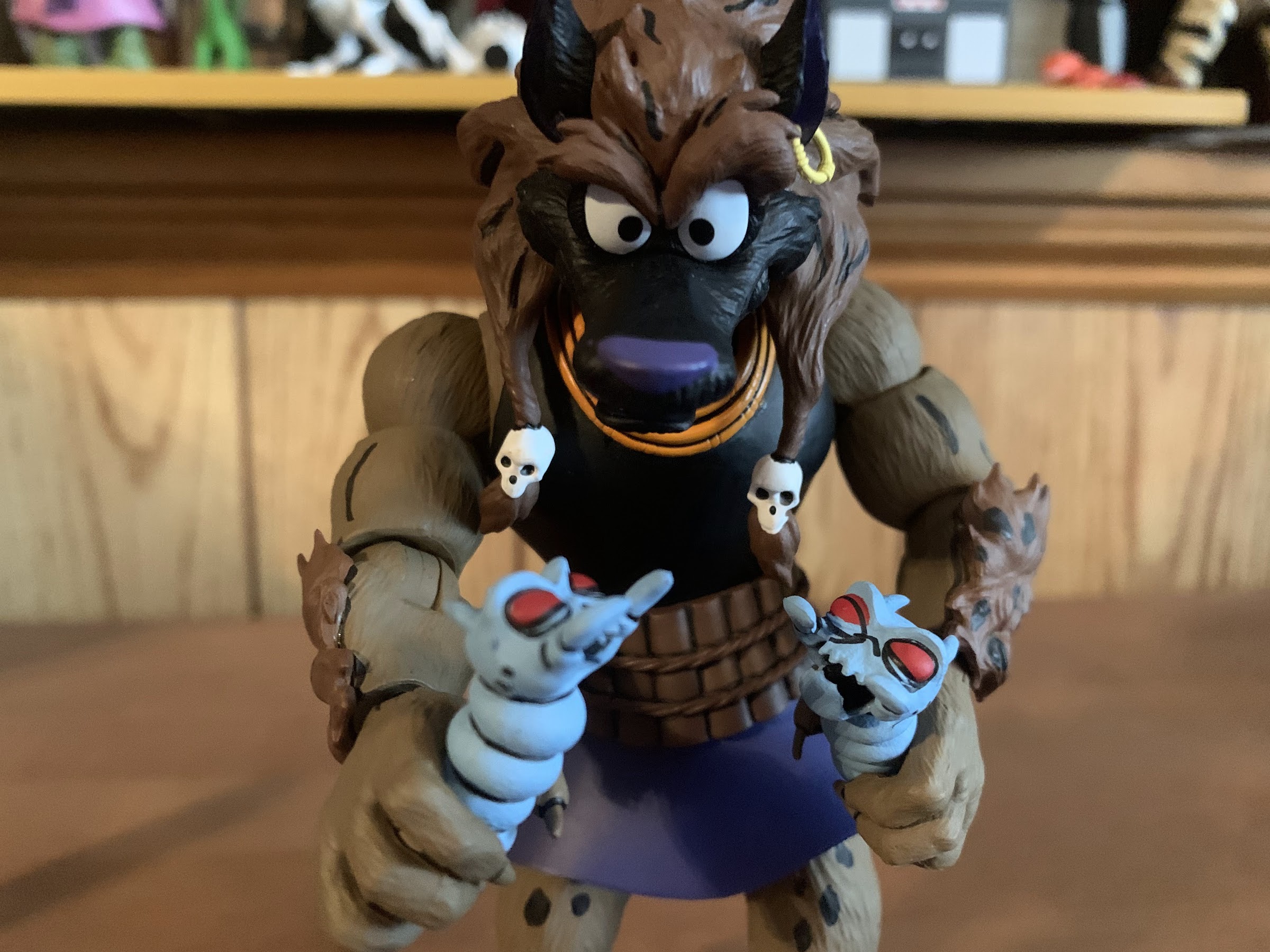
Dreadmon is a character with a pretty neat design. He has a wild mane of hair on top of his black face that is supposed to be dreadlocked. There’s some evidence of that where the hair is twisted and slid through tiny skulls two of which hand over his shoulders with three more on the back of the head. There’s a lot of black linework in the hair to add some character while the sculpted texture looks more like thick fur to me. There’s even a curve to the back of the mane and from the side it looks a little spiky giving me images of Sonic the Hedgehog as I look at him. The ears and face are black with the nose and inner ear painted purple. It’s a fun look and the paint is really clean. The inner portion of his mouth is also painted and looks clean. For his attire, I’m not really sure what he’s wearing. He’s got this black tank top and a three-ringed necklace. Unlike a lot of figures from NECA, the torso clothing appears to be part of the sculpt instead of an overlay. He has a belt that looks like it’s wooden slates bound together by hemp rope and there’s a purple skirt sticking out below that. I’m not sure if it’s supposed to be an actual skirt or was conceived as the end of a tunic, but it’s essentially a skirt and I think he pulls it off.
Obligatory scale shot – I’d say he looks fine.
A lot of the body outside of the torso on this guy is actually shared with Jagwar. The shoulders, biceps, hands, and thighs are the same which is fine. They don’t need to be different and this sort of reuse is what companies should be doing to keep costs down. And the parts are well-sculpted with a fur texture applied and they’re painted a matte brown. There’s also some black lines applied here and there and it’s a nice touch. The forearms are unique so that Dreadmon can have tufts of fur which are done in a redder brown to match his mane. He has some black spots there as well and there’s some on his thighs too. The lower legs had to be different to accommodate his canine feet so the calf is shorter because the foot is longer with a hinge in the center of it. He stands on his toes, though if you wanted to you could flatten the feet and stand him that way, but it looks pretty silly. He does have a tail which is a unique sculpt and it’s a bushy one the color of which matches the mane and there’s some linework applied as well. He looks nice as the paint is once again really clean and has the appropriate finish. The darker palette certainly adds some contrast to the display, but he still has that “pop” factor by nature of the design and those little hits of white and purple help. About the only thing, aesthetically speaking, that bothers me a little is that it’s hard to get him to look like he’s staring straight ahead. His head seems to always be tilted down and it’s hard to pose away and that’s basically due to the hair. We’ll get into that more with articulation, but that’s pretty much it. You do have to watch out for paint rub too as the white skulls that hang over his chest can leave behind streaks on the torso. I had some and I did lightly hit his torso with a dry Magic Eraser and it mostly came off, but I also don’t want to take off too much of the black either as everything is painted on this guy.
I did not have much luck with this particular accessory. The one on the left came with Jagwar and is missing the jaw while the one on the right came with Dreadmon and has a horribly misaligned eye.
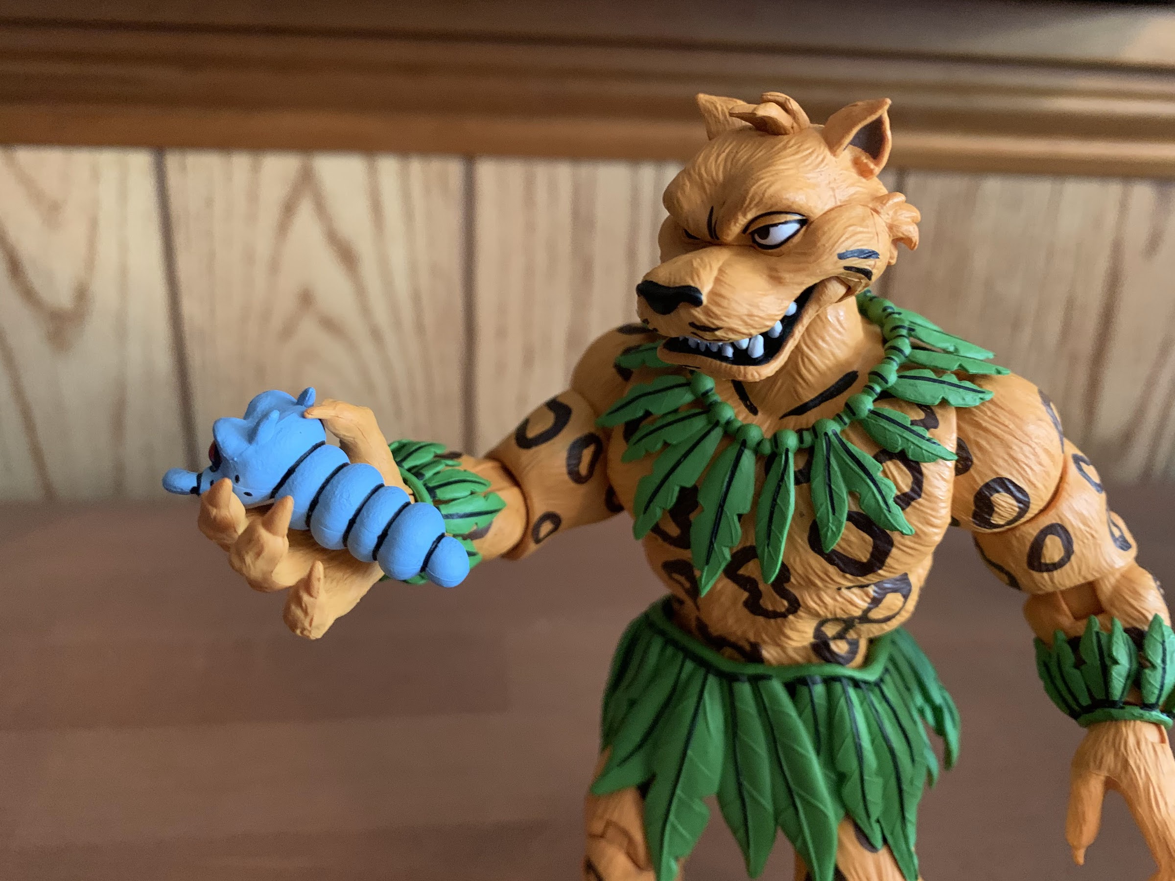
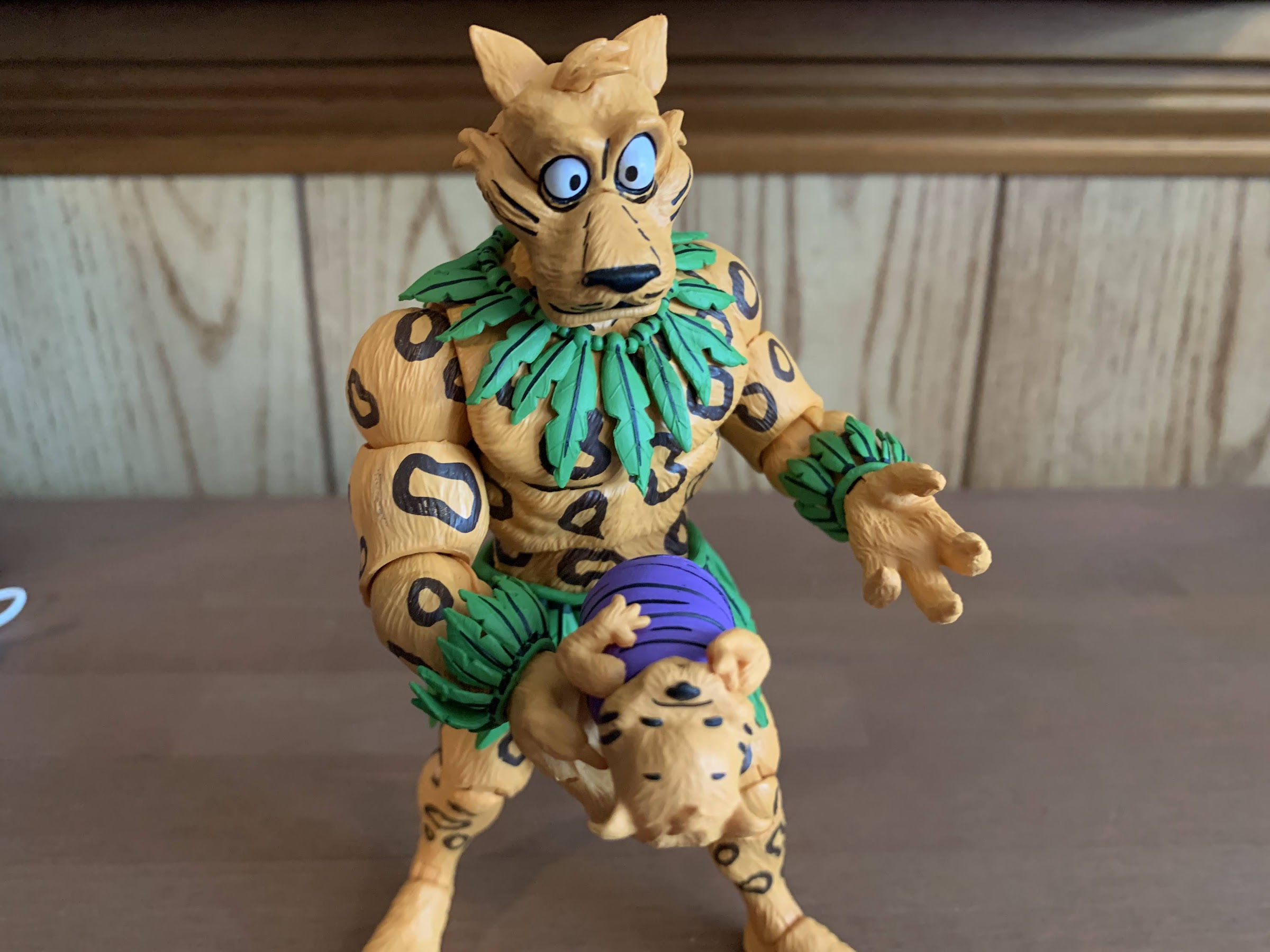
A lot of Dreadmon’s accessories feel similar to Jagwar’s in both concept and because they are quite literally the same. That includes the hands as Dreadmon comes with the same, three, sets: fists, open, and gripping. NECA painted some black linework around the claws which does make them look a little better when compared with Jagwar’s which lacked that detail. Dreadmon also has the same Malignoid worm thing. The one I got with Jagwar was missing the lower jaw, while the one I received with Dreadmon has a terrible paint job. The black lines weren’t lined up properly so it looks stupid. I guess I can’t win when it comes to this thing. Dreadmon also has a fruit bowl, but it’s different from Jagwar’s as his bowl is a bit more distressed and also features some intestines under the fruit. He is a wolf or coyote or something and they do enjoy their entrails! It looks appropriately gross, though not exactly realistic, so it doesn’t throw off the vibe of the property. If it’s too nasty though you get a pair of bananas that he can hold. One is intact while the other has been partially peeled and is ready to eat. He has a blue can of something. There’s no indication of what’s inside it so someone more familiar with the property will have to clue me in, but it looks like a soup can. There’s also an unmarked grave. It just sits on a surface and looks foreboding though I have no idea what significance it holds since it’s unmarked. The Mutanimals did meet an unfortunate end in the books so it could just stand for that. Lastly, Dreadmon comes with a second set of eyes. His default ones are wide open and have a bit of a toon vibe to them while the alternate set is narrowed and more menacing. I like the look of both so I haven’t decided what I’ll ultimately settle on for the shelf, but it’s nice to have options. Swapping them is also pretty painless, provided you keep your thumbs clear of those pointy ears.
“Uhh, got anything without entrails?”
After being pleasently surprised with the articulation on Jagwar, I’m sorry to say that Dreadmon is a bit of a step back. Much of that is unavoidable based on his character design, but it is what it is. The head is probably on the standard double-ball setup we’ve been seeing with NECA figures of late, but the hair isn’t going to let you do much with it. You get some rotation and a little tilt, but virtually no ability for the figure to look up. There is a hinge at the base of the neck which will allow the figure to look down pretty far. The jaw is articulated and it’s fine as it looks good when open or closed. The shoulders are the standard ball-hinges we’re used and they rotate just fine and allow the character to raise its arms out to the side to a horizontal position. There’s a biceps swivel plus single-hinged elbows that have some room to swivel. He can hit a 90 degree bend, though I remain surprised that NECA opted not to use a double-jointed setup here. The wrists swivel and hinge and all of the hinges are of the horizontal variety. In the torso, we get just a ball joint at the waist with no diaphragm cut. He can rotate freely on that peg and crunches forward a bit, but doesn’t go back at all which is a bit surprising. There’s some tilt as well, but it’s pretty limited. The legs are ball and socket joints and NECA put slits in the skirt to keep them pretty much unencumbered. Dreadmon can just about his a full split and he kicks forward to about horizontal and kicks back a bit too. There’s some twist on the ball joint so you have some play there followed by the usual double-jointed knees. After that comes the ankle hinge and rocker followed by the mid-foot hinge. That hinge is a little loose for my liking, but he’s standing okay so I guess it’s fine for now. There’s also a ball hinge for the tail that gives him some pretty good range there as well. Because he has a bushy tail, it’s not wired for added posing like Jagwar’s or Man Ray’s. It’s also too short to be relied upon as a third leg of sorts unless you put Dreadmon in some really low poses.
It’s just pragmatic to have a blank tombstone onhand. You never know when you’re going to need it…
Dreadmon’s unique leg situation and the more simplified approach to the torso means he’s not as poseable as Jagwar or even Man Ray. The unique nature of the legs can also make him a bit tricky to just get straight up and down. You have to make sure both hinges in the knees are bent at the same angle in each leg and then the same is true at the ankle and foot. Often times, I find myself placing Dreadmon on a surface and he’s taller on one side than the other so I have to mess around to try to get his shoulders more level, unless I’m going for a more angled look. And then there’s the previously mentioned annoyance of just trying to get him to appear to be looking forward. I wish the waist joint could bend back to help with that as the range going forward just works against what I’m trying to do. As far as tightness goes, everything felt pretty nice out of the box. The joints are all tight in a satisfying manner. The only ones that are a bit on the loose side are the waist and foot, but neither are failing to hold a pose. He is going to be a little harder to stand than the other figures in the line, but if you’re having problems he does have peg holes on his feet. I’ve done a couple of poses with him so far to just leave alone and he’s fallen over a couple of times. Other times he’s been fine, so there’s a nuance to it when it comes to finding a shelf-safe pose that will last longterm.
That’s hardly a bad looking group.
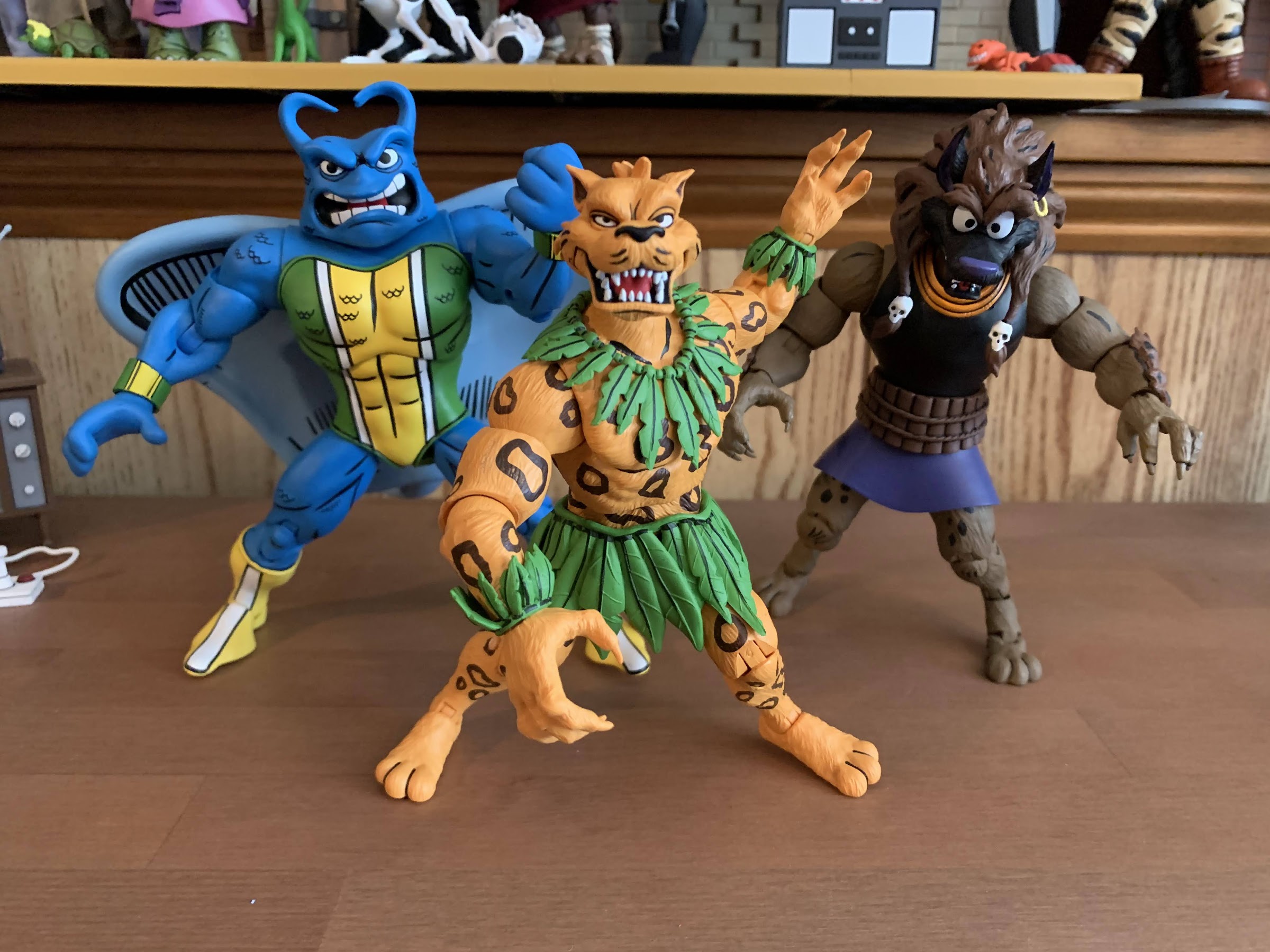
Dreadmon gets us one step closer to assembling the entire Mighty Mutanimals squad. Slash was associated with them, but most consider the core team to be Man Ray, Jagwar, Dreadmon, Wingnut, Screwloose, Leatherhead, and Mondo Gecko. NECA has yet to indicate what’s coming next, but it will be interesting to see if they continue with the Mutanimals or if they pivot to something else. They have stated that evergreen versions of the turtles aren’t really in play right now as they’re design is very similar to the cartoon, but it was suggested that some of their other looks from the comics might be in play (think wrestling attire). Could that be next? Maybe, though I wouldn’t be shocked if such a set started off as a convention exclusive or something. I hope they don’t dick around though and just continue with the Mutanimals as a lot of people have been waiting a long time. Mondo and Leatherhead from the toon line can kind of fake it as Archie versions, but Wingnut and Screwloose most certainly cannot so it’s for that reason that I’d like to see them be next in line. Hopefully we won’t have to wait long.
If you’re looking to add Dreadmon to your collection of NECA TMNT figures then you shouldn’t have too hard of a time. Haulathon has come and gone at Target, but Dreadmon is not exclusive to that event or store. He should start showing up at other brick and mortar locations and will also be solicited to specialty retail. At Target, this figure cost $35 so the specialty shops will likely tack on a few bucks, but if you missed the initial drop your patience should pay off eventually.
Want to know more about the other TMNT Adventures action figures from NECA?:
The next figure in NECA’s line based on the Teenage Mutant Ninja Turtles Adventures comic series is a much anticipated one for fans of those books and its spin-off The Mighty Mutanimals. And that’s because this character is making his debut in plastic. Previously, we looked at Slash who has been pretty well-represented in some…
Back when Teenage Mutant Ninja Turtles ruled the world, there was a lot of brand synergy between all of the various media being generated by this one mega popular piece of intellectual property. The comics came first followed by a toyline which necessitated the creation of an animated mini series to basically serve as a…
As NECA continues to find success with its Teenage Mutant Ninja Turtles lines of action figures, the company has sought to branch out beyond the usual source material in an effort to give collectors more of what they want and also likely to just keep the hype train rolling. NECA started first with doing figures…
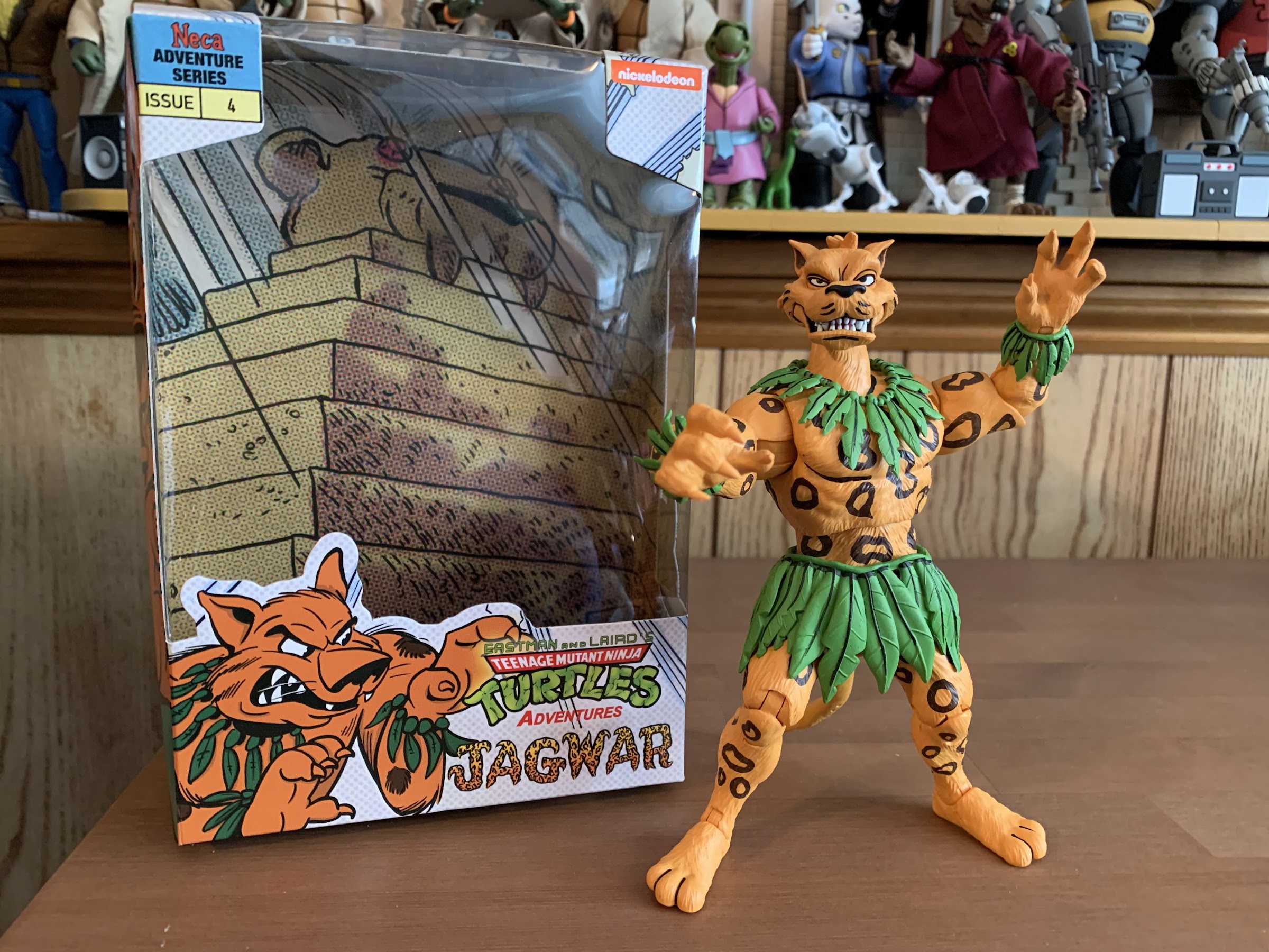
The next figure in NECA’s line based on the Teenage Mutant Ninja Turtles Adventures comic series is a much anticipated one for fans of those books and its spin-off The Mighty Mutanimals. And that’s because this character is making his debut in plastic. Previously, we looked at Slash who has been pretty well-represented in some form or another in most versions of the franchise. Last week was Man Ray’s turn, and while technically a new debut, he’s basically Ray Fillet from the old toy line so the anticipation level wasn’t quite the same. For Jagwar, we’re talking something completely new to the world of TMNT action figures. Like a lot of characters that make up the expanded universe of TMNT, Jagwar began life as an action figure concept for Playmates since Mirage Studios and its artists basically were churning those out in the 80s. He was rejected, for one reason or another, but he got a second chance at life with the comic series. In that, he was actually not a mutant jaguar, but the result of some lady getting it on with a Jaguar god. I guess that makes him a demigod or something? I don’t make the rules, so call him what you will. He’s a crusader for the Brazilian rainforest and his exploits have a real world connection in that they were influenced by activist Chico Mendes, who was unfortunately assassinated for his work in saving the rainforests of Brazil. He was even made an ally of Jagwar’s in the comics and he’s basically carrying on his legacy which is pretty cool.
Who doesn’t want to be friends with a jaguar demigod?
Jagwar would befriend the turtles and then go on to become a founding member of The Mighty Mutanimals, and it’s from those books that this action figure from NECA appears to take most of its inspiration. During Jagwar’s earlier depictions, he was drawn with solid spots on his body and I think he even had a skull pattern on his forehead, but later the the spots turned to ring shapes which this figure utilizes and the skull was dropped. Jagwar, like the other figures in this line, is also based on the art of Ken Mitchroney so he’s somewhat stylized to resemble how he would draw the character. He also did the box art and the shape of the box is more in-line with what we saw with Slash as Man Ray had to go with an oversized one to accommodate his added bulk. Jagwar was first released as part of the Haulathon event with Target which is over at this point, but he may still be getting shipped out to Target stores. He is expected to eventually show up elsewhere including other big box retailers as well as specialty retail so if you missed out on this guy just keep your eyes open at other venues as he’s not likely to be too hard to come by.
I like that both he and Man Ray come with “sexy” faces.
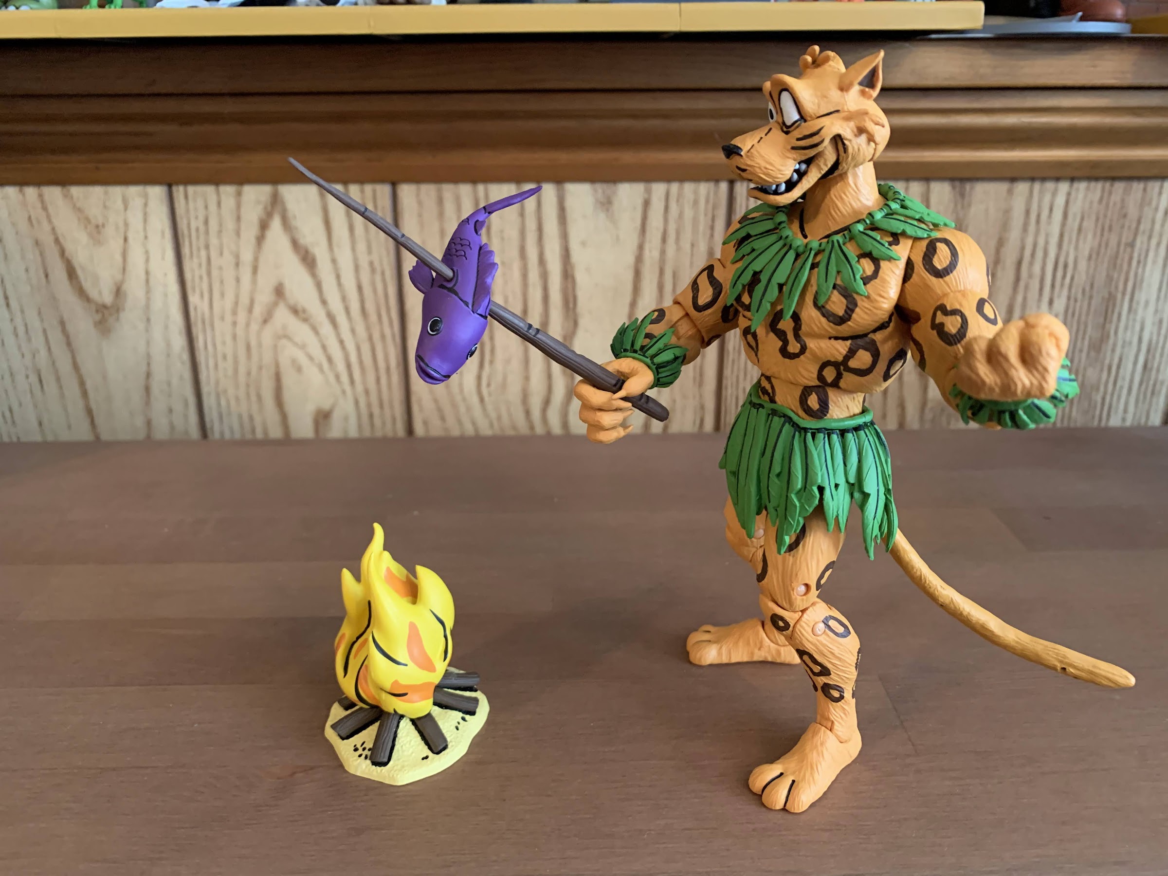
Out of the box, Jagwar stands approximately 6.25″. He’s a mostly naked jaguar guy who just wears a necklace of leaves to go along with the same at the wrists and waist. The necklace is a separate piece that pegs into the back and chest so it doesn’t move all over the place. I assume it’s reinforced with glue, but I could be wrong. It definitely doesn’t appear to want to come out. The leaves at the wrist are more of the floating variety and could be slid off if desired while the leaves at the waist are done in a similar fashion to the necklace so they’re pretty locked in. The body is done in orange and painted over as well, which NECA often does. The only other paint needed are for the spots and some black linework here and there. The spots are done in brown, which seems consistent with the books, and my only critique here is that the opacity seems to vary between the limbs and torso giving some rings a darker look than others. There’s also no paint on the hands aside from the orange which makes them look a bit plain. I would have at least liked some linework around the claws and I’m going to assume having the claws match his fur is consistent with the source material. The head, which features a comical expression, has some nice linework and the eyes are rather cleanly applied so that is all in order. I think the expression some may take issue with as it is a bit odd, but we do have another head to talk about when we get to accessories so I think it’s fine. It has that toon vibe I associate with the Archie series so I don’t mind it.
“Am I supposed to eat this?”
And for those accessories, we have some interesting stuff and some pretty typical items. For hands, Jagwar has a set of fists, gripping hands, and open, style posed, hands. The gripping hands have a standard horizontal hinge and feature a pretty wide grip and they’re not really suited for much of what he comes with. And as for things he can hold, we get a little Malignoid slug, baby, worm, thing. It’s painted in blue and has a rather wicked head on the end of it. Mine is defective in that it’s missing its lower jaw, though it’s not something I even knew about until I saw another one. It’s pretty fat though so it doesn’t fit into his gripping hands effortlessly and you’ll probably end up leaving some orange paint behind on it when pulling it out. His other item for gripping is a stick going through a purple fish. It looks fine, but it’s almost too thin for the gripping hands. At the fattest portion, the figure still can’t really get a good grip on it, but you can position it to stay in his hand. The paint is really nice on the fish though I’m a little surprised he doesn’t have “X” eyes. Jagwar also comes with a little campfire to cook his fish over. It looks fine and the fire itself is done entirely with paint as opposed to translucent plastic. There’s also a bowl of fruit for when he’s not in the mood for fish and it looks fine too, but in the end, is just a bowl of fruit. There’s also a baby Jagwar so he can hold a baby version of himself and create a wicked time paradox. Lastly, we have a second head and in keeping with Man Ray there’s a cockyness to this expression. His eyes are narrow and I can’t decide if he’s ready to throw down or looking to attract a mate. It’s fun though and I have a feeling a lot of people will use this head in place of the more cartoonish one.
“Now that’s more like it!”
The accessories for Jagwar aren’t terrible, but do feel a bit lackluster. He did sometimes use a blow gun so I’m surprised to see that omitted, but regardless, he can make up for that with the articulation. Jagwar is pretty much all new tooling, and if anything is repeated it’s not obvious to me. As such, it will be interesting to see how he moves. The head is on a double-ball peg and it has terrific range. He can rotate, tilt, look up, look down, the whole nine yards. There’s no joint at the base of the neck, but he doesn’t seem to need it. The jaw on both heads is articulated, but it doesn’t open as far as I’d like on either. It doesn’t get ugly though, so that’s a plus. The shoulders are the customary ball hinge joints and Jagwar can raise his arms out to the side to about horizontal and rotate freely. We have a biceps swivel and single-hinged elbows. I’m a little surprised at the lack of double elbows here, but he can at least achieve a 90 degree bend. There’s a slight swivel at the joint too, but it doesn’t have much range and I don’t think the goal was to get much there either. The wrists swivel and hinge and all of the hinges are horizontal. They were also the only joints I’d consider stuck, but I was able to get them moving without having to resort to heating them. In the torso, we get a diaphragm joint that mostly allows for rotation. You get a little bend back, no crunch forward, and some tilt. The waist also has a waist twist. At the hips, we get the ball and socket joints that allow for the figure to almost hit a full split, but the leaves at the waist prevent the legs from going out to the side as far as they could. There is a little thigh twist there and the legs kick forward to almost horizontal (again, the leaves get in the way) and kick back a little. The knees are double-jointed and work fine while the ankles have the customary hinge and rocker combination which also works fine. Lastly, we have a wired tail on a little ball hinge that rotates and can be positioned pretty well. The wire is also strong enough that you could use the tail to help stabilize the figure if you so wanted to.
“I am freaking out here!”
And this isn’t even the “camping” variant of Jagwar!
Jagwar moves pretty well for this line. I’m a little disappointed that NECA didn’t separate some of the leaves at the waist to provide some pathways for the legs as I’m sure they could bend further without the obstruction. We saw a similar situation with the Chakahachi figure from the toon line where the sculpt has room to be modified with the goal to achieve better range at the hips, but NECA opted not to do so. I’m guessing they were worried about the durability of the soft plastic if they had cut into it, but I think they could have found a way. The diaphragm joint also could be better as I’m surprised it gets virtually no range bending forward. This is a character who should have a lot of articulation so while I normally go soft on the criticisms when it comes to that area, I think this is one of the few characters that should have a bit more. Even with those shortcomings, he still poses pretty well which is a good thing because his accessories don’t offer a whole lot there. You can have him holding a bowl of fruit or roasting a fish over a fire, but that’s not likely to be how most assemble the Mutanimals on their shelf.
The Mutanimals are starting to come together…
Was the wait worth it? Considering fans of Jagwar have been waiting for over 30 years for this I would have to guess that the answer is “No,” because how could it have been worth it? So many versions of TMNT have come and gone since without a Jagwar and that’s pretty surprising. If we’re just going back to when NECA got the license then I think the answer is “Yes.” Jagwar looks pretty cool and he’ll look good with his buddies, the ones already out and the ones likely to come. There’s certainly some room for improvement, but at the more normal price of $35 I think I can safely recommend Jagwar to fans of the Archie universe of characters and to those collectors that just want to mix him into their toon display. Archie fans, at long last your wait is over.
As NECA continues to find success with its Teenage Mutant Ninja Turtles lines of action figures, the company has sought to branch out beyond the usual source material in an effort to give collectors more of what they want and also likely to just keep the hype train rolling. NECA started first with doing figures…
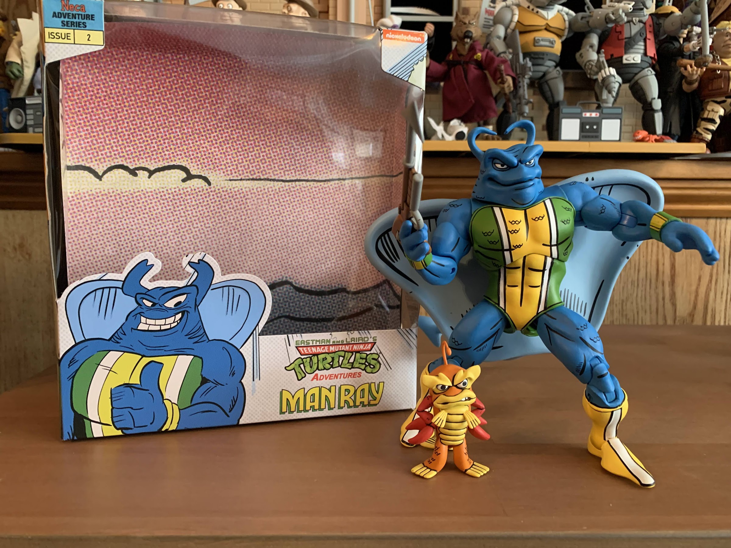
2022 is nearly in the books. As we countdown the final hours and minutes until 2023, it feels good to say that the new year will begin with no further Loot Crate obligations. That’s because after a delay of more than a year, the second crate in Loot Crate’s Teenage Mutant Ninja Turtles series of…
Back when Teenage Mutant Ninja Turtles ruled the world, there was a lot of brand synergy between all of the various media being generated by this one mega popular piece of intellectual property. The comics came first followed by a toyline which necessitated the creation of an animated mini series to basically serve as a…
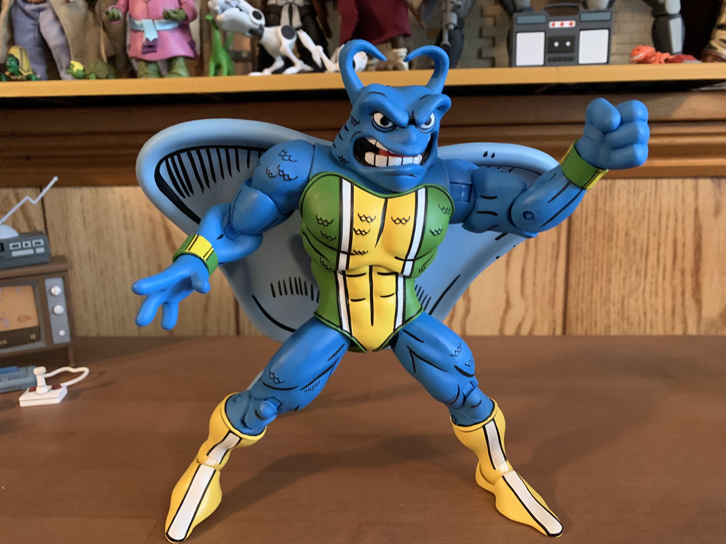
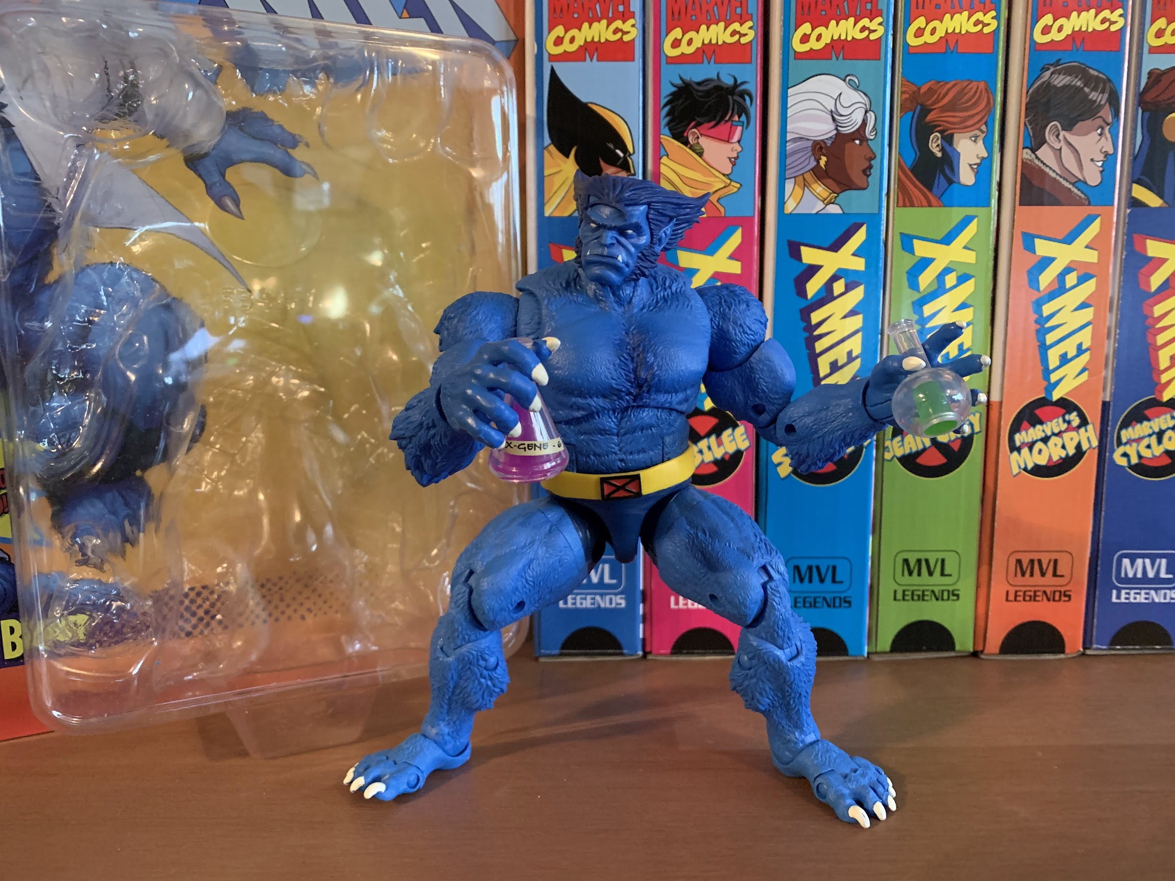
Back when Teenage Mutant Ninja Turtles ruled the world, there was a lot of brand synergy between all of the various media being generated by this one mega popular piece of intellectual property. The comics came first followed by a toyline which necessitated the creation of an animated mini series to basically serve as a commercial. When the toys and cartoon took off, more episodes were ordered and certainly more toys were created, but the comics remained as they were. Which is to say they were pretty much intended for an entirely different audience. Enter Adventures of the Teenage Mutant Ninja Turtles, or Teenage Mutant Ninja Turtles Adventures, whatever you want to call it. It was a comic that started off as an adaptation of the animated series, but pretty quickly became its own thing. Published by Archie Comics, it was the kiddie comic though it would actually get far more mature than the cartoon series ever did. Characters created for the toy line would show up in the cartoon and sometimes in the Archie books as well. When that happened there tended to be differences and we saw that with the first figure in this subline from NECA: Slash. Now we have another one in Man Ray, who non-readers likely know as Ray Fillet. The character is credited to Stephen Murphy and Ryan Brown, and it’s my understanding that the concept of Ray Fillet came first for the toyline, but was imported into the comic as Man Ray. The two look very similar, but there are some differences. As for the cartoon version, he was named Ray and really couldn’t be much more different. If we ever get a Ray toy we’ll get into that there, for now, let’s talk about Man Ray.
Do you prefer your Man Ray angry or sultry?
Man Ray debuted in issue number 5 of Teenage Mutant Ninja Turtles Adventures and he had a fairly standard origin for this kind of property. Marine biologist Jack Finney touches a manta ray, comes in contact with the mutagen, and is turned into a mutant superhero. He looks like a humanoid manta ray and he can command sea creatures like a more famous hero from the pages of Detective Comics. He fights for all of the usual stuff, but also has an ecological bent which I can appreciate. Of course, we’ll ignore the fact that we’re talking about a mass-produced lump of plastic in the character’s image which is doing who knows how much harm to our present environment. Man Ray would also go on to join The Mighty Mutanimals, the offshoot series for TMNT, where he’d work alongside the likes of Slash, Leatherhead, and more. As the second release in the Adventures line, Man Ray is a logical choice. He seems to have a pretty strong following in the fanbase as a lot of people my age really liked that Ray Fillet figure, myself included. I also had his origin story, though I don’t think it was the comic, but rather an adaption as a children’s book that I have long since lost track of. And since he didn’t really appear in the cartoon series it also makes sense to get to him early as collectors will want the character as either the Archie Comics character or just as a stand-in for Ray Fillet in their toon display.
Man Ray comes in a slightly oversized box relative to Slash which once again features original artwork from artist Ken Mitchroney. I personally love Ken’s art and I think it has the right aesthetic to really separate it from both the work of Mirage Studios and the cartoon. The figure itself is also based on Ken’s style and this one is presently showing up as part of NECA and Target’s Haulathon. Unfortunately, by the time you read this the online drop will have past and possibly even restocks at the store as Man Ray was part of the initial wave of product. If he’s anything like Slash then he may hang around so it shouldn’t be too hard to get your mitts on this figure. And if you miss him entirely he should eventually show up at other retail outlets. He’s just debuting at Target, he’s not exclusive.
Flight stands are going to be tricky with this guy.
Once out of the packaging, Man Ray stands at approximately 6.5″ to the top of his head and closer to 7″ if you factor in the…horns? I don’t know much about manta ray anatomy. He’s clad in his green and yellow suit which I suppose is the character’s default look. He had several looks in the comics so bigger fans would have to tell me if this is the most appropriate. His skin is a very rich shade of blue and it’s what really stands out the most. I love it, but I also love the color blue, and all over his body are little areas of sculpted-in scales. The scales ate outlined in black, as are his muscles, and he has a very superhero look to him. The paint is super clean given the abundance of it and I’m really impressed with the piping on the costume and how well NECA handled the white stripes. He has those big fins on his back which are permanently affixed and there’s a tail that has to be inserted by the user. The tail and fins are done in a light shade of blue which contrasts nicely with the main body. The sculpt for the head looks terrific as he’s pretty angry looking and ready to throw down. The only blemish with the presentation I notice is with the boots and specifically the hinge there. He has a white stripe right down the center of the boot so NECA cast the hinge in white plastic. When the hinge is visible from the front, it’s a bit of an eyesore, but going with white is better than having a yellow gap. On the rear though you get a white block of color amongst all yellow because the stripe is only on the front. There’s not really much NECA could do about that without changing up how they articulate ankles. The April figure had a similar issue, but at least it’s a blemish largely confined to the rear of the figure and it makes sense to do it this way given that.
Man Ray comes with not just one little buddy…
Man Ray comes with a bunch of stuff in his rather large box and the first thing we tend to talk about are the hands. In the box you have fisted hands, wide gripping hands, a right trigger finger hand, a left relaxed hand, and a left splayed hand. The very wide gripping hands are so he can carry his harpoon gun in a more casual manner as seen on the cover of his debut appearance. The trigger finger hand is to hold said harpoon gun in a more conventional manner, though the trigger finger just barely can touch the actual trigger. The gun looks fine though as it’s brown and gray and features a lot of line work on it. Man Ray also has a second portrait which is this cocky, almost flirty, sort of grin. This is the type of fish Troy McClure would love to have an encounter with. Man Ray also comes with a little sea turtle who I guess is a stand-in for his summoning powers. He’s cute and really well painted, but is otherwise a slug figure. He also has a little buddy, Bubbla, who looks like a lobster or crayfish type of creature and was apparently based on the little buddy figure the toy came with, Fishsticks, though they look nothing alike. Bubbla looks a bit irritated, but he’s well painted and stands nicely on a shelf and is a fun inclusion.
…but two little buddies when you count this turtle here!
Where these NECA reviews have been going off the rails a bit lately is with articulation, and perhaps to no one’s surprise, Man Ray isn’t going to impress here. For one, we’re dealing with a character that has no neck and giant fins on his back. Despite the no neck, the head is on a double ball peg which is mostly good for rotation. He can tilt forward and back a bit, but really moving the head at all breaks up the sculpt and he looks pretty silly as a result. It can kind of shimmy side-to-side which works better than rotating it, but it is what it is. The shoulders are the usual ball-hinged joint that just pegs in. The arms will go as far as they can until they strike the fins and raising them out to the side won’t quite get to horizontal. There is a biceps swivel and below that a single-hinged elbow. There’s a generous cut-out in the forearm for the hinge so it will bend a tick past 90 degrees. The wrists rotate and hinge and all of the hinges are a horizontal hinge including the trigger hand. The hinges are also cut a bit off-center which I assume is intentional. They’re all also super tight and most won’t work for me. Swapping hands is at least easy, though swapping heads required heat.
“How dare you pollute my ocean, Shredder!”
In the torso, we get a diaphragm joint that feels like a double ball peg system. Man Ray doesn’t bend back very far, nor does he crunch forward much, but you do get a generous amount of tilt on the joint plus rotation. You probably want to be gentle though so as not to scuff the abdomen. There’s no waist joint and the hips are the standard ball joints. Man Ray can basically do splits as the diaper overlay is cut way back which I like a lot. The thigh will swivel a bit on the joint and below that we have double-jointed knees. They’re very tight and manipulating them past 90 degrees is a challenge because they strike the fins. Kicking backwards also doesn’t work very well for the same reason, but he can kick forward a decent amount though his legs want to go off towards the side when doing so. There is no boot cut and the ankles have the previously mentioned hinge joint and rocker, both function well. Lastly, we have the tail which is a ball-hinged joint that gets decent range. The tail itself also has a bendy wire running through it for a little extra something. Man Ray stands pretty well, but the tail can also add stability if you feel it’s warranted or if you have him in a more unnatural pose. There is a lot of weight to this figure, but it feels like it’s pretty well-distributed and the big feet and tight joints will help to keep him upright.
We’re slowly putting together the Mutanimals!
Man Ray is a pretty typical release for NECA and it’s Teenage Mutant Ninja Turtles offerings. The sculpt and paint are all terrific while the articulation is just so-so. Man Ray does have some hurdles to deal with unique to his design, so I can forgive NECA for that. I think he’s going to move well enough and it’s hard for me to quibble too much with the articulation setup given how nice the sculpt turned out. And when it comes to the look of this guy I’m pretty much in love. I love the colors, I love the expressiveness of the face sculpts, and the detail work is fantastic. The accessories are solid and I might just display him in a superhero pose without the gun because I don’t think he needs it. The only other thing left to discuss is the price tag which comes in at $40 making Man Ray not as cheap as Slash and some other recent releases, but less than Zog. I guess he’s a little more involved than some other figures, but it’s hard not to get the feeling that NECA started at $40 and then added on stuff to get to that price like the turtle and Bubbla. Slash was somewhat bare bones, but also using an older mold. Jagwar, another character we will be looking at in due time, is $35 with all new tooling, lots of accessories, and plenty of paint. Maybe NECA figures to reuse some parts from that one later on? I’m not sure and I don’t know the economics of the situation I just know what’s on my shelf and what it cost me. At $40, Man Ray isn’t the value some other figures are. I do think he looks great though so I’m not exactly saying he isn’t worth it, but I do wish he could have been cheaper. And for fans of the Mighty Mutanimals, I suspect he’ll be worth it to them too as NECA is building up that team and it certainly seems like a priority for the company so I suspect we’ll be talking about them for awhile to come.
Like TMNT comics or TV show action figures? We’ve got you covered:
As NECA continues to find success with its Teenage Mutant Ninja Turtles lines of action figures, the company has sought to branch out beyond the usual source material in an effort to give collectors more of what they want and also likely to just keep the hype train rolling. NECA started first with doing figures…
NECA and Target’s Haulathon event which has seen a vast assortment of product dumped onto shelves recently was not content to limit the products to just the cartoon Teenage Mutant Ninja Turtles. Far from it, as an assortment of comic book based characters were also released and today we’re going to look at the first…
When we took a look at NECA’s Muckman from the Teenage Mutant Ninja Turtles cartoon line of action figures, I mentioned how Muckman was supposed to be released in a two-pack with Mondo Gecko. That obviously didn’t happen and it’s because the figures just got too expensive for the two-pack format. Rather than release a…
From the pages of Mirage Studios come the Shredder clones!
NECA and Target’s Haulathon event which has seen a vast assortment of product dumped onto shelves recently was not content to limit the products to just the cartoon Teenage Mutant Ninja Turtles. Far from it, as an assortment of comic book based characters were also released and today we’re going to look at the first of 5 such releases: the Mirage Studios Shredder clones. In the original comic series, Shredder was unceremoniously killed off in the very first issue. He was never supposed to be a reocurring villain and really no one likely expected to even do a second issue of Teenage Mutant Ninja Turtles, but the comic sold well so another had to follow. Co-creators Kevin Eastman and Peter Laird had no trouble coming up with other adventures for the boys, but the popularity of the Shredder character meant that he had to come back in some way. And he would, eventually, but first we got the clones.
“You ready to mess shit up, little buddy?”
Issue #20 of the original run saw the debut of the clones when they showed up and killed off the Triceraton warrior Zog (more on him in the coming weeks), though their full debut came in the following issue when the turtles actually did battle with them. The clones were essentially an attempt by the Foot to bring back the Shredder, but something must have gone wrong. They needed a few tries, and it would seem this trio of clones represented those first few failed attempts. One such clone is known as the Claw Shredder. A figure of him was released as part of the latest round of Loot Crates and it was basically a slender Shredder with big claws for arms. The other two clones are the subject of today’s post as they’ve been released together: Multi-armed Shredder and Mini Shredder or Shrimp Shredder. I don’t know if they necessarily have official names as these clones have now appeared in multiple iterations of the franchise and even in toy form. I suppose their official name isn’t important and all you need to know is we get a big, beefy, version of Shredder with four arms and a small Shredder. These two have been released as a two-pack and come in an oversized version of NECA’s Mirage packaging featuring new artwork by Kevin Eastman.
He may be little, but don’t turn your back on him.
I suppose we can start with the Shrimp Shredder, my preferred name for him. He’s more like an accessory, but since the box does say “Shredder Clones” with a plural, we can treat him like a figure. And this will be quick because there isn’t much to him. He stands at roughly 2.75″ to the top of his helmet, but his true height would probably add another half inch to him. That’s because he’s in a permanent crouch since his legs are prepositioned and lack knee articulation. His color scheme is like that of the standard Mirage Shredder so he has a red outfit with brown wraps at the forearms, waist, and boots. He looks like a tiny Shredder with the only difference being his skin tone is an earthy brown and he has red, glowing, eyes from behind his mask. He has just a single blade on each hand as opposed to two and features no spikes at the shin. The figure has the cutomary black line work this line is known for and it’s all really clean. The helmet and other “metal” parts have a luster to them. They’re painted in silver with hits of light blue to create the illusion of metal and it looks really sharp. It’s really impressive how much detail is packed into such a small figure and the lack of paint slop is to be commended.
“Destroy them, my clone! Take no prisoners!”
Where the little guy does come up short is in the articulation department. He’s not a slug figure, but he also doesn’t do a whole lot and it’s very similar to the baby turtles we saw in the recently released accessory set. The head is on a ball peg, but it’s pretty large relative to the creature’s body so turning it will result in it coming into contact with the spiked shoulder pauldrons. He can look down, but he can’t look up, and there’s really little in the way of nuance posing. The shoulders rotate and hinge, but they can only go so far because the elbows are bent. Eventually, the spikes on the hands will hit something when rotating and the pauldrons obstruct the figures abilito raise its arms out to the side. The hips are ball-jointed and they’re mostly unrestricted. They do kick out to the side more than forward, but his bent knees mean he wasn’t going to do kicks anyway. They pivot and can go forward and back and are easily the most accessible of the joints. The ankles feature hinges and an ankle rocker. He’s not really going to do much. You get a few options in how the arms can be positions and the legs being bent means you can’t really take advantage of all of the articulation down there. He can basically crouch, sit, kneel, or be on one knee. He’s not too hard to stand, easier than the baby turtles, so mostly he’s fine. If they could have given us knee and elbow articulation that would have been nice, or maybe just swappable legs and arms? He gets the job done though and he’s not the main attraction.
“See, dude? I told you this would be way more fun than fighting.”
Is that you, Goro?
That’s because the big guy is. We’re talking about the multi-armed Shredder, or Shiva Shredder in some parts, and he’s definitely the more impressive of the pair. Standing at around 6.75″, he’s the tallest in the Mirage line so far, or would be if he wasn’t being released at the same time as Zog. More so than the height, he feels big because he’s very broad in the chest and he needs to be because he has four, beefy, arms that need to attach to that trunk. Everything about his design is broad as even his head is practically square-shaped compared with the more rounded features of Shredder. His chin is squared-off behind the metal plate and the color scheme for this guy is the same as Shrimpy. Also similar to the little guy is that he only has one blade on each hand, but since he has four hands he has the same number of blades as Shredder. The paint is all the same so same flesh color, same approach for the steel, and so on. And like the little guy, it’s all applied exceptionally well and is mostly free of defects. The actual spikes on hims are quite firm and pretty sharp too so keep this one away from your little ones. I kind of have a “thing” for designs with four arms so I am especially taken with how this guy turned out. He’s going to look awesome in your display whether you have a ton of releases or just a few.
This guy might require both swords to take down, Leo.
Now when it comes to the articulation there’s a lot to work with, but this clone still feels like most releases from NECA. The head is on a ball peg and there’s also a ball peg in the base of the neck. He gets good rotation there with plenty of room for nuance posing. He can look up only a little due to the shape of the helm, but he can look down rather well. There’s nothing in the torso and I’m guessing that’s because of the arms. Each one is articulated as expected. We get a shoulder hinge with rotation at the peg insert, there’s a biceps swivel, double-jointed elbow, and wrists that swivel and hinge. Rotating the arms is a bit cumbersome because they conflict with each other or the pauldrons, but it can be done to a certain degree. The elbows, even though they’re double-jointed, really only give 90 degrees of bend because the gauntlets on each arm ride up so far and the biceps on this guy are pretty massive. You can rotate at the gauntlet as well which I like because it allows you to keep the forearm blades in-line with the hands. There is a waist twist, but it’s just that and doesn’t feel like a ball-joint. The hips are the standard ball hips and this big boy can almost do full splits as a result. He doesn’t kick forward very far, and the legs tend to go out to the side more than forward. There is rotation at the thigh and the knees are double-jointed and can bend past 90. There is no boot cut, but the ankles hinge and have a rocker which works well enough. In terms of stuck joints, I had a little trouble with the left knee, but I was able to get it going without having to resort to hot water or a hair dryer. Some of the biceps and elbows were a bit stubborn, but again, nothing that required heat. His a big, brawler, type so I think the articulation here is good enough and he stands easily so that’s a plus.
“My arm! The filthy reptile slashed off my arm!”
When it comes to the accessories, this set is somewhat lacking. Unless you consider the little clone an accessory, then I guess it’s better. He has no accessories, but the big guy gets some extra hands. He has, in total, two fists, two clenching hands, two gripping hands, and two chop hands. I guess if you wanted four fists you’ll be disappointed, but I’m good with the variety. He also comes with some battle damage accessories. In the comic, these guys were made up of some weird worms. They’re like a hive mind and whatever they eat they can replicate, or something. It’s not important, but when they get damaged the purple worms become visible which is pretty gross. What you can do is pop off each forearm just behind the gauntlet, which is why you get a swivel point there. With that removed, you have a cap that can go over the stump which makes it look like a bunch of purple worms are visible. And for the discarded limb, there’s another purple cap that can attach to the that making it look like the worms are spreading out from it. It’s pretty cool and certainly helps for those into toy photography or want to stage a fight on their shelf. The pieces work fine and look fine as well, but that’s it for accessories. Is it pretty slim? Yeah, but I don’t know what else we could really ask for. I guess more battle damaged parts if that’s your thing, but I’m more or less content with this.
Including the original Shredder with them highlights the strides NECA has made in painting the metal bits.
The Shredder Clones two-pack is another very specific release and one that unfortunately is limited in value by the presence of a Loot Crate figure. If you have the Claw Shredder then you probably want these guys and if you don’t then you might not see the point. The good news is, the Claw Shredder really hasn’t been that sought after and aftermarket prices haven’t been terrible. They might go up now that these guys are out, but he’s certainly easier to get than Scrag. I have that figure so I wanted this pair and I’m happy to have them. I’m also happy to say that they came in at $40 which doesn’t seem terrible. With online retailers charging $38 for Casey Jones and the Utrom, $40 for this pair feels like a pretty damn good price. That’s the Target price though and when this gets sent to specialty retail he may very well cost more. We’ll have to wait and see. For now, this pair is only available at Target stores for the month of March and it remains to be seen if it will be refreshed or if it was a one and done affair. If you’re into the Mirage stuff and you come across this one then I definitely recommend it. You can never have too many four-armed figures and apparently you can never have too many Shredders.
Here’s some more TMNT goodness that might interest you:
It was October 12, 2021 when I last posted a review of a Teenage Mutant Ninja Turtles themed Loot Crate. It did not go well, but the review closed with some optimism for the future. I made mention of the delays impacting the latest series of TMNT themed crates from Loot Crate and NECA, but…
We’ve become so accustomed to having the Teenage Mutant Ninja Turtles in our lives that the name of the franchise has almost lost all meaning. Well, maybe not all, but I feel we mostly have lost sight of how ridiculous a concept this franchise is. And it extends to other characters in the franchise and…
We’re well into the cold of winter and spring feels like it’s just around the corner which means it must be time for another NECA Haulathon. Haulathon, if you don’t recall from last year, is basically a tandem promotion between NECA and Target which was just an excuse to get NECA some more visibility in…
When it comes to multimedia based on the Teenage Mutant Ninja Turtles, we find ourselves in a rare dry spell when it comes to television and movies. The final episode of Rise of the Teenage Mutant Ninja Turtles aired in 2020 with no new television series announced since. The show did receive a long-delayed finale in the form of a movie released on Netflix last year, but that hardly makes up for the otherwise lack of presence for TMNT on TV or on the big screen. The last transitions were much quicker when it came to the 2003 series to the 2012 series to Rise, but the dearth may soon be over as there is a new movie scheduled to arrive this summer. We’ll have to wait and see what that means for the franchise, but one aspect of TMNT has just continued plugging along and it’s the comics from IDW. There’s a main series that’s been running for years now, but much of the attention has been sucked up by the sidestory, The Last Ronin.
The Last Ronin is a flash-forward to a possible end for the Teenage Mutant Ninja Turtles when the lone surviving turtle has long graduated from the term “teenage.” I covered every issue here and found it to be mostly entertaining, but what I really loved about it were the character designs. Upon reading that very first issue one of my takeaways was “Man, it would be really cool to get an action figure of this guy.” NECA’s Randy Falk agreed when he basically gushed over the series so it was not a surprise at all when the company unveiled their own take on The Last Ronin.
This guy is certainly a different style of turtle from what we’re accustomed to seeing.
The titular turtle arrives in the standard NECA Ultimates box with a fifth panel and artwork on the front. The art comes straight from IDW’s Ben Bishop and Luis Antonio Delgado. It’s mixed with product shots on the rear and inside panel and it’s the type of packaging that will likely catch the eye of someone who hasn’t been paying attention to TMNT and stumbles across it in Target. And how could it not? This figure depicts The Last Ronin, who I will just call Ronin from here on out since I remain committed to not spoiling anything, as he appears in issue number one. He’s sporting the black bandana, heavy hooded jacket, full pants, shoes, and gloves. Basically, he looks the opposite of how most envision a ninja turtle as he is covered from head to toe. Well, he has sandals on so I guess not head to toe literally, but the point remains. The turtles usually run around all but naked, but this guy does not. He’s also a hell of a lot taller than your standard turtle coming in at about 6.5″ to the top of his head, a little taller with the hood. This is in stark contrast to the old Mirage turtles or the cartoon ones, though a bit closer to the movie figures. In fairness, the Ultimates line from NECA is usually treated as a 7″ scale line whereas the cartoon line is closer to a 1:12 line. It’s not a huge difference, but worth mentioning. Despite that though, this turtle is supposed to be bigger than the rest. I think the reason given is because he continued to mutate the older he got. In the books, I want to say he’s taller than April or at least as tall, which is in contrast to the turtles normally being shorter than her. He’s also bulkier, wider, and less lean. At the same time, the head is smaller than usual and the limbs longer. He’s an altogether different sort of turtle than we’re used to seeing.
This comparison needed to happen.
The sculpt for this one was handled by Paul Harding and he continues to impress whenever he’s handed something TMNT related by NECA. There’s a lot of detail on this guy that might not jump out right from the start, but a closer examination reveals a truly impressive figure. The face looks great. He’s got his teeth gritting, there’s wrinkles in the flesh, and the eyes are focused and angry. This is an older turtle and that point is driven home when you pop the hood off to reveal the ages spots on the top of the head. The hood just clips into the back of the head so it doesn’t pose a problem when posing and there’s an optional bandana “tail” if you prefer, though no down hood accessory like we saw with Renet. There’s great texturing on the jacket and shoulder pads with almost a mesh texture on the sleeves and undershirt. The pads and forearm gauntlets have some nice aging done to them to make it look like this is a turtle who has been in a few scraps. There’s detailing with black line work, as has been customary with all of the comic styled turtles from NECA, and a healthy dose of shading. Because this character is so muted in contrast with more colorful portrayals, the paint doesn’t scream out for attention like it did with the Utrom, but it’s still very clean and very well applied. Because he has a coat, this is the rare TMNT figure without an exposed shell, but you can get a sense that it’s there due to the subtle nature in which the creases are sculpted into the body. The rear also features the hoop and rope that is famously depicted on the cover of the first issue. NECA chose to do it with a combination of a sculpted ring and brown thread. It works into the body and I’m guessing it’s tied off somewhere inside of the figure, but it is a bit fragile looking so beware. And since that ring contains two hoops for weapon storage, you have to be very careful when inserting and removing weapons. Or at least, I’m making the assumption that you should be careful when doing so.
Which turtle is he? Does it matter when he’s got the equipment to be all of them?
This turtle has a bit of an awkward look to him compared with the usual turtle, but he still has all of the articulation we’ve come to expect. And actually, with no visible shell he’s basically freed up to have a bit more than usual. The head sits on a double ball peg, but it sits right on top of the figure with barely any neck. I guess it’s due to the clothing? The look is right, but the lack of a neck means he has minimal range. He can rotate, but up and down is barely there and there’s not much nuance posing to speak of. The shoulders are ball-hinged and they’re a little tight. He can’t quite get to a horizontal pose, but can rotate around with the shoulder pads only impacting that part a little. The elbows are the controversial NECA double elbows with a hinge and swivel at the top and bottom. With a sleeved figure, it works fine and it isn’t the eyesore it is on a figure with bare arms. Still, I don’t know that it was the right call as we’ve seen the traditional double elbow work fine with the movie figures and the larger scaled figures and here we basically just get to a 90 degree bend. The forearm gauntlets really get the in the way of the bottom hinge being able to do much of anything. The swivel at both points works fine. At the wrists, we have the usual swivel and hinge and, I know I must sound like a broken record at this point, but NECA went with the wrong hinge once again for the gripping hands. This guy has a ton of weapons so it really sucks that he has horizontal hinges instead of vertical ones. This is a figure that should have both, but he lacks the ones he really needs most and it’s a shame. At the waist, we get a twist which is unusual for a turtle, but with no visible shell it’s not an issue here. It feels like a ball-peg, but you basically get nothing other than rotation at the spot. At the hips, the usual ball and socket are present and they get to almost a full split. There’s a little thigh rotation and double-jointed knees that bend past 90. At the ankles, we get a swivel plus hinges and an ankle rocker and they work okay. The ankle doesn’t go as far back as I’d like due to the shape of the shoe, but it goes forward pretty far. Usually it’s the opposite.
He can balance on one foot, so he’s got that going for him.
The end result is you get a figure that poses just alright. There’s not a ton of dynamic range here, but he is a bulkier turtle than we’re used to so not a ton was expected. He has these nice, big, feet so he can do some one-foot poses if you wish. The hips allow for some wide stances so he can look fairly menacing if you need him to. With this design, I am left wishing that NECA experimented with a butterfly joint so we could have a figure that can reach across its body, but I’m not aware of any NECA figure having that style of joint so that’s not something I could have expected. There’s just some two-handed poses I wish he could do with his weapons that he just can’t. I also feel like the heads needs to be better. Sit the head a little higher and that probably solves the issue. He’s a turtle, after all, he can have a neck.
Weapon storage for days!
The articulation, shortcomings and all, is probably still as expected. Where this figure is going to shine is with the overall presentation and the extras, and this guy has a lot of extras. Let’s start with the extra parts, shall we? Ronin has one extra head featuring a screaming or yelling expression. It’s every bit as good as the default one and it’s hard to pick a favorite. Popping one off for the other is also easy so changing things up is actually encouraged. There are two bandana tails, one is a swoop and the other goes straight back. They just peg in so they can be rotated. He also has his goggles which are sculpted plastic with an elastic band. To get them on, you will want to take the hood or bandana off first, slip the goggles over that, and then replace either the hood or bandana. This keeps the elastic under whatever is pegged in which will help to keep the goggles on as this guy’s head is basically a sphere so that elastic just wants to slide off right away. It’s definitely tricky to do with the hood, but pretty easy without. You could also just stick the goggles under the head which is how he carries them in the comic. For hands, we have fists, gripping, and open. The right gripping hand appears to be slightly more relaxed than the left with more spacing between the fingers which makes it good for the included sai if you want to put the center blade in between the fingers, which is always a popular look for TMNT even if it’s not exactly practical in a fight.
Given all of the stuff he comes with, hard to imagine going with a bo pose on the shelf.You prefer your turtle with shades?The little gizmos are fine, but probably destined for a drawer somewhere.I’m having a hard time settling on a preferred head with this guy.
That lone sai is one of many weapons Ronin comes with. The idea is that this guy is like four turtles in one so he has the weapons of all. That means in addition to the sai he has one set of nunchaku, a katana, and a bo staff. The sai is a great sculpt. It’s a bit wider than usual and quite rigid and pointy. The “metal” has a nice luster and finish to it and it might be my favorite sai that NECA has done. The nunchaku feature two plastic handles connected via a real chain. The handles have a sculpted grip to them that looks nice and is different from the usual taped look we get. The bo staff is a bo staff. It has some tape and it’s well-sculpted and it looks fine. The katana is quite lovely. It’s long like a katana should be with a curved blade. The handle is lovingly sculpted and the paintjob is pristine as it has the same finish as the sai. The blade has some nicks carved into it making it look like a well-worn sword, but also one that has been lovingly cared for. It comes with an included black sheath which slots into one of the loops on the ring on the figure’s rear. There’s another slot there for the bo as well. The sai and nunchaku each have their own place on his belt and there’s a third loop on said belt for his tonfa. The tonfa is one of Ronin’s seemingly preferred weapons and it has a square design and it certainly looks like something you wouldn’t want to get struck with. It’s a little tough getting it into the belt loop, but it can be done and he can store all of his weapons. He also has a grappling hook which is a plastic claw type of instrument with more brown thread affixed to it. It can be wrapped around a stored weapon or bundled up and crammed through an unoccupied belt loop if you want. It’s kind of tough to pose since the rope is a literal string, but it’s cool to have. Lastly, we have a handful of throwables. Ronin has four shurikens which are really pointy. They’re presented in a gunmetal color and he can hold them between a thumb and finger. The last item is a grenade. It’s a tiny spherical object that can basically just be placed in one of the open hands or a gripping hand, though it more rests within them as opposed to being gripped. He has no storage for the shurikens or grenade so try not to lose them.
This dude, simply put, is bad ass.
All of these elements add up to one impressive release from NECA. This figure of The Last Ronin is one of the best figures released in 2022. It perfectly captures the look of the character from the comic which is a comic that I think is going to be highly regarded years from now as one of the best TMNT stories ever told. This figure isn’t perfect, but it is very good and it’s just the start. NECA released alongside it an unarmored variant which they rather cleverly bundled with the missing tonfa (Ronin had two) and broken katana featured in the story which encourages collectors to get both even if they prefer one look to the other. I’m tempted by that other one, but haven’t taken the plunge just yet. More are coming as NECA has decided to make The Last Ronin a full-fledged subline for TMNT. Flashback versions of the turtles and Splinter are coming as are two versions of the Foot Patrolbot. I think I’m all-in so if you’re curious about any of those releases check back as they start to make their way to stores. It sounds like Leonardo is up next, but we’ll have to wait and see. This line has the potential to be the best TMNT subline NECA has going, and given the quality of the cartoon, Mirage, and movie lines that’s saying something.
A few years ago, Mattel launched a new subline of action figures based on their most famous IP: Masters of the Universe. The subline was titled Origins and it basically took the vintage toys of the 80s and updated them with more modern articulation while still preserving that vintage aesthetic. And ever since then, collectors…
I don’t read a lot of comics these days. Actually, I suppose I never truly read a lot of comics even when I was very much into X-Men and Spider-Man. Back in the 90s, I received most of my comic lore from trading cards. They were cheaper and fun to collect. When it came to…
After lending Tuesday to the gargoyles for one week, the turtles are back on Turtle Tuesday and this time it’s for the latest (and final) issue in the The Last Ronin storyline. The Last Ronin is a concept for the final story of the Teenage Mutant Ninja Turtles dating back to the days of Eastman…
2022 was the year a dream toyline of mine was made a reality. Hasbro finally decided to do a line of Marvel Legends based on the animated series X-Men, which premiered 30 years prior on Halloween 1992. The line was staggered with a release coming every 6-8 weeks or so and ended up totaling 8 figures, pretty standard for a single wave. There was hope on my part that the line would continue into 1993, when the show really took off, but that was not Hasbro’s plan. As a result, several characters from the show are still outstanding, and while Hasbro has referred to this break as a pause, that’s hardly a guarantee of anything going forward. If this were a romantic relationship, it would be dead, and maybe it should be since the line was subpar. I am a glutton for punishment apparently so I do want to see it continue so that we can get the missing X-Men and some of their most notable villains, but I can’t count on that. That means I’ve had to take matters into my own hands. I’m probably playing right into Hasbro’s thinking in doing so, but so be it, which is why I now have Marvel’s Beast to talk about.
We need to ponder the potential release, or non-release, of Beast in the X-Men Animated Series subline.
Beast, or The Beast, had an interesting run in the television show. He was part of the team, but basically written out of the first season pretty quickly as he was arrested and held for trial for the bulk of the episodes. He’d be released at the end of that first season and was able to become a recurring character as a result. Beast has always been one of those characters where the viewer is not supposed to judge a book by its cover. He looks like a beastly creature and adopted a name to play off of that, but in reality he’s pretty gentle, thoughtful, empathetic, and highly intelligent. Since he’s a well read individual, the writers of the show had a lot of fun with him as they could make him rather wordy and insert lines from famous writers and poets into his vocabulary as he was quite fond of quoting others. Some viewers found it annoying, but I was always rather charmed by Beast. And mostly, I just liked him because he was blue! Blue is my favorite color so a big, blue, furry, creature is aesthetically pleasing for me. Especially because I just really like the shade of blue used for his fur. It stands out and it’s a fun, somewhat ridiculous, design.
I prefer him naked.
This figure of Beast is a re-release. There’s been a prior blue version as well as a gray version and Hasbro apparently felt now was the time for another re-release. This one differs in that the shade of blue is different, more of a cobalt, and it’s all together brighter than that past one. There’s also less shading and he comes with a new head and some new accessories. It’s my thinking that certain figures from the animated series were not in play last year because of planned releases like this one or figures that were recently released on a retro card like Rogue and Gambit. It’s also my feeling that if we get a Beast in a 2024 or 2025 from the show he’ll basically just be this figure with some cel-shading and maybe a new head. And since I just really like how this blue turned out, I took the plunge with this figure as a stand-in. Maybe a permanent stand-in? Who knows? I’ll probably want that damn box when and if it comes so, yeah, this could easily be a double-dip for me, but at least I’m future proofed.
Beast! No!
The retro card is a throwback to the Toy Biz days and features artwork by David Nakayama. It’s a lovely card and many collectors like to keep one mint and open another, but I am not one of those guys. Beast stands right around 7″ if you stand him up straight, though practically speaking he’s a little shorter since this is a character that is almost always in some kind of a hunch or crouch. He comes out of the box sporting a white lab coat which is one of the new additions. It’s not an original idea to pair Beast with a lab coat as Toy Biz did the same early in the Marvel Legends line, but some people who already have the older Beast might want it. It’s decent, but the quality of the soft goods isn’t going to impress. Mine has several stray threads and if I intended to display Beast with this coat on I’d probably do some trimming. It does have a chest pocket on the left side which is neat.
The coat is not the best quality, but I also don’t know how much of a draw it truly is for collectors.
Getting the coat off is rather easy and once done we have our furry blue boy in all of his glory. This Beast is clearly inspired by the artwork of Jim Lee, as nearly all of the retro card releases seem to be. He has a stoic expression which features his completely white eyes and his teeth poking over his upper lip. This is where the distinction between show and comic comes into play as Beast in the show always had pupils, but in the comics he was often depicted this way. I prefer my Beast with pupils, but I can’t hold that against a figure that is trying to emulate a comic look. His hair is a darker blue and the body has lots of sculpted fur on it. There are hits of dark blue shading in the middle of the chest and shoulders which makes up the bulk of the paint on this guy. Otherwise, there’s just the belt and upper legs. The trunks are sculpted in navy and the belt in yellow with the X logo painted on. The upper thigh piece appears to be sculpted in navy and the parts of his exposed fur are painted and Hasbro did a good job of matching the blue paint to the blue plastic. The area around his ab crunch though is less successful as far as color-matching goes as it appears that was sculpted in navy as well. The rest of the paint is basically reserved for the white claws on the hands and feet and it’s done okay. It’s not the cleanest application of paint I’ve ever seen, but at least it’s not egregiously bad or anything. The proportioning on the sculpt is very well done for a Marvel Legends release. His chest and shoulders have plenty of mass and so do the legs and biceps. He should fit in pretty well with your other X-Men releases from this era of the comics, or show, in my case.
Fascinating!
I already mentioned the coat, but Beast does come with some other things as well. For hands, he has a somewhat tight gripping right hand and a loose gripping left hand. He also has a right fist and a left fully open hand. I would have preferred just two sets of gripping hands that match each other, so two tight and two loose, as the loose gripping hand is a nice style pose hand. The fist I find useless while the open hand is fine. It would be a bit more useful with better articulation, but we’ll get to that. The claw paint on all of the hands is pretty consistent in that it’s passable. Beast also gets a second head and this one is from the older release. It’s a screaming head and it’s pretty well painted and the inside of the mouth is sculpted. The hair on it is slightly more narrow, enough so that it throws off the aesthetic for me. I like the wider hair look of Beast, but this older head probably wasn’t going for that. It’s fine, but I’ll never use it as I just don’t think of Beast as a screamy sort of character, but artists have had fun drawing him like one for years. Beast also comes with a pair of beakers, one containing the X-Gene and another a green liquid. They’re fine and they look nice since they’re cast in transparent plastic with a colored fill to create the illusion of a liquid inside. They’re also two different designs with one featuring a more spherical base and they certainly work with the lab coat if that’s the look you want. Lastly, Beast has a pair of glasses. They’re cast in transparent plastic with the ear pieces painted black. They’re pretty terrible though because there’s nothing to hold them onto his face. They’re rubbery and soft so they don’t pinch at all and there are no holes or any way to key them in. I’m glad they didn’t do that, but these could have been manufactured in a stronger material so that they gripped his head better. Or they could have been designed to fit between his brow and his nose. Whatever, it is what it is, and at least they fit in his pocket. I received a Baxter Stockman figure last year from NECA that came missing a pair of glasses, and since NECA still has not sent me the replacement they promised, I’ll give these to Baxter for now.
I would not leave him like this on a shelf.At least someone can make use of these glasses.A potential addition for the accessory-less Mr. Sinister?He does enjoy the arts.
Lastly, we need to rundown the articulation on this blue boy. Beast has quite a bit, and most of it I like, but he’s not without his problems. For starters, he has the usual ball hinge at the neck only with this figure the ball basically sits right on top of the hinge. His head is low so it affects the range. He can rotate and tilt a bit and he does have up and down, but since he’s a character who crouches a lot I would like even more range looking up. His shoulders are ball-hinged with butterfly joints. He can raise his arms to the side no problem and the butterfly joint goes way back, but hardly anything forward. He has a biceps swivel and double-jointed elbows that will bend past 90 degrees even with his rather generously sized biceps. The wrists swivel and hinge with all of the hinges being of the horizontal variety which is appropriate, in this case. In the torso, we have a diaphragm joint that runs along the bottom of the rib cage. It mostly affords rotation as any movement to the front, back, or tilt is minimal at best. Below that is an ab crunch that is mostly hidden behind the floating belt. It basically only has 3 positions so you get one click back and one click forward. It’s okay. At the hips we have some ball and socket joints and he can nearly hit a full split. He kicks forward about 90 degrees with no movement to the rear. There’s a thigh cut below that and double-jointed knees which work just fine. The ankles have a ratcheted hinge, from the feel of it. It will go back all of the way with two clicks of movement, but it goes forward only one click. He has a very nice ankle rocker and he also has a fairly well-engineered toe hinge as well. I wish the toe hinge was a little more firm, but it seems to be usable.
With a different head, I’d be more than satisfied with this display.
For Beast, it’s a solid mix of articulation points and approaches and, for the most part, I think it works. Where it’s lacking just a bit is with the ab crunch and the butterfly joints not coming forward more. Beast is known for that one-handed pose on the ground in a crouch not unlike Spider-Man. He has the big, open, hand for such, but he really can’t hit it convincingly. If you get him in a crouch with the hand down he looks silly because he doesn’t have the range in the head to be looking forward. More range back in the diaphragm would have helped. It does make me think his proportions might be just a little off in that his arms should be longer. It wouldn’t surprise me if he’s a character where artists cheat at times and when he’s just standing around his arms look fairly normal in length, but when posed in a more “beastly” manner they mysteriously get longer. It’s just a bummer he really can’t do his classic Jim Lee pose from the cover of X-Men #1. He can stand on one hand though, if you’re patient. I wouldn’t recommend leaving him like that on a shelf without a stand, but I was able to pull it off.
It’s kind of a Beast pose.
This Beast is probably as good as a Marvel Legends version of the character is likely ever to get. Yeah, he can’t hit all of the “Beast poses,” with ease, but he still poses well. Mostly though, the sculpt looks great for the character so it’s no wonder why Hasbro has re-released it multiple times at this point. The extras like the lab coat do little for me, but this new, stoic, head is definitely more of what I envision for the character. Yeah, I want a smiling portrait with pupils in the eyes (like the box art, I might add), but I can’t really hold that against the figure since this is a comic interpretation and he has white eyes in the comics. Mostly, I just like this blue and I love how it pops on the shelf. I think the shading on the figure is enough, though maybe some hits on the calves and forearms would have livened things up, but it’s fine. The prior version looks over-shaded to me so I prefer this dialed-back approach. The only other thing to mention is the cost. This figure, for whatever reason, is considered a deluxe release so it’s going to cost you around $35 or more in some places to add him to your collection. Considering it’s nearly 100% reuse, there’s not much in the package to justify the price aside from Hasbro just doing whatever it wants. Compared to other releases at this price point it’s not a good value, but if you need a Beast (or have doubts about Hasbro doing more animated X-Men) you’re probably going to pay it. At least the figure looks nice enough.
It is Halloween and that means it’s time for costumes, candy, and spooky fun. It’s also Halloween 2022, a pretty important date if you grew up loving those mutants who ran around in colorful spandex fighting for a better tomorrow. That’s because 30 years ago on this very night, the animated series X-Men premiered on…
The toyline of my dreams was announced last October. In celebration of the 30th anniversary of the television series X-Men, Hasbro is doing a dedicated line of Marvel Legends with figures based on the look of the show. The show was obviously inspired by the designs of Jim Lee, but there are differences in the…
A few years ago, I talked about my love of X-Men, the animated series, via a book review of Previously…on X-Men by Eric Lewald. That book chronicled the development of the 92 animated series that helped propel the Fox Kids Network to the top of the Saturday morning leaderboards through notes from the author and…
Where there be turtles, there be Casey Jones – the bad ass vigilante of New York City! Casey was an early addition to the comics and he’s basically been included with every iteration of Teenage Mutant Ninja Turtles since. And in all of them he tends to wear a hockey mask and bludgeons bad guys with sports equipment. It’s a pretty simple design, but it has stood the test of time. When NECA Toys started dipping its toe into TMNT back in 2008 it was probably assumed that Casey was on the short list of figures the company was likely to put out. Unfortunately, the line only extended one figure past the turtles (April) and fans never got their favorite vigilante in plastic. Things have changed since then and Casey Jones is no stranger to NECA or plastic. He’s been released as part of the toon line and received three separate releases in the movie line. And now, at long last, he finds himself released as part of NECA’s line of action figures based on the artwork of Mirage Studios.
How many Caseys is too many? And I even skipped one of the movie releases.
Casey Jones comes in the now standard single pack release. It’s a trapezoidal window box emblazoned with original artwork by TMNT co-creator Kevin Eastman. There’s product shots on the rear and a little cross-sell on the bottom. I’ll say upfront that this release from NECA is slightly controversial among some of the more hardcore members of the TMNT collector community. Like Renet before him, Casey comes in his reinterpreted IDW colors. That means a gray shirt instead of a red one and brown shoes in place of his black ones. I don’t know why NECA is doing things this way, but it looks like a red variant is coming too. Will it be stuck behind that Auto T bullshit the Mirage-accurate blue Renet was? Probably, but that hasn’t been confirmed. One would think the standard colors would be the standard release with the modern variant the slightly more expensive specialty option, but then that would make too much sense, now wouldn’t it? For all I know, this is the preferred look of the character by someone like Kevin Eastman. Personally, I don’t care that much because I’m used to seeing these books in black and white. Mirage Casey Jones is black and white in my head even though he had a red shirt on the cover of the Raphael one-shot. And unlike Renet, where I most definitely preferred the blue outfit to the red one, with Casey I’m less definitive. Red, gray, – it’s just a shirt. He at least stands out on my shelf a bit more considering the Foot all wear red and there’s Renet as well, but I certainly wouldn’t complain if he had a red shirt either. I guess if it’s that important to you then wait and find out how the red version is getting released. Or paint the damn thing yourself.
Casey seems to share some parts with the Foot.
He’s not exactly equipped to handle the Utrom, but then again, neither are the turtles.
With that out of the way, lets look at the figure for what it is. Casey Jones stands approximately 6.5″ tall which feels right for the line. He’s comprised largely of parts reused from Shredder and the Foot as he has the same upper arms, thighs, and probably torso as those releases. What’s new is the shirt overlay for the torso, the hands, calves, shoes, forearms, and namely the head. His default portrait is masked and I like that the mask is a separate piece that’s glued down to the face. It gives it some nice depth, even though the eye slits are painted and we don’t need to see his eyes underneath it. It’s very similar to the cartoon figure’s mask, but it is different and looks just as cool as it always does. There’s paint basically everywhere on this guy with a lot of black linework throughout which really helps it to pop on a shelf. He’s depicted in sweat pants and they have some sculpted wrinkles in them and the lower leg is a bit baggy which looks nice. This is a very lean Casey, which does match-up with how he was drawn in the comics. He’s not as bulky as the toon version, but he’s menacing enough in appearance. Despite that, I do wish he had a little extra bulk in the midsection as there’s a lot of plastic for the hips, especially on the rear of the figure, which is a little unsightly. Overall, he looks good, it’s just a character design that’s not made to impress so he’s a bit less exciting than someone like Renet or the Utrom.
You gotta have the hockey stick!
In terms of accessories, NECA outfitted Casey with a decent allotment. He’s basically known for having a bunch of weapons at his disposal, so NECA gave him his customary hockey stick, a pair of baseball bats, and a golf club. The stick and bats all feature sculpted tape around portions of them and are well-painted. The two bats are identical, which is a bit of a bummer, but I get why NECA wouldn’t want to sculpt two different ones for this release. At the same time, we’ve seen bats in other lines so it feels like they could have pulled from there. The club is a white wood style club and it looks fine, though it’s comically small. I’m not a big golfer or anything, but I have played the game and own a set of a clubs so I know how big they’re supposed to be. This club barely comes up past Casey’s knee so he must have found a youth model or something. It’s also very thin so he doesn’t grip it that well with two of his gripping hands. All of the weapons can be stored in his equipment bag. It has a square design to it so I’m not entirely sure what it’s supposed to be. It doesn’t look like a normal sports equipment bag or a golf bag, but it works. It’s easy to get onto the figure and looks fine. It’s brown and features the same black line work as the figure so it has a nice appearance.
I’m sure it wouldn’t feel too nice to get smashed over the head with this driver, but it sure is comically small.
Casey also has a few extra parts he can make use of. For one, he has a set of fists and a set of gripping hands. He wears fingerless gloves and those details are painted on. The gloves begin just past the hinge so that doesn’t get in the way and I can’t tell just which part of the hand is painted. Is it the gray glove portion or the fingers? Either way, the colors look fine and I’m not seeing any paint rub on the weapons so that’s a good thing. I do wish he had a different set of hands than the fists though. His gripping hands basically look like fists when he’s not holding anything so they feel redundant. Maybe some open hands, a finger pointing hand, or just different degrees of gripping hands would have been a better use of the budget. And this figure does commit the sin of not having the proper hinge on the gripping hands. Casey should have a vertical hinge, but instead he gets the mostly useless horizontal design. He has one extra, right, gripping hand as well and I think it’s meant for the golf club as it’s the only hand that gets a decent hold on that item. He does get an extra head and this one is unmasked. He’s a pretty ugly dude though so you might prefer to leave the mask on. He looks as he should, so that’s not a criticism of the figure, just the reality of the character design. Lastly, just like the movie version, he comes with a mask that can either be held or hung from the handle of one of his weapons stored in his bag. It looks quite nice and it’s a different mold from the mask on the default head as the eye slits are open. The straps are a soft plastic and, if you really want to, it can fit over the unmasked head, but you’re far better off just displaying him with the masked head than going this route unless you really like the look of the eyes from behind the mask.
A face only a mother could love.It fits!
That takes us to articulation and if you have Shredder or the Foot from this line then you know what you’re in for. The head is on a double-ball peg and he can look down okay and rotate, but looking up is blocked some by the hair. He can look up, it’s just only a little. He does have some nuance posing there, so overall I like it. The shoulders are your typical ball hinges. He has a hard time getting his arms up to a horizontal position, but the shirt is cut back enough that rotation isn’t a problem. I do wish NECA would improve these shoulders though as it’s a consistent issue. There’s a biceps swivel and double-jointed elbows that bend past 90 degrees with ease. He is fully painted so you may need to heat some of the joints, but for me, my figure was fine out of the box. We already mentioned the wrists and in the torso he has some kind of diaphragm joint that isn’t usable because of the shirt overlay. It feels like a ball joint and you get the tiniest amount of range there, so little that it’s not worth counting. The waist twist is fine, but not the prettiest due to how slender his abdomen is in relation to the pants. A ball joint probably would have looked nice and might have also functioned better. At the hips we have the standard ball and socket. Even with the “diaper” piece, Casey can damn near hit a full split so that’s good. They’re also not loose which is even better. There is a thigh twist there that works quite well and the knees are double-jointed and go past 90. There is a boot swivel at the top of the shoe and at the ankle we have a hinge and rocker. The range on the hinge is pretty poor as it only goes back a little and barely any forward. The ankle rocker also isn’t the best as it’s pretty steep and limited, plus it also feels a bit gummy so I’m worried that I’m stressing the peg more than spinning it on the joint.
“Enough standing around, let’s kick some ass!”
The articulation is rather basic. It’s par for the course for this mold and this line in general as NECA definitely does not prioritize making super-articulated figures. They want it to look like the comic first and foremost and then add a suitable amount of articulation where it makes the most sense. As a result, we have a figure that doesn’t really feature any eyesores brought on by the articulation, but it also isn’t very dynamic. The wrist hinges and the ankles are my biggest areas for critique, and to a lesser extent, the waist and shoulders. The limited ankle articulation makes him harder to stand than expected, and it’s not helped by the added weight on the figure’s back brought on by the bag. He’s not as tipsy as the movie Casey, but I do feel like NECA could have done better at the ankles. The wrists are what they are and it’s something NECA has lately been overlooking, unfortunately. I would like them to make it a point of emphasis going forward. I also do think they could have done the shirt overlay a little differently to give us some added range in the diaphragm. It shouldn’t be that hard to at least give us some twist there and I don’t think much sacrifice in the sculpt would have been needed, if any. I think it’s something just brought on by the desire to reuse parts for the torso from figures that had a full shirt and were never going to move there anyway so there was no reason to engineer it differently. Considering they’re planning on two releases, at least, for this figure, maybe a little extra tooling could have been done?
“When you’re the best of friends…”
At the end of the day, if you want a Casey Jones for your Mirage Studios TMNT display you’re going to get this figure. Or you’re going to get the red one. Or you’re going to get both! And I think, for the most part, those who do pick this figure up will be content with the end product. He looks pretty nice, there’s a decent amount of articulation, and he has the weapons most expected. I have some nitpicks with the figure and those nitpicks combined with the character having a less than impressive design result in me viewing this one as the weakest in the Mirage line, but that doesn’t him bad or anything. He’s pretty average for a NECA release, and at least for NECA, that’s still a good product. The paint is clean, I had no stuck joints, and perhaps most importantly, the price isn’t too bad. You should be able to find this figure at specialty shops and even Walmart where he’ll range from $35-$38 and that’s not bad in today’s climate. If the red version does end up being an Auto T release, expect to have to shell out $40 for that one. For some, the character has to have a red shirt and I get that, but for me, I’ll pocket the five bucks and go gray.
Welcome to the first Turtle Tuesday of 2023! 2022 is the year that NECA returned to the Mirage Studios subline of Teenage Mutant Ninja Turtles action figures it started way back in 2008. When the line was announced to return, it was essentially taking the place of the Turtles in Time figures that had been…
I swear this blog is not just a NECA Teenage Mutant Ninja Turtles blog, even though that’s what it has looked like lately. I’ve just been getting crushed with new releases lately, but it looks like a drought of some length will be incoming soon. Before that can happen though we need to talk about…
Something that is likely common to most of humanity is a desire to be successful. We all measure success differently, be it professional, financial, or something else, but we all strive for it. And sometimes success can feel like a burden. Take NECA’s line of action figures based on the Teenage Mutant Ninja Turtles property.…