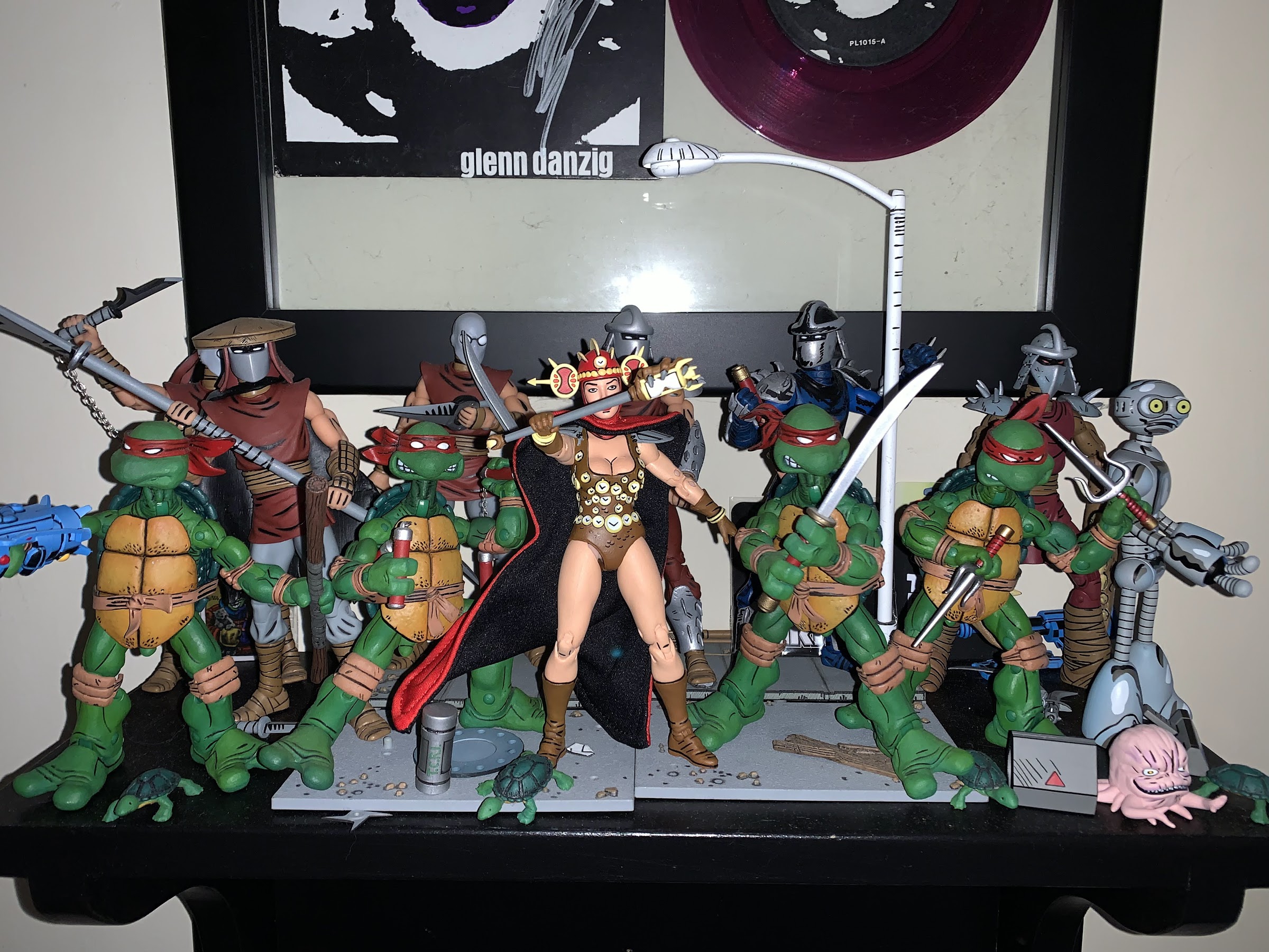
Where there be turtles, there be Casey Jones – the bad ass vigilante of New York City! Casey was an early addition to the comics and he’s basically been included with every iteration of Teenage Mutant Ninja Turtles since. And in all of them he tends to wear a hockey mask and bludgeons bad guys with sports equipment. It’s a pretty simple design, but it has stood the test of time. When NECA Toys started dipping its toe into TMNT back in 2008 it was probably assumed that Casey was on the short list of figures the company was likely to put out. Unfortunately, the line only extended one figure past the turtles (April) and fans never got their favorite vigilante in plastic. Things have changed since then and Casey Jones is no stranger to NECA or plastic. He’s been released as part of the toon line and received three separate releases in the movie line. And now, at long last, he finds himself released as part of NECA’s line of action figures based on the artwork of Mirage Studios.
How many Caseys is too many? And I even skipped one of the movie releases.
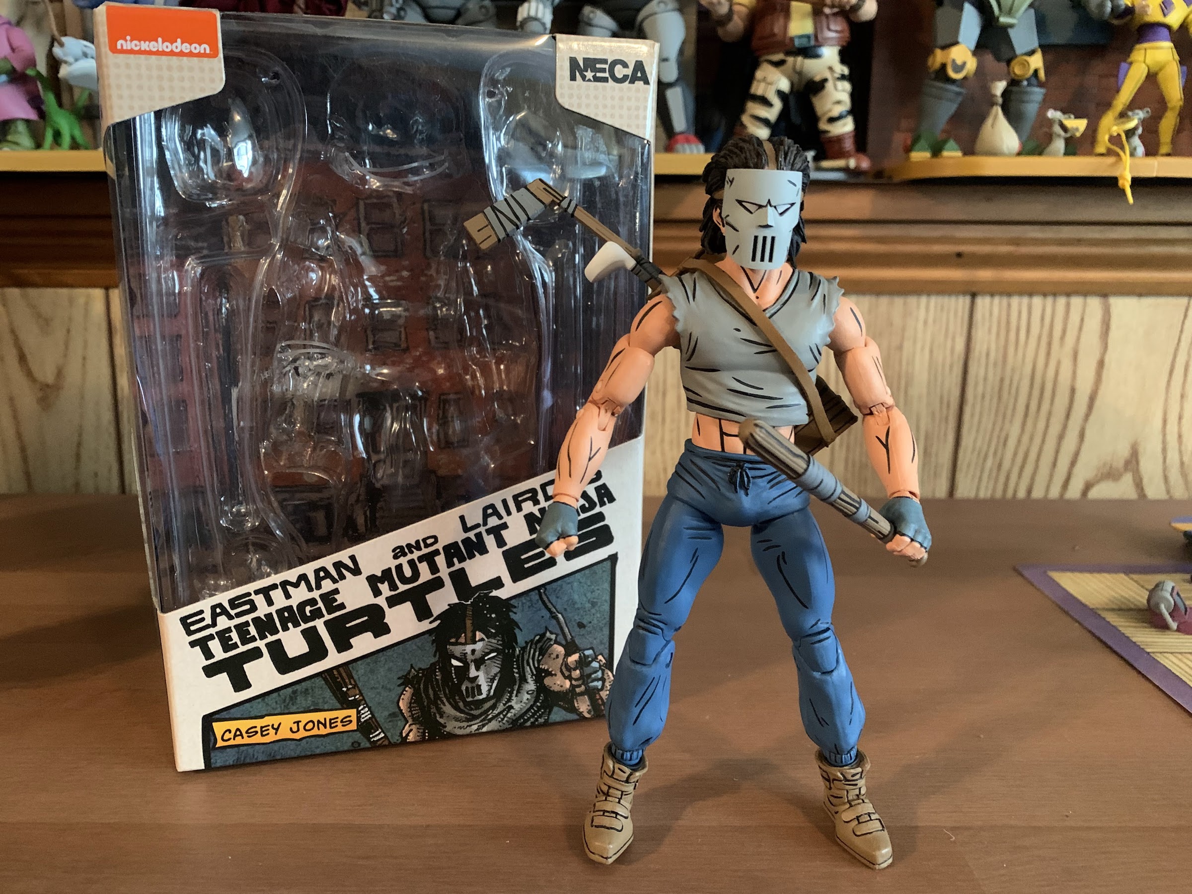
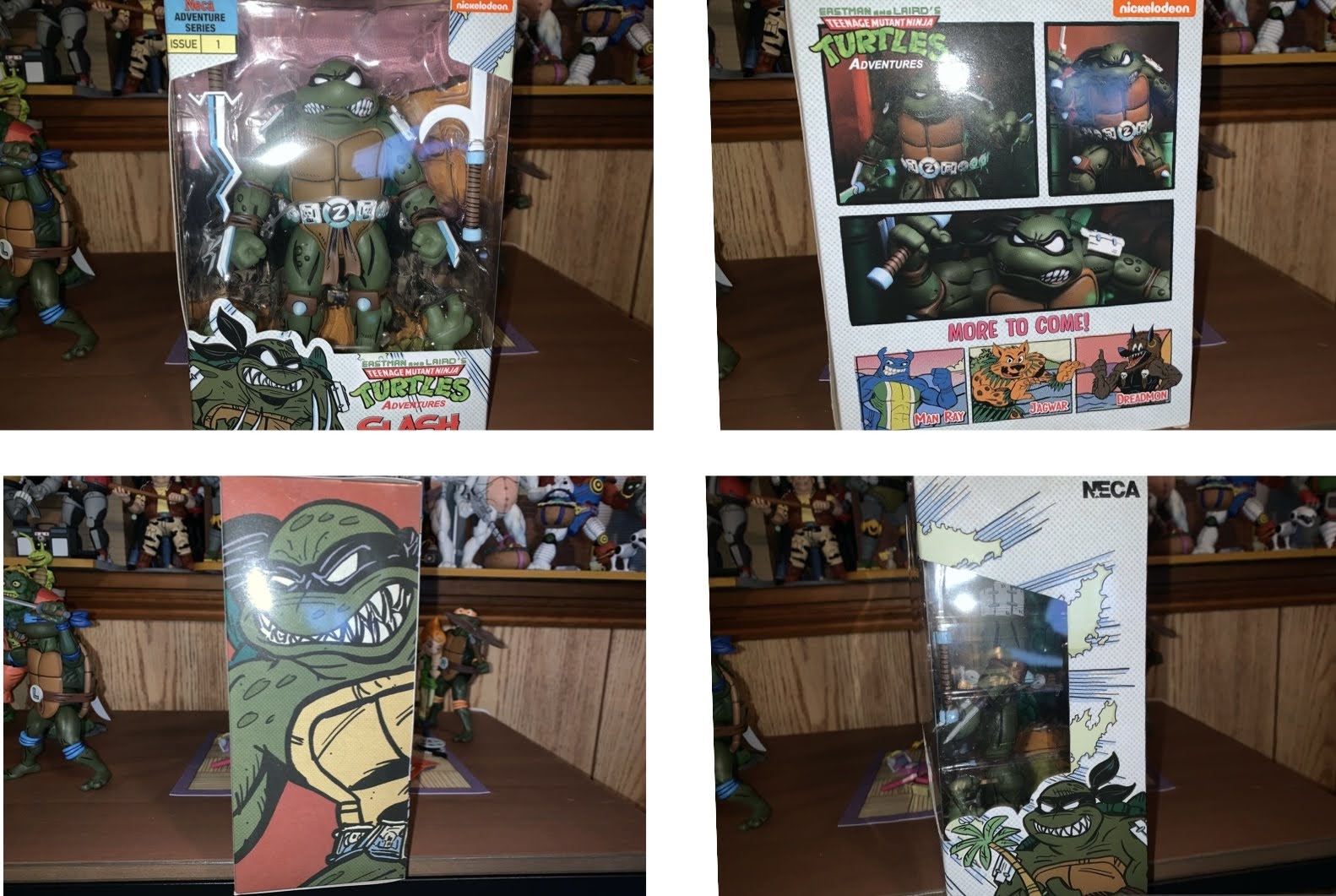
Casey Jones comes in the now standard single pack release. It’s a trapezoidal window box emblazoned with original artwork by TMNT co-creator Kevin Eastman. There’s product shots on the rear and a little cross-sell on the bottom. I’ll say upfront that this release from NECA is slightly controversial among some of the more hardcore members of the TMNT collector community. Like Renet before him, Casey comes in his reinterpreted IDW colors. That means a gray shirt instead of a red one and brown shoes in place of his black ones. I don’t know why NECA is doing things this way, but it looks like a red variant is coming too. Will it be stuck behind that Auto T bullshit the Mirage-accurate blue Renet was? Probably, but that hasn’t been confirmed. One would think the standard colors would be the standard release with the modern variant the slightly more expensive specialty option, but then that would make too much sense, now wouldn’t it? For all I know, this is the preferred look of the character by someone like Kevin Eastman. Personally, I don’t care that much because I’m used to seeing these books in black and white. Mirage Casey Jones is black and white in my head even though he had a red shirt on the cover of the Raphael one-shot. And unlike Renet, where I most definitely preferred the blue outfit to the red one, with Casey I’m less definitive. Red, gray, – it’s just a shirt. He at least stands out on my shelf a bit more considering the Foot all wear red and there’s Renet as well, but I certainly wouldn’t complain if he had a red shirt either. I guess if it’s that important to you then wait and find out how the red version is getting released. Or paint the damn thing yourself.
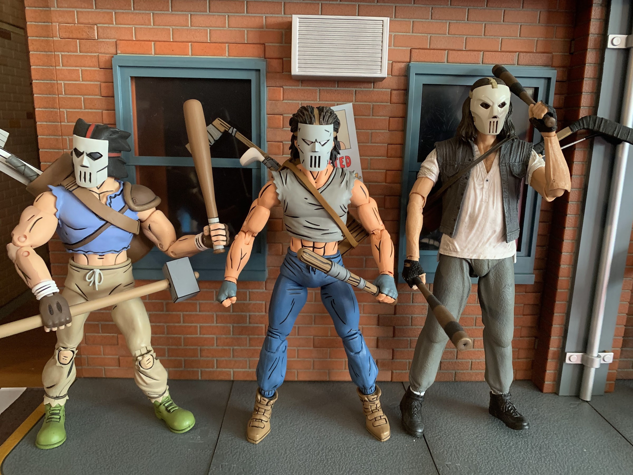
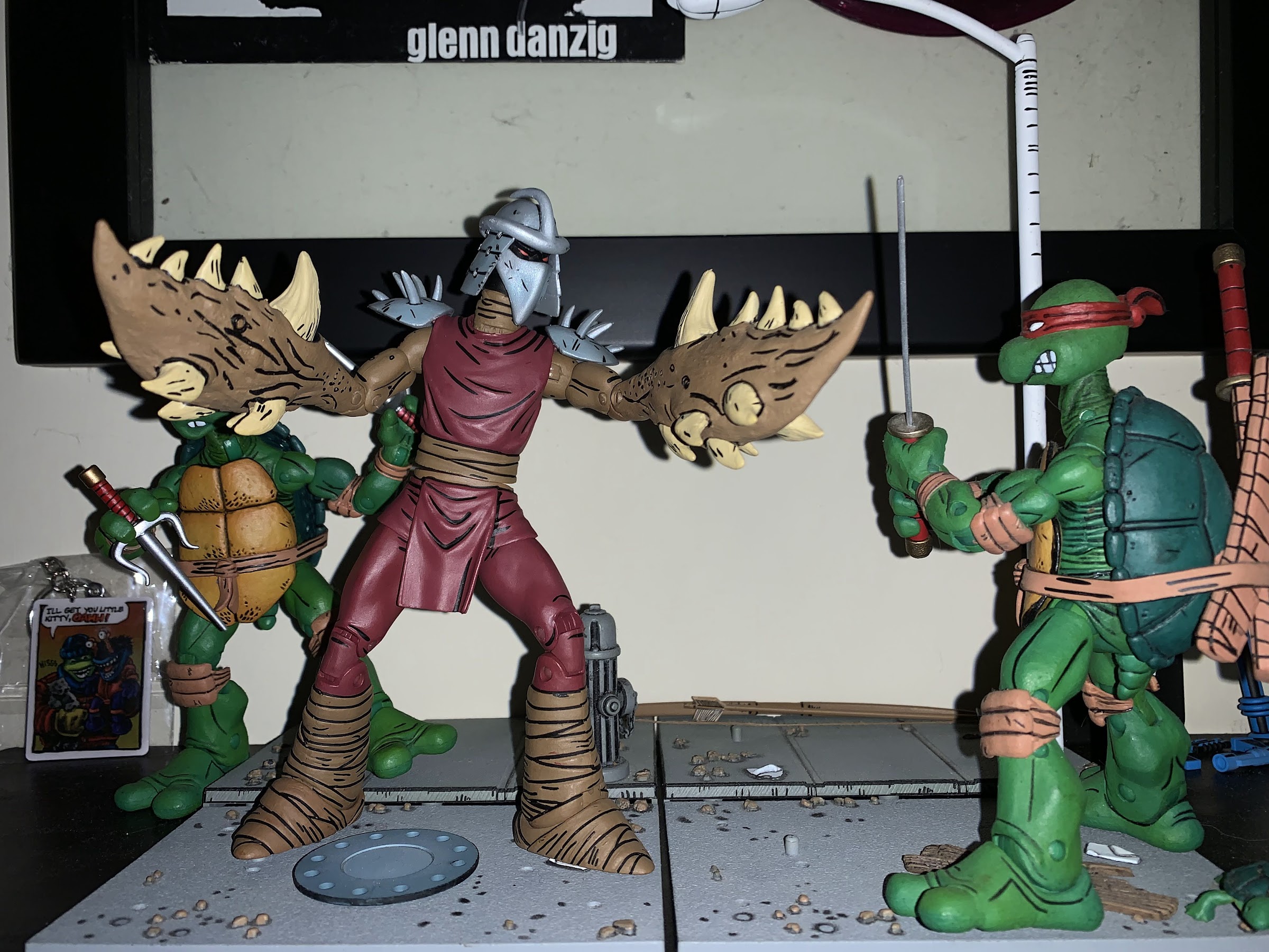
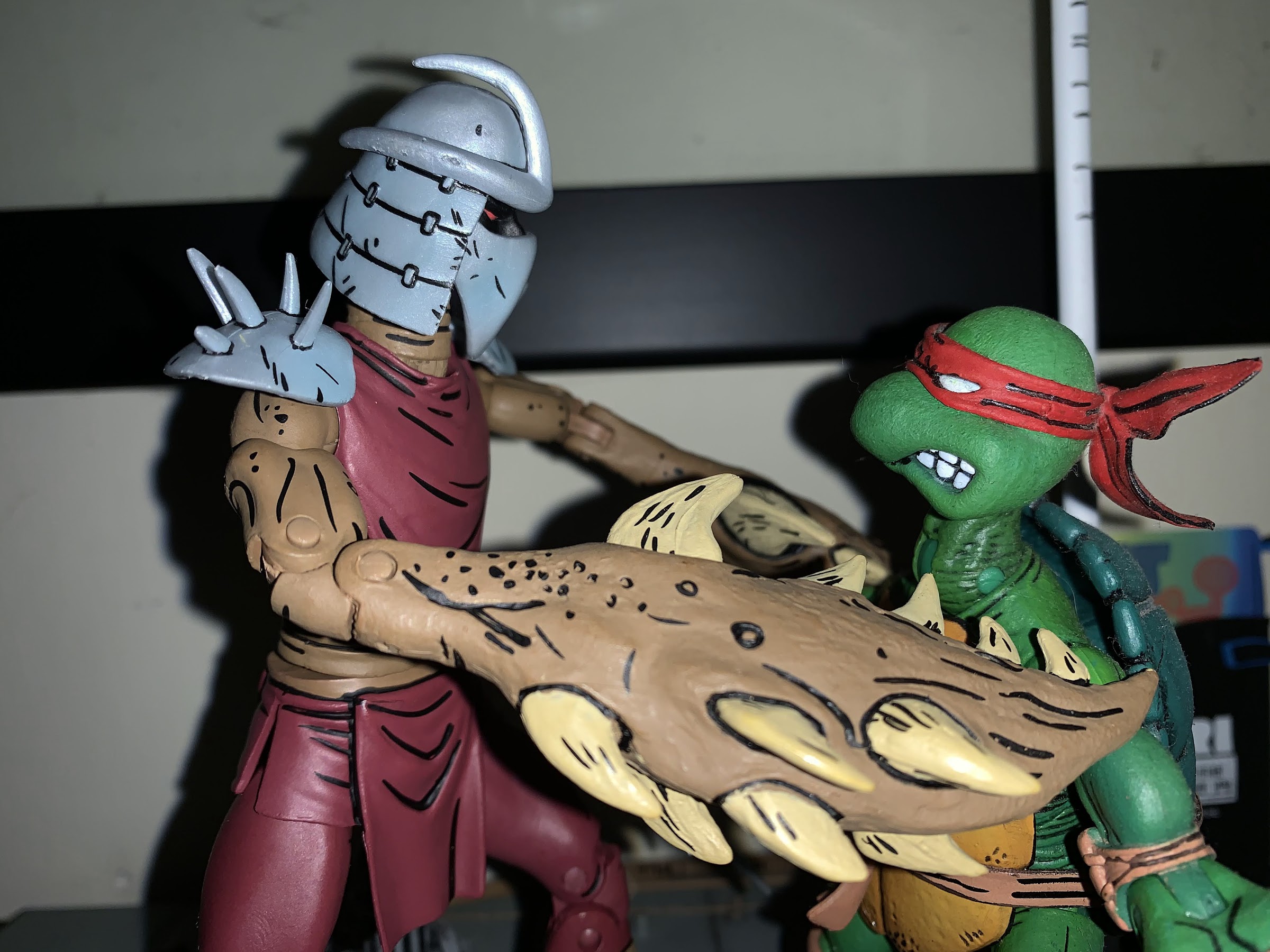
Casey seems to share some parts with the Foot.
He’s not exactly equipped to handle the Utrom, but then again, neither are the turtles.
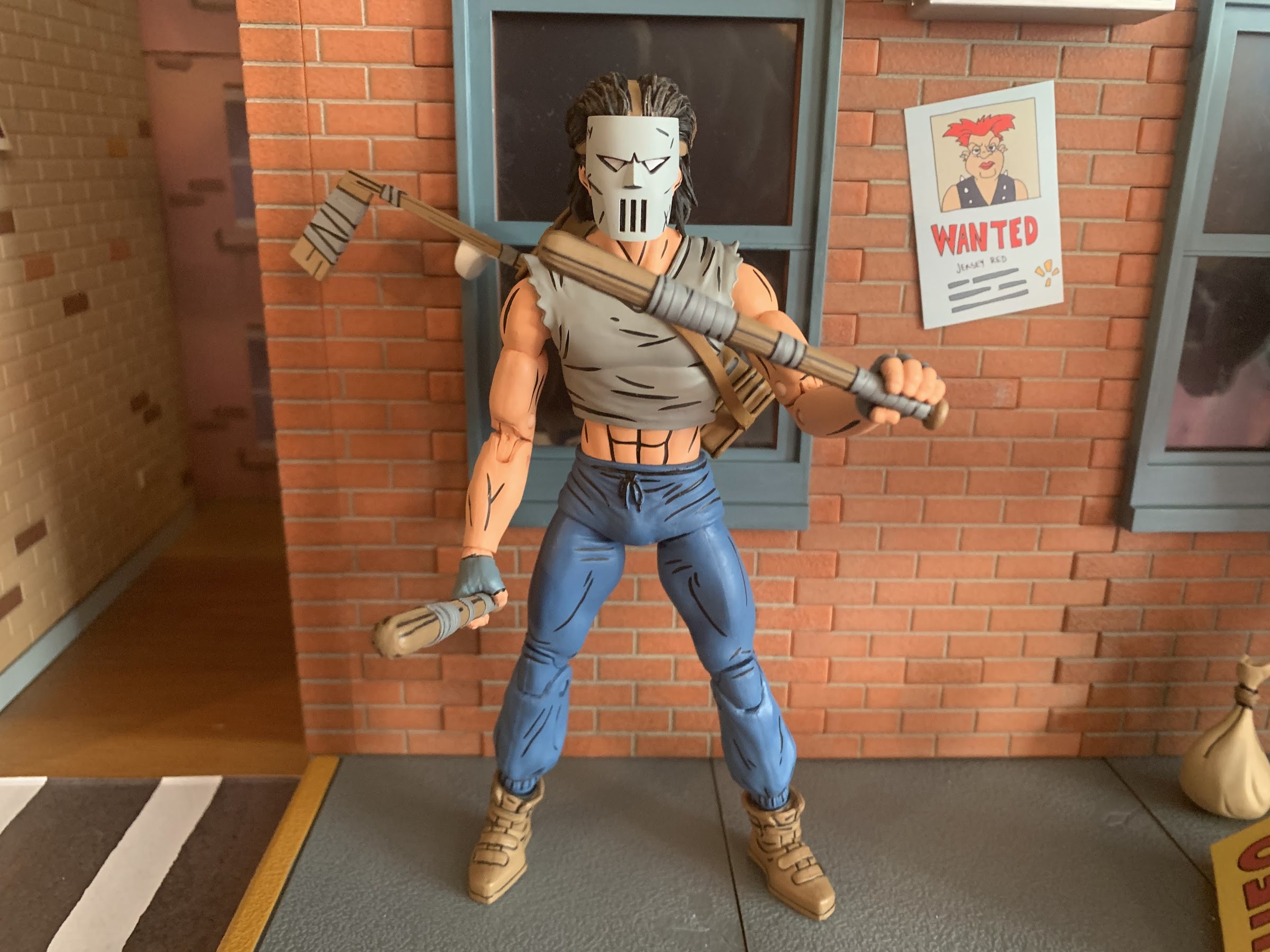
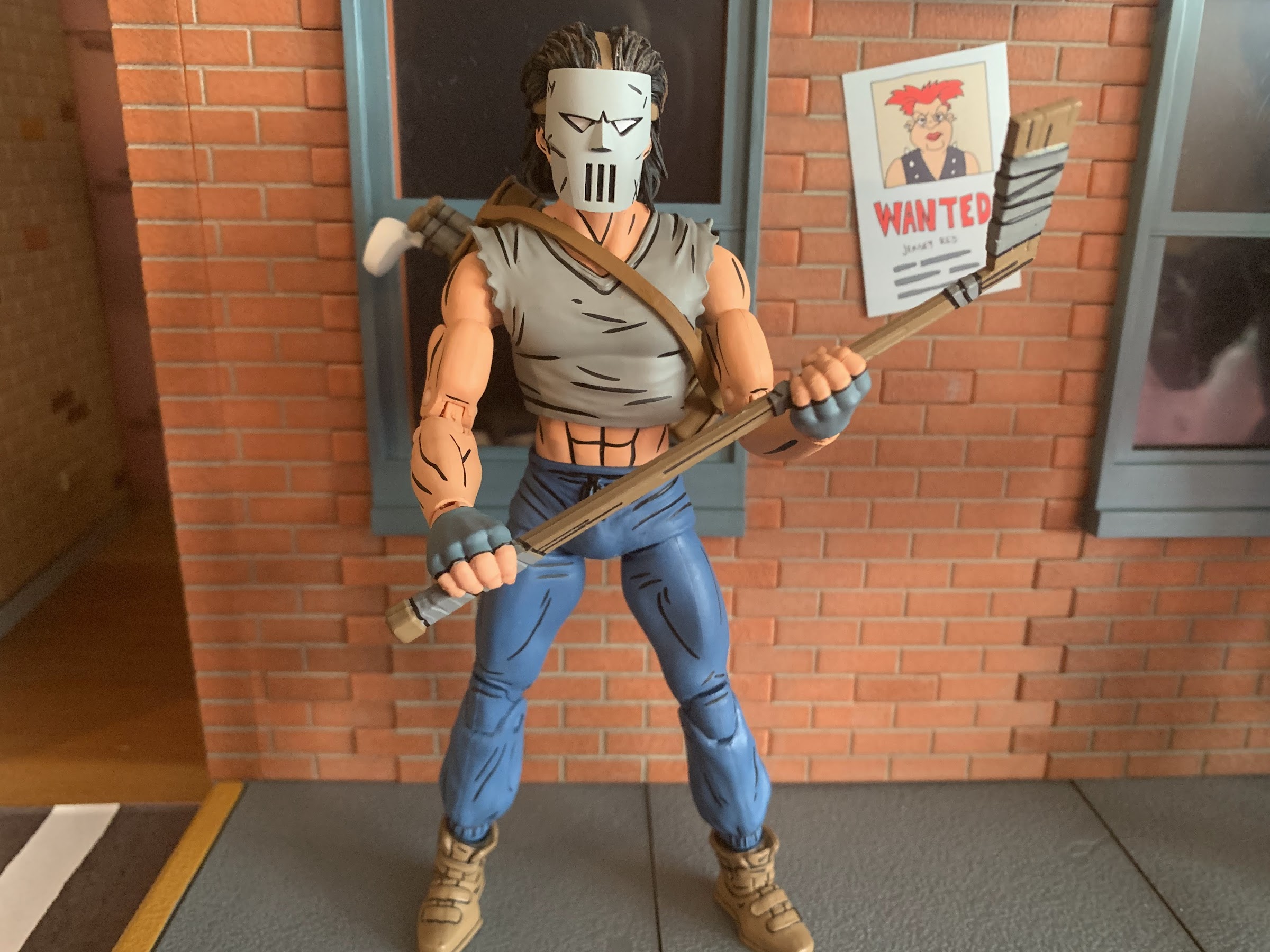
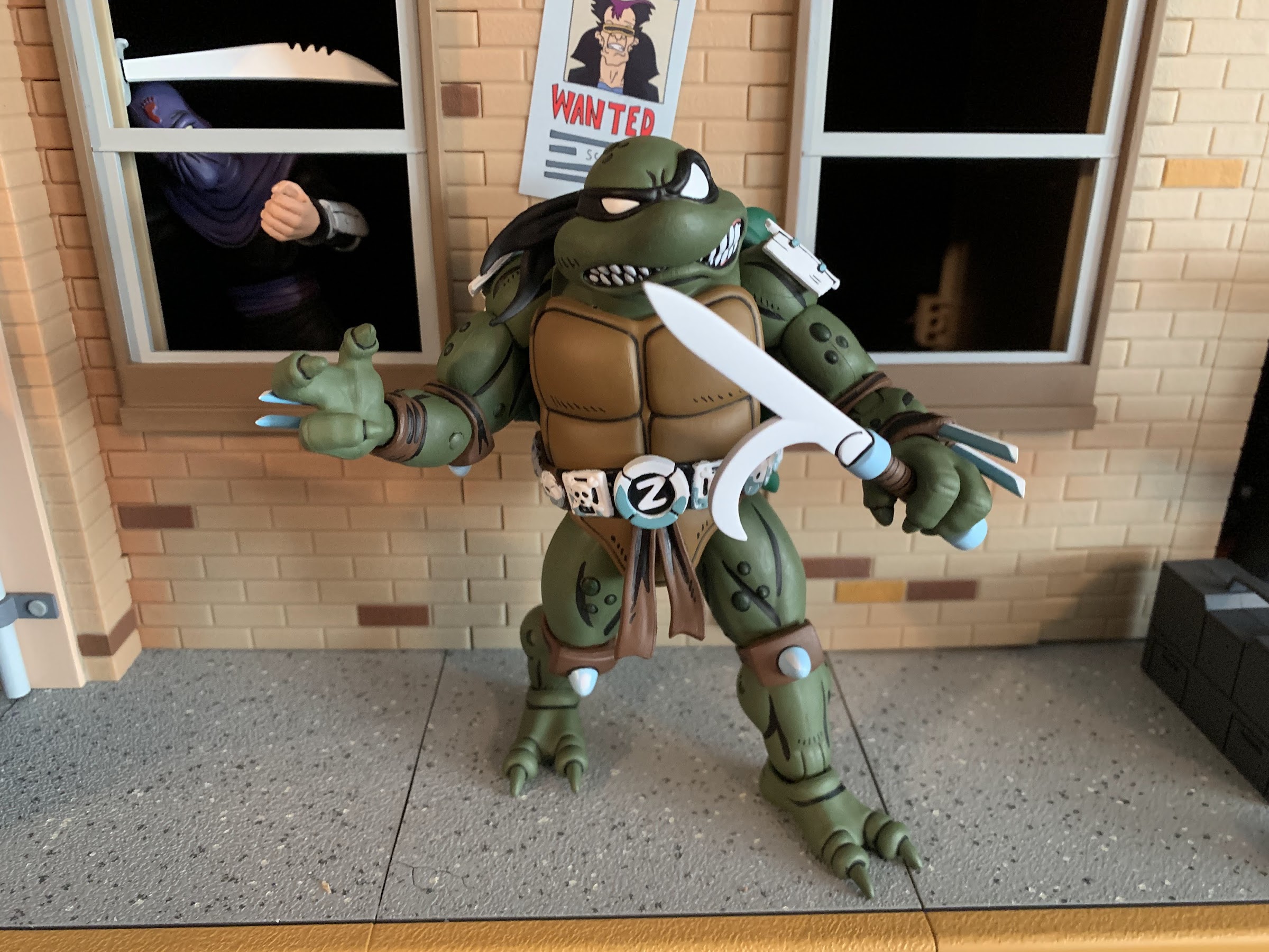
With that out of the way, lets look at the figure for what it is. Casey Jones stands approximately 6.5″ tall which feels right for the line. He’s comprised largely of parts reused from Shredder and the Foot as he has the same upper arms, thighs, and probably torso as those releases. What’s new is the shirt overlay for the torso, the hands, calves, shoes, forearms, and namely the head. His default portrait is masked and I like that the mask is a separate piece that’s glued down to the face. It gives it some nice depth, even though the eye slits are painted and we don’t need to see his eyes underneath it. It’s very similar to the cartoon figure’s mask, but it is different and looks just as cool as it always does. There’s paint basically everywhere on this guy with a lot of black linework throughout which really helps it to pop on a shelf. He’s depicted in sweat pants and they have some sculpted wrinkles in them and the lower leg is a bit baggy which looks nice. This is a very lean Casey, which does match-up with how he was drawn in the comics. He’s not as bulky as the toon version, but he’s menacing enough in appearance. Despite that, I do wish he had a little extra bulk in the midsection as there’s a lot of plastic for the hips, especially on the rear of the figure, which is a little unsightly. Overall, he looks good, it’s just a character design that’s not made to impress so he’s a bit less exciting than someone like Renet or the Utrom.
You gotta have the hockey stick!
In terms of accessories, NECA outfitted Casey with a decent allotment. He’s basically known for having a bunch of weapons at his disposal, so NECA gave him his customary hockey stick, a pair of baseball bats, and a golf club. The stick and bats all feature sculpted tape around portions of them and are well-painted. The two bats are identical, which is a bit of a bummer, but I get why NECA wouldn’t want to sculpt two different ones for this release. At the same time, we’ve seen bats in other lines so it feels like they could have pulled from there. The club is a white wood style club and it looks fine, though it’s comically small. I’m not a big golfer or anything, but I have played the game and own a set of a clubs so I know how big they’re supposed to be. This club barely comes up past Casey’s knee so he must have found a youth model or something. It’s also very thin so he doesn’t grip it that well with two of his gripping hands. All of the weapons can be stored in his equipment bag. It has a square design to it so I’m not entirely sure what it’s supposed to be. It doesn’t look like a normal sports equipment bag or a golf bag, but it works. It’s easy to get onto the figure and looks fine. It’s brown and features the same black line work as the figure so it has a nice appearance.
I’m sure it wouldn’t feel too nice to get smashed over the head with this driver, but it sure is comically small.
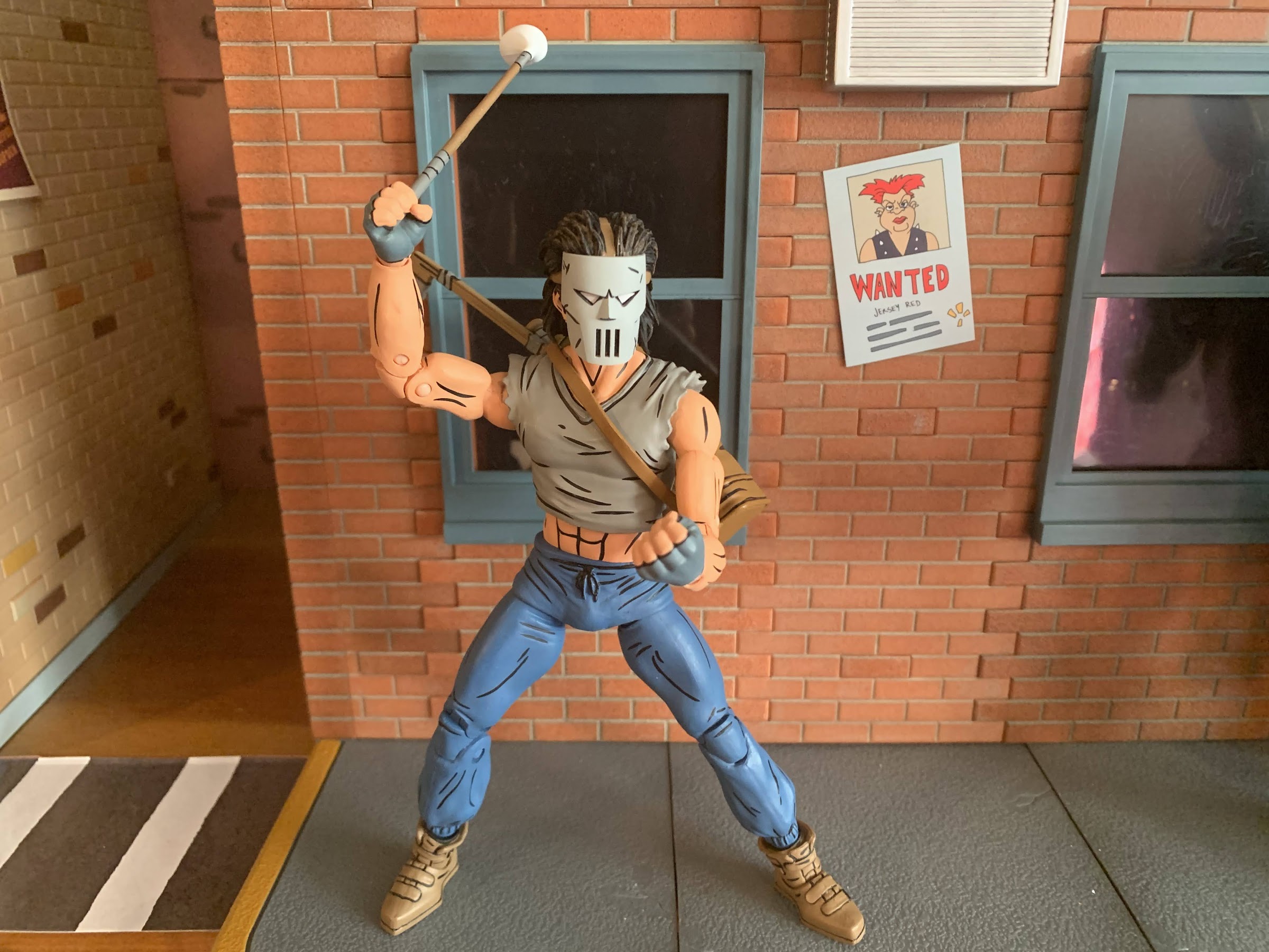
Casey also has a few extra parts he can make use of. For one, he has a set of fists and a set of gripping hands. He wears fingerless gloves and those details are painted on. The gloves begin just past the hinge so that doesn’t get in the way and I can’t tell just which part of the hand is painted. Is it the gray glove portion or the fingers? Either way, the colors look fine and I’m not seeing any paint rub on the weapons so that’s a good thing. I do wish he had a different set of hands than the fists though. His gripping hands basically look like fists when he’s not holding anything so they feel redundant. Maybe some open hands, a finger pointing hand, or just different degrees of gripping hands would have been a better use of the budget. And this figure does commit the sin of not having the proper hinge on the gripping hands. Casey should have a vertical hinge, but instead he gets the mostly useless horizontal design. He has one extra, right, gripping hand as well and I think it’s meant for the golf club as it’s the only hand that gets a decent hold on that item. He does get an extra head and this one is unmasked. He’s a pretty ugly dude though so you might prefer to leave the mask on. He looks as he should, so that’s not a criticism of the figure, just the reality of the character design. Lastly, just like the movie version, he comes with a mask that can either be held or hung from the handle of one of his weapons stored in his bag. It looks quite nice and it’s a different mold from the mask on the default head as the eye slits are open. The straps are a soft plastic and, if you really want to, it can fit over the unmasked head, but you’re far better off just displaying him with the masked head than going this route unless you really like the look of the eyes from behind the mask.
A face only a mother could love.It fits!
That takes us to articulation and if you have Shredder or the Foot from this line then you know what you’re in for. The head is on a double-ball peg and he can look down okay and rotate, but looking up is blocked some by the hair. He can look up, it’s just only a little. He does have some nuance posing there, so overall I like it. The shoulders are your typical ball hinges. He has a hard time getting his arms up to a horizontal position, but the shirt is cut back enough that rotation isn’t a problem. I do wish NECA would improve these shoulders though as it’s a consistent issue. There’s a biceps swivel and double-jointed elbows that bend past 90 degrees with ease. He is fully painted so you may need to heat some of the joints, but for me, my figure was fine out of the box. We already mentioned the wrists and in the torso he has some kind of diaphragm joint that isn’t usable because of the shirt overlay. It feels like a ball joint and you get the tiniest amount of range there, so little that it’s not worth counting. The waist twist is fine, but not the prettiest due to how slender his abdomen is in relation to the pants. A ball joint probably would have looked nice and might have also functioned better. At the hips we have the standard ball and socket. Even with the “diaper” piece, Casey can damn near hit a full split so that’s good. They’re also not loose which is even better. There is a thigh twist there that works quite well and the knees are double-jointed and go past 90. There is a boot swivel at the top of the shoe and at the ankle we have a hinge and rocker. The range on the hinge is pretty poor as it only goes back a little and barely any forward. The ankle rocker also isn’t the best as it’s pretty steep and limited, plus it also feels a bit gummy so I’m worried that I’m stressing the peg more than spinning it on the joint.
“Enough standing around, let’s kick some ass!”
The articulation is rather basic. It’s par for the course for this mold and this line in general as NECA definitely does not prioritize making super-articulated figures. They want it to look like the comic first and foremost and then add a suitable amount of articulation where it makes the most sense. As a result, we have a figure that doesn’t really feature any eyesores brought on by the articulation, but it also isn’t very dynamic. The wrist hinges and the ankles are my biggest areas for critique, and to a lesser extent, the waist and shoulders. The limited ankle articulation makes him harder to stand than expected, and it’s not helped by the added weight on the figure’s back brought on by the bag. He’s not as tipsy as the movie Casey, but I do feel like NECA could have done better at the ankles. The wrists are what they are and it’s something NECA has lately been overlooking, unfortunately. I would like them to make it a point of emphasis going forward. I also do think they could have done the shirt overlay a little differently to give us some added range in the diaphragm. It shouldn’t be that hard to at least give us some twist there and I don’t think much sacrifice in the sculpt would have been needed, if any. I think it’s something just brought on by the desire to reuse parts for the torso from figures that had a full shirt and were never going to move there anyway so there was no reason to engineer it differently. Considering they’re planning on two releases, at least, for this figure, maybe a little extra tooling could have been done?
“When you’re the best of friends…”
At the end of the day, if you want a Casey Jones for your Mirage Studios TMNT display you’re going to get this figure. Or you’re going to get the red one. Or you’re going to get both! And I think, for the most part, those who do pick this figure up will be content with the end product. He looks pretty nice, there’s a decent amount of articulation, and he has the weapons most expected. I have some nitpicks with the figure and those nitpicks combined with the character having a less than impressive design result in me viewing this one as the weakest in the Mirage line, but that doesn’t him bad or anything. He’s pretty average for a NECA release, and at least for NECA, that’s still a good product. The paint is clean, I had no stuck joints, and perhaps most importantly, the price isn’t too bad. You should be able to find this figure at specialty shops and even Walmart where he’ll range from $35-$38 and that’s not bad in today’s climate. If the red version does end up being an Auto T release, expect to have to shell out $40 for that one. For some, the character has to have a red shirt and I get that, but for me, I’ll pocket the five bucks and go gray.
Welcome to the first Turtle Tuesday of 2023! 2022 is the year that NECA returned to the Mirage Studios subline of Teenage Mutant Ninja Turtles action figures it started way back in 2008. When the line was announced to return, it was essentially taking the place of the Turtles in Time figures that had been…
I swear this blog is not just a NECA Teenage Mutant Ninja Turtles blog, even though that’s what it has looked like lately. I’ve just been getting crushed with new releases lately, but it looks like a drought of some length will be incoming soon. Before that can happen though we need to talk about…
Something that is likely common to most of humanity is a desire to be successful. We all measure success differently, be it professional, financial, or something else, but we all strive for it. And sometimes success can feel like a burden. Take NECA’s line of action figures based on the Teenage Mutant Ninja Turtles property.…
Raise your hand if you knew who this was. Be honest!
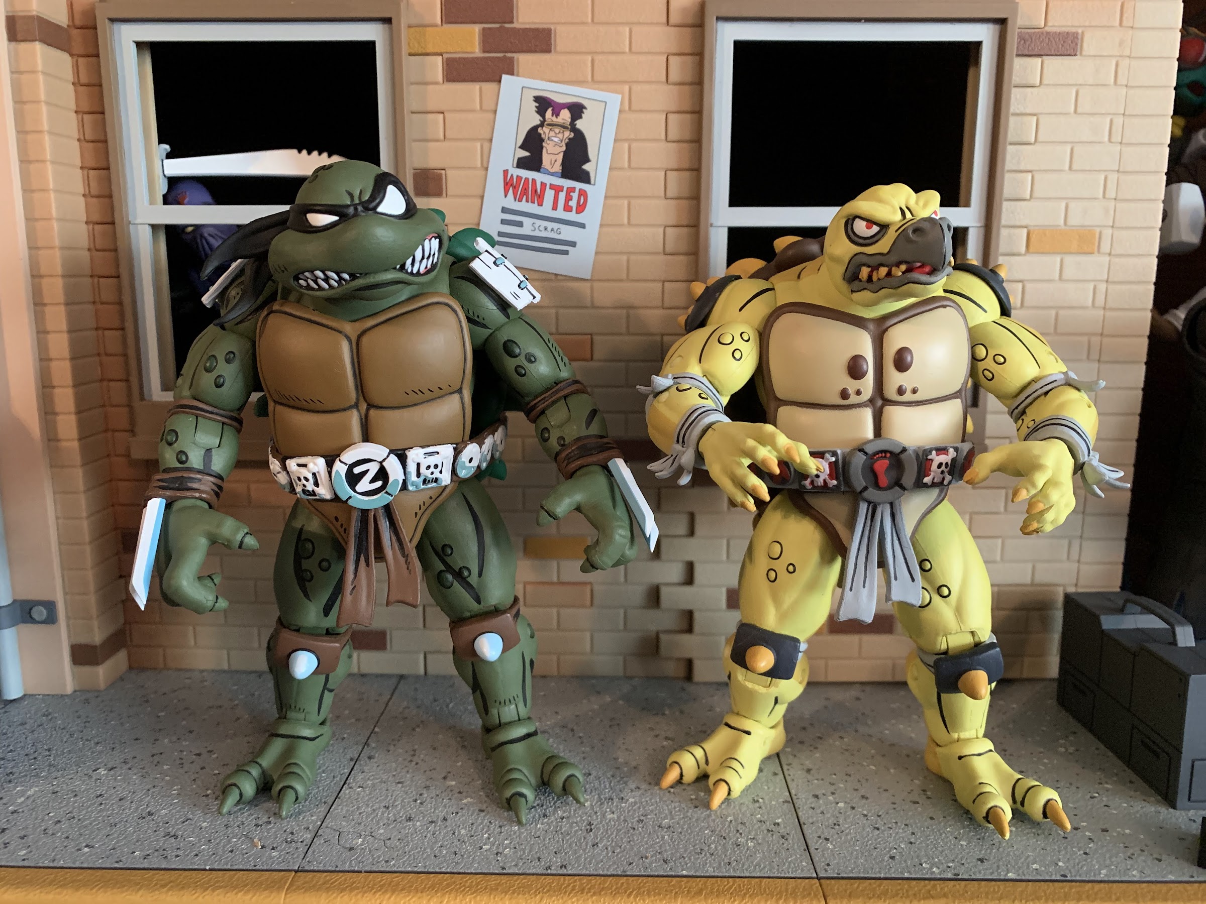
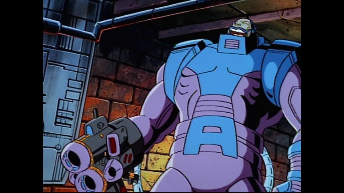
We’ve become so accustomed to having the Teenage Mutant Ninja Turtles in our lives that the name of the franchise has almost lost all meaning. Well, maybe not all, but I feel we mostly have lost sight of how ridiculous a concept this franchise is. And it extends to other characters in the franchise and I’m talking about Krang. Krang from the cartoon series is an oversized, talking, somewhat monstrous brain. In the context of the show, he’s perhaps not as outlandish a design as he would be in another show, but he’s still pretty out there. And then you add in his body. A large, bald, man in a red diaper and suspenders. Krang can’t go in his head like a normal brain would because then he’d no longer be visible so he has to go in the body’s stomach. I think it’s Vernon who draws attention to this factor in the fifth episode of the series when he sounds positively repulsed at the sight of a man with his brain in his stomach, and he’s right to be grossed out! Krang is one of the craziest designs from a popular franchise that I can think of.
These two make quite a couple.
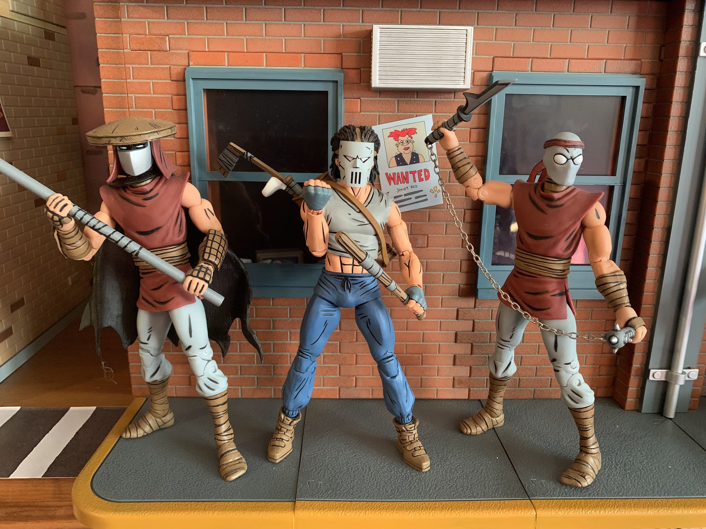
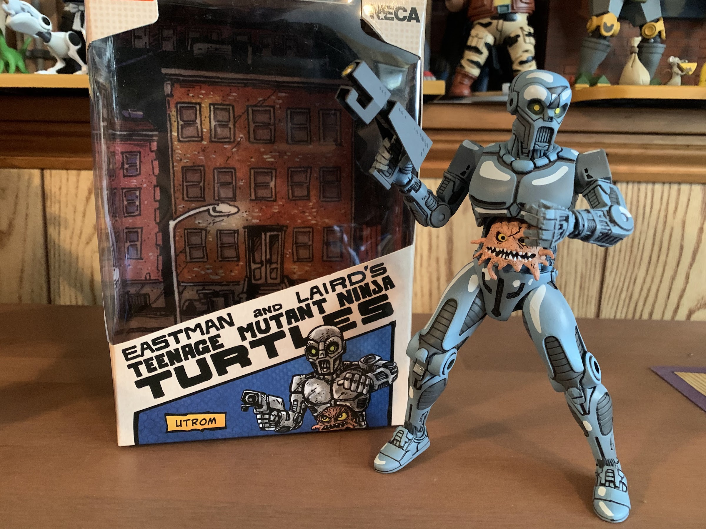
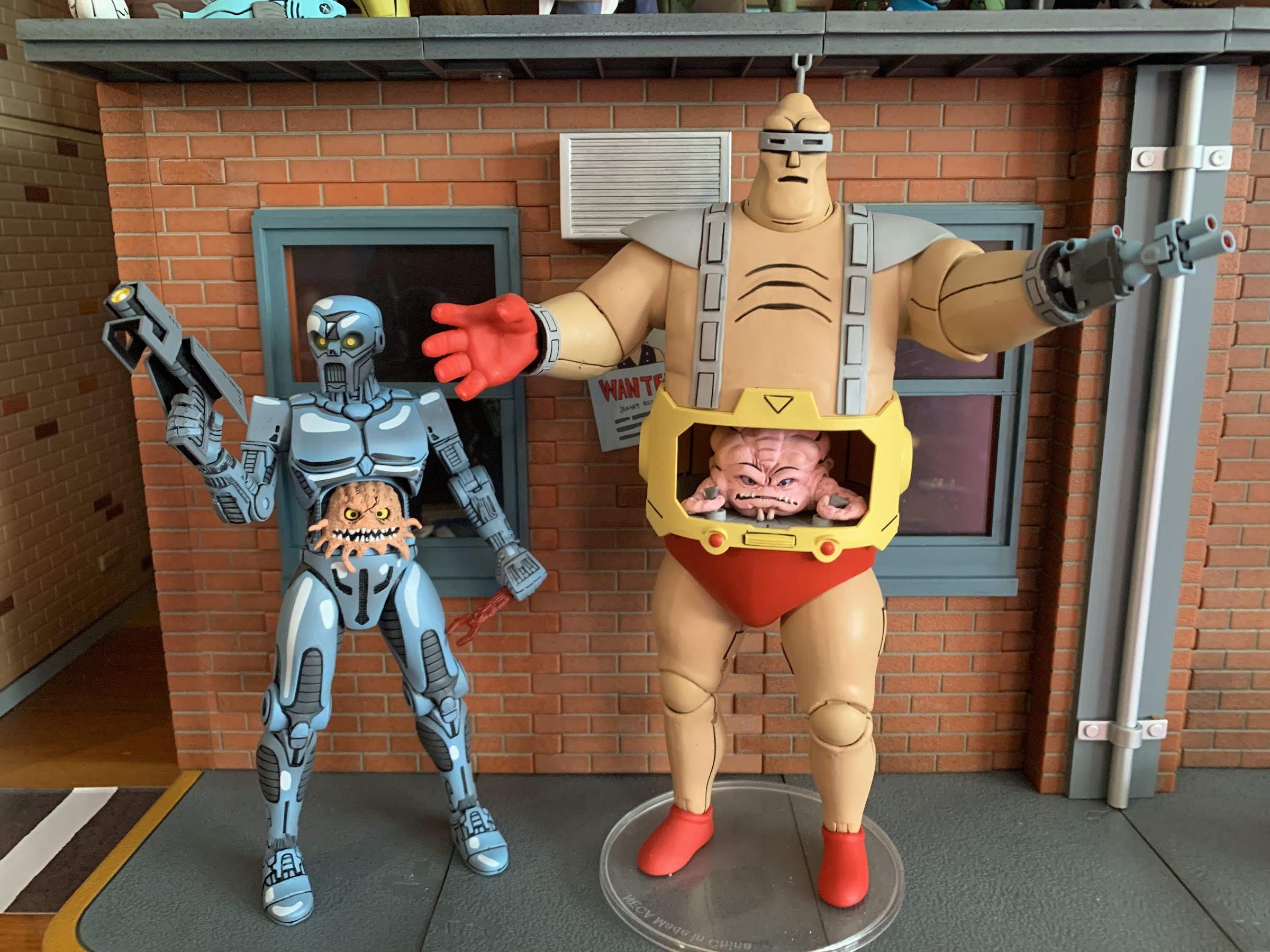
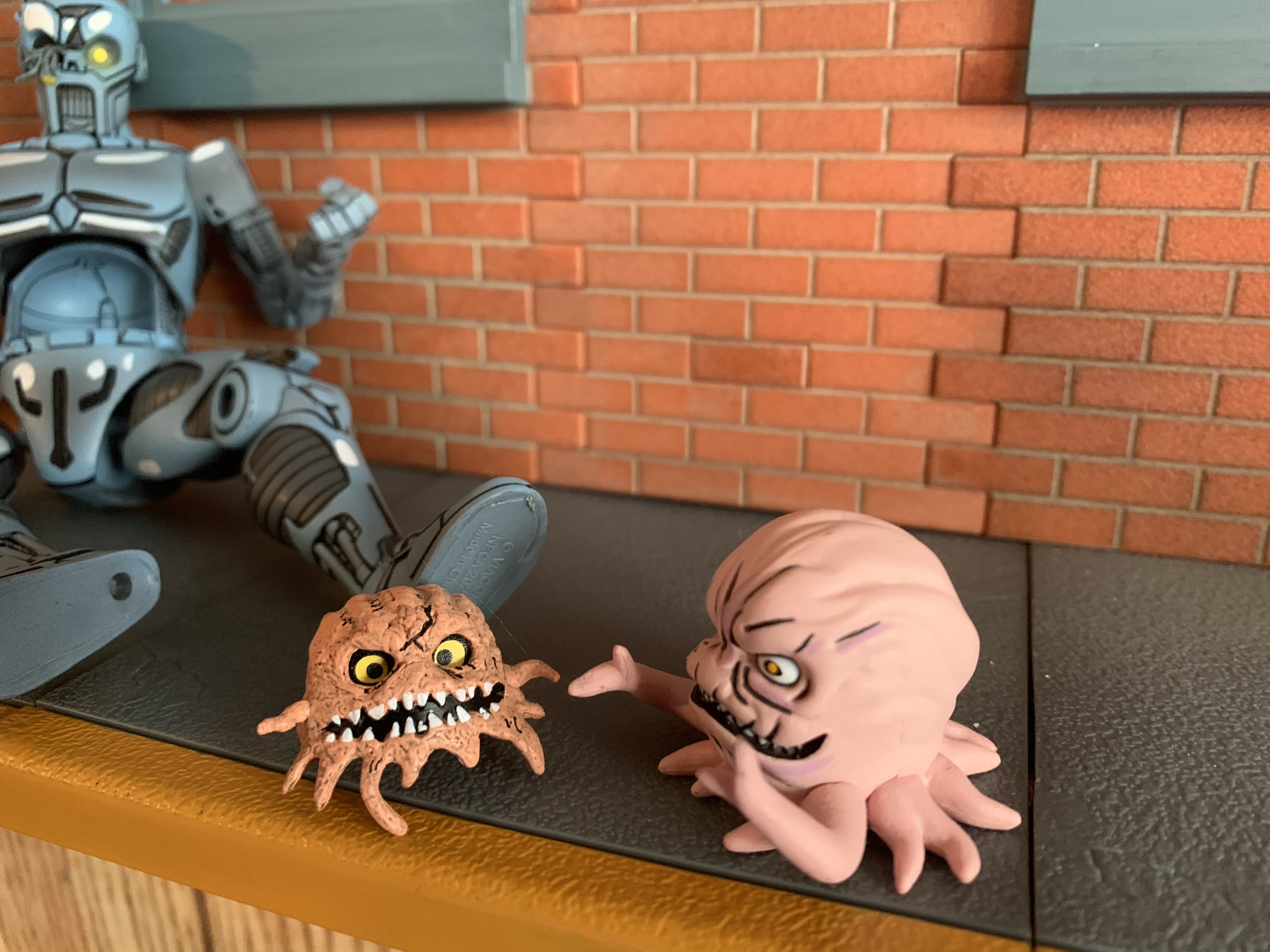
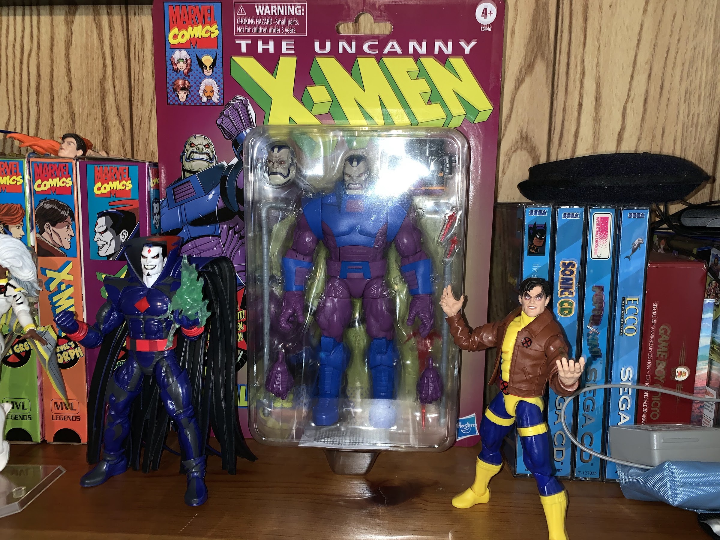
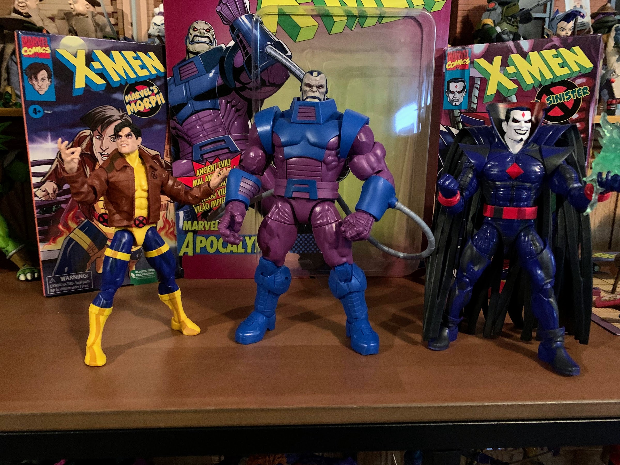
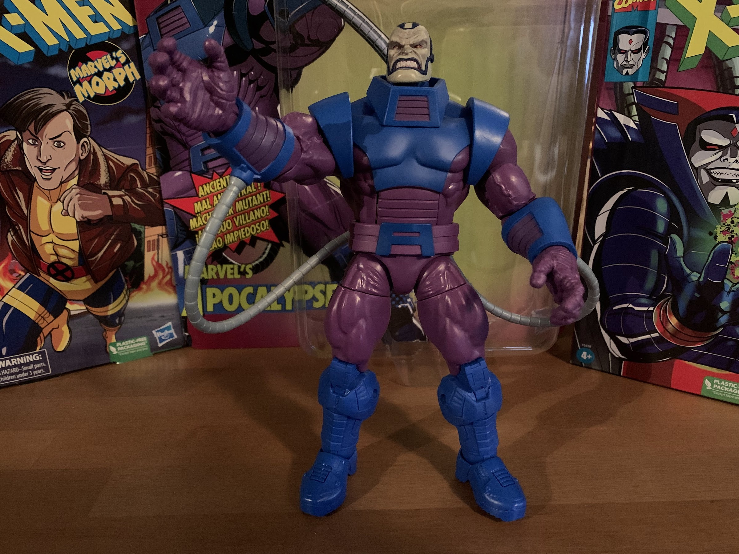
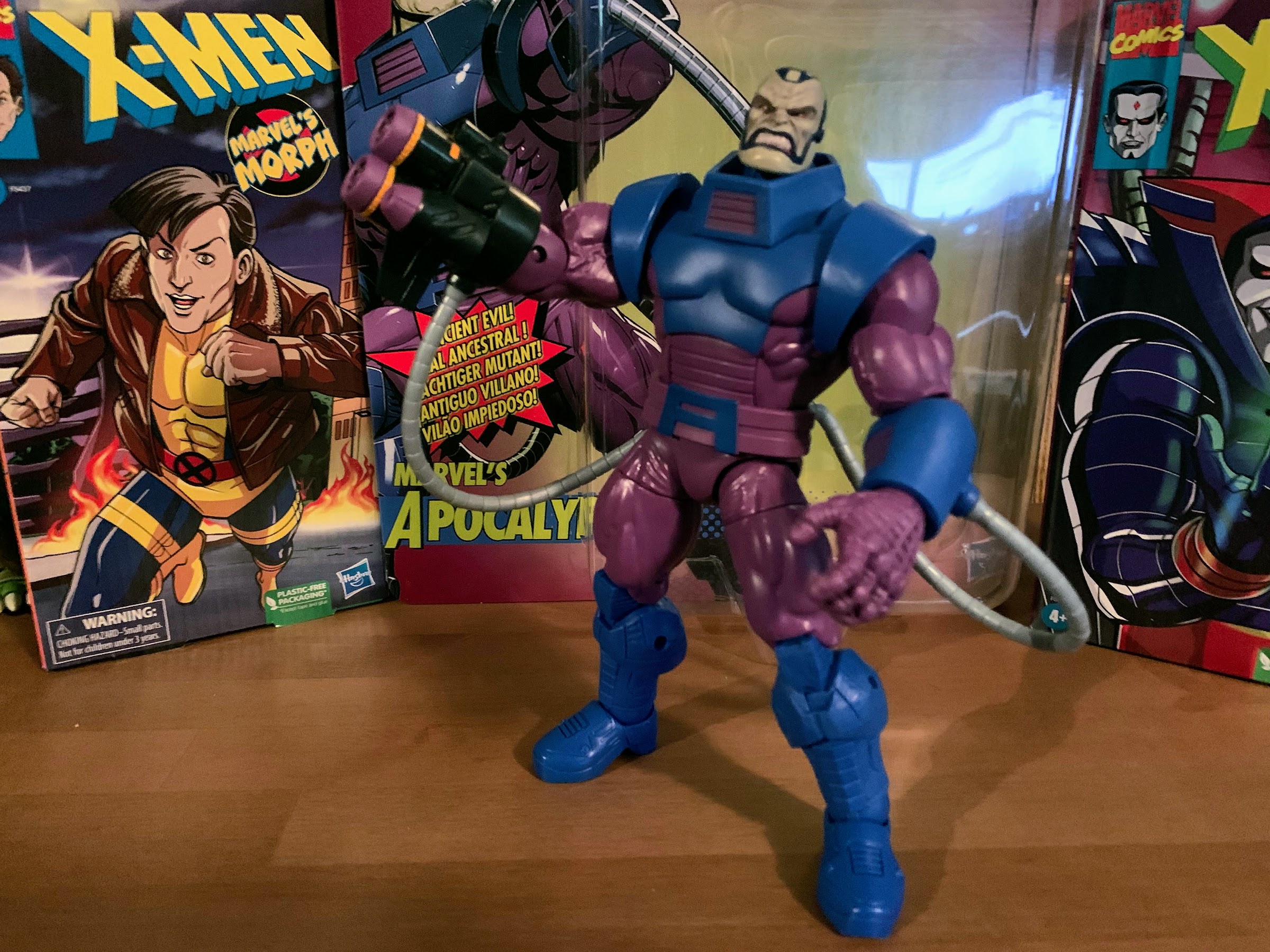
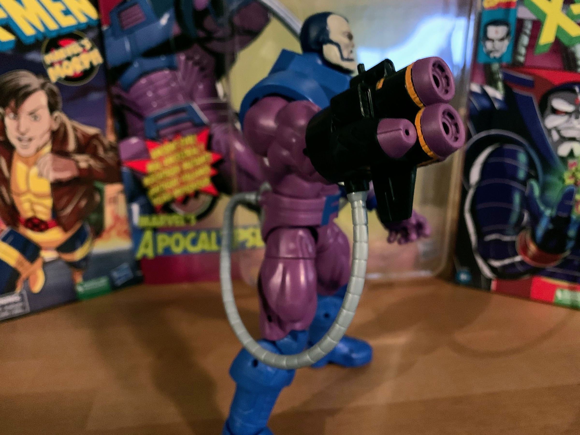
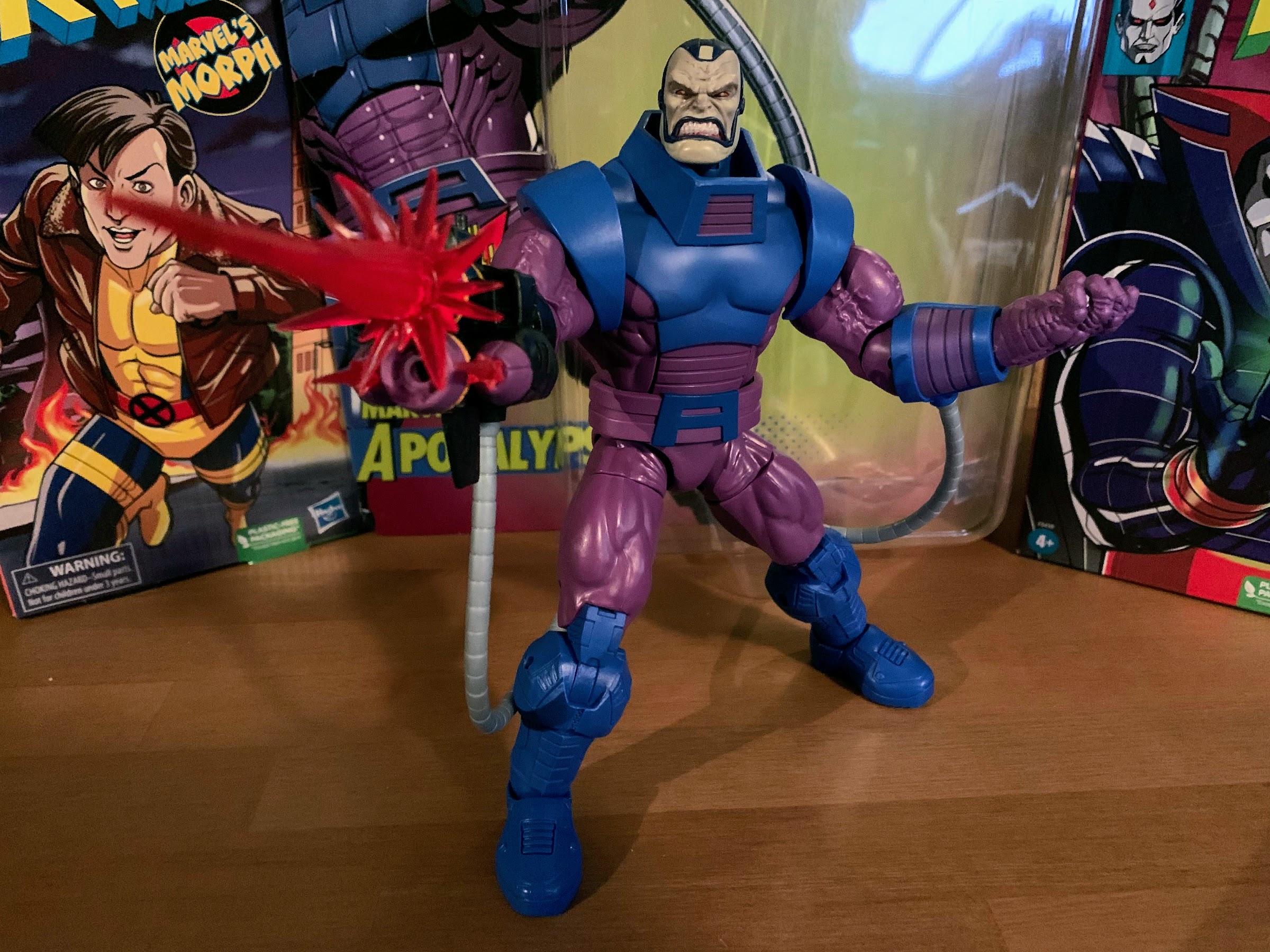
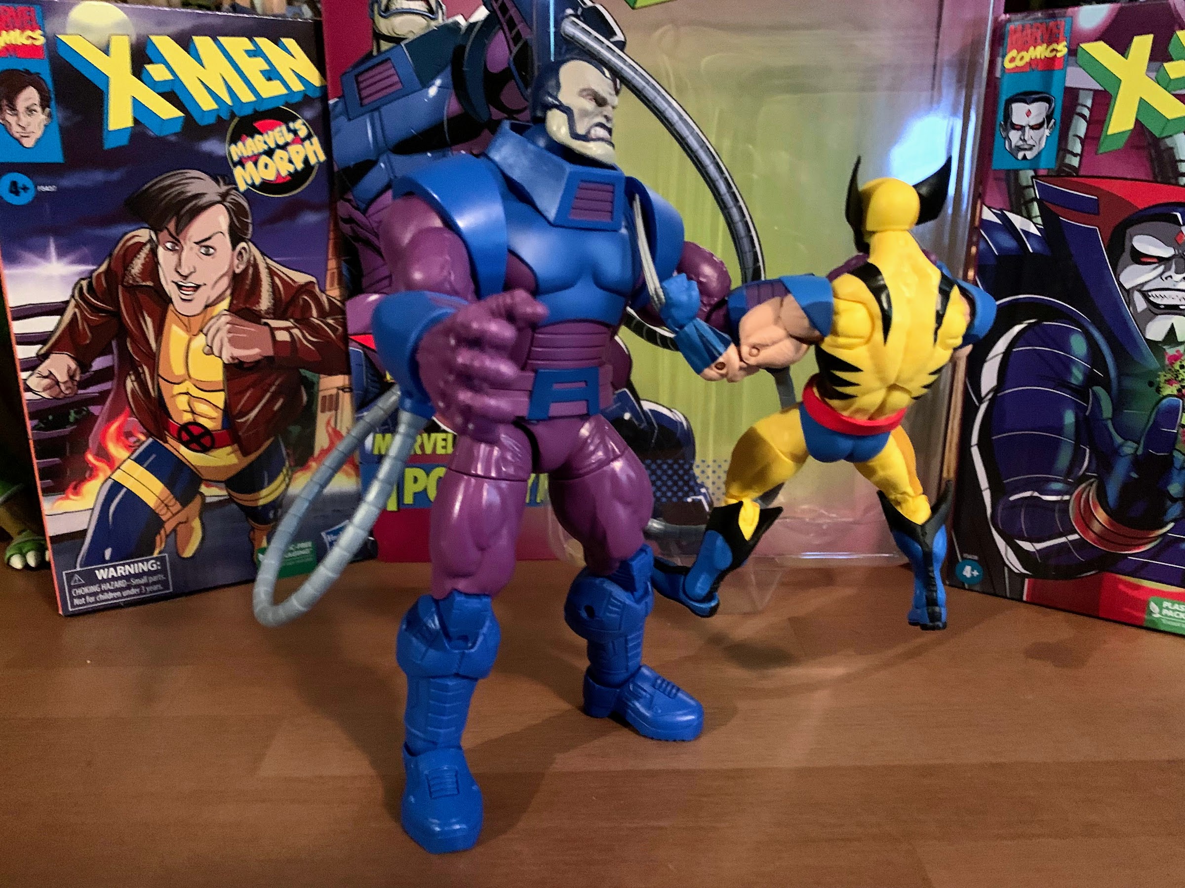
And if you have a deep familiarity with Teenage Mutant Ninja Turtles then you know Krang is taken from the original comics, only there his race of beings were called the Utrom. There weren’t many (any?) that were actually named, they were just alien brains that got around in robotic bodies. Like Krang, they controlled those bodies from the stomach area, but unlike Krang their bodies were far more mechanical looking. Think the endoskeletons from Terminator, as that’s more in-line for how they appeared. They were foes to the turtles, but also tied in with their origin, and I’d elaborate more, but ever since the 2012 show came along the Utrom and the Kraang from that series kind of run together in my head. Needless to say, they play a significant enough role in the original comics that an action figure from NECA made sense.
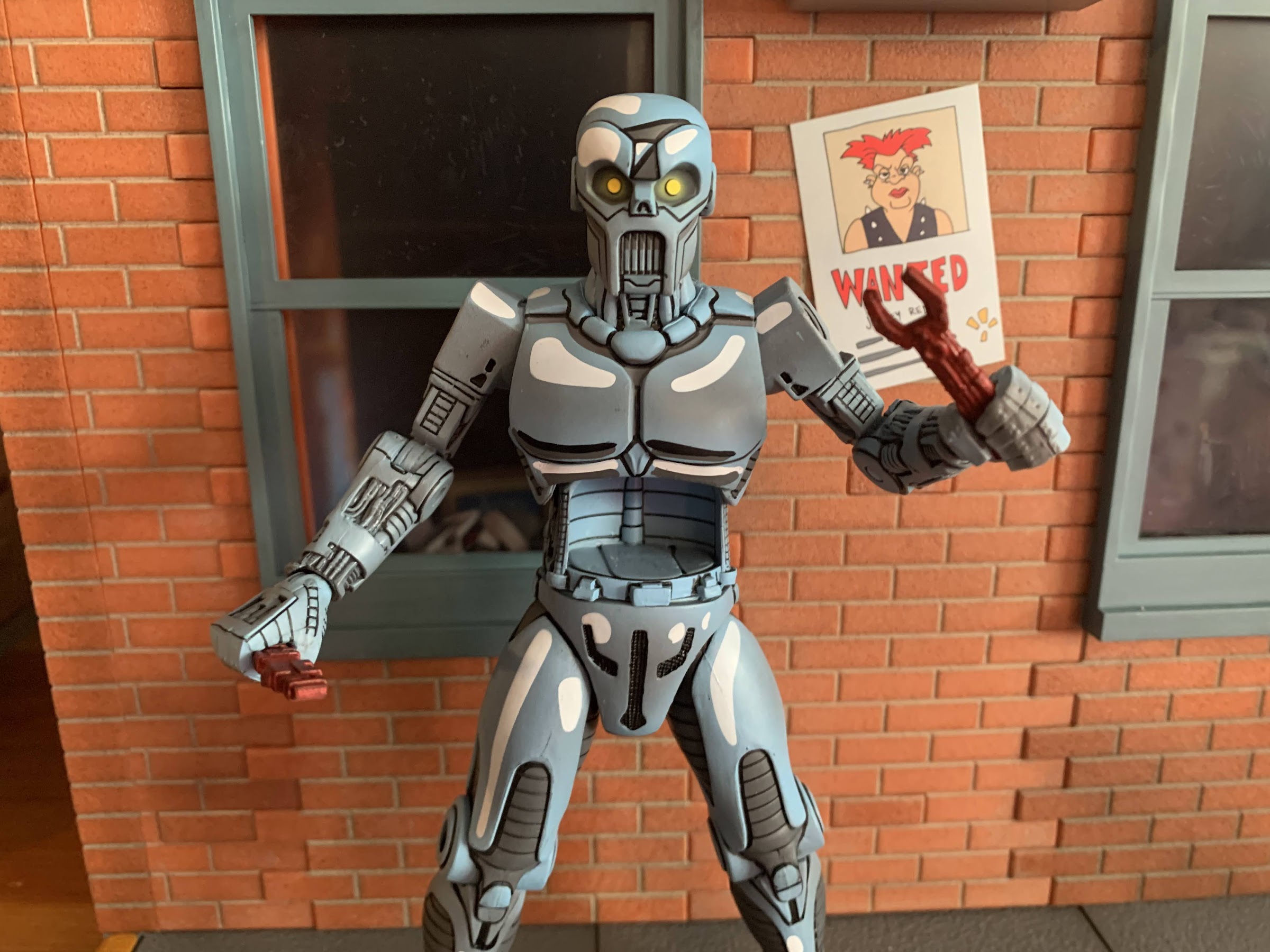
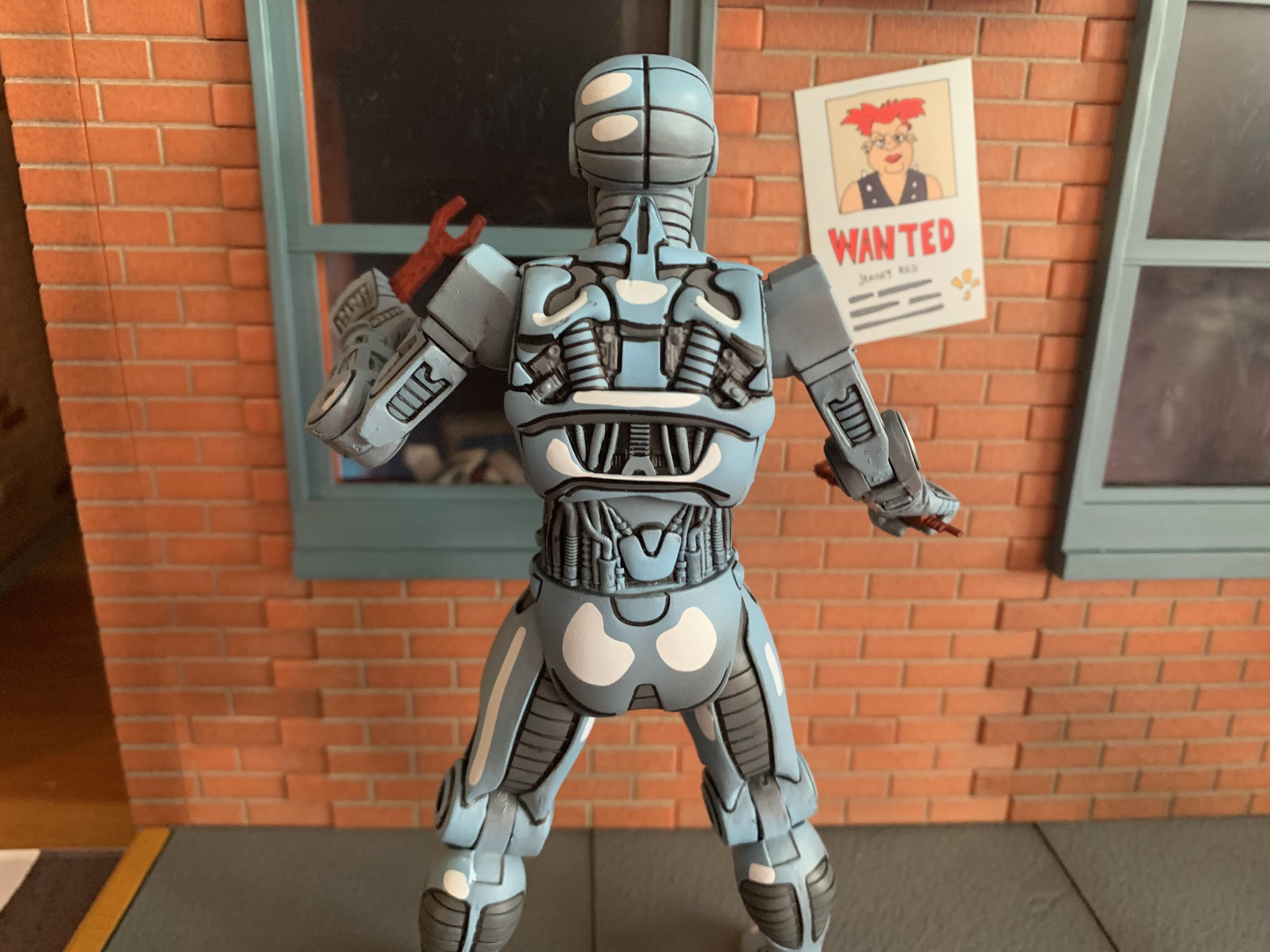
The Utrom from NECA stands at right around 6.625″ in height. It comes in the standard window box packaging with new artwork from Kevin Eastman on the box depicting the character. On the rear are product shots and a cross-sell for more figures in the line. Let’s just get right to the big talking point with this guy: the paint job. This figure is gorgeously painted. If you thought the Fugitoid figure looked terrific, wait until you see this. It is fantastic! I am in love with how this figure turned out. It’s sculpted in a light blue plastic, like a periwinkle, with white accents painted onto parts of it to go along with the usual black linework this line is known for. There’s also a hit from an airbrush that contains some gray paint and the effect is just wonderful. This looks like it jumped off of the the page, colored version, and I just love how stylized this looks. This is what I want from action figures based on comics. You can’t sculpt it in chrome, and just making shiny plastic isn’t going to achieve the same end result. The eyes are also painted yellow with a hit of yellow from the airbrush to create the illusion that they’re glowing. The Utrom in the figure’s stomach is also well-painted. The eyes and teeth are clean and there’s a wash applied to really bring out the nasty with this little guy. And with this amount of paint on the figure, there’s virtually no slop. No stuck joints. It’s about as perfect a paint job as one could get in this price range. If I have any nits to pick with it, it’s that a couple hits of the white look a little thin. Maybe the neck area and some of the details on the arms could have used another hit of the airbrush, but that’s all minor and just me trying to poke holes in this thing because, otherwise, it’s awesome.
The sculpt and paint on this guy are just incredible.
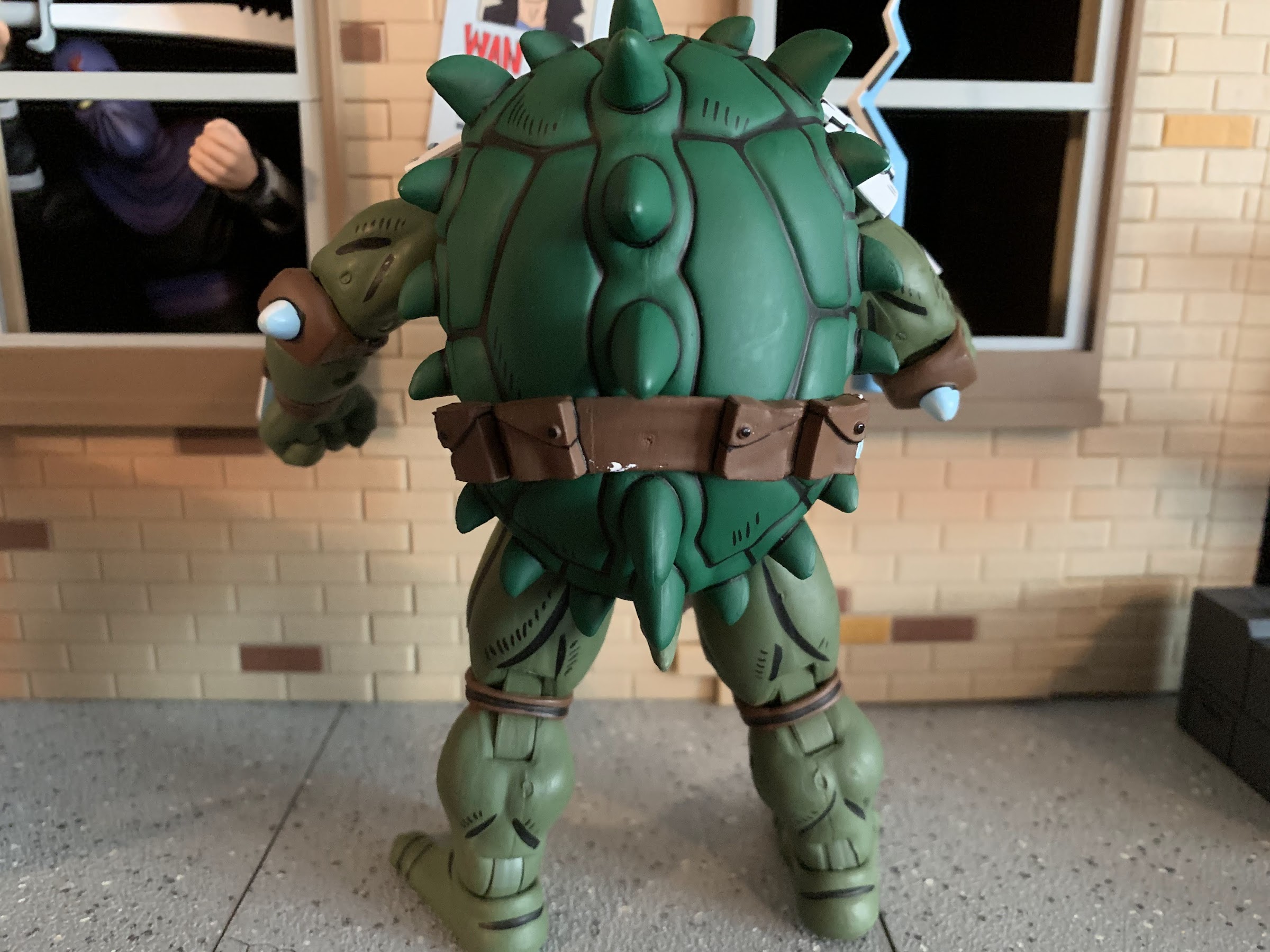
The wonderful thing about this figure too is it has a sculpt to match. There are tons of little details in the arms, especially, that look like wires and little machinations. I love the contrast of the smooth plates on the figure’s thighs and the ribbed portions underneath. The rear of the figure is really loaded with sculpted details which is commendable since that’s a spot NECA could have cheaped out on, but obviously did not. It all speaks really well to NECA as a company because they’re clearly committed to delivering the best, most accurate, representation of the character possible. Who knows if much or any of this figure can even be reused for other figures. I’m sure we’ll get a variant at some point, but we have numerous examples of other companies just half-assing their sculpts to present a compromised vision of a character in the interest of saving money on tooling and NECA is just putting them to shame. And something I should praise NECA for more often than I do is that they credit the folks who design their figures so a major shout out and hearty congratulations to sculptors Brodie Perkins and Josh Sutton with paint credited to Geoff Trapp and Mike Puzzo. We should also probably give a shout out to director Trevor Zammit as I assume he’s the one pushing to make these look like the source material and he just does a fantastic job with all of the TMNT lines he oversees at NECA.
And if you thought they would cheap out on the figure’s rear you’d have been wrong.
We’ve gushed over the look of this one, now let’s talk about the stuff it comes with. The Utrom has three sets of hands: fists, gripping, and trigger finger. All of the hands feature the horizontal hinge, our first disappointment of the release, but I do like that the fingers are soft plastic and getting the accessories into the trigger hands is relatively easy and free of paint rub. He also has a gun and it has a really fun design as it has these panels over it. It has some linework on it and the muzzle is painted rather simply, but well. There’s two red tools for the figure to wield. One resembles a wrench and the other is a bit more nondescript. I’m guessing it’s pulled right from the comic, but I don’t know exactly what it is. He also has a little canister with a straw in it. I think this is a drink for that actual Utrom in the belly, the only problem is he doesn’t hold it very well. The fingers on the trigger hands are flexible enough that you can wedge it in there with some effort, but a more relaxed hand would have worked better. Lastly, we have a second portrait for the robot that features battle damage. It’s right eye is hanging out and there’s a big gouge taken out of the top of the head that looks really cool. It’s nice enough that the temptation is there to get another figure, I just wish he had more battle damaged parts to swap to or even a second Utrom with a different expression to create a bit more variety. The Utrom that came in the comic con 4-pack years ago is much too big to fit in this guy.
Bang!
The accessories are solid leaving just the articulation for us to talk about. Like most of the figures in this line, the articulation isn’t going to be the strongest aspect of the release, but I think it’s going to be enough. There’s a ball joint in the head that provides rotation and some nuance posing. It looks down well, but not up. The shoulders are ball-hinged and you get all of the rotation you need, but the boxy shape of the shoulder means the figure can’t raise its arms out to the side. You get maybe 45 degrees there. There is a biceps swivel and it’s integrated very well into the sculpt. The elbow hinge is only a single hinge, but the design allows it to go past 90 degrees so that’s fine. The wrists swivel and hinge and I already mentioned the direction of the hinges is unfortunate. In the diaphragm, we do have a ball joint above the opening for the Utrom. It’s actually more functional than I expected as you get a little forward and back, some tilt, and a fair amount of rotation. At the waist is another twist and the hips are the standard ball and socket joint. There’s a thigh pivot there that provides just a little something for adjustment poses as opposed to a full thigh twist. The legs kick forward to a full horizontal position, though they do drift out from the body a little the higher you go. There’s no range going back, and the single-jointed hinge will get you a 90 degree bend. At the ankles we have a hinge that allows for plenty of range backwards, but nothing forward. The ankle rocker works fine. It’s decent and I think it’s enough for this character. He can do plenty of one-handed gun poses. I do think NECA could have sacrificed a little bit in the sculpt at the shoulders for more range, and the lack of vertical hinges for the hands is an ongoing problem. The actual Utrom in the body is not articulated, but I don’t think it needs to be.
Hydration is importnt!“I told you, Jerry, you can’t fit!”He’s a sharing kind of alien brain.
The Utrom may not be a character that gets a lot of TMNT collectors excited, but the finished product is one of the best releases from NECA in a long time. I think this is easily my favorite from the Mirage line and I would put it up there with the best from the toon line as well. I can’t say enough good things about the paint job. This comic deco is fantastic and I love that NECA has the guts to try something like this with its figures. So many collectors dump on “cel-shading” when it comes to figure releases without realizing that most of the companies attempting that effect with their figures do a piss poor job. It takes effort and money to get it right as well as artistic vision. I’ve said it numerous times, but natural lighting cannot shade an action figure based on a comic book character the way that character is drawn in the book. It’s impossible. Comic book artists do their own thing that doesn’t work in reality and no one complains because it looks awesome. It’s stylized, but some of it is so prevalent that we don’t really think about it. I always use Venom as an example. We know his costume is black, but if you showed a panel from “Lethal Protector” to a kid he’d tell you the costume is blue because that’s how comic book artists shade black. And that’s what I want out of my figures. Major props to NECA on this one, they hit a homerun. I can’t wait to see what they do next.
More from NECA and their expansive selection of Teenage Mutant Ninja Turtles action figures:
We’re back for 2021, and right now it looks like a lot like 2020 as we have a new Teenage Mutant Ninja Turtles action figure to talk about – Android Krang! Hopefully, this doesn’t mean 2021 is a lot like 2020 going forward, but if it’s going to copy anything from 2020 then let it…
I’m having a hard time coming up with an action figure line that has had retail releases separated by more than a decade. I don’t mean long-running lines of figures like G.I. Joe or Marvel Legends which have been around for decades, I mean a line that was started, ended, then re-started like NECA’s line…
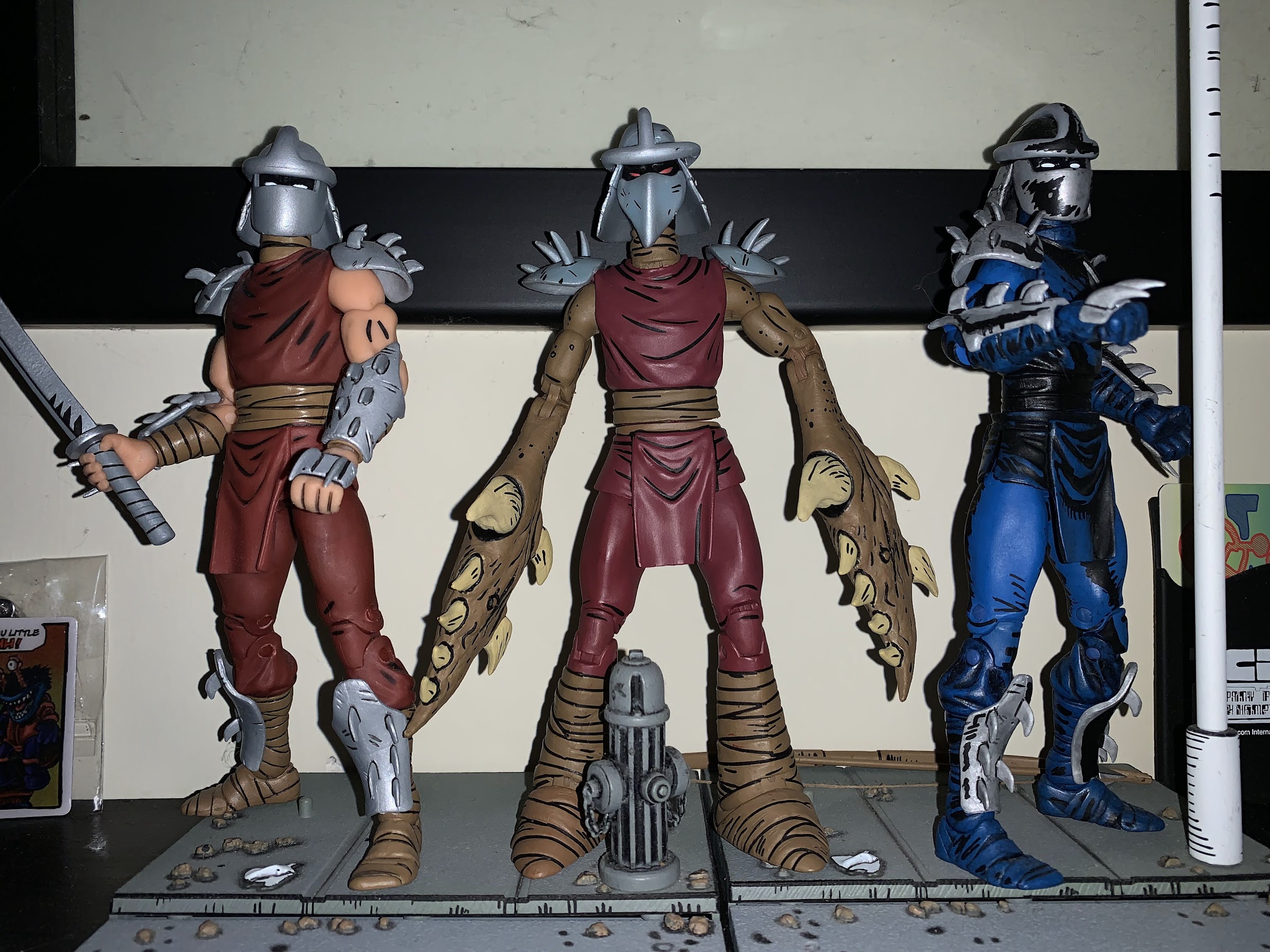
The Shredder had a rough go at things for awhile when it came to plastic. He was featured rather prominently in the old Playmates line, though perhaps not as prominently as one would expect. Playmates never did do a movie version of him, aside from Super Shredder, and his figure was arguably the worst from…
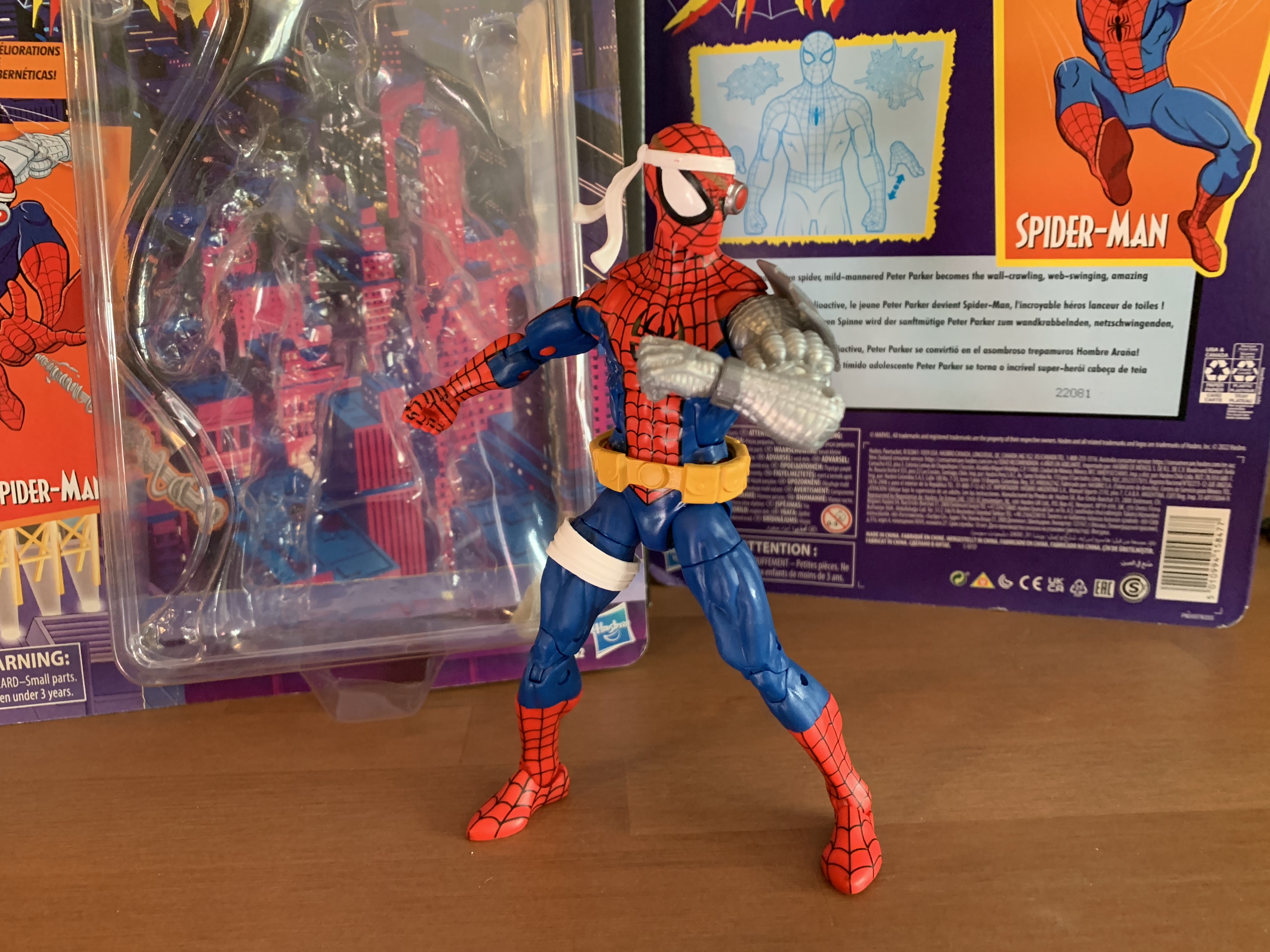
Well, this is a figure that I never planned on reviewing. It’s a bit old at this point, but we’re looking at yet another Spider-Man retro card release from Hasbro and this time it’s Cyborg Spider-Man. Now, I remember seeing this quite some time ago at Target and thinking it looked fine, but I’m not a Marvel Legends collector so I never paid it any real mind. I say that, and yet 2022 is the year I bought more Legends than I have since 2006 mostly due to the X-Men animated line, but it also got started with the animated Venom. That Venom lead me down a rabbit hole where I wound up with Web-Man, Symbiote Spider-Man, and more recently the animated Spider-Man. It was getting that most recent one that basically resulted in me grabbing this guy because what I really wanted was a webline part. That figure didn’t come with one, but when I went to Target recently I spotted a figure that did. Spoiler alert – it’s this one!
Even with the new hardware, he still does spider shit.
Cyborg Spider-Man is a 2021 release, if I’m not mistaken. Possibly late 2020. Things blend together a bit in my head when it comes to release dates, especially for lines I don’t typically collect. The foot of this one is stamped 2016, but I’m guessing that’s because most of the parts are that old. It’s not recent though and not one I’ve seen in Target in quite some time. I don’t know why my nearest Target had one, random, figure on the pegs, but it did. It initially didn’t even ring up because the barcode was no longer in their system, and when it finally did, it rang up as some Spider-Man bow and arrow toy. Unfortunately, that toy carried the same MSRP as this one so I didn’t get a deal or anything, but it suggests to me that maybe Target recently unearthed some extra stock because the figure is also online again as of this writing. Regardless, I thought the sculpt was interesting and a pretty fun variant on Spider-Man, and since it came with a web line accessory, I said “Why not?” And since I have a blog that heavily leans into toy reviews, we might as well take a look.
I think of him as more of a punchy Spider-Man.
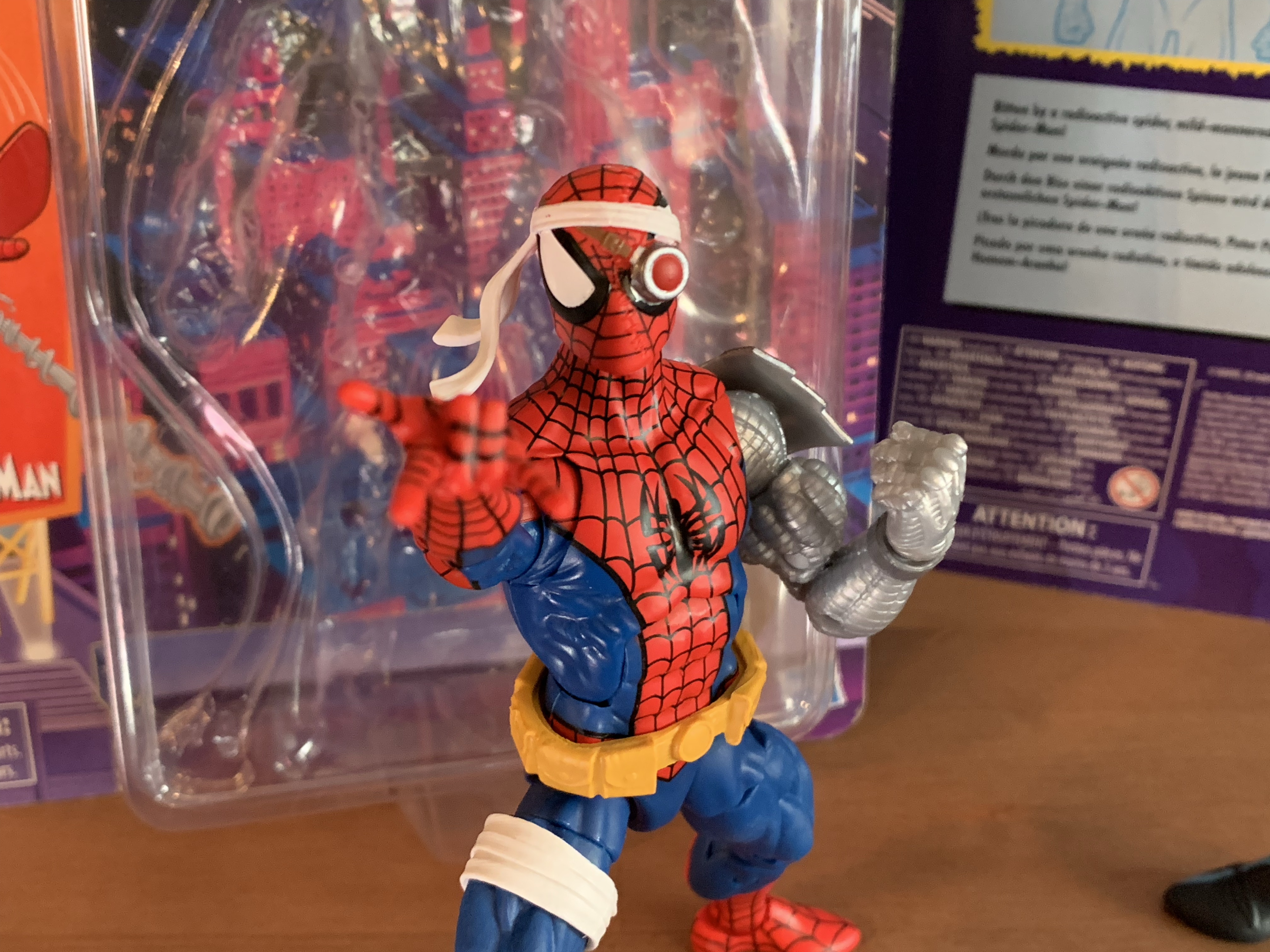
Cyborg Spider-Man stands a tick over the 6 inch mark. He comes packaged on a retro card and is a nice throwback to the Toy Biz figure of the same design. I actually never had that one, I really didn’t get many Spider-Man variants, but I can recall thinking it looked fine. I just prioritized getting villains over yet another Spider-Man. He was also a late entry in the line, if I’m not mistaken, and it’s possible I was already shifting priorities. The design hasn’t changed though. This is basically Spider-Man, but with a robot arm. He does have a belt and some accessories on the head, but it’s the big, cybernetic, left arm that stands out the most. Since I’m not a regular buyer of this line, I couldn’t tell you where all of these parts are from. The main body is the same one we saw with Web-Man which I think originated with a Spider-Man 2099 figure. The arm could be from someone like Cable or Deathlok, or it could be all new. Since it’s an older release, it’s not a pinless body so we get the ugly red dot on the inner right arm resulting from the red peg that goes through it. The blue pegs around the knees don’t cause the same sort of eyesore. It’s a very muscular sculpt and one that feels appropriate for this specific version of Spider-Man. I like how the cybernetic arm turned out and it looks as it should. The head has these giant eye lenses which are also fun and very McFarlane-esque. The belt is glued in place, but the white wraps on his right thigh are a floating part which could be removed if desired. It’s a little annoying that it doesn’t stay in place and it’s a reminder why newer figures like Morph and Cyclops have them keyed in. The only details I don’t like about the sculpt are the tiny shoulders, which is a consistent criticism I have for Marvel Legends. They just look silly and sit too low.
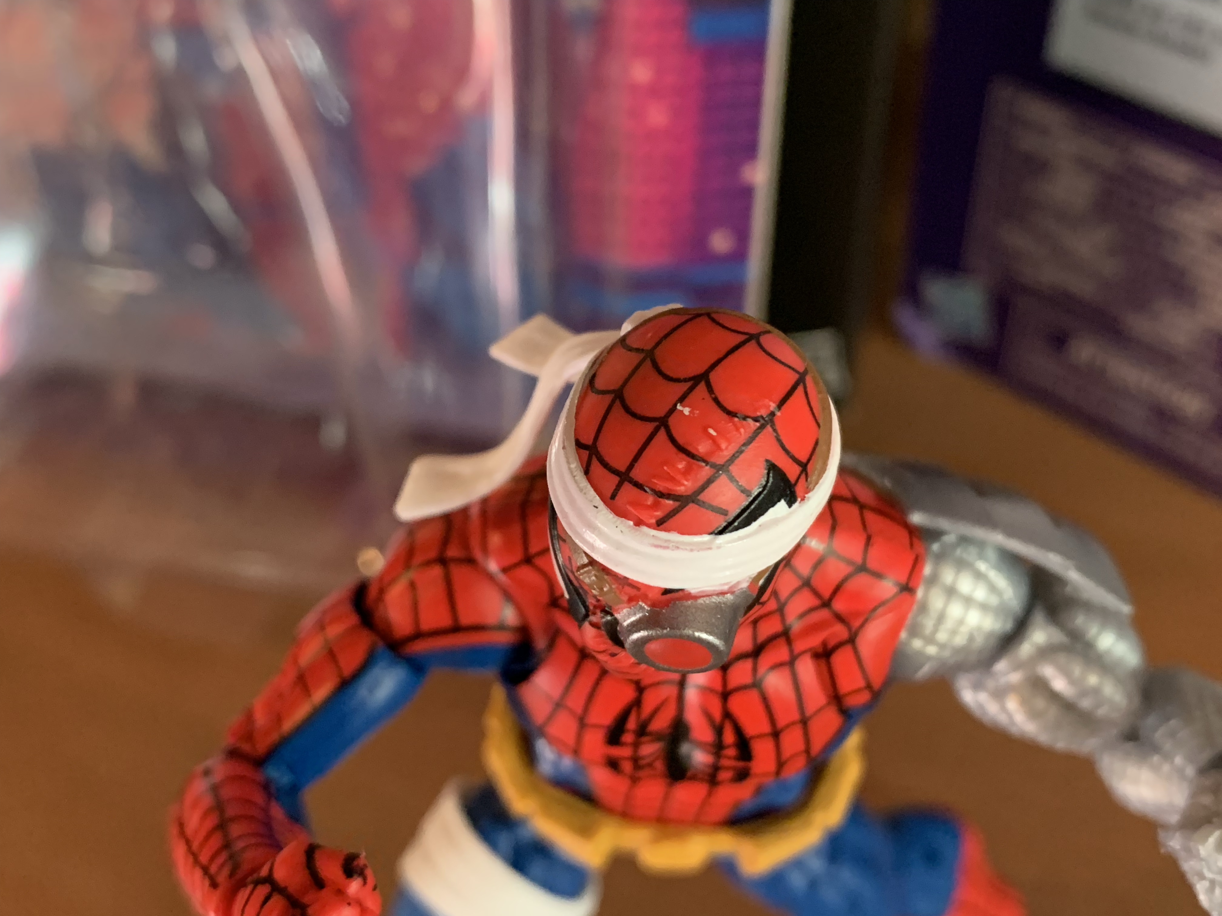
I wish they had painted the stitching on the mask.
As far as paint goes, we have our usual Marvel Legends mixed bag. The figure is a mix of blue and red plastic with a light gray used for the robot arm. The weblines are done well enough and I like the black outline on the red portions of the costume, something the animated Spidey didn’t roll with. The painted and colored reds look close enough and the painted portions of the head are fine. What I don’t like is how the spider logo on the rear turned out. It really needs a black outline or something to help it pop and it looks almost washed out. It also has a big hole which I guess is for an old flight stand. There’s also a severe lack of paint in most places. On the head, there’s stitches holding a portion of the mask together which were left unpainted. It’s a shame, because they’re sculpted well enough, but are barely noticeable due to the lack of paint. There’s also no paint on either the belt or the left arm save for the plate on the shoulder and bracelet area. The belt just looks boring and cheap as a result while the arm has too much of a plastic look. There’s no attempt to make it look like it’s made of metal and, again, it’s a shame because the sculpt is there. It just needs a little dry-brushing to bring it out. In a perfect world it would be painted-up like NECA’s Fugitoid, but I know Hasbro isn’t going to sink that kind of money into this line. At least this one is $23 instead of $28 or $35 so it’s easier to overlook these shortcomings, but still unfortunate to see Hasbro not do right by their sculptors and designers.
This spider on the back could have been handled better.
The articulation for this Spider-Man is not really it’s strong suit. I suppose we shouldn’t expect a cyborg version of the character to move as well as a traditional one, but I thought it would be a little better than this. The head is on the usual ball hinge which provides good enough range up and down, but not much nuance posing. The shoulders are ball-hinged and pretty limited out to the side. The left arm is hindered by the big plate on the shoulder, but even the right arm can’t quite hit a horizontal pose. There is a butterfly joint which provides more range going back than forward. It’s okay, but a bit ugly because the paint isn’t continued as far as the joint goes so you end up with gaps in the weblines on the front and the spider legs on the rear. The elbows are double-jointed on both arms and both can bend past 90 degrees. The cybernetic arm can even go further than the right arm as more plastic was cut away to make it work. The wrists rotate and hinge horizontally while the abdomen features a ratcheted ab crunch. It only allows one click back and one click forward so the range isn’t impressive. The waist twist is a waist twist and it is at least hidden by the belt because otherwise it would look pretty hideous. The legs can just about hit a split with a little effort, why newer figures can’t is a real mystery, while the legs kick forward to about horizontal with no range going back. We get the usual thigh cut and the double-jointed knees work just fine. There’s a boot swivel and the ankles hinge forward and back pretty far and feature a steep, but usable, ankle rocker. It’s nothing particularly impressive, but I don’t know what kind of posing most want to do with this guy. I tend to think he should be posed more like a brawler than the nimble Spider-Man of norm, but that could be just me. By Legends standards, it’s basically average.
Your webline is looking a bit limp there, Spider-Man.
And that’s kind of it for selling points with this guy because the accessories are not impressive. Cyborg Spider-Man comes with fist hands in the box and he has one thwip right hand he can switch to. He also has that all important webline I wanted which is just a piece of malleable, off-white, plastic with a little curl at one end and a triangular shape at the other. It’s kind of odd that they don’t have a clip on the end designed for the hand/wrist area. And since he can’t grip it with any hand it makes it hard to do much with. I found I can kind of get the triangle to work with the thwip hand, but it’s rather precarious and frustrating. It’s a bit amusing that I basically bought this figure for this piece and I’m not finding it very useful. If it was just a bendy wire that could wrap around him that would be better than this. That’s it though. One extra hand and one mediocre web effect.
All right, you can stay.
Given the articulation woes and the lack of accessories, this figure is basically one to judge based on the overall aesthetic. And if you like this interpretation of Spider-Man, then you’ll probably be fine with this one. I do like the look, and while I wish it was painted better, I think it looks okay on a shelf. The fact that it’s at the older price point definitely helps because if it was up any higher I’d have not bought it. And if you are into customizing your action figures, this one probably won’t take much effort to really bring out some of the details. There are elements of the figure that are a bit dated, but the sculpt helps make it worthwhile. In short, I’m content to have this figure I never planned on getting.
When I was a kid, my dad took me to some local convention or trade show. I have no idea why because my dad wasn’t the type who would go to such an event. He liked car shows, but from what I can remember this was more of a hobby show. It was early in…
I wasn’t sure he would make it in time, but Hasbro managed to ship Cyclops before the end of the year. Cyclops marks the final figure (for now) in Hasbro’s X-Men animated series subline of Marvel Legends. It has been…a ride. What was once a dream line of mine to see brought to fruition, turned…
No, this is not bootleg Spider-Man, this is Web-Man! Who is Web-Man? I actually had no idea until I just looked it up. It would seem Web-Man is a copy of Spider-Man created by Dr. Doom. Not only are his colors inverted from the real thing, but so is most everything else. And since Spidey…
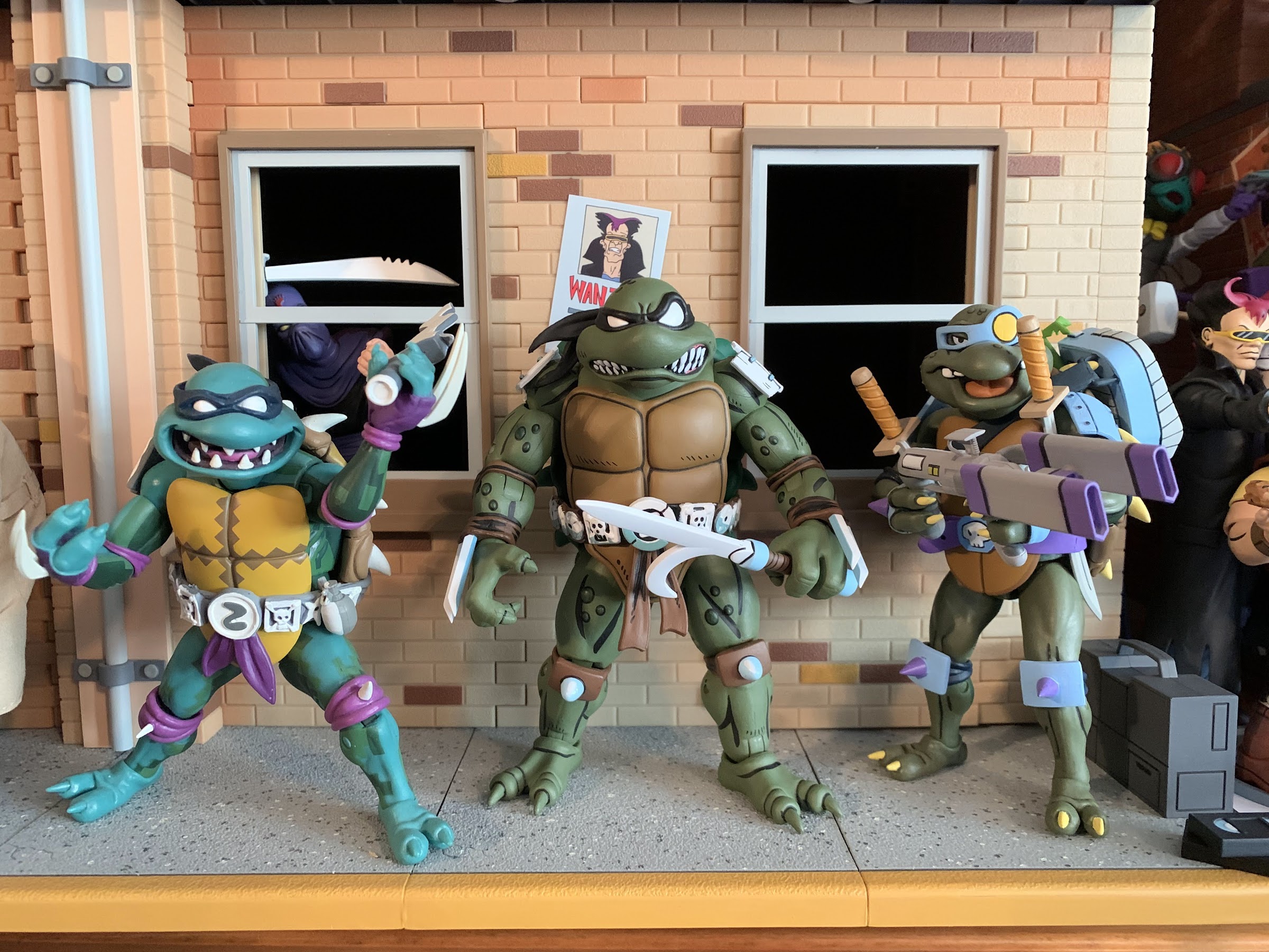
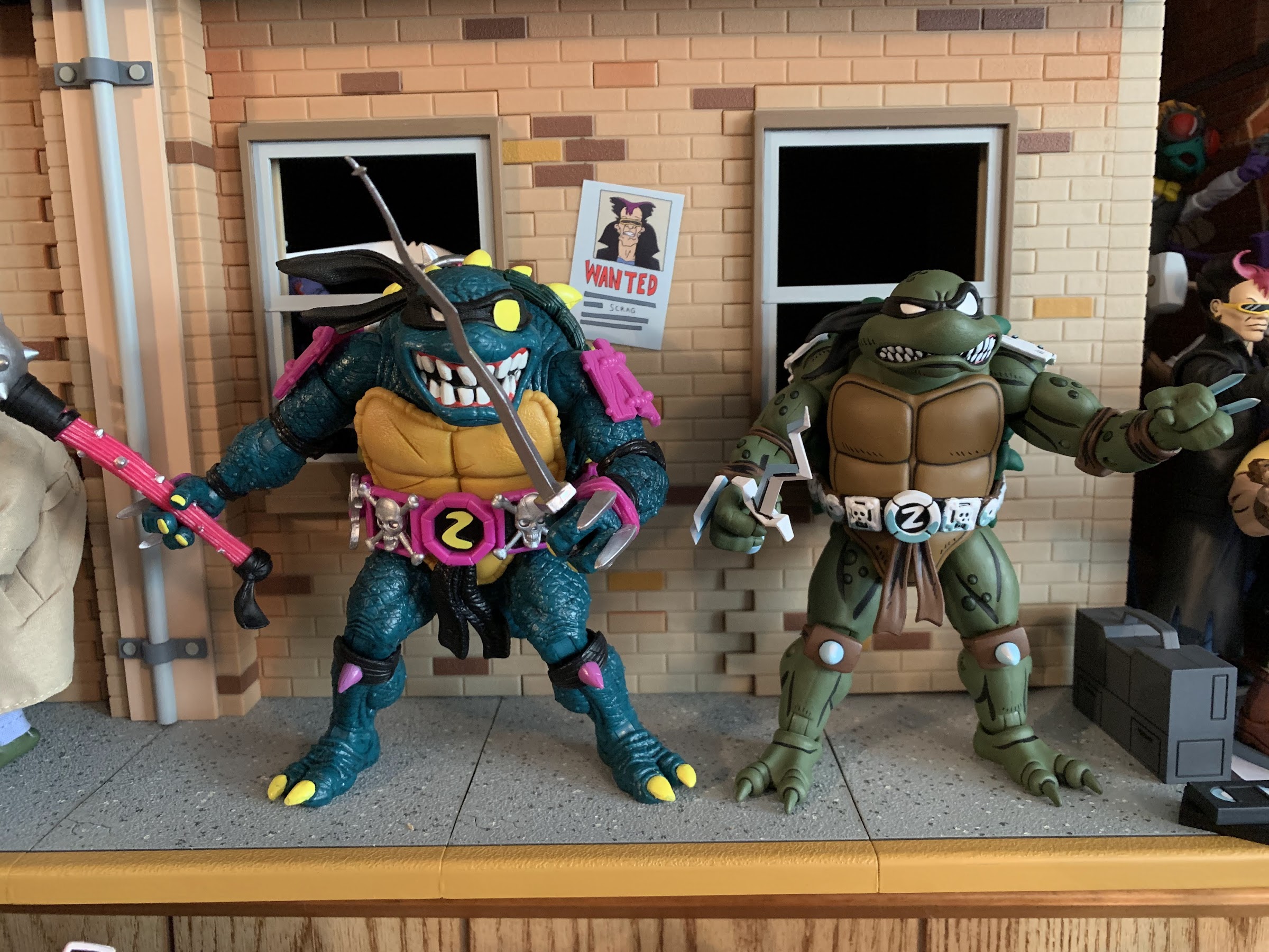
Welcome to the first Turtle Tuesday of 2023! 2022 is the year that NECA returned to the Mirage Studios subline of Teenage Mutant Ninja Turtles action figures it started way back in 2008. When the line was announced to return, it was essentially taking the place of the Turtles in Time figures that had been sold through specialty shops over the past two years or so. These figures would be sold in a similar fashion as it was the small shops that would be able to place orders after being shutout of the more popular movie and cartoon sublines of TMNT. What NECA didn’t clarify at the time was that the Mirage figures (and Archie) would not be exclusive to those places, just available. When the company released Fugitoid earlier this year, it was via Target with the specialty shop places not getting the figure until months later. Since then, more has been revealed and for collectors it’s been a mixed bag as far as the experience goes. Specialty shops were given the figures Renet, Casey Jones, and the Utrom to solicit, but in the case of Renet and Jones, they were getting a variant based on the IDW re-colored issues. Renet is normally clothed in blue and Casey red, but the figures up for order featured a Renet in red and a Casey in gray. Is that a big deal? It depends on who you ask. A Blue Renet would eventually surface as a Walmart exclusive attached to some weird, NFT-like, distribution in which the consumer places an order either online (it has since sold out) or in-store that just gives them a code. They then go home and enter that code into a different website to take digital ownership of the figure at which point the collector can either “store” it or ship it. The turn-around on shipping was promised to be around two weeks, but turned into a month or more for those who participated. Oh, and the figures sold in this fashion (which also included black and white variants of the Mirage Foot Soldier and Shredder) retailed for 40 bucks, five more than the other versions.
Renet is no damsel in distress.
I personally wanted nothing to do with that arrangement. It sounds needlessly complicated, plus the toys are more expensive. Unfortunately, I did want the blue version of Renet, but I’m too stubborn to give in and jump through those hoops so when I eventually found the standard version at Target I just grabbed it. My experience with the character has mostly been in black and white anyway, so I’m not that attached to the blue color scheme, I just prefer it. It looks nicer. For others who grew up reading the colorized version of the old books they understandable have more attachment to the blue costume and I do not blame them one bit that the easy to order version of the character is essentially a variant with the true version locked behind an exclusive arrangement. That is, frankly speaking, bullshit and not the way I think NECA should be approaching this line. If part of the selling point of the Mirage line is to feature it at actual comic shops then it should be those places that get the standard version and send the IDW colors to Walmart. Instead it feels like NECA is admitting that variants of these characters aren’t going to be that popular so they’re making the more desirable version both exclusive and more expensive. It’s not a good look and given that NECA’s reputation has already taken a hit in 2022 thanks to the Loot Crate fiasco, it feels like another self-inflicted wound.
She can also go hoodless, if that’s your preference.
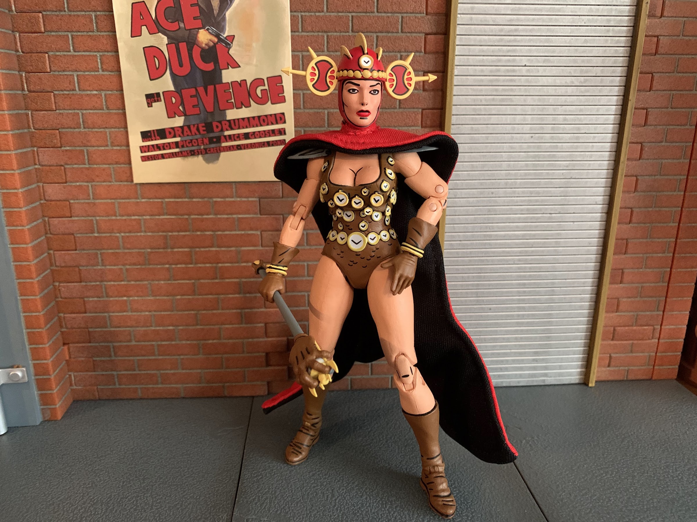
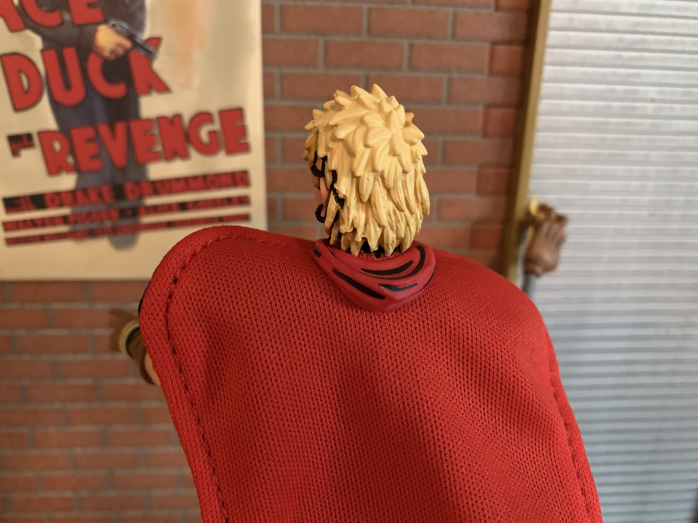
All that aside, Renet is pretty damn good figure. That’s the frustrating part as it would be nice to just voice with the wallet and skip the release all together, but the product is good and it’s not like sculptor Jon Matthews is responsible for how the thing is sold. Renet, if you’re unfamiliar with the character, debuted in issue number 8 or the Mirage Studios run. She is the Mistress of Time and carries the Sceptre of the Sands of Time which, as you probably could have guessed, affords her the ability to manipulate time. This leads to a time-hopping adventure with our heroes which would be adapted in both the 2003 cartoon series and the 2012 one (she kept her blue clothing in both, by the way). Given that there are so few female characters associated with the brand, it makes sense to turn to Renet fairly early in the relaunch to provide some variety out of the gate.
And if you want to go hoodless, she has this little piece to go over her neck that resembles the hood.
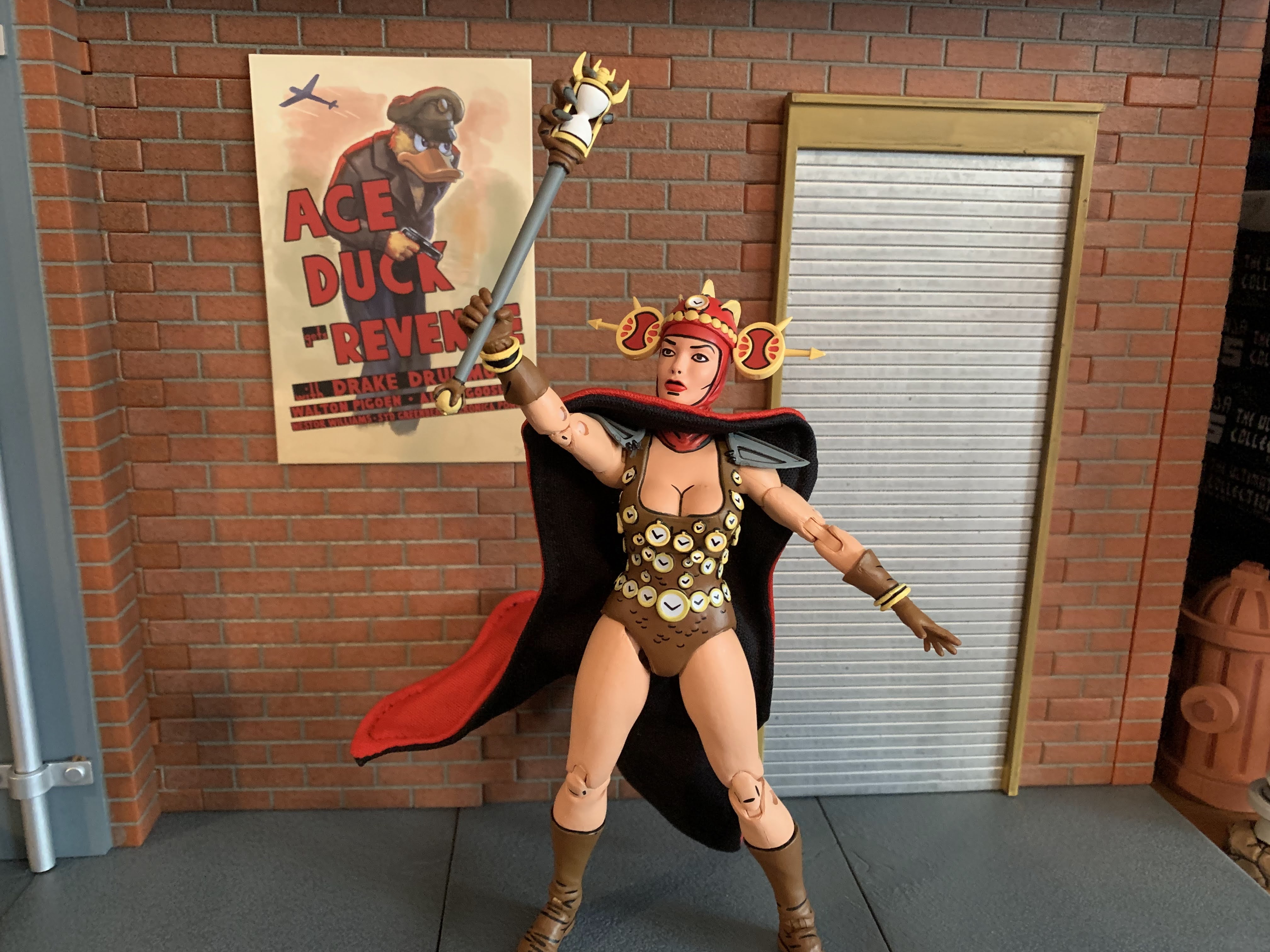
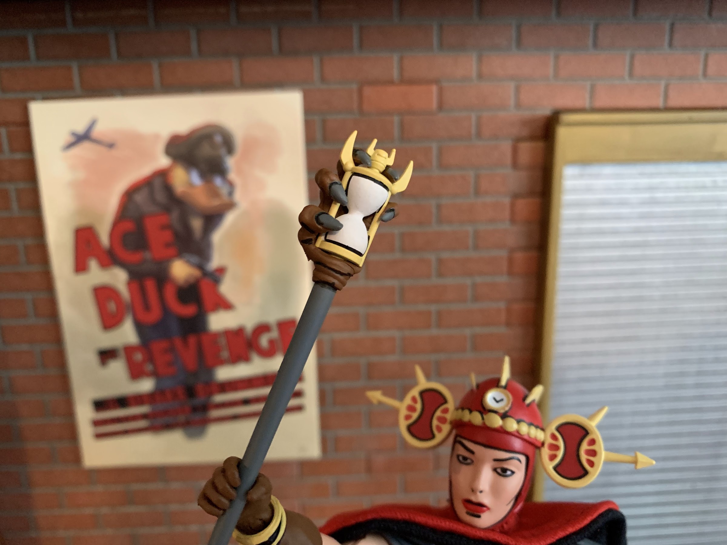
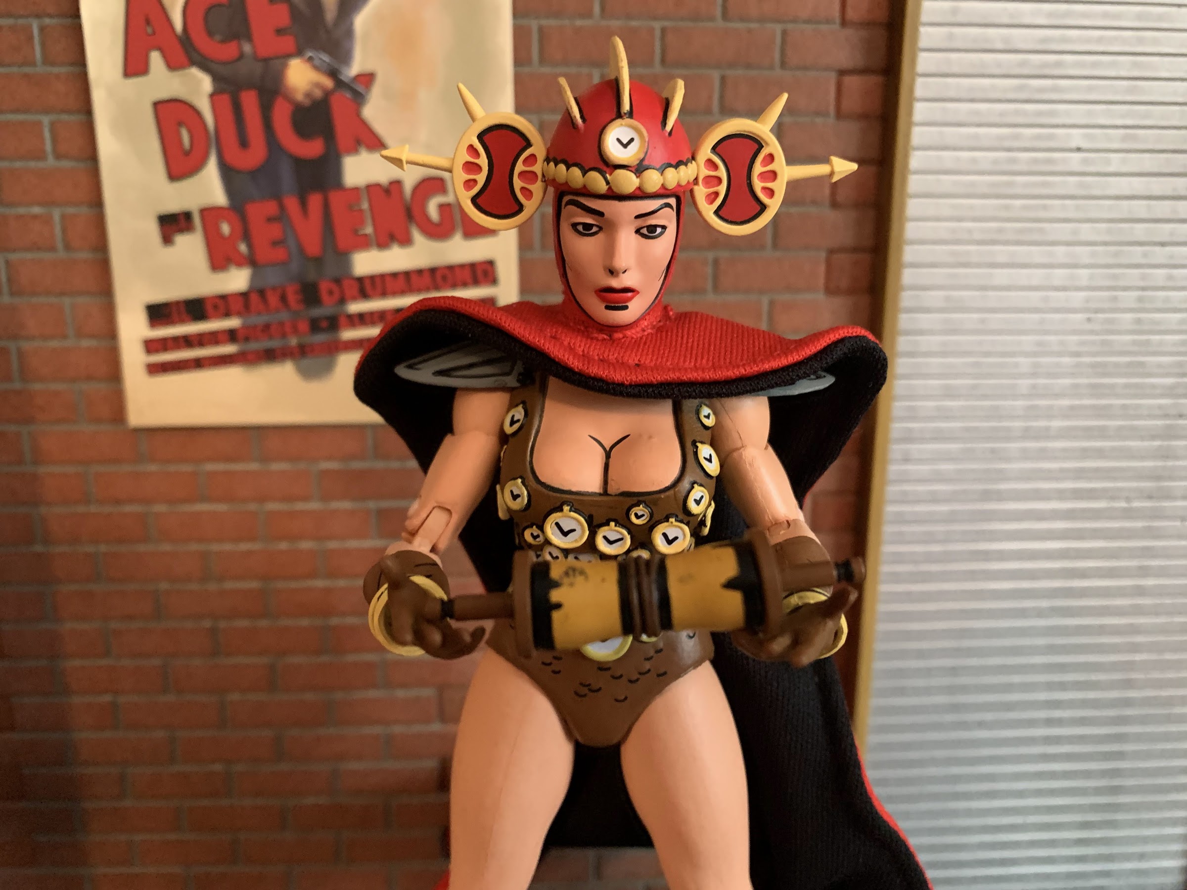
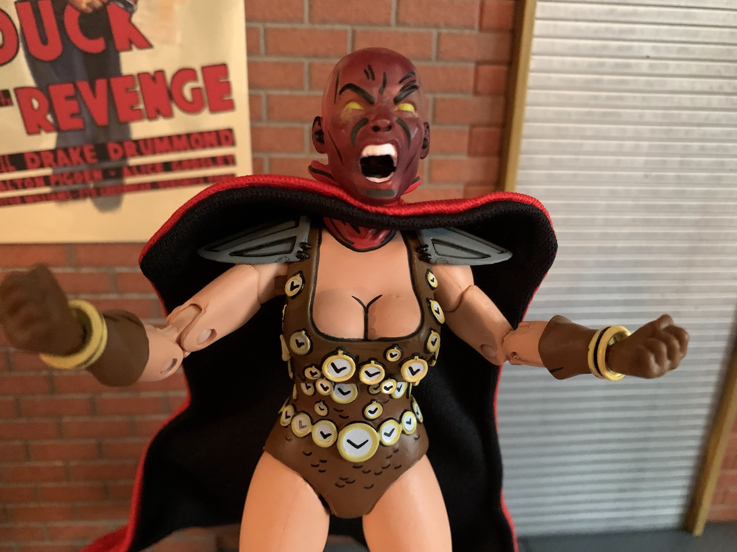
The figure arrives in the trapezoid styled box that Fugitoid came in complete with new artwork from Kevin Eastman. Renet stands approximately 6″ in height and feature the unfamiliar color combo or red and brown. Her default portrait features a red hood with a removable helmet that’s also red and accented with yellow. Her actual costume, which is essentially a one-pieced bathing suit, is brown and adorned with numerous clockfaces which are all sculpted details, and not decals. There’s some black linework to make the suit appear to be armored and she has gray shoulder pads, brown gloves, and brown boots. Every inch of this figure is painted and given the numerous clockfaces on the costume it’s really impressive that there’s little in the way of paint slop. If you go hunting for it you’ll probably find a clockface that isn’t perfect, but it’s rather remarkable how well the paint turned out. And I can say I saw three figures at Target and all three looked great. There’s the customary linework as well on the clothing and even some of the flesh portions like the knees and elbows. The only detail I don’t care for is the black line under her mouth which I just don’t think needs to be there. Otherwise, the paint is terrific.
The sculpt all around on this figure is exceptional for what is a mass produced item.
The sculpt for Renet is equally wonderful. The clocks I already mentioned and they’re a nice touch. The clock hands on each face are painted on so I guess if you have exceptionally high standards you can take NECA to task for not sculpting those, but I think they look good. Renet’s face and hair looks very true to the source material which was a bit rugged back in the day. Eastman will readily admit that he felt they had a hard time drawing females in the early days and it was something they worked hard to refine. I think she looks good though and her body certainly isn’t lacking for curves as she’s rather buxom. I like that her legs and arms have some shape to them though like she is strong and capable. This is in contrast to a lot of Marvel Legends where I feel their females tend to be too thin and lacking in muscle definition. Other sculpted details on the figure include wrinkles and creases in the gloves and boots which simulate the look of leather very well. The shoulder pads have sculpted indents in them too. Renet’s unusual helmet is also handled well with sculpted ridges and those weird ovals on the side.
And it’s not just the figure, the accessories are well-sculpted and well-painted too.
This scroll contains basically the only paint imperfections in the set. I can live with it.
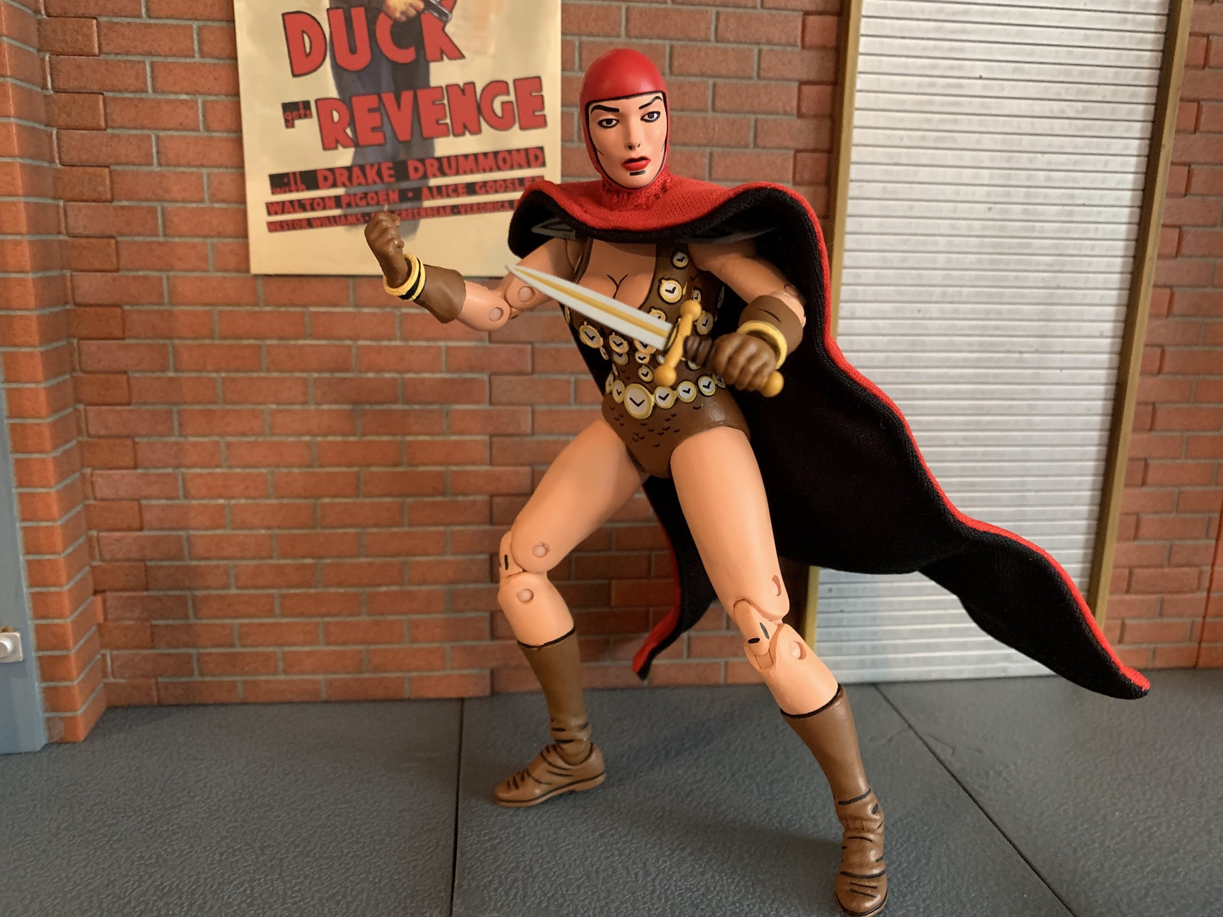
Renet also comes packed with the standard assortment of articulation we’ve come to expect from NECA. The head is on a double-ball peg that allows her to look up, down, rotate, and tilt. Her shoulders are ball hinged and she can raise her arms out to the side to a horizontal position and rotate around. The shoulder pads flex so they don’t get in the way much, but I would recommend not rotating all the way around to not damage them. There is a biceps swivel plus double-jointed elbows which is great to see. NECA has, in the past, seemed resistance to double double-hinged elbows on characters without sleeves and I’m glad to see they’ve moved on from that fear. The wrists rotate and hinge horizontally. In the torso, there is a diaphragm joint, but it basically just affords some rotation with no forward and back. You will want to be mindful of doing much here too since the sculpted timepieces could get damaged. Because of that fear, I consider the joint functionally useless. At the hips are ball and socket joints that allow Renet to do splits. The crotch is a soft plastic so you do want to watch out for paint rub there, though mine seems okay. The thigh can rotate on that ball a bit and the knees are double-jointed. There is no boot swivel, and the ankles hinge and rock side-to-side. Lastly, we have the wired cape which is basically part of the articulation. It works very well and will allow you to position it as you see fit. My only issue with it is that it doesn’t always want to sit flush with her chest. The articulation here is serviceable. I wish she had some vertical hinges on her gripping hands and it would have been nice to get something out of the diaphragm joint. I like how the legs turned out though as they look terrific since the only visible joints are the knees. It’s a very clean looking figure so if the articulation isn’t going to amaze then at least it’s not contributing to some ugly cuts in the plastic.
This head looks awesome too, I just wish I had a place for it in my display.
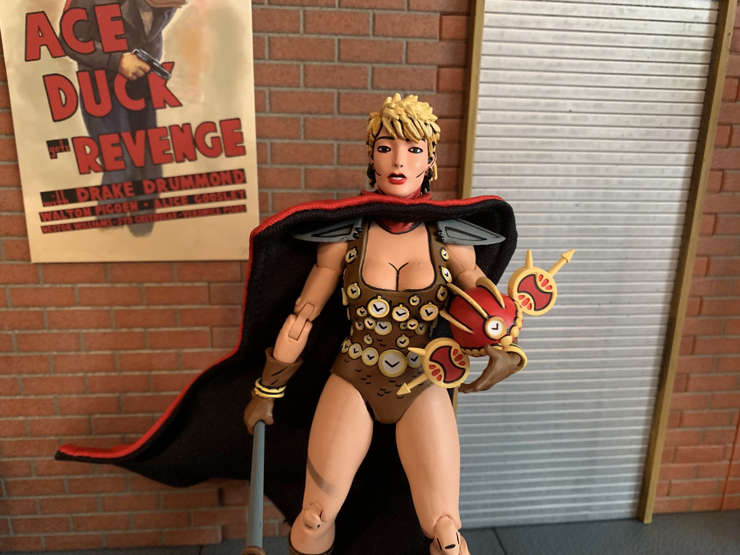
Renet also comes with a pretty solid assortment of accessories. For hands, she has a set of open hands, fists, and gripping hands. For those gripping hands she has a scroll she can hold loosely. It’s brown and a yellow-gold on the parchment and is really the only instance of paint slop on my set as there’s a black blob on the yellow. She also has a dagger which is painted rather well and easily slips into her gripping hands as the fingers are fairly flexible on both. She also has her sceptre which looks terrific. The top of it is a monstrous, clawed, hand gripping an hourglass and it’s incredibly well-painted. The only thing that would make it look even better would be if it had an actual hourglass in it. The bottom of the staff also features another claw gripping a gold ball. Just a really cool accessory. Renet also have an alternate portrait with her hood down. There’s a piece of red plastic that serves as the hood which can be placed between her head and cape and the illusion is well conveyed. Her expression on the alternate head is one of concern which is contrast to the strong, stoic, default portrait. She’s also sporting a mullet, which is amusing. I don’t know if I’ll ever use this other head, but it looks good. Lastly, she has a third head which is actually not of her, but Lord Simultaneous. It’s done in transparent red plastic and is accentuated with some black linework and yellow eyes. It looks really cool as the face is screaming, I just don’t know what to do with it. I wish NECA had included a transparent stand for it, just a tall post, for display purposes. The head can be placed on the figure, but I can’t imagine many using this head for their display in such a fashion.
Never would I have imagined Renet serving as the centerpiece of Mirage shelf. Also, I need another shelf.
Renet the character is not one I have ever been particularly attached to, and the wrong color presentation initially lead me to believe I could pass on this release. Then I saw it in-store and found myself giving in, and that’s because this is a really well done figure. The sculpt is terrific and the paint somehow even better. I love the inclusion of the wired cape and she comes packed with plenty of accessories. And if you find her at retail, she should only cost you around $35. Some places tack on a few bucks, but if you shop around you can probably find a good deal on this one. Ignoring the garbage that is the release model for the blue version, this is worth your while if you want to add Renet to your Mirage Studios TMNT collection. The relative obscurity of the character means that Renet will likely be the favorite release in this line of few, but she might be the best overall figure that NECA has done so far in the Mirage line and that’s some pretty high praise.
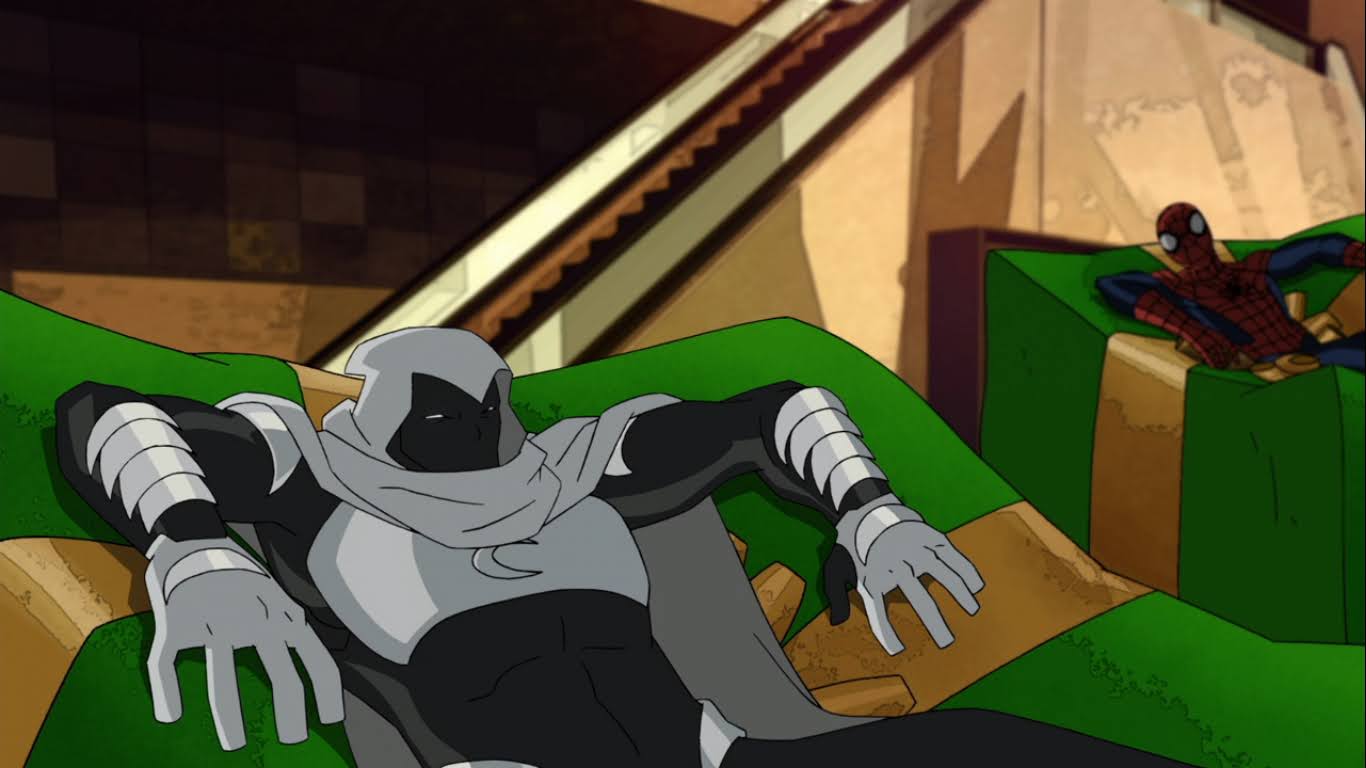
When it comes to doing these write-ups, I naturally trend towards older Christmas specials. The name of the blog is The Nostalgia Spot, after all, so it would only make sense for me to favor stuff that’s at least a decade old, if not more. The fact of the matter is, there’s really not enough content out there to only focus on the old, and besides, sometimes it’s fun to be a bit topical. In 2022, Marvel unleashed Moon Knight on the masses via Disney+. Since I am a subscriber to Disney+ and a casual Marvel fan, I watched it because it was there and I like feeling like I’m getting the most bang for my buck. It was a fine show and I especially enjoyed the performance of Oscar Isaac in the lead role. I believe it was mostly well-received, though I know there were some out there disappointed at the lack of Moon Knight in a show called Moon Knight which is understandable. I’m sure we’ll see more of him though because this is the Marvel Cinematic Universe, after all, and it’s always building towards something.
Prior to watching the show, my only knowledge of Moon Knight was that he was some superhero with a cool looking costume. I have an old ToyBiz Marvel Legends figure of the same, but I’ve honestly never picked up a Moon Knight comic. He always had the reputation of being a Batman knock-off, and to some extent I guess that’s true. In the hands of an unskilled writer, I could easily see his books turning into a Batman-like story. In the show, he was far more interesting though so I don’t think such criticism is warranted in that case, but what about in other media?
I guess the show had a different title in its final season? It’s just listed as Ultimate Spider-Man every where.
In 2012, Disney began airing a show called Ultimate Spider-Man. Despite the name, this show was not an adaptation of the comic book series of the same name. Like many post 2000 Spider-Man shows, it borrows from that comic, but also basically every other form of Spider-Man to create one big hodgepodge of what are hopefully the best traits of the various Spider-Men over the years. I never paid any attention to the show while it was airing, but it hung around to total over 100 episodes with the series ending in 2017. One of the last episodes of the show happens to be a Christmas one, and it also features Moon Knight, and it’s also presently the “knight” before Christmas, so now feels like the right time to take a look at this one.
Ultimate Spider-Man is a Film Roman production that was overseen by Alex Soto. It’s a 2D animated cartoon series with a pretty straight-forward approach to the character designs and scenery, unlike a more stylized series and prior Christmas spot entrant Spectacular Spider-Man. The show stars Drake Bell as Spider-Man/Peter Parker and when it begins he has already been Spider-Man for about a year, until attracting the attention of Nick Fury. This is a young Spider-Man still feeling his way around things and it seems an emphasis of the show was to feature lots of team-ups with other familiar faces from the Marvel Universe. The show was able to assemble a rather impressive writing team which included Brian Michael Bendis, the creative behind the comic of the same name, and Paul Dini, perhaps the most celebrated writer in superhero animation (this particular episode is by Elliot Casey). It would seem there’s a lot to like about this one on paper and it also looks like some money was spent making the show look good so it’s a bit of a surprise on my behalf that I’ve basically ignored the series for as long as I have.
This show loves playing with the size of Spider-Man’s eye lenses.
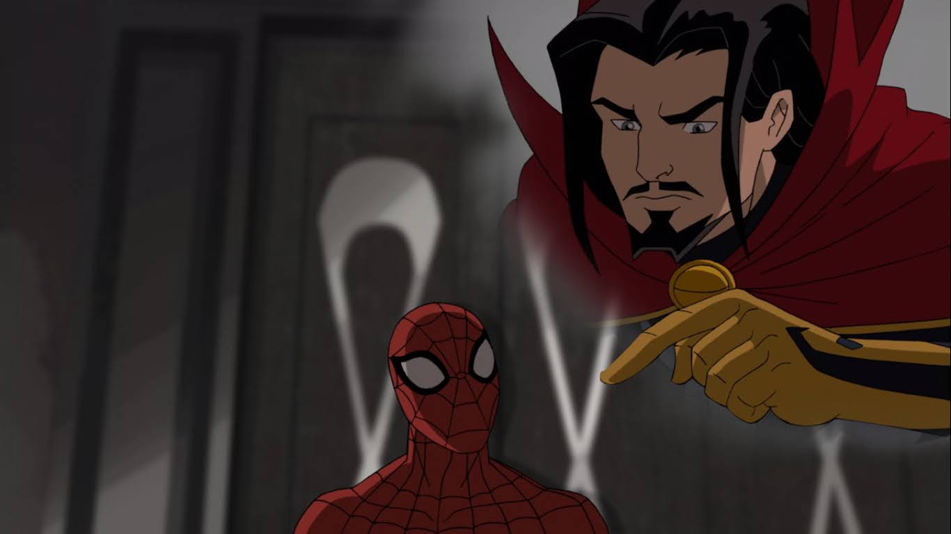
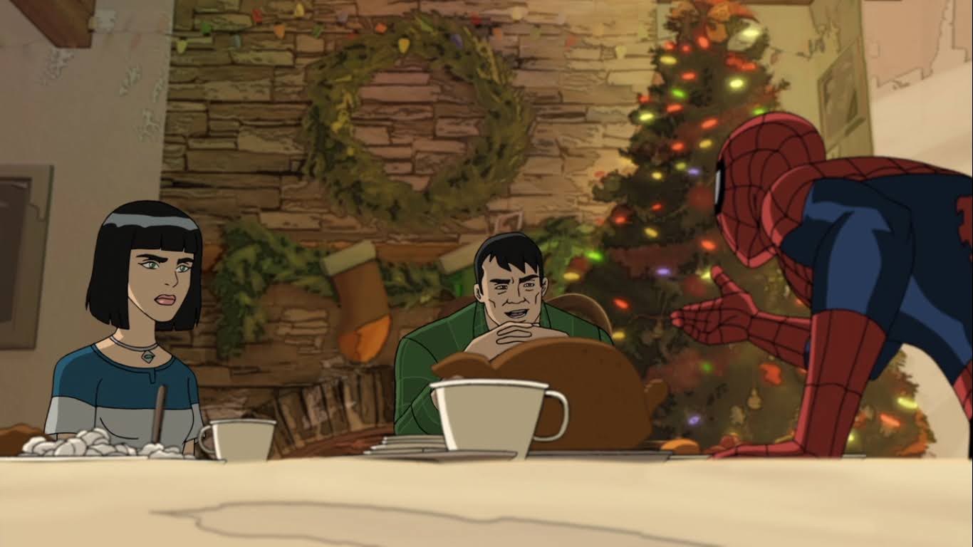
The show begins without any sort of opening title sequence, I’m guessing that’s to come. We find Spider-Man (Bell) decorating a…tree of some kind and talking to himself. He seems to be trying to psyche himself up to have a terrific Christmas because he needs to. He’s actually house-sitting this Christmas for Dr. Strange (Liam O’Brien) in his Sanctum Sanctorum while the good doctor is off saving reality, or something. It would seem this is Spidey’s first Christmas away from his Aunt May and he’s just trying to make the best of it. Unfortunately, this bizarre, monster, tree that Dr. Strange keeps in his home is sentient and not up for being decorated like a Christmas tree. It also doesn’t seem to appreciate Spider-Man’s sass and takes a swipe at him forcing the web-slinger to retreat into another room. Oh, and this is a show that seems to break the fourth wall via its protagonist. A lot.
It also seems to like this story device as we’ll see it again.
After running from the grinchy monster plant, Spider-Man finds himself in a fancy looking armory. It’s apparently a room he’s not supposed to enter and as he tries to recall what Dr. Strange told him about the room an apparition of the doctor appears above him. A very young looking Doctor Strange is recalled just telling him to stay out of the room because of all of the dangerous weapons and artifacts present. Spidey then sheepishly scratches the back of his head as an “Oops, my bad,” kind of thing since he’s already broken his promise to Strange. I’m getting the impression this Spider-Man is a bit of a goof.
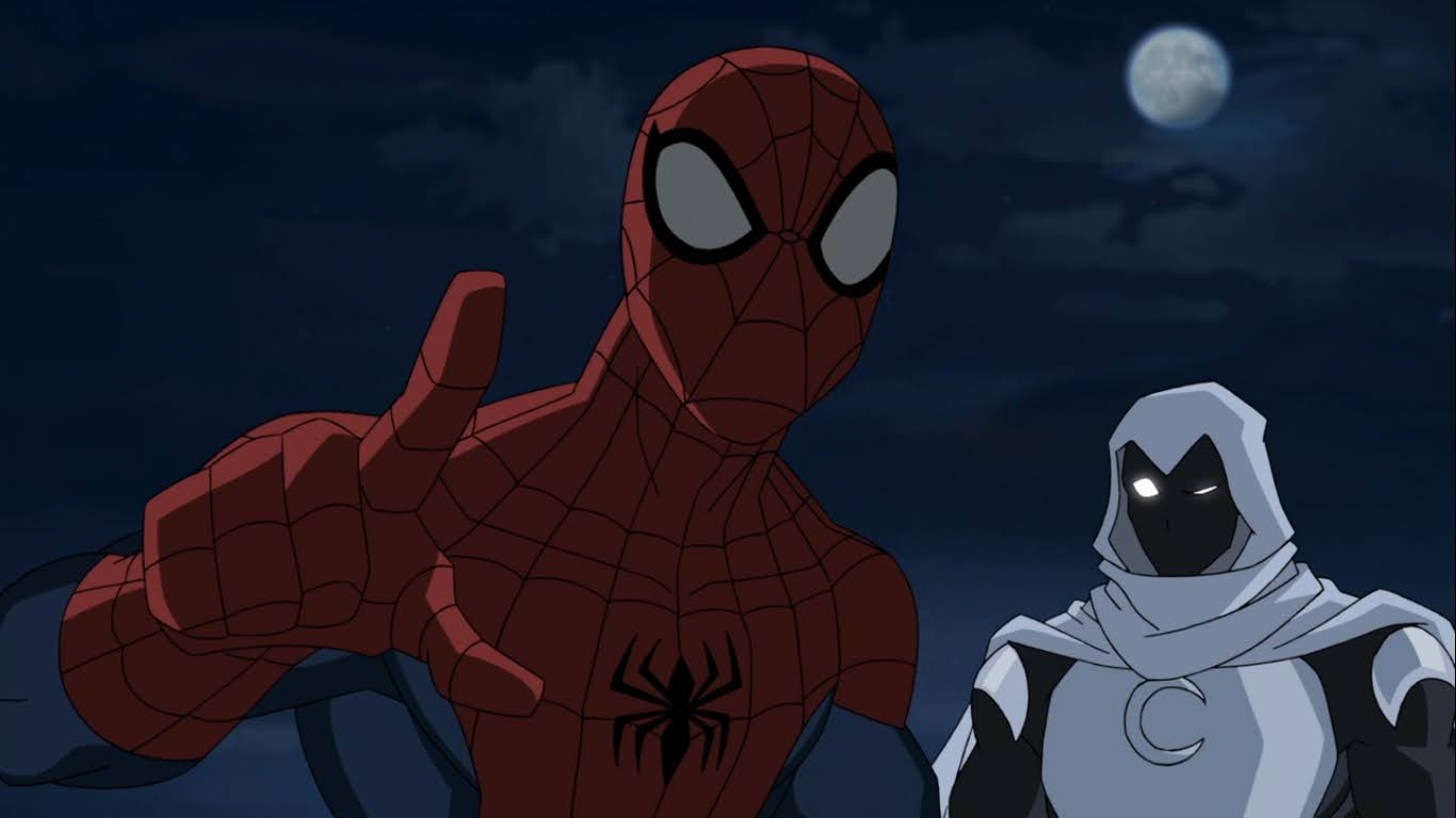
That’s a pretty bad ass way to introduce Moon Knight.
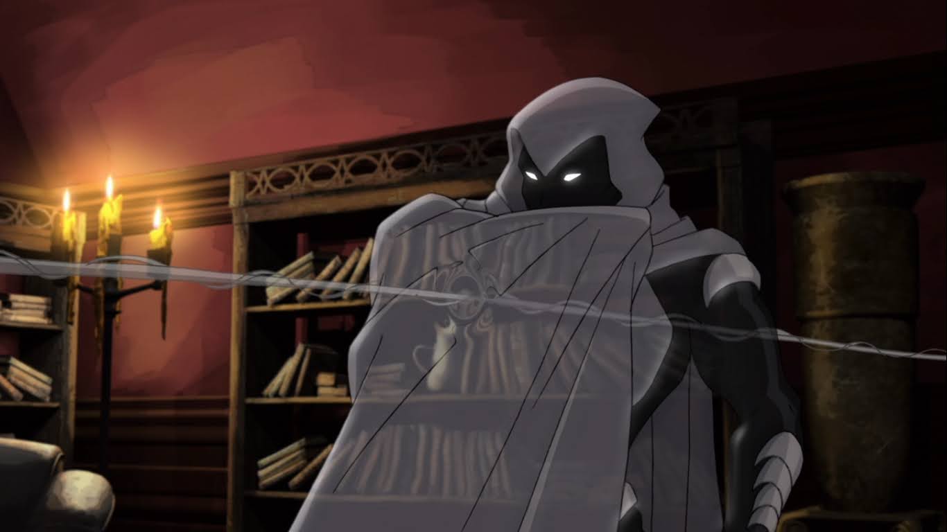
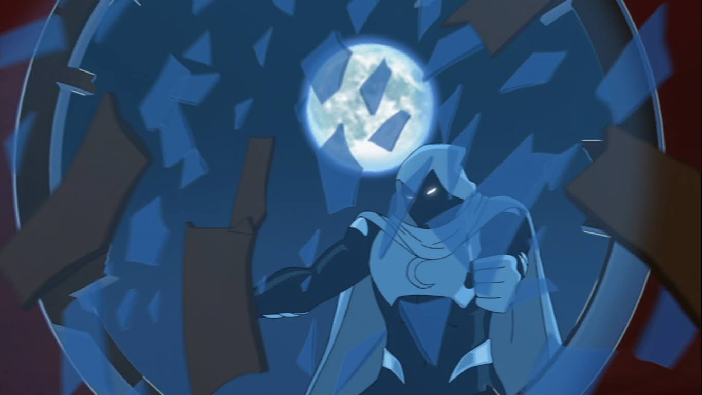
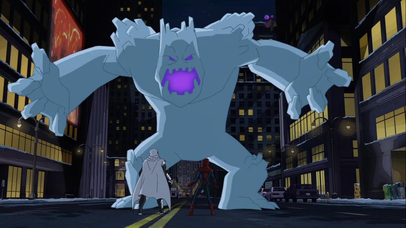
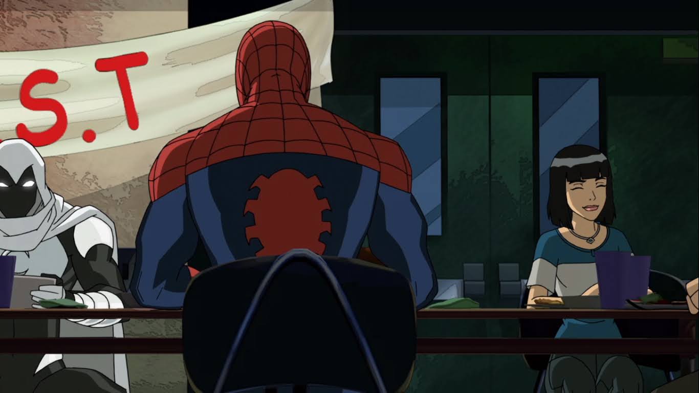
A scream from outside gets Spider-Man’s attention. He’s supposed to look after Strange’s home, but he can’t ignore what sounds like a girl in distress! Spidey races outside to find a young girl being harassed by a strangely dressed man. That man is Moon Knight (Diedrich Bader), and it would seem that Spider-Man has never encountered this soldier of the moon before. His entrance is pretty cool though as Spidey looks up at the moon and we see the alleged hero reflected in the lens of his mask. Spidey deftly avoids him and grabs the young girl in the process before staring down his new foe. Moon Knight introduces himself, and Spider-Man makes a lame crack about him not being Santa Claus as we smash cut to the opening title. Apparently this era of the show is called Ultimate Spider-Man vs The Sinister Six as that’s what the title card says. I guess it would have helped if I had watched some of this show before jumping into one of the final 3 episodes.
This rescue isn’t going very well so far.
After the very brief title card is “webbed away,” we get to see Spider-Man vs The Moon Knight! Moon Knight is impeccably voiced by Diedrich Bader in what feels like a preview of the somewhat aloof Batman (in contrast with the straight-forward Batman he has played elsewhere) he will play in the future on Harley Quinn. He’s an unintentionally humorous character (as-in, the character isn’t trying to be funny in-universe, but he’s definitely written to be comical to the viewer) as he constantly keeps referring to the moon, talking about the moon, and even converses with the moon. I’m having flashbacks to the Mooninites from Aqua Teen Hunger Force here because this guy loves the moon as much as they do. Spider-Man seems annoyed with him, and Moon Knight doesn’t really seem to have a high opinion of Spider-Man for that matter and even calls him a demon. It never dawns on Spider-Man though that maybe this guy is attacking this young girl for a reason, so he decides to retreat into the safety of Strange’s townhouse, but not before whipping Moon Knight by his cape into some snow (“And that is why I don’t wear a cape!”). Unfortunately, the building has a protective spell placed on it that requires a magical command to allow additional people through and Spidey is drawing a blank on what those words are. While he stands safely behind the magical shield, the girl he’s trying to save is in harm’s way. Worry not though, for Spider-Man is able to recall those words just before Moon Knight nails her.
And now we have some wholesome, Christmas, entertainment!
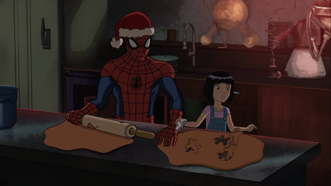
As Spidey bids Moon Knight a good night, the vigilante tries pounding on the forcefield and cries out that Spider-Man is giving this girl exactly what she wants, but he’s not listening. Inside, Spider-Man and the girl get acquainted. Her name is Francine (Mary Kate Wiles) and she tells Spider-Man she’s an orphan. A recently made orphan as she lost her father not too long ago. Spidey acts like he’s going to cry hearing her sad story and welcomes her to spend Christmas with him in this lonely old house. We then go into a montage hosted by Spidey Claus! The two make gingerbread cookies that literally get up and walk away, which they have a laugh at. We then see a sequence of polaroid photos of the two making silly faces and eating candy canes. Spidey is laying in front of the fire looking at said pictures when the brief montage ends, while Francine seems interested in looking around. She soon finds the door to the forbidden room, and like most kids, immediately wants to go in once she hears it’s forbidden. Spidey tells her he’s not going to break his promise to Doctor Strange and let her in, but as he lectures her he doesn’t really pay attention and she just slips right past him.
I’m guessing this thing is important.
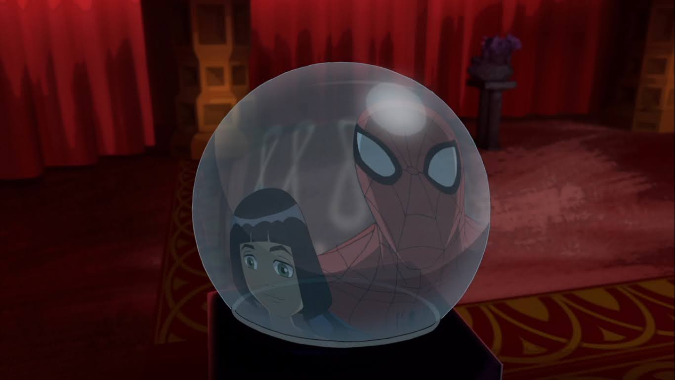
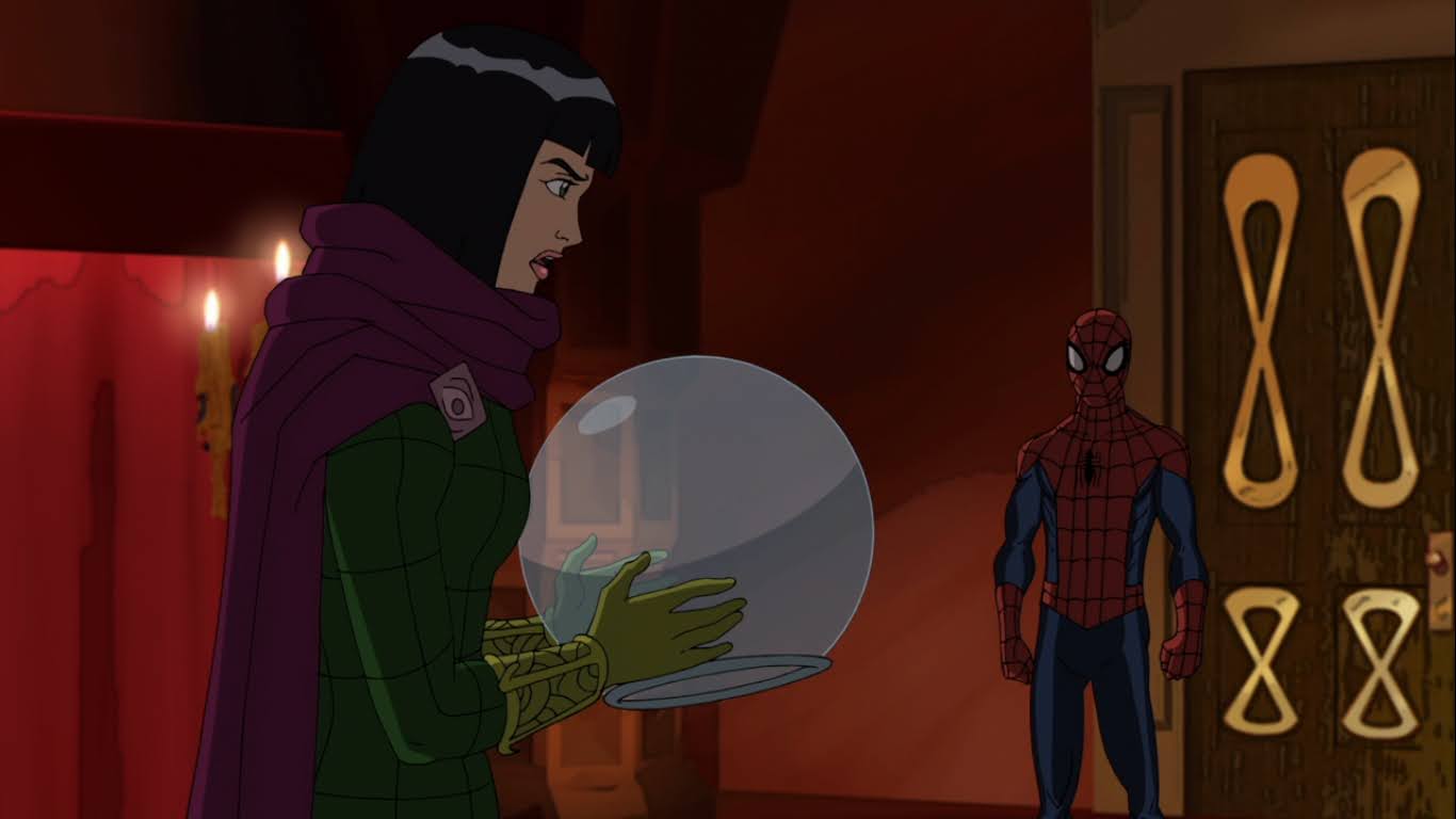
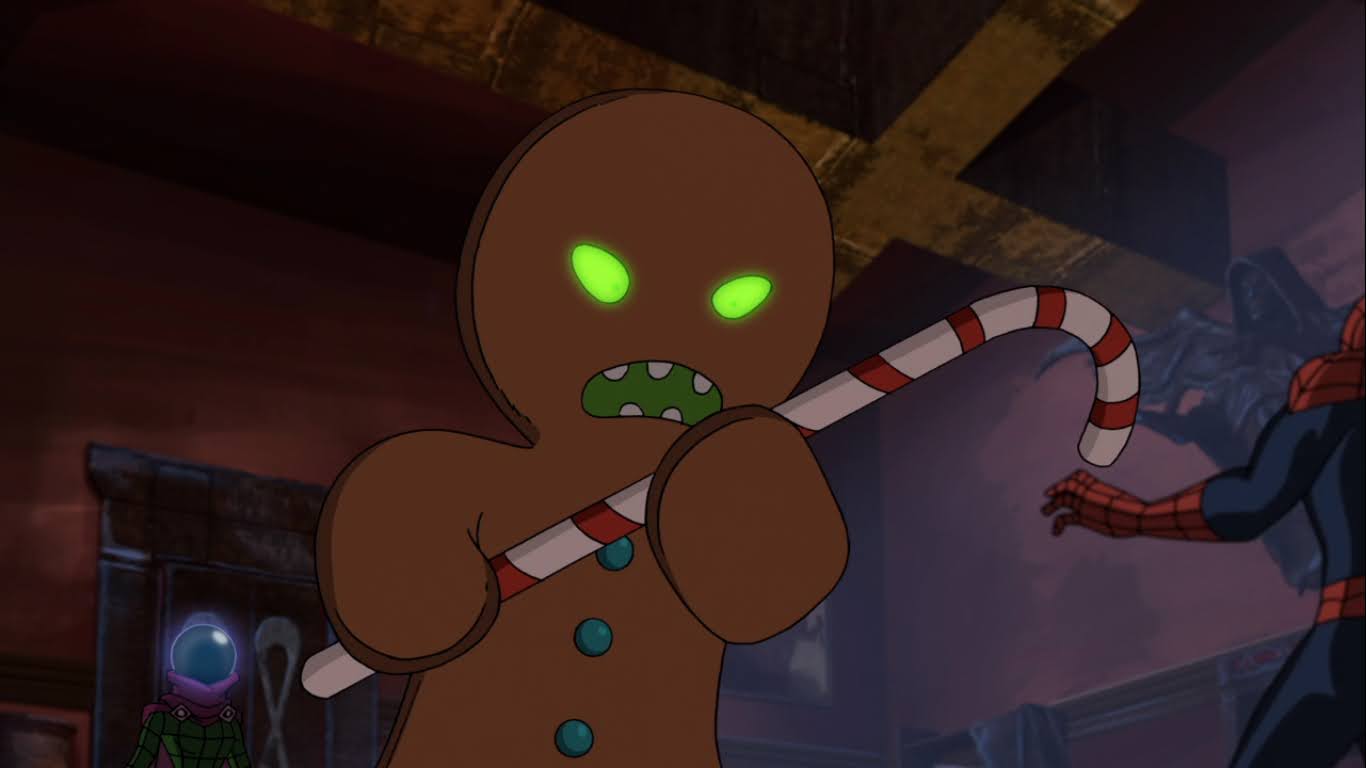
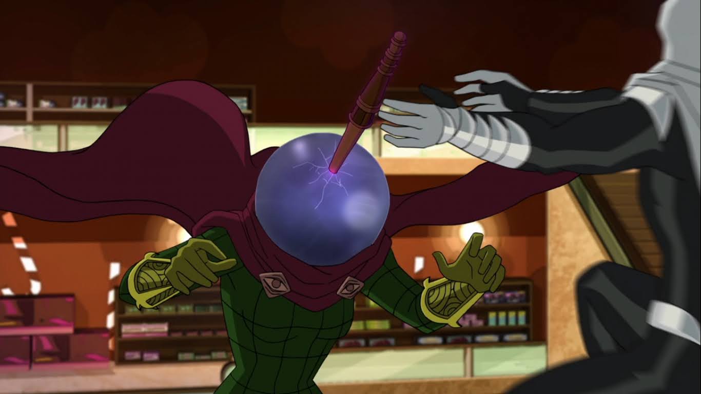
Francine enters the room and is immediately drawn to a crystal ball. Spidey comes over and realizes he’s seen that ball before. It belonged to the villain Mysterio, and we see a flashback of him doing crimes and battling Spider-Man. Apparently, he fell off the Brooklyn Bridge at the end of one of their encounters and Spider-Man was unable to save him. The ball is his helmet and it was magically enhanced so that it could make Mysterio’s many illusions turn real. Pretty sweet! After Mysterio fell into the river below, Spider-Man recovered the helmet, but no body. He gave it to Strange and is surprised the sorcerer didn’t simply destroy it.
It’s a lot harder to hurt someone when you can’t touch them.
A crashing sound from upstairs gets Spider-Man’s attention and ends his little story time. He hands the helmet to Francine and tells her to stay put while he investigates. He heads upstairs into what looks like a library only to find Moon Knight inside! He’s pretty surprised to see him since Strange put that spell up to keep out the unwanted, but he’ll have to figure that out later. Spider-Man attempts to web Moon Knight, but he turns intangible and the web line goes right through him. Spidey then tries to attack in a more conventional manner, but continues to encounter difficulties. Moon Knight explains that he is but a reflection in the moonlight, which is poetic, but still confusing. Spider-Man then hears a sound coming from outside and looks up to see Moon Knight on the other side of a skylight. Two Moon Knights?!
It turns out she’s the bad guy. Try to act surprised.
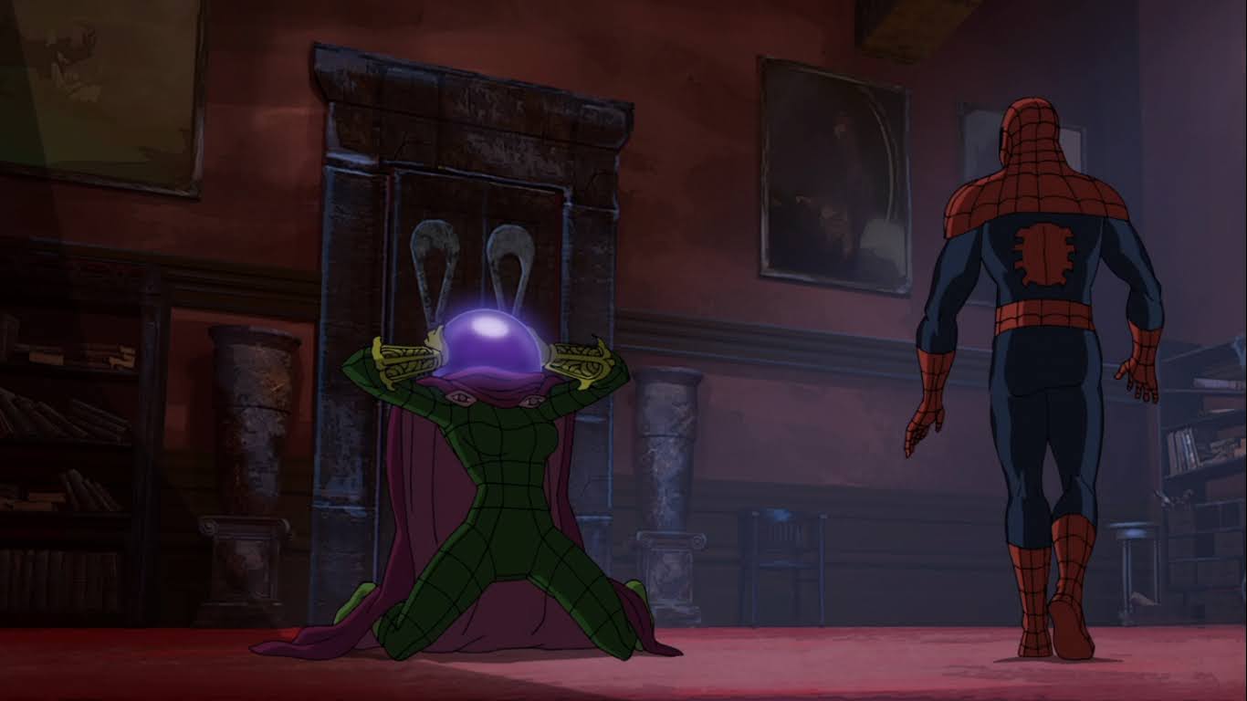
Spider-Man noticing another Moon Knight outside seemed to be enough for this Moon Knight to call it quits. It disappears in a blue light and Spider-Man realizes he was just an illusion. Saying the word “illusion” out loud is enough for him to figure out what’s going on. He heads back to the forbidden room and somewhat nervously pops his head in to check on Francine. He finds the girl holding the orb and she too is surrounded by a cold, blue, light. When it fades we see she’s a grown woman, and wearing Mysterio’s old costume too. She then thanks Spider-Man, and introduces herself as Frances Beck, daughter of Mysterio! It would seem she holds a grudge against Spider-Man for her father’s apparent death and retrieving his magical helmet is exactly what she needs to exact sweet, festive, revenge. This is going to be the best Christmas ever!
Just the first of Mysterio’s holiday themed not-illusions. You have to appreciate a villain that gets in on the theme of the episode.
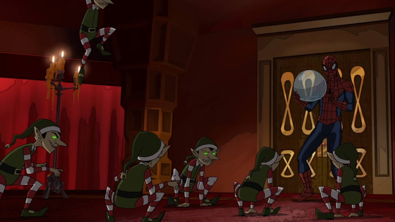
Lucky for Spider-Man, the New Mysterio is quite new to this whole villain thing and Spidey just takes the helmet away from her via a simple web-line. He tells her she can’t handle this thing and suggests she’s not the real deal, but she assures him she is. She lifts her arms up and opens a portal in the ceiling and a horde of vicious looking elves drop in! Spidey is able to escape to the ceiling though as they’re rather short, and he and New Mysterio do the whole “You killed my father!” “No, I didn’t!” routine before Spidey bails into another room.
Dr. Strange is here to save the day! Though Spider-Man is fighting a master illusionist that has already tricked him once…
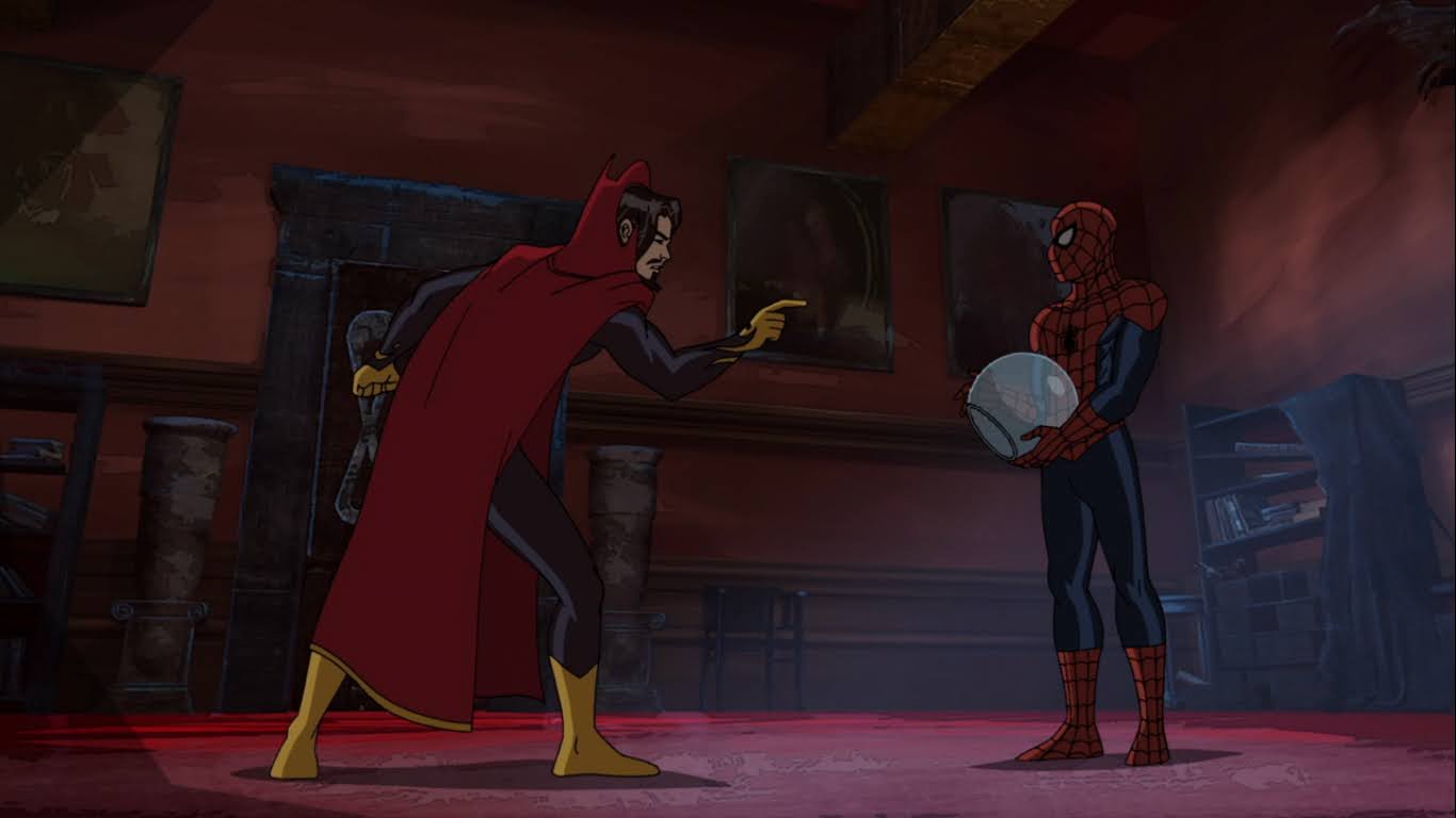
Spidey’s webs can only hold off the elves for so long as they are vicious little bastards, so he retreats back up to the library. There he finds Moon Knight, still just chilling out on the roof outside the window, before he’s visited by an unexpected guest. Or should I say homeowner? Because Dr. Strange can’t be a guest in his own home! He appears before Spider-Man and seems quite ticked off with old web-head. He let people into his home, entered the forbidden room, and has removed a powerful item from said room! Spidey tries to apologize, while Moon Knight bangs on the window shouting “Not strange!” This confuses Spider-Man more as he very much disagrees with Moon Knight and reminds him that this night has actually been very strange! He then finally realizes what Moon Knight is saying, and it’s probably helped by Dr. Strange lunging for the helmet and failing this whole thing, that he means Strange, not strange. Which, I mean, come on Spider-Man! I know you’re not a detective like Batman, but you’re facing an illusionist here and she’s already fooled you once!
More holiday monsters – I love this stuff!
The illusion of Strange then vanishes and is replaced by Mysterio. She makes a crack at Spider-Man referring to him as a joke to which he responds with “To be fair, I think everything’s a joke.” She also does some magic finger snap that just makes the helmet appear in her hands. She finally puts it on and uses the power of the helmet to summon a giant gingerbread man! Spidey points out that this is very much a joke as he dodges the massive candy cane the beast swings in his direction. I must say, I do admire Mysterio’s commitment to the season with her various summonings. Come to think of it, how did she summon the non-illusion elves without the helmet? Maybe it was the magic of the season? I guess it’s best not to think about these things.
Here comes Moony!
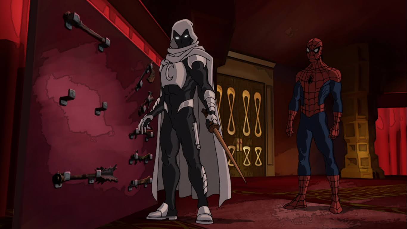
Spider-Man does what he seemingly does best: flees to higher ground. Up on the ceiling, he’s able to watch the Christmas abominations lay waste to what are likely some very old and likely priceless objects in Doctor Strange’s library and also regroup. He tries to recall the advice Dr. Strange gave him in the past, but all he can do is recall generic advice like wearing a hat when it’s cold outside. He then remembers something about Strange advising him to make allies out of the enemies of his enemies. Naturally, this means Moon Knight who is still banging away outside because he is one persistent fellow. Spider-Man shouts out the magic words to release the barrier and Moon Knight is finally able to smash in that very expensive looking window and join the battle!
Seems there’s a downside to all of this power, who could have foreseen that?
Moon Knight comes in wielding his baton and smashes some ginger foes! He’s ready to rumble, and it allows Spidey to attempt to appeal to Francine. She corrects him when he addresses her by that name and refers to herself as Frances Beck! She is not going to be swayed, but before she can really get into her villain speech she collapses to her knees in pain. Reaching for the fishbowl on her head, it would seem the orb is a bit more than she can handle. Spidey tries to help her, rather lamely though by putting an arm around her when he could have just yanked the thing off. She recoils from his touch and uses her power to open a portal that she and her gingerbread minions are able to escape through.
Look out world, Moon Knight has a wand!
With Frances gone, Moon Knight and Spider-Man are able to have a little heart-to-heart. Only, Moon Knight doesn’t seem interested in sharing any of his knowledge with Spider-Man, probably because he’s pretty much responsible for this mess they’re in. Their conversation is interrupted though by the moon. Yes, Moon Knight takes his orders from the moon and it’s played rather comically since Moon Knight can hear the moon, but no one else can including the viewer. It would seem the moon has decided that Spider-Man’s help is needed and Moon Knight is commanded to reveal all. He basically just relays that the moon warned him about Beck and that she intended to wake a dormant evil that lurked in this place, which must be the fish bowl. It also told him how to stop it: a magic wand! Yes, some wand has the power to make the helmet collapse in on itself, and it just so happens to be in this house too! Spidey is forced to break his promise, again, to Strange and admit Moon Knight into the forbidden room. There he finds the wand they need and the two set out to stop Beck.
I’ve seen this guy before.
As the two walk out the front door, Spidey asks Moon Knight (he calls him Moony – adorable!) if this wand will destroy the wearer of the helmet. He only responds with “The moon shall have its vengeance,” which is interesting because I never thought of the moon as the vengeful type. Spider-Man points out that isn’t really an answer and tells Moon Knight if his aim is to kill Francine then he doesn’t want his help. He doesn’t offer a reply as the two head outside and find Mysterio floating high above the city doing super villain stuff. She uses her new powers to summon a giant snowman monster than looks curiously like Marshmallow from Frozen.
Now Santa is getting in on this – is nothing sacred?!
Upon coming face to face with this monster, Spidey is suddenly more interested in Moon Knight’s help and willing to accept any conditions. Of course, when he looks over to the vigilante for help, he’s busy chatting it up with the moon. This guy! It would seem he’s also trying to convince his…boss…that Spider-Man is a liability, which Spidey takes offense to. The two then turn their attention to the task at hand and Spider-Man observes the Moon Knight method of dodging. Which is to say, he does no such thing. He takes a punch from the beast and explains to Spider-Man that he’d rather take the hit than waste time avoiding it, which Spidey is forced to admit is pretty badass (my words, not his). While Moon Knight tangles with Marshmallow, Spidey tries reasoning with Frances, but she just responds by turning an inflatable Santa sentient which goes on the attack. Lucky for him, Moon Knight’s aversion to dodging gets him knocked into Santa and solves that problem for him!
Hey! Quit laying around! There’s a city to save!
Spidey takes to the sky to try to get away from the monster, but ends up getting swatted instead. He crashes through a building and finds himself in a department store. A giant, novelty, present broke his fall. Moon Knight soon follows and lands on top of another novelty present and Spidey is forced to make a crack about the bad holiday décor. Moon Knight ignores Spider-Man’s joke and informs him of the dire situation they find themselves in. He also adds that the moon demands this situation be rectified by any means necessary. The duo are soon set upon by an army of nutcrackers and toy airplanes. The two leap into the scaffolding smashing toys along the way until the big snowman comes bashing in with Mysterio right behind.
I’m very surprised Spider-Man didn’t make a crack about a splitting headache here.
As Spider-Man dodges their attacks, he sees Moon Knight go for Mysterio. He calls out for him to wait, but Moon Knight leaps through the air and plunges the wand through the glass dome. Frances collapses to her knees and appears to be in a trance of some kind. Moon Knight suggests the spell is taking over and will soon end all of this, but Spidey isn’t willing to give up on Frances. He realizes that the only way to get Moon Knight to help him is to trick him. Sounds deceitful, but if this plan works then Moon Knight only has himself to blame for Spidey pretends to hear the moon. Moon Knight is perplexed, but also a bit impressed, as Spider-Man acts as if the moon is commanding him to save Frances. Moon Knight may be a badass, but he’s definitely not the sharpest knife in the drawer as he falls for it. He agrees to hold off the monstrous snowman, while Spider-Man attempts a rescue.
We all talk to the moon all the time. You’re not special, Moon Knight!
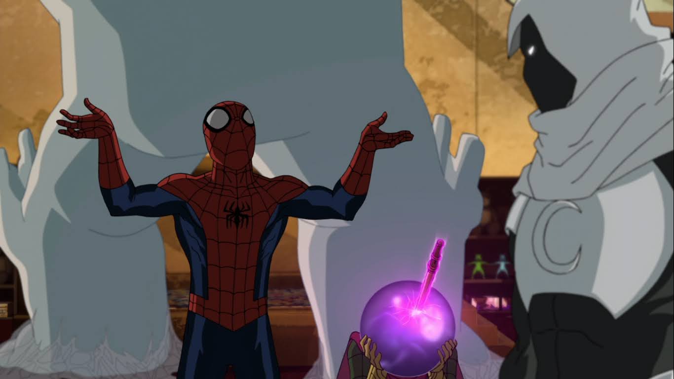
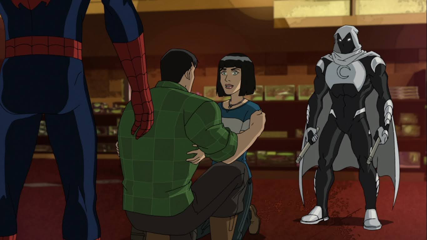
Spidey doesn’t really know what to do, so he instinctively grabs the wand. That seemed like the logical place to start, only the unexpected happens and Spider-Man gets sucked inside the helmet! He finds himself in a dreary setting, but a farm house comes into view and Spider-Man figures it must be the farm house that Frances told him about. He approaches a window and spies Francine inside seated at a dinner table with her father, Quentin Beck (Paul Scheer). They appear to be having Christmas dinner, and the decorations in the background would indicate as much. As Spidey gets closer, he finds himself transported into the house and seated at the table. There, he tries reasoning with Frances by telling her this is all an illusion and they need to get out. She insists it’s real though, that her father is real, but Spidey tells her if it was real then he’d tell her what happened that night between them. So he does!
Well, since you’re here, you might as well stick around for Christmas dinner, Spidey.
It turns out, Frances was right and this is the real Quentin Beck. He describes how he made a deal with the demon Dormammu for the power to make his illusions real, and this is the price he paid. He tells his daughter that Spider-Man did try to save him, but he refused the hero’s aid. When he fell off of the bridge, he was pulled into the helmet where he’s to remain. This also explains why Doctor Strange didn’t destroy it since doing so would have destroyed Beck. Unfortunately for the Becks, this world starts to collapse upon itself. A vortex opens above them and it’s pretty clear they need to get out. Frances pleads for her dad to come with them, but he knows he’s trapped in this prison. Or is he? Spider-Man doesn’t think so, but soon the ground opens up below them and Frances is sent falling into the void!
No daughter, I think I would prefer to remain here in Armageddon than join you for Christmas.
She stops though, bathed in a green light, lifted up by her father. He’s holding all three of them with his magic, I guess, suspended in the air. Beck then uses his powers and a green light envelops all three of them. Outside the helmet, Moon Knight is having a rough go of things. He’s being attacked by the snow monster, nutcrackers, and some nasty looking teddy bears. As he sees the helmet pulsate, he assumes that he has failed and apologizes to the moon. Then, his enemies drop dead and Spider-Man appears with the Becks and Moon Knight is forced to correct himself.
Oh look, it all turned out well in the end. That tends to happen at Christmas in TV shows.
While father and daughter have a reunion, Spider-Man remarks how Moon Knight really trashed the place. He reminds Spider-Man this isn’t the only place that’s been damaged this evening and Spidey lets out an “Oh no!” We cut to Dr. Strange finding his home in shambles. As a book crumbles to dust in his hands, he curses Spider-Man to the heavens! We then are taken to F.E.A.S.T. where Aunt May volunteers to help the less fortunate. Spider-Man, Moon Knight, and the Becks are shown enjoying a meal together and there’s laughter and happy, holiday, cheer. We then head to the roof, where Spider-Man is attempting to wrap things up for us, only he’s distracted by Moon Knight’s persistent conversation with the moon. He makes fun of him for it, but Moon Knight turns the tables since Spider-Man can’t even explain who he’s addressing. Moon Knight calls him a weirdo, and Spidey is apparently content to leave things there as he wishes us all a “Happy Holidays,” and we exit with an iris shot.
I suppose it didn’t turn out all that well for Strange. Don’t worry about him though, he can magic that glass back together or something.
That was how Spider-Man spent a Christmas. And it was a rather eventful one. I have to confess, I wasn’t much at all interested in the story of the Becks. We barely got to know Francine so it wasn’t as if I felt hurt by her betrayal of Spider-Man like he seemed to be. I also wasn’t attached to her, but I guess it’s good that Spidey wasn’t willing to take the easy way out and let the magic wand kill her. I also never saw the episodes with Mysterio so I didn’t have that to fall back on. What hurt things further though was the performance of Paul Scheer as Quentin Beck. He is so wooden in the role and the scenes with him are terrible. Was he just mailing this one in? I’m surprised they would stick with this casting because it did not work at all. Perhaps the direction for him was poor as when the vortex is swallowing them he sounds bored, like maybe he didn’t really know what was happening to his character? I also don’t understand how his powers work. I thought he just did illusions and the helmet contained the magic? Did he learn how to utilize the helmet’s magic from within it? Could he have “magicked” himself out of that thing this whole time? It’s messy.
Even Moon Knight joined them for Christmas dinner.
What did work though was Diedrich Bader as Moon Knight. He steals the show and when he’s not on the screen I was definitely looking for him. He gets to be a badass with a personality as he comes across as aloof due to his constant conversing with the moon and Spider-Man is a natural foil for such a character. He takes himself very seriously, and Spider-Man could certainly be described as the opposite. As for old web-head, he manages to be charming and charismatic, but also annoying. It’s a unique quality that Spider-Man sometimes possesses. This particular iteration pushes things at times and he’s definitely upstaged in the funny remarks category by Moon Knight and his deadpan delivery, but I’m guessing that doesn’t happen in most episodes. As for Christmas, it’s here in spirit and Mysterio does her part to make sure of that. We don’t really see much of the reunion at the end so we never get a big dose of those Christmas feels, but given my distaste for the performance of Scheer, it’s probably a good thing that we ended things where we did.
After watching this episode I just have one question: where’s my Spider-Man and Moon Knight spin-off?!
If you like Spider-Man and want to see him at Christmas, this is fine. There’s some lore here to work around, but nothing that should feel too difficult for a casual Spidey fan. The animation is solid and I like how this thing looks. It did take me a bit to warm up to Spidey’s constant eye posing, but I could definitely watch more of this. I don’t know that I will, but maybe. This episode and the rest of the show is streaming on Disney+ and I would not expect to see it shown on television, especially this late in the game. This is also the show’s second Christmas episode, but the blurb on the first one made it sound like an It’s a Wonderful Life parody and I didn’t want to bark up that tree. If I’m mistaken and you think I should check it out, let me know. For now, I feel fine leaving it at this. Plus, that one doesn’t have Moon Knight!
Can’t wait until tomorrow for more Christmas? Check out what we had to say on this day last year and beyond:
2021 marked an important anniversary in animation: Shrek turned 20. The animated film from DreamWorks is credited as really helping to launch the company as a viable competitor to Disney’s Pixar. Prior to Shrek, DreamWorks had found success at the box office with Antz and Chicken Run, but Shrek was the first to really explode…
When I listed out the best Christmas specials over a week ago, I included the stop-motion A SpongeBob Christmas. And I stand by that as that special is pretty great. Before there was A SpongeBob Christmas, there was The SpongeBob Christmas Special. Confused? Well, there are only so many ways to title a Christmas special.…
We have reached a day of great, holiday, release – Christmas Eve. And what better way to mark the occasion than with a holiday short titled The Night Before Christmas. A lot of cartoons have made use of this title, but today’s subject is the Silly Symphony short that falls under that heading. It felt…
What’s this?! A brand new TMNT sculpt from Playmates? And I bought it?!
A few years ago, Mattel launched a new subline of action figures based on their most famous IP: Masters of the Universe. The subline was titled Origins and it basically took the vintage toys of the 80s and updated them with more modern articulation while still preserving that vintage aesthetic. And ever since then, collectors have been barking up the tree of Playmates Toys, known throughout the world as the producers of the original Teenage Mutant Ninja Turtles line of action figures, for something similar. And so far, Playmates has said “nah.” Instead, the company seems more interested in reissuing figures from its back catalog and reworking the Classics line from 2012. This is all well and good for folks looking to add or replace vintage figures, and I guess the 2012 reissues are good for those who want a Shredder or Ryu figure? All right, those reissues are pretty terrible, but I’m guessing they’re doing well enough that Playmates sees little value in sinking money into a new line. Then again, who knows with Playmates as they recently re-sculpted a new turtle body for the Stranger Things two-packs. They look okay, though scale with nothing, making the whole thing feel very perplexing.
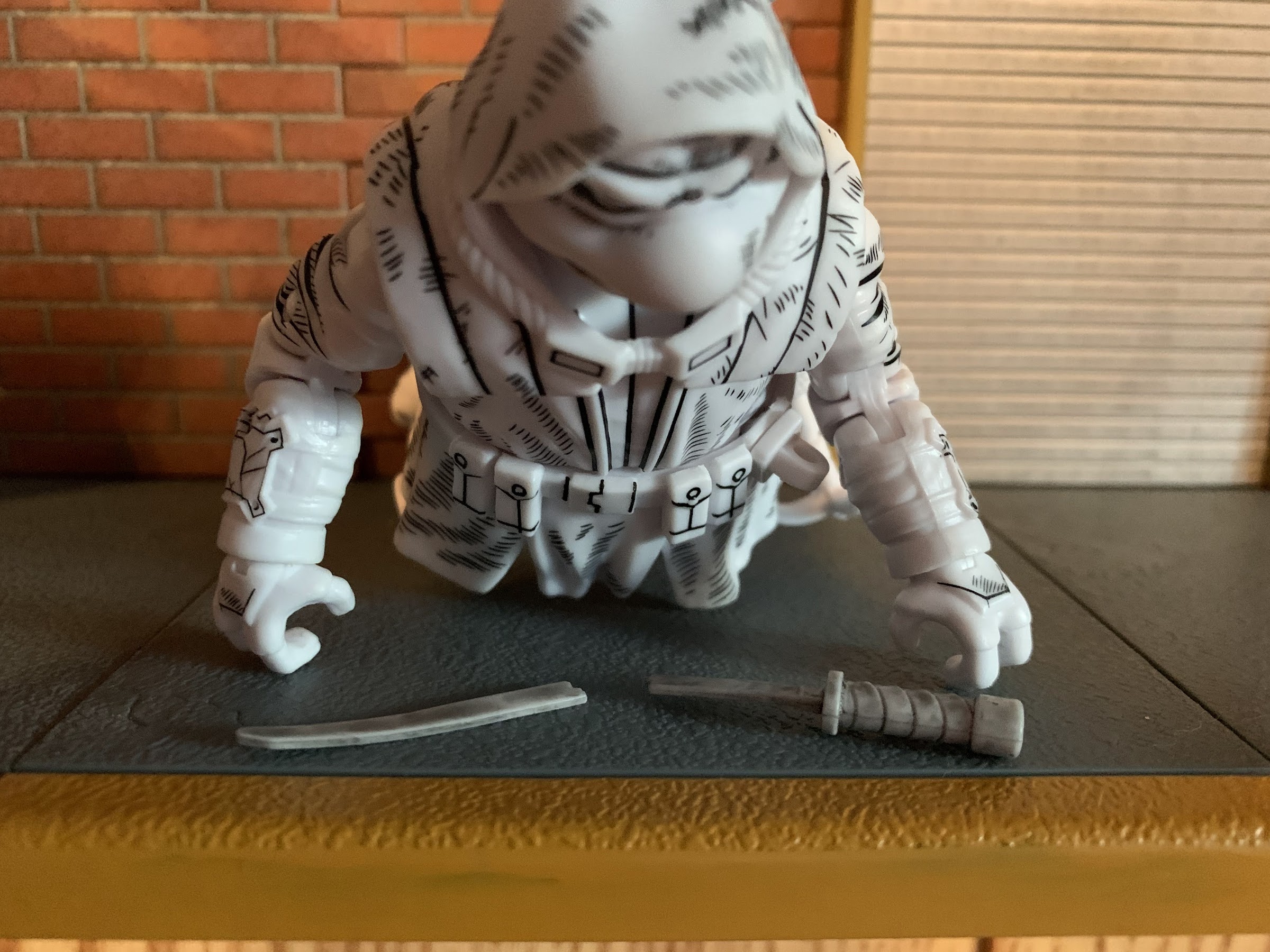
In-box collectors should be pretty happy with this one.
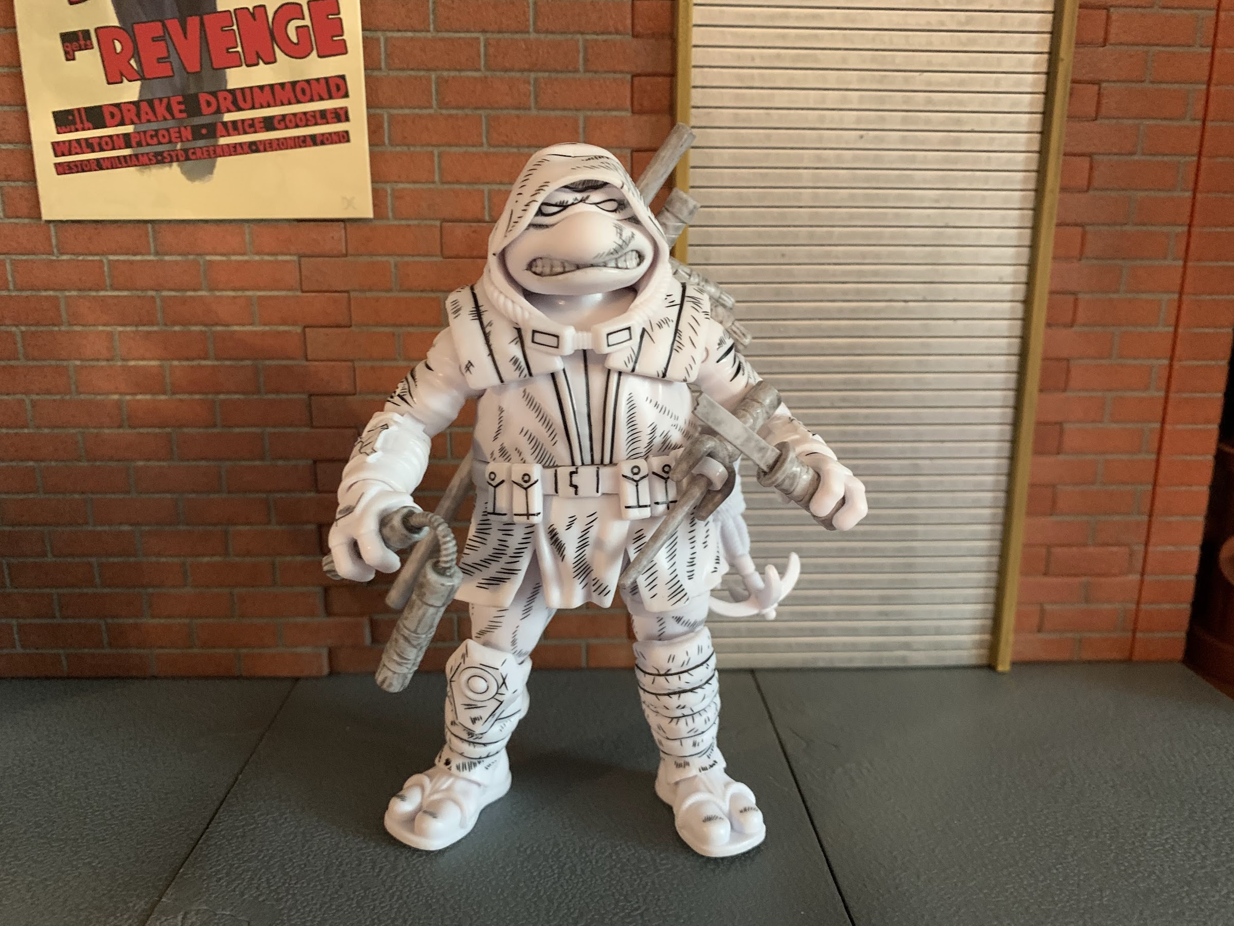
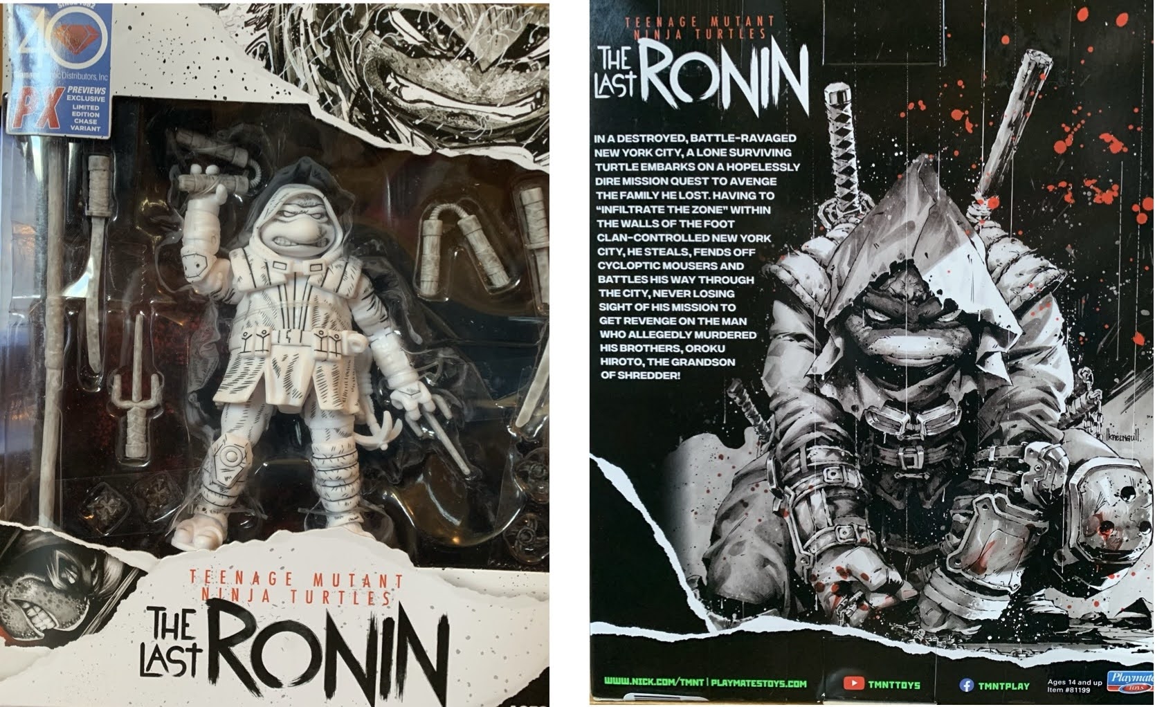
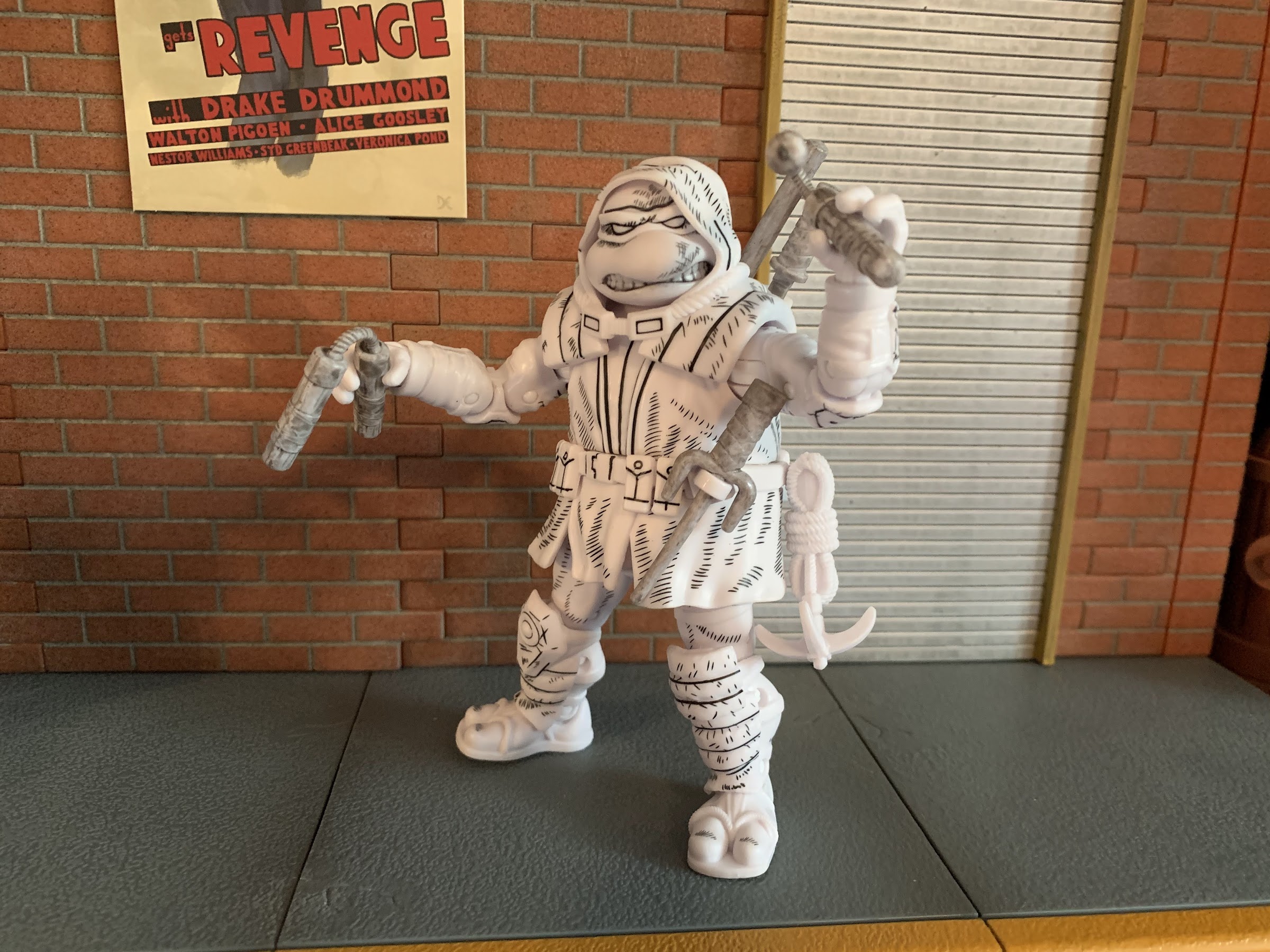
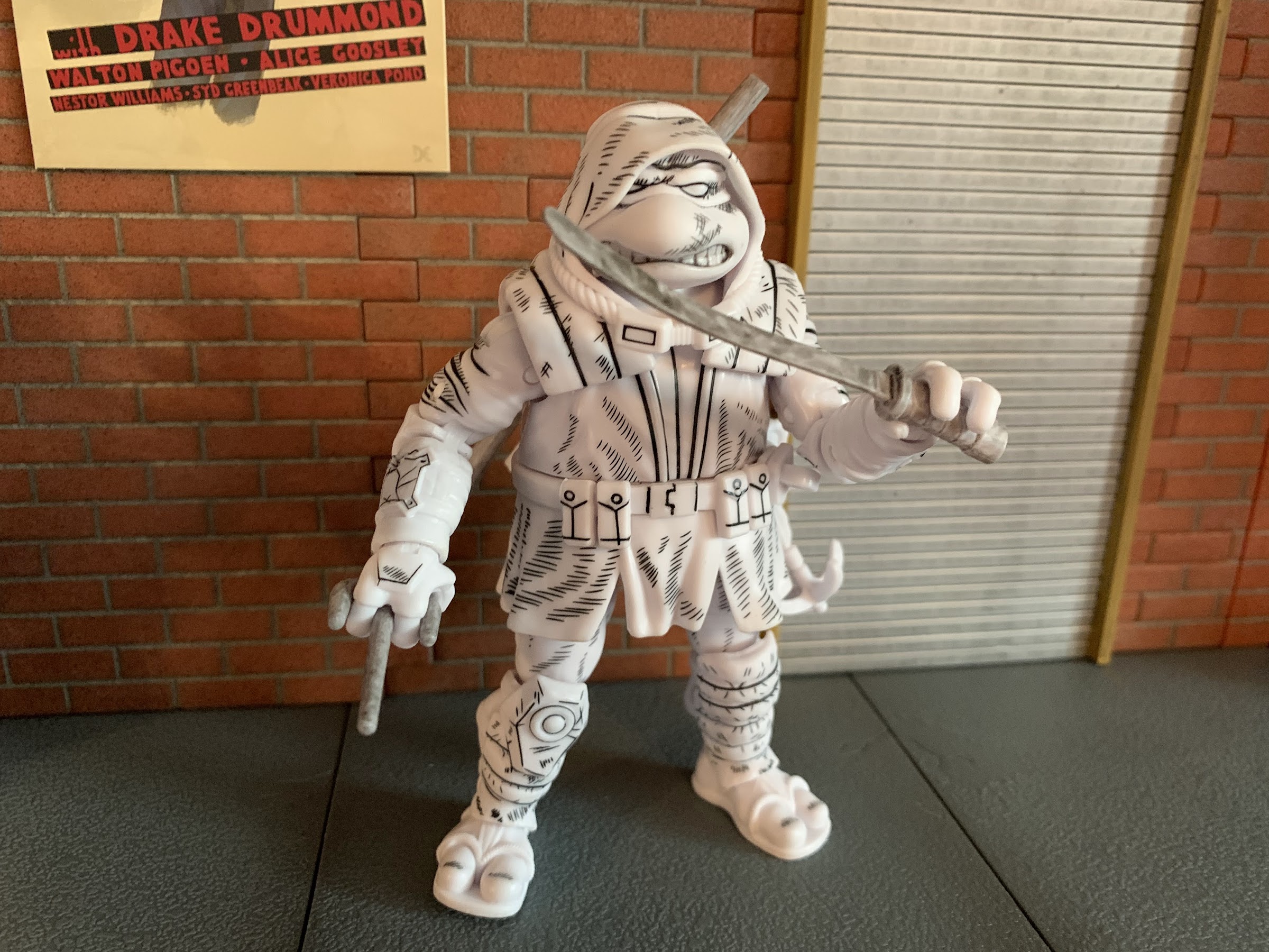
Since Playmates seems to delight in surprising us, they had a new figure to show off earlier this year based on The Last Ronin. The Last Ronin has been a popular addition to the TMNT universe and it’s a not surprise to see toys follow, it’s just a surprise to see one from Playmates. Especially one that would appear to present a solid enough blueprint for a hypothetical TMNT Origins line. I was initially going to pass on the figure when it was first shown, but my curiosity recently got the best of me. Playmates released two versions of the figure: a standard, painted one, and a black and white version with some hatching, “comic,” paint effects. For some reason, that black and white version really appealed to me, which sucks for me since it’s considered a “chase” version and virtually every retailer that carries it will apply a surcharge to it. Oh well. It comes in a nice window box though with artwork from the series on it and surprisingly no product shots. Since there’s no cross-sell, I’m assuming this is a one and done release, but I suppose if it does well Playmates could revisit it in the future.
This deco just does “it” for me.
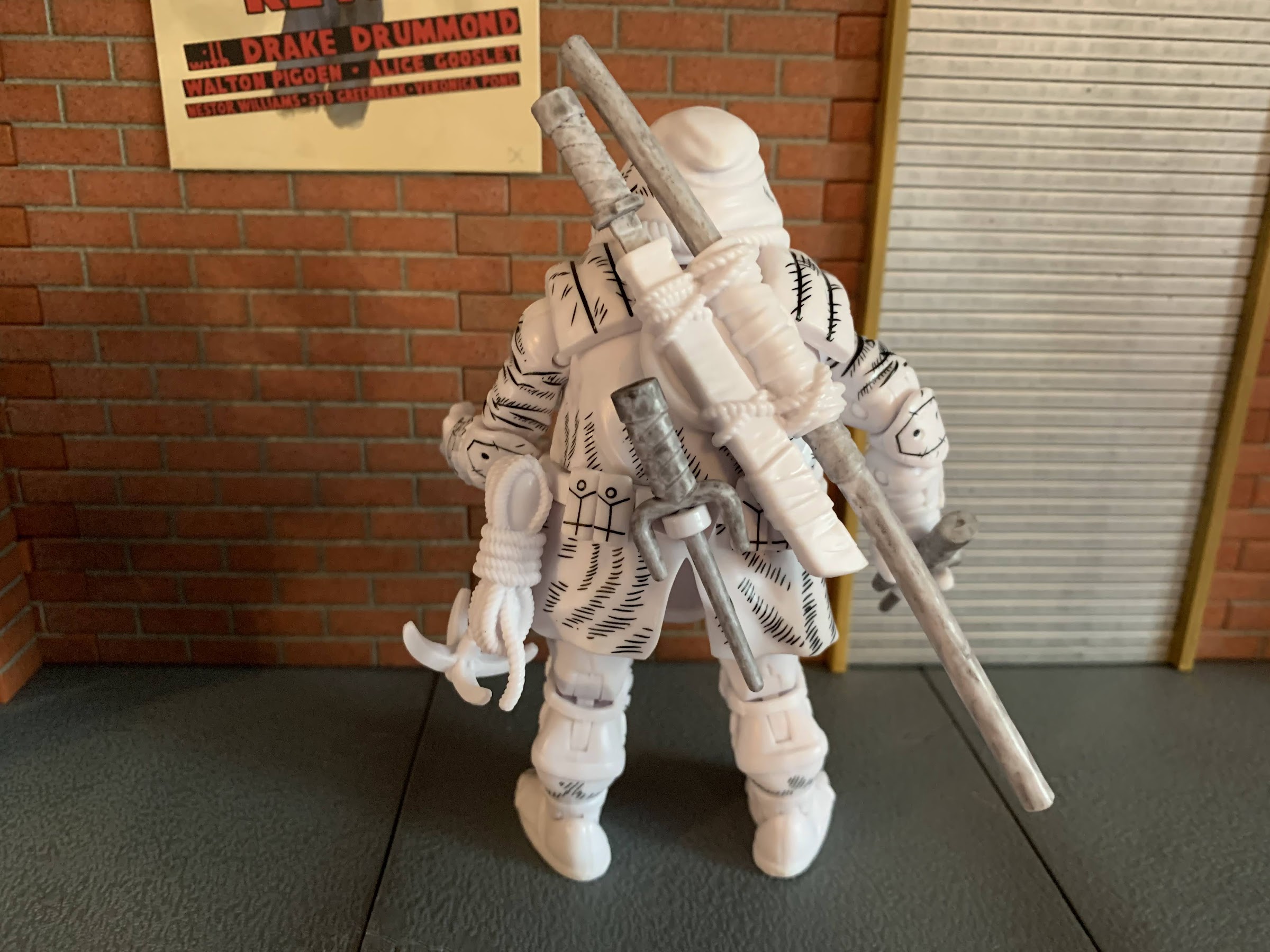
Any Last Ronin figure is going to need some weapon storage, and this edition does a solid job. Still needs more though.
Even though this is considered the rare chase version, I am an opener so we’re going to talk about this figure. The figure stands around 4.75″ in height and is pretty close to the same size as a turtle from the vintage line. A direct comparison is a little difficult since those figures all had pre-posed legs, but the height is pretty close though the vintage figures are all chunkier. It’s especially noticeable when comparing the hands between the two releases. Even so, the face on this new figure definitely has a vintage look to it. He has visible teeth on both sides of his beak, but more of an effort has been made to round the features and add detail. He has way more teeth, for example, than a vintage figure and they don’t have a large gap of green (or white, in this case) between them. As far as sculpting goes, this guy is all unique as far as I know. He’s depicted in his overcoat complete with hood and it’s all done in plastic with no soft goods or removable pieces. The hood is a separate piece that doesn’t seem to peg into any part of the figure, but is nevertheless quite secure where it is. With heat, I’m guessing one could pry it off, but I’m not going to attempt any such thing. The bandana underneath is fully sculpted though from what I can tell. The goggles are part of the sculpt on the hood so you can’t do a goggles-on look, but I’m not particularly disappointed by that. The belt and bottom of the coat seems to be the only other overlay and it’s either glued or keyed in. It’s a slightly softer plastic, though the flex isn’t going to facilitate any extra poseability with the figure. The black linework on this guys is very clean save for the top of the bandana on mine and I love the added scuff marks and such all over him. I would have welcomed a little more in some places, especially the hands, feet, and weapon holsters, but it looks solid nonetheless. I also like how he has different knee pads since that asymmetrical look was so popular in the old line, though in this case it’s done to be accurate with the source material.
This sword could probably use some heat to straighten it out.
This guy is really charming to look at. It’s not the hyper-accurate to the source material the NECA version goes for, but it has a certain appeal for those who either grew up with or just collect the vintage line. He may lack the chunk of that old line, but I think he can fit into a vintage display without too much issue. The standard version might stand out a little more given it has far more paint apps, though a stark white figure doesn’t exactly have any comparables in the line either. This is a fun look though, it just might be a little too pricey for what it is. Most seem to list the regular version for around 30 dollars. If Playmates could do this level of quality at 20 or even 25 that would feel a lot more agreeable. Having this black and white version has made me more curious about the regular release and how many paint hits it has. Are all the ropes painted? Are there any wash effects? I don’t know if I’m 30 dollars curious, but maybe if this thing hits clearance I’ll add another.
You also get the broken sword, which just reminds me of all of the broken swords I had in the old line.
Raph had a pair of sais, so Ronin gets two as well!
The big selling point of the Origins line is the addition of modern articulation, so it’s fair to wonder if this figure could be a model of things to come in a similar line from Playmates. And if that’s the case, well then there’s some good, and some not so good when it comes to this figure. The head appears to be on a ball peg, but the hood makes manipulating it rather difficult. I can get him to look left and right, and even up and down a little, but I’d call it more nuance posing than anything. The shoulders are ball-hinged and he can raise his arms up past a horizontal position, so that’s good, and there’s no real shell to prevent rotation all the way around too. The elbows are double jointed and bend past 90 degrees with ease and the wrists swivel and feature horizontal hinges which is a bummer since vertical would have been better. There is a waist twist and the legs attach via ball and socket joints. He can spread his legs basically as far as the skirt of the jacket will let him, which isn’t much, and the same is true for kicking forward and back. You get a tiny bit of thigh twist, or pivot, on that ball joint, but it’s not a lot. The knees are double-jointed and bend past 90 without issue while the ankles feature a hinge. The feet appear to peg into the hinge so you get a tiny bit of swivel there, but there’s no ankle rocker which is a bummer. That’s the biggest omission for me as being able to pivot down at the feet really opens up the stances available when posing a figure. Without it, there’s not a whole lot he can do below the waist. The other major omission is the lack of a biceps swivel. If they added those two points, which might not have cost them anything when they were tooling this guy, it would have made a world of difference. Instead, he moves just okay. It’s certainly below average for a modern figure, and this is a guy with a lot of weapons so it’s an extra bummer he can’t pose better. Yeah, he’ll pose better than your turtles from 1988, but that’s probably not the standard we should be holding Playmates to in 2022.
Donnie typically only wields one bo staff though, so he only gets one of those.
If you don’t want him wielding any of the more traditional TMNT weapons, he also has some shurikens he can turn to.
One of the hallmarks of The Last Ronin is the character is basically a one turtle army. He has all of the weapons of the core 4, and even more in the book, so this edition has to do the same. There are no extra hands or portraits so all of the accessories are weapons. In the box, you get: two sai, two nunchaku, one sword, one broken sword, one bo staff, two star-shaped shurikens, and two diamond shaped shurikens. It’s a good assortment and the only weapons missing are the tonfa the character wields in the book. There’s also a grappling hook that pegs onto the belt, though it’s just a lump of sculpted plastic and not something he can really do anything with. All of the weapons are sculpted in a light gray with a black wash added. The shurikens might be a darker gray, but they also have a much heavier wash on them making them appear more black than gray. The sculpt of the weapons is all solid. The ‘chuks are sculpted to have ropes instead of chains and they all feature wraps sculpted onto the handles. The sai are the only ones I don’t love since the bladed portions have been rounded off significantly and look a bit silly as a result, but I guess that’s because Playmates adheres to department store standards when it comes to safety. Like the book character, this figure has room for weapon storage, but he can’t store everything. There’s a slot for the bo on his back and a scabbard for one sword. There are two pieces for the sai, one on the rear and one on the front, and they even pivot so you can adjust them as needed. There’s no way to store the nunchaku though nor is there a place for the shurikens. He can at least hold everything and his hands are sculpted so the sai blade can go between his fingers if you wish. I just wish he had a true belt to slot some of this stuff into when he’s not holding it. I almost feel discouraged from displaying him holding any of the weapons he can otherwise store.
So where does this guy fit? We have a NECA toon on the left, and a Playmates vintage on the right. He’s close to the vintage, but decidedly less chunky. I think he mostly exists on his own, which is appropriate given the source material, but some may want him to blend more seamlessly with the vintage line than I do.
On its own, this Playmates version of The Last Ronin feels like a worthwhile release. The word I keep coming back to with this guy is “charming.” He’s a charming figure. It has enough of that vintage aesthetic going for it with the face, but it also brings its own flair to the shelf. As a one-off, it feels okay at this price point, but as a blueprint for a potential revival of the old line it does feature some room for improvement. I would like to see the articulation shortcomings addressed, and if they can’t get the price below 30 then it might not matter what they do. That feels way too close to the going rate for something from NECA, though an Origins-inspired line might not face competition from NECA, but Super7. Maybe a 30 dollar price tag is good enough if consumers are comparing that to the $55 remakes Super7 is doing? It’s hard to say. I’m not even sure I want such a line to exist as I feel pretty well covered at this point when it comes to TMNT toys. As a novelty, I could see myself kicking the tires on the four brothers at least, but as another line I’m all-in or nearly all-in on? I don’t know if the appetite is there, but I could be in the minority. Hopefully, if Playmates continues to do one-off styled releases, or even does more of those two-packs, they try to adhere to this style more than the 2012 Classics Collection mold which just doesn’t hold up very well. More of this, please, Playmates.
The big, bad, alien, turtle is here to kick some ass!
As NECA continues to find success with its Teenage Mutant Ninja Turtles lines of action figures, the company has sought to branch out beyond the usual source material in an effort to give collectors more of what they want and also likely to just keep the hype train rolling. NECA started first with doing figures based on the original comic appearance of the turtles in the Mirage Studios series which has lead to video game, movie, and cartoon adaptations. The cartoon is, by far, the most popular and successful it would seem and a natural complement to that television show is the line of comics released by Archie while the show was in production titled Teenage Mutant Ninja Turtles Adventures. These comics started off as adaptations of the show, but soon went their own way. It’s through this comic that many characters fans would come to enjoy in both the Playmates toyline and the show actually originated. One of the most popular characters to debut in this fashion has been the sometimes evil mutant, sometimes alien, turtle Slash!
Slash is someone we’ve talked about recently as Super7 just sent out their take on the beastly snapping turtle. That figure is based on the Playmates release which really honed in on Slash’s debut where he was more bad guy than good. It likely made sense to someone in marketing to basically have an anti-ninja turtle in the ranks of the bad guys and that toy set the stage for the character’s introduction in the show, even though toon Slash would end up being quite different as far as temperament goes. Slash as he was presented in the comics was a little more nuanced. His home world was destroyed by industrialists which essentially sent him into a frenzy that landed him in an intergalactic prison of sorts where he befriended Krang. Not really knowing how evil Krang was, Slash helped him and was introduced as a villain to the Teenage Mutant Ninja Turtles, but he’d eventually come to realize that Krang was no friend of his and was taken in by the Mighty Mutanimals which basically made him a good guy. A lot of other takes on the character seem to have followed suit where Slash will start off as an adversary before becoming more ambiguous and even heroic. His debut was in an issue of the series written by Stephen Murphy, though I can’t find a credit for who actually created the character, but many on the Archie staff were unhappy with how the Mutanimals characters were treated when brought over to the cartoon and I assume Slash was no exception.
Per usual, NECA went all out with the artwork on the box hiring former TMNT Adventures artist Kevin Mitchroney to handle things.
Slash, being a popular character within the fanbase, makes some sense as NECA’s debut in the Archie universe. They have done two versions of the character already, one for the video game and one for the cartoon, but both utilized the standard ninja turtle mold. I like both interpretations of the character, but my main criticism with each release was that Slash was too small. He doesn’t necessarily need to be taller than the turtles, but he should have more mass. NECA seems to have heard that criticism from the fanbase as this version of Slash is on the newer Tokka base body. It’s amusing to me because in the vintage Playmates line, Tokka was basically a repurposed Slash so the cycle is complete! This body though gives Slash that thicker, more physically imposing, appearance that I think fans wanted from the other figures. TMNT brand director for NECA, Trevor Zammit, has even indicated they may redo the cartoon version on this body. They have been saying similar things about April for awhile too so I certainly wouldn’t hold your breath, but as the toon line gets further into deep cut territory it wouldn’t shock me to see a fan favorite like Slash revisited once again.
This figure shares most of its anatomy with the previously released Tokka.
Since this is the first in a new subline from NECA, we should talk a little about the box. It’s in the same shape as the Fugitoid and Loot Crate Claw Shredder packaging which is that of a trapezoid and features a window display on the front with artwork on the sides and product shots on the rear. All of the art is done by former Archie artist Kevin Mitchroney who also previously worked on the San Diego Comic Con exclusive carrying case from a few years back. It’s great to see NECA continue to seek out an authentic artist for these lines as it really does add to the presentation. Of course, ultimately the box is just trash that houses the action figure and mine has been ripped open, but I still think the box is pretty cool. Slash comes on a plastic tray that is easily removed from the box, if you want to preserve it, and the backdrop is that of his home world, if I’m not mistaken. Possibly my biggest pet peeve with this release starts here as every limb and accessory for this guy is held down by an annoying, plastic, tie-down. I hate these things so much because you have to pull on them to stretch them and then snip. You can try to rip past them, and I ended up doing that for the optional hands, but these little things get everywhere and leave your fingers sore. You also can’t do the rip technique for anything painted, which for a NECA figure is almost everything, as that could damage the paint. I find the tie-downs unnecessary as the bubble is plenty strong enough to keep the figure in place, but maybe it’s extra reinforcement to appease mint-in-box collectors, but screw them! NECA, please, ditch these things!
One thing NECA had to re-sculpt for Slash is the shell, which is a bit more vicious looking than Tokka’s. Note the unfortunate white blob of paint on the belt of my figure.
And speaking of unfortunate paint apps, paint rub might be a universal issue with this release.
With that out of the way, lets actually talk about the figure. Slash when standing upright is about 5.875″ tall. He is one of those characters that’s a bit hunched forward so he’s never as tall as he could be. He seems to scale well with the toon turtles, and I’m assuming if they do Archie turtles they’ll be the same height, and that promised mass is certainly on display out of the box. He is just a chunky boy. Most of the figure is cast in a muted green, but then painted over, to give him a matte finish. He has some black linework on his muscle lines and the plastron which helps the figure to pop. The warts on his skin are done in a darker green and the plastron brown. On the back, his shell is cast in a much richer green and features a lot of that linework featured elsewhere. It’s also on his belt, and the metallic portions are painted white with a hit of blue shading which gives him a very comic-like appearance. There’s no panel shading so the approach here is definitely similar to the Mirage line. As for the new sculpt, the new parts are the plastron, hands, shell, and obviously the head. I love this expression Slash is sporting with one eyebrow raised and his sharp teeth all on display. The paint on his head is really clean and: Look! – painted shoulder pauldrons! His trademarked blades are also quite pointy and a little sharp and if I have one critique with the sculpt it’s that I wish they were longer like they are on the box art. In terms of presentation issues, it’s basically just paint imperfections here and there. There’s a small blob of white on the back of the belt that I might try to remove and there’s a couple of rough spots. One is on the edge of the plastron above his right pectoral and the paint is pretty choppy around the thigh joint on the rear of the leg. There’s also a bit of paint transfer around the the knees on mine from the kneepad to the thigh. That joint was also stuck out of the box and I think it’s because of the paint there. When you use as much paint as NECA does, these blemishes are bound to happen and overall I’d say it’s at an acceptable level here. Especially since the alternative would be to use less paint which I am not in favor of.
This chunkier build is much more suitable for Slash than the turtle body, which is what the previous NECA Slash releases utilized.
And here he is with those past releases. I like all three, but I much prefer this body for Slash, though I wish his wrist blades were as long as the video game figure’s.
Slash, being a chunker, is not the most impressive figure when it comes to posing. He has pretty much all of the joints one would want, but his design limits his range. The head is on a ball peg and since it’s positioned forward he doesn’t get as much range as one might hope. He can look up a little, down a little, and to each side a little. Perhaps if he had more of a neck he could get better range, but as it stands it’s a bit lacking. The shoulders are ball-hinged, but he has those white pauldrons to be mindful of. The right one on mine sometimes wants to curl under the shell when positioning the arm which makes me worried about paint transfer. He basically isn’t going to get his arms out all the way to the side, and since he’s a turtle, he can’t rotate all the way around either as the shell gets in the way. We do have a biceps swivel after that and the elbows are double-jointed. Because of the elbow pad, he’s basically only good for a 90 degree bend. If you really work at it, you can possibly get him to go past that. The hands swivel and all feature horizontal hinges, which is a bummer for the accessories. It also kind of stinks that he can’t rotate his blades at all. In the torso, there is a waist twist that’s either single or a double-ball, but because he’s a turtle, it doesn’t allow for much movement. The hips are ball and socket joints with a thigh swivel. He can just about hit a full split, though the built-in thigh swivel doesn’t seem to want to move much on mine. Instead, the hip mostly pivots on the ball and socket, but that might be enough rotation for most. The knees are double-jointed, but like the elbows, you’re probably not getting past 90 here. The ankles are hinged and have a rocker and both work well. In terms of joint tolerance, I would say most of the joints are on the tight side. The right knee is the only one I had to heat up, but the shoulder hinges seem especially tight as well. The hips are a little on the loose side, but he’s holding himself up even at the widest stance possible so it’s not presently an issue. Because of the blades in his wrists, the wrist hinges are pretty tough to make much use of as you definitely don’t want to rub the hands on those mostly white blades. It mostly just highlights the need for vertical hinges as those would be far more preferable than what’s present.
In addition to the kris, Slash also come with one of these things.
Slash does come with a few accessories he can make use of in the form of weapons and spare parts. Out of the box, he’s equipped with fists, but he also has a set of gripping hands and clenchy, style, pose hands. Swapping them is a bit tricky because of the blades, and the fit is also rather snug, but do-able without any heat. In terms of weaponry, he has his kris sword which some refer to as a sai. It’s just a crooked, short, sword and it has the same white and blue paint app that his belt and blades feature which I like a lot. Based on most of his artwork, I think it could have been made a little bigger, but otherwise it gets the job done. Slash also comes with a bladed, hook, weapon and it’s mostly known as that thing that came with all of the vintage turtles. I have no idea if he actually used such a weapon in the comics, but I’m probably not going to make use of it. That’s it though. It’s definitely not a lot, but for most it will probably be enough. I think an extra head is always nice to have, but admittedly, I really like his present expression so I’m not sure another would be any better. I find it curious that he’s depicted with his little, toy, palm tree on the box art, but NECA declined to include one with the figure. It’s made more odd since they’ve already tooled such an accessory for the toon Slash. The only thing I really miss is just vertically hinged gripping hands. It would have also been cool if the bladed wrist weapons were removable just for some different posing opportunities.
He also looks rather menacing without a weapon.
Slash is a pretty cool looking figure. I suppose I didn’t need to write as much as I did up to now when I could have just said that and been done with it, but it’s the truth. He just looks cool. There are some issues with the articulation and paint, but the overall package seems to overcome that just fine. And since he’s the debut of a new line, there’s an added element of excitement at play as well. Slash is just the first, and still come to are Man Ray, Jagwar, and Dreadmon with more certain to follow. It would seem that NECA is prioritizing the Mutanimals first, and I think that’s a sound strategy since some of them have never been in plastic before. This figure is currently being sold at specialty retail for around $38 which is basically what NECA Ultimates are starting to retail for these days. It’s higher than I would like, but I have already seen this one discounted in some places. I do not know if there are any plans to bring any of this line to big box retailers like Target. The fact that Man Ray was unveiled quite a while ago and no preorder has gone up makes me think there’s a chance he’s going to one of the big stores initially, like Fugitoid, before specialty gets a crack at him. Unless the plan is only to do one figure from this line per year. I actually have little affection for the comic this figure is from so I don’t know how deep I’ll go on this line, but I liked this look enough for Slash that I got it anyway. I’ll probably do the same with at least Man Ray since he never had a proper appearance in the cartoon. For fans of those Archie comics though, this is pretty exciting and I hope they’re happy with how this figure turned out.
I’m guessing someone out there will want to see this guy with the Super7 figure, so here you are.
“I know more of this world than you could even dream, that is why I must…destroy it!”
It is Halloween and that means it’s time for costumes, candy, and spooky fun. It’s also Halloween 2022, a pretty important date if you grew up loving those mutants who ran around in colorful spandex fighting for a better tomorrow. That’s because 30 years ago on this very night, the animated series X-Men premiered on the Fox network. The decision to debut a cartoon in prime time with characters still on the periphery of mainstream appeal was both a bold choice and one brought about by necessity. Fox had done the same recently with Batman – The Animated Series, but that hardly feels like a gamble considering that was coming hot on the heels of Batman Returns. You see, the show should have premiered in September on Saturday mornings, but the project was fraught with delays and the early animation sent back from studio AKOM was said to be a disaster. And since the show wasn’t going to be able to premiere as planned, the producers involved decided to focus on the first two episodes to get them ready for a Halloween premiere with the rest of the season to follow in early 1993. Marketing dubbed it a sneak peek, and it must have worked because before long the show was a ratings hit and the rest is history.
Given that it’s such an important day for an elder X-Men fan like myself, it only felt appropriate to forego something spooky this Halloween in favor of something celebrating that show. Now, I originally intended to debut my review of Hasbro’s Morph, but I received that figure in late September and I was just too eager to talk about Morph. The timing just didn’t make sense, so we’re pivoting to something else. Had Mystique, the next planned figure in Hasbro’s dedicated X-Men animated line, arrived this month she would have been featured here. And she even embodies a bit of that Halloween look with her blank eyes and affection for skulls. Instead though, I think we have the next best thing with one of the major villains from the show: Apocalypse.
This card is stupid big.
Hasbro’s retro card series of Marvel Legends has caused some confusion in the collector community, and I’m afraid this Apocalypse only adds to that. It started a few years ago as an homage to the classic ToyBiz line of figures from the 90s. Hasbro created updated blister cards based on those styles and packaged Legends in them. They had to be slightly oversized to accommodate the larger Legends figures compared to the classic ToyBiz ones, but who in the collector community doesn’t love a good dose of nostalgia? They’re definitely neat, and since the designs of the figures are largely based on their 90s appearances they hit pretty hard when it comes to nostalgia. It was successful enough that Hasbro then did the same with Spider-Man. Unlike the old X-Men line, the Spider-Man line from ToyBiz was a direct tie-in to the animated series that premiered on Fox (in sneak peek fashion as well since it worked so well with X-Men) in 1994. As a result, collectors weren’t sure if these new Spider-Man retro card releases were based on the animated series as well. I’ve seen many collectors refer to the Hobgoblin, especially, from that line as being animated inspired, but that doesn’t appear to be the case. The only one released that is definitely based on the cartoon is the PulseCon exclusive Venom from last year (which is being followed-up with an animated Spider-Man this fall).
The actual figure though? Not really that big. I would have actually liked a little more height out of this guy.
Now adding to any confusion that still exists out there is this Apocalypse figure. Apocalypse had multiple releases in the ToyBiz days so a retro card release makes sense. However, this particular figure features a purple and blue deco. That is significant because that’s the color scheme Apocalypse had in the animated series. No where else has Apocalypse ever looked like this. And to drive the point home further, he comes with an interchangeable gun attachment for his arm that is pulled right from an episode of the show which has left many to ask “So why is this not a release in the VHS line?” And the answer is, “I don’t know.” I don’t think any of the marketing team for Legends has explained that one. My guess is that someone on the team really wanted to do this character in this look, but the budget for the VHS line couldn’t accommodate it so they did it this way. It’s bizarre, because this figure does not feature the cel-shading paint job of the VHS line so it’s not just a difference in packaging. This figure is also based on the build-a-figure Apocalypse released a few years ago, so disassembling it to fit in a VHS box would not have been problem. Plus, as illustrated with Mr. Sinister’s VHS box, Hasbro is willing to adjust the sizing when necessary on those boxes so there’s really nothing stopping Hasbro from releasing the figure in that line from a design standpoint. I know the cel-shading is a bit of a contentious topic in the community, but this figure is so cartoon specific that I can’t imagine there was a ton of demand from collectors not interested in the animated series. This version of Apocalypse has always been viewed as a little “goofy” because of those colors so comic collectors are most certainly not the target audience, but here we are.
This is unquestionably supposed to be Apocalypse from the cartoon, you can’t fool me Hasbro!
Because of the colors on this guy, I definitely consider him to be part of the animated series line of action figures. It’s bizarre, and if it’s simply a matter of budget then I don’t know why they didn’t just hit this guy with more paint so he would fit in, but here we are. That said, I’m happy to have Apocalypse in this deco as it’s been perhaps the figure I’ve wanted most to come out of the animated line next to Morph. This funky color palette just hits right for me. Like most kids in the early 90s, I was confused why Apocalypse looked like he was painted for Easter in the show and would have preferred him in black and blue, but over time this look has just become a hallmark of the series for me and I appreciate it more as a result. Plus, Apocalypse is so bad ass that he can look like this and still be feared!
The figure does come on the aforementioned blister card and it is pretty massive. It’s almost comical to look at how big this thing is relative to other retro card releases and even more ludicrous compared to the 90s cards. It features some nice artwork, though not in the animated style aside from the suit colors, and definitely has that old school ToyBiz feel. Many like to keep these releases mint-on-card, but I am not one of them. If you want to preserve the card as much as possible, I recommend slicing the bubble from the bottom with a blade which will allow you to slide this big boy out. And once removed, he is indeed rather big standing at around 8.25″.
Even this gun attachment is taken right from the show.
In looking at this figure, what immediately stands out as “animated” aside from the colors is the sculpt of the chest. I mentioned earlier that this figure is based on the build-a-figure from a few years ago, but it’s been re-tooled in several places and the upper torso is one such place. The musculature has a very soft look to it which is in-line with the show. There’s basically just a hint of pectorals and nothing more. The other details of the costume, such as the shoulders and the collar area, look as they should. The only parts not exactly screen accurate are the boots and the gloves. The boots are just all-together busier in their design, something an animated show would strive to eliminate. The hands are similar, but they’re also just not sculpted right as he should have a blue knuckleguard on each hand. Lastly, the cables that connect his arms to his back should plug-in around the elbow and not the forearm. Obviously, these inaccuracies exist because Hasbro is reusing old parts and I would say it’s mostly fine. While I would love to buy action figures that are committed to matching the source material to a more exact specification, I know that’s not Hasbro’s approach. They do things mostly with cost in mind and basically think giving us a new torso is good enough. The issue now is that approach was more acceptable when these figures were a lot cheaper. It’s something that will bother some folks, and for others it won’t. In my experience Hasbro has done a good job of conditioning its fanbase to accept these figures for what they are so my expectation is most will be unbothered.
In typical Hasbro fashion, they give you some of what you want, but not everything. This gun has four barrels, but you get just 3 blast effects.
As a last bit of aesthetics, we should talk about the paint job. Apocalypse is quite purple and quite blue, as he should be. Hasbro prioritizes using as much colored plastic as possible with their figures and this one is no exception. The paint is mostly limited to the head, upper torso and the gauntlets. The head is where the most paint was needed and it’s done well enough. We’ll talk about the appropriateness of the expressions when we get to the accessories, but there’s enough paint to bring out the sculpted details of the face with minimal slop. He’s not the easiest face to paint as the lips basically wrap around the whole head and he has that gap in the blue on top of the head, so Hasbro did a very nice job here. What is unfortunate though is his head is in two pieces glued together and there’s a blue seem as a result between his forehead and the portion of his flesh that runs up his head and it looks stupid. Otherwise, the paint details are fairly simple and done well enough. The chest even has this really nice, matte, finish which looks great, but also makes the shiny, plastic, portions look worse by comparison. Where they had to match colored plastic to painted, the figure also looks fine.
The source material for the gun is clearly the show, though it was simplified a bit for this release.
The elephant in the room when it comes to paint is obviously the exclusion of cel-shading. This is a retro card release, so cel-shading isn’t normally expected, but he’s also animated Apocalypse and the other X-Men animated figures all have it. Personally, I would like characters based on a cartoon to feature a paint job that reflects that medium. On the other hand, I concede that the cel-shading in the VHS line has been applied poorly. Part of me would like to give Hasbro some credit here in thinking that with a bigger figure to work with, the cel-shading would turn out better, but there’s no guarantee of that. They seem to struggle just finding the right colors to use when shading (see the hideous mustard color they use to shade yellow). Ultimately, it is what it is. I would love some shading on the torso, especially, but it’s not here. Maybe that’s a good thing? I don’t know, but that’s just my opinion. I don’t think he clashes in a significant manner amongst the other figures in the VHS line so I guess it doesn’t matter that much. As was the case with the accuracy of the sculpt, the absence of shading is going to matter more to some, and not at all to others.
Would it have been hard to just give us one more teeny, tiny, piece to stich in that bottom barrel? Though the proper thing to do would have been to sculpt a new, double-barrel, blast effect that plugs into both at the same time.
Moving on to accessories, Apocalypse is pretty much par for the course when it comes to Legends these days. He doesn’t have a lot, but at least here what he does have is done well. First of all, he has two sets of hands: fists and open, “clenchy,” hands. That’s fine as it allows him to look menacing, dramatic, and you can even get those clenchy hands to grab onto another figure. He also has two heads: an angry one and a stoic one. The angry one is reused, and the stoic is new. As a comic inspired sculpt, I think the angry head is fine. As an animated Apocalypse? It’s terrible. He basically never looked like this in the show so I probably won’t be using it. The stoic head is more my thing. It’s still done in the Legends style so it’s not a toon-accurate look for the character, but that’s been true of almost every release in the VHS line as well save for Wolverine. I refer to it as stoic, but he is frowning and looks kind of ticked off. I do wish the shape of both was different as Apocalypse tends to have a wide jaw compared with the top of his head, in both the comics and the show, but these heads are pretty uniform. If it were up to me, I’d have gone with this head, but with less detail to remove the frown and paired it with a laughing head. Imagine a laughing Apocalypse on your shelf with his fists on his hips or his arms crossed? Perfection. Lastly, we have the optional gun part. It attaches to the forearm and the cable can even plug into it. It is taken directly from the “Beyond Good and Evil” plotline when Cable confronts Apocalypse at the start so it is pulled right out of the show. It looks nice and Hasbro even included some blast effects for it which I would not have expected. It’s nice to have as it allows you to display Apocalypse as a menacing overlord on your shelf, or as someone willing to get his hands dirty which was rather true of the character in the show. They could have loaded him up with more arm attachments, but this feels like a fine selection of stuff for Apocalypse. It just would have been nice to get a new effect part for the main part of the gun that plugs into both of the center barrels. Since they instead gave us three separate pieces, one barrel will always be empty.
The gripping hands are wide enough that you can make your Apocalypse perform chokeslams on Wolverine.
Time to talk about the articulation. Despite being a big boy, Apocalypse moves okay and is pretty standard for the line. We have the ball-hinged head that lets him look up and down, all around, and even tilt the head a smidge. The collar doesn’t really get in the way until you try to rotate the head, but the range is decent. The shoulders are just ball-hinged and he can raise his arms out the side and rotate them pretty well even with the shoulder pads getting in the way slightly. The elbows are single-jointed and he can’t quite hit a 90 degree bend, so that could be better. The wrists rotate and hinge horizontally. In the torso, we get an ab crunch that lets him bend back a bit, and crunch forward a decent amount. It’s mostly colored plastic here so paint rub shouldn’t be of great concern, but it’s worth being mindful of. The waist is just a twist and the legs are ball-pegs. He can damn near do a full split and is capable of kicking forward just fine, though the cheeks will prevent much rear leg motion. There is a thigh cut which does what thigh cuts do and the knees are double-jointed. There’s no boot cut, but down in the ankles you have the usual hinge and rocker combination which works just fine. More importantly, everything is nice and tight so he shouldn’t be toppling over on your shelf. Apocalypse really only needs to hit a few poses and this figure is capable of doing that.
He is here to crush the mutants, and seems capable enough.
All in all, I am quite pleased with this release for Apocalypse. Yes, I would have preferred this come in the VHS line for both the packaging and the cel-shading, but since it didn’t, at least we got a fairly robust release as far as accessories go. I’ve been pretty disappointed with the majority of the VHS line because of the poorly applied cel-shading, inappropriate reuse of some sculpts, and the dearth of worthwhile accessories. It’s really been a money-grab kind of line and at least this Apocalypse feels more substantial and like a better value. They actually did some re-sculpting to make the figure more cartoon accurate, and while they didn’t go as far as they could with that, I think most will find they went far enough. My preference would have always been to receive figures with sculpts actually designed to mimic the animated look, but Hasbro was never committed to doing that for one reason or another. This figure does suffer a bit as a result because the head isn’t right and the veiny biceps look stupid on Apocalypse (and they would look stupid on any version of Apocalypse so I don’t get the thinking here). The rest of its shortcomings are just par for the course with Marvel Legends, like the dearth of paint apps (the cables look especially plain), so regular Legends collectors will likely be content. Unless someone else can get the license to produce animated X-Men figures (highly unlikely), this is unfortunately the best we’re likely to get. And at least with Apocalypse, this one does indeed feel good enough. Most of the VHS figures are not and the feeling of settling is palpable with each one, but here I don’t feel that way. At least not as much.
Apocalypse does come at an inflated price though of $40 which is obviously a lot for a Marvel Legends release. This one at least feels more worthy of that price compared with the VHS figures at around 28 bucks. A comparable figure would probably be NECA’s Chrome Dome from the Teenage Mutant Ninja Turtles line which was also $40. I would argue that the NECA release is a better value than this as it came with more stuff, more paint, and was 100% new tooling, but it also came out a year ago so maybe in 2022 it would be $45. Value, as always, is rather subjective, but in this case I think the value is there. If you’re interested in picking this one up, you may have to dig around a bit as it is sold out in several places. Hasbro Pulse still has it open for order so that may be the safest bet. Amazon does as well, but they can be hard to trust. Re-stocks may be on the way too so I don’t think it’s one you’ll have to spend a fortune on eBay for, but I also would recommend acting fast since I don’t think this one is ticketed for big box stores which would indicate there will be fewer of these out in the wild than the Age of Apocalypse version, by comparison. More importantly, if you can find some time today (admittedly, difficult given the holiday) or maybe even just this week throw on some classic X-Men and take a trip through time. It’s incredible to think I was watching the show as a kid 30 years ago, and while it may not hit the same as it did for me then, it’s still a worthwhile nostalgia binge and a show I think is worth celebrating. Or if you want to read more about it, I’ve covered both Previously on X-Men and the X-Men art book and recommend both to fans of the show. Here’s hoping the sequel series due next year is able to carry on its legacy.
It was October 12, 2021 when I last posted a review of a Teenage Mutant Ninja Turtles themed Loot Crate. It did not go well, but the review closed with some optimism for the future. I made mention of the delays impacting the latest series of TMNT themed crates from Loot Crate and NECA, but I made sure to praise the communication we were receiving from Loot Crate about said delays. 2021 was full of them, so it wasn’t exactly a surprise these things were impacted as well. All a supplier can do is keep the consumer informed and offer a reasonable timeframe for delivery. And Loot Crate was doing just that, until it wasn’t.
When that October review concluded the expected ship date for Crate #2 was December. If you look at the title of this one, you will notice this is not a review of the second crate. We still don’t know when that is coming, but we have Crate #3! The last update we received from Loot Crate was via the company’s Twitter account on January 25th. I’m shocked the Tweet is still up, but in it the author acknowledged the frustrations of fans, but shared some good news: the items for crates 2 and 3 were in the warehouse and should ship in February! Hallelujah! Obviously, that didn’t happen since this post is going live on the last day of June. I can handle a missed shipping date, what I don’t like is being lied to. Those items clearly were not in warehouse and if the social media person simply made a mistake it should have been corrected, but that didn’t happen.
🚨#TURTLETUESDAY UPDATE🚨 Hey there #TMNT fans! We know you've been waiting patiently on updates regarding the Turtle Crates. We've received notice that all of the items for crate 2 and 3 have arrived in warehouse and BOTH should be expected to arrive early-mid February! pic.twitter.com/YVYZCv1HhK
Loot Crate’s Twitter handle has basically gone dark since March. Rumors have swirled around the company since that there have been layoffs, missed payments, and pending litigation. A Facebook user claiming to work at a factory in China even shared an image of a bunch of apparent product for Loot Crate that was allegedly being held hostage at a factory because Loot Crate had yet to pay for it. I don’t know how much of that is true, or if any of it is, but I do know that their customer service has gone to shit and when responses have been made to emails (and for a while, customers were getting automated responses that the recipient’s inbox was full) they’ve been coming from reps that seem to represent Costumes.com and NECA.
I know this is what everyone wants to hear about, but we do have to talk about the other “loot” first.
Which brings us to NECA. NECA and Loot Crate are both owned by Joel Weinshanker, but they aren’t the same company. Whenever NECA’s social media has responded to questions from collectors about where their Loot Crates are they’ve been quick to point out that fact. And it’s not a lie, but NECA obviously knows more about the situation than we do. And when it comes to consumers conflating the two, they only have themselves to blame since they partnered with Loot Crate to offer exclusive figures. And the two companies are clearly intertwined since my NECA Mousers, purchased directly through NECA’s website, was shipped to me by The Loot Company. NECA can scream from the mountaintops that they’re separate from Loot Crate and be absolutely correct, but there’s no denying that this relationship with Loot Crate is hurting their reputation just as much as it is Loot Crate.
The packaging for the Claw Shredder fits in with the recently released Fugitoid.
I couldn’t talk about this crate without talking about the drama surrounding Loot Crate, but with that out of the way, how about we actually talk about this crate? Like the title says, this is actually Crate #3 which is the Mirage Studios themed crate. Like last year’s movie themed crate, this one is rather small compared with the 2020 crates. It seems clear to me now that rather than raise the price on these that Loot Crate opted to put fewer items in the crate. That’s fine by me so long as the figure isn’t compromised. Unfortunately, that was not the case with the first crate as the Danny Pennington figure is the worst NECA figure I own. It was bad and that crate felt like a real rip-off. I suppose the counter to that is “If you hated it so much, why don’t you sell it for more than 50 bucks?” and the answer is “Because I’m too much of a completist.” The movie line is rather small and the Danny figure is a unique character as opposed to a variant, so it is what it is.
Hey look! A pin! Normally these crates come with a little card that details the contents which probably would have told us which turtle this is supposed to be. This crate did not.
Let’s get the extraneous stuff out of the way first. This crate comes with two standard items that have appeared in every crate thus far: a pin and a shirt. The pin is of everyone’s favorite turtle. I say “everyone” because the comic turtles are indistinguishable from each other and the pin is of just the turtle’s head. Yes, it’s probably lifted from existing art so if you really must know which turtle the pin is of that’s probably do-able, but I don’t recognize the image to that degree and a cursory look through the first few issues of the comic didn’t turn up anything for me.
I would very much like to wear this shirt, but it’s a bit snug.
The shirt is more specific and features Raphael with the comic logo above. The word “Turtles” is printed in white with an image of Leo’s blood-soaked sword within it colored in red. The shirt is fine, but it lacks the creativity of some of the others we’ve seen. Loot Crate also sent me a size small shirt despite the fact that I ordered a medium. This seems to be happening to a lot of people and an informal Twitter poll turned up several instances of people receiving a size smaller than what was ordered. I have yet to see the inverse, which is annoying because collectors could at least swap with each other if that was the case. A few people did receive what they ordered, but they appear to be in the minority for now. I can at least pull off most small sizes, but this one definitely feels a bit tight especially at the neck so I don’t know if I’ll ever wear it. Maybe my daughter, who has a newfound love of the 2012 show, will welcome a new Raphael “nightgown.”
That explains the fit. It seems this is a common problem that Loot Crate is unlikely to remedy.
Lastly, we have a gimmick item in the form of an Utrom fanny pack. If you’re not familiar with the Utrom, they’re basically Krang in other iterations of the property. By printing the image of the alien on a fanny pack it simulates the wearer being controlled by a brain alien much like the robot bodies inhabited by the Utrom. It’s impractical in this day and age to sport a fanny pack, but cute, I suppose. Would I buy any of these items if sold separately? No, but I’m at least willing to wear the t-shirt so long as it fits. The rest is going in a drawer or something.
Ok, this I like for the sheer lunacy of it.
Which brings us to the main attraction: Claw Shredder. Shredder was rather famously killed-off in the first issue of Teenage Mutant Ninja Turtles. Despite that, he would be made the central villain of the cartoon and film series of the franchise and basically every version of the turtles that’s followed. Naturally, TMNT co-creators Kevin Eastman and Peter Laird felt they needed to bring him back and they first did so by way of a trio of failed clones. Claw Shredder, or Crab Shredder, is one of those failed clones and he’s pretty grotesque looking. He’s basically Shredder, but with an elongated face and arms that end in massive, hideous, claws. His legs are also mutated as well and he’s just an all together abomination. The figure comes in the new style of comic packaging we first saw with Fugitoid so in-box collectors should be happy to see he’ll fit in with that release and the ones to come. It’s numbered “LC01” which could signal an intent for future Loot Crate figures. It also ignores the previously released First Appearance Shredder Loot Crate figure which I suppose might bother some.
He looks like a hugger.
Claw Shredder stands at approximately 6.625″ to the top of his head and slightly taller depending on how high that middle tine on the helmet rises above the dome. The figure is a mixture of old and new parts. The torso, shoulders, and biceps are reused from the previous Mirage Shredder figure while the hips and thighs are from the updated Turtles in Time Shredder and Stern Pinball Shredder that featured the newer style ball and socket joint. What’s new is obviously the head which is largely distinguished from regular Shredder by the elongated mouth guard. The lower part of the legs and feet are new as this character has oversized feet wrapped in brown bandages and then the most noticeable difference are the monstrous, clawed, forearms. In addition to all of that, the shoulder pauldrons also feature new, longer, spikes.
Who needs Foot Soldiers when you have 3 Shredders?
I’m happy to report that this figure looks and feels like a standard NECA release. The plastic and the figure as a whole has a nice weight to it, there’s a good mixture of painted parts and bare plastic, and the presentation is just very good. I love the comic deco that NECA does which includes a lot of black linework, dots, and cross-hatches on the “metal” parts. It looks like the character from the comic and the paint applications are all very clean. There were some stuck portions due to all of the paint, namely the ankles, but no joints are cast in the wrong color so when some paint flakes off it’s not leaving behind a mis-matched color. Interestingly, the lower part of the shirt that hangs over the crotch and part of the thighs is a floating piece and isn’t locked down. The left and right forearms appear to be exactly the same, but the source art appears to illustrate them as being identical too. One could argue this figure should be more spindly, or thinner, than it is when compared with the comic, but I don’t think it would work very well as an action figure if done that way given how large and heavy the claws are.
I really like the scale of the Mirage line. These turtles are just the perfect size and all of the figures to follow have been sized appropriately.
Being that this figure shares a lot of parts with previous Shredder figures, it shouldn’t be much of a surprise that it largely articulates the same way. Basically, the only joint this one omits is something at the wrist since it doesn’t really have wrists. The head is on a ball and the neck is independently articulated via a swivel and hinge at the base. It’s a little tricky to work that neck joint, but it does allow the figure to look up and down an acceptable amount. The shoulders are standard ball-hinges. The pauldrons will obstruct some movement, but you get what you expect there. The biceps swivel is intact and the elbows are still double-jointed. The elbows feel a bit gummy on my figure so I would caution doing too much there. In a rare feeling for me, I actually wish NECA had used those odd double-joints we sometimes see (like the first movie Casey) so we could get a swivel point there as the actual claws can’t rotate at all. The big, “thumb” claw does feature a hinge so it can kind of pinch though it’s not big enough to grab a turtle by the throat or anything. The waist swivels and on mine it was partially separated out of the box, but seems fine now. The legs are the previously mentioned ball and socket and you get some twist there along with the usual forward, back, and out to the side motion. They are very loose and floppy though similar to the cartoon Deluxe Foot Solider which is a bummer. Fortunately, the giant feet help alleviate any standing issues. The knees are double-jointed, and the ankles hinge and pivot. Initially, the ankle rocker didn’t really want to do much on my figure, but a little persistence cured that. It’s always a bit stressful to force the issue with a joint and even more so with these exclusive Loot Crate ones. I probably should have played it safe and hit the joint with some hot water, but I got away with it and the pivot points work well now.
Raph, meet the lord of the crab people.
The articulation is solid and about what I expected. I do wish his legs weren’t so floppy, but as I said above, he stands just fine. I only run into stability problems if I try to position his claws too close together as their weight will cause the figure to topple. And while the shoulders, biceps, and elbows are fairly tight, there are “slip points” in the shoulders and elbows that won’t hold a pose due to the weight of the claws. It makes the figure a bit finicky to pose, but the nature of the character’s design was always going to limit the posing somewhat. I wish there was a way to position the claws via a swivel somewhere other than the biceps, but otherwise I’m not crying out for more articulation here. Or at least, no more than I would a standard NECA release as I would like them to switch to a ball-peg system in the torso to allow for some more forward and back posing.
Claw Shredder is thankfully a much better release than the figure in the last Loot Crate. It doesn’t feel like a downgrade from a standard retail figure and the only shortcoming is the complete and total lack of accessories. However, this isn’t a figure that really needs accessories which is partly what makes it an appropriate selection for just such a thing. The figure looks good in or out of the box, the quality is there, and it’s not just a repaint. Does it and the included “loot” add up to a $50 value? No, not really, but that’s apparent from the beginning as these sorts of things rarely feel like they’re worth the money. The good thing is if someone truly feels they’ve been had, the figure and items can probably be flipped for a small profit. I don’t know if this particular figure will be as in-demand as some of the others, and I suspect this time around more people ordered multiple crates with the idea of flipping some than before, so don’t expect to send your kid to college via Loot Crate. Ignoring the terrible consumer experience that has become Loot Crate, I am satisfied with what I got here. Hopefully we get a chance to add the other Shredder clones to our collections via a different delivery method. That four-armed clone would definitely make for an interesting figure.
I wasn’t sure I was going to be able to get this new figure onto this crowded shelf, but somehow I did. I don’t think it can handle any more so I guess it’s time to build another shelf.
Don’t confuse that sentiment for me breathing a sigh of relief or anything. I am still owed two crates plus a bonus figure and I won’t feel any sense of relief until all of those are in my possession. We have seen the figure for Crate #2, Armaggon, and the bonus figure, Scrag, show up in the hands of some people in China and at least one comic book store in New Jersey located suspiciously close to NECA’s headquarters. That at least tells me that those figures are done and hopefully in Loot Crate’s possession, but it’s also possible they haven’t left China. Again, no one is saying anything and we only have one Tweet from January saying that stuff had been received into the warehouse. We have yet to see the figure for Crate #4, Dark Turtle, in anyone’s hands. Is that the figure supposedly being held hostage by the factory? Considering that’s the figure I was most excited about, I’m going to remain anxious until we have some confirmation it’s actually done and manufactured as that one did not make an appearance in the NJ comic store like the rest. Maybe that’s because the owner of the store, or an employee, kept it for themself? That’s possible, but at this point nothing would surprise me. I just want my stuff and I look forward to a day when I can say that I am done with Loot Crate and I really hope NECA is too.
There’s a belief when it comes to children’s entertainment that the young audience needs a surrogate on screen, someone who they could believably place themselves in the role of. For the animated series X-Men, that character was Jubilee. The role was of such importance to the property that the earlier pilot, not affiliated with the 1992 Fox Kids program, “Pryde of the X-Men” had the exact same role written into it. Only with that would-be series, the character would have been Kitty Pryde. Kitty was the kid X-Men character of the 80s, but come the 90s she had been aged out of that role in the comics and even moved to a different team of mutants in Excalibur. When it came time to create the same character for the 92 show, it was Jubilee who the writers ultimately settled on.
It’s easy to see why such a role was envisioned for the show. Both versions of X-Men were presenting the super hero team as something already established with a large roster of heroes. By introducing a kid character just coming into contact with the X-Men it would mean the kids watching at home would learn about them along with the character. And even though the comic was white hot in 92, the cartoon was still likely to hit a wider audience of kids who had never even looked at a comic book.
The getup looks okay, but that doesn’t really look much like the Jubilee I know from the toon.
Young Jubilation Lee, played by Alyson Court after a lengthy search to find the right voice for the character, is introduced in the show’s first episode and has the distinction of being the first X-Men character we really meet, even if she isn’t technically a member of the team yet. Her origin was changed to be an orphan in foster care and her well-meaning foster parents recently signed her up with the Mutant Control Agency. Her foster dad thought they would help her and her budding mutant powers, but man, why would anyone trust an organization with such a name would be helpful? Jubilee refers to herself as a kid, though her actual age is never given. Eventually we’ll see that she’s being taught how to fly a plane and drive a car, so I guess she’s around 15 at the start of the series though she looks younger. After her initial arc, she mostly fades into the background popping up here and there to head a plot, often paired with Wolverine who is like a big brother to her.
Decisions, decisions…
When Toy Biz was making action figures in the 90s based on the X-Men, two characters from the show seemed to get short-changed: Jean and Jubilee. Perhaps Hasbro considered that when it decided to make Jubilee the second character in this series of Marvel Legends based on the cartoon. Or it’s because Jubilee was released not that long ago as a Marvel Legends figure and the tools were on-hand to make this one. Either way, this figure is similar to the Wolverine one in that it’s mostly reused from past figures. In this case, two different versions of Jubilee were utilized to settle on this one. Unlike Wolverine, basically nothing new was created here as Hasbro mostly just updated the sunglasses. There’s also no show specific accessory included. Instead, we get some effects parts to go along with the VHS packaging featuring new art by Dan Veesenmeyer. Is that good enough?
Transparent on the left, solid pink on right. I think I prefer the ones on the right, but it’s nice to have choices.
Jubilee is depicted in her show accurate costume: pink shirt, blue shorts, blue boots, yellow gloves, and her traditional yellow trench coat. Is it supposed to be a rain coat? I don’t know, Jubilee’s style has always been bizarre and unique to her. She also has her pink sunglasses and the only inaccuracy about her look here is that her earrings are gold instead of red and black. And yet, this one misses the mark. Jubilee’s portrait makes her look much older than she was in the show and the hair style is wrong. Standing at 5.75″ she’s also too tall to be an animated Jubilee. Mostly though, I think it’s her coat that makes her look off the most. In the show, she’s practically swimming in the thing, but for her figure it’s lovingly tailored to fit her physique. When I hoped for a series of Marvel Legends from Hasbro, my fear was that Hasbro would just repackage it’s existing Jim Lee era figures and call them animated versions and that’s basically what’s happening here and it’s a bummer.
If you don’t like either set of glasses, there’s the alternate head with the glasses molded above the eyes. This is from a prior build-a-figure Jubilee.
The main change with this figure from past ones is obviously the paint. Jubilee is cel-shaded like Wolverine, though it’s not as noticeable. I suppose that’s due to the coat as it hides most of the shading on her torso which is also just limited to a block of red paint on her right side and a streak by her neck. There’s also very little shading on the coat which is limited to the sleeves and the area around her collarbone. It’s strange to see none on the creases of the coat. They also used that same mustard shade of yellow that was used for Wolverine which doesn’t look right. There’s not much rhyme or reason to the shading on her though. With Wolverine, there was more shading on one side of him than the other which is how most characters are colored for animation. With Jubilee, it’s just haphazard and the shading on the coat especially is rather ugly. I suppose I’d rather the shading be present than not at all and her boots and shorts look fine, ignoring that her boots aren’t the proper shape. There’s no shading on the flesh portions of her arms and legs which is true of Wolverine so I guess that’s going to be a thing going forward. There is some shading on her sunglasses which turned out okay, but like basically everything with this figure, could have been better. It’s the sort of shading I wanted to see on the windshield pieces of Super7’s Optimus Prime.
While I prefer this look for young Jubilee, that head is just so sleepy and boring. Where’s the smile?
Jubilee doesn’t nail the look of the character from the show, and unfortunately, her accessories don’t sweeten the package much. Her default look is a head with her hair trimmed short and no glasses. She has two pairs of shades that can slip over her eyes: solid pink, and translucent pink. Both feature the shading on the front and both fit on the character’s head just fine. I prefer the solid pink ones as that looks more like the character from the show, but she also rarely wore her sunglasses in a traditional manner. And because of that, Jubilee has a second head with the glasses permanently above her eyes. This look is more faithful to the show and her hair looks better, but she still looks like an older version of the character. Plus she’s missing her earrings – come on, Hasbro! I’m torn on which head I’ll ultimately display, and it sucks that I’m trying to decide which is the least worse. Lastly, we have two effects parts cast in translucent pink plastic. They would be fine if they at all resembled her powers from the show (or comic), but they don’t. These look like the same parts released with Scarlet Witch and Negasonic Teenage Warhead just colored differently. I didn’t love them then, and I like them less now since they don’t make sense. There had to have been better effects parts for Hasbro to recycle, right? Dazzler’s parts would have worked better than this.
These effects pieces seem inappropriate for the figure. There were better options out there.
One, final, bone I have to pick with this figure is the articulation. Hasbro, for whatever reason, seems to always shortchange the female characters when it comes to articulation. For some reason, they think double-elbows and ab crunches can’t work with them and Jubilee is no exception. Her head is on a ball hinge that lets her look up, down, and around with some tilt. The shoulders are ball-hinged and they’re fine. There’s no butterfly joint or biceps swivel as the top of her arms have the sleeves sculpted on. She does get a swivel at the elbow and single hinges that let her bend her arms at a 90 degree angle. Her wrists swivel, and interestingly, one wrist has a horizontal hinge and the other vertical. It’s not necessary, but I kind of like it. In the torso, we have a ball joint in the diaphragm that does little. It gets almost no range forward, back, or tilt and it’s mainly just a swivel point. No waist twist, and we have ball-jointed hips. She can kick forward, but not back, and her legs go out to the side an acceptable amount. There’s a thigh cut just below the shorts which looks good, and double-jointed knees. The hinges at the knees feel a bit gummy and the top one is quite tight, but if you get both to move properly, she can bend past 90 degrees. There’s a boot cut below that and the usual ankle hinge with rocker that works very well. Jubilee is pretty conventional for a female Marvel Legend. The elbows are okay and the torso stinks, but at least she’s not worse than usual.
Jubilee should get used to finding herself behind better looking figures.
As a final bone to pick, we have to talk about value. This figure is $27 and sold exclusively through Hasbro Pulse and Shop Disney, so you have to order it. There’s no brick and mortar option, so tack-on the cost of shipping to that 27 bucks, or the cost of a Pulse Premium subscription (which is what I ended up doing as I figured this line would pay for itself through the free shipping perk) unless you happen to catch her on Disney during a free shipping promotion (otherwise you have to order $75 worth of merch to trigger that perk which you actually could right now just by ordering the three figures from this line currently available – Wolverine, Jubilee, and Mr. Sinister). That’s not cheap, and to illustrate that I have the below picture. All four figures were released or solicited around the sound time so there’s no COVID impact to the price of one that wouldn’t affect the other, and in comparison this figure is just not a great value. Let’s go left to right:
Not included is the DC Collectibles Batman from the animated series I reviewed previously. It’s a better value than Jubilee and features good cel-shading, but I don’t know if it was available to purchase around the same time so I left it out.
NECA Turtles in Time Raphael – the cheapest at $26, not sold exclusive to any retailer. 100% reuse from a past figure save for the new sais and hoverboard (though the mold for that is used for other figures). He also has his own unique deco via the pixel shading. It’s a reissue of a figure from 2020, but so is Jubilee basically.
Jubilee, who is $27 plus the cost of shipping because she’s not available at retail. 100% reuse, bad paint job where the cel-shading is concerned.
NECA Groundchuck – This guy is sold in a two-pack for $65, so he’s $32.50 and found at Target and pretty comparable in price to Jubilee. And unlike Jubilee, there’s no reuse with this guy and likely won’t be any future use for these tools unless NECA does a variant. Tons of paint, tons of hands, and a gun. Terrific value. And if you think I’m cherry-picking from the set I’d say his box-mate Dirtbag is just as good and actually has more accessories.
Bandai/Tamashii Nations Goku Black – this guy is the most expensive, but he’s $35 and sold at Target. It’s a reissue with a new paint application on the hair. This is Bandai reissuing an older figure and giving the consumer a discount as a result. Jubilee is a reissue of an old figure, but more expensive. Plus this is an S.H.Figuarts release, a much higher quality product than Marvel Legends. Normally the comparison would be unfair and ludicrous, but it’s $35 so it’s very much comparable to what Hasbro is giving us.
Value is a subjective concept, but I don’t see a strong argument for this Jubilee being comparable to those other 3 where value is concerned. Basically we have two companies offering up a reissue or variant of an older figure and giving the consumer a price break, while the third figure is all-new and just so happens to be right around the same price. They’re also all licensed figures and not an in-house brand for any of the companies above. I don’t doubt that the Marvel license is more expensive than TMNT or Dragon Ball, but that is meaningless to the consumer since we’re just judging the product for what it is and how it compares elsewhere. Unfortunately, Marvel is exclusive to Hasbro in this scale so there’s no alternative unless a non-US company like Medicom wants to start doing animated X-Men. If this were down at 20 or even 22 bucks then I’m not making this comparison, but if Hasbro wants to charge a premium for this line then we’re entirely within our rights as consumers to expect better. If they have to charge more to do these figures justice then charge more, but don’t repackage old figures at a mark-up and expect people to just smile and accept it. If this line fails it’s going to be because collectors saw it for what it is and not a reflection of the desire out there for a line based on the cartoon X-Men.
I think it’s pretty clear which figure Hasbro sunk more money into.
Jubilee as just another Marvel Legends release would be fine. Probably a little on the subpar or average at best scale, but ultimately fine. The sculpt is okay and the paint effects are applied well with minimal slop. It’s as a representation of the Jubilee we know and love from the classic animated series that this figure fails. This just doesn’t look like that Jubilee. She’s too tall, the proportions aren’t right, the cel-shading on the coat is bad, and she looks much older. Had Hasbro at least given her a more show accurate head-sculpt, like it did for Wolverine, I would be satisfied and able to overlook the other inaccuracies. And if they gave her more expressive effects parts that would have helped too. Instead, we have a figure destined to lurk behind the other figures in this line. Hopefully, she ends up being the least accurate of the bunch (though that Jean isn’t looking too hot) and all future figures are better because I’d hate to see one that’s worse. Hasbro has its hooks in me though, and as long as they’re the only ones giving us a line of figures based on the animated series, I’ll probably keep on buying. Not enthusiastically, but I guess if Hasbro is getting my money regardless that’s all they care about.