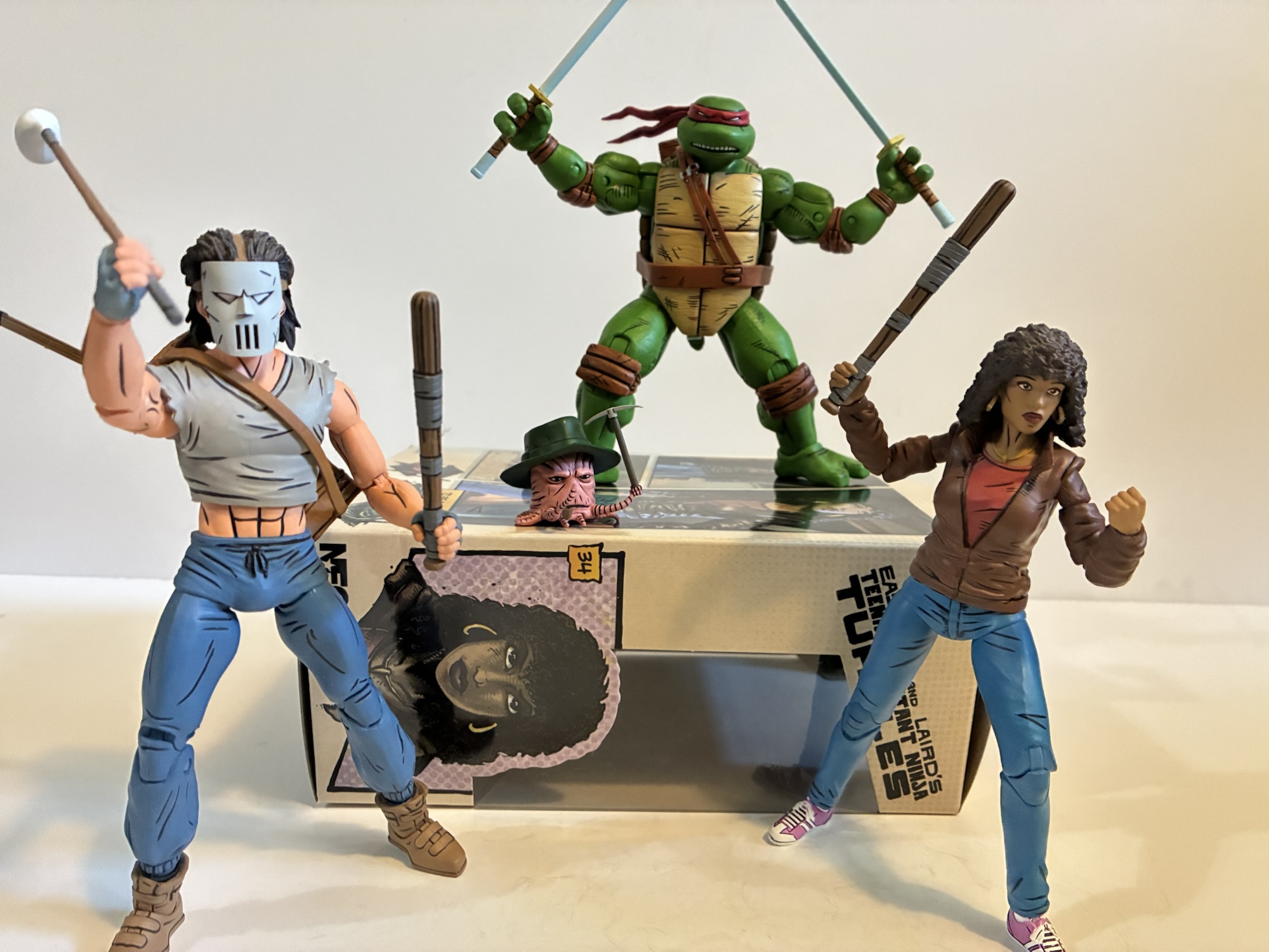
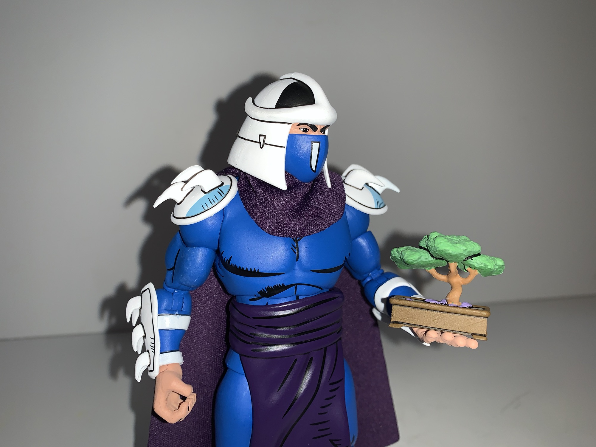
NECA has gradually built out the ranks for Shredder’s Foot Clan via its line of action figures based on the pages of Teenage Mutant Ninja Turtles as published by Mirage Studios. The clan got started way back in 2016 with a box set released in conjunction with New York Comic Con. That set featured Shredder, two Foot ninja, and a Foot Elite ninja. The sculpts were based on the original Eastman and Laird intended one-shot that became anything but. As the comic went on, the look of just about every character changed. Kevin Eastman and Peter Laird grew as artists and refined some of the looks they had devised initially. Once TMNT became a marketing juggernaut, the pair stepped back allowed other artists such as Jim Lawson to work on the books which further moved the characters away from their initial looks. NECA has marked that with its re-release of the turtles which emulate the work of Lawson and now we’ve moved onto other characters like the Foot Elite Assassin.

I’m not sure if the Elite Assassin was ever intended to be different from the old Foot Elite. With Shredder dead, these guys basically assumed leadership of the Foot Clan and they were depicted as bigger and badder than what NECA gave us back in 2016. The design is more or less the same though as a regular Foot ninja with a faceguard like Shredder, a round hat resembling a conical sedge hat, and the remnants of a cape or cloak. Where this guy differs from the old look is in the proportions and overall size. He comes in at just about a full 7″ to the top of his head. His chest is much broader and there’s more meat front to back as well. His arms and legs are equally beefy, though not on the same level as the Foot Enforcer. He’s overall just way more imposing and shares none of his parts with the old figure.

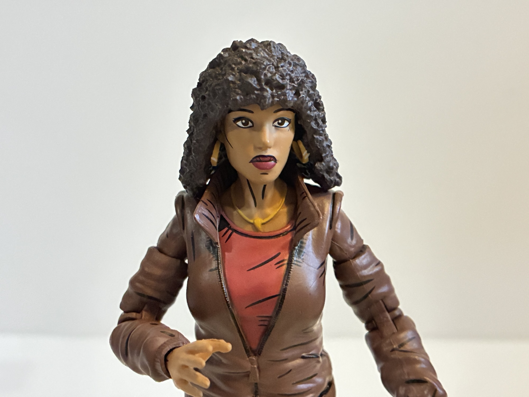
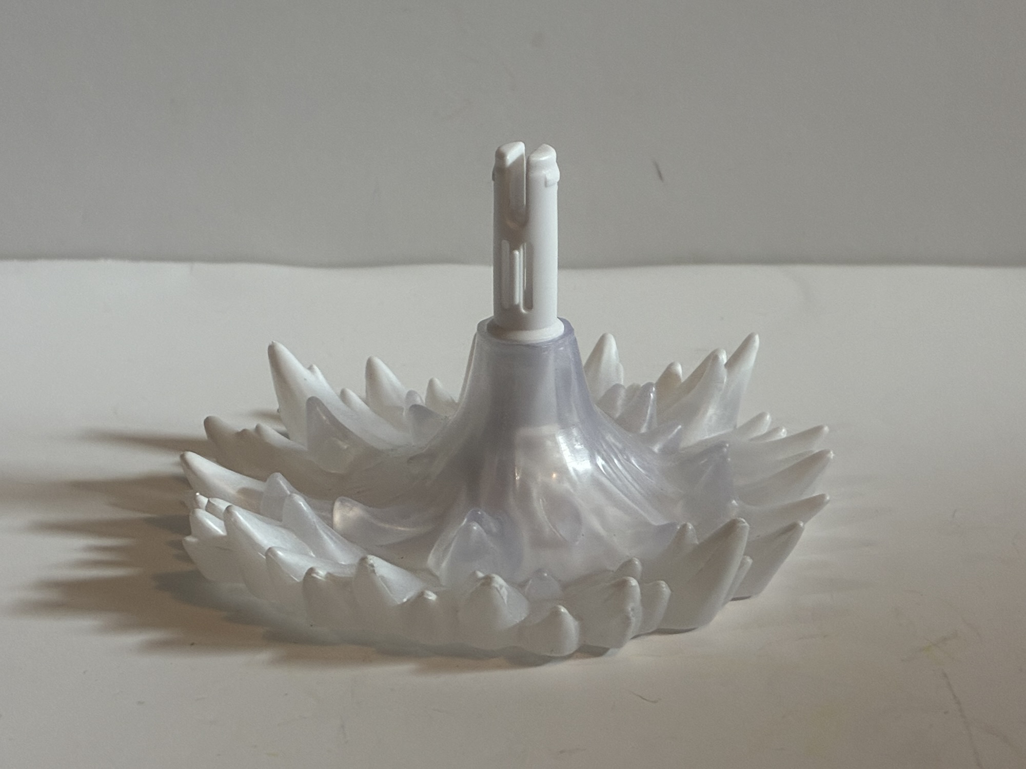
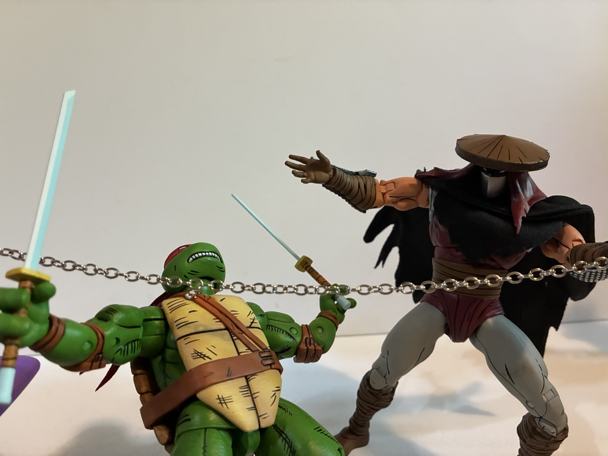
The version of the figure I’m looking at today is the standard colors one. We already have seen two other colorways with the first one being an all red and black edition. I think that one is based on the IDW reissues, but there’s also a black and white one which was released around the same time as this standard one. The standard one follows the basic Foot coloring with a brownish-red tunic, gray pants, and brown wraps on the forearms and shins. There’s a big brown sash across the midsection and from the hat drapes a red hood of sorts that leaves the face visible. For the face, we have the faceguard which is done in silver and the flesh is painted all in shadow with two, beady, white eyes peering through. The hat can be removed and the red hood is attached to it. Doing so reveals a somewhat comically small head, but if the head was made any bigger it would probably look a little too big with the added hood. Plus, it’s not meant to be displayed without the hat since it leaves a big peg hole in the top of the head sort of like a Lego mini figure.

The paint is fairly simple, but clean, and has the usual NECA comic embellishments. There’s a lot of linework the emphasize the muscles and to outline all of the wraps. There it’s remarkably clean though if you get in close you’re likely to find some places where the linework doesn’t precisely match the carved-out groove. The faceguard is a nice, metallic, silver and the forearm armor contains a hit of light blue shading at the edges to create the illusion of a metallic surface. It’s a nice effect and so simple which makes it a shame that other companies don’t do the same with their figures often opting to just use bare, gray, plastic for metal parts. I do very much like the proportions on this guy so a tip of the hat to sculptor Gurjeet Singh. Nicole Falk is also credited, though I see her name most often credited with “fabrication” which makes me think she handled the cloak, which is also well-tailored and looks fabulous. Geoffrey Trapp and Mike Puzzo handled the paint for this guy.


The Elite Assassin comes with a fair amount of weapons and other assorted parts to do some assassinating. The hands available include sets of fists, gripping, chop, and open/style-posed hands. He also has an alternate portrait with no faceguard. According to the box, the face is supposed to be a clean-shaven face and there’s some shading applied to the lips, but some wires were crossed at the factory and the lip shading turned into a mustache. I’ll never use it so I don’t care, but it is kind of funny. For weapons, we have a short sword, a handheld sickle, a longer sword with a ball and chain attached to the hilt, and everyone’s favorite weapon, a pair of gray sticks. These guys may have been drawn with such weapons in a comic somewhere, but I don’t think it’s something we really need. He also has a time bomb which I’m sure is from the comics and it’s well sculpted and painted. The bladed weapons are all silver with some blue applied and it looks nice, though different from how they do metal with the turtles. For some reason the Foot get silver and the turtles get white. Makes sense to me!

Articulation is where these NECA figures often come up short and the Elite Assassin is no different. He does some things well, and some things not so well. The head is the unusual setup of a ball peg because the head is so small. This is the type of joint a lot of import companies utilize for wrists, too bad NECA doesn’t do the same. As a joint for a head, it’s fine, but the hood is going to limit rotation quite a bit. Shoulders are conventional hinged ball joints and we have bicep swivels, double elbows, and swivel and hinge wrists. The bicep swivels on mine are tight and when they do move they feel like they’re binding more than rotating as the bicep wants to kick back to where it was. Definitely something to be careful with. The hands all have a horizontal hinge, including the gripping hands, which is unfortunate and honestly quite annoying at this point. I’m thinking of just boycotting NECA figures that don’t come with the proper wrist articulation at this point because they’re so, maddeningly, inconsistent with it.

The only articulation in the torso is a ball-joint in the upper diaphragm. It kicks forward and back a suitable amount and will rotate some as well. It’s not going to provide a true ab crunch though, but it would have with a ball-jointed waist. Given the large sash around the waist I don’t know why NECA didn’t just do this. A ball joint there would give him some nice forward and back and provide for more natural rotation. Hips are the typical ball and socket with a thigh swivel built in. There’s double-jointed knees and ankle hinges and rockers that work fine. Missing is a boot swivel and forearm swivel, even though there are natural places for such to exist. It’s annoying with the forearms since the armor continues onto the back of the hands so rotating the hands breaks that up. Lastly, we have a nice wire going through the cape which does allow for some dynamic posing of that.

This is a solid figure that’s so close to being a great figure. The missing waist articulation is more of an annoyance for me than the wrists and I don’t know why NECA didn’t put that in. If he had that he’d move pretty damn well. I think much of this figure is utilized for the new Shredder currently available in a two-pack. I don’t know if that one has waist articulation and I don’t plan on finding out until it’s available as a single-packed figure (or it hits deep discount). And for an assassin, I do think this guy should have some kind of a ranged weapon. The sword with the ball and chain is pretty cool, but doesn’t seem very practical for an assassin. He looks cool though and isn’t a total stiff so if this is something you’re interested in based on the look of it you’ll probably be content. I found this guy at Target where it only set me back $35. He’ll probably be available in various other places eventually if he’s not already, though probably at a small markup.
If you feel like your Foot Elite Assassin needs some companions then these might interest you:

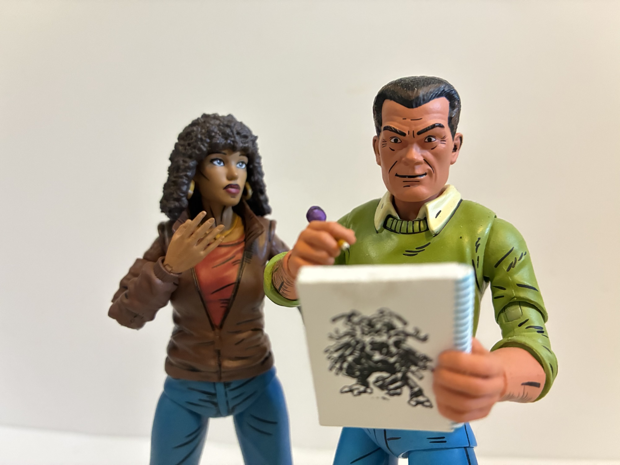
NECA TMNT Mirage Studios April (Version 2) with Professor Obligado
Back in 2008, when NECA was planning out a line of Teenage Mutant Ninja Turtles action figures that they hoped would run for a long time, they turned to the turtles’ most trusted ally when it came time to do a fifth figure. The line wasn’t long for this world, and that figure of April…
Keep reading
NECA TMNT Mirage Studios Karai as The Shredder
Where do you take your heroic comic book franchise when you kill your main villain in the first issue? Well, you first undo that rash decision by bringing him back! Teenage Mutant Ninja Turtles co-creators Kevin Eastman and Peter Laird famously killed The Shredder in the first issue of their comic. They never intended to…
Keep reading
NECA TMNT Mirage Foot Enforcer
When a regular Foot Ninja just won’t cut it, The Shredder has to turn to the Foot Enforcer. This brute of a specimen is bigger, stronger, and comes packed to the gills with an assortment of weapons designed to reduce the turtles into a pile of flesh and shell. And they’re needed, because how often…
Keep reading