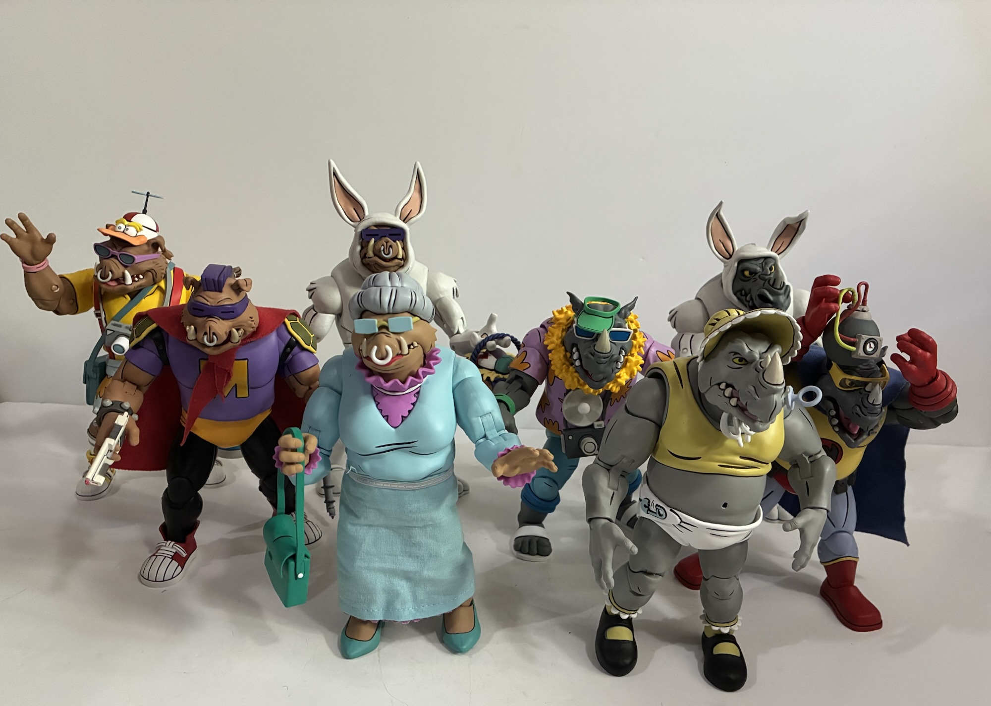
It feels like the last few times I’ve made a Super7 Teenage Mutant Ninja Turtles post I’ve wondered if it’s my last one so I’m going to stop trying to predict that. This one comes courtesy of Big Bad Toy Store and their generous summer of deals. I wasn’t going to pick up this particular action figure because it came at a pretty large MSRP, but when it was slashed nearly 50% I decided to bite so here we are to talk about Guerilla Gorilla.
Someone at Super7 must have loved Sergeant Bananas. Their love for that ape in a banana-print onesie apparently was so vast that they could not take “No” for an answer. It’s pretty surprising. I’ve never met a TMNT fan who loved Sgt. Bananas. I had the figure as a kid and he was fine. I liked his little buddy, Larry the Lemur, quite a bit, but Sgt. Bananas was one of those characters who never made the leap from figure to cartoon. He never even showed up in the Archie books. And therein lies the problem for Super7. Looking back on it, this figure is where we should have been clued into the fact that Super7 was having some issues getting stuff approved because of Playmates Toys. Originally, some just thought Sgt. Bananas must be independently owned, but he was likely created by the team at Mirage Studios for the toy line which means he’s owned by Paramount as they got everything with the purchase of the franchise. The problem for Super7 is that Playmates was able to exercise control over the characters that only appeared in their toyline when it comes to Super7’s. Making a series of vinyl blind box toys? Sgt. Bananas is on the table! Making a Playmates homage toyline though, well, you’re going to have to do without.

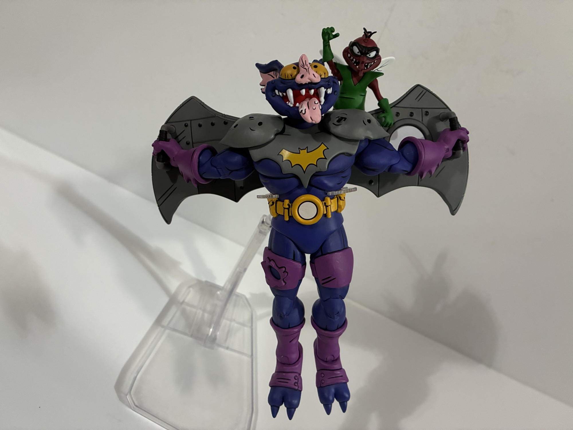
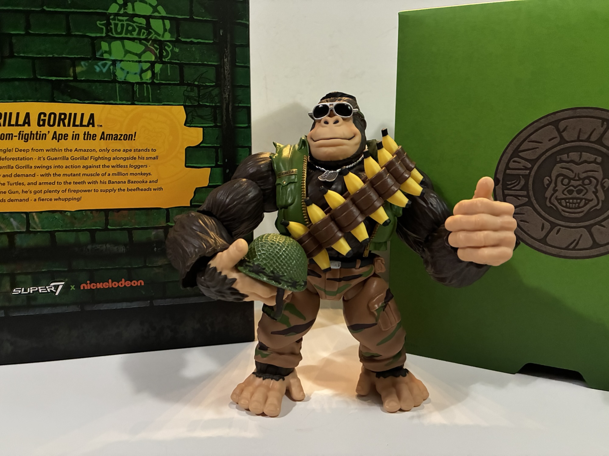
And that’s how Super7 landed on Guerrilla Gorilla. The company so badly wanted to make Sgt. Bananas that it instead pivoted to this similar character who appeared in an issue of Teenage Mutant Ninja Turtles Magazine. I was pretty tapped into TMNT during this time, but I had no idea there was a magazine. I’m not surprised since pretty much everything that was popular had a magazine. Guerrilla Gorilla debuted in issue number 4 titled Bungle in the Jungle. The issue is by Ryan Brown with art by Jim Lawson. In it, the turtles meet Guerrilla who is basically a freedom fighter out to protect the jungle from deforestation. According to Turtlepedia, he and Sgt. Bananas are the same character and there is some sort of legal distinction needed. They’re both mutant gorillas with an army motif, but they don’t look all that similar aside from that. Sgt. Bananas had the pretty goofy banana print uniform while Guerrilla is more understated, generic, army ape with an olive vest and camo pants. If you’re asking me to pick a design then, yeah, I’ll take Guerrilla Gorilla, but I’m not married to either one.

The whole thing becomes a little crazy to me when we start talking price. Despite the character looking to be only slightly larger than the turtles in the magazine, Super7 decided Guerrilla Gorilla needed to be massive in comparison. And that uptick in size meant an uptick in price all the way up to an MSRP of $75. That seems nuts to me for Super7 to essentially ask TMNT fans to pay that kind of dough for a character they’ve probably never even heard of. That seems to be part of the Super7 brand though – we make the stuff no one else would, or something like that. I think they like to be perceived as a little “out there” and their co-founder Brian Flynn is quite fond of tossing around the word “bonkers” to describe a lot of what they do. I just don’t think it makes much business sense, and if the quality isn’t there then people start to get pissed. It doesn’t seem like a company on great footing these days, but what do I know? I’m just a dude with a blog.

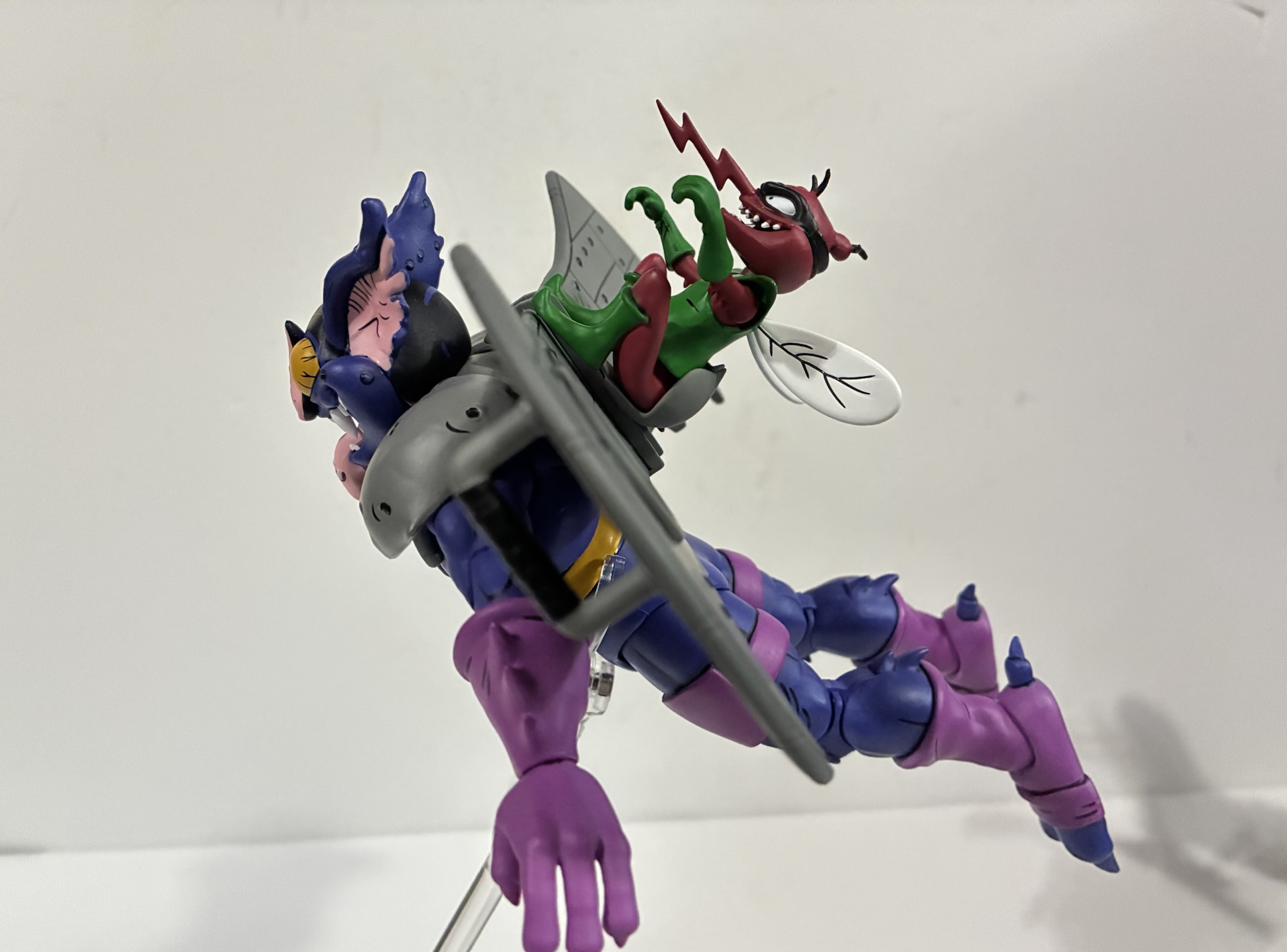
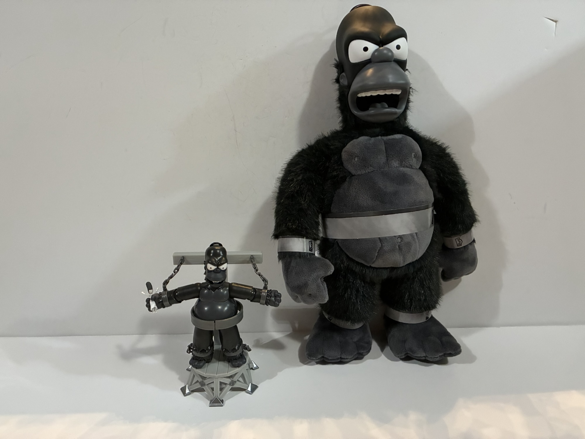
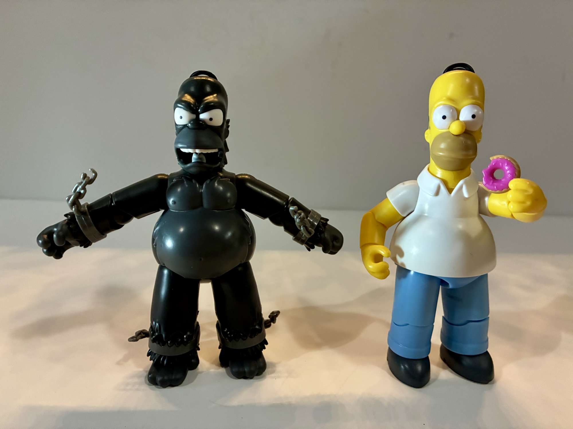
Guerrilla Gorilla comes in the standard Ultimates! style packaging including the now discarded slipcover. It’s probably the biggest box yet in the TMNT line, though it’s not as big as some of the Power Rangers stuff I’ve received. Out of the box, our ape friend stands around 8.5″ to the top of his crew cut. More than just the height though is the sheer mass of this thing. This is a heavy toy. You could probably really hurt someone with this thing if wielding it like a club. And it might even hold up pretty well too because it’s quite solid. For more dimensions, each arm on this guy is about 6″ long. His wingspan is around 15″ – this is a big, freaking, action figure for 1:10 scale. Stick a turtle next to him and they’re going to look puny. Even the bigger characters in the line look a little small when they’re next to this guy. Of the figures I have, the only one similar in terms of height and mass is the Triceraton, but Guerrilla has him beat. If you’re of the opinion that size matters then you’ll probably be pleased with this one.

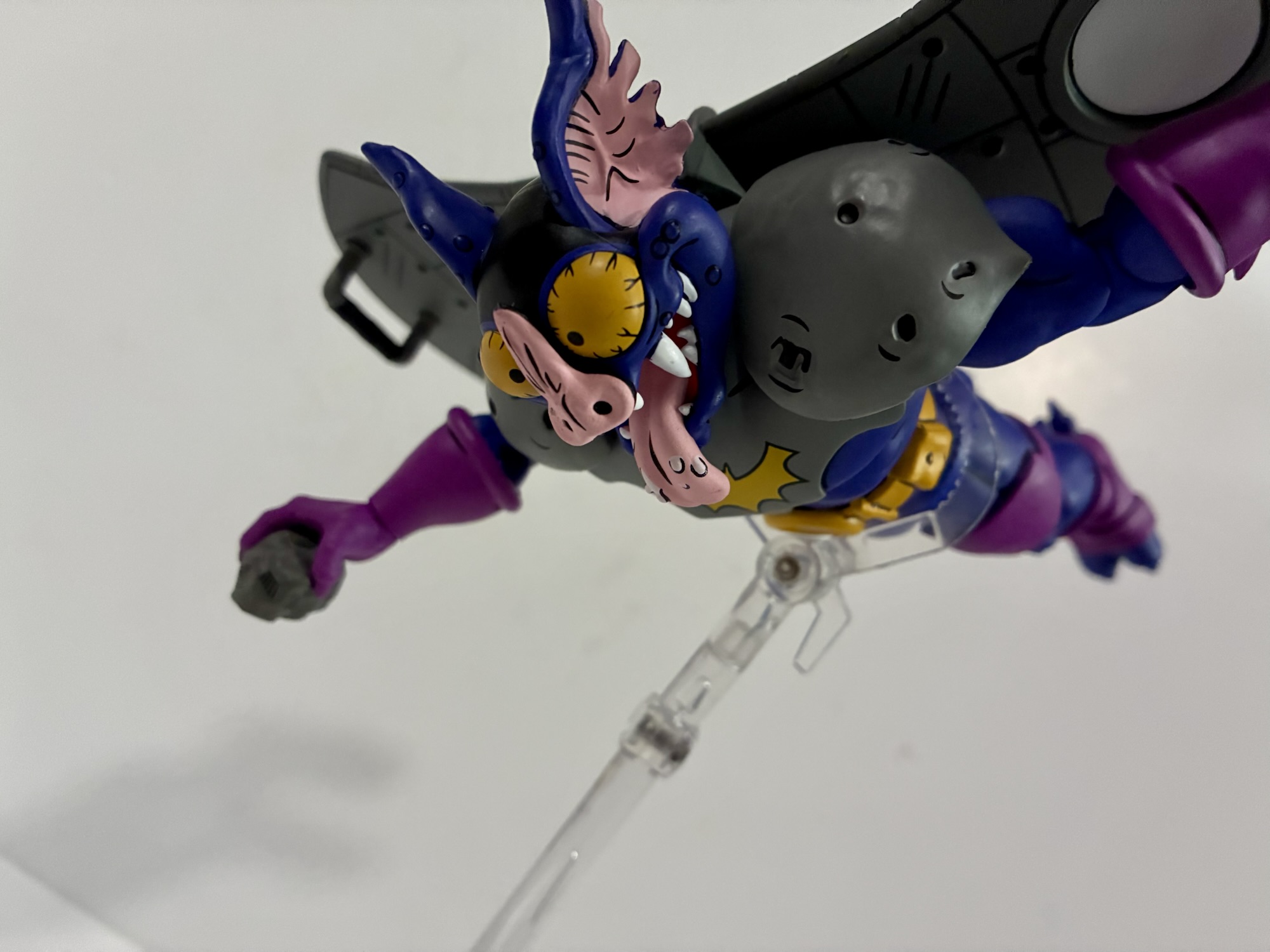
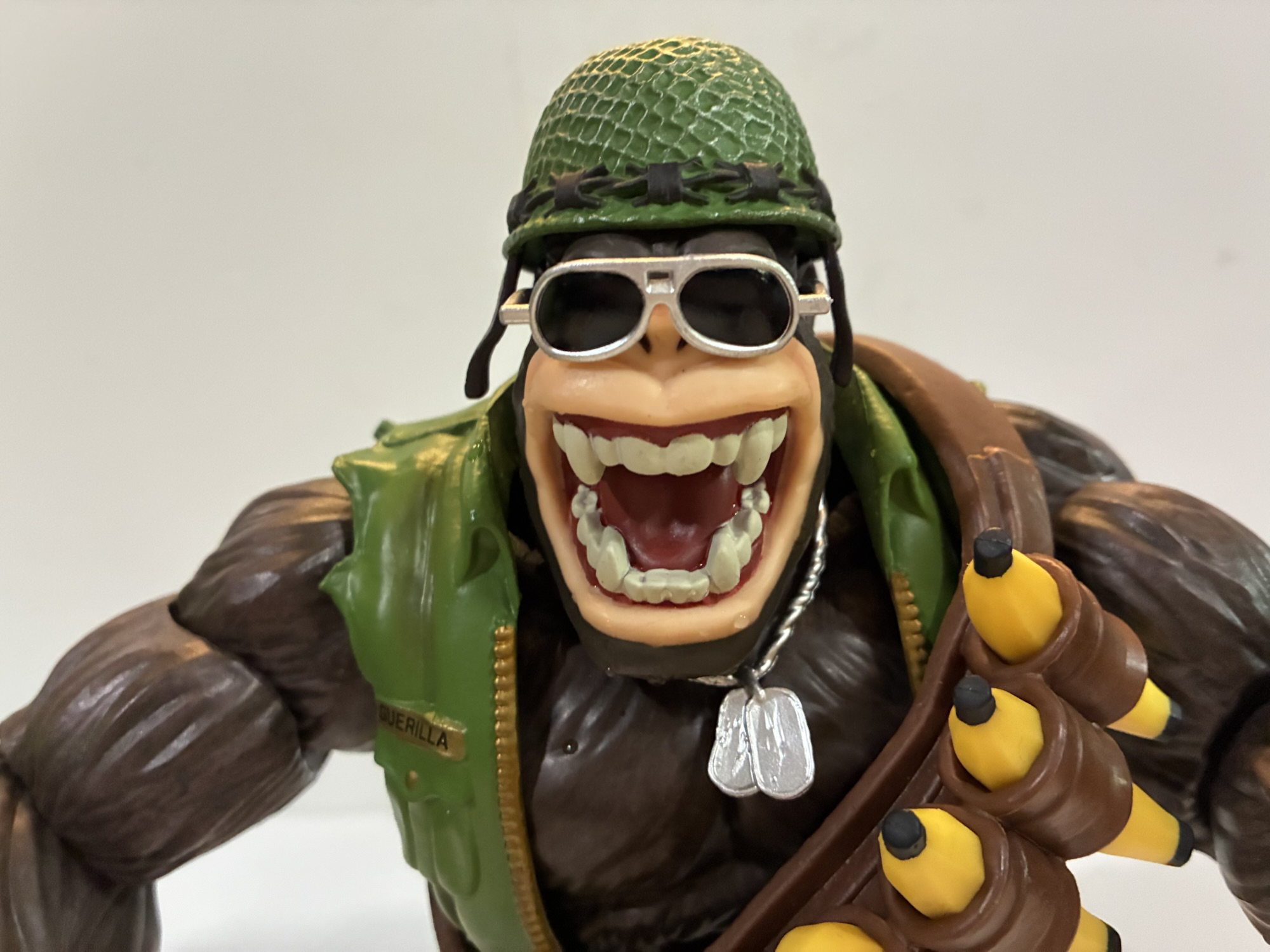
Size is but one aspect of presentation, the rest is devoted to sculpt and paint. As far as sculpt goes, this guy seems fine. I like his portrait and there’s solid texture on the furry parts without being too overdone or realistic for the line. He’s mostly molded in brown plastic, but there’s paint applied to give it some definition. The skin portions are a little bland by comparison and come across as a little plasticky, but it’s not bad. Super7 continues to do a solid job with jackets as his vest looks really nice and I like the shade of green in use here. The gold of the zipper is painted well. The camo pants are just okay. There’s nothing wrong with them, the pattern is just a little on the minimal side. If they were fully painted I think they’d look a lot better and it’s the unpainted stuff that just brings this one down a smidge because the area is just so damn big. There’s no hiding it.

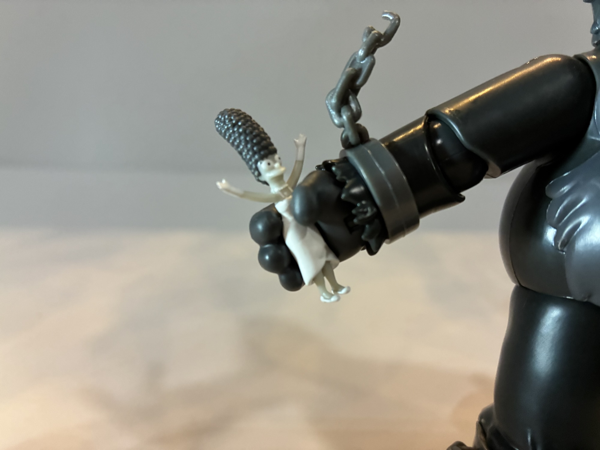
The articulation, on the other hand, is a bit of a stumbling block. It tends to always be the case with Super7 and I’m at least happy to report this guy isn’t a floppy mess. Loose joints would absolutely sink him at this size and weight so Super7 seemed to take extra care to make sure everything is tight. The factory applied shock oil in places to help lubricate joints including the elbows and wrists and it does help, but he’s also really stiff. Swapping parts is not fun. As of this writing, I haven’t been able to get his right hand removed though I’m assuming I’ll be able to with some heat. I was able to remove the left and it takes some effort to insert another one. The default head came off, but I had to kind of snap it back. There’s a chip missing from the double ball peg inside and I don’t know if I did that or if it’s just a factory thing. I could not get his alternate head on, but I’m assuming some heat will do the trick as the opening doesn’t look any smaller with the naked eye. It’s just that this plastic has zero give. There’s no flex at all.
I mentioned the double ball head already, but you also get ball-hinged shoulders, biceps, single elbows, wrist hinge and swivel, diaphragm joint, waist cut, ball-hinge hips, thigh swivel, single knees, ankle hinge and rocker. The head sits real low so it’s not going to do a ton while the shoulders are extremely tight. They’ll move, but it takes some force and there’s no smoothness to the hinge so it basically behaves like a ratcheted joint. The bicep swivel appears to be like a sleeve over a post so it moves independent of the forearm. Most import toys do something similar and we saw the same with the recently released Gamerverse Wolverine by Hasbro. The elbows swivel too and the range is fine. I’ve found the wrists and ankles to work pretty well as do the hips. The knees start off slightly bent, but will form a 90 degree angle when bent all the way. The diaphragm joint has really no forward and back range and is basically another swivel point. He can stand upright, or be pitched forward with knuckles on the ground. He’s stable, but obviously he’s not going to do a whole heck of a lot. With all of the plastic here, and the jacket overlay, I do wish they tried working a butterfly joint into this guy as that would have helped with the weapons, but that’s also not Super7’s style.

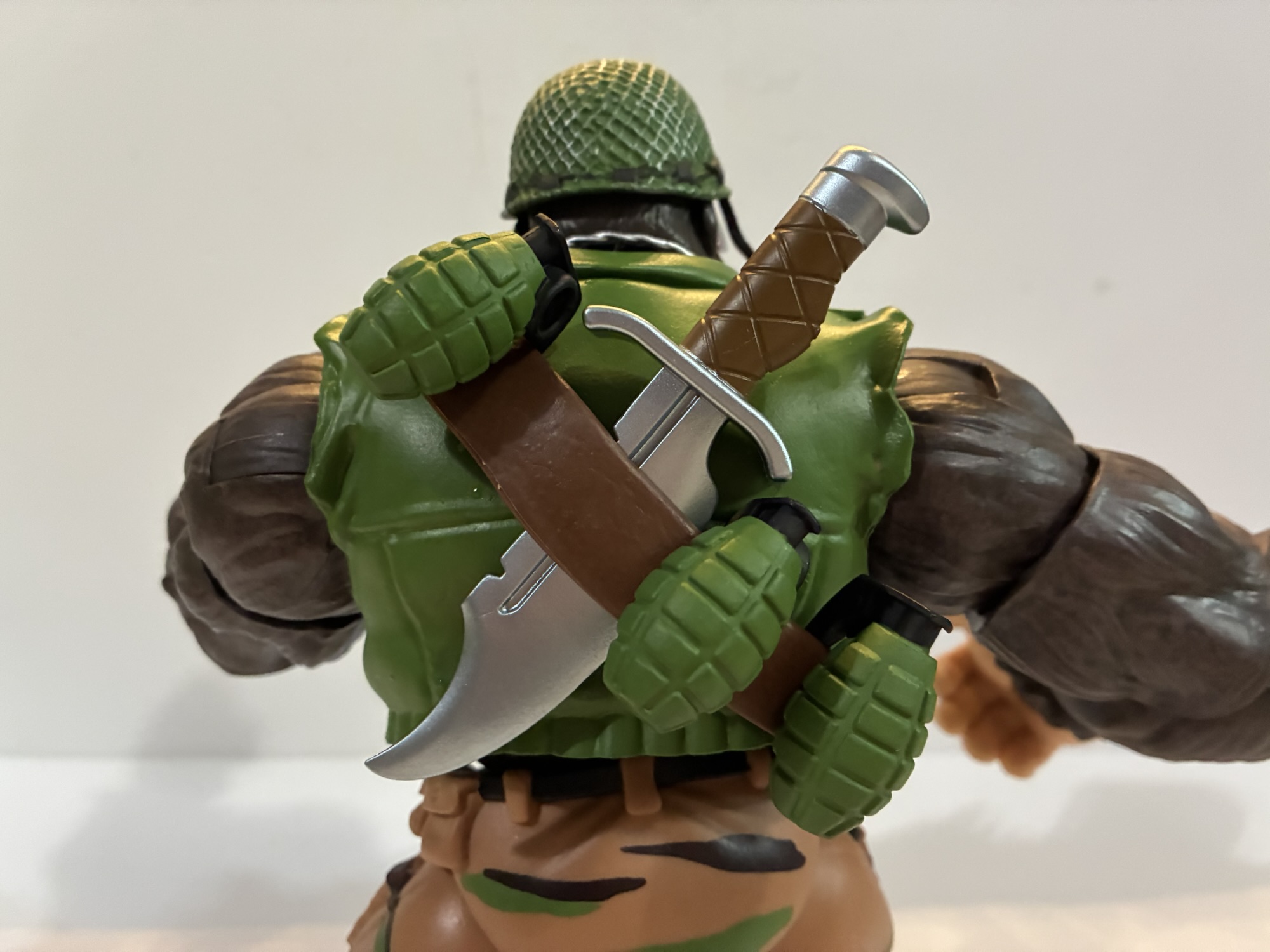
Super7 could have just stopped at “Giant Monkey Man,” but they decided he also needed to come with a ton of stuff. I guess they really took the whole “Ultimates!” moniker to heart here as there’s not much else Guerrilla Gorilla could come with. For starters, he has 10 available hands. I don’t even know how to describe most of them as they’re just different levels of gripping hands plus the customary fists and open variety. There is one that’s an obvious trigger finger hand and it has the preferred vertical hinge. There’s an opposite hand with a less pronounced trigger finger that also has the proper hinge. He also has the yelling head as an alternate portrait and it looks good. The helmet also fits on it just fine. He has a set of sunglasses and they fit the standard, smiling, portrait better than the yelling one, but you can fudge it if you’re determined. He comes wearing an empty bandolier and there are seven bananas to slot into the openings on it. In case he gets hungry, or maybe they’re ammo? I don’t know with this guy. He also has three grenades, a big ass knife, a machine gun, and a bazooka.

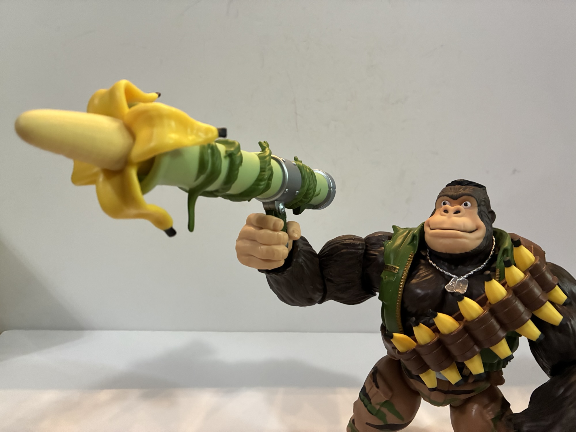
The machinegun is painted silver with a plain, black, painted handle and it has sculpted vines on it that basically serve as a sling. He can wear the gun over his shoulder if he wants and it will stay in place rather well. The bazooka has no potential for weapon storage (you can slide the knife and grenades under the bandolier if you so desire) and he basically has to hold that one. It comes with a gigantic banana sticking out of the end which can be removed and replaced with a coconut. A coconut makes more sense as a projectile, but when have TMNT weapons ever made sense? The issue with basically all of the weapons, and especially the guns, is that the hands offer zero give. If you want him to hold anything, you’re going to have to heat these hands up to get them nice and pliable. Otherwise you’re just going to strip paint or worse. He can hold the grenades and bananas just fine while you should probably heat up a gripping hand if you want him to hold the knife.
Posing him with the weapons is another story. I kind of hate how they designed this bazooka. It looks fine, the silly premise suits the line, but it has a handle and trigger on it set way back. If your ape holds it as intended it looks more like he’s holding a small gun. It doesn’t rest on his shoulder. I tried using an open hand to just balance it on his shoulder with the hand on top, but that didn’t really work either. The machine gun works only slightly better. The hard plastic vines sculpted to it means it looks a little ridiculous. I wish he could hold it in a firing pose with the vine around his shoulder. The vine really needed to be a separate piece like a true strap so it could be soft and pliable. Then it probably would work the way I want it to. I also can’t envision getting a trigger finger onto the actual trigger with it. It, like everything, is super rigid with no pliability so the end result would probably be a busted trigger guard or worse if I tried to force the issue.

Guerrilla Gorilla is, in many ways, a great encapsulation of the Super7 experience. They got so excited and gung-ho about making a massive gorilla figure that they didn’t really stop and take the time to envision a more practical build. It’s great that the figure is so big and has this shelf presence about it by virtue of its size, but it doesn’t do a lot of the little things well as a result. And it never needed to be this big. Would anyone care if he was the same size or even a little smaller than Bebop? I know I wouldn’t. The incredibly tight hands and some of the joints suck a lot of the fun out of handling this thing. I’ve seen many people who claim Super7 is really a company for in-box collectors and this Guerrilla Gorilla figure makes them look right. That said, it’s not an awful release. If you’re the one weirdo out there who wanted this character as a figure then you’re probably really happy. And you may have even been happy to drop $75 on it. I did not care one bit about the character or his more famous version so it was a nonstarter at that price. Given the size and amount of stuff in the box, the MSRP really isn’t all that bad. For $40? Yeah, I went in on that to see how it was and to add a unique piece to the Turtle shelf. I’m content with him, warts and all, at that price provided I don’t shear his hand off trying to swap stuff. I have a feeling we’ll never see another Guerrilla Gorilla from anyone else so if you ever had an interest in the character now is probably the time to get on it. Even though the figure is just okay, I would not be shocked if a couple of years from now he’s a bit expensive on the aftermarket because he’s such an oddball character. That’s a dumb reason to buy a toy, but all I’m saying is if you think you may want him in your collection best to do it now while you can score one on clearance rather than later when $75 might look like a good deal.
The Super7 Ultimates! line may be winding down for TMNT, but we’ve already taken a look at quite a few here:

Super7 TMNT Ultimates! Triceraton
My summer of discounts continues today with yet another Super7 Ultimates! release. Back when wave 7 of Super7’s line of Teenage Mutant Ninja Turtles was unveiled I quickly locked in a preorder for three figures: Punker Don, Robotic Bebop, and Triceraton. By the time the line released way, way, late, I only ended up with…
Keep reading
Super7 TMNT Ultimates! Foot Soldier (Battle Damaged)
The last Super7 review I did was for the wave of Teenage Mutant Ninja Turtles based on the 2003 cartoon and I concluded it by speculating it would be awhile before I found a reason to review another figure from Super7. That turned out to be a lie. With it being revealed that Super7 has…
Keep reading
Super7 TMNT Ultimates! Teenage Mutant Ninja Turtles (2003)
Who isn’t making Teenage Mutant Ninja Turtles action figures these days? It’s becoming a far easier thing to keep track of than just who is making them. For years, it was the domain of Playmates Toys and only Playmates Toys. NECA tried to get in on that TMNT action in 2008 and it ended prematurely…
Keep reading