Author Archives: Joe

NECA TMNT Secret of the Ooze Keno and Foot Soldier

Coming this fall to FOX, it’s Keno and the Fat Man!

I’ve been spending parts of the past month or so ducking in and out of any Walmart I come across in search of the Masters of the Universe Origins Turtles of Grayskull Krang. You see, it’s a store exclusive and if you know anything about toy collecting it’s that toy collectors hate store exclusives. Especially Walmart exclusives. I don’t particularly care for Walmart in general and will go out of my way to not shop there, but sometimes they use their capital advantage to make that a challenge. When you keep going into and out of stores leaving empty-handed each time it gets old which can sometimes lead to bad purchasing decisions. Or perhaps “bad” is the wrong word in this case, let’s instead say that it can lead to making unplanned purchases. And that is how I ended up with the NECA Teenage Mutant Ninja Turtles II – The Secret of the Ooze Keno (Foot Training) and Foot Soldier set.

Ever since NECA received permission from Viacom to sell its TMNT products at brick and mortar it has separated the cartoon and movie toy lines giving one to Target and one to Walmart. I have been fortunate in that most of the movie figures I have wanted have been made available by other means, usually via NECA direct in the form of a comic con exclusive or just a direct sale. I haven’t had to stake out Walmarts in search of product really since the Casey Jones and Raphael in Disguise two-pack from 2020. I did purchase the Shadow Warriors two-pack from Walmart, but that was a fairly low demand set. I could have bought the Casey Jones and April Farm two-pack on numerous occasions, but I didn’t see that one as being particularly essential.

I don’t know if that height is correct. Keno is 6.3″ which is fine, while the turtles are 6.5″ which maybe is a touch short?

Last summer, right around this time, NECA put up for pre-sale not one, but two TMNT movie sets as San Diego Comic Con exclusives. One of those sets, the Teenage Mutant Ninja Turtles III four-pack, I purchased. The other, Keno (Pizza Delivery) and moped I did not. NECA wanted $100 for Keno and his scooter and that just felt like too much for me. I liked the second Turtles movie well enough as a kid, but as an adult I can see it for what it is -a cash grab with bland, slapstick, humor that barely qualifies as entertainment. Still, I do have a soft spot for Keno, played by Ernie Reyes Jr. in the movie, and wouldn’t mind having him in my collection. And his pizza boy attire is how I picture him so it was my preference, but again, not at a hundred bucks.

They just like him because he always brings pizza.

When NECA unveiled the Keno and Foot two-pack a month later at Comic Con, it wasn’t really on my radar. Like I said, I picture Keno in his pizza boy attire first and foremost and not as he is depicted in this set. And even though the Foot Soldier he was bundled with was different from the ones I had, it didn’t feel like a necessity. That is, until it had been staring me in the face one too many times. Missing out on that $25 Krang motivated me to spend $60 on this set and it’s honestly a solid set of figures. Is this the Keno I wanted? No, but maybe it’s the Keno that will make me happy.

In this house, we worship Teezus.

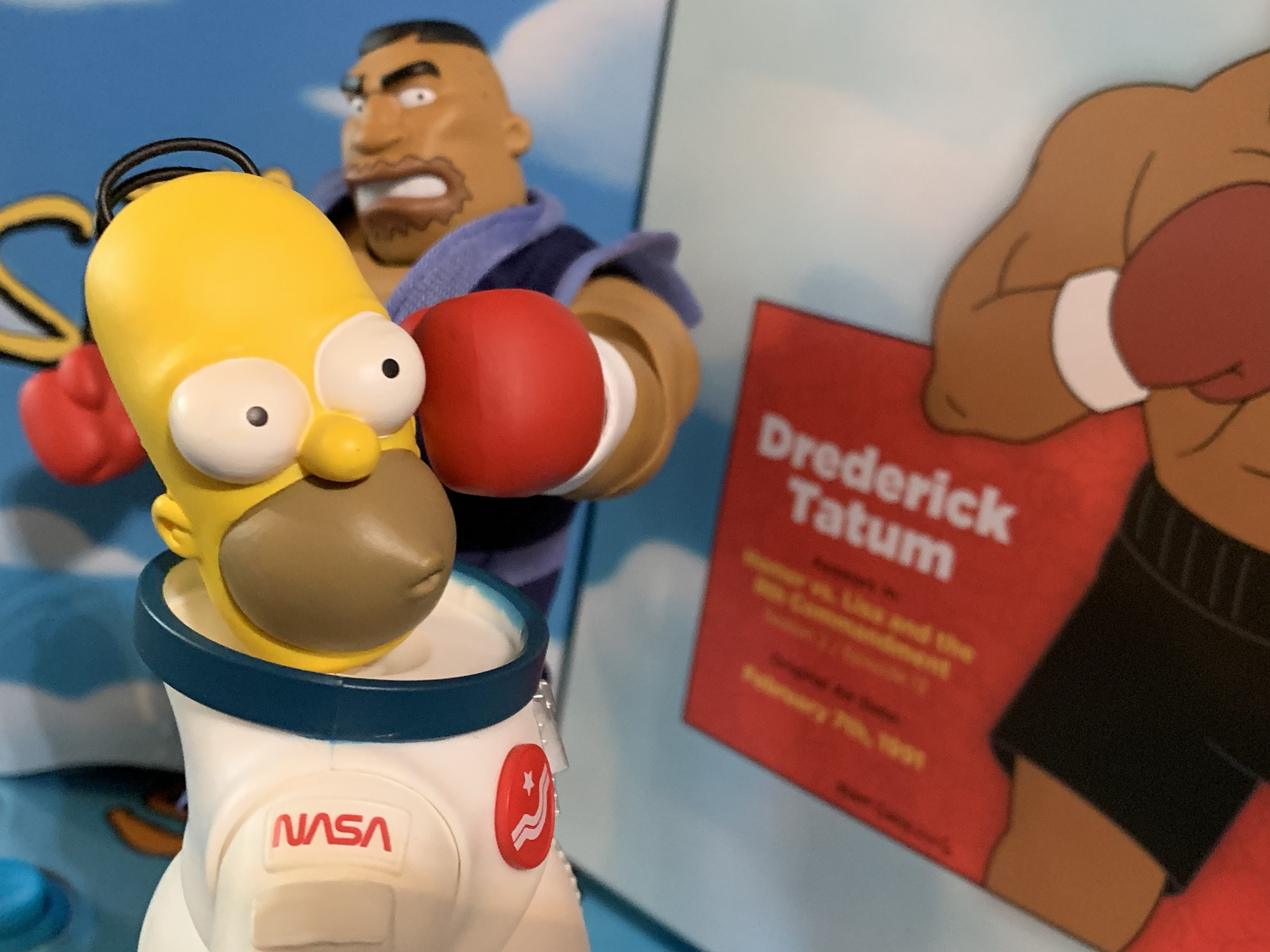
This set depicts Keno from the scene where he and Raph decide to infiltrate the Foot Clan by getting him admitted. He basically puts on his kickboxing gear and beats a bunch of other trainees up before having to submit to a final test which Raph helps him pass. It’s probably one of the better plotted elements of the movie and I suppose it’s better than Keno’s all-denim look from a bit later in the movie. For this release, Keno is sporting a tank top, black sweats, kickboxing gloves and shoes. Everything is well-sculpted and detailed. The shirt has a nice design to it and the likeness is on point. Keno is sporting an aggressive expression like he just spin-kicked some jerk in the face and it’s done well. He comes with another portrait and it features a toothy grin. I may have preferred a more neutral expression as a secondary option, but both look pretty good so I’m not exactly upset about it. He also has a set of non-gloved gripping hands, but I don’t see the point in them. This is kickboxing Keno, baby! Plus, I watched a review of this set and the reviewer had the wrist peg break when swapping hands and I don’t want to chance it. For what it’s worth, the stability of my figure seems fine. The heads are very snug and I had to use hot water to get the other portrait on, but nothing felt fragile or too stiff with this guy.

This bag rocks.

The one thing that does stand out with Keno vs a lot of other NECA figures is the lack of paint. NECA opted to leave his flesh basically bare plastic when normally NECA paints basically everything. There is a slight sheen to the skin as a result, but it almost imparts an illusion of sweat which works for the look. Is that by design? I don’t know, but it looks fine. There is a little paint slop around the ears of both portraits. For some reason, the right ear was apparently problematic and maybe it was whatever the factory used to hold the piece in place while it was painted as there’s a line of “flesh” connecting the ear to the hair which sucks. The hands and feet are nicely painted and you can even see the bottoms of his feet when turning him over which is pretty neat. If you like this look for Keno then you should be pleased with what NECA has done.

“Ahh hah!”

As for the Foot Soldier, he’s a mix of old and new. For the sequel, Golden Harvest and New Line Cinema wanted to get it out fast and cheap as basically everyone viewed TMNT as a fad destined to blow up unexpectedly and without warning. They also wanted to tone down the violence which meant they no longer needed a bunch of stunt guys and martial artists to play-fight the good guys. They mostly just wanted them to do pratfalls and get hit with sausages. As a result, the background extras were just random people which lead to some, how should we say, unathletic looking Foot ninja. This guy is reflective of that as he’s basically the plus-sized version of a Foot ninja. He has a new, bigger, head and a new, wider, torso. Both look fine, but the figure is reusing the old arms, hips, and legs from the standard Foot which makes him look pretty goofy. He really needs some meatier thighs, at least, because as-is he looks like a kit-bash of mismatched parts. He does have a gritty, dirty, brown, wash applied to him as the Foot were kind of dirty in that movie. Maybe it was because they were residing in a dusty junkyard? Or maybe it was just old, well-worn, costumes no one wanted to replace or wash.

What does he expect to do with those dinky little things?

The Foot doesn’t come with much, just extra hands and a set of weapons. The hands are fists, gripping, and these style posed hands. The fists and gripping hands are the same as what has been included with other Foot releases. The style posed hands are new to me. My Foot ninja came from the SDCC set from way back so I’m not sure if these were added for the two-pack releases, but I think they’re new. For “weapons,” he has two, black, sticks. The movie was looking to tone-down the violence so swords and axes were out. Instead, guys would have sticks be they long ones or these little, stubby, ones. Even Leonardo uses something similar at one point. It’s bizarre, but a fun inclusion. Like past Foot Soldiers, he has a soft goods, elastic, belt over the sculpted one which serves as weapon storage. There’s also another canister of ooze, maybe because it was a chubby Foot ninja who caught it during the showdown at the TGRI building? It’s the same canister most are likely used to at this point.

Looks like he passed.

As for Keno, in addition to the extra head and hands he has some pretty neat accessories. Well, one is neat. The one that isn’t is the handful of various bells that Raph helped him remove from a training dummy during his final test. It’s just a lump of painted, sculpted, plastic and it’s possible to get him to cradle them as he did in the movie even though his gloved hands are fisted. I kind of wish he had his “Is this enough?” expression to pair with it, but I doubt I’d use it anyway. The other, more impressive, accessory is the punching bag. It’s a big hunk of red plastic with a fake brand name stamped on it. It’s connected to real chain which can hang on the included stand, which is a metal hook with a plastic base. It works well, and the sculpt of the bag is very convincing both up close and from a distance to the point where it feels surreal to touch it and find it’s not a miniature punching bag.

They can handle the basics, but don’t go too crazy with the posing.

The articulation is usually secondary for NECA, and that’s mostly true here. We’ll do Keno first. He has a double-ball peg for a head which works pretty well. His mullet will get in the way a bit, but not as much as you may have thought. The shoulders are simple hinged pegs while the elbows are the same. There’s no biceps swivel, and instead the elbow pivots. Wrists rotate and hinge horizontally for all hands in the set. There is a diaphragm joint of some kind, but the overlay for the shirt makes it hard to utilize. You can force some posing out of it, and I suppose a really determined person could heat the shirt if they don’t care about warping it, but I wouldn’t advise doing so. The waist has a ball joint as well and the hips are ball and socket joints that can facilitate splits and kick forward a full 90 degrees. There is a thigh twist and the knees are double-jointed. The ankles hinge forward and back and possess a solid ankle rocker. He’ll be able to do some decent kicks and he can stand on one foot if you’re patient. I just wish the diaphragm joint worked better to get some really nice looking kicking poses. This is where I personally would prefer to see the torso sculpted with a joint in the middle rather than an overlay, but I get why NECA does what it does.

Shredder may need to start paying his guys better if he wants to attract better ninja.

The Foot ninja is basically the same as the other Foot. Even the hips still use the old peg and hinge engineering. There’s no added articulation, nor is any lost, with the new head and torso. I will say, while Keno’s joints are all nice and tight, the Foot ninja has some pretty loose ankles. Not terribly, at least not yet, but some simple stances were more troublesome than they should be as he’d just fall forward. Hopefully he doesn’t worsen over time.

The Secret of the Ooze section of my Detolf is pretty jam-packed. Thank goodness I passed on the third Super Shredder.

On an individual basis, this Keno figure and his included stuff is pretty damn nice. Yeah, I’d like a little more articulation out of him and it’s not my preferred look for the character, but the execution is plenty good and the punching bag is awesome. As a two-pack, it’s a little less spectacular because the Foot ninja is nothing special. NECA didn’t go all-in on making this guy look great by reusing too many old parts. It’s a bit of a bummer because people may have wanted a couple of stocky looking Foot Soldiers in their display if the figure were better. These parts have been used and reused so much that NECA surely has made plenty of money off of the tools that it’s a shame it didn’t spend to update them. They probably could have kept the arms, it’s the hips and thighs mainly. And since the figure essentially costs $30, it’s a tough sell. Basically, if you’re like me and skipped the SDCC Keno, then this is your only option to add the character to your TMNT II display. It’s not the Keno I wanted, but at least he’s damn good for what he is so I don’t regret my purchase and it’s still better than paying $100 for the character. Now, if say a $70 or $80 version of the Keno and bike two-pack shows up I may feel differently.

If it’s TMNT movies you like then we got you covered:

NECA TMNT Secret of the Ooze 4-Pack and Accessory Set

It’s that time of year when a lot of folks are reflecting on the past year and all of the things that happened. This usually coincides with list-making for favorites and worst of the year in basically every category you can dream of. And for action figure enthusiasts, there’s definitely a lot of list making.…

Keep reading

NECA TMNT Secret of the Ooze Ultimate Shredder

For the first time in a long time we went a week without a blog entry here. That’s because I took a much needed vacation and didn’t schedule anything. I’ll probably be backing off a little bit as we dig deeper into 2022 since there’s a certain holiday I need to get crackin’ on if…

Keep reading

S.H.Figuarts Dragon Ball Z – Mecha Frieza

Talk about your makeovers.

When you have an action figure line as long in the tooth as the Bandai/Tamashii Nations Dragon Ball Z line from S.H.Figuarts, you tend to find some pretty obscure characters making the jump to plastic. Characters that may have existed for a blink and you miss it kind of moment, but when one’s collection already has most of the heavy hitters, the company needs to find ways to keep things fresh. That should be how we think of today’s figure, Mecha Frieza, a version of the villain that basically showed up for an episode and got murdered by Trunks, but since this is a variation on the long-running manga/anime’s chief villain, it doesn’t exactly feel like a deep cut.

I’m surprised that he didn’t view this as an opportunity to get taller.

Mecha Frieza is the end result of Frieza’s battle with Goku on the doomed planet Namek. After getting walloped by his own buzz saw-like attack, Frieza takes an energy blast from Goku right in the face and seems to be left for dead. Missing an arm, a chunk of his face, and all of his lower half, Frieza seemed like a goner, but apparently his race is able to survive even when blown apart. His father, King Cold (snicker), and the various minions at his disposal are able to fashion new, mechanical, parts to rebuild the villain and once completed he immediately sets course for Earth to exact revenge upon Goku. Only, Goku is no where to be found and instead he comes face to face with the Saiyan from the future – Trunks. From there, Frieza is dispatched effortlessly as he was just there to show how powerful a Super Saiyan really is. In other words, Mecha Frieza is a chump.

Frieza! Number one!

He’s a cool looking chump though! Mecha Frieza is a fun design as it takes the villain and covers him in odd junk. It’s a very Akira Toriyama-like design and seems rather out of place in this era of Dragon Ball. It’s a fun juxtaposition with the otherwise sleek and clean look of Frieza’s fourth form and the different textures and finishes just cry out to be captured in plastic. Years ago when Irwin Toys had the license to make Dragon Ball figures, Mecha Frieza was basically their crowning achievement. I should dig it out some day to see how it’s aged, but in my mind’s eye it was basically perfect from a sculpt presentation. Because of that, this version of Frieza has long been on my short list as a want when it comes to the S.H.Figuarts line. It just seemed like a character design that would display well. It would require more paint, more texture, than the average character in this line allowing it to occupy a prominent spot in any display. Last year, Bandai decided to make it happen and put Mecha Frieza up for preorder through the Premium Bandai website. Premium Bandai is essentially a made-to-order model for action figure production and since this figure is a bit more involved than most, it didn’t feel misplaced (where as, releasing any Vegeta through this model seems absurd, but whatever). I’ve had this figure for a little while now, but I finally have found the time to let you know how I think it turned out.

All of these new components did nothing for his bedside manner.

Mecha Frieza comes in the standard SHF packaging with product shots all around and a window on the front. The figure itself stands approximately 4.75″ to the highest point of its head. As expected, there’s a lot going on here and in some respects this may be the best work of Tamashii Nations. There’s a lot of white plastic for the remaining fleshy bits of Frieza with a slight blueish tone that looks rather nice. The black portions are mostly painted and they have this satin finish that looks really good in person and in photographs while the metallic bits are nice and shiny. The brown panels are painted cleanly as are the facial details. There’s some great sculpt work, especially in the robotic hand, and there’s a clever mix of parts that are either fitted together tightly or glued. It looks like the silver portion of the head and chest is separately molded and it’s a very involved sculpt that actually earns the “premium” designation.

These shoulder “caps” are unnecessary and feel like a case of over-engineering.

It’s not all perfect though. Bandai did do a couple of things with this figure that I don’t care for. One is the shoulders. I guess it’s for articulation purposes, but the outer shoulders are basically plastic caps connected via a hinge. It seems completely unnecessary to me and it’s not something done on the standard fourth form Frieza and I don’t think they’re doing this with the upcoming full power edition. It’s a harder, thinner, plastic too which looks cheap. The left shoulder which is painted black and brown looks fine, but the white shoulder with the purple cap does not look good as the white isn’t the same shade of white as the rest of the arm.

I’m also not a fan of the articulated tail. Just make it one, continuous, piece, please.

Another visual aspect I don’t care for is the tail. It’s well-sculpted and appropriately shiny, but Bandai decided it needed an articulation point in the middle that does next to nothing and looks bad. It’s also hard to attach to the figure and is cumbersome to deal with. Lastly, and the issue that bugs me the most, is the head on this figure is just too big. I’m guessing they enlarged it to better capture the detail, but he’s a real egghead. It’s really apparent when placing him beside the previous version of Frieza, and while I do think the head should be bigger than it is with that figure, not to this degree. They took it too far. And while the painted details they did add look great, there are still some slashes and such on the figure left unpainted which is a shame. I think a little color, or even just a wash, over those would have helped enhance this figure even further.

Flight stands aren’t a bad idea with this guy as the tail can make him difficult to stand.

Mecha Frieza comes with a fair amount of accessories. For hands, we get four sets: fists, open, clenching, and pointing. The figure also comes with four portraits: smiling, toothy smile, teeth-clenching, and yelling. The choice of expressions is done pretty well, but the quality control is a bit iffy. The heads are basically two sculpts fitted together where the white parts are out of one mold and the cybernetic parts out of another. On two of my heads, the parts aren’t seated properly. The angry, teeth-gritting head looks the worst as there’s a gap near the chin. The brown panel and the blue, transistor, things on the right side of the head are removable and intended to swap between the heads. I guess this was done to cut down on the paint hits?

This head isn’t quite assembled properly. It may seem like a small detail, but for the price point this shouldn’t happen.

The most attention-grabbing accessory though is definitely the sliced-in-half body. Mecha Frieza is best known for dying, so it makes sense that his figure should capture that. And since he got anime-sliced down the middle, it presented a real challenge for Bandai if they wanted to capture that in figure form. In order to do that, Bandai supplied a whole, separate, torso. It’s of Frieza with a horrified expression on his face. It’s basically cut in half, but glued together askew like his body is sliding apart. It is completely unarticulated, but there are no arms, legs, or tail. Instead, you’re supposed to disconnect the arms and legs from the main figure and affix them here. Same goes for the tail. There’s a circular, acrylic, base with a question mark-shaped post that plugs into it and then into the back of this bust. Because Frieza is hunched over, it’s a little more challenging to display than I’d like has he’s listing forward. It basically has to go as far back as the tail will allow to look its best. It’s also kind of annoying because it means you have to disconnect parts from the actual figure. Would it have cost that much more to just go all the way and put sculpted arms and legs onto this thing? It looks cool, but I don’t want to sacrifice the main figure to this thing.

“Hmm, it’s a bit grotesque, but what can I say? I do like it.”

Since this is an SHF release it’s obviously going to have quite a bit of articulation. Mecha Frieza does some good, and some not so good, when it comes to posing. The head is on the very annoying hinged ball peg. It means if you want to use the hinge you need to be mindful of which direction it’s facing since it rotates at the base. The neck is also on a ball peg and it has a habit of raising up a bit and creating a gap, but it can be reseated. I mentioned the hinged shoulder caps and they don’t do a whole lot, but if they pop off on you (one of mine arrived disconnected) they’ll be a bear to get back on. The biceps swivel is fine and the double-jointed elbows will go a bit past 90. I find the top joint in the elbow to be pretty tight and hard to work with. Hinged ball pegs at the wrist are fine.

“Looks like you will be the first of Goku’s friends to die, boy!”
“WHAT?! I thought I destroyed all of those monkeys and their offspring!”

The torso is a bit of another trouble spot because Frieza has this purple shield-like plate right in the middle of his body. It’s a separate piece of plastic that can pop off, but it will restrict Frieza from crunching forward much. Going back is okay, and there’s a ball peg at the waist that will add more range going in both directions, but it’s nothing crazy. The hips are the annoying drop-down style which have a tendency to be loose. Frieza’s are right at the edge of being too loose. He can’t do splits even with them, but at least he can kick fairly high. The thigh swivel works and looks pretty nice since it works with the sculpt. The double-jointed knees are fine and the ball-hinged ankles are okay. The ankle rocker is pretty steep. The tail articulation is pretty bad though. Hinged pegs at the rear and the midpoint function more like swivels. The midpoint joint is especially useless.

“No! I am still Frieza! The mightiest in all the known universe! I will not be felled by a blond-haired swordsman!”
“Gah!”

Mecha Frieza is an interesting release and in some ways a frustrating one. It’s not frustrating in the sense that it drives me nuts when in-hand like Super Saiyan Trunks, but frustrating in that it’s so close to being one of the best figures in the line. The sculpt and paint are terrific and well-executed. The oversized head is my main critique and I absolutely hate the tail. If the sliced accessory could display on its own without having to sacrifice the figure proper then it would be all the better. I think this figure was $85 plus shipping and at that price point it shouldn’t feel incomplete. Even with the imperfections, this is a figure I do think is worth having for your DBZ collection. Frieza is arguably the best villain the series has produced and he’s certainly become the most enduring and this form is perhaps the most interesting from a visual perspective. Sure, he showed up to die, but at least it was memorable. Certainly far more memorable than King Cold, and a great deal cheaper too.

“No…how could this…be..?!”

If you liked reading about this one then maybe you’ll enjoy one of these other Dragon Ball figure reviews:


MOTU – Turtles of Grayskull Skeletor

Prepare for havoc!

When it’s come to the Turtles of Grayskull line by Mattel, I have mostly stayed in the Teenage Mutant Ninja Turtles side of the pool. I have all four turtle boys plus Sla’ker, who is more Slash than Faker if you ask me. The one exception has been Mouse-Jaw, but the classic Masters of the Universe villain has been mashed-up with a Mouser so there’s a gray area there. Plus, if I want to build this line’s version of Metalhead I needed to get him. Today, there is really no way to color it, I just bought a MOTU character and his name is Skeletor.

I couldn’t expect these two to operate without a proven leader.

As someone who has been buying and enjoying action figures since the 1980s, it’s kind of shocking to me that I have never owned a Skeletor action figure. As the chief villain of one of the most famous action figure lines to exist, it seems like the sort of thing I would have picked up somewhere along my travels. I have owned a He-Man, but just never got a Skeletor even though I’ve always enjoyed his design. I’m pretty sure I considered getting the 2000 Skeletor, but probably correctly realized that I had my fingers in too many figure lines and passed. With this Turtles of Grayskull line, I actually have yet to come across Shredder. The online images didn’t sell me on the figure, but it would be nice to have a big baddie for the display and if that can’t be Shredder, why not Skeletor?

“I’m the real bad guy here, Shredder!”

Skeletor isn’t a whole lot different from his classic portrayal. He’s still a purple-gray body with a greenish skull face, only now he has a stylish samurai helmet. I don’t know why he’s grabbed this helmet, but it looks pretty cool on him. What really caught my eye with this figure though is the presence of the neon green. It adorns his helm, weapon, and the trim of the armor. It’s garish, but it’s the kind of thing I love because a lot of toy lines were doing this back in the day. I’m surprised Mattel didn’t take it one step further and just make the plastic glow-in-the-dark because it almost looks like it should, but that doesn’t appear to be the case. He has some snap-on armor for his forearms and a tattered black cape that’s well textured. Basically, this is a Skeletor that took one look at Shredder and said “That looks pretty cool.” He just stopped short at copying the blades and such.

The biggest influence TMNT apparently had on Skeletor was turning his staff into a proper ninja weapon.

The paint work is fairly sparse, but not out of line with the other figures we’ve taken a look at. It would have been nice to get a wash applied to the face to bring out the teeth, but this line doesn’t do that sort of thing. What’s present is fairly clean. The straps on the armor look solid and the silver ram skull that’s a logo of sorts for the character was applied very cleanly to the center of the helm. The shin armor is molded, silver, plastic which is an interesting choice. There is a little metallic silver in places, but the majority of the armor add-ons are black and green so it’s a little odd the shin guards didn’t go with a similar scheme. Black with green trim would have looked pretty nice.

The quality of the links on the plastic chain may vary from figure to figure.

For accessories, (not including the cape) Skeletor has two, which is one more than a lot of figures. His havoc staff has been turned into havoc nunchaku. The weapon is cast in neon green and basically the head of the staff adorns both ends. They’re connected via molded, plastic, chain links just like the nunchaku we saw with Michelangelo. The chain did not come out of the molds as cleanly with Skeletor as they did Mikey and some don’t really move at all. Some careful trimming with a blade might fix that, but it’s too bad that they couldn’t do better. The figure also doesn’t really have any weapon storage for this item. I suppose you could fake it by shoving it through the straps of his harness, but it would look rather stupid. The other accessory is a vile of mutagen, or ooze, if you prefer. It looks like a classic mutagen canister with silver ends, only much slimmer to fit into the standard MOTU Origins gripping hands. The center is transparent plastic with a blueish fill and it looks nice.

What would happen if Skeletor drank the mutagen?

Even though Skeletor is not a turtle, his articulation is essentially the same. All of the same joints are present with the same range. The only aspect of the articulation I feel merits pointing out is the head and neck. Skeletor still uses the same double ball peg setup, but it’s fairly loose. With the cape on, which just slots over the neck, it’s not noticeable. If removed, the head becomes borderline floppy. This may be purposeful engineering to increase the range with the rather thick, plastic, cape on, but if you dislike that look then this aspect of the figure may let you down.

“And you thought you had it bad before, turtle!”

In the world of action figures, Skeletor is a legendary character and was obviously going to be included in this toy line. The TMNT influence on the character is fairly light though, and if the mutagen canister was taken away there really wouldn’t be anything obvious about this figure linking it to the TMNT franchise. That might bother some, or it might not. I think this is a fun, cool, look for Skeletor which is why I decided to grab it. None of the other MOTU specific characters in the standard line have tempted me at all, but this works for me. It’s odd it ended up being my very first Skeletor, but better late than never. I don’t think this is going to open the floodgates or anything. As far as other characters in this line are concerned, my wants list is pretty small and concerns only TMNT characters. That could change, and it’s possible I’ll feel compelled to add He-Man eventually just because, but that’s fine too. For MOTU fans collecting this line, Skeletor should make for a solid addition. And if you’re more of a TMNT fan like me, you may still enjoy seeing him in your collection.

By the power of pizza…here’s more Turtles of Grayskull coverage:

MOTU – Turtles of Grayskull Michelangelo

Mattel’s Masters of the Universe Origins subline, Turtles of Grayskull, has given us three of the iconic four reptilian brothers with a MOTU theme. Now, we have the fourth. The heroic captain of cowabunga Michelangelo is in the house and he’s got a new look, and a new ‘do, to show off. Like his brothers…

Keep reading

MOTU – Turtles of Grayskull Deluxe Sla’ker

It’s a Tuesday, and I have a new Turtles product to talk about, so let’s make it another Turtle Tuesday! And today brings us the second in the line of deluxe Masters of the Universe Origins – Turtles of Grayskull line exclusive to Target – Sla’ker: The evil cybernetic snapping turtle! This is Slash, the…

Keep reading

MOTU – Turtles of Grayskull Deluxe Mouse-Jaw

Nothing can be simple in this day and age of retail toy sales which is why the new mash-up of Masters of the Universe and Teenage Mutant Ninja Turtles toyline features ostensibly 3 SKUs: standard, deluxe, and deluxe with build-a-figure parts. The standard releases are, as you may have expected, released abroad and you can…

Keep reading

Jada Toys Mega Man

The Blue Bomber is back!..in figure form.

We just had 11 consecutive weeks of action figure reviews on Super7’s line of figures based on The Simpsons. Things were getting pretty negative in that sphere as that line went out with a whimper. I don’t like reviewing bad figures and it’s mostly because everything I review here I buy for my own collection. Why would I want to buy a bad figure? That line let me down and I need a pick-me-up to run this Thursday. Enter Jada Toys and their shiny, new, Mega Man figure!

Jada is a company I have had little interaction with. I bought my kid a remote controlled car years ago that was made by Jada. It was a great toy, fairly inexpensive, and it worked really well for what it was. I have a good impression of Jada as a result, but it’s not like that product should lend itself well towards action figures. That’s a whole different ballgame. Less complicated in some respects, but also more so in other ways. Jada, possibly because the action figure market has expanded over the years, decided to get into that sphere and it has targeted licenses that have been underserved of late – mainly video games and food mascots. It’s an odd combo, but people like both things and there’s a ton of much beloved food mascots out there that have interested folks. None have really appealed to me, but they look so good that I’ve been tempted. Jada’s partnership with video game developer Capcom is where the most popular figures appear to be coming from. Street Fighter II has been the focus and again, not something that appeals to me, but still tempting because they look so good and have received a lot of positive buzz. Finally, and most recently, Jada has released figures for a license I do have interest in and that is Mega Man.

Two heads, an extra set of hands, weapon, and effect part – see! It doesn’t have to be difficult!

When it comes to the video games, I am a casual Mega Man fan at best. If I had to pick a favorite game in the series, it would probably be Mega Man X for Super Nintendo. Is that sacrilege to choose a game from the X franchise over the classic one? I have no idea, but it is what it is. In the 80s, Mega Man games were popular, but also hard. I had friends who owned them, but I never owned one myself because I sucked at them. Even so, television shows like Captain N: The Game Master had me convinced Mega Man was a Nintendo mascot. I’m not sure at what point I realized that wasn’t the case. Even though I’m not a huge fan of the games, I always really liked the character designs from the series, both the classic series and the X one. I watched the DiC animated show and considered getting into that toyline long ago, but never did. I’ve often been tempted by the many model kits and such out there, but I’ve never taken the plunge.

The box art definitely goes with a more late 90s vibe to the artwork, but the figure is pretty much classic Mega Man.

Jada made it easy to finally buy my first Mega Man action figure. Not only have their figures been well received so far, they’re also cheap. The figures in the Mega Man line will only set you back 20 bucks a piece. I think they’re considered 1:12 scale with the characters running small, but $20 for such a scale is almost unheard of now. And it’s not like Jada is scaling back on quality. These things are fully articulated, well-painted, and come with a suitable amount of accessories. And it’s all for a licensed toy line! Is this just entry level pricing and we’re being setup for increases to follow? I don’t know, and I almost hate praising a company for their low prices as that could signal to them they have some room to raise them, but it’s a pretty stark contrast between what Jada is selling for $20 and what a company like Hasbro is selling for $25 and up.

He can run!

Mega Man comes in a box that’s adorned with game art. The actual artwork for Mega Man on the front seems to come from the Mega Man 7 or 8 era as he has a very anime look to him. It’s not the little, chubby, guy from the 8-bit era nor is it the hideous artwork from the US releases. It’s an attractive, tidy, box so if you like to keep things in-box it should serve you well as it’s also quite sturdy. Mega Man stands approximately 4 5/8″ to the tip top of his helmet. He’s a little guy, but if you’re buying this figure for your Marvel vs Capcom display then it will serve you well when it comes to scale. As he is known as the blue bomber, Mega Man is composed of different shades of blue. His torso, legs, and sleeves are a light blue while the boots, helmet, and forearms are a dark blue. The dark blue parts are also glossy which meshes well with the artwork. The light blue portions of the helmet as well as the facial features are painted and look nice. There’s a hint of blue shading on the light blue parts and the light just plays on it very well. It’s a nice looking figure with a good in-hand feel.

He can kick!

Mega Man’s accessories are perhaps not substantial, but better than adequate. We get two heads: a smile and an angry expression. Both are suitable for the character and I have a hard time choosing between the two. I suppose the smiling one when not in use can double as an extra life power-up. Mega Man also has four hands: a set of fists, a right curled gesture and a left wide open hand. I’m surprised the non fist hands are different, but the curled hand is intended to pair with the Mega Buster while the splayed hand is probably meant to harken back to some classic poses. And speaking of, we have a Mega Buster! Both of Mega Man’s forearms are connected to the bicep via a hinged peg and can be removed and swapped with the Mega Buster. The Mega Buster is a nice, glossy, blue with the yellow power indicator on it. You can rotate it any which way so it looks fine on either the left or right arm, though I always picture Mega Man with buster on the left arm. Lastly, to round things out we get an effect part. It’s a translucent, yellow, fireball with an acrylic stand. The stand has two joints in it and you’re supposed to basically put almost two right angles into it in order to get it to the right height. It works well though giving us a spread of two heads, four hands, a weapon, and a power effect. Who knew it was so hard to get that kind of spread with an action figure?

He can slide!

As you may recall, when I pointed out the affordable price for this figure I also mentioned there was no cut to the articulation budget as a result. Mega Man can do just about anything you need him to. The head is on a double ball peg so Mega Man can rotate, look down, and tilt. His range looking up isn’t great, but he does have a ball-jointed diaphragm. That joint will allow him to bend forward and back which should provide for the up range you need at the head. That joint also rotates and tilts a bit to the side with a waist swivel below. Shoulders are simple ball-hinges. Elbows are single hinges and that’s where you’ll get your bicep swivel. Hands rotate and hinge horizontally. Hips are simple ball sockets and Mega Man can do splits and kick better than 90 degrees forward. There is a thigh twist there while the knees are single-hinged and bend about 90 degrees. Ankles hinge back quite far, but not much forward and the ankle rockers work surprisingly well given the unique shape of the boots.

And he can go “pew pew!”

Mega Man moves very well. Even without butterfly joints, he gets solid range at the shoulders for Mega Buster poses. He can rest the curled hand on top of the buster or under it when firing straight out in front of his body, he just can’t achieve that when aiming out to the side. He can do running poses and he’s really good at standing on one leg thanks to the oversized feet so if you want to recreate some Mega Man Soccer you should have no problem. All of the joints are nice and tight too. The only joints that felt a little too tight were the knees as those hinged-peg style knees can be a little scary to move when tight. I didn’t need to heat anything up though to get things moving. I’ve had this guy living on my desk for over a month now and I’m constantly having fun fiddling with him and finding different poses.

If you want this figure for your Marvel vs Capcom display then it should fit in nicely.

This Mega Man figure from Jada Toys is a delight. It is a really fun toy to handle and behold and it comes with just about everything you need. There is very little to critique with it as a result. A neck joint might have helped with the head range and if they could have included mirror image versions of the two style pose hands that would have also been great. Otherwise, what else is there? An action stand? Maybe they could have worked a peg hole somewhere into the figure so it could use the effect part stand? I also have one fist that’s glossy while the other hands appear to have a matte coating on them. I’m guessing it’s an error, but not a particularly impactful one.

All that is to say whatever issues I have with this figure are nitpicks at best. For 20 bucks, I dare you to find a better value in the current action figure market. There are unlicensed figures of similar quality to this figure that cost considerably more. This isn’t from some huge company either. I don’t know how Jada is doing it, but I hope it continues. This Mega Man line is not one I’m going to go all-in on or anything as I’m not a big enough fan of the franchise. I’ll cherry pick my favorites, and at 20 bucks I won’t be waiting for a discount or anything. I’m tempted by Ice Man, but I’ll definitely get Cut Man and I’m very interested in seeing what they do with Guts Man. And if they do an X I’ll definitely grab him. This is a great line and if you have even a passing interest in Mega Man I urge you to give it a try. This toyline is going to be on a lot of “Best of” lists at the end of 2024.

Not a lot of video game inspired toys on this blog, but there’s still plenty of fun here:

Marvel Legends X-Men Animated Series Wolverine

The toyline of my dreams was announced last October. In celebration of the 30th anniversary of the television series X-Men, Hasbro is doing a dedicated line of Marvel Legends with figures based on the look of the show. The show was obviously inspired by the designs of Jim Lee, but there are differences in the…

Keep reading

NECA Turtles in Time…Turtles!

Longtime readers of this blog might have noticed something in my review of the Turtles in Time Bebop and Rocksteady – they were paired up with the Turtles in Time Leonardo and Raphael. I’ve never reviewed those figures and they’ve been out for a long time. Well, I held off. Initially, I just wasn’t convinced…

Keep reading

Arcade 1Up Marvel Super Heroes Counter-Cade

Arcade 1Up has been around for a few years now selling arcade cabinets at a reduced size and also a reduced price. The cabinets are significantly smaller than an actual arcade cabinet, but still plenty large enough to take up a lot of floor space in your home. And while they’re cheaper than the “real…

Keep reading

MOTU – Turtles of Grayskull Michelangelo

That’s a new look for Michelangelo.

Mattel’s Masters of the Universe Origins subline, Turtles of Grayskull, has given us three of the iconic four reptilian brothers with a MOTU theme. Now, we have the fourth. The heroic captain of cowabunga Michelangelo is in the house and he’s got a new look, and a new ‘do, to show off.

Like his brothers before him, Michelangelo is a very familiar release. He’s going to recycle a lot of the same assets created for those turtles, but in his own shade of green. Somewhat to my surprise, Michelangelo uses the very yellow-green we have seen Playmates use before in their 2012 toyline for the character. The other brothers in this line were closer to their 1988 counterparts and if Michelangelo were to follow that pattern he would have been a very dark green. I’m curious how much freedom Mattel had when it came to the shades of green in play, but I don’t hate the choice. This is a rather bright line of figures and the lighter green has a place here. I think the figure would have looked just fine with a darker tone too, but it’s not something that’s going to bother me.

This version of Mikey isn’t following his old color guide, but is close to the 2012 version (left).

Outside of the green, the main thing that jumps out about this Michelangelo is that he has something he rarely features – hair. Mikey has apparently taken a liking to He-Man to the point where he decides to basically just dress up like him. He’s sporting He-Man’s battle armor, only he’s replaced the big “H” with an “M,” and tossed on a wig to help sell the look. The wig just sits on the figure’s head so if you hate it then it’s nothing to take it off, but I think it adds a dash of silliness to the look that’s fitting for Michelangelo. From the waist down, he’s basically the same as Leo and Raph only the straps on the fur parts of his shins have been left unpainted. He has his own, removable, turtle-shell shoulder pads and there’s an orange harness around his torso. The actual torso piece is new sculpting as the battle armor is non-removable. I say “new” as-in it’s new to me, but it could very well be reused from a past MOTU figure.

He’s a happy guy.

Mikey’s sporting a rather happy expression. He has an open mouth with visible teeth and he’s smiling. The carve-out for the open mouth isn’t very deep and has been left unpainted. I think some black in there would have helped the look. The white eyes and smile combo always looks a bit weird to me whenever it show up on figures, but it obviously would have been weirder to give just Michelangelo pupils. While I appreciate Mattel capturing Michelangelo’s silly side, I do think an angry expression would have looked better. The paint is limited in application, but where it is applied it looks fine. There’s one defect I don’t like where there’s a little blob of white paint at the bottom of the left eye. I’m tempted to try and scrape it off, but I’m worried that could make it look worse. There is a seem line on the front of Michelangelo’s snout that’s a bit off-putting which I assume is present on all figures.

Keep it above the belt, Mikey.

Accessories with this line are slim and with Michelangelo that’s true. We already covered the wig, but he also has the same removable shell the other turtles come with. The only other accessories are the weapons and Mikey has his trusty nunchaku. To create them, Mattel went with an all plastic approach and utilized orange, which makes thematic sense. The chain links are done like real chain, just in plastic. I can’t recall a Michelangelo figure coming with plastic, chained, ‘chuks before, but it works fine. NECA did do a green chain with the Bugman release. There are a couple of links that are stuck together which I was able to work out, though there’s one that’s still pretty stuck. I think it’s because they had to mold these chains all in one go as there’s no cut in the links. You also get another installment of the comic. This time it has word bubbles (I never confirmed if the one that came with my Raph was unique to me or not) so if you’re interested in where the story is going it will actually make more sense now.

I don’t think we need to run-down the articulation for a fourth time here. Michelangelo is the same as his brothers, which are also basically the same as every MOTU Origins figure I’ve encountered. Mikey is going to pose reasonably well for what this line is going for. The joints are tight, but nothing is stuck. He should be fairly painless to pose.

A TMNT toy line never feels quite right until all four brothers are together.

And that’s Michelangelo. He’s more of the same which is the whole point of the Origins line of figures. The success or failure of the figure on a personal level almost entirely comes down to the design of the character. I think this is an amusing take on Michelangelo and it works in the context of the line. I do think the head could have used some tweaking, but the rest works for me. I like that Mattel went with chain links for the weapons and the all plastic approach suits the line well. For 20 bucks, I think a little more isn’t a hard ask. It would have been nice if all of the turtles came with a second head or a secondary weapon or accessory, but it is what it is. These things seem to be flying off the shelves around me so clearly Mattel has it all figured out. If you have the other three turtle boys, then this figure belongs on your shelf.

By the power of pizza…here’s more MOTU Turtles:

MOTU – Turtles of Grayskull Raphael

Mattel’s Turtles of Grayskull line rolls on with wave two. This Teenage Mutant Ninja Turtles x Masters of the Universe collaboration is a continuation of the Masters of the Universe Origins toyline. That’s a line of roughly 5.5″ figures designed to capture the aesthetic of the original MOTU toyline, but with some modern articulation engineered…

MOTU – Turtles of Grayskull Deluxe Sla’ker

It’s a Tuesday, and I have a new Turtles product to talk about, so let’s make it another Turtle Tuesday! And today brings us the second in the line of deluxe Masters of the Universe Origins – Turtles of Grayskull line exclusive to Target – Sla’ker: The evil cybernetic snapping turtle! This is Slash, the…

MOTU – Turtles of Grayskull Leonardo and Donatello

These days, there isn’t much the Teenage Mutant Ninja Turtles haven’t crossed-over with. Back in the day we had Star Trek, trolls, and the Universal Monsters. More modern times have seen cross-overs with the likes of WWE, Ghostbusters, and Mighty Morphin Power Rangers. Throughout all of that, as well as the action figure license seemingly…


Super 7 The Simpsons Ultimates! King-Size Homer

Homer is large and, more or less, in charge.

Well, we’ve done it. We’ve reached the last figure in Super7’s line of Ultimates! action figures based on The Simpsons. Did we save the best for last? No, not really, but I am happy to say today’s figure is definitely not the worst. And this fourth and final wave has featured multiple contenders for worst in the line. I don’t wish to beat a dead horse, but for whatever reason this fourth wave was pretty terrible. Even the figures that look fine, like last week’s Drederick Tatum, suffer from inexcusable levels of quality control. How hard is it to make sure an arm or a leg fits properly? I don’t know. A lot of toy companies seem to have no issues with such things, but Super7 has certainly made it look challenging with this line.

A much wider Homer than we’re used to.

King-Size Homer comes from the episode of the same name from the show’s seventh season. It is our second Homer Simpson in this short-lived line of action figures which normally wouldn’t seem like something that stood out, but here it does considering we never got a Marge or a Lisa in the line. The company that made it a point to include a female character in each wave of its Mighty Morphin Power Rangers line didn’t seem to find any value in doing the Simpson women before double-dipping on Homer. Cool. At least this Homer is a little more of a popular variant than wave one’s Deep Space Homer. Not that Homer going to space wasn’t a memorable episode, it’s just that there are a lot of Homer variants I would have gone with over that one. I still would have chosen several over this version as well, but I concede that of all the various Homer Simpson looks he’s had in the show, this is among the most memorable. And it’s way better than Dancing Homer or Homer the Vigilante, though it’s no Mr. Plow.

Oh look, he’s monologuing again.

King-Size Homer comes in the standard box with no slipcover, as has been true of every figure in this wave. If you’re unfamiliar with the episode, this gargantuan Homer is the result of him trying to gain a bunch of weight to be declared medically obese and thus eligible to work from home. As evidenced by his appearance here, Homer was pretty successful in packing on the pounds (thank you Play-Doh doughnut) and achieved his dream. Homer stands at right around the 7″ mark which is more or less in-line with the wave one figure, only now he possesses far more girth. He’s in his floral moo-moo and comes packaged with his “fat guy hat” and has an optional soft goods cape. Since this Homer is far bigger than the last, everything here is new sculpt and it looks pretty good. Homer has his much girthier neck and even his hands have been enlarged to match the show.

This sort of thing drives me nuts.

As for the paint, well it’s again another mixed bag. Unlike that first wave Homer, this one is done in yellow plastic and not painted over. There is a matte coat to cut down on the shininess of the plastic, but he has a cheaper look than that first Homer as a result, but it also puts him in-line with Devil Flanders, Burns, and Ralph. The strands of hair atop his head are done with soft plastic and with Homer it works far better than it does with Ralph. Unfortunately, he’s packaged wearing his hat and the default head on my figure has some warped hair as a result. It also has a blob of white paint on the back of the head too. The garment he’s wearing looks okay and the flowers are painted cleanly, but they did a thing that really annoys me. Since Homer has a cut for articulation in the torso, some of the floral pattern gets broken up and if you line-up one flower it doesn’t line up all of them. The cape looks nice at least and it’s well-tailored. It might be a tad on the small side, but it’s not as if it gets lost when he’s wearing it. It just slips over the head and it completes the look. The paint on the shoes and eyes is hit or miss. Some portraits look good, while others have a sloppy edge to the eyes. My Homer’s right shoe has a chunk of white missing around the sole.

Reaching broom included.

For accessories, Homer comes with various items from the episode that should look pretty familiar. For heads, we get one with a slight smile, a side-eyed angry expression, and one where he’s making his “Ooo” mouth. It’s basically the same expression that Deep Space Homer came with, which is one I like, but it feels a little redundant. For hands, Homer has fists and that’s really the only “set” he has as the rest are specialized hands. He has a gripping left hand which seems intended to work with his ice cream cone (Ooo, raspberry). The cone looks fine and comes close to matching Ralph’s alternate head which I suppose is nice for symmetry. There’s a different-shaped gripping right hand and that’s intended to work with Homer’s “reaching broom.” In the episode, Homer sits on the couch watching TV and utilizes the broom to just whack the keyboard of his work computer so it seems like he’s doing something. The broom-head has sculpted indentations for his fingers and thumb to slot into and he gets a pretty good grip on it. Sadly, his articulation is lacking so he can’t really use it as intended, but we’ll get to that. There’s also an open left hand and that one works well with the famous drinking bird. This is the bird Homer got from his brother Herb in the season three episode “Brother Can You Spare Two Dimes” and it’s a novelty toy. It returns as Homer’s assistant in the episode. The bird is articulated so you can simulate the pendulum effect it’s supposed to have. The sculpt and paint are fine, and this is an accessory Homer had to come with. Lastly, Homer has a pointing right hand and his medal which he is awarded at the end of the episode for using his ass to prevent the release of deadly, poison, gas.

At least they got this guy in.

It’s a solid spread of accessories and I think Super7 keyed in on the right objects from the episode to give Homer. They could have given him a computer, but as we saw with Ralph, without something to put the PC on it serves little purpose. I would have preferred an expression that could work with the ice cream cone, but I suspect that didn’t happen because he can’t reach his face. There is absolutely one thing missing though and it’s Homer’s sign from the episode that reads “Give Me Ride or Everybody Dies.” Really, that scene should have been priority for Super7. Cut the pointing hand and replace it with a hitchhiker’s thumb. Cut either alternate portrait and give us exasperated Homer with his hair limp. When you’re going to do these episode specific action figures you really need to hit on the episode’s best jokes and Super7 certainly whiffed on that one.

They’ve been staring at this bird for hours.

As for the articulation I’ve been teasing, what is there really to say? It’s terrible. Just look at this guy. It was going to be bad and it is as expected. He is basically a statue with arms that swivel. The head is the only aspect of the figure that has moderate range, because the rest does not. The elbows are poor, the diaphragm twist adds little, and the garment renders the leg articulation absolutely useless. They could have done absolutely nothing with his legs and the figure probably would not have suffered for it. I’m not going to kill Super7 for the articulation here because there isn’t much that can be done with a comically obese Homer Simpson. Maybe if they had done all of the clothes with soft goods it would have allowed for the legs to have some utility, but to do what, really? I guess it would be cool if he could sit down, but the line didn’t last long enough for Super7 to deliver a couch. The only thing that sucks is the lack of a vertical wrist hinge so he could properly wield his reaching broom. The cape at least has a wire, so you can add some dramatic flair to your Homer, but this is a figure that is just going to stand there.

You’re probably not getting that cone much closer to his face.

King-Size Homer isn’t exactly a homerun Homer, but he’s a cromulent one. The look, aside from my nitpick with the floral pattern, is on-model and while I bemoan the lack of yellow paint at least the finish is a matte one. The accessories are also pretty solid and the figure looks good with or without the costume accessories in the form of the hat and cape. I’d be a lot higher on the figure if Super7 had nailed the “Give Me Ride or Everybody Dies” scene and if this figure carried the standard MSRP of $55. It does not and instead will set you back $65. I guess because there is a minor uptick in plastic versus some of the other figures? Hell if I know why it’s more money since one would assume Homer is going to sell the best out of all of the figures in the wave. I can kind of see charging more for an obscure character like Drederick Tatum, but a popular version of Homer? The pricing is absurd, but is functionally moot since this line is dead. This figure is all but guaranteed to hit the clearance rack before long so you need only wait it out if you want a better deal.

The only award this line will ever receive.

And that’s a wrap on Super7’s journey with The Simpsons. It got off to an odd start given the confusing character selection and long wait for wave one. Plus the thing with Moe’s apron wasn’t great, but remedied in a fairly painless fashion. I felt the quality of the first two waves was pretty damn good though and the figures were about as good as I think could be expected of Super7. The issues with those figures were just the choice of characters and I suppose disagreements over accessories. Starting with the third wave though, the quality took a hit in particular with Burns and Ralph and this fourth wave was practically a disaster. King-Size Homer is the only figure in the wave without blatantly obvious quality control issues. I suppose the only good thing for Super7 is that waves 2, 3, and 4 basically all arrived at the same time so the line didn’t experience a gradual decline, it just went off a cliff.

“Way to lower the quality of the line, Flanders!”

It leaves me wondering what will be the legacy of Super7’s take on The Simpsons? I’m guessing it will be viewed as a failure considering a great many fans were unhappy about the character selection and we know the intent was to pivot away from this approach with the canceled fifth wave. It should have a “missed opportunity” vibe, but did we really miss out on much? If the fourth wave is any indication then no, because it can be assumed the fifth would have sucked just as hard. The majority of this line was just flat-out not worth the money and yet the price kept going up while the figures were getting worse. That’s a pretty bad combination. The figures also lack an attention to detail that would have made it feel like truly hardcore Simpsons fans were in charge at Super7. Lacking that charm, there’s no pull. I don’t see these figures appreciating in value and becoming something fans who missed out on chase down ten years from now. Maybe they will the ReAction figures which were actually pretty well done. Perhaps I should make a post on them because they were certainly more deserving of your money than the Ultimates! line and they actually form a cohesive display, premature death and all. In the end, The Simpsons and Super7 is just a thing that happened. If the line has any sort of lasting ramifications it may be something we look back on as the beginning of the end for Super7’s Ultimates! because the company’s reputation certainly didn’t get better by producing this line.

Here it is, for better or worse, the entire assortment of Simpsons Ultimates! by Super7.

Missed any of our Simpsons Ultimates! coverage?

Super7 The Simpsons Ultimates! Drederick Tatum

We have looked at 15 figures from Super7’s line of Ultimates! action figures based on The Simpsons and we’re about to look at the 16th. What I’m wondering at this stage is do I need to keep talking about the baffling character selection? Yes, yes I do. Drederick Tatum is today’s figure, the show’s Mike…

Keep reading

Super7 The Simpsons Ultimates! Radioactive Man

Last week, we started on our journey through the fourth and final wave of Ultimates! from Super7 based on The Simpsons. It did not start well. Devil Flanders represented a new low point for the line and maybe for Super7 as a whole. I know I certainly do not own a worse Super7 figure than…

Keep reading

Super7 The Simpsons Ultimates! Devil Flanders

Last week, we concluded our look at the third wave of Super7’s line of figures based on The Simpsons and now we embark on the fourth and final wave. That’s right, Disney pulled the rug out from under Super7 and handed The Simpsons license over to Jakks. Their products will start rolling out this fall.…

Keep reading

Mondo X-Men TAS 1/6 Scale Rogue – Limited Edition

Rogue is here to add a little drama to your shelf.

The conclusion of X-Men ’97‘s first season has left behind a void. For 9 consecutive Wednesdays, we had something awesome to get up for. Now the long wait for a second season has begun, but here to help fill the void while we wait is Mondo. Mondo has been dishing out some very impressive sixth scale action figures based on X-Men, the ’92 version. I’ve been waiting since that show debuted for action figures dedicated to that show that match the quality and accuracy that I want from a figure line. I probably wouldn’t have selected this scale for such a line, but basically everything else has been great. And now here to bolster the ranks of the X-Men is the best female member of the team: Rogue.

The only surprise with the packaging is that they didn’t use the storyboard from the Apocalypse episode. You know the image I’m thinking of.

X-Men was my formal introduction to the character Rogue. I had seen her on the cover of comics, but always in her 80s look. When the cartoon debuted I only knew the two characters were the same because of her unique hair color. Rogue, despite looking like a super model, is the muscle of the team. She can knock a Sentinel’s head clear off with a punch and look good while doing it, but like all good characters her powers come with a price. And for her, it’s that she can’t touch another living person without sucking the life from them. This allows her to steal other powers from her fellow mutants which is pretty cool, but not being able to physically touch or kiss another human is a trade-off she often wrestles with. Her inability to touch makes her one of the most empathetic members of the team and someone that’s easy to sympathize with. Despite that personal torment, she is often able to maintain an upbeat personality, can dish out puns with the best of them, and doesn’t mind getting her hands dirty when the situation calls for such.

There’s a lot to like about this figure, but I don’t think they quite nailed it with this default portrait.

Rogue from Mondo is a lot like the other figures released so far. She’s designed and sculpted by Alex Brewer and comes in a box featuring original artwork by storyboard artist for the show Dan Veesenmeyer. Tom Rozejowski handled the paint master and the rest of the packaging is adorned with recreations of original storyboards from the show from the episode “Till Death Do Us Part.” Original series showrunner and writers Eric Lewald and Julia Lewald provide the character bio which is situated on the inner flap of the box. Behind that is a window box showcasing Rogue and her array of accessories. This version of the figure is the limited variant which sold out much faster than any other limited edition to come before it in this line. Is that the popularity of Rogue or did she get an X-Men ’97 aided boost since anticipation was building to a fever pitch when she went up for sale?

That’s more like it!

Per Mondo, Rogue stands at approximately 11.75″ and I’m willing to take them at their word. She’s taller than Wolverine and Jubilee, but shorter than Gambit, Magneto, and the rest. That seems suitable and she seems much closer to true sixth scale than some of the other characters. She is wearing her show accurate yellow and green bodysuit with olive drab coat. She sports a variation on thigh-high boots in the show and Mondo’s approach for that was to make the green straps at the top of the boot as well as the yellow cuff separate, floating, pieces. Perhaps going this route made the figure easier to paint? Or maybe it was to allow these legs to be repurposed for a Storm down the road? Either way, the moving parts on a figure with so much paint are a little worrisome, but they can be seated in such a way that they’ll seldom move. Just do be careful when positioning them to not create a paint rub situation.

And if you want to get cheeky.

The head on the figure has received some criticism and it’s not unwarranted. The default portrait is basically a neutral expression. Rogue’s face has always been tough to duplicate in plastic for some reason. I think it’s because the female characters tend to not have hard facial features so there’s not a lot to key-in on. For the figure, Rogue features a very glammed-up look. Her eyes are narrow with long lashes and her lips are full and pouty. The paint is applied well as are the eyes (Mondo sent out a warning before the figure shipped that some heads featured poor eye placement. If your figure looks off just email their customer service and they’ll replace it), but it doesn’t really resemble Rogue. More like an artist’s interpretation of what a more sultry Rogue might look like. Or Rogue if she were in a Barbie line.

It might not be show accurate, but this power absorption hand is pretty neat.
Sorry Logan, not this time.

Thankfully, we have other, better, heads to choose from and the limited edition has far more than the standard. The alternate head for the standard edition is an angry expression and this works just fine. The right eye on mine features a dot of skin tone, but otherwise looks great. I think a lot of people will go with this for their display, whether they bought the limited edition or standard. If you did grab the limited version then you have some harder decisions to make. First up is the winking smile. The smile is very wide so this head doesn’t quite resemble the character from the show, but damn if it isn’t cute. I really like this one, though it does make me wish we had a non-winking smile portrait as well. Or perhaps a more subtle smile.

This is just fantastic.

Our next portrait is pulled directly from the show. In the episode “Deadly Reunions,” Cyclops gets knocked unconscious and stops breathing momentarily. Rogue, in an effort to save him, gives him mouth-to-mouth (C.P.R. back then called for this) and it works, but it also causes Rogue to absorb his powers. Rogue’s eyes start blasting red energy until Cyclops is able to instruct her to just shut her eyes. The included portrait is a screaming Rogue with those lasers streaking from her eyes. They’re done with translucent, red, plastic and it looks awesome. In some ways, I think this head most looks like Rogue from the show, probably because we can’t see her eyes and she looks kind of angry. The last head in the box is a bit of a gimmick one as it’s Rogue from X-Men: Evolution. Like the fairy Jubilee or unmasked Sabretooth, this head doesn’t work with the body since that Rogue had a very different look. It’s more of a fun inclusion. It looks fine, but I do think they should have added a touch of shading to the brim of her nose since that was something always present in the show.

I guess this one is for the younger fans.

That’s a whole bunch of looks for Rogue and one, if not more, are sure to please those who pick this one up. Also included are a whole bunch of hands. Rogue comes packaged with open hands, but she also has a set of fists, a right trigger hand, a left gripping hand, a more casual gripping right hand, and a bare left hand. When the left hand is removed, the yellow cuff is a separate piece which slides off to sell the look of her going ungloved. There’s also a removed glove accessory which slips into the casual gripping hand quite well. I do wish we got two bare hands since she did grab enemies with both hands at times, but one is better than none. If you want her to look like she is actually draining someone’s energy, she has yet another open left hand, but this one is encircled in translucent blue plastic. I don’t think her power absorption abilities were ever depicted like this in the show, her hand usually just glowed white and the light sometimes traveled up her arm, but I can’t deny that this hand looks pretty cool. Another included effect part of sorts is a gripping right hand that’s crushing a small gun. I don’t recall this gun or scene, I remember her crushing Bishop’s armband, but it’s an effective accessory at showing her strength.

This thing is all kinds of rad.
And the base works pretty damn well as a stand too.

The last major accessory included in the limited edition version is a base. Rogue is the first figure to get a base and Mondo stated they felt it was important to include something that hinted at her power. To do that, Mondo decided a decimated Sentinel head made the most sense. It’s well sculpted and really well painted and resembles a Sentinel from the show. There are two foot indentations, one towards the front and one towards the back, that the figure slides into rather effortlessly. It does a pretty good job of holding Rogue up too, though she has tumbled to the side on me once already. It’s not super heavy, so the figure took the base with it in falling over. I’ve resituated the figure on the base amongst my other figures in the line and hopefully she holds true. She also comes with a standard Mondo stand and I could potentially use that in conjunction with the base for added stability. One of the stands from a past release (Magneto?) that I have also has worked well to hold her off the ground just a little bit. That particular one has a very strong, telescoping, arm to it and can support the figure’s weight while some of the others feel too loose. I’m sure there will be folks in search of a proper flight stand for this figure and if I come across any that work I’ll be sure to update this.

Magneto has something to show you, Rogue.
A little X-Men ’97 preview, I suppose.

The visual aesthetics are what this line goes for, but this is an action figure so it does articulate. Rogue moves about as well as the rest of the line, and in some respects, perhaps a bit better. The head, shoulders, elbows, and wrists are all standard for the line. We’re talking a double ball peg at the head, single-hinges and swivels at the elbow, ball-jointed wrists, and ball-hinged shoulders. The head is limited by her big hair, but they did a decent job of sculpting out some room so the head can turn a bit and tilt. The shoulders and elbows are the most limiting. She can’t bring her arms across her chest or her hands to her face and it’s just something you’ll have to work around. Rogue does not have a waist twist, but does have a ball-jointed diaphragm. Mondo used a curved cut for it and I’m a tad surprised they didn’t try to conceal the cut under her bust or perhaps along the rib cage. It at least works well enough as a rotation point and it allows for a little forward and back. The hips are big ‘ole ball sockets and have probably the best range of any joint on the figure. They’re almost loose and I’m curious if they’ll get to the point where I do consider them loose, but for now they hold their pose fine. The knees are double-jointed and work okay while the ankles feature a hinge and an ankle rocker.

“Hey Remy, you got any plans tonight?!”
“I didn’t know you could read minds, ‘cherie.”

Since Rogue does wear high heels, she is a bit of a challenge to stand. It’s not as bad as I was expecting though. If you’re just looking to place her in a vanilla pose, she’ll stand okay. It might take a bit of adjusting, but it’s do-able. If you want her to do anything more dynamic then you’re better off with a stand. Even lunging positions are a challenge because she’s so top heavy, and I’m not talking about her chest. That hair adds a lot of weight, but since she doesn’t feature a trench coat or a cape, the Mondo stands actually can help out with this figure when normally I consider it useless. And if you have the limited version then you also have the base to rely on.

Cyclops and Jean kind of dominate the conversation, but this was the couple I was always rooting for.

Rogue is perhaps not a perfect, 1:1, encapsulation of the character model from the show, but she’s still a damn fine addition to the Mondo roster. The paint on this release is incredible. Not in the sense that it’s perfect and free from blemishes, but in that it just pops and really nails the cel-shading from the show. Yeah, you will likely find a dab of paint here and there where it shouldn’t be or even a slight smudge, but that’s the nature of hand-painted items. On the whole, the figure looks terrific and I’m very happy with the limited edition. With the Sabretooth figure, I wasn’t sure if the limited version was really worth it, but I feel completely different about this one. I love the base and the extra heads are probably the best heads in the box. The articulation may not be on par with figures in the 1:12 scale, but I haven’t had any real challenges in finding a display pose and I doubt many will.

We’re about halfway through the main roster and Cyclops is soon to be on deck.

Unfortunately, if you do want this version of the figure with extra stuff then you’ll have to score it secondhand. As I mentioned earlier, it sold out surprisingly fast leaving just the standard version as an option. Mondo sold out of the standard version as well, but has another preorder open right now on their website for $210. Other retailers may have open preorders as well that could be fulfilled sooner than Mondo’s estimate of September 2024. Even if I could only get the standard version, I’d consider it well worth it. She has the angry portrait and comes with all of the same hands as the limited edition version so you’re just missing out on the three extra heads and base. Rogue is an essential character for any X-Men display and she will certainly look good in your collection.

Now, nobody fall!

Interested in seeing more from Mondo’s X-Men line of sixth scale action figures:

Mondo X-Men TAS 1/6 Scale Gambit

It is my belief that when it comes to X-Men, the animated series which debuted in 1992, the breakout star of the show was Gambit. Wolverine was the closest thing we had to a household name going into the show and was the de-facto pick for favorite character of many. And while the whole roster…

Keep reading

Mondo X-Men TAS 1/6 Scale SDCC Exclusive Logan

Mondo has been absolutely killing it with its sixth scale line of action figures based on the now classic animated series X-Men. The company also really ramped up production in 2023 on the line by soliciting five new figures during the year. At over 200 bucks a pop, it was quite the hit to the…

Keep reading

Mondo X-Men TAS 1/6 Scale Magneto

If you showed a random individual this blog and asked them what my favorite cartoon was as a kid I’m guessing they would go with Teenage Mutant Ninja Turtles. And they wouldn’t be wrong as that was my favorite for a time, but come 1992 I was starting to drift away from that show. Batman:…

Keep reading


Super7 The Simpsons Ultimates! Drederick Tatum

He’s here to make orphans of your children.

We have looked at 15 figures from Super7’s line of Ultimates! action figures based on The Simpsons and we’re about to look at the 16th. What I’m wondering at this stage is do I need to keep talking about the baffling character selection? Yes, yes I do. Drederick Tatum is today’s figure, the show’s Mike Tyson parody, and he’s about as warranted as last week’s figure, Radioactive Man. I don’t know that any, named, character on The Simpsons who has spoken lines could be called a deep cut or anything, but there’s tons of minor characters in the show who show up for a joke here and there and then fade away. Sometimes for years at a time. Tatum isn’t unique in that sense, and yeah, those minor characters are certainly part of the charm of The Simpsons, but I don’t think I’m alone in saying that fans would prefer dozens of characters ahead of Drederick Tatum. Characters like Principal Skinner, Edna Krabapple, or how about freakin’ Marge Simpson?!

“I do not appreciate the way you are looking at me, Homer.”

We all know the case against Drederick Tatum, but what’s the argument for the character getting immortalized in plastic? I don’t think he had a figure in the Playmates line back in the day so that’s one. That line actually was super expansive and probably should have done a Tatum, but maybe they were afraid of a lawsuit? He is a minority character in a line that’s been all yellow dudes and the occasional alien, dog, or robot. And he has a pretty unique build in the show relative to the existing characters so it’s a different sort of figure.

“D’oh!”

The existence of this figure is probably pleasing to some. I know at least one person who is a Mike Tyson fan that is getting just this figure from the line. And that’s good for him since this figure won’t pair with anything else in the line. I don’t think it changes the fact that it’s still a bizarre choice in a line rife with them. Perhaps more concerning though would be is the figure any good? I have not had a very good time with the fourth wave of this line. It’s featured sloppy paint, a low accessory count, and limbs that just fall off. The bad news is those were the “cheap” figures of the wave at $55. The last two figures come with an inflated MSRP of $65 and that includes Mr. Tatum. What about this figure warranted the extra ten bucks? I have no idea. Maybe Super7 expected lower orders for this character and thus decided to tack on an extra Hamilton. Sure, he’s bigger than Flanders and Radioactive Man, but not to the degree one would think warranted more money. There’s not a ton of paint here and the accessory count is just okay. Basically every figure in this line has been all unique tooling and most have featured soft goods. What separates him from Krusty or Duffman? Again, I have no idea.

Duffman seems to be the figure most similar to Tatum.

This figure has to impress a bit more as a result of that price, and at least at first glance, it’s off to a solid start. Tatum stands around 7.5″ to the top of his head. This sets him a little taller than he probably should be if we’re going off of his appearance in “The Homer They Fall” as he was really no taller than Homer there. He’s a chunky figure with a good feel in-hand as there’s some heft to him, not the overly hollow, plastic, feel some of the other figures possess. He has a very neutral expression, but that’s suitable for the character. The paint on the face is okay. The top of the eyebrows aren’t painted and if you get in close the black lines around his stubble aren’t perfect. The eyes look nice and it’s amusing how this character has such small eyes compared with the usual Simpsons design.

“Don’t make me hurt you, Duffman.”

The body of the figure requires far less detail. He’s a boxer so he’s just a guy in trunks and boots. The body is molded in brown plastic and has a nice, matte, finish. The forearms appear to be molded in white plastic and painted brown, but they match the rest of the arms perfectly. Why? Because Super7 painted brown over brown! They had started to do that with the second wave in places, but abandoned the practice with the third wave. It looks so much better and it’s basically what NECA does with all of its toon figures. The trunks are just plastic though, as are the boots. They’re a really dark, almost black, navy and the exposed portions of the legs are painted brown and look fine.

This right shoulder just has no room to really move properly and leads to scuffing.

The paint is not perfect, but few figures can claim to have a perfect paint app. The brown paint doesn’t quite reach the white cuffs where the boxing gloves begin and there is some chipping around the elbow of the right arm of my figure which leaves behind white marks. What is more the fault of the figure and Super7 is how tight the shoulders are. Clearly, they’re not used to painting this much of their figures because the shoulders were close to stuck out of the box. The left arm was easier to free than the right and it’s fine, but the right arm is all chewed up on the underside of the shoulder joint. That sucks, and the elbows are also very hard to work with and I think it’s a combination of paint and how far recessed the hinge is in the arm. I basically have to take the hands off to work the elbows otherwise they’ll just pop off. They, and the heads, come off easily. Maybe too easily for the hands, but they’re not falling out so I’m not bothered by that. I am, once again, bothered by the hips though. Just like Radioactive Man, the right leg loves to come off when posing the figure. The left is a little better, but I even had that pop off on me when I was setting up for pictures.

Good luck getting him into any sort of “boxing” pose.

The rest of the articulation is pretty mediocre. The shoulders suck and so do the elbows. He has a diaphragm joint that pivots and can go back a bit, but not much forward. The waist twist doesn’t want to work on mine. It moves, but snaps right back into a neutral position so I think plastic is bending as opposed to rotating. The hips have good range, but the knees do not. Ankles are fine, but this is a design with stubby legs and small feet relative to the body so posing options are going to be pretty limited. He can’t really get into a “ready” position for a boxing match, but he can sort of deliver a punch at least. He, like most of the figures in this line, is best equipped to just stand on your shelf in a fairly neutral pose. And as a blunt, understated, sort of tough guy in the show, that’s at least a look that works better with Tatum than others.

Not enough is made of his nickname in the show.

Tatum does have some accessories to speak of, most notably the soft goods “Mr. Armageddon” robe. It’s very well done and looks nice. There’s no wire this time, but this isn’t the sort of garment calling for one. It looks so good though that I doubt many will display the figure with it off. For alternate heads we have a teeth gritting expression which is meaner than the normal one and an eyes closed one with a smile. They’re painted well enough, though I can’t see myself ever using the smiling portrait. Since Tatum wears boxing gloves, there isn’t much need for alternate hands, but we do get one extra set. They’re open hands with peg holes in them and they’re to be used with his championship belt. The belt is really thick and done on a rubbery plastic. It has pegs on the reverse side so he can hold the belt over his head. It does not fit around his waist nor does it look good draped over a shoulder because it’s just too thick to hang naturally. Completing the look is a white, preposed, towel to be draped over Tatum’s shoulders and it looks good whether he’s robed or not. The last accessory is his “butt-ugly shoe” which is from the episode “Large Marge.” Tatum was paid to endorse them, but wasn’t up to the task. Or just too honest for his own good.

“Please purchase this shoddy action figure butt-ugly shoe which I have been paid millions of dollars to endorse.”

Drederick Tatum is another somewhat subpar release for this line. He looks better than some of the other figures in the line, but the quality control isn’t up to par. Especially for the money Super7 is charging. It’s still hard to shake the feeling that the company blew off a lot of the review process in order to get these out faster (it was rumored that Super7’s slow release pace was a problem for Disney) because it’s very basic, tolerance, checks that these figures are failing at. The hips are still an issue and so are the shoulders. They both required more fine-tuning, which is indicative of a rush job since that fine-tuning may have been scrapped. Super7’s Brian Flynn acknowledged the issues with Devil Flanders, but said nothing of the rest of the wave other than to sell it as “So good,” like it’s a tragedy the line is ending. And to be clear, Devil Flanders is the lone figure I think was absolutely not fit for release in its present state. The rest are more flawed than outright disasters.

The champion of Wave 4?

Even with its problems, the Drederick Tatum figure is the best of The Simpsons Ultimates! Wave Four. That’s an admittedly low bar since one figure wasn’t fit for release while the other had plenty of issues on its own. The real question is does this figure do anything to warrant the price tag? No, not really. I mean, if you want a figure of Drederick Tatum this at least looks good. It’s going to satisfy that need, it’s just overpriced at $65. It’s possible not a ton of these figures were produced so waiting for a discount might come back to haunt the person who needs this figure to complete their collection, but I still have a hard time seeing this guy sell out at the current price. If you’re asking me it’s probably worth the gamble, but perhaps be ready to pounce if it drops below 40 bucks. Next week, we’ll see if this line’s final figure can redeem this awful wave or if the line is fated to end like Homer’s attempt at jumping the gorge.

Want to see more from Super7’s take on The Simpsons (you masochist):

Super7 The Simpsons Ultimates! Radioactive Man

Last week, we started on our journey through the fourth and final wave of Ultimates! from Super7 based on The Simpsons. It did not start well. Devil Flanders represented a new low point for the line and maybe for Super7 as a whole. I know I certainly do not own a worse Super7 figure than…

Keep reading

Super7 The Simpsons Ultimates! Devil Flanders

Last week, we concluded our look at the third wave of Super7’s line of figures based on The Simpsons and now we embark on the fourth and final wave. That’s right, Disney pulled the rug out from under Super7 and handed The Simpsons license over to Jakks. Their products will start rolling out this fall.…

Keep reading

Super7 The Simpsons Ultimates! C. Montgomery Burns

We wrap-up our look at Wave 3 of Super7’s Ultimates! line of action figures based on The Simpsons today with the main villain of the series: Charles Montgomery Burns. Mr. Burns has been around since the beginning and, like Ralph, is a worthy inclusion in the line at this stage and it’s only odd that…

Keep reading

Playmates TMNT Original Sketch Turtles

Who are these goofy looking boys?!

Last week we took a Turtle Tuesday off which feels like a rarity for this blog. And that’s because there seems to be new stuff featuring the Teenage Mutant Ninja Turtles branding coming out all of the time. And it’s only going to become more plentiful as the franchise celebrates its 40th anniversary this year. I’ve made quite a few TMNT purchases already this year, but this is the first featuring a 40th anniversary logo and it’s appropriate that it comes from Playmates Toys.

Expect to see that 40th logo on many more TMNT products going forward.

Most likely know by now that the Teenage Mutant Ninja Turtles were co-created by Peter Laird and Kevin Eastman as basically a gag amongst the two. They gave birth to this franchise, but perhaps the entity most responsible for a little comic book becoming a global phenomenon is Playmates. Those toys released in 1988 set the world on fire in their target demographic. Playmates was basically a doll maker before it decided to take a chance on TMNT after more noteworthy action figure producers had said “No thanks.” And even though it seems like everyone is making TMNT toys these days, it’s still Playmates that is the primary master license holder when it comes to TMNT.

The original sketches are featured rather prominently on the packaging.

The legend goes, that one night while drawing together in Dover, New Hampshire, Kevin Eastman came up with the idea of a ninja turtle. He passed the doodle onto his partner in art, Peter Laird, who was amused enough by the concept to do his own interpretation. Sometime later, the idea of a group of four anthropomorphic, ninja, turtles was fleshed out in greater detail and committed to paper. This version of the turtles is now referred to as the “Original Sketch” turtles. Truthfully, I had never heard of this image referred to in that way until recently. The actual image has been less celebrated than the original drawings and the Mirage Studios version that followed for Teenage Mutant Ninja Turtles #1. Playmates has chosen to celebrate this sketch in action figure form. It makes sense since the original drawings were of a singular turtle which most resembled Michelangelo. Playmates has already made Mirage versions of the characters and even recently re-released them. This set of sketch turtles is basically untapped, but I doubt it will be the last we see of them.

Weapon storage, baby!

Shipping now to Target stores, the original sketch turtles come in window boxes adorned with recreations of original Eastman and Laird TMNT art. It has a black and white deco for the most part with a green “The Teenage Mutant Ninja Turtles” logo in a font similar to the original sketch. On the top flap and rear of the box are Laird and Eastman’s original take on a ninja turtle as well as a print of the original sketch itself. There’s a brief blurb about the origin of these fighting teens and the sides of the box are reserved for images of the toys themselves.

Each turtle comes with an ooze canister which doubles as a standee for the original sketch recreation.

Each turtle is released separately and in the box you will find a turtle, a broken canister of ooze, weapons, holsters (if necessary) and a piece of a diorama to recreate the original sketch posing when all are purchased. Each character retails for $15, though I was able to take advantage of a sale going on at Target and got them for around $10.50 a piece. There was only one of each character and they were stocked in the toy aisle with the other Playmates products. Some Targets appear to be stocking them towards the back of the store with the collectibles so you may have to hunt them down. It does seem like stores are only getting one set initially, but since it’s a Target exclusive item there are likely to be restocks. So far there has been no online drop, but one could still come.

You also get a street diorama piece with each figure. Mikey also comes with the detachable box and board.

Even though the original sketch was in black and white, these turtles are depicted in their Playmates colors. That means a different shade of green (or brown, in the case of Donatello) for each turtle plus colored bandanas and pads. These are basically prototype turtles so they look just as funky as the original art. They’re more like tortoises, and if Cecil from Looney Tunes got together with three of his buddies to cosplay as ninjas they might look something like these guys. As expected, there’s a lot of shared parts between the four brothers, but also more differences than folks are accustomed to. A lot of that is due to the four not having a uniform look to start. Leonardo, for example, is the only turtle with kneepads while Michelangelo doesn’t even have a belt. They’re little guys too standing at about 4.5″ in height. The bodies are practically spherical while the legs widen as they go ending in rather large feet. Leo and Donnie feature expressions that are mirror images of each other while Raph and Mikey use the same portrait.

The hollow feet are definitely not great.

The round body on these guys might be fairly hollow, but there’s a nice weight to each figure. The paint is sparse, but where it’s applied it’s fairly clean. It looks nice around the bandanas and it’s pretty good on the elbow pads. Michelangelo and Leonardo both have a blemish on their right eye, while Mikey’s paint at the elbow pads is noticeably sloppy compared with his brothers. If this were a $35 turtle I’d be more critical, but at this price range it’s acceptable. The black linework in the teeth is a surprising touch and there are a few painted hashmarks on the plastrons of each figure. Someone willing to fully paint these to tone down that plastic sheen could probably make these look really impressive. The only other thing about them I don’t care for are the hollow feet. Sure, you can’t see such a detail when they’re on a shelf so long as both feet are on the surface, but it looks pretty cheap and does remove the option for kick displays.

These turtles are quite diminutive, but not really out of place with other Playmates turtles.

As expected, each turtle comes with their signature weapons. Even in this early stage, Eastman and Laird knew how they wanted to arm their creations, with only one slight change. Donatello is the skimpiest since he has just his bo staff. It’s fine. The wraps are painted and there’s a little blackwash so it’s about as nice as a bo can look at this price range. Leonardo has two katana and they feature wavy, distorted, handles and blades. This is in-line with the original sketch and not a defect of the product. He has two detachable sheaths which plug into the rear of his belt. The sketch has them going sideways, but they’re on pegs so you can orientate them however you wish. Mikey has his two nunchaku and they’re done with real chains. In a departure from most versions of the character, his weapons storage is on his forearms. The handles of the ‘chuks slot into them and it’s something I think Mikey should do more often. Raph has his sai and I like the shape of them compared with most versions of the character. He also has a sword because the original depiction of the character had one. He comes with the same sheath as Leo and it plugs into the rear of his belt. The weapons are all either painted or make use of colored plastic so they look rather nice and the figures have no trouble holding them.

Of course, they look downright tiny beside a Super7 turtle.

You can probably take one look at these guys and figure that articulation isn’t going to be anything special, and you would be right. It’s pretty much standard Playmates for their modern TMNT toy lines. Hinged pegs are used for the neck, shoulders, elbows, knees, and hips and they get solid range, but I personally hate the approach for hips. The shoulders actually have really good range because of where they’re placed. There’s no ankle articulation and the wrists just swivel. Some of the joints are a little tight, but nothing is loose. They can basically do the poses they’re supposed to so you can recreate the original sketch or do your own thing. My only real gripe is I wish the wrist cut could have been better blended into the sculpt and the same is true for the knee. Leo has the benefit of knee pads to hide the knee cut, but none of the others do.

It’s getting a little nuts how many versions of these characters we’ve seen over the years.

Each turtle also comes with a diorama piece and the previously mentioned ooze canister. The canister is broken and there’s a sculpted puddle to go with it. It’s not something that was present in the original picture, but it’s obviously a big part of the origin story of the turtles. It looks okay with the canister bits painted. It serves another purpose though as there’s a slot in it to hold the included image of the original sketch. It’s printed on a thick piece of cardstock and it works as intended. A fun inclusion and it comes with each figure. The diorama pieces are part of a city street. Leonardo’s piece includes a manhole cover that is non-removable while Mikey also comes with a box and board so he can be positioned above his brothers to recreate the sketch. The board and box are surprisingly nice with a little dry-brushing on them. Raph and Donatello come with the same piece and all four can clip together to form a display. It’s fun, and better yet, it works as these guys can basically nail the pose from the drawing. The only shortcoming is Mikey was depicted spinning one of his ‘chuks, but Playmates didn’t include a spinning accessory. It’s the one detail I feel like they missed.

There are numerous ways to display these boys, but obviously this is the money shot. It’s not a perfect 1:1 recreation, but it’s pretty damn neat.

For 10-15 bucks, depending on your luck with Target sales, these are pretty solid and fun figures to own. No one has done turtles based on this sketch before and it’s cool to see Playmates tackle it. I’m sure others will follow and we already know that NECA is at least planning on doing the original two turtle sketches in figure form, though neither has been formally announced as of this writing. This is likely just the first of many 40th anniversary celebrations for Teenage Mutant Ninja Turtles and it’s something I think most fans will want to add to their collection. It’s presently only available at Target, but Playmates stuff seems to rarely stay exclusive. I would not be surprised to see it offered later at online shops, or maybe even as a black and white variant (you know that’s coming) so don’t fret if you’re having a hard time tracking it down. Patience will be rewarded in the end.

Want to keep celebrating TMNT’s big milestone? Look no further:

NECA Mirage Teenage Mutant Ninja Turtles

A dozen years ago, toy company NECA dipped its toe into the world of Teenage Mutant Ninja Turtles for the first time, and shockingly it failed to stick around. That’s incredible to hear for collectors currently chasing down Bebop and Rocksteady at Target, but it’s the truth. There are a lot of folks at NECA…

Keep reading

Super7 The Simpsons Ultimates! Radioactive Man

He’s not just Springfield’s hero, he’s America’s hero.

Last week, we started on our journey through the fourth and final wave of Ultimates! from Super7 based on The Simpsons. It did not start well. Devil Flanders represented a new low point for the line and maybe for Super7 as a whole. I know I certainly do not own a worse Super7 figure than that one. This week, we’re going to rely on a man, a radioactive man, to right the ship.

Pardon some of the poor quality, but here we have the three Radioactive Men from left to right: comics, Richter, Wolfcastle. This figure seems to clearly be of Richter, though it’s not perfect. Note, the comic Radioactive Man usually has his nose uncovered unlike how he’s depicted here.

Radioactive Man is, and stop me if you’ve heard me say this already, a curious choice for a toy line’s fourth wave. He’s recognizable to fans of The Simpsons, but likely not high on anyone’s list of wants that would warrant inclusion at this stage. And it’s even more perplexing because, in the show, there are basically three versions of Radioactive Man. There’s the comic book hero whom we’re lightly introduced to in the show’s second episode. His proper introduction occurs in “Three Men and a Comic Book” which we talked about before since it’s the main inspiration for the Bartman figure from the second wave. Comic book Radioactive Man is a comic book superhero like any other. He’s big and musclebound and wears a cape and cowl. The second Radioactive Man is portrayed on TV by the late actor Dirk Richter. The show, in the world of The Simpsons, is a lot like the 60’s Batman show (even though that existed as well in the show’s canon). It’s campy, and Richter doesn’t exactly feature a body with “heroic” proportions. The final Radioactive Man is played by Springfield regular Rainier Wolfcastle for the Radioactive Man movie which was the subject of one episode. He is basically like the comic book version, but with a different profile.

“Is that supposed to be me?”

So which Radioactive Man did Super7 produce? I don’t know. This figure references the comic book hero on the box and the accessories seem to indicate that, but he doesn’t look like the heroic Radioactive Man from the show. He looks more like Richter’s Radioactive Man, at least his body, with a comic book head. I can definitely say this is not the Wolfcastle version, and even though that’s only from one episode, I would argue that version is the most memorable. This Radioactive Man is rather frumpy in appearance. There’s no muscle definition to the sculpt. The arms and legs are sculpted in such a way as to make the costume appear baggy. The hands and feet are fairly large like a hero might possess, but that’s it. It’s cosplay Radioactive Man.

It’s a guy in red and yellow pajamas – isn’t that what you wanted?

The approach is unfortunate because the figure just looks very bland. It’s mostly yellow and red plastic with just a touch of paint here and there. The paint applications are just okay to mediocre. There’s a little bleeding around the muzzle of my angry portrait while the eyes feature the same on the stern face. The atomic logo on the stern face is also off-center and there are little, red, blemishes on the yellow, plastic, gloves. The red is at least coated with a matte spray and looks pretty good. It’s probably on the yellow as well, but it doesn’t do much to take-away from the cheap look it has. The lower legs are sculpted to appear baggy, which I don’t care for and it makes for a bit of an ugly knee joint. The thing I dislike most though is how they did the cape. It features a big, cavernous, carve-out for the head and that’s because the cape needs to loop over the ball-joint inside. It takes away from the figure’s neck and makes the cape look like it’s just emerging from inside the chest? I wish they had done it the same way they did Duffman’s cape, which is how the licensing art on the box does it as well, because this just doesn’t look good.

Beware of stuck joints that strip away paint.

The look of the figure may be a bit more on the subjective end, but the quality is definitely more objective. Like Flanders, this is a figure that doesn’t have a premium look or feel to it despite the $55 asking price. The shoulders are really tight and the red paint on them chips and flakes off with relative ease. I have a large, yellow, blemish, behind the right shoulder on mine. I’m afraid to move him much as a result because I don’t want any more paint to chip-away. The head appears to be misshapen when it comes to the socket. It’s extremely wide at the base, and then deeper in the head where the ball should snap-in which is quite narrow. The end result is that the stern head just barely pops on while the angry one fits a little better. It takes minimal effort to knock it off and will likely drive anyone nuts who is trying to pose this thing. The hips, like Flanders, are also unnaturally loose. They’re not as bad as Devil Flanders as they will mostly stay where you position them, but while moving and posing the figure expect them to fall off unintentionally. In particular, the right leg on mine is prone to coming off.

Not the best logo placement on the right.
This is about as good a flying pose as the articulation will allow. Granted, I’m using a pretty bad flight stand here.

I suppose the head and hips are less of an issue with a figure that you either won’t want to pose or really just can’t pose well. Like many figures in this line, Radioactive Man does not prioritize articulation. He’s just going to stand on your shelf, desk, whatever in a pretty neutral pose. His head doesn’t look up well enough for a head-on flying pose as seen on the cover of Radioactive Man #1, and the range of the arms and such aren’t going to lend to anything dynamic. The shoulders are super tight and can’t reach a horizontal position anyway and elbows and knees won’t reach 90 degrees. The hip range is quite good at least while the waist twist is surprisingly limited. The cape is wired and I will say that while I may have not always liked the soft goods in this line, at least the capes have always been wired which is a good thing.

“Hey, ma! It happened again!” I don’t know why he’s talking like Cletus.

If you’re hoping for the accessories to help sell this one, well, you may be let down. This is a very light release as we get just the two portraits and a small assortment of hands: fists, a single gripping right hand, a pointing left hand, a relaxed right hand, and a thumb’s up left. It’s weird to have only one gripping hand. It’s also weird we get the one relaxed hand as two of them would make for okay flying hands, but since he can’t look forward anyway I suppose it’s not necessary. For his gripping hand, he has an American flag. It looks pretty good, it’s not accurate to an actual flag, but I’m guessing that’s on purpose. For the relaxed hand, he has a comic book that can slot between the thumb and index finger. It’s Radioactive Man introducing Neutrino. Not a particularly memorable sight gag from the show. It’s also very flimsy and warped out of the box, but the printing is nice and sharp.

He’s got a comic. Cool?
He’s just a big Hacksaw fan.

That is all though. It seems like a very uninspired set of accessories. Maybe they wanted to do a gag smoking head and hands accessory, but after the Krusty issue it had to be cut? If this is indeed Dirk Richter, why not include some punching effects to really drive that home? The flag is about as sterile as it gets. I get it that Radioactive Man is sort of like the show’s Superman in imagery, but it doesn’t really make for a fun, or funny, release. This is a comedy series, after all, but I’m left wondering where’s the comedy? If they had gone with Wolfcastle, we could have had a goggles portrait which is really the character’s most iconic moment from the show. And if it had been a more comic look for the body, a Wolfcastle alternate head would have worked just fine. Anything referencing the show within a show could have been funny, but instead I’ve got this frumpy looking Radioactive Man in a Hacksaw Jim Duggan pose. Neat?

I guess these guys go together?

When it comes to Radioactive Man I just don’t see what reason Super7 is putting forth for Simpsons fans to buy this. It really is a figure for the completists or for that one hardcore Radioactive Man fan out there, but then again, the odd approach might annoy that person more than me. I don’t know who this figure is for and I don’t see anything here that is making a strong argument for your money. What is becoming an all too common refrain with this line is the recommendation to not buy it, but wait it out. It’s unlikely to sell out and will probably be heavily discounted as soon as this summer. Perhaps next week we’ll look at a figure that can turn things around for Simpsons Wave Four, otherwise this line is going to go out with a whimper.

Here’s a look at more stuff from Super7’s take on the World of Springfield:

Super7 The Simpsons Ultimates! Devil Flanders

Last week, we concluded our look at the third wave of Super7’s line of figures based on The Simpsons and now we embark on the fourth and final wave. That’s right, Disney pulled the rug out from under Super7 and handed The Simpsons license over to Jakks. Their products will start rolling out this fall.…

Keep reading

Super7 The Simpsons Ultimates! C. Montgomery Burns

We wrap-up our look at Wave 3 of Super7’s Ultimates! line of action figures based on The Simpsons today with the main villain of the series: Charles Montgomery Burns. Mr. Burns has been around since the beginning and, like Ralph, is a worthy inclusion in the line at this stage and it’s only odd that…

Keep reading

Super7 The Simpsons Ultimates! Ralph Wiggum

Last week, we talked about two out of left field choices by Super7 for its line of action figures based on The Simpsons. This week, we’re discussing a fan favorite character that belongs and his inclusion is only perplexing given that there is no member of the Simpson family in the wave. Ralph Wiggum was…

Keep reading