Get that Halloween out of here – it’s Christmas time!
Welcome back for another year of The Christmas Spot here at The Nostalgia Spot! 2024 has been another long year in some respects and I think we could all use a little Christmas right this very minute. Just like in years past, December 1st will mark the start of the advent calendar countdown to Christmas here with a different Christmas-related post each day. And for most (all?) of those days, that is going to take the form of taking a look at a Christmas special. Some will be true classics, some will be total duds, and there may even be a few oddities as well.
There has been Christmas content on this blog every year since its inception. Christmas and nostalgia just go so well together. The advent calendar style countdown is entering its tenth year, and if you haven’t noticed, that’s a lot of content! It does mean that it may be time to wind this thing down. It’s quite the time sink to come up with 25 posts every December and I’ve really felt the grind the past couple of years. I don’t do anything on this blog for exposure or money, it’s all just for fun and my own personal amusement so if I’m losing that enthusiasm then maybe it’s time to put a bow on it. There will never be a day where Christmas completely disappears from this blog so it’s not like I’m going to just stop. And my enthusiasm for the season hasn’t diminished either.
All that said, maybe once the calendar turns over I’ll feel differently about it. Maybe I’ll feel like it needs to continue now more than ever – I don’t know. Let’s not dwell on it because we have 25 Christmas posts still to come in December 2024 and it’s going to be a lot fun. I’ve looked at some good ones this year, and some bad ones that are still fun to talk about so grab some milk and cookies and come back on the first as we kick this thing off!
Can’t wait until the first of December for Christmas stuff? Well, worry not, for these a whole bunch of stuff on this blog to tide you over. Here is just a sample, but if you want more just click on that The Christmas Spot link in the header of this blog to find all of our Christmas Spot coverage.
As someone who loves the cartoon shorts produced by Warner and Disney, I sometimes am guilty of overlooking the contributions of MGM from that same era. MGM was a big player back then, and their flagship creation was Tom and Jerry. The cat and mouse pair first debuted in 1940 and were the creation of…
The Tick arrived on the Fox Network’s Saturday morning programming block in 1994 after a wave of successful super hero cartoons. With the success of Batman, X-Men, and Spider-Man it meant the timing was right for a parody hero like The Tick to get a shot at finding an audience. Often the last cartoon aired…
Welcome, Christmas Day! Hopefully you’re not hungover from too much Christmas partying last night, and if you are, hopefully it was worth it. By now, Santa should have deposited presents under the tree, if you were good this year, and hopefully he remembered the batteries. It’s been fun, but this post means we are done…
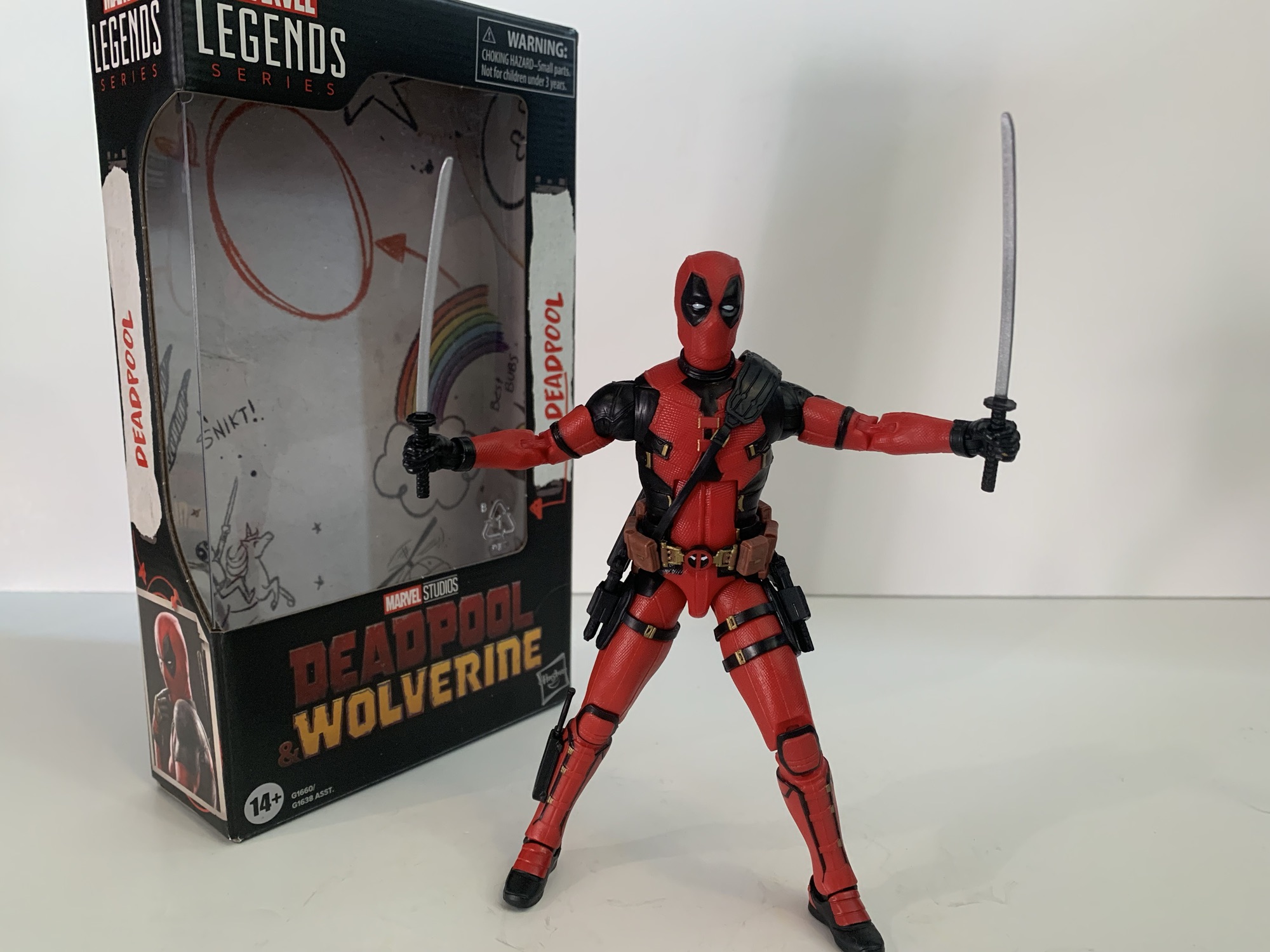
Despite the amount of reviews presents on this blog, I still do not consider myself a Marvel Legends collector. That’s because my interests are somewhat narrow when it comes to the Marvel brand. Over the years I’ve developed a fondness for Deadpool as depicted on film by Ryan Reynolds. I think the comic book character is fine, but I really like how the character has translated to live action. Which is unusual for me as typically I don’t care much at all about the live action versions of comic book characters. I enjoy the movies, when they’re good, but when it comes to toys just give me the comic book version.
“Hmm it’s probably a lot easier to hide all of the dried blook with a darker costume…”
Live action Deadpool appeals to me enough that years ago I picked up the Deadpool and Negasonic Teenage Warhead two-pack. I sold the Negasonic figure, but kept Deadpool as that was what I wanted. And it’s one of my, if not the, favorite Marvel Legends figure in my collection. I struggle to think of one I enjoy more. It wasn’t without some flaws, but generally speaking, it’s a fun figure with a great likeness. When it was announced that a new movie was coming I figured I’d be interested in any new Deadpool. If there was one thing about the old figure I wasn’t that crazy about it was the very muted shade of red. The new movie rectified that with a much brighter version of the Deadpool costume and it even added some little gold accents. The only question was how different was the figure itself from the one I already own?
Head is probably a little too big, or the body too small, but the details of the costume are pretty accurate.
Turns out, a lot. I’m guessing Hasbro had the digital files of that old figure still and used them to update the costume and create this new figure, but as far as cutting steel molds go this figure is almost entirely new. I can only say for certain that the hands are old as are the holsters for his swords (and the accessories are reused too), but the rest is different. Most of the differences are subtle as the previous figure had some distress marks throughout the suit and more visible wrinkles which this version has done away with. The chest has a different pattern to the costume as well as do the boots and holsters for the sidearms. It still very much feels like the same figure, but it’s different.
“See, I have swords, which are way less painful than blades that pop out of your fist.”
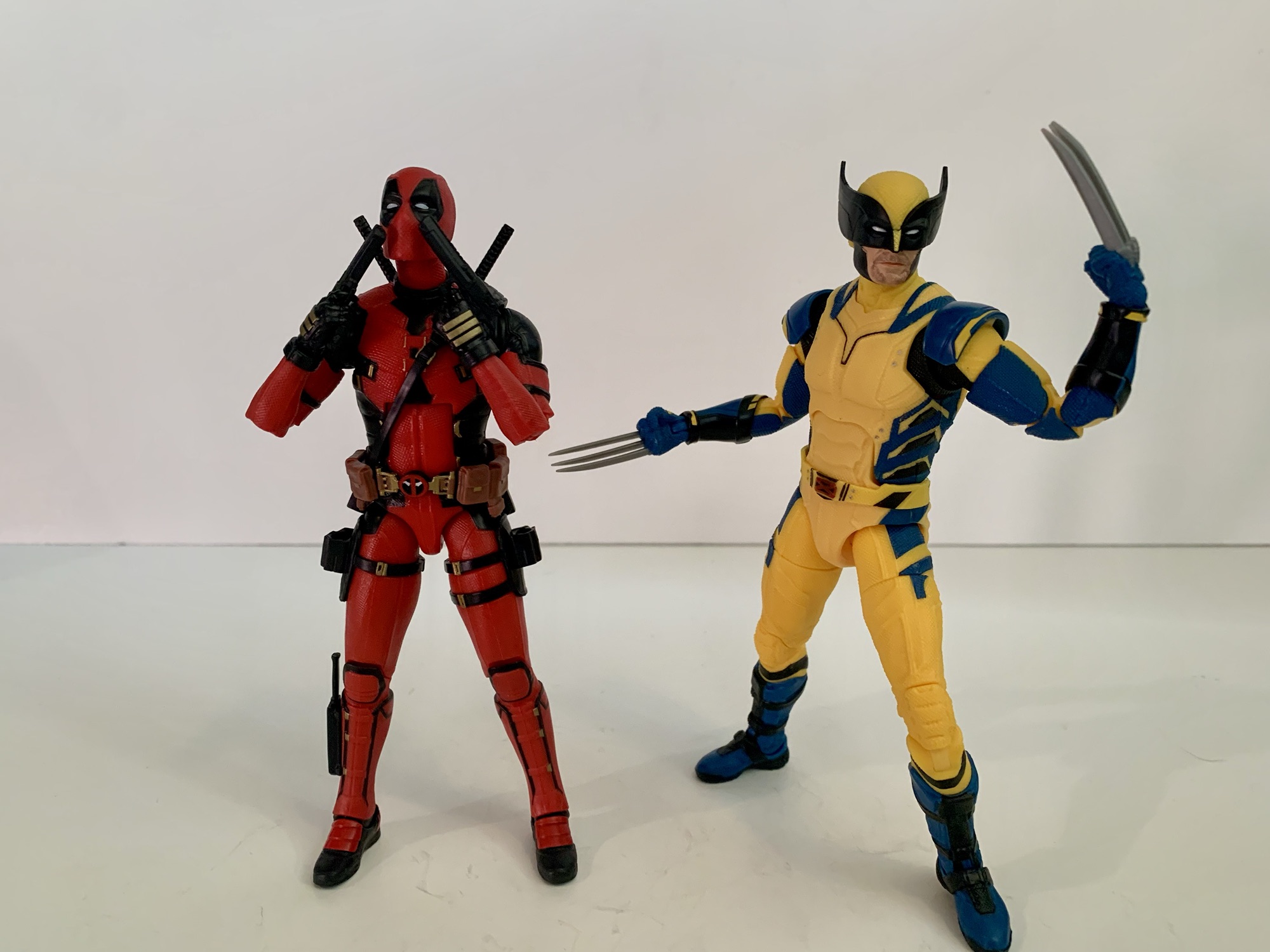
These differences all help to make this new version of Deadpool look like the one we see onscreen in Deadpool & Wolverine. And that makes a lot of sense since that’s what it’s supposed to do. The figure stands around 6.325″ making it a touch shorter than Wolverine. Jackman and Reynolds are close in height in real life with Jackman the slightly taller of the two, though onscreen they appear pretty damn close to equal. I’ve seen some express dissatisfaction with this Deadpool figure’s height, but I’m not bothered by it. The figure is mostly red plastic with the black and gold parts painted on. It has a better paint job than my old figure as the eyes are clean and there isn’t much overrun with the detail work. Some portions of the black are cast in black plastic. The holsters, for one, as well as the shoulders, wrist straps, and gloves. The feet are black as well with the red painted on and there the finish isn’t the same as it is with the other red. Perhaps it’s on purpose, but the red on the top of the boots is very glossy and a little darker than the rest of the suit.
“Ohhh, I should have seen that coming!”
The overall proportions for Deadpool are solid, certainly better than Wolverine. The head is probably a touch too big, but I like the shoulder placement and the torso shape. Could he be a little beefier? Yeah, probably, but it’s fine. Really, my only gripe with the look of the figure is that the bare plastic does give it a cheap look. This is consistent with a lot of Hasbro releases and even some higher end stuff like S.H.Figuarts. Give this guy a coat of paint and he probably would look a whole lot closer to “premium.” As it stands, he still looks good and the lighting of your display will either help to make the figure look better or look worse.
Oldpool has the edge when it comes to accessories.
Unfortunately, as was the case with Wolverine, this Deadpool figure is lacking some when it comes to accessories. Only in this case it’s made more obvious since we just saw the previous Deadpool get re-released with a bunch more stuff. For weapons, you get what is expected: two katana, one knife, and two sidearms. The sidearms are no longer glued into the holsters and are fully useable. The previous movie Deadpool had them glued in for some reason, but he also came with two additional handguns which were molded to make them appear to be mid-fire, which was cool. We don’t get those here nor do we get the extra hands. This Deadpool just has a set of gripping hands and trigger hands. The previous Deadpool had a set of fists and and a set of open, style posed hands. Deadpool is a very expressive character so it’s a shame to see the extra hands get axed. I’m not disappointed that Hasbro didn’t include the stuffed unicorn accessory again, but why not the hands? We’re also still lacking an unmasked portrait. It’s something consistently missing from movie Deadpool figures. Are companies just cheap and don’t want to pay for the likeness rights? Or is Ryan Reynolds averse to having his likeness (albeit a heavily distorted one via the makeup) cast in plastic for some reason?
“I do not respond well to my own failings!”
The sculpt for this guy may be new, but the articulation is exactly the same. It’s just as functional as before, but also just as dated as Wolverine. The main issue is the lack of a ball joint in the torso. Instead, we get the old ab crunch with a waist twist. It’s more of an issue with Deadpool since he’s basically a ninja and is a character that should be able to hit as many poses as humanly possible for an action figure. His gripping hands also have the wrong hinge for articulation as they’re sporting a horizontal one. The trigger hands have the proper vertical hinge, but they unfortunately are too loose for a satisfactory grip of the swords.
Some effect parts and more hands would have been cool, but honestly this is a pretty solid release.
This Deadpool is basically more of the same when it comes to movie Deadpool figures. If you like the old ones and want to see a deco more appropriate for Deadpool & Wolverine, then by all means go ahead and grab this one. It’s not as good a value, but he probably has the bare minimum, at least. If you don’t like the articulation of the old release or really lament the absence of a Ryan Reynolds portrait then this release won’t solve those problems for you. I ended my Wolverine review from the same film with the thought that while it was a flawed release, it nailed the Hugh Jackman portrait which was something other action figures weren’t providing making it perhaps a worthwhile investment. With Deadpool, the opposite is true as we are likely to receive a superior action figure in the form of the Bandai S.H.Figuarts movie Deadpool which has more hands, expressions, and effects. It’s also more than triple the price. If you only want one Deadpool and aren’t opposed to spending more money, that’s a figure that might make you happier. If cost is more of a priority then this will probably do fine.
We have more Deadpool & Wolverine and just Deadpool in general:
Look through my various toy reviews and you’ll probably notice that I’m not much of a Marvel guy. That wasn’t always the case for me though as I was huge into Marvel Legends once upon a time. I basically stopped around the time Hasbro was awarded the Marvel license. I felt there was a dip…
In celebration of the release of Deadpool 2 I thought it would be a good opportunity to take a look at one of my favorite action figures from the Marvel Legends line – Deadpool! Marvel Legends is a series of action figures that originated with the now defunct ToyBiz and is now owned by Hasbro.…
It might be hard for the young folk to believe, but once upon a time movies based on comic book characters were treated like box office poison. Unless you were Superman or Batman, you just didn’t belong in cinema. Even those characters weren’t bulletproof. Superman had a nice run, but fizzled out with the fourth…
An unexpected addition to the 1990 TMNT movie collection from NECA Toys.
2024 marks 40 years of Teenage Mutant Ninja Turtles and several companies have been marking the occasion in their own way. NECA, who has been flooding the market with TMNT action figures for several years now, celebrated the milestone with a San Diego Comic Con exclusive two-pack of The First Turtles. Based on the original sketches from co-creators Kevin Eastman and Peter Laird, the action figure set made a lot of sense as a 40th anniversary tie-in and as a Comic Con Exclusive. San Diego Comic Con may be the biggest convention in the world each year, but New York Comic Con is a pretty big deal too and since NYC is where the turtles call home, it made sense for NECA to have something special cooked up for that convention too. And they did and I think it caught everyone by surprise.
Eastman is obviously not the first human character in the line.
When the 1990 film Teenage Mutant Ninja Turtles was shot, there was a planned cameo from co-creator and current NECA collaborator Kevin Eastman. He was to play a garbage man and I assume he would be present in the aftermath of the battle with Shredder (and I think he is in the background). The scene was supposedly shot, but cut, highlighting the need for a better physical media release of the film that actually includes some of the shelved content. Even though the cameo may have been cut, NECA felt the need to celebrate it with a Kevin Eastman action figure as he would have appeared in that movie. It’s a great idea, and since it’s coming from the movie subline it means Eastman can be shown as he would have appeared in 1990. While it would be fun to see his comic book caricature turned into a figure (along with Laird), it’s definitely cool to get just a regular old Kevin first.
“April O’Neil here with the only eyewitness to tonight’s melee in the Bronx who has generously offered to provide a sketch of the strange creatures he saw tonight.”
You may want to watch your back, Kevin.
NECA sold the Eastman figure at NYCC and also on its website beforehand. And he sold out fast. It caught me and probably many others by surprise as it felt like the old days when the only way to get NECA’s TMNT product was through quick-selling online drops. The figure comes in a standard NECA Ultimates box designed by Chris Raimo. The figure was sculpted by Kyle Windrix and Trevor Grove with paint by Geoff Trapp and Mike Puzzo and some fabrication elements by Anthony Minichino and Brodie Perkins.
“Make sure you get my good side, dude.”
Eastman stands at roughly the 7″ mark putting him on more or less equal footing with April and Casey in the line. He’s clad in the black jumpsuit of a garbage man with a flannel shirt underneath and brown work boots. He has an almost amused look on his face, like he’s just happy to be here, and his trademark curly hair and moustache are in place. It’s a simple look and the paint turned out well. There’s a subtle sheen to the folds on the jumpsuit that makes it seem like it may have been nylon. The name tag is very legible on the chest and the flannel pattern is pretty sharp. The only negative is the paint on the hairline, particularly the figure’s right side, is not as sharp as it should be.
The most important accessory.
And I thought it was going to be just another boring manhole accessory.
Accessories for Kevin are sparse, but he probably has enough. Since he’s a garbage man he has a garbage bag. It’s a shiny, black, plastic, bag that’s tied off and likely stuffed with a sponge-like material to give it shape. It is what it is. Kevin has one gripping left hand and a pencil gripping right hand plus four pencils to go with it. The pencils, or pens, are just gray which is a little disappointing. Maybe they match the scene, but a more traditional orange #2 pencil would have looked a little nicer. He also has a clipboard with doodles of the turtles on it. They are done in an Eastman style and I’m guessing these are actual Kevin Eastman drawings shrunk down. It’s the accessory most are likely to display the figure with. Lastly, there’s a manhole cover which seems kind of dull at first. It reads “Lairdman Island,” a reference to the film and a portmanteau of Laird and Eastman. Flip it over though and you’ll find a recreation of the actual manhole cover that was placed in Dover, NH, birthplace of the TMNT, earlier this year. It has the address sculpted in and there’s a silhouette of the four turtles from their debut issue. I still need to get up there to see it for myself (my sister even lives in Dover) to properly compare, but this is a neat little accessory.
“I’m not sure you really captured the likeness here, pal.”
Articulation for Kevin is pretty bad. The hair keeps his head from doing a whole lot, but he can look down at his clipboard at least. Arms are basic and the elbows are single-hinged and the hinges on both hands are the standard type which I suppose is fine. There is a waist twist, but it has minimal range and the hips do almost nothing. They’re the old pin style too which I have a strong dislike for. I’m guessing these legs are reused from another figure, but I have no idea what. I assumed he was going to share parts with the jumpsuit Professor Perry (which I passed on), but that doesn’t appear to be the case. Knees are single-jointed and they’re fine. Ankles don’t really do anything.
“The results are in, Mr. Eastman: you ARE the father!”
The sculpt is pretty good and it’s executed well enough when it comes to the paint, but as an action figure this is a pretty bad release. Does that matter? Probably not. A Kevin Eastman Comic Con Exclusive action figure based on a cut scene from a 34 year old movie fits squarely in the novelty category. And as a novelty and a tribute to the franchise it’s fine. I’ll try to find something to do with the manhole cover while the trash bag will just live in the box. Kevin will be able to stand among my movie figures happily doodling on his clipboard and that’s good enough for me. Hopefully he’s joined by Peter some day. Unfortunately, if you weren’t able to get this guy he’s sold out. He was slightly expensive for a NECA release at 40 bucks not including shipping. If you missed it and absolutely must have it as part of your collection, I personally wouldn’t go beyond 60 bucks. And that’s just for someone who feels like their collection would be incomplete without it. If you only had a passing interest, or were hoping to do more with the figure from a posing perspective, I wouldn’t go nuts trying to track this down as I don’t think it will be worth it for you.
Just a guy and his kids.
If you feel like celebrating 40 years of Teenage Mutant Ninja Turtles then you have come to the right place:
As the story goes, one night Kevin Eastman was drawing with his friend and partner-in-comics Peter Laird when the idea to doodle a ninja, anthropomorphized, turtle entered his brain. Laird was so amused by this drawing that he too drew his own take on it. What was done just to amuse each other eventually turned…
Say the name “The King” to a comic book fan and they will immediately know of whom you speak. Jack Kirby is a titan in the world of comics. Creator or co-creator of a great many characters known throughout the world today, it’s hard to imagine what a comic book would look like without his…
NECA’s Teenage Mutant Ninja Turtles line has so been so successful that it’s allowed the company to branch out. It wasn’t that long ago that Playmates was the only game in town when it came to TMNT action figures and the company showed little to no interest in releasing anything other than the turtles themselves.…
It might be hard for the young folk to believe, but once upon a time movies based on comic book characters were treated like box office poison. Unless you were Superman or Batman, you just didn’t belong in cinema. Even those characters weren’t bulletproof. Superman had a nice run, but fizzled out with the fourth flick while Batman basically did the same in the 90s. Still, 1989’s Batman was a massive hit in all of the ways Hollywood dreams up. It not only did well at the box office, but it was a cultural phenomenon with a hit soundtrack, tons of merch, and home video sales to back it up. Because it did so well, studios started to look at Batman as the blueprint for what could work in movie theaters when it came to comic book characters. If you couldn’t fit a franchise into that mold, then why bother? That’s probably why Spider-Man could never get off the ground despite someone always holding the option to start a film franchise. It’s also probably why a little known comic book hero in Blade did manage to sneak into theaters and actually do fairly well. And it meant that when it came time to bring the X-Men to film that franchise needed a dash of Batman.
“Why are you so short?”
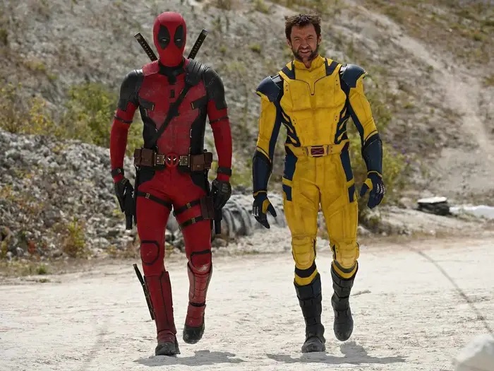
This mainly manifested in the film’s look. Audiences weren’t going to believe a bunch of people in blue and yellow spandex could save the world. They’d look stupid, so out with the colors and in with the black. Almost all black, and since the film ended up being a hit I guess the lesson to take from X-Men was that approach worked, but was it the only way? When we finally made it to the now Marvel Cinematic Universe there seemed to be a willingness to just take the costumes people liked in print and just go with it. The Fantastic Four film franchise isn’t celebrated as a massive hit these days, but it made money with blue spandex. Spider-Man wore his traditional costume and faired well, so when Marvel got to Iron Man they basically let him do the same. Along with Captain America and, to some extent, Thor. Fox’s X-Men franchise still tiptoed around the subject, but eventually some of those comic blues made it in, but one thing we never got was Wolverine with the mask, with the yellow (or brown, for that matter), until a little movie called Deadpool & Wolverine.
Is this what we’ve wanted the whole time?
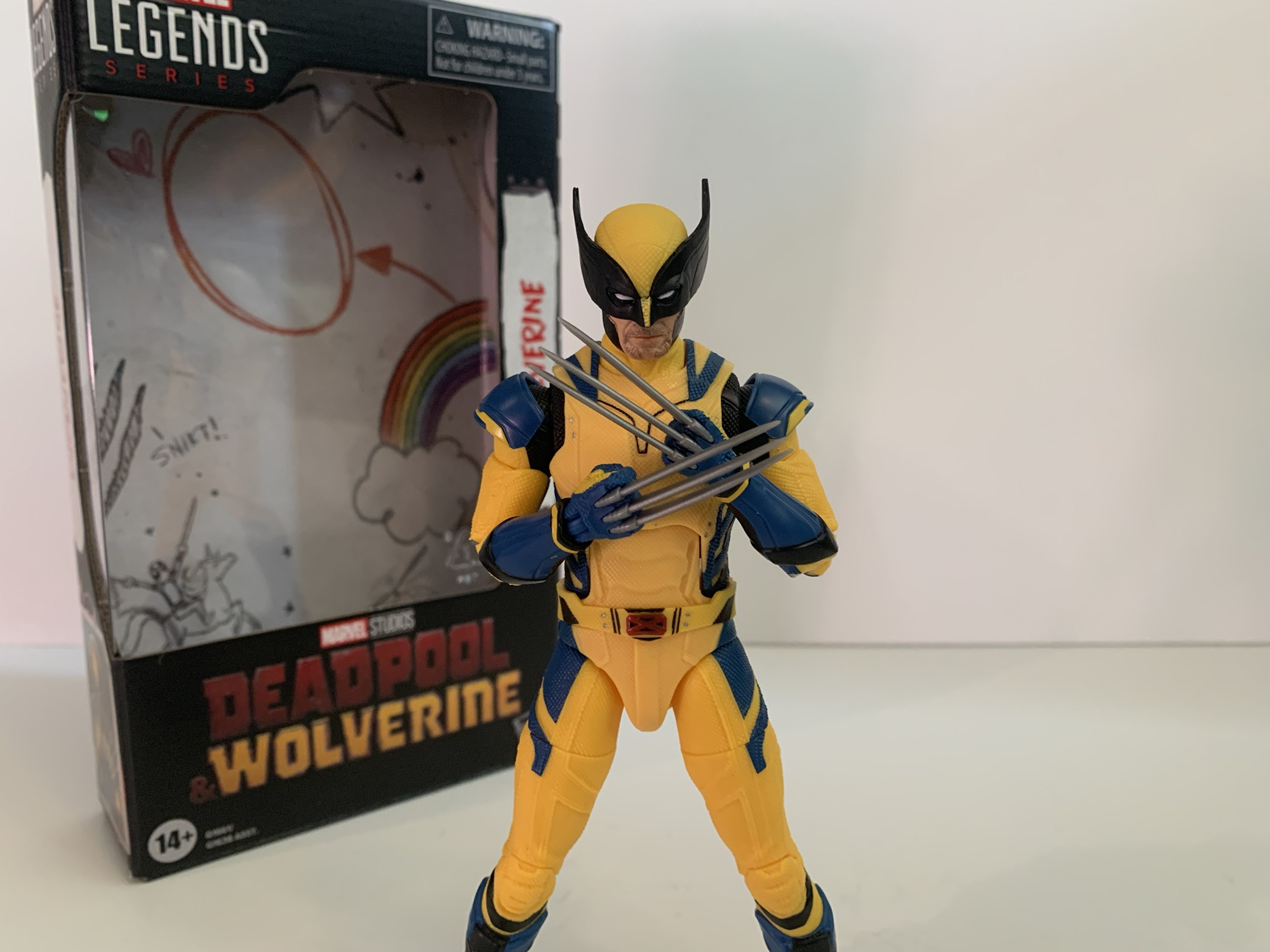
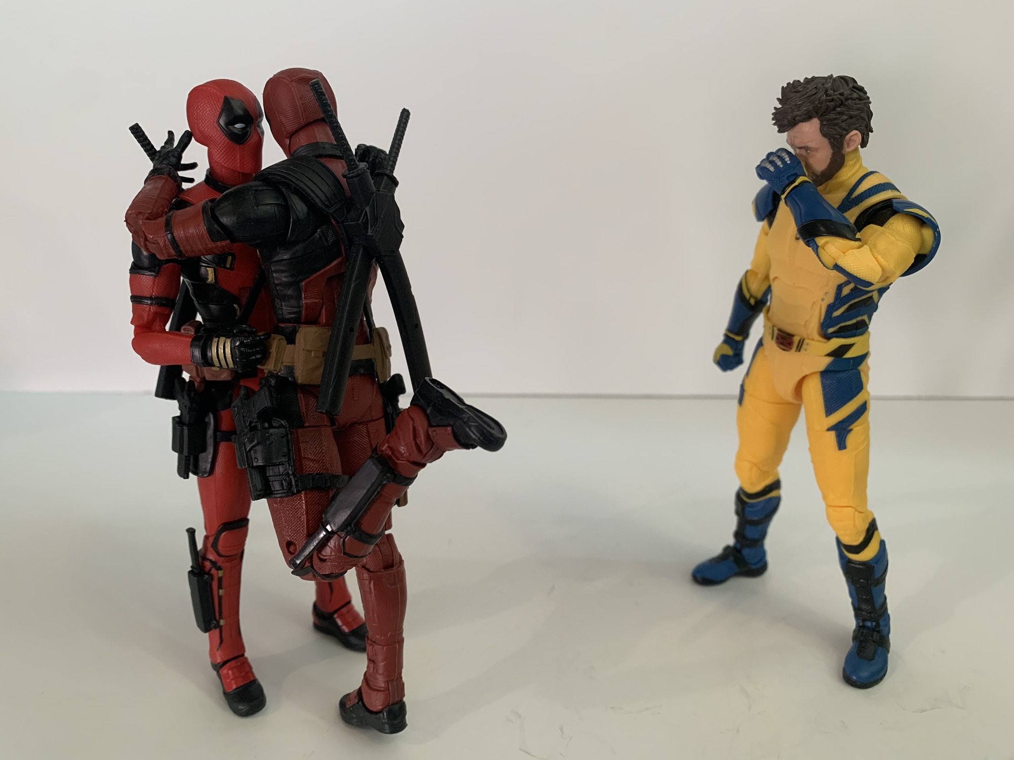
I didn’t do a review of Deadpool & Wolverine here. I probably should have, though it would have been lost in the many other reviews of the same. If I were to summarize it briefly, I’d call it Fan Service: The Marvel Way. It was plenty fun, maybe a little too long, but an overall enjoyable movie-going experience. It sure seemed like a big reason for the movie to exist was just to get Hugh Jackman’s Wolverine into a movie with a proper Deadpool (not that abomination from the Wolverine movie) and in a costume more reflective of his comic book self. Mission accomplished. The only surprise was that Hasbro wasn’t at the ready with Marvel Legends figures at opening. Now, I suspect there’s a good reason for that. Marvel and Disney probably wanted to keep the whole Wolverine look under wraps for as long as possible, at least until that first big trailer, and in doing so froze out action figure makers. They need a long lead time to get product on shelves and it probably wasn’t doable. They did manage a filler wave of older releases to try and placate fans, but now we finally have the first go at proper Deadpool & Wolverine figures and today we’re looking at Wolverine.
And who could forget his trusty sidekick, Deadpool?
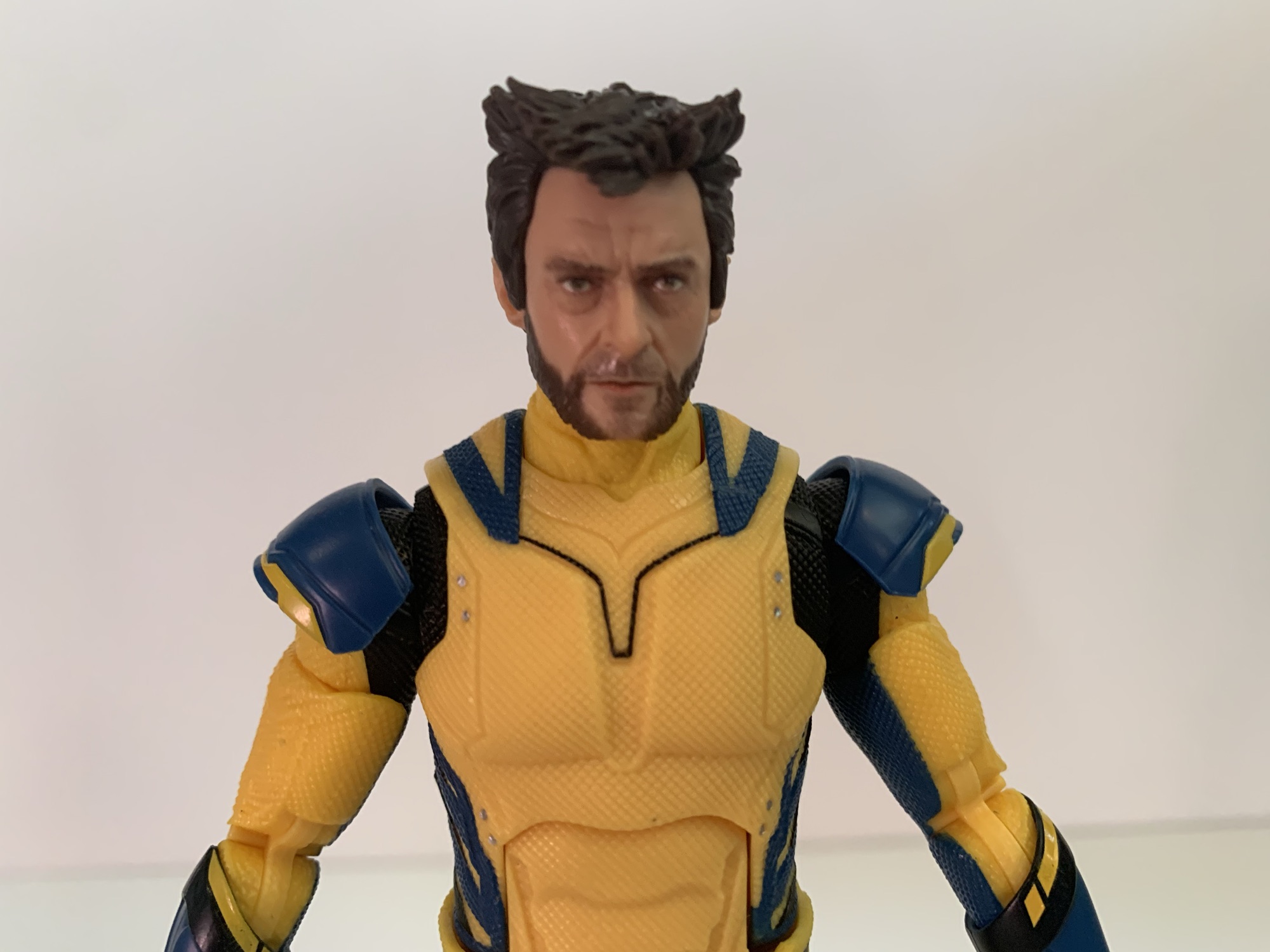
Wolverine stands at approximately 6.5″ to the top of his noggin and comes clad in that bright yellow and blue suit you’ve likely seen by now. By default, he’s sporting his cowl which is interesting because this figure depicts a version of the character unseen on the screen. That’s because he has his yellow sleeves. If you’ve seen the movie, and I suppose light spoilers if you have not, then you know he begins the movie with the yellow sleeves, but eventually discards them. Before doing so, we never see him with the mask on. That’s saved for a big reveal later. He could have worn the mask at any time so I guess this figure is sort of like a depiction of the character before we ever meet him when his life was presumably better. And had Hasbro withheld the masked portrait people would have likely complained. They’re complaining anyway, but we’ll get to that.
I hope you like yellow.
What stands out with this figure right away is holy yellow, Batman! Or Wolverine. The yellow is very bright, though not necessarily inaccurately so when compared with the film. It’s just that in the film Wolverine acquires a fair amount of grime pretty quickly which this figure does not reflect. The yellow is also bare plastic which gives it a cheap look. Yellow is a tough color to sell and it would not surprise me if a lot of would-be customizers out there give this guy a wash to dampen that effect. There is a lot of blue on the costume as well which is mostly painted on. It’s fairly clean and Hasbro also painted the little, silver, rivets on the front of the costume which is a nice touch (they’re unpainted on the back, a fairly common tactic utilized by Hasbro). The X emblem on the belt looks nice and there’s black mixed in with the blue on the gloves and boots. The yellow is also all textured so it’s not a smooth figure. It almost has a sandpaper feel to it.
Deadpool and Wolverine from the film.Proportions aren’t great here.
There are good and bad things to be found with this sculpt. The somewhat cheap look is one of those bad things and another would be the almost frumpy look Wolverine has. If you’ve seen Hugh Jackman in the role, then frumpy is probably one of the last words one would use to describe Jackman’s Wolverine. We see a lot of these issues with the comic Legends figures, but it’s largely a matter of proportioning. His chest is very narrow and there isn’t much thickness to it either. It doesn’t taper in like a human’s torso (or superhero’s) should and the head is too big. The legs seem short and he’s got these wide, birthing, hips. Now, this is all an issue when you have the figure just standing straight up and down on your shelf. Widen his stance and the issue is mitigated, but there’s no hiding completely that this body shape is off. And that’s a shame, because I bet we’re going to see most of this figure again at some point in the future. The other noticeable blemish that shows up more in pictures than in-hand is the different shades of yellow. The torso is almost a pale yellow while the limbs are more vibrant. The torso feels a touch harder and it’s thinner which may be the cause of the discoloration because both are cast in yellow as opposed to painted.
That’s a good looking face.
What undeniably turned out well though are the portraits. Well, specifically one portrait, but the masked portrait is solid too. It’s a good likeness of Jackman in the mask from the film which, honestly, looks a little goofy, but this is what we wanted, damn it! The yellow paint on the bridge of the nose is a little dingy, but that’s what happens when you paint yellow over black. The facial hair is a little messy too and there’s some overlap of the flesh on the edges of the jaw opening. It will look okay on a shelf, but up close isn’t all that impressive. And that’s assuming you want to display Wolverine masked and I’m not sure many will because this Jackman alternate portrait is fantastic. I don’t know if any other company at any other price range is going to top this likeness. It’s uncanny how lifelike this looks. Sure, get up real close and you see that almost pixelated paint app that’s a result of the face printing Hasbro uses, but at half an arm’s length it’s going to look awesome. The paint for the beard will probably vary a little from figure to figure and there’s a missed spot near my figure’s right ear, but overall I am very happy with this portrait. It’s the main reason why I decided to get the figure since the import versions look like they won’t even have a Jackman portrait.
The extra set of hands are kind of worthless. Just stick with the claws.
Accessories with Marvel Legends are rarely a selling point these days. Aside from the stellar unmasked head, this figure just comes with a set of clawed fists, a non-clawed right fist, and a trigger finger left hand. He has no gun to shoot so I guess Wade will have to loan him one. The clawed hands are probably what most care about and they’re fine. Claws are fairly straight and look good. The yellow paint on the hands is a little like the yellow paint on the nose, but what are you going to do? My hands did have some excess yellow paint in places, but I got it off with a Magic Eraser sheet. Obviously, the big omission here is the lack of optional arm parts. I mentioned earlier how we only see Wolverine in the film with bare arms while wearing the mask and that was certainly needed here. Was Hasbro not aware of that detail when the figure was designed? It’s possible. Or, they looked at all of this unique tooling they had to do in order to create this figure and decided a double-dip was in order. They can re-release this figure, throw in some arms that may not even need to be tooled, and call it a day. Maybe we’ll get a new head or something. An angry masked head, a yelling non-masked (which they could also repurpose from another figure), or maybe just this figure with bare arms. Personally, the bare armed look is the one I like best. Wolverine just looks weird in sleeves, like he’s wearing pajamas. Because it feels like such a certainty, I definitely don’t blame anyone willing to play the waiting game.
“Oh great, now there’s two of them.”
Wolverine’ articulation is a little different from what we’re used to. The head is a double ball peg and while it’s not executed perfectly, it is better than most Hasbro double ball pegs as Wolverine can look up, down, and there’s some tilt at play. He doesn’t have a neck joint though so those low Wolverine crouches aren’t really in play. The shoulder joints are basically big ball pegs. It’s what a lot of import companies use, but they do it in tandem with other joints to create more range. This one doesn’t. There’s a black, floating, cap and some space cut out of the chest to get a little range going across the chest, but it’s minimal. There’s almost no range going back so I wouldn’t even consider this a butterfly joint of any kind. Perhaps worse is that the shoulder pads just peg onto the shoulder itself. And it’s a big old peg with no play which means the shoulder pads are static and will hinder range at the hinge. He can’t raise his arms out to the side a full 90 degrees and even rotation is a bit cumbersome. The bicep, double-jointed elbows, and wrists are fine. The trigger finger hand has a horizontal hinge which is mostly worthless.
“And I thought Gambit was horny.”
The torso features an old school ab crunch. It goes back basically one “click” and forward two clicks. There’s a little nuance in between clicks, but not much. It’s very limited and the lack of a ball joint there is unfortunate. The waist twist is just a waist twist. The belt is floating so it can get out of the way. The hips are big ball sockets. He can almost hit a split and kick forward about 90 degrees with no room going back. There’s a thigh twist, but it breaks up the pattern on his thighs which is one of those things that may bug me more than most. The double-jointed knees work as expected as do the ankle hinges and rockers. The gloves and boots appear to both be separate pieces, but there’s no rotation to them. Overall, I’d call the articulation mediocre to average. Wolverine not being able to rear back with a fist is pretty disappointing and I don’t know why they let the shoulder pads become such a problem. I’m guessing there was a reluctance to break up the sculpt in the chest, but I personally would have done so for a ball-jointed diaphragm joint as well as a neck joint. I guess we’ll have to look to another company if we want a super-articulated Wolverine.
Friends forever?
Hasbro’s first stab at Wolverine from Deadpool & Wolverine is a bit of a half-baked release. It’s lacking in accessories including a major one and doesn’t hit a homerun with the articulation. It’s sacrificing articulation for sculpt, but the sculpt isn’t exactly deserving of such reverence. It does however deliver an incredible likeness of Hugh Jackman in the form of the unmasked portrait. Even with the limited articulation, it’s still possible to pose away some of the sculpt’s shortcomings. Because fans have been waiting so long to see Jackman in such a costume, it feels a little bit like this is a figure from a company that knows the fans were going to eat it up no matter what. And as a result, they only managed to deliver a satisfactory product. Hey, I’m clearly part of the problem in this instance since I bought this even though I really wanted a version of the character sans sleeves. And I fully expect such a character to come out in 2025. Knowing it’s likely to happen makes this a hard recommend. If you just want an MCU Wolverine right now and the imperfections don’t bother you then I guess go for it. I think the future S.H.Figuarts Wolverine will be a better action figure, but it too appears to lack a set of bare arms and I don’t think it’s even coming with an unmasked head. Plus it costs more than triple the amount of this one so I guess what I’m saying is I understand anyone who decides that this is good enough for now. I clearly did and while I’m not entirely satisfied with the decision, I’m not exactly regretting it either. Maybe I will when and if I replace it with something better, but who knows when that will be? At least for right now I get to enjoy tiny Hugh on my desk.
Do you like Wolverine? Do you like Deadpool? Well, I’ve got some other stuff you can check out:
The toyline of my dreams was announced last October. In celebration of the 30th anniversary of the television series X-Men, Hasbro is doing a dedicated line of Marvel Legends with figures based on the look of the show. The show was obviously inspired by the designs of Jim Lee, but there are differences in the…
Look through my various toy reviews and you’ll probably notice that I’m not much of a Marvel guy. That wasn’t always the case for me though as I was huge into Marvel Legends once upon a time. I basically stopped around the time Hasbro was awarded the Marvel license. I felt there was a dip…
When San Diego Comic Con was cancelled for 2021, many of the entities that would have sold exclusive merchandise at the event pivoted to web sales. And since the 2020 iteration of the famed event was also canceled due to the COVID-19 pandemic, many seemed to expect the same for 2021, or the massive delays…
Hello daddy. Hello mom. I’m your buh-buh-buh-buh-buh-buh-Bellybomb!
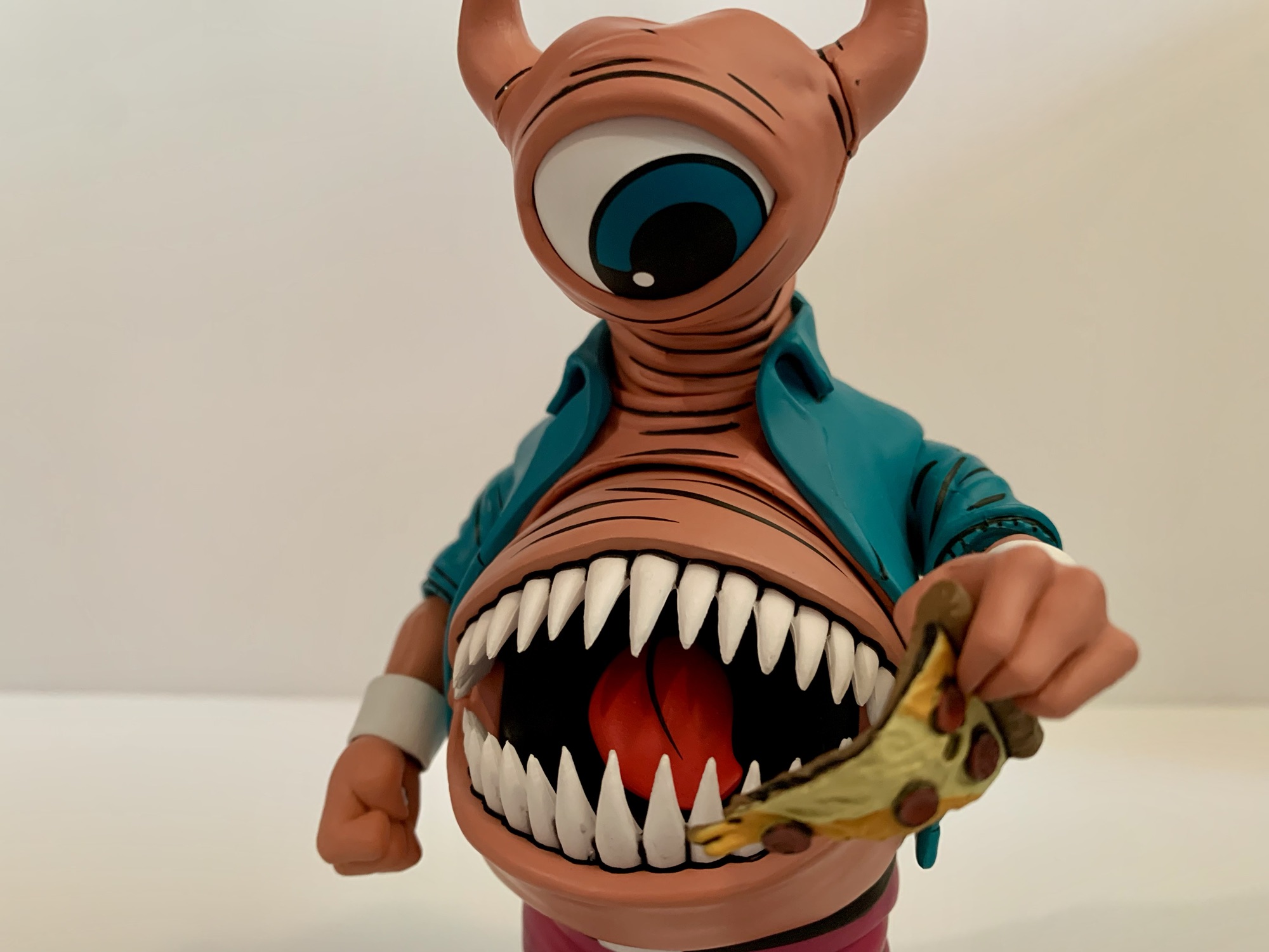
Sometimes, a character design so fun and outrageous can be enough to motivate one into dropping $35 on an action figure. Such was the case with NECA Toys’ Bellybomb figure from its subline of Teenage Mutant Ninja Turtles action figures based on the characters from the Archie Comics series. Of course, in this case it helps that I’ve been collecting most of the TMNT figures put out by NECA so I was predisposed to getting this guy when he dropped, but mostly I wanted him because he just looks so weird. I know next to nothing about the character. He’s some kind of alien or Dimension X creature and he’s a bad guy for the most part. Mostly though, he’s a dude with his mouth in his stomach and eyeballs in his palms – he’s a freak!
You might think he only has one eye at first, but he actually has three.
Bellybomb, to me, looks like a character that belongs in The Real Ghostbusters toy line from Kenner back in the day. A big eye, sharp teeth, and a wacky design. I remember having a football player in that line and his entire back lifted to exposed a monstrous mouth. Bellybomb can never pass as human or anything, but his anatomy is so very Ghostbusters. I wish I knew who created him so I could properly credit the artist responsible for this design, but I wasn’t able to find anything online. Maybe it was Chris Allen? Ryan Brown? I don’t know, whoever did though my hat is off to you. The character has been brough to life by sculptors Brodie Perkins and Tomasz Rozejowski. I believe it was Perkins who did the main figure and I’m guessing Rozejowski either did the gun or his little buddy (we’ll get to that). Paint is done by Geoff Trapp and Mike Puzzo and once again Ken Mitchroney is on hand to do the artwork on the box.
“Hey man, how’s it going?”
Bellybomb is a figure that gets by on this outrageous design. He stands around 6.375″ to the top of his…head, and is closer to 6.75″ if you factor in the horns. He’s a bit of a chunker since the torso is just a giant mouth with an eyeball rising out of it. His skin is a very fleshy color with numerous wrinkles and if you want to compare him to a certain piece of male anatomy there’s little I can say to dissuade you. It’s a valid comparison and just adds to the grotesqueness of the character. There’s lots of black linework while his clothing is pretty basic, but also bright colored. He has a blue dress shirt which is obviously unbuttoned to expose that massive maw. The hot pink pants and blue boots make him look like a creature out of the 80s, though he’s technically a 90s invention as far as I know.
“What the heck are you?!”
The two things that stand out with this sculpt are the mouth and the eye. The mouth is full of sharp, white, teeth while the interior is painted black with a big, red, tongue. The teeth are legitimately sharp so if you want to open the mouth try to push on the lip instead. He has a big, blue, eye at the top of his head that’s well-painted and sits cleanly in the socket. It’s moveable as well. It feels quite loose, but it stays where it’s supposed to as long as you’re not shaking the figure. Each of his hands also has an eyeball sculpted and painted on the palm which is done very well. Even the fist hands leave the eyeballs exposed which is a nice touch.
“What is this greasy concoction?”“Oh my god! Pizza, where have you been my whole life?!”
And aside from that, there isn’t much else to talk about with Bellybomb. His neck, I guess, which the eyeball sits on is articulated at the base and at the top. It can be positioned very well with plenty of room for nuance. The mouth opens and closes and it looks pretty good in both positions. The rest of the figure does very little, The shoulders are standard ball-hinges while I can’t get the elbow hinges to do anything. There’s rotation there, but that’s all. Hands swivel and hinge with the trigger hand being vertically hinged so that’s a plus. There is a waist twist while the hips and knees, despite being double-jointed, are pretty limited. The ankles hinge forward and back a bit with an ankle rocker, though the right ankle on mine is pretty loose.
New Krang is so cute!And now Slash gets a buddy.
Bellybomb is mostly going to just stand there and look at stuff with his big eye or maybe stuff things in his mouth. He also doesn’t come with much. He has a pair of fists, gripping hands, open hands, and a trigger finger right hand. He has a big rifle that’s nicely painted and appears to be accurate to the comic, but he can only hold it with one hand and there are no effects for it or anything. The only other thing he comes with is his little buddy and accomplice in crime, Krang. Krang in the Archie books features the same, general, design as the Krang from the cartoon except he’s a whole lot more adorable. He’s a cute little blob, and I love the very toon-like eyes. His tentacles can be posed a little bit and the underside of the figure is sculpted to be curved so he can sit in Bellybomb’s hand or on Slash’s shoulder, which is how he got around for a time in the comics.
Bang! Bang!
Bellybomb is basically a slam dunk of you’re into this design. He looks awesome, I’m smitten with it, so it’s an easy recommend. He’s not going to pose as well as some of the other figures in your collection, but I think the figure more than makes up for it. Maybe the package is a little light on stuff, but the included Krang is a nice touch. And if you’re turned off by the coloring, NECA has a blue variant of this figure on the way based on his look from one of the covers. I was able to track this guy down at Target. He wasn’t advertised as being part of the Cowabunga Collection from August, but he arrived at basically the same time. I never did encounter this one in-store though and had to stalk the online listing where he’s been going in and out of stock since August. It’s likely a wider release will follow at some point so if you’ve been having a hard time tracking this one down just be patient as he’ll likely wind up on online retail outlets soon enough.
Check out more from NECA’s line of action figures from Teenage Mutant Ninja Turtles Adventures:
.The NECA Cowbunga Collection is a content creator’s dream. Here we are deep into October still talking about figures that dropped in August. This time it’s another Teenage Mutant Ninja Turtles Adventures action figure and it’s fan-favorite Mondo Gecko. Most TMNT fans probably know Mondo from the Playmates action figure line. He also made the…
We are rolling right along with more reviews of NECA’s TMNT Adventures line of action figures and we’re also staying within the realm of Stump Wrestling. When the turtles wound up in the intergalactic wrestling federation, they didn’t just encounter aliens, they also encountered an old foe. I don’t know how Leatherhead wound up as…
Back when Teenage Mutant Ninja Turtles ruled the world, there was a lot of brand synergy between all of the various media being generated by this one mega popular piece of intellectual property. The comics came first followed by a toyline which necessitated the creation of an animated mini series to basically serve as a…
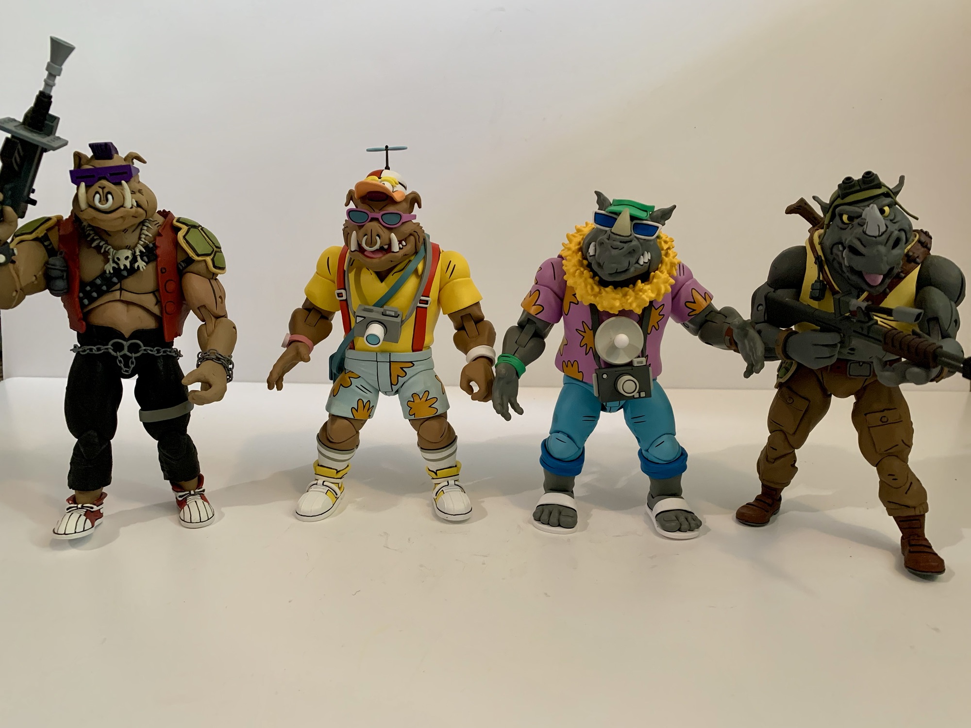
Pack your bags and grab the sunscreen because today we’re heading to Florida! It’s vacation time folks, and even the bad guys deserve a little fun in the sun sometimes. Coming from NECA Toys we have another fun variant of the duo Bebop and Rocksteady. Always more comic relief than true threat, the boys come dressed for the theme park as they accompanied the boss man down to Florida in an episode of the classic cartoon series which resulted in the further mutation of the punk frog Napoleon. As this line has gone on, I’ve become more and more drawn to the silly offshoots and Bebop and Rocksteady have provided ample opportunities for such. We’ve had them as rabbits, robots, and superheroes and now we have them as tourists. The only question is does anyone need a couple of dimwitted mutants in floral patterns?
Seems like with each subsequent release, Bebop and Rocksteady shrink a little more.
Bebop and Rocksteady come courtesy of the duo Tony Cipriano and Tomasz Rozejowski with contributions from Kushwara Studios. Paint is handled by the frequent pairing of Geoff Trapp and Mike Puzzo. If there are any reused parts from past versions of these two, it’s not apparent. Even the hands look like they’re new. They do share parts between each other, but for the most part this is an all new set. Not that they don’t feel familiar as the construction of these two is pretty consistent. They’re more visual than poseable, but the very loud outfits will help to boost their shelf presence even if they aren’t the most dynamic figures in your collection.
This smaller scale for the duo probably is more accurate to the source material.
Rocksteady stands at around 6″ while Bebop is closer to 6.5″ which adheres to their presentation in the show. The two have similar, but different, outfits. Rocksteady is rocking the Hawaiin shirt in shades of purple and orange while Bebop went with a more bold choice with a yellow polo and red suspenders. Bebop brings in the floral print with the light blue shorts with orange flowers while Rocksteady seems to be wearing jeans with the cuffs rolled up. Bebop retains his usual style of kicks, opting for a matching yellow while Rocksteady has traded in his boots for flip flops. Bebop has more traditional sunglasses than his usual ones and Rocksteady has old man sunglasses with the strap going around his head. Neither are removable, nor is Bebops very fashionable “Not Donald Duck” hat with propeller. The propeller does not spin, unfortunately. Rocksteady actually has two hats: a blue visor or a yellow cabby hat which he switched to in the show.
“This is no vacation!”
These two look great for what they are. I feel like the Bebop and Rocksteady portraits keep getting better (well, except for Rhino-Man who was a little weird) and more aligned with how they looked in the show. There’s tons of paint and it’s pretty cleanly applied, but there will be some variation from figure to figure. My Bebop has an ugly spot near his suspenders on the back of his shirt, but it’s otherwise the only real paint defect. These figures are not pin-less, which is apparently something being rolled out by NECA slowly. It’s not that big of an issue on its own, but does create an eyesore with Bebop’s high socks. The factory went with a flesh colored pin even though the hole is cut through the socks. Gray would have been the more appropriate choice, or they could have painted them. There is also no cel-shading on these figures which continues to be something that NECA utilizes inconsistently. I’m not really bothered by it, but I would prefer NECA to just pick a lane with this stuff and stick to it.
It’s sort of like his son?One ugly bug.
These two come with an assortment of hands and vacation accessories. For both, we get a set of fists, gripping, and open hands. Rocksteady comes with a lei around his neck while Bebop has a satchel. Both also have a camera with a strap on it. Rocksteady’s features a large flash while Bebop’s is more compact. Unfortunately, neither can really be held as they’re too chunky for the gripping hands. You could heat them to wedge it in, but then you risk rubbing the paint. Plus, it’s unlikely they’d be able to hold the cameras in front of their face like they’re using it. There’s a large, blue, canister that looks like a water jug, but it might be some mutagen thing from the episode. I didn’t rewatch it. Unlike the cameras, the pair have no issues holding this thing by the handle. Lastly, we get a little rhino-fly. In the episode, a dragonfly has contact with Rocksteady and then contact with the mutagen to become this gross, little, abomination. It’s a fun little inclusion, though I wish he had a little acrylic stand or something because he really can’t do anything by himself. He basically needs to be held.
They can handle waving, but not much else.
Articulation for these guys is pretty basic stuff for a NECA figure. All of the cuts and joints you would expect are there, but they’re kind of limited. You have the ball joint at the head, but they mostly just rotate because there’s a lot of stuff in the way. The jaws are articulated, but the range is poor. The shoulders are ball-hinged and we get a bicep swivel as well. Double-jointed elbows are really limited by the fact that the neutral position for the arm is slightly bent. They’re also really tight and I can’t get better than a 90 degree bend out of them. Wrists rotate with a horizontal hinge. The shirts are basically overlays with not much inside them but a ball joint. They’ll rotate, but they won’t bend forward or back much. Ball-socket hips kick forward an okay amount but not back. They’ll go out to the side a solid amount though. There is a thigh swivel and double-jointed knees. Like the arms, the neutral pose is somewhat of a squat so the legs can’t go perfectly straight. Knee joints are tight, but even if you get both hinges working in tandem it won’t get you more than 90 degrees. The feet hinge forward and back a bit with an okay ankle rocker. Bebop’s is better than Rocksteady’s, but for the most part the pair move the same which is to say not very well.
“It’s more beautiful than I ever imagined!”
If you’re a collector of this line though from NECA Toys then that’s probably not a surprise. This line always favors aesthetics over articulation and Bebop and Rocksteady are no different. They are a little too far in one direction for my personal taste, but given that they’re goofy variants I’m more fine with it than normally. If these were the more evergreen interpretations of the characters I’d want more out of the torso and head, especially. And, come on, the propeller doesn’t whirl? Missed opportunity, NECA. A second one that’s sculpted like it’s spinning would have been fun too. And I’d be remiss if I didn’t mention that the box art features Rocksteady holding a little, red, flag from the episode which is not included. That’s just odd since that’s probably a pretty inexpensive accessory, but it’s also not some great loss.
“Do I know you?” “No, but I’m a big fan of your work!”
When it comes to variants of figures, I think more falls on how one perceives that look for the character. With Vacation Bebop and Rocksteady, that is very much the case. I can critique and praise aspects of these figures all I want, but at the end of the day the only people buying this set are those who are amused by these looks. I think they’re fun. I love the bright colors and I especially love how Bebop looks practically giddy to be heading out to an amusement park. Teenage Mutant Ninja Turtles was a silly, stupid, show and I want the toy line I’m collecting to reflet that so I didn’t hesitate to grab these. For $60, I can also understand how someone might look at these and conclude “I don’t need them.” If you’re not one of those folks though, then you can find this set at Target. It was part of the Cowabunga Collection released back in August, but it was stocked in generous quantities and is still pretty easy to track down well into November. It probably won’t last forever though and I wouldn’t guarantee on another production run so if it’s something you like you probably don’t want to wait too long.
If you like figures of Bebop and Rocksteady then you have no shortage of options these days:
2021 introduced a lot of good things for collectors of NECA’s Teenage Mutant Ninja Turtles line of action figures based on the classic cartoon. The toy maker still kept the line a Target exclusive when it came to brick and mortar, but it also started selling a lot of it online to coincide with each…
I have been rather fortunate when it comes to toy collecting in recent years. When I was a kid, toy collecting meant going to Toys R Us or a similar store and seeing what was on the shelf. Catalogs, commercials, and card backs were my main source of information. I assume there were newsletters and…
We did it! We finally made it to the end of the Haulathon releases from NECA Toys and we may have saved the best for last. Back in early 2020, I made a wish list for what I wanted from NECA and Teenage Mutant Ninja Turtles. It was only 10 deep, though there were some…
It just wouldn’t be Halloween without The Simpsons.
Happy Halloween fellow toy enthusiasts and fans of The Simpsons! Every year since 1990, there has been a Halloween edition of The Simpsons. The annual anthology style episode called Treehouse of Horror is basically appointment viewing each and every year. Sometimes it arrives before Halloween, sometimes on Halloween, and often times after Halloween (as it’s doing this year for some unknown reason). It would be nice if there could be some consistency when it comes to that aspect of the annual show, but at least with Halloween occurring on a Thursday this year it’s not a long wait until Sunday.
Here at The Nostalgia Spot, much time was spent on Simpsons action figures in 2024, and in particular, those from Super7. The company announced it had the license a few years ago to produce action figures based on the show, but it took a long time to get things moving along. As a result, Disney may or may not have grown impatient or they just didn’t like the returns they were getting from Super7 because the company yanked the license (along with all other Disney licenses) away and gave it to Jakks Pacific. That lead to three waves of Ultimates! figures getting released in a short window earlier this year with varying degrees of quality (most not great). I enjoyed some of those figures, but I also did not enjoy some and I was pretty harsh at times. This isn’t an apology though, the figures are what they are, and the criticism was warranted. When I finished that though I opined on if I should make a post about some Super7 figures based on The Simpsons that I did enjoy. Namely, the ReAction brand.
The ReAction figures are a little bigger than the new Jakks 2.5″ (Bart on skateboard) line, but a lot smaller than the Jakks 5″ line (far right).
Super7’s ReAction brand is its retro-style action figure. Loosely based on what Kenner started in the late 70s with Star Wars, these are approximately 3.75″ figures with five points of articulation: head, shoulders, hips. All of those points are simple swivels and Super7 has used this format for basically a whole bunch of licenses over the years. Personally, I don’t have any nostalgia for the original Star Wars line from Kenner so I typically am not interested in these intentionally ugly, limited articulation offerings from Super7. It also doesn’t help that they’re usually around 20 bucks (ouch). However, for some properties Super7 alters its approach slightly to basically sculpt and paint the figures to match the source material and that’s what it did with The Simpsons.
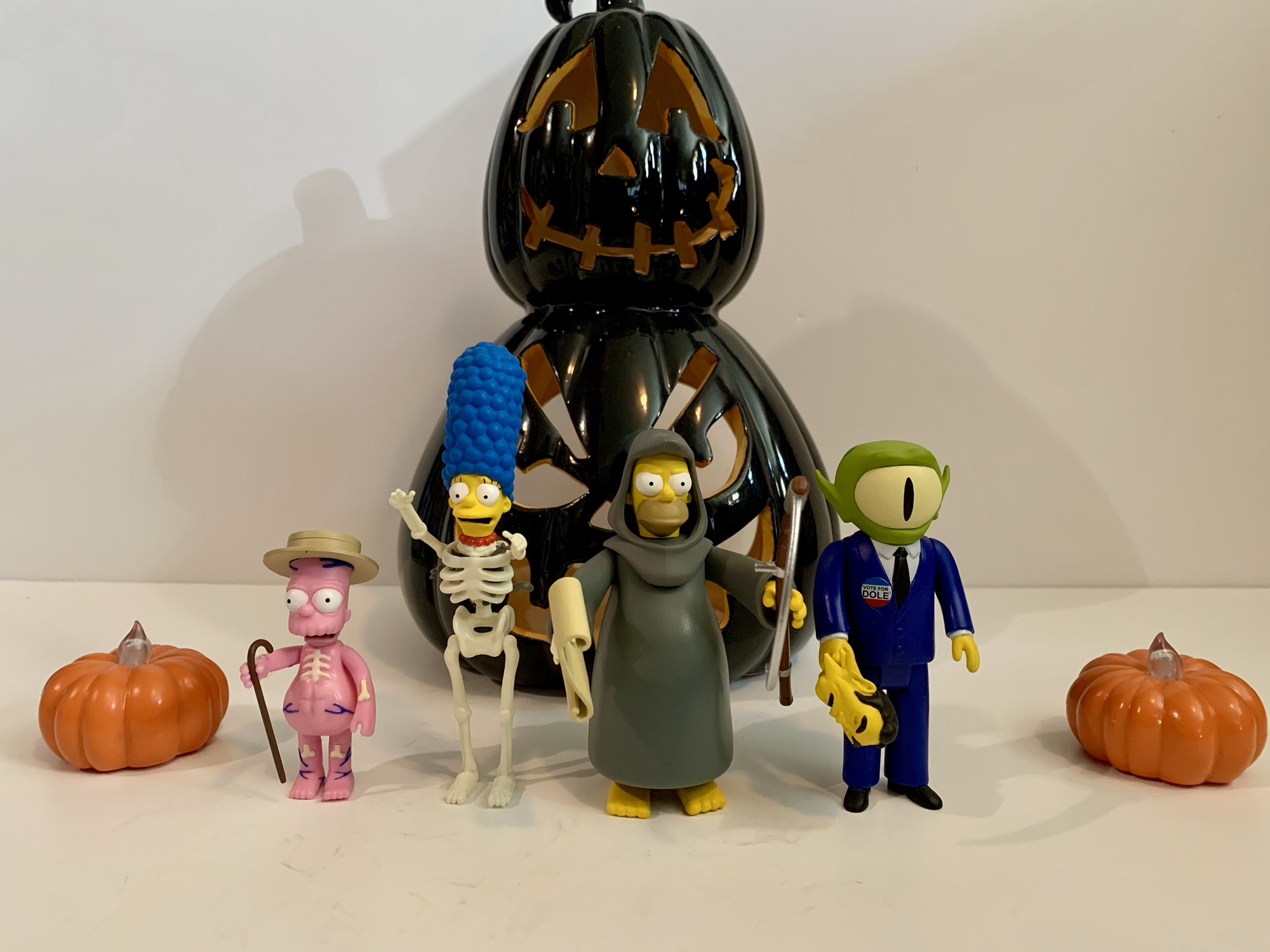
Each wave of Simpsons Treehouse of Horror ReAction consists of four figures.
Super7 did four waves of Simpsons ReAction. One was based on the movie within the show, McBane, while another was a series of Troy McClure two-packs (and they were great). The other two were devoted to Treehouse of Horror. Wave one consisted of Reaper Homer, Skeleton Marge, Inside Out Bart, and Kang as Bob Dole. The articulation across the board is terrible, but the sculpts are pretty nice and these figures are fully painted. What really helps sell them is the yellow paint for the skin, something the much larger and more expensive Ultimates! figures skimped on at times. The Marge sculpt, in particular, is very nice as she has a skeleton body with her normal head (in a horrified expression). Inside her rib cage is a trapped Snowball II and even the little kitty appears to be fully painted. She’s a bit tough to stand because the hips are a touch loose and her hair makes her top heavy, but overall she’s rather nice looking.
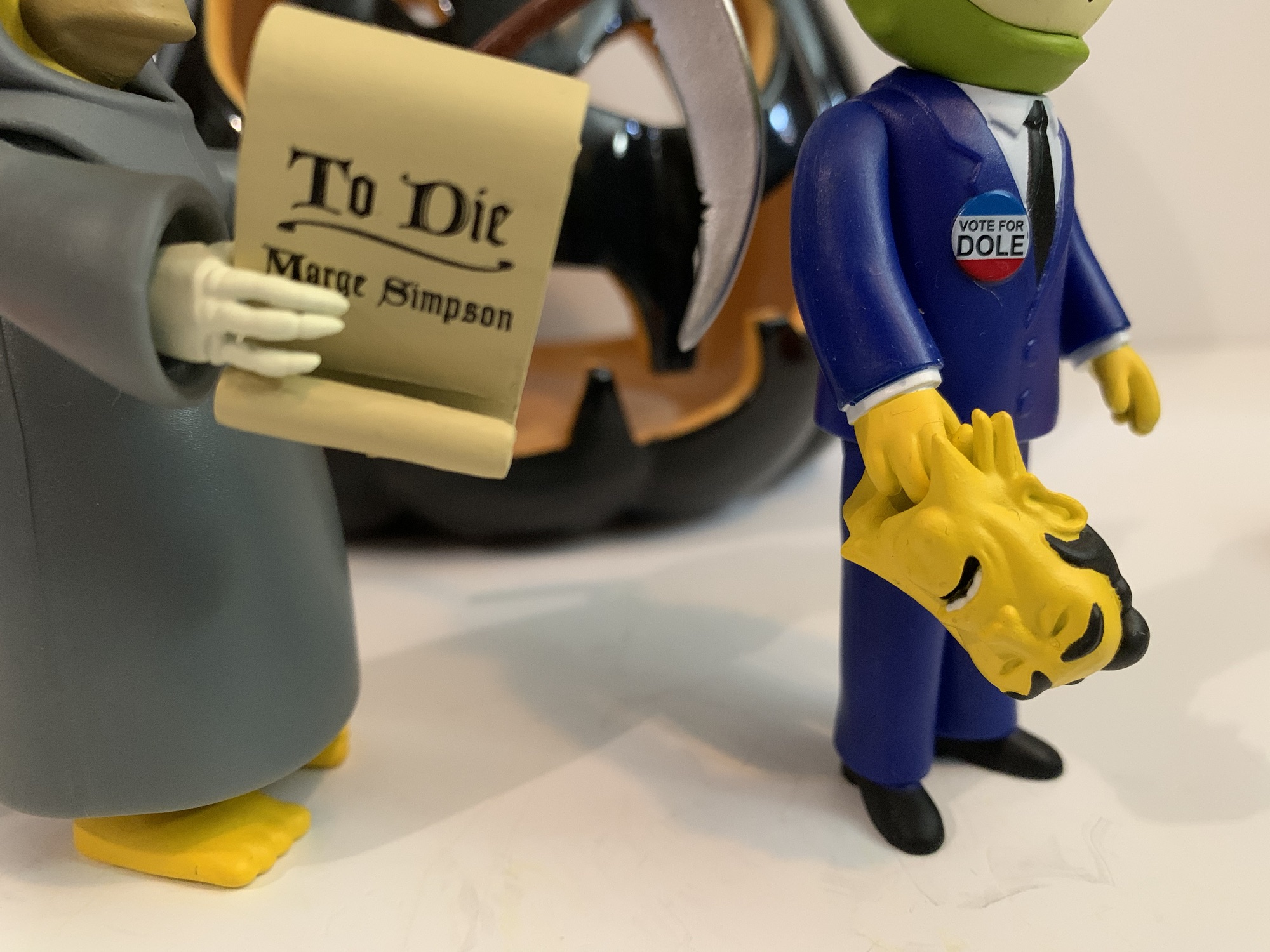
Finally! I have Bob Dole’s boneless face in plastic!
Homer also looks great. This take on the “Reaper Madness” segment where Homer became the Grim Reaper captures the likeness well. He has one skeletal arm and one normal one. Plus, he has two accessories: his scythe which he can hold okay with his left hand, and the scroll ordering him to kill Marge which he can hold with his right. He’s even more limited articulation wise, but these things are basically just little statues. Kang-Dole is depicted from the moment in the segment where Homer yanks the Bob Dole mask off of his head exposing the top of his eyeball. The Bob Dole mask is an accessory and it’s kind of creepy. The details on the figure are nice though and it’s certainly a memorable segment from the show. Inside Out Bart is perhaps the least interesting of the bunch. Even though the concept should lend itself well to figure form, there’s less paint since they were able to just mold him in pink and just paint a few veins here and there. His expression is also odd, but he has his cane and top hat and looks fine. It’s just the limited posing (even for this form as his legs do very little) of this form factor that lets the figure down since this character only exists for a dancing segment and he definitely can’t be posed in any dancing maneuvers.
Not the most creative character selection, Super7.
Wave two was surprisingly more of the same for Super7. It once again features a version of Homer, Marge, and Bart and then throws in a side character, which in this case is Groundskeeper Willie. Marge comes in her witch attire from “Easy-Bake Coven.” She has a laughing expression and comes with her broom. She, of course, can’t really ride the broom and even though she’s wearing a long skirt Super7 still gave her hip articulation by splitting the sculpt. I hate when they do that and it’s one reason why I’ve never been tempted by their Misfits ReAction figures. They left the robed Homer alone, but not Marge. It just looks stupid, and the limited articulation doesn’t add much. Still, she’s a good representation of this Marge, even if a little less exciting than the skeleton one.
Both Homers look pretty great.
Homer is in his Snake form from the segment “Hell Toupee.” That means he looks like regular Homer, only he has a gray shirt and hair. Somewhat to my surprise, Disney let Super7 sculpt his pack of cigarettes under his right sleeve. It’s a small detail, but they’re so averse to smoking in anything that I’m surprised they didn’t insist on removing it. He also comes with a corkscrew with Moe’s heart stuck on the end. It’s pretty gruesome for such a small item, but I appreciate his right hand being sculpted in such a way that he holds it properly. The Bart in this wave is technically not Bart, but Hugo from the segment “The Thing and I.” His shirt is a little darker than usual and his clothes are tattered. The remnants of his shackles are still on his ankles and he comes with a glass of milk and plate of fish heads. His grip on the glass is pretty loose and can get annoying as dropping that tiny accessory can lead to a long search for it. The plate of fish heads also just kind of rests on his right hand and can be precarious since it throws off his balance. Basically, once you get him right, don’t touch him! The sculpt looks nice though and he’s well painted, though the tattered bits of the hem of his shirt could have been done better. It’s basically seamless with his body so it looks odd upon close inspection.
Willie, with his Jakks counterpart.
The last figure in the wave is Groundskeeper Willie in his Freddy Krueger attire from “Nightmare on Evergreen Terrace.” He is perhaps the most preposed of the line (Hugo is as well) as his knees are bent and his arms are situated in such a fashion that he can hold his included rake with two hands. It basically just means he has one pose so the articulation on this guy is almost pointless. He looks great though and I’m definitely not upset about his inclusion or anything. I do think this line is open to criticism when it comes to character selection. We get two each of Bart, Marge, and Homer, but no Lisa? After the Ultimates! completely shut out her, Marge, and every female in Springfield it was disappointing to see the ReAction figures almost do the same. We could have easily received a witch Lisa instead of Marge, or maybe sorcerer Lisa, Einstein Lisa, snail Lisa, or a multitude of others. Hawk Lisa with a shrew Maggie (or whatever she was supposed to be in “The Island of Dr. Hibbert”) could have been a way to get both of the Simpson daughters into the line.
I love what Super7 gave us, but could we have sacrificed a Marge for a Lisa? I get that Homer and Bart are the most popular, but we needed a Lisa!
All other criticisms of character selection mostly stem from the line only lasting two waves. It’s a shame, because Treehouse of Horror is ripe for more figures. I might have preferred a fly Bart or werewolf Bart to the inside out one, but it’s not like Inside Out Bart is a bad pull or anything. Plus it comes from one of the best editions of Treehouse of Horror. With this line, Super7 had a great process. The sculpts were on model, they didn’t sacrifice on paint, and even the scale looks pretty good. I was certainly looking forward to more and it’s a shame this is it. If you want to collect what’s present here, you definitely won’t want to wait. Most places are sold out with figures only available on the aftermarket where folks are looking to get more for them now that the line is cancelled and no more are coming. At 20 bucks a piece, they were already too expensive for what they are. I could forgive it because at least they looked nice (and I got some of these on sale too), but at any more than that it becomes a really hard to sell. You have to be a hardcore fan of The Simpsons and Treehouse of Horror in particular to spend more than that, and if you are such a fan there’s a good chance you already have them. Happy Halloween!
For more Simpsons figures, and even some Treehouse ones, look no further:
We are onto the third wave of Ultimates! from Super7 based on The Simpsons. Like past waves, plenty of questions abound when it comes to Super7’s character selection and they’re not unfounded. Perhaps the two most questionable inclusions in this third wave are the subject of today’s post: Kang and Kodos. These are two separate…
Last week, we concluded our look at the third wave of Super7’s line of figures based on The Simpsons and now we embark on the fourth and final wave. That’s right, Disney pulled the rug out from under Super7 and handed The Simpsons license over to Jakks. Their products will start rolling out this fall.…
I think it was early this year that we found out Super7’s line of ReAction and Ultimates! action figures based on The Simpsons was ending after just a couple of years. That meant Super7 was done after four waves of Ultimates! and four waves of ReAction figures. We had seen figures for a possible fifth…
It’s the last Turtle Tuesday before Halloween, so this calls for something a bit spooky and what better way than to take a look at two figures from NECA Toys’ line of Teenage Mutant Ninja Turtles x Universal Monsters figure line? I haven’t been collecting this one because one; I have tons of TMNT stuff already to collect and two; I’m not a fan of the Universal Monsters. I think they’re fine, but I’ve just never been drawn to those movies or really cared about them. I didn’t even get a single release from the vintage Playmates line when they started this whole business that NECA has continued. I did get the Michelangelo as The Mummy because I just thought he looked cool so I have always been at least open to adding more to my Halloween TMNT display. It was just a matter of waiting for the right figure and at the right price.
Raphael and Leonardo have the honor of being the only turtles so far in this line to get a second figure. Both had a figure debut before these two with Raph cosplaying as Frankenstein’s monster and Leo going as Ygor from the same film. I don’t think anyone was complaining about Raph getting the Frankie treatment, but I definitely saw more than a few people who felt perplexed by the first Leo. Maybe this one makes up for that? For these figures, NECA has turned to two more recognizable monsters: The Wolfman and The Creature from the Black Lagoon. Interestingly, Leonardo already portrayed The Creature for Playmates making him the first repeat pairing in this line (for a turtle, April got to be The Bride in both as well) as it felt like NECA was actively avoiding the same pairings as Playmates. Leo also got to portray The Wolfman in that line so we’re looking at two characters who have been played by Leonardo in the past and now the present which is something that might be of interest only to me, noted Leonardo super fan.
The shells on these guys are pretty gnarly.
If you’re new to this line, this is basically what you expect. The only wrinkle that NECA has tossed into the gimmick is that the turtles are based on their look from the 1990 movie making this like an offshoot of NECA’s movie line. I feel that aspect is quite evident in the portrayal of Raph, but less so Leonardo, but that has more to do with the Creature’s facial features than anything. The line is definitely going for that NECA realism they like to put on a lot of their figures. These figures possess intricate sculpts and a lot of paint while making some sacrifices where articulation is concerned. Both come in the standard Ultimates style of packaging NECA is known for with new artwork on the front by Daniel Horne. The sculpts on both are by Tony Cipriano with contributions from Kushwara Studios and the paint is provided by Geoffrey Trapp and Mike Puzzo.
The sound of a wolf howling in New York is strange enough, but what’s really odd is some claim the wolf is howling, “DAAAAAAAMN!”
We’ll talk Raph first since he came out first. Raph as The Wolfman is about what you would expect. He’s clad in the familiar olive green shirt, but it’s been torn up along with his trousers. The head very much looks like Raph, but just covered in fur. He still has his pads and bandana and his hands and feet follow turtle anatomy rules, they’re just combined with a canine aesthetic. He has two portraits, one that’s neutral and one that’s in a yell. The yell is certainly the more fearsome of the two with the teeth prominent and well painted. The neutral expression is a lot of fun because it has an undeniable Muppet quality to it which I very much like since it was the Jim Henson Company that designed these original suits for the film. The most interesting part of the sculpt for me was the shell. NECA opted to cover even that in fur which certainly makes a statement. I suppose I never gave much thought to how the shell would be represented, but I was a bit surprised and amused by the decision. The detailing is all very nice though and the paint exceptional. The only downer with the presentation was the very sticky texture my figure possessed out of the box. In particular, the hands and belt. I’ve had this figure for months actually just letting it air out and it’s now finally reached the point where most of the tackiness is gone, but it was certainly unpleasant at first and I considered returning it.
I don’t think a mother could even love that face. Now, a giant sewer rat? Maybe.
Raph’s sculpt and paint are certainly nice, but the aesthetic of The Wolfman feels almost basic compared with The Creature. This is a true overhaul for Leonardo and one of the busiest sculpts I can recall ever owning. Every millimeter on this guy is textured. The scales form plates all over the figure’s body with lots of bony protusions on the limbs. The hands are webbed, there’s gills and fins aplenty, the weird fish lips, and the TMNT stuff like elbow pads and knee pads. Leonardo forgoes the belt in favor of netting which is done with soft plastic and draped over his torso. There’s also an extra rope with optional hooks and bobbers that he can wear. There’s a little shine to portions of the paint giving the figure a glistening quality like it’s an actual fish-man, err, turtle. There’s a gradient to the paint with dark green in the crevices giving way to a more yellow-green while the fins are almost bronze. The fins are very rigid so do take care to make sure this guy doesn’t take any shelf dives on you since I fear they’d chip easily. This figure is beautifully ugly. It’s an amazing sculpt and paint job, but also an off-putting one which I’m assuming is exactly what they were going for.
Raph has some bone sai and a fun “Muppet” head.
While these figures may carry a double licensing fee, NECA still finds a way to include enough stuff in the box to make them feel like a complete release. I already mentioned the second portrait for Raph, but both figures come with three sets of hands. For Raph, they’re gripping, fists, and open hands. For Leo, he has gripping, somewhat relaxed hands, and splayed open hands. Both figures also come with their signature weapons. For Raph, he has a pair of sai made from bone and the remnants of Talbot’s cane in the film. They look appropriately feral and Raph has storage for them on his belt. For Leonardo, he has two harpoons that are fashioned to resemble his katana. There’s rope wrapped around them in places and there’s a nice wood grain texture here. One harpoon also features a speared piranha which looks neat, though it would have been better if it was removable. He also lacks any weapon storage which is a bummer. I suppose you could thread the “swords” through his netting, and there are even some larger openings in it that may be intended for just that, but it’s awkward and I’d worry about it stretching over time.
That looks like it would hurt.
After the weapons and extra parts, Raph has just one more accessory in the form of a bear trap. It’s sculpted and painted really well to create the illusion of a rusted, steel, contraption and it does have real chain affixed to it. The trap can open and close as well. As for Leonardo, he has a bone forearm attachment which the box labels as a “fossil.” It clips onto the wrist and extends beyond his hand like a weapon. It’s very rigid though and a little hard to get in place, but it looks cool. He also has the necklace I mentioned with the optional hooks and bobbers, but no secondary portrait which might be a bummer for some. Lastly, Leonardo comes with a little tortoise buddy. It’s a slug figure that’s well textured and the paint is solid. He’s got a bit of a smile to his beak which makes him almost appear cartoony. It’s kind of a weird inclusion considering we didn’t get an extra portrait.
Leo comes with a friend.
Articulation for both figures is pretty basic and also limited. Both figures feature a ball-jointed head and neck with ball-hinges at the shoulders. They have the NECA double-jointed elbows that swivel above and below the elbow and they’ll struggle to hit a 90 degree bend because of the elbow pads. Wrists swivel and all hinge horizontally. There is a ball joint in the torso, but it’s pretty much worthless because of the shells. The hips are ball sockets and they go out to the side almost for splits, but forward and back is almost nonexistent. Especially for Leo who has fins on the back of his thighs that get in the way. The knees are double-jointed, and like the elbows, the kneepads will interfere. Raph has digitigrade feet so he gets an extra hinge joint in the ankle and one in the toe region while Leo’s feet are the usual hinge and rocker which offer little because of the sculpt.
He’s a happy little tortoise.
Of the two, Raph articulates a little bit better, but his digitigrade feet make him harder to stand. Leo’s sculpt is a massive hindrance to almost everything he can do. The shoulders and wrists are about the only things not impacted by the sculpt or an accessory. His hips and ankles are almost worthless. I’m surprised he didn’t get an articulated mouth, especially in light of the fact that he doesn’t have an extra head, but I’m not particularly bothered by it. Raph may move better, but he doesn’t articulate well. Both figures are very statue-like and aren’t going to be posed doing anything crazy. The sculpt and paint is what’s being counted on to sell these so if you’re a fan of the look that’s going to really be the determining factor on if you like these or not.
The best thing about this line is it creates a way for the turtles to hang around your Halloween decorations.
Raph and Leo are both sold in various places for around $35 a piece. I got Raph over the summer and held off on reviewing him until the timing made more sense while Leo is a figure I only acquired recently. I was leaning towards passing on him since I know even less about The Creature than I do The Wolfman, but Walmart had him on sale for $25 which was low enough to get me to bite. Hopefully he’s still on sale for those also interested in such a price. NECA is also doing black and white releases of all of the Universal Monster Turtles if that’s more to your liking. There’s a two-pack of Leo and Raph (Ygor and Wolfman) and a four-pack featuring the remaining four turtles which is a clever way to get both versions of Leo and Raph out there in black and white. Or it’s a terrible way to do it if you only want one. According to NECA, these repaints are also a bit of a stalling tactic as they work on more new sculpts for the line. With Leo and Raph getting two figures, it would stand to reason that Mikey and Donnie will follow suit and we still haven’t seen a Dracula in the line yet. Surely, NECA would not let the line end before getting to such a heavy hitter, it’s just a question of who is the most appropriate for such a prestigious character? And since I have three of the four turtles now, I suppose I’ll need to add Donatello. While I have actually been tempted by his Invisible Man mash-up, I might as well wait and see what his other figure turns out to be in case I prefer it. Maybe by next Halloween we’ll know what direction I went in.
Looking to add more action figures to your Halloween decorating? Here’s a few suggestions:
As the toyline and cartoon series started to go long, Playmates Toys turned to other ideas to keep the good times rolling on the Teenage Mutant Ninja Turtles. Long thought to just be some quick fad, the turtles outlived all expectations into the 90s spawning multiple films and video games and a cartoon series that…
When Glenn Danzig and Jerry Only reached a settlement over who owned the rights to The Misfits in the mid 90s (resolution: they both did), it set off a wave of new merchandise plus a new version of the band. What had once been a logo found mostly at punk and metal shows, the visage…
Happy Halloween, my fellow action figure enthusiasts! It’s a day for mischief, a day for candy, and a day to laugh at Death. Today, we’re laughing at a special kind of death, a robot death, and it comes courtesy of Super7’s in-house brand The Worst. The Worst is a line of action figures that’s basically…
.The NECA Cowbunga Collection is a content creator’s dream. Here we are deep into October still talking about figures that dropped in August. This time it’s another Teenage Mutant Ninja Turtles Adventures action figure and it’s fan-favorite Mondo Gecko. Most TMNT fans probably know Mondo from the Playmates action figure line. He also made the jump to the cartoon series and he’s shown up quite a bit in other TMNT media ever since. Like a lot of those old toys though, Mondo is a Mirage Studios creation. Ryan Brown is the credited creator and Mondo would go on to appear in the Archie Comics Teenage Mutant Ninja Turtles Adventures books where he would be an ally of the turtles. He would then go on to become a member of the Mighty Mutanimals alongside the likes of Man Ray, Dreadmon, and others.
When it comes to NECA’s subline of figures based on TMNT Adventures, it would seem they have two priorities: Stump wrestling and Mighty Mutanimals. The first few figures started building out the Mutanimals before pivoting to the wrestling stuff. Mondo is a reminder that more Mutanimals are needed and likely coming. First unveiled at San Diego Comic Con 2023, Mondo arrives in the standard TMNT Adventures packaging with new artwork by artist Ken Mitchroney. He’s a sculpt by Tomasz Rozejowski and Kushwara Studios with paint by Geoff Trapp and Mike Puzzo. Because Mondo’s appearance in the comics is so close to his vintage toy, which also inspired his cartoon design, this figure is perhaps the least exciting one in the line so far. That’s just because he’s so familiar, but that doesn’t mean this isn’t a worthwhile release.
This is NECA’s second run at Mondo. As you can see, there’s a lot of similarities between his Archie and toon design, though no parts are shared.
Mondo stands at around 5.5″ to the top of his head and tack on another quarter of an inch for the hat. His design is almost exactly like the old Playmates toy with one obvious exception. He has the torn yellow shirt with skull emblem on the chest, the asymmetrical gloves and knee pads, high top shoes, and purple shorts and hat. The main difference is the long, black, hair. The old toy had it tied back in a ponytail while this Mondo just lets his hair down. His eyes are partially closed and his mouth is in an open position with a big smile which helps to expose those braces. It gives him a bit of a stoner look and there’s a toon quality to the face that’s appropriate for the line. I know some who aren’t crazy about the expression, but it works for me.
The little guy partly responsible for why Mondo looks the way he does.
Paint on Mondo is a little sparse compared with some releases, but I’d stop short at calling it lacking. The body is a rather bright, almost neon, green textured like a basketball to impart scaling. There’s some black curves painted on to highlight the scales as well and a lot of linework on the figure’s face. The teeth, eyes, and tongue are painted cleanly as are the gloves and shoes. The shirt is an overlay and the print on that is clean. The bare plastic in use for the green is not glossy or cheap, but the figure doesn’t pop as much as say Man Ray. The only area I don’t love are the hands. He has sculpted claws, but everything is green. His nails weren’t painted in the books from what I’ve seen, but this could be an odd spot where the sculpt should have been a little softer to make for pointed fingers as opposed to fingers with claws. In another deviation from the Playmates/toon design, there’s no blue on the character’s belly or the underside of the tail. The bright green also doesn’t match the box art nor does it match the comic. He should be a more olive green, very close to the turtles, and I’m guessing this was a creative choice by NECA to brighten the figure up. Perhaps to differentiate him from Slash too.
What do you think is in the cup? My guess is Mountain Dew.
Mondo comes with an assortment of accessories, most of which are expected. For hands, he has a set of gripping hands and open ones. He comes with a right hand in a devil horns gesture and a left in a hang 10 one. There’s also another right gripping hand that’s wider which is for holding his soft drink. It’s an all white cup with a straw that has a red diamond on it. There’s some black linework on it as well and it’s sharp looking. There’s also a microphone which is done all in black and is taken right from the books as he was a human musician who got mutated into this gecko man. There’s also an included gecko who is pretty cute and has his little tongue sticking out. He’s mostly green with some linework and yellow eyes. I wish they had painted the inner mouth black rather than leaving it green as it looks a little funky with the red tongue poking out, but it’s fine.
A guitar strap or microphone stand would have gone a long way here.
The two big accessories are Mondo’s instrument of choice and mode of transportation. Mondo has his trusty six string which is mostly teal with white accents. The paint on the fretboard is really clean and there’s volume and tone knobs sculpted in as well. I do have to point out that there are only five strings sculpted onto it even though there are six knobs at the end clearly indicating that this should be a typical guitar. It’s also lacking a strap so Mondo is forced to hold it if you want to display him with it which seems like an odd oversight. Mondo also has his skateboard which is all purple with a sting ray on the underside. It’s not as flashy as the cartoon board and it’s also not equipped with a motor. The wheels do turn and it has a single peg on the rear. My board did come with the front truck not glued on. There’s a sculpted tab on the underside for it that it slides onto and I’ll have to glue it myself if I want it to stay in place. Otherwise, it’s a skateboard and it does what it’s supposed to, we’ve just received a lot of boards from NECA at this point so it’s a little hard to be impressed by it.
Looks like the factory missed a spot of glue.
Articulation for Mondo is pretty much the norm for the line. We have a ball joint at the head, but the presence of the hair and open jaw is going to severely limit what he can do there. It’s primarily a swivel point and even that is limited. Shoudlers are ball-hinged and he has a biceps swivel past that. The bicep on the left arm of my figure doesn’t want to seat properly on the peg for the joint. I’ll have to try heating it to see if that works as right now the joint is basically working itself out when I mess with it. Elbows are double-jointed and this figure does feature pins. They don’t create much of an eyesore, but your mileage may vary. Hands rotate and hinge horizontally on all hands. No vertical hinges anywhere. The gloves are painted on, so repeated use of these hinges may expose the green plastic underneath so do be mindful.
It’s an easy fix.
In the torso is a ball joint in the diaphragm which rotates and tilts in all directions. Nothing crazy, but it’s there. There doesn’t appear to be anything at the waist while the hips are ball sockets that go out to the side for splits, but will be limited by the crotch overlay kicking forward and back as the legs will want to go off to the side. Forcing the issue will likely just result in the leg popping off. There is a thigh pivot built into that joint which works fine and the double-jointed knees bend a little past 90 degrees. The ankles feature the customary hinge and rocker setup and NECA wisely put the hinge right in the middle of the sneaker so it’s not really hindered by anything. It also appears to be smartly engineered so that paint rub or flaking won’t present an issue. Mondo is also rocking a tail and that’s connected via a ball hinge. There are no segments in the tail or a wire or anything so it’s pretty basic, but can be posed a bit. It’s also fairly short so it’s not the most useful third leg, but it can be utilized for added stability in certain poses.
The Mighty Mutanimals are nearly assembled with the addition of Mondo and it’s a natural way to display him, but…
Mondo Gecko is a solid release. The figure doesn’t possess much of a wow factor and part of that is due to it just being so similar to the toon figure and the vintage one, which has in recent years received an update via Super7. The articulation is okay and most of the accessories are solid. He’s not really the right shade of green, but I don’t think that’s really impacting my enjoyment of the figure at all. I do think he should have at least another head for those who aren’t crazy about the expression. I’m also surprised that the jaw isn’t hinged. This is definitely a figure for those who want to assemble the Mighty Mutanimals on their shelf. If you’re a more casual TMNT toy collector then you may feel like you’re covered when it comes to Mondo with one of the other releases.
…this also kind of rocks!
If this figure is to your liking and you want to add it to your TMNT Adventures collection then head to Target. There Mondo will run you $37. The figure is likely to see release at other retailers in the not too distant future as well. Adding Mondo means we’re just missing a proper Mutanimals Leatherhead as well as Wingnut. Once they’re out, the team is basically complete (some will claim they need Ninjara as well, but I don’t think of her as part of the core team) and I would imagine that NECA is already planning on a release for both. They may string us along a bit first, but I have faith that the full team will at long last be immortalized in plastic.
If TMNT Adventures is your thing then check out some of these reviews:
Back when Teenage Mutant Ninja Turtles ruled the world, there was a lot of brand synergy between all of the various media being generated by this one mega popular piece of intellectual property. The comics came first followed by a toyline which necessitated the creation of an animated mini series to basically serve as a…
The next figure in NECA’s line based on the Teenage Mutant Ninja Turtles Adventures comic series is a much anticipated one for fans of those books and its spin-off The Mighty Mutanimals. And that’s because this character is making his debut in plastic. Previously, we looked at Slash who has been pretty well-represented in some…
We’re almost done with all of these NECA Haulathon drops from March and up today is the last of the single-packed figures, the Mighty Mutanimal Dreadmon! Technically, he’s the third figure in NECA’s line of figures from the pages of Teenage Mutant Ninja Turtles Adventures since he’s listed as number 3 on the box. However,…
The lineup for McFarlane’s first wave of dedicated Batman: The Animated Series action figures.
Years ago, perhaps as many as 10 or more, DC Direct was filling comic book stores around the country with action figures based on the classic cartoon series Batman: The Animated Series. The figures were stylized to resemble their onscreen counterparts and it was a line that included many of the characters from the show as well as multiple vehicles. Eventually, DC (or parent company Warner Bros.) decided it no longer wanted in on the action figure market. The branch of the company devoted to toys was dissolved and the license was sold to McFarlane Toys. Since then, Todd’s company has devoted many resources to its DC Multiverse line which is sold at big box retail as well as specialty. The 1:10 line features more variations of characters than I can count and it has its own distinct style. Early in the line, a Batman based on BTAS was even released, though it wasn’t something that I found particularly enticing.
Here is your comparison to what DC Direct was doing in its final days and what we’re getting from McFarlane.
When the DC Direct line was alive and well, I wasn’t really in the collecting game. By the time I got back into it, I was left a little underwhelmed by the offerings available to me. They weren’t cheap, were quite limited in terms of articulation, and it wasn’t an evergreen line where characters were easily attainable. Instead, it was more of a blink and you miss it kind of deal. Towards the end of the line, there were some reissues and I would end up getting the last standard Batman from the line which featured the new tagline of The Adventures Continue. That Batman is fine. The likeness is good enough even if the articulation is pretty poor. It was retooled to have better hips and the paint job was more ambitious and a marked improvement over the Batmen to come before it. I would also add a Gray Ghost, purely out of nostalgia, but any ideas I had on getting more of the figures was pretty much dashed by the absurd aftermarket prices that had emerged. Figures were selling for hundreds of dollars and I just wasn’t interested.
The big selling point for the McFarlane line is the build-a-figure inclusion.
Last year, McFarlane made the wise move to begin reissuing these long out of production figures. McFarlane apparently has access to the molds so this was a pretty low cost way to get some characters out into the wild that fans have been clamoring for. The first wave arrived about a year ago now, but I’m just getting to it for reasons that will become clear as we move along. That first wave consisted of Batman, Robin, Mr. Freeze, Scarecrow, with a build-a-figure of The Condiment King. All four of the retail figures are straight reissues of past DCD offerings with the only new sculpt being The Condiment King. To differentiate these from the other figures, and perhaps to not crater their aftermarket value and risk angering their fanbase, a new deco was applied to each figure and the packaging is all new. These come in oversized window boxes that are honestly way bigger than they need to be, but whatever. It’s just the trash that surrounds the figure. Is this return to stores what fans and collectors have been waiting for? Read on and find out, though you may not like the answer.
What do we think of McFarlane’s attempt at cel-shading?
Let’s start with Batman. This is a reissue of the Batman that came with the Batcycle. He has a soft goods cape and an ab crunch to help make getting him on the bike a little easier. It’s a less attractive figure as a result, but what are you going to do? The main thing that’s going to stick out is the paint job, and that’s going to be true for basically all of these figures. McFarlane decided to attempt cel-shading with these figures. The final Batman from DCD did the same thing to fantastic results. There was blue in the cape, a little gray under the pectorals, and hits of blue on the gloves and boots. It was subtle, but very evocative of the show. This Batman does none of that. He has this ugly brown smear along the side of his face, a dark gray that’s slapped on the side of his body without much regard for anything, and very little blue one the boots and gloves. It’s hideous. DCD gave you the blueprint, McFarlane, why couldn’t you just follow that?
Robin and Freeze get these goofy-ass hips.
Unfortunately, the same is mostly true for the rest. Robin looks almost as bad as Batman with the same brown on his face, but the red and green of his costume at least works better with the shading. They completely missed the yellow on the inside of the cape which is also plastic so he won’t work as well with vehicles as Batman. Mr. Freeze has some pretty atrocious cel-shading as well, though it doesn’t appear to be as heavy as it is with Batman. Scarecrow is the only one who doesn’t look awful, but that’s because his costume of brown and red works better with the shading. It’s barely visible on the red portions while the dark brown doesn’t clash all that poorly. This is also second appearance Scarecrow and, overall, he looks the best of the bunch in terms of being on-model. Mr. Freeze would place second if this were a competition, but he’s too small and his oxygen tank is the wrong color. I don’t think scale is a strength of the line. Robin looks more like a reinterpretation of his old Kenner figure with the big head and dopey grin while Batman just plain looks bad.
It’s a lot of stuff, but how much of it is useful?
Each character does come with accessories. For Batman, it’s a bunch of hands including one with a grapnel gun molded in. He also has a Batarang that’s all black. He has fists, gripping hands, and Batarang hands plus a stand-alone grapnel gun that’s all black. Robin has fists, relaxed hands, gripping hands, and a hand with a molded grapnel gun in it. He also has a bollo that’s just a long piece of plastic. It would have looked better with a whirling effect. Scarecrow has open hands, a gripping right hand, and a left fist, plus an unmasked portrait. The gripping hand is for his scythe which looks pretty good, though I wish he came with two gripping hands or that the one gripping hand actually worked better. Freeze has his freeze gun and then a whole bunch of hands: fists, trigger hands, gripping hands, clenching hands, and open hands. The clenching and gripping hands look specific, like maybe he was supposed to have more accessories (a snow globe, perhaps) that were cut. It’s a comical amount of hands though for a guy who is just going to stand there holding his gun.
That’s not impressive…
Which brings us to articulation, which was never this line’s strong suit and part of that is due to the character designs. We’re talking ball peg heads, ball-hinge shoulders, single elbows, and wrists that swivel and hinge horizontally. Nobody has good range anywhere, save for maybe the head, but it’s at the hips where things get weird. Batman has updated ball socket hips so he can kick forward a reasonable amount and almost do splits. Scarecrow does too, only his range is terrible, but he has a thigh swivel built-in (Batman does not). Freeze and Robin have these awful hinge and peg hips. The hinge leaves this T shape in the cut on the side of the thigh. It allows for full splits, but looks ridiculous and is one of the ugliest joints ever conceived. Neither character can kick forward worth a damn too. All of the figures have double-jointed knees except for Freeze and Robin. Even without the extra hinge, Freeze can still bend his knee 90 degrees. Robin cannot. All of the figures have a swivel and hinge at the ankle with only Batman and Robin having an ankle rocker. Everyone except Scarecrow has a boot cut. The combination of poor articulation and tiny feet make all but Freeze tough to stand. He has large, boxy, feet so it’s not an issue, but his arms are the most limited because of his design. I wasn’t sure if he even had elbow cuts. They’re there, but functionally useless. He’s also the only one without a waist twist.
I like Condiment King’s sculpt and the paint is acceptable, but why is he so big? And I have him lurched forward a bit here just to get him to stand. In other words, this picture makes him look smaller than he is.
Given that these are all old molds and exclusive to Target you would think they’d come at a friendly price. They do not as all of them retail for around $30. Of course, if you get all four then you get a bonus fifth figure in The Condiment King. He is all new and comes with his backpack and twin guns: ketchup and mustard. The guns connect via a thread to the backpack so it limits his posing, but at least they’re here. As for the sculpt, it looks fine. Great even. This is one of the show’s silliest characters and it’s a fun inclusion as a BAF. It might not be the type of character everyone needs, but the hardcore will enjoy building him. His light blue costume with white accents is done well enough. Yes, there’s cel-shading, but it’s not as bad as it is with some of the others. The only spot I hate is the brown smear on the side of his face. Articulation is satisfactory for the line as he has single elbows but double joints at the knee and ball-socket hips, it’s just that the hips are way too loose. Combine that with the backpack and this is one tough figure to stand. The build quality of the guns is also questionable as the handle of the ketchup gun came off when I tried inserting it into his hand. It looks like the guns were molded in two pieces to get the string inside so it’s nothing a little glue can’t remedy, but still annoying. By far though, the biggest issue I have with Condiment King is his size. He’s way too big. He stands around 6.75″ to Batman’s 6.25″. He’s just overall big when in the show he’s just some guy who went nuts. He looks like he’d be more than a match for Batman at this size. It’s almost like he’s from an entirely different toyline.
I mostly just wanted these two. Freeze still sucks for 30 bucks, but Scarecrow? He’s at least okay, though he can barely stand or hold onto his scythe.
Is $120 for 5 figures of worth it? It could be, but not these figures. The paint is not only a bad fit, it’s sloppy too. Batman’s cape feels cheap and the articulation cuts for his torso and the hips on Freeze and Robin are truly hideous. Scarecrow is the only figure of the five that comes close to earning his value, but he still doesn’t feel like a 30 dollar toy. All of them feel very fragile and very cheap. Moving these thin limbs, swapping the hands, all feel terrible. I don’t like handling these figures so I guess it’s good that they don’t pose well since the temptation to change things up isn’t really there.
The Batcycle is pretty cool, though even with the added ab crunch this Batman can struggle to sit on it in a convincing manner.
What drove me to make this post though was where I did find some deals: the vehicles. McFarlane has not only reissued the figures, it’s also reissued the Batcycle and Batmobile with the Batwing also on the way (there’s also a Jokermobile, which was supposed to be a part of the old DCD line, but was cancelled). Initially, these vehicles were pricy, but still enticing, but I got both on sale. For the Batcycle, I think MSRP was 40 or 50 bucks, but I got it down to $10. At full price, it’s not bad, but at ten bucks it’s a real steal. It’s a straight re-release of the old bike including the base. It has battery operated lights, though you have to hold in the button on the bottom of the bike for them to be on as opposed to a switch. The base is reversible and can either resemble the Batcave or just a street and it allows for the bike to be tilted and there’s a little swoosh effect too. Instead of being all black, it’s now cel-shaded, but it turned out great! There’s a nice use of blue on it that really makes it resemble the bike from the show. And if you want Batman to play it safe, it also comes with a new head for Batman that features a helmet. They should have tossed in the same for Robin, but I probably wouldn’t use it anyway. The head looks fine, though it features a pale complexion. The tires are rubber and the thing feels solid. For what it is, it’s terrific.
The Batmobile is big. The last image on the right is with a standard Hot Wheels Turtle Van and the oversized Batmobile, not the standard Hot Wheels edition.
The Batmobile is quite similar in that regard. It’s not fully painted out like the bike, but the sides are black and the top is a dark blue which helps it to resemble the look of the car in the show better than the original all black edition. The canopy slides forward and there’s room for two figures inside. The steering wheel telescopes which makes it easier to get figures in and out. The dashboard is all transparent plastic because this has a light-up feature as well for headlights, interior, rear lights, and the thruster in the back. Oh, and did I mention it’s big? This thing is a shelf hog measuring about 25.5″ long and a little over 8.5″ at its widest. It is a mostly hollow, plastic, box so it doesn’t have as nice a feel as the Batcycle. It does have nice wheels though that are rubber and the front ones can turn, though they are not connected to the steering wheel. The MSRP for this thing is $80, but I got it on sale for $40. Some people have found it for as low as $23! At $80, it’s a luxury item for the Batman enthusiast that has the room for it. At $40, it’s a great deal for the Batman fan that maybe doesn’t know what to do with it, but will figure it out in time. At anything less than that it’s a simple no-brainer. I’m not one who buys toys as an investment, but if you get a Batmobile for under forty bucks and sit on it for a year you’ll probably make some money.
The lights are pretty nifty, and two figures can fit inside though Robin’s lack of a soft goods cape means he’ll sit rather wonky.
What do we make of McFarlane’s foray into this old BTAS toy line? On one hand, I think it’s great that these molds are back out in the wild. I got Freeze and Scarecrow last year because I love Mr. Freeze and I thought Scarecrow looked good. I only recently got Batman and Robin because I wanted them for the Batmobile. Target lured me in with a sweet deal on that Batmobile and in turn got me to spend another sixty bucks (clever girl) I wouldn’t have otherwise. I think Scarecrow is fine, he’s limited, but he looks the part and I think aesthetics are what collectors are after most with a BTAS line. The Condiment King, if he was packed as a stand-alone figure, would be okay as well though I wouldn’t feel good about spending 30 bucks on it. Freeze is imperfect and too expensive while Batman and Robin are pretty bad. Why did I convince myself I needed them just to stuff in a toy car? I don’t know. It was more of a need for Batman, and then with only one figure shy of a Condiment King I figured why not get Robin? My older DCD Batman could not fit in the Batmobile with his sturdy, plastic, cape, plus he actually looks good and I don’t want him hidden. I’m fine hiding these two.
The figures are overpriced and kind of blow, but the Batmobile is pretty cool.
All that is to say, try and track down an actual DC Direct Batman if you want a Batman from this line. This one and Robin just aren’t worth it and unlike the vehicles, they seem to never go on sale. Mr. Freeze and Scarecrow aren’t worth your 30 dollars either, but if you do get Scarecrow you at least may not regret it in time since he looks fine. The vehicles are great though. If you have a DCD collection and passed on them then I think you should reconsider. Especially the Batcycle which looks pretty cool and isn’t too hard to fit into a display. The Batmobile presents obvious space concerns and I still don’t know where it’s going to end up in my house, but it’s an okay problem to have and now I’m wondering if I should consider the gargantuan Batwing. I shouldn’t, but if it ends up at Target for 40 bucks then I can’t be held responsible for my actions. As for the line itself, I wish McFarlane would spend a little to improve these figures. Better hips, better ankles, and figure out how to do proper cel-shading or just give up. No one will be angry if it goes away. This line is fueled only by a love of the show because if there was a better option out there then surely most would get that. Unfortunately, there isn’t and there likely won’t be in this scale anytime soon.
There aren’t a ton of Batman toy reviews here, but we do have some:
If you’re a repeat visitor here at The Nostalgia Spot, then you’ve probably noticed that around here there is a high opinion of the television show Batman – The Animated Series. I did a re-watch of the series that spanned more than two years and also checked out the various films based on the property.…
I’m not much of a car collector, but when I was a kid I went through a Hot Wheels and Matchbox phase. My favorite car was a small, black, one that I only barely remember. I have no idea what make or model the car was, but what I liked about it was that it…
I have long maintained that the best episode of the now classic Batman: The Animated Series is the Mr. Freeze story, “Heart of Ice.” It is not, however, my favorite episode of the show as that honor belongs to “Beware the Gray Ghost.” That episode introduced the character Gray Ghost, a superhero from television who…