Tag Archives: san diego comic con

NECA TMNT Toon SDCC 2025 Exclusive Bodacious Beach Bro Turtles

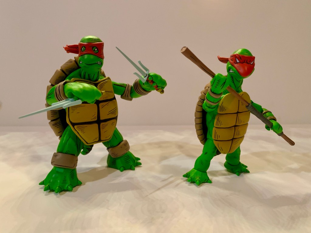
For the second time, we’ve got a set of convention exclusive toon turtles with art by Ken Mitchroney!

2025 was almost an end of an era for me. After being a regular buyer of NECA’s convention exclusive Teenage Mutant Ninja Turtles action figures since 2017, I found myself passing on such a set. If you’re new to the exclusive game, each year for San Diego Comic Con NECA makes an exclusive set of TMNT figures to sell at the convention, but also online before the event takes place. Usually the sale is spread over three days and sell-outs are guaranteed to happen, you just don’t know how fast. Some years it’s practically instantaneous, other years it may take a half hour to an hour, it depends on the set. This used to be the only way NECA was allowed to sell TMNT action figures, but ever since the license was freed up some by Paramount it’s been less essential for collectors to snag every last exclusive NECA comes up with.
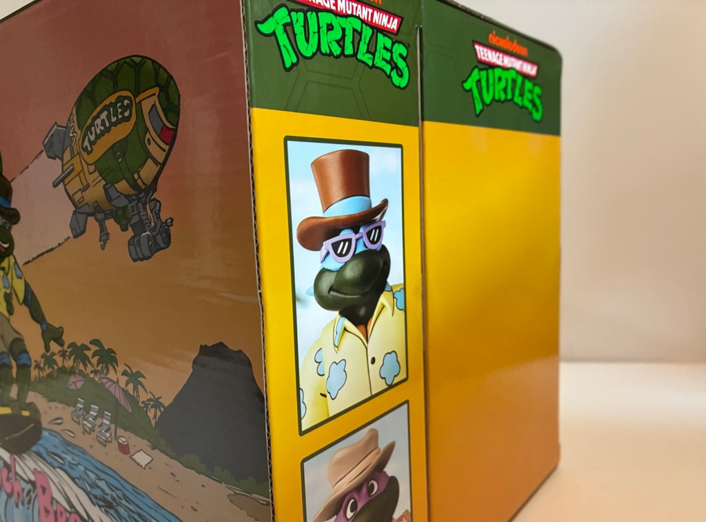
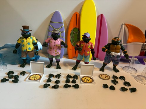
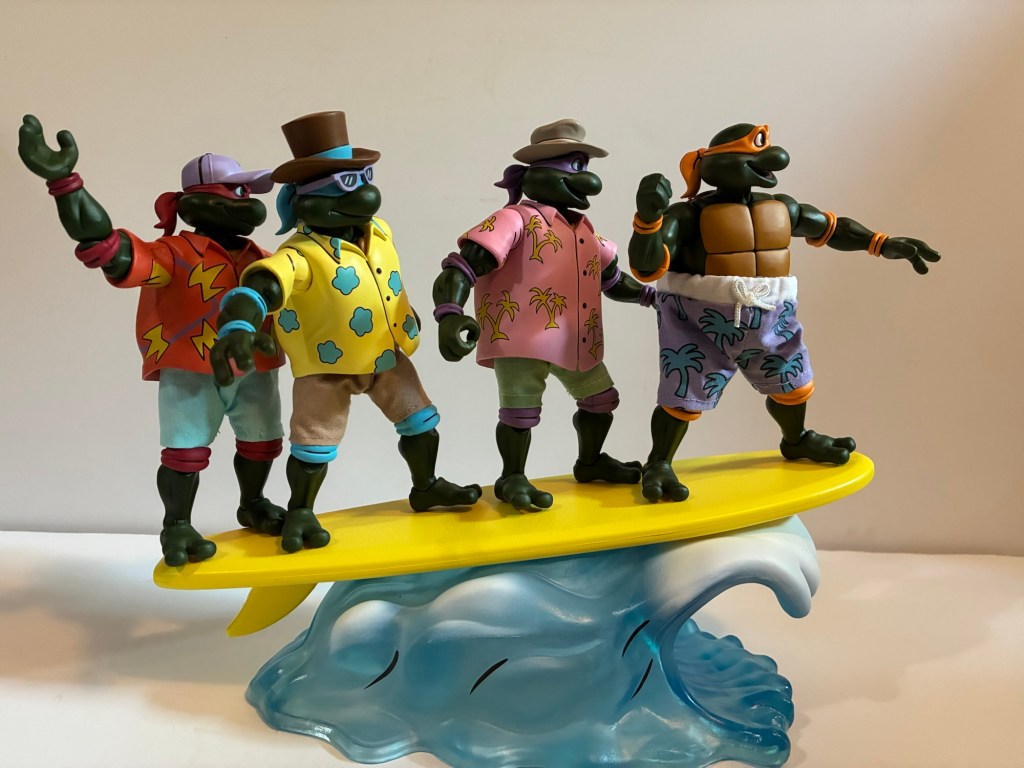
This year’s exclusive came from the toon subline based on the old Fred Wolf cartoon. It depicted the four brothers in beach attire which was all taken from different episodes of the show and paired them up with surfboards and a giant wave accessory. The sculpts looked to be new and more in-line with what we’ve seen from the Archie subline, but aside from that detail there wasn’t much to get excited about. It’s a fine looking set, I just never had beach turtles on my wants list when it came to the property. Four packs start at $150 and I was curious if this one would go higher since it was an exclusive. It can only be bought by non-attendees on NECA’s store and they did away with their flat-rate shipping a year or two ago so the price was expected to be substantial when all things were considered. When the item went up for sale, I took a look and found it would cost about $190 for me and I just wasn’t feeling it. Maybe I’m finally growing up, but I was able to walk away and break my streak of TMNT exclusives from NECA.

The main event with new sculpts by Tomasz Rozejowski.

Apparently, I wasn’t the only one. The set hung around for an hour, then another, and it became clear that this wasn’t the most sought after exclusive NECA ever came up with. This was day one of a three day sale, mind you, so it certainly looked like NECA was going to have more than enough product to meet demand this go-around. Perhaps that made the company nervous? How else can one explain NECA out of no where sending a coupon out that evening for forty bucks off the set? They’ve never done that before and called it a loyalty deal. Supposedly, if you had bought a lot of TMNT product from them you got the email with the coupon code. I have bought a ton of TMNT stuff from NECA over the years, but not everything, and I didn’t get it. It didn’t matter though since it was a simple coupon code that was quickly shared online. Everyone who had already ordered had the code automatically applied to their order and for me it brought my total down almost to MSRP at $154 after shipping and all fees (yes, there is a tariff fee). It was enough to get me to pull the trigger and the set eventually sold out that day. I don’t know how it did the following days or what NECA charged at their booth, but it ended up being slightly less than what I would have paid at a retail store for a NECA four-pack.

There’s quite a bit of stuff in the box.

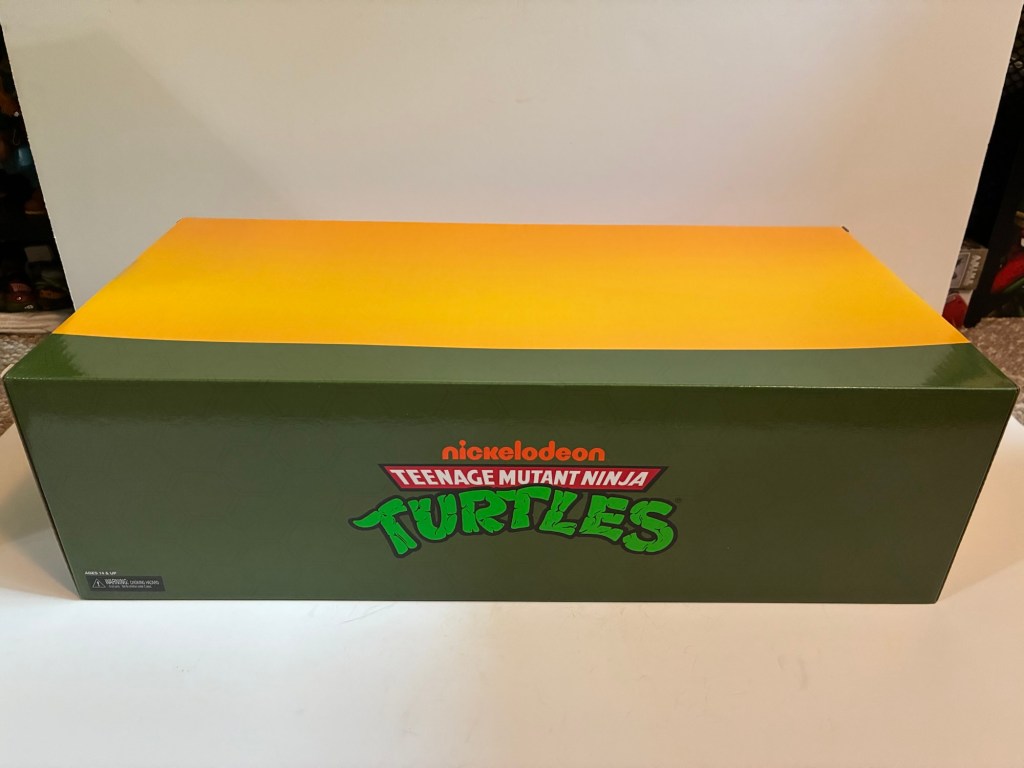
The price may have been right, but it was still a set that I wasn’t exactly jazzed about getting and my hope was that once in-hand I’d sing a different tune. The box it comes in is pretty massive as it’s basically a four-pack that you would find at Target, but it also goes deeper because of the giant wave accessory. The wave is in its own box that has the same colorway as everything else NECA does for this line, but doesn’t feature any graphics. Coincidentally, it’s one of two NECA convention exclusives this year to feature a wave effect and NECA also revealed a beach Slash that should pair nicely with this set. The figures themselves are all new sculpts that resemble the pin-less, Archie sculpts. Per Trevor Zammit at NECA, these are pretty much the new default turtles going forward so if you didn’t want this set don’t fret, I would expect more evergreen turtles to follow at some point on these bodies. Each turtle is in beach clothing taken from the show, though not all the same episode. It’s also a mix of materials as Leo, Raph, and Donatello have plastic shirts and soft goods shorts while Mikey just has soft goods shorts. Donatello and Leonardo also have ridiculous top hats while Raph has a more conventional baseball style hat. Mikey is hat-less and can easily be converted to a base Michelangelo if you so desire while the other three can’t without considerable work.

A new take on an old design.

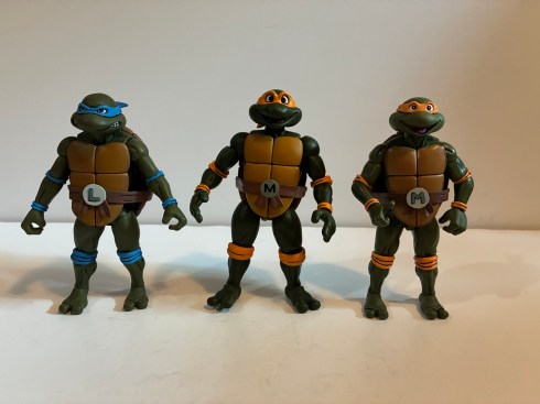
When I first took these boys out of the box I expected to find some mix of old and new. I took Michelangelo, being the most basic of the four, and compared him with the Stump Wrestling Raph since he’s practically a naked sculpt. To my surprise, these figures do not appear to share any parts. They may share some internals, basically what’s hidden by the shell and plastron, but that’s it. I figured the hands would be the same and the new ones even have that same, rounded, quality to them the Archie figures possess, but they’re all new as well. The Archie turtles appear to be just a touch bigger than these new toon bodies which in turn are bulkier than the old toon turtle body, but not really any taller. I’m not sure how I feel about this new look. There’s certainly a pleasing, toon, quality to these sculpts, but if anything I’ve felt the turtles were a little oversized for the line. They look too big mixed with the human characters, in particular. NECA basically fixed this with Shredder at least by giving us a new, bulkier, version of the villain. Do they intend to do more new sculpts of Casey, April, and others? Maybe. I guess these new ones help make Zach seem smaller.

The figures also feature a much darker green for the skin. It’s definitely a lot closer to the Pizza Club reissues we saw a year ago or the Punk Turtles from that four-pack, but perhaps darker than both. We did just establish these are new sculpts, but if you were still hoping to mix and match with the old figures that’s not going to work. The colors will be off, plus the old hands are too small and the heads are as well even though they feature the same expression swapping tech. It’s an odd choice as I think the color of the turtles has always been pretty screen accurate. I know there are episodes where they’re darker, that’s just what happens with multiple studios working a show that’s trying to pump out as many episodes as it can in a short amount of time, but this does feel less accurate. I’m left to assume there is more of a subjective element at play here and NECA feels that these just look better with this shade of green. I did see someone speculate that maybe they’re darker since they’re at the beach and I suppose that’s possible too. Whenever new base turtles arrive we’ll dive into this more then, but for now I’m a little conflicted on where NECA is going with the turtles.

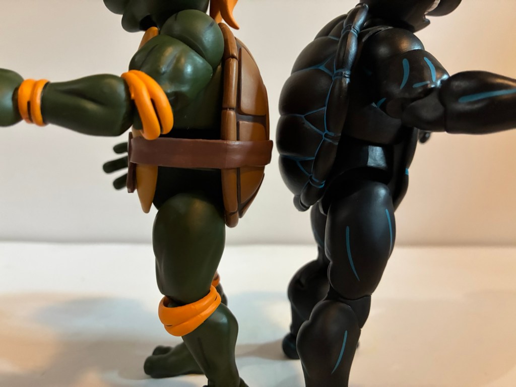
We’ll continue with the body talk here and just jump to articulation. If you have those Stump turtles then you know what to expect as the setup is basically the same. There’s a ball joint at the head and neck, hinged-ball shoulders, waist twist, diaphragm, bicep swivel, double-jointed elbows, wrists, ball-socket hips with thigh twist, double-jointed knees, and ankles that hinge and pivot. Because they’re turtles, the diaphragm joint is pretty useless. They also have elbow pads and knee pads which hinder the range at the elbows and knees. They go past 90 in both spots, but not to the degree you may expect. The hinge on the gripping hands is a horizontal one and not the preferred vertical, weapon-wielding orientation. Since these guys don’t come with any weapons, it’s not that big of a deal at the moment, but I hope it’s not indicative of what’s to come. There’s also a noticeable gap between the top of the thigh and the sidewall, if you will, on the shell with Michelangelo. The same gap is present on the old toon bodies as well as the Archie ones, but not to this degree. I wonder if there’s going to be a filler piece here like the plastic “diaper” on the Mirage Jim Lawson turtles? NECA may have skipped it since Michelangelo’s shorts hide it, but if so that’s kind of a cheap tactic. It probably does give him better range at the hips where full splits and high kicks are possible so I guess that could be their excuse. I do think most would have preferred this to just be a standard Mikey with soft goods pants though.

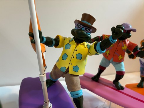
The shirts look good, but I do wish they were removable. The same is true of the hats and glasses.

For Leo, Raph, and Don, we have a soft plastic overlay in place of the shell and plastron. The shoulder is also a different piece as it’s a sculpted sleeve. The arm plugs into that and you get your bicep swivel inside the sleeve so the articulation is essentially the same as it is with Michelangelo. The shirts are designed to seem big like they’re hiding a shell underneath. There’s even some of the plastron sculpted into the piece at the collar. Because it’s soft and there is no hard plastic underneath, these guys do move a little better at the waist as they can actually pivot some in addition to rotating. I still can’t get the diaphragm joint to do anything though even though I can see it at least. The hats are also pegged onto the head and appear to be further secured with glue as they don’t want to spin. They’re soft and it’s easy to peel them back some to see there’s a big peg sticking out of the top of the head so even if you could get them off it would look hideous. It sure would have been nice if NECA just made them separate. Leonardo also has sunglasses and they’re glued to his head like the ones with the Punk Turtles. While the plastic shirts help give a more toon appearance, I do find they clash a bit with the soft goods shorts. And I probably speak for most when I say I wish they went with soft goods all over so we could convert this whole group into a standard look, but then we wouldn’t buy the eventual four-pack release that’s sure to come, right?

I can’t tell if Raph is happy.

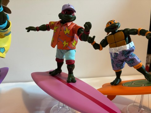
The paint across all four is mostly good. The cel-shading is gone as that appears to be a thing of the past now and instead they’re the same shade of green all over. The patterns on the shirts are handled very well and there’s some black linework painted onto the sculpts. Basically, NECA is taking the same approach now with this line as it does the Archie one when it comes to paint. These turtles do have massive pupils now and it’s a bit weird looking. Their eyes almost look dialated. Raph also seems kind of pissed, but maybe he didn’t pick the outfit? He also has some black linework on his hat that basically just goes from one “ear” (I realize they don’t have any, I just mean where an ear would be) over the top of the hat to the other. There’s a sculpted shape to the top of the hat though and I almost wonder if the line was supposed to follow that because it looks weird to see that left unpainted. I do have a couple of paint dots on the forearms of all but Leonardo. They’re very small and in the color of the turtle’s elbow pads. I’m not sure if it will come off, or if it would just be easier to go over it with a little dab of green paint.

The only picture I took of my original set: Mikey’s broken bicep.

Unfortunately, I do have a quality control issue right out of the box. Michelangelo’s left arm is barely hanging on at the bicep. The peg looks to have split as I can see right into it. It was obvious to my eye just looking at him. Had it not been I probably would have twisted the arm right off. In addition to that, Raph’s left shoulder won’t budge at the hinge and his arm has some wiggle at the bicep as well. It’s possible it just isn’t seated perfectly in the joint or it could also be defective, but just not to the extent of Michelangelo’s arm. Some hot water would likely free up that shoulder, but with Michelangelo basically broken I didn’t want to try without first reaching out to NECA. I emailed them after 5 PM on a Thursday and they got back to me before 9 AM the next day with a shipping label for me to return the entire package. Thankfully, I had only removed the turtles from the box so it was pretty easy to put everything back in its place and ship it out. NECA did say they would send me a replacement if one was available. Since it is a Comic Con exclusive, it’s possible they don’t have any to replace it with and if that’s the case they’ll refund me. It’s kind of annoying that they couldn’t commit as maybe I’d elect to keep it if I couldn’t get a replacement? At any rate, I’m writing this in between shipping the set back and receiving a new one from NECA so if it all went according to plan then you’ve seen a bunch of pictures and the review can continue on from here. And if not…

After just over a week after receiving the first set from NECA I had a new one. Michelangelo is now fine and the Raphael appears to be an improvement as well. The only new issue is my Raph has a little blemish on his nose. It’s not really visible because of the darkness of the skin, but can be felt. All in all though, a good customer service experience and no complaints from me. Now we can move onto the other stuff in the box.

For hands, these turtles each have a set of gripping hands, fists, open, and thumbs up hands. We also get one extra set of open hands for good measure, I guess. Every hand as a horizontal hinge which is unfortunate for both the gripping and thumbs up gesture. Hopefully this doesn’t mean the eventual standard turtles aren’t missing the vertical gripping hand. Each turtle also comes with a surfboard. They’re not really color-coded to the turtles as we get a purple one with shell pattern, orange with a shell tamp, pink with red stripe, and a solid purple board with an attachable orange sail. These are all almost certainly taken from the cartoon, but it was still surprising to see we don’t have a simple blue, red, orange, purple pattern. The sail plugs into the purple board rather snugly. It won’t even rotate once inserted so maybe make sure it goes in the way you want it to because getting it out could be tricky. It’s hard plastic and probably would be easy to snap. The boards also need their fins attached to the underside and each comes with a clear, acrylic, stand like the old Turtles in Time figures NECA put out. Three of my stands work fine while the fourth is too loose. I’ll have to modify it so the boards can fit snug onto it. Right now, the board just tilts all the way back until the fin hits the surface it’s on.

That sure is a wave.

The big accessory, and what is probably the selling point, is the wave and fifth surfboard. The wave is done in translucent, blue, plastic, with white paint for the crest. There’s a black ball peg towards the front and that’s for the yellow board to plug into. The wave is about 8″ long and the board 11″ (the other boards are close to 9″) and once plugged in it will get your turtles about 4″ off of the surface it’s placed on. There’s some nice weight to the accessory and it does what it’s supposed to do. The board has no pegs on it for added stability, but does feature a rough surface which may help with grip. You can fit all four turtles onto it, though it gets pretty crowded. It completes the look and when all is said and done I’m guessing this thing is the only aspect of this set that will remain exclusive to it, but who knows? Maybe it will even show up in another line?
The only other accessories in the box are three pizzas and two pizza boxes that just say “Pizza” on them. They are the hinged style, so I guess that’s good. Is that enough? Considering it’s a convention exclusive and the figures are all new (though destined to be reused many times over) sculpts I think it feels about right. The only real negative for me is that the figures can’t just be converted to regular turtles. Michelangelo might be, but the rest aren’t and none of the old expressions work here. Considering the change in skin-tone it’s not as big of a loss as it would have been, but it’s still annoying to go from a solid assortment of expressions to just what we have here. I’ll withhold final judgement on the sculpts as far as their appropriateness for the source and as replacements of the old ones. I have felt for awhile that the turtles have fallen behind some of the more on-model sculpts we’ve seen in the line over the past few years so I wanted new ones, I just don’t know how much of an improvement these are.

What day at the beach would be complete without pizza?

That’s a discussion for another day, as for this one, should you get it? Only if you love the concept. If you never wanted and still don’t want beach turtles after reading this then feel free to skip it. Yes, it’s a little exciting to get your hands on new turtle sculpts a bit early, but we’ll get the real thing eventually. If on the other hand you really like the look of this one then, sure, go for it. Assuming it’s not now overpriced. I have a feeling demand was soft and that NECA still has a bunch of these. Will they put them back up for sale? Probably, though with these things they usually first do it as booth exclusives at later shows. If they go up on a website it probably won’t be for a little while and without fanfare. Costumes.com was the website that would get that stuff in the past and it might in the future. Convention goers looking to flip this for a quick buck probably won’t find many takers so if you play the waiting game on eBay you may eventually find people looking to just offload this one at cost, especially if they were able to take advantage of the $40 off promotion. We also know these figures are going to get two-pack releases in a different colorway eventually so, as I said before, the only real exclusive here may just be the wave. As for me, I’ll probably make these guys a summer time decoration and that’s all. It will help make them kind of fun, but it’s not a set I’ll likely do much playing with. Hopefully, I can get them back into the box without too much fuss, though I also kind of want to get rid of it since it’s so damn big. Ultimately, it’s a good convention exclusive because it has a theme, it’s executed pretty well, and it’s not something everyone needs.

The Bodacious Beach Bros. are just the latest in a long line of NECA convention exclusives:

NECA Teenage Mutant Ninja Turtles III SDCC Four-Pack

2023 marked the 30th anniversary of the much maligned third entrant in the Teenage Mutant Ninja Turtles film franchise and you just had to know that NECA Toys would mark the occasion. It was almost too obvious that I thought maybe the company would zig when everyone was expecting a zag, but they didn’t and…

Keep reading

NECA Cartoon TMNT Premonition of a Premutation SDCC 4-Pack

It was a little over a month ago that San Diego Comic Con occurred, in person, for the first time since 2019. This was cause for a celebration, even if for those of us who take in the convention from the comfort of our homes saw little change. Even without the event taking place the…

Keep reading

San Diego Comic Con 2025 is in the books!

San Diego Comic Con is always an exciting time of year for toy collectors. Even for someone like me who has never considered actually going to the event, I get up for it because I know the coverage is going to be coming fast and furious. Some years are bigger than others, but for me I think I can say that the 2025 edition has been the most surprising. I went into it with certain expectations some of which were met, but some were not and that’s not unusual. What was unusual for me is that some of the things I basically considered a “lock” did not come to pass and I left the event being perhaps most excited about a company and a product line I definitely didn’t see coming. Let’s start with the familiar though and my bread and butter franchise: Teenage Mutant Ninja Turtles

TMNT

NECA is heading down the 2012 TMNT rabbit hole this fall.

As has been the case most years, the Teenage Mutant Ninja Turtles had no shortage of coverage this year at the convention. There was even a dedicated brand panel that covered releases from several companies. We still have Playmates for vintage re-releases and some modern takes, NECA is hitting on the toon, Archie, and Mirage, Super7 has the 2003 edition of the show, and now we have Mondo doing sixth scale stuff. Mondo’s line is their own take on a post 1990 film franchise and it looks interesting, but isn’t really on my radar for the time being. I don’t have the space or funds for another Mondo sixth scale franchise. Super7 also reaffirmed its commitment to 2k3 by unveiling silhouettes for the next wave which will include Hun, April, and a motorcycle Raphael and Shell Cycle. This would seem to be the nail in the coffin for the vintage inspired figures Super7 started off with which is really frustrating considering the figures missing (topped by Heavy Metal Raph). I’m done with the 2k3 series after Shredder, and possibly done with Super7 after that as well.

NECA has been the company at the forefront for TMNT the past several years, but their showing was surprisingly light. They did announce a line of turtles based on their appearance in the game Fortnite, but that might have been the most noteworthy. There was a leak the week before SDCC of one of their reveals for the toon line, granny Bebop and baby Rocksteady, though that release wasn’t going to blow anyone away (even if it is entertaining). The only new figure shown for the toon line otherwise was a beach Slash. There was also no big display with dioramas and such, just figures in a case. It’s pretty clear that NECA wasn’t going all out for SDCC. Is that a shift in strategy? It certainly costs money to put these big displays up and staff a booth plus rental space isn’t cheap. Are they going to pivot more to social media for reveals? Is New York Comic Con considered their flagship event? Or did the reappearance of Toy Fair earlier this year just mean all of the stuff that would have been revealed at SDCC was instead shown there?

NECA didn’t have a lot of surprised in their booth, but this certainly was the most standout one.

I don’t know the answer to any of those questions, but I was very surprised at the lack of Tempestra. She has become the biggest missing piece for the toon line, even if she is very much a B-tier character in her own right. I’m not sure why they’re slow-walking that one. They mocked up an arcade cabinet accessory for a still unreleased movie April variant more than two years ago that most assumed was really made for a Tempestra. What I did like, even though none of the figures shown were new reveals, was how the 2012 TMNT line is shaping up. The sculpts look fantastic and they’re all dated for this year and will be sold as single releases so no four or two packs. I don’t think it’s been confirmed where we’ll be able to buy them, but they’re among my most anticipated releases for the second half of 2025. The only other showing that excited me was Garfello, i.e. Garfied cos-playing as a ninja turtle, which was unexpected. It looks great and comes with Odie and is the sort of silly release I’m very likely to get.

As for the rest, there wasn’t much to be excited by. Playmates is re-releasing its remastered turtles minus the bumpy texture a lot of people didn’t like. We actually knew about that going into SDCC, but that was basically the official launch. Mezco also showed off 1990 movie turtles for its One:12 line. They look worse than the NECA releases (which are coincidentally being re-released in single packs this year), but will probably cost more than twice as much.

Mondo

No one does animated X-Men better than Mondo.

We’ll pivot from an IP to a company here as Mondo had a lot to show off. Perhaps more than any other company, though I confess I’m not interested in everything they do (like Masters of the Universe and ThunderCats). What gets my attention first and foremost when it comes to Mondo are their plans for their X-Men animated line of sixth scale figures. It’s a line that is becoming much harder to collect because of the tariff situation in the country, but I’m in too deep to dump it. Heading into the event, we knew the next figure to be solicited was likely to be Mr. Sinister who had already been shown. There was also the reveal of an event exclusive Savage Land Rogue which went up for preorder before the show. They were both at the event along with the next figure: Storm. She looks awesome and was my guess for next up. It didn’t end there though as we also got to see concept art for the next figure and it’s Beast! I’m glad he’s a little ways off since he might be an expensive one. Perhaps things can improve economically before going up for order, though there’s always the chance things get worse. Little is likely to change before Sinister goes up though which is happening in August. I love the look of the figure and he’s an A-list villain from the show, but I do not look forward to the sticker with that one.

That was a hoot!

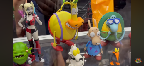
That’s the only sixth scale line I’m in, but Mondo did reveal more Marvel and DC figures (Superman, Two-Face, Dr. Doom, Lizard) in their other lines which all seemed solid. What really caught my eye though were their Mondo Squads which are more statuesque figures with swappable parts and sold in bundles of characters. Previously, they had done a set of characters from the Nicktoon Aaahh!!! Real Monsters and now they’re moving onto Rocko’s Modern Life. I love Rocko and this set of the titular character plus his mates Heffer and Filbert is pretty much an automatic buy from me. We don’t have a lot of Rocko merch out there so the scarcity will help. Also shown is a squad of Beavis and Butt-Head with their couch and the four fellows from King of the Hill (Hank, Bill, Dale, Boomhauer). Similar to Rocko, I may have to get King of the Hill since there’s so little out there for the franchise that I have really grown to love in recent years after previously dropping off around Season 5. Mondo also teased future squads based on Rugrats and The Ren & Stimpy Show.

The last of the real Ghostbusters makes his debut in Ray.

Mondo is also heavily invested in The Real Ghostbusters, which was probably the biggest reveal of the 2024 show. We’re still waiting on the first release to drop (once again, thank you tariffs), but we have now seen all four of the busters and their companion ghosts. And, to no one’s surprise, everything looks great. I still have reservations about the price, but it is what it is and we’ll talk more about that when Peter finally arrives (hopefully sometime in August). Mondo also revealed that Janine will follow the boys and she’ll be in her more traditional secretary attire. To sweeten the package, she’ll come with her desk and an alternate lower half for a clean cross-legged sitting position. I’m guessing all of this extra stuff means she’s going to retail for $202 like the Ghostbuster + Ghost package we’ve seen up until now, but maybe that won’t be the case. That will be a tall ask and is probably something I won’t be interested in.

Marvel Legends

It’s all X-Men ’97!

I knew Hasbro would have some X-Men ’97 stuff for us, but I wasn’t prepared for just how much and how much I’d like it. We learned what wave three will be and those figures were all on-hand for folks to gawk at: Morph, Jubilee (final suit), Sunspot (final suit), Emma Frost, Cable (first outfit), Wolverine (classic civilian clothes). All of them looked pretty damn good. I’m mostly looking to supplement my ’92 display with these so Cable and Wolverine were locks. My dissatisfaction with the ’92 Jubilee puts the ’97 one on my radar, though I’m disappointed she’s in her black jumpsuit. Maybe I’ll swap heads with the ’92 one? Maybe even arms and coat? Emma just looks great though a classic take on the White Queen was enough to get me to put in a preorder and I love Morph so I’m in for the ’97 version. The only one I didn’t preorder was Sunspot. Nothing against the figure, I just don’t really care about Sunspot.

Gambit, what did they do to you?!

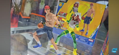
That wasn’t all though as we got a nice look at the made-to-order Sentinel which went up last year and there were some two-packs announced. We can look forward to a finale Cyclops and Jean (Marvel Girl), finale Wolverine and Storm, and a pairing of Rogue and Gambit from their basketball scene in the first episode. None are essentials for me and I don’t think I’ll be getting any, but I love to see how all-in Hasbro is with X-Men ’97. The one set that I would have had the most interest in is the basketball two-pack, but it is unfortunately the worst looking set of the two. That’s because it looks like Hasbro repurposed its Starting Lineup body of NBA players for its shirtless Gambit. That sculpt has a very unpleasant looking ab crunch in the middle of it. It worked okay for Starting Lineup because all of those figures had a jersey. Gambit doesn’t have that luxury and it looks terrible. It’s honestly one of those “How did this get approved?” moments that comes along once in awhile.

Aside from that, I had little to be critical of with Hasbro’s panel. They also revealed their next made-to-order figure: Mephisto. Mephisto was previously released many moons ago by Diamond in their Diamond Select line. Marvel Legends has not touched him though because he’s basically Marvel Satan and not afraid to show it. There was going to be one attached to the Engine of Vengeance HasLab if it hit a certain number of orders, but that product didn’t even fund. The Legends team had previously stated Mephisto could not be released any other way, but there was almost certainly some gamesmanship in those statements. Something obviously changed and now Mephisto is on the way, though he won’t be showing up at Walmart or Target. He is coming with his own throne and this thing sure looks familiar.

Hey! I know that skull!

Crystar fans can probably spot where this thing is from and the Legends team was not shy about stating it’s based on the cover of issue 8 by artist Michael Golden. We’ve covered that issue here and that’s because it’s also the cover musician Glenn Danzig stole from to come up with a logo for his band Samhain which then became the logo for the band Danzig. The Legends team, once again, was not at all shy about pointing that out and might even be hoping for some cross-sale appeal with that fanbase. As for Danzig, no comment has been made. The item was shared in the official Danzig fan group on Facebook and has since been removed so either he’s not happy or the moderators for that group think he would not be happy to see it. Fans have frequently traded and sold issues of Crystar there so it’s not like the group hides from the connection, but maybe he’s salty that he won’t get a cut? He probably thinks he made the image famous, and he probably did, but he has also made a lot of money off of art he never owned so I think we can call it square on this one, Mr. Danzig. Especially if Marvel never came looking for a cut of those t-shirts. Either way, the throne looks awesome and yes, I’m buying it. I don’t even care about Mephisto, but this thing looks too good to pass up. It’s an open preorder that closes August 26th and will set you back $80 when it ships next year.

As for other odds and ends, I continue to be impressed with the offerings from Jada Toys, even if the IPs they traffic in have little or no appeal to me. Except for Frosty the Snowman, I will get that. Big Bad Workshop had a variant of its upcoming action figure of The Tick on display and he might already be my most anticipated for next year. I love The Tick and it’s been at the top of my most wanted for a few years now and I hope the line is a success. We also know who will be the next character: Chairface Chippendale. The Naughty or Nice collection is also continuing and we’re finally getting a Mrs. Claus. I assume she will go up for preorder around Christmas time and hopefully will fund. She’s not the design I would have gone with, but I’ll be happy to have a Mrs. Claus join Santa on my shelf some day.

And that’s a wrap! Thanks to all of the people who cover this event every year and whose videos I snipped screen grabs from: Pixel Dan, Toy Anxiety, Robo Don’t Know. Toyark.com also has some great coverage if you prefer still shots. All of the folks involved help people like me who can’t make it to the con enjoy from my home or wherever I happen to be.

If you liked reading this here’s some related content you may enjoy:

Mondo X-Men TAS 1/6 Scale SDCC Exclusive Logan

Mondo has been absolutely killing it with its sixth scale line of action figures based on the now classic animated series X-Men. The company also really ramped up production in 2023 on the line by soliciting five new figures during the year. At over 200 bucks a pop, it was quite the hit to the…

Keep reading

Rocko’s Modern Life: Static Cling

After taking a trip to the past with Rocko’s Modern Life during the spring, it seems only fitting that I also take a look at the Rocko’s Modern Life movie from 2019: Static Cling. To be fair, the term “movie” is definitely used loosely when applied to this piece of media. Static Cling was originally…

Keep reading

The Saga of Crystar – Crystal Warrior #8

There’s been a hole in my Danzig collection for quite some time. It was a hole that was easy to fill and actually quite cheap considering most Danzig records fetch well over $100 these days, but an important piece was missing. And that piece is not what one would necessarily expect, but I would assume…

Keep reading

NECA Mirage TMNT – The First Turtles SDCC 2024 40th Anniversary Edition

Today belongs to the originals.

As the story goes, one night Kevin Eastman was drawing with his friend and partner-in-comics Peter Laird when the idea to doodle a ninja, anthropomorphized, turtle entered his brain. Laird was so amused by this drawing that he too drew his own take on it. What was done just to amuse each other eventually turned into something that would change both of their lives as well as the lives of many others.

Kevin Eastman was commissioned to do the packaging and it’s appropriately “special.”

In 1984, the first issue of Mirage Studios’ Teenage Mutant Ninja Turtles hit shelves and became an indie darling. That comic would go on to inspire a toyline, which beget a cartoon series, and a phenom was born. The Teenage Mutant Ninja Turtles, once thought of as a fad, are still relevant today now more than 40 years from their inauspicious beginnings. To celebrate the milestone, NECA partnered with co-creator Kevin Eastman to create an action figure two-pack of those inaugural turtles. Sculpted by Paul Harding with paint by Geoff Trapp and Mike Puzzo, the set was sold as a two-pack at San Diego Comic Con as well as a presale on NECA’s own website. The First Turtles are just the latest in what are sure to be more celebratory figures to come. It’s on the heels of Playmates’ own Original Sketch Turtles which can currently be found at Target and on Amazon. Those turtles were the more refined, second pass, versions of the characters which bare a strong resemblance to what would be featured in that first comic, where as these originals are quite crude by comparison.

The original Eastman pose, as best as I can recreate it here.

The set sold by NECA comes in a rather large box adorned with new artwork by Eastman. It also features a lenticular slipcover depicting the drawings changing from black and white to color. The rear of the slipcover is almost bare white as the idea here was for convention goers to be able to have Eastman sign or even doodle on the box for them. I suppose that is still possible for other convention appearances to come. The interior box is a fairly typical NECA window box that displays both figures and their accessories quite well. The only thing missing is the actual original drawings which I’m surprised by, but maybe there were legal reasons. This really is a pretty nice display item, but I’m no in-box collector so let’s rip into this one.

And the original Laird pose.

First of all, the figures here are presented fully painted in color that’s basically a match for what NECA did with the Jim Lawson turtles released in 2023. The original drawings were never colored by Eastman and Laird, but since Eastman worked closely with NECA on this release it can be assumed that this is how he and Peter likely would color them today. We also don’t really know how tall they envisioned these guys to be or if any consideration was really given. Eastman probably had input there, but I don’t know if Laird had any involvement (he’s essentially retired after having sold the property to Viacom over a decade ago). Based on interviews Trevor Zammit of NECA has given, it sounds like NECA had some freedom to figure out how to present these two. Eastman’s turtle, which was really more tortoise-like in some respects, was made bigger and chunkier while the more lithe version Laird came up with is shorter and thinner.

These pair pretty well with the Playmates Original Sketch Turtles, which were like the second version of the property.

We might as well discuss the Eastman turtle first since it was the one said to be created first. The figure stands roughly 5.75″ to the top of its head. He may not be the tallest figure in the line, but he’s definitely a big boy. This turtle is quite chunky and there’s a nice heft to the figure. The shell is quite large and another area where NECA had to exercise some creative freedom since the drawing depicted the character from the front. Now, these turtles are not intended to be any, one, turtle from what followed. This isn’t Michelangelo or Raphael, it’s just a ninja turtle. Still, he has some recognizable traits from the turtles that followed. He’s sporting the red bandana along with brown elbow and knee pads and wrist wraps. There is no belt, but there is a tail. The original turtle also did not hold any weapons, but did have nunchaku affixed to both forearms which this figure does as well. The weapons are fused together, but do have real chain links affixed to them. They tab into a slot on the inner wrist band and are quite easy to work with.

A little too Raph.

What really stands out about the first turtle is the portrait and proportions. The head is more egg-shaped with barely any sort of beak. The eyes also feature pupils and areas of green around the eyes are visible through the eyeholes on the bandana. The hands and feet are large and more closely match that of an actual turtle. The hands look more like flippers for swimming through the water while the feet are quite tortoise-like. He has five digits on each limb as opposed to the three and two that would follow. The paint job is truly exquisite as there is tons of black hatch lines all over. The articulation cuts are not very prominent making this figure look almost like a statue. While subjectively many may find this turtle to be crude and even a bit ugly, objectively the figure is nothing short of a work of art when compared with the original sketch.

A lot of Michelangelo can be found in these original designs.

The same is true of the Laird turtle. This one clocks in at around 5.375″ and is far less substantial in mass when compared to the Eastman turtle. Laird’s turtle is similar to Eastman’s in style, but different. There’s a mask in place, but on this turtle it extends over a pronounced beak essentially wrapping around where the nose would be. It does feature the nunchaku on the forearms, but there are no chain links present this time and the straps holding them on are the only other garments on the turtle. There are no pads or belts, and the hands and feet feature four digits instead of five. He still is more turtle-like than the finished design, but the leaner proportions make him a bit more convincing as a ninja, even if still comically implausible. The paint job here is just as good as it is on the Eastman turtle, and despite the smaller size, this figure still has substantial weight to it.

The Lawson turtles were like the advancement of the original Mirage style.

Where the two figures also differ concerns the articulation. The more slender Laird turtle was likely easier to work with and articulates slightly better than the Eastman variety, though neither turtle is intended to be placed in poses many would consider “dynamic.” Both feature neck and head articulation with basic arm articulation. There are no double joints on either figure and the range at the hinge joints is probably going to be less than 90 degrees for most. The bandana knot and tail swivel while the hips are ball sockets with thigh swivels engineered into them. Neither turtle is going to be able to hit a split or kick forward all that far. The Laird turtle gets to have hinges at the knees and ankles with an ankle rocker. The Eastman turtle, who has big stumps for legs, just has one set of hinges below the kneepads. There is basically no ankle to be found on this guy so that’s it.

And, of course, it was the ’87 version of the property that launched a phenomenon.

Safe to say, if it’s articulation that you prioritize in your action figures then these are not for you. I think for most, they’ll pose them like the original drawing and call it a day. And that’s definitely a viable display option, but it would mean ignoring all of the goodies in the box. NECA decided to load this pair up with all of the weapons you would expect and more. That means we get a set of katana, nunchaku, sai, and a bo staff. There’s also a nunchaku with a whirling effect that even spins and looks really nice. There’s a tonfa as well if you prefer more of a Last Ronin vibe. All of the weapons are fully painted and look great. There’s a slight crudeness baked into some of them as well such as a chip in the blades of the katana and the wraps of the bo being off-center. They also appear to be based off of the original sketch of the four that followed which, if so, is a logical choice.

The tonfa has to nod to this guy, right?

In order to properly wield such weapons each turtle comes with an alternate set of gripping hands. The standard hands are an open style and the gripping are just that. They feature horizontal hinges, unfortunately, but at least they work with the clip-on nunchaku just fine. Both turtle can adequately wield any of the included, though aside from those clip-on ‘chuks there’s no weapon storage to be found. NECA also decided to give each figure one optional portrait. The default ones from the drawings are what I would deem stoic, while the alternate ones are angrier and feature exposed teeth, something we would be most accustomed to seeing out of the TMNT. It’s an appropriate alternate, for sure.

A fun set that feels like a real piece of TMNT history. Track it down if that’s something that appeals to you.

NECA’s send-up to the origin of the Teenage Mutant Ninja Turtles is a worthy inclusion in the year-long 40th anniversary celebration. It’s cool to see both of the co-creator’s original vision celebrated here in action figure form. While they don’t exactly put the “action” in action figure, they make for a great display piece and it’s something that I think diehard TMNT collectors will want to add. Since this was a San Diego Comic Con exclusive, it’s now unfortunately sold out and only available on the after market. NECA sometimes sells remaining stock online and at future conventions, but the likely easiest path to owning this set for those that missed out is to keep an eye on retail. It’s expected that some stores are going to be home to an another version of this set where the figures will be painted in black and white, but with red bandanas and weapon handles. It looks like it’s going to contain everything from this set as well, though the slipcover will probably be dropped. The SDCC version was priced at $70 so expect something similar for the retail version. Listings for it have already been spotted at Walmart, but NECA’s own solicitation did not mention any store by name so I don’t think this will be exclusive to Walmart. Needless to say, I really dig this set for what it is and I think every TMNT collector should try to pick up the version they like best.

More from the world of Teenage Mutant Ninja Turtles:

Playmates TMNT Original Sketch Turtles

Last week we took a Turtle Tuesday off which feels like a rarity for this blog. And that’s because there seems to be new stuff featuring the Teenage Mutant Ninja Turtles branding coming out all of the time. And it’s only going to become more plentiful as the franchise celebrates its 40th anniversary this year.…

Keep reading

NECA Mirage Studios Teenage Mutant Ninja Turtles 4-Pack

When it comes to the popularity of Teenage Mutant Ninja Turtles a lot of the credit goes to Playmates Toys. Kevin Eastman and Peter Laird created the characters born out of a joke. Credit them for having the vision to think this joke had appeal beyond their small circle as they self-published Teenage Mutant Ninja…

Keep reading

Super7 TMNT Ultimates! Classic Rocker Leonardo

When I was a kid, I had parents with divergent musical tastes. Dad likes oldies from the 50s and 60s while mom was more into modern rock (then 80s). One area where their tastes overlapped was Bruce Springsteen. We had several of his records in my house and I distinctly remember that cover to Born…

Keep reading

S.H.Figuarts Dragon Ball Z Super Saiyan Son Goku & Super Saiyan 2 Son Gohan Exclusive Edition

Time to do this father-son style.

We are now past Valentine’s Day and I’m ready to close the book on San Diego Comic Con 2023. The last action figure exclusive to look at is the two-pack of Super Saiyan Goku and Super Saiyan 2 Gohan. Dragon Ball Z has been around for a long time and has given birth to many iconic images whether it’s Goku and Vegeta squaring off or Goku’s initial transformation into a Super Saiyan or any others. One of the top ones is definitely Gohan finishing off Cell with what has been dubbed the Father-Son Kamehameha. Gohan, bloodied and with his left arm just hanging limp at his side, summons the strength to muscle-up one last blast with his father urging him on from beyond the grave. Goku appears as a spirit behind him as if he’s providing his own blast alongside his son. Whether it’s to be taken literally or not has never been really clear to me, but it’s a dramatic moment and definitely a fan favorite.

Did you think I was going to make you wait until the end?

For Comic Con 2023, Bandai released a two-pack that has shockingly never happened before. A battle damaged Super Saiyan 2 Gohan and a “ghost” Super Saiyan Goku so collectors can essentially reenact that moment as part of their collection. It comes in an oversized box with a black and purple deco and the photography on the box makes it obvious what moment this represents. The window only shows Gohan which almost makes Goku feel like it’s a surprise, or a glorified accessory. Both figures are re-releases of past ones. We’ve seen this base Goku body many times before across several iterations of the character. Gohan is also a re-release, though it’s an older figure and one I’ve never interacted with before. Initially, I was only going to get the event exclusive Raditz, but this release just looked too cool and it earned my $95.

I’ve suddenly found myself with many Gohans.

Let’s talk Gohan first since, as I mentioned earlier, Goku feels more like an accessory here even though he’s a full-fledged action figure. Gohan is, as the box states, in his Super Saiyan 2 form and his purple gi is all tattered and torn. There’s some battle damage painted onto his flesh in places, but no blood. He’s a young teen so he’s much smaller than his father and stands about 4.25″ to the top of his face. He follows some past event exclusives by featuring translucent, yellow, plastic for his hair which has been brushed over with a pearlescent, gold, paint. It’s a pretty heavy coat of paint so it’s actually hard to tell that there’s any translucency to the plastic, but it’s there and it looks pretty nice. I don’t know if I prefer it to painted, yellow, plastic, but it’s fine. The face printing looks sharp and is likely updated from the original release of the figure. Bandai did a good job matching colors the rest of the way, and it helps that the upper body is cast all in flesh-colored plastic. The only painted flesh are the exposed knees. The rest of the paint is fairly minimal. The gi is painted and there’s a darker purple for the inside portions of the torn parts. There’s a little shading around the knees, and then there’s the battle damage. It’s limited to the chest, face, and left arm and I’m surprised there aren’t any cross-hatches on his right arm, but it looks good and at least it isn’t overdone.

I also now have a pair of Super Saiyan 2 boys.
Gohan is a wee bit small for the aura effect.

For optional parts, Gohan has four portraits: stoic, teeth gritting, yelling, and an even bigger yell. The two yelling are certainly pretty similar, but it’s hard to argue anything is missing. For hands, Gohan has a set of fists, open, relaxed, Kamehameha, and Kamehameha hands with pegs on them. And if you get those blast effect hands with pegs, that usually means you get some kind of blast effect and that is true of Gohan. He comes with the charging, Kamehameha, effect. It’s done in translucent, light, blue plastic and consists of a small sphere with slots in it to accommodate seven, acrylic, posts. It’s an effect we’ve seen a few times and it seems like it’s becoming a favorite of Bandai as I think I have four of them now. This one seems lighter in color from the one that came with Orange Piccolo and doesn’t feature any shading. It felt a little softer too and the posts are more finicky, but it’s still a useful accessory.

“G-Gohan?! Is that really you?!”
This Gohan has proven really fun to mess around with. Too bad he’s going to just occupy one pose on my shelf.

When I ordered this set I didn’t really think much about Gohan as a figure because, like I’m guessing most people, he only needs to hit one pose and that’s it. To my surprise though, this is a wonderfully engineered little figure. I’m finding myself really charmed by it and if I didn’t want him on my shelf in his iconic pose he’d make for a great desk figure to fiddle with. His head is on a hinged ball peg, which isn’t my favorite setup as you need to keep track of which way that hinge is going to make use of it. I didn’t mention it in the aesthetics, but I love that the faceplates do not include the sideburns so the fit is seamless. The heads get some tilt, rotation is fine, and there’s a joint at the base of the neck that lets him look up and down, though if you want him to look as far up as he can it will create a gap at the base of the neck. The shoulders are hinged ball pegs and the range is terrific. Gohan’s arms go up past horizontal. The ball peg in the shoulder allows for the arms to come forward and across the chest pretty far. It’s not a true butterfly joint, but since the figure’s chest is so small the clearance is fine. There isn’t much in the way of a floating piece or cap to hide the joint which might turn off some, but it doesn’t bother me at all.

He’s coming for you, Cell!

In the arms, we get the usual biceps swivel and double-jointed elbows which go past 90 degrees. The hands are on hinged ball joints and they work fine. The diaphragm has what feels like a single ball joint that lets Gohan tilt a bit to each side. It only pivots rather than provides for rotation and there’s no forward and back. The waist has a ball joint which rotates and goes forward and back enough. The legs will kick forward past horizontal and kick back almost as far. They don’t go out to the side for full splits, but it’s better than 45 degrees. There is a thigh swivel in each leg and the knees will go a little past 90 degrees. The sculpted tatters interfere a bit. The ankles are the only articulation point I dislike. I think it’s just a ball peg, but Gohan has these sculpted boots that Bandai apparently didn’t want to break up so they’re one, solid, piece except for the toe hinge. They’ll go forward a bit on the ball joint, but not back very far. The ankle rocker is pretty poor, but the toe hinge is at least done well.

Technically not the first dead Goku figure in this line. Or even the second.

That’s Gohan, which means we’re only halfway through this one because we still have to talk about Goku. This Goku is essentially the Super Saiyan Full Power Goku, only now he’s sculpted in blue, translucent, plastic. There’s some darker blue paint for things like his boots and shirt and his face is printed on as well. Some parts of the body are more transparent than others as there’s some air-brushing over his pants. It’s a cool looking figure though and puts any Marvel Legends Iceman to shame. The only parts that aren’t translucent are joints like the knees and the inner part of the butterfly joints, but they don’t stand out in an ugly fashion. He looks great. It’s a figure I never felt like I needed and I still feel that way, but if you’re going to do it it’s hard to imagine it being done better than this.

The translucent effect is pretty neat, but you will want to hide the few non-translucent parts, like the elbow joint, if it can be helped.
This Goku may look different, but he’s still plenty familiar.

Like Gohan, this is a figure that basically only needs to do one thing, but Bandai still outfit him like a full figure. Goku comes with three portraits: stoic, yelling, and teeth-gritting. The printing looks pretty good considering it’s on translucent plastic. If anything the white of the eyes are too opaque, but it’s good that they stand out. For hands, he has the usual Goku assortment: fists, Kamehameha, open, martial arts posed, and a set of Instant Transmission hands. All of the extras are probably good for those who want to have a little fun with their toy photography, but he only needs those Kamehameha hands for me. Articulation is the same as all of the other Goku figures. It’s fine, with some areas showing their age, but he can do what he needs to. The joints are all nice and firm, but not overly tight.

Don’t worry guys, Goku will be watching over you. Always watching…

Like I said, this set just needs to be able to hit one pose and it does. It actually does it even better than I would have expected. This is a great release as an event exclusive. It’s a variant of two of the most popular characters in Dragon Ball Z and it’s centered on an iconic moment. It’s a wonder that Bandai hasn’t done more of this, but I wouldn’t be surprised if there’s more to come. There are plenty of other spots they could look to, and in a way they’ve already started by including certain extra parts and accessories with some figures. They orchestrated Vegeta defeating Android 19 by including a new portrait with 19 and the upcoming full power Frieza comes with a new face for Legendary Super Saiyan Goku. I’m curious to see how far they go with this and it’s a natural path considering they’ve released damn near every major character at this point. As for this release, it was an event exclusive that Premium Bandai put for preorder on its website. It’s been made and distributed, but they may unload extra stock on another retailer so keep your eyes opened if you missed out. I like it enough to recommend it even at a mark-up, but certainly don’t sleep on it because it’s only likely to go up.

We’ve got plenty more from the world of Dragon Ball to talk about:

S.H.Figuarts Dragon Ball Super: Super Hero Orange Piccolo

When Akira Toriyama set out to draft the plot for Dragon Ball Super: Super Hero his original goal for the film was to take a favorite character of his and give him an upgrade. That character was Piccolo who had basically been left behind by the likes of Goku and Vegeta way back at the…

Keep reading

S.H.Figuarts Dragon Ball Super: Super Hero Son Gohan Beast

Last summer, fans of Dragon Ball were treated to a new movie: Dragon Ball Super: Super Hero. The intended purpose of the movie seemed to be to take two somewhat forgotten characters in Piccolo and Gohan and give them a makeover. The manga and anime Dragon Ball Super has basically been a story about Goku…

Keep reading

S.H.Figuarts Dragon Ball Z Event Exclusive Raditz and Son Gohan

The beloved nephew and uncle duo.

I’ve been getting a little taste of July of late in the dead of winter as not one, not two, but three action figure exclusives from San Diego Comic Con have arrived at my door. That’s because the nature of the exclusive has changed over the years. Why make a limited number of something and sell it at one location when it’s something a lot of people want? As a company, you’re just denying yourselves more sales and letting resellers reap the rewards. That is why Bandai has been making its event exclusives available to non-attendees when it comes to most conventions. The lone exception thus far as been last year’s World Tour version of Son Goku Awakening Super Saiyan, a re-release of Super Saiyan Goku from the moment where he first transformed. And I think the only reason why that one was kept exclusive to the events and store fronts it was sold at is because shortly after a similar, but new, version of Super Saiyan Goku was put up for preorder (we’ll be talking about that one in due time).

Vegeta: ”I’m surrounded by idiots.”

When I first got into Dragon Ball action figure collecting I intended to only get my favorite characters. This was back in the early 2000s when Irwin Toys had the license. One of their earliest figures was Raditz, and since he wasn’t a favorite of mine on par with the likes of Vegeta and Piccolo, I passed. Then as more figures came along I got caught up in the frenzy and just started buying everything and only passing on the figures I felt turned out exceptionally poor. I regretted not getting that Raditz in the end and for some reason I didn’t consider that when it came time for Bandai, via the Premium Bandai route, to do its own Raditz. I hemmed and hawed, but at the time I was (stop me if you’ve heard this) just getting my favorites. Fast forward a few years and my collection is bigger than I intended. While I have never gone full completist or anything, I do have my favorite arcs and such from the manga/anime and Raditz represents a hole. The same was true of Nappa and thankfully he got a re-release via the convention route. Now, it’s Raditz’s turn.

Raditz is a pretty big boy. Here he is between some Piccolos.

Raditz comes in the event exclusive packaging which is just the standard package, but with a two-tone approach. In this case, it’s orange on black. This version also comes with a buddy, or rather a foe, in nephew Gohan (more on him when we get to the accessories since that’s essentially what he is) though it isn’t a moment specific release since at that point in the fight Raditz had some battle damage. And since Premium Bandai is intended to be a one and done affair, Bandai couldn’t just re-release Raditz with some new accessories. No, he necessitated a new color scheme. In both the manga and anime, Raditz had black armor with dark brown shoulder pads. When Bandai made its first Nappa figure, it featured the same color scheme as that’s how he appeared in the manga and his first appearance in the anime. When the event version came around, it meant Nappa could have his anime colors from when the Saiyans land on Earth. Raditz, unfortunately, has no real other look so he’s recolored to have light brown shoulder pads. It’s not accurate to the show or manga, but beggars (i.e. me) can’t be choosers.

Raditz could really mess with some folks if he dyed his hair blond.

Raditz stands a tick over 6″ to the top of his portrait and considerably taller when you factor in that giant mass of hair he’s got going on. He has his scouter, which features a blue lens now, and the muted brown shoulder pads and other plating over dark navy, almost black, armor. The scouter is removable, but only so you can swap the faces. There’s no replacement ear if you want to go without the Scouter look since Raditz never took it off. The hair is pretty damn huge, as expected, but done in a more simpler manner when compared with Super Saiyan 3 Goku. It’s thinner and lighter so it isn’t the impediment to standing that it is with Goku, which I guess is why we don’t get a flight stand for Raditz. In addition to the color change on the armor, the bands Raditz wears on his left arm and left thigh are now silver instead of red. It does pair well with the white piping of the armor, though I wish they had just left it red. One advantage this release has over the original is that the faces are using the new printing process recent DBZ figures have featured so they look very nice. My lone complaint is that they didn’t do the portraits in the same manner as they’re done for Vegeta with much of the front hair part of the face. This means there is an unsightly gap between the hair and sideburns. It’s a small thing, but we are talking about an $85 figure.

I think this cocky expression is going to wind up being my preferred look.

As is customary with S.H.Figuarts releases, there isn’t a ton of paint on Raditz. There’s basically no shading and the paint is reserved for the trim work on the armor and the bands on his arm and leg. What’s there is pretty clean. His skin tone is on the pale side, but I think that is to differentiate it once more from the first run of the figure. It looks good, but it’s also a bit of a shame for those with the old one since I think these faces are a slight improvement, but probably would look off when placed on the old figure. The joints are colored pretty well and don’t feature any extreme differences from the softer parts, a problem we’ll be talking about on another SHF release in the not too distance future.

This face, on the other hand, is definitely the worst.

For accessories, Raditz gets a solid complement of faces. We have a stoic/grumpy face, a smirk where he’s giving a side eye, a yelling face for when he’s angry, and a perplexed/surprised face for when he spies an unexpected power level on his scouter. Unfortunately, my stoic face is not aligned properly and his eyes (in particular, his left eye) is printed partially over his eyebrow which makes his pupil all but disappear. I reached out to Bandai about a potential replacement, but they send the error essentially wasn’t “bad enough” to warrant any action on their part. I guess they don’t take the “Premium” part of their store too seriously. For hands, he’s got a set of fists, open, and clenching. His left hand was a bear to swap as the joint kept coming apart at the forearm, not the wrist, so I had to hit just the fist to get it off. The other hands are also tough to get one snug and may need some heating up.

I like the idea behind the crossed-arms piece, but it just doesn’t work with this figure.

We get two versions of his tail. There’s the “belted” version that goes around his waist and an extended version. The extended version has a bend to it and I suspect that’s so Goku can grab it, provided you have a Goku with gripping hands (I don’t think I do). He also has a crossed-arms piece like many a cocky fighter before him. The arms can disconnect at the bicep and the crossed arms piece can be inserted. It’s a piece that’s never fun to put on, and with Raditz the shoulder pads and his incredibly spiky hair cause some issues. I mentioned that Raditz is easier to stand than Super Saiyan 3 Goku, but he’s still not as easy to stand as other figures in the line. For that reason, he actually has a panel on his back that can pop off and there’s a replacement part that features a port for a stand. We saw something similar with Piccolo, though Raditz required the adapter so it can get around the hair. You basically take any stand, remove the claw, and it can slot into that for easy posing.

This is easily the most paint I’ve ever seen on a SHF figure.

The big accessory Raditz comes with is, of course, his nephew Gohan. Gohan is a mostly static figure and it’s depicting him when he emerges from the Saiyan pod to confront his dear uncle. Unlike Raditz, this little guy is fully painted because he’s basically a slug figure. The paint is done quite well as the emblem on his shirt is clean and there’s even little tears under his eyes. Gohan has an angry expression, but he also has a second faceplate which features his eyes closed like he’s smacking into Raditz. There is a tiny bit of articulation at the head which is on a ball and the ponytail is as well. Now, I lamented that Raditz doesn’t come with a flight stand like Super Saiyan 3 Goku, but there is one in the box. It’s here for Gohan though. Yeah, it probably would have been a little greedy to expect two, but it is what it is. Gohan needs the stand because he literally can’t stand on his own given the sculpt. It would have been cool if he was supplied with a second lower half that you could pop out so he could stand, but if such a thing were at the expense of the stand then I guess I’m fine. If you don’t value the Gohan much, you can just leave him in the box and give the stand to Raditz, but I personally can’t see myself doing that.

Take that, you mean old space man!

Raditz being a bulky character in Saiyan armor isn’t the most poseable of figures. He’s pretty similar to Nappa when it comes to restrictions, only now you have to deal with that big mass of hair. The head is, like SS# Goku, on a hinged ball peg and there’s another ball joint at the base of the neck. This gives the figure solid range at the head looking in all directions, and since the hinge is behind the face plate, you’ll always know which war it’s oriented. The hair curves away from the body in such a way that it provides for more clearance than one might have expected. There’s also a joint maybe a third of the way down the hair to give it a little nuance. The shoulders are hinged ball pegs and they lift out to the side beyond 90 degrees as the shoulder pads are on hinges and lift out of the way. Those shoulder pads are a nuisance with the crossed-arms piece though and getting them to stay flush with the chest armor is damn near impossible (even the glamour shots feature a gap). The biceps swivel and that’s all good while the double-jointed arms are a bit too beefy to go much past 90 degrees. The hinged ball joints in the wrists are pretty standard, but the design of the Saiyan armor restricts the range pretty severely.

If you switch to the extended tail you technically gain another point of articulation.

In the torso, we get a ball joint. I’m not detecting a hinge in there so it just goes forward and back a bit. There’s some rotation and tilt, but do be mindful of paint rub on the abdomen when doing so. The waist does rotate a little bit, but it’s pretty minimal, while the armor bits down here are all hinged as well. There’s a decent chance they’ll pop off repeatedly when fiddling with this guy, but try not to get too frustrated. The hips go out to the side maybe 45 degrees, so no splits for Raditz. They kick forward nearly 90, and go back a bit. There is a thigh swivel and it’s incorporated into the sculpt rather well and the double-jointed knees, like the elbows, only go a little past 90 because of the chunky anatomy. It’s one of the better looking knee joints as a result since there’s no gapping present. The ankles are restricted like the wrists, but you get a bit of a rocker and they’ll move forward, but not much back. There’s also a toe hinge, if that’s something you value. It’s not a good one though as it doesn’t stay flush with the sole of the boot.

“Ah hahahaha! Need a hand, green man!”

Raditz is a bulky figure and mostly moves like one. His biggest issues from an articulation standpoint stem from the design of the Saiyan armor. Bandai hasn’t really come up with a good way of doing it as the hinges just don’t work very well. Yes, they’ll get out of the way for certain poses, but it looks stupid when there’s this big gap between the chest and shoulder. They almost need to be on a track instead so then can slide back and create the illusion that the armor is bending. Or, Bandai should just supply different shapes that plug in. That would probably be the most aesthetically pleasing approach, but it would probably be more expensive. Though given the amount of characters that wear this style of armor, I think they’d be able to make their money back. It would also provide for a reasonable excuse to reissue the Ginyu Force, and since they’d be a little different from the original P-Bandai releases, it’s something they could do without betraying the intent of that service. My figure did have a fairly loose left hip joint. I popped the leg off and found it was drowning in some kind of a lubricant. It wasn’t a clear oil, but more like Crisco as it was a milky color. I ran some dry Q-Tips through the hip and leg and it’s much better now. If yours is loose you may want to take a look for yourself.

“What?! His power level is rising?!”

Despite some qualms I have with this figure, I do mostly like it and I think it’s a great representation of Raditz. Yes, the colors are no longer anime accurate, but they’re close enough. If the armor had been a carbon copy of Nappa’s then it would bother me more, and really the only thing that bothers me are the red bands now being silver. Everything else looks great and the little, in-scale, Gohan is a fun inclusion. I wish we could get more of these slug style figures for the various kids and little guys in the show because the articulated figures of Kid Goku, Krillin, and others are way too big. The bad portrait is a definitely a bummer though. Some could wave it off as not a big deal since he has other display options, but we’re talking about an $85 release. That shouldn’t happen, and for a company in this business to just throw their hands in the air over it does not engender much consumer loyalty. For whatever reason, I’ve always been drawn to the design of Raditz so I’m glad I finally gave in to my own wants and picked up a figure of the character. Maybe this means we’ll now get a new Goku from this fight with a special, snap-on, Special Beam Canon to reenact one of the most iconic shots from the anime? I’m honestly surprised it hasn’t happened yet, but we also still haven’t received a Kamehameha Goku vs Vegeta’s Galick Gun style of release so there’s still plenty of iconic moments left wanting and it wouldn’t shock me if Bandai gets to them all some day.

If you’re interested in more S.H.Figuarts releases then I got you covered:

S.H.Figuarts Piccolo: The Proud Namekian

When the S.H.Figuarts line was launched years ago and Dragon Ball Z was at the forefront, it wasn’t Goku who got to be the first figure out of the gate. Nope, it was Piccolo. That figure caught my attention when it was announced even though I had not purchased a Dragon Ball figure in quite…

Keep reading

S.H.Figuarts Nappa – Event Exclusive Color Edition

When it comes to my S.H.Figuarts collection, I’ve been able to largely keep to just Dragon Ball. And by Dragon Ball, I mean the original anime and manga that centered on a young boy named Goku. Even though that’s my favorite edition of the venerable series, it doesn’t mean my favorite is the one shared…

Keep reading

S.H.Figuarts Dragon Ball Z Super Saiyan 3 Son Goku

I believe I have touched on it before, and it’s also probably common knowledge among fans of Dragon Ball, that the story was supposed to end with Gohan’s triumph over Perfect Cell. Goku was dead and gone having sacrificed himself to save the world, but his son would carry on his legacy in his own…

Keep reading

Mezco One:12 Collective Mighty Morphin Power Rangers Green Ranger

Say it with me: “It’s morphin’ time!”

Remember San Diego Comic Con? That event back in July? Well, it turns out people are still waiting on product tied to that event. It’s become such a huge event in the world of collecting that most companies that attend have some sort of event exclusive to either sell or give-away. The action figure producers of the world all go about distributing those in different ways. Some companies strictly sell product at the event on a first come first serve basis. Others like to make the product available online too for non-attendees. Some setup preorders that ship after the event while others open preorders for a future production run. In short, the whole concept of an “exclusive” is barely hanging on, but no one cares because if a company has a neat figure ticketed for the show then most would like to be able to buy it without going to San Diego.

The Green Ranger is only my second figure from Mezco joining the 1989 edition of Batman.

For Mezco, one of their exclusives this year was the Green Ranger from Mighty Morphin Power Rangers. Mezco opted to sell the figure at the event and also allow fans to preorder one before the event which would ship once the event was concluded. NECA did the same thing and I got their set several weeks back. Mezco took their sweet time though and even though the event ended nearly two months ago, I’m just now getting my Green Ranger I paid for back in June. And that was after it sat in “label created” purgatory for a month in the FedEx app. Speed is clearly not Mezco’s strong suit. This figure, after all, was first unveiled more than 2 years ago. At least with this one Mezco didn’t put it up for preorder and take everyone’s money back in 2021, lord knows it was a long wait for Batman. Making the most popular Power Ranger a convention exclusive though was surprising, but maybe Hasbro limited the distribution. Either way, the figure is out and in people’s hands now and I’m here to tell you if it was worth the wait.

I’m not a huge fan of soft goods costumes on figures, which is why most of what Mezco puts out doesn’t appeal to me, but this figure works with about the only eyesore being this seam on the rear of the figure.

My experience with Mezco is very limited which I detailed in my Batman ’89 review not that long ago. In short, most Mezco figures don’t appeal to me. Their bread and butter is soft goods clothing and most of my interests are taken from animation or comics and soft goods on most superhero bodies just look frumpy and bad, to me. I wouldn’t pay 10 bucks for most Mezco figures, let alone the $95 and up many go for. Where Mezco’s strength lies with me is in live action properties. I got the Batman figure because it was based on a live-action movie and I wanted a figure that looked like it stepped off of the big screen, but at a smaller scale than what Hot Toys provides. Mighty Morphin Power Rangers fits that aesthetic very well. Plus, it gets to compete with other versions of the characters released in just plastic. It’s apparently quite challenging to get these simple designs to translate well to plastic making the soft goods approach very intriguing. When Mezco first showed off its render of the Green Ranger, I knew I wanted it because it looked almost perfect. I’m basically a casual fan of MMPR, but I’ll grab a Green Ranger when it’s interesting or otherwise just looks good and I can be happy with just that. Mezco’s offering figured to be the most expensive Green Ranger I’d ever get, but it also looked like a safe bet to be the best.

The Lightning Collection (left) might be closer to true 1:12 scale. The Super7 version (right) is supposed to be 1:10.

The Green Ranger comes in the standard One:12 Collective box with insert tray inside. There’s some artwork on the front of the character which is repeated on the back. There are no product shots and no window, but since it was sold only at a convention where one was on display or online I guess it doesn’t matter. The figure comes covered with bits of plastic to protect the paint and soft goods, but isn’t otherwise held down by anything in the tray which is nice. Once placed on a surface, the figure cuts a pretty nice profile, though Mezco clearly took some liberties with the design. The figure is a little bulkier than the actors who played the character on television as well as taller. I mentioned this in my Batman review, but I find it amusing that an action figure line that lists the scale right in the name seems to play fast and loose when it comes to scale. Jason David Frank (R.I.P.), who played Tommy the Green Ranger in the American broadcast, was only 5’11” but this figure is about 6.5″ making it half an inch too tall. And if you’re thinking maybe Mezco was trying to match the height of the Japanese broadcast, that actor was actually a touch shorter. The scale isn’t really a huge concern for me as this is a one-off in my collection, but it might bother some.

“How dare you exclude The Shredder from the comparison shot?!”

The figure itself is quite impressive in hand. The helmet looks to be pretty spot on to the show, including sculpted seams and belt buckles on the rear. The helmet is a very saturated shade of green with a bit of a matte finish. Some may have preferred a glossy finish, but I really like how this turned out. There’s plenty of gloss on the visor and the painted details like the red diamond and silver dragon teeth are cleanly applied. The only detail it appears to lack are the nostrils for the dragon portion. The Dragon Shield is modeled after the Japanese costume and is painted gold with a slight pearl finish to give it that shine it had on television. The black is cleanly applied in the center and the arm bands match the finish of the shield. The Power Morpher is glued down to the belt and has all of the right details in place. The paint there is terrific, as is the black linework on the belt itself.

It would be great if the suit didn’t have this lined texture, but on a shelf it won’t be as visible.

The soft goods costume is stretchy and feels almost like a nylon material. The texture is a bit off from the show, but that’s going to happen at this scale. It also lacks that silk-like shine the material in the show had, but that would have likely been quite hard to duplicate and on a shelf this is going to look pretty damn good. You do have to accept that there are going to be seams in the costume, but most can be posed away. Where the suit is sewn shut on the rear of the figure’s torso is a bit ugly, but it’s also on the back and should be out of sight. The only real nitpick I have for the appearance is that the green triangles on the gloves and boots don’t quite fill the area carved out for the paint. Aside from that though, the presentation is terrific right down to the zipper placement on the gloves and boots. The white diamonds are present on the shirt portion and they’re printed on. The shield is removable (I have yet to remove mine as it looks like a pain to get back on) as well should you wish to display your Green Ranger without it. The arm bands are floating, but in order to remove them you would likely need to remove the entire glove first and I don’t know if they’re designed to come off.

Mezco went for a different look with the unmasked portrait. I don’t hate it, but I’ll also never use it.
In terms of capturing the Jason David Frank likeness, I might give the edge to Hasbro.

This figure comes loaded with accessories, many of which will feel familiar to those who purchased the Super7 Green Ranger. I suppose that’s because there aren’t a whole lot of obvious accessories for a Green Ranger figure, so companies end up doing the same thing. We do get a non-helmeted head featuring the likeness of the late Jason David Frank from his first appearance on the show when he had long hair held back by a green sweatband. The green is a dingey green and it has some brown paint over it to make it look dirty. He’s sporting a cocky expression that’s at least different from what we’ve seen out of other toy makers, but the likeness isn’t quite there for me. It’s not terrible though and the portrait is well-painted. Even if it was perfect, it’s not something I’d ever use for a display.

He has the required Dragon Dagger and the hands to “play” it, but getting him to pose with it is trickier than I’d like.
It is possible to fake it, but as you can see, the button pressing hand won’t actually be on the dagger. The button pressing hand also doesn’t actually grip the dagger so you can’t just do a one-handed pose with it.

The Green Ranger also comes with an assortment of hands. Out of the box, the figure features fists, but he also has five other sets of hands to choose from: clenching, gripping, trigger finger, open, and a set of flute/Dragon Dagger playing hands where the right hand is posed as if it’s pressing the buttons while the left is a gripping hand with two fingers extended. They obviously pair with the Dragon Dagger which looks fantastic. The little, gold, buttons on it are separate pieces though and I’ve read reports of them popping off for some folks so do be gentle when trying to slot the dagger into one of the hands. It pairs with the included black holster that just clips onto the belt. It has a strap on it that’s designed to come off to allow the dagger to slide in, but it’s really stubborn and took some courage to pry open.

Does the Green Ranger really need a Blade Blaster? No, but I’ll take it.
And it even converts into “pew pew” mode!

If you don’t want to display the black holster on the figure’s hip, there’s also a white holster which is what the other Rangers use to carry their Blade Blaster. The Green Ranger only used a Blade Blaster once, that I can recall, and it was when he was a villain, but Mezco still included one anyway. It’s pretty neat because it actually functions like the one on the show with just one alteration. That means it can convert from pistol to dagger mode and the only cheat is that the blade portion is a separate piece that pegs in. Everyone else who does Power Rangers at this scale or near it just does multiple pieces for the Blade Blaster so it’s pretty cool that Mezco was able to do one that works. The paint is also pretty nice on it. I normally would never consider displaying a Green Ranger with a Blade Blaster, but Mezco did such a nice job that I’m really tempted to.

Did you want the Sword of Power? No? Too bad!
Now that’s the sword you want! And it should probably go without saying, but this version is far better than the Hasbro or Super7 one.

And that’s not all as we have three more weapons to talk about. All three were also included with Super7’s Green Ranger (I bet they’re happy they managed to beat Mezco to market) and they are the Sword of Darkness, the Sword of Power, and the Mega Heater. The Sword of Darkness is the best version of this weapon we’ve ever received. The sculpt is perfect, there’s no bending or warping like there was with the Hasbro version, and the tassel was done with a black wire so it can be posed. The paint is also very nice and, once again, I’ll be really tempted to use it in my display because I just always loved the look of this blade. The Sword of Power is fine, but I don’t like the look of this weapon so it will never see action for me. The Mega Heater also looks like it should and this figure can hold it with both hands. It’s fine, but it’s just not as interesting to me as the other weapons available.

It’s lightning time!
There’s also some bigger lightning.
Blade lolly!

To spruce things up with said weapons are some effect parts. For the Dragon Dagger, we get two, green, lightning effects with one being shorter than the other. They can slot over the blade and add a little drama to your posing. You can also attach them to the clenchy hands, if you wish, which I think he did when he was evil in the show, but I could be mistaken. Both parts are done with translucent, green, plastic and have some bend to them, but they’re not so soft that they can’t hold their shape. There’s also a green wave type of effect that the Dragon Dagger slots into. I don’t recall this from the show and I also don’t think it looks particularly good. It just makes the Dragon Dagger look like an oddly shaped lollypop. Your mileage may vary.

Here we have the little blast.
And here’s the big blast! These things actually make the Mega Heater worth displaying.

For the Blade Blaster and Mega Heater we get some blast effects. They’re done in traparent plastic and painted red. The smallest, and thinnest, of the three is intended for the Blade Blaster when in gun mode. It does not slot in very easily, but I was able to get it in there. These pieces are a bit brittle feeling so you’ll want to be careful not to snap them. There is a little flex towards the end, but not where the peg is. My small one is slightly warped too, but it looks okay in the weapon. The other two blasts are for the Mega Heater. One is long with a more pronounced muzzle flash while the other is shorter and seems to get thicker as it stretches out from the gun. I definitely prefer the longer one, but both definitely enhance the otherwise ho-hum Mega Heater for me to the point where I could talk myself into using it at some point. Lastly, we have the traditional Mezco stand which has three hinges in the armature and ends in a rotating claw. The base is black with the Dragon coin painted on in gold and it looks fine. It also gets the job done for more dramatic poses or serves as a base.

And lets not forget the stand. It can be used as a foot peg stand, or you can attach the armature for something more dynamic.

That’s a whole lot of stuff in the box, but can the figure make much use of it with its articulation? Figures in soft goods are always limited to some degree when it comes to articulation because clothing over plastic is going to be more cumbersome than bare plastic. That’s just a fact. It doesn’t mean the figure needs to be articulated poorly though. The head is on a double-ball peg and it can look up and down a bit with plenty of room for nuance posing. The shoulders are likely just ball-hinged joints that can’t quite come out to a horizontal position. There’s forward and back rotation, but given the soft goods, you probably shouldn’t try to rotate all the way around. There is a biceps swivel and the arm bands slide out of the way easily to access that. Following that is a double-jointed elbow which bends past 90 degrees smoothly. The forearms swivel where the glove meets the arm and the hands are on ball-hinges so they have all of the movement they’ll need.

Did the Green Ranger ever make lightning snap from his hands? I feel like he did.

In the torso, it feels like a ball-joint in the diaphragm area. Tommy can arch back and forward some, though the Dragon Shield will get in the way a bit if it’s on. It also rotates just fine and bends to the side nicely. At the waist, it feels like there may be a twist, but it’s very tight and I don’t want to force it. The hips can go out to the side almost to a full split, but don’t quite hit 90 degrees kicking forward. There’s no range kicking back, but there is a thigh swivel under the clothes. The knees are double-jointed and bend well past 90 degrees and there’s a boot swivel below that. The ankles hinge forward and back an acceptable amount while the ankle rocker is pretty limited rotating in. It actually has more range going out which is a bit odd and not really useful.

If you don’t care about screen accuracy then you can have your Green Ranger play the flute one-handed.

Mezco’s Green Ranger, in some respects, moves better than I expected. The shoulders are a bit finicky, but the rest is all nice and smooth. There’s some trepidation that comes with the design because if that costume rips it’s game over, but it’s very stretchy so it’s not as scary to move as it could be. I probably wouldn’t leave it in too stressful a pose, but most should be fine. Really, the only thing I don’t care for is that this figure still can’t really play the Dragon Dagger. It can get close, and if you force it the dagger can reach the helmet’s lips, but once you stop forcing it the arms will snap back into place. It’s definitely easier to fake it with this figure than it was the others, but for $95 I feel like we shouldn’t have to. The Dragon Shield is pretty stiff and rigid, but it doesn’t appear to be causing any issues. The figure probably just needed a butterfly joint to really be able to pull it off, but Mezco declined to include such.

I bought this with the expectation being that it would be the best Green Ranger figure in this scale out there and I do believe it has delivered on that. I don’t begrudge those who wish to spend less and feel happy with one of these other two though.

That $95 price tag is really the biggest negative about this figure. Especially since most are going to have to pay a shipping charge to get it, unless you happened to get it at San Diego Comic Con. And since the item is waitlisted it may cost even more to acquire at this point. I don’t know if any figure in this scale should cost that much, but at least with this figure I feel like we have the best Green Ranger figure to date. And that goes for larger scales as well. It’s not a perfect 1:1 likeness to what was on television screens in 1993, but it’s 95% of the way there and the only differences seem to exist for the figure’s benefit. He’s not as skinny as he could be, but not jacked like some of the other action figures released. The soft goods give it a close to screen accurate look without the overly sculpted wrinkles and such we’ve seen from Hasbro. All of the little details are there and you’ll be hard pressed to want any additional accessories. Maybe the green candle?

This one is expensive, but damn does it look good.

Mezco’s Green Ranger was a long time coming, but it was worth the wait. If you have the spare coin and a love for Power Rangers, then give this one a look. I think it’s an easier sell when you’re like me and don’t need the whole team because that’s a serious investment. As a one-off splurge, this figure is quite a treat. If you think getting it will tempt you to get the other five then I guess make sure you’re prepared for such an expense.

Interested in more Mezco or perhaps you want more detail on past Green Rangers?

Mezco One:12 Collective Batman (1989)

When it comes to the world of more high end action figure collectibles, I’ve been able to get my hands on a few. Some rather prominent companies have yet to cross my path though, and it’s not really for any reason other than they either don’t make what I like or I don’t really like…

Keep reading

Super7 Mighty Morphin Power Rangers Ultimate Green Ranger

We continue to finally offload some long standing preorders this year and up next is Mighty Morphin Power Rangers from Super7. It was June 2021 when these figures were announced to the surprise of many. Why? Because Power Rangers are now owned by Hasbro, probably the biggest toy producer in the world who has its…

Keep reading

Hasbro Lightning Collection Mighty Morphin Green Ranger

In the early days of the ongoing Covid-19 Pandemic I found myself filling the social hole in my heart with toys. That has continued, but in the earliest days I went backwards. I grabbed some toys that I had wanted as a kid, but never got, and I talked about them here. One such toy…

Keep reading


NECA Teenage Mutant Ninja Turtles III SDCC Four-Pack

NECA did it. Those crazy, sons of bitches, actually did it.

2023 marked the 30th anniversary of the much maligned third entrant in the Teenage Mutant Ninja Turtles film franchise and you just had to know that NECA Toys would mark the occasion. It was almost too obvious that I thought maybe the company would zig when everyone was expecting a zag, but they didn’t and for San Diego Comic Con we got yet another four-pack of action figures in an oversized, VHS, inspired package.

Not only did everyone expect this set, but we all expected it to arrive just like this too.

It’s amusing that we’re here, since back when NECA first dipped its toe into the TMNT film franchise the director of product development at NECA, Randy Falk, basically scoffed at the idea of doing figures based on the sequel films. I don’t say that to throw shade at him or anything, it was a totally defensible position as the only good movie of those three 90s films was the original. What Falk couldn’t have predicted was just how well TMNT would sell for NECA. The popularity made it too much to ignore and fans wanted figures based on the sequels so NECA delivered. Kudos to them for listening to their fans.

Just a turtle looking to migrate.

Now, the third movie is mostly shunned because it has little to do with the first two movies and New Line Cinema no longer employed the services of The Jim Henson Company. That meant lower quality suits that looked pretty terrible. Where I could believe that the turtles were real when I first saw the original film, come the third the illusion was shot. Their suits looked like rubber, the head flapped with little nuance, and the turtles had a far more uniform look now. What was really bad though were those eyes: giant, lifeless, sunken-in eyes. They looked off back in 1993, and now with HD you can really see how they had eyeholes right underneath the bandanas for the suit actors. All that said, I am on record as saying the third movie is actually a better watch than the second. The only thing the Secret of the Ooze has over the third film is Henson, everything else sucks. The third movie has some of that “So bad it’s good,” charm going for it. I still have no interest in revisiting either film these days, but if I had to pick one I’d pick the third. And I’d probably pre-game with a few beers before watching it.

“Man, you dudes are ugly!”
“Hah! You need to look in a mirror, dude!”

Because the third is so non-essential to me from a visual standpoint, I wasn’t sure if I was going to get the action figures when they were eventually announced. I would say that to anyone who asked, but in my heart I think I knew I’d cave the second they were made available. I have the first two therefore I need to complete the set. And since it’s another VHS box I basically had to do it – so I did. No, I did not attend San Diego Comic Con this year, instead, I bought this off of NECA’s website as they made the set available through there just as they have over the past several years. It wasn’t super hard to get, and their shipping was actually really cheap for a change, and they also sold more during the con both physically and online. I’m guessing they made a ton of these things so my guess is everyone who wanted one was able to get it. It was $150, basically the new standard for their four-packs, and it was also sold alongside a Keno from Secret of the Ooze. I passed on Keno, so apologies if you were looking for a review from me. NECA wanted $100 for Keno and his scooter and tossed in a bunch of “swag” to basically bring it up to that price. That’s too much for a Keno. If the set makes it to retail at a more manageable price I’ll reconsider it then.

I pretty much had to do this one.

Before we get to the toys, lets talk about that box. Just like the convention exclusives for the first two movies, this one comes in a box that looks almost exactly like the original home video release. That means we get the four turtles on the cover with their helmets from the film. There’s some shots on the back as well and even a flashy quote from the Yes, Have Some podcast group. Where this set is different though is that NECA had to “cheat” to do the cover. The figures on the front of the box are not the ones in it. That’s because the turtles were sans clothing on the VHS box, but these figures place them in their samurai costumes. NECA does have a disclaimer on the front of the box letting you know that you’re looking at the Secret of the Ooze figures with the movie three heads. Am I mad about that? No, but I felt it was warranted to point out in case anyone was hoping for maybe soft goods in the box that could strip-down for this look.

As usual, NECA’s sculpt and paint is exceptional. These figures were done by Brodie Perkins.

With that out of the way, lets get down to business. The turtles are all essentially the same figure with minor differences. They stand around 6.5″ in height which puts them pretty much on par with the past movie figures which exist in more of a 1:10 scale as opposed to 1:12. As mentioned previously, the clothing and armor is all part of the sculpt, and it’s pretty impressively done. There’s a ton of detail on the chest especially with a wash applied to the softer materials to bring out the sculpted folds. There’s some nice trim work on the shins and gloves, and if you spin the figure around you’ll see a bit of the shell poking through. Since they’re fully clothed, NECA didn’t actually sculpt and affix a shell to each figure which will pay off when we get to the articulation.

I’m less impressed by the soft goods. They’re just okay.

The heads on these guys are what will attract the most attention. They have that pretty dead-eye stare going with some deep recesses where those eyeholes would have been. There’s also a bit of green visible around their eyes and the expressions are fairly neutral. Donnie has a bit of an open mouth with a hint of a smile and Mikey’s mouth is a bit more relaxed as well. Leo and Raph look almost bored which is pretty on-model for the film. And if you don’t like these faces, they have their masks to cover them up. They slide on rather easily and fit snug enough. There’s some nice weathering applied via the paintjob and the sculpted mustache and beard is color-coded for each turtle. Leo and Don get blue and purple, respectively, while Mikey gets a light brown and Raph a darker one. I have no idea if they were like that in the movie, but this is NECA, so the answer is “probably.”

You can put the new heads on an older body if you want an unclothed look. On the left, is movie 1 Mikey and on the right is SotO Mikey’s body with the TMNT III head.

To complete the look, each turtle has a helmet and cloak. The helmets are all the same and they slot onto the bandana knot on the back of the figure’s head. They were pretty snug in the box and I haven’t been able to get them back on to that degree with the masks on, but they sit fine either way. The cloaks are soft goods with a wire running through the front. As far as soft goods go, they’re not NECA’s best. They feel thin and kind of cheap. If there was a bit more substance to them, and in turn more weight as a result, I would like them a lot more. Three of them are the same, while the fourth is for Leonardo and it has some slits cut into it to accommodate his sword holsters. It’s a little tricky getting his on as a result, and it looks kind of bunched up and messy once done. I’m left thinking just a pair of long slits would have worked better, but this is probably more film accurate. Regardless, it’s on the figure’s back so it’s not that big of an issue.

“Donnie, what are you doing?!” “What?! We need horses and Barbie is HUGE right now. We’d be stupid not to get in on this!”

Once you get everything on, the turtles do look pretty cool and like they stepped out of the film. All of the details I remember from the movie are present and I like the proportioning on these guys too. I agree that it was the right move to just sculpt all of the clothing because the samurai look is the one most associated with the movie. I know they did ditch the outfits fairly quickly, but if they had come with soft goods there’s no way I’d display them unclothed. Unless the soft goods turned out frumpy and bad, which is likely given they’re wearing armor over clothing. There is one subtle difference between the four and it’s the belt. Again, I’m not sure if it was different for each turtle in the movie or not, but it probably was and I’m glad NECA didn’t skimp on such a minor detail when they probably could have.

The accessories for this set are mostly as expected. In keeping with past four-packs, all four figures come equipped with gripping hands in the box and there are five additional sets of hands for the guys to share. This is actually better than the Mirage four-pack which only had four extra sets. And those extra sets are relaxed hands, wide open hands, pointing hands, fists, and a set of tighter gripping hands. The tighter hands work well with some of the thinner weapons in the set while the pointing hands also function well as specialty sai hands. The regular gripping hands can also manage to grip a sai with the center blade through them. All of the hands feature horizontal hinges which is a continued bummer for NECA and TMNT.

This thing had to be included.
“Ohh man, I’m never time-traveling again.”

To go with those hands, the turtles have their expected weapons. Raph has a pair of sai, Mikey his nunchaku, Donnie his bo staff, and Leo his set of katana. The sai, ‘chuks, and bo are the same as past versions of those weapons while Leo’s swords are new. I’m guessing they decided his swords were different enough onscreen to warrant a re-sculpt, but it may have also been to make them a bit more durable. The prior swords are thin and some have complained that they’re too brittle. I haven’t had an issue with them, but these new ones are fine too. The handle is pretty thick as well and they slot into the scabbards with ease. Mike and Raph can store their weapons by just fitting them between the belt and body. Donnie could too, but not really while wearing the cloak.

“Donnie, is this thing really going to work?” “Of course it is!”
Say what you want about the third movie, but at least it didn’t have Mikey running around with hot dogs for weapons.

We’ve got hands and the usual weapons so what else do we need from the movie? How about a time scepter? How about 3?! Yes, we get three versions of the magical, time-traveling, device: the standard version, the broken version, and the homemade version. All three look pretty damn great. There’s some nice, transparent, plastic used for glass and the sculpt and paint looks great, especially on the standard one. The busted one has sculpted breaks in the glass and a darker paint job as if it had a bunch of smoke just pour out. The homemade one is appropriately plain, but cool to have, I suppose. The little, hourglass shaped thing in the center doesn’t actually spin, but they look cool and obviously we had to get the scepter. I don’t know if we needed all three, but credit NECA for covering their bases. We also get a pair of sabers from the scene where Michelangelo finds them in a barn. I didn’t remember that they were actually two different swords in the movie, but of course NECA did. They look great as well and it’s a good pull from the film.

The extra heads are a nice idea, but they don’t really match the movie 1 bodies and bandana tails.
The blue on the new head is quite a bit different from the original with Leo.

Lastly, we get some interesting bonus parts in the form of four additional heads. These heads though are not for these figures, necessarily, but are actually based on the first movie. All four are basically angry, almost snarling, expressions and I think they’re from the scene where the turtles find Danny hiding in their old sewer lair. At least, the shape of Michelangelo’s mouth looks to be from that quick shot. It’s an interesting addition for this set though and tells me that maybe NECA was unsure of whether or not figures based on the third movie would sell so they sweetened the deal with these. And that’s fine, but the problem is that the paintjob doesn’t really match those figures. The color of the bandanas is a bit different and the shade of green of the skin is too. As a result, I can’t really see myself using any of these. There were some variations in those first four figures so maybe they’ll match other sets better than they do mine.

Raph and Donnie’s extra heads, if you’re interested.
Leo’s got some new swords.

That’s all that’s in the box, so how do these heroes on the half shell move? Well, not great. These figures are definitely going for aesthetic over function, but I do wish they could do a bit more. Especially considering we have some clothing to hide joints. The head is on a double ball peg and that’s fine. You will get plenty of range so long as the figure is without helmet. The shoulders are hinged ball pegs and they raise out to the side just fine and rotate easily. NECA also snuck a little butterfly joint into the shoulder which is uncharacteristic of them. I’m not sure why they did it, but that’s cool. It unfortunately doesn’t add a whole lot though, but it’s not useless. The elbows are hinged pegs as well so you get a swivel and a bend that goes about 90 degrees. I was surprised that NECA didn’t use their unique double-jointed elbow setup which I think would have worked fine here. The wrists swivel and hinge and all of the hinges are horizontal ones which sucks.

If there is a diaphragm joint, I can’t tell. It would be useless, if so. The waist is a ball joint so you get a little play forward, back, and to the side, but it’s quite minimal. No shell means you get full rotation, at least. The hips are ball-jointed and raise out to the side to almost a full split. They, unfortunately, don’t kick forward much at all due to the presence of a “diaper” piece. Given how the armor has these flaps that hang down, I wish NECA had not gone with the diaper over the hips or had cut away a bunch of it for more range. The thigh swivel is pretty non-existent as well. The knees are double-jointed with a pair of hinged pegs similar to some of the elbows NECA does. Unfortunately, the sculpt of the pants basically covers the top hinge and it can’t do anything. The bottom hinge and peg will let the figures bend about 90 degrees and also swivel. At the ankle, we have the usual hinge and rocker which work okay. Lastly, there’s the wire in the cloak. It’s more for positioning, but if you want your figure to look like it’s getting blasted in the face with a leaf blower it can do that too. The wire is only in the front though and doesn’t run through the entire hem.

The pizza from the Musical Mutagen Tour set was the closest thing I had to Mikey’s attempt at pizza in the film.

These figures aren’t going to bust out with the cool ninja moves, they’re intended to just look neat on your shelf with some minor degree of posing. I think they mostly look good enough to make up for that lack of articulation, but I also think NECA could have done a little better and sacrificed some of that aesthetic for better range, particularly in the hips and knees. It probably doesn’t matter that much though as if you have ever wanted figures based on the third Teenage Mutant Ninja Turtles movie then you’re probably not passing on this set. I can see some folks out there wanting base turtles from that movie, maybe with different expressions, but for me this is perfect. It’s the turtles from the movie in their most recognizable look. The set isn’t the home run it could have been given how the extra heads turned out, but the figures look the part and that’s what is most important. And if you’re into the novelty packaging, then NECA has you covered there as well. Now, let’s all thank Moe for being such a good sport!

If you want to read about more turtle toys, I can’t imagine a more robust place on the internet than here:

NECA 1990 TMNT Movie SDCC Set

For the past several years, the folks over at NECA have been making San Diego Comic Con an annual event for fans of the Teenage Mutant Ninja Turtles. I mean, it’s always an event, but it’s been especially fun for TMNT fans because NECA has been able to release limited action figure sets based on…

Keep reading

NECA TMNT Secret of the Ooze 4-Pack and Accessory Set

It’s that time of year when a lot of folks are reflecting on the past year and all of the things that happened. This usually coincides with list-making for favorites and worst of the year in basically every category you can dream of. And for action figure enthusiasts, there’s definitely a lot of list making.…

Keep reading

Teenage Mutant Ninja Turtles III

When I was a child, going to the movies was a pretty big deal. It didn’t happen often so when it did it felt like a special occasion. Most of the Disney films of the late 80s and 90s were seen by me at home. Batman, Ghostbusters, every Back to the Future movie- all films…

Keep reading


NECA Cartoon TMNT Premonition of a Premutation SDCC 4-Pack

Straight from San Diego Comic Con 2022, it’s another NECA 4-pack of action figures from the classic cartoon series Teenage Mutant Ninja Turtles.

It was a little over a month ago that San Diego Comic Con occurred, in person, for the first time since 2019. This was cause for a celebration, even if for those of us who take in the convention from the comfort of our homes saw little change. Even without the event taking place the past two years, it didn’t stop most companies from saving announcements for the summer time to get all of those who are into the sort of subject matter featured at the convention worked up into a frenzy. It also didn’t stop those same companies from making convention exclusives.

NECA has been in the business of making con exclusive sets for years now. And unlike some companies, they have always made sure to include those who couldn’t make it in on the fun. This would often mean selling the exclusives on their website during the convention, or shortly before, which was often quite successful, but also lead to sell-outs and some hurt feelings along the way. With the convention getting cancelled, the exclusives were shifted to retail, but this year marked the return of the NECA webstore sale. And going back several years now, one of the pillars of con season for NECA has been Teenage Mutant Ninja Turtles. With the brand becoming the most popular thing NECA makes product for, the company has made sure to make a lot of stock available when it comes to these exclusives. And just like with 2021, NECA has turned to its toon subline of TMNT for another convention four-pack: Premonition of a Premutation.

It’s the figures you always wanted as a kid! Okay, well maybe not every body. Left to right: Baxter Stockman, Hamato Yoshi, Bebop, and Rocksteady.

As the name implies, this is a four-pack of popular characters from the show in their less celebrated pre-mutation forms. They are: Baxter Stockman, Hamato Yoshi, Bebop, and Rocksteady. Fans have been asking for these versions of the characters for years now and most knew it was only a matter of time given how popular the line is. Plus, the company already unveiled Scrag, one of the seldom seen gang members associated with Bebop and Rocksteady in the show’s earliest days, as a figure for Loot Crate that NECA swears will see the light of day some day. Obviously, even as a limited release item, NECA isn’t going to make Scrag and not the more popular punkers. Hamato Yoshi also felt like a given and we saw Baxter teased via the packaging on the Turtles in Disguise set last year. The only real surprise is that they were reserved for a convention exclusive four-pack, but given how easy it was to secure a set, this doesn’t seem like a bad thing. It only stinks for those who were only interested in one or two figures in the set and not all four since it wasn’t exactly cheap at $150 plus shipping. We also had to pay upfront and wait awhile if ordering online. I paid for this item on June 3rd and it was supposed to ship after the convention concluded on July 24th and I didn’t end up receiving it until August 24th. That was definitely a longer wait than usual for these convention exclusives, but it’s here now so let’s talk about it.

“Has anyone seen my glasses?!”

The set comes housed in the now standard NECA four-pack setup. It’s a long box with a front flap that’s secured by Velcro. All around the box is new artwork based on the cartoon featuring the characters and likely a few hints here and there about what could possibly be on the way. There are product shots on the rear, and the front flap lifts up to reveal the figures inside. They’re packaged all in a row with some of their accessories visible, and more behind them (basically just the optional hands). My box arrived in good shape and would have been suitable as a mint-in-box item, thought I did have one issue which we’ll get to momentarily.

He may have a net, but what he really needs is a fly swatter.

For me, and I think most collectors, the character I most wanted from this set has been Baxter Stockman so I’m going to start with him. Baxter made his debut in the show’s second episode as the inventor of the Mousers which would soon terrorize the turtles and especially their master, Splinter. It was fitting he debuted in the show’s second episode since he made his original debut in the second issue of the comic, though he looked much different. Baxter would become a lackey for Shredder, sort of a right-hand man, and he remained in that role into the show’s second season where he underwent his mutation into a fly at about the midpoint of that season. As a kid, I remember waiting for that to happen since I knew there was a mutant fly toy with the same name as the character I was seeing on television and I was pretty excited when that day finally arrived. NECA delivered the fly version of the character awhile ago now, which is kind of funny when one considers that the human version of Baxter appeared in the show more often than the fly one, but we all remember and love the old toy so it’s easily the dominant image when one conjures up the name Baxter Stockman. Baxter is also the only figure in this set to not get a figure in his human form back in the old Playmates days. The other 3 were all featured in the Mutations subline, so while not stand-alone figures, their human forms were at least represented in some fashion.

“Baxter! You’re of no use to me at this height!”

Let’s get it out of the way upfront: this figure is too short. A lot of this set contains reused parts from previously released figures to keep costs down. That’s fine when the reuse makes sense, but in the case of Baxter it really doesn’t. NECA reused most of the parts from the fly version, but when Baxter was mutated he also shrunk. In the show, he was shorter than Shredder, but about as tall as the turtles. Scale was not the show’s strong point, but it was fairly accurate in those first five episodes where Baxter debuted and I maintain that, whenever possible, that original mini series should be the go-to when it comes to character designs and scaling. Unfortunately, Baxter is about 4.25″ tall to the top of his head, a little taller when factoring in the hair, and when placed beside Shredder he looks ridiculous. He looks like some sort of goblin or something. He barely looks human because the scale is just so goofy and it really does drive me nuts. It’s probably not something that will bother everyone, but it does me. My figure also has another big problem: no glasses! They’re supposed to be attached to his head in the box and when I got my set I was surprised to see them missing, but figured they must have fallen off during transport and were in there somewhere. Nope, no glasses to be found. I emailed NECA right away and around 24 hours later received a response that said a replacement head will be shipped to me as soon as possible. We shall see, but I’ll certainly update this post should that happen.

I wish they had gone with the same grin he’s sporting on the box. This expression is just puzzling.

Aside from the height and glasses issues, the figure does do a decent job of recreating Baxter’s look. He has the same torso as the fly version which features the now black vest and yellow bowtie. The lab coat has been added and is fairly flexible and he has his sneakers instead of ugly, purple, feet. The head is okay, though a little oversized for the body in some respects. He has a somewhat neutral expression though his mouth is contorted in such a way that maybe he’s a little angry or in thought? He has his wild hair and it’s well-painted and fits the character. The face looks off-model from certain angles and might be due to how his nose angles up a bit. I think he looks better from the side than the front, but it’s not as-if he’s unrecognizable. It’s a decent depiction of the character, just not the homerun some of other figures in this line have been. Of course, mine has some ugly holes in the temples where his glasses should plug-in, but hopefully that’s only temporary.

“Good boy!”

As for his articulation, it’s about what one would expect. His head is surprisingly not impacted much by the hair. He basically can look in all directions and the only one that’s limited is looking up. The shoulders are standard ball-hinges and they raise out to the side almost horizontal and rotate. NECA used their controversial double-elbow with this guy which they do a lot for human characters in jackets or sleeves so you get rotation above and below the elbow and the bend goes past 90 degrees, it just looks weird because the piece in the middle is fairly long so rather than the elbow coming to a point when bent, it’s squared-off. The hands rotate and feature a horizontal hinge. The waist is connected via a ball-peg, but it basically only offers rotation as the torso is covered up by the plastic overlay for the shirt. The legs are ball-sockets and come out to about 45 degrees and he can kick forward enough and kick back just a little before the “diaper” piece gets in the way. The knees are double-jointed and work fine while the ankles feature the standard hinge and rocker combo. The cuffs of the pants get in the way a bit, but this isn’t a guy who will be doing much posing and what we have here is fine. The left foot on mine falls off frequently as I think they missed some glue at the factory, but that’s probably not a common occurrence.

Baxter has a tiny set of turtles that may be sparsely painted, but are still pretty cool nonetheless.

As for the paint, Baxter looks pretty good. The lab coat is a mix of white on the front and a light blue on the read and inside. There’s a lot of black linework and I really like how the front pockets turned out. The line work on his face is very clean, as is the black on the shoes. There’s a very light scuff on part of the jacket and some parts where the paint came out a touch thick, but that’s only noticeable upon really close inspection. Some of the joints will flake, but they all appear to be painted in the appropriate color so it’s just a mild annoyance. Overall, the paint application is easily the strong point of the figure and I have no complaints with it.

Wise human Hamato Yoshi.

Our next figure is Hamato Yoshi, the man who would one day become Splinter the rat and mentor to the Teenage Mutant Ninja Turtles (he seriously calls them that in the first episode, it’s so silly). Unlike Baxter, Yoshi does not reuse any parts from his previously released mutated form. Even the kimono is new as NECA chose to sculpt it rather than utilize soft goods. He stands a tick under 5.5″ to the top of his hair and basically looks the part. NECA did a good job with the facial likeness as Yoshi had a fairly unique look to him in the show. He wears his kimono more like a shirt in his human form with it tucked into some striped pants and fixed in place with a black belt. Curiously, there’s no shading on the pants, but the black lines are painted very well. There’s still shading on the top, but that’s it aside from the shading in the hair (which looks really good). I’ll just say the paint is well done with him, rather than devote an entire paragraph to it, and he definitely looks more on-model than Baxter.

“Life as a rat isn’t so bad, you get used to eating out of the trash.”

As for articulation, we would like a ninja master such as Hamato Yoshi to move better than Baxter and he does in some respects, but not in others. His head is on a double-ball-peg and gets good range of motion. There’s no joint at the base of the neck so he doesn’t look down super far, but far enough. The shoulders are ball-hinged and he can raise his arms out to the side okay while the shoulders of the kimono piece need to be worked around when rotating. It’s at the elbow where NECA made an odd choice to go with a single hinge and swivel. The biceps piece is cut at an angle and it makes it look like his arms are slightly bent all of the time. The puffy nature of the sleeves must have convinced NECA to do it this way, but he can just barely hit 90 degrees at the hinge and the swivel only works a little bit as it throws off the sculpt in most, non-neutral, positions. The wrists rotate and feature horizontal hinges and he has the same limited ball-joint at the waist as Baxter. At the hips, he can almost do full splits. He can’t really kick back though and kicking forward only goes so far until the legs want to shoot out to the side. The knees are double-jointed and NECA continued the paint on the top piece so they don’t look bad when bent, not on the bottom. He can bend his knees past 90 though and it looks okay. Above the ankle is a swivel point and below that we get the usual hinge and rock combo which works fine. One thing I wish he could do better than he does is sit, but otherwise he moves around fine.

Bebop sure had style back before he got mutated.

Next up is the tallest figure in the box and it’s Bebop. Bebop is also the first black character in the line and might end up being the only one as I can’t recall many others from the old show. He too also doesn’t reuse anything from his mutated counterpart, but he does appear to share some parts with Vernon. He stands around 6.25″ to the top of his head, and nearly a full 7″ when you factor in the mohawk. He’s pretty lanky looking, which seems close enough to the source material. He has the big red jacket and purple mohawk and matching glasses and the paint is all really well done. There’s shading on the torso, but not on the pants as they’re all black. I think I like the facial likeness on this guy the best out of all of the figures in the set and he may be my favorite overall.

Bebop looks pretty good, but these elbows are weird.

The articulation with Bebop is a bit similar to Yoshi in that I’m not crazy about the elbows. The head and neck are articulation via ball pegs and they work very well. He can even look up quite far with that mohawk of his so long as you turn the head first to avoid his giant collar. The ball-hinges at the shoulders allow the arms to be raised out to the side, but again NECA went with a simple hinge and swivel for the elbows. Bebop’s arms basically can’t be positioned straight and will always have a slight bend to them. When bent, you basically get 90 degrees out of it, but it looks odd because the actual hinge is above the elbow, which is sculpted and painted. They don’t make visual sense when bent and I wish I could say it was less noticeable than it really is, but he basically always looks “off” to a certain degree unless his arms are left in a neutral position. He has the same waist joint as the others and the hips are fine as he has the most range of anyone kicking forward and back in this set. He can almost do splits too, not that he needs to. This is also as good a time as any to say the hips are all nice and snug in this set, which is a noted improvement over some past releases. The knees are double-jointed and they work fine while the ankles are hinged and rock. There’s no boot swivel so don’t try to crank on those parts.

We might as well call him Mr. Big Head.

Lastly, we have Rocksteady who features a lot of parts reuse, but not from the rhino version of the character. Like Bebop, Rocksteady gets his parts from a member of the Channel 6 News Crew, in his case it’s Burne. This means Rocksteady is pretty short coming in at 5.5″. He’s probably a bit undersized compared with his character model, but not as severely as Baxter. His proportions are also a little odd as Burne featured a pretty big melon so Rocksteady does as well. His head was not this massive compared with his body in the show, but he’s at least still clearly Rocksteady and wouldn’t be mistaken for someone else. And since he’s based on Burne, he has another oddity in that he has two belts. The overlay on his torso features a belt sculpted onto the bottom while the pants on Burne featured a sculpted belt on the hips piece. It’s only noticeable if you’re looking for it, but it is odd. The paint on him is pretty good though with the pants and vest both featuring the usual shading, though the sleeves of his t-shirt are not shaded. There are some scuff marks on the rear my figure concerning the pants, but the front looks fine. The linework is all done really well, but overall I think he might be the weakest of the set. The giant head just bothers me more than Baxter’s shortness (I’m disregarding the missing glasses since that’s likely a me issue) and he’s another one I’d consider acceptable, but definitely not a strength of the line.

“Hey! Don’t even think about touching my soup, Ugly!”

Burne is possibly the worst articulated figure in the line so unfortunately that’s going to extend to Rocksteady as well. The head is on a ball-peg and that’s fine as he’s not restricted by the sculpt at all and can look in all directions. The shoulders are ball-hinged and they can get out to the side, but his elbows are terrible. They’re always bent a little bit, and more-so than we saw with Bebop. There’s just one hinge and when bent fully gets to about 90 degrees, but since the neutral pose is already bent you’re only getting a range of motion here of about 45 degrees. He also has the same issue as Bebop where the elbows are painted and shaped to be below the hinge and it just looks really weird. The hands rotate and hinge horizontally and the waist joint is a ball-peg that just basically allows for a twist with very little forward and back or side-to-side. The legs do not kick out very far, but he can almost do a split. The knees are double-jointed, but very tight. I can get the top hinge to work okay, but the bottom is fairly stubborn. Ideally, if only one worked you’d prefer it be the bottom so the kneecap stays in place. He can bend past 90 degrees though. There’s no boot cut and the ankles do the same thing all of the others do. Overall, he might be the worst articulated, though Baxter does have the long coat to contend with, but the only part I’m really disappointed with are those elbows.

Rocksteady’s elbows might be worse than Bebop’s.

Okay, that was a lot of words on some figures so now lets spend some more on accessories! Each character comes with a set of fist hands in the package and some additional ones to swap to. Baxter has a set of gripping hands with the left hand being looser than the right. He also has a more open, but still clenching, left hand and a right pointing hand. Hamato Yoshi has a set of gripping hands, karate chop hands, and a loose gripping left hand. Bebop has a gripping right hand, an open, but clenchy right hand, and two left loose gripping hands. Those two look almost the same, but I think one is slightly more closed than the other. Functionally, they’re almost the same though and I don’t understand why he doesn’t have a tight, gripping, left hand to pair with the right one. Rocksteady has a set of gripping hands and a set of open hands. The open hands are the same ones that Burne came with and they’re oddly shaped like maybe to be used as typing hands with the computer he came with? They’re weird and probably useless with Rocksteady.

“Hey Bebop! Get a load of these pipsqueaks!” “Yeah, they sure are ugly! Not as pretty as we are.”

In addition to hands, we have a whole bunch of other stuff too. Baxter comes with another Mouser and its the same as the one from the set released earlier this year. He also has the jeweled tracking device for some special crystal from a Season Two episode and there’s another tracking device that almost looks like it has a turtle shell in the center. They’re both painted very well and give Baxter something to hold onto. He also comes with a net for catching tiny turtles which are also here and come housed in a jar. The turtles are removable, but they’re one piece sculpted together and the only paint is green and yellow. They still look pretty neat and it’s certainly a fun accessory. The sculpt on the tiny turtles is also pretty damn impressive, as far as I can tell. The net is fairly basic and the actual net portion is soft plastic. I’m surprised they didn’t go for the real thing, but maybe that would have cost too much. Baxter Stockman is definitely well-stocked, pun intended, though and about the only thing missing is the remote for the Mousers. I’m seriously shocked that hasn’t been included with something yet.

These baby turtles are pretty damn great.

Hamato Yoshi is comparably much lighter in the accessory department than Baxter, but he has a few things. For one, he has a bo staff to arm himself with. It has some sculpted lines to simulate wood grain, but is otherwise very basic and just painted brown. He also comes with a translucent fishbowl and four baby turtles. They’re pretty damn cute and painted rather well considering how small they are. The only thing that stinks about them is it’s really hard to get them to stand on all fours inside the bowl. I’d probably have to get tweezers to do it properly. It would have been nice to get just a blob of mutagen for them to stand on outside of the bowl, and maybe one to go on the back of a shell, but this is fine.

Sometimes you just need some good tunes when committing acts of vandalism.

Bebop and Rocksteady essentially have a bunch of stuff they can share. Rocksteady has his stick that sort of resembles a baseball bat, but not quite. It’s a light brown with some black linework and certainly looks the part. There’s also a baseball bat if you prefer the real thing and it’s a very light brown with white tape painted onto the handle, but surprisingly no wood grain. It’s also not the same bat included with Casey Jones as this one is slightly smaller, so that’s also a surprise. There’s also a gray crowbar and an actual chain since I think it was Bebop who did sport one in the show. They also come with two cans of spray paint and the sculpt on these is really fun. It would have been cool if they could have attached the nozzles via small ball-pegs similar to the controls in Krang’s body, but they look cool. One is painted blue with a green, wavy, line across the center while the other is purple with the same green line. Rocksteady really can’t hold them though, but Bebop’s slightly wider clenched hand holds them well. Lastly, we get a new boom box which is different from the one included with the Turtles in Disguise set. It has a fairly simple design, but it’s painted well enough. The accessories are often a strong point with these four-packs, and with this set, that’s pretty much the case. What’s missing amounts to nitpicks, and it’s great to be able to add yet another Mouser to the family.

These two feel right at home in a darkened alley.

Overall, this a solid release from NECA. Compared with last year’s convention exclusive, I might like this one just a little bit more because we’re getting four, distinct, characters where as last year’s included another Vernon and Cat April wasn’t particularly high on my wants list. Plus, I can only get so excited for the news crew, even if I did want all of those characters on my shelf. With these four, I did want to add them all. The one I was probably least interested in is Hamato Yoshi, but a TMNT collection should include him so it’s not like I’m disappointed. He also arguably turned out the best out of all of the figures in this set. It’s really between him and Bebop, who would be perfect if not for the elbows. Baxter and Rocksteady are the two most off-model, and my Baxter obviously has the missing glasses which is a real bummer. I’m not one to complain as everyone makes mistakes and all products have a fail rate, but it does irritate me that two out of the past five shipments I’ve received from NECA featured an obvious defect readily apparently to anyone who would have looked at it. A missing accessory stored under the tray would be one thing, but the glasses are supposed to be right on the figure’s face! Does anyone inspect the product before shipping it?

Criticisms aside, this Rocksteady is certainly an improvement over the old one. I don’t have Bebop from that line, but if memory serves they made him white and I’m fairly positive the new one is an improvement. Same for Yoshi.

Frustrations aside, if you wanted human versions of these characters in your collection then this set should scratch that itch. Yes, two out of the four figures could have been better from a likeness point-of-view, but they’re not hideous or anything. They just aren’t as good as some of the other releases we’ve seen of late. None are threatening April for worst in the line, but none are challenging the likes of Chrome Dome for the top spot either. They’re merely adequate, but they didn’t really need to do much more than that. If you missed out on the web sales or the convention itself then you may be out of luck when it comes to this set. The after-market will definitely have some and it might not be the type of set that’s super sought after. There is no retail release planned though, but convention exclusives from NECA’s past have shown up recently on costumes.com so maybe keep an eye out there. It’s entirely possible that NECA didn’t sell every set and the extra will show up there or maybe even at Target? In other words, it might pay off to be patient, but it could also mean missing out completely. If this is a set you think your collection will be incomplete without, then it might make more sense to act now rather than chance it. Hopefully, your Baxter will have glasses.

That’s better.

UPDATE: NECA did indeed come through for me, albeit, it took awhile and repeated emails, but I did finally receive a replacement Baxter head on May 20th. That’s about 9 months from when the set was shipped to me. I had “played it cool” and didn’t even follow-up with my initial request until October and, despite politely asking if there was an estimated timeframe for when the replacement might be sent out, I was basically scolded for not being patient. Lovely. I wouldn’t follow-up again until February and I didn’t receive a response. A similar follow-up in April yielded the same, but maybe that one put me back on their radar since it wasn’t that much longer until the replacement was sent out from NECA’s headquarters in New Jersey. I was irritated by the experience as NECA has continued to sell this four-pack at other conventions. They had sets on-hand they could have exchanged mine out with, but chose not to. I don’t think they’ve done another production run and my guess is someone was told to just pull a head out of an existing set or maybe they had already opened one to replace another part/figure for someone else. Either way, they did come through and to some that’s all that matters, but NECA could stand to do better. Hopefully, the other orders I have with them go much smoother.

NECA and TMNT are no strangers to Comic Con as you can see here:

NECA TMNT Cartoon Channel 6 Newsroom SDCC Exclusive Set

Remember San Diego Comic Con? You would be forgiven if you did not since, like last year’s edition, the event was a virtual one once again. Only unlike the 2020 version, this one came with the expectation it would be virtual. It also coincided with a global shipping crisis, so combine that with the expectation…

Keep reading

NECA TMNT Musical Mutagen Tour SDCC Set

Awhile back, I decided to rank the various incarnations of the Teenage Mutant Ninja Turtles from worst to best. Occupying that dubious last place spot were the Turtles featured in The Coming Out of Their Shells tour. That may sound like the title of a TMNT sex tape, but it was something else entirely. If…

Keep reading

NECA 1990 TMNT Movie SDCC Set

For the past several years, the folks over at NECA have been making San Diego Comic Con an annual event for fans of the Teenage Mutant Ninja Turtles. I mean, it’s always an event, but it’s been especially fun for TMNT fans because NECA has been able to release limited action figure sets based on…

Keep reading

S.H.Figuarts Dragon Ball Super Event Exclusive Color Edition Beerus

The God of Destruction has arrived.

Let’s take a break from the Goku and Goku-adjacent figures and talk about a totally different character: Beerus. Or should I say Lord Beerus: God of Destruction! Beerus made his debut in the film Battle of Gods which essentially became the premiere of Dragon Ball Super. He’s some sort of cat creature who happens to be charged with destroying worlds within his assigned universe. Being a god, he’s only sort of a villain. I guess if he were a Dungeons & Dragons character he might be considered Chaotic Neutral, or maybe Lawful Evil? I honestly can’t remember if there’s a rhyme or reason to his destruction. When we’re introduced to him, he is seeking out the Super Saiyan God and has come to Earth in search of, who else, Goku. If Goku can’t impress him and show him the power of a Super Saiyan God, then he has no use for Earth and will destroy it, so I guess he’s lawful? Anyway, he’s one of the best new characters to come to the show so I’m happy to add this event exclusive edition to my collection.

Like many a Dragon Ball villain there’s a lot of power packed into a somewhat unassuming frame with Beerus.

Beerus embodies the power of a god and Dragon Ball villain, while also displaying the traits of a cat. He gets sleepy, can be petulant, impatient, and certainly carries himself in a regal manner. And like many characters in this universe, an easy way to please him is via his stomach. He loves food and it’s the food on planet Earth that initially spares the world from his destruction. He’s quite threatening, but easily slips into a comedic performance as the scene demands. He’s terrific. And this figure is actually an old one from 2016. It was part of Bandai’s San Diego Comic Con collection of exclusives from last year. Premium Bandai’s website basically couldn’t handle the volume of people interested when the item went up for sale, so they offered a make-up sale a couple of days later that was for a second batch. I really wanted the Nappa they released, so I just went for that because the site was so slow and buggy that trying to add multiple items to my cart felt like a risk I just couldn’t take. However, when the second sale went up I gave in and grabbed both Beerus and the Super Saiyan God version of Goku.

“Come at me, if you dare.”

Unlike Nappa, this version of Beerus is a better use of an event exclusive. I loved that Nappa, but he was a re-release of a figure done in his proper animated colors. That’s something most fans probably wanted from the original release, and making him an event exclusive kind of sucks. Since it ended up being easy to get, I guess little harm was done other than some folks felt compelled to get two versions of the same figure. With Beerus, his change is subtle. I don’t have the original release, but from what I can tell, the main difference is just in the collar-like shirt he wears. I don’t know the proper name for the garment, but it’s the blue and black item he wears over his shoulders. The original was a standard matte look, while this one is done with a shiny, chrome-like, finish. It looks cools, and it’s the type of thing that owners of the previous figure probably don’t feel compelled to buy, while those looking to fill a hole in their collection aren’t settling for some glow-in-the-dark variant or something.

The dreaded Finger Poke of Doom!

Being that Beerus is an older release, there’s going to be some dated things on him. Let’s start with the aesthetics. He looks like Beerus from the show/movie. His default, stoic, look captures that of the character and a cat as he appears content, but those narrow eyes have a menacing quality to him like his mood could change at the drop of a hat. His skin is a pale gray-violet which works well with the blues and blacks of his attire. The only shading on the figure is on the front of the pants while the other painted flourishes are rather clean. The sculpt is rather nice as it captures how thin the character is and Bandai did a great job at the hips which don’t jut out like the Goku Black I looked at recently.

These two literally do not see eye-to-eye.

As nice as Beerus looks, there are a few nitpicks to find. His neck gets a bit gappy where it meets the upper chest, and I wish his face had a wash or something on it as it looks rather plain. His nose should probably be darker than the rest and just some subtle paint touches on some of the lines, as we saw with the Super Saiyan 4 Goku, would really bring out the features. His feet appear to be cast in blue plastic, which is rather odd. I only know this because some blue is peaking out of the seems and at the pins in the toe. And lastly, he also seems a bit too tall. Beerus stands at about 5.75″ to the top of his head, 6.625″ to the top of his ears. Goku is about 5.625″ to the top of his head, so his eye level is lower than that of Beerus which doesn’t look right. It’s been a few years since I watched Dragon Ball Super and it wouldn’t surprise me if Beerus was drawn shorter in that than he was in his debut feature, sort of like how Vegeta was suddenly taller when he became more of a good guy, but I don’t think even this is accurate to Battle of Gods.

Yeah, that doesn’t look right.

Aside from the paint, this release is the same as the older one so the accessories included are also the same. They’re just appearance accessories, so optional heads and hands. In addition to the neutral expression, Beerus also has a yell and a yawn. Both look terrific and I think all three portraits have worth in a display as the more comedic yawn is still a spot-on depiction of the character. With the hands, things are less interesting as Beerus comes packaged with fists and can swap to gripping hands, open hands, and he has a right, sort of clawing, hand. It’s a gesture he uses when firing some of his attacks and could also be used as a “Come here” gesture. What’s curious though are the gripping hands as he has nothing to grip. Was there a short-lived directive at Bandai to make sure all of their figures came with gripping hands? It’s bizarre, as Beerus doesn’t wield any weapons in the film or show so they really are useless. I would have preferred more style posed hands, or maybe one with chopsticks and a bowl of ramen or something. There are no effects parts either, which is always bummer. It does help that Beerus doesn’t really have a signature attack, but he could still have something.

Those knees aren’t pretty. On the plus side, these yawning head is great!

Where the figure really feels dated is with the articulation, which also factors into the appearance somewhat. The head is on a ball hinge, like what Bandai uses for the wrists. It’s okay, but once the head is on you don’t really know where the hinge is so it doesn’t function super well. Also like the hands, it’s something you have to battle with just to get those heads on. There’s a ball joint in the base of the neck so he can bury his chin and also look up a bit with the usual rotation and tilt. The shoulders have part of that collared garment pinned to them, like most of the Goku figures do with the his sleeves. It’s a bit unsightly, and you need to be careful with those pieces as they will slide under the chest part and could get scratched. It’s a ball hinge so the shoulder can move up and down a bit, but the butterfly joint is useless due to the chest piece getting in the way. There’s a biceps swivel and double-jointed elbows and a ball-hinge wrist. In the torso, there’s a diaphragm cut but it’s pretty tight. It feels like a ball-hinge so if you pull up on it you can get him to crunch back. Leave it low and the figure makes some uncomfortable noises when rotating there, and he doesn’t get much forward crunch either way. The ball-joint at the waist is a bit better and that’s where you’ll get rotation and a little tilt.

Note the single tear squirting out of his right eye.

At the hips, Beerus has hinged ball-joints that drop down. Leaving them in the up position results in a nice looking joint that is reasonably functional out to the side and kicking forward and back. Dropping the leg doesn’t add a ton, just a little extra clearance on the kick, which is probably why we don’t see this joint too much anymore. The knee is where things really get poor though as Beerus has just a single joint with no cap on the front. When you bend that knee, you just see the joint at the kneecap and it’s ugly. It’s unfortunate because that yawning expression would lend itself well to certain sitting, bent knee, posing that will expose this shortcoming. This is simply just an outdated joint, as some of the early SHF releases featured the same, and has been retired in favor of what we see on other poufy pants characters like Goku. It’s too bad they couldn’t fix that for this release. At the ankle, we also have the old ball-peg system. You get good movement back, little forward, and the rocker is just mediocre. There is a toe hinge, but I don’t have much use for toe hinges. Beerus, being a cat, also has a tail and that’s connected via a ball-hinge. You get some decent posing out of it, but the tail itself doesn’t articulate further. It’s soft and pliable, but does not have a wire in it so it’s fairly static. It’s a thin tail, though, so I’m fine with it not being segmented for articulation.

Beerus is right to yawn in Nappa’s direction.

Beerus is an old figure with a shiny coat of paint added to go along with a fancy box. The sculpt has aged well so he should still look the part on your shelf. I have some nitpicks with his size, but I largely think he looks good. He just shows his age primarily with those knees and it’s the one thing I would definitely change. This isn’t a budget release, after all, as he retailed for $50 so it would have been nice to see an upgrade made there. Even factoring that in, I still think he’s worth the price tag and I do find myself quite charmed by this release. He’s very much an essential character if you’re collecting Dragon Ball Super. Since this figure was an event exclusive, you’ll need to seek him out on the secondary market. Big Bad Toy Store is carrying this edition, but at a significant markup (more than 100%) so you might be better off on eBay or Mercari. I like the figure, but I don’t $100 like the figure so I guess it will come down to how important it is for you personally to add Beerus to your display.

“Buy me or the Earth is destroyed!”

S.H.Figuarts Nappa – Event Exclusive Color Edition

Here comes Nappa!

When it comes to my S.H.Figuarts collection, I’ve been able to largely keep to just Dragon Ball. And by Dragon Ball, I mean the original anime and manga that centered on a young boy named Goku. Even though that’s my favorite edition of the venerable series, it doesn’t mean my favorite is the one shared by millions across the globe. Most fans prefer Dragon Ball Z to any other iteration of the anime (the manga just kept the name Dragon Ball until Dragon Ball Super became a thing) so there is ton more merchandise for those fans than there is for me.

Now, just because I have a preference, does not mean I dislike Dragon Ball Z. Like many American viewers, I saw DBZ way before I ever saw Dragon Ball. I saw it briefly when it was on a broadcast network in my area really early in the morning, but I became a fan when Cartoon Network started airing it. The popularity of the show led the network to center a whole block of action cartoons, most of which were anime, around it and Toonami was born. During those early days, only the first 56 episodes or so were dubbed in English (it’s confusing because there was enough material cut that the English dub had a smaller episode count for awhile), and since the show had failed to catch on initially, there were no plans to dub more. Those same episodes then aired over and over so we American fans came to know those characters and arcs rather well. And one of the early villains of the show was the Saiyan warrior: Nappa.

I hope you like yellow and black.

Nappa arrived with Vegeta following Raditz’s defeat with the idea being to get vengeance for his fallen comrade. Even though he viewed Raditz as weak and pathetic, there was enough Saiyan pride in the grunt to want to seek revenge. His comrade and superior, Vegeta, had other ideas though. He cared nothing for Raditz and only wished to find the Dragon Balls so he could wish for eternal life. Unfortunately for Nappa, Vegeta’s lack of affection for Raditz extended to him as well, and when Goku delivered a devastating blow to the warrior that left his back snapped in two, Vegeta decided to put the beast down rather than help him rehabilitate.

Yeah, I know, it’s the wrong Vegeta.

As a result, Nappa’s presence on the show was fairly brief. He shows up, beats up the lesser fighters, and then gets to be the sacrificial lamb to Goku in a bid to demonstrate how far the warrior has progressed in his training. Still, I always thought he was a really effective bad guy. A remorseless killing machine who just loves to fight. His design is simple in that he’s just a massive piece of man-beef with a bald head and moustache. He wears the giant Saiyan armor that was still rather new to viewers at the time, but has shown up in a myriad of places since, and just really looks the part of a guy you wouldn’t want to mess with. So many villains in the show are intentionally drawn small and unimposing as series creator Akira Toriyama seemed to enjoy toying with expectations. Nappa was different, though also kind of the same since the much smaller Vegeta was considerably stronger than him.

I love that scouter look.

A few years ago, a version of Nappa was released in the Bandai/Tamashii Nations S.H.Figuarts lineup that was really tempting. A comic book store near me had one on display in a glass cabinet, but I never could bring myself to bite on it. He even got marked down eventually, a paltry 10%, but a discount nonetheless, and I still passed. That version of the character had more of a manga appearance. His armor was basically black and brown, but he still looked cool. In the anime, his coloring was slightly different which happened from time to time. His shoulder pads were more of a yellow and the black portions had a blue hue to them. That was my Nappa, and when Bandai unveiled a version of the character that matched that appearance I finally gave in.

“Hands off the tail, Namek!”

During the virtual San Diego Comic Con in July, Bandai put what would have been its exclusives on its Premium Bandai webstore. The whole thing was a shit show, and getting from one screen to the next was incredibly tiring as the website was just overrun by collectors looking to buy one of the five Dragon Ball exclusives. It took me over an hour, but I did get an order in for Nappa. I had to wait over a month for delivery though, which funny enough, makes Nappa the first SDCC exclusive I have received in 2021. Either because the global shipping crisis delayed release, or because manufacturers expected they wouldn’t need to have product on hand for a physical con, most of the exclusives ended up being pre-orders. My NECA purchase might arrive in October, or it might arrive in December and my Mondo purchase is dated January. My guess is the reason for the delay is actually a combination of both reasons spelled out, but ultimately, it’s a case of “it is what it is.” You want this stuff? Cool, you got it, but you’re going to have to wait.

These chop hands really draw attention to how massive his hands are.

Nappa arrived in the usual SHF window box only this one features a black and yellow motif to accentuate that it’s an event exclusive. My event exclusive Kid Goku was packaged similarly, though I never did post a review of that figure since he’s the same as the other Kid Goku, just with a blue gi instead of orange. Nappa is a chunky boy. He’s not the tallest SHF figure I own, but he’s probably the heaviest. He stands just a tad shy of 7″ and really fills out the package he comes bundled in. He’s a great figure to hold as he looks and feels like a collector grade action figure. The plastic is firm and each, individual, piece has a lightness to it, but the sum of its parts results in a nice heft for this guy. All of the musculature is well sculpted and the anatomy and design of such really echoes the source material well. As is the case for most of the figures in this line, there’s not a ton of paint, but what’s there is clean. Nappa actually commands more paint than usual as his gloves and boots feature some gray piping with mustard braids around the wrists and ankles. The mustard yellow of the abdomen, shoulder pads, and skirt pieces are all painted and there’s even a slight wash on his muscles. The painted portion of his upper chest area matches the sculpted flesh color of the neck well. The only paint application that looks a little odd to me is the moustache on his smirking head because it doesn’t follow the crease of his smile on the right side. I don’t think it’s supposed to though, it’s just one of those things that looks odd. I’d have to closely inspect the source material to see if I’m wrong, but it only looks odd when the figure is placed right in front of your face. Otherwise, I have no complaints about the aesthetics of this guy.

He’s a bit of a ham for the camera.

Where the SHF line rises above most is in its ability to wed these impressive sculpts with a ton of articulation. Nappa has a whole bunch at his disposal and it’s all of the stuff you would expect. He has a ball joint at the head plus another at the base of the neck so he can look all over the place including up and down. At the shoulders, he has a ball joint plus a butterfly joint. Because of the bulky armor, he can’t bring his arms out and across his chest as well as some figures. The shoulder pads are on hinges so they can be moved out of the way, but the bicep hits the edge of his pec. There’s a biceps swivel and double elbows, but his arms are so thick that he can’t bend past 90 degrees. On the plus side, none of the plastic joiner pieces are over-exposed to accommodate a truly wide range of motion so his arms look pretty nice in whatever position you place them in. His hands are attached via ball pegs, and even though they’re recessed in those gauntlets he’s wearing, he can still move them around pretty well. In the abdomen, he has a ball-joint that I don’t think is hinged. At least, mine won’t go up. He can bend back okay, but not forward very well and you definitely have to be mindful of the upper chest area rubbing on his abs and ruining the paint. At the waist, he has a very small ball-peg that basically just affords swivel rotation. There’s a little tilt there, but nothing game-changing. At the hips, he can kick forward and back about as far as you would ever need him to. There’s a thigh twist and double-jointed knees that go just a tiny bit past 90. At the ankle I believe we have a ball-joint. It’s nice and tight, which is what a big figure like this needs, but doesn’t provide a huge range of motion. There’s also a toe hinge, but it’s not very good and is kind of ugly because the joint is too far forward.

I couldn’t really get him into a kneeling pose to sell this one better.

Nappa moves reasonably well. Obviously, there’s no getting around that armor he wears. It’s big and bulky. The hinges on the various flaps help to some degree, but there’s only so much they can do. While I wish he could reach out in front of himself better than he can, I wouldn’t want to put any cuts in the armor to facilitate that so I’m happy with the choices Bandai made. It helps that Nappa doesn’t really have a signature energy blast like a Kamehameha or Special Beam Canon that he needs to mimic. He’s more of a brawler, and if Bandai ever did want to do a more articulated version of him they could also do a battle damaged one that doesn’t have the armor. As I mentioned in the prior paragraph, the lesser articulation means his joints mostly look really good. His elbows and knees look pretty great whether bent or out straight and there’s not a lot of gapping issues on him. The only area, besides the useless toe hinge, that I think looks a little unsightly is the neck. He’s always going to have a small gap there and since his neck is bare there’s no way to hide anything. The trade-off for the neck articulation is one I’d make though. He is an action figure, after all, not a statue.

Time to fly!

There’s a lot of plastic in Nappa, so it’s probably not surprising to see his accessory count is on the smaller end. Nappa comes with four, distinct, facial portraits. He comes with a smirking face, a yelling face where he’s looking straight-ahead, a yelling face where he’s looking down and to the left (or like he’s trying to look behind himself because there’s a guy grabbing onto him) and a smirking face with scouter. The scouter is non-removable so you only get one display option if you wish to use it. I always think of him as having the scouter on so that’s my preferred look, but I like the others as well. The head where he’s trying to look off to the side is definitely present so you can recreate the scene where Chaoz blows himself up why clinging to Nappa’s back. It’s even illustrated on the back of the box. I don’t have that figure though.

The base of the stand looks pretty cool, it’s just that Nappa isn’t the best figure for such a stand.

In addition to the alternate heads, Nappa also comes with 3 sets of hands. He has fists in the box, but also has grabbing hands and a set of hands that are in a “chop” position. I’m assuming he does some chops in the anime, though I really can’t recall specifics (maybe when he’s smashing up the jets) and the product shots on the box are of no help as none feature them. He also has a seventh hand which has two fingers extended. It functions like a cool, style, pose sort of thing and he may have done an attack that utilized such a gesture, or I could be mistaken. I think it’s present because that’s how he makes holes in the ground to plant the Saibamen. Of the sets, I definitely prefer the grabby hands, but all of them feel like they have use and I’ll likely switch them up, though I don’t know that I’ll ever display him sans scouter. That’s it though for accessories. As usual, there’s no blast effect which would have been nice. A big, mouth, blast would have been pretty fun and unique. I think the standard version might have come with a small one? Or the shop I used to see him at just happened to display him with such. That blast effect wasn’t the best, but I’d still take it over nothing.

Goku, on the other hand, works just fine. The third stand (not pictured) uses Whis’ symbol for the base.

That’s not all I have to talk about though. For SDCC, Bandai had four figures available plus a fifth set which was a box of action stands. They’re personalized to coincide with the figures they did and I grabbed a set. I think it was 40 bucks, but it got you 6 stands, 2 each of the following design: Goku, Whis, and a Saiyan Space Pod. I grabbed it because I really did need more stands and I thought they looked pretty slick. Unfortunately, when it comes to Nappa it doesn’t work too well because he is just so thick. The stand is designed to grab the figure around the waist and has some added crotch support, because even action figures need crotch support. The clasp really can’t get around Nappa’s waist, but he can at least be position on the crotch piece. You will likely need to tighten the screws in the stand as far as they’ll go to accommodate his bulk or else it will just topple. I like that the pack came with two of each style though since anyone who has the previously release Saiyan Saga Vegeta will likely want to use one with him. I do not have that figure, though if he ever gets a re-release I’ll probably grab one now. I was able to finagle a flying pose for Nappa with the stand, though I don’t think I’d trust it on a shelf. That means it’s more like a base for Nappa, and having the space pod as a base is kind of cool in its own way, but it would have been nice if it had been specially engineered to work better with the bulky Nappa.

This figure has some shortcomings, but ultimately it nails what it needed to the most and that’s the look. This looks like Nappa from Dragon Ball Z and he looks fantastic. It would have been awesome if they had found a way to make him move a little better, (and at least one of the product shots on the back of the box must be a render because he can’t wipe his mouth with the back of his hand) or stuck in a cool effects part, but he can definitely can hit all of the important poses for the character. Really, the biggest negative about him is now I want more figures that display well with him. A Saiyan Saga Vegeta is the most appropriate, but it did cause me to look at the recently released Kid Gohan, but I don’t think I need him. I considered Kaioken Goku, but he squared off with the unarmored Nappa so that doesn’t feel necessary. I did grab one figure, and I’ll tell you about him soon enough, and I also pre-ordered the new Krillin so Nappa should have a few guys to play with in due time. This is a guy that enjoys being violent, so I definitely need to feed him.

This dude looks good and he knows it. He’s not quite as tall as King Piccolo, but definitely chunkier.

This action figure is an event exclusive from Premium Bandai. Other retailers did buy some stock, but they tack on a sizable surcharge. Even with that surcharge, it looks like most have sold out so if you want him you may have to go to the secondary market. Some people are probably looking to flip him, and Bandai did open a pre-order window since their website was so terrible so some people (and possibly retailers) will get him in Q1 2022 so if you don’t like the prices right now you can wait and see if they improve next year. Bluefin Brands has also been hosting a pop-up shop that will be selling the con exclusives. They’ll probably only hit major cities like LA and New York, but maybe you have a buddy who can get to one for you or something. If you prefer the older version, maybe the release of the more anime-accurate Nappa has knocked the price down on that guy a bit. I’m pretty happy with him, even if my Saiyan Saga collection is rather light, and I don’t think any DBZ collection of S.H.Figuarts should be without a Nappa.