There are a number of Christmas specials out there that are basically known by all and I’ve written about most of them here. Some have been annual traditions especially when we had more of a monoculture in the US, but the slow death of cable television has made those annual traditions fade away. One holiday icon endures though (well, two counting Rudolph): Frosty the Snowman. The story of a snowman come to life based on a 1950 song premiered on CBS in 1969. There it aired every year until 2023 when CBS at long last let the rights expire. NBC was there to pick it up where it aired in 2024 and is set to air this year on December 4th continuing its run in prime time television for another year.
Specials like Frosty the Snowman were appointment viewing for me as a child even with my beloved Christmas Tape at hand. It was just a thing to get excited for on the road to Christmas and with how popular specials like it have been I’ve always been surprised at the lack of toys. These are Christmas specials, after all, a holiday synonymous with toys. Jada apparently felt the same for it unveiled its own take on Frosty as seen in that Rankin/Bass special which coincidentally arrives a year after Super7 did the same with its ReAction line. Unlike that toy, Jada went all out in making Frosty an actual, modern, action figure. Is this something that’s long overdue for the magical snowman or is there a reason why Frosty has never made the leap to plastic in such a way?

There may have been some trepidation about wading into the Frosty waters as Jada opted to partner this release with Big Bad Toy Store. It’s an exclusive there where it will set you back $50 and I wouldn’t expect a sale on it anytime soon. That’s a steep price for an action figure, especially one from Jada. I don’t know if they’ve ever done an action figure at this high a price point. I suppose the release is technically a two-pack as it does come with the rabbit, Hocus Pocus. Still, is that enough?
The packaging for Frosty is pretty damn fun. The window box is modeled after an old, 80s, television set which is probably similar to the actual set many people saw Frosty on for the first time. It has faux wood paneling and even the rear of the box resembles a CRT television. The bubble is shaped to have a curve in it as well and if you’re an in-box collector this will display pretty well like this. I, of course, am not so I broke into this thing and I do think it will go back together after the holidays just fine, should I choose to pack-up and store Frosty in such a manner.
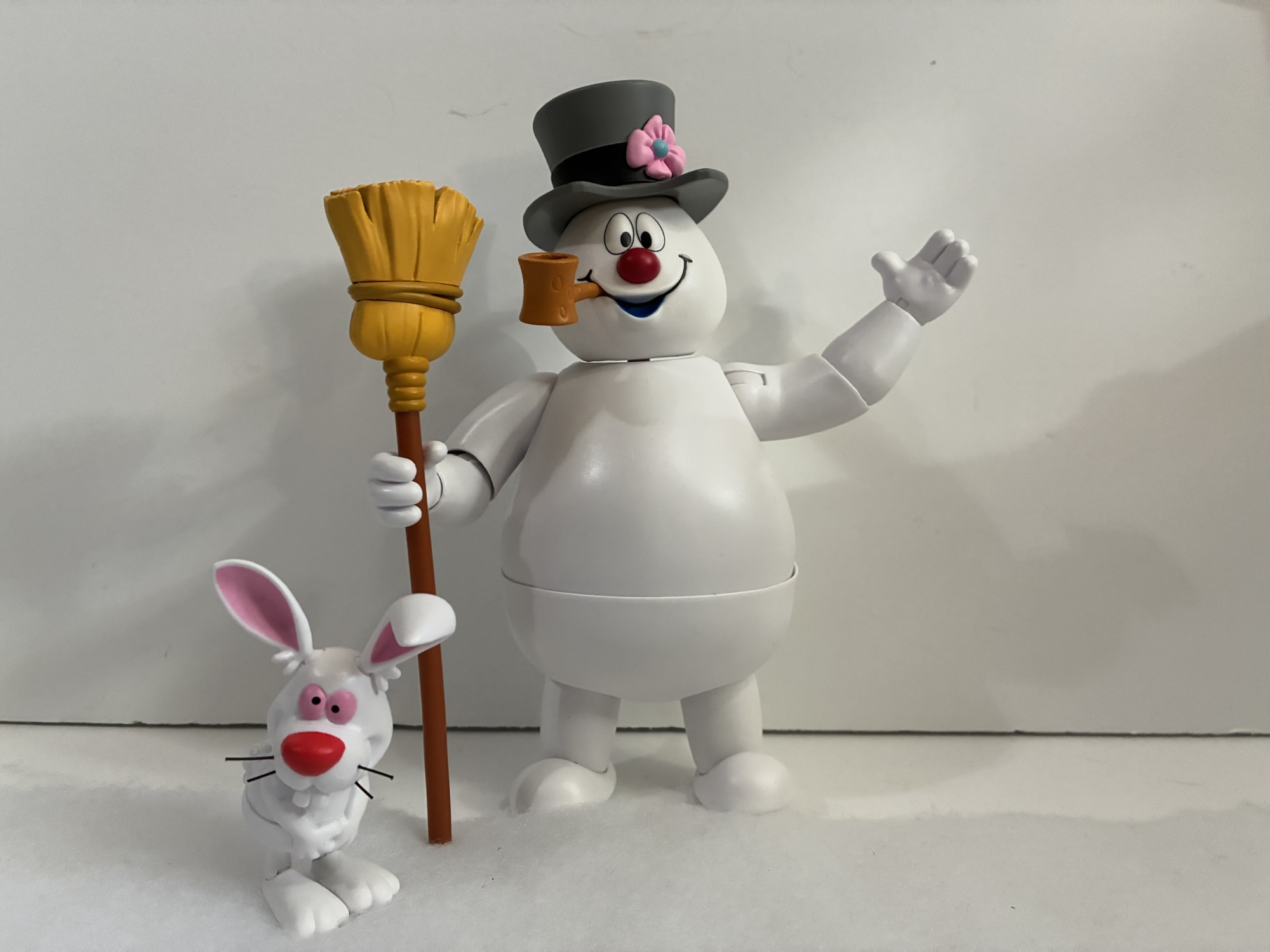
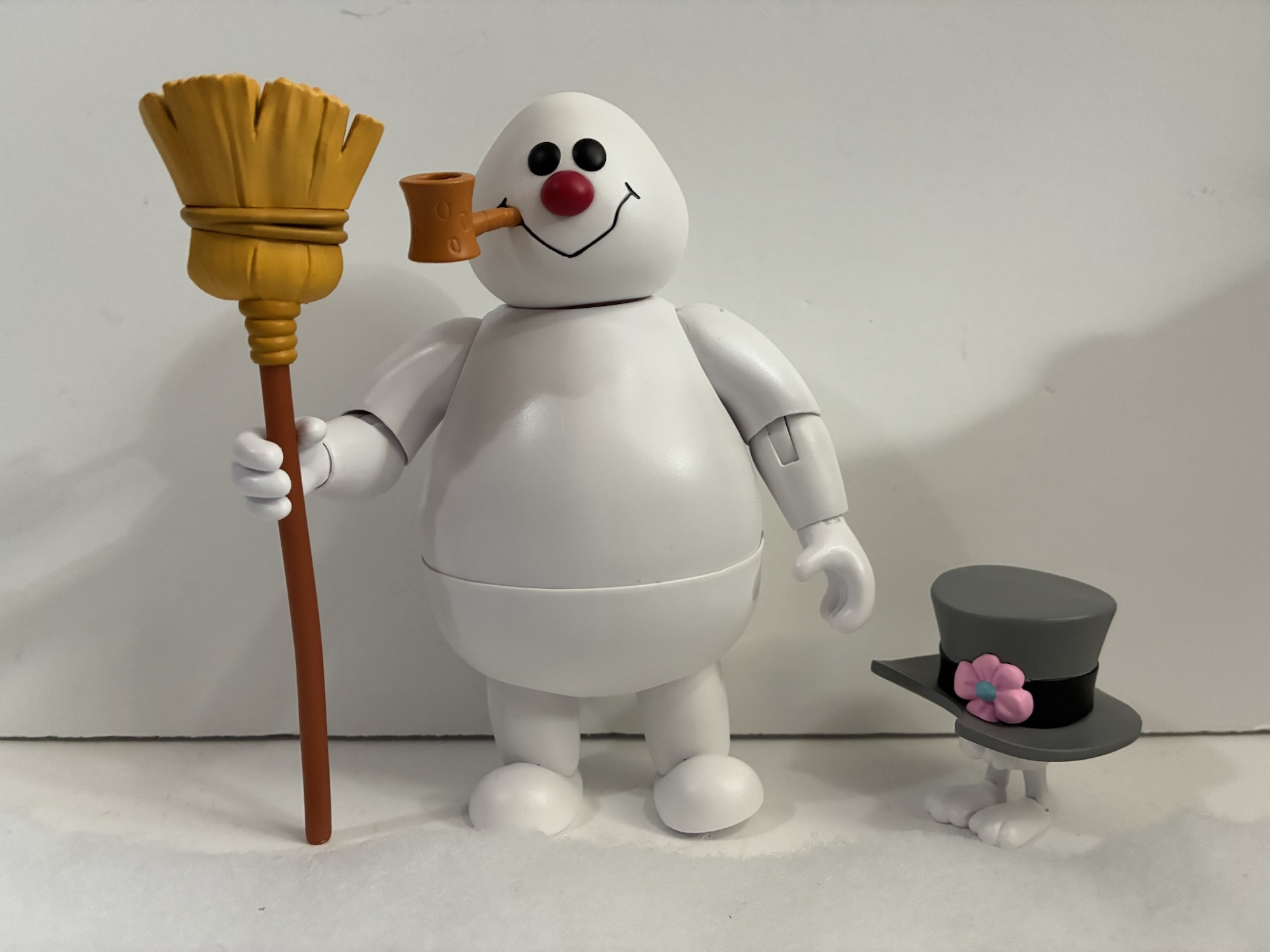
Out of the package, Frosty stands at about 6.375″ to the top of his head. The default portrait has the hat affixed to it so that one will take the snowman over the 7″ mark. From a distance, he’s basically just a big hunk of white plastic, but upon closer examination it’s evident that Jada applied a pearlescent overcoat to the figure to give him a little shine. It’s about as close to approximating the look of snow when the sun hits it they could come up with and it does help to at least give him a little nicer finish, though there’s no hiding from the fact that this is just a big, white, toy. There is paint on the face for the eyes, button nose, and the inner mouth which they opted to paint blue. This had me running back to the special to see if that’s what Rankin/Bass did and, no, they did not. Frosty’s inner mouth was red so I’m not sure why blue was chosen, but it may have been an artistic choice to work off the white. I don’t hate it, it just stood out to me as an odd choice.

The likeness of the sculpt is decent. The face is pretty much spot-on, though there wasn’t a lot Jada had to get right there. Where I do think the figure comes up a little short is just in the overall shape of the snowman. His torso is very pear-shaped when the character in the show was more round. It’s possible they had to mess with the proportions a bit to better suit the articulation. The head also sits a touch high as it’s not sunk-in at all into the body. Was this done to better accommodate the articulation? It’s possible, but I don’t know if the trade-off was worth it. I feel similarly about the waist cut on Frosty. I appreciate the attempt, and maybe I’ll appreciate it more if we ever get a Karen for him to interact with, but I wouldn’t mind seeing how the figure looked without it. And if I’m going to nitpick further, the hat seems a touch too tall, but on the other hand, it’s not consistent in the special and there are shots where it’s more like it’s presented here and others where it’s more squat.

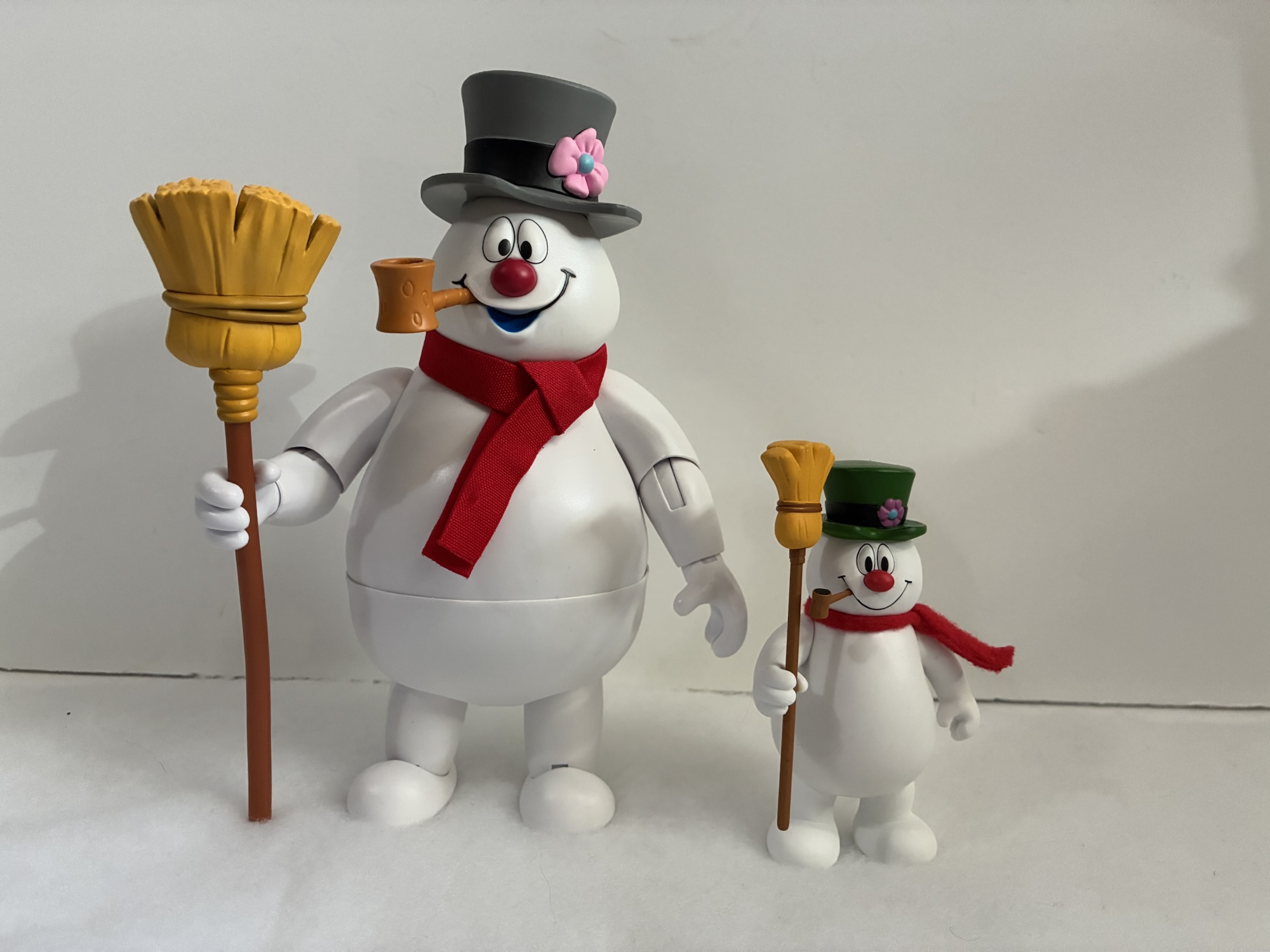
Frosty does come with a handful of accessories, most of which are basically essential to the look of Frosty. We have his corn cob pipe which plugs into his smile. It’s basically essential since without it he just has a hole in his face that looks kind of lame. It doesn’t bother me as I would never choose to display him with out, but if you want your Frosty to quit his bad habit you may be disappointed. He does have his broom stick which is well-painted and sculpted. It’s basically in solid colors which matches the animation fairly well. He also has some optional parts. For hands, Frosty has a set of relaxed hands, a wide-gripping left hand, a tight-gripping right hand, a pointing left hand, and a right fist for when someone disses his fly girl. There’s also an optional portrait of “dead” Frosty from before the magic hat is applied. It looks fine and has the same hole in the mouth for the pipe and I like having this one as a means of displaying the figure in the lead-up to December. Lastly, there’s a soft goods, red, scarf which is a thing that has sprung up over the years. I’m not sure the origin, but lots of Frosty merch over the years has placed a red scarf around his neck despite him never wearing one in the cartoon (in the sequel, he wears a striped scarf). Super7 did the same thing so I can only assume it’s just something that has been added into the licensing art over the years. It’s here if you want it, though I don’t think I’ll ever use it.

Of course, the other accessory in the box is Hocus Pocus. The little white rabbit stands at just a tick over 2″ and has a goofy looking smile fitting the character. His pupils are not aligned, presumably as intended, though I can’t recall him looking that way in the special (I’m not saying it didn’t happen, just that I can’t remember a specific moment for it). Like Frosty, he’s essentially a lump of white plastic with the only paint being reserved for his red nose, the pink of his eyes and inner ears, and the black of his pupils. He has his freckles sculpted in, but they get lost in the plastic since there’s no outline applied. His whiskers are represented with black wire and his arms are permanently sculpted into the torso. He does feature articulation at the base of his ears, head, waist, hips, and ankles, but it’s pretty limited. He has one accessory – the hat. Hocus is designed to separate at the head which reveals a super long double-ball peg that can plug into the hat. There’s some sculpted out area for his arms inside the hat to get a snug fit and it successfully recreates the look of Hocus from when he makes off with the hat and delivers it to the children. It’s a good idea and a fun way to display him if you’re opting to display Frosty with his “dead” portrait.

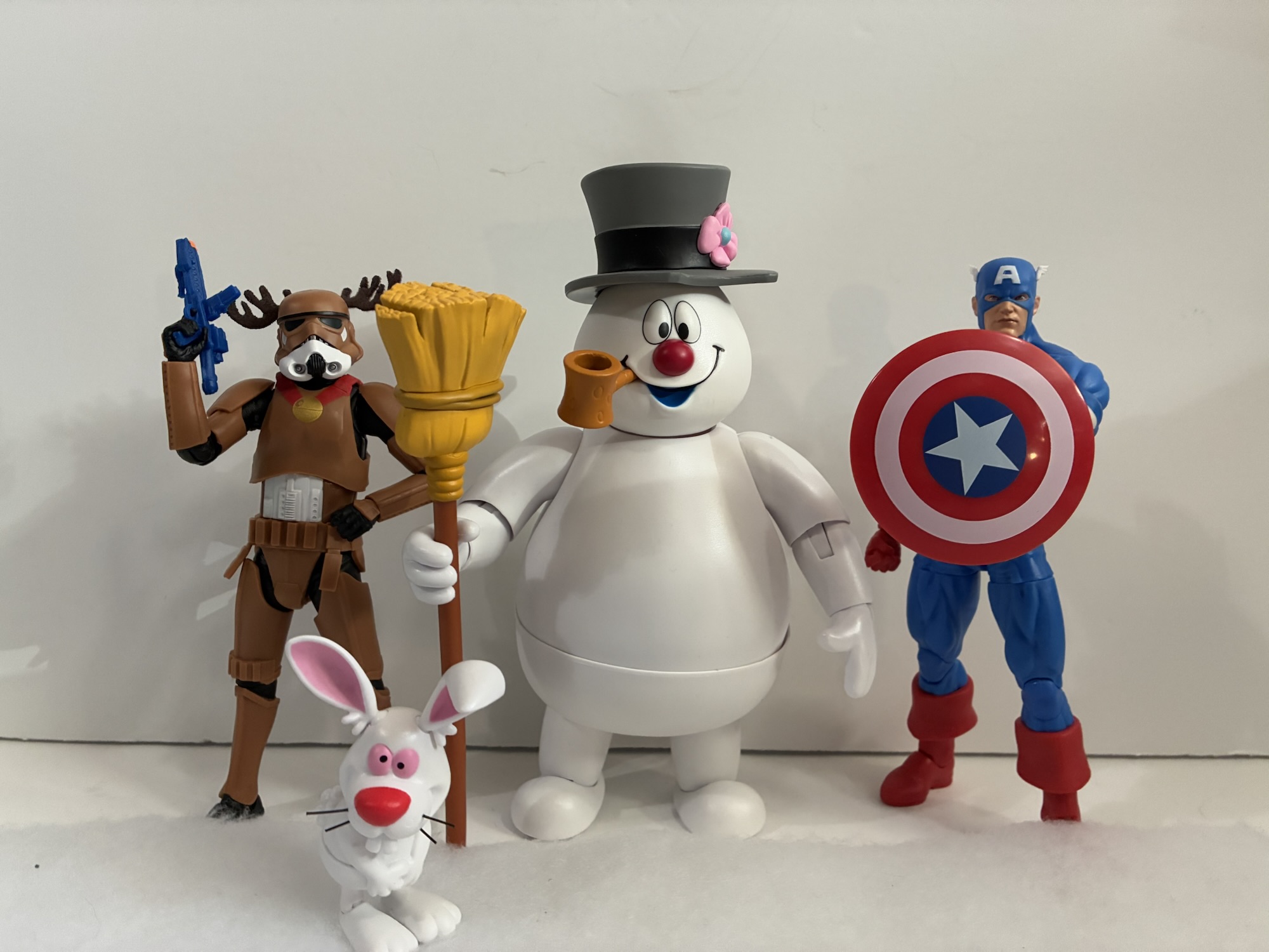
Frosty’s articulation is also nothing to write home about. He has the same double-ball peg setup at the “neck,” and another one at the hat. This is where the figure is most expressive as he can rotate and tilt at both the head and hat which provides enough nuance to be fun. He has hinged shoulders, single-hinged elbows, and hinged wrists that rotate. Unlike NECA and their many TMNT figures, Frosty actually has the proper vertical hinge for his broom and any other weapon you feel he should have. That waist joint is a ball joint so Frosty can rotate and tilt, but don’t expect too much forward and back. The legs are connected via ball-sockets, but they’re functionally useless due to the shape of the character. He has no knees and instead some ankles that hinge and rock. If your dream is to recreate Frosty’s marching pose on your shelf then you may have to get a little creative. He also doesn’t have any peg holes on the bottoms of his feet so finding a stand to work with him might be a challenge.

Frosty isn’t going to impress with his poses, but no one likely expected him to. What will sell this figure are the aesthetics and the power of nostalgia. Nostalgia for Christmas. Is that sort of thing worthy of your $50? It’s a legitimate question and one not easily answered. If I were to grade this release on the quality of the figure and the amount of stuff in the box then I’d have to say “No,” this isn’t a $50 release. I’d feel better about it if we got a more expressive Hocus or maybe some optional parts for Frosty to recreate the signature poses from the special. This Frosty can’t even belly-whop because the range at the head doesn’t allow for it. He basically needs a third head with the socket for the ball joint in the back. Perhaps a future Karen release could come with such a thing?

Despite my feelings on the value present, I am happy to have this. I have a huge soft spot for Christmas specials (obviously) and there’s no way I was passing on this. It’s still a better value than a Super7 Ultimates! release (and cheaper) and it looks good enough on my Christmas shelf. And I do selfishly want this release to be successful because I’d like to see more from Jada and Frosty the Snowman. I already name-dropped Karen, but throw-in Santa and Professor Hinkle and that will make me pretty happy. It would be fun if each came with a different Hocus since he had some different looks/poses in the special, and in the case of Karen, that belly-whopping head would be nice. If you’re interested in this release as strictly an action figure, then it probably won’t win you over. If you have a lot of affection for the old television special and won’t miss the $50 then I say go for it. There’s plenty of Christmas magic in this box to take away the sting of the price.
If you’re curious to read my thoughts on the original special or just have an interest in Christmas toys then check these out:

Dec. 1 – Frosty the Snowman
Welcome back, lovers of Christmas, to the 7th edition of The Christmas Spot! If you missed the introduction a few days ago, we’re doing things a little differently this year. Yes, you’re still getting a dedicated write-up each day through Christmas about a beloved or not-so-beloved holiday special, but this year we’re also going retro…
Keep reading
Naughty or Nice Classic Santa and Cyborg Santa
It was looking like we were in for a photo finish this year. Last year, toymaker Fresh Monkey Fiction partnered with online retailer Big Bad Toy Store to launch the Naughty or Nice collection. Structured similar to a Kickstarter campaign, FMF posted several action figures for preorder with a minimum order quantity needed for the…
Keep reading
Naughty or Nice Father Frost & Mall Santa
Fresh Monkey Fiction is back with Naughty or Nice Wave Two and just in time for…(checks calendar)…Valentine’s Day? Okay, so things didn’t go quite as planned with this line. In 2021, Fresh Monkey Fiction partnered with Big Bad Toy Store for this line of action figures based primarily on Santa Claus. That preorder took about…
Keep reading