Tag Archives: action figures

TMNT Loot Crate Series 2 Vol. 2 – Pixelated Shark Boy

Wow, it’s actually full this time.

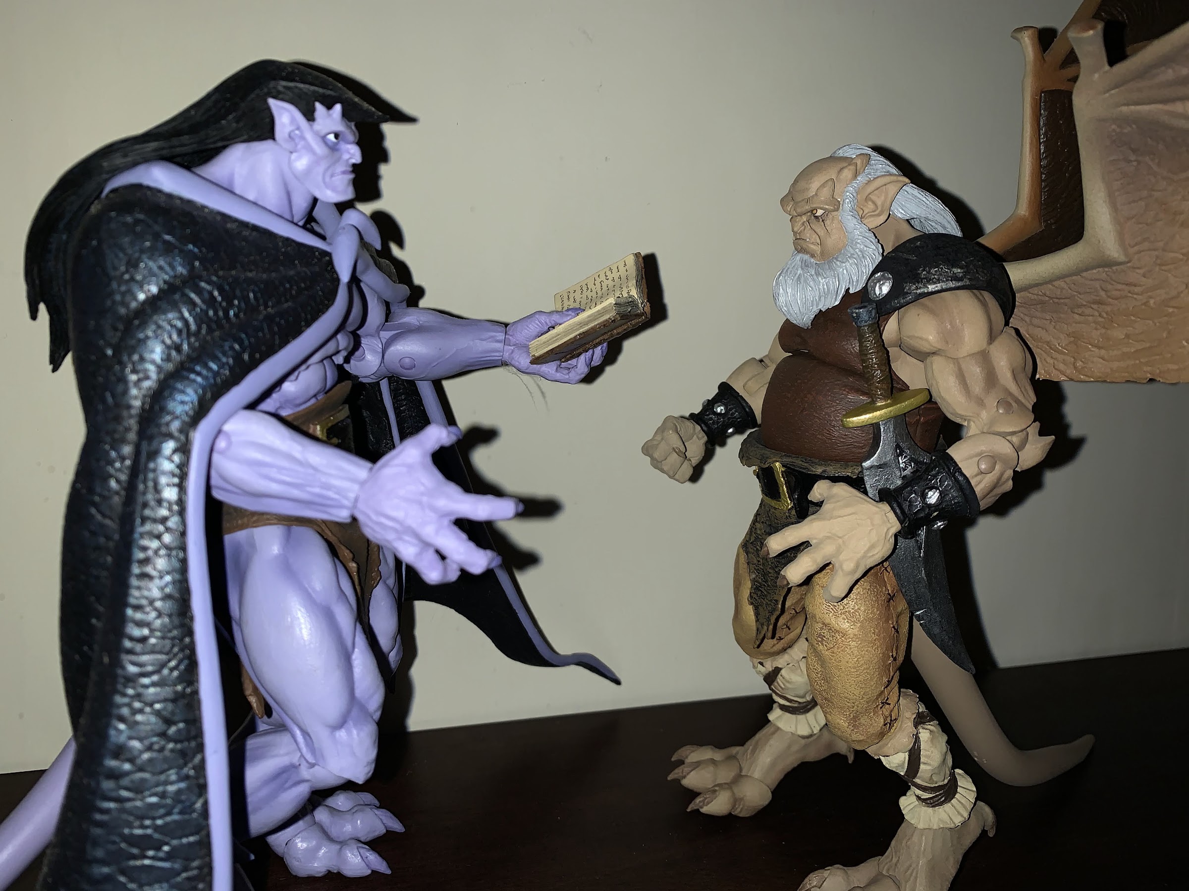
2022 is nearly in the books. As we countdown the final hours and minutes until 2023, it feels good to say that the new year will begin with no further Loot Crate obligations. That’s because after a delay of more than a year, the second crate in Loot Crate’s Teenage Mutant Ninja Turtles series of crates is finally here. It may be the second crate, but it’s arriving fourth due to…who knows? Loot Crate basically went silent to start 2022 and stopped providing updates on where things were. This crate was supposedly ready to rock 10 months ago, but obviously that wasn’t the case. I ranted and raved a bit in the other crate reviews so if you want more background info I’d say go give those a peek, but let’s relax and be happy that it’s all over now.

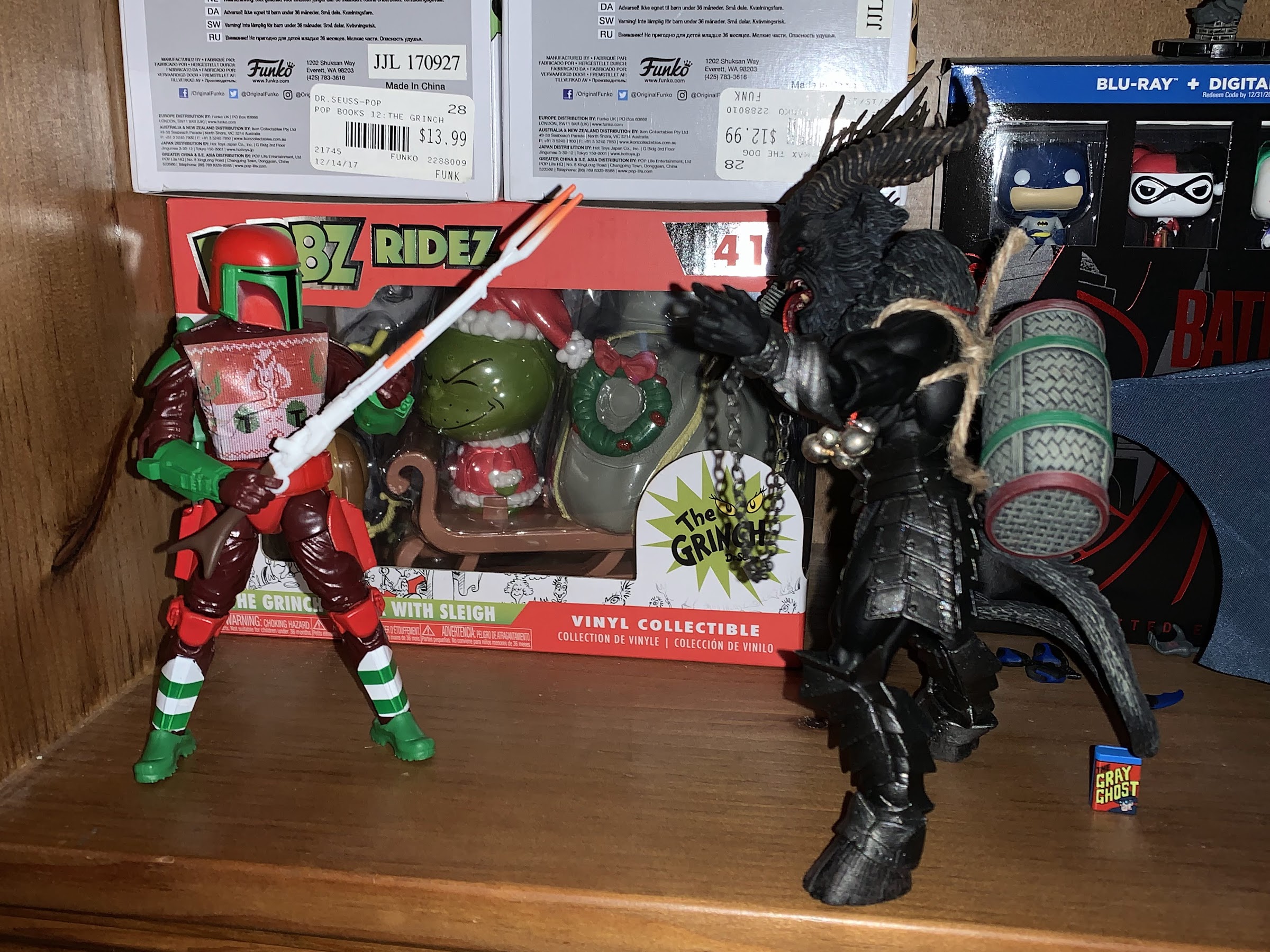
If you’re new to the scam, each crate in a series of four is based on a different pillar of the Teenage Mutant Ninja Turtles media empire: comics, movies, television, and video games. This final crate is the video game one, which in the first series was themed around Turtles in Time. The same could be said for NECA’s line of action figures released to comic shops, but this one is a mix of two different video games: Turtles in Time and Tournament Fighters. Like past crates, you get a bunch of junk and a t-shirt with the real selling point being an exclusive action figure from NECA. And in this one it’s Armaggon from Tournament Fighters, a character that I’m not particularly attached to, but I know a lot of other collectors out there who are really excited to get this one. And not because they’re huge fans of Tournament Fighters, but because Armaggon was a character in the Archie comics. He’s basically a mutant shark from the future and he’s quite the badass. The Armaggon from the video game was a mostly faithful adaptation of the comic character making this figure a pretty faithful adaptation of the same. Well, except for that pixel deco NECA uses for its video game line.

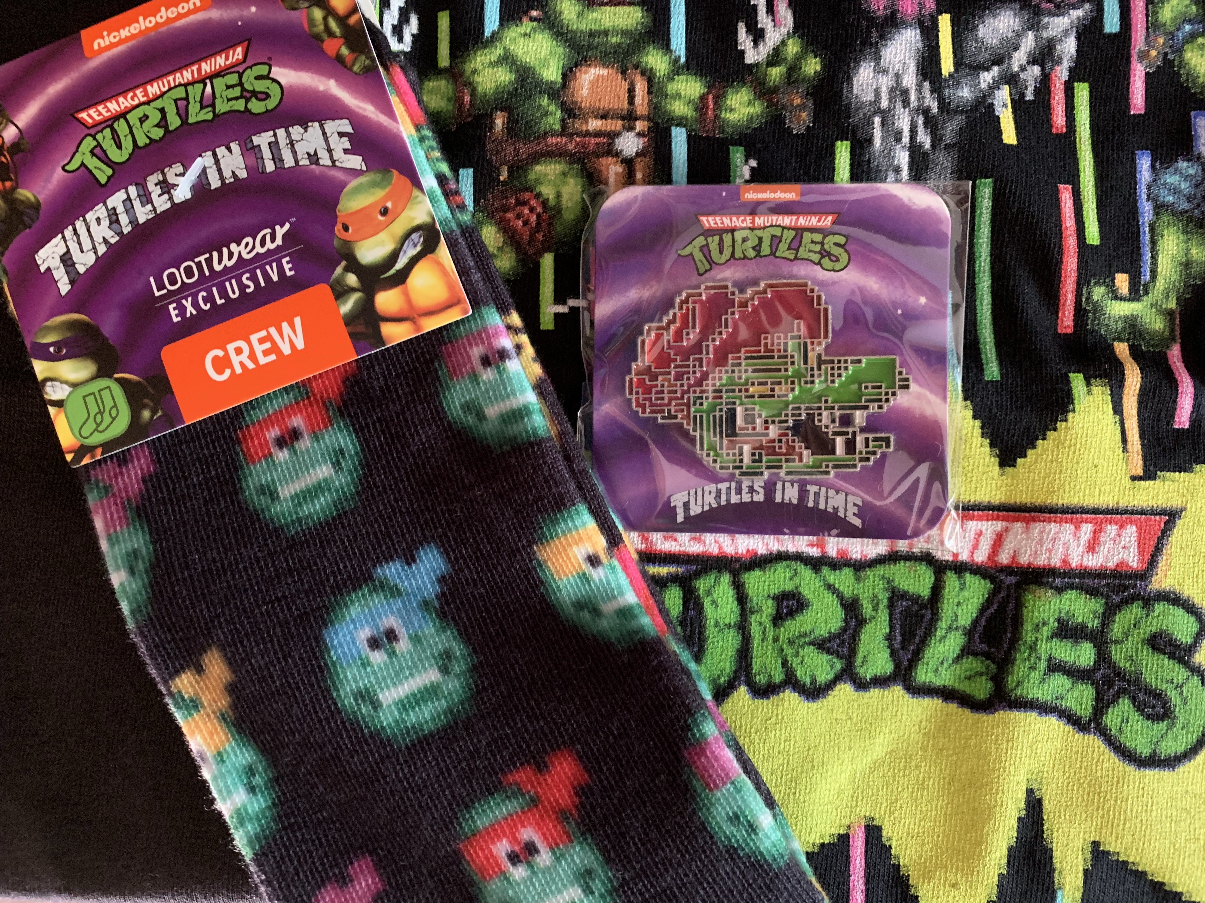
Before we get to the main event though, we should probably talk about the junk. As I mentioned in the prior paragraph, some of this is from Turtles in Time and some from Tournament Fighters. From Turtles in Time, we get a pair of socks. They have some graphics on them from the game (turtles on one sock, villains on the other) and…they’re socks. They’re fine. We also get a pin, as every crate has included a pin so far. This one features Leatherhead’s head and…it’s fine. We also get a boxed set of two glasses featuring Tokka and Rahzar from the game. When I picked the box up and saw the image of the glassware inside, I assumed they were shot glasses, but they’re actually bigger. I guess these are whiskey glasses? Bourbon glass? Loot Crate calls them juice glasses. Either way, the graphics are more like decals so if you decide to use these you will want to hand wash them because a dishwasher will likely obliterate the images. Some of the decals on mine are crooked, which is a shame. At least the images look, in a running theme for this crate so far, fine.

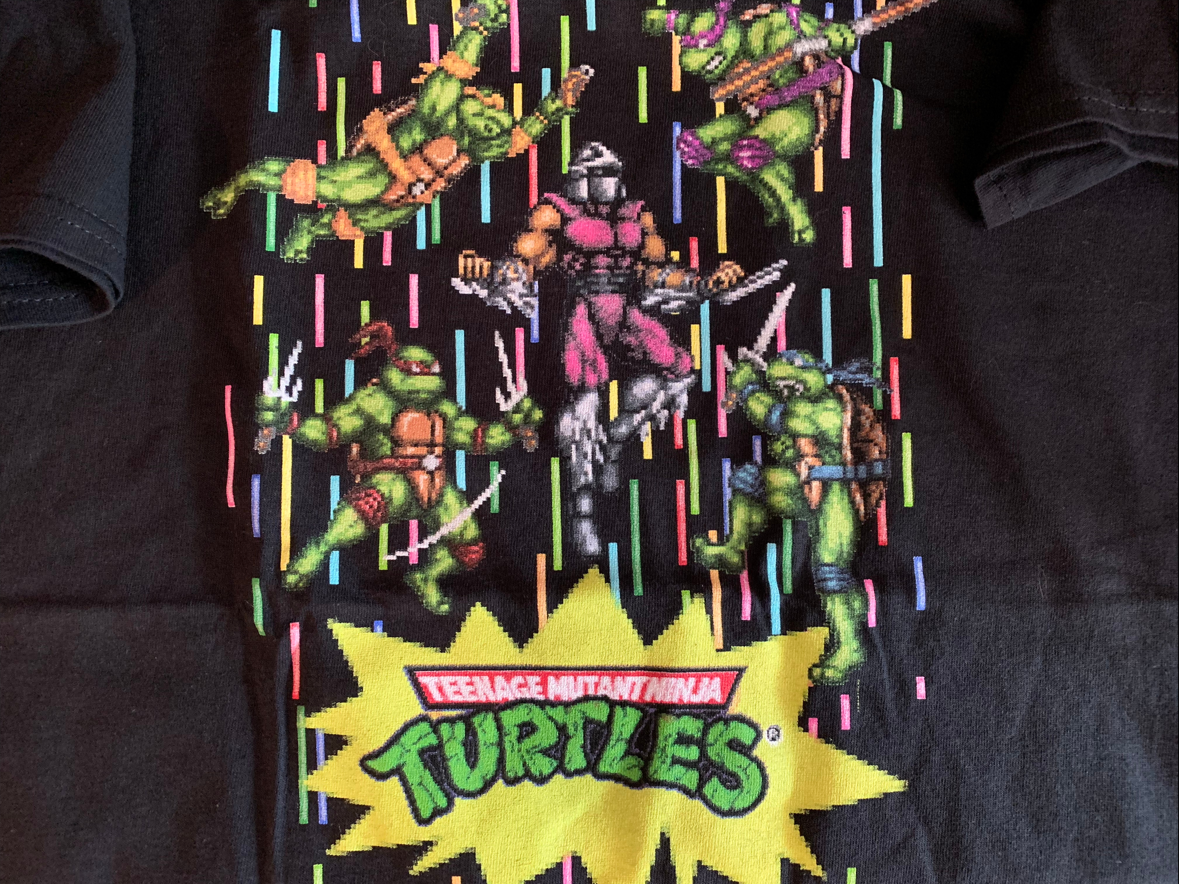
Tournament Fighters, in case you forgot, was a TMNT fighting game released exclusively for consoles. It’s odd that it wasn’t released to arcades, but maybe that’s how late it was to arrive. It’s also a Konami fighter, and now that I think about it, Konami really didn’t tackle the genre much and I can’t think of a single Konami fighting game released in arcades (Martial Champion, anyone?). They mostly specialized in brawlers, but I guess they felt they could not ignore the hype generated by the likes of Street Fighter II and Mortal Kombat. The game was released for the Super Nintendo, Genesis, and Nintendo Entertainment System. In what is an example of a bygone era for game development, each version of the game was completely different from the other. The Super Nintendo one is the version that featured Armaggon, so it’s from that game that the theme for the t-shirt is pulled. In what can only be described as a Christmas miracle (I got my crate before Christmas), Loot Crate actually sent me the proper sized shirt. The shirt itself is just black with the turtles fighting Shredder with some very 90s colors in the background. It’s…fine. Lastly, and it’s not really from any game, is a Krang stress ball. He has more of a toon look to him, but a licensing art toon look. It’s pretty fun though, I’ll give it that. We also get a summary card of the stuff in the crate, something the last one omitted.

They put a lot of effort into this packaging.

So yeah, the junk in this crate is all fine. Nothing is terrible, nothing is really a surprise, and nothing is really all that welcomed. I guess it’s nice to have another shirt, and I definitely prefer it to the apron from the last crate, and I’ll wear it and probably the socks because why not? I’ll find a home for the silly stress ball, and the rest will probably end up in a drawer or behind my bar. In comparison with the other crates, it’s way better simply by virtue of getting the shirt size correct, but it’s still a bunch of stuff I never would have purchased individually. The real attraction is and always has been the action figure. And in order to get the bonus figure of Scrag in the last crate, I had to get all of them. If I could have picked and choosed what crates I wanted and still got Scrag I may have passed on Armaggon. Nothing against him, I just have no affection for Tournament Fighters. It was a middling fighting game that was also brutally difficult and I wasted a rental on it as a kid. It wasn’t one of my worst rental decisions, but it was a game I never contemplated renting again or actually buying. And if I’m going to get an Armaggon, I’d prefer a true comic one. That said, I was still curious about this figure. I could tell from early solicitations that it was going to reuse some components from Bebop and Rocksteady, but it was also hard to tell just how much. And to a lesser extent, I was curious how the figure would be packaged and if NECA was intending to do more from the game.

And here’s good old shark boy, free from his box!

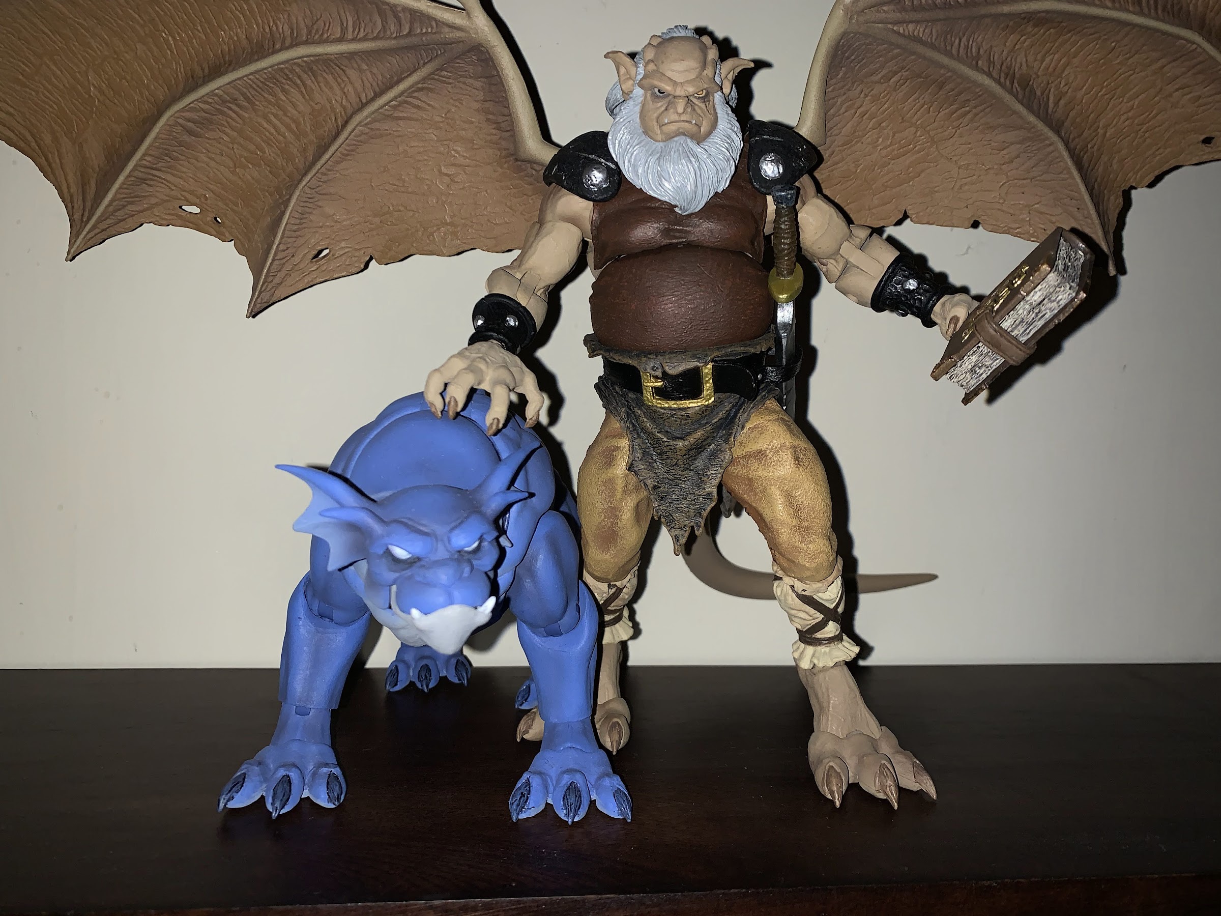
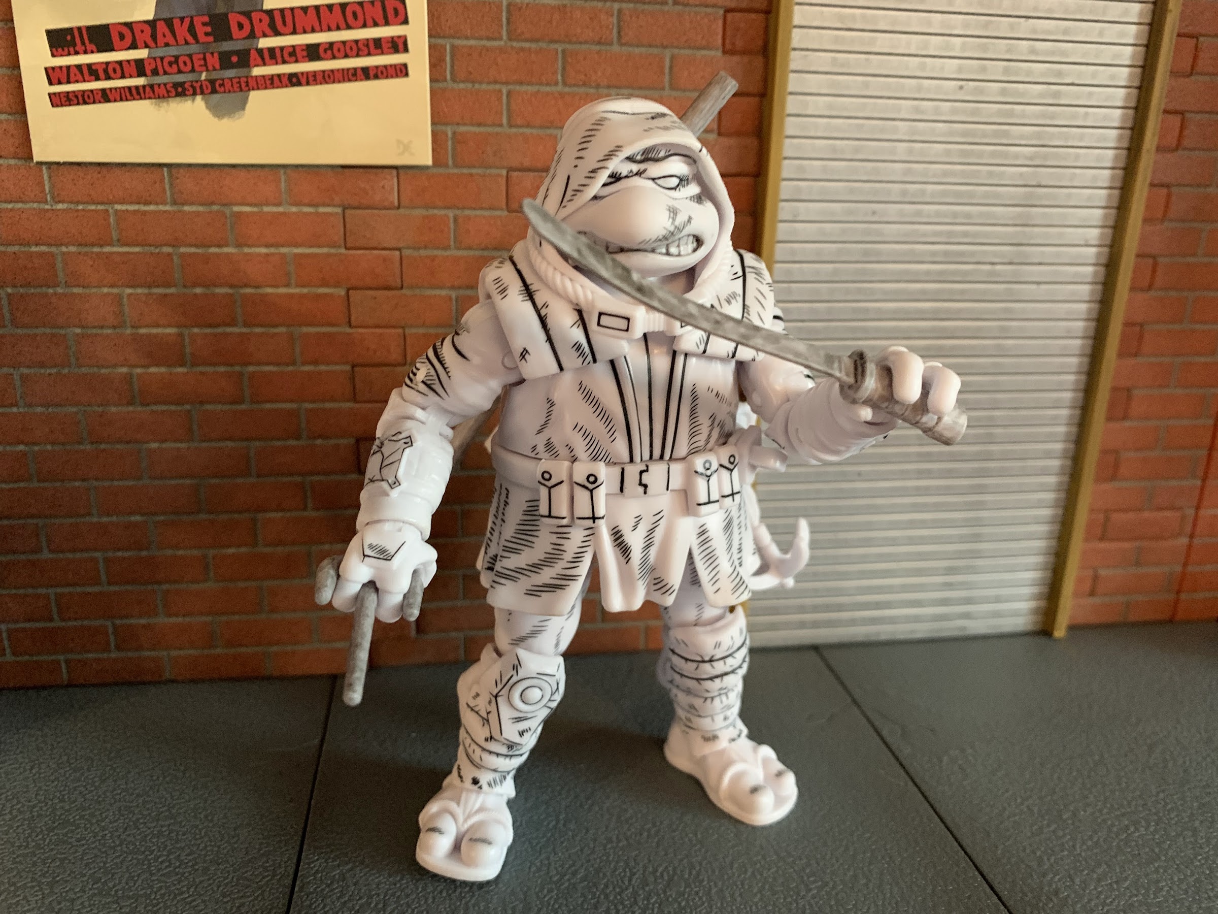
Armaggon comes bundled in a box that is essentially the same shape as the other Loot Crate figures. The graphics on it though are tailored to the Tournament Fighters SNES game and they did a really good job. Almost too good considering this isn’t a figure that will show up on shelves at a store near you. The box graphics are designed to mimic the packaging of a Super Nintendo game and NECA even put it’s own logo on there in the same style as the Nintendo logo of old. There’s shots of the arcade Donatello on it designed to emulate the same posings from the artwork of the Tournament Fighters game and they whited out the eyes on him and updated the figure to look a bit more like the Donatello from the game. He doesn’t look quite like the source though since those sprites were designed to resemble the 1990 movie suits. It would have been interesting to see NECA try to do the same just to see how that figure would have looked, but eh, it’s fine.

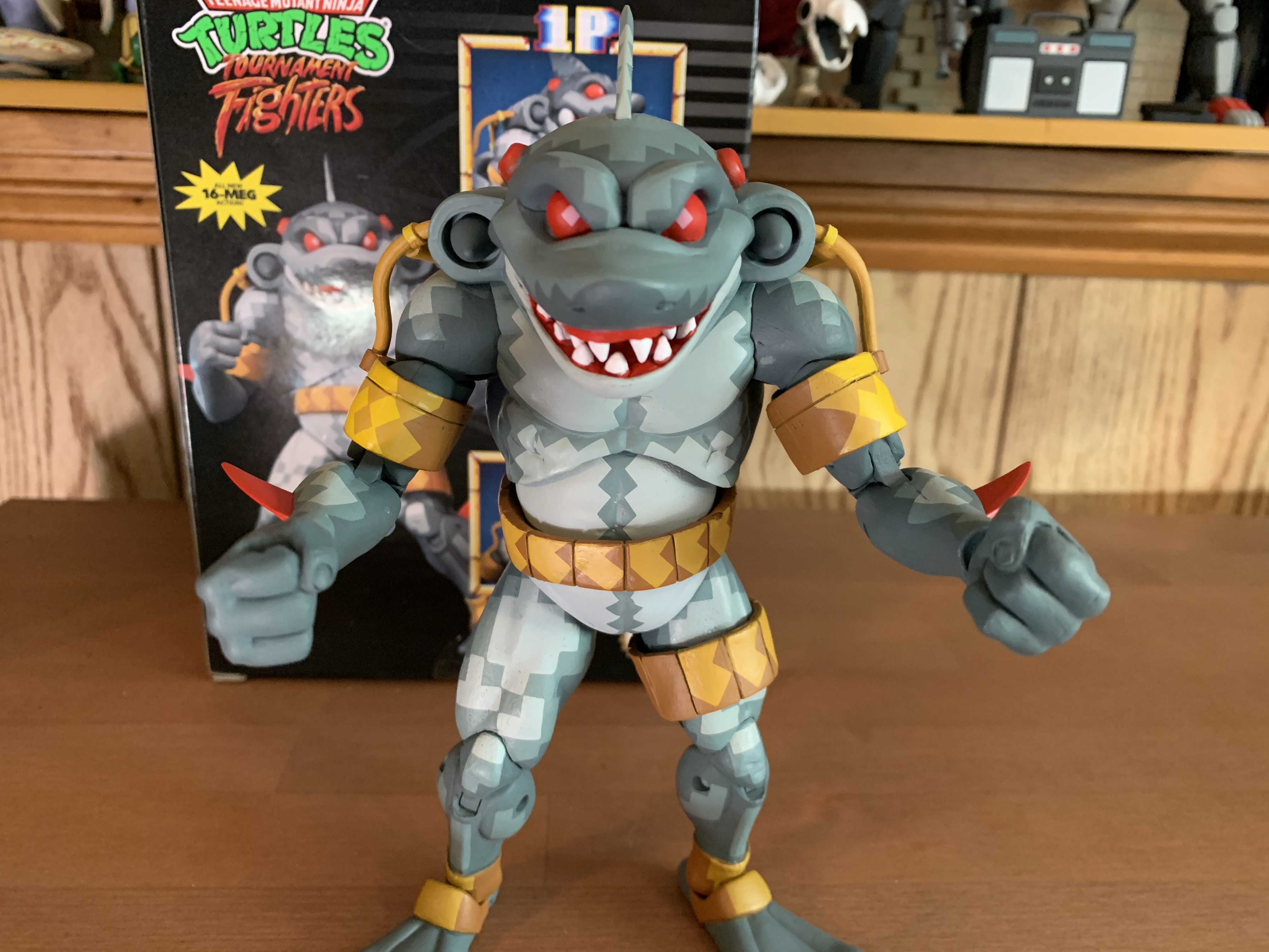
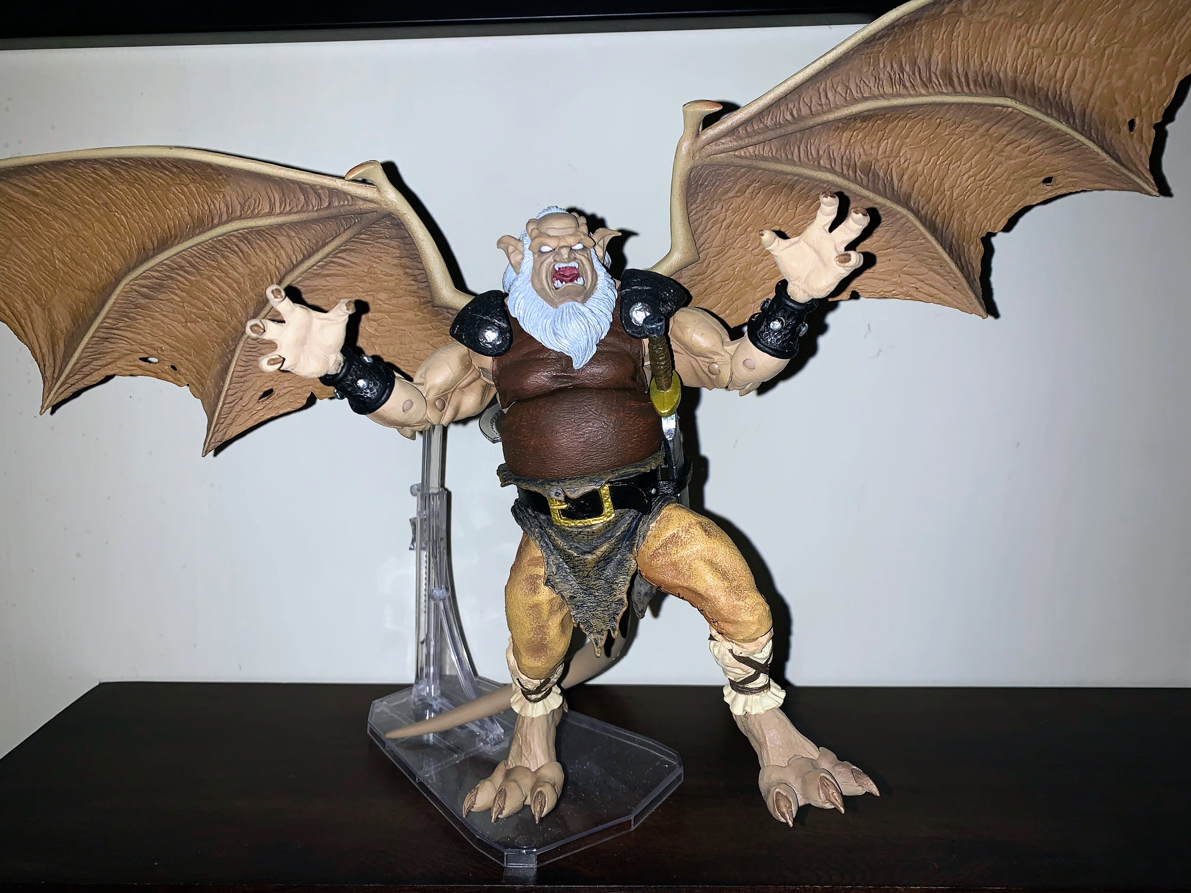
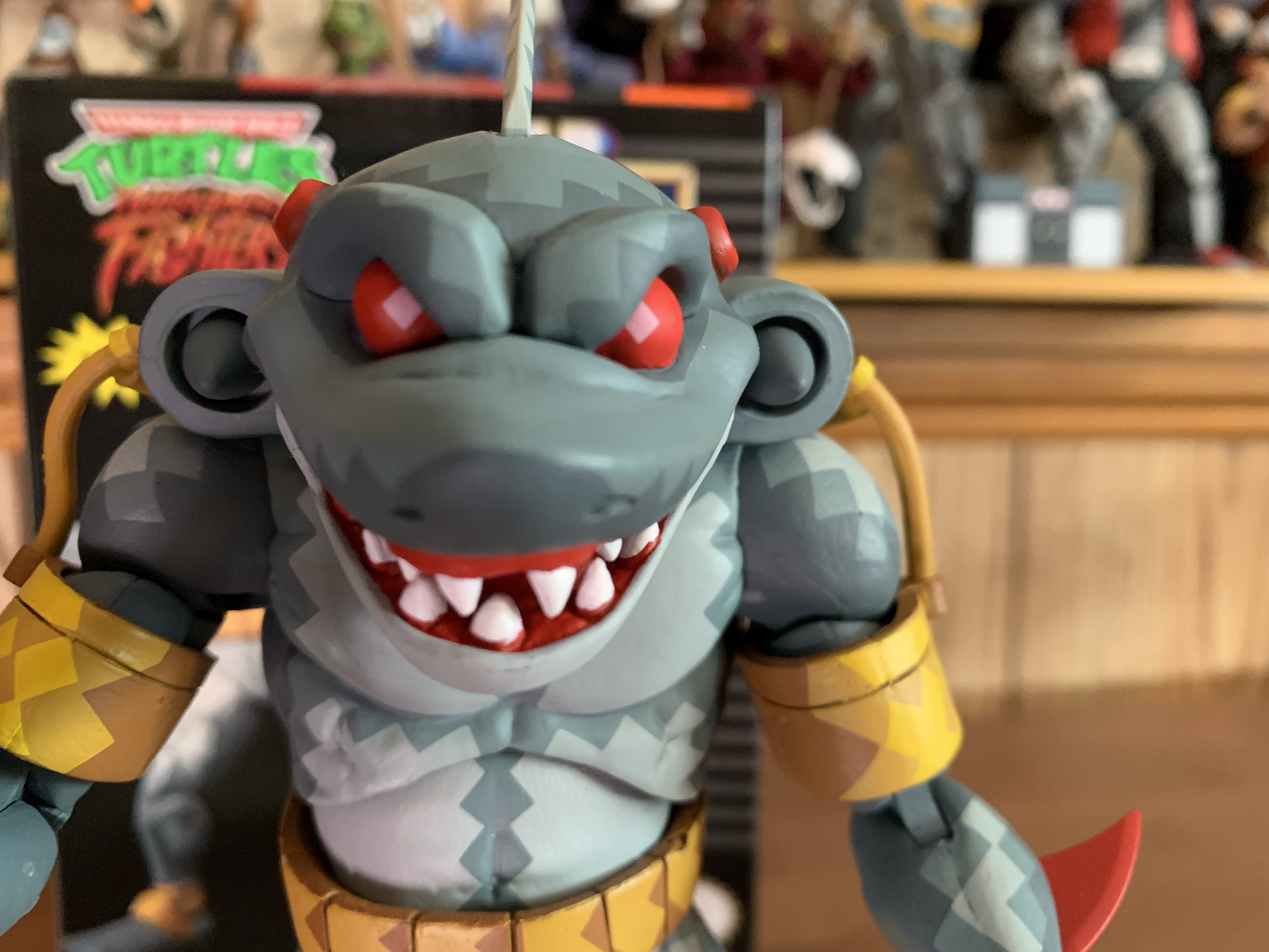
Once removed from his cardboard prison, Armaggon cuts a pretty intimidating pose on a shelf. He’s fairly tall coming in at a tick under 7″ (not counting his fin which puts him closer to 7.5″) or so which makes him one of the largest figures in the video game line. The first thing that jumps out though is the head. He looks pretty crazed with those red eyes and red gums to go with a lot of sharp teeth. It’s a nice sculpt and one that’s obviously all new. It sits on the torso of Bebop and I’m guessing the biceps and shoulders are recycled as well. The forearms needed to be re-tooled because Armaggon has some red fins there and they give his arms the added length they need. The hands are straight from the other release though as are the thighs which have the clothing wrinkles still sculpted in which is a bit annoying, but NECA did the same for the Triceratons so it’s hardly a surprise. The lower legs and the feet are all new since Armaggon has flippers. The other new part appears to be the crotch as his belt is part of the same piece. On the rear of the figure is a shark tail and that’s all new as well. To summarize, the only old parts are the torso, upper arm, hands, and thighs which is less than I expected.

He has the same gripping hands as Rocksteady, with one being a trigger finger. I’m not sure he needs them.

What stands out with the figure is the paint and his cybernetic bits. The pixel deco is one of NECA’s best applications of it. There are parts of the figure, like the right thigh and shoulders, that really blend like a sprite should when viewing it from the shelf. It’s a neat effect, and while some don’t like it, at least it’s done well. The cybernetic stuff is basically all of the yellow around the head area. It’s sort of like a harness, I don’t really know the function of it, but it’s very intricately done. He has lots of tubes and straps and while they look good, it does give the figure a fragile appearance. And considering it’s a limited edition figure that’s not supposed to ever be sold at retail, it makes it even scarier to handle. He also has his missiles sculpted into his traps and they’re colored gray like the game. They don’t do anything, but it’s obviously something the character needed. Overall, I’d call the sculpt and paint pretty damn good all things considered. The reuse present is appropriate and there’s plenty of new stuff to justify the cost. Well, if we’re applying a cost of 25 bucks or so to the figure since the crate costs $50.

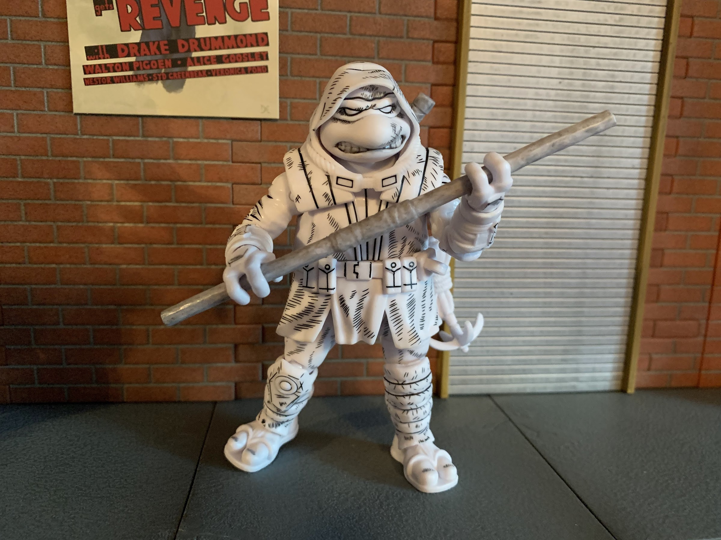
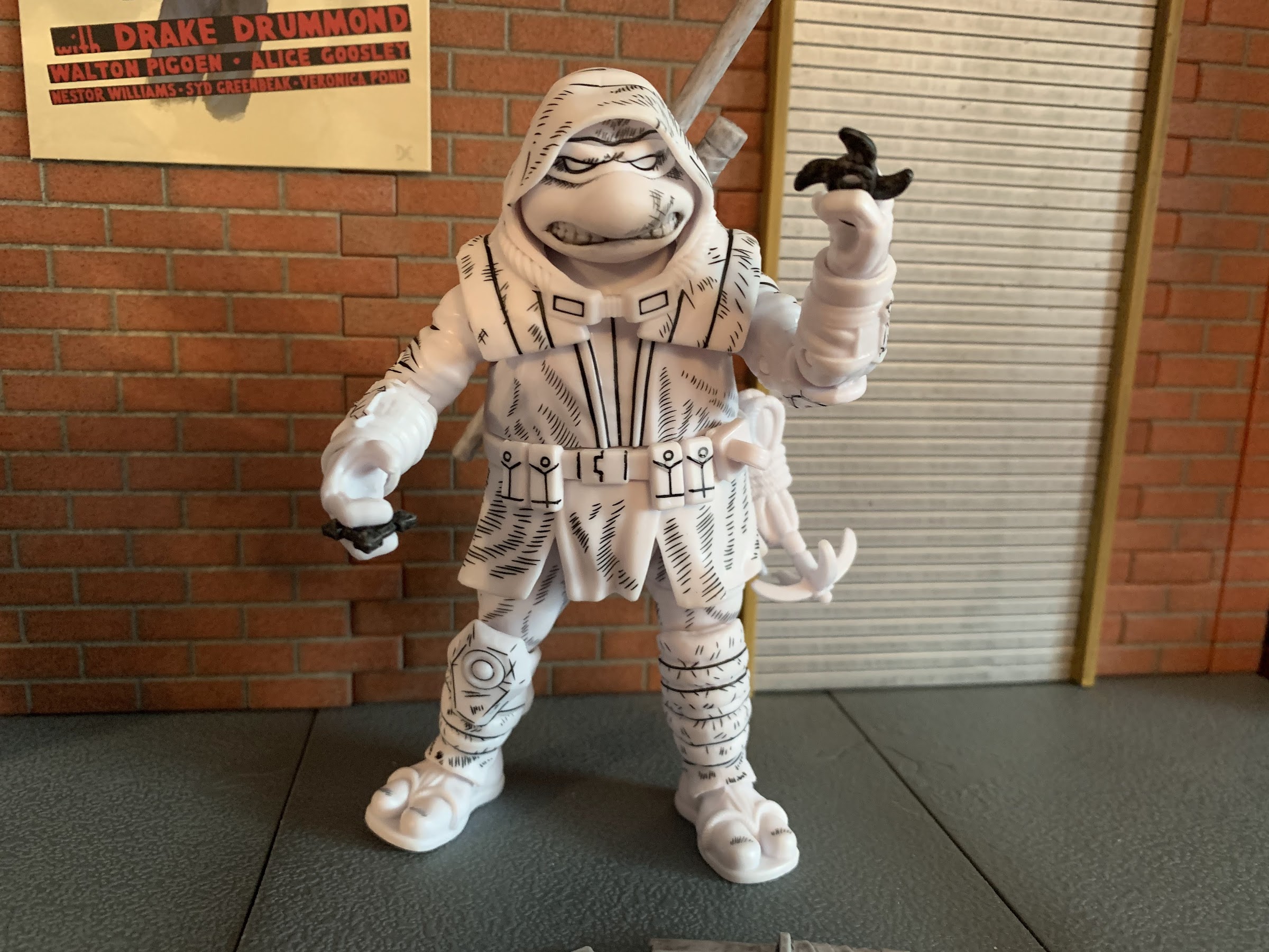
In terms of articulation, well, there isn’t a lot to talk about. As hinted at earlier, this guy is scary to pose. The head is locked down, but he does have a hinged jaw which is cool. The arms though are connected to those tubes and harness contraption and I hesitate to do much with them. They bend, but I can see them getting stressed and I personally will pose this guy in as unstressful a position as I can get. Which is probably straight up and down, but we’ll see. He does have hinged shoulders though and a biceps swivel. The elbows are double-jointed and the wrists swivel and hinge. There’s a torso joint that basically just provides a tiny bit of rotation and little else. If the waist does anything, I can’t tell. At the hips, we have ball and socket joints like the Triceratons which I am very happy about as I feared we’d get the old style Bebop and Rocksteady hips. There’s a slight thigh twist at the ball and the knees are double-jointed. The ankles hinge and have a rocker and move fine. The tail is on a ball peg, but it does very little. This guy is pretty stiff out of the box so be gentle. Maybe just be extra cautious and heat anything up that feels stuck. The lower half of the figure is the stronger part when it comes to articulation and it’s okay. I feel fine posing him down there. It’s the arms and upper torso that scare me the most, and really it’s the upper arm. The elbows and hands are fine. He’s not going to pose very well though, unfortunately.

These three all share some parts between them.

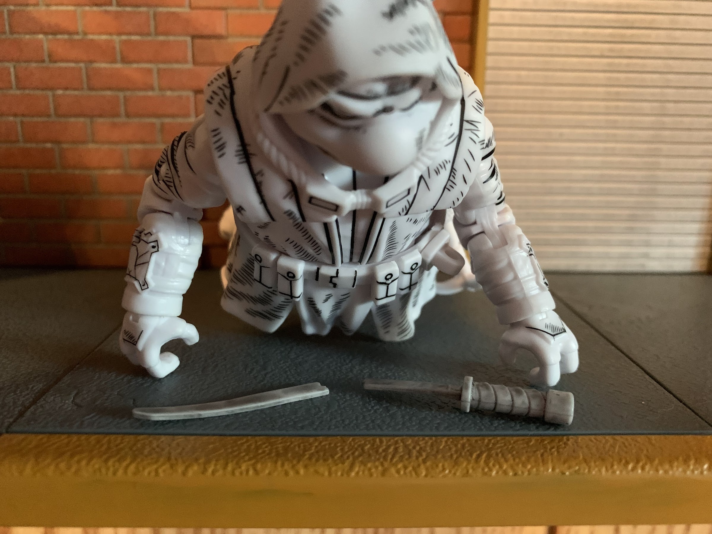
As has been the case with basically all of the Loot Crate figures, the accessories are rather weak. In fairness, I don’t know that Armaggon needs anything from the game. Maybe an effect? He just has extra hands though and they’re all recycled from Bebop and Rocksteady. He has a set of fists and open hands plus a trigger finger right hand and a gripping left. He has nothing to grasp, but if you want to give him a gun or something at least you can. I’ll probably just go with the open, style posed, hands and leave it that way.

Will NECA ever do proper Tournament Fighter turtles? I wouldn’t rule it out.

Well, that’s it! The second, and hopefully final, series of Loot Crates based on Teenage Mutant Ninja Turtles are history and it feels good to be done. I’ve had plenty of preorders over the past two years that went long so it’s not the delays that bothered me. It’s the lack of communication and the outright lying that came out of The Loot Company that ticked me off. Plus, we’re not talking about a preorder that took two years to be delivered. This was paid for back in early 2021 and it was supposed to ship in September of the same year! That’s nuts! At the end of 2021 they were saying it was going to ship imminently – there’s no way that was ever true! And they screwed up a ton of the orders, went really light on the stuff in crate 3, and just all around delivered a bad consumer experience. Hopefully, Loot Crate is allowed to die for good this time and never return, because if another round of these things is announced I’m staying away. Unless they change their business model to not require payment upfront, because this stuff felt super shady. If I’m allowed to ignore the consumer experience and just judge the whole thing on what we got, it still was a subpar experience. The Danny figure stunk, and there was nothing of value in 2 of the remaining three crates outside of the figures. At least those figures were done well enough, but why do they need to be sold this way? Collectors will happily just buy these figures from NECA direct and there’s really no character too obscure for release at this point. Now, it’s just my opinion, but I don’t think NECA liked the experience of partnering with Loot Crate either so it’s my hope that they have enough pull with their owner, who owns Loot Crate, to put an end to the partnership because it really hurt their brand more than it helped. For now, let’s just be happy it’s over and try to enjoy the figures we got. Here’s to a new year free of Loot Crate!

TMNT Loot Crate Series 2 Vol. 1 – The “It’s Dan now” Crate

Loot Crate’s first series of Teenage Mutant Ninja Turtles crates in 2020 were a massive success. The crates sold out and anyone who missed out found out acquiring them on the secondhand market would be most expensive, and that’s because each crate came bundled with a NECA exclusive action figure. NECA’s parent company rescued Loot…

Keep reading

Marvel Legends X-Men Animated Series Cyclops

The field commander of the X-Men has arrived.

I wasn’t sure he would make it in time, but Hasbro managed to ship Cyclops before the end of the year. Cyclops marks the final figure (for now) in Hasbro’s X-Men animated series subline of Marvel Legends. It has been…a ride. What was once a dream line of mine to see brought to fruition, turned into something less. I won’t go so far as to get overly dramatic and juxtapose dream line with nightmare, but basically nearly every negative thought I had going into it came true. I don’t have a high opinion of Hasbro to begin with, but they are a giant toy maker that is pretty good at getting out a decent product at a good price. It’s just in 2022, most of those things have stopped being true. There’s been a reduction in quality, content, and it’s been paired with a rising price. Initially, I tried to be positive about a line based on the show X-Men. We had those Into the Spider-Verse figures to use as examples of what Hasbro is capable of when it decides to base their design’s on a particular source material, but the company chose not to do that with this line. Instead, we got previously released comic book figures with a dash of cel-shading and little in the way of new tooling or accessories. The line is best qualified as lazy, and I hate to use that word because I know there are people who work at Hasbro who are anything but lazy. The direction of the line has sucked. It’s been inconsistent, underwhelming, and yet, I’m still sad to see it end. To a degree. I want the company to just finish the main cast so I can take a step back and assess what we have, but that’s been put on pause with no guarantee of anything past this figure.

For some reason, Hasbro (and Toy Biz before them) have had trouble with this costume, but I think they finally got it right.

Given all of that, there’s at least a chance that Hasbro saved the best for last. Prior releases of Jean, Storm, Jubilee, Mr. Sinister, and Mystique have basically been of the straight repaint variety with varying results. Mystique and Storm got new hair parts, while Wolverine got a new head and hands. Morph has been the only new figure, though in Marvel Legends fashion, his body is mostly reused from past figures. He did get to debut new legs which were re-tooled to allow for his thigh and boot straps to be keyed in and it’s a part that’s going to be reused quite a bit in the figures to follow. Like this one! Cyclops, like Morph, is a mix of old and new. His costume is based on the show, which was based on the costume Jim Lee designed for the character during his run. It’s been a bit of a challenge to get this costume to look nice in plastic because of the unusual belt. Cyclops has a belt that goes up and over both shoulders, but only attaches to the waist at one spot on the rear and front. It’s sort of like a pair of suspenders, except one side of the belt has been clipped to the other side instead of the waist. It’s pretty goofy, but it’s been around over 30 years now so it seems pretty ordinary as a result. It just stinks for a toy-maker like Hasbro which wants to reuse the main body of its figures and add belts onto it, but past attempts have made the end result look ugly and chunky. Not to mention it can make any articulation in the torso seem pointless.

The chest strap is now keyed into the sculpt so it doesn’t hinder articulation and it’s not as cumbersome.

That’s why, like Morph, Hasbro decided to re-tool some parts to better accommodate the belt. The torso for Cyclops, which I think is the same as Vulcan, has been modified slightly so that the belt can now key-in like the straps on the thighs and boots. This means the belt no longer has to be one continuous piece, it’s actually “broken” at the ab crunch, but when the figure bends it creates the illusion that the belt is sliding around, but really it doesn’t move. The bottom piece of the belt just gets hidden by the ab crunch with no gap visible between the top and bottom piece. Is it totally seamless? No, but it’s an action figure and it needs to articulate and short of just making the belt part of the sculpt, this is probably the best solution. And by keying it in, it sits closer to flush with the rest of the costume. It’s not as chunky and awkward looking, and it’s easy to see why Legends collectors more interested in the comic line are excited for this release because you know Cyclops is likely to get re-released there. Possibly on a retro card or something.

Stay away from my friends, Sinister!

Hasbro did some actual tooling and it’s for the better. Sadly, that’s a pretty major development for this line as standards are pretty low at this point. And it’s not all, as Cyclops has a new head and his gloves might be new as well since they’re a little different from other figures released on this buck thus far. And just taking him at face value, he looks fine. Maybe even good. The head seems a little too big for the body as superheroes (especially from this era and the show) tend to have smaller than normal heads. The shoulders still sit too low and the chest could use more mass. Cyclops is a big dude, and this figure doesn’t really capture that perfectly, but it does so better than before. There’s also an eyesore on this guy on the forearms. Vulcan has long gloves that go up his forearms and Hasbro decided to sculpt in a groove where that glove ends and the paint stops. Cyclops has short gloves and apparently Hasbro blew the budget for tooling on the torso modifications because they didn’t do the same for the forearms. It feels especially cheap because surely there are other figures who would benefit from forearms without that line? It’s so frustrating how Hasbro will go halfway to deliver an accurate product, but stop short of something so simple.

Yup, he’s cel-shaded. Get over it.

The major talking point of this line has and likely always will be the cel-shading. Again, I reiterate that I like cel-shading when it makes sense. I think figures seeking to emulate a specific look benefit from the effect, but only if it’s done well. This line has been an example of how not to do it well. It’s been applied in a cheap and lazy fashion. Cyclops really isn’t any different, but by virtue of much of the figure being cast in a dark blue, it’s not as bad. The darker blue used to shade the main body, arms, and legs looks good. A better figure still would have used three colors for the shading, but here it’s acceptable. The yellow parts still look terrible. They’ve been using this gold, mustard, color for the yellow which matches no source material I’ve ever seen, comic or show, but expecting them to change at this point would be equally stupid. It’s also applied the same as it was on Morph for the boots which includes this goofy, wavy, line on the right foot that makes no sense. The belt on his torso has almost no shading, so it really stands out as just being bare plastic, but the trunks and waist have a little. It’s still not good, but it’s not the worst we’ve seen in the line (that honor rests with Jubilee), but it is as expected so at least they’re consistent?

“You left me to die!” “No, I didn’t.”

If this line has a strength (aside from the very well done box art by Dan Veesenmeyer) it rests in the articulation as it’s been pretty solid. I think at this point that’s the main strength for Marvel Legends given the changes brought this year. Cyclops still uses the ball-hinge head which works fine and his design doesn’t introduce any elements that would hinder the range up there so that is good. The shoulders are hinged and come out to horizontal just fine, rotate, and we get a biceps swivel that does what it does. There’s a butterfly joint in each shoulder that works well enough, though the left one will be hindered a bit by the chest strap. The elbows are pinless and double-jointed and he can bend his arm past 90 degrees. Even though we have that “cut” on the forearm, there’s no articulation there. It only exists to be ugly. The wrists swivel and hinge in typical fashion. In the torso, there’s an ab crunch that’s rather stubborn on my figure, though that seems to be unique to mine. It works, but bending him back makes him look pregnant or like he has a beer belly. The waist rotates as one would expect. At the hips, we have ball and socket joints and he can spread his legs enough, not a full split, but enough for Cyclops. He kicks forward just fine, not really back, and we have the usual thigh cut. A lot of people remain unhappy with the placement of these straps and how high they are, but I couldn’t possibly care less about that. The knees are double-jointed and bend past 90 and we get a boot cut below the straps. It’s ugly, but you don’t have to use it if you don’t want to. The ankles hinge forward and back enough plus they have a rocker. I’ve seen more than one person have issues with the ankle rocker snapping. It does feel a tad gummy, and even though these are the same feet as what we saw with Morph, the ones on Cyclops feel different. Just be careful. This guy is going to do what he needs. It’s disappointing that the ab crunch results in such an ugly look for the figure considering this is a mold Hasbro intends to reuse over and over, but it is what it is.

If you know, you know.

What is not a strong suit for this line has been the accessory count and Cyclops is no different. He doesn’t even get a second head. The only other items in the box are a set of open hands and a two-finger pointing right hand designed to be used with his visor or his X communicator. There’s no effect parts or anything like that which feels pretty damn cheap.They’ve done Cyclops effects in the past, but I guess they wouldn’t work here. For 28 bucks, he really should have a second head that includes a blast. The fact that the Mr. Sinister figure in this wave was a straight re-paint with no accessories should have created enough savings for the entire line to get a decent spread. The open hands are also reused from Morph (and likely from other figures) and, like the gripping hands we saw shoehorned into the Wolverine set, are sculpted to be bare hands so he has sculpted fingernails and it looks rather silly. Again, Hasbro couldn’t see a benefit with multiple figures of creating a gloved, open, hand? We’re moving well beyond “cheap” with some of these shortcuts.

“Next time, I use these!”

Did Hasbro save the best for last? I wouldn’t go that far. I still think, given that this is a line of figures supposed to be based on the animated series, that Wolverine remains the best. He got two new heads which both look like they came from the show plus a fun little toss-in accessory in the form of the picture frame. Cyclops is sort of in a tie with Sinister and Morph. I can see arguments for all 3. Sinister is the most on-model, but also the biggest rip-off in many ways in the line given how little Hasbro had to put into it. Morph gets bonus points for just being Morph, but there was really no imagination put into that figure and the default portrait really looks nothing like the character from the show. As has been the case with most of these, Cyclops is a figure of half-measures. Hasbro did some good, but also did some bad, and the bad is mostly in what they chose not to do. His proportions are still iffy, but that seems to be a problem with Legends in general while the forearm thing is just annoying and it makes it look like Hasbro has zero pride in their product. Cyclops, like basically every release in this line, is a terrible value and I can pull up several other figures from different companies in a similar price-point that actually justify their cost. Nothing from Hasbro of late in the Marvel Legends line does that, but we keep buying it so it’s not likely to change.

This is it for the animated line for now. Despite my issues with it, I would still like for Hasbro to at least finish off the team and hit on a couple of the most important villains.

Given all of that, I actually find myself really drawn to this Cyclops. I’ve always loved this look for him and that combo of a rich, royal, blue with yellow just does it form. There’s a ton of nostalgia at play here which has made this figure hard to put down. Certainly if you’ve been collecting this line you’re not going to stop before you get to Cyclops unless you’re just so dissatisfied that you’re bailing all-together and selling everything off. For what this line has been, he’s good, but overall he’s more fine than good. It’s hard to get enthusiastic about any of these. If you would like to add Cyclops to your shelf he’s available on Pulse and should be available at some point on ShopDisney. He’ll set you back 28 bucks plus shipping, but once he’s gone it’s unclear if he (or any of the figures in this line) will receive another production run. Some have already started to sell out so you may not want to sleep on it. At the same time, this is the last release in the line for now with no, true, assurances that it will continue. Hasbro called it a “pause” so that it could focus on doing figures from the Spider-Man 90s cartoon, but it’s not like they’re obligated to continue it. My guess is that it’s still under consideration, but if the figures sell out then it’s more likely they return to it. This clearly hasn’t been an expensive line to produce, so any hurdle it has to clear performance wise may not be very big. I think they just wanted to space out some of the retro card releases like Rogue, Gambit, and the new Beast a bit more before tackling them for this line. We’ll probably know the fate of this one come this time next year (likely a little earlier as I imagine PulseCon is where we’ll find out), but as always, buyer beware if you feel you need the team to be complete to feel satisfied. I am, for better or worse, all-in with this line so if more come you can be sure I’ll cover them. And if you just want more animated X-Men figures to talk about, I did order the Mondo Magneto so the discussion isn’t over with 2022.

More from the world of X-Men: The Animated Series:

Marvel Legends X-Men Animated Series Wolverine

The toyline of my dreams was announced last October. In celebration of the 30th anniversary of the television series X-Men, Hasbro is doing a dedicated line of Marvel Legends with figures based on the look of the show. The show was obviously inspired by the designs of Jim Lee, but there are differences in the…

Keep reading

Marvel Legends X-Men Animated Series Mr. Sinister

This week, the long wait for an in-person San Diego Comic Con comes to an end. For the first time since 2019, attendees, creators, and the like will be invited back into the city of San Diego for a celebration of all things comics, movies, and general “nerd” culture. One of the many panels this…

Keep reading

Marvel Legends X-Men Retro Card Series Apocalypse

It is Halloween and that means it’s time for costumes, candy, and spooky fun. It’s also Halloween 2022, a pretty important date if you grew up loving those mutants who ran around in colorful spandex fighting for a better tomorrow. That’s because 30 years ago on this very night, the animated series X-Men premiered on…

Keep reading

Super7 Disney Ultimates! Robin Hood

Robin Hood is after you and he’s not in a joking mood!

When Super7 announced it was taking Disney into its world of Ultimates! line of action figures, they really seemed to confuse the Disney fans unfamiliar with their business model when the first wave consisted of Sorcerer Mickey, Pinocchio, and Prince John from Robin Hood. Where was Robin Hood?! Well, he was coming, just in Wave 2. The company was apparently going to slow burn the movies in Disney’s very famous film library, but persistent confusion and outcry (which Super7 felt was coming from the Disney collector, and not necessarily the Super7 collector) caused them to change lanes. Wave 4 of Disney Ultimates! was solicited a couple of months ago and all three figures are based on The Nightmare Before Christmas. That will apparently be the model going forward, but given that there’s a significant lag between solicitation and delivery, we’re still talking about Wave 2 which just dropped in the past month and included that much sought after Robin Hood.

Robin and PJ together at last!

Robin Hood is the lone figure from the film of the same name in Super7’s Wave Two. He comes in the standard window box with slipcover and I got mine direct from Super7 for the not so lovely price of $55. Back when the figure first went up, I really wanted to support Super7 in their journey into Disney so I placed my order direct with them. I also thought that meant I’d get it before other retailers, but Big Bad Toy Store has been shipping these for about a month now so that obviously didn’t work. And after being all-in on Wave One largely on principle, I just couldn’t do it for Wave Two which also featured Alice from Alice in Wonderland, the Mad Hatter from the same, and Hyacinth Hippo from Fantasia. I just could not muster up any appetite for those three figures as I don’t really like either movie. The hippo looked the most impressive out of all four figures in the wave, but since I had Prince John I did want to pair him with someone. And Robin Hood was a film I liked a lot as a kid and it holds up pretty well today.

So what do we think? Accurate enough for you?

When the solicitation did go up, I wasn’t that impressed, but I also wasn’t for Wave One and those were refined along the way and turned out better than the render. Unfortunately, the same isn’t true of Wave Two. Robin Hood looks as solicited which is to say he’s a bit off-model. The head shape seems all wrong to me, the proportions are off, and there’s nothing in the paint or sculpt that attempts to capture that scratchy look of the lines from the film. It’s like they had someone sculpt the character from memory, or maybe there’s some modern, licensing, art out there designed to make the character look cuter? There could also be another factor contributing to the aesthetic that we’ll get to. First glance though is that he doesn’t look right. There’s clearly no commitment to make the character look like he just jumped out of the film which is the approach I want to see, but maybe that’s not what Super7 wants?

Who has two thumbs and an arrow through the head?

It doesn’t get much better with the figure in hand. Robin Hood is very plain looking. There’s almost no paint on this figure past the neck. It’s a very “plastic” looking release similar to Prince John. Unlike Prince John, there are no soft goods present on the base figure. And I should talk about this like it’s two figures. I’m fine with that though as a soft goods tunic would probably look terrible. Unfortunately, the figure just looks cheap and it feels just as cheap. The tail in particular looks too soft and feels worse because it’s hollow. I don’t disagree with making it hollow as a heavier tail affects balance (and he already balances poorly), but there’s nothing really on it. No attempt to make it appear furry. It’s just not good.

This pose is easy enough to pull off, once you heat the hand to fit the bow anyway.

Accessories can help liven up a dull experience, but with this figure, your mileage may vary. Robin Hood has gipping hands in the box and a second set of hands with a tighter grip and a thumb up. They appear to be intended for use with the bow and arrow. The bow looks fine and has a real string, but it doesn’t fit either hand well. The standard gripping hand is too loose and the secondary one is too tight. At least with the too tight option some heat can make it pliable to get the bow in there. The included arrow fits fine into the other tighter hand as it slides between the index and middle finger so he can string it. There’s also a quiver and to get that onto the figure you will want to remove the head because there’s almost no give in the strap. The quiver is also solid plastic and the arrows don’t come out which is a bit of a bummer, but not the end of the world as long as you don’t lose the one, lone, arrow. His other accessory is a second head which features a startled expression and an arrow through his hat. The arrow is warped and looks ridiculous and I doubt I ever would use this head anyway. There’s also an unsightly seem line on the lower jaw that takes away from the presentation. All of the other accessories are for the stork disguise, which we’ll discuss separately, which really makes the base offering feel light. The default gripping hands are essentially useless as they don’t work with the bow and arrow and he has nothing else to hold. No sword, really? And how about a legitimate second head that maybe has a cocky grin or a more determined face instead of this gag head? You basically can pose with the bow and arrow or with nothing which is pretty poor for options.

This is not, though it’s hardly convincing anyway. If I let this figure rest like this either the bow or the arrow would eventually give out and go flinging off somewhere. The arrow should be able to peg into the bow, or knock, for added stability.

Which brings us to articulation. Never the strong suit for Super7, I’m afraid it’s worse than usual here. Super7 went with a ball-hinge for the head, which is different from the usual big ball peg for this line and also different from the double-ball I see in the TMNT line. The only thing the hinge does is let the figure look down, but not really any more than the previous setup. There’s no up rotation and no nuance posing. He can rotate, but that’s basically it. The hinge just gets in the way when swapping heads making for a frustrating experience. The shoulders can raise out to the side and rotate all around while the elbows are single-hinged with a swivel. The biceps also swivel at the sleeve. The arms are very thin and gummy feeling, but at least the elbows bend past 90 degrees. The wrists also swivel and hinge and all of the hinges are horizontal hinges which is not optimal for the bow and arrow. There’s a diaphragm joint that does almost nothing. No forward, no back, just a little rotation. The waist also can rotate. At the hips, we just go forward and back. There’s no out to the side and the knees are a single hinge and swivel point. The swivel does more harm than good as it’s hard to figure out what the neutral position is supposed to be. The hinge does very little and I think his knees are supposed to always be pointing out from his body, but it’s frustrating to pose. Worse are the ankles which, like the knees, just swivel and hinge. There’s no ankle rocker. And what’s more annoying is trying to get the hinge pointed where you want it is a pain because it swivels above and below the hinge so if you grip the foot to rotate that piece it will just spin with the shoe. It’s maddening. Thankfully, he does have that ugly tail because it makes getting him to stand much easier than it would be without and that thing swivels and has a hinge. No ankle rocker is an awful choice. It’s usually the one joint Super7 does well and here they declined to try it for some reason (probably for the disguise). The only saving grace for this figure, articulation wise, is he can do a bow stringing pose, but that’s pretty much it.

Hey! It’s some stork guy!

And now that takes us to basically the other figure: Stork Robin Hood. During the film, Robin Hood disguises himself as a stork to enter an archery contest and Super7 decided to make that a focus for this release. I don’t know that I agree with the call, but it’s what they decided. Personally, I consider his beggar persona more iconic, but admit the stork has a fun look in the film. To do that, the figure separates at the waist and Super7 included a second lower half. It’s just the legs in a squat pose and the only articulation is found at the ankles which is the same hinge piece the other lower half possesses. Basically, we’re just cutting out the knee joints. For the that, there are new “feet” which are Robin’s feet on stilts that peg into the ankle joints. They feature no additional articulation, not even a swivel at the boot. I’m guessing this is why they abandoned the ankle rocker to make the connection point simpler, but why not just make the stilts peg into the standard feet? Were the knees that much of a problem? And if they were, just make the stilts already attached to the second torso – why separate them? The left leg also isn’t straight and I don’t know if that is by design or not. There are three sets of winged hands that peg into the arms where the hands go plus there’s a quiver, bow, and arrow to match the ones he used in the film plus the golden arrow trophy on a pillow. Lastly, we have a new head to complete the ensemble.

Robin is considerably taller in this getup. Note how I picked he wrong bow and failed to secure the quiver before putting on the head.

Assembling the figure isn’t what I would describe as a fun experience. The hands are tight, but they came off without damage and the winged ones go on fine. Before doing that though, you will want to slip the soft goods tunic over the torso. The head is a bit of a pain to get off and on, but doable. The torso pegs together easy enough as do the feet and once assembled Robin stands over 8″ tall. It’s once the whole thing is together that the frustration sets in. The hinges where the feet peg in are way too loose. It makes his legs want to go all over the place when trying to stand him. And since there’s no articulation at the boots on the stilts, you have few tools to work with when trying to balance the guy. I watched it fall over and over before finally getting him to stand still in a semi decent arrow-knocking pose. And once I did, I realized I forgot to put the quiver on. That thing has no give in the strap so getting it on is way harder than it should be. And then once it’s on, trying to get the head without disturbing it is even harder. My quiver now has purple paint on it from it riding up under the hat while trying to get the head on. Plus at some point he fell and one of the false arrows in the quiver snapped off. And if you need to do anything to this guy once posed, expect it to all fall apart. The waist isn’t held on by much, though I suppose it’s better that it separate easily than not. Having him actually draw the bow is pretty tough too as the arrow doesn’t have a notch in it. I hooked the string onto a finger and then just tried to balance the arrow in a convincing manner, but it doesn’t work too well.

He can at least handle the bow in a slightly more convincing fashion than the base figure.

Once standing it’s the type of figure that you don’t dare mess with. Or at least, I wouldn’t if I intended for him to stay this way. I will say, the stork head looks great. It’s easily the best sculpted part of the set and also the best painted. One of the legs features some chipped paint which stinks though. The whole costume really looks much better than the base figure, provided you can stand him. I just don’t know why so much of the budget was put into making this costume the way it is. He has a set of open hands, a set of gripping hands, and a set of bow and arrow hands. Why so many when the regular Robin Hood gets just two? What purpose do the regular gripping hands serve that the arrow hands can’t do? The direction and decision making on this one is just baffling and to top it off there are no peg holes in the feet. For a figure that struggles to stand, why not at least put some holes in there? He really should just come with a stand, or a second torso. Or the damn legs should just be static so he stays standing. It’s not like they can do anything. They could have included a second, unarticulated, torso then at least you would get a second display piece out of this. The money spent to tool more hands would have been better served on that. They wouldn’t even have to paint it or anything since it’s hidden by the soft goods. Instead, it feels like an inordinate amount of the budget went towards this disguise that most people will never use. I’m slightly tempted to display it by virtue of the fact that it looks better than the standard Robin Hood, but I have zero confidence in it staying upright on my shelf and I’m not sinking more money into this thing to add a stand. I think the proportions and articulation of the base figure were compromised to make this stork version look more on-model and that makes no sense. Someone just fell in love with the concept of making Robin Hood “transform” into this stork persona and never stopped to question if it was really a good idea to move forward with.

PJ seems to think he smells. He’s not wrong.

The final verdict is that Super7 delivered an off-model and compromised figure of Robin Hood that can pull off a convincing stork disguise in theory, though in practice the results are far more mixed. Is that what people wanted? I know I didn’t. To make matters worse, the figure looks and feels cheap, the articulation is poor, and the display options boil down to two, three if you’re in love with the arrow through the hat expression. And it costs 55 bucks! This thing is way overpriced relative to what you’re getting. At this price point, this thing needs to “wow.” It needs to feel like a premium collector item, but it looks like a toy from the 90s. The look of it really reminds me of the Lion King action figures from when that film came out. The plastic look of the figure makes me think of Happy Meal toys. That’s not a good thing for a $55 action figure. This is the worst Super7 figure I own and I’m out. No way am I paying upfront for any of the figures in this line again. Had I ordered this from another retailer I would have cancelled it. It’s that bad. If it were 25 bucks and didn’t feature the stork I still don’t think I’d buy it because it just doesn’t look that good. Why spend money on something that doesn’t look good whether its 10, 20, or 50 bucks? And I didn’t even mention the shipping so I’m actually in for closer to $70 on this thing. That’s pretty bad. I’m also really second guessing the preorder I have for Wave 3’s Big Bad Wolf. I want to see Super7 go into the classic shorts for this line so I preordered that partly as a show of support for that move, but after getting this and looking at the anatomy of the character in the solicitations I’m left feeling the experience will be similar. Unlike with Robin Hood, there’s still time for me to cancel that one and I’m thinking that’s probably a good idea.

We’ll end on a shelf shot, since that’s probably what matters most for many would-be buyers.

It probably goes without saying, but I’ll say it anyway, that I do not recommend this figure at all. If you love the stork version or are not bothered by how Robin Hood looks then maybe take a swing when it inevitably hits clearance. This thing will not stay at $55 and I bet it’s around $38 before long. Hold out even longer and you may do better. Seriously, Entertainment Earth has had some wild sales on Super7 stuff of late so at this time next year it wouldn’t shock me to see this sold for less than $30. I still wouldn’t buy it at that price, but it’s a lot better than $55.

Looking for more from Disney and Super7?

Super7 Disney Ultimates! Prince John

Our third and final figure of the inaugural wave of Disney Ultimates! from Super7 is the most surprising of the bunch: Prince John, the phony King of England! Super7 often surprises with its deep cuts, and Prince John certainly fits the bill. While it’s hard to argue much from Disney could be considered a true…

Keep reading

Super7 Disney Ultimates! Mickey Mouse as The Sorcerer’s Apprentice

The first figure from this line of Super7 action figures based on characters from Disney’s treasure trove of animated characters was Pinocchio. In that review, I mentioned how Disney wanted to outdo itself with Pinocchio and sunk a lot of money into that film’s production. Well, the only other film from that era that might…

Keep reading

Super7 Disney Ultimates! Pinocchio

It seems I keep setting personal records this year for longest duration of a preorder and the new champion is Super7’s first wave of Disney Ultimates! These figures went up for preorder in August of 2020 likely closing sometime in September. At the time, the expected release was somewhere around June 2021, but a lot…

Keep reading

NECA TMNT Secret of the Ooze 4-Pack and Accessory Set

Teenage Mutant Ninja Turtles II – Let’s Get Silly!

It’s that time of year when a lot of folks are reflecting on the past year and all of the things that happened. This usually coincides with list-making for favorites and worst of the year in basically every category you can dream of. And for action figure enthusiasts, there’s definitely a lot of list making. And here to blow it all up is NECA who managed to sneak this set out before the end of the year even though it wasn’t expected until Q1 2023. When the set went up for preorder in April, I think most hoped that by Christmas we’d have it hand. And when a few months ago two-packs of the Teenage Mutant Ninja Turtles from The Secret of the Ooze started showing up at Walmart that seemed to encourage fans to dream of an early arrival. It also predictably annoyed some since the stuff that was prepaid for in the spring was still outstanding while Walmart was getting basically the same thing, but that’s a whole other thing.

NECA has eased into the second film in the TMNT franchise. After first indicating it wasn’t that interested in any of the films beyond the first, we started to see the villains. Tokka and Rahzar, multiple versions of Super Shredder, and a standard Shredder all arrived before the actual turtles. Those first film turtles are some of my all-time favorite action figures. They began life as quarter scale figures and the very first one I got was Donatello. It was a Christmas gift in 2016 so it’s fitting that I’m still talking movie turtles now six Christmases removed. Despite my love for those figures, I wasn’t really feeling that excited about these ones. I ordered the set largely out of convenience. I had no desire to stalk Walmart in search for them and my Secret of the Ooze collection had grown large enough that it needed the turtles. I don’t even particularly like the movie, but I did as a kid, and I’m still at least fond of the costumes from it. I also expected these figures to be very similar to the previous ones so there wasn’t a lot to be excited about. Then I got them in hand and I felt rather stupid for ever overlooking a NECA TMNT release.

There she is, in all her glory!

This set is the NECA store exclusive VHS four-pack. Just like NECA did with the first film, this set of four turtles comes housed in a pretty substantial box which is designed to resemble the original VHS release of the film. Only the turtles on the box have been substituted for images of the actual figures. It’s pretty cool, though this set made it a lot harder on photographer Stephen Mazurek. The front cover looks fantastic, but the image on the rear is pretty goofy looking because these figures really aren’t articulated enough to replicate the poses from the back of the VHS box. As a result, Mikey and Donnie both look like they’re riding an invisible horse or something. The box is huge though as it’s nearly 17″ in height and 10″ across. The lettering on it is raised, like a VHS, and it will look nice next to the same box from the first movie set. And like that, it’s a slipcover and the inner box features a tray with the figures and accessories inside secured behind a plastic cover with more photography all over the place. Considering that nothing in the box is exclusive to this set, you’re basically paying a premium for the fancy box and at least it delivers. Well, there is one thing that’s exclusive and it’s a backdrop. It’s a thick cardboard and it’s of the club from the film’s climax, the exterior wall. Could we one day see the interior stage setup? Only time will tell.

These may be the only turtles I choose not to display with their weapons.

I’m as charmed as anyone by a fancy box, but what I really care about are the figures inside. The turtles are all on the same body, but it does differ from the body of the first film turtles. They each stand at around 6.25″ in height, and considering it’s a 7″ scale line, that seems pretty good. The only thing that stinks about that is all four turtles are the same height when at least Michelangelo should be shorter, but that was something we had to overlook with the other figures too. The stuff that’s reused are the arms and legs and maybe whatever is inside the shell. The plastron, shell, pads, belts, and heads are all new. Even though the thighs appear to be the same between releases, these figures do have updated hips with the ball and socket joint. Like the previous figures, the biceps are actually a little different as Leo and Mikey share the same parts while Donnie and Raph share some as well. The shells are all the same, though Raph’s has some distress marks carved into his and Leo’s appears to allow for the scabbards of his swords to key-in. Each turtle does differ in that the pattern of their freckles are applied different from brother to brother.

In terms of changes from the past figures to these ones, they’re mostly subtle, but apparent. Obviously, the heads are all different as the costumes were overhauled to allow for a wider range of expressions. Donnie’s changed the most, while there’s a hint of the first film Leo and Raph in their designs. Mikey was practically unchanged, but his head seems a little smaller and more round. All of the turtles wear their bandanas over both shoulders and that’s reflected here. There are no optional display parts there. The colors are also a bit softer, especially Leo and Raph, and it’s captured here. The skin tone also appears to have more yellow incorporated into the green so they have a slightly different appearance. For some reason, there’s a powdery, green, residue on them this time around which tends to rub onto the accessories when placed in the gripping hands and can even find its way onto one’s hands after extensive play. I’m not sure why that is, but it’s so far been easy to clean off of the accessories. The plastron of each turtle is shaded more heavily than it was in the first film and I like how it contrasts with the otherwise brighter look. Michelangelo also has satchels for his nunchaku this time around which is cool and a nice addition to both the real world costume and the figure. Perhaps due to the flaky nature of the topcoat, there are a few spots on the figures where the plastic is shiny. On Leo especially, his right foot appears a lot glossier than the left which is a bit odd. Maybe they missed that piece with a final paint app or something. The powdery green also shows up in some of the grooves, especially on the hands, which is a little off-putting but not something that can be seen from a shelf. I would classify such issues as relatively minor, for otherwise these look like they jumped out of the movie. It’s almost eerie at times to look at them because they seem so lifelike.

It’s turtle time.

Since the bodies in use are very similar to the past turtles, it shouldn’t surprise anyone to learn the articulation is more or less the same. All of the turtles feature a double-ball peg for the head. The lower peg is recessed quite a bit so the range isn’t optimal. The turtles can basically rotate fine, but looking down varies from turtle to turtle with Michelangelo performing the best. None of them can look up and the ball peg is pretty snug and tight. At the shoulders we have ball-hinges and they can raise their arms out to just about horizontal and rotate all around. There’s no biceps swivel, which is something I would have welcomed, but we do have the NECA double-elbows which feature two hinges and a swivel above and below the joint. The elbow pads are smaller this time around and peg into the elbow like the quarter scale figures. This results in better range than we saw on the first film release as the turtles can now bend their elbows past 90 degrees. The wrists swivel and every hinge features a horizontal orientation, which is a bummer for Leonardo, especially. In the torso, there’s a ball joint or something, but it doesn’t do a whole lot. It basically just provides a tiny bit of rotation and tilt. The hips are the newer model hips and the turtles can just about do splits. They can’t quite kick forward all the way though as the thighs rub against the plastron. It’s also very creaky and unpleasant. There’s a bit of a thigh swivel at the ball-joint and the knees are double-jointed. They can just get past 90 degrees there while the ankles feature the usual hinge and rocker combo and works all right. They’ll move okay, but elaborate stuff is a bit out of the question. I do wish they had decided to sacrifice a tiny amount of the aesthetic to carve in a biceps swivel, but I understand why they didn’t. The lack of vertical hinges for the gripping hands is the one major oversight and NECA frustrates me in that area. They sometimes include such a hinge, and sometimes they don’t. Toon Leo and Raph, for example, have them and even the quarter scale movie Leonardo has them. The 7″ scale ones don’t though and that’s a real bummer.

Combat cole cuts!

This four-pack also comes packed with a fair assortment of accessories. Some are repeats, and some are new. For hands, all four turtles come with gripping hands. They then share the following sets: open, relaxed gripping, thumbs up, and pointing/sai grip. The gripping hands are really tight, but pliable. They’ll hold almost everything, but the green paint will transfer. There’s a full canister of ooze, which you probably have several of by now, and a second empty canister of ooze which is new. The fire extinguisher makes a return, but new this time is the foam bat from the opening of the film. It’s not actual foam though, but painted, hard, plastic. There’s also a new pizza box and it comes with a bunch of pizza “stubs” which is a nice addition. There’s also a full slice with a hole through the center so Raphael can catch his touchdown pass as he did in the film. There’s an extra left forearm and this is for Donnie as his default forearm features the wristwatch in the wrist strap as seen in one scene of the film. I have no idea how easy it is to swap forearms as I have no intention of removing the unique wristwatch arm. Mikey also comes with his “combat cole cuts,” two pairs of linked sausages which are in a nice, rubbery, plastic that almost makes them feel real. And lastly, each turtle has his standard weapons. For Leo, Raph, and Donnie, these are the same as the first film turtles with Donnie’s bo having a noticeably lighter paint app. For Mikey, his nunchaku have been updated so that instead of a pair of strings connecting the two he has something more like a bendy wire. It doesn’t seem to be strong enough for posing, but perhaps it will be more durable. They slot rather snugly into his new satchels too.

That’s a fair amount of stuff. I think we could always use more hands, especially with vertical hinges, but I think they come with enough. Maybe another set of open hands should have been included so they could execute a proper Cowabunga pose, but at least we have the hands from the first set. If that’s not enough though then NECA has you covered as they also put up for sale an accessory set alongside this release. I passed on the same for the first film, but this time I decided to go all-in. And there’s a lot of stuff in here. It comes in a square box with an image of one of the film’s theatrical posters on the cover (the same image we saw on the Super Shredder release) with photography on the rear and spines. Inside the box is a big plastic tray with a cover over it and all of the accessories are visible. It’s not as flashy a package as the VHS box, but it’s durable and easy to reseal if you can’t find a home for all of this stuff.

I guess we’ll just plow through it, but this thing has a lot of stuff pulled from the film. Up first, another ooze canister! This one though is basically the catalyst for the film as it’s the empty, broken, canister and it can separate just like the one in the film. It’s a nice little thing to have and kind of makes me wants another Splinter. To keep track of these things, there’s a computer and keyboard and, uh oh, one canister is still active! Also in here is Michelangelo’s chocolate bar so he can annoy Raph. And if he’s thirsty, there’s a red mug of what appears to be cola that features a straw and a blue mug without a straw. If salty is more your thing, there’s also a bowl of popcorn and two bags of potato chips (the bare essentials). When it’s time to clean up after another pizza party, there’s a pair of aprons: pink and purple. They’re soft goods and can tie onto any of the figures. There are also two cleaning brushes (wax on, wax off) and Donnie’s bo with a mop molded onto both ends – perfect for cleaning and romancing! These guys eat a lot of pizza, so there’s another box of pie! It’s the same box as the one featured in the four-pack, but this one has four, full, slices inside. They appear to be the same mold as the pizzas that came with the first film figures. When it’s time to move out of April’s apartment there’s a suitcase which can open and actually has a lot of room for stuff inside. Michelangelo’s hat is also included to protect him from the rain, and since you’ll be wanting to contact April once a new home is found there’s also a payphone. It has a slot on the back so that it can be hung on a nail or tack, if you wish. As for something cute, there’s a pre-mutated Rahzar which features articulation at the head. Less cute is the pre-mutated Tokka which has a hinged jaw. Rahzar looks fine, but Tokka is actually pretty impressive. There’s more paint on this little snapping turtle than is featured on most Hasbro figures. There’s also some included reading material, a little, paper, newspaper with “NINJA RAP IS BORN” as the cover story. They had to include that. And if reading’s not your thing, then you can also rock out with the included keytar. It easily slips over the head/shoulder of any turtle and is known to cause massive headaches in villains.

That’s a lot of stuff, and I feel like I’m forgetting something, but I don’t think there’s any way to shake that feeling. Probably the main draw of this set is the five extra heads included for the figures. For Donatello, we get an open mouth expression which works for any of his talking poses. For Michelangelo, we get the opposite as his is more stoic compared with his default open mouth. Leonardo also gets a stoic face and it’s an expression I more associate with the character than his smiling portrait from the four-pack. Raphael’s is the least different as he has a half smile, I guess, by default and the new head is a full smile. He gets a third head though which features tape across the mouth so he can be “a little too Raph” should it please you. I wish they included a post to tie him to as well. Oddly, the Raph heads feature a darker shade of red on the bandana while the others are more uniform. I’m guessing this is an error, but it’s probably not something that will bother most. As for swapping the heads, it’s pretty painless. I was nervous about it at first, but I didn’t even need to heat them up or anything (same is true for the joints on the figures) and was able to just pop them off. Getting the secondary heads to really snap-in is tricky and may require heat. It does create a dilemma on what to display. I definitely prefer the alternate Leo head and I think I like the open mouth Donnie head more. Raph is the only one where I’m kind of lukewarm as far as preferring one over the other. Eventually, I probably will tie him up as it’s just too funny.

These figures are pretty damn terrific. If you have any desire to add action figures of the turtles from Secret of the Ooze to your collection then you absolutely should track these down. The four pack is basically long gone, but two-packs should continue shipping all throughout 2023 to Walmart stores. Hopefully, NECA does a big restock at some point to help make it easier because they’re going to be in demand. The accessory set is unfortunately a NECA store exclusive and it too is long gone. They might reissue it at some point, but considering they’ve never done that for the first film accessory set it likely will be a long wait. If it’s something you have to have then you’re just going to have to bite the bullet and buy one on the secondary market. For 60 bucks, I think it’s worth it, but I don’t think I’d personally go much higher than that. The two-packs are a complete enough package that it’s hard to call the accessory set essential, but there is a lot of fun stuff in there. I particularly like the phone and the PC, though figuring out a way to display the PC is going to be tricky. I wish they had just included a little table for it and the office chair Donnie went surfing on. If the accessory set had included more hands, especially the coveted vertical hinged hands, it definitely would have been more of a slam dunk.

The collection basically doubled with this release (not pictured is the Shadow Master variant of Super Shredder nor the Euro variant, the latter of which I didn’t get).

This is another homerun from NECA and an A+ release. It’s also potentially the last release from the Secret of the Ooze for me. A figure of Keno with his moped is coming in 2023, but I’m on the fence there. Do I need a Keno? No, but the fact that he comes with his motorcycle is pretty cool. And if he’s sold on the NECA website that will go a long way. I’m definitely not going to run around Walmart looking for him. If this is the end though, then I’m pretty damn happy with the display I have and I think anyone else who invests in this line will be too.

More from The Secret of the Ooze…

NECA TMNT Secret of the Ooze Tokka and Rahzar

Merry Boxing Day every one! I hope you enjoyed the Christmas content this year, but it’s time to go back to our usual programming. Which in 2020 means toys. And I just could not wait any longer to talk about what was probably my most anticipated release of 2020: NECA’s Tokka and Rahzar based on…

Keep reading

NECA TMNT Secret of the Ooze Ultimate Shredder

For the first time in a long time we went a week without a blog entry here. That’s because I took a much needed vacation and didn’t schedule anything. I’ll probably be backing off a little bit as we dig deeper into 2022 since there’s a certain holiday I need to get crackin’ on if…

Keep reading

NECA TMNT Super Shredder

“The last vial of ooze!” “He must have drank all of it!” “It’s a Super Shredder!!!” It’s a simple, obvious, and corny introduction for a character, but as a 7-year old it felt rather impactful. The introduction of Super Shredder in the waning moments of Teenage Mutant Ninja Turtles II: The Secret of the Ooze…

Keep reading

NECA Gargoyles – Ultimate Hudson

We’re coming out of Christmas with a figure of the year candidate.

Happy Boxing Day! It’s been a minute, but we’re back with another figure in NECA’s line of action figures based on the 90s cartoon/property Gargoyles – Hudson! Hudson, who was wonderfully brought to life by the late Ed Asner, was always my favorite character in the show. He’s basically the old veteran of the group. A bit surly, and at his happiest in a comfy chair with his TV and pal Bronx at his side. Though don’t mistake that for Hudson being some useless old geezer. When he’s called upon he’s still a ferocious warrior. Armed with his curved sword, he may not be the warrior he was in his youth, but he won’t back down from a fight. His biggest contribution to the Manhattan Clan though is his wisdom as Goliath often seeks his advice before rushing headlong into a confrontation. There’s no doubt about it, Hudson is pretty damn cool and I’ve been looking forward to this release for awhile. I just had to wait, because he was originally scheduled for release in September, which became October, and you get the idea. I actually ended up finding this guy at an FYE. At first, I was turned off by their inflated price, but eventually I came back and wound up walking out with him. The damage was $47 plus tax, probably close to $10 more if I could have found him at Walmart where he showed up in very small quantities weeks ago, but it’s only $5 more than the preorder I had secured so I figured the extra five bucks was worth it to have the figure now and not have to ship later.

Good doggo.

Hudson comes in an oversized Ultimates styled box since he’s a pretty big boy. The cover of the box features some impressive artwork of Hudson by Djordje Djokovic with paint by Emiliano Santalucia. Hudson looks like he’s striking a ferocious pose or emerging from his stone state and it’s actually a bit festive as there’s snow falling around him. The rest of the box contains product shots of the figure plus a cross-sell of the rest of the line which includes headshots of the unreleased Lexington, Broadway, and Brooklyn. Once out of the box, Hudson feels pretty similar to the other figures we’ve seen in this line, except for Bronx, obviously. Posing him in a natural, gargoyle, stance puts the figure at about 7.5″ with his knees bent and standing on his toes. Some assembly is required, as was the case with the others, as both the tail and the wings need to be attached to the figure. Neither is particularly hard. I had to work the tail in deliberately, but once in it felt secure. The wings just snap into place and it can be done with the figure’s head on or off. The hair gets in the way a little, but it can be flexed out of the way without much trouble.

This guy looks frikken’ amazing!

With the figure assembled, I will just come out and say that this is the best release in the line so far. Hudson looks fantastic and, like Bronx, retains a lot of his animated look. For Hudson, I attribute that more to the fact that he wears more clothes so there was little where the NECA sculptor (Djokovic) could freelance by adding more musculature like we saw with Goliath. The default portrait is a stoic, or neutral, expression for Hudson. His eyes have visible pupils, with the left eye being blinded and colored yellow, and his mouth is set in something close to a scowl. It is undeniably Hudson and the quality of the sculpt is impressive. Equally impressive is the paint as it’s all nice and clean. His beard and hair are sculpted in white but have been brushed with gray and a hit of silver in places. The crispness of the ridges on his brow, around the nose, the lines under his eyes, are just awesome, for lack of a better word. And the rest of the sculpt is just as good. His clothing has a nice texture to it, the paint is really clean all over. There’s shading, the straps on his calves are nice and clean, the buckles and studs are all painted, and it just looks like no expense was spared. The wings are unique to Hudson. Yes, they’re still spread wide open so the shelf space needed to display him is immense, but they do look good. There’s shading on the wings and he has some tattered parts of the membrane with some holds in there to reflect a long, hard, life. If I’m going to nitpick the presentation at all, the tail is still bland looking as they do the tails in rubber with a bendy wire. There’s no texture or anything to it, but it’s also positioned behind the figure at all times. And the feet don’t look as good as the rest of the figure because there’s no paint wash on them. They just stand out a little as looking flat, but like I said, it’s a nitpick. This figure is gorgeous and once again makes NECA look like an outlier in the toy world right now, but in a good way. Hasbro is an outlier in a bady way as their prices seem rather high and the quality of the product low compared with their peers. Meanwhile, NECA is out here with prices not much different (I paid $47, but this guy should be $37 or $38) selling figures with mostly new tools, tons of paint, and plenty of accessories. They are the best deal in town right now.

Most stands are going to struggle to hold up this big boy.

And we should talk about those accessories. Hudson isn’t loaded, but he has enough. He comes with fist hands in the package, but NECA also includes a set of open hands, a loose gripping left hand, a tight gripping right hand, and a tight gripping right hand with a vertical hinge. That last hand is to be used with his sword, which like the figure, is gorgeous. The blade has it’s unique shape we’re used to and it’s nice and thick and sturdy and comes to a point, safety measures be damned. There’s some intricate carving on both sides of the blade plus some sculpted weathering and damage to the blade customary of one that’s seen use for centuries or however long Hudson has lived. The texture is great and the paint has a silver finish to it to go along with the brown hilt with gold handguard. It looks perfect, and Hudson even has a loop in his belt to store it when he’s not brandishing the weapon. Lastly, we have an alternate head which is customary for this line as we need a neutral face and a battle face. The gargoyles all see their eyes go white and glow when they’re in battle and that’s what Hudson’s secondary face reflects. His mouth is open and both eyes are white. They have a pearl finish to create the illusion that they’re glowing and the quality of the sculpt and paint is every bit as good, if not better, than the default portrait. Talk about a homerun. And all of these parts are easy to swap so there’s a lot of fun to be had with the display options here.

“Hello, old friend. Care to borrow this one when I’m finished?”

This figure feels damn near perfect, which means we’ve saved the worst part of it for last and that’s the articulation. Articulation hasn’t been a strong point for this line so far, and Hudson can be categorized as more of the same. The head is on a double-ball peg, but because he has long hair and a long beard, it’s pretty locked down no matter which head you use. There’s some flex to the hair, but that’s more for positioning the wings than anything. He can basically look left and right a bit, but not much more. The shoulders are ball-hinged and they’re limited by his shoulder pads which are a very, hard, plastic. He can only rotate as much as those will allow, but he can raise his arms out to the side just about horizontal. There is a biceps swivel and the double-jointed elbow works very well, though is a little unsightly when bent past 90 degrees. The wrists rotate and hinge and I already mentioned he does have the correct hinge direction for his sword hand, so that’s great. In the torso, there’s a diaphragm joint that mostly allows for some rotation. He can go back a little there which is good for some lunging and flying poses, but he can’t really go forward and there’s not much tilt. There’s a waist twist below that and the hips are the standard ball and socket joint. Hudson can damn near hit a split and he kicks forward pretty far and back pretty far. There is a thigh twist and the knee joint swivels and bend, but because of the unusual gargoyle anatomy, the range isn’t terrific. There is an ankle joint past that which contains a ratcheted hinge which is nice because they need to be strong. The joint also has a rocker and past that is the toe hinge which is what the figure is supposed to stand on. That hinge works fine and it has a little rocker action to it as well. The tail is on a ball hinge like the shoulders and it’s bendy so you can move it around a bit and also utilize it to support the figure in a stance. The wings are ball-hinged too so they can rotate and flap. They still make that scary, loud, clicking sound, but I’m happy to report no looseness like we saw with Demona.

I surprised myself by fitting another gargoyle onto this shelf. There won’t be another without some smaller wing options.

Hudson’s articulation is limited, but I think it’s probably good enough. NECA clearly prioritizes the aesthetic of its figures and Hudson is certainly proof of that. His biggest posing limitations are the shoulders and what the wings bring to the table. It’s been said before, and it will be said again, that the things are an issue. Each figure just takes up too much room and packaging caped wings with other figures is too slow a delivery method. And if a character ever called for those wings, it’s Hudson. I wish he could assume a proper seated pose, but the legs kick out a bit too much. He could sit in a recliner, but not with these wings. I don’t know what it would cost to add a secondary pair of wings to each release, but whatever it is, I’d likely pay it because these guys are really hard to fit onto a shelf together.

Hudson may not be the most dynamic release, but he’s still a damn good one. He’s easily my favorite in the line so far and I am absolutely floored by some of the aspects of this figure. The sculpt is as close to perfect as I think NECA could get at this price point. The paint is terrific and is an area so many companies (charging more for their figures) skimp on, but NECA seems pretty insistent on painting every inch of their figures and they look great as a result. I don’t know if they’ll top this one, I don’t think I can even expect them to, but I am excited to see more and I am definitely excited to one day have the entire Manhattan Clan assembled on my shelf. Though right now, it’s looking like I’ll need multiple shelves to fit them all.

Check out more of NECA’s Gargoyles line of action figures!

NECA Gargoyles – Ultimate Bronx

Well, here’s something different. Bronx, the good gargoyle dog, is NECA’s fourth entry in its relatively young line of action figures based on the beloved Disney Afternoon series Gargoyles. And not only is Bronx here all on his own, he’s also got something for his buddy Goliath that collectors of this line have been begging…

Keep reading

NECA Gargoyles – Ultimate Demona

When NECA launched it’s line of action figures based on Disney’s Gargoyles, it seemed to imply that Demona would be figure number 2. She was not. That honor went to Thailog, the Goliath clone, and that might have had something to do with the many factory delays and shipping woes that were impacting the entire…

Keep reading

NECA Gargoyles – Ultimate Goliath

It was nearly 6 months ago that NECA unveiled one of its newest licenses for 2021: Gargoyles! I was incredibly pumped at the time to see that NECA had acquired Gargoyles because the license had so much potential. The show was basically a cult hit in the 90s often characterized as Disney’s answer to Batman:…

Keep reading

Naughty or Nice Classic Santa and Cyborg Santa

“What’s this?!”

It was looking like we were in for a photo finish this year. Last year, toymaker Fresh Monkey Fiction partnered with online retailer Big Bad Toy Store to launch the Naughty or Nice collection. Structured similar to a Kickstarter campaign, FMF posted several action figures for preorder with a minimum order quantity needed for the figure to go into production. The only difference was, since it was through BBTS there was no real obligation to buy. Payment wasn’t required until the product shipped, which was going to take about a year, so it felt like a pretty significant gamble on the part of FMF and BBTS. Essentially, they were banking on a line of Santa Claus themed action figures to be a big enough hit to take the risk, and so far it looks like it’s worked out.

The latest in Christmas action figures are here!

The goal from the get-go was to get these figures into the hands of collectors in time for Christmas 2022. That was looking a bit dicey going into November, but FMF came through as the figures arrived on Tuesday the 13th and BBTS began shipping them out the next day. I received my order on the 18th, a week before Christmas, ensuring at least 14 days or so of holiday display. As for what I ordered, that ended up being just two figures plus the accessory set. The line is essentially a series of Santa Claus figures. There’s a classic one, a black one, an army one, robot, pirate, and zombie. In addition to that, there were two versions of Krampus on the same buck and a bunch of elves and nutcrackers done in a five-points style. The main Santa body, which is used for every figure, is basically a 1:12 Santa. Some have described it as a “Marvel Legends” styled Santa, but it’s simpler than that as far as construction goes. The articulation setup is more like a Mythic Legions release, but the sculpt less ambitious. There’s also more paint than a typical Hasbro offering and, ultimately, they are their own thing. I ordered just the Classic Santa and the Cyborg Santa. I do like some of the others, but at $37 a piece I’m not sure I need any of the others. What attracted me to the Classic Santa should be pretty self-explanatory, while the Cyborg one just looked pretty cool. In what is planned to be my final Christmas themed action figure review of 2022, we’re going to take a look at both.

Some Figura Obscura and Fresh Monkey Fiction. Plus a clock.

The Naughty or Nice collection comes packaged in a window box with a hanger on the top. It’s pretty similar to a Hasbro window box or the old DC Direct boxes. The cardstock is a little thin, but it seems durable enough to protect the figure. It just may be difficult to get a mint one through the mail. The figure can be removed from either side, or the bottom, but not the top unless you want to destroy the box. Both figures are identical with the exception of the heads and hands, which is why I feel fine reviewing them together. The figures stand at about 6.5″ to the top of the head and close to 7″ with the hat on. The hat is removable and it plugs on just fine. It looks like FMF did not apply any paint to the inside of the hats so there should not be a cause for concern with paint rub, unless it comes from the head to the hat.

The figures present pretty well. The heads are fully painted as they were sculpted in white plastic while much of the body appears to be sculpted in red. My Classic Santa has a tiny chip on the tip of his nose and a small blob of flesh-tone on his moustache which is unfortunate, while Cyborg Santa’s default portrait looks terrific. The beard on Santa has some dry brushing over it with a light brown. This is different from the solicitation and even the cross-sell on the boxes where it was all white with some gray shading like Cyborg Santa. I’m guessing they wanted to differentiate the figure more from the others, but I definitely prefer the all-white approach to this one. It’s almost cream colored as a result and it takes some getting used to. The suit is also shaded which looks nice and helps to reduce the plastic look. I like the shading applied to the white portions of the suit as it gives this Santa a more hearty presence like he’s been going up and down chimneys all night. The paint is cleanly applied in most places. It’s not super crisp around the beard of Santa, but it’s good enough. The only issue I have with the paint is the choice to sculpt the boots in red and paint black over them. There’s a couple of small chipped areas where red shows through and the hinge down there seems to pick up pieces of red plastic which flake out. The foot is done in black so the hinge is black as well which is nice, but if I could make one suggestion going forward it would be for FMF to make the entire boot a separate mold that pegs into the lower leg which would also add a boot cut. The hands on both figures are ungloved and the sculpt for the Cyborg Kringle is wonderful. There’s some nice paint wash there as well and they just look great. The regular Santa has hands molded in a flesh color and it looks like they were paint too to give them a warm presence and not a plastic one.

These guys look nice at a stand still, but the one thing that I was really curious about was how these guys would move. They feel really nice and sturdy in hand and out of the box all of the joints were nice and tight. Some maybe a touch too tight, but I never felt like I was in danger of breaking anything while I was breaking them in nor did I need to apply any heat. The head is just on a big ball peg, which again, makes it feel like a Mythic Legions release as it’s the same setup as the Father Christmas figure. Because Santa has a beard and a coat, he really can’t do anything except turn his head as far as the beard will let him. There’s no down, and barely any up rotation. At the shoulder, we have a ball-hinge setup which can raise out to the side almost to a fully horizontal position. It can also rotate around, but you have to avoid rubbing the edge of the torso when doing so as it’s cut at a slight angle. The elbows are just single hinges and do not reach a 90 degree bend. There is a swivel point there as well which is okay, but these arms are pretty limited. The wrists rotate and hinge and I’m happy to report that Cyborg Santa’s trigger hand hinges vertically instead of horizontal which is a nice attention to detail. There’s a ball joint at the waist that mostly allows for rotation with barely anything forward or back. The hips are ball and socket joints and because the lower part of the coat and belt are one piece and done in a soft plastic, the legs can go out to the side way farther than they need to. They kick forward a decent amount, but nothing really back. The knees are like the elbows, a single hinge with a swivel, and also can’t hit a 90 degree bend. At the ankle, there’s a hinge and a rocker which works pretty well..

The overall articulation is merely functional. These guys aren’t going to get into any sort of exotic pose, which is probably expected of a Santa figure. The problem though is they struggle with basic stuff. Santa can’t really get his hands to his head for cookie eating or a finger by the nose pose. You can fudge some of these with perspective shots, but that’s it. Santa also can’t present one of the gifts with both hands under it which is unfortunate. Worst of all though, is Cyborg Santa can’t hold his shotgun in a convincing two-handed fashion. I can get two hands onto it, but not with one on the trigger. I would like to see some improvements for next year’s batch. I think the biggest addition they could make is a biceps swivel. I don’t know if it would solve all of the problems, but it could help. An upper torso joint would be a nice addition too, but I don’t see that happening. I also wouldn’t expect, or even ask for, something like a butterfly joint to help get the hands closer together. And anything that could improve the range of the elbow bend would be welcomed. I think the overall aesthetic of the figure base is good so I get not wanting to mess with it too much. A biceps swivel wouldn’t harm the look, as far as I’m concerned, while I can see some not wanting an upper torso joint. Mostly, I hope they don’t just rest on their laurels and do nothing to improve what was released here.

Both figures also feature some accessories, and some are shared. Both Santas come with a second head. For Classic Santa, it’s a winking face and it looks okay. The winking eye is just a straight, black, line and I feel like it could better. It’s not bad enough that I’ll never use it, but not the slam dunk I expected. For Cyborg Santa, the alternate head is a half Santa half robot look as we’re definitely going for a T-800 thing here. It’s awesome and I’m really torn on which head to go with for this guy. Classic Santa also comes with extra hands. His default ones are gripping hands and he also has a set of relaxed hands and a pointing right hand. The pegs on the hands are basically the same diameter as a Marvel Legends, just shorter, so one could conceivably swap hands with other figure lines. Both figures come with “The List” which is sculpted like a scroll of paper. It’s fine, but I wish the printing on the list itself was different. Santa should have a nice list and Cyborg Santa a naughty list, for instance. Both figures have a red gift box with a painted green ribbon and bow on it. It opens from the top and it’s fine. Both figures also come with a white display stand that is pretty unnecessary since they stand fine and it’s not attractive enough to force its way into the display.

“Merry Christmas, Morph!” “Wow! Thank you, Santa!”

Both figures also have their own unique additions. For Cyborg Santa, it’s a police style pump shotgun. It’s all black and it looks fine, but the problem is it’s too thin. He doesn’t get a good grip on it as a result and it’s a balancing act to pose it. Maybe they were worried about paint rub and thus overcompensated on the thickness of the weapon? It’s too bad and I already mentioned the posing issues with it. For Santa, we get a plate of cookies and a glass of milk. Everything is it’s own piece so the plate is separate from the cookies so you can place them on it or put one in Santa’s gripping hand. He can also grip the plate just fine, and if you’re persistent, you could probably balance it on one of the relaxed hands. The glass of milk is also two parts as it’s a transparent glass with the milk a separate piece of plastic so it can be empty or full. The only problem is, the gripping hands are too tight to grasp the glass while the relaxed hands are too loose. I wish one of the relaxed hands had been replaced with a hand designed specifically for holding the glass. It is possible to position it in such a way that will stay in Santa’s hand, but in an unnatural way. I suppose with enough heat, the gripping hand could be softened to the point where it could hold the glass, but I didn’t want to risk the paint transfer from the hand to the glass. My solution? Blue sticky tack.

“What the Hell is this?!”

We also have one more thing to talk about and that’s the accessory set. FMF sold a separate pack for about 22 bucks that contains the following: a cloak, a sack, an extra red present, a set of green presents, two stockings, two pieces of coal, a candy cane, another list, and another set of milk and cookies. I grabbed this mostly for the cloak and sack, but I’m having a bit of buyer’s remorse. The soft goods cloak has a real cheap feel to it. It’s thin, the white trim is like what you would find on a 3 dollar stocking, and the tie is done with cheap ribbon. It just doesn’t look great on Santa. I think it needs to be heavier and maybe the trim should be a shorter “fur” to add a touch of class. Santa can wear it with or without his hat, but I don’t know that I like it enough to use. The sack is basically the same deal as it’s done in the same style and there is a ribbon for the drawstring which I just don’t like the look of and it’s much too long. Santa needs a sack though, so I can see myself using this, but it could have better. The rest of the stuff is just “meh.” The stockings are solid plastic so you can’t fill them with anything. The Santas both have trouble gripping the candy cane, and the coal is just coal. The green presents are molded together and they add something to the display. The repeat items are unnecessary though – why do I need another set of milk and cookies or list? I guess I like being able to fill out the plate a bit more with the cookies, but how about some toys instead? I like the presents and stockings just to fill out a display, but this set could have been better and I don’t think it’s something I can recommend.

I’m not here to pick favorites, I’m just happy to have multiple representations of Santa Claus in my display.

The Naughty or Nice collection isn’t without its issues, but the total package of the Santa figures I purchased are still good enough to merit inclusion in a holiday toy display. I like the look of both figures and my only nitpick there is that I wish Santa’s beard was whiter. The sculpt is great and there’s enough paint to add a touch of class to both figures. These don’t look or feel cheap (provided you’re not using those soft goods in the accessory set) and can stand beside the Figura Obscura Father Christmas and not look out of place. Ultimately, I recommend these based on your own personal preferences. If you want a classic, Coca-Cola, styled Santa then the Classic Santa should be more than sufficient. The other figures are just about what amuses you. I thought Cyborg Santa looked cool so I bought him. If the gun situation was better, I might have talked myself into Sgt. Santa too. I can definitely see a lot of folks liking the look of Pirate and Zombie Santa and it would be easy to just go all-in to amass a larger, Santa, display. I personally wanted to like Krampus, but him being on the same Santa body just doesn’t do it for me. I want a naked, furry, Krampus and not one dressed like Santa, but the head sculpt looks pretty rad. He does have a tail, and there’s a plug on the Santa figures to cover-up the peg hole for that tail, though it’s not visible so I don’t consider it an eyesore.

Blue sticky-tack is your friend.

If you would like to add these or any of the other figures in the collection to your holiday display then head over to Big Bad Toy Store. Some of the figures have been going in and out of stock, but have since been re-stocked it would seem. Fresh Monkey Fiction also plans to make some of this collection available for preorder again when and if they do sell out, but those won’t be delivered until next year. Wave 2 is also up for pre-order and it looks like the major new addition from a sculpting perspective is a shirtless Santa which will also be used for a shirtless Krampus. I am probably going to order a figure or two from the second wave, so check back next year to see how those turned out!

Need some more Christmas toys?

Figura Obscura – Father Christmas

It was just last year that Four Horsemen launched a subline of its popular Mythic Legions brand of action figures called Figura Obscura. Practically speaking, there’s little difference between the two lines as Mythic Legions seeks to serve as a modular line of toys based on myth and legend and that doesn’t feature licensed characters.…

Keep reading

Figura Obscura – Krampus

Over the years, I’ve acquired quite a few action figures designed by the good people over at Four Horsemen LLC. They’ve been designing figures for companies for awhile now. My first exposure to the company was via NECA’s inaugural line of Teenage Mutant Ninja Turtles based on their appearance in the Mirage Studios comics. Lately,…

Keep reading

Transformers Generations Holiday Optimus Prime

We interrupt our regularly scheduled holiday posts with something very familiar to this blog: a toy review! Yes, we have ourselves another Christmas toy to talk about and it too comes from Hasbro. We already looked at a Star Wars toy at the end of November, and now we’re turning to what I suppose is…

Keep reading

Figura Obscura – Father Christmas

“Father Christmas, give us some money…”

It was just last year that Four Horsemen launched a subline of its popular Mythic Legions brand of action figures called Figura Obscura. Practically speaking, there’s little difference between the two lines as Mythic Legions seeks to serve as a modular line of toys based on myth and legend and that doesn’t feature licensed characters. Figura Obscura uses the same tools and approach, it’s just the character selection will apparently trend towards popular characters of folklore that don’t necessarily conform to the Mythic Legions aesthetic. The first figure was Krampus, and I loved him. The second was the Headless Horseman, and while I didn’t purchase that one, I do admit it looked awfully cool and I was tempted by it. Now, we have the third figure in the line and for it we’ve gone back to Christmas as Four Horsemen have delivered a character to pair with Krampus in the form of Father Christmas.

They sure know how to package a figure over at Four Horsemen.

Father Christmas, Santa Claus, Saint Nicholas – whatever you want to call him, he’s certainly a known character. And he’s a character that has had some different looks and interpretations over the years and is a natural pick for such a line. And Four Horsemen delivered. The figure was announced and solicited basically within 24 hours as it was December 2nd when the figure was teased and it was made available on the Four Horsemen website the next day. I know of some who had more of a Mythic Legions mindset when the thought of a Santa was floated that included armor, battle axes, or maybe a look that resembled a wizard or something. After all, this being just the third figure in the line, expectations could be allowed to go a little wild. For me, I was just hoping for a classic, European, take on the character: robes, a satchel, a ring of holly as a crown. I’m happy to say that I basically got what I wanted. After placing an order that Saturday morning, I had to wait a mere six days to have the figure in-hand and, spoiler alert, he’s a great addition to my Christmas display.

He’s got a hood for when it gets really cold.

Father Christmas comes in the same style of box as Krampus. It’s a window box, but it’s wrapped with a thick, magnetized, cover that covers three sides of the box. Once removed, it can be used as a backdrop or just put back on the box. It has some lovely illustrations on it with a depiction of the character on the front and a quiet, snow-covered, village on the reverse. The figure itself is presented well in the box, but he’s not long for it! Once removed, Santa stands right around the 6″ mark. He’s pretty much eye-to-eye with Krampus and looks resplendent in his red robes. The tailoring on the soft goods coat is impeccable. It fits the figure well and the trim-work on it looks as good as any garment one would buy. Underneath the robe is another purple robe which is secured via Velcro on the figure’s rear. It’s basically just a thin, filler, robe to help hide the ordinary Mythic Legions body underneath which is garbed in leather armor and devoid of paint. That’s fine since he’s meant to be displayed with the soft goods. The headsculpt looks terrific though and he has this massive beard that goes all the way to his belt. The paintwork on the head is well done and I like that 4H used a wash on the hair. And I swear the right eye is shinier than the left to give it a “twinkle” effect. The only other part of the actual figure visible are the hands and feet. The hands are brown while the feet are more of a grayish, gun-metal, color which extends to the greaves that aren’t visible. He has a belt that fastens around the waist rather tight and mine was unfastened in the box, but it goes together painlessly. It’s just prone to popping off when handling the figure which can get a little annoying, but it does fit the figure well.

So are these guys friends? Enemies?

Let’s bust out the articulation on this guy now since it’s going to be the biggest weakness. The head sits on just a big ball so the only movement you get is just the head sliding around on that ball. And since this guy has a massive beard, it means he can’t look down. Range to the side is minimal as well, and looking up is hindered by the soft goods. The shoulders are just ball-hinges and they’re ball-hinges, nothing special. The elbows are single-hinged and swivel while there’s also a gauntlet swivel and a wrist swivel with horizontal hinges. Santa just has two gripping hands and I do wish he had some vertical hinges instead. There is a diaphragm joint, but it’s going to be limited by the robes, but you get some twist there. The hip articulation is fine and Santa can basically do a split if the robes are moved out of the way. He kicks forward just fine, back a little, and has some thigh rotation. The knees are single-hinged and can hit a 90 degree bend and there is a swivel there as well, but the shape of the greaves limit how far they’ll twist. The ankles rotate, hinge up and down, and also have a nice rocker. Lastly, the robe is wired so you can play around with that to create a windswept look and such. This articulation is purely basic and the soft goods hinder most of it, which is fine and expected, as far as I’m concerned. I wish the head worked better, but short of hinging the beard or something I don’t know how it could have been done much better. A joint in the lower neck would have helped, and even though I typically don’t love it, a hinge there would let him look up better. Personally, I don’t think it’s a big deal. The only change I really would have preferred is to have vertical hinges on the gripping hands, but that’s it.

He has a lot of stuff, but he can also store it all which is pretty cool. Well, except for the tree.

The articulation may not impress, but this guy is designed to “wow” with the soft goods and the stuff. And this guy has a lot of stuff. For starters, we have a separate soft goods hood that can hook under the chin. You pretty much have to pull the head off to get in there, but once in place it looks solid. As a hood, it can be tough to get it just right, but 4H included a wire in it so it can be laid down flat very easily and looks great. And if you prefer the hood down look, there’s a pair of holly crowns to put on the figure’s head. As far as I can tell, they’re identical to one another so one is basically just an extra, but it’s well-sculpted and well-painted. You also get a second head and this one has a shorter beard and a fuller face. I suppose this makes him look more like a modern Santa, but I do prefer the shorter beard look and will probably display this one. Mine does have a minor paint blemish near the right temple which is unfortunate, but not something that will be visible from the shelf. Father Christmas also needs a staff and he has this long, gnarly, one that looks like old oak. It ends with a hook and from that a lantern can dangle which also looks fantastic. It’s done with transparent plastic for the glass and paint job on the weathered, “metal,” portion is great. There’s a candle inside designed to look lit, and the only thing missing is an actual light source. There’s also a small evergreen tree that’s basically flocked, which makes it a tad messy to handle. It’s mostly made of green wire and slots into a piece of sculpted, plastic, wood which in turn pegs into a snowy base. It’s not terribly convincing as a small tree, it looks like something one might find with a model train display, but it’s nice for ambience.

He’s got a sack full of toys for all the good girls and boys.

What would Santa be without toys? Not much of a Santa! This guy has quite a few to deliver this year. For starters, there’s a doll that looks like an elf. The red coat has a deep pocket on each side and the elf fits rather nicely into one. For the other, we have a trumpet which looks lovely as well, or he could just hold it. There’s a satchel that can either be hung off a shoulder or over the neck. It’s full of stuff including a bear, nutcracker, book, candy cane, drumsticks, and more. And speaking of drumsticks, they pair nicely with the drum that Santa comes with. It has a chain affixed to it with a plastic hook on the end of it which clips right onto his belt. It’s so well done too that it looks like it should produce sound like an actual drum, but it’s all plastic. Lastly, we have a sack of goodies and some of them are meant to be a surprise so I won’t spoil them. Basically, you have two toys in there and two accessories. The accessories seem like they’re geared more towards the Mythic Legions enthusiast, but that’s all I’ll say on the matter. The sack itself is more soft goods with a rope around the top. The rope is held onto the sack via some brown thread which I like as it makes it easy to secure it. I wish NECA did something similar with the Santa figures I’ve purchased from them as manipulating the bags can be frustrating.

This drum looks incredible, I just wanted to slip in another shot of it.

With the Figura Obscura Father Christmas, I do think we have ourselves a case of “What you see is what you get.” The soft goods means he’s not going to pose all that dynamically, so if you like how the figure looks in pictures here or on Four Horsemen’s website then chances are you’ll like the figure in person as well. And if you do like it, you’ll want to head over there to secure one. Last year’s Krampus did get a re-release in red which was sold elsewhere so it’s possible this figure will follow a similar path, possibly in a green robe. This version though will likely be a Store Horsemen exclusive and once it’s gone that could be it. It presently retails for $60 which is steep, but I think it’s worth it given the quality of the soft goods and the abundance of stuff in the box. I also really get excited for Christmas so your mileage may vary. Personally, I am thrilled to add this one to my collection and I’m already wondering what next year may bring.

Looking for more holiday themed toys?

Figura Obscura – Krampus

Over the years, I’ve acquired quite a few action figures designed by the good people over at Four Horsemen LLC. They’ve been designing figures for companies for awhile now. My first exposure to the company was via NECA’s inaugural line of Teenage Mutant Ninja Turtles based on their appearance in the Mirage Studios comics. Lately,…

Keep reading

Transformers Generations Holiday Optimus Prime

We interrupt our regularly scheduled holiday posts with something very familiar to this blog: a toy review! Yes, we have ourselves another Christmas toy to talk about and it too comes from Hasbro. We already looked at a Star Wars toy at the end of November, and now we’re turning to what I suppose is…

Keep reading

NECA Gremlins Santa Stripe and Gizmo

The Christmas Spot is just around the corner, but before we can get to there we have a new Christmas action figure release from NECA Toys to talk about: Santa Stripe! NECA has done an admirable job of mining material from the film Gremlins and it’s sequel Gremlins 2: The New Breed, and Santa Stripe…

Keep reading

Transformers Generations Holiday Optimus Prime

Prime is here to…transform…your holiday!

We interrupt our regularly scheduled holiday posts with something very familiar to this blog: a toy review! Yes, we have ourselves another Christmas toy to talk about and it too comes from Hasbro. We already looked at a Star Wars toy at the end of November, and now we’re turning to what I suppose is Hasbro’s flagship franchise: Transformers. Like Star Wars, I don’t have a strong history with Transformers toys from my youth. I had one or two figures in the 80s and I couldn’t even tell you what their names were and I’m not even sure I could pick any of them out of a lineup of Generation 1 toys. When Generation 2 launched in the early 90s, I took a passing interest. I think I ended up with a mere four figures: Grimlock, Megatron, a fire truck, and Optimus Prime. Even though I wasn’t that into Transformers, that Optimus was a favorite toy of mine for at least a little while. I had to save up a lot of money to get it, 30 bucks in 1992 money, and I remember getting it on Halloween. I was pretty blown away by the diecast parts and the rubber tires on him and I quickly learned how to convert the figure with ease from robot to truck mode. The sound effects were neat, and once I had that Prime I basically had to get Megatron which I would for Christmas that year. I wasn’t that taken with that toy though as he was way bigger than Prime, had that camo deco that wasn’t show accurate, and just wasn’t a ton of fun to play with. Transformers was just filling a short gap for me between my obsession with Teenage Mutant Ninja Turtles and my blossoming love of X-Men. Despite my enjoyment of that Prime though, I let my sister sell it in a yard sale many years later. I think she got 50 cents for it.

I will never get used to Optimus Prime as this style of truck.

Even though Transformers has never really been my thing, I’ve still ended up with some toys here and there including the Masterpiece Prime and more recently the Super7 offering. Transformers as a franchise is something I have basically zero interest in. The show never worked for me, I don’t care about these characters, and the movies are terrible. Well, Bumblebee was okay, but it was basically just E.T. with robots. As a toy though, I think the bots to vehicles concept is wonderful – it’s two toys in one! In actual practice, I just tend to find them to be less fun. Most are either clearly better as a car or a robot and it’s rare you get two worthwhile toys out of it. I was also more of an action figure guy and the robots and their limited articulation sometimes frustrated me so it’s been easy to not get sucked in. I am a major sucker for Christmas though, so when Hasbro announced this holiday themed Optimus I was pretty interested and put in a preorder right away. As the weeks went by though, I started to have second thoughts. Is this something I really need? It’s not exactly priced in the usual impulse territory, and I wasn’t sure where I’d put it or how I’d display it. I was pretty close to just cancelling the preorder, and then I got the “processing soon” email from Pulse so I just let it ride. Was that a good choice? I guess it’s time to find out.

And this is why I prefer the classic style for Prime as you don’t get this ugly seam down the middle in truck form.

This Optimus Prime comes from the Generations subline. I don’t really know what that means, but I see other figures in this line at big box stores. It looks to me like the releases are focused on classic characters with a modern lens. I wasn’t sure what to expect as far as quality goes. My son has acquired a few Transformers figures here and there, including the movie Grimlock from last year, I want to say. That thing is pretty cool, though he doesn’t seem to place much value in it. My nephew had a Transformers phase (and it’s what lead me to get the Super7 figure) and he had more of the standard releases which is what I’m expecting of this figure. That’s to say it’s not a gigantic piece nor do I expect it to feature any diecast parts. Paint is minimal, as it probably should be for a figure with this many moving parts, and it’s not something I expected to be of the rugged nature and I would say my expectations are largely met.

For those who prefer the no trailer look.

The figure comes in a nice holiday themed box that makes me think of the Hess truck releases over the years. I don’t know if Hess was a regional thing, but the company was a gas station in the northeast when I was a kid that always put out a special truck, or vehicle, each year. I had a few growing up and the trucks are still released through Speedway each year even though Hess no longer exists. Optimus Prime is certainly decked out for Christmas as he features a white and red color scheme. The trailer of his truck looks like a big candy cane and the “glass” on the cab of the truck is tinted green to drive the point home. Optimus is not in his standard Freightliner truck form with the flat front, but his more Peterbilt style as seen in the films, though this truck is actually a licensed model from Volvo. I prefer the gen 1 look for Prime as I think it’s better for transforming. This style of truck has an actual front-end which is something that needs to split down the middle. When in robot mode, it forms the side of his legs and it’s a bit clunky, but I guess this is the Prime the kids today are more familiar with. In addition to the colors, there’s some snow decals on the trailer to give the appearance that Prime is trucking through a blizzard to deliver some holiday cheer. The Autobots logo also has a festive Santa hat applied to it and the overall effect is achieved – this is clearly a Christmas toy. I am left wishing that Hasbro sought out a partnership with Coca-Cola for this one though. Imagine if Optimus was transporting Santa packs of Coke? That would have been pretty damn cool, even for someone like me who rarely drinks Coke products. Maybe Coke is still pissed about that Pepsi Prime variant from way back?

The trailer opens into a repair station, but it’s completely devoid of color and looks terrible.

As a truck, it looks fine. I hate the seam in the middle of the front-end, but that’s the type of thing you just have to accept with Transformers. As a robot, the Christmas theme is a little less obvious, but still apparent. Prime stands around 7″ tall and basically looks like Optimus Prime. He has his standard blue head, but the rest of the body is pretty well dominated by the color red with some white and probably too much black. The underside of the truck is what forms the front of his legs so there’s more black than I would like for a Christmas toy. They should have just substituted that for a dark green. It’s basically not important in truck form, so it could have been any color, really. I get why they kept his head blue, but I would have gone with green like the Super7 ReAction figure of Christmas Prime. We do at least get a hit of green right in the center of the chest as the transparent green plastic is used there to house the Matrix of the Holiday Spirit. The only other thing I’m not crazy about, visually speaking, is how most of the tires of the truck are now positioned on the figure’s back rather than the legs. It gives Prime a very rugged appearance and it’s a little messy. As for the trailer, it opens up into a “battle station” like the G1 Prime. It’s basically just all white plastic inside and it’s incredibly dull to look at. It has an articulated fixture with some claw arms on it, I guess like a repair station for Prime, but it’s so lifeless looking that I’ll never display this thing open. It’s basically just a play feature for the kids.

He’s packing a candy cane flavored blaster!

When it comes to accessories, there’s not a lot to talk about. I suppose the trailer can be considered one, but we’ve covered that. It looks fine as a trailer, bad as anything else. Prime has his Matrix of the Holiday Spirit, which as far as I know, is just the usual Matrix of Leadership. Only now it has a red core with a green center. It’s fine and it’s something that’s basically expected to come with every Optimus Prime figure. It fits in his chest, or it can be removed, but the figure can’t actually hold it since both hands just have a hole through them. The only other accessory is Prime’s ion blaster which also has a red and white candy cane deco applied to it. In his hand, it looks okay. He doesn’t have trigger finger hands so it’s not the most convincing thing when the figure is brandishing it as a weapon. It has a hinge in the center so it can be folded and stored on the figure’s back. What’s far more notable about it though, is Hasbro left a slot for it on the underside of the trailer when Optimus is in truck form. When it’s placed there it, well, looks like a penis:

Hmmm…

Now that you’re done giggling, we can talk about the figure as an action figure. The set arrives in vehicle form and Optimus transforms in what Hasbro considers 37 steps. It sounds like a lot, but some of the steps are pretty basic and are simply “this little piece needs to move on a hinge 90 degrees – done!” As someone who doesn’t handle many modern Transformers, I found the directions mostly descriptive enough. There are no words, just images, likely so that Hasbro didn’t have to print this in multiple languages. The only part I found tricky was actually pretty early in the process, step 3, as it involves moving the rear cab panel down, but they didn’t engineer much in the way of anything to gain leverage with. And it being the first time, it’s hard to pinpoint where the piece separates. Plus, the hinge is on some transparent, green, plastic and that stuff is usually pretty damn fragile. It’s not really a good idea to do that type of piece on transparent plastic, and I’ve already seen people share images online of the part breaking, so definitely be careful with step 3. It can be freed up from the side, just don’t force it.

The gun looks less obscene when stored on the figure.

Once transformed, Optimus has what feels like the usual amount of articulation for a Transformer. The head rotates and can look down and up a little. The shoulders rotate and the arms can raise out to the side below the shoulder joint as there’s a hinge inside the shoulder housing. Past that is a swivel and an elbow hinge that achieves a 90 degree bend. The hands just rotate. At the waist is a twist and he can crunch forward a little bit at the same spot. The legs kick forward and back 90 degrees and he can even do splits, if you wish. The knees bend 90 degrees as well and that’s where the articulation stops. There’s nothing at the ankles which is what will limit the posing the most. The most exotic thing he can do is simulate a running pose or a walking one. He looks convincing enough in a “blasting” position too, but like most Optimus figures I encounter, can’t do a two-handed pose with his blaster. This one also has some extra bits and such to watch out for, mostly on the back of the calves related to the truck’s front end. The mirrors and smokestack could conceivably be a breaking point if this guy were to take a shelf dive or something and I definitely tried to avoid grabbing those parts when transforming the figure.

Of course, we have to work the Matrix into this guy somehow.

Which brings us to the last bit of info that’s probably worth having: the price. This guy retails for $56 via the Pulse website as well as other retailers. I have no idea if this guy is headed to any brick and mortar locations, so feel free to tack on a shipping charge as well. That’s a bit steep for a Transformer with no diecast, no rubber, and few accessories. I’m guessing the plastic box that is the trailer is contributing to the cost, as well as a smaller production run, but it definitely feels like there’s a Christmas surcharge here. I already mentioned I was contemplating cancelling this one before it shipped and it was mostly due to the price. If this were 35 bucks I would be far more likely to recommend it, but at more than 20 beyond that it’s a tough sell. I guess if you’re into Transformers you may want this in your collection, or perhaps being really into Transformers makes it easier to pass since you’re probably sitting on a mountain of Optimus Prime toys. As a result, this figure feels like it’s more for people like me: toy collectors who are into Christmas offshoots. And as a Christmas version of a popular character, it’s fine. I would have liked more accessories, maybe a blast effect for the gun or something other than the matrix that the figure can actually hold, but it does get the job done. This is clearly a Christmas toy on your shelf. It’s just the price that’s hard to get past. If you’re okay with spending $56 or more on this guy, then you’ll probably be content to roll him out each Christmas to decorate your house. If the thought of spending that much on a red, white, and green Optimus makes you recoil, then feel free to ignore it. And if you’re somewhere in the middle, maybe waiting it out will pay off in the form of a discount in the new year.

Want to read more about Transformers or maybe some Christmas toys? We’ve got you covered:

Super7 Transformers Ultimates! Optimus Prime

I think we’re over discussing the merits of non-transforming Transformers, right? It’s been done for a long time, but was really pushed to the forefront with the Hasbro RED series in 2020 and while there will always be a section of the fanbase that wants nothing to do with such a concept, it’s still an…

Keep reading

Figura Obscura – Krampus

Over the years, I’ve acquired quite a few action figures designed by the good people over at Four Horsemen LLC. They’ve been designing figures for companies for awhile now. My first exposure to the company was via NECA’s inaugural line of Teenage Mutant Ninja Turtles based on their appearance in the Mirage Studios comics. Lately,…

Keep reading

NECA Gremlins Santa Stripe and Gizmo

The Christmas Spot is just around the corner, but before we can get to there we have a new Christmas action figure release from NECA Toys to talk about: Santa Stripe! NECA has done an admirable job of mining material from the film Gremlins and it’s sequel Gremlins 2: The New Breed, and Santa Stripe…

Keep reading

Star Wars The Black Series Mandalorian Warrior (Holiday Edition)

Straight from my Christmas shelf, it’s the holiday Mandalorian Warrior!

We’re getting to Christmas coverage at The Nostalgia Spot one day early this year with this look at one of the latest in the Holiday Collection from Hasbro’s Star Wars line of action figures referred to as The Black Series. I have previously looked at a figure from the very popular streaming show The Mandalorian from Hasbro’s The Vintage Collection. That’s a line of Star Wars figures that basically takes the old Kenner form and adds a whole bunch of articulation to it. I found that particular figure exceedingly charming and I’m a bit happy that I’m not a huge Star Wars fan or else I’d end up with a bunch of them (I’ve since only bought one more which I didn’t bother to review). Despite my preference, the clear most popular line from Hasbro in regards to Star Wars is the 6″ line known as The Black Series. I guess Star Wars collector wanted to see their favorite characters in a larger scale, or Hasbro simply ran out of 3.75″ figures and going to a new scale was an easier way to get someone to buy yet another Luke and Vader. Since I’m not a huge collector of Star Wars, it’s a line that’s never appealed to me. I always found the smaller scale for Star Wars as something that made the brand unique, plus it works way better for vehicles.

Special holiday figures demand special holiday packaging.

One way for Hasbro to get someone like me to buy a figure from its Black Series is to simply add some Christmas to it! Hasbro has been doing Christmas versions of Star Wars characters for a couple of years, if I’m not mistaken. This year’s lineup was actually supposed to drop last year, but delays at the factory or port, or both, caused them to miss Christmas 2021. Rather than drop them after the holidays, Hasbro simply held onto them to release later. There are a handful of these and they’re basically all just re-paints and re-decos of previously released figures to give them some holiday appeal. It’s been a desire on my end to add more Christmas toys to my annual display, so naturally this caught my eye. While I didn’t care for most of them, the holiday version of a Mandalorian Warrior stood out as being quite striking and festive so I decided to track it down. If you’re unaware, Hasbro arranged for each figure to be sold via a different retailer with this one landing with Target. It actually took me 4 tries to get this guy as I’d see him pop up on the app and I’d place an order for pickup only for it to be cancelled due to lack of stock. The fourth time was the charm though, and I even spied a couple on the pegs last time I was in there, so they appear to be shipping in some relative abundance. Perhaps the delay helped to make sure there would be enough product to meet demand. Nevertheless, lets rip this sucker open and give it a look.

“Fly away, Rodney!”

The Holiday edition of figures comes in a window box that’s desiged to resemble a wrapped present. The other benefit of these being delayed so long is that they retain the old window box packaging instead of the plastic free stuff Hasbro has switched to. I’m generally in favor of the move to eliminate needless plastic, but concede the window box is more attractive. I guess enjoy it while you can. It provides a straight-forward look at the figure inside and the accessories and if you’re an in-box collector it probably looks okay. Once removed, our nameless warrior stands a tick over 6″ at around 6.25″ and looks rather resplendent in his green and red attire. The helmet is rather striking at it’s predominantly red and green, but there’s a bit of shading applied in a dark red and, of course, we have the black visor. The shoulder pads, gauntlets, jet pack, and boots are done in green with red being applied to the belt, trunks, kneepads, and weapon holsters on his thighs. The rest of the figure is a reddish brown though his shin guards are white with thick, green, stripes. Much of the figure is done in molded, colored, plastic with the paint reserved for the helmet, shoulders, and shins. The only major deco is applied to the chest which has a festive, ugly, Christmas, sweater design applied to it. It’s the strong part of the figure and what basically ties it all together. The other colored parts look a bit cheap as a result, especially the trunks/belt and the jetpack. I’m left wishing they hit it with an enamel or clear coat that gave it a hard candy appearance. Just anything to apply a texture really would have helped.

I’m still working on acquiring Christmas figures, so it felt appropriate to pose him with some red and green figures from Hasbro for the time being.

As for the sculpt, this one is apparently an old one. I am not a collector of The Black Series, but my understanding is this was reworked from an old Jango Fett release from the earliest days of the line and it does show in places. I mentioned the finish as being cheap, but that’s more an issue of paint than sculpt. The feet are a bit odd as they’re very small. This guy looks like he’s wearing Crocs rather than boots. Maybe he’s supposed to and the feet are new? I’m not sure, but I suppose it doesn’t matter. By far, the worst offense this figure commits is featuring some sculpted wires that connect his biceps area to his forearms. Assuming it’s true that this is based on a Jango Fett figure, I suppose there was nothing Hasbro could do about the awkwardness involved in connecting two parts of the arm via wires, but here we have a fantasy creation that doesn’t need to be held down by that. Surely they had other arm molds without these annoying things they could have utilized? As it stands, we have two pieces of the figure joined by plastic. It can bend and flex, but stress marks appear rather quickly and I assume anyone that poses this frequently will eventually find these broken in short order. Hasbro must have determined they were too small to implement them like they do the cables on Apocalypse where they’re separate pieces that can be removed effortlessly. Not so here.

Though I suppose he could just battle Krampus.

I suppose that’s a good springboard to talk about the articulation. Here the figure shows its apparent age as well as this isn’t one to write home about. The head is on the typical Hasbro ball and hinge combo, but the boxy nature of the helmet means he basically can rotate and do little else. The shoulders feature the shoulder pads which prevent his arms from coming up to horizontal, but they can rotate around. The biceps do swivel, but as mentioned before, you need to be mindful of those sculpted wires when utilizing that function. There’s just a single hinge at the elbow, and the range is rather abysmal as he can’t even hit a 90 degree bend. The forearms swivel, which helps to keep those wires in-line, and the wrists swivel and hinge horizontally, not vertically as would be better. The armor means he does nothing in the torso and the waist is just a twist. The hips let the figure kick forward, but not back, and he can spread his legs far enough. There is a thigh cut and the knees are double-jointed. The ankles feature a hinge and rocker, but the range forward on the hinge is poor. The rocker is okay, but the feet are rather small so he can be tough to stand and pose. In addition to that, he’s a bit loose and floppy in the lower half which is unpleasant. The figure feels rather basic as a result, and it rears its head with the accessories as well.

You also get this little guy in the box. Cool?

As for those accessories, the Mandalorian Warrior comes with few. He has no extra parts, but his hands are trigger finger hands so he can hold his weapon in either hand. And that weapon is a long rifle, the Amban blaster, which can fit in either hand, but he can’t really hold it properly. I was amused when Target’s solicitation shot even featured him holding the weapon in an unnatural manner. He can basically just carry it, but the lack of butterfly joints and the proper wrist range means he can’t hold it as if he’s firing it. He also can’t holster it anywhere and it’s a shame the two holsters on his thighs can’t store anything. The deco of the rifle is a bit interesting as it’s primarily brown, white, and orange which was done to make it resemble the Nerf version of the same. It’s a bit of a deep pull so many who get this might wonder why they didn’t give it more of a Christmas deco, but it seems appropriate to make it a “toy” version of the gun. The only other accessory is a small bogling, which is done in all white with blue feet. It’s cute, I suppose, and it frees up Grogu for a separate holiday release which is probably what Hasbro wanted to get casuals like me to buy two. And that other figure is the Walmart exclusive Scout Trooper which I may or may not get. I suppose the jetpack can be considered a third accessory since it is removable. It just plugs into the back and, as I mentioned before, is rather plain looking given the lack of paint.

“Well little guy, we’re pretty mediocre, but at least we’re Christmas!”

The holiday edition of the Mandalorian Warrior presently retails at Target for $26.49. That seems really high for a figure that is, as far as I know, just a re-paint. It probably has a smaller run than some other figures which may account for some of the increase, but I’m guessing the added price is mostly to take advantage of people like me who will impulse buy a Christmas Star Wars figure. As an annual decoration, I think it’s okay. It stands out on a shelf because of the color combo and the Mandalorian design, which is basically just Boba Fett, is pretty timeless and distinct. As an action figure, it’s pretty mediocre though as the paint is scarce, the articulation poor, and the accessories lacking. I would have preferred pistols that actually fit in the holsters to the rifle, and they must have done a Mandalorian figure that can holster the rifle like the Vintage Collection version, no? I don’t understand why they would reuse this old mold when better ones exist. Maybe because if they just did the actual Mandalorian it would be even more obvious that they wanted to separate Grogu off for another release? If that’s the reason then that’s lame. Ultimately, I don’t necessarily regret my purchasing decision here, but it doesn’t endear Hasbro to me either. It certainly drives home that Hasbro is a big company out to make as much money as possible, and I’ve helped them out in their quest for that. If you want what is essentially a Christmas Boba Fett, then this might do it for you. If you’re expecting what is the current level of quality of a Black Series release with a Christmas surcharge then this might disappoint you. And if you never needed to see Star Wars characters dressed for Christmas, then you can certainly skip this.


Playmates TMNT The Last Ronin PX Previews Exclusive (Chase)

What’s this?! A brand new TMNT sculpt from Playmates? And I bought it?!

A few years ago, Mattel launched a new subline of action figures based on their most famous IP: Masters of the Universe. The subline was titled Origins and it basically took the vintage toys of the 80s and updated them with more modern articulation while still preserving that vintage aesthetic. And ever since then, collectors have been barking up the tree of Playmates Toys, known throughout the world as the producers of the original Teenage Mutant Ninja Turtles line of action figures, for something similar. And so far, Playmates has said “nah.” Instead, the company seems more interested in reissuing figures from its back catalog and reworking the Classics line from 2012. This is all well and good for folks looking to add or replace vintage figures, and I guess the 2012 reissues are good for those who want a Shredder or Ryu figure? All right, those reissues are pretty terrible, but I’m guessing they’re doing well enough that Playmates sees little value in sinking money into a new line. Then again, who knows with Playmates as they recently re-sculpted a new turtle body for the Stranger Things two-packs. They look okay, though scale with nothing, making the whole thing feel very perplexing.

In-box collectors should be pretty happy with this one.

Since Playmates seems to delight in surprising us, they had a new figure to show off earlier this year based on The Last Ronin. The Last Ronin has been a popular addition to the TMNT universe and it’s a not surprise to see toys follow, it’s just a surprise to see one from Playmates. Especially one that would appear to present a solid enough blueprint for a hypothetical TMNT Origins line. I was initially going to pass on the figure when it was first shown, but my curiosity recently got the best of me. Playmates released two versions of the figure: a standard, painted one, and a black and white version with some hatching, “comic,” paint effects. For some reason, that black and white version really appealed to me, which sucks for me since it’s considered a “chase” version and virtually every retailer that carries it will apply a surcharge to it. Oh well. It comes in a nice window box though with artwork from the series on it and surprisingly no product shots. Since there’s no cross-sell, I’m assuming this is a one and done release, but I suppose if it does well Playmates could revisit it in the future.

This deco just does “it” for me.
Any Last Ronin figure is going to need some weapon storage, and this edition does a solid job. Still needs more though.

Even though this is considered the rare chase version, I am an opener so we’re going to talk about this figure. The figure stands around 4.75″ in height and is pretty close to the same size as a turtle from the vintage line. A direct comparison is a little difficult since those figures all had pre-posed legs, but the height is pretty close though the vintage figures are all chunkier. It’s especially noticeable when comparing the hands between the two releases. Even so, the face on this new figure definitely has a vintage look to it. He has visible teeth on both sides of his beak, but more of an effort has been made to round the features and add detail. He has way more teeth, for example, than a vintage figure and they don’t have a large gap of green (or white, in this case) between them. As far as sculpting goes, this guy is all unique as far as I know. He’s depicted in his overcoat complete with hood and it’s all done in plastic with no soft goods or removable pieces. The hood is a separate piece that doesn’t seem to peg into any part of the figure, but is nevertheless quite secure where it is. With heat, I’m guessing one could pry it off, but I’m not going to attempt any such thing. The bandana underneath is fully sculpted though from what I can tell. The goggles are part of the sculpt on the hood so you can’t do a goggles-on look, but I’m not particularly disappointed by that. The belt and bottom of the coat seems to be the only other overlay and it’s either glued or keyed in. It’s a slightly softer plastic, though the flex isn’t going to facilitate any extra poseability with the figure. The black linework on this guys is very clean save for the top of the bandana on mine and I love the added scuff marks and such all over him. I would have welcomed a little more in some places, especially the hands, feet, and weapon holsters, but it looks solid nonetheless. I also like how he has different knee pads since that asymmetrical look was so popular in the old line, though in this case it’s done to be accurate with the source material.

This sword could probably use some heat to straighten it out.

This guy is really charming to look at. It’s not the hyper-accurate to the source material the NECA version goes for, but it has a certain appeal for those who either grew up with or just collect the vintage line. He may lack the chunk of that old line, but I think he can fit into a vintage display without too much issue. The standard version might stand out a little more given it has far more paint apps, though a stark white figure doesn’t exactly have any comparables in the line either. This is a fun look though, it just might be a little too pricey for what it is. Most seem to list the regular version for around 30 dollars. If Playmates could do this level of quality at 20 or even 25 that would feel a lot more agreeable. Having this black and white version has made me more curious about the regular release and how many paint hits it has. Are all the ropes painted? Are there any wash effects? I don’t know if I’m 30 dollars curious, but maybe if this thing hits clearance I’ll add another.

You also get the broken sword, which just reminds me of all of the broken swords I had in the old line.
Raph had a pair of sais, so Ronin gets two as well!

The big selling point of the Origins line is the addition of modern articulation, so it’s fair to wonder if this figure could be a model of things to come in a similar line from Playmates. And if that’s the case, well then there’s some good, and some not so good when it comes to this figure. The head appears to be on a ball peg, but the hood makes manipulating it rather difficult. I can get him to look left and right, and even up and down a little, but I’d call it more nuance posing than anything. The shoulders are ball-hinged and he can raise his arms up past a horizontal position, so that’s good, and there’s no real shell to prevent rotation all the way around too. The elbows are double jointed and bend past 90 degrees with ease and the wrists swivel and feature horizontal hinges which is a bummer since vertical would have been better. There is a waist twist and the legs attach via ball and socket joints. He can spread his legs basically as far as the skirt of the jacket will let him, which isn’t much, and the same is true for kicking forward and back. You get a tiny bit of thigh twist, or pivot, on that ball joint, but it’s not a lot. The knees are double-jointed and bend past 90 without issue while the ankles feature a hinge. The feet appear to peg into the hinge so you get a tiny bit of swivel there, but there’s no ankle rocker which is a bummer. That’s the biggest omission for me as being able to pivot down at the feet really opens up the stances available when posing a figure. Without it, there’s not a whole lot he can do below the waist. The other major omission is the lack of a biceps swivel. If they added those two points, which might not have cost them anything when they were tooling this guy, it would have made a world of difference. Instead, he moves just okay. It’s certainly below average for a modern figure, and this is a guy with a lot of weapons so it’s an extra bummer he can’t pose better. Yeah, he’ll pose better than your turtles from 1988, but that’s probably not the standard we should be holding Playmates to in 2022.

Donnie typically only wields one bo staff though, so he only gets one of those.
If you don’t want him wielding any of the more traditional TMNT weapons, he also has some shurikens he can turn to.

One of the hallmarks of The Last Ronin is the character is basically a one turtle army. He has all of the weapons of the core 4, and even more in the book, so this edition has to do the same. There are no extra hands or portraits so all of the accessories are weapons. In the box, you get: two sai, two nunchaku, one sword, one broken sword, one bo staff, two star-shaped shurikens, and two diamond shaped shurikens. It’s a good assortment and the only weapons missing are the tonfa the character wields in the book. There’s also a grappling hook that pegs onto the belt, though it’s just a lump of sculpted plastic and not something he can really do anything with. All of the weapons are sculpted in a light gray with a black wash added. The shurikens might be a darker gray, but they also have a much heavier wash on them making them appear more black than gray. The sculpt of the weapons is all solid. The ‘chuks are sculpted to have ropes instead of chains and they all feature wraps sculpted onto the handles. The sai are the only ones I don’t love since the bladed portions have been rounded off significantly and look a bit silly as a result, but I guess that’s because Playmates adheres to department store standards when it comes to safety. Like the book character, this figure has room for weapon storage, but he can’t store everything. There’s a slot for the bo on his back and a scabbard for one sword. There are two pieces for the sai, one on the rear and one on the front, and they even pivot so you can adjust them as needed. There’s no way to store the nunchaku though nor is there a place for the shurikens. He can at least hold everything and his hands are sculpted so the sai blade can go between his fingers if you wish. I just wish he had a true belt to slot some of this stuff into when he’s not holding it. I almost feel discouraged from displaying him holding any of the weapons he can otherwise store.

So where does this guy fit? We have a NECA toon on the left, and a Playmates vintage on the right. He’s close to the vintage, but decidedly less chunky. I think he mostly exists on his own, which is appropriate given the source material, but some may want him to blend more seamlessly with the vintage line than I do.

On its own, this Playmates version of The Last Ronin feels like a worthwhile release. The word I keep coming back to with this guy is “charming.” He’s a charming figure. It has enough of that vintage aesthetic going for it with the face, but it also brings its own flair to the shelf. As a one-off, it feels okay at this price point, but as a blueprint for a potential revival of the old line it does feature some room for improvement. I would like to see the articulation shortcomings addressed, and if they can’t get the price below 30 then it might not matter what they do. That feels way too close to the going rate for something from NECA, though an Origins-inspired line might not face competition from NECA, but Super7. Maybe a 30 dollar price tag is good enough if consumers are comparing that to the $55 remakes Super7 is doing? It’s hard to say. I’m not even sure I want such a line to exist as I feel pretty well covered at this point when it comes to TMNT toys. As a novelty, I could see myself kicking the tires on the four brothers at least, but as another line I’m all-in or nearly all-in on? I don’t know if the appetite is there, but I could be in the minority. Hopefully, if Playmates continues to do one-off styled releases, or even does more of those two-packs, they try to adhere to this style more than the 2012 Classics Collection mold which just doesn’t hold up very well. More of this, please, Playmates.