Tag Archives: action figures

Mezco One:12 Collective Batman (1989)

Let’s get nuts!

When it comes to the world of more high end action figure collectibles, I’ve been able to get my hands on a few. Some rather prominent companies have yet to cross my path though, and it’s not really for any reason other than they either don’t make what I like or I don’t really like what they make. Mezco is more of the latter as their approach to superhero characters with soft goods come out looking like Mego to me. There’s nothing wrong with that aesthetic, if you like it that’s fine, but me personally? Not really. And it’s definitely not something I have any interest in spending upwards of 90 to 100 dollars on. The company seems to have a really dedicated following though so there’s obviously a market for what they do. As for the company itself, I’ve heard mixed things. I’ve read too many horror stories from people trying to get a replacement for a defective product and having their concerns go unanswered. The company is known for its lengthy delays on product with zero communication about where any of it is. And they do the thing that a lot of companies do where they launch something with rendered images and the waiting to actually see what the figure will look like usually lasts until release.

This body takes some getting used to.
The Bat Ass.

Needless to say, I’ve approached the company with some degree of trepidation. I’ve been able to ignore most releases from Mezco because I just don’t like the product, but the one that did catch my eye was their reveal of Batman from the 1989 film of the same name released on this day 34 years ago. The Michael Keaton version of the dark knight has always been a favorite of mine. It fits right in with the theme of this blog as Keaton’s Batman was my introduction to a more grim version of the character. Prior to the Tim Burton-directed film showing up on my television (my family rarely saw films in the theater when I was a kid) my only point of reference for Batman was the Adam West version. No disrespect to Mr. West and his show, which I adore for different reasons, but this Batman was an all together different animal. I had lots of the Toy Biz and Kenner releases that tied-in with that film and its sequel and Batman was a pretty big deal following the release of that film for basically the rest of time. The funny thing with that film though is that most attempts at action figures have failed to “wow” me. I’ve basically disliked them all for one reason or another and the best ones have all been in larger scales that I’d rather not collect. When Mezco showed off their version, it was the first time where I saw that depiction of Batman in a 1:12 scale that I felt matched up the 1:4 or 1:6 scale figures out there. Once I was able to get over the price, I did commit to buying one. And then the wait began. And it went on and on and on….

He moves reasonably well, but there’s a fear element that comes into play every time.
That’s about as far as I dare go with a kick.

Three years! That’s how long it took for this product to go from flashy internet pictures to reality. No excuse has been given as to why it took so long. Mezco would just put up a release window, and when that came and went they’d bump it to the next quarter and we did that dance for years. Did they have issues with the license? Maybe, but a lot of companies have their hands in Batman so that seems unlikely. Was it this new-fangled seamless body they had been working on? Very possible, but it’s not something they haven’t attempted before. Maybe they were forced to time it to the release of The Flash which features Keaton’s Batman? Again, maybe, but probably not from the start. If such a mandate came down it was probably pretty late in the game. Did Mezco have cash issues? I don’t know, but I suppose you can never rule it out. For whatever reason, it took a long time for this figure to get to me. I had honestly given up on ever seeing it. I wasn’t that worried about it since I ordered through Big Bad Toy Store so I didn’t pay upfront. Those who had through Mezco certainly had more to worry about and more to be angry about, at that. They all got their figure a couple of months ago, as they should. I had to wait a little while longer and in the interim I’ve often found myself not really knowing how to feel about this one. I normally avoid reviews of anything I plan to review myself, but my curiosity got the better of me with this release. Now that I have my own figure in-hand, I’m still sorting out my feelings on this one.

The white residue is annoying and seems to have accumulated the most under the arms.

Batman arrives in a plain, but somewhat flashy, box. It’s all black with the film’s logo on it which is honestly how it should be. Inside, the figure and its many accessories are housed on a tray and everything is packaged rather well which is obviously a good thing. If you’re going to charge as much as Mezco does, then you damn well better make sure the product gets to people in good shape. Out of his packaging, Batman stands at right around 6.25″ to the top of his head. Michael Keaton is not an especially tall man meaning this figure isn’t true 1:12 scale, but it’s fine. The film often did its best to try and shoot Keaton from angles that kind of hid how short he is. Low angles and isolated shots were relied on with the one scene that really broke from that being Batman’s run from the Joker with Ms. Vale in tow. And wouldn’t you know, he kind of looks goofy in some of those shots. Mezco took some liberties with his height, but also with the cowl. I may prefer the 1989 movie, but when it comes to costumes I much prefer his look from Batman Returns. Well, the cowl anyway. I could take or leave the armored torso of that film, but the cowl was more stream-lined and appeared to be made of a thinner material. In the first film, it’s more rounded on the sides and quite thick. It did help it to cast more shadows around his mouth and eyes, but at the cost of almost looking squished. Mezco’s take on the cowl strikes me as somewhere in-between the 89 version and the one we see in Returns. And it looks pretty good. I see the Keaton likeness in the opening of the cowl as well as in the eyes. And the details of the suit itself also look pretty nice, save for one thing.

This setup sucks. Big time.

All of that white stuff. Batman is basically coated in powder as part of the shipping process. The body, being seamless, is basically rubber with a metal skeleton underneath it. It’s like a high-end version of those rubber, bendy, figures that were pretty common once upon a time. To prevent it from cracking or sticking to things during transportation, the suit is coated in a powdery substance that looks terrible, but should gradually ware off. Handling this figure is honestly the best thing you can do for it. Some have turned to vinyl coatings and such, but I don’t know if that’s recommended for long-term use. At least I know I’m not willing to try it, but I will concede that I’ve seen some sharp looking results from those who have taken that route. This rubber body does create a disconnect between the hard plastic of the hands and cowl and the rest. It’s more muted and not as dark. It’s also hard not to shake the feeling that the head is a bit oversized for this body. In the movie, it kind of was due to the cowl, but perhaps not to this extent. He’s also not meant to be displayed like this as just a body with a head so I don’t want to be too critical, but it is a $100 action figure so I don’t know that it’s really possible to be too critical.

This is the best I could do with the cape, and as you can, it’s still not flush. I’m not OCD, but this drives me nuts.
It also fits him like a poncho so you’re going to want to take advantage of those wires to pose some of that away.

With a cape added, the figure starts to look more like its big screen counterpart. That is, if you can get the damn thing on. Mezco included two capes with this figure: a wired one and a non-wired one. Both capes are fairly large and feel like a faux leather material on the outside and plush on the inside. There’s a lot of material here that basically covers the entirety of the figure, but it’s quite wide giving Batman a bell shape. This is what I don’t like about soft goods at this scale. They just don’t have the proper weight to behave like a larger cape would. It should, at some point, start to come back towards the body instead of just continuing to fan out. It’s why I much prefer the wired cape as that can be controlled some, but it has its own problems. Both capes affix to a ring under the head and it’s supposed to snap-in to the collar on the figure. The problem is, the squishy body doesn’t provide enough resistance and working it in becomes an extremely frustrating process. Plus, Mezco decided to make the heads connect via a magnet. It’s honestly not a bad idea as this costume prevented Batman from being able to move his head so why bother with a ball joint? The issue this creates though is if you can’t get that cape to snap-in properly, the magnets in the head and body are not strong enough to just hold it in place. There’s a gap that’s left behind and it looks stupid. Part of the problem is the cape is sewn to the ring around its entirety leaving very little room for the chest. There are product shots on the back of the box that are clearly using a different cape because of how it comes out of the bat logo on the chest. There’s just way too much cape here. And even with the wires, the cape is still a chore to maneuver. I’ve seen many people just clip it behind the figure to get that more tapered look, but that hardly seems acceptable to me for a figure in this price range. They also did the same thing Medicom did with its Hush Batman in not using enough wires. Mezco included a wire in basically every other seem rather than all. Why cheap out there?

My pictures aren’t going to do these faces justice, but trust me when I tell you they look great including bloody-faced Batman.
There’s another magnet in the belt which works with the grapnel gun accessories, but unfortunately not the Batarangs.

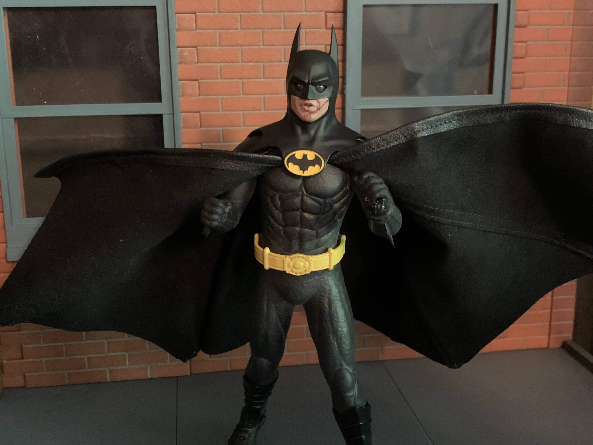
The rubber body is essentially confined to the torso, hips, and the limbs. It ends just past the elbows on the arms where the gauntlet begins which is a standard, harder, plastic. The same is true at the legs where the body ends just past the knee and the boots are done in plastic. The belt is floaty and also plastic and there isn’t much holding it in place. There’s a groove sculpted into the waist for it, but it’s going to move around constantly. The squishy texture of the body is definitely an unusual sensation with an action figure. It feels more springy than a stress ball, almost like handling a water balloon. The legs and arms have a nice shape though, while the torso is sculpted well from the front. From the side, he loses a bit of shape. Poor Batman has no ass, but at least Mezco gave him some nice, large, shoulders that tape well at the bicep. Someone should show Hasbro that this is how you sculpt a shoulder in relation to the bicep. There is some sculpting on the back and I have to assume it’s accurate to the film. I don’t recall ever seeing Batman’s back without a cape. There’s even a sculpted seam on the rear of the cowl that, again, I’m willing to just concede is accurate to the film as I can’t recall a good shot of the back of Batman’s head.

“Joker’s robbing the bank, better summon the Batmobile!”
“I remember you being a lot bigger.”

Where this figure is going to shine brightest is with the heads. The figure comes with an articulated head which is by far the worst in the set, but even it looks okay. The eyes articulate on it, so they’re very large in relation to the rest giving him a real surprised look. I don’t care for it personally, but I get why Mezco did it as the figure can’t turn his head so this gives people at least some ability to allow Batman to look to his left and right. The neutral head without the eye gimmick is plenty fantastic. The Keaton likeness is damn near perfect and I love how the eyes came out. He looks confident like he’s about to knock some sense into some hoodlums and all of the cowls have this nice, satin, finish to them that really captures the look of the film. The one drawback that’s basically present on every headsculpt is that the Batman logo is not painted as cleanly as it could be. All seem to feature at least a little yellow on the bat logo, and that’s really not excusable at his price range. Especially on a figure with very little paint. The other portraits include one with a slightly open mouth like he’s talking and a battle-damaged one from after he wrecks the Batwing. The mouth is open on it like he’s taunting the Joker with his own catchphrase (“You ever dance with the devil in the pale moonlight?”) and there’s even a touch of scuffing applied to the ridge over his left eye. It looks great and while I think the vast majority of people who get this figure will just stick with the neutral head, these other ones are totally viable for a display as well.

The head with the moving eyes helps a little bit when trying to sell an action pose, but it only goes so far.
I do like the wired accessories to the point where I think I’m going to have to display him with at least one.

That basically concludes the aesthetics portion of this review. Now, considering all of the attention this unique body construction has received, I think we’ll just jump right into articulation. As stated previously, this figure is basically a metal skeleton with rubber coated over it. I expected it to be a bit stiff out of the box, but was surprised at how smoothly it moves, for the most part. Mezco does include a brief instruction sheet with this release that basically cautions against moving any of the joints past 90 degrees. Doing so will risk taring a hole in the body itself and you don’t want to do that to your $100 toy. I wish they had included an image of the body itself without the suit over it as I think it would be helpful to know how the figure is truly constructed. I found that moving the arms out to the side was a piece of cake, but sometimes they don’t really want to rotate forward at the shoulder and I have to assume something is getting in the way. I was able to bring the arm out, and then forward, and that usually worked. For whatever reason, it’s more of an issue with the right shoulder than the left and the hips seem to function the same. Out to the side is no problem and Batman can do some splits, but going forward can be finicky.

He’s also got this big ass thing if you find the grapnel gun too understated.
It also articulates, though it doesn’t have any wired accessories.

In addition to that basic movement, we also get rotation at the biceps, a bend at the elbow, a twist at the glove, and little ball-hinges at the wrists. The legs can rotate a bit at the thigh and bend at the knee. The boots also swivel and at the ankle we get a little range going back, almost nothing forward, and a little bit of range at the ankle rocker. The knees and elbows both have no issue hitting a 90 degree bend. I think they could go further, but I’m not pushing it. There is some rotation at the waist, which Mezco doesn’t draw attention to, and even an ab crunch. Engaging such is kind of scary though, but it appears to work pretty well. It at least allows for some adjustments when posing the figure if you want it to be as tall as possible or maybe rotate a little to work with the accessories. Mezco recommends not leaving the figure in anything extreme for too long. I’m not sure what passes for extreme. Can he be left on the shelf with a bent elbow or his arms out to the side? I don’t know. It doesn’t seem particularly stressful for the arms to be out to the side, but I can totally see a bent elbow perhaps doing so. It feels like there’s enough material over the skeleton to prevent issues of the steel becoming exposed in most places. With this figure, it’s really going to be a case of “time will tell” as what happens if it starts to dry out? Will this body become brittle after awhile and split in places? I don’t know, and I don’t know if Mezco could honestly answer that or not. It’s a risky everyone is taking who purchases this figure.

Remember his bomb? It’s okay if you don’t.
And I think this tiny, little, thing is his smoke bomb.

If you like accessories, Mezco certainly has you covered. Batman is known for an assortment of wonderful toys and we get just about all of them in this set. For starters, he has four sets of hands: fists, gripping, a wider set of gripping hands, a trigger right hand, and a more open left hand. For the tighter gripping hands, he has four Bataranges. They’re sculpted well and have a touch of silver paint at the tips and look like the real deal from the film. He also has a fifth Batarang connected to a thin, bendy, wire for him to use like a grappling hook or an offensive weapon. There’s also a tiny vile of his smoke bomb stuff (at least, I think that’s what it is) which he can hold and he also has the little remote for the Batmobile. There’s a silver shuriken, which I don’t remember at all from the movie, and he has his time bomb which is this little steel-colored gadget. It has a really intricate sculpt and I’m surprised at how far they took it for something that’s largely obscured by the gripping hand.

You also get an action stand, which I think is pretty typical of Mezco releases.

For the trigger hand, we get the grapnel, or spear, gun. Batman can hold it effortlessly and it also features a magnet of its own so that it can attach to the right side of his utility belt. There’s a hook attached to a bendy wire that can also peg into it like it’s being fired or you could extend it entirely. He also has a second hook with no wire. It’s supposed to slot into the end of the gun like it’s loaded, but mine doesn’t seem to fit. I don’t know if it’s defective, but I’ve seen plenty of images of others who got it to work properly. We also get the collapsed version of the grapnel gun. This is what he has attached to his belt in the getaway scene that he has Vicki grab onto. It also can attach via a magnet to his belt and it can accept the bendy wire hook. There’s also that gigantic, double-grapnel hook gun which Batman uses to escape from the museum. It slides over the figure’s forearm and the two firing mechanisms are articulated so it can spread out like it’s going to fire a line to either side. It feels a little delicate, but it looks really cool and it’s well-painted, just be sure to go easy with it. Especially since the gauntlet portion is painted silver and it would be a shame if that rubbed off on the figure. Lastly, Mezco includes a stand that features either a peg for the foot to slot into or you can slot in a transparent arm which is also included. It’s a solid stand and a pretty conventional one at that. The base is the Batman logo, though like the movie poster, it’s a traditional Batman logo and not the one on the figure’s chest with the two added points at the base of the bat. It’s fine, though this figure doesn’t need much help standing and the metal skeleton makes it heavier than a typical figure. It’s also a little strange since Mezco doesn’t recommend leaving the figure in any crazy poses, though if you just want him with his arms out it can work for that. I’m still happy to have it, even if I end up using it for a different figure.

It’s only a matter of time until Batman gets his own “Bat-verse” film or special.

There’s a lot going on with Mezco’s take on this version of Batman. There’s also some baggage too considering the long wait, especially if you were one of those individuals who paid upfront and had Mezco just hanging onto your money with no communication for three years. There are certainly issues with this figure, and some of them should not be. The biggest offender for me is the cape, which is just not well-engineered and poorly designed. It has me considering a third party cape, which is pretty absurd for an action figure in this price range. The seamless body is also something I’m still not entirely sold on. It looks okay, and the white residue is not as bad in person as I thought it would be. I still wonder if it was necessary though. Do we really care if we see joints in our action figures? Plus, with the cape you can hide a lot of that if you want to. It seems to pose okay, but I’m also afraid to pose it. It’s not a fun way to make a toy.

At least we can all feel a little safer now knowing Batman is out there.

At the same time though, the likeness is fantastic. This is the best looking Michael Keaton Batman I’ve seen. I think it rivals the figures in a larger scale. NECA did one in a 1:12 scale a few years back that was okay. It was almost too accurate to the film though and he had kind of a frumpy look. Mezco took some creative licensing with their adaptation and I think the figure benefits from that. It has me really wondering what I would do if they announced a Batman Returns version with the same approach. Would I be down for another one of these seamless bodies? Ehh, it’s a tough call. I know I wouldn’t be if it had the same cape and I definitely wouldn’t pay upfront and order through Mezco. I’m almost left hoping I don’t even have to make that decision. Considering the price of this figure and the unknowns surrounding how this body will hold up long-term, I have a hard time recommending it. I definitely don’t at the current aftermarket/post release price which is around $170-$185. It’s just not worth that kind of money. It’s barely worth considering at the MSRP which was $110, if I’m not mistaken. What it comes down to, for me, is how much you value having a little Michael Keaton on your shelf. If that’s worth a lot to you, then I think you’ll ultimately be satisfied with this figure. Excepting the cape, it looks great and it has a lot of accessories. If you don’t have much of an attachment to the Keaton Batman and you just thought it might be fun to have this version of the character with your other Batmen, then it’s probably a luxury you can do without.

If that’s not enough Batman for you, I have a few more toy reviews you can check out:

Batman – The Adventures Continue #50: Batman

If you’re a repeat visitor here at The Nostalgia Spot, then you’ve probably noticed that around here there is a high opinion of the television show Batman – The Animated Series. I did a re-watch of the series that spanned more than two years and also checked out the various films based on the property.…

Keep reading

The Hot Wheels Batman Series

I’m not much of a car collector, but when I was a kid I went through a Hot Wheels and Matchbox phase. My favorite car was a small, black, one that I only barely remember. I have no idea what make or model the car was, but what I liked about it was that it…

Keep reading

MAFEX No. 105 – Batman: Hush

You may have been wondering why I decided to devote an entry earlier this week to a nearly twenty year old action figure of mediocre quality, and if so, now you know why. I wanted to take a look at the DC Direct Batman based on his appearance in the Jeph Loeb written, Jim Lee…

Keep reading

NECA TMNT Toon “Colossus of the Swamps!” Deluxe Napoleon Bonafrog

Napoleon smash!

NECA’s line of Teenage Mutant Ninja Turtles action figures based on the animated series which debuted in 1987 has had some big figures. Most of these are what NECA terms “deluxe” releases and have included the likes of Krang in his android body, Chrome Dome, and the more recently released REX-1. The latest addition to this cast of characters is the one that caught me by surprise the most. Napoleon Bonafrog had the misfortune of getting mutated into a rampaging beast in a one-off episode of the show. A version of this character was unveiled last year at San Diego Comic Con. I saw the images, but for whatever reason I didn’t truly process his size. Then my lovely wife, who found this figure along with the other latest toon releases, handed me the box and I was aghast at how heavy it was and at just how much real estate the figure took up inside it.

That’s one big frog.

Napoleon is not the tallest figure in the line, but I think he’s the new heaviest. And prior to him, that honor probably went to REX-1 who was released earlier in the spring, but Napoleon is like a brick. This is a figure you can keep by your bedside and use to scare prowlers in the night who are foolish enough to invade your home. I don’t have a scale suitable for weighing this guy, but height-wise he stands at 8.25″. This makes him rather close in height to REX-1, but a lot shorter than Chrome Dome who gets to continue its reign as tallest in the line. That weight though is something, and the circumference of the shoulders is quite massive. Picking him up, he feels most similar to one of the quarter scale figures in the line as opposed to any of the standard or deluxe figures. It’s certainly an experience and adds an undeniable “fun” factor to the package.

“Looks like frog legs are on the menu tonight!”

And that package comes at a cost. Napoleon rang-up a shocking $55 at Target. I had not given it much thought prior to release, but with REX-1 being $50 I certainly wouldn’t have been surprised at that, but another 5 bucks? That was unexpected. And sure, 5 bucks isn’t exactly a lot in a vacuum, but it does suck to keep seeing the price go up with this line. And this one may not even be the worst offender, but we’ll get to that when we do. At any rate, is this guy really worth it? That’s a tall ask especially for a very obscure version of an already reasonably obscure character. If it weren’t for the fact that Napoleon did get a figure in the Playmates line (albeit, a totally different interpretation of the character) few would likely remember him by name.

“WHAT?! You’re just in time – looks like I’m makin’ my mama a new luggage set!”

We already covered the size, but the sculpt overall for this one is also pretty damn fun. Even though he’s a hell of a lot bigger than his previous figure, he actually has the same basic construction and outfit. The skin is a very dark green with some freckles done in black outlines in places. He still has the toon shading so his skin is lighter on the front, and darker on the back. The shirt is a soft plastic overlay that basically floats on him. If you were to pull out his arms from the socket, you could easily remove it as it’s not glued down anywhere. It’s yellow on the front, and an ever so more saturated yellow on the back that’s barely noticeable. The single orange strip runs around the shirt and it’s painted fairly well. Rather than make it a darker orange on the rear of the figure, NECA painted it red which looks a bit off. Dark orange and bright red aren’t exactly interchangeable. The necklace is glued in place and the shorts are painted a light purple on the front, dark on the rear. The edges are tattered and I wonder if Napoleon was chosen by the show for this mutation because he wore shorts that reminded the writers of the Hulk? Where the shorts separate at the fly is painted purple, which looks a bit odd. Even the smaller figure got that detail right as it’s painted green. There’s some sloppy paint on the left bracelet as well, and a smudge or scuff on the back of the shirt on my figure. Nothing that will show on a shelf, but worth mentioning.

“Rocksteady! Use that muta ray to make me a colossal frog!”

There’s not a whole lot of room with this guy for the paint to truly “wow” the holder, so it’s going to have to do that with the overall sculpt. And in that respect, it’s got a good argument as being a “wow” piece for the shelf. The default portrait is this angry, snarling, expression. The eyes are set a bit deep in his skull with black rings around them to give off an enraged vibe. He’s got this massive underbite with his teeth jutting out. They’re huge, chunky, blocky, cartoon teeth and they’re outlined in black and it all came out very clean. NECA sculpted and painted a pink tongue within the mouth and it’s a head with a lot of personality. The biceps on Napoleon are just plain massive and I love the exaggerated proportions of his upper body vs his abdomen. Sculptor Brodie Perkins did a tremendous job here. He’s going to command attention no matter where he’s placed in your collection and I think that’s what most want out of these deluxe releases.

“Put me down you idiot!”

Because the figure’s anatomy is essentially the same as his smaller counterpart, so is the articulation. There’s really only one difference between the two. The head is on a double-ball peg which lets the figure look up and rotate. Because it sits so deep in his shoulders, he can’t really look down and there’s little room for tilt. He also has a hinged jaw, but it’s range is very limited. It basically goes from closed to just open enough to see his tongue. The shoulders are standard hinged ball-pegs and the figure can raise its arms out just past horizontal. Rotation is fine and there’s a biceps swivel past that. The big change from the smaller frogs is the introduction of double-jointed elbows. Because his biceps are so massive, he can only bend there a little past 90 degrees. The wrists swivel and hinge horizontally.

“Gee Napoleon, what happened to you?!”

In the diaphragm we get a ball joint of some kind. It’s probably a double as he can lean back a solid amount, forward a little, and he gets good tilt to either side plus rotation. There is a standard waist twist below that and then the hips are connected via the ball and socket setup so many NECA figures utilize. There is a little bit of pivot action at the joint, but mostly it’s for kicking forward and back which he can do very well. The leg will go out to the front all the way and back pretty far. They also go out to the side almost to the point of full splits. Plus, they’re not loose which is definitely important for such a large figure. My regular Napoleon’s hips were so loose that he couldn’t even stand without sliding into a split. I had to apply super glue to the joints to finally fix that. The knees on this guy are double-jointed and will bend past 90 degrees. The ankles feature a hinge and rocker combo. The range forward and back on the hinge isn’t great, but it should be enough. The rocker works fine. And also, it’s very snug which is, again, super important for such a heavy figure.

He’s also capable of being a gentle soul.

So far so good, but where this figure does start to come up short rests with the accessories. There just isn’t much a colossal frog needs so there isn’t much he gets. For hands, he comes with a set of fists in the box plus a set of open hands and a set of gripping hands. He also has a second head which features a calm, almost befuddled, expression. It’s sort of cute, I suppose, but I’m guessing most will want their giant, hulking, frog to look a little more angry. The second head also drops the articulated jaw.

He has a gun, but it isn’t really for him, or anyone for that matter.

And that’s it! Well, that’s it for the main figure. NECA did throw a couple of other items into the box to try and sweeten the package. There’s the included muta-shooter which is the weapon that did this to Napoleon. It’s mostly gray with some linework and darker bits painted on, but the most striking aspect is the green “liquid” inside the barrel. It’s basically transparent plastic with a semi-transparent green insert. It looks fine, but only from certain angles because the green piece inside isn’t solid. From the top, the illusion of it being an actual liquid is ruined and it’s kind of crummy looking. I don’t know why they didn’t just make it a solid piece of green plastic, but oh well. It’s also not really conducive to being properly held. It’s a very weird shape and I couldn’t really get anyone with a trigger hand to properly hold it. I was able to basically balance it in Rocksteady’s hands to fake it for a pic, but it’s probably getting the bin treatment after this is done.

I do like these extra heads for Napoleon and Genghis. The Napoleon head has a shape more representative of how the frogs were actually drawn for the show while the Genghis head is just outrageous.

The last accessories are two new heads for the previously released Napoleon and Genghis figures. The new Napoleon head features a scared, or concerned, expression like he’s about to shit a brick. It’s very similar to the box art expression and I like it well enough. The Genghis head is a more exagerrated, screaming in terror expression that makes me think of the video game Battletoads. It’s pretty silly looking, but I confess that I do love it. Mostly, it’s nice to be able to break up the expressions of the Punk Frogs as they all had the same two expressions to choose from. Now they can all have a different expression, so I do like that.

“We just love our new, giant, brother!”

That’s all though. It definitely doesn’t feel as substantial as past deluxe releases. We just looked at April who came with a ton of stuff and REX-1 before this release also had quite a bit. One could argue that this figure didn’t need anymore than what it comes with, but for added cost it’s a bit of a tough pill to swallow. If he came with additional heads for the other two frogs that would have gone a long way to sweetening the package. I also wish he had another set of gripping hands, something wider, for grabbing other figures around the waist. His existing ones are too tight for that, and they’re way too big to handle really any of the weapons in the whole line. I’m surprised NECA didn’t toss-in the rhin-bug that was featured in the episode as a gag and also appears on the back of the box. Napoleon also shot his tongue out in the episode and that could have been a fun extra head or accessory. I definitely feel a bit short-changed as is which isn’t typical of NECA.

Is Napoleon “The Colossus of the Swamps” Bonafrog worth the pretty steep asking price of $55? It’s hard to say. It’s definitely a case where I look at the figure, then consider the price, and my immediate reaction is, “No.” On the other hand, now that I have him and that money is gone, I do like him. He’s a really cool figure and I like that his existence makes my Genghis and smaller Napoleon a little more interesting, but I do hate that I gave NECA $55 for it as I’m endorsing the price at that point. He’s an obscure character, and if you never cared about getting this version of Napoleon in figure from then maybe continue living your Napoleon-free life. On the other hand, I never really desired this character in figure from, but it does make me happy so it’s not the end of the world that I overpaid for it. I would suggest finding this one in store and seeing what your reaction to holding it in hand is. If it makes you giddy like a little kid and losing $55 won’t hurt you, then go for it. If it doesn’t stir anything within you and you’d only be buying it because it’s new, then don’t be afraid to put it back on the shelf. Chances are, if you reconsider you’ll see it again.

Want some more frog content or are you just into big action figures?

NECA TMNT Cartoon Napoleon and Attila

It took almost five months, but the Punk Frogs are now complete. NECA, recognizing that they were about to release the same sculpt four times, decided to space out the frog two-packs in its Teenage Mutant Ninja Turtles line of cartoon action figures. Genghis and Rasputin arrived back in May, while Napoleon and Attila started…

Keep reading

NECA TMNT Cartoon Rasputin and Genghis

During Season Two of the classic cartoon, Teenage Mutant Ninja Turtles, the world was introduced to the Punk Frogs. Despite their name, there was nothing particularly punk about these mutated amphibians as they all dressed like they were going to a Jimmy Buffett concert. They make a few return appearances in the show, and given…

Keep reading

NECA Cartoon TMNT From the Files of Pizza Squad (Deluxe Rex-1)

When you’re doing a syndicated cartoon expected to air basically every day, you need to pull story ideas from anywhere you can. I think that’s why parodies are so popular in the cartoons of the 80s to the point where it didn’t matter if the show was parodying something kids would actually know. Take REX-1,…

Keep reading

Star Wars: The Vintage Collection Dark Trooper

Isn’t he a cute little fella?

I’m back with another Star Wars action figure review! Actually, I don’t do these very often. This is only the third such review out of me because I usually don’t collect Star Wars. Sure, I think the franchise is fine and I did collect figures as a kid, but it’s not something I’m drawn to in the same way I am other properties. And that’s worked fine for me since there’s tons of Star Wars content and reviewers out there. And when it comes to Star Wars, I’m basically just an original trilogy fan, but the recent output of television from Disney has actually been pretty solid so it’s no surprise that this is yet another review of a character featured on The Mandalorian.

The Mandalorian is basically Star Wars as a spaghetti western. It’s easy to digest, but has some overarching plots (especially Season 3), and the characters are plenty likable. One of my favorite designs from the show came from the Season 2 finale which featured the Dark Troopers. These robotic replacements for Storm Troopers are these big, hulking, glossy, black instruments of death, though I don’t think they actually kill anyone in the show (it’s been awhile). The design was great though and it was only a matter of time until action figures arrived. The emphasis being on the word “time” there as Disney apparently didn’t give Star Wars license holder Hasbro any advance notice of what was coming in that season so even though it aired over two years ago we’re just now getting to the figures.

So…he looks a bit different on the box, no?

If you are a collector of Star Wars action figures from Hasbro then you probably know that the company has three styles of releases: The Black Series, The Vintage Collection, and the Retro Collection. The Black Series is the roughly 1:12, 6″ scale characters that Hasbro has made a focus of its action figures division ever since it brought back Marvel Legends. The Retro Collection is basically a 5 points of articulation line that harkens back to the original Star Wars line from Kenner. It’s a style that’s basically been resurrected by Super7 and it’s ReAction series and Hasbro wanted to tap into that themselves. The Vintage Collection, which is where the figure we’re talking about hails from, is like a combination of the two. It’s a 3.75″ scale line, but it features modern sculpting, paint, and articulation. It’s the only line from Hasbro that has much appeal for me. I’m not a scale snob when it comes to my collecting and I appreciate a variety, it just so happens that most of the properties I enjoy most either come in 1:12 or 1:10 scales. The smaller 1:18 stuff is a scale I’ve always found really charming and it’s a scale that’s perfect for Star Wars given the presence of vehicles. The one figure I did review from the line (I did also purchase a Koska Reeves figure, but never reviewed it) was a release I really enjoyed so adding to that has always been a possibility.

And I probably would have added more to it by now if not for one thing. Hasbro, for awhile, seemed to resist raising prices during the pandemic and was holding strong for awhile. However, it being a publicly traded company, eventually caved to shareholder demands and we’ve seen price hikes across the board from Hasbro over the past year. And it’s like they’ve been playing catch-up as the increases have been rather extreme. The Vintage Collection was basically Hasbro’s best bargain just a couple of years ago. I want to say the Koska figure I bought was only $12. Recently, I was at my local Target and saw the new, Kenner-inspired, Boba Fett and I was fixing to add him to my tiny collection, but he rang-up at $23! Yeah, no way. And the figure I knew I wanted when I first saw the episode was this Dark Trooper, but Hasbro wanted $26 for this one and I had to pass. Then, somewhat out of the blue, the figure hit clearance at the more palpable price of $17.50. Still higher than I think it should be, but I had wanted this for over two years so I gave in. And since the order pick-up option I selected actually sold out before the unit could be secured for me, I got free shipping out of it so let’s take a look and see if this thing is even worth the discounted price I got it for.

This guy is a bit of a nightmare to try to photograph. He’s so dark the camera often doesn’t want to focus on him.

The Dark Trooper comes in Hasbro’s plastic-free packaging which I think they’ve already backtracked on. It’s just a cardboard box with an image of the figure on the front and a hanger affixed to the back. Inside the box is a cardboard tray that the figure is slotted into plus a brown paper pouch with the accessories. I buy most of my toys online so I have not cared one bit about the loss of the plastic bubble on the packaging. This hobby I and many others enjoy unfortunately is a big polluter since they’re primarily all plastic so I was in favor of Hasbro’s move to plastic-free, regardless of the company’s true motives (which I’m not speculating on). It seems to be going away though, so be it.

Bang!

The Dark Trooper stands at just about 4″ tall and at first glance, wow, this thing does not look like the figure on the box. It’s cast in all black plastic with almost no paint. The paint is limited to the metallic portions of the elbows, wrists, and knees plus some patches on the biceps. There’s also some red dots on the chest, but that’s it. In the helmet, is red, transparent, plastic to create a light-piping effect that really doesn’t work very well at this scale. You have to basically hold a light to the back of the head (where the rear of the plastic is present in the form of a red square) to get anything out of it. They may have been better off just trying to paint glowing red eyes, or better yet, they could have done both and given us some options. As it stands, the eyes mostly get lost in the face.

“And now I squish your little friend!”

That is unfortunate, but what is really disappointing for me is the lack of a chrome-like finish. The image on the box is either a render or placed under some very harsh light. Even blasting white light on my figure at close range I can’t get it to resemble that finish even a little bit. It’s a glossy plastic, but not overly so, and it very much looks like plastic. There is no illusion here that this guy could be made of the same material as the actual character. The black plastic almost seems to suck in the light more than throw it back. And that could be due to its composition as it’s a soft plastic, there’s a gummy-ness to it, and not something harder. I think a harder plastic would have thrown more light back at the viewer and helped sell the figure. Or maybe it just needed some paint. The face, especially, just doesn’t translate because of the all black plastic. The sculpt is there, but you have to get in close to appreciate it.

“Whoa! How did you do that?!”

And that’s an issue with the whole figure. Granted, this scale is not the best choice to celebrate a sculpt, but it still can if the finish is done properly. And the sculpt looks pretty nice. There’s a lot of detail in the abdomen and the limbs, and really, all throughout the figure. There is a floating crotch piece that has these little pistons on them, at least I think that’s what they are, that can get a little messed up. It’s a softer plastic and one of the four pistons on mine is warped a bit, but at least it’s on the rear of the figure. The left shoulder is also a little jacked-up, it probably didn’t come out of the mold clean, but otherwise I don’t have any issues with the sculpt. At first glance I thought the hands might be a little on the small side, but after a little research, that seems to be a case with the design and not the figure.

::Muffled screams::

The Dark Trooper does come with a handful of accessories. For extra parts we get two fists. I don’t see myself using them, but I guess it’s always useful to have some fists. The default hands are a trigger finger right hand and a gripping left which work well for two-handed weapon poses. And the main weapon is a blaster rifle of some kind. It’s all black plastic and it can be either held by the Dark Trooper or it can be slotted into the right thigh. There are thrust effects that peg into the feet. They’re a semi-transparent orange plastic and look okay, but without a flight stand they’re kind of useless. The Dark Trooper also comes with its own, personal, hangar. It has to be assembled as it comes in three pieces and it was a little harder than I expected it would be. It’s black plastic with some red paint in places and it’s fine. It perhaps creates some desire for people to army build these guys so you can have some inactive units in your display, but at these prices I don’t know if many collectors want to do that. The hangar also has two cables that plug into it that I guess are supposed to curl under the arms. I guess they’re like charging cables? I don’t know. They don’t really hold the figure in place so they’re rather perfunctory.

Go to bed, Dark Trooper, I’m sick of looking at you!

One of the hallmarks of this line is you get small, retro-inspired, action figures that move like modern toys. The Dark Trooper mostly comes as advertised in that regard, but it’s not without its flaws. The head feels like it’s on a ball peg of some kind with another joint at the base of the neck. You get your rotation and the figure looks down well enough. The range going up is minimal and you only get a little bit of tilt out of the joint. The shoulders are ball-hinged and the trooper can just about raise its arms out to a horizontal position. Rotating forward and back is fine, though the shoulder pad will prevent full rotation there. At the elbow there’s a swivel point which is basically your biceps swivel and the hinge will allow for a 90 degree bend. The wrists swivel and feature a large hinge as well that moves in a horizontal fashion. There is, sadly, no vertical hinge on the trigger hand. In the diaphragm, there’s a ball joint that’s mostly for rotation. There’s a little tilt and a tiny amount of forward and back, but not much. The hips can kick forward about 90 degrees and they go back a little bit as well. Out to the side, you basically get to a full split so that’s good. There is a thigh swivel that’s pretty well hidden and at the knee we get a swivel and a hinge that will go about 90 degrees. The ankles feature a hinge, but it’s very clicky. You basically have a neutral position, one click forward, and two clicks back. And really, all of the hinges are like that including the knees and elbows. It can make it a challenge to stand this guy to not have something more nuanced. There is an ankle rocker that too is a bit on the clicky side. It will move a little, then just jumps to a full tilt, which makes its usefulness limited.

Issues aside, I think the Dark Trooper will move well enough to get it into Dark Trooper poses. It basically just stomps around blasting foes and shrugging off the weapons of others. It’s not much of a melee fighter, because it doesn’t have to be, and when it does get in close it just swats away its prey. It also comes with enough stuff and the only thing missing is a flight stand to better take advantage of the thruster effects. I suppose a blast effect might have been preferred, but oh well. What’s going to determine if you like this figure or not is just how good do you think it looks? And for 25 bucks I don’t think it’s good enough. I didn’t seek out any reviews on this figure before buying it, so silly me for thinking the image on Hasbro’s packaging was indicative of what this figure looked like. Even at the discounted price I got this one at, I don’t think it’s really there. This should be a $12 line, and the fact that it’s double that is crazy and unfortunate as I think Hasbro is going to kill The Vintage Collection with these prices. I don’t hate that I have this figure, but it’s also not something I can whole-heartedly recommend.

If you want to read all of my Star Wars coverage you don’t have much to catch up on, but if you just like laser fodder, I’ve got plenty of reviews of such characters:

Star Wars The Black Series Mandalorian Warrior (Holiday Edition)

We’re getting to Christmas coverage at The Nostalgia Spot one day early this year with this look at one of the latest in the Holiday Collection from Hasbro’s Star Wars line of action figures referred to as The Black Series. I have previously looked at a figure from the very popular streaming show The Mandalorian…

Keep reading

Bucky O’Hare Wave 3.5 Aniverse Storm Toad Trooper

It’s been a long time between releases by Bucky O’Hare license holder Boss Fight Studio. The last figure released by the company was 2018’s Storm Toad Trooper, a figure that arrived at my doorstep on Boxing Day 2018. Since that time, Boss Fight Studio has had sculpts and specs to show off, most notablyBruiser, but…

Keep reading

NECA TMNT Toon “Mutant Interest Story” – Deluxe April O’Neil

The long-awaited April O’Neil update has finally arrived!

Whenever I approach my rankings for NECA’s now long-running action figure series based on the 1987 cartoon Teenage Mutant Ninja Turtles, I don’t always just pick the objectively best or worst toy in the line to slot them into the rankings. It’s a combination of the figure’s quality and the character’s importance. A great figure of someone like Scrag can only go so far because how many people really care about Scrag? Similarly, if NECA were to whiff on an integral character, say April O’Neil, that’s going to get a lot more attention than a subpar Screwloose. And NECA did whiff on April and my disatisfaction with that figure has earned it the dubious honor of worst in the series. NECA must have seen my rankings (I kid) because they decided to take another stab at April and the long anticipated redo is now hitting Target stores across the US. Is it a real improvement and is it worth the wait?

New on the left, old on the right, you tell me which is better.

NECA’s been seemingly so disatisfied with their April figure that they’ve never even re-released it up until now. And it makes sense if you think the figure is bad. Unfortunately, that original one was released during the summer of 2020 during that time when TMNT figures were just so hard to come by. Many never found one and the aftermarket prices have been ridiculous for what is a pretty mediocre action figure. A lot of collectors have had a pretty big hole in their collection as a result, but it looks like this new April is hitting stores in pretty substantial quantities.

There’s a ton of interest in this figure so I’m going to throw a bunch of comparison shots at you. Here she is with Zach and Casey Jones.
With Usagi and Hamato Yoshi.
With Bebop and Smash and the Triceratons always watching. Always watching…

This time around, April is getting the deluxe, or ultimate, treatment. She is single-packed in a box featuring artwork by Dan Elson designed to mimic the f.h.e. VHS releases from the 80s and 90s. It looks great and the window flap provides for a look at the figure itself before making a purchasing decision. Now, the problems with the previous April were that her scaling was off leaving her way too short and just overall small compared with the turtles. And her headsculpt was just bad. It was oversized, too round, and just soft in appearance. The opinion of me was that the body looked fine, but needed to be scaled up, while the head was the right scale, but just not well-executed from a sculpting standpoint.

“Hah hah, I can’t believe they thought you were good enough to be me!”
Here’s the figure alongside some reference art from an early episode of the show. You can decide for yourself how it looks.

NECA’s new April stands at just a tick under 5.75″ while the former stood at…5.5″. Okay, so we didn’t get much height out of this new one and that’s because…it’s basically the same figure. NECA reused almost the entire figure from before replacing only the upper torso and the head. The good news is the head looks much better. This actually looks like April and has her features. It’s tough to translate female characters from cartoons like Teenage Mutant Ninja Turtles because they usually have slim features with no markings on their face. It’s all about getting the shape of the eyes right and their size, really. This April looks fine and sculptor Tomasz Rozejowski did a good job. What some people seem to dislike about this new April is her neck. To say that April has a swan-like neck would be an understatement. And she often was drawn that way so it’s a feature that I think she should have. Did NECA go too far? I don’t think so. And the more I look at it and reference art from the ’87 mini series (which should be the template for every character that made an appearance in the first five episodes) I really see no issue with it. Maybe if her collarbone was a little higher it lessen the illusion? Mostly, it seems a lot of the promo shots didn’t have her head seated all the way (the collar of her jumpsuit should come up just past her hair) which made it look worse, but in hand, this looks good and I’m happy.

“This is April O’Neil – Happy Hour news!”
“Come on, Vernon! I know where we can find a great story!” “Ohh, April, do we have to go back into the sewers?!”

As for the rest, well, the sculpt is fine. It’s just very slight. She looks fine on her own, but put her next to a turtle and she starts to look like the cosplayer from the old MGM Studios parade because the turtles just look so big by comparison. Height-wise, she’s a touch taller than them, but needs a little more. It’s unfortunate and I have to assume it was done this way just to save money. They could have taken the digital files, just upped them 10 percent, and cut new molds based off of that, but that was obviously deemed too expensive. She’s retailing for $37 with mostly old stuff (which we’ll get to) so she definitely doesn’t feel like the best value in the bunch, but it’s April and people will buy her. Scale with this line definitely isn’t its strong suit anyway, so I think this will be a case of your mileage may vary. Some will see this April as totally fine, others will want more size. I would like to see her bigger overall, but admittedly it’s mostly a nitpick on my part.

“Come on, April, I need you dig up some dirt on those so-called Teenage Mutant Ninja Turtles!” “Oh come on, chief, I keep telling you they’re the heroes!”
“April, maybe you should just do what the boss tells you.” “Never, Irma, out there are the real stories that I was born to tell!”

The paint is still mostly the toon shading with a golden yellow on the front and a more mustard on the back. In comparison with the original release and cat April, the yellow is darker as the old one looks practically neon by comparison. Interestingly, the boots are no longer shaded gray on the backside. And actually, they’re not painted well either. The plastic underneath must be yellow as there’s a lot of yellow coming through the boot. The hinges are at least the right color and the feet are fine, but the main part of the boot is not. There’s still an abundance of black linework on the figure and it’s mostly clean. It’s a little messy around the belt, but otherwise okay. The flesh part of her chest has no linework on it, which is in contrast to the first version which had some lines for her clavicle and neck. I don’t know why they opted not to do it this time as I think it would have looked fine. The other area that’s a little messy are the elbows. NECA paints the joints and the paint flakes off because it just doesn’t adhere to that type of plastic. The hinge is flesh colored on that portion of the elbow and yellow on the other, which is fine, but it looks almost gross when it has pieces just flaking off.

“Nice kitty…”
“Whoa! Not nice kitty!”

The articulation for April is also the same as the past one, but we do have one, not great, difference. And that’s the head. NECA is using a double ball peg, which it did with the previous April, but it sits pretty low in the neck. That means you don’t get much play. She gets very little tilt and very little up and down. Her head also fights the ball peg when trying to rotate it. I think that’s because it’s designed to seat pretty deep into her head. It wants to snap back to a neutral position so I think it’s just not sliding nicely on the peg. Aside from that annoyance, the rest is the same. Diaphragm joint in the torso works well for rotation and some forward and back. Arms hinge out to the side just fine and the unusual NECA double elbows are in place which go way past 90 degrees. They’re a little stiff to rotate though, and her arms are very thin so do be cautious. Hips can do splits, kick forward and back, and the double-jointed knees work great. The feet hinge forward and back with an ankle rocker. Her feet are pretty small though so she can be a little tough to stand. This April should be able to handle just about any pose the character needs with the only real bummer being the stubborn neck articulation.

April has a lot of stuff, most of which is rather familiar.
“Wow, you guys REALLY like this story!”

As for accessories, well, April is pretty loaded. Unfortunately, most of her accessories are just rehash from the first release with very little new. For hands, we get a set of gripping hands that come on her in the box as well as sets of open hands, pointing hands, “peace” hands, thumbs up hands, and wide open hands. All of her hands have a standard, horizontal, hinge which you might think is fine for April, but vertical hinged gripping hands would work better for a microphone and hand camera. And she does have a microphone and hand camera and they’re the same as before. As is the tape recorder with wired mic. She still comes with the hamster statue, a baby pizza monster, and her turtle communicator. She also has another copy of The Hare and the Tortoise. And there’s also the doku plant. It’s a little darker than the previous one, so I guess you could treat one as the gazai plant if you also have the Splinter and Baxter two-pack.

The new heads will fit the old body just fine.
“Whose sick idea was this?!” “Uhh, umm, certainly not Master Splinter’s!”

As for new stuff, well we get some extra heads. April has a fairly neutral head by default and also comes with a smiling portrait and a blindfolded head. The smiling head looks lovely while the blindfolded one pairs well with the same headsculpt we got for Vernon. Unfortunately, they all fight that head peg just the same so the articulation isn’t any better. And if you’re wondering, yes, the new heads do fit on the old figure and make that figure look noticeably better. April also comes with the capture clamp/body manacle (it’s listed as both on the box) which is a metal restraining device that can lock around her. This may have been on her when she was blindfolded? I don’t remember, but it’s relatively neat and well-painted. Getting it on her isn’t the easiest thing, but it can be done. April also has a potted venus fly trap, mutated of course, that looks cool. And lastly, she has a photo frame of dear Aunt Aggie. Aggie, like other characters who have appeared in photo frames, is done as a digital render of a would-be action figure. Will she actually get immortalized in plastic? That seems doubtful, but never say never with this line.

“So Donatello, do you think my dear Aunt Aggie deserves her own action figure?!” “Don’t take this the wrong way, April, but no.”
“Sorry Irma, I couldn’t find you a date for tonight, but I saw this adorable house plant that I thought you’d like!” “How pathetic do you think I am April?! …I’ll take the plant.”

Was April 2.0 worth the wait? I don’t know. I guess if you didn’t have an April at all, then yeah, absolutely. Even if you did, like me, this feels like getting the character for the first time in some ways. I kept my April inside the street scene diorama out of view because I just didn’t like it very much and space is a precious resource. While I do wish this figure corrected the issue of April’s size vs the rest of the line, I do think this is a much better interpretation of the character. And if you have the other figure, it’s especially great that this one has multiple headsculpts so that old one can be tossed into a bin and never spoken of again. Is this April perfect? No, but it comfortably fits into the line and is a worthy entrant. I like the updated colors and some of the new accessories are fun. Just be mindful of the boots. Hopefully mine are just off and most of the rest feature better paint there, but otherwise, yeah, go get her.

At long last, the real fifth turtle is here and she’s good!

NECA’s deluxe version of April is sold exclusively at Target. She just started showing up and in pretty substantial quantities so if you haven’t come across this figure yet, just keep looking. Target is also planning on doing online drops for the next several Fridays at 9 AM EST as part of their Summer Geek Con. As of this writing, there’s no confirmation of what will actually be part of that drop, but it definitely wouldn’t be a surprise to see this figure included. Good luck!

Interested in more April O’Neil figures? Here’s a few more you can check out:

NECA TMNT Cartoon April O’Neil and Bashed Foot

There’s a line from one of my favorite Christmas movies, Bad Santa, in which the main character, Willy, says to The Kid, “Well, they can’t all be winners,” when The Kid pulls a candy corn out of his advent calendar. Bad Santa isn’t a movie for everyone, but the sentiment expressed by Willy in that…

NECA TMNT Movie Ultimate April O’Neil – Signature Edition

NECA’s Teenage Mutant Ninja Turtles line has so been so successful that it’s allowed the company to branch out. It wasn’t that long ago that Playmates was the only game in town when it came to TMNT action figures and the company showed little to no interest in releasing anything other than the turtles themselves.…

Hasbro MMPR x TMNT April O’Neil and Michelangelo

We have arrived at the last two-pack in the Mighty Morphin Power Rangers x Teenage Mutant Ninja Turtles line of action figures from Hasbro and it’s that bodacious dude, Michelangelo, along with the ravishing reporter April O’Neil. There’s not going to be a whole lot to say about these figures at this point as, if…


Mondo X-Men TAS 1/6 Scale Jubilee

Let’s welcome young Jubilation Lee to the world of sixth scale action figures!

When one hears the phrase “mall babe” it implies a certain visual. Probably a short, young, girl with intentionally messy, short hair. There’s a certain confidence the phrase exudes so she has to have style. Maybe hot pink, bright blues, and certainly a long yellow coat with gloves to match! There has to be an attitude present in anyone deigning to call themselves such a thing so shades are a must. Boxy, hot pink shades would do best and we might as well toss some bubblegum for added effect. And just what part of the mall does a self-proclaimed mall babe setup shop? The food court – where else?! Any mall babe worth her weight in quarters needs a steady supply of chili fries and soda to wash it down. It’s a staple of the mall babe’s diet.

If what I am describing does not meet your own personal definition of a mall babe then clearly you weren’t watching X-Men in 1992. That paragraph describes Jubilee, the self-proclaimed mall babe of the team who was our gateway to the world of Marvel’s most famous superhero team (well, before The Avengers became a household name). This role as the audience surrogate is perhaps what has made Jubilee so popular, or at least, why both Mondo and Hasbro perceive her as popular enough to introduce her relatively early in their respective action figure lines. Jubilee had the privilege of being the second figure and second member of the X-Men introduced in Hasbro’s line of Marvel Legends based on the animated series and Mondo has essentially bestowed upon her that same honor. The only difference is Mondo went to a villain for its second release where as Hasbro held off on the villains for a little longer. For me personally, I always found the kid characters in shows as more patronizing than anything. Jubilee didn’t offend me though, and it was a great choice to use her as a way to introduce the audience to the X-Men, but she was never a favorite of mine. And with the price of Mondo’s figures being north of $200, I thought Jubilee was going to be one for me to skip. Then I saw the full reveal of her and found myself sucked in, and you know what, I don’t regret it one bit!

In addition to being an expert at blowing stuff up, as she puts it, young Jubilee is also an accomplished bubble blower.

Jubilee arrives in the same style of packaging as Magneto before. Mondo partnered with storyboard artist for X-Men, Dan Veesenmeyer, to adorn the box with actual model sheets production art of Jubilee from the show plus a brand new illustration by Veesenmeyer to shine on the front. It’s a five-panel, window box design though Mondo packages their figures very carefully so opening the Velcro front flap basically just reveals a bunch of tissue paper concealing a figure behind it, but it’s still nice. On the inside of the flap is a profile of Jubilee from X-Men showrunner Eric Lewald and his wife and fellow writer Julia which just adds to the overall atmosphere that this figure is a labor of love by those involved, something the Hasbro releases most certainly don’t possess.

“Wow! You’re so small and sucky!”

Jubilee stands at approximately 9.25″ once removed from the packaging. She’s close to 9.5″ factoring in her hair and if I pull out the handy-dandy reference art from the show, I can see that Jubilee is supposed to be right at 5′ to the top of her hair making this figure a little small if we’re talking true sixth scale. It’s not a big deal on its own, but it is going to compound things a bit when she’s placed beside Wolverine who came out a little tall if we’re talking true sixth scale with him. My assumption is that Mondo isn’t taking a literal approach to the scale and it’s more subjective. It’s one of those things that I think most won’t care about that much, but I do have to point it out as part of a review.

Attitude to spare.

Jubilee is depicted in her traditional show attire: pink shirt, blue shorts, blue boots, yellow gloves, and that big, yellow, trench coat. It’s a style that could only come out of the 90s and I can honestly say I have never in my life, 90s or any other decade, seen a person sporting such a look. It’s always been something that’s amused me about Jubilee. The sculptor for this figure is Alex Brewer and I think he did a great job of nailing Jubilee’s proportions. Her sunglasses are part of the headsculpt which I think is the right call to preserve the look of the character as she appeared in the show. The coat has her sleeves rolled up and the strap on the back. She also has those little rings by the collar which really captures the details present in the show. The coat is all plastic, no soft goods, but it is soft and pliable. She also has her yellow gloves, instead of the blue she had in the comics, and it looks like Brewer took a bit of a creative license with her face as more of her Chinese ancestry is reflected in her eyes. Jubilee, as presented in the show, was mostly white-washed, though I don’t think it was for any nefarious reasons.

I love that Mondo seems committed to spotlighting the opening title of the show as much as possible.

As was the case with Magneto, what really stands out with Jubilee is the paint work. Credited to Tom Rozejowski, the cel-shaded paint job on Jubilee really makes the figure pop. I’ve admired Tom’s work as a customizer for years so it’s great getting to see him show off with an official release. It starts at the hair where streaks of gray-blue are added for shading, a common tactic for cartoons and comics when dealing with black hair. I love the light pink streaks on her glasses and the black linework all throughout the coat and rest of the clothing. Three shades were used for the coat as the primary shading color is orange with a more brownish yellow for the interior of the coat. The direction of the shading is with purpose and follows the curves of her body and the flow of her coat. It looks fantastic and the paintjob is very clean across throughout the figure. About the only nitpick I can offer is that the orange on her coat is perhaps too orange when the show used more of a marigold to shade her coat. It would also often use a very light yellow in places that was almost white. Yellow is a hard color when dealing with paint and I will say this looks much better than that mustard color Hasbro utilized.

All you need is a spark.

In keeping with the other releases in this line, Mondo saw fit to include plenty of extra parts and accessories with Jubilee. For hands, she gets a set of fists, open hands, and clenching hands. She also gets two sets of effect hands and a pointing right hand with a couple of sparks at the end of her index figure, probably a callback to breaking out of her restraints. The effect hands are terrific. The first set has her hands in an open pose with stars shooting out in a nod to her appearance in the show’s opening. The effects are attached to the hands and done with red, translucent, plastic with painted, gold, stars at the end. The other effect hands have her powers coming from her palms in a big, conical, blast with stars shooting off the ends. It has a metallic paint job that does a great job of capturing the color spectrum to mimic Jubilee’s powers as best as can be. These ones are a tad on the heavy side, but I was able to get Jubilee posed with her blasts going forward so they can be worked around.

And now you know why she has the shades.

Jubilee also comes with a variety of heads to choose from. I did get the deluxe version of the figure, so I will have some extra stuff the standard version does not come with. Her default portrait is a neutral expression that very much looks like Jubilee to me. She can swap to an open-mouthed smile that works for a Jubilee getting in a quip type of expression and it would be my guess that this one gets the most use out of those who buy this set. She also has a glasses-down head with teeth-gritting and her hair is a touch more wild, good for use with her blast effects. For something more fun, there’s a bubblegum blowing head where the bubble is sculpted and painted pink with a couple swashes of white.

This one is here if you want it. Only putting it on once resulted in a little scuff on the neck of my figure. Would not recommend.

The “deluxe” edition of Jubilee includes two additional heads and another accessory. The first is a head depicting Jubilee as she looked in the episode “Jubilee’s Fairytale Theater” from the show’s final season. That season featured a redesign for the characters that gave Jubilee long hair and ditched her sunglasses. For this particular episode, Jubilee tells some kids a fairytale where she puts herself and fellow X-Men into the roles of the heroes. Jubilee was some sort of elf Robin Hood, so the head features her with long hair, a headband, and oversized elf ears. It looks fine, but since she featured an entirely different costume during the story, it’s not a particularly useful addition and more like an in-joke. I would have preferred just a normal Season Five head with long hair, though admittedly I would not have been likely to use such for display purposes either so I guess it doesn’t matter.

A sidewalk surfer.

The other bonus head features Jubilee with her shades down and a skateboarding helmet on. This is from the episode “Red Dawn” where she’s briefly seen skateboarding. To complete the look, she also has a pair of purple kneepads which are made out of a very soft, rubbery, plastic and fasten over her knees pretty easily. A skateboarder obviously needs a skateboard and she has one of those as well. It’s all blue with some shading and it features sculpted wheels. I’ve seen some gripes out there that the skateboard doesn’t have real wheels, but I don’t need my $200 action figure to roll around and potentially fall. It does not have peg holes either so I am hesitant to actually display her standing on this thing without some support. She stands on it fine though, and overall this is a pretty fun look and one that I think will see some use from me.

Jubilee is never far from her chili fries and soda. That’s, like, her thing, right?

Lastly, Jubilee has a couple of “mall babe” accessories. One of her first scenes, and possibly her best, features her accidentally nuking an arcade machine and sarcastically responding with “Yeah, a quarter,” when the manager asks her how much she thinks that machine cost. She gets a cup, and it’s modeled after that scene and it says “SLUR-P” on it and has some bubbles or something. It looks really cool for what it is and there’s even a bubble on the top that’s been pushed in to indicate what flavor she selected. One of Jubilee’s other lines from the show was “Does a mall babe eat chili fries?” which she says in response to her foster parents asking her if she’ll come visit them now that she’s going to live with the X-Men. Jubilee does indeed consume chili fries and she has a tray of them and they too were featured on the arcade cabinet she demolished by accident. It’s a yellow fast food tray and the fries inside have a red-brown sauce slathered over them. It’s not super detailed, but it’s from a cartoon that couldn’t be super detailed itself so I think this works just fine and it’s a really fun inclusion. Between the heads, hands, effect parts, and accessories, it’s going to be a lot of fun switching up Jubilee on the shelf. She also comes with the standard Mondo action figure stand. I consider it pretty useless, but maybe others find some use with these.

“Me and Wolverine can take on anyone!”

Okay, last and maybe least, we should break down Jubilee’s articulation. The articulation for this line has been adequate. It’s not really a homerun, but the designs are also limited and the articulation can’t interfere as much with a sculpt at this scale, plus there’s paint to be considered. Jubilee, for her part, has basically all of the points of articulation one would expect, save perhaps one area. And I think she moves about as well as could be expected. It starts with a double ball peg for the head so she can move around quite well up there. She doesn’t look up really at all, but everything else is fine. She at least doesn’t rub the collar of her coat with most of her heads and it’s really only the elf head that introduces any paint rub concerns, but we already established that few are likely to do much with that accessory.

“Did you say ‘anyone,’ girl?!” “Gulp.”

At the shoulders, we get the standard ball-hinge setup. They’re very tight and getting Jubilee’s arms out to the side takes a little work. Her biceps swivel where the arm meets the cuff of the jacket and that works fine. The elbows are single-hinged and will get pretty close to a 90 degree bend, but it’s basically that one area I mentioned before where some may have been hoping for more via a double joint. The hands are on ball-joints and Jubilee’s work much better than Wolverine and Magneto’s. I had some QC issues with Magneto, but Jubilee’s hands have been free and easy out of the box. The peg goes in and out of the forearm very easily and the hands will spin on the ball to allow you to line her hands up however you wish. Some of the effect hands aren’t as easy to move, but I’ve mostly left them alone as I want them to be on the tight side considering the heft they present.

In the torso, Jubilee has a diaphragm joint that lets her tilt to the side a bit and grants some rotation. You have to work around the coat to do so, but it’s not too difficult. There’s a ball joint at the waist that provides for some forward and back and rotation. At the hips, we get some big ball and socket joints. They’re done at an angle, so it limits her ability to do splits by quite a bit limiting her to about 45 degrees out to the side. Kicking forward is only a little better as she can’t get her leg all the way up into a horizontal position. I’m also backing off as the “diaper” piece gets in the way and those willing to push it could probably scratch out a little more. There’s a little play on the ball joint at the hips in the form of a thigh twist, but it’s minor. I’m surprised they didn’t sneak a cut into the thigh itself where her shorts meet her legs. The knees are double-jointed and are very smooth. She bends past 90 degrees there without effort. There’s no boot cut that I can see, and at the ankles we get a hinge and an ankle rocker. The hinge is pretty tight and seems to only go back one “click” and doesn’t really go forward at all. The ankle rocker is not steep at all and is more for adjustment purposes. Lastly, the little rings coming off of the collar of her jacket do move. They’re pegged in so they can be positioned slightly. I think this was done to prevent them from snapping off accidentally when posing her arms and they’re not really intended for anything else.

This figure is just a lot of fun. I’m even going to make use of this silly look!

Jubilee’s articulation is basically as expected. She’s going to be able to hit plenty of Jubilee poses on your shelf and she has enough range to cooperate well with her accessories. I do wish she could do wider stances a bit better than she can, but even that’s fine and it’s more her feet won’t stay flush on the surface due to the limitations of the ankle rocket. I’m mostly happy that it seems a lot of care was taken to try to prevent paint rub as there’s plenty of clearance at the head for her to look around without fear of rubbing on the collar. The angled hip joints are a bit weird, but they also have the benefit of reducing rub at the joint so I don’t think it’s a bad trade-off. She probably moves as well, if not better, than Wolverine which is impressive considering she has the big coat to work around. Magneto has a similar handicap with his cape, but came out far more limited than Jubilee.

The animated series shelf didn’t even exist a little over a year ago. Now it’s looking mighty crowded and we need to make some room for Gambit!

At the end of the day, the only thing stopping more people from buying this figure of Jubilee is price and scale. Some people just don’t collect sixth scale figures and I get it – they take up a lot of real estate. Even Jubilee, who is small for a sixth scale figure, still takes up more space than a Marvel Legends Build-a-Figure and you do have to be more thoughtful about where to ultimately place her since shelf dives are likely to be far more destructive considering the amount of paint present. Excepting those two hurdles, it’s hard to imagine someone making a better figure of Jubilee from X-Men than what Mondo has produced. She just looks fantastic and has so many useful accessories and optional parts that just adds to the enjoyment. I loved the Magneto release, but even I have to admit I’m likely to never use most of the heads he came with while with Jubilee I’m having a hard time picking one. Which is why I have to remind myself that what she looks like on my shelf today doesn’t have to be what she looks like tomorrow. It goes without saying, this figure absolutely blows the Hasbro one out of the water and it should considering the price difference. At the same time, it’s easier to tell that Mondo set out to make the definitive Jubilee from the cartoon. The attention to detail is present in almost every facet of this release where as the Hasbro one always felt like a cheap cash grab. If you love X-Men and want the characters from that show on your self in the best way possible, then you’ll be pretty content with this Jubilee.

I purchased Jubilee direct from Mondo which included the extra parts. A dedicated retail version is expected to follow at other locations and is supposed to be priced at $195 (you can still preorder that version direct from Mondo right now). It’s pricey no matter what version you get, but in my opinion she’s worth it. And up next is sure to be another fan-favorite as the cajun himself, Gambit, is expected before summer’s end and I cannot wait to see how he turned out.

Interested in the rest of what Mondo has to offer for X-Men, or maybe you want to check out a smaller scale? I’ve got you covered:

Mondo X-Men TAS Wolverine 1/6 Scale SDCC Exclusive Action Figure

When San Diego Comic Con was cancelled for 2021, many of the entities that would have sold exclusive merchandise at the event pivoted to web sales. And since the 2020 iteration of the famed event was also canceled due to the COVID-19 pandemic, many seemed to expect the same for 2021, or the massive delays…

Keep reading

Mondo X-Men TAS 1/6 Scale Magneto

If you showed a random individual this blog and asked them what my favorite cartoon was as a kid I’m guessing they would go with Teenage Mutant Ninja Turtles. And they wouldn’t be wrong as that was my favorite for a time, but come 1992 I was starting to drift away from that show. Batman:…

Keep reading

Marvel Legends X-Men Animated Series Jubilee

There’s a belief when it comes to children’s entertainment that the young audience needs a surrogate on screen, someone who they could believably place themselves in the role of. For the animated series X-Men, that character was Jubilee. The role was of such importance to the property that the earlier pilot, not affiliated with the…

Keep reading

NECA Gargoyles – Ultimate Broadway

Broadway’s here and he brought snacks!

We are getting oh so very close to assembling the original Manhattan Clan in action figure form! Disney’s take on gothic beasts originally included the following gargoyles: Goliath, Hudson, Bronx, Brooklyn, Broadway, and Lexington. The clan would grow from there, but those six are still the first that come to mind for me when I think Gargoyles, and with the release of Broadway we’re just one figure away from having the entire crew in place. Broadway arrives hot on the heels of Brooklyn, or in tandem, depending on where you got your figures. For me, it was basically simultaneous and the arrival of both was very much welcomed by me after only getting one Gargoyles release over the past calendar year. And like virtually all of the rest in this line, Broadway is pretty much as expected. That’s not to say it’s all good, but it is mostly good and I do think that today’s figure will be the favorite in the line for some folks out there.

Broadway arrives just like the others in an oversized NECA Ultimates five-panel box with new artwork by artist and sculptor of the figure Djordje Djokovic with paint by Emiliano Santalucia. I was a little critical of the design of Brooklyn’s box as I felt he didn’t mesh with the background, but for Broadway, it looks terrific and there’s even a little easter egg in the background. As nice as the box is though, I couldn’t care less as I’m interested in what’s inside the box. Broadway, in his neutral stance, is about 6.5″ tall give or take. It’s an inexact science considering the gargoyles always have their knees bent to some degree and that’s true of how I have Broadway. Like the other releases, there’s influences from the cartoon series present in Broadway’s design as well as some added realism. It looks fine in some respects, but maybe not so much in others. His headsculpt is pretty damn close to the show as he has his underbite and there’s a nice roundness to his features. The proportions look great to my eye between the size of his head his fin-like ears and the head is well-painted with some nice shading to help bring out his features.

Broadway is usually pretty cheerful, but he can get angry with the best of them.

Below the head, I have some issues. Broadway is the chubby one of the bunch as seemingly all 90s cartoons needed a fatty who loved food. I don’t recall many jokes at his expense in regards to his weight, and it’s just a feature of his character. NECA did include his rather rotund belly, but they also made Broadway look pretty well-defined when it comes to his muscles. In some ways, it reminds me of 90s Marvel cartoons where seemingly every male character was jacked, even the more portly ones. This wouldn’t bother me if NECA stopped at just the limbs, but it looks like they tried to sculpt some definition to his abs which is weird. And it’s made more weird by the shading along the sides of his belly and a random stripe across his pectorals. It strikes me as a case of just overdoing things. We love our chonky-boy Broadway, just let him be himself, NECA. Not every character needs to be absolutely shredded.

I’m not sure this guy needs weapons to look scary.

Beyond that, the figure does look pretty good. I may disagree with the approach subjectively, but objectively this is a well-sculpted figure. I also think NECA nailed the color of Broadway which is basically a pale teal. There’s more green to him than Demona and I like how his flesh blends with the more saturated blue of his loincloth. The inside of his wings has a lot more yellow applied to create a grassy looking green that’s shaded well. There’s a nice gradient to the membrane with the rear being a dark blue. Unlike Brooklyn, Broadway likely shares some parts with Goliath and Hudson, but it may only be limited to the hands and feet. If they are reused, it’s appropriate reuse and Broadway is going to make up for it with quite a few accessories to pick through.

“What is this?! Vegetables?!”

And those accessories include a bunch of hands, some weapons, food, and a secondary portrait. Broadway has a set of open hands, a set of fists, a tight gripping right hand with vertical hinge, and a loose gripping left hand. His secondary portrait features an aggressive, open-mouthed, pose with the eyes whited-out, which is what we’ve come to expect in a secondary portrait for the line. It looks good, but I always think of Broadway as the most light-hearted of the group so I doubt I’ll make much use of this head. For weapons, we get more Kenner homage stuff with an axe and a morning star. They’re styled and painted in a manner similar to Brooklyn’s lance and they also fit together to form one, long, super weapon. It’s a bit of a bummer that he doesn’t have two, tight, gripping hands to properly wield it with two-hands. Then again, sort of like with the head, I’m unlikely to pose him with random weapons when he comes with food! There’s a turkey leg with a big bite taken out of it that feels right at home with a comic-relief, food, monster. He also has this piece of green sludge, or moss, or algae, or whatever it is which is from the first episode of the show and was consumed by Broadway in the rookery. Best of all though, is the container of popcorn which is well-sculpted and lovingly painted. Yeah, that’s the one going into the display for me.

“Hey bro, let me have some of that popcorn.”

Articulation hasn’t really been a homerun for this line of figures and Broadway is basically more of the same. His more rounded proportions make him feel rather similar to Hudson in some ways, but since he lacks clothing he has a bit more freedom of movement. The head is on the customary double-ball peg which will allow for plenty of rotation and nuance posing. He can look down pretty well, but lacks much range going up as all of these figures seem to have their necks at a bit of an angle coming forward, and without any independent neck articulation they can’t really look up. Which is a shame considering the wings, which peg into the back and are hinged. They’re ratcheted, so you get a handful of positions and they do swivel, but are so damn big and cumbersome. They’re essentially flight wings, but the gargoyles always have to look at the ground since they can’t look forward when flying. Yeah, I’m as sick of complaining about the wings as you probably are reading said complaints, but it’s going to be out there until NECA comes up with a better solution.

“BACK OFF MAN I’M STARVING!”

At the shoulders, we have the usual ball-hinge setup that allows for full rotation while limiting Broadway to a less than horizontal position when trying to raise his arms out to the side. The biceps swivel works fine and the double-elbows will go past 90. At the wrists, we get swivels and hinges with at least one gripping hand having the preferred vertical hinge. In the torso, there’s what feels like a double-ball peg in the diaphragm. It really doesn’t offer much in the way of forward and back, but the figure can rotate there pretty easily and there’s some side-to-side tilt as well. At the waist, we get another twist. For the hips, good old ball and socket joints which allow Broadway to kick out to the side to a position quite close to a full split. Kicking forward works better than it did with Brooklyn, though like the rest in this line, his leg tends to want to go out to the side the further forward you push it, but it can get up to waist level and a little beyond. Kicking back works pretty well too, if you value that. The single-hinged knees bend about 90 degrees, though these monster types are intended to stand with knees bent, though it can go straight if you would rather that. They do swivel, and below that we get ankle and toe articulation where both feature a hinge and rocker. The ankle rocker works pretty nice, while the toe rocker forces you to fight it a bit due to the shape of the sculpt, but it works. At the tail, the usual hinged peg plus bendy wire provides for some freedom of movement. It’s nice and tight on my figure, better than it’s been with most of the rest, so it works like a third leg if needed. Funny enough, Broadway is probably the easiest for me to stand so far and I haven’t really needed to rely on the tail for much help.

Broadway is basically as expected for those who have been collecting the line. I think he’s a little better than average though as I like his sculpt, for the most part, and I think both portraits turned out well. He probably articulates the best out of all of the male gargoyles, understanding he still has his limitations. I do kind of wish he had an articulated jaw since he has lots of food accessories, but I do like how the neutral head turned out. Maybe they could have scrapped the extra weapons most will never use in favor of a third, eating, head. Where he could have been improved is with a softer approach to the torso and more focused shading. The sculpt preference is more subjective on my part, but the shading is a bit weird. And, of course, the wings remain an issue. Especially for Broadway who many are likely to pose snacking on their shelf. He doesn’t need his wings spread out in an aggressive posture when chowing down on popcorn. He, more than perhaps the rest, would have been better served with something more casual.

They look pretty good together, but damn these wings.

If you want to add Broadway to your Gargoyles collection he can be found in various places online and at local comic shops. He is likely to head to the big box retailers in the near future as well so if you primarily get your figures in those places just keep an eye out. He may also run a few dollars cheaper when that happens. MSRP appears to be about $37 or $38 with some retailers charging over $40. He’s a solid enough value at that price considering he does feature plenty of unique tooling and a solid assortment of accessories. I think this one is likely to be a favorite among those who collect this line, and if you are collecting it, well you have to have Broadway in your display.

Looking for more Gargoyles reviews? Check these out:

NECA Gargoyles – Ultimate Brooklyn

For the first time in a long time, we did not have a Turtle Tuesday post this week. We do, however, have a Warriors by Night Wednesday for you! It feels like NECA’s Gargoyles line is the most stop-and-start action figure line I’m into of late. The line has seen large gaps between releases and…

Keep reading

NECA Gargoyles – Ultimate Thailog

One of last year’s biggest announcements in the world of action figures was NECA’s acquisition of the Gargoyles license. It had been decades since Gargoyles figures occupied real estate at the toy and hobby shops of America and fans of the series were eager to see what NECA had cooking. It being 2021 though, collectors…

Keep reading

NECA Gargoyles – Ultimate Bronx

Well, here’s something different. Bronx, the good gargoyle dog, is NECA’s fourth entry in its relatively young line of action figures based on the beloved Disney Afternoon series Gargoyles. And not only is Bronx here all on his own, he’s also got something for his buddy Goliath that collectors of this line have been begging…

Keep reading

Mattel Disney 100 Minnie Mouse & Mickey Mouse

The true “it” couple.

When it was announced that Mattel had wrested control of the Disney license from rival Hasbro, I felt it would be a good thing for my daughter who loves Barbie and also loves the Disney princess dolls. Now they’d be able to swap clothes easily and fit in all of the Barbie vehicles and playsets without issue. I did not stop to consider what it meant for my personal toy buying habits. If the new Disney 100 Minnie and Mickey set is an indication of what’s to come, then maybe I should be a little more excited for the Mattel era than previously thought.

I have made many posts on this blog under the “Toys” subcategory and almost all of them have been action figure related. None of them have been a Mattel product. As someone who just missed the He-Man hype in the 80s, Mattel was rarely on my radar. I can’t, off of the top of my head, even recall if I ever owned a Mattel action figure. I know I had the He-Man power sword from The New Adventures of He-Ma when I was a kid and I think I had at least one figure from that toy line too, though it never sunk its claws in me. In fact, when I role-played with that sword as a kid I would often pretend I was Link from The Legend of Zelda, not He-Man. The other big license Mattel has these days is WWE, but I don’t buy WWE action figures and thus I don’t have any experience there. Rumor has it, there may be a Masters of the Universe x TMNT on the horizon so maybe that will get me to purchase more from Mattel, but for now, this unexpected set is my first experience with a Mattel figure in a long time.

So these two ended up being quite a big bigger than expected. Here with two other Disney stars.

When Disney has some milestone coming up, the company always finds a way to flood the market with new merchandise. There was Disneyland’s 60th a few years back and the company just concluded a 50th anniversary celebration at Walt Disney World that lasted over a year (I managed to catch the start of that and the tail end despite my trips to Disney World being spread over 3 calendar years). The latest money-maker for the company is Disney 100 celebrating 100 years of the Walt Disney Company, or some variation on it. I honestly haven’t dug too deep into the company’s claim so I don’t know how fast and loose they’re playing here, but I always have some degree of skepticism with it considering they don’t even acknowledge the first Mickey Mouse cartoon as being the first Mickey Mouse cartoon. I thought this Disney 100 thing would only lead to new Lego minifigures for me, though that hunt has not gone very well thus far (I only have four), so imagine my surprise when this two figure set popped up on Amazon on a random Thursday. I had no idea it was coming, and it took me all of two seconds to hit “Check Out” on an order for myself. Less than 24 hours later it was in my possession. Say what you will about the practices Amazon engages in (and many are unpleasant), but it always blows my mind when I can order something online and have it on my doorstep just a day later.

These two aren’t going to scale well with your Super7 figures.

Minnie and Mickey come packaged in a nice window box adorned with sketch artwork of the pair and plenty of reminders that this is a Disney 100 tie-in. The first thing that jumped out at me was how big these two are. Minnie and Mickey stand at around 5.5″ to the top of their head stretching to 6.25″ to the tips of their ears. And it’s not just height, they’re just proportionately pretty big. They’re not going to fit in with your Super7 Disney Ultimates or the ReAction figures, but they may look all right mixed with Hero Cross and Beast Kingdom. The height is similar, but even still, the proportions are all together different with Minnie and Mickey having pretty large heads compared with the figures I have. They’re also modeled after their early appearances in the 1920s and 30s, but depicted in color. Mickey has his trademarked red shorts and yellow shoes while Minnie is sporting a light blue, polka-dotted, skirt with red hat and yellow heels. Both feature an all white face with large, black, ovals for their eyes which was the style at the time. My preferred Mickey has always been with a white face and black eyes so this style was right in my wheelhouse for the pair.

They can hang with the offerings from Hero Cross and Beast Kingdom though.

The figures themselves are mostly colored plastic. We have black for the bodies with the clothing being these soft, rubbery, overlays. The shoes and gloves are also a soft material and the paint is basically just reserved for the heads. There, Mattel had to paint on the black around the face as well as the details of the face itself. Their portraits are almost the same save for Minnie’s sculpted eyelashes. She has a dash of purple eyeliner as well. Even with just a little paint, it’s not super clean. The eyes look fine, but the black for Mickey’s widow’s peek doesn’t fill in the entire area it’s supposed to. The painted portion also has a slightly matte appearance compared with the shinier plastic, but it’s not particularly noticeable. The rest of the appearance is solid with the only oddity being there’s a different visual quality to the materials in use. The soft plastic bits have a muted look and it’s easy to tell from a distance that they’re made of a different material from the bodies. Minnie looks fine, but I would have liked a little more saturation out of Mickey’s shorts and shoes. Their proportions also strike me as just a bit off-model. The heads, as previously mentioned, are huge and they also have pretty long arms which is not uncommon for cartoon characters. Shrinking the heads maybe 5% and making them just a little less round might have turned out better, but as is, these fit the part well enough.

They definitely have more stuff than I expected.

A Minnie and Mickey figure set was a surprise, but so was the approach to the accessories. I wouldn’t have expected optional parts, but Mattel surprised me again. Mickey and Minnie can share hands and between the two of them they have a set of gripping hands, a set of gripping hands with the thumbs up, a set of wide open hands, another right gripping hand, and a relaxed left hand. I’m not sure why we got essentially three, right, gripping hands instead of a set of the relaxed hands, but so be it. They also don’t have anything to grip, unless you count Minnie’s hat which slots between her ears. We also get one extra portrait for each featuring the duo in a kissing pose. It’s cute, but I feel like it needs some paint around the mouth. If viewing it from the side, which I think is how it was intended, it’s not as noticeable. Lastly, we also have two display stands with multiple pegs on them to help you pose your figures in case you don’t just want them flat-footed. The stands are all black and say Disney 100. They’re nothing fancy, but can at least provide some piece of mind if you’re worried about shelf dives. There’s also a little card with a sketch of the pair on it that says Disney 100 on the reverse. The packaging also implies the insert (featured as a backdrop in my images) is an accessory, albeit a pretty lame one.

They even come with alternate heads for maximum adorableness.

Where I didn’t expect these two to impress is with articulation, and unlike the additional parts, my expectations were basically met. These two aren’t terrible when it comes to articulation, but they’re also not exactly robust. The heads just sit on a ball peg so they rotate and get a little play on that ball. The ears feel like they’re pegged in and there’s some play, but I’m not sure how much of that is intentional. It’s not enough to position the ears for a side profile pose that mimics the impossible ears of these two in animation. The shoulders rotate and there’s a single hinge for each elbow which also rotates. It can be hard to tell which way the elbow is supposed to bend, but since they have rubber hose arms it doesn’t really matter as the hinge will bend in either direction. It’s not going to give you a full 90 degrees though, and the shoulder hinge won’t raise the arms out all the way to the side either. There is a hinge at the wrist, but it sits pretty deep inside the gloves so it doesn’t do a whole lot. The hands can also rotate on the peg. There’s a waist twist at the shorts and skirt of Minnie and at the hips it’s basically another hinged ball peg so you can swivel the leg and then line the hinge up the way you want it to go. Mickey’s shorts get in the way a bit, though Minnie is less restricted. They’re a bit tight and I didn’t really test it too much. There’s no joint for the knee and instead we get another hinged peg at the ankle. Once again, Minnie gets more range here because of her shoe design while Mickey’s can’t do much. There’s no dedicated ankle rocker, though you can manipulate the hinge so it’s going off to the side if you wish. Lastly, we get another hinged ball-peg at the tail which works well enough.

They don’t do a ton, but it’s hard to argue with the price.

It’s not a ton of stuff, and one can see why some of the more premium imports skip some of these joints in favor of static arms that can be swapped in and out. For what this set is, I think it’s okay. I would have preferred something better at the hips, especially since the joints can be hidden relatively easily with the clothes, but the rest I’m fine with. I also wonder if Mattel would have been better off scrapping the wrist hinge and just doing another ball peg like they did for the head. You will be able to find some poses that look cute for this couple though, be they holding hands, waving, or smooching. The joints are all nice and tight, which is good since these two are a bit top heavy. It does mean there is some degree of trepidation that comes with posing them since the limbs are pretty thin. These figures don’t look or feel like premium items, so there is a cheapness to them in-hand, though I’d hesitate to say they look cheap.

“Ugh, get a room!”

The best thing this set has going for it is affordability. This pair only set me back $42. Basically, getting Mickey and Minnie from Mattel is about the same price as getting two ReAction Minnie and Mickey figures from Super7 and noticeably less than a single Super7 Ultimates release. It’s also less than half of what the Beast Kingdom Donald Duck set me back and I think I like these two more than that figure. There are better figures out there of Mickey, and maybe Minnie, but definitely not ones in this price range. While I think the amount of hands these two came with was probably unnecessary, there are still enough optional parts that make settling on a display quite enjoyable. And swapping parts is easy and I didn’t feel like I was at risk of breaking anything. If you’re interested in an affordable set of Minnie and Mickey figures, I think this will do nicely. Now I’m left hoping Mattel does Donald and Daisy.

Interested in more Disney collectibles? I’ve got you covered:

Hero Cross HMF Donald Duck #006R

I have coveted the Donald Duck figure from Hero Cross for a few years now. If you’re not familiar with the company, Hero Cross is a toy manufacturer based in Hong Kong that specializes in hybrid figures that utilize both plastic and metal. Their main line is called the Hybrid Metal Figuration series, or HMF…

Keep reading

Lego 21317 – Steamboat Willie

It was just over a week ago I made a post wondering what happened to the Lego/Disney relationship. Sure, there have been some Duplo sets and the Lego Friends brand has featured some princess characters, but nothing major followed the 2016 release of mini figures and Cinderella’s Castle (based on the structure in Walt Disney…

Keep reading

Beast Kingdom Disney Dynamic 8ction Heroes Classic Donald Duck

Few brands are as immensely popular as Disney, which is why it’s a bit surprising that the company’s presence in the world of action figures has always felt a little lacking. It’s thought (and maybe even confirmed by the company) that Disney’s interest in properties like Marvel and Star Wars stemmed from them being unable…

Keep reading

NECA Gargoyles – Ultimate Brooklyn

There’s a part of me that wants to just call him “Firebrand” whenever I see him.

For the first time in a long time, we did not have a Turtle Tuesday post this week. We do, however, have a Warriors by Night Wednesday for you! It feels like NECA’s Gargoyles line is the most stop-and-start action figure line I’m into of late. The line has seen large gaps between releases and we’re basically on a 2-1-2 release schedule with gaps of 6+ months in between. Today’s figure I think went up for preorder with an estimated ship date of last September or October, but here we are in May and it’s just now arrived, but with another figure! Are these supply chain delayed figures or is it merely NECA having to prioritize other releases to either hit a certain window with them or are events like Haulathon mucking things up for our beloved warriors of the night? I’m not sure, but the release calendar for Gargoyles is looking uncharacteristically crowded for 2023 and I’m curious to see how much product eventually sees release this year. As for today, we’re taking a look at the latest member of the Manhattan Clan and his name is Brooklyn.

Scream for me, Brooklyn!

Brooklyn arrives in the same Ultimates styled box as the rest of the figures in the line boasting original artwork by Djordje Djokovic and Emiliano Santalucia. It seems to appropriately place Brooklyn at the bridge from which he took his name, though it almost looks like that was a thought that came after the image of Brooklyn himself was conceived since he’s hovering in a crouched pose which is a bit odd. Djokovic is the sculptor as well for this release with paint by Geoffrey Trapp and Jon Wardell. Brooklyn is unmistakably based on the character from the animated series, but like the other figures in the line, the realism is dialed up a notch with him. He’s very lean and very cut, and unlike the other humanoid gargoyles we’ve seen so far, he has a visage that’s very much animalistic in form as opposed to the more human features of a Goliath or Hudson. That’s Brooklyn’s defining trait for me, his rather large beak, as well as the red hue his skin features. It’s a muted crimson and he boasts simplified wings that are more like large kites than bat wings. He also has the claw like tips on his wings similar to Demona. And despite being another male character, he does feel a bit like Demona due to his more slight appearance.

He comes with a lance, like the old Kenner toy, in case you feel like he needs one.

Brooklyn in his neutral stance, which does involve some bent legs, stands at around 6.25″ to the top of his head and a great deal taller if you factor in his horns. He seems to scale well with Goliath and the others and he certainly fits in stylistically. His default portrait is pretty similar to his animated appearance, but with an added paint wash over the flesh that makes his eyes stand out a bit more. He translates rather well and so far I think Goliath has been the one to look the least like his animated counterpart. Of course, the added detail of the muscles here really sets this version of Brooklyn apart from the show. He does not look bad by any means, but the musculature does feel a bit overdone. He must have less than 1% body fat as he is absurdly cut. His entire body is cast in the same red plastic, which reminds me of a red crayon that’s melted in the sun, but also hit with a topcoat of paint for some added definition. The claws look like they’ve been hit with a red-brown shade of paint, though it’s not evenly applied. The toes look great, but the right, open, hand he comes packaged with on my figure almost has no paint on the claws. The interior of the wings look like they’ve been hit with a wash in a similar shade that oh so slightly darkens that area from the bone structure of the outer wings while the backside is far darker. They’re almost purple, and the light shines off of them and creates a more vibrant range of colors like a soap bubble might do. The hair appears to be sculpted in white, but with a pearl coating and some light blue to give it a nice luster. He’s also sporting the typical loincloth the gargoyles all seem to be fond of and it’s a pale blue which contrasts nicely with all of the red. This is an overall strong looking figure that compares favorably to the others released so far. He’s not knocking Hudson off the top of my personal list of best in the line, but I think he’s ahead of Goliath.

The clan so far. Yes, obviously, there is a fifth on the way that may already be here, just off to the side.

Brooklyn has a fairly typical arsenal of accessories for this line, but with some surprises. For hands, he comes with two open hands in the box plus a set of fist hands and a set of gripping hands. The width of the grip on each hand is different so one is a bit tighter than the other. The tighter of the two works best with his included lance weapon. I don’t recall a lance in the show which makes me think it’s a tribute to the old Kenner figure which all featured weapons. It looks pretty cool though and is painted with a gun metal finish and I suspect many will display Brooklyn utilizing it. He also has some show accessories in the form of a pair of sunglasses that can fit over his eyes reasonably well and a page torn from Demona’s grimoire, something the sorceress would like to get her claws on in the future. It’s not an amazing accessory by itself, but it’s a fun inclusion since Demona’s grimoire was sculpted with the page torn out so it pairs well. It’s also very well done for what it is boasting more paint than your typical Marvel Legends action figure. Lastly, we have a second portrait which features the jaw permanently open and the eyes whited-out. The hair sculpt looks to be exactly the same, but it looks nice and it will work if you want your Brooklyn ready for battle on your shelf, or hanging from your ceiling, or wherever you ultimately place him.

“Looking for something, Demona?”

Brooklyn’s articulation should also feel familiar as he basically follows in the same footsteps as the other figures in the line. He’s very similar to Goliath, but with a little extra range by virtue of his more slender build. His head is on a double ball peg, but his movement is pretty well restricted by his hair. He can only look so far in either direction and has basically no range looking up. He does have some tilt and can look down. I should add, I’m rating the articulation with his wings on. They do come off, but he’s a gargoyle and they’re a part of his body that he can’t actually remove. If you were to take them off, you’d get a little more range out his head, but why would you display a gargoyle with no wings? He does have an articulated jaw on his standard portrait and that works just fine. He does have a joint at the base of the neck, but it doesn’t really do anything. I’m not sure if it’s supposed to, or if it just exists as a way to connect a neck there and allow for some future reuse down the road. It seems like a missed opportunity though since the cut is already there. The shoulders are the standard ball-hinges and Brooklyn can raise his arms out to the side to a horizontal position. They will rotate as far as the wings will allow, though they do rub a bit on his pectorals which stick out a bit. They’re the same color, so there’s not a lot of danger here, but it’s something to be considerate of. He has a biceps swivel which works fine and double-jointed elbows that will bend past 90 degrees. The wrists swivel and hinge and the tight, gripping, hand has a vertical hinge which is much appreciated.

In case you wanted to try reading it for yourself.

In the torso, we have a ball joint at the diaphragm that mostly exists to allow the character to rotate there. There’s some forward and back and a little tilt to either side, but it also feels a little on the loose side which worries me a bit going forward. So far, it seems fine. There is a waist twist below that which feels like it’s just a twist instead of a ball joint which would have added some more forward and back, but oh well. The thighs are connected via ball and socket joints and Brooklyn can rotate there. His loincloth rides up and over his left thigh, but covers more of his right thigh, so the left has more rotation than the right. The left one also has some paint rub on the thigh which is unfortunate, and the loincloth restricts Brooklyn’s ability to kick forward to about 45 degrees, which is disappointing. He can kick back pretty far though, if that’s something you value. The knees are single-hinged and can bend to about 90 degrees. They also swivel. The ankles are hinged and have okay range and they also feature an ankle rocker. The toes hinge and rock as well as these creatures are designed to essentially stand on their toes. They’re nice and tight which is needed for their normal stance. The tail is affixed via a hinged peg and it’s also bendy. It works fine and the hinge is tight enough that it can act as a support limb for stances, though it could be tighter. The wings connect via the same mechanism and can be adjusted up and down as well as in and out. The hinges are very tight and like the other figures in the line make horrible clicking noises that will have you thinking you’re about to break the figure. So far, I have had no such breakage from any of the Gargoyles figures and Brooklyn’s are nice and stable, unlike Demona’s which were way too loose.

“Check out the shades, bro.”

Brooklyn’s articulation is basically in-line with the rest: good, but not great. The range at the head is an issue for him as NECA declined to include any articulation in the hair. This means you have these big, open, wings for flight, but Brooklyn can’t look forward in a flying pose, something that was an issue for Goliath as well (and really, all of them so far). The range in the torso and hips is also not suitable for crouched poses which is a bummer since these are gargoyles, after all, which typically are crouched when in stone form. I wish we could get these guys into a three-point stance, but it’s just not possible with or without the wings. And then there’s those wings, those gigantic, rigid, wings. You would think we’d be used to them by now, but it seems they just become more of a nuisance with each successive release. They’re really only good for very dramatic posing which doesn’t lend itself well to the more neutral portraits each figure comes with. Brooklyn’s wings are also just plain huge as his wingspan is about 22.5″. I always thought of him as one of the smaller gargoyles, but evidently I was wrong. He’s the first release in the line that I just can’t fit onto my shelf, which already includes Goliath with the caped wings. It’s a problem for this line and NECA’s solution of packing caped wings with the non-winged characters isn’t the best solution. What we really need are relaxed wings, and at this point I think NECA just needs to suck it up and offer a wing set on their website or something. And just package future figures with options. If it raises the price, then so be it, because it’s a consistent complaint I see online about this line.

Brooklyn must be the “cool” one.

In short, Brooklyn is very much as expected. If you’ve been happy with the releases in this line so far then you’ll be happy with him. If you have been displeased, or annoyed by the wing options, then expect the same. I want to love this line, and the paint and sculpt work have been very good. It’s clear that NECA has done its homework given the episode specific accessories we’ve seen so far, but something has to be done about those wings. Then again, it’s an issue that hasn’t stopped me from buying these so maybe that’s all that matters to NECA, but I’m actually seeing people sharing images of their collection and they’ve just taken the wings off which is insane to me. They just aren’t gargoyles without wings, so I’m continuing to try and find a way to work these things into my collection, which now will require a second, dedicated, shelf. If you’re interested in adding Brooklyn to your collection, he’s currently available online and can be found at specialty shops. He should also arrive at Target any day now where you’re likely to find the lowest price available (around $36, if I’m not mistaken). If you’re in on this line, then you probably need him. If you’re out because of the wings, well he’s not going to change your mind. Hopefully, relief is on the way.

Interested in more Gargoyles content?:

NECA Gargoyles – Ultimate Goliath

It was nearly 6 months ago that NECA unveiled one of its newest licenses for 2021: Gargoyles! I was incredibly pumped at the time to see that NECA had acquired Gargoyles because the license had so much potential. The show was basically a cult hit in the 90s often characterized as Disney’s answer to Batman:…

Keep reading

NECA Gargoyles – Ultimate Hudson

Happy Boxing Day! It’s been a minute, but we’re back with another figure in NECA’s line of action figures based on the 90s cartoon/property Gargoyles – Hudson! Hudson, who was wonderfully brought to life by the late Ed Asner, was always my favorite character in the show. He’s basically the old veteran of the group.…

Keep reading

NECA Gargoyles – Ultimate Demona

When NECA launched it’s line of action figures based on Disney’s Gargoyles, it seemed to imply that Demona would be figure number 2. She was not. That honor went to Thailog, the Goliath clone, and that might have had something to do with the many factory delays and shipping woes that were impacting the entire…

Keep reading

S.H.Figuarts Dragon Ball GT Super Saiyan 4 Vegeta

I can just hear him yelling “Damn you!”

We’re back with another action figure review from everyone’s favorite version of Dragon Ball: Dragon Ball GT! And really, the only thing people remember from Dragon Ball GT is the Super Saiyan 4 transformation. Designed to bring the Saiyans back to their more primal roots, the Super Saiyan 4 transformation is pretty much on an island all its own when compared with other versions. It’s essentially been erased too with the creation of Dragon Ball Super and is but a footnote in the world of Dragon Ball at this point. Maybe it will come back at some point, certainly never say never, but for now it’s the black sheep of Super Saiyan transformations.

They think they’re so cool.

The Super Saiyan 4 power was achieved in Dragon Ball GT by Goku. Not wanting to feel left out, he was soon followed by Vegeta, as he often is. Vegeta took some shortcut to get there, pretty much a betrayal of his character and something to add to the long list of reasons why many fans don’t particularly care for GT, but once he did the look was pretty similar. It was a little different though which is actually yet another unique aspect to this transformation. It’s certainly terrific fodder for fan art as individuals try to imagine how Trunks or Gohan would have looked if they had done something similar, but as for the actual series only Goku, Vegeta, and their fusion Gogeta managed to pull this off. Bandai released the Super Saiyan 4 version of Goku last year and I think most expected that Vegeta would follow just as likely many expect a Gogeta next year. And at the time, I assumed it would be an easy way to make a quick buck off of some unique tooling that had to take place for Goku, but it looks like I was wrong with that assumption. Vegeta has a lot of new parts and is almost a completely different figure from Goku despite looking very similar. Maybe since both were manufactured at Bandai’s factory in Vietnam there was more room in the budget for new tooling? However it was accounted for, it’s nice to see that really no shortcuts were taken with this release.

“Behold! The true evolution of the Super Saiyan form! Jealous?” “Uhh, sure…”

Vegeta in his Super Saiyan 4 form stands at approximately 5″ to where the flesh of his head ends and a tick over 6″ to the tip of his hair. He looks good beside Goku as he’s noticeably shorter, but also not as bulky. And it’s really that slimmer profile that necessitated the need for new parts for Vegeta as he can’t really share anything with Goku as a result. In fact, I don’t think a single part is shared as I thought maybe the tails were, but Goku’s is a little more full than Vegeta’s. Even the little pieces for the butterfly joints appear to be different. Design wise, there’s a lot that’s different as even though both follow the same design principals with big hair and a furry torso, Vegeta’s ended up red compared with Goku’s more hot pink. Vegeta’s hair also became more of a chocolate brown. It retained it’s main Vegeta shape, except with hair going down his back as well and the same two parts coming over the shoulders. Because of that desire to keep Vegeta’s classic hair shape, he almost looks like he has a super mullet of some kind. It’s a bit of a goofy look, but that’s Super Saiyan 4 for ya.

Well that isn’t pretty.

With Goku, there was a sense that the figure was a bit rough around the edges coming out of the Vietnam factory and some of that seems true of Vegeta. This look required more paint than Bandai seem to like as we get the red fur on the torso which meets up with a bare chest and some of the abdomen. The paint is pretty crisp along the right side of the flesh-tone parts, but less so on the left for some reason. The painted belt looks nice though and most of the colors appear to match when it’s painted vs plastic. The neck, which is bare plastic, is just a touch off and glossy in comparison. The faces all look great when it comes to the eyes, mouth, and linework. The paint on Vegeta’s trademarked widow’s peak is not as well done though with the stoic expression looking downright terrible. The other portraits are at least acceptable. It looks like his gloves are all bare plastic and so are the arms. They appear to have cut off his forearms past the elbow so they could key the gloves on and avoid having to match paint here, which is fine. The pants are really nicely painted though and have a lot of shading applied. I have no idea if they’re supposed to be leather or some other material, but it looks nice. The boots are mostly bare plastic with the yellow portions painted on. They look all right, but juxtaposed with the shaded pants right there makes them take on a very plastic look. There’s also no shading on the rear of the pants so apparently that’s where they cut a few corners. Aside from the one portrait though, this figure does a good job of nailing this unique look for Vegeta so if you wanted a Super Saiyan 4 Vegeta for your collection I think you’ll be pleased with how he looks on your shelf.

I bet his mom thinks he’s cool.

Vegeta has a pretty similar loadout of accessories as Goku. It basically comes down to a bunch of hands, four faces, and an effect part. For hands, you get a set of fists, Big Bang Attack flat palms, open hands, clenching hands, clenching hands with a peg in the palm, and a set of stye-posed three finger gesture hands. The clenching hands with the peg in the palm works with the effect part, which is this little, translucent, green/blue ball of energy with some sculpted lightning cracking around it and a hit of blue air-brushing. It’s not as visually impressive as Goku’s charging Kamehameha effect, but it’s fine. Vegeta can either palm it like he’s getting ready to shoot an energy blast or it can be positioned in-between his clenching hands like he’s powering up a Final Flash technique. For portraits, we get four: stoic, smirk, clenching teeth, and yelling. All four have his eyes forward, so no side eye, and the actual face is painted very well on each. It’s just the previously mentioned widow’s peak that is an issue with the stoic head being so bad I consider it unworthy of display. The other three are fine, with the yelling head being the best under close scrutiny. If I felt confident I could match this shade of brown with a Gundam marker or something similar I’d probably attempt a touch-up. At least it’s the stoic head, which is a bit boring for Vegeta, and not an expression I was likely to use anyway. It should still be better though and it’s also missing some paint behind the ear. All in all though, a solid spread of accessories. I suppose I’m a little surprised at the lack of a crossed-arms piece, but those are always a paint to fiddle with anyway so I don’t miss it. One quality control issue I’ve had with this figure is the ball hinge on the right wrist keeps coming apart. It snaps together, but it’s pretty annoying.

Vegeta is probably angry that his effect part is smaller than Goku’s.

Vegeta may be comprised of all new parts, but he’s still pretty familiar as far as articulation goes when compared with Goku. The head is on a double-ball peg, but since the head is basically all of the hair, he’s a bit limited. He can rotate, but he can’t look up, and he mostly looks down as a result of the joint at the base of the neck. The hair on the back of his head limits how far he can rotate as well and he basically has no room for any nuance type movement. Tamashii Nations tried to lessen the impact of the hair by making the tufts that come over the shoulders and hang off of his head separate pieces connected via ball pegs. They only do so much though. The shoulders are on ball pegs, but they’re quite tight and really don’t get much play in the joint. They are hinged though and Vegeta can lift his arms out to the side past a horizontal position and rotate all around. The butterfly joint in there lets the arms come forward a bit, but almost nothing back. It’s a little messy looking due to the nature of the design, but at least he can do his Final Flash pose so I guess it’s worth having. There is a biceps swivel, double-jointed elbows that bend past 90 degrees, and ball-hinged wrists that work fine. All of the joints so far are on the tighter side. Nothing scary or that required heat, but nothing is remotely loose so far.

Final Flash!

In the torso, we have what I assume is a double-ball peg in the abdomen. I don’t feel a hinge, so this guy just can go forward, back, rotate, and tilt to the side. The range back isn’t very good, but he crunches forward a solid amount which is probably more important. The tilt going to the side is sufficient and he rotates plenty far, possibly all the way if you really wanted to push it. I’m also not seeing any paint rub or gapping issues which is probably more important. At the waist, it’s another ball joint so you get more rotation there and some pivot. The hips feel like ball joints, but it’s hard to see in there since there’s some pieces in the way. Vegeta can do splits just fine, but he can only kick forward to a horizontal pose and really can’t kick back much at all. There is a thigh swivel which works fine, but isn’t the prettiest thing. It’s so poorly implemented that it creates the illusion that these legs don’t belong on this figure. It’s easily the ugliest aspect of the figure and it’s something I’d like to see Bandai move away from. The double-jointed knees really don’t go much past 90 degrees. They also create some gaps at the base of the knee joint when pushed as far as they’ll go. At the ankles, it looks like we just get a hinged ball peg. The foot can go back a little, and basically doesn’t go forward at all. The ankle rocker is a touch restricted by the design of the boot. The ankle can rock in a fair amount though that I don’t think it’s going to be too problematic for posing. There’s a toe hinge, but it’s pretty damn ugly and implemented so poorly that I don’t think it’s usable. The tail is also connected via a ball-hinge, but it’s essentially pre-posed in an S shape and the articulation just serves as a way of making sure it doesn’t get in the way.

I have no idea what Vegeta’s aura looks like in this form, but this looks pretty cool.

Vegeta was doing pretty well until we moved below the waist (hopefully, that’s not what she said). I think he absolutely should have more range kicking forward and back and the knees are pretty limited for a SHF release. Some aspects of this release though are definitely an improvement over Goku. The shoulders look more natural and the neck doesn’t sink in like it tends to with the Goku figure. Sometimes the joint at the base of the neck slides past the chest and leaves a gap, but it can be pushed back into place easy enough. It’s more finicky than anything. The thigh cut looks worse on Vegeta when compared with Goku since his baggy pants mitigated it some. Removing the subjective component of which Super Saiyan 4 looks better, I think Vegeta turned out better than Goku as a result and it just feels like he’s less rough around the edges. The joints being tight and smooth helps, and the only thing Goku has over Vegeta articulation wise is better range at the hips. And even there, Goku came up a bit short too so it’s marginal.

Whenever Vegeta wants to feel tall he calls Krillin.

This whole review is honestly kind of pointless because what’s going to drive someone’s purchasing decision is how much they like the Super Saiyan 4 look. If you think it’s the coolest transformation of all, then this is a no-brainer. If you hate it and consider it an abomination then save your money. This isn’t going to convert you or anything. I feel like the rare person who occupies the middle on Super Saiyan 4. I think there’s an absurd component to the look, but that’s also what makes it charming and unique. I don’t have any love for Dragon Ball GT, but getting this goofy look into my display feels like the right choice. And as a figure release, Vegeta is solid. The sculpt is great and some of the paint is good, but it’s still not up to standard for the price point. The accessories make up for that a bit, but at an MSRP of around $65 this one is definitely pushing it. The fact that this one features all new tooling helps justify the price, but a bargain it is not. Still, if you like the look of Super Saiyan 4 Vegeta then I think you’ll be content with the purchase. And for me, this is probably all I need from GT so if that Gogeta does follow as expected don’t count on seeing a review for it here.

Missed our review of SS4 Goku? You can check it out below along with other S.H.Figuarts releases from the world of Dragon Ball:

S.H.Figuarts Dragon Ball GT Super Saiyan 4 Goku

In the world of Dragon Ball, there are varying opinions on which version of the anime is superior. Dragon Ball Z is unquestionably the most popular, but there are people (like me) out there who swear by the original Dragon Ball that came before it. More recently, Dragon Ball Super has entered the fray and…

Keep reading

SH Figuarts Super Saiyan Vegeta

He’s the Prince of all Saiyans. The last survivor to have laid eyes on Planet Vegeta, home world of the mighty warriors and birthplace of the legendary Goku. And he’s also a pretty fine toy. Vegeta, arguably the most popular character to emerge from Dragon Ball Z, has seen his likeness cast in numerous forms…

Keep reading

Marvel Legends Spider-Man ’94 Spider-Man vs Carnage

It’s not Spider-Man vs Venom, but I guess it’s the next best thing?

Last year, Hasbro celebrated the 30th anniversary of X-Men, the animated series that premiered on Halloween 1992 and would become a ratings hit shortly thereafter for the Fox Kids Network. It was responsible for getting a lot of kids into the X-Men and Marvel comics in general and the first, prime, benefactor of that rise in popularity was Spider-Man. Spidey had taken a couple of swings at television and found modest success, but certainly nothing on the level that some of the other prime kids’ shows that were contemporaries. I personally recognized Spider-Man more from his public service announcements or the Marvel Productions animatic that would follow a show like Muppet Babies. With X-Men being a hit though, it opened the door for more Marvel cartoons and Spider-Man was next in line arriving in sneak peak fashion, just like the X-Men, in the fall of 1994.

You guys still into the VHS inspired packaging? I think I still am, but this would have been way cooler if it was actually two boxes and a slipcover instead of just one, big, box.

The Marvel Legends VHS series for X-Men must have been received well for the company to do the same with Spider-Man. That is easy to understand. What is not is why now? The X-Men wave has almost sold out on Hasbro’s website and it’s expected the remaining figures will eventually get there (Cyclops was just added to shopDisney in April) which suggests that a second wave is certainly in order. The 8 figures Hasbro did release hit on some members of the team and some notable villains, but more remain. Why not come back around with another 8 in 2023, 30 years after the show really took off since only 3 episodes premiered in ’92, and then come back with Spider-Man in 2024 to, you know, coincide with that show’s 30th anniversary? It seemed like it was setup perfectly for just that, but apparently Hasbro and the Legends team got impatient or they feel like they need to space the X-Men releases out more or that line is dead and they’re not ready to admit it. I personally don’t get it and I will be a little ticked off if they don’t come back to X-Men to finish off the team, at least, even though that product line was rather poor. I’m a sucker for that cartoon though so I was committed to filling out the roster, as imperfect as it was, and not having the likes of Gambit, Rogue, or Magneto leaves my shelf feeling incomplete.

It’s Spider-Man once again, who is the same, but different, as the last black-costumed Spider-Man we saw.

That aside, Hasbro’s approach to Spider-Man could be described as the same, but different. We’re still getting VHS styled boxes with TV show inspired artwork, only now they’re apparently coming in two-packs. I guess that’s great if you didn’t like the gap in releases between the figures in the X-Men line, but it stinks if you only want one of the two figures (and I think that will be true for many with the upcoming Doc Ock and Aunt May two-pack). Hasbro doesn’t think it’s worth their effort to credit the artist on the box, but good thing we have social media as I was able to find out that it’s Harry Moore once again who did the art on the retro card release too. The box is designed to look like a slip cover with two VHS tapes in it, but it’s just one box with the two figures inside. Like the X-Men line, this one is likely to be a collection of repaints with minimal investment made in the tooling of new parts. These figures aren’t direct adaptations of the characters you saw onscreen. It would have been great if that was what Hasbro committed to, but at this point no one should be surprised. A big feature of the X-Men line was also the cel-shading approach to the paint. It was something that was not applied consistently from release to release. Some figures looked okay, some looked terrible, but it mostly came down to the application being cheap and unfocused. With this line, we’re going to have two figures where one is shaded, and the other is not. It looks like cel-shading isn’t going to be as big of a focus here, but it’s hard to know why with anything Hasbro does.

Yeah, it’s pin-less and has some toe joints, but the only reason to get this figure is if you like the shading.

We’ll start with Spider-Man first. This is the symbiote, or black suit, Spider-Man from the show since we already received a standard, animated, Spider-Man via the retro card release late last year. Thematically, it makes some sense to pair symbiote Spidey with Carnage, a fellow symbiote, though anyone who watched the show can point out that Spider-Man never fought Carnage while wearing the black costume. Interestingly, this Spider-Man is a repaint of the figure that came in the Renew Your Vows two-pack last year. The animated Spider-Man from last year was on the noticeably smaller Amazing Fantasy figure mold making this figure basically not scale with the other Spidey. Cool. The sculpt is also much more cut than that one so this is a Spider-Man that looks almost absurdly ripped and lumpy for this source. The head appears to be the exact same as the retro card black costume Spider-Man and so are the hands, and for that matter, the torso. Whatever your preferred body is, none are particularly great for the animated Spider-Man as he was very broad shouldered and full in the chest which neither figure is. This one is pin-less in the arms and legs, so it has that going for it.

I don’t consider myself a Legends collector, and yet I now have 5 Spider-Men (Web-Man and Cyborg version not pictured).
“We’re the same guy, just in a different costume.” “If you say so.”

What is going to be most divisive with this release is probably the paint. The figure is cast in black plastic so the only paint present is the white and the blue. Yes, blue, as this figure is shaded like the show. Or rather, like basically every version of black-costumed Spider-Man. Just doing him in all black won’t show up on print or on TV, so he (and Venom) have always been shaded blue. In the show, Spider-Man was outlined in blue and the muscles were also done in blue. For the figure, Hasbro appears to have tried to outline the abdomen with blue while also hitting both clavicles. For the limbs, it’s just a few lines down the meat of the arms and the front of the legs. There are a couple of lines in between the eyes, and almost nothing on the back of the figure. There’s also none on the hands. It looks okay, but there doesn’t appear to be a ton of thought put into the blue on the arms. And, as usual, I think the figure would have benefitted from a little more. Something on the crown of the head would have looked nice, and maybe some under the pecs. And maybe just more curves to the lines would have helped with the biceps looking the worst out of all of the spots, but it’s probably as good as we could have expected out of this line. The rest of the paint is reserved for the eyes, hands, and the spider logo which has some gray shading. That is not consistent with the show, but it looks okay on the front, though I don’t know what they were going for on the back. The spider itself is pretty clean, though the white on the hands is too thinly applied. The eyes, which have a little luster to them, look okay.

“What am I supposed to do with these?”
“Nice split, spider dweeb!”

There’s no point in devoting a full paragraph to accessories for this guy as he just comes with the standard array of hands: fists, wall-crawling, and thwip. The thwip hands are useless since this version of Spider-Man shoots webs out of the back of his hands so why not drop them for a set of gripping hands? Or web accessories? It’s like the people who design these figures have little or no attachment to these characters, but any average fan would say “This doesn’t make sense.” Anyway, this guy should be pretty familiar when it comes to articulation too since he’s like most of the other Spider-Man releases. We get a double ball peg at the head that feels rough. It has some gapping issues and they did that thing where they cut out a chunk of the rear of the neck which shouldn’t be necessary for a figure that has no hair. Even with that, he doesn’t look up all that far and the head just wants to fight me for some reason. The shoulders are ball-hinges on butterfly joints. He can raise his arms out to the side fine while the butterfly joint provides okay range going back and forward, but nothing crazy. They also didn’t continue the paint on the spider logo on the rear so when the arms are all the way forward you get a gap. There’s a biceps swivel and the elbows are double-jointed. I cannot get the top hinge on the right arm of my figure to budge, but I was able to get the left one to move. He gets a little better than 90, so nothing impressive, but it doesn’t look ugly. The wrists swivel and hinge.

Go web! (Web not included)
Yeah, it doesn’t make sense, but they look good when they’re matchy-matchy.

In the abdomen we get a ball joint that lets the figure bend back and forward a little bit. It creates gaps in both directions so it’s better used for rotating and pivot and the range going to the side is pretty good. Below that we have an ab crunch that does what it’s supposed to and at the hips we get the utterly useless drop-down hinged hips. With the hinge up, he can kick forward about 90 degrees and he doesn’t really kick back due to the sculpted butt cheeks. With the hinge down, he kicks forward…about 90 degrees. Maybe a little better and more straight, but you’re gaining practically nothing. With the hips up or down, he can’t achieve a full split. It’s pretty crazy the amount of figures I have that can do a split, and yet none are Spider-Man. There is a thigh cut, but not only does it break up the anatomy it breaks up the blue shading as well. The double-jointed knees work better than the elbows and they go well past 90. There is a boot cut if you want it, but again, it breaks up the sculpt and the shading. At the ankle, we get a hinge that lets the feet go forward and back an acceptable amount, though it’s kind of ratcheted so finding those in-between positions is a challenge. The ankle rocker works well and we also get a toe hinge which is fine. Aside from the addition of the toe hinge, this figure moves as well as the previous symbiote Spider-Man which I would categorize as good, but not good enough for a Spider-Man figure. There’s plenty of things to nitpick, but mostly it’s just scrap those garbage hips. Ball and socket hips would work better and cost less than the silly hinge. The whole thing also has a gummy feel and ultimately posing this guy isn’t really a fun experience.

This entry won’t have the maximum amount of Carnage, but it will have enough.
He wanted a picture with his daddy.

Okay, that’s enough about Spider-Man, let’s talk about Carnage. This figure is a partial reissue of the Monster Venom wave Carnage from about four years ago. Some stuff is the same, while some stuff is different. The head, hands, and probably the arms are the same while the torso and legs are actually different. That older figure lacked butterfly joints while this one has them. It appears to be the same torso we saw with Web-Man, who shared a torso with Spider-Man 2099, if I’m not mistaken, and probably several others. He is a very bright red, which isn’t really what I’d call show accurate, and the black paint for the various swirls and lines on Carnage is understated compared with a comic version of the character to attempt to match the show. The head is clearly the comic inspired head so it doesn’t really match the show aside from the amount of black on it. The Carnage in the show had a much stubbier head as opposed to the elongated one from the comics. There was one shot of the symbiote right after it attached to Cletus Kasady that looked like the comic book character, but that was pretty much it. I think there should actually be a bit more black on the torso to really match the look of the show, but that’s not Hasbro’s goal apparently so I don’t why I feel the need to point out the inaccuracies. This figure also has some tendrils plugged into the arms and a removable one that slots into the back. That aspect of the character wasn’t seen much in the show where animation and the ability to do it well is a concern, but I prefer Carnage with them so they don’t bother me. I think he looks okay, he just doesn’t really look like the character from the show. He’s much too lean and suffers from that Marvel Legends “tiny shoulders” syndrome that so many figures in this line possess. The figure also struggles with trying to be somewhat inspired by the animated series without looking cheap. It seems to me if they just committed to a more toon-accurate paint job that would have solved that issue to a point, but I’m just some guy with a blog so what do I know?

Why use the regular hands when you can use these?
I basically feel the same way about this head as I do the hands. Plus it’s a pain to get on anyway.

When it comes to accessories, Carnage fares better than Spider-Man. Again, these are all reused from past releases, but you get a second head that’s of Kasady and he looks pretty creepy. There’s no paint on the hair, so that’s a bummer, but at least the face appears to be done with face printing making it much better looking than the original release. It’s a comic inspired look, but you probably could have guessed that. If you have the older figure, it might be fun to have this head on that, but I’ll probably never use it. For hands, Carnage has two open hands by default where his fingers look long and bladed. They’re basically style posed, though the right hand is more curled like it’s trying to grip something. The fingers on that hand also don’t end in points and are rather stubby so they look stupid. You’ll never use it though because the optional hands are way better. For the left, we get a more exagerrated, clawing, hand that also has some added tendrils on it. I think it looks great save for the added blob on the index figure which is just a bizarre design choice as it makes it look like he has six fingers. For the right hand, we get a fisted hand that’s affixed to a big, symbiote, axe head. I like how it’s sculpted to have slime separating the fist from the axe and then the axe head itself has a neat design with a little hook in it. It’s painted too so we get some black lines that look nice and help sell it. They also gave the figure a vertical hinge on this hand which is appreciated. The only downside is it is pretty heavy, and the hinge fairly loose, so posing it can be a tad frustrating.

Spider jump!

For articulation, we have a pretty standard Marvel Legends figure. The old ball hinge is in place for the head and the figure can look up and down without issue as well as rotate. He even gets a touch of tilt on the ball, so that’s okay. The shoulders hinge out to the side less than 90 degrees so that’s disappointing. Web-Man can get his arms out to the side without issue which has me thinking these two share a torso, but the arms are actually different. The butterfly joint provides for solid range going back, but not much across the chest. There’s a biceps swivel and the double-jointed elbows will let the figure bend past 90 degrees there. The wrists swivel and hinge and all except the axe hand hinge horizontally. In the torso, we get an ab crunch that works well going forward and back with no gapping issues present. Hasbro also continued the black paint so that looks good. The waist has a twist which looks pretty ugly because there’s nothing to hide it, but it does work. At the hips we get the standard ball and socket setup and, what do you know, he can do a split. It’s a miracle! There’s a thigh cut below that which works fine, but breaks up the black paint. The double-jointed knees also work fine and you get a boot cut if you want it. The ankles hinge forward and back all the way and rock side-to-side just fine. I think the legs are basically the same as the old release, they just don’t have the plug holes for more tentacles. In other words, more old Spidey parts shared with Web-Man and other Spider-Man figures. Aside from the shoulders, he moves well enough. There’s still gummy-ness to the joints with Carnage, but it isn’t as pervasive as it is with Spider-Man.

Spider kick!

Overall, this release is basically what I expected it to be. It’s a bunch of parts reuse, with a different paint job. As a kid, it always bothered me that every Venom figure I bought was just black plastic when in the comics he was clearly blue. Obviously, that’s because an all black look wouldn’t work, so he had to be shaded blue and even some artists made blue his dominant color (he was very much black in his first appearances though). Because of that, I always wanted a Venom or a Spider-Man in the symbiote costume that took a similar approach so that’s what drew me to this set. Plus, I did like the cartoon series and it’s where most of my Spidey knowledge came as prior to that it was all from Spider-Man and his Amazing Friends and the occasional stray comic book. This figure from Hasbro has its problems, but it comes close to satisfying that urge for me and I think it looks better than the more plain release from the retro card line. It’s pretty absurd that he’s so much bigger than the red and blue Spider-Man when they’re supposed to be the same character from the same show and the accessories blow, but at least the base figure looks fine.

Worth it? Eh, I guess if you like what you see, it’s okay given the apparent new going rate for Marvel Legends.

With Carnage, this is a character all new to me in figure form. Well, new in the sense that I had not purchased a Carnage since the Toy Biz Carnage II figure from the Spider-Man line way back in the 90s. I was never a huge fan of the character, he was just Venom without a conscience, but he did look cool and I certainly spent many hours playing Maximum Carnage back in the day. As a figure, he’s fine. He looks good, moves well enough for the character, and I like the optional parts. I like them so much that I consider the main hands rather useless, but it’s fine. And when I got that animated Venom in 2021 I knew I wanted to add a Spider-Man and a Carnage to my little display so I at least achieved that. As for this series going forward, I might have been interested in that Doc Ock, but the Aunt May he’s bundled with looks bad and I’m not paying for her. This set retails for $53 on Hasbro’s Pulse website. If you’re a member, you get free shipping, but if you’re not then tack on the price of shipping as well. This was the last order I made with my subscription and I don’t intend to get more. At this price, it’s something a fan of the show can possibly talk themselves into. The box is nice, if that interests you at all, and the figures are I guess the usual level of quality for Marvel Legends. Had they just given Spider-Man some worthwhile accessories it would have been much easier to recommend, but since they didn’t it puts this one squarely in the niche category. Few Marvel Legends are worth their asking price these days, and these are no exception. If you’re primarily a comic book collector and already have these figures, then don’t bother. If it looks like something you like and you know what to expect, give it a shot. Or wait awhile for the next warehouse sale when you can probably get it for 40-something where it would be a much easier recommend. That’s probably not going to happen for awhile though. There’s also shopDisney which is supposed to carry this and may be more aggressive with its sale prices if it hangs around a few months. You can also get free shipping there, though you have to spend $75 I think. If you time it right, and have a wife or kids that love Disney, it’s not a tough threshold to meet. At least it’s easier to get than the stupid Walmart exclusive.

Need to know more about what Marvel Legends has done for Spider-Man? Check these out:

Marvel Legends Spider-Man (Animated)

It was in 2021 that Hasbro released a PulseCon exclusive Venom figure on a Spider-Man retro card. The retro card series is meant to stir-up nostalgia for all of the adults who were buying toys and watching cartoons in the 90s as the retro card is a facsimile of the old cards Toy Biz used…

Keep reading

Hasbro Retro Card Symbiote Spider-Man

One of the most iconic costumes in the world of superheroes is definitely that of Spider-Man. I put that classic red and blue with webbed detailing right up there with Superman and Batman. I would argue that there’s no more iconic costume in the world of Marvel than Spidey’s, and the crazy thing with Spider-Man…

Keep reading