We have done it. We have made it through another year and another holiday season is upon us. That means it’s time for another installment of The Christmas Spot! This will be the ninth year that this blog has undergone a re-theming as December rolls around to celebrate, or demonize, a Christmas special from the past. The past is often several years, even decades, prior to, but some are far more recent because when it comes to a daily Christmas special you can’t be too choosey.
For the past couple of years, I have taken it upon myself to expand on a Christmas special I had briefly covered in the past as one of the greatest of all time in more depth. That continues this year as The Christmas Spot Redo posts will start on December 5th and follow every fifth day thereafter. If you wanted to figure out which specials will go live on those dates it wouldn’t be too hard as only five remain to be covered in depth from that list of The Top 25. After this year is done, all of the specials on that list will have full posts up which means I won’t have anymore to take a second look at next year, but maybe I’ll go all the way back to my very first The Christmas Spot to look at the specials I booted off the list some years later.
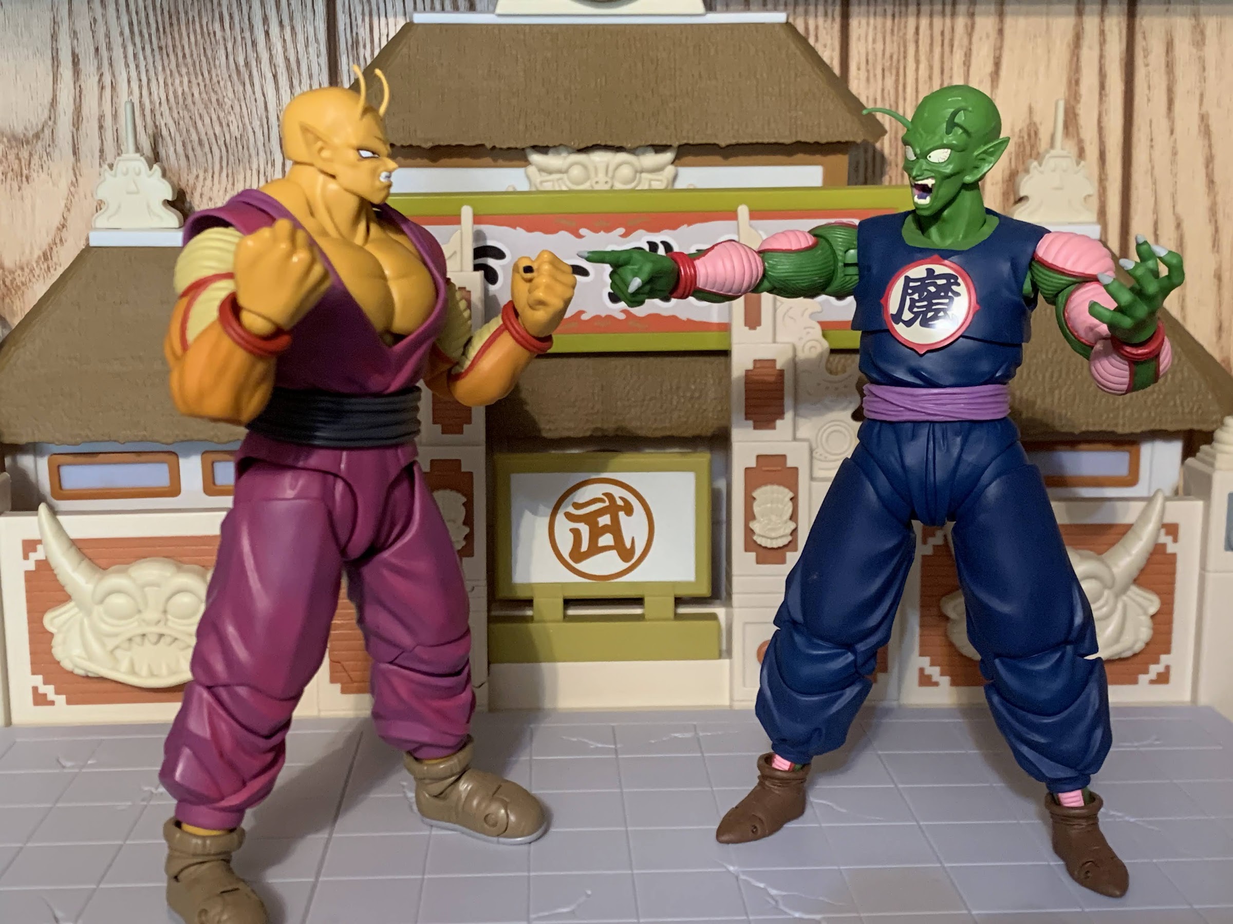
Is this the best Christmas moment from Bugs Bunny? Maybe.
This year I also had a few other goals in mind. I wanted to really dig deep into any and all things Looney Tunes in a quest to find a good Christmas special. In particular, I want to see the great Bugs Bunny have a good Christmas special because Bugs Bunny’s Looney Christmas Tales ain’t that. I also decided to comb the depths of the Nicktoons. I was around for the early days of the Nicktoon, but kind of trailed off over the years. Really, anything past Rocko is a show I haven’t watched that much. There’s a lot there, and as I mentioned before, I can’t be choosey or else I won’t have anything to talk about!
The real crossover we’ve always wanted?
The Christmas Spot may run only from December 1 through December 25, but for me it’s basically a full year commitment. I start work on the next year pretty much right after it finishes. Spreading it out during the year also helps to prevent burnout and if I tried to fit all 25 into a short window of time I’d go nuts. This year was the first where I started to think about my exit plan. It’s a lot, and it’s something I really do for myself since this isn’t a monetized blog or anything. How many more years do I want to keep doing this? I’m not sure, but after nine years, I’m definitely closer to my last version of The Christmas Spot than I am the first. I feel like 2023 probably isn’t the last installment, but who knows? We’ll see.
I don’t want to end this on a downer though as we have 25 Christmas posts to look forward to this year alone! On December 1st, the first will go live and one each day will follow. These are all scheduled to go live just after midnight EST, so wherever you are in the world, check back then. We’ll dive into a special, decide if it’s good or not, and I’ll even tell you where to go if you want to experience it for yourself. This season only comes once a year, so lets enjoy it as much as we can before it’s gone!
Are you not excited? Maybe some of these hype posts from yesteryear will get your Christmas spirit flowing:
We’re nearly through another year, which means another holiday season is upon us. For some, this started once Halloween was over while for others it seemingly never ended. And like years past, we’re going all-in at The Nostalgia Spot. Every day in December through Christmas Day, join us as we take a look at a…
It’s that time of year again! Every year since 2015 when the calendar hits December 1 this blog turns into The Christmas Spot; a place to countdown the days until Christmas while basking in a festive, holiday, special of some kind. It will be 25 days of 25 posts, most of which will feature a…
Tomorrow is December 1st, and it’s that time of year when this blog goes Christmas! Yes, 2020 has been a horrendously shitty year so Christmas can’t come soon enough. Of course, it’s a Christmas tinged with disease this year as we’re almost certainly going to be asked to quarantine for another holiday as the world…
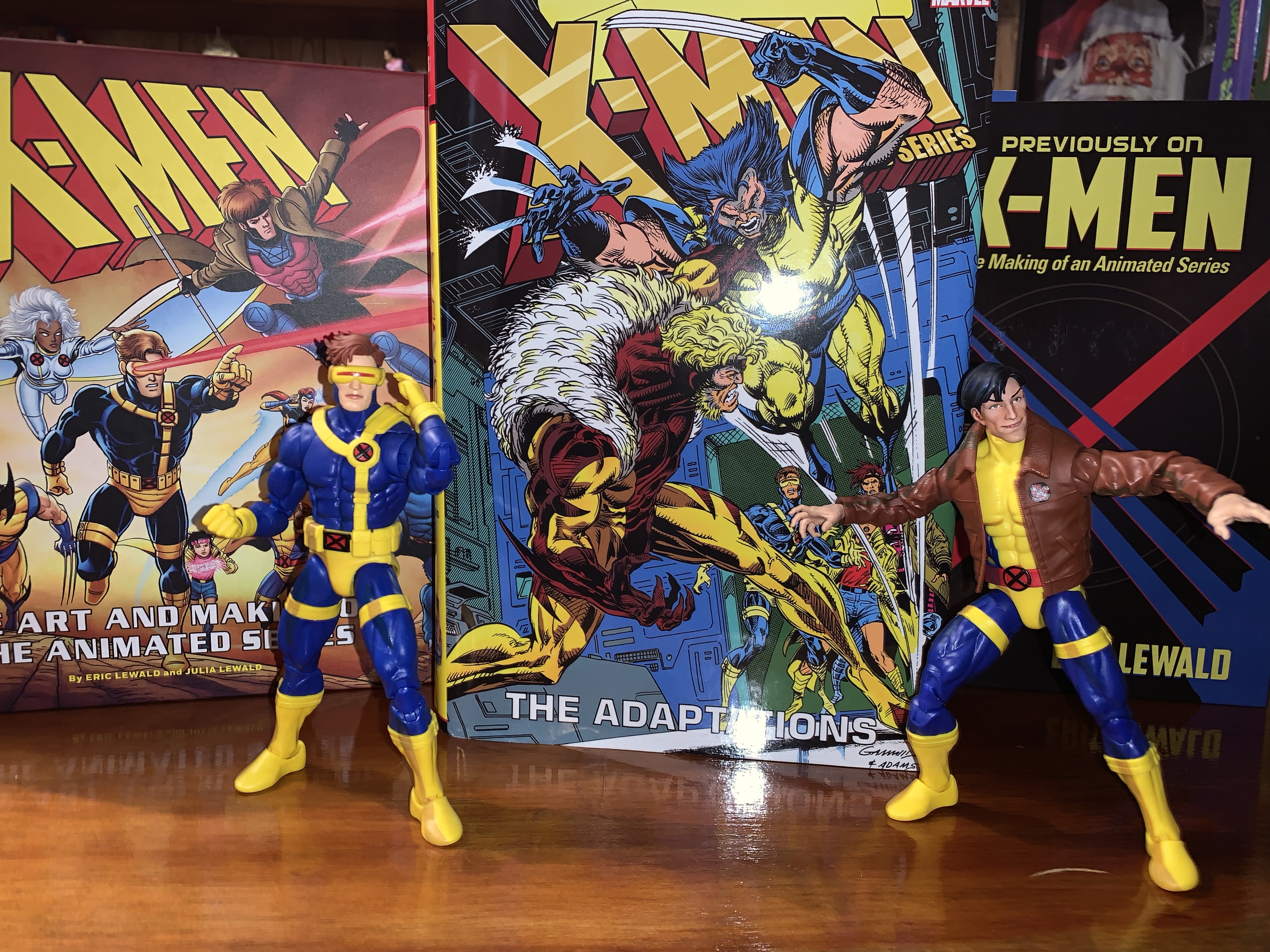
I can’t seem to get enough X-Men merch based on the 90s cartoon series.
Halloween 1992 was when things really changed for the X-Men. A high-selling comic book was about to blow open and enter the mainstream with a hit new Saturday morning cartoon series. Spearheaded by Eric Lewald for Saban Entertainment, X-Men would become the highest rated children’s program on the Fox Network and the overall highest rated children’s program in 1993. At least, until a little show called Mighty Morphin Power Rangers came along. Even following that, the show remained a hit for the network and it’s likely that without the success of the cartoon we never would have had the film series that followed.
When Fox agreed to bring the spandex-clad mutants to network television it did so with Saban and Graz Entertainment who had their own ideas for the show. Lewald was the showrunner who oversaw a team of writers that crafted the inaugural season, most of whom were unfamiliar with the comic from which their characters were taken from. As a result, the first season was largely unique. It was not pulled from the comics with the exception of the “Days of Future Past” arc. Sure, the characters largely acted and behaved like their comic book counterparts, but the plots and character history were pretty much all new. I don’t think this necessarily played a huge role in what followed, but if the new show wasn’t just copying and pasting what the comic books had done then it made sense for a comic companion to tag along. Enter X-Men Adventures, a comic book adaptation of the animated series. Writer Ralph Macchio (no, not that Ralph Macchio) was handed the teleplays for the first season and was paired with varying teams of artists to bring the show to the pages. The first issue arrived in November 1993 and would run until March 1996 concluding with the “Dark Phoenix” arc. After that, the book split away from the cartoon series rather than adapt what was dubbed Season 4 and beyond, but up to that point, it had largely remained in lockstep with the show.
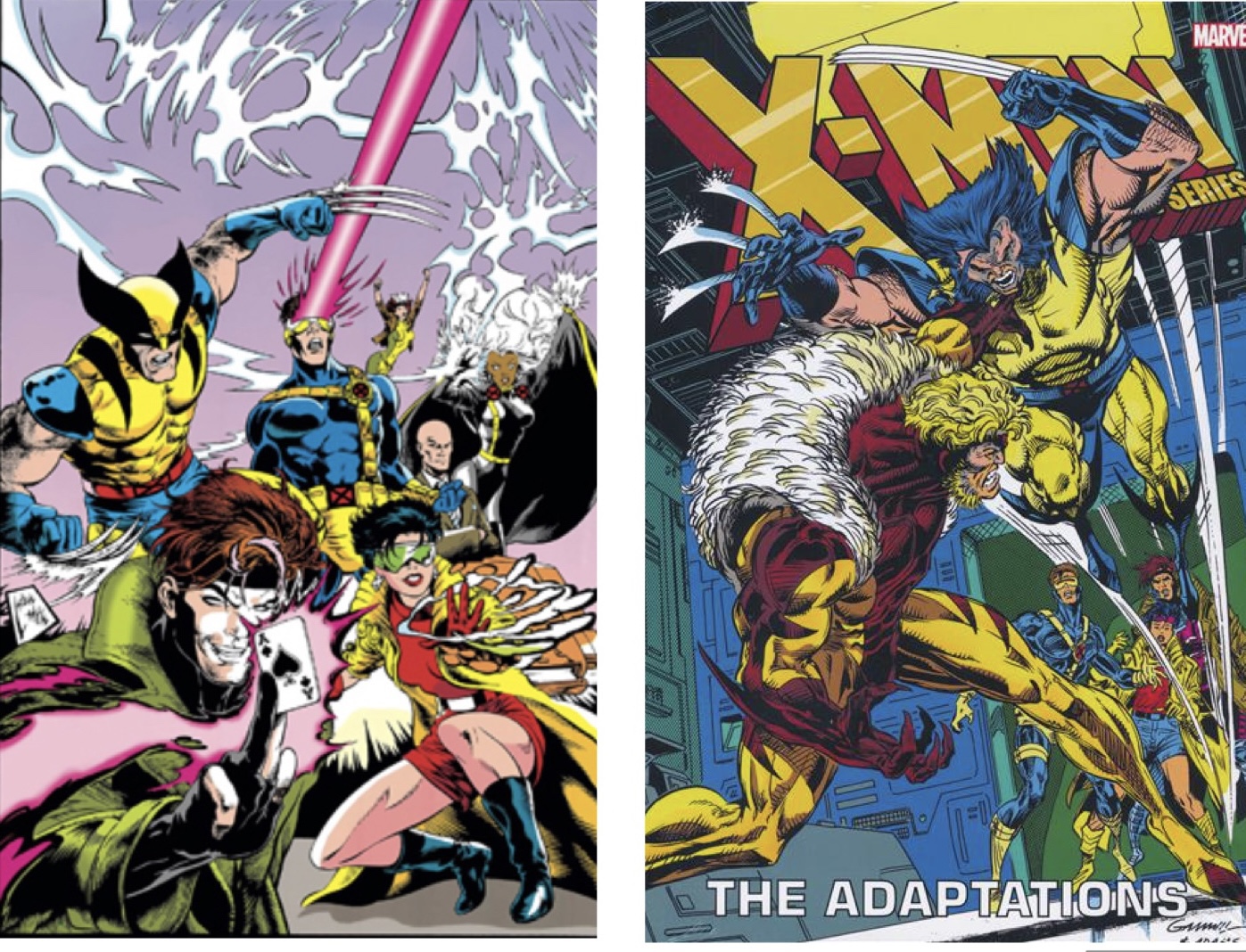
The two covers available for this collection.
As a kid, I didn’t bother with X-Men Adventures despite my love for the cartoon. In my mind, it felt redundant. Why buy a comic version of something I already saw on TV when I could get a comic book that told a whole, new, story? Now that I’m older and fond of reminiscing on things I enjoyed as a child, I’m more curious about something like X-Men Adventures. Surely, the comic would present opportunities to frame things differently. How would it handle something like the death of Morph? Would the characterizations be the same? Would some characters assume more of a spotlight or less of one? I probably could have answered such questions with relative ease and not much of an expense. Being a 90s comic, X-Men Adventures isn’t terribly hard to come by secondhand, especially if you’re one who is unconcerned with condition.
Rather than scour the back issues at a local comic shop, I turned to a new publication: X-Men: The Animated Series – The Adaptations. That mouthful of a title was released earlier this year. It’s a hardcover collection of X-Men Adventures totaling the first 41 issues, or said another way, all of the issues that mirrored the show. It’s a heavy, meaty, tome that’s nearly 1,000 pages with most of them devoted to the old issues. The paper is a nice white, though it has some transparency and isn’t as thick as it could be. The main cover illustration is the same as the very first issue of X-Men Adventures by Steve Lightle. The version I have is the variant cover which depicts Wolverine battling Sabretooth in the War Room and it’s done by Kerry Gammill and Greg Adams. The collection is expensive with an MSRP of $125. That was too rich for me so I played the waiting game eventually scoring one for less than $60 off of eBay. This one had bent corners that likely had been damaged during the shipping process. The eBay listing also had a typo in the title which may have helped to keep it on the site long enough for me to notice. Either way, I was willing to accept some cosmetic damage in exchange for a price that was more than half off. Now several weeks later, I’ve read this thing cover to cover and am ready to share my thoughts.
This one isn’t going to shy away from Morph’s death.
X-Men Adventures volume 1, which is thought of as the first season, spanned 15 issues which is longer than the show’s 13 episode first season. As such, the first season of books is more expansive than that season and also more expansive when compared with the seasons that followed. My guess would be that with the show being new, and being tinkered with practically right up until air date, there was a lot less that was nailed down and thus there was more room for Macchio’s own interpretation. It’s also interesting that the characterizations of the book’s characters are far more reliant on their comic history. This is seen most with Magneto who is very much a villain in these books as opposed to a friendly rival. He’s not going to team-up with these X-Men to take down the Sentinels and he’s far more willing to inflict pain upon them as well. The costumes for the characters also all mirror the comics. Jean is more yellow and blue with long hair, Apocalypse isn’t purple, and Sabretooth doesn’t have the massive physique of his animated counterpart. Fights, like Wolverine vs Sabretooth, can be more violent with actual blood spilled and our boy Wolverine is also free to smoke cigars and drink beer.
By far, the thing I was most interested in seeing was how the books handled the death of Morph. In the show, his death is essentially offscreen, though the characters deal with it in a pretty realistic manner. It wasn’t some Saturday morning “zapped to another dimension” sort of end for old Morph. In the books, it’s foreshadowed with a rather grizzly depiction of Morph with half of his face burned off. I’m not sure the character needed to have these visions, but it was an interesting way to go about it. When the time comes for him to actually die, it’s handled in a far more personal manner with Beast cradling Morph in his arms as he draws his dying breath. Of course, the character would be brought back in Season Two which was never the plan at the time. It does muddy things a bit since his death was so final in the books. Did the Mutant Control people haul Beast away and just leave Morph’s corpse behind for Sinister to come along and swipe? Apparently so, because no other explanation is offered.
Wolverine is allowed to fight like, well, Wolverine!
Morph’s death was one area where the books could go into more detail and be a bit more showy than the cartoon. It’s also pretty unique as the rest of the issues largely unfold in a more expedited fashion after the first season. The first 15 issues are far more dense and interesting as a result, while the rest are still enjoyable, but missing that extra component. Some stories, like the Omega Red confrontation or Wolverine’s parlay with Alpha Flight, end far too abruptly to feel satisfying. If you didn’t like how the X-Men defeated Omega Red in the show, then you really won’t like it here. And since comics always seem to operate with the idea that any issue could be someone’s first, there’s a lot of needless exposition from characters explaining their thoughts, motivations, powers, etc. too plainly. It feels demeaning to the reader and like a dumbing down of the material at times, something the show seems careful to avoid.
The other aspect of these stories that threw me the most was just the changing art styles. These books never seemed to have a single vision for very long when it came to the art. Andrew Wildman was the penciler for the first six issues. He had a slightly more realistic style than some, but it’s not bad. Chris Batista then takes over for two issues and he has a more streamlined approach which actually might suit the animated look a bit better, though I think I still prefer Wildman. Wildman would return for the 9th issue and hang around through issue 13 and then back again for the final issue of the first season. In between is an issue by Nick Napalitano. All three pencilers for that first season complement each other well, but later seasons have more divergent takes, some of which I like and some of which I don’t. By the end, Ben Herrera was handling a lot of the load and I’m just not into his style. It’s very reflective of what the 90s comics were producing at the time, and even then, it wasn’t a style I enjoyed. My least favorite issues were the ones done by Hector Collazo. He seemed to take to heart that this comic was an adaptation of a cartoon because his style could best be described as toony. I’d enjoy it on a Looney Tunes or Animaniacs book, but not an X-Men one.
The art style isn’t consistent for all 40+ issues so readers are likely to enjoy some more than others.
Reading through this book basically gave me what I was looking for: familiar stories told through a different lens. The only downside for me was how the second and third seasons were more streamlined with less room for freelancing, if you will. The first season was by far the most enjoyable part of the book, though I am curious about the issues not included. Following the third season, Macchio basically was allowed to continue writing stories for this version of the X-Men, but ones that didn’t follow the show. Those works are collected in another trade paperback that I should probably give some thought to acquiring. If you’re someone like me curious about what another interpretation of the beloved show could look like, this isn’t a bad experience. I don’t think it’s worth the asking price so I’d recommend getting it used or on sale. The actual quality of the book is pretty nice, though there are the occasional page that came out slightly blurry from the printer. It seems to be an issue that becomes more frequent further into the book. It may also be something that’s not consistent from copy to copy. Either way, it’s a tough ask at full price. A lot of places have it marked down to around 80 dollars, which is still a lot, but better than $125. I’m not sure I’d even recommend it at that price, but definitely consider a look if you ever find it closer to 50 bucks.
Interested in living in the world of X-Men as established by the animated series?
A lot of cartoons made an impact on me as a child. My first love was The Real Ghostbusters. Its goofy cast of characters and excitement were plenty of fun and there were interesting toys to supplement the series with, which was pretty much the goal of all cartoons in the 80s. The Teenage Mutant…
A few years ago, I talked about my love of X-Men, the animated series, via a book review of Previously…on X-Men by Eric Lewald. That book chronicled the development of the 92 animated series that helped propel the Fox Kids Network to the top of the Saturday morning leaderboards through notes from the author and…
Today, The Christmas Spot temporarily alters it’s name to The X-Mas Spot. As a sort-of celebration for the animated series X-Men turning 30 this past Halloween we’re going to look at the show’s lone holiday special – “Have Yourself a Morlock Little X-Mas.” The show X-Men was a pretty serious affair as far as kid…
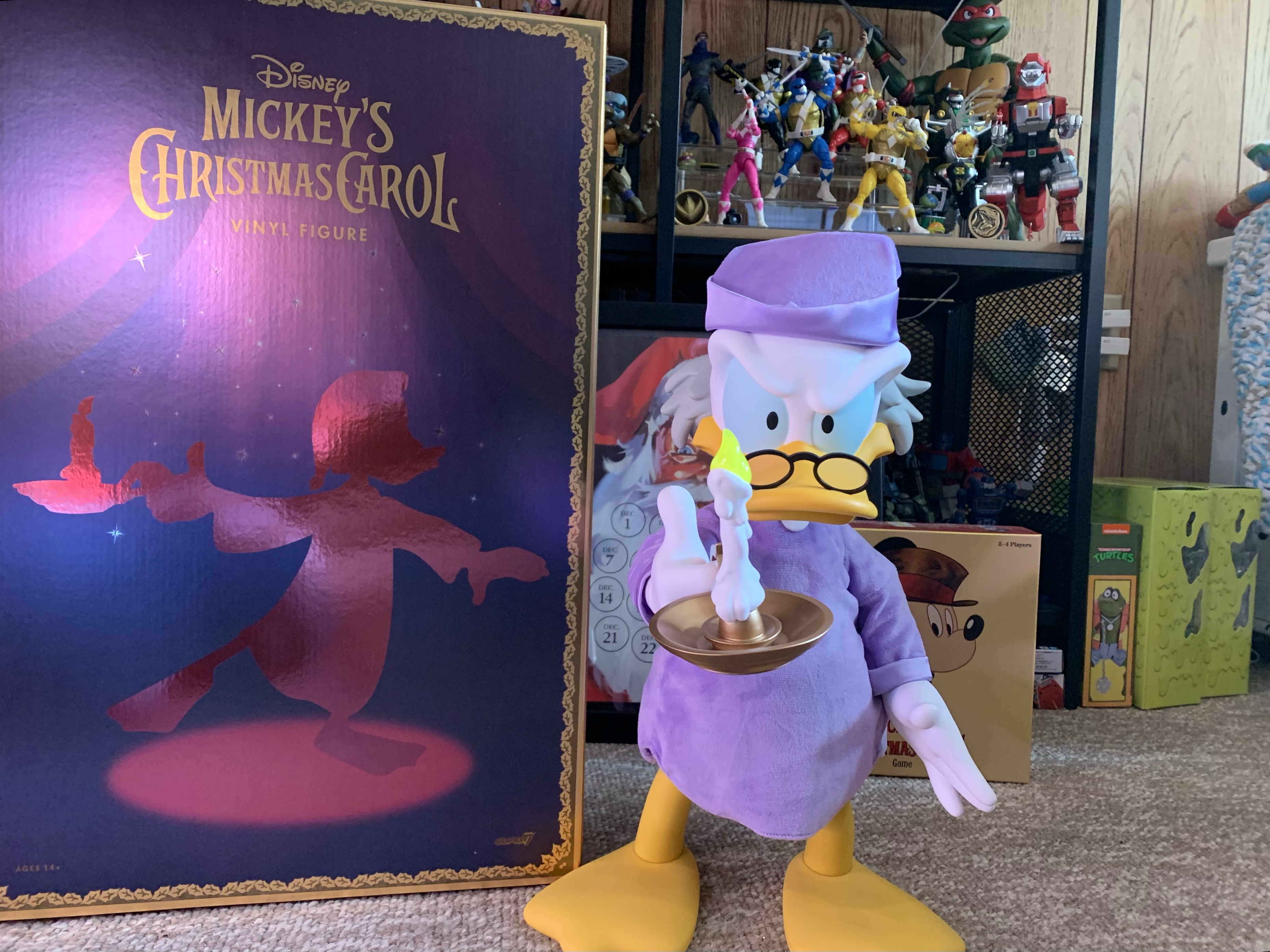
Before Christmas and The Christmas Spot can begin, we have another Christmas toy to look at. This one comes courtesy of Super7 and its Super Size line. The Super Size line is a line of vinyl figures that stand around 17″ in height. These are big figures, and being that they’re vinyl, they’re not really articulated. They’re kind of like jumbo versions of their ReAction figures and some of them are basically direct adaptations of that line. They’re also really expensive and when you combine that with how much real estate they take up it makes it a hard line to truly collect.
This is what you came here for.
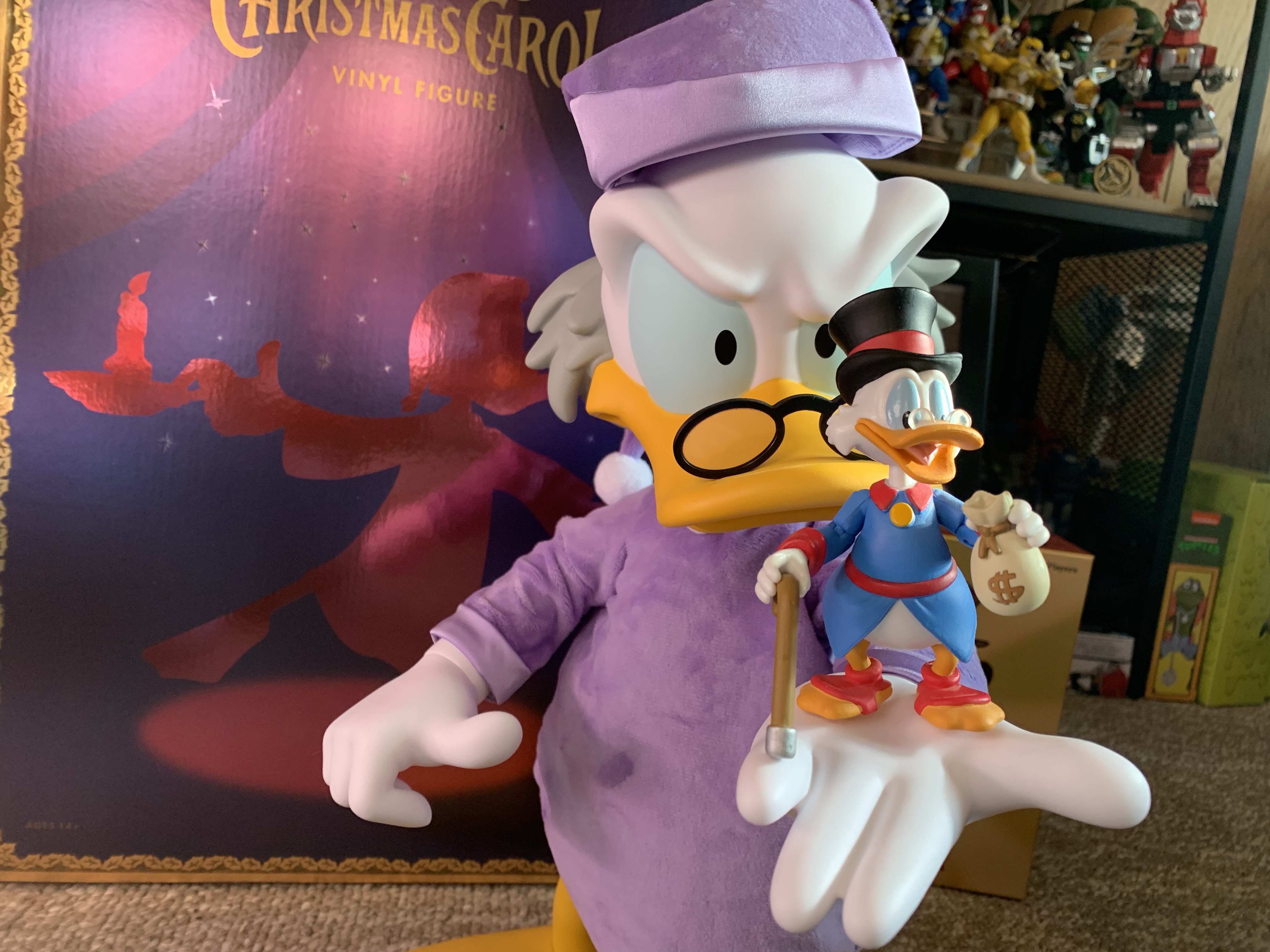
Last year, Super7 went after my heart by adding Scrooge McDuck to their line of Super Size offerings. And it wasn’t just Scrooge McDuck in his adventuring attire, it’s Scrooge as Ebenezer Scrooge from Mickey’s Christmas Carol, one of the greatest Christmas specials of all-time. How could I resist? Well, there were two-hundred and ninety-five reasons for me to resist that temptation. The MSRP basically made this one a nonstarter, even if I wanted it badly. I just couldn’t see myself spending three-hundred bucks on a vinyl statue. It just wasn’t going to happen. Lucky for me, waiting paid off. Recently, Amazon had a sale on this particular figure and it dropped to a tick over half-off. At under $150 bucks, now we’re talking. I even gave it some thought overnight, while also allowing the wife to maybe consider it as a Christmas gift, before pouncing. Now I have a new Christmas decoration for 2023 and, I have to say, I’m pretty pleased with my decision.
Not quite.
Scrooge arrived in a massive, brown, shipper. On it lists the product and it would appear this figure is one of 1,004. For a $300 vinyl toy of a cartoon duck, a thousand units is probably all that was made and it’s not really that surprising that some made it to the clearance section. Inside that brown shipper was a plain, white, box and inside that was the product’s box. It’s a glossy, deep, purple box with shiny gold trim. On the front and back is a silhouette of Scrooge from when he’s searching his room for spirits before going to bed and it’s done in a glossy rose gold. On the top is a simple Disney logo and on the sides it reads Mickey’s Christmas Carol. Actually, on one side it says that, on the other side it reads Alice in Wonderland Queen of Hearts. Whoops! I’m assuming all of the boxes feature this misprint and that mine isn’t unique. It’s definitely the type of goof few companies would spend money to fix.
Inside this box is the actual figure. Scrooge is in a blister bubble with one zip-tie at the right arm. Getting him out is rather painless, and once removed he stands with relative ease on a flat surface. Scrooge is depicted as he was before retiring for the evening so he has his purple cap and gown on. To the top of the feathers on his brow, he’s just a tick under 17″ and pretty dense so he has a nice weight to him. The cap and gown are done with soft goods and it’s a plush material so it brings in its own texture. It doesn’t really match the look of the animation as a result, but it does add a little more prestige to the presentation than just a flat material. The hat is removable and it just rests on his head. There is a stiff insert sewn into the front of it to help it maintain its shape and it sits on his head just fine. There’s no easy way to remove the gown if you would rather Scrooge be naked or if you wanted to dress him up in something else. You would have to attempt to disassemble the figure to get it off, or cut it.
It would have been nice if this doll were in-scale with Scrooge. Oh well.
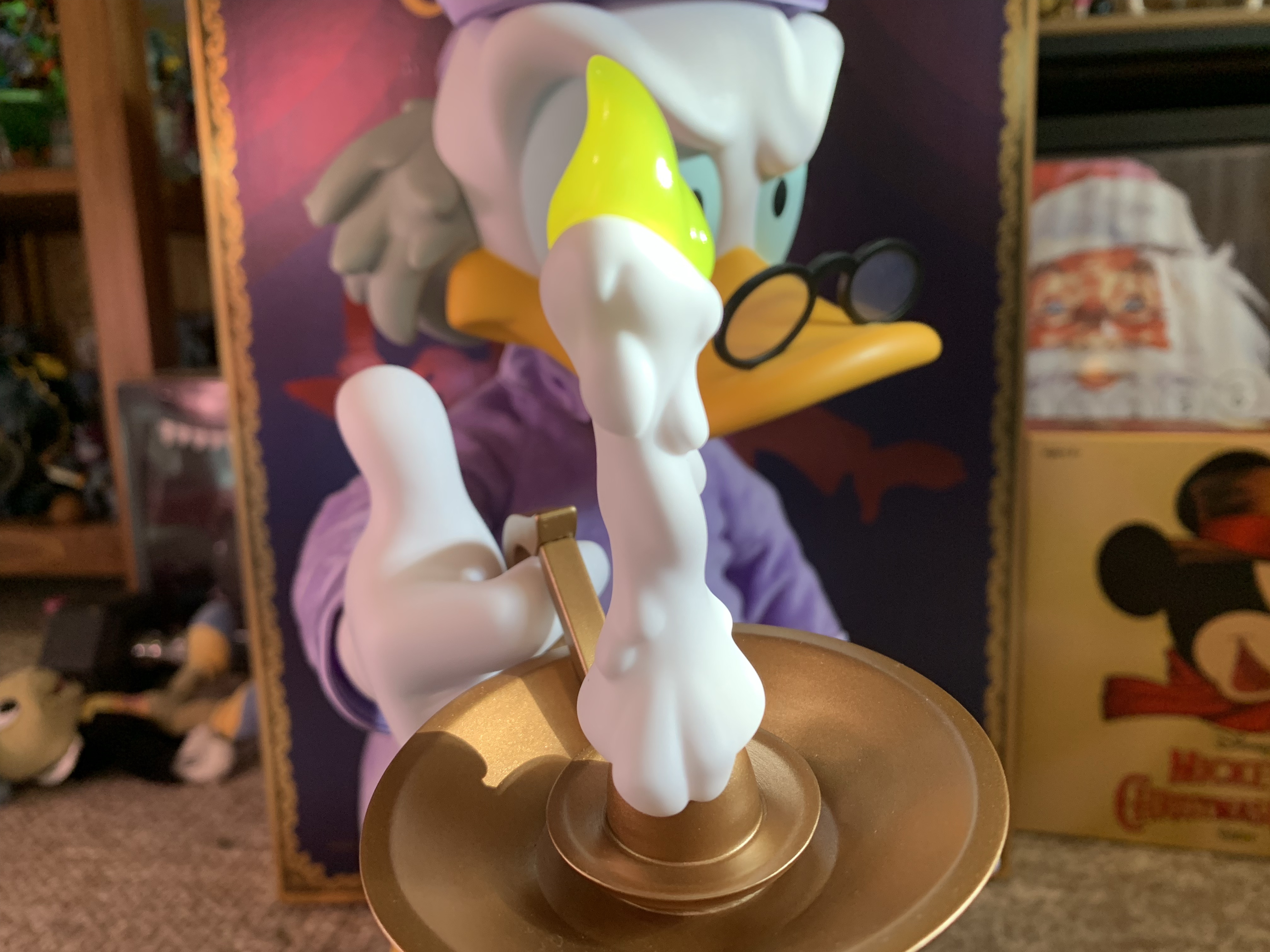
This is a vinyl figure, so the presentation is pretty simple as a result. Most of it is done with colored vinyl. The eyes might be the only area that’s actually painted. Even so, it looks really nice. There’s a softness to the finish which is customary with vinyl and since it’s a matte finish it works really well. Scrooge has a scowl on his face which is befitting the character and the hair on the back of his head is done in gray which is consistent with his presentation in the short. The glasses are glued in place and have clear, plastic, lenses and look great. The right hand is in a gripping pose while the left is open and flat. If I have any criticism to levy here, maybe I’d have shaped that left hand in a more natural, relaxed, position, but it’s fine. And he looks good with the hat on or off so take your pick.
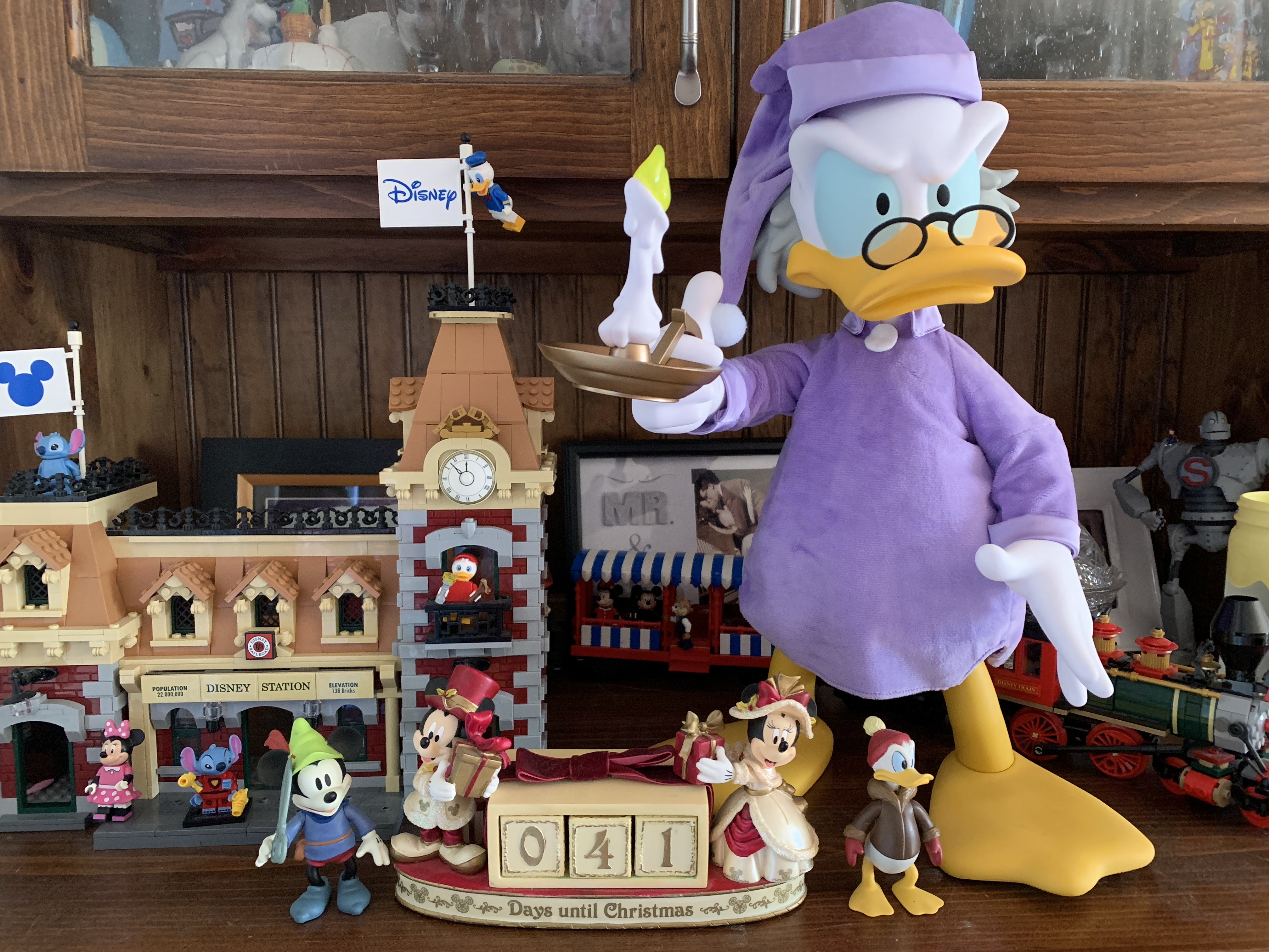
Excepting the clothing, the only accessory here is a lit candlestick and holder. For what it is, it looks great. The flame is a translucent yellow and the holder is bronze in color. It fits over Scrooge’s index finger with relative ease and it’s not too heavy either. As for the articulation, if you’ve ever bought a vinyl figure before then you know there isn’t much to be found. Scrooge actually has more than I would have expected. Every joint is a simple swivel and he has one in the neck, shoulders, wrists, diaphragm, legs, and ankles. The diaphragm is actually surprising and nice to have. It’s the only spot that allows for some nuance as you can make Scrooge look like he’s peering around the corner or something. Rotating at the legs will pitch the figure forward or back if you want him more hunched or not. The ankles aren’t particularly useful though to the point that I’m surprised they bothered as it’s the one joint you can’t hide. The rest are either hidden by the clothing or just not plainly visible.
He’s definitely “Super Sized” compared with the Funko Scrooge McDuck.
This Super Size version of Scrooge is really one of those “what you see is what you get” type of releases. I will say, pictures don’t really do the figure’s size justice. It’s pretty damn big and feels big, even if it’s not much bigger than some quarter scale figures I have. Mostly, it just looks really nice. I love this thing. Would I have loved it at 300 bucks? Maybe, after the sting of paying for it subsided. The price I paid for it puts it in the range of a lot of quarter scale stuff. It’s even a lot less than the sixth scale Mondo figures I love. Those figures are true action figures with a lot of paint, accessories, and articulation. The comparison to a quarter scale figure, like a NECA TMNT release, feels more apt though. While those figures have more stuff and more articulation, they’re pretty heavy and I basically find a pose they can handle and leave them.
You’ll be able to tell when I took this thanks to the Christmas countdown.
This is a figure that doesn’t need a whole lot of articulation. The vinyl toy approach is what works, and it turned out really well. It reminds me of the old store display characters, some which still exist in Disney World, that would be motorized where just their head rotates and an arm might go up and down or something. My mom even has one of Winnie the Pooh, somewhat ironically, in a nightshirt with a lit candle. I love that aesthetic and if I had more resources (and more space) I’d go after vintage items like that. I’d also probably have the Super Size Brave Little Tailor Mickey Mouse, but I truly have no where to put such a thing. With Scrooge, he’s a Christmas decoration so I can find somewhere to place him for a month out of the year, even if it’s a bit cumbersome. I basically do the same thing with a Christmas tree each year. If you’re like me and a have love for the cartoon this character is taken from then you’ll probably love this item. I can’t really recommend it at full price, but I definitely endorse it while it’s available for around the price I got it. Aye Super7, you drive a hard bargain.
Check out more from Mickey’s Christmas Carol and Scrooge McDuck:
We made it! Another year in the books, and another Christmas has come. Indulge in it. Bask in it, for it only comes once a year, and not to get too dramatic, but you never know how many you’re going to get. And we’re ending this year’s edition of The Christmas Spot with another throwback…
It’s been nearly a year since DuckTales returned to television airwaves. Scrooge McDuck, along with his nephews and surrogate niece Webby are back to solve mysteries and rewrite history. It’s a fun show that adheres more to the work of Carl Barks than to the series that ran in the 1980s while also doing its…
It’s that time of year once again! Every day goods are a little pricier, egg nog is invading the dairy case at every grocery store, and red and green versions of every candy in existence flourish in the seasonal section of department stores. Yes, it is Christmas time and it would be obnoxious if it…
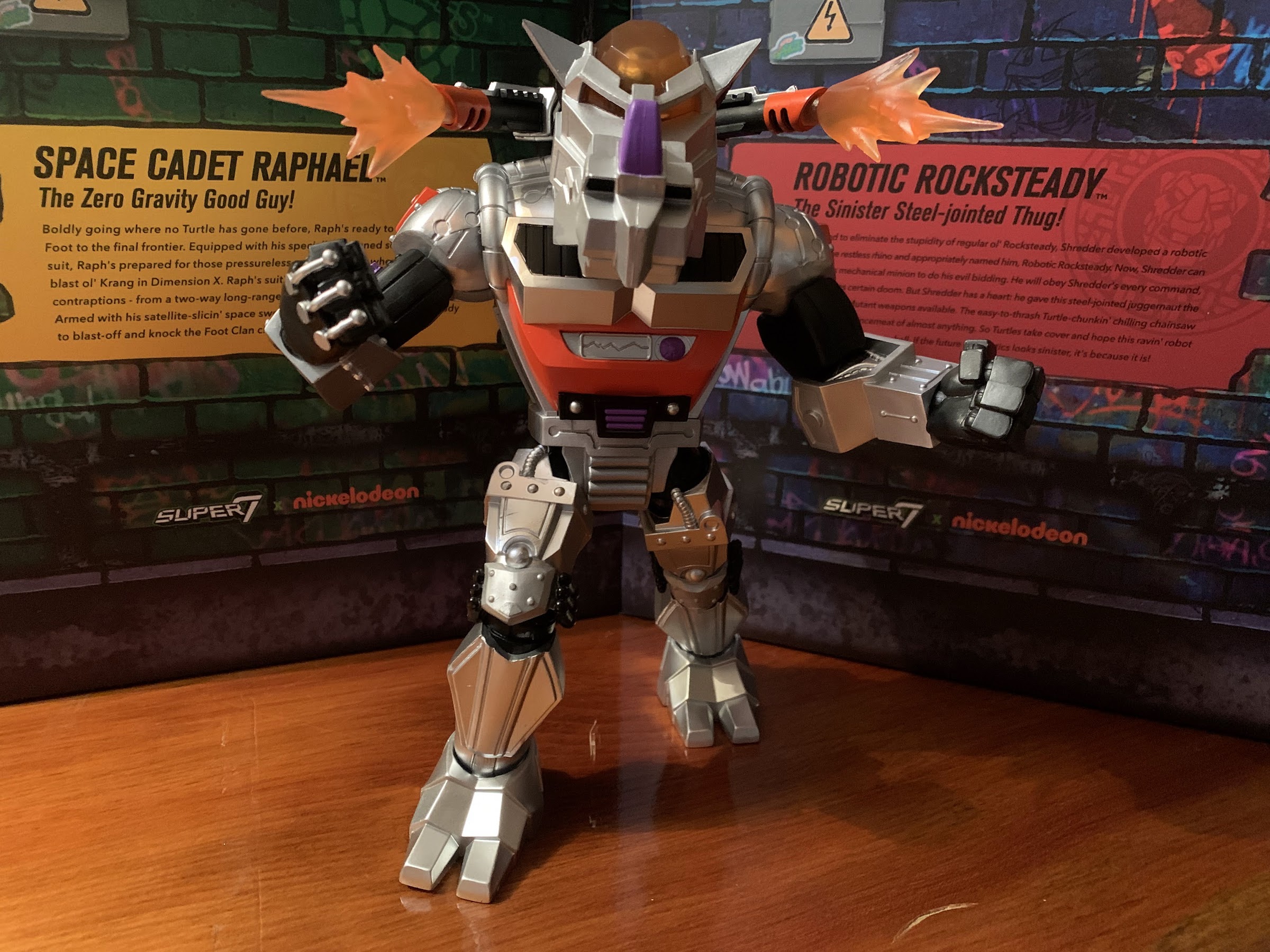
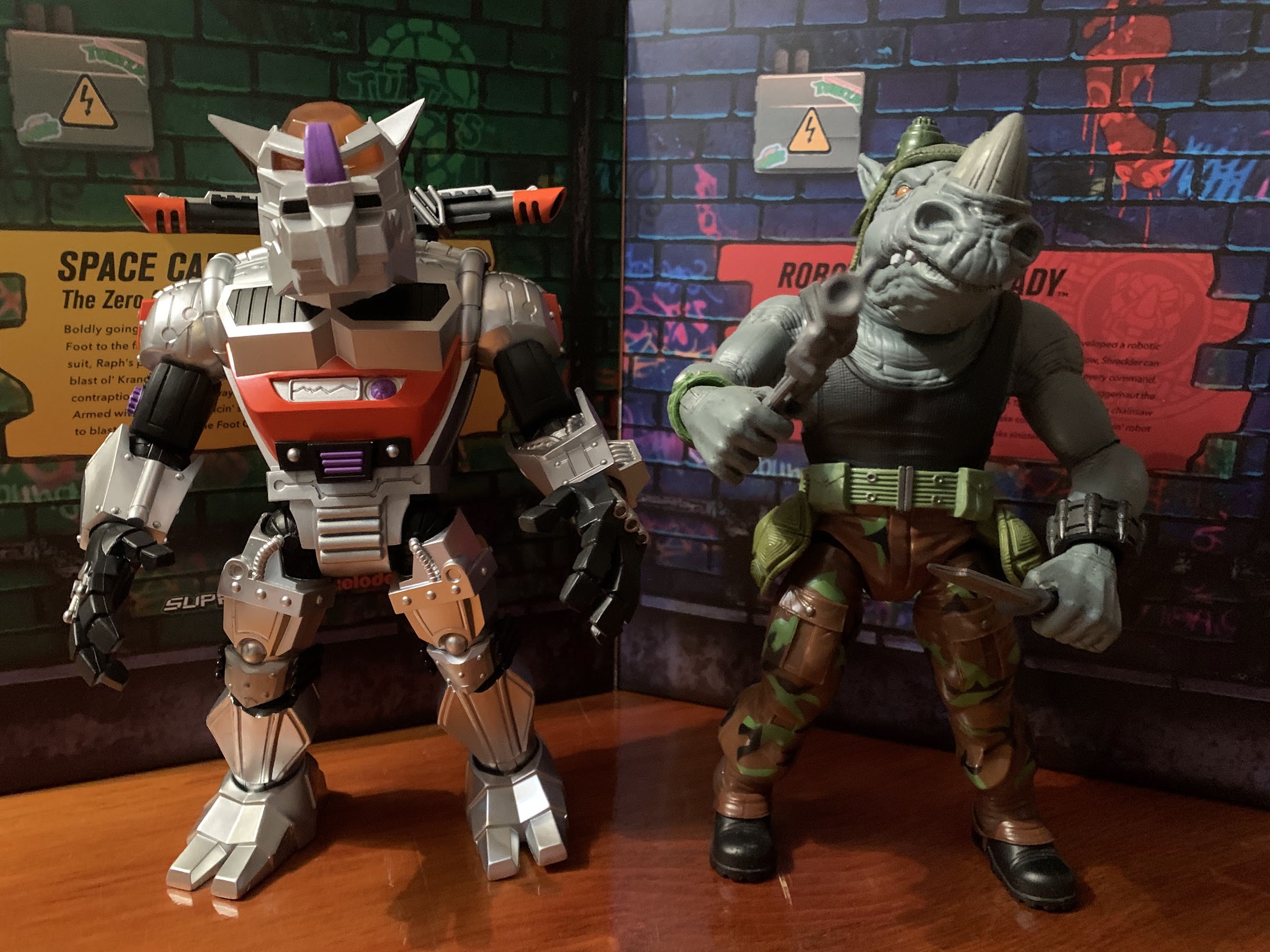
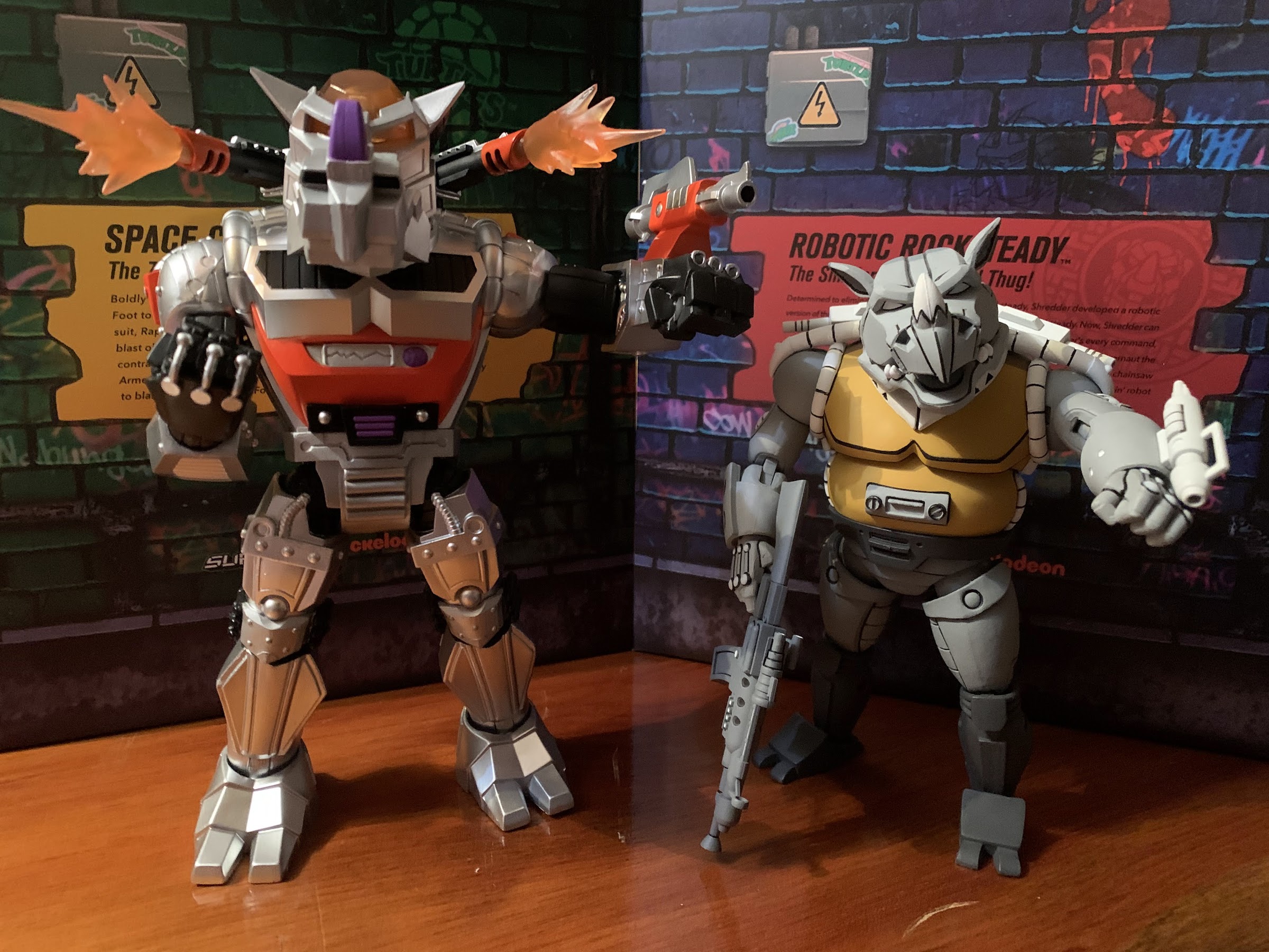
Last week, it was Space Cadet Raphael’s turn to be put through the ringer by me. Super7 didn’t really impress with that offering, but I did tease at the end of that lukewarm review that a more positive one was on the horizon. This is that more positive review. Robotic Rocksteady is the latest villain from Super7’s line of TMNT Ultimates!. It’s another figure that’s essentially a scaled-up reproduction of a toy originally released by Playmates Toys, but given a new coat of paint, a bunch of accessories, and some beefed up articulation. And, spoiler warning, it may be the best in the line.
The robotic version is roughly the same size as its biological counterpart.
Robotic Rocksteady was originally released in 1993 which was year 6 for the vintage toyline. By the time this figure arrived, I had moved on. 1992 saw the release of X-Men on Fox and by 1993 it had totally sunk its teeth into me. I think I bought only one TMNT action figure that year, Ninja Action Raphael, which was the last figure I purchased in the toyline I once loved as much as life itself. I did also get the TMNT Turtle Trolls, but they felt like a whole other line to me. Robotic Rocksteady was one I missed, though I do recall seeing it on the pegs. I remembered the character from the cartoon, which I was still watching on Saturday mornings, and because of that there was a desire to pick him up. I never did though, but now Super7 is giving me another chance at the figure I let pass me by.
They very nearly see eye-to-eye.
Even from the back he looks pretty nice.
Rocksteady stands right at the 8″ mark to the top of his head. Being a robot, he’s predominantly a metallic silver with hits of black, red, and purple sprinkled throughout the sculpt. Just about every bit of this guy is textured to some degree. There’s wires and rivets to be found throughout and in true Playmates fashion there is some asymmetry at play. Surpsingly, not with the feet, but with the hands as the right hand has wires that arc over the back and onto the fingers while the left hand appears to have guns built into them. They look like the channels on Wolverine’s gloves and there’s even three of them. There’s definitely a heft to this guy that wasn’t present with Raph and he’s pretty similar to Bebop in that department. The top of the head and the eyes inside are handled with translucent, orange, plastic to give the figure a light piping feature similar to what we saw with Metalhead. The paint is handled well and pretty clean. It’s not some incredible, super-detailed, approach, but it feels appropriate for this subject matter.
The turtles, on the other hand, will be looking up to this guy.
Robotic Rocksteady is just a fun figure to look at. The size, sculpt, and colors really give it the shelf presence that I felt the Wave 3 Rocksteady lacked. That wasn’t really the fault of Super7 (though they could have taken some steps to mitigate that), but a reflection of what I always felt was a pretty bland character design. This figure is definitely not that and I really love how this guy turned out. When it comes to the actual sculpt and paint, the only thing I don’t like is the panel in the middle of his torso. It looks like it’s supposed to be a screen of some kind with a soundwave on it, but it’s entirely cast in silver like most of the body so it just looks kind of odd. It’s reminiscent of the many unpainted details that were found in the vintage line. It’s a minor quibble, but it is unfortunate that this one deficiency that I find with the figure is right, smack, dab, in the center where it can’t hide.
I do wish this canon could be rotated in a straight-away manner as opposed to off to the side.
NECA’s version of the character taken from the cartoon series can position its forearm canon the way I want this one to.
Super7 loaded Rocksteady up with a bunch of suitable accessories, most of which could be found with the vintage release. He has two, shoulder-mounted canons which are non-removable, but come with optional blast effects. They’re a cloudy, translucent, orange, plastic and they slide in and out easily and look pretty good. He also has his forearm canon intended for his left arm. It might not be clear to those who don’t recall the vintage figure because it doesn’t really snap on. It just fits over this coil piece that’s part of the sculpt. It’s not the most secure attachment, but it seems to stay on well enough. And since it doesn’t peg into anything really, the arm looks like it’s not missing anything if you opt not to display the figure with it. My one real grip with the accessory is that the fin on mine is warped. I don’t know if it’s supposed to be, I don’t think it is, but it looks off and I may try to straighten it out. The canon also can’t accept the blast effects that the shoulder canons make use of which feels like a missed opportunity. Or it could have just included its own – that would have been better.
Not all of the accessories are offensive in nature.
Rocksteady also has a pair of weapon attachments in place of hands and the usual assortment of extra hands as well. For said hands, we get fists, gripping, and open hands. They go on and off easy enough and look pretty good too. If you find traditional hands too boring, Rocksteady also has a chainsaw sword attachment. This is from the original figure (which I think held it) and it’s a rather nasty looking weapon. The main blade of the sword looks like a chainsaw and there are two circular saw blades on either side. They don’t spin, unfortunately, but it’s still fun looking. The other hand attachment is a fire, or beam sword which just pegs in (same with the chainsaw sword, neither has a hinge or anything) and is made of the same translucent orange plastic as the blast effects. It’s a cool thing to have, but I think I prefer it as an attachment to the forearm canon. It’s a tight fit which is why I don’t necessarily think it was intentional, but once inserted it makes that weapon look like a flamethrower. The final accessory is a defensive one and unique to Super7’s version. It’s a futuristic take on Rocksteady’s manhole cover shield. Like the wave 2 Rocksteady, the manhole cover has a reverse side that’s more like Bebop’s trashcan lid shield, but otherwise it’s a translucent, purple, device with some silver accents. He kind of grips it awkwardly since it has a full handle as opposed to being one he could strap to his forearm. It has a channel in the underside of the handle that you can fit his fingertips into which helps him to hold it in a more defensive position, though it also slides around. I find it’s easier to just use the open hands instead and slide them through the handle.
You’re in trouble now, toitle!
Articulation is never Super7’s strong suit and it’s probably not going to be for a chunky, robotic, rhinoceros. Even so, Rocksteady moves well enough. His head feels like it’s on a ball joint of some kind so there’s some tilt and rotation is fine. Like the original Rocksteady figure, his “neck” is positioned forward a bit so it limits the practical up and down range, but you get some. The hinged ball pegs for the shoulders work find and he can raise his arms out to the side and rotate. The biceps swivel isn’t great though due to how the arm is shaped. The bicep sits inside the outline of the shoulder so it butts against it and limits the range, which is unfortunate and avoidable. The elbows though bend a full 90 degrees, but the way the forearms are shaped limits the swivel there as well. It’s really only an issue because with the left arm he can’t position the canon as well as I’d like. It can never be perpendicular with the ground, it’s always at an angle due to the limitations of the swivels at the bicep and elbow. The wrists rotate fine and all of the hinges are horizontal. The shoulder canons also swivel.
Flame swords – ignite!
In the torso, we do have a waist twist. Because the black piece in the middle of the abdomen hangs over the waist, the range is limited. The crotch area is done with a softer overlay so there’s less worry about scratching the plastic when rotating at this joint. This hips are hinged ball pegs and this robot can essentially do a full split. He kicks forward better than 45 degrees. At that point, the sculpted wires start to hit the hips, but if you rotate at the thigh joint that’s there to clear it, he can raise his leg out a full 90 degrees. He kicks back a bit, and the knee joint is the typical Super7 single hinge with rotation. It bends just about 90 degrees, though like the biceps, the pointed kneecap limits the swivel. If you bend the knee first, you can swivel a bit more. At the ankle is a hinge which works pretty well forward and back and there is the usual ankle rocker. It’s a bit more limited than some, but you still get some usable range there.
I think I prefer the flame sword as a flame-thrower.
This action figure of Robotic Rocksteady is not exactly “super” articulated, but it works well enough for the character. I think it’s better than Space Cadet Raph in that department which is something I would not have guessed going in. It has limitations, but they’re limitations that can be worked around. If the left bicep could rotate far enough to better position the forearm canon, I’d be more than happy with what this figure can do. That’s really the only blemish for me when it comes to the articulation. The only way to get that canon as level and forward-facing as I’d like it to be is to basically pose him like he has a bird sitting on his forearm. That means the arm all the way out to the side and elbow bent 90 degrees. It’s not perfect, but at least he can indeed bend his elbows. None of the joints are loose and few were overly tight. No heat was needed to get every joint working.. The only other critique I have is I wish he had a hinged jaw. It’s sculpted like he has one, so why not go the extra mile? It would just make him a touch more expressive, which is my main critique of both Bebop and Rocksteady figures we’ve received thus far.
Your turtles will have their hands full with this foe.
Robotic Rocksteady might be my new favorite figure in this line. He looks awesome and he’s pretty damn fun to mess around with, something I can’t say for many figures in this line. All of his accessories have purpose and I like displaying him with everything. I even like how the hands look which makes it hard to decide if I want to use the chainsaw sword or something else. This is just a cool looking figure that I’m quite happy with and the only true negative is the $65 MSRP. Yeah, he’s even more expensive than usual which is a bummer. Robotic Bebop, who is part of Wave 7 which is somehow arriving after both Waves 8 and 9, was $55 and apparently that was an error or something they felt needed revision. At $55, this figure would be a no brainer for me and even at $65 it’s pretty close. Sixty-five bucks is just a lot for an action figure, even a good one. We’re basically at S.H.Figuarts prices here, but the quality of this figure is also pretty damn high. I think it’s the rare Super7 figure that earns it’s original price so I’m going to give it a recommend. The more savvy shoppers probably will benefit from being patient, but the early adopters will also get to enjoy a pretty cool figure while those ones wait it out.
There’s plenty more Super7 and Rocksteady content to be found on this blog if that’s your thing:
We saved the big boy for last! The lone villain of wave 3 of Super7’s Teenage Mutant Ninja Turtles Ultimates! line is the mutant rhino, Rocksteady. He follows in the footsteps of the monstrous Bebop who was released in wave 2 and is the crown jewel of the young line for many collectors so far.…
2021 introduced a lot of good things for collectors of NECA’s Teenage Mutant Ninja Turtles line of action figures based on the classic cartoon. The toy maker still kept the line a Target exclusive when it came to brick and mortar, but it also started selling a lot of it online to coincide with each…
This post marks number 800 for this blog! Now, when I hit a nice, round, number like that I usually try to find a special topic of some kind, but also one representative of the content on this blog. Well, we certainly look at a lot of toys on this space, and there have definitely…
Ho! Ho! Ho! It’s the jolly one – Santa Claus! Oh, wait, no, it’s the somber, moody, one: Batman Santa! Yes, it’s our first Christmas themed post of 2023 and it’s an action figure review – shocking, I know. McFarlane Toys has held the DC license for several years now, but this is my first experience with the line. I’ve never been a big DC guy, though I do enjoy the Batman. McFarlane’s DC Multiverse line is a 1:10 scale action figure line that seems fine, but it has its own aesthetic and it’s not one that I’m particularly drawn to. It’s not very comic-like, and more of a grittier, militaristic, interpretation. It’s like a toyline based on the aesthetic found in Rocksteady’s Arkham series of Batman video games. If you like it – great, and if you don’t that’s fine too. I thought that by now I would have bought at least something from the line, but even the animated characters didn’t do much for me so I never had reason to dip my toe into the McFarlane waters. That is, until Todd decided to pair Batman with Santa.
He’s Batman in a Santa hat and robe with beard. Also, he can’t lower his arms past this pose.
The Batman Santa figure is a case of what you see is what you get. It’s Batman, and he’s dressed as Santa. I’m not aware of any story to pair with this one and there’s some artwork that goes along with it which is fine, but I’m always down for Christmas variants of characters I love. This figure is part of the Gold Label series which, as far as I can tell, is more of an excuse to tack on five bucks to the usual price as I don’t see anything all that special in the box. It comes in a clamshell package and was sold exclusively on McFarlane’s webstore in two versions: red and blue. The red is undoubtedly a more traditional take on Santa, but I like blue and blue feels more appropriate for Batman. The figure was 30 bucks, though there was a bundle to get bother versions for $50. It sold out by the time I made my purchase (even though both versions were still available as singles) so I didn’t even get a chance to consider double-dipping here, but I don’t think I would have. I only need one Santa Batman, or Batman Santa, for my holiday decorating this year.
Lot of texture on this guy. He just might be bullet proof because, you know, Santa always has to worry about getting shot at.
Batman comes in at right around 7.375″ to the top of his hat. If this Batman is reusing any parts from a past release in the main line I’m not aware, because I don’t regularly purchase figures in this line. The Bat suit he’s wearing seems pretty modern to me and very much in that style I described going in. It’s textured like Kevlar and is armor-plated on the chest and lower legs. It’s almost all done in blue plastic without any shading or much in the way of paint. He has a silver Bat logo on the chest as well as silver shoulder pads and gauntlets. The gauntlets are held on by “straps” which are sculpted into the forearms. The same is true of the kneepads, but McFarlane didn’t paint the straps. Some white might have looked nice, but oh well. There’s a lot of paneling on the boots, but it’s all black plastic. It makes me wonder why they didn’t go with a less-detailed sculpt. Come to think of it, this getup would have been pretty appropriate for a Batman ’66 release.
I do like how they chose to paint the face.
Where paint is used is on the trim of the hat, robe, beard, face, and the cuffs of the sleeves. In almost all cases, the paint is white. I can’t quite tell what’s going on with the hands. It almost looks like they painted white over blue, even if it would have made more sense to just cast them in white. Then again, maybe it wouldn’t if nothing else on the figure is molded in white. The paint is mostly fine though and is cleanly applied. I wish the white was a bit more white, but it has a dingy quality to it. I suppose that fits the line’s aesthetic better than a pure white would, though I also can’t tell if it’s intentional or just the result of painting white over a very bright blue. The masked portion of the face is painted black which I love. It looks like a classic, 70s, Batman. It helps sell this blue color scheme, which honestly makes Batman look more like a Hannukah character than a Santa one.
“Thank you for assisting with the decorating today, Mr. Freeze.” “I was…what? Decorating?!”
And that Santa element is captured in really just three features of the figure. The head features a Santa hat which is part of the sculpt as well as a beard. To go along with that is the long overcoat with a utility belt holding it in place. The belt is black with a series of pouches painted white that make up about 2/3rds of the belt itself. It’s not a lot, but it’s certainly enough to get the point across. I think just some more color would have helped, but otherwise this is a Batman Santa and it’s what I wanted. The bladed forearms and shoulder pads are the only things I’m not that sold on. While I like that they do provide for a splash of color, they also make Batman look more like the Shredder than Batman. Is this what the character looks like in the comics now? It’s bizarre to me, someone who hasn’t opened a Batman comic in 20 years.
Here is your accessory for your 30 dollar action figure.
And that’s mostly all you’re going to get, a Batman that’s dressed like Santa. For accessories, we get a sack of presents. It’s blue plastic with silver painted gifts oozing out of the top. Batman can’t hold it, it can just sit on a surface beside him. And that’s it as far as action figure accessories go. No extra hands, no extra heads, no additional weapons or toys. How about a Christmas-themed grapnel launcher? Or Batarang? Or little Charlie Brown tree with a bat for a star? The artwork features a sleigh that would have been pretty cool, but admittedly not practical at this price. If this figure is reusing a ton of assets, then I’m a little annoyed at the lack of accessories for the price. If it’s not, then I guess it’s more acceptable, but still not great. You do get a little disc stand with the figure which at least helps to stand it on cotton “snow” as seen in my pictures. There’s also a plastic piece that snaps together and the artwork insert can slot into that to create a backdrop of sorts. It’s not a bad idea and I like the artwork on it, but I wish it had something else on the reverse side. Something like a true backdrop such as the Batcave decorated like Santa’s workshop. Instead, it’s just the same image on both sides. Opportunity wasted.
This is pretty much the extent of his articulation.
This figure is basically designed to just stand there in front of that backdrop with the sack of presents beside it, but it is still an action figure so we should talk about the articulation. It’s not great. The head just swivels side-to-side as the hat and beard prevent any up and down movement. There’s also no tilt to be found. The shoulders are big ball-hinged pegs that can raise out to the side past a horizontal position. The shoulder pads are soft enough to move out of the way and the arms rotate just fine. There’s some slight up and down play, but no real butterfly joint. The biceps swivel is fine and the double-jointed elbows bend well past 90 degrees, but the joint is hideous and strangely he can’t straighten his arms out or place them at his side. They’re always bent slightly. The hands are on a ball hinge or something similar, but the cuffs of the sleeve render the joint pretty useless. There’s no forearm swivel either, which I always hate on figures with gauntlets like this one since you can’t position them and I don’t like the default placement of them either.
He’s a pretty big Batman. Also, notice where the other Batmen position those blades on their gauntlets? This one can’t do that.
In the torso, the figure has a diaphragm joint, but the coat won’t let it do much of anything. The waist twist works fine though and the legs can kick forward all the way and kick back some as well. They go out to the side for full splits, but don’t appear to feature a thigh twist of any kind. The knees are double-jointed, but despite that I can’t get them to go past 90 degrees. There’s no boot cut, and the ankles are pretty restricted by the design of the boot. They bend back pretty far, but not forward. The ankle rocker doesn’t appear to work and there’s a fairly useless toe hinge as well.
No sleigh? No problem!
Despite the coat being fairly flexible and featuring an open design on the front and back, it still makes it hard to do much with this figure when it’s combined with the articulation scheme. Batman Santa can stand there, he can do splits if you want, or assume a walking pose. He has gripping hands, but nothing to grip, which seems like a bad idea as the hands aren’t expressive. Even if he had a grapnel hook or a line to swing from, his arms are really short and he wouldn’t be able to grab something over his head. It’s not a figure you’re going to do a whole lot with, but it didn’t have to be this way.
“All right Batman, I’ll let you handle the deliveries this year, but the milk and cookies are MINE!”
Batman Santa is an action figure that doesn’t articulate well, has some weird proportions, and is a pretty terrible value considering the price tag and the lack of accessories. It’s an online only figure too so you have to pay a shipping charge as well. The cost of this guy was $39.28 for me before taxes and that’s pretty expensive for a McFarlane figure. You really need to be a Christmas weirdo to want this figure, which is what I am. And now that I have it, how do I feel about it? Well, I’m happy to have a Batman as Santa action figure, even if this actual figure barely scratches that itch. It’s a novelty, and one that probably doesn’t justify the price. If you like it, I guess go for it. If you want an action figure that behaves more like an action figure then it will probably let you down.
This Batman Santa isn’t the first Christmas themed action figure we’ve looked at on this blog, how does it stack up with these?
It was just last year that Four Horsemen launched a subline of its popular Mythic Legions brand of action figures called Figura Obscura. Practically speaking, there’s little difference between the two lines as Mythic Legions seeks to serve as a modular line of toys based on myth and legend and that doesn’t feature licensed characters.…
We interrupt our regularly scheduled holiday posts with something very familiar to this blog: a toy review! Yes, we have ourselves another Christmas toy to talk about and it too comes from Hasbro. We already looked at a Star Wars toy at the end of November, and now we’re turning to what I suppose is…
It was looking like we were in for a photo finish this year. Last year, toymaker Fresh Monkey Fiction partnered with online retailer Big Bad Toy Store to launch the Naughty or Nice collection. Structured similar to a Kickstarter campaign, FMF posted several action figures for preorder with a minimum order quantity needed for the…
It feels like it’s been awhile since we had a proper Turtle Tuesday around here, but today that streak ends. It also feels like a long time since we had a new wave TMNT Ultimates! from Super7 to talk about – and that’s because it has! Not including the glow-in-the-dark variant of Leonardo I looked at over the summer, the last figure in this line reviewed by me was posted on November 22, 2022. Who knows when I actually wrote that one, I’m guessing I had the figure in early November. At any rate, it’s now November 2023 so it’s been nearly a year. I don’t know why that is, or why we’re talking about a figure from Wave 8 while Wave 7 is scheduled to release in May of 2024, but it is what it is.
Looks like we’re just missing Donnie, but for some reason his disguise figure hasn’t even been solicited, but Punk Rock Don and Slam Dunkin’ Don have.
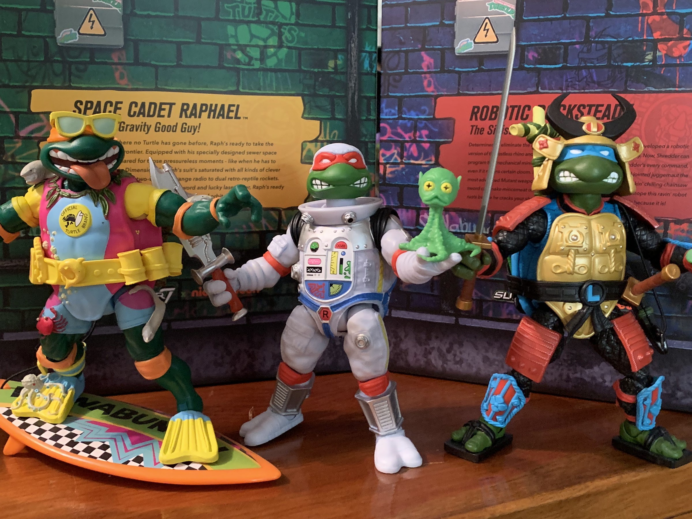
Space Cadet Raphael is the third Super7 reproduction of the 1990 Turtles in Disguise wave by Playmates Toys following in the footsteps of Sewer Samurai Leonardo and Michelangelo the Sewer Surfer. Raph is stepping out of the sewers and into the vastness of space as he’s apparently decided to become an astronaut. I’m not sure what about Raphael’s personality made him the most likely to do so (seems more like a Donatello thing), but I guess that’s not important. For me, the vintage version of this figure (which I sadly no longer possess) was one of my favorites. I don’t really know why, I just kind of liked how it was all put together. And I liked it even more after the release of Space Usagi because it meant Raph had a buddy to take with him on his expeditions. Because of my fondness for that figure, I was really looking forward to this update from Super7. Tempering my enthusiasm though was the fact that Wave 5 in this line was a mess. Wave 6 was better, but the repeated delays didn’t exactly add to my confidence – quite the opposite actually, so how did this one turn out? In many ways, I would say as expected, but that’s not exactly a good thing. Read on for more!
He’s in a bulky spacesuit, and yet he seems smaller than the other Raphs. That astronaut diet must be something.
Space Cadet Raphael stands at roughly 6″ in height. This puts him right in-line with the Wave 1 release of Raphael, which seems right, but then you factor in that this Raph is in a space suit and it makes less sense. Perhaps that’s a nitpick, but what’s not is that he has noticeably less mass than his naked counterpart. How does a bulky space suit make one smaller? It obviously doesn’t, but in the case of the figure I think it’s because most of what you see on the torso is an overlay. And underneath that overlay is just the basic “skeleton” of a Super7 figure, not a bulky turtle shell. Is it a big deal? I don’t know that it is. It’s likely something that will vary from person to person, but I personally liked how the previous Turtles in Disguise releases appeared slightly larger than the standard versions and I wish that were true of Raph.
I do like the almost quilted texture of the shell.
The sculpt on this figure is probably the thing people are likely to be most pleased with. The head is in-line with the vintage version, stylistically. The paint around the edges could be better, but it’s probably good enough. The suit has a lot of sculpted detail on it and most of those details are painted. The body is cast in a shade of white that has a slight blue tone to it. There’s blue air-brushing over it which I think helps to minimize that plastic look present on Deep Space Homer. There are yellow zippers along the side that are painted as well as a blue harness. The tanks on his back are a nice metallic silver with black straps painted on as well. The elbow and knee pads are red plastic and don’t quite match the finish of the painted parts so they stick out in a bad way. There’s also a couple of pouches sculpted on that aren’t painted either and they detract from the look of the figure. Super7 did add a wrist communicator though that’s a metallic silver and it flips open. Inside is a decal of Fugitoid so that’s pretty neat. The front of the torso is not a big sticker, but some kind of print. The flatness of it makes it look a little cheap, but it would look worse if it was a sticker.
“What’s up, Fugitoid?”
Raph’s got a new helmet this time around which some are referring to as a Storm Trooper helmet. I can see it, but I’m not convinced that was the intent.
Super7 usually goes big on accessories, and with this figure they went further than some. Raph comes with 4 sets of hands: open, fists, gripping, and trigger finger hands. They peg in pretty easily and come out almost too easily, but we’ll speak more on that when we go over the articulation. He has his standard head and the plastic dome to go over it. It’s a nice, clear, plastic or acrylic, but the way it was molded left this big, ugly, “nipple” in the middle of the top that sucks. Maybe the factory they used didn’t know how to do such a piece and do it right, but I have a Mr. Freeze figure with basically the same feature and his dome features no such imperfection. There’s also an alternate head and it’s basically Raph with a full astronaut helmet. It turned out pretty well. While I am loathe to go against the vintage original, I will say the new look is tempting.
Yuck. I don’t know what went wrong here.
For weapons, Raph has the same ones the vintage came with and then some. He has his laser pistol which is done in a metallic plastic and it includes a hose in the same color. It’s very flexible as there’s no wire inside and kind of feels like an old payphone chord. It plugs onto the handle of the gun and then connects to a port on the torso of the figure on the right side. The port on mine was barely open out of the box to the point where I couldn’t even tell it was a hole until I stuck something else in there. I had to widen it with a screw to get the hose to fit, but now it’s fine. Raph also has his “space sword” which has a design that appears to be close to the vintage figure’s, but also has a new, translucent, red, handle. It’s pretty cool, though I never think of Raph as a sword guy. Apparently Super7 doesn’t either as they also gave him a pair of sai. They’re sort of like the lightsaber equivalent of a sai as the bladed portion is in the same red, translucent, plastic that the sword’s handle features. Super7 must love this stuff because they also gave Raph some goggles made of the same plastic, though it also has a silver mouthpiece. Lastly, there’s a slice of pizza in a silver, vacuum, sealed pouch that looks pretty neat. The little green alien that was part of the vintage figure’s sculpt is also present, but now he’s a little buddy figure. He has an articulated head, but otherwise is just a slug figure, but a neat idea nonetheless.
I assume Raph never leaves home without his trusty sai, so it did seem odd that Playmates would send him into space without.
You won’t find me complaining about the accessories with Raph, but you will find me complaining about the articulation. Never the line’s strong suit, Raph is still disappointing even by those low standards. The head is on the usual double ball peg that’s really long. It works and works well as far as range of motion goes, but does leave a sizable gap where the neck meets that head. The shoulders are hinged ball pegs, but because Raph’s suit has these black cuffs at the shoulder, his arms only go out to the side about 45 degrees. They rotate fine, and the biceps swivel is acceptable as well, though a little tight. The elbows though are atrocious. I don’t think this figure even gets 45 degrees of bend there as the elbow pads are over the hinge. His elbows might be worse than Super7’s Optimus Prime – they’re that bad. It’s just a baffling design error. Why not just sculpt the elbow pad onto the figure? We know Super7 will never do a double joint for an elbow, even though they work best with characters like the turtles who have elbow pads, but doing it this way is unacceptable. It’s just dumb and it makes me question who approves this stuff over there. An action figure that can’t bend its elbows? It’s ludicrous. The wrists swivel and all of the hands have horizontal hinges, another mess-up that shouldn’t be as the trigger and gripping hands would be improved with vertical hinges. Super7 is usually good about that, but not here. The hands are also set too deep in the forearm so the hinge is almost useless. Try to bend the open hands into more of a cupping position (since you can’t get that our of the elbows) and they’ll just pop out. It almost feels like nothing is holding those hands in place and swapping weapons is a frustrating experience. Just take the hands out first and do it that way. Posing will also drive you crazy as if you go to bend the elbows or even rotate at the shoulder you’re liable to accidentally knock a hand out of place. This is not a well-thought out action figure.
This is as far as the elbows can bend.
Ranged or melee? He can do both.
In the torso is a waist twist, but because we’re dealing with a giant turtle here, it’s more like a pivot point. The legs connect via hinged ball pegs so Raph can just about do a full split as well as kick forward and back a decent amount. There’s rotation there as well so you get some thigh pivot, but it’s a bit tight. The knees, like the elbows, are single-hinged and feature kneepads to contend with. Raph can bend his knees better than he can his elbows, but still can’t do a full 90 degrees. The lower leg can also rotate on that joint. The feet have little range hinging forward and back. They basically behave like a ratcheted joint with only 3 positions. The ankle rocker works well though and is probably the most consistent joint from figure to figure in this line.
Can’t forget the pizza.
Like a lot of figures in this line, Space Cadet Raphael is a figure that looks reasonably good on a shelf, but isn’t that fun to handle. And it’s all a result of just bad design. It’s not cheap, it’s just incompetence. Why are things like the elbows getting worse as we go deeper into the line and not better? The original turtles can at least bend their elbows and the design is basically the same, but this one can’t. I also think the figure should be bulkier than it is since we are talking about a turtle in a spacesuit here. I didn’t mention it when going over the accessories, but a little more ingenuity with the sculpt to add some weapon storage also would have been appreciated. This figure comes with a lot, it’s the figure’s greatest strength, but he has no where to put any of it when he’s not holding onto it. A holster for the gun, some loops for the sai, anything would have been better than nothing. Again, this isn’t stuff that would have cost Super7 more money, it just requires more thought.
Raph, you’re gonna need a bigger gun.
“I can’t believe NASA put this guy on my crew.”
This figure is basically relying on nostalgia to sell you on it. And with me, it got me. I know preordering a Super7 figure is a risky proposition, but I did it anyway. I have more on preorder, but I’ve mostly stopped doing so until I can see the finished product. Had I known what I was getting going into with this one, would I have still bought it? Not at the MSRP of $55. This isn’t worth it. It’s not the trainwreck that Sewer Samurai Leonardo was and it looks better than April or Shredder, but it’s not exactly a strong addition to the line. I think on clearance this one has value, maybe at $35 or so, but it has too many problems to be a recommend at $55. I hope Super7 takes such criticism to heart as I certainly don’t want to dislike their products. I have liked many of them in the past and I will have some a review very soon at that. It’s just frustrating to see a company keep making stupid mistakes with a property that should be a homerun.
Want to see what I thought of the other Turtles in Disguise or maybe you’re curious about that Optimus Prime I mentioned:
Well, after looking at the Wave 6 Slash a couple of weeks ago we can now finally turn our attention to a Wave 5 release from Super7’s line of Teenage Mutant Ninja Turtles Ultimates! series of figures: Sewer Samurai Leonardo. The thing with TMNT is, you have the four good guys, a few core allies,…
We are back with one more look at Wave 6 of Super7’s Teenage Mutant Ninja Turtles line of Ultimates! action figures: Sewer Surfer Mike. This, like every figure in the line so far, is a recreation of a Playmates Toys figure from the vintage line of TMNT action figures, and in this case it’s of…
I think we’re over discussing the merits of non-transforming Transformers, right? It’s been done for a long time, but was really pushed to the forefront with the Hasbro RED series in 2020 and while there will always be a section of the fanbase that wants nothing to do with such a concept, it’s still an…
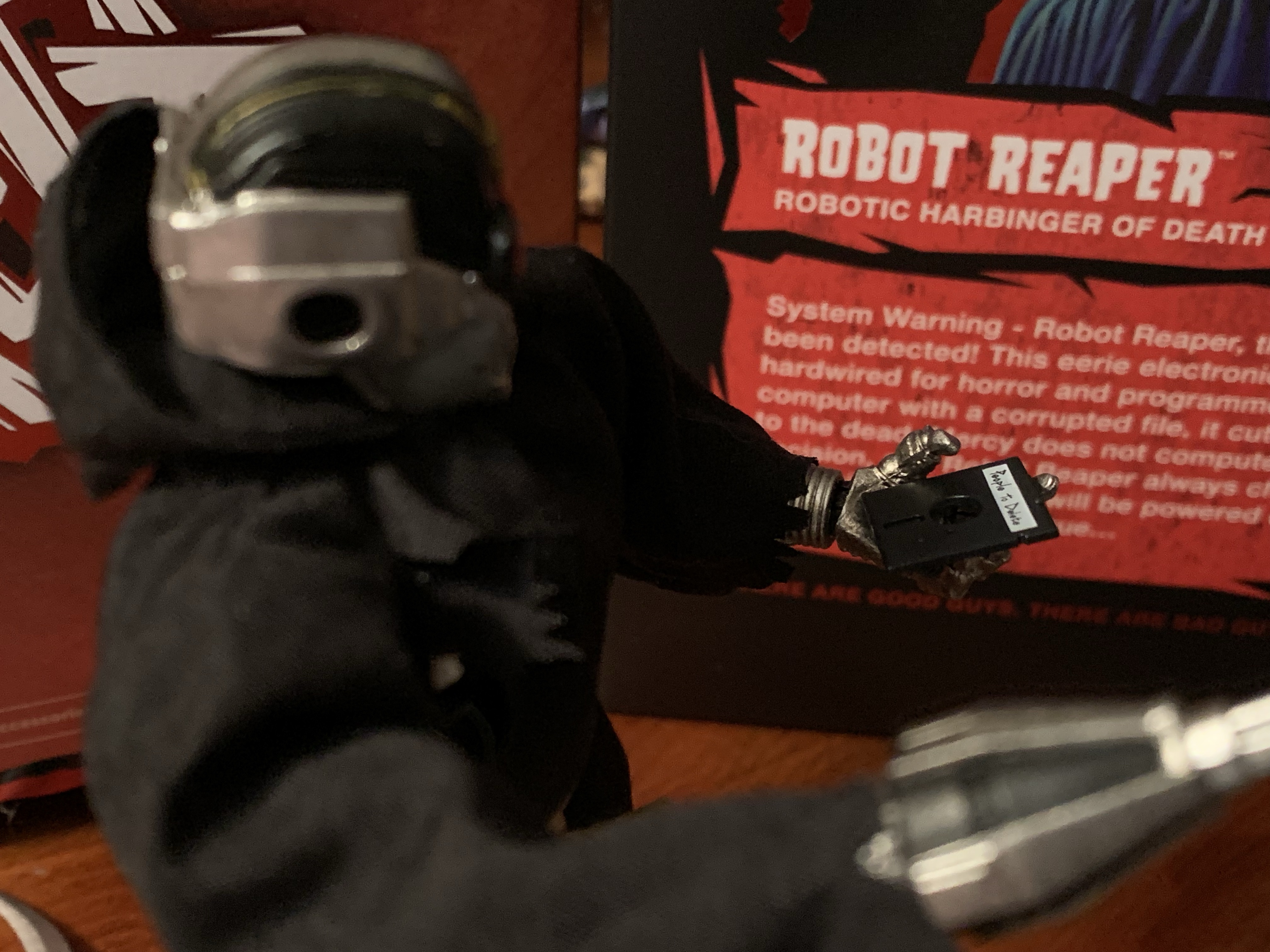
He’s a reaper and he’s a robot, hence the name Robot Reaper.
Happy Halloween, my fellow action figure enthusiasts! It’s a day for mischief, a day for candy, and a day to laugh at Death. Today, we’re laughing at a special kind of death, a robot death, and it comes courtesy of Super7’s in-house brand The Worst. The Worst is a line of action figures that’s basically self-explanatory. They’re a villainous sort and many of which follow a certain archetype, but with a twist, like a Dracula that’s more like a man-bat. As the box says, “There are good guys. There are bad guys. Then there are…The Worst!”
This looks like a cool group to go trick-or-treating with.
I’m not big on unlicensed action figures or in-house brands. It’s not because I have an aversion to such on principal or anything, but that I just spend enough of my income as-is on licensed figures that I just don’t have much room to stray. Every now and then though, a design comes along that I can’t ignore. The Robot Reaper was very much such a design. He is as described, a robotic version of the Grim Reaper, but he has this old school aesthetic about him that just makes it work. I never paid any attention to The Worst when it was just a ReAction brand, Super7’s 5 POA line of retro figures, but when I saw the solicitation for this figure I was hooked. I just wasn’t sure how it would turn out. I played the waiting game, and once some impressions had arrived after those who pre-ordered it got the figure in, I felt confident enough to grab one myself. Did I make the right call, or is this thing really just The Worst?
This guy has a lot of electronics, none of which appear to be new.
Robot Reaper comes in the usual Ultimates! packaging with a nice painting on the front and a write-up on the back. Out of the box, the figure stands pretty much right at the 7″ mark. It’s obviously a plastic action figure with the typical Super7 engineering, but it’s all clad in a soft goods robe affixed at the waist with a faux piece of hemp rope. The figure is sculpted in a shiny silver plastic with lots of painted detail, much of which you can’t even see because of the robe. He has this big, glowing, red eyes that reminds me of traffic lights and I think his mouth is supposed to be open. There’s some gold piping in places and he’s kind of a reverse C-3P0 in that he’s mostly silver, but has a gold, right, shin. The robe is held via a Velcro strip along the rear of it and that rope. I’d take it off completely, but I’m afraid I’ll never get that rope as perfect as it is right now. Plus, I have no intention of displaying him naked. Most of the body though is done in a paneled approach with large swaths of silver and black, but some areas (like the spine) are far more detailed. Super7 hit these areas with a paint wash and it looks really good. The robe itself is pretty basic, but doesn’t look cheap. He very much looks the part.
“Just five more minutes, five more minutes!”
What sold me on this guy is the 80s aesthetic to some of the electronics. He looks like he was created over 30 years ago and it’s fitting for a Grim Reaper character who is thought of as an ancient force. And 30 years or so in PC tech is an awful long time. From the front, he has a nice look, but from the back it gets real fun. The default head essentially has an old floppy, disk, drive in the back of its skull. I’m not talking the small, 3.5″, not-very-floppy disks that were still around well into the 90s, but those big, black, actually floppy disks that if you interacted with them may have contained games like Number Munchers, Odell Lake, and the legendary Oregon Trail. And yes, he does come with a floppy disk that fits in the slot. It’s labeled “People to Delete” and I love it. You probably don’t want to shove it all the way into the slot as it will be quite difficult to remove, but it’s such a fun design choice.
Ah yes, where would the Grim Reaper be without his People to Delete file?
That silly gimmick is what sold me on the concept, but the figure also has a bunch of other stuff that works well to add to the package. For hands, we get a set of fists, pointing hands, gripping hands, and open hands. If you’re not in love with the disk drive head there are two others. One looks like a powered down version of the default head with some circuitry ripped out. It’s more in-line with the classic Grim Reaper as a skeleton being as this head is more decrepit, more cold, and more lifeless. The other head is the opposite. It has a more futuristic flair to it. The face is all black with a sculpted-in jaw. It’s framed by steel to give it that skull visage and there’s a red button, or light, in the center of the brow. It’s cool, but I’ll never use.
This is just fantastic.
We also get some fun accessories to round this package out. First, is the big scythe which all Grim Reapers need. It can be held as a staff or by the handles for a swinging pose. The gripping hands don’t grip it as well as I’d like, and the texture of the wood is pretty bland, but it’s fine. If you want something a bit more unique, there’s a scythe attachment for his forearm that functions like an extra hand. It’s definitely more befitting of that futuristic head. The figure also comes with an hourglass that’s flat, pixelated, and looks exactly like the loading cursor from old computers. Lastly, there’s a Not-a-Game Boy for him to play. I don’t quite see how it fits the aesthetic here, but who is going to say “No” to a little Game Boy accessory? It’s purple with a gray screen and the only thing keeping it from being a Game Boy is that it has 3 buttons instead of 2. It also has one rounded corner, like the actual Game Boy, but it’s in a different spot. I wish he could hold it a little better, it’s more an issue of shoulder range, but it’s fun.
If you’re a weirdo who doesn’t like the disk drive head, there’s also this more decrepit one.
Articulation is pretty secondary for me with this figure, and it probably should be for this line, but Robot Reaper is actually pretty decent there. The head is on a double ball, and while it’s inserted way too far into the neck, there’s at least some okay range there looking up, down, and nuance. The shoulders are just ball-hinges, but he can raise his arm out to the side okay. There’s a biceps swivel, and the elbow moves about 90 degrees. The wrists swivel and all have horizontal hinges, though I would have preferred vertical hinges for the gripping hands, but it’s not a big deal here given the weapon load-out. There is a diaphragm joint that lets the figure tilt forward and back a little, plus rotate. There’s a waist twist below that and the hinged ball peg hips go out to the side for full splits. They don’t kick forward all the way, but do kick back almost as much as they do forward. There is a thigh pivot there and the knees bend back about 90 degrees and also bend forward, if you like, since he has no knee caps. The ankles are the only joints I don’t love as there isn’t much room for the ankle rocker to pivot. I think they should have done something there to remedy that, especially with this being a unique design.
And then there’s this head for an all-together different aesthetic.
By Super7 standards, this figure is well-articulated. The robe itself is going to hinder it some, but you could remove it if you really want to try to pose this guy up. the hem of the hood is wired too, so that’s like another point of articulation. He’s a reaper, so I don’t think this one needs to do much and it does what it needs to, and then some.
“Don’t you forget about your friend, Death.”
I love this figure and it’s 90% the design. I just think it’s fun, and if you look at it and see the same then I think you’ll like it too. The elephant in the room is, of course, the price. The MSRP on Robot Reaper is $55 and that’s just too much for some. One would have liked to see a lower price considering no license is needed, but at least the accessory count is solid and the quality control is about as good as it gets for this brand. Still, those willing to wait it out will probably be able to get this one on clearance eventually. I obviously thought it was worth buying at $55 as I wanted it for Halloween, but if I were stumbling on this in February then, yeah, I’d probably hold out for a better deal. There’s also a glow-in-the-dark version on the way, if you prefer. It’s a blue color, like a frozen version, and looks pretty cool, but I think this version is better.
Do you prefer your action figures be untethered from a major brand?
These days, the buzz word in the entertainment industry is “content.” Everyone wants content, especially streamers. It all goes back to the value of intellectual property. It’s costly and difficult to turn a new product into a popular one. It’s far easier, and less risky, to just throw money at an existing brand and create…
In 2020, Lone Coconut, a small company out of the Dominican Republic, launched a Kickstarter campaign for a line of original action figures called Plunderlings. They’re basically little imp-like creatures with a pirate motif that have a very charming design. From an engineering point of view, they made for a smart toyline because every figure…
Over the years, I’ve acquired quite a few action figures designed by the good people over at Four Horsemen LLC. They’ve been designing figures for companies for awhile now. My first exposure to the company was via NECA’s inaugural line of Teenage Mutant Ninja Turtles based on their appearance in the Mirage Studios comics. Lately,…
We’re going to keep this Marvel/Mutant Monday thing going for one more week! After taking a look at a trio of figures from Hasbro’s new X-Men ’97 line of figures in its Marvel Legends catalog I’ve decided to do one more: Bishop. The first three figures I looked at were basically all missing pieces to the VHS line Hasbro did last year for X-Men, the animated series which aired on Fox in the 90s. Bishop wasn’t featured in that line either despite being the most frequent guest star in the series so it would stand to reason that I’d be interested in adding him as well. Unfortunately, or fortunately depending on your view, Bishop’s character received a redesign for the new show. It’s not incredibly drastic, but it removed his most mighty possession: his fabulous mullet.
Yes, Bishop decided to ditch the 80s haircut he had (despite being a guy from the future – maybe the mullet makes a comeback?) for something a bit more modern. He now sports a closely cropped head of hair, but largely maintains his look outside of that. He’s still sporting the yellow and blue, still has that kerchief about his neck, and also carries a big gun. Well, more on that last part later. Still, for someone like me who just wants to assemble the team from the show I grew up watching, it seemed like this was a figure I could skip. Then I saw him in a store, then I saw him again, and eventually I caved and bought the thing. I just like how it looks! Something about that yellow and blue will always appeal to me, but beyond that the figure looks better than a typical Legends release. It’s more in-line with how I would personally design the line if asked to so let’s dive into this one so I can explain what it is about Bishop that made me want to take him home.
He’s a bit bigger than your “Vulcan” body figures, but smaller than some of the villains presented in an oversized fashion. And yes, that is a custom Morph head.
Bishop stands at right around the 7″ mark making him the tallest figure in his wave. He’s composed mostly of blue and brown plastic with some yellow where it makes sense. His belt and the cuffs around his shoulders are soft, yellow, plastic keyed into the figure and secured with glue. The ends of his sleeves also appear to be yellow strips of plastic glued into place. The only paint needed on this figure was the yellow and black stripe down the body, the red and black X logo on the belt, and the details on his face. And perhaps to no one’s surprise, the painted areas are the weakest part of the figure and it’s mainly just that yellow stripe that runs the length of his body. All of the figures I found on the pegs had some issue with that part of the figure, either messy application or a chipped spot and I settled on the one that bothered me the least. The yellow isn’t as saturated as it needs to be so some blue shows through while the black line running down it gets messy in places. The easiest way for Hasbro to have prevented that would have been to cast the figure in yellow and paint on the blue and black, but Hasbro really doesn’t want to use that much paint so this is what we got.
I really like how the torso has a lot of mass to it.
Aside from that, I really like the presentation on this figure. I don’t have any other Bishop figures (I never even got the Toy Biz Marvel Legends one), but I believe most of what is presented here is new. He has a much sturdier build than most Legends figures I’ve encountered. His shoulders are broad, his chest has a lot of mass, and his proportions look great. I do think the cuffs at the shoulders help to minimize that low shoulder look a lot of Legends have and they also make the shoulders appear bigger. I’m guessing if I cut those off I’d be less impressed, but since they’re present I have to give the figure its do. I also really like the matte finish this thing has. It’s on the blue portions as well as the skin and it’s just really, really nice. There’s a temptation to seek out an older Bishop head that would better match the character I know, but I doubt any head I found, custom or official, would have the same finish. It means I’ll probably just have to get used to short haired Bishop, unless someone wants to sell custom pieces of hair since it appears to be a separate piece that’s glued down.
The gun is small and gummy, but it appears to look like the one from the show. At least the muzzle does.
The accessories for Bishop are like the other figures in the wave – terrible. It’s basically bare minimum type stuff here as Bishop has a set of trigger hands, a right fist, and a left gripping hand. I’m not sure why we need the gripping hand and trigger hand, I’d have preferred two fists, but either way the accessory count is too low. Bishop also has his gun which looks a lot like the one from the original show. It’s pretty small though and I wish it had more size to it. Maybe it’s accurate to the new show – I don’t know. In the 92 series, his gun wasn’t very consistent and there are some shots where it looks puny, but I would say it’s supposed to be on the bigger side. He has a holster behind his left shoulder that it slots into fine and the sculpt is solid on the weapon. It’s cast in gray plastic and unpainted so it’s certainly not flashy. There’s nothing else in the box though – no effect parts, no alternate head, no nothing. It’s Hasbro doing the bare minimum at a not bare minimum price point.
“I’ve still got my eye on your, cajun!”
Assuming much of what’s here is new, Bishop should articulate fairly well. Or at least as well as a burly fellow like him can. The head is on a double ball peg and it’s just okay. He looks down enough and the rotation is obviously fine, but looking up is severely limited. That’s because Hasbro just buries the lower part of the peg in the neck and doesn’t allow for as much range as it could. The shoulders are just hinged ball pegs and they rotate and can go out to the side to a horizontal position. The biceps swivel is fine and the double-jointed elbows bend past 90 without much fuss. The wrists swivel and the trigger hands have vertical hinges, the rest horizontal. In the torso is an ab crunch that’s pretty “clicky.” It basically has three positions: neutral, forward, and back. Going back just makes his belly stick out and he looks pretty silly, going forward is fine, but it’s not a great joint. The waist twist is a peg twist. The hips go out to the side well past 45 degrees though not to full splits. He kicks forward about 90 degrees, but doesn’t kick back very far. There is a thigh cut and a boot cut, though the thigh cut breaks up not just the striping down the left side of the figure, but also the sculpted pouches on the thighs so it’s a pretty useless joint. The knees will go past 90 degrees, and are on the tight side. The ankles hinge forward and back a good amount while also pivoting just fine.
“For the future!”
The articulation for Bishop is probably acceptable given he’s a big dude with a gun, he’s not here to do high kicks and such. My only real complaints are with how they did the joint at the head since he should have more function up there if they just did it right. I’m also kind of tired of these Legends figures with useless thigh cuts that break up the costume in unnatural ways because who is going to pose their figures in such a way? Put the rotation at the ball joint and it will look so much better. The torso also sucks and I’d like to see Hasbro ditch these ugly ab crunches in favor of double ball pegs in the abdomen. That will let the figure bend forward and back, especially if paired with a ball joint at the waist, while also providing tilt and rotation. It’s not something that’s really any more expensive to produce compared with what we have, it’s more a matter of changing over the infrastructure that’s the real cost. They’ve been doing it with pin-less joints for years now, a figure of mostly new tools like Bishop would have been a great place to incorporate more advances.
It’s not the Bishop I want, but he does look pretty nice.
The criticisms I have for this representation of Bishop are basically criticisms directed at Marvel Legends in general. For a Legends release, I think this Bishop is pretty damn good and it largely just comes down to the finish and proportioning. He’s supposed to big a big, burly, man and he is. He has the mass to his chest that so many figures lack. Just look at a figure like the well-received VHS Cyclops or the new Magneto from the side – there’s so little mass they’re almost flat. That’s not the case with Bishop and he looks a lot better than most figures as a result. He looks so good that I bought him when I had no intention of doing so. I probably could have waited for a clearance sale, but didn’t want to chance it. Now watch them re-release the figure with a ’92 inspired head (you know they will) so I can kick myself for giving Hasbro money in the first place.
If you’re interested in X-Men ’97 here are my other reviews on the line:
Everyone can relax – Gambit has returned. Or arrived, since I’ve never reviewed a Gambit action figure in this space, but that’s because I haven’t bought a Gambit figure in about 20 years until now. When X-Men arrived on airwaves in the fall of 1992, hardly anyone on that team could be considered a true…
Previously, on X-Men reviews we looked at Magneto from the upcoming series X-Men ’97. The animated series may have been delayed into 2024, but the action figures from Hasbro are already here. And if you were collecting Hasbro’s line of figures based on the animated series from the 90s, this new line offers a chance…
It was two years ago that Hasbro made the announcement that it was wading into the weeds of X-Men, the cartoon series that aired on the Fox Kids Network from 1992-1997. The line was released across eight installments in 2022 (plus a ninth if you include the obviously animated-inspired Apocalypse released on a retro card)…
When Akira Toriyama set out to draft the plot for Dragon Ball Super: Super Hero his original goal for the film was to take a favorite character of his and give him an upgrade. That character was Piccolo who had basically been left behind by the likes of Goku and Vegeta way back at the onset of The Cell Saga in Dragon Ball Z. After fusing with Kami, Piccolo was briefly the most powerful fighter on Earth, but he was soon surpassed by Cell, then by Vegeta, Trunks, Goku, and you get the idea. Following that arc, Piccolo was more like a resource for the heroes and sometimes fighter, but even when called upon, he usually just got whipped. And he was oddly okay with no longer being competitive, which I suppose is a reflection in a change in nature from the Evil King Piccolo to the Namekian he had become.
“Son! What happened?!”
That isn’t really fun though when it comes to story telling with Piccolo and it would seem that Toriyama wanted to have him be able to mix it up with the best of them again. Enter Orange Piccolo. Spoiler alert for those still waiting to see Dragon Ball Super: Super Hero, but Piccolo makes a wish to the Eternal Dragon Shenron to have his latent power unlocked to defend the Earth from a new threat. Shenron grants the wish, but also does him one better and bestows a hidden power on the proud Namekian. Shenron is not usually known for his generosity, but since Piccolo (as Kami) created Shenron it would seem the dragon felt he owed it to him to give him a power not seen in ages. The movie doesn’t have time to explain it, but that power is an ancient one wielded by Namekian warriors. When their planet was in danger, the mightiest of the Namekian would turn to their Dragon Balls for a power boost. This is detailed briefly in the manga Dragon Ball Super and not the show or film, which is unfortunate because it sure explains a lot when it comes to Orange Piccolo.
He’s orange, buff, and feeling pretty good about himself.
Orange Piccolo is this buffed out state. We don’t know if this how the form was always represented, but I think we can assume the orange part is since it ties back to the actual Dragon Balls. As for the name, well that’s entirely due to Piccolo not having much imagination or time for fancy titles. The form’s name is basically an afterthought and a little bit of a joke that works with the Piccolo character. The only thing we really need to know is that Orange Piccolo is a really big version of Piccolo that’s orange and really powerful. How powerful? Toriyama suggests that he’s on Goku and Vegeta’s level in this form and likely behind Gohan’s new Beast form. I’m not sure if we’re supposed to assume that this is something Piccolo can now do at will or if he’ll need Shenron’s help in the future, but for now, he’s got a cool new form and it’s plenty powerful. Piccolo fans, rejoice!
Orange Piccolo probably marks the end of the Super Hero subline which has been a mix of general release and Premium Bandai figures.
What just might be the final release from Premium Bandai for Super Hero is indeed Orange Piccolo. The figure comes in the same Super Hero packaging as the previous releases only much bigger. And that’s because Orange Piccolo stands at around 7.5″, but beyond his height is his mass. Remember when Trunks got super buff in his fight with Cell? That’s kind of like what Piccolo goes through with this transformation. His head becomes more square-like, his neck is almost as wide as his ears, and his chest is massive. The flesh of his head, neck, and torso is a pale orange while his arms are a more saturated shade. He loses all of the lines on the normally green portion of his arms while the puffy areas remain yellow with a red rim (Super Hero followed the manga coloring so those areas were yellow instead of pink). That’s the basis of the transformation and you either like it or you don’t. I love these big, chunky, action figures so this works for me. At first, I was torn on Piccolo’s color change from green to orange as I think the green is just a part of his identity. Now knowing why he’s orange, I’m less bothered by it. It’s a neat way to call back to what the series is named after and strengthens the lore of the property (though it does raise questions as to why none of the Namekians tried this to stop Frieza, but we’ll just have to ignore that).
The size and the expressions are what sell this figure.
As a figure, Orange Piccolo casts an impressive…figure…on a shelf due to that size. The figure is comprised largely of orange and purple plastic with the purple gi closer to a fuchsia to simulate an aura. There’s some pink shading on the gi as well that’s heavier at the cuffs of the pants and the abdomen. The other paint is reserved for the yellow and red portions and it’s done okay. This figure is a “premium” release and cost $85 so I wouldn’t blame anyone for demanding a little more out of the red piping. The right shoulder on my figure is a little sloppy and there are spots here and there where it could be cleaner. The elbow hinges, which have the pattern continued onto them, are surprisingly clean. I’m a little concerned how these painted hinges will hold up over time, but their movement is smooth so it may be less of an issue than it would be with a cheaper product. The fingernails look like they may just be painted on and they don’t look great. The portraits, on the other hand, are terrific in keeping with Bandai’s output of late. This is a pretty typical release in that it mostly looks fine, but would look improved with a paint wash (especially on the boots) here and there, but that’s something Bandai doesn’t seem to like to do much.
“Oh my, if it isn’t that pathetic Namekian I nearly destroyed all those years ago.”
Like Gohan Beast, Orange Piccolo uses a rubbery overlay for the top of the gi. And like Gohan Beast, this is a mixed bag. On the plus side, you remove any visible joints in the torso. There are new cuts in the cuffs of the shirt though and they need to be accounted for when posing as the figure will look terrible if they’re exposed. The main drawback though is with the articulation. Piccolo has a double-ball peg in his diaphragm, but it’s rendered useless by the overlay. It does nothing aside from annoy as sometimes it will rotate with the waist which can prove irksome since his barely visible abs won’t line-up properly with his pecs. Underneath the overlay, the chest is fully sculpted and painted so if you wanted to you can remove it and have a shirtless, but better articulated, Orange Piccolo, but do you really want to do that to your $85 figure?
“WAIT! WHAT?!? AN ORANGE NAMEKIAN?!”
Like Gohan, the rest of the articulation is mostly fine. The head is on an oddly shaped joint, but it essentially functions as a double-ball peg. The head comes off easy, but it still moves well in tandem with a neck joint and you get up, down, and some nuance. The shoulders are on hinged pegs and that peg slots into a butterfly joint. The arms go out to the side at just about a horizontal position and rotate fine around the cuff of the shirt. The butterfly joint is pretty limited thanks to the overlay. There’s more forward than back, but I question the need to have it at all if it’s going to be this limited. There is a biceps swivel and a double-jointed elbow which does bend past 90 degrees even with the added bulk. The wrists are on hinged ball joints so they rotate and hinge just fine.
“I’ve been looking forward to this, Frieza!”
The waist is on a ball joint so there’s some forward and back to go with the rotation at that joint. The belt is a floating piece that may tab in on the back. The flatter portions of the gi overlay will be exposed if you bend the figure too far in any direction, but the belt can be positioned to remove that. At the hips, the legs go out to the side to almost full splits and Piccolo can kick forward to a horizontal position. They don’t kick back very far and there’s a thigh swivel there that works okay, but isn’t the prettiest joint. Double-jointed knees bend past 90 degrees and the ankles swivel at the top of the boot. Because the boot is such an odd shape, the hinge and ankle rocker offer little range in any direction, but you get a toe hinge!
Not to be forgotten, is Gohan’s new Kamehameha effect part. It can be used with Goku, as well, or even Gohan Beast.
Basically, all of the problems Gohan Beast has so does Piccolo, but because of his bulky appearance, it’s even more restrictive. That’s not necessarily a terrible thing though. While I want my figures to have as much range as possible, this version of Piccolo is unquestionably a bruiser and brawler. I think he has just enough and the only real change I’d implement is to dump that overlay. If the overlay was designed to be removed easily because he went shirtless in the film or something then the trade-off would be worth it, but otherwise I’ve been content with the all plastic approach to the torso of past figures. I did see some reports of people getting figures with loose hips. I can say mine are fine. They could probably stand to be a little tighter, but it isn’t an issue. It’s likely something that’s just going to vary from figure to figure. The rest of the joints are all nice and smooth.
As for accessories actually intended for Piccolo, it’s basically four portraits and some clenching hands and slightly less clenchy hands. In other words, not much.
The one area Orange Piccolo does feel light though is with the accessories. He has just three sets of hands: fists, open, and a slightly clenching hand. He does have four heads: stern, smirk, yelling, and teeth gritting. They all look great too and are viable, but that’s where it ends for Piccolo. Because this is the Super Hero subline, he apparently needs to come with parts for the Gohan Super Hero figure like all of the rest. That means he has a set of clenching hands with posts on them and a Kamehameha effect. It’s the same effect that came with Super Saiyan 4 Goku only now it’s the more traditional blue instead of red. And I like the effect and I like that it can actually work with both Gohan and Goku, but where’s Piccolo’s effect part? I’d rather get an effect part for the actual character I’m buying a figure for, not someone else. It’s nice to have, but did that effect part actually help sell more Orange Piccolo figures? I’m skeptical.
This is one tag team you don’t want to mess with.
Orange Piccolo is another A-/B+ release from Premium Bandai. I like the figure, but I do feel like it’s missing that extra ingredient to push it over the top. And that’s how I’ve felt about basically all of these Premium Bandai figures I’ve purchased based on the movie. And since this was a Premium Bandai release, it’s basically made-to-order so if you snoozed several months ago when it went up for sale you’ve already lost. The MSRP was $85 and those who bought Gohan Beast got free shipping. It’s likely more expensive on the secondary market, but if you must have an Orange Piccolo, that may be your only option. Dragon Ball Super is rumored to be coming back to television in the near future, so maybe when the anime gets to Orange Piccolo we’ll see a re-release of some kind, but that is probably a long way off at this point. The $85 is pretty pricey for what’s in the box. I can give it a somewhat tepid recommend at that price, but anything over $100 would be a really hard sell. Good luck!
Interested in other releases from Dragon Ball Super: Super Hero?
Last summer, fans of Dragon Ball were treated to a new movie: Dragon Ball Super: Super Hero. The intended purpose of the movie seemed to be to take two somewhat forgotten characters in Piccolo and Gohan and give them a makeover. The manga and anime Dragon Ball Super has basically been a story about Goku…
As part of the promotion for the film Dragon Ball Super – Super Hero, Bandai released a wave of action figures from its S.H. Figuarts brand of characters from the film. The neat thing was, these releases were actually really cheap relative to other SHF releases with a MSRP of just $35. Of the four,…
Last year saw the release of a brand new film in the Dragon Ball franchise: Dragon Ball Super: Super Hero. The mouthful of a title was a bit of a throwback affair. It seemed that Toei and series creator Akira Toriyama wanted to use the film to return the spotlight to Gohan and Piccolo, two…
Everyone can relax – Gambit has returned. Or arrived, since I’ve never reviewed a Gambit action figure in this space, but that’s because I haven’t bought a Gambit figure in about 20 years until now. When X-Men arrived on airwaves in the fall of 1992, hardly anyone on that team could be considered a true household name. Wolverine was certainly the closest. He was featured in a lot of Marvel related ads and had his own solo comic series as well. Other characters showed up as guests on Spider-Man and His Amazing Friends or in the pilot for the never was series, “Pryde of the X-Men” and the arcade game essentially based on it. My own familiarity with the team was mostly from the first run of ToyBiz action figures featuring Wolverine, Cyclops, Storm, Nightcrawler, Archangel, and Colossus.
Gambit was not featured in any of those things. For me as a kid in ’92, the first episode of the cartoon series was my introduction to the character and I don’t think I was a unique case. Gambit was the break-out star of the series, as far as I’m concerned. He was essentially designed to be cool. He’s probably over-designed, but somehow Marvel pulled it off. He looks ridiculous, and yet come 1993 that’s who I wanted to be for Halloween. I think it’s the trench coat that brings a lot of that “it” factor upfront and the way his face is framed with that unusual hood he wears and red eyes which adds a mysterious component. I remember thinking his gloves were cool, and for some reason exploding playing cards just struck me as bad ass. All of that allowed him to pull off the hot pink undershirt and that weird, blue, thing he wears around his neck area.
This figure should be pretty familiar to more dedicated Legends collectors.
Following the debut of X-Men, most of my peers would cite either Wolverine or Gambit as their favorite character. That’s just how it was. ToyBiz hit stores with Series 2 of its X-Men line around the same time and Tiger Stripe Wolverine (or Wolverine II) and Gambit were the two hardest to find. Maybe the character’s popularity has faded over the years, but I was surprised that Gambit wasn’t featured in the VHS line of Marvel Legends based on the show. I think the real reason for his exclusion was due to the fact that Hasbro had somewhat recently released a Gambit figure in the same getup on a retro card exclusive to Target. I think it’s even still available. The same was true of Rogue and I think Hasbro made a business decision not to compete with itself for both figures, but if you’re going to have a line of X-Men figures based on the animated series you have to have Gambit.
The heigh isn’t quite right, but I’m not sure it is with any figure in this line. Look at how massive Sinister is, for crying out loud.
Enter X-Men ’97 and its first wave continues to right the wrongs of the VHS line by including, among others, Gambit. This figure is basically a re-release of that Target exclusive with minimal changes that come down to a new head and new overcoat. I don’t have that Target figure, but as far as I know, everything else is the same including the accessories. The paint application is a little different to better reflect the new source material, but that’s it. Chances are, if you have that figure and you’re happy with it, you probably won’t need this one. I, on the other hand, just want an animated Gambit to put on my shelf with the rest of the animated X-Men so I grabbed this one along with Rogue and Magneto so lets see if that was a good decision or not.
The portrait is very animation inspired.
Gambit comes on the same card as the rest of the line with artwork from the show on the front. Out of the box, Gambit stands at approximately 6.25″ to the top of his head and 6.75″ to the top of his hair. Like the rest of this wave, the scale is suspect. Gambit is a bit too tall, but not egregiously so. The head sculpt will get the most attention here as it has a very animated look to it. It’s a very clean approach with few lines to make it easy to animate. I don’t hate it, but it doesn’t look like Gambit from the original series. It looks more like him than the Target figure, but that’s it. He looks reasonably enough like the art from the new show, so that’s fine. The paint is iffy though. The eyes are good and he doesn’t have lipstick, but the edge of the cowl isn’t clean. There’s a spec of flesh color on the right eyebrow of my figure and they added some stubble to his chin via paint. It’s on the character model, so I can’t kill it, but I wish it wasn’t there. The hair is huge and probably divisive. I don’t mind it though. Again, not at all accurate to the ’92 show, but looks fine for X-Men ’97 based on what I’ve seen. There’s no shading on it, but it’s probably fine for the source material.
Gambit comes with his staff, though I’ve never understood why he would need one.
And speaking of shading, you won’t find any on this figure. The coat is an overlay and it’s fine. It’s pretty stiff though and won’t pose at all, but it looks okay in a default pose. The sleeves are part of the sculpt and we’ve seen these before. The hands are unique to Gambit, at least the left hand with two finger gesture, so it’s odd to see fingernails sculpted onto the digits covered by the glove. They’re black, so the flesh part is painted which ironically covers up the fingernails to make them barely noticeable. Maybe this hand is reused for another figure? I don’t know, it seems odd to me. The torso is molded in pink and the blue portion appears to be molded in blue as well and keyed in. The very bottom of the shirt is painted pink and doesn’t match as a result. It’s pink over black plastic, which is an odd choice. I guess it’s because they wanted to do the legs in black so they could paint the pink thigh stripes, but it’s a lot easier to paint black over pink than the opposite. The pink stripes are also sloppy and the black shows through. The boots are just blue plastic and it shows.
It’s a very mixed bag on the presentation. Excepting the boots, the parts in molded plastic look fine, but the paint is bad. Gambit also has the same issue as Rogue in that the overlay coat isn’t snug enough at the shoulder. There’s plenty of pink showing between the sleeve and overlay when it didn’t need to be that way. It’s basically just another figure that is only concerned with the bullet points when it comes to the presentation, but the finer details are most certainly lacking.
Holy crap! An actual effect part!
Gambit does get to have more accessories, at least, when compared with Rogue and Magneto who both just got a hand swap. That’s not to say Gambit is loaded, by any means. He has his staff which is molded in blue, and to my surprise, it appears to be a darker shade than the boots. It’s a staff, so it’s fine. What’s not is the gripping right hand which is too loose for it. Gambit can hold it if you’re patient and careful, but it’s not good enough. And if you wanted a two-handed pose you’ll have to search for a new left hand somewhere because Hasbro didn’t provide one. I mean, you can kind of use the default left hand, but it looks a bit silly. Instead, they provided an effect part hand. It’s molded in a transparent pink plastic or acrylic and has three cards extending from an open hand with a swoosh effect. It looks fine, there are fingernails on the hand again for some stupid reason, but the swoosh kills it for me. It makes no sense because it extends beyond the hand in both directions. The swoosh should end at the front of the hand and extend only one side, not past the hand on both. It makes it look like an energy wave is shooting out with cards too. At any rate, there’s also a single card effect to place between the two fingers of the default hand. I like this one much better and it’s good, but no second portrait? No second gripping hand? No gripping hand that actually works?!
Though it’s not exactly a good effect part. That swoosh makes no sense, but Hasbro keeps re-releasing this damn thing.
The articulation is basically as expected with Gambit. The head is on the hinged ball peg that provides range up, down, and rotation, but zero tilt for more nuanced poses. The shoulders are hinged ball pegs that raise out to the side just past a horizontal position. The biceps swivel is fine and the single-hinged elbows give the figure better than 90 degrees at the elbow plus some swivel. The hands swivel and the gripping hand has a vertical hinge and the other a horizontal one. The torso has an ab crunch that goes forward pretty far, but the coat prevents much use going backwards. There is waist twist, but it’s pretty ugly because it just sits on a peg flush with the hips. The hips kick out to side about 45 degrees and kick forward all the way. There’s some range going back that’s stopped by the coat. There is a thigh cut for a swivel there and they put it in between two of the leg stripes so that’s a plus. The knees bend past 90 pretty far and there is a boot cut in the middle of the shin if you want it, but it’s ugly. The ankles hinge forward and back a solid amount and the ankle rocker is fine. My left ankle is pretty stuck at the hinge and I haven’t tried heating it up to free it.
This is definitely not the most fun figure to pose. The torso joints have acceptable range, but they’re of little use on this figure.
Aside from the left ankle, the rest of the figure is fine as far as joint tolerances go. Like Rogue, the shoulders are a bit tight, but with Gambit I don’t feel any binding at the joint. This one seems less gummy than the other two figures so at least the feel is fine. This is just one of the few figures where I wish Hasbro had inserted a butterfly joint. It would serve him well with his staff and cards, plus the coat would hide it. Double ball joints at the head and waist would also have improved the figure. I don’t think the ab crunch offers much use and a ball joint there that gets some rotation would be better. It’s a very dated approach to articulation, but Gambit’s unique attire means unique tooling is needed and Hasbro doesn’t want to spend money it doesn’t think it has to.
If he’s just going on your shelf then I guess this animated Gambit is passable. When that Mondo one shows up though he’s going to really look like a piece of crap.
The X-Men ’97 version of Gambit is essentially another compromised take on an animated character that will be acceptable for some and unacceptable for others. At $26, it’s too expensive for what’s in the box, but if you want an animated version of Gambit this is what you’re stuck with. And, for me, it’s mediocre, but passable. On the shelf with the rest of the crew, he looks okay. In hand and on its own, the figure isn’t much fun to mess with and a bit frustrating to pose the way I want to. Add the mediocre accessory load-out and frustrating gripping hand and it results in a below average action figure by today’s standards. Here I am essentially talking myself out of what little affection I have for this figure, but to summarize, if you (like me) just want a Gambit for your animated shelf it will probably get the job done. If you want something that’s an improvement over what Hasbro has already released, then you’re going to be let down. As seems to always be the case with Marvel Legends, you’re better off waiting for a sale.
Need to catch up on other X-Men animated Marvel Legends releases?
Previously, on X-Men reviews we looked at Magneto from the upcoming series X-Men ’97. The animated series may have been delayed into 2024, but the action figures from Hasbro are already here. And if you were collecting Hasbro’s line of figures based on the animated series from the 90s, this new line offers a chance…
It was two years ago that Hasbro made the announcement that it was wading into the weeds of X-Men, the cartoon series that aired on the Fox Kids Network from 1992-1997. The line was released across eight installments in 2022 (plus a ninth if you include the obviously animated-inspired Apocalypse released on a retro card)…
This week, the long wait for an in-person San Diego Comic Con comes to an end. For the first time since 2019, attendees, creators, and the like will be invited back into the city of San Diego for a celebration of all things comics, movies, and general “nerd” culture. One of the many panels this…