In the far off land of 2021 we received word that a new animated Batman series was in development and attached to it was none other than Bruce Timm. Timm was one of the main creative minds behind Batman: The Animated Series and the DC Animated Universe it spawned so this news was met quite enthusiastically. Then Warner stepped in and muddied things up. The series was originally pitched as an HBO Max/Cartoon Network joint affair, but corporate reshuffling nixed that idea. Still, Caped Crusader is actually here now in 2024 which some other projects can’t say the same. It was shopped around for much of 2022 eventually landing with Amazon. This past Friday, the entire first season was dropped all at once on the Prime service ensuring talk of it will likely be ancient history once this goes live, but we should talk about it, nonetheless.
Caped Crusader is said to have come about as a result of Timm not wanting to continue with the universe he helped create starting with Batman. That’s understandable since a lot of that cast has either retired or unfortunately passed on and trying to recreate the magic of that series seems like a fool’s game. Timm instead used the opportunity of a new animated Batman to do things he couldn’t do with the other shows. This was to be a younger Batman set in a distinctive noir setting, not some time-locked version of an otherwise contemporary Gotham. It would not be beholden to any past era of the character, but would also be free to draw from the classic comic run. It could be more mature with its action and plots since it wouldn’t be airing as part of a network television kid’s programming block.

Alongside Timm is a host of other executive producers: J.J. Abrams, Matt Reeves, Ed Brubaker, James Tucker, Daniel Pipski, Rachel Rusch Rich, and Sam Register. Brubaker was hired as the head writer and directors Christina Sotta, Matt Peters, and Christopher Berkeley split the 10 episode series (4, 3, 3 respectively). Abrams’ Bad Robot Productions would handle much of the animation with DC Studios and Warner Bros. Animation also credited. Amazon MGM Studios is also listed, though I don’t know if that’s more branding or if that studio did actual work on the show. Frederik Wiedmann was brought on as the composer for all ten episodes.
Wiedmann had some big shoes to fill taking over for Shirley Walker, but equally as large is the role of Batman himself. Kevin Conroy left one hell of a mark on the character, but he had essentially retired from the role when the show was announced and would sadly pass away before this show could be completed. Dawning the cape and cowl this time is Hamish Linklater. He is joined by Jason Watkins who serves as loyal butler Alfred Pennyworth. This is a story of a Batman just starting out. We can assume he has been at this whole crime fighting thing for a little while because he has the costume, the car, and the cave all in place. What he doesn’t have are connections just yet within Gotham’s police department and other legal institutions. Most of the citizens seem to regard him as a myth and over the course of this first season the Batman will become more established and will be known to people like Commissioner Gordon (Eric Morgan Stuart) and his daughter, Barbara Gordon (Krystal Joy Brown).

I will say upfront that I came away from the first season of Batman: Caped Crusader with mixed feelings on the show. The design is definitely one of the elements I took issue with the least. Batman resembles his original design of black and gray with those tall, wide-splayed, ears on the cowl. He does not have the purple gloves, which is probably a solid choice. Alfred has a younger, rounder, build while Jim Gordon seems noticeably younger than usual while Barbara is noticeably older. She’s a career woman who is a public defender in Gotham. I don’t know how that is supposed to work, her being a public defender for those whom her father essentially locked up, but I suppose it makes for good conflict in a TV show. I just know I wouldn’t want the police commissioner’s daughter representing me if I were to find myself in trouble with the law.
The desire for a noir atmosphere is captured in the setting quite well. Technology is of the 1940’s with old style vehicles, phones, and televisions. There isn’t much technology on display in the rogue’s gallery, possibly to keep the show firmly locked in its setting, though it does give way to more supernatural elements. Batman has always encountered such and the 90s show had villains like Clayface, the Man-Bat, and others, though I can’t recall him fighting an actual ghost at any point like he does here. There are still villains who are very much of the gangster type. The first we meet is The Penguin, who has been gender-swapped to a female crime boss voiced by Minnie Driver. The first screenshot I saw of this version of the character looked a bit silly, like it was just the classic Penguin in a wig and lipstick, but the character model is much better in the show. I actually liked this change and found that bird-influenced appearance suited a female quite well. Another villain, Clayface (Dan Donohue), was redesigned to more resemble a Dick Tracy villain while the eventual Two-Face (Diedrich Bader) appearance was surprisingly simple.
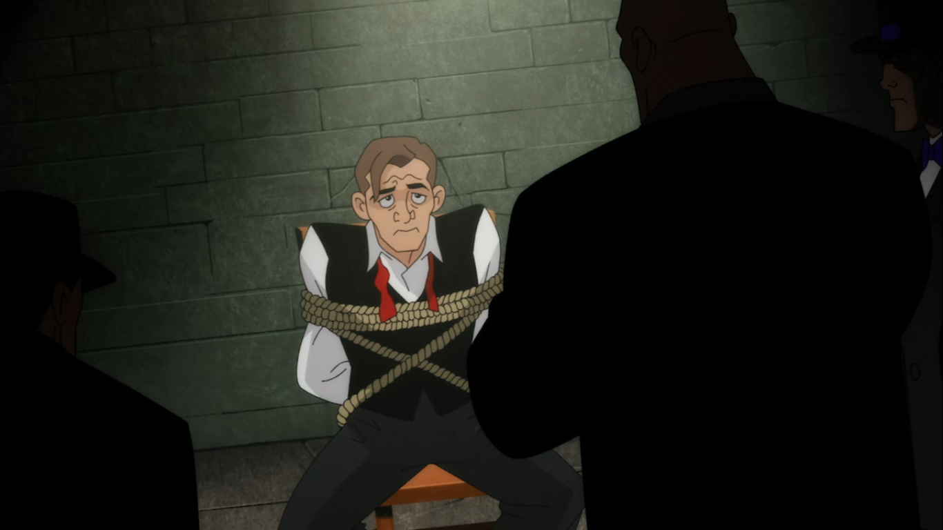
I could take or leave certain character designs, but what I found myself most disappointed in consistently was the animation on display. Characters have very stiff, sometimes robotic, movements. Walking animations with a character in full frame are surprisingly ugly for a 2024 show. Did Warner really cut the budget on this once it was no longer going to appear on one of their platforms? The lighting also isn’t always up to task. The very first shot in the series is a classic police interrogation scene under a single light. It looks awful as there’s a real lack of shadows being cast by the light. It’s a huge downgrade as far as I’m concerned. There are a few shots where more effort was put into it, but also plenty where it doesn’t even feel like the episode is taking place at night. It was never going to come close to matching the efforts from the 90s, but compared to X-Men ’97 this one leaves a lot to be desired.
The voice cast is a mixture of recognizable names as well as talent that is new to me. Most of them are quite good in their role. The only one I was left disappointed by was, unfortunately, Linklater’s Batman. Like a great many to do it before him, Linklater plays Bruce Wayne and Batman differently. Bruce is more personable, more perky, while Batman is curt and speaks in a lower voice. There’s an art to voicing Batman and I think Linklater needs more time in the role to really get it. His Batman is stiff to the point of sounding robotic. It’s possible he was receiving direction to play a character still trying to figure out his tough guy persona. Linklater is a talented actor so I’m assuming he’ll grow into the role, but it’s a little disappointing since a perfectly good Batman, Diedrich Bader, is right here on the cast already.

The ten stories of the first season are mostly stand-alone, but with some connecting tissue between them. The final three episodes are more purposefully connected and I suppose it can be considered serialized, but you wouldn’t miss a whole lot by mixing up the first 7 episodes. One villain, Harley Quinn (Jamie Chung), is introduced as her therapist persona first before the villain shows up and that’s one of the few aspects of the early episodes that wouldn’t work out of order. Speaking of, Quinn appears here in an origin separate from The Joker which was a somewhat bold choice. She’s her own thing this time around and I thought the show did a solid job with her. The tone of these stories is also allowed to be more mature. We see lots of people get shot, though gratuitous violence isn’t present. Batman is also free to punch guys in the face and sometimes the show feels a little preoccupied in pointing this out. There’s alcohol and even some romance making the show feel like it’s something akin to a PG-13 rating.
Other episodes were just okay. Few felt like they had heavy stakes and I found it hard to establish an emotional connection to any of the villains of the day. The best Batman episodes found something interesting to say about their bad guys, but this show struggled there. There’s even a kid villain in one episode that I think the episode wants us to have a response to at the end, but it just didn’t do enough to earn it. It at least does a good job of getting us to hate its crooked cop characters, but I think it also mishandles the character of Harvey Dent. We all know what Dent’s fate is to be when he’s first introduced, but this is an unlikable Dent. He’s arrogant and far more consumed with making the jump from District Attorney to Mayor of Gotham than actually doing his job so when the thing we all know is coming does, there’s no emotion. Plus there’s no one close to him to be affected by his transformation that we can feel something for instead. The Bruce/Harvey friendship is shoehorned in too late to make much of an impact, but I will give the show credit for finding another angle to play that at least puts Batman and Alfred at odds with each other. That’s also probably the only real character development we get out of our lead. We spend a lot of time with Gotham’s finest, but not a whole lot of time with Bruce or Batman. The show needs to find a way to make its lead more interesting.

I went into Batman: Caped Crusader not expecting to find something on par with Batman: The Animated Series. That would be an unfair expectation. I did expect to find something good and the product I got was at least approaching that. Caped Crusader is not a bad television series, but is it exceptional? No, not really. It’s a pretty easily digestible 10 episode season that mostly just gets credit for existing. Most of its “bold” choices for the Batman universe are just doing gender and career swaps with its characters. A lot of the story beats felt too predictable, too ordinary. The best episodes of the season were the ones that felt like stories that hadn’t really been told before, but they were few. I don’t expect it to make much of a mark on pop culture and I don’t know if a second season is even a sure thing. The show definitely expects one and it does the predictable thing of teasing a major villain at the very end to try and drum up some excitement, but it all feels a bit played out. Amazon did order a second season back in 2023, but if the streaming numbers are bad then nothing is stopping them from going back on that and getting one of those highly coveted tax write-offs. If it does come back then I’ll probably watch it, and if it doesn’t I probably won’t even notice.
Here’s more Batman content if you’re in search of such:

Batman – The Adventures Continue #50: Batman
If you’re a repeat visitor here at The Nostalgia Spot, then you’ve probably noticed that around here there is a high opinion of the television show Batman – The Animated Series. I did a re-watch of the series that spanned more than two years and also checked out the various films based on the property.…
Keep reading
Batman: The Animated Series Wrap-Up
One-hundred and nine episodes plus three features leading to one-hundred and twelve blog entries have been devoted to the subject of Batman: The Animated Series. It started as a celebration of the show turning 25 and then as a curiosity piece. Since its premiere in 1992, the show had become much celebrated and praised all…
Keep reading
Dec. 18 – Batman: The Brave and the Bold – “Invasion of the Secret Santas!”
Come 2008, the DC Animated Universe had been dead for 2 years. Justice League Unlimited aired its final episode in 2006 bringing an end to something that had been ongoing since 1992. As I touched on earlier in this year’s countdown, the DCAU wasn’t something I was particularly invested in so it’s end went unnoticed…
Keep reading