When 2025 is all said and done I think we’ll look back on it in the Teenage Mutant Ninja Turtles collector sphere as the year the NECA toon toyline started showing its age. For some, that probably already happened. Jersey Red, Chakahachi, Lotus Blossom – who the heck are these characters? They are pretty deep cuts, but they are unique characters with unique sculpts, at least. This year, there have been new deep cuts like Creepy Eddie and Tattoo, but also a what-if Leonardo and beach variations on the turtles – twice! And now we have maybe the silliest release of all: Granny Bebop and Baby Rocksteady.
NECA tends to scale these guys up. I don’t think Shredder was shorter than them in the show.
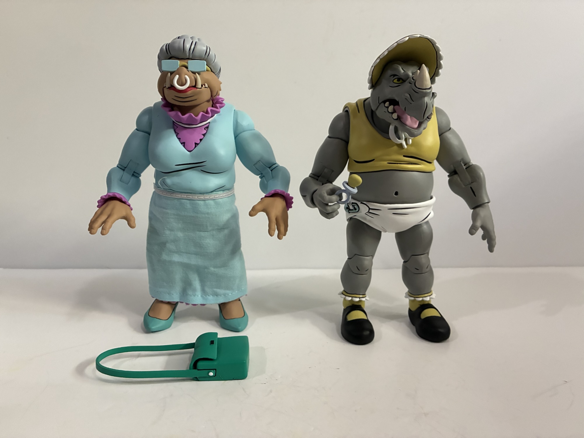
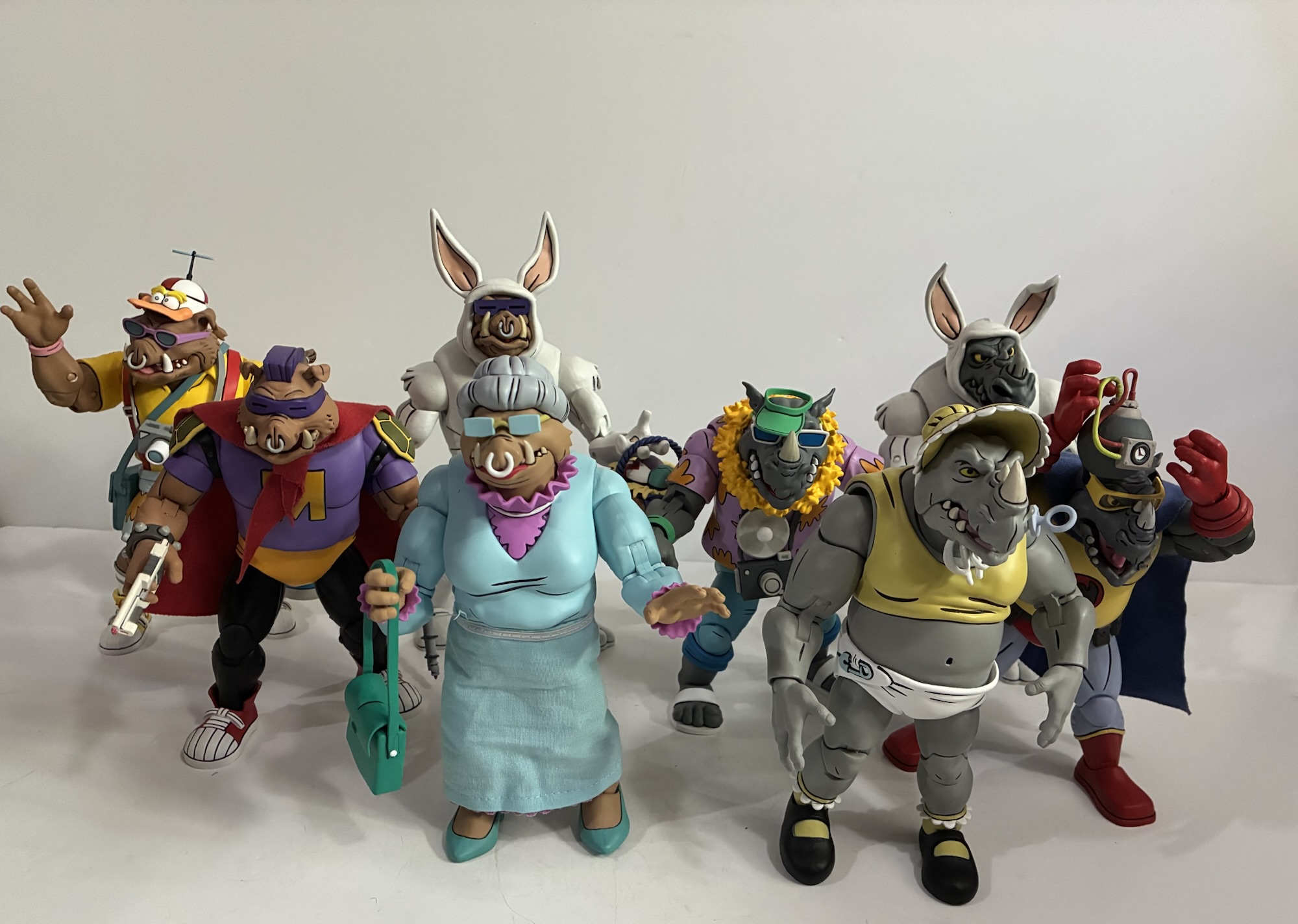
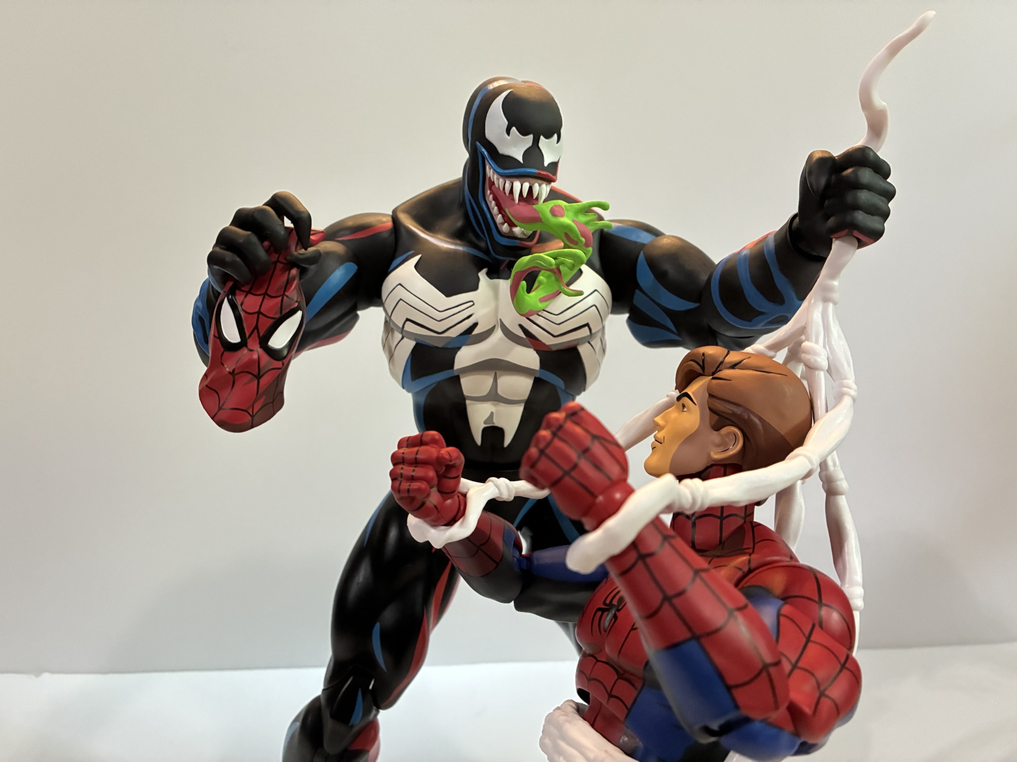
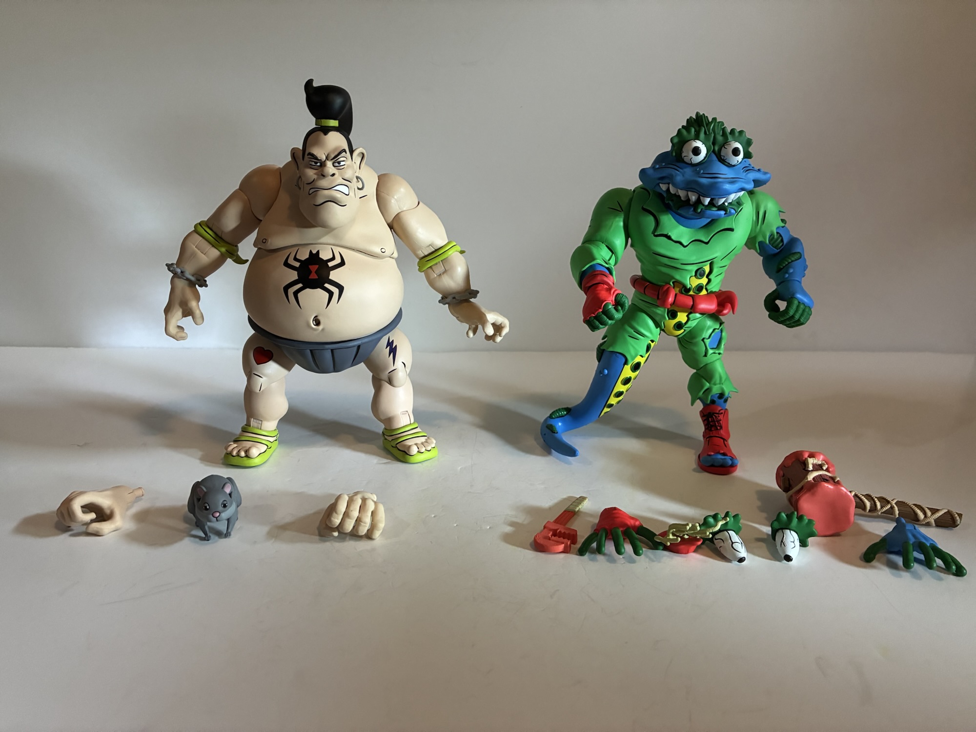
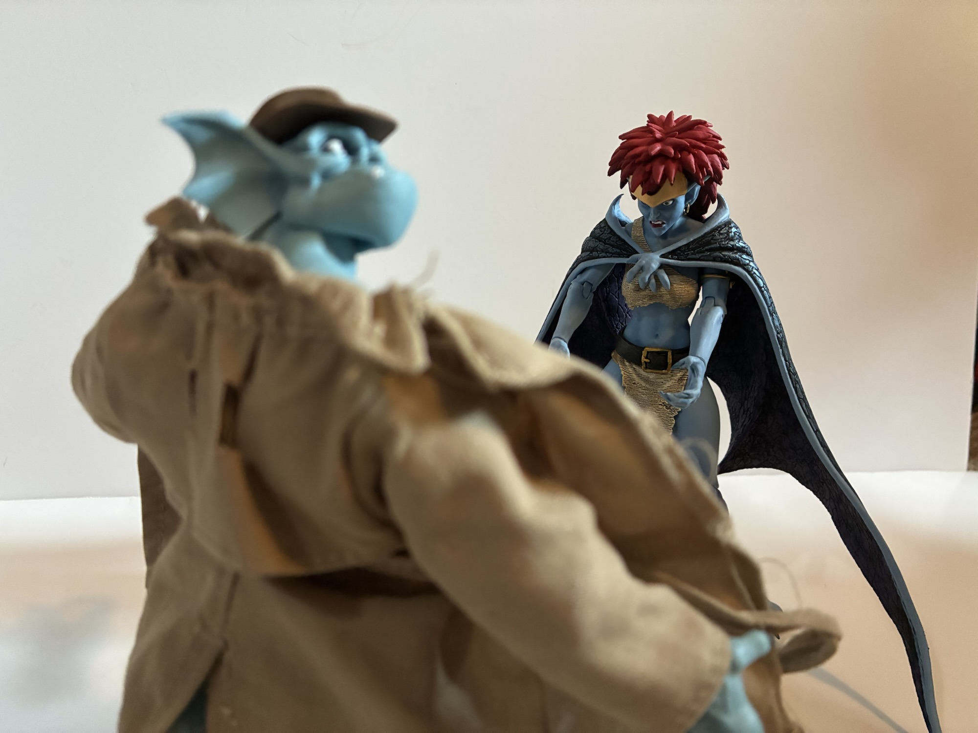
Bebop and Rocksteady have been NECA’s go-to characters when they want to do something offbeat. And it’s easy to see why as the pair were comic relief in the cartoon series. They did a lot of dumb stuff and had different looks. We’ve seen them as superheroes, rabbits, vacationers, and robots. Now, we have Bebop in drag and Rocksteady in a giant diaper. It’s ludicrous, but when I look back on the original TMNT cartoon it’s the silly stuff that I recall most easily. The show was dumb, and if I’m being honest, kind of bad, but I loved it! I don’t know how many hours I spent watching it as a kid, but it never felt like enough in the moment. A lot of the silly looks from the show I actually wanted to see in the companion toyline and now NECA is making that a reality.
Light accessory load-out for this pair.
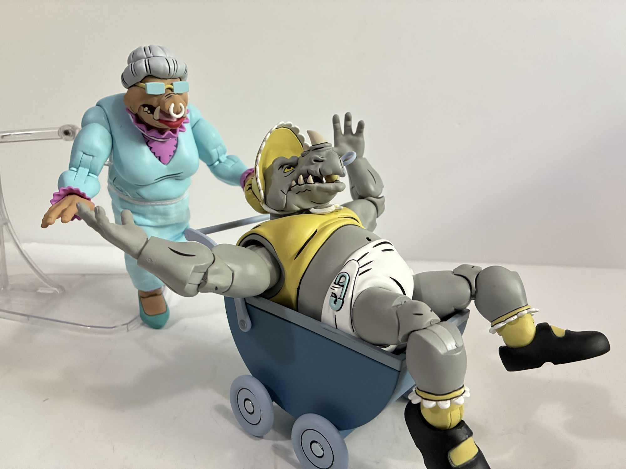
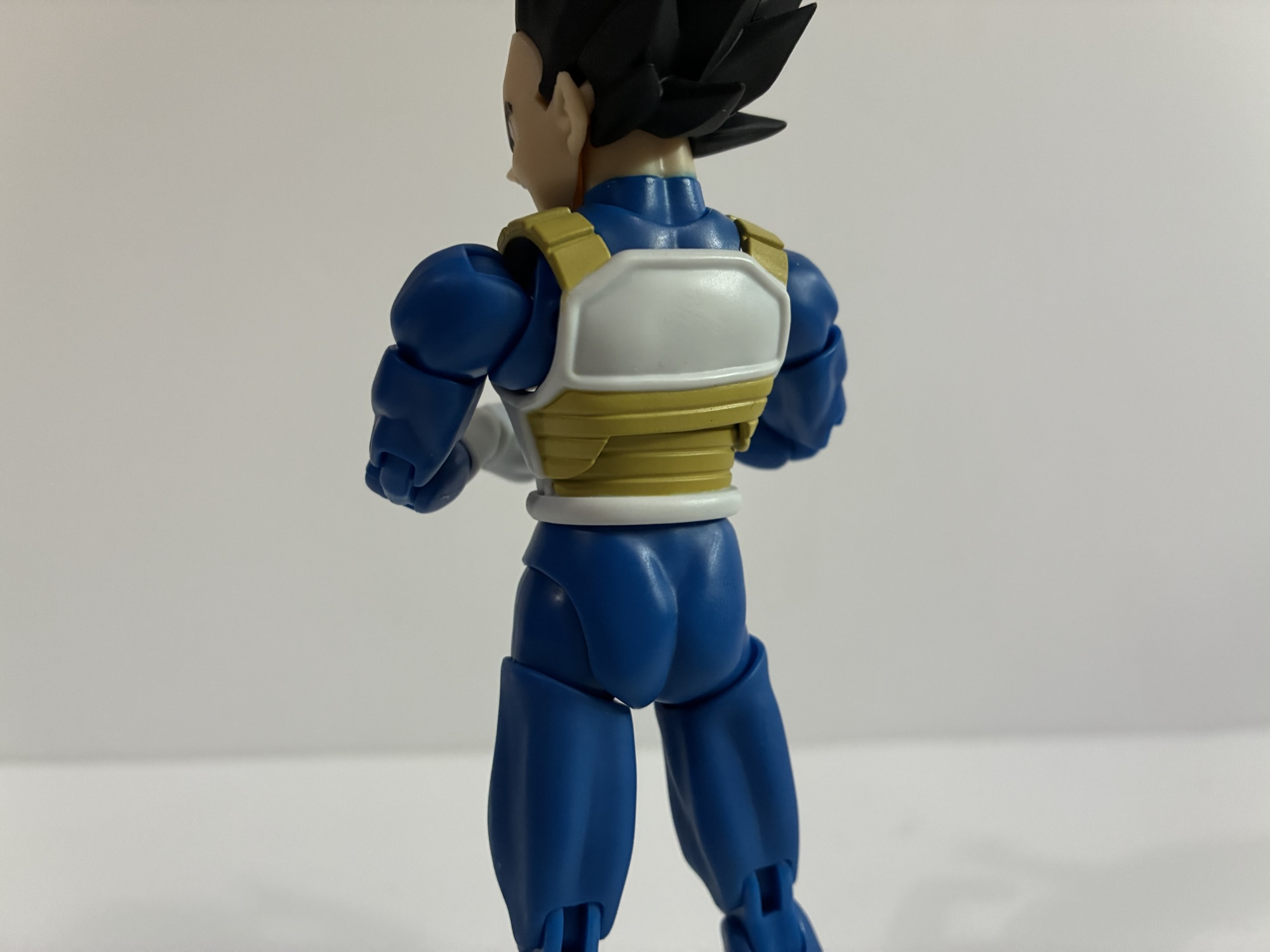
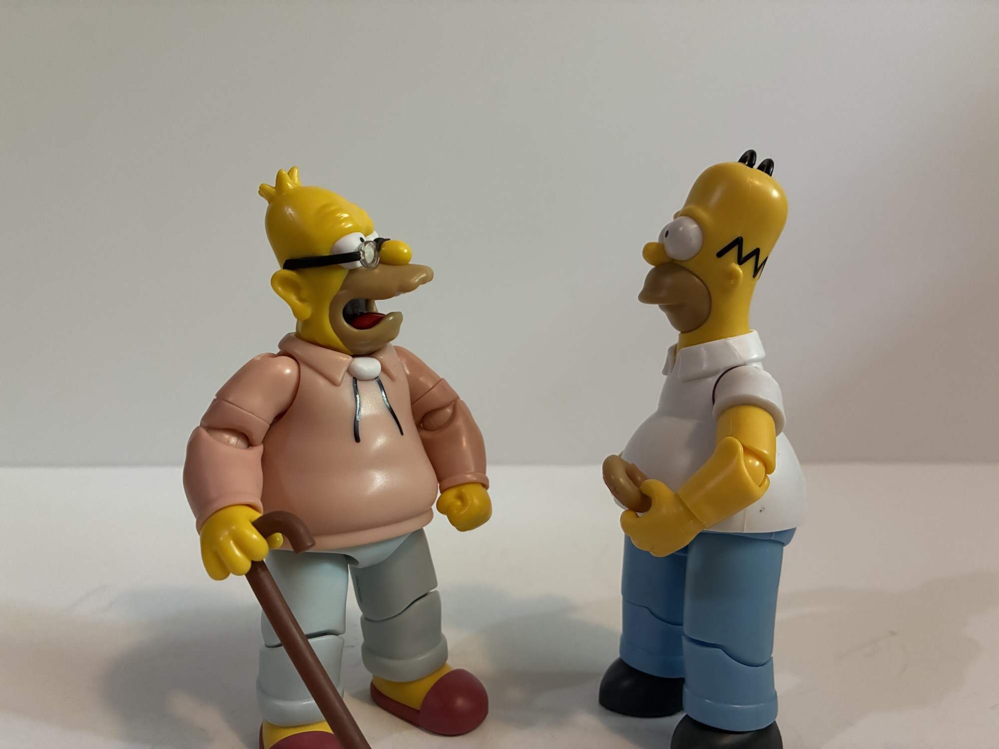
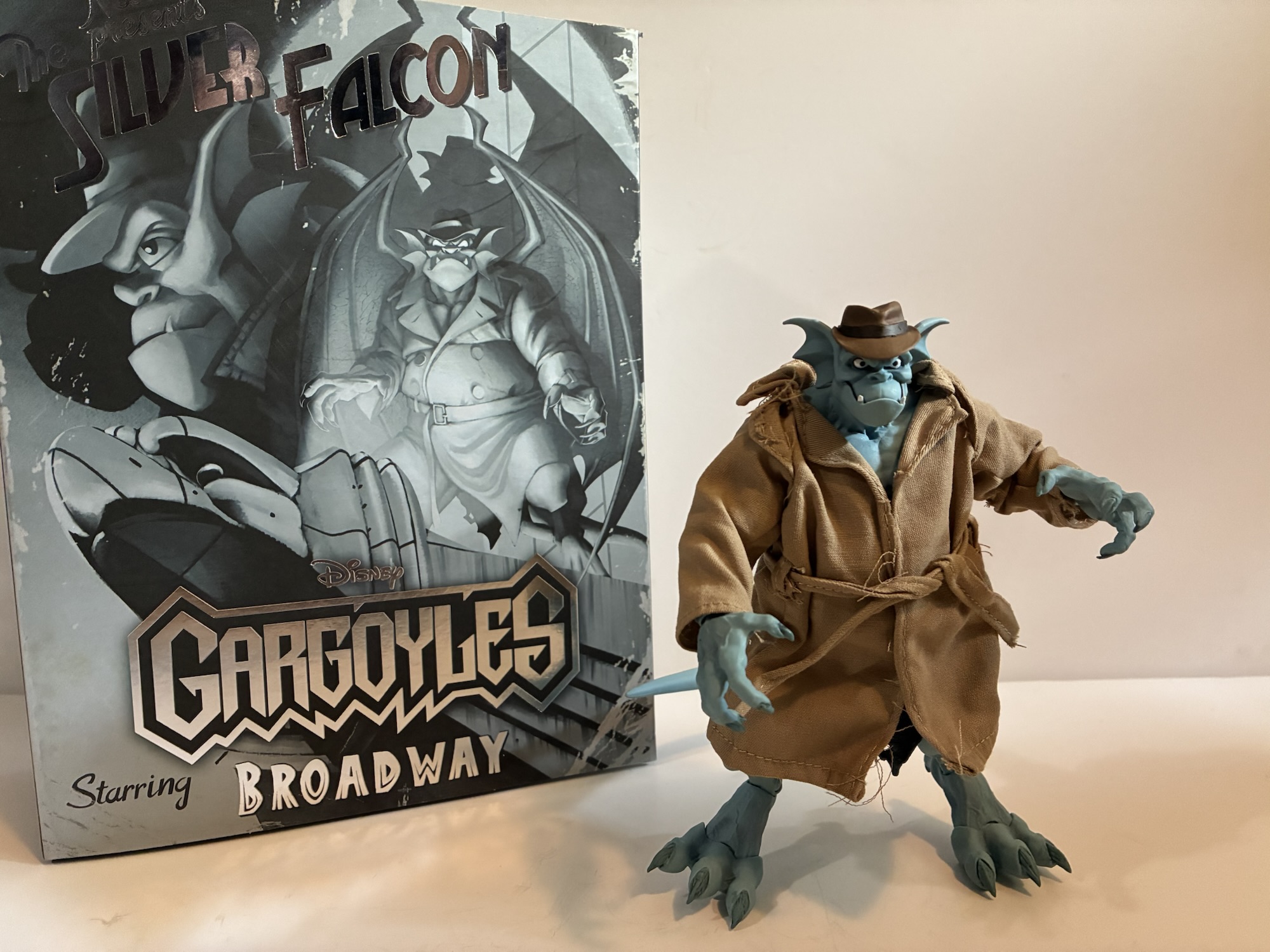
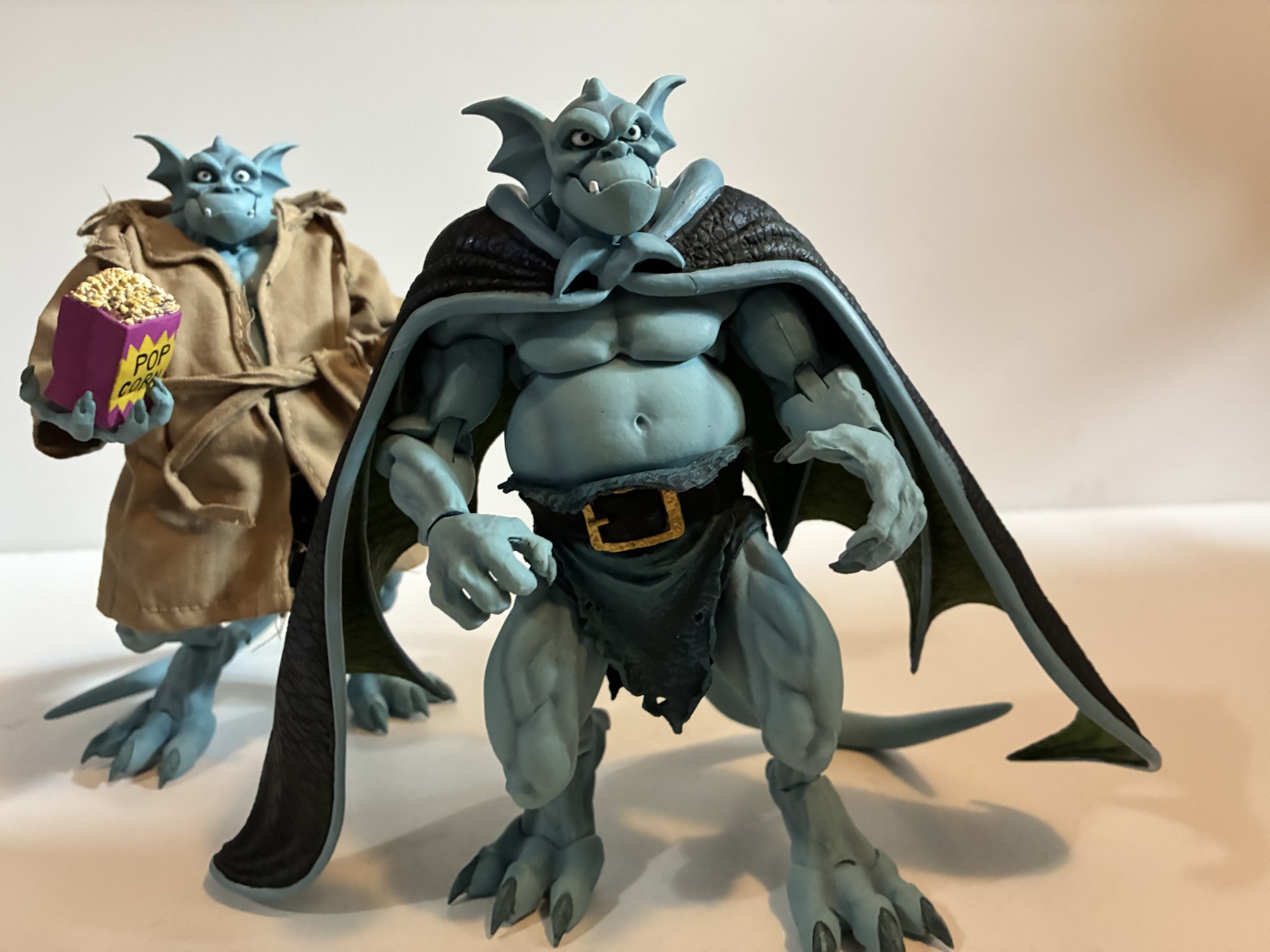
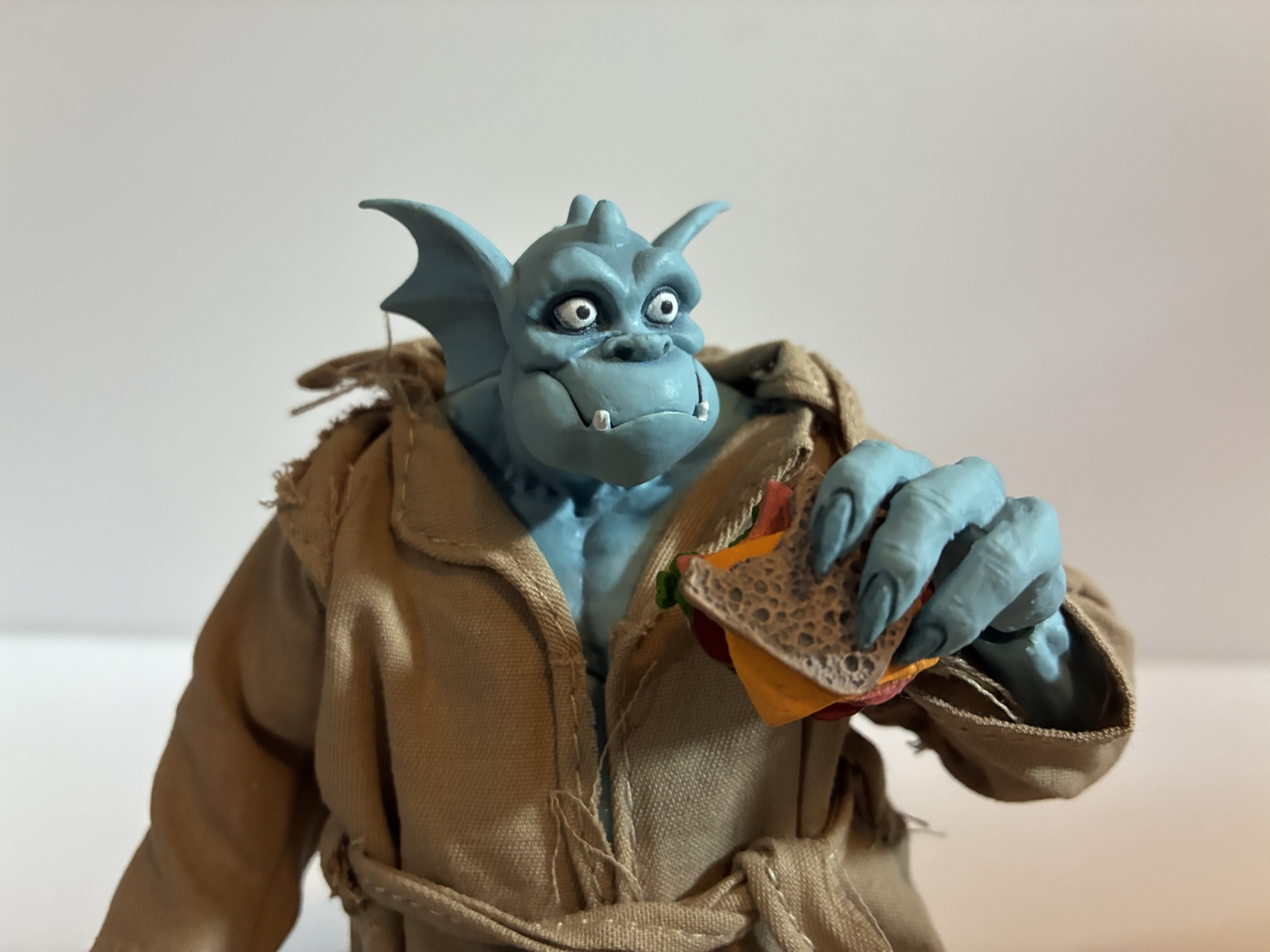
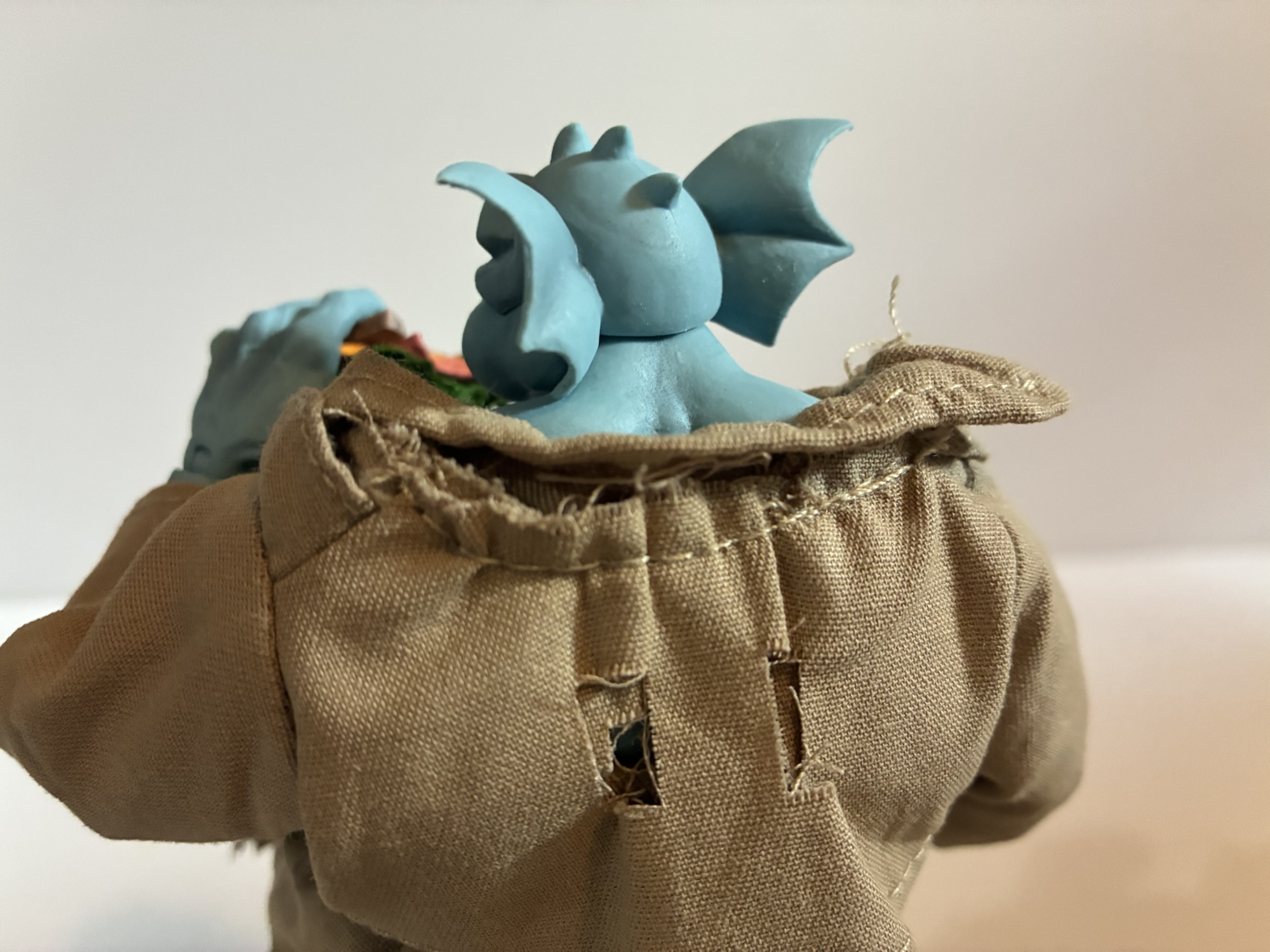
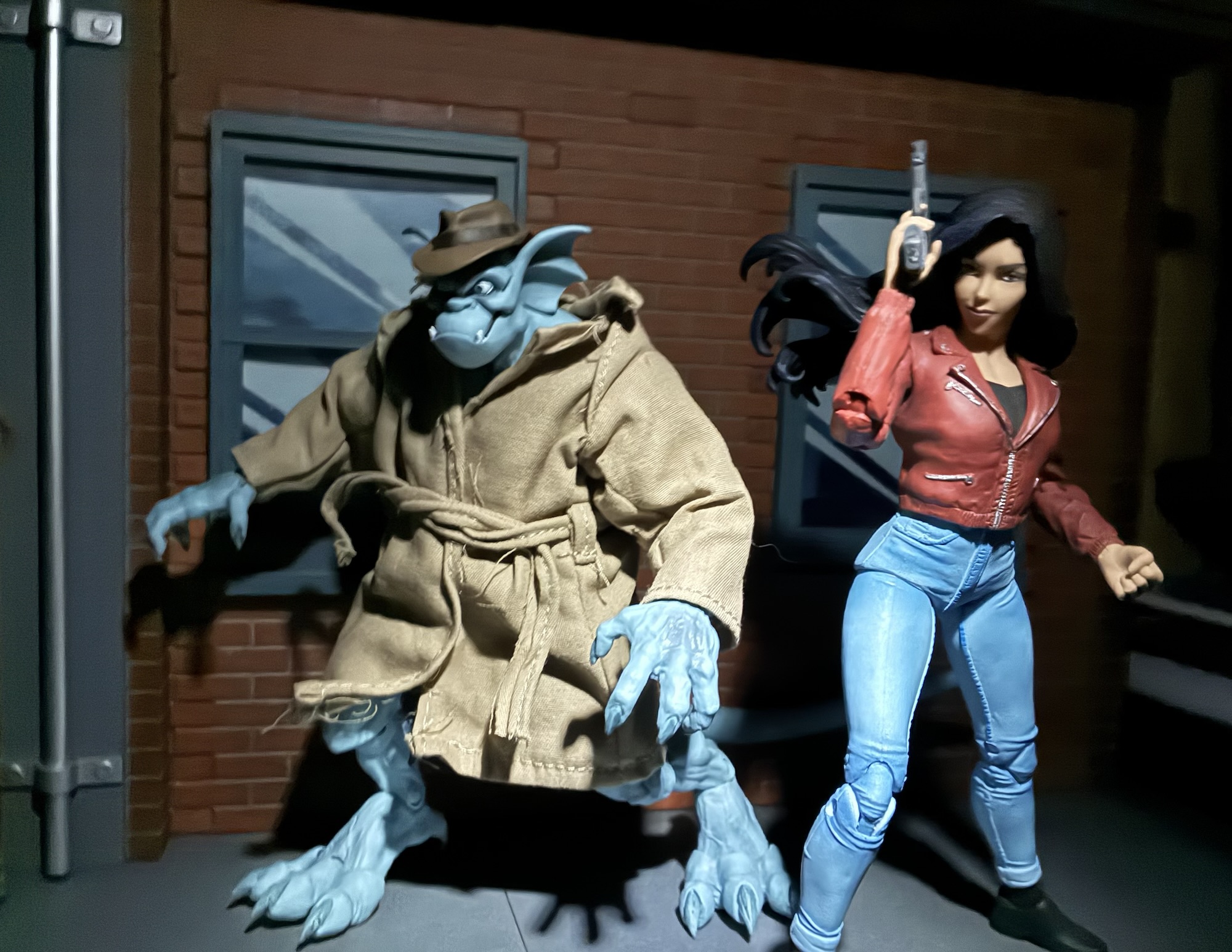
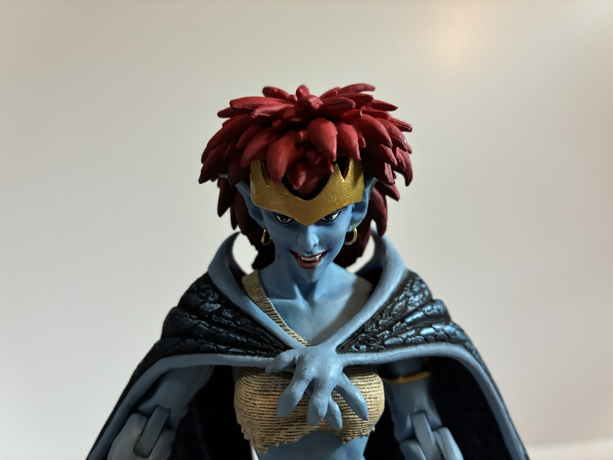
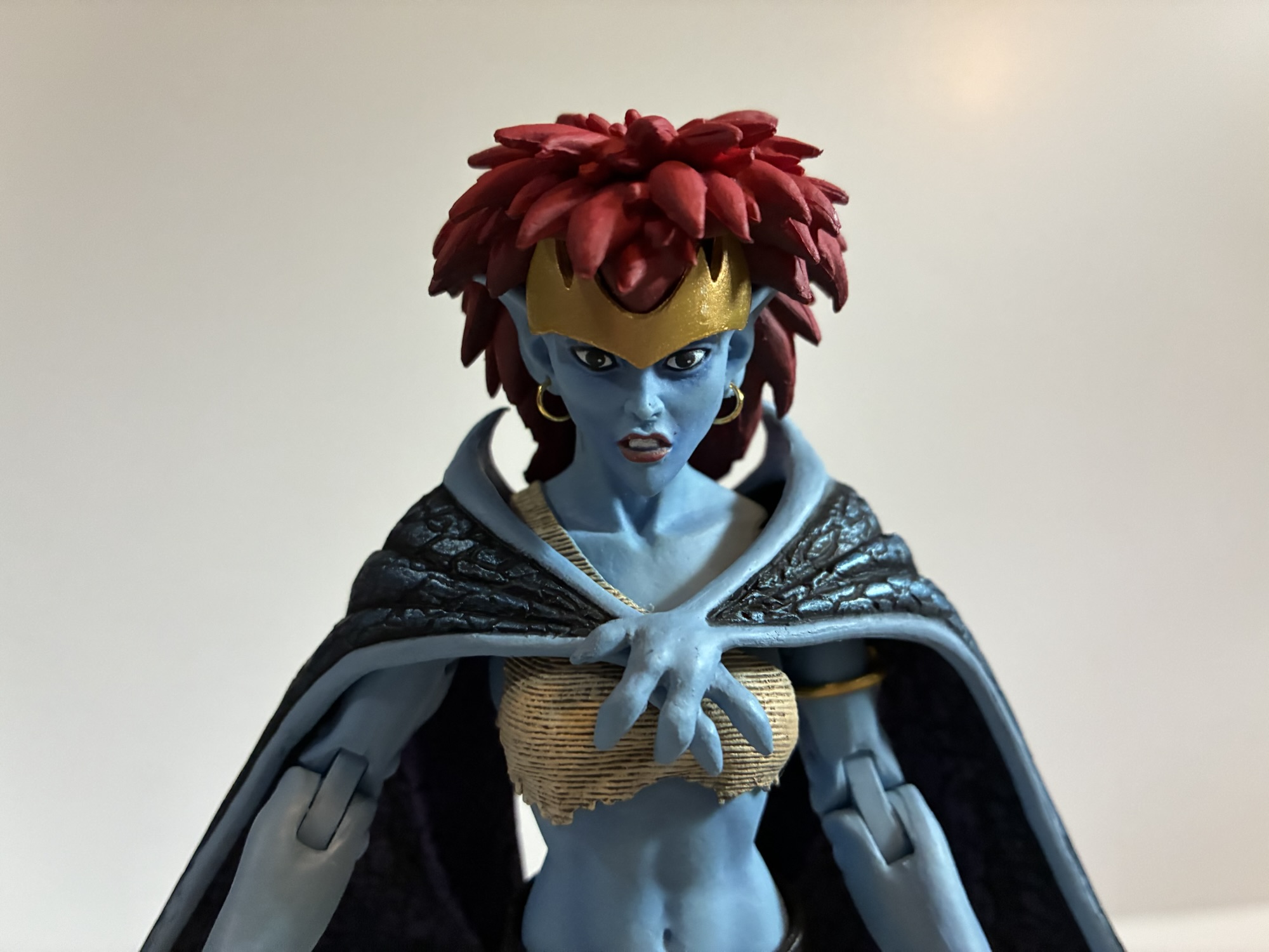
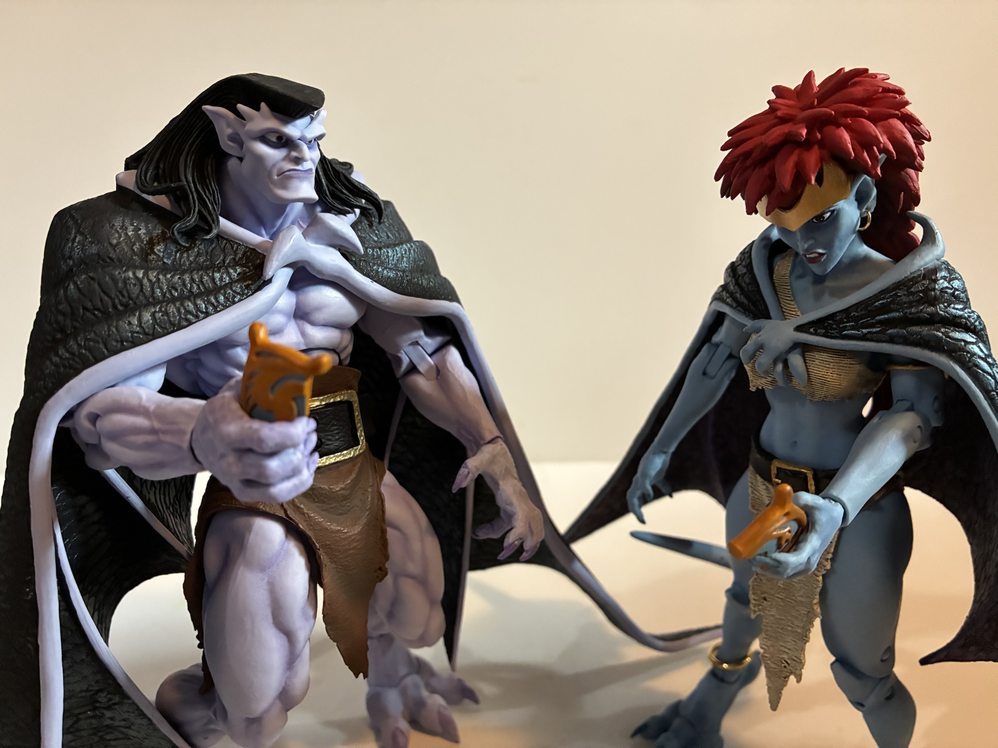
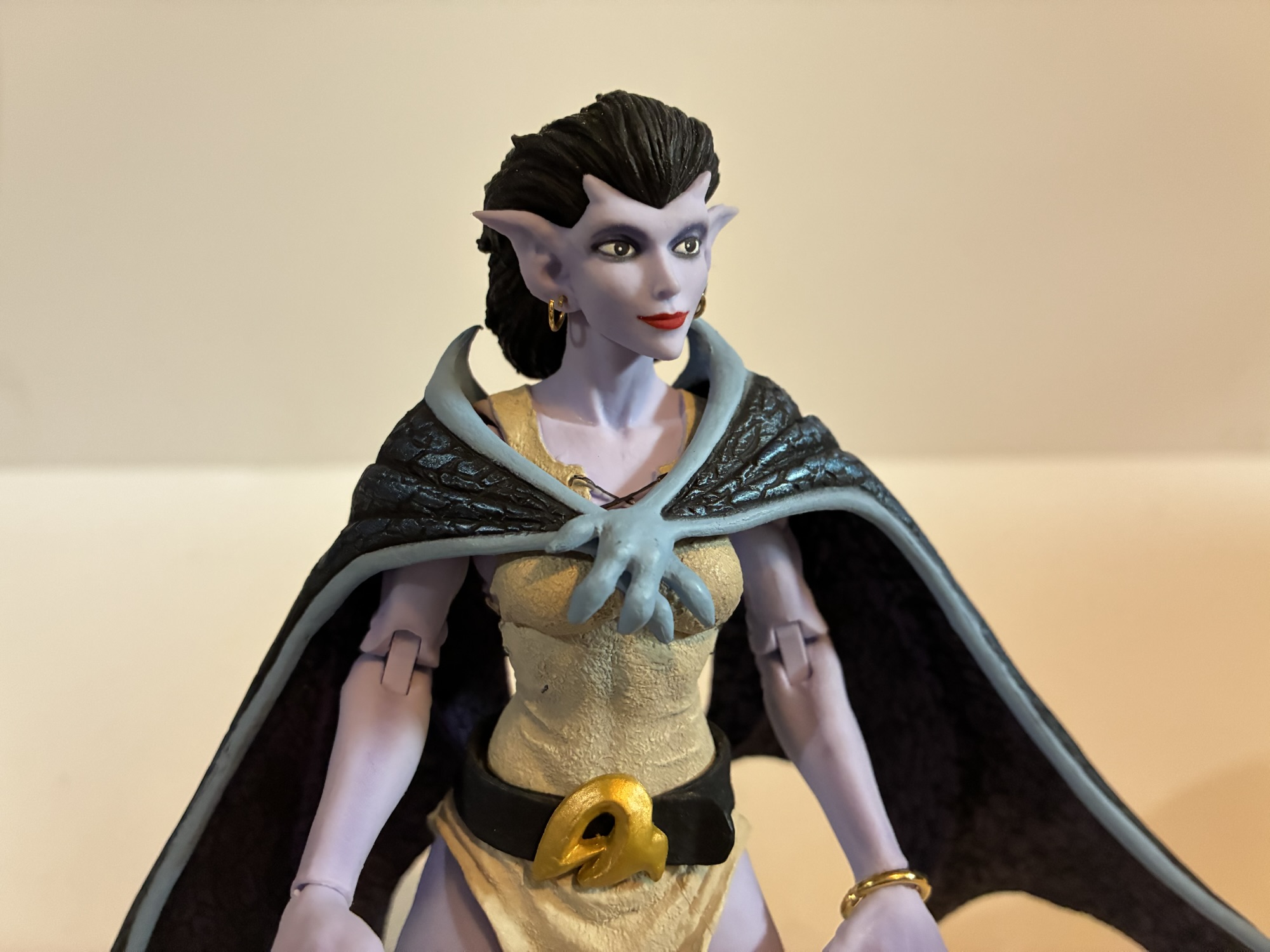
Bebop and Rocksteady, being a mutated warthog and rhinoceros, couldn’t just walk into a public place and not freak people out so they needed disguises. One such disguise was Bebop as a grandmother and Rocksteady as his baby. It obviously made no sense since it’s pretty obvious that they’re still a warthog and rhinoceros, but that was the show. And now it’s immortalized in plastic. These two guys are pretty familiar if you’ve purchased others in the past, but there’s new stuff here. Rocksteady stands about 6.5″ to the top of his head while Bebop is about 6.75″ to about where the top of his head should be under that wig.
“Hey, big boy!”
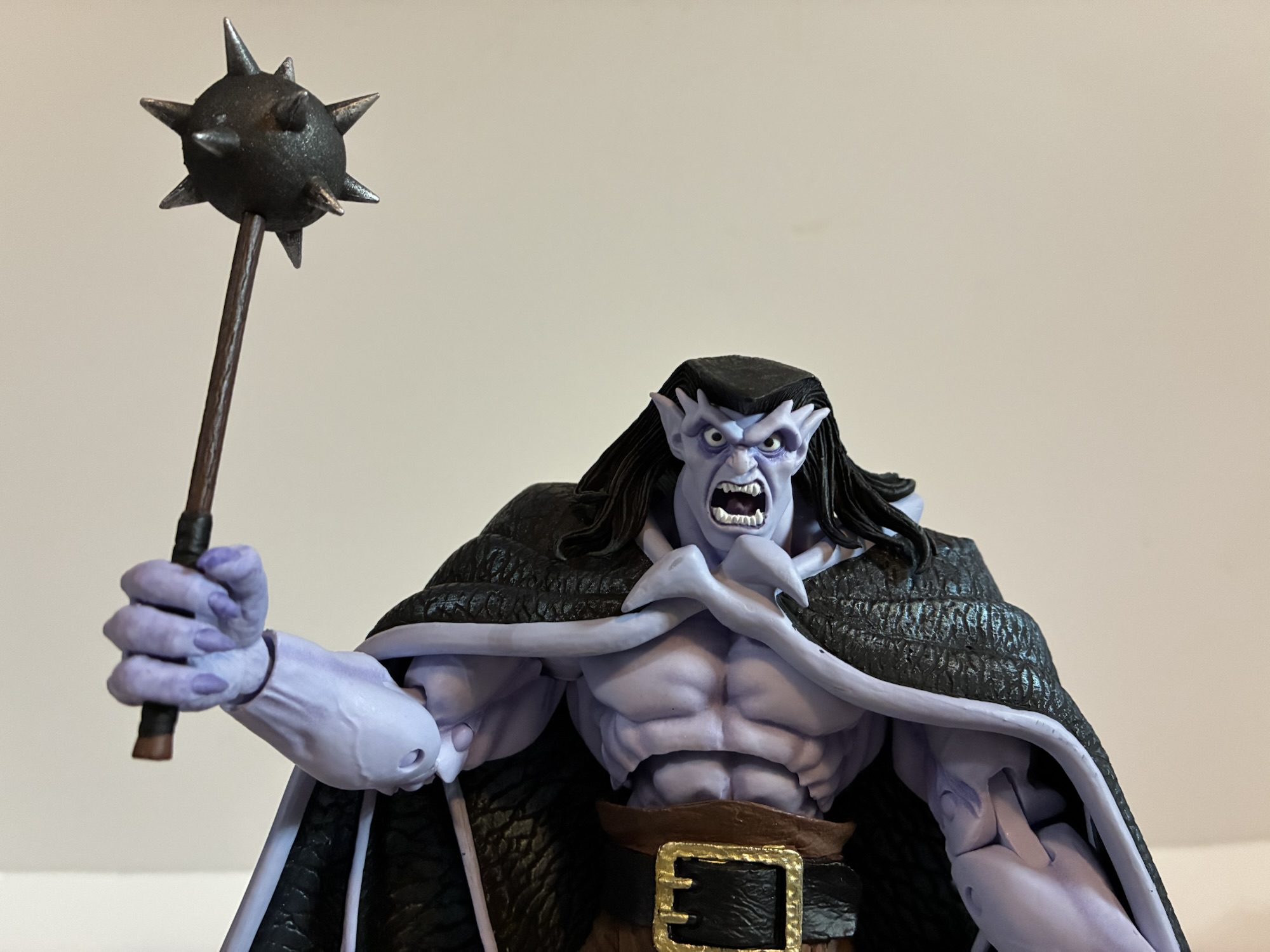
The pair share a lot of the same parts with only slight modifications. They have the same arms and legs as far as I can tell with Rocksteady just having ruffled socks and Bebop open sleeves by his wrists. The torso on both is done with an overlay, NECA’s modus operandi when it comes to this pair, and I’d suspect whatever is under that is the same. Hands appear to be recycled from the vacation set while both figures have new feet and new heads. There are similarities with the rest of the limbs compared with the vacation set only this time around everything is pin-less. They may have began life as the same digital mold and were just recut for tooling. The box lists three sculptors on this set: Brodie Perkins, Tony Cipriano, and Tomasz Rozejowski. Usually, that seems to happen when pieces from past sets are utilized along with new parts.
“You’ve made me the happiest warthog – I mean, woman alive!”
Regardless of how these two came together, both certainly look the part. The paint is clean and there’s plenty of linework emphasized with the paint job by Geoff Trapp and Mike Puzzo. It’s very clean on both figures even in tight places like the teeth or Rocksteady’s safety pin. Bebop does utilize some soft goods for his skirt and it looks okay. It’s not the nicest material, but they at least included a purple hem at the bottom. There’s some loose threads on mine right at the waist that are kind of annoying. The skirt is glued into place so I can’t just take it off and either trim them or push them behind the skirt. I’ll have to see if I can snip them. I like how they managed to sneak some lipstick onto Bebop and I like that his ponytail is sticking out as well. Like other recent releases in the line, there’s no cel-shading on the backs of these figures. I guess that’s out with the line, but Panda Khan had it so who can know for sure?
“Hey toitle! Check my diapy!
Accessories for this set are pretty light. Each character gets 3 sets of hands: fists, open, gripping. Rocksteady also has a pacifier which can fit in between his teeth or be held with a gripping hand. Bebop has a green purse which is made from a soft plastic and does open, though he doesn’t have anything to put inside it. The main accessory is the baby carriage which is pretty big for a baby carriage, but still not big enough for Rocksteady. It’s simply painted and does feature real wheels on it. Rocksteady can be placed in it and made to look pretty damn ridiculous which helps sell the comedic angle of the set. The handle is a very rigid ABS plastic that won’t easily slide into Bebop’s gripping hand. It almost certainly be done, but you will want to heat the hand up first or else risk snapping the thing.
“Somebody save my baby!”
Articulation for these guys is super basic and pretty standard for the line and these characters. Both feature a ball jointed head with a hinged jaw. You’ll get some nuance posing and rotation, but not much up and down. The shoulders are ball-hinged with a bicep swivel, double-jointed elbows, wrist swivels and hinge. A ball joint at the waist allows for rotation and some tilt, but little in the way of forward and back. Ball-socket hips will basically go as far as the skirt and diaper will allow on each, which is short of splits and 90 degree kicks. You can roll up the skirt for more range on Bebop, if you desire. There is a thigh swivel at the joint as well as double-jointed knees, ankle hinge, and ankle rocker. Bebop, being that he is in heels, will be a bit difficult to stand, but not impossible. There are no loose joints on either while some of the elbows and knees were pretty tight. The bicep swivels can be tricky to get moving as well due to the shoulders moving so freely. It looks like they were lubricated at the shoulder so getting the leverage needed to break the seal on the bicep took some effort.
Things are getting silly.
These two aren’t going to do anything spectacular on your shelf and they’re not really designed to. Rocksteady is meant to go in the stroller and to do that he doesn’t need to do much. Bebop just needs to stand behind it either pushing it or doing very little. They’re capable of doing as much and anyone who sees your collection is probably going to ask about them because they look so stupid. That’s basically the joke and the whole reason to get this one. If you think it’s funny then you’ll probably be happy. If the idea of these two in these outfits just seems too dumb to spend money on then it probably is. It doesn’t help that they’re sold exclusively at Target for $65. That’s a steep price. I was able to knock 10 bucks off with a current promotion going on at Target which may or may not still be active when you’re reading this. I think it’s stupid and funny so I probably would have paid full price, but I’m definitely happy to not have. They don’t appear to be shipping in big numbers, but these variant sets have a tendency to hang around either way so you could always wait for the next deal. My local store also had them in their inventory, which usually doesn’t happen with NECA unless Target is stocking them. I don’t know if that is the case or not, but if it is, then there’s a slim chance they go on sale if Target can’t unload them. With the holiday shopping season upon us, that seems unlikely.
At this point, there’s enough releases in NECA’s TMNT line for it to be a Bebop and Rocksteady line:
Pack your bags and grab the sunscreen because today we’re heading to Florida! It’s vacation time folks, and even the bad guys deserve a little fun in the sun sometimes. Coming from NECA Toys we have another fun variant of the duo Bebop and Rocksteady. Always more comic relief than true threat, the boys come…
2021 introduced a lot of good things for collectors of NECA’s Teenage Mutant Ninja Turtles line of action figures based on the classic cartoon. The toy maker still kept the line a Target exclusive when it came to brick and mortar, but it also started selling a lot of it online to coincide with each…
We did it! We finally made it to the end of the Haulathon releases from NECA Toys and we may have saved the best for last. Back in early 2020, I made a wish list for what I wanted from NECA and Teenage Mutant Ninja Turtles. It was only 10 deep, though there were some…
Hi kids, it’s Spider-Man! He has a cold and a bad back so he won’t be saying anything or doing anything.
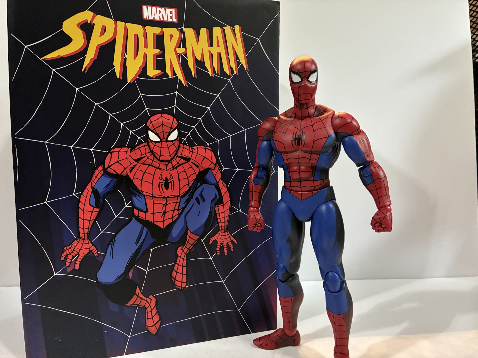
It took a long time for Mondo’s Spider-Man to get to me. At first, I wasn’t sure if I was going to even buy it. I passed on the Mondo offering in 2024, debated the symbiote costume variant, but ultimately passed on that as well. The X-Men line from Mondo is my true love and I just don’t have room on my shelf for another line of sixth scale action figures. I did get Venom because I love the character, and when Entertainment Earth had a big anniversary sale I decided to take the plunge on Spider-Man. That was in October of 2024 and at the time the figure was expected to ship in January. Then all of the tariff nonsense struck. The figure kept getting pushed out and eventually EE even had to up the price on me because of said tariffs all but wiping away the discount I was originally expecting. As the months went along I started to debate just cancelling it all together. I loved my Venom figure and I didn’t need a Spider-Man to enjoy it any more than I already did. When I received a notification that the figure was, at long last, in-stock I figured “Well, it’s happening.” Then nothing. Then my order was flipped to backorder. I emailed EE which didn’t offer much other than to say they didn’t get enough to fulfill all of their preorders. At that point, I figured I should just drop it and move on, but before I could my order was changed to “processing.” Now I have a Spider-Man from Mondo and I kind of wish I didn’t let my indecision get the best of me.
Spider-Man comes in a large window box with artwork by Nick Bradshaw and Peter Santa-Maria adorning it. It has an almost dark-deco vibe to the skyline which is evocative of the show’s CG cities when Spidey was seen web-swinging around New York. The figure itself is a sculpt by the renowned Alex Brewer with paint by Mark Bristow. The packaging concept is credited to Jordan Christianson and art direction to Hector Arce.
The ’94 version of Spider-Man could probably be taller, but I like the difference between he and Venom.
Spider-Man stands at about 11.75″ to the top of his head. I’m a little surprised they didn’t make him the full 12″, but I also don’t mind him being that much shorter than Venom. I tried to find some turn-around art from the show’s production for comparison, but the Internet has let me down. I can only compare him to still frames from the show and I have to say I feel like the silhouette is a touch off. Spider-Man in the 1994 cartoon is a pretty big Spider-Man. Pretty much all of the super hero shows back then had one style for all of the male characters. Flash Thompson would pick on Peter Parker for being a nerd, even though Pete was built like a linebacker. Here, the neck is a little slender and sits inside the silhouette of the head, which isn’t really how he was drawn. The shape of the head is also a little narrow which just draws even more attention to it. It was a Saban production and those were notoriously cheap for the time so there’s a lot of inconsistency from episode to episode, scene to scene, and shot to shot. Did Spider-Man look close to this in some shots? Probably, and there’s going to be some subjectivity on the part of the sculptor. For me personally I would have liked a slightly more beefy Spider-Man since that’s what stands out to me about the ’94 design.
Apart from that, the actual design and paint applications for this figure are fantastic. The eyes have that very ’94 shape to them and there’s a lot of empty space around the spider on the chest, as was true of the show. The linework is very clean and the cel-shaded paint job pops as one would expect. It was important to nail the shade of blue and red to make this feel like it’s from the show and Mondo did an excellent job there. There is some light scuffing on the left thigh of my figure which is odd because that area was wrapped in cellophane when packaged. Maybe it was wrapped too soon after painting or it just got too hot during transit? Despite that, the paint is easily the best aspect of the figure and really the entire Mondo sixth scale line and Spidey doesn’t lower the bar at all.
He’s a handsome fella.The mask looks more like a helmet when held this way.
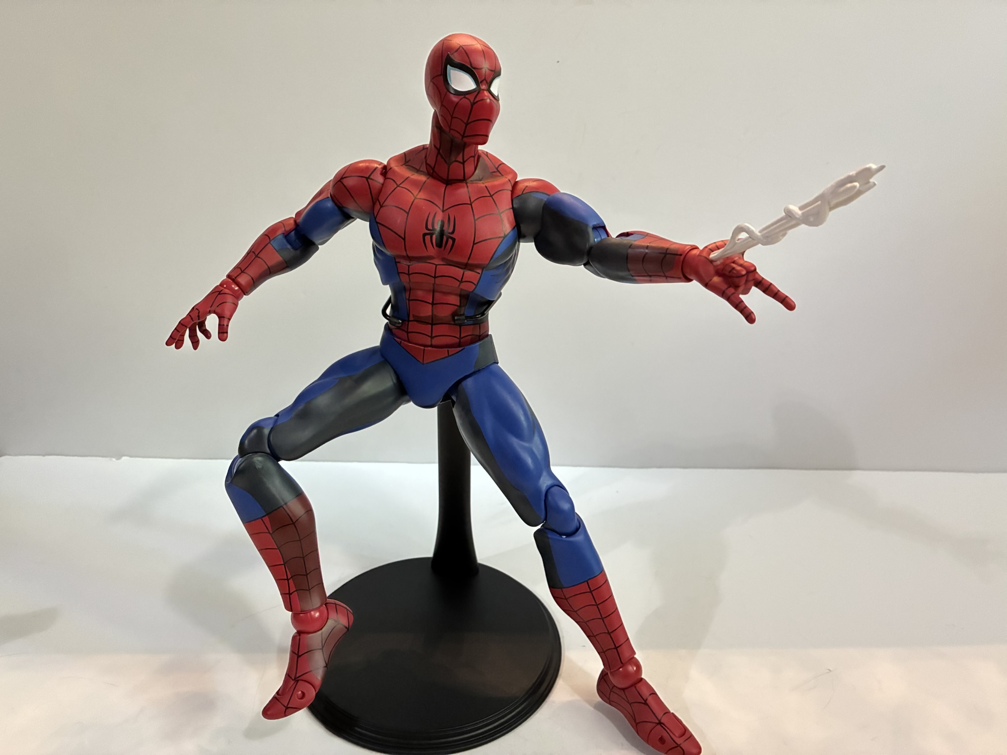
Spider-Man has a host of accessories, though this particular edition has fewer than the limited run solicited by Mondo initially. For an alternate head we just have the unmasked version of Pete. It looks exactly like the character from the show and the paint job is terrific. He does have a bit of a smile to his face which does present an issue for a different accessory, but not one that actually came with this figure so I guess we can’t really ding it for that. There’s also a mask accessory. It’s shaped like Pete should be able to hold it and have it hang from a gripping hand, but I couldn’t get it to work. I thought it might be intended for Venom, but then I remembered Venom came with his own Spider-Man mask accessory and that one is glued into his gripping hand. Maybe other villains will be able to make use of this one down the road?
Go web!Long web.
For hands, Spider-Man comes equipped with a set of gripping hands. What he’s supposed to grip, I don’t know. He also has a set of relaxed hands, fists, and thwip hands. Peter also has his trusty camera which is molded to a web splat like it’s stuck to a wall. It does make it hard for him to hold, but I suppose one could stick it to a wall in their display with some tack or even via a finish nail or clear pushpin. Peter also has two thwip hands with short bursts of webbing coming out of them. The hands do not feature any articulation and are on straight pegs, which is fine for what they’re meant to do. There’s also another set with the long web lines attached just like we saw with Venom. There is a bendy wire in these webs, but I’m not really sure what purpose it would serve since the web lines are non-removable. For the ends of the webs, there are two conical attachments that serve as generic ends to the webs. There are also two web splats if you want the webs to be striking a surface or other figure. And lastly we have the typical Mondo display stand which is of limited utility. I don’t ever use these things, but I actually probably will with this figure. For that reason, it’s a shame it’s a plain black stand without any artwork on the base. It’s also the basic doll style stand and not the more dynamic one they have coming with Nightcrawler. I appreciate Mondo finally addressing the quality of their stands, but if you were going to do a better one wouldn’t Spider-Man be a character deserving of such?
It’s even a challenge to do convincing web firing poses.
That is all well and good, but where this figure has really come up short for me is with the articulation. Mondo’s figures are not super-articulated. They’re fairly basic as this is an aesthetics forward line, first and foremost. I’ve always felt it suits the X-Men line very well as the show that is based on featured pretty stiff, limited, animation. Those characters didn’t do a whole lot. Spider-Man wasn’t much better, but it still featured a character who spends most of his time crouching on landings, crawling on walls, and swinging through the city. Mondo correctly recognized that there was a need for more points of articulation with Spider-Man than they might normally do, but unfortunately the execution is lacking.
This is pretty much the extent of his range in the torso.
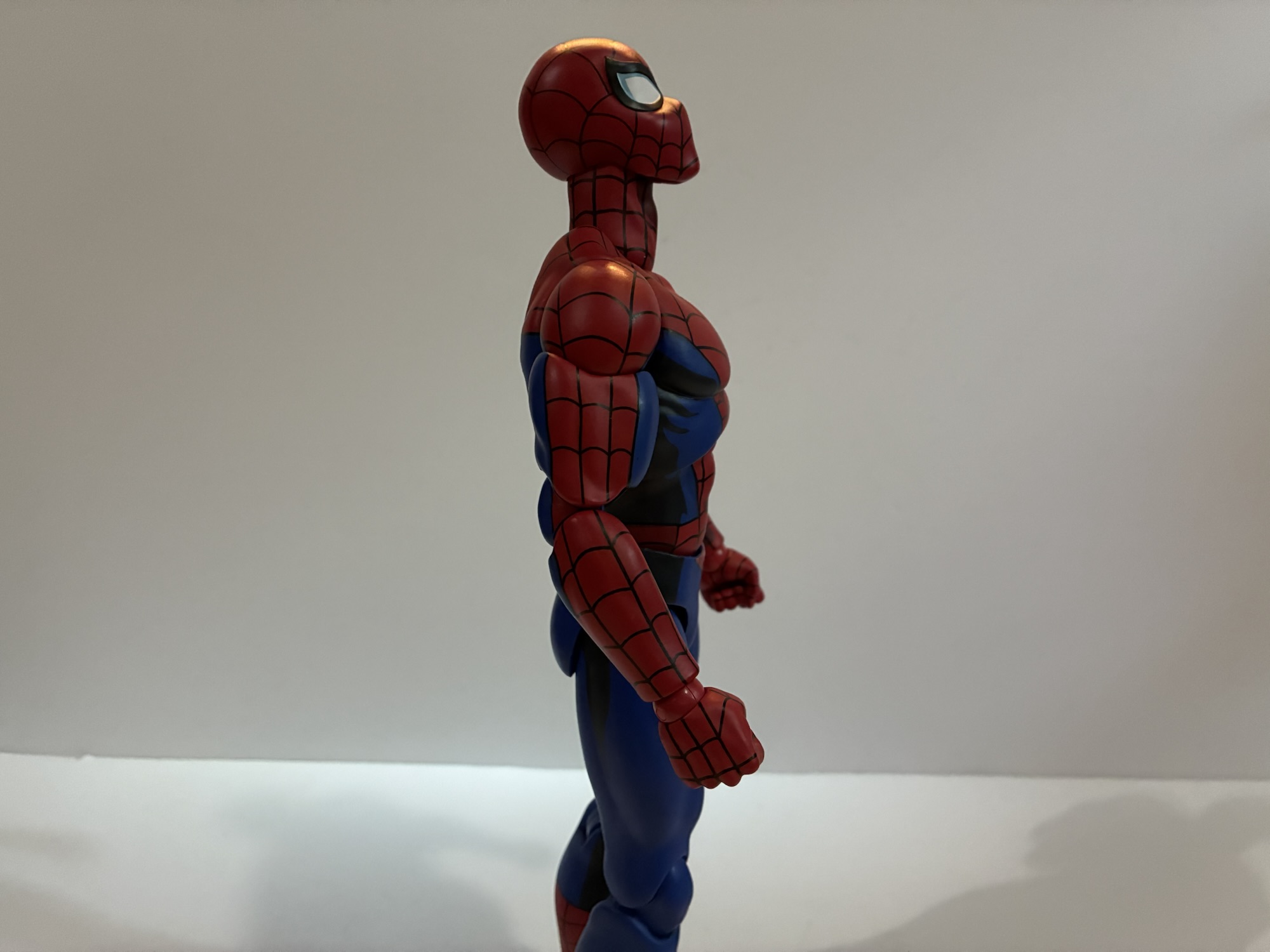
Spider-Man has a standard double-ball peg head which all Mondo figures seem to have. Unfortunately, Mondo really buried the lower ball joint in the neck which limits Spidey’s ability to look up. This can sometimes be corrected with a lower neck joint and Mondo opted to do just that. Unfortunately, the ball joint at the base of the neck might as well not be there. It’s way too snug and offers nothing when it comes to articulation. The shoulders are the standard hinged ball peg and there’s no butterfly joint. I’m okay with the absence of a butterfly joint at this scale and with this character design, but what I’m not okay with is how tight the right shoulder on my figure is. I could not get this thing to move much at all out of the box and I’m surprised it didn’t snap at the bicep. Even after heating and lubricating the joint, it still barely functions so it’s not a case of needing to just crack some paint that worked it’s way in there. There are bicep swivels, double-jointed elbows, and ball-hinge wrists and they work fine.
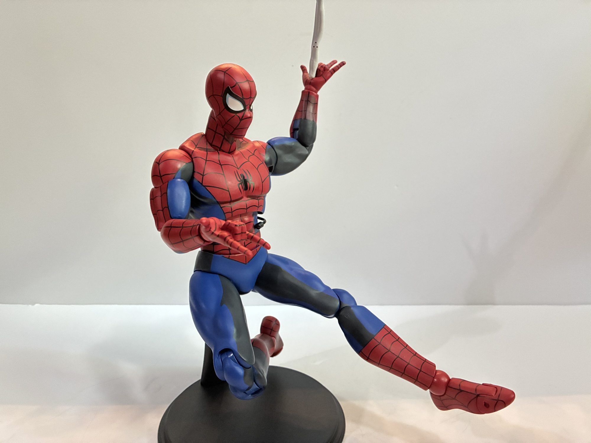
If you want your Spidey to crouch, good luck. Here he’s being supported by the stand.
Where things start to take a turn for the worse is with the torso. Mondo typically goes with a ball joint in the diaphragm and one at the waist and that’s what they did here. This combination is ideal for waist articulation even in a character like Spider-Man who is expected to crouch a lot. Unfortunately, Mondo screwed it up. The diaphragm joint does almost nothing. It doesn’t really rotate nor does it really go forward, back, or tilt. It’s just way too snug on the abdomen. As for the waist, it barely moves as well. Even rotating it doesn’t work all that well as the joint feels like it’s fighting me. Did the factory not lubricate any of these joints during the assembly process? It doesn’t feel, or sound, like it and I have noticed zero lubrication residue anywhere apart from what I added. I get it that Mondo would not want articulation that leads to large gaps in the figure or that might cause too much paint rub. They went too far though and basically made the pieces so snug and tight that the articulation is functionally useless.
This is probably the extent of his swinging ability.
At the hips, it only gets mildly better. We have ball-socket hips with built-in thigh swivels. The left hip is okay while the right hip is stubborn. It sometimes snaps back into position when I try to move it. I have popped it off and applied some lubricating oil which has improved it some. It still doesn’t mean Spider-Man can do splits or kick a full 90 degrees. If you try to kick forward, the figure wants to go off to the side. You can rotate at the hip to basically get into a split, but the way the cel-shading is done makes it look kind of dumb as the darker shaded portion of the legs will be forward-facing. The knees are standard double-jointed knees and at the ankles Mondo decided to go with hinged ball pegs like they do at the wrist. This means you can swivel and move those feet all around as much as you want, but it’s not a strong joint which is why I recommend using that display stand with this one. He’s just not going to stand very well. There’s also a toe hinge that’s kind of ugly. It works, but there isn’t enough stability in the figure to utilize the joint without a display stand.
I was not expecting Marvel Legends levels of articulation from this figure, but I was hoping for more. He’s really stuck in vanilla poses which is not befitting a Spider-Man. If the joints just worked he’d be fine. Then you could hunch him forward or having kind of twisting in a swing pose. I was hoping for a basic crouch, not a super low one, but you’re not getting that either. He can kind of do a basic swing pose, but it’s a bummer that he doesn’t have a web line to just grab onto. If they could pop out of the web shooting hands that would have solved that. I’m just really disappointed in what this figure is capable of and it left me feeling that Spider-Man is a poor fit for what Mondo wants to do.
At least this was a pleasant surprise.
There is one other thing to talk about and it’s Venom’s web swing. If you have the Mondo Venom, he comes with a left hand accessory that’s a web swing/harness for Spider-Man. It’s based on a scene straight out of the episode “Venom” where Venom webs up Spider-Man and takes his mask off. He dangles him off a rooftop threatening to expose his secret identity to the world. The accessory is basically a belt and two loops for each hand. I was able to slide it onto my Spider-Man figure starting at his feet. It wasn’t easy and his right leg popped off in the process, but it is doable. The two strands for his hands are simple enough to attach and I plugged the Venom hand portion into my figure to test it out. To my surprise, the thing actually works! I first just had him on a surface and Venom was able to remain standing while holding Peter, but Peter’s feet were on the same surface. I moved the pair to a shelf where I was able to dangle Peter off the edge like in the show. Venom was up to the task and the two remained without issue. I don’t know if I actually have the guts to leave them there permanently like that, but I was sorely tempted. I didn’t think it had a chance of working this well, but credit to Venom’s tight joints and hefty weight. The only disappointment is Peter’s stupid, smiling, face. He really needs an angry expression or a scared one to sell this display. The black costume version of the figure comes with an angry unmasked head which probably would work better for this specific display, but that was a limited edition and has long since been sold out.
The harness accessory working so well was certainly a pleasant surprise, but it doesn’t redeem this figure of Spider-Man for me. This is the first Mondo figure that I regret buying. He looks good enough in a neutral pose, but Spider-Man is not a character for a neutral pose. It’s frustrating to know that Mondo recognized that and incorporated more points of articulation into the figure to address the issue, but nothing they added really worked. Ball-jointed torsos aren’t that complicated even at this scale and if the worry was the figure would topple over well then why hinged ball-joints at the ankles? It’s unfortunate and this is a figure I can’t recommend especially at the price it commands. If you think he looks good and don’t mind that he won’t be doing much of anything on your shelf then have at it. I personally expected more from Mondo and Spider-Man.
If you liked this review then here’s some other related entries you might like:
Mondo has had success with its sixth scale line of action figures based on X-Men and X-Men ’97 so it’s no surprise that the company has decided to dip its toe into another 90s animated Marvel series in Spider-Man. And when it comes to Spider-Man, I’m not sure what to call it. I always referred…
It was in 2021 that Hasbro released a PulseCon exclusive Venom figure on a Spider-Man retro card. The retro card series is meant to stir-up nostalgia for all of the adults who were buying toys and watching cartoons in the 90s as the retro card is a facsimile of the old cards Toy Biz used…
Last year, Hasbro celebrated the 30th anniversary of X-Men, the animated series that premiered on Halloween 1992 and would become a ratings hit shortly thereafter for the Fox Kids Network. It was responsible for getting a lot of kids into the X-Men and Marvel comics in general and the first, prime, benefactor of that rise…
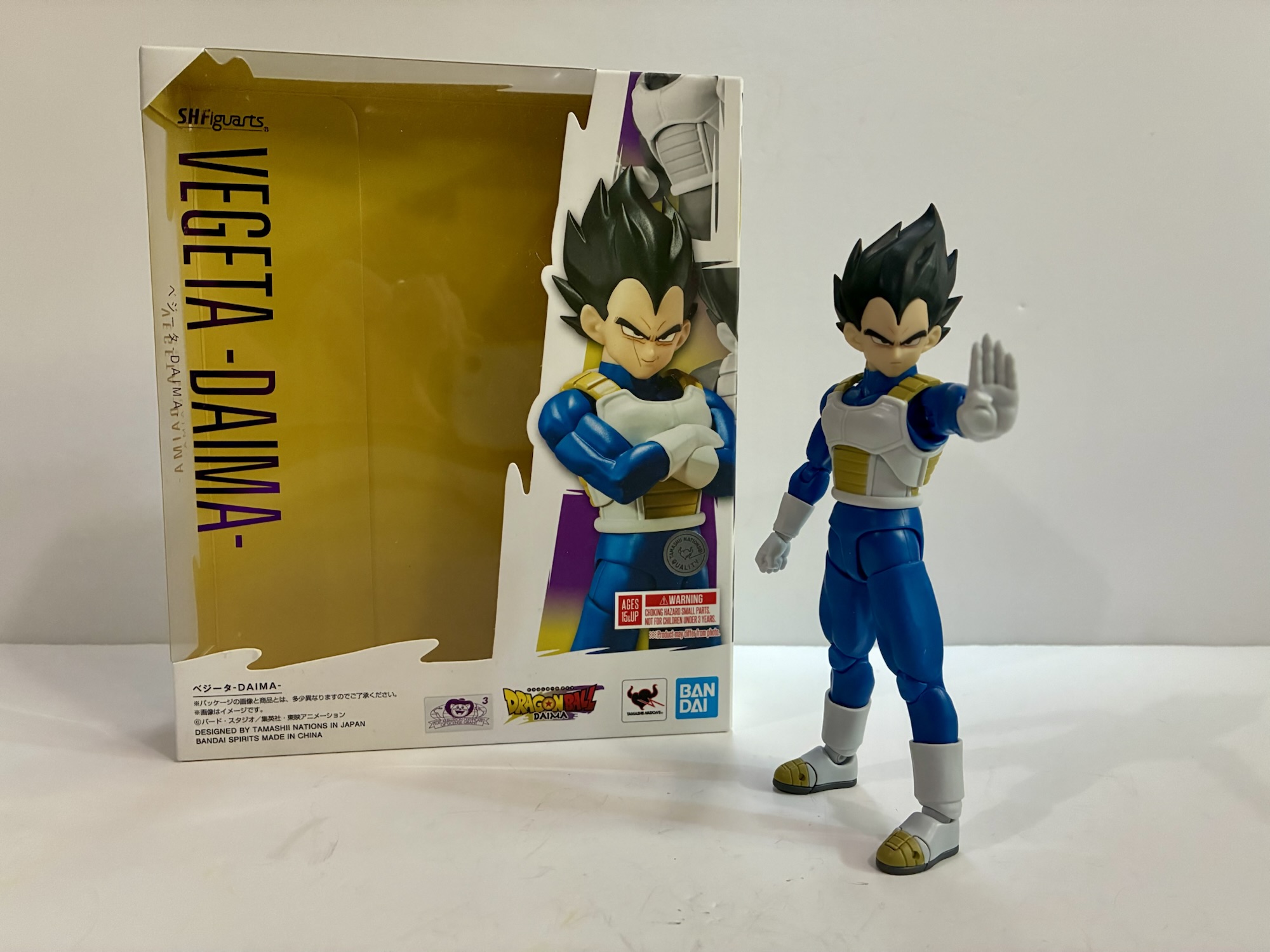
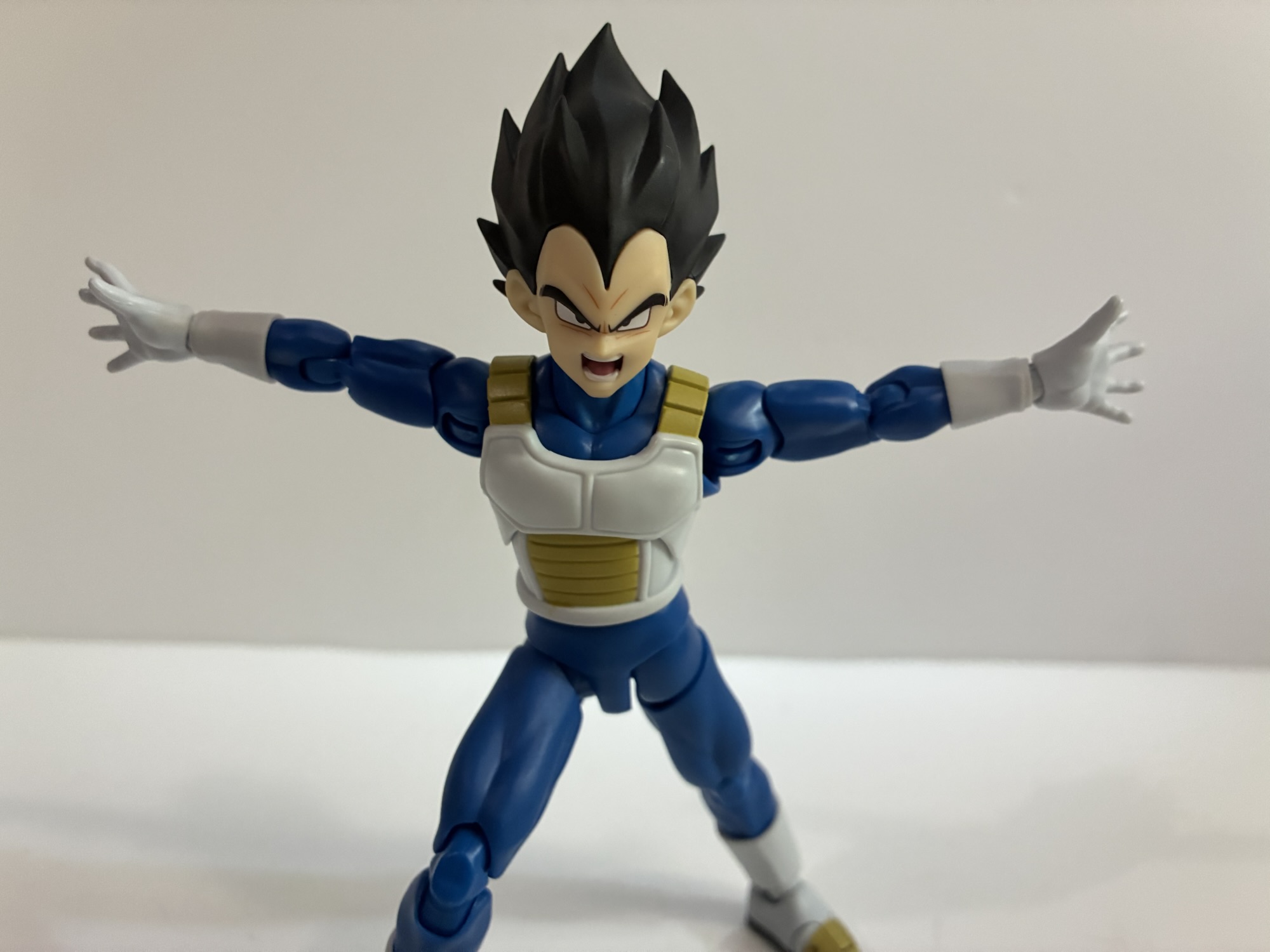
Dragon Ball Daima has come and gone, but we’re still getting action figures based on the limited series. When it comes to the Bandai/Tamashii Nations action figure line, that’s usually par for the course. It’s not like the classic movie tie-in toy line where product shows up in stores weeks before the movie hits theaters. That’s probably for the best as that’s how you end up with massive spoilers like the infamous Phantasm action figure released ahead of the Batman movie Mask of the Phantasm. For the Premium Bandai figure line, the spoilery figures were at least held off until the episode premiered (the Japanese dub, anyway) while a fairly generic figure of someone like Vegeta went up for preorder last year. And likely owing to the ever changing tariff situation in the U.S., it’s actually taken a little longer than initially expected for the figures to arrive in the U.S.
If you like your Vegeta short then this may be the figure for you.
Vegeta – Daima is just that, Vegeta from Dragon Ball Daima. He is still Vegeta, still in his blue and white Saiyan armor, only now he’s styled to reflect the artwork from the show. Dragon Ball Daima has its own distinct look. It’s not far removed from what we have seen out of Dragon Ball Z and Dragon Ball Super, but it might be just enough to give some collectors pause if they’re not interested in Daima figures specifically. Bandai has yet to give us a base Vegeta from the Cell Saga or from Dragon Ball Super so this Vegeta might catch the attention of some. It’s also an entirely new sculpt with some new approaches to engineering and it comes at the more budget friendly price of $35. That alone might get enough collectors to take the figure for a spin.
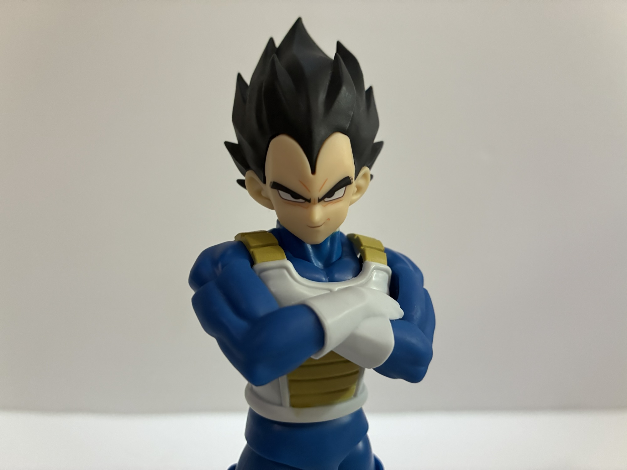
Narrow face, fewer lines, softened features, and a paler complexion kind of sums it up for the Daima style.
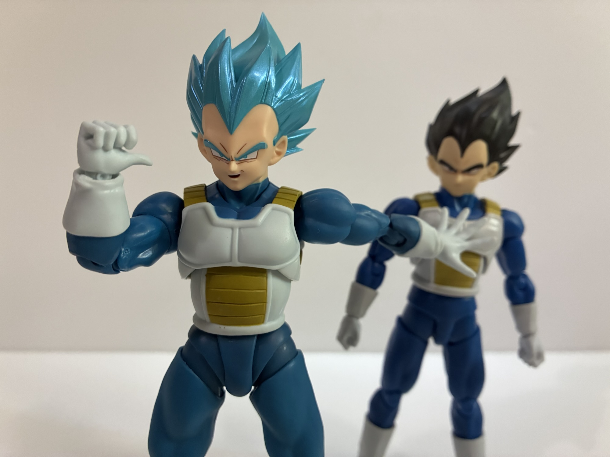
Vegeta from Daima is essentially a stream-lined take on the character. Compared to the 2.0 Vegeta sculpt we’ve been receiving variations on for the past 6-7 years it’s more slender and the proportions are overall just a little smaller this time around. Compare one body part on the new figure to one on the old and they’re almost all a little smaller save for maybe the feet. This Vegeta has got some big feet and ears. The face is a little softer compared to the more recent Super Saiyan Blue Vegeta, but perhaps more defined than the original Super Saiyan Vegeta on the 2.0 body. He’s also a touch shorter at approximately 4.875″ to the top of his widow’s peek compared with 5″ on the Super Saiyan Blue version, which as the most recent edition on that body is the one I’ve decided to compare directly to.
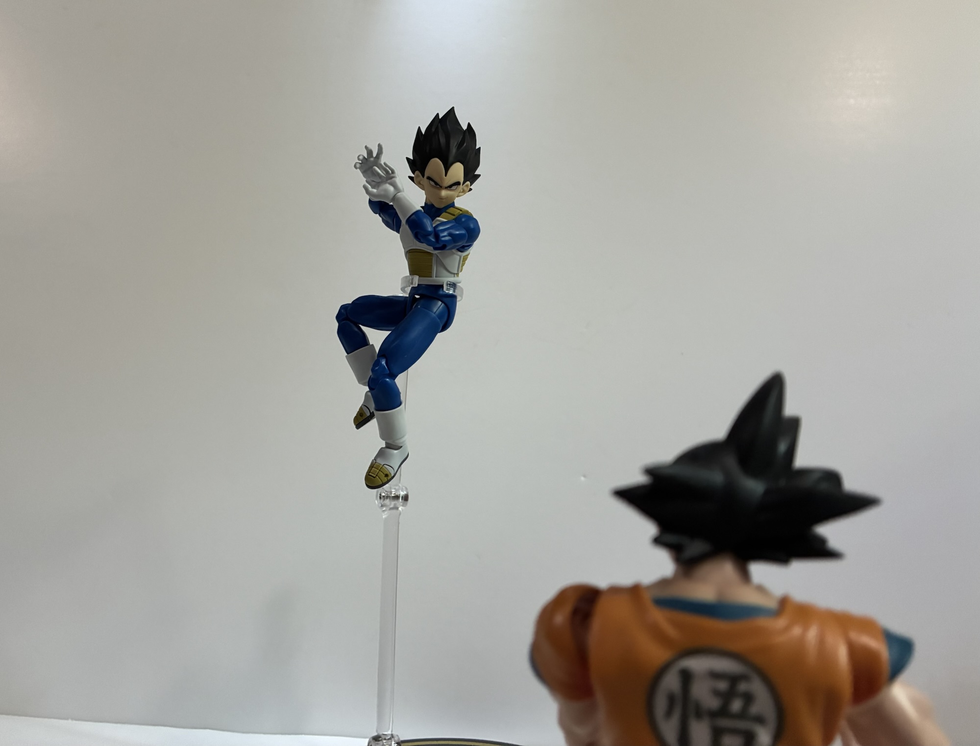
The new engineering lets him kick quite high. You can even push it higher than this.
The engineering is almost all together different with this Vegeta. Like we’ve seen with other more recent figures in the line, Bandai is experimenting with soft, plastic, overlays instead of just sculpting everything in hard plastic. The upper part of the armor is made of the more rubbery material, though it doesn’t really impact anything as it’s glued down to a plastic chest. Doing it this way basically just allows Bandai to skip out on painting the blue portion of the chest. The crotch piece is also rubbery which should allow for better posing. This does mean there is less paint overall with this figure as it’s limited to the yellow parts of the armor and boots as well as the face and neck. The paint on the neck isn’t perfect, nor is it on the boots, but it’s not so bad that I’d consider either sloppy. The overall look of the figure is solid and there are no mismatched colors at least. Some may not like how the crotch looks with the new articulation, but I can’t honestly say it’s worse than before. The one eyesore is at least reserved for the rear of the figure where Vegeta has been gifted a long, flat, ass. Watching the show, it’s fairly accurate. Old Vegeta has never been blessed with buns, but the figure draws attention to it with a sculpted butt crack where as the show usually omits that detail. The figure probably should have just done the same.
These two are always up for some sparring.
The accessory load-out for this Vegeta is pretty damn good for a $35 action figure. We get a pretty typical spread of hand options including sets of fists, open, clenching, flat palm (i.e. Big Bang Attack), and his two-finger martial arts posed hands. He also has a crossed-arms piece, as many Vegeta figures have featured, which connects at the bicep. It doesn’t separate in the middle like some of the new versions of this piece, but it has some flex and isn’t as annoying to apply as past versions. For expressions, Vegeta has stoic, smirk, yelling, and an angry expression with his eyes looking down and to his right. There’s also a second hair piece. The first is a neutral pose and the second one has some bend to it like it’s being blown by the wind. The faces this time around also do not have any bangs attached to them, they just plug into the hair, and they all look pretty good. The only thing this figure is missing is a stand and an effect part. Bandai usually doesn’t provide either of those even in its more expensive offerings so it’s not a surprise, but Storm and Jada are out here making everyone look bad these days.
Vegeta is having a long ass day.There’s more range this time around, but it gets gappy.
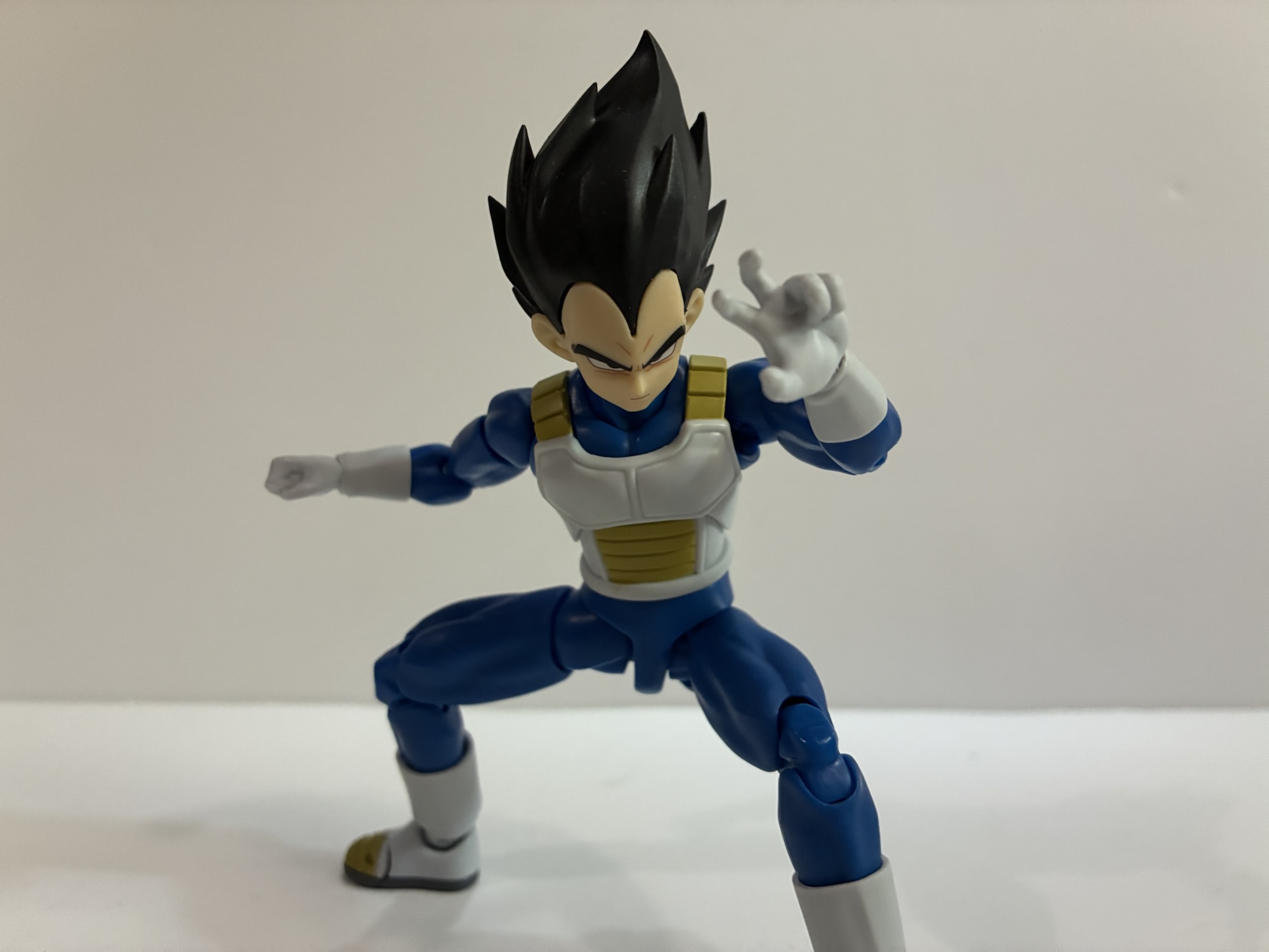
Whenever we do get a new sculpt from Bandai articulation is the prime driver of curiosity. With Vegeta, Bandai did a lot of what we’re used to while also doing some different things as well. The head is a double ball and the neck is on a ball as well so that all works as expected. He still doesn’t look up well, and for that you’ll need to engage the diaphragm joint. In there, he has some sort of ball hinge setup, but not like the old hinge that allowed the chest to literally rise. This one lets Vegeta bend back a solid amount, but it exposes a pretty large gap in the chest. Going forward is almost nil. There’s another ball joint set into a hinged joint at the waist and it does provide for solid range going forward and back, but like the diaphragm it leads to significant gaps when bent all the way. Rotation and tilt at both is good, but it’s a shame they didn’t extend some of these pieces to fill those gaps.
He’s got the expressions you would expect.
The shoulders are your typical ball-hinge set into a ball peg inside the chest. This allows the shoulder to move up and down and out for a butterfly joint. The butterfly isn’t significant, but it’s enough for Vegeta’s signature maneuvers. The rest of the arm is standard stuff: bicep swivel, double-jointed elbow, ball hinge wrists. The hips are likely standard ball sockets and can go out to the sides for full splits, something past Vegeta figures could not do. He does have those weird fillers Bandai inserts onto the inside of the thigh and I don’t get why they do that. It looks weird. Going forward and back is not a problem either as Vegeta can do those splits as well and even kick past 90 degrees. The crotch flexes plenty and gets out of the way. There are thigh swivels and they look fine, double-jointed knees, and hinged ankles. The ankles do rock side-to-side and there are toe hinges which aren’t great, but you can ignore them if you don’t like them.
“Step aside, worm, I’ll take it from here.”
The articulation is good and bad. That torso falls into the bad and it’s a shame Bandai didn’t do something better with it. On the other hand, comparing this Vegeta to the prior ones I would say the range in the shoulders is better, the hips are way better, and the ankles are superior as well. The head and neck area is basically the same as well as the elbows and knees. I’ll even give the waist to the new figure even if it gets gappy.
Classic Vegeta.
Removing aesthetics from the argument, I would say this Vegeta is an upgrade over the prior one, it just could have been even more of one with a little more tinkering. And if you want to get into aesthetics, I’d say that’s entirely subjective and based on what you think of the Daima art style. I personally like it. I don’t prefer this look to Z or Super Vegeta, but it’s fine. I no longer feel like I need a base Vegeta on the 2.0 body, this will fill that hole well enough. In fact, I would prefer to never buy another Vegeta on that old body. It’s a figure that looks nice, but the articulation shortcomings in the hips and ankles are something I don’t need. And I’ve bought that figure enough already. I suspect we’ll see more from Vegeta and Daima and I’m curious what Bandai will do for the body. I don’t think it would make sense to reuse this body on a powered-up Vegeta, we’ll have to wait and see. I’m also a little surprised we haven’t seen another adult Vegeta solicited yet, but maybe they want to deliver on some of the Premium Bandai offerings first. At $35, this is a good figure and I think most SHF collectors will be happy. It’s really fun to just mess around with and pose and I hope we continue to see more improvements with future figures in the line. I’m left feeling excited for that upcoming Cell Saga Goku due later this year which can’t get here soon enough!
If you like Vegeta and Dragon Ball Daima then we have plenty more for you here:
When Akira Toriyama sadly passed away in 2024 it shocked the world of manga and anime. While his passing was sudden to those confined to the fandom, he at least had one more adventure to deliver in the world of Dragon Ball that would be unveiled later in the year: Dragon Ball Daima. I’ll talk…
I guess we’re making the first week of March Vegeta Week here on The Nostalgia Spot, and why not? He is royalty, after all. This one should be a short one since we’ve looked at this figure before. Multiple times. Bandai has been able to extract a lot of value out of their Super Saiyan…
Vegeta is a character who has had a few looks throughout his time in Dragon Ball Z. Almost all of those looks are some variation on his Saiyan armor from his debut with minor tweaks and modifications. Since Vegeta has become one of the most popular characters from the long-running manga/anime, most of those looks…
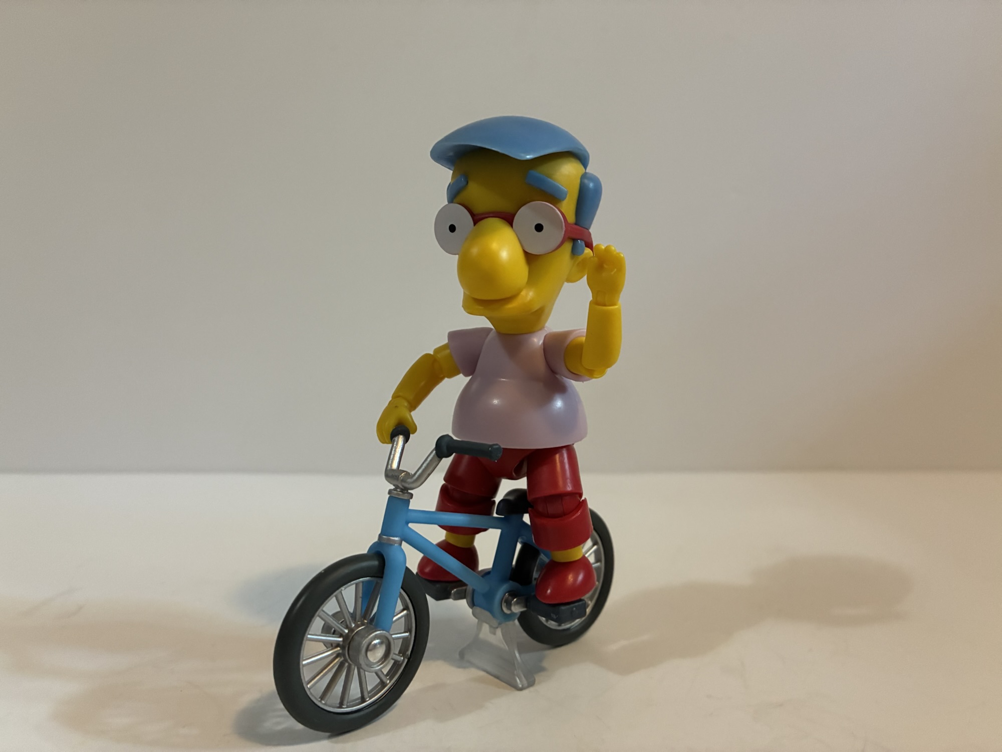
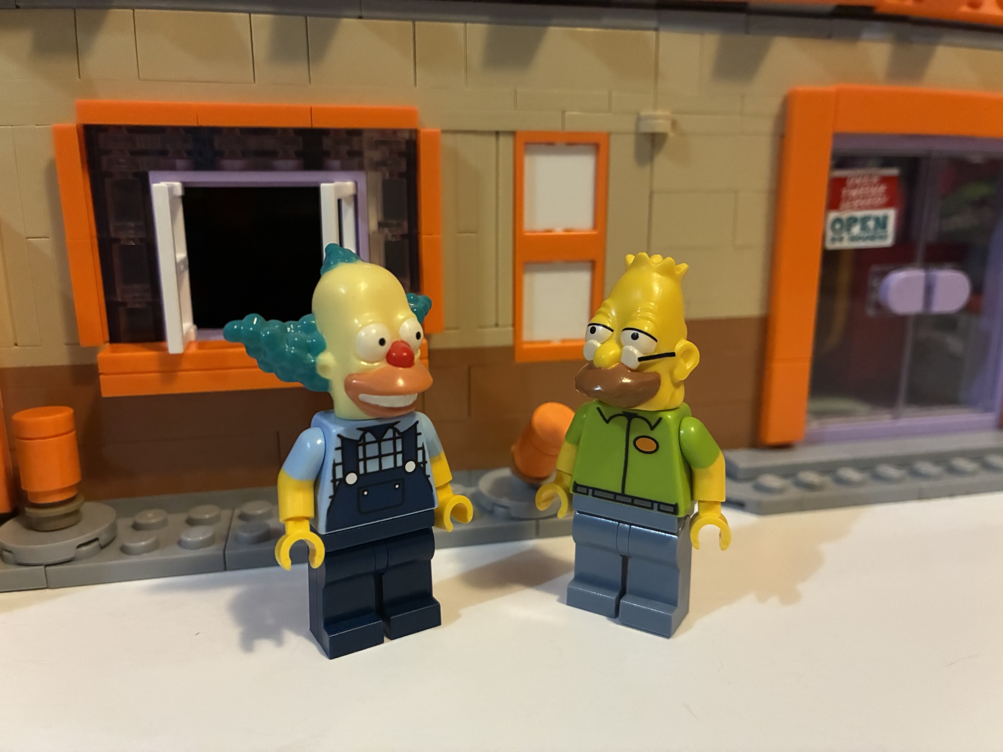
The Springfield on your shelf has made some additions these past few weeks.
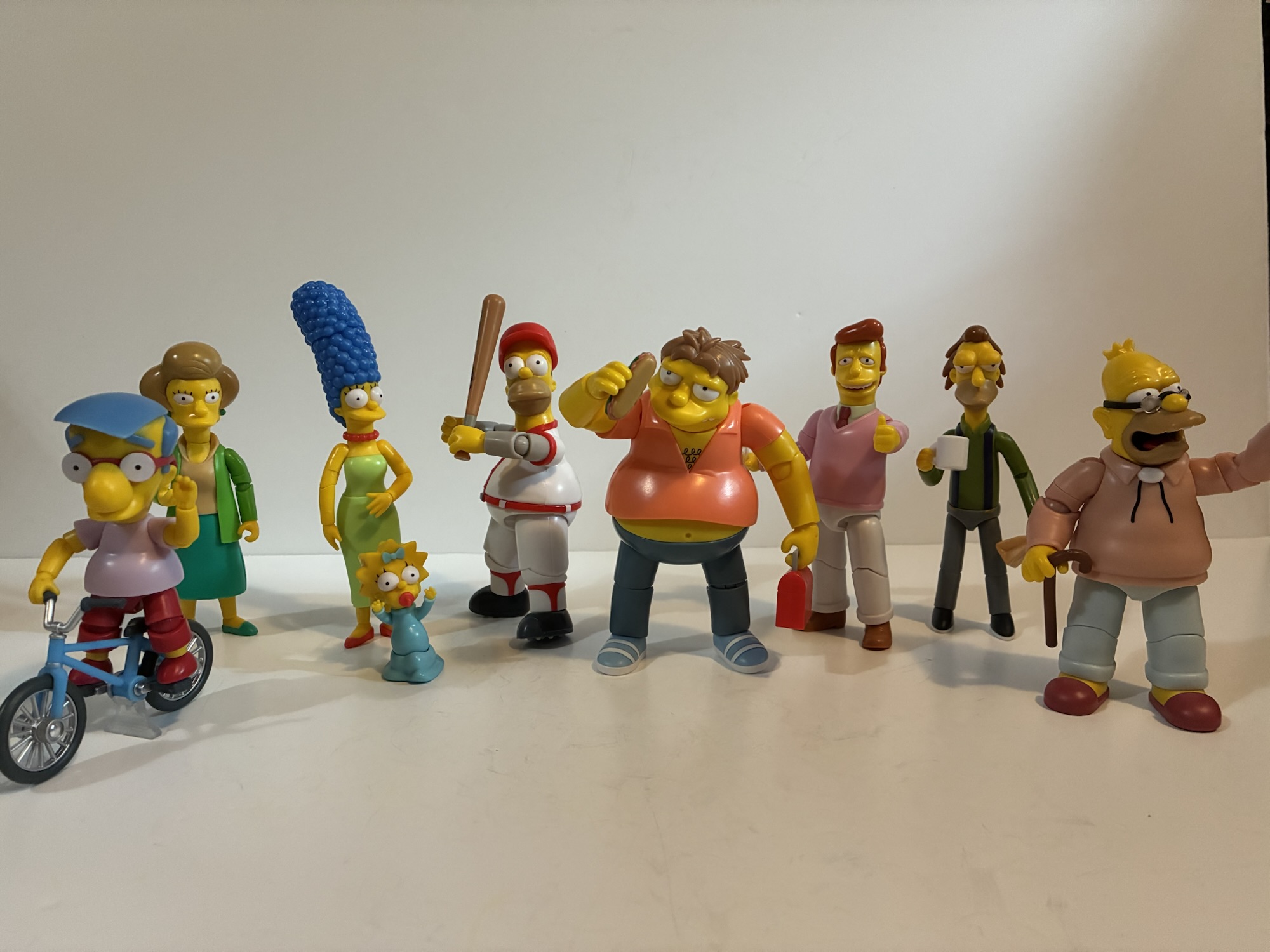
One thing I wasn’t expecting for 2025 was that the hardest line to collect would be The Simpsons by Jakks Pacific. It’s a mass retail release so, if anything, I thought it would be pretty easy. My assumption has been proven wrong and I think it’s because this is a line that is trying to serve too many audiences. It’s Jakks and they specialize in lower cost toys sold at Walmart and Target for brands like Sonic the Hedgehog and Super Mario Bros. With The Simpsons, Jakks has basically taken that same approach with a property that probably doesn’t have much appeal to kids. It’s adults that are likely buying these and it’s adult collectors who want every character. Jakks keeps sending plenty of Homers and Barts to the stores while collectors struggle to find the Lennys and Carls. Jakks also doesn’t prioritize selling these things to more collector friendly outlets making it quite difficult to just preorder what you want.
Despite that frustration, I will say the line is pretty solid for what it is: a low cost, articulated, line of characters as seen on The Simpsons. It’s a better take on the old Playmates Toys World of Springfield line, though it has so far lacked the dioramas of that line which seemed to be reserved for the 2.5″ scale line. I’m definitely only interested in the 5″ scale line with only few exceptions and I’m mostly happy with it. I do wish they were more selective with their expressions on the figures, but that seems to be something that’s getting better which we’re going to talk about today.
It was a little while ago that I found Wave 3 in my travels. I wanted to do a combined Wave 3 and Wave 4 post, but I’ve been unable to get all of the figures from Wave 4 that I’m out looking for. Since then, I’ve received Wave 5 so we’re just going to skip over the missing figures which for me are Carl Carlson and Bumblebee Man. The fourth figure in the line is blue shirt Bart which I don’t need. I also didn’t want hockey Bart from Wave 5, but he does look fine if you’re into that variant. Let’s blast through these though as there isn’t a ton to talk about for each.
Marge and her big baby have arrived to complete the family.
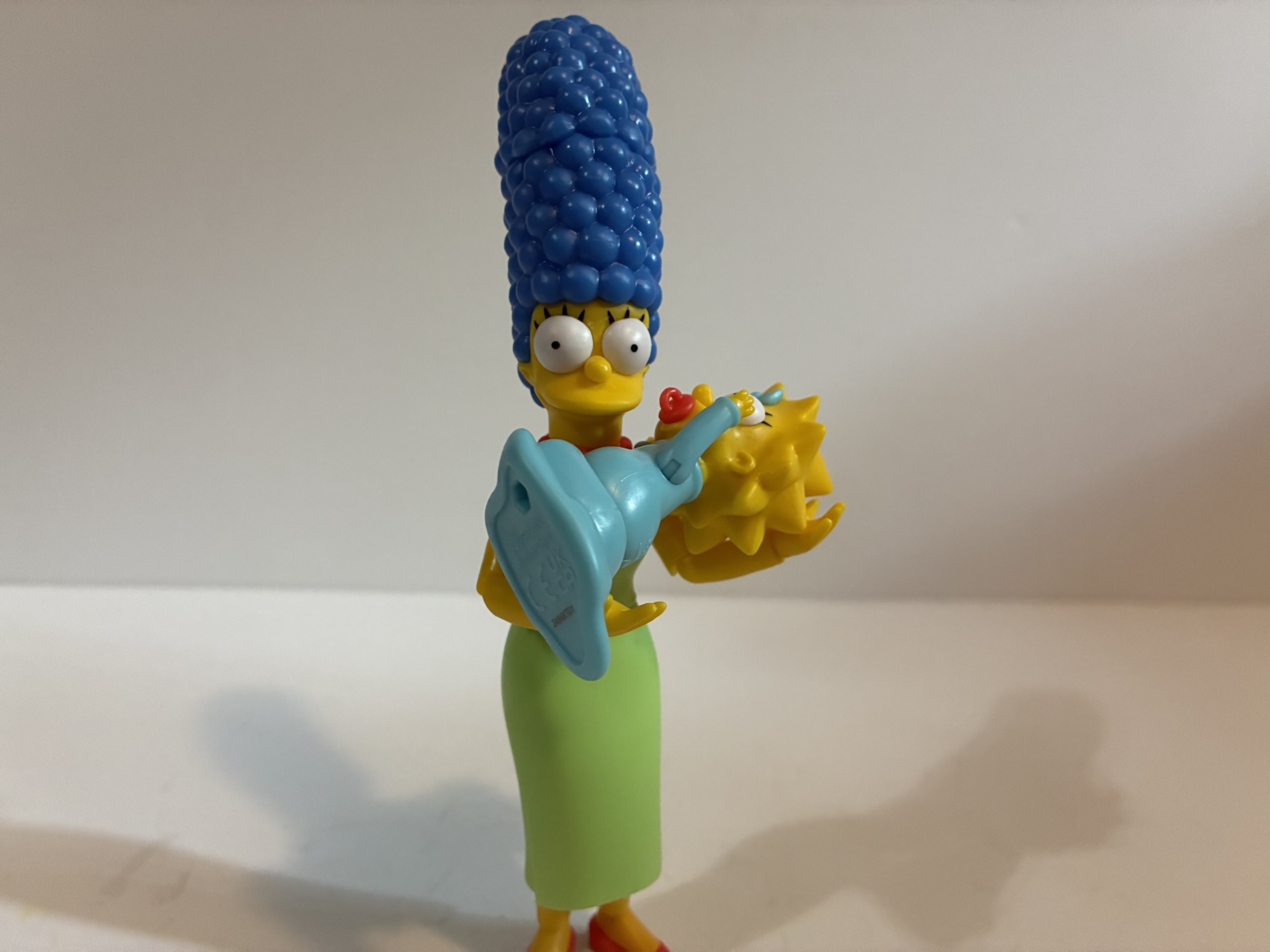
The headliner for Wave 3 was Marge Simpson. We got Homer, Bart, and Lisa in the first two waves leaving her as the family member most needed. She is easily the tallest figure so far standing at 5.75″ to the top of her hair. She also might be the most on-model of the family as she has a slight smile which works well as a default portrait and her hair bends ever so slightly back. Everything is where it should be with her red pearl necklace, green dress, and a butt that won’t quit. The only thing I don’t care for about the presentation is the very visible seem line in her hair about 2/3rds of the way up. Apparently, they couldn’t cast it as one piece? It’s a bit odd. She also can’t articulate for crap because the dress kills basically everything from the waist down. You’ll only be posing her arms.
The scale will never stop bothering me with this line.
And if you’re saying to yourself, “Hey! What about Maggie?” – don’t worry, for she is Marge’s lone accessory. Yeah, it kind of stinks that Marge doesn’t come with something fun like a potato or toxic drinking water, but it’s definitely great that we got Maggie. She’s in her blue onesie with her trusty pacifier in place. Jakks gave her articulation at the head, shoulders, and waist which is basically a ball joint that lets her rotate and pivot. The only issue with Maggie is the same as the rest of the kids: she’s way out of scale with the adults. Her head is the same size as Marge’s and she looks ridiculous in Marge’s arms, if you can get her to stand while holding Maggie. Since she basically is an accessory she doesn’t actually come with any. It might have been a better release model if Jakks gave Marge some accessories and sold Maggie with the Simpson pets as a three pack, but hey, at least we have the whole family.
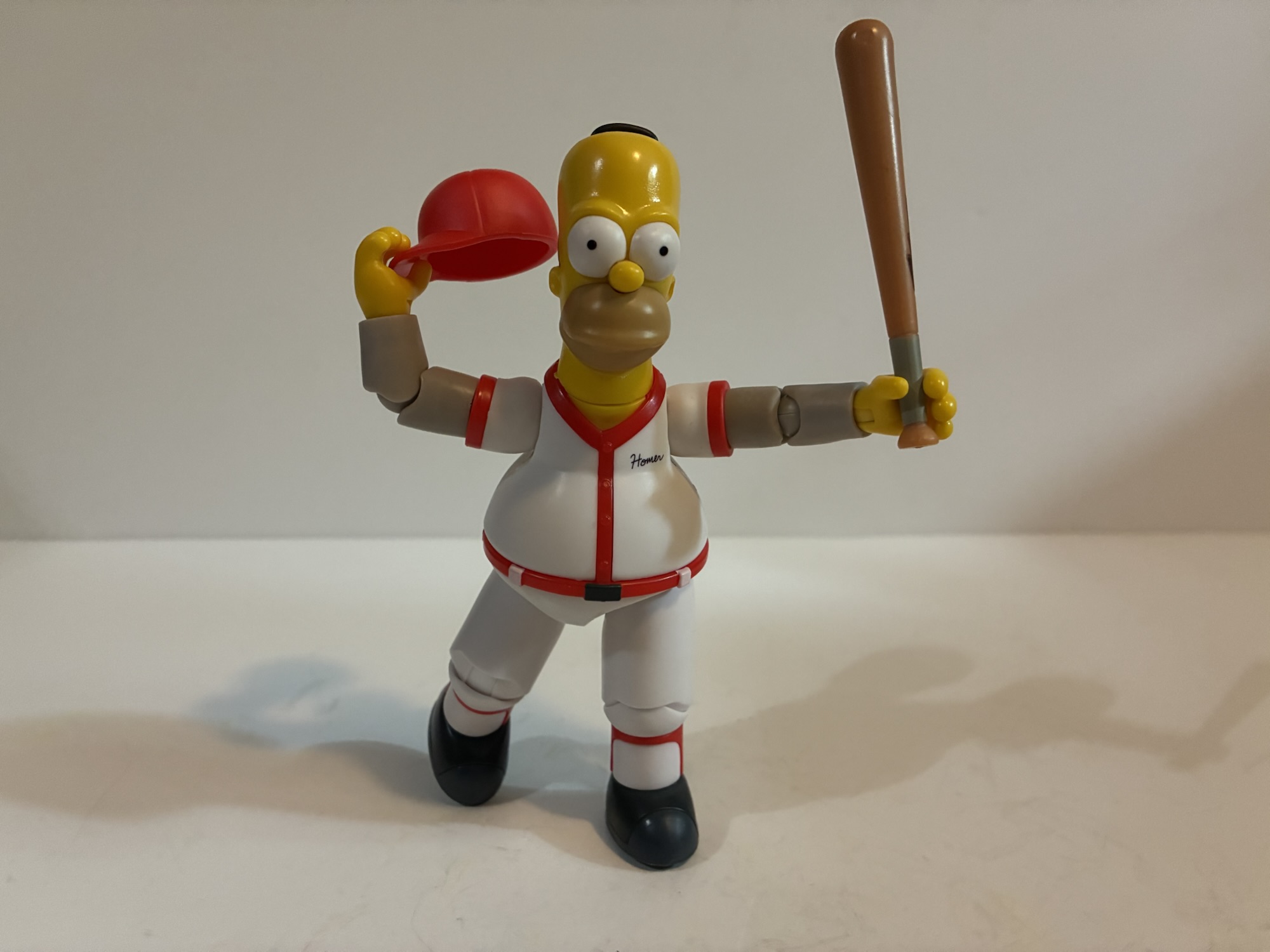
He can’t properly grip the bat or scratch himself in sensitive areas, but I’m such a mark for the episode that I have to like this Homer.
The Homer variant of Wave 3 is Home Run Homer from the iconic episode “Homer at the Bat.” That’s the one where Homer joins the Nuclear Power softball league with his trusty Wonder Bat. Homer is basically the same head as the first wave Homer with a body clad in his softball uniform. The body is mostly new since the uniform requires red piping which Jakks did with plastic instead of paint. I think the only paint might be his name on the chest, the white belt loops, black belt buckle, and gray spikes on the bottoms of his cleats. For accessories, Homer has a removable hat and good old Wonder Bat. He looks really nice, though the hat is quite large on his head making me question the decision to make it removable and not just part of the sculpt. The real downer though is Homer’s inability to hold his bat with two hands. Solicitation images implied this was possible, but they lied. He also lacks a vertical hinge for his wrists so he can’t call his shot. I would have preferred better articulation and a new expression as well. Still, as a representative from one of my personal favorite episodes, I can’t not like this one.
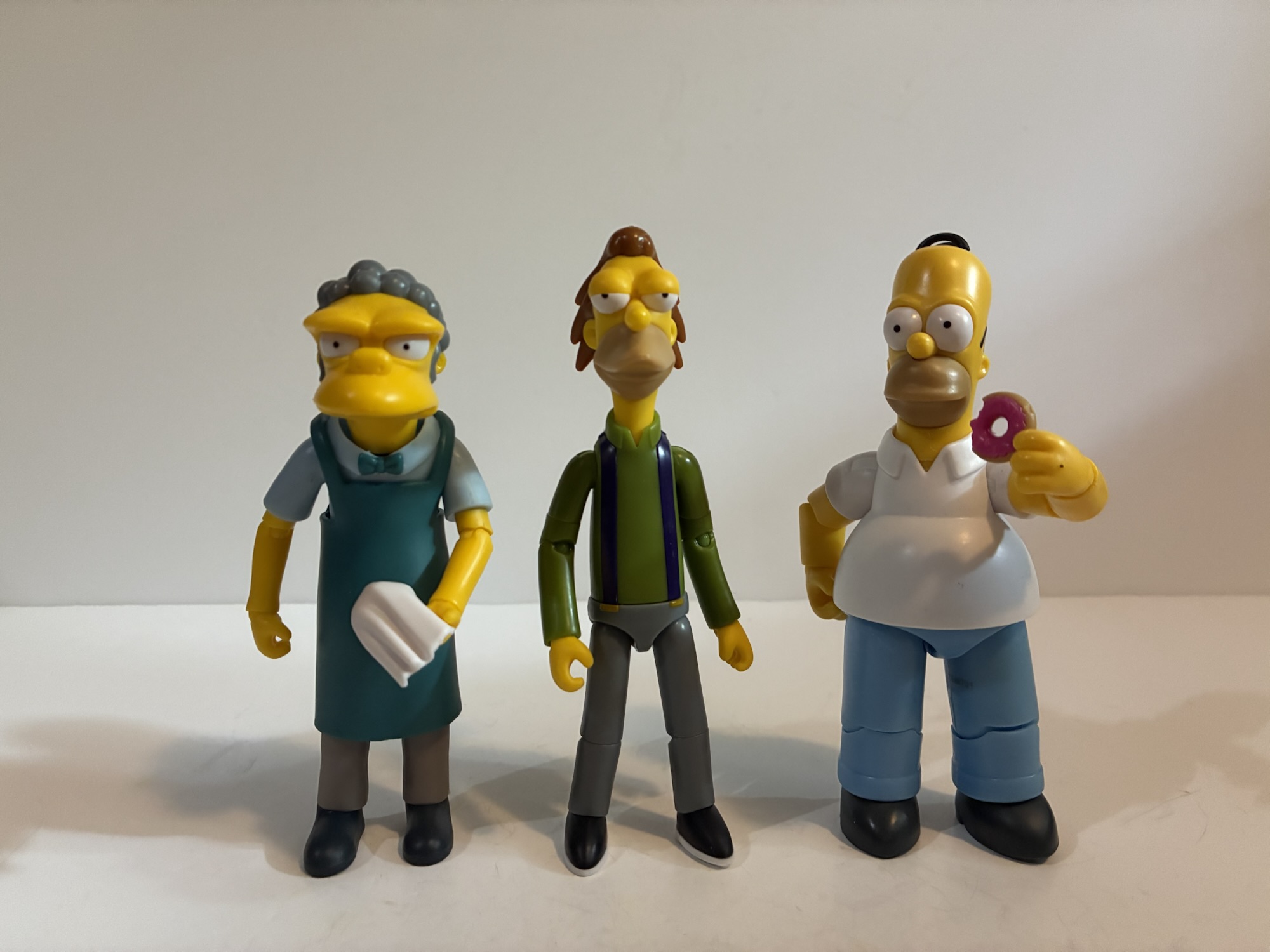
The mug is nice and round so Lenny doesn’t have to worry about it injuring his eye. The bag on the other hand…
Another member of that famous softball team, Lenny Leonard, also finds himself in Wave 3. Unlike Homer though, this is standard Lenny as one would find him at work at Springfield’s Nuclear Power Plant. Jakks did a good job with getting the color of Lenny’s olive shirt right and I like that he has half-closed eyes as his expression. Lenny is a bit trickier to render in three dimensions so he doesn’t look as on-model as Marge and Homer, but that’s mostly just from the front. If you view him as he would normally be presented in the show from the side or at a three quarters angle he looks solid. His hair is also just a little off as Jakks took an almost semi-realistic view to the shape. In that, it reminds me of their Sonic figures and how his hair (quils) is tough to translate into 3D. For accessories, Lenny has a mug of coffee and a bag lunch. Perfectly suitable for him, and at least he doesn’t have to worry about getting any pudding in his eye.
His mom says he’s cool while his music teacher insists that no one likes him. Who are you going to believe?
The last figure of Wave 3 is the little wiener nobody likes: Milhouse. I kid, of course, as I do like this figure which comes with perhaps the most ambitious accessory in the line yet: a bicycle. It would have been a lot cheaper to just give him an issue of Biclops, though it also would have been funnier to actually give him Lisa’s bike. Milhouse looks great though, but suffers from the child scaling like Bart and Lisa. His articulation is essentially the same as Bart and he can sit on the bike fairly convincingly. The bike has a stand, though it can still be tricky to get Milhouse properly balanced on it. The one difference with Bart that’s a bit odd is Jakks sculpted his knee articulation into his shorts rather than have it begin just past them. I suppose his shorts are traditionally longer than Bart’s, but it does look a bit weird. It’s also extra noticeable since he needs to bend his knees to ride his bike. That aside, he does look good and I think he turned out better than Bart and Lisa.
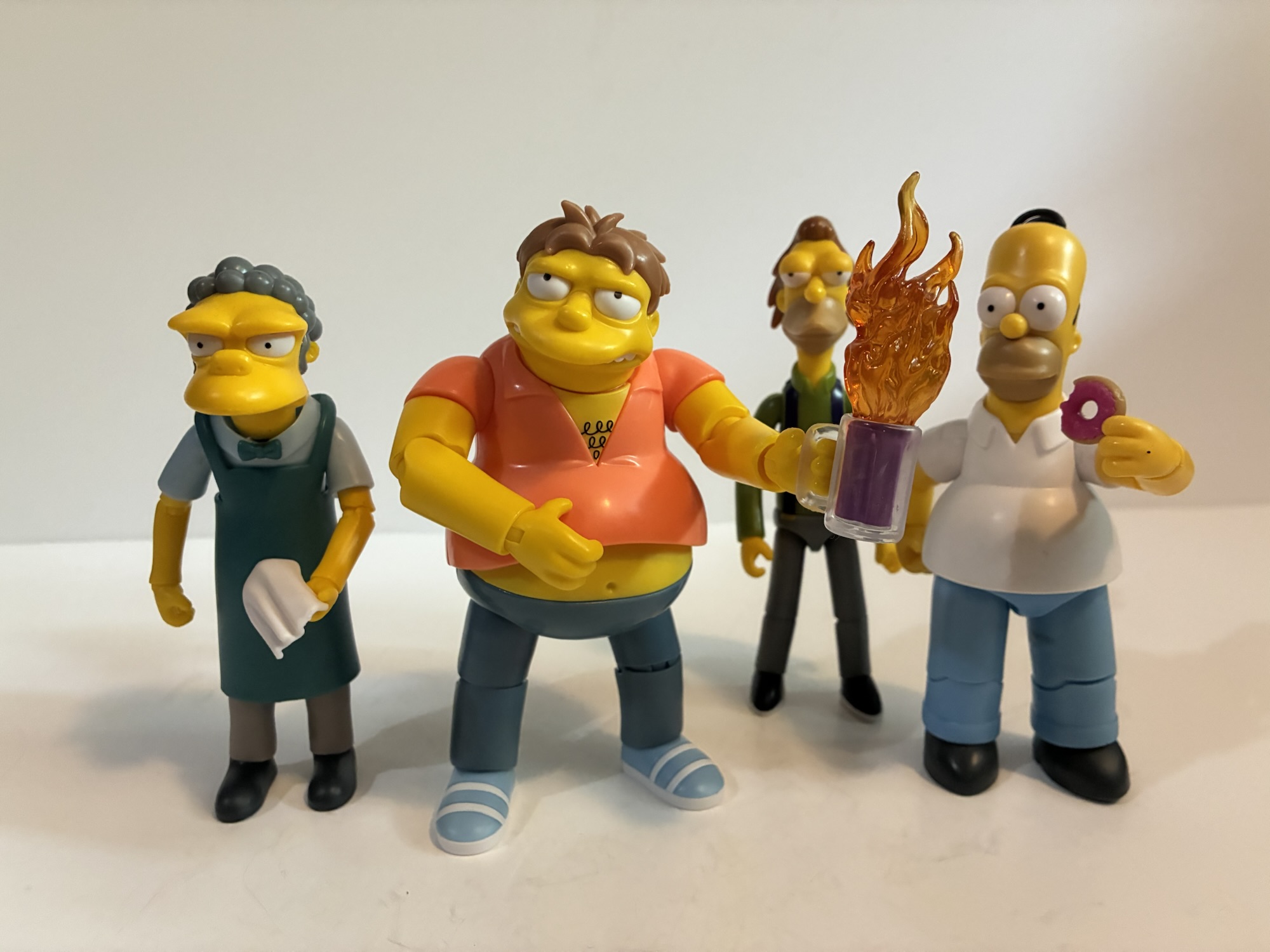
Carl’s absence feels especially painful now. And that’s the Super7 Faming Moe, if you’re curious.
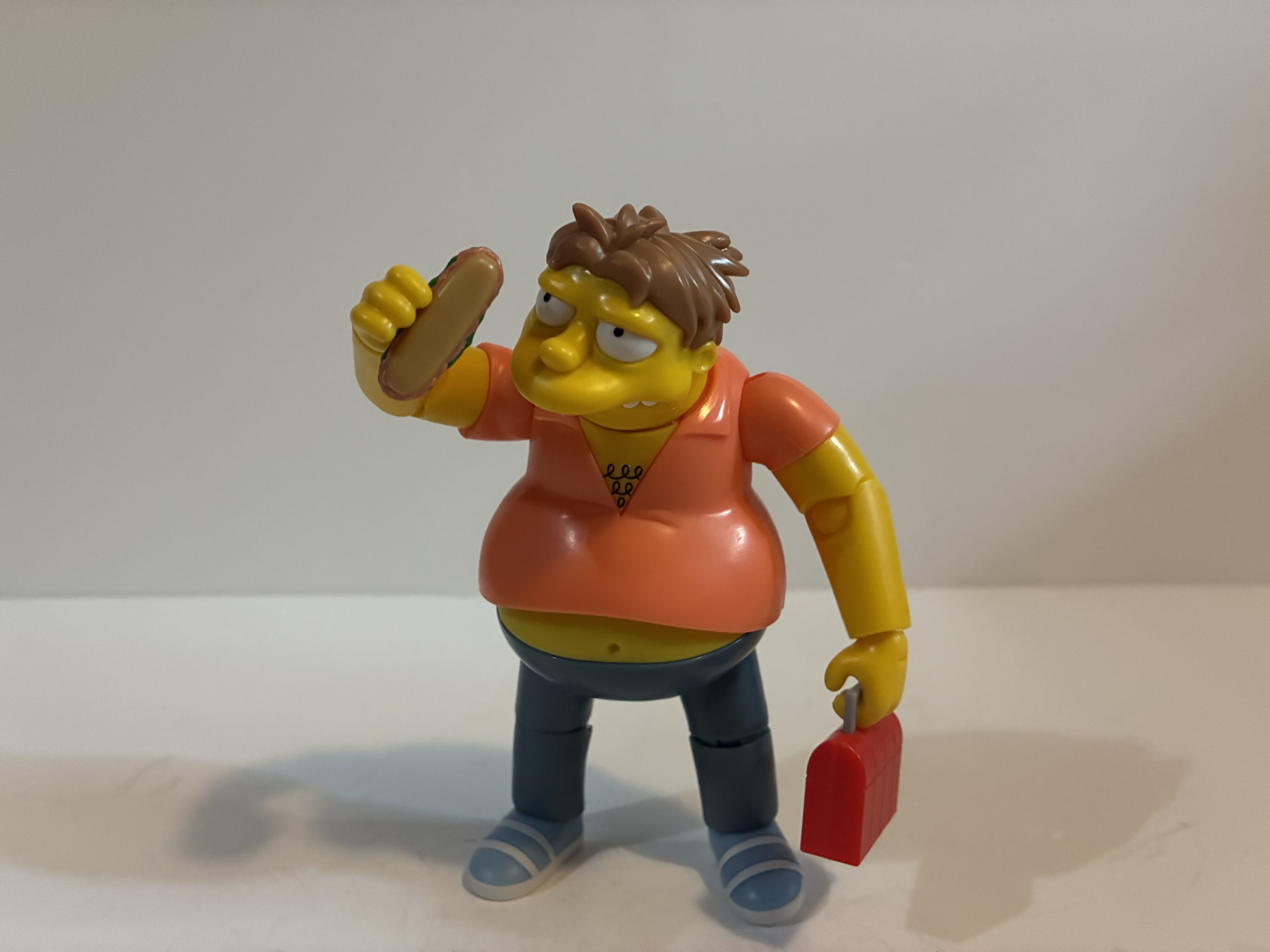
As I mentioned before, Wave 4 is the one I’m struggling with and the only figure I’ve managed to land is Barney Gumble. If that’s the only I can find at least it might be the best. Barney rivals Marge for title of most on-model which is impressive considering he has a design that should also be hard to translate. He scales well with Homer, Moe, and Lenny and has that perfect dead-ass drunk expression. If I have one critique, it’s that his shirt is too orange when it should be closer to a salmon. He actually articulates pretty damn well and comes with two accessories: a lunchbox and a big hoagie. Yeah, they don’t really make much sense for Barney, but Jakks wasn’t going to pack alcohol related accessories in with him. I’m struggling to think of anything from the show that would work. I guess they could have given him a soda can, but that would be equally lame. Maybe that plant he never watered? A cup of quarters? No, that might be too close to a gambling reference. Maybe this should just have been the first alternate portrait in the line of Barney mid belch?
“The problem with kids these days…”
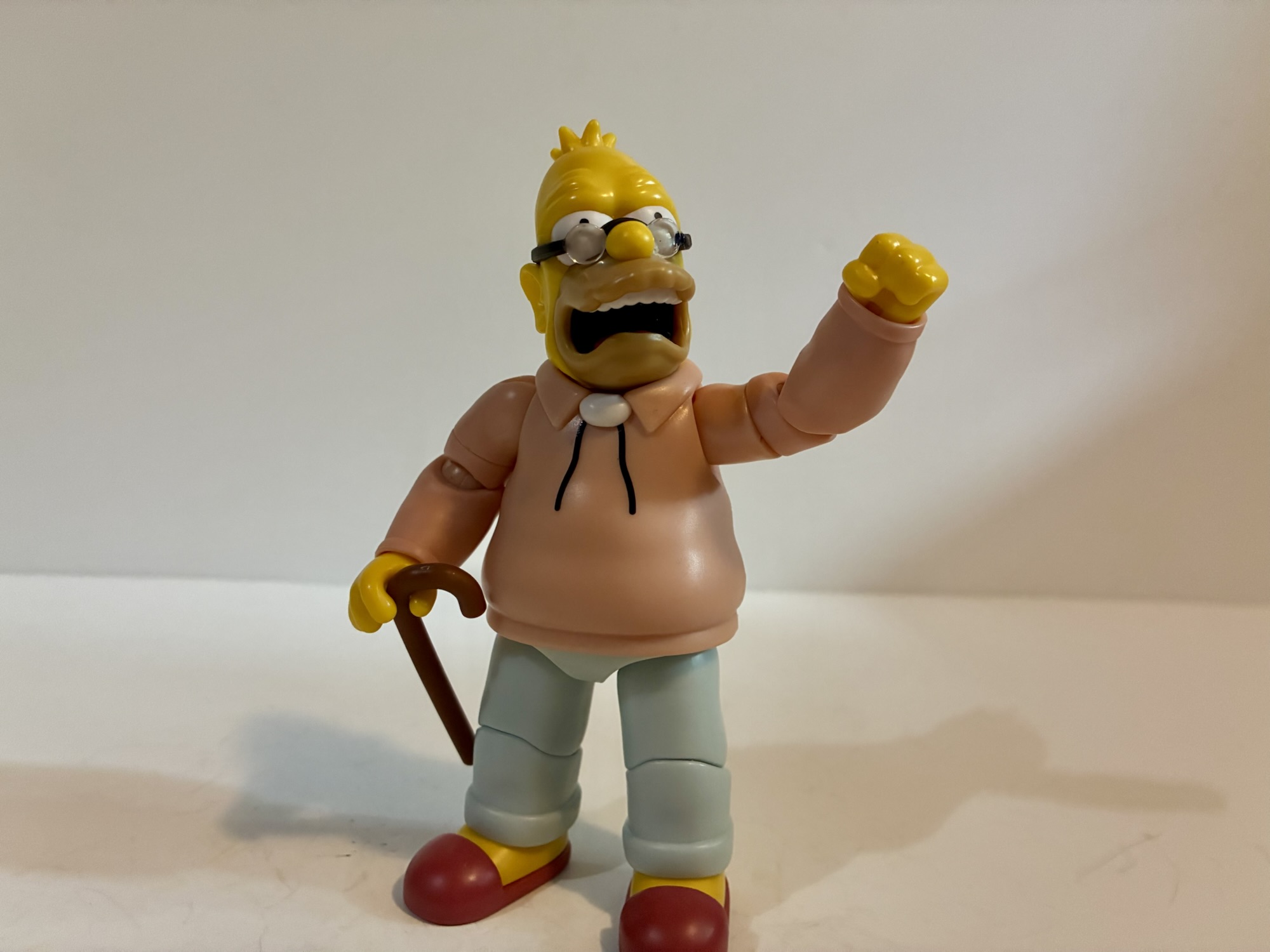
Wave 5 is where we’re getting some more side characters, though I would say it’s headlined by the inclusion of Abe “Grandpa” Simpson. This is where Jakks seems to be taking the portrait criticism to heart as Abe appears to be clearly modeled after the “Old man yells at cloud,” meme. I just find it ironic that they took this approach with a character who would have looked good with a dead-eyed stare. Still, I do like it though Abe’s head looks a little fat to me. The forehead area doesn’t have as dramatic a slope to it so he’s a bit off-model. It’s almost like a more Saturday morning approach to the character. The sculpt of his shirt looks nice though and his bolo tie is painted. His glasses are also clear plastic unlike Milhouse who has his eyes painted onto the lenses. The eyeglasses are too thick, a frequent issue for toy manufacturers, as well. His lone accessory is a cane and that suits him. If I am allowed to be pedantic, and Simpsons fans are known for such, Jakks did screw up by making his left hand the fisted hand and the right the gripping hand if they wanted to properly match the Old man yells at cloud image. I’ll let it slide though.
I don’t really care for any of Mrs. K’s accessories so I think I’ll just give her Lenny’s coffee.
Bart’s teach, Mrs. Krabappel, finds herself among the characters of Wave 5. Like Lenny, she’s a bit off-model as she has a head that’s tough to render in three dimensions. Her eyes are off and it throws off the look of her as they’re too narrow and elongated. A half-lidded approach might have served her well and some bag lines under the eyes. She’s a little too happy and glowing for the downtrodden teacher. She also suffers from the same issue as Marge where her plastic skirt hinders any articulation she may have at the waist and below. Her accessories are a ruler and an eraser, which I guess is fine. I honestly would have been okay with a repeat of Lenny’s coffee mug or her picture of Woodrow. There’s no paint on either accessory so they don’t look great and you can barely tell the ruler is sculpted. She can hold them though so I guess that works.
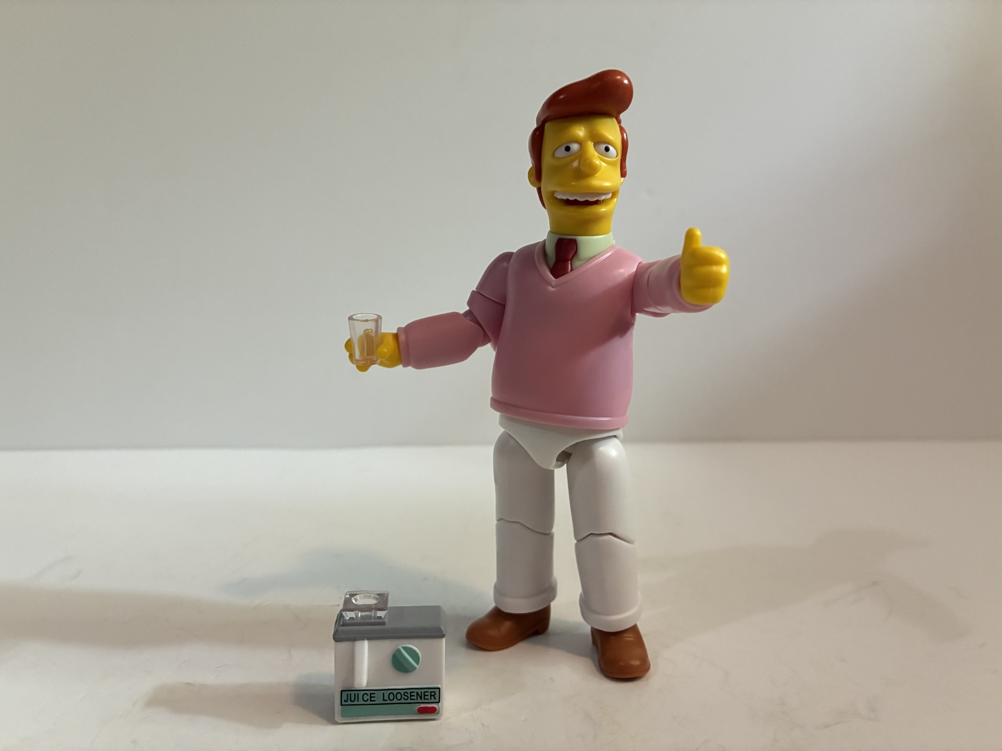
Out of the box, he could hold his breath spray, but I left him holding his glass of OJ for too long and now he can’t.
The last figure we’re going to take a look at is everyone’s favorite aquatic lifeform enthusiast, Troy McClure. You may remember him from such toy lines as The World of Springfield and Super7 ReAction! He’s depicted in his traditional look of pink sweater, red tie, and white pants. He has a nice, toothy, grin and I like that Jakks did include some bags under the eyes for old Troy, though some crow’s feet would have helped too. The head is maybe a tad undersized as it looks a bit off-model to me. I’m also surprised they went with an open mouth instead of just his smile, but I don’t mind as it makes him look like he’s in mid sentence. They also didn’t give him a microphone which surprised me and instead he has his breath spray from the episode “A Fish Called Selma.” I had to look at the package to figure out what it was as it looks more like a bottle with a screw top. His other accessory is pretty great though: The Juice Loosener. As seen in the episode “Marge in Chains,” the Juice Loosener is a juicer with horrible efficiency as illustrated by the included glass with an orange, circular, sticker on the bottom to show how much juice one can expect to get from an entire bag of oranges. It’s pretty great, and since Troy has a thumb’s up gesture for his left hand, he can hold the glass in his right (FYI: not an easy fit) and enthusiastically gesture with his left!
Sure would be nice to have a bully to chase these two. Or a principal.
That’s going to do it for this look at some Jakks Pacific Simpsons figures. I would say, in short, Marge, Barney, Milhouse, and Home Run Homer turned out pretty great by the standards of the line. The rest are pretty good, including Maggie, though suffer from being a bit off-model. I find Mrs. Krabappel to be the least interesting of them because it doesn’t capture the right spirit of the character for me. She’s sarcastic while this figure makes her look more like the ideal teacher eager to spread some knowledge. It’s hard to argue though that this isn’t a solid selection of characters. I assume we’ll be seeing the likes of Skinner, Ralph, and maybe even Super Intendent Chalmers pretty soon. Jasper would pair well with Abe, and we still don’t have a 5″ scale Flanders or Sideshow Bob. If the next wave has been announced I missed it, but I’ll also remain on the hunt for Bumblebee Man and especially Carl. My Lenny needs his Carl as do the other denizens of Moe’s Tavern.
We’ve got more Simpsons goodness from Jakks and others:
I think it was early this year that we found out Super7’s line of ReAction and Ultimates! action figures based on The Simpsons was ending after just a couple of years. That meant Super7 was done after four waves of Ultimates! and four waves of ReAction figures. We had seen figures for a possible fifth…
Back in October, we took a look at the very first wave of action figures from Jakks Pacific based on The Simpsons. At the time, I only had two figures from that inaugural wave: Homer and Bart. It was a series of great interest to myself and other Simpsons fans since it’s existence basically meant…
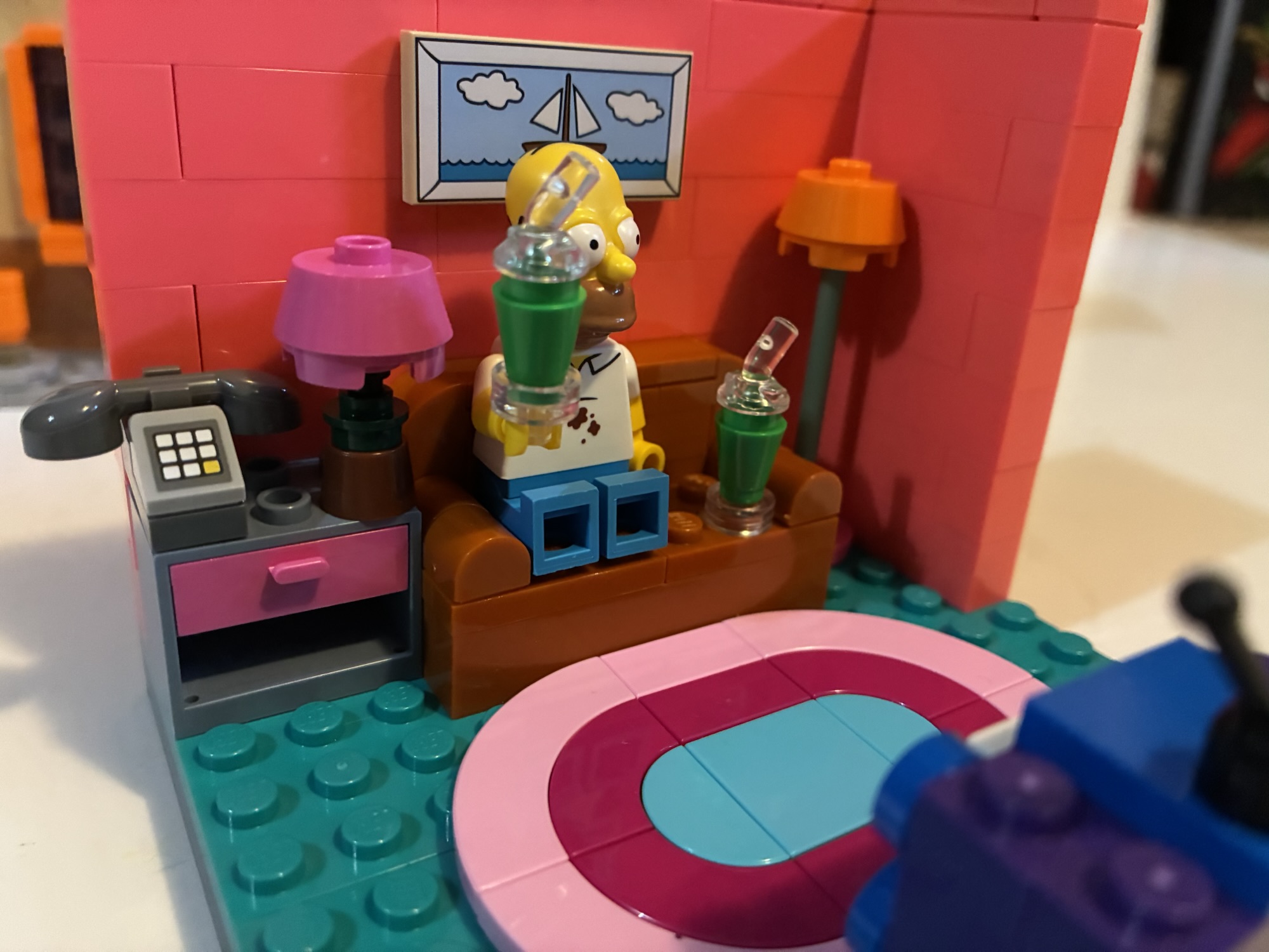
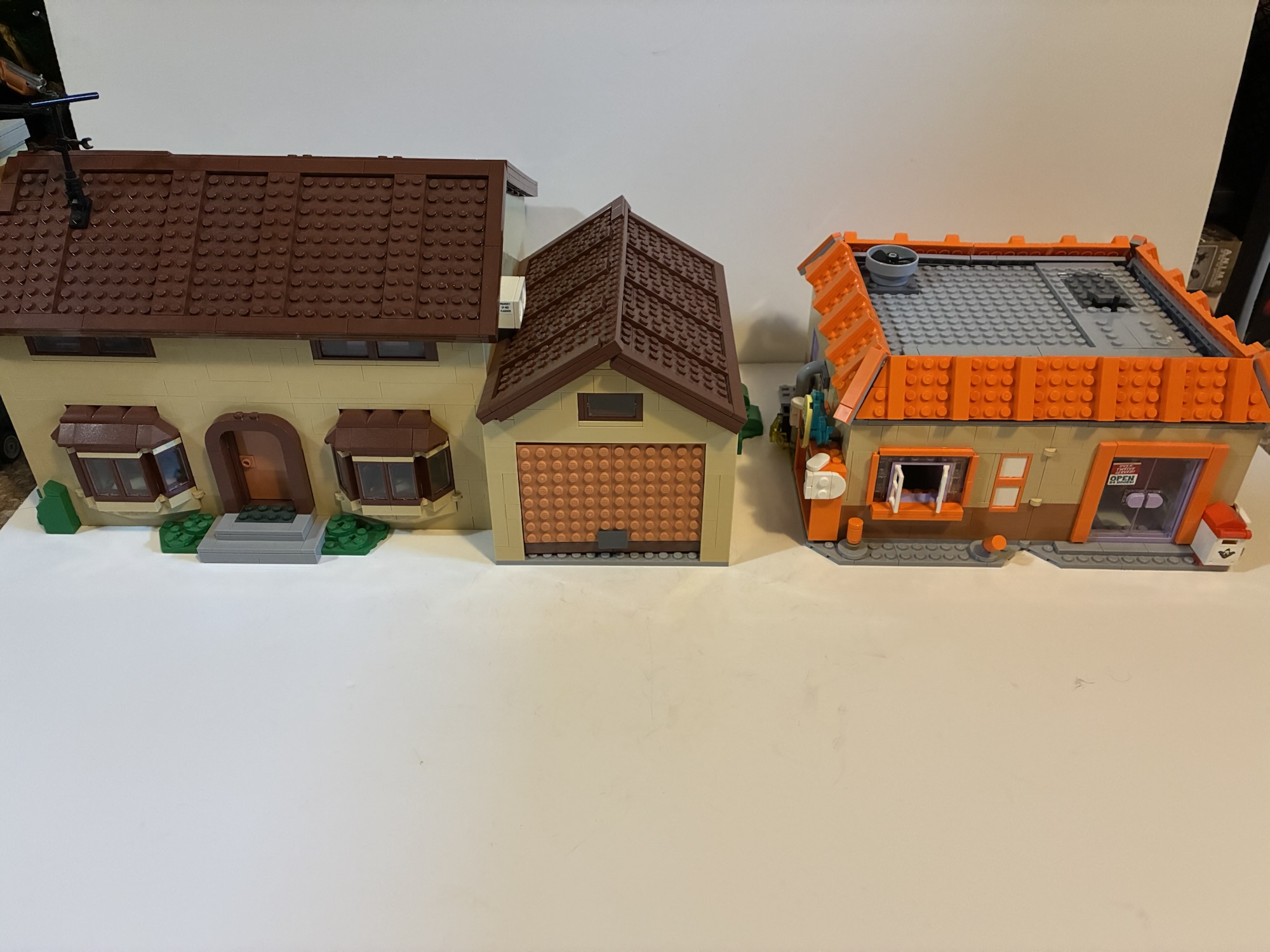
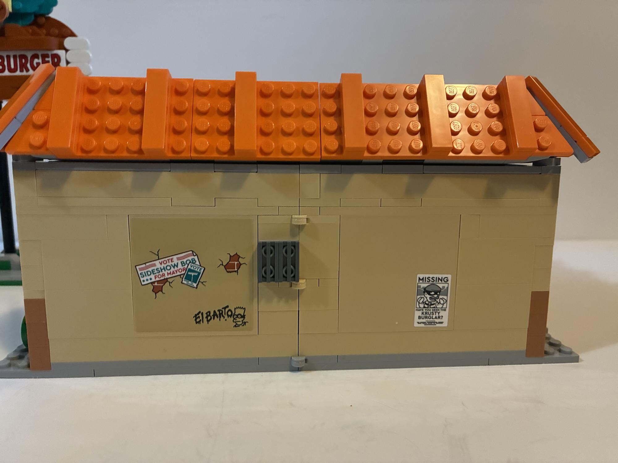
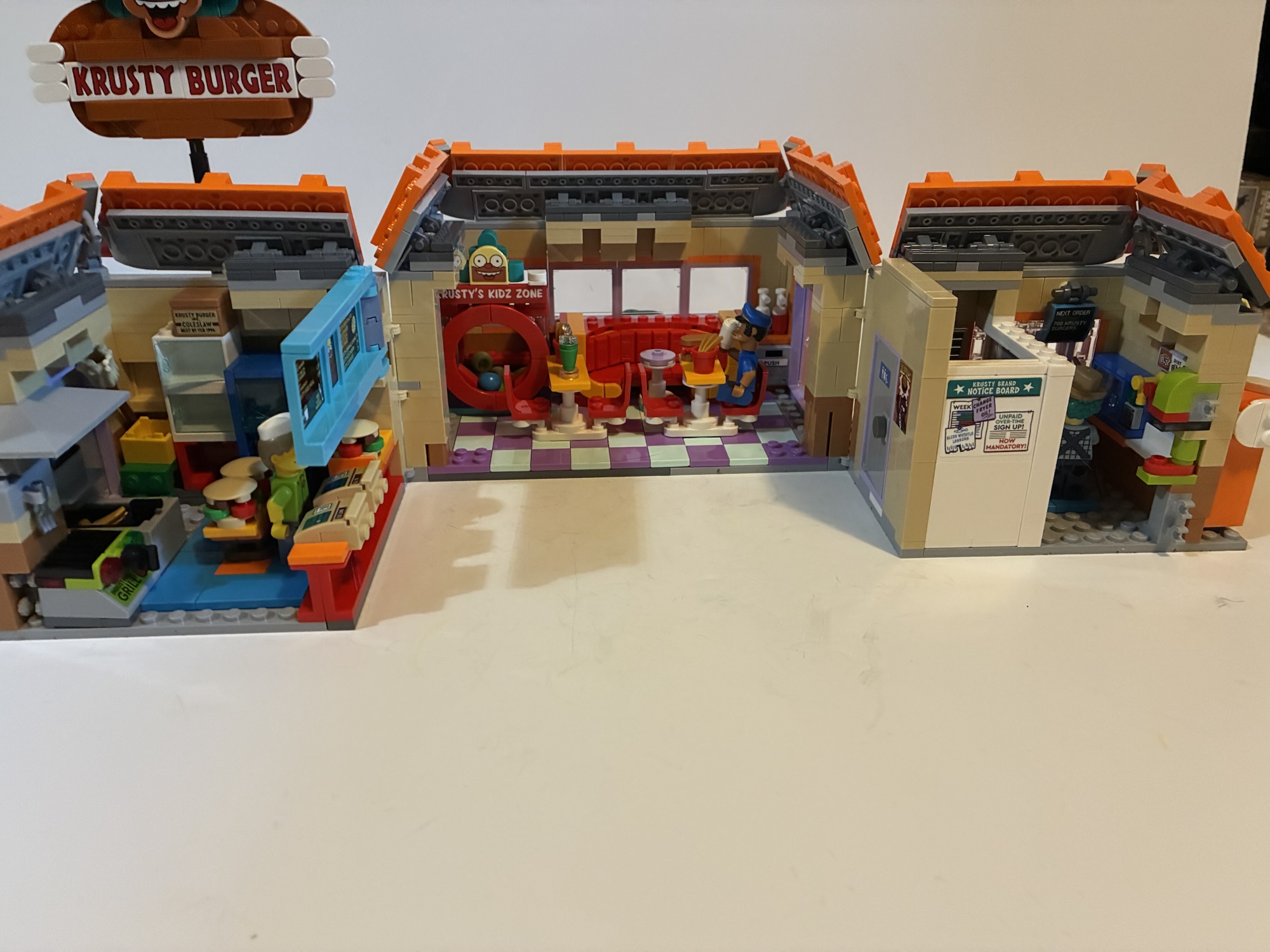
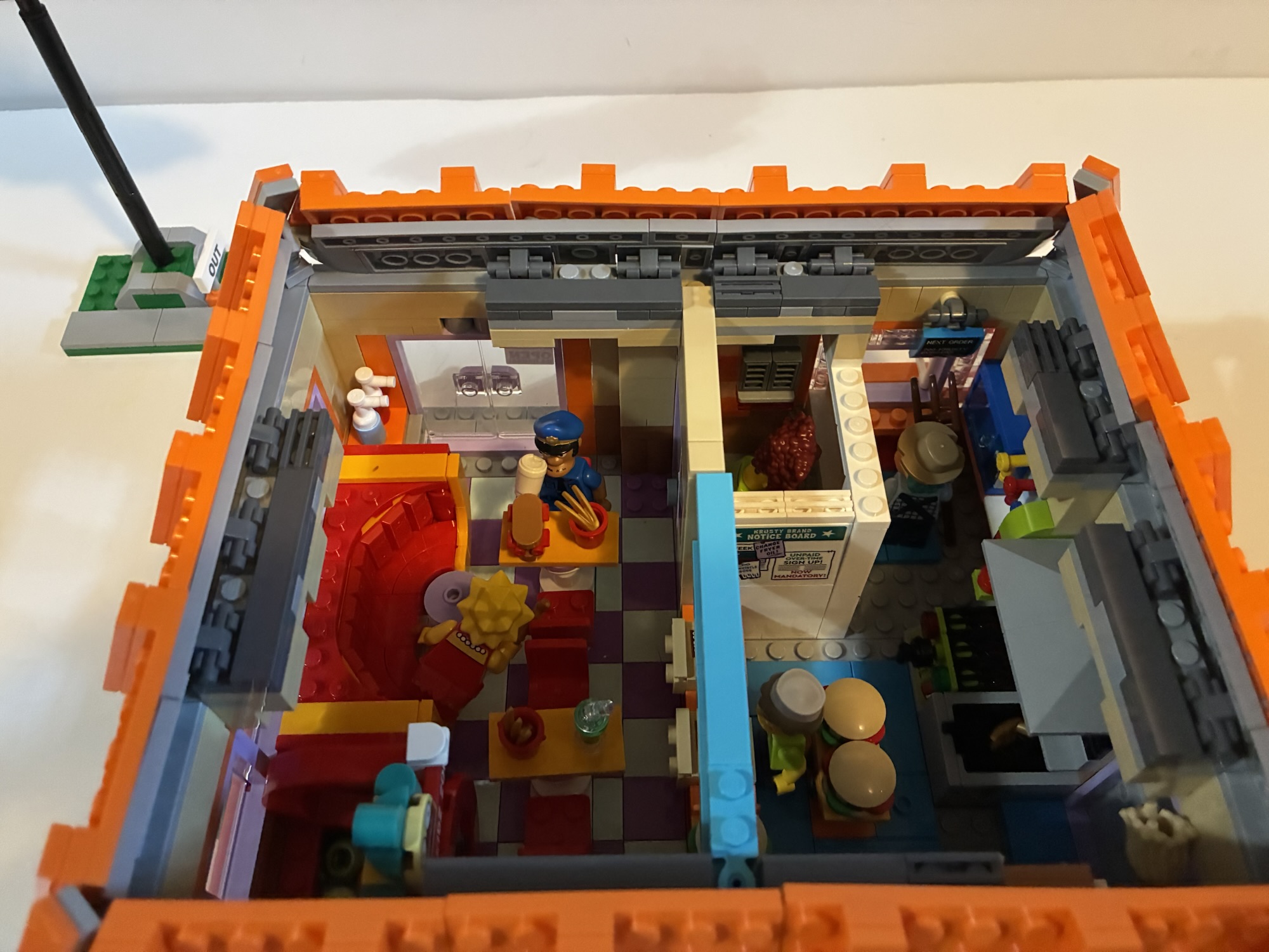
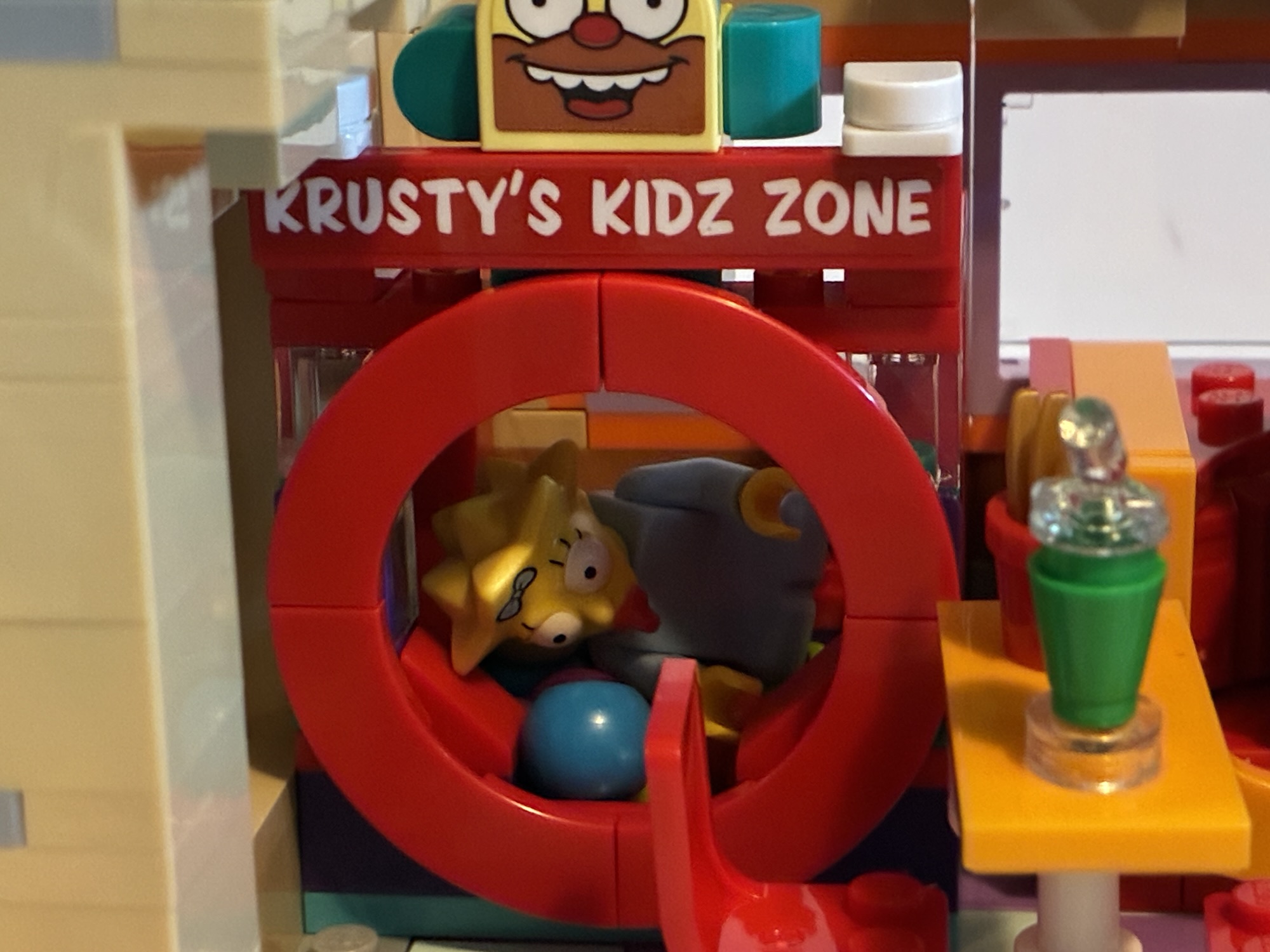
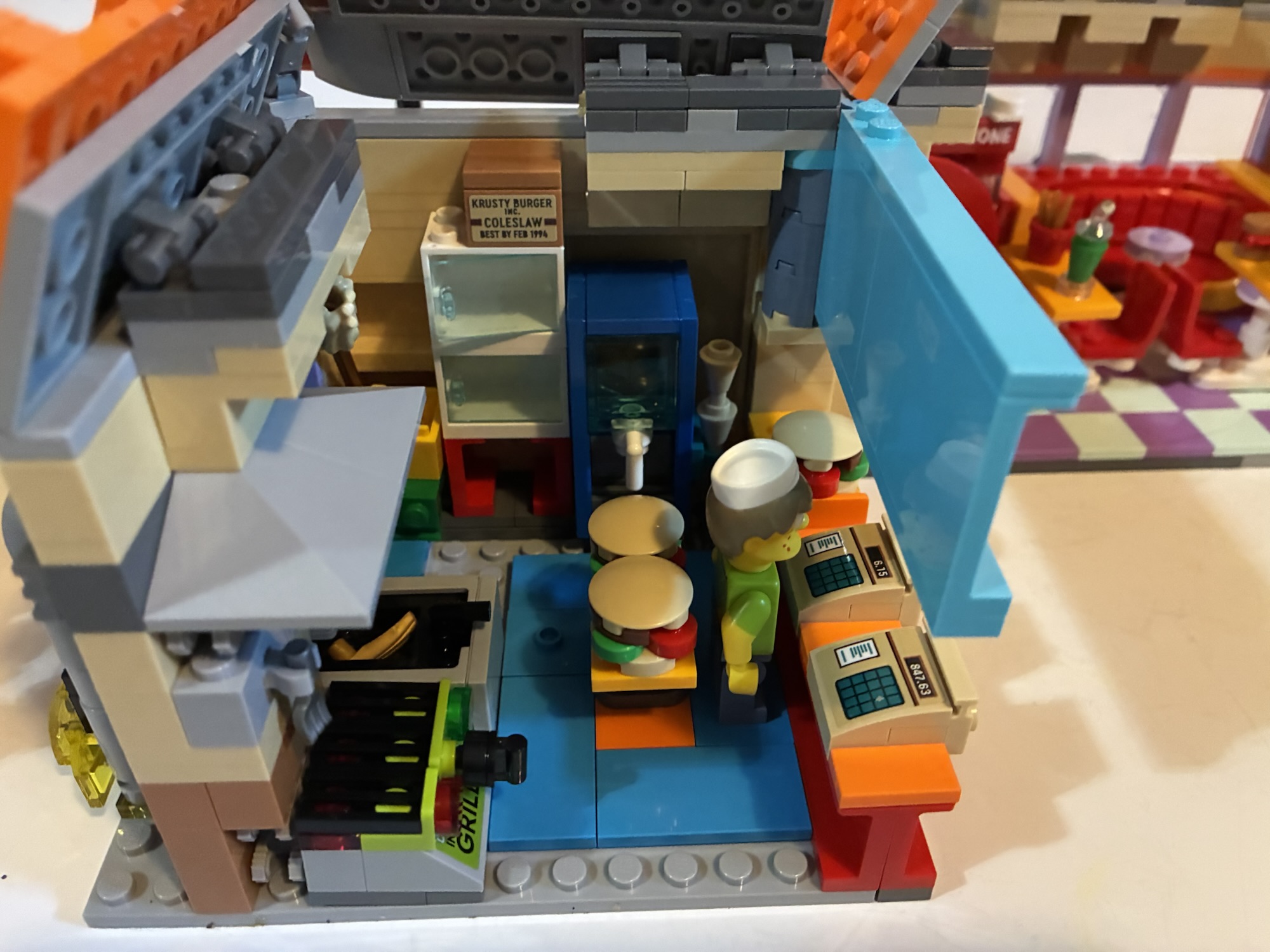
It has been just over 10 years since I last posted about a Lego set featuring The Simpsons. That last set, the Kwik-E-Mart, came out in 2015 and was preceded by the home of the Simpson family the year prior. Those sets along with two waves of mini figures seemed to sell pretty well, but…
Does bustin’ still make me feel good 40 years later? Let’s find out!
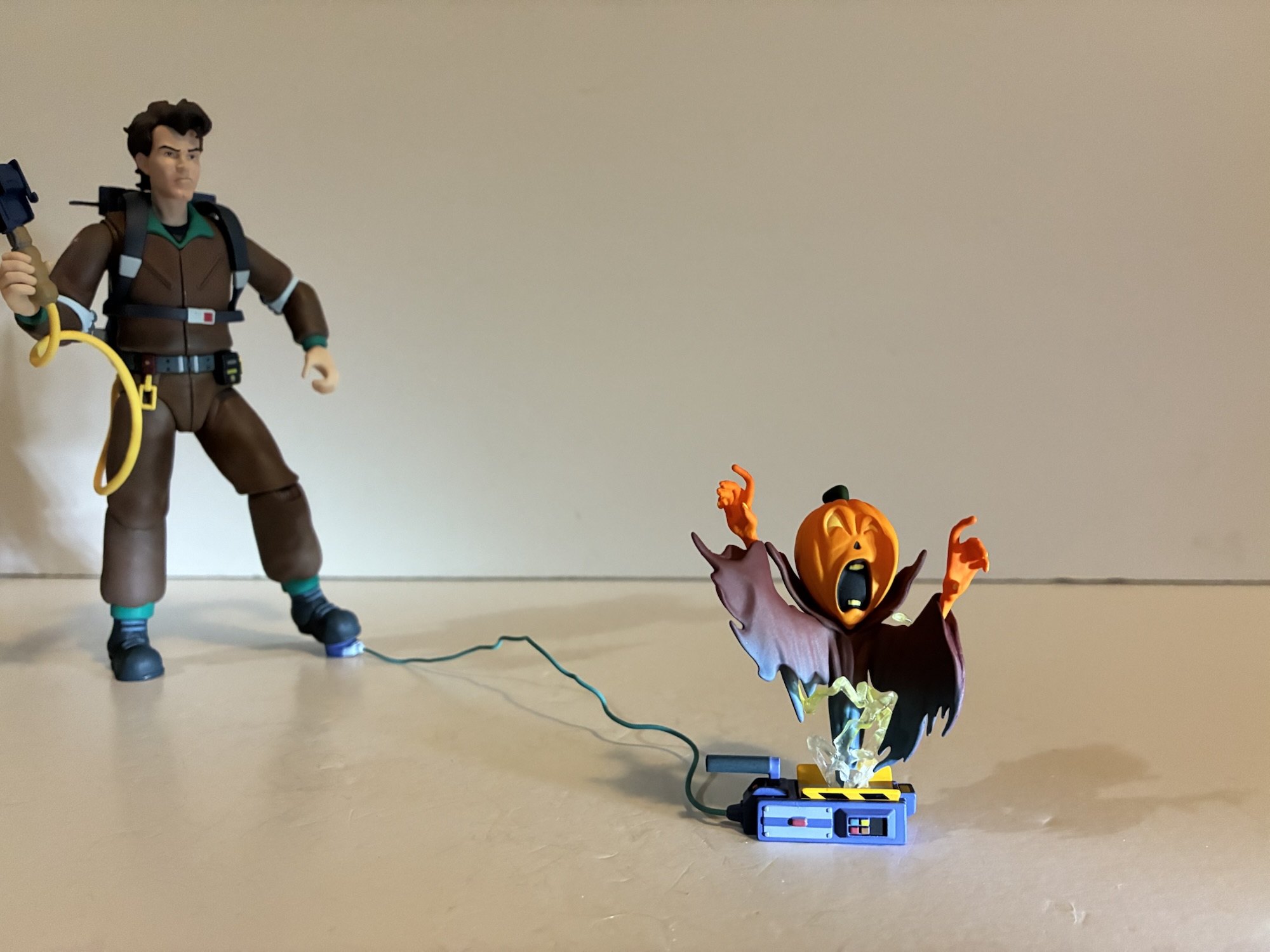
I didn’t do a big 2024 wrap-up type of post like I sometimes do, but if I did I would have awarded toy producer Mondo with the biggest reveal of the year when they debuted their line of action figures based on The Real Ghostbusters. The Real Ghostbusters was one of many 80s properties to have its moment in the sun when it came to toys, but ever since the original Kenner line ended in 1991 little has been produced based on the property. Diamond Select gave it a shot, Mego did as well, and current license holder Hasbro has dabbled in re-releases of the old Kenner toyline. What has alluded collectors and fans of the old cartoon and toyline is a truly dedicated, collector-friendly, line of modern action figures that better match the style of the show. Not to be denied, action figure sculptor and designer Alex Brewer made his own digital mock-ups of what he thought a modern line would look like and shared his work on social media. The response was pretty big and it helped get his employer, Mondo, to kick the tires on bringing his vision to life.
Mondo likes to go all out on packaging.
I have a pretty good memory, but I can’t reliably recall my life before The Real Ghostbusters. It was my first love when it came to action figures. I liked Matchbox and Tonka products prior to, but no figure line captivated me like The Real Ghostbusters. I have no idea how I was introduced to the property or what my first toy was from the series. I can’t remember getting the iconic firehouse playset or the Ecto-1, my memory basically starts with them in my possession. I can remember getting excited for the Ecto-3 and the tie-in products with the release of Ghostbusters II. I had some roleplay items including the trap, and in general I just had an awesome time playing with my Ghostbusters toys and watching the cartoon every afternoon.
Mondo also threw-in some cardboard standees of popular ghosts from the Kenner line.
Then came the Teenage Mutant Ninja Turtles. For a little while, the two co-existed, but eventually The Real Ghostbusters were phased out by the turtles, Bucky O’Hare, and eventually X-Men. Most of my toys would be sold in yard sales, though somehow my fright features Peter Venkman survived. I don’t think it was for any particular reason even though he was always my favorite, I think he just got misplaced. As an adult collector, I have wanted to reconnect with my former love, but no one was offering up the right product. Sure, I enjoy the theatrical version of these characters, but I don’t associate it with toys so I’ve never felt much of a compulsion to collect any of those outside of a pair of Venkmans. The Kenner reissues also don’t really do anything for me and I’m actually much happier with the Lego stuff I have, but The Real Ghostbusters? That’s the stuff I really want, so I was pretty damn excited when Mondo unveiled Peter and the best ghost from the show, Samhain. What I was not happy about was the price, and we’ll get to that, but as far as what Mondo was doing I was more than pleased and pretty damn excited to get my hands on them.
A gathering of Peters.The 80s were awesome.
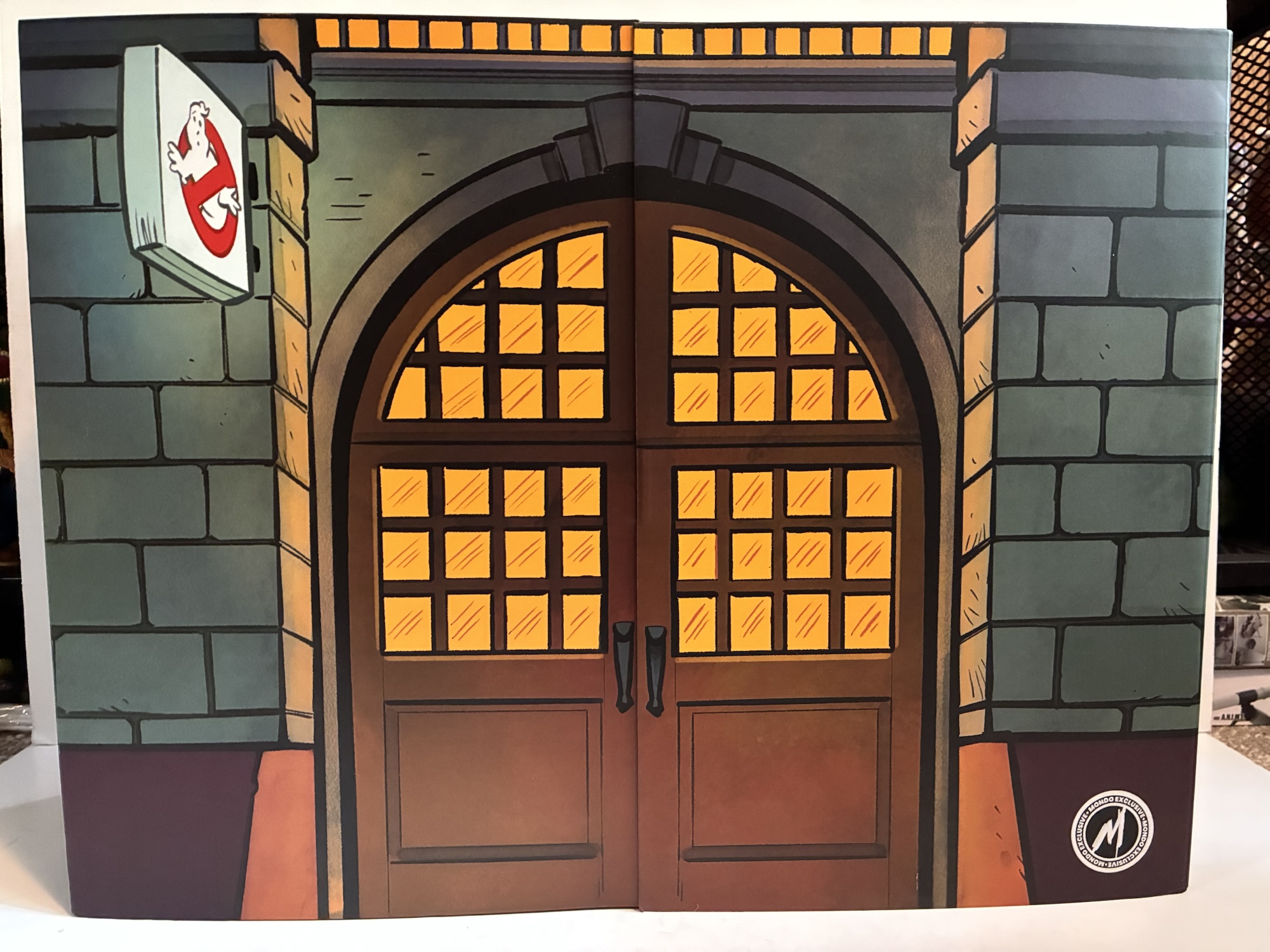
The first set has taken awhile to get here, but it’s finally here. Originally expected to arrive in May, the circus that is the current United States government messed things up with its tariff policy and the elimination of the de minimis shipping exemption. Mondo used to ship directly from the factory to your door, but the cost to do so increased overnight and made that impossible. They had to scuttle their whole operation and the result is a delay of about 3 months. The good news is we still received Pete and Samhain before the fall season hits as I suspect a lot of folks would like to have them on display for Halloween. The set was sold exclusively last fall on Mondo’s website as a two-pack while Peter was sold individually in all of the usual places. It came packaged in a huge box that recreates the front door of the firehouse and there’s artwork on the back which lists out all of the people responsible for the set’s creation. The front opens in the middle and is held fast by magnets revealing a window display behind it, though there’s so much tissue paper over the figures to protect them that it’s not very useful. My box also arrived pretty banged-up, but since it’s intended purpose is to protect the figures inside I can say it at least accomplished its goal.
It’s so beautiful.Convenient trap storage on the side.
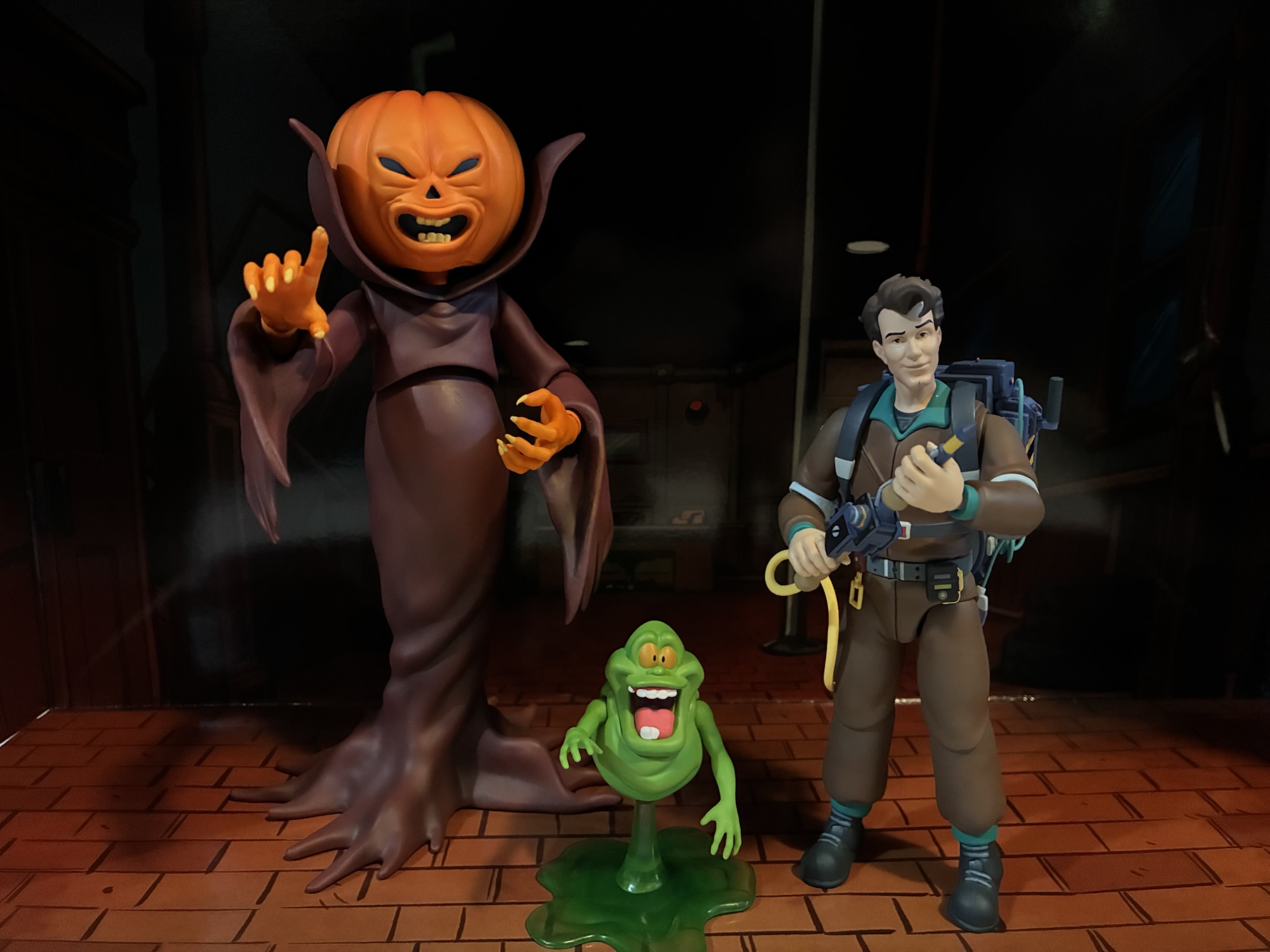
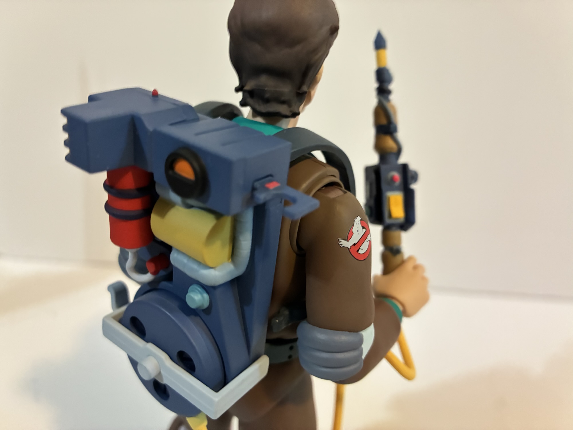
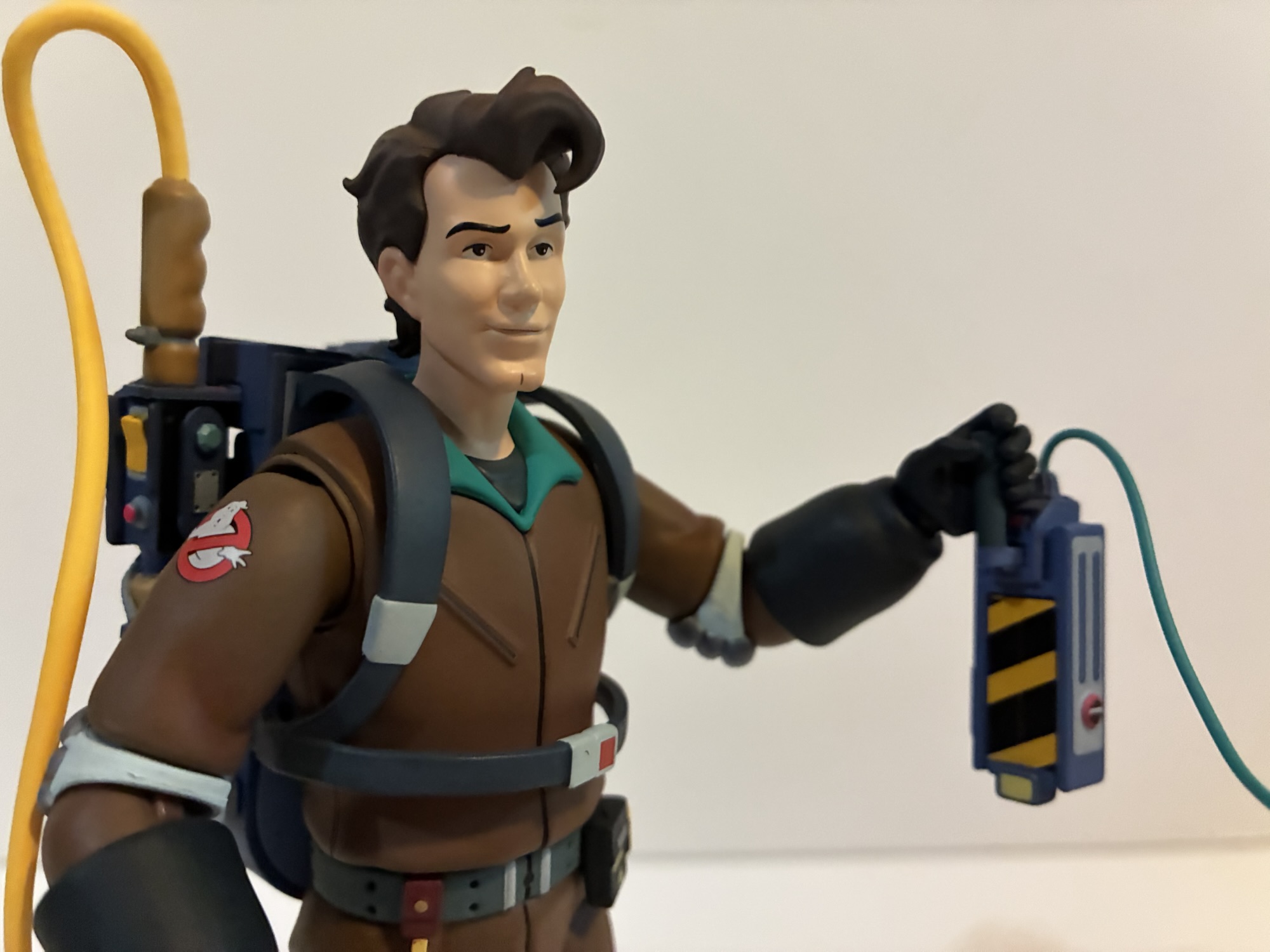
Mondo typically lives in the scale of 1:6, but this line is its first foray into 1:12. Peter stands at around 6.5″ tall so I’m not entirely sure if its true 1:12 scale or not. That would make Pete 6.5′ tall and while he might be, I can’t say I ever thought of him as especially tall. The only thing he has to scale with is Samhain, Slimer, and the other Ghostbusters so I can’t say I’m all that concerned by it. Out of the box, he’s sporting a bit of a smirk with a raised left eyebrow which captures Peter’s personality well. He’s in his classic brown jumpsuit with teal color, black boots, and gray belt. There are some sculpted accessories attached to his belt that jump right off the screen. I have no idea what this yellow hook is or this thing that looks like a tape measure is or does, but I recognize them from the show. The paint is super crisp and matte. This figure has all of the detail work one would expect from Mondo’s sixth scale figures, but at a smaller scale.
Neutrona wand holster on Pete’s right. The tab is very rigid and kind of scary, but it works.
What really stands out is Peter’s proton pack. Brewer and painter Mark Bristow must have studied countless frames of animation to make sure everything is just right. It has all of the little details one would expect and yet there’s a simplicity to it which reflects the animation. The paint is pristine with little or no slop anywhere on the pack itself and the wand. The neutrona wand is connected via a very pliable, plastic, hose that does not detach from either the wand or the pack so there’s nothing to fiddle with. It’s plenty long so it won’t get stressed by placing it in the figure’s hands or when it’s holstered. Equally detailed is the included trap accessory. It looks fantastic and has a bendy wire that connects to the plastic foot pedal. The trap can be hung from the side of the pack just like it was on the show and there’s another hook for the bendy wire to be wrapped around. I was mildly concerned with the durability of the wire, but it seems strong and I don’t see any cracking of the plastic around it. The pack itself is a fairly light, but hard, plastic including the holster for the wand. That part is a little scary as it takes some mild effort to click the handle of the wand into place. It’s the part to be most mindful of as it doesn’t feel like it would take much to snap it. The pack goes on over Peter’s head pretty easily and the belt tabs into the back of the pack. It’s not the easiest thing to snap into place, but it also doesn’t really need to be secured for it to stay in place either (because it’s reenforced with a magnet, which I didn’t realize until after this review went live) so don’t stress yourself out if it doesn’t seem like it’s pushed in all the way.
At least he can kind of hang onto Peter, if you want.
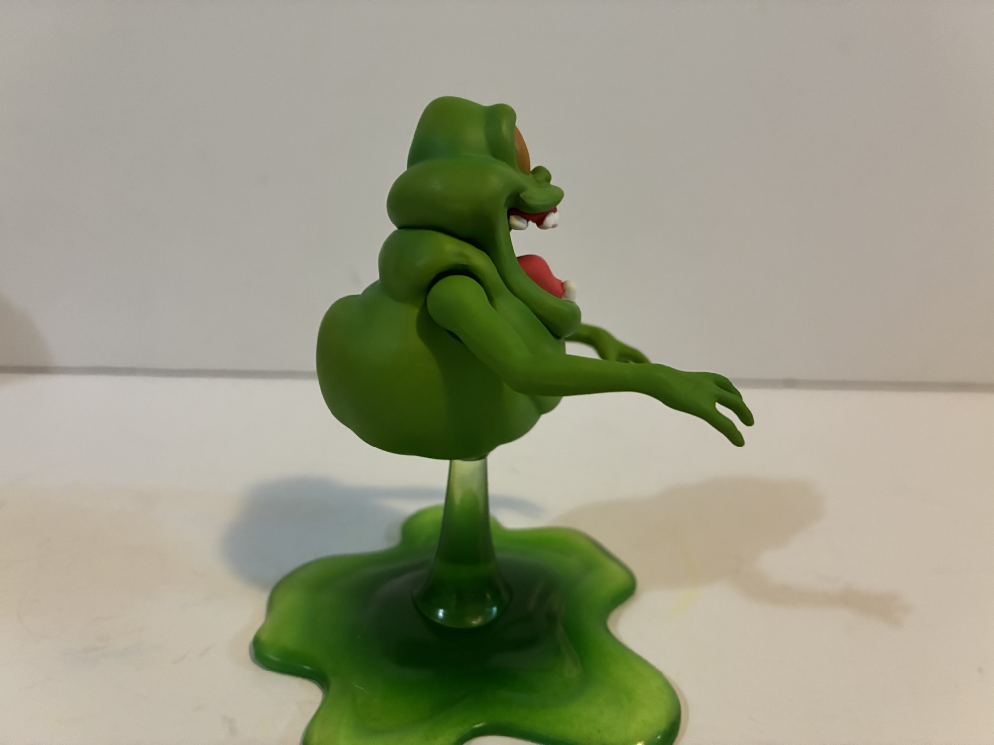
Peter’s other accessories include a set of black hands for the few times he wore gloves in the show. There are cuffs for the gloves that slide over his forearms to complete the look. He also has an alternate, angry, expression which is appropriate for when he’s busting ghosts or annoyed with Slimer. Speaking of, we get a Slimer! He looks to be 100% on-model to the point where the resemblance is borderline mystifying. This is one of the most fun characters I’ve ever had the privilege of just holding in my hand and looking at – he looks that good. He has his own translucent, green, stand and if I have one complaint it’s that he doesn’t have a taller stand. This one puts the top of his head at Peter’s mid-thigh level when it would be great to get him up to eye level. Slimer is minimally articulated with swivels at the shoulders. There’s also a simple disc stand for Peter, but he doesn’t seem to need it. It’s not decorative or anything so it’s likely to stay in the box. Mondo also tossed in some cardboard ghosts and standees which was an unadvertised bonus item. It’s kind of fun, but I don’t see myself ever punching them out of the cardboard.
Who doesn’t like a good blast effect?
Even though Slimer is more of the friendly ghost variety, Peter does need to but ghosts from time to time. To do so he has a blast effect for his proton pack. It’s a clear plastic with just a hint of blue in it. It’s subtle, some would probably argue too subtle, but it’s a reasonable facsimile of what we used to see in the show. It slides onto the wand’s tip and doesn’t disrupt the weight of the figure any. He also has an accessory for the trap. The inner yellow doors of the trap are separate piece – a brick of plastic than can slide out. You can replace it with a set of open doors with lightning streaking out and the ghost, Samhain, getting pulled in. It’s a really fun idea and is also included with the standard version of Peter so those who skipped the ghost still have something they can bust.
Samhain comes with three portraits and four hands.
And speaking of, we get Samhain! He’s much taller than Peter coming it at around 9″ tall. He’s a pretty simple design with a purplish robe and a jack-o-lantern head. Since he doesn’t have feet, he’s very easy to stand and is unlikely to ever tumble off your shelf. His default portait features narrow, black, eyes and a menacing grin. He also has two additional portraits both featuring his yellow eyes which I think we saw more of in his second appearance in the show. One alternate portrait features a toothy grin while the other an angry howl. He’s appropriately creepy, and like Slimer, really on-model. He also has an extra set of hands. His default ones are these curling, gesture, hands and he has an optional open right hand and a clawing left hand.
This trap effect is pretty awesome.
Where both figures are going to come up short is in the articulation department. Samhain is extremely limited as he just has head, diaphragm, shoulder, elbow, and wrist articulation. He’s basically all about presence, but at least what’s there works fine. Peter has a double ball joint at the head, hinged-ball shoulders, single elbows, ball-hinge wrists, waist cut, ball-socket hips, single knees, and ankles that hinge and rock. There’s an attempt at something of a butterfly joint at the shoulders, but it really doesn’t do anything. The elbows will bend 90 degrees, but the knees come up short. You do get a little rotation at both the knee and elbow, and the ankles and wrists work fine. The head really can’t look up or down and the tilt is pretty minimal. The hips are a bit tight and probably only go out to the side 45 degrees or so and do not kick forward and back effortlessly or with much range. He can get both hands onto his wand, and the hands are soft and pliable to minimize paint rub, but he can’t point it out straight from his body with two hands on it. Basically, when you want him to look like he’s shooting at a ghost, he needs to hold the wand across his belly or chest. It’s certainly not the most convincing thing and to really, properly, wield his proton pack he probably needs a more effective butterfly joint, but Mondo was clearly prioritizing the sculpt over articulation.
“Your time’s up, Samhain!”
Which brings us to the final negative we need to talk about: the price. This set retailed for $202 with free shipping in the US. If you want just Peter, the price is $101. Why so high? Well, some of that is due to Hasbro. They hold the master toy license for Ghostbusters which Mondo had to work around with the licensee, Sony. Unlike a Paramount and Playmates situation with TMNT, Hasbro is a toy giant and not likely to get pushed around. Mondo hasn’t gone into the specifics, but they did cite that as an issue and expressed that this isn’t the price they wanted. It is assumed that in order for them to be compliant with the license, any 1:12 scale Ghostbusters toy had to be more than $100 and probably had some restrictions on where it could be sold and that sucks for us collectors. On the other hand, Mondo may not have been able to dictate the price as freely as it wanted to, but the company could have made the set feel a bit more value-friendly. One extra portrait and one extra set of hands (which is basically duplicative since they’re more gripping hands) is pretty slight. Peter, at a minimum, should have another portrait that’s probably a scared one or a slimed one. Some expressive hands, maybe emulating their dance during the ending credits, would have also been welcomed. If he’s not holding something his hands look silly. They may not have wanted to give Slimer more articulation and break-up his sculpt, but he could have had another set of arms. And for Samhain, maybe an effect part of his own? Something like the aura effects Bandai does for its Dragon Ball figures would have looked cool.
With only one Ghostbuster, Slimer is going to have to pitch in.
What I’m basically getting to is that this set isn’t really worth the asking price. It wasn’t going to be and I knew that when I placed my order. It’s also why I’ve passed on the other ghosts and am just getting the remaining Ghostbusters to round out my collection. That doesn’t mean I’m unhappy to have this. One can dislike the price and feel like they’re being overcharged while still enjoying the finished product. I’ve certainly paid for plenty of meals, drinks, and entertainment and felt like I was getting a bad deal, but still enjoyed what I paid for. I mean, I have been to Disney World many times. These figures aren’t perfect, but they look great. I’ll likely never have need of another set of figures based on The Real Ghostbusters when all is said and done. And considering how long I’ve had to wait for them, I’m okay with paying a little extra. If you loved the show and the old toyline, chances are you’ll be okay with it too.
Yeah, bustin’ still makes me feel good.
Interested in more Ghostbusters posts? Check these out including a very festive version of gang:
Bill Murray is the greatest actor of all time. If you want to disagree with me, that’s fine, just know that you’re wrong. Because of my love of toys and Mr. Murray, I’ve always wanted a Bill Murray action figure. It might sound like a weird want to most people, but to a toy enthusiast…
The 1980s sometimes feel like they belonged to the Ghostbusters. That’s because, for me, the Ghostbusters were always around. The film came out when I was but a wee baby, but by the time I had a real interest in television The Real Ghostbusters (not to be confused with the Filmation series) was airing…
For many years, one of the most talked about subjects in the world of movie sequels was the prospect of a Ghostbusters 3. The original film was released back in 1984 and a cultural phenomenon was born. It was a huge hit for both its comedic acting and for the (at the time) incredible special…
For the second time, we’ve got a set of convention exclusive toon turtles with art by Ken Mitchroney!
2025 was almost an end of an era for me. After being a regular buyer of NECA’s convention exclusive Teenage Mutant Ninja Turtles action figures since 2017, I found myself passing on such a set. If you’re new to the exclusive game, each year for San Diego Comic Con NECA makes an exclusive set of TMNT figures to sell at the convention, but also online before the event takes place. Usually the sale is spread over three days and sell-outs are guaranteed to happen, you just don’t know how fast. Some years it’s practically instantaneous, other years it may take a half hour to an hour, it depends on the set. This used to be the only way NECA was allowed to sell TMNT action figures, but ever since the license was freed up some by Paramount it’s been less essential for collectors to snag every last exclusive NECA comes up with.
That’s a lot of box.
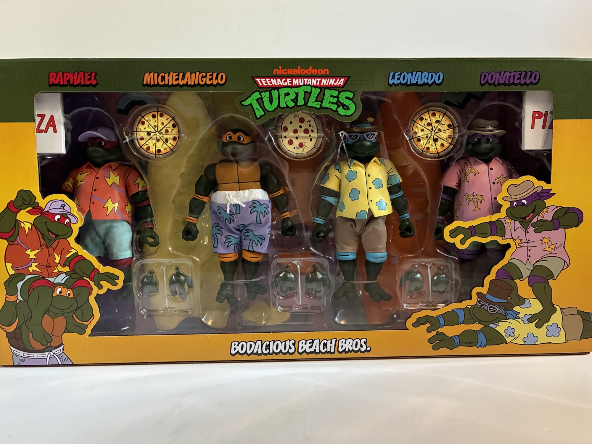
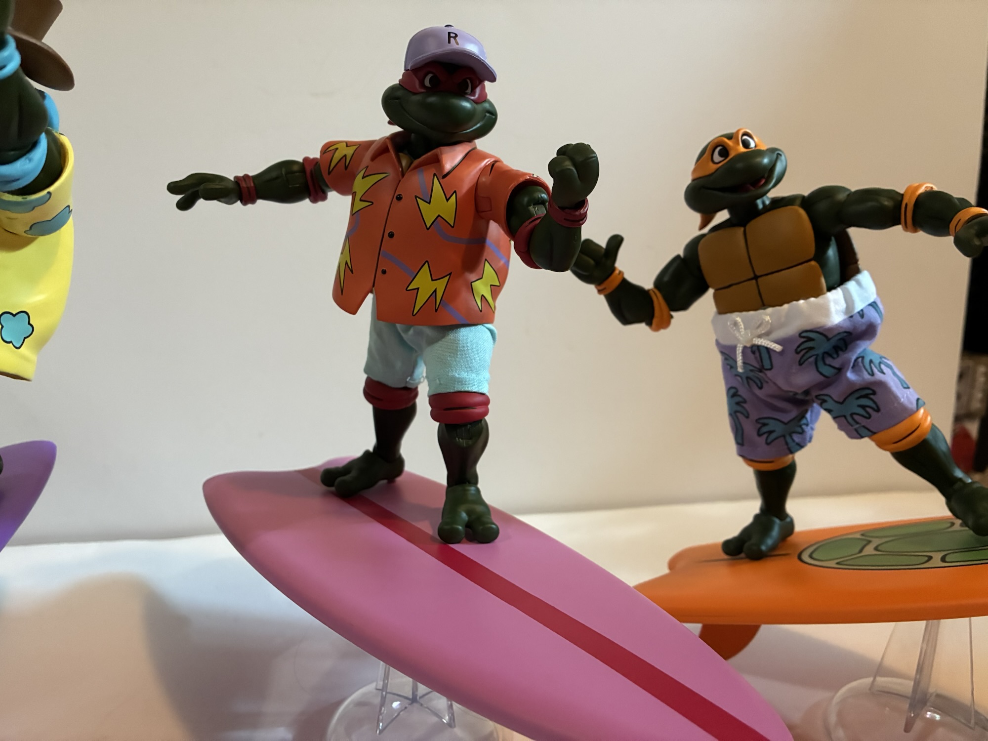
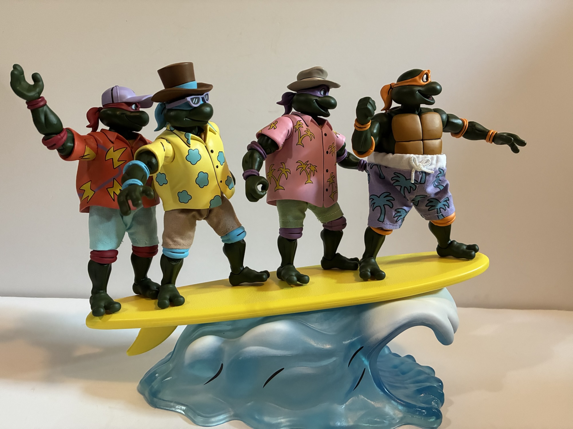
This year’s exclusive came from the toon subline based on the old Fred Wolf cartoon. It depicted the four brothers in beach attire which was all taken from different episodes of the show and paired them up with surfboards and a giant wave accessory. The sculpts looked to be new and more in-line with what we’ve seen from the Archie subline, but aside from that detail there wasn’t much to get excited about. It’s a fine looking set, I just never had beach turtles on my wants list when it came to the property. Four packs start at $150 and I was curious if this one would go higher since it was an exclusive. It can only be bought by non-attendees on NECA’s store and they did away with their flat-rate shipping a year or two ago so the price was expected to be substantial when all things were considered. When the item went up for sale, I took a look and found it would cost about $190 for me and I just wasn’t feeling it. Maybe I’m finally growing up, but I was able to walk away and break my streak of TMNT exclusives from NECA.
The main event with new sculpts by Tomasz Rozejowski.
Apparently, I wasn’t the only one. The set hung around for an hour, then another, and it became clear that this wasn’t the most sought after exclusive NECA ever came up with. This was day one of a three day sale, mind you, so it certainly looked like NECA was going to have more than enough product to meet demand this go-around. Perhaps that made the company nervous? How else can one explain NECA out of no where sending a coupon out that evening for forty bucks off the set? They’ve never done that before and called it a loyalty deal. Supposedly, if you had bought a lot of TMNT product from them you got the email with the coupon code. I have bought a ton of TMNT stuff from NECA over the years, but not everything, and I didn’t get it. It didn’t matter though since it was a simple coupon code that was quickly shared online. Everyone who had already ordered had the code automatically applied to their order and for me it brought my total down almost to MSRP at $154 after shipping and all fees (yes, there is a tariff fee). It was enough to get me to pull the trigger and the set eventually sold out that day. I don’t know how it did the following days or what NECA charged at their booth, but it ended up being slightly less than what I would have paid at a retail store for a NECA four-pack.
There’s quite a bit of stuff in the box.
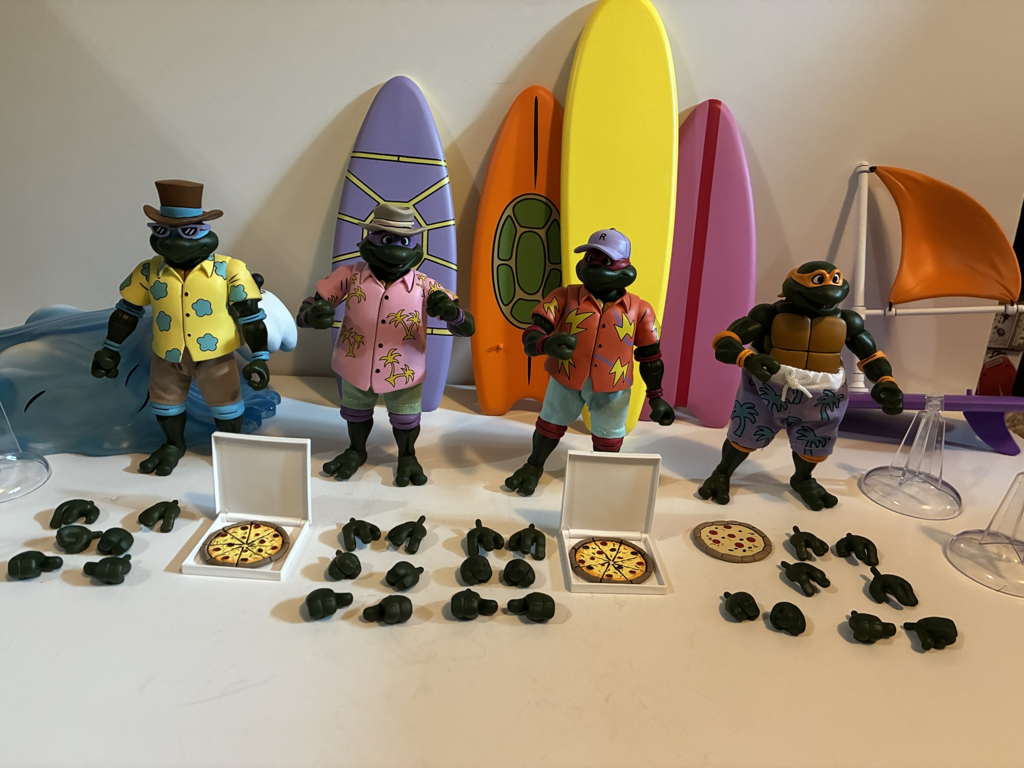
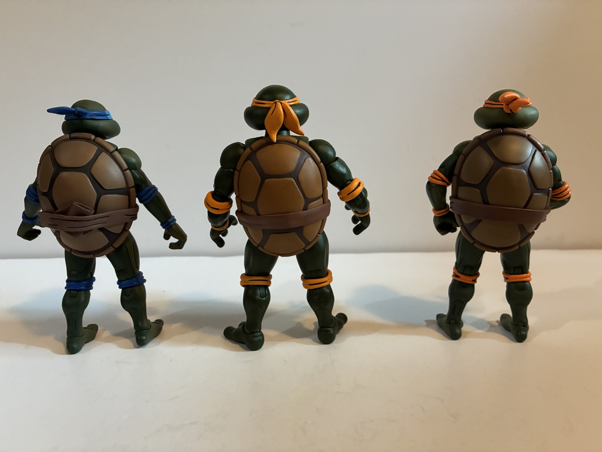
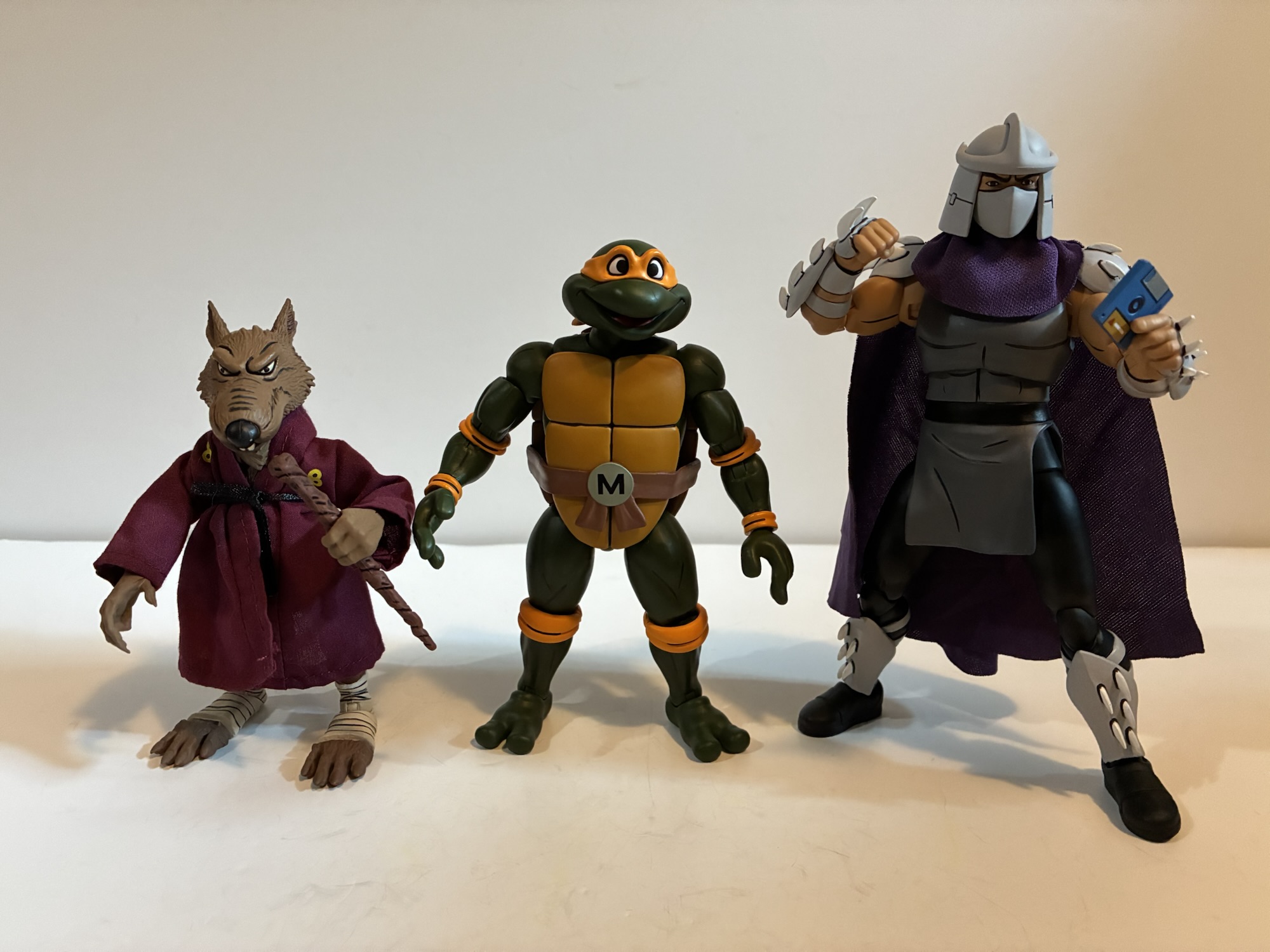
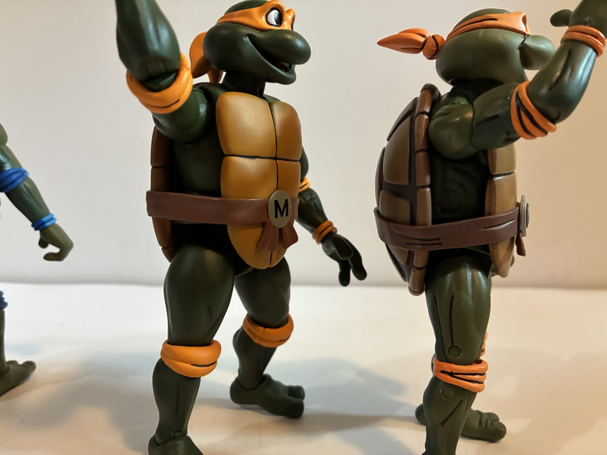
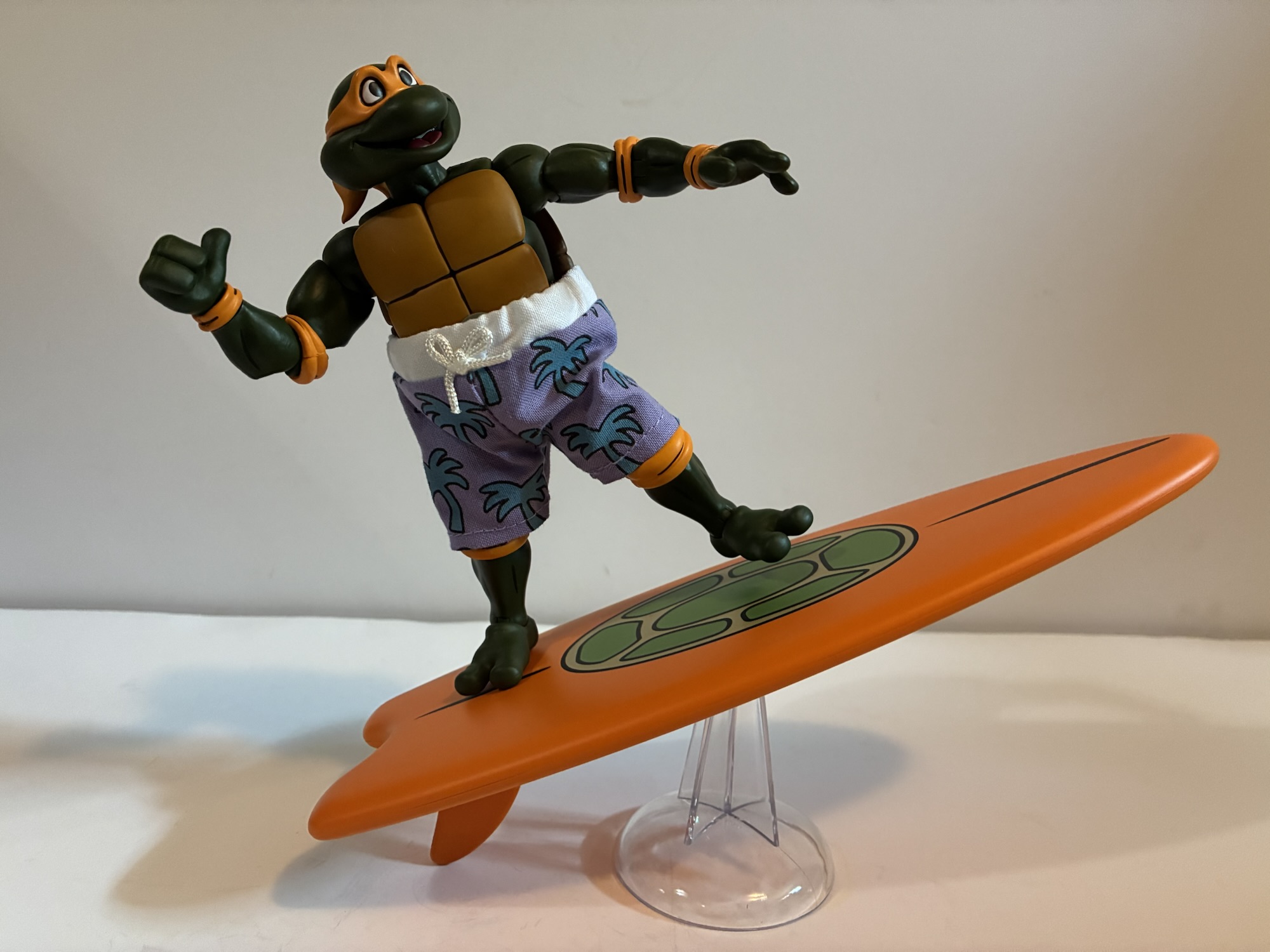
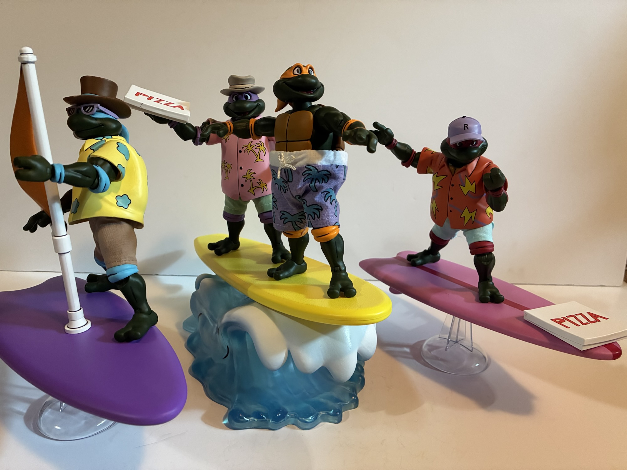
The price may have been right, but it was still a set that I wasn’t exactly jazzed about getting and my hope was that once in-hand I’d sing a different tune. The box it comes in is pretty massive as it’s basically a four-pack that you would find at Target, but it also goes deeper because of the giant wave accessory. The wave is in its own box that has the same colorway as everything else NECA does for this line, but doesn’t feature any graphics. Coincidentally, it’s one of two NECA convention exclusives this year to feature a wave effect and NECA also revealed a beach Slash that should pair nicely with this set. The figures themselves are all new sculpts that resemble the pin-less, Archie sculpts. Per Trevor Zammit at NECA, these are pretty much the new default turtles going forward so if you didn’t want this set don’t fret, I would expect more evergreen turtles to follow at some point on these bodies. Each turtle is in beach clothing taken from the show, though not all the same episode. It’s also a mix of materials as Leo, Raph, and Donatello have plastic shirts and soft goods shorts while Mikey just has soft goods shorts. Donatello and Leonardo also have ridiculous top hats while Raph has a more conventional baseball style hat. Mikey is hat-less and can easily be converted to a base Michelangelo if you so desire while the other three can’t without considerable work.
A new take on an old design.
When I first took these boys out of the box I expected to find some mix of old and new. I took Michelangelo, being the most basic of the four, and compared him with the Stump Wrestling Raph since he’s practically a naked sculpt. To my surprise, these figures do not appear to share any parts. They may share some internals, basically what’s hidden by the shell and plastron, but that’s it. I figured the hands would be the same and the new ones even have that same, rounded, quality to them the Archie figures possess, but they’re all new as well. The Archie turtles appear to be just a touch bigger than these new toon bodies which in turn are bulkier than the old toon turtle body, but not really any taller. I’m not sure how I feel about this new look. There’s certainly a pleasing, toon, quality to these sculpts, but if anything I’ve felt the turtles were a little oversized for the line. They look too big mixed with the human characters, in particular. NECA basically fixed this with Shredder at least by giving us a new, bulkier, version of the villain. Do they intend to do more new sculpts of Casey, April, and others? Maybe. I guess these new ones help make Zach seem smaller.
With Archie RaphThe shell sits a tad lower now.I guess this works?
The figures also feature a much darker green for the skin. It’s definitely a lot closer to the Pizza Club reissues we saw a year ago or the Punk Turtles from that four-pack, but perhaps darker than both. We did just establish these are new sculpts, but if you were still hoping to mix and match with the old figures that’s not going to work. The colors will be off, plus the old hands are too small and the heads are as well even though they feature the same expression swapping tech. It’s an odd choice as I think the color of the turtles has always been pretty screen accurate. I know there are episodes where they’re darker, that’s just what happens with multiple studios working a show that’s trying to pump out as many episodes as it can in a short amount of time, but this does feel less accurate. I’m left to assume there is more of a subjective element at play here and NECA feels that these just look better with this shade of green. I did see someone speculate that maybe they’re darker since they’re at the beach and I suppose that’s possible too. Whenever new base turtles arrive we’ll dive into this more then, but for now I’m a little conflicted on where NECA is going with the turtles.
This gap is something I’ve never noticed before.It’s far more severe on the new figures.
We’ll continue with the body talk here and just jump to articulation. If you have those Stump turtles then you know what to expect as the setup is basically the same. There’s a ball joint at the head and neck, hinged-ball shoulders, waist twist, diaphragm, bicep swivel, double-jointed elbows, wrists, ball-socket hips with thigh twist, double-jointed knees, and ankles that hinge and pivot. Because they’re turtles, the diaphragm joint is pretty useless. They also have elbow pads and knee pads which hinder the range at the elbows and knees. They go past 90 in both spots, but not to the degree you may expect. The hinge on the gripping hands is a horizontal one and not the preferred vertical, weapon-wielding orientation. Since these guys don’t come with any weapons, it’s not that big of a deal at the moment, but I hope it’s not indicative of what’s to come. There’s also a noticeable gap between the top of the thigh and the sidewall, if you will, on the shell with Michelangelo. The same gap is present on the old toon bodies as well as the Archie ones, but not to this degree. I wonder if there’s going to be a filler piece here like the plastic “diaper” on the Mirage Jim Lawson turtles? NECA may have skipped it since Michelangelo’s shorts hide it, but if so that’s kind of a cheap tactic. It probably does give him better range at the hips where full splits and high kicks are possible so I guess that could be their excuse. I do think most would have preferred this to just be a standard Mikey with soft goods pants though.
The shirts look good, but I do wish they were removable. The same is true of the hats and glasses.
For Leo, Raph, and Don, we have a soft plastic overlay in place of the shell and plastron. The shoulder is also a different piece as it’s a sculpted sleeve. The arm plugs into that and you get your bicep swivel inside the sleeve so the articulation is essentially the same as it is with Michelangelo. The shirts are designed to seem big like they’re hiding a shell underneath. There’s even some of the plastron sculpted into the piece at the collar. Because it’s soft and there is no hard plastic underneath, these guys do move a little better at the waist as they can actually pivot some in addition to rotating. I still can’t get the diaphragm joint to do anything though even though I can see it at least. The hats are also pegged onto the head and appear to be further secured with glue as they don’t want to spin. They’re soft and it’s easy to peel them back some to see there’s a big peg sticking out of the top of the head so even if you could get them off it would look hideous. It sure would have been nice if NECA just made them separate. Leonardo also has sunglasses and they’re glued to his head like the ones with the Punk Turtles. While the plastic shirts help give a more toon appearance, I do find they clash a bit with the soft goods shorts. And I probably speak for most when I say I wish they went with soft goods all over so we could convert this whole group into a standard look, but then we wouldn’t buy the eventual four-pack release that’s sure to come, right?
I can’t tell if Raph is happy.
The paint across all four is mostly good. The cel-shading is gone as that appears to be a thing of the past now and instead they’re the same shade of green all over. The patterns on the shirts are handled very well and there’s some black linework painted onto the sculpts. Basically, NECA is taking the same approach now with this line as it does the Archie one when it comes to paint. These turtles do have massive pupils now and it’s a bit weird looking. Their eyes almost look dialated. Raph also seems kind of pissed, but maybe he didn’t pick the outfit? He also has some black linework on his hat that basically just goes from one “ear” (I realize they don’t have any, I just mean where an ear would be) over the top of the hat to the other. There’s a sculpted shape to the top of the hat though and I almost wonder if the line was supposed to follow that because it looks weird to see that left unpainted. I do have a couple of paint dots on the forearms of all but Leonardo. They’re very small and in the color of the turtle’s elbow pads. I’m not sure if it will come off, or if it would just be easier to go over it with a little dab of green paint.
The only picture I took of my original set: Mikey’s broken bicep.
Unfortunately, I do have a quality control issue right out of the box. Michelangelo’s left arm is barely hanging on at the bicep. The peg looks to have split as I can see right into it. It was obvious to my eye just looking at him. Had it not been I probably would have twisted the arm right off. In addition to that, Raph’s left shoulder won’t budge at the hinge and his arm has some wiggle at the bicep as well. It’s possible it just isn’t seated perfectly in the joint or it could also be defective, but just not to the extent of Michelangelo’s arm. Some hot water would likely free up that shoulder, but with Michelangelo basically broken I didn’t want to try without first reaching out to NECA. I emailed them after 5 PM on a Thursday and they got back to me before 9 AM the next day with a shipping label for me to return the entire package. Thankfully, I had only removed the turtles from the box so it was pretty easy to put everything back in its place and ship it out. NECA did say they would send me a replacement if one was available. Since it is a Comic Con exclusive, it’s possible they don’t have any to replace it with and if that’s the case they’ll refund me. It’s kind of annoying that they couldn’t commit as maybe I’d elect to keep it if I couldn’t get a replacement? At any rate, I’m writing this in between shipping the set back and receiving a new one from NECA so if it all went according to plan then you’ve seen a bunch of pictures and the review can continue on from here. And if not…
After just over a week after receiving the first set from NECA I had a new one. Michelangelo is now fine and the Raphael appears to be an improvement as well. The only new issue is my Raph has a little blemish on his nose. It’s not really visible because of the darkness of the skin, but can be felt. All in all though, a good customer service experience and no complaints from me. Now we can move onto the other stuff in the box.
Mikey drew the short straw and got the bad stand.
For hands, these turtles each have a set of gripping hands, fists, open, and thumbs up hands. We also get one extra set of open hands for good measure, I guess. Every hand as a horizontal hinge which is unfortunate for both the gripping and thumbs up gesture. Hopefully this doesn’t mean the eventual standard turtles aren’t missing the vertical gripping hand. Each turtle also comes with a surfboard. They’re not really color-coded to the turtles as we get a purple one with shell pattern, orange with a shell tamp, pink with red stripe, and a solid purple board with an attachable orange sail. These are all almost certainly taken from the cartoon, but it was still surprising to see we don’t have a simple blue, red, orange, purple pattern. The sail plugs into the purple board rather snugly. It won’t even rotate once inserted so maybe make sure it goes in the way you want it to because getting it out could be tricky. It’s hard plastic and probably would be easy to snap. The boards also need their fins attached to the underside and each comes with a clear, acrylic, stand like the old Turtles in Time figures NECA put out. Three of my stands work fine while the fourth is too loose. I’ll have to modify it so the boards can fit snug onto it. Right now, the board just tilts all the way back until the fin hits the surface it’s on.
That sure is a wave.
The big accessory, and what is probably the selling point, is the wave and fifth surfboard. The wave is done in translucent, blue, plastic, with white paint for the crest. There’s a black ball peg towards the front and that’s for the yellow board to plug into. The wave is about 8″ long and the board 11″ (the other boards are close to 9″) and once plugged in it will get your turtles about 4″ off of the surface it’s placed on. There’s some nice weight to the accessory and it does what it’s supposed to do. The board has no pegs on it for added stability, but does feature a rough surface which may help with grip. You can fit all four turtles onto it, though it gets pretty crowded. It completes the look and when all is said and done I’m guessing this thing is the only aspect of this set that will remain exclusive to it, but who knows? Maybe it will even show up in another line?
It is indeed possible to get all four brothers standing on this board.
The only other accessories in the box are three pizzas and two pizza boxes that just say “Pizza” on them. They are the hinged style, so I guess that’s good. Is that enough? Considering it’s a convention exclusive and the figures are all new (though destined to be reused many times over) sculpts I think it feels about right. The only real negative for me is that the figures can’t just be converted to regular turtles. Michelangelo might be, but the rest aren’t and none of the old expressions work here. Considering the change in skin-tone it’s not as big of a loss as it would have been, but it’s still annoying to go from a solid assortment of expressions to just what we have here. I’ll withhold final judgement on the sculpts as far as their appropriateness for the source and as replacements of the old ones. I have felt for awhile that the turtles have fallen behind some of the more on-model sculpts we’ve seen in the line over the past few years so I wanted new ones, I just don’t know how much of an improvement these are.
What day at the beach would be complete without pizza?
That’s a discussion for another day, as for this one, should you get it? Only if you love the concept. If you never wanted and still don’t want beach turtles after reading this then feel free to skip it. Yes, it’s a little exciting to get your hands on new turtle sculpts a bit early, but we’ll get the real thing eventually. If on the other hand you really like the look of this one then, sure, go for it. Assuming it’s not now overpriced. I have a feeling demand was soft and that NECA still has a bunch of these. Will they put them back up for sale? Probably, though with these things they usually first do it as booth exclusives at later shows. If they go up on a website it probably won’t be for a little while and without fanfare. Costumes.com was the website that would get that stuff in the past and it might in the future. Convention goers looking to flip this for a quick buck probably won’t find many takers so if you play the waiting game on eBay you may eventually find people looking to just offload this one at cost, especially if they were able to take advantage of the $40 off promotion. We also know these figures are going to get two-pack releases in a different colorway eventually so, as I said before, the only real exclusive here may just be the wave. As for me, I’ll probably make these guys a summer time decoration and that’s all. It will help make them kind of fun, but it’s not a set I’ll likely do much playing with. Hopefully, I can get them back into the box without too much fuss, though I also kind of want to get rid of it since it’s so damn big. Ultimately, it’s a good convention exclusive because it has a theme, it’s executed pretty well, and it’s not something everyone needs.
The Bodacious Beach Bros. are just the latest in a long line of NECA convention exclusives:
As the story goes, one night Kevin Eastman was drawing with his friend and partner-in-comics Peter Laird when the idea to doodle a ninja, anthropomorphized, turtle entered his brain. Laird was so amused by this drawing that he too drew his own take on it. What was done just to amuse each other eventually turned…
2023 marked the 30th anniversary of the much maligned third entrant in the Teenage Mutant Ninja Turtles film franchise and you just had to know that NECA Toys would mark the occasion. It was almost too obvious that I thought maybe the company would zig when everyone was expecting a zag, but they didn’t and…
It was a little over a month ago that San Diego Comic Con occurred, in person, for the first time since 2019. This was cause for a celebration, even if for those of us who take in the convention from the comfort of our homes saw little change. Even without the event taking place the…
Recently on #TurtleTuesday, I talked about a set of figures from JoyToy that lured me in just by being good toys. This week, it’s a two-pack that got me in spite of my feelings on the product in part via that annoying drive to have a complete collection and by retail’s favorite trick to lure in extra purchases: the discount. Target recently had a promotion on toys that meant consumers could get ten bucks off any toy purchase over $40. What’s a toy that is over $40 and in my line of sight? NECA Teenage Mutant Ninja Turtles two-packs!
This past spring, Haulathon returned to Target which meant more NECA TMNT figures based on the original cartoon series. Among those was a two-pack featuring the classic characters Tattoo and Wyrm. Yes, that “classic” is meant to be sarcastic as neither character fits that descriptor. Both were featured in the original toy line by Playmates, but I don’t recall either being a fan-favorite. Tattoo was perhaps one of the most boring releases in the entire line. He was simply a sumo wrestler who came with a bunch of stick-on tattoos you could apply in any which way you wanted to the actual figure. Wyrm was more typical of the line and a gross-out, mutated, worm. If any of these two were more beloved than the other it was probably Wyrm. For me, I owned neither as a kid. Tattoo didn’t interest me and Wyrm may have been a little too gross. Truth be told, I don’t remember ever passing him up at the store so had I been given a chance to buy Wyrm maybe I would have done so, but just because I can’t remember it doesn’t mean it never happened. Plus, he’s a mutant earth worm. That’s definitely not as cool as a wolf or a snapping turtle.
Not a ton in the box for this set.
Tattoo made his small screen debut in “Planet of the Turtleoids Part 1,” which was the closest thing to an event moment the cartoon series had. He’s a bit of a throw-away villain who opens act 1 and is dealt with pretty quickly. As for Wyrm, he actually never appeared in the show so why is NECA able to include him in the toy line? In addition to NECA embarking on more “What If?” type releases as seen with Panda Kahn, Wyrm did appear in animated form during the 90s, it just wasn’t the show. He was featured as an animated character in a commercial for the action figure alongside Chrome Dome, Dirtbag, and Groundchuck. The other three made their television debut during the Planet of the Turtleoids arc which makes one wonder if Playmates thought the same would be true for Wyrm? Or maybe it’s just coincidence? Wyrm would finally get to appear in the 2012 series, but he never did officially appear in the 1987 one.
Tattoo is more round than tall.
We might as well start by talking about Tattoo since his name comes first on the box and he’s the least interesting of the two. Tattoo is a big, chunky, figure and what you see is pretty much what you get. He stands about 6.25″ to the top of his head and he’s literally a big guy in sumo gear. The show did adopt some of his tattoos for animation like a black widow on his stomach and a lightning bolt on his leg, but they kept it pretty simple for animation. As is typical of the line, everything is painted on Tattoo even if the bare plastic underneath is the same color. You do have to watch out for the joints as they are painted over and that type of plastic won’t hold the paint. That means the elbows, especially, will flake off after repeating use. As has been the case for a few releases now, the old bisected shading with the dark on back and light on front is no longer in use here. Paint is mostly clean, though the right shoulder on my figure has some weird scuffing. It looks similar to a situation I had with the Neutrino Zak and I was able to get that off with a Magic Eraser. Hopefully it works here.
This blemish above the shoulder is a bit of a bummer.
Tattoo looks fine, it’s just that he’s not a very interesting design. I didn’t really want him, but if I wanted Wyrm I had to buy him. For accessories, he just comes with a set of clenching hands and a set of gripping hands. He also has a really large hamster which is technically himself. That’s because in the show this hamster, or gerbil, somehow was mutated into Tattoo. Yeah, it was pretty bizarre and is easily his most noteworthy fact. The articulation for Tattoo is poor. His head, being set forward and not on top of a neck, just pivots. His has articulation at the ponytail, shoulder ball hinges, bicep swivels, double-jointed elbows, swivel and hinged wrists, a diaphragm joint, a waist swivel, ball-socket hips, single hinged knees, and ankle hinges with rockers. The range of motion everywhere is pretty limited save for maybe the diaphragm, though even that just rotates. The elbows are pin-less, but also pretty ugly once bent. The left one is fused on my figure, but I don’t know if I’ll even bother to heat it up. He stands in a semi crouch which means his hips and knees do almost nothing. The range at the knees is probably less than 45 degrees, and since the joints will flake it makes this the sort of figure that is just begging you not to mess with it.
Not the nicest looking elbow joint.
Wyrm, by contrast, is far more of a typical design for the old Playmates line. NECA adapting him for this toon line actually means he’s a little more striking than a lot of the figures in the line since so many of those toy designs had to be toned down for animation. With Wyrm, you’re really just getting an updated version of that old toy as there isn’t much separating the two. He has some size to him as he’s about 6.25″ from the bottom of his booted foot to roughly the top of his head. He’s another character with a head that slopes forward and he has hair and a hat on top of his head to make it a bit more subjective just how tall this one is. He’s very bright though as the flesh is this royal blue while his outfit is basically a neon green onesie. In looking over my toon collection, I can say there isn’t much of either shade within it so this guy should pop. There’s obviously a lot of green in the display, but nothing as bright as this shade with the closest being Zork. The blue also stands out as it’s more saturated than Chakahachi or Rex-1. If you want to slot him in with the Night of the Rogues grouping, he’ll stand out amongst them. He feels like he belongs with the likes of Scumbug and Antrax.
Wyrm fits the aesthetic of the line much better than Tattoo.
Wyrm, as the name implies, is a mutated worm. And since he’s from the old toy line, he contains a lot of hallmarks one remembers from the line. The designers (who were mostly Mirage Studios artists) loved asymmetry with their mutants and that shows up here with Wyrm sporting a blue glove on his left hand and a red one on his right. It also shows up where it most often did: the feet. Or rather in this case, a foot and a tentacle. Wyrm’s left leg is fairly humanoid. It ends in a red boot with the toe ripped open exposing his digits of which he has only four to go with five digits on his hands. The right leg is basically a tentacle or worm tail. It’s blue on the outside and yellow on the inner part with little green and black suckers. It’s the most memorable aspect of the character’s design and I’m surprised he doesn’t have a tentacle left arm, though this is probably more manageable from a play point of view.
Donatello is right to be scared.
The design plus NECA’s ability to execute when it comes to the sculpt and the paint is what is going to sell Wyrm to most people. I suppose now is as good a time as any to list the credits which include Tony Cipriano and Kushwara Studios for the sculpt and the duo of Geoff Trapp and Mike Puzzo on paint. The detail work is all nice, but not overdone since this is supposed to be Wyrm as a cartoon. Still, animators would have hated this guy with his tattered clothes and this pattern of suckers on the inner, right, leg. He has a few bumps on his flesh and also what appear to be leaches in certain places. I think he’s supposed to be an earth worm, but he’s more like a tentacle monster. The eyes are bulgey and veiny and rimmed with dark green slime (I guess?) which helps make them stand out. The teeth and the green sludge in his mouth are all painted well and there’s a suitable abundance of black linework and detailing throughout. Like Tattoo, the toon shading is not in effect here and the approach is basically no different from what we’ve seen out of NECA’s Archie line. My assumption is that’s the approach we can expect going forward and I don’t hate it.
This mallet has been used to commit crimes.
Wyrm comes with a lot more stuff than Tattoo. He does equal the big guy in the hand department as he has just two sets: gripping and open. The right gripping hand is much tighter and I think it’s so he can get a solid grip on the included monkey wrench. The wrench is a salmon color with tape around the handle. It doesn’t articulate or anything and it’s just a wrench. The vintage toy came with the same, but it had some kind of rodent attached to it as well. The other weapon is a big old mallet and it fits into the slightly wider left gripping hand rather well. It has a wood grain texture and sculpted worms throughout it, or just one really long worm. Both ends of the head are covered in red slime. I guess it’s supposed to be blood? The shade of red is a little light, but what else could it be? It’s certainly one of the most gruesome accessories in the line up to this point.
NECA came up with a genius idea to replicate the original toy’s action feature.
That’s not all though, as Wyrm has a couple more extra parts he can utilize. The old toy had an action feature which was bug-out eyes and these little worms in his mouth that would pop out. NECA isn’t going to include an action figure on a line aimed at adults, but it can simulate the effect with optional parts. Wyrm comes with a second set of eyes which are elongated. To use them, you simply pop out the stock ones and pop these ones in. They’re keyed in such a way that you can’t mix them up and that green goop behind his eyes doubles as an easy way to find some leverage to pop them out. For the worms, NECA included a bonus tongue. You open Wyrm’s mouth as far as it will go and just lay this one over the sculpted tongue inside his mouth. This new one has the worms sculpted onto it and they’re done in a soft plastic so they feel similar to bristles on a toothbrush, just much thicker. It’s a clever way to simulate the effects on the old figure and I’m left surprised NECA was able to get away with reproducing it here when Super7 has run into so many issues with their Playmates homage line. I guess you get more leeway from the licensor when you’re bringing in more money for them.
“Dude, you are one big rodent.”
It’s a good thing that Wyrm comes with so much stuff and looks so good, because he articulates about as poorly as the worst of this line. There’s not much he can do as we have articulation at the head, jaw, neck, shoulders, elbows, wrists, waist, hips, thighs, knee, and ankle. The elbows are single-jointed so that also serves as the bicep swivel. The gripping hands at least have a vertical hinge so that’s okay. The head is fairly restricted by the placement and shape and there’s no articulation in the torso aside from what ends up being a basic waist twist despite the fact that it’s a double ball peg (it’s way too deep in the chest and the base of it is in a sculpted out cone of plastic so it can’t go anywhere – I took it apart to see). The knee is double-jointed, but that left leg isn’t very useful because we have to contend with the right one. For that, NECA went with a rubber tentacle over a heavy gauge wire. It will bend, but getting Wyrm to stand is a chore. I can get him standing, but it never seems to last long. This is a figure that ever since I got him I find toppled over every morning. The old figure went with a plastic, pre-posed, right leg which actually made him fairly easy to stand. NECA’s approach here is fun, but what good is the bendy wire? It’s just kind of a pain in the ass. I’ll probably bust out a disc stand for this guy and see if that helps keep him standing.
Also scary is Tattoo.
Wyrm’s articulation is obviously better than the old figure, but it’s so limited that functionally it’s not that much different. The range at his elbows is mediocre so you’re mostly going to post his arms with his shoulders and the swivel point. The legs need to be in a specific position to keep him standing if you’re not using a stand so he almost feels like a 5 POA style figure. We’re used to articulation in this line taking a back seat to the aesthetics, but in the case of Wyrm it’s more noticeable than most. He also will have the same paint-flaking issues as Tattoo, though it’s only really noticeable on the back of the left knee.
This is a set of what you see is what you get. If you like the look of Tattoo and Wyrm and want them in your collection then that should be the motivating factor. The accessories for Wyrm do make things a bit more interesting and I definitely enjoy his look far more than I do Tattoo’s. The real problem here is the asking price of $65. That’s at the high end for NECA two-packs (though there’s the threat of price increases looming meaning this could be the new floor) and thus a harder sell. This set isn’t nearly as good as the similarly priced Antrax and Scumbug or even some of the cheaper sets like Space Don and Samurai Mikey. This may be the first two-pack where I really notice the budget as it feels like Tattoo was only bundled with Wyrm because he could be done a bit cheaper. Just one extra set of hands and a slug figure so Wyrm could get extra stuff and a unique bendy wire leg. There’s also nothing unifying the two characters aside from the fact that both were featured in the vintage toy line. In the circles I frequent, I found most people were only interested in one half of this set with most favoring Wyrm but there were a few only interested in Tattoo. Maybe that can create some opportunities for folks to split a set? They’d almost have to be local though with the cost of shipping these days.
If you think these guys look cool and you’re okay with the price, go for it. This stuff almost never hits clearance as it is.
If you want this set your only option right now is Target. They’ve been in-stock on the website for some time, but may be gone by the time this goes live. They should be sold in stores as well, though I personally have yet to see either Haulathon two-pack show up on shelves. International buyers should be able to get these on the Haulathon website. The set gets a tepid endorsement by me. The quality is there relative to the rest of the line and I do genuinely like the look of Wyrm. Tattoo may be boring, but he looks the part of the character from the show, he’s just severely lacking in the accessory department. He should have slapping hands and a yelling portrait, at least. Wyrm looks great, it’s just a problem of cost. Even at the discounted price I got this set at, I still feel like I paid $55 for Wyrm and that’s a terrible deal. I definitely envy those who look at this set and see two characters they need in their collection.
We have plenty more thoughts on NECA’s line of TMNT Toon figures for you:
I’ve been looking forward to this one for awhile. Antrax and Scumbug only appeared in the cartoon series Teenage Mutant Ninja Turtles once, but like last week’s figure review, they were present in the toy line long before their animated debut. And these later period episodes, such as “Night of the Rogues,” tended to just…
I encounter the sentiment often that the majority of Teenage Mutant Ninja Turtles fans in my age group (the over 40 club) associate the property with the vintage toyline first and foremost. The cartoon was a big hit, but it could only appear for a half an hour at a time where as the toys…
When it comes to character selection in NECA’s line of action figures based on the 1987 cartoon Teenage Mutant Ninja Turtles I think it’s safe to say we’re well into the weeds. This latest batch to arrive at Target as part of the company’s branded Haulathon have certainly illustrated that. Aside from heroic versions of…
It has been just over 10 years since I last posted about a Lego set featuring The Simpsons. That last set, the Kwik-E-Mart, came out in 2015 and was preceded by the home of the Simpson family the year prior. Those sets along with two waves of mini figures seemed to sell pretty well, but for whatever reason Lego decided that was enough Springfield for now. I don’t know why they’re suddenly back ten years later with a new set, but I’m not complaining. I was hoping for at least one more set plus another wave of mini figures since we were missing so many iconic characters from the show: Principal Skinner, Superintendent Chalmers, Lenny, Carl, Barney, Jimbo, and many more. It was unlikely that we’d ever get every character we wanted, but it felt like a third wave would have really filled in the most crucial gaps.
That didn’t happen. Is a third wave now on the table since we have a new set to talk about? I don’t know, but for now we do have Krusty Burger. When I was left to ponder new sets for Lego, I’m a little surprised at myself for not having Krusty Burger pretty high on my list. If I had to make a wager on what was most likely, I was going to go with The Android’s Dungeon the local comic book store run by Jeff Albertson better known simply as Comic Book Guy. It’s small, has some nerd appeal, and works well with existing figures. Maybe it could have led to us getting a Lego Stan Lee? Instead, we have Krusty Burger, the local fast food establishment run by the clown of the same name. Many episodes (and even the movie) have scenes set at Krusty Burger and some are quite memorable. It’s a perfectly cromulent selection by Lego so let’s see how it turned out.
This set comes with a total of 7 mini figures, though some are repeat customers.
The Krusty Burger set contains 1,635 pieces and seven mini figures. Of the mini figures, four are repeat characters: Homer, Bart, Lisa, and Krusty. Bart and Lisa are exactly the same as some past releases. They have neutral expressions and Bart comes with a slingshot while Lisa has her saxophone. Homer also has a neutral expression, but he at least gets some grease stains added to his shirt. Krusty is all new and he’s in his farmer Krusty attire from the episode “Coming to Homerica” complete with hat. It’s a bit interesting to me because Jakks Pacific recently released a Krusty Burger in their toy line featuring a Krusty in the exact same outfit except theirs omitted the hat.
The character selections were made for their ties to the restaurant and Krusty and with some headswaps with old figures we can almost make Grandpa from his time at the restaurant (though he wore the old uniform in his time there).
The rest of the figures are of new characters. Working at the Krusty Burger is the squeaky-voiced teen. He is a teen of many names in the show and also many jobs. He’s in a green and gray uniform which is a color combo seen in more recent seasons of the show. In the old days the workers often had purple shirts. He looks the part and also has his hat on which is non-removable. Also there to enjoy a Krusty burger is officer Lou. I assume he’s included because of the scene from “22 Short Films About Springfield” where he discusses visiting a McDonald’s in Shelbyville which confuses fellow officers Wiggum and Eddie. We also already have a Chief Wiggum (two, actually) so he pairs well with him. Lastly, we have Sideshow Bob. He’s featured in a green shirt and blue pants which would appear to be the default style guide for Bob these days. He’s here I guess because of his connection to Krusty and he is a pretty big name character. He unfortunately doesn’t look the best as Lego really went conservative with his outlandish hair.
Homer’s Krusty-fied car turned out fine, but I wish we had a Homer as Krusty to go with it.
Just like the previous two Simpsons sets, The Krusty Burger also comes with a vehicle. This time it’s Homer’s sedan, but redone to match the episode “Homie the Clown” when Homer became a Krusty impersonator. It has the Krusty visage on the front and also comes complete with speed hole decals for the hood. The build is pretty much exactly the same as the standard version of Homer’s car which includes no roof. I guess this is so Marge could fit inside, but I really hate the no roof look. Why not give us an optional one? It also has exposed studs on the hood like the original which is also something I don’t care for. I would have preferred a smooth exterior there. And while I think this is a solid inclusion, it does make me wonder why we didn’t just get a Homer as Krusty mini figure? That obviously would have cost more money because they would need to cast a new head, but they could have made up for it by just having Krusty come with his default head instead of the one with the hat. Or drop Bart or Lisa from the set – I don’t know. I want a Homer as Krusty!
This little living room set that was a throw-in for people who ordered from Lego is a nice little item, especially for those unable to get the Simpson’s house.
If you ordered this set from Lego directly then you also get a mini set of the Simpson living room. It’s the couch, TV, and end table, and a lamp and it’s basically a cut-away. The TV is the same as the one included with the house only this one comes with a screen featuring a Krusty Burger commercial. A mini figure can easily fit on the couch if you want, but it’s not a couch that is to scale with the house. It can really only accommodate two figures so no family couch gag is happening here. Still, it’s a fun little throw-in and considering the Simpson house set is 11 years old there may be a lot of people buying this set who don’t already have it. This isn’t exactly a substitute for the whole house, but it’s better than nothing.
The Krusty Burger is by far the smallest Simpsons set from Lego so far.
As for the Krusty Burger itself, it’s the smallest of the three sets and by a noticeable margin. It’s pretty self-contained with nothing surrounding it aside from the buildable sign. The layout is a bit odd as the front door is right next to the drive-through window, but that’s how it’s depicted in modern episodes. The right side of the building has a lot of windows while the backside features a rear door and an overflowing grease container. It’s done well with translucent yellow bricks and feels like the sort of thing one would likely find behind an actual Krusty Burger. The left side of the building features the drive-through menu and intercom which pretty much matches the depiction of the same from “Lisa vs Malibu Stacy.” You get to see what everything costs which depicts this restaurant as frozen in time back to the early 90s. My one critique as a fan of the show is that it lists milkshakes on the menu. Krusty Burger doesn’t sell shakes, it sells partially gelatinated, non-dairy, gum-based beverages.
To access the interior, you have to first remove the roof. It just rests on top of the set and there’s a big fan on it that doubles as a handle. There’s also roof access for your mini figures via a little trap door. Once removed, one side of the building can open up which basically breaks the kitchen in half and isolates the dining room in the center. If facing this open set, the left part is the counter and kitchen. There’s a large menu over the counter and two registers. Behind the registers is a small area to fit a mini figure with a prep table behind it that contains some massive burgers. The burger build is creative, but does lead to comically large sandwiches. The deep fryer can be found here as well which has a removable fry basket. For the french fries, Lego is using Wolverine’s claws, but in gold. I’ve seen them do some funny stuff with their hot dog shape, but I wasn’t expecting Wolverine claws for fries here. Also back here you’ll find some storage and an ice cream machine that’s forever out of order. The contents are basically just water which is a nice touch.
It takes up considerable more space when opened to access the various rooms inside.
The center of the build contains the dining area. It’s pretty cramped as it contains one booth and two tables each of which has two stools. Tucked into the corner is Krusty’s Kidz Zone which is a small ball pit. It’s cute, though I would have probably preferred more seating to fit as many figures into this thing as I wanted. Having the Simpson family at one table and the cops at the other would have made sense. Some food is intended to go into this area including Krusty’s version of the Ribwich. It’s made with those tiny Lego cars which is pretty amusing. I had previously seen those in a Christmas tree set.
The right side of the build contains the bathroom and the rest of the kitchen. The bathroom is pretty small and walled-in. For the image on the box, Lego even removed the side wall to make it present better which you could also do if you chose to display the set open. The bathroom is in a pretty sorry state as the sink appears to be overflowing, the toilet is leaking, and there’s no toilet paper left on the roll. It’s what one would expect of a Krusty Burger. The part of the kitchen that’s behind it is the drive-through window. There’s a nice little in-joke on the order screen and there’s also a drink machine in this area.
There are a lot of references throughout the set which is what we’ve come to expect as Simpsons fans with basically anything like this. Lego did a good job with the past sets and they do an adequate job here. This set did begin life as a Lego Ideas design and the pitch was pretty similar to what we got. One of the main differences though was that it was going to come with Marge’s station wagon instead of Homer’s Krusty-fied sedan. It is surprising to me that we have now had three sets from Lego that all came with vehicles, but we still don’t have Marge’s car. And with this set in-hand, a Simpson fan is likely to immediately wonder what could be next? I’m not holding my breath, but now that we have a Krusty Burger I would so love a Skinner house so we could recreate the Steamed Hams sketch in Lego form. The house could be pretty small as we only need the dining room, kitchen, and then they can do whatever with the upstairs. Just having that setup would surely be unforgettable.
If you were curious, the answer is “Yes, you can fit both cops into the previously released cop car.”
The Krusty Burger is a pretty quick and enjoyable build. It’s not very big, but I’m also not surprised that it didn’t get the same love as the Kwik-E-Mart given that ten years have past and costs have changed. The set will set you back $210 making it the most expensive Simpsons set so far, especially per brick. Given the cost, I do wish there were more printed bricks and less stickers. This one came with two sticker sheets and if I have one major complaint with Lego it’s stickers. My Kwik-E-Mart’s stickers are curling on the front and it’s become an eyesore. I don’t have the same issue with other Lego sets that I have, but a lot of them also don’t have exterior stickers like that one. The Krusty Burger does though, and I hope it doesn’t end up in a similar state one day.
As a Simpsons fan, I almost can’t not recommend this Lego Krusty Burger. Sure, I would have packed in more references to the show, probably would have preferred some different characters for mini figures, and definitely would have done things differently with the car, but everything that’s here is still done pretty well. It looks good and there are certainly a lot of memorable scenes from the show one could stage here. It may be small, but it doesn’t look drastically out of place with the other sets. Hopefully, this isn’t the last we see of The Simpsons and Lego and hopefully the next collaboration isn’t ten years away. There’s a lot more Lego could do with Springfield even if there are aspects of it they’d never touch, and I am certainly ready for whatever comes next.
If you missed my other Lego Simpsons reviews or want to see what else is out there check below:
Last year, Lego released its first set and series of mini figures styled after The Simpsons, the animated institution that has anchored Fox’s Sunday Night lineup longer than Justin Bieber’s been alive. Debate the merits of the program’s more recent seasons all you want, but it couldn’t diminish my curiosity for a set of Legos…
When I was a kid, the coolest and most colossal Lego sets were often pirate ships or castles. These things required hours upon hours to assemble and cost a lot of money. My parents, when looking to spend money on me at Christmas or for a birthday, opted for video games or a bicycle as…
Back in October, we took a look at the very first wave of action figures from Jakks Pacific based on The Simpsons. At the time, I only had two figures from that inaugural wave: Homer and Bart. It was a series of great interest to myself and other Simpsons fans since it’s existence basically meant…
Recently I took a look at the NECA Gargoyles release “Vows” which featured Goliath and Demona repackaged with a small upgrade for Goliath and some new accessories. It was a purchase brought on by news that NECA had cancelled the Gargoyles line of action figures which motivated me to reconsider some releases I had passed on. Today is another such release and quite possibly the last Gargoyles release from NECA that I’ll ever buy. The only figures I did not purchase are the Steel Clan robot gargoyle and the video game Goliath variant. There’s also a toon variant of Goliath that was sold with a copy of the Sega Genesis Gargoyles rerelease on modern consoles from Limited Run Games and I have no idea if that was ever fulfilled or not (looks like it was as it’s available to order right now from their website). It’s also likely to be the most expensive missing figure so there’s little or no chance I’ll ever go for that one.
“I’ll trade you these snacks for those wings.”“Done!”
This release, titled NECA Presents The Silver Falcon starring Broadway, is just the previous Broadway figure in a trench coat. The selling point is a new portrait and some new accessories as well as the much coveted caped wings. All of the other gargoyles to receive the caped wings accessory had them bundled with a new figure making Broadway the one and only gargoyle collectors were expected to re-buy in order to get this accessory. It basically went against how NECA had previously indicated these wings would be distributed when they said the wings would be packed with human characters and smaller ones like Bronx and Lexington. Lexington would eventually come out without any such wings. Perhaps he ended up costing more than originally thought? We were also supposed to get MacBeth who I am guessing would have come with Hudson’s wings. Instead, Hudson has to go without and so does Angela and Thailog while Broadway only gets them if you really want to see him in a coat.
If you want to use the old wings with this guy you certainly can.
Because of that, I initially passed on this one. I was hoping it would eventually wind up on sale somewhere, but NECA doesn’t clearance their items at Target and I couldn’t find this one on sale anywhere. It’s possible there are a lot of folks like me looking to buy now that the line is done. I also grew sick of the amount of opened wings on my shelf and felt like I just needed to tidy things up and getting these wings for Broadway would definitely help there as it leaves just Hudson and Angela (who I hope to actually outfit with Demona’s caped wings now that I have two sets) as the lone gargoyles with their wings extended on my “good guys” shelf. I also don’t hate the idea of Broadway sporting a trench coat on my shelf, but will he actually keep it? Let’s find out.
Those wings! Those are the style everyone wanted, but NECA never delivered.
This version of Broadway comes in an attractive box with a black and white interpretation of the figure on the cover. It is by Djordje Djokovic with paint by Emiliano Santalucia and features some nice, silver, embossed lettering. The profile shot of Broadway is the most toon-like illustration associated with this line and if I cared about packaging I’d probably hang onto this one, but I don’t. Broadway the figure is exactly the same figure as previously released a couple of years ago. The only difference is the default portrait is a new one where he has a closed, but full, mouth and looks pretty happy. It’s a good, light-hearted, take on a pretty light-hearted character and is meant to pair with the numerous food accessories included here and with the original release.
This new portrait is for stuffing his face.The stitching on the coat is pretty sloppy all over.
The look here is inspired by the episode of the same name, “The Silver Falcon,” featured early in the show’s second season. In that episode, we see Broadway’s love for old detective, noir, type films manifest in this look. Elisa’s partner, Matt, has gone missing and Broadway has volunteered his services in finding the missing detective. The trench coat starts off looking rather sharp, but gradually deteriorates throughout the course of the episode until it’s nothing but rags in the end. He also loses the hat. For this release, NECA is using a plastic hat and a soft goods coat. The hat is shaped to fit in between Broadway’s ears and it has indents inside it that fit over the spikes on his head making it useable with all three portraits. The coat itself is pretty basic. There’s a wire in the collar which allows for some posing as well as a wire running through the sash. The wire protrudes from one end on my release which is annoying and something to watch out for. The coat is not very accurate to the show as it’s missing buttons on the back and a belt buckle on the front. It’s also poor quality as it contains numerous loose strings along the seems. I have soft goods trench coats from multiple NECA releases and this is by far the worst of them all. I’ve left them in place for this review, but I’ll probably try to clean this thing up with some scissors when I’m done.
“Did I ever tell you I love a gargoyle in uniform?”
The big inclusion is obviously the caped wings. They’re styled like Goliath’s where they’re molded together in both the front and the back so the only way to put it on is by removing Broadway’s head first. In the episode, the trench coat hides his wings until he needs them at which point they rip out the back of the coat. He never drapes them over his coat, but should you wish to NECA did cut out two holes in the back of the jacket to allow the pegs to slot into the wing holes. It’s more trouble than it’s worth as trying to find the holes in the coat followed by the ones in the figure is more than a little frustrating. You can just get away with dropping them over his neck if you want, but it’s probably just best to use them without the coat. And they’ll work fine in that fashion. The wings are painted to match Broadway’s other wings, though there’s some sloppy linework right on the front of mine which bugs me. It involves the teal bleeding over the black outer wing membrane and I can’t tell if that black is the base color of the plastic or not so I’m hesitant to try and remove it. I think it’s safe, but I’d need to test it.
You can count on Broadway to bring the snacks.“Why are these jars impossible to open?!”
The other accessories included are the two original Broadway portraits we’ve seen already as well as some hands: open, fists, and a gripping left hand. The gripping hand is quite wide and seems to be intended to hold the sandwich he comes with. It looks to be a ham and cheese with some lettuce and tomato on wheat bread. There’s a bite missing and, as far as little plastic sandwiches go, this looks pretty damn good. Broadway also has a pot of chili, a takeout container with what appears to be lo mein, and a jar of jalapeno peppers. Everything looks pretty good. The pot has some nice dry brushing on it to make it resemble cast iron and there’s a ladle sticking out of the top. The contents are also molded like it’s boiling which makes me think it’s based on a specific shot from the show. The lo mein is convincing as well and the pepper jar is probably as good as it can be. There’s some paint spray inside of it that creates a cloudy appearance. I don’t know if it’s intentional or just a result of how the peppers were painted. He does not come with a lone pepper, but if you have Goliath then you’ll have one. My only disappointment here is I wish he had a biting portrait. NECA may have been able to get away with just doing eyeballs on the roaring portrait. Yeah, he still would have looked angry, but he could really use a head where he’s taking a bite and not just a mouthful.
“Hey Demona!” “Ugh, you repugnant ape!”
And that’s kind of it. The figure itself is exactly the same so it articulates the same only now he doesn’t have any open wings to get in the way. That makes him a little easier to pose, but he’s still pretty limited. I do think, out of all of the Gargoyles, this figure is the most toon-like as his face retains that look. As a result, it is one of the better looking figures in the line perhaps second to Hudson. From that perspective, I suppose if fans were expected to buy multiples of a figure then Broadway isn’t the worst one to have to rebuy, though it’s still unnecessary. I’ll probably just toss this in a drawer and leave my original Broadway on display with the updated wings. The trench coat looks like crap so I have little incentive to keep it on my shelf. The extra food accessories are fine, but hardly worth the asking price. As a result, it’s hard not to look at a release like this one and conclude that it was part of the problem with the line as opposed to a benefit. It’s a shame NECA never found a good solution for the wing issue and instead turned to low effort variants like this one. They set a bad precedent and discourage the fanbase. I doubt this specific release killed the line, but it certainly didn’t save it.
“Don’t worry partner, I’ve got your back!”
Does this conclude my journey with NECA and Gargoyles? Perhaps. As I mentioned earlier, the only figure I didn’t buy that wasn’t a variant is the Steel Clan robot and the only reason why I didn’t is because it’s more like an army builder. I have the armored Xanatos which is basically the same figure with only minor changes and a different deco. Perhaps I’ll go back and review figures like that as well as the others that I didn’t bother to post a review of. We’ll see. It’s a shame the line had to end though. I was looking forward to MacBeth and Coldstone, though I honestly didn’t need anything beyond them. It’s a solid assortment that we have right now, it just stinks knowing it would have felt that much more complete with those two (well, mostly MacBeth, but Coldstone is a kick ass design and the prototype looked awesome so it would have made for an interesting release). As for the future of Gargoyles – who knows? The comics from Dynamite are still going with the Demona mini series launching in July (after several delays thanks to the fiasco with Diamond Comics going bankrupt) and Mondo is working on their own figures, but in sixth scale. These figures are a chore to cram onto a shelf in 1:10 scale, imagine sixth scale? I’d love to see a company try Gargoyles again with a more toon aesthetic, but NECA giving up on the line probably isn’t tempting other companies to want to try their hand. As long as the franchise is still around and producing new content though, there’s always chance.
It’s been awhile since I last took a look at a Gargoyles release from NECA and there’s a good reason for that. While I was super pumped when NECA announced it had acquired the license for Gargoyles back in 2021, I found the figures to be a case of diminishing returns. Goliath, the first figure…
It’s been awhile since I’ve posted a review on an action figure from NECA’s line of figures based on the Disney Afternoon animated series Gargoyles. That’s not due to me not getting any figures, it’s more just me not having a ton to say. Or maybe it would be more accurate to say that I…
We are getting oh so very close to assembling the original Manhattan Clan in action figure form! Disney’s take on gothic beasts originally included the following gargoyles: Goliath, Hudson, Bronx, Brooklyn, Broadway, and Lexington. The clan would grow from there, but those six are still the first that come to mind for me when I…
It’s been awhile since I last took a look at a Gargoyles release from NECA and there’s a good reason for that. While I was super pumped when NECA announced it had acquired the license for Gargoyles back in 2021, I found the figures to be a case of diminishing returns. Goliath, the first figure released, was promising, but had some notable flaws. The flaws would then be shared by just about every figure to follow and while fans practically begged NECA to address the main issue, the company failed to do so. Instead, it quietly cancelled the line after releasing over a dozen characters and a few variants. What was that issue? Wings. Big, honkin’, wings. These things came packaged with their wings spread wide open sucking up tremendous shelf space. The only solution NECA came up with was to include the caped or folded wings with other releases. To get Goliath’s, you had to get Bronx. Brooklyn’s came with Elisa while Demona’s were packaged with Xanatos. If you wanted Broadway’s you had to re-buy Broadway in his detective guise and if you wanted the same for Angela, Hudson, or Thailog, well – you were just plain out of luck as none of them received the wings they were looking for.
Is that why the line came to a premature end? I don’t know. Sales initially were said to be hot. NECA boasted that its Goliath was one of the fastest selling figures they ever had for a new product line. Things must have cooled following that. Perhaps momentum was stunted a bit when the second figure was Thailog, essentially a Goliath repaint. Demona and Bronx followed roughly six months later as part of the inaugrual Target Haulathon which made the pair perhaps harder to acquire than it should have been. They eventually made it to other retailers and by the end of the year we had Hudson. There was a pretty wide gap in releases between Hudson and Brooklyn/Broadway who arrived basically at the same time. Did that slow sales down? Maybe, only NECA knows. The property was untested in this collector space and it’s possible a lot of folks were just happy to get Goliath and didn’t necessarily need anymore. Maybe they didn’t like Goliath after they got him and dropped the line? There weren’t any drastic quality control changes and most of the figures turned out roughly the same. Deciding which figure was best ended up being a fairly subjective exercise. There were a lot of unique sculpts so it wasn’t a low cost line. The boxes were fairly large as well and swallowed up almost as much retail shelf space as they did collector shelf space. Allegedly, Walmart was the first to sour on the brand and stopped ordering it and I guess other retailers must have followed suit. This means the other figures shown off – Coldstone, MacBeth, and Gabriel, are likely to never see the light of day which is a shame.
If you were curious what a Best Buy Open Box item might refer to, this seems to be the extent of it.
For me, my number one issue definitely were those wings. The wide open wings were the most dramatic, but not practical. The caped wings solved the space issue, but their design really hinders articulation and posing too. What I really wanted were just some relaxed wings. Collectors started referring to them as the A wings since they kind of make an A shape when at rest. They didn’t have to be articulated, just more manageable. In addition to that though was the articulation in general. NECA rarely prioritizes articulation with its figures. They tend to have an acceptable amount of articulation points and styles, but NECA is very much an aesthetics forward company. And the gargoyles are basically big, naked, monsters so they don’t present too much options for hiding articulation as well. Even so, almost all of them have their necks at a forward angle that really limits how their heads can be positioned. The torso joints offer little and these guys can’t hit most of their signature poses. Plus you add in their anatomy which makes them hard to stand to begin with and you can see how we might have some issues. My collection is largely a bunch of characters in vanilla poses as a result. They’re not very fun to handle and as a result I kind of stopped wanting to talk about them. I didn’t even review every figure I have for that reason.
Goliath gets 3 new expressions with the neutral one being a holdover. The hair is also new.
With the line’s cancellation, it has me rethinking where I left off. When I found myself losing interest in the line it made it easier to pass on some releases, especially variants. I passed on the Steel Clan and instead just got the armored Xanatos. I passed on the video game variant of Goliath as well as the Detective Broadway. I also passed on the subject of today’s post (I swear I’m getting to it), the Goliath and Demona two-pack, but when a Best Buy open box option popped up I decided to grab it since it was nearly 50% off.
Demona also gets 3 new expressions, but sadly no new hair.
This set, dubbed Vows, contains the same figures we’ve already looked at before of Goliath and Demona, but with one change. That change rests solely with Goliath who has had his head replaced with two new hairsculpts that function like Demona’s. The original release of Goliath just had two portraits with the same hairsculpt: neutral and angry. This one makes use of swap-able face plates so you end up with four expressions and two stylized pieces of hair giving you eight total display options. It’s the approach I thought NECA would have taken from the start and I’m surprised they didn’t, but at least it’s been remedied here. And the expressions packaged in this set for Goliath feel a little more alive to me and more evocative of what we saw out of the character in the show. There’s a stern expression that’s pretty much the same as the one that came in the first release, a smile, a teeth baring expression, and an angry yell. The yell doesn’t feature the whited out eyes so he’s not on the attack rather he’s probably pleading with Demona to not do something evil. His default hair sculpt is the same as the original release and it’s basically his normal look. The second has the hair more spread out and over his shoulders. It’s not exactly wind blown, but it’s a little messy. I call it his sexy hair.
The Phoenix Gate is sort of the main attraction as far as the accessories go.
As for Demona, she is also the same figure as before. And since she already had the face plate technology, there’s basically no change to her. We don’t even get another hair piece. What we do get are more expressions. Her default one is the same as the default one from before, but she adds to it a surprised look, a smile where her teeth are visible, and an angry look that also has a hint of surprise to it. It sort of looks like she smelled a fart. I like them, though the surprised face features a right eye that’s not in alignment with the left. It’s a little higher and tilted which is a bummer because I kind of like this expression the best. Since it’s an issue with the sculpt I’m assuming they’re all like this too.
Demona! No!
The rest of the accessories contain the usual mix of hands and a couple of unique items. For both we get fists and open hands. Both also have a gripping right hand and a trigger right hand. Demona also has a clawing left hand. I think of it as a spell-casting hand or a gesture where she’s reaching for something. Goliath’s gripping hand seems to be intended to work with the mace he comes with. I’m assuming this is another throwback accessory to the original Kenner line since the first Goliath didn’t feature such an item (Broadway, Brooklyn, and Lexington all did), or it’s the mace used to smash the gargoyles in the first or second episode. That would truly be a morbid inclusion. Demona has a new laser rifle that’s mostly blue plastic with a little black paint. It’s probably a direct pull from the show, but I don’t recognize it immediately. I was hoping the effect part that came with Xanatos would work with it, but the opening is too small. They also come with two versions of the Phoenix Gate item from the show: one fully formed and one broken in half. That’s where the whole vows theme comes into play as they each took half of the magical artifact for safekeeping when the two trusted each other. My how times have changed.
Goliath gets a mace, even though he has no real need for one.
What I have not yet mentioned are wings and with this set each figure comes with the caped wings and that’s all. It’s an odd choice because this set came out so long after the single releases of each character. Why wouldn’t NECA include both wing options? It seemed like this was a way to get newcomers to the line to jump on with two of the most popular characters in the franchise, but to not include the other wings is an odd choice. I do realize I spent quite a bit of time complaining about those wings, but my issue isn’t with the wings themself, just that they’re the only default option for every character. At the time this set came out, both Demona and Goliath were still fairly easy to come by. It wasn’t like they had sold out and become sought after by newcomers to the line. NECA gave the fanbase that had been collecting this whole time little incentive to double dip here. The accessories are fine, I like the new portraits, but enough to rebuy the pair? Goliath’s caped wings also came with Bronx, a character I doubt many would pass on. Demona’s previously came with Xanators and I guess some collectors may have passed on him if they were only interested in the gargoyles. I didn’t review that figure, but I did buy it, so I had no need for either wings in this set.
Demona has some new firepower which is always appreciated.
Is all of that enough? Bare in mind that I didn’t even mention the MSRP on this set yet. This thing was $70. Gargoyles fans were expected to drop seventy bucks for a few new portraits and the Phoenix Gate. That’s nuts. I don’t know what NECA was thinking with this one. Yes, it’s reuse of existing molds so that naturally makes the cost lower, but who did they think would buy this? I got it for $40 and honestly that’s even too much considering I already owned both figures and the wing options within. I only was willing to do it for a few reasons. One, I did like the new expressions. I’ve never been satisfied with Goliath’s default expressions and these seemed much better. Two, my original Demona wasn’t great. Her wings were floppy and the factory didn’t paint the claws on her right foot. And, after a few years standing on my shelf, her shin has become warped and I was hoping this one would be less gummy. And three, we never got caped wings for Angela. She and Demona share the same body and can share the same wings. Of course, Angela is shaped like Demona, but colored like Goliath, so I’m going to have to try to paint a set of wings to match. I honestly don’t know if I’m up to the task, but I have two sets of caped Demona wings so I might as well try.
These wings should work fine with the Angela figure, provided they’re re-painted.
As for the figures themself, they’re exactly the same as before. Same pros, same cons. Goliath is hard to pose, but with his tail he’s not that hard to stand at least. The caped wings mean his arms can’t do much though so he’s just going to stand there. The open wings work fine as well, provided you have them. Demona is also the same. Her caped wings really don’t want to plug into her back, or rather, the right peg doesn’t want to. I can probably get it in if I heat it up, but I have yet to try. I didn’t have any issues with the other caped wings and my first release. Demona is still really frustrating though because she’s basically always looking down slightly. I wish NECA had given her a second hair sculpt with her ponytail up or articulated or something. The angle of her face just drives me crazy. She’s also hard to stand because female gargoyles in the show keep their knees straight and stand on their toes while the males bend at the knees, making weight distribution simpler. A stand for the women would have been nice. These figures also really needed a neck joint or alternate portraits that allowed them to look forward while flying gliding parallel with the ground. NECA got some great sculpts out of Djordje Djokovic, but they really needed their engineers to do something more with them. They probably thought they were doing him a favor by not cutting them up more, but really they did him a disservice since these things just don’t pose well.
And the old wings will work just fine as well.
Should you buy this set? No, probably not. If you have been admiring the line from afar and want to try and get into it before it disappears forever, then I guess, yeah, this is probably preferable to buying the figures individually. It’s $70 and Demona alone costs $36 while Goliath was $32, I want to say. I think NECA charged a little less with him on purpose to lure fans in. Right now on Big Bad Toy Store, you can get Goliath for $26 and Demona for $42. They also have the Vows set, but priced at $80 which is crazy. If that set came with both sets of wings then I could see going for that, but you can also find it cheaper. It mostly comes down to preference. If you prefer these caped wings then definitely go Vows. If you like the big, open, dramatic wings then get the individual releases. You’ll get more expressions with this set though. For Goliath, I don’t think anyone is really missing the book and jalapeno pepper, though the first Demona had two guns that turned out pretty nice plus her grimoire. She’s a bit more of a toss-up. Wouldn’t it have been nice if NECA just made this two-pack the ultimate release of both characters like the box suggests? There’s a balancing act to doing reissues like this where you want to put enough new in the box to entice existing customers, but also make it a good jumping on point for newcomers. I don’t think NECA satisfied either group here which seems like a shorthand way to describe the Gargoyles line in general – so close to being great, but oh so painfully short.
“How dare you turn our daughter against me, Goliath!”
If you’re curious what I thought of these figures the first time around see below:
It was nearly 6 months ago that NECA unveiled one of its newest licenses for 2021: Gargoyles! I was incredibly pumped at the time to see that NECA had acquired Gargoyles because the license had so much potential. The show was basically a cult hit in the 90s often characterized as Disney’s answer to Batman:…
When NECA launched it’s line of action figures based on Disney’s Gargoyles, it seemed to imply that Demona would be figure number 2. She was not. That honor went to Thailog, the Goliath clone, and that might have had something to do with the many factory delays and shipping woes that were impacting the entire…
Well, here’s something different. Bronx, the good gargoyle dog, is NECA’s fourth entry in its relatively young line of action figures based on the beloved Disney Afternoon series Gargoyles. And not only is Bronx here all on his own, he’s also got something for his buddy Goliath that collectors of this line have been begging…