One of my Dragon Ball blind spots is the sequel anime series Dragon Ball GT. It’s not exactly a true blind spot as I had seen some episodes and experienced the bullet points of the series via video games, but I have never sat down and watched it from start to finish. And that’s largely due to the series having a rather poor reputation. When the Dragon Ball manga ended in 1995 it marked the end of a decade of nose to the grindstone work for series creator Akira Toriyama. The life of a manga writer and artist is a busy one and the guy was ready to take a break and move on. The only problem was the manga had been adapted into an anime series and was very successful. Toei, the company that produced the anime, wanted more and like they had done already with a series of Dragon Ball movies they decided to create a new series largely on their own. Toriyama, to his credit, was fine with that. He gave the company a concept, a name, and even provided new designs for his characters and then largely left the rest to Toei. Aya Matsui would write, Osamu Kasai would direct, Katsuyoshi Nakatsuru, designed the new characters and power-ups, while Akihito Tokunaga composed the music for the new series which Toriyama had named Dragon Ball Grand Tour, or Dragon Ball GT for short.
Considering that we are in a bit of a holding pattern with Dragon Ball following the death of Toriyama, I figured now was as good a time as any to make some time and view all 64 episodes of Dragon Ball GT for myself. I have certainly been guilty in the past of dismissing it out of hand or referring to it as a lesser show, and while that may be true, it’s not exactly fair of me to pass judgement on something I’ve never actually sat down and watched. I did sit down and watch the English dub of the series which is presently available via Hulu. It is perhaps not the best version of the show because while the English cast is fine and comprised largely of the people you know and love from the past series, it contains a new soundtrack that I really did not like at all. I suppose it was similar in spirit to the original English broadcast soundtrack for Dragon Ball Z credited to Bruce Faulconer, but I strongly would have preferred the soundtrack from Tokunaga. This soundtrack is more guitar driven, but it’s a very synthesized sounding guitar like industrial music. There’s often a dissonance to it and it’s very plodding and I just found it exhausting. It might be the rare anime where if given the choice I’d just go for the subtitled option if it meant I got to enjoy the music. And considering it’s Dragon Ball, it’s not like there’s a ton of dialogue that I really felt I needed to pay attention to.
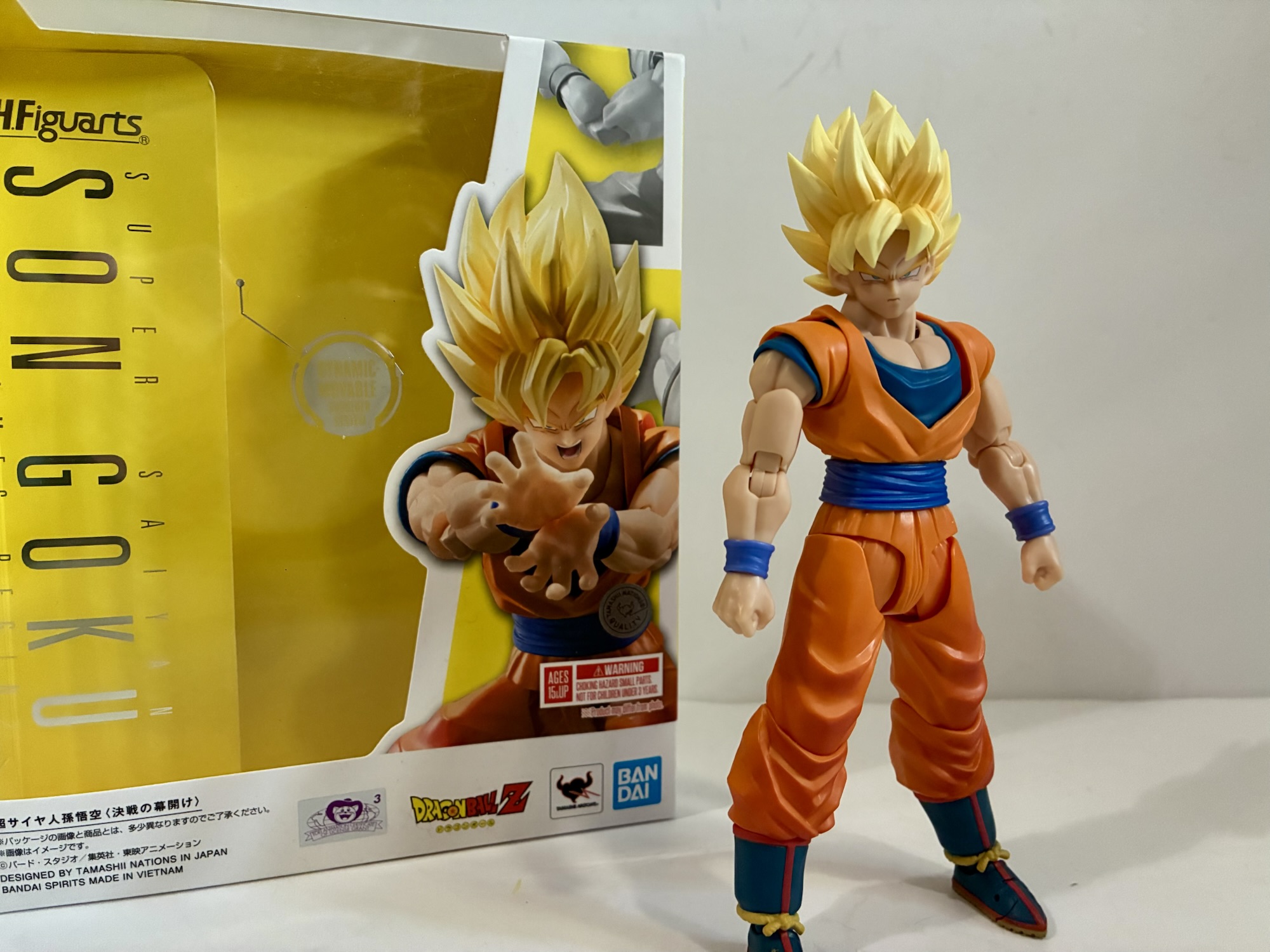
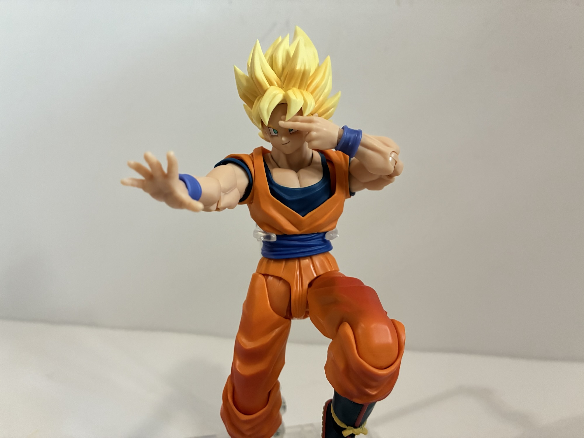
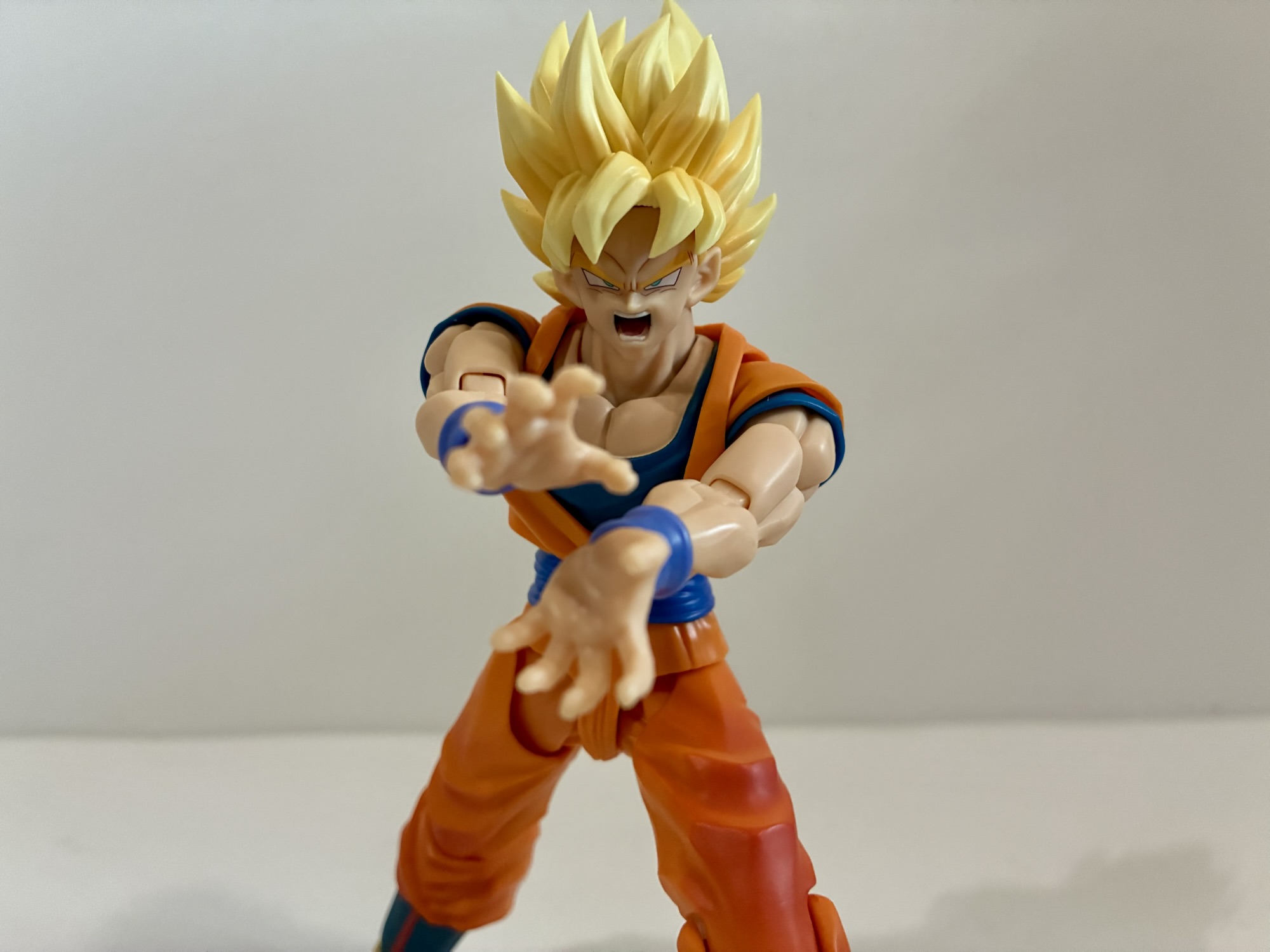
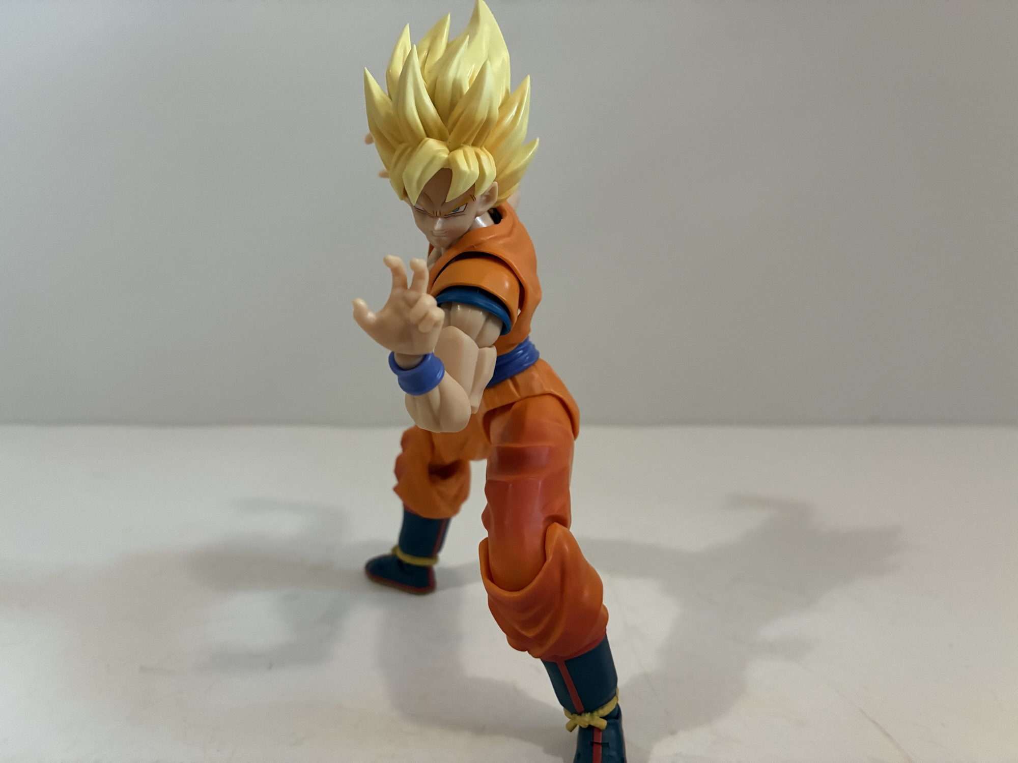
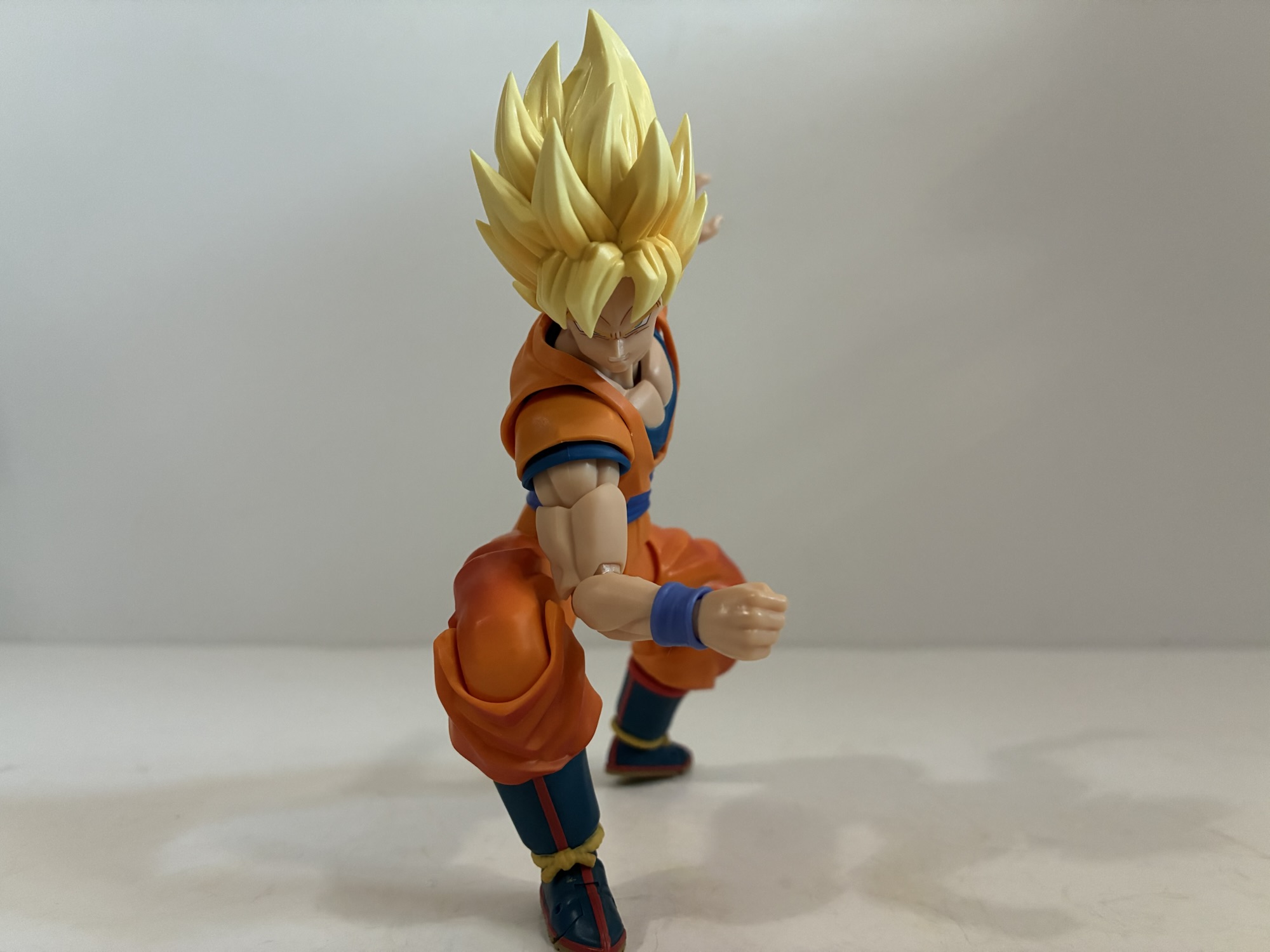
That said, what are some things that I found Dragon Ball GT did well? Well, for one, there’s the music and it extends to the opening theme “Dan Dan Kokoro Hikareteku” which was adapted for the English broadcast and adapted well. It does unfortunately contain vocals by a voice actor who was outed during the whole Me Too thing so I don’t feel like name-dropping him, but I’ll at least acknowledge that I enjoy the performance. The ending themes I enjoyed less so, but the initial one “Hitori Janai” was the best of them. That one was performed by Stephanie Young. The animation and artwork throughout GT is consistently good as well. It doesn’t have the same action set pieces of Dragon Ball Z, but it also never has episodes where the quality drops in an obvious manner. In this, it’s much closer to the consistency of the Buu saga. The voice actors also do a fine job and Stephanie Nadolny gets to reprise her role as Goku for plot reasons which is a treat to experience again.
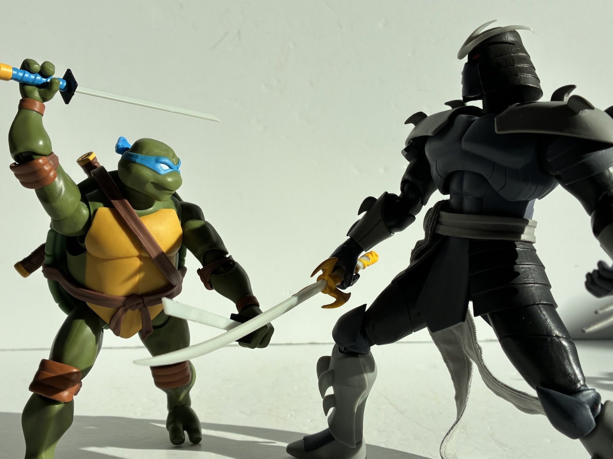
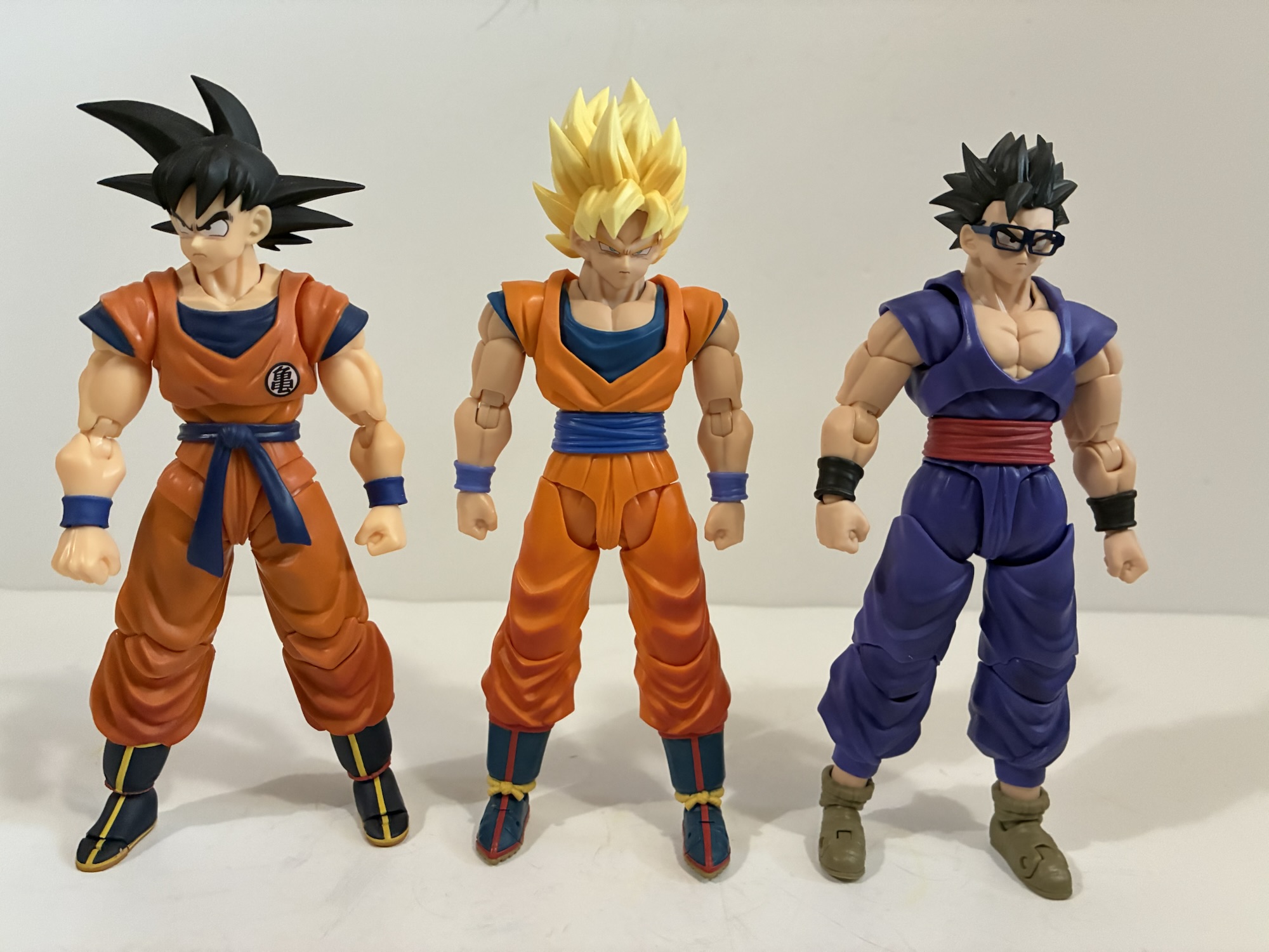
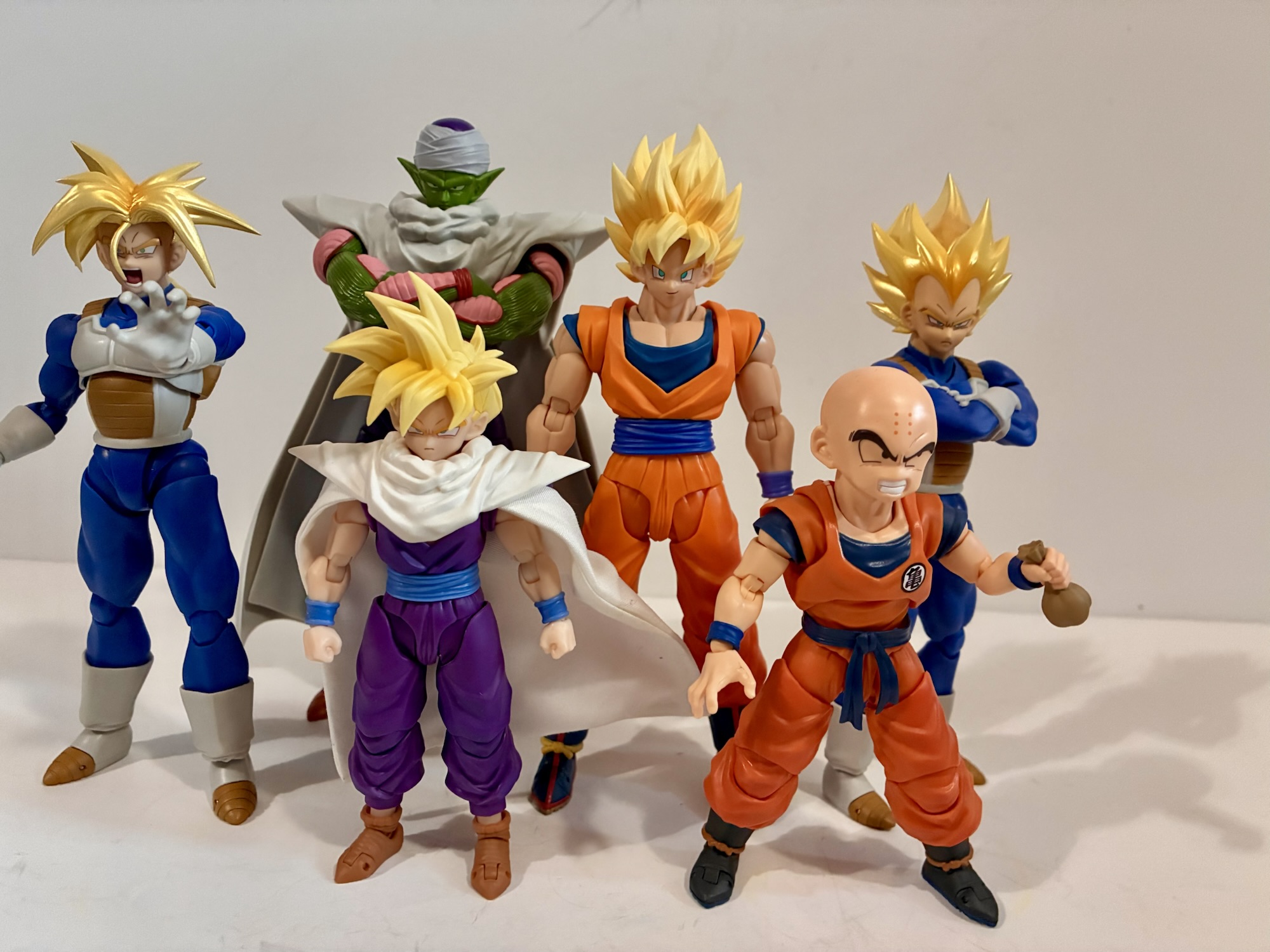
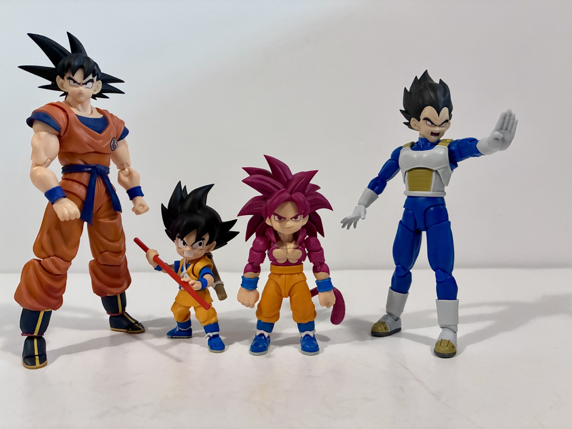
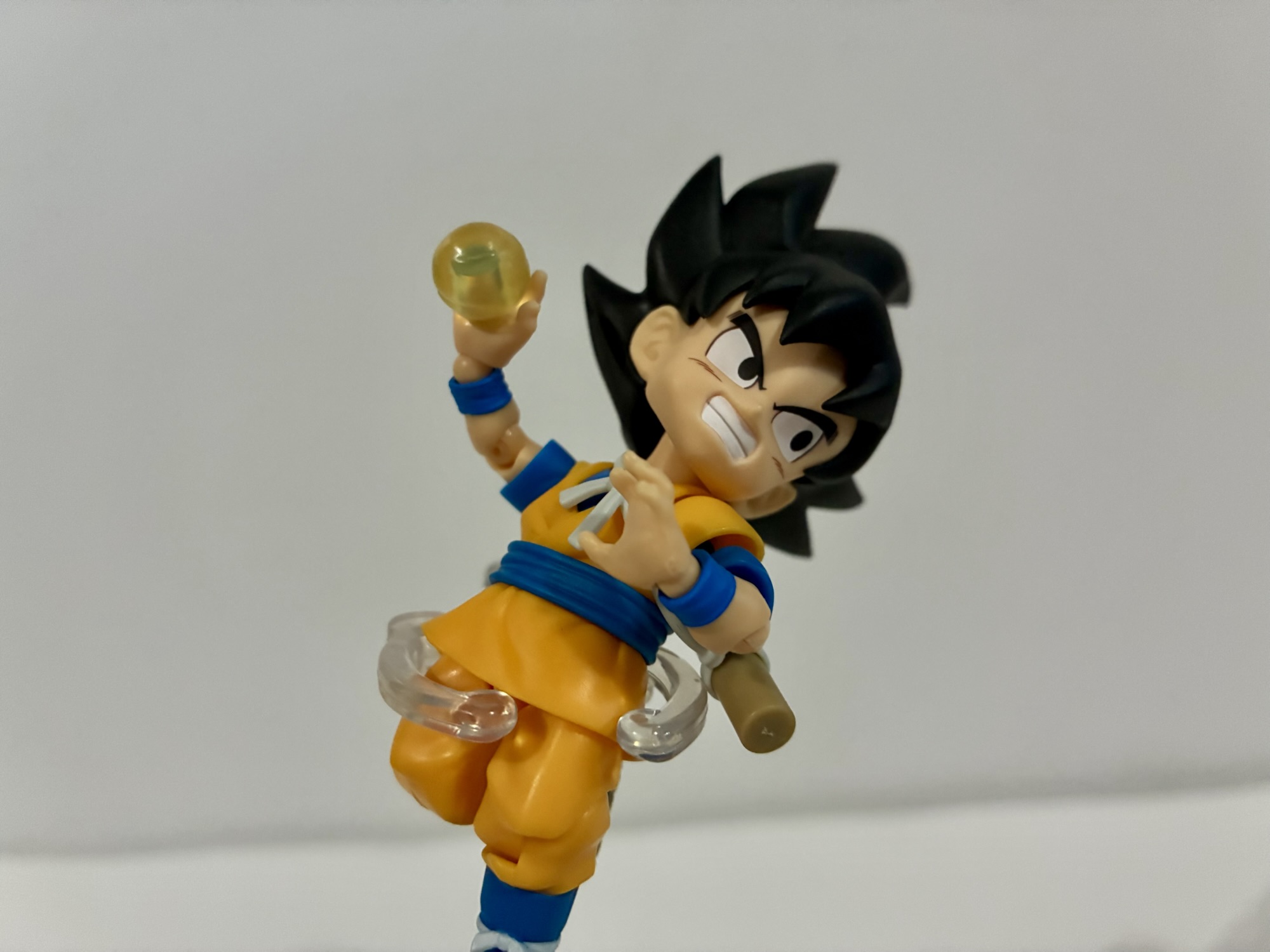
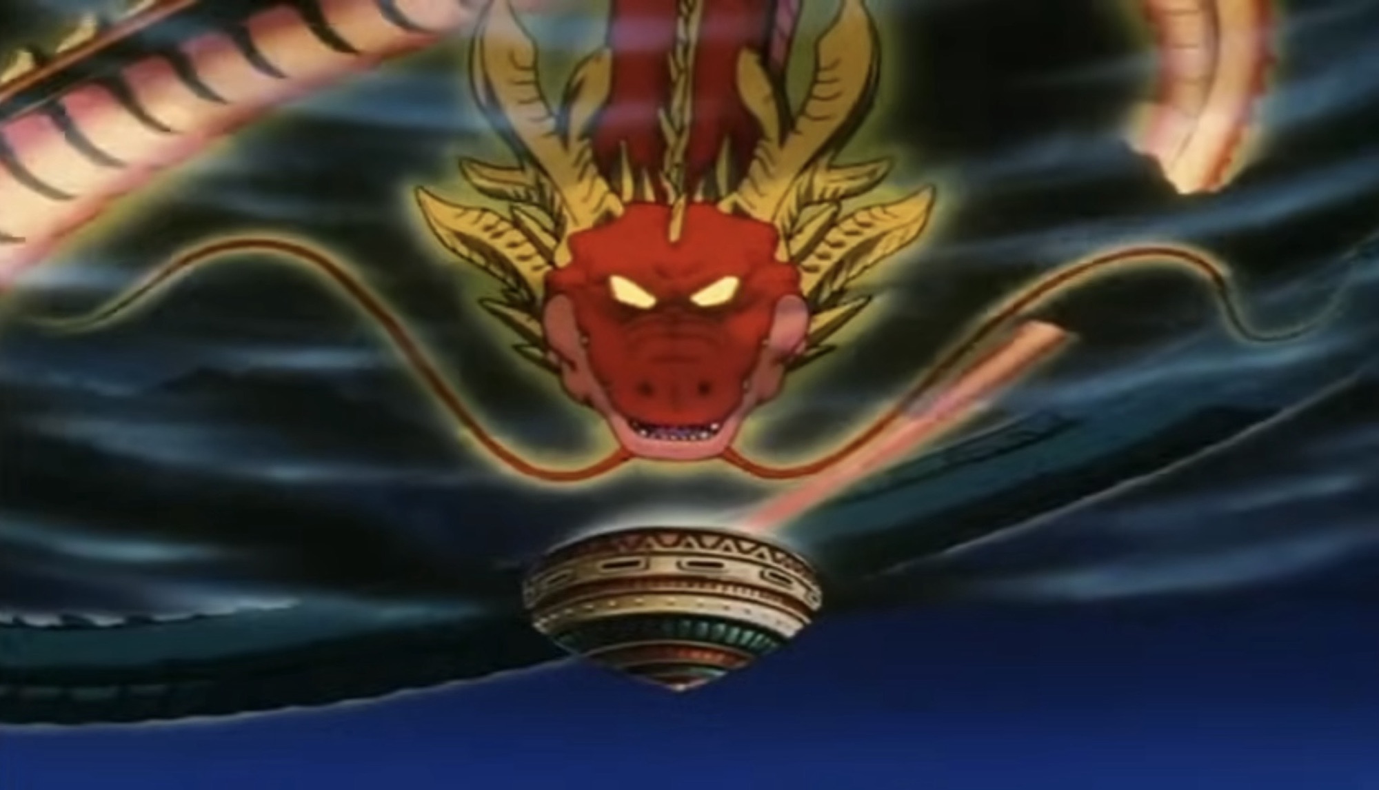
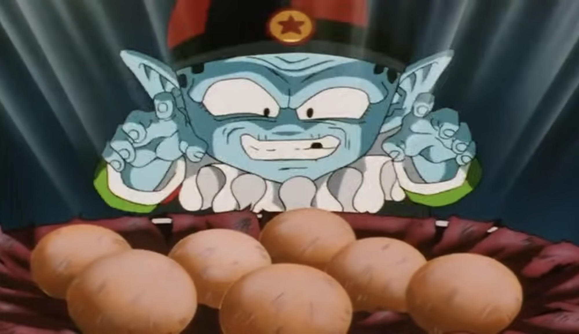
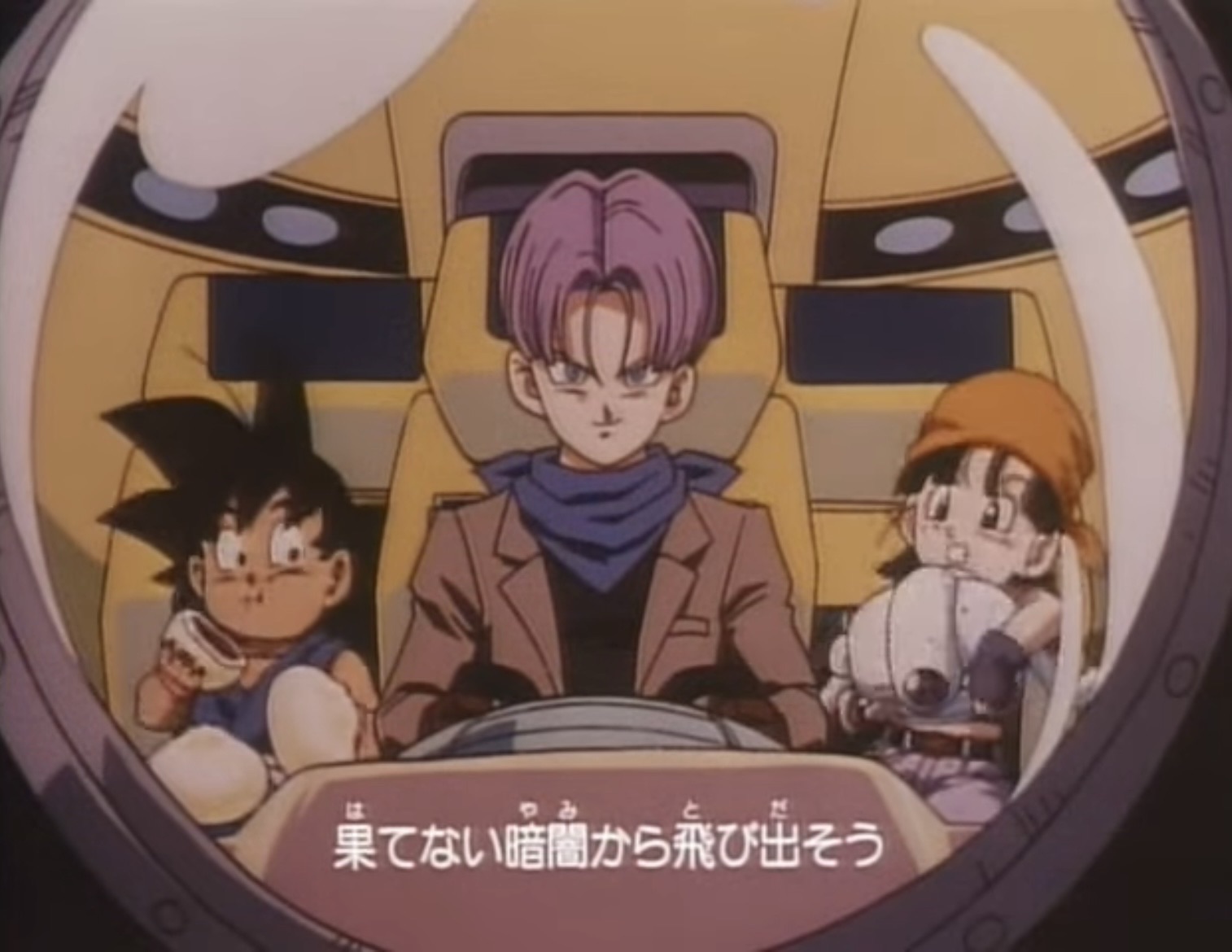
As for that plot. While I like the setup, it does seem to quickly run out of steam. At the start of the series we find Goku (Sean Schemmel) and Uub (Sean Teague) engaged in a sparring match at Earth’s look-out. A few years have passed since the end of Dragon Ball Z where Goku abandoned his family to train Uub, the reincarnation of Kid Buu, so he could be Earth’s next defender. He’s apparently done now so Uub heads home while a familiar trio invades the lookout. Pilaf (Chuck Huber), along with Mai (Julie Franklin) and Shu (Chris Cason), have returned and are after the Black Star Dragon Balls. What are the Black Star Dragon Balls? They are apparently the Dragon Balls created by Kami before he purged himself of the wickedness in his heart which gave birth to Piccolo. They have apparently just been hanging out at the lookout this whole time and for some reason did not become inert when Kami ceased to be. Pilaf and the gang have little trouble in locating these balls, which look just like the regular Dragon Balls save for the stars are black instead of red, and they summon Red Shenron to grant their wish. Goku, noticing the changing color of the sky, investigates before a wish can be made and recognizes the now elderly Pilaf. Pilaf gets frustrated because Goku always messed things up for him in the past and, in a moment of frustration, wishes he was just a kid again. Shenron, hearing this, takes it literally and turns Goku into a child and then disappears scattering the Black Star Dragon Balls not across the Earth, but across the galaxy. This is apparently a big problem as King Kai (Schemmel) pops into Goku’s head to tell him that without the Black Star Dragon Balls the Earth will explode. Yeah, a pretty big deal and it sure seems like Dende should have taken better care of these things given that. It basically falls on Goku, Trunks (Eric Vale) and Goku’s middle school aged granddaughter Pan (Elise Baughman) to travel the galaxy in a Capsule Corp spaceship and bring those balls back before the Earth explodes.
What I like about this setup is it takes GT back to the roots of Dragon Ball and quite literally by turning Goku into a kid again. After that though things start to go down hill and rather quickly. The first dozen or so episodes are adventure focused, but the gang never really finds a worthwhile adventure I enjoyed watching. Pan is portrayed as an annoying character who is quick to get angry, especially when the crew takes on a little android named Giru (Sonny Strait). She is vicious to the sympathetic little robot and it’s like the show wants me to hate this kid. Goku, for his part, isn’t all that much better. He’s a bit aloof, but constantly complaining about being hungry. I know, we get it, Goku likes to eat and eat a lot. GT returns to that well far too often and it loses any and all comedic value. He also tends to forget how powerful he is and there were many moments where I just felt frustrated by what was going on because Goku should be able to handle it no problem. He just chooses not to. Sometimes the show will make a joke out of it, but not often. They do take away his ability to use his instant transmission maneuver as I guess they just found it was too powerful, but there’s no attempt to explain it. He just can’t do it as a kid for some reason. Trunks is more of a stabilizing presence and he’s fine in that role.
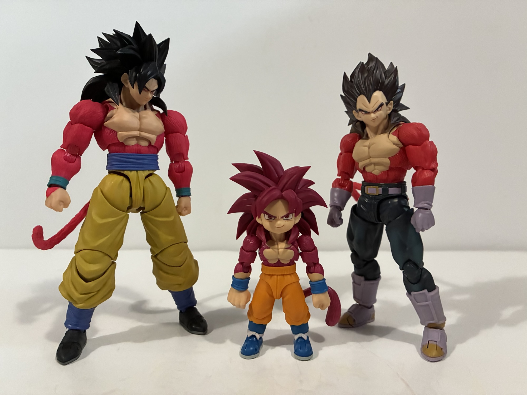
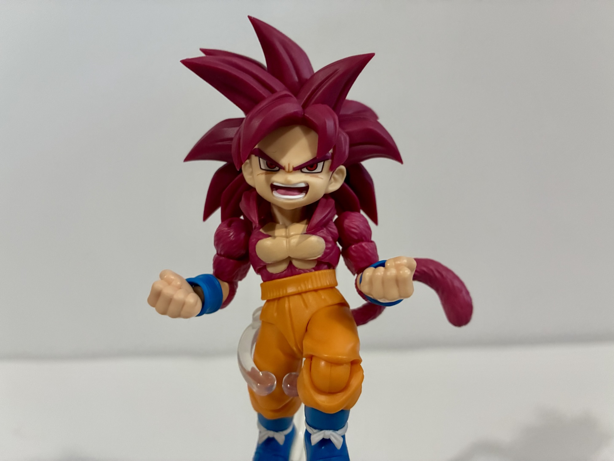
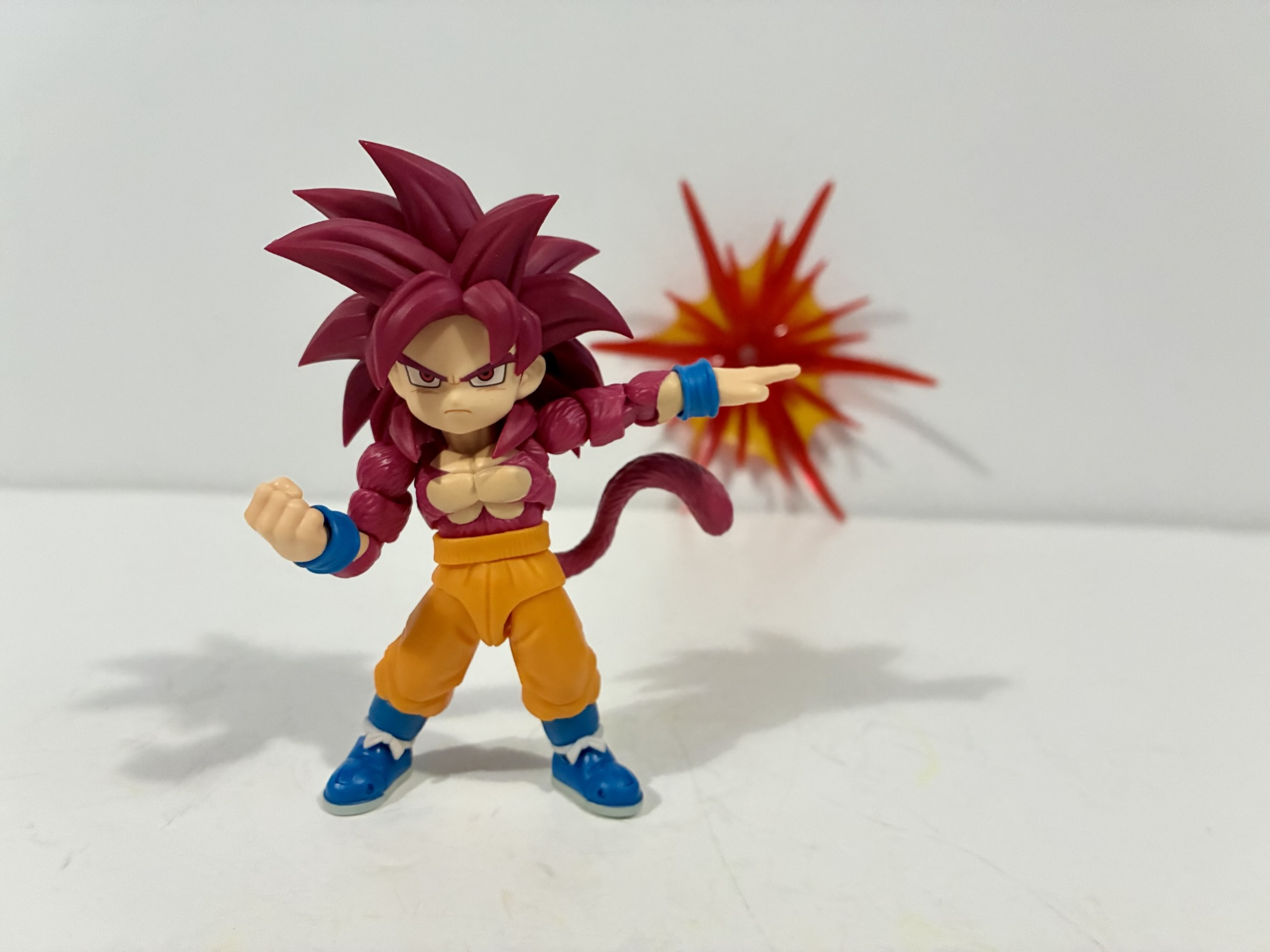
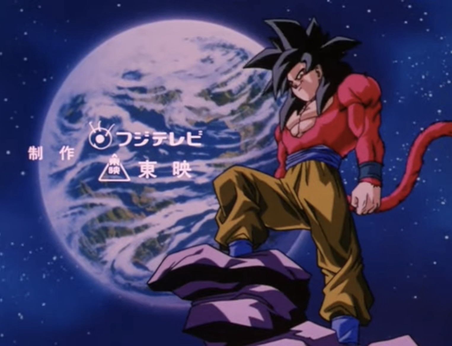
The show arguably doesn’t get rolling until we enter the Baby saga. While hunting for the Dragon Balls, the gang encounters a Dr. Myuu (Duncan Brannon) who is a total rip-off of Dr. Gero. He’s created an artificial lifeform called Baby (sound familiar?) which can absorb others and use them to gain power, but also requires a host body to reach his full potential. Baby (Mike McFarland) is born of the Truffle race, an alien lifeform that was eradicated by the Saiyans, which is a detail I actually do like. He wants revenge against all Saiyans which is what brings him to Earth. He there takes over the body of Vegeta (Christopher Sabat) and also infects almost everyone on Earth creating a sort of hive mind. It’s during this arc that we get introduced to the most memorable part of Dragon Ball GT: Super Saiyan 4.
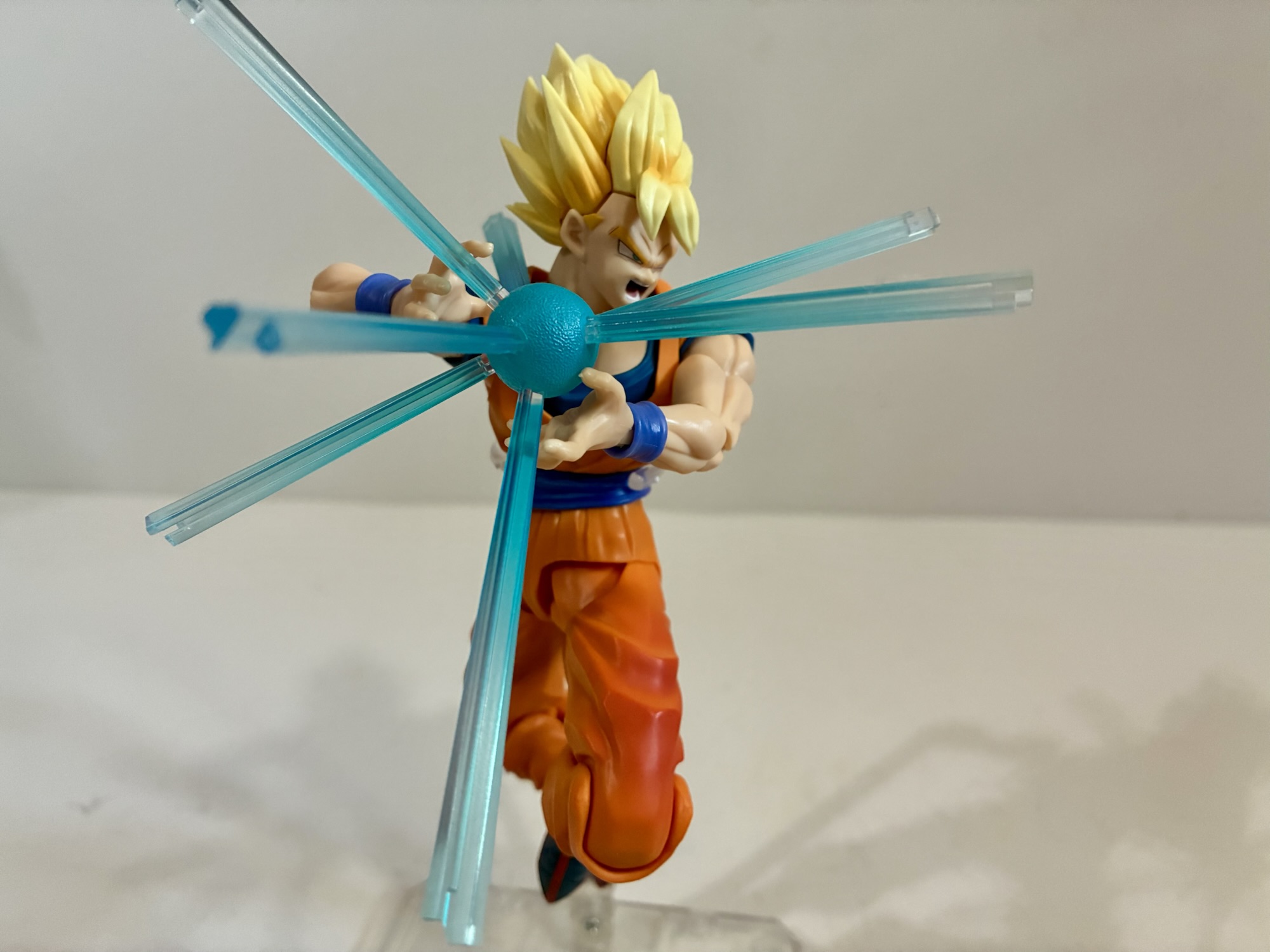
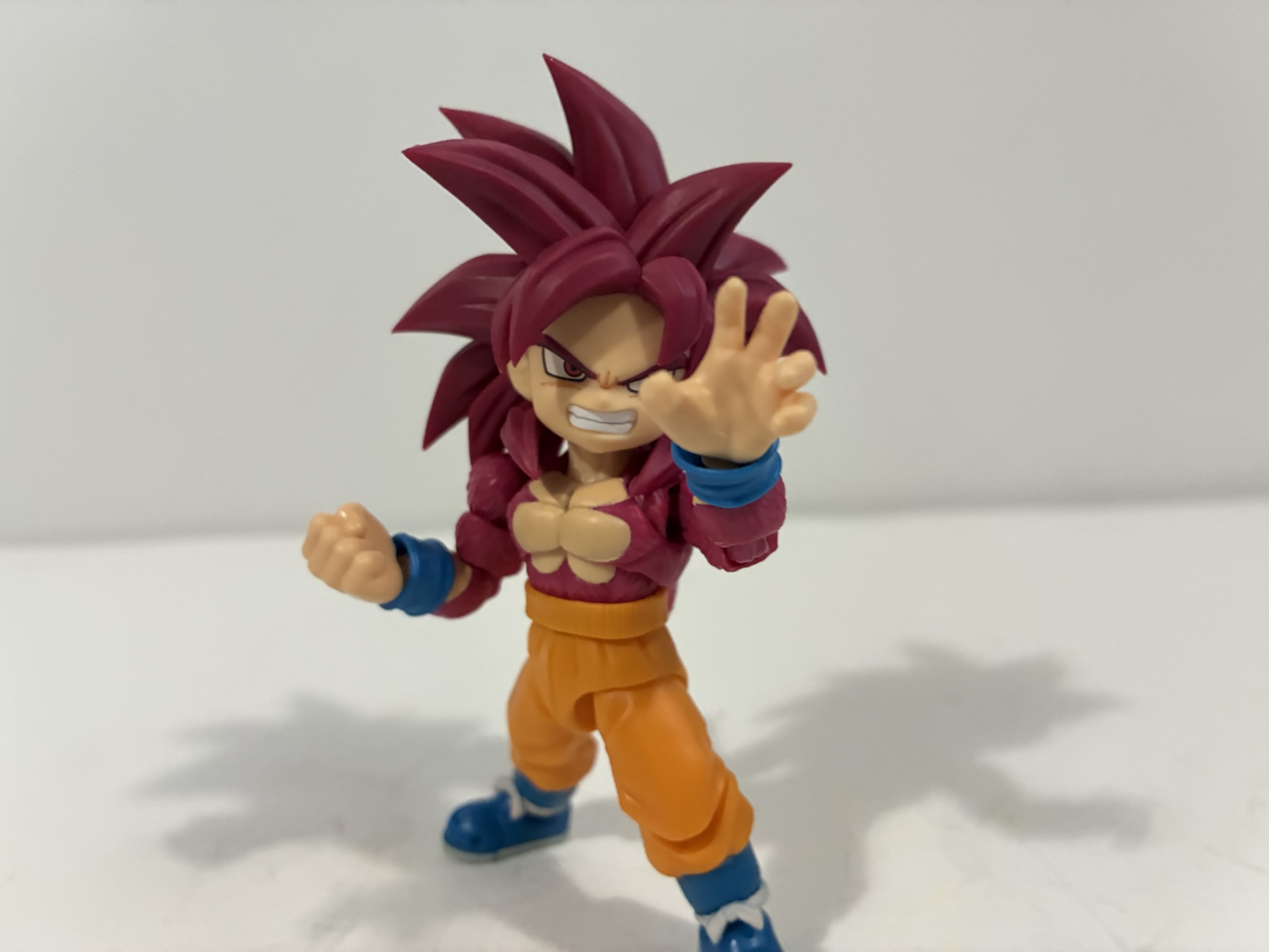
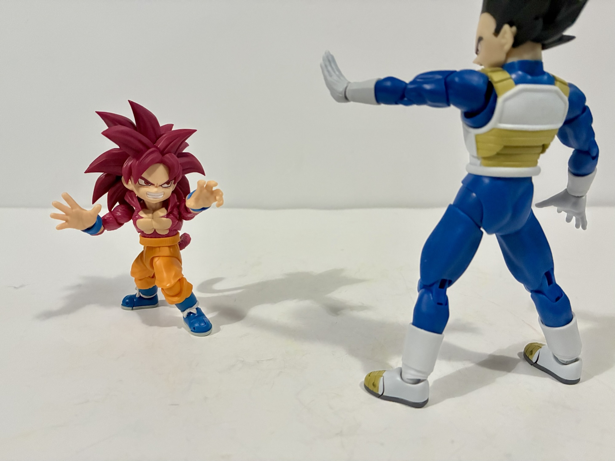
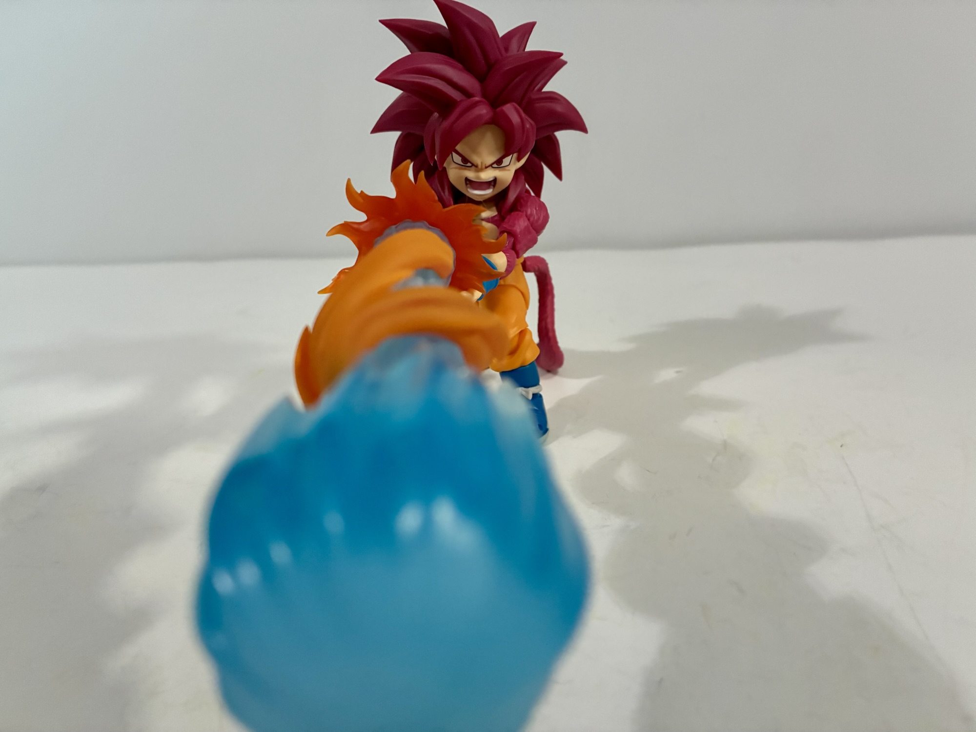
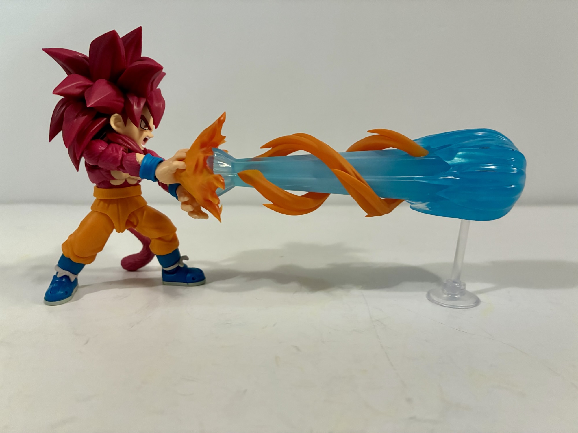
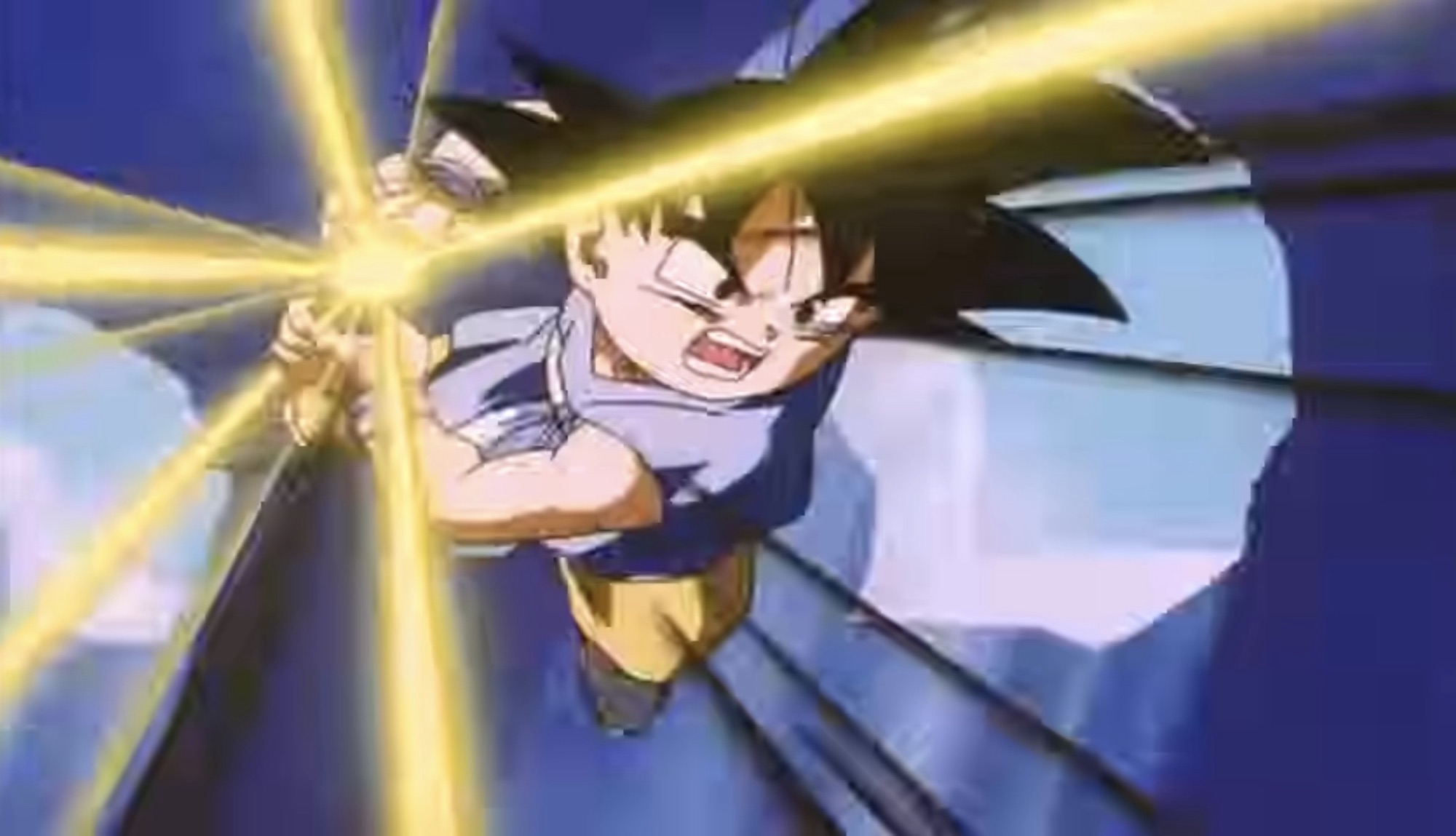
As a concept, I like Super Saiyan 4. I don’t know if I would have designed the look exactly like the one presented here, but the idea of a Saiyan reverting to his primal ape form and then harnessing that into this new Super Saiyan form is a good one. However, I hate Super Saiyan 4 Goku. For some reason he gets extremely cocky in this form. He talks in a lower tone (think Goku Black if you’ve watched Dragon Ball Super) and just comes across like a dick. It feels so out of character for Goku who can display confidence, but not to this extent and not in this manner. He acts like the fusion character Vegito, just without Vegeta’s voice literally filtering into his speech. It was also during this arc that it really became apparent that Goku basically has one move: Kamehameha. You will get sick of hearing Goku say that long, drawn out word by the time you’re done with GT. The action is so uninspired throughout the series and seems to only get worse as it goes on. Almost every confrontation is between two fighters who are unmatched. Whether it’s Goku or the villain, someone is at an obvious disadvantage to the point where they don’t even have to take the other fighter seriously. It makes for a drama-free experience and the only thing that turns the tide of battle is basically a new power-up.
After the Baby saga comes the Super Android 17 arc which is quite brief. It’s also inexplicable because the show basically draws attention to how the character Dr. Myuu is just a Gero knock-off by having the two team-up! And their team-up occurs in Hell where for some reason they’ve been allowed to keep their bodies (it’s best not to think about continuity with this series) and create a carbon copy of Android 17 in Hell. Some how. He is apparently able to control the real 17 and get him to open a portal to Hell so all of the bad guys can escape and run amok like an episode of Animaniacs. It’s a bit of a rehash of the twelfth Dragon Ball Z movie, but without charm. It’s terrible, let’s move on.
The final arc is the Shadow Dragon one and, again, it’s a solid concept that is just not well executed. Goku (who is still a kid and will remain one the whole series) and the gang try to make a wish with the Dragon Balls only for them to break. Black smoke comes out and with it comes the Shadow Dragons. Earth has made too many wishes in a short period of time and they’re being punished for it. The writers are essentially punishing themselves for this easy get out of jail free card baked into the series. In order to set things right, Goku has to beat each Shadow Dragon and recover the Dragon Ball imbedded in them. A few have a gimmick to them that Goku has to overcome while the finale, Omega Shenron (Sabat), is just a really strong guy. It culminates in a battle that’s really drawn out and almost never interesting. It’s always one-sided. The writers also never figure out a new way to end a confrontation. It’s always a riff on something from before. They absolutely love having the other Saiyan characters lend their energy to Goku so he can power himself up which is something that only previously took place in the movies. It’s not a gimmick I have ever liked. There wasn’t one new wrinkle to come up with?
Dragon Ball GT has the reputation of being the worst Dragon Ball series to date and it’s a well earned reputation. While I do think the people working on it had good intentions and tried their best, it just feels formulaic and too derivative of itself to be any good. There’s very little in the way of creativity and while Dragon Ball is certainly guilty of repeating itself quite a bit, it’s usually able to find some way to put a spin on things or at least be charming in the process. GT drops almost all of that charm in favor of a cookie cutter, disposable, experience. It’s ending is lackluster and just as unsatisfying as the ending to Dragon Ball Z, something I’ve never talked about in this space but is an ending I despise. I get that Goku is a bit of a dolt who just loves to eat and train, possibly in the opposite order, and we’re supposed to laugh when he just up and abandons his family to go train Uub. If Z had not created Pan and showed us how much she idolized her grandfather in those few episodes at the end of the series it might have worked for me, but instead it just makes me sad. I don’t like thinking of Goku as a selfish piece of shit, but he’s sometimes written that way. GT has a very similar ending, but since I was looking forward to the series being over it didn’t bother me nearly as much. This isn’t a good series. You’re actually way better off just experiencing it through the video games which basically gives you the Cliff Notes version of the series and lets you act out battles that are probably way more satisfying than what’s actually in the show. And if you love Super Saiyan 4, go buy an action figure or just watch Dragon Ball Daima which takes a lot of the concepts baked into GT, but actually does them well. Only watch the series if you’re like me and don’t properly value the 30 or so hours of your life it takes to get through all 64 episodes.
If you must hear more about Dragon Ball GT then here are some toy reviews you may find interesting:

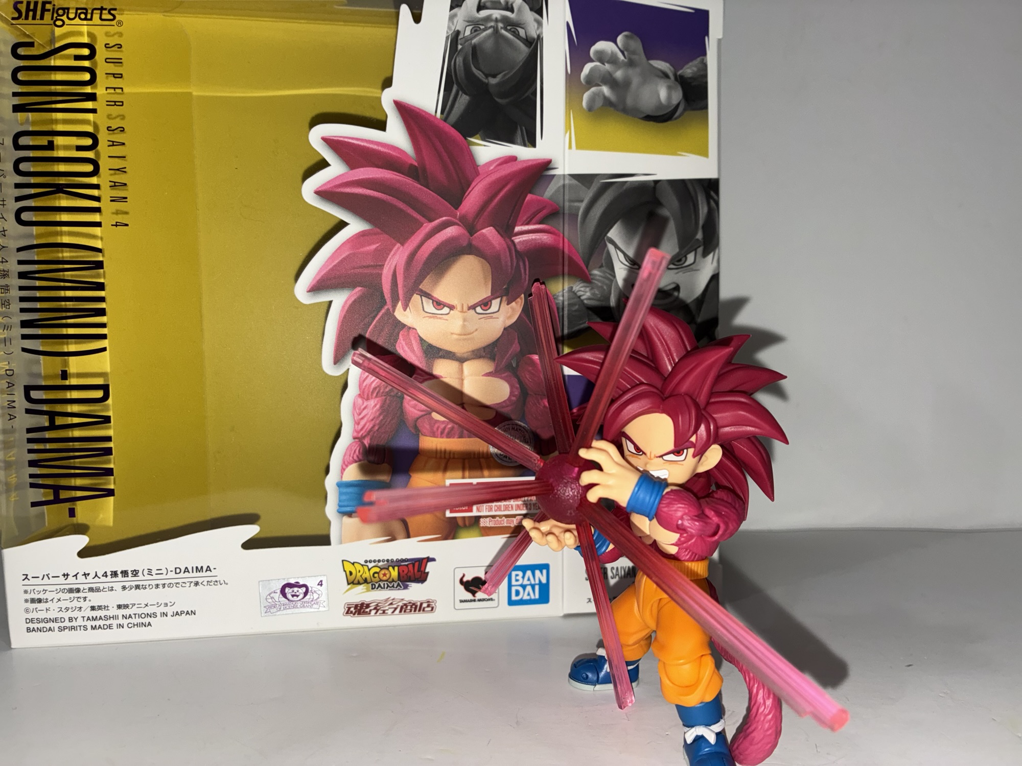
S.H.Figuarts Dragon Ball Daima Super Saiyan 4 Son Goku (Mini)
It’s no great secret that the black sheep of the Dragon Ball universe is the anime Dragon Ball GT. Created in-house by Toei animation, Dragon Ball GT was a continuation of Dragon Ball Z without creator Akira Toriyama. While Toriyama had to grant approval to many aspects of the series, he wasn’t directly involved with…
Keep reading
S.H.Figuarts Dragon Ball GT Super Saiyan 4 Vegeta
We’re back with another action figure review from everyone’s favorite version of Dragon Ball: Dragon Ball GT! And really, the only thing people remember from Dragon Ball GT is the Super Saiyan 4 transformation. Designed to bring the Saiyans back to their more primal roots, the Super Saiyan 4 transformation is pretty much on an…
Keep reading
S.H.Figuarts Dragon Ball GT Super Saiyan 4 Goku
In the world of Dragon Ball, there are varying opinions on which version of the anime is superior. Dragon Ball Z is unquestionably the most popular, but there are people (like me) out there who swear by the original Dragon Ball that came before it. More recently, Dragon Ball Super has entered the fray and…
Keep reading