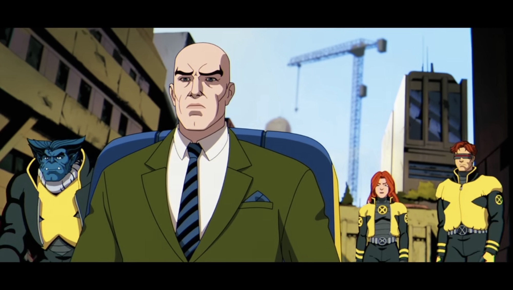
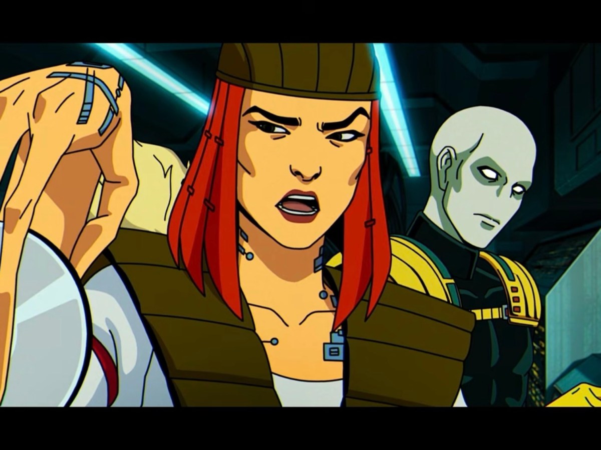
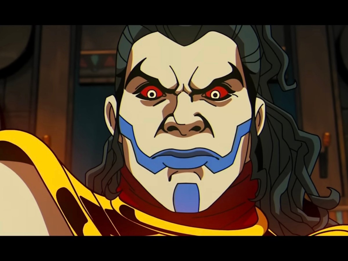
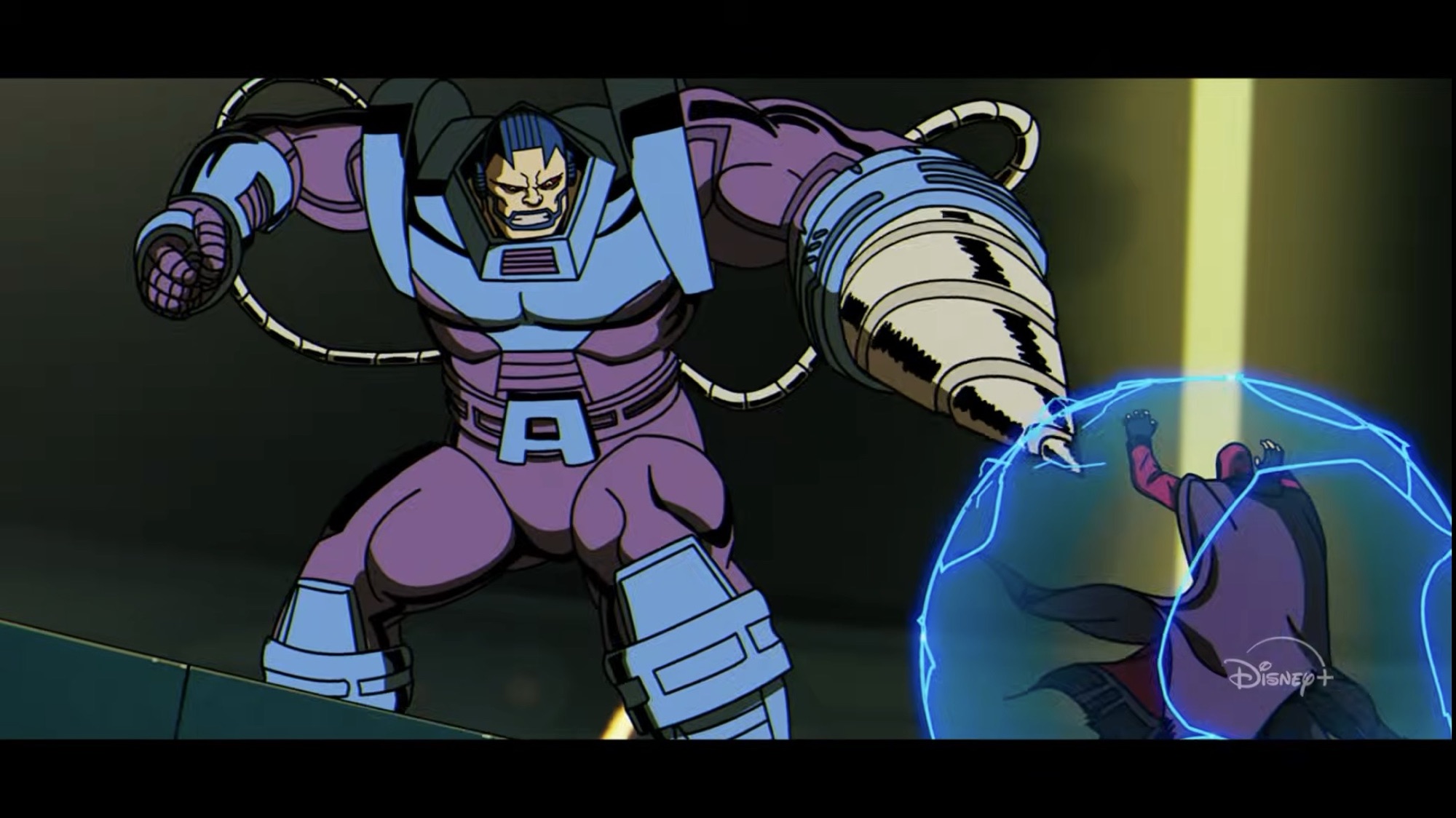
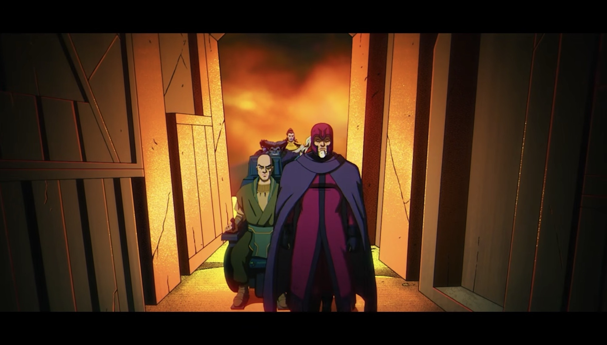
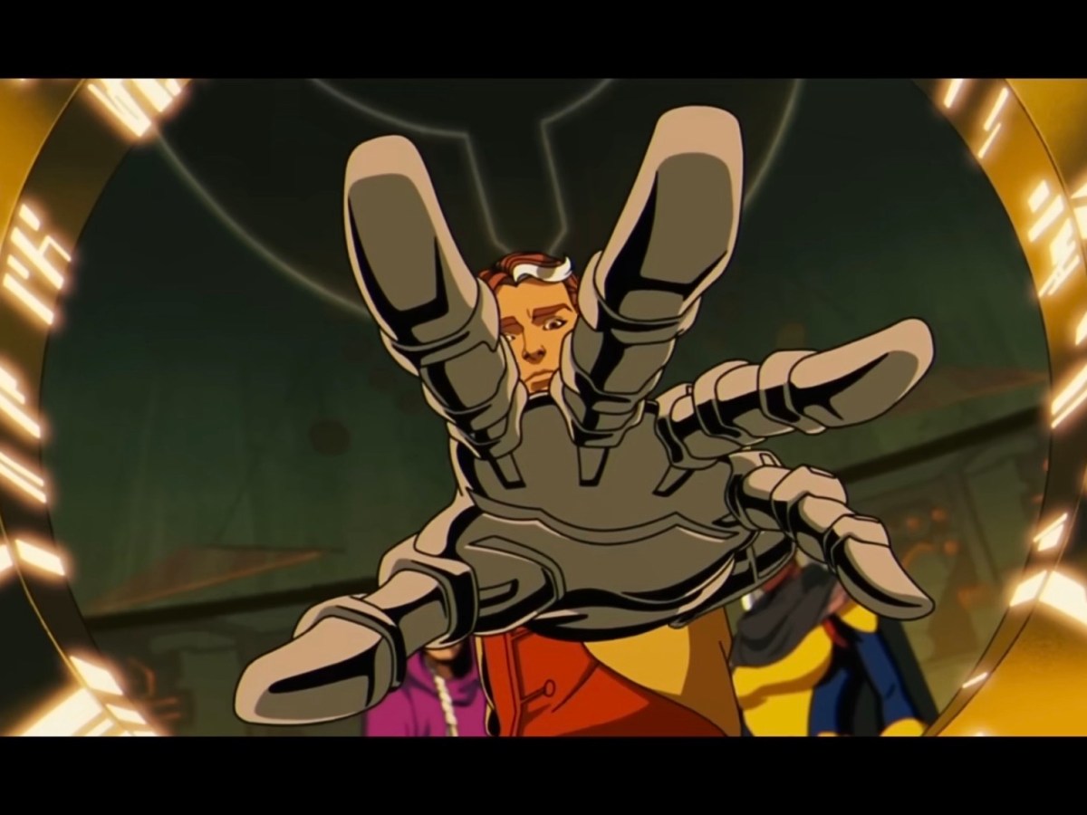
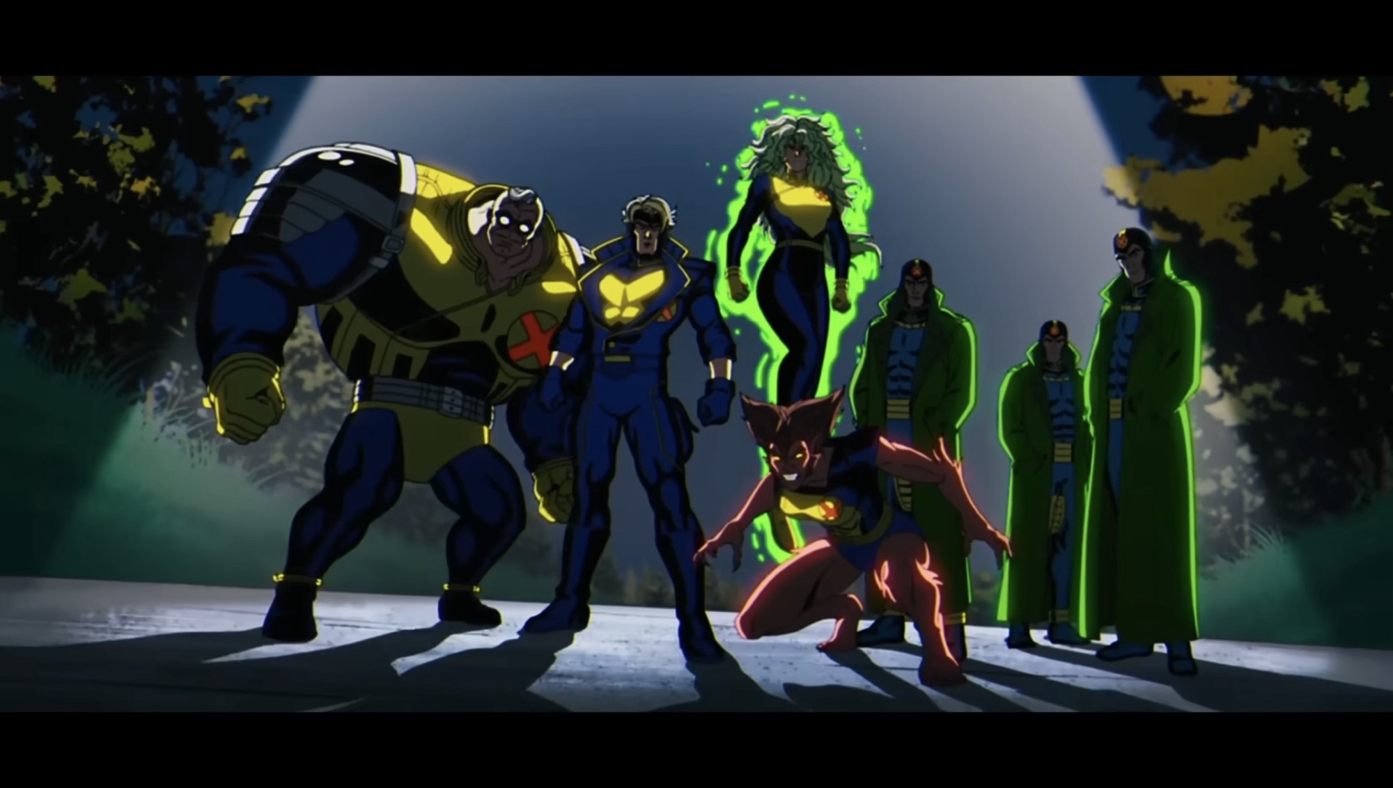
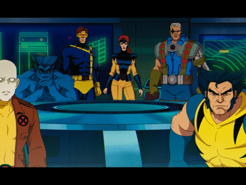
After last week’s side trip up north to get Wolverine his skeleton back, this week’s episode of X-Men ’97 brings us back to the mansion which we really haven’t seen much of so far this season. The season’s sixth episode is centered on survivor’s guilt and the sins of a parent. For the guilt portion, we have Charles Xavier (Ross Marquand) who witnessed the death of his friend, rival, and surrogate brother Magneto at the hands of Apocalypse. For the sins of the father angle, we have Polaris (Carolina Ravissa) who we really don’t know much about. Sure, if you’re a comic reader then you probably know plenty about the sometimes daughter of Magneto, but anyone who only absorbs X-knowledge via the animated series just knows she’s a former member of the team who once dated Iceman and is now a member of the government task force known as X-Factor. Oh, and she has a green hair for some reason.
Polaris gets something of a spotlight episode this week which just makes me wonder if a certain ancient, evil mutant has a plan for her?
Since both the original show and this one have dedicated so little screen time to Polaris, it’s even possible that viewers have no idea that she essentially has the same power set as Magneto. The comics have always been a bit non-committal with her lineage. Some writers made it a point to say she wasn’t related to Magneto while others have said the opposite. Obviously, if she has the same magnetic powers then one is going to naturally wonder if the two are related, though there are plenty of mutants with similar powers that are not so it’s also not a requirement. For this universe, we were shown previously the two are likely related since Polaris appears in silhouette form in the first season finale in Magneto’s mind. I guess that means he knows about her, and that much is confirmed early on in the episode “Danger.exe.” At the beginning, Polaris is shown breaking up a weapon’s smuggling ring being lead by old friend Carl Denti aka the X-Cutioner (Lawrence Bayne), though he’s no longer sporting the fancy costume. He’s teamed up with a bunch of other folks all in service to the reverand William Stryker (JP Karliak), the enemy featured in the classic story God Loves, Man Kills by Chris Claremont. More casual fans will recognize him as the foe in X2: X-Men United though for that role he was turned into former military and the whole preacher thing was dropped – a pity. Here he’s just a cameo, but I do hope he plays a bigger role in the episodes to come at some point.
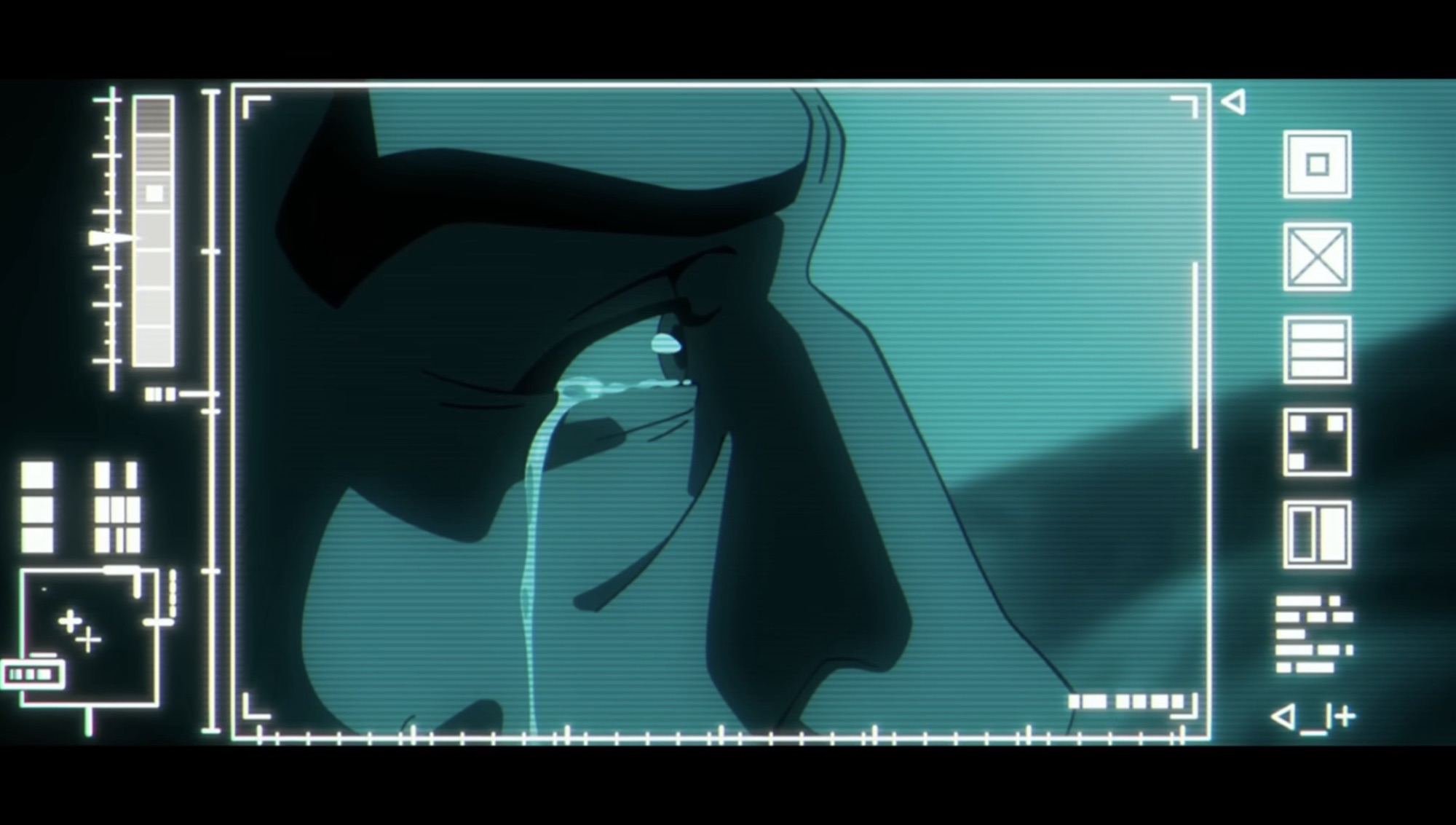
Xavier using the Danger Room to relive Magneto’s execution is pretty grim.
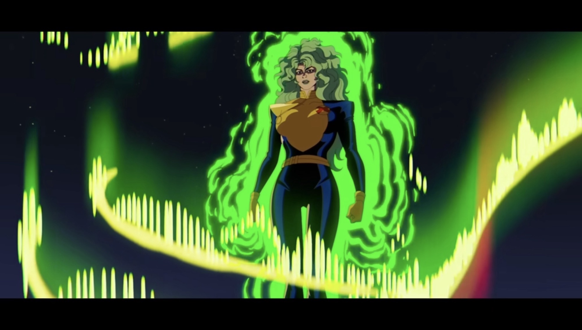
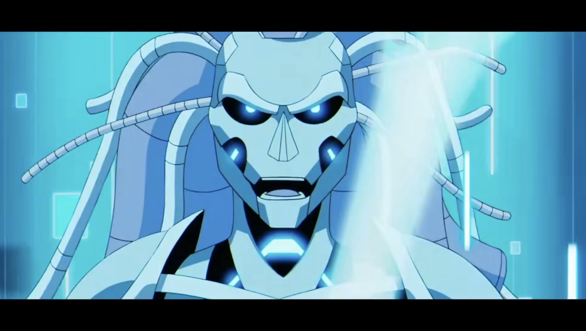
Polaris breaks up this gathering in pretty extravagant fashion. She also loses her cool a bit which puts her in hot water with X-Factor’s leader and government liaison, Val Cooper (Catherine Disher). Seeing the two have a very different idea for how members of X-Factor should approach their work, Polaris finds herself dismissed, but that’s not so big of a deal when your fallback plan happens to be the X-Men. Lorna returns to find her room had been left untouched, which is impressive since the mansion has been destroyed at least two times since she left. Her and the professor get to have a little chat and things seems to be going well, all until the Danger Room’s artificial intelligence breaks free and turns on everyone. This is where Xavier comes in as he and a small team have returned to Genosha to pick up the pieces. The Danger Room A.I., simply known as Danger (Rachel Kimsey), seeks a confrontation with its maker in Charles and that’s the physical conflict of the episode. The mental one is Xavier overcoming his guilt and helping Lorna to not be afraid of where she comes from in order to cut loose and use her powers to help those who are in need.
There is some…danger…incoming for the X-Men this week.
This episode is a little less meaty than most of the ones we’ve had this season. I liken it to the Lifedeath stuff from last season as there’s some necessary character growth, just minus the big, world-changing, moments. There is a lot of subtle change at play here as Storm (Alison Sealy-Smith) has been promoted to headmistress and put in charge of the education at the Xavier Institute. The government has also forbid the X-Men from acting as a paramilitary organization and the institute is only allowed to remain open if it’s to function as a school. Basically, anything they do outside of education is going to put them into conflict with X-Factor and it feels like we’re setting up a showdown between the two. How X-Force plays into all of this remains to be seen as we haven’t checked in with them in quite some time now. There are also a lot of new students at the school, most of whom we saw in that X-Force centric second episode so I’m assuming there is some cooperation between the X-Men and X-Force, or they just ditched the kids on their doorstep. A bit surprising that Jubilee didn’t hang around.
Looks like another wardrobe change for the X-Men is in order.
In terms of the bigger picture, there was an interesting conversation between Xavier and Lorna where Charles basically confesses he tried to preserve Magneto’s psyche just before Apocalypse murdered him, but failed. Are we aborting on Onslaught? That’s a strong possibility. The episode concludes with a long-expected scene as well which may or may not pay dividends next week. I would not be surprised if it’s put off until the penultimate episode. This episode is also noteworthy in that it does not feature Wolverine. It’s hardly a surprise to see an episode of X-Men ’97 not feature the runt, but following the end of last week’s episode it was a bit disappointing to not see if his relationship with Morph has been affected. The episode does put some players on the move and there is an attempt at placing the focus back on Apocalypse despite the emphasis on a villain of the week format. I get the sense that the show is maneuvering its pieces into place before the big conclusion. With only three episodes to go in the season, it feels like things are about to pick up.
When X-Men went into development for the Fox Kids Network, it didn’t take the writing staff (who was unfamiliar with the property going in) long to figure out that Wolverine was their ticket to television royalty. The character really took off in the 1980s and helped the X-Men storm into the 1990s as the most…
Unlike the first three episodes of season two of X-Men ’97, this fourth one is going to spend all of its time in one era. And as you could probably guess, that era is 3,000 BCE since that is where we left off last week. I consider these reviews that I do spoiler free, but…
The premiere episode for season two of X-Men ’97 took us to the far off future where Apocalypse reigns supreme. The second followed that one up with a story set in the present time of the series: 1997 (Duh!). Now, for the third episode of this three-part premiere we head to ancient Egypt to meet…
X-Men ’97 appears to be building towards one hell of a finish.
With the airing of last week’s episode “Weapon X, Lies, and DVDs” the second season of X-Men ’97 passed the halfway point. And after tomorrow when this goes live, we’ll be 2/3rds of the way through the season since it’s only nine episodes. Since I am away (again) for the sixth episode, I figured I’d do a little recap post and offer up some of my thoughts on where we’re heading from here. There’s a lot of stuff we know is likely to happen, but a lot we don’t, and it sounds like the plans for season three have been changed since they were originally mapped out. It should probably go without saying, but just in case, there are spoilers ahead for the first half of X-Men ’97’s season two and I’ll also be talking about the potentially scuttled plans for season three so you have been warned.
Season two of X-Men ’97 has been a lot of fun so far. The actual episodes have been pretty tight focusing on just select squads of the heroes involved while also laying the groundwork for a big finale against Apocalypse. With the most recent episode, we got a deviation where Wolverine and a select group of mutants ran off to Canada to shut down the latest Weapon X lab. Or at least that’s what the squad signed up for, but in reality Wolverine was just looking to get his adamantium skeleton back which Magneto had stripped from him in season one.
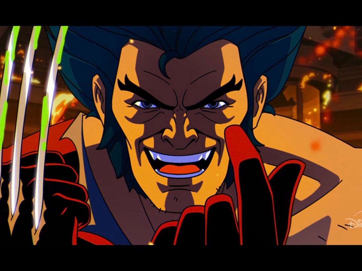
Wolverine is left to wonder, “Was it all worth it?”
We might as well start there. That episode was a pretty interesting look at Wolverine and it also really put a spotlight on his relationship with Morph. It’s been a little divisive in some circles from what I’ve seen and that goes back to how the story was presented in the comics. Any X-Men show or movie is going to run into issues where fans compare what they’re seeing on their screen to what already happened in the comics while writers and showrunners aren’t always looking for a direct adaptation. In the comics, Wolverine went years without his adamantium skeleton and even had a botched attempt at it during that time period which brought about the feral Wolverine era. We got a slight taste of that in episode one as Wolverine’s look was evocative of that one, but that was it. The comic book story put Wolverine before Apocalypse with a choice: battle Sabretooth for the right to become Death, or let Sabretooth assume that mantle. Whoever became Death would have an adamantium skeleton courtesy of Apocalypse which was kind of like a little bonus. For Wolverine, it meant letting someone else turn him into a weapon as the Weapon X program had done years before against his will. On the other hand, letting Sabretooth get basically a power-up and a new job that was all about killing didn’t exactly sound appealing either. Wolverine’s choice was presented as a sacrifice and he had faith in himself that he’d eventually beat Apocalypse’s programming and ultimately cause the world far less harm than a powered-up Sabretooth and that’s just what he did.
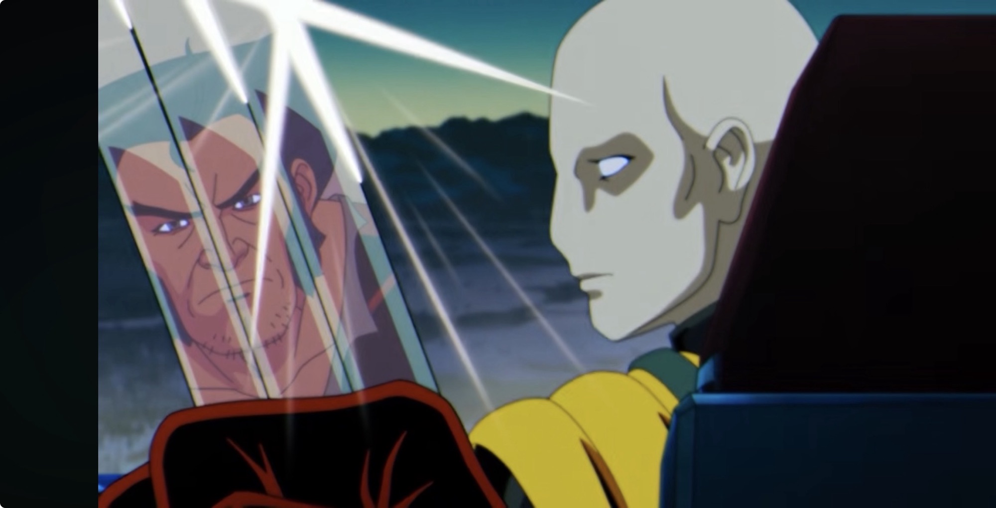
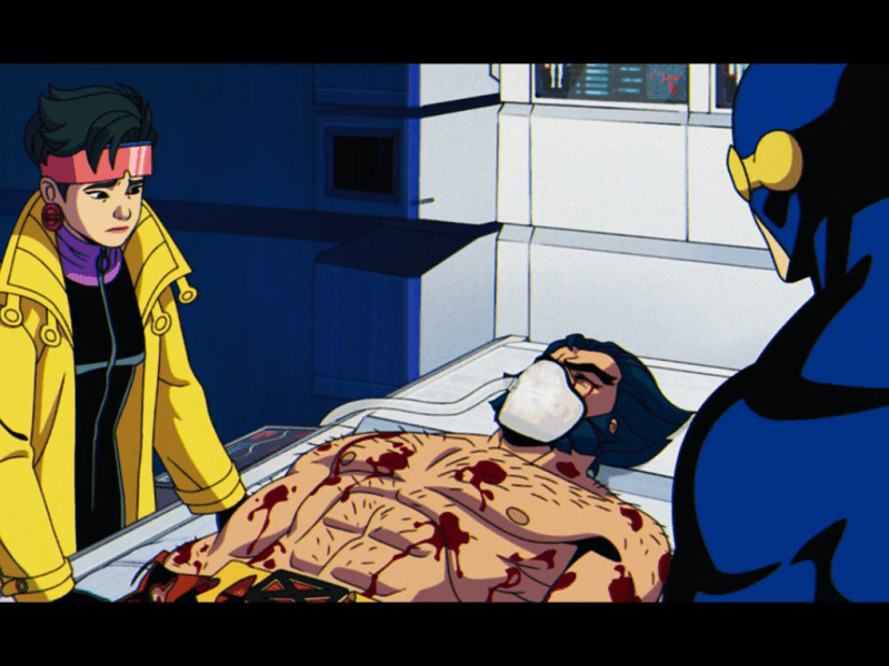
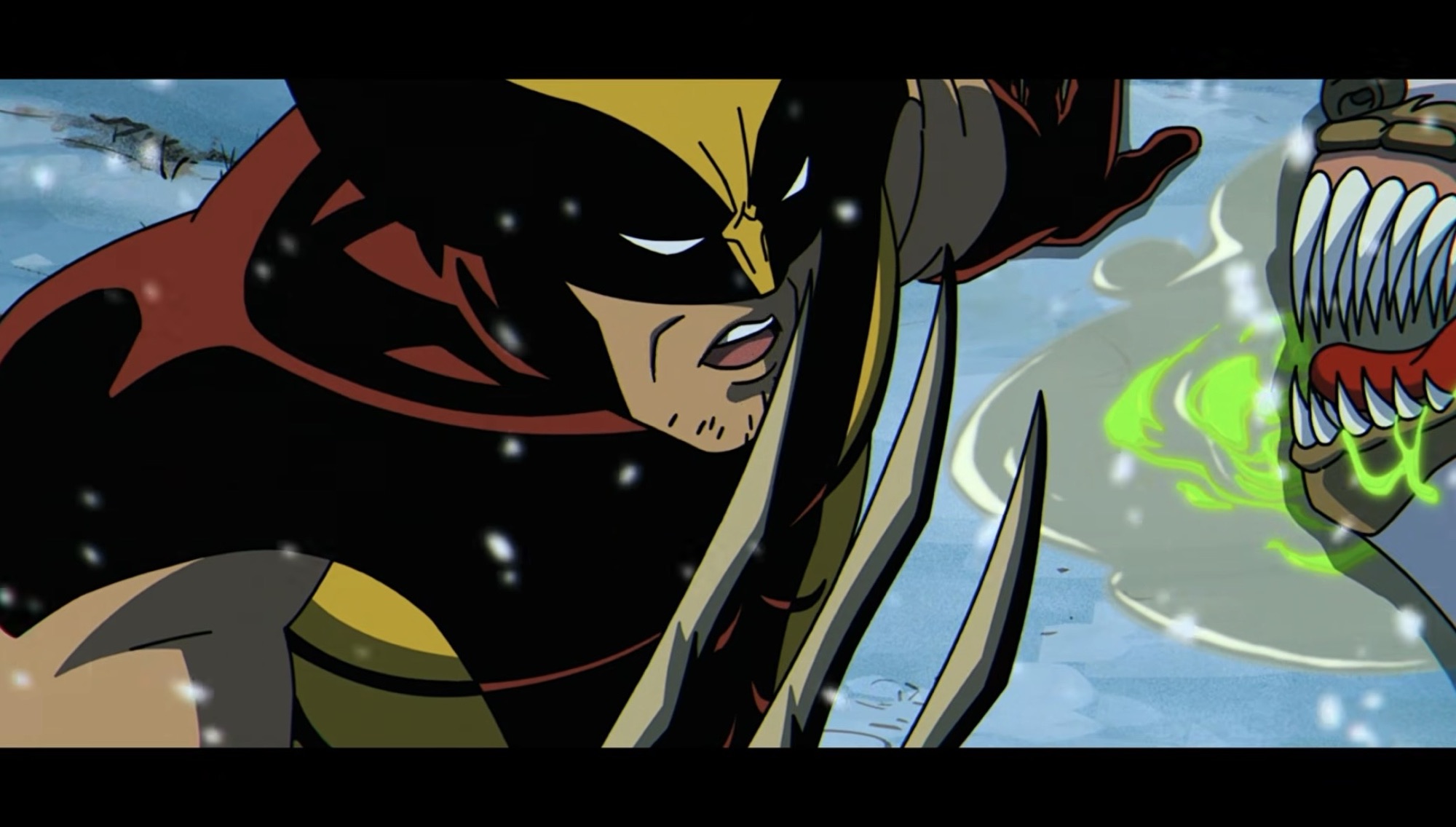
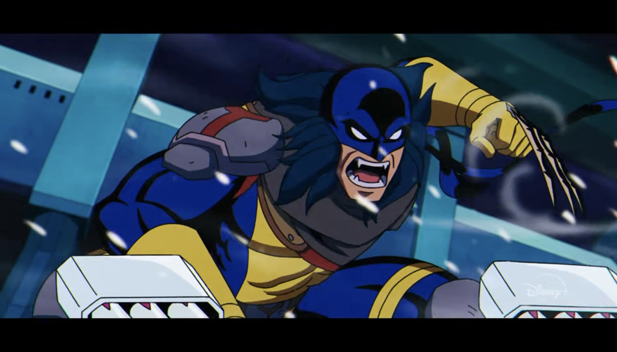
In X-Men ’97, Wolverine lead a group of allies and enemies into a hornet’s nest under false pretenses. During the first episode and in this one, we saw how Wolverine’s effectiveness had been reduced thanks to his new, fragile, bone claws. He had a tough time taking down the robotic foes in the distant future and was unable to takedown a Brood-infested polar bear in this one. And in that moment, Sabretooth had to bail him out and he was all too happy to let him know. Wolverine ended up getting infected by the Brood which caused him to murder his ally Maverick who wanted to bail on the mission as soon as they realized what they were up against. He very nearly killed Morph, but Morph was able to distract him by morphing into Jean (that always works). Sabretooth and Deathstrike saw through what Wolverine was doing, but Morph was the last one to cross the finish line. Morph refused to see Wolverine as a monster, but in the end, they found out that even Wolverine thinks he has no worth unless he’s a monster. It must have been a pretty devastating episode for Morph who we know has feelings beyond just friendship for Wolverine. Morph presenting as themself to Wolverine to try and get him to stop failed, but Jean? Apparently she has enough of Wolverine’s heart to pull that off and Morph likely never will. There could be a rift forming here and it will be interesting to see how this plays out. For fans, I get it that some were upset that Wolverine’s sacrifice in the books was turned into a selfish act, but I think this aspect of his personality that X-Men ’97 is shining a light on is also a worthwhile avenue. We’ll just have to see how it goes.
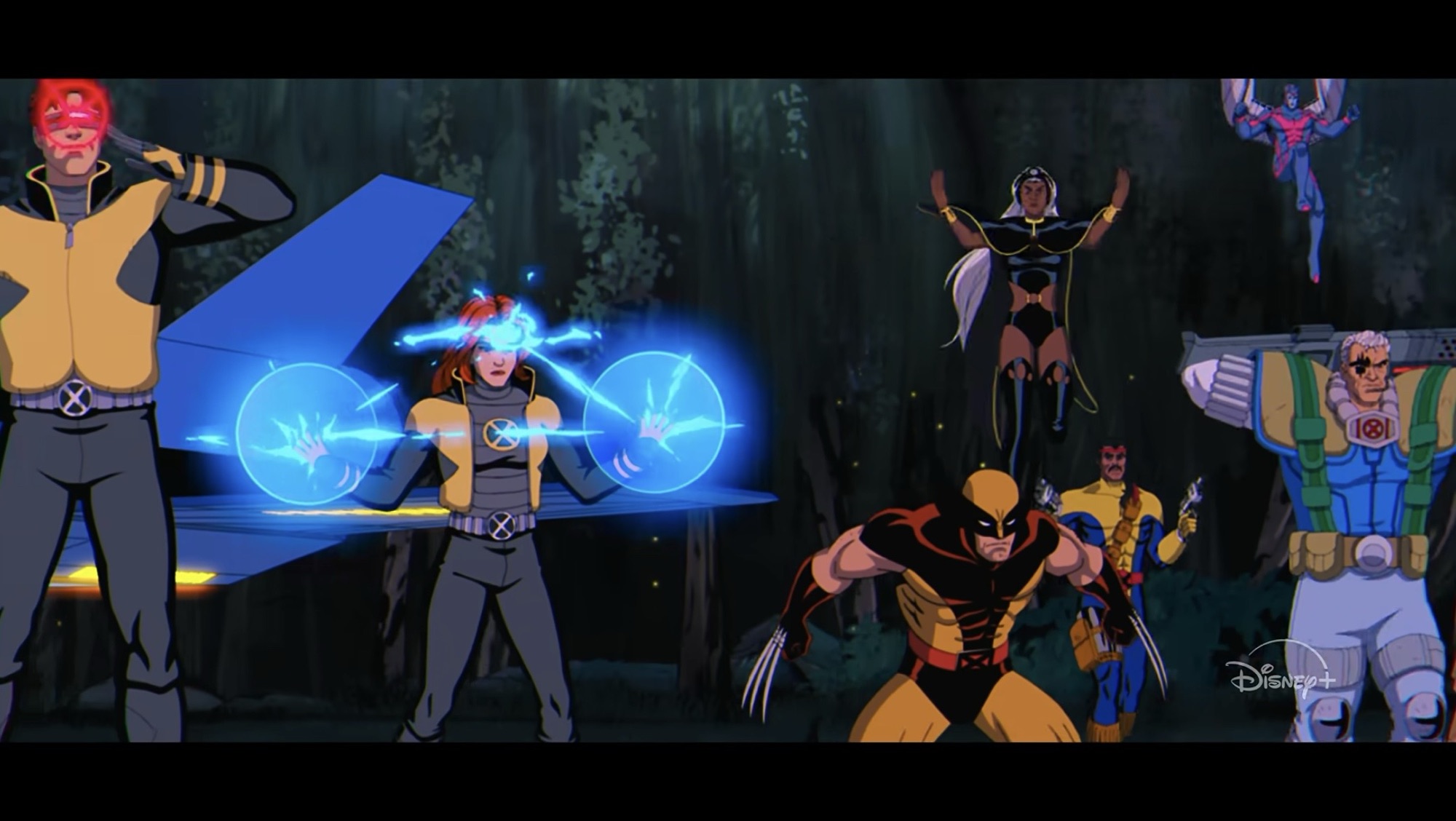
As for the rest of the season, we know the episode titles for what’s to come starting with the episode that airs the day after this post goes live “Danger.exe.” I am expecting this one will feature the enemy Danger (duh), and based on the newer trailers, it could also feature an X-Men and X-Force team-up. Or a fight, either sounds enjoyable. It should be a good opportunity to bring in the Grant Morrison era costumes we’ve seen featured in the trailers (they thankfully have not featured Wolverine’s look from that run which I have never liked) and I think it will also be a chance to get most everyone in the same place. We have not had an episode where the whole team is together. It would also be a chance to see the first bit of fallout from the time jumping adventure the X-Men went on as well as the loss of Magneto. I wonder if it will stick with the Danger plot, or maybe jump around? We haven’t really had an episode like that this season apart from briefly jumping to the future in episode two and starting episode 3 in the present.
Could this episode be where the show brings back the Genosha fallout?
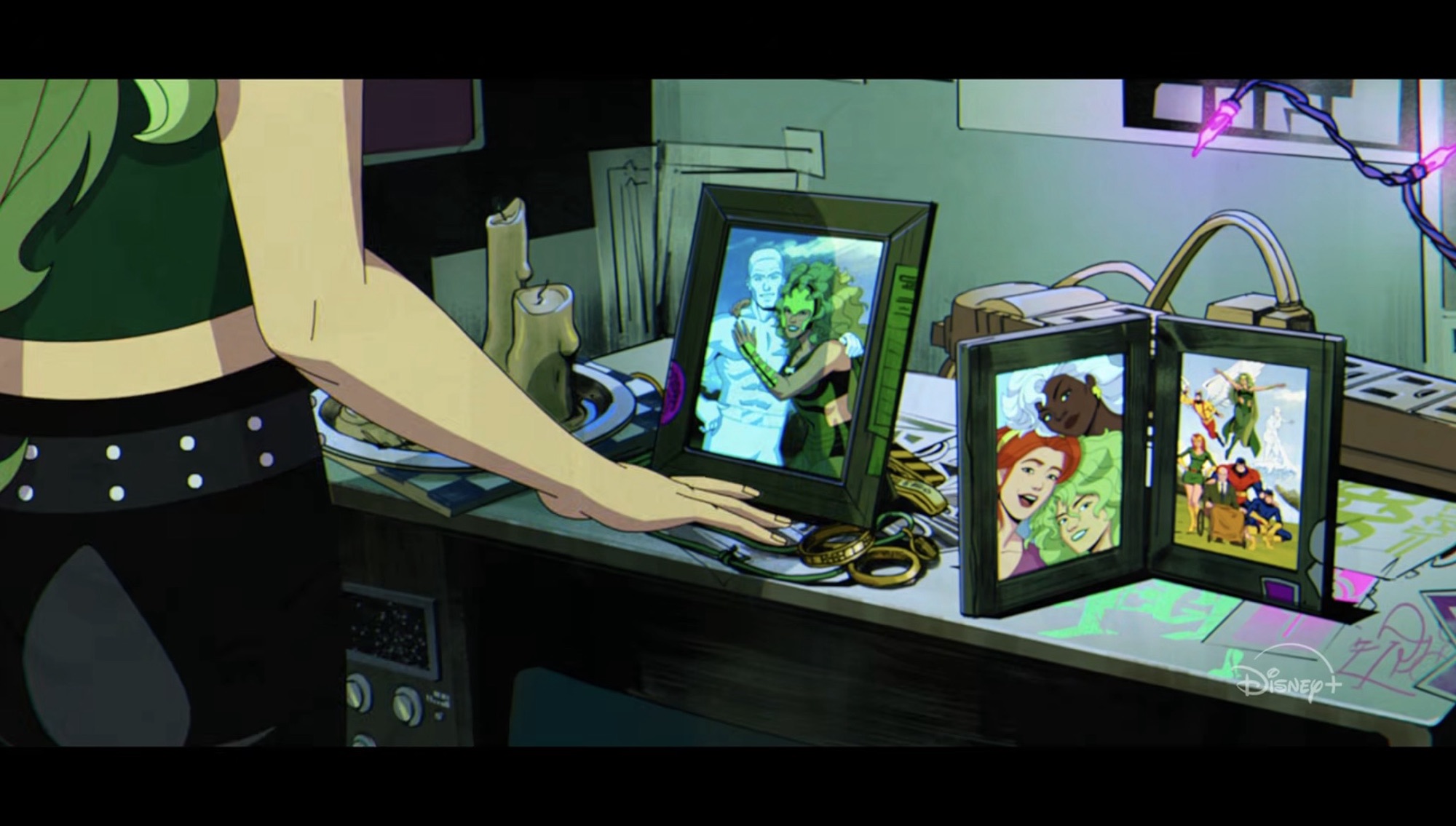
The next episode is titled “Strange Land, Savage Heart” which is a play on the episode title from the original series “Savage Land, Strange Heart.” It would seem to suggest the presence of the Savage Land and perhaps that is where the shrine for victims of Genosha has been erected? We also saw shots of Nightcrawler battling with Exodus and perhaps that takes place in the Savage Land? Or we’re just going to split up with Nightcrawler and Rogue heading to Genosha and the rest heading to the Savage Land. Beyond that, I’m not sure, but I think this is the episode that brings everything back to focus on those lost at Genosha. And based on the trailer, it looks like the body count has gone up since season one ended as Magik and possibly Iceman were added to the death toll despite appearing on Forge’s board as being alive and accounted for. Colossus was also in his Acolytes costume and if the Acolytes have a new leader it’s almost certainly Exodus. Colossus is likely to be in a bad headspace following the loss of his beloved sister. We know of some similar scenes with Polaris returning to the mansion and taking sight of how everything has been destroyed and one shot in the trailer shows a picture of her and Bobby which seems to further hint that he may have been among the casualties. This all leads me to speculate on some big things in the next episode.
Or maybe they are just going on a Savage Land adventure?
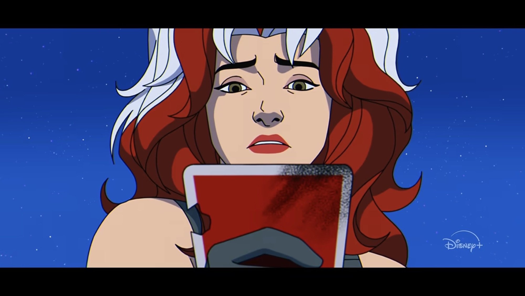
“Dead Man’s Hand” sounds pretty self-explanatory. When Gambit died in season one, few expected it to be permanent. That’s just not how comics work. When Apocalypse was shown at the end of season one finding a playing card in the rubble of Genosha that basically cemented it. Gambit is coming back as Apocalypse’s horseman of death, but what of the other three? Horsemen always come in fours and we have not seen any shots in any trailer suggesting who could be among the horsemen. In the comics, Polaris became one at one point and could her anger towards humanity over the loss of Bobby and others drive her to Apocalypse? She doesn’t know it yet, but she’s also lost a father in Magneto though that one is complicated by the fact that it was Apocalypse who killed him. Then again, that could be what the X-Men use to pull her out of his clutches. Rogue is another possibility. She was devastated by the loss of Gambit, could this be a way to be with him? I don’t know if she would go willingly, but there’s a darkness in her brought about by Genosha. Archangel also reminded us in episode two that it was Rogue who took away the evil within him and allowed him to break free of Apocalypse’s control. That evil has been dwelling inside her ever since perhaps ready to come out. She could also attempt to do the same for Gambit, and maybe that backfires? In the scene where it looks like the X-Men and X-Force are bracing for a fight from the trailer, I don’t think Rogue is seen, though that might not be them getting ready to tangle with Apocalypse too. Colossus is another candidate. Devastated by the loss of his sister, he could certainly turn towards Apocalypse if he thinks the Acolytes aren’t doing enough.
Rogue is definitely going to feature heavily in the climax of this season.
The other possibility for the horsemen that I envision is the show using it as a way to undo some deaths. We know Gambit is likely one such character, but then there’s others who perished in Genosha like Magik, Iceman, Marrow, and Banshee. Many others fell as well and if they indeed decided to add Magik and Iceman to the death toll between seasons then virtually anyone is on the table if we have yet to see them alive. And it could also be a way to bring back Magneto. Perhaps when Apocalypse nuked Magneto’s body he preserved his essence to put into a new body and control? I personally think it would be a mistake to bring Magneto back yet again, but I can’t rule it out. After all, these are comic book characters and they seem to never die. There’s also opportunities to introduce new or forgotten characters to fill out Apocalypse’s ranks. Characters like Nemesis, Mikhail Rasputin, Deathbird, or Tyler – Cable’s son he essentially abandoned in the future. We’ve also never really had Stryfe in the animated universe as he’s only ever made cameos. We have not heard from Sinister at all this season and it’s been even longer since we’ve seen Mystique, the Brotherhood, or anyone from The Nasty Boys. And can we fully write-off Wolverine as a horseman? Maybe his opinion of himself as only a weapon and his actions up north create a bigger divide with the team than expected and it allows Apocalypse to corrupt him somehow? Maybe a character like X-23 or Daken gets introduced as a horseman and Wolverine has to find his worth as a human being in order to convince one of them to suppress what Apocalypse has done to them?
Either way, I see the finale “Survival of the Fittest” as being the battle for Gambit’s soul and anyone else corrupted by Apocalypse. They’ll also have to actually defeat Apocalypse and I don’t know how they’ll do that. I do hope it’s something satisfying as the ways in which those confrontations were settled in the original series were never satisfying for me. That’s the Apocalypse problem – he’s made to be so strong and so powerful that there’s almost no believable way to stop him. He kind of just runs for no reason or you get something a bit more abstract like the ending to “Beyond Good and Evil.” One possibility for taking him down is Onslaught. In the comics, when Charles Xavier wiped the mind of Magneto during the Fatal Attractions arc it meant Magneto’s consciousness remained with Xavier’s mind. It basically tormented him and eventually it caused Onslaught to emerge. Now, few fans seem to actually like that arc. The setup is fine, the character certainly has a 90s cool factor, but it basically lead to the temporary deaths of a lot of Marvel’s non-mutant heroes and brought about the controversial Heroes Reborn era. I, like many, am not a fan of the Onslaught saga, but I’m also not afraid of it. The way I see it, X-Men ’97 could be a way to redeem the character, but that may not happen.
If this represents X-Men and X-Force getting ready to duke it out with Apocalypse, it could be more telling to focus on who isn’t there rather than who is.
According to former showrunner Beau DeMayo, Marvel axed his plans to introduce Onslaught in episode ten of this season and that’s why we ended up with nine episodes instead of ten. I would guess he knows this to be true because he probably lost a credit over it. Onslaught was going to be a season three enemy and somehow that was going to lead to an Age of Apocalypse in the animated universe. That might also explain why Hasbro decided to reissue their own Onslaught figure (review coming soon) since this was all stuff being worked on years before this season premiered. Does that mean Onslaught is completely off the table? No, as there’s been plenty of time to reconsider if they wanted to. They could have decided to kick the can further down the road as opposed to bring it into season two. There’s certainly plenty of foreshadowing with how Xavier ended episode four. Perhaps he even “saved” Magneto from death by psychically downloading his mind into his own? Such a thing sounds like absolute nonsense, but for X-Men? Nah, that could be sold. And from there it could be that which brings about Onslaught. How this would have created an Age of Apocalypse when the previous show already went down the rabbit hole of “What if Xavier were killed before forming the X-Men?” with the two-parter “One Man’s Worth,” is also something I can’t wrap my head around. Maybe the show was just going to forget about that? I’m pretty sure it was referenced in the opening title during season one so DeMayo likely wanted us to remember it for a reason. Either way, I could see Marvel not wanting to set an entire season of the show in an alternate present thereby throwing a wrench into the whole thing. Comic fans seem titillated by it, but would the casuals want to see another season where Magneto leads the team and characters like Beast and Cyclops are villains?
Onslaught not being the ultimate end game for season two has one obvious benefit in that it makes it really hard to predict what could follow instead. It could simply be a cleaner ending, but I can’t imagine them not teasing another villain or plot to come. Perhaps Krakoa? That seems to be something a lot of fans would take in place of Age of Apocalypse. It wouldn’t surprise me if we see Generation X being formed and maybe a reshuffling of some cards where X-Force and X-Factor are concerned. The mere fact that I’ve written over 2,000 words on the subject should be enough of a tell that I’m pretty excited and eager to see where things are heading. There’s so much for the show to cover or not and it feels like we’ve barely spent time with most of the characters. I hope the show is doing really well with whatever metrics Disney uses to evaluate these streaming shows so that it ensure we get even more beyond a third season because this is just too much damn fun each week.
Some prior X-Men ’97 musings and reviews if this wasn’t enough for you:
When X-Men went into development for the Fox Kids Network, it didn’t take the writing staff (who was unfamiliar with the property going in) long to figure out that Wolverine was their ticket to television royalty. The character really took off in the 1980s and helped the X-Men storm into the 1990s as the most…
The return of the ’92 era X-Men featured in the classic animated series could not have gone any better. I was extremely excited for that show’s continuation via X-Men ’97, but at the same time a bit fearful. Could it really live up to my own expectations even as I tried to tamp them down?…
Today, X-Men ’97 dropped the curtain on its first season and what a way to bring it to an end. Last week’s episode was a roller coaster of emotions for me. I couldn’t go into much detail of my review of “Tolerance is Extinction – Part 2” without wading into spoiler territory, so allow me…
When X-Men went into development for the Fox Kids Network, it didn’t take the writing staff (who was unfamiliar with the property going in) long to figure out that Wolverine was their ticket to television royalty. The character really took off in the 1980s and helped the X-Men storm into the 1990s as the most popular comic book in publication. Because the character was so interesting (and expertly brought to life by voice actor Cal Dodd), he had a tendency to soak up featured episodes. His long and mysterious history was an easy source to tap into for episodes about his adventures in Canada, Japan, or his past history with Team X and the Weapon X program. Because of the sheer amount of Wolverine content in that first series, it wasn’t a huge surprise to see the character deemphasized for the first season of X-Men ’97. Wolverine often found himself on the sidelines in that first season, but had a big moment in the penultimate episode when Magneto ripped the adamantium from his bones. Because of the structure of the first four episodes of the second season, Wolverine hasn’t had a ton to do since the first episode, but for the fifth episode he finally gets his time to shine.
Because I make these reviews spoiler free, it means I don’t get to react to big moments when it’s too hard to do so without spoiling what transpired. Let’s take it back one week for a second to acknowledge the climax of episode four when En Sabah Nur took on the mantle of Apocalypse and destroyed Magneto while allowing the rest of the time-displaced X-Men to return to the 90s. For Magneto, this is kind of like his third death already in the short-lived series which makes me think that this time it might stick. And perhaps it should? His arc feels complete when examined from the events of the first series up through this one. Magneto began as a rival and came to believe in Xavier’s dream as the best path forward for humans and mutants and gave his life in service to that. And while his body was essentially vaporized, there’s no death that can’t be undone for the world of comic books and their adjacent media. Because of that, it didn’t land with the thump that I think the episode wanted it too. I tend to think he’ll return either as Xorn, a horseman of Apocalypse, or through Onslaught, but perhaps the show should consider leaving him dead?
Wolverine has assembled a similar, but different, crew to investigate another Weapon X facility.
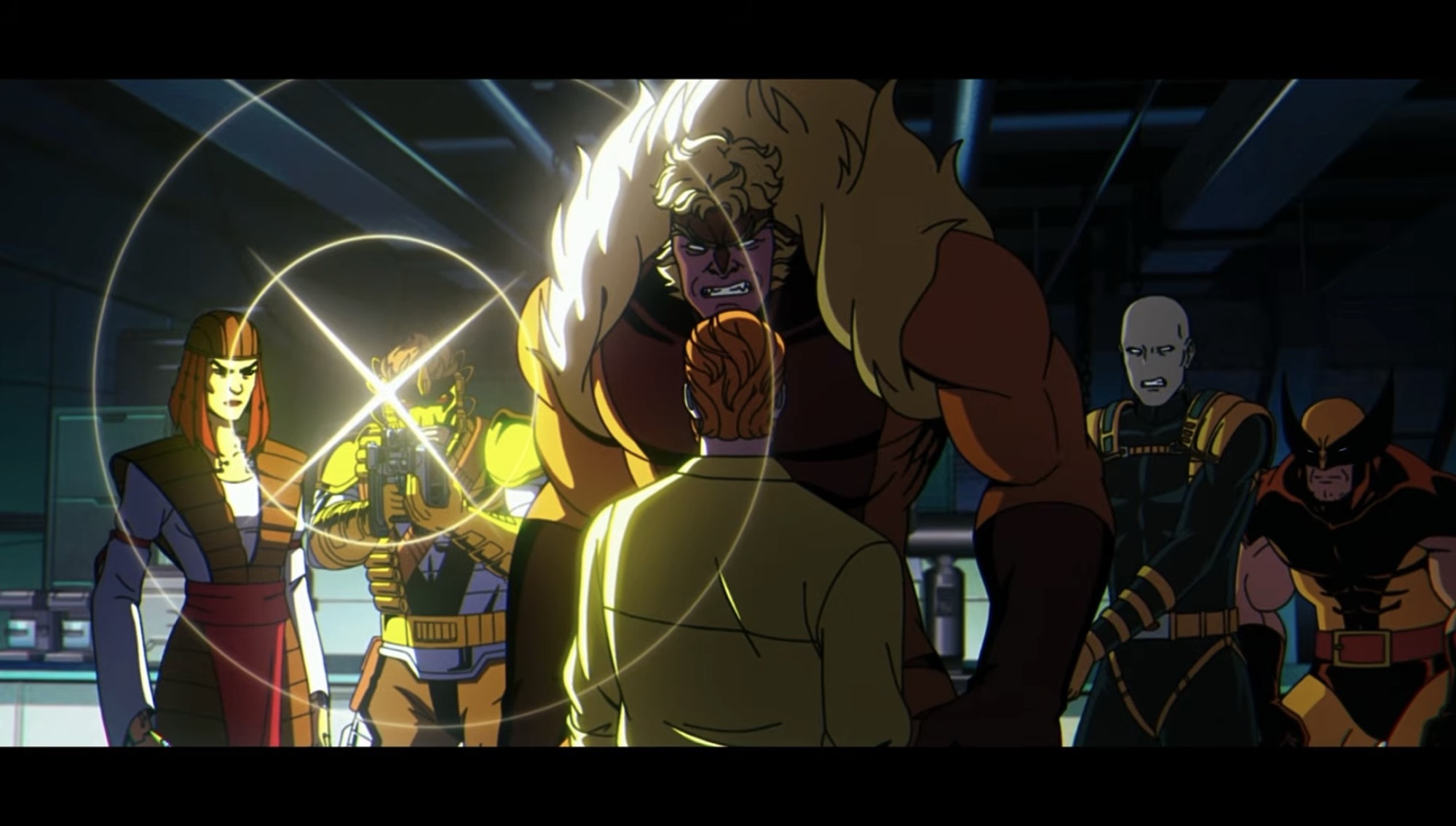
Back to this week. We have before us “Weapon X, Lies, and DVDs” which is essentially a spiritual sequel to the original series episode “Weapon X, Lies, and Videotape.” It picks up where last episode left off when Wolverine received a dossier from Captain America and Black Widow and mentioned that he had assembled a team to investigate Weapon X. That team is revealed to be Morph (sporting the old Team X black and gold uniform), Lady Deathstryke (Erika Ishii), Maverick (Crispin Freeman), Sabretooth (Darin De Paul), and new-comer to the series, Garrison Kane (Ben Pronsky). They’re heading to a newly discovered facility where the old program seems to be back up and running and performing experiments on God knows what. And before the thing even gets started, it lets you know that this is a Wolverine episode as almost all of the clips in the opening title feature Wolverine. The only exception is the inclusion of the Morph/Sinister sequence (Morph also gets to deliver the “Previously,” line). Forge also makes his first appearance in the roll call, but we won’t be hearing from him or any other X-Men. This is all Wolverine and his merry band of mercs.
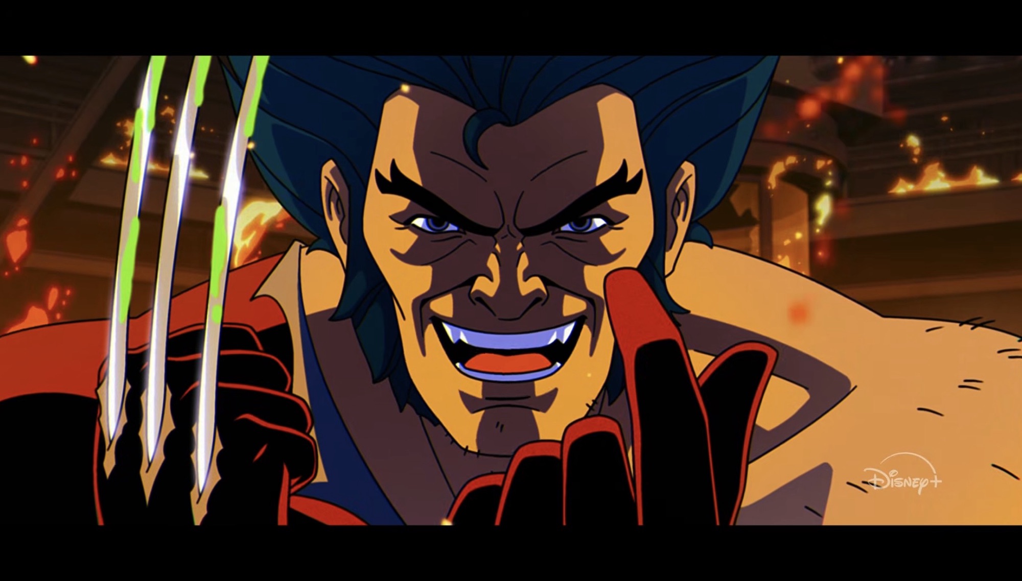
The show isn’t obvious about it, but it’s pretty clear that Wolverine doesn’t feel like himself since having the adamantium torn from his bones.
This new version of Team X will find itself stranded pretty early and the cause is some infected animals. They’ll soon find the facility they’re looking for and find it to be overrun with more infected creatures that reveal themselves to be alien in nature. The whole episode takes on a little bit of a horror/suspense vibe as they search a darkened facility littered with corpses and creatures lurking in the shadows. They’ll have to work together in order to survive, but there’s a lot of mistrust among this group, which should be expected. It’s basically the perfect recipe for a Wolverine centric episode. There are lots of moments for action, but also plenty of soap opera-like drama as who has more of that in their past than Logan? The only characters who don’t have some bad blood between them are Wolverine and Morph (J.P. Karliak), which just makes the rest look upon that pairing with further distrust. Deathstryke also takes to referring to Morph as Tomo, a loyal shapeshifting fox from Japanese folklore, which fits their characterization in this episode to a T. More than once, Morph is challenged to explain what their stake is in all of this, but the sly one is able to sidestep such questions, but is also exposed to a different side of Wolverine. One that the rest of this crew is all too familiar with.
It’s pretty clear that Morph holds Wolverine in high regards, but the events of this episode may change that.
There’s a lot of good character stuff in this one. Because we are dealing with Wolverine, a character not exactly known for being an open book when it comes to his feelings, the episode has to peel back layers on Wolverine via the other characters in his orbit. It can’t rely on exposition like it has done in that past and I think that makes for a better episode. He’s clearly in a state of flux, lost because he’s not the same person he was following his encounter with Magneto. He reacts when an attack with his bone claws fail to take down a polar bear like a defeated man. When Sabretooth notices the bone claws, Wolverine is cagey about what happened and Morph looks on him with pity. The other characters are the first to figure out that this so-called mission is far more personal in nature for Wolverine than he let on and Morph has to confront that. Morph admires Wolverine for the man he is, but Wolverine seems to only view himself as a weapon. Someone who can do the dirty work and spare his friends and comrades from the same. Credited writer Anthony Selliti should be commended for how well crafted this one turned out. There isn’t a neat and tidy finish to it either as there is definitely some rifts forming and I wonder if the remaining three episodes (yes, only three which is such a pity) will even have time to deal with the fallout here. It would be nice for Morph to eventually get their own spotlight episode.
Who doesn’t enjoy references to 90’s tech?
I am a sucker for these kinds of Wolverine stories so I really enjoyed this one. It was nice to see the episode stay here too. X-Men ’97 moves fast, but by not jumping around the pace feels a lot better this season. I suspect some comic purists will be less pleased than I as we have a bunch of different plots being repurposed to serve this one. And maybe there should have been more episodes placed between this one and last season’s penultimate episode, but I’m okay with it. I may be less okay with it if this episode isn’t really followed up on in a meaningful way, but I don’t think that will be the case. Even if it’s not as soon as next week as I expect we will be dealing with more of last week’s fallout. However, given the episode title of “Danger.exe” we may be in for our first full squad episode of the season. And it only took six episodes to get there.
Unlike the first three episodes of season two of X-Men ’97, this fourth one is going to spend all of its time in one era. And as you could probably guess, that era is 3,000 BCE since that is where we left off last week. I consider these reviews that I do spoiler free, but…
The premiere episode for season two of X-Men ’97 took us to the far off future where Apocalypse reigns supreme. The second followed that one up with a story set in the present time of the series: 1997 (Duh!). Now, for the third episode of this three-part premiere we head to ancient Egypt to meet…
The title of this post says X-Men ’97, but in some respects it should read X-Force ’97 because that’s what the opening title presents. Yes, boys and girls, we have ourselves an X-Force on television. Cable made numerous appearances in the original series, but never as the leader of X-Force. This surprised me as a…
Unlike the first three episodes of season two of X-Men ’97, this fourth one is going to spend all of its time in one era. And as you could probably guess, that era is 3,000 BCE since that is where we left off last week. I consider these reviews that I do spoiler free, but even so, I don’t think it’s much of a spoiler to say that Rama-Tut’s (John de Lancie) attack at the end of last week’s episode was not very successful. The show wanted us to believe that our beloved X-Men were in real danger, but that was pretty hard to believe considering it was just the third episode. As expected, Magneto (Matthew Waterson) was able to put up a forcefield just in time to spare our heroes. Also surviving, to no one’s surprise, is En Sabah Nur (Adetokumboh M’Cormack) who is basically some kind of super man and I think he just shrugged it off. As for the rest, they’re all dead and Nur’s fortress is in ruins. Among the dead is Baal, Nur’s adopted father, and it’s unlikely he’ll react well to that.
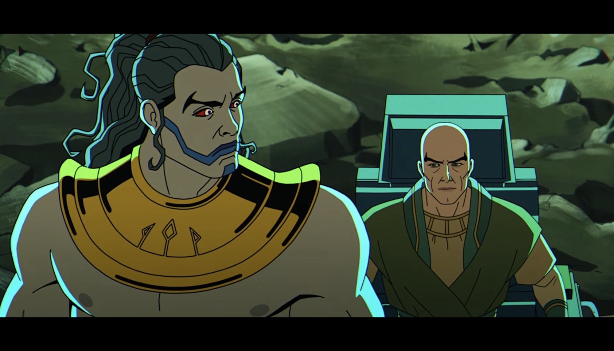
Much of last week’s episode featured Magneto trying to get En Sabah Nur to buy into Xavier’s (Ross Marquand) dream of human and mutant coexistence. Mercy was a big part of that lesson, but when Nur discovered that Magneto and the X-Men were sneaking around behind his back and working on a time machine, he grew pretty angry. He felt this was a betrayal, which seemed extreme to me at the time, but it’s hard to get a read on just how Magneto sold himself to Nur. Clearly, he doesn’t look like someone born in Egypt so he should have known that he was from somewhere far off (we’ll ignore the whole language thing, everyone speaks English because it’s just easier that way). Then again, Nur doesn’t really look like a typical Egyptian either thanks to his mutation and I suppose he may have assumed the same of Magneto. Either way, that door was shut by episode’s end, but now it’s Xavier’s turn to try to appeal to the would-be mass murderer. Since Xavier and pals survived Tut’s attack, Nur is forced to look upon him with respect since he does buy into that whole survival of the fittest mantra. Xavier is then able to convince Nur to allow him to probe his mind to find out just what it is they are both seeking.
You’re up, Chuck.
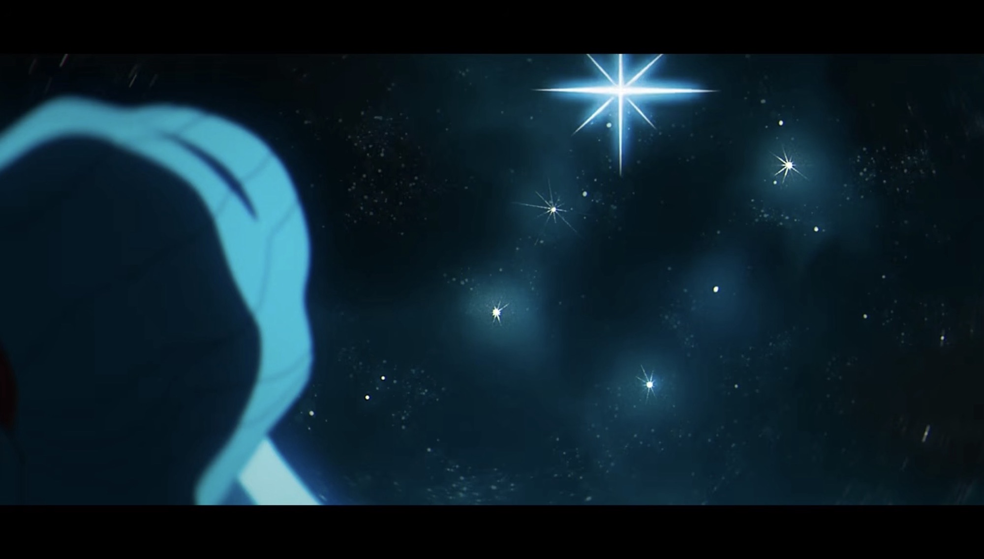
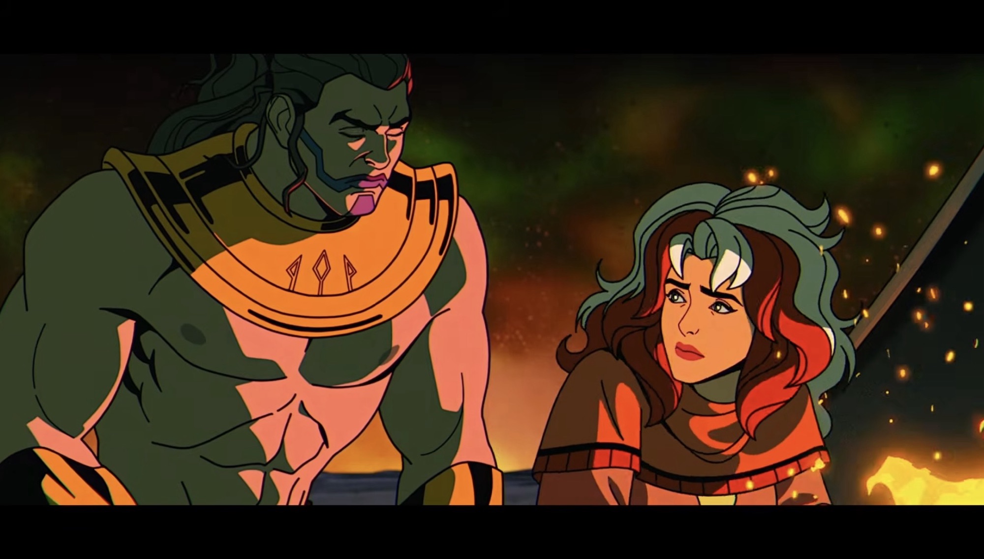
Xavier doesn’t really learn anything new, at least not to the audience. The temple they, and Rama-Tut, are seeking is quite literally calling out to En Sabah Nur. It’s clearly not of this world, but it’s a destination they all seek. It’s also made even more important for the X-Men to find this thing because Magneto is very much committed to his idea of reform for Nur so much so that he disables Bishop’s (Isaac Robinson-Smith) time traveling bracelet. He seems to think they’ll be able to repair it with the tech waiting for them at this temple, but that’s one Hell of a gamble. The rest of the episode is fairly straight-forward. We do get some character moments of which the most intriguing is between Rogue (Lenore Zann) and Nur while camping for the night. Xavier also receives a communication from Rama-Tut himself during which viewers not familiar with the character get the Cliff’s Notes version of just who he is. The most interesting aspect of the meeting is finding out that Tut is attempting to prevent the rise of Apocalypse (Marquand), though he seems to view it as inevitable. I mostly find it interesting because we know that he, as Immortus, will assist Bishop in doing just that some 5,000 years in the future during the “Beyond Good and Evil” arc. He had to wait an awful long time for that sort of satisfaction.
Well, that answers some questions.
And inevitable is certainly a theme with this one. What we’re seeing is a fatalistic approach to time travel on display where everything occurs in a loop. We saw that in episode two with Nathan obtaining the power of Apocalypse’s celestial ship, which was referred to simply as Ship in the X-Men episode “Obsession.” That entity manifests itself as Cable’s computer, a device which allows him to travel through time and a power Apocalypse seeks in “Beyond Good and Evil.” It first rested with Apocalypse until Cable essentially stole it before he reacquired it to embark on that particular quest. With the X-Men in the past attempting to prevent his rise, they have inadvertently become a part of it. Apocalypse is inevitable, and like Bishop trying to alter time to improve upon his future, it seems like there is little mere mortals can do about it. Everything has happened for a reason and for longtime viewers of X-Men and now X-Men ’97, it’s rewarding to see how everything intertwines.
Even this one finds time for some interesting character moments.
This episode does feature an action-packed climax and a resolution designed to land with a wallop. It is, unfortunately, undermined by the show up to this point as we have had numerous fake outs and lasting consequences seem to be in short supply when it comes to X-Men ’97. That is not unique to the show as it’s something of a failing for comics as a whole. Perhaps the fallout will land better in a future episode, but for me when this one was over I didn’t feel much of anything other than appreciation for how well everything was animated. To my surprise, the episode also didn’t really toy with the idea of the X-Men taking out En Sabah Nur before he becomes Apocalypse, assuming they could. There is a brief moment where it seems like Bishop is willing to do so, but he’s stopped and no discussion ensues. A pedantic complaint I also have is we see Xavier and Magneto secretly communicating via telepathy, but the whole time Magneto is wearing his helmet. This would not have been an issue in the original series because at that point it had not been established that Magneto’s helmet blocked psychic attacks. Unfortunately for the show, that retcon was adopted for the first season of the show so it should still be in effect now. It further annoys me because we didn’t need Magneto to put his helmet on. He didn’t have it in the previous episode and I don’t even know how he managed to recover it during all that happened on Asteroid M, so why even stick it back on his head now? The design is slightly different so maybe it’s not the exact same helmet and instead one he created during their time in Egypt. Even so, it sure looks to be largely the same so there’s no reason to think it wouldn’t possess the same benefits as his old one.
That helmet is bugging me way too much.
It’s not important, just something a very invested fan like myself needs to call out. “Rise of Apocalypse: Part 2” lives up to its name and it will likely prove to be a necessary step for the greater conflict with Apocalypse this season. Nothing is resolved here as far as that conflict goes, though other aspects of this early season are. For instance, we do learn who was calling out to Xavier in that vision he had in the prior episode, though the individual is never given a name (you’ll have to…search…that information out yourself). I should also point out that there is a stinger scene at the end of this one during the credits so don’t bail on it while the X-Men are spinning on their pedestals. It’s just a tease for next week’s episode and if you looked ahead at the episode titles then you can probably guess where we’re heading. I’m expecting it to be kind of a time out episode before we get back to the Apocalypse plot, but I obviously could be wrong. This is an episode of X-Men ’97 that largely keeps the train rolling and serves to be an exciting half hour of television with some time travel quirks, albeit one with an ending that doesn’t land as forcefully as the writing staff probably intended.
The premiere episode for season two of X-Men ’97 took us to the far off future where Apocalypse reigns supreme. The second followed that one up with a story set in the present time of the series: 1997 (Duh!). Now, for the third episode of this three-part premiere we head to ancient Egypt to meet…
The title of this post says X-Men ’97, but in some respects it should read X-Force ’97 because that’s what the opening title presents. Yes, boys and girls, we have ourselves an X-Force on television. Cable made numerous appearances in the original series, but never as the leader of X-Force. This surprised me as a…
At last, X-Men ’97 has made its return to airwaves with not one, not two, but three episodes for the premiere which means there’s a lot to talk about. Truthfully, too much for one post which is why we need to keep things to one episode per entry as is the style of the time.…
The premiere episode for season two of X-Men ’97 took us to the far off future where Apocalypse reigns supreme. The second followed that one up with a story set in the present time of the series: 1997 (Duh!). Now, for the third episode of this three-part premiere we head to ancient Egypt to meet up with the rest of the X-Men, only they’re not alone for in this time is the mutant En Sabah Nur who the X-Men know will one day become Apocalypse. They have been unknowingly sent here against their will by Mother Askani to prevent the rise of Apocalypse, but just how they’re supposed to go about such is a matter of debate. Beyond that is the debate of if it should happen at all?
The episode opens with the X-Men who were sent to the future now back in the ruins of the X-Mansion. They returned expecting to find the team Bishop (Isaac Robinson-Smith) was sent to retrieve there as well, but when no one appears they become concerned. This is time travel, after all, so the idea that they have to wait for their return doesn’t make sense if they were all set to return to a specific moment in time. All they can do is wait though, because Forge (Gil Birmingham) is unable to get a reading on their time bracelets. In 3,000 BCE, En Sabah Nur (Adetokumboh M’Cormack) is preparing to lead his forces against those of Rama-Tut (John de Lancie) who is a vicious ruler and slaver that once possessed Nur. Alongside Nur is Baal (Michael Dorn), the man he looks up to as a surrogate father for he is the one credited with rescuing Nur from a life of slavery. Nur is, as far as we know, the world’s first mutant with the tell-tale sign being his pale skin and blue lips. He also possesses incredible strength and durability and is something of a super man which is what makes him a natural leader of other former slaves.
The X-Men have been sent to the past to stop En Sabah Nur from becoming Apocalypse.
The X-Men trapped in this past are under no delusions who En Sabah Nur is, or rather, who he will become. Charles (Ross Marquand) feels their presence in the past is an affront to nature and they should do everything in their power to not interfere and instead focus on getting back home. Magneto (Matthew Waterson), on the other hand, sees this as an opportunity to set Nur on a different path. If he can instill in him the values of Charles Xavier then perhaps Xavier’s dream of human and mutant coexistence can come true before he’s even born to dream it himself. He views this as penance for his hand in what happened on Genosha, but Charles is not so certain this is the correct path. What no one seems to suggest is simply destroying En Sabah Nur before he can become Apocalypse. Such is the quagmire of the time traveler – if you can prevent an atrocity by taking out the orchestrator of such before it happens should you? En Sabah Nur as he exists in this moment in time is not the same man who committed countless atrocities as Apocalypse. Can he be sentenced for a crime he has not committed? This question doesn’t come up in this episode, but perhaps it will soon enough.
This isn’t the Egypt you read about in your textbooks.
As for the X-Men stranded here which includes Beast (George Buza), Rogue (Lenore Zann), and Nightcrawler (Adrian Hough) in addition to Magneto and Charles, their journey home is perhaps an impossibility. Beast is no Forge, but he has spent time working with Bishop’s time traveling device and has some knowledge of how it works. The problem is acquiring the power and resources needed to create a time machine and to do that they look to the forces of Rama-Tut. We may be in ancient Egypt, but the tech of Tut is certainly not of this era. He attacks with robotic minions lead by a human general named Logos (Chris Britton) and once the forces of Nur lay waste to them, the X-Men scavenge the battlefield for parts, but they’re not making much headway which is taking its toll on everyone, especially Beast. The plot takes a turn when Magneto is able to convince Nur to abandon his survival of the fittest mantra and take Logos hostage rather than kill him. With him in their clutches, Magneto hopes to convince Xavier to probe his mind and perhaps find a solution to their problems, but instead Xavier just finds more riddles. A disembodied voice that espouses a famous quote from Apocalypse appears before Charles alongside a massive, fiery, eye that looks like a galaxy being born. The presence of a shattered moon in the shape of Magneto’s helm leads me to believe this could be a foreshadowing for Onslaught, though I’ve seen some speculate that this could be a reference to Stryfe. I would have thought it was merely a vision of Apocalypse himself, but Xavier is the one who classifies this individual as a mystery and that would be a pretty lame mystery since we know that Apocalypse is the villain already in focus.
In this era, Rama-Tut rules, but I definitely wasn’t expecting to see the X-Ternal (credited as Candra) from the episode “X-Ternally Yours” to make an appearance.
The episode does end on a cliffhanger, though it’s a bit of a toothless one since these characters have quite a bit of plot armor at this point. Bishop will also make an appearance and, if anything, this cliffhanger may just explain why the X-Men were unable to rendezvous with their comrades in 1997. Perhaps we will find out the events of this episode caused the time bracelets to be damaged and the X-Men will have to seek out another way to return home. Of course, with me catching up and this going live the day part two drops that means these questions have likely already been answered (and maybe the identity of the mystery voice has as well), but I had to make sure I got my thoughts down before that episode dropped. I am guessing the technology of Rama-Tut hides a way for the team to get home and it would be a great example of circular story-telling since it was a future version of Rama-Tut that helped Bishop and the X-Men take down Apocalypse in the “Beyond Good and Evil” arc. There, he took the form of a cosmic janitor named Bender who only revealed himself to the viewer as Immortus at the end, but he’s basically a future version of Rama-Tut who is also an aspect of Kang the Conqueror. Yeah, it’s complicated.
A lot of capes in this picture.
“Rise of Apocalypse: Part 1” is a bit slower paced than the other two episodes in this three episode premiere. Being that it’s co-written by Beau DeMayo (along with JB Ballard), that’s not a surprise as he seems to like these more talky episodes and when you get Magneto and Xavier sharing scenes that tends to happen. It’s a necessary episode, though I do wonder if this is really how I want to see Apocalypse portrayed. I like origin stories and villain ones can be a lot of fun, but Apocalypse as a Spartacus figure is hard to square. Are we supposed to have sympathy for this character? Apocalypse is a genocidal monster, I’m not sure that I want or need to know that he wasn’t always bad. This is an adaptation of Rise of Apocalypse by Terry Kavanagh and Adam Pollina so it’s not a new story, but I never read that one to know if the portrayal of En Sabah Nur was quite the same. At any rate, I’m willing to see how things progress from here and since this is only part one it does feel a little incomplete. We’ve set the table, but the meal has yet to arrive.
The title of this post says X-Men ’97, but in some respects it should read X-Force ’97 because that’s what the opening title presents. Yes, boys and girls, we have ourselves an X-Force on television. Cable made numerous appearances in the original series, but never as the leader of X-Force. This surprised me as a…
At last, X-Men ’97 has made its return to airwaves with not one, not two, but three episodes for the premiere which means there’s a lot to talk about. Truthfully, too much for one post which is why we need to keep things to one episode per entry as is the style of the time.…
Today, X-Men ’97 dropped the curtain on its first season and what a way to bring it to an end. Last week’s episode was a roller coaster of emotions for me. I couldn’t go into much detail of my review of “Tolerance is Extinction – Part 2” without wading into spoiler territory, so allow me…
The title of this post says X-Men ’97, but in some respects it should read X-Force ’97 because that’s what the opening title presents. Yes, boys and girls, we have ourselves an X-Force on television. Cable made numerous appearances in the original series, but never as the leader of X-Force. This surprised me as a kid since if you went to a toy store during that era you would find action figures featuring an X-Men cardback as well as those with an X-Force one. Cable was basically the Wolverine of that line as he received quite a few figures, though never as many as the more famous Canadian. The line lasted for a few years, but it always was less popular than the X-Men one. In my home town we had a big warehouse store that was literally located in an old warehouse that was family owned. Even though the place looked like a dump and was most associated with cheap products, the toy section was often pretty current and sometimes they would get stuff before even Toys ‘R Us. However, they would also get some of the more unwanted figures and when it came to X-Men there was a long drought because they couldn’t get rid of their X-Force figures. G.W. Bridge, Gideon, Shatterstar, and Kaine seemed to linger forever. It’s why I had a Shatterstar because he felt like the coolest of the ones available. Cable was rarely there, same for Deadpool and Fourarm. Maybe the stink of that store is what kept me out of X-Force because I think the only other X-Force figure I would own from that Toy Biz line was a later Cable who had Terminator-like tare-away flesh for some reason. And that one was given to me by my friend.
When the first season of X-Men ’97 ended with the majority of the team flung through time, but Cable remaining in 1997, it seemed like the time was now for X-Force to make its animated debut. The first episode ended with a tease as Cable (Chris Potter) is seen in the present telling two familiar faces in Archangel (Christopher Barger) and Psylocke (Naoko Mori) that they need to focus on recruitment. When the second episode, “A Force to be Reckoned With” opens, it comes as a cold open which is unusual for the show. It depicts a group of young mutants on the run being lead by some kind of energy bird to the remains of the X-Mansion. It’s in ruins, and one of the kids has an “I told you so,” attitude about the discovery because everyone knows the X-Men are gone. These kids are just the start of the cameos as this is going to be a big one for those who like to scan the background. There are more cameos in this one than there were during the segments in Genosha from the original series (and from last year’s episode, for that matter) so I’m not going to bother to list them all. These ones are rather prominent as among them are Kid Omega (Thomas Dekker) (sporting a Phoenix shirt) and Penance (Miatta Ade Lebile).
X-Factor has entered the chat.
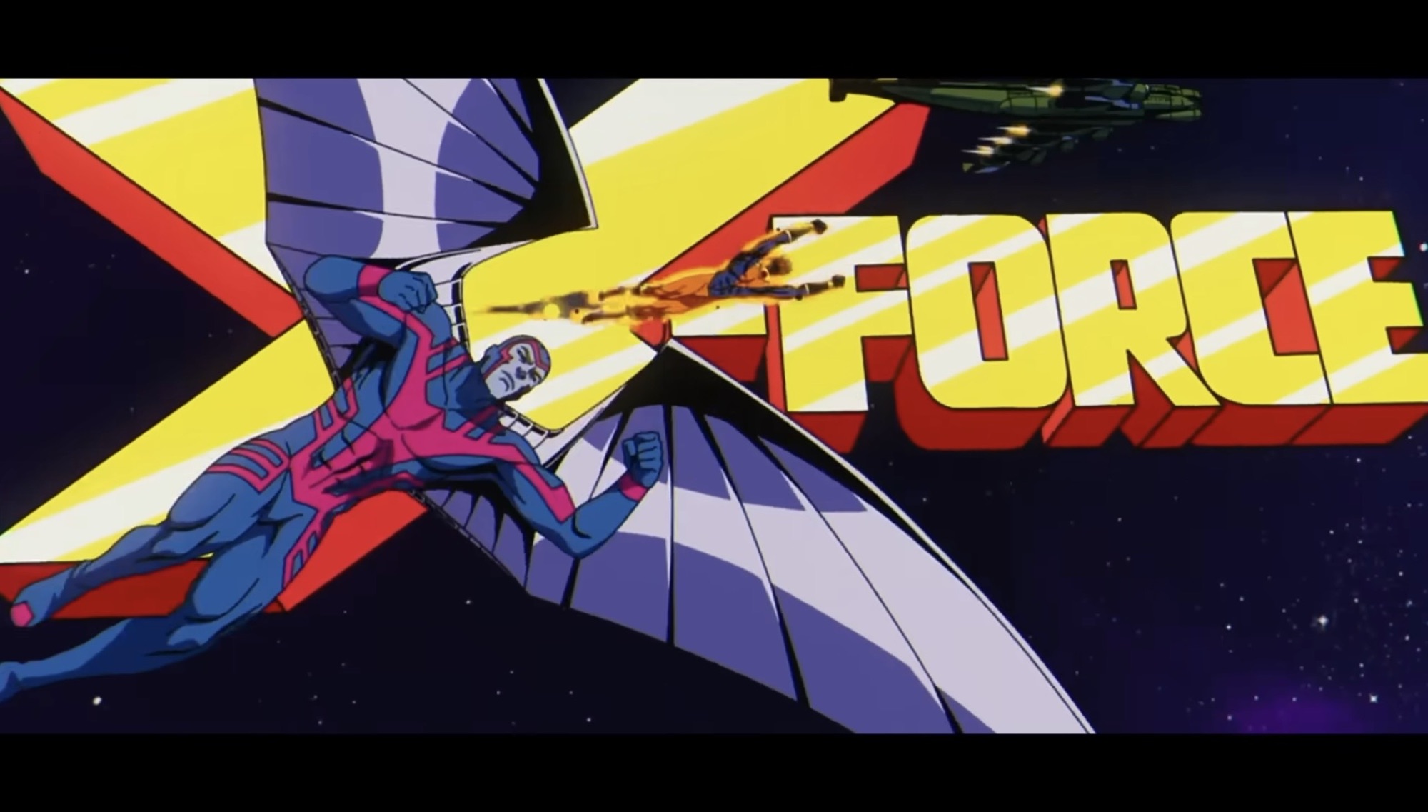
Who are these kids running from? That would be X-Factor, the government backed version of the team that briefly showed up in the original series episode “Cold Comfort.” There, they were lead by Forge, but now they’re being directed by Val Cooper (Catherine Disher) to round up mutants in a bid to turn down the current temperature where human-mutant relations are concerned. The actual makeup of the team is still pretty much the same as we have Havok (Teddy Sears), Polaris (Carolina Ravassa), Strong Guy (Adrian Hough), Wolfsbane, and Multiple Man, the latter having no lines and thus no credited voice actor at this time. Following that scene, we catch up with Jubilee (Holly Chou) and Sunspot (Gui Agustini) at an arcade, but they’re soon visited by an old friend: Cable. Here we get the recruitment pitch, and when Jubilee asks if this team he’s putting together has a name, we smash-cut to the opening title only it’s X-Force! Each member of the team gets their own segment which is headlined by Cable and there are a lot of similar shots to the standard intro. There are throwbacks to the first season of the show as well as the original series including the scene of Cable encountering Apocalypse in his temple and one of the creation of Archangel. The ending sequence has X-Force colliding with the forces of Apocalypse with the mutant kids caught in the middle. It’s an awesome sequence that is almost sure to put a smile on the face of every viewer, even those not necessarily familiar with X-Force.
This is pretty awesome.
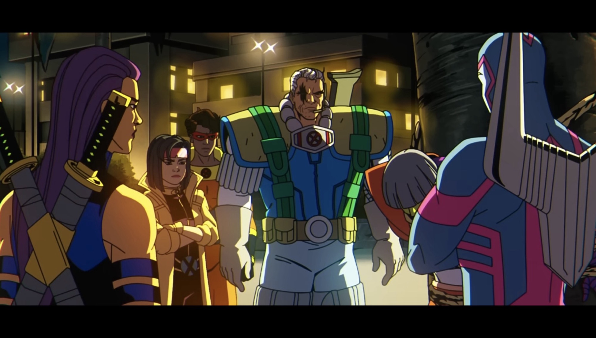
With the fun intro over, the rest of the episode can focus on X-Force chasing leads, the first of which concerns the horseman War (Lawrence Bayne) from the first season of the original show. He was the green guy with the bowl cut who I don’t think has ever been seen again since that episode, but Cable lets everyone know that this guy has been pretty busy spreading death and genocide wherever he goes. Our team is indeed Cable, Psylocke, Archangel, Jubilee, and Sunspot with the latter two getting a costume change. Jubilee now has her longer hair and red Generation X costume while Sunspot is sporting his X-Force blue and orange. Curiously, Archangel is back in the blue and pink which we knew from the trailers and Hasbro figure, but why he ditched his Angel look is not addressed. Psylocke is in her ninja look from the 90s and now sports a British accent despite not having one in the original series. Since this is more accurate, I can let that inconsistency slide. This is a hodgepodge assortment for X-Force, but in the confines of the animated series, I think it makes sense. The cast is already bloated and introducing the likes of Warpath, Shatterstar, and Kaine would just be like adding to the pile.
This group may not scream “X-Force,” to 90s comic readers, but for this show I think this squad makes sense.
The mission to capture and interrogate War reveals to Jubilee just how Cable envisions this squad working which stands in direct opposition of what Charles Xavier would do. Cable rationalizes them as soldiers, not students or teachers, and Xavier’s pacifist methods are not going to cut it. He’s more ruthless, and yes we do get our answer as to why the Marvel Legends Archangel comes with Cable’s gun, though I still think it was a mostly worthless inclusion. From there, the focus pivots based on what Psylocke is able to extract from War’s mind by force and telepathy to an old foe in Emma Frost (Zehra Fazal). This puts our squad on a collision course with X-Factor that also leads to Jubilee getting separated which is where the episode really kicks it into high gear.
It’s time for Jubilee to truly graduate.
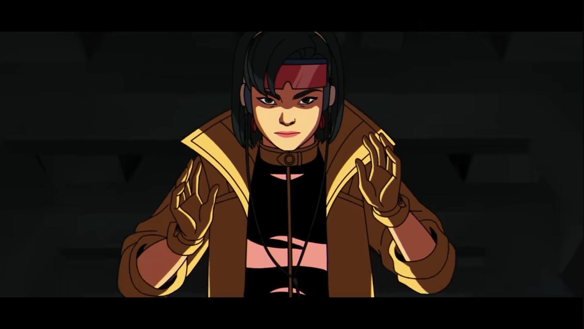
During the original series, Jubilee was featured a fair amount, but often as the kid who got in over her head and needed the other X-Men to bail her out. Her most independent episode might have been “Jubilee’s Fairy Tale Theater” in which she keeps a group of students calm with a story we see acted out in animation while they wait for rescue. It’s not exactly the sort of spotlight someone like Wolverine would get. In this episode, Jubilee gets her moment as she’s captured and tasked with not just breaking out, but also freeing all of the captive mutants being held by X-Factor on what looks like a SHIELD helicarrier. It’s set to a very era appropriate song which has Beau DeMayo written all over it, but I don’t know for sure who is responsible. The sequence shows Jubilee really cut loose with her powers and skills and the nice thing was that during the new opening title we were treated to a sequence of Psylocke training Jubilee. It’s just a nice, tidy, way of saying this is something that’s been going on for a little awhile and we’re seeing the fruits of that labor on display. What I really appreciate though is that before Jubilee can bust out, we get to see Sunspot and Cable argue over what to do about her capture. Sunspot, being the heroic boyfriend, wants to set everything aside to rescue her, but Cable tells him to trust her. He knows she can take care of herself, or at least he wants to see if she can. When Jubilee does eventually cause a commotion, there’s a moment where we see Cable smile, but it’s not some cocky, “I told you so,” smile. It’s the kind of smile a teacher might feature when a student demonstrates that they’ve absorbed the material they’ve been taught. And he said they weren’t students.
I didn’t necessarily need to know where this thing came from, but it was pretty cool.
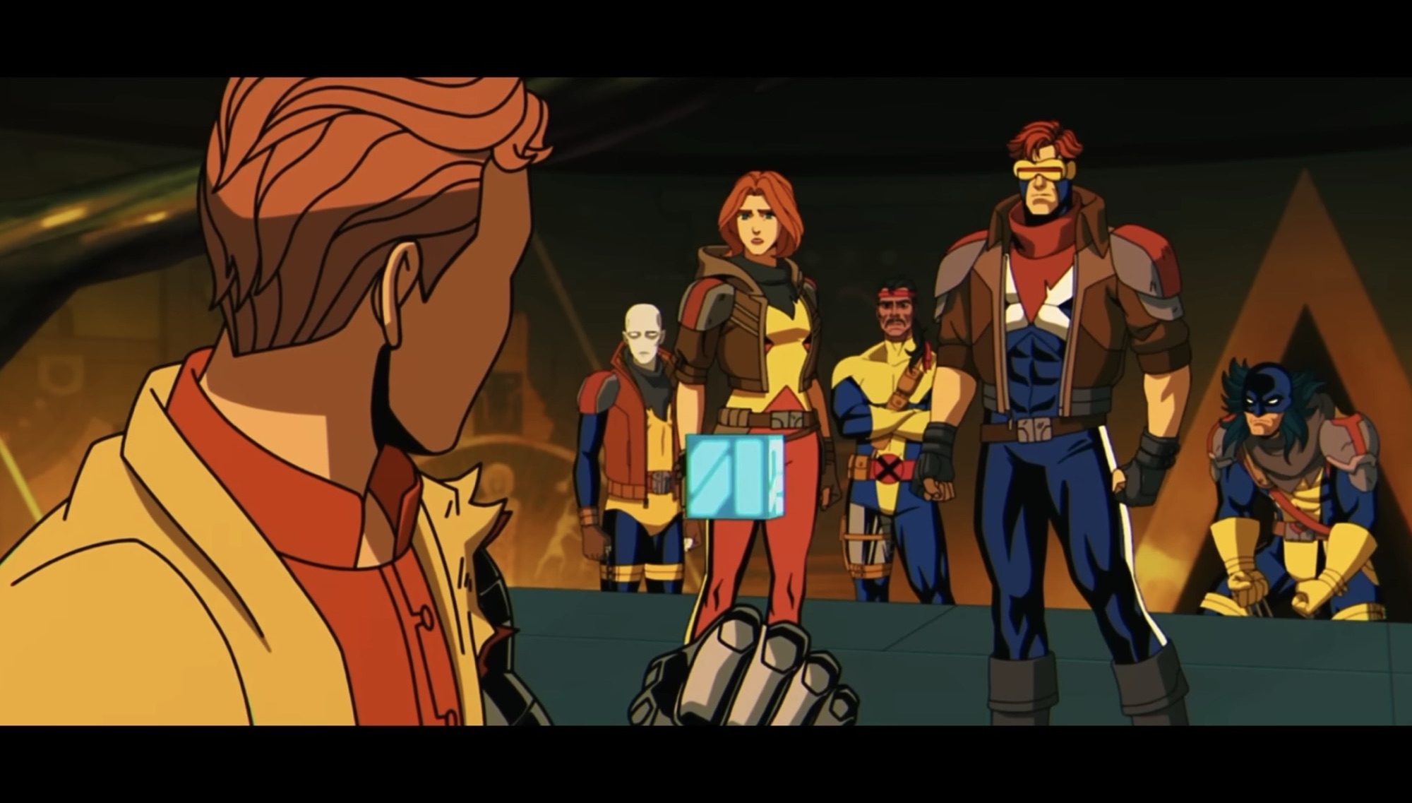
The episode does end back in the future to wrap-up the events of the first episode. In doing so, the origin of Cable’s computer cube (Rachel Kimsey) is revealed in a rather clever way. I have no idea if this is something born from the comics or if it was created for the show (this episode was written by Anthony Sellitti and Mariah Wilson), but I do like it. It also sets up the events for the third part of this season premiere where we will check in on the squad sent to the distant past. Even though this is deliberately woven into other threads, this episode of X-Men ’97 X-Force ’97works really well as a stand-alone adventure. It ties into the core mission of the X-Men through a different lens and putting this X-Force team up against X-Factor is another great way to put the focus on just what the X-Men (and X-Force) are out to do. Jubilee’s escape is a ton of fun and should be a highlight of season two when all is said and done, assuming it’s not overshadowed in the 8 episodes to follow. There is some foreshadowing contained in this one via Psylocke’s observations in the mind of War that are certainly intriguing. I think anyone who watched how the first season ended can guess what’s coming, but it’s still fun to see the show tease it. I just wonder when it will pay off?
At last, X-Men ’97 has made its return to airwaves with not one, not two, but three episodes for the premiere which means there’s a lot to talk about. Truthfully, too much for one post which is why we need to keep things to one episode per entry as is the style of the time.…
Today, X-Men ’97 dropped the curtain on its first season and what a way to bring it to an end. Last week’s episode was a roller coaster of emotions for me. I couldn’t go into much detail of my review of “Tolerance is Extinction – Part 2” without wading into spoiler territory, so allow me…
Magneto was right. That was the realization many characters seemed to share at the end of last week’s episode of X-Men ’97. As we roll into the penultimate episode of the show’s first season, a lot is on the line and the show is drawing inspiration from several different sources related to the X-Men over…
At last, X-Men ’97 has made its return to airwaves with not one, not two, but three episodes for the premiere which means there’s a lot to talk about. Truthfully, too much for one post which is why we need to keep things to one episode per entry as is the style of the time. It’s been a long two years since the first season ended with the X-Men scattered through time. When that episode ended, it was tough to know just where everyone landed, but with the first episode of season two that is at least resolved along with a whole bunch of other things. And structurally, the three episode premiere makes sense because each episode is going to take place at a different point in time and focus on a different group of mutants with the very first taking place in the far off future of 3960 where we know Cyclops (Ray Chase) and Jean (Jennifer Hale) wound up, but will soon learn it’s also where Storm(Alison Sealy-Smith), Wolverine (Cal Dodd), and Morph(JP Karliak) landed as well.
As we basically knew going into this one based on how season one ended, season two is going to focus on Apocalypse (Ross Marquand) as the big antagonist of the season. At least, that’s the setup and I suppose he could be dispatched before the season ends, but it sure feels like he’s going to have a presence throughout. When the show begins with that fantastic intro, we find Forge (Gil Birmingham) and Bishop (Isaac Robinson-Smith) taking stock of where the X-Men are. Forge has utilized his mutant powers of invention to create a crude version of the time portal seen in the very first season of X-Men and through that they have been able to pinpoint where everyone wound up. Because Forge’s love interest, Storm, resides in 3960 he draws the task of traveling to the future to bring back the X-Men there while Bishop will be tasked to heading to ancient Egypt to retrieve the rest.
Expect Apocalypse to have a presence throughout this season.
In 3960, we’re properly introduced to Nathan Summers (Michael Johnston) and Mother Askani (Gates McFadden). Askani leads a tribe of individuals who are resisting Apocalypse in this future. There, the immortal mutant has pretty much taken over and successfully enslaved much of the world. The Atlantic ocean is dried up and his fortress looms large. Cyclops and Jean have been training Nathan who does not know that they’re his parents for a few months while the other X-Men are just along for the ride. When Forge arrives, he finds a Wolverine sans his adamantium skeleton who is forced to tangle with Apocalypse’s robotic Dark Riders with bone claws that shatter upon impact, but soon regrow thanks to his mutant healing ability. Because the episode is heavy on the Summers family dynamic, we don’t get any insight on how Wolverine has been coping with that very traumatic moment from the penultimate episode of season one and Morph is mostly there for a little window dressing. Forge has the unenviable task of convincing the Summers family to separate and return to the present despite getting this unexpected opportunity at a life with their son.
The main focus of the episode is on the Summers family.
As such, the episode is heavy on the soapy elements X-Men is known for. Cyclops distrusts Mother Askani who declines to reveal her origins, though the episode is not shy at hinting at it. She feels Nathan is destined to take down Apocalypse and that takes precedent over the whims of his long lost parents who are struggling with the idea that their kid needs to go on without them. We also learn just why the X-Men are where they are, and even though there’s a lot of drama there’s also no shortage of action in this opening episode. It also leads directly into the second episode as we briefly touch base with Cable in 1997, one of the few heroes from season one not sent through time, and even see the origin of a second season of X-Men character.
Claws of bone have limited effectiveness against machines.
“Days of Past Future” is written by Brad Ford Sullivan, Anthony Sellitti, and JB Ballard which does call into question if anything former showrunner Beau DeMayo had planned for this one made it in. Since he will be receiving writing credits in future episodes (and is an executive producer on the series still), I suspect that isn’t the case and the larger picture he had for the show is still intact. Whether that’s a good or bad thing is not something I can say, but since he oversaw the excellent first season I can only assume it’s good despite how his time on the show came to an end. The visuals in the show have only improved, if anything, with bright, vibrant, colors even in this dystopian future dominating the palette. I especially love the little touches like how Wolverine can be seen wincing in pain every time his claws snap and the way this show really makes Storm’s powers resemble those of an actual goddess. The soundtrack by The Newton Brothers, which borrows heavily from the original series score, is thumping and there’s a great use of Cable’s old theme as well when Nathan enters a scene. If I have anything to criticize it’s that the episode resolves itself rather quickly. It’s not necessarily unexpected as we can’t have a big showdown with Apocalypse right out of the gate, but it did bring the episode to a bit of a screeching halt. It’s not unsatisfying as the character interactions work especially well, but perhaps felt a bit too neat and tidy.
Young Nathan will be forced to grapple with his own destiny.
As a return to the world of X-Men ’97, “Days of Past Future” works exceptionally well. I love the callbacks and the minor tweaks to the opening title. This is a show that is rich in lore for longtime viewers of the show and readers of the comic books from which the show draws inspiration from. And in this case, we’re talking about The Adventures of Cyclops and Phoenix which was written by Scott Lodbell who probably should have received a credit on the episode. It’s a good setup for the next several episodes and the season to come and if it had arrived all by itself I would have absolutely been frothing for more, but since it didn’t I got to go right into the second episode which might be even better.
Today, X-Men ’97 dropped the curtain on its first season and what a way to bring it to an end. Last week’s episode was a roller coaster of emotions for me. I couldn’t go into much detail of my review of “Tolerance is Extinction – Part 2” without wading into spoiler territory, so allow me…
Magneto was right. That was the realization many characters seemed to share at the end of last week’s episode of X-Men ’97. As we roll into the penultimate episode of the show’s first season, a lot is on the line and the show is drawing inspiration from several different sources related to the X-Men over…
Ever since the episode list was released for X-Men ’97 I’ve been looking forward to what reads like an epic, three-part, season finale. In truth, given that X-Men ’97 is a serialized show you could basically call every episode “X-Men ’97 Season 1 Part 1” and so on, but the titles do add a dramatic…
On July 1st, 2026, our long wait ends. X-Men ’97 returns to Disney+ with its greatly anticipated second season a little over two years after the conclusion of the first. It’s something I have been looking forward to pretty much ever since credits rolled on the finale and the only thing that stinks about it is that it arrives when I’m on vacation. As a result, I likely won’t have any thoughts up on this blog for a little while where that debut episode is concerned, but to tide things over we do have a toy to look at and it’s of a character that figures to be featured somewhat prominently in the second season of X-Men ’97: Warren Worthington the third, also known as Archangel.
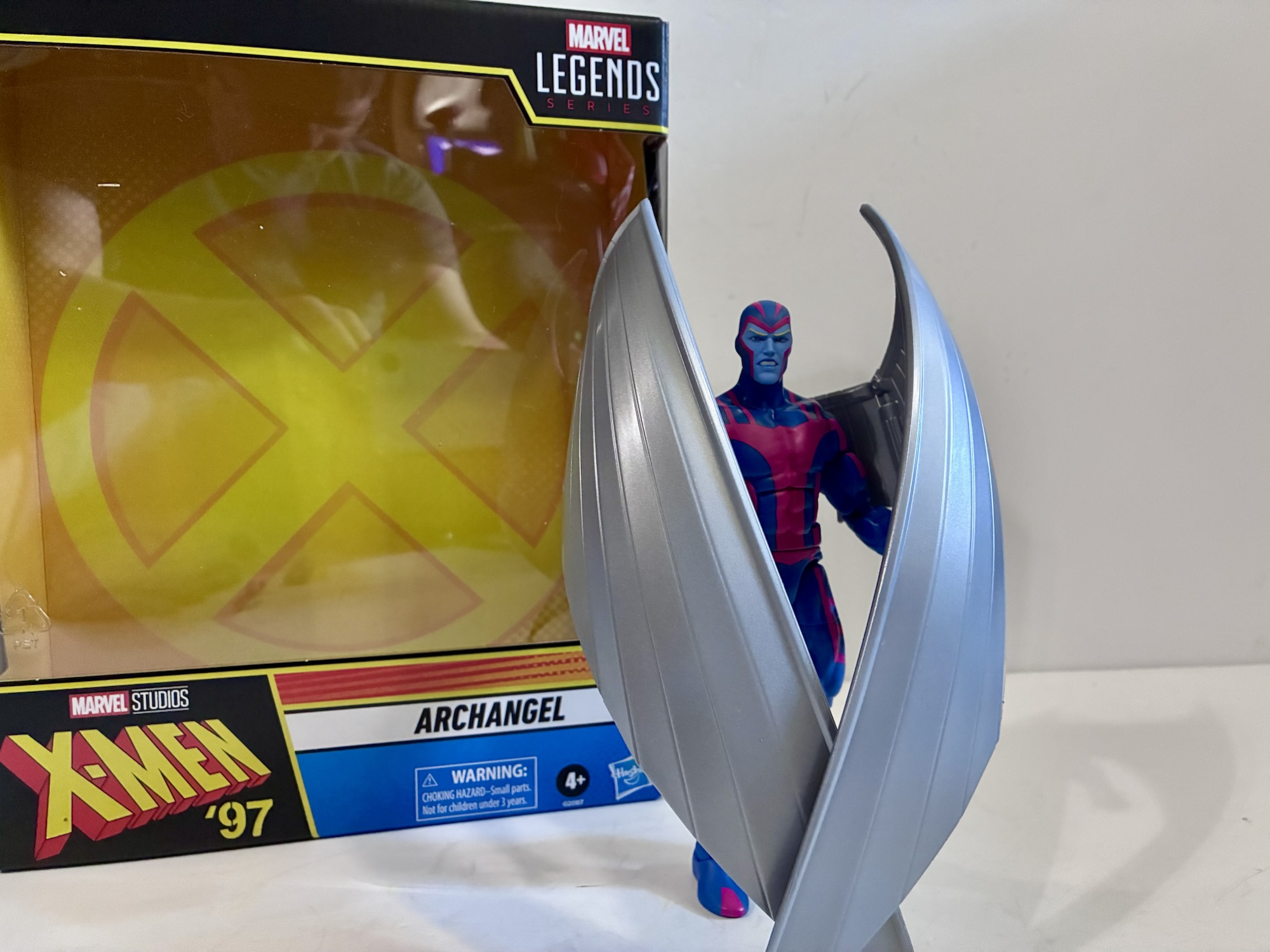
Archangel made his debut in the first season of the original series. He’s ambushed by Cable over his funding for a cure for mutation and winds up being the first victim of said cure when Mystique turns him into a slave of Apocalypse. In the process, Worthington’s feathery, angelic, wings were replaced with cold steel and his skin turned blue. He’d break free of Apocalypse’s control by the next episode, but his quest for revenge consumed him in his next appearance, “Obsession,” before a slightly milder version of the character appeared during the “Beyond Good and Evil” arc. That story was intended to be the show’s finale and at the end of it Archangel was to join the X-Men where he belonged, but a surprise order for new episodes extended the show and such plans were scuttled. During that arc, Archangel had returned to his Angel persona of blue and white, but for some reason when we meet him in X-Men ’97 he’s going to be sporting his original blue and pink Archangel look which is what this figure is based on. Will a reason be given in the show for the switch back? I don’t know. It could be whoever was in charge of the character designs just likes this look better, but I guess we’ll have to watch to find out.
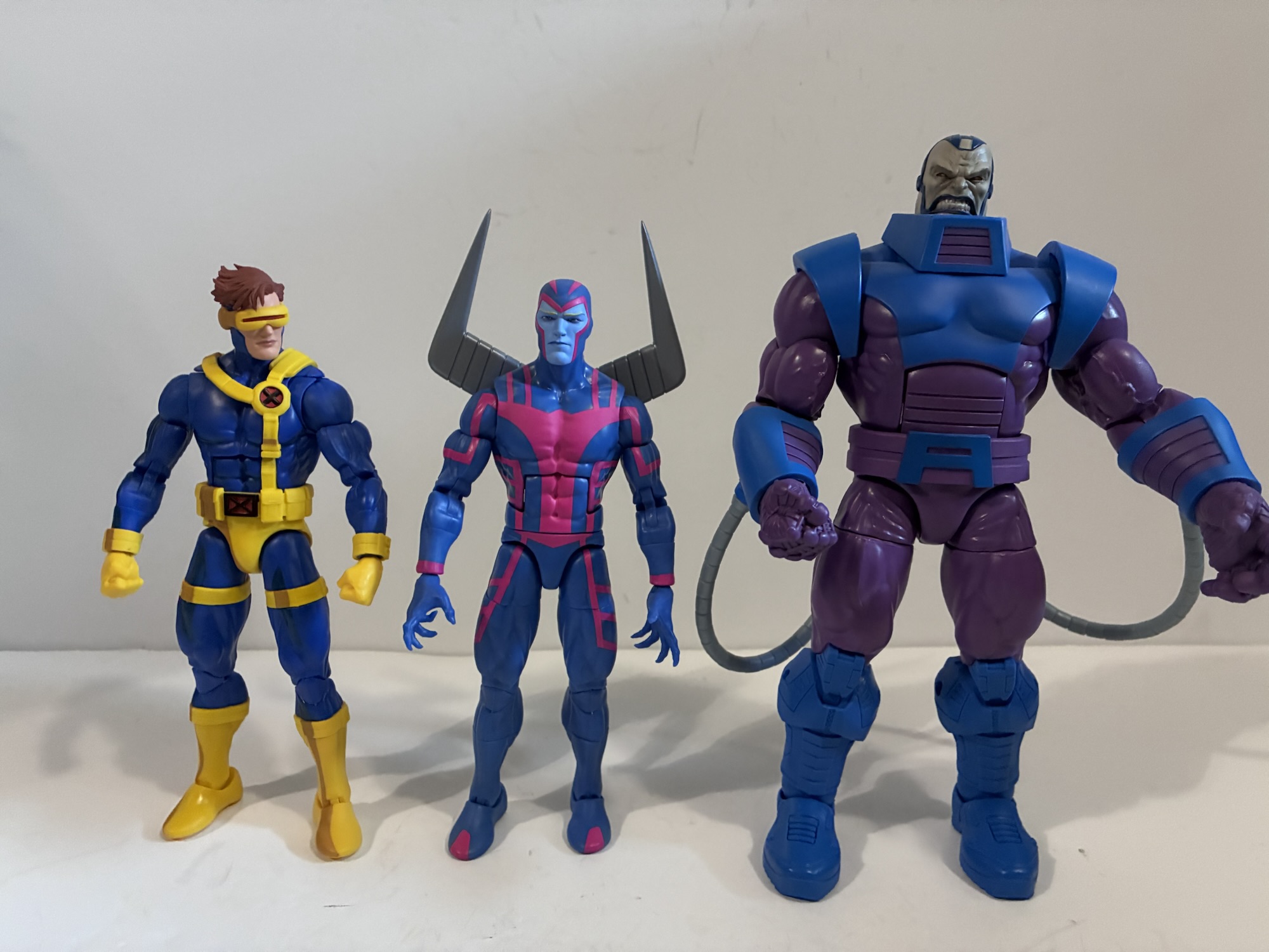
Archangel is a pretty standard height for a superhero.
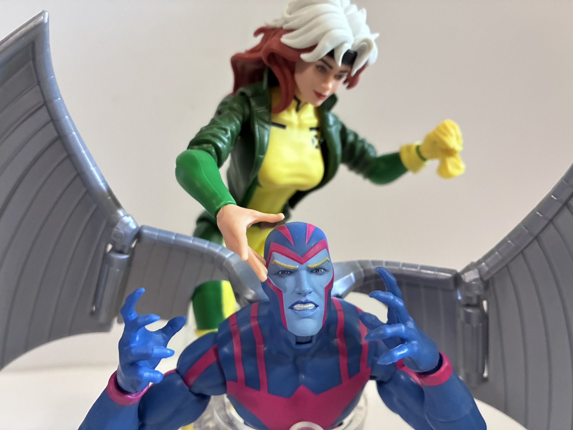
Archangel is considered a deluxe offering so he comes at an inflated sticker price and in a box as opposed to a blister card. The base figure is the same as the previously released Angel of a couple of years ago which is essentially just a modified version of the Vulcan sculpt. The only difference from that mold is that the torso had to be redone to exclude the butterfly joint in the shoulders in order to fit the ports for the wings. The body even still has the grooves in the forearms intended for characters with long gloves because it’s apparently too much to ask for Hasbro to just sculpt some smooth forearms. The costume is very similar to its appearance in the original series which is also quite similar to the look from the comics. It’s still blue with a pink design painted onto it and the application is pretty clean. The opacity of the pink varies as it transfers to different types of plastic which make up the body. It looks pretty damn good on the torso where the paint has a nice matte appearance. It gets a little thin on the thighs, but it’s not as noticeable as it was with the Gamerverse Venom and its white logo. The only difference between this version of the costume and the one from the 90s series that I can see is that the hands are the same color as the rest of the costume. In the older show, the sleeves ended at the wrist and Archangel’s hands were bare and matched the shade of blue of his face. He also tended to have dark, black, lines under his eyes which are not present here, but that’s probably for the best. They also decided to give him clawed hands which is an interesting choice. I would have preferred that they didn’t, but this (and the color of his hands) all appears to be part of the character design in X-Men ’97 so these aren’t critiques of the figure, but of the design.
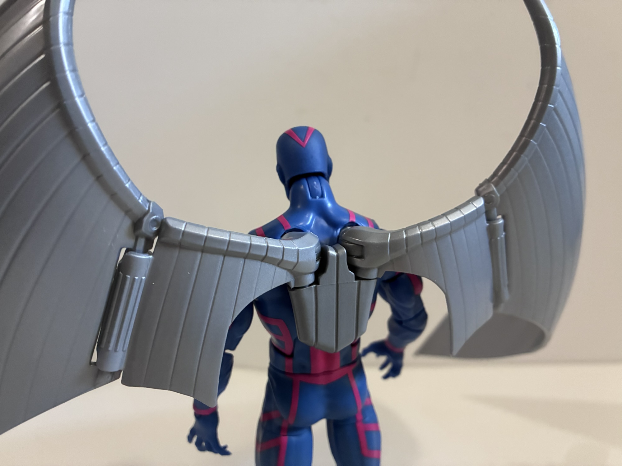
The two wing setups available.
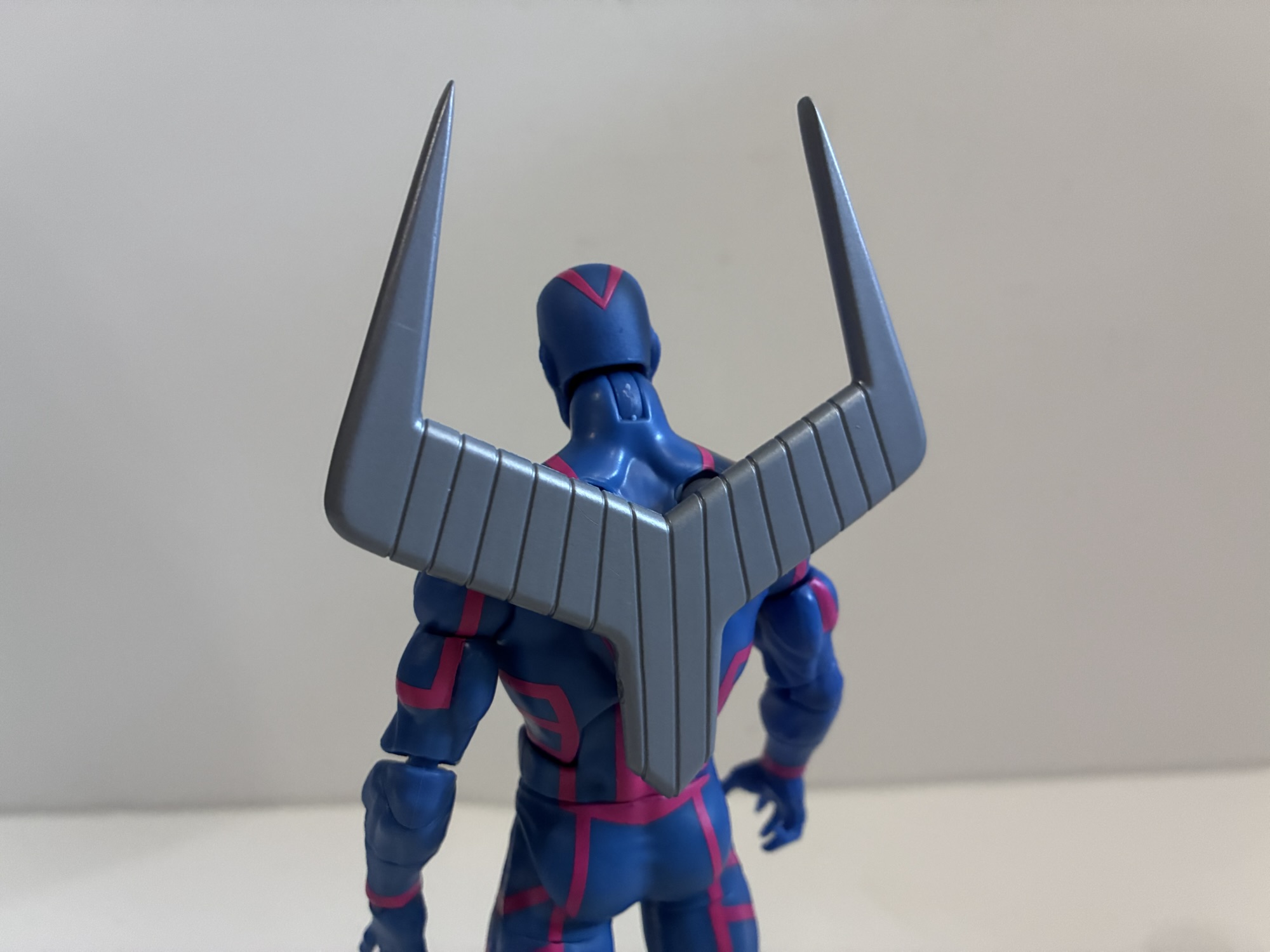
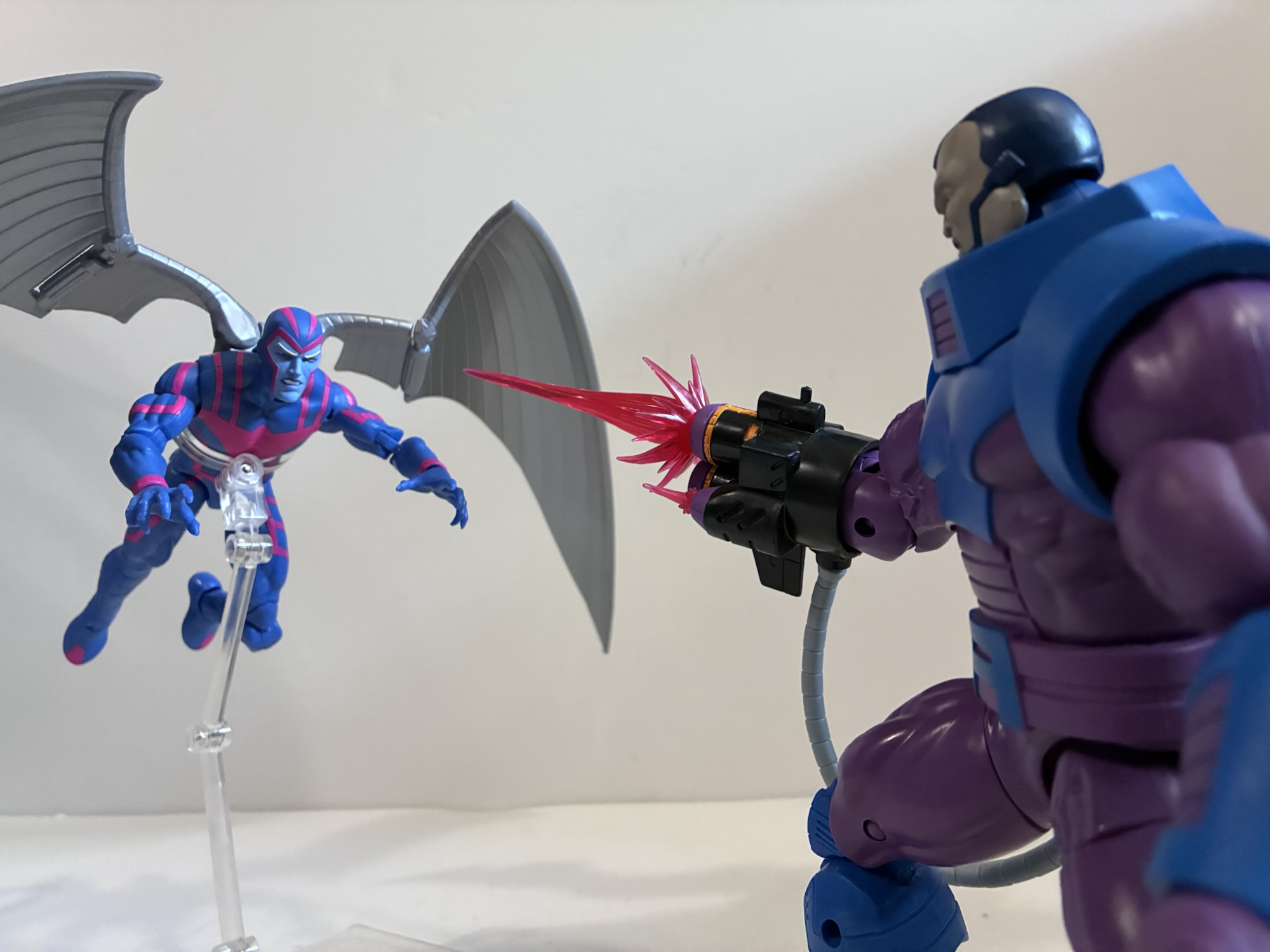
Archangel’s distinguishing feature is the pair of big, steel, wings on his back. For the show, Archangel’s wings are fairly simple and are represented by two somewhat triangular pieces of metal. In the comics, he could have all kinds of panels and metallic feathers and there are definitely some designs that are quite busy. This is a simplified look and it’s one I prefer. The wings clip into the figure’s back, but there’s also a joiner piece in the center they port into. The center piece basically just exists to match the look of the show, but it does provide some stability as well. There’s a hinge close to the center for flapping, but otherwise this central piece basically holds the wings in place. If you want to shift them up and down you’ll have to remove that piece, though it leaves behind something ugly. The wings are basically a light gray plastic and there’s no metallic paint applied. It would have been nice to see them fully painted to better reflect their look on television, but that’s not really how Hasbro does things. They do look fine, though I’m torn on how much I like the curve sculpted into them. Maybe something a little less severe would have looked better? If you don’t like them, Hasbro did include Archangel’s retracted wings. Resembling a tuning fork, this just plugs into the back like the standard wings and will take up far less shelf space. It’s a nice option to have, though I don’t know if I’ll be able to resist posing him with his wings out in a flying pose.
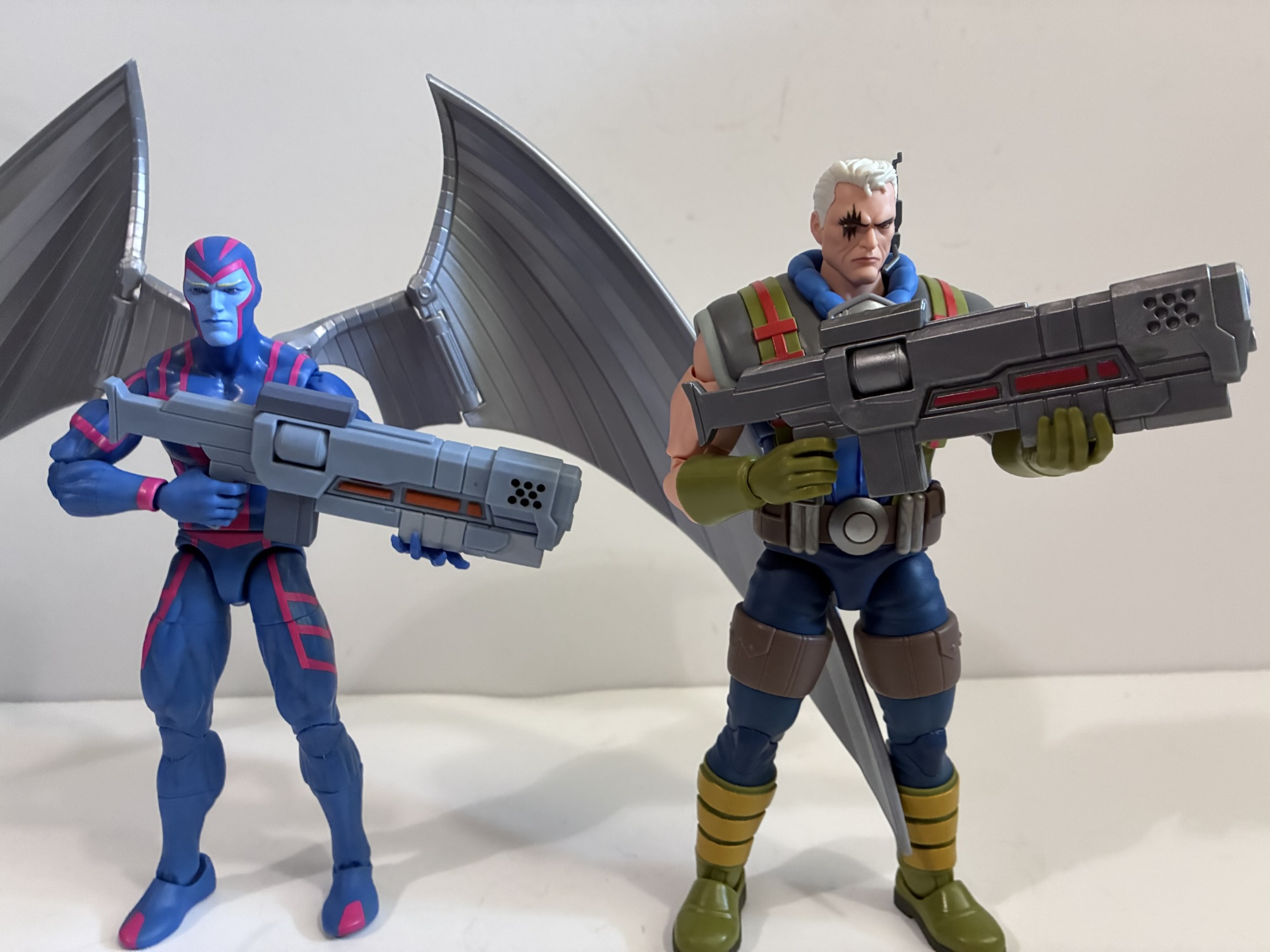
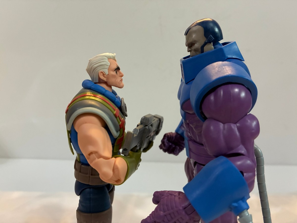
He comes with an alternate version of Cables’s gun for some reason.
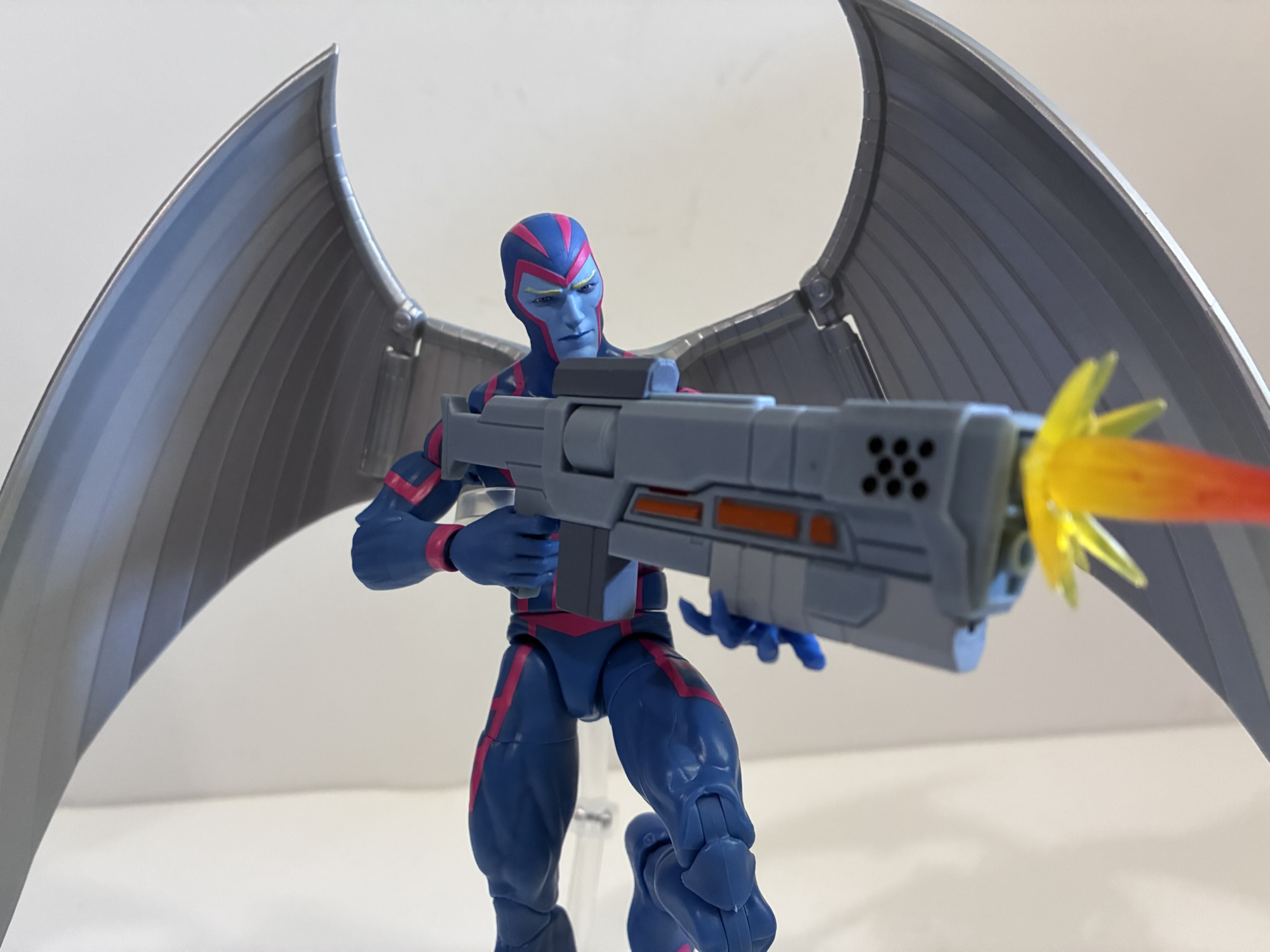
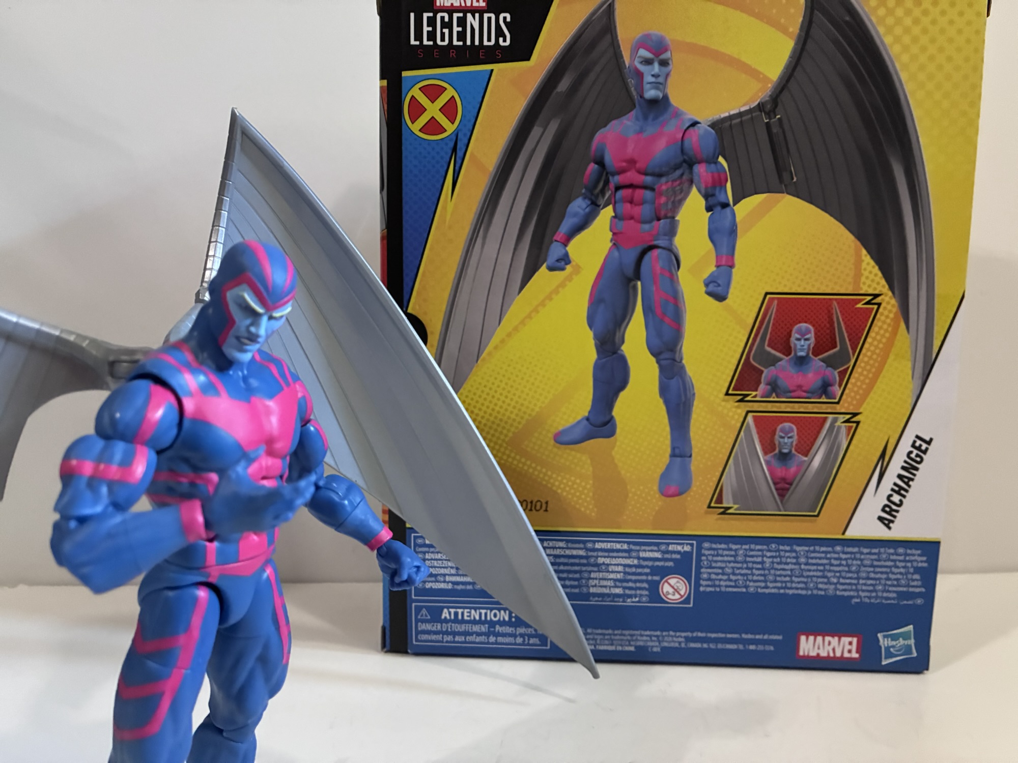
The other accessories are a bit minimal. Archangel has two portraits: neutral and a teeth gritting one. Both are cowled and it’s a shame we didn’t get an un-cowled look. If Ka-Zar wasn’t so expensive I’d consider buying one and painting the face blue as I always preferred Archangel with his blonde locks showing. By default, Archangel has a trigger finger right hand and a left fist. He also comes with a set of open, clawing, hands which are okay, but I already mentioned how I’m not a fan of his new talons. I’m also irritated we don’t get a right fist, despite one appearing on the back of the box. What would that have added to the budget? A penny’s worth of plastic? If that? The trigger finger hand is unusual, but they did decide to include a gun. Cable’s gun, to be exact as it’s the same one that came with the X-Men ’97 figure. It’s the bigger of the two guns and it has a new deco. The colors are more matte where as the original used a shiny plastic Hasbro loves for metallic objects. This new deco makes it a bit more animated looking, but it’s an odd accessory to include with Archangel. I assume he wields the gun at some point in season two, but getting it over a third head option, extra fist, or some feather blade accessories kind of sucks. A flight stand would have also been nice and, honestly, should be standard issue for a deluxe figure that has big wings on its back.
It’s like they gave him two fists on the back of the box just to call attention to the fact that we’re missing one.
Archangel’s articulation is pretty standard for the line. If you have a figure on this Vulcan body (like Cyclops), then you know what to expect for the most part: hinged neck, ball-hinged shoulders, ab crunch, waist twist, bicep swivel, double-jointed elbows, wrist hinge and swivel, ball-socket hips, thigh swivel, double-jointed knees, shin swivel, ankle rocker and hinge. As stated earlier, the only change is the removal of the butterfly joint which does kind of suck for a flying character. Range otherwise is fine at all of the joints though the various swivels break-up the sculpt of the pink linework and musculature in a rather ugly fashion so they have limited utility. If you want Warren to wield the gun, the trigger hand does have a vertical hinge though the open, clawed, left hand is only so-so as as a stabilizing hand for the barrel. The wings have a hinge where they plug into the back and towards the middle so they can “flap,” and they can also wrap around to the front of the figure. As I mentioned earlier, you can take out the central mount to get swivel articulation, if that’s your preference. The joints are the usual tolerance for a Legends release with the exception of the left elbow. Mine is a touch on the loose side, but not so much that it can’t hold a pose or support the weight of the gun. I’ve never seen a loose elbow joint on a Legends release since they moved to the pin-less design so I’m thinking it’s a one-off with mine and likely not something afflicting all copies.
He should mix in fine with other characters from the animated universe.
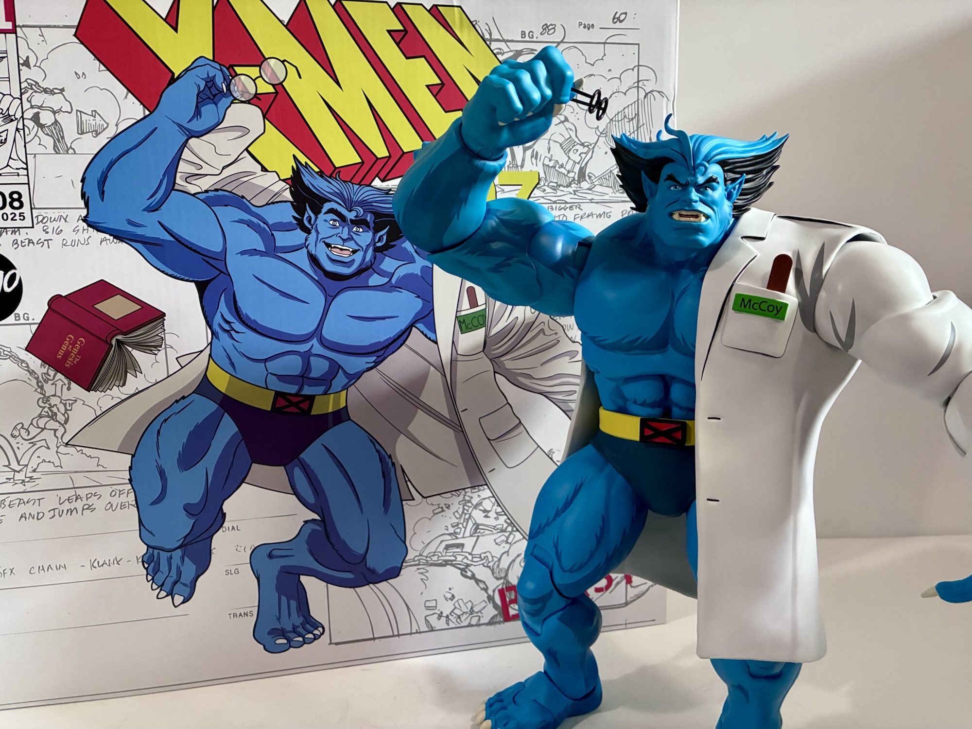
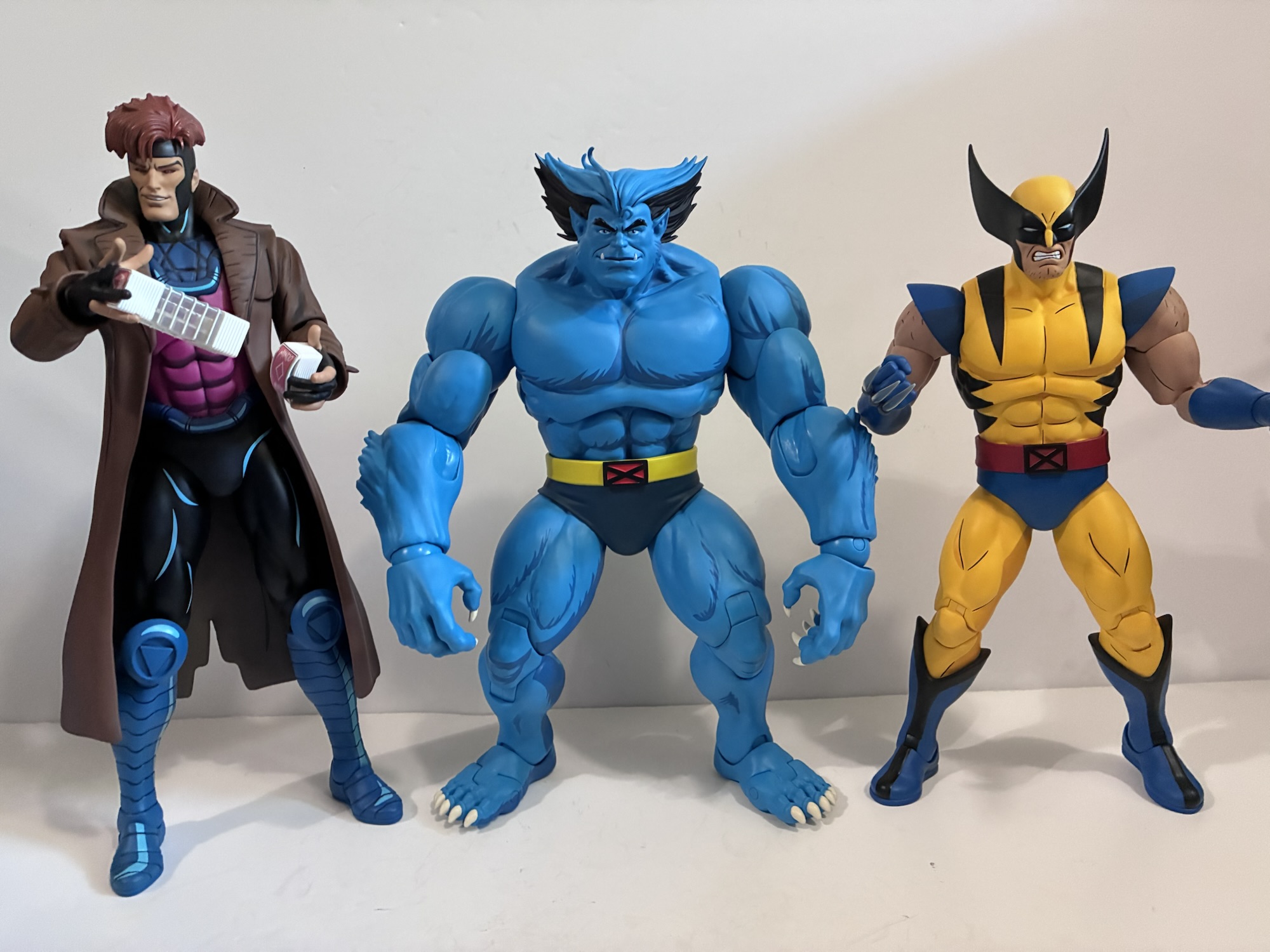
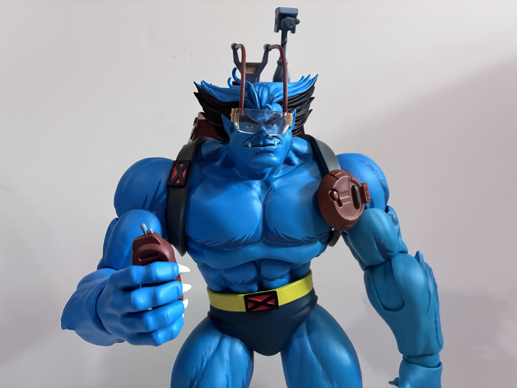
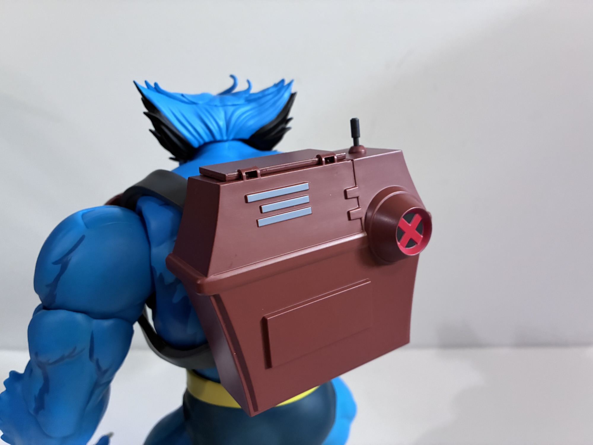
This X-Men ’97 Archangel is not an unwelcomed addition to the collection. As a reoccurring guest character in the original series, it always made sense to do a figure of Warren. While I don’t think any of the subtle changes to his look are an improvement, it’s not far enough removed from the 90s look for me to care all that much. What I do care about are the lackluster accessories and Hasbro getting cheap on us with the hand assortment while simultaneously upping the price. They’ve been doing that more and more with releases and it’s getting pretty annoying. Most Legends figures pull from the same pool of already sculpted hands so we’re just talking about the cost of plastic in most cases which is pretty damn negligible with something as small as a hand. And at the asking price of $40 it’s not as if this is a basic release. We’re paying an extra charge just because this guy has wings which is honestly kind of ridiculous. Back in the old days, Archangel was the same price as anyone else, but Hasbro likes to take any excuse it can to raise the price which is why they recently solicited a Doc Samson figure for $35 even though he’s really not deluxe sized and only comes with one extra head and one extra set of hands. I shudder to think what the X-Men ’97 Beast is going to cost since he actually has a backpack accessory – they’re practically breaking the bank! As a result, I’m far more excited for the return of X-Men ’97 than I am for this figure of Archangel. It’s not an underwhelming release, nor does it overwhelm the synapses. It merely whelms. He’ll slot into my animated X-Men collection, though I’ll always wish he had an unmasked head or another fist.
For more X-Men ’97 and ’97 adjacent releases from Hasbro, check these out:
Today we finish our look at wave 3 of X-Men ’97 Marvel Legends action figures and I think I saved the best for last. Cable was one of the non-members of the X-Men to play a pretty substantial role in the original animated series. He showed up in multiple episodes in both the first and…
Previously, on X-Men reviews we looked at Magneto from the upcoming series X-Men ’97. The animated series may have been delayed into 2024, but the action figures from Hasbro are already here. And if you were collecting Hasbro’s line of figures based on the animated series from the 90s, this new line offers a chance…
It is Halloween and that means it’s time for costumes, candy, and spooky fun. It’s also Halloween 2022, a pretty important date if you grew up loving those mutants who ran around in colorful spandex fighting for a better tomorrow. That’s because 30 years ago on this very night, the animated series X-Men premiered on…
I’m guessing you already heard the news, but in case you haven’t: the X-Men are back.
The return of the ’92 era X-Men featured in the classic animated series could not have gone any better. I was extremely excited for that show’s continuation via X-Men ’97, but at the same time a bit fearful. Could it really live up to my own expectations even as I tried to tamp them down? It turns out that it absolutely could and I truly feel we were gifted something unique. Not many shows are allowed to grow up with its audience. Even long-running shows like The Simpsons or Sponge-Bob Squarepants mostly stay the same and rely on picking up new fans as older ones fall off. X-Men ’97 really did take a show crafted for 7-12 year olds in 1992 and age it up for that same audience 30 years later. And the fact that it worked was pretty remarkable. That first season ended two years ago so it’s been a bit of a wait for the show’s second season. For that first season, I reviewed every episode and intended on doing a season one wrap-up or overall review, but I never got around to it. As a warm up for this second season, now seems like the appropriate time to share my final thoughts on that first season while also getting hyped for what’s to come.
I watched quite a bit of the first season of X-Men ’97. When a new episode would premiere, I’d get up and watch it while riding my exercise bike which really helped get my heart rate going. My son also took an interest in the show so we’d usually watch it together after school and then I’d watch it again the next day to prepare for my review which I’d post on Friday. Recently, with the release of the new trailer for season two I went back and watched the whole season again in one sitting. It was a rainy Sunday so a perfect time to refamiliarize myself with the show again. Before that rewatch, my opinion of the first season was that it was quite good, but also felt rushed at times. Upon rewatching it, I felt it didn’t go by as fast as I remembered. Some stuff certainly did like the entirety of the “Inferno” plot being condensed into one episode. I still don’t like how that one ends with Cyclops declaring he won’t abandon his son and then immediately flipping or how the clone Jean Grey just pulls the name Madelyne Pryor out of thin air. The “Lifedeath” arc was the other one I felt got rushed, but upon reflection I no longer think so. It was probably my least favorite plot in the season so the idea of spending more time with Storm and Forge isn’t really a recipe for making the season better. Once the show hit the fifth episode, “Remember It,” it moves at a nice clip. The events of that episode are felt throughout the rest of the season and dedicating three episodes to the finale was also a smart move. The final episode of the season is more of an aftermath episode with a lot of character work. Cyclops and Jean seem to resolve their differences and have that nice moment with Cable while Xavier and Magneto reconcile with the damage they’ve inflicted upon each other over a lifetime despite their love for each other.
Effect shots like Nightcrawler taking Wolverine and this jerk on a ride through his teleportation simply were not possible in the original series.
The production values of the first season were also wonderful and the biggest upgrade over the original series. Much of the voice cast returned and while many sound a bit older, their acting chops have only been further honed over the decades. The redone X-Men theme is grander and worthy of cinema and I am delighted that Marvel seems to have settled on it as the theme for the X-Men from here to eternity. The animation though is the clear upgrade. Going from the original series to this one reminds me of the first time I saw the Star Wars prequels. No, not in terms of the quality as a whole, but just in what we were allowed to see the characters do. The technology is now available to match the imagination of the writers and storyboard artists. The old show would never have been able to pull off the action that this show possesses. The action sequences from that show are what have arguably aged the worst. And you don’t have to watch X-Men ’97 for very long to see this on display as in the very first episode we get that incredible sequence where Storm enters the battlefield and uses her powers to blast the desert sand with lightning turning it into a sheet of glass. She then unleashes a tornado on the same which shatters and grabs the shards of glass to create a violent, Sentinel-destroying, freak of nature. Such a thing would not have been possible in 1992 either due to the talent of the animators or the budget supplied by Saban.
The prospect of topping that first season is what really drives my excitement for the second season set to premiere on July 1st. Last year, attendees at New York Comic Con were treated to a new trailer to hype that season which was sadly never made public. While there were leaks, us regular folk had to wait until fairly recently for a proper trailer. A follow-up has already been released and the hype train is now traveling at full speed. When that first season ended, the X-Men were scattered across time. Some appeared to be stranded in the present like Wolverine and Morph, while a small group was sent to ancient Egypt where they meet En Sabah Nur, better known in the present time as Apocalypse. Cyclops and Jean were also shot forward in time where they meet Mother Askani and their son, Nathan, who is now a boy of about 10 by the looks of things. And if that wasn’t thrilling enough, the final stinger for that first season featured Apocalypse combing through the ruins of Genosha and uncovering a playing card while musing on the subject of death, an obvious foreshadowing for what is likely in store for the fallen Gambit.
The sister of Colossus, Magik, is an unexpected casualty of the Genosha massacre.
I’m not going to go through all of what is in the trailers for season two, but I wanted to touch on some things featured prominently. One, it sure looks like we have more Genosha fallout to deal with. One of the scenes featured in the trailer is Colossus, wearing for the first time his yellow and red costume, cradling the body of his sister Illyana, also known as the mutant Magik. We later see a scene where Colossus, now in his Acolytes outfit, is leading Rogue and Nightcrawler to a shrine where his sister’s picture is front and center among others lost in the attack on Genosha (and now that I look at it more closely, is that a picture of Iceman to the left of the Never Forget sign?). This is an interesting development as in one of the final scenes of the first season we see Forge and Bishop conversing in front of a wall of portraits of mutants as Forge is attempting to account for them. Magik is featured and is noted as being alive, but clearly something has changed since then if she actually fell in Genosha. It was a huge catastrophe and it’s reasonable to assume more bodies were still being recovered, though at that point they probably would have had a firmer idea on who was alive and who was presumed dead. Much of the second season had already been written by the time the first aired, but just before the show premiered the showrunner Beau DeMayo was fired by Disney. It stands to reason that a new showrunner would likely have ideas of their own and things may have changed.
Is this a bad sign for Bobby?
The Magik reveal further interests me because it calls into question other names on that bulletin board. My beloved Iceman is seen on it and seemingly fine, but there was also a blink and you’ll miss it moment in the fifth episode where an ice cream man on Genosha uses his mutant powers to make a treat for Leach. He certainly looks a bit like the Bobby character model from the original series so was he on Genosha too? With this show being far more willing to tackle social issues it would surprise me if the most prominent gay X-Man was unceremoniously killed off like that, but you never know. In the trailer, we see Bobby’s ex-girlfriend Lorna return to what appears to be the mansion and a photo of her and Iceman together is shown. Is she reflecting on the loss of him as well as the X-Men?
That you, Bobby Drake?
Lorna’s presence also coincides with the return of X-Factor and the apparent formation of Cable’s X-Force. Both teams are featured prominently in both trailers and it does make one wonder if the cast is perhaps getting too big? That’s a whole lot of people to follow, not to mention we see scenes of Wolverine and Morph paling around with the likes of Sabretooth and Deathstryke plus some young mutants including Kid Omega. In the old show, it wasn’t unheard of for groups of mutants to drop in and out so this could end up being nothing. We had episodes with Alpha Flight, X-Factor, The Morlocks, or episodes like “Slave Island” which were full of cameos. Not everyone is going to get the spotlight shined on them and that’s probably for the best with a cast as big as this one. I do think some characters will be featured more though and Polaris definitely seems to be one. The show also has yet to reveal that Cyclops and Havok are related and we saw their other brother, Vulcan, among the Shi’Ar in season one so that could come into play at some point.
During some part of the season it would appear that Wolverine will dawn a costume evocative of his feral appearance from the comics, but perhaps without the feral personality?
What does intrigue me perhaps the most is Wolverine’s arc this season. He is shown prominently in the trailer since he was given the line, “We’re back,” and he delivers it while striking a pose identical to the cover of his first mini series by Frank Miller. As he does, his claws pop out and they have been re-bonded with adamantium. What further intrigues me are the sequences we see where he’s in his skull cap look with bone claws. This harkens back to the “feral” Wolverine era in the comics. Some time after losing his adamantium skeleton during the “Fatal Attractions” arc, Wolverine is lured into a trap by Genesis, the son of Cable corrupted by Apocalypse. He tries to replicate the adamantium bonding process with Wolverine to turn him into a weapon for himself, but Wolverine’s body rejects it leading to this feral transformation. Perhaps that happens right after his skeleton is returned? It looks like he’s in his brown and tan costume in the trailer when he flashes those claws, but the feral look is yellow and blue so I think it’s something from later in the season. There’s also a group shot of Wolverine with his adamantium skeleton and brown costume that could take place anywhere in the second season timeline. We’ll just have to wait and see.
This feels like an homage to X-Men vs Street Fighter and I am here for it!
And then there’s Apocalypse. He’s obviously the big baddie this season and it looks like the X-Men will be confronting him across timelines. I can see this being the season long arc. Maybe not every episode will deal with that conflict (we know that Danger is featured), but I would be surprised if there isn’t some big showdown in the final episode with Apocalypse and perhaps a new set of horsemen. Nothing is teased about Gambit possibly returning as Death (unless you consider Rogue being handed a playing card foreshadowing) and that makes sense. They should refrain from such to preserve the surprise as much as possible so I think there is much that is still to come. I have seen some speculate that the events of this season could give rise to an Age of Apocalypse third season. That would be interesting since the original series already did something similar with the “One Man’s Worth” episodes, but that arc also didn’t involve Apocalypse so it wouldn’t be as redundant as it seems at face value. Those episodes were the genesis for the hypothetical “What if Charles Xavier were assassinated before starting the X-Men?” question that gave rise to the Age of Apocalypse in the comics which is why many of the character designs from that arc were featured in the episodes. And since we’re following the show’s version of “Fatal Attractions,” the prospect of Onslaught still looms. Hasbro even re-released Onslaught (or is set to) in its Marvel Legends line and they usually don’t do stuff like that with very specific characters unless there’s an outside reason for such. Perhaps that will be our season three which is right now scheduled to arrive in 2027 so we won’t have to endure an extra long wait to find out.
I am completely and utterly hyped about this second season and I can’t wait to sink my teeth into it. Unfortunately, the premiere arrives while I’m on vacation so I’m not sure when I’ll be able to share my thoughts on it. I do plan to take time out of my vacation to watch it, but if I had been home I probably would have spent the Tuesday before binging the first season once again. Whenever I do get to it I am sure it will be a fun time and I plan on reviewing every episode right here on The Nostalgia Spot.
To help you get hyped for the return of X-Men ’97, here are the reviews of my favorite season one episodes:
The first episode of X-Men ’97 left me grinning from ear to ear and eager to see what would happen next. I’m happy to say, the show’s second episode left me feeling very much the same. “Mutant Liberation Begins” starts off right where the previous episode ended. Magneto, has revealed that it was the wishes…
Last week’s episode of X-Men ’97 saw the show take a breather with a fairly low stakes plot involving Jubilee and Roberto getting sucked into a video game. The last 7 or 8 minutes of the episode concluded with a more serious tone as Storm and Forge found themselves at odds in the wildlands of…
Magneto was right. That was the realization many characters seemed to share at the end of last week’s episode of X-Men ’97. As we roll into the penultimate episode of the show’s first season, a lot is on the line and the show is drawing inspiration from several different sources related to the X-Men over…
I don’t normally do this, but for once I figured why not try to emulate the box art with the pose?
Back in the old Toy Biz line, it felt like we had to wait a long while for an action figure of Beast, or The Beast as the opening title of X-Men: The Animated Series referred to him as. Perhaps that was due to the character spending the bulk of the first season out of sight and out of mind thanks to being incarcerated. And I say it was a long wait, but what is a long wait to a child? It may have been about two years, but Beast eventually arrived with flipping action and an accessory that let him hang off of a smooth surface via a suction cup. I believe I got my figure for Christmas in 1994 and it felt like a big deal as he arrived alongside Morph and nearly filled out the roster from the cartoon. All that was missing was a proper Jean (we’d have to settle for her as Phoenix) and Jubilee (who eventually received a figure in the Generation X subline) while Rogue would arrive shortly after, if memory serves (action figure producers in the 90s were quite reluctant to make women). When Hasbro returned to X-Men for its Marvel Legends line based on the show, they made sure to get to Jubilee and Jean pretty early, but never did release a Beast. For the X-Men ’97 line, once again Jean and Jubilee made it out along with Rogue, but Beast got the shaft yet again. Finally, Hasbro unveiled a ’97 version of Beast on June 8th which is set to go up for preorder in August and will presumably release at some point in 2026. And that very same week I got a shipping notification from Mondo for its take on Beast who will get us ever closer to completing the main roster from the original series.
If you stand him up as tall as he’ll go then he’ll look down on the likes of Wolverine, but I think this is about right for his posture.
Beast has the distinction of arriving before Storm despite going up for preorder after her. And in this case it was well after as Storm went up around Halloween while Beast went up in February, but for some reason the blue guy beat her out of the factory. Maybe it’s the soft goods needed for Storm’s cape? I’m not sure, but I’d be lying if I said I was disappointed for while I do look forward to getting Storm, Beast was a pretty sizable want for me (literally). He’s just a fun design and we really have never received a proper animated Beast. Even that old Toy Biz figure featured more of a comic look as Beast had his whited-out eyes while the animated version had normal, blue, human eyes. Most of the Legends versions have followed a similar pattern with perhaps the only deviation being the very first Marvel Legends Beast which, apart from the eyes, didn’t bare much resemblance to the cartoon version (not that it was aiming for that). This Beast unquestionably is and like most Mondo releases in this line it arrives first as a limited edition with a bunch of extra goodies thrown in the box. It is yet another wonderful sculpt by Alex Brewer with paint by Mara Ancheta and packaging artwork Dan Veesenmeyer. The packaging does follow the same design as Mr. Sinister with no flap on the front and a write-up by Eric and Julia Lewald on the back detailing their affection for Hank. It would seem this is the standard going forward which is honestly fine as the front flap on the old boxes revealed little since these figures ship wrapped in plastic to protect the paint.
“Eureka!”“Let me tell you about this wonderful resource.”
Beast is a big hunk of plastic coming in it at about 11.75″ per Mondo. Since he is a character often depicted standing with a bit of a hunch, exactly how much vertical space he’ll occupy on your shelf is certainly variable. He does pack some heft though as he’s solid. He doesn’t look out of place among the other figures and I do like that Mondo appears to have a mostly no compromises approach to size and scale with these releases. He’s also very much a ’92 design. While there isn’t much separating Beast from the original series and its sequel series, there are some subtle differences most notably in the shape of the face and the linework of the body. This Beast has the wide face of the original series with tufted bits of fur along the jaw line. His stark, black, eyebrows also sit more in-line with the eye as opposed to stretching well beyond them and his hair is a bit more unrestrained. It’s also reflected in the paint job as the original series was more likely to paint the inner lines of Beast’s musculature in a rougher manner. Instead of one, curved, line it was more like several shorter lines arranged in a curve shape to create a subtle illusion of fur. The ’97 art mostly goes with an all blue body with the fur only appearing as a means of breaking the silhouette in key places, something the original series also did. For this figure, Mondo did not sculpt any fur inside the body, but painted it withing the muscles such as in the base of the pectorals and basically along all muscle groupings. It means Beast has a slightly furrier appearance in plastic than he does on celluloid, but given the scale I think it’s a necessary touch to give him a bit more depth and the paint job is subtle enough that it doesn’t detract from the source material. Instead, it feels like this is how Beast is represented in the show on episode’s with the biggest budget or in close-ups as opposed to when he’s just lost in the background.
Beast is known for being well-read.He’s not really known for being well-dressed. This is as formal as he gets.
Apart from the paint job, this is just a really great looking take on the character. Initially, I thought the shoulders looked a little bulbous in the promotional shots, but in-hand I don’t see the same. Beast always had quite large shoulders on the show and sculpt reflects that rather accurately. My favorite X-Men character designs are the ones that bely the personality of the individual underneath. A great example is Nightcrawler, the character who looks like a demon but is actually a devout Christian. In the case of Beast, it’s a monstrous individual who is actually a scholar and medical doctor. What makes me prefer the animated design over all others rests with his face. Beast has this very gentle, human-like, visage as opposed to the more primal one he is often given by comic book artists. And for this one, Brewer really nailed the different expressions contained in this set. We get a neutral face by default that has a faint hint of a smile which feels like the perfect default Beast. There’s also an angry one, and a yelling one if you want more of a battle setup. We also get this humorous toothy grin which is the only face that might be from X-Men ’97 though it still reads as a ’92 look to me. Lastly, there’s sad Beast and this is likely pulled from his spotlight episode, “Beauty and the Beast,” though he does have moments of sadness in other episodes that it could work for. I really like that Beast is the chosen character to wear his emotions on his sleeve as he’s basically the first to cry in X-Men ’97 when things get heavy.
It’s not easy being a beast.A Howard the Duck shirt will be a smile on even the saddest face.
Those are just the expressions available, for hands we get a solid spread that includes sets of fists and gripping hands. There’s also another set of gripping hands that are asymmetrical, a very wide or style posed right hand, a pointing right hand, and an open left hand. He also has two books, one that is open and one that is closed. The closed book contains a shoutout to showrunner Erik Lewald and writer Julia Lewald as it’s titled Lewald’s Book of Words. The open book is The Genus of Genius, a bit smug for someone like Beast. For seeing that small print, Beast has his glasses which slot over his ears well enough without the need for any ugly cut-outs. They’re just black, plastic, frames without a lens and I think it serves the prupose here. He also has his tactical backpack which has a few different accessories all pulled from the original series. There’s a set of goggles that come up and over the head as well as a little blaster that pops out. These just plug into the backpack if you wish to use them or you could have the backpack appear closed. The goggles don’t slot into anything on the face, so you basically have to position his head and the pack itself to get it to sit right. Even so, you’ll probably have a hard time getting him to look in any direction other than straight ahead with these on. Beast also has a little handheld device that served as a communicator in “The Phalanx Covenant – Part One” in conjunction with a radio inside the pack, but that would have been a little too ambitious to include the whole thing. If you don’t want him out in the field though, there’s also an included lab coat accessory which he actually comes packaged wearing. This necessitates the swapping of arms as it’s setup just like the coats that came with Logan and Cyclops. It looks nice when in place and there’s even a little pocket with optional tongue depressor on the left breast, something that showed up in both shows. Because the coat adds a little more bulk to the shoulder area, I’d say it actually casts the slightly better silhouette as a result which was also true of the Cyclops figure. Lastly, Beast also comes with his Howard the Duck shirt as seen during The Phoenix Saga episodes. Unfortunately, it’s just a lump of painted plastic meant to represent the shirt folded up and it’s not something he can actually wear. An actual soft goods one he could wear would have been the icing on the cake. Beast also has the typical Mondo display stand. Unfortunately, they didn’t deem him worthy of the flight stand which is what I’d prefer to see become the standard for the line as these doll stands are pretty poor. If you think it’s a matter of heft my counter to that would be the recently solicited Goliath from Gargoyles comes with a flight stand so if it can support him then it could likely support Beast.
Beast is ready to head out into the field.
Beast has a pretty standard array of articulation for Mondo, but to my surprise, it’s among the most well-executed. For joints, we get a double ball head, hinged shoulder pegs, bicep, single elbow, ball-jointed wrist, diaphragm, ball-jointed waist, ball socket hips with swivel, double-jointed knees, ankle hinge and rocker, and a toe hinge. The head is perhaps the most limited as his sloped posture and large head means his range is a bit subtle and it’s easy to pop the head off by mistake when posing him. The shoulders have terrific range for what they are and the elbow hinge is pretty deep so Beast has no issues bending his arm 90 degrees, be it sleeved or not. The diaphragm joint actually works and he can arch back and crunch forward a bit and the waist enhances both directions. Both spots swivel and provide for a little rock. Nothing outrageous, but better than other figures in the line. All of the joints are also firm, but smooth, out of the box so I’ve had more fun messing around with Beast than a lot of figures from Mondo. The heads and hands are pliable enough to easily swap and all of the pegs are nice and thick so there’s no durability concerns here. Still, without a neck or butterfly joint, Beast will be confined to mostly simple poses. He can’t quite get down into a three-point stance nor can he look up well enough to emulate his pose on the cover of X-Men #1. He can crouch down and I was able to do so without the aid of a stand. I probably wouldn’t trust him on a shelf without one in such a pose (and I did have him take a dive already), but it is doable.
“Open your mouth and say, ‘Ahh,'”Like Nightcrawler, Beast can get into a crouch.
As a result, Beast is probably the most fun character to handle since Nightcrawler, with Nightcrawler being the only one that’s obviously superior to him in the articulation department. He fits in really well among his teammates and I do love the big splash of blue it adds to the shelf. Or rather I will when I find a way to fit him in. The Mondo shelf is getting extremely crowded and it only gets worse when figures are released. I’ll have to find a home for Storm as well at some point this summer and eventually there’s Jean. That’s all that’s been shown so far and with the release of Jean that essentially completes the default team from the ’92 show with the exception of Professor X. And honestly, I don’t know if I want a Professor X for this line given the likely size and cost of such a thing since he has to come with the hoverchair. I do absolutely feel that we need a Morph since he was in the first episode and is a full-time member in X-Men ’97. After that, there’s Bishop, Cable, and Archangel which would all be nice to have, but aren’t necessities for me. If Mondo thinks it can do Apocalypse justice without a massive price hike, then I’d certainly be interested in him as well. He is really the only villain I feel like I need. Juggernaut would be cool as well, but he really didn’t show up much in the original series and has yet to make an appearance in X-Men ’97.
That’s a lot of plastic.
All that is to say there’s a light at the end of the tunnel for this line, but also not. I just listed out probably a couple grand in “maybe” figures not to mention shelf real estate so I guess we may not be as close as I would like to think. With San Diego Comic Con on the horizon, I am sure we’ll see a new figure or two in this line, though it would not shock me if Mondo prioritizes Spider-Man a bit more since that line has only put out three characters so far. Then again, X-Men ’97 returns to Disney+ in just two weeks so they’ll want to strike while the iron is hot with some new reveals. For now, Beast is a clear enhancement to the collection and one of Mondo’s best. I feel like I say that a lot with new releases in the line, but Beast really does vault up to the top or near top of my personal rankings for the line. He’s definitely one to get whether you’re cherry-picking the line or looking to assemble a full squad. And best of all, this limited edition version is still available on Mondo’s website. He is not cheap coming in at $255 and Mondo charges a lot for shipping these days. He is also still listed as coming with a tariff surcharge even though they’ve been reduced dramatically. That’s probably to not enrage the customers who preordered and paid that upfront. With the limited edition of 1,500 units not selling out, it’s possible that a standard version is not inbound either and there’s no indication on the listing what is part of the limited version and what would not be in a hypothetical standard edition. I’m not sure if any of these figures are truly worth what they cost, but if any are then Beast is among them as he’s very well executed. I am certainly happy to have him in my collection.
For more Mondo X-Men figures, check out the below:
When the topic of X-Men villains is broached the first name that comes to mind is Magneto. And rightly so, he was on the cover of the very first issue getting pelted by a snowball from Iceman (and Marvel wonders why the kids of the day thought the X-Men looked lame). When the X-Men were…
Yes, I’m afraid this is another toy review that needs to begin with a word about tariffs. It was the talk of 2025 in the toy collecting community because it caused considerable delays, disruptions, and worst of all, increased prices across the board. One line impacted by the introduction of these new costs more than…
Back in 2021, Mondo unveiled for San Diego Comic Con a sixth scale Wolverine action figure based on the X-Men animated series from the 90s. It was a presale to coincide with the 30th anniversary of the show’s premiere and product went out in 2022 closer to that actual anniversary. At the time, Mondo wasn’t…